1/6
We Already Know the Color That's Going to Have 2027 in a Chokehold — Now's Your Chance to Beat the Trend
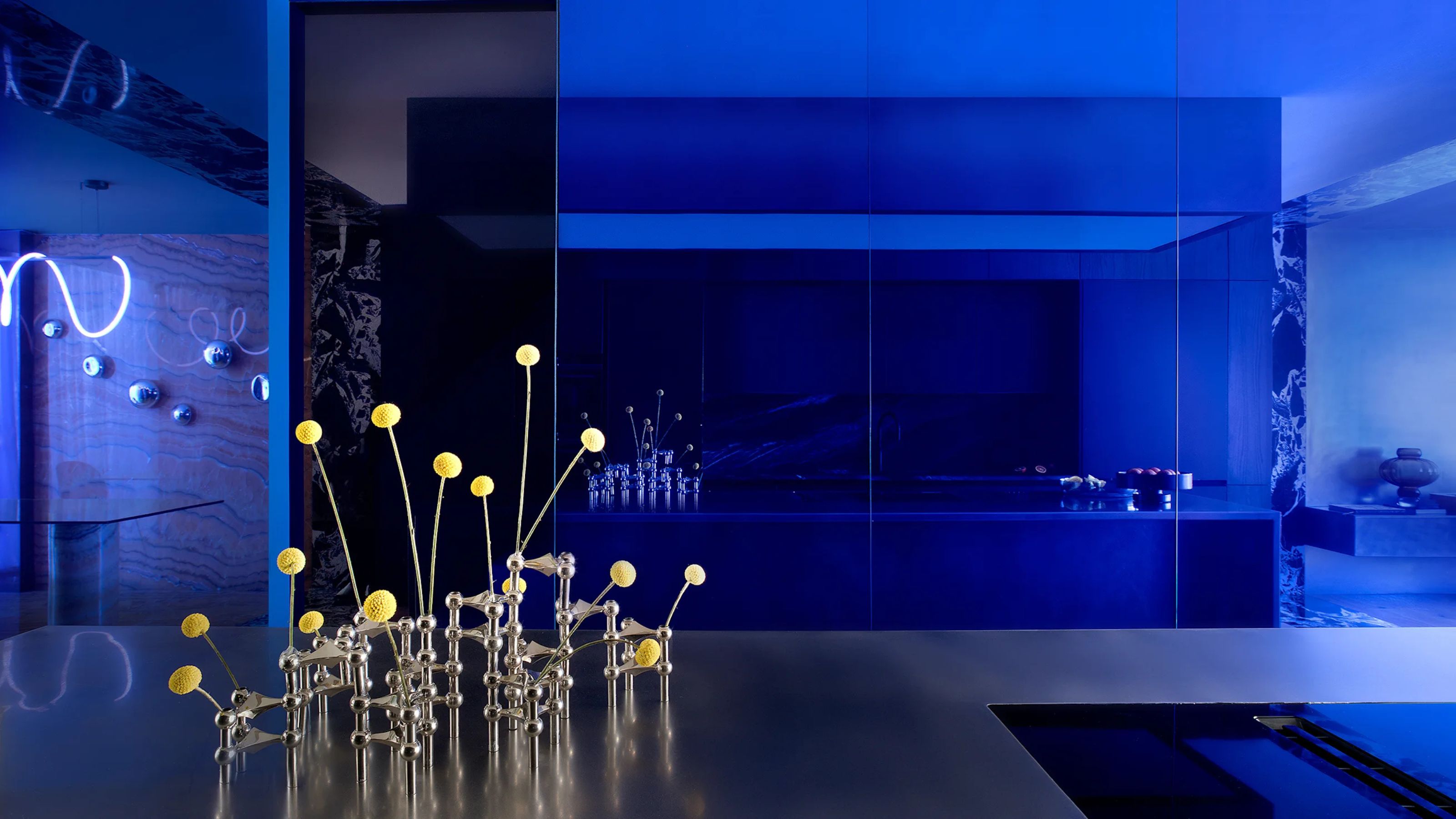
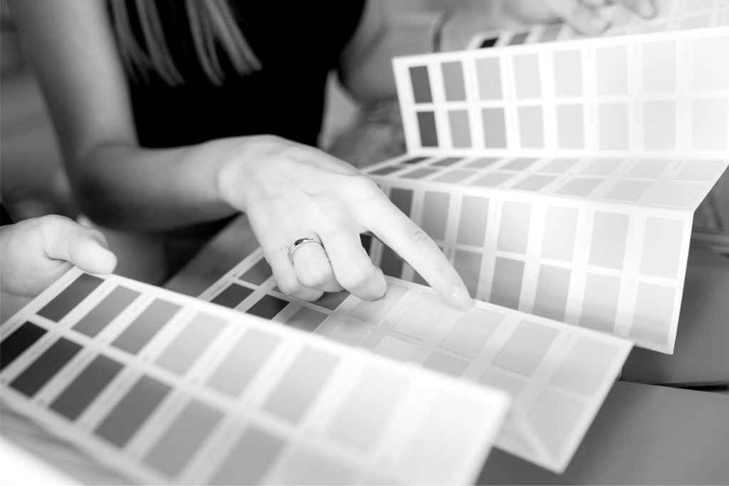
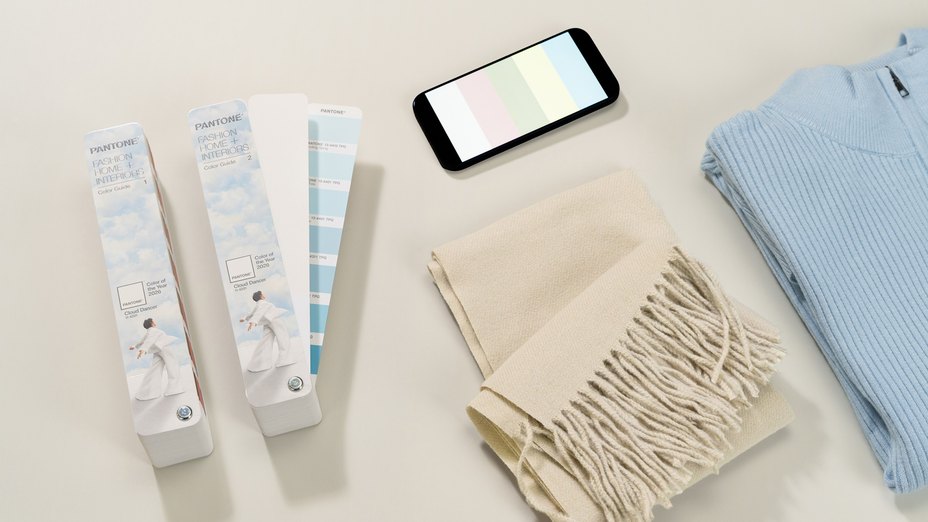
WGSN, a prominent consumer trend forecaster, and Coloro, a leader in color excellence, have announced 'Luminous Blue' as the Color of the Year for 2027. This blog post explores how homeowners and designers can incorporate this vibrant hue into interiors immediately, rather than waiting for its official year. The article highlights a shift in interior design towards more experimental and energetic styles, moving away from the calmer tones that have recently dominated color trends. Amy Moorea Wong, Livingetc's color expert, describes Luminous Blue as a pigment-heavy, alluring shade that exudes intensity, life, and a celebratory spirit, suggesting its immediate adoption for those looking to infuse their homes with this dynamic energy.
Luminous Blue is characterized as pure glory, embodying energy, excitement, confidence, and joy. It is described as endless positivity in color form, with Wong expressing personal excitement for its recognition. The color draws comparisons to Yves Klein’s International Klein Blue, a deep ultramarine tone known for evoking the infinite and offering an introspective and immersive experience. However, Luminous Blue is noted to be brighter, fresher, and more approachable, possessing a lighter and more optimistic mood. It is also likened to cobalt blue or ultramarine, historically significant shades in the art world and considered among the most expensive-looking blues. This contemporary blue offers a stark contrast to recent popular colors like butter yellow or Pantone's Mocha Mousse, bringing punch and power rather than calmness and zen. Wong suggests that while previous colors encouraged relaxation, Luminous Blue is more about celebration and vibrant social energy.
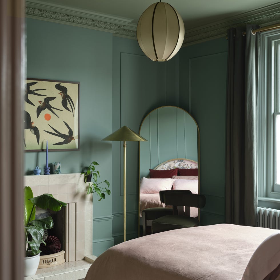
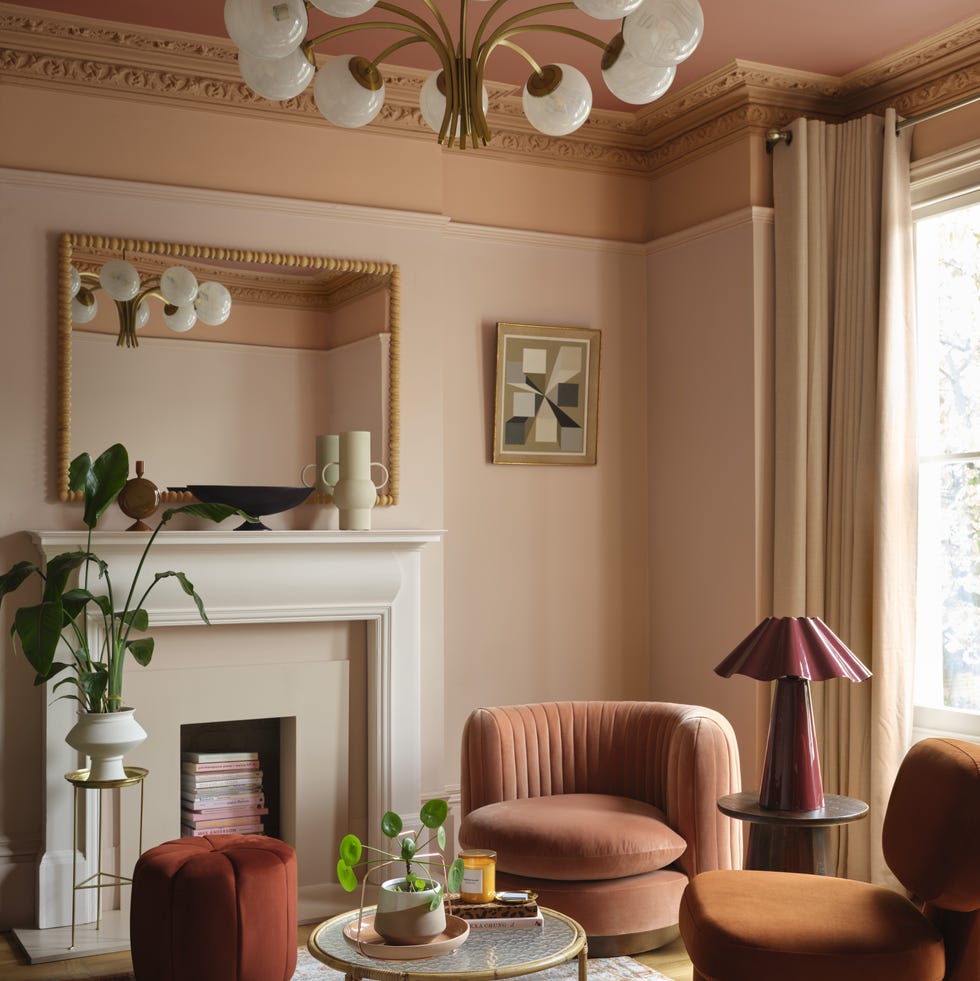
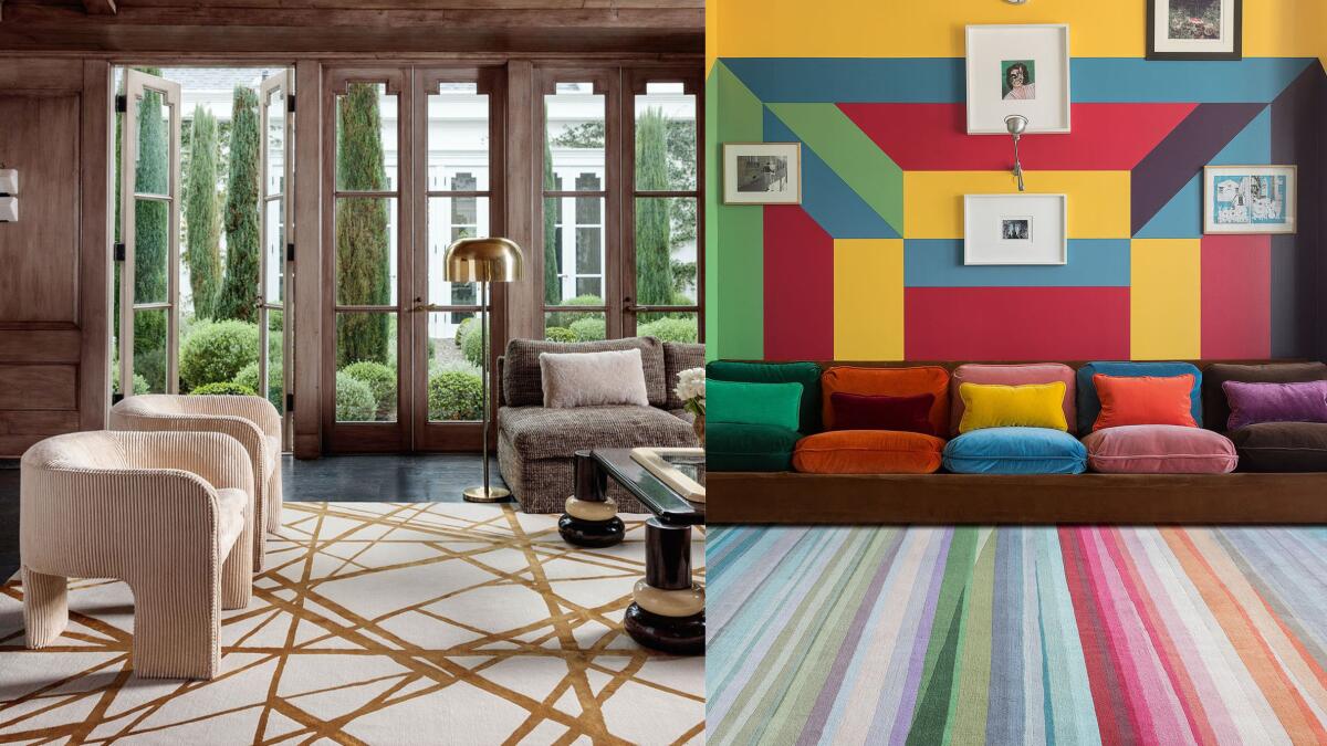
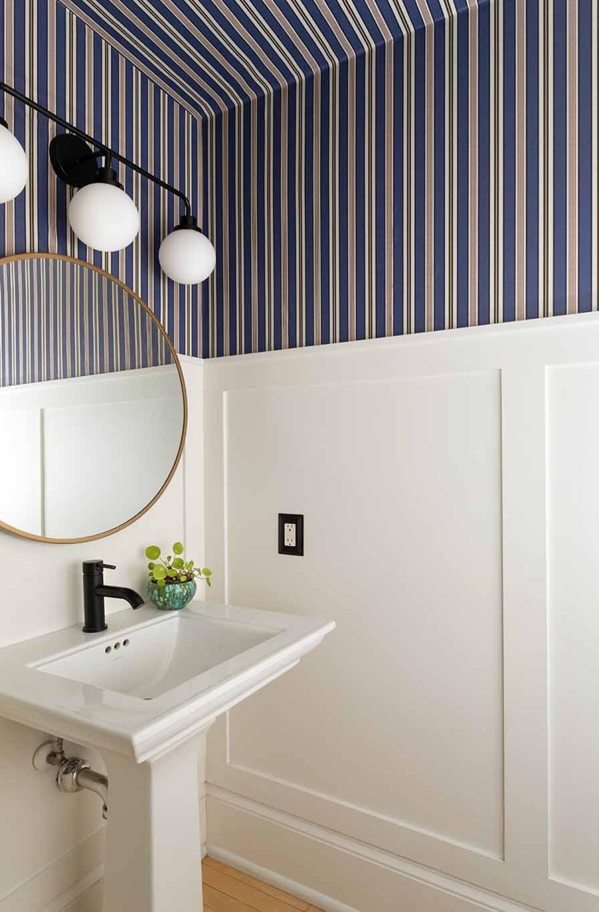
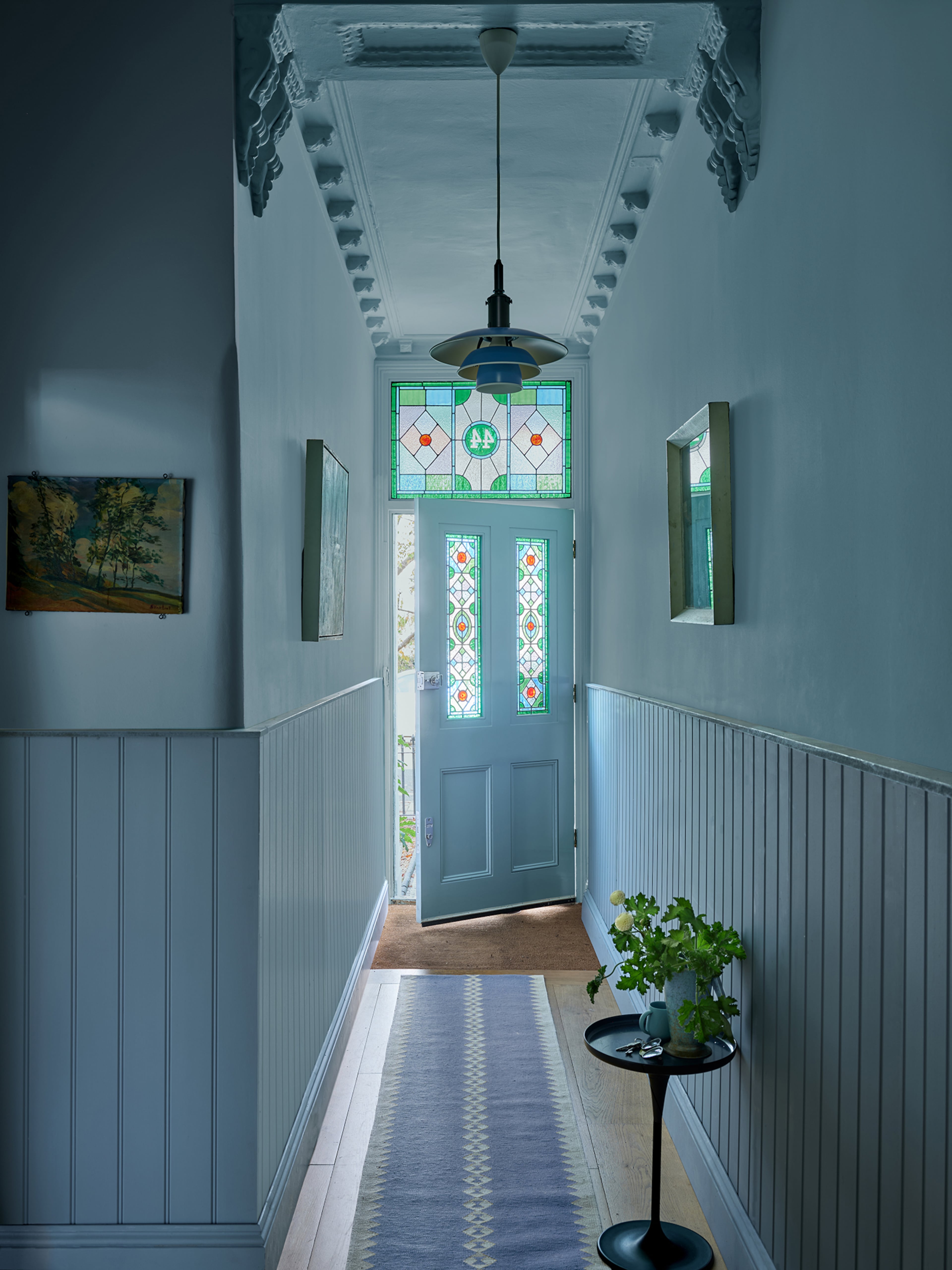
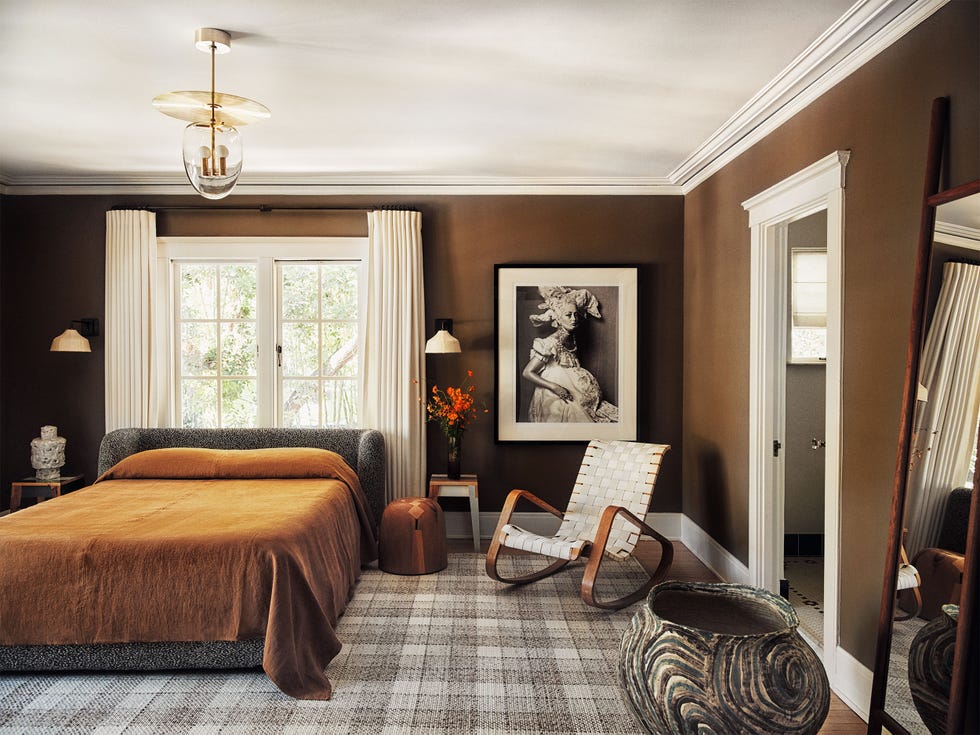
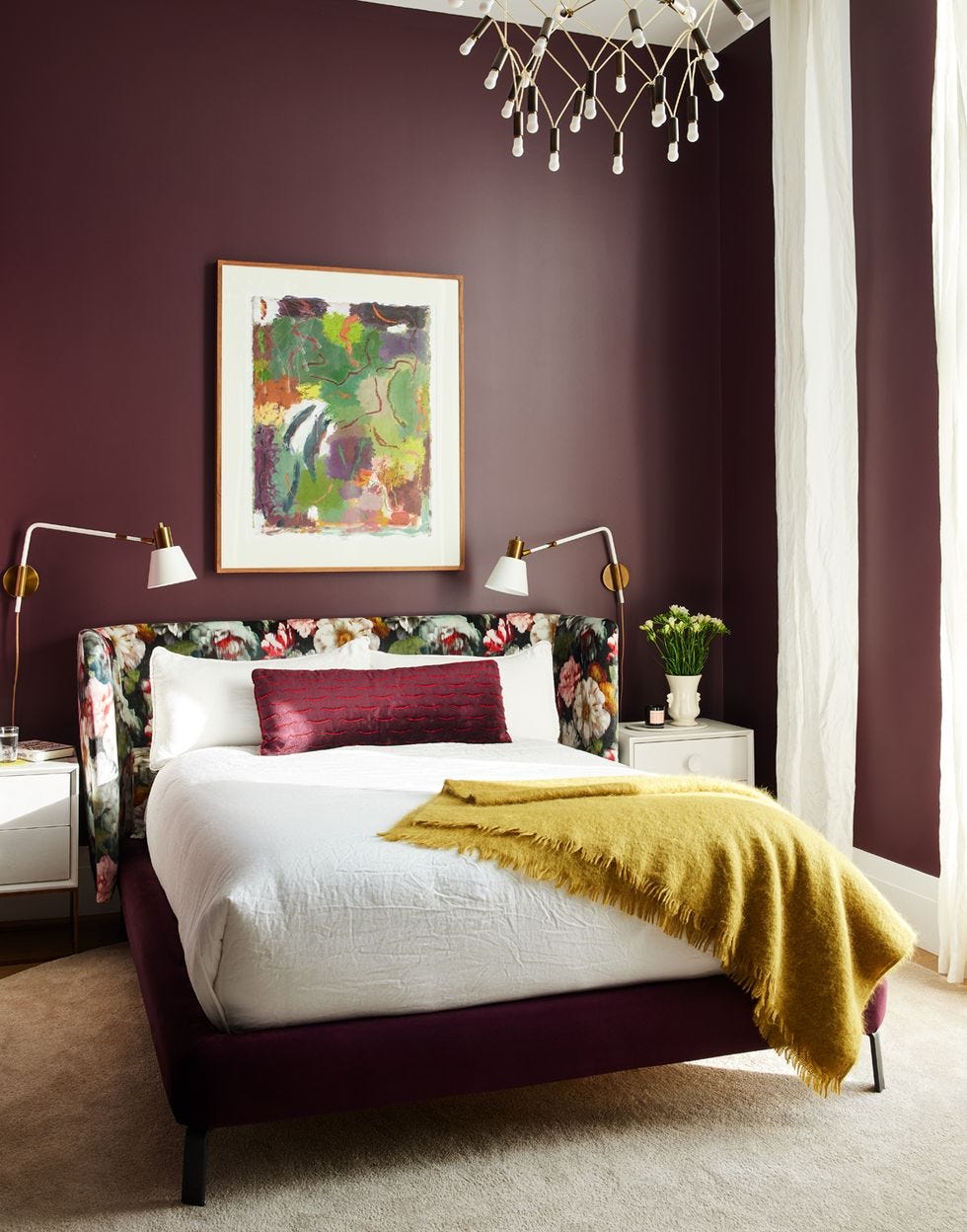
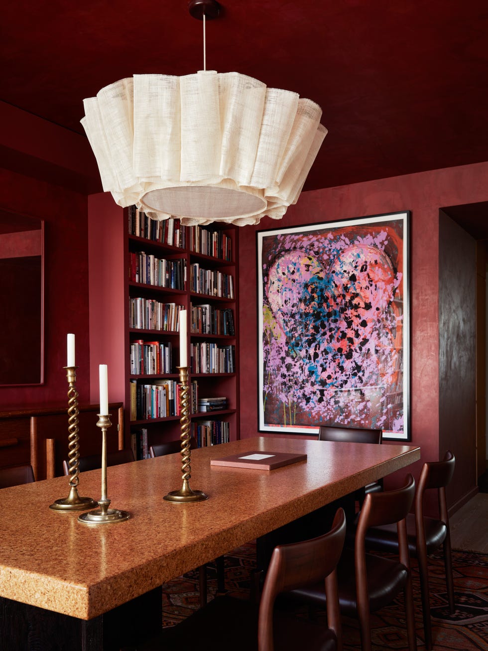
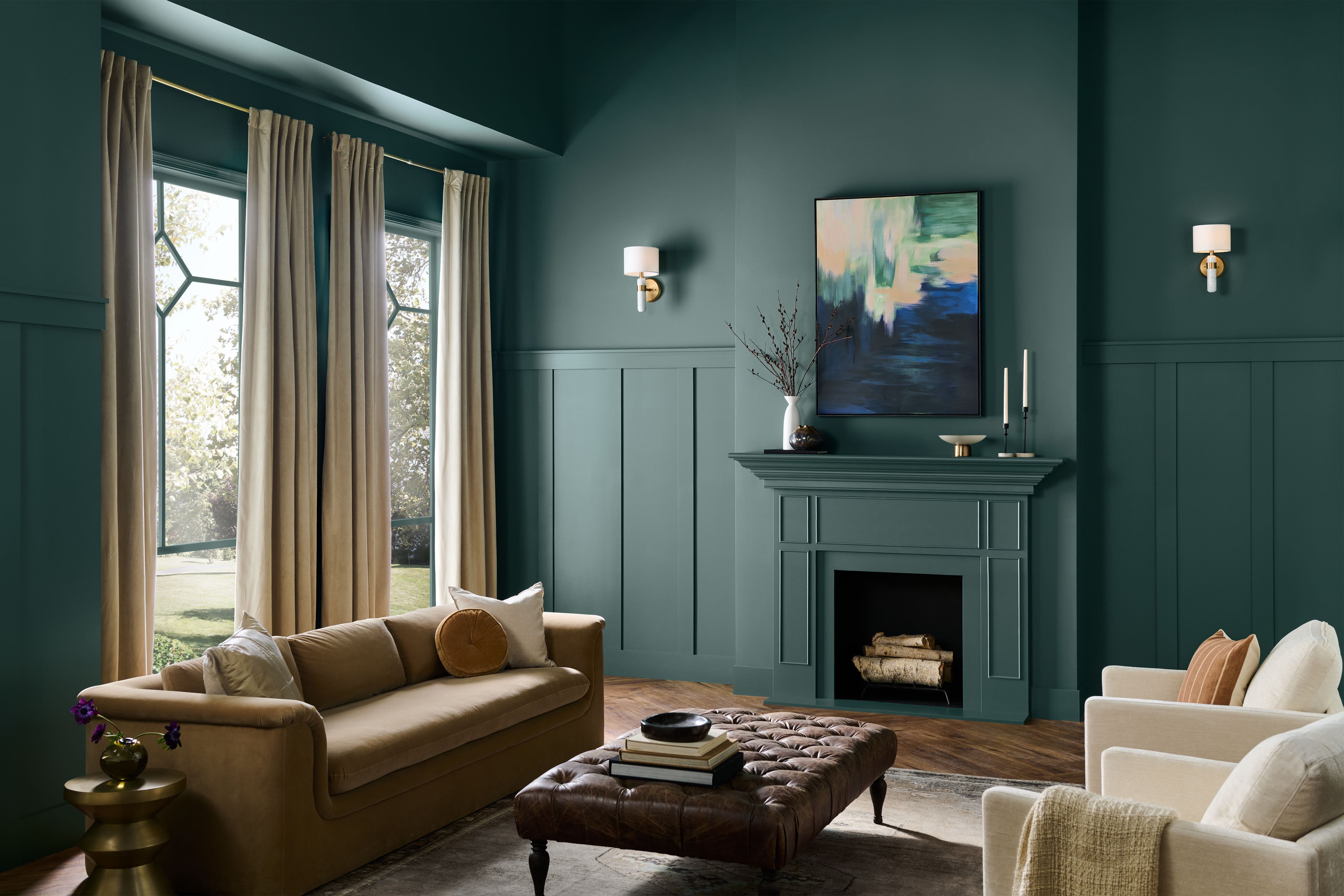
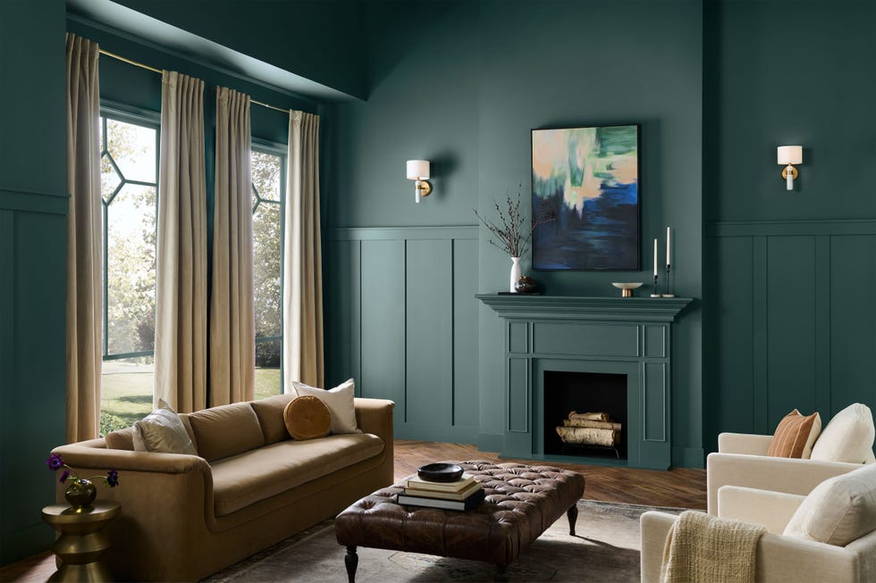
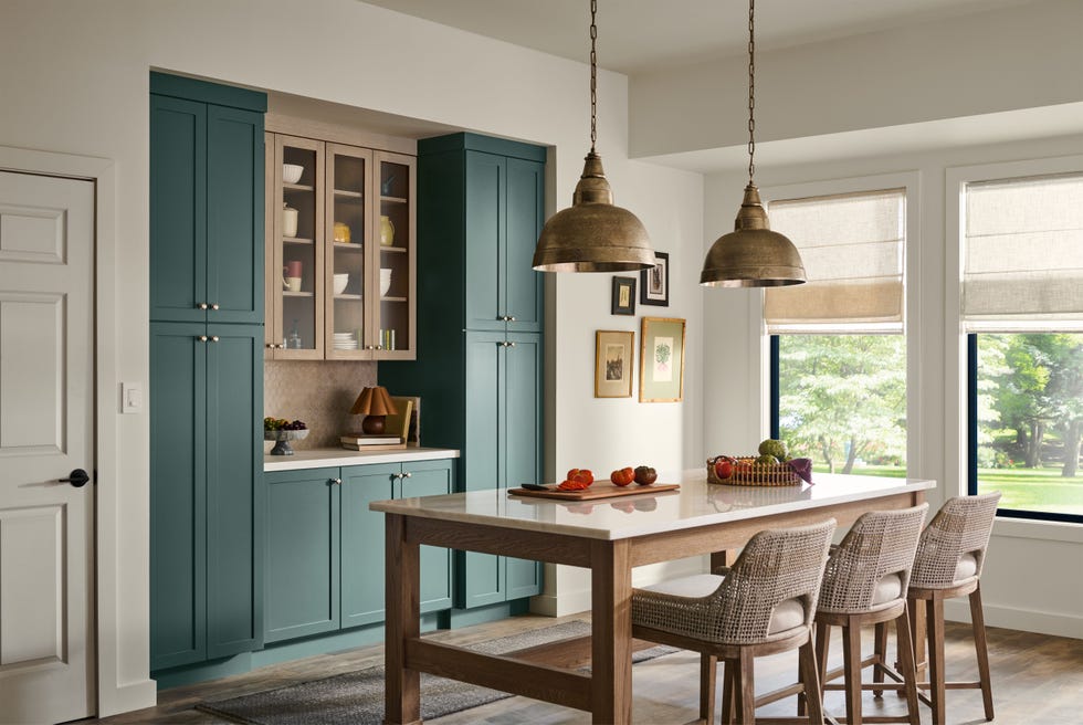
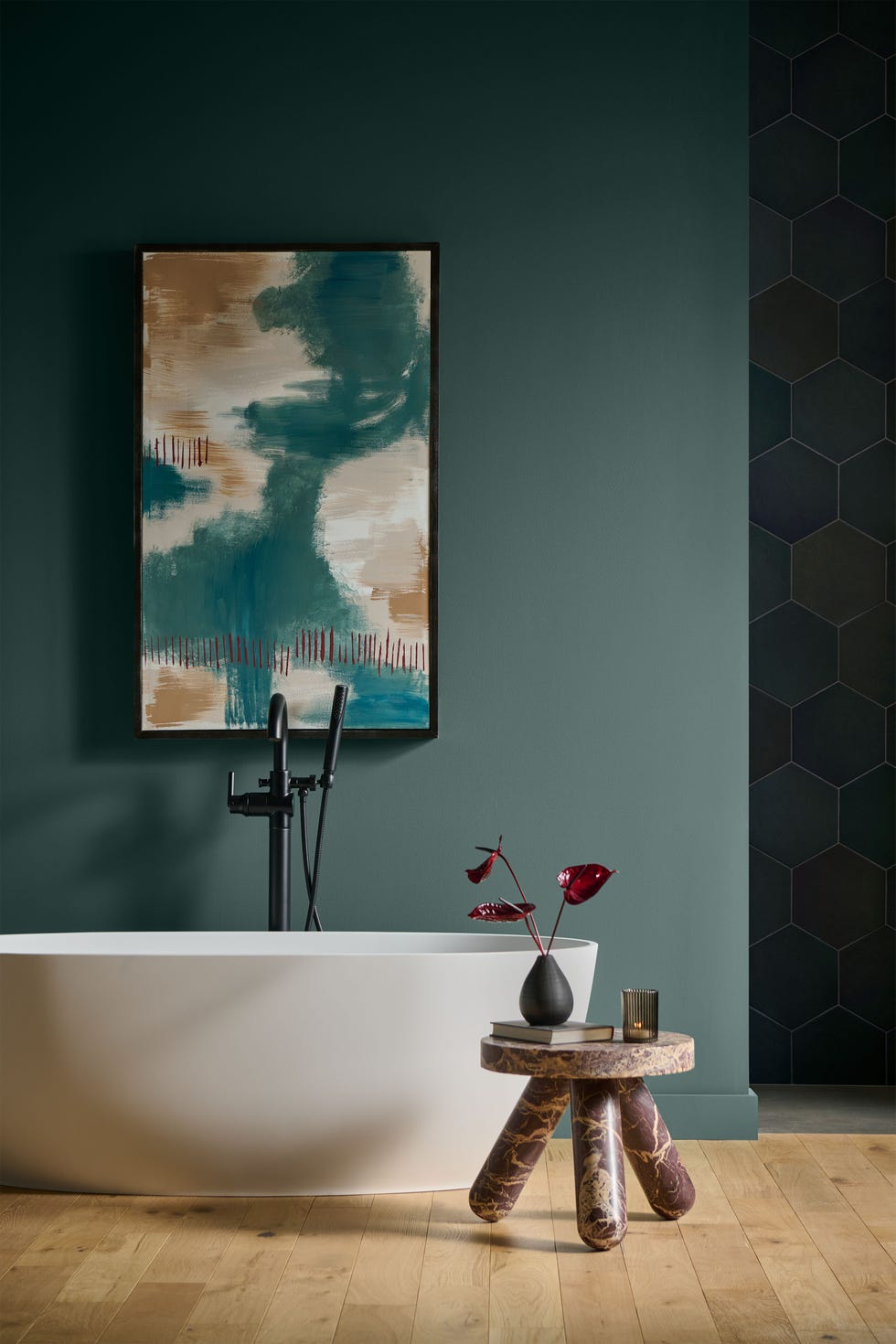
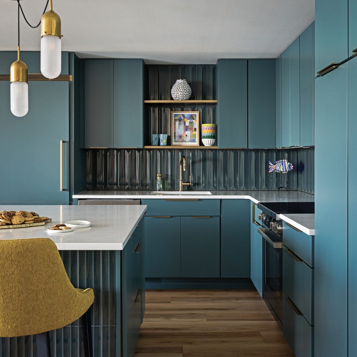
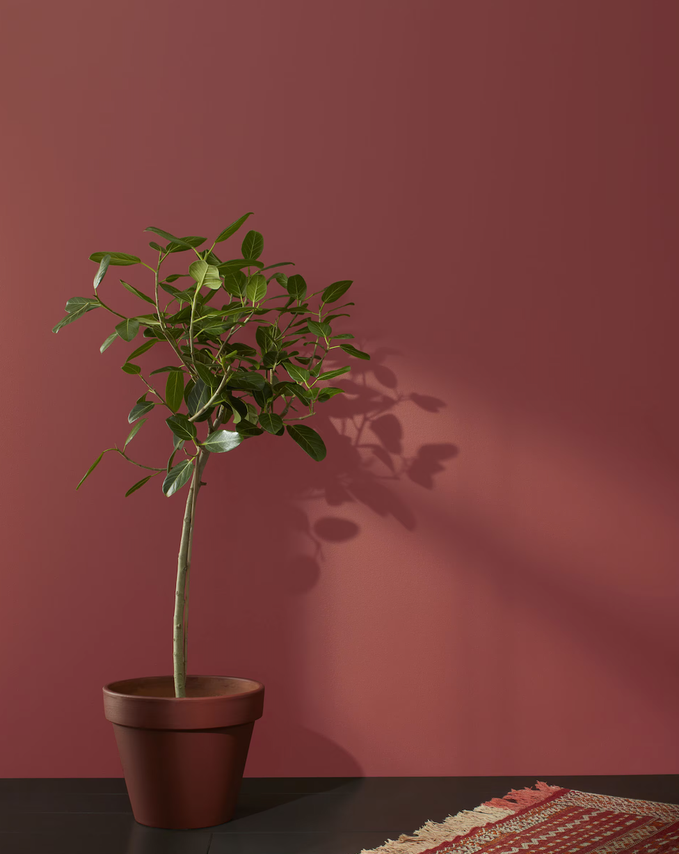
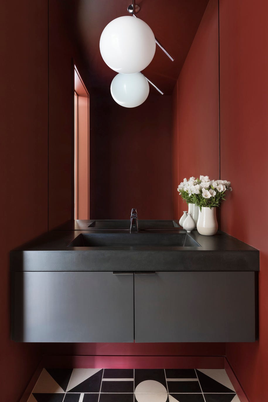
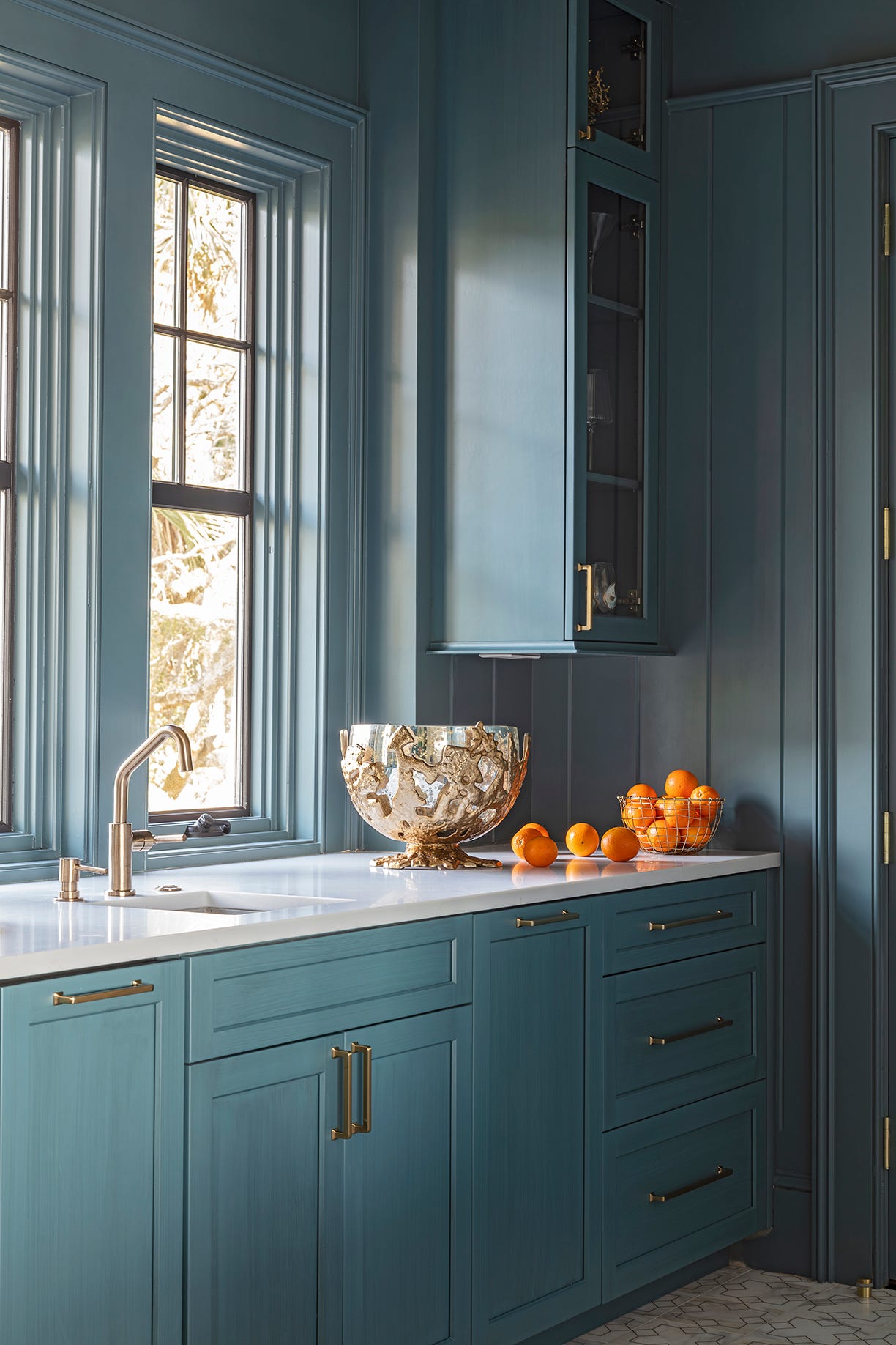
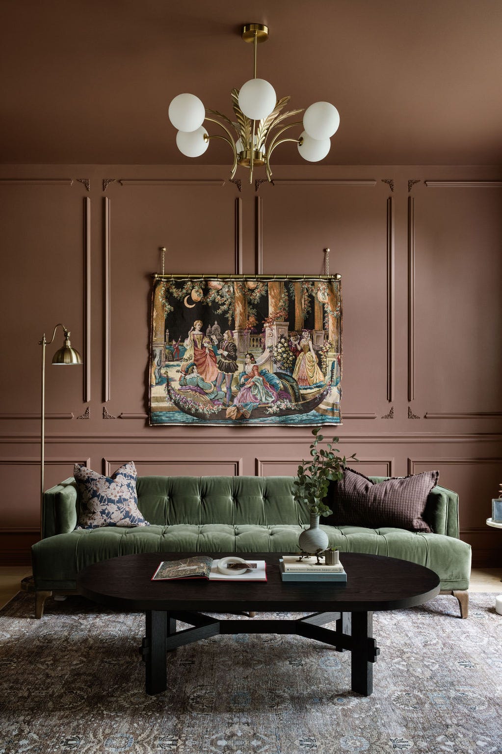
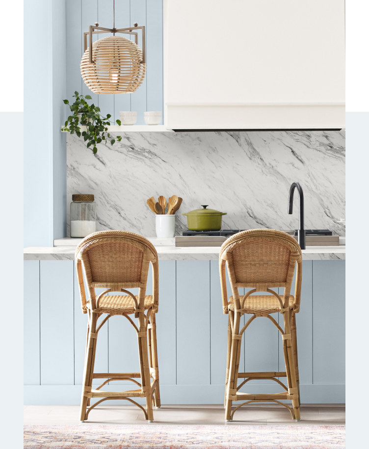
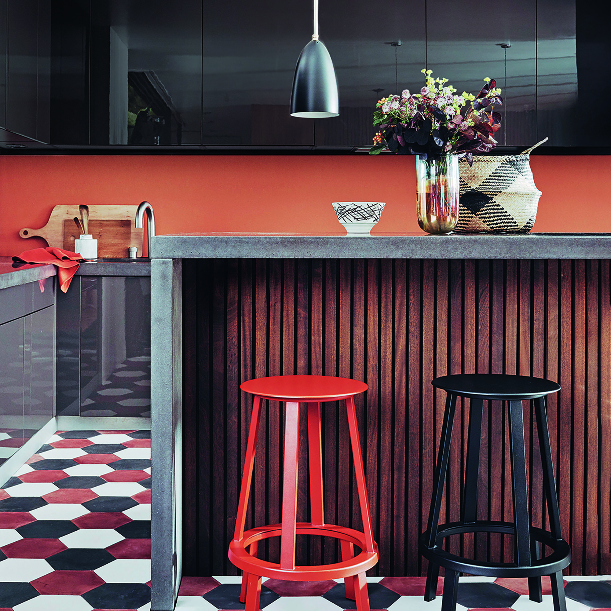
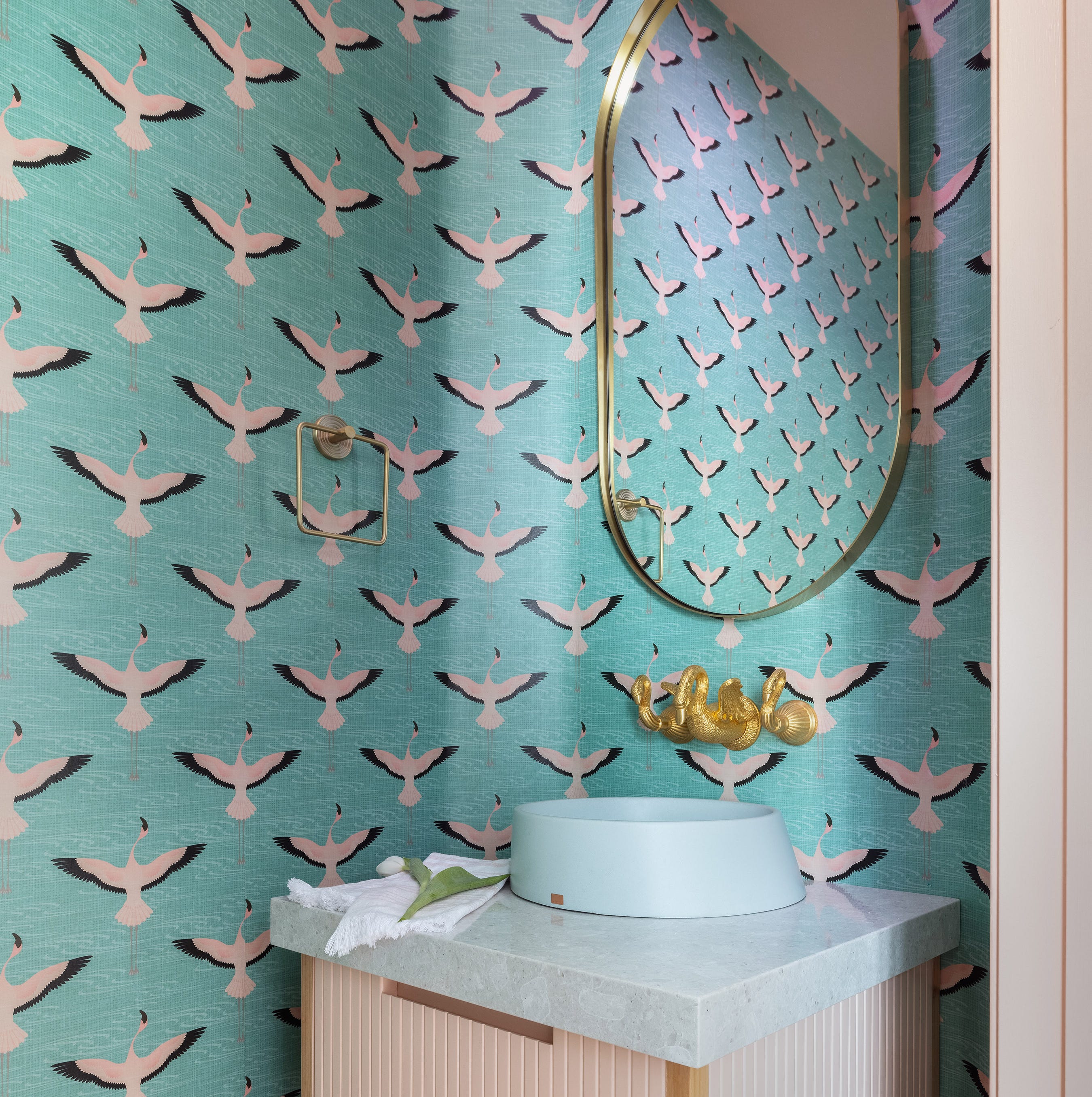
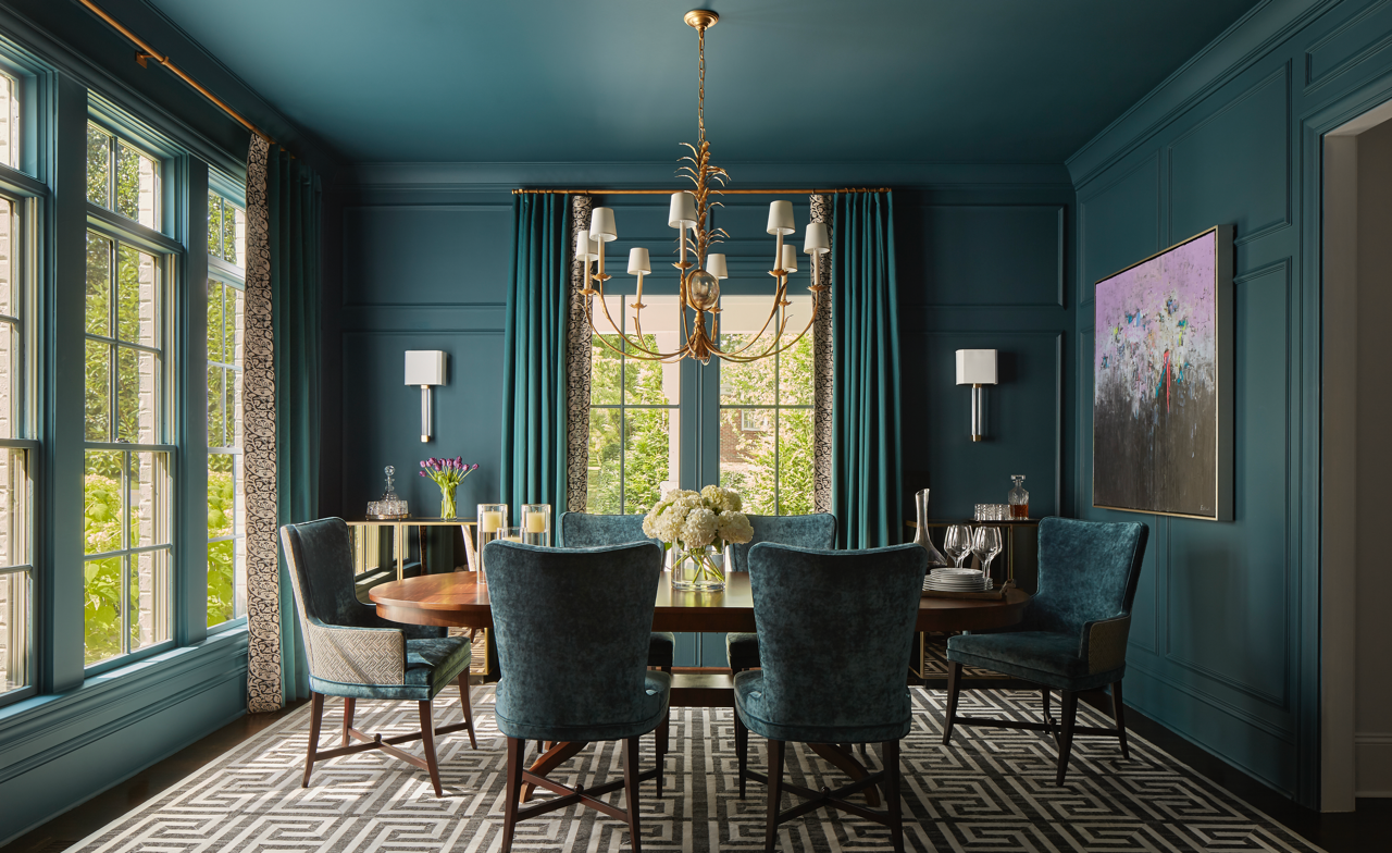
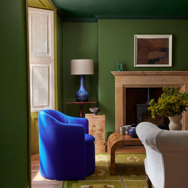
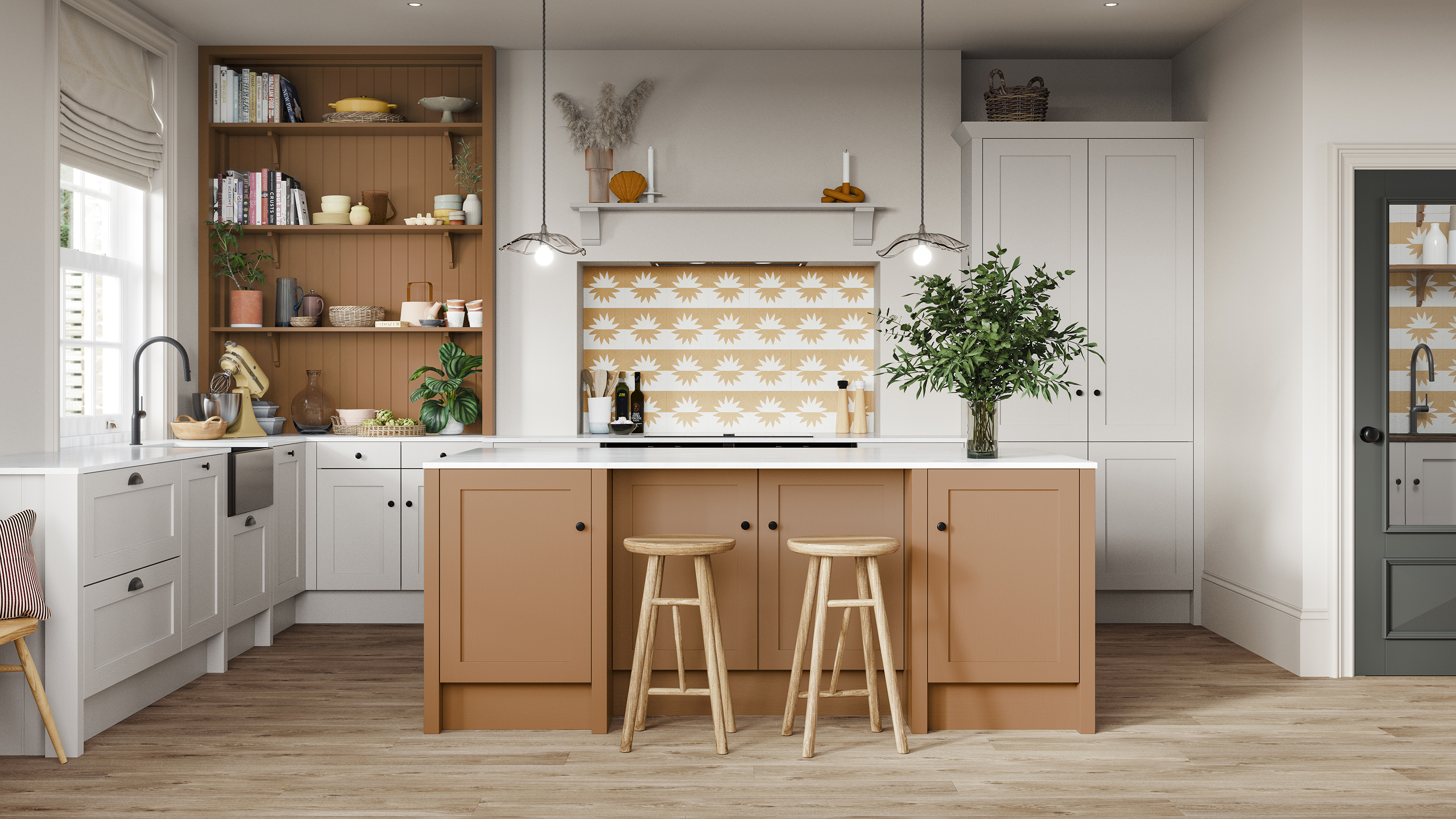
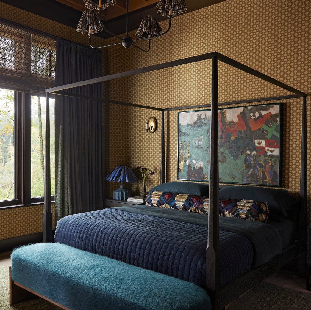
The article provides practical advice on styling Luminous Blue in interiors, emphasizing its versatility despite its boldness. Interior designer Róisín Lafferty, known for creating spaces with this dynamic blue, suggests that its vibrant nature works effectively with a 'color-drenching' method to create an immersive and bold environment. This approach can transport inhabitants to a different world, creating an all-encompassing feeling. However, for those hesitant about full color saturation, Guila Minozzi, senior designer at Visual Display, recommends using blue as an accent color. This can involve painting a specific wall or ceiling in a bedroom, or introducing it into a small space like a powder room to create an unexpected and precious feel. Minozzi also suggests using it on a piece of furniture or an interior detail to draw attention.
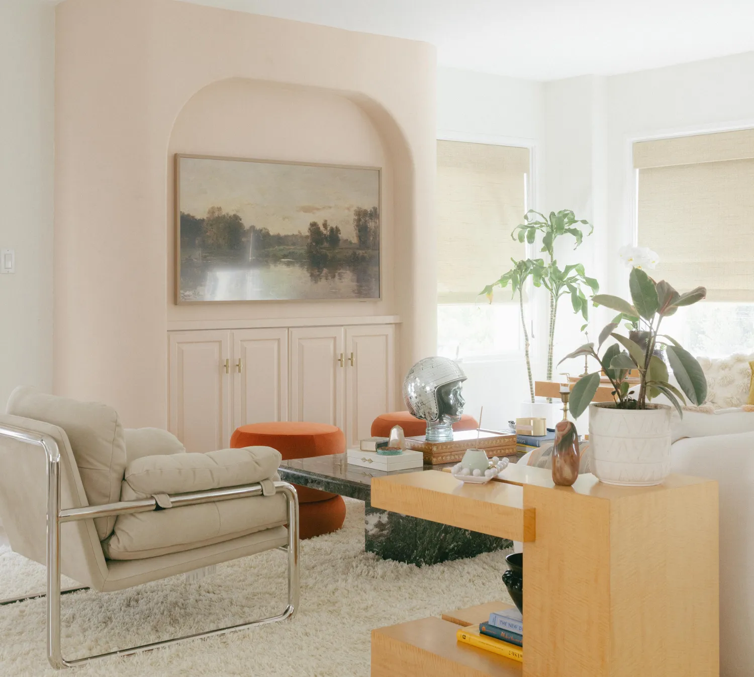
To ensure balance, Róisín Lafferty advises using saturated colors as accents in multiple locations to guide the eye through the space, thereby adding vibrancy and drama. Amy Wong recommends starting with small items such as cushions, tableware, art, or decorative objects, gradually progressing to larger pieces like a Luminous Blue lounge chair or rug as comfort with the color grows. The article also stresses the importance of combining Luminous Blue with neutrals and textures to ground and soften its intensity, making it more livable. An example provided is a living room with a neutral color scheme and natural textures, where a Luminous Blue side table acts as a strategic pop of boldness, creating drama and capitalizing on the 'one amazing thing' theory. Ultimately, while Luminous Blue is a powerful color requiring careful handling, it is presented as a fun and accessible way to enrich the soul and empower inhabitants, offering a thrilling decorative experience.
#LuminousBlue #ColorTrends2027 #InteriorDesign #HomeDecor #Coloro #WGSN #AccentColors #ColorDrenching #ModernInteriors #LuminousBlue #ColorTrends2027 #InteriorDesign #HomeDecor #Coloro #WGSN #AccentColors #ColorDrenching #ModernInteriors
0 comment in total
You may also like
Meet 'colour capping', the paint trend set to take over 2026
Every 2026 Color of the Year That Has Been Announced So Far

8 Kitchen Trends Designers Predict Will Be Everywhere in 2025

Move Over, Beige—This Unexpected Neutral Is Taking Over in 2026

Looks Like Bold Stripes Will Have Their Moment in 2026

Behr's 2026 Color of the Year Is Here—And It’s Moody

We're Calling It: The 7 Paint Colors That Will Be Huge in 2026

Pick Your Favorite 2024 Color of the Year

Bold, edgy color drenching is going to be big in 2024
Every 2025 Color of the Year We Know So Far

Designers Say These 12 Paint Colors Will Be Everywhere in 2026

Kitchen colour experts are calling this the 'it' colour of 2024 that will go down as a future classic
The 2026 paint Colors of the Year Have Been Announced

2026 Color of the Year Announcements Have This In Common
What Colors Will Rule 2027 (and Beyond)? Experts Make Their Predictions
This Very "Controversial" Color Is About To Be Everywhere Again
We’re Calling It: These Are the Official Color Trends of 2025
Color Explosion: 2025 Color Trends

The #1 Paint Color Trend of 2025, According to Designers
UPDATE: Here Are All the 2026 Colors of the Year—Including Pantone’s Shocking Pick