Move Over, Beige—This Unexpected Neutral Is Taking Over in 2026
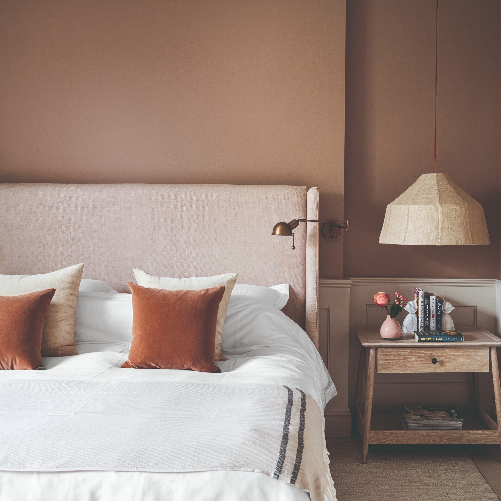
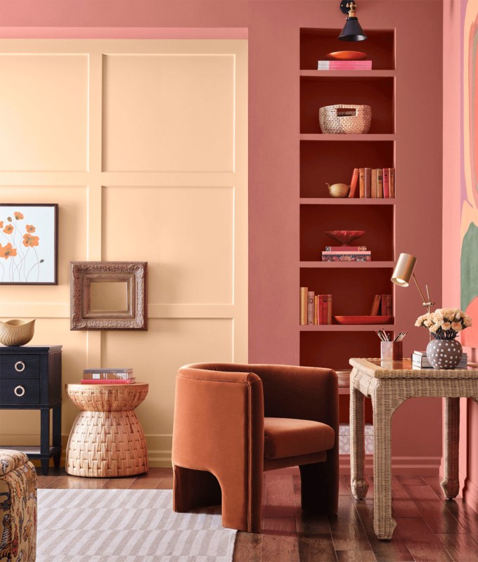
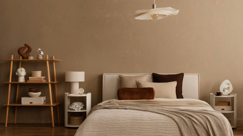
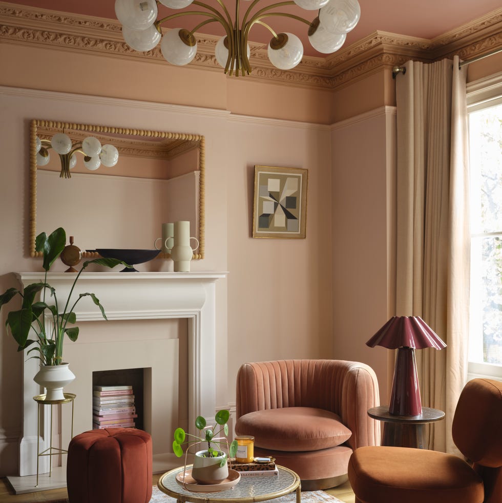
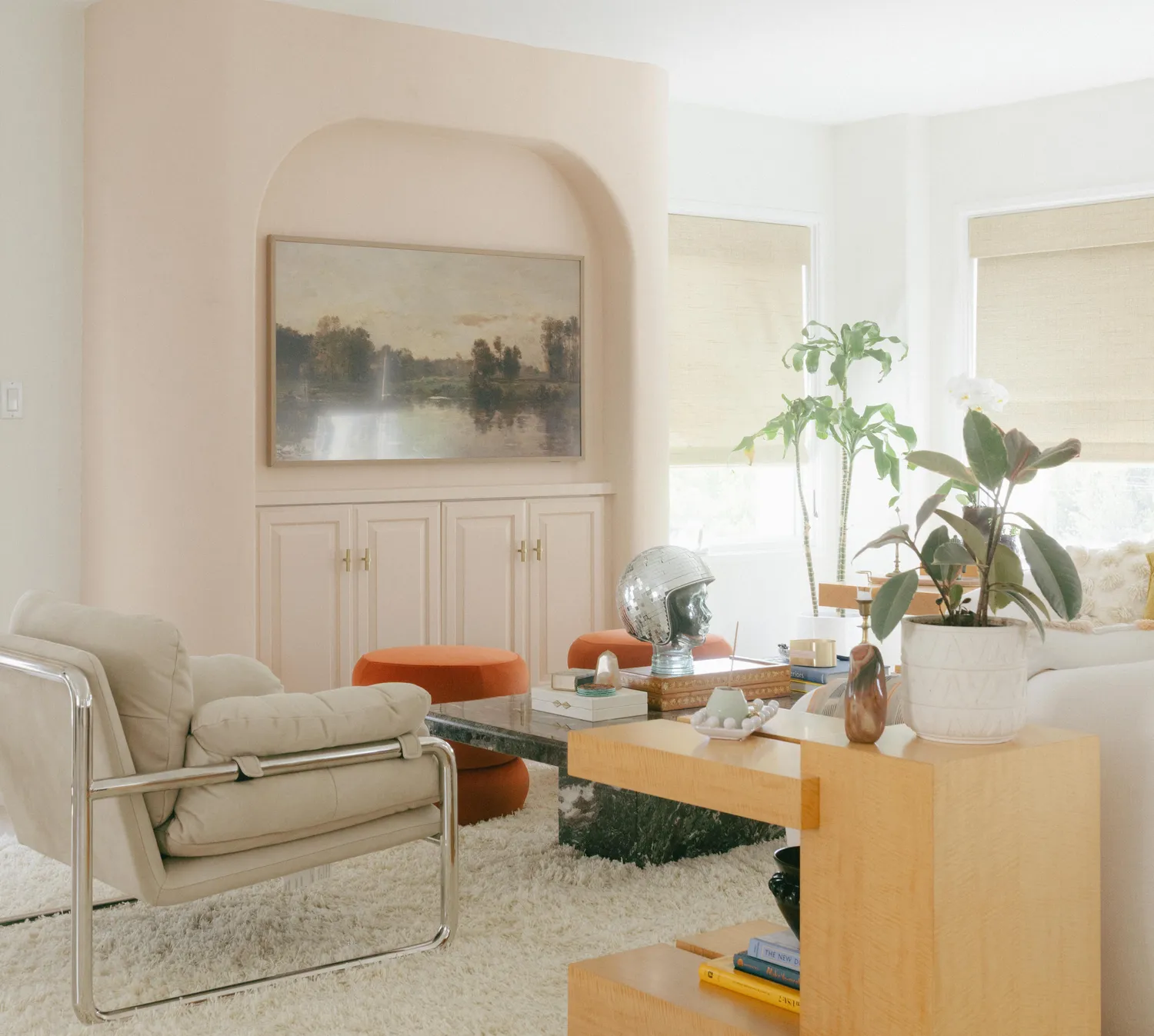
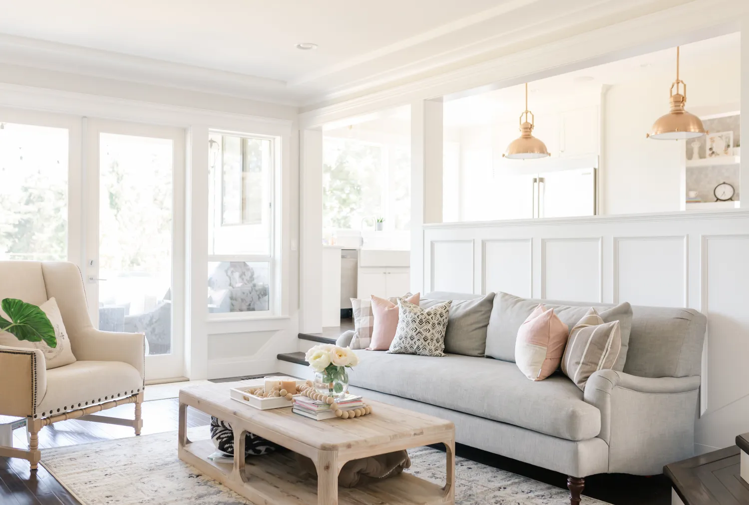
Designers are increasingly embracing sophisticated pinks as a new neutral in home decor, moving beyond traditional neutrals like ivory, beige, and black. These muted pinks, which include shades like putty, muddied salmon, and dusty blush with undertones of brown, beige, or gray-brown, are gaining popularity for their versatility and flattering qualities. According to New Orleans-based designer Aaron Hahnselle of Hahnselle Studio, warm pinks create a soft, glowing undertone that makes a space feel welcoming and cozy. The soothing and nurturing qualities of pink make it an ideal choice for bedrooms and bathrooms.
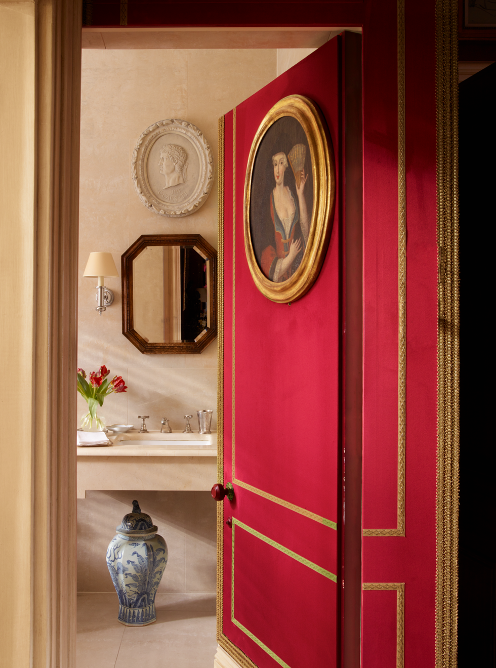
There are several creative ways to incorporate these shades into home design. One method is to use two shades from the same color family. For instance, Hahnselle suggests using a warm, neutral pink in a bathroom, as these hues reflect flattering light onto the skin and pair well with earthy tones such as camel, olive, and mustard, as well as jewel tones like sapphire and emerald. He highlights an example where Farrow & Ball’s Setting Plaster was used on the walls with Benjamin Moore’s Roman Shade on the trim, creating depth and contrast without resorting to darker colors.
Another approach is to integrate muted pinks within a room dominated by traditional neutrals. Isabella Patrick of Isabella Patrick Interiors illustrates this by upholstering a key furniture piece, such as a banquette, in a sophisticated pink shade. This allows the color to bridge other neutral elements in the room, like caramel-toned hardwood floors, brass fixtures, and light-colored cabinets, ensuring the color remains consistent and vibrant due to materials like faux leather.
The trend also involves mixing pinks with luxurious finishes. Designer Crystal Blackshaw used earthy blush accents and paint in a child's bathroom suite, pairing them with a white oak vanity, Carrera marble, and satin brass details. This combination creates an understated yet luxurious feel that can evolve with the child, avoiding an overly saccharine aesthetic.
When selecting a pink shade, considering the Light Reflectance Value (LRV) is crucial, as advised by Grey Joyner of Grey Joyner Interiors. She notes that paler, sophisticated pinks, reminiscent of "old Hollywood pink" rather than pastel hues, are preferred. The undertones of the pink should also complement the existing colors in the space; cooler room palettes require pinks with cooler undertones. A higher LRV is suitable for bright, airy rooms or those with limited natural light, while a lower LRV can create a moodier ambiance. An example is a dining room ceiling painted in a high-gloss pink with an LRV of 78, reflecting light to brighten the space.
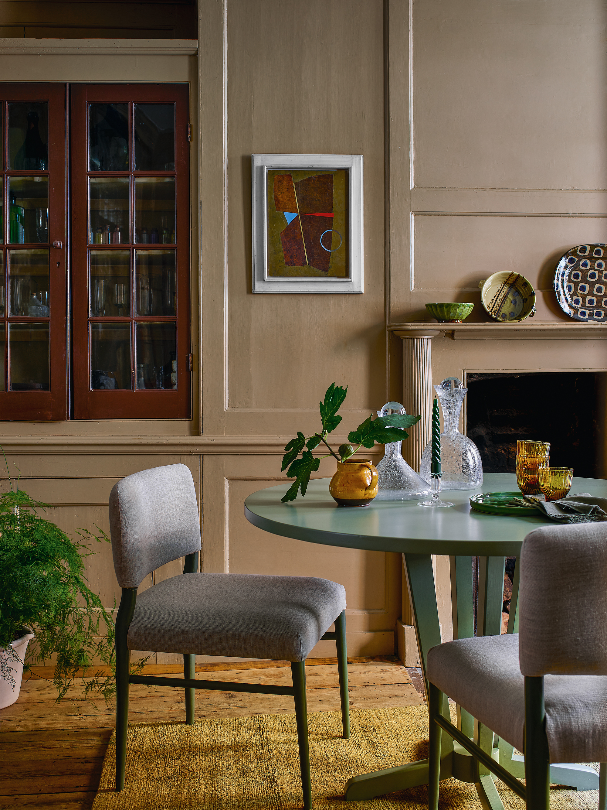
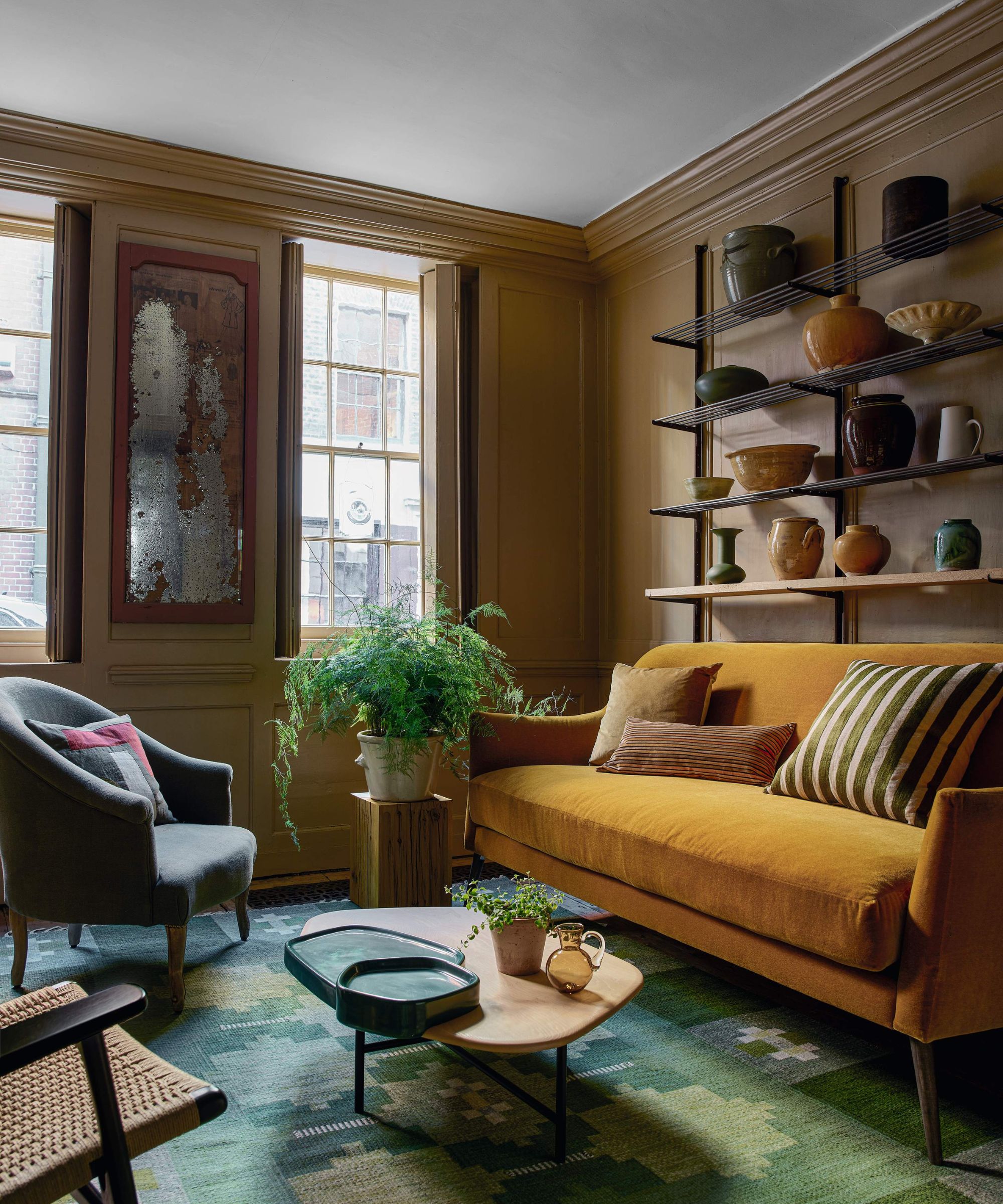
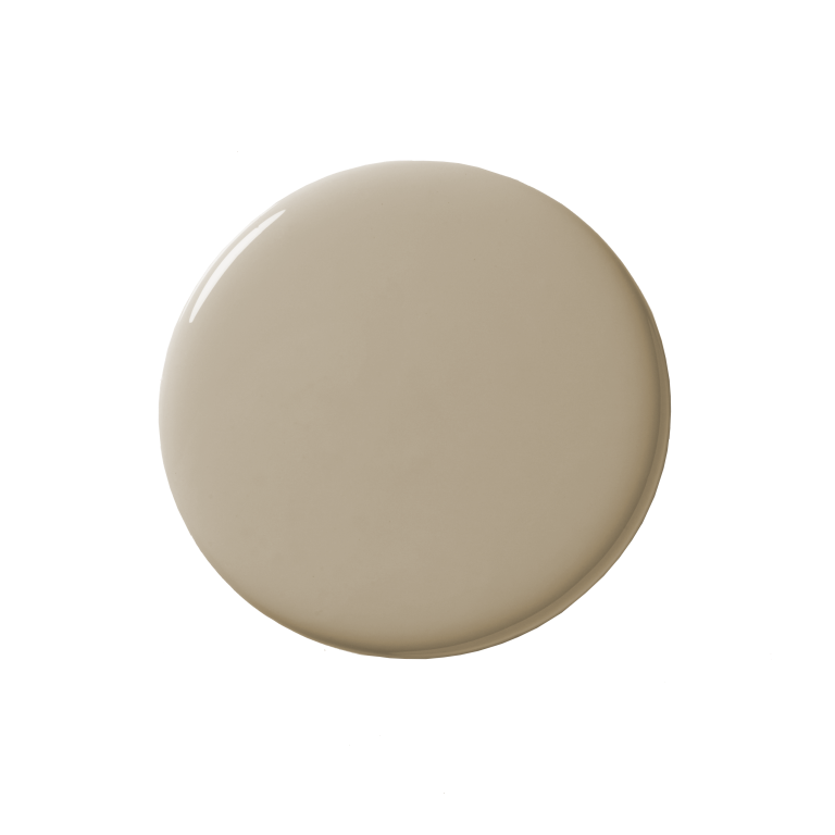
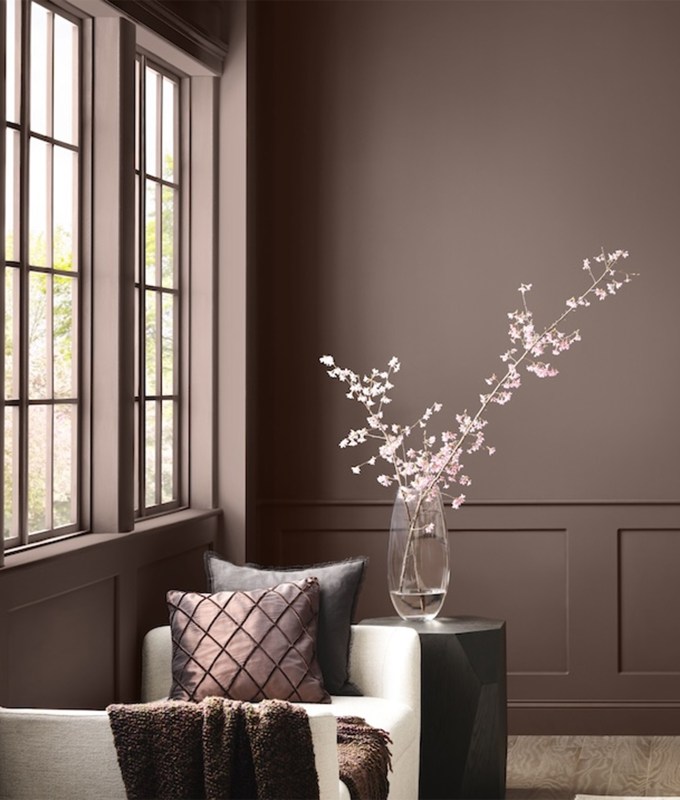
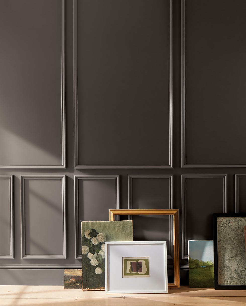
For a more dramatic effect, designers are leaning into moodier shades of pink with strong brown undertones. Debbie Boggs, co-founder of Staging Studio, used Sherwin-Williams Interface Tan in a media room to create a sophisticated and modern look. This brownish-pink offers an earthy feel, making it suitable for smaller spaces where a dramatic impact is desired, and is distinct from “Pepto” or “millennial” pinks.
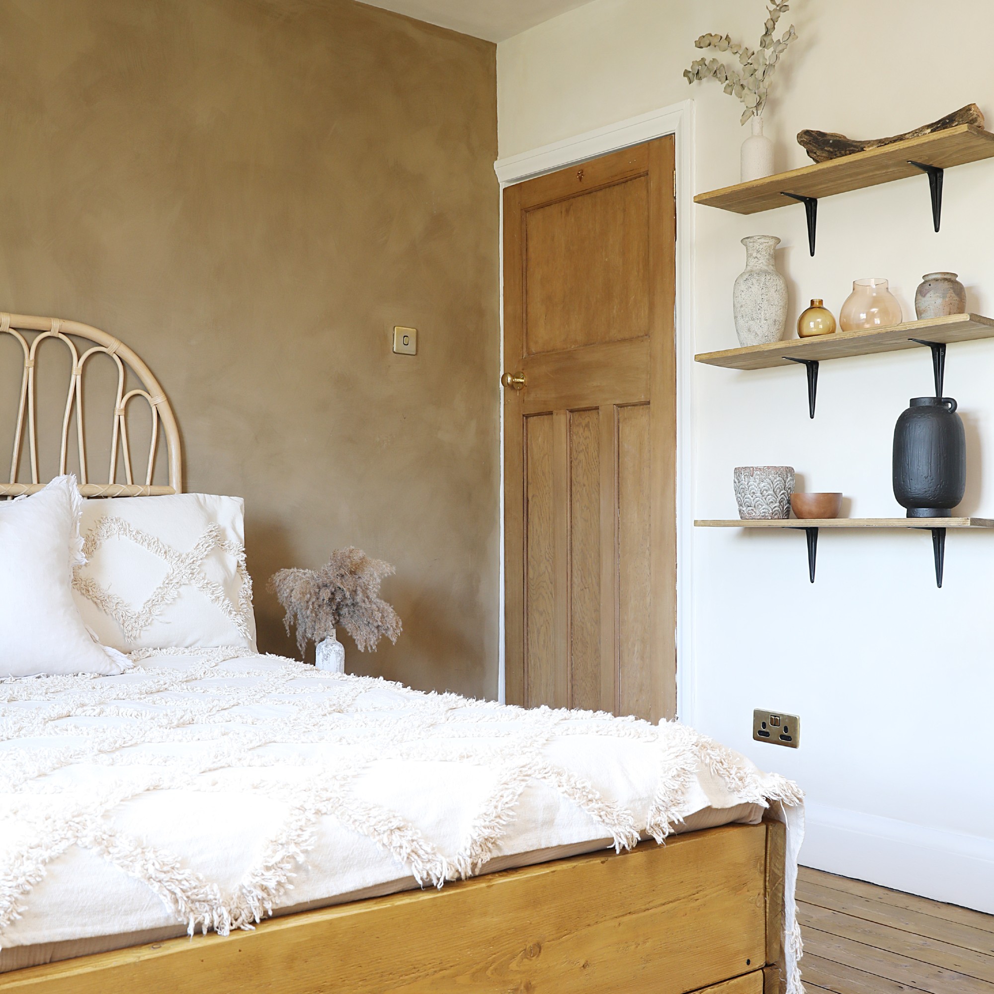
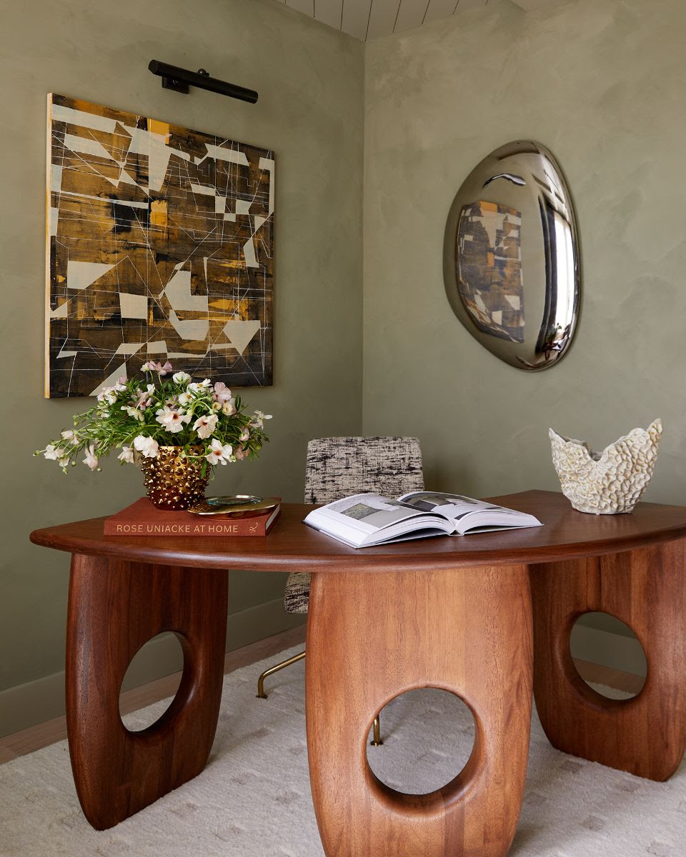
Finally, combining similar shades of pink for added depth is a common technique. Michelle Accetta of Michelle Accetta Home used a blend of Setting Plaster from Farrow & Ball and Angels Landing from Portola Paints. These two colors, despite being similar, create a sophisticated duo with different finish textures, evoking the warm stucco finishes seen in European architecture, transforming an outdated space into something subtle yet earthy.
#HomeDecor #InteriorDesign #PaintTrends #NeutralColors #PinkPalette #ColorPsychology #LuxuryFinishes #LRV #DesignTips #HomeDecor #InteriorDesign #PaintTrends #NeutralColors #PinkPalette #ColorPsychology #LuxuryFinishes #LRV #DesignTips
0 comment in total
 No comments yet
You may also like
Looks Like Bold Stripes Will Have Their Moment in 2026


2026 Color of the Year Announcements Have This In Common
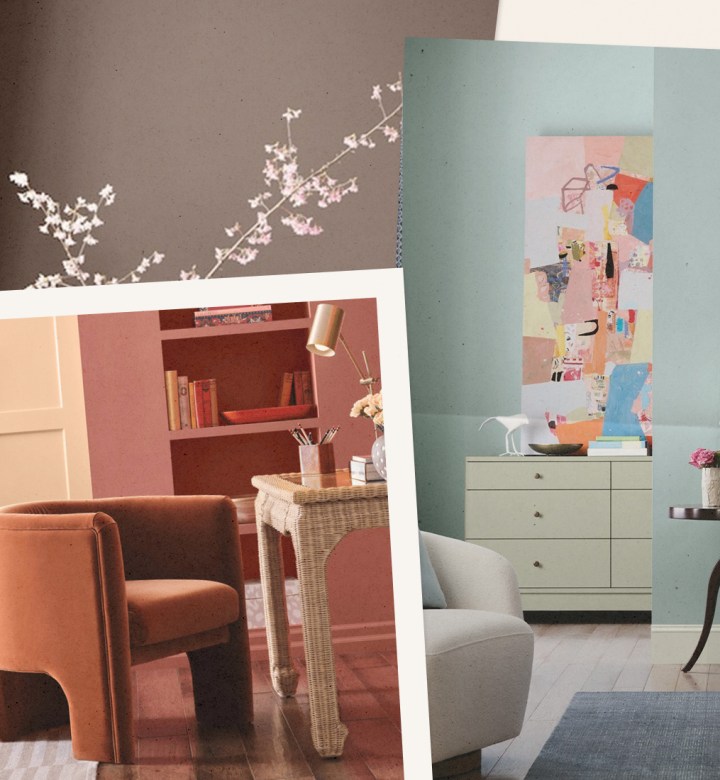
Bye-Bye True Blue: These Are the New Coastal Colors for 2026
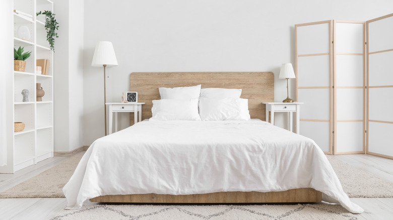
Say Goodbye To White Bedrooms — These Neutrals Will Dominate 2026 Design Trends
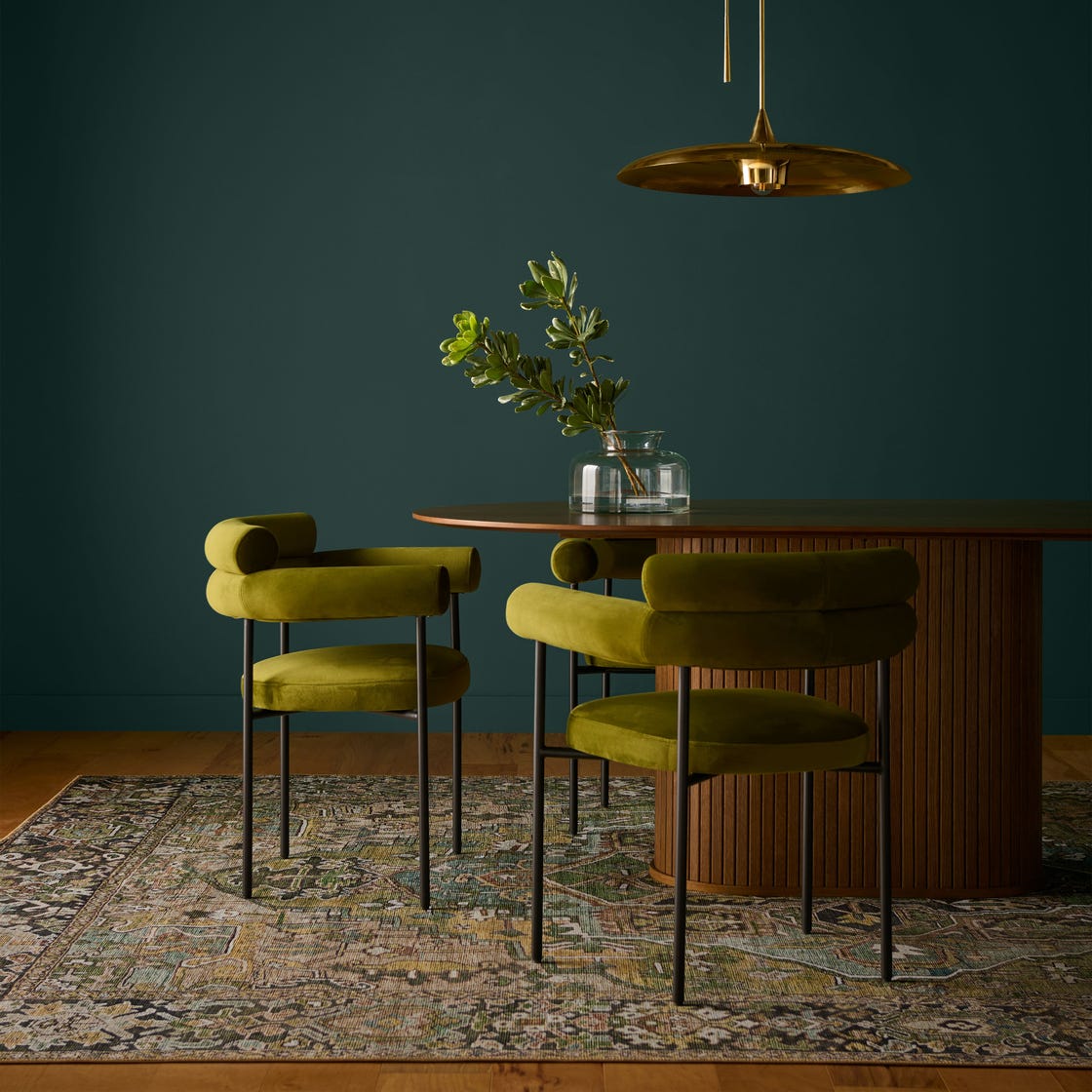
Behr's 2026 Color of the Year Is Here—And It’s Moody

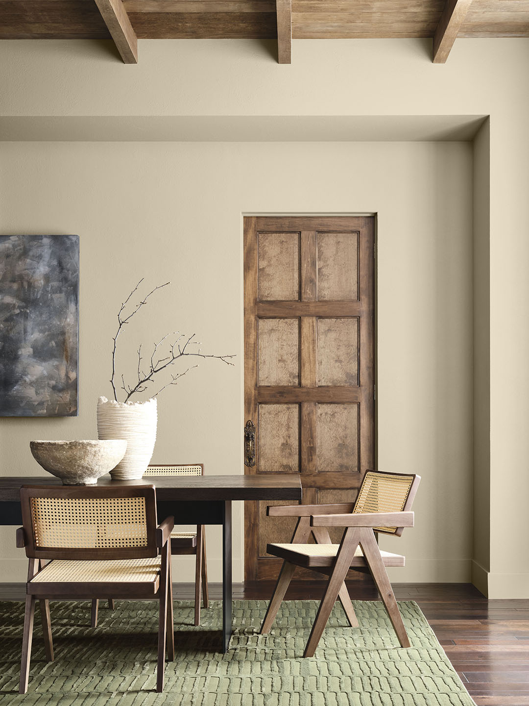
This Controversial ’90s Hue Deserves a Second Chance in 2026

Goodbye Gray—This Soothing Paint Color Will Dominate Interiors in 2026, Designers Say

Our 2026 Color of the Year Started With a Scandal-Plagued Royal—No, Not That One

What’s replacing beige in 2025? Last year's go-to neutral is taking a back seat in favour of these two new earthy colours
Say Goodbye to Neutrals: Color-Drenching Will Define 2026 Interiors
We Already Know the Color That's Going to Have 2027 in a Chokehold — Now's Your Chance to Beat the Trend

Bold, edgy color drenching is going to be big in 2024
We're Calling It: Blues And Greens Are The New Neutrals For 2025

2026's new neutral? We're pretty sure we just spotted the next must-have tone on Stanley Tucci's living room walls
Every 2026 Color of the Year That Has Been Announced So Far

This British Paint Trend Is Set to Take Over 2026
What color is replacing beige? This is the one color we prefer to use instead of beige in 2024, say designers
Which Neutral Is Replacing White in 2025? Experts Reveal
Benjamin Moore’s 2026 Colour Of The Year Is A Rich, Warm Neutral With Staying Power
6 Colors Designers Say to Skip in 2026—Yes, Even This Popular Neutral