1/20
Which Neutral Is Replacing White in 2025? Experts Reveal
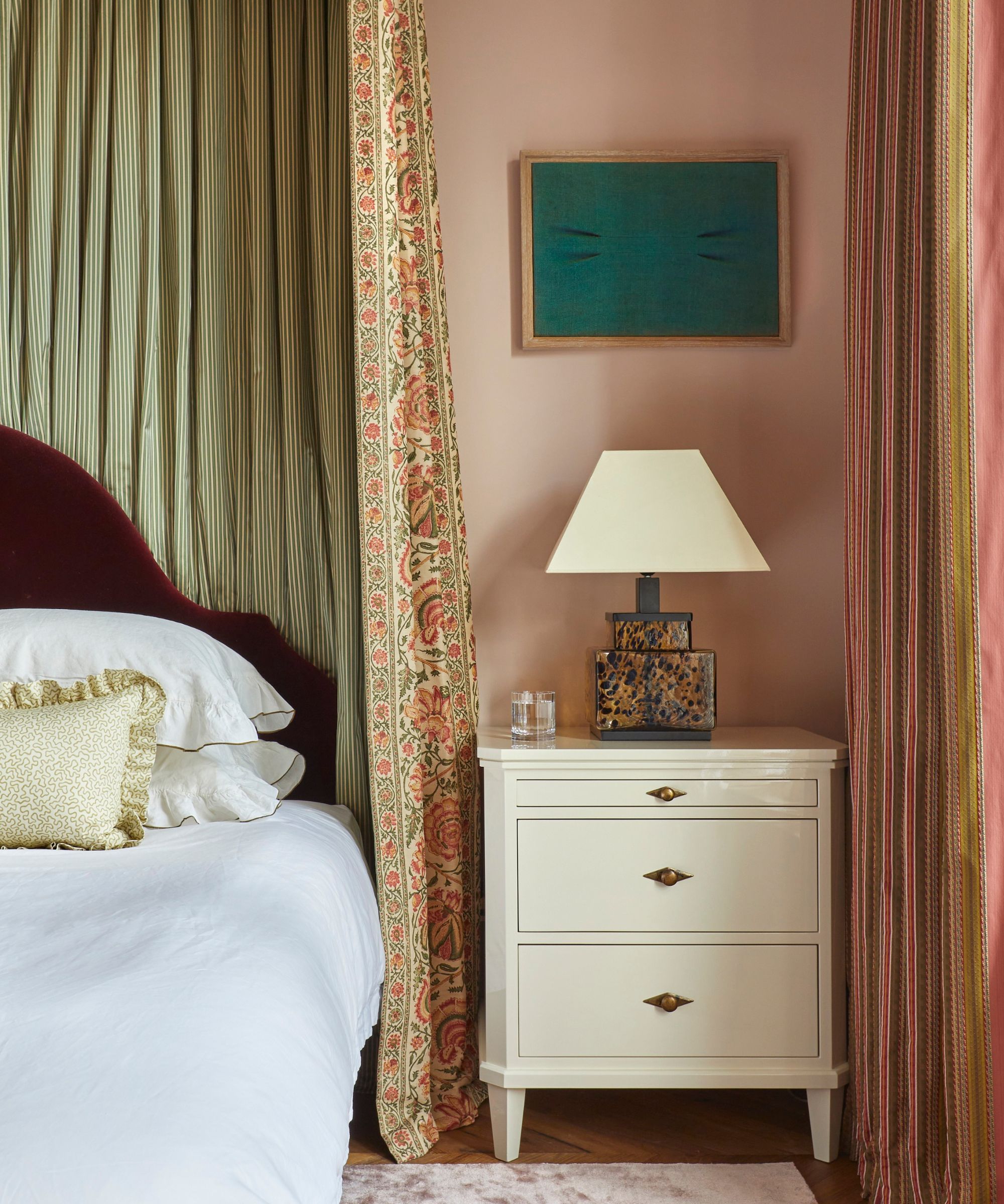
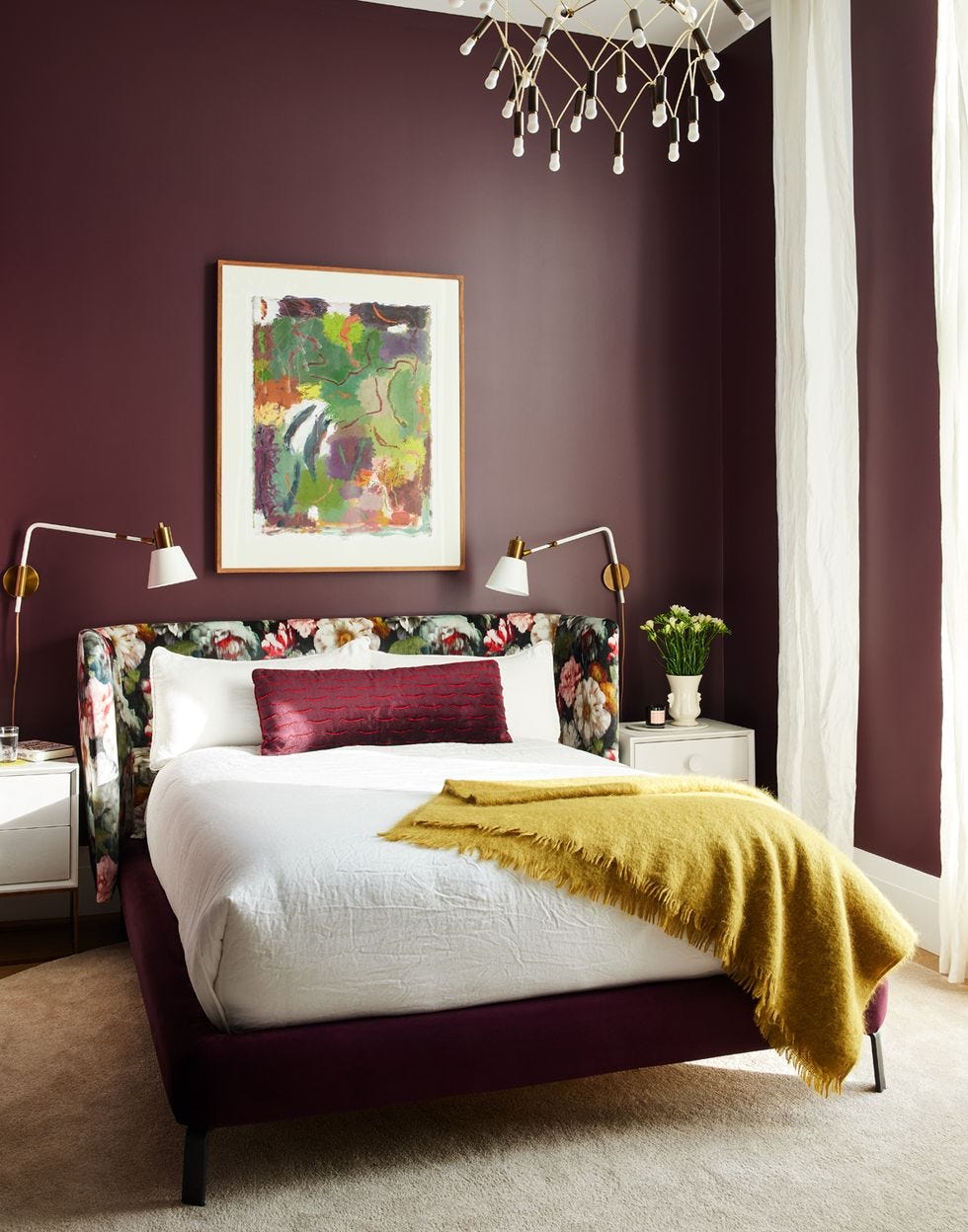
While white paint has traditionally served as a reliable and versatile choice for interiors, offering a fresh and calming backdrop, a shift is occurring in the design world. For 2025, color experts and designers are advocating for a move away from stark white in favor of a broader spectrum of warmer, more nuanced neutral shades. These emerging neutrals offer greater design versatility and depth, helping to transform homes into inviting sanctuaries rather than appearing sterile.
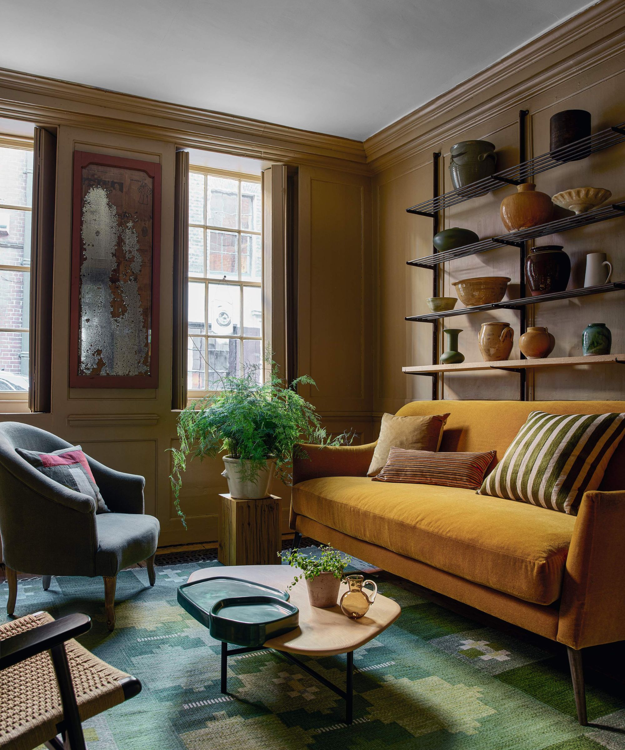
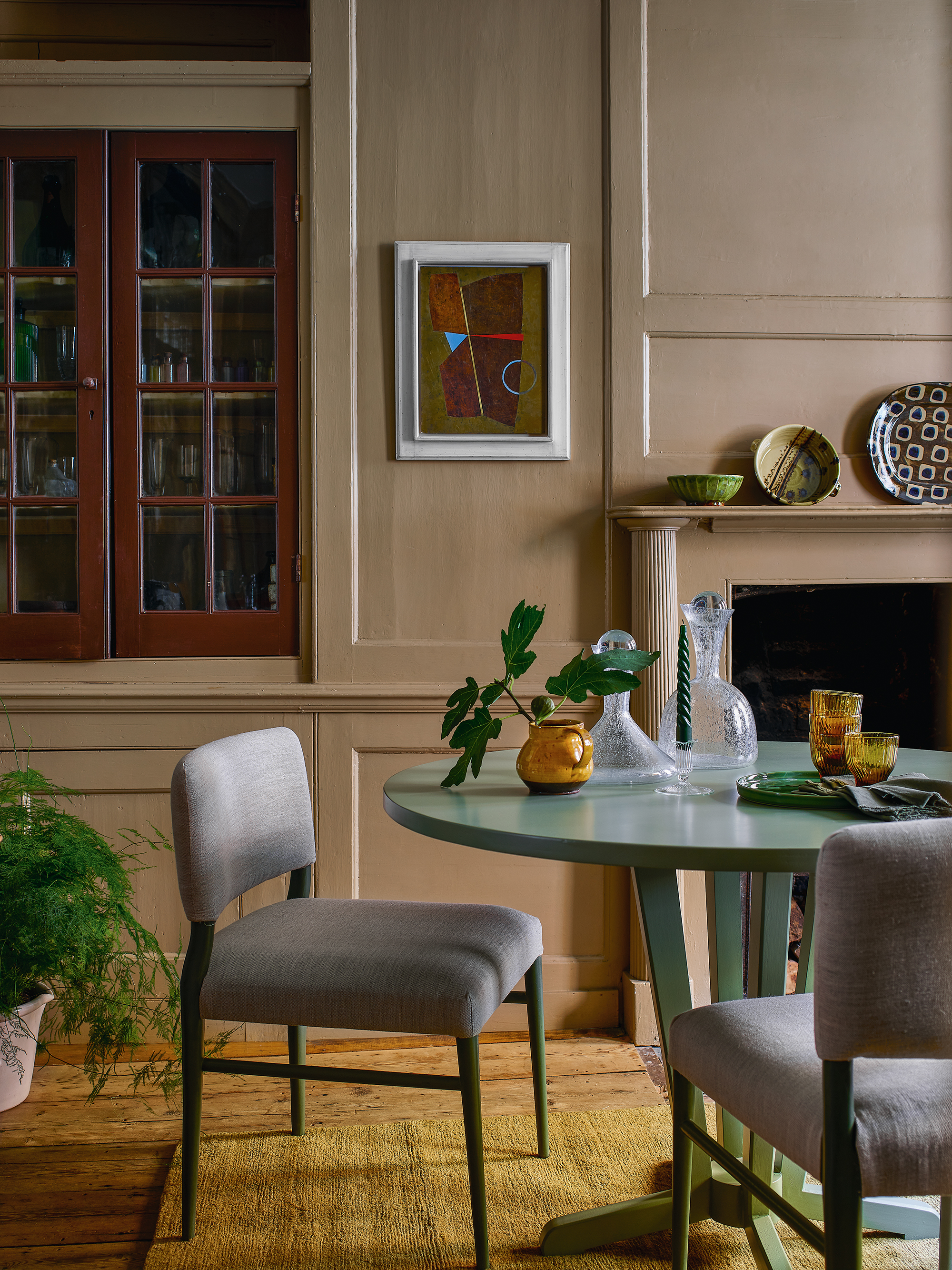
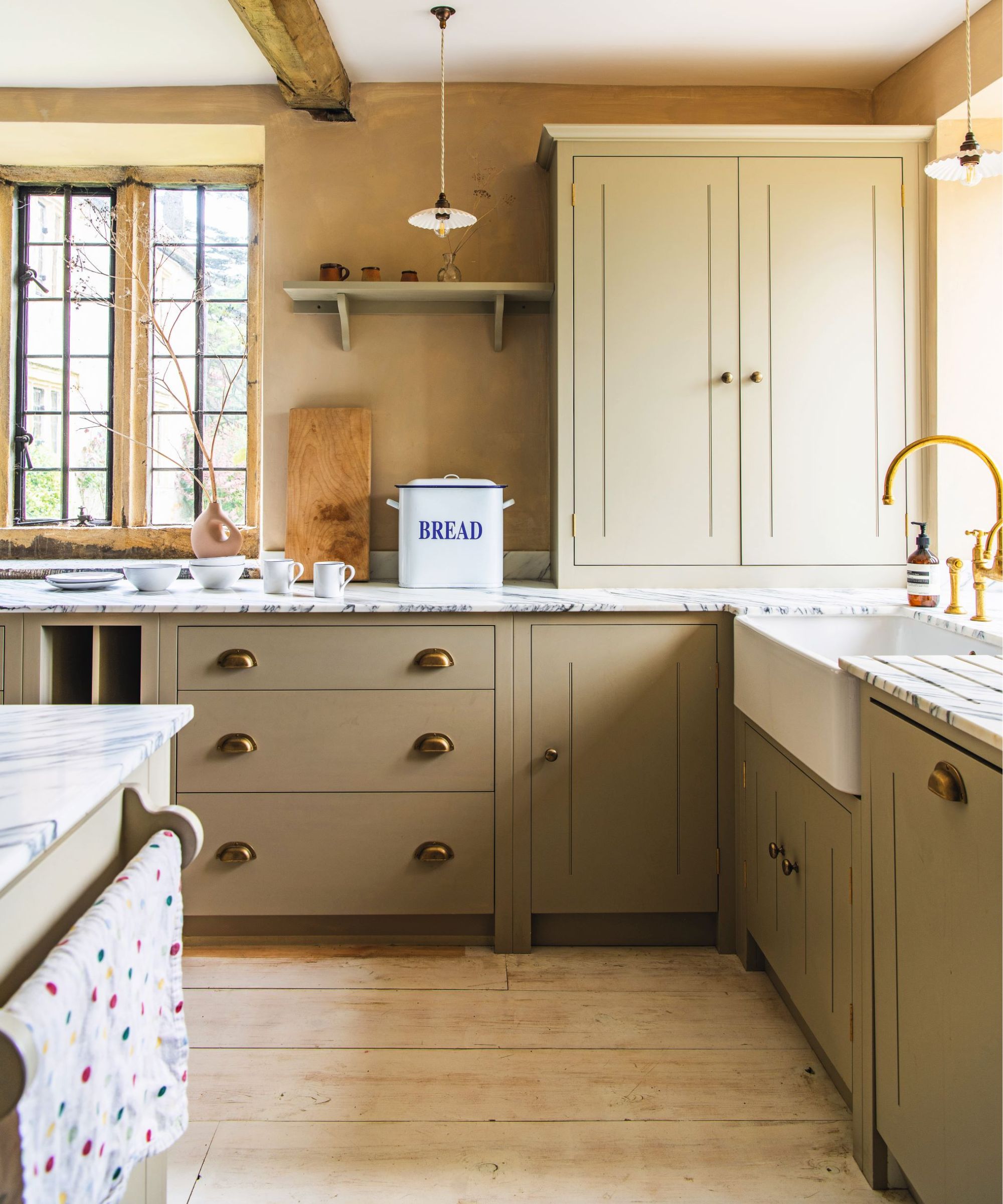
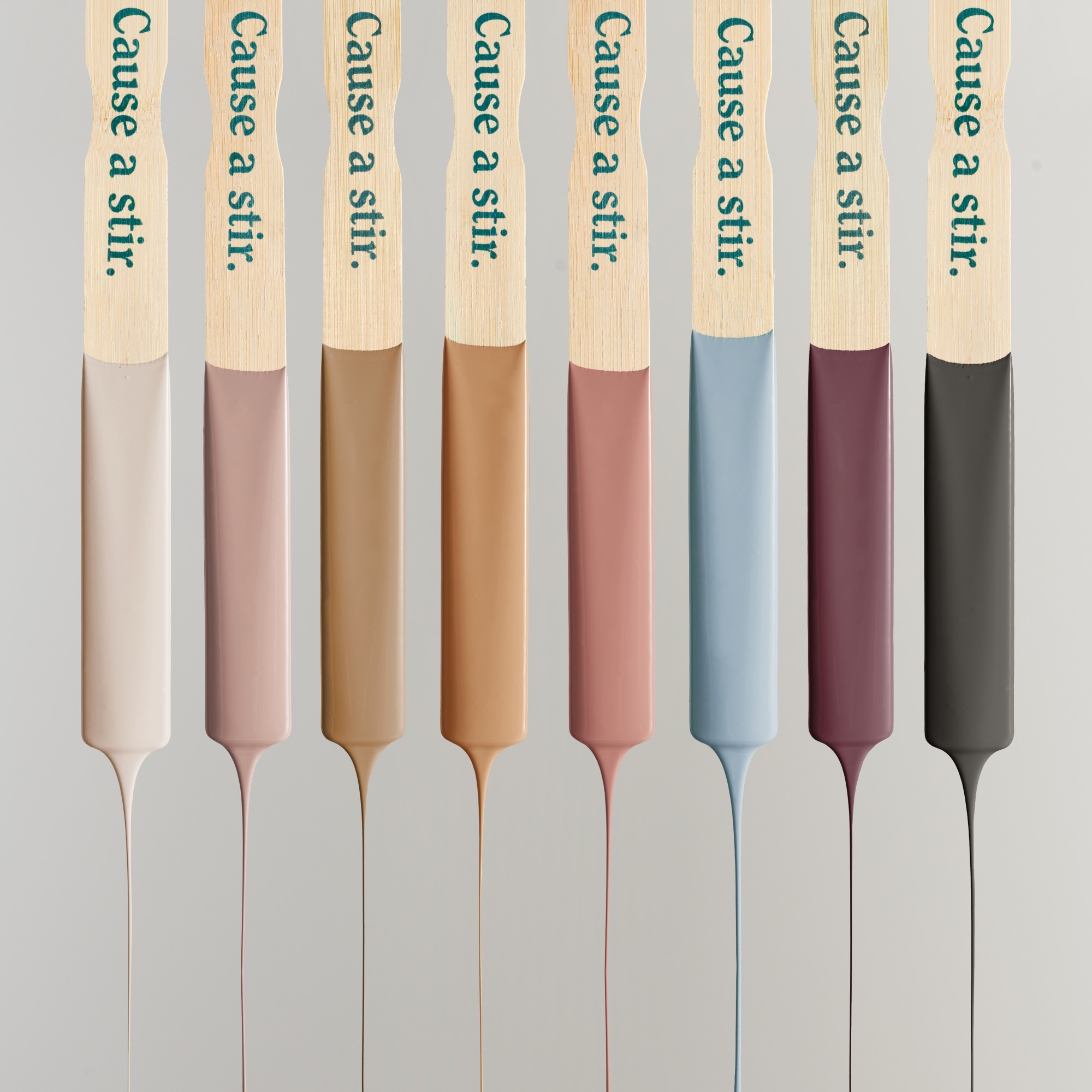
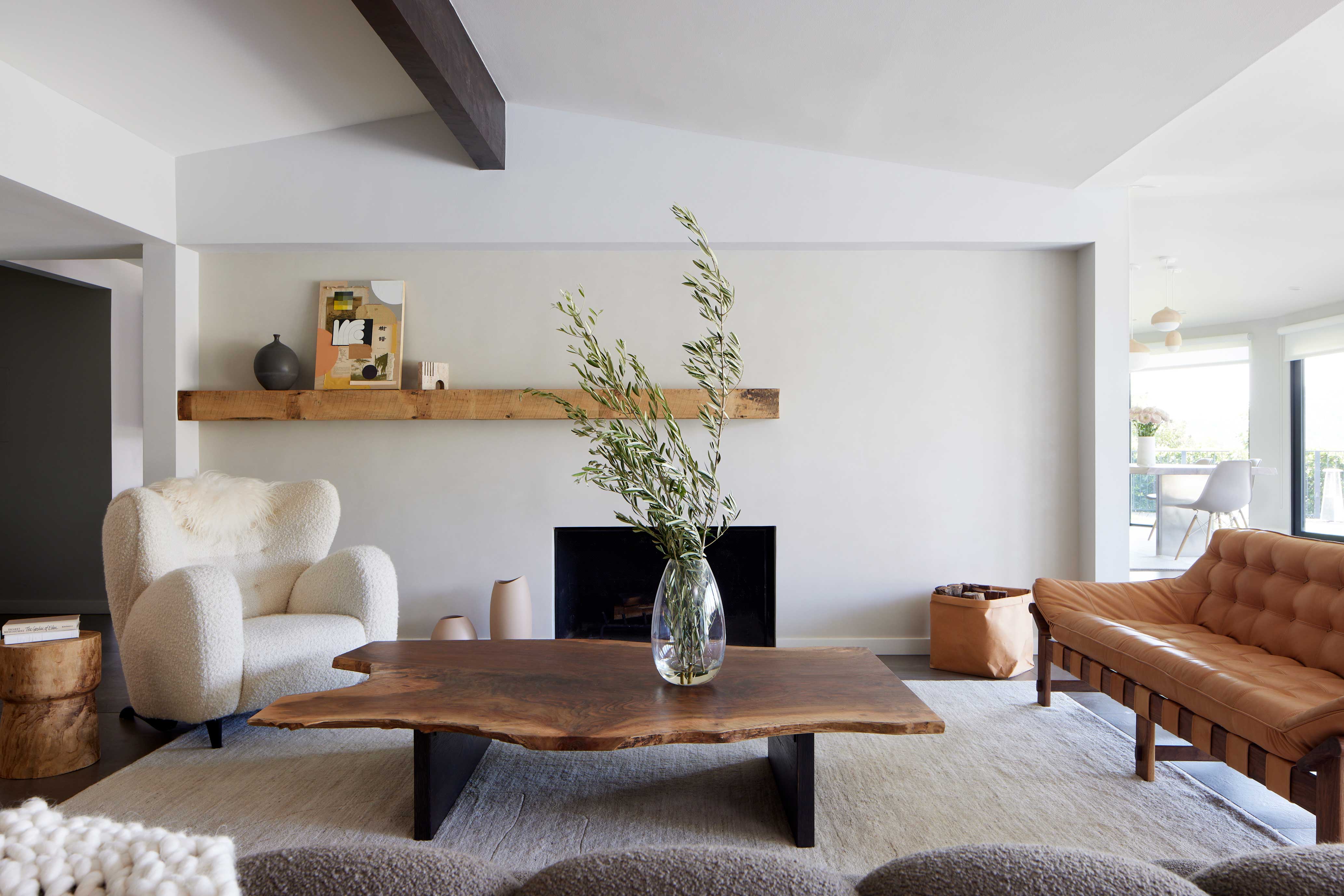
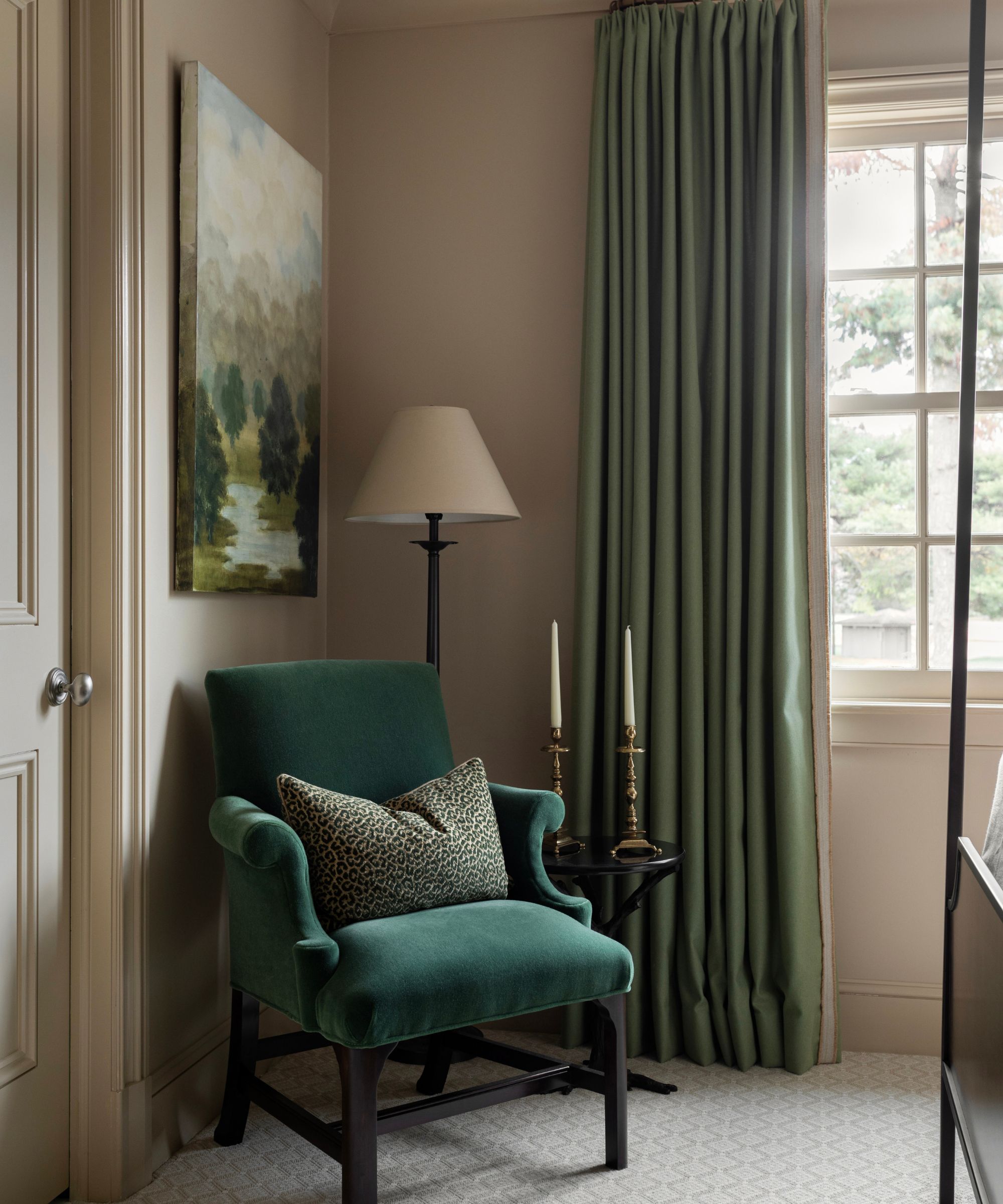
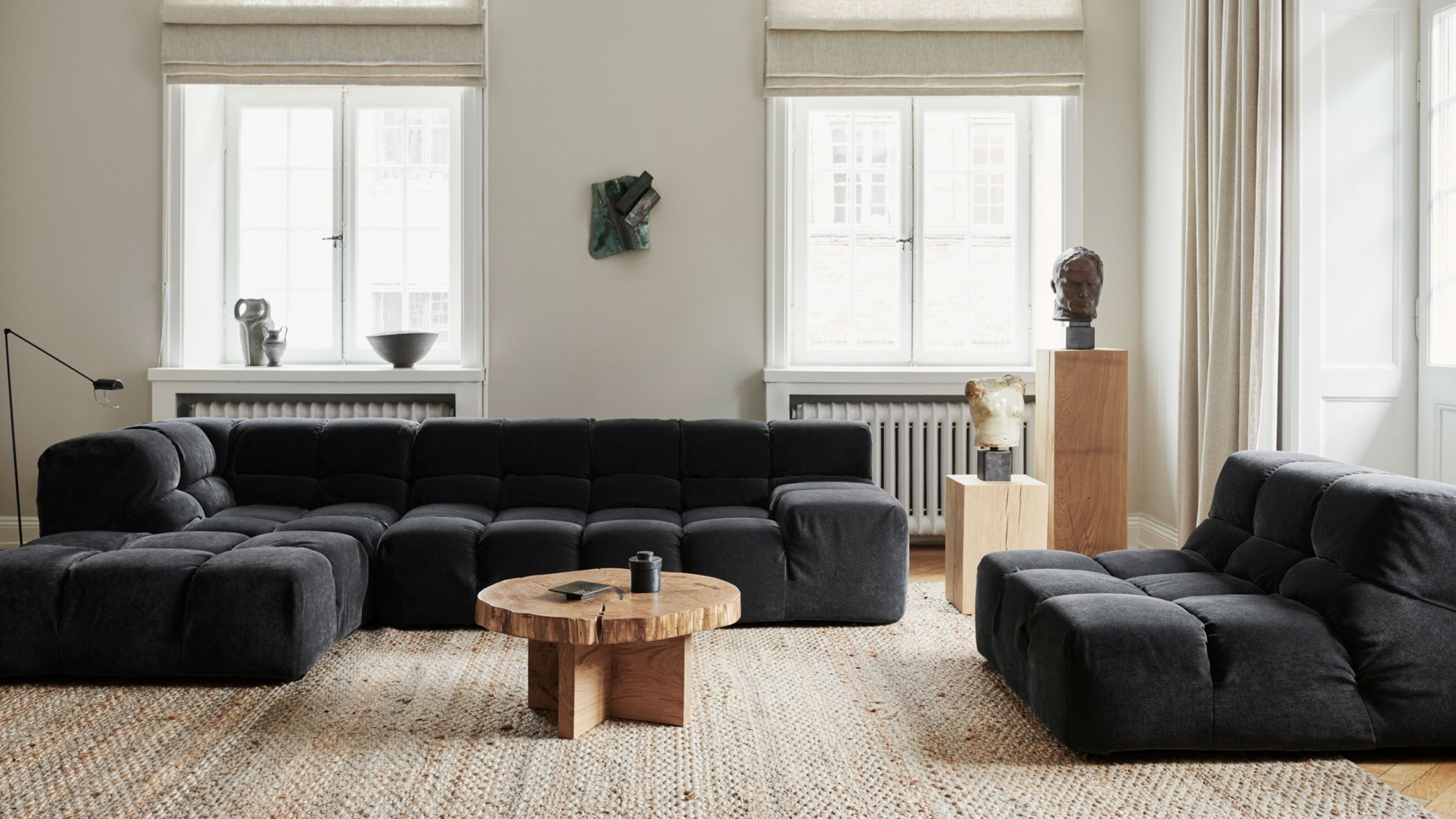
One significant trend identified is the rise of grounding khakis. Ashley Banbury, color marketing manager at HGTV Home by Sherwin-Williams, highlights khaki as a fresh alternative to white. This shade, with its subtle nod to 1990s minimalism, provides a warm and comforting foundation, emphasizing simplicity and relaxation. Khaki pairs effectively with natural elements like blonde wood and lighter colors, creating airy environments that connect spaces to the outdoors. It is particularly suitable for areas dedicated to relaxation, merging modern minimalism with a sense of comfort. Options like Farrow & Ball's Cardamom, Benjamin Moore's Light Khaki, and Backdrop's Masterpiece Theatre exemplify this trend.
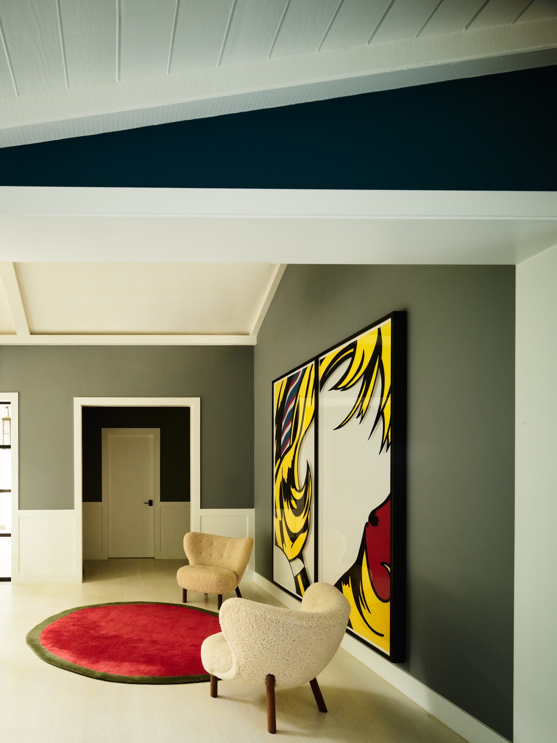
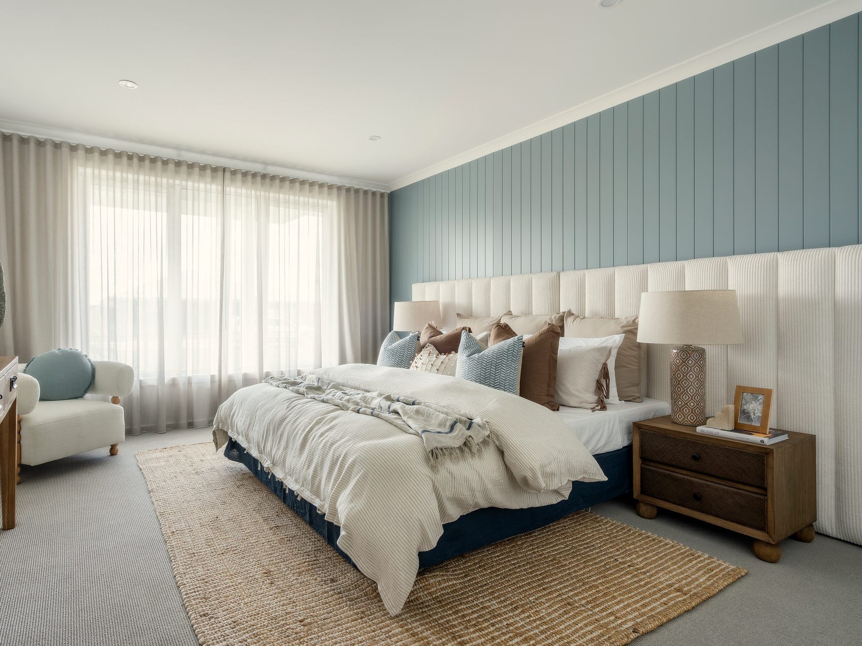
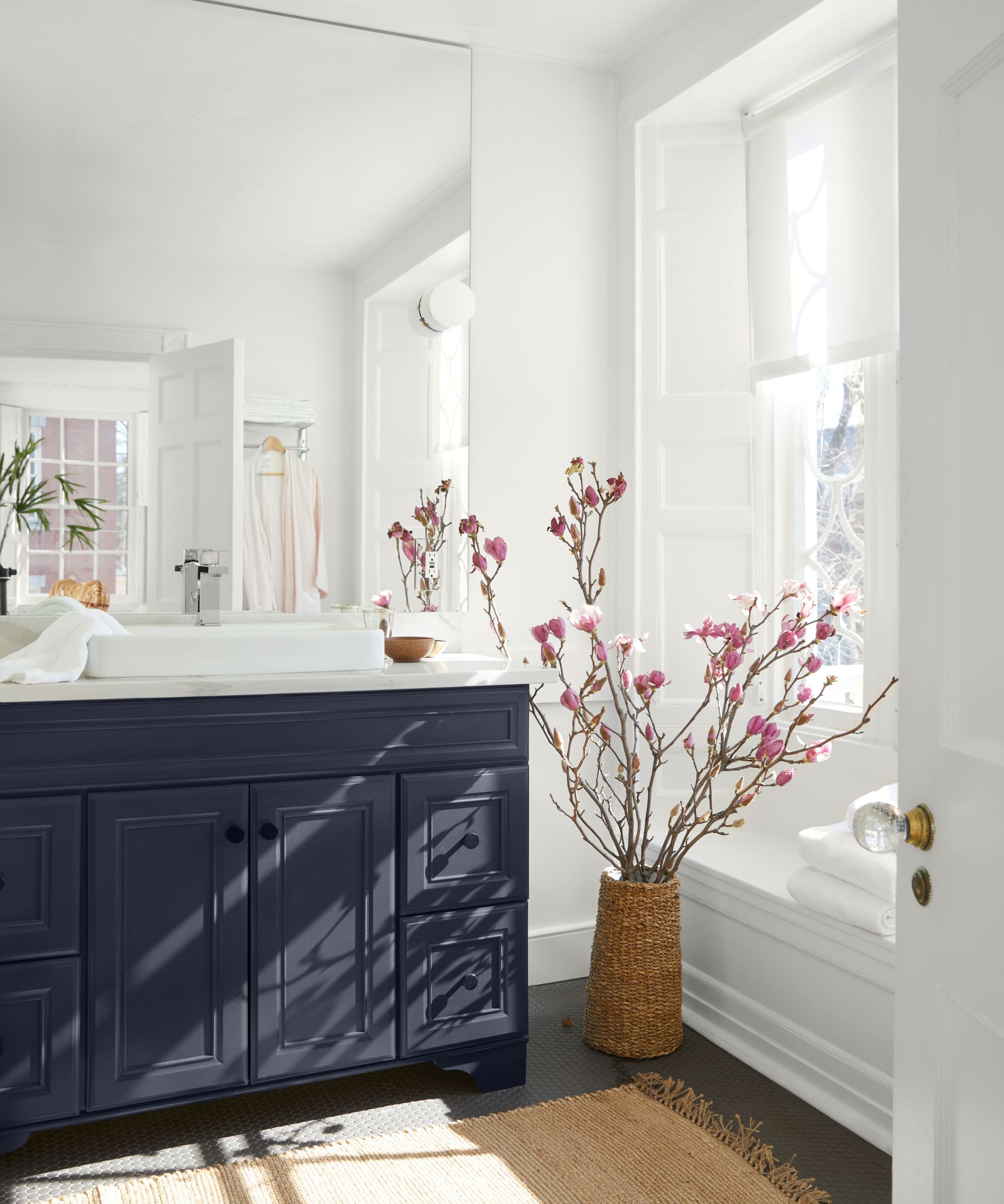
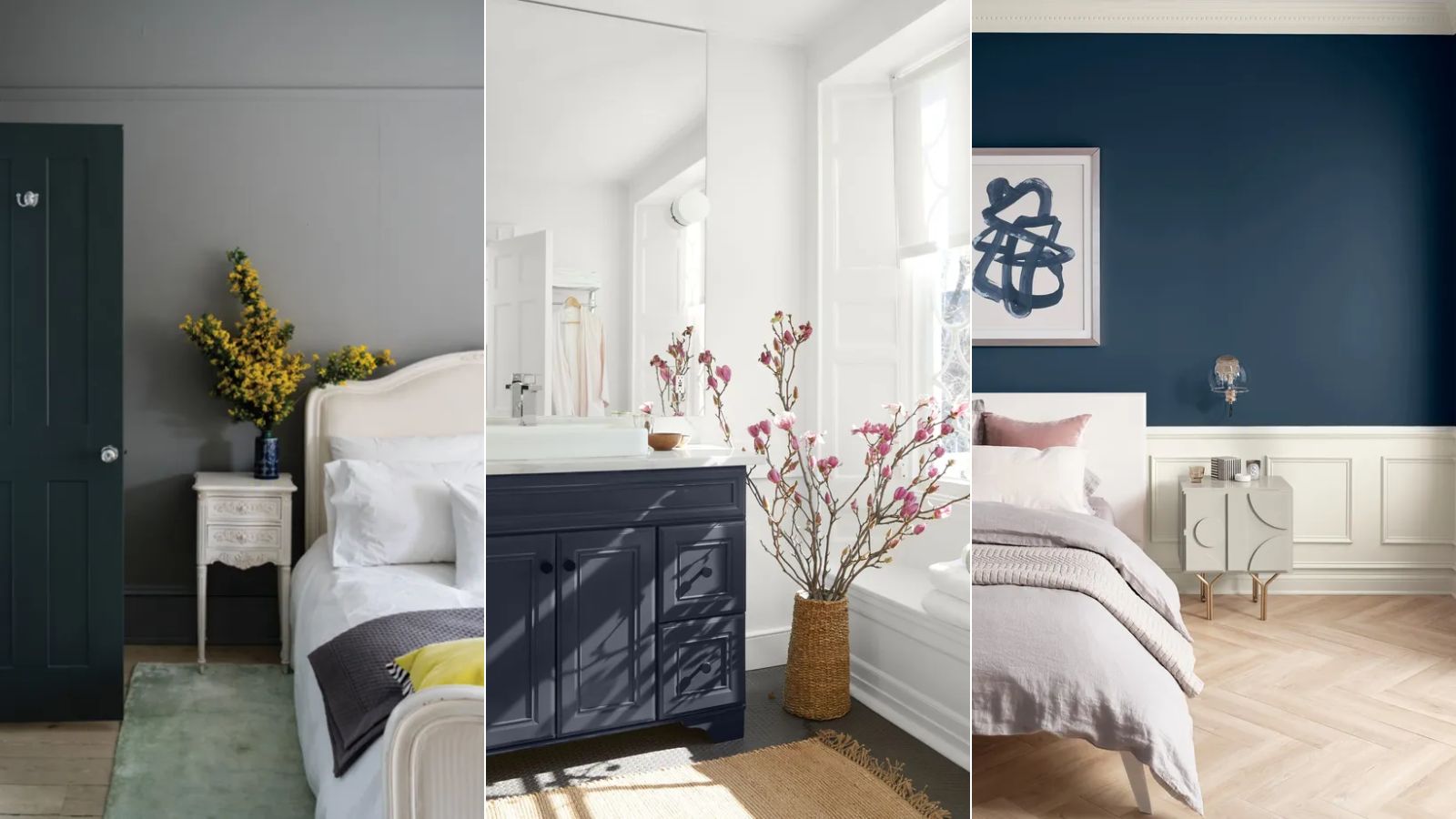
Cooling blues are also gaining traction as a new neutral. Katherine Cohen, associate creative director at FLOR, notes that designers are increasingly incorporating various blue hues, from navy to cobalt and indigo, into neutral palettes. These tones cultivate calm and comfort, effectively grounding a space while harmonizing with other colors. Blue can be introduced through wallpaper, accent pillows, furniture, or rugs, allowing homeowners to refresh their spaces while maintaining a neutral aesthetic. Examples include Backdrop's Blue is the Coolest Color, Farrow & Ball's Blue Maize, and Benjamin Moore's Crystal Blue.
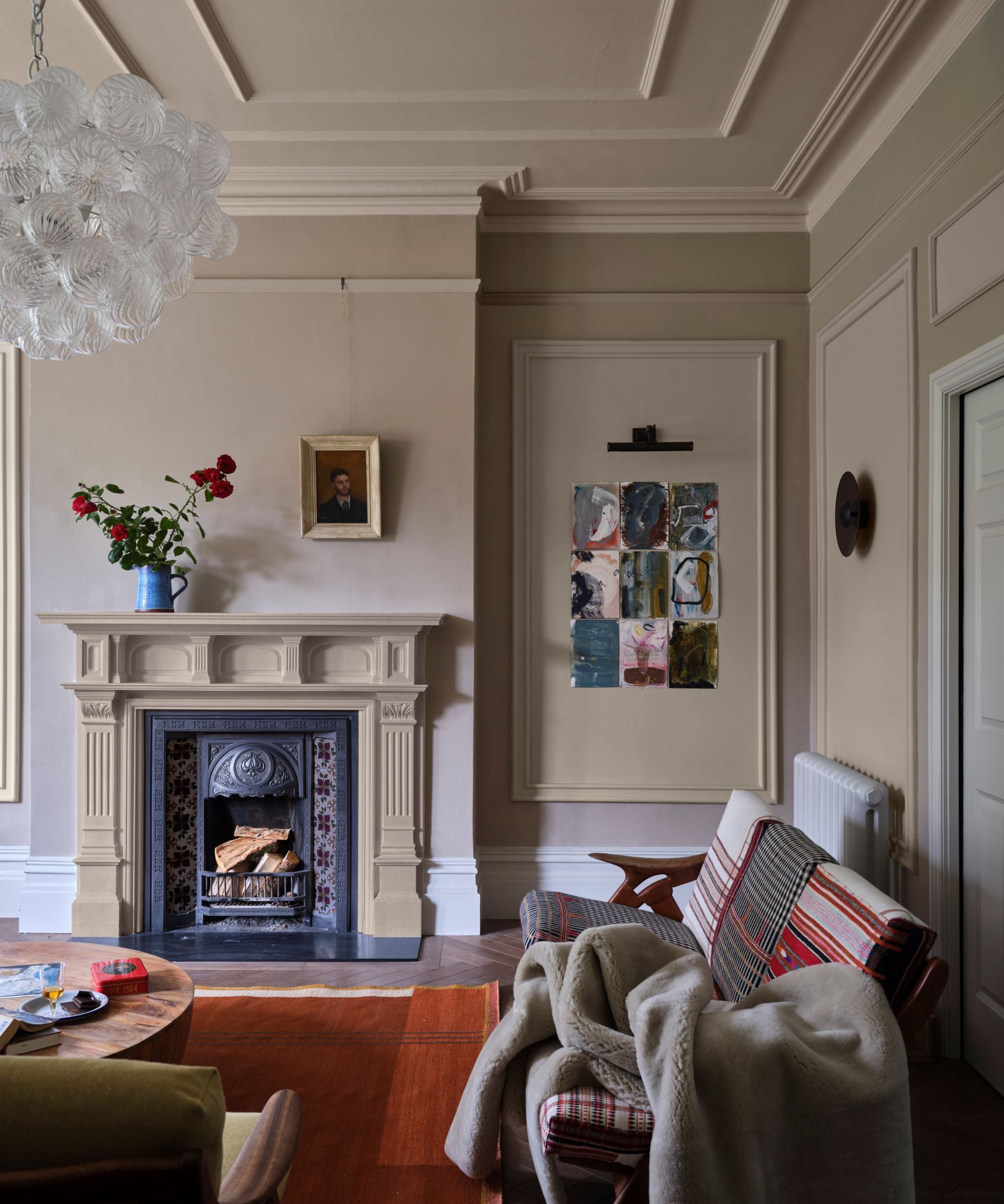
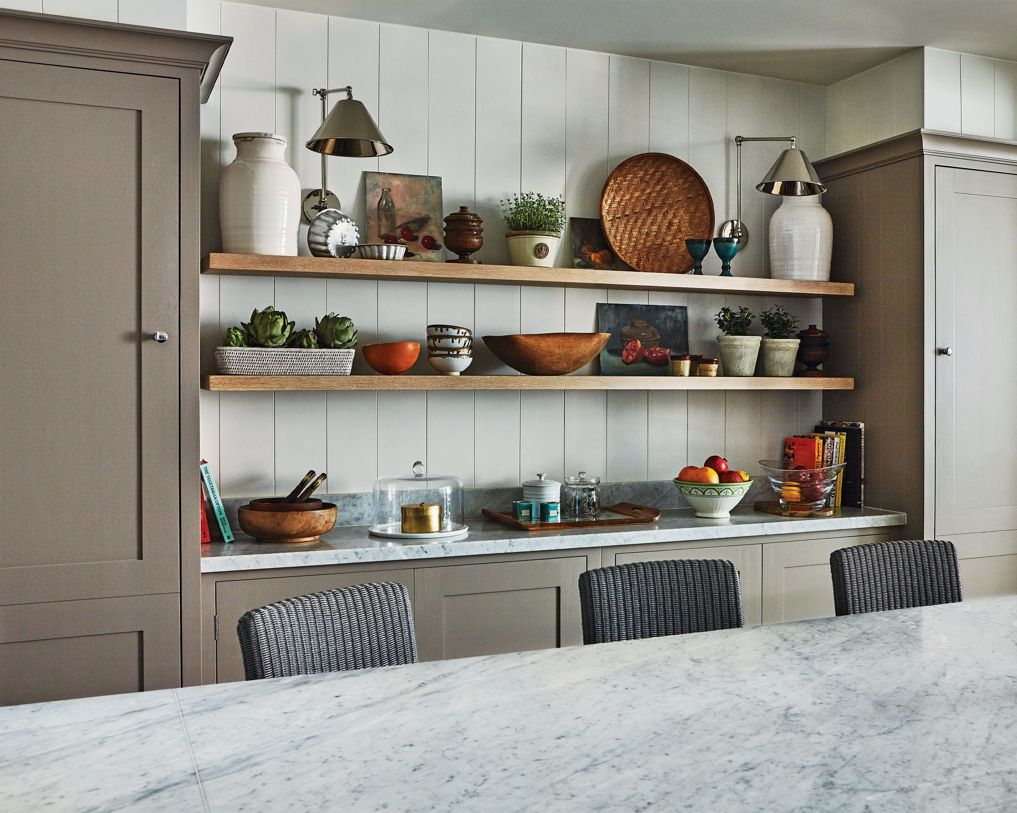
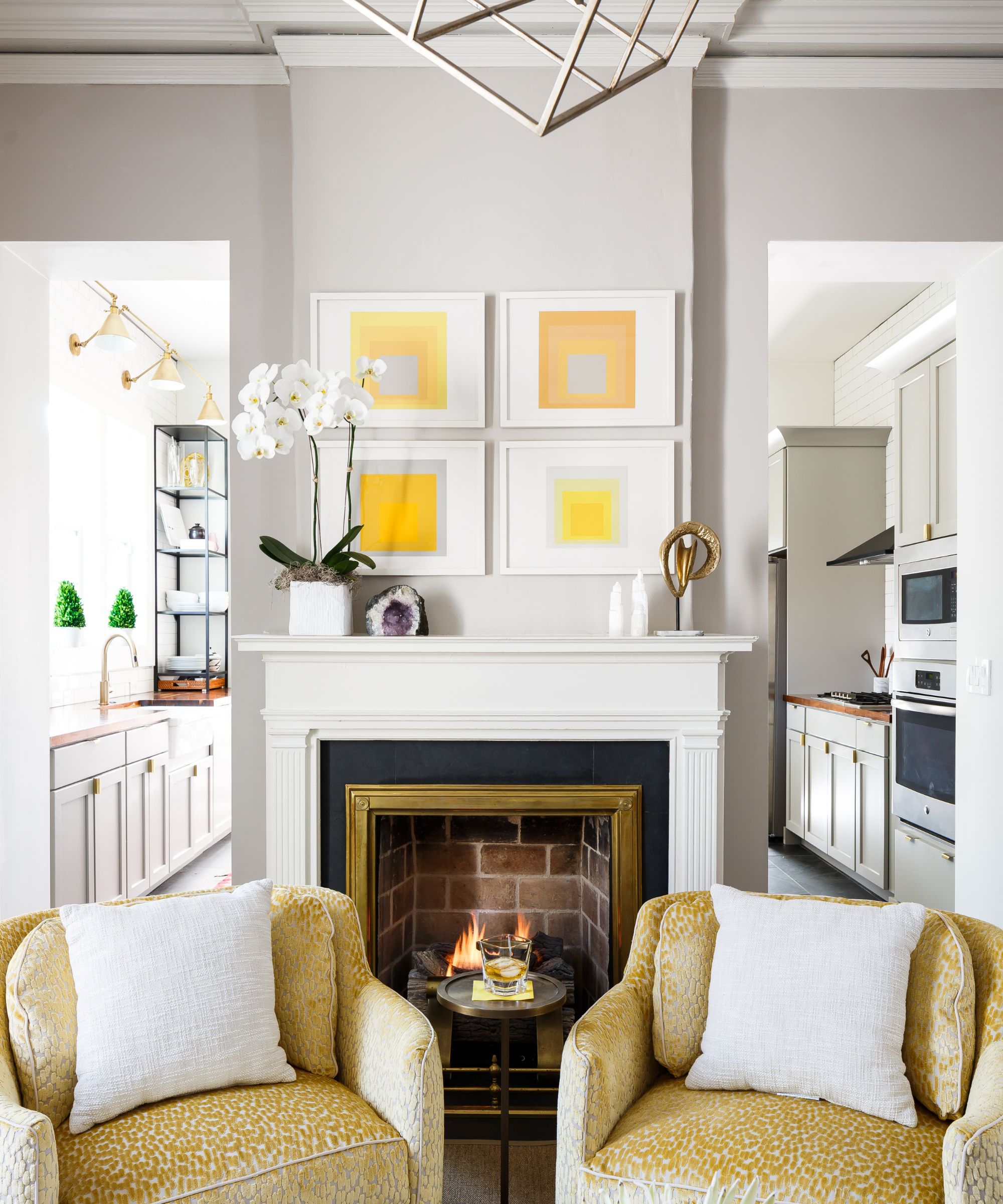
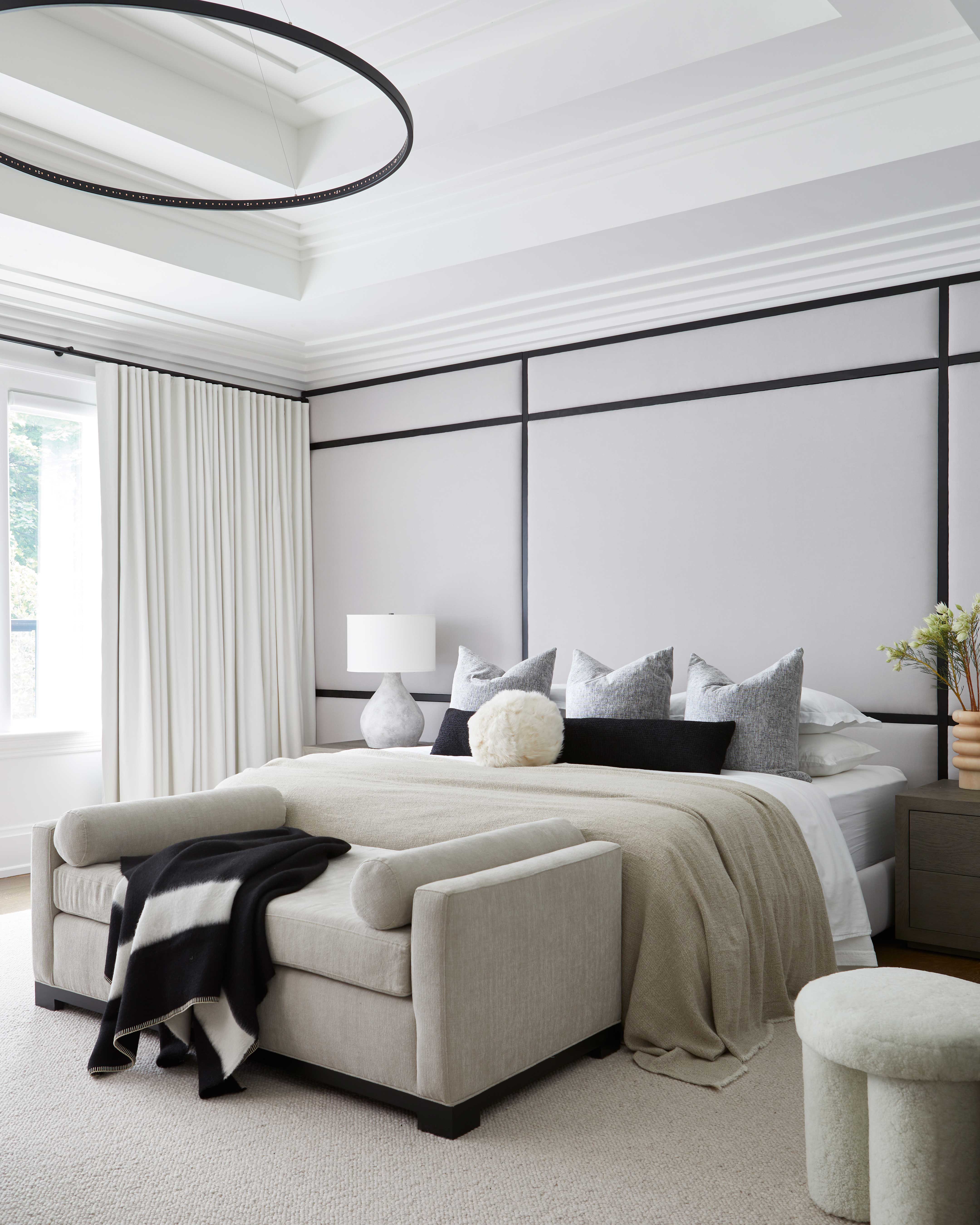
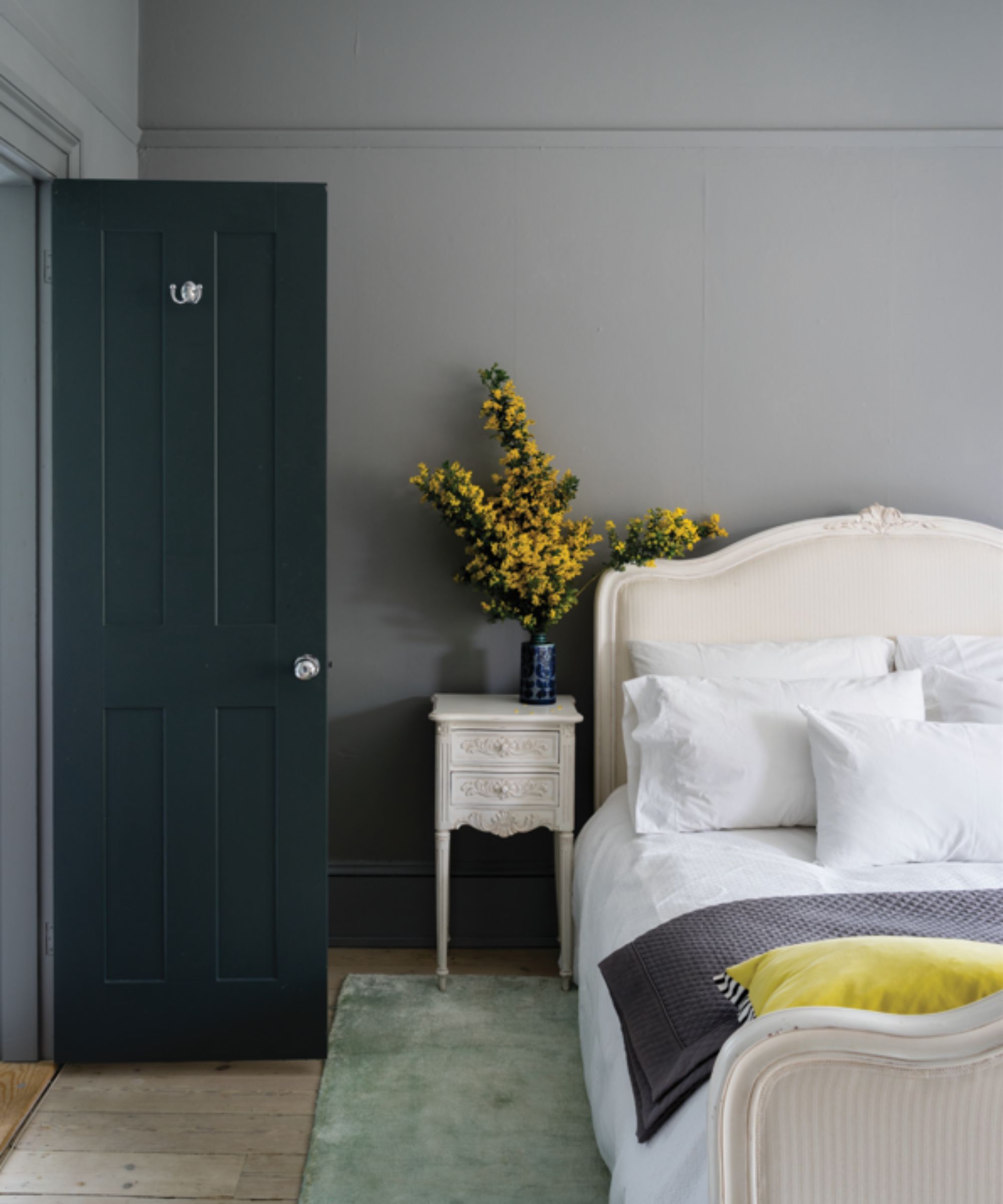
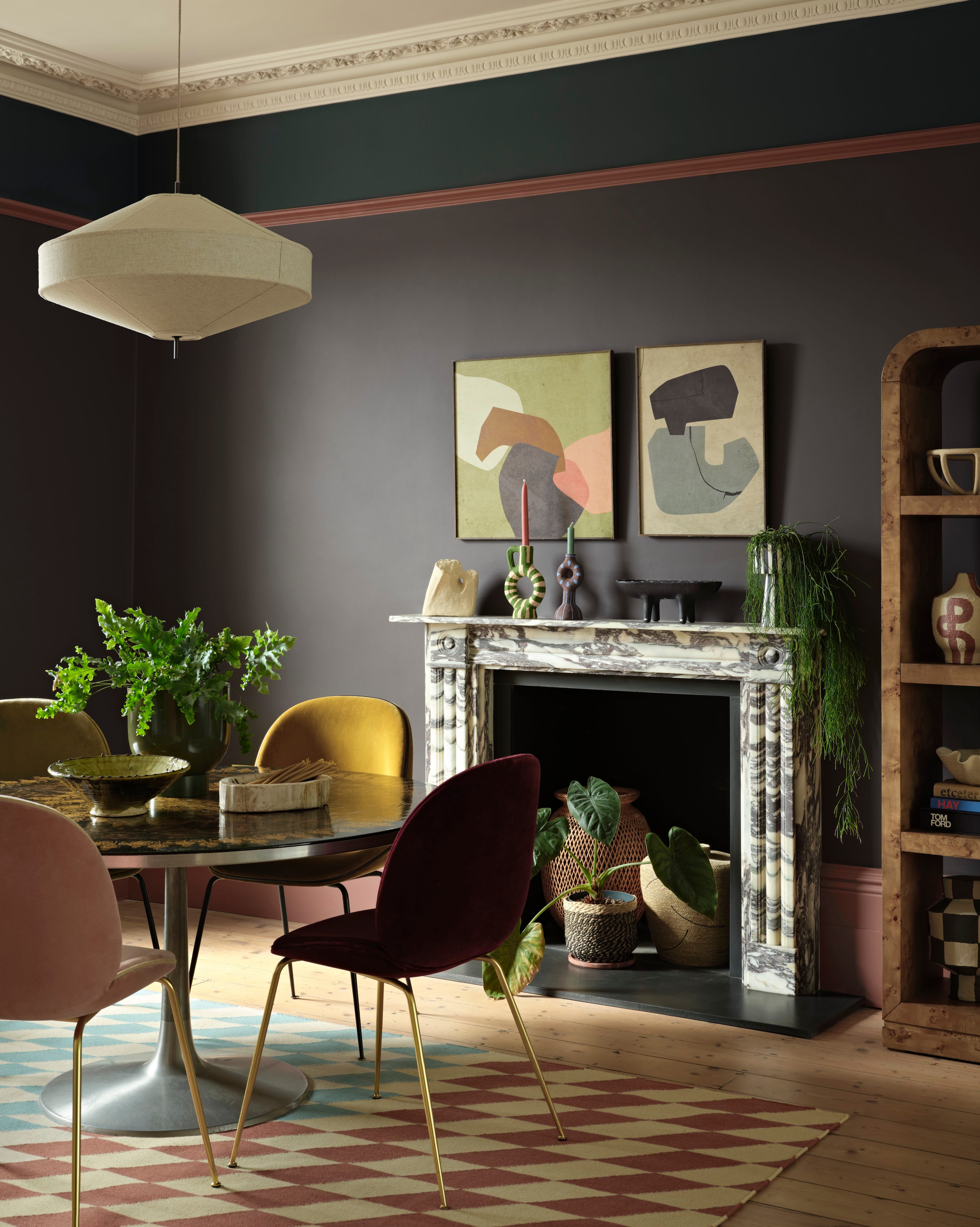
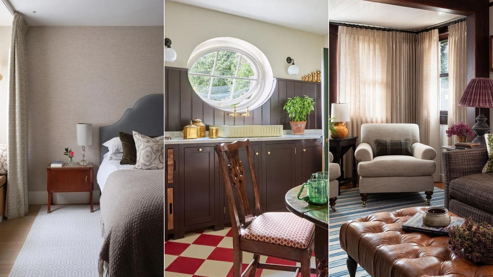
Furthermore, warm grays are replacing cooler variations. Steven Mena, CEO of AAA Fence and Deck Company, observes a preference for warmer gray tones over stark whites, as they introduce a cozy atmosphere without being overpowering. Shades like greige, a blend of gray and beige, or mushroom taupe, create inviting and versatile palettes. These grays complement natural textures such as raw wood, stone, and brass, and can be accented with bold colors like deep blues or warm yellows. They can be applied to walls, cabinetry, tiles, or as foundational colors for furniture pieces. Sherwin Williams' Anew Gray, Farrow & Ball's No.275 Purbeck Stone, and Backdrop's Morning Ritual are notable examples.
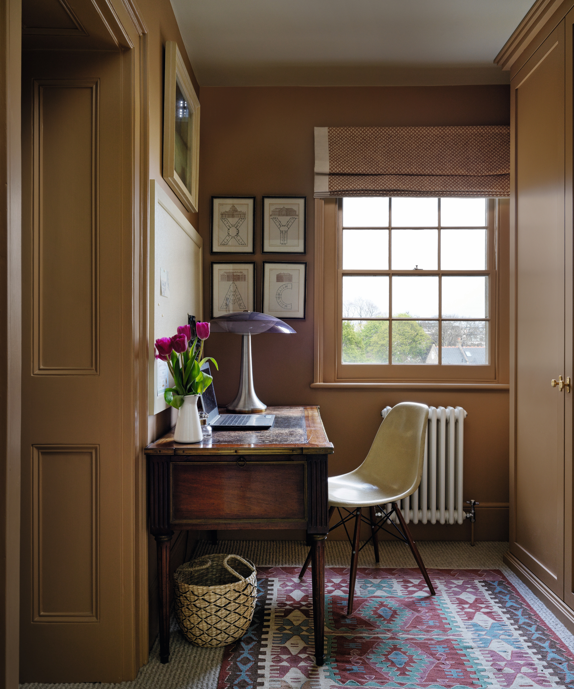
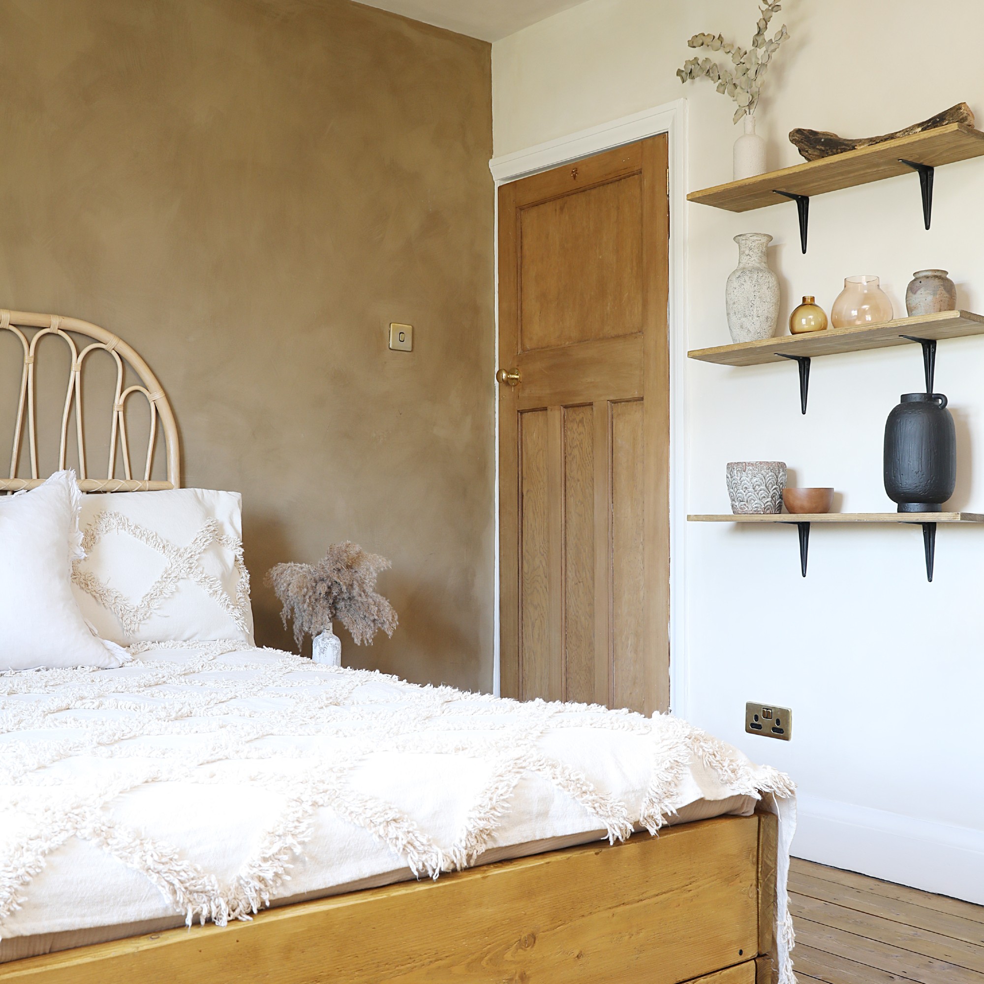
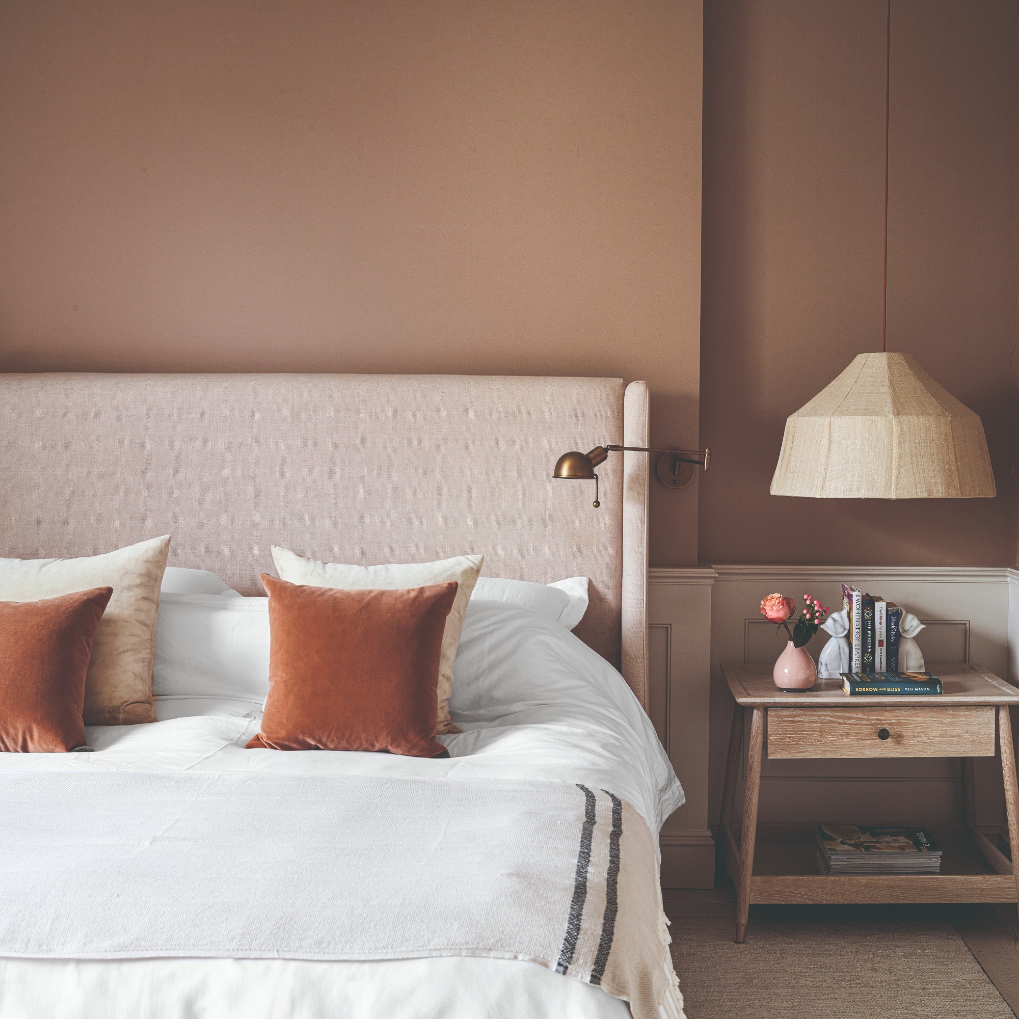
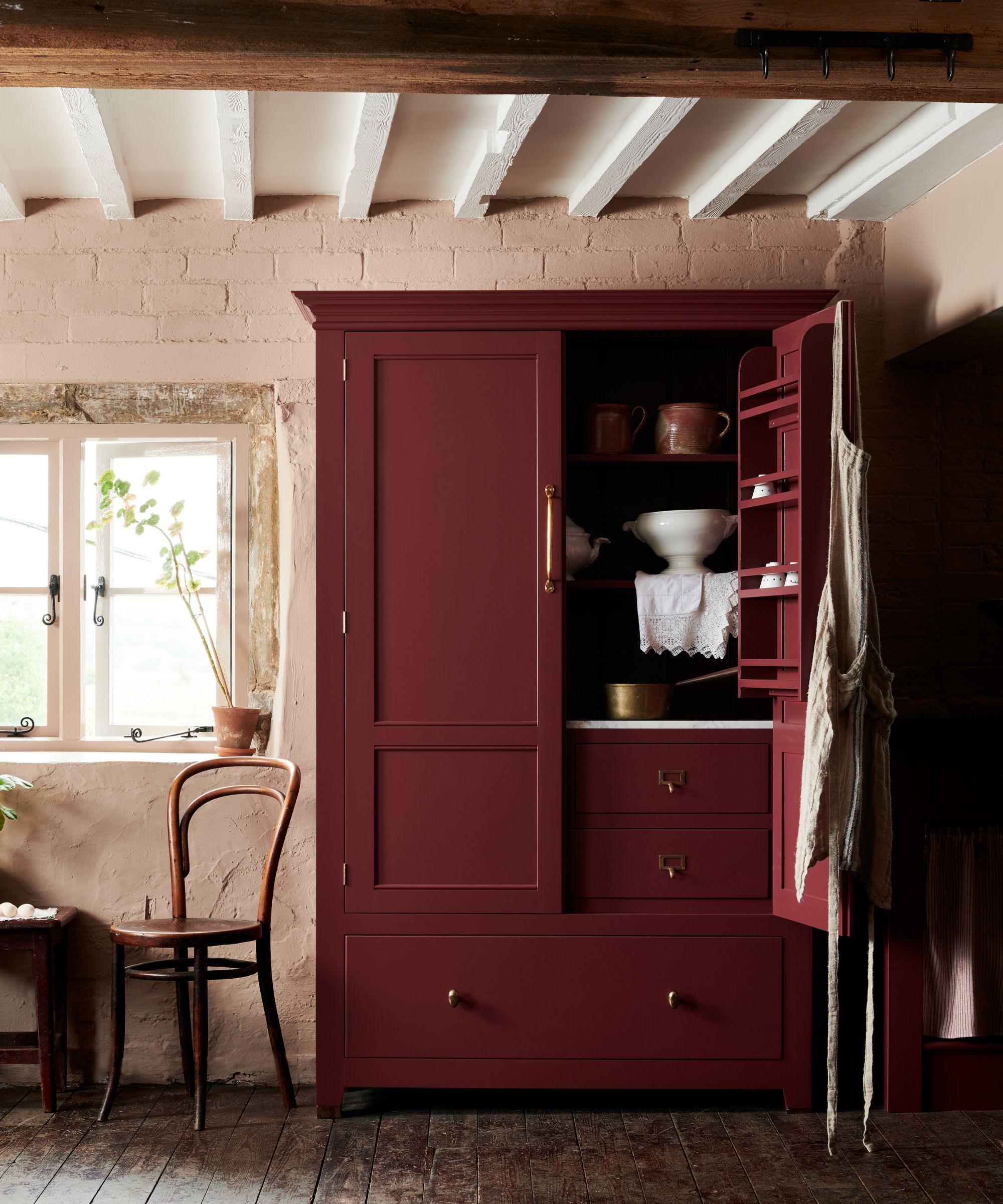
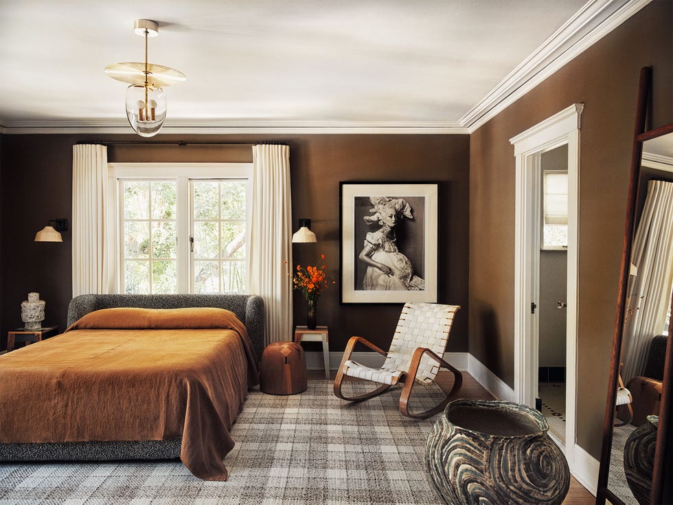
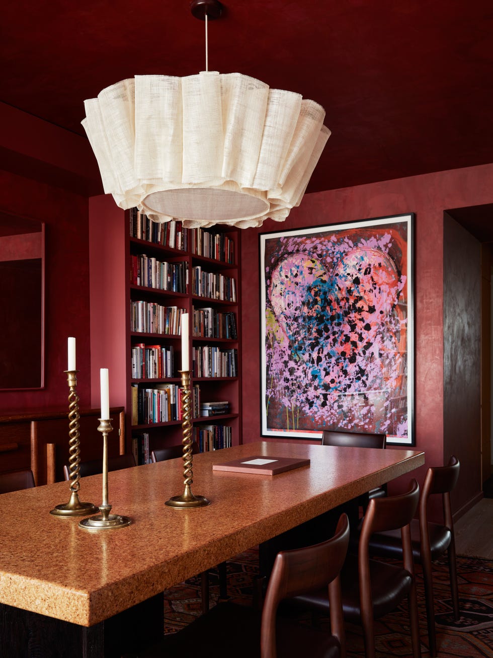
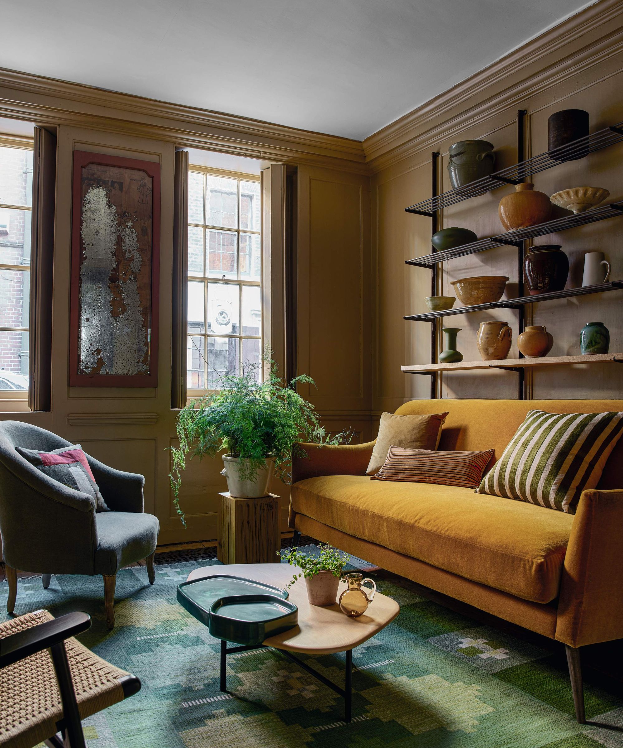
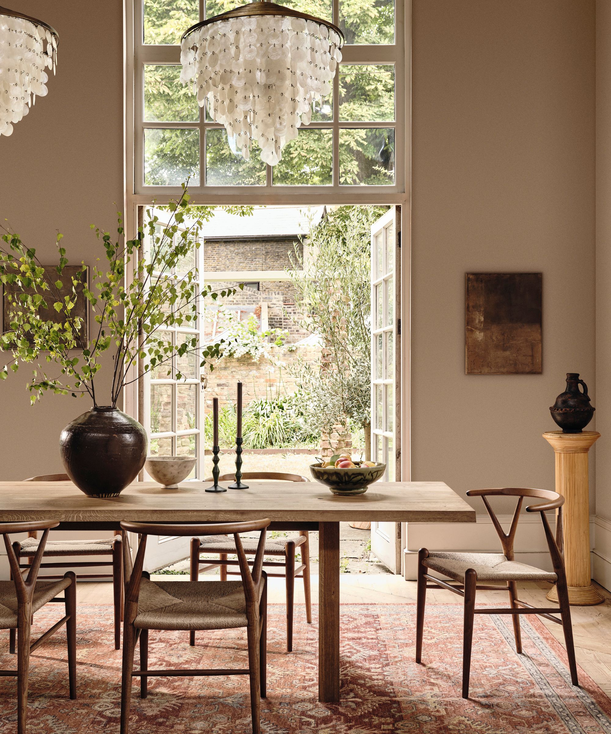
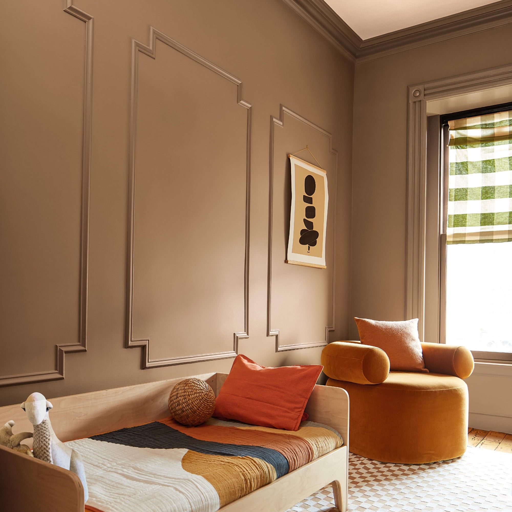
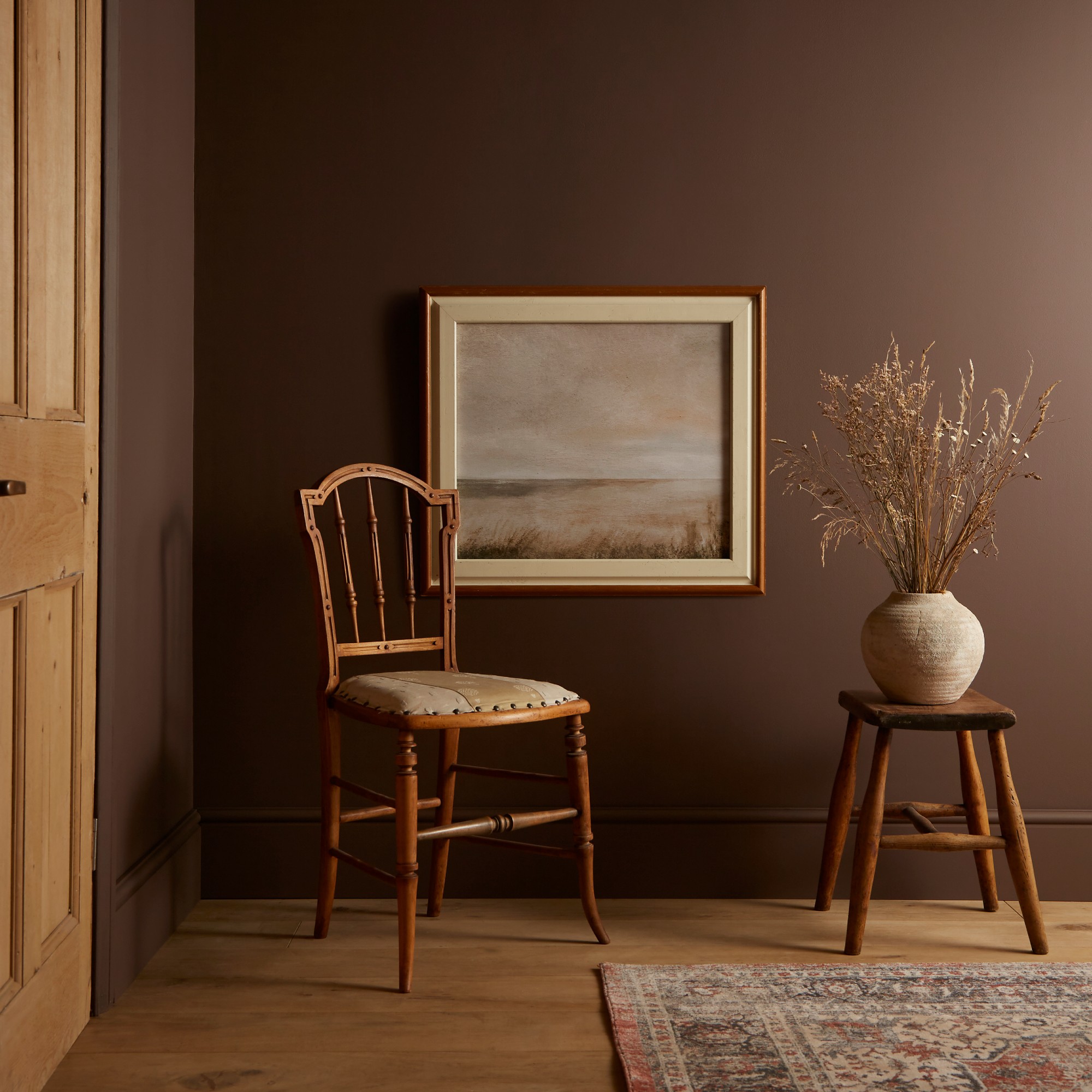
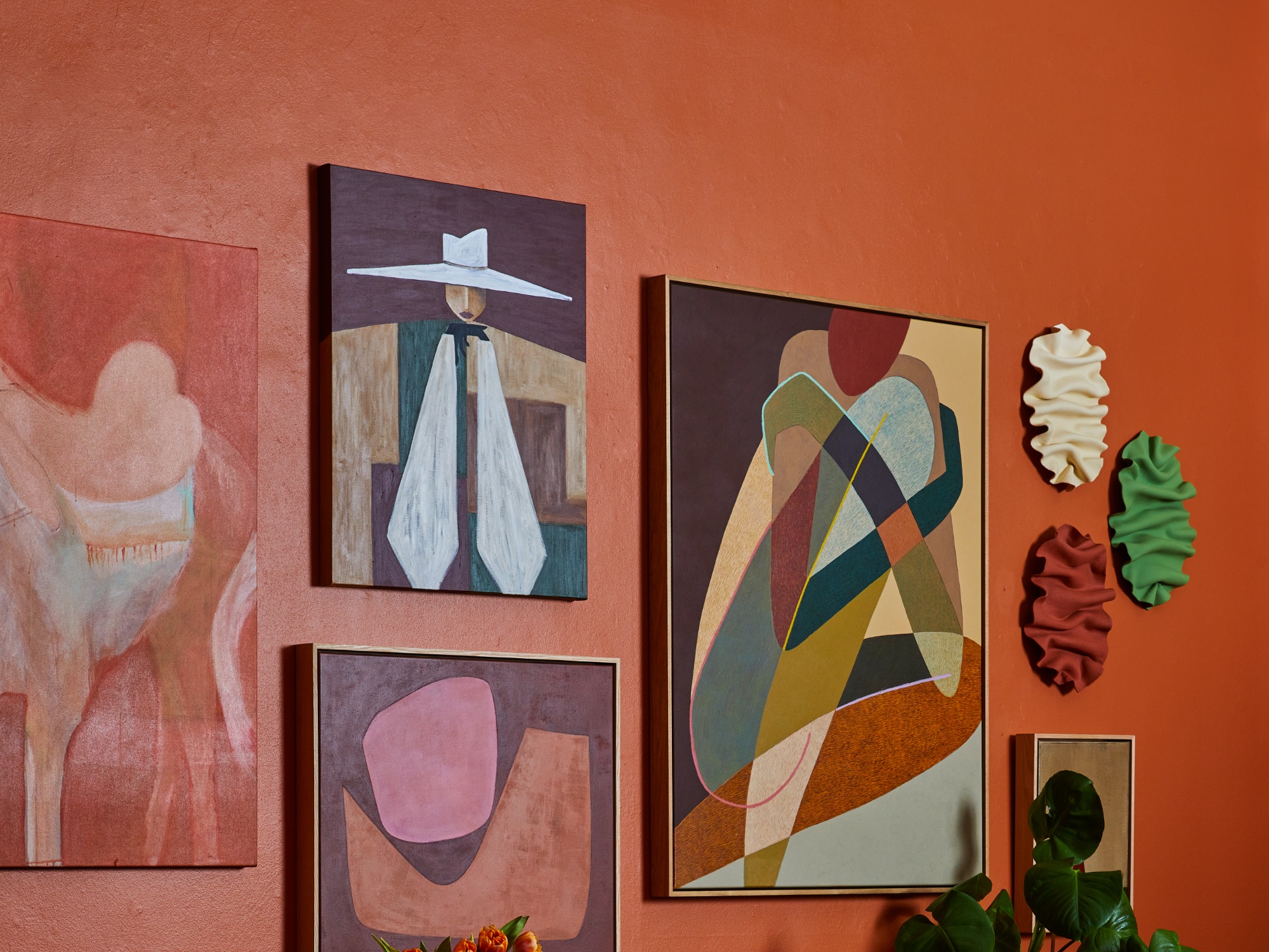
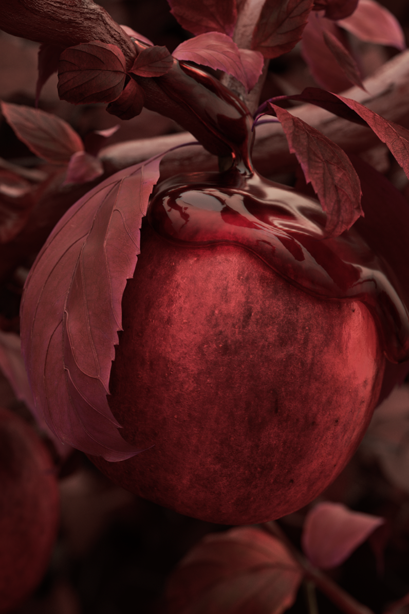
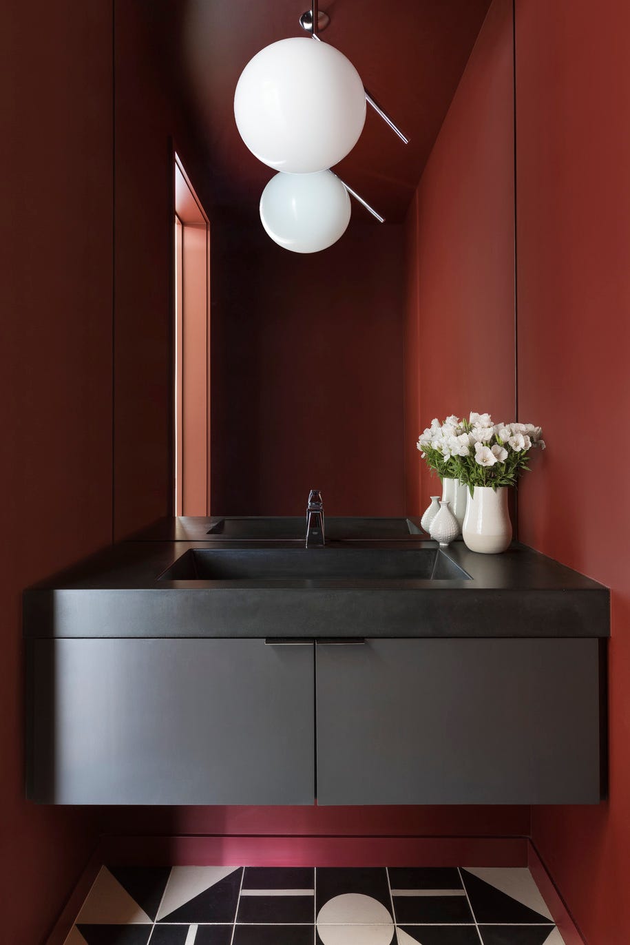
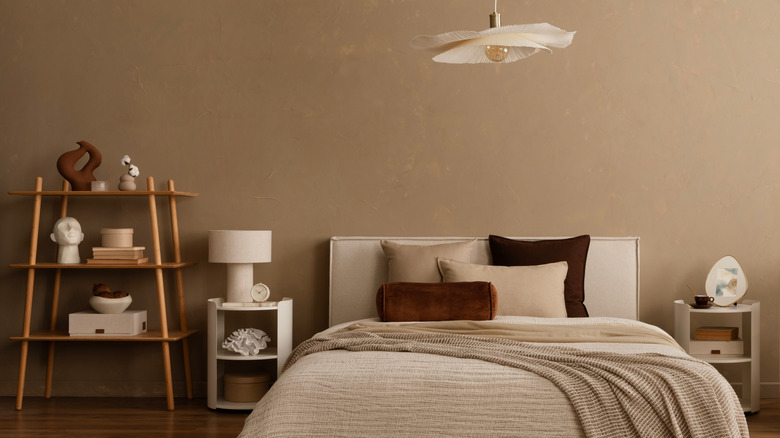
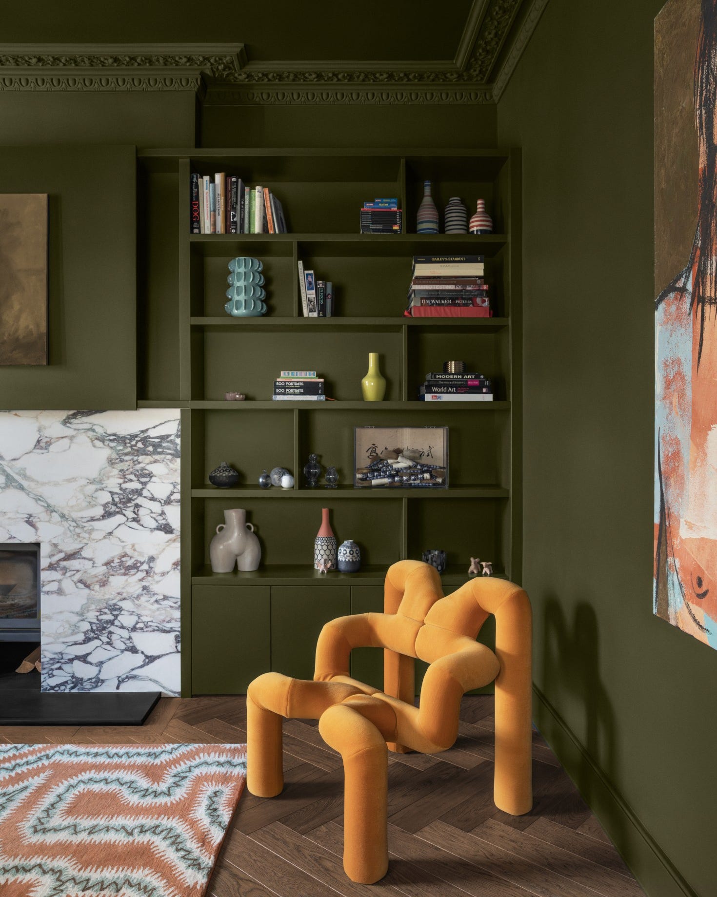
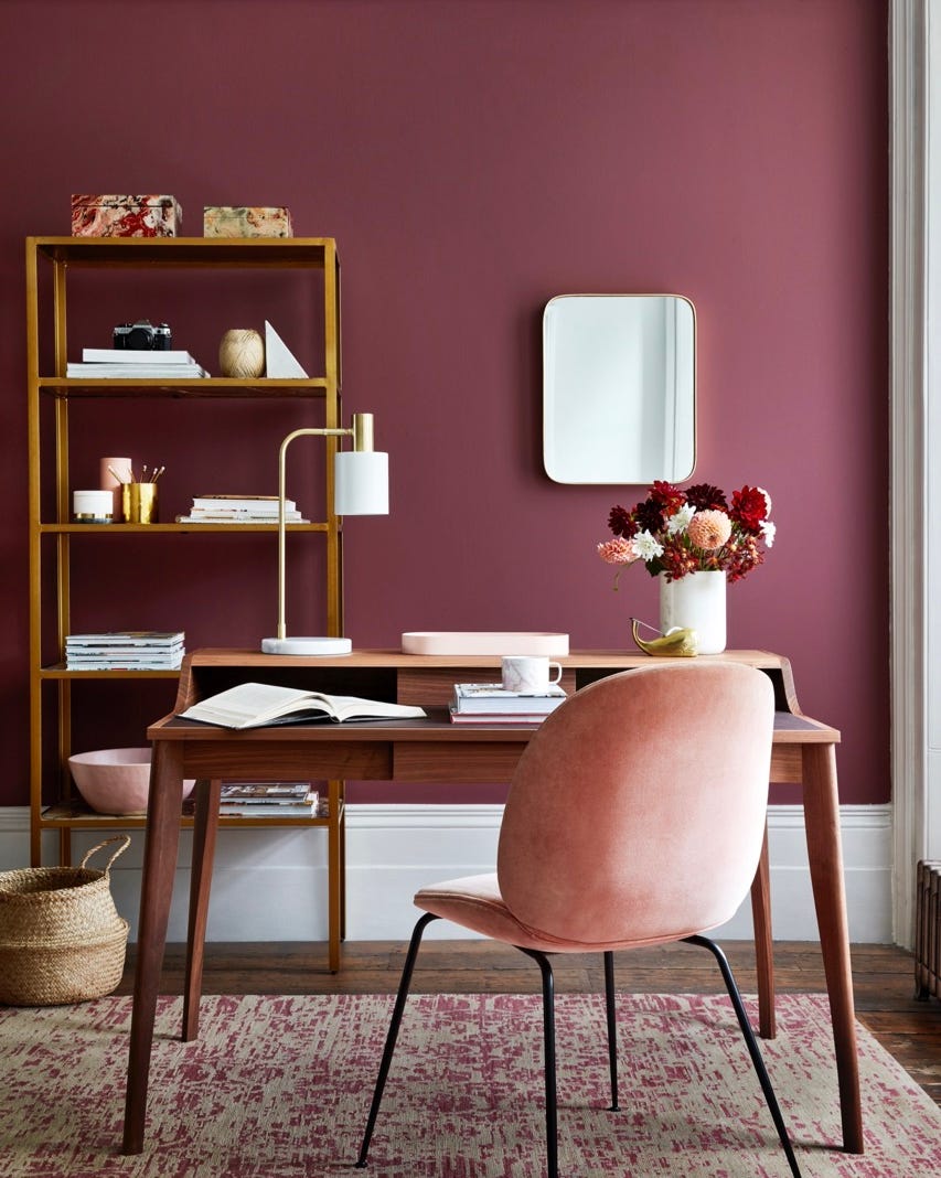
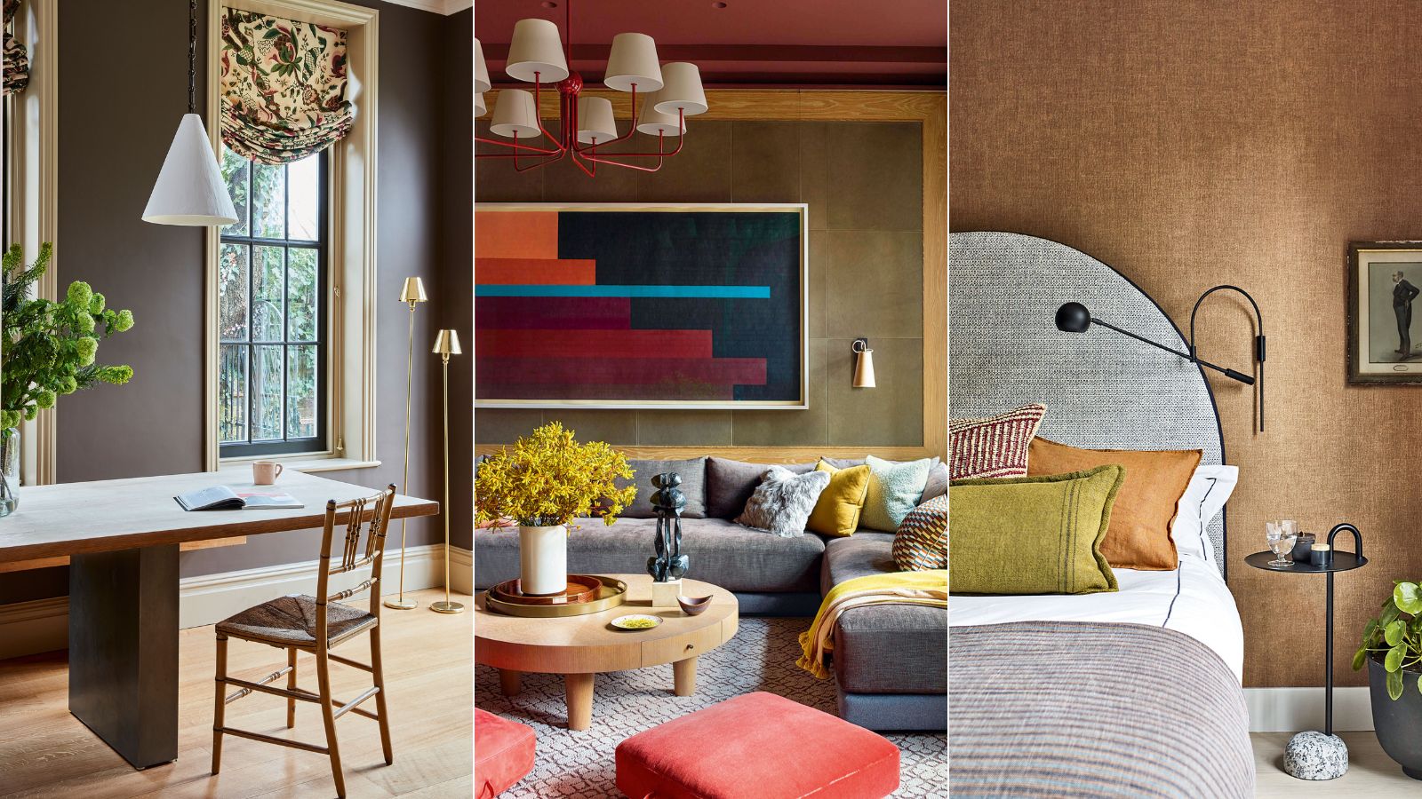
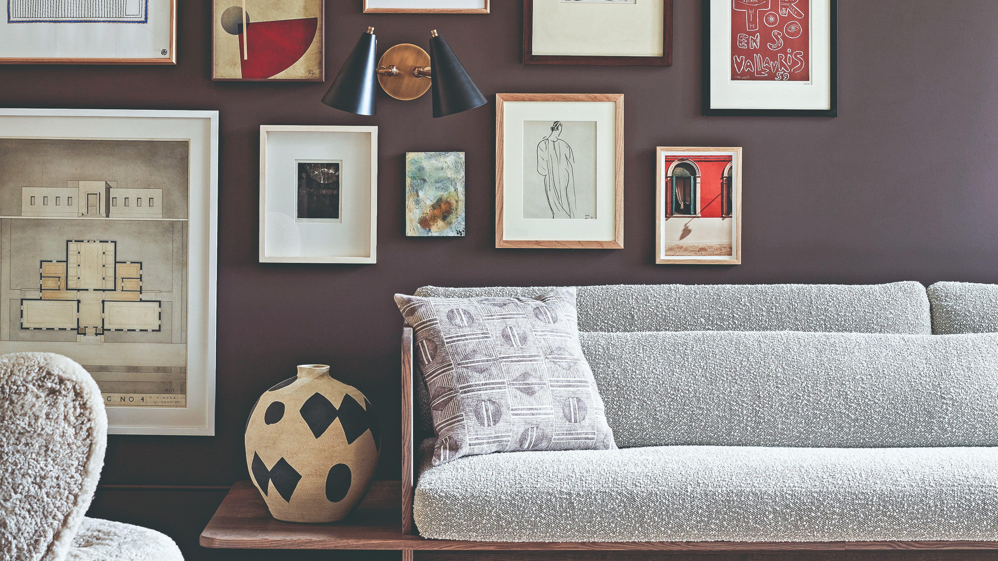
Earth-inspired tones, particularly browns, are also emerging as dominant neutrals. Avalana Simpson, creative director of Avalana Design, points to mid-tone browns like chocolate and caramel as key for 2025, offering a more intense and less clinical alternative to white. These shades provide a strong foundation that can be paired with coordinating textures, such as leopard print, or shimmering metallics. Morgan Blinn, lead designer at Rumor Designs, expands on this, including terracotta, rust, beige, and light green, which create warm, inviting, and sophisticated spaces suitable for various applications, including kitchen cabinetry and ceiling accents. Sherwin Williams' Redend Point and Svelte Sage, Benjamin Moore's Ten Gallon Hat, and Farrow & Ball's Cola are recommended.
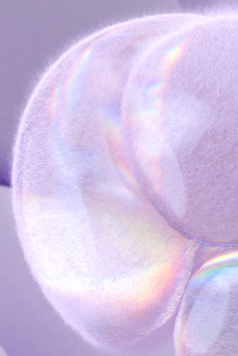
Finally, "futuristic" neutrals are providing a contemporary alternative to traditional neutrals. Influenced by technology and digital spaces, shades like Digital Lavender, alongside frosted silver and pale lilac, offer a sleek, cutting-edge, and serene vibe. These colors are ideal for modern, tech-savvy homes and minimalist interiors, evoking calm and creativity. While Digital Lavender was named a color of the year in 2023, its influence continues, with designers recommending its subtle integration through accessories rather than full wall coverage to avoid an overly futuristic look. Benjamin Moore's Hidden Sanctuary, Farrow & Ball's No.270 Calluna, and Backdrop's Not So Delicate are examples of these technologically inspired shades. Overall, the trend is towards richer, warmer, and more diverse neutral palettes that offer comfort, sophistication, and a departure from sterile white interiors.
#ColorTrends #InteriorDesign #NeutralColors #PaintColors #HomeDecor #DesignVersatility #WarmNeutrals #KhakiGreen #CoolBlues #WarmGrays #EarthTones #FuturisticNeutrals #DigitalLavender #ColorTrends #InteriorDesign #NeutralColors #PaintColors #HomeDecor #DesignVersatility #WarmNeutrals #KhakiGreen #CoolBlues #WarmGrays #EarthTones #FuturisticNeutrals #DigitalLavender
0 comment in total
 No comments yet
You may also like
What color is replacing white? Interior designers prefer this neutral for 2024
What color is replacing beige? This is the one color we prefer to use instead of beige in 2024, say designers
‘Unexpected Yellow Theory’: The Bold New Interior Trend Replacing Red in 2025
Say Goodbye To White Bedrooms — These Neutrals Will Dominate 2026 Design Trends
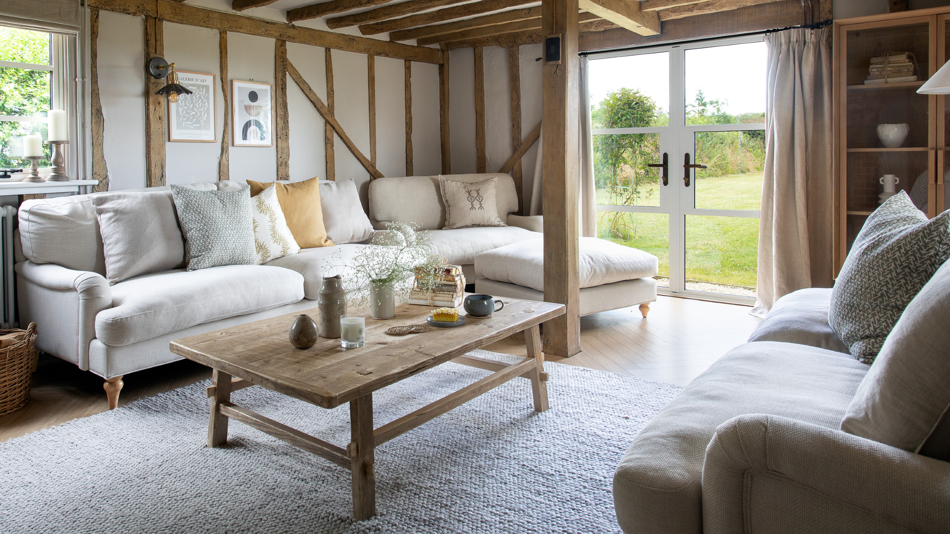
What’s replacing beige in 2025? Last year's go-to neutral is taking a back seat in favour of these two new earthy colours
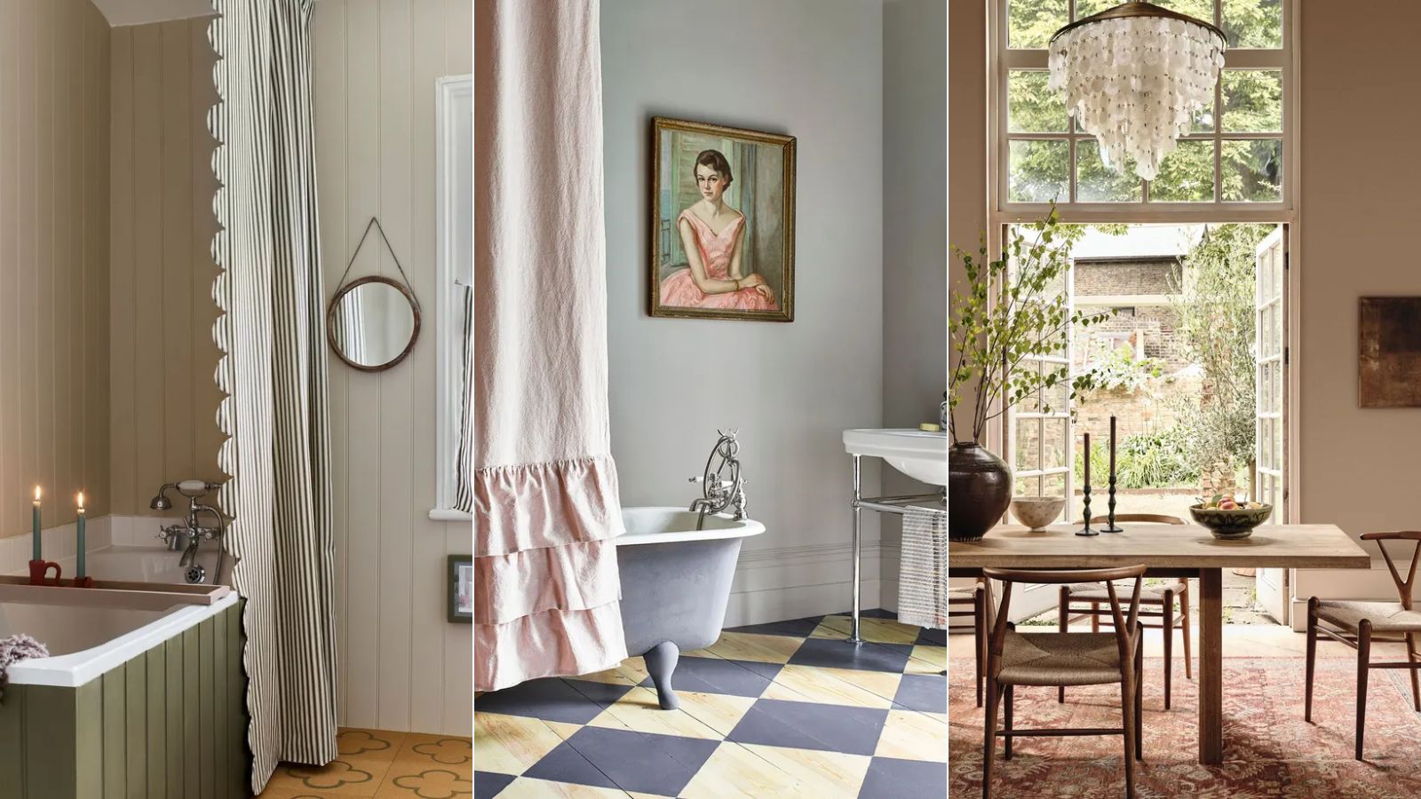
Is gray or beige more on trend for 2025? Designers share all on these popular neutrals
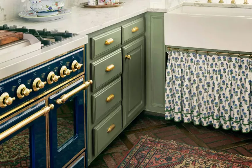
The ‘New Neutral’ Paint Color Everyone Is Adding To Their Homes In 2025, According To Designers

The #1 Paint Color Trend of 2025, According to Designers

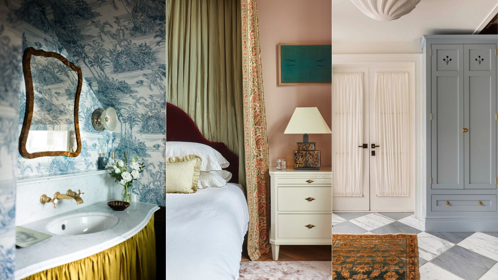
What's replacing the 'Unexpected Red Theory'? Here's what colors designers say will be popular in 2025

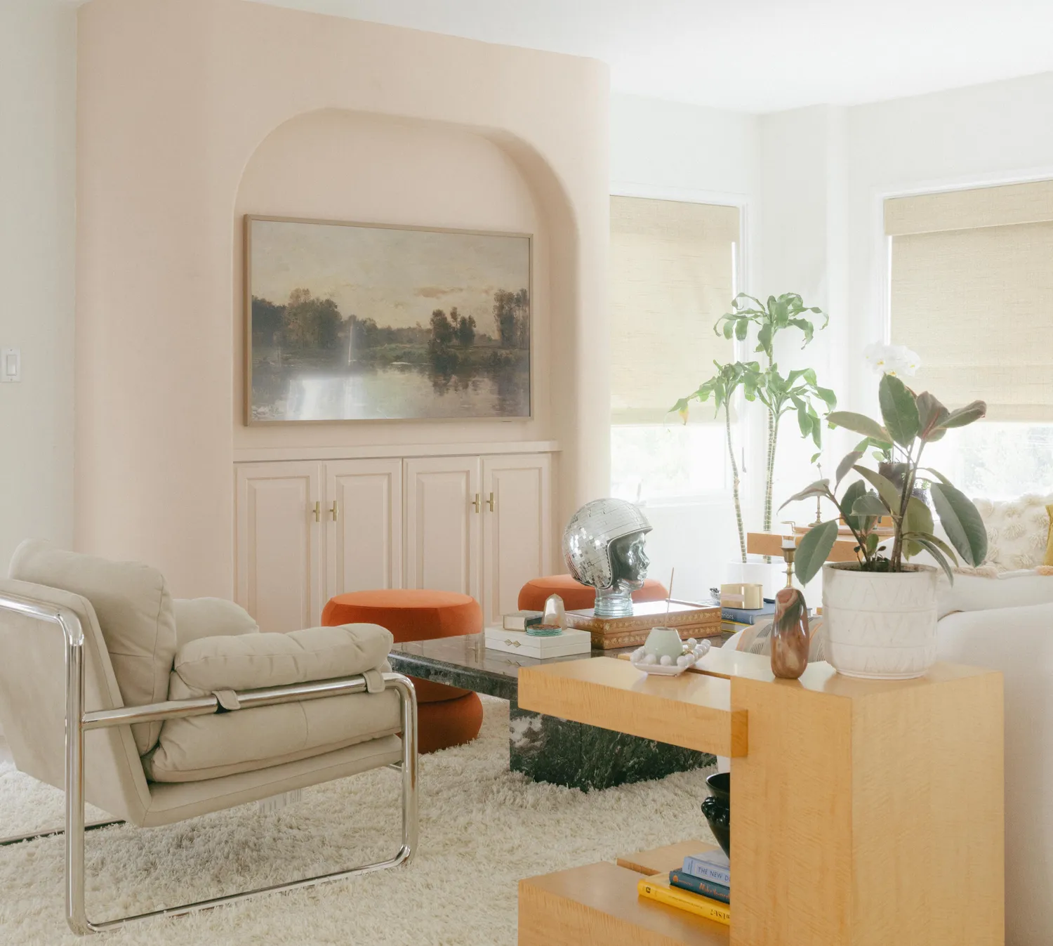
Move Over, Beige—This Unexpected Neutral Is Taking Over in 2026

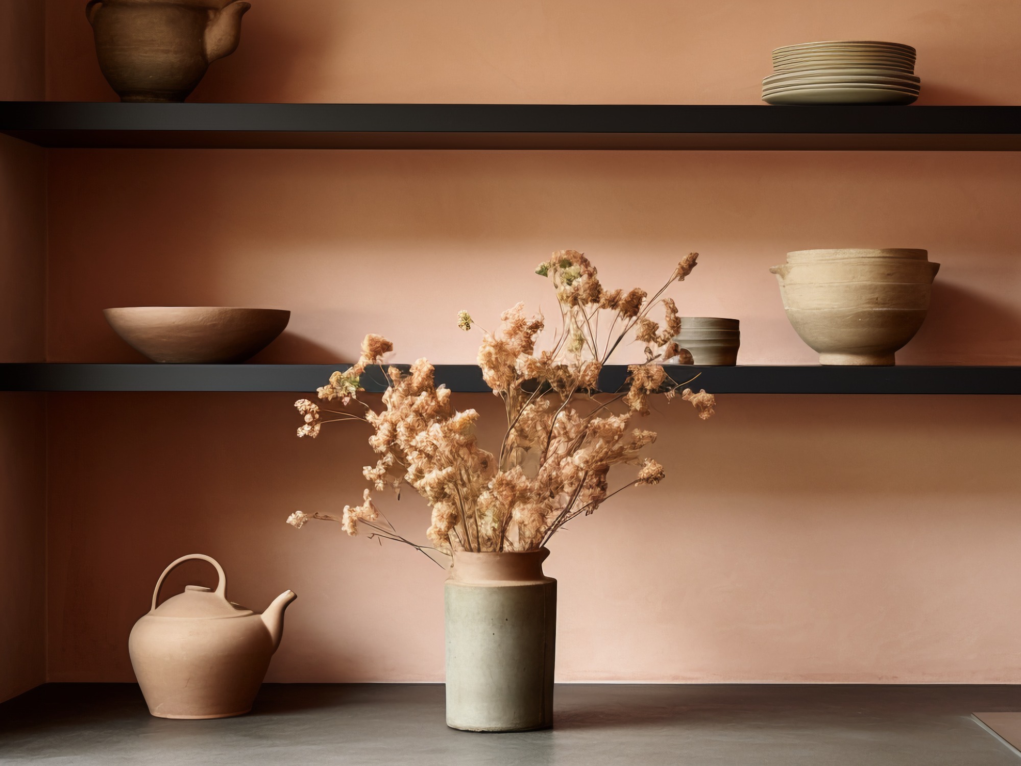
The Biggest Colour Trends Taking Off in 2025
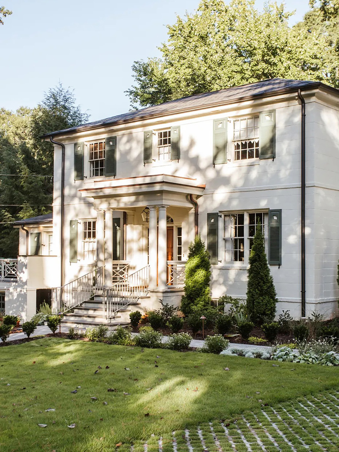
The Moody Shade That Will One-Up White Exteriors in 2026

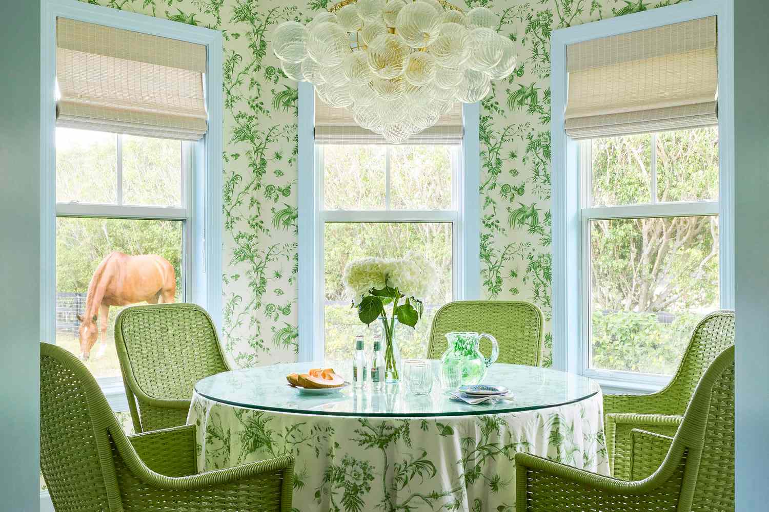
We're Calling It: Blues And Greens Are The New Neutrals For 2025
The colour palette for 2025 – these are the shades paint experts say we’ll see everywhere next year
Paint colors going out of style in 2025
What Paint Colours will Rule 2026? The Experts Make Their Predictions

We’re Calling It: These Are the Official Color Trends of 2025
What Neutral Wall Color Should I Pick in 2024? These are the Big Neutral Color Trends, Say Designers
What Colors Will Rule 2027 (and Beyond)? Experts Make Their Predictions
5 Outdated Color Combinations We're Saying Goodbye to in 2025, According to Designers