UPDATE: Here Are All the 2026 Colors of the Year—Including Pantone’s Shocking Pick
The article presents a comprehensive overview of the Colors of the Year for 2026, as announced by various paint and design companies, with one exception for 2027. The selection process for these colors often begins well in advance, with some companies releasing their picks over a year ahead due to the extensive planning required for product development, design, and marketing across numerous industries. These annual color selections are influential in shaping interior design, product trends, and consumer preferences for the upcoming year.
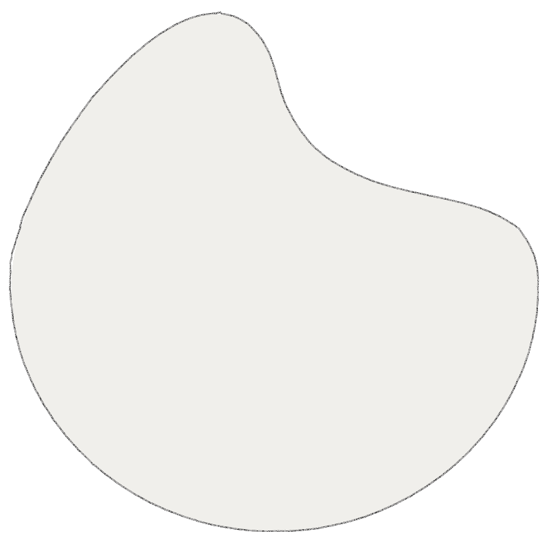
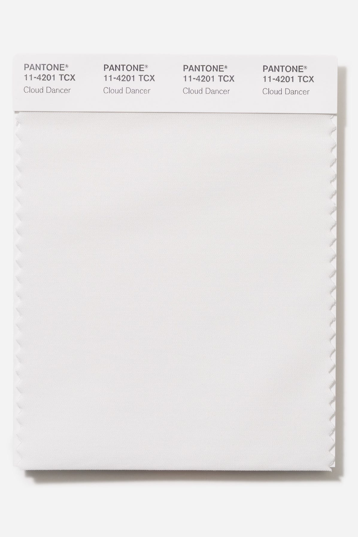
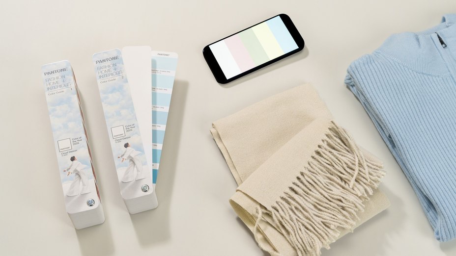
Pantone, known for its significant impact on color trends, has made a surprising choice for 2026 with "Cloud Dancer." This marks the first time since 1999 that Pantone has selected white as its Color of the Year. Cloud Dancer is described as a balanced, wispy neutral, symbolizing calm, peace, and a desire for a fresh start. It encourages simplification and offers a canvas for new approaches in a fast-paced world, being suitable for various applications such as walls, cabinetry, furniture, and window trim.
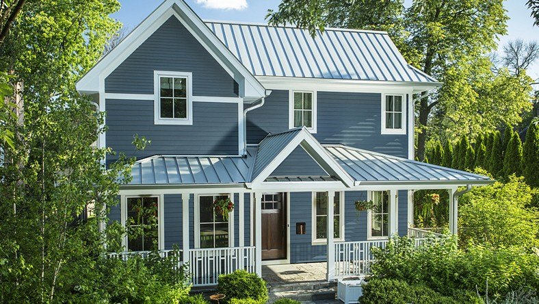
James Hardie, a company specializing in exterior siding, chose "Iron Gray" for 2026. This saturated, chalky matte gray is designed to complement warm wood tones and can be paired with white trim for a traditional look or black for a modern aesthetic. While not a paint, Iron Gray is intended for exterior siding to create a contemporary yet grounded home appearance.
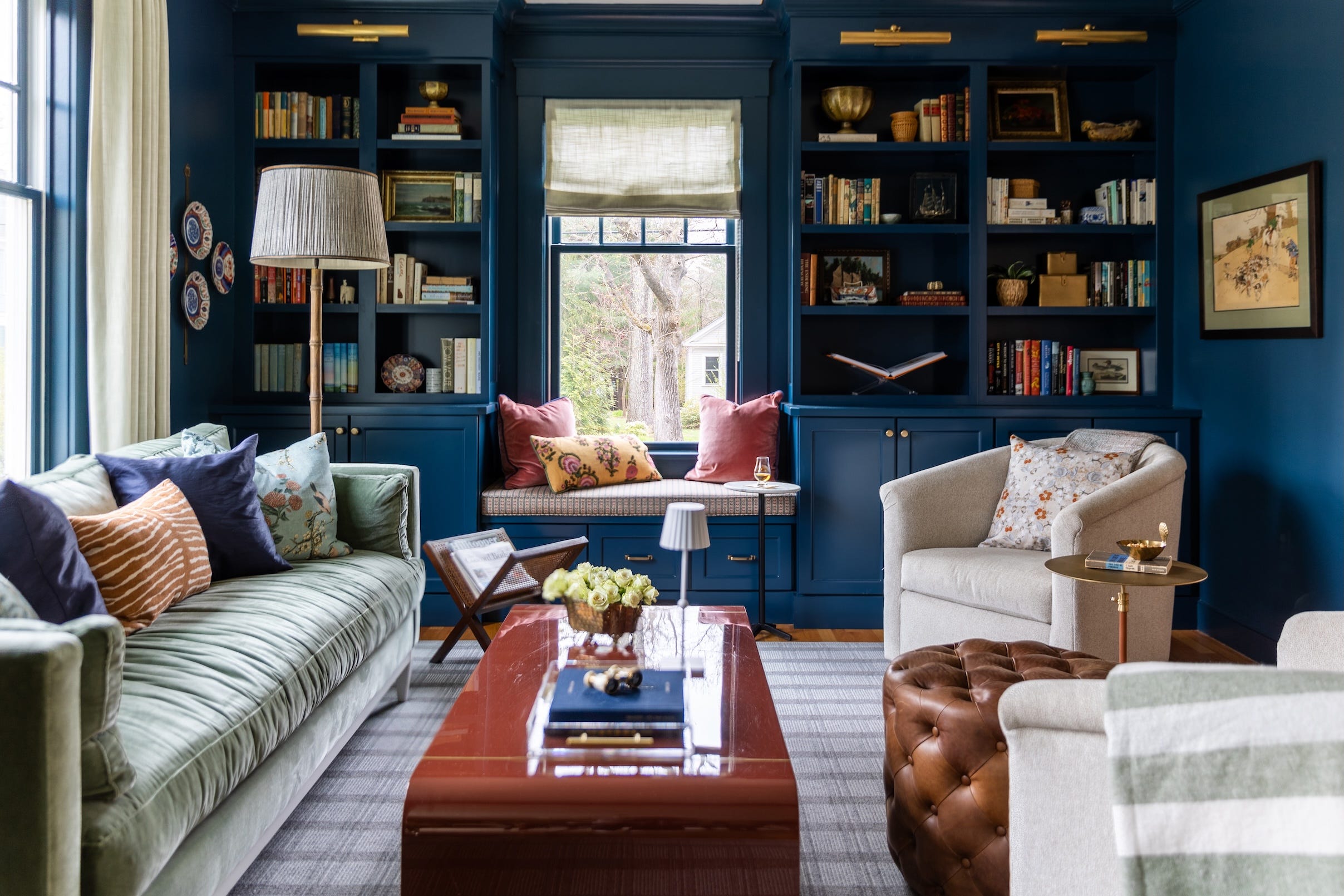
WGSN and Coloro, trend forecasting and color expert partners, have revealed "Luminous Blue" as their 2027 Color of the Year. This decision to announce a color so far in advance reflects the long lead times required in product and design industries. Luminous Blue is a vibrant, lapis-like hue, characterized by its mysterious, eccentric, and versatile nature, appealing across genders and seasons. It is suggested for use as an accent color in interiors, transforming simple items into statement pieces.
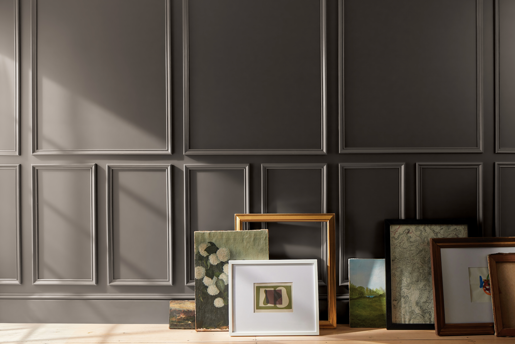
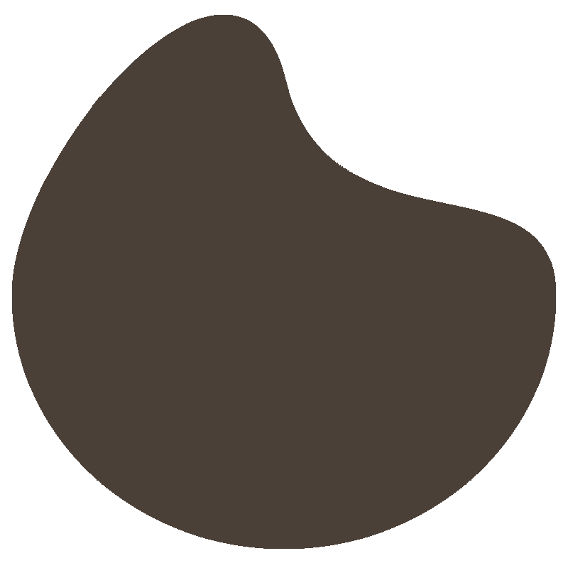
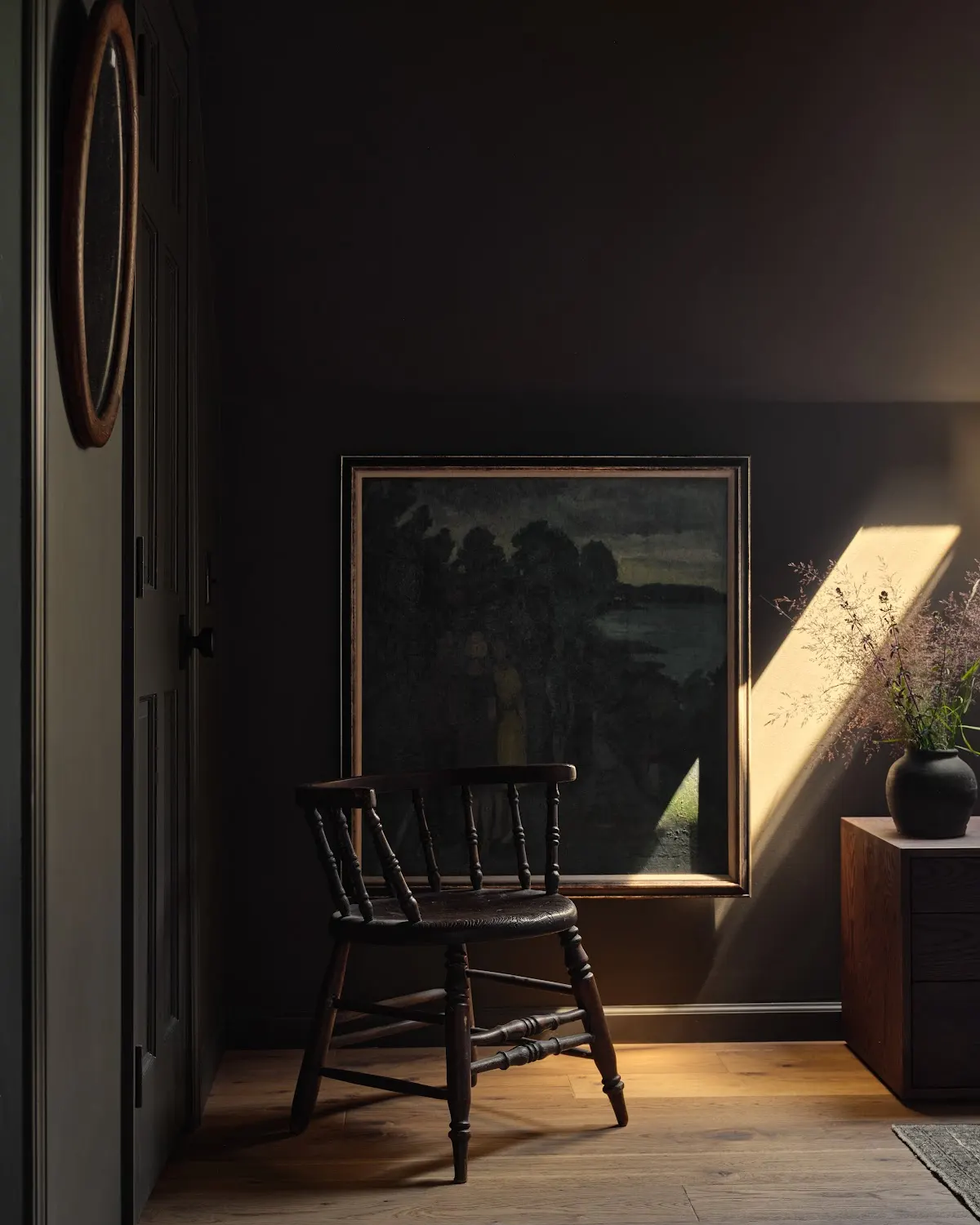
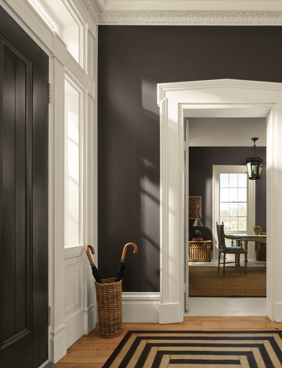
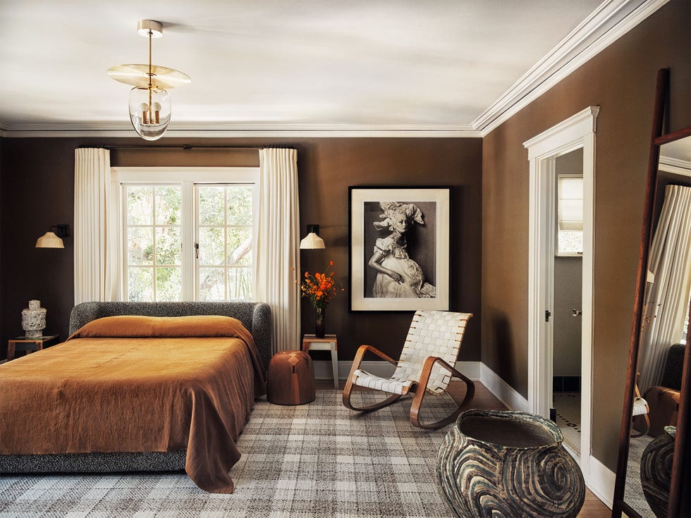
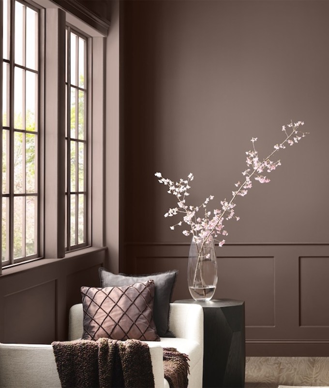
Benjamin Moore's 2026 Color of the Year is "Silhouette AF-655," a deep charcoal-espresso with burnt umber and delicate charcoal undertones. This color draws inspiration from tailored suiting and the growing interest in the brown color family, exuding elegance and drama. It is recommended for creating a sophisticated atmosphere, particularly when used in a color-drenched application or for painting built-ins and woodwork.
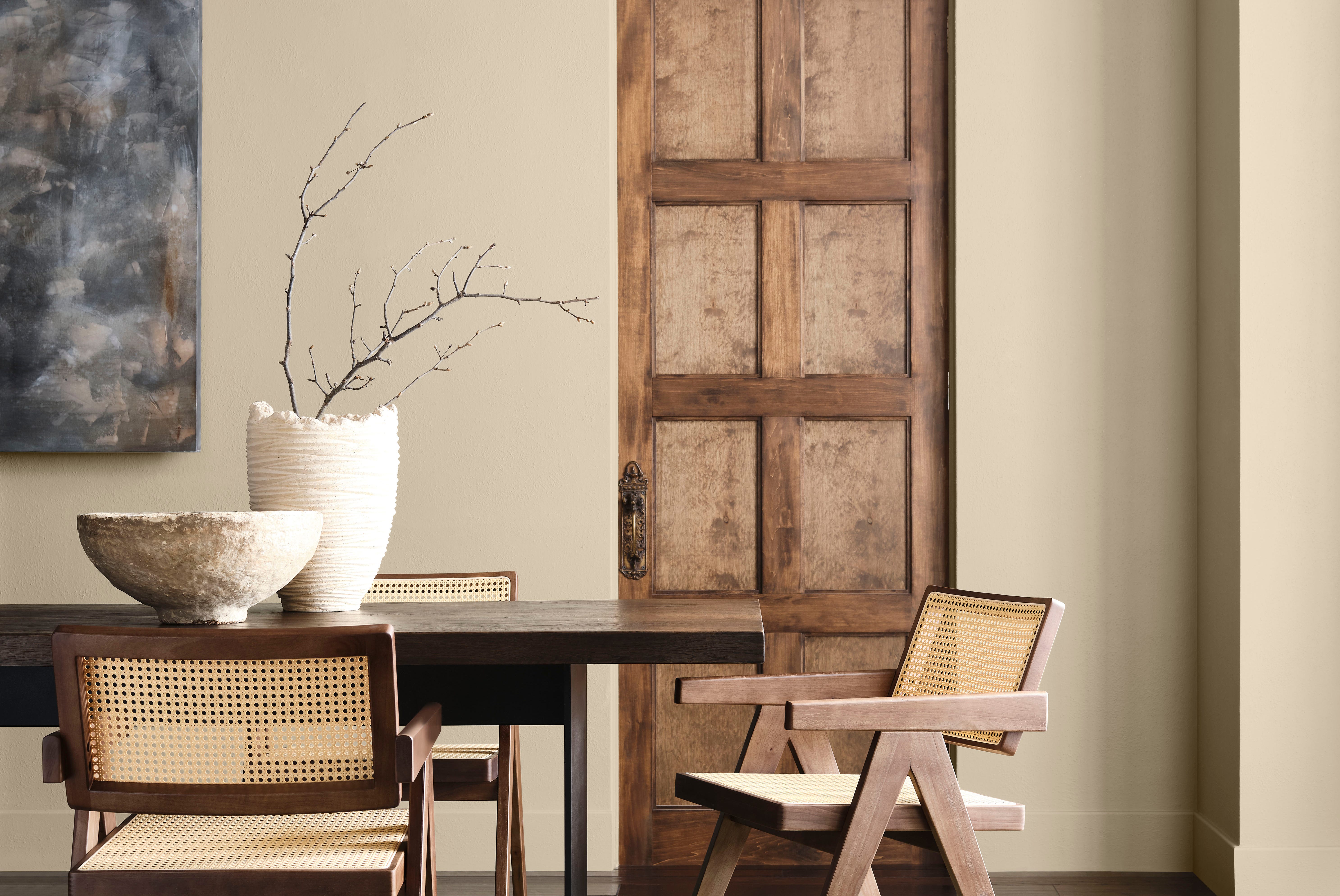
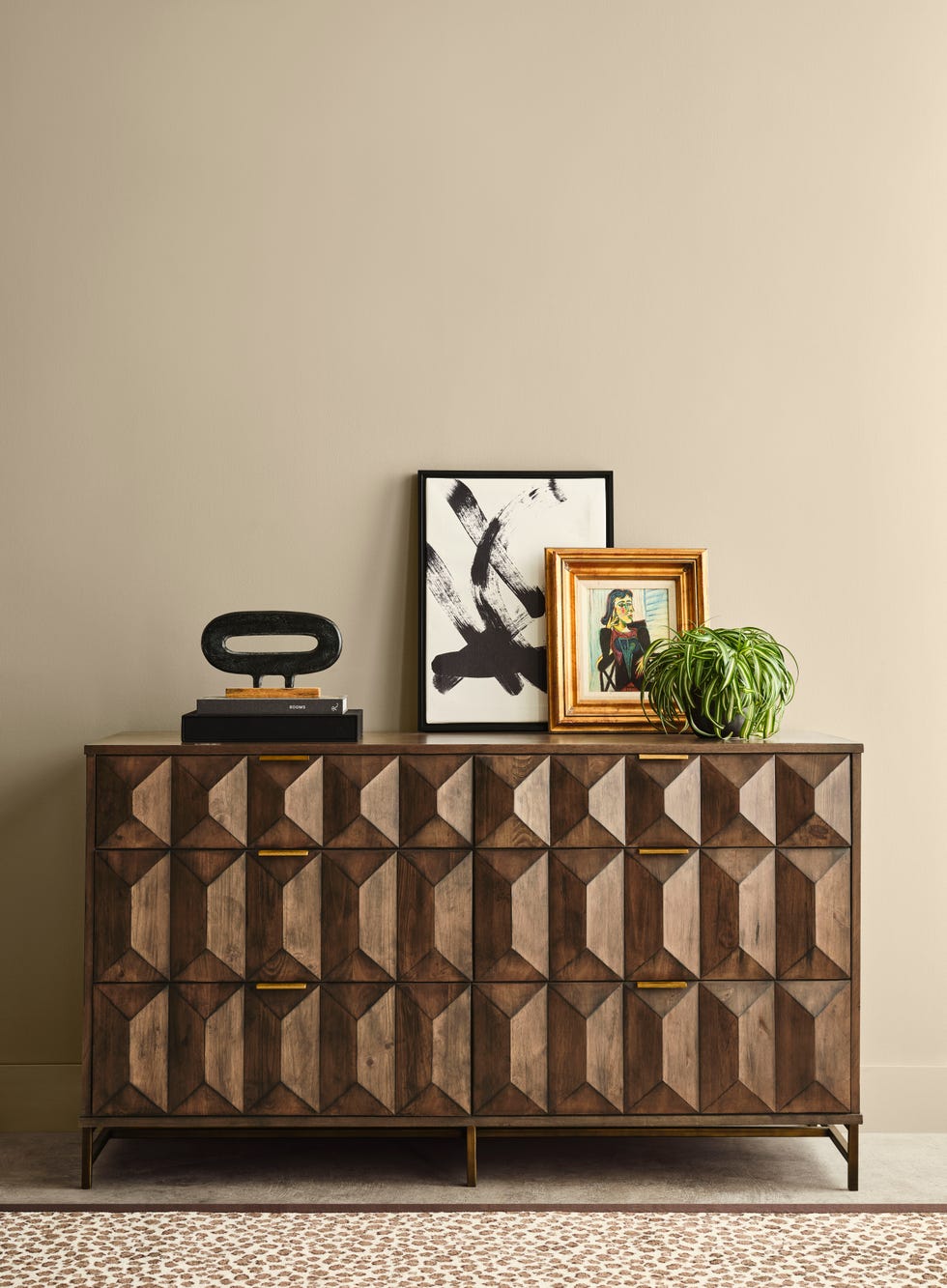
Sherwin-Williams and HGTV by Sherwin-Williams jointly selected "Universal Khaki" for 2026. This mid-tone tan is described as a warm neutral, offering an earthy, luxurious feel. It is ideal for grounding large living spaces, coordinating beautifully with wood-toned moldings, and suitable for cabinetry or furniture.
Krylon’s 2026 Color of the Year is "Coffee Bean," a rich hue balancing between black and brown. It pairs well with various neutrals, metallics, and deeply saturated jewel tones. Available as a matte spray paint, Coffee Bean is suitable for transforming freestanding furniture pieces, such as dining chairs or vases.
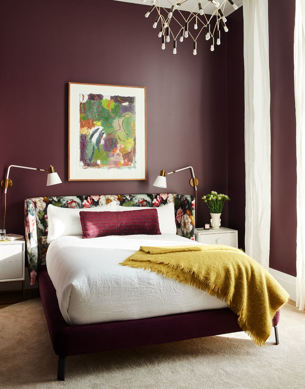
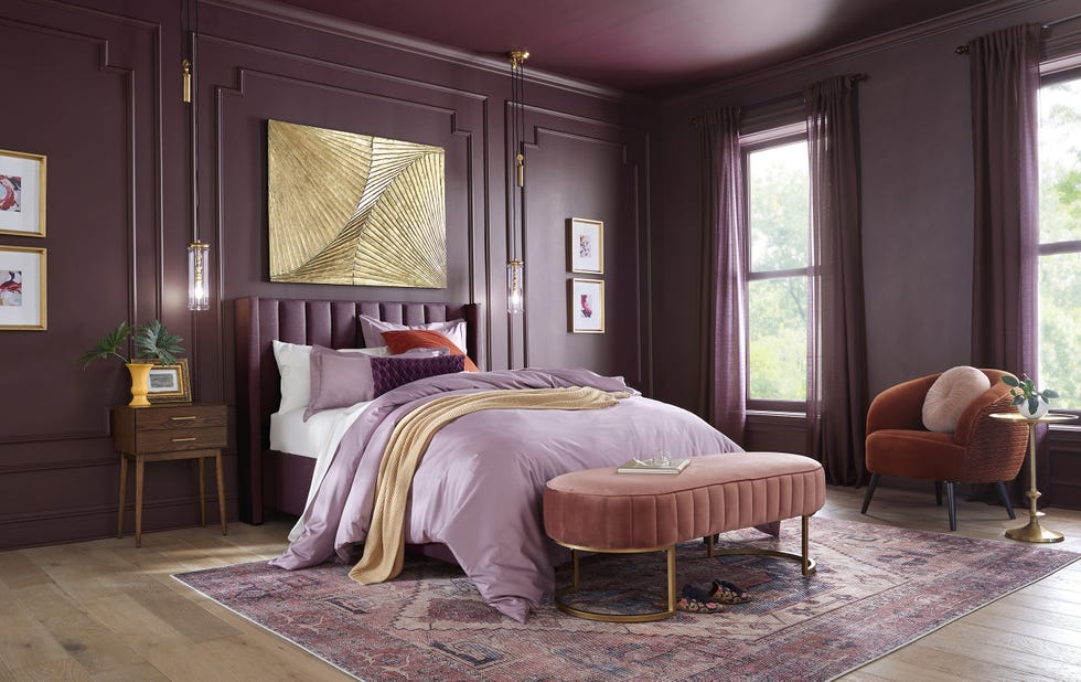
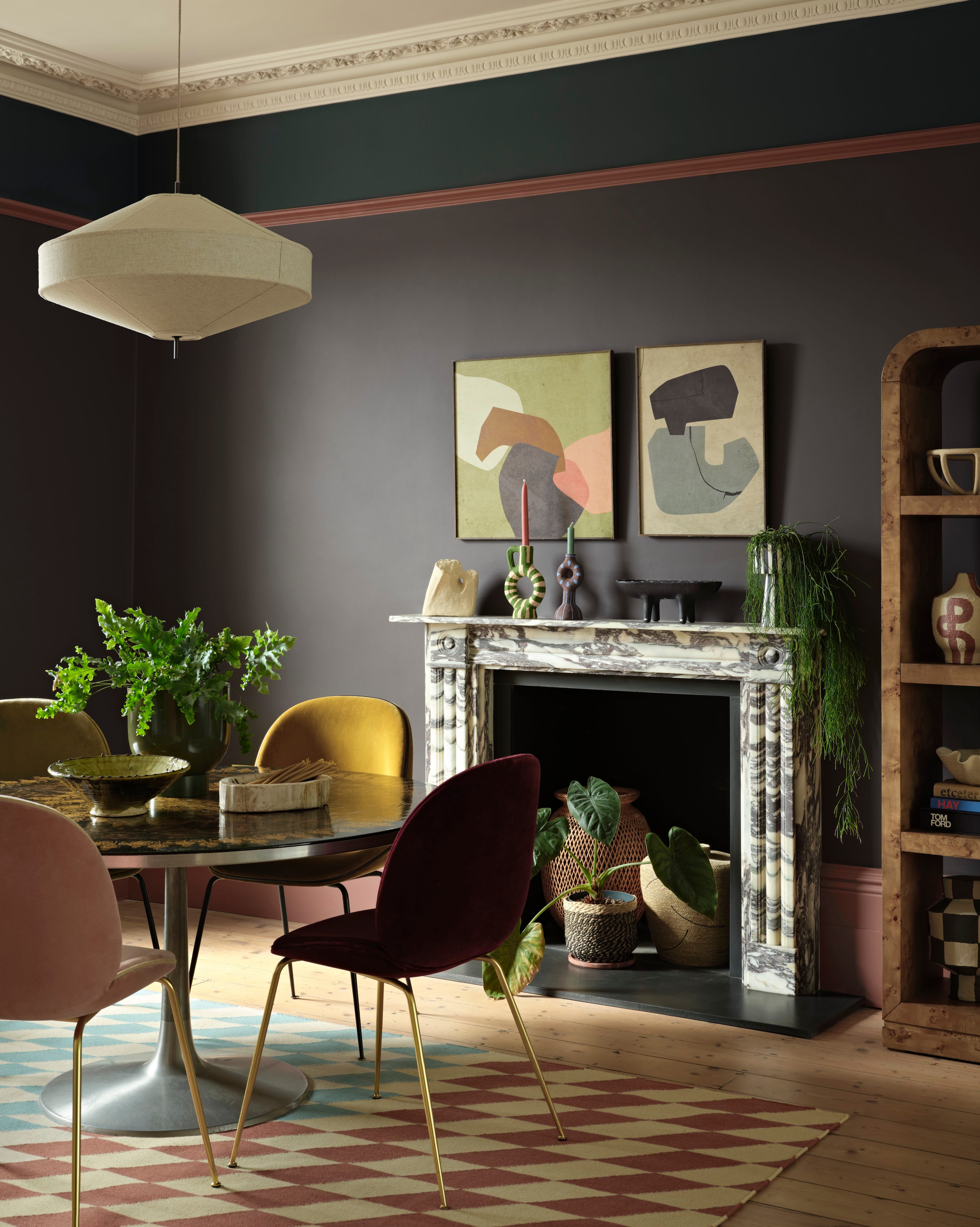
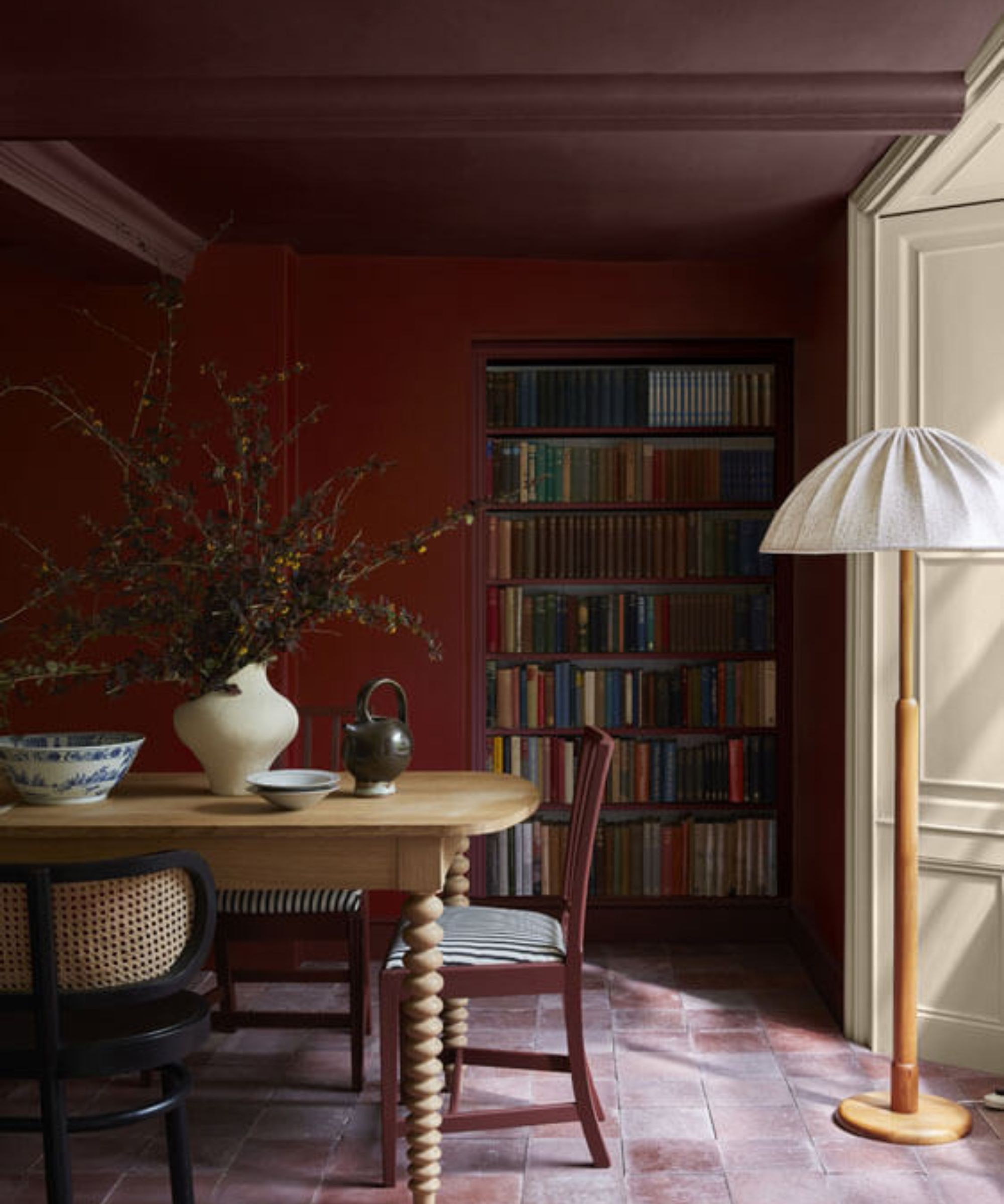
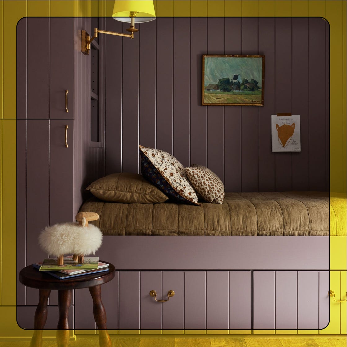
Little Greene introduced "Adventurer," a deep, plummy aubergine for 2026. This sophisticated color has enough black to prevent it from appearing overtly purple, evoking the ambiance of a 100-year-old English cottage. It is recommended for creating intimate and cozy spaces like listening lounges, home offices, or library nooks.
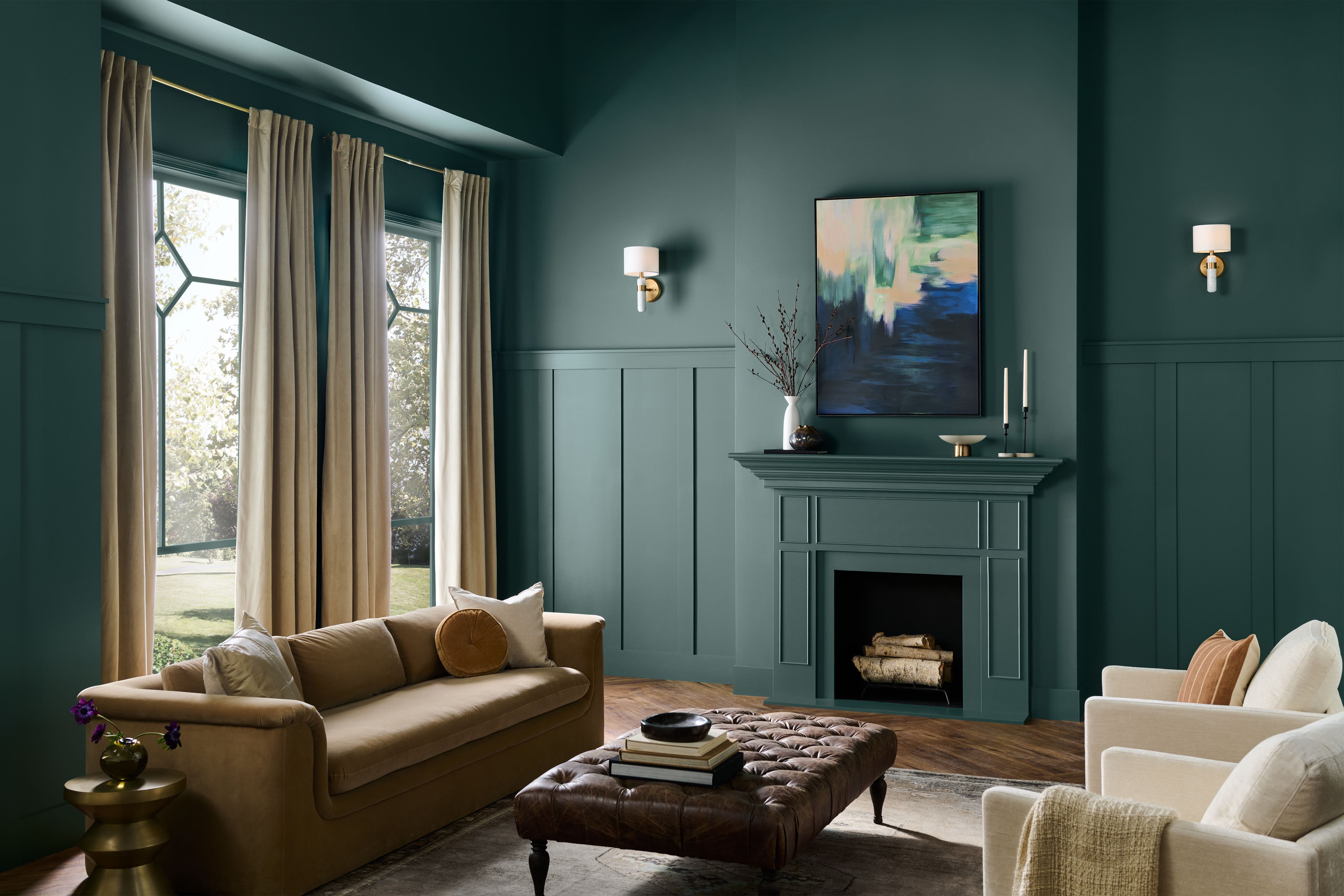
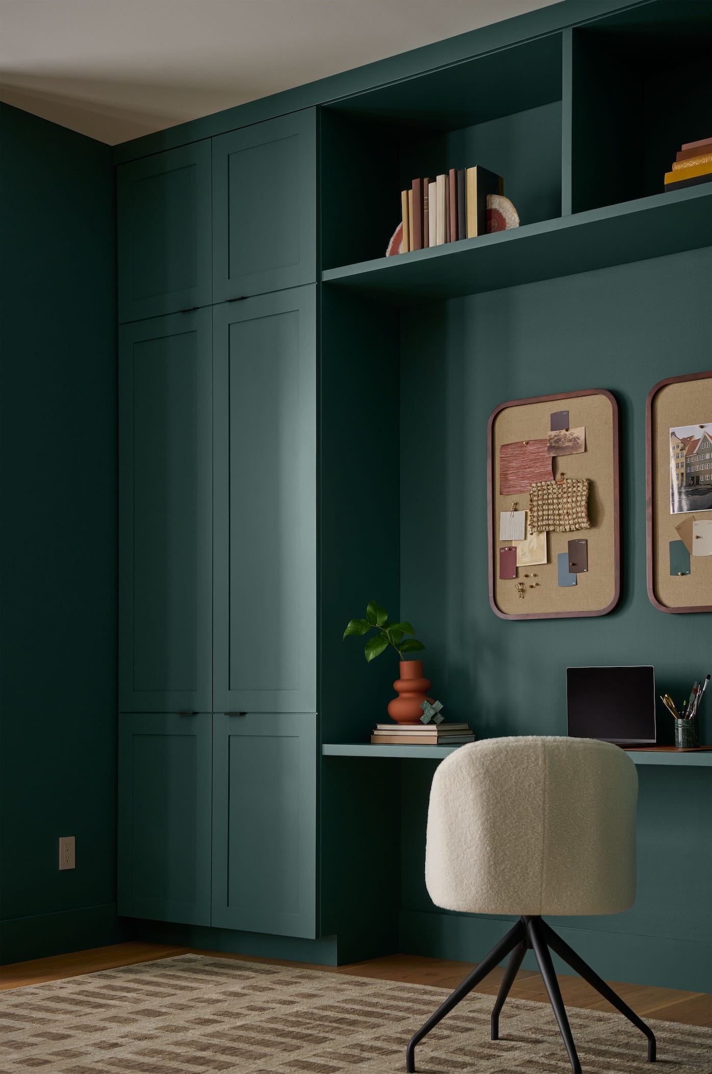
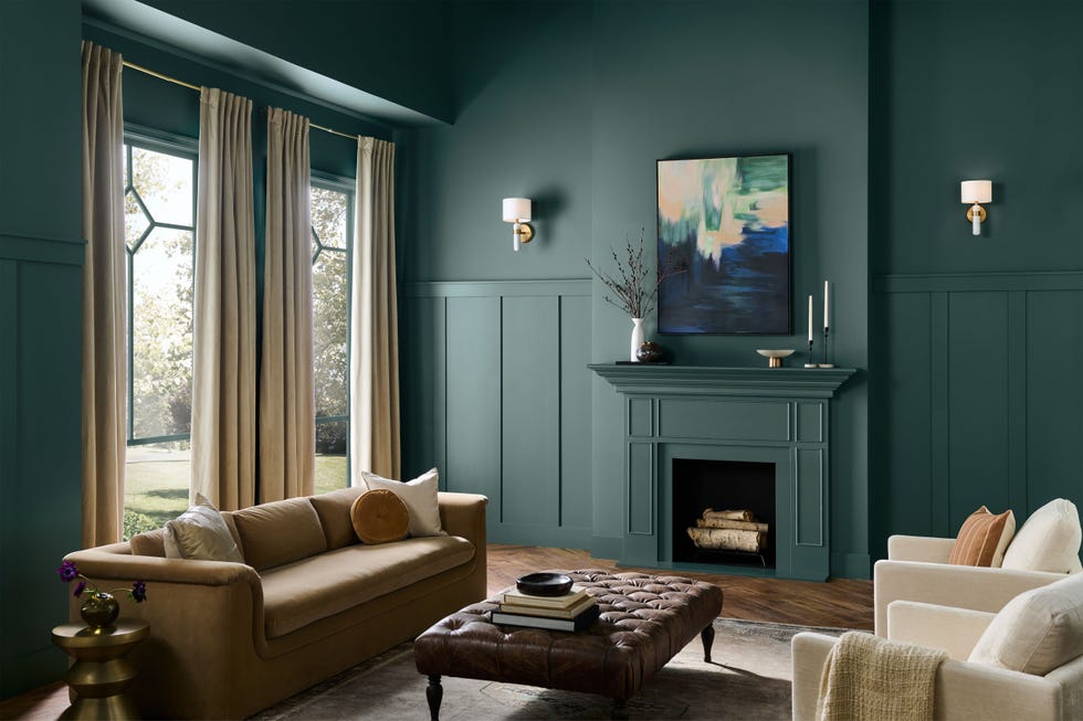
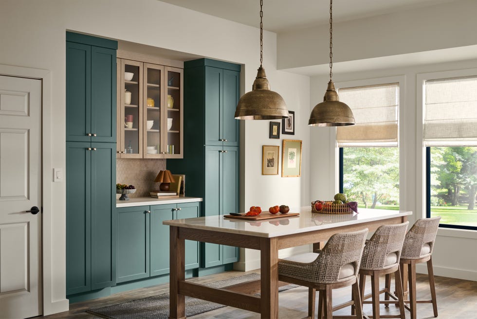
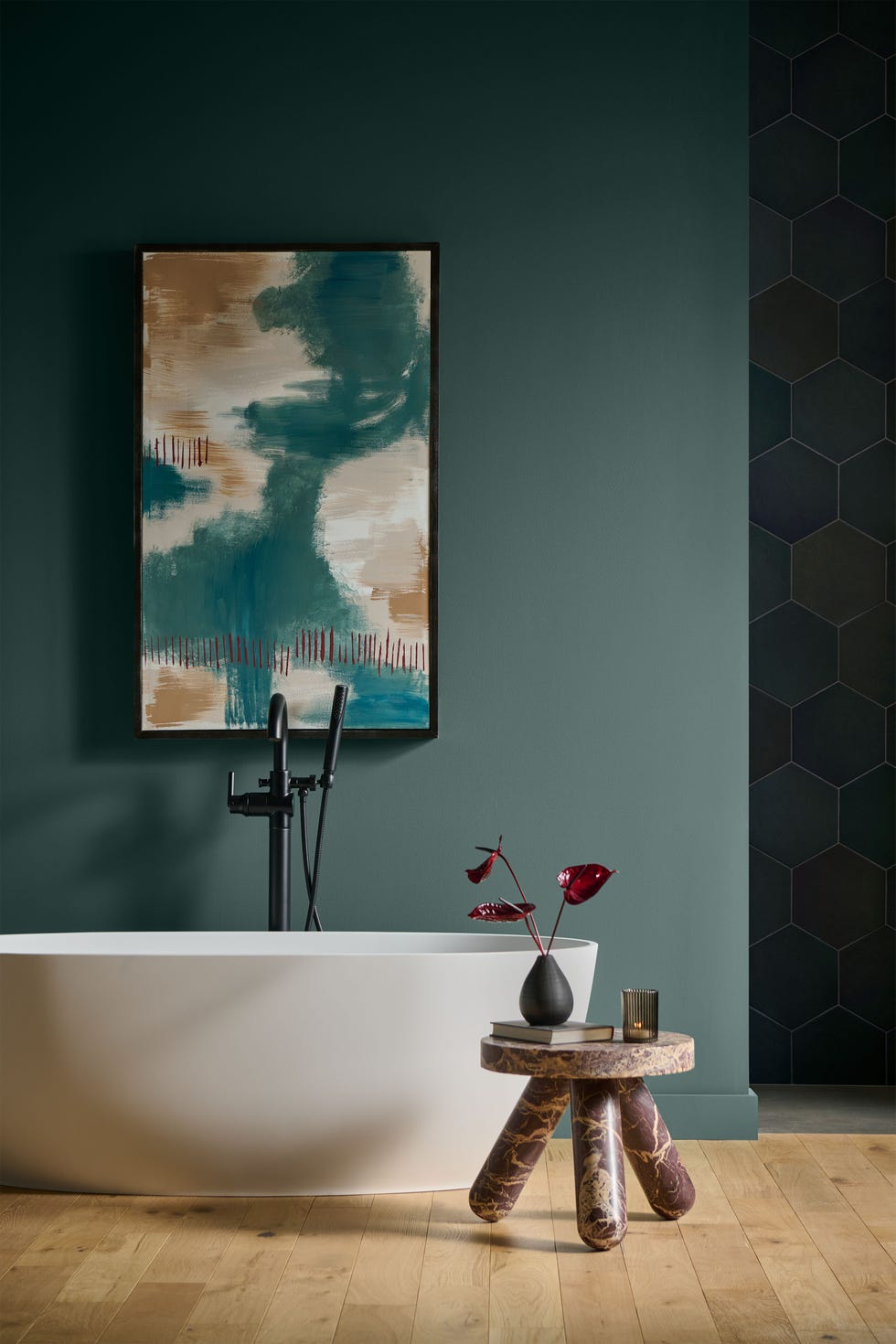
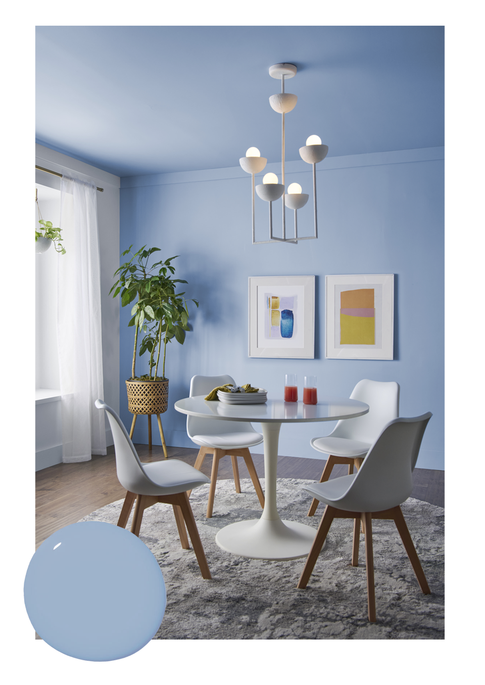
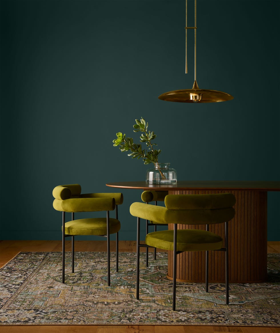
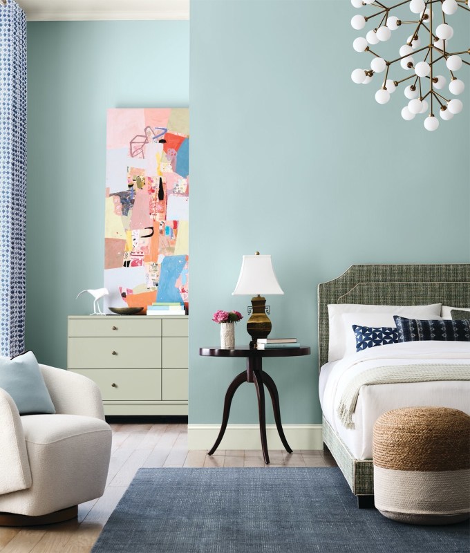
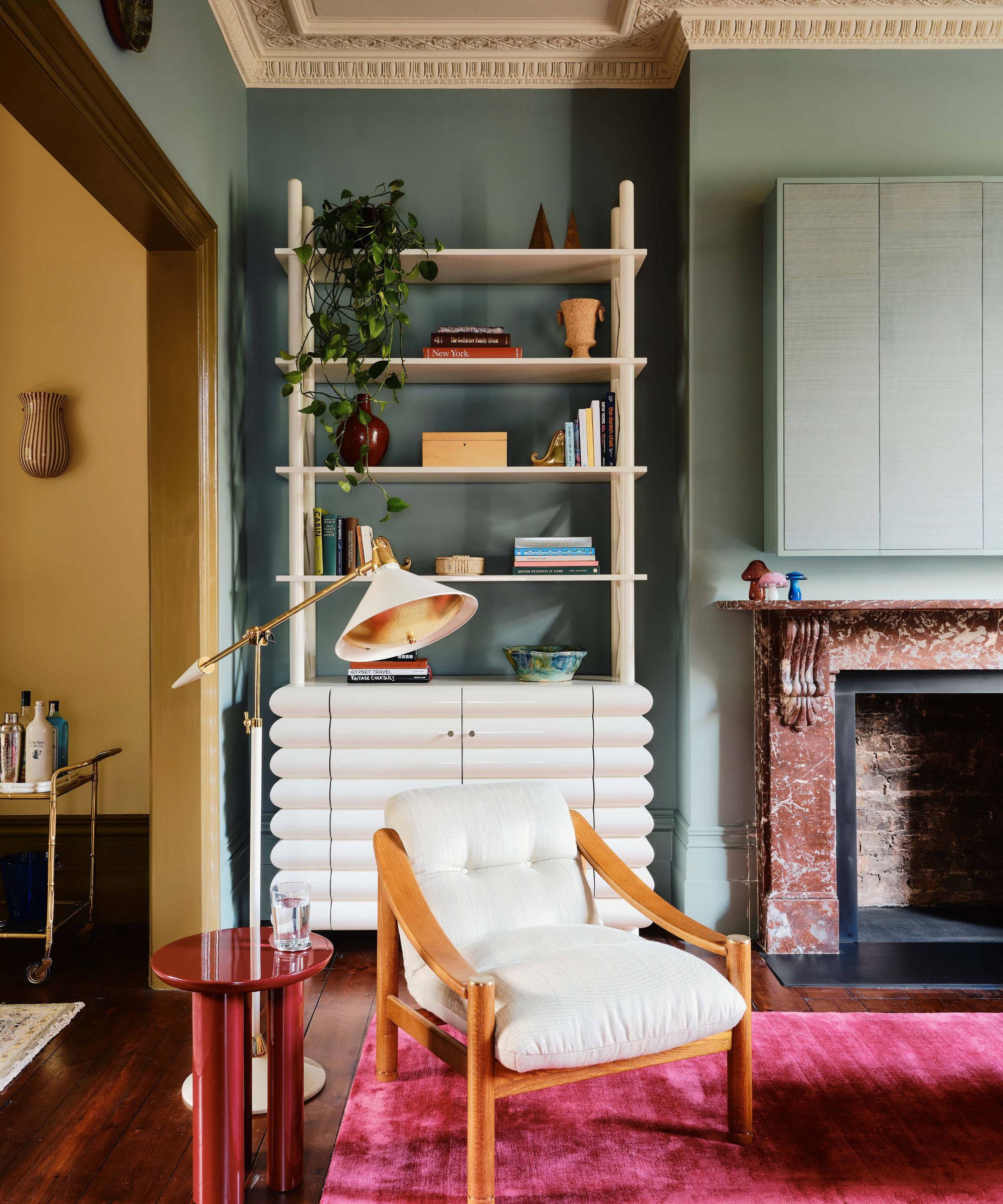
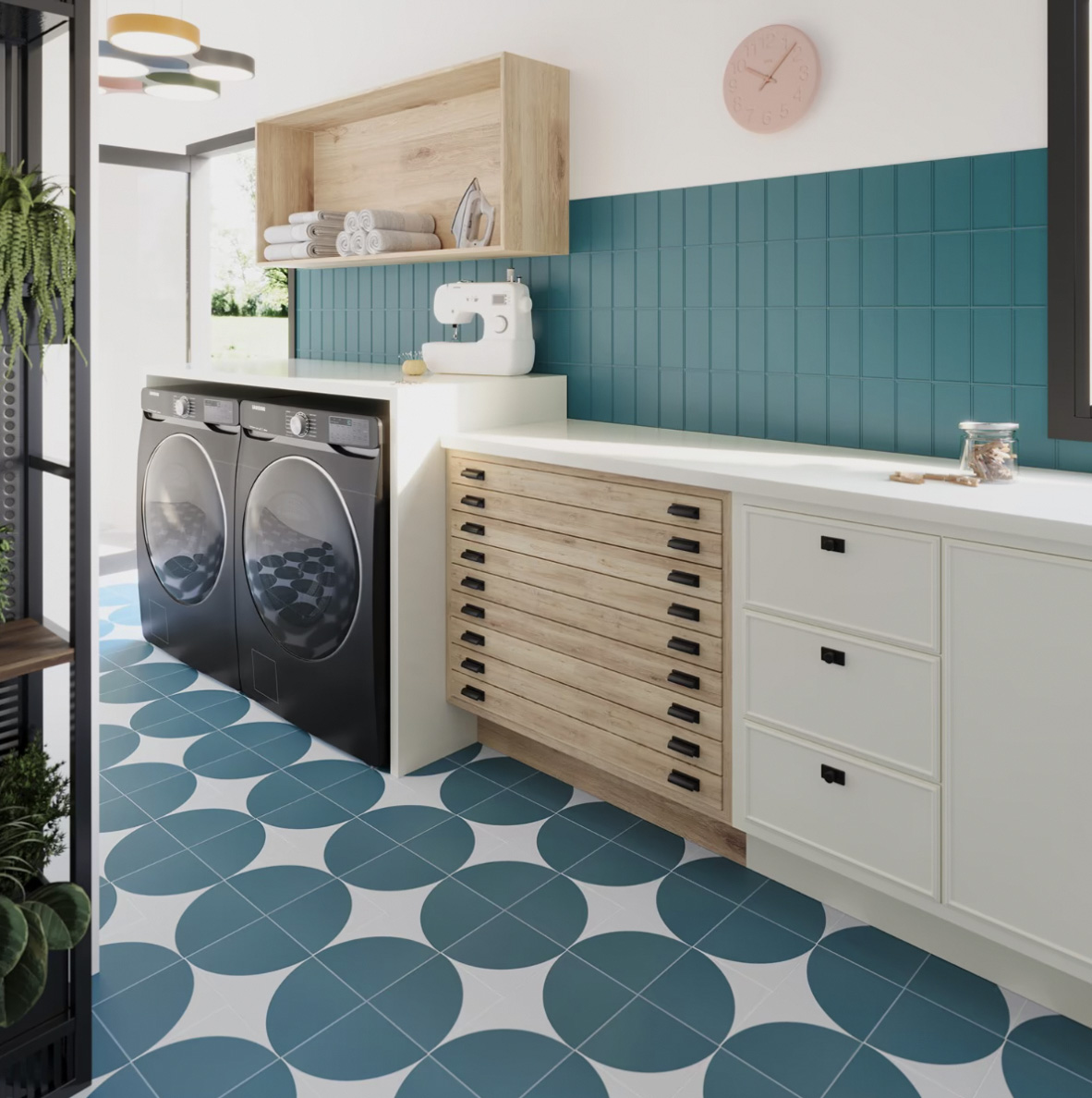
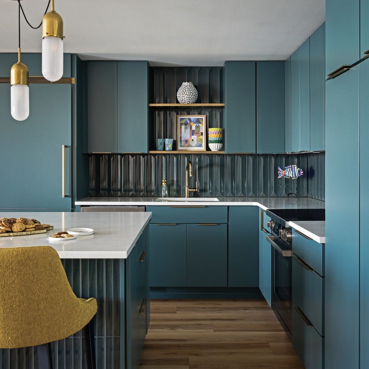
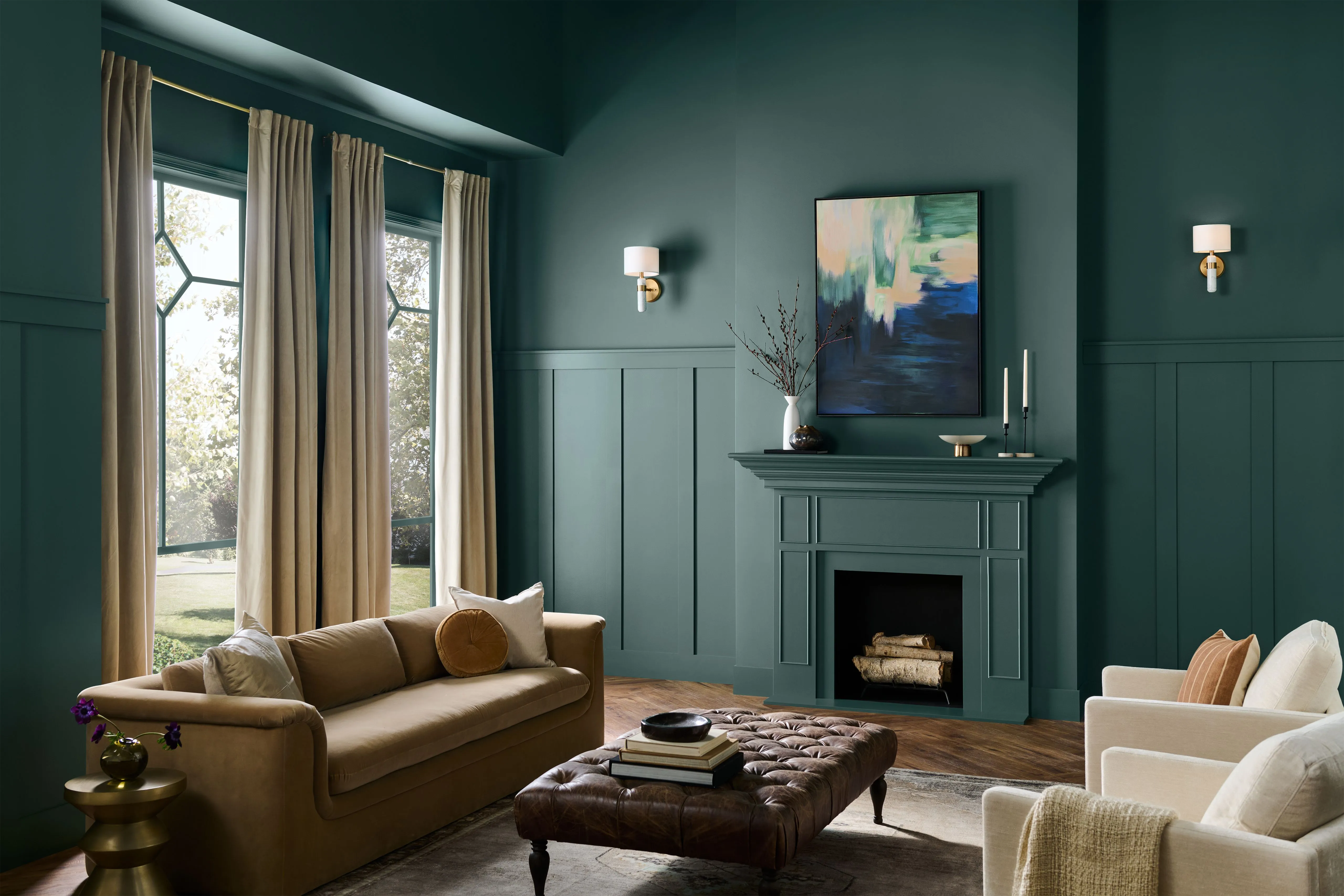
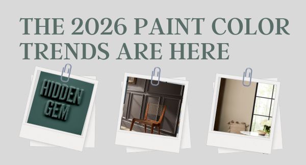
Behr's first-to-market 2026 Color of the Year, "Hidden Gem," is a smoky jade. This saturated blue-green hue is described as mysterious, sophisticated, and versatile. Its deep pigmentation makes it suitable for walls, trimwork, ceilings, bathroom vanities, kitchen cabinetry, or front doors.
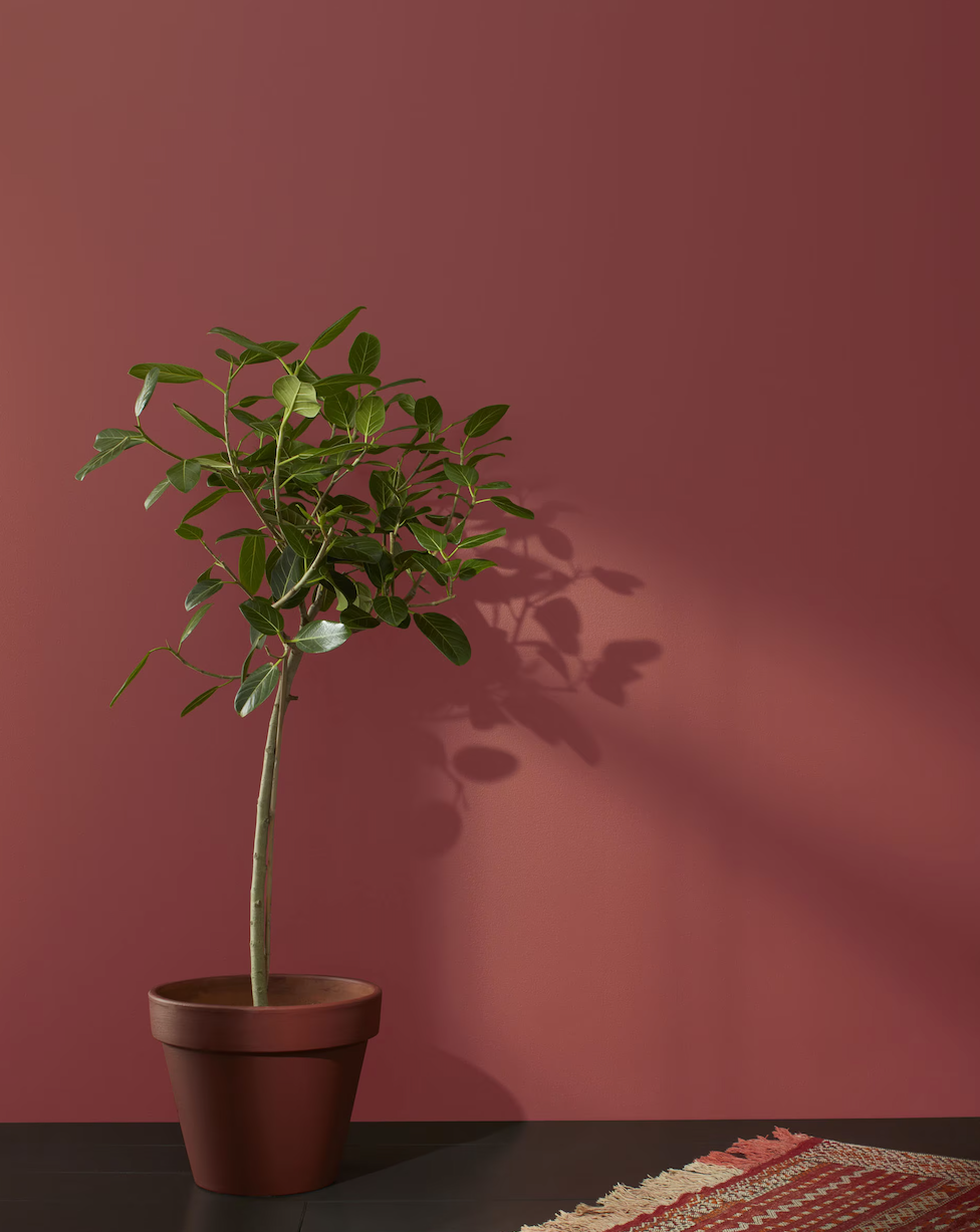
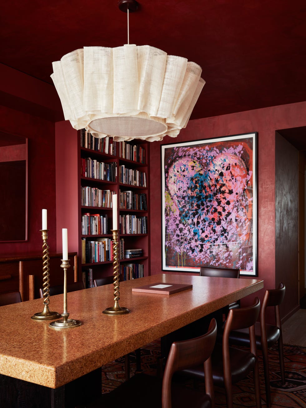
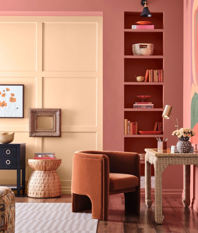
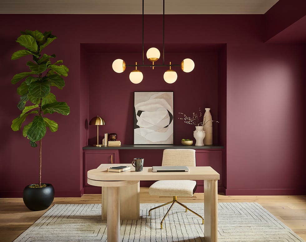
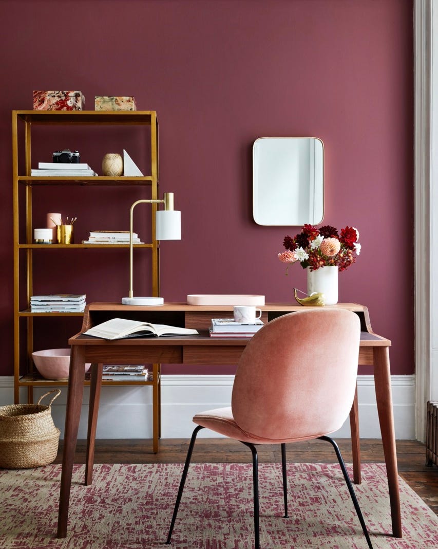
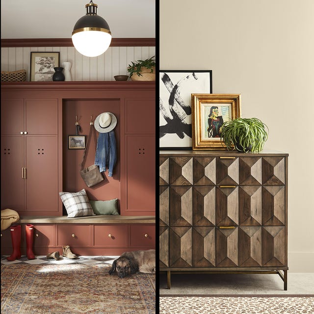
Glidden selected "Warm Mahogany" for 2026, a reddish-brown that is both punchy and grounded. It nods to contemporary red trends while maintaining a timeless appeal. This color is suggested for modern interiors, especially in color-drenched bedrooms or home offices, or to add depth to dining rooms and kitchens.
Minwax’s 2026 pick is "Special Walnut," a wood stain rather than a paint color. This choice reflects a shift away from lighter woods towards deeper browns, providing a warm, authentic, and historic feel. It is ideal for natural wood furniture projects, fireplace surrounds, mantels, shelving, and bookcases.
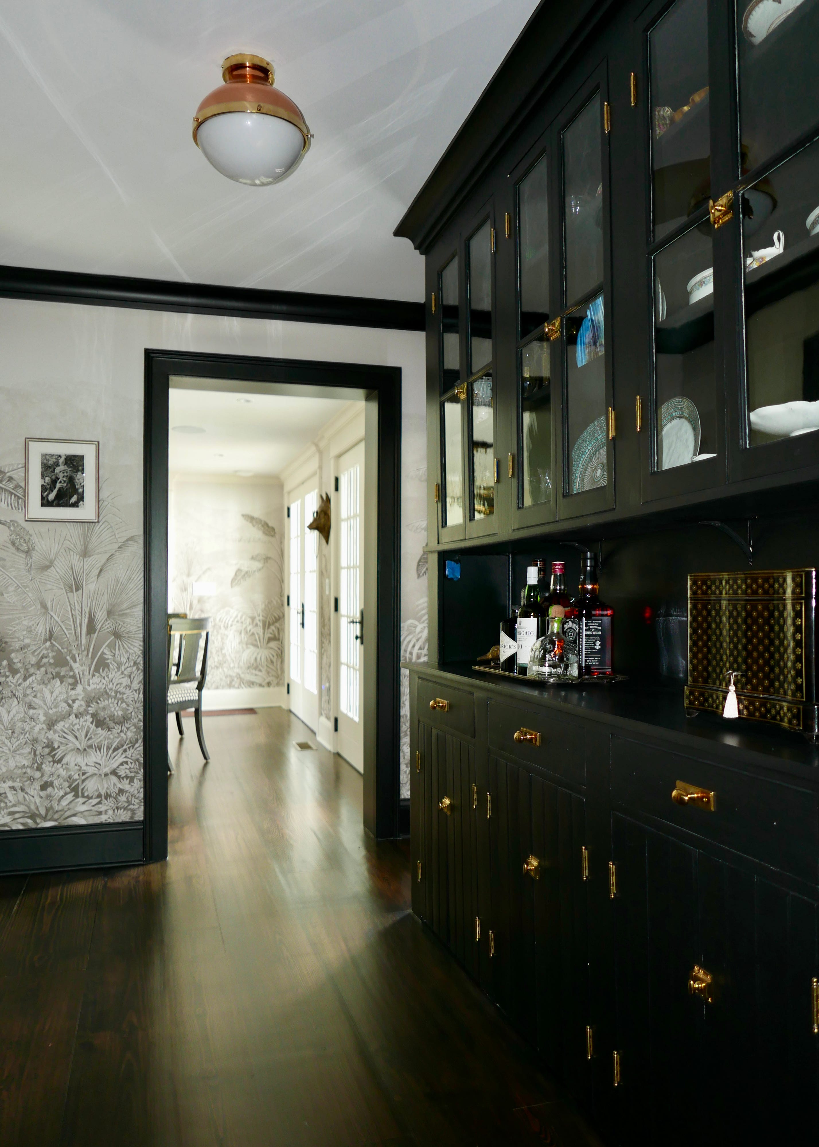
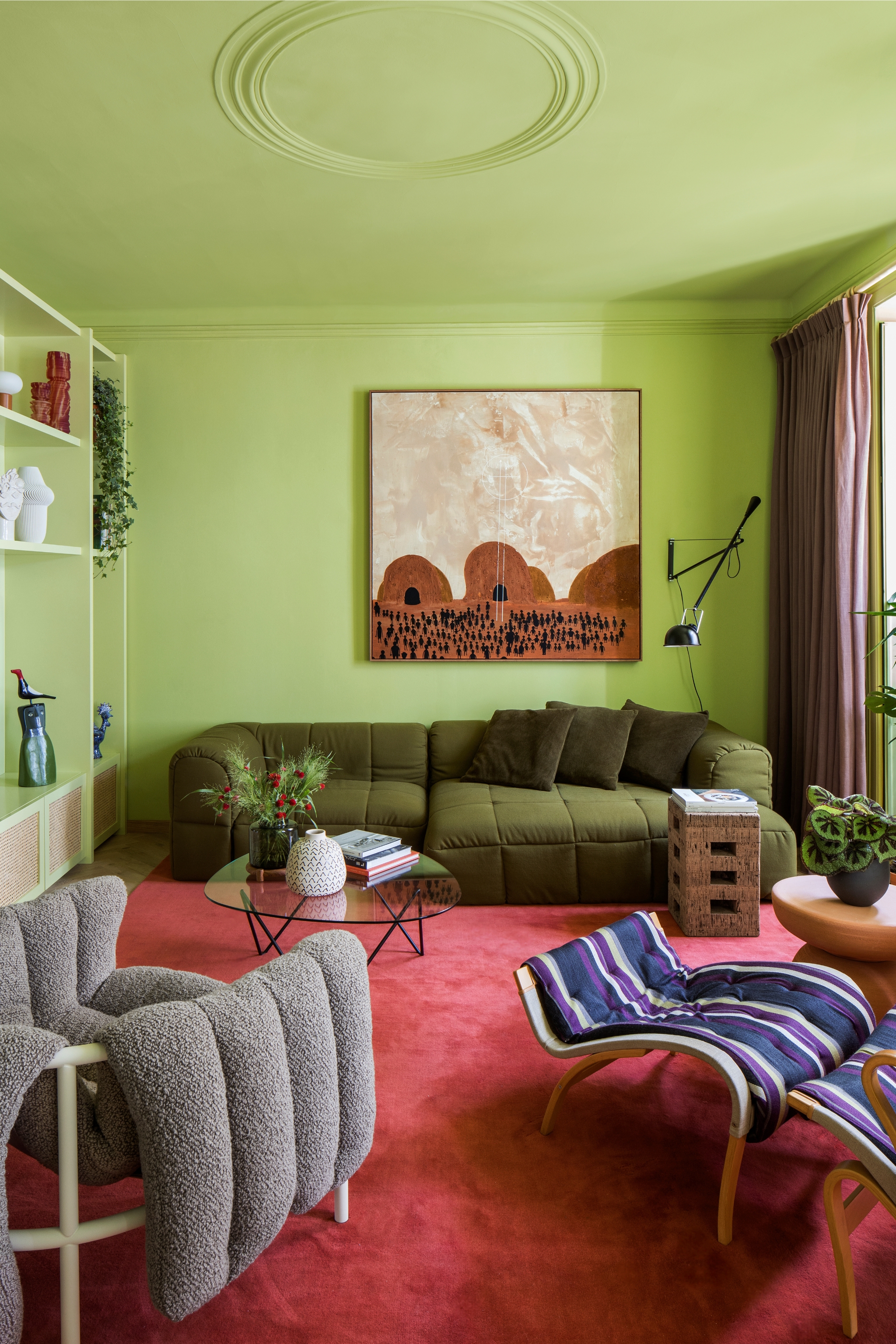
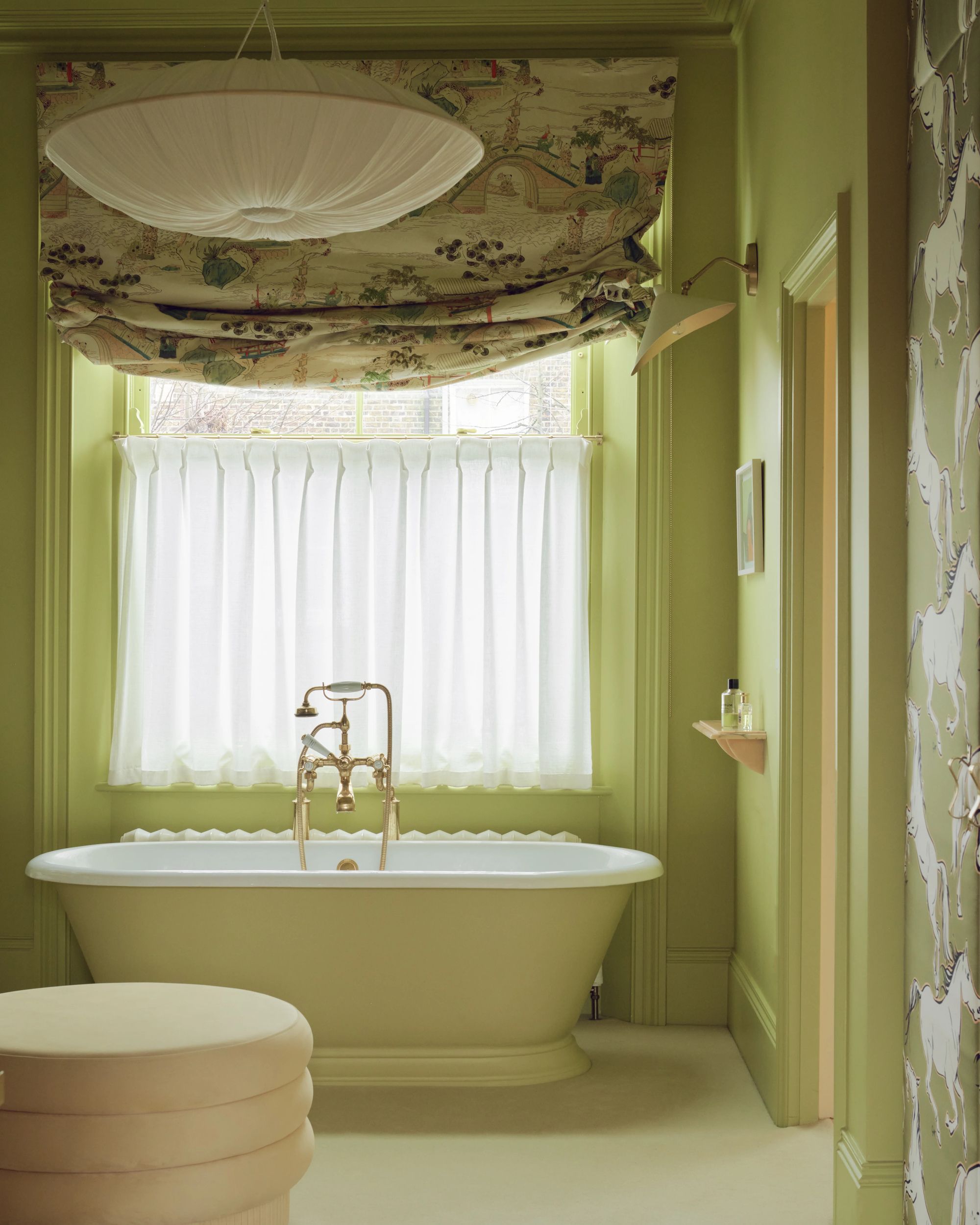
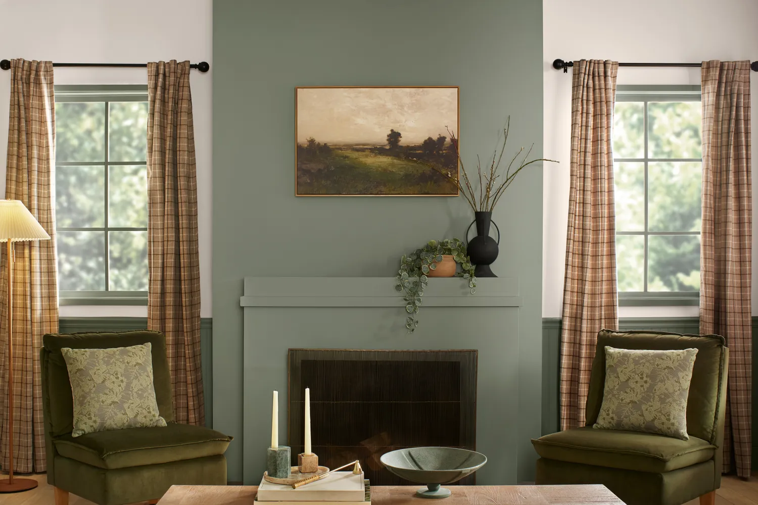
Valspar's 2026 Color of the Year, "Warm Eucalyptus," is a serene sage green with warm undertones, aiming to reflect comfort. This familiar and retro shade offers style resilience, working well on mudroom built-ins, butler's pantries, wainscoting, or the exterior of craftsman, bungalow, or Victorian homes.
Finally, Dutch Boy announced "Melodious Ivory" for 2026, a warm, buttery cream. This shade provides a soft glow, offering an alternative to stark whites. It is described as timeless and calming, with sufficient pigment to feel intentional rather than merely a neutral fill-in, suitable for kitchen millwork, sunny master bathrooms, or cozy living rooms.
#ColorOfTheYear #Pantone #HomeDecor #InteriorDesignTrends #PaintColors #Behr #SherwinWilliams #BenjaminMoore #Valspar #Krylon #ColorOfTheYear #Pantone #HomeDecor #InteriorDesignTrends #PaintColors #Behr #SherwinWilliams #BenjaminMoore #Valspar #Krylon
0 comment in total
 No comments yet
You may also like
Every 2026 Color of the Year That Has Been Announced So Far

Behr's 2026 Color of the Year Is Here—And It’s Moody

What This Sour Yellow-Green Says About Color for 2026

Update! From Evening Blue to Cinnamon Slate: See All the 2025 Colors of the Year We Know So Far

2026 Color of the Year Announcements Have This In Common
What Paint Colors Will Rule 2026? Designers Make Their Predictions
Every 2026 Color of the Year We Know So Far, From Soft Neutrals to Your New Favorite Green

What Paint Colours will Rule 2026? The Experts Make Their Predictions
Designers Say These 12 Paint Colors Will Be Everywhere in 2026

Every 2026 Color of the Year Revealed So Far—and What They Say About the Year Ahead

Bye-Bye True Blue: These Are the New Coastal Colors for 2026
According to Designers, These Are The Outdated Color Trends for 2026

The 2026 paint Colors of the Year Have Been Announced

What 2026's Colors of the Year Say About You—And All Of Us
Every Single Pantone Colour Of The Year From 2000 – 2026
Color Explosion: 2025 Color Trends


Experts Say These 5 Paint Colours Will Be Everywhere In 2026
We’re Calling It: These Are the Official Color Trends of 2025
A Guide to Every Color of the Year for 2025 (So Far)
Here's Every 2024 Color of the Year We Know So Far