1/16
9 'good weird' paint colours approved by designers
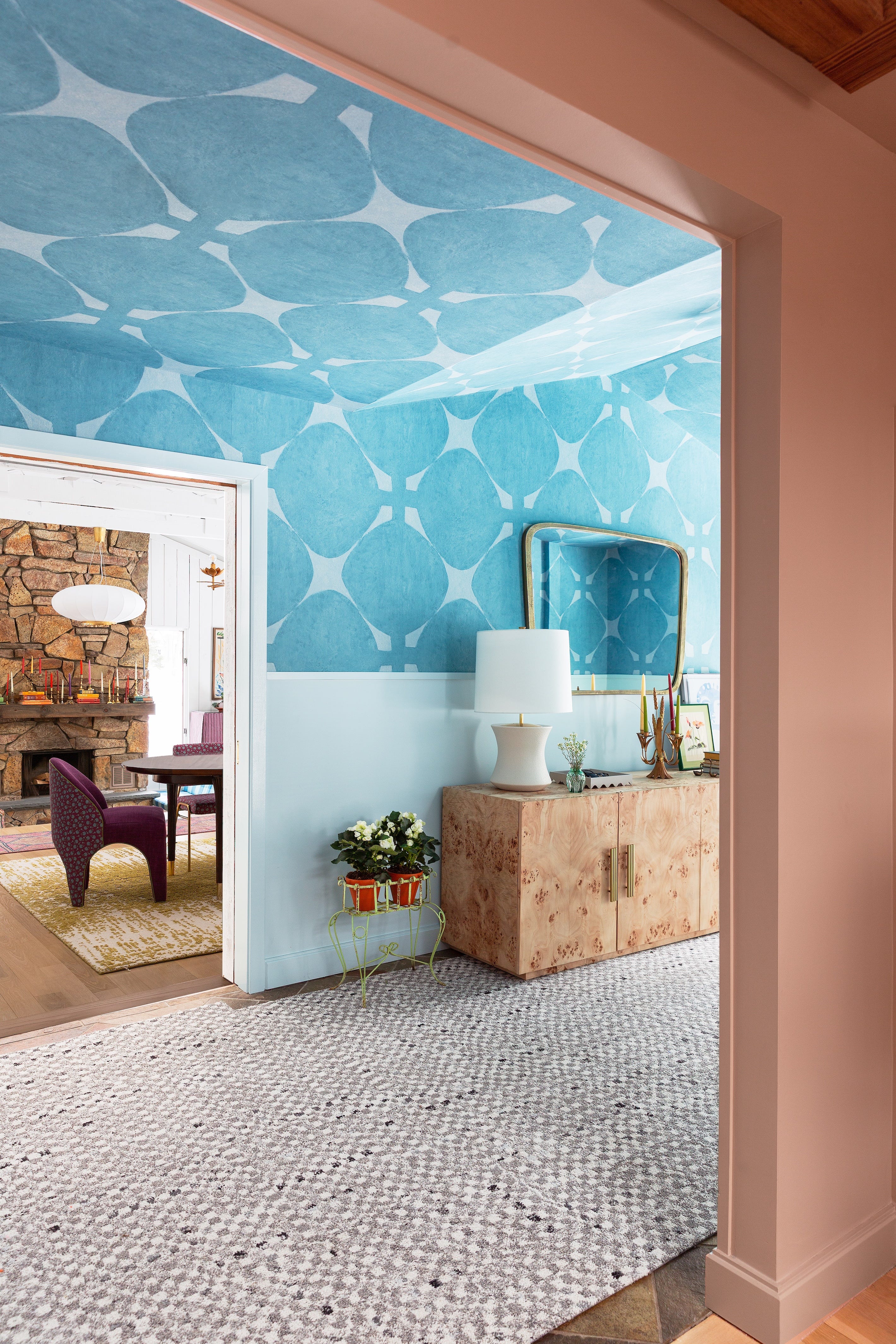
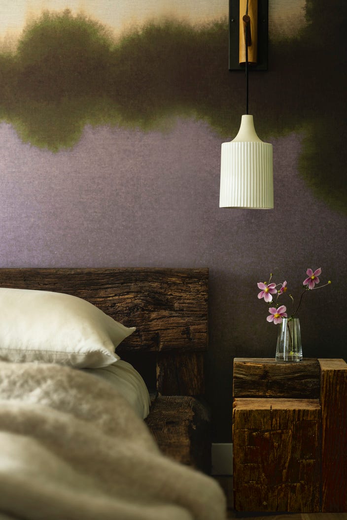
The selection of paint colors for interior spaces often leans towards safe and conventional choices, yet a growing trend among designers highlights the transformative power of 'good weird' hues. These unconventional colors are capable of injecting vitality, surprise, and playfulness into a room, and can even alter the perception of its dimensions. Ryan Brooke Thomas, founder of Kalos Eidos, defines 'weirdness' in this context not as quirky or loud, but as mysterious and unique, qualities conveyed through nuanced tones and their interaction with broader material palettes.
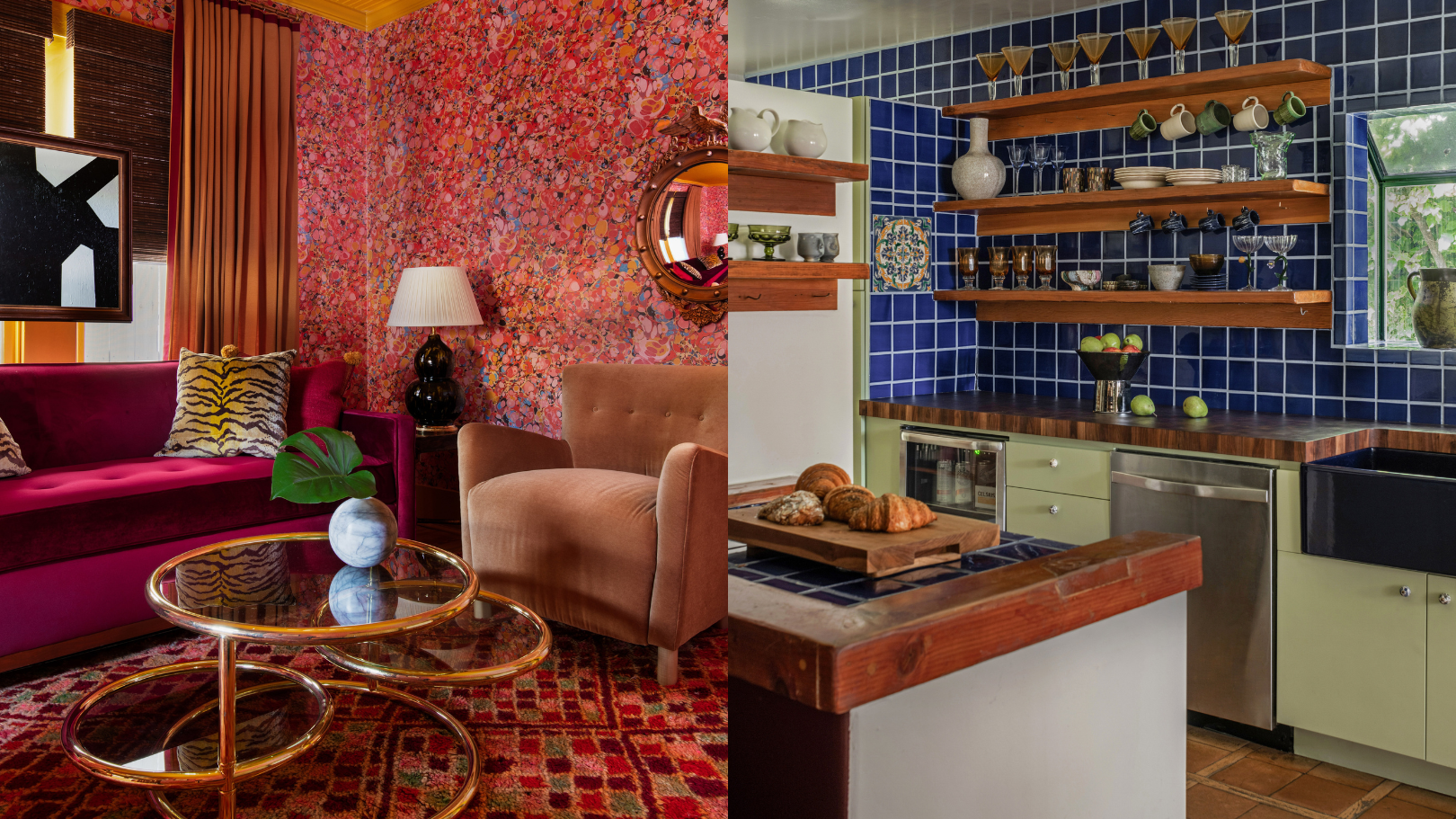
Designers share their experiences with several such 'weird' paint colors. Kristina Khersonsky of Studio Keeta, for instance, chose "The Natural Habitat" by Backdrop, a pale avocado green, for a kitchen. This choice harmoniously blended with existing cobalt blue backsplash tiles and dark walnut butcher block countertops, while still standing out playfully without being overpowering.
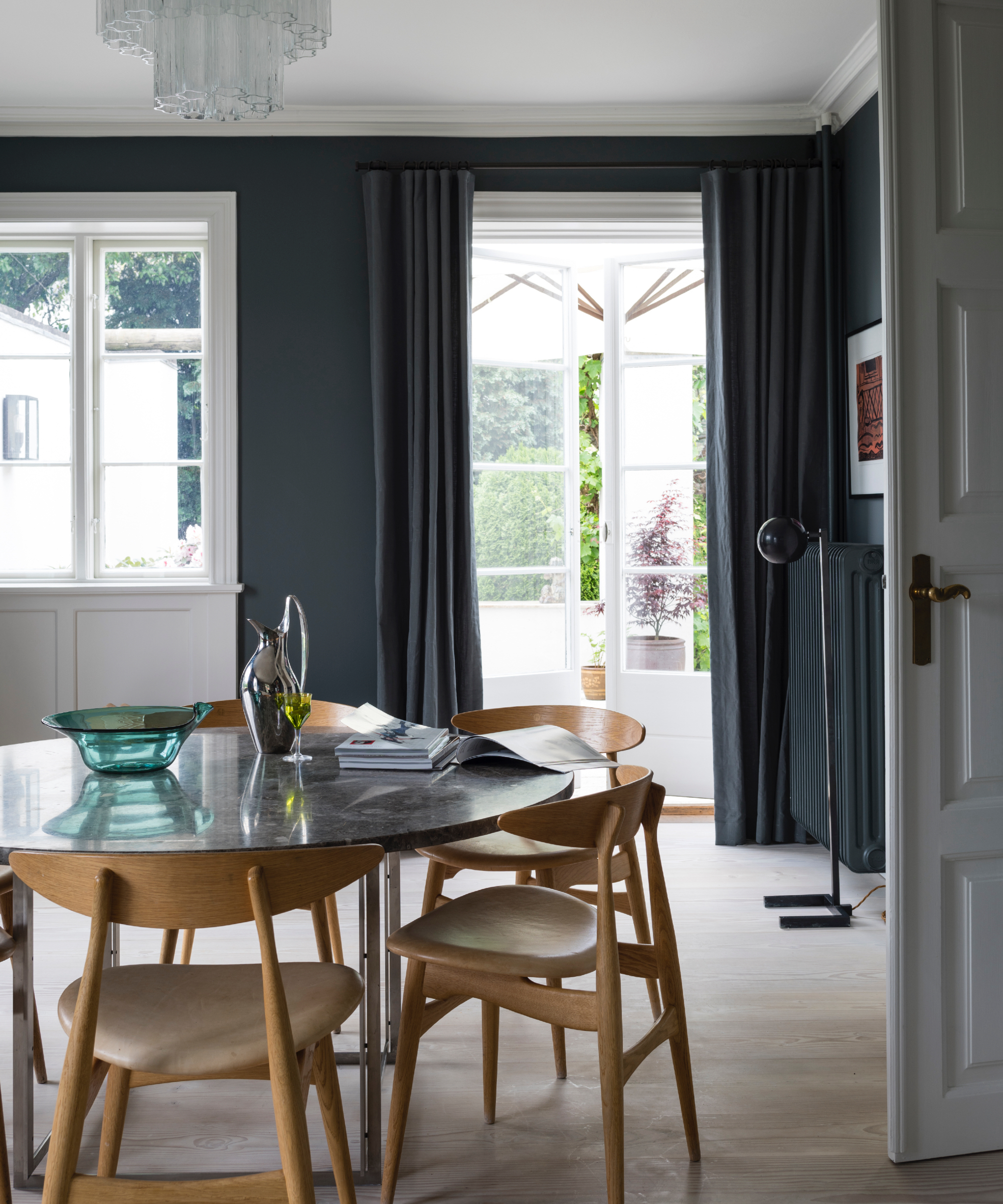
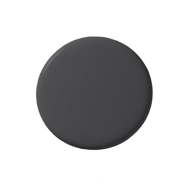
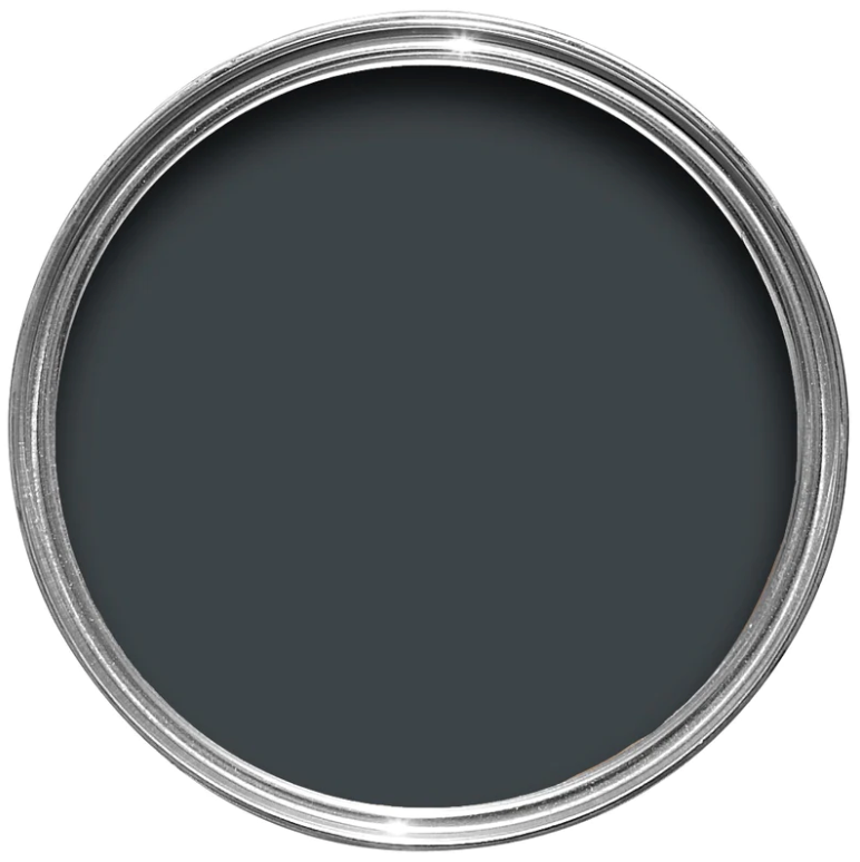
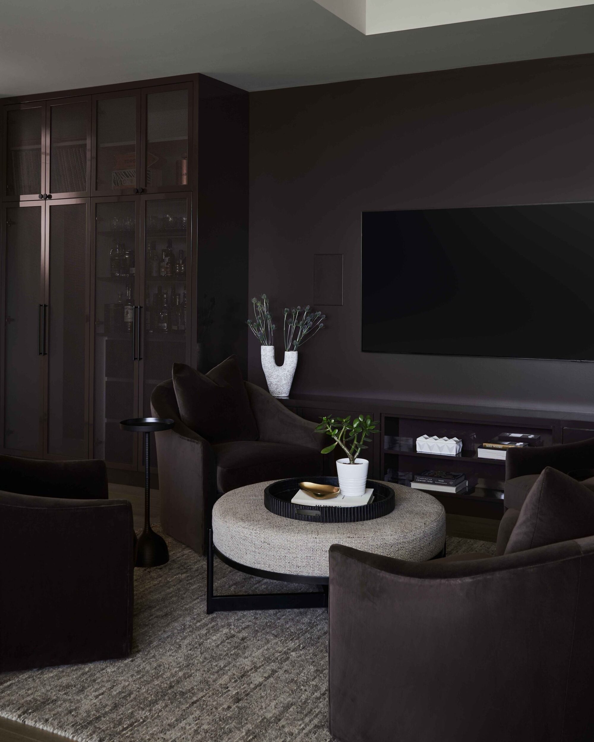
Margaret Cashman of Cashman Interiors utilized "Copper Clay" by Benjamin Moore for a ceiling, demonstrating how an orange hue, often polarizing, can introduce warmth without detracting from high-rise views. Applying it to the ceiling, paired with clean white walls, created an unexpected visual twist, allowing the vibrant orange to become a focal point. Hema Persad of Sagrada Studio embraced "Little Black Dress" by Behr Paint for her entire dining room, including the ceilings. While black is often avoided for fear of making a space seem small and dark, Persad found it created a cozy ambiance and a limitless feel, making the ceiling appear taller by obscuring its boundaries.
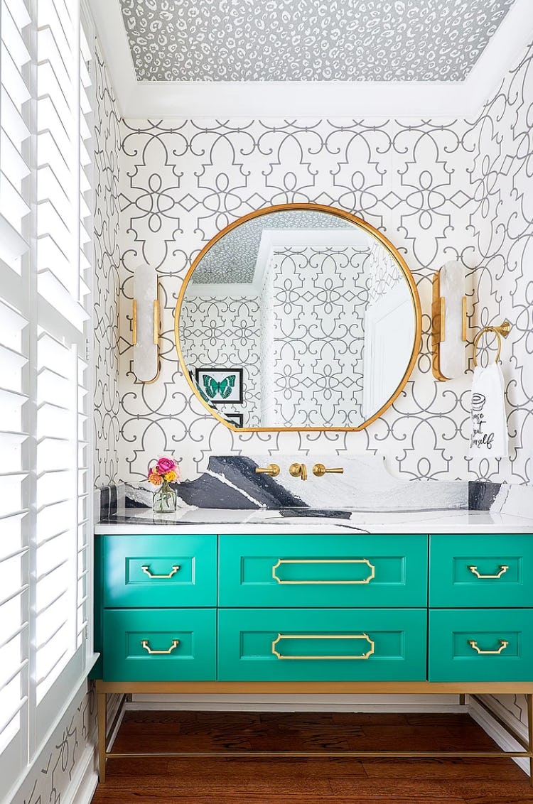
Nicole Lanteri of Nicole Lanteri Design used "New Lime" by Benjamin Moore in her Washington, DC, kitchen and living room. Starting with black-and-white terrazzo tile floors, she introduced a vibrant lemon-lime neon for lower cabinets, creating a fresh juxtaposition. Later, she extended this color to the living room fireplace, proving its ability to add a sharp, fun contrast against moodier tones and consistently deliver delight. Emma Beryl of Emma Beryl Interiors opted for "Negroni" by Backdrop, a bright red, in a powder room. This bold choice, paired with a dark tropical wallpaper, created a fun and moody atmosphere, demonstrating the freedom to experiment with color in smaller, less frequently used spaces.
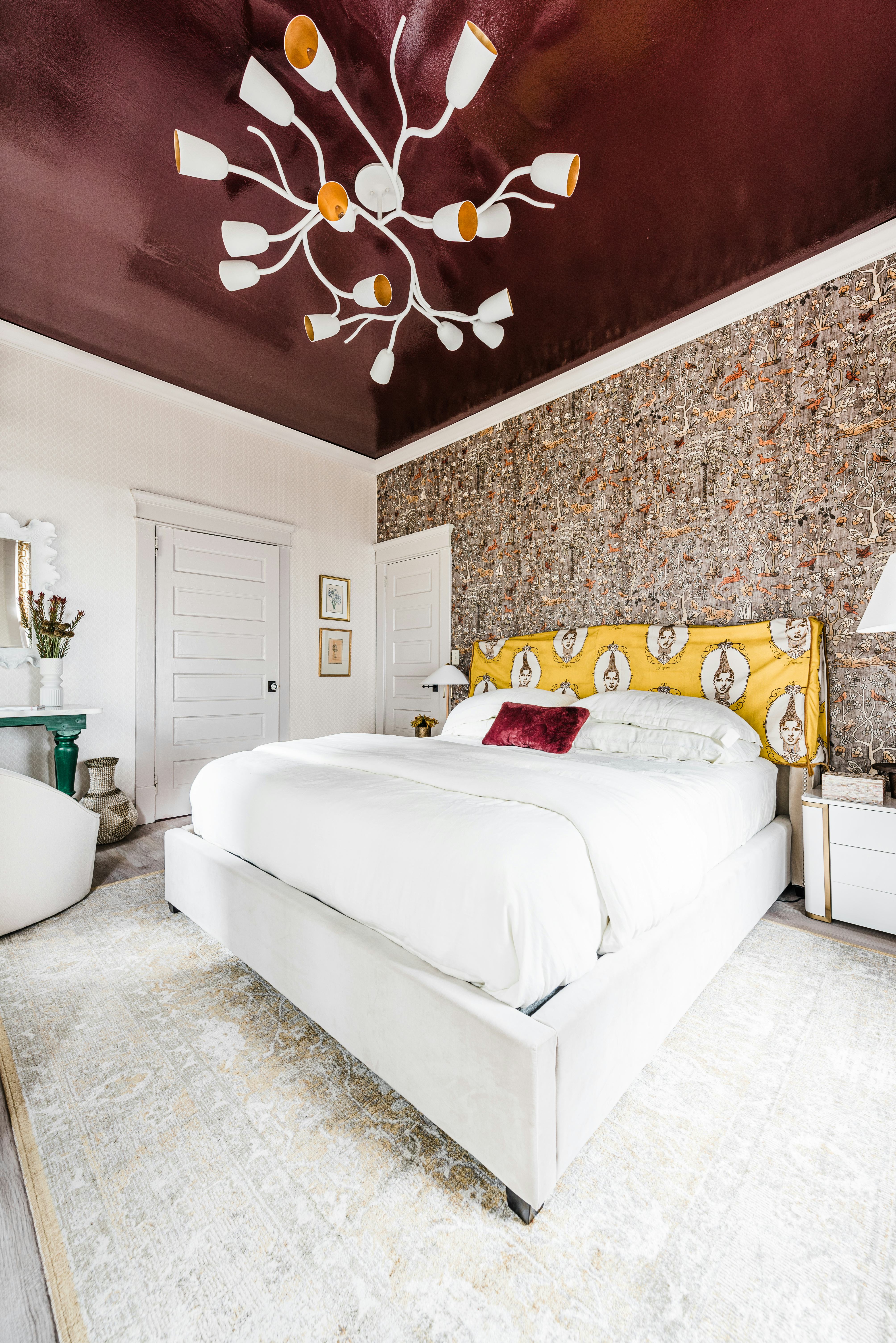
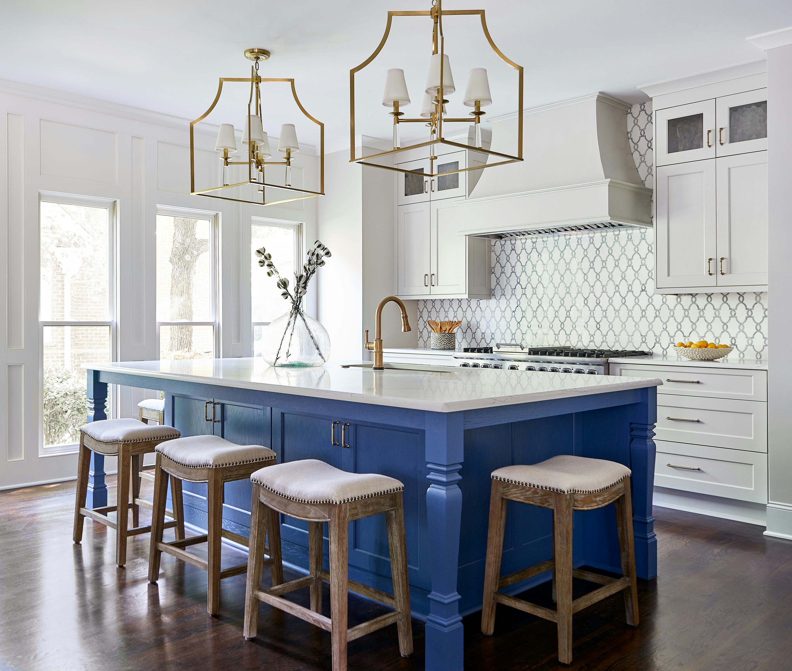
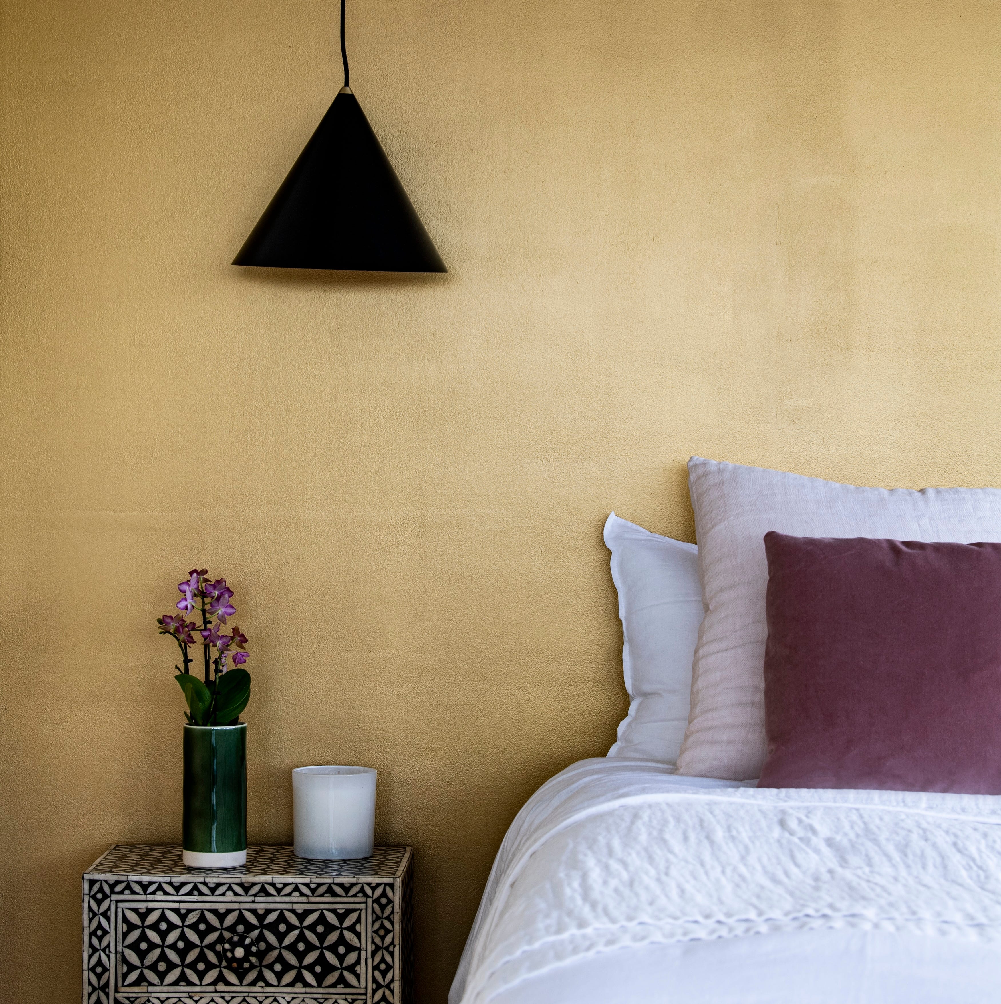
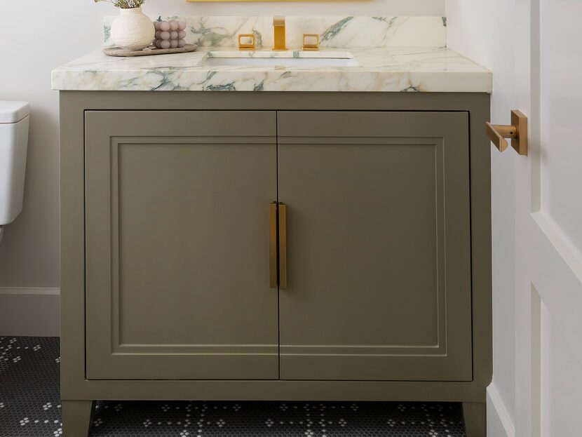
Kristine Renee and Deborah Costa of Design Alchemy praised "Bamboozle" by Farrow & Ball, a punchy red that commands attention. They used it on windows, doors, and a built-in bar, finding its name perfectly captured its vibrant and attention-grabbing effect. Ryan Brooke Thomas, from Kalos Eidos, selected "Refined Green" by Dunn-Edwards for a kitchen. This unusual ocean-blue-green tone, when placed alongside black elements, offered a pop of color while maintaining visual anchor and adding depth. Leah Ring of Another Human chose "14 Carrots" by Benjamin Moore for a dining room, fulfilling a client's desire for a bold and vibrant space. She balanced the bright orange walls with elegant cornflower blue curtains, creating a cohesive yet lively palette. Lastly, Sarah Stacey of Sarah Stacey Interior Design incorporated "Auric" by Sherwin-Williams on the ceiling of a west-facing sitting room in a Texas hotel. This golden hue complemented a red marbled wallpaper, washing the room in rich tones and evoking a permanent 'golden hour' feel, despite initial comparisons to mustard.
These examples illustrate that bold and unconventional paint choices can significantly enhance interior spaces, creating unique atmospheres and challenging traditional design norms.
#Decorating #HomeDecorIdeas #DIYHomeDecor #PaintColors #InteriorDesign #UnconventionalColors #DesignTrends #LivingRoom #KitchenDesign #Decorating #HomeDecorIdeas #DIYHomeDecor #PaintColors #InteriorDesign #UnconventionalColors #DesignTrends #LivingRoom #KitchenDesign
0 comment in total
 No comments yet
You may also like
These Unusual Paint Colors May Not Be An Obvious Choice, But Designers Can’t Get Enough

7 Most Underrated Paint Colours, According To Colour Experts

Britain's best interior designers on the paint colours you just can't go wrong with
7 Paint Colors Designers Totally Regret Using (and What They Wish They’d Used Instead)


7 of the most versatile and easy to use paint colors according to designers

9 Best Interior Paint Colors

9 Ceiling Paint Colors Designers Love That Aren’t White

7 best dark paints loved by interior designers
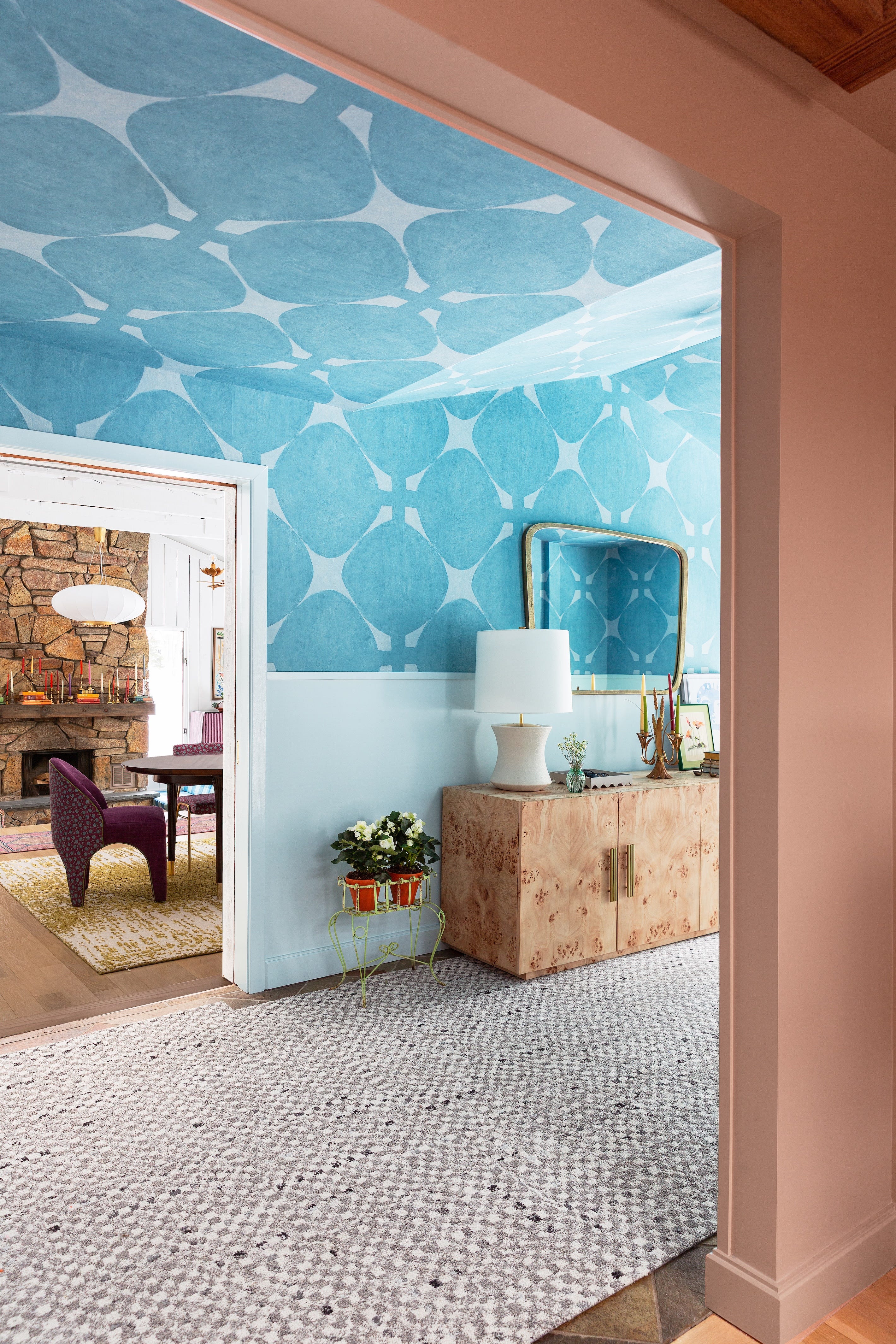
Designers Say These Unusual Paint Color Combos Will Transform Your Home

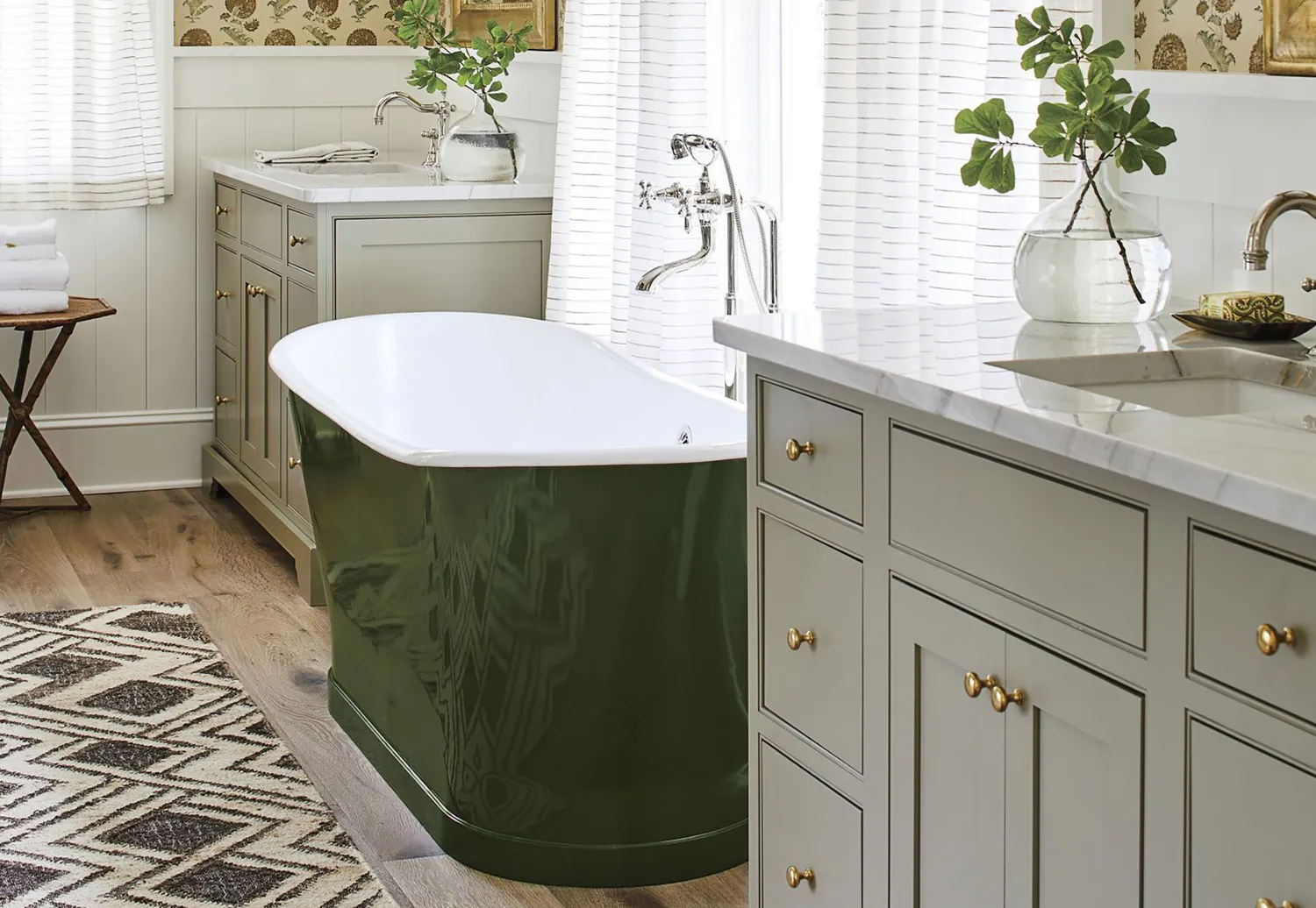
10 Greige Paint Colors Designers Recommend Again And Again
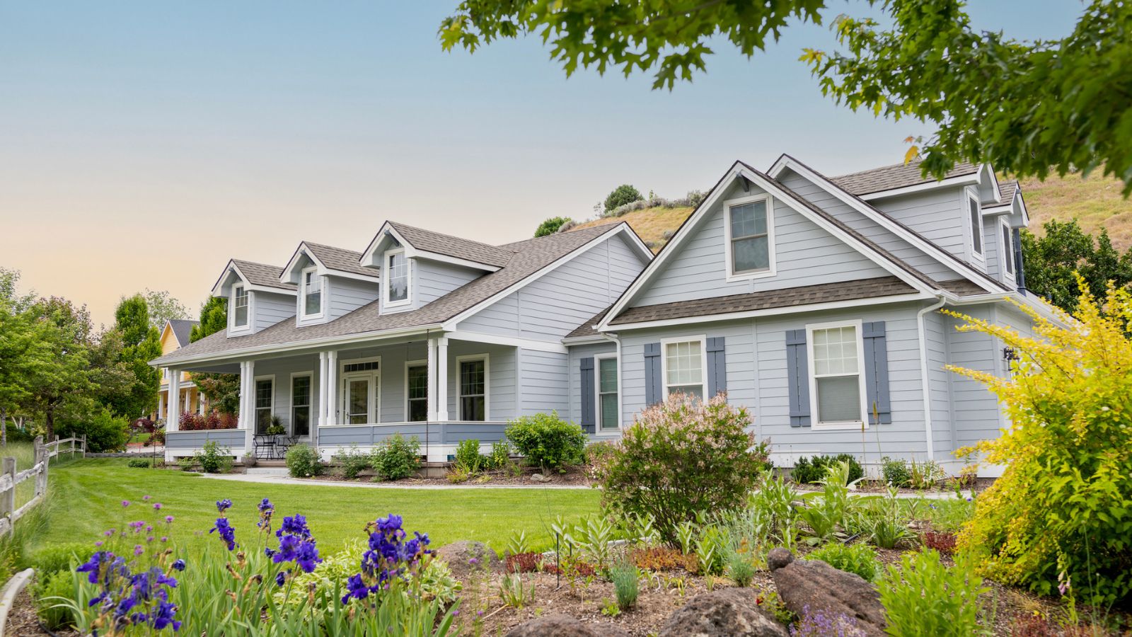
10 of the best exterior paint colors according to designers – these are the go-to shades from tried and trusted brands
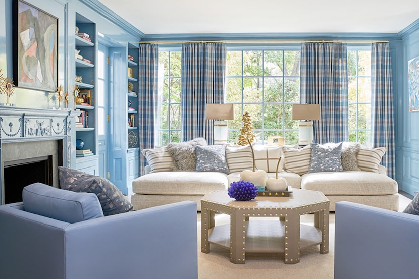
19 go-to paint colors that Dallas designers love
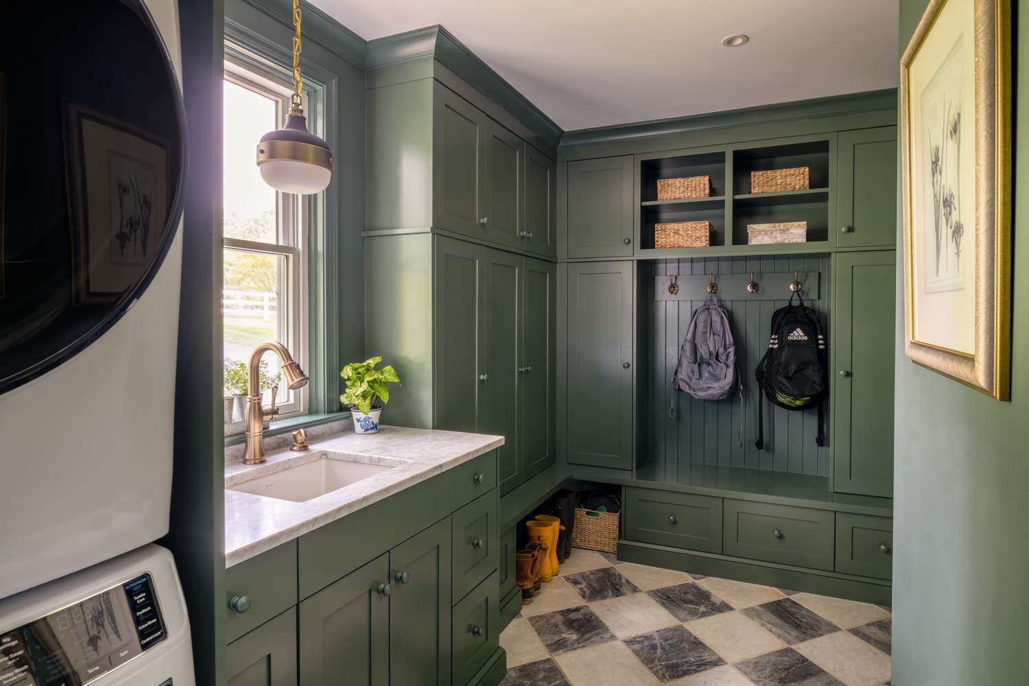
Tired of Touch-Ups? These 9 Paint Colors Are Forgiving and Designer-Approved

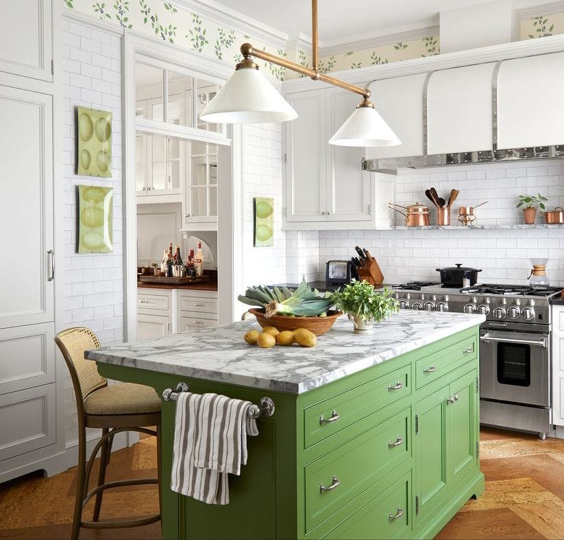
It’s Official: These are the Best Kitchen Paint Colors, According to Designers
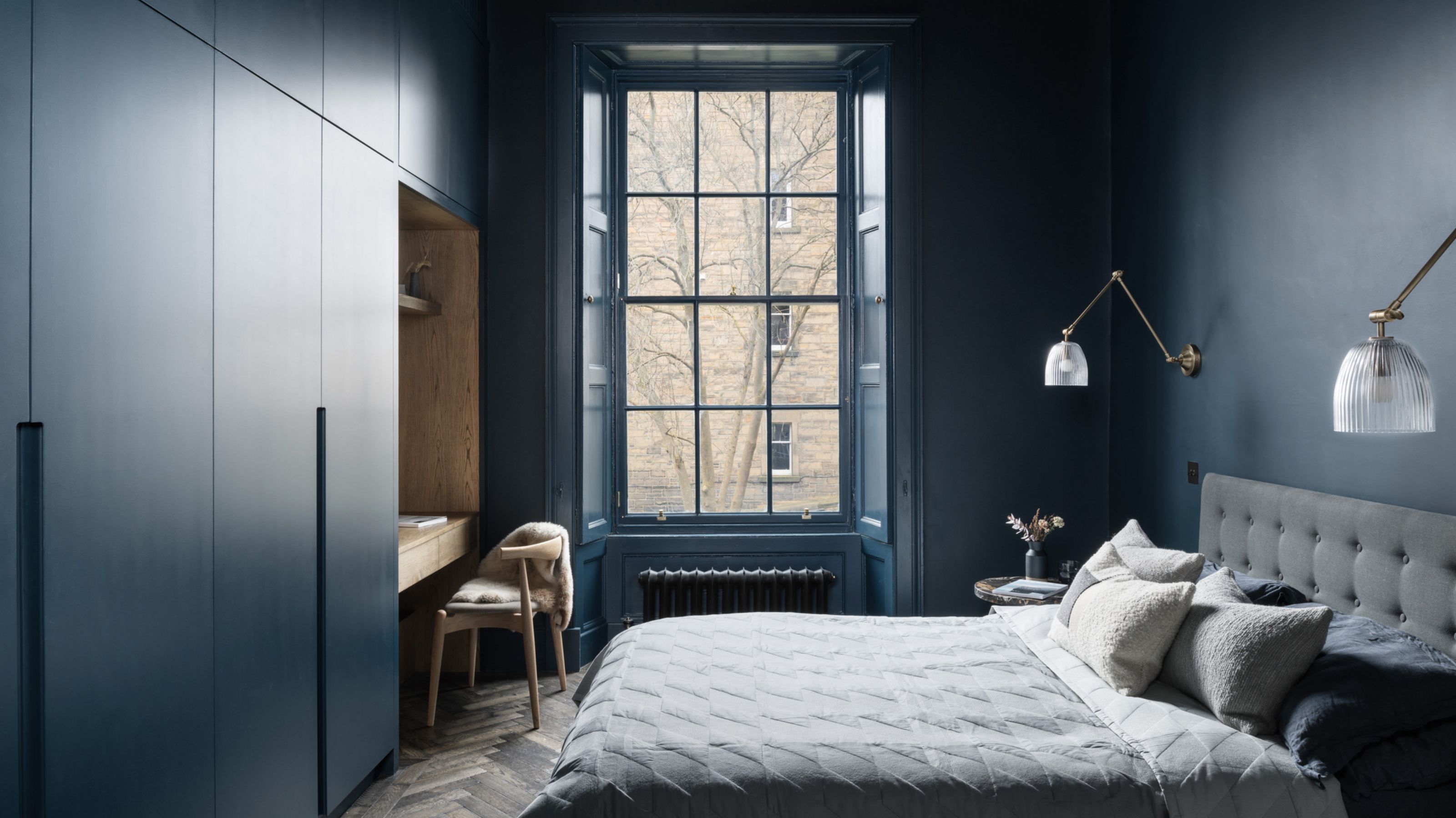
6 Dark Paint Colors That Designers Use to Bring Glamour

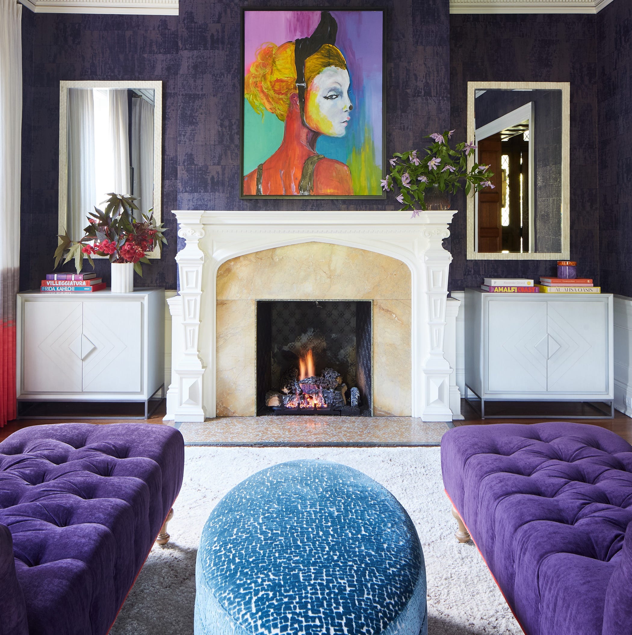
Designers LOVE Pairing These Unexpected Colors With This Sophisticated Hue
The Best Exterior Paint Colors Designers Have Ever Used


The most timeless paint colors according to designers

An A-List Designer’s Secrets To Picking Perfect Paint Colors
The Best Exterior Paint Colors, According To Designers