1/7
Designers Say These Vintage Paint Colors Are Back
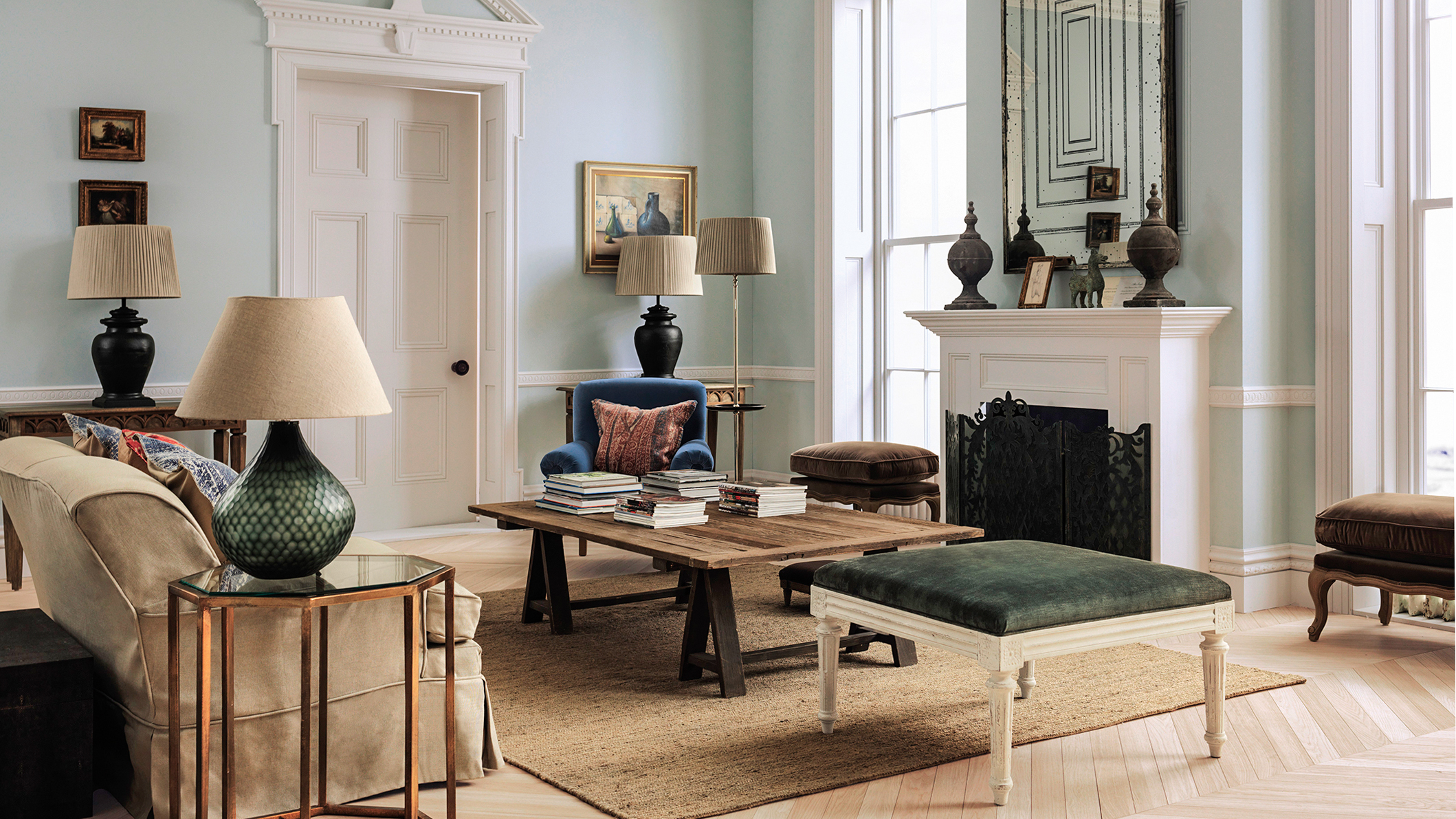
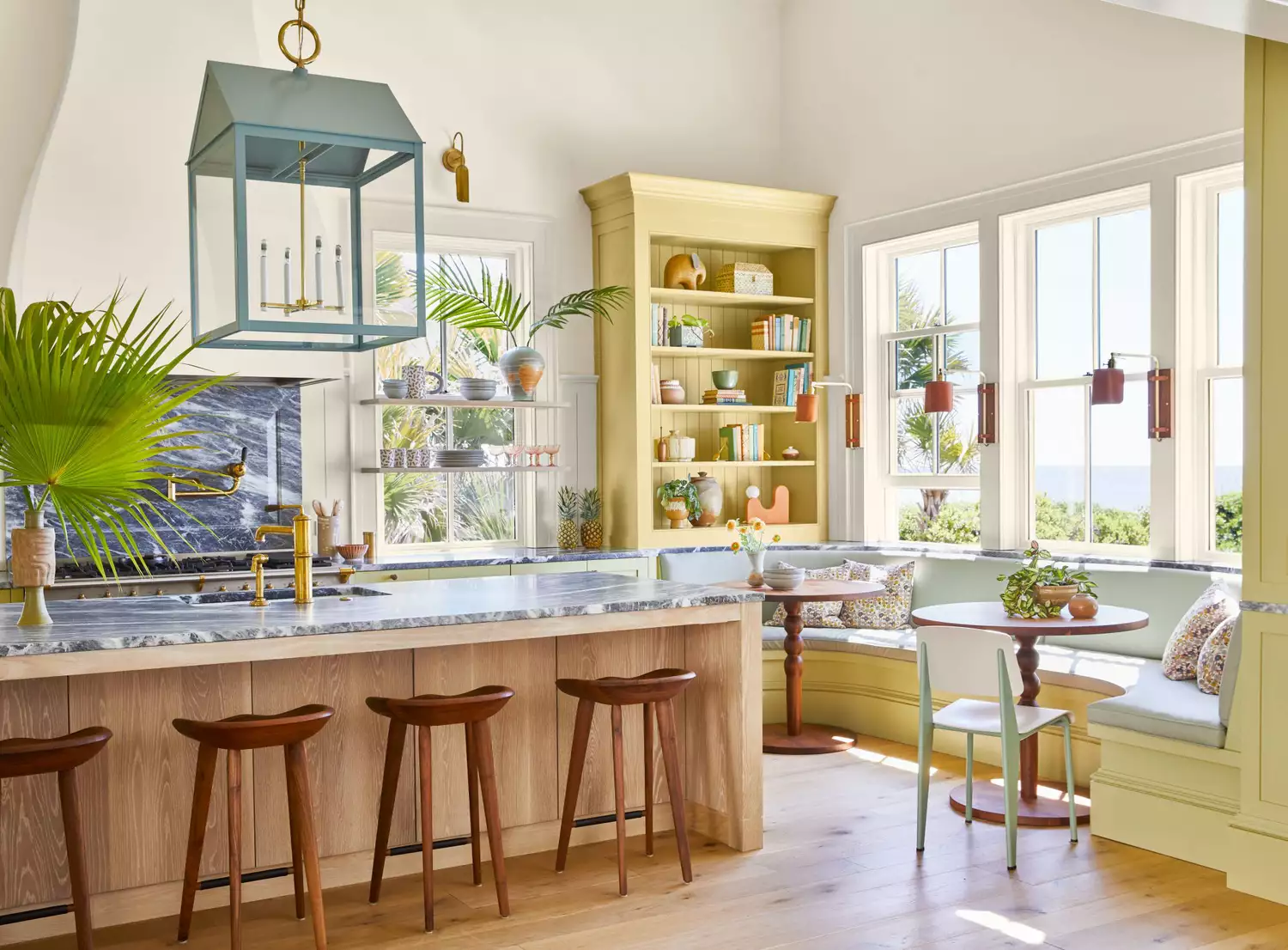
The article explores the resurgence of vintage paint colors in home design, according to various interior designers. It highlights how classic tones, ranging from vibrant jewel tones to subdued neutrals, are making a significant comeback, offering timeless appeal to modern homes. The discussion begins by acknowledging the broader trend of retro design elements re-entering style and specifically focuses on paint colors. The piece categorizes these popular vintage hues into several groups: green tones, deep plums, greige, blues, and creams/warm whites, providing expert insights and specific paint recommendations for each.
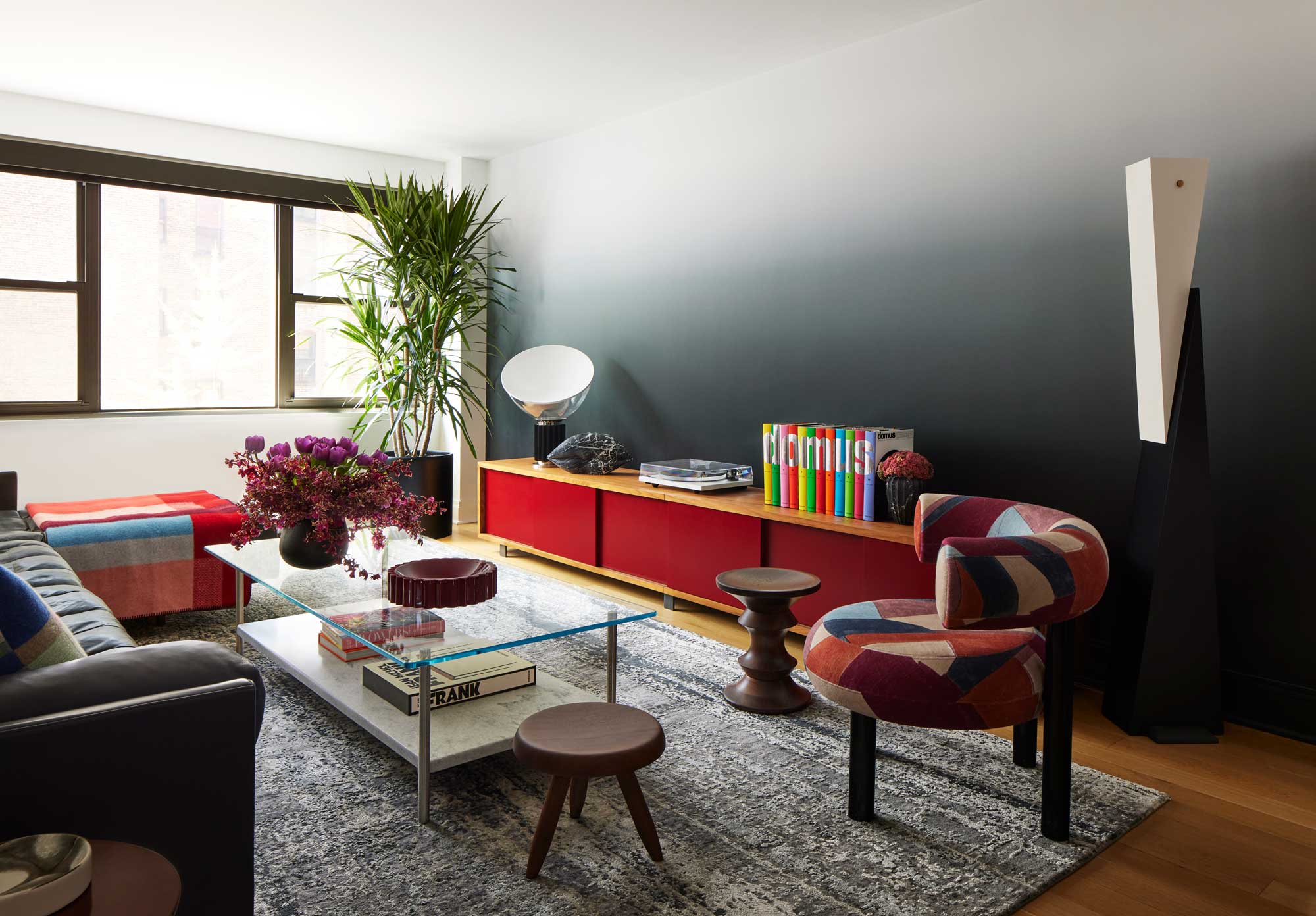
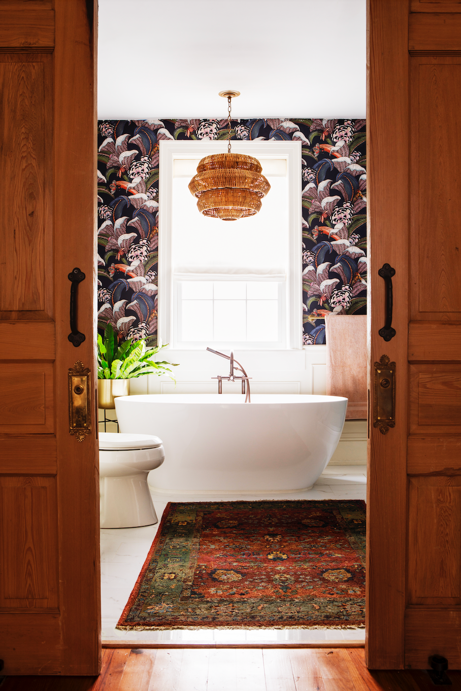
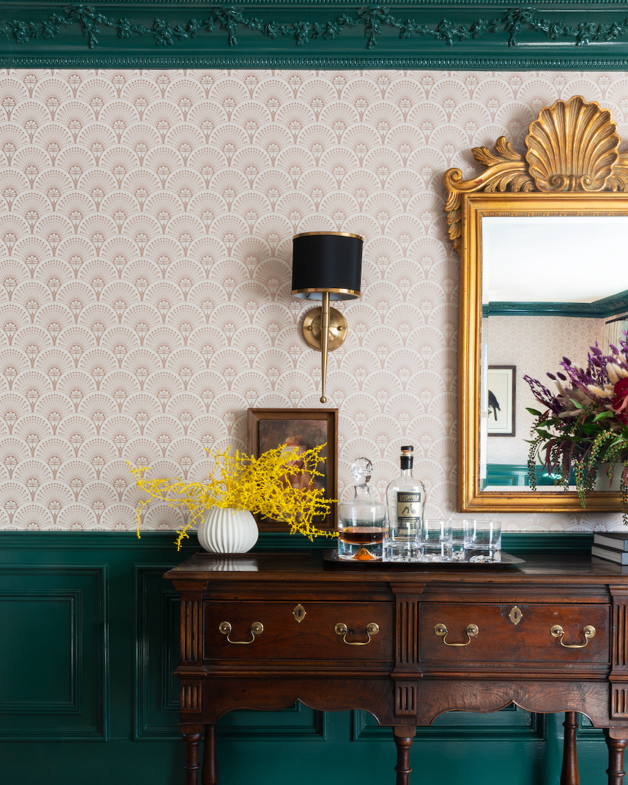
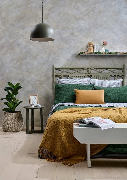
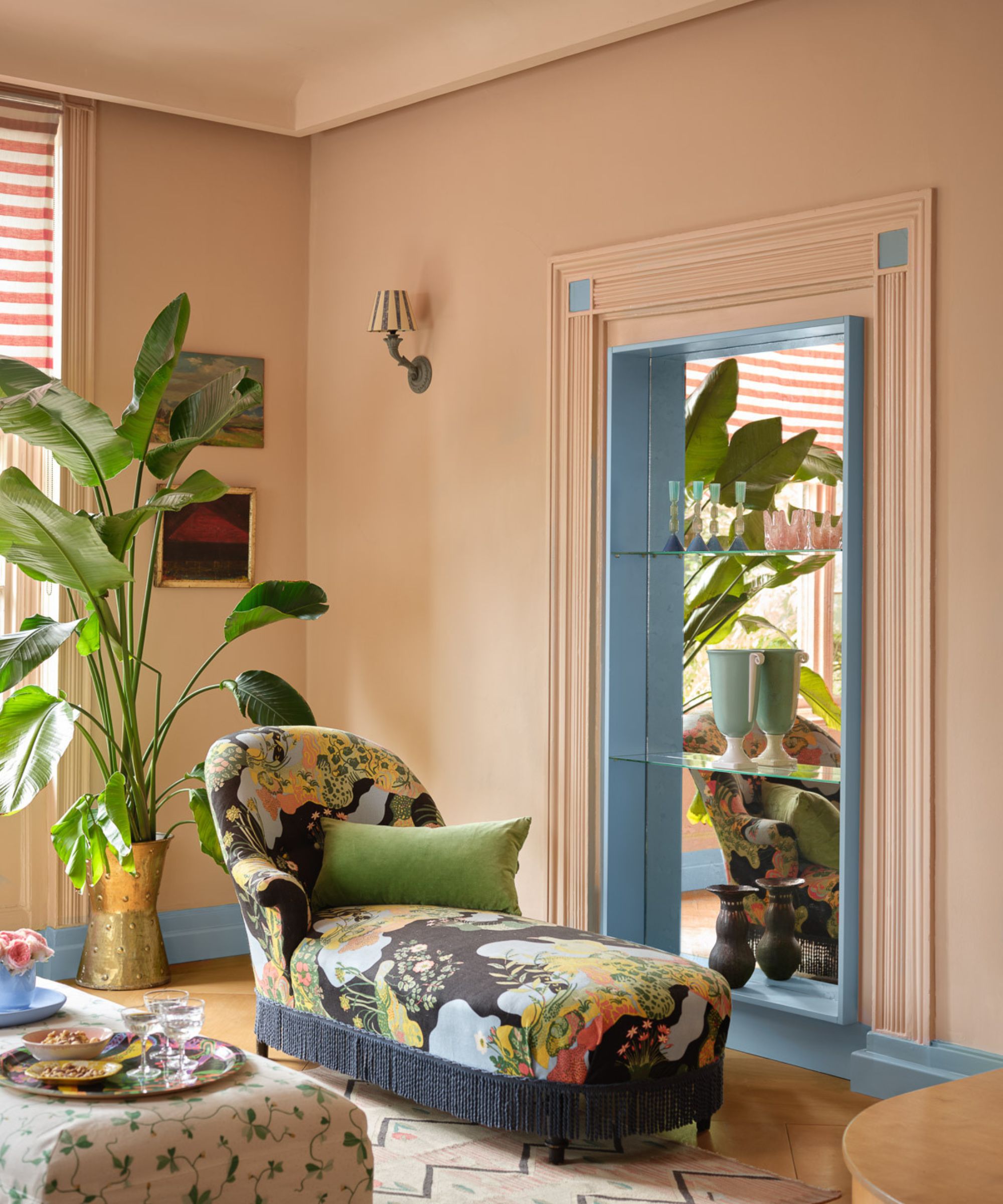
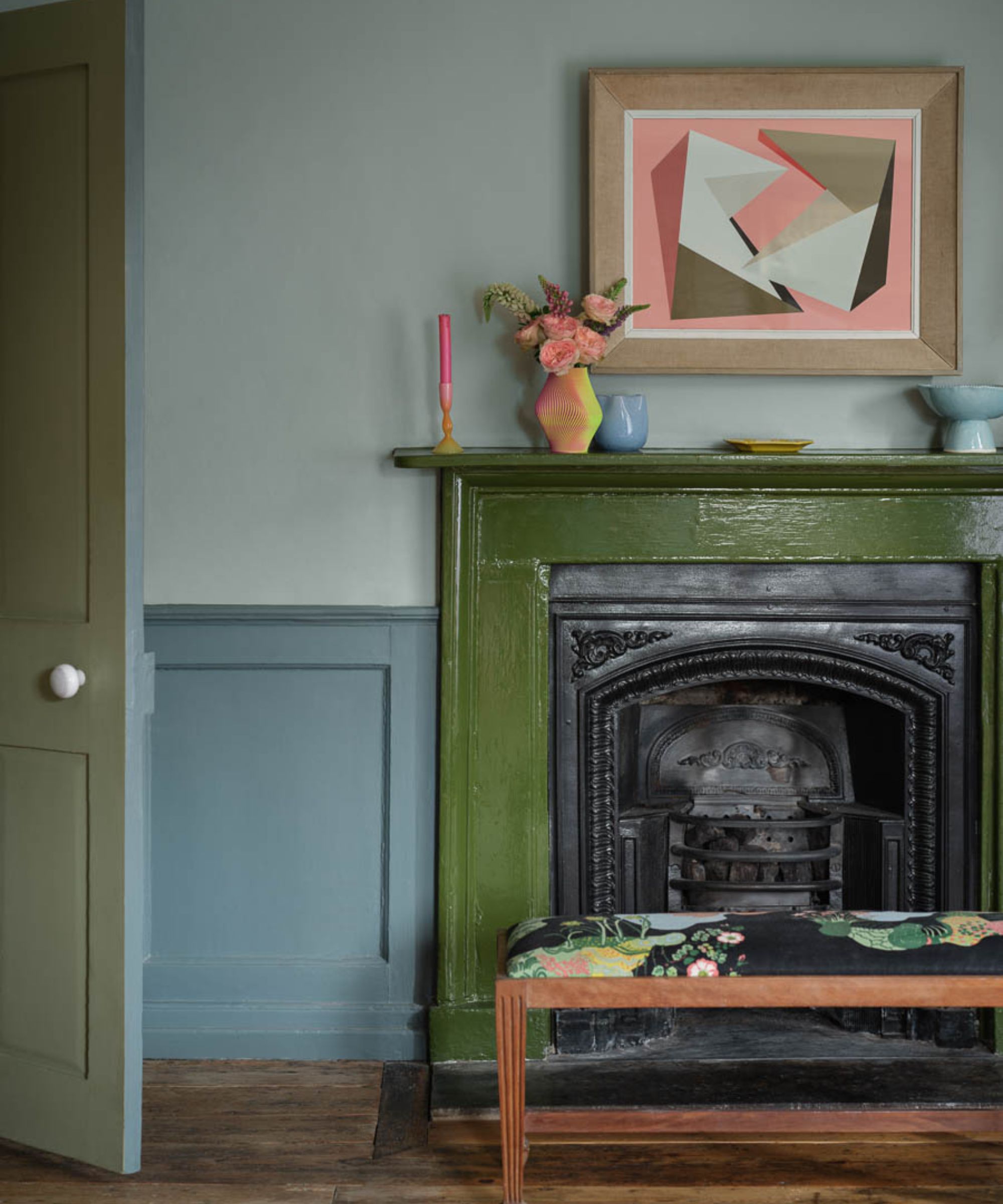
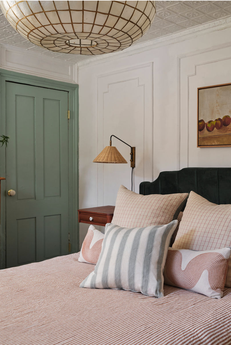
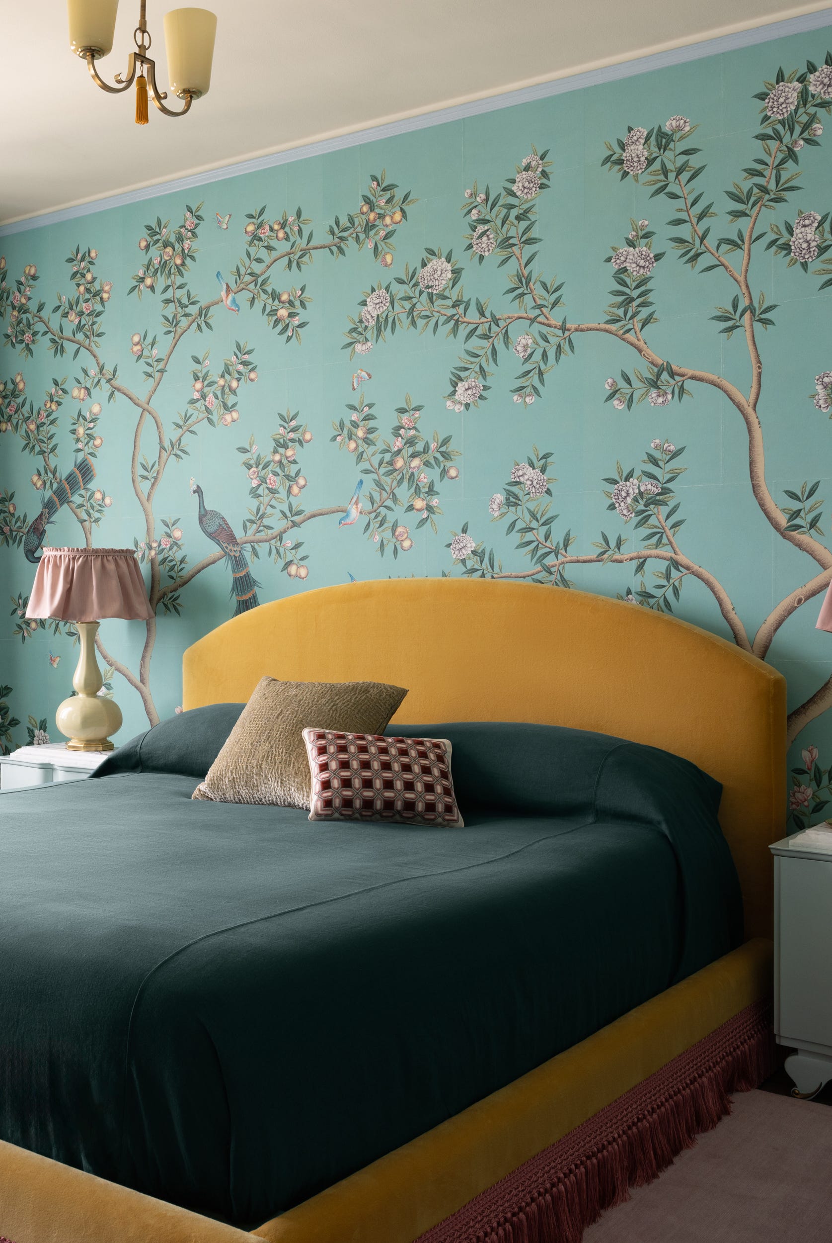
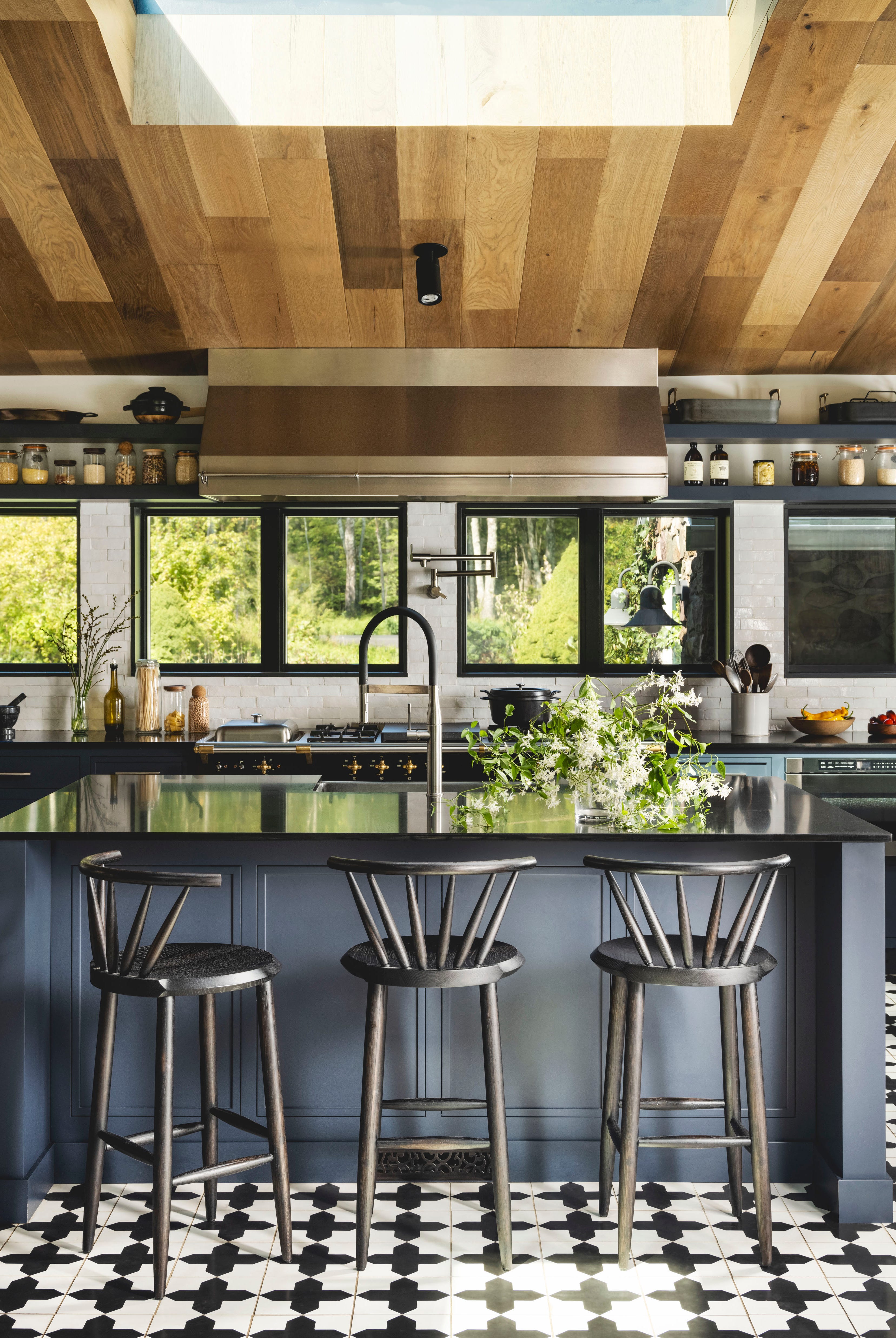
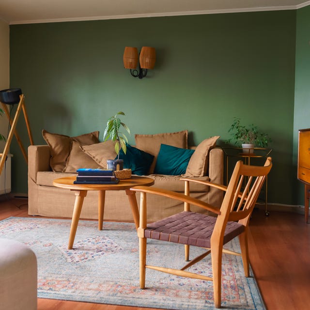
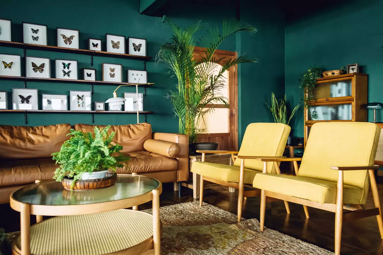
Green tones are presented as a staple of historic interiors, echoing nature and complementing various materials without appearing overtly trendy. Designers suggest shades from moody forest greens to olive hues for a vintage touch. Specific recommendations include Benjamin Moore's Saybrook Sage for a soft, olive-toned green with historic depth, and Sherwin-Williams' Rosemary for a deep, moody green suitable for pantries and home offices. The article also mentions forest and Kelly greens, noting their 80s popularity and suitability with wood and cream colors, and suggests pairing dark green with light blue for a fresh look. Farrow & Ball's Green Smoke, a smoky color with a hint of blue popular in late 19th-century interiors, is also highlighted for color-drenching rooms.
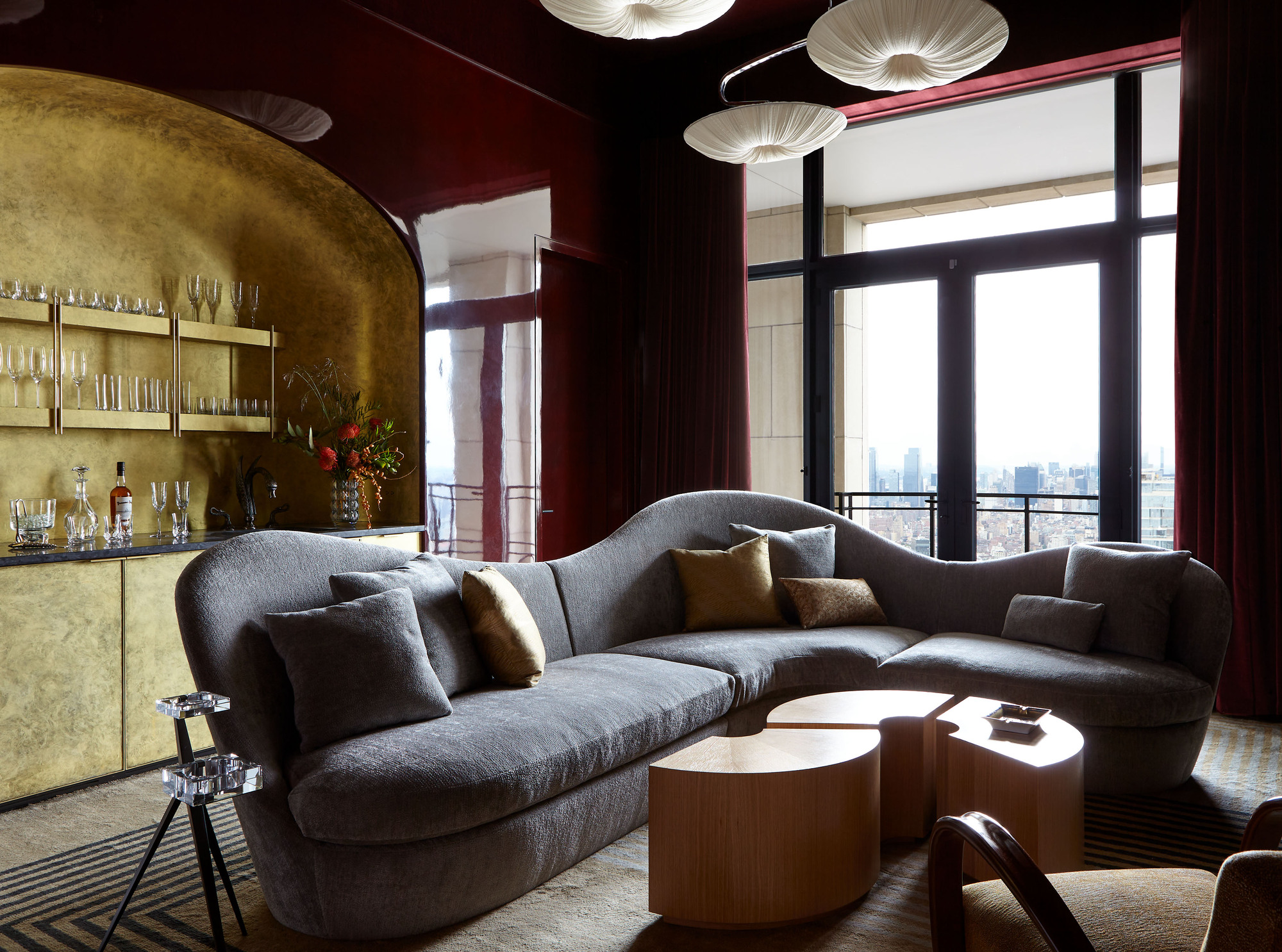
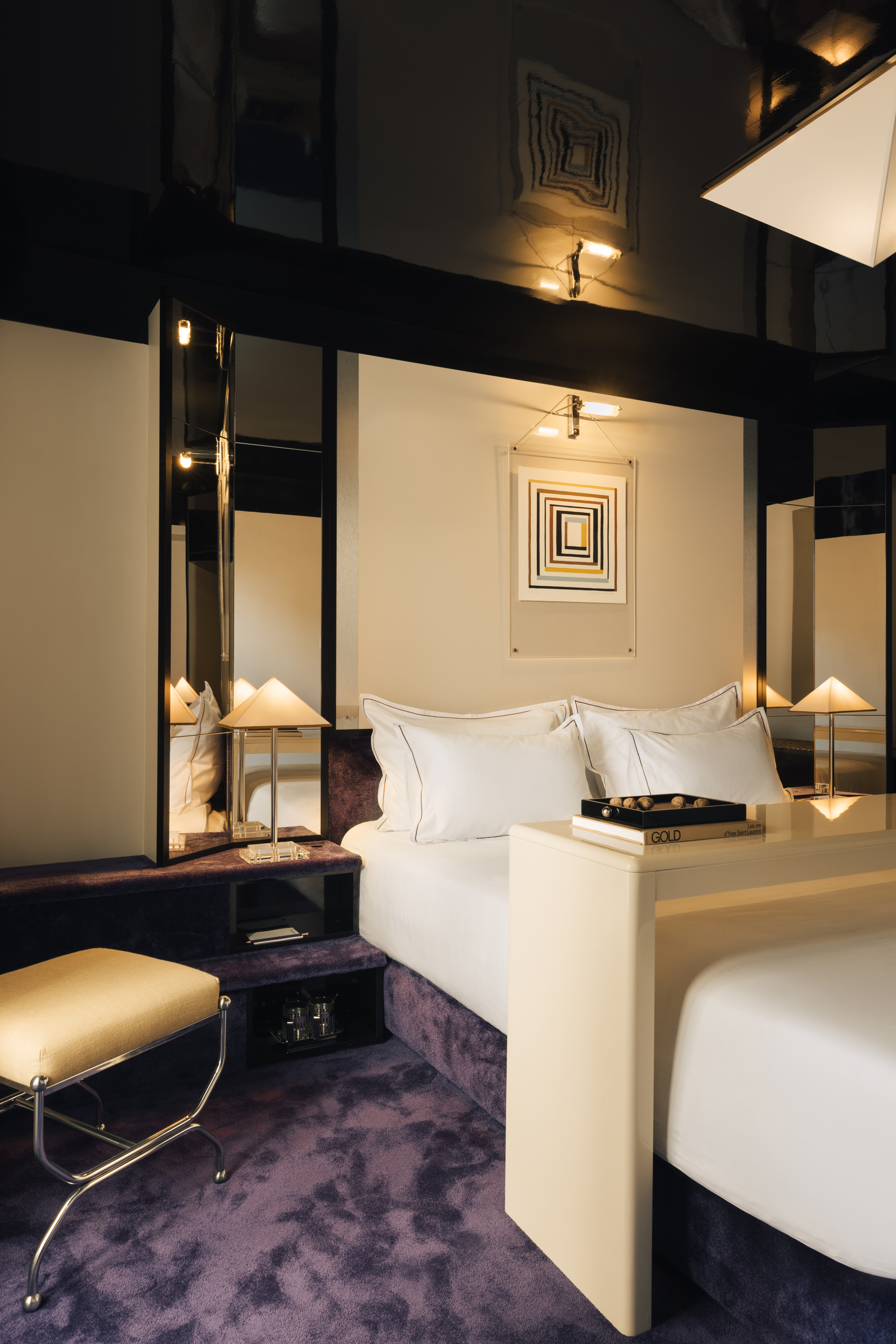
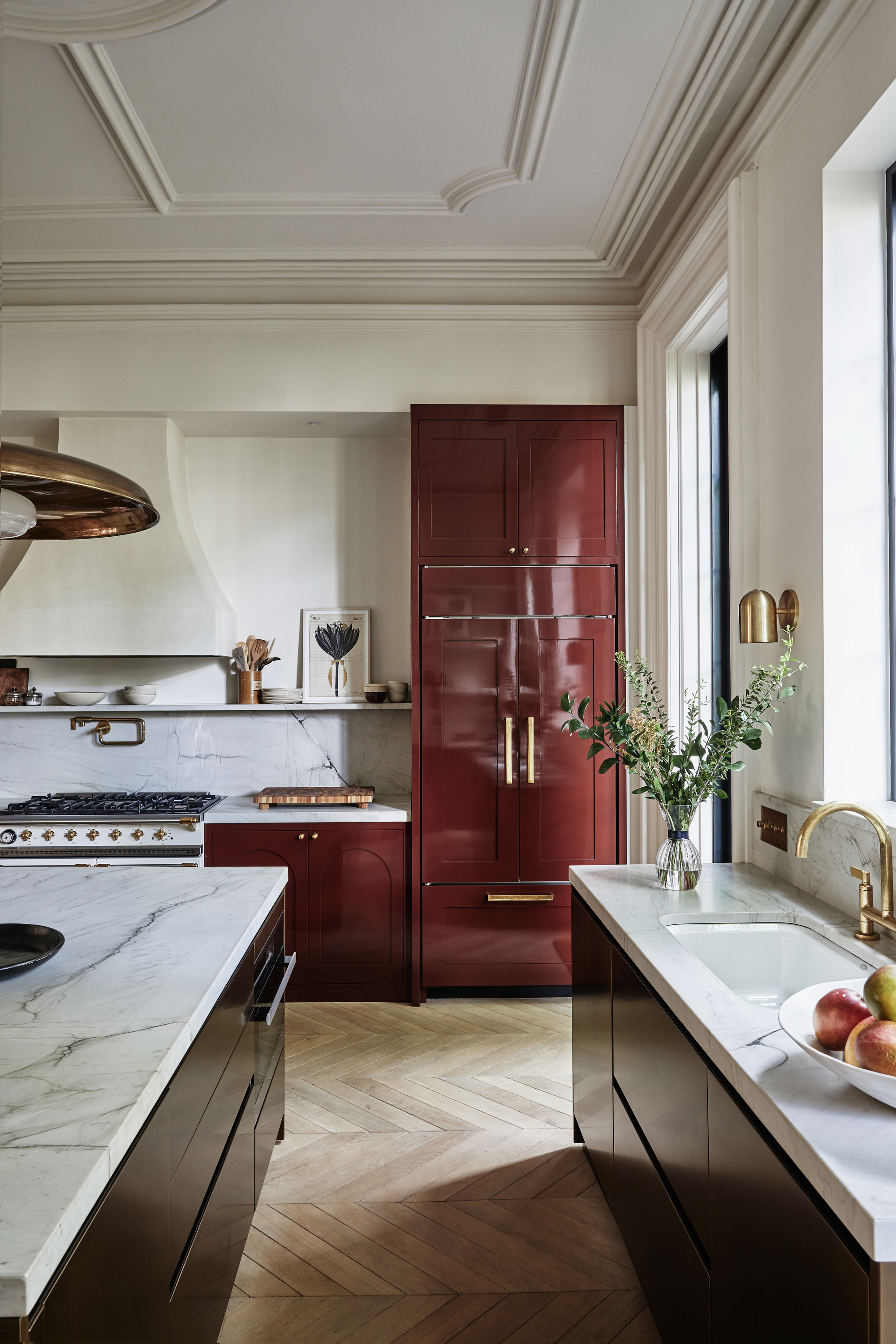
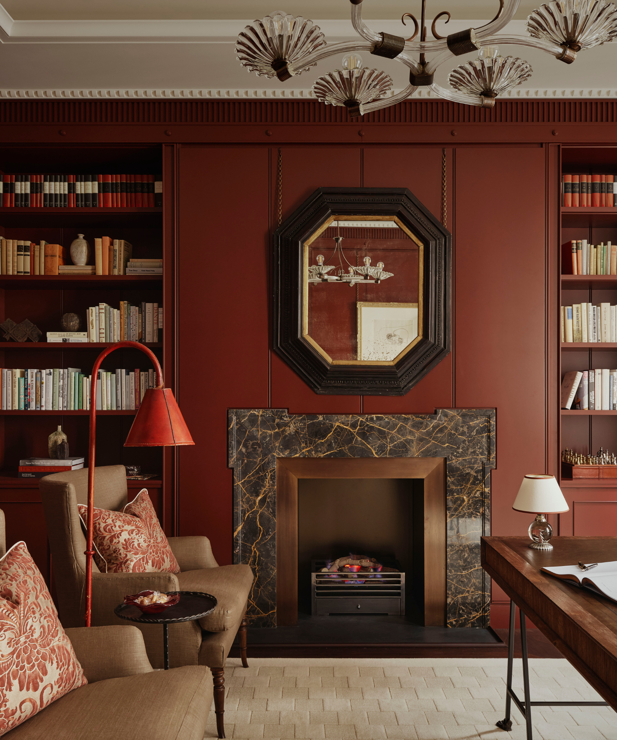
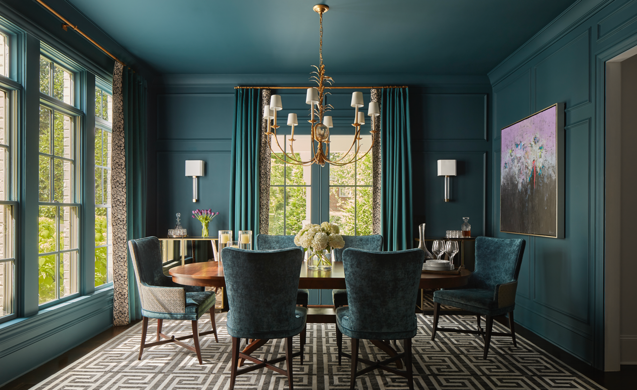
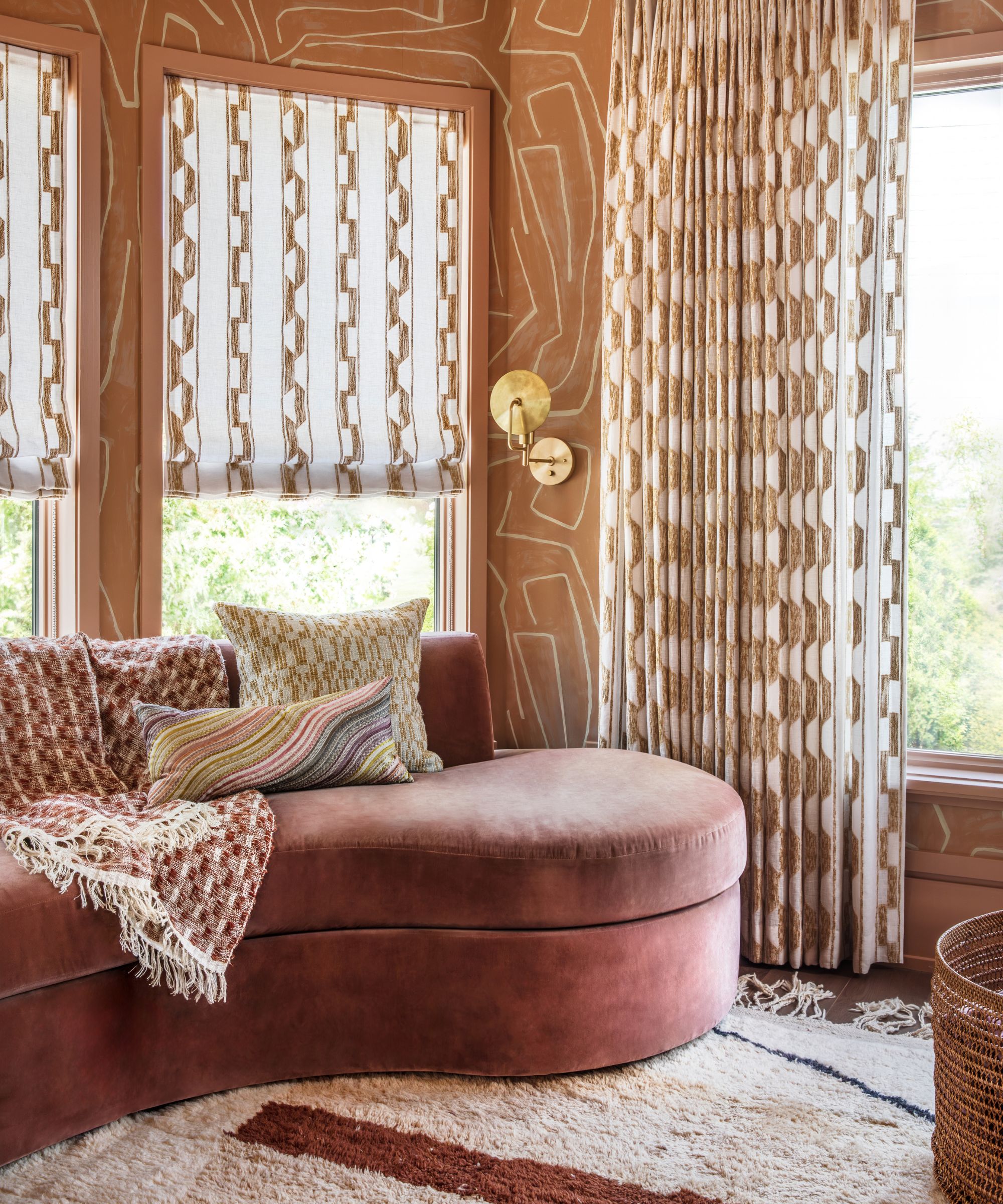
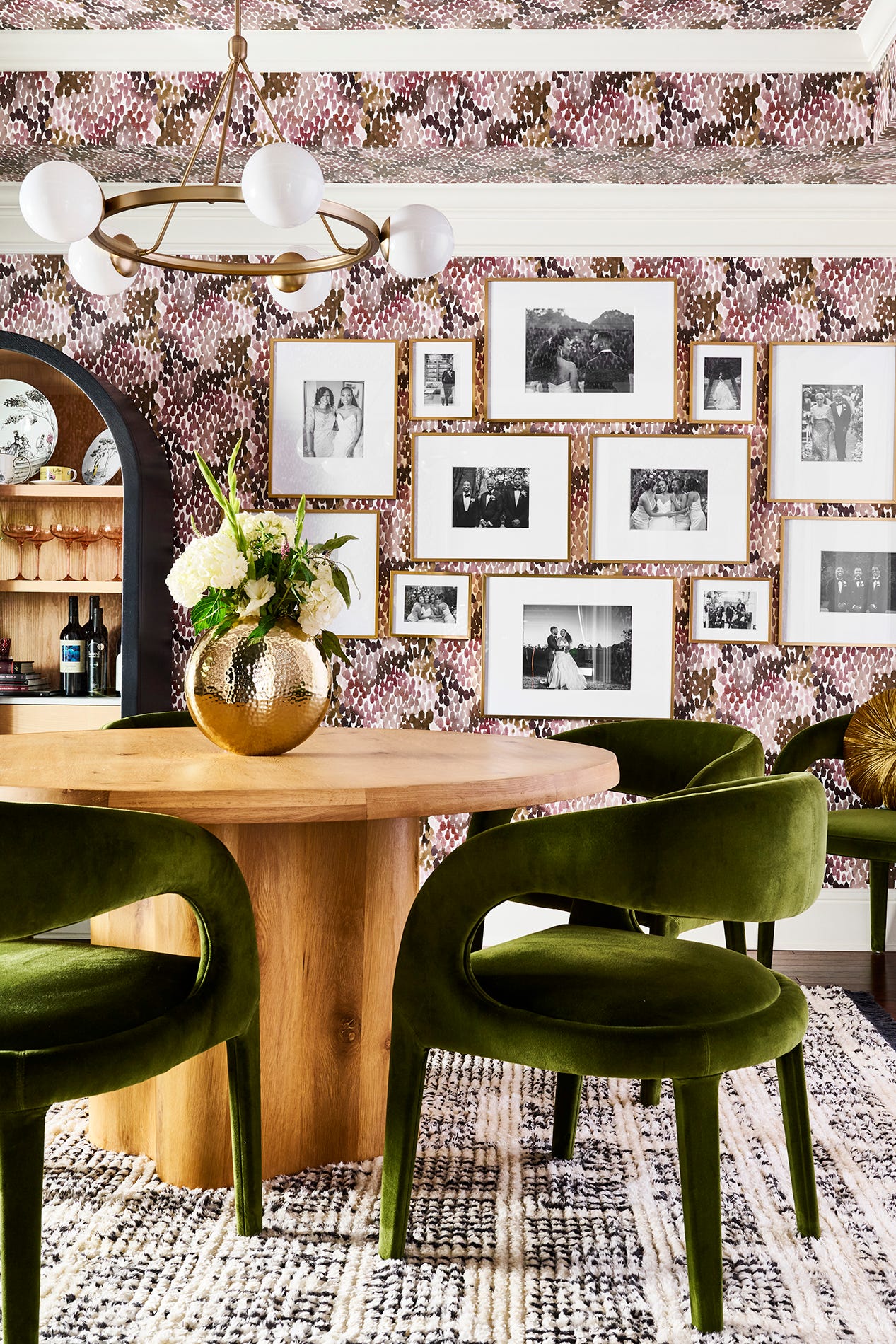
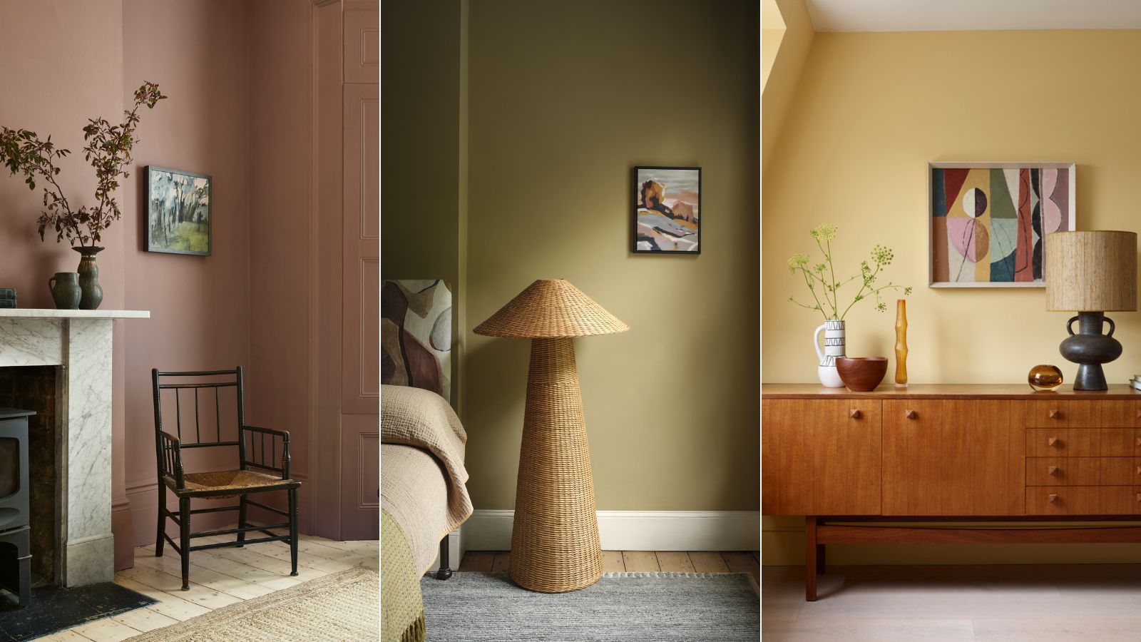
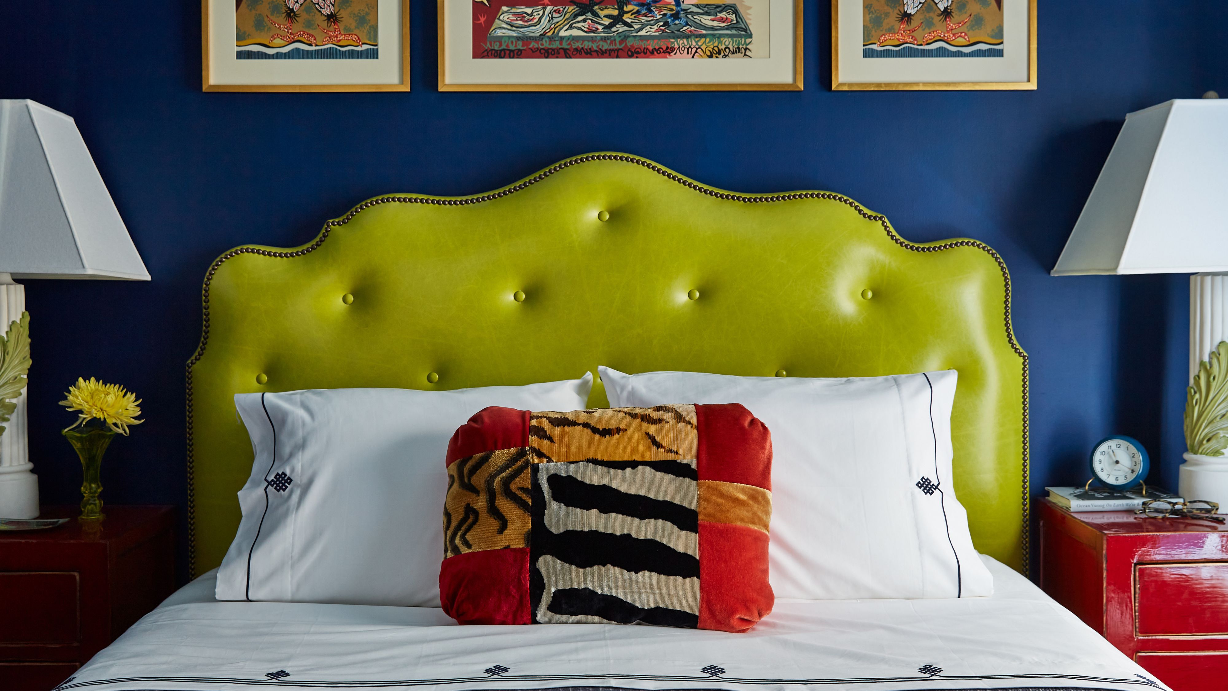
Deep plums are discussed as a way to infuse warmth and luxury into rooms. One designer favors these rich purple tones, citing their nod to iconic 1970s palettes and their ability to create a moody yet sophisticated ambiance with a sense of depth that is both dramatic and soothing.
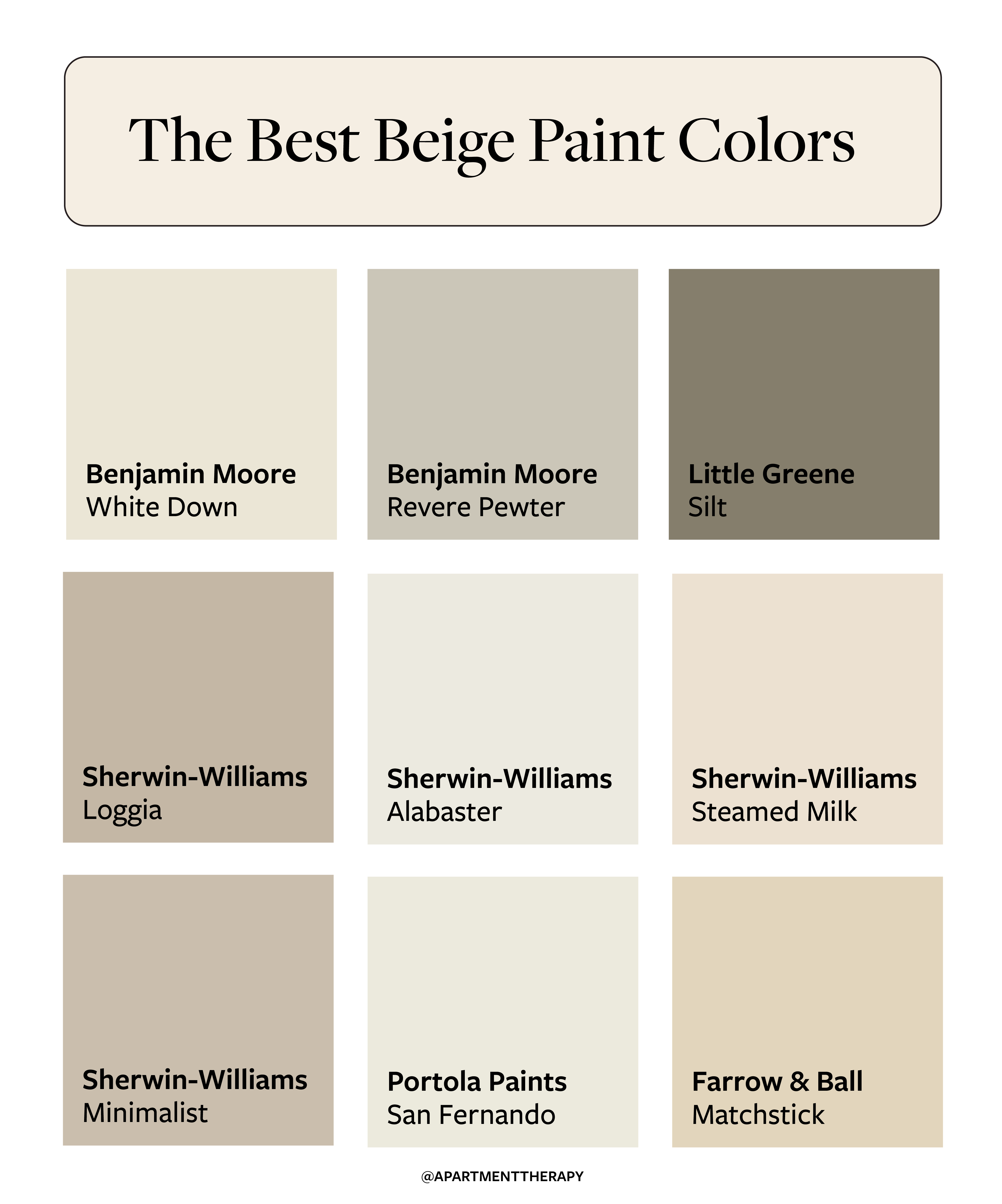
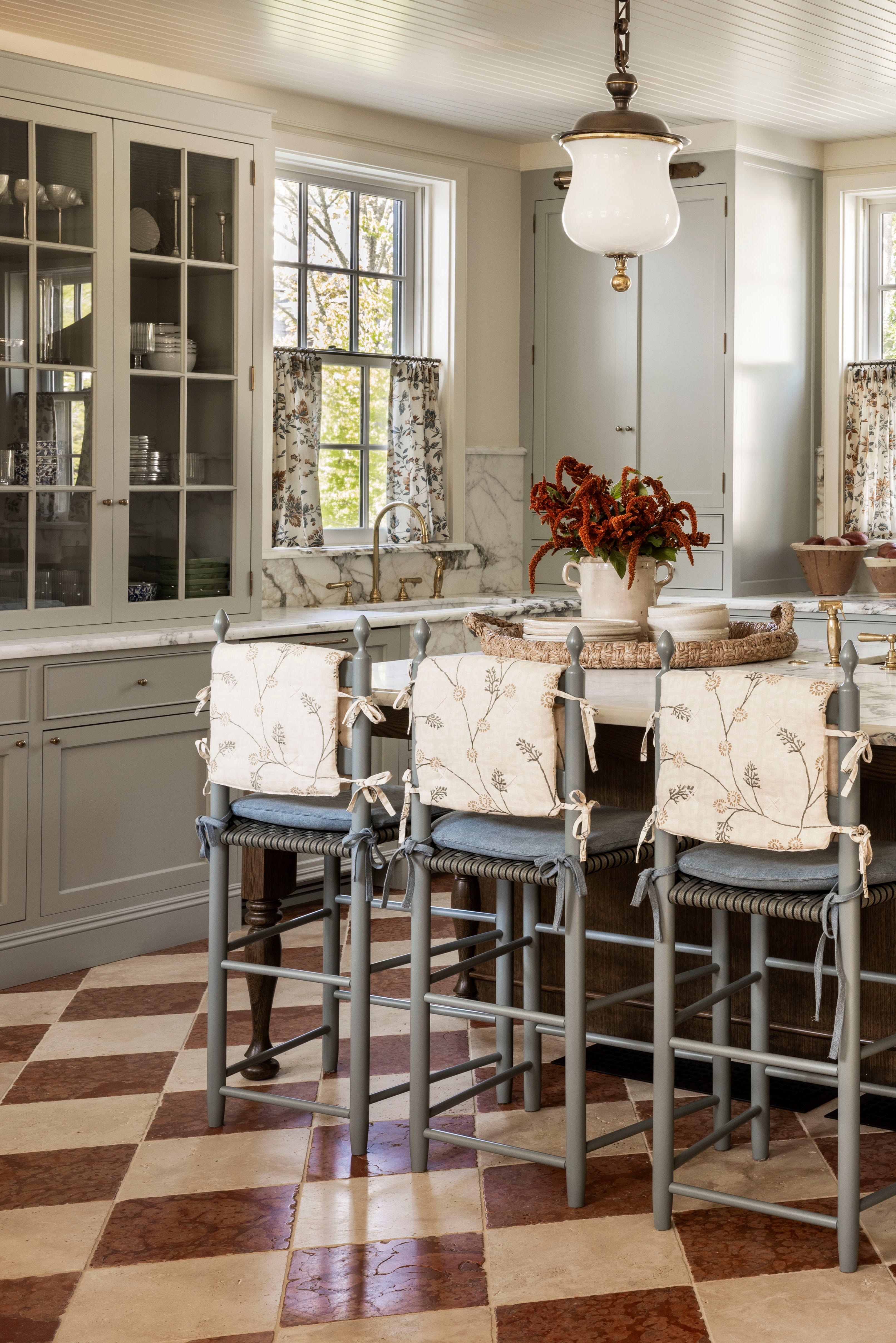
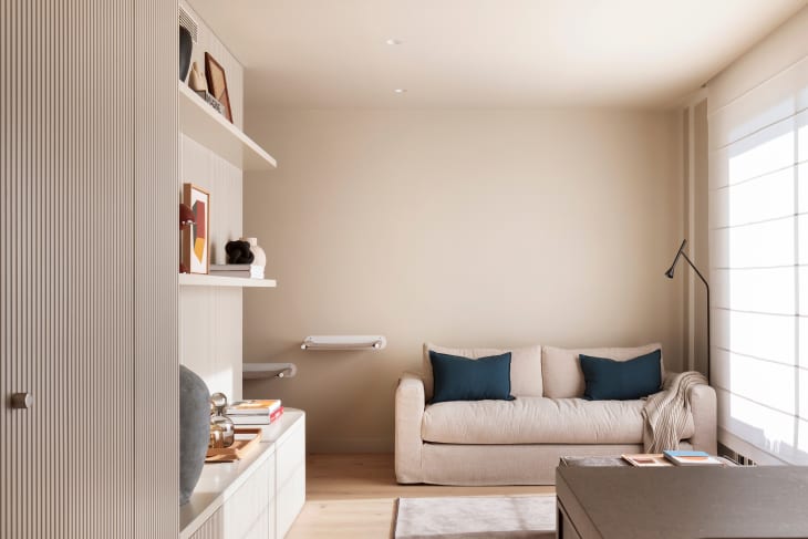
Greige, a blend of gray and beige, is another designer favorite, exemplified by Benjamin Moore's Pale Oak. This versatile shade complements both warm and cool tones, serving as a subtle backdrop that enhances vintage or traditional decor rather than dominating the room.
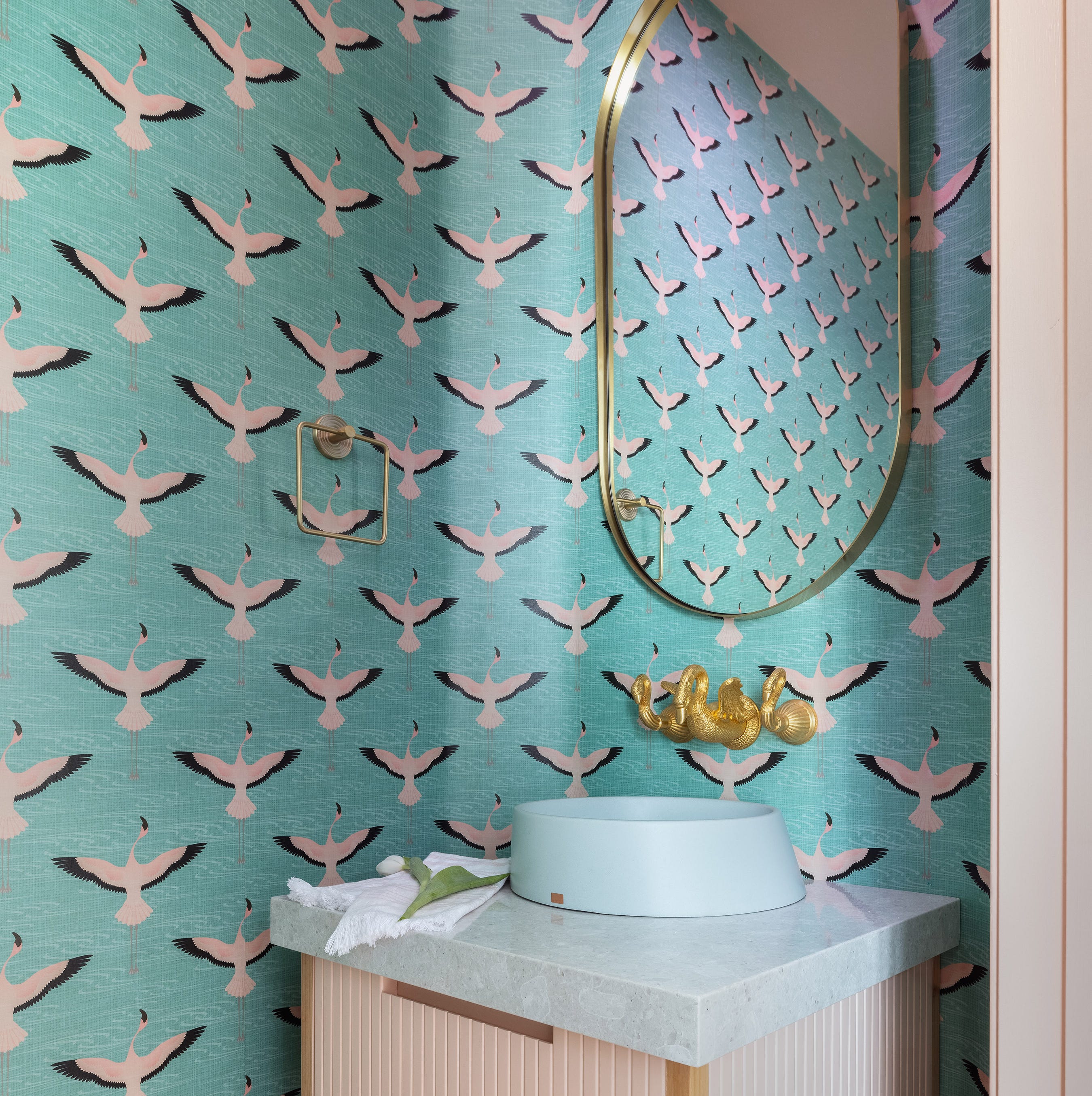
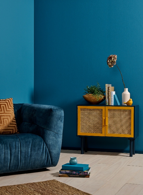
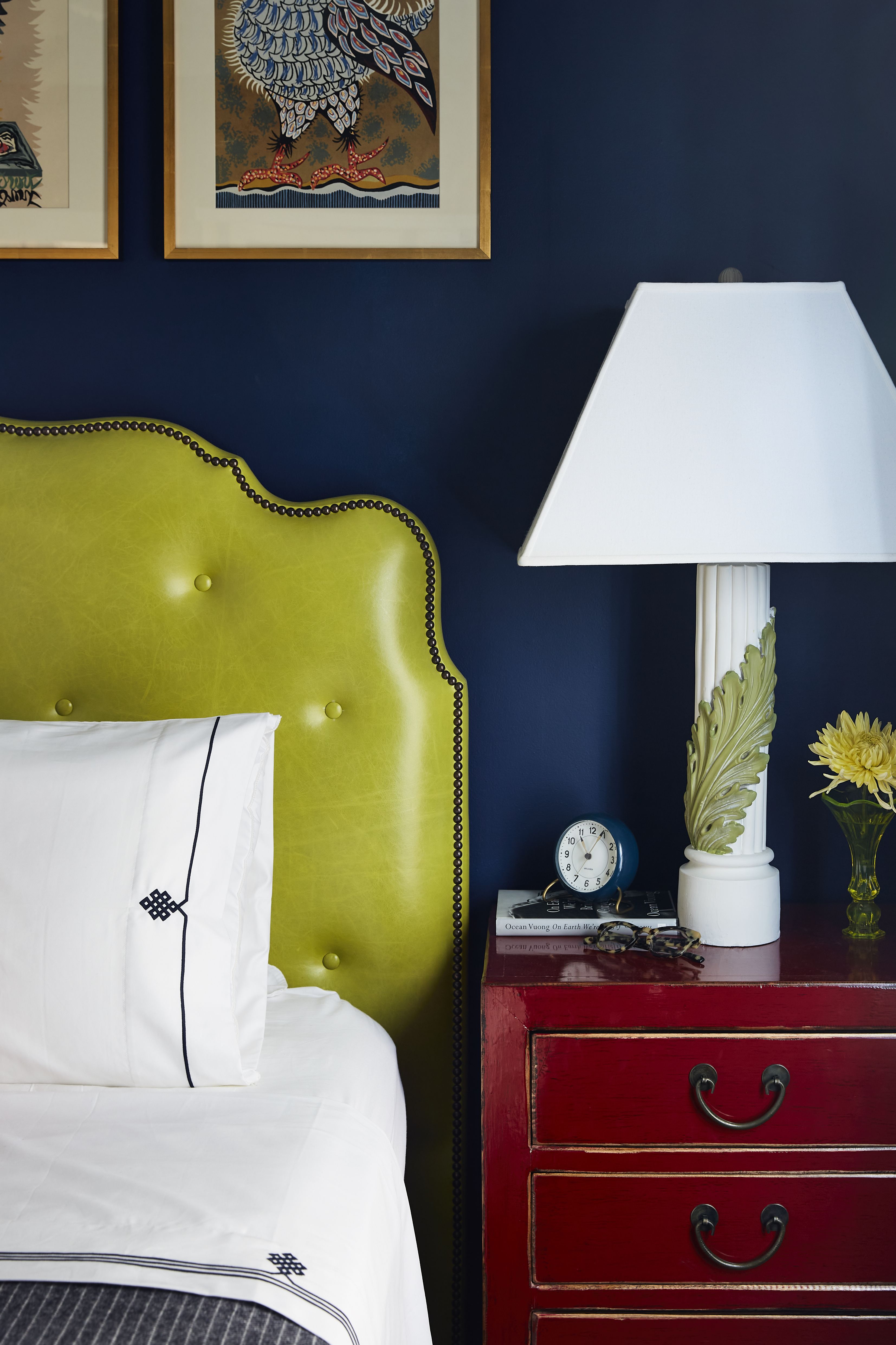
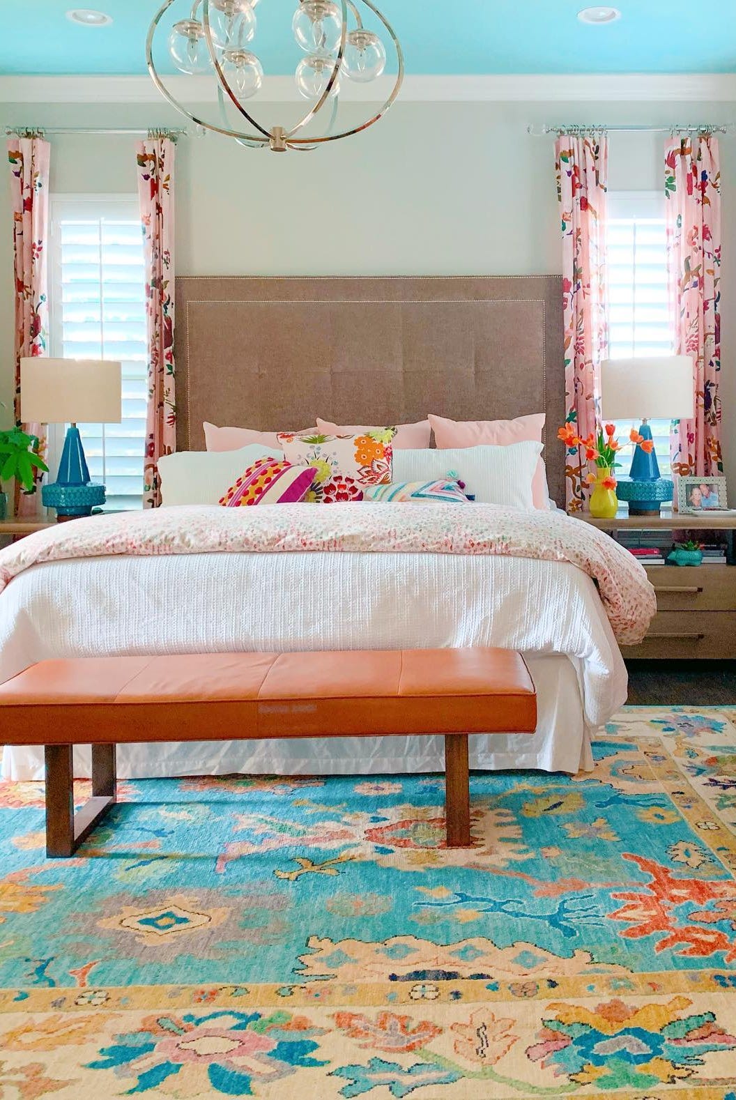
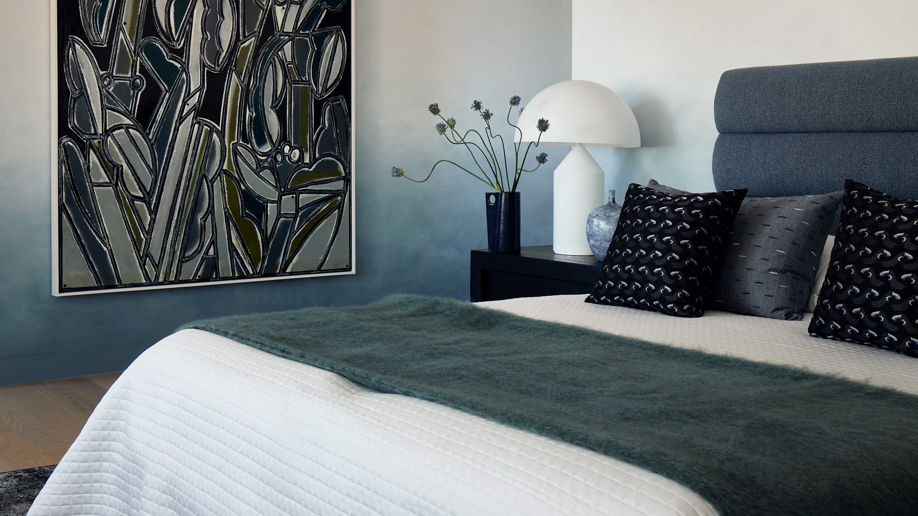
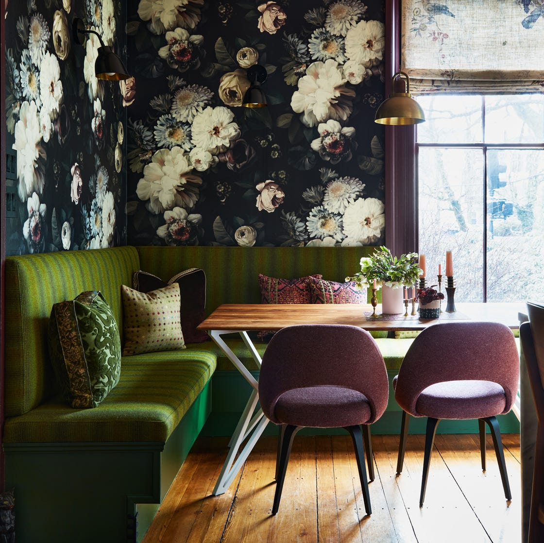
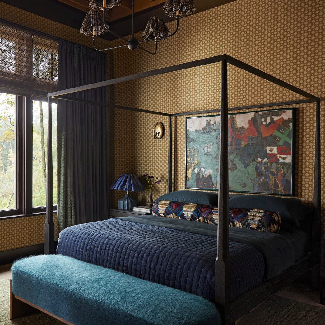
Calming blues are presented as a reliable choice for an old-world aesthetic. Farrow & Ball's Oval Room Blue (No. 85), a blue-green hue with black undertones, is praised for its depth and aged quality, making it feel intrinsically part of a space and a good match for navy. Sherwin-Williams' Daphne, a muted blue with gray hints, is recommended for its powdery, vintage softness and ability to evoke nostalgia, ideal for breakfast nooks or any room desiring a serene, timeless feel.
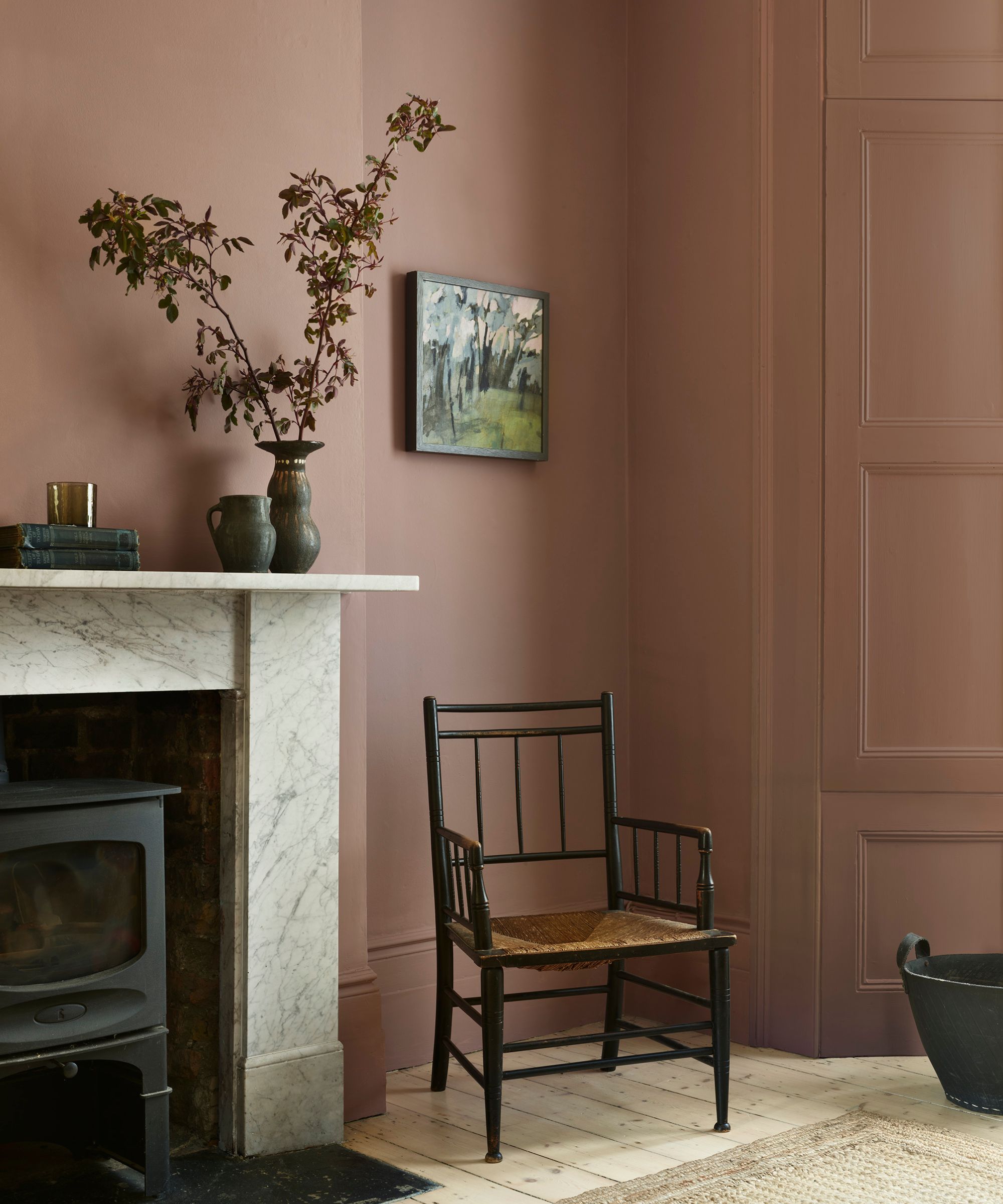
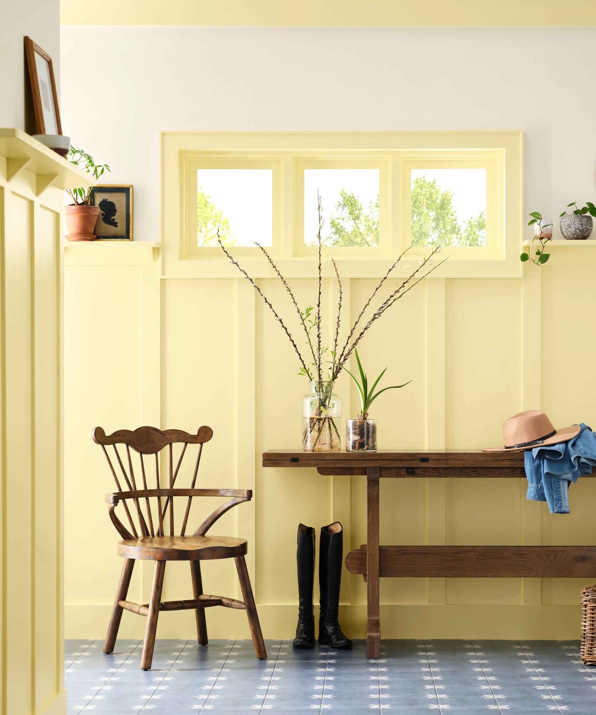
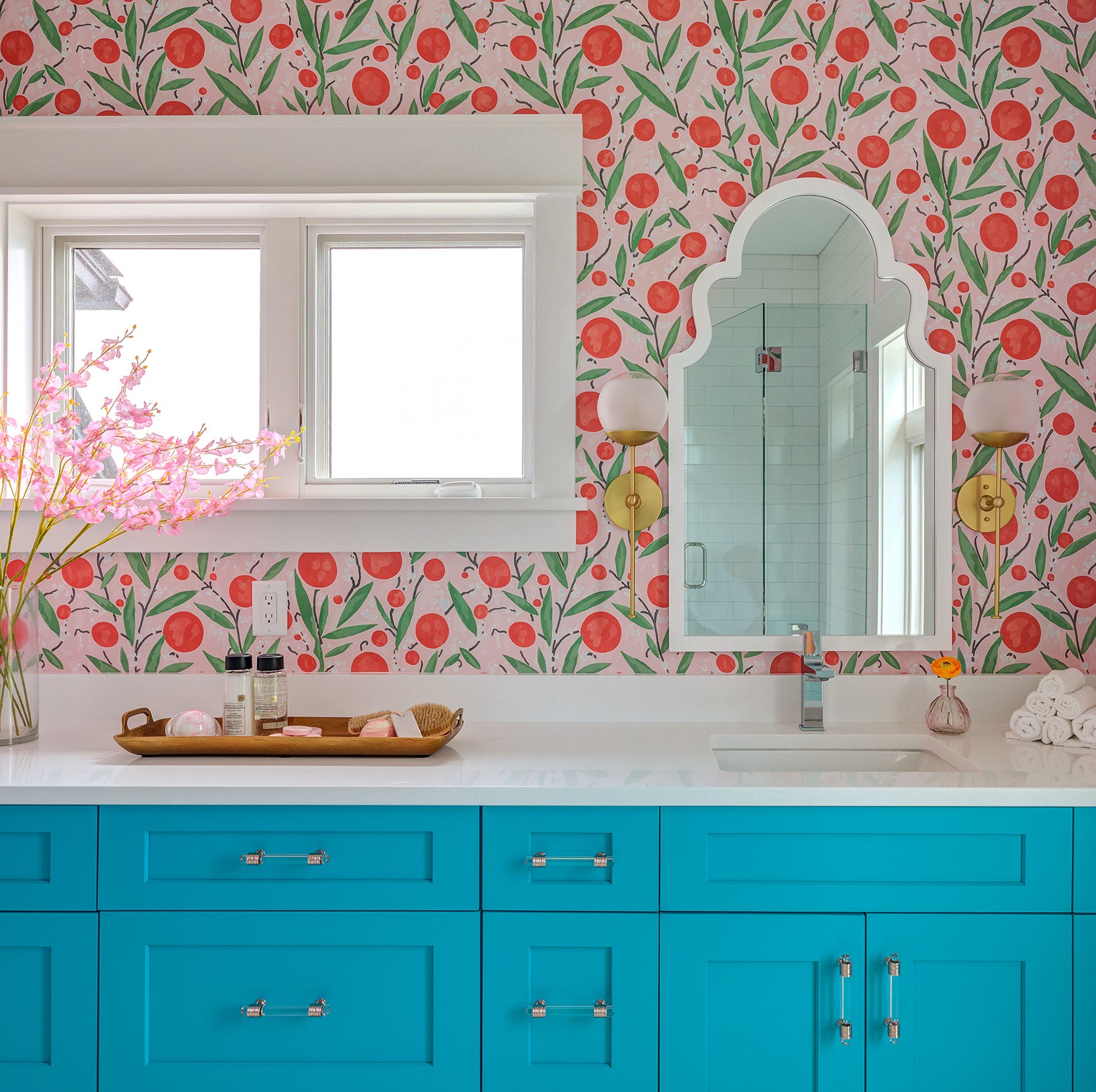
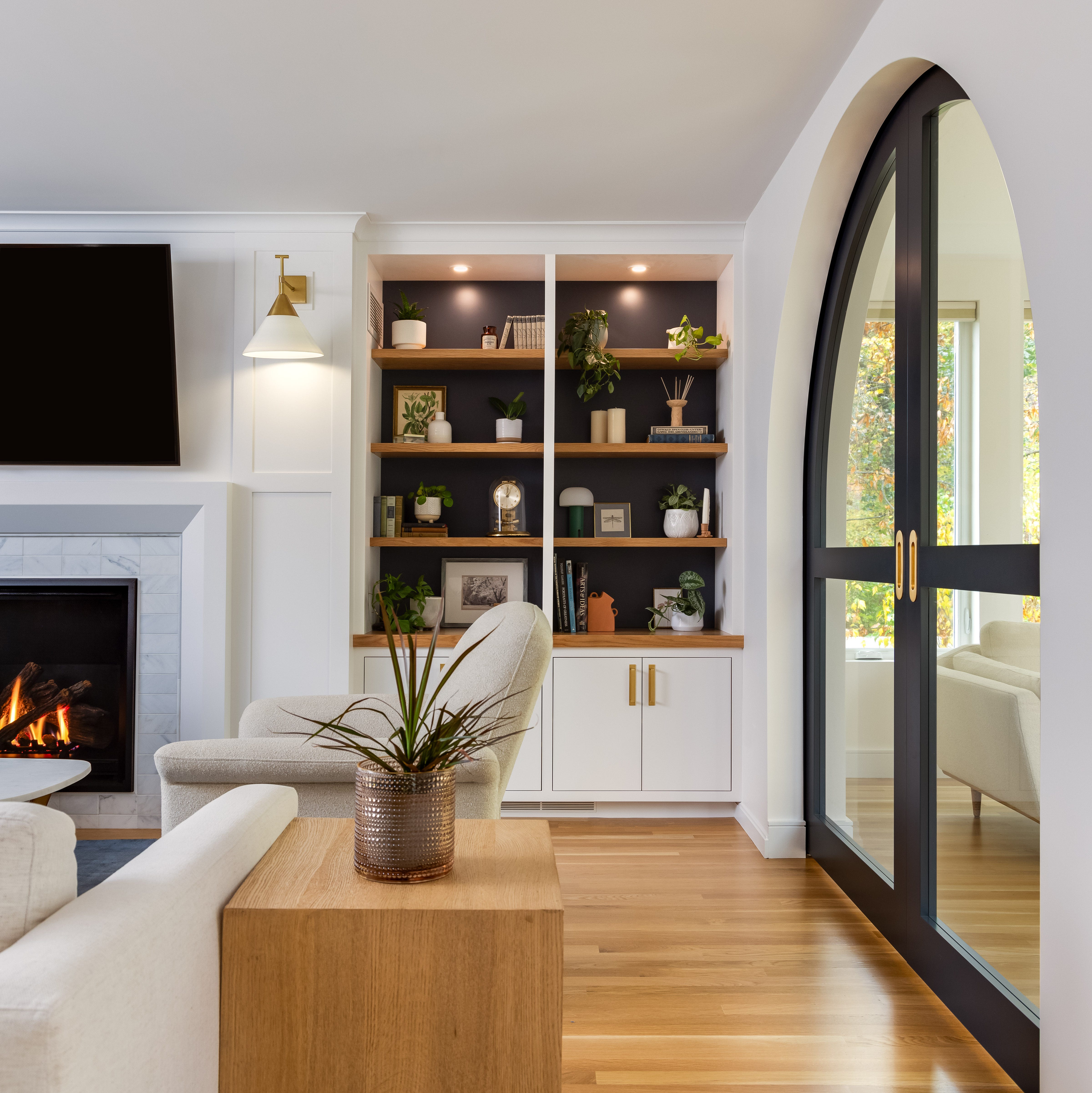
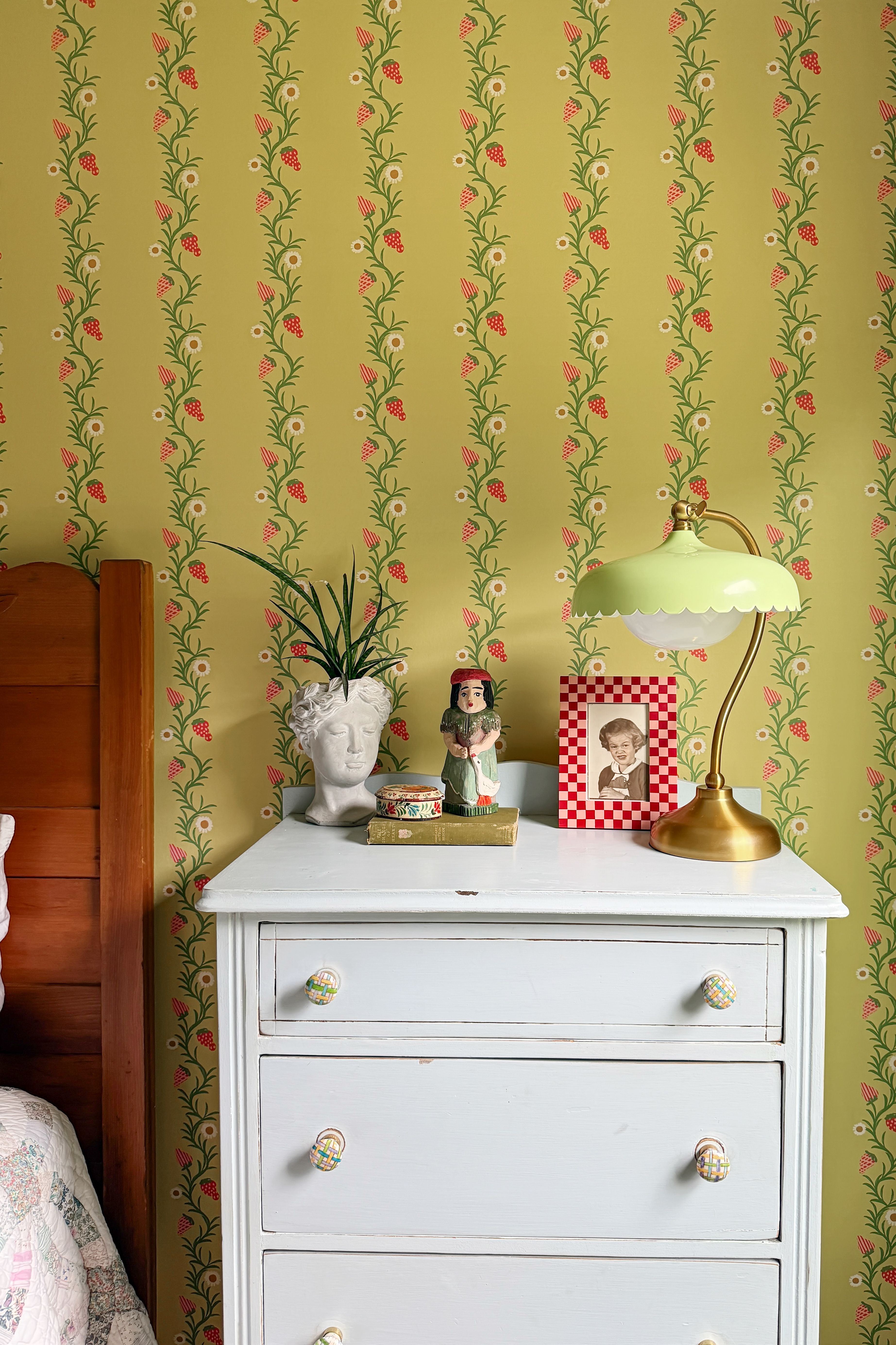
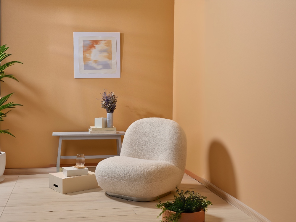
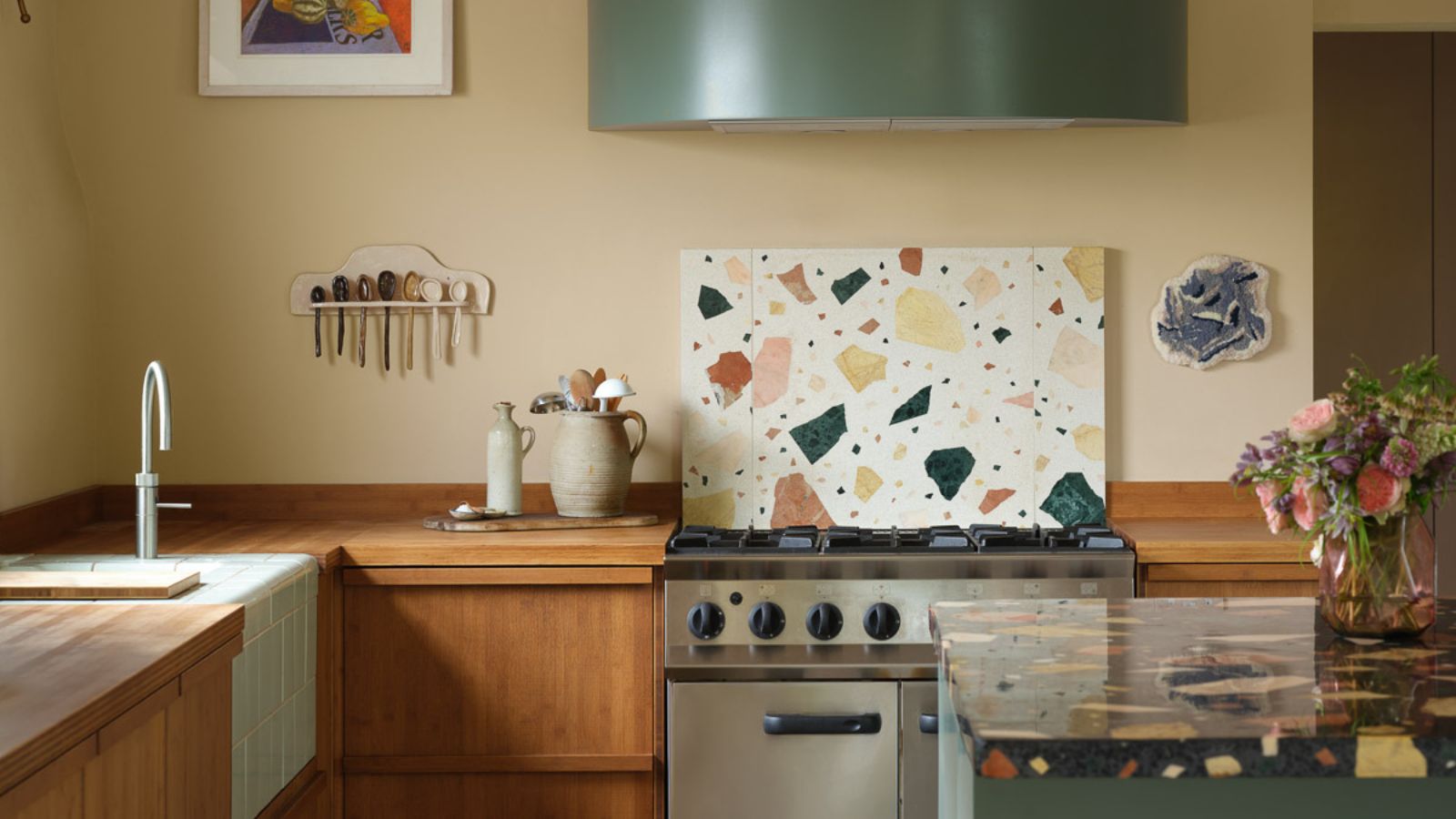
Creams and warm whites are detailed as inviting shades that offer warmth without heaviness and brighten spaces while maintaining character. Benjamin Moore's White Down, a warm white with a creamy base, is suggested for classic setups, while Farrow & Ball's Slipper Satin pairs well with oak floors and unlacquered brass. Warm neutrals and earth tones, drawing inspiration from natural materials like clay and raw wood, are described as grounding and enduring. Sherwin-Williams Renwick Rose Beige, a muted rose-beige, is recommended for intimate spaces like powder rooms or bedrooms, offering a sepia undertone that softens modern lines. Benjamin Moore Davenport Tan, a muted gray from their Historical Color Collection, is suggested for home libraries and offices, adding depth and character. The article concludes by emphasizing the enduring appeal and versatility of these vintage colors in contemporary interior design.
#VintagePaintColors #HomeDecor #InteriorDesignTrends #ColorPalettes #PaintColorRevival #DesignerTips #GreenTones #DeepPlums #Greige #VintagePaintColors #HomeDecor #InteriorDesignTrends #ColorPalettes #PaintColorRevival #DesignerTips #GreenTones #DeepPlums #Greige
0 comment in total
You may also like
This surprising color trend is having a comeback

Designers Say This Vintage Home Feature Is Back

The Best Vintage-Inspired Paint Colors — 6 Expert-Approved Shades for a Touch of Chic Nostalgia
The return of the fashion colour consultation

This Outdated Paint Trend is now Predicted to Return — Designers Love its "Fun, Eye-Catching Glamor"
The #1 Retro Design Trend Designers Say is Making a Comeback
12 Jewel-Tone Paint Colors Designers Say Are Always On-Trend
12 Color Schemes That Are Popping Off Right Now, According to Designers

Vintage paint colors making a comeback this year – experts reveal their top shades for adding a touch of nostalgia

Designers Hope This Early 2000s Paint Trend Never Comes Back
Interior Design Trendwatch: Colour is coming home

Designers LOVE Pairing These Unexpected Colors With This One Timeless Hue

12 Vintage Paint Colors That Are Trending Again, According to Color Experts

This once-dated couch color is making a comeback – designers share all on how to bring this retro style into 2024
This electric 1960s shade is making an unexpected return – and designers say it’s the key to lifting darker, moodier interiors this fall
Deeper, moody colours and precious jewel tones are in style this year
This Very "Controversial" Color Is About To Be Everywhere Again
Forget Millennial Pink: When It Comes to Wall Paint, "Boring" Beige is Back
Designers say these '80s-inspired colors are making a comeback in 2025 – 5 retro shades for a colorful home
The 1950s Paint Color Trend Taking Over In 2025 That Designers Call ‘Refreshing’ And ‘Nostalgic’