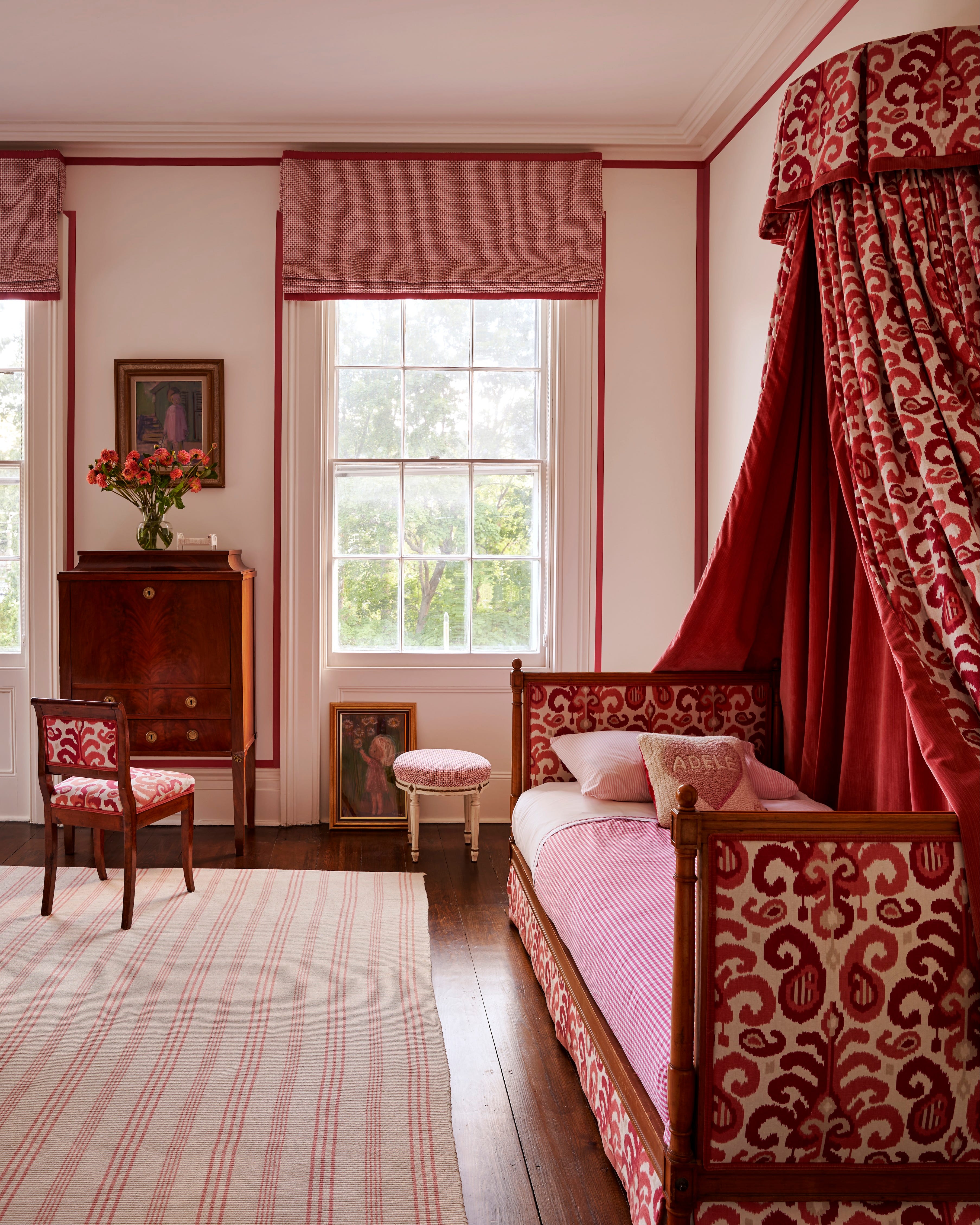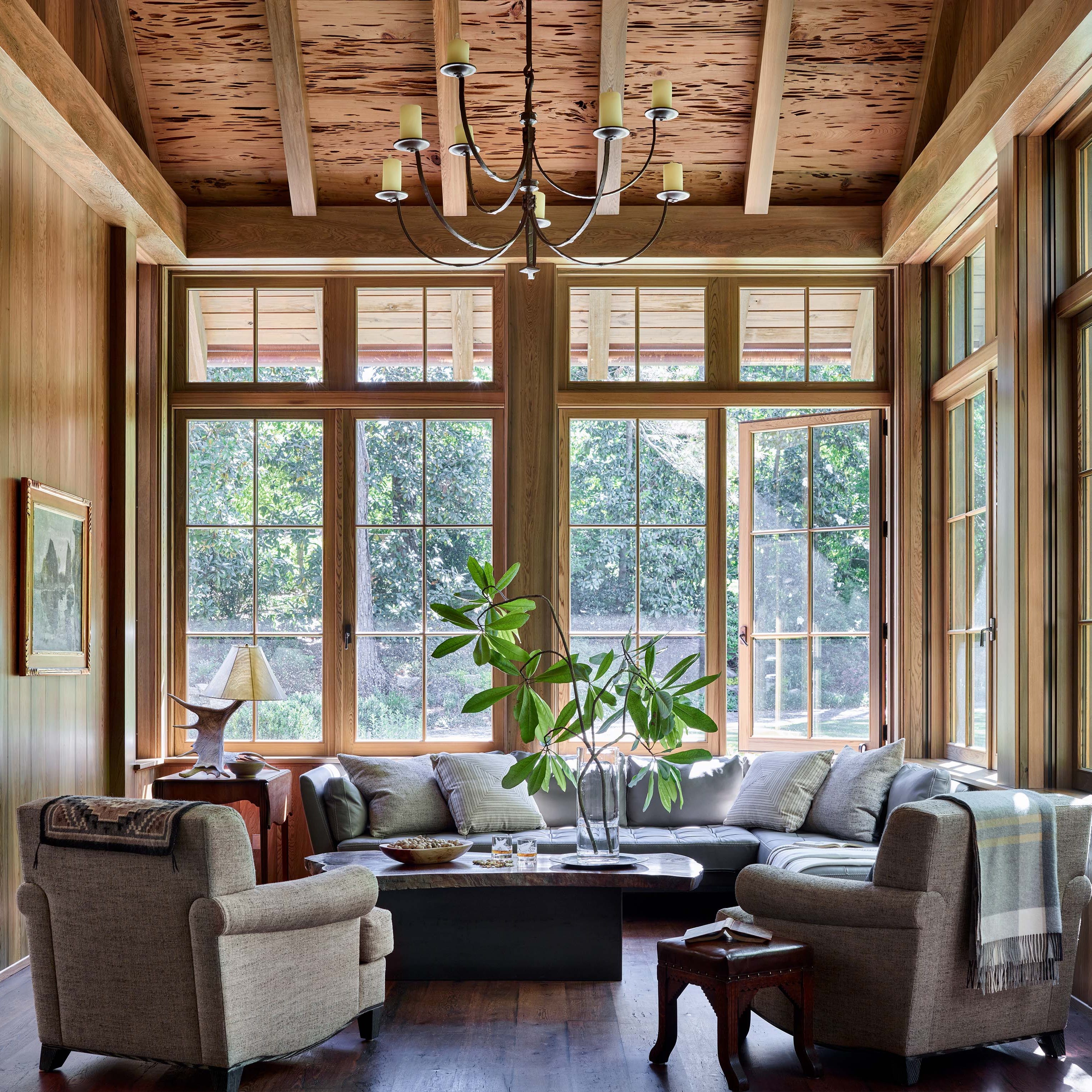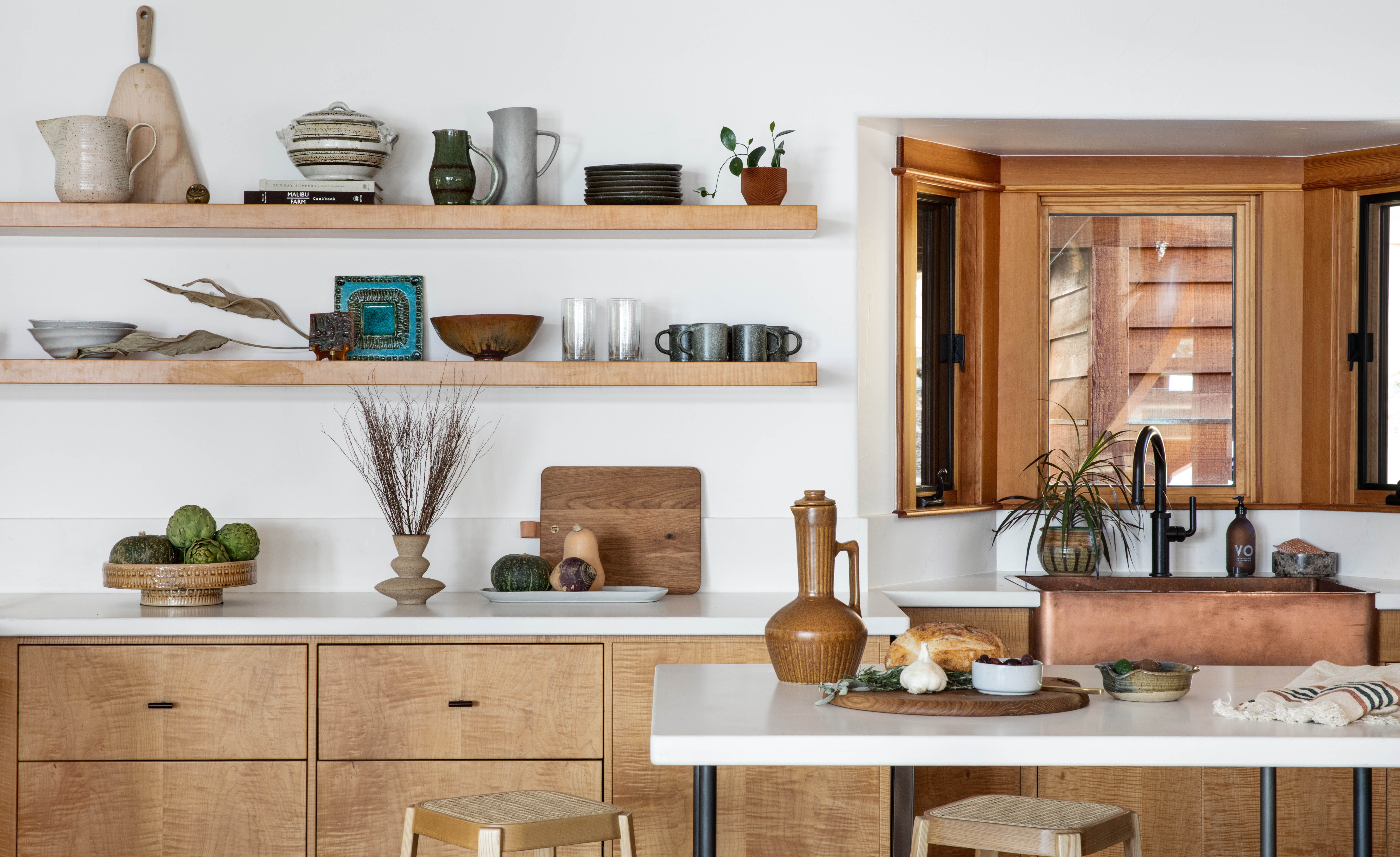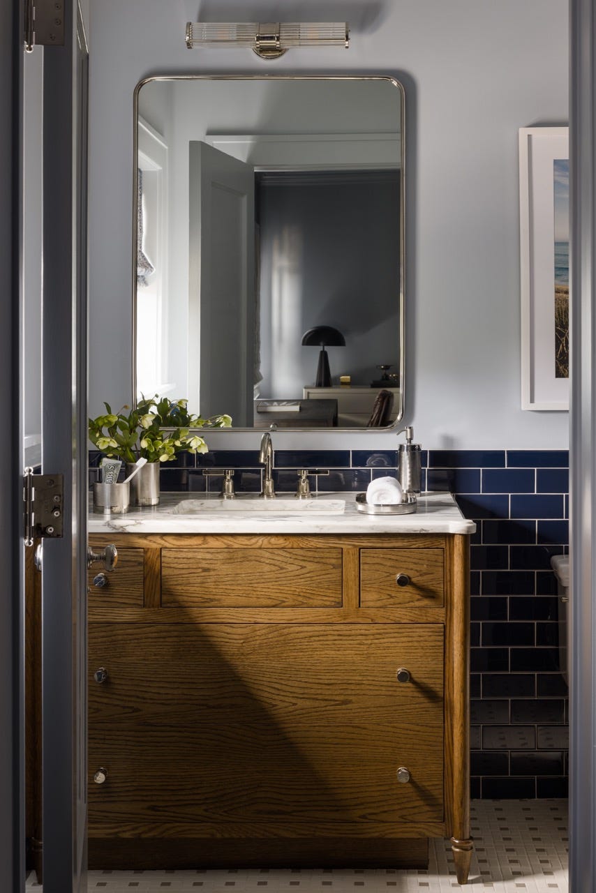
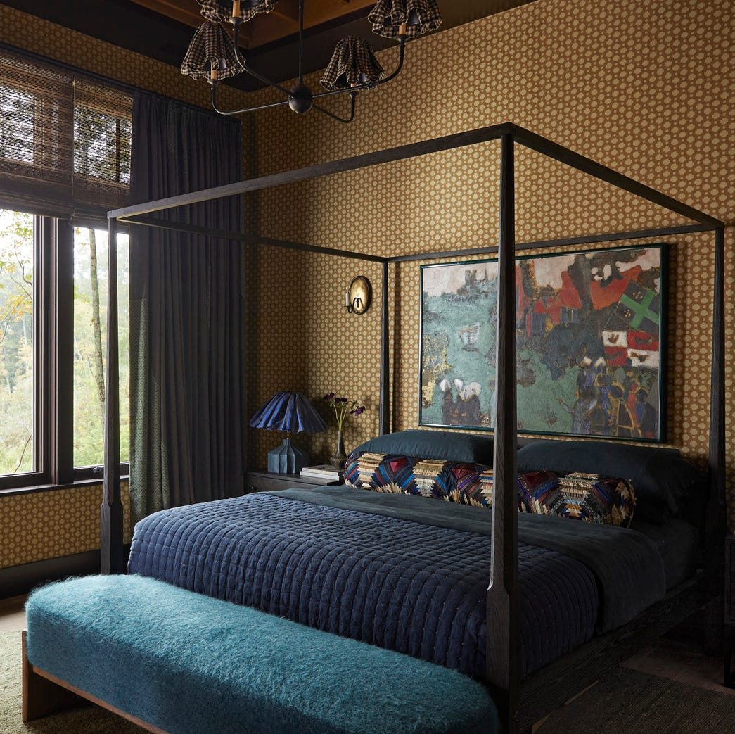
1/4
This electric 1960s shade is making an unexpected return – and designers say it’s the key to lifting darker, moodier interiors this fall
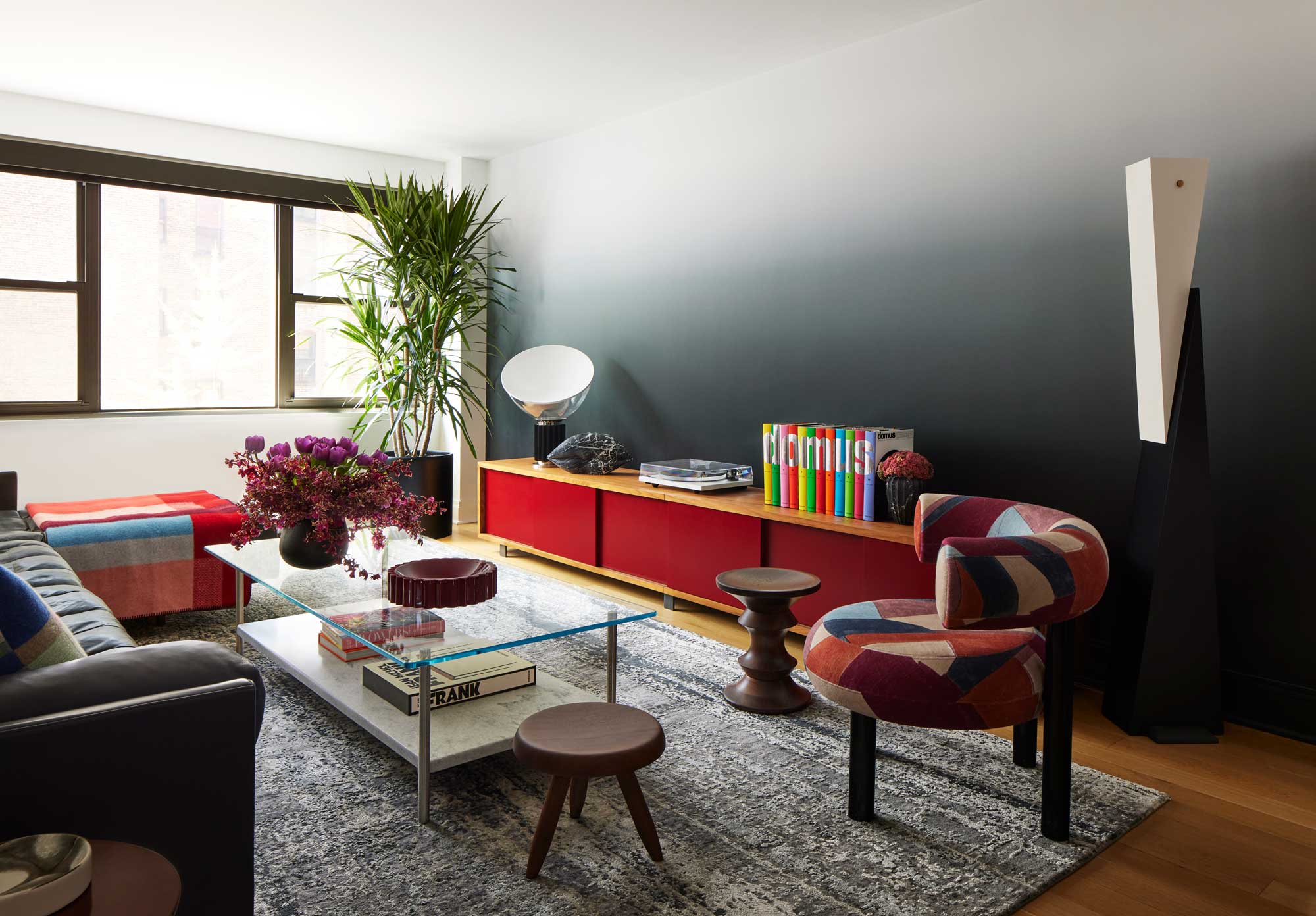
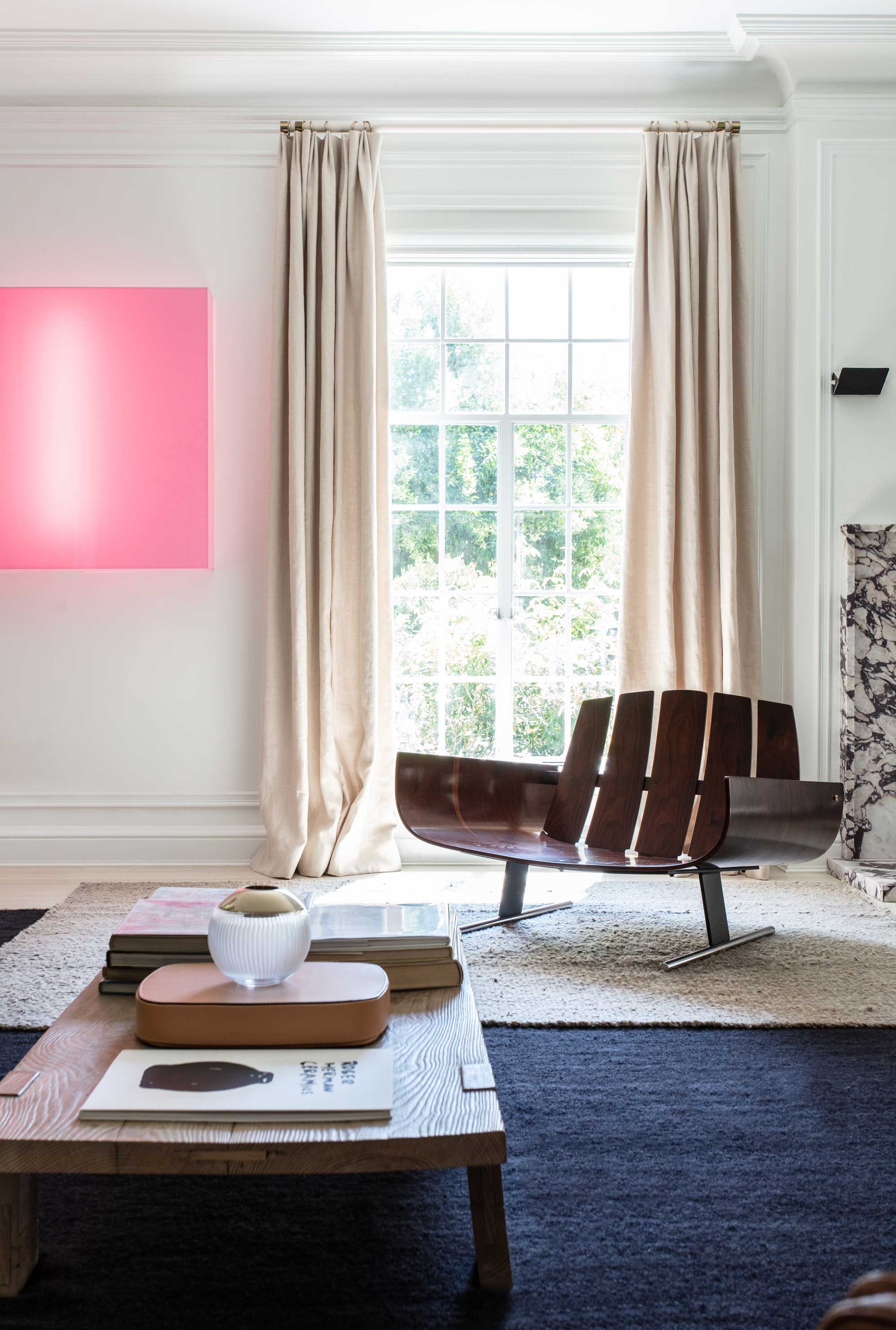
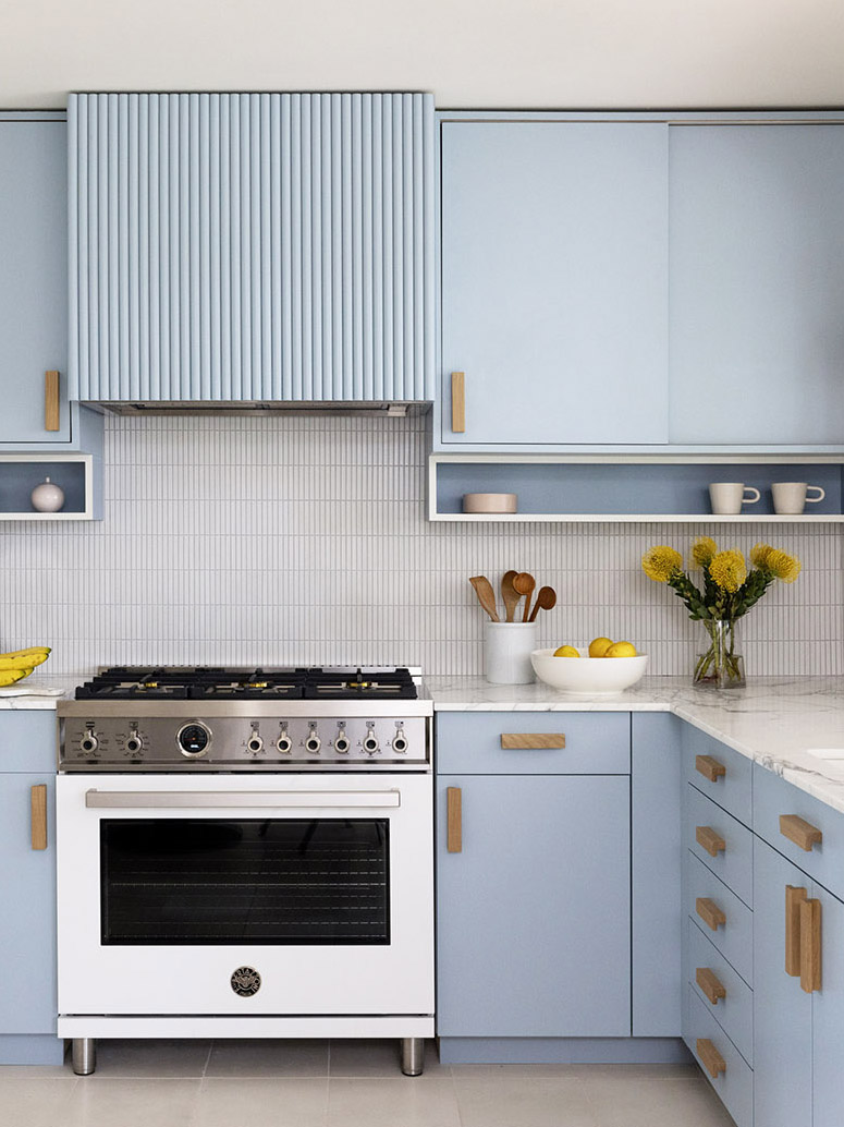
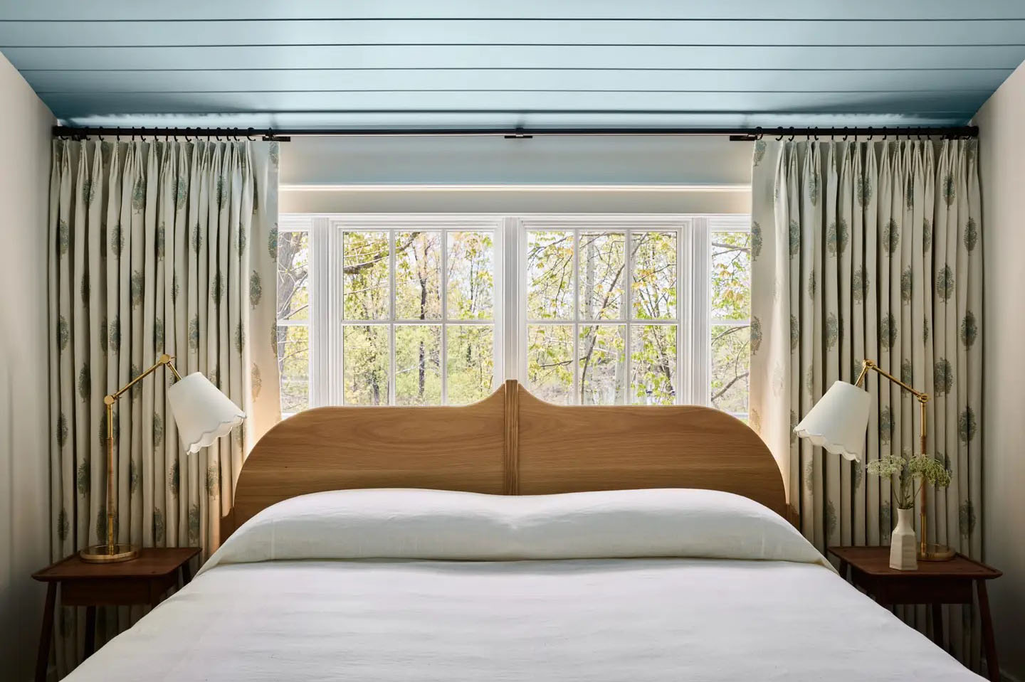
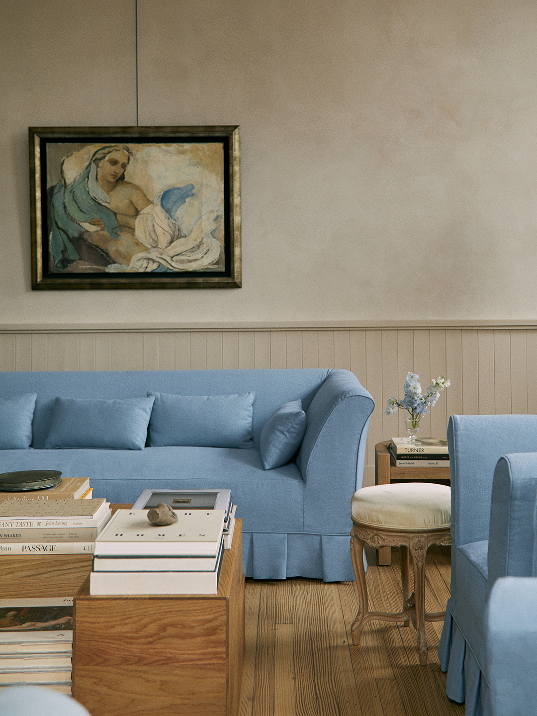
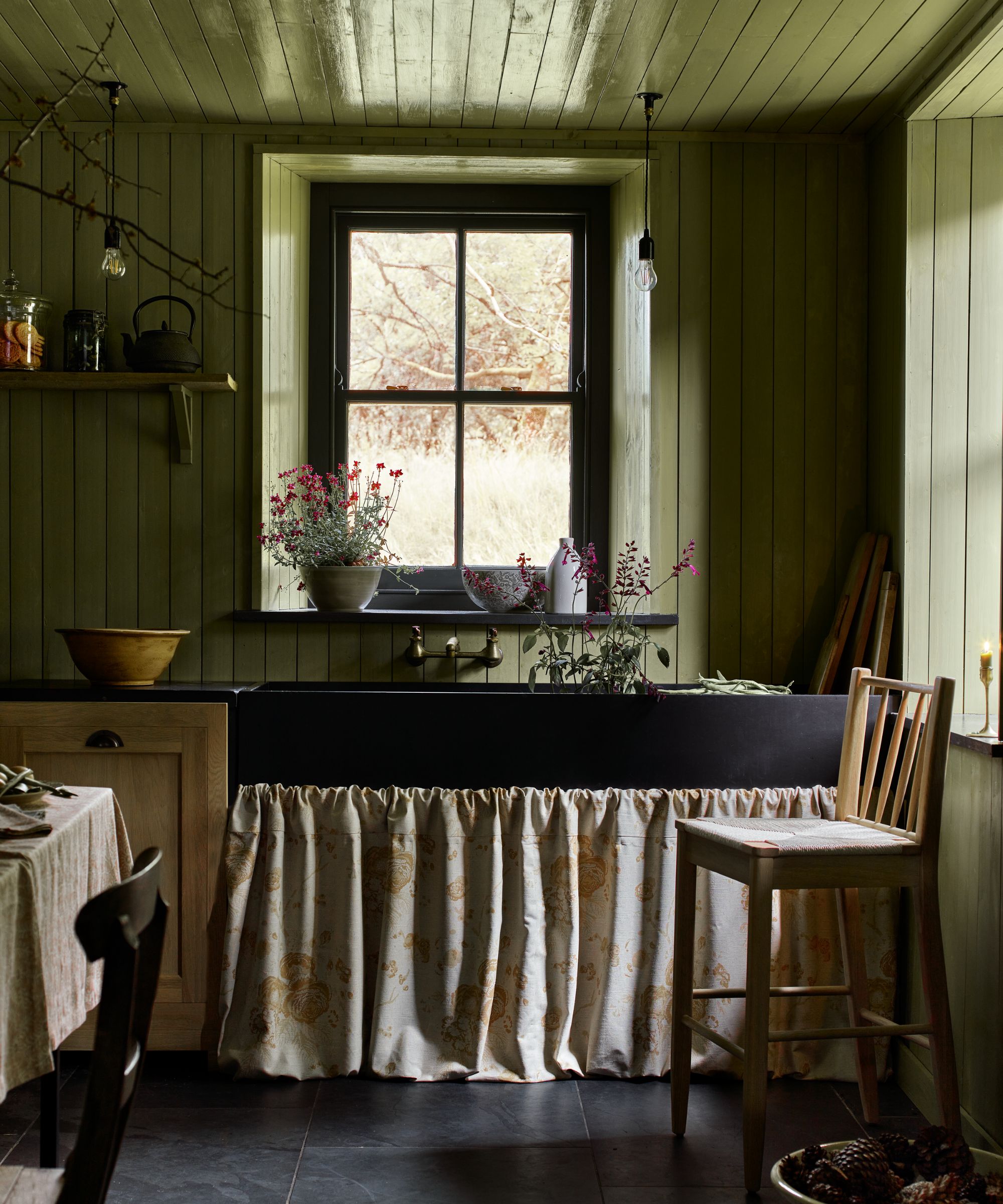
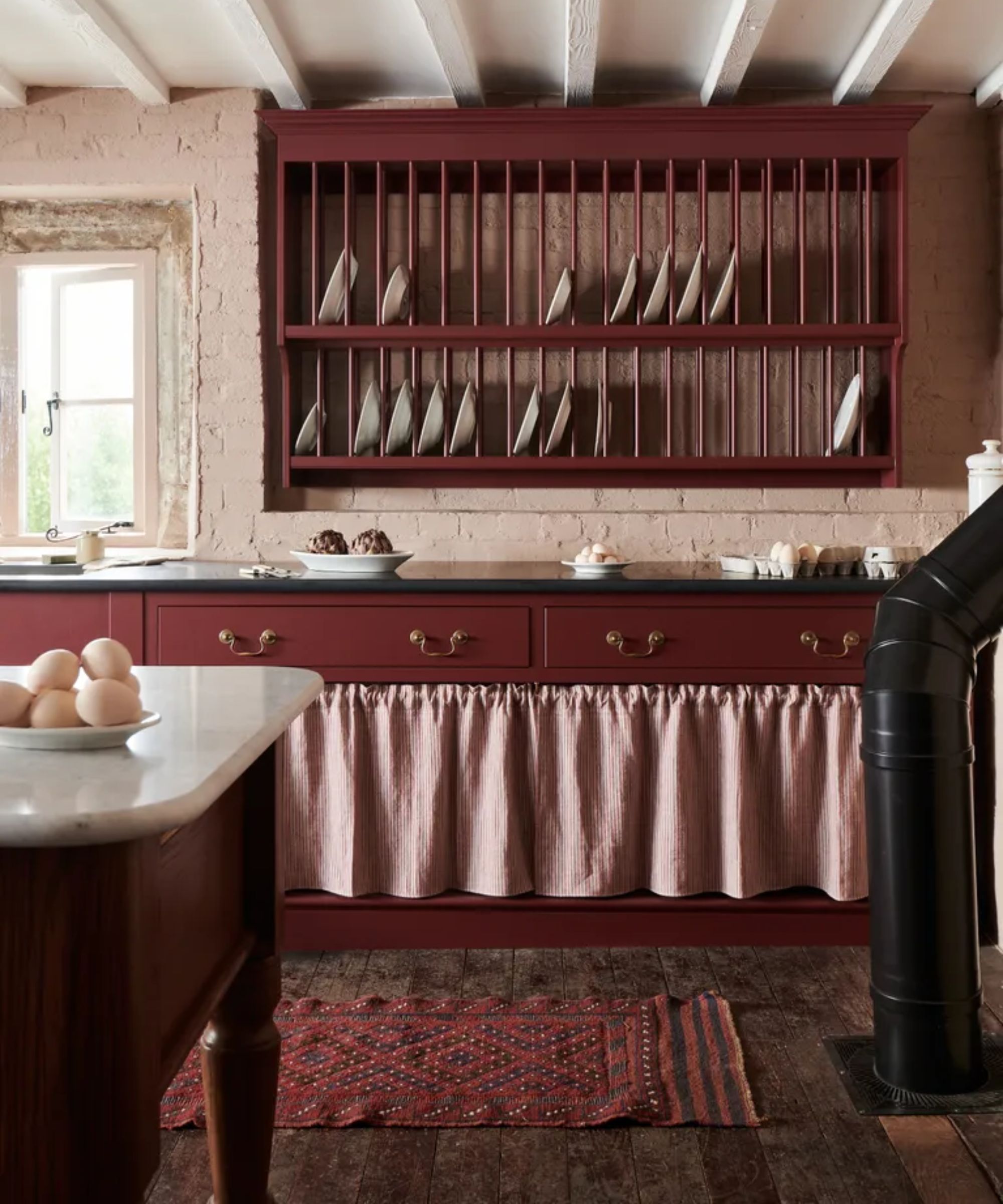
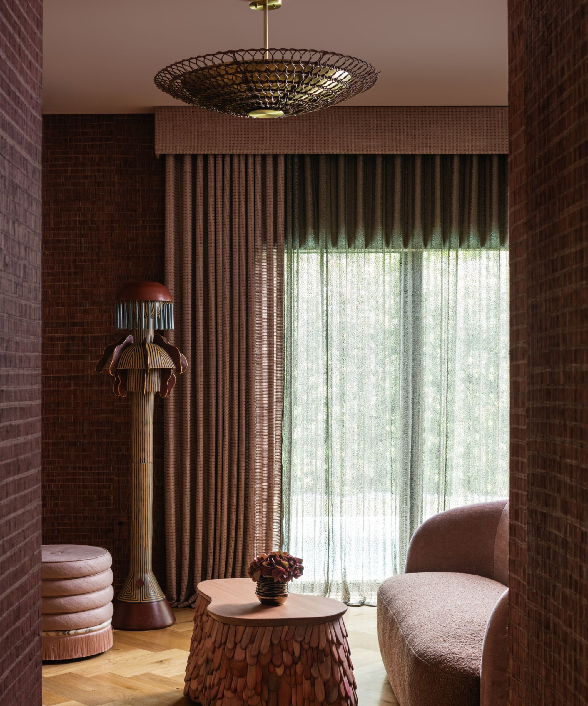
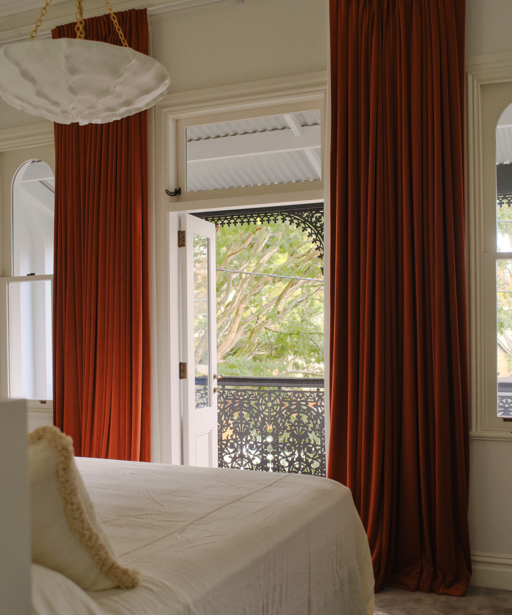
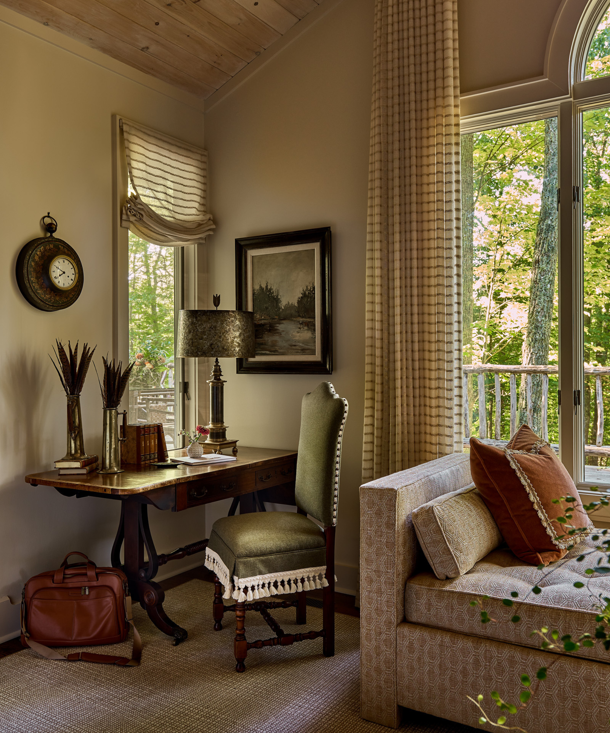
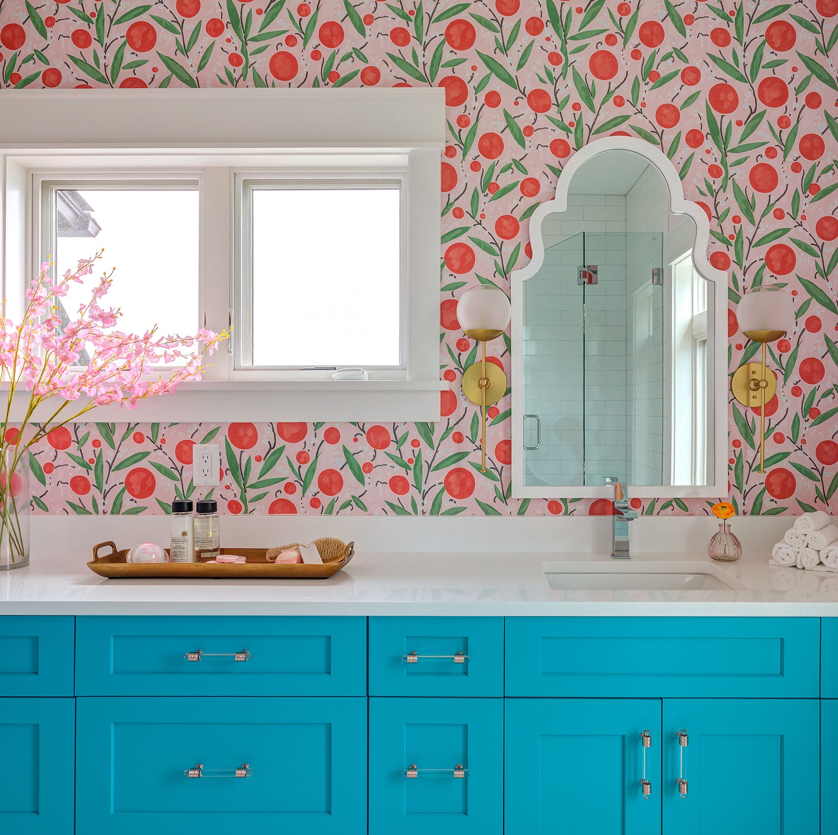
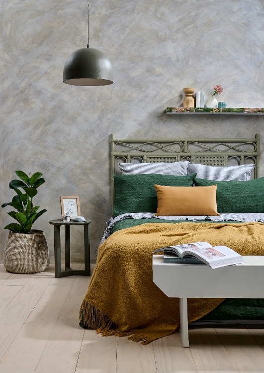
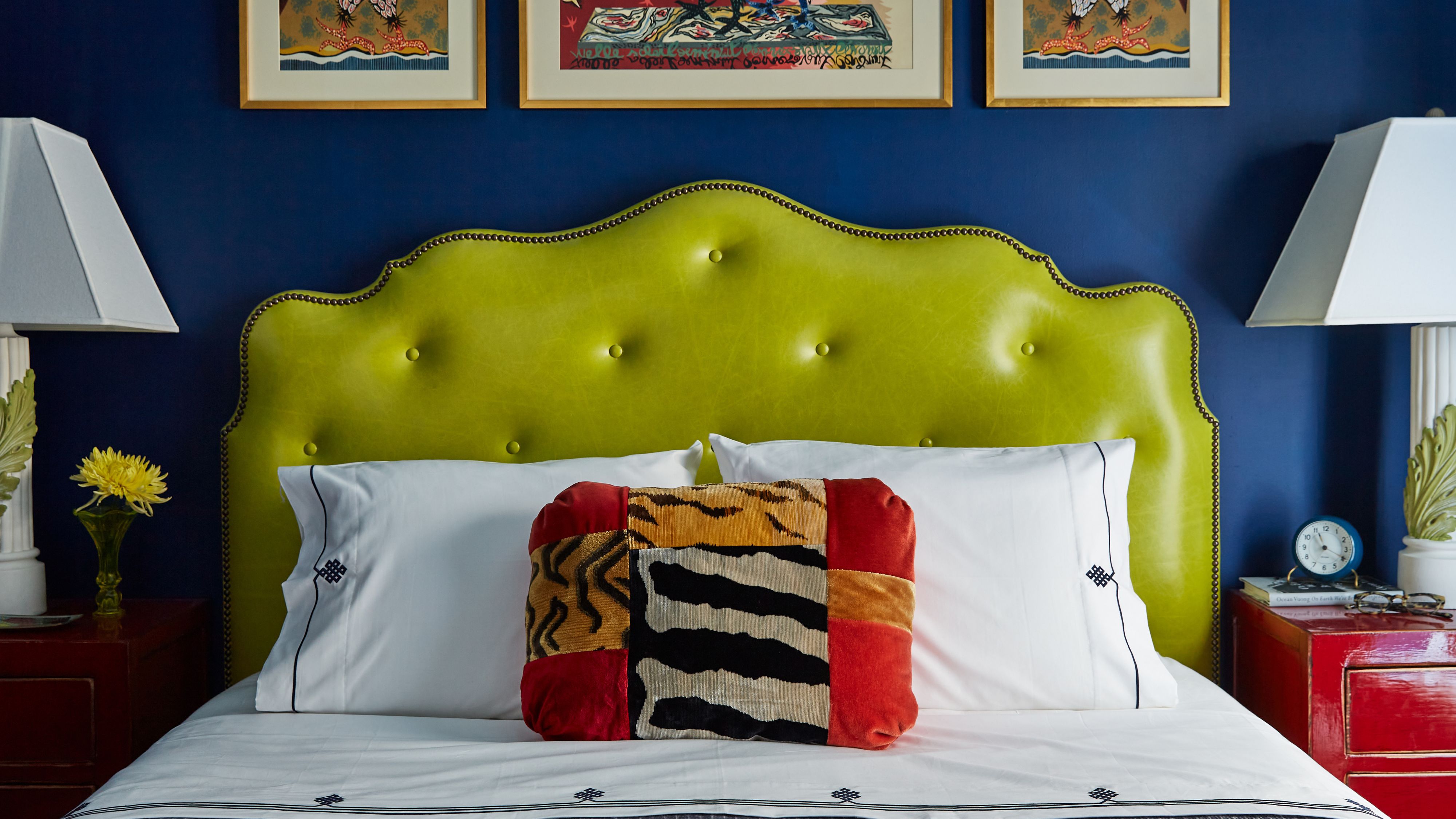
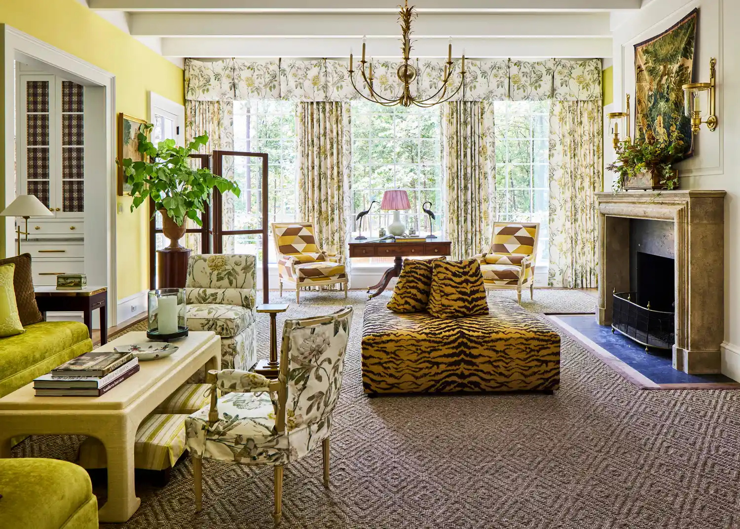
The acid-sick, highlighter-adjacent yellow-green color known as Brat Green, popularized in 2024, is evolving into its calmer, more design-literate cousin, chartreuse, making an unexpected return as a key color trend for fall 2025. This electric shade is anticipated to lift darker, moodier interiors, providing energy and irreverence to autumn palettes. While Brat Green offered a maximalist, club-kid aesthetic, chartreuse leans more yellow and offers a fresh, alive feeling, especially as the weather turns colder and natural greenery diminishes.
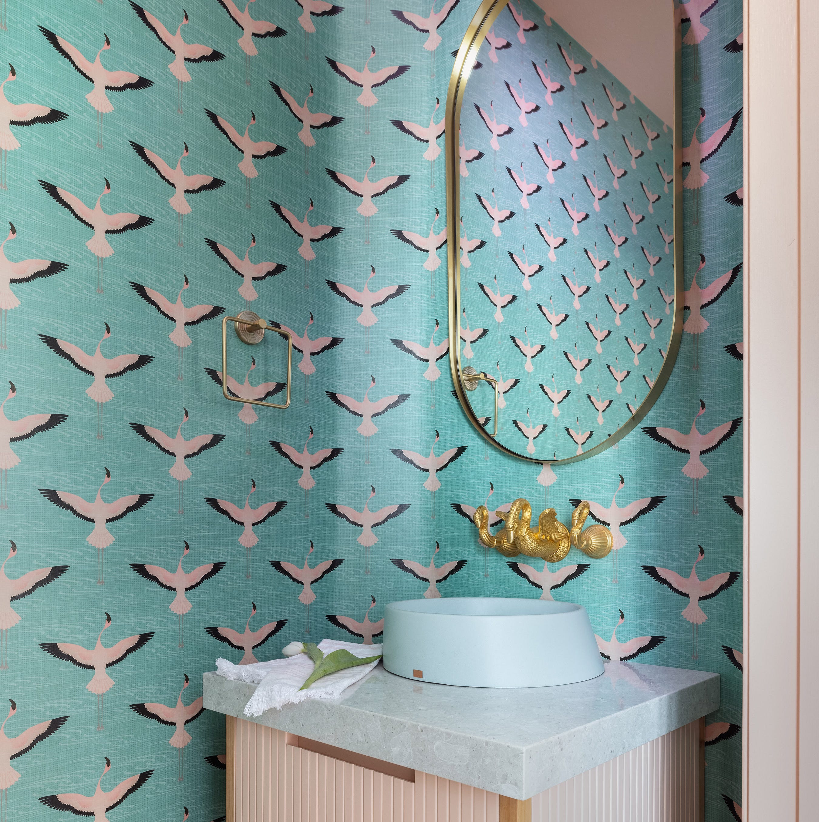
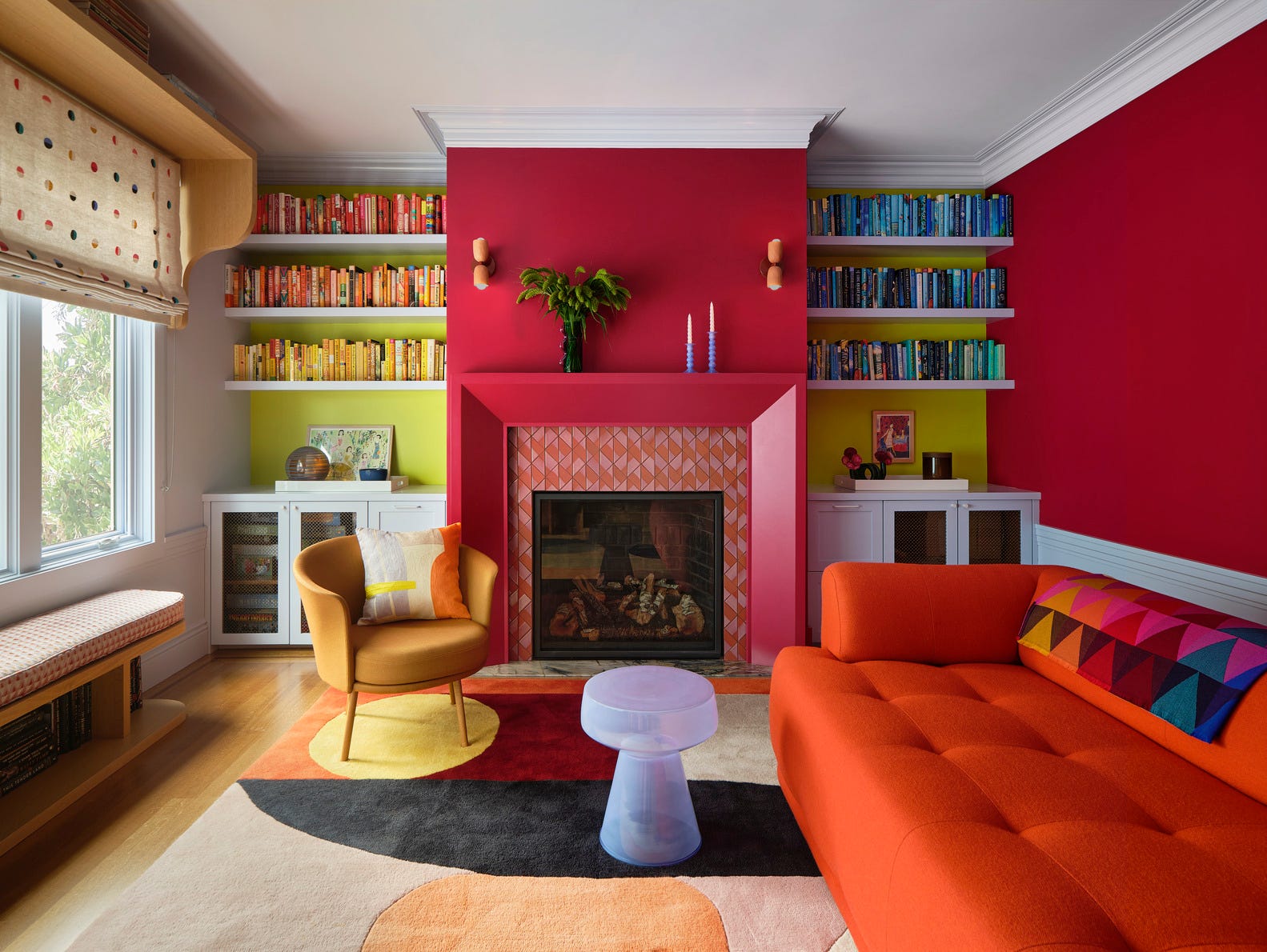
Interior designers are expressing enthusiasm for chartreuse, recognizing its ability to bring instant energy and optimism to a space, countering the recent trend of softer palettes. For fall, when interiors often become heavier, chartreuse acts as an unexpected spark, preventing rooms from feeling too dark or oppressive. Designers view it as a 'rockstar accent color,' suggesting its use in patterned wallpapers, single velvet chairs, or even stripes to transform a space. This color trend is not entirely new; chartreuse has a rich history in pop culture and design, from Andy Warhol's art to 1960s fashion and 1990s television shows, giving it a nostalgic appeal for many.
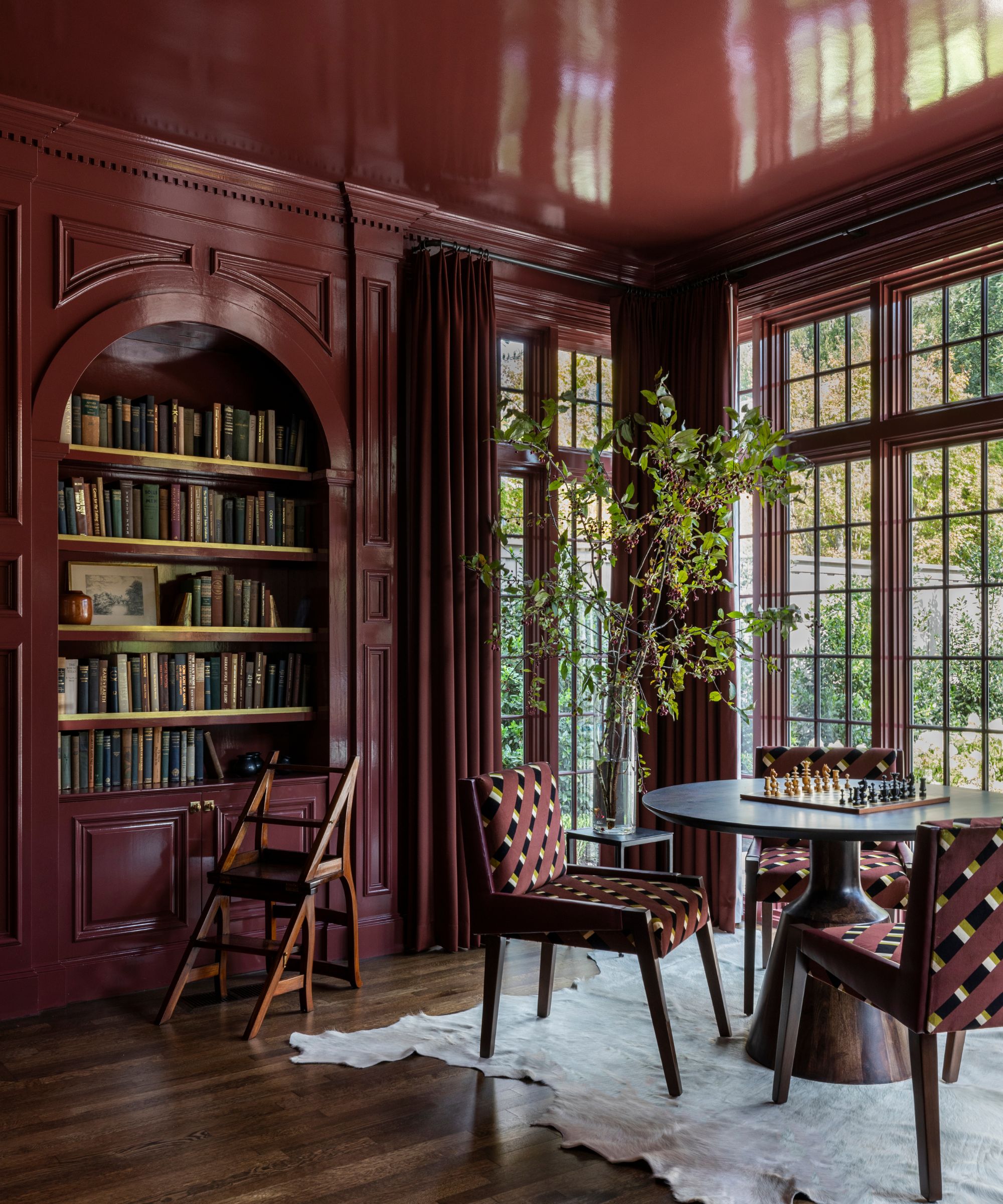
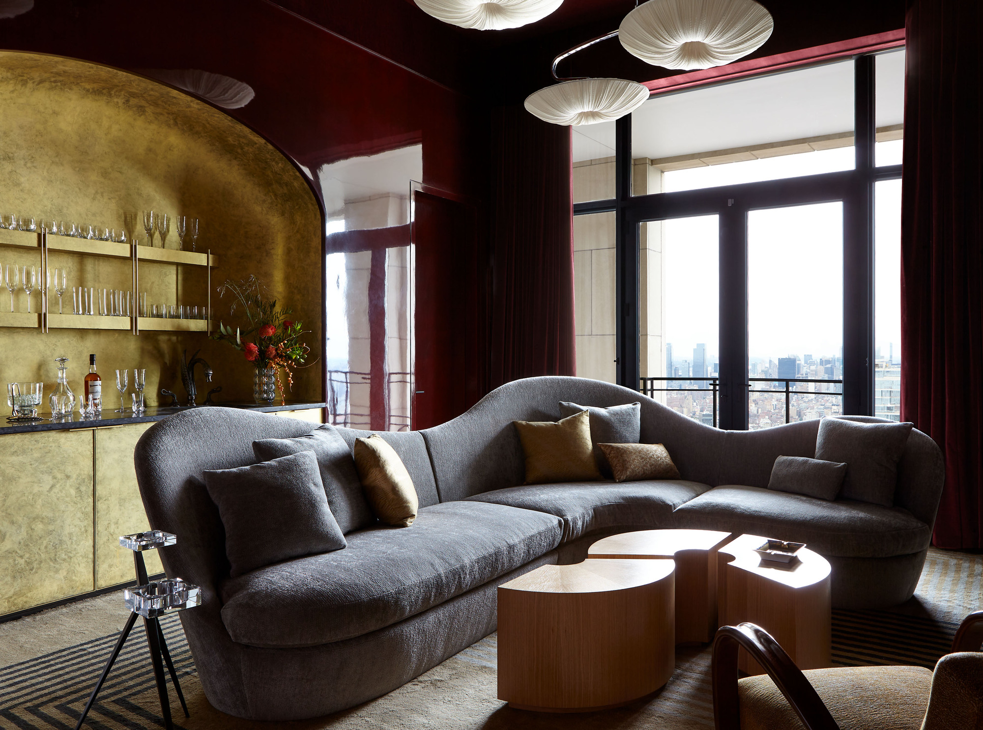
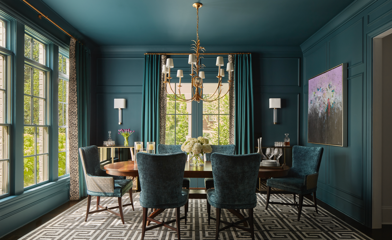
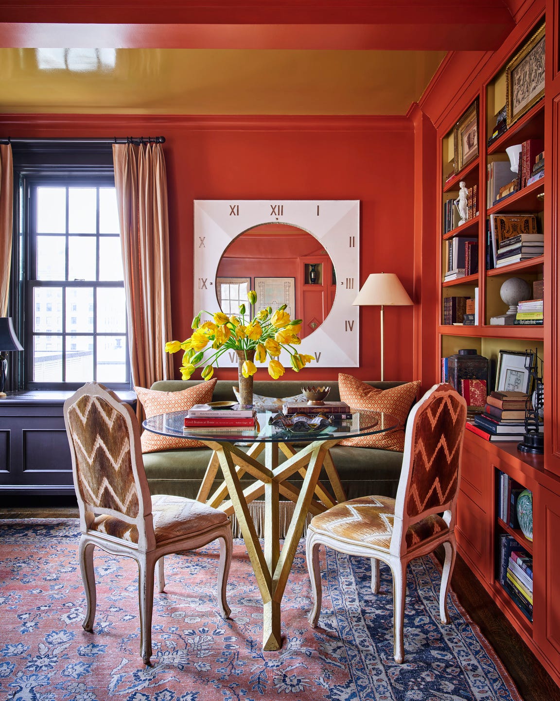
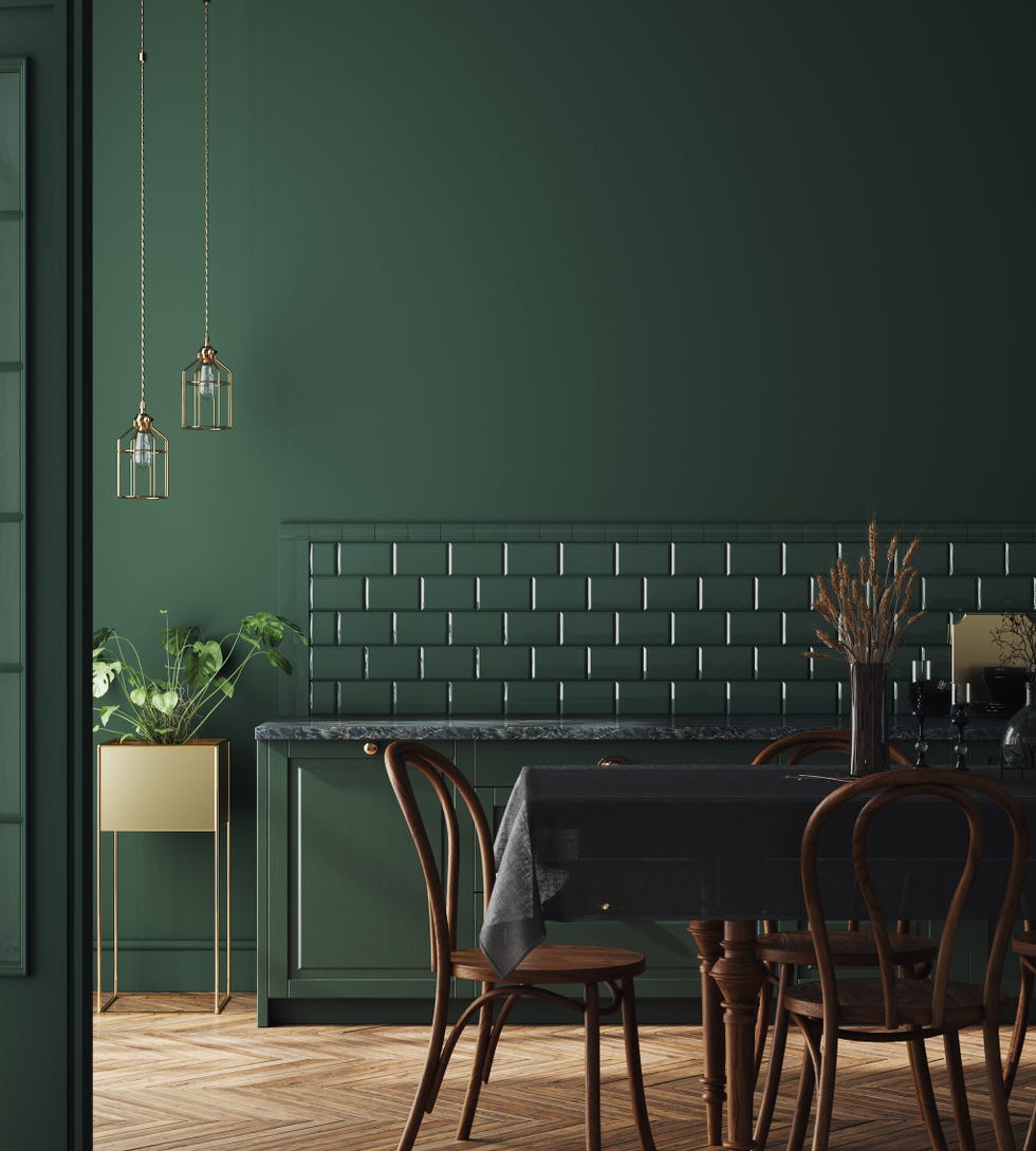
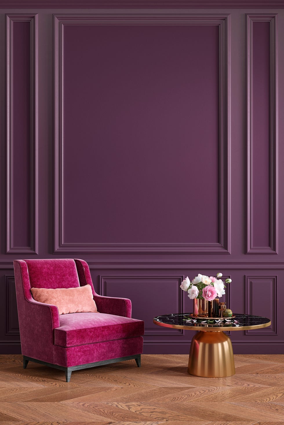
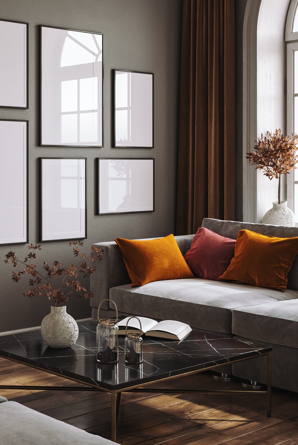
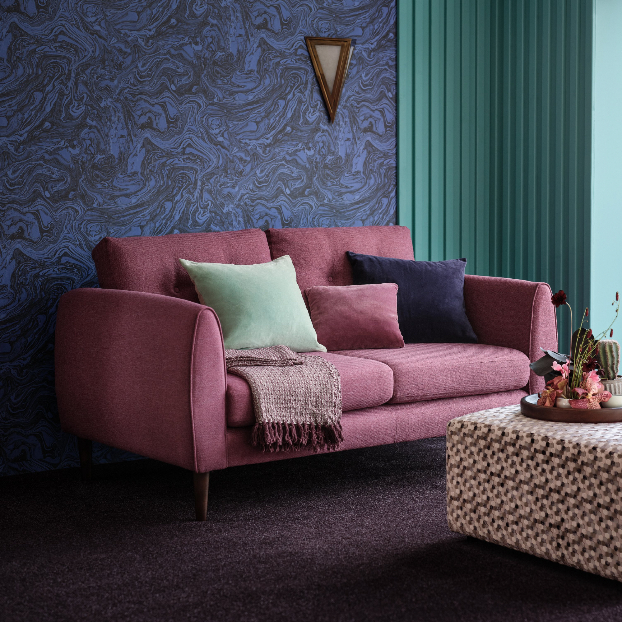
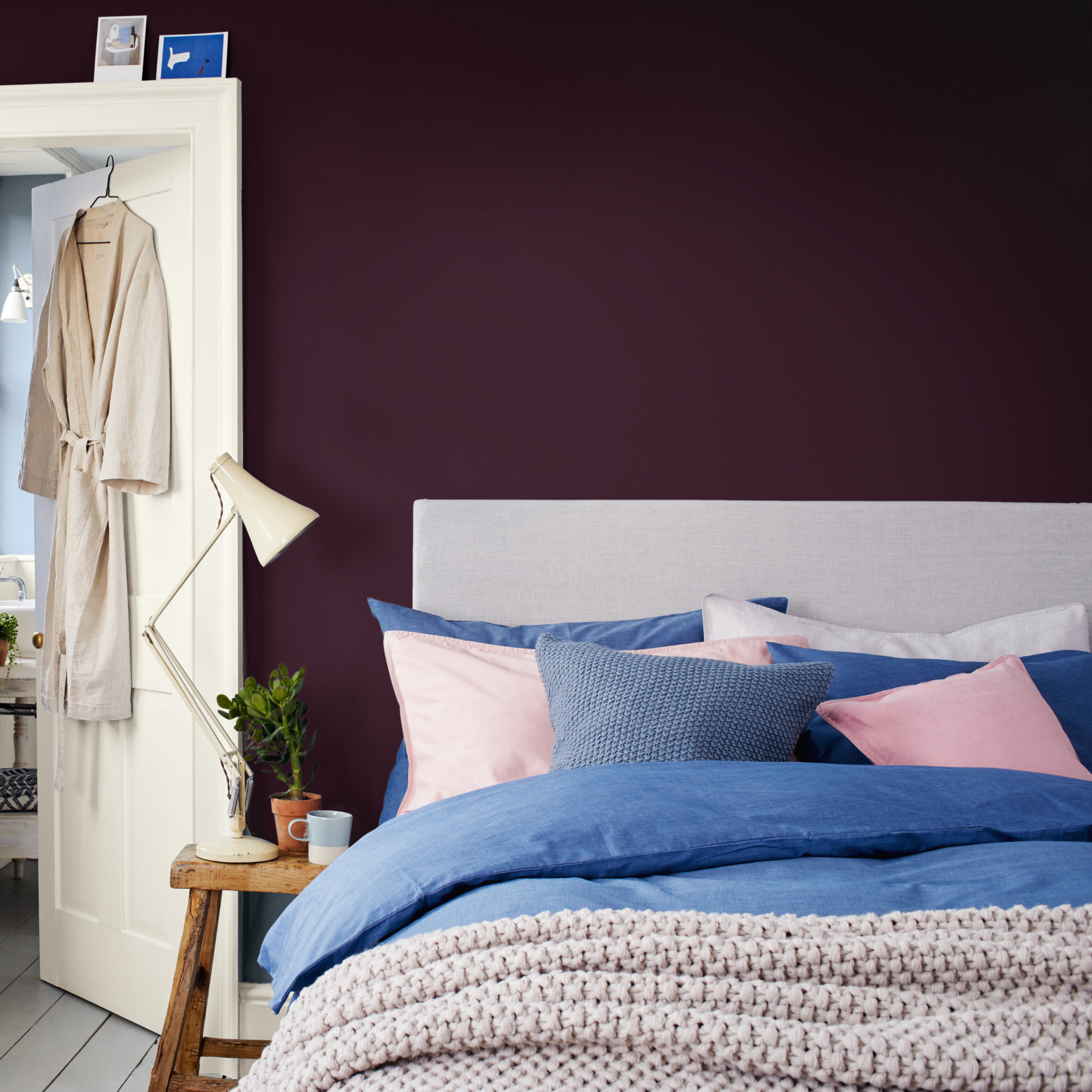
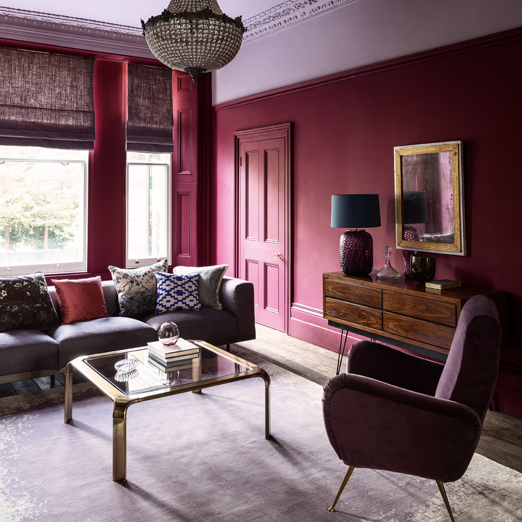
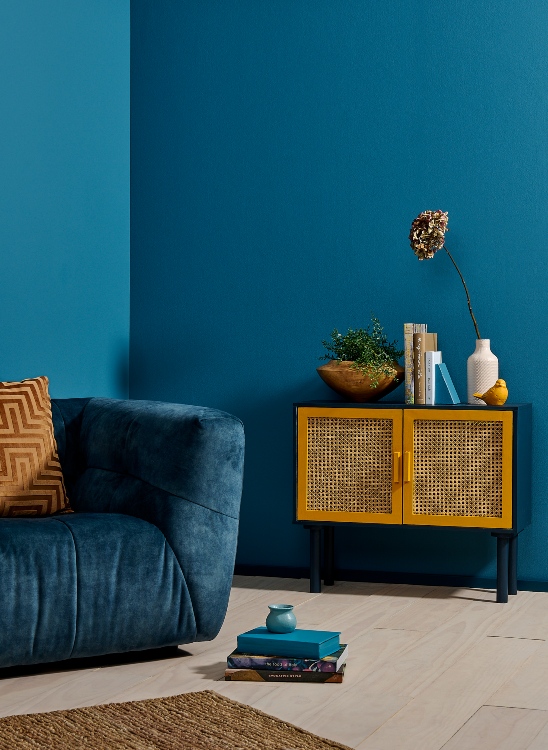
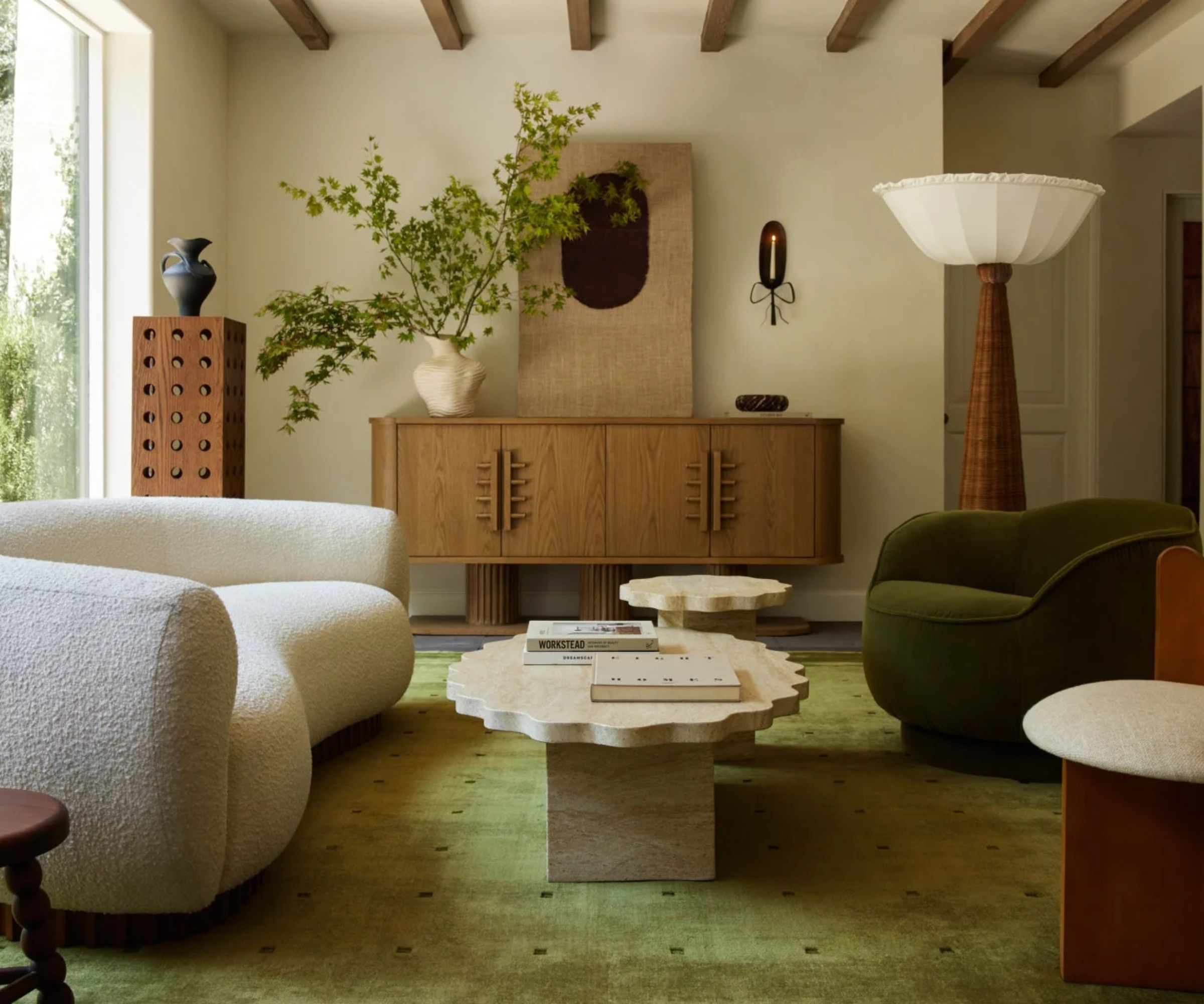
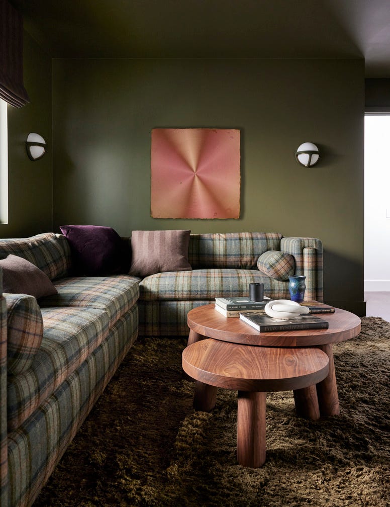
Designers recommend strategic integration of chartreuse, using it in textiles like drapes, which project confidence, or as paint colors in high-gloss lacquer behind built-ins. For a cozier winter aesthetic, chartreuse can be balanced with deep, rich tones such as inky navy, dark espresso, or chalky mauve. The color’s presence in nature, evoking images of Concord pears or Aspen trees changing from green to gold in the fall, makes it easy to incorporate into various color schemes. Its versatility allows it to pair well with different design styles, from antiques to modern lines or coastal themes, maintaining a fresh feel regardless of the context.
Chartreuse is being embraced in new product lines, including wallpaper and fabric collections, by design houses. Unlike fleeting viral trends, chartreuse is presented as a sharp and versatile tool for interior design, rather than a gimmick. It offers a sophisticated way to introduce vibrancy and life into homes, particularly during the darker months of fall. Practical applications include using chartreuse as an accent color in decorative trays, vases, hardware, and lamps, allowing for subtle integration or bolder statements depending on personal preference. The article also briefly mentions 'dill green' as another earthy tone to watch for in upcoming color trends, suggesting a broader interest in green hues for interior design.
In essence, chartreuse is positioned as a significant interior design trend for fall 2025, offering a vibrant yet sophisticated alternative to past color crazes. Its historical roots, combined with its current reinterpretation by leading designers, underscore its potential to revitalize and add character to home environments. The color’s adaptability to various design elements and its ability to harmonize with different palettes ensure its relevance and enduring appeal in modern interiors. Overall, the color is seen as a timeless and impactful choice for adding an energetic touch to decor.
#ChartreuseColor #InteriorDesignTrends #FallDecor2025 #AccentColor #HomeDecor #ColorPalette #DesignInspiration #DecoratingWithGreen #ChartreuseColor #InteriorDesignTrends #FallDecor2025 #AccentColor #HomeDecor #ColorPalette #DesignInspiration #DecoratingWithGreen
0 comment in total
 No comments yet
You may also like
This surprising color trend is having a comeback

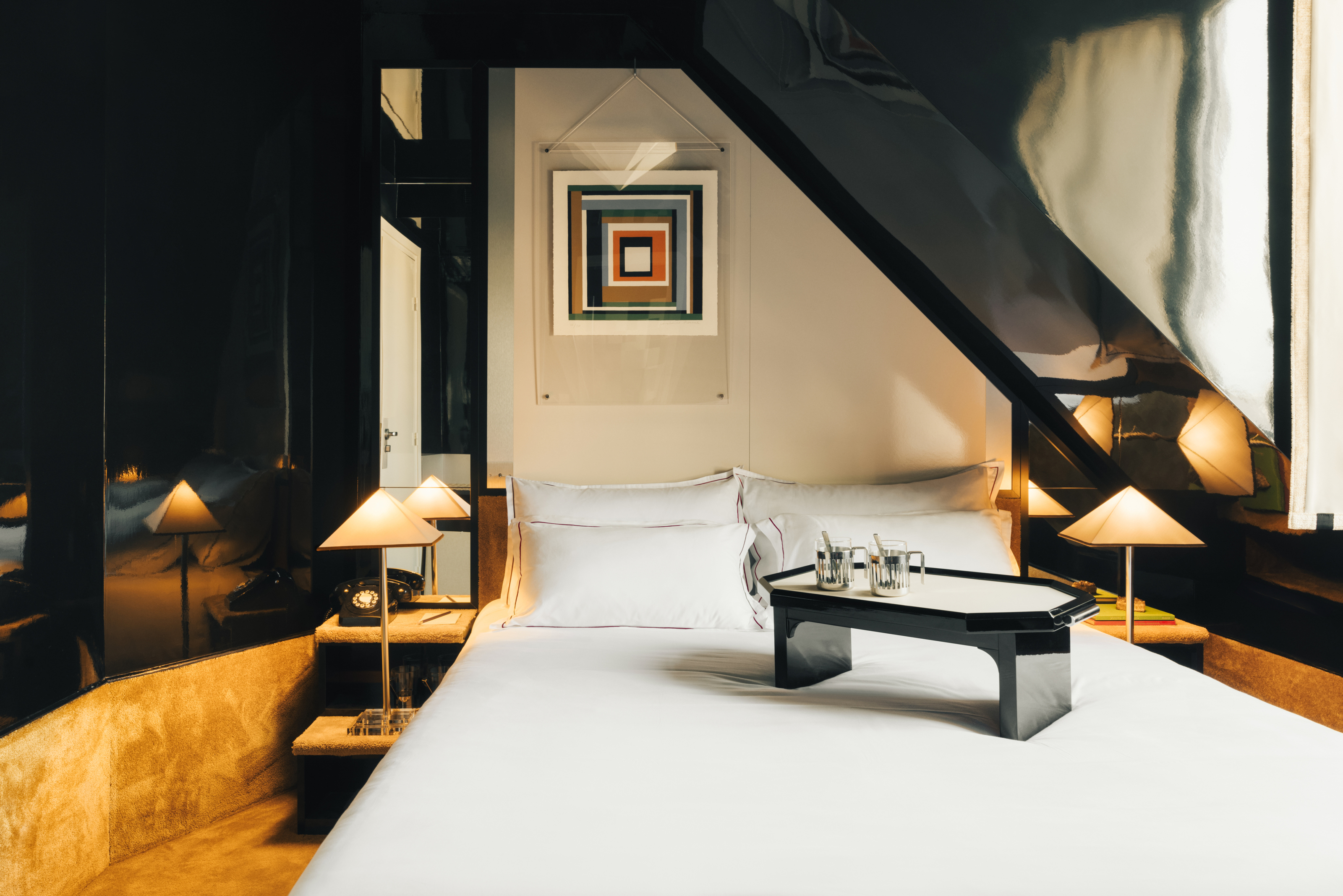
This Outdated Paint Trend is now Predicted to Return — Designers Love its "Fun, Eye-Catching Glamor"
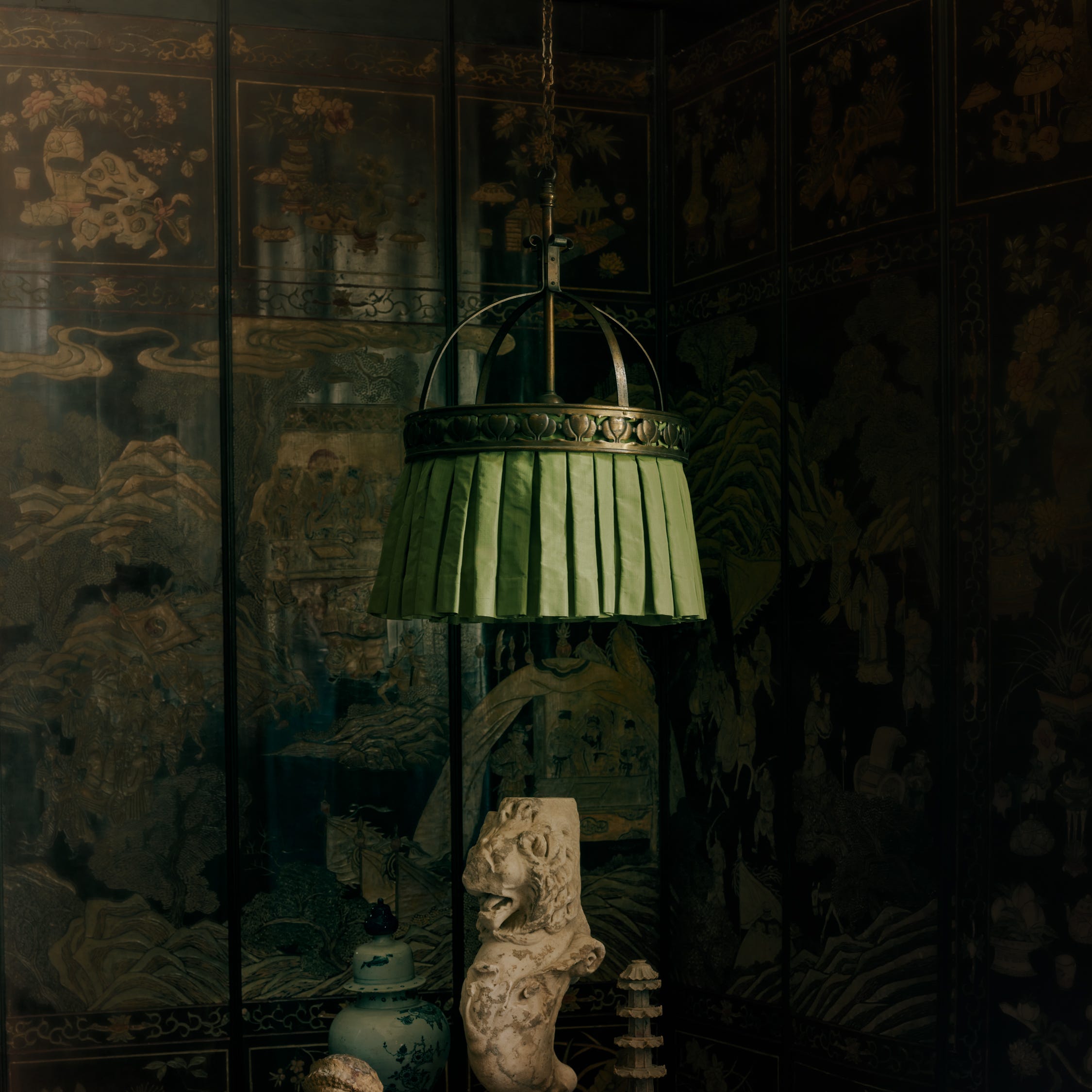
The Bold New Lighting Collection Everyone is Talking About
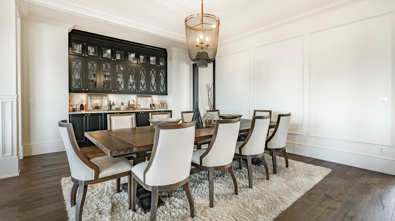
Upgrade Your Dining Room Lighting With This Vintage-Inspired Trend

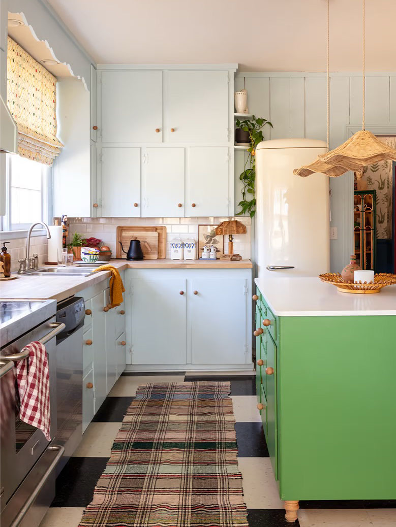
From Cabinetry to Upholstery, This Soothing Color Is About to Upstage Sage

This Very "Controversial" Color Is About To Be Everywhere Again

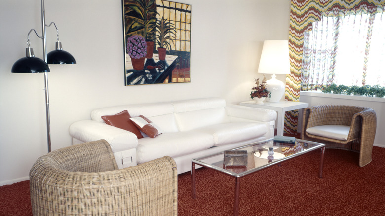
The Outdated '80s Lighting Trend That's Back & Better Than Ever
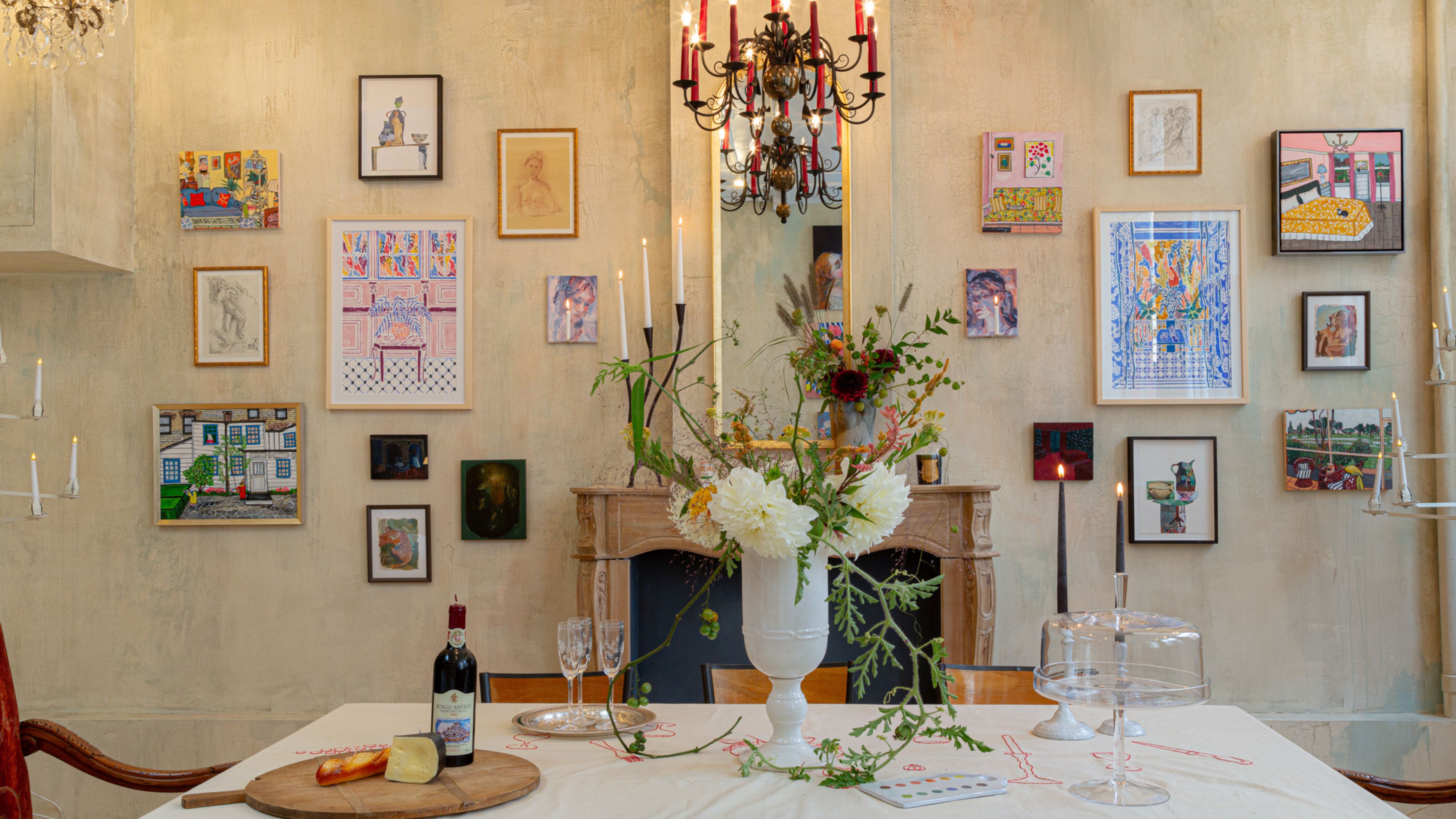
I’m romanticizing my home this fall – and this vintage lighting trend is the effortless, elegant touch making it happen
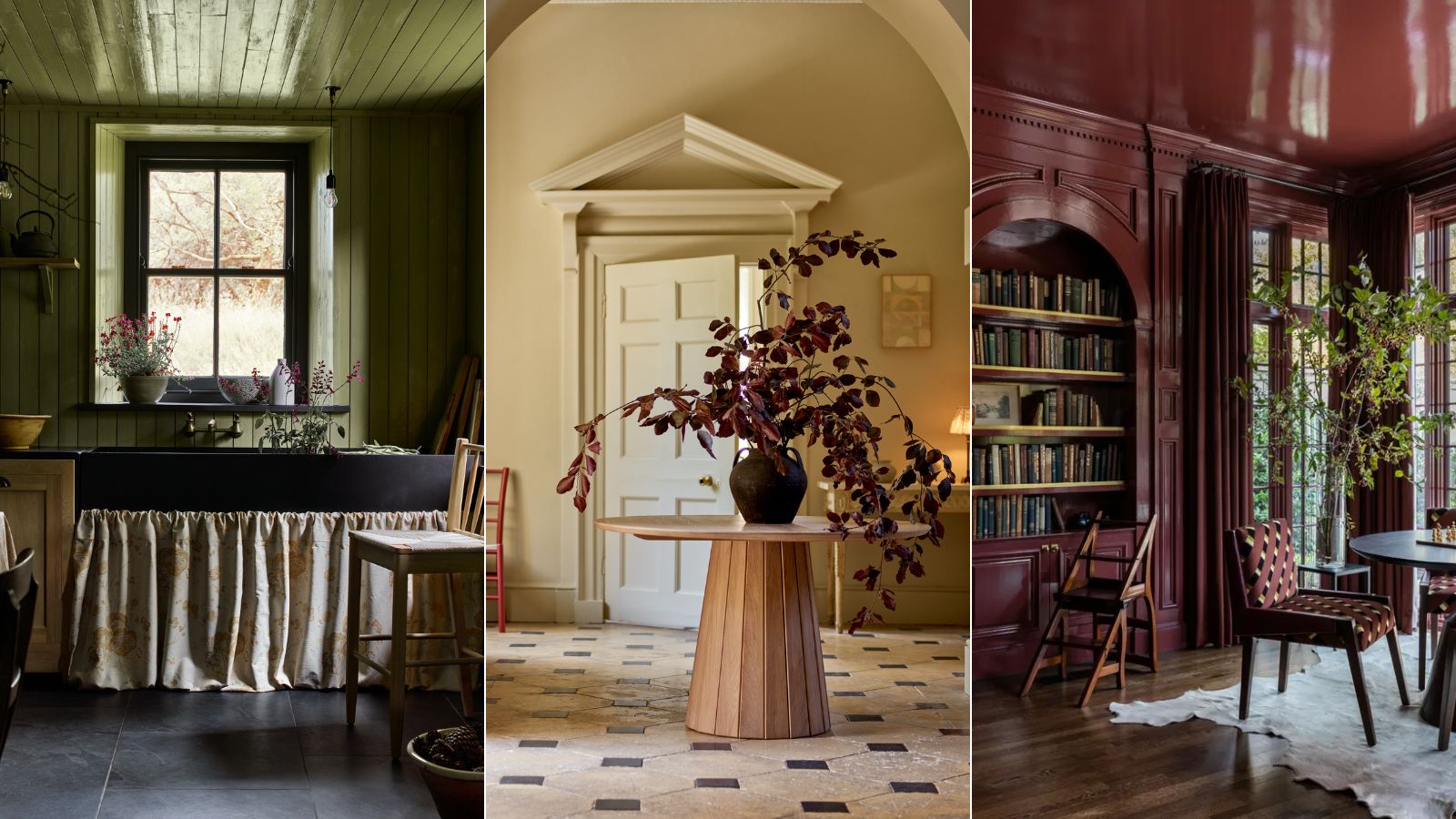
11 fall interior design trends that will help you to create elegant, warm looks for your home this autumn
Why This Hue Is Suddenly Dominating Every Designer's Wishlist—Plus, How to Style It

Designers Say These Vintage Paint Colors Are Back

Jewel Tones Are Trending for Living Room Paint Colors, According to Designers
This Bold 1960s Color Is Making A Comeback In Our Idea House
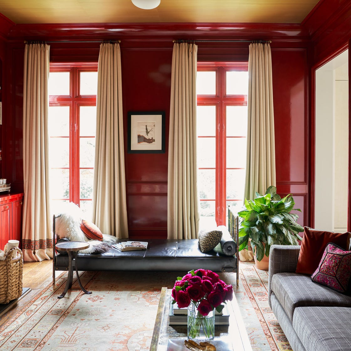
Why This Hue Is Suddenly Dominating Every Designer's Wishlist—Plus, How to Style It

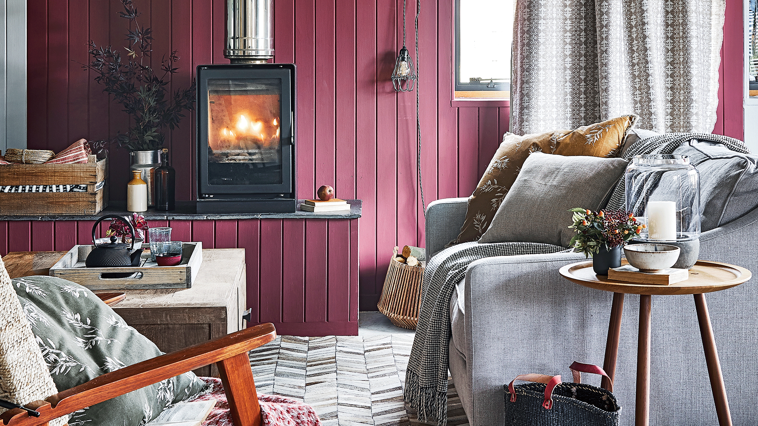
This cosy and warm colour is on track to become autumn's stand out shade
Deeper, moody colours and precious jewel tones are in style this year
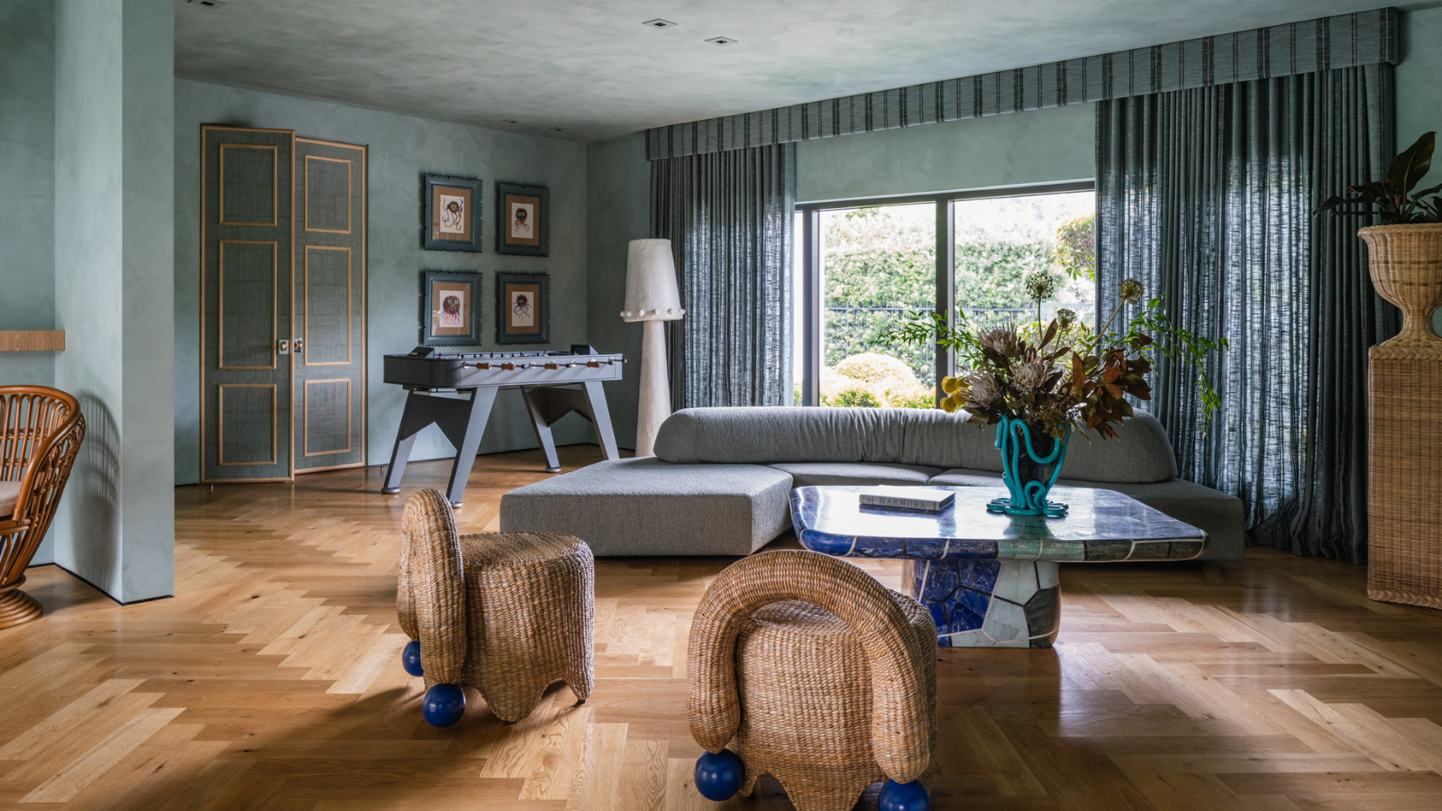
Bye-Bye Boring Drapes, The Once-Dated Trend for Luxuriously Dramatic Window Treatments Is Back – and Designers Very Much Approve
The Most DIVISIVE Wood Stain From the '90s Is Back in a Big Way
Interior Design Trendwatch: Colour is coming home
Forget Single Painted Accent Walls: This Stunning Trend Is Taking Over