1/6
5 best green paints that will always be classics, according to interior designers
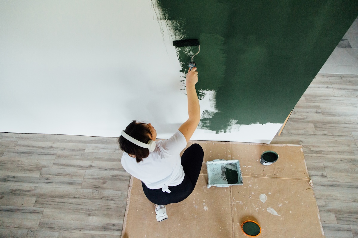
Green paint colors are often regarded as relatively neutral, possessing a balanced warmth and coolness that makes them highly versatile for various spaces, regardless of lighting conditions. Interior designers were consulted to identify their top five classic green paint shades and gain insights into their optimal use and pairing strategies.
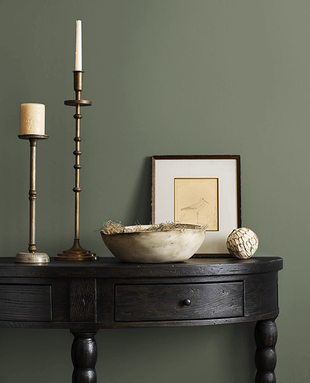
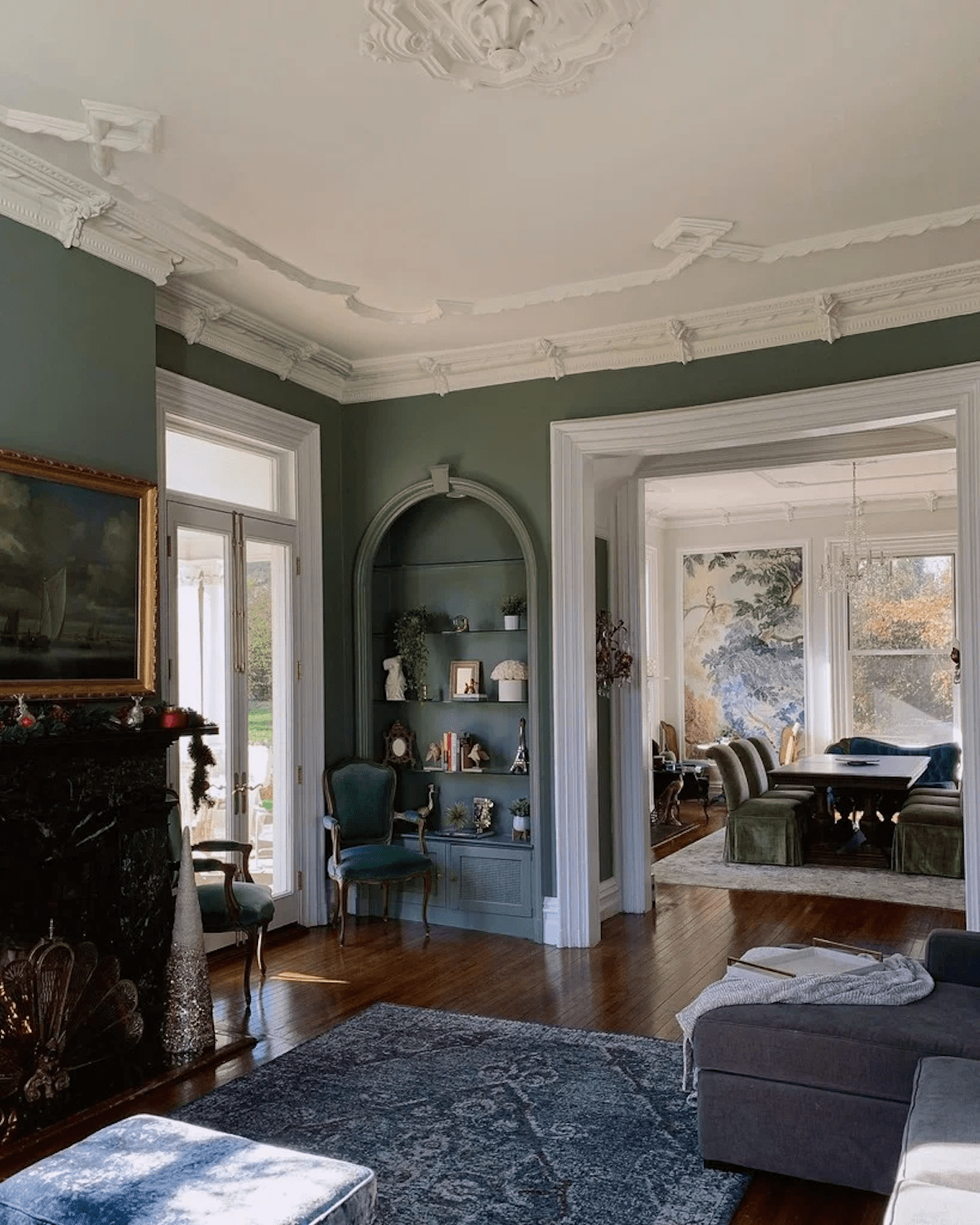
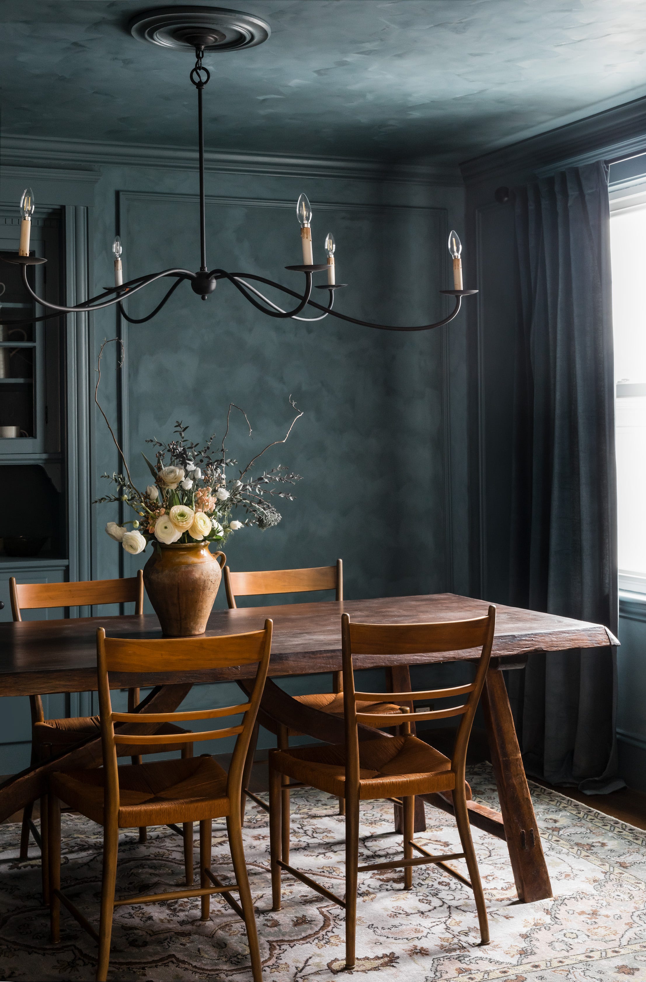
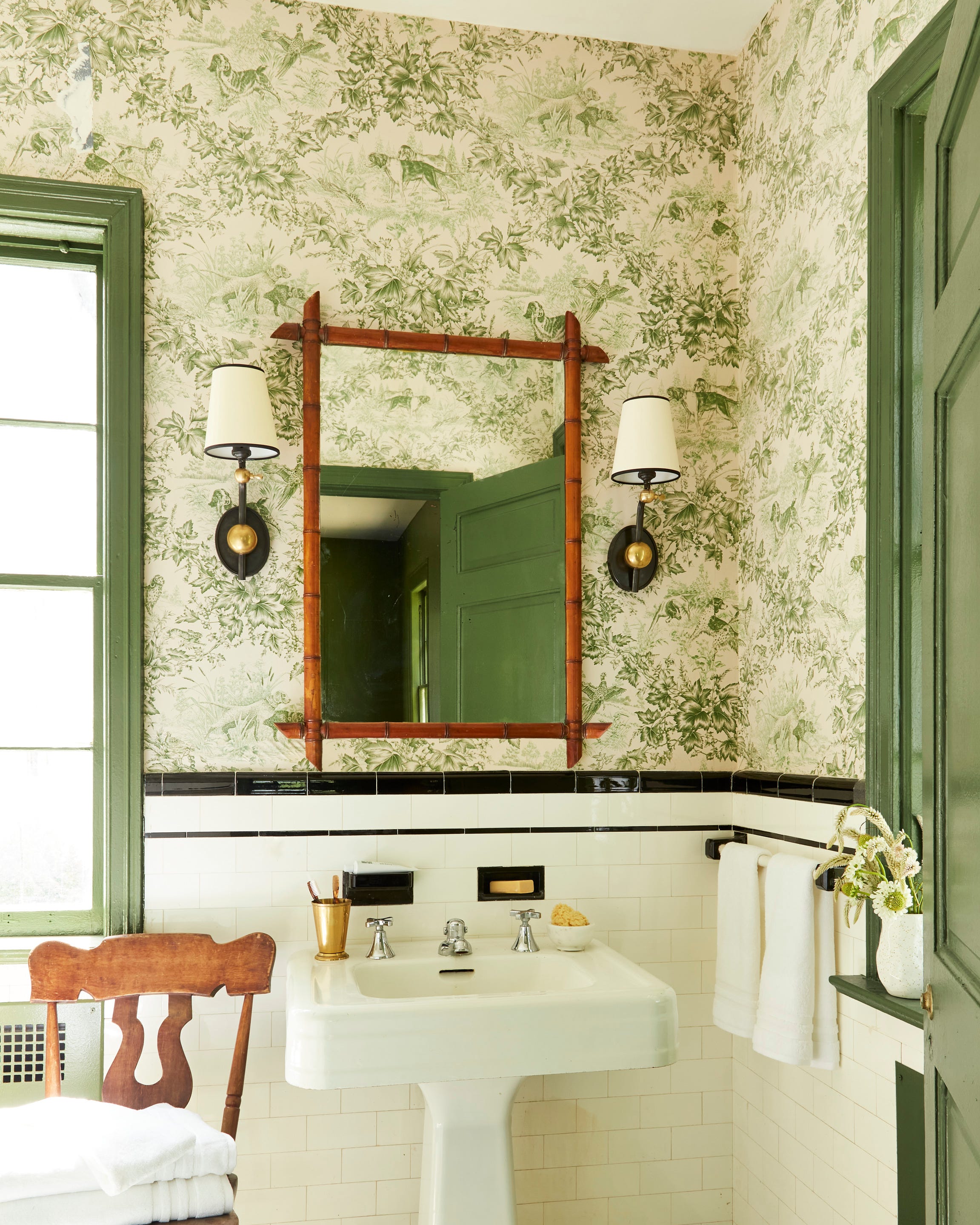
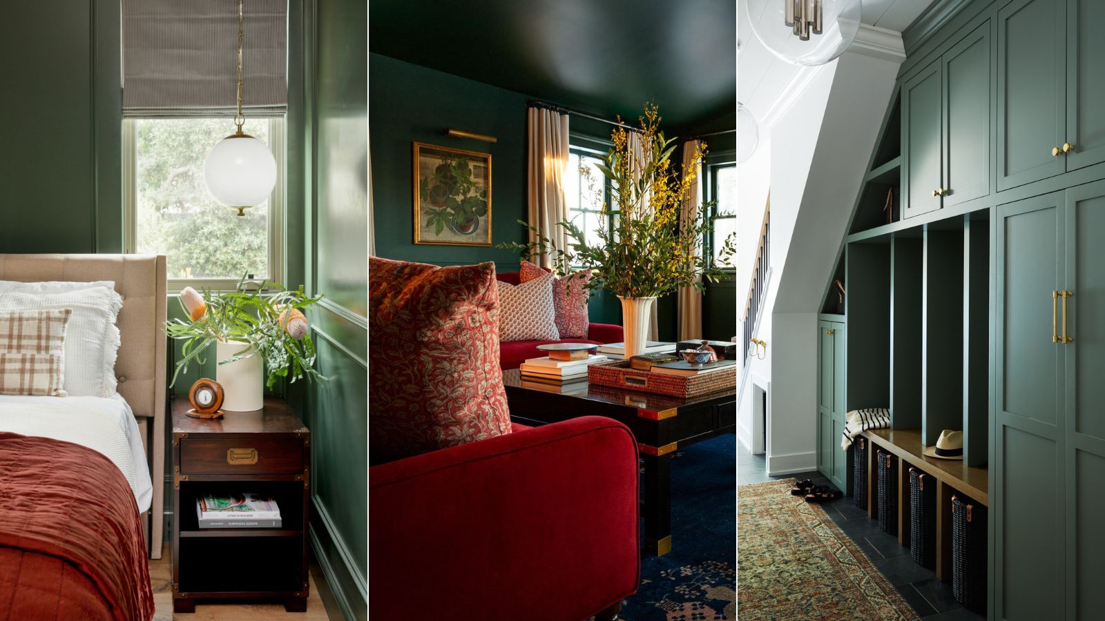
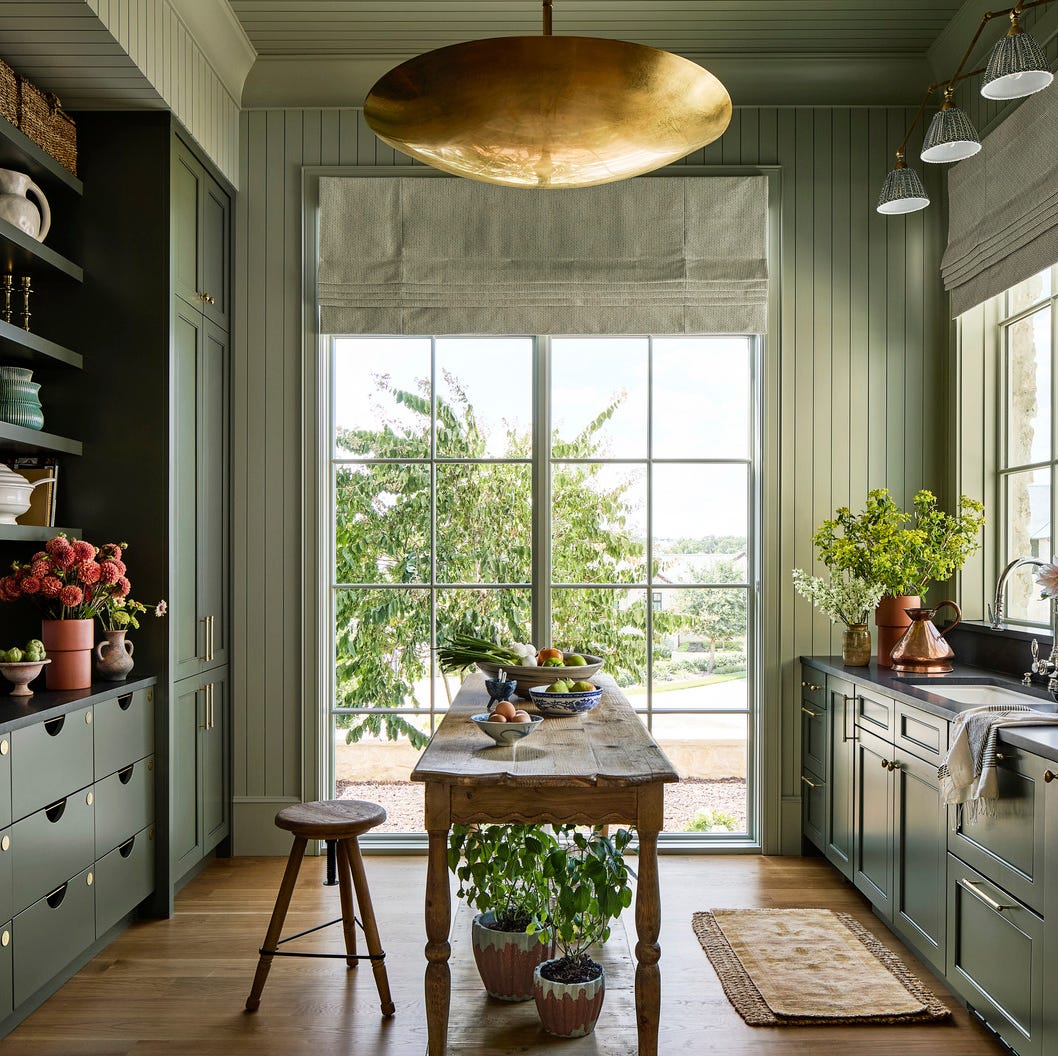
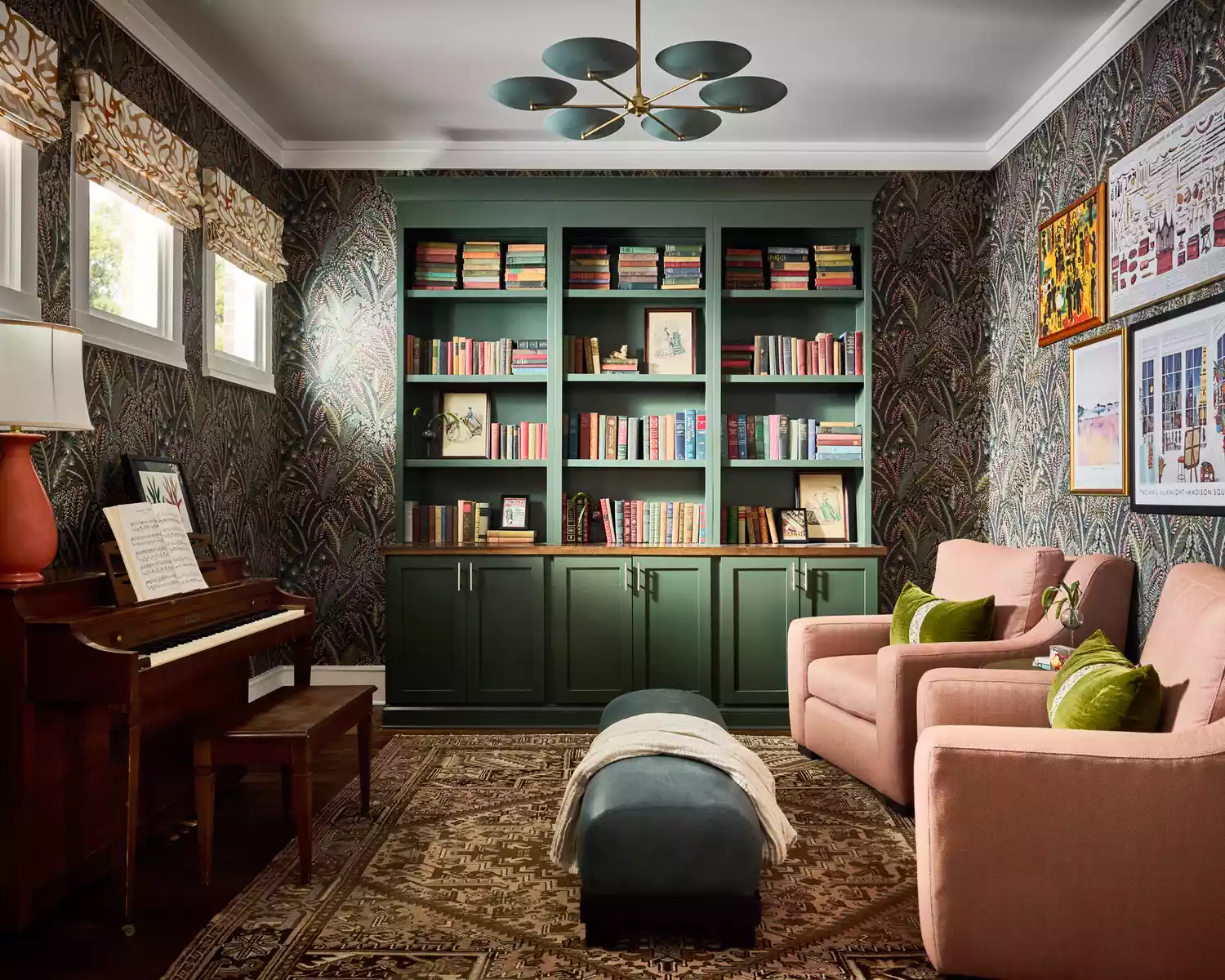
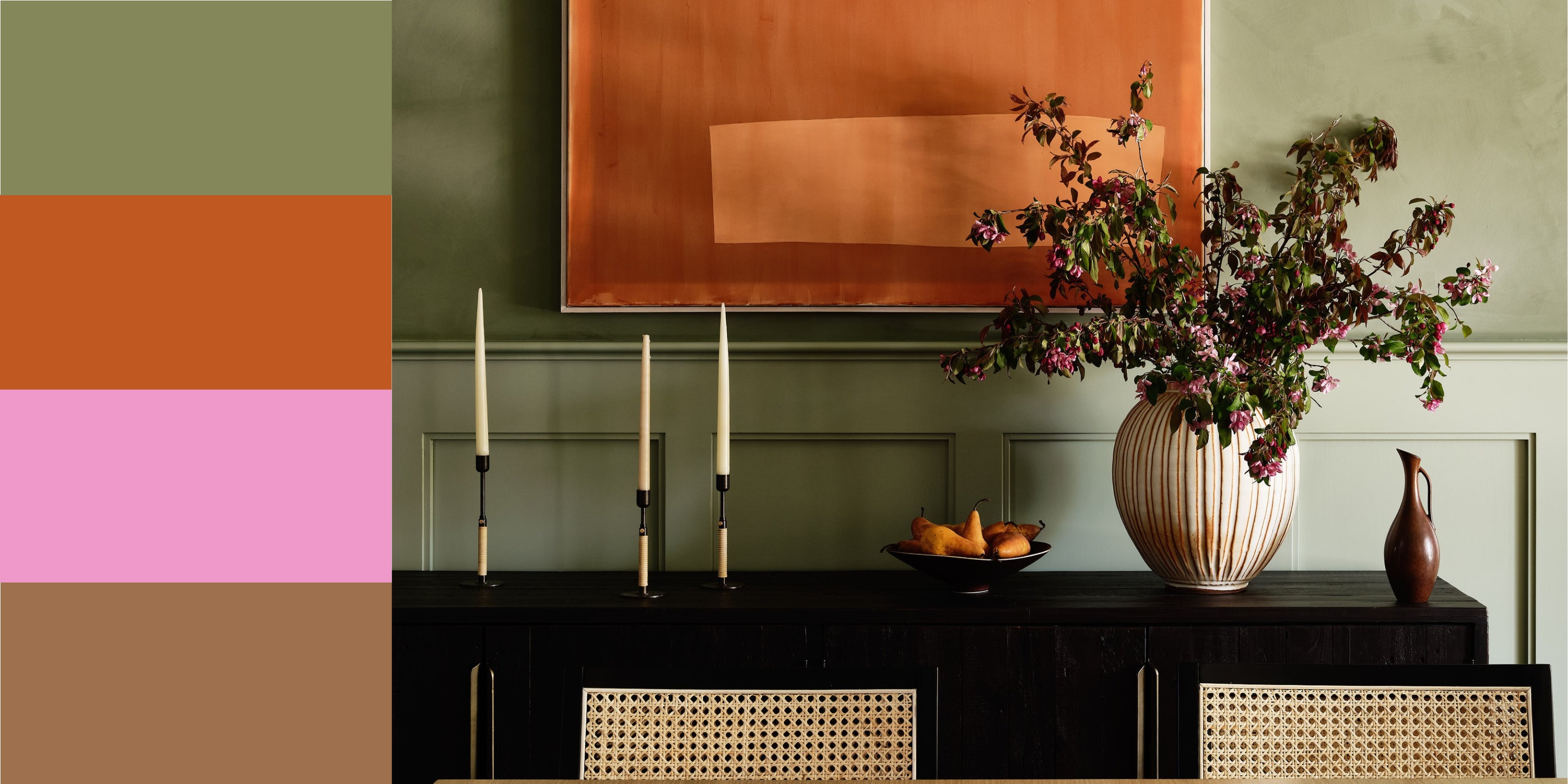
The first recommended shade is Farrow & Ball's Card Room Green. This mid-toned green features grayish undertones, providing a moody yet warm and deep hue. Its versatility allows it to complement both lighter and darker colors effectively. Historically named after Victorian-era study rooms, it adapts well to different lighting, revealing subtle shifts throughout the day. This makes it an ideal choice for spaces like mudrooms, where it can harmonize with vintage elements.
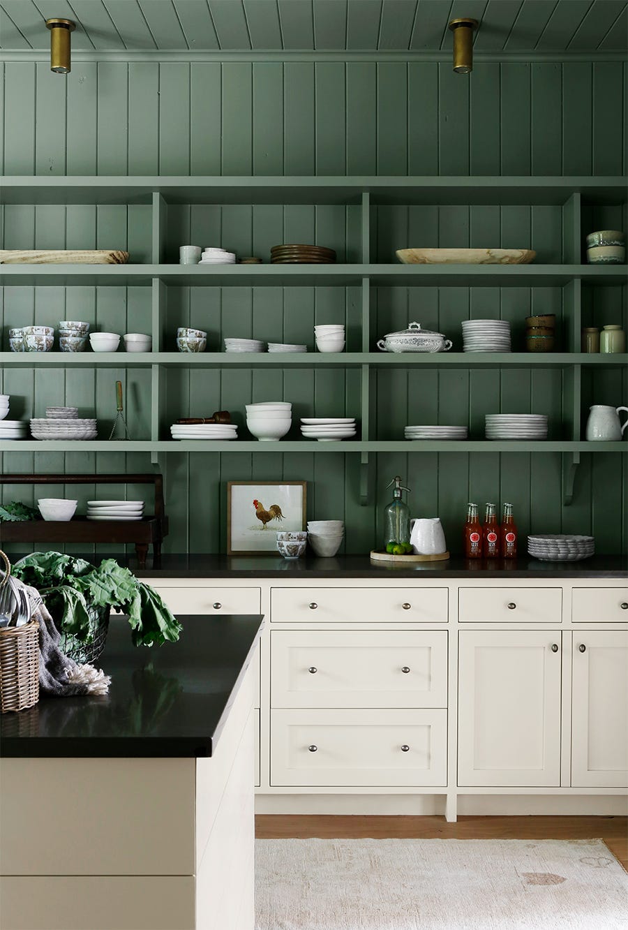
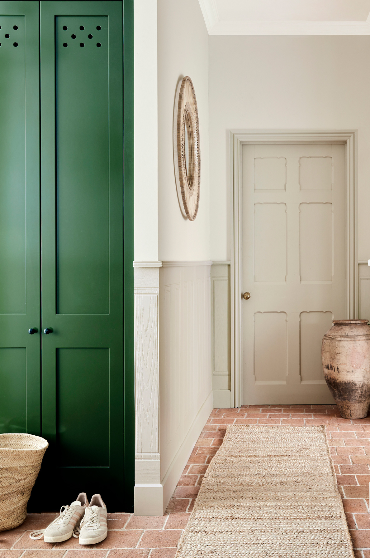
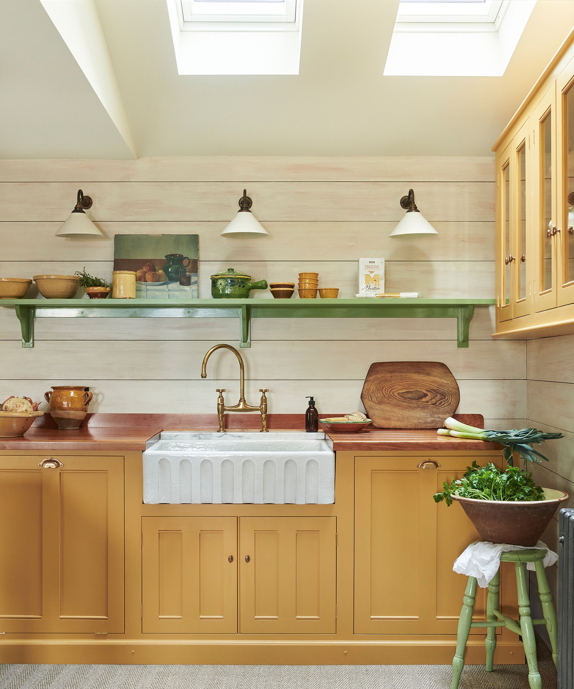
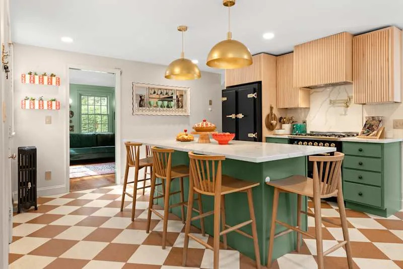
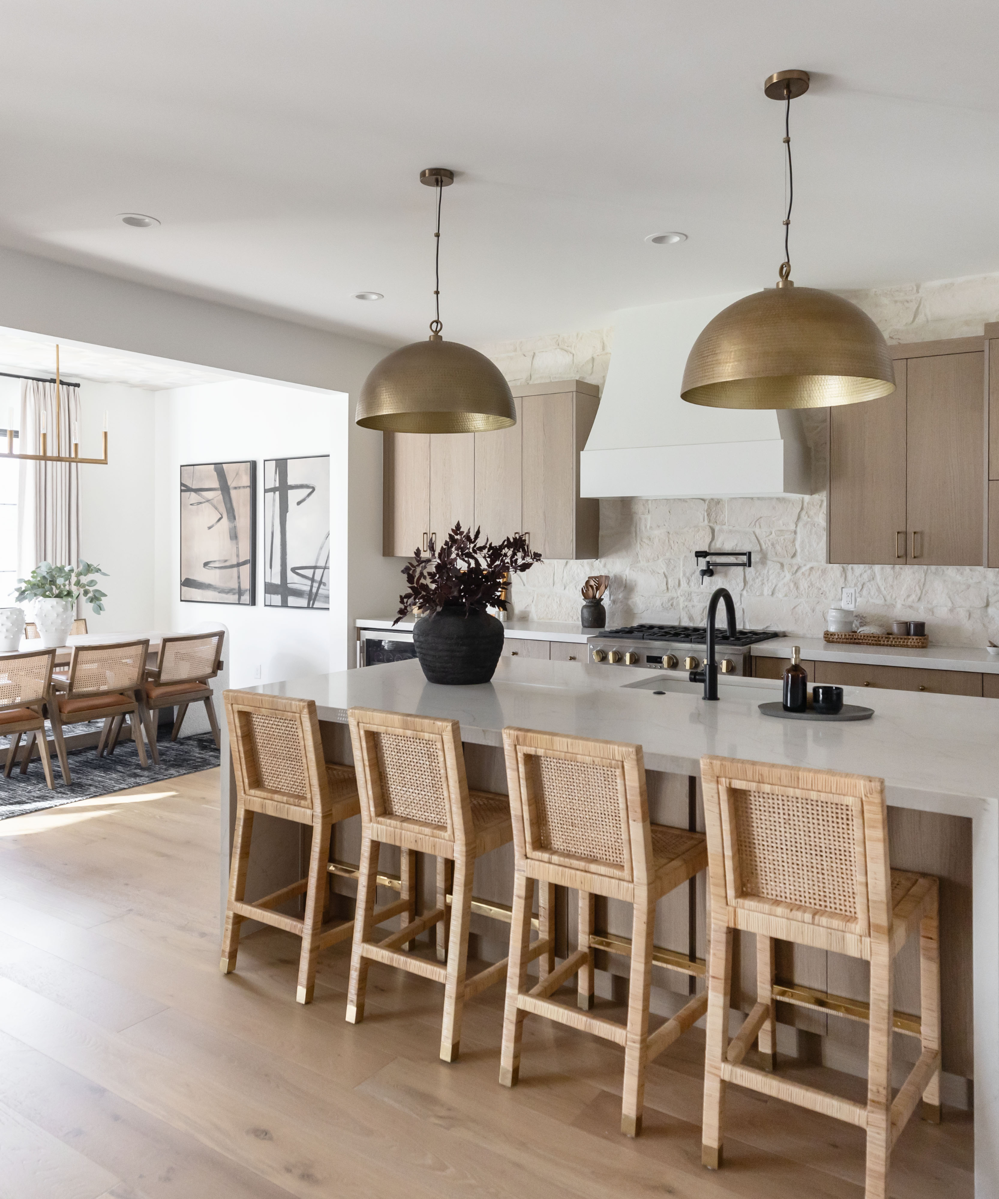
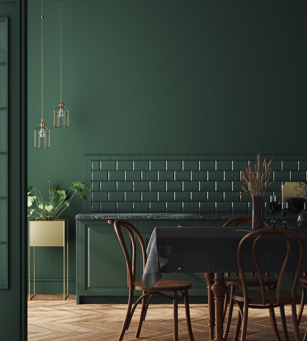
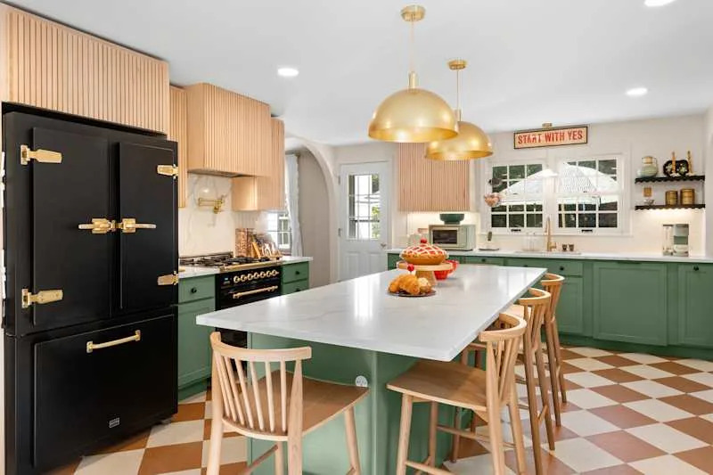
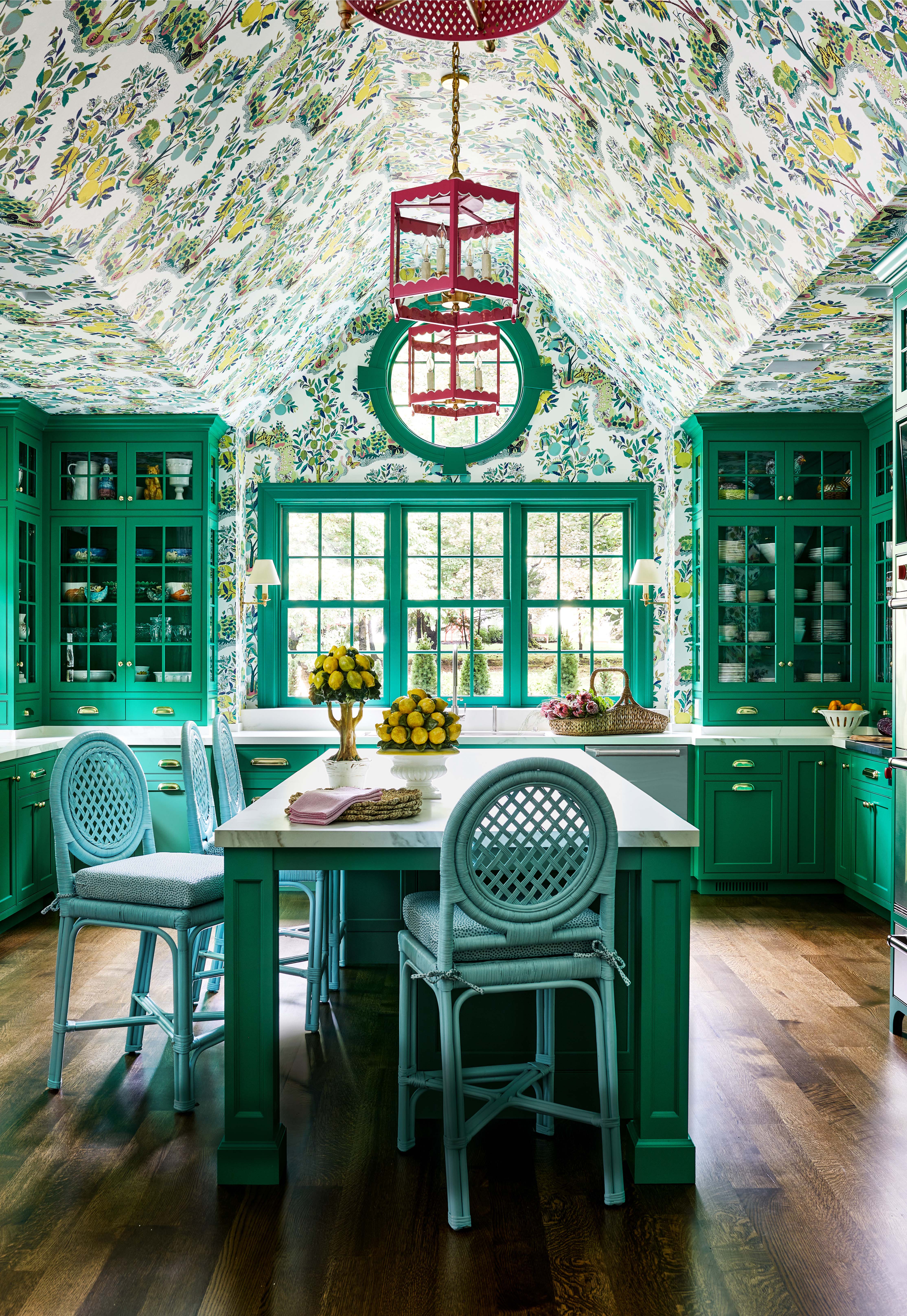
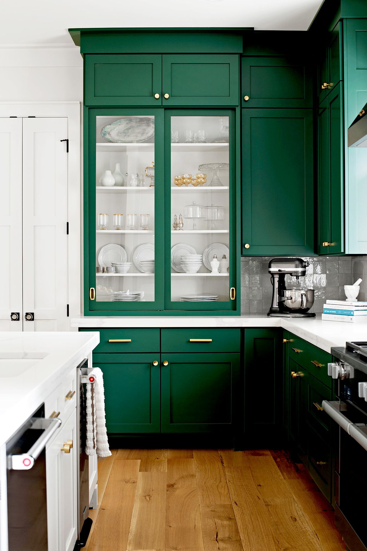
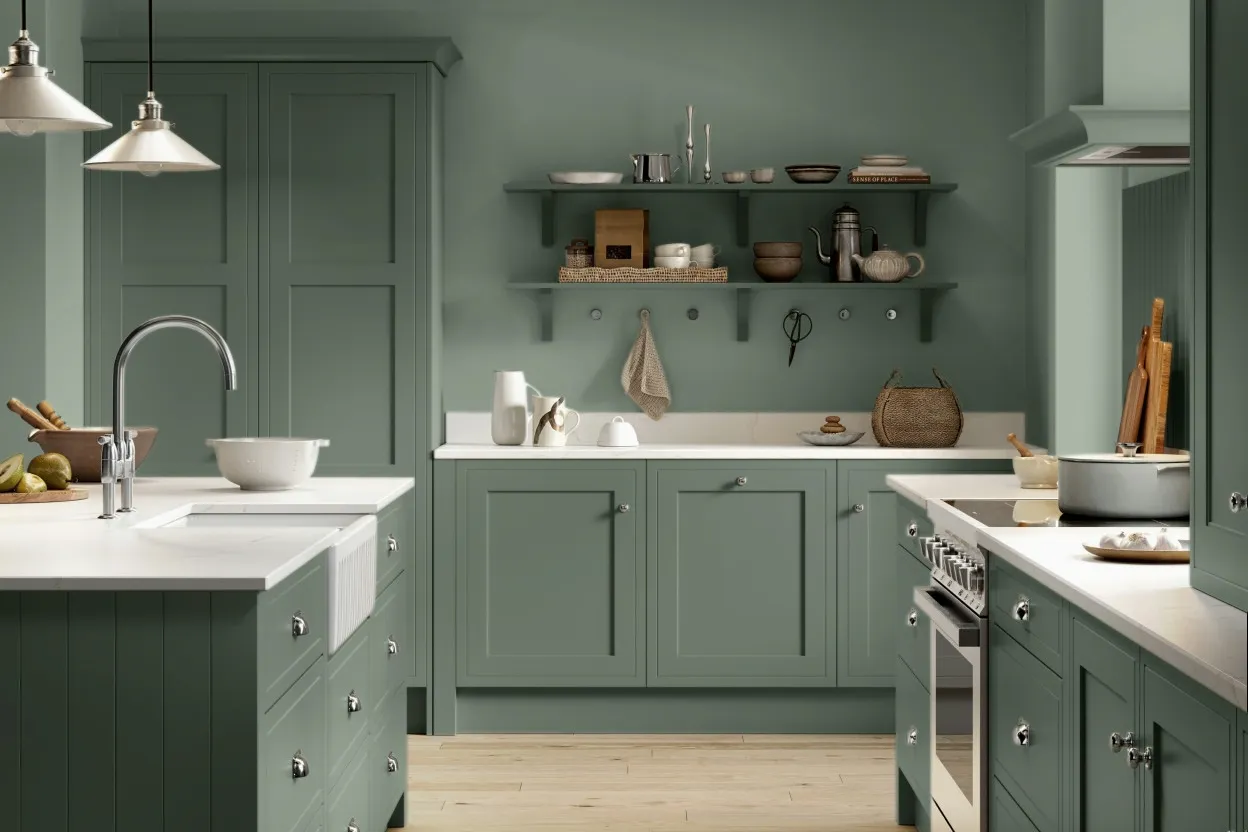
Next is deVOL's Bakehouse Green, a deep, utilitarian green with an old-school charm, particularly suited for kitchens. It imparts a sense of timelessness, making furniture feel sophisticated and resistant to fleeting trends. This shade is available in both furniture paint with a satin sheen and flat matt emulsion, both offering a rich depth of color. It pairs elegantly with aged brass accents, enhancing its classic appeal.
For those seeking a bolder statement, Sherwin-Williams' High Strung is an acid green that introduces an element of surprise and freshness. Its intensity evokes nature, making it a contemporary choice for living rooms or study areas. To balance its vividness, designers suggest pairing it with dark colors like black for a modern aesthetic, or with white for a fresh, invigorating contrast.
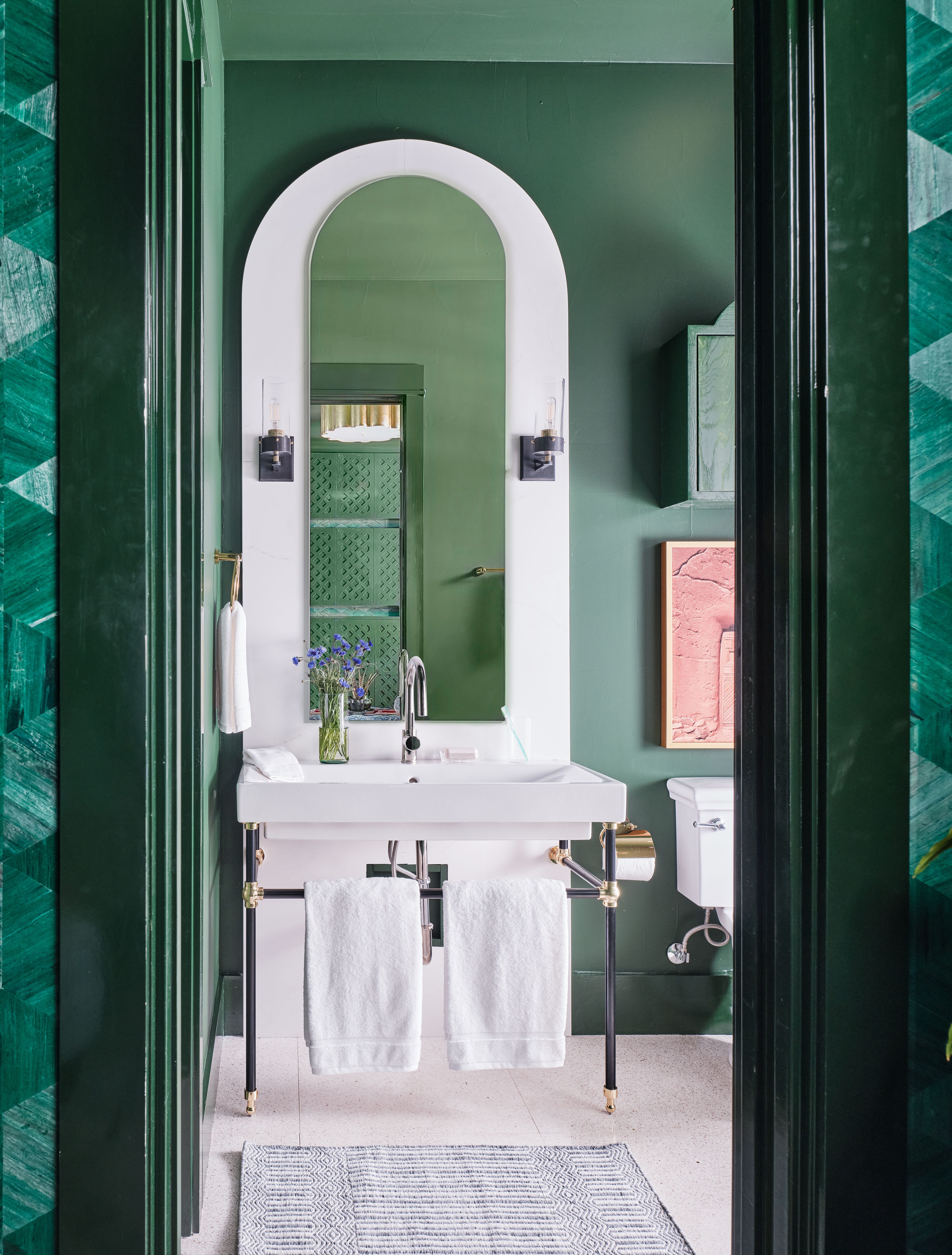
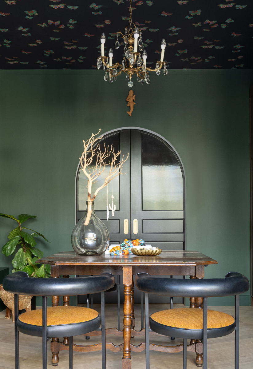
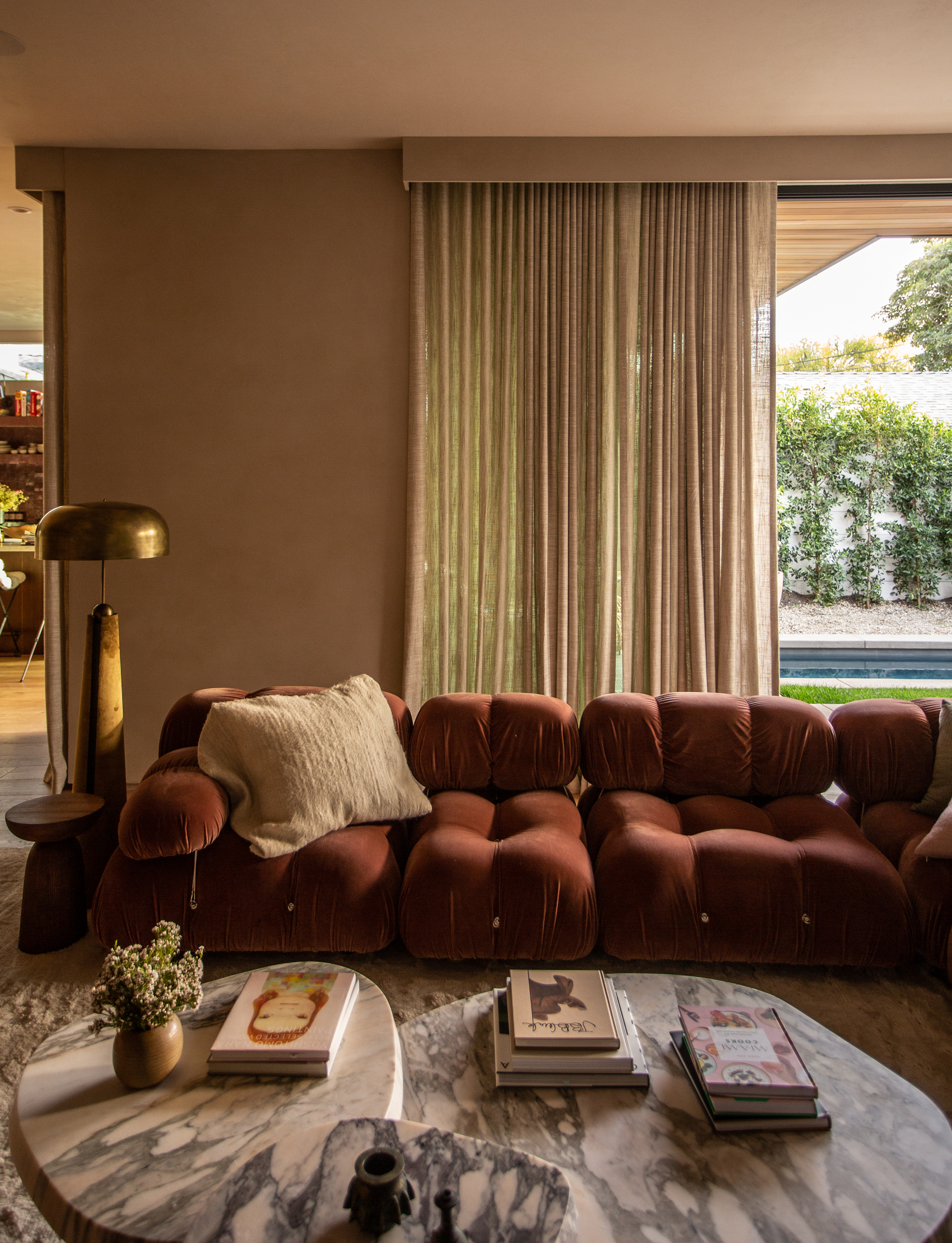
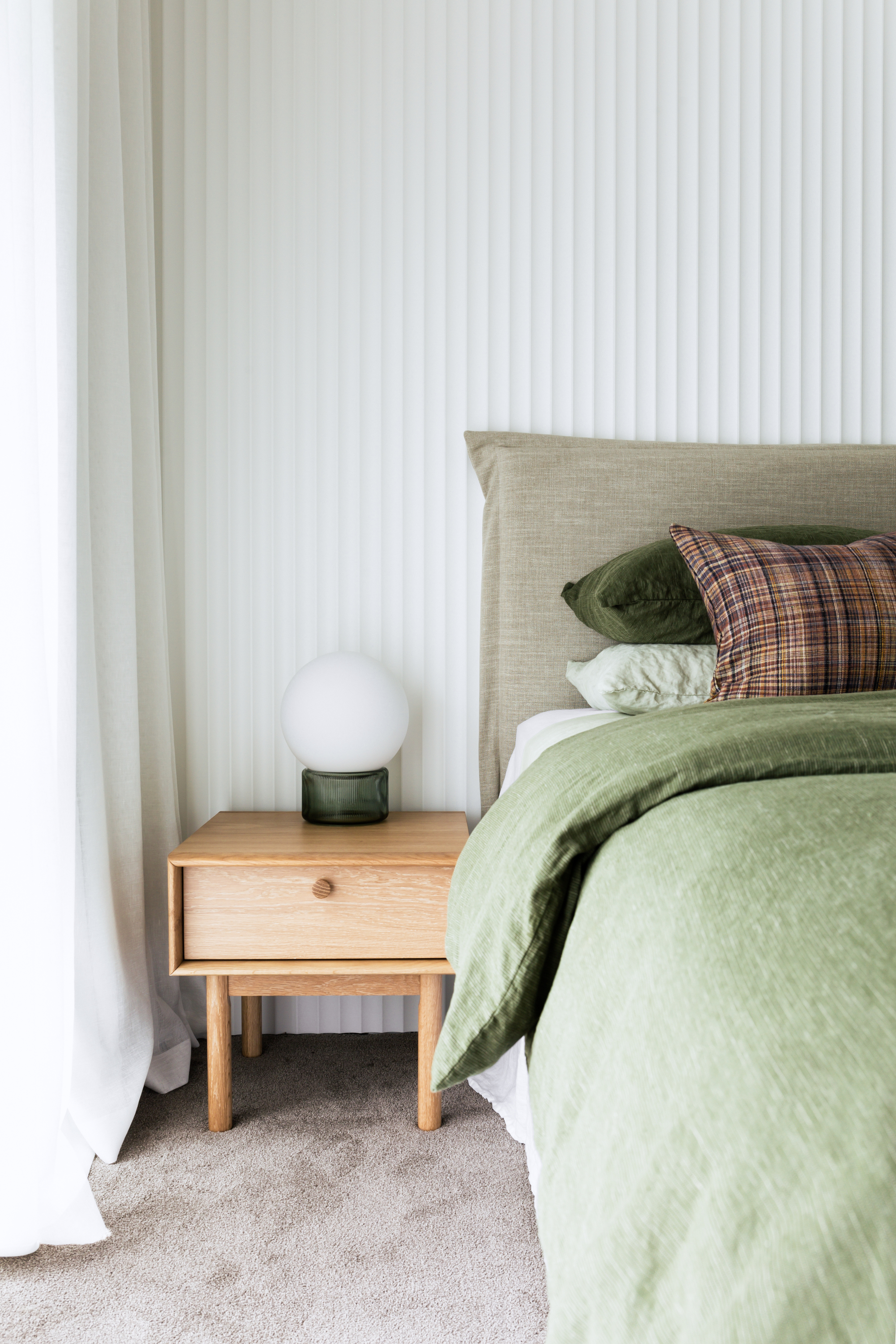
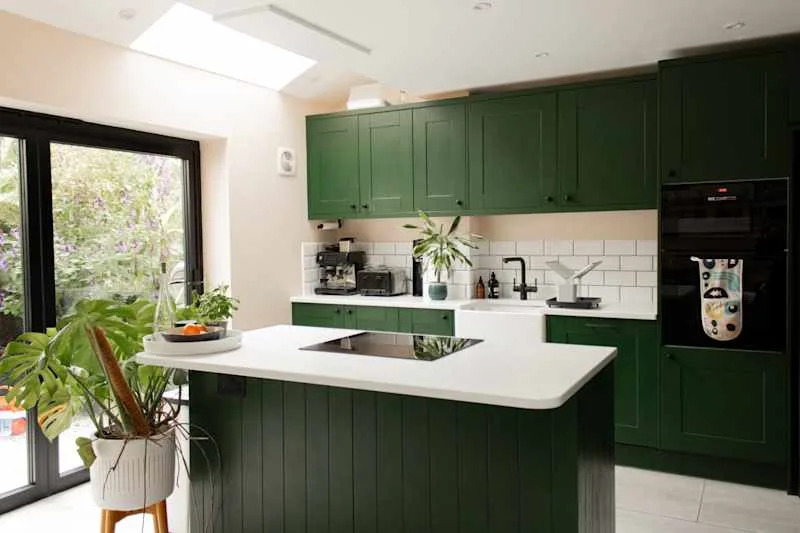
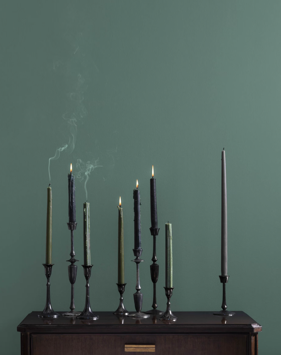
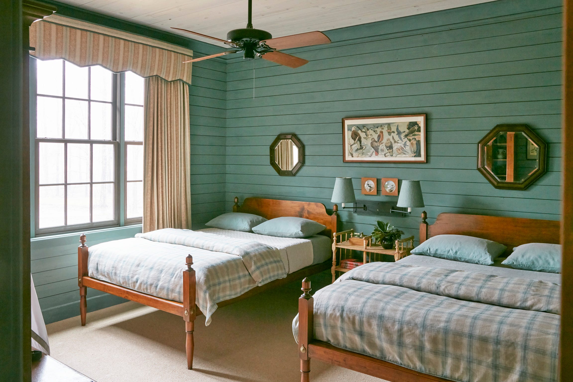
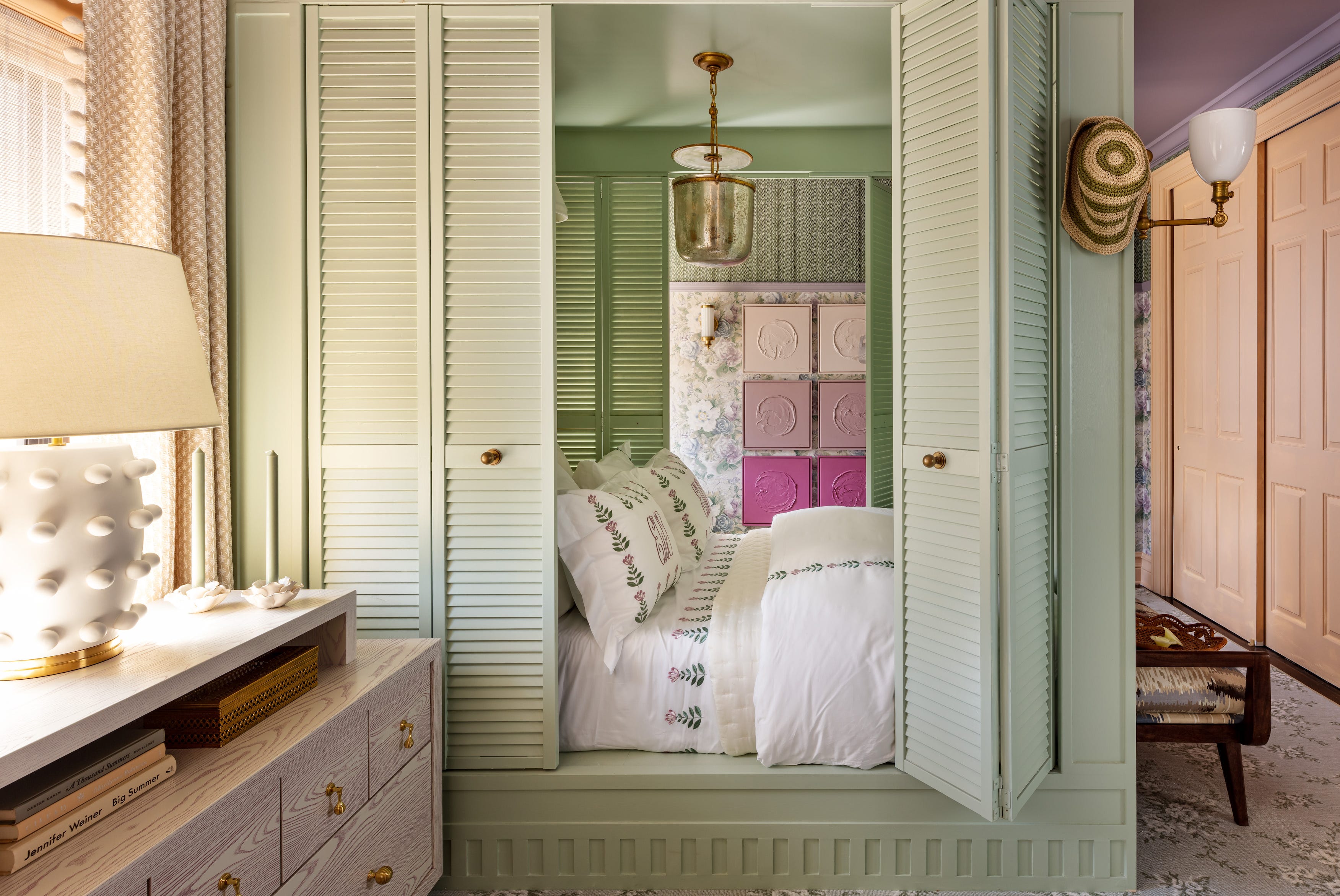
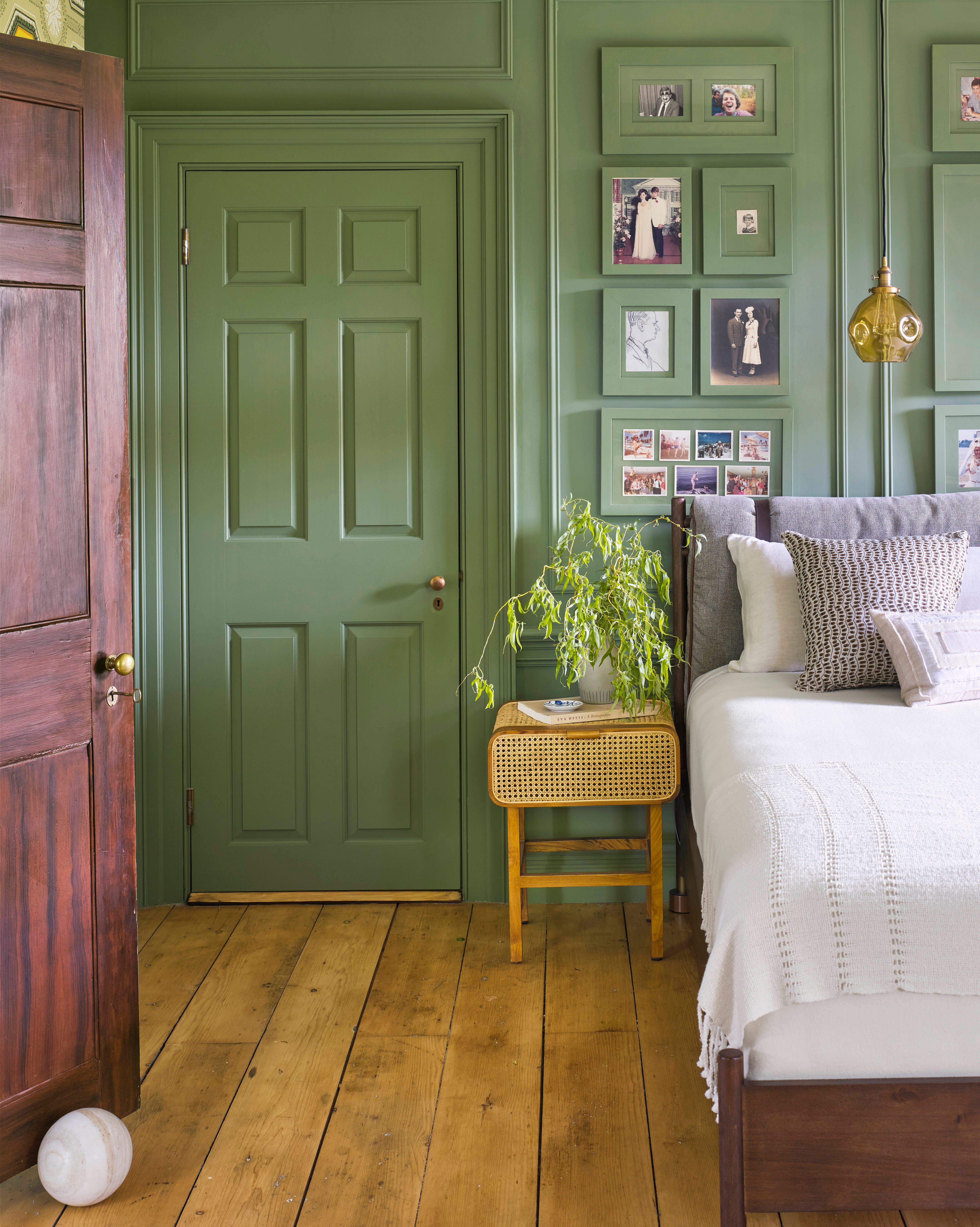
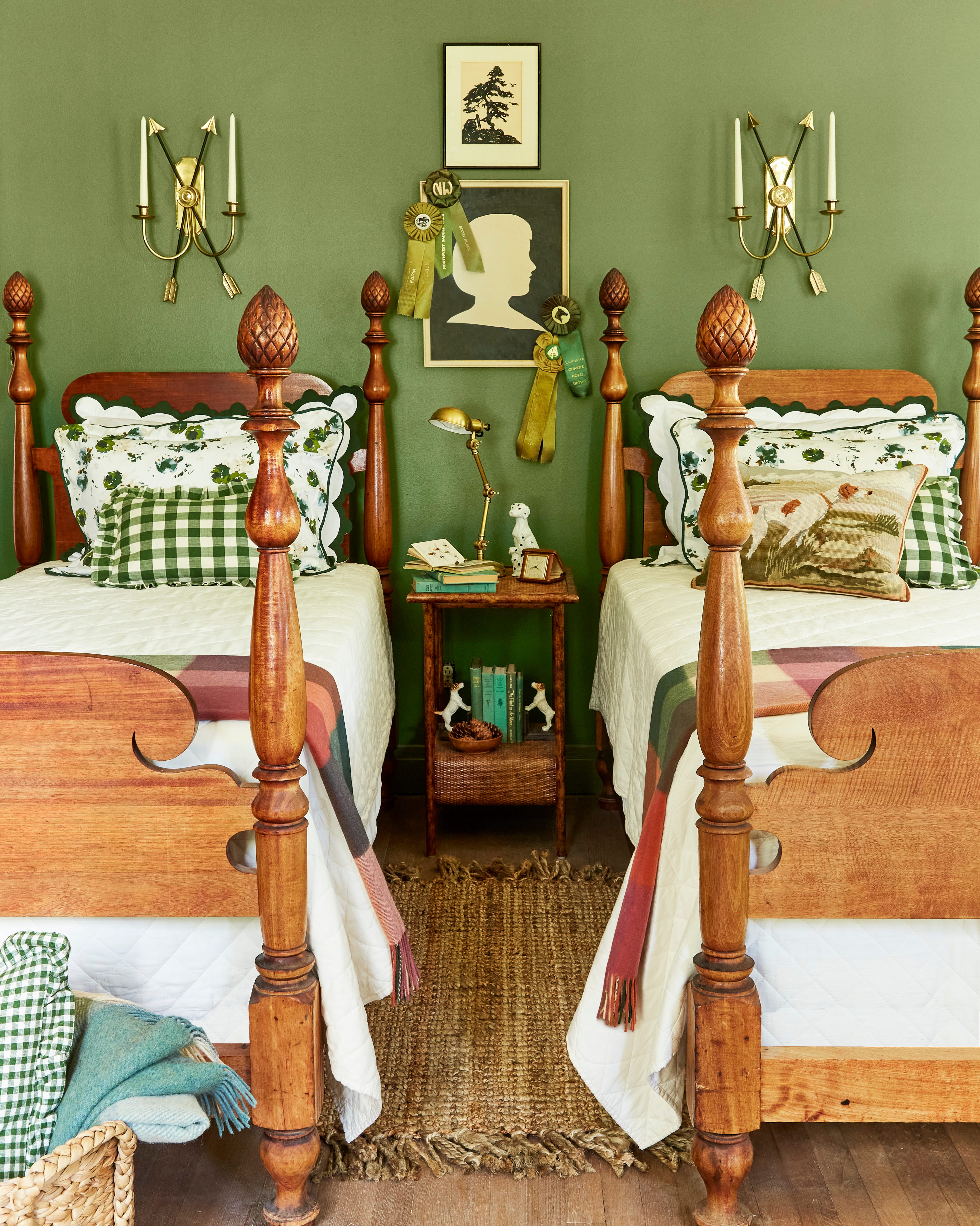
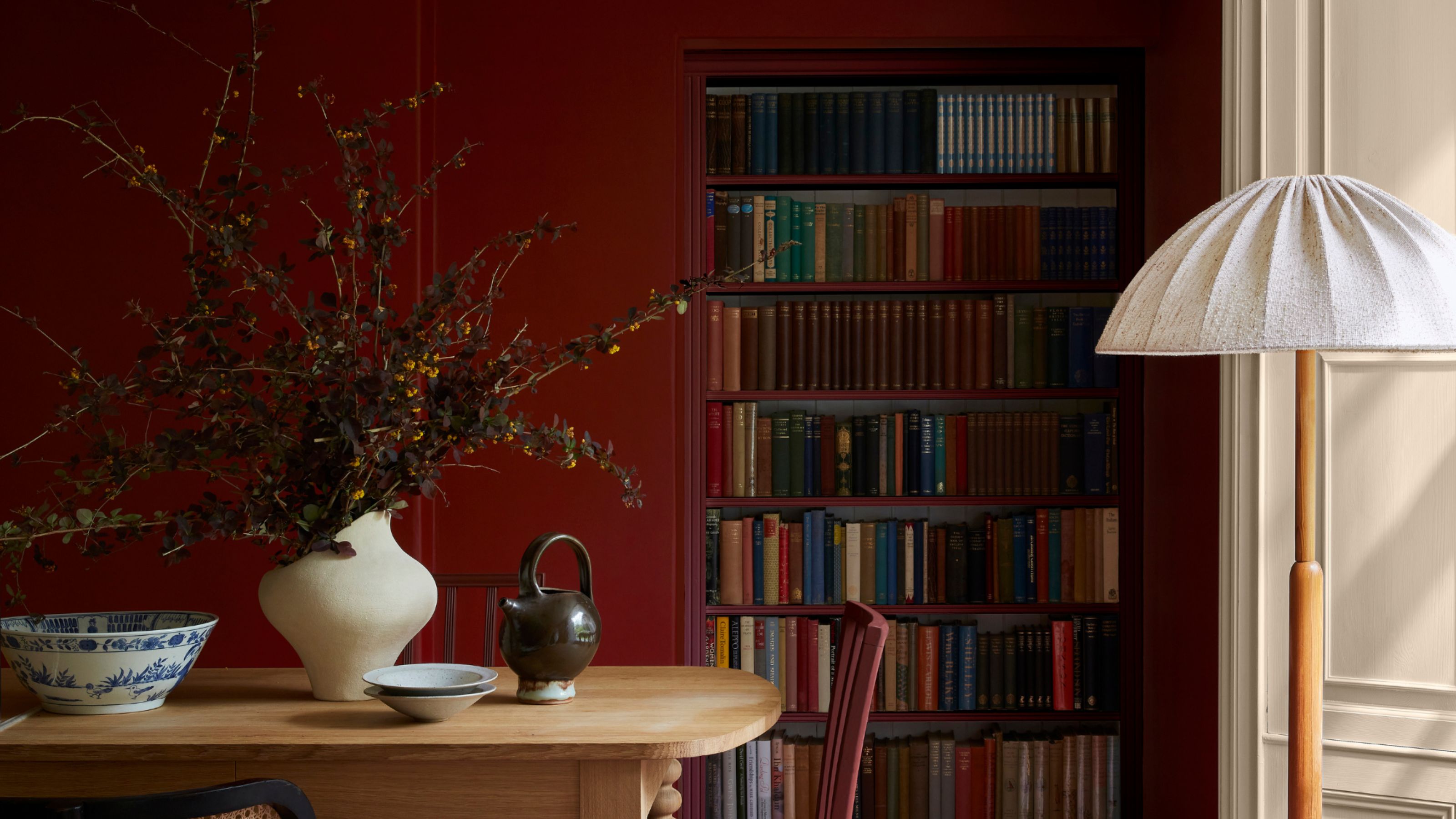
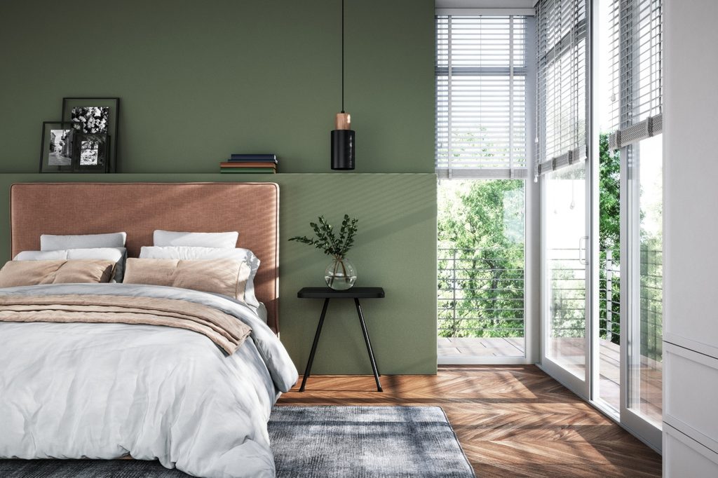
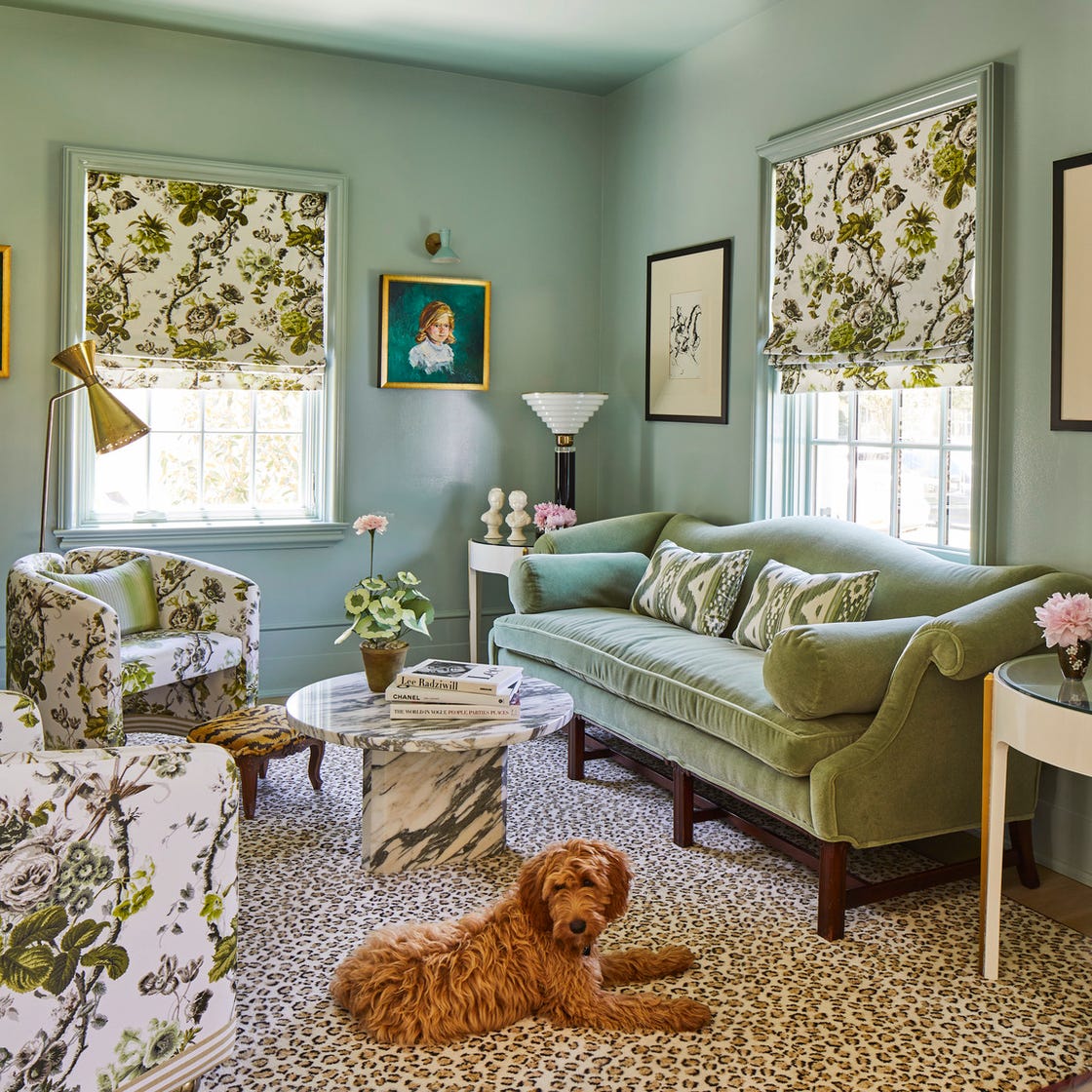
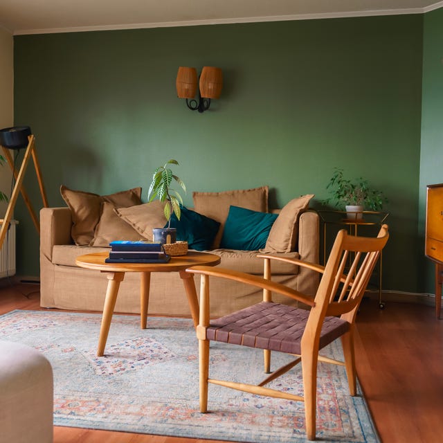
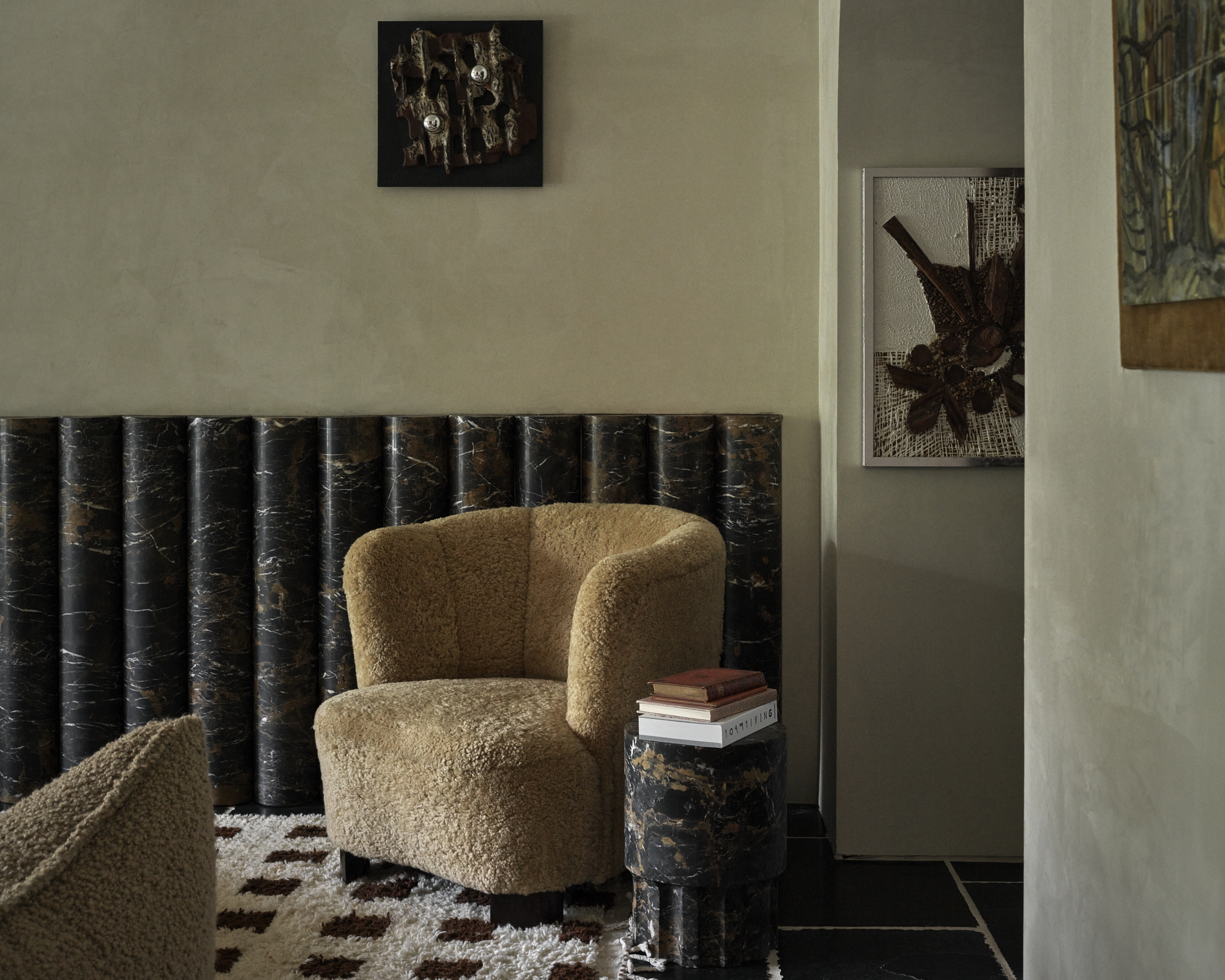
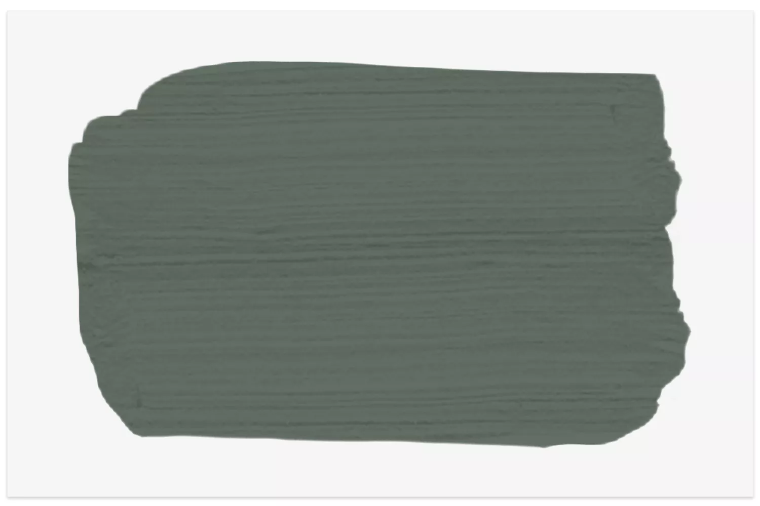
Sherwin-Williams' Rosemary is described as a soothing, organic green with dark grey undertones. It creates a cozy and saturated ambiance, especially when applied to paneled walls with a semi-gloss finish, allowing it to shimmer with changing light. This color beautifully complements antique pieces and crisp white woodwork, and can be enlivened with coral accents. Its natural and calming qualities make it a strong candidate for bedrooms or any space designed for relaxation.
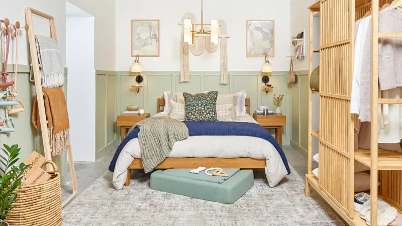
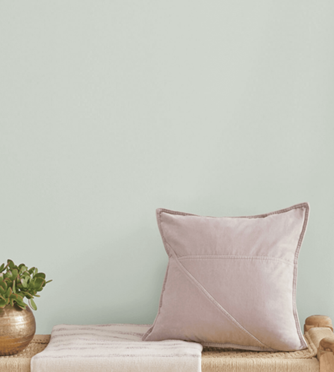
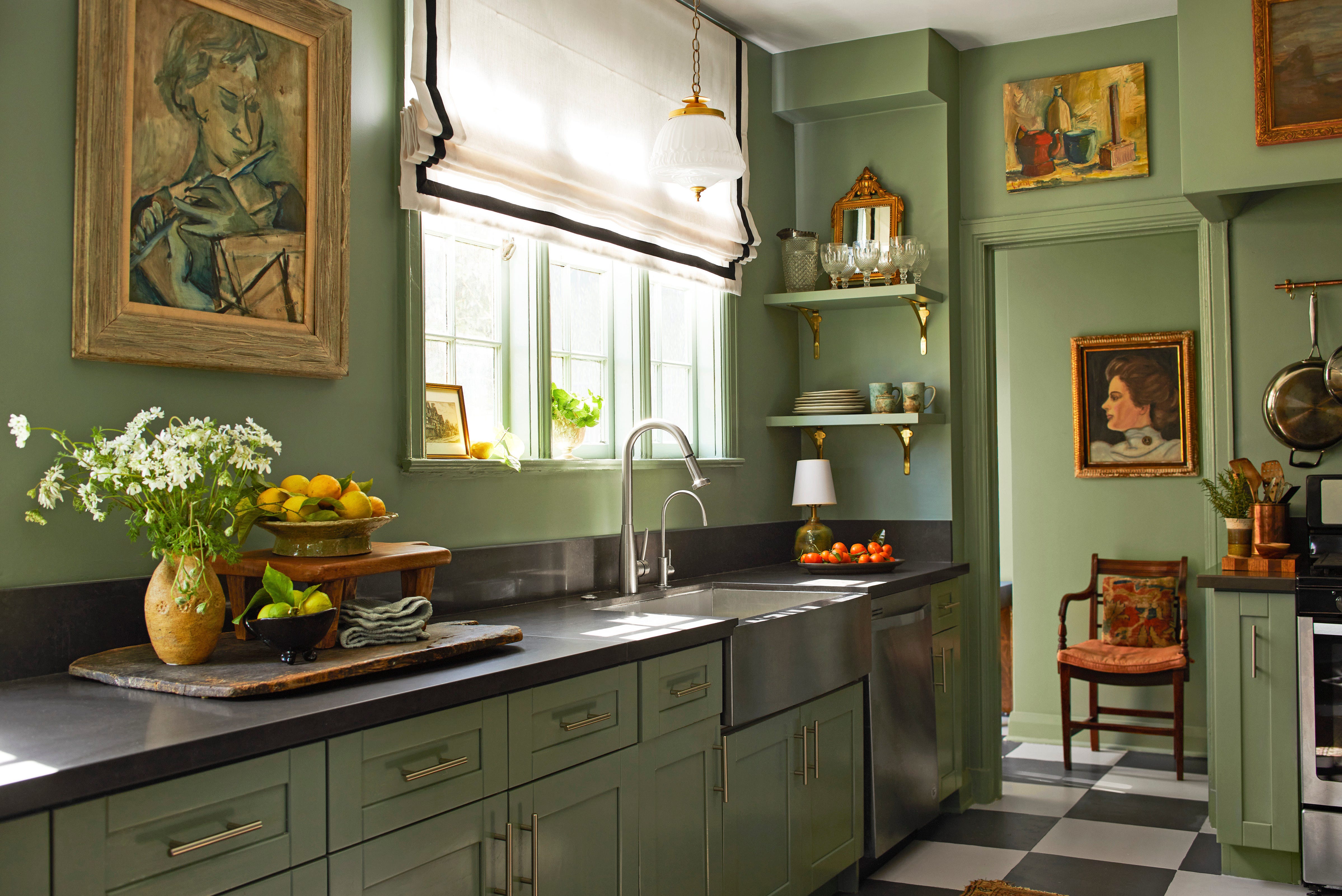
Finally, Little Greene's Sage & Onions is a bright, lively green that is particularly effective in rooms intended for entertaining or high activity, such as kitchens, dining rooms, and living rooms. This shade naturally lifts the mood and reflects the energy of the space. It also works well in bedrooms, contributing to a serene and calming atmosphere, and is especially fitting for rooms overlooking gardens, bringing the outdoors in. Ruth Mottershead, Creative Director at Little Greene, highlights olive and deep greens for their tranquil effects, while praising Sage & Onions for its mood-lifting properties, especially when combined with crisp white for a fresh look.
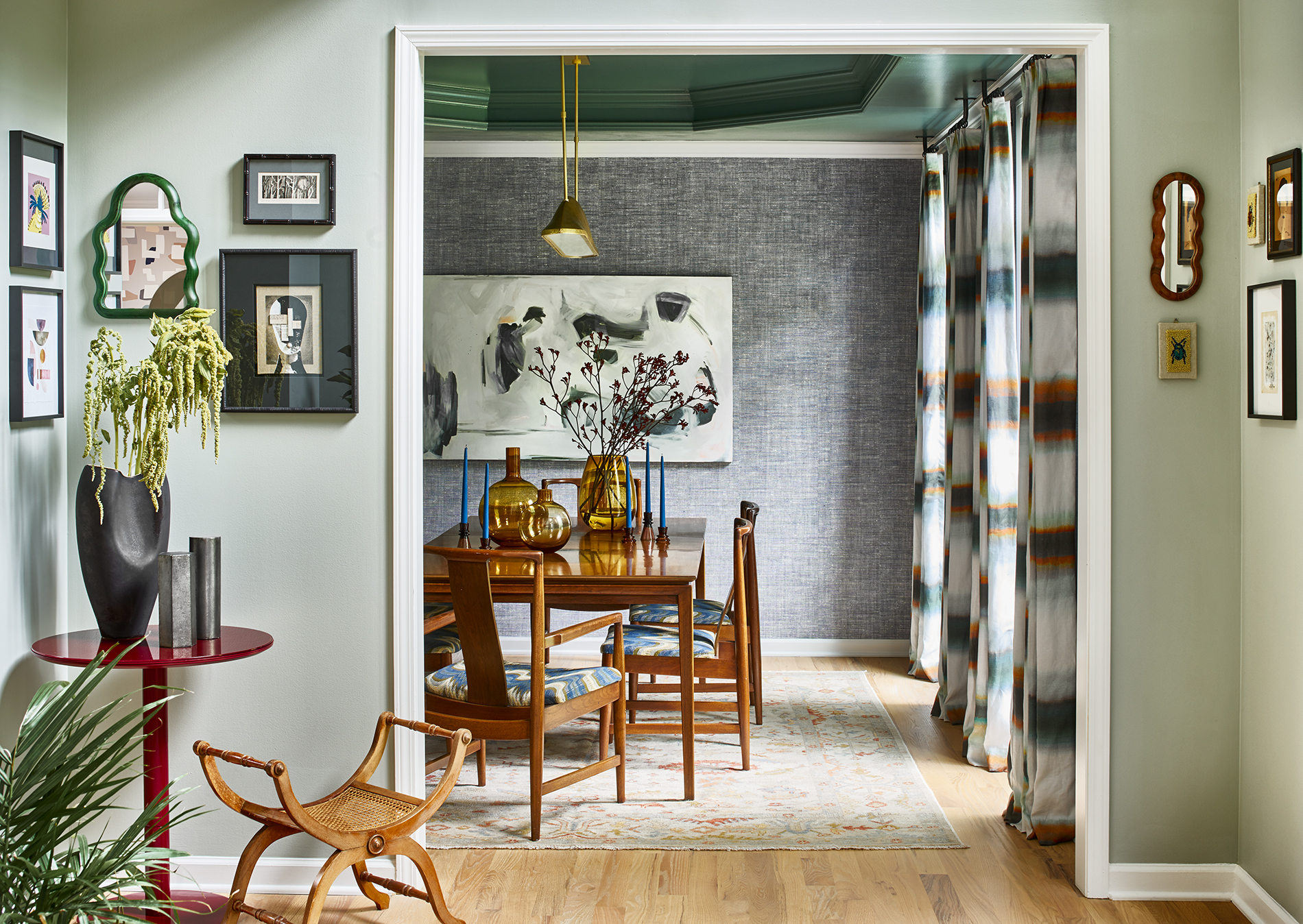
Overall, green is presented as a highly adaptable and classic color suitable for any room in the house. Its inherent cheerful, positive, and calming attributes, coupled with its connection to nature, make it a favorable choice for interior design. Designers suggest pairing it with colors like coral and pink for a modern yet cozy feel, or with black, navy, or white for a minimalist aesthetic.
#InteriorDesign #GreenPaint #ColorTrends #HomeDecor #PaintColors #InteriorDecorating #DesignerTips #InteriorDesign #GreenPaint #ColorTrends #HomeDecor #PaintColors #InteriorDecorating #DesignerTips
0 comment in total
You may also like
5 Timeless Paint Colors That Will NEVER Go Out of Style, According to Designers

The 10 Best Little Greene Paint Colors For Your Home, as Chosen by Interior Designers

These 13 Green Paint Colors Are the Best We’ve Ever Seen

The best green paint colors for a soothing, sophisticated home

There Are Only Certain Green Paint Colors That Can Bring a Room to Life
The most timeless paint colors according to designers
17 Green Paint Colors for Every Room, From Soothing Sage to Electric Emerald
Designers Swear By These 11 Sage Green Paint Colors

19 of the Best Green Paint Colors for Any Room in Your Home

The 12 Best Green Paints for Cabinets, According to Experts

5 interior designers on the styles they will love forever
Gen Z Just Declared This “Boring“ Color the New Millennial Gray and I Am So Upset
8 Green Paint Colors Interior Designers Swear By for a Bold and Fresh Home

I asked interior designers what color they include in every project – these 5 enduring shades were the favorites
The 10 Best Blue-Green Paint Colors Designers Can't Stop Using

Designers Say These Vintage Paint Colors Are Back

12 Colors That Go With Green I'm Seeing Interior Designers Use All the Time Right Now
5 "trend-proof" colors for your home designers think will be just as popular in 10 years' time
5 of the best gray paints that interior designers love using
14 Best Green Paint Colors