
23 Versatile Cream Paint Colors That Will Pair with Basically Anything
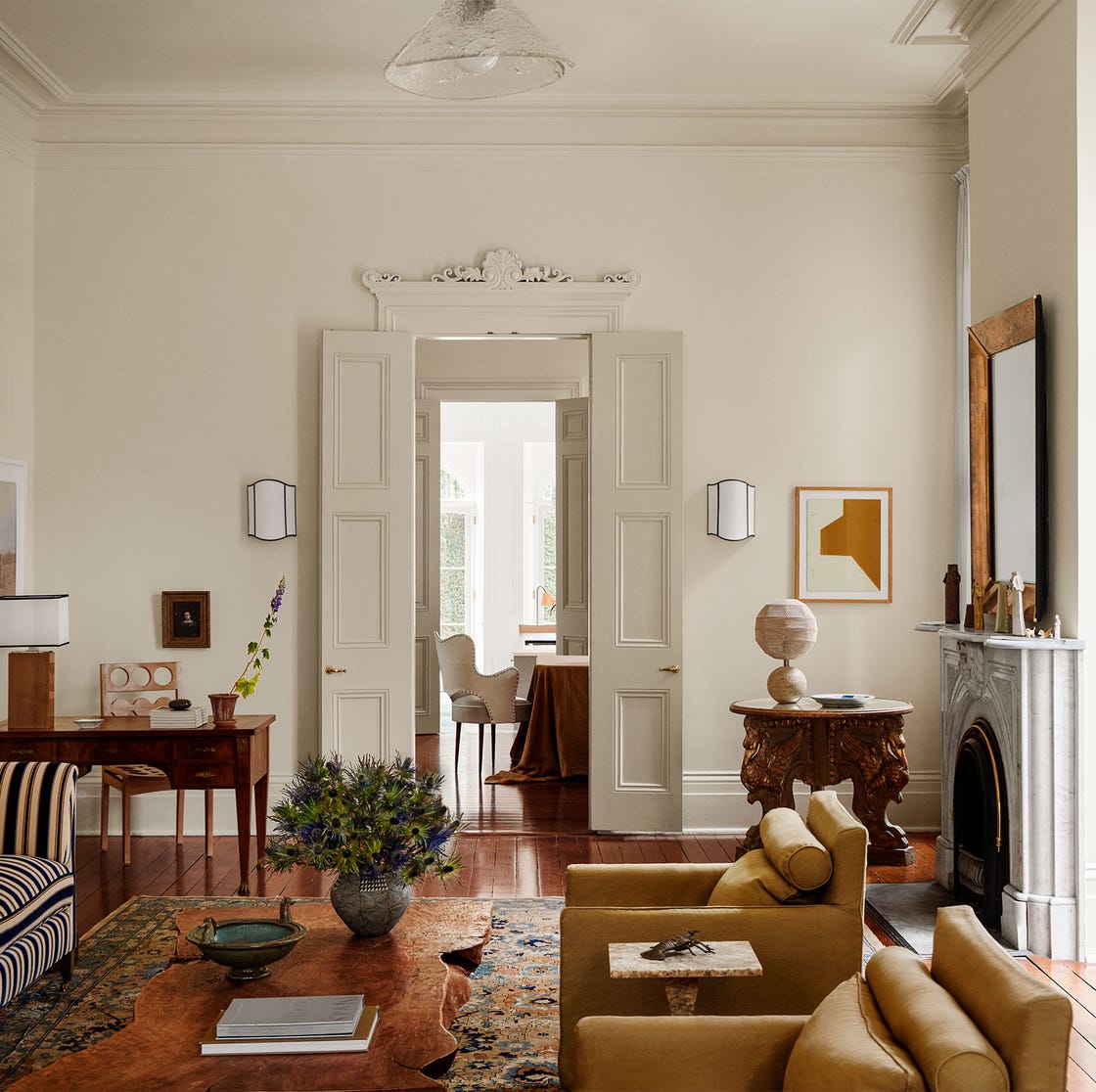
The article explores the versatility of cream paint colors in interior design, offering a comprehensive guide to selecting the perfect shade for various aesthetics and moods. It emphasizes that cream is a timeless and adaptable choice, suitable for both bold and neutral design schemes. The piece features insights from top designers who share their preferred cream hues and explain the rationale behind their choices, highlighting how different undertones in cream can significantly impact a room's ambiance.
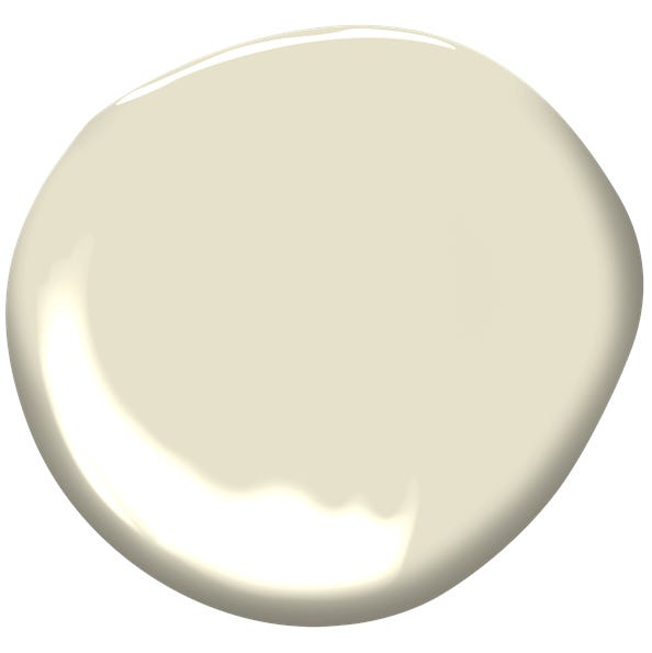
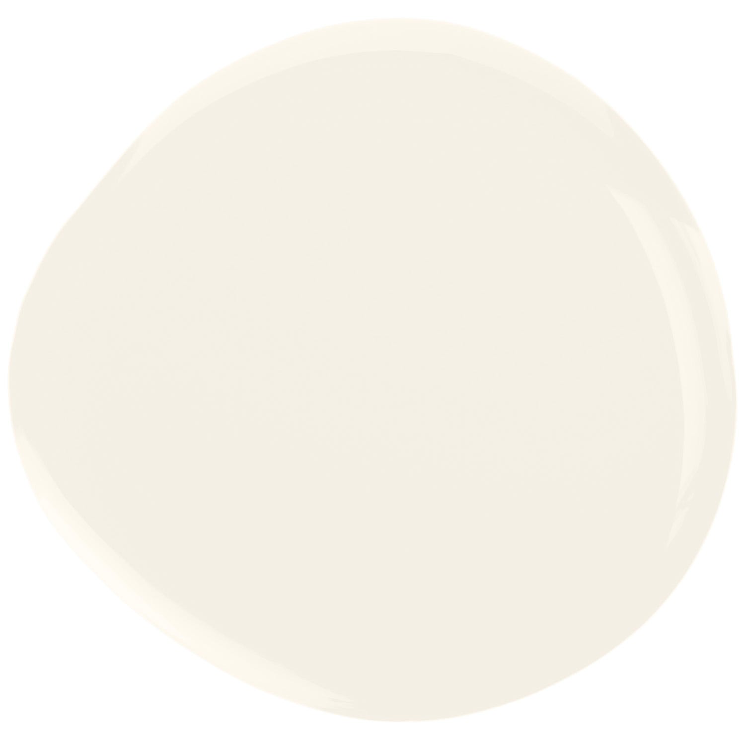
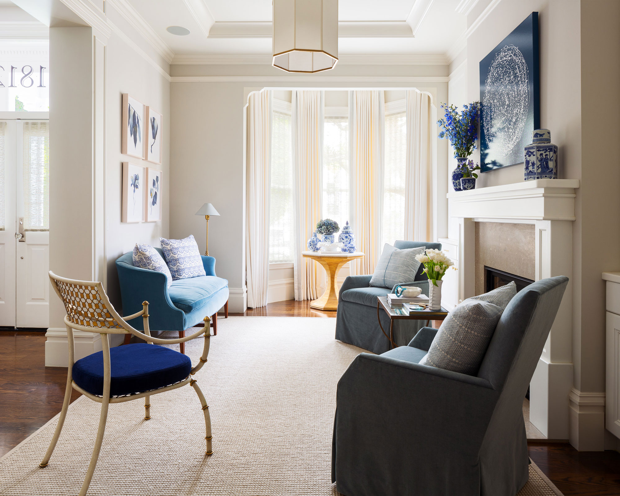
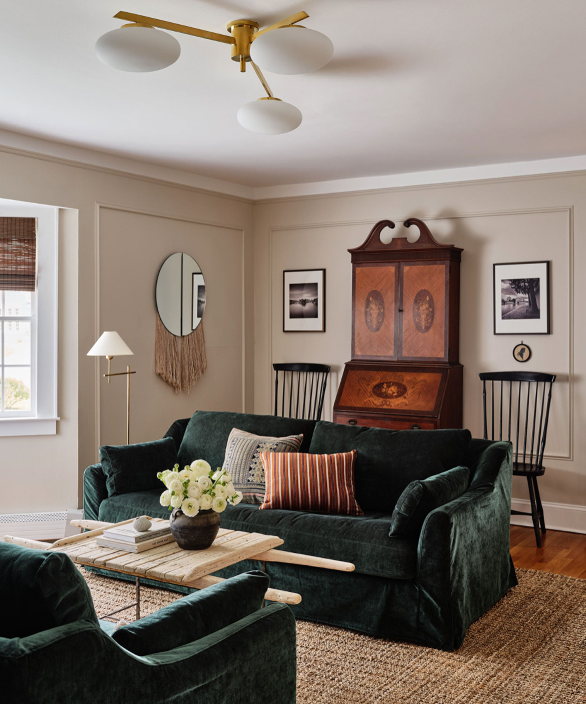
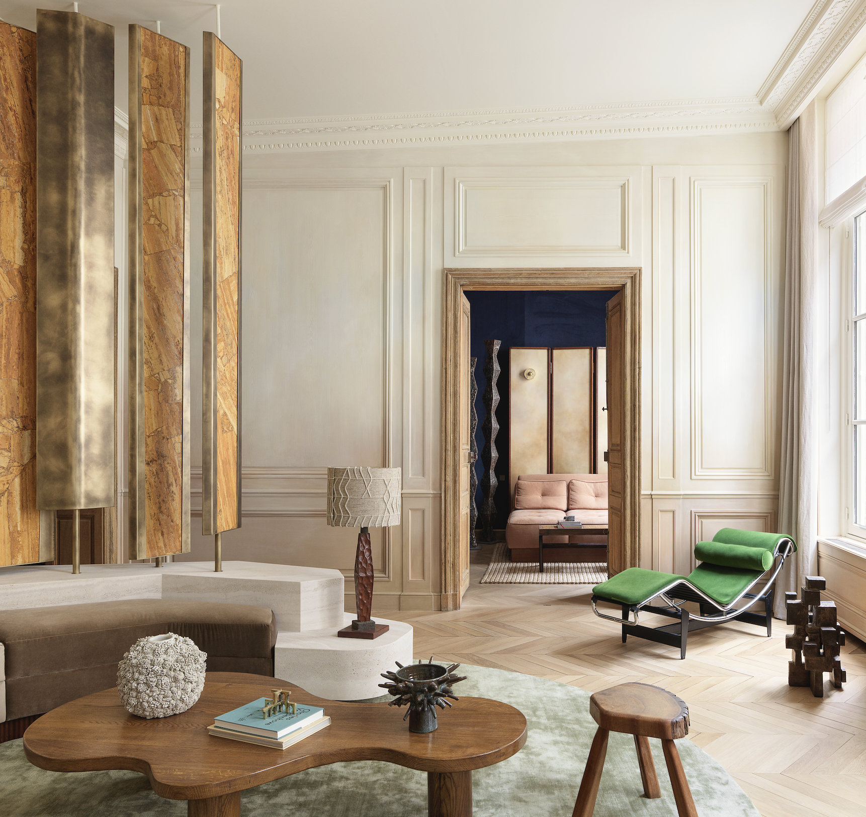
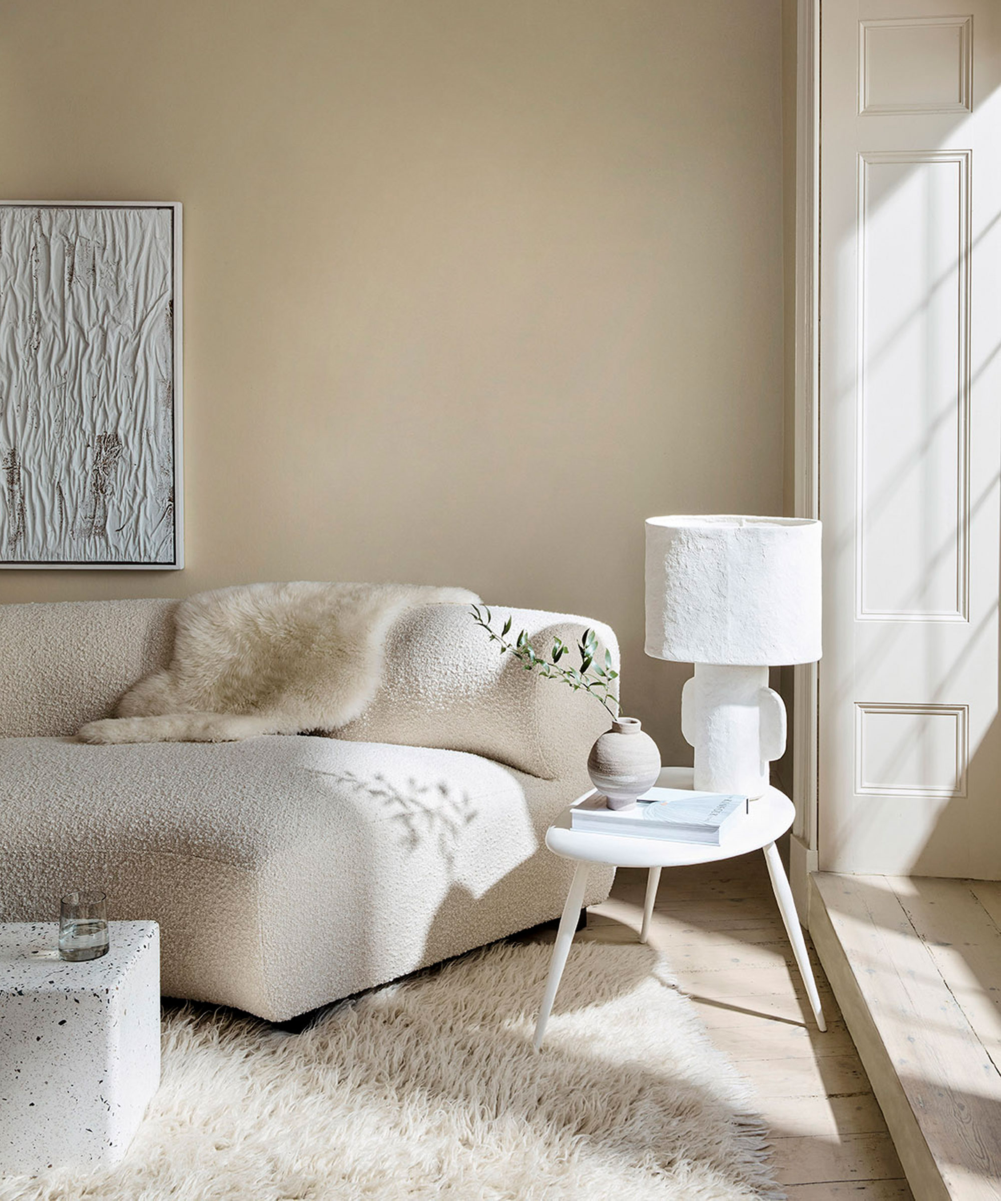
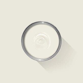
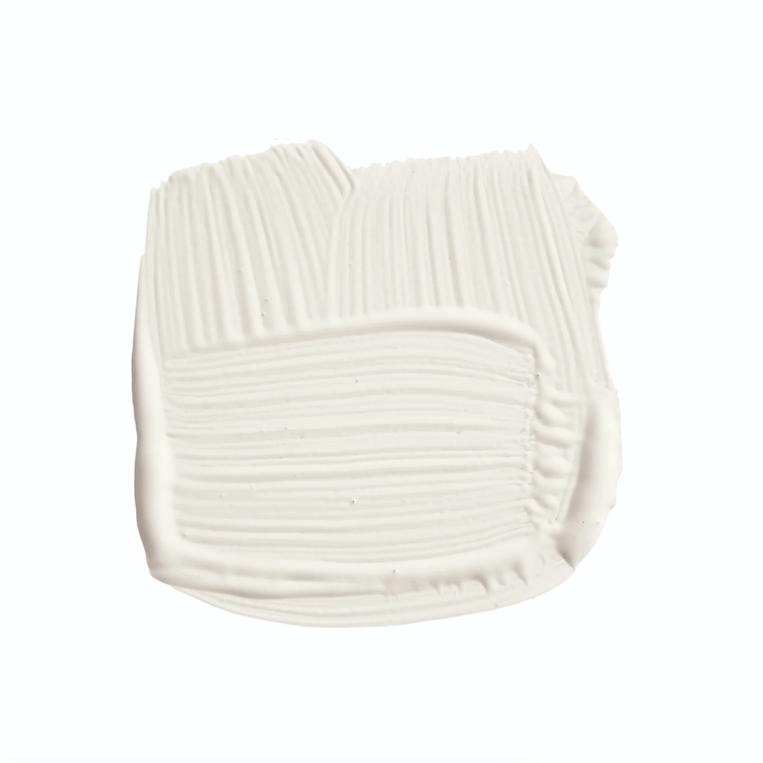
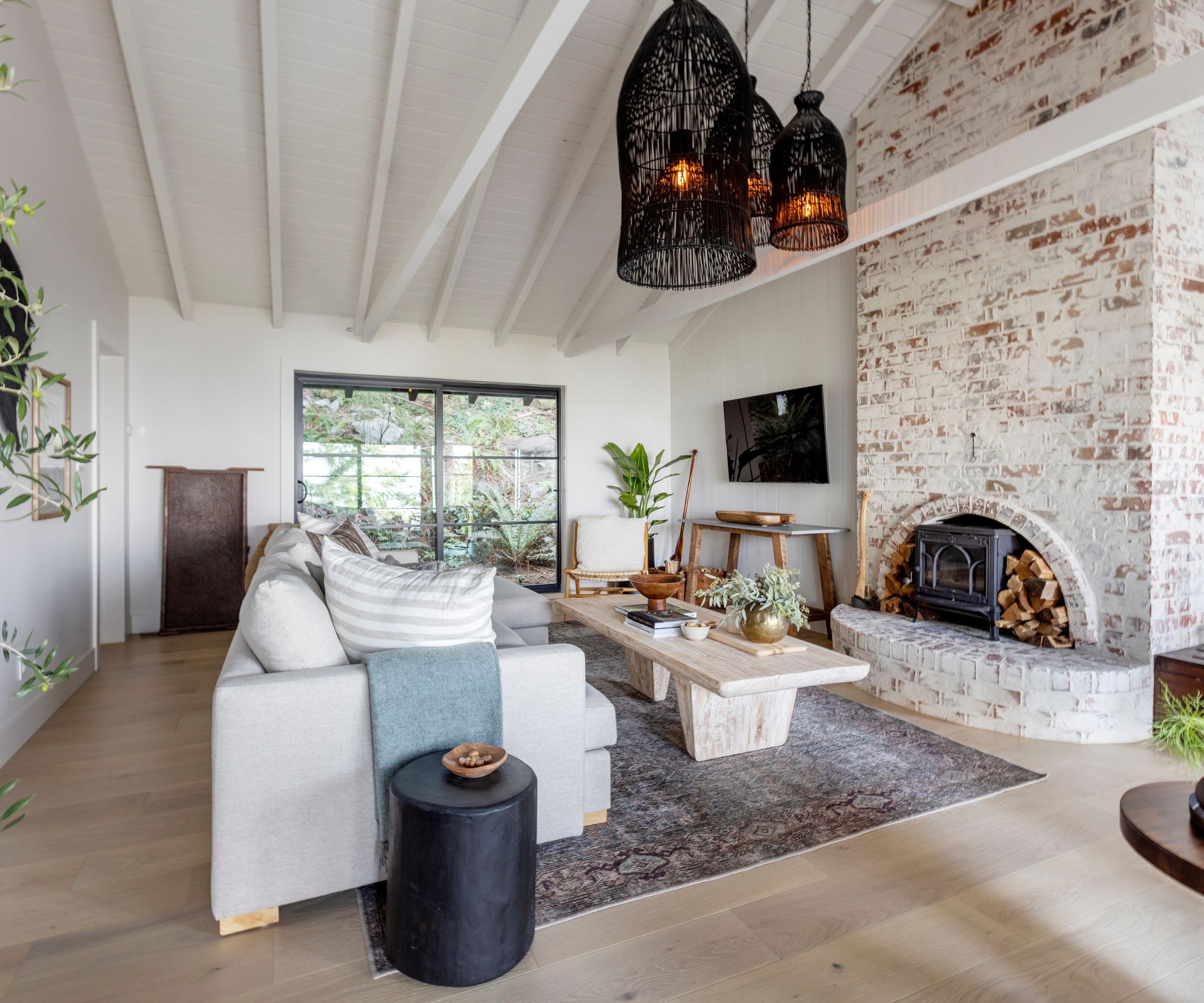
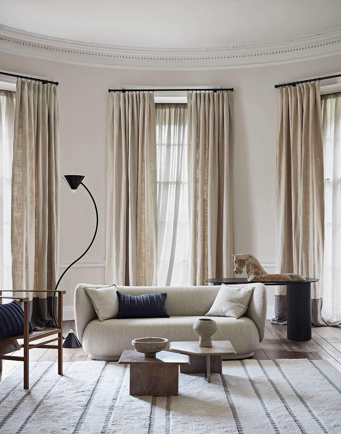
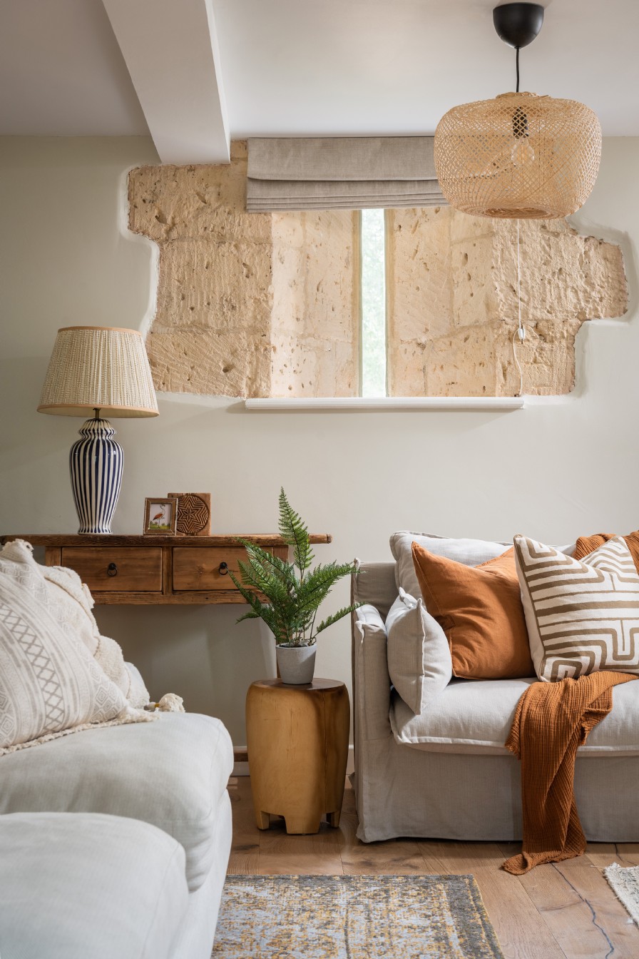
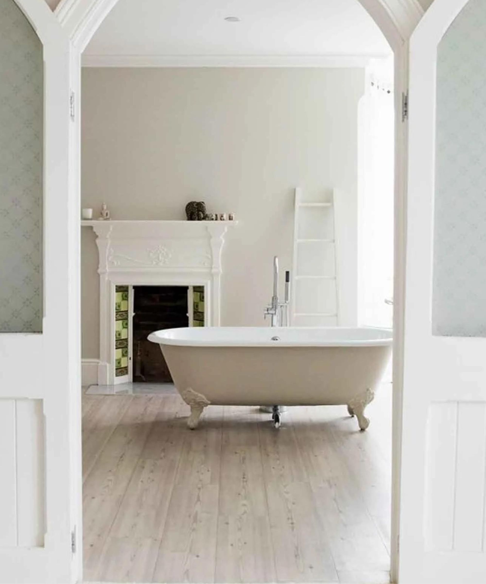
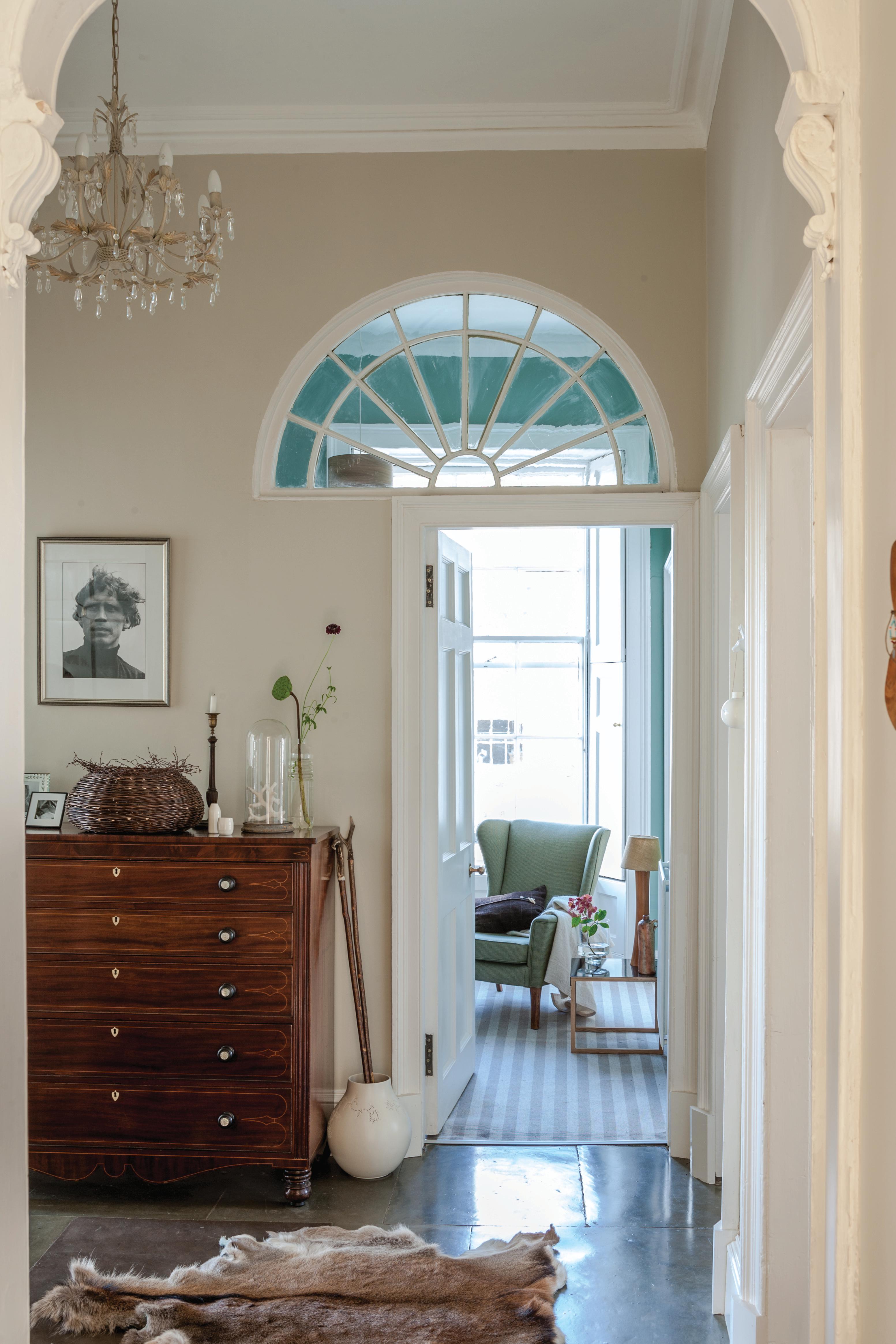
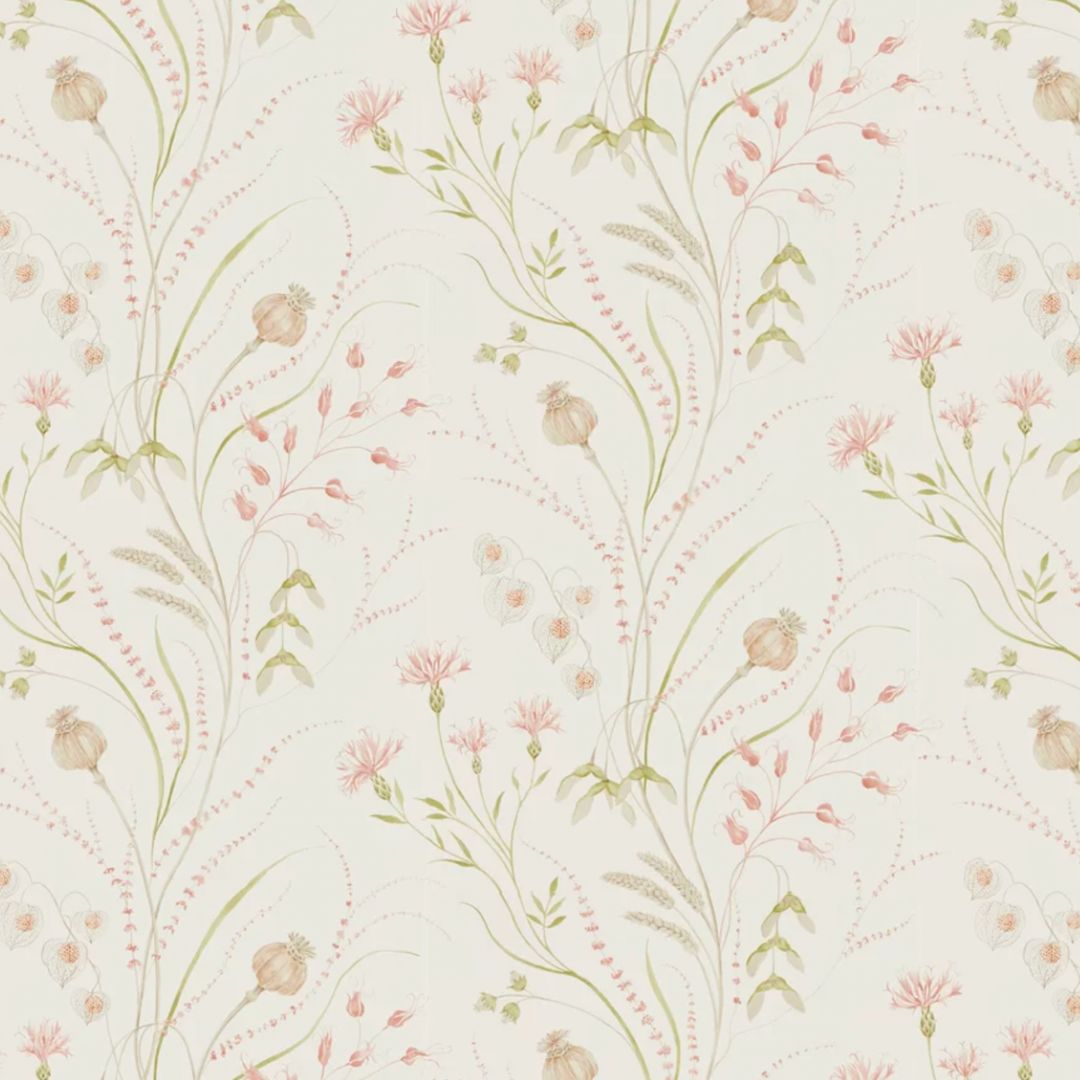
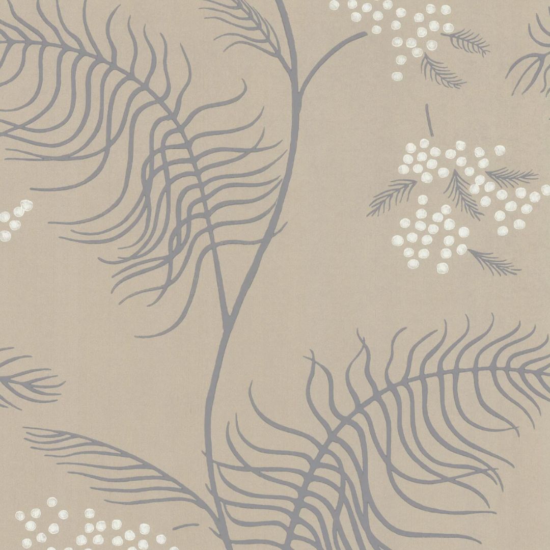
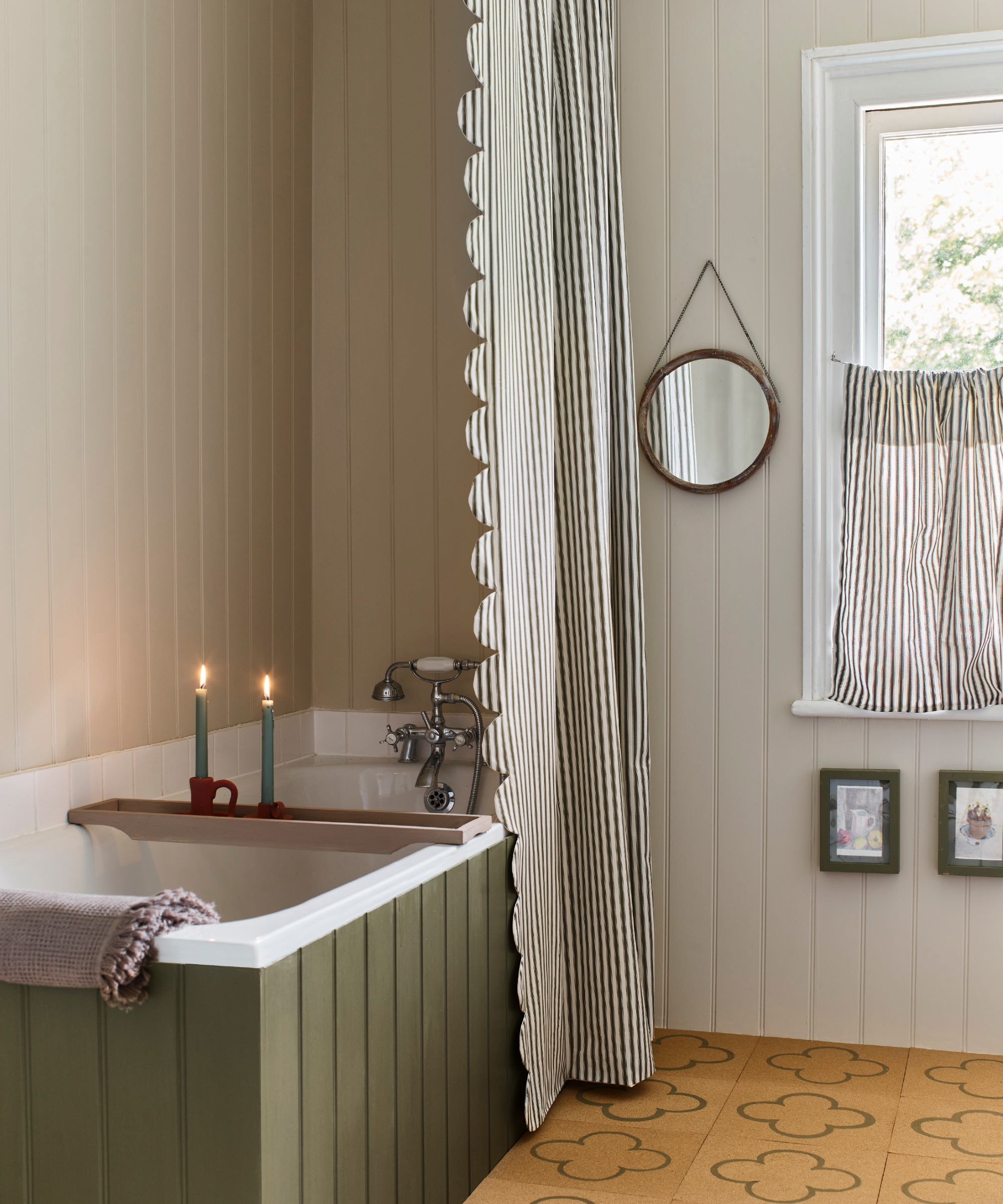
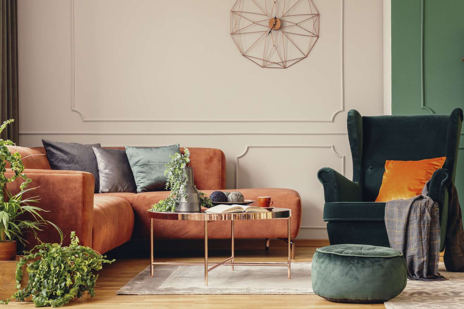
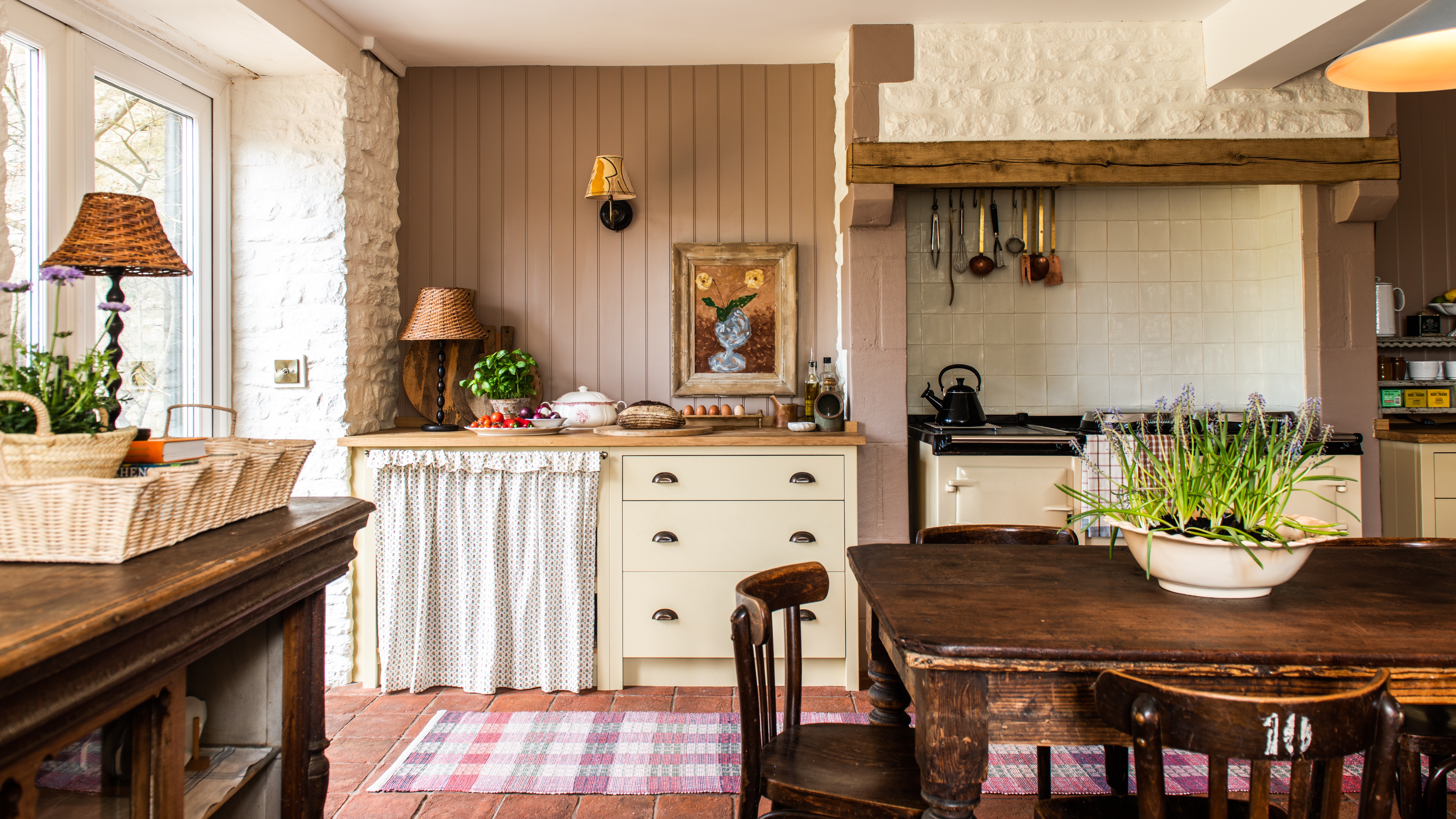
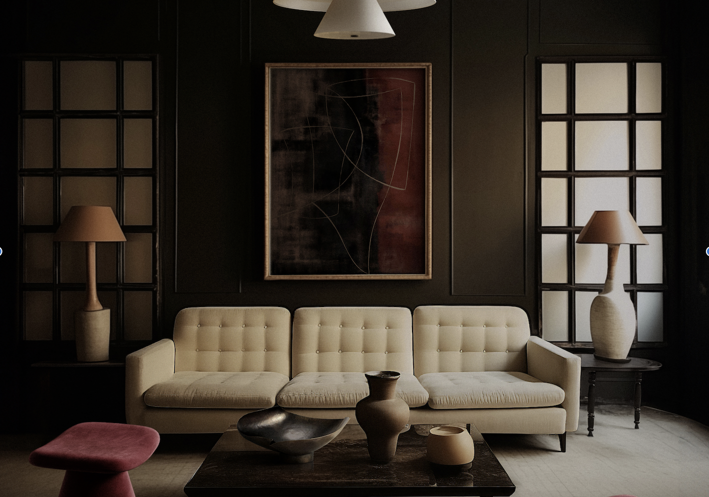
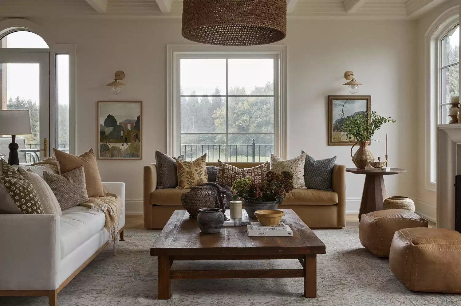
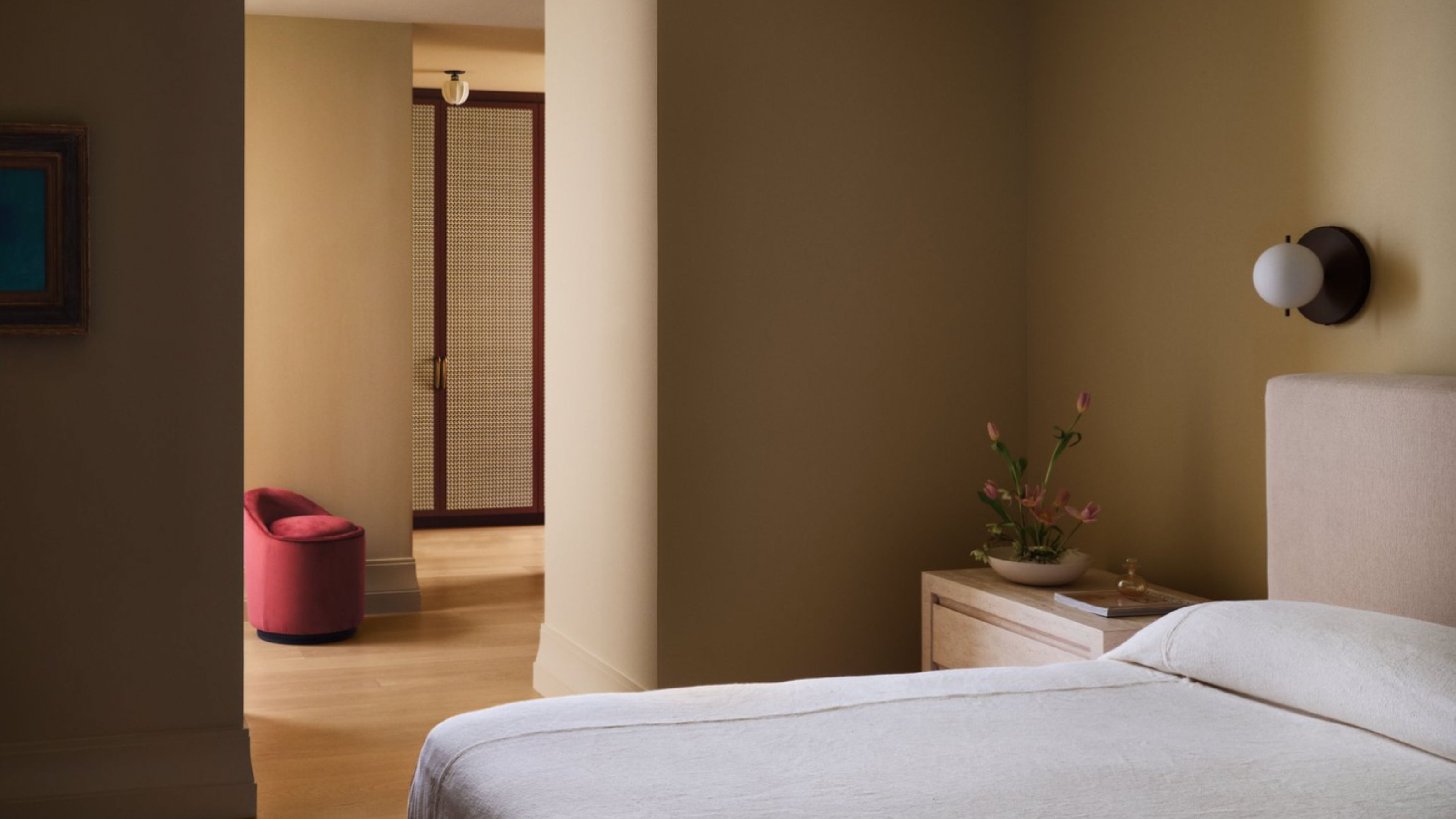
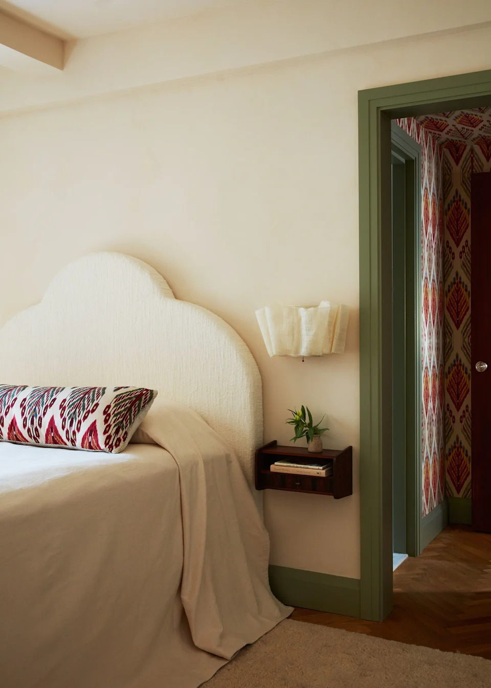
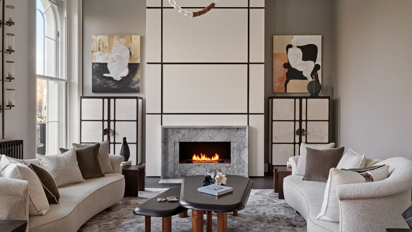
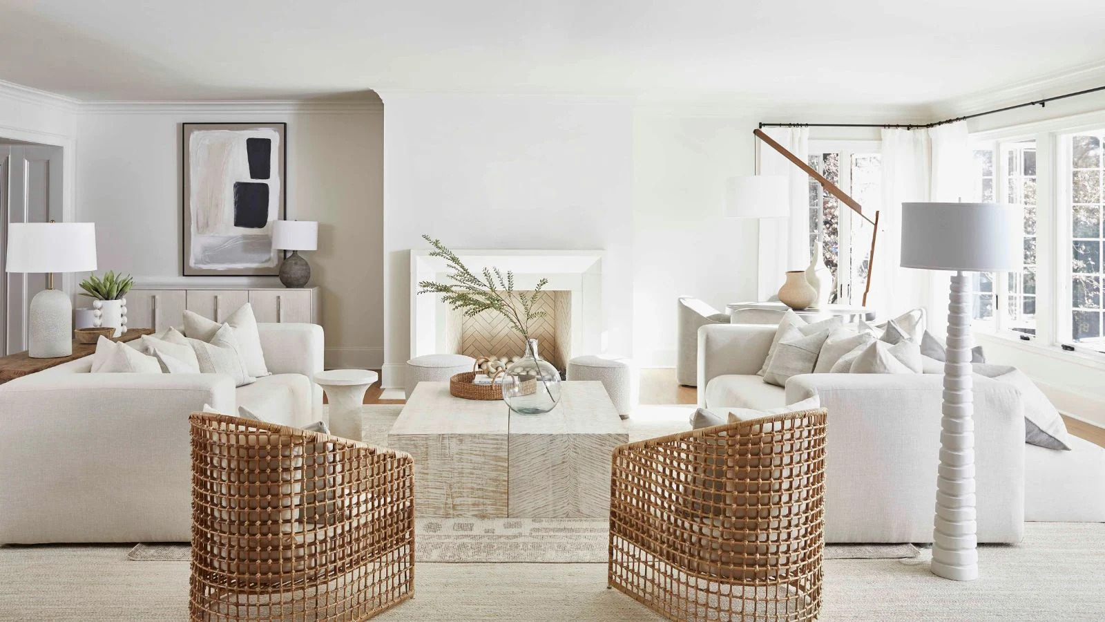
Designers emphasize that cream is far from a one-dimensional color, noting its range from cool, almost gray undertones to warm, buttery variations. The selection of a cream paint should consider the existing elements in a room, such as natural light, furniture, and other decor items, to ensure a cohesive and inviting atmosphere. Some designers recommend creams with subtle yellow undertones for a warm and cozy feel, while others prefer those with a touch of gray or beige for a more sophisticated and contemporary look.
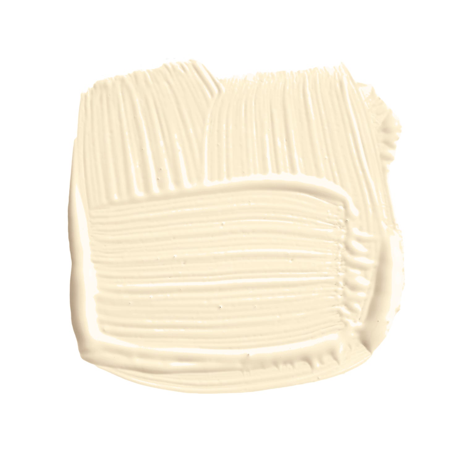
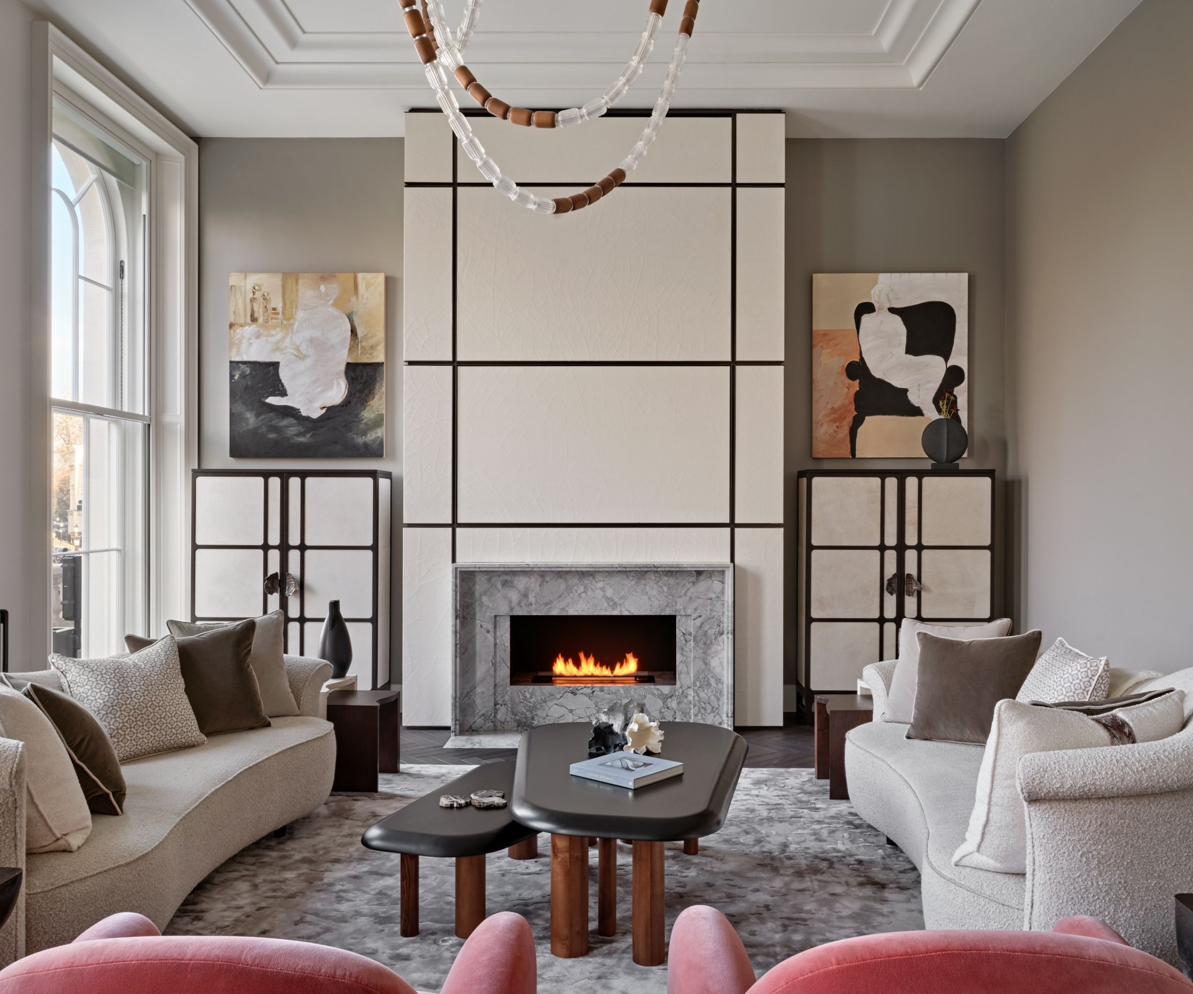
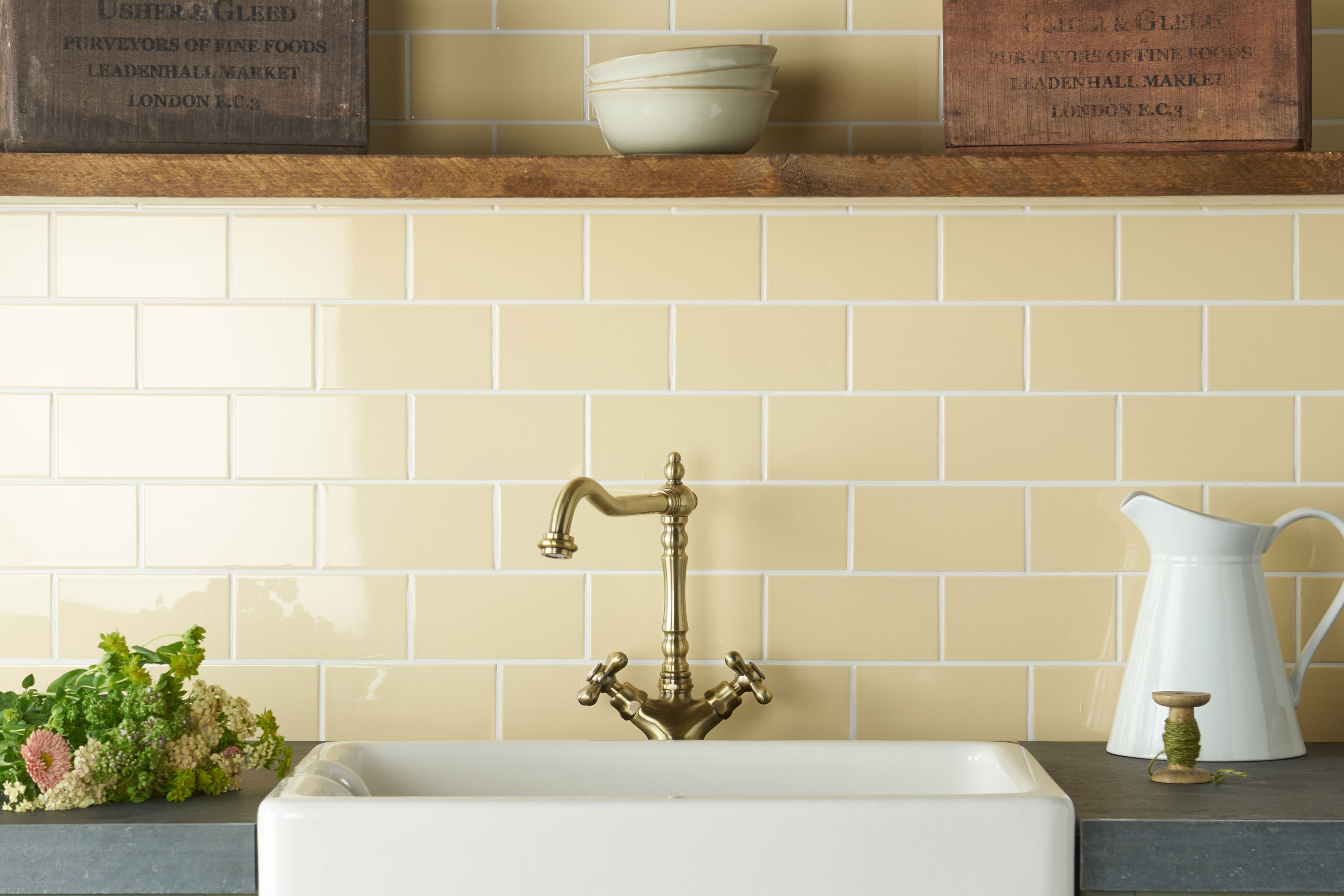
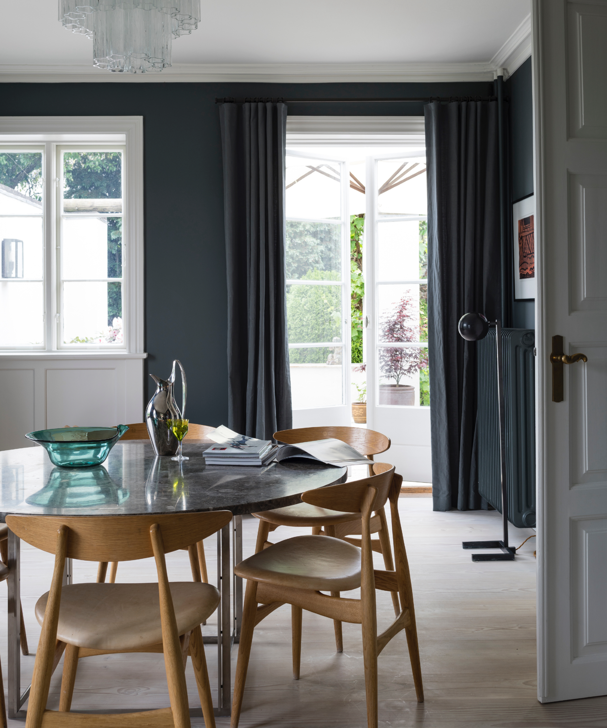
Specific examples of designer-approved cream paints are provided, including Benjamin Moore's "White Dove," noted for its soft, slightly off-white quality that complements both traditional and modern styles. Another popular choice is Farrow & Ball's "Wimborne White," described as a versatile, warm white that avoids harshness. Sherwin-Williams' "Dover White" is also mentioned for its creamy richness, making it ideal for creating a welcoming environment, particularly in spaces with abundant natural light.
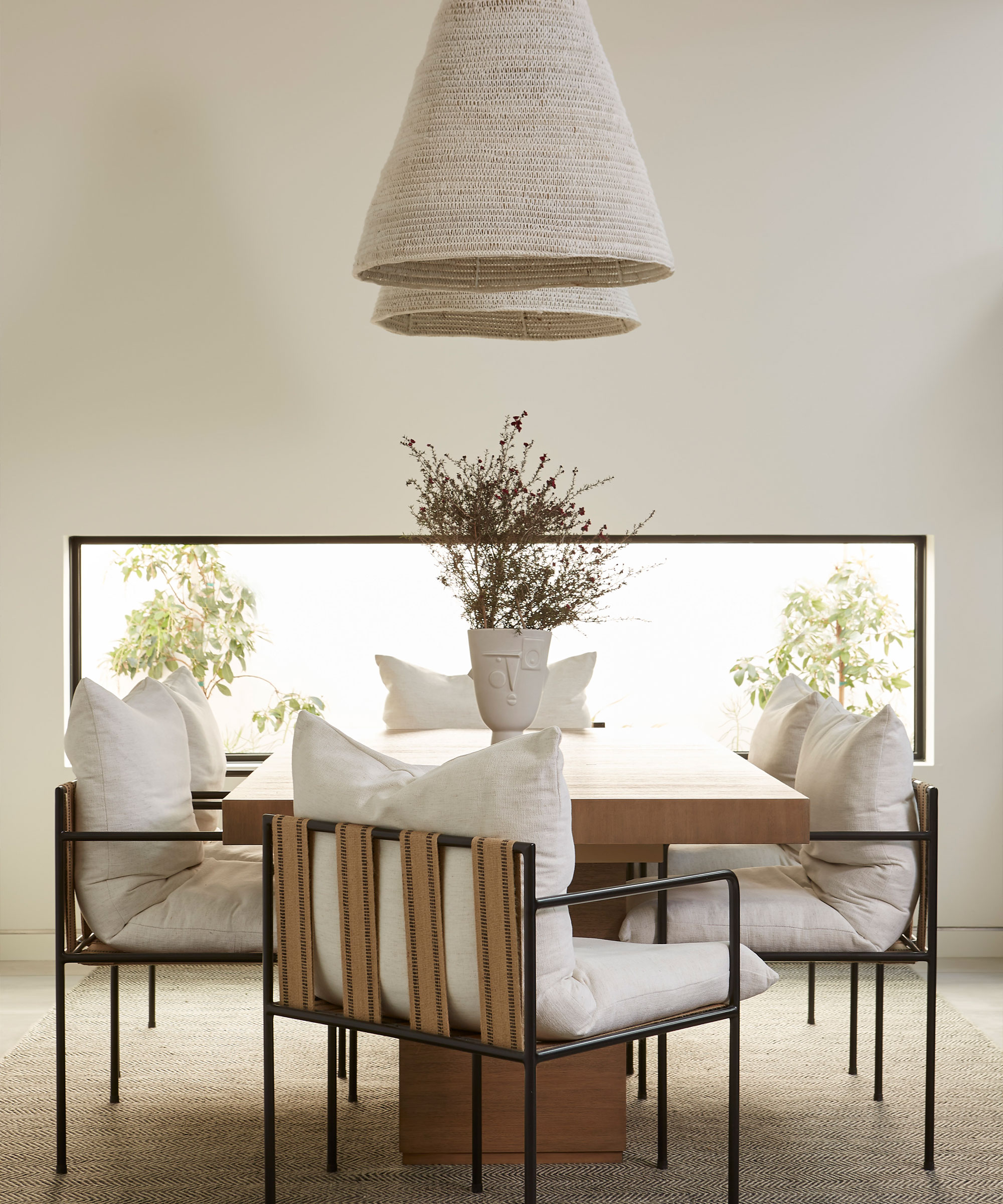
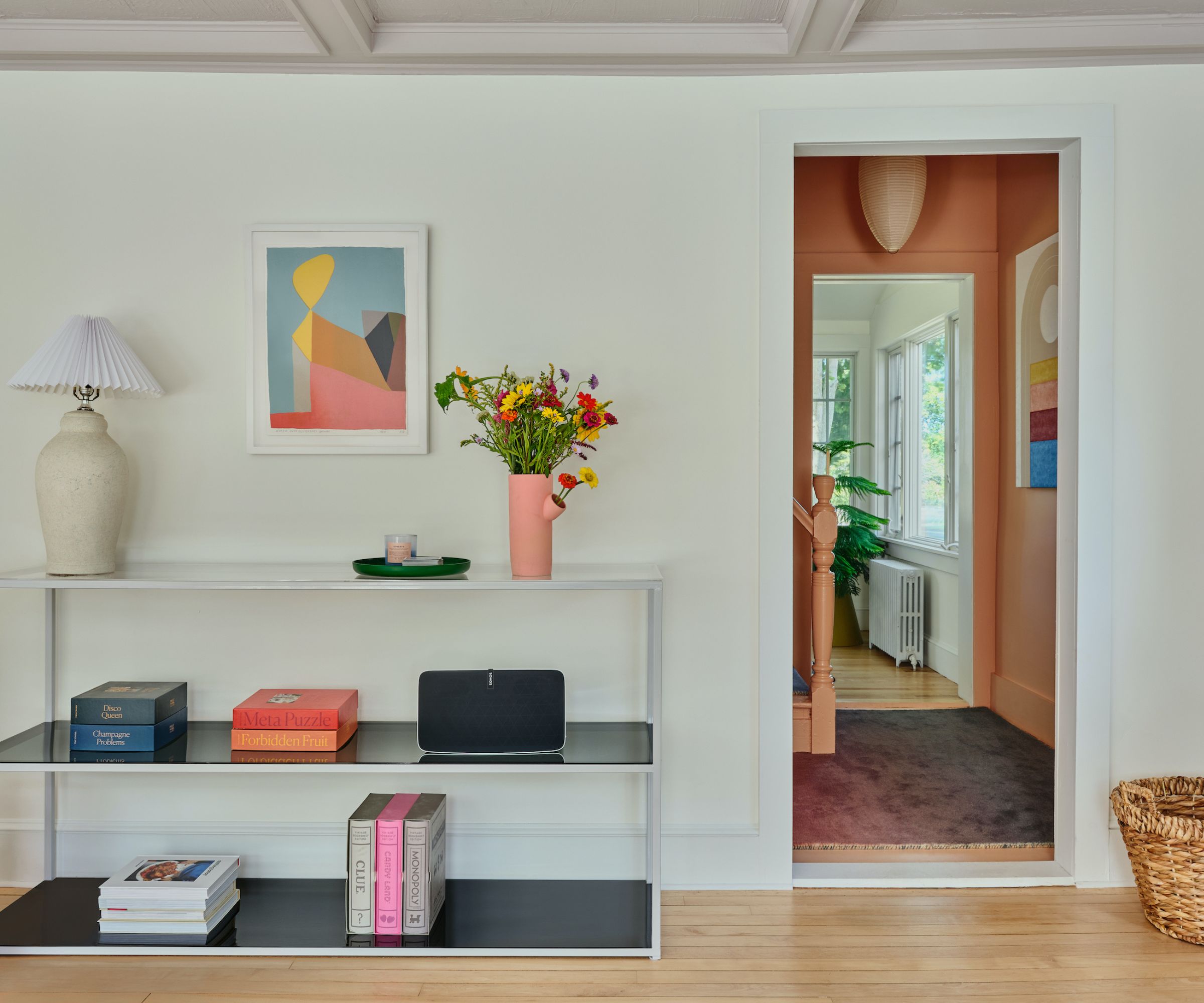
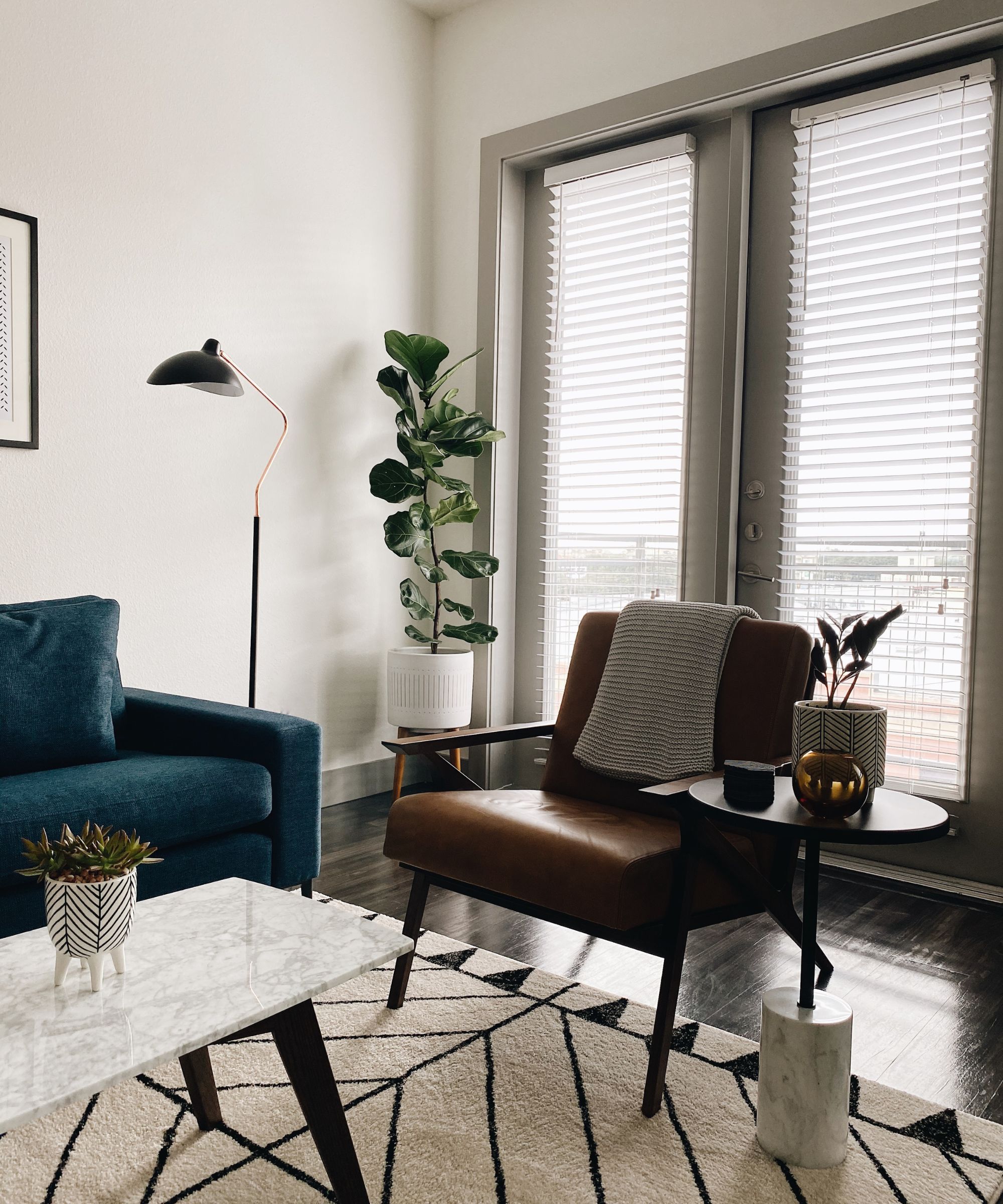
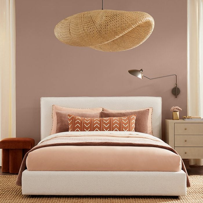
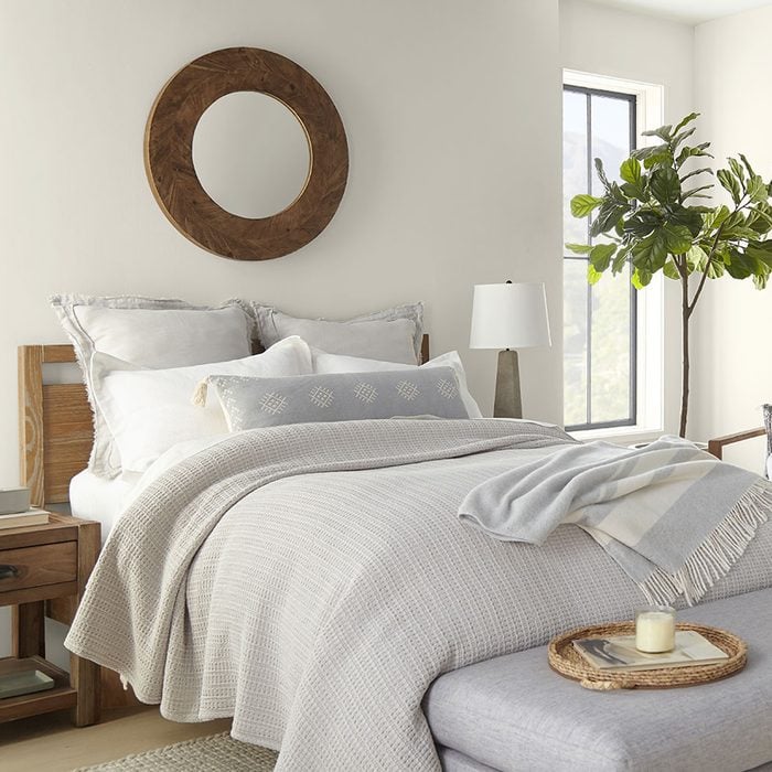
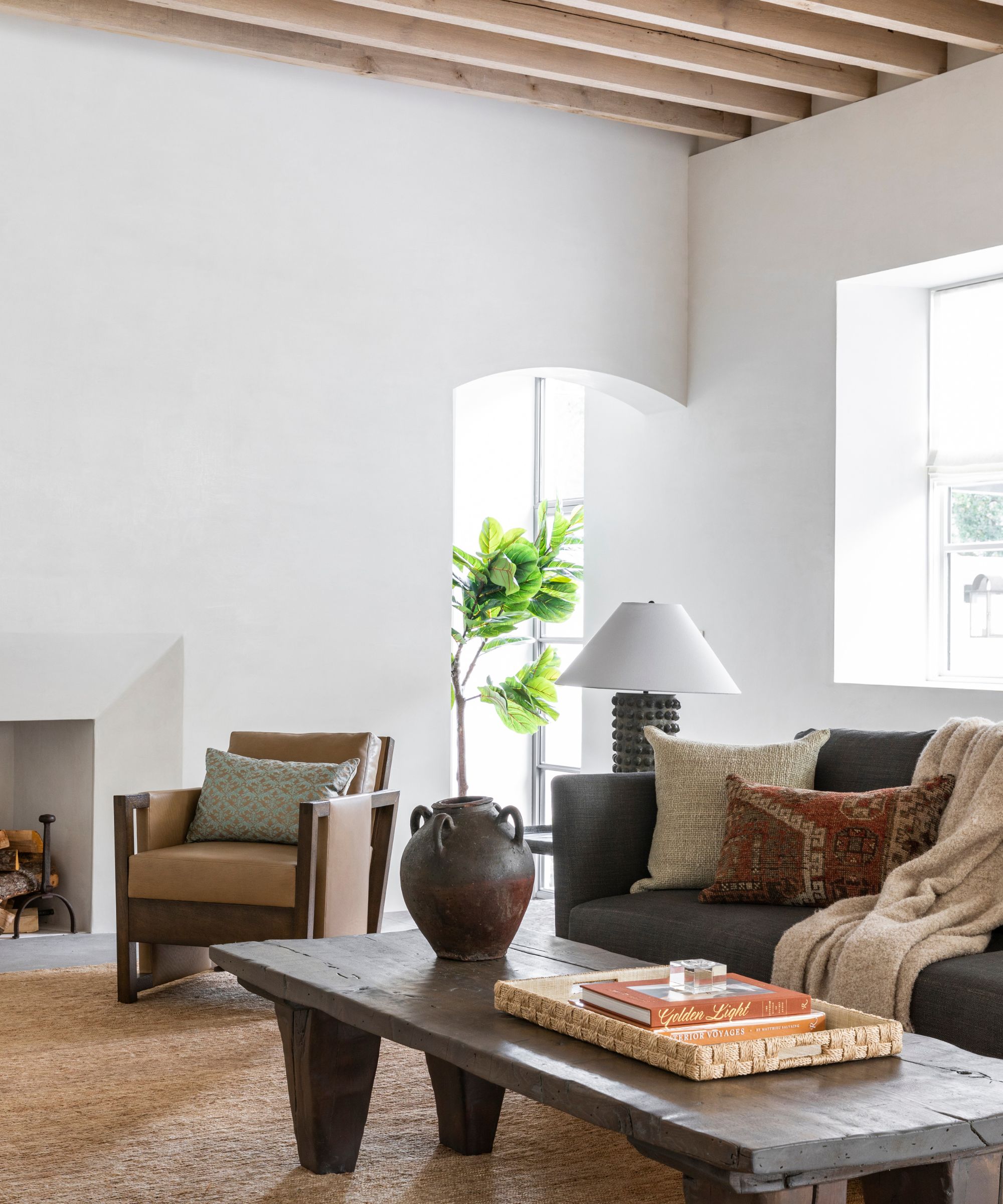
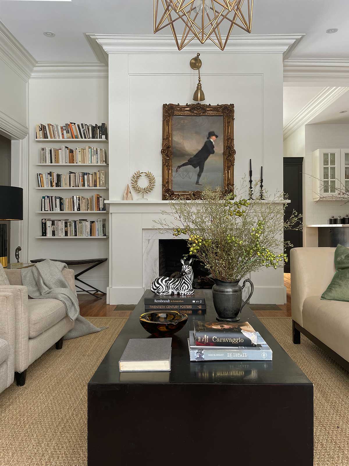
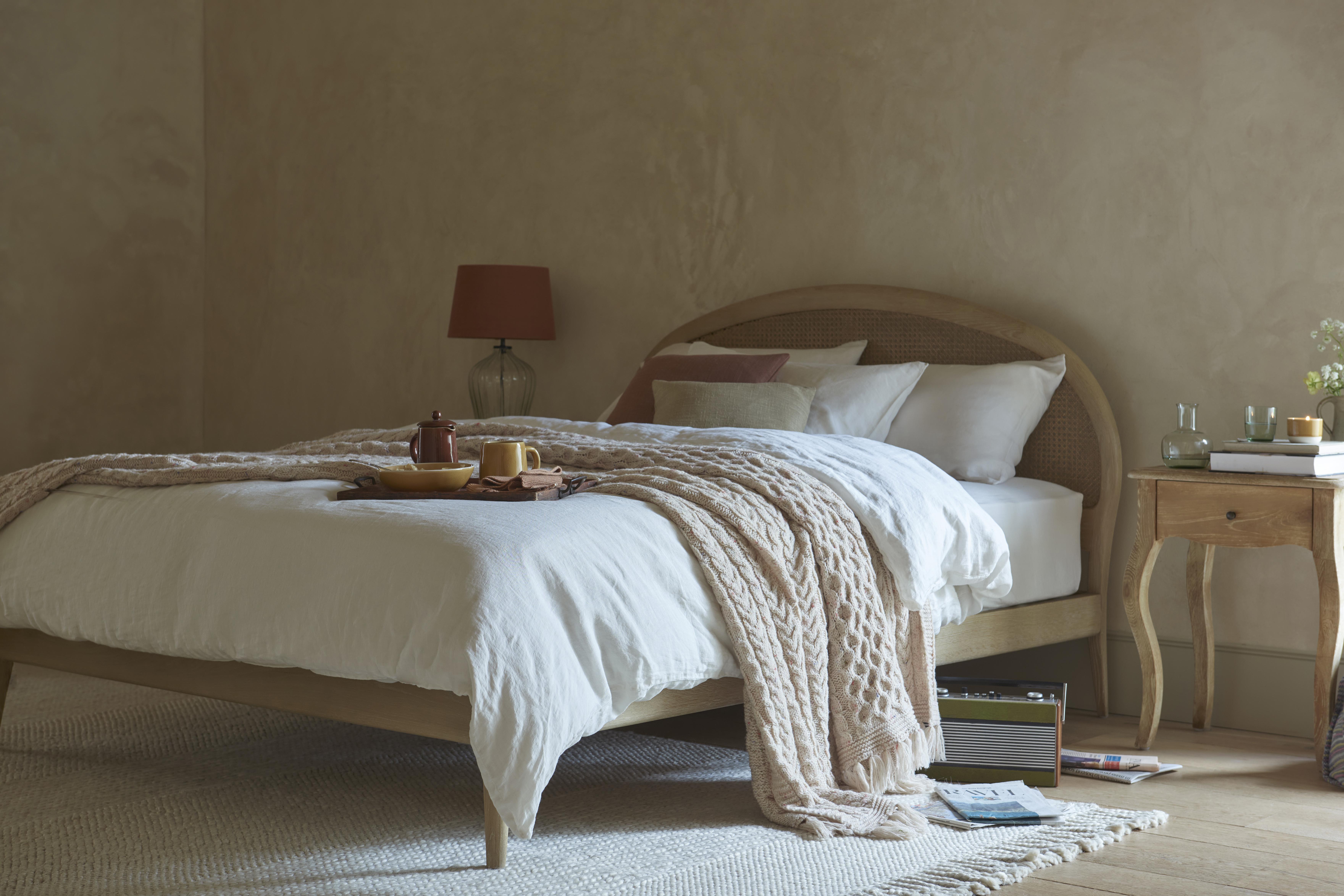
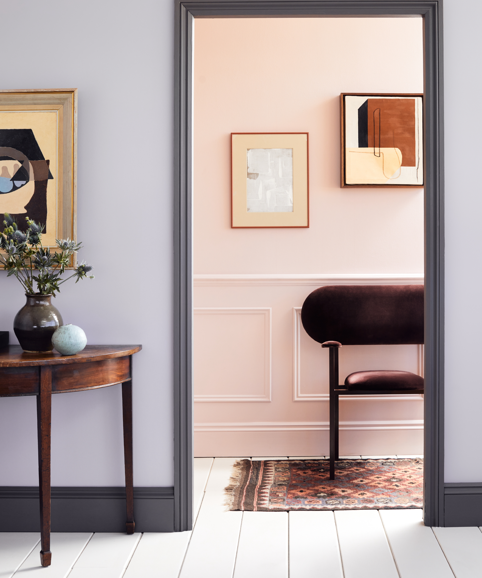
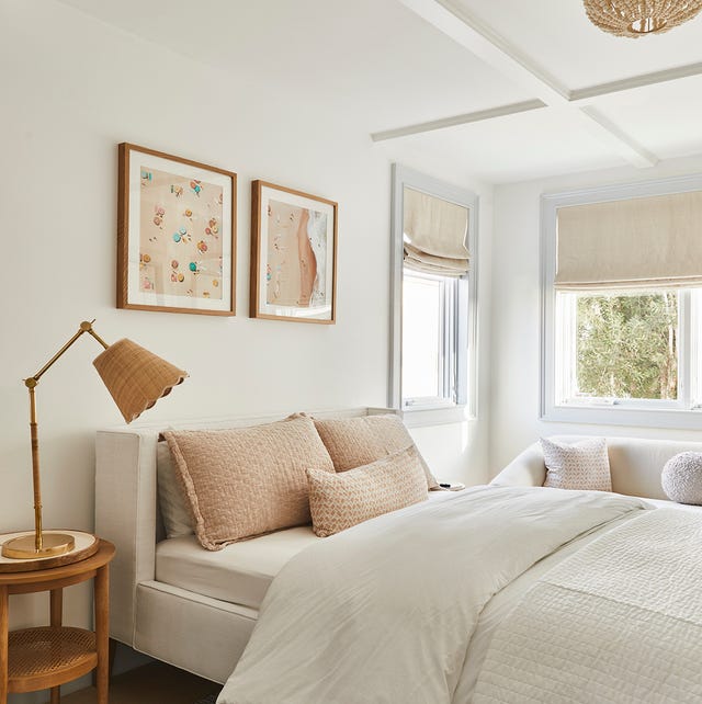
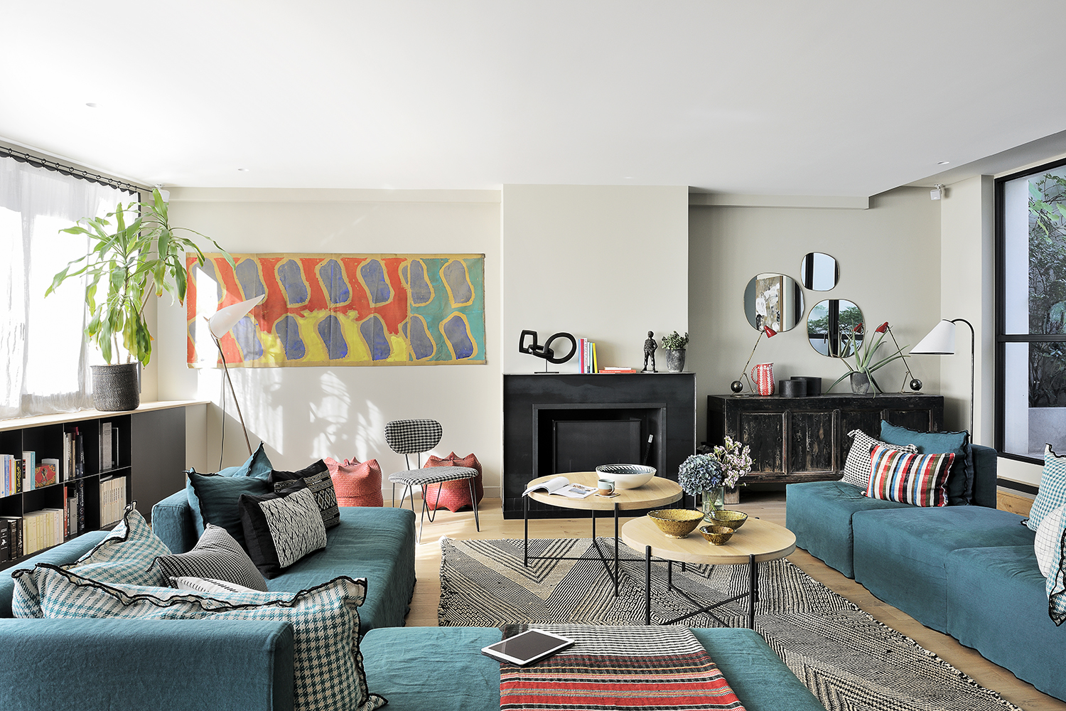
Further recommendations include creams that lean towards a taupe or greige (gray-beige) spectrum, which offer a more subdued and grounding presence. These shades are particularly effective in contemporary settings, providing a neutral backdrop that allows other design elements to stand out without overpowering the space. The article also touches upon the use of cream in different room types, suggesting lighter, airier creams for bedrooms to promote tranquility, and richer, warmer creams for living areas to encourage comfort and social interaction.
The article concludes by reinforcing the idea that cream paint colors serve as an excellent foundation for any decor style due to their inherent ability to harmonize with a wide array of textures, materials, and accent colors. It encourages readers to experiment with samples and consider the interplay of light throughout the day to find the ideal cream shade that transforms their living spaces into inviting and elegant retreats.
#CreamPaintColors #InteriorDesign #HomeDecor #PaintShades #DesignTips #VersatileColors #WarmUndertones #CoolUndertones #TopDesigners #CreamPaintColors #InteriorDesign #HomeDecor #PaintShades #DesignTips #VersatileColors #WarmUndertones #CoolUndertones #TopDesigners
0 comment in total
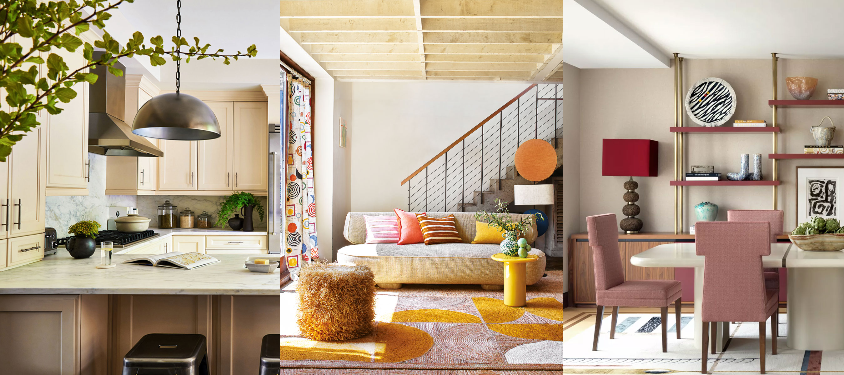
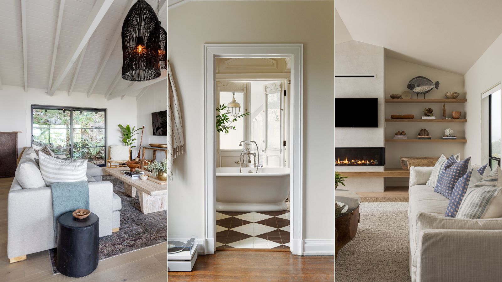
You may also like
Here Are the Best Cream Paint Colors, According to Design Pros

Interior Designers Share Their Favorite Cream Paint Colors
The Best Cream Colored Sweaters To Add To Your Wardrobe Now
5 Timeless Paint Colors That Go With Absolutely Everything, According to Color Experts

What colors go with cream? 8 complementary colors for this neutral favorite
5 best cream paints, as chosen by interior designers
13 Multi-Use Cream Makeup Palettes That MUAs Rave About
Creamy neutral paint colours are back — just don’t call it magnolia
What Colors Go With Cream? 10 Crème de la Crème Pairings That Go Perfectly With the Warm Neutral

From the Living Room to the Bedroom, These Cream Paint Colors Work Anywhere

Compare All the Paint Colors of the Year for 2023

10 Cream Bedroom Ideas That Prove This Velvety Shade is Anything But Boring
23 Versatile Cream Paint Colors That Will Pair with Basically Anything

Cream living room ideas – 10 ways to play up this versatile neutral

7 of the best cream wall paint colors, as chosen by designers – 'they look modern, and anything but magnolia'
7 of the most versatile and easy to use paint colors according to designers

Is cream paint back on trend? 7 ways interior designers use this once shunned shade
The Gray, Cream, and Navy Items I Swear Out-Rich Every Other Color Trend (Yes, Even Black)

We Can’t Get Enough of These 13 Paint Color Trends for 2021
7 of the best cream wall paint colors, as chosen by designers – 'they look modern, and anything but magnolia'