1/7
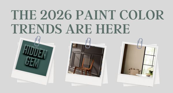
What This Sour Yellow-Green Says About Color for 2026
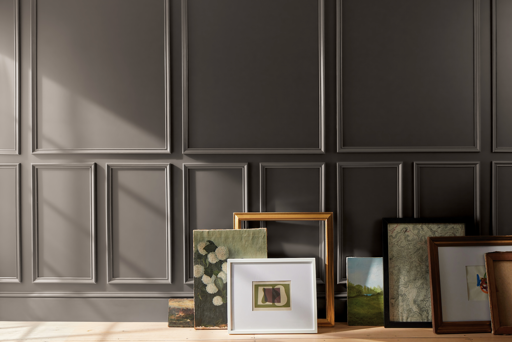
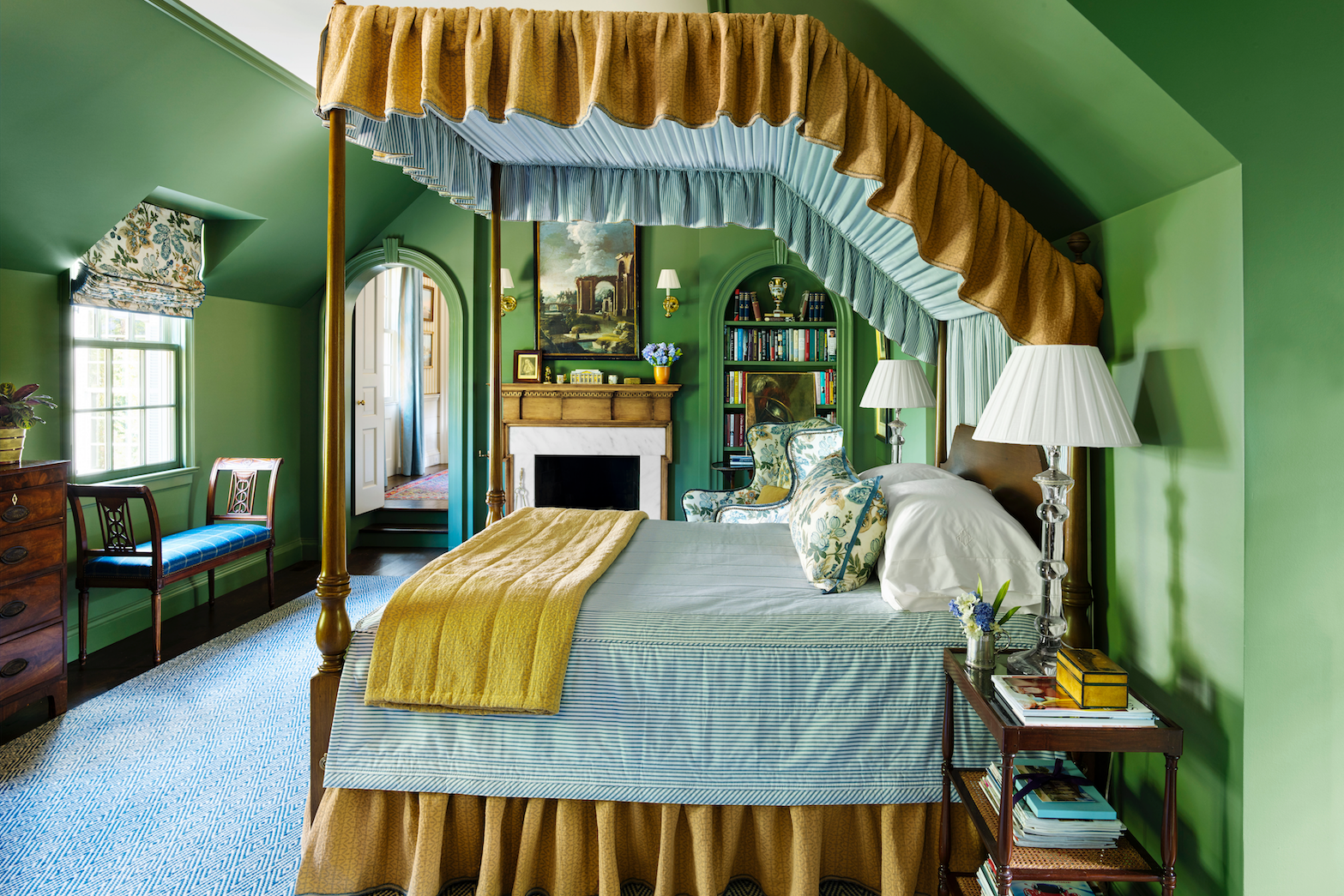
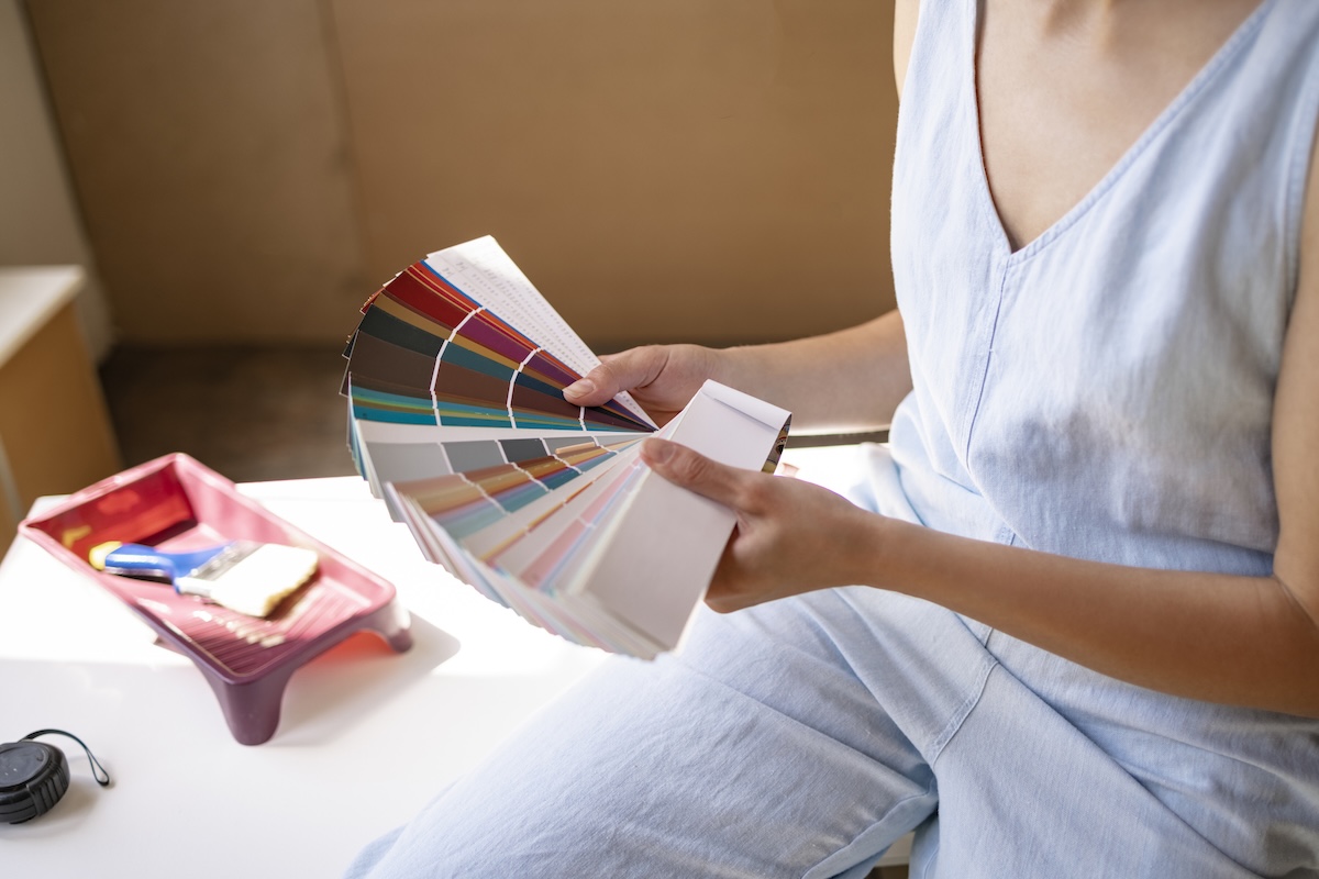
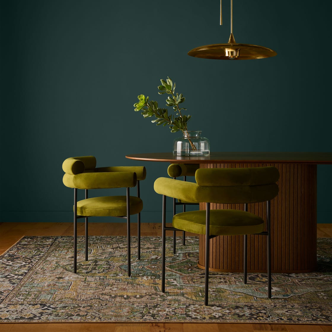
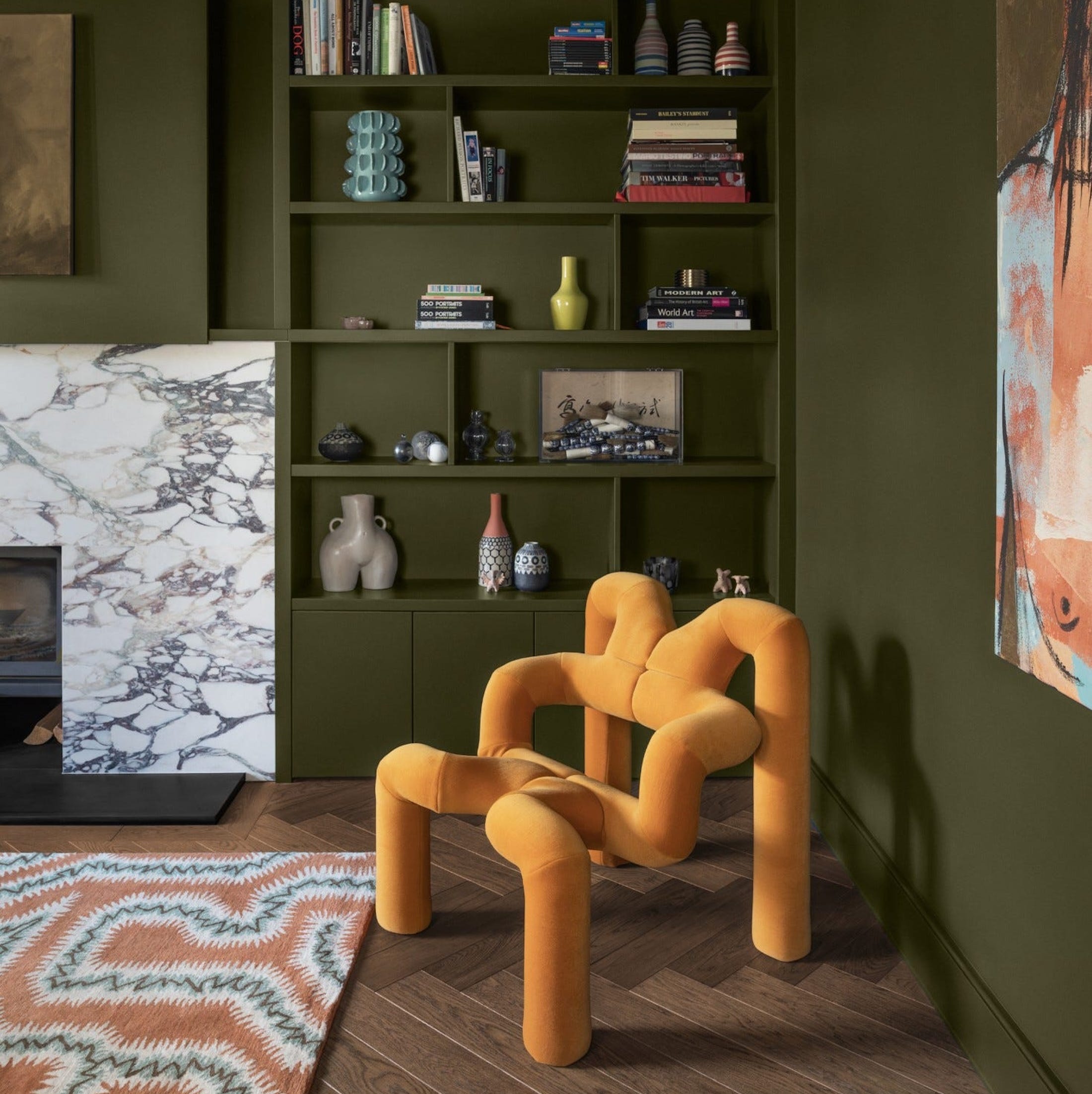
The article explores the emerging trend of 'Sour Chartreuse' in interior design for 2026, a bold yellow-green hue that challenges traditional aesthetics. This color is presented as a stark contrast to the calming neutrals that have dominated interior design in recent years. Livingetc's color expert, Amy Moorea Wong, describes Sour Chartreuse as a shade that goes against convention, creating an 'electric shock' or 'alarm bell' effect that demands attention and signals confidence and wit. The color is characterized by its ability to evoke an emotional reaction, regardless of whether it is perceived as positive or negative, highlighting a shift towards more daring and unconventional color choices in home décor.
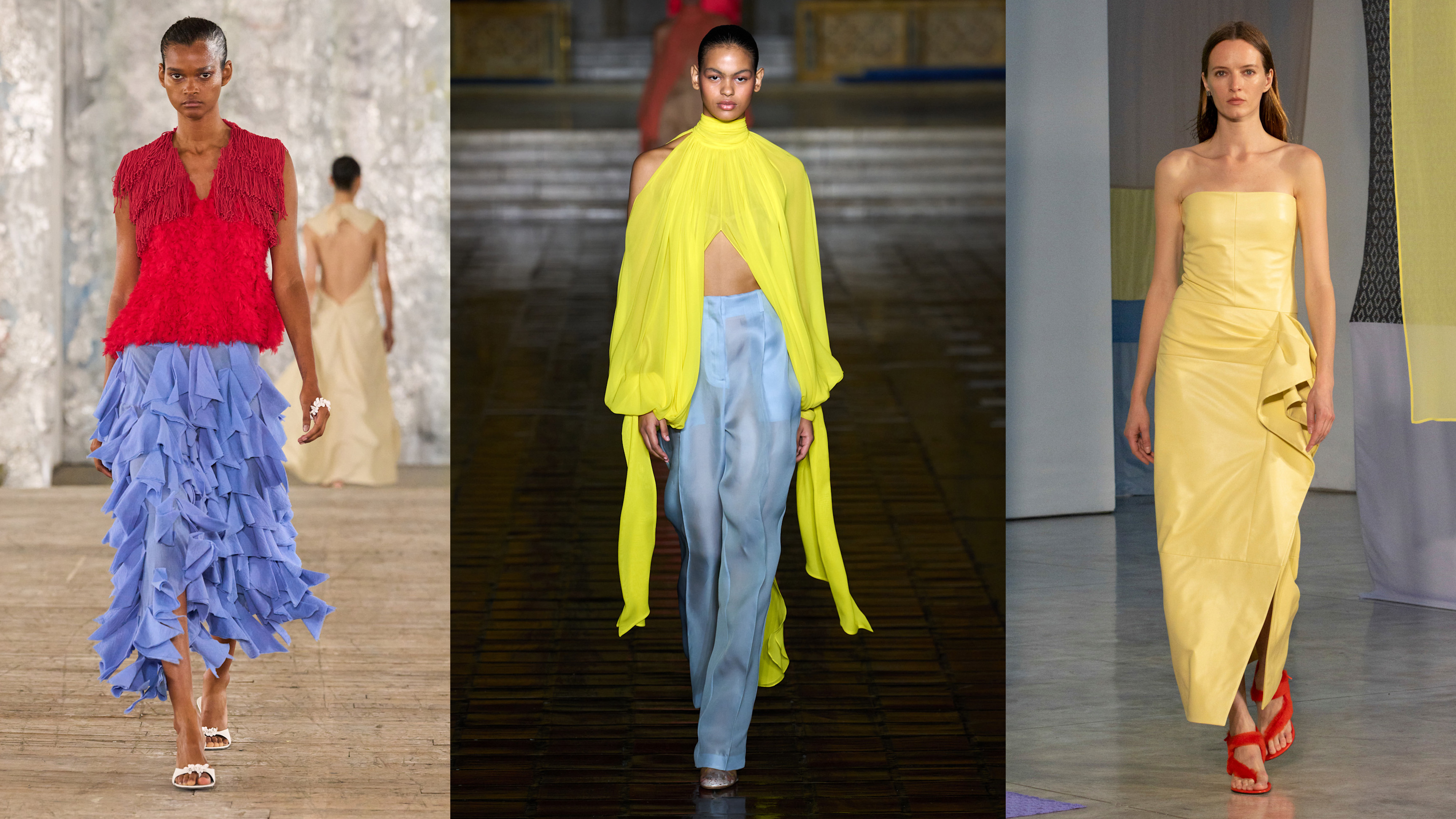
The article emphasizes that Sour Chartreuse is not merely a playful color but a deliberate choice engineered to provoke curiosity and energize a space in a way natural shades cannot. It stands as an antithesis to the organic color palettes previously favored, suggesting a move towards more human-made and striking hues. The expert connects this trend to broader cultural influences, drawing parallels to the psychedelic 70s, 90s rave culture, and fluorescent Y2K aesthetics, but with a refined, 'grown-up' clarity. It is even posited as a more sophisticated evolution of the controversial 'Brat Green' trend that briefly appeared in 2024, offering similar energy but with greater restraint and complexity.
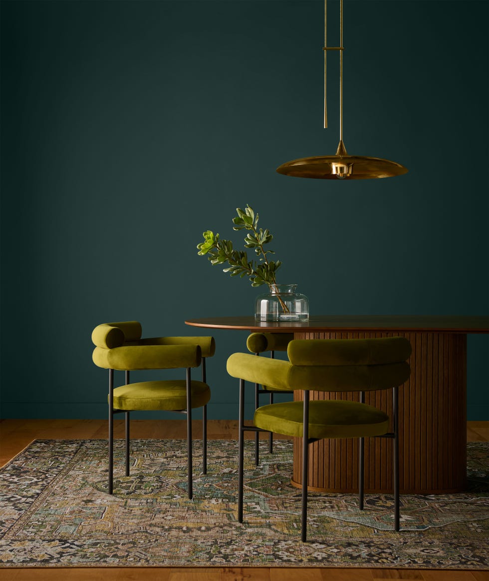
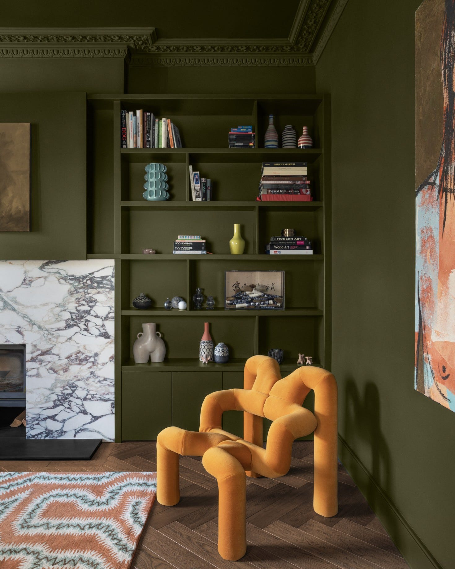
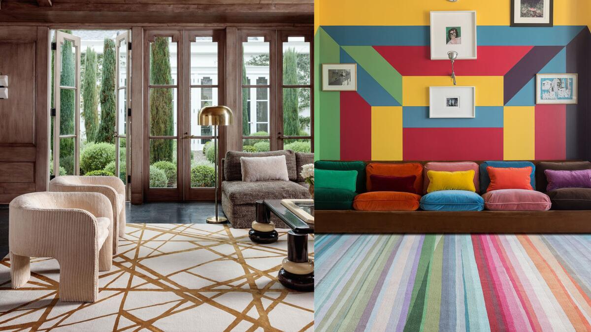
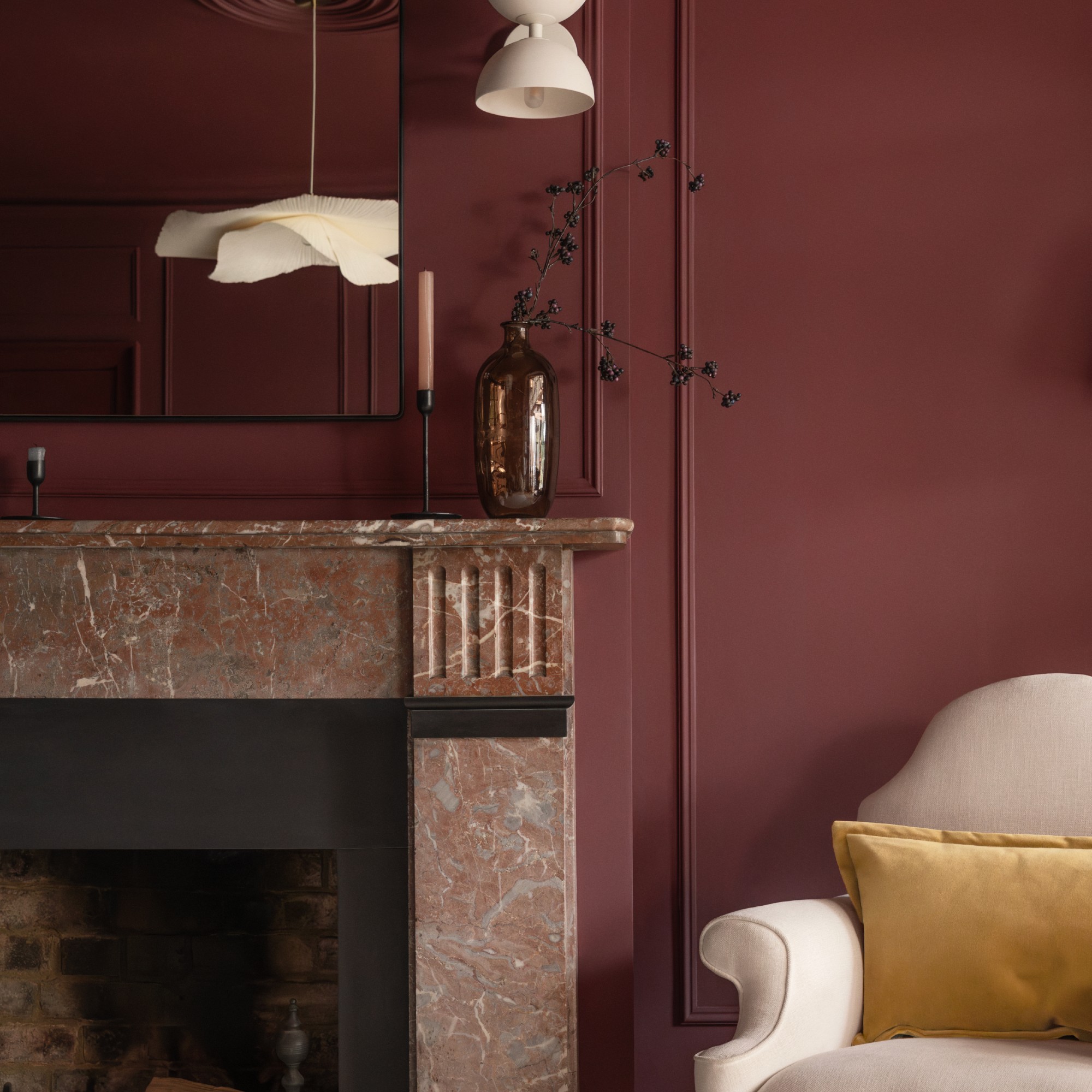
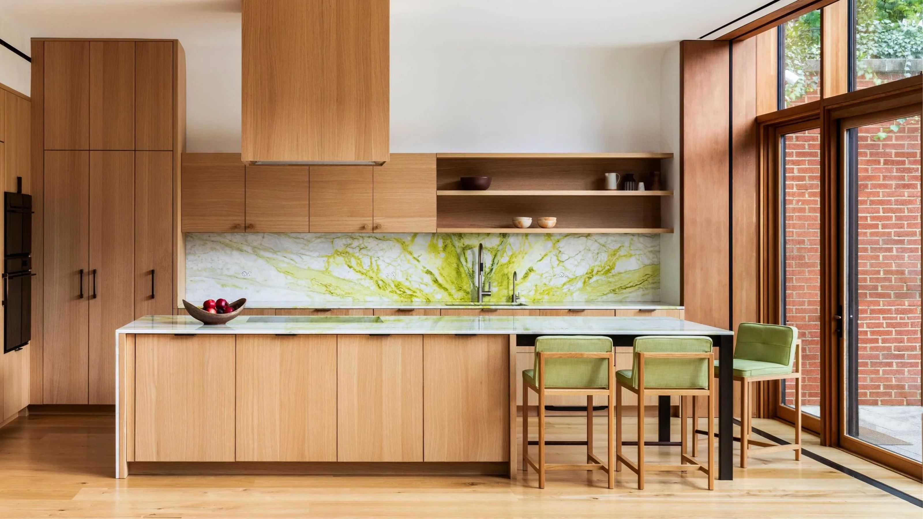
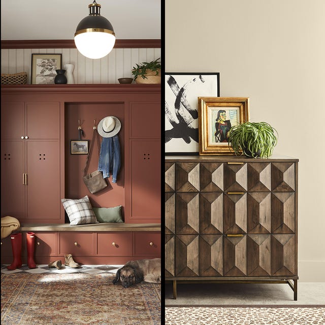
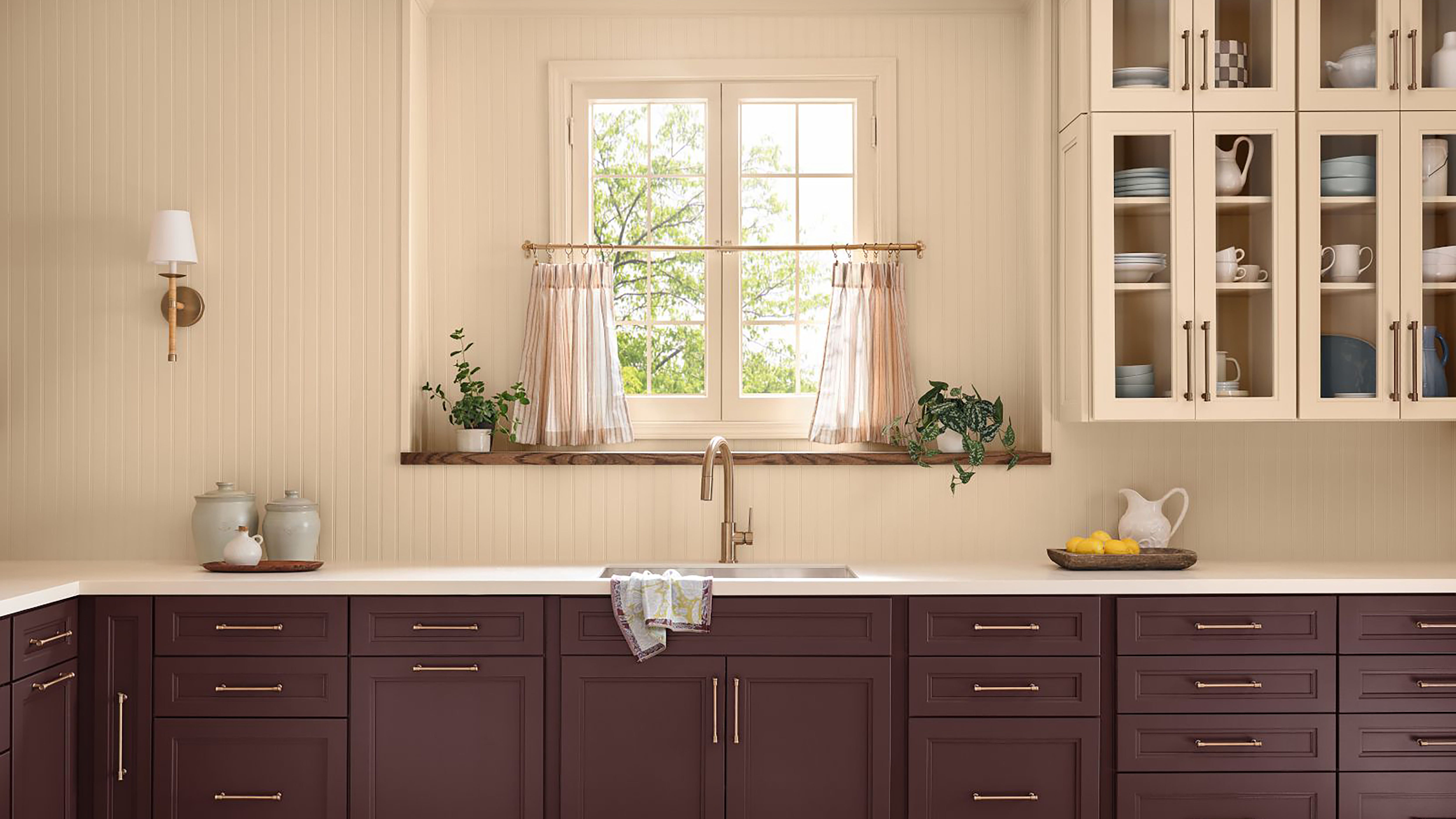
A key insight shared is that despite its vibrant and potentially overwhelming nature, Sour Chartreuse can work harmoniously within interior schemes. The article notes that applying the color extensively, such as through 'color-drenching,' can surprisingly make it feel less intimidating and overwhelming by reducing stark contrasts. Designers like Estudio Guto Requena and Golden have successfully implemented this approach. Poonam Khanna of UNIONWORKS highlights the color's ability to create tension and a dynamic conversation within a space, especially when used in elements like a kitchen backsplash alongside warm timber tones, effectively blurring the lines between indoor and outdoor aesthetics.
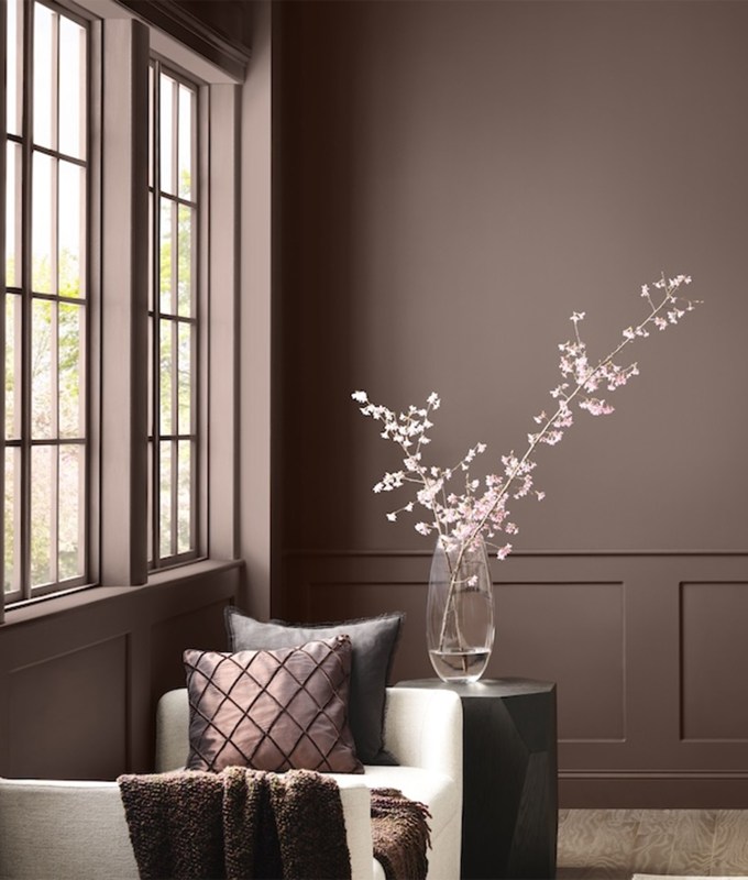
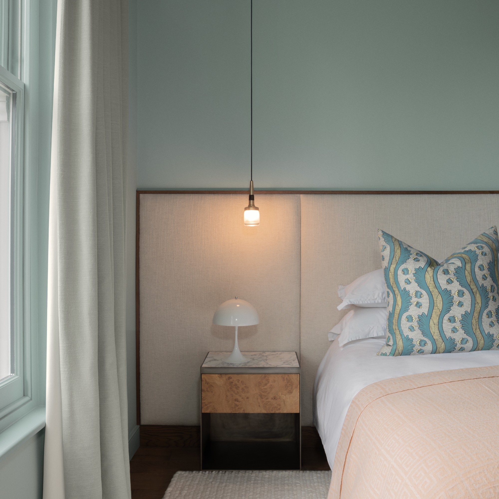
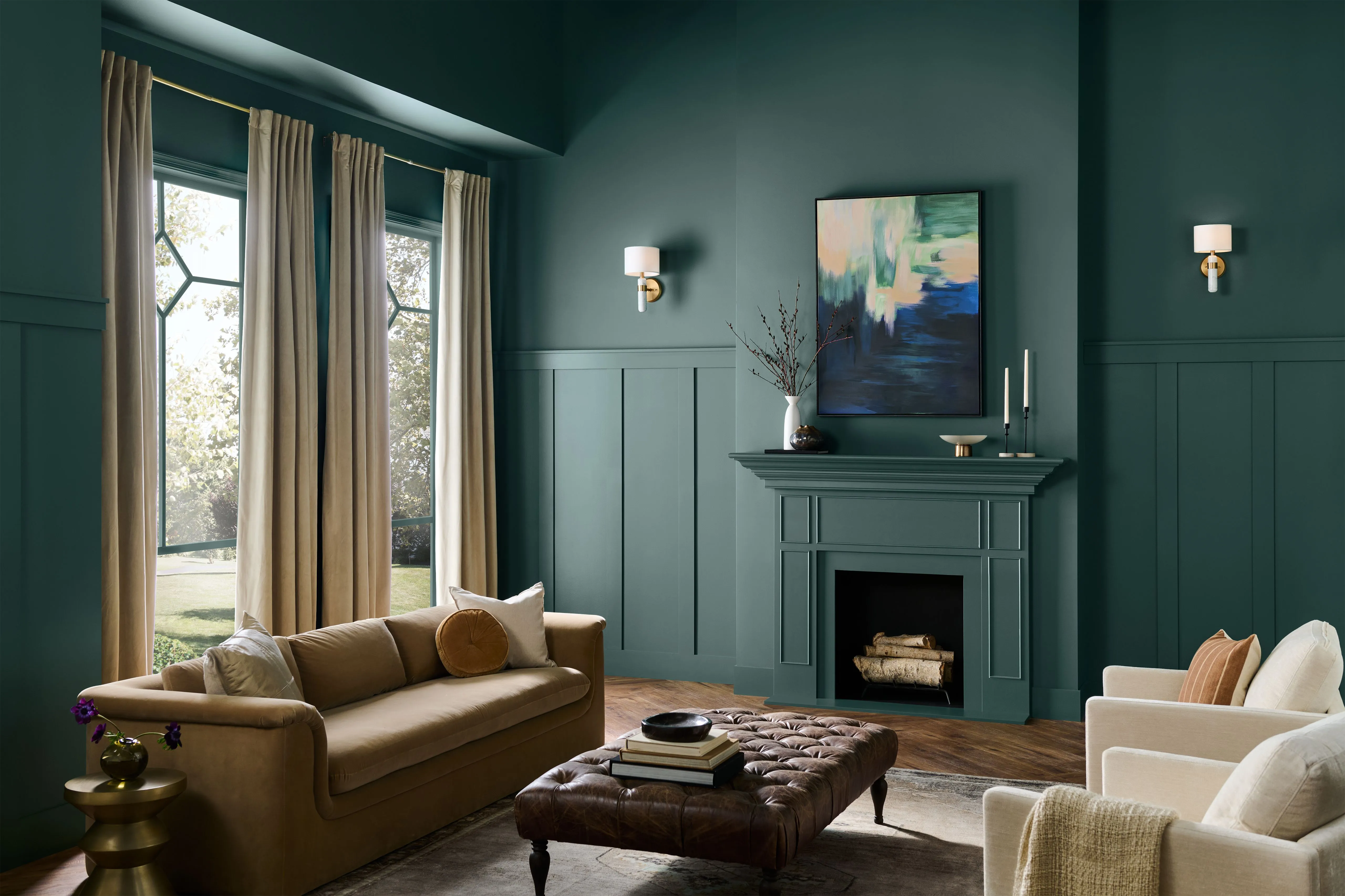
Practical advice for incorporating Sour Chartreuse is also provided. Helen Shaw, director of marketing at Benjamin Moore, describes it as a mood-boosting color with an almost neon lime characteristic that adds energy. However, she stresses the importance of careful consideration regarding placement, intensity, and finish to prevent the color from becoming overwhelming. Factors such as lighting levels, surface finishes, and texture are crucial to ensure a sophisticated yet vibrant outcome. The article also discusses how different lighting conditions affect the color's appearance, with cooler light amplifying its green notes and warmer light bringing out its yellow undertones.
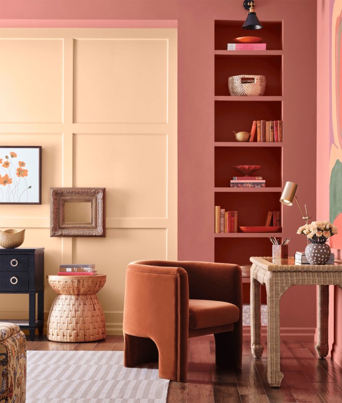
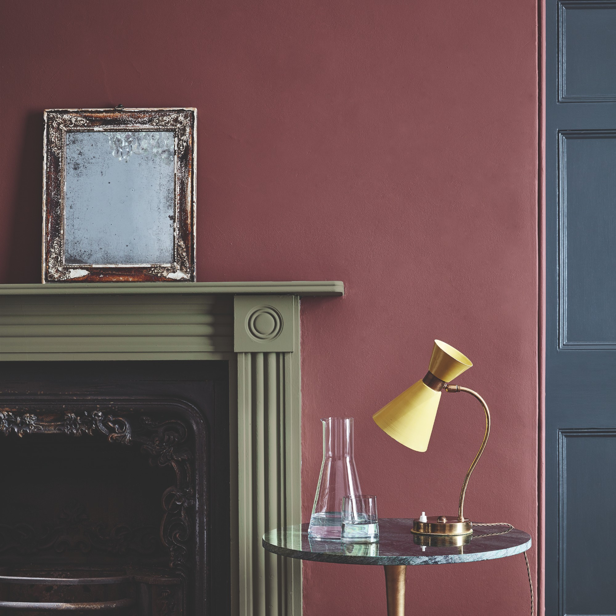
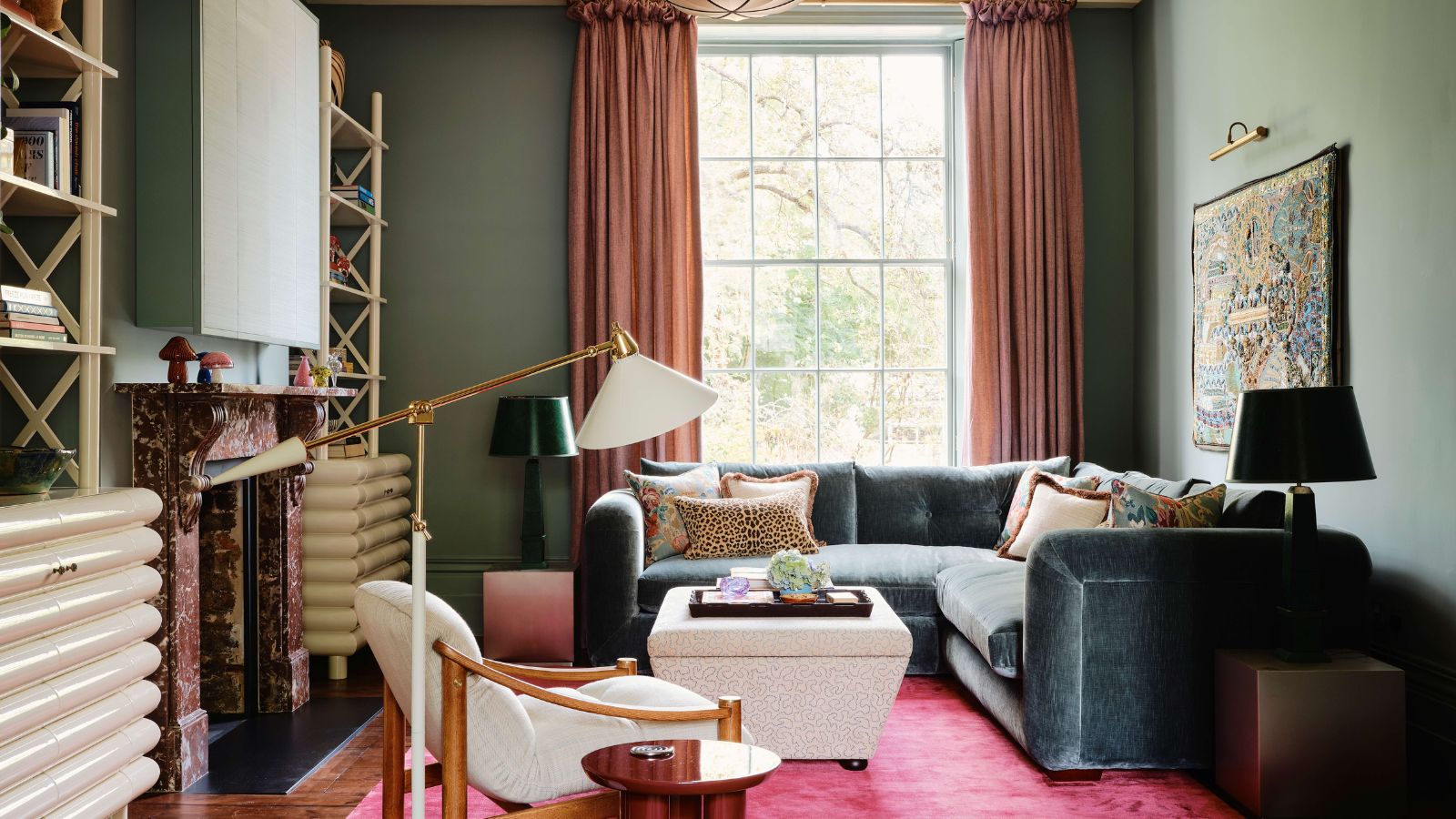
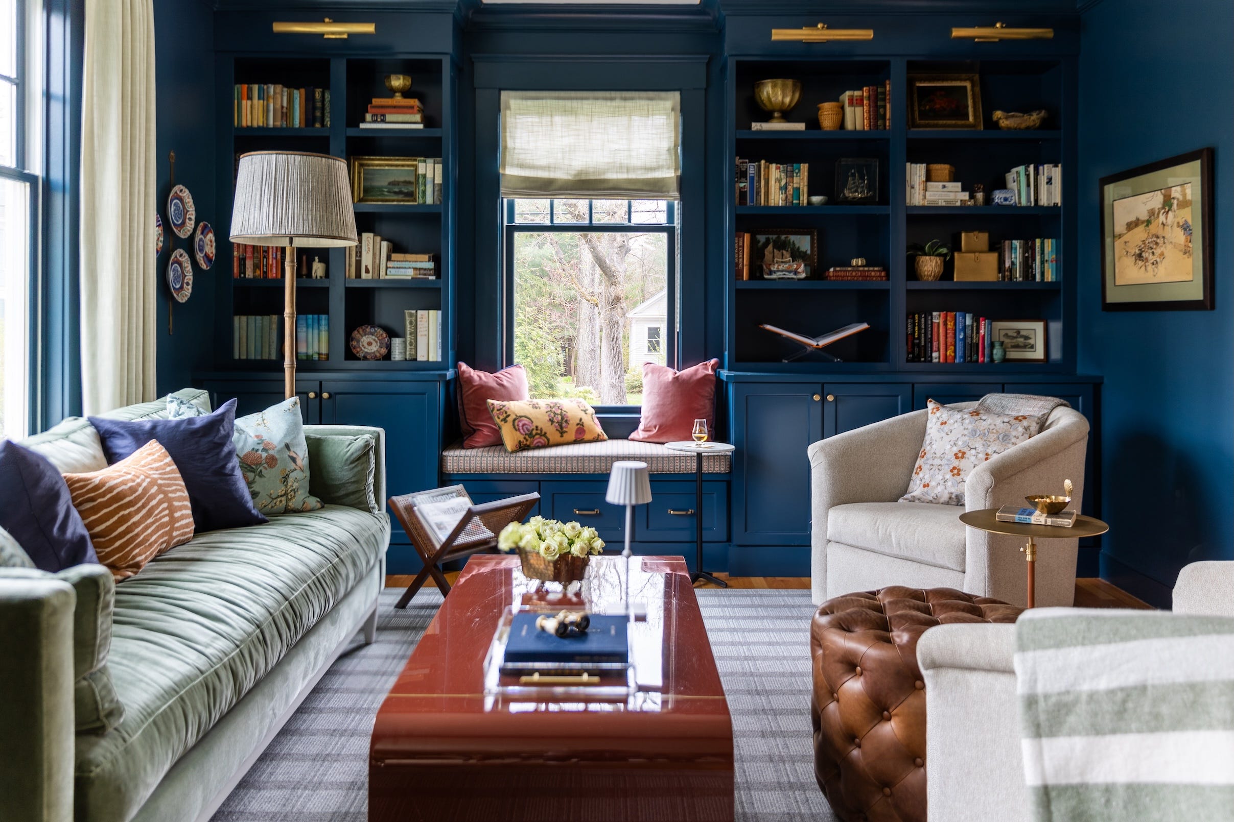
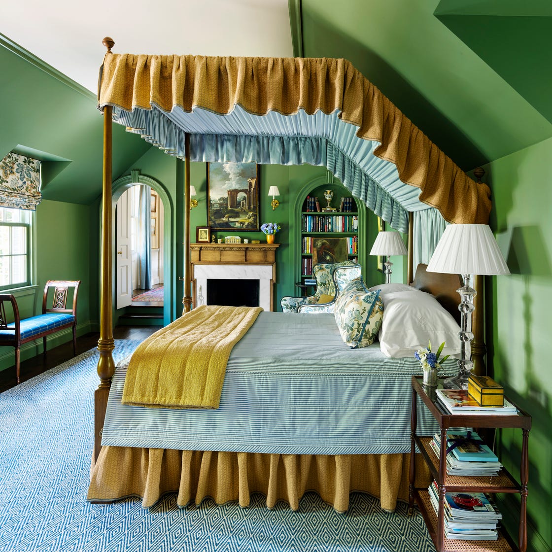
Finally, the article delves into effective color pairings for Sour Chartreuse, suggesting that it works best with sleek finishes like chrome, timber, and stone, which are currently prominent interior trends. These materials help ground the energetic color, adding warmth and calm while allowing Sour Chartreuse to be the focal point. For those wishing to introduce other colors, moody neutrals such as cocoa, espresso, or deep navy can increase contrast, while fuchsia, coral, or teal can amplify the dopamine-inducing effect. The overarching message is to embrace courage in color application, encouraging homeowners to experiment and create spaces that evoke genuine feeling, regardless of whether Sour Chartreuse becomes a permanent fixture or a fleeting trend.
#InteriorDesign #ColorTrends #SourChartreuse #HomeDecor #DesignInspiration #ColorPsychology #ModernInteriors #2026Trends #InteriorDesign #ColorTrends #SourChartreuse #HomeDecor #DesignInspiration #ColorPsychology #ModernInteriors #2026Trends
0 comment in total
You may also like
2026 Color of the Year Announcements Have This In Common
What Paint Colors Will Rule 2026? Designers Make Their Predictions

‘Unexpected Yellow Theory’: The Bold New Interior Trend Replacing Red in 2025
Every 2026 Color of the Year We Know So Far, From Soft Neutrals to Your New Favorite Green

What 2026's Colors of the Year Say About You—And All Of Us

According to Designers, These Are The Outdated Color Trends for 2026

UPDATE: Here Are All the 2026 Colors of the Year—Including Pantone’s Shocking Pick
Unexpected Color Combinations Trend Spring/Summer 2026

Behr's 2026 Color of the Year Is Here—And It’s Moody
Every 2026 Color of the Year Revealed So Far—and What They Say About the Year Ahead

We’re Calling It: These Are the Official Color Trends of 2025
The colour trends 2026 that will define our homes next year

The 2026 paint Colors of the Year Have Been Announced

What Paint Colours will Rule 2026? The Experts Make Their Predictions
Designers Say These 12 Paint Colors Will Be Everywhere in 2026

These 7 Colors Will Rule Interiors in 2026, According to Experts

Every 2026 Color of the Year That Has Been Announced So Far
Looks Like Bold Stripes Will Have Their Moment in 2026

Bye-Bye True Blue: These Are the New Coastal Colors for 2026
An interior designer shares insight on the 2026 Color of the Year and what it means for the trend cycle