Every 2026 Color of the Year Revealed So Far—and What They Say About the Year Ahead
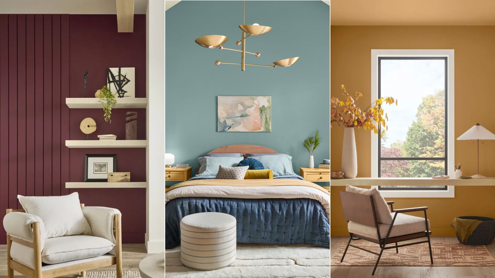
As the year approaches, various paint brands and home exterior companies have begun unveiling their selections for the 2026 Color of the Year, offering insights into upcoming trends in home design and decoration. Color serves as a powerful tool in setting a home's style, influencing mood, and shaping perceptions of design.
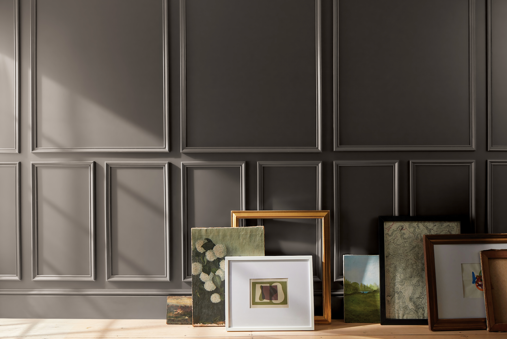
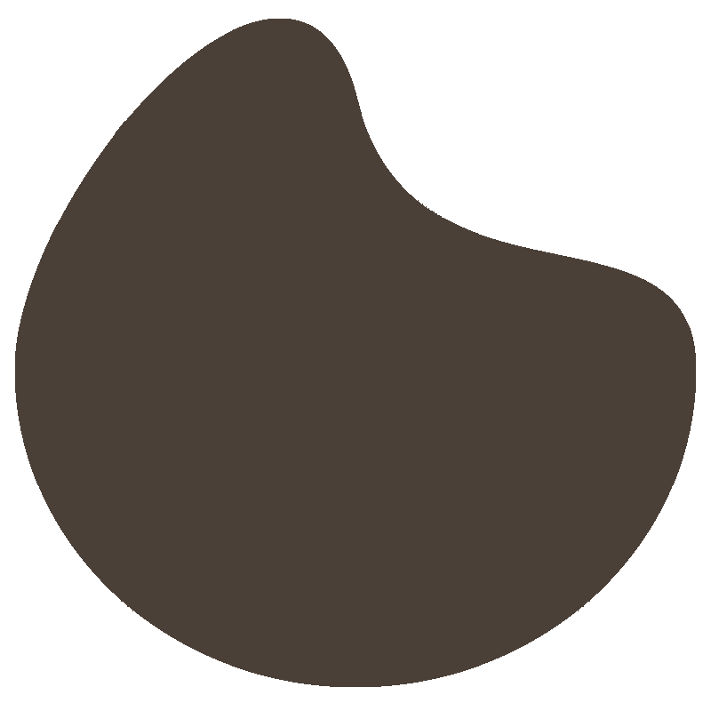
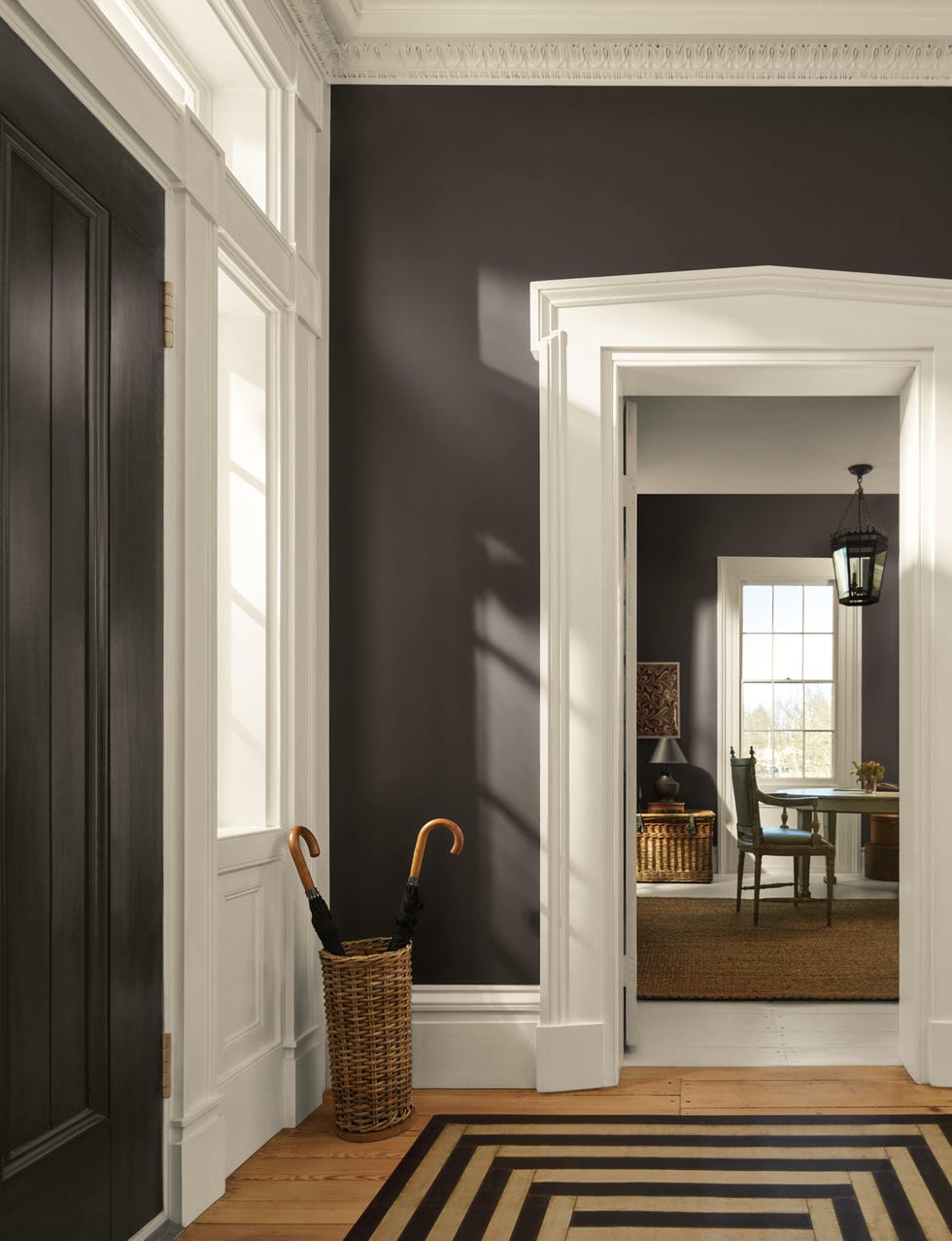
James Hardie, a home exterior company, declared "Iron Gray" as its 2026 Color of the Year. This bold charcoal hue is suitable for both modern and traditional homes, effectively highlighting architectural features when paired with appropriate trim and accent colors. The brand suggests Arctic White for contemporary or traditional looks, while matching accents create a modern statement.
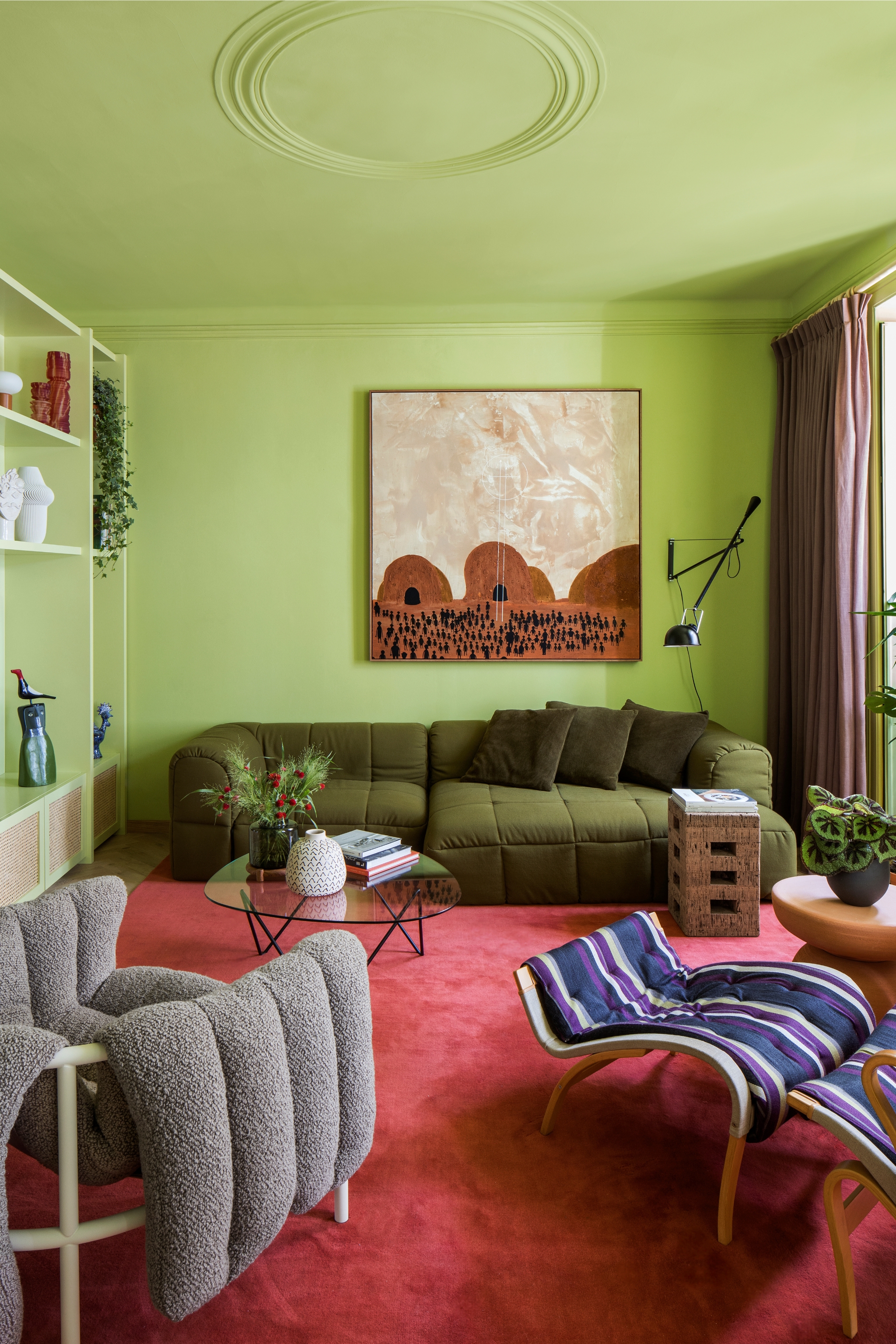
California Paints selected "Cactus Valley," a medium earthy green, as its color of the year. This choice is part of a curated palette of 12 shades designed for balance and versatility, reflecting a shift towards bold, calming colors that foster connection.
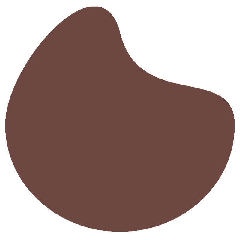
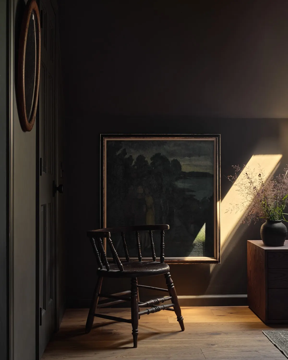
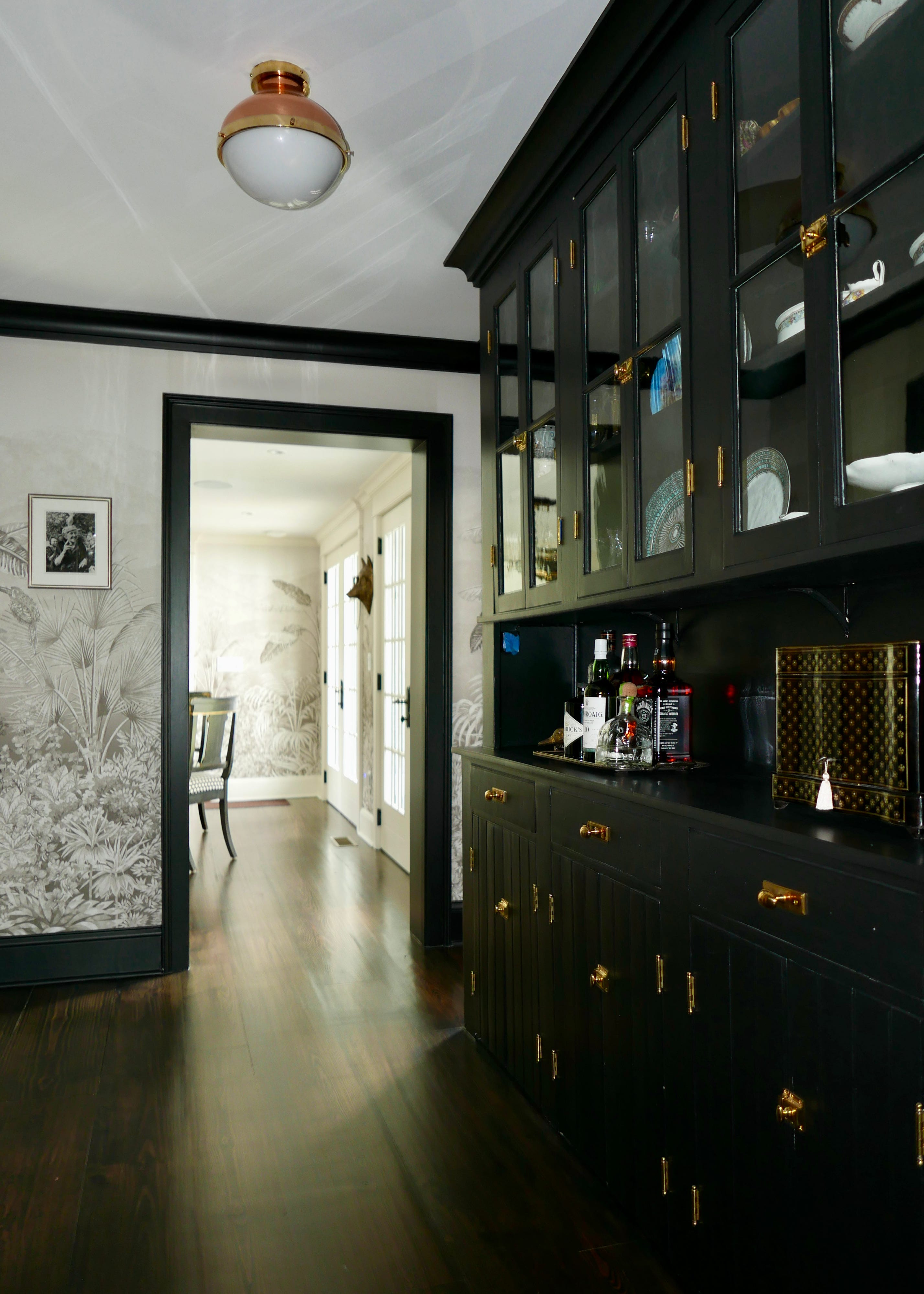
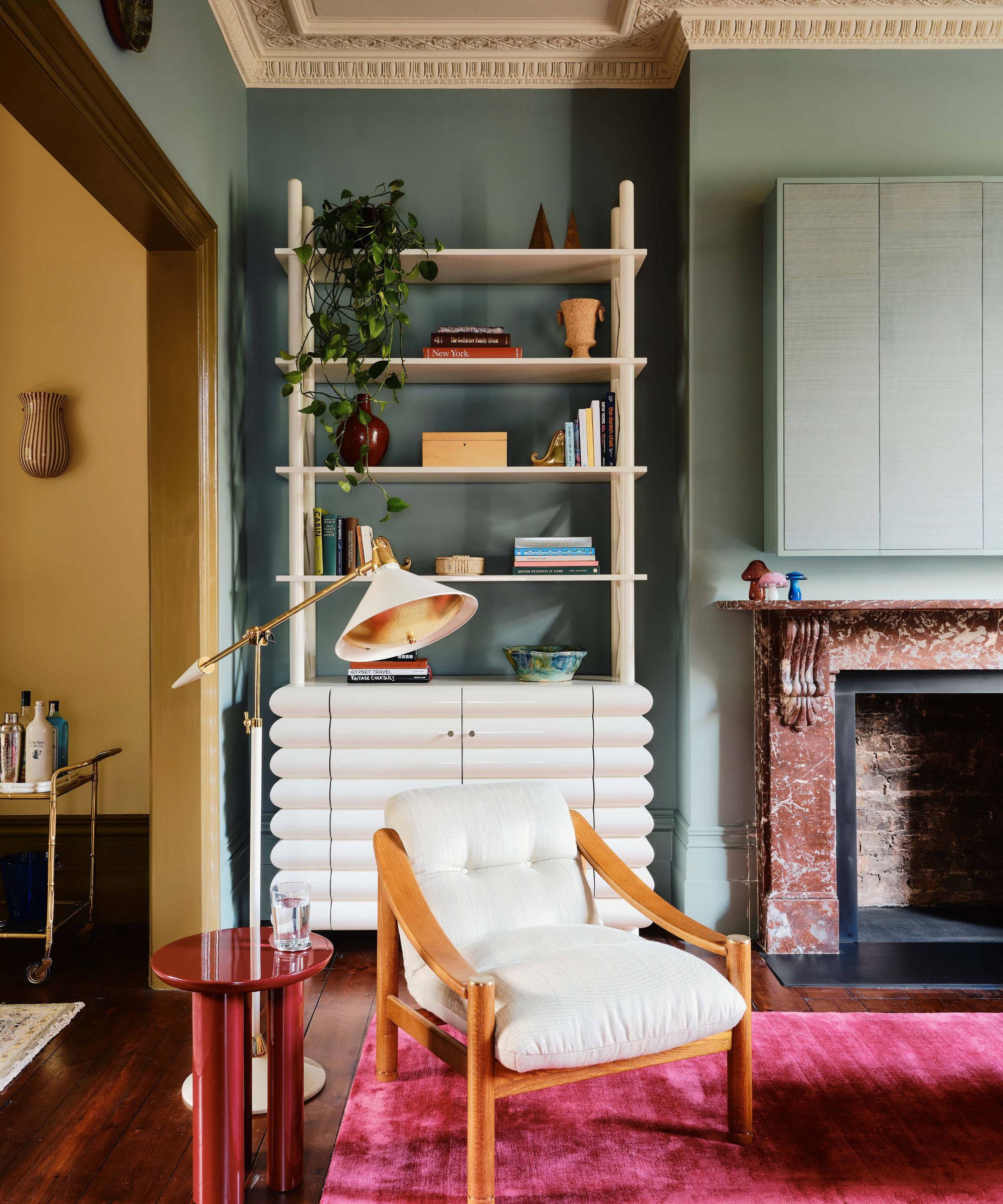
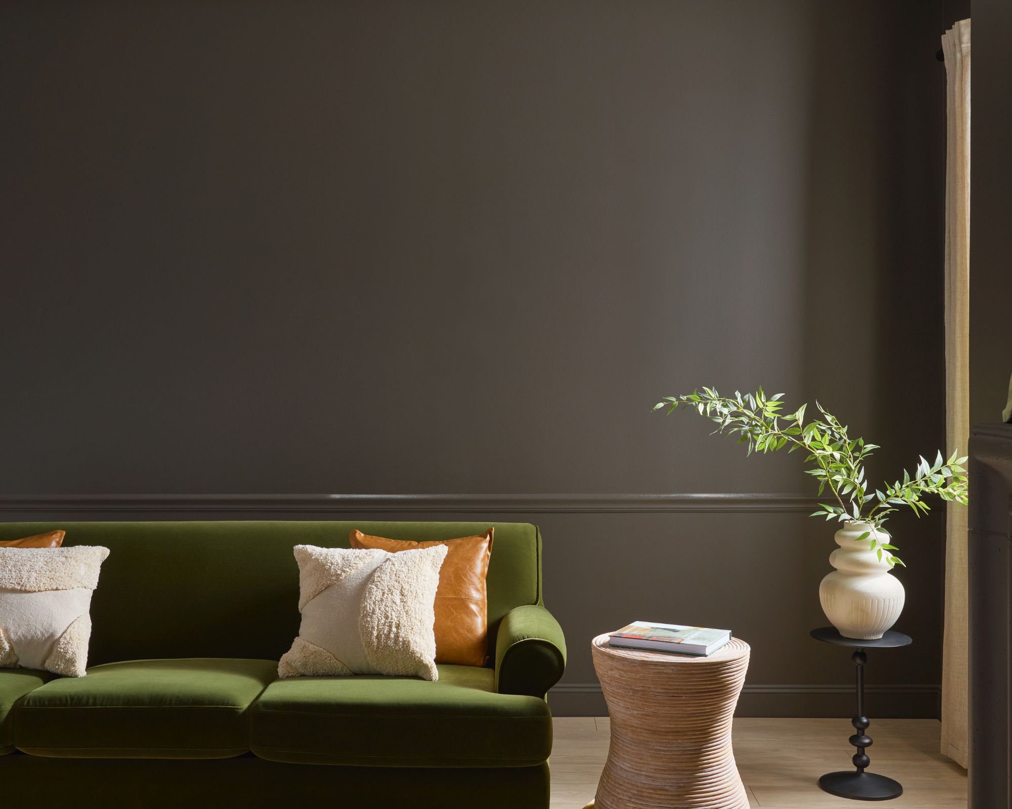
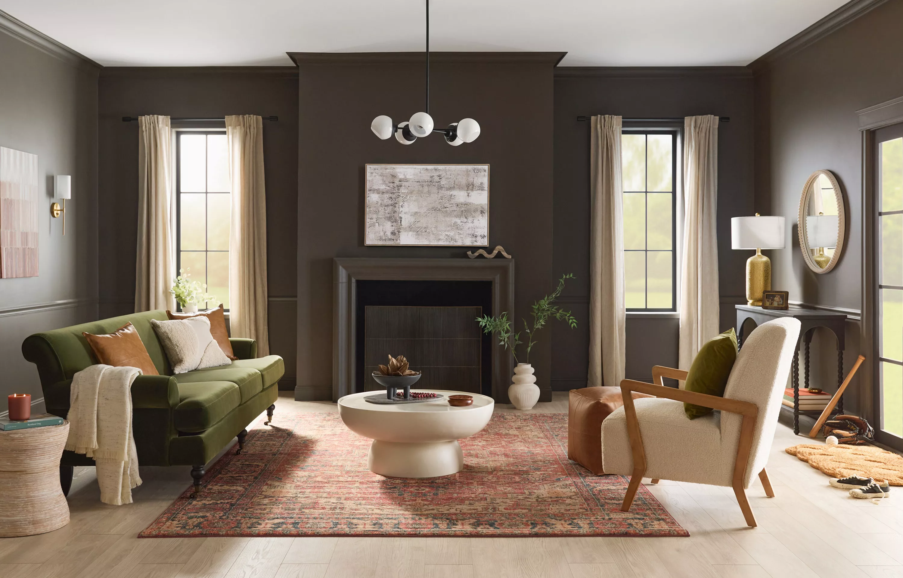
Benjamin Moore's "Silhouette" is a chocolatey espresso with charcoal undertones, inspired by tailored suits. This sophisticated hue caters to both moody contemporary and timeless styles, aligning with the current popularity of brown paint colors for formal dining rooms, bedrooms, and bathrooms.
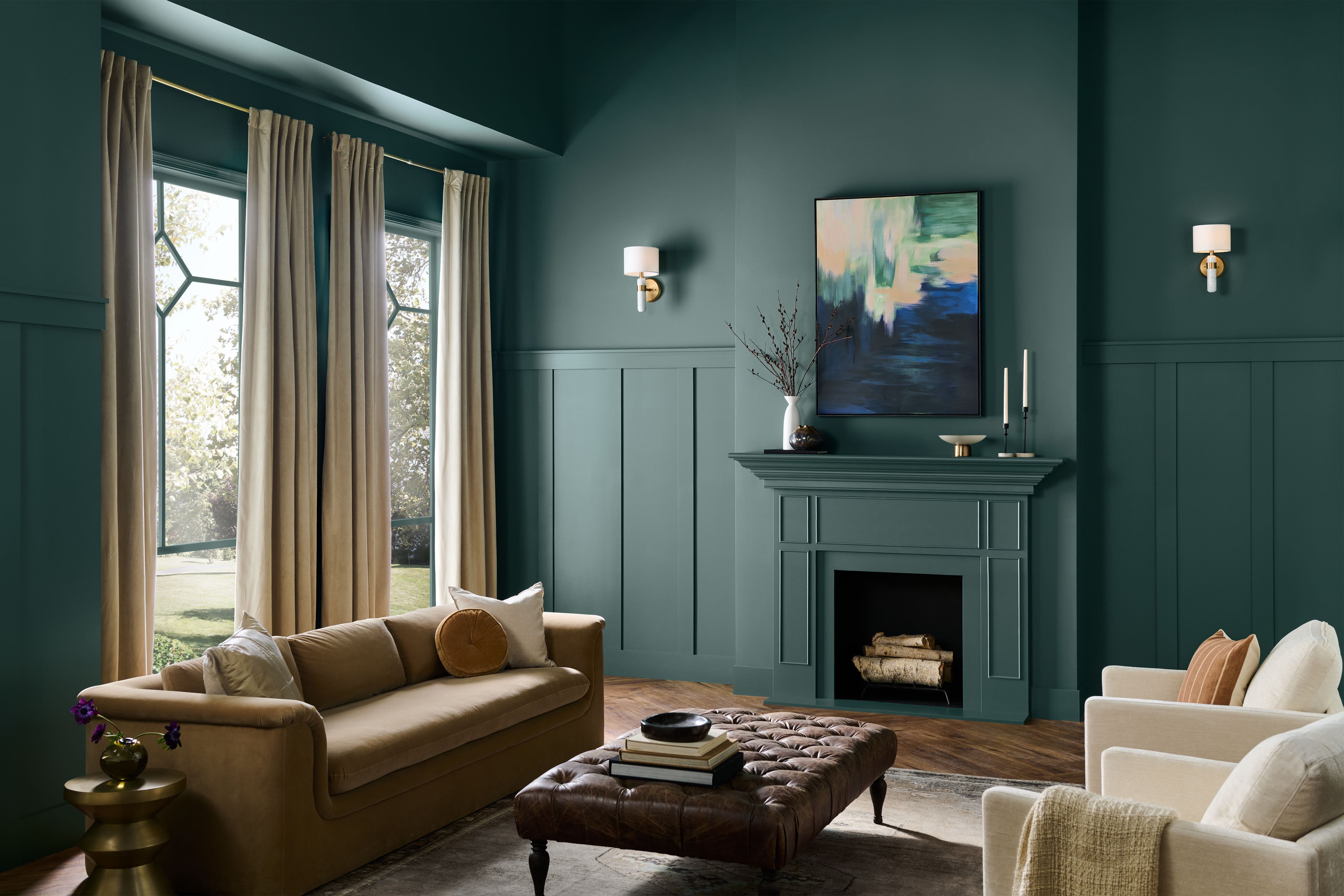
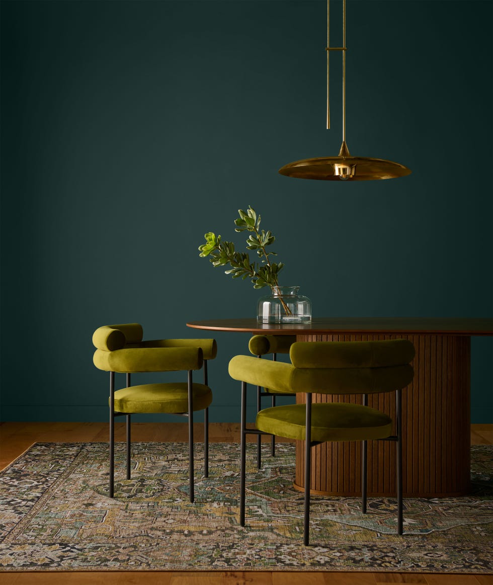
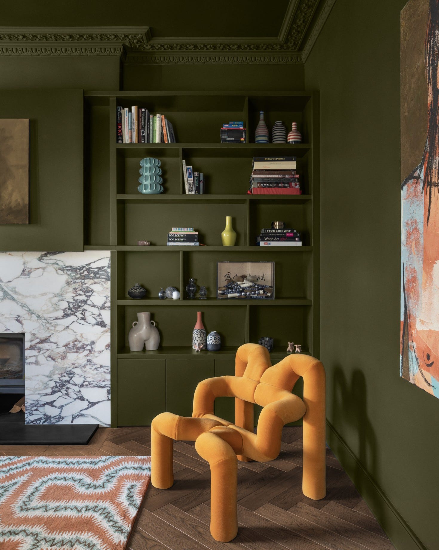
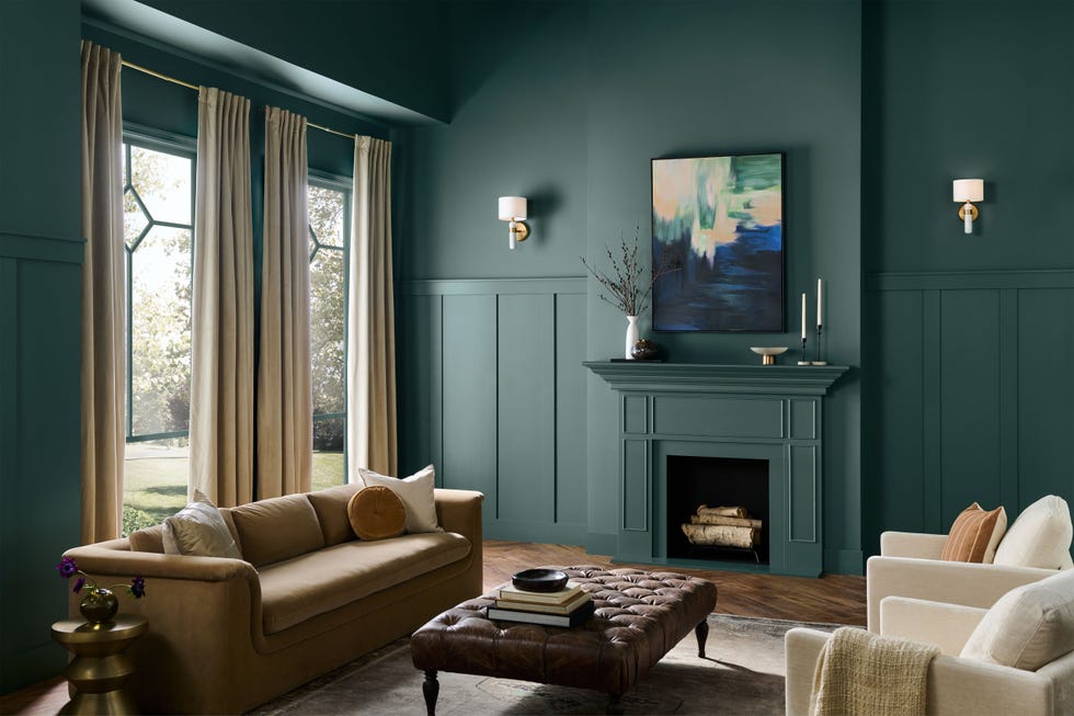
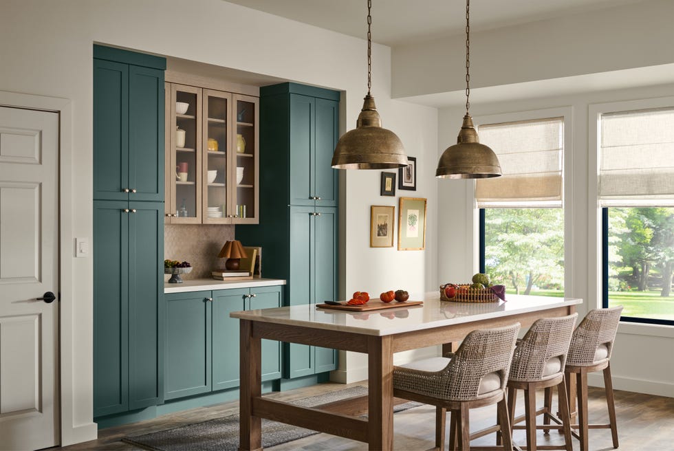
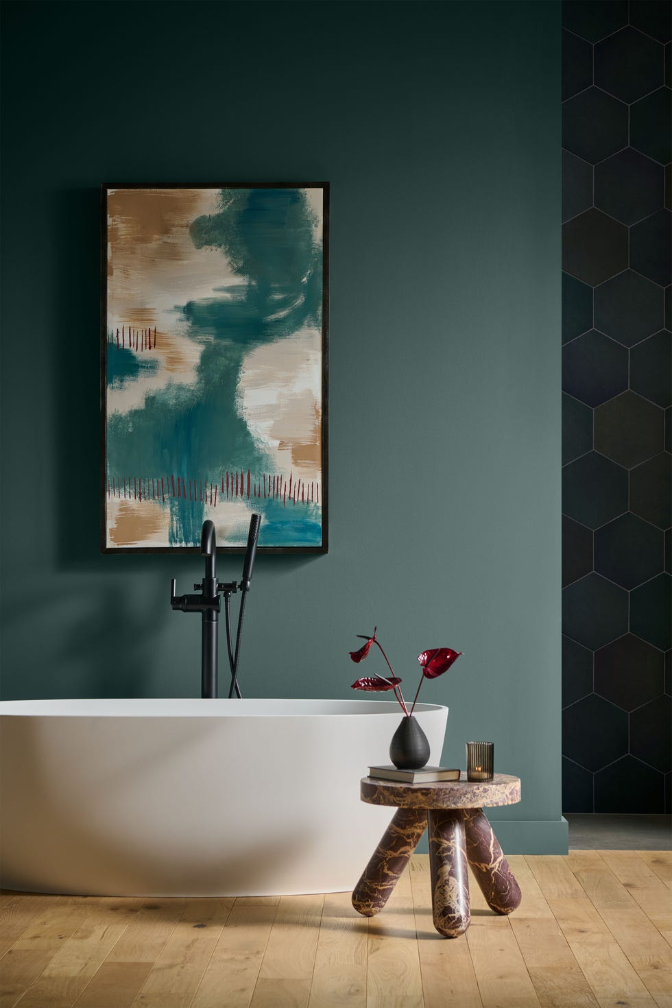
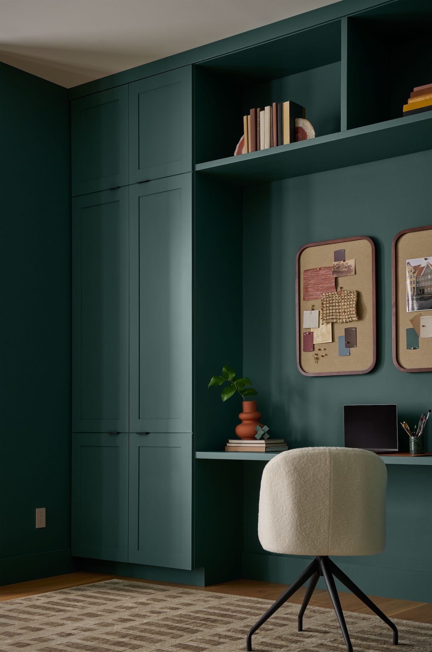
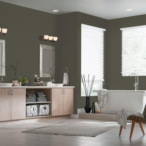
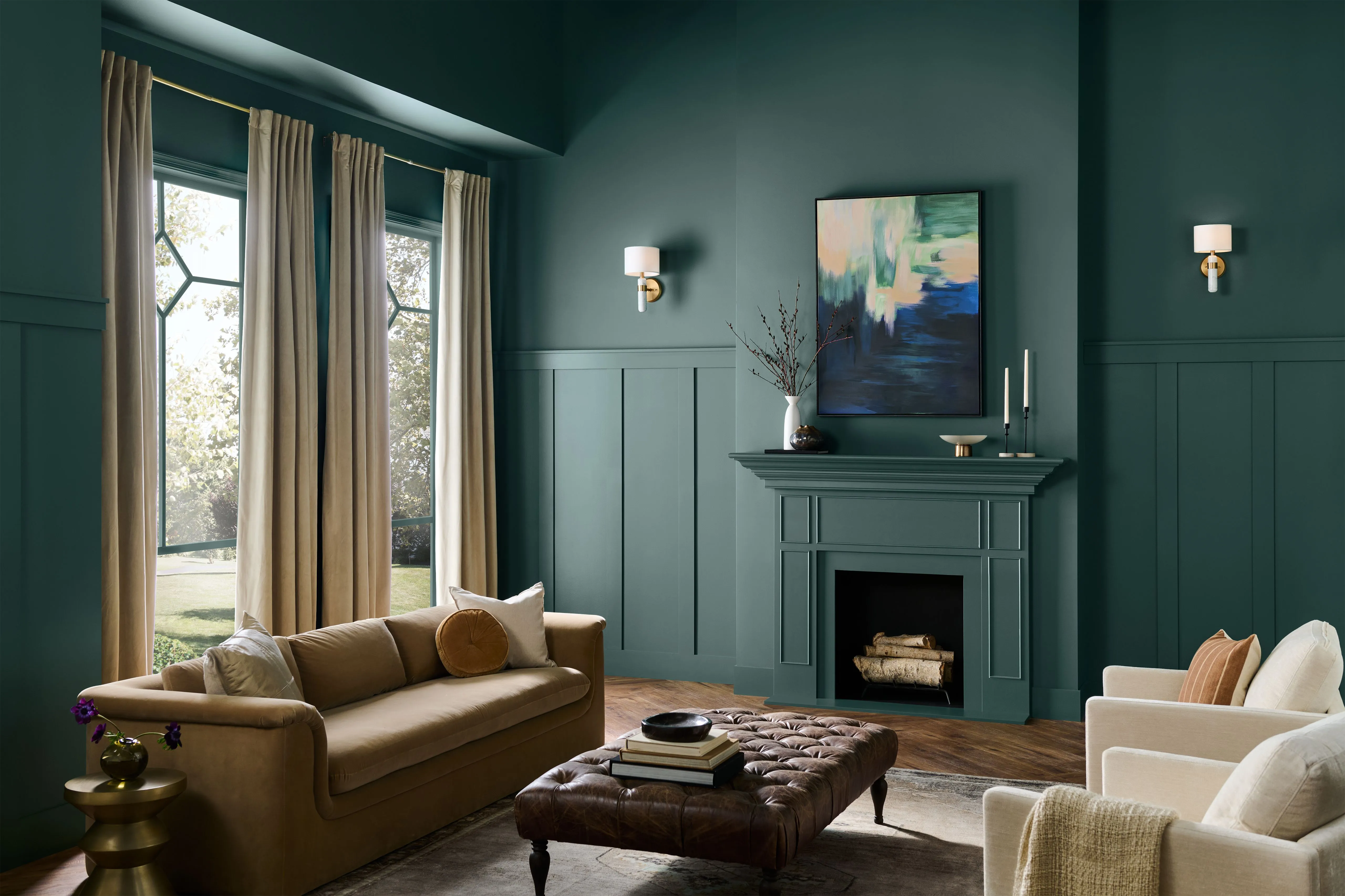
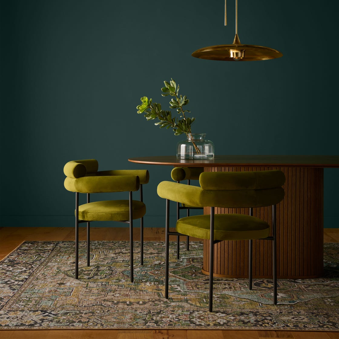
Dunn-Edwards named "Midnight Garden" as its 2026 Color of the Year. This deep, muted green, reminiscent of moss, offers versatility for cabinetry, walls, accents, and exteriors. Despite being a current trend, its muted nature allows it to function as a neutral, pairing well with terra-cottas, purples, and other neutrals from Dunn-Edwards' 2026 Color Trends.
Clark+Kensington's choice is "Hazelnut Crunch," a toasty, earthy hue available at Ace Hardware. This color reflects growing consumer demand for nature-inspired spaces and cozy minimalism, providing a familiar yet bold presence. It anchors two palettes, Grounded (warm neutrals) and Tranquil (muted mineral hues), to help consumers integrate it into their personal styles.
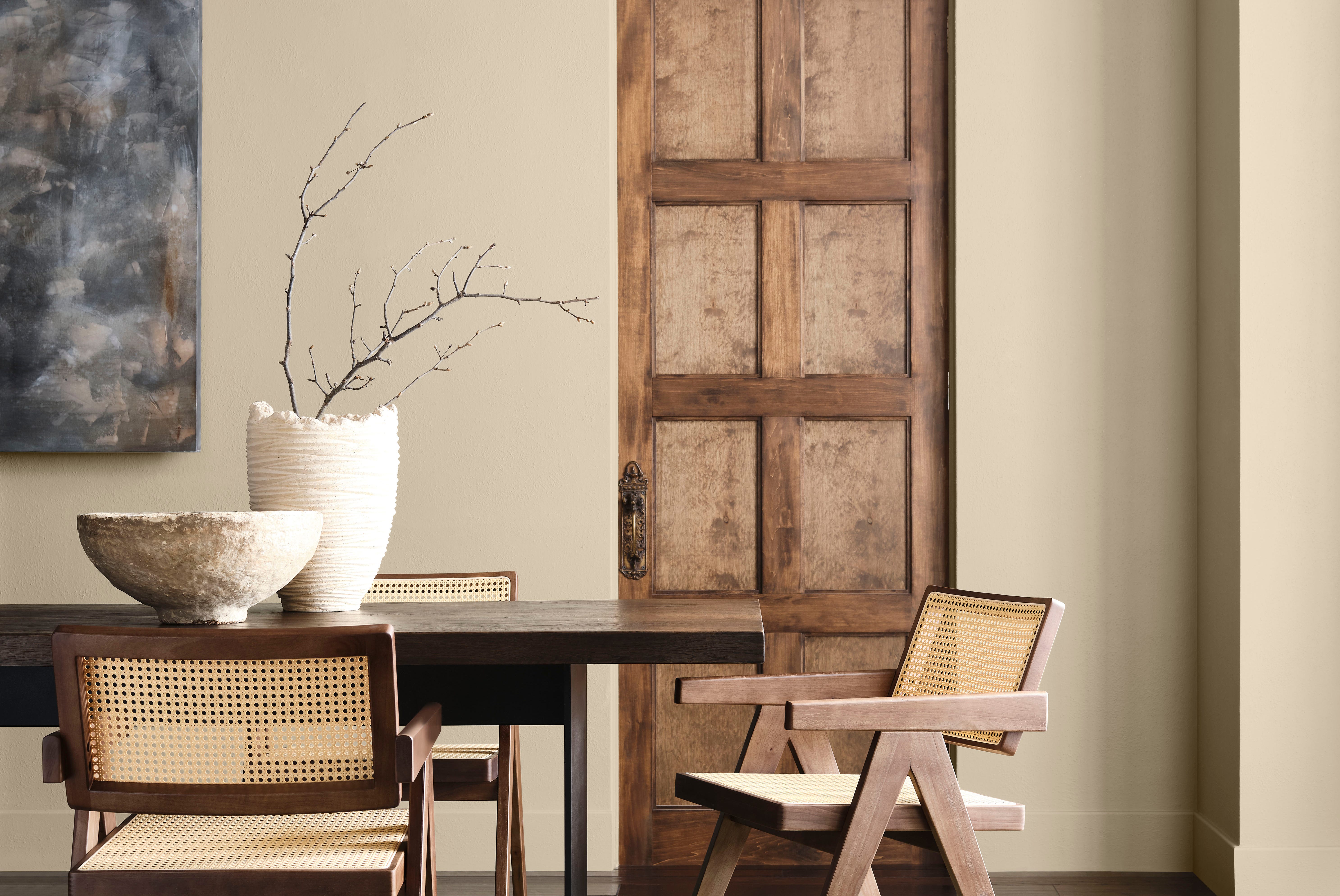
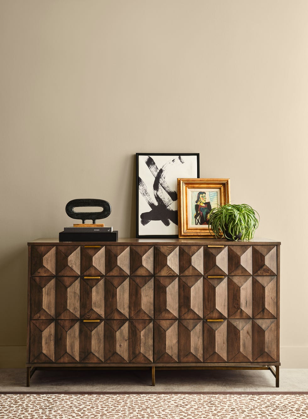
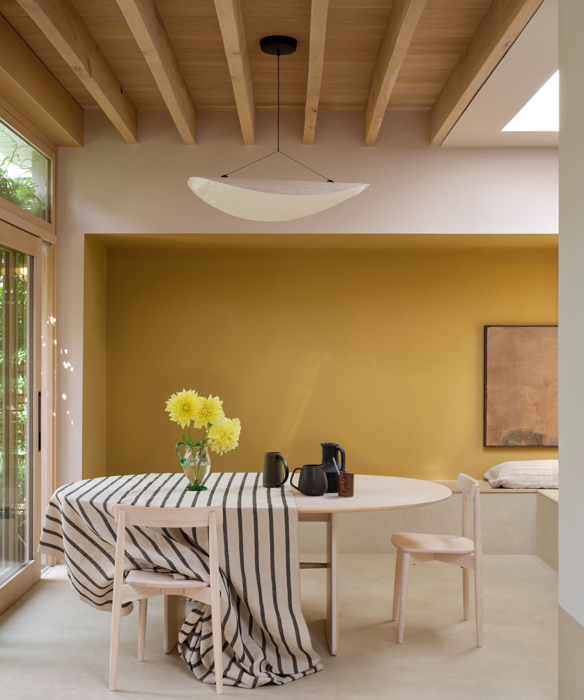
Sherwin-Williams and HGTV Home by Sherwin-Williams collaborated on "Universal Khaki." This warm, grounded neutral with yellow undertones is described as versatile, elegant, and understated. Its appeal lies in its ability to complement a wide range of colors, making it suitable for utilitarian spaces like laundry rooms and mudrooms, as well as inviting dining rooms and living spaces.
For DIY enthusiasts, Krylon selected "Matte Coffee Bean," a dark neutral, as its Color of the Year. This choice emphasizes creating spaces for slowing down and recharging. It is adaptable for various design preferences and exudes timeless elegance, pairing well with organic materials like wood, stone, and marble.
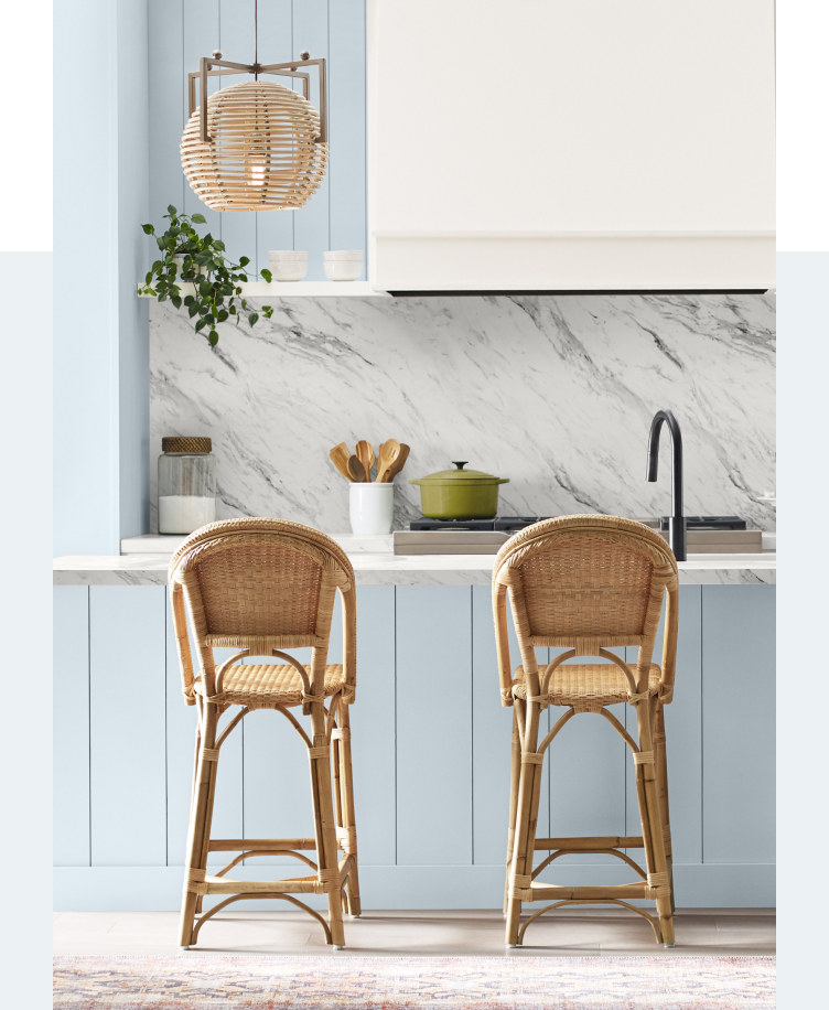
C2 Paint's "C2 Epernay" is a soft, timeless neutral with European influences, suitable for traditional, old-world, or contemporary design schemes. It is part of the "En Terre" palette, which focuses on heritage, craftsmanship, and mindful design, featuring complementary shades like Parador, Spearmint, Potato Leek, Snow Sky, and Blueberry.
Minwax declared "Special Walnut" as its 2026 Color of the Year, reflecting a shift towards darker, textured wood accents in home design. This rustic, nostalgic brown stain is versatile for restoring vintage pieces or finishing new projects.
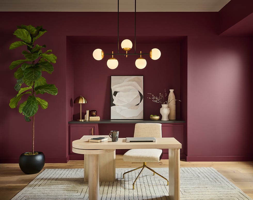
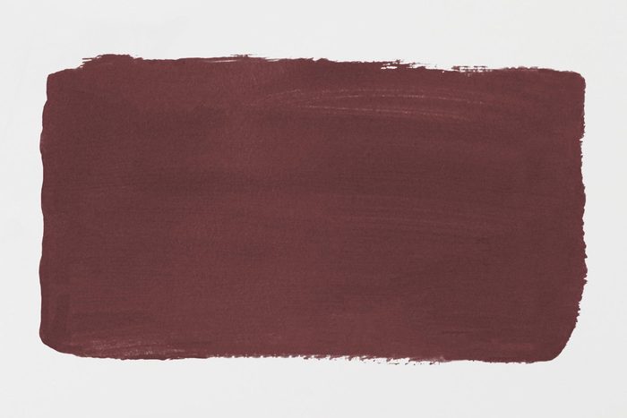
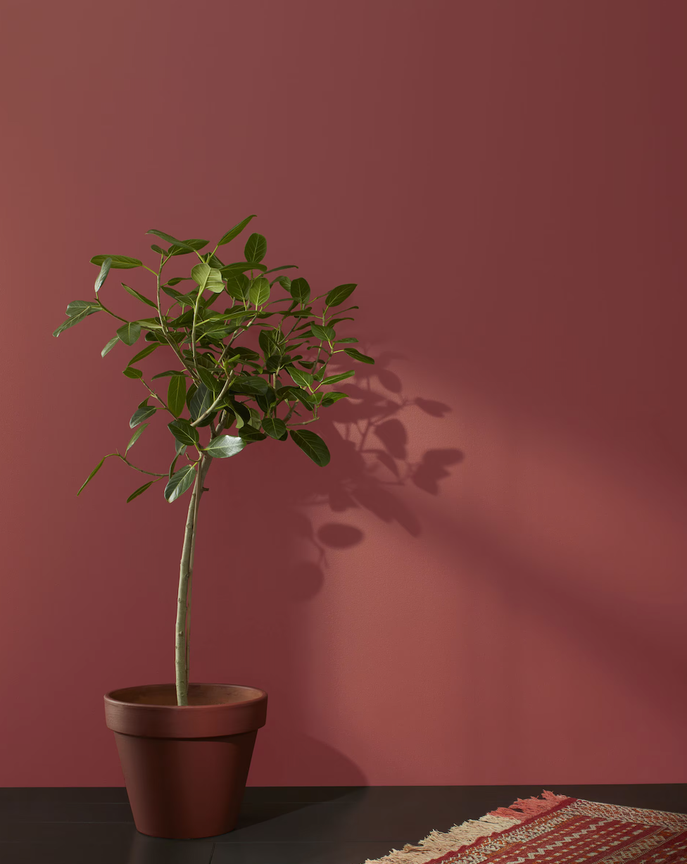
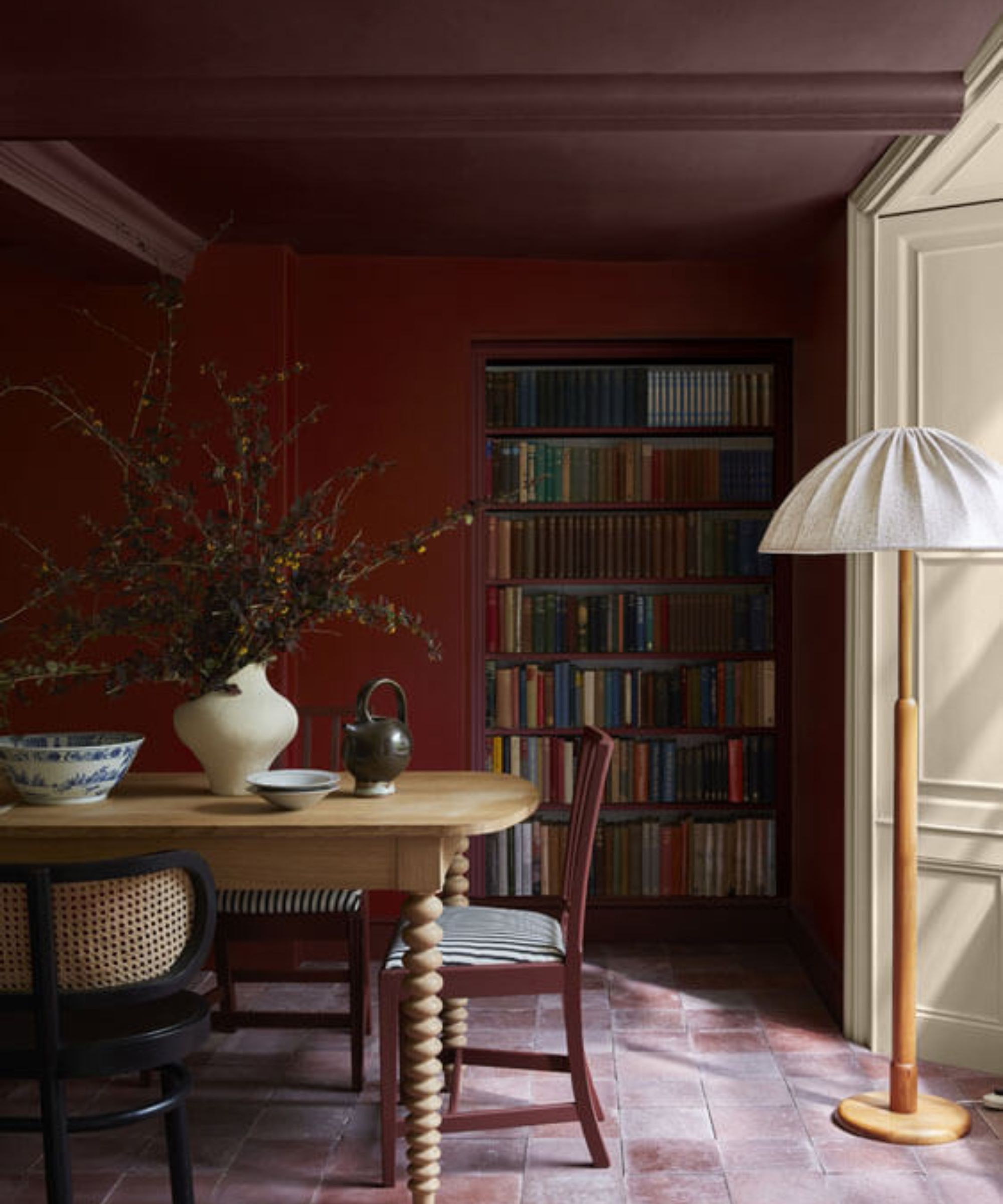
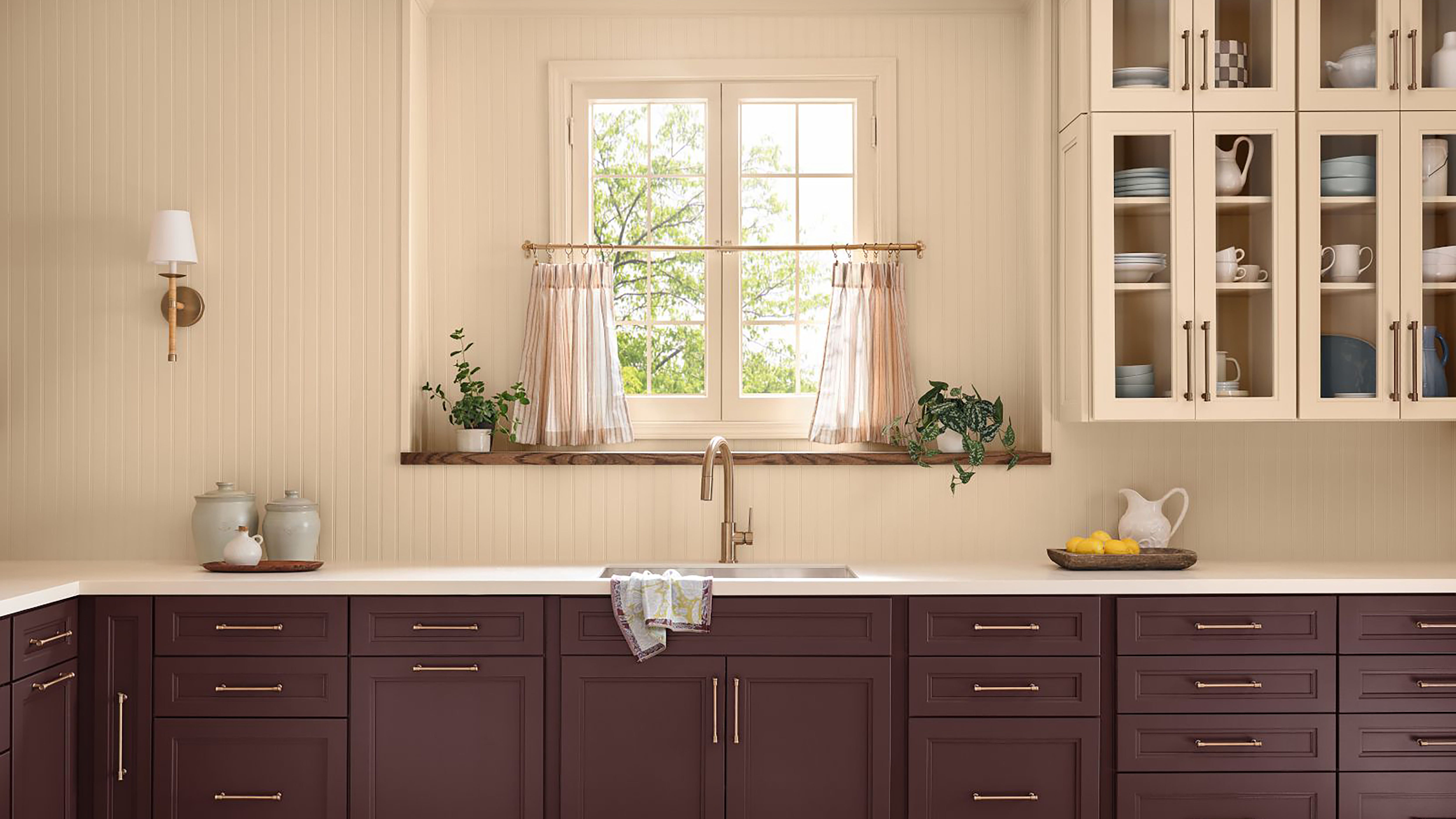
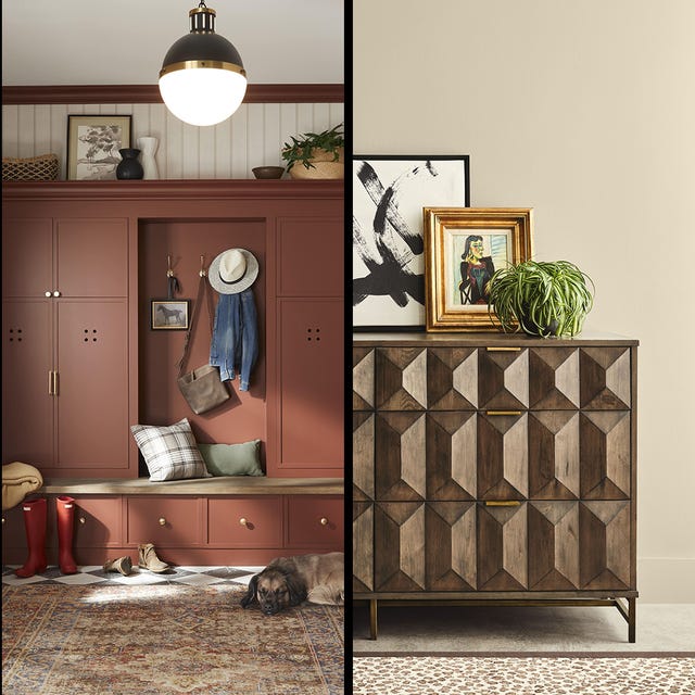
Glidden's "Warm Mahogany" is a rich, dark red that brings heritage and timelessness, adding comfort and drama to interiors and exteriors. Described as a "trend for anti-trend seekers," it is versatile for color-drenched rooms, accents, or two-tone kitchen looks.
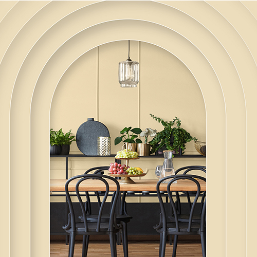
Dutch Boy Paints selected "Melodious Ivory," a soft, creamy beige. This warm neutral responds to social influences of nostalgia, off-grid romance, and mindful consumption, embodying calmness, comfort, and community. It is part of a 2026 Color Trends Forecast with three curated palettes and pairs well with natural materials and warm metallic finishes.
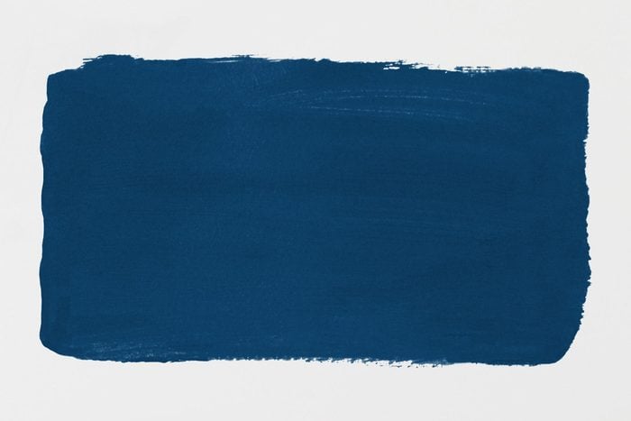
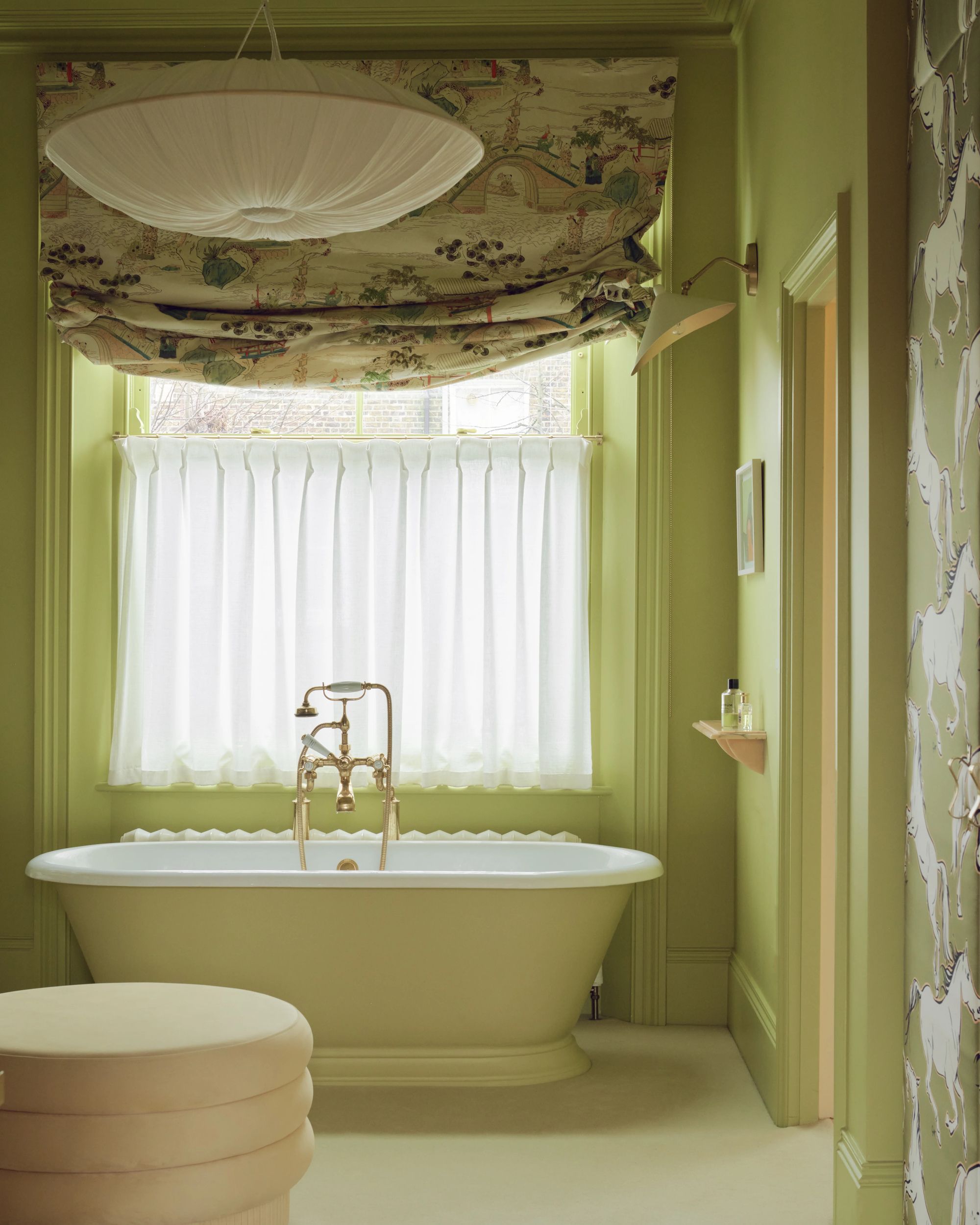
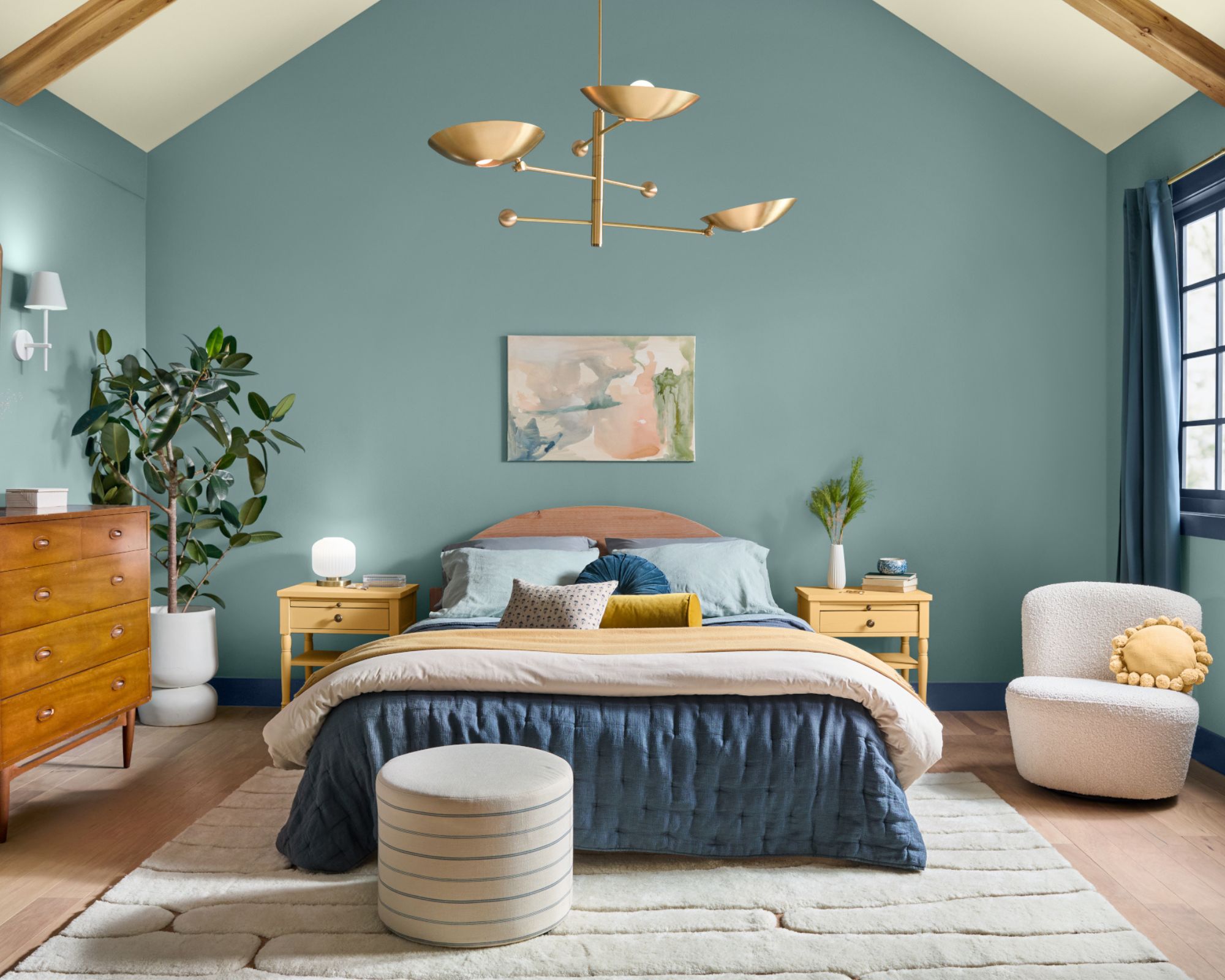
Finally, Valspar chose "Warm Eucalyptus," a vintage-inspired sage green. This calming and serene hue is ideal for spaces dedicated to restoration and peace, reflecting a desire for nostalgia and comfort. It works for both interiors and exteriors, with suggested pairings like Degas Blue and Groundbreaking.
#ColorOfTheYear #HomeDecorTrends #InteriorDesign #PaintColors #DecoratingAdvice #ArchitecturalStyle #ColorPalettes #HomeImprovement #ColorOfTheYear #HomeDecorTrends #InteriorDesign #PaintColors #DecoratingAdvice #ArchitecturalStyle #ColorPalettes #HomeImprovement
0 comment in total
 No comments yet
You may also like
Every 2026 Color of the Year That Has Been Announced So Far

2025 Colors of the Year, and How to Use Them

What This Sour Yellow-Green Says About Color for 2026

The 2026 paint Colors of the Year Have Been Announced


2026 Color of the Year Announcements Have This In Common
What Paint Colours will Rule 2026? The Experts Make Their Predictions

Here's Every 2024 Color of the Year We Know So Far
Colors of The Year – get to know every shade revealed by leading paint brands for 2025

What 2026's Colors of the Year Say About You—And All Of Us
Every 2025 Color of the Year We Know So Far
Behr's 2026 Color of the Year Is Here—And It’s Moody
Pick Your Favorite 2024 Color of the Year

Every 2026 Color of the Year We Know So Far, From Soft Neutrals to Your New Favorite Green

Every Single Pantone Colour Of The Year From 2000 – 2026
Designers Say These 12 Paint Colors Will Be Everywhere in 2026


Experts Say These 5 Paint Colours Will Be Everywhere In 2026
A Guide to Every Color of the Year for 2025 (So Far)
What Paint Colors Will Rule 2026? Designers Make Their Predictions
According to Designers, These Are The Outdated Color Trends for 2026
UPDATE: Here Are All the 2026 Colors of the Year—Including Pantone’s Shocking Pick