Every 2026 Color of the Year We Know So Far, From Soft Neutrals to Your New Favorite Green
The article highlights the early announcements of the 2026 Colors of the Year from various paint brands, offering insights into upcoming home decor trends. These early revelations provide inspiration for homeowners looking to refresh their living spaces, whether through comprehensive room makeovers or subtle seasonal adjustments. The selection of a new paint color is presented as one of the most impactful and accessible ways to update a home's aesthetic.
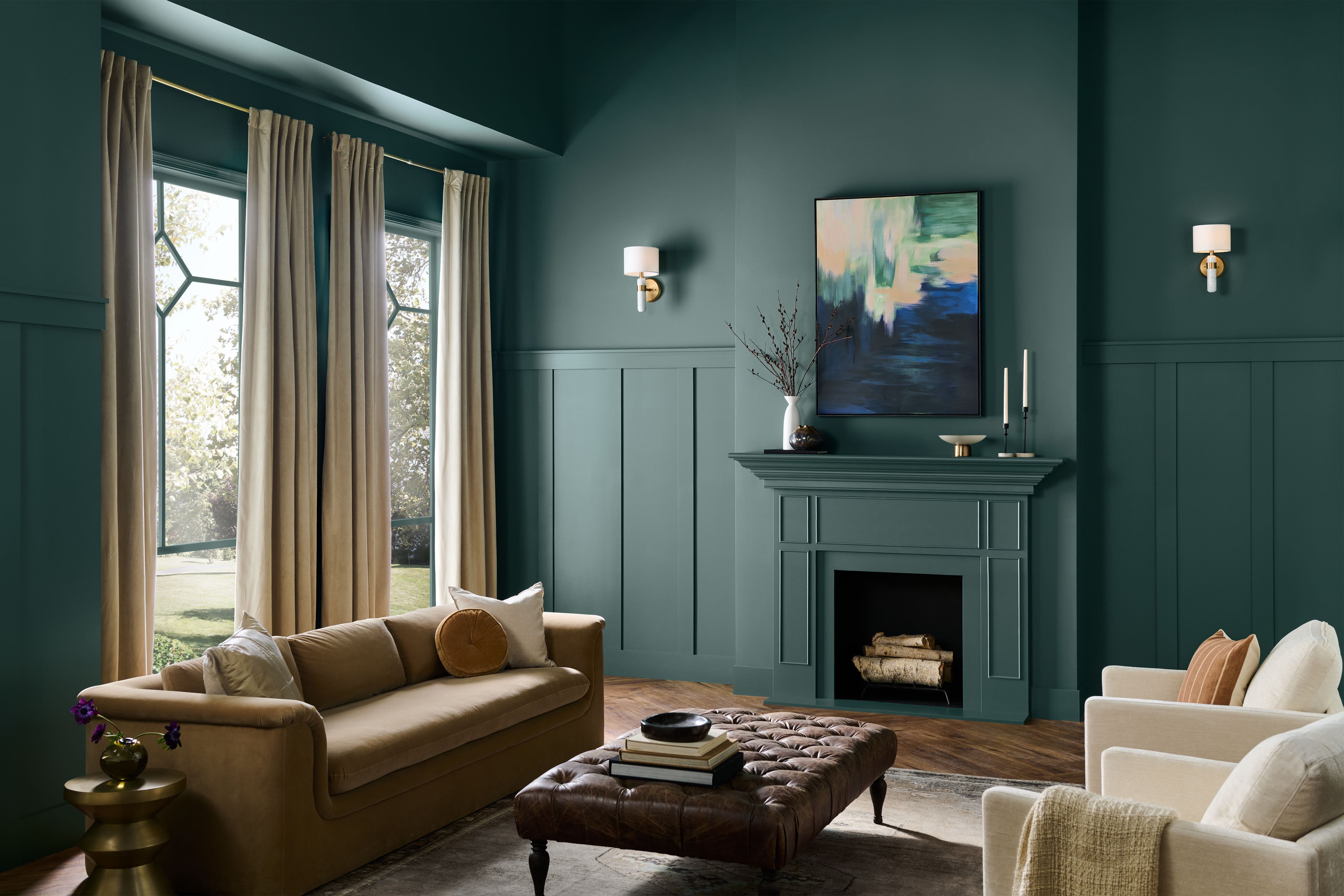
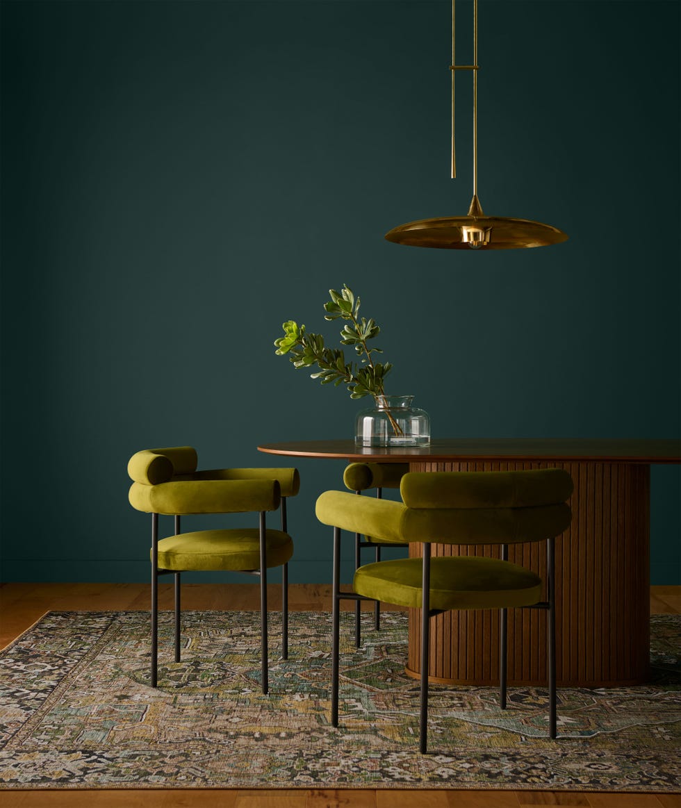
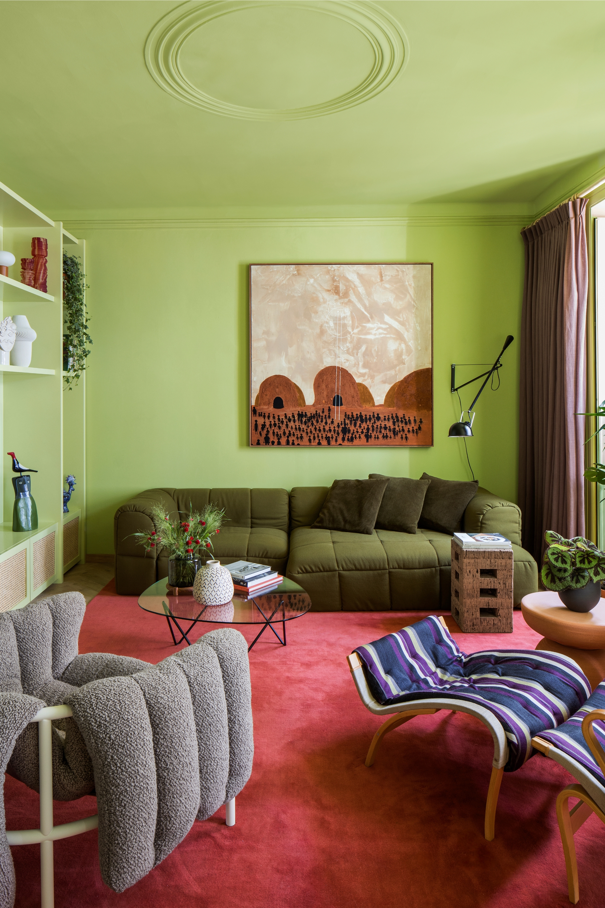
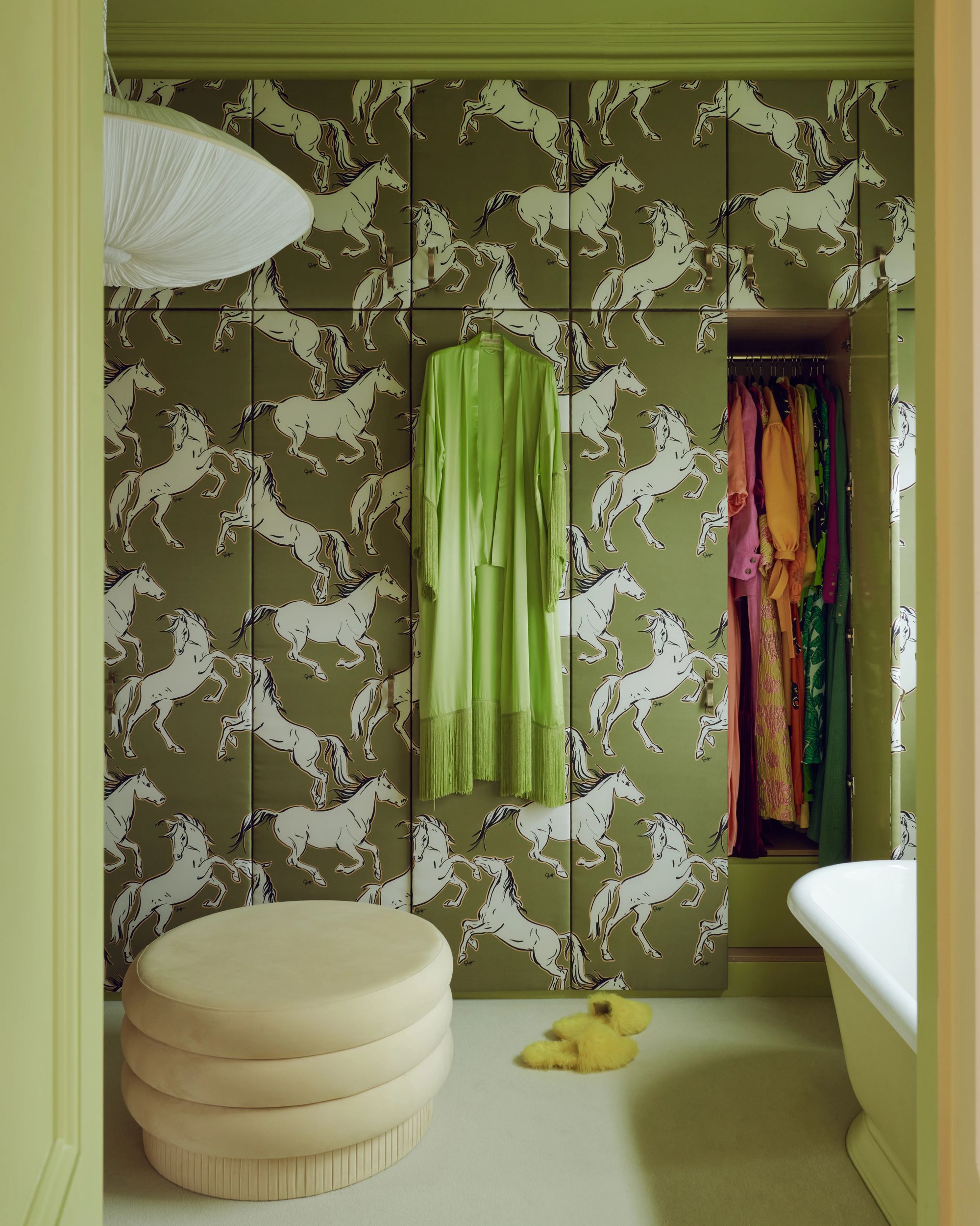
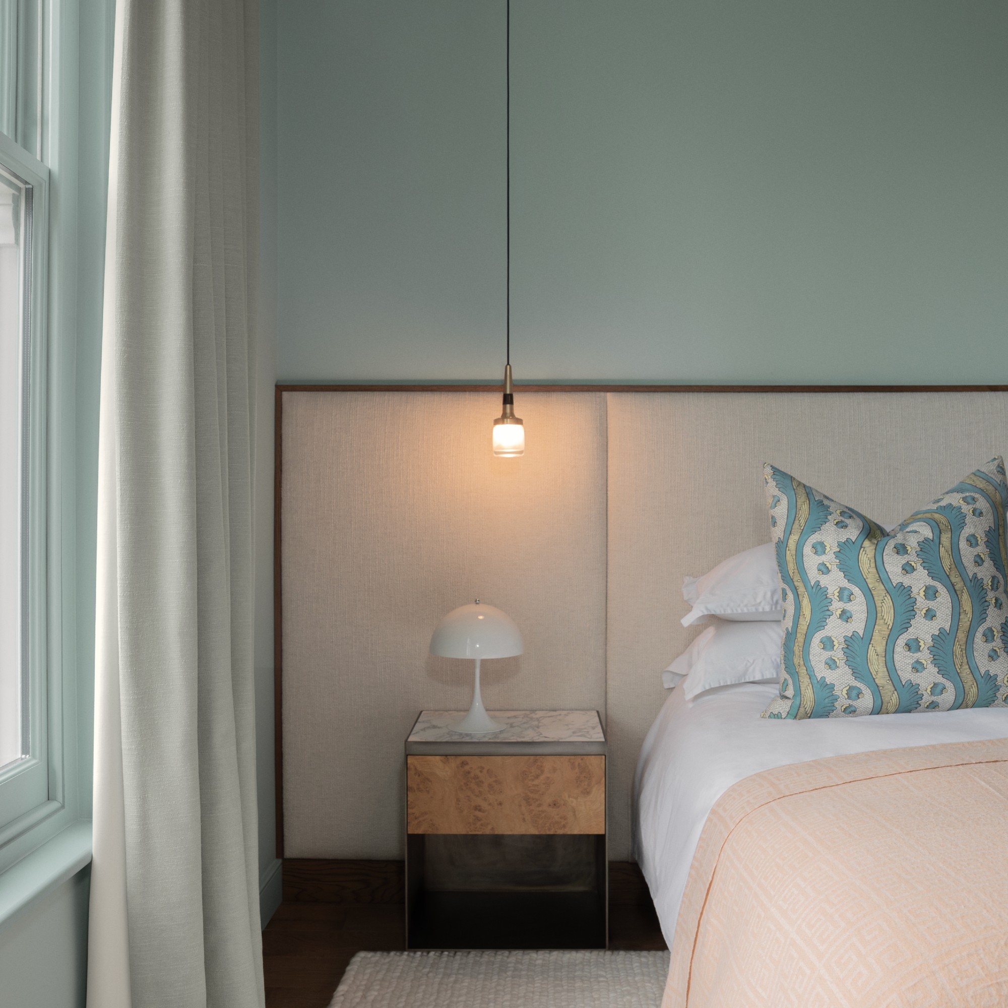
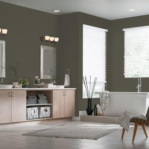
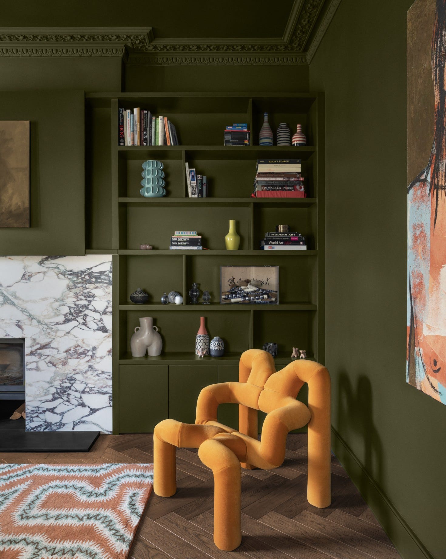
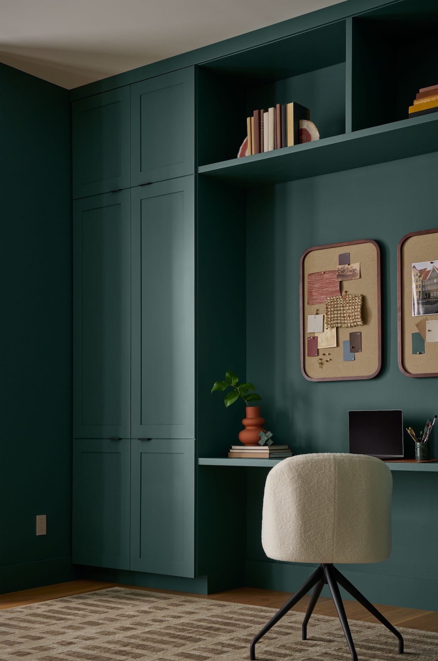
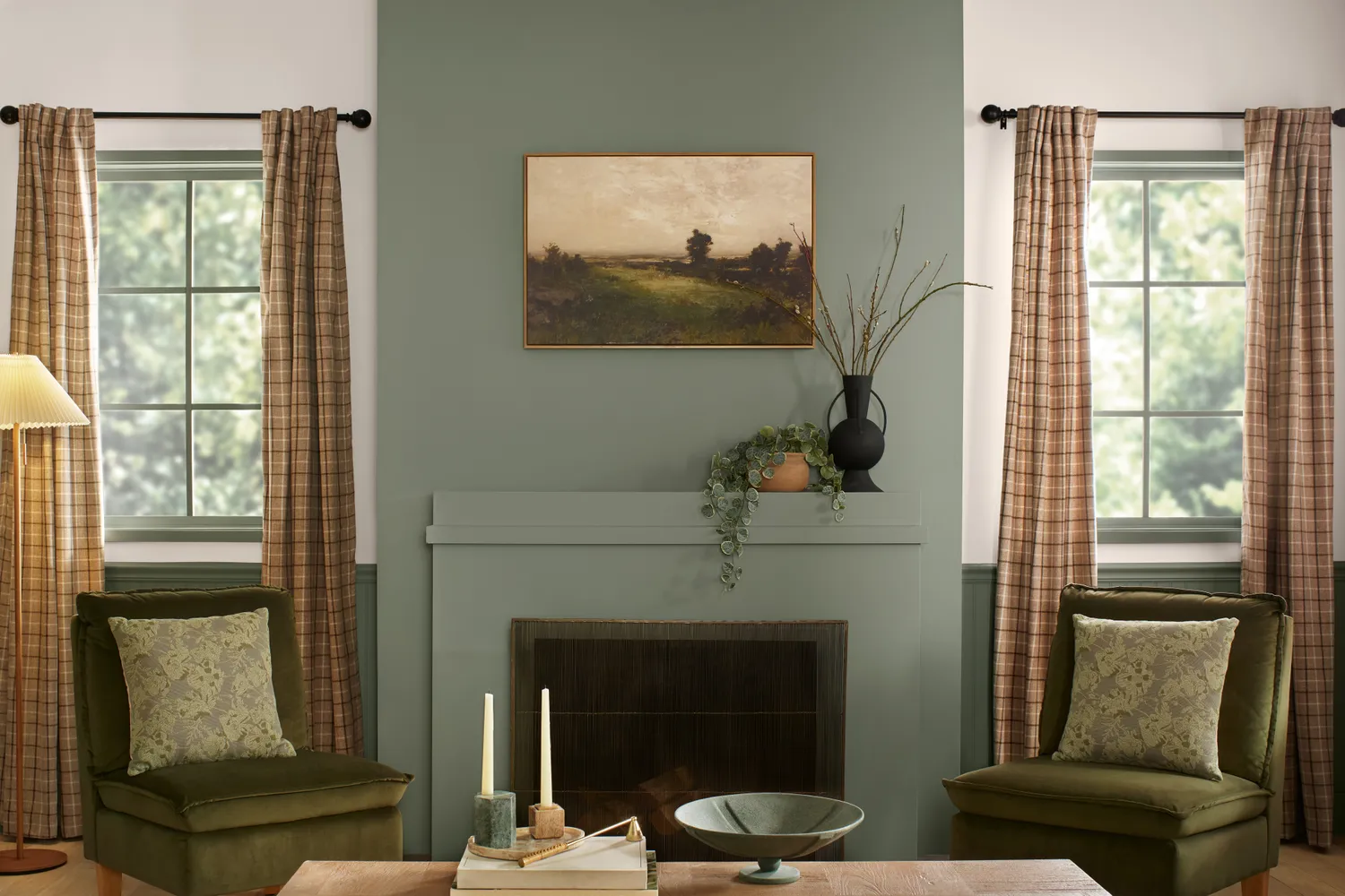
Dunn-Edwards introduces "Midnight Garden," an earthy green reflecting a desire for wellness and grounding in home environments. This versatile shade is suitable for various applications, including cabinetry, walls, accents, and exteriors, and pairs well with natural textures, warm neutrals, and minimalist designs.
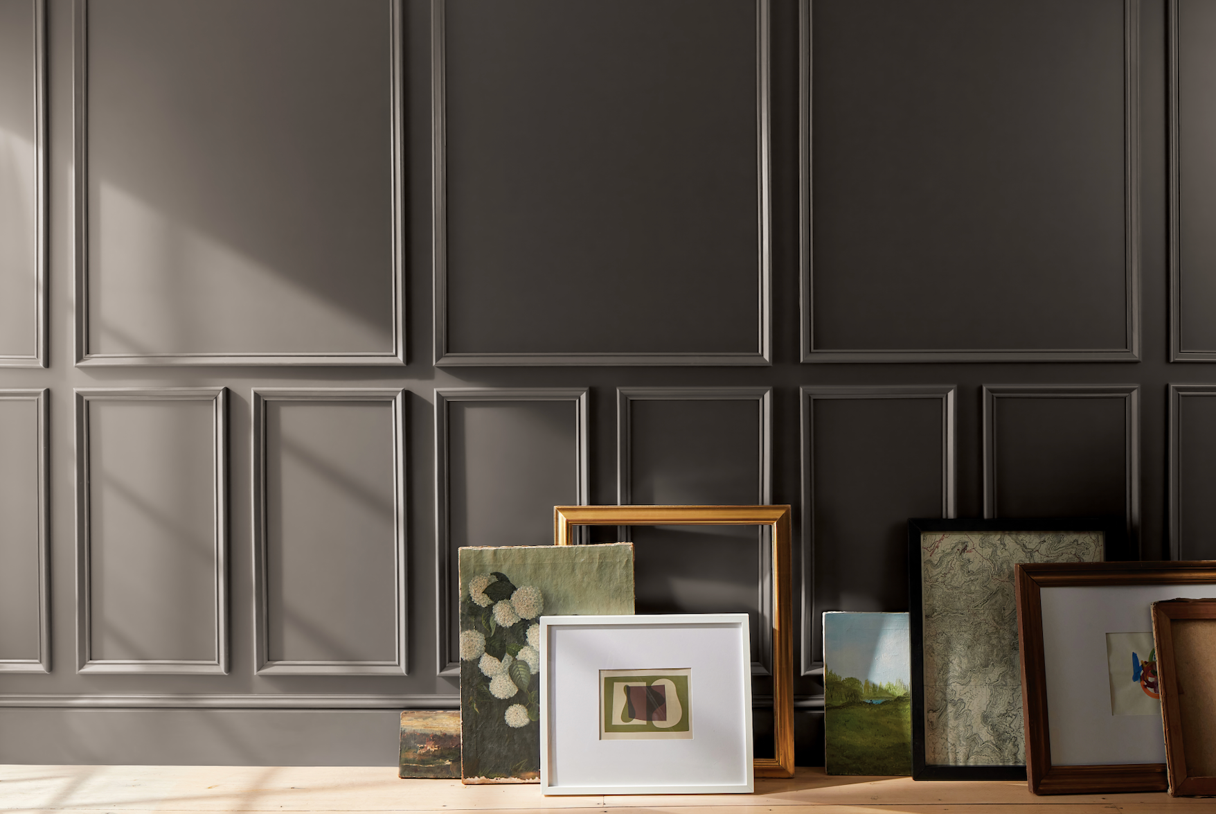
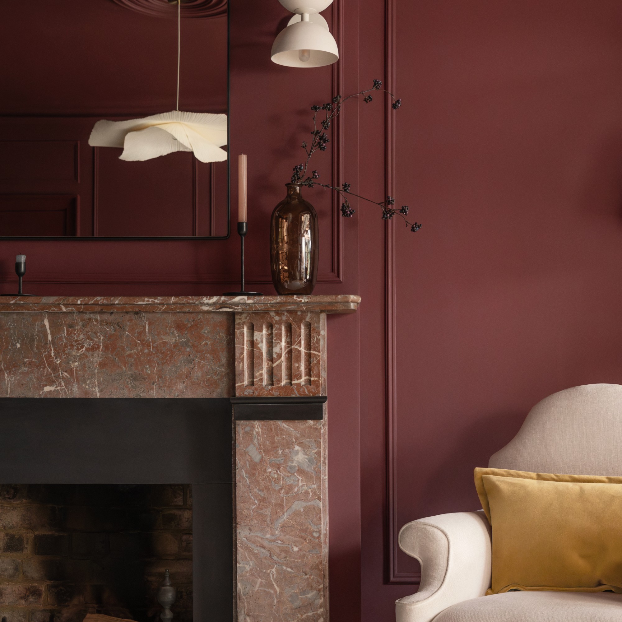
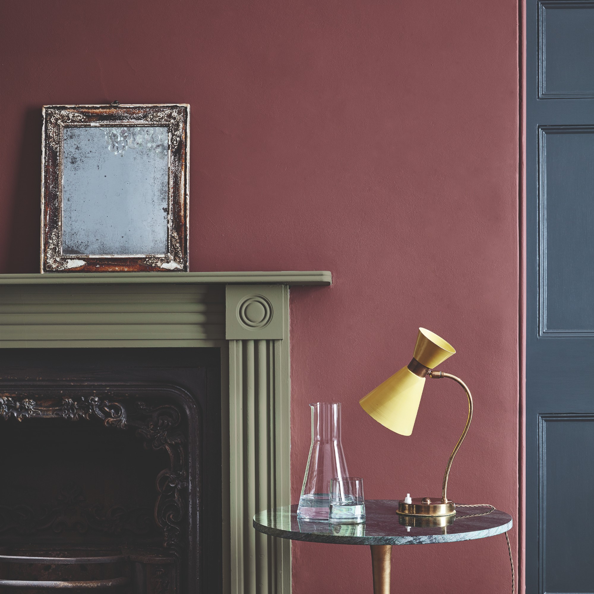
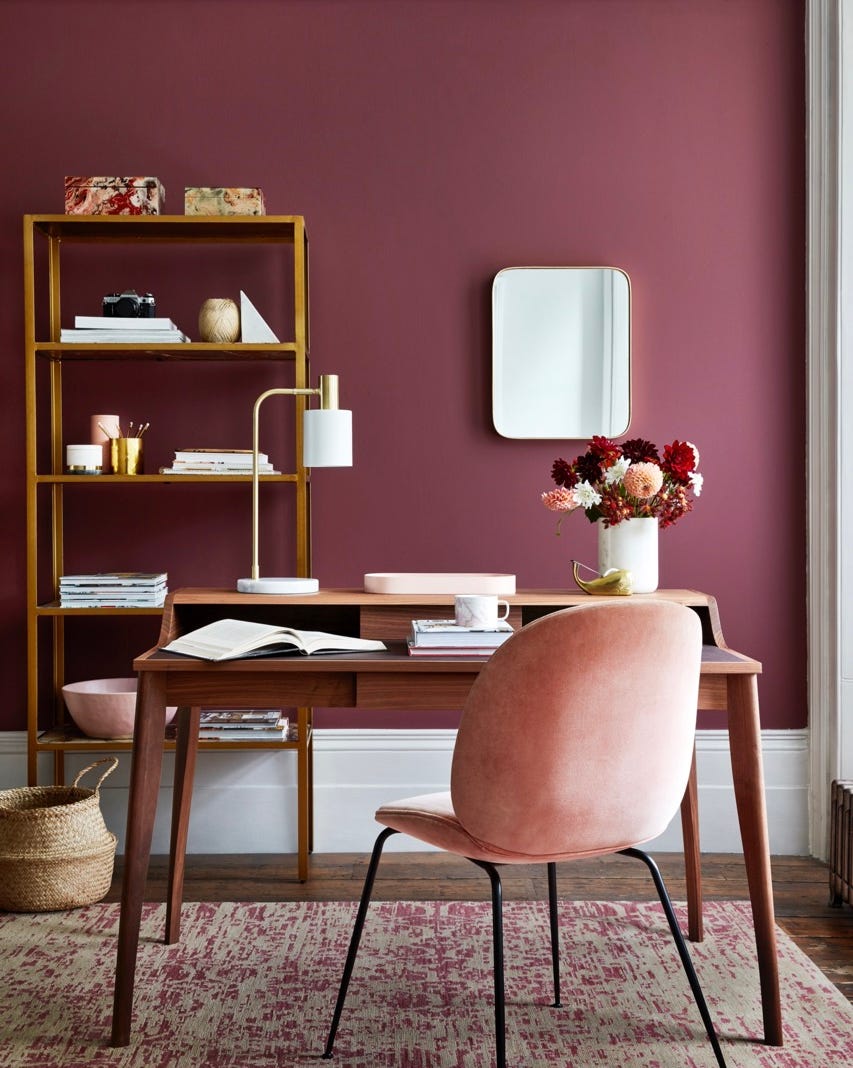
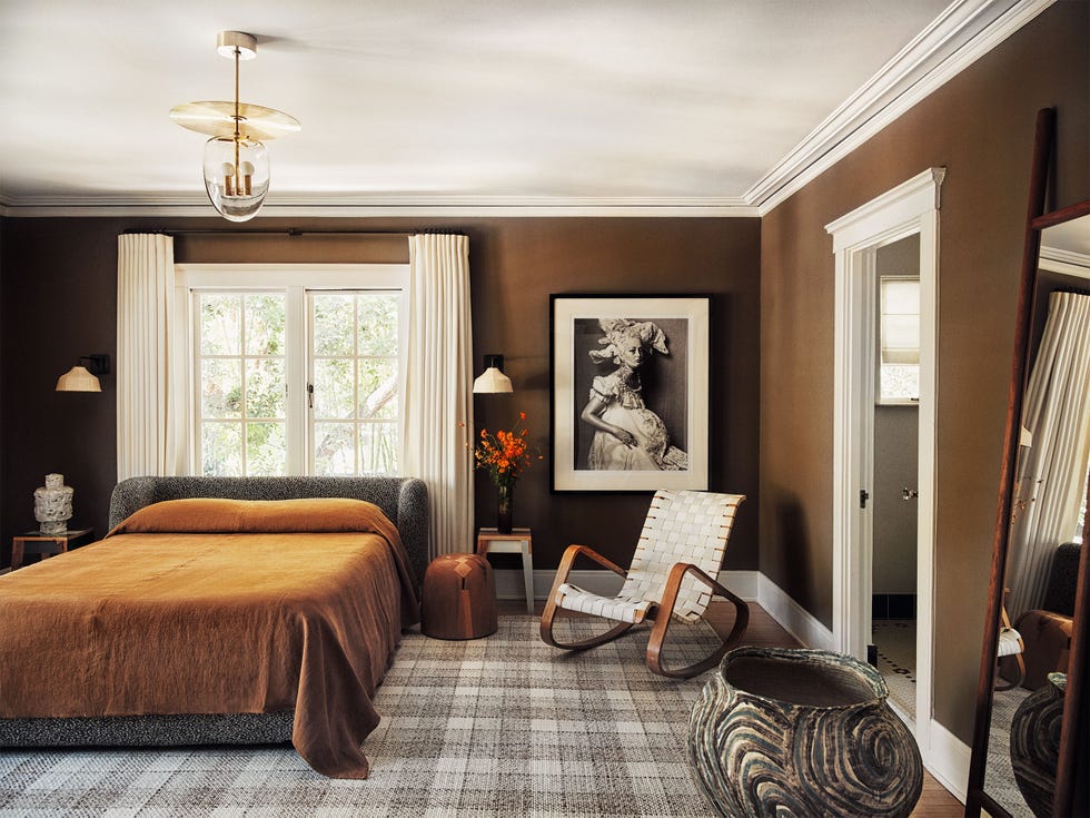
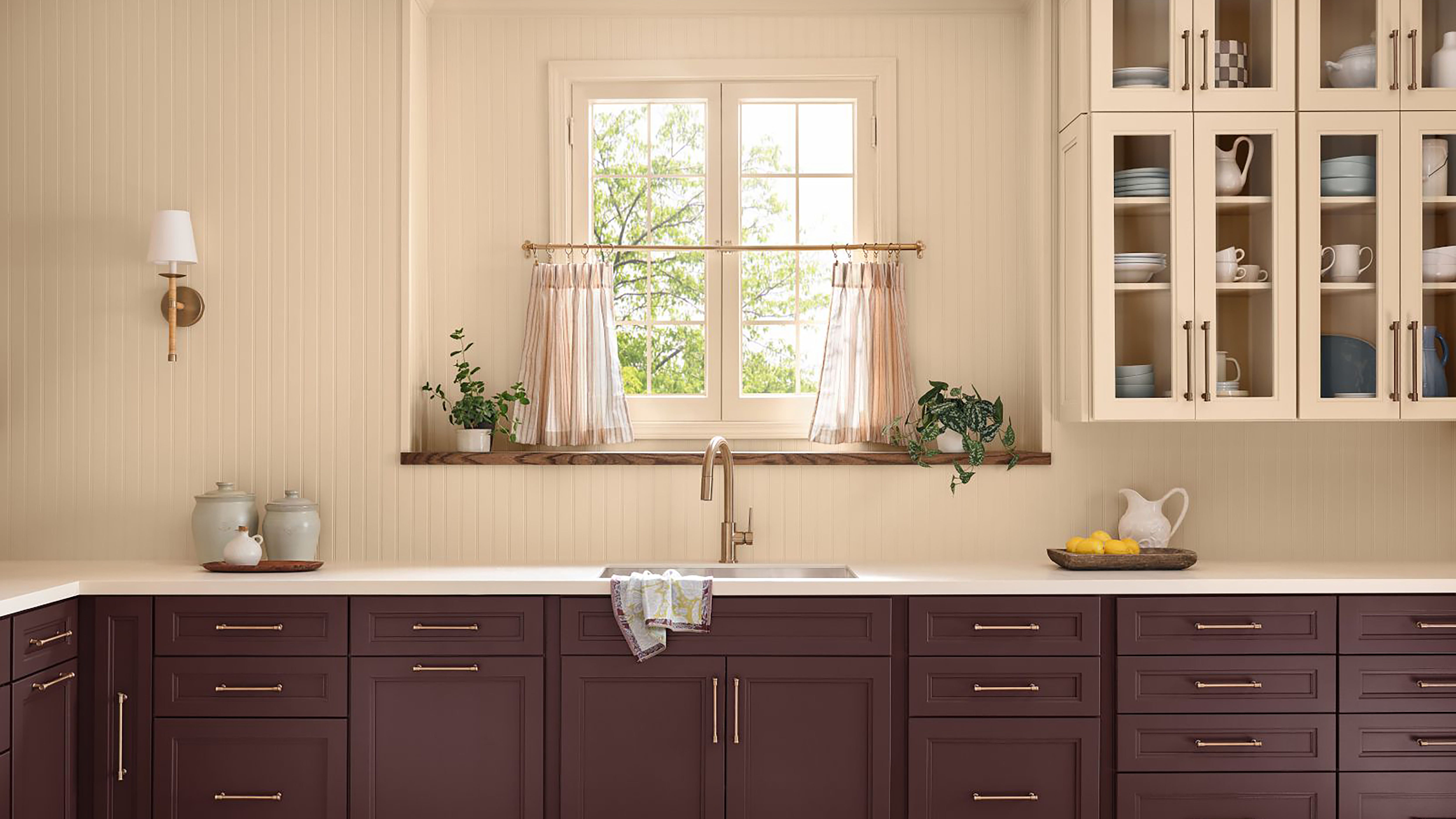
Clark + Kensington's "Hazelnut Crunch" signals a trend towards brown-maroon tones, offering a rich, deep hue that promotes restoration, comfort, and calm. This color integrates seamlessly with both natural textures and modern design elements, appealing to homeowners seeking a relaxed atmosphere.
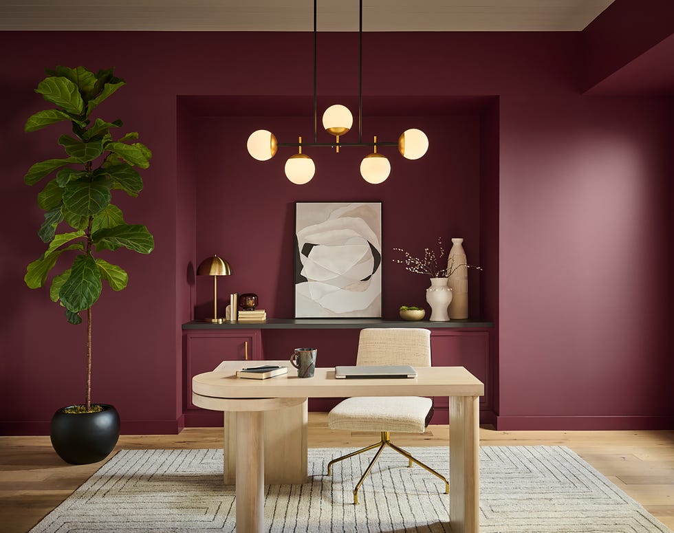
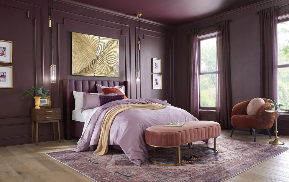
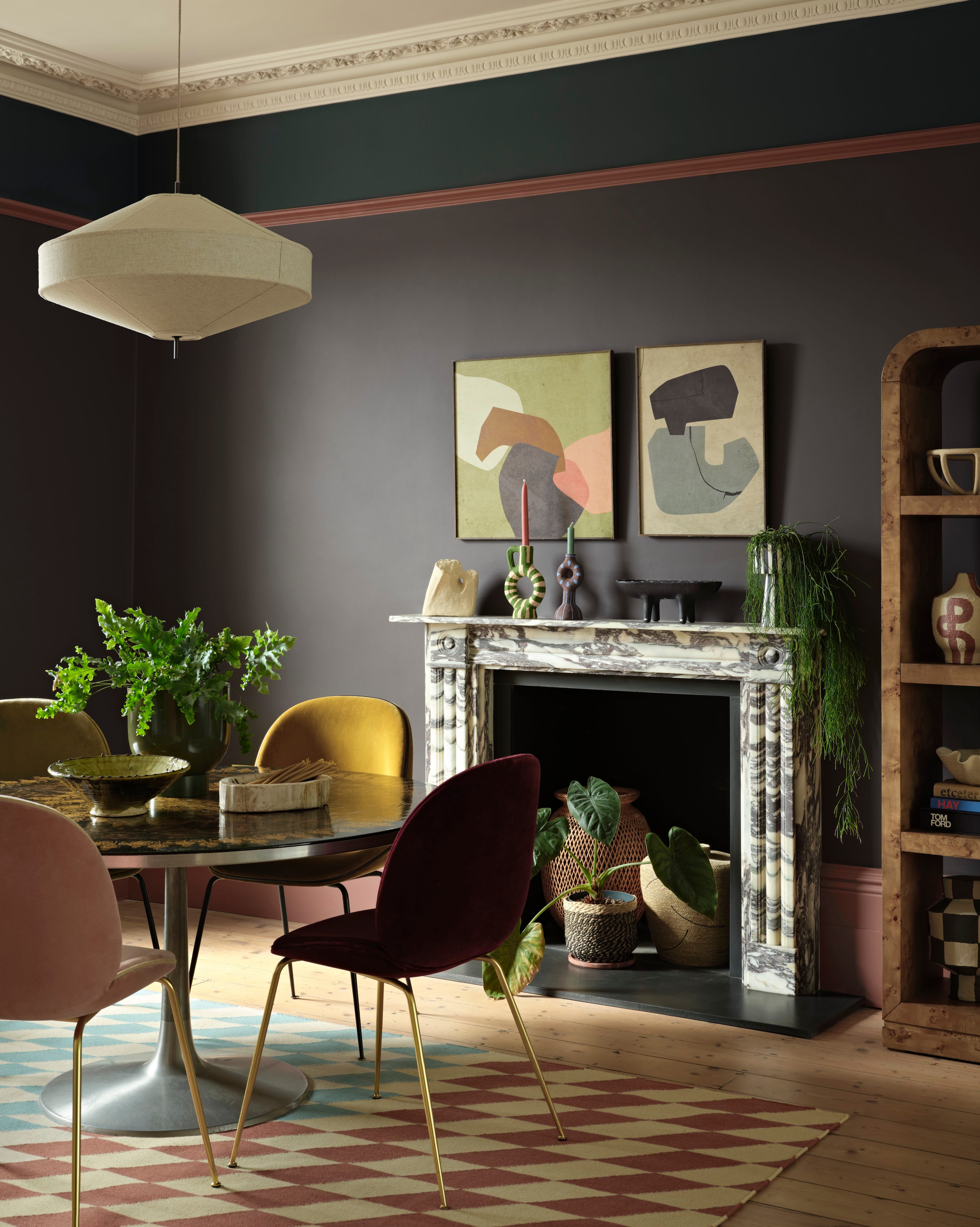
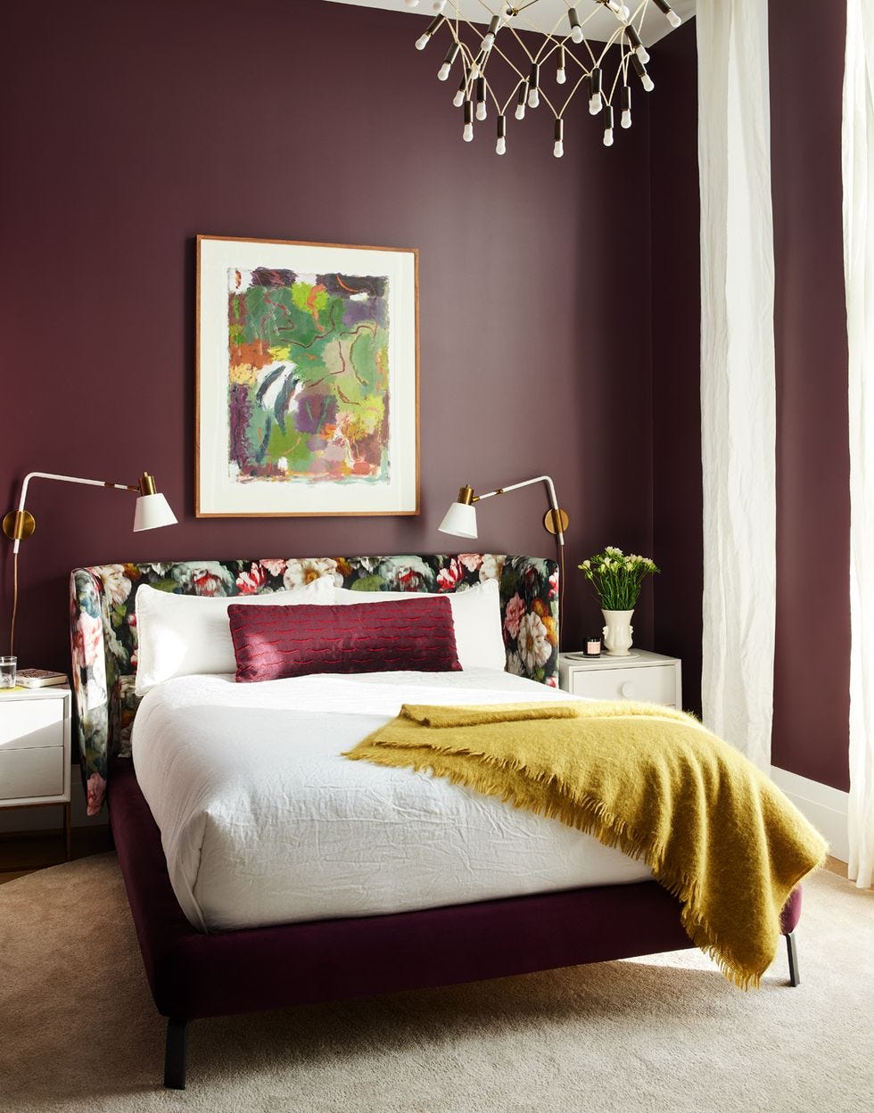
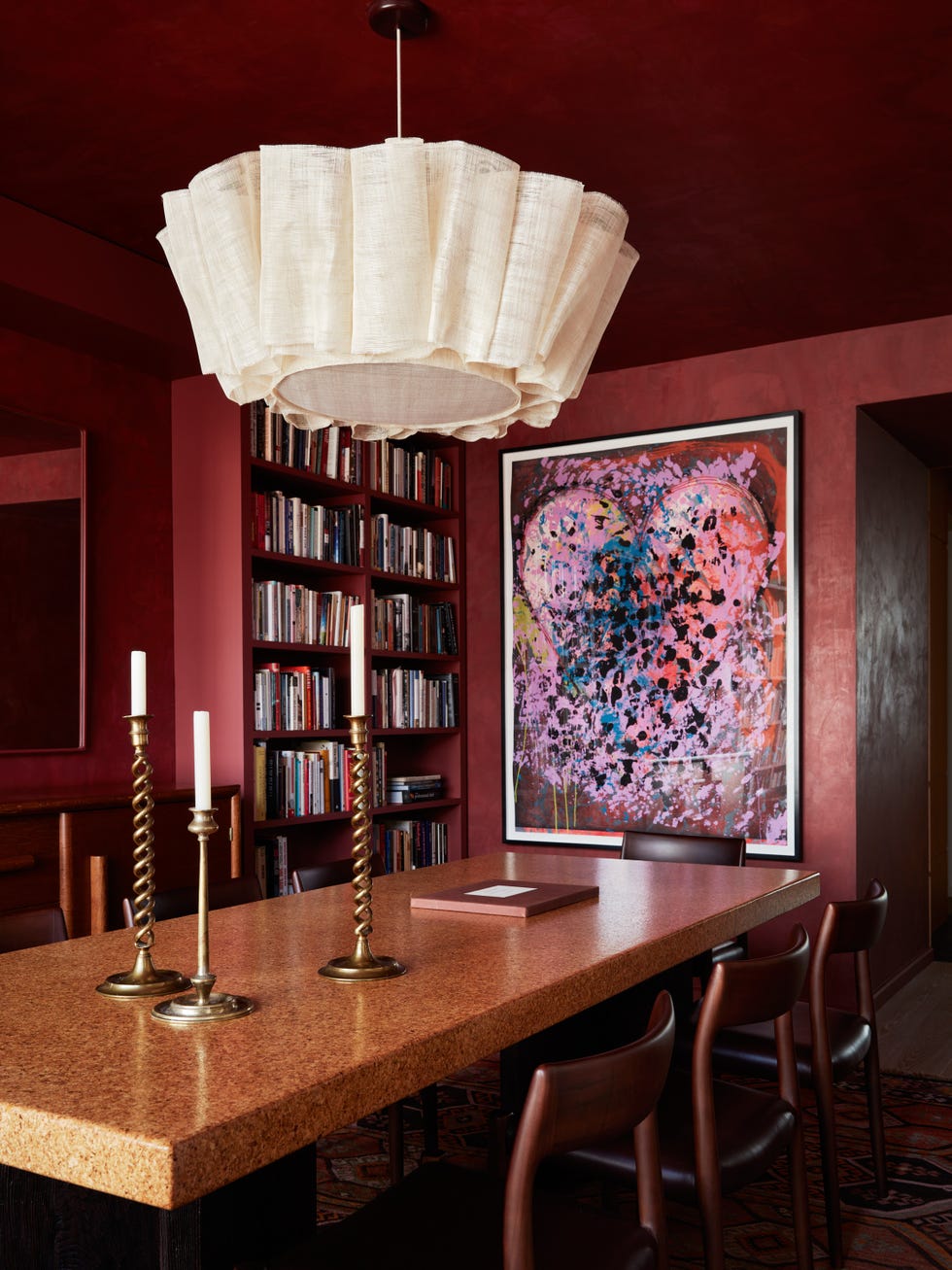
Graham & Brown presents "Divine Damson," a bold burgundy that emphasizes personality-driven design. This luxurious color, a British institution's pick, adds sophistication and a contemporary edge to whimsical designs. The brand also unveiled a Design of the Year, Eternal Weave, and a Mural of the Year, Eternal City.
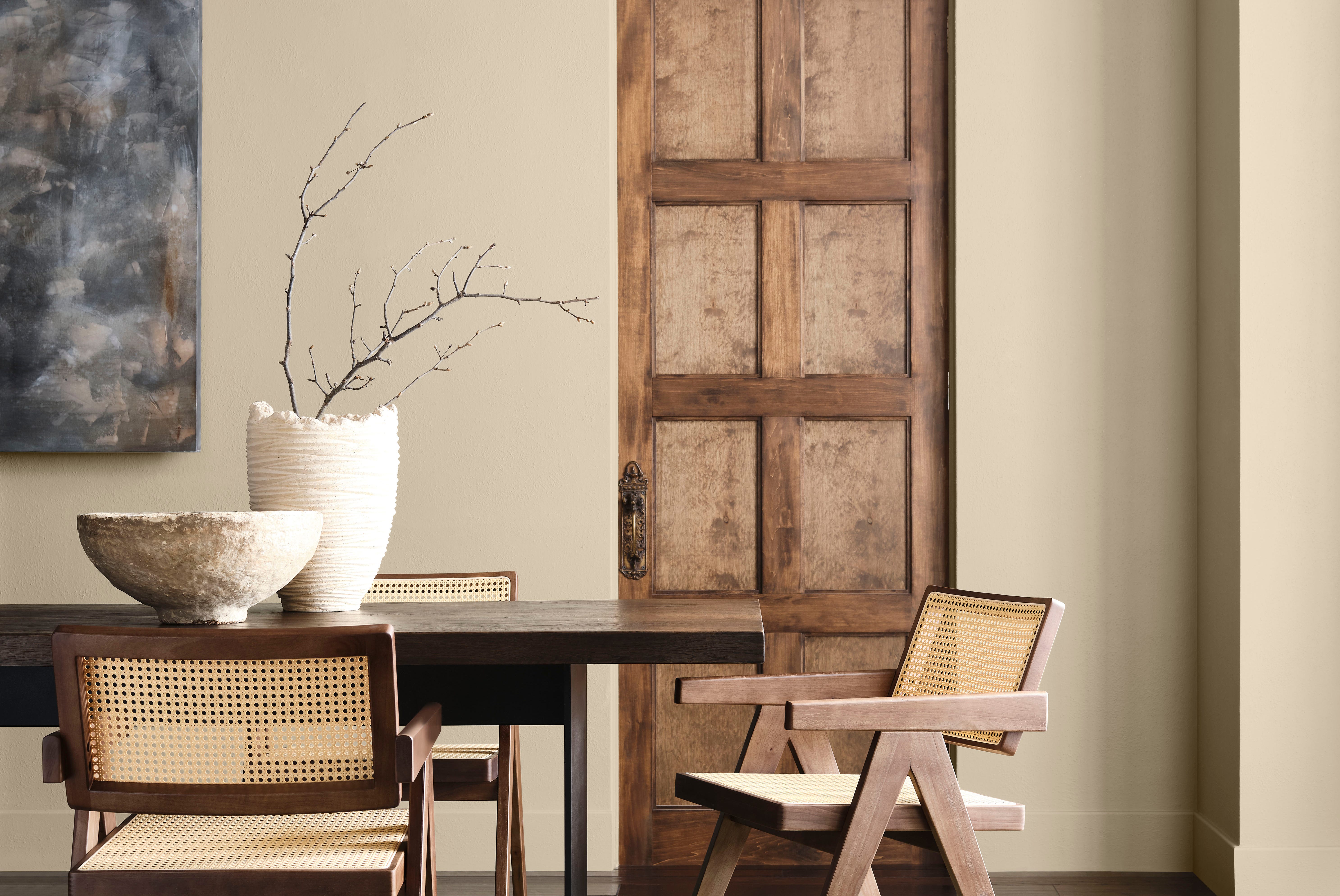
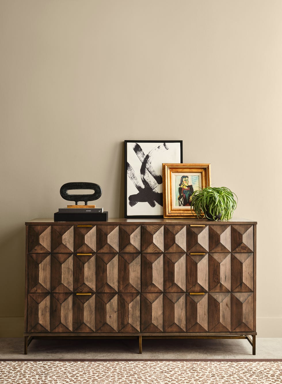
Sherwin-Williams and HGTV Home by Sherwin-Williams collaborate on "Universal Khaki," a versatile neutral that blends familiarity with freshness. This color is inspired by enduring elegance and rejuvenating resilience, forming a sophisticated yet simple backdrop. It is also featured in Sherwin-Williams' Colormix Forecast 2026, Anthology: Volume Two, which includes four distinct color palettes.
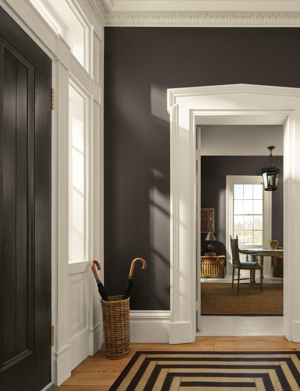
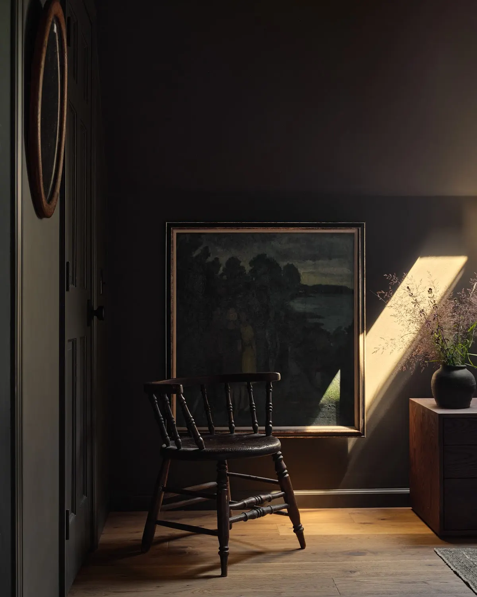
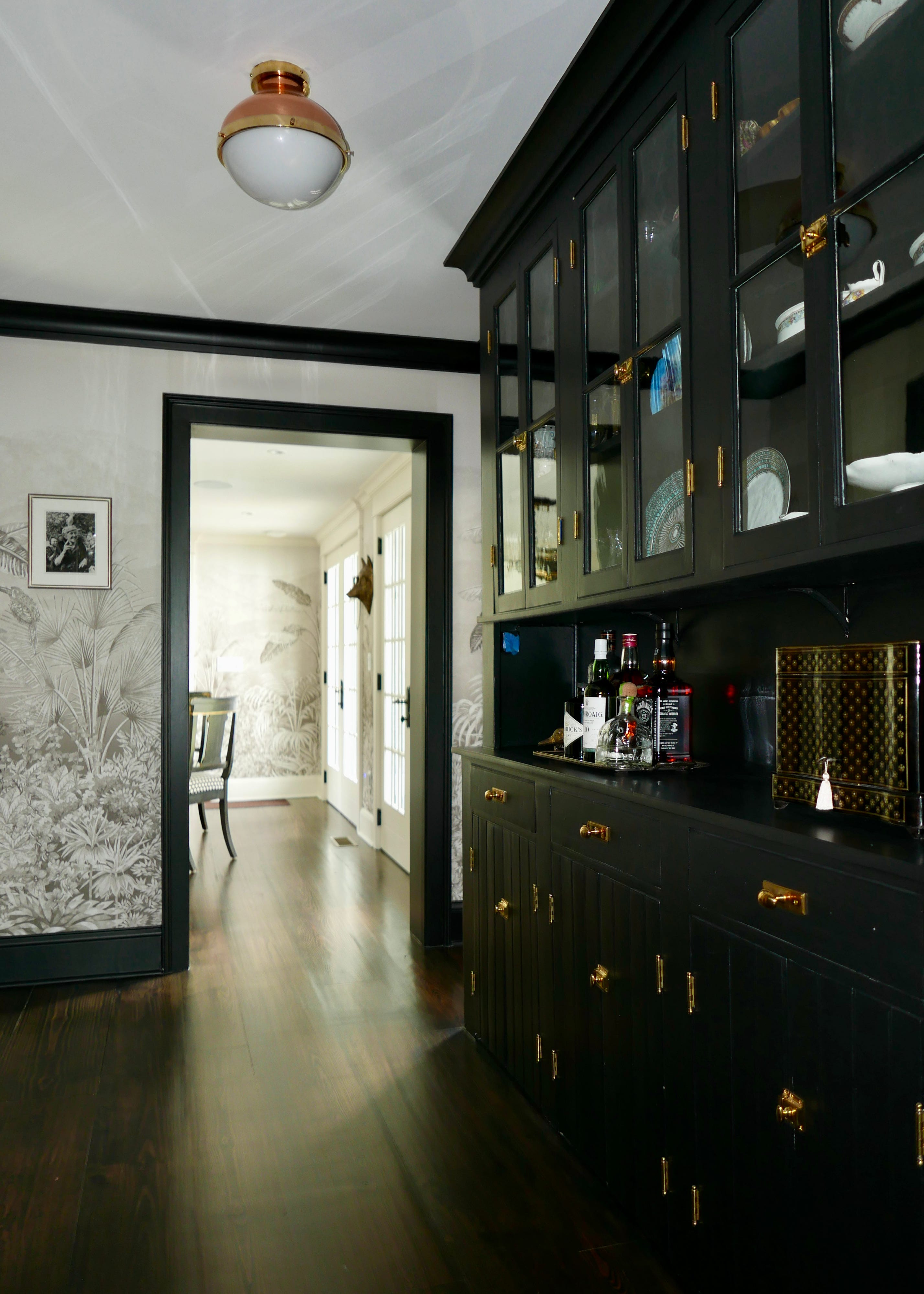
Krylon's "Matte Coffee Bean," an almost-black brown, is intended as an accent color for spray paint applications. This shade adds dimension and a grounded allure, aligning with the appeal of organic minimalism. It draws inspiration from natural elements like clay, wood, and stone, providing a timeless and sophisticated choice for elevating everyday spaces and fostering harmony. It is suitable for updating furniture pieces, planters, and vases.
C2 Paints' "Epernay" is a sophisticated ochre yellow, offering a richer and more timeless alternative to the butter yellow trend. This color is associated with European influences and contemporary design, evoking connections to art, history, and nature. It encourages appreciating the individuality of homes and the stories they hold. "Epernay" is part of C2's 2026 En Terre palette, which includes complementary shades like Parador, Spearmint, Potato Leek, Snowsky, and Blueberry.
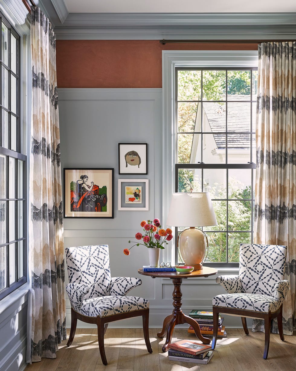
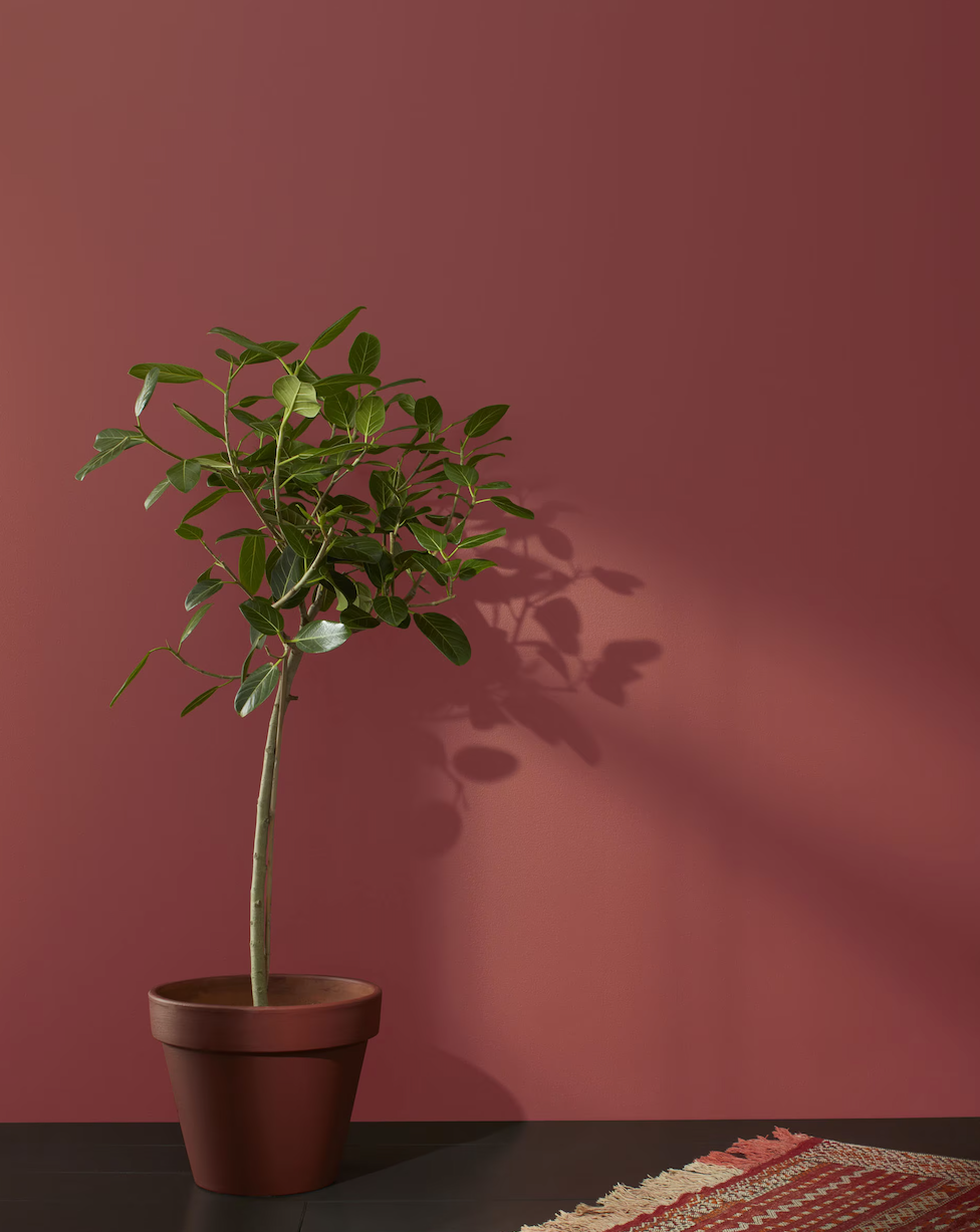
Glidden's "Warm Mahogany," a rich, burnt red with an almost-brown undertone, marks a departure from recent neutral palettes. This color has a nostalgic, retro, and mid-century modern feel, yet remains current. It functions effectively as both an accent and a primary color, and is also suitable for trim. Ashley McCollum, Glidden paint color expert, describes it as a classic and timeless color.
Minwax, a wood stain brand, selects "Special Walnut" for 2026, reflecting a renewed appreciation for wood's natural character in interior design. This classic, dimensional tone is versatile across styles and applications, ideal for restoring vintage pieces or finishing new projects.
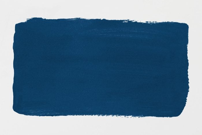
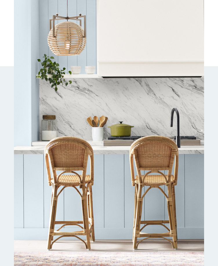
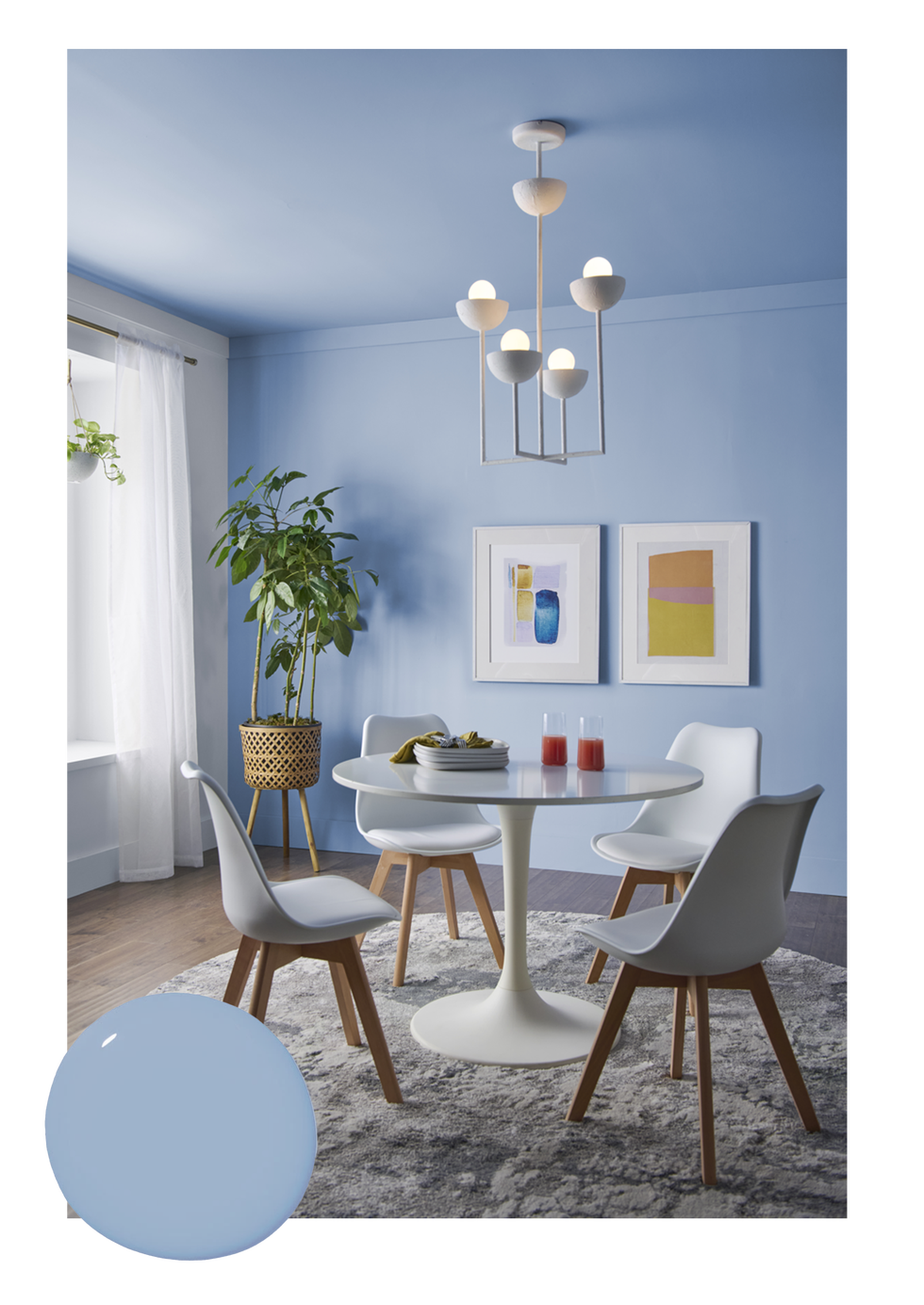
Behr introduces "Hidden Gem," a green-blue that encourages the integration of more color into homes after a period dominated by neutrals. This bold yet approachable shade is connected to nature, promoting confidence in its enduring appeal. It can be used for color-drenching a room or as an accent.
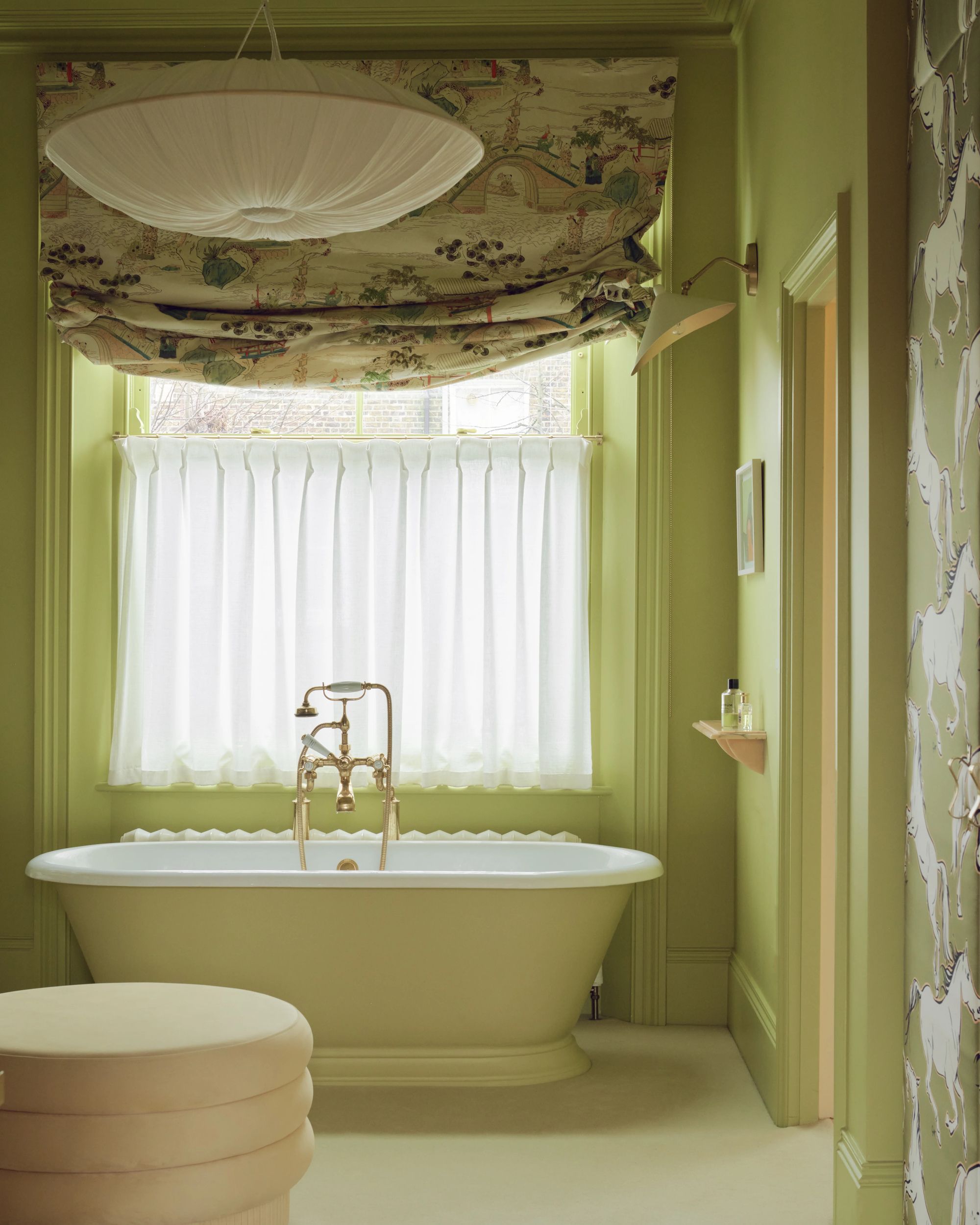
Valspar's "Warm Eucalyptus" is a cooler, earthier green, offering a comforting and serene option that adds color without being overly bold. It has a spa-like quality and is suitable for various rooms, including bathrooms, kitchens, bedrooms, living rooms, and exteriors. Sue Kim, Valspar's Director of Color Marketing, notes its adaptability as both a statement and a subtle anchor.
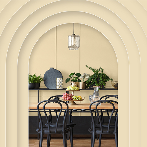
Dutch Boy Paints' "Melodious Ivory" is a creamy-beige neutral that aims to transcend trends. It provides a classic backdrop that supports various textures, elements, and personal touches, emphasizing comfort, quality, and connection in the home.
These selections reflect a collective movement towards more personalized, comforting, and nature-inspired palettes, indicating a shift from purely neutral aesthetics to richer, more expressive tones in home interiors.
#ColorOfTheYear #PaintTrends #HomeDecor #InteriorDesign #PaintColors #DesignInspiration #HomeTrends #ColorPalettes #ColorOfTheYear #PaintTrends #HomeDecor #InteriorDesign #PaintColors #DesignInspiration #HomeTrends #ColorPalettes
0 comment in total
 No comments yet
You may also like
Every 2026 Color of the Year That Has Been Announced So Far

2025 Colors of the Year, and How to Use Them

What Paint Colors Will Rule 2026? Designers Make Their Predictions
Here's Every 2024 Color of the Year We Know So Far

A Guide to Every Color of the Year for 2025 (So Far)

What This Sour Yellow-Green Says About Color for 2026

UPDATE: Here Are All the 2026 Colors of the Year—Including Pantone’s Shocking Pick
Designers Say These 12 Paint Colors Will Be Everywhere in 2026

What 2026's Colors of the Year Say About You—And All Of Us
Every 2025 Color of the Year We Know So Far
What Paint Colours will Rule 2026? The Experts Make Their Predictions

These 6 Colors Will Rule Interiors in 2026, According to Experts

Every 2026 Color of the Year Revealed So Far—and What They Say About the Year Ahead
The colour trends 2026 that will define our homes next year


Experts Say These 5 Paint Colours Will Be Everywhere In 2026
We’re Calling It: These Are the Official Color Trends of 2025

2026 Color of the Year Announcements Have This In Common
Pick Your Favorite 2024 Color of the Year

Every Single Pantone Colour Of The Year From 2000 – 2026
Update! From Evening Blue to Cinnamon Slate: See All the 2025 Colors of the Year We Know So Far