1/21
The 60 Most Popular Living Room Paint Colors Right Now
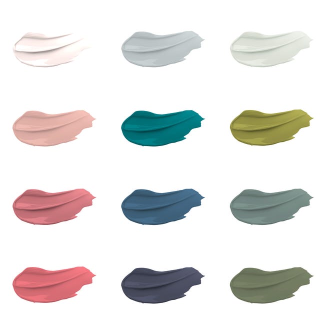
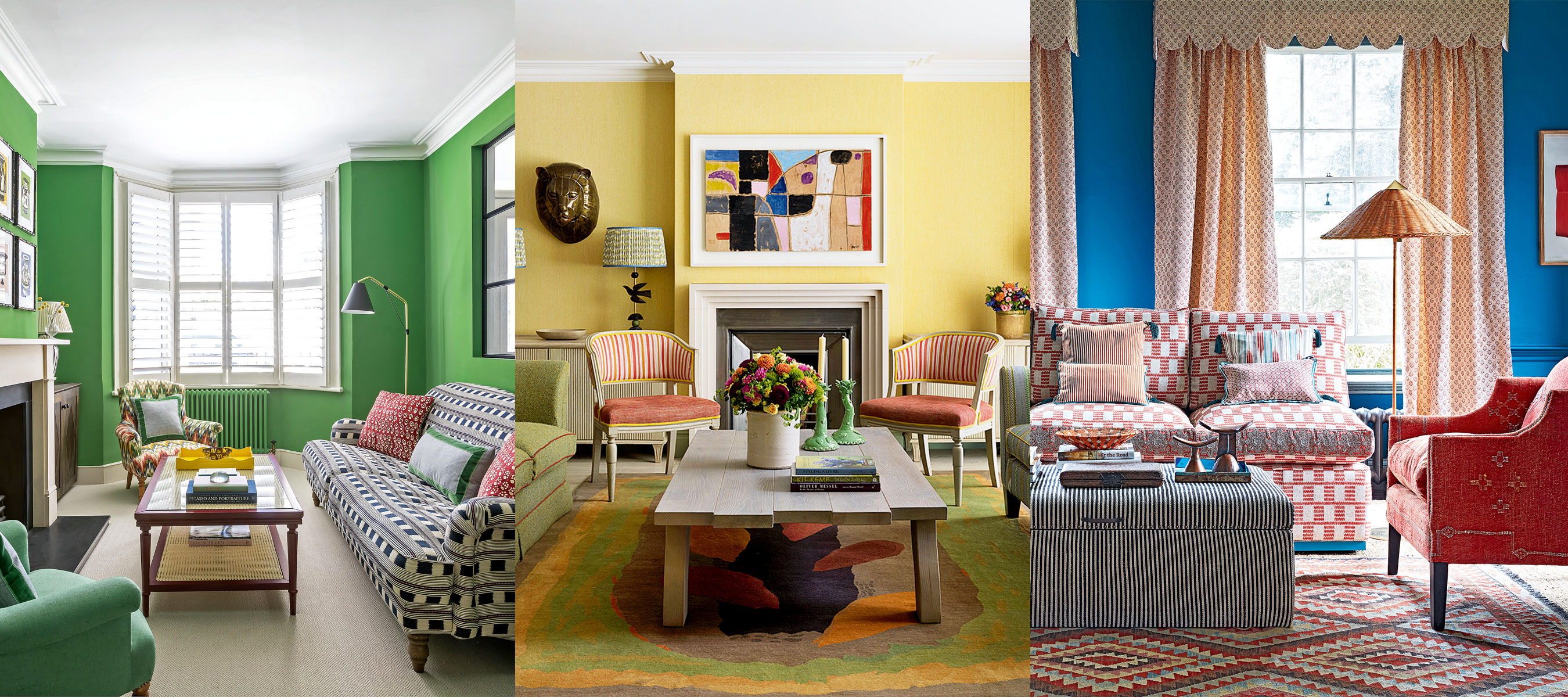
Choosing the ideal paint color for a living room can be a challenging task due to the vast array of options, varying undertones, and the dynamic effects of natural and artificial lighting. The color chosen significantly influences the room's atmosphere, impacting mood and relaxation levels. Interior designers emphasize the importance of selecting a versatile hue, unless frequent repainting is an option, while also encouraging bold experimentation. Popular choices currently range from warm neutrals to vibrant and dark tones. These include cheerful greens, fresh blues, and moody purples, which designers recommend even for smaller living spaces. Alternatively, for those seeking a calmer environment, muted tones such as light blue, blush pink, or soft sage are suggested.
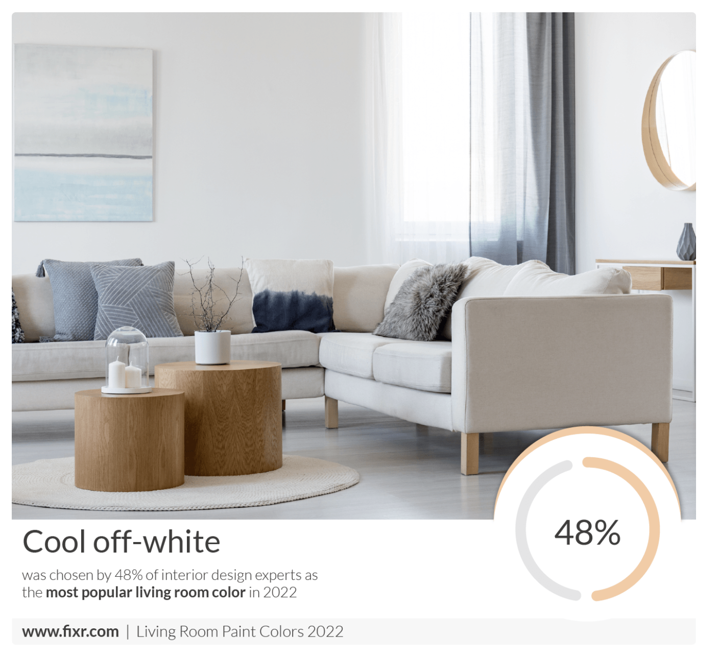
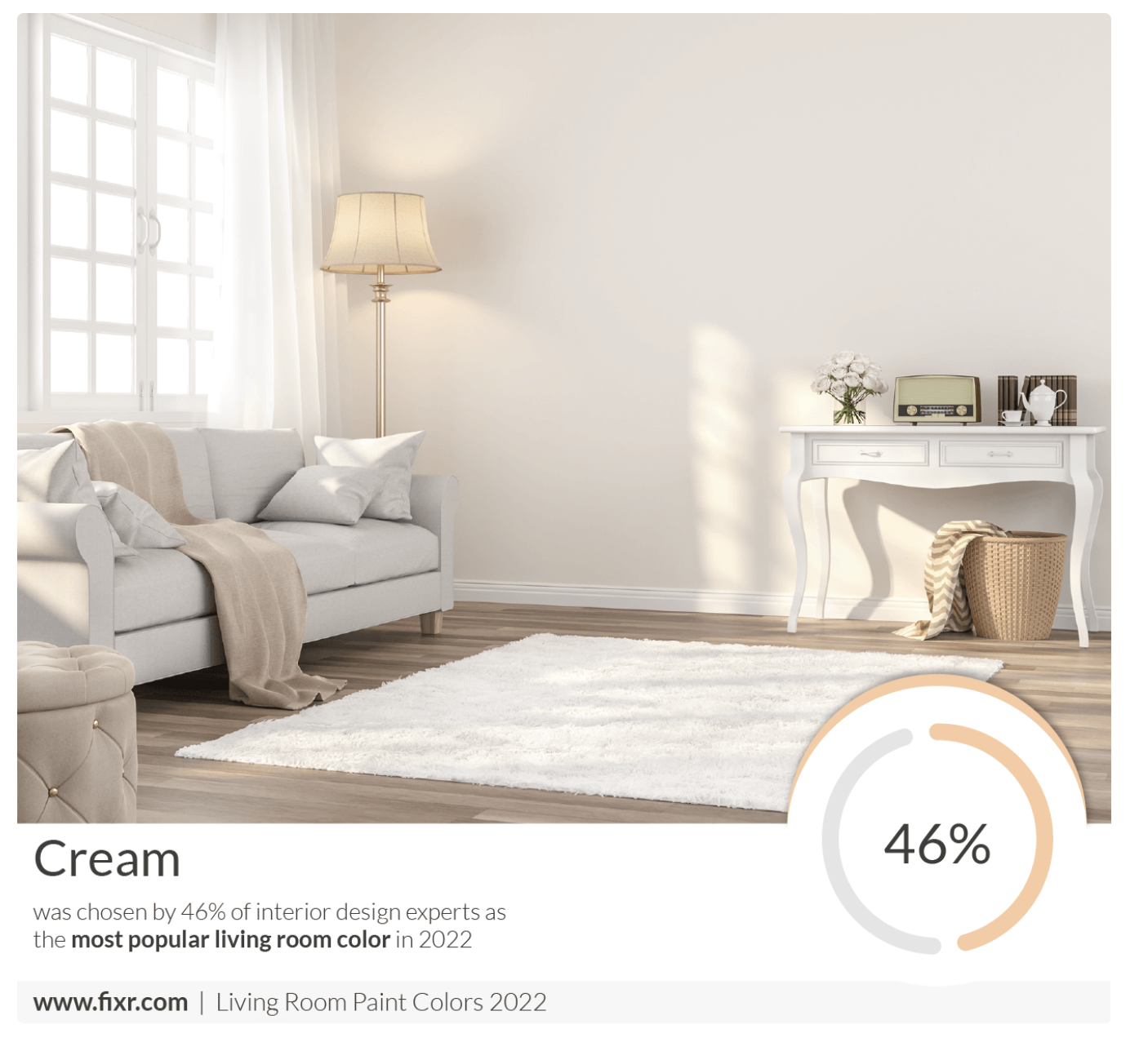
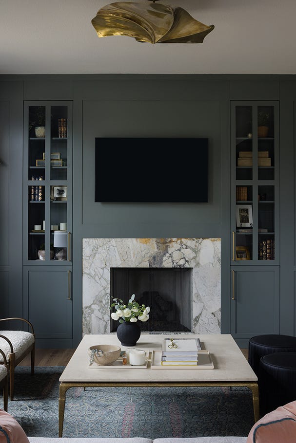
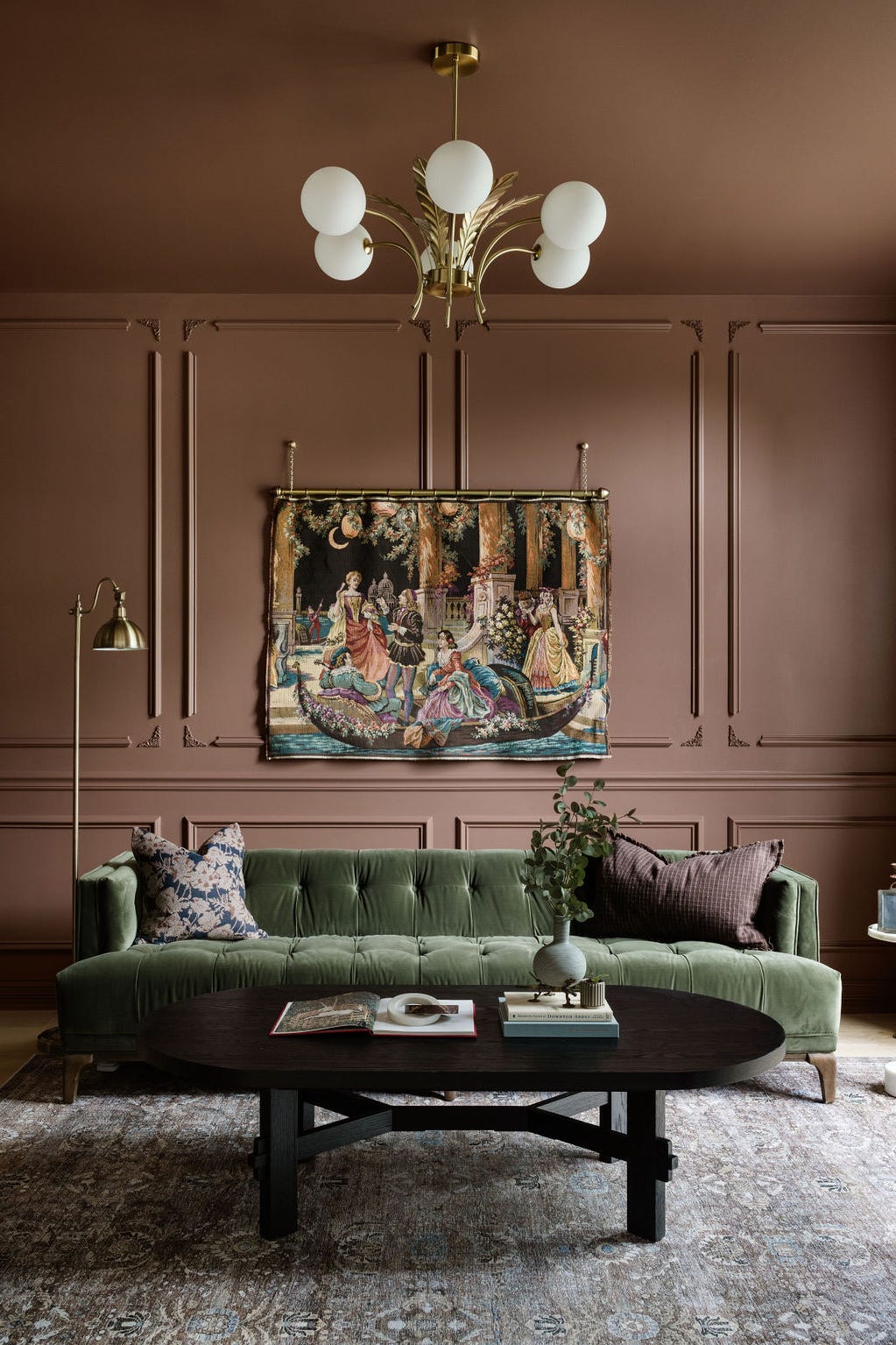
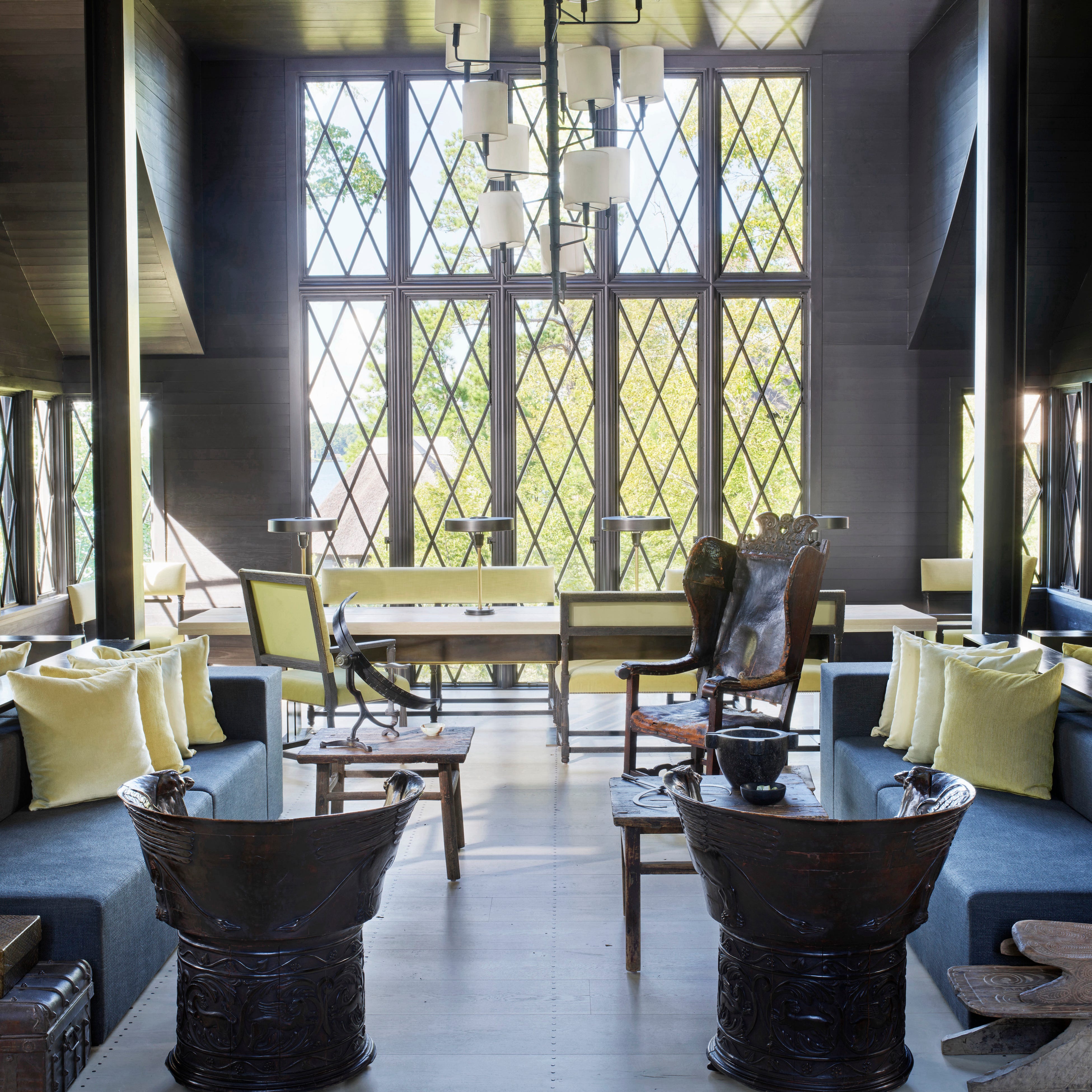
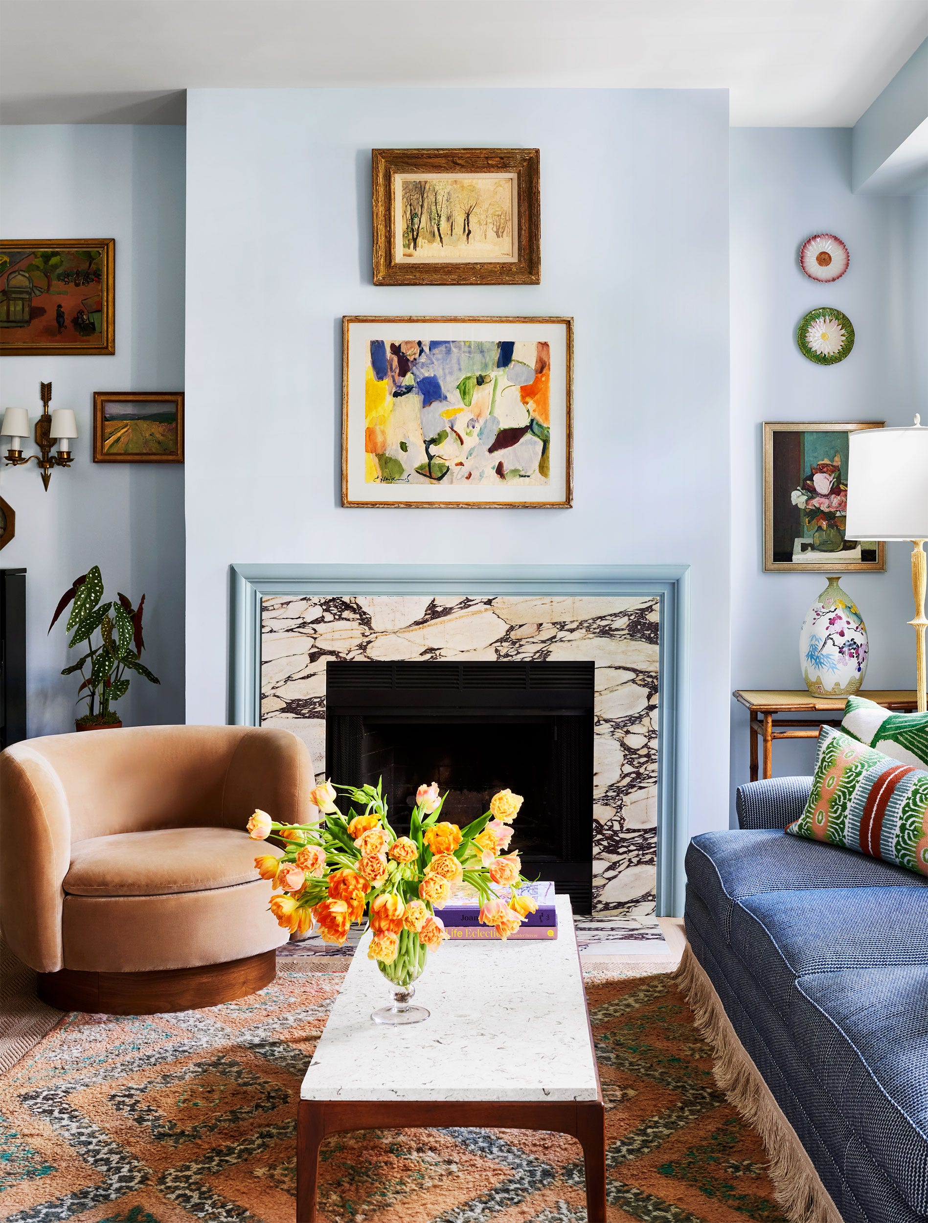
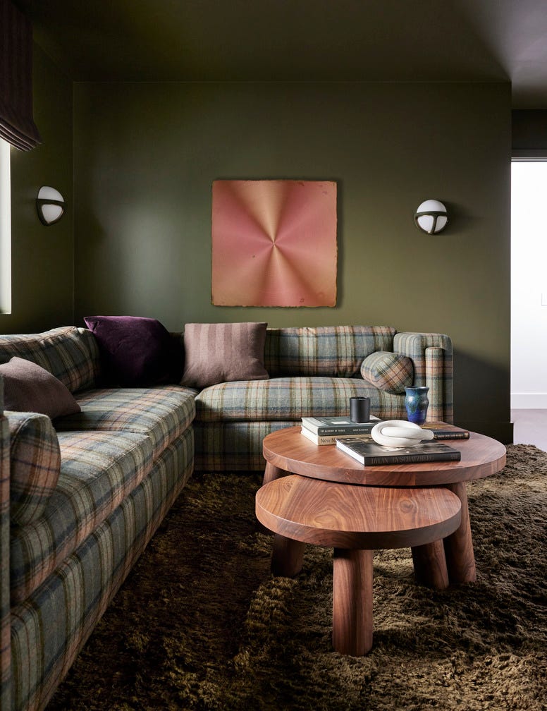
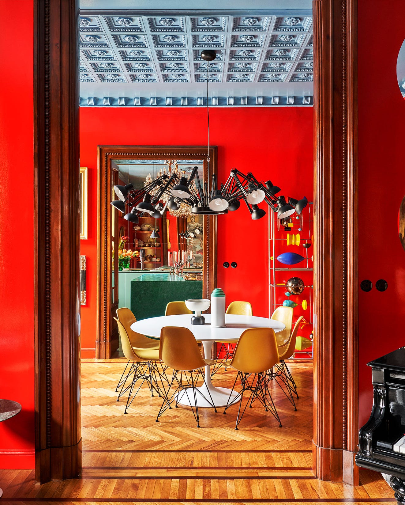
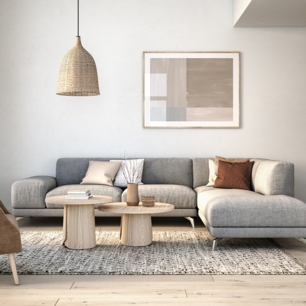
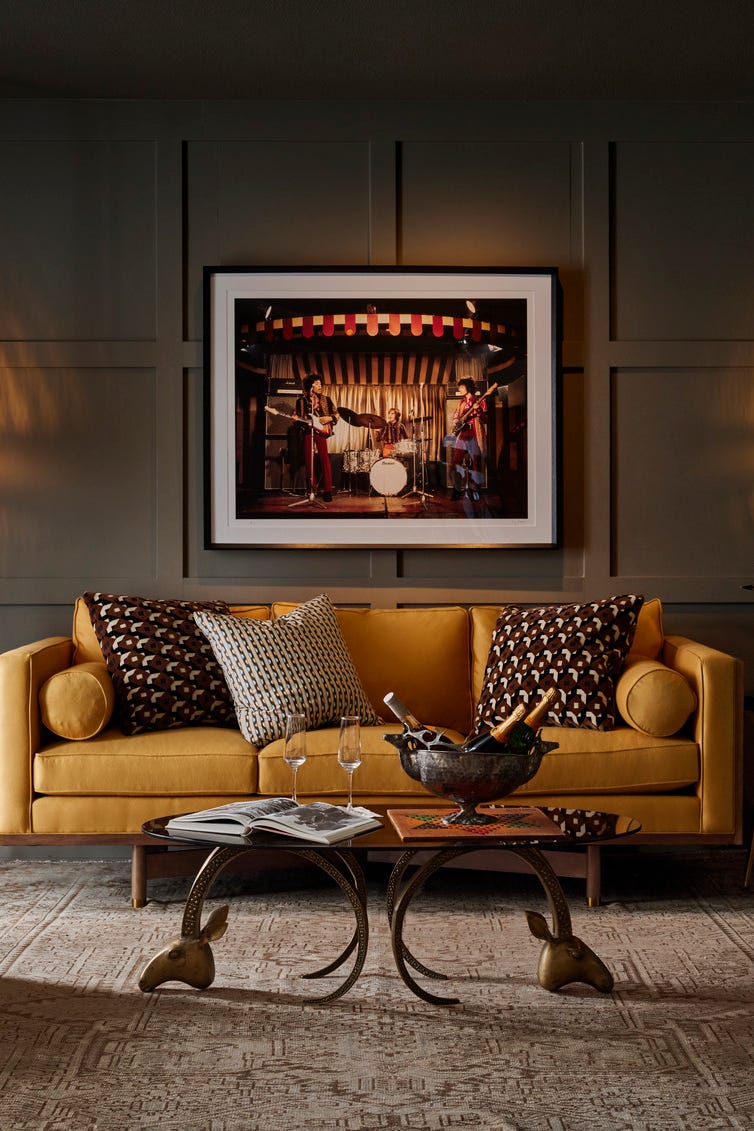
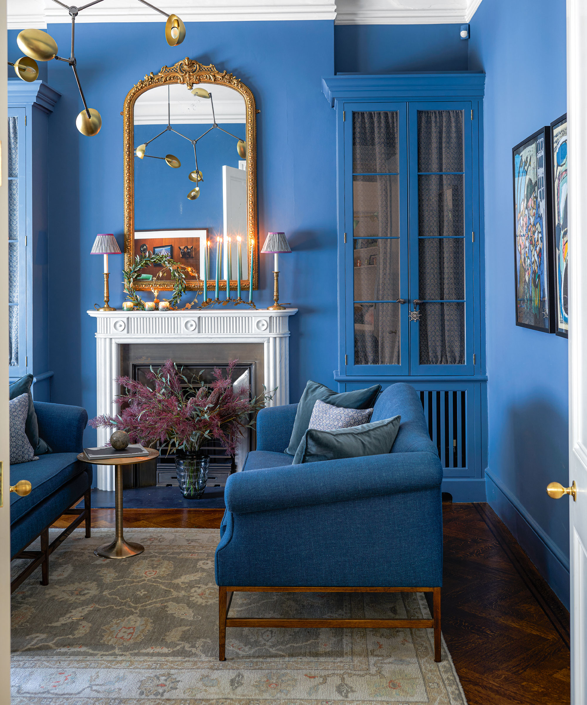
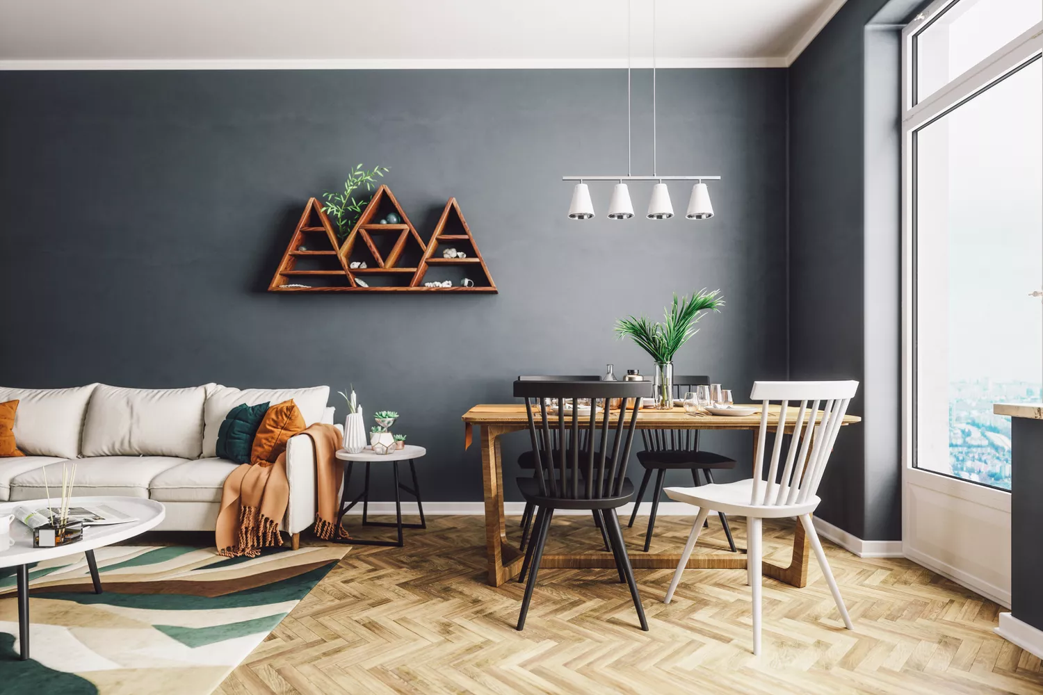
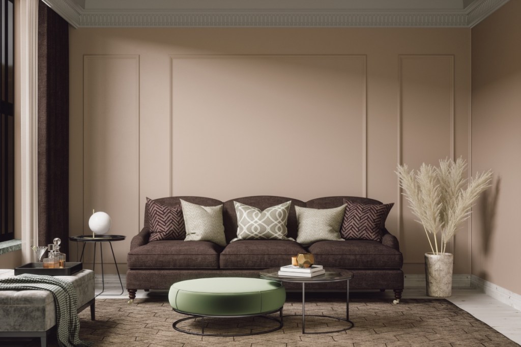
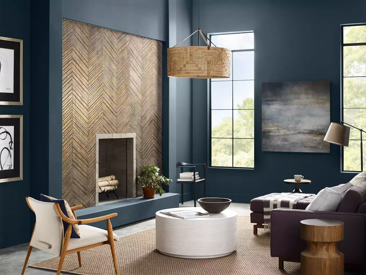
Warm neutrals, including sandy beige, creamy white, and rich brown, remain classic and safe options. Cool tones, such as bright white and classic gray, are also timeless. The article provides examples of various popular paint colors, beginning with deep blue-gray, an aged hue that combines moodiness with neutrality, effectively highlighting features like a marble fireplace. Rich brown shades, particularly red-toned ones, are noted as a trending choice for creating warm and cozy interiors, even when applied to both walls and ceilings.
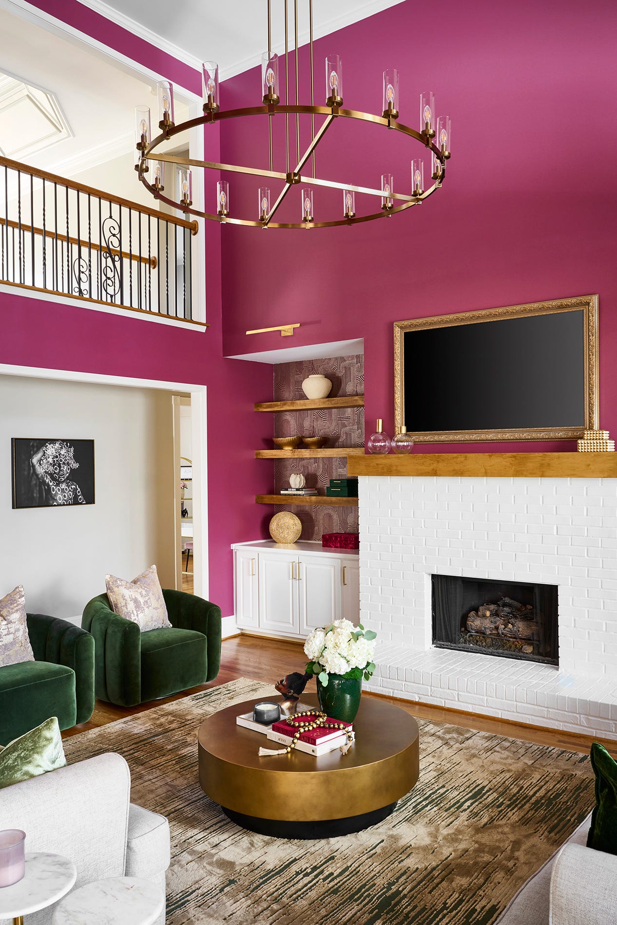
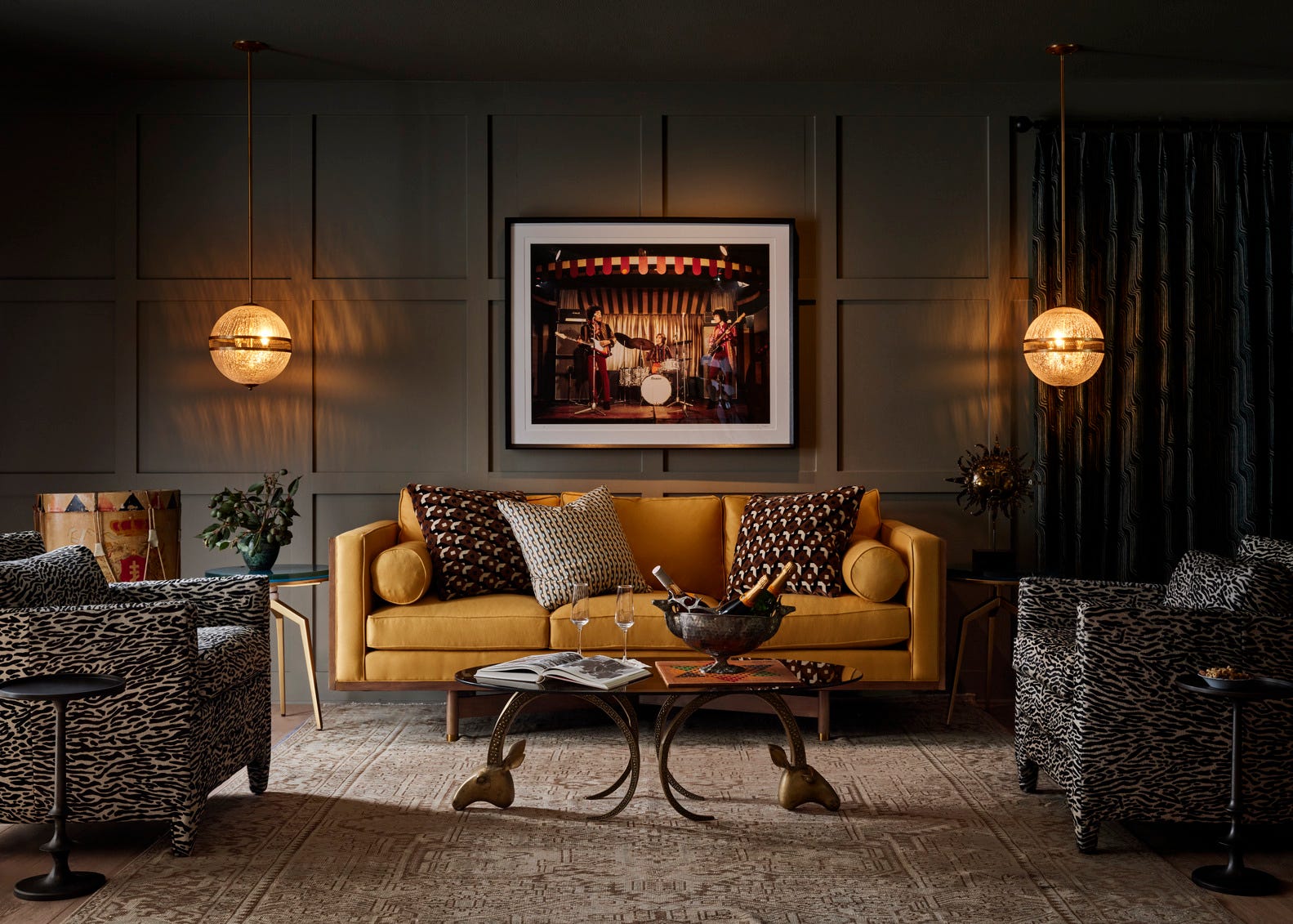
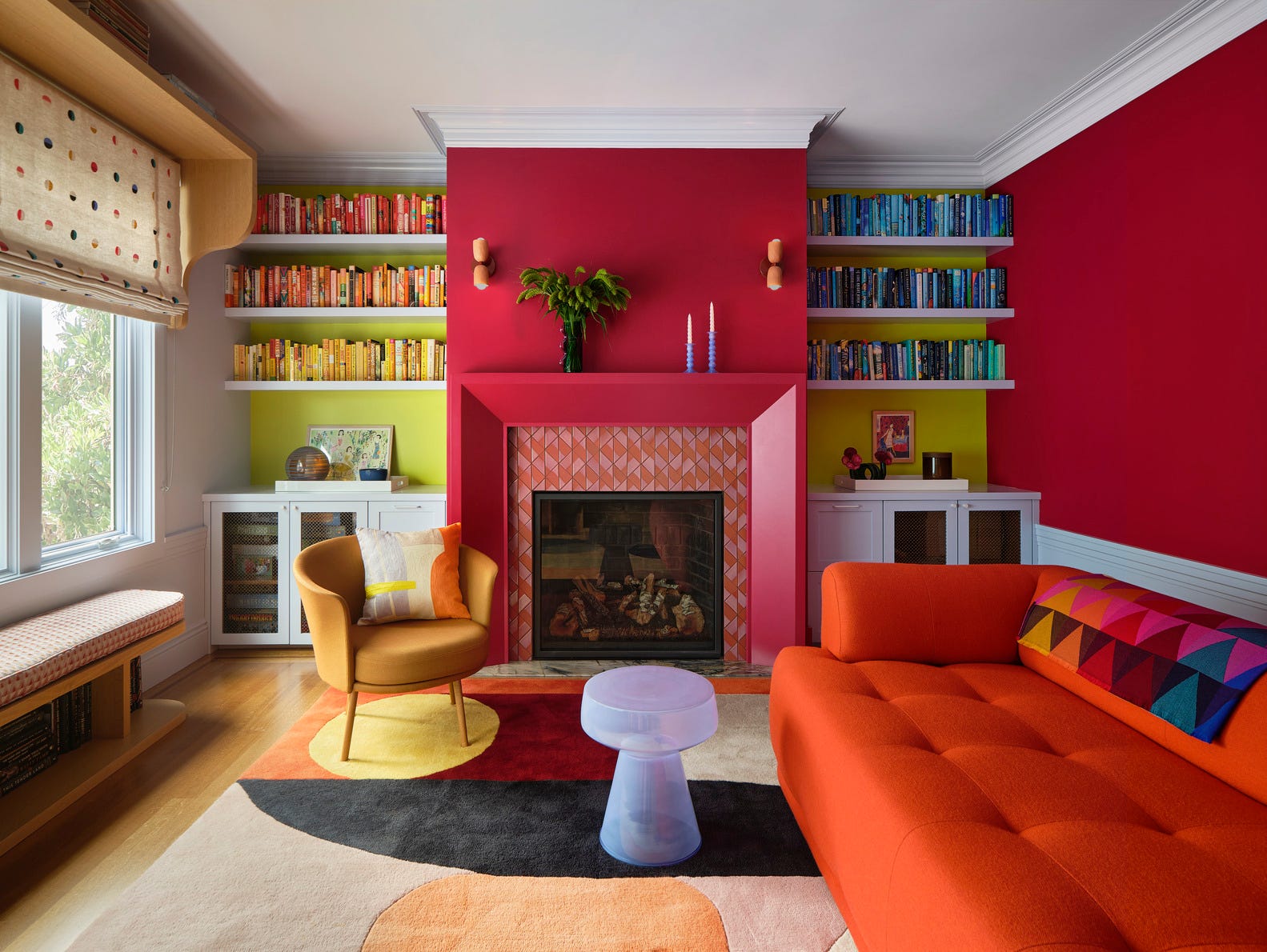
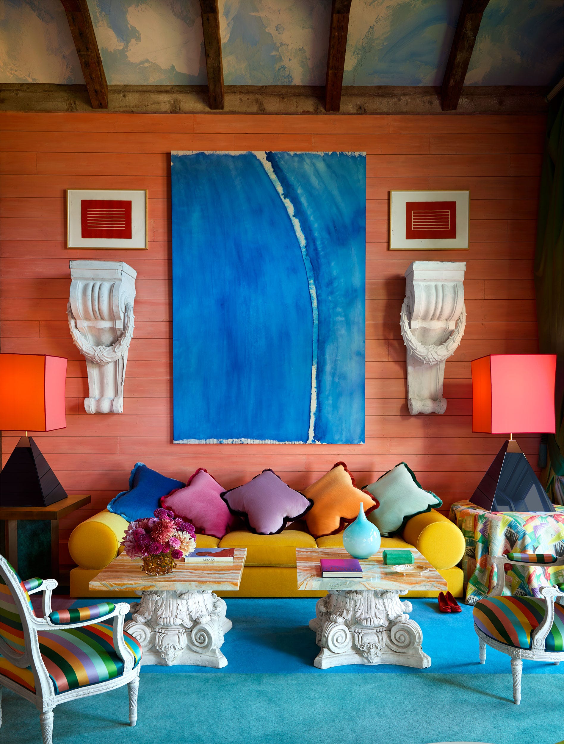
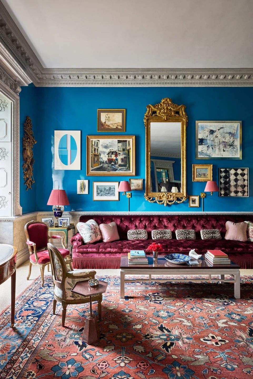
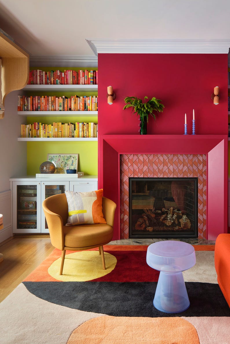
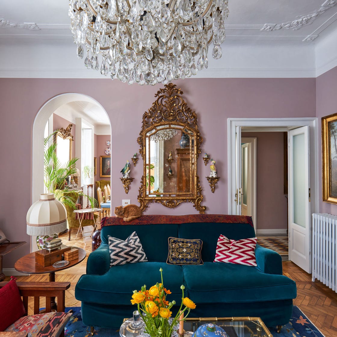
For a more striking statement, magenta pink, a vibrant pinkish-purple, is showcased in a two-story living room, expertly contrasted with white accents. Peacock blue, a rich teal, is demonstrated in a monochromatic application across walls, molding, and window trim, complementing a green velvet couch. Charcoal black offers a bold yet functional option, especially beneficial for media rooms during daylight hours, and pairs well with wallpapered ceilings and dark gray sofas.
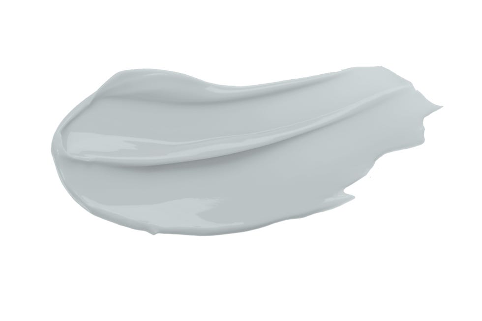
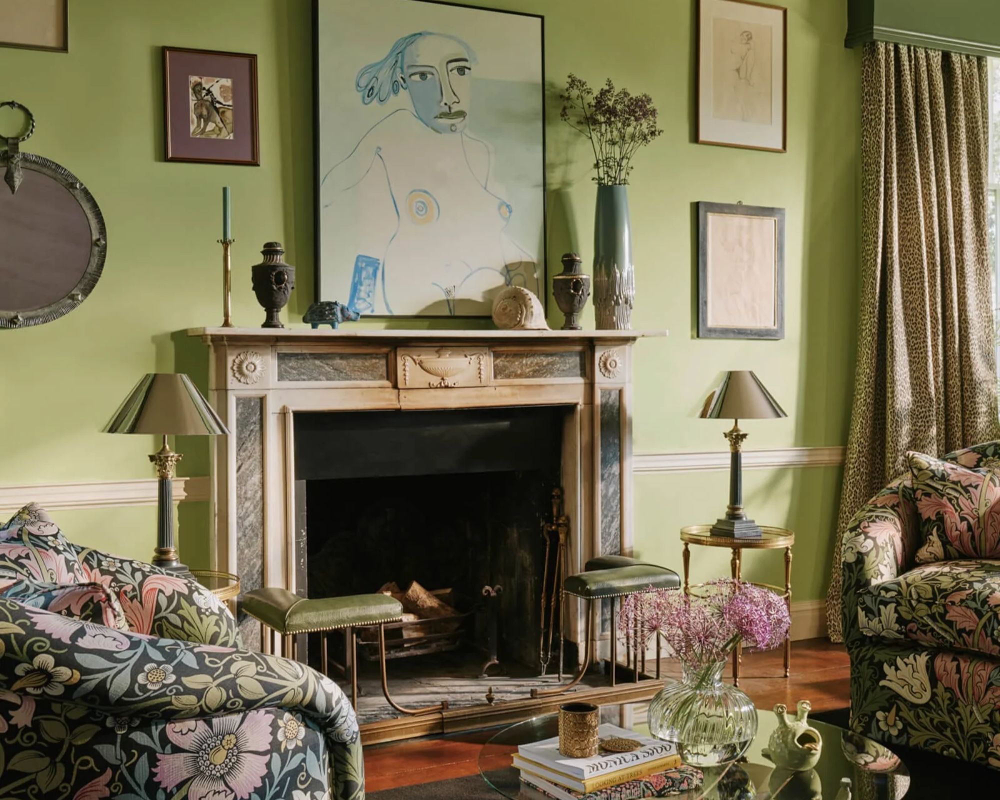
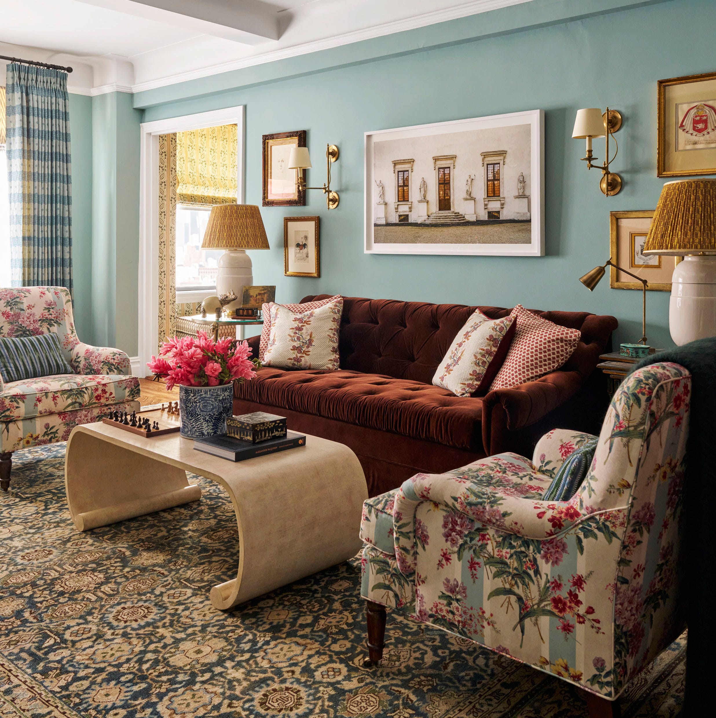
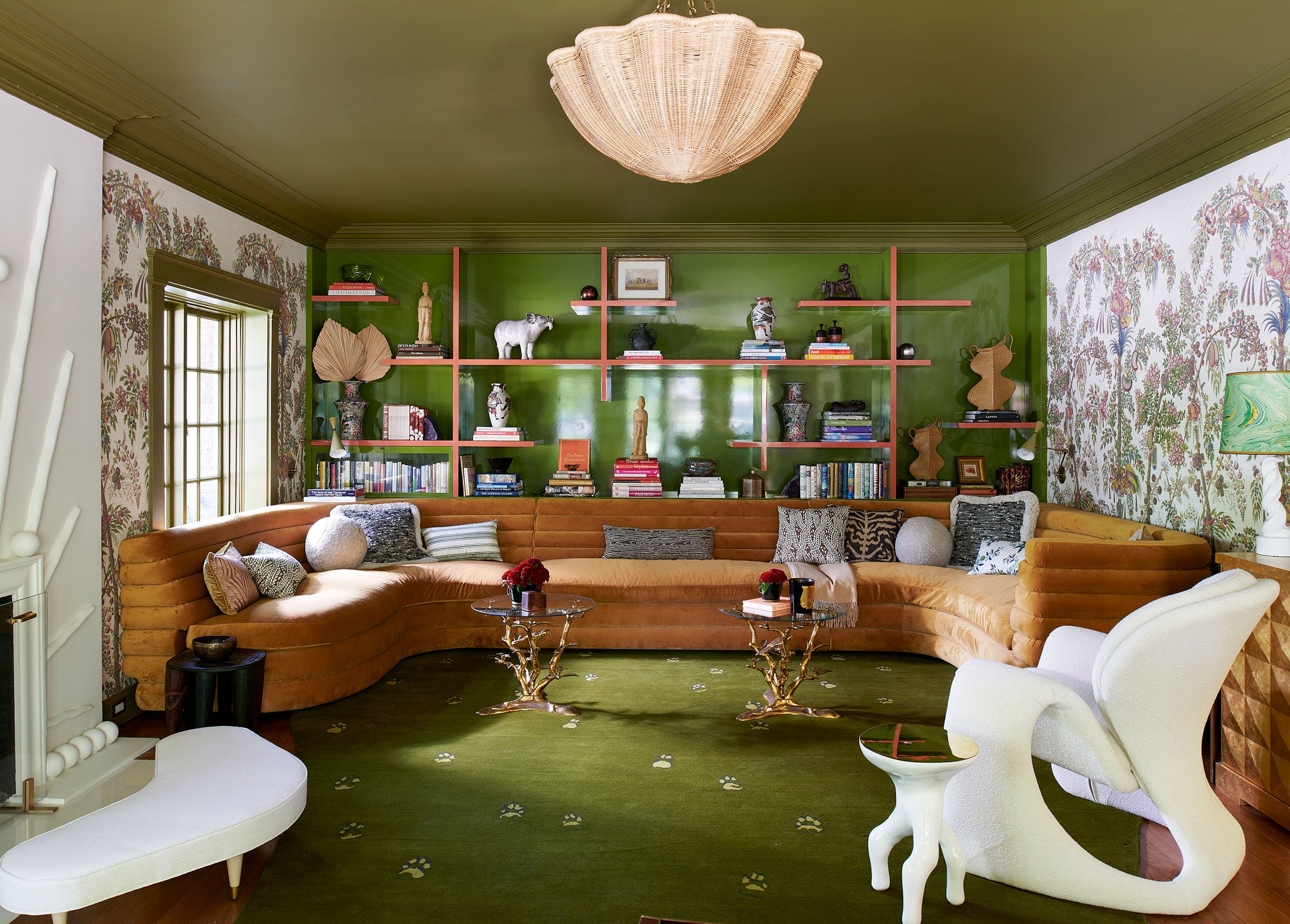
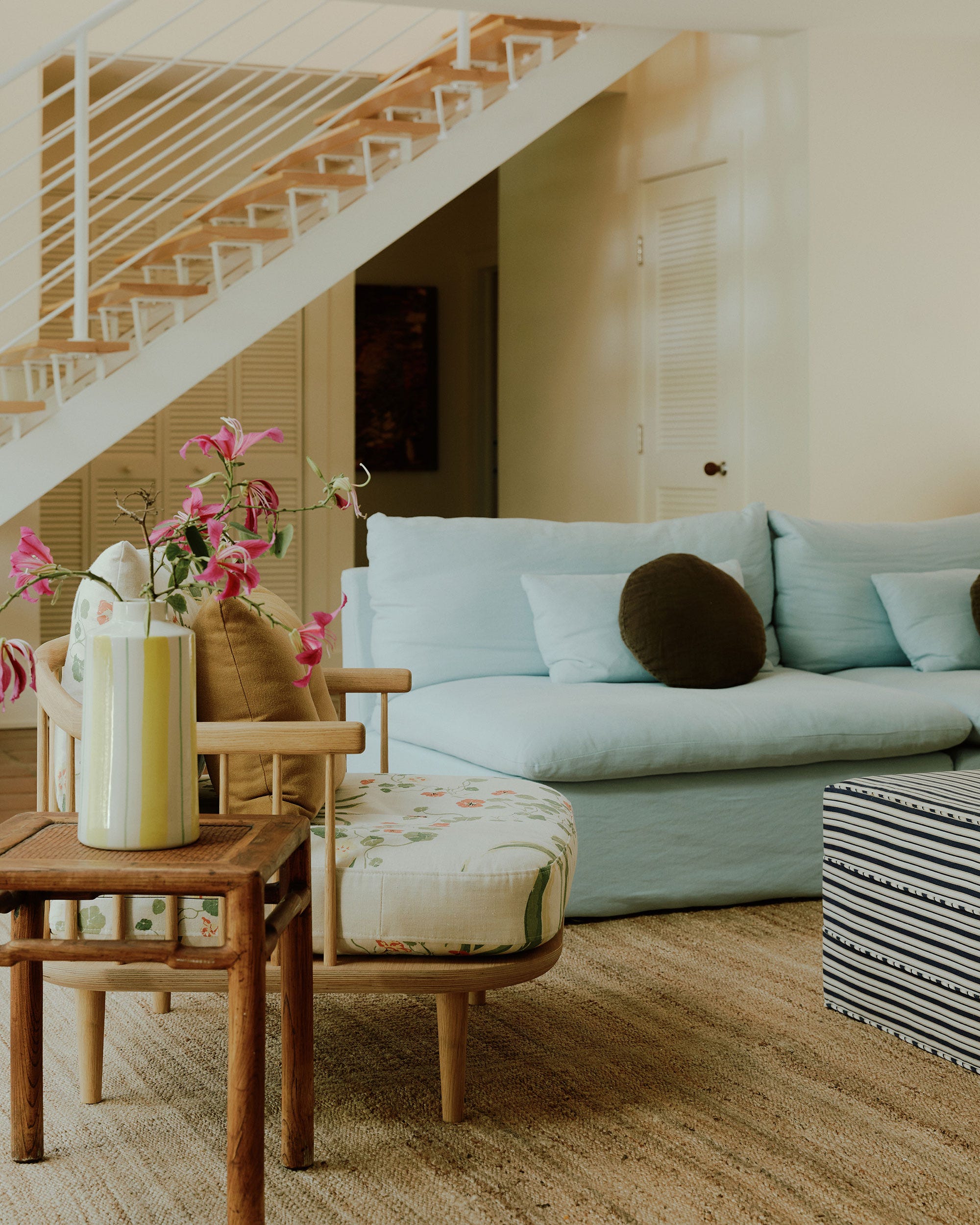
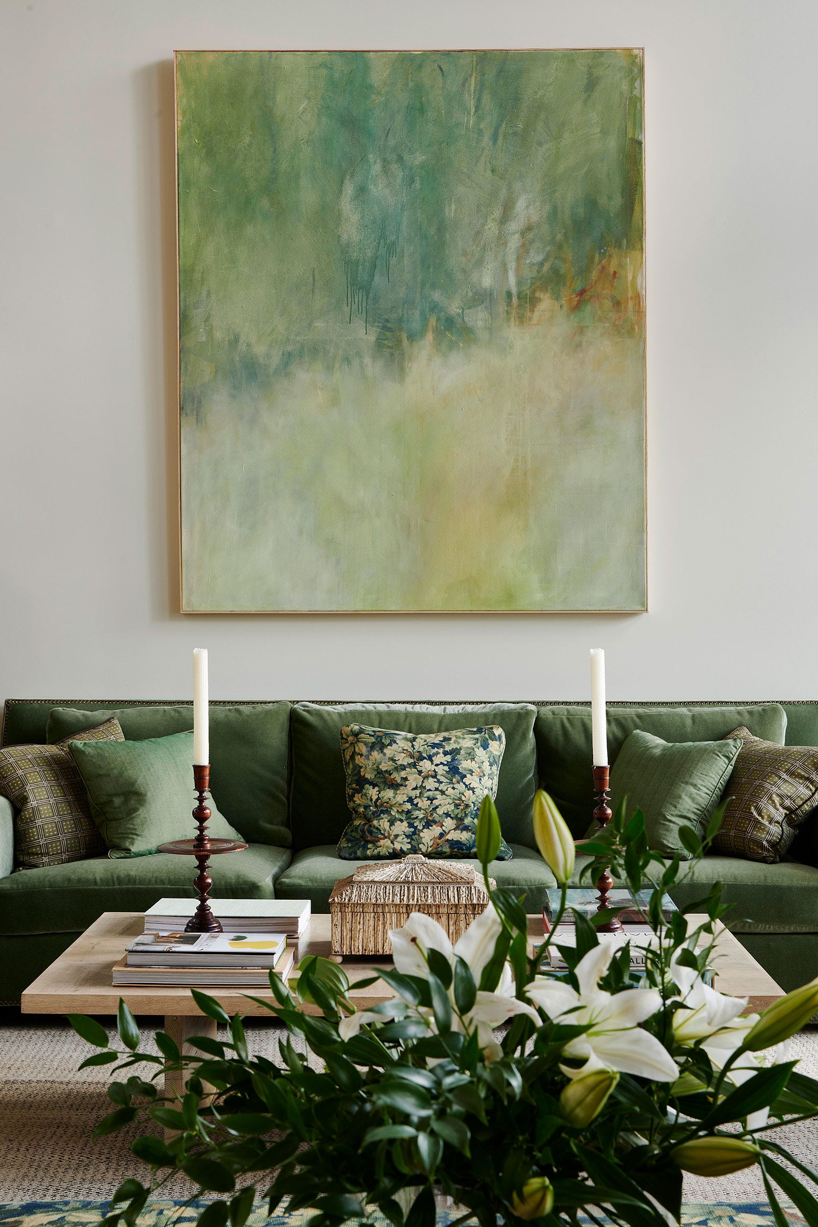
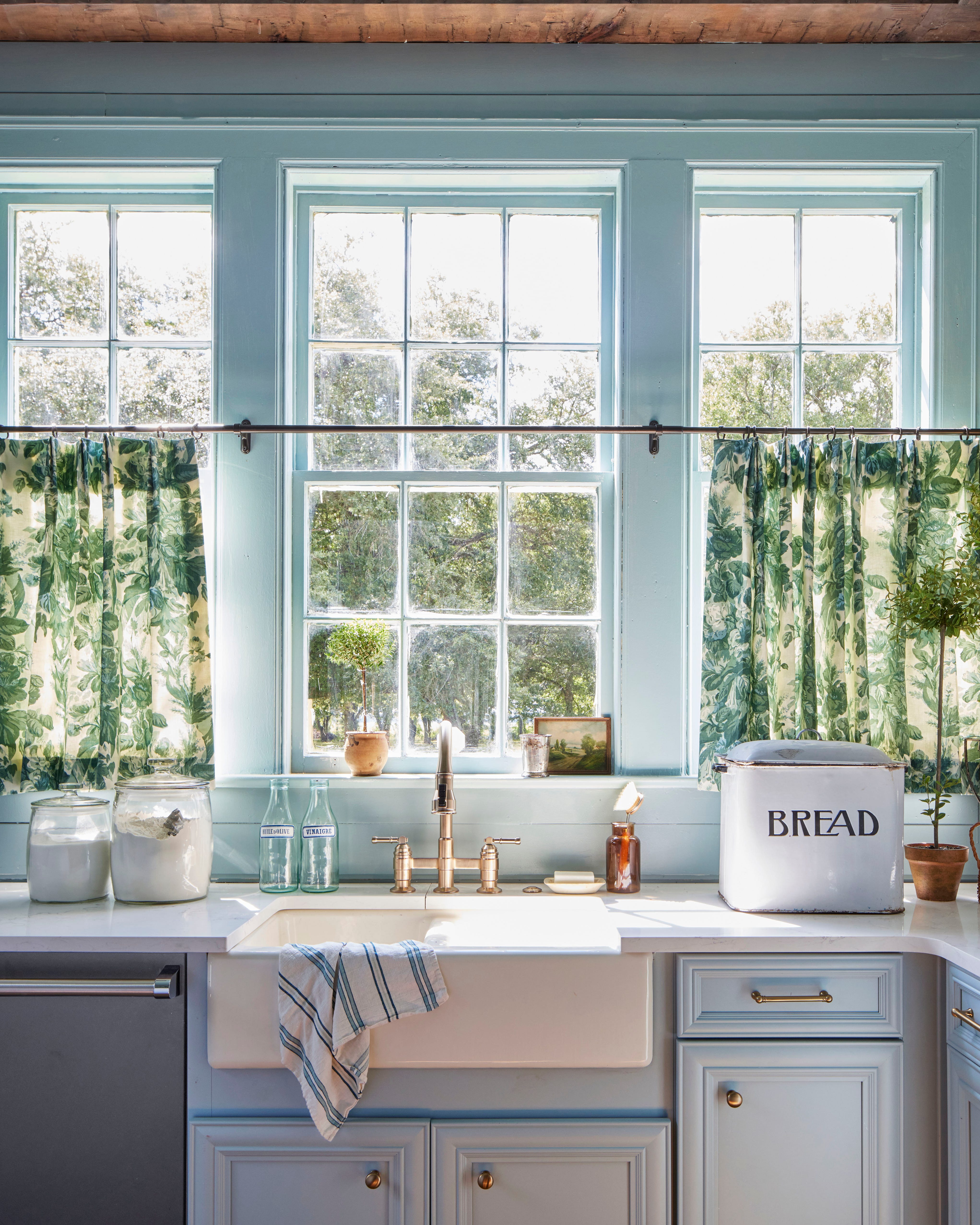
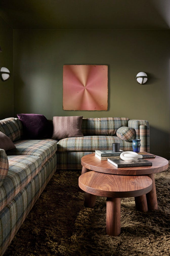
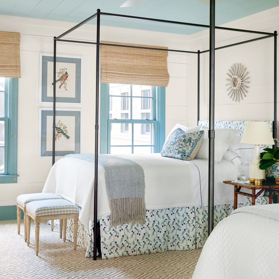
Olive green, a subtle green-meets-gray shade, is presented as an elegant choice for built-in shelving, contrasting crisply with white walls. Golden beige, a warm hue, is shown to extend onto the ceiling, enhancing comfort. Mist green, a gray-tinged green, thrives in well-lit rooms and is layered with green patterns to accentuate its undertones. Soft blue-gray, a nearly neutral shade, provides a fresh and clean coastal feel, with blue accents helping to bring out its color in varied lighting.
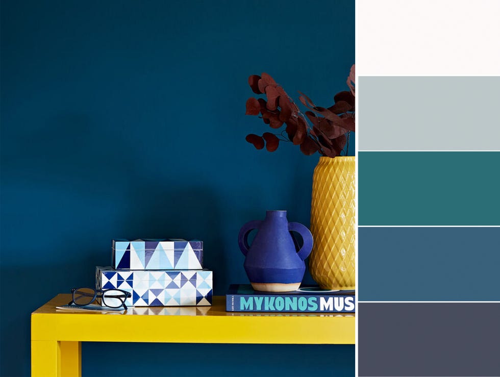
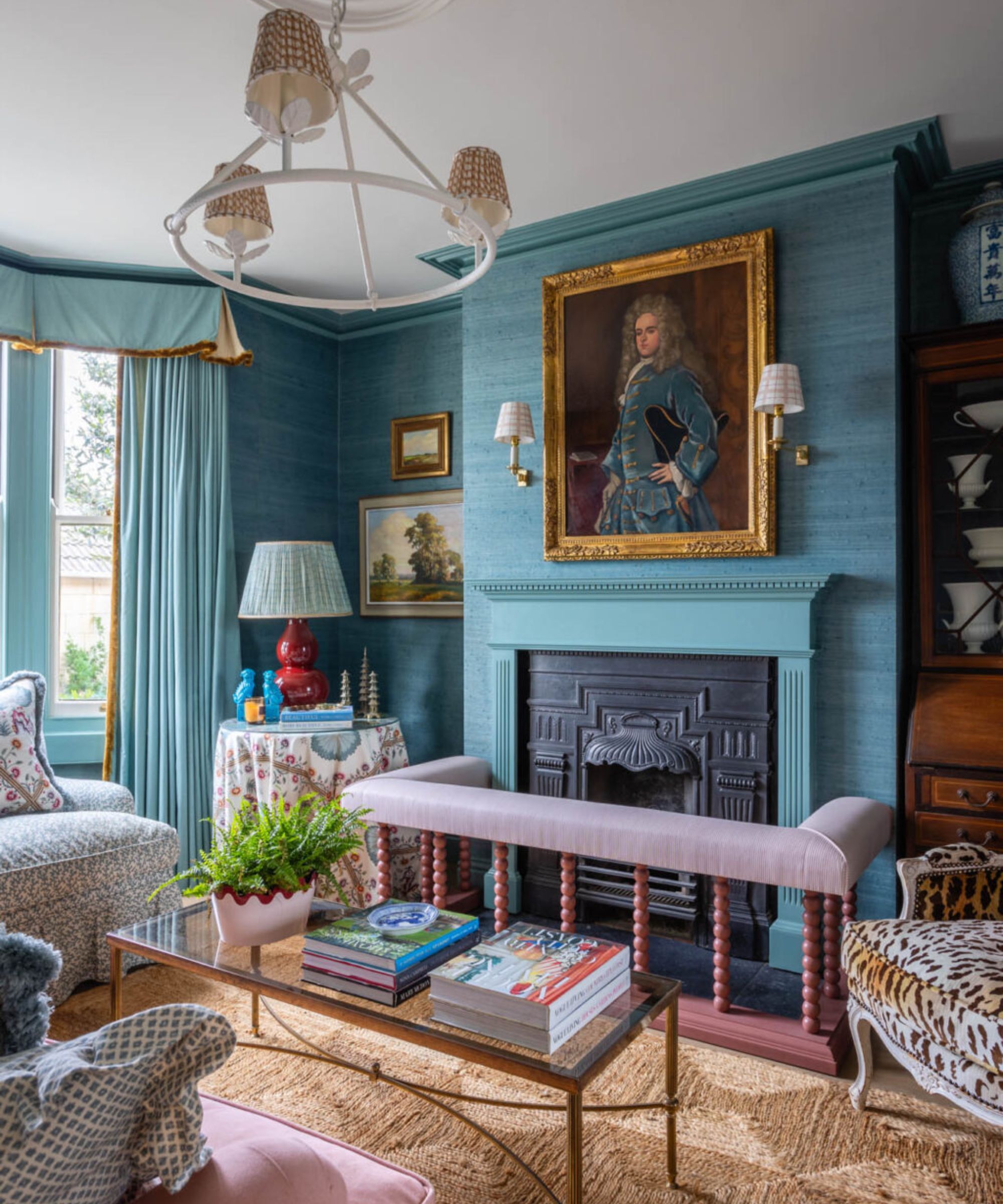
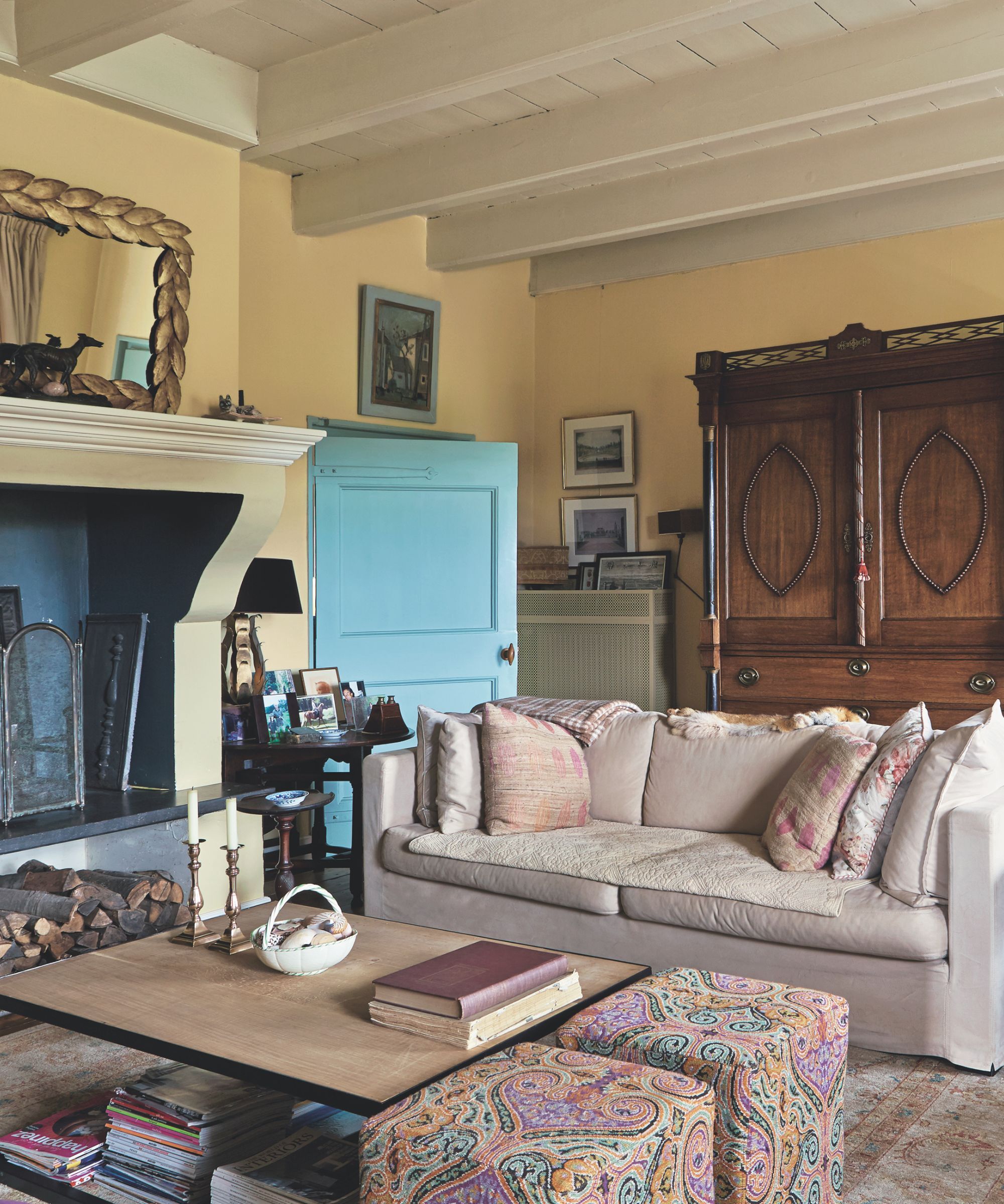
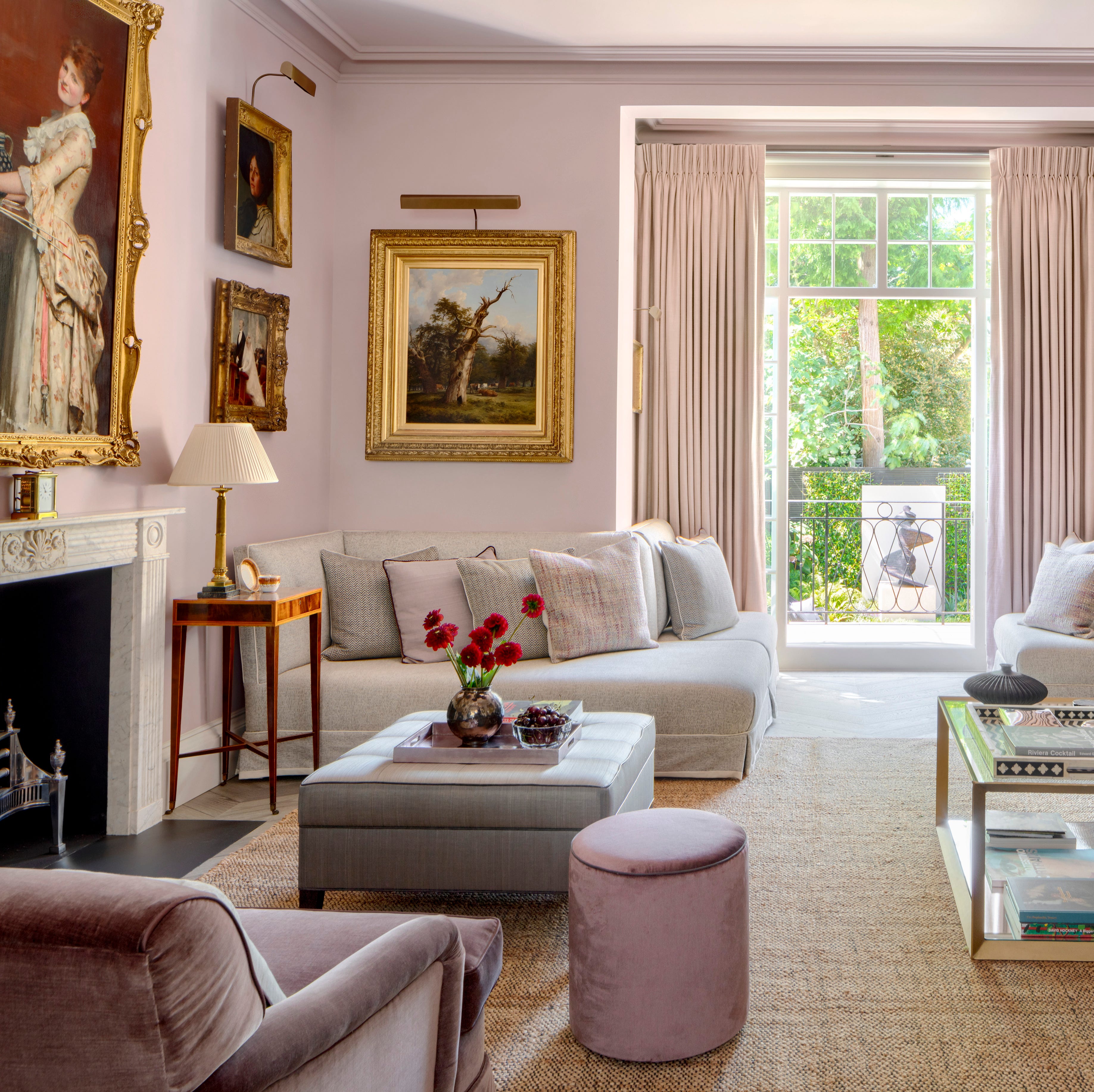
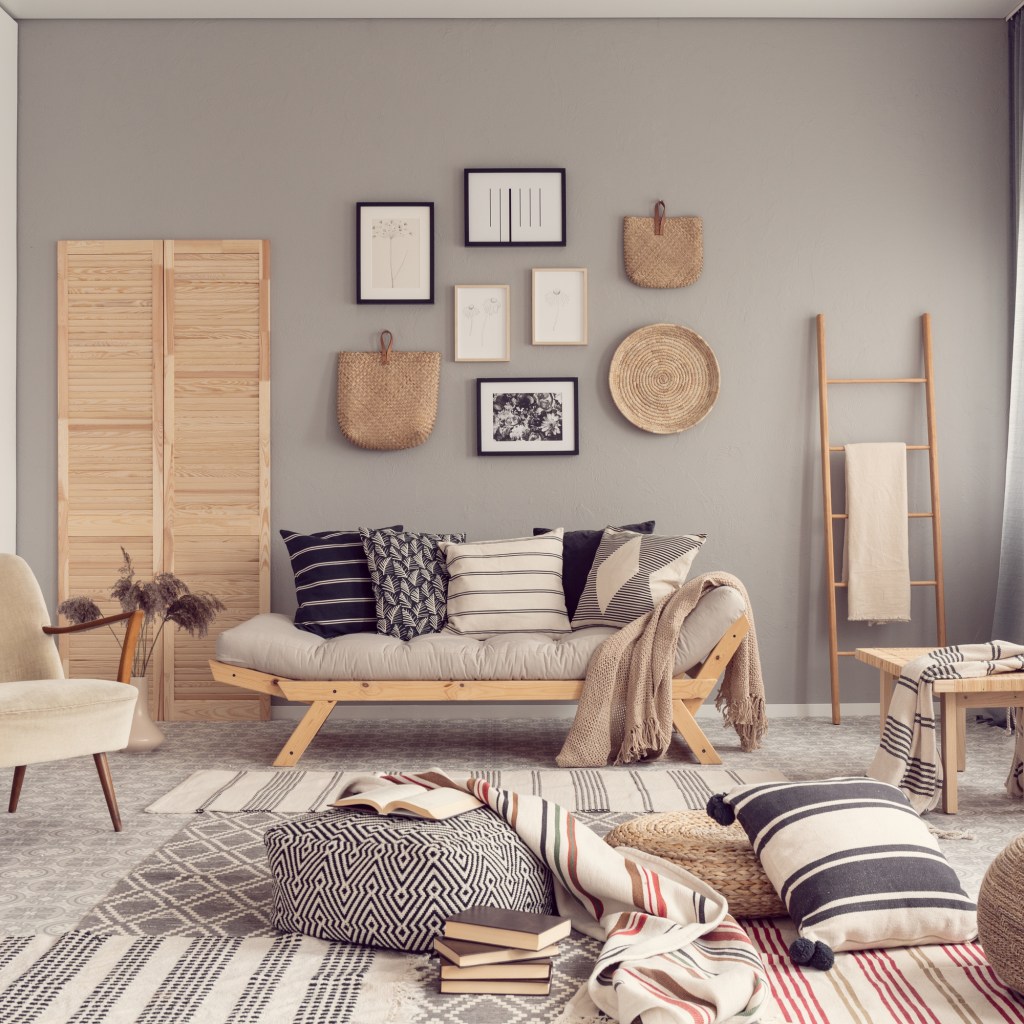
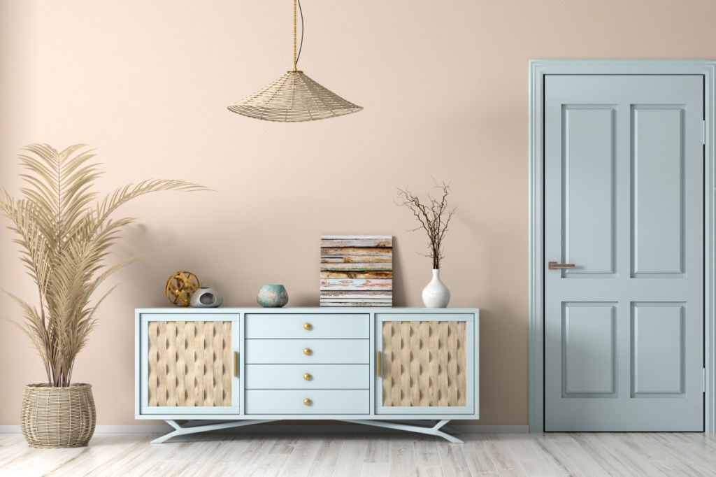
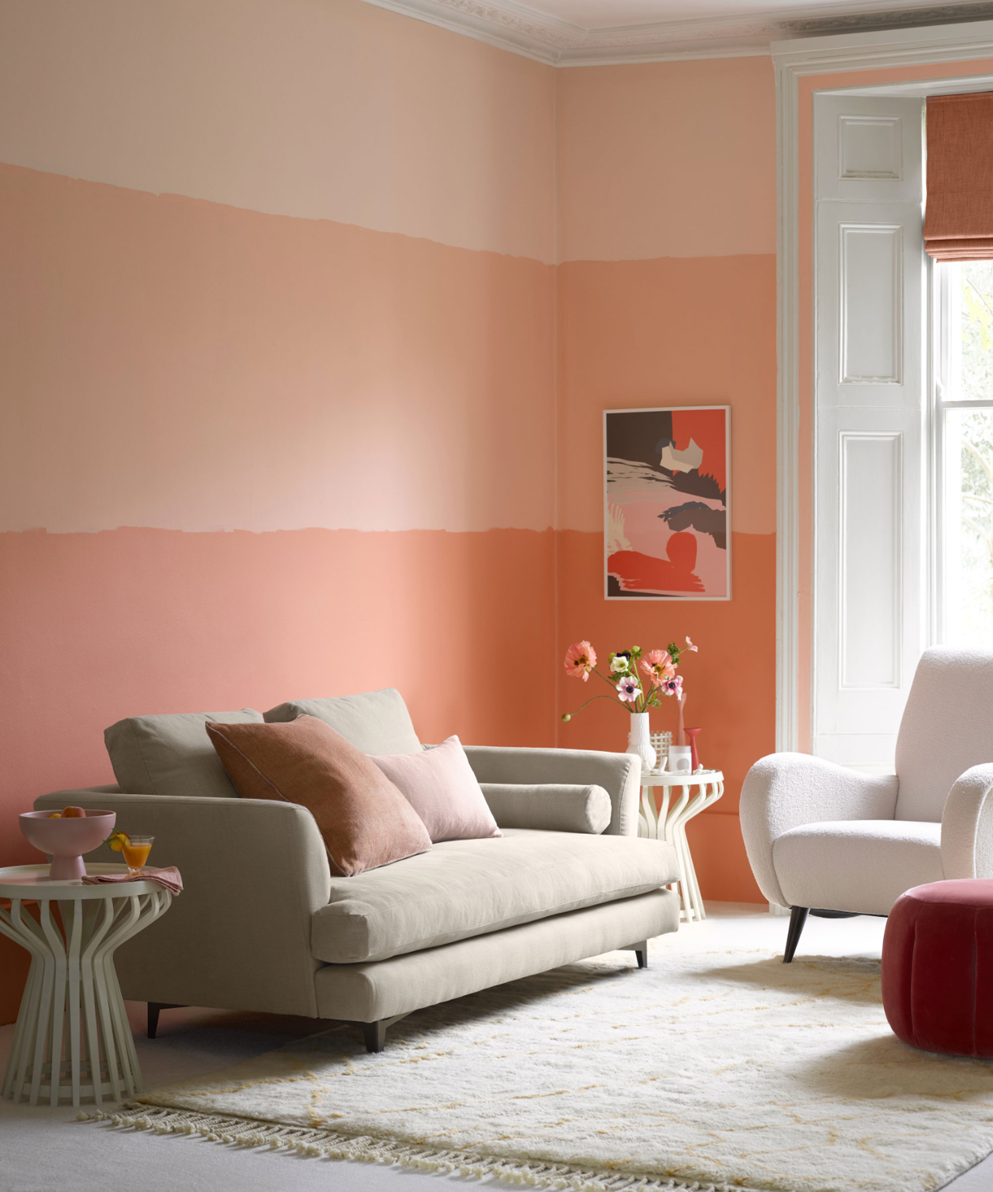
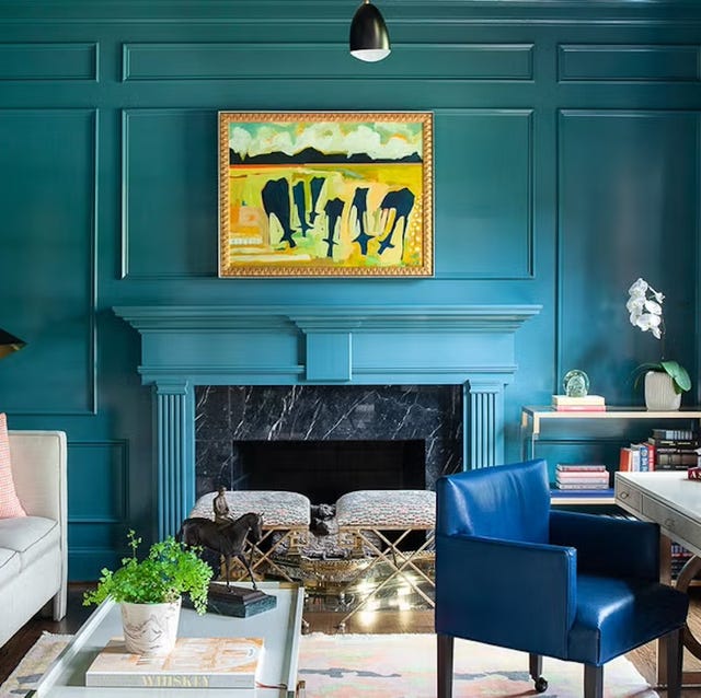
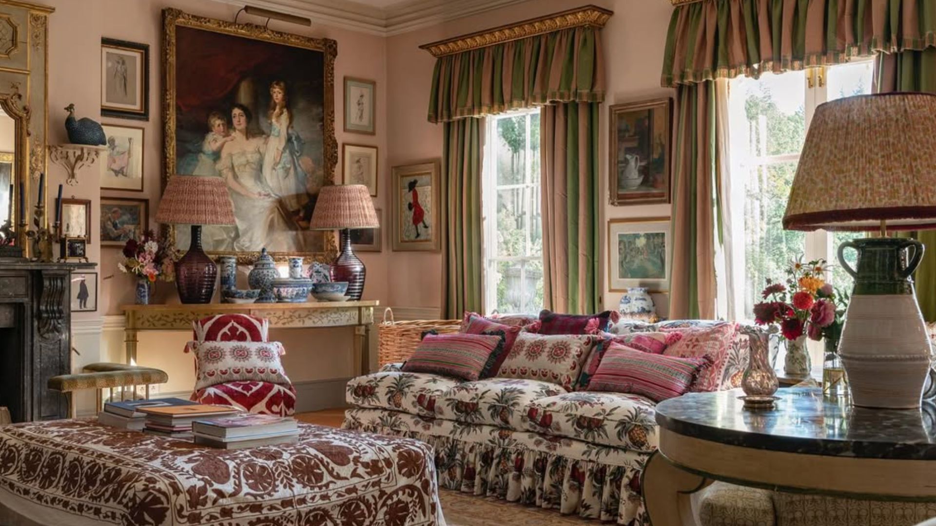
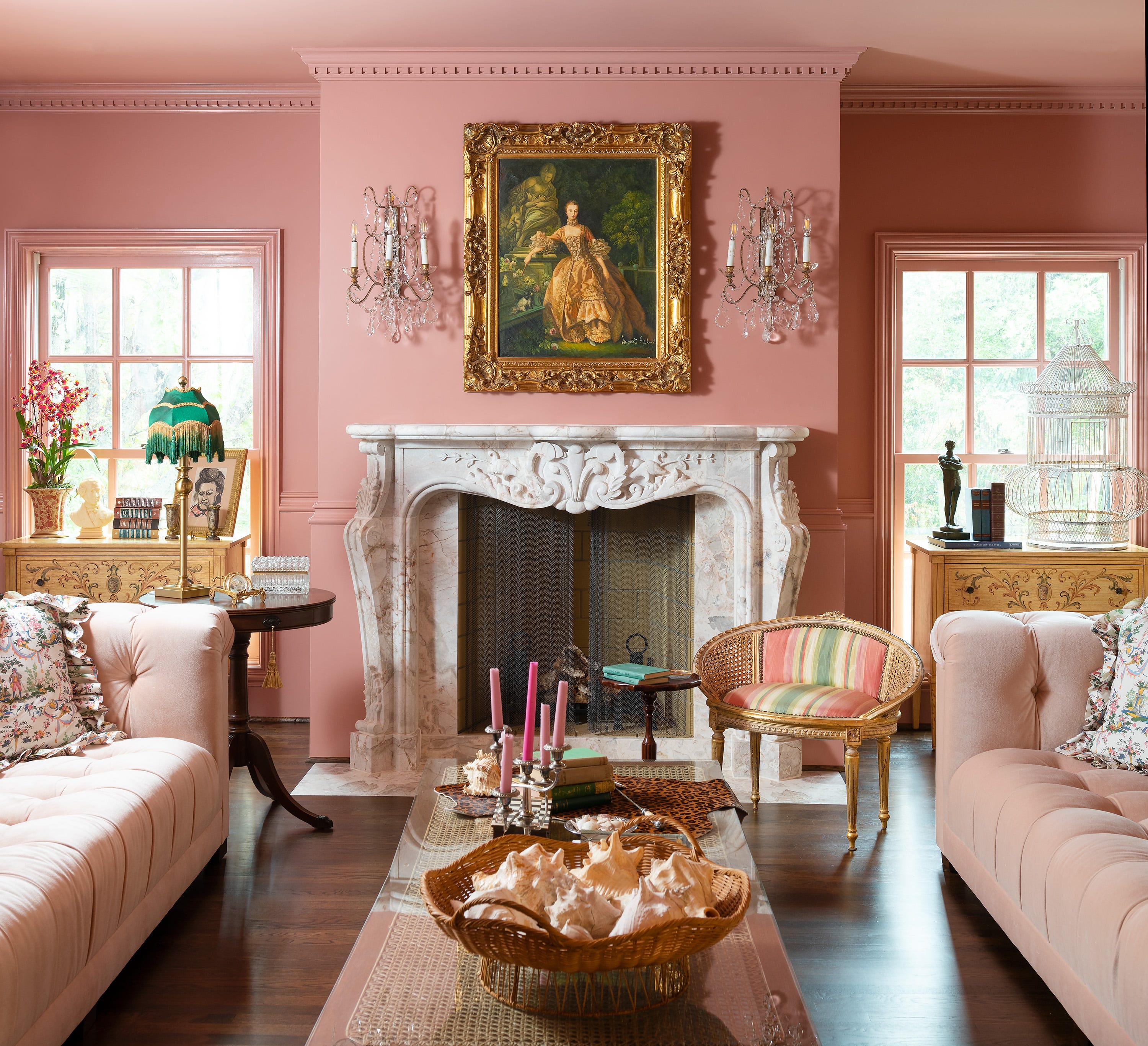
Teal blue, a vibrant blue-green, is used extensively in one living room example, covering walls, molding, and fireplace mantels, with patterned wallpaper on the ceiling adding drama. Honey yellow, a warm color, is noted for its ability to enliven a space and appear differently throughout the day. Mid gray, a timeless shade, offers a calm and cozy feel, and is effectively contrasted with a glossy black fireplace. Deep turquoise provides a moody teal for shiplap walls and built-ins, balanced with warm wood tones. Bright white is highlighted for its ability to make a space feel larger and brighter, particularly in modern beach house settings. Lastly, dark teal is recommended for creating drama by painting walls, trim, and built-in cabinetry in a dark blue with green undertones, complemented by botanical wallpaper on the ceiling. Dusty pink, a soft pink with yellow undertones, serves as a versatile neutral that pairs well with many colors, often seen in newly plastered houses.
#LivingRoomDesign #PaintColors #InteriorDesign #HomeDecor #ColorTrends #HomeImprovement #DIYDecorating #LivingRoomDesign #PaintColors #InteriorDesign #HomeDecor #ColorTrends #HomeImprovement #DIYDecorating
0 تعليق إجمالاً
 لا توجد تعليقات بعد
قد تعجبك أيضًا
7 Popular Paint Colors for the Living Room
Designers Swear By These 65 Living Room Paint Colors

55 Living Room Color Ideas That Will Take Your Space from Drab to Fab

6 Living Room Paint Color Trends That Are Going to Take Over Walls in 2026

Listen Up: These Are the Best Paint Colors for Your Living Room

Experts reveal the best living room paint colours to transform every space

Designers Swear By These 55 Living Room Paint Colors


10 Timeless Living Room Paint Colors Designers Swear By
30 on-trend paint colours for every room in your home

4 Living Room Paint Colors That Are So Outdated, According to Designers

The 3 living room paint colors all the trendiest experts are using

4 Interior Designers Share the Biggest Paint Color Trends Right Now (and What’s Out!)

5 Living Room Paint Color Trends for When You're Craving a New Look
These Living Room Paint Colors Are a Total Mindset Shift
The 60 Best Blue Paint Colors for Every Room in Your Home
Living room paint ideas – 30 stylish ways with paint, and expert color tips

5 living room paint colors going out of style in 2025
Jewel Tones Are Trending for Living Room Paint Colors, According to Designers
Designer-Approved Living Room Colors That'll Make You Feel Happier
The Best Living Room Paint Colors, According To Designers