1/7
6 earthy neutral paints that designers say are replacing bland white walls
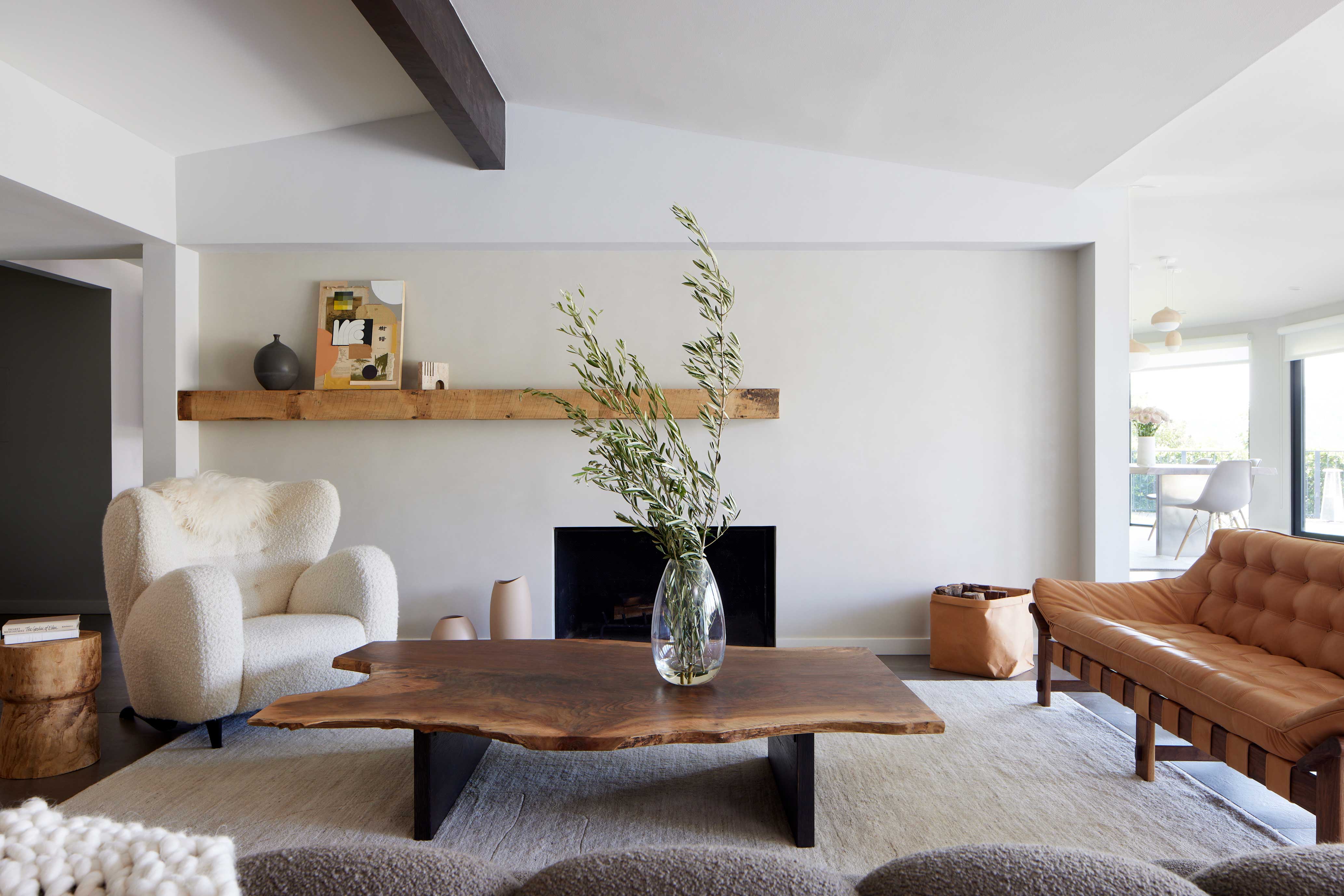
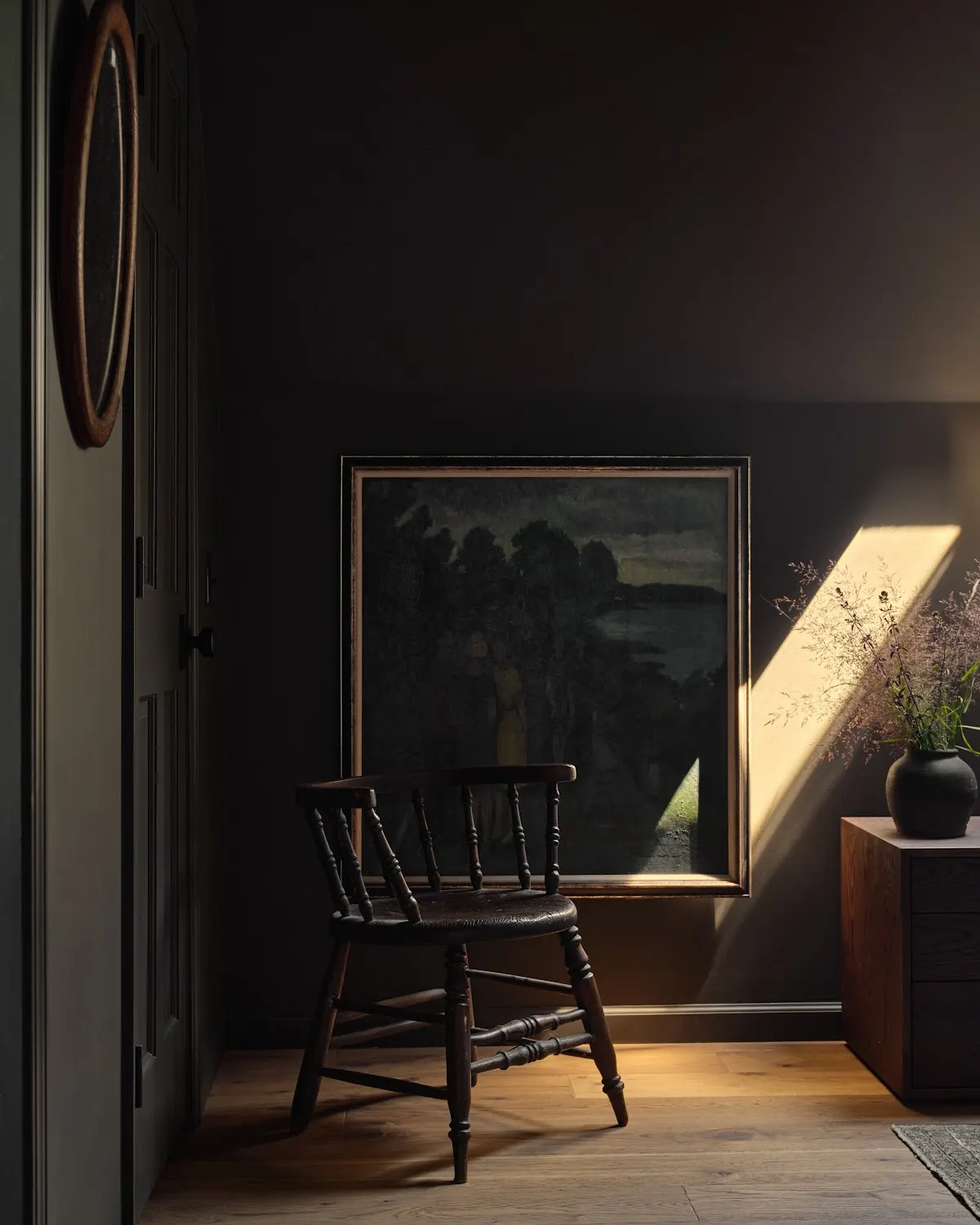
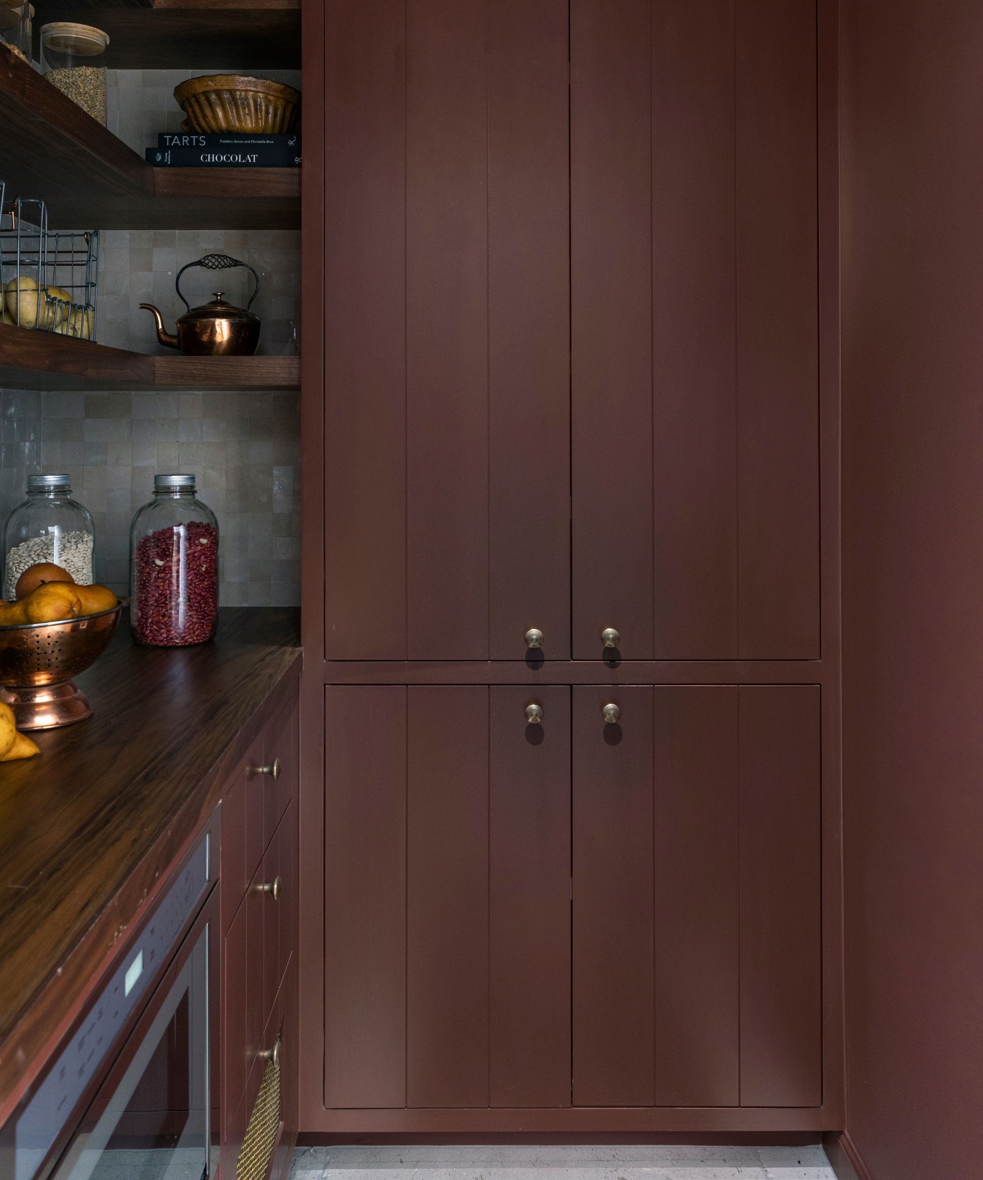
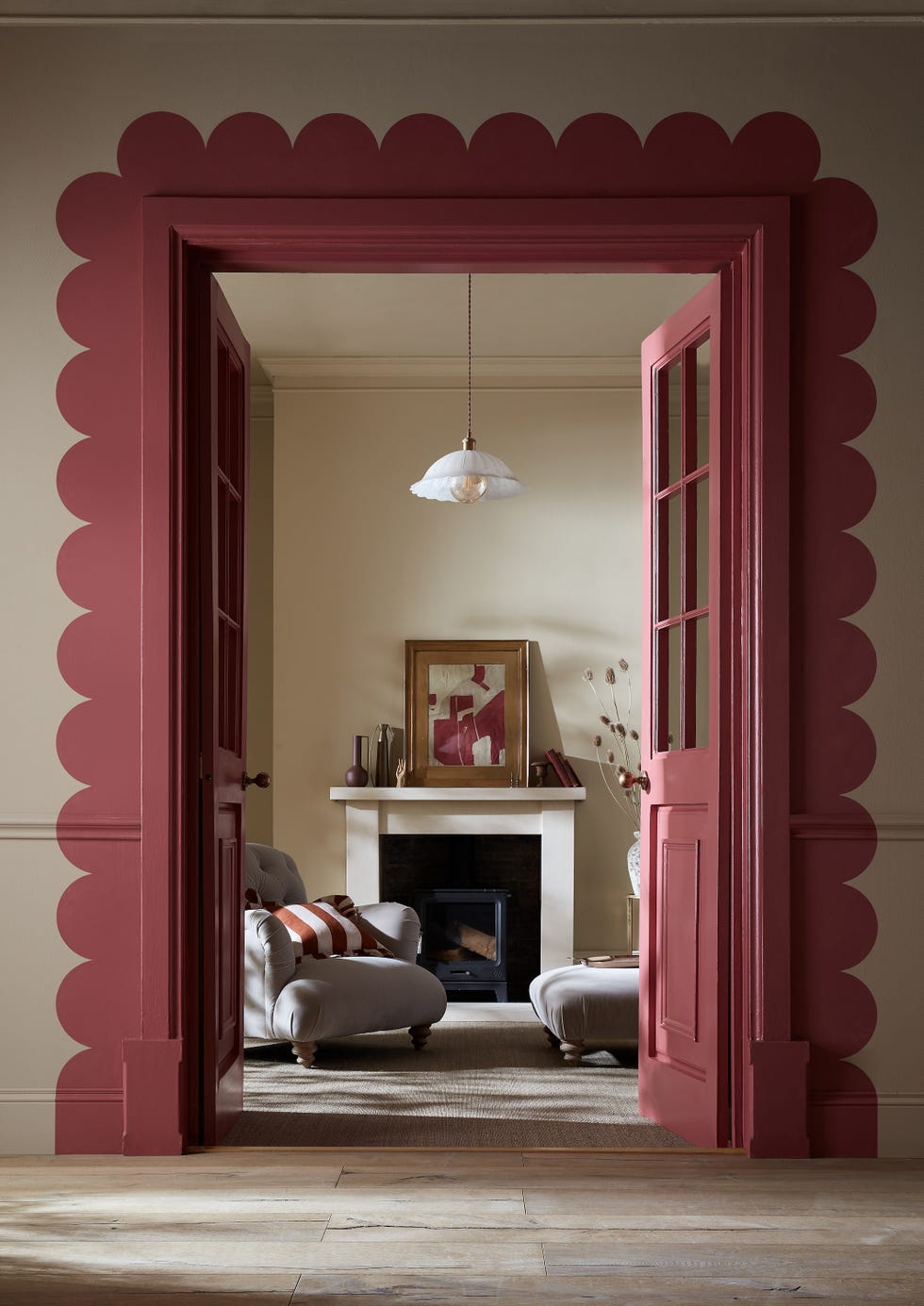
The article highlights a significant shift in interior design trends, moving away from traditional stark white walls towards a preference for earthy neutral paint colors. This change is driven by a desire for warmer, softer, and more inviting spaces, aligning with concepts like 'warm minimalism,' 'quiet luxury,' and 'low-key luxe.' Designers note that while white has been a staple, the current trend emphasizes coziness and a lived-in feel, which deeper, more earthy neutrals are better suited to achieve.
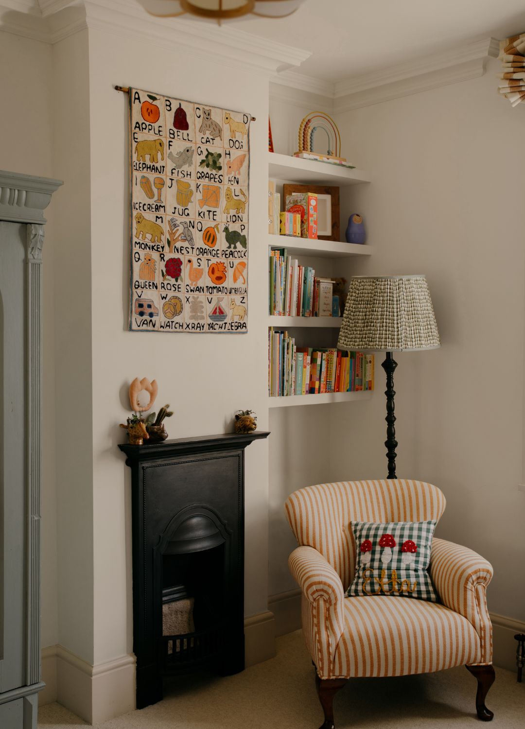
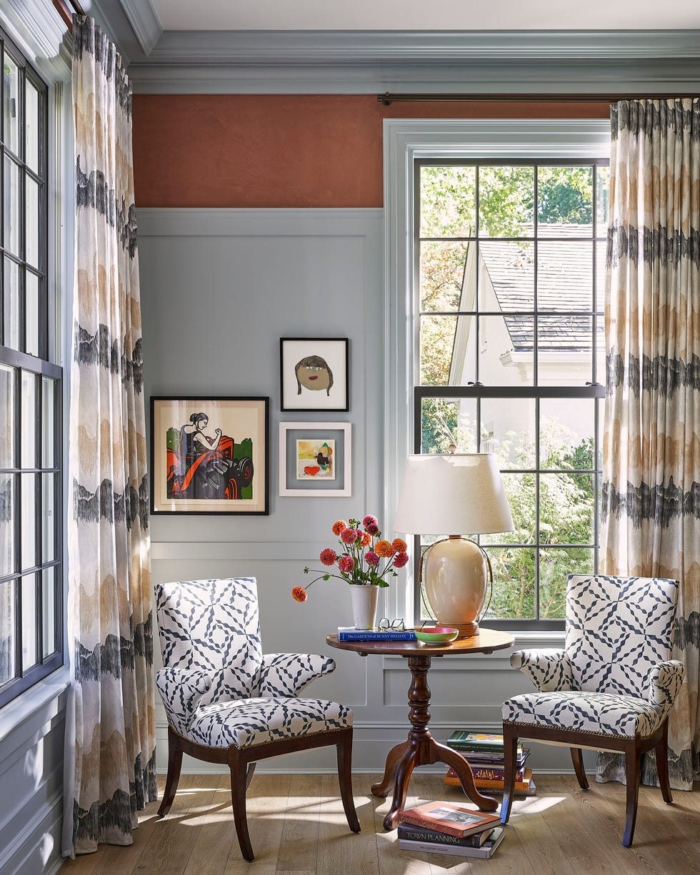
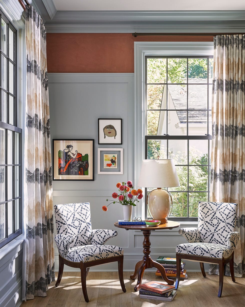
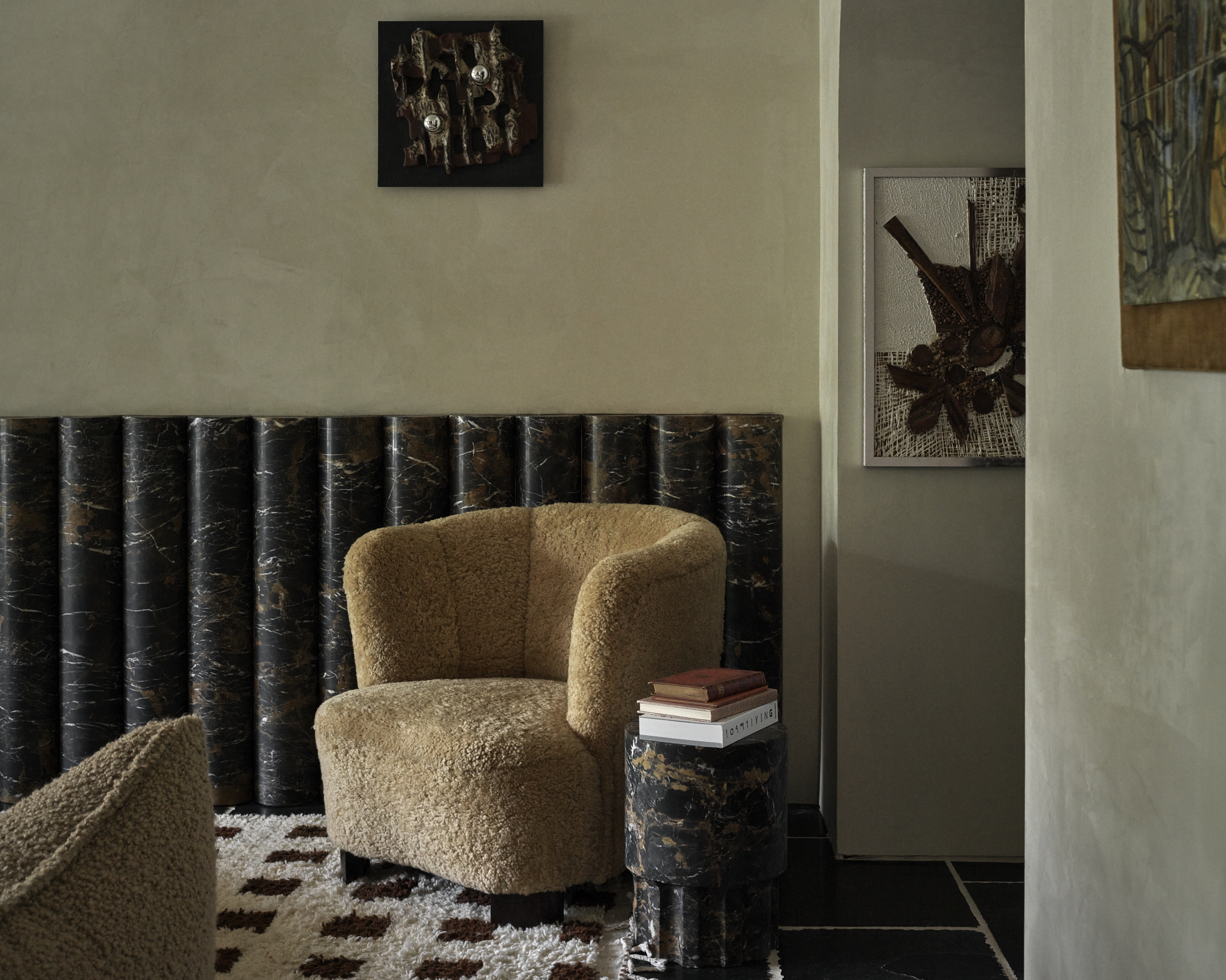
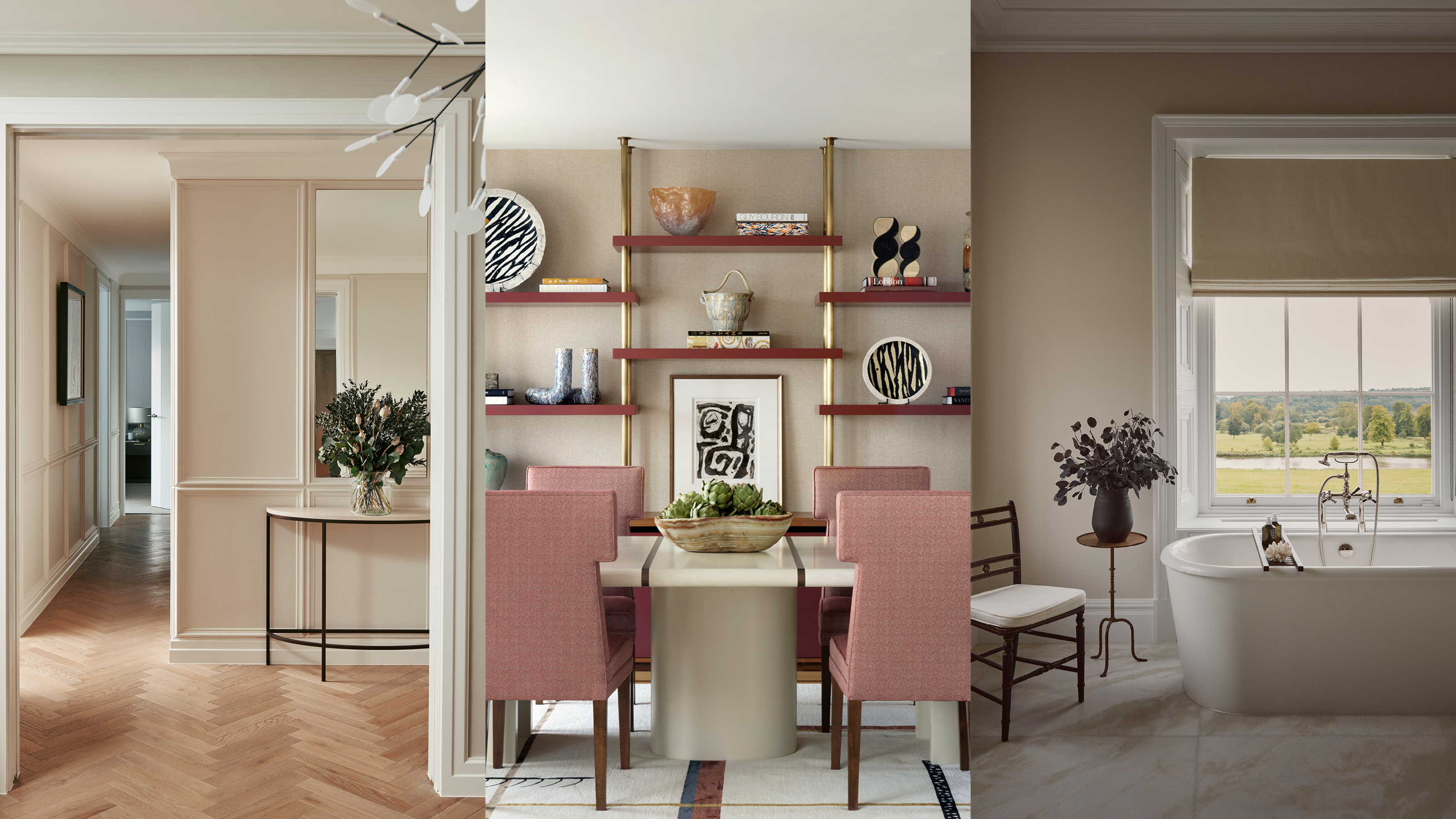
Several designers champion the return of browns and beiges, which were once overlooked, as versatile and chic options. Eleanor Taylor-Roberts suggests soft creams and warm desert-influenced shades as calming alternatives to clinical whites or overused grays. She also mentions that bolder, deep rusty and terracotta tones can infuse spaces with warmth, reflecting a growing consumer preference for wellness within the home. Kati Curtis further explains this evolution, stating that the 'modern white box aesthetic' is being replaced by richer, warmer hues reminiscent of natural palettes, like the plaster walls of Italy or adobe walls of Mexico, to evoke comfort and tranquility.
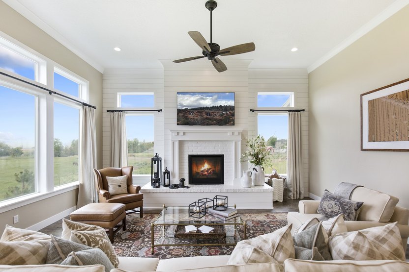
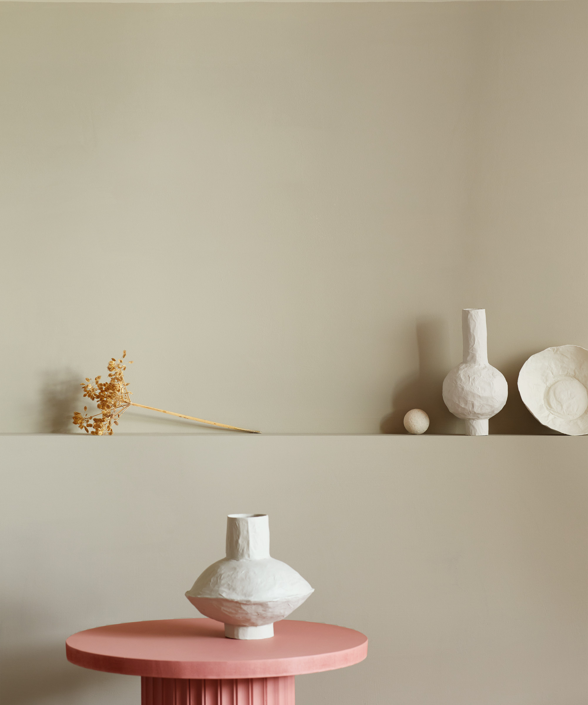
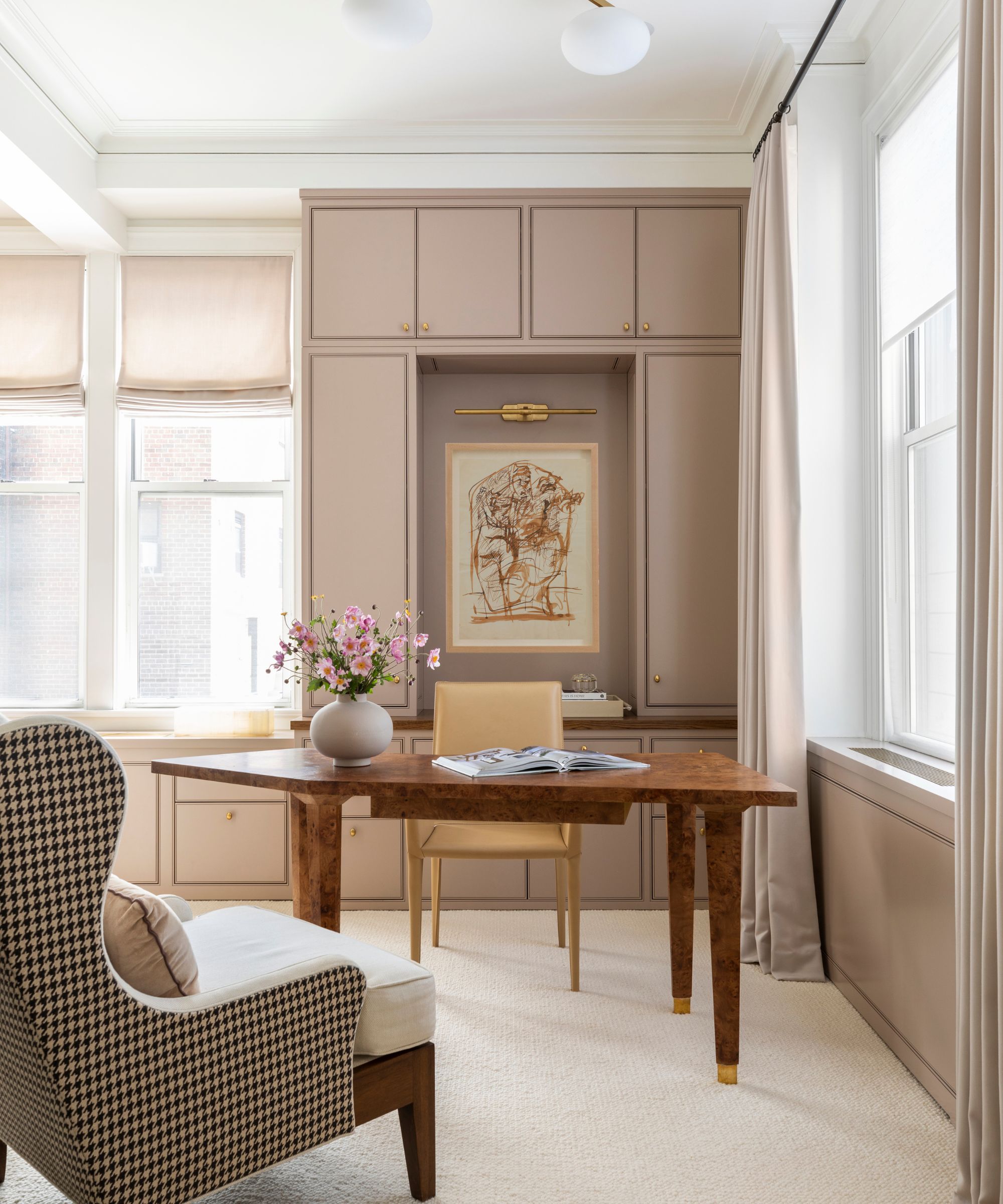
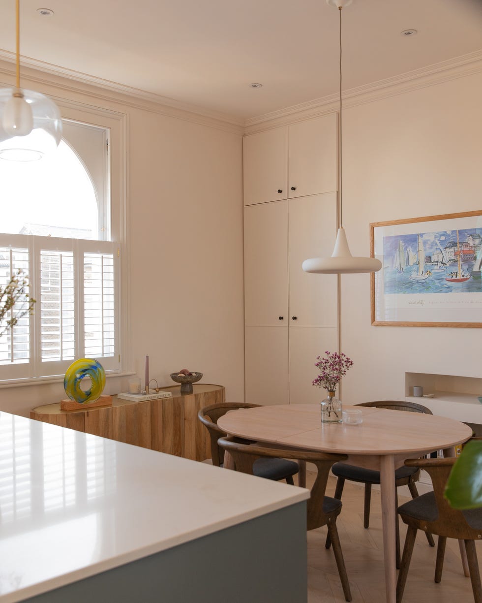
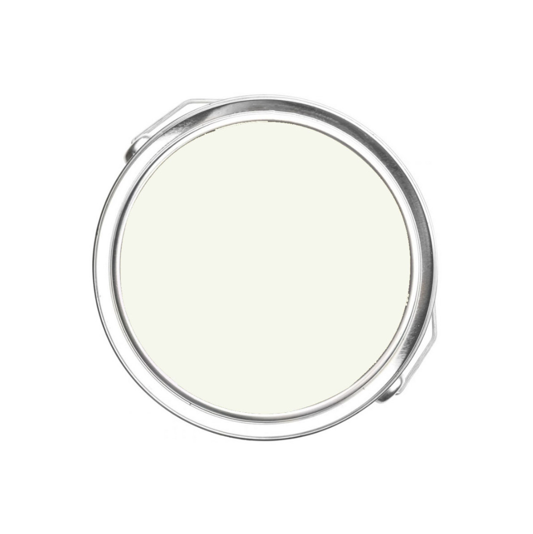
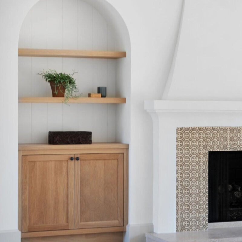
The article presents six specific earthy neutral paint recommendations from various brands. The first is Farrow & Ball's Oxford Stone, described as a versatile and neutral beige that adds a subtle earthy warmth. This pale brown or taupe works well in layered earthy neutral schemes, pairing effectively with paler beiges and stronger browns to create a warm and welcoming, yet fresh, palette. Joa Studholme of Farrow & Ball suggests using Oxford Stone on walls with a stronger color like Tanner’s Brown on trim to make walls appear lighter and rooms feel more spacious.
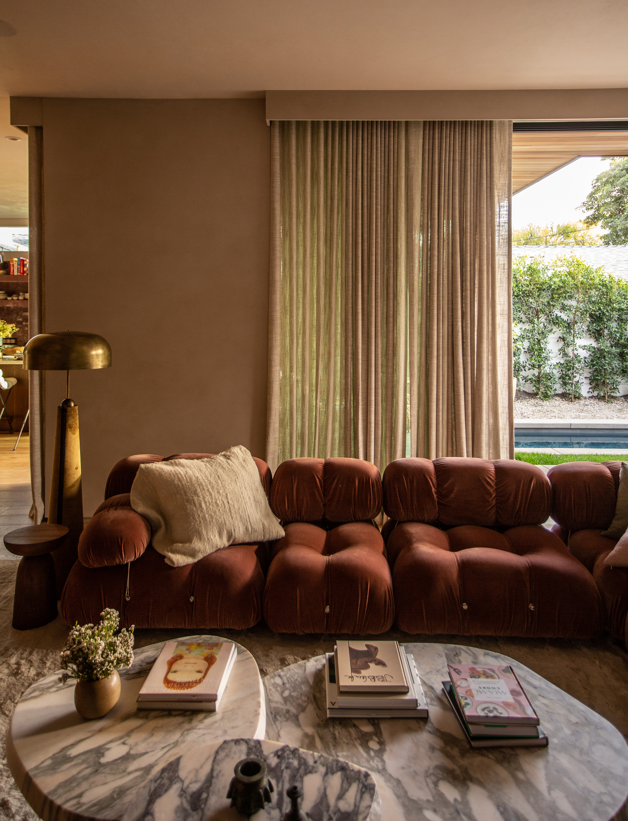
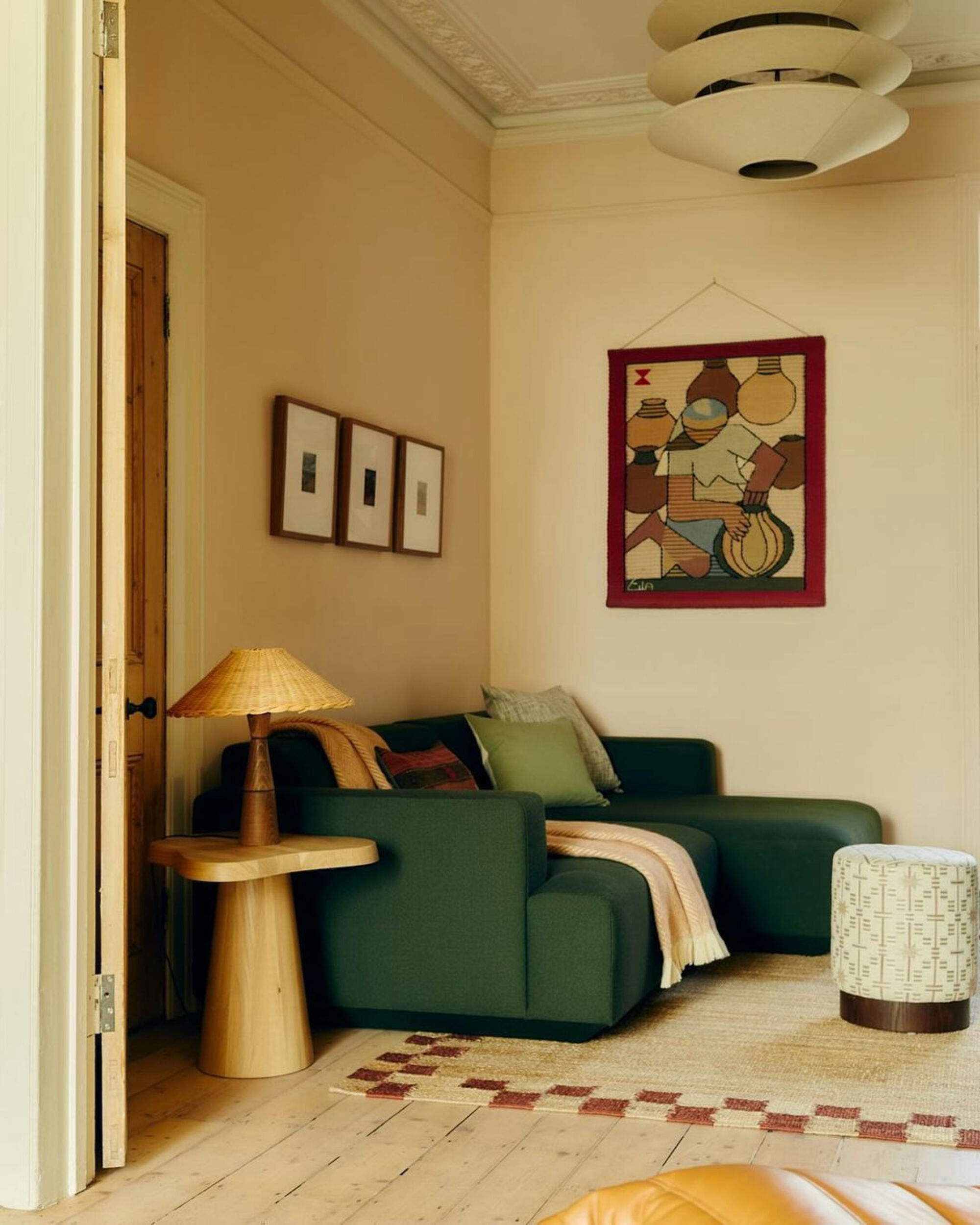
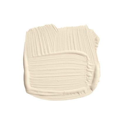
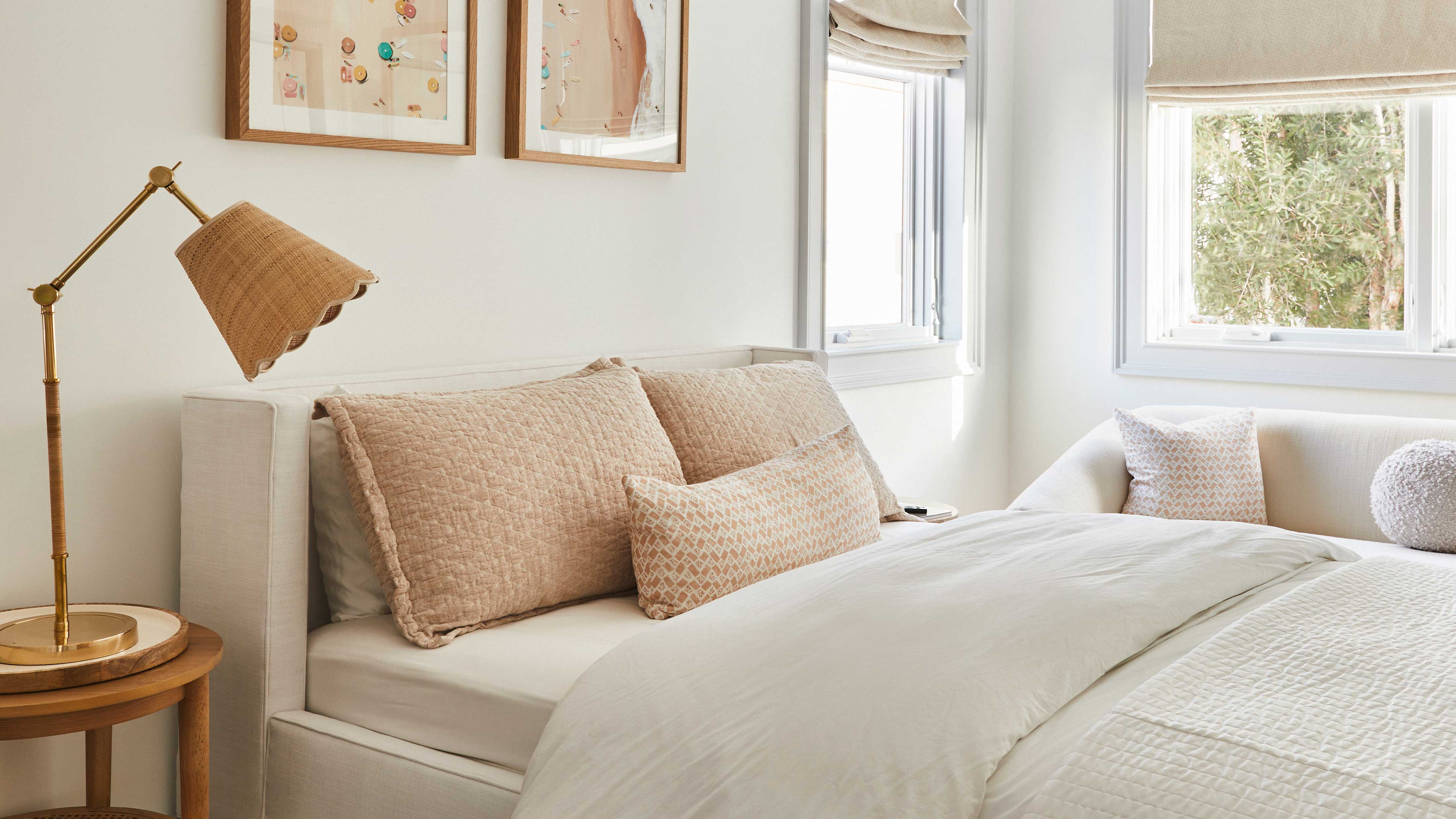
Benjamin Moore's Venetian Portico is recommended for those seeking a subtle pink-beige. This golden tan hue evokes images of sun-drenched ancient buildings, offering timeless elegance. Helen Shaw, Director of Marketing at Benjamin Moore, notes the increasing popularity of neutrals with pink and red undertones, such as Venetian Portico, which create an earthy, natural feel, especially when paired with natural materials or painted wood in well-lit spaces.
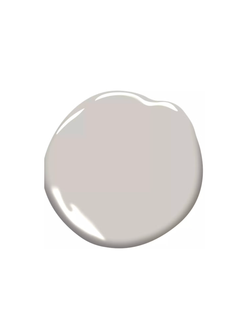
Farrow & Ball's Setting Plaster is another iconic pink-beige shade favored by designers for its dreamy, in-between color that serves as a unique alternative to traditional white or cream. Designer Nick Cryer highlights its ability to create a relaxing and grounding vibe, noting its use in a 'House of Colour' project where it provided a contemporary backdrop for antique furniture in a master bedroom.
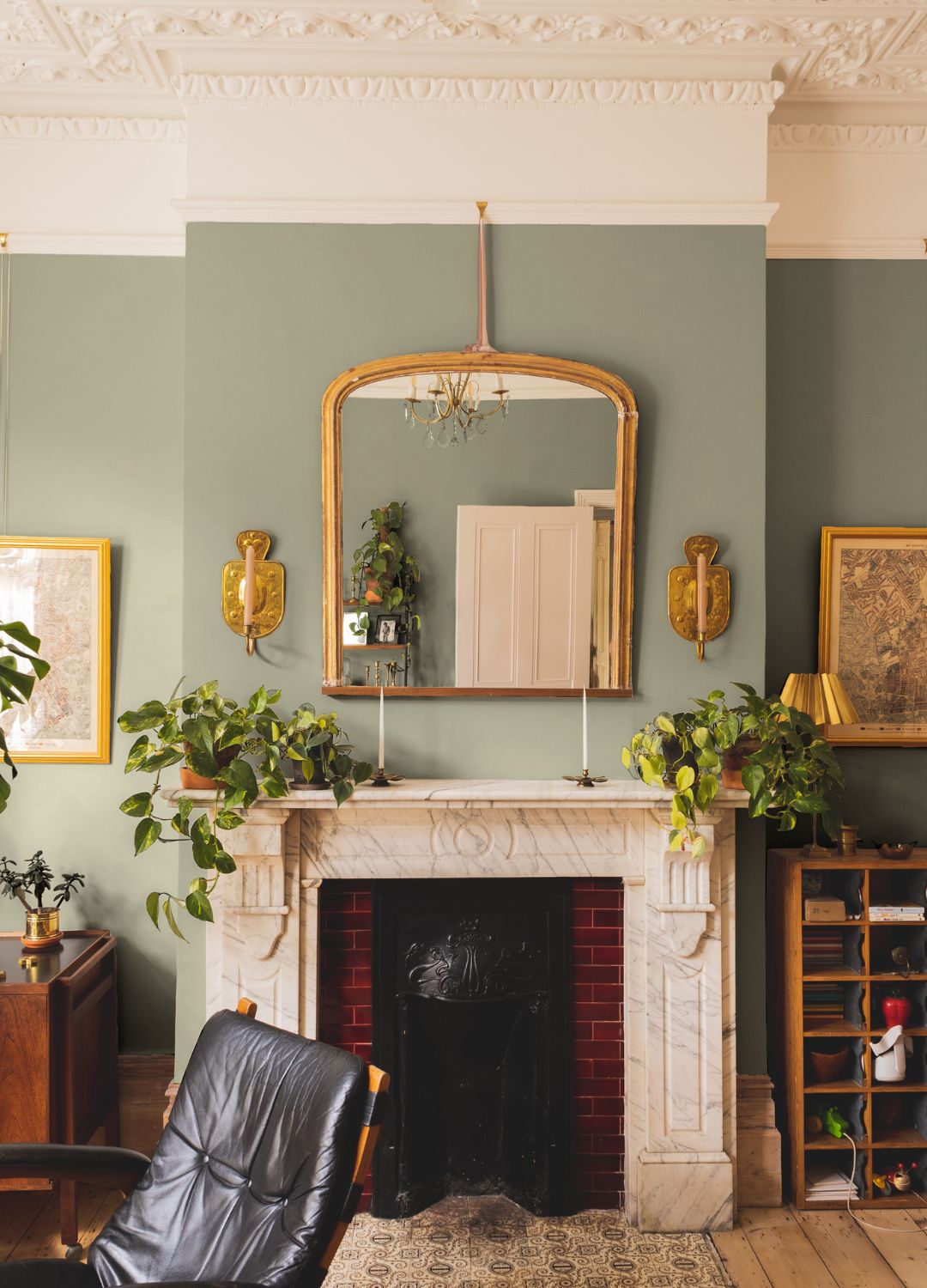
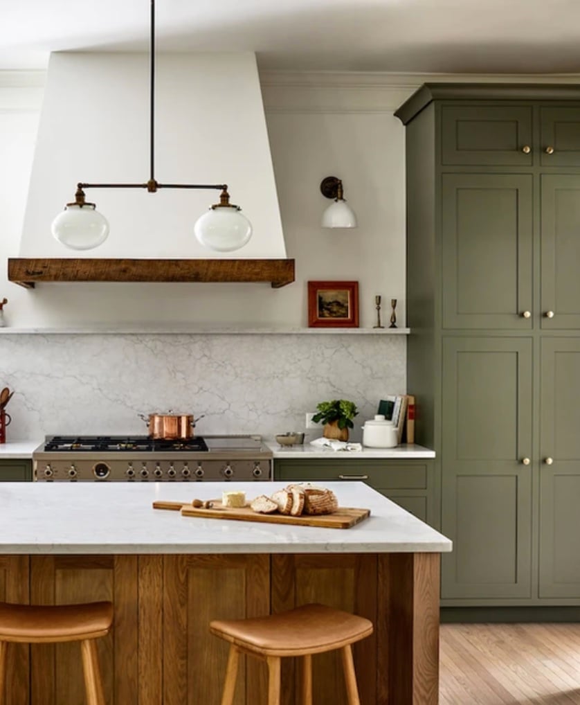
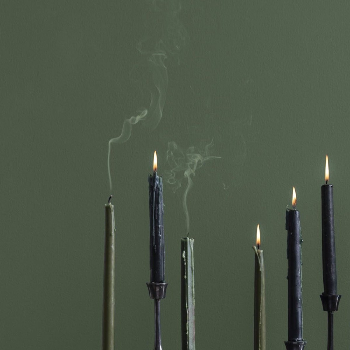
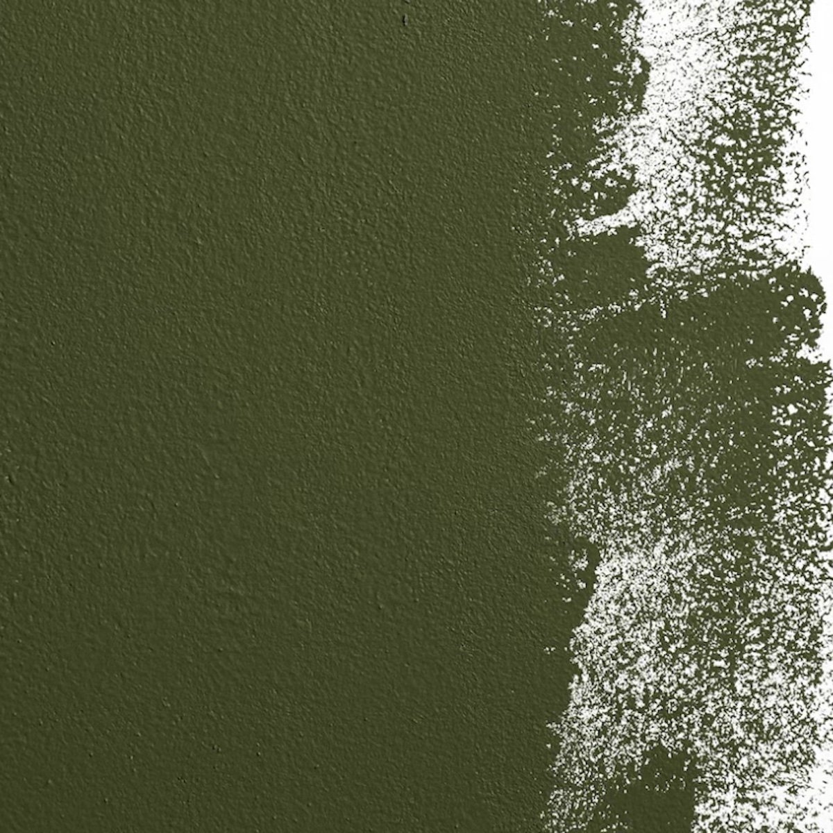
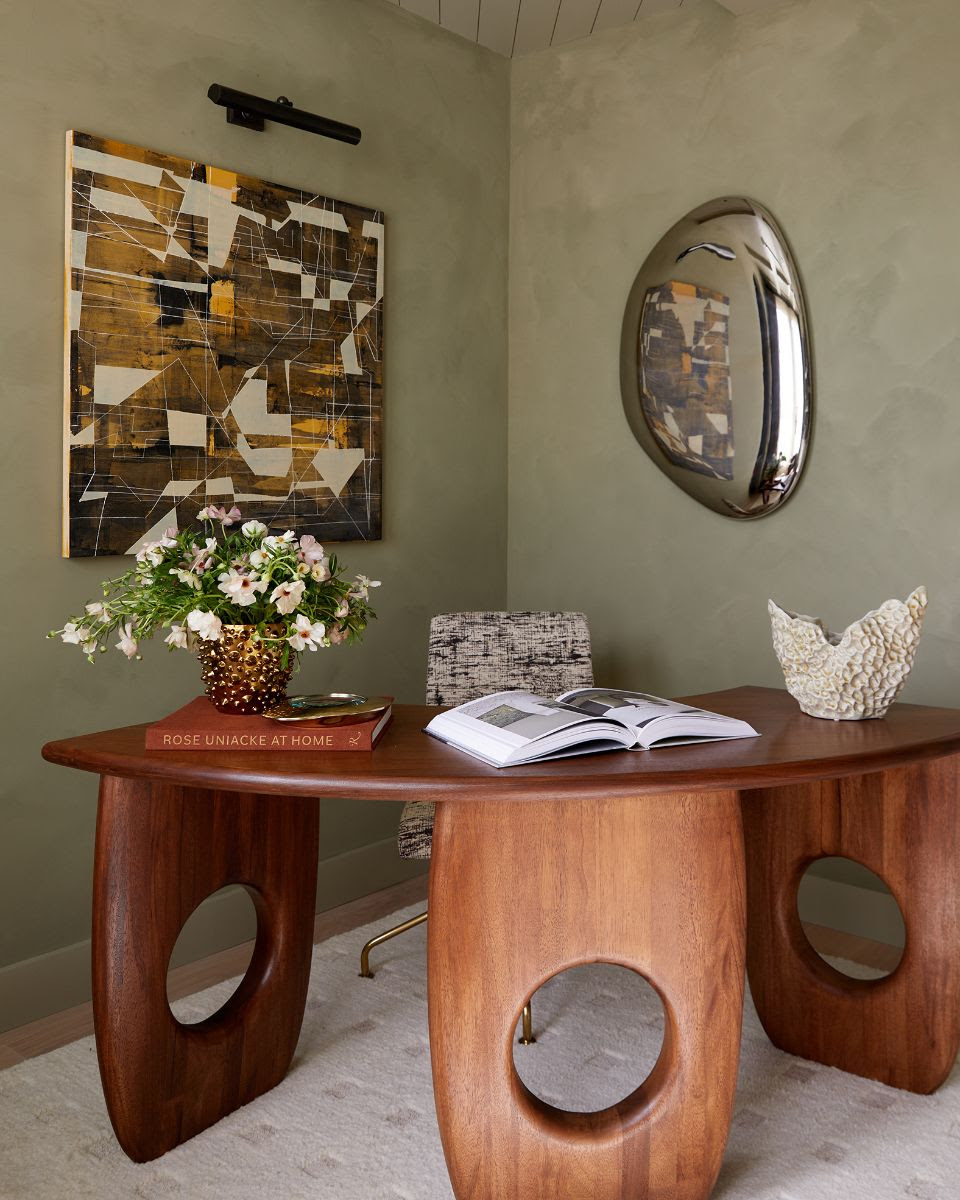
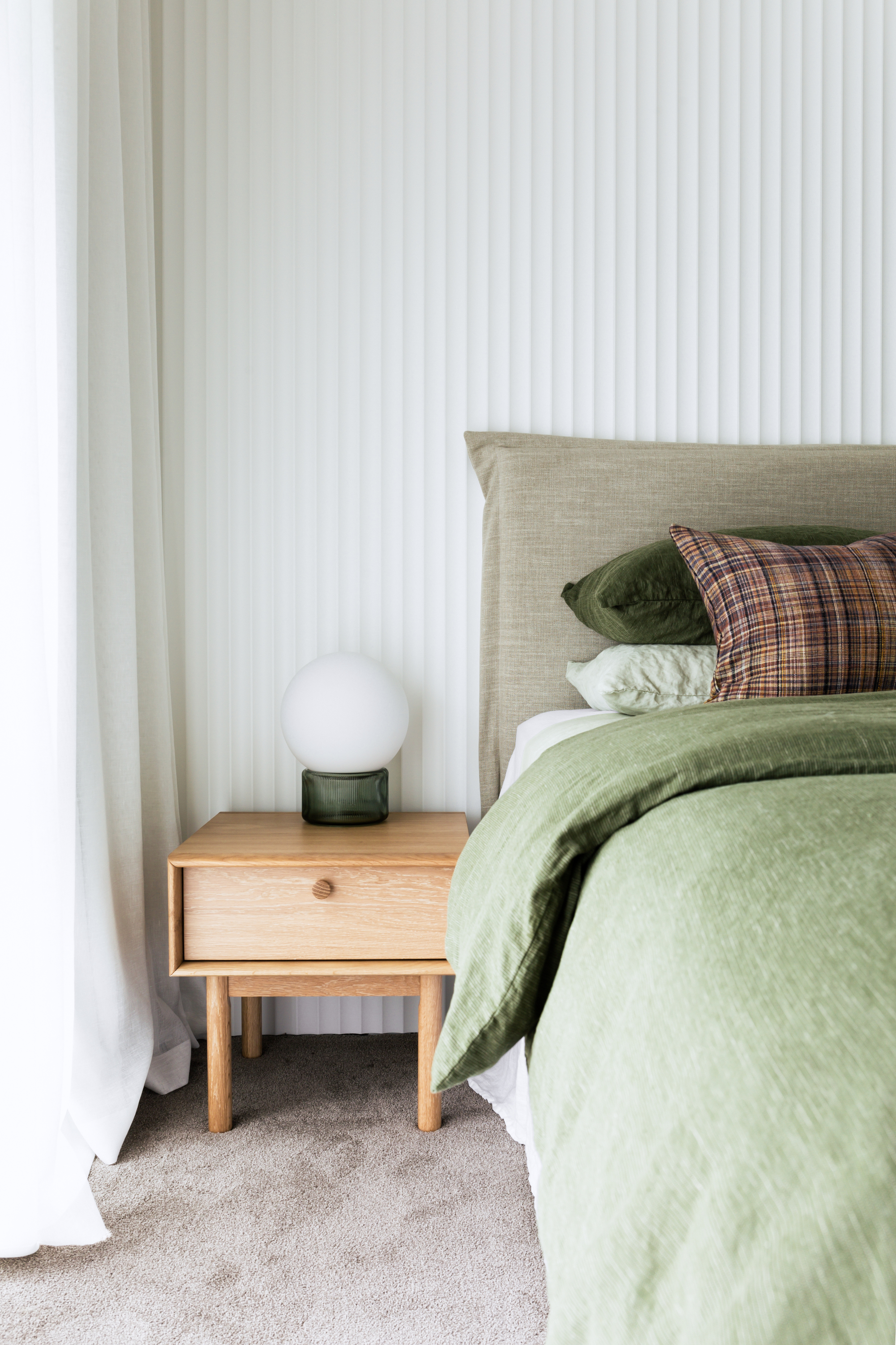
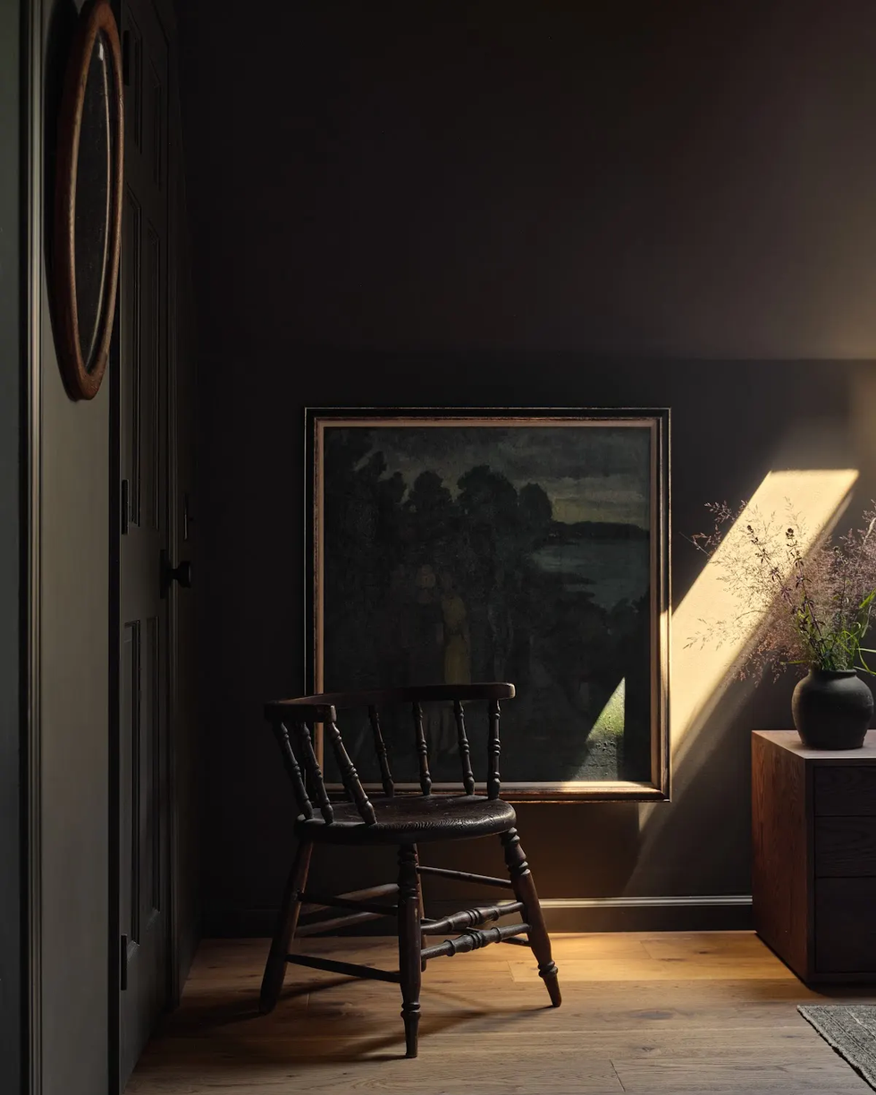
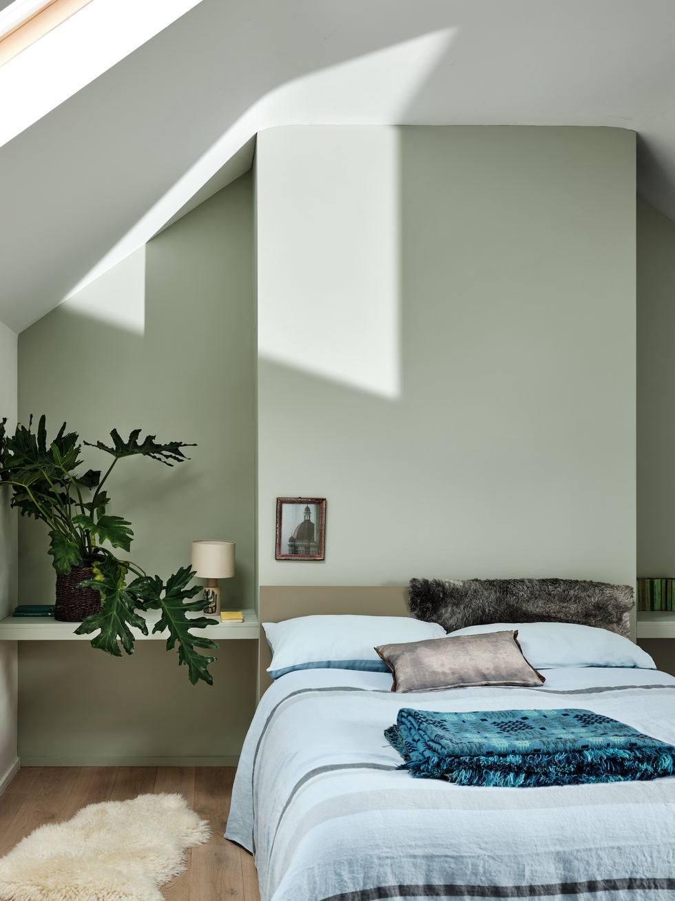
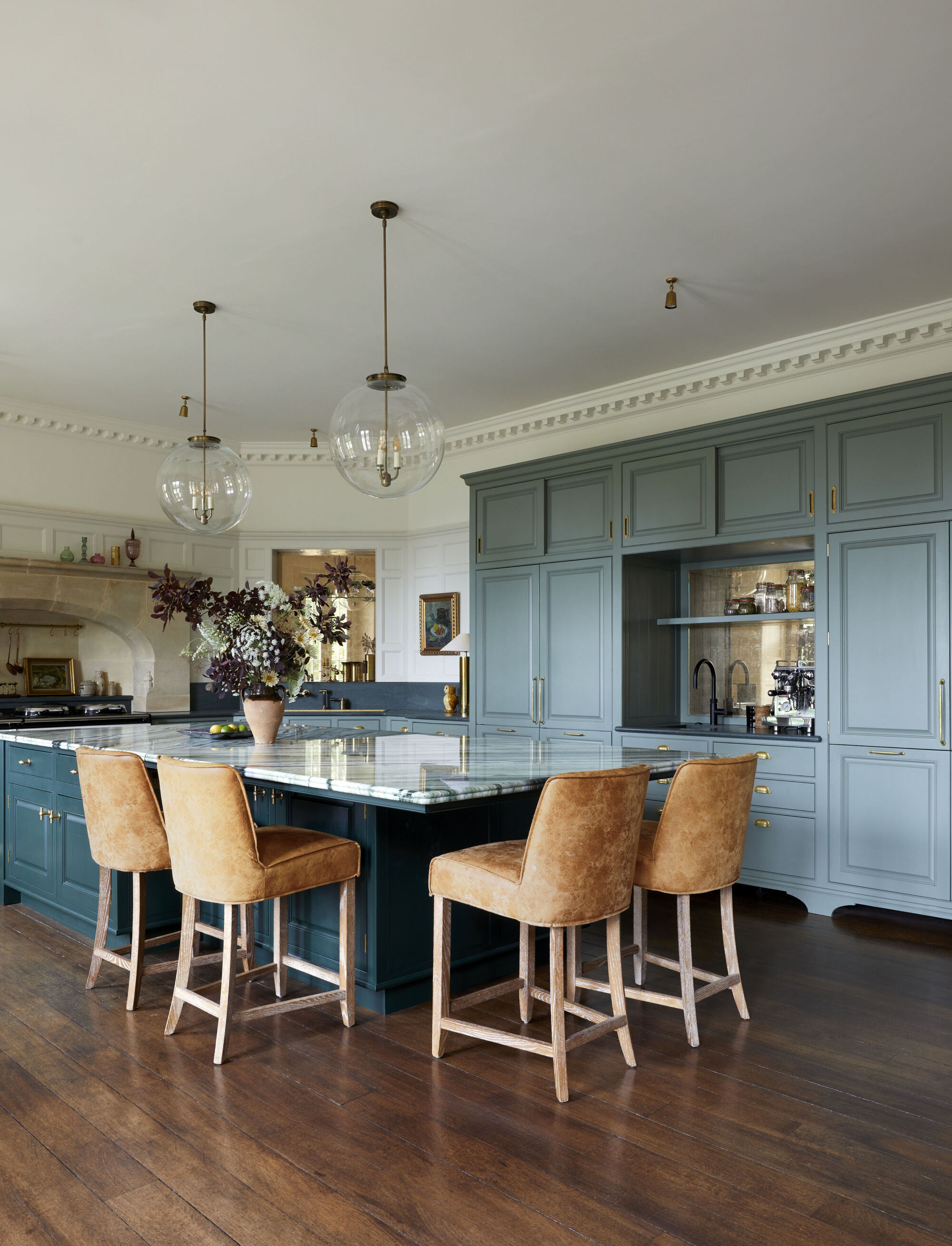
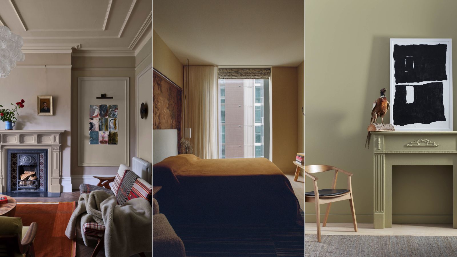
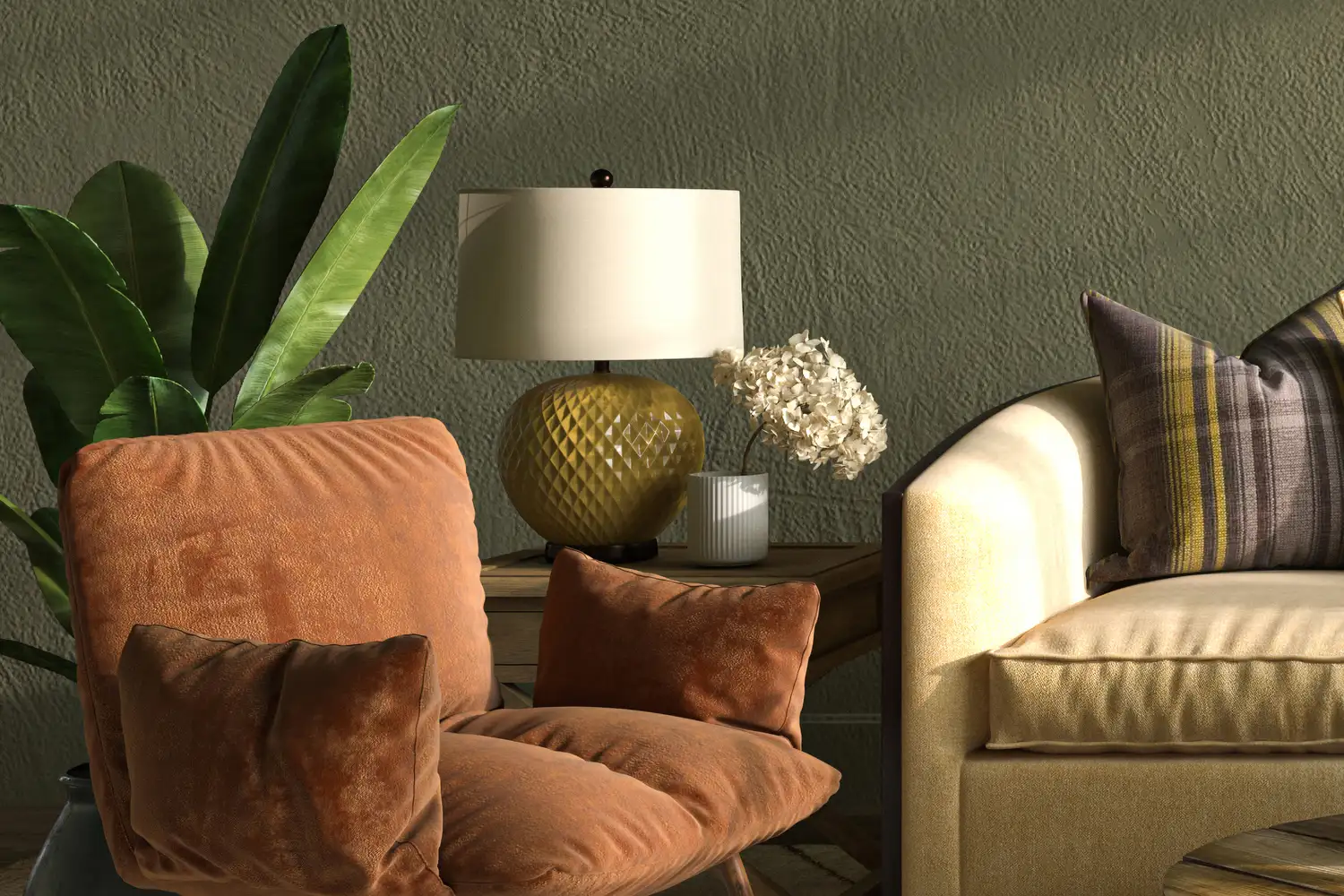
Earthy neutrals also extend to greens, with Benjamin Moore's Dry Sage being a prime example. Designer Kathy Kuo praises its 'almost neutral' quality, making it a soothing color ideal for neutral bedrooms or living rooms. It offers an organic and versatile feel without being too heavy. Sherwin Williams' Pewter Green is presented as a darker, more moody, yet soft and cocooning green, perfect for a dark living room. Jennifer Davis explains that these green and taupe shades are gaining popularity as alternatives to white walls, aligning with the current 'moody' design trend and offering a calming ambiance that connects inhabitants to nature.
Finally, Domingue's Veneto lime wash is highlighted for its ability to introduce earthy tones with added texture. Tanya Selway of Stelly Selway explains how lime wash paints, particularly in browns and yellows, provide warmth and subtle luminosity. In their 44 East Project, a lighter 'Dauphine limewash' brightened living areas, while a darker Veneto lime wash made a bedroom feel cozier and more textural, with shadows beautifully accentuating the finish in the evenings. The article concludes by emphasizing that earthy neutrals offer an accessible and livable way to incorporate color and depth into homes, serving as a more exciting, slightly bolder, yet versatile evolution from whites, creams, and grays.
#EarthyNeutrals #InteriorDesignTrends #PaintColors #HomeDecor #WarmMinimalism #FarrowAndBall #BenjaminMoore #SherwinWilliams #LimeWash #EarthyNeutrals #InteriorDesignTrends #PaintColors #HomeDecor #WarmMinimalism #FarrowAndBall #BenjaminMoore #SherwinWilliams #LimeWash
0 تعليق إجمالاً
 لا توجد تعليقات بعد
قد تعجبك أيضًا
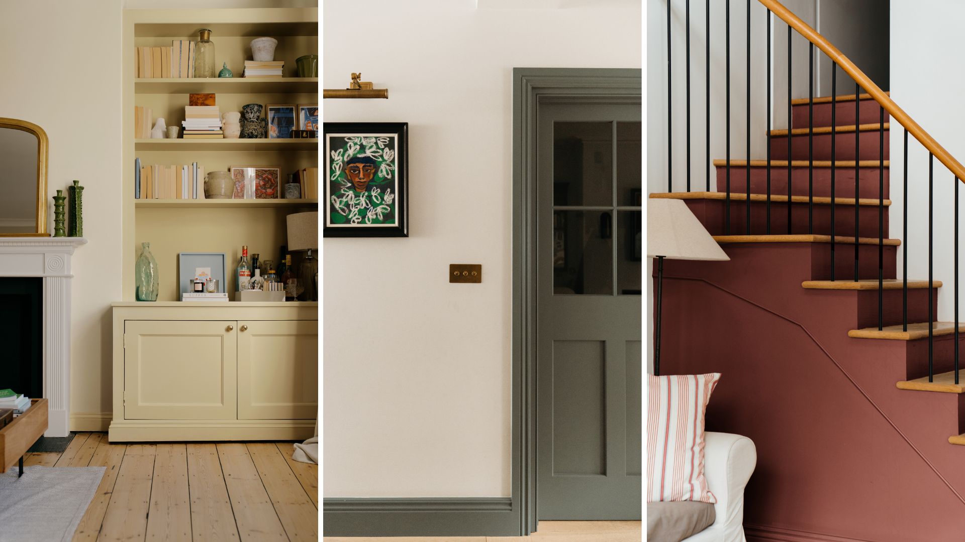
Make choosing paint easy with new 'natural light' colours

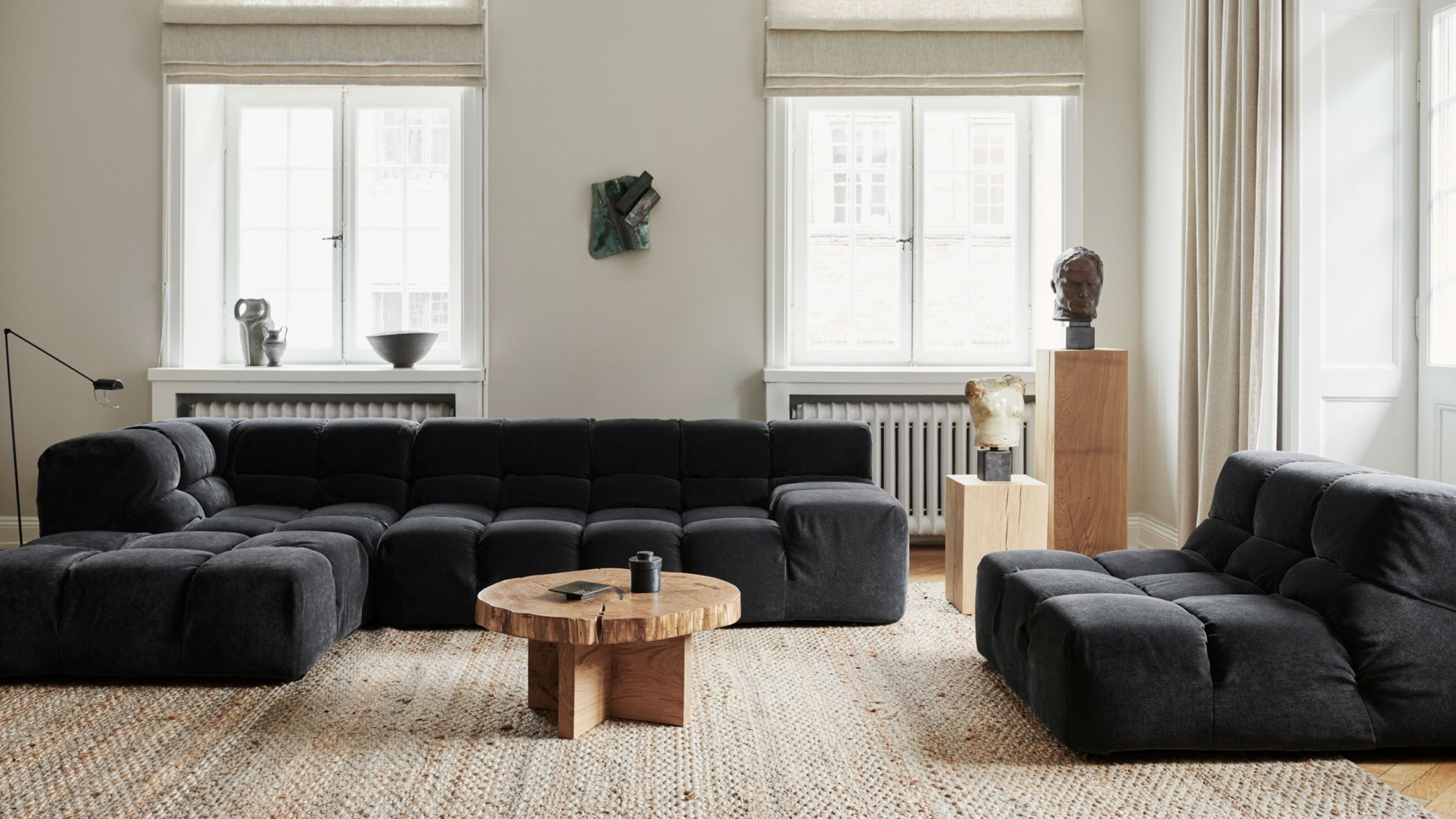
Which Neutral Is Replacing White in 2025? Experts Reveal

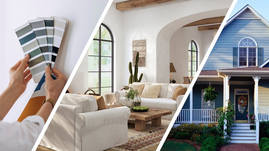
Real Estate Experts Reveal the Paint Colors That Decrease Your Home Value—and Tricks for Finding the Perfect Hue
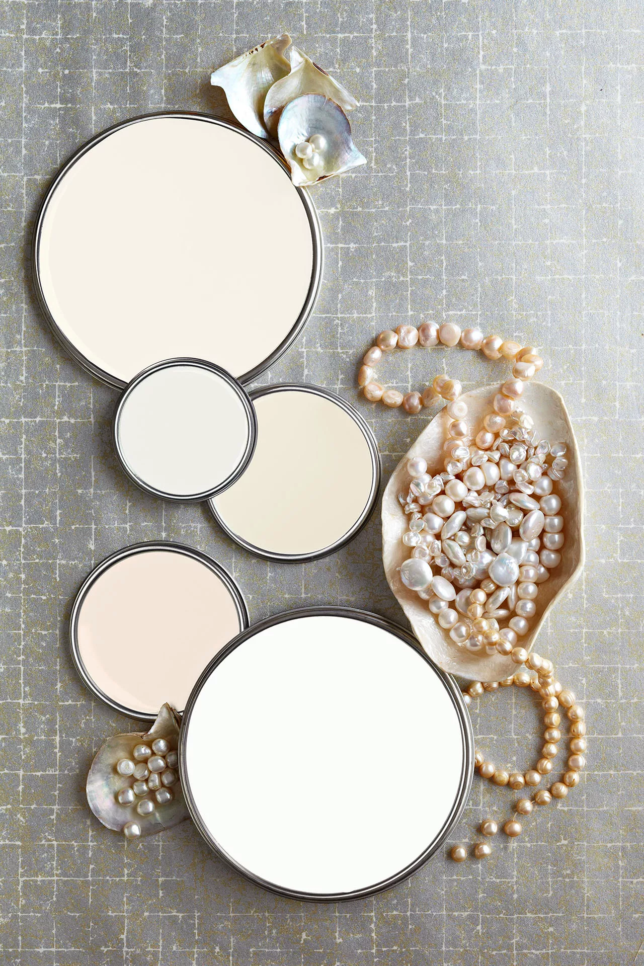
27 Neutral Paint Colors and Tips from Experts On How to Use Them

The Paint Color Trends of 2023 Are in—And They’re Gorgeous
5 "trend-proof" colors for your home designers think will be just as popular in 10 years' time
6 Earthy Paint Colors That'll Make Any Room Feel Cozy and Relaxed

7 Paint Colours That Could Help You Sell Your Home For More

What Neutral Wall Color Should I Pick in 2024? These are the Big Neutral Color Trends, Say Designers
6 Colors Designers Say to Skip in 2026—Yes, Even This Popular Neutral

Beige-grey – the timeless paint color perfect for a barely-there backdrop
I'm a Color Expert, and Here's Why I Think Earthy Color Palettes Always Feel At Home
Bored With White Walls? Try One of These Designer-Recommended Neutral Paints Instead

You Should Always Paint Your Home Beige
How to decorate with earthy colors – 6 ways to work with warmer shades
These Are the Neutral Paint Colors Interior Designers ACTUALLY Use

Once-Trendy Paint Colors That Will Make Your Home Look Dated In 2025
What Paint Colors Will Rule 2026? Designers Make Their Predictions

8 Paint Color Trends You'll ACTUALLY Want to Live With in 2026, According to Designers
6 Outdated Paint Colors Designers Don't Want to See in Homes Anymore in 2026