1/4
This Trend Forecaster Says Every Home Needs "Chromatic Tension" — But, What Actually Is That?
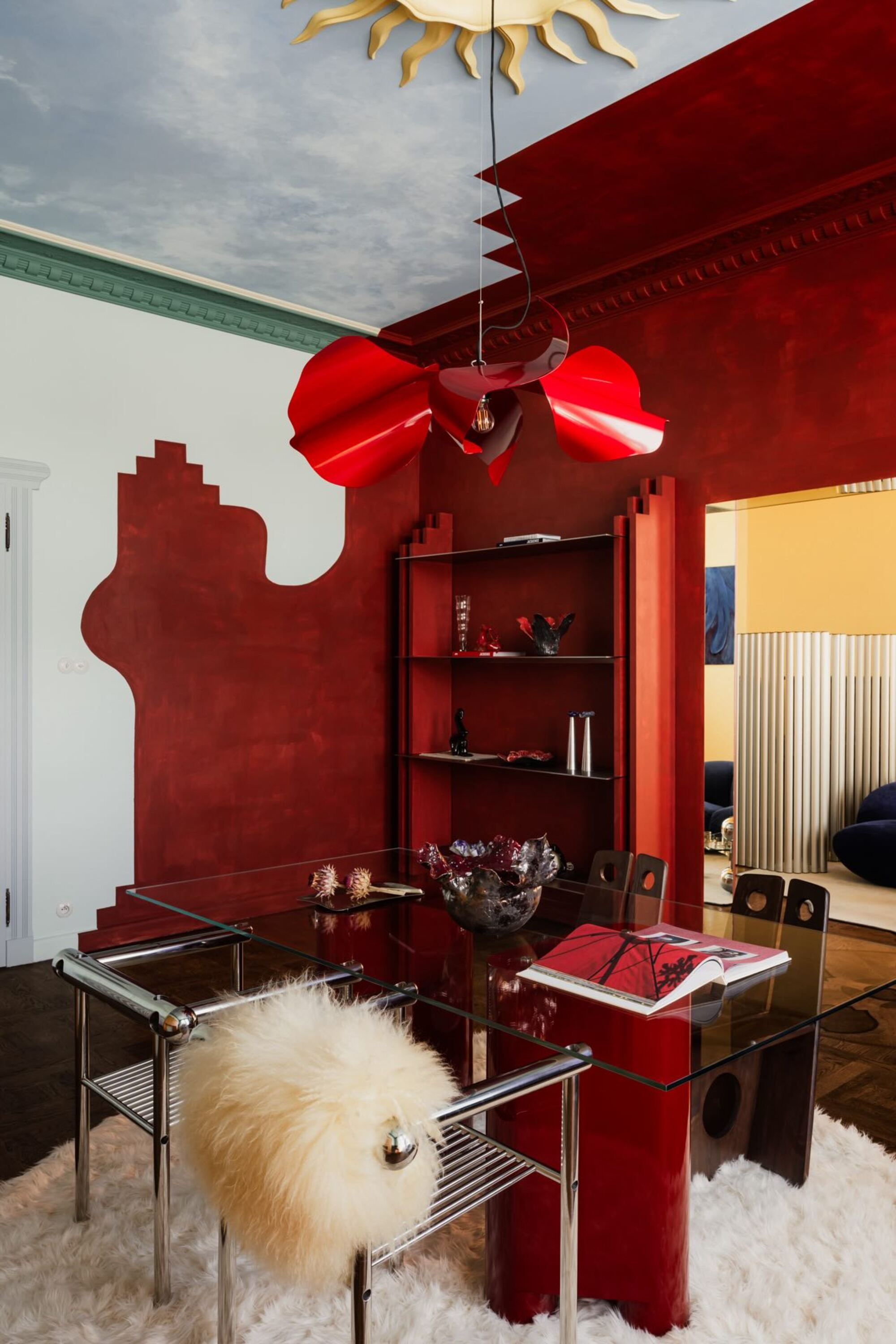
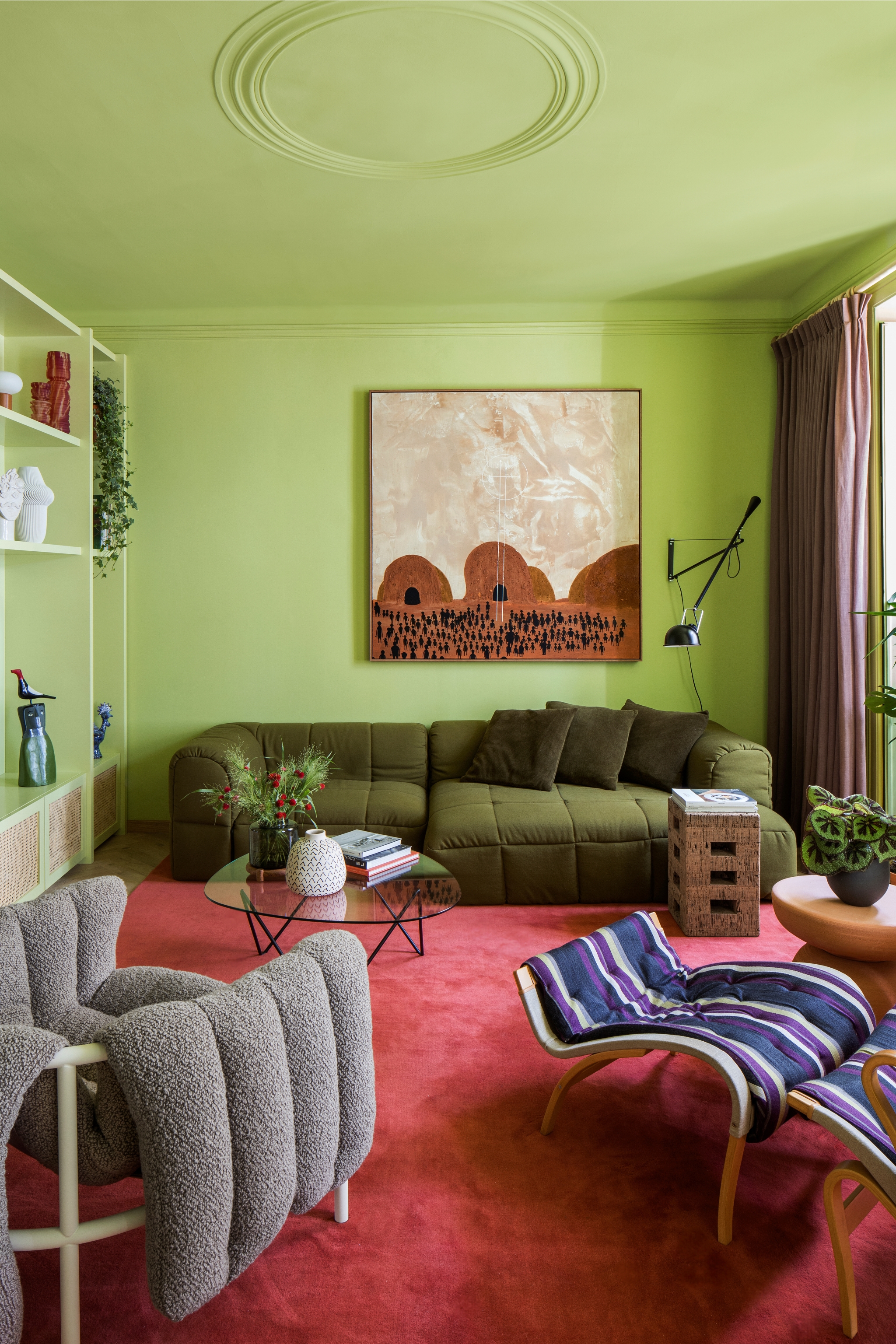
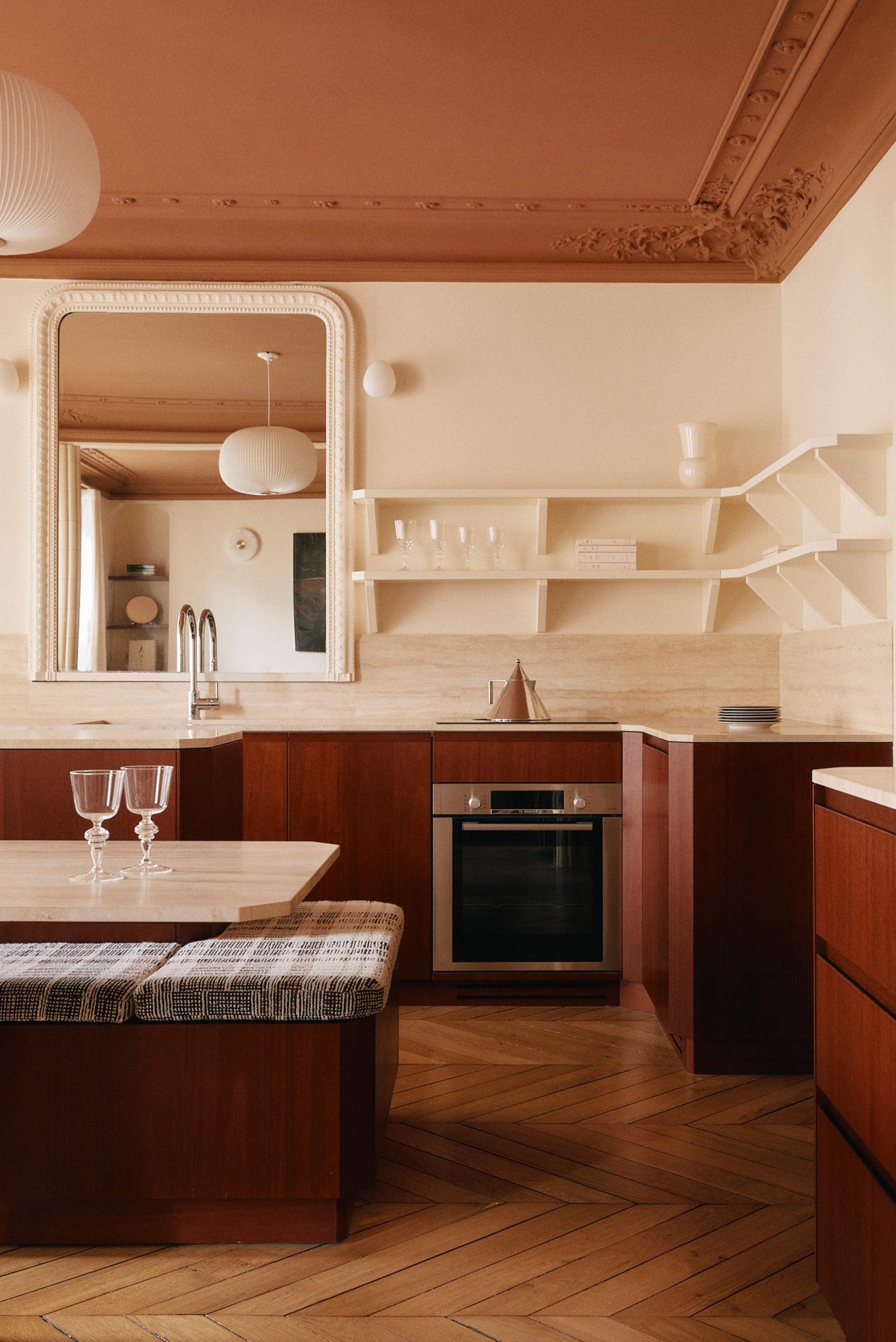
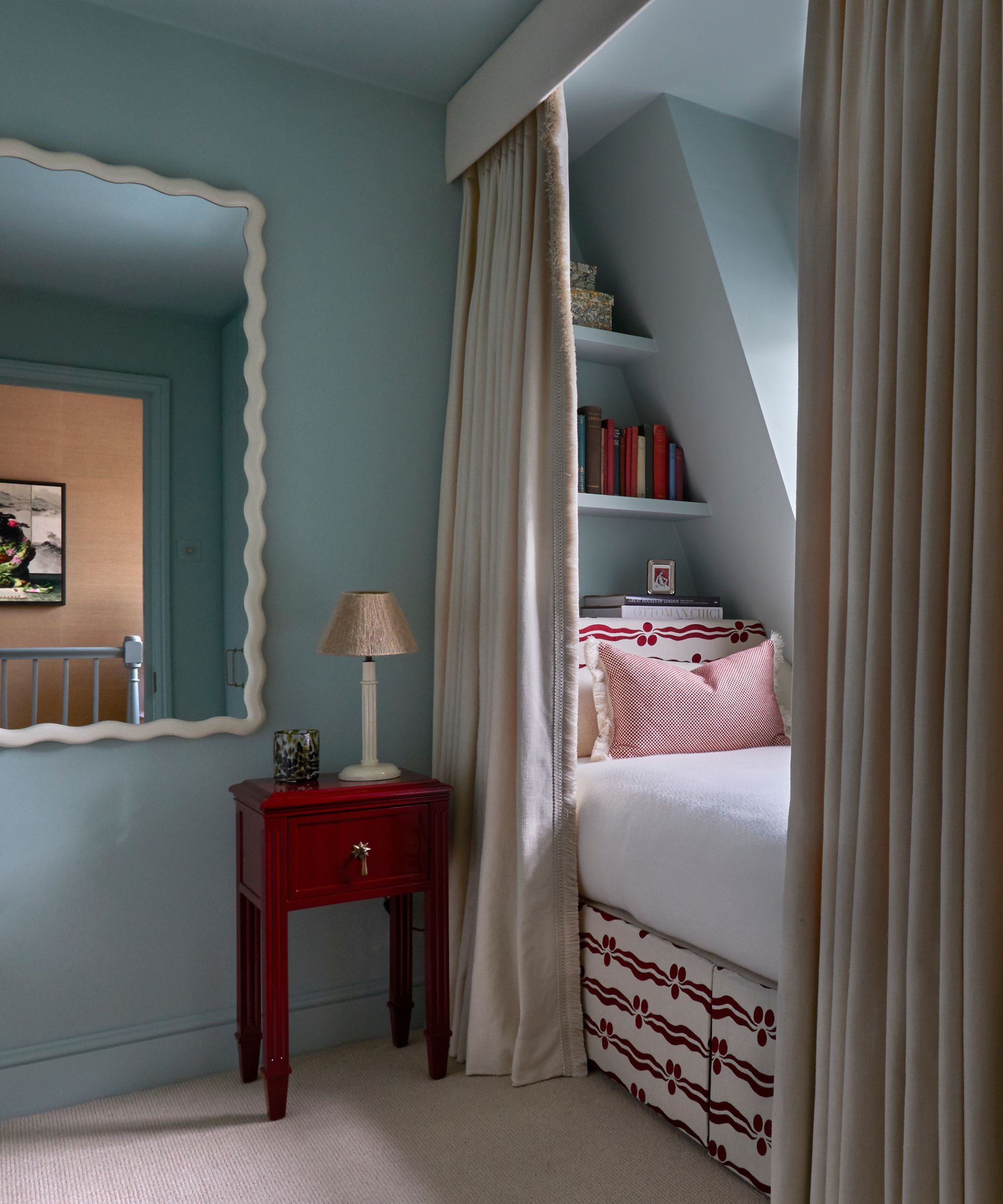
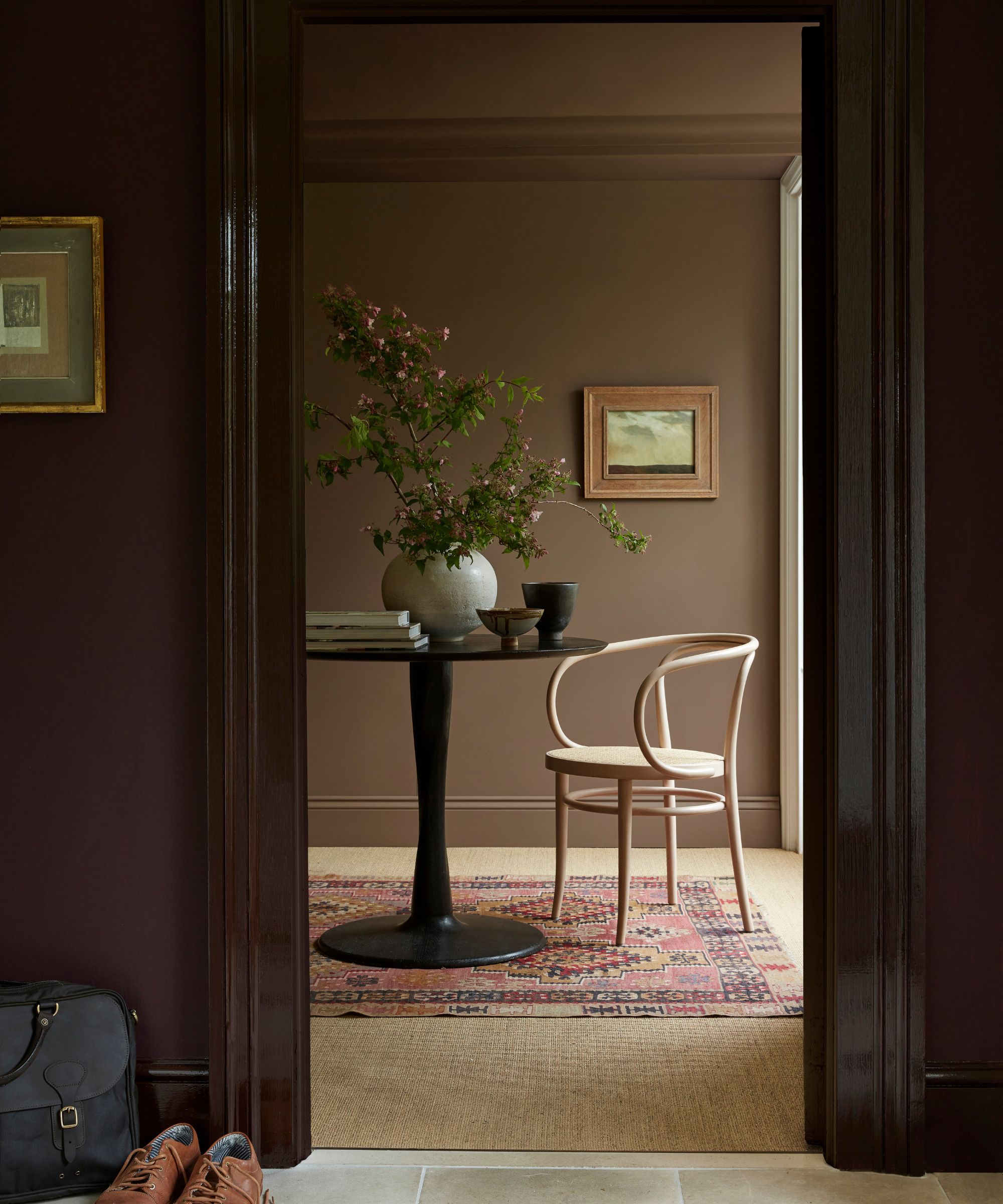
Trend forecaster Rebecca Goesling, director of design at Goesling Group, introduces the concept of 'chromatic tension' as an essential element for interior design in 2026. This technique involves using unconventional color combinations to energize spaces, creating a clear sense of character and mood. The article suggests that as neutral-dominated spaces become less prevalent and color palettes grow richer, chromatic tension highlights the importance of maintaining strong contrast when decorating with color. Goesling emphasizes that while soothing tones are vital for comfort, stimulating the senses through interior design is equally crucial. She argues that a lack of tension can diminish not only discomfort but also positive experiences like joy and inspiration. Goesling believes that a healthy dose of challenging material, when applied correctly, can ignite action and release emotions within a space. The concept addresses how to balance a room's color scheme effectively.
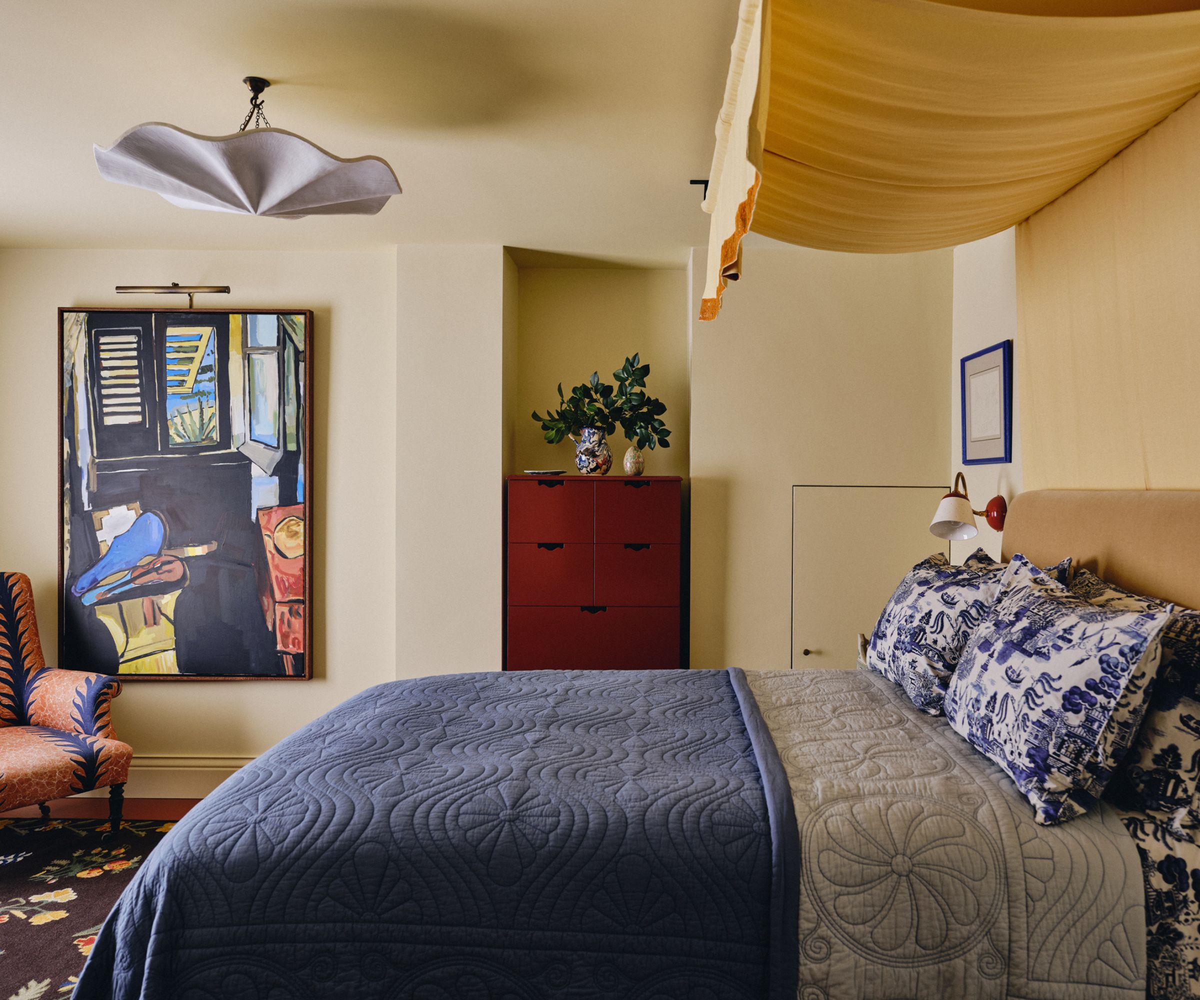
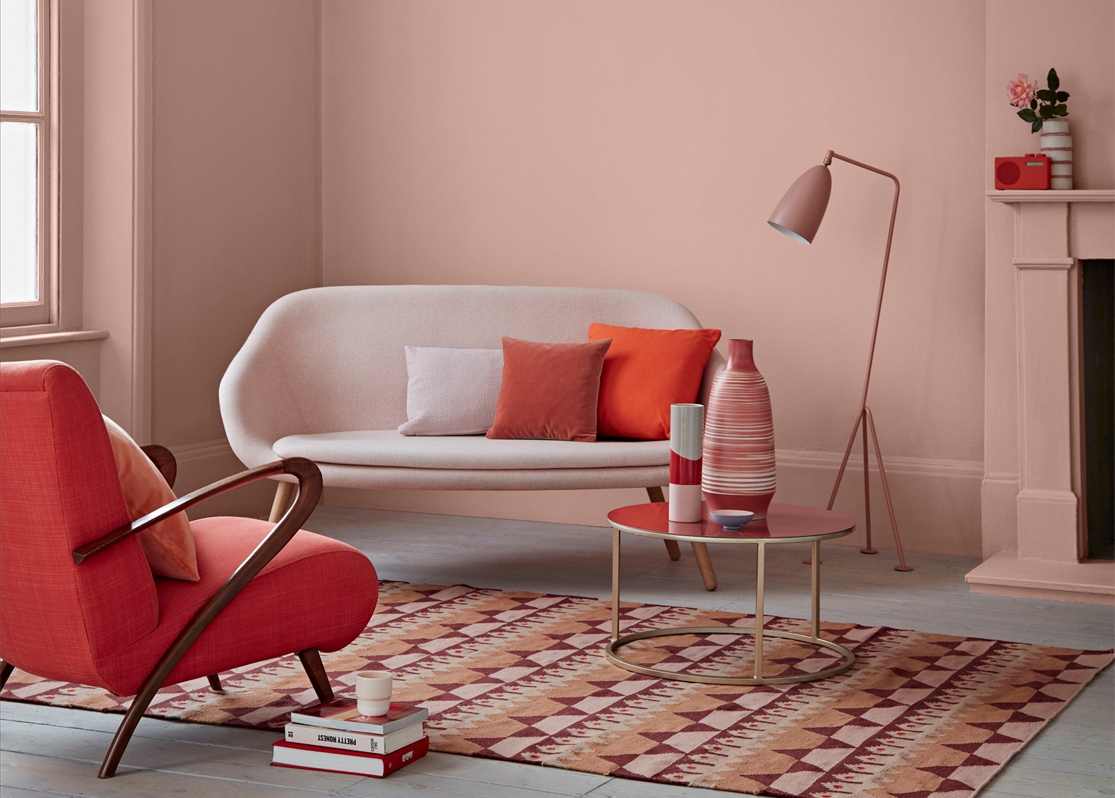
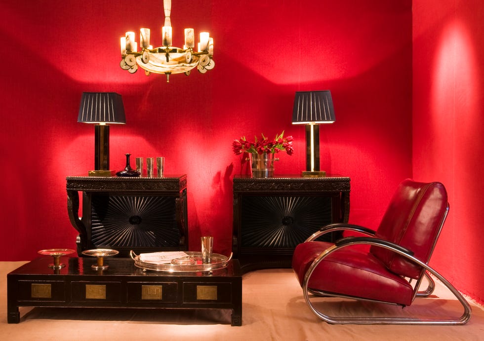
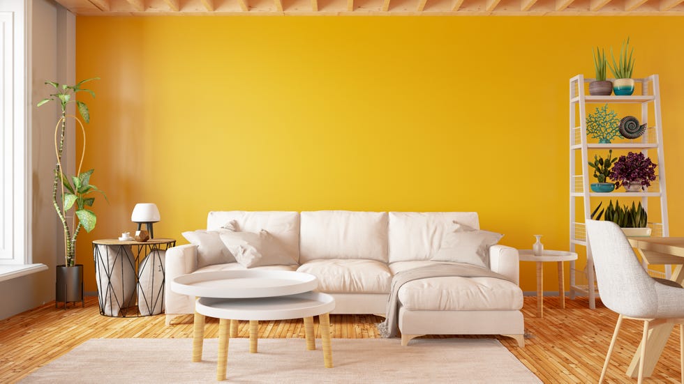
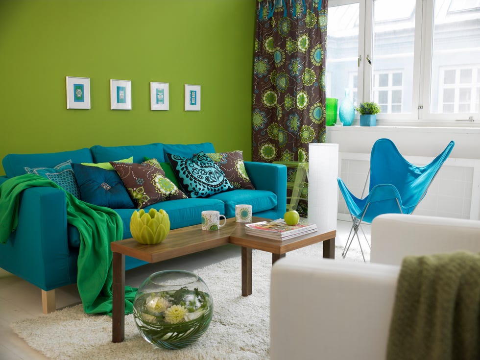
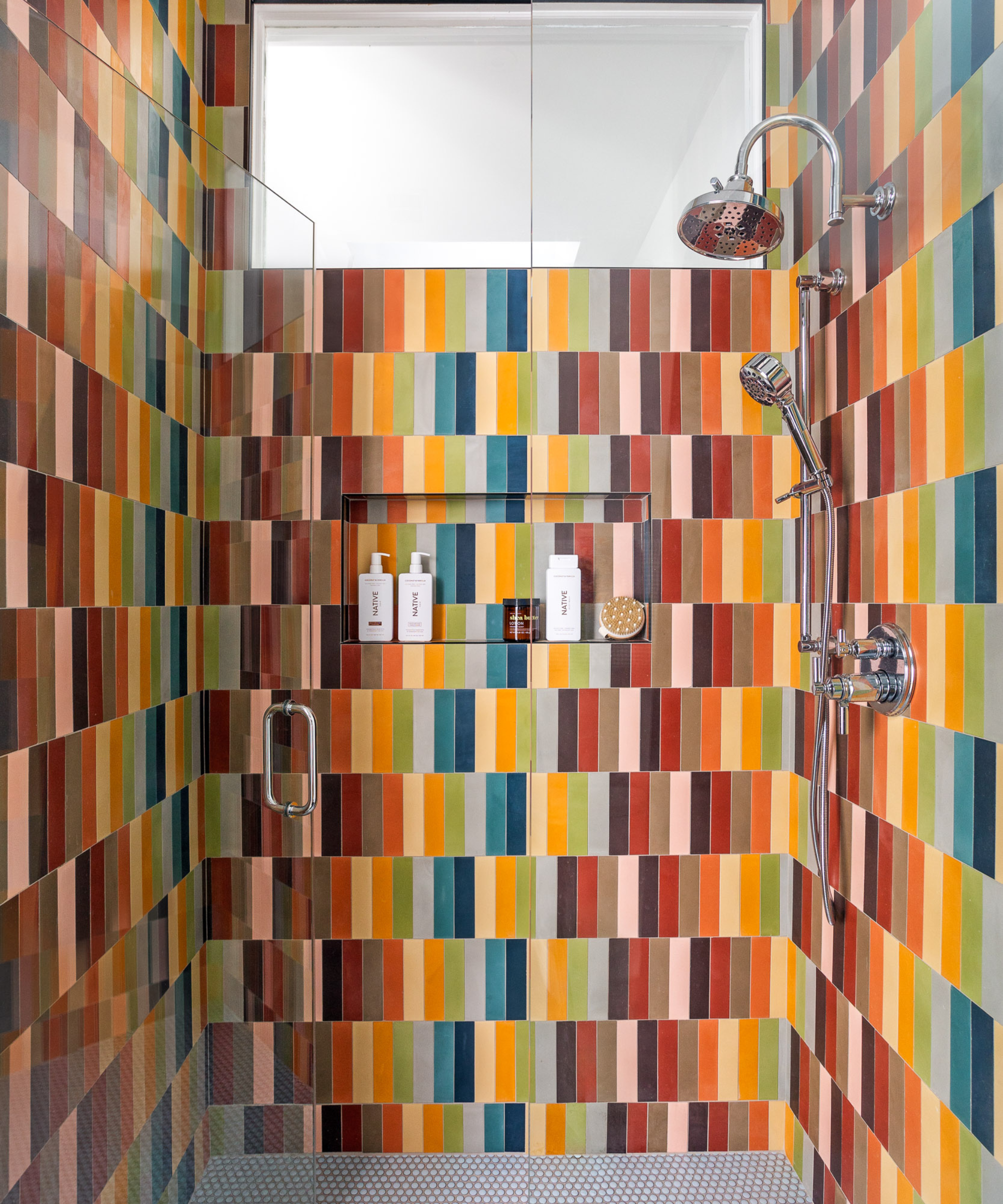
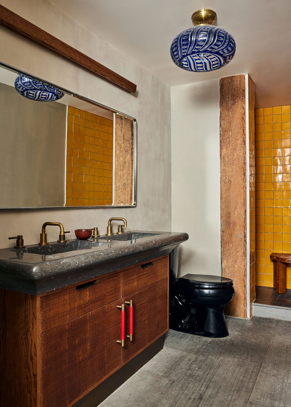
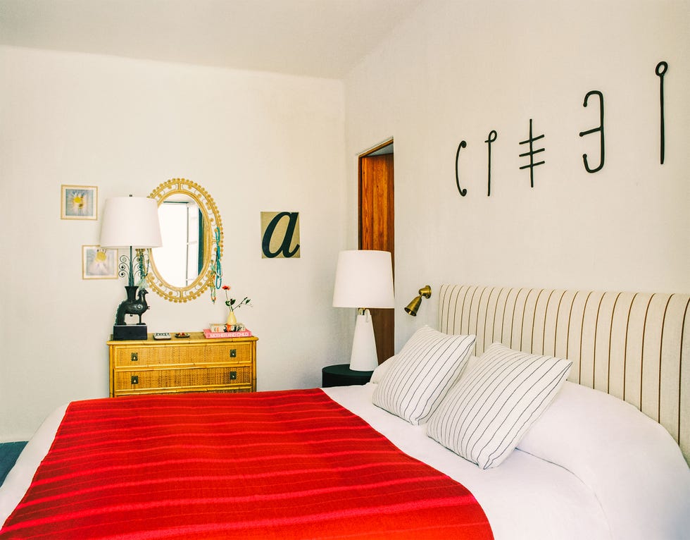
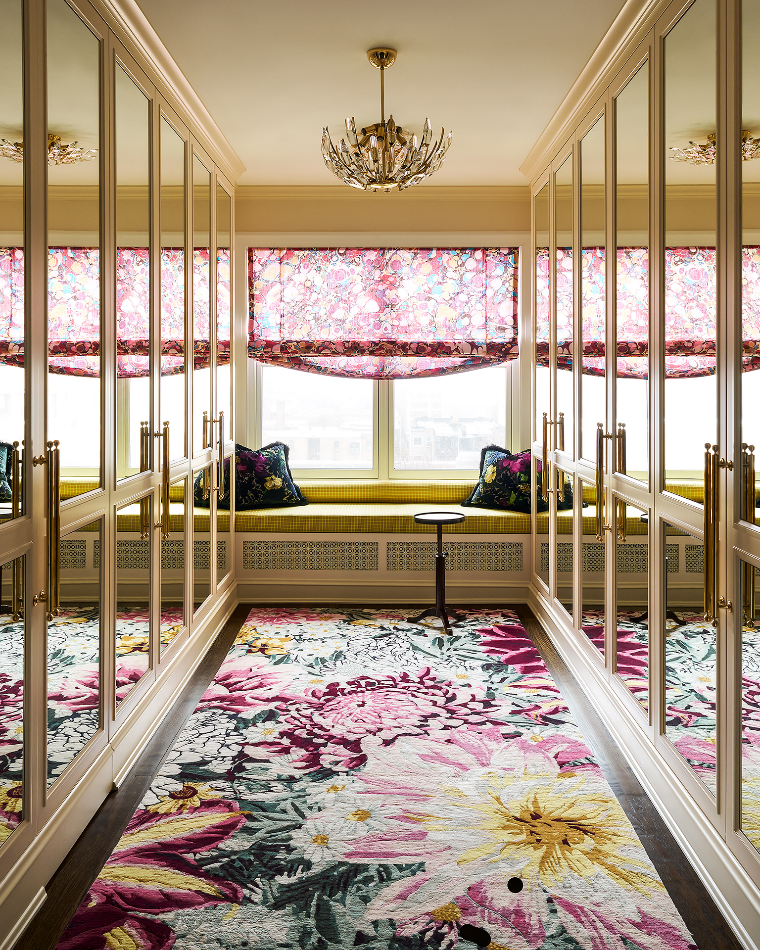
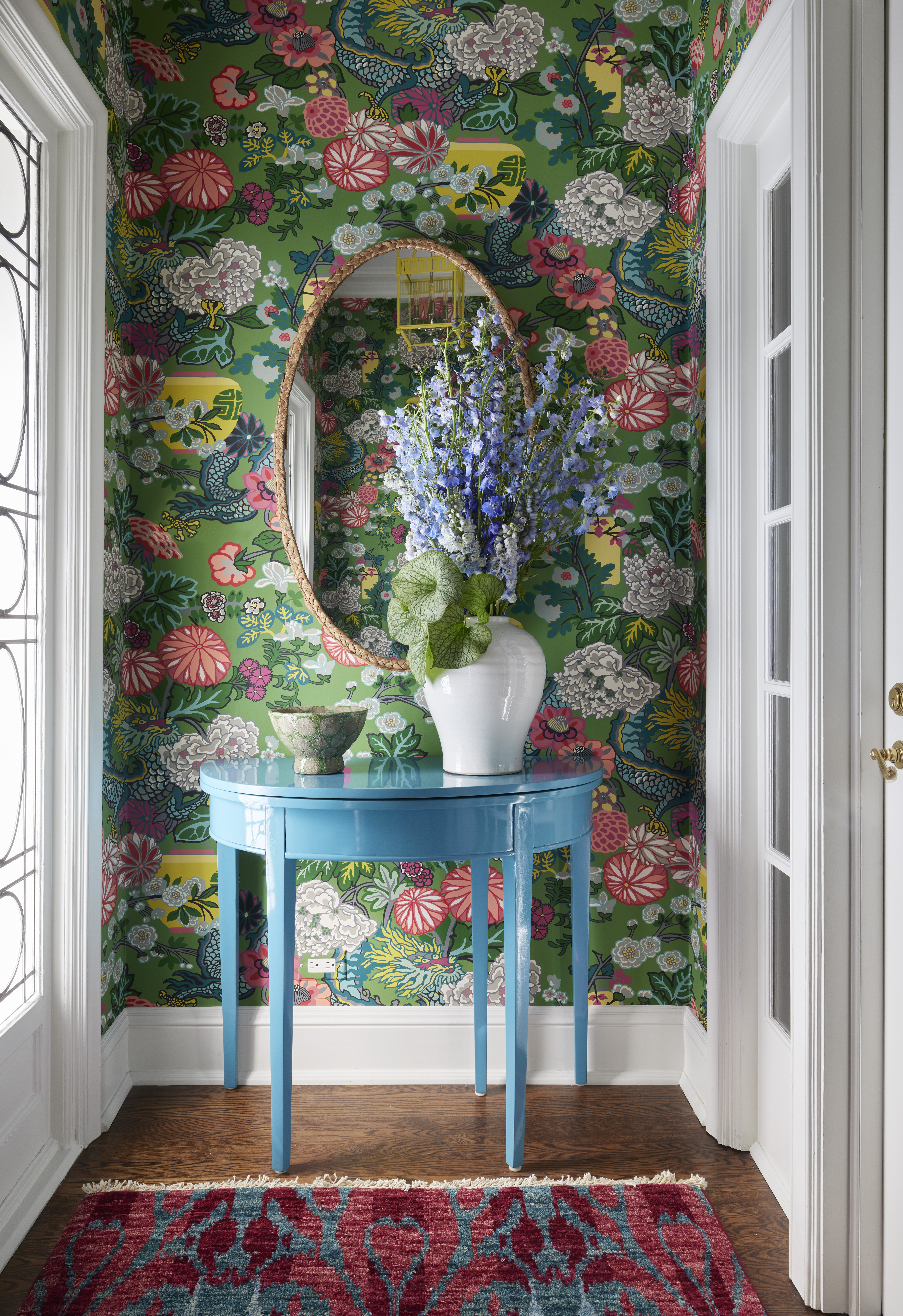
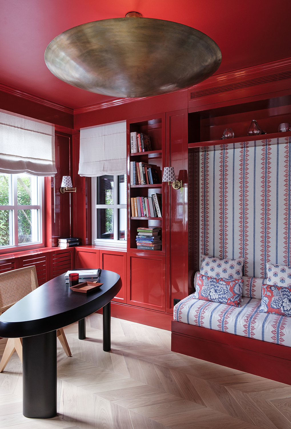
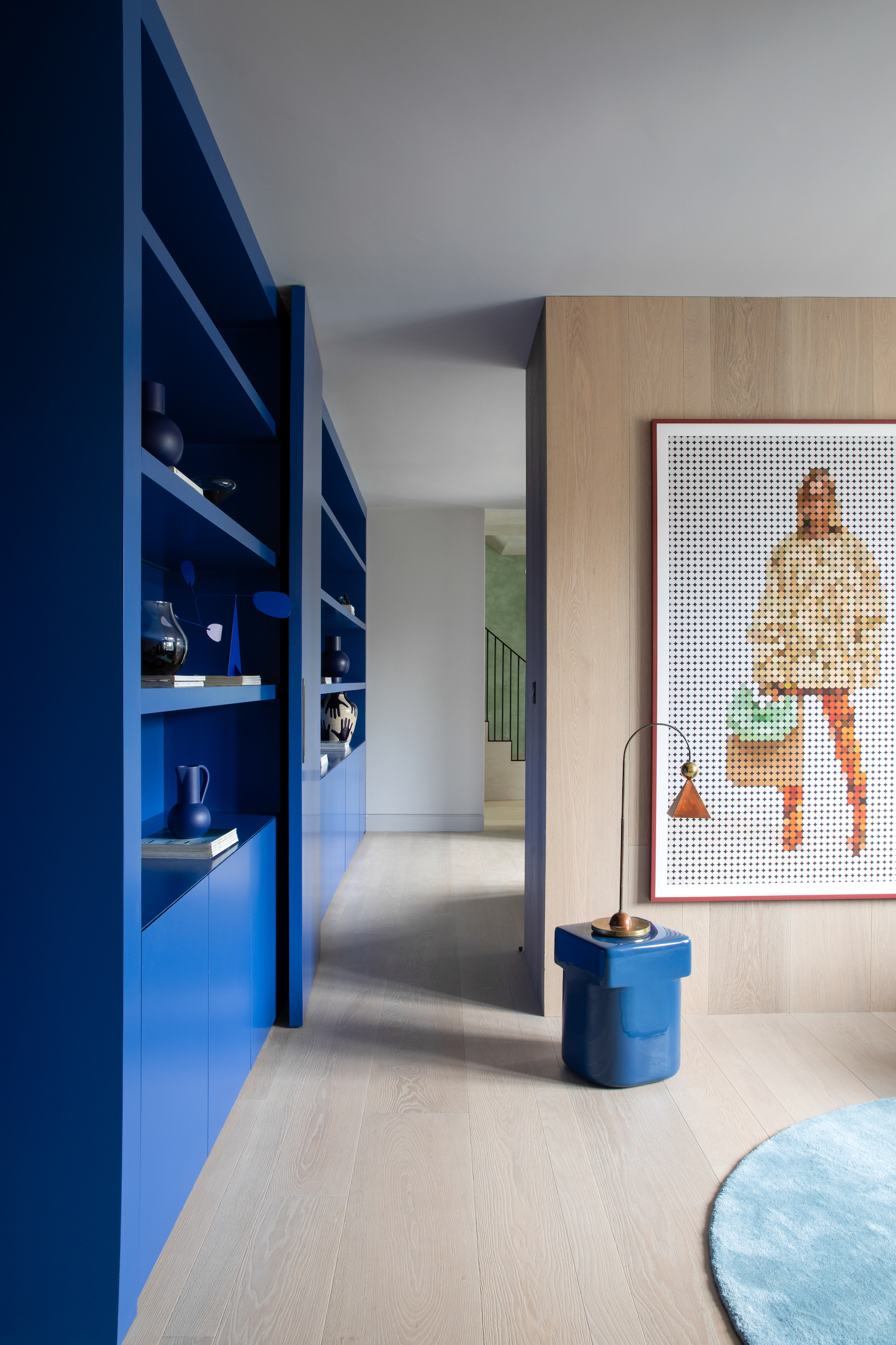
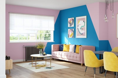
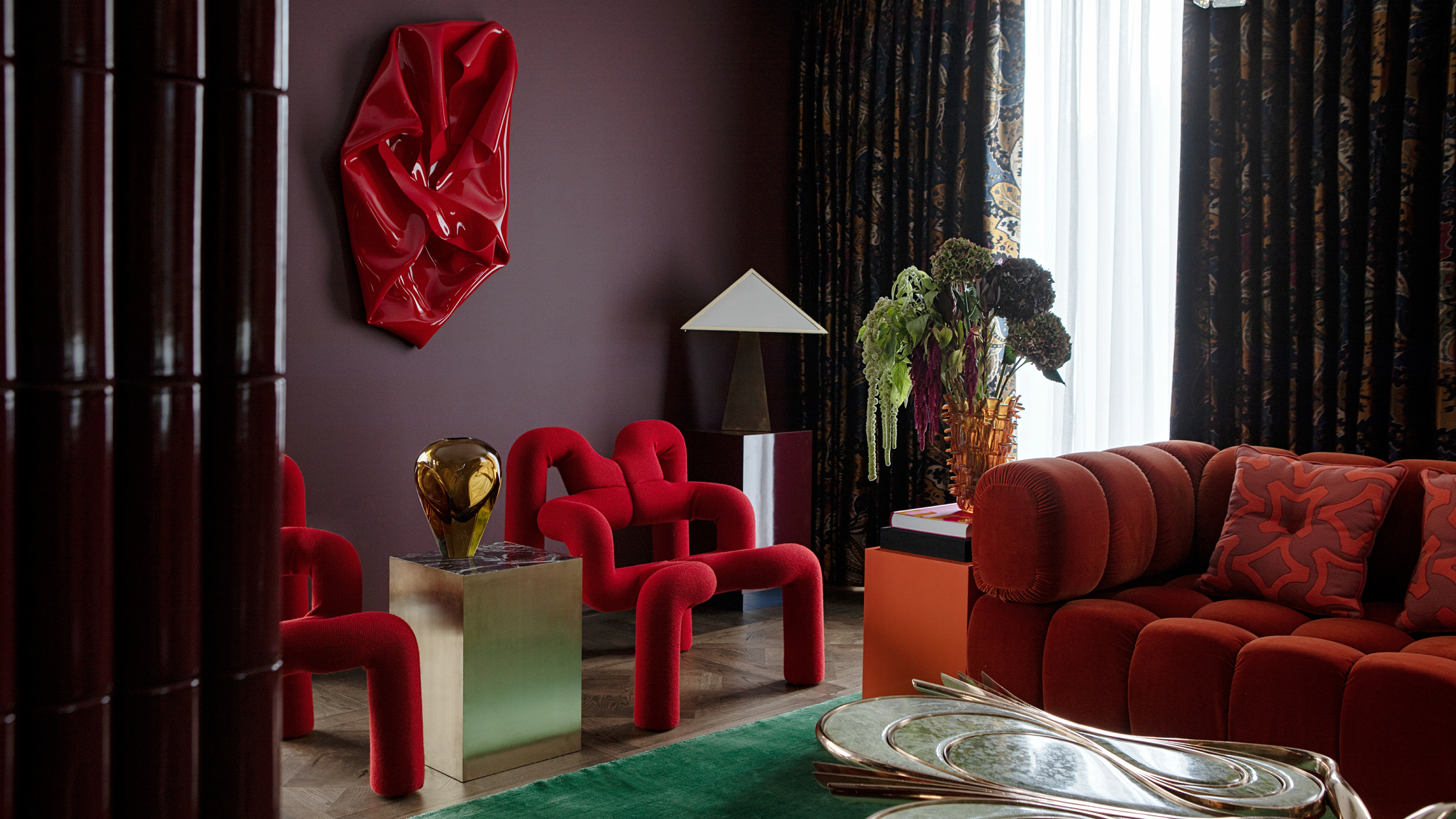
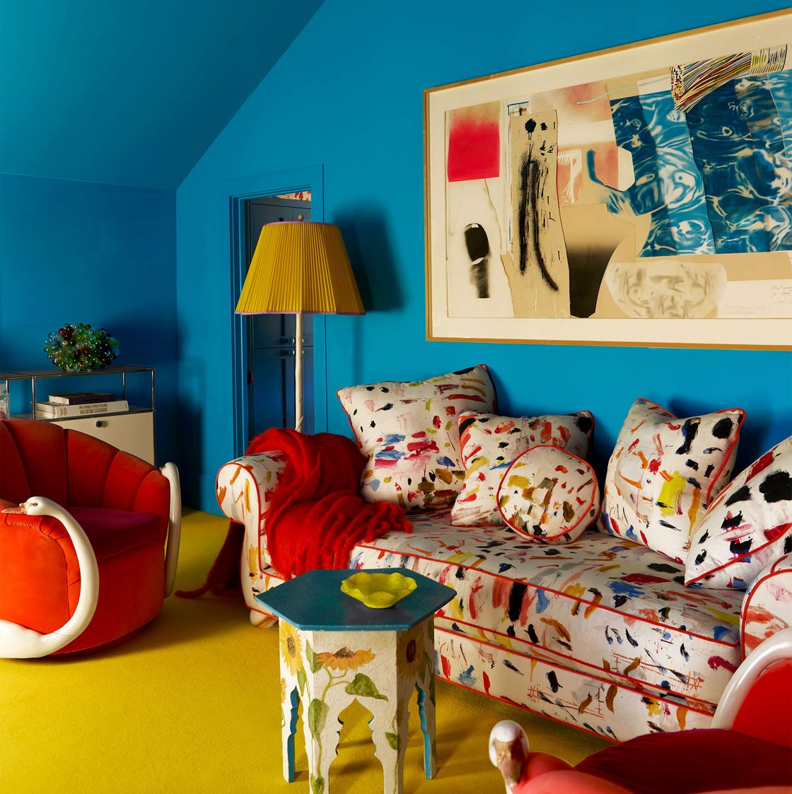
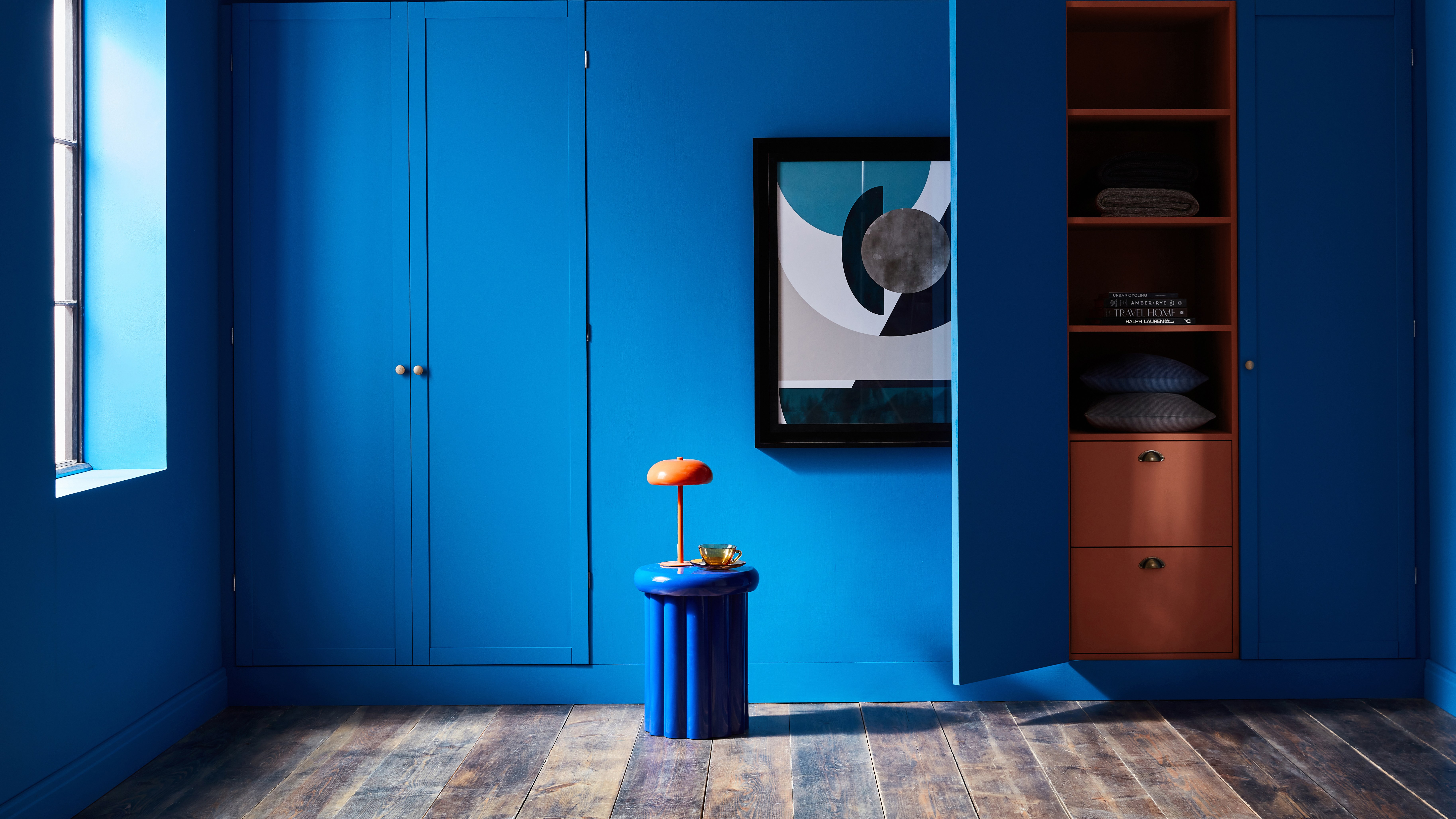
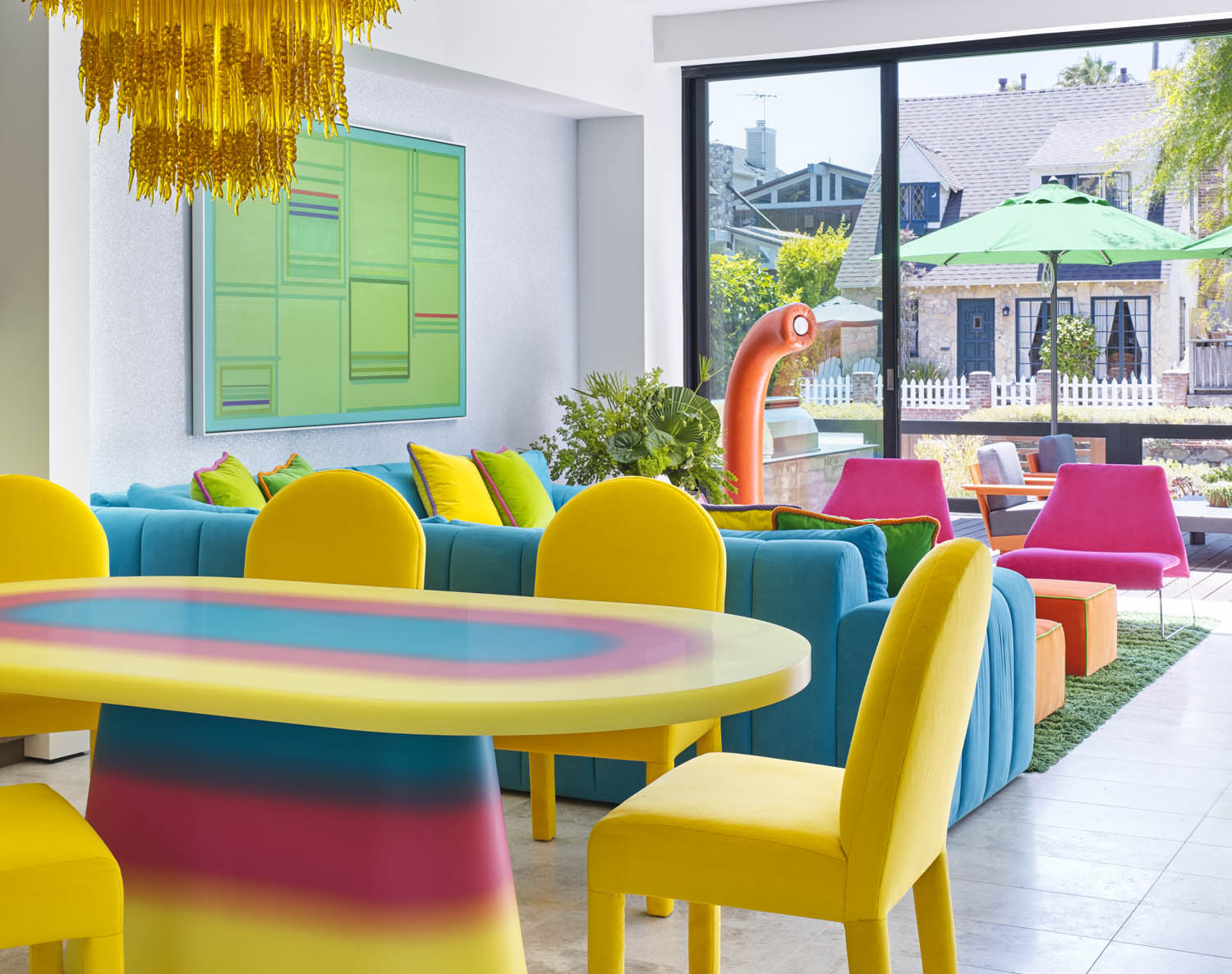
Chromatic tension in interior design is defined as the use of color to create visual restlessness. It involves juxtaposed hues, whether complementary or in opposing saturations, to produce a 'pulsing or vibrating sensation.' Goesling clarifies that it goes beyond merely using bold colors; the objective is to dramatize the interaction between different hues, tints, tones, and shades within a single area. While consulting the color wheel for complementary combinations is a starting point, the ultimate goal is to achieve dissonance. For instance, color blocking, despite its boldness, doesn't inherently create tension if executed with analogous hues, similar tints, or harmonious saturations. True chromatic tension requires a degree of discord.
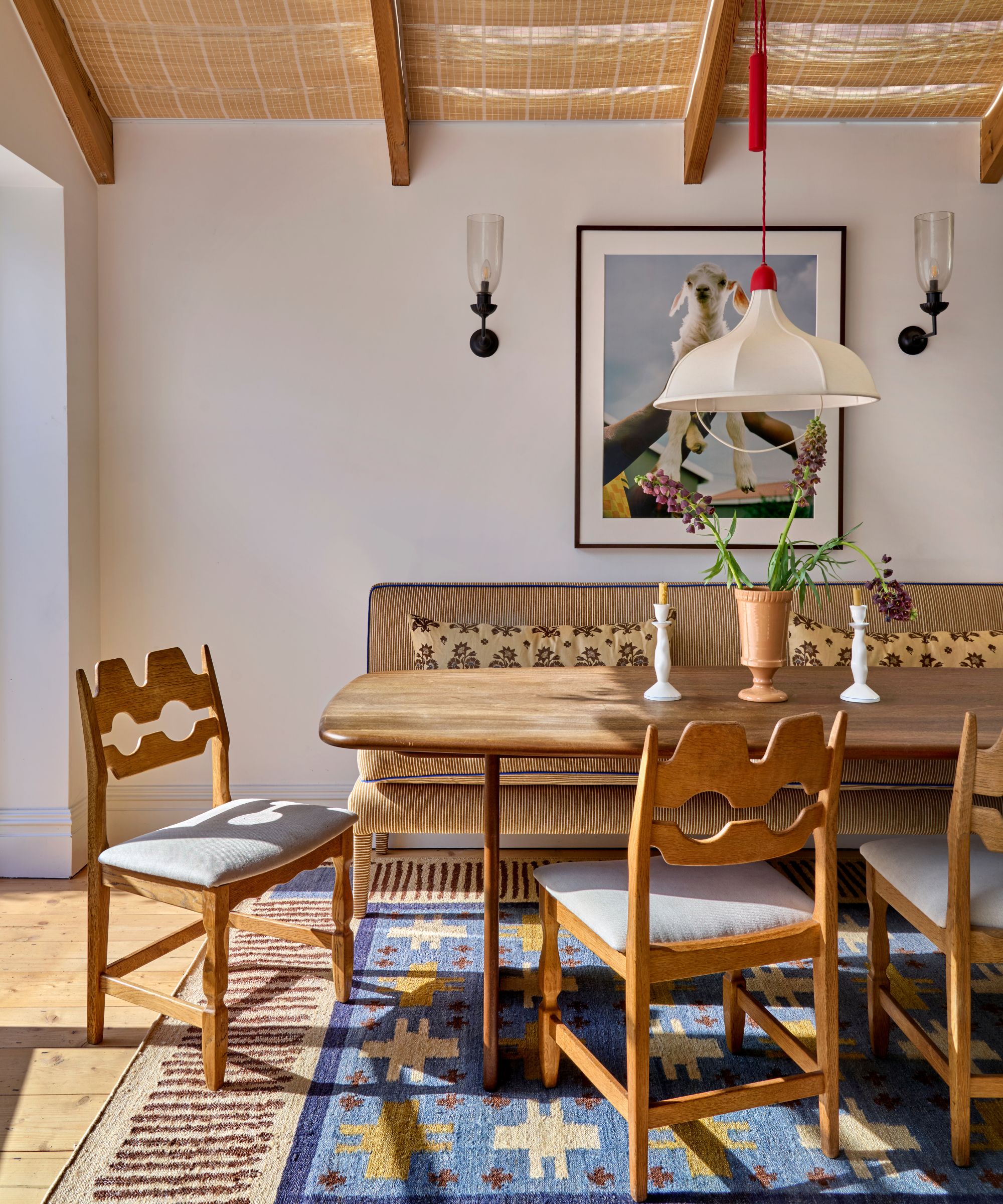
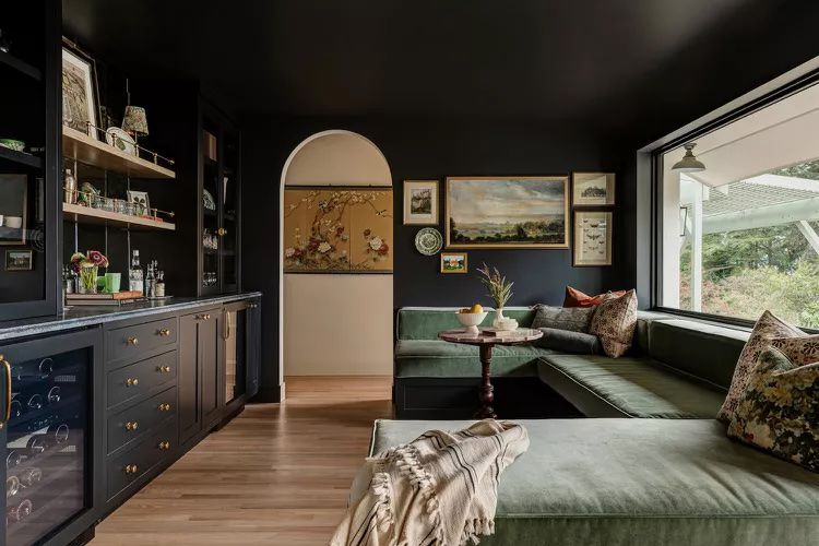
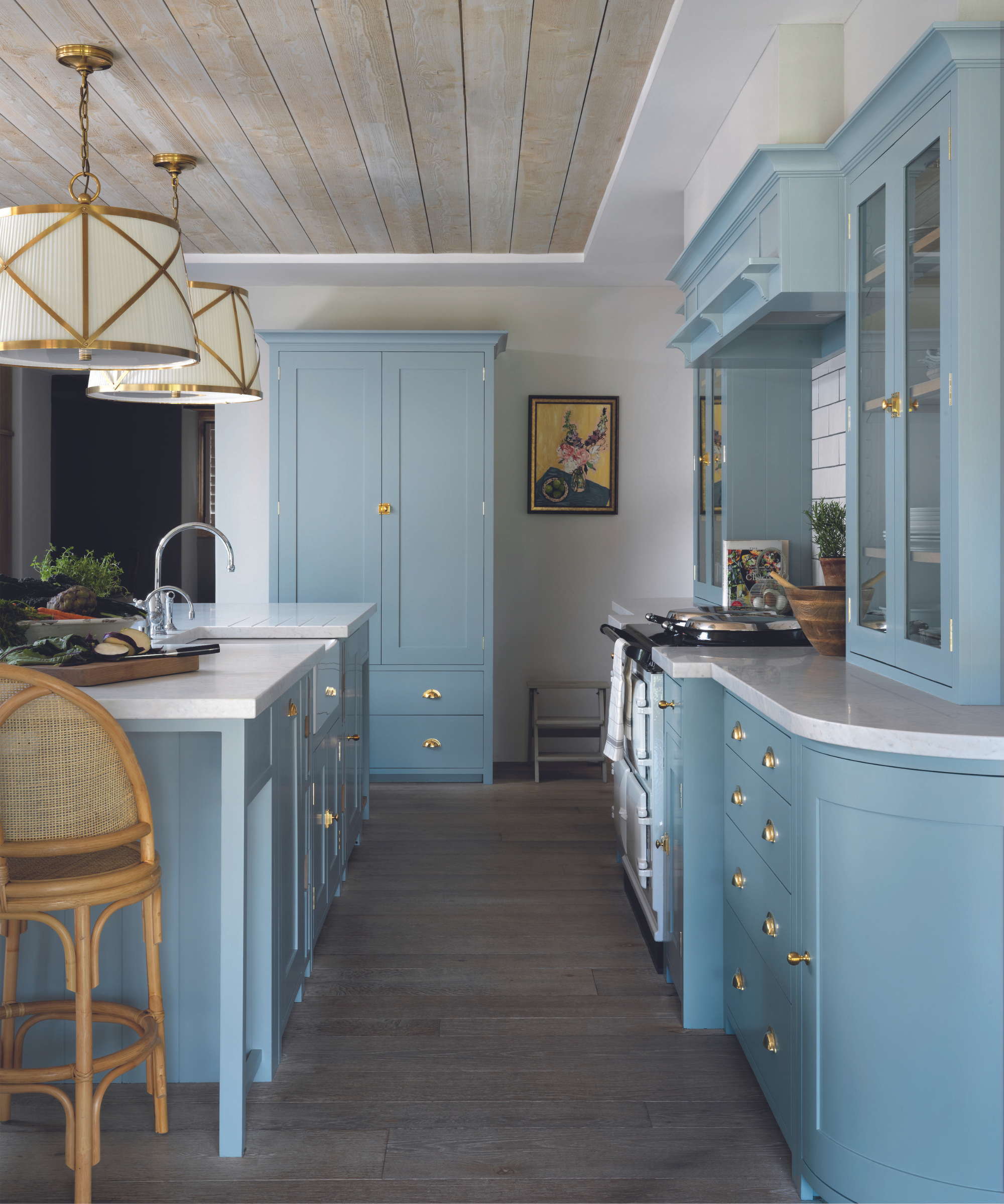
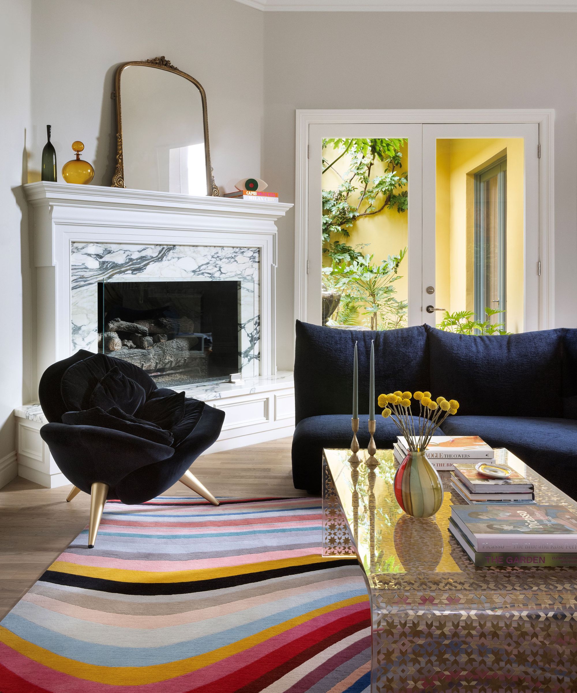
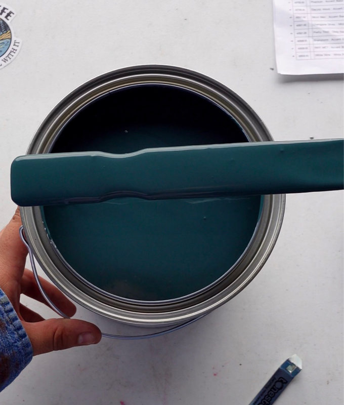
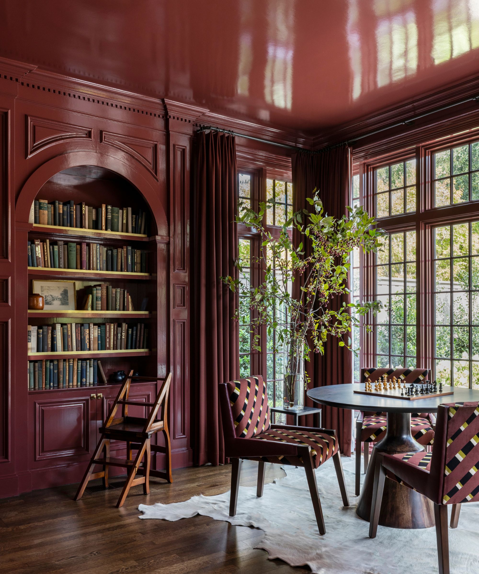
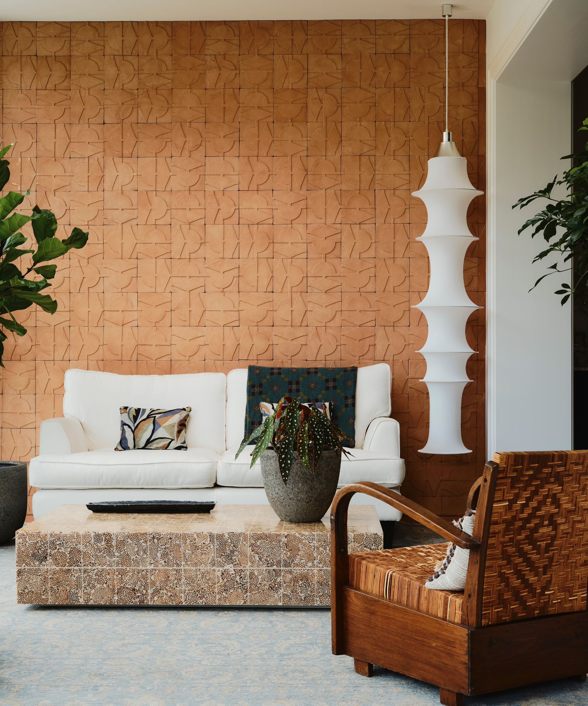
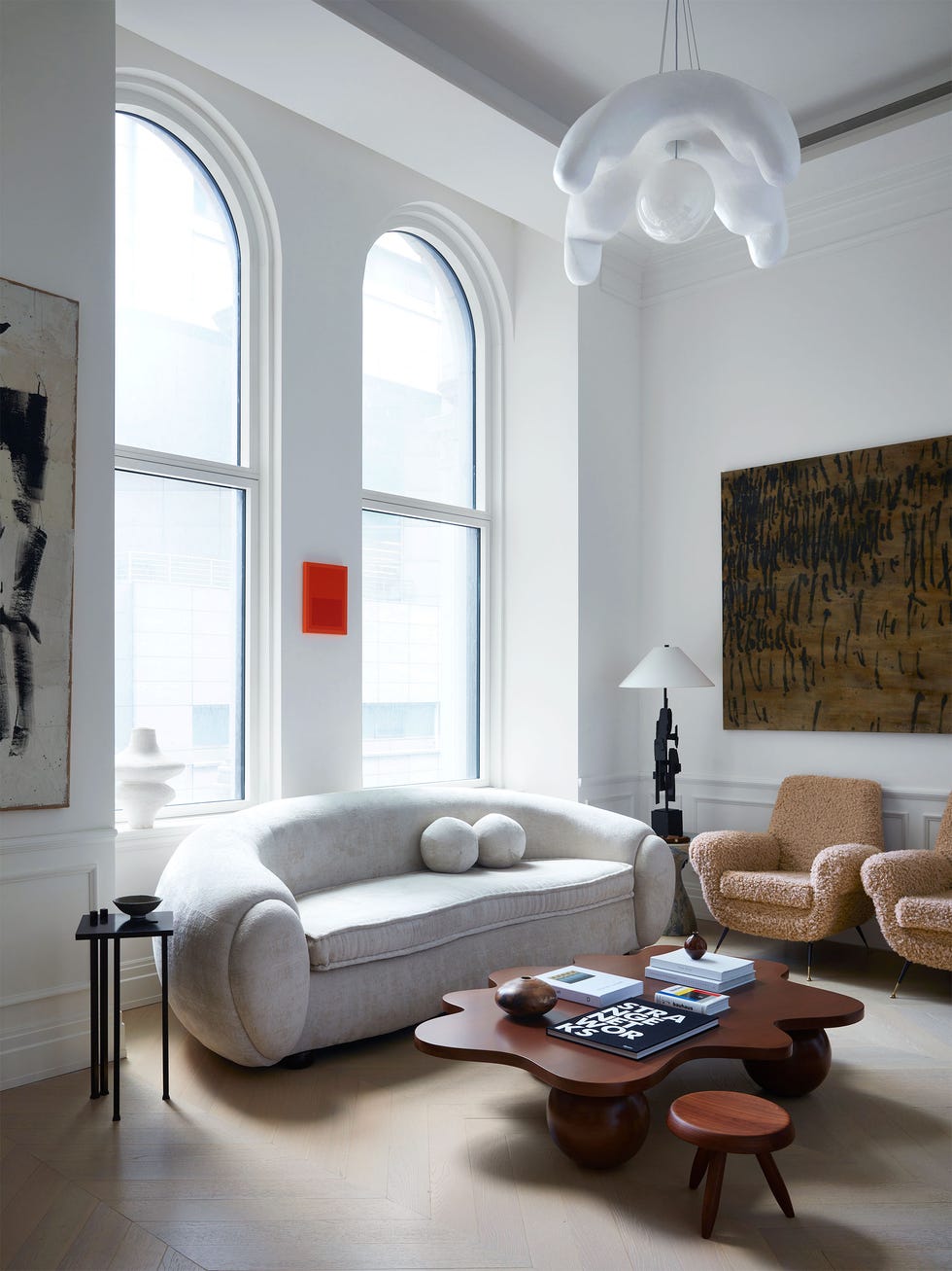
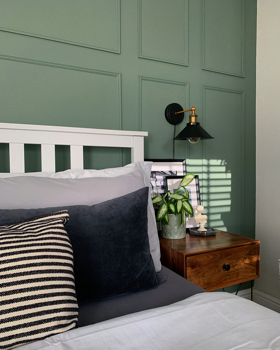
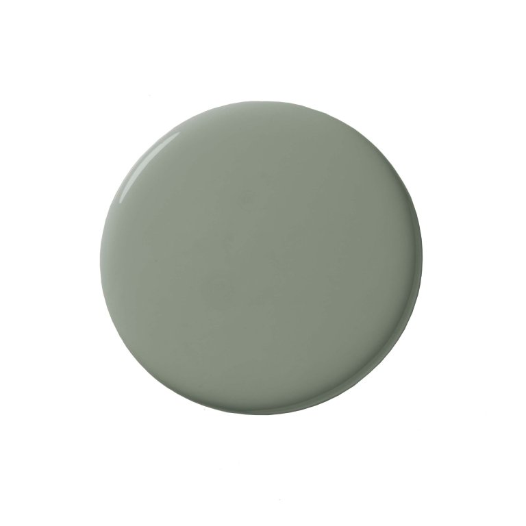
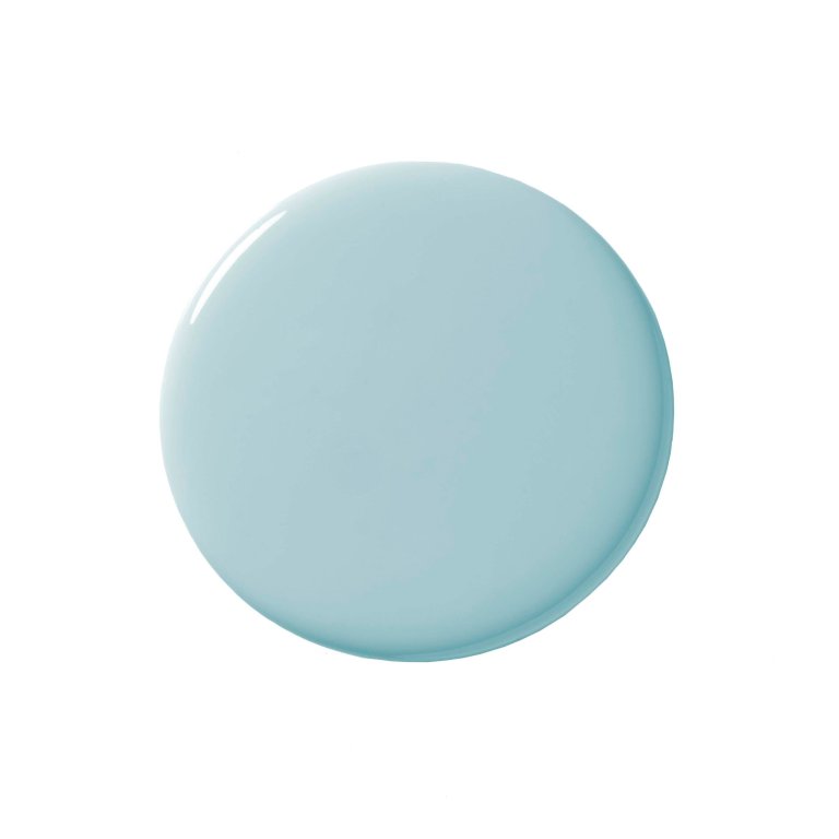
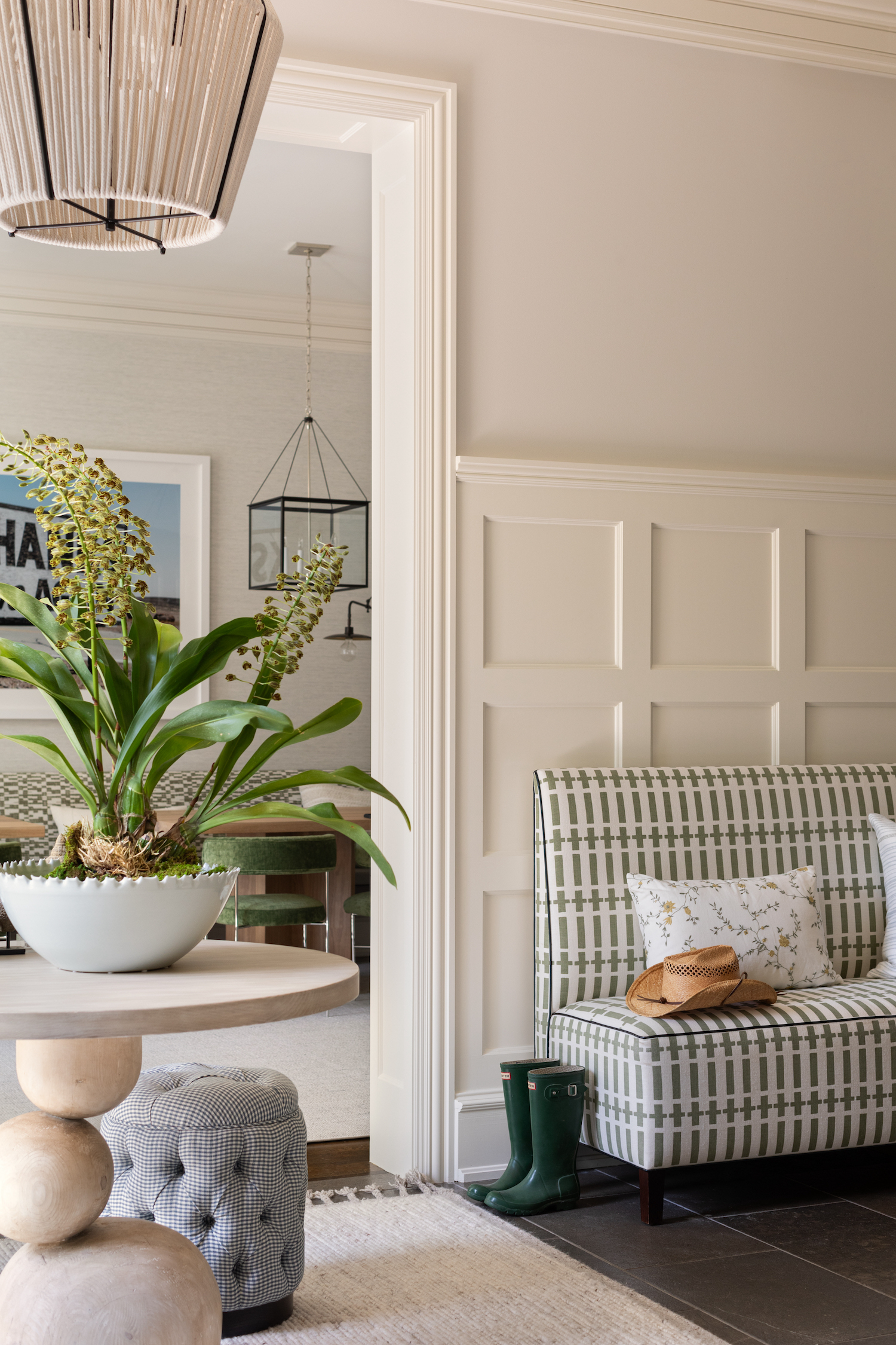
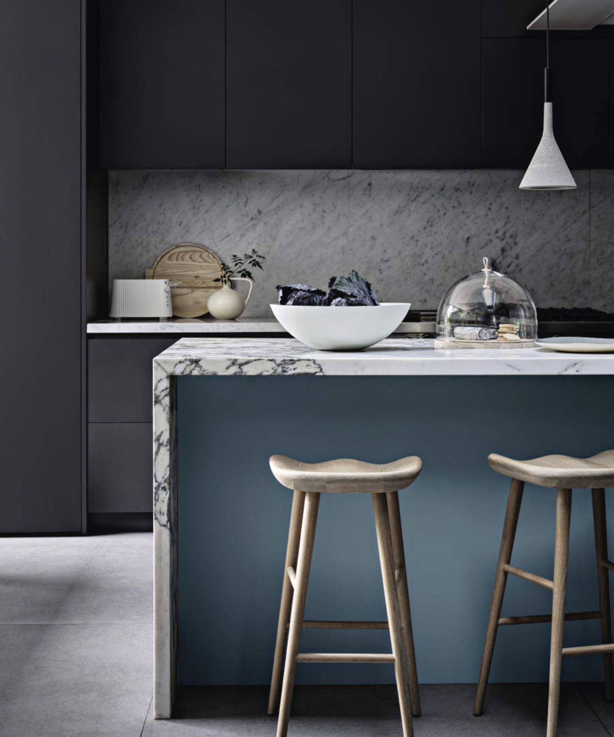
The article explains how to incorporate chromatic tension into interiors, noting that it doesn't always necessitate bold wall colors, although that is one maximalist approach. It can be applied subtly, such as through an unexpected piece of colorful hardware, a purple sofa in an earth-toned room, or contrasting throws and pillows. The fundamental aim of this technique is to use color to create contrast and energize a room in a livable manner. The layering of colors should feel surprising yet result in a satisfying discovery. Goesling highlights exciting combinations for 2026, including satin periwinkle with velvet chocolate, high gloss chartreuse with matte baby blue, matte tangerine with metallic moss, and magenta with mushroom. These combinations balance energetic, emotional hues with pragmatic, grounded colors, striking a balance between frenetic emotion and soft, earthen palettes. The article also suggests that incorporating contrasting materials can further enhance these color schemes. The technique is compared to the 'unexpected red theory' and the 'strategic neon trend,' as it encourages experimental, exciting, and evolving color use in interiors.
The article concludes by prompting readers to consider adding intrigue to their interiors using chromatic tension, suggesting that this approach allows for dynamic and engaging home environments.
#ChromaticTension #InteriorDesign #ColorTrends2026 #DecoratingWithColor #ColorPsychology #HomeDecor #DesignTheory #RebeccaGoesling #ColorPalettes #ChromaticTension #InteriorDesign #ColorTrends2026 #DecoratingWithColor #ColorPsychology #HomeDecor #DesignTheory #RebeccaGoesling #ColorPalettes
共0条评论
 暂无评论
暂无评论你可能还喜欢
OMG — Is Color Blocking Actually Cool Again?
6 Paint Colors That Will Make Your House Sell for More Money

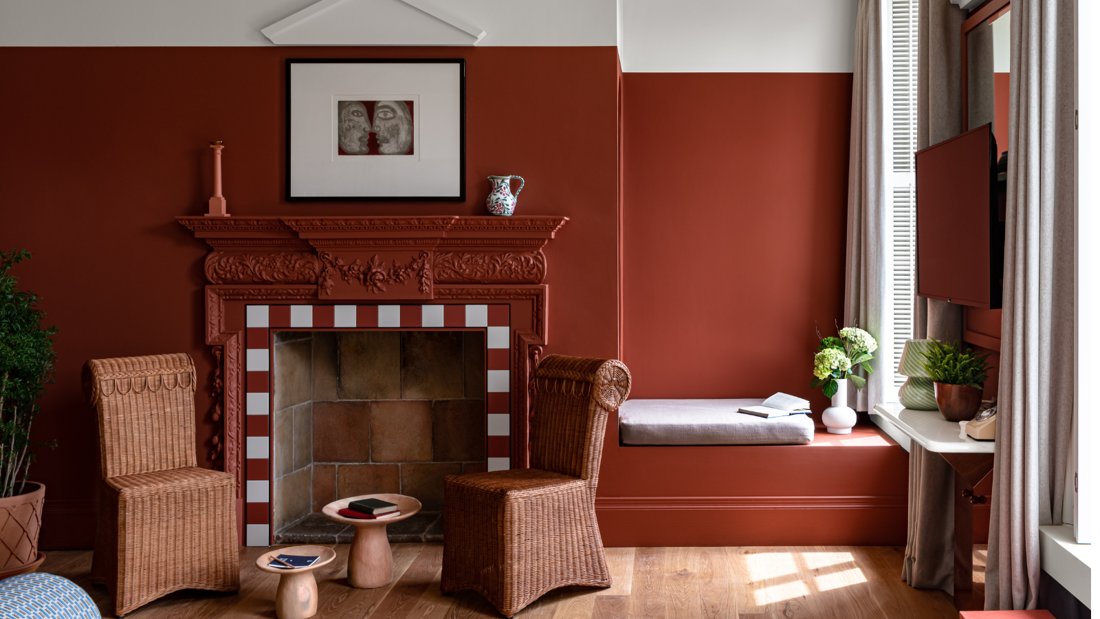
6 'Energetic Colors' for Vitality and "Sophisticated Interiors", According To Psychologists And Design Experts
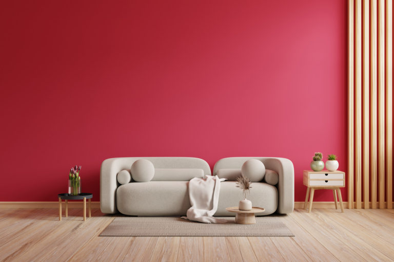
What Is The Unexpected Red Theory? & How To Make It Work For You
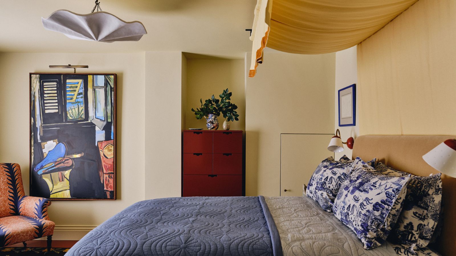
Is the ‘unexpected red theory’ trend still going strong in 2025?

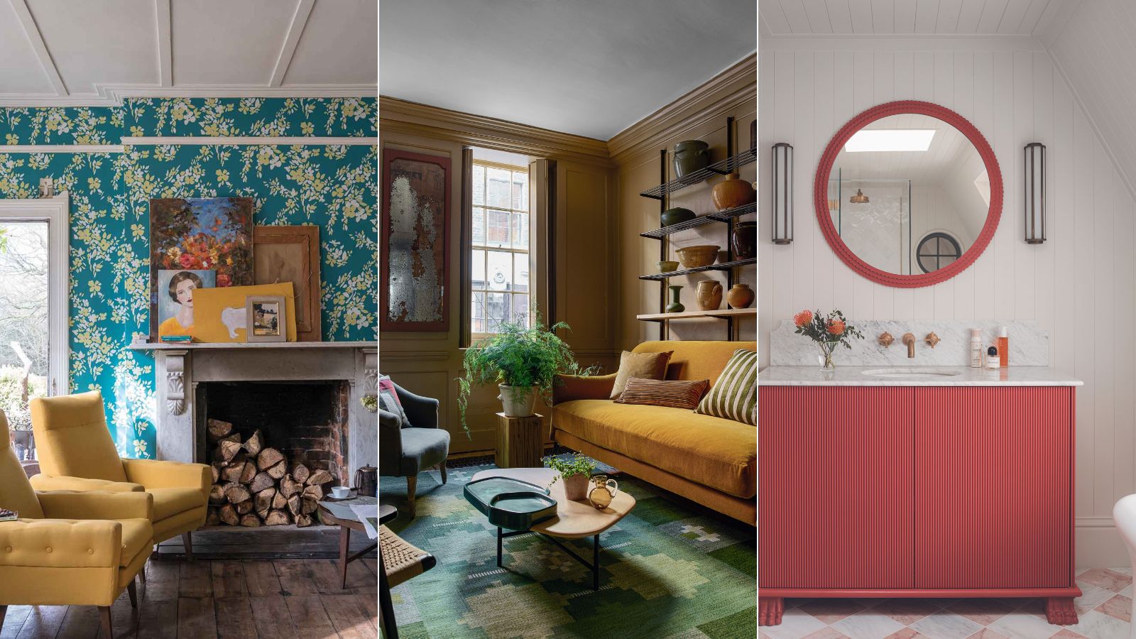
Seasonal color analysis in interior design – should your ideal palette influence the shades you choose for your home?
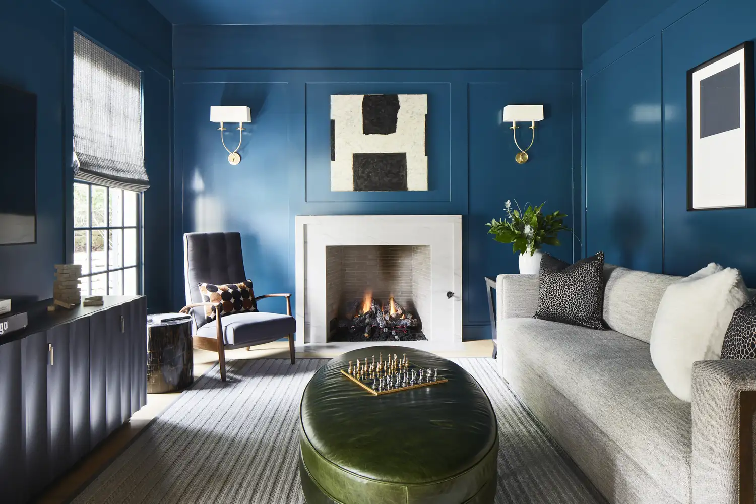
Say Goodbye to Neutrals: Color-Drenching Will Define 2026 Interiors

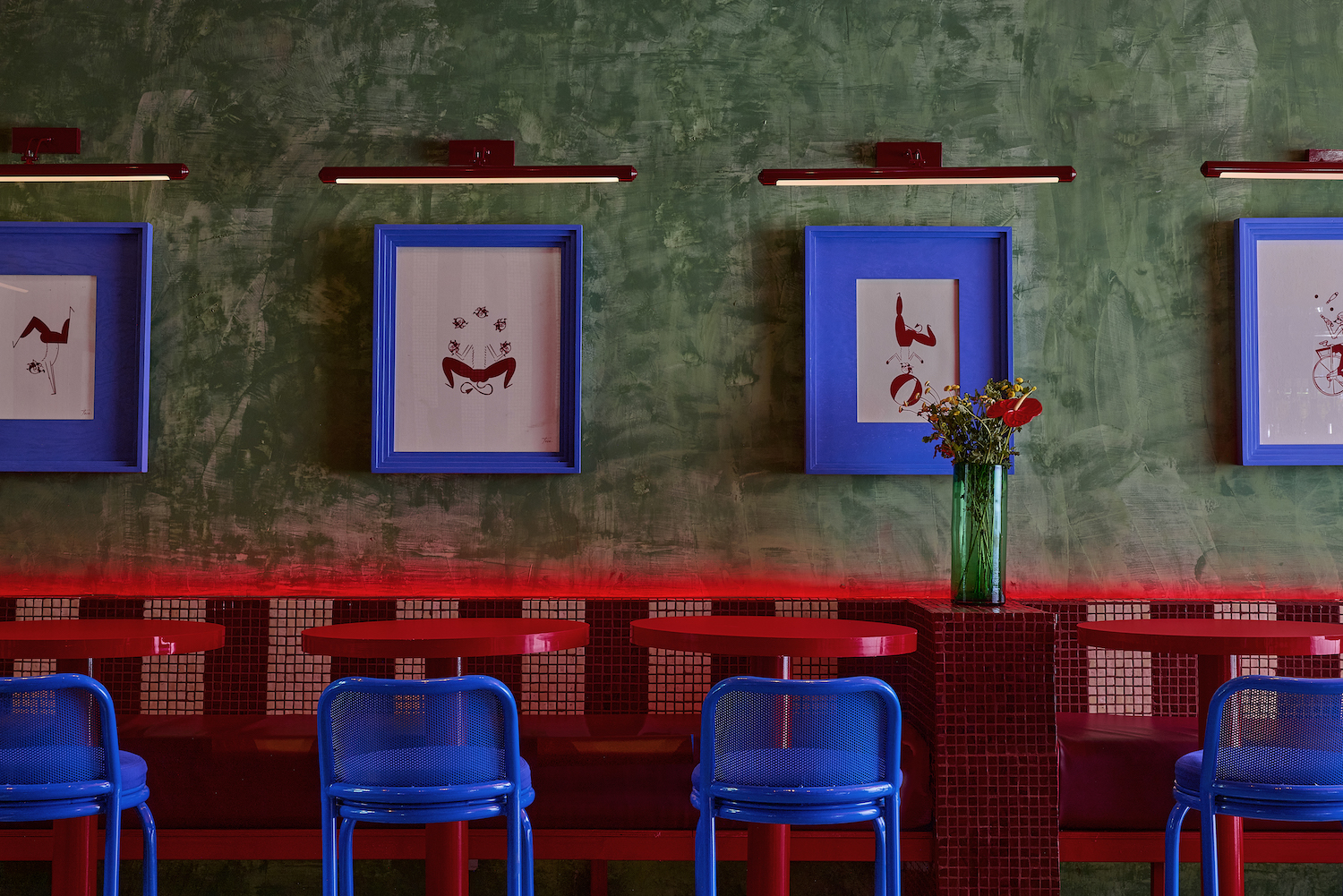
7 'Unhappy' Colors That Color Psychology Experts Would Never Paint Their Walls
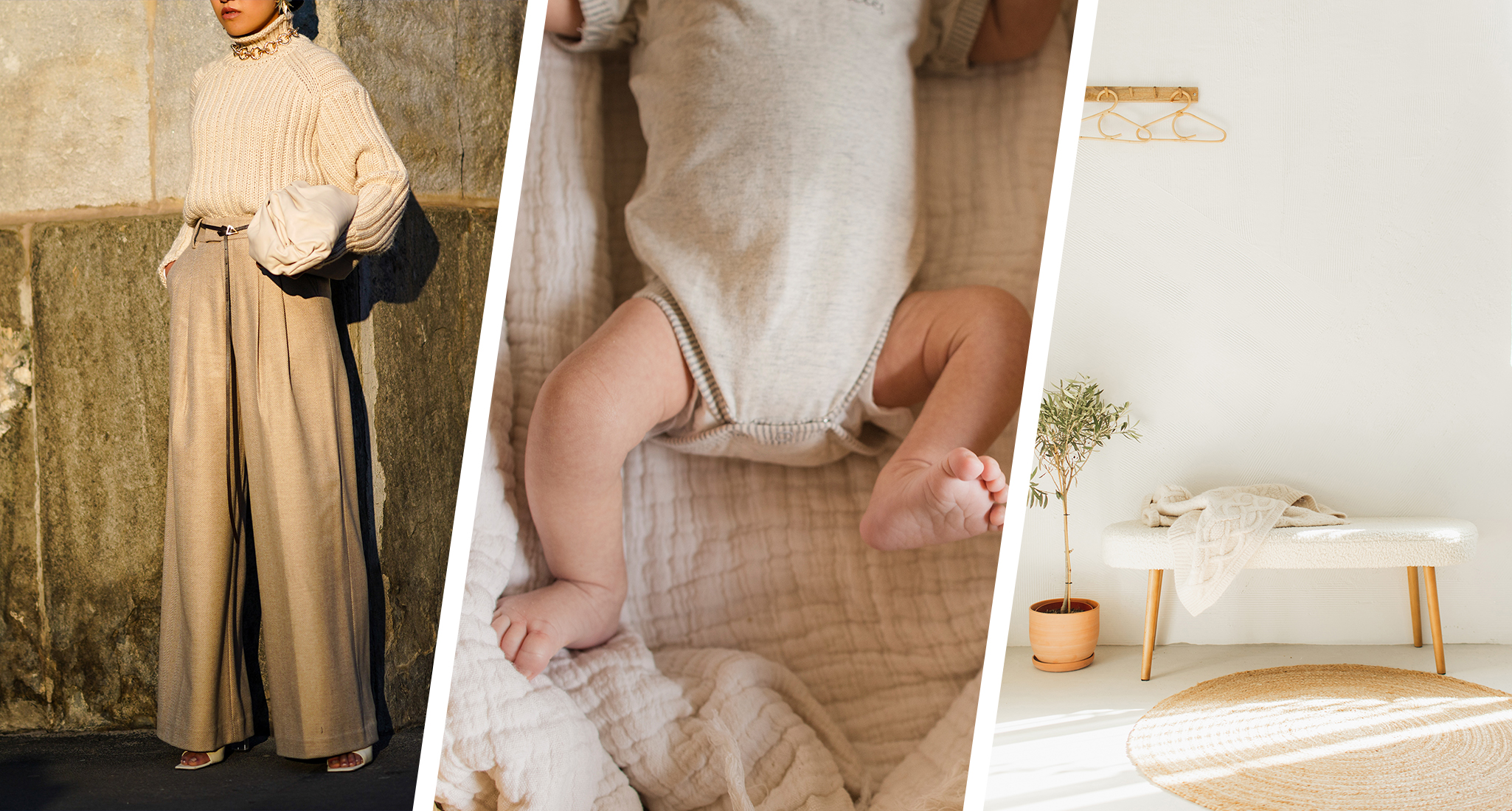
From Quiet Luxury to the Sad Beige Baby, When Will ‘Beigification’ End?

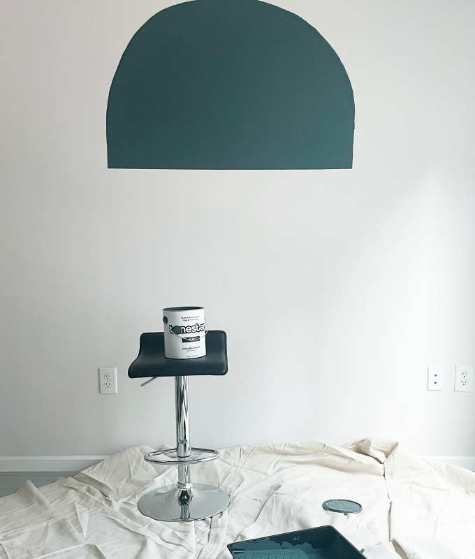
The Hottest Paint Color Nobody Saw Coming: How ‘Storms in Paris’ Is Taking Over Homes Everywhere
The Viral ‘Unexpected Red’ Theory in Interior Design Actually Isn’t That Simple
Decorating with paint
Want to Sell Your Home for More? Don't Skip This Color Trend Buyers Want to See in Every Listing

These Paint Colors Bring Hostility to Your Home, According to Experts

A Color Psychologist Says This Is the Most Relaxing Paint Color

Outdated color trends – 5 overdone colors that designers no longer love, and what to use instead
How to transform your rooms with colour drenching
The biggest color trends of 2025 – 10 colors designers say will lead the way next year
5 Vibrant Color Palettes Designers Are Using to Add Energy and Excitement to Decor
Fresh coat of paint can create clean slate