6 Paint Colors You Should Never Use in Your Bedroom, According to Interior Designers
Color profoundly influences mood, particularly in a bedroom, which ideally serves as a peaceful sanctuary for rest and rejuvenation. Selecting the wrong paint color can disrupt sleep and create an unwelcoming atmosphere. While personal taste varies, some colors are generally considered unsuitable for a restful bedroom environment due to their inherent qualities. Interior designers consistently advise against specific hues that can make a bedroom feel chaotic, cold, or claustrophobic.
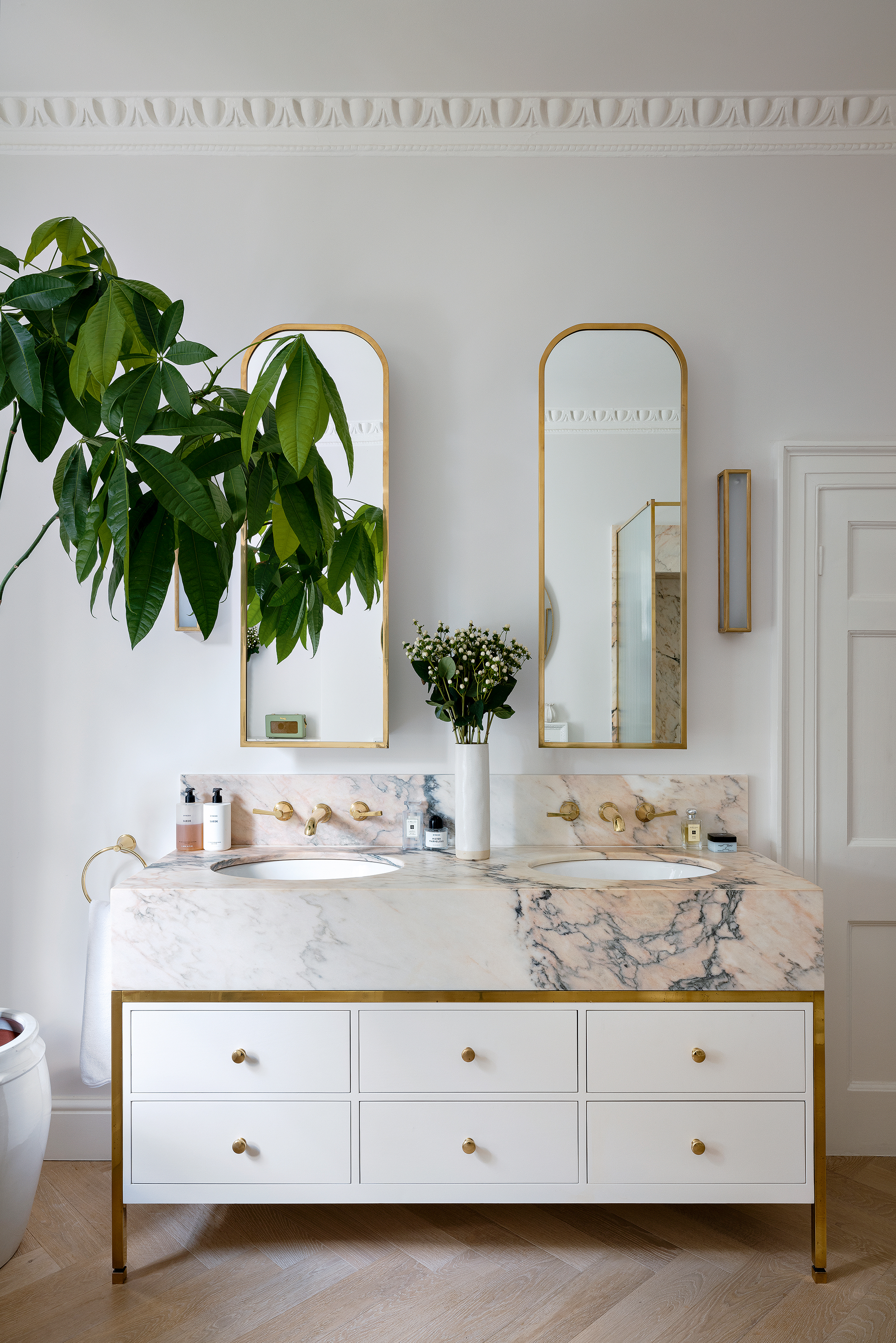
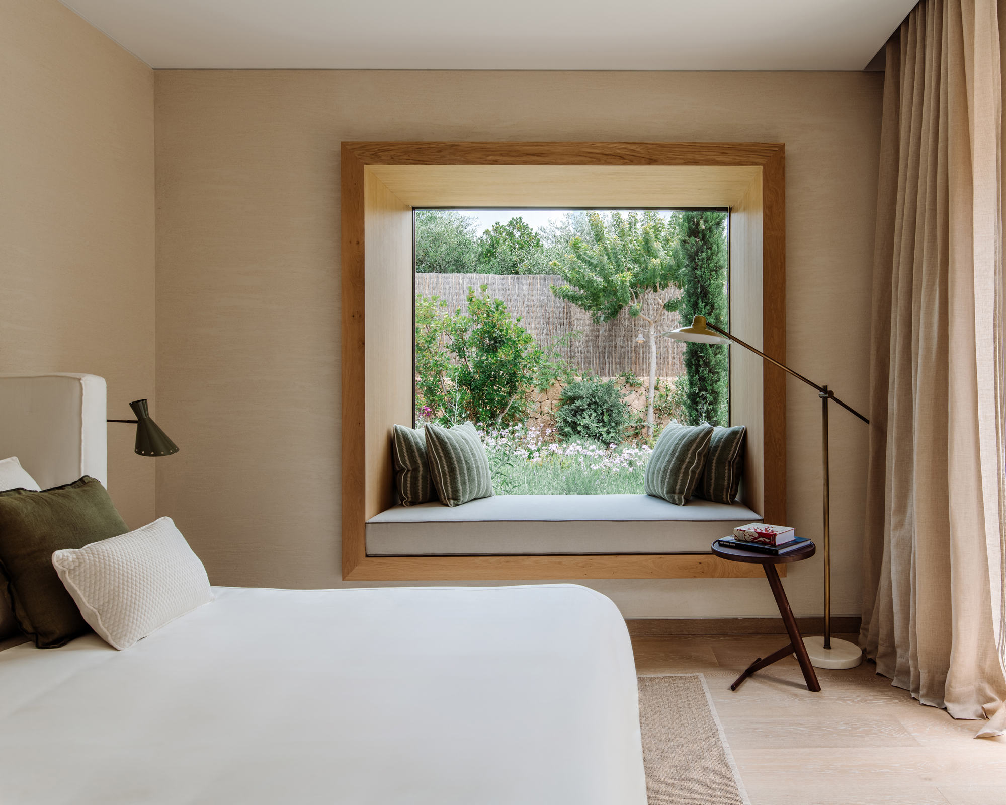
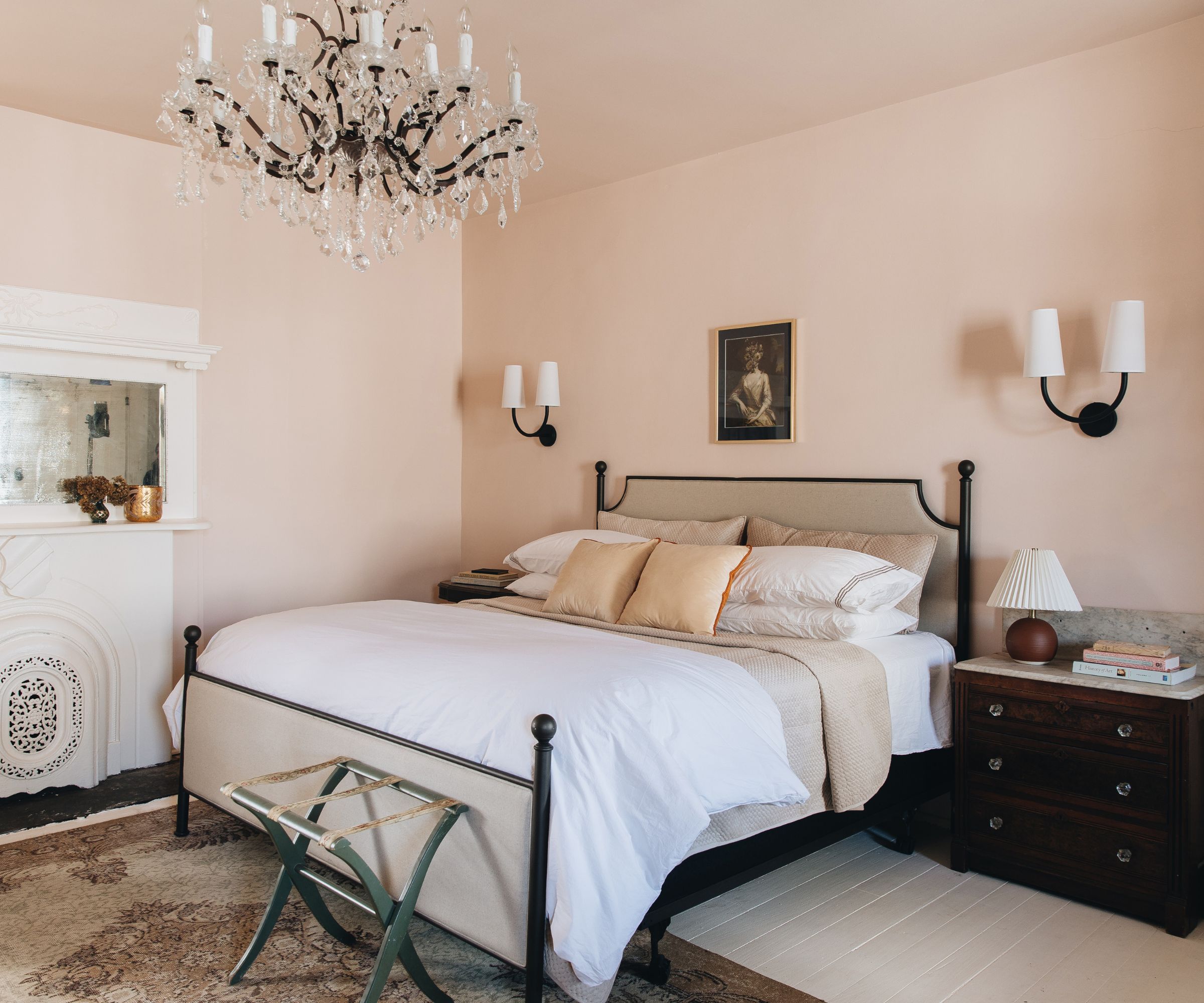
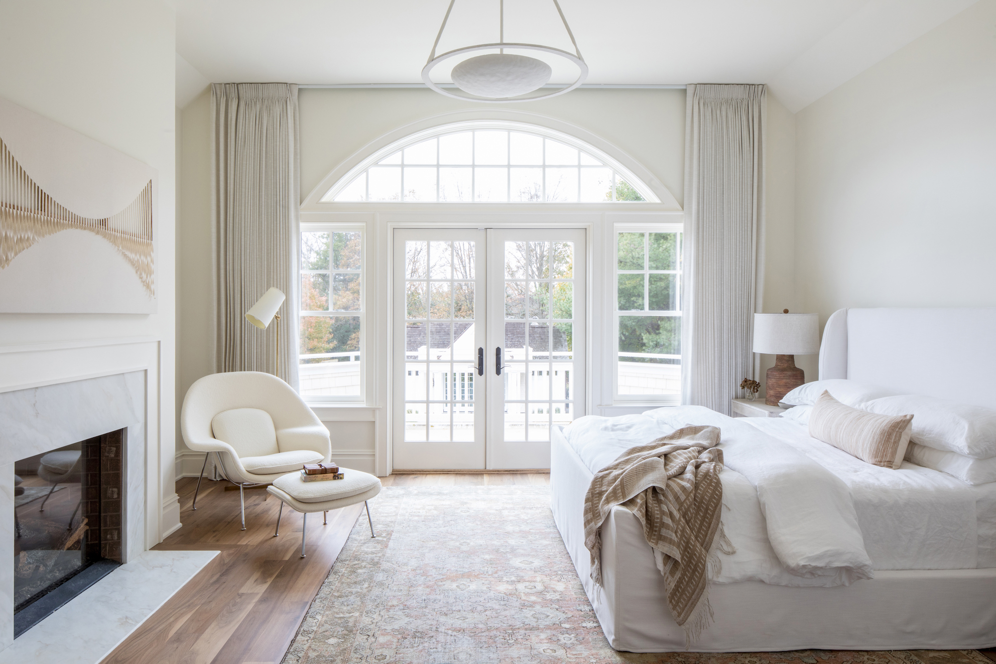
Stark white is one such color. Despite its common association with cleanliness and simplicity, cool, stark white can render a bedroom sterile and uninviting, especially when combined with artificial lighting. Interior designer Bailey Li emphasizes that such shades lack the warmth necessary for a truly restful retreat. Instead, warmer, creamier off-whites are recommended to foster a soothing and inviting ambiance, transforming the bedroom into a sanctuary rather than a blank, impersonal space.
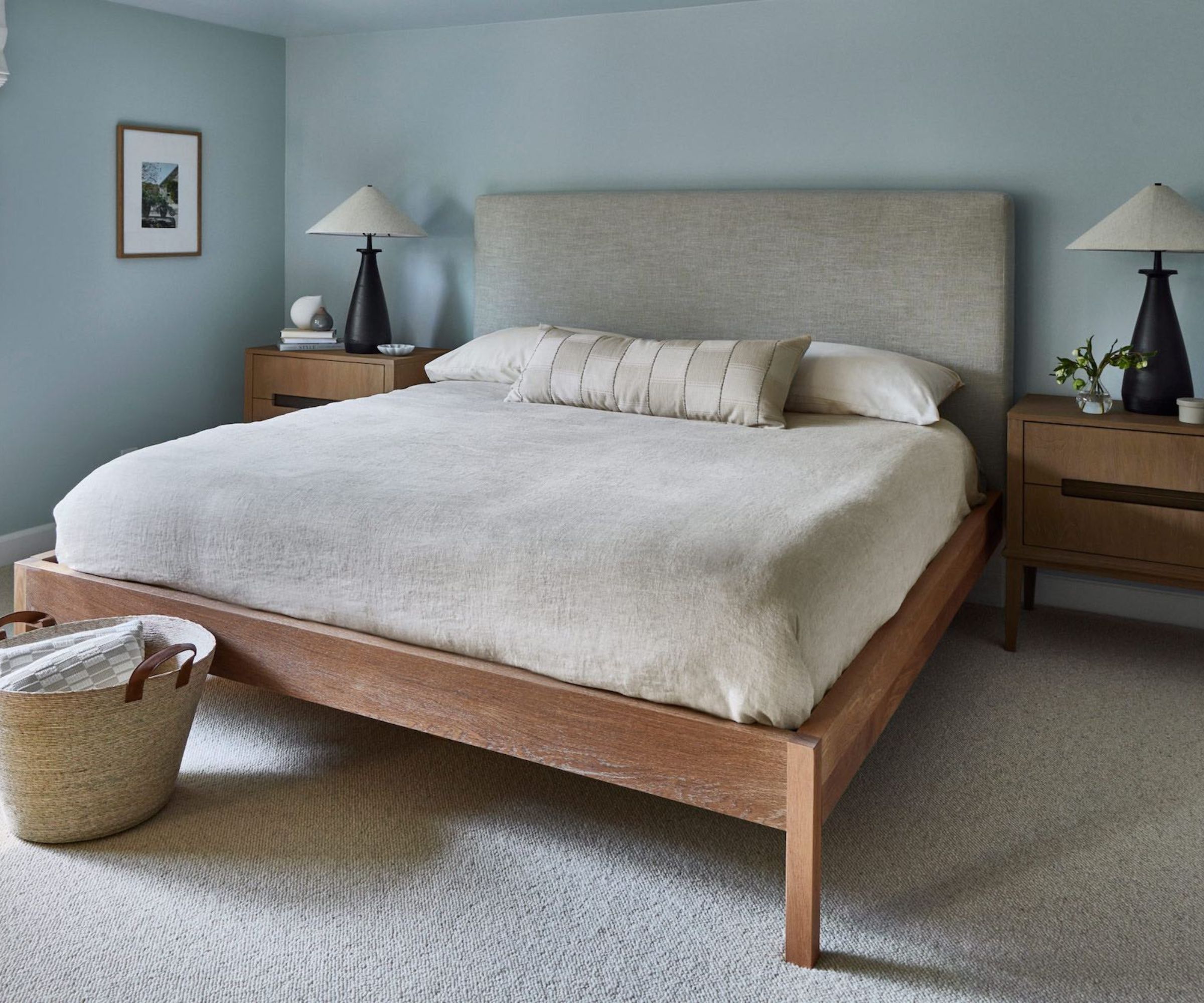
Bright purple is another color to avoid. In color theory, bright purples are more energizing than relaxing, making them counterproductive for a bedroom's primary function. Andrea Magno, Director of Color Marketing and Design at Benjamin Moore, points out that colors on the warmer side of the color wheel, such as red, orange, and yellow, tend to be intense and energetic, thereby hindering a restful environment. She suggests opting for cooler colors like blues and greens, which are naturally calming and better suited for bedrooms and bathrooms.
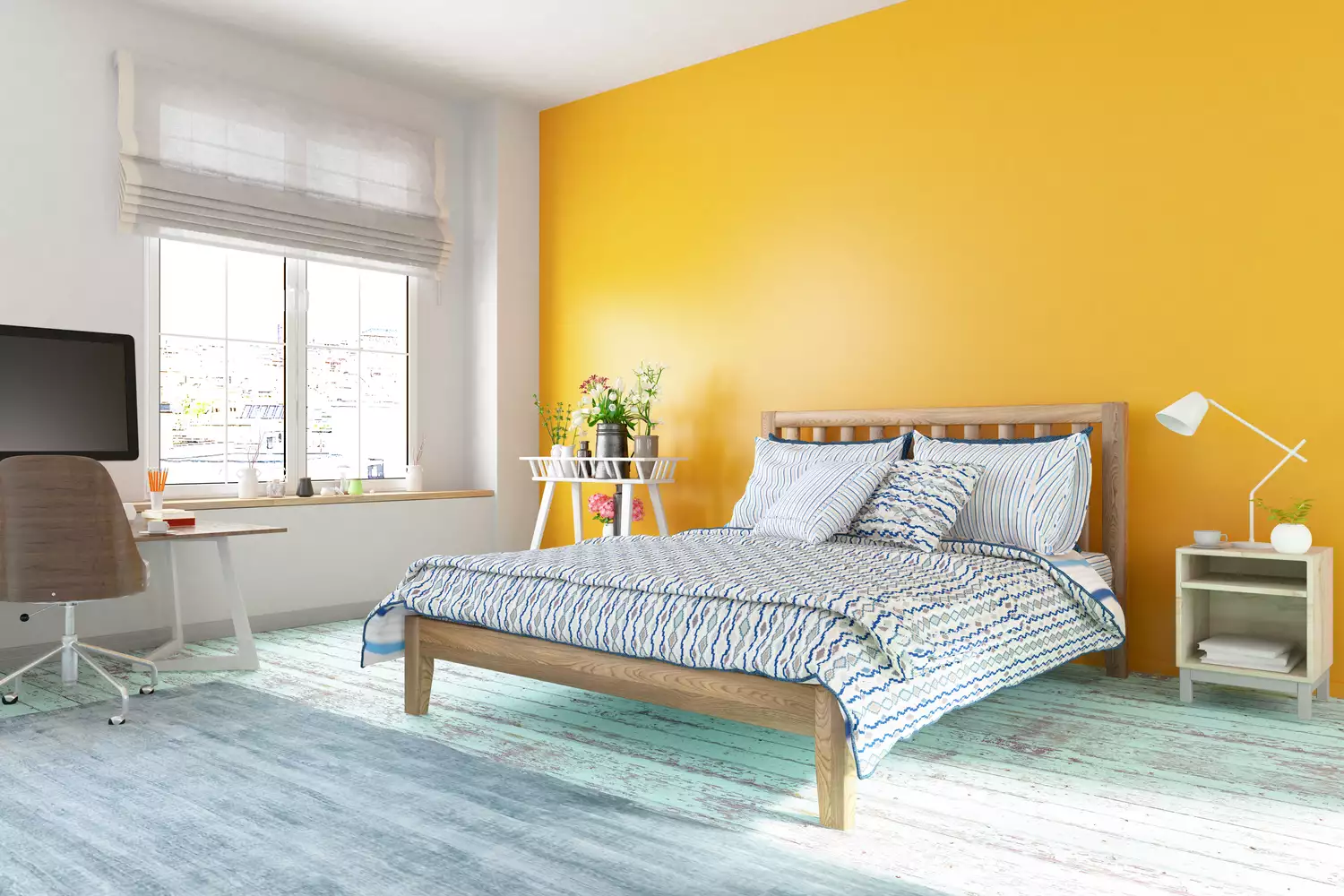
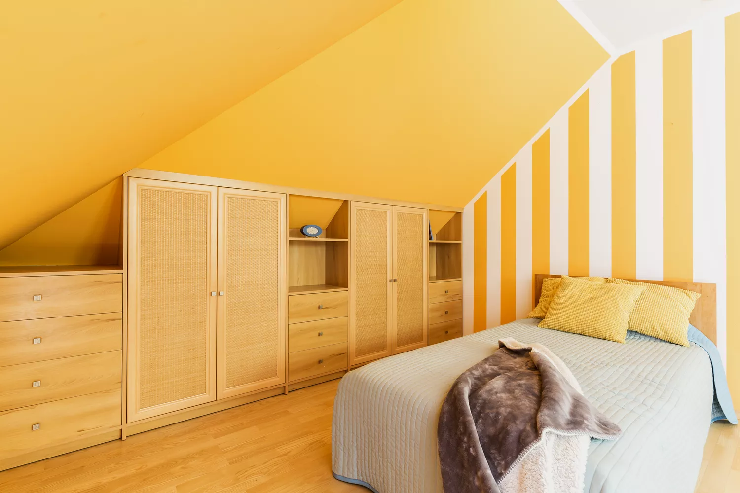
Yellow is problematic for bedroom use primarily because of its association with sunlight and daylight. This connection can make it challenging for the body to relax and prepare for sleep at night. While yellow can brighten dimly lit rooms, Magno notes that a vibrant yellow can become even more intense in spaces with limited natural light. It is generally advisable to reserve yellow for living areas or bathrooms. If yellow is desired in a bedroom, a pale, muted shade can be used to softly reflect light without overwhelming the space, or it can be incorporated through accessories like bedding or side tables.
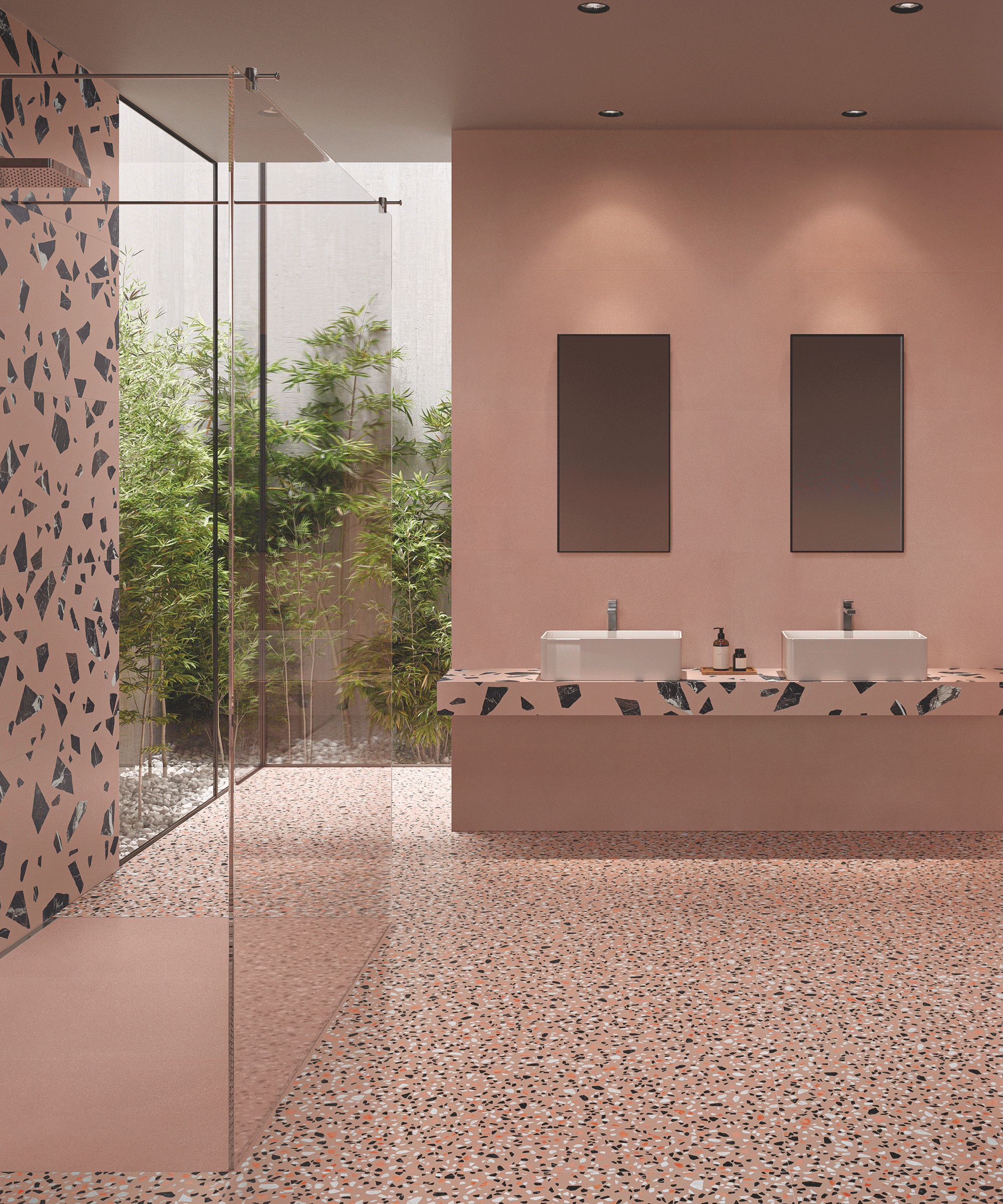
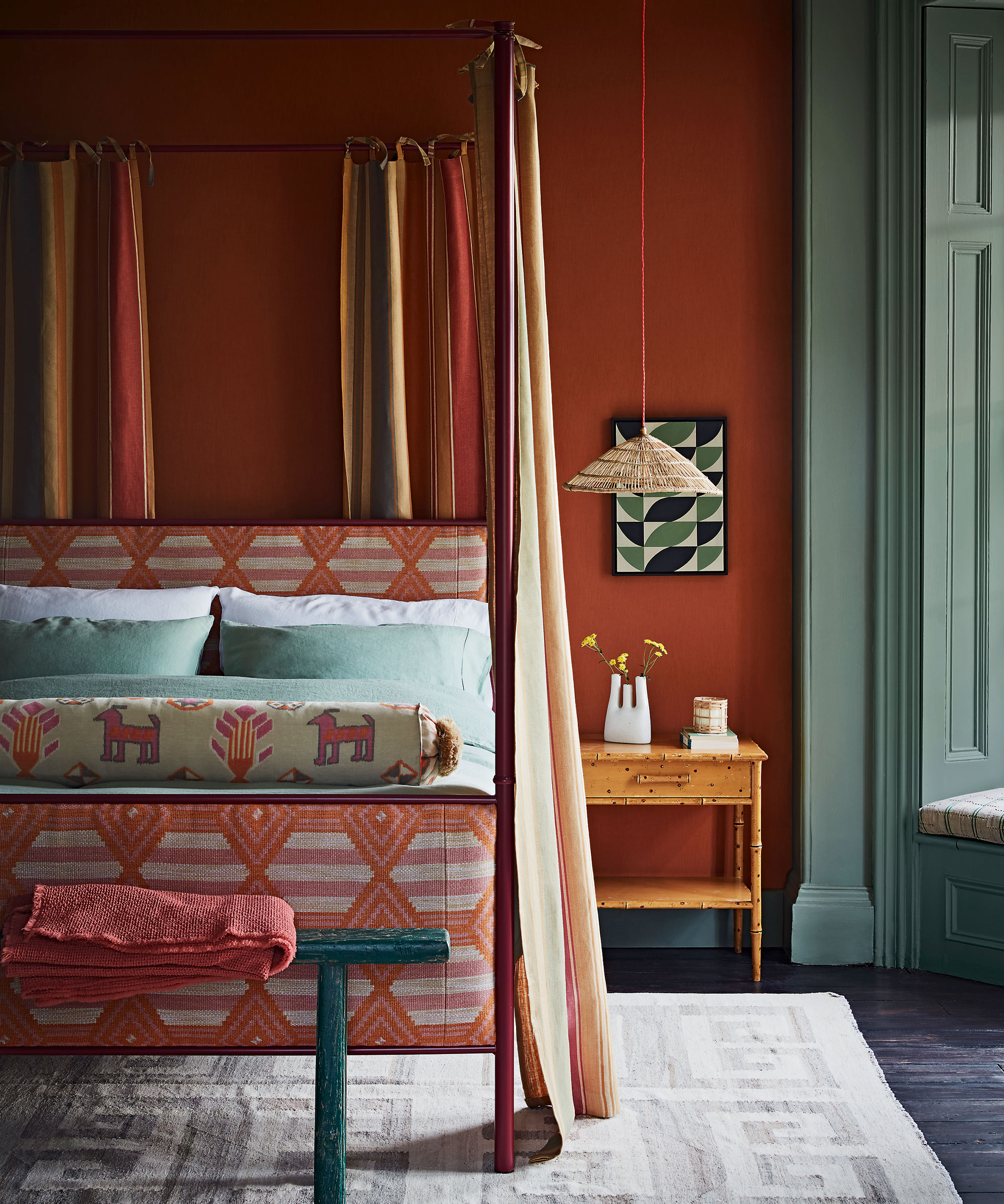
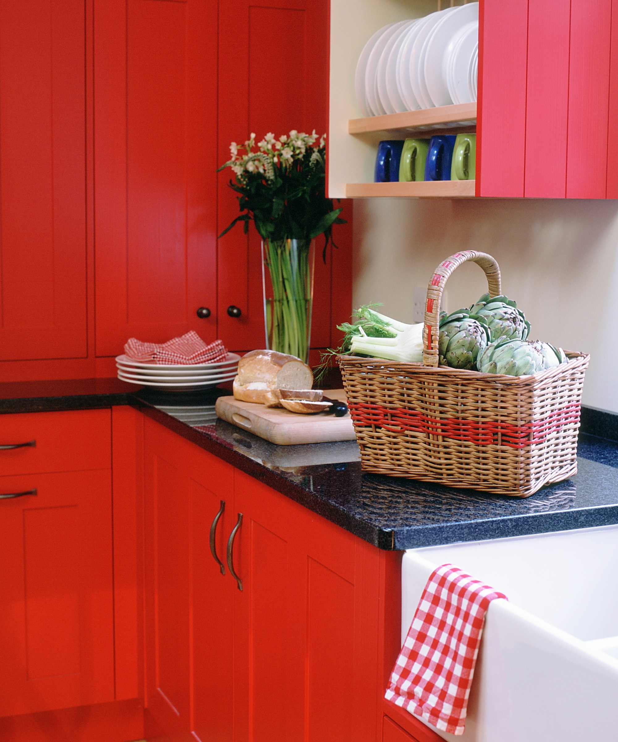
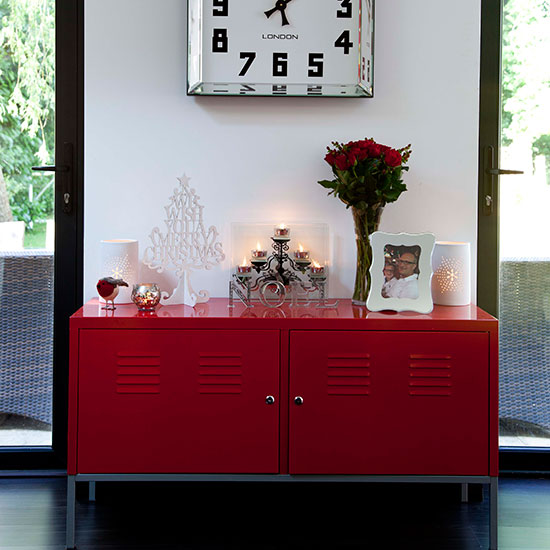
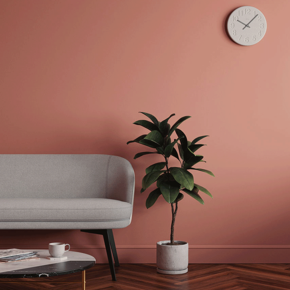
Red is another color that interior designers caution against due to its stimulating effects. Li explains that red can elevate energy levels, making it difficult to unwind and fall asleep. For those who appreciate red tones, earthy terracottas or soft blushes are suggested as more calming alternatives. Magno adds that warm colors like red work best when balanced with analogous colors, creating a harmonious scheme. If red walls are too overwhelming, incorporating red in small doses, such as a terracotta nightstand against pale blue walls, can provide contrast without dominating the room.
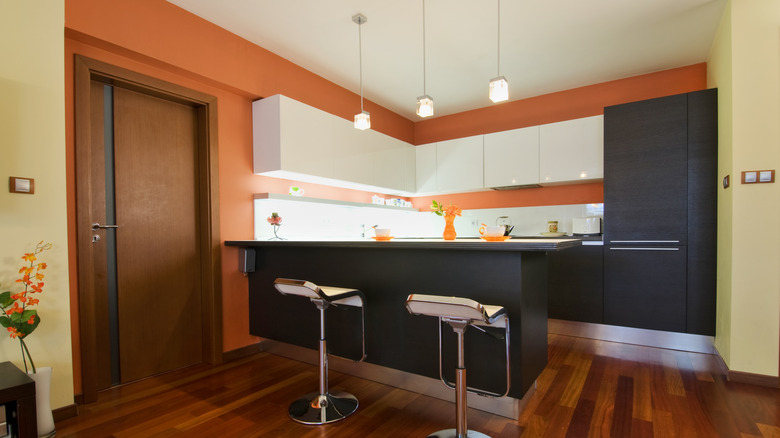
Orange shares similar characteristics with red, being a bold and energizing color. It is typically more suitable for lively spaces than for areas dedicated to relaxation. While terracotta, a blend of red and orange, can offer warmth without being overwhelming, bright orange is generally deemed inappropriate for a bedroom. Interior designer Mary Patton recommends using brighter oranges in spaces that benefit from an energetic boost, such as laundry rooms. For bedrooms, soft shades like blues, grays, or earthy neutrals are preferred to create a genuinely restful atmosphere.
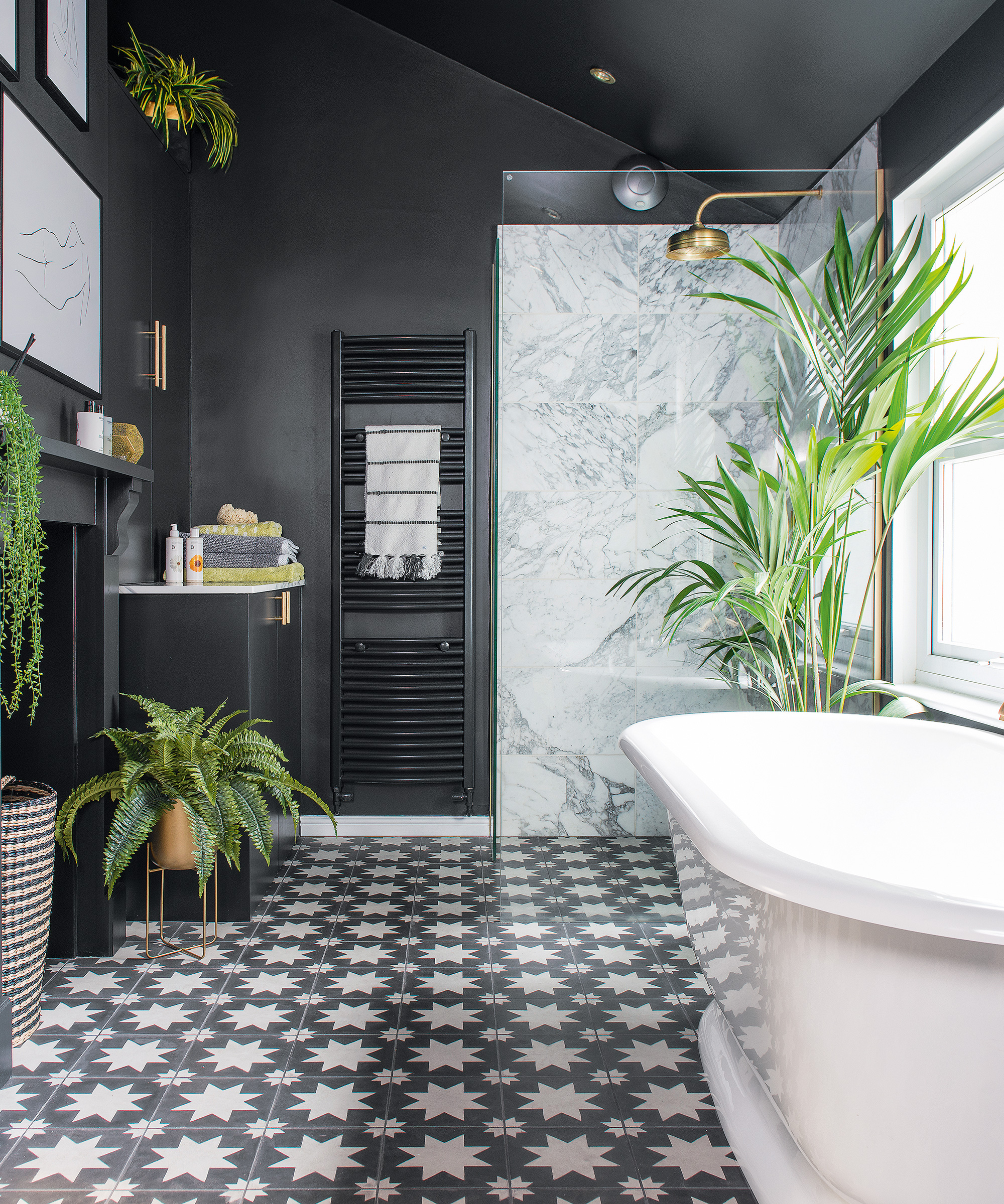
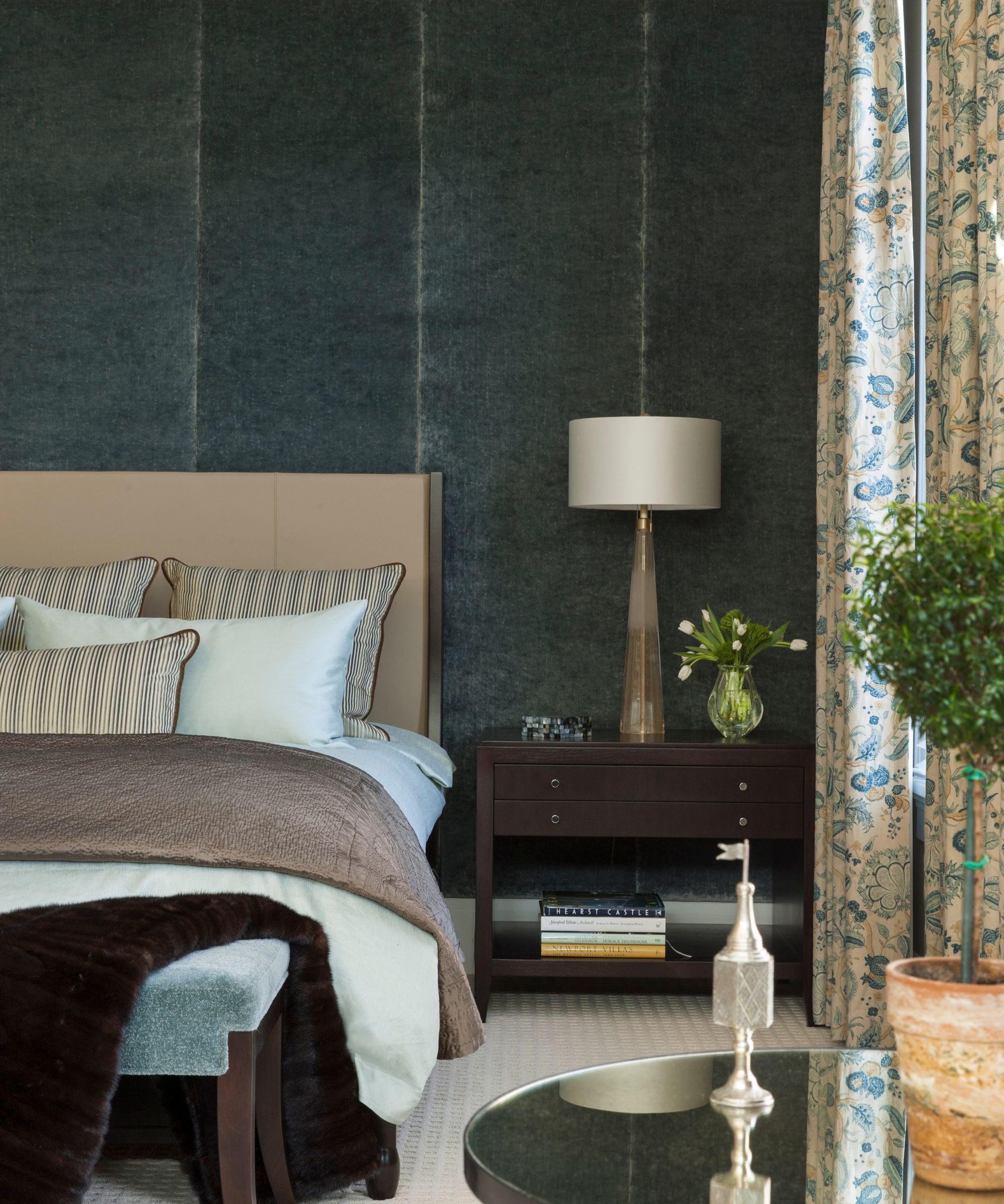
Finally, black and dark gray, while popular for dramatic and elegant aesthetics on platforms like Pinterest, may not create a restful environment for everyone. Although these dark tones can add sophistication, they can also feel heavy and potentially oppressive in a bedroom. Magno advises finding a balance between darker and lighter hues within the same color family to achieve a cohesive look that is not overwhelming. Softer grays and warm neutrals can offer similar sophistication without the intensity of pure black or very dark gray, contributing to a more comfortable and relaxing bedroom.
#BedroomDecor #PaintColors #InteriorDesign #HomeDecor #ColorPsychology #SleepEnvironment #RelaxingSpaces #DesignTips #BedroomDecor #PaintColors #InteriorDesign #HomeDecor #ColorPsychology #SleepEnvironment #RelaxingSpaces #DesignTips
0 ความคิดเห็นรวม
 ยังไม่มีความคิดเห็น
คุณอาจจะชอบอีกด้วย

What are the worst colors to paint a room? The shades experts say you should never use


5 colors you should never paint a pantry – designers share the shades they swerve
6 colors to avoid in an entryway – and the ones designers know make a better first impression

Interior designers share 6 things you should never have in your bedroom

5 colors you should never paint a small room – designers warn us to steer clear of these hues, and what to pick instead
6 Worst Colors To Paint Your Kitchen (And What To Choose Instead)
6 Colors You Should Never Paint Your Entryway, According to Color Experts

Colors not to paint a mudroom – 5 hues to avoid in this high-traffic space

5 colors you should never paint your entryway – according to interior experts
6 Bedroom Paint Colors Designers Don't Want to See in 2026
6 bedroom paint colors going out of style for 2024 – and the colors to use instead
You should never paint your hallway this colour, according to colour psychologists
5 Paint Colors You Should Never Use In A Bedroom, According to Designers


Interior design experts reveal the colour rules you should be breaking

4 Outdated Colors Designers say you Should Steer Clear of When Decorating a Living Room
10 designers on the bedroom colors they always recommend
5 colors to avoid in a bathroom – according to designers
8 colors you should never paint kitchen cabinets according to the experts

6 things to never put in an entryway, according to interior designers
5 Paint Colors to Never Use in Your Living Room, According to Interior Designers