1/7
6 Failsafe Color Combinations That Designers Always Fall Back on – 'They're so Reliable!'
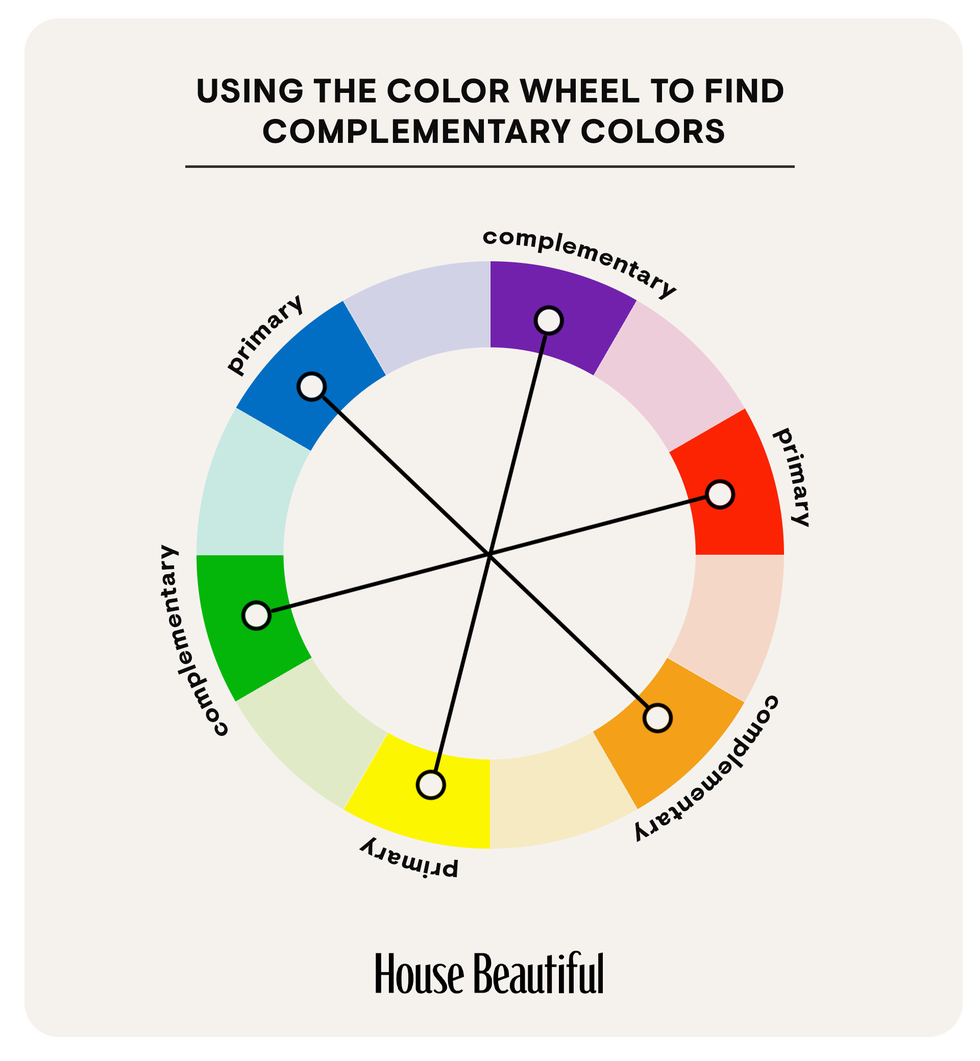
Choosing the right color combinations for home interiors can be a daunting task, especially without professional guidance. The myriad of available options often leads to overwhelm, making it difficult to select pairings that align with decor, complement natural lighting, and express personal style. Helen Shaw, a paint expert at Benjamin Moore, highlights the importance of color theory in this process, suggesting that effective color pairings are often determined by their position on the color wheel. She advises considering monochromatic schemes, which utilize varying saturations of a single color, or analogous schemes, which employ colors adjacent on the wheel.
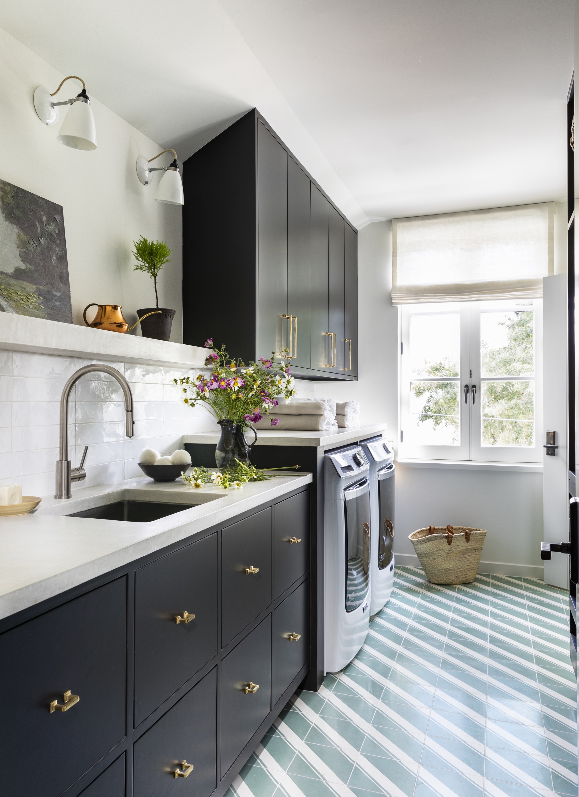
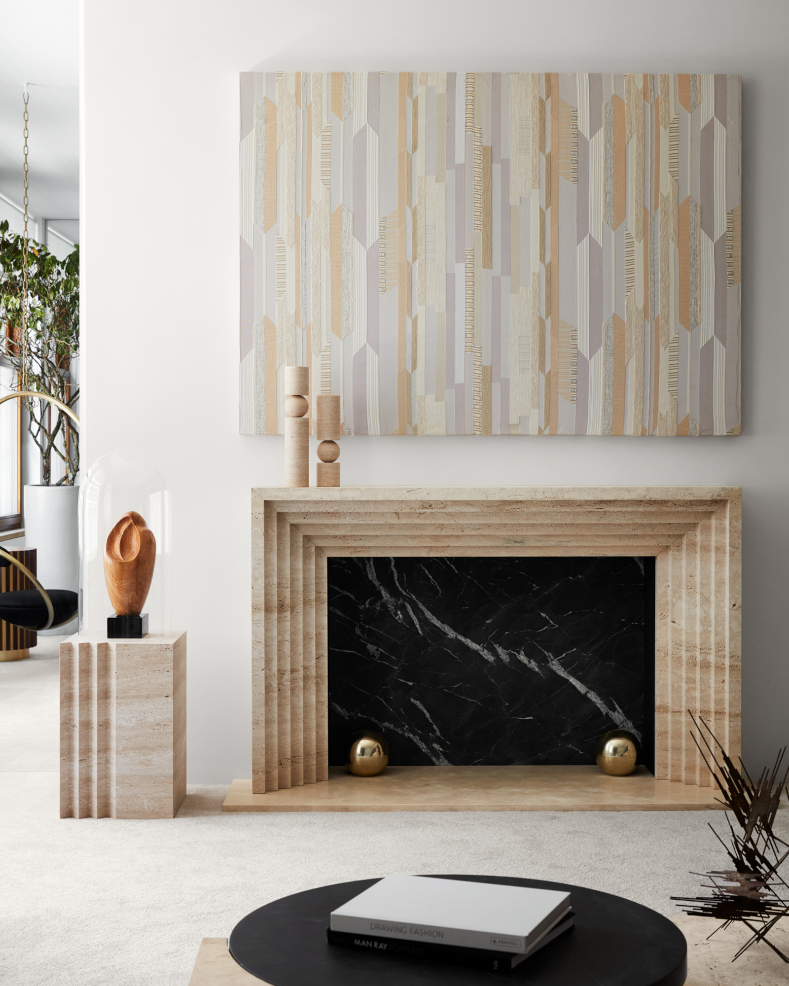
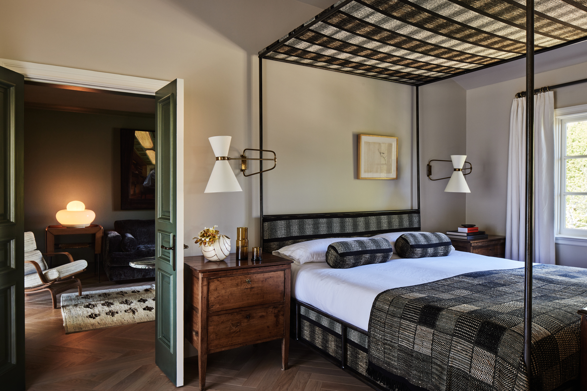
To simplify this decision-making process, several designers were consulted to share their go-to color combinations. These experts also provided insights into where these shades would be most effective and how to integrate them into an interior design for a contemporary aesthetic. The first recommended combination is the timeless black and white. Manuela Hamilford, founder of Hamilford Design, notes that monochrome has been a consistent and impactful design choice for over a century, offering versatility and a sleek finish. This pairing is particularly effective in tiling for hallways and bathrooms, with charcoal grey suggested as a softer alternative to black.
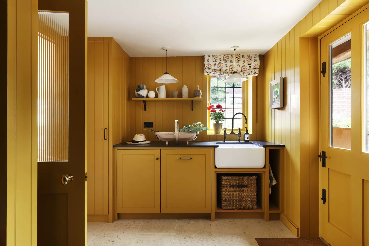
Another reliable combination is yellow and off-white. While not always a primary choice, yellow, especially when paired with cream or off-white, introduces a positive and comforting ambiance. Shades like India Yellow by Farrow & Ball, combined with a subtle Off White, can be used for both walls and furniture. Patrick O’Donnell of Farrow & Ball specifically recommends yellow for kitchen ideas, as it promotes a positive and energizing atmosphere, making it suitable for the home's central hub.
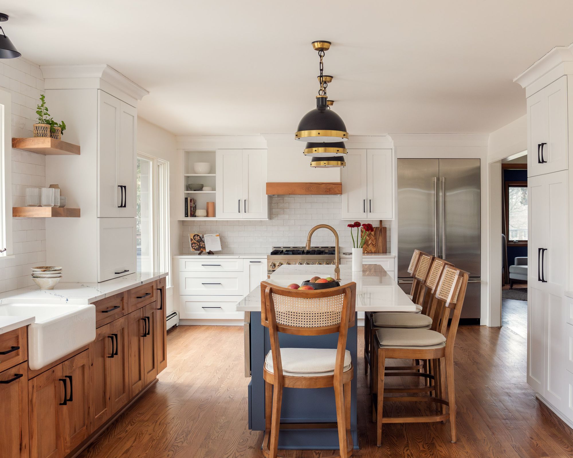
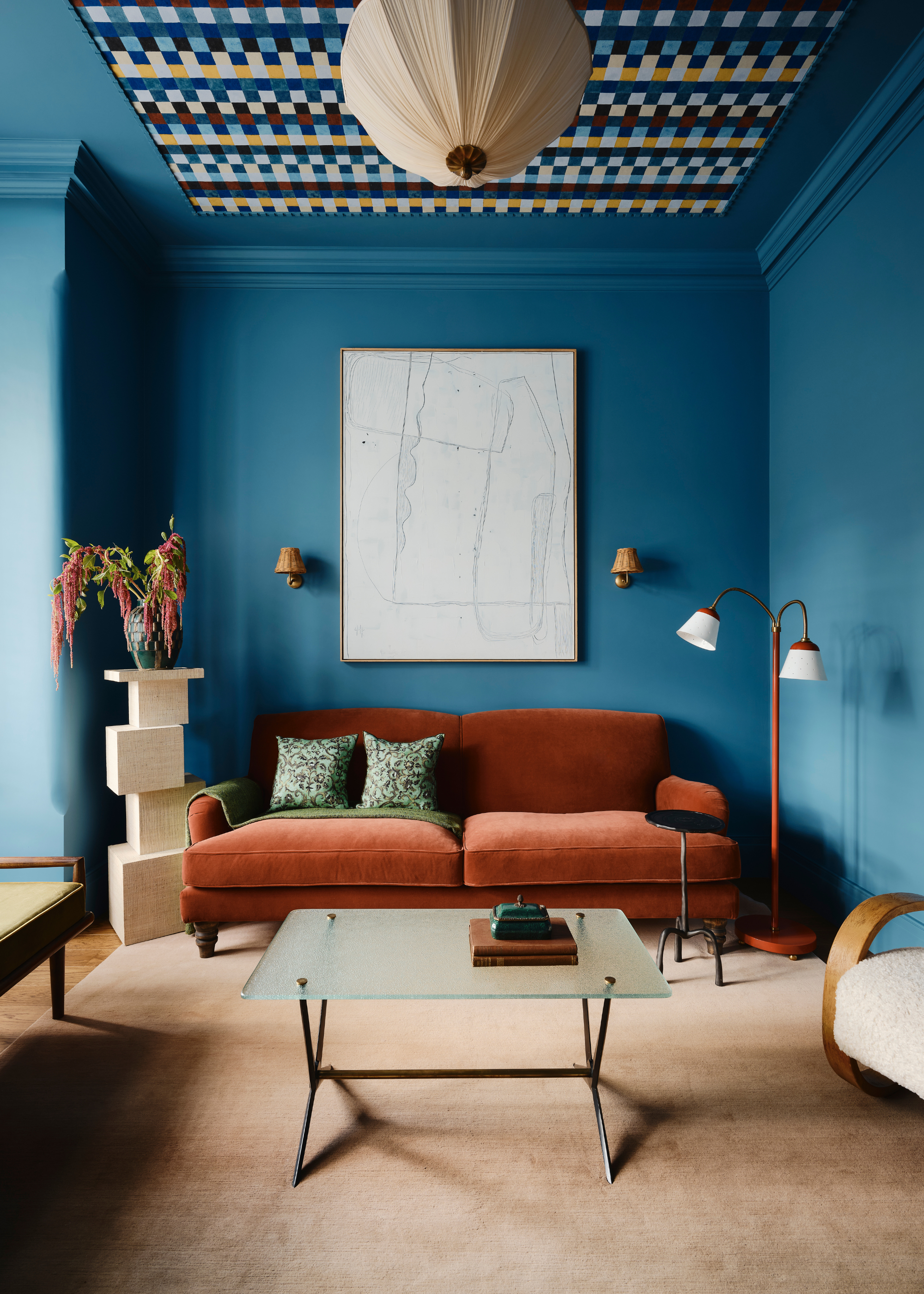
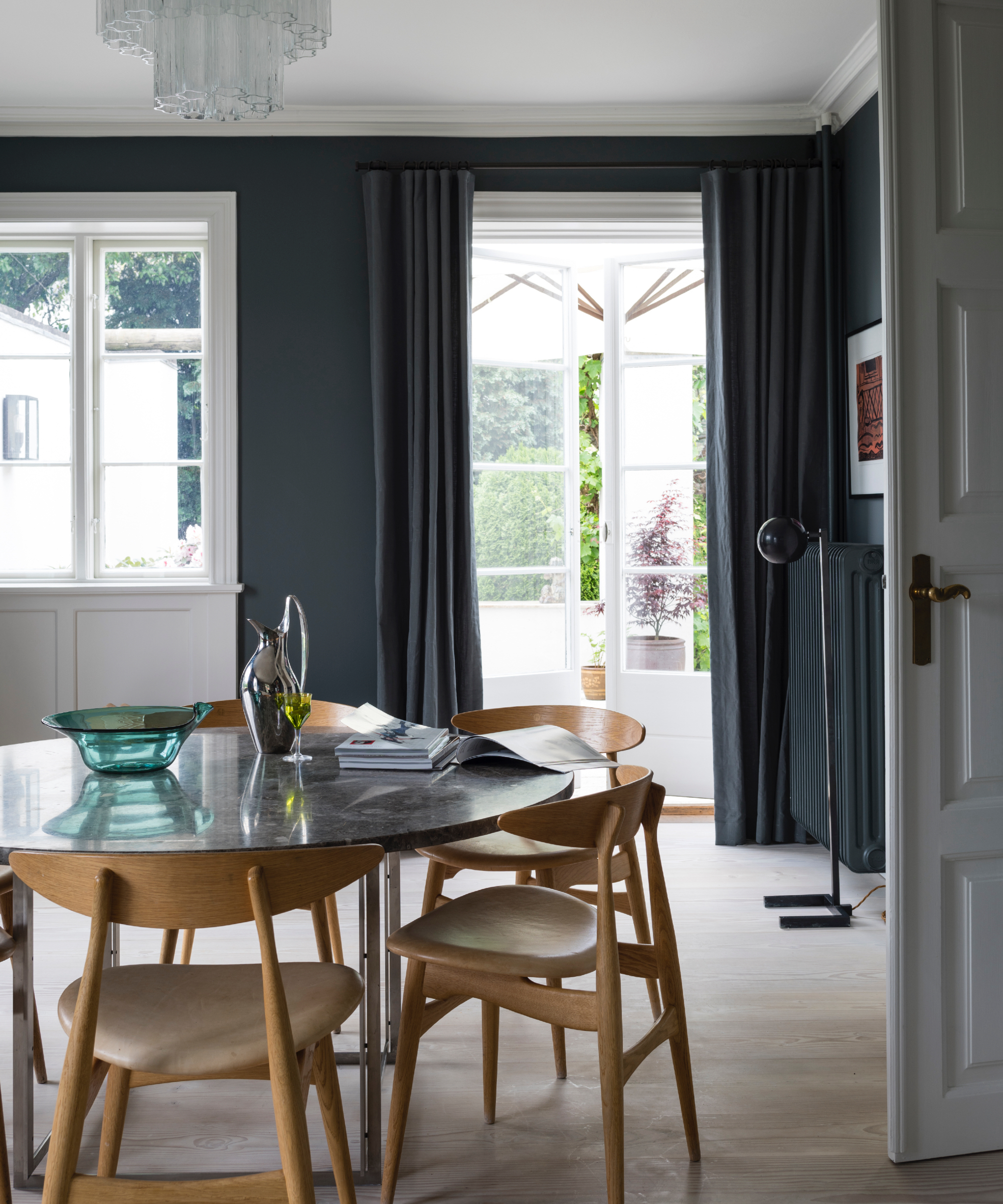

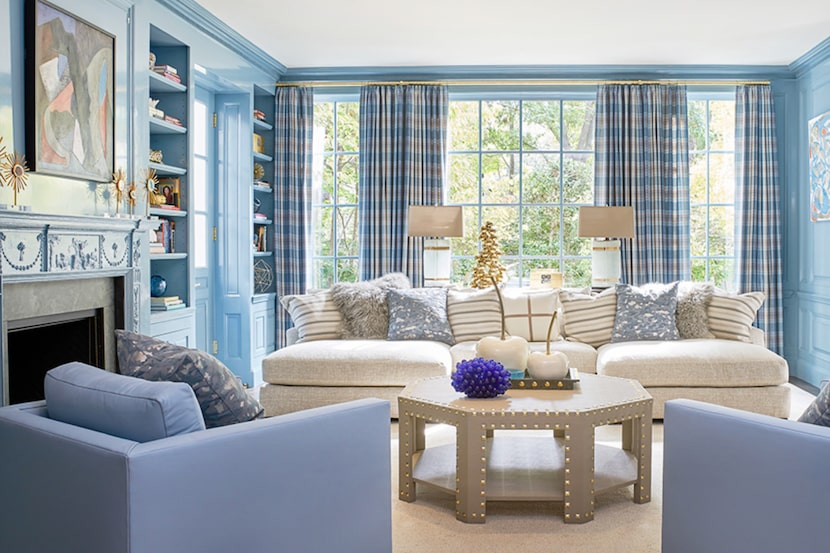
Blue and white form a classic combination known for its cool and calming effect, evoking a beachy and relaxing vibe. Alyssa Devoe, senior designer at KA Murphy Interiors, describes this as a favorite for comfortable living spaces. Blue's adaptability allows it to harmonize with various decors; lighter, steely blues have been prominent in 2024 color trend predictions. For darker shades like royal blue, incorporating wooden furniture can introduce warmth and a heritage feel.
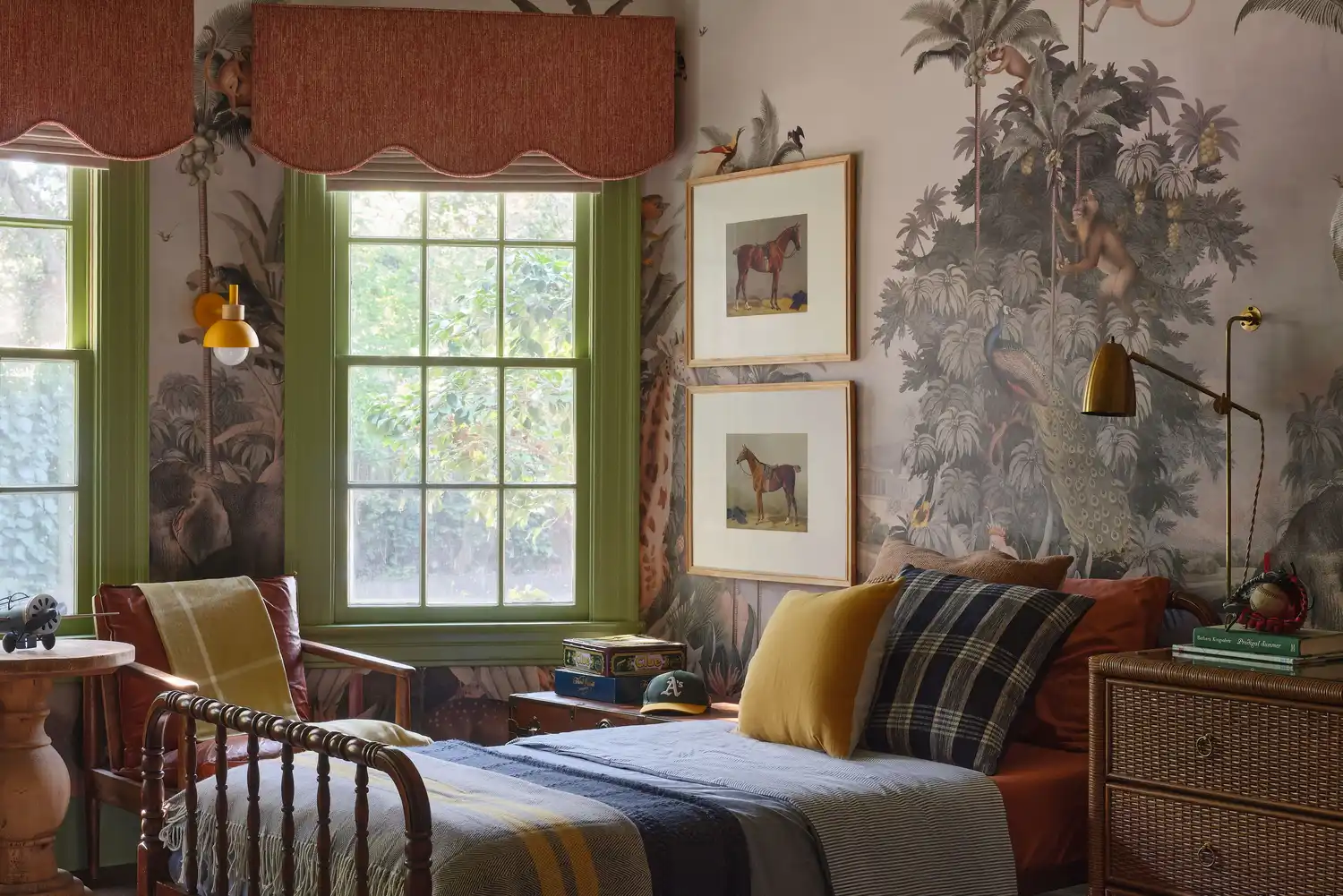
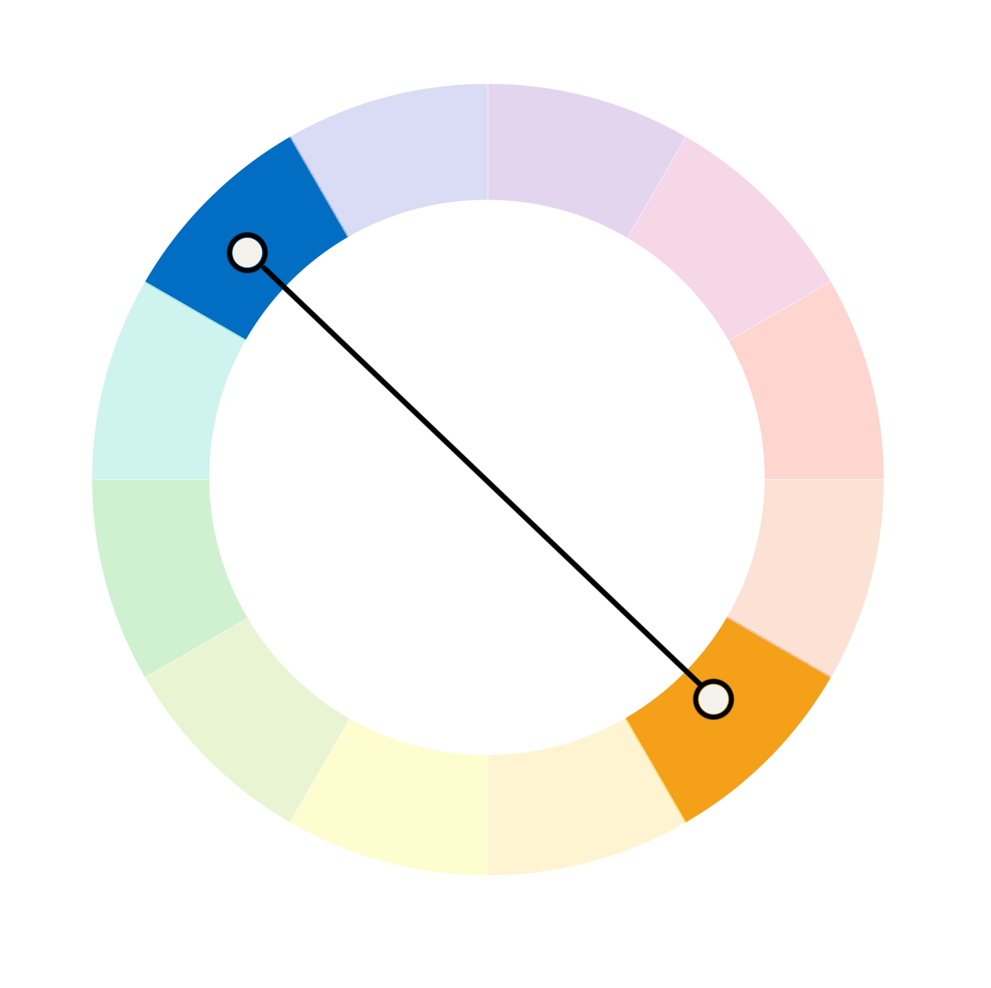
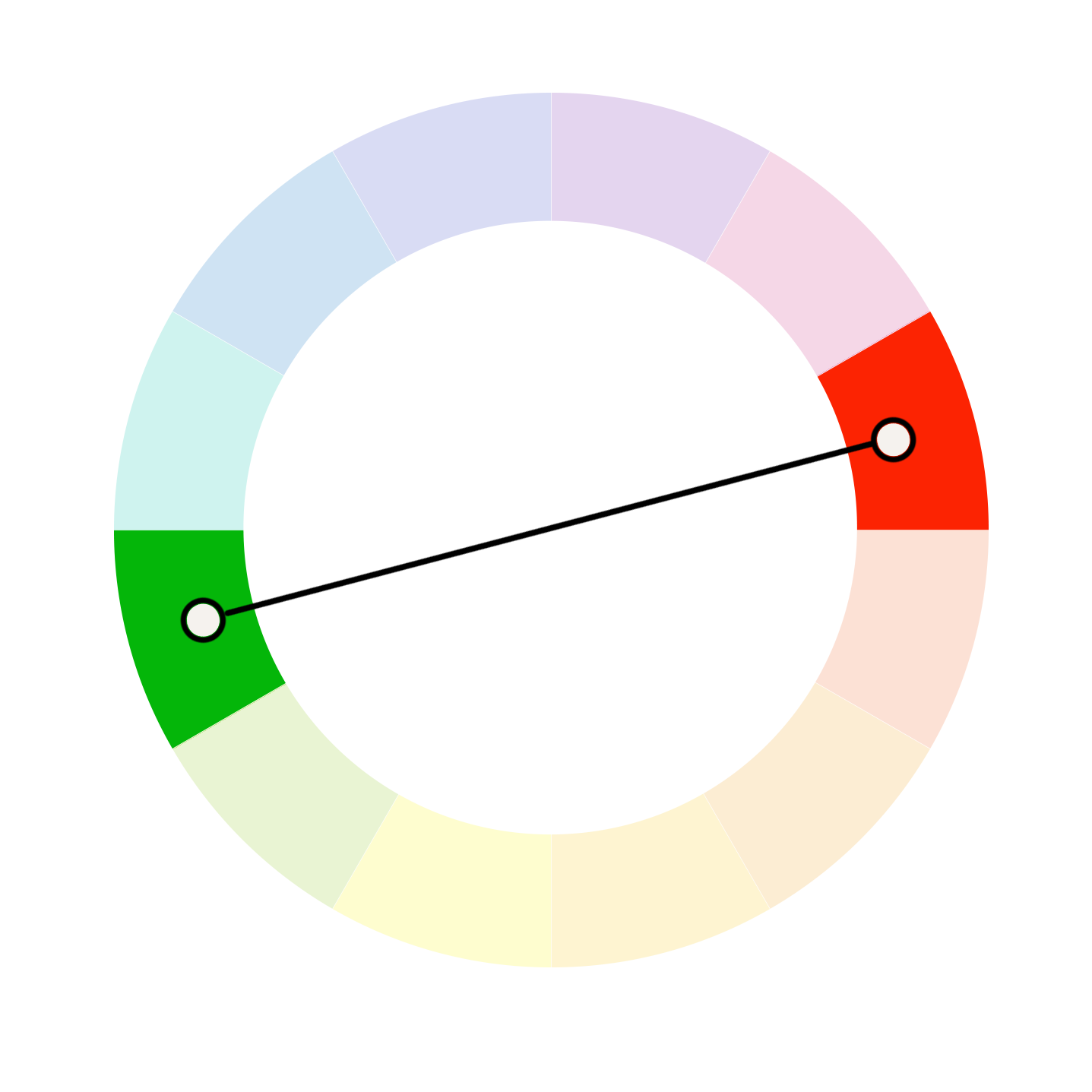
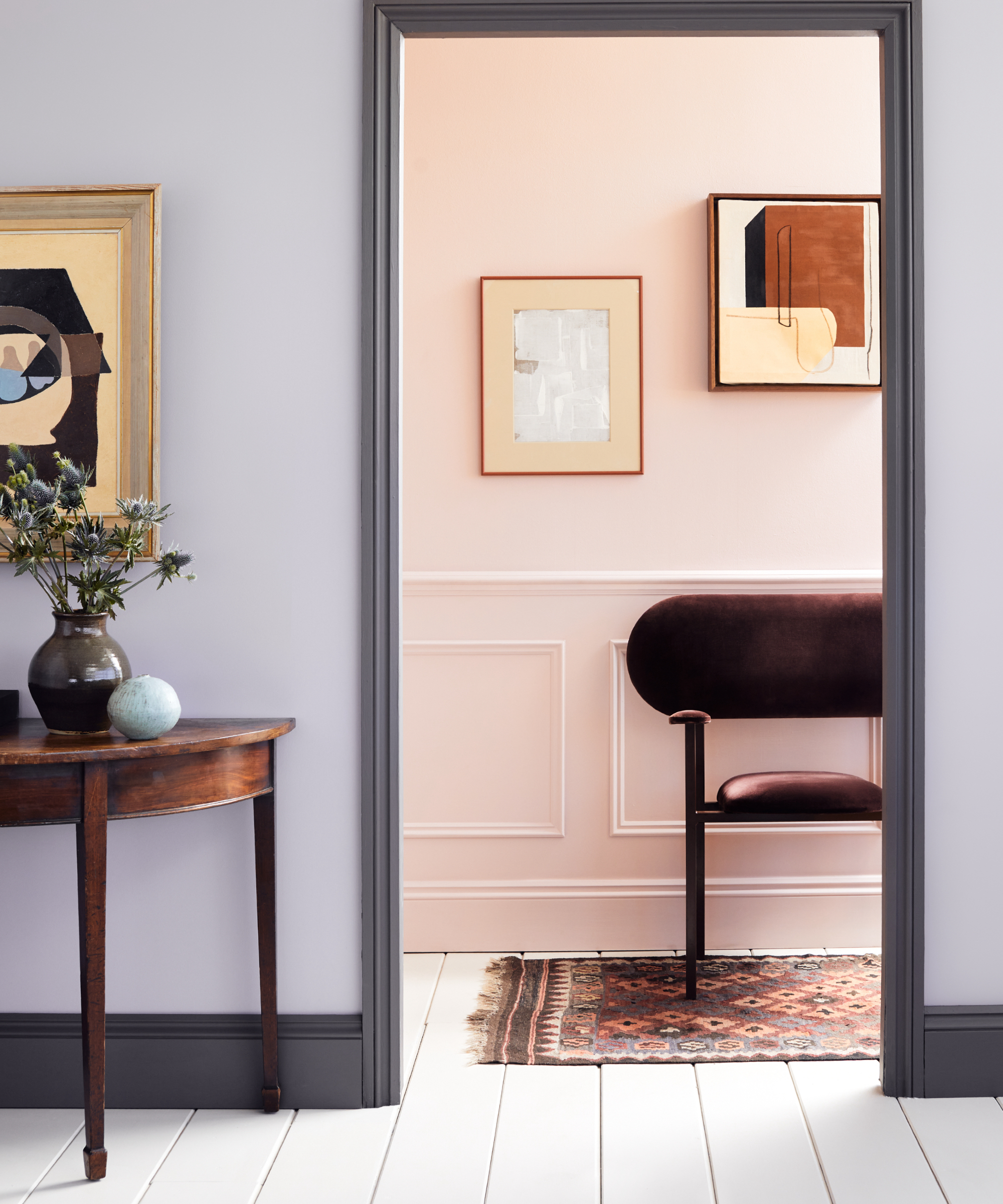
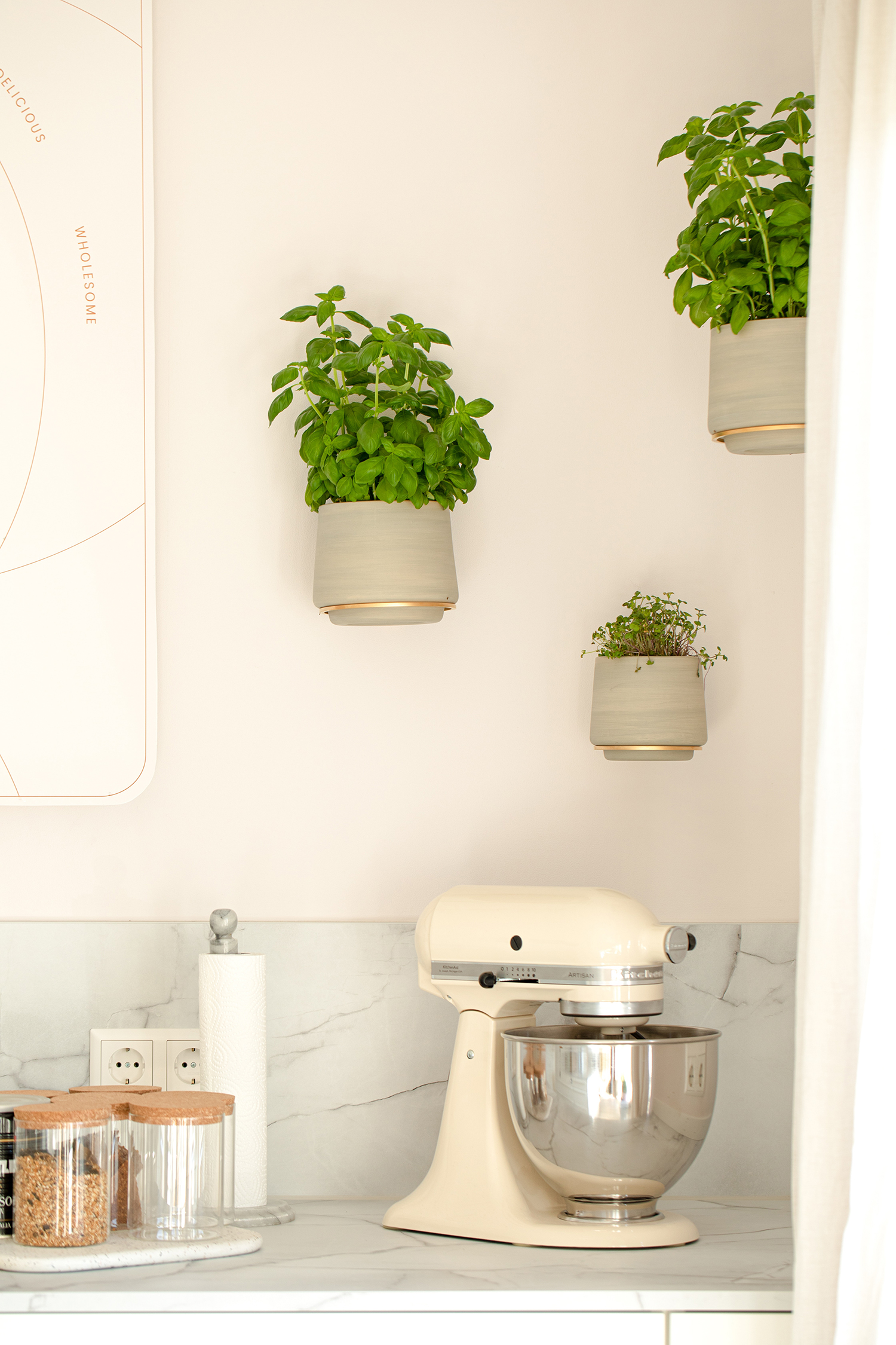
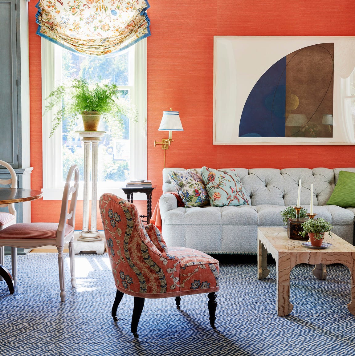
For those seeking a bolder statement, pink and orange offer a vibrant and impactful pairing. This duo can liven up a living room, and despite its intensity, can be integrated subtly through decor. Pairing these colors with gold interiors can create a regal and glamorous look, or they can be combined with funky interiors for a playful aesthetic. Additionally, peach and green are trending colors with enduring appeal. Helen Shaw explains that these complementary colors, situated opposite each other on the color wheel, can create an invigorating and pleasing aesthetic through various interplays of shades.
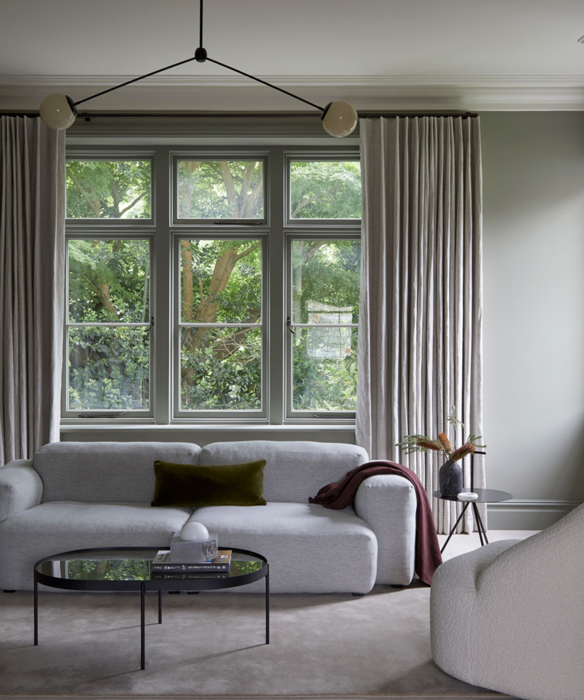
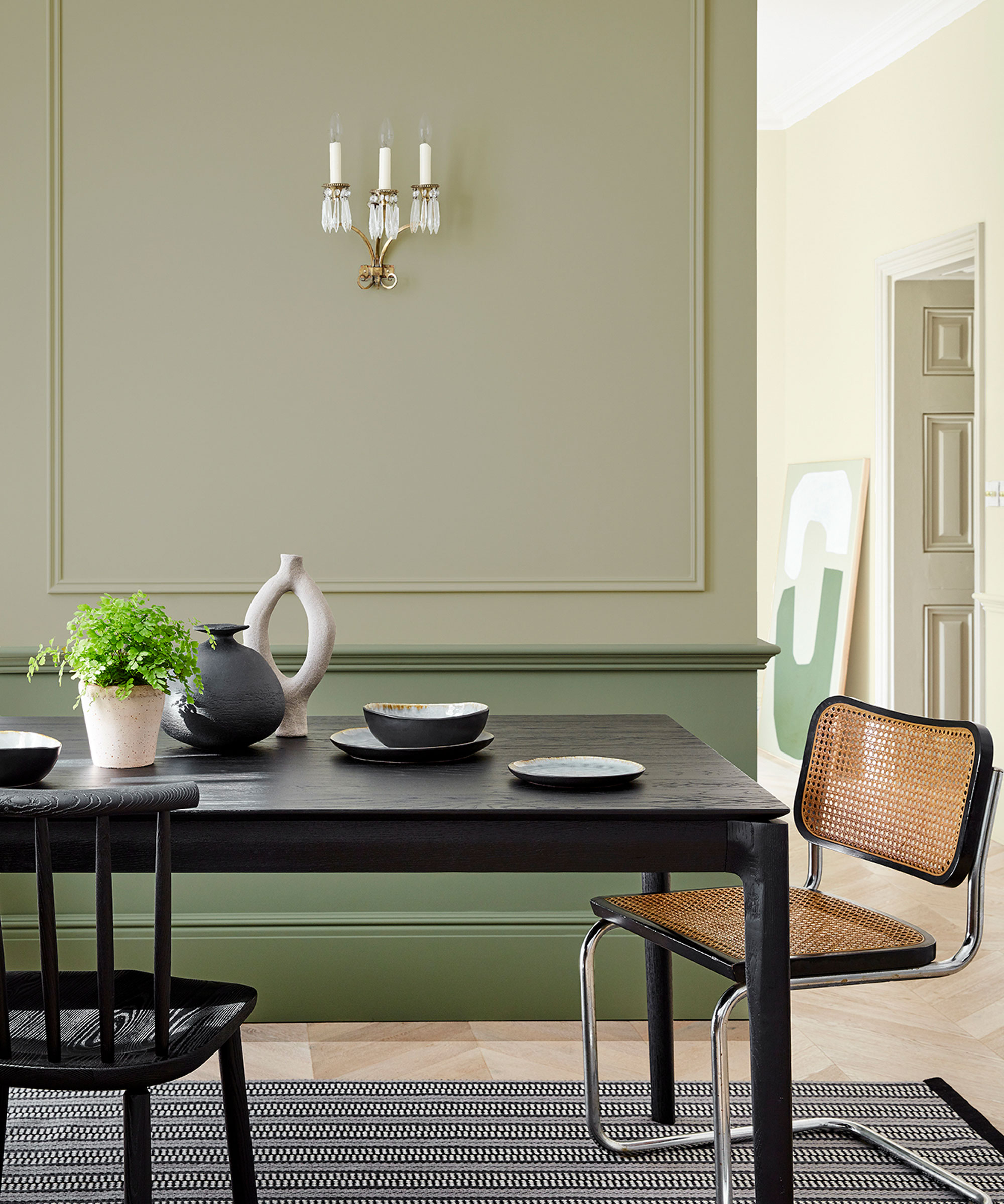
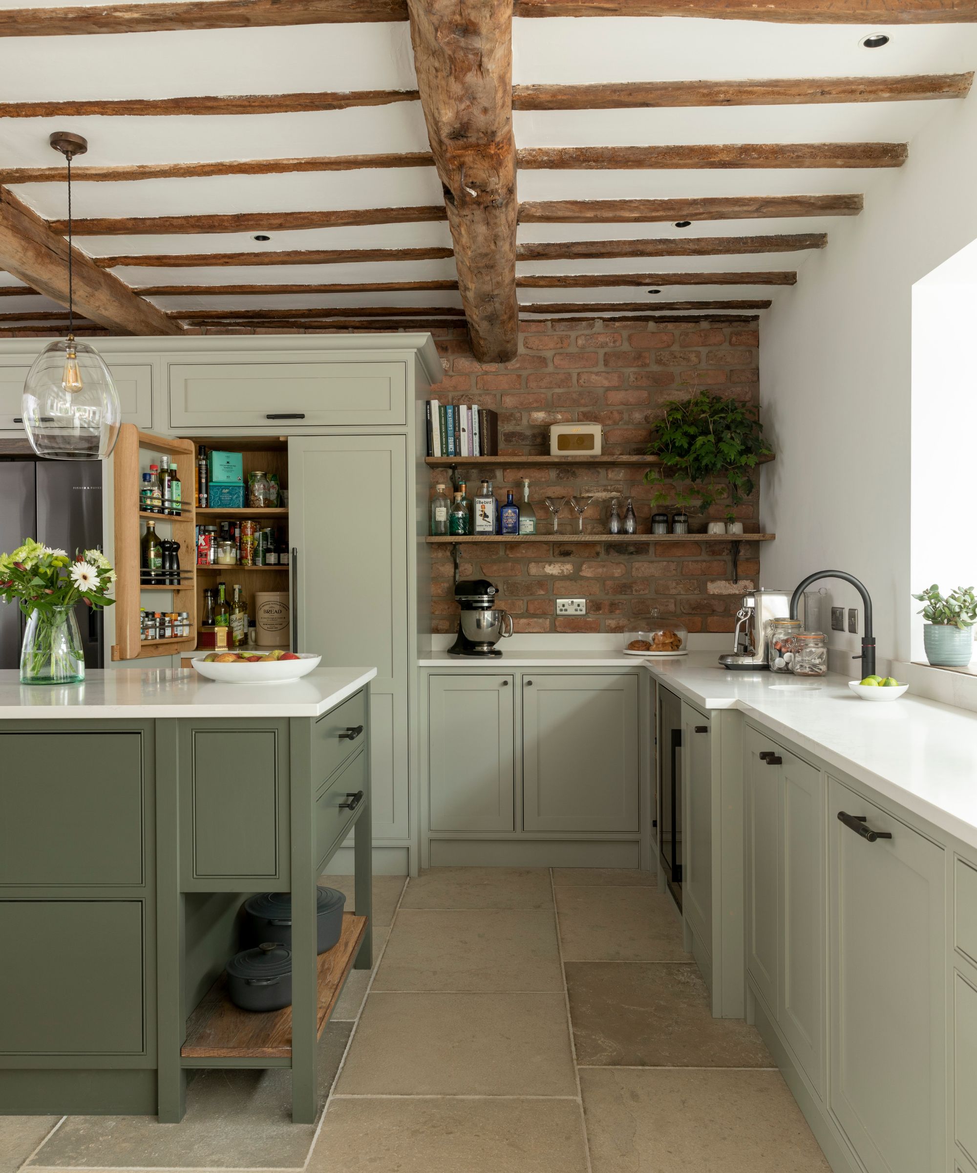
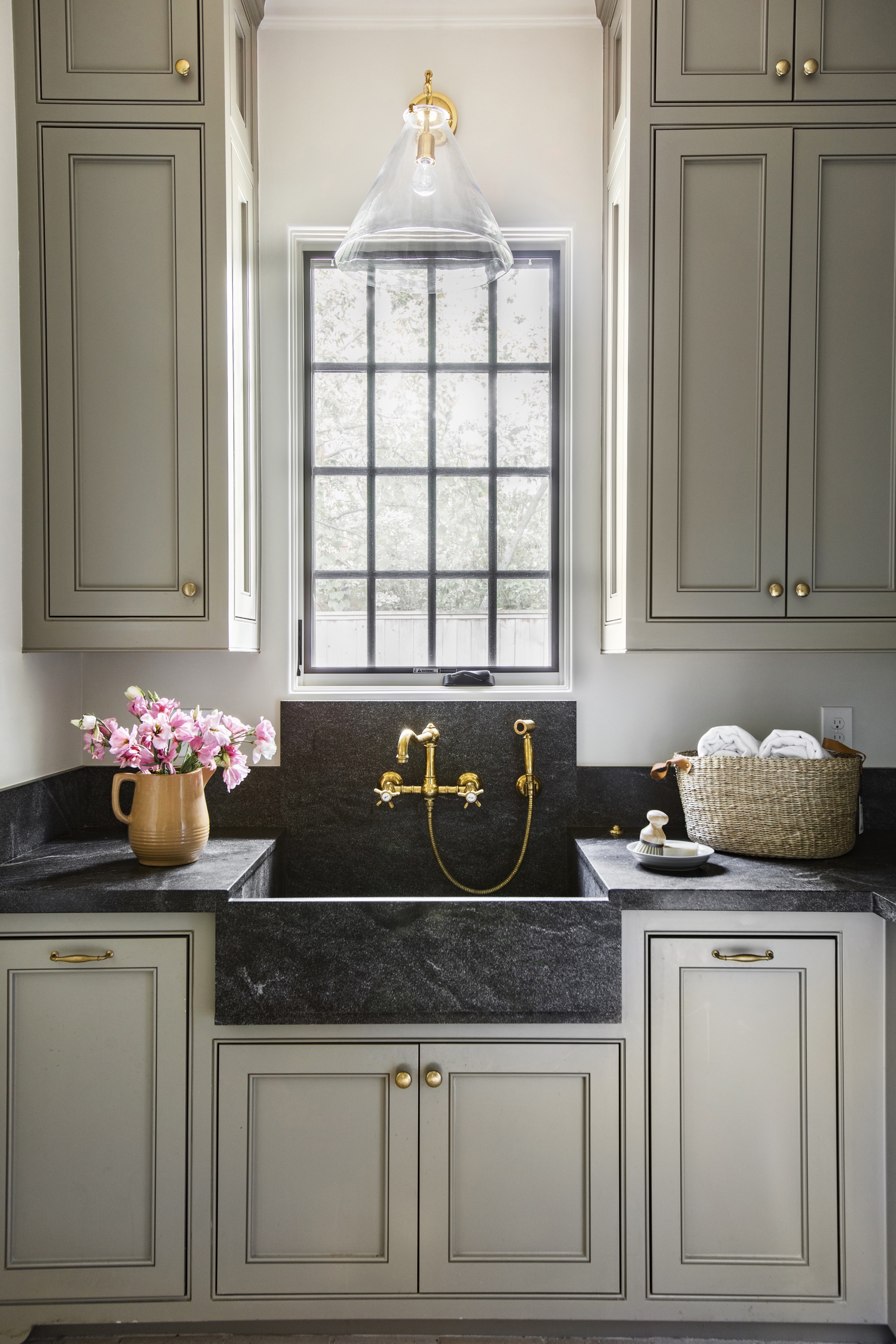
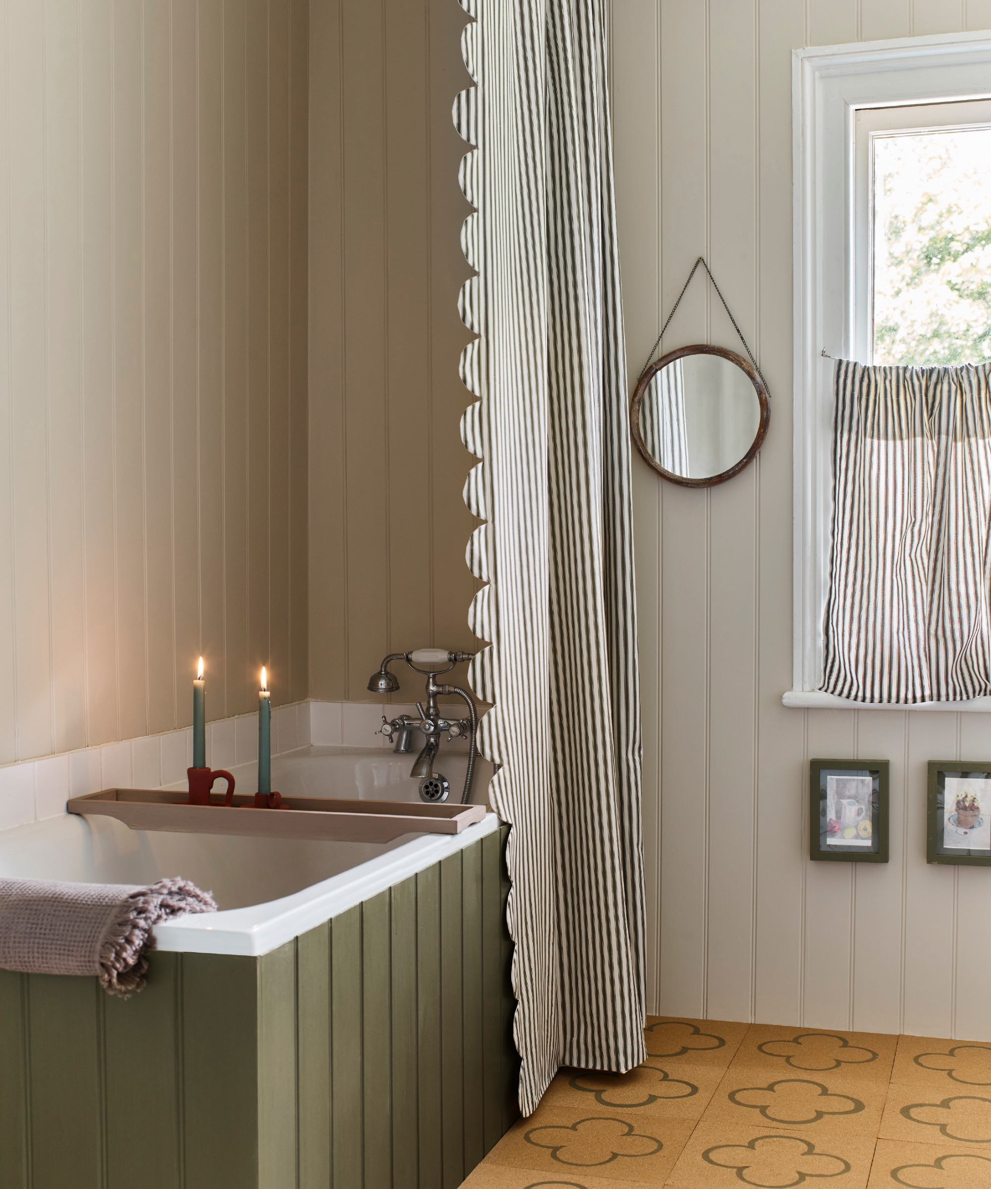

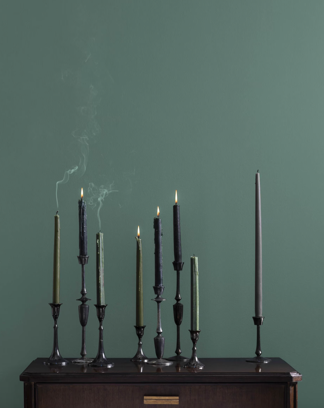
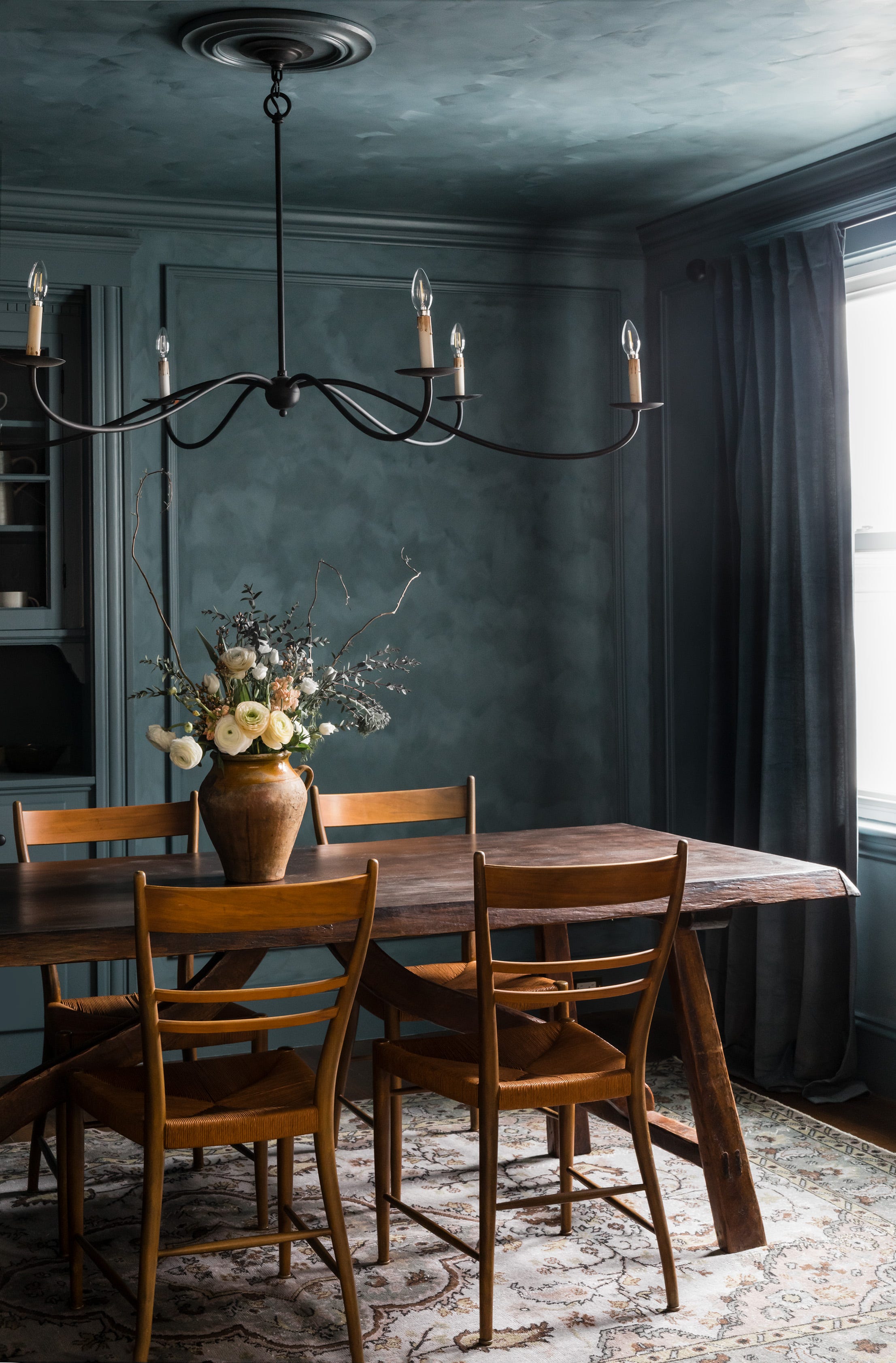
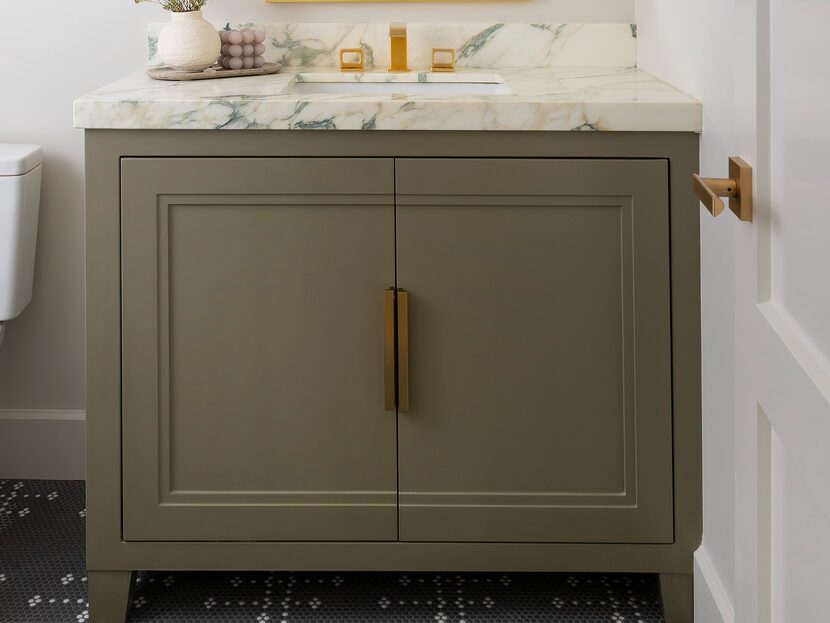
Finally, forest green is highlighted as one of the most versatile colors, remaining popular throughout 2023. This regal shade pairs well with almost any color, from earthy browns to hot pinks. When combined with metallic rust, antique gold, or brass, it exudes a modern majestic interior. Manuela Hamilford particularly favors forest green in bathrooms or powder rooms, noting that these separate spaces do not require adherence to the home's overall theme. It also works effectively in dining areas, imparting a sense of luxury.
#ColorCombinations #InteriorDesign #HomeDecor #ColorTheory #PaintIdeas #DesignerTips #ModernInteriors #BlackAndWhite #YellowAndOffWhite #BlueAndWhite #PinkAndOrange #PeachAndGreen #ForestGreen #ColorCombinations #InteriorDesign #HomeDecor #ColorTheory #PaintIdeas #DesignerTips #ModernInteriors #BlackAndWhite #YellowAndOffWhite #BlueAndWhite #PinkAndOrange #PeachAndGreen #ForestGreen
0 ความคิดเห็นรวม
 ยังไม่มีความคิดเห็น
คุณอาจจะชอบอีกด้วย
5 enduring colors designers always return to when they have trend fatigue

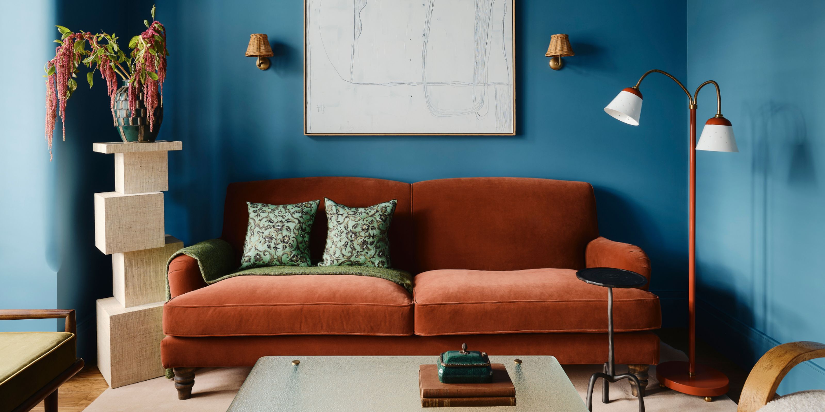
Colors That Go With Blue — 16 Pairings Designers Depend on for Bold, Breezy, and Perfectly Balanced Palettes
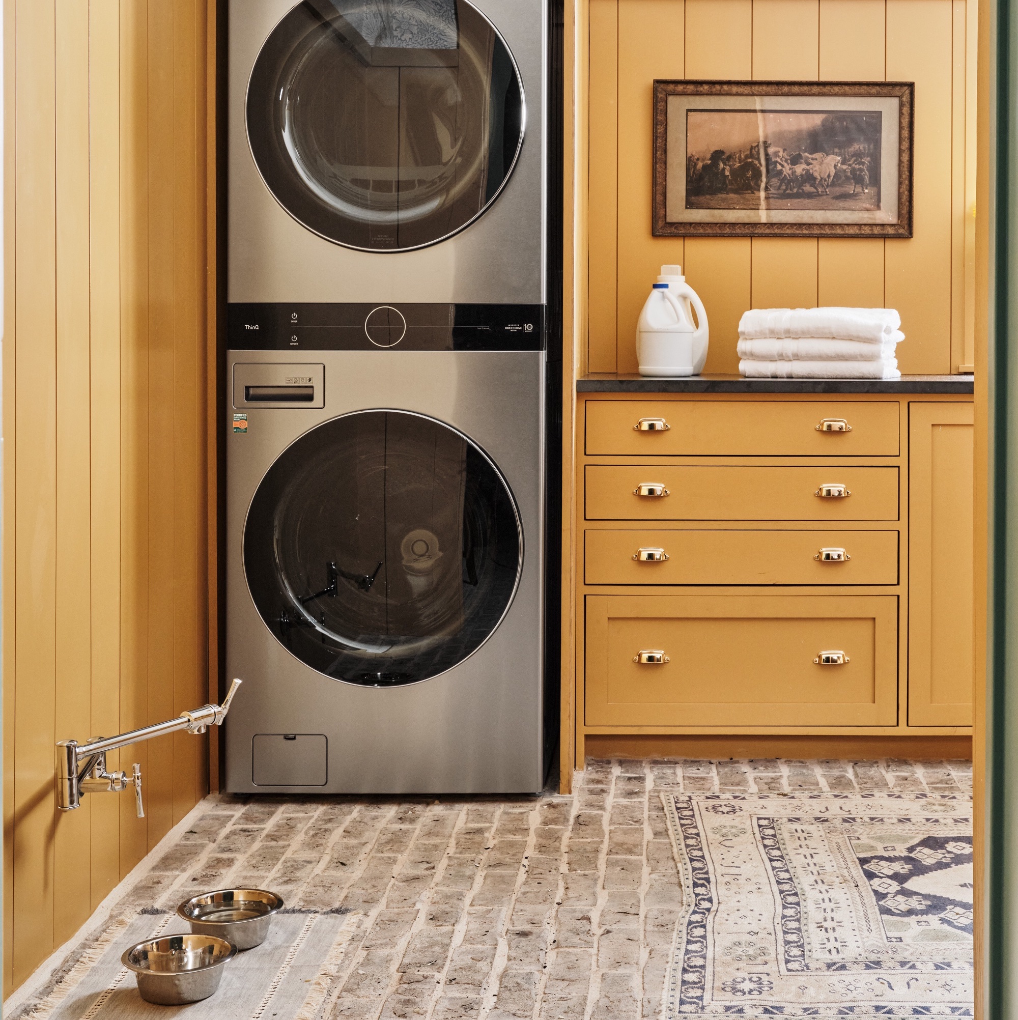
6 colors designers pick for laundry rooms - exact paint matches, from classic choices to surprising shades
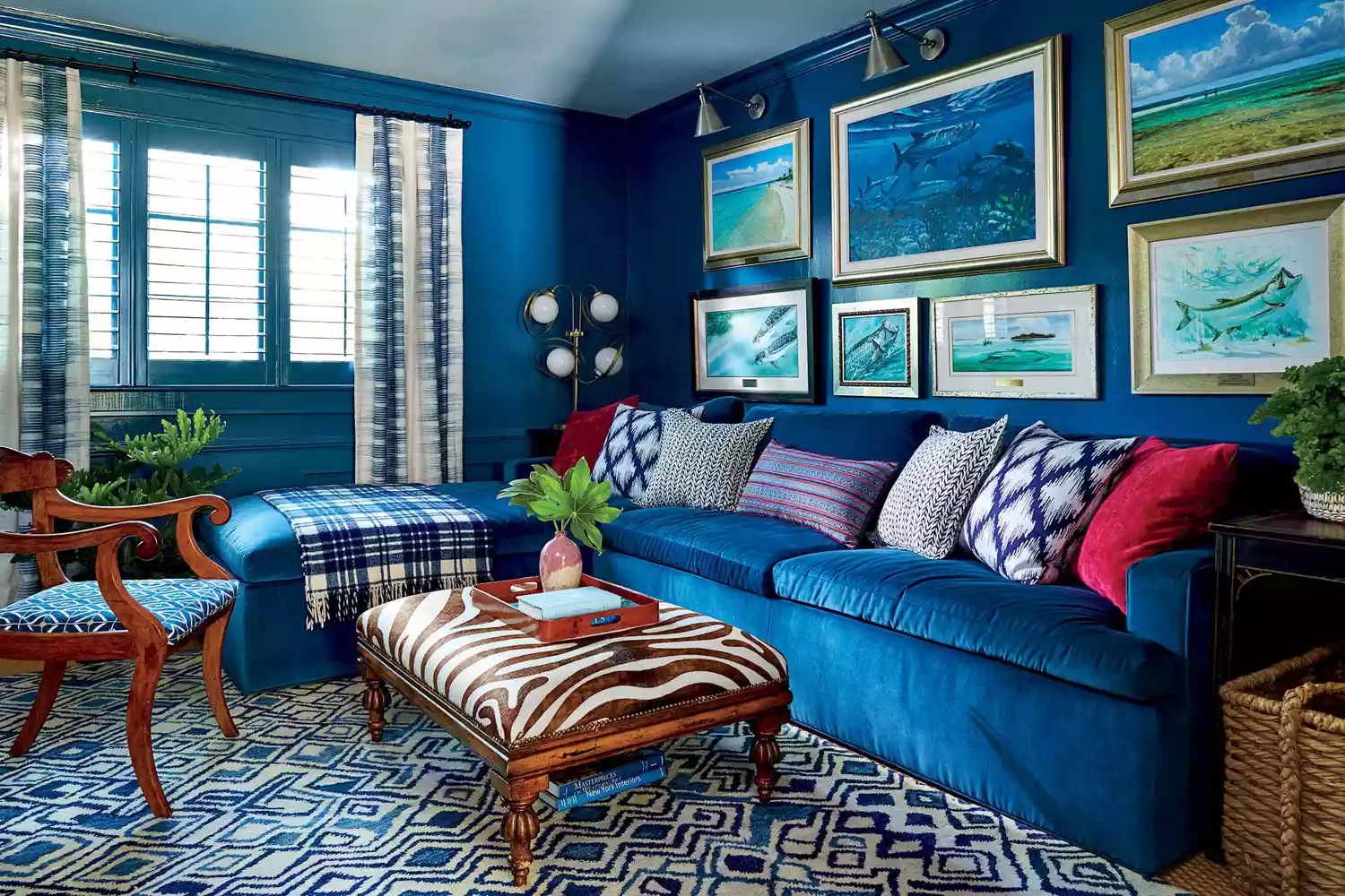
6 Paint Color Mistakes To Stop Making, According To Designers
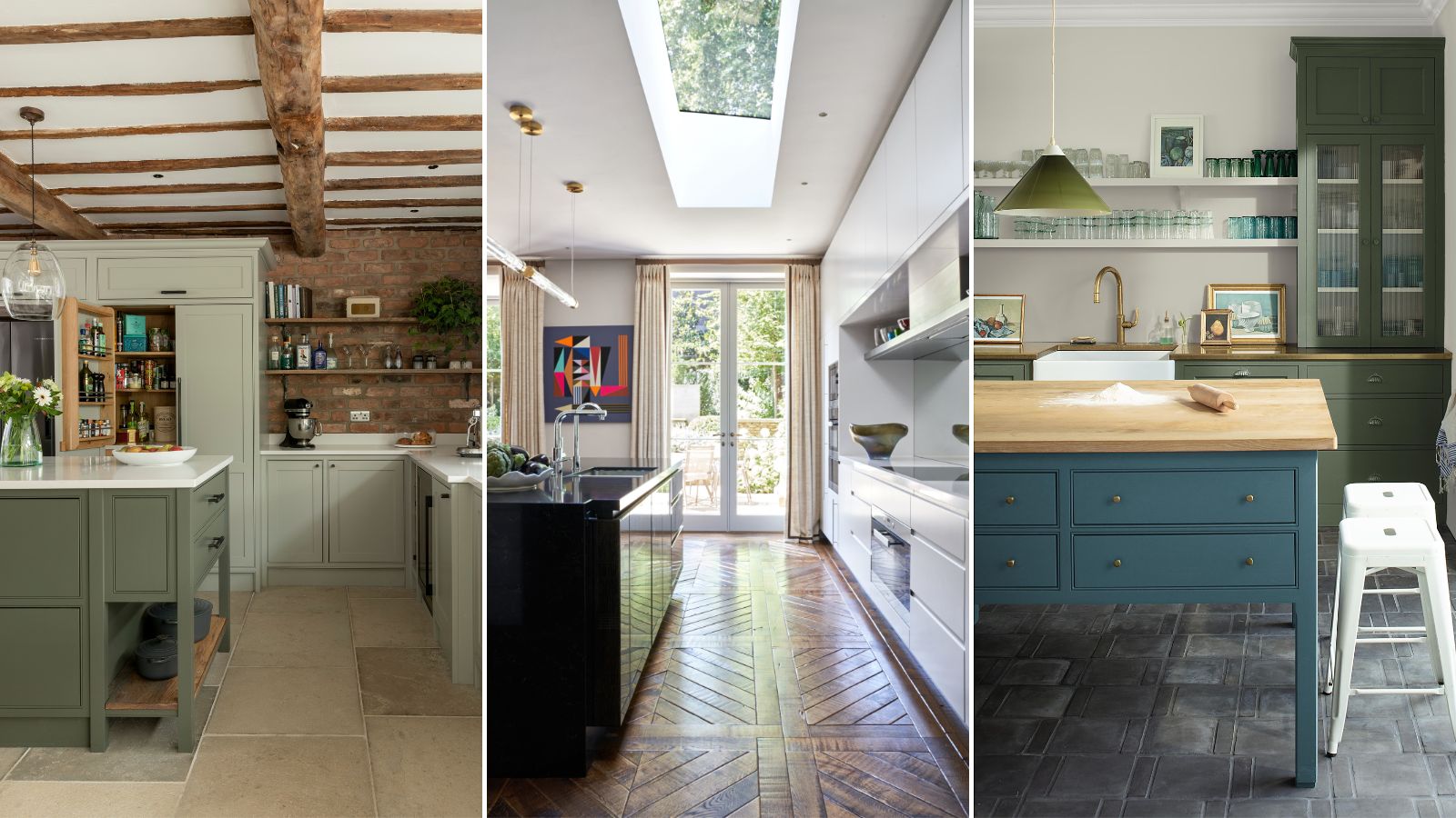
5 fail-safe kitchen cabinet color combinations that always work
How to Choose Colors That Work Together Every Time

15 Timeless Paint Colors You’ll Never Tire Of, According To Designers
The 6 Paint Colors for Your Kitchen That Will Never Go out of Style
6 Paint Color Duos Designers Can't Get Enough of This Fall

5 Underrated Paint Colors Designers Always Use in Their Projects (and You Should Too)

9 Neutral Paint Colors Designers Constantly Reach For — "It's My Tried-and-True"
The 10 Best Blue-Green Paint Colors Designers Can't Stop Using
7 Color Combos That ALWAYS Look Good Together, According to Designers


5 Timeless Paint Colors That Will NEVER Go Out of Style, According to Designers


Designers LOVE Pairing These Unexpected Colors With This One Timeless Hue
19 go-to paint colors that Dallas designers love

An A-List Designer’s Secrets To Picking Perfect Paint Colors

The most timeless paint colors according to designers

7 of the most versatile and easy to use paint colors according to designers
6 Paint Color Mistakes To Stop Making, According To Designers