1/6
Six things you need to know before painting a room off-white — and five beautiful tints to consider
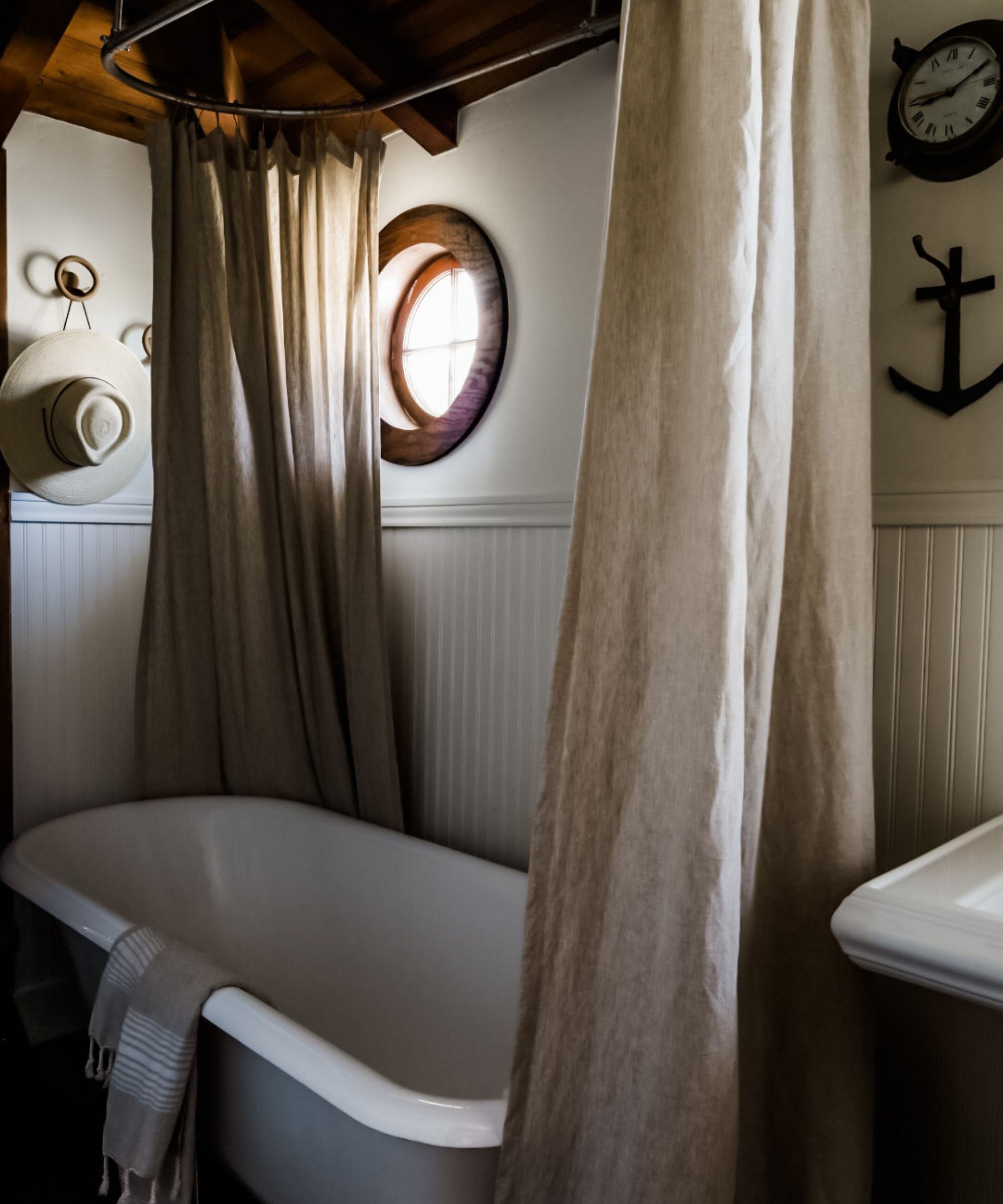
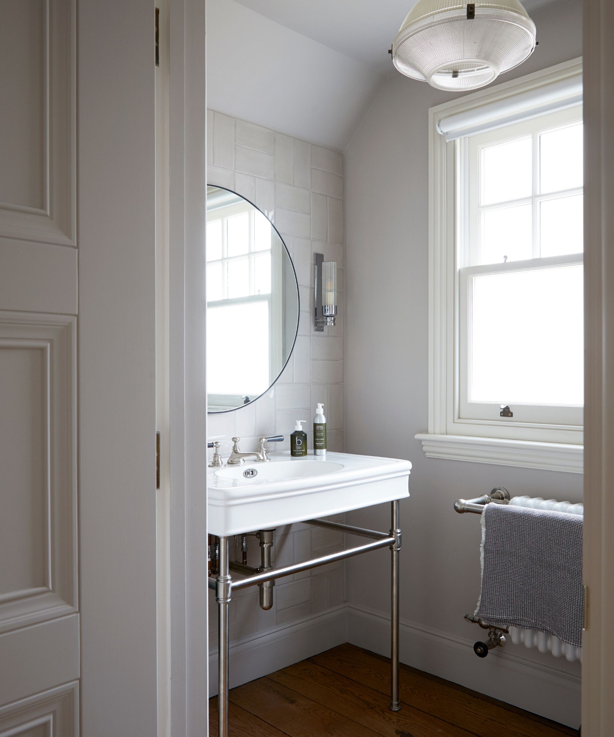
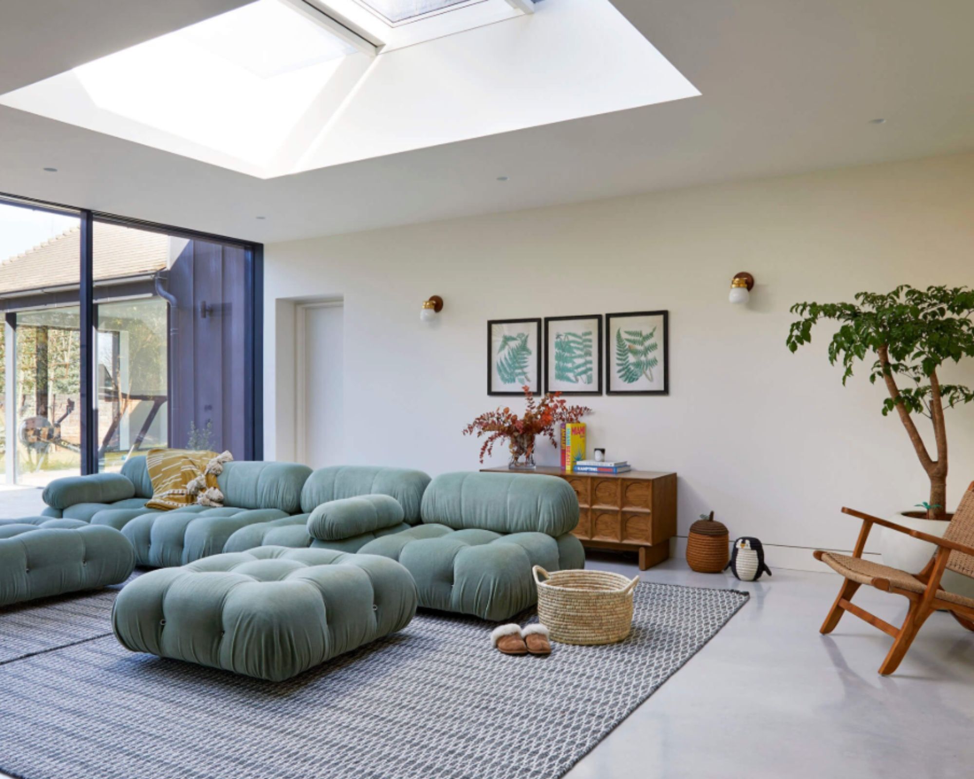
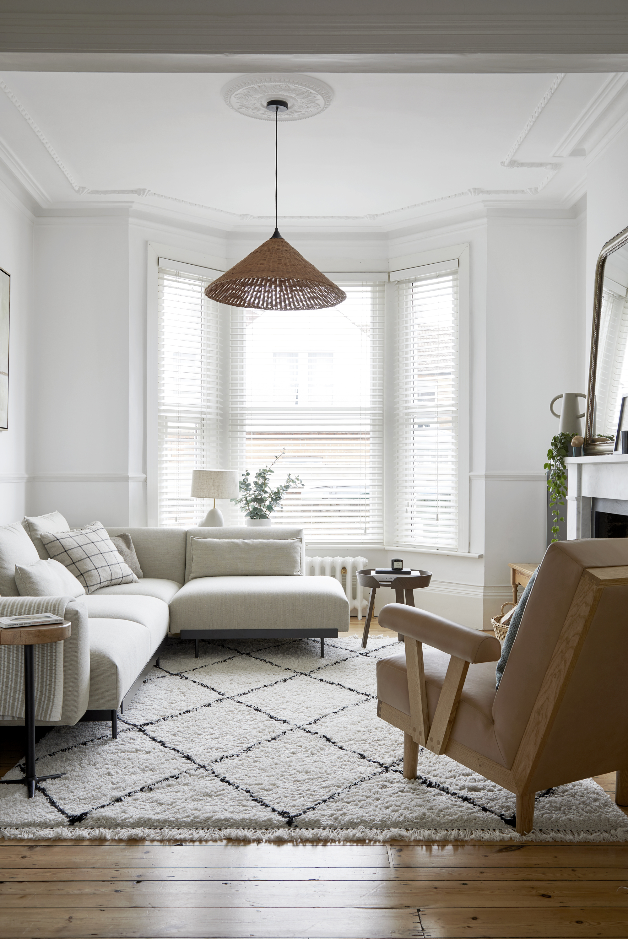
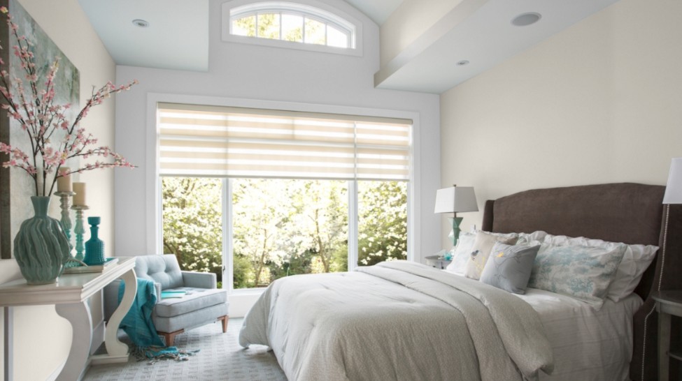
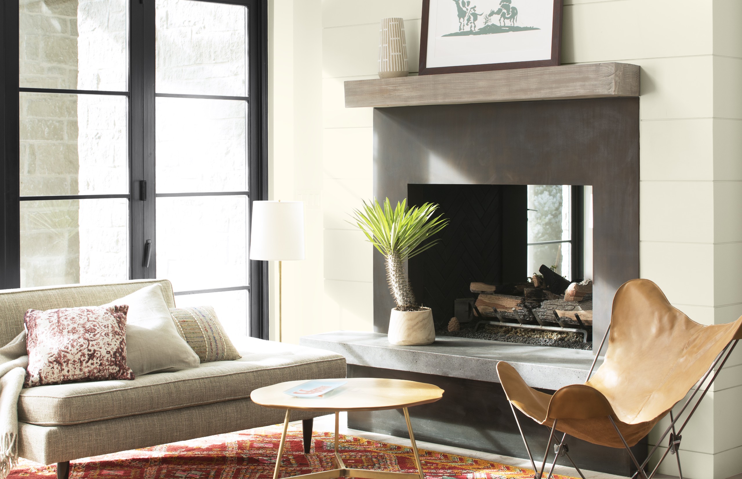
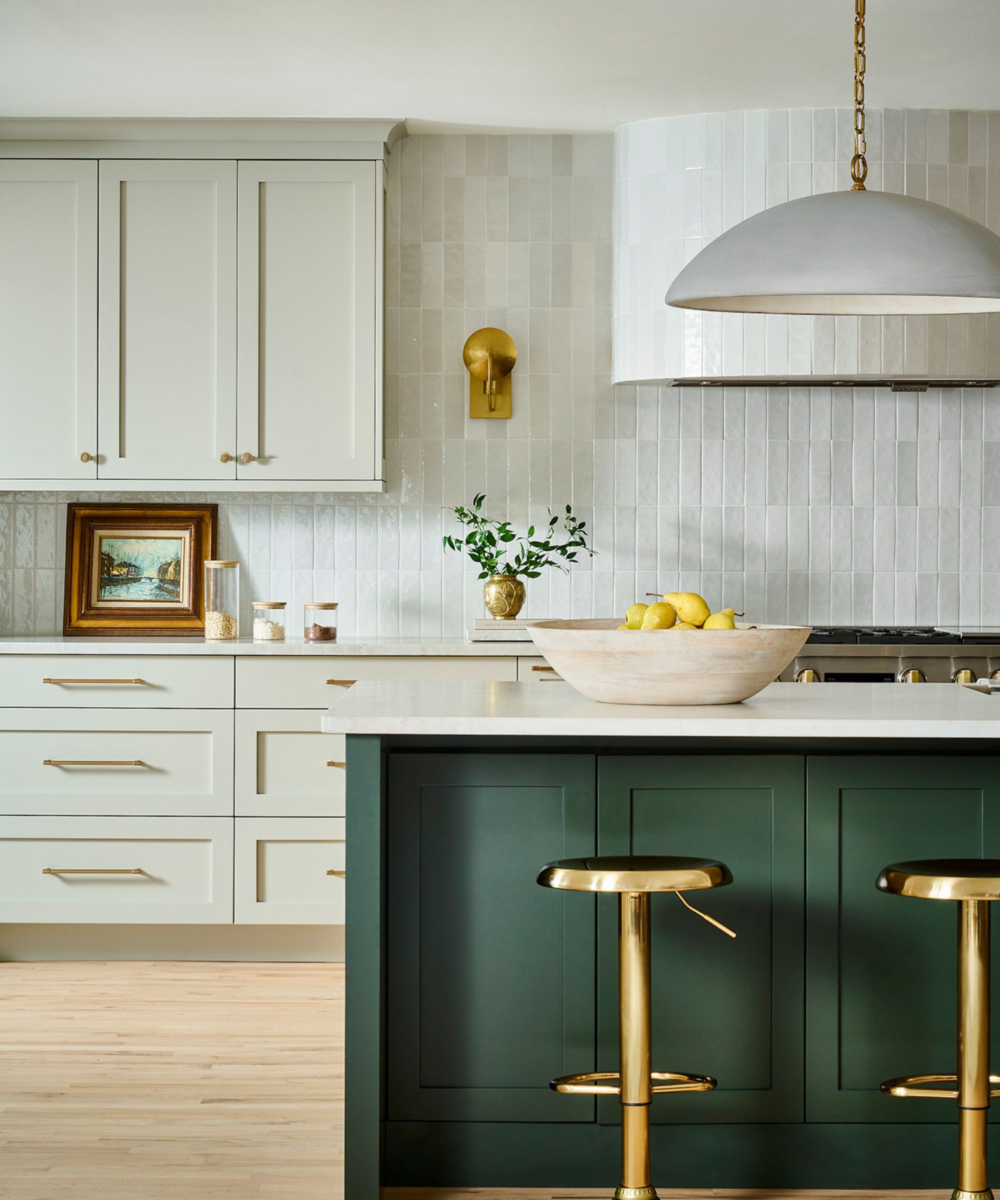
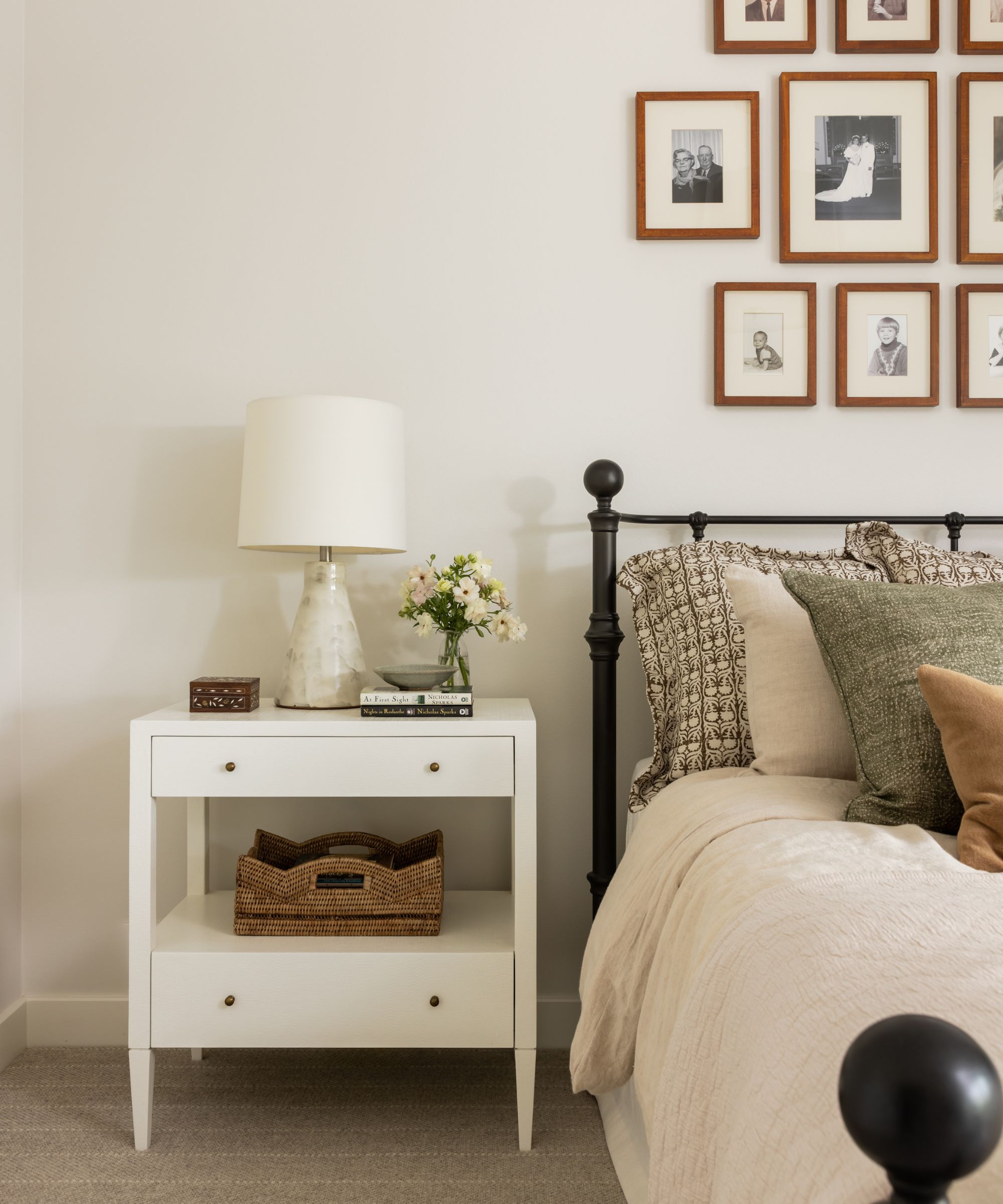
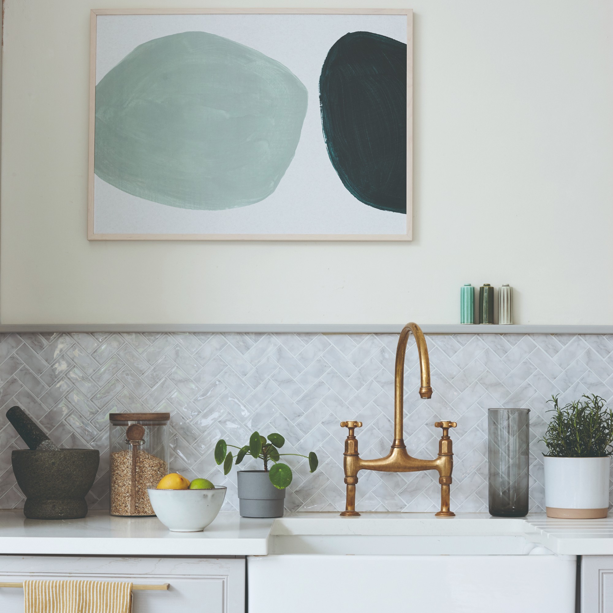
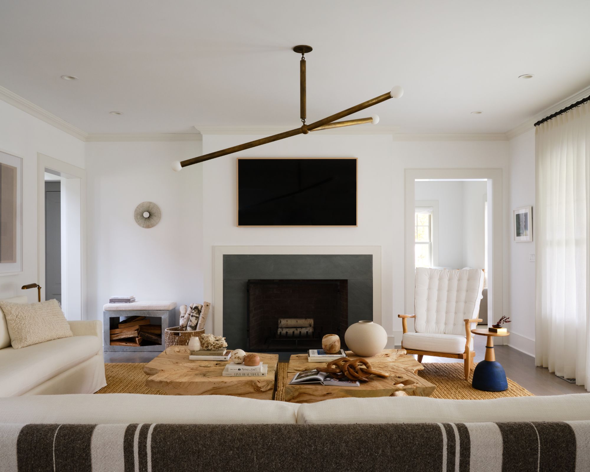
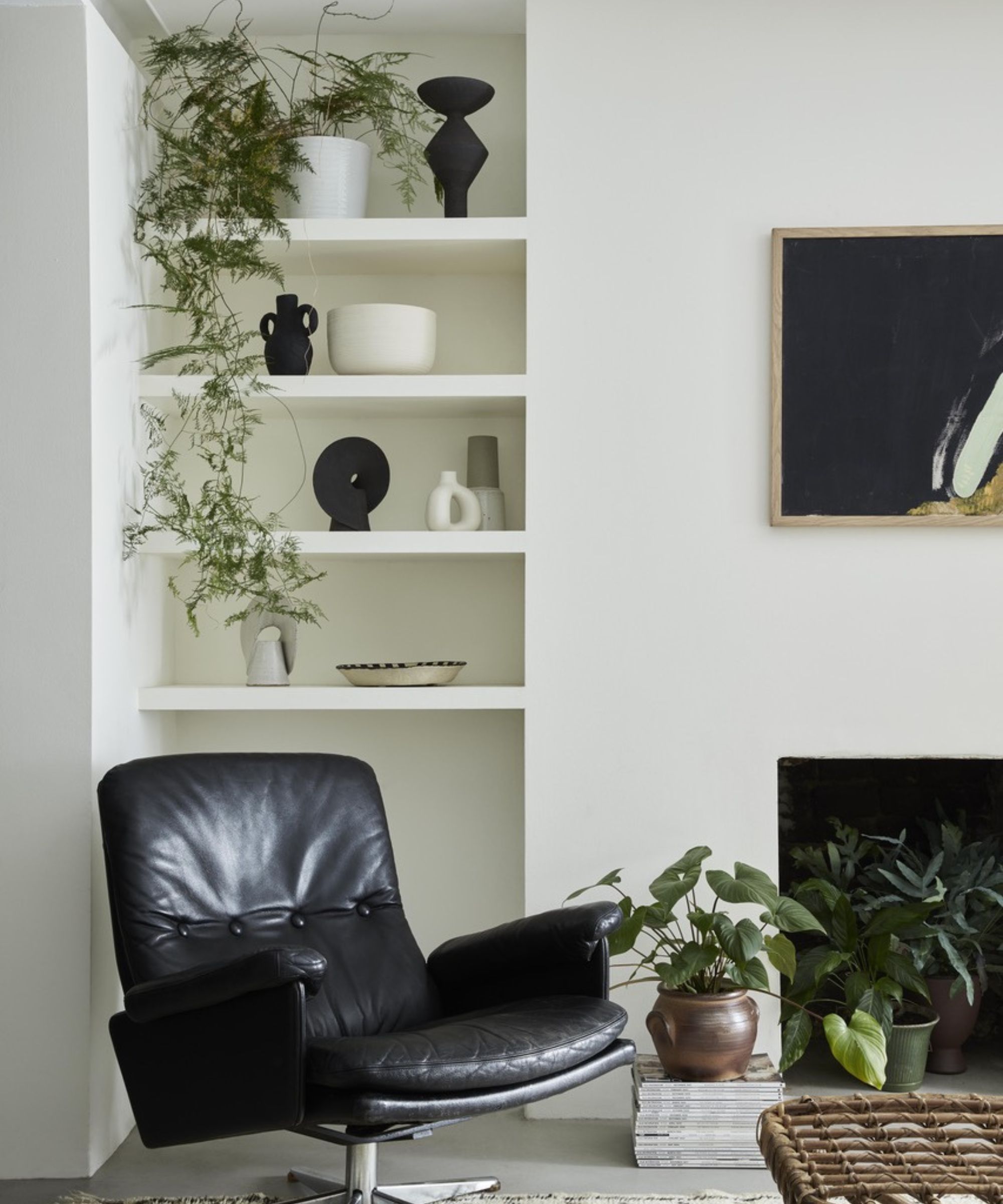
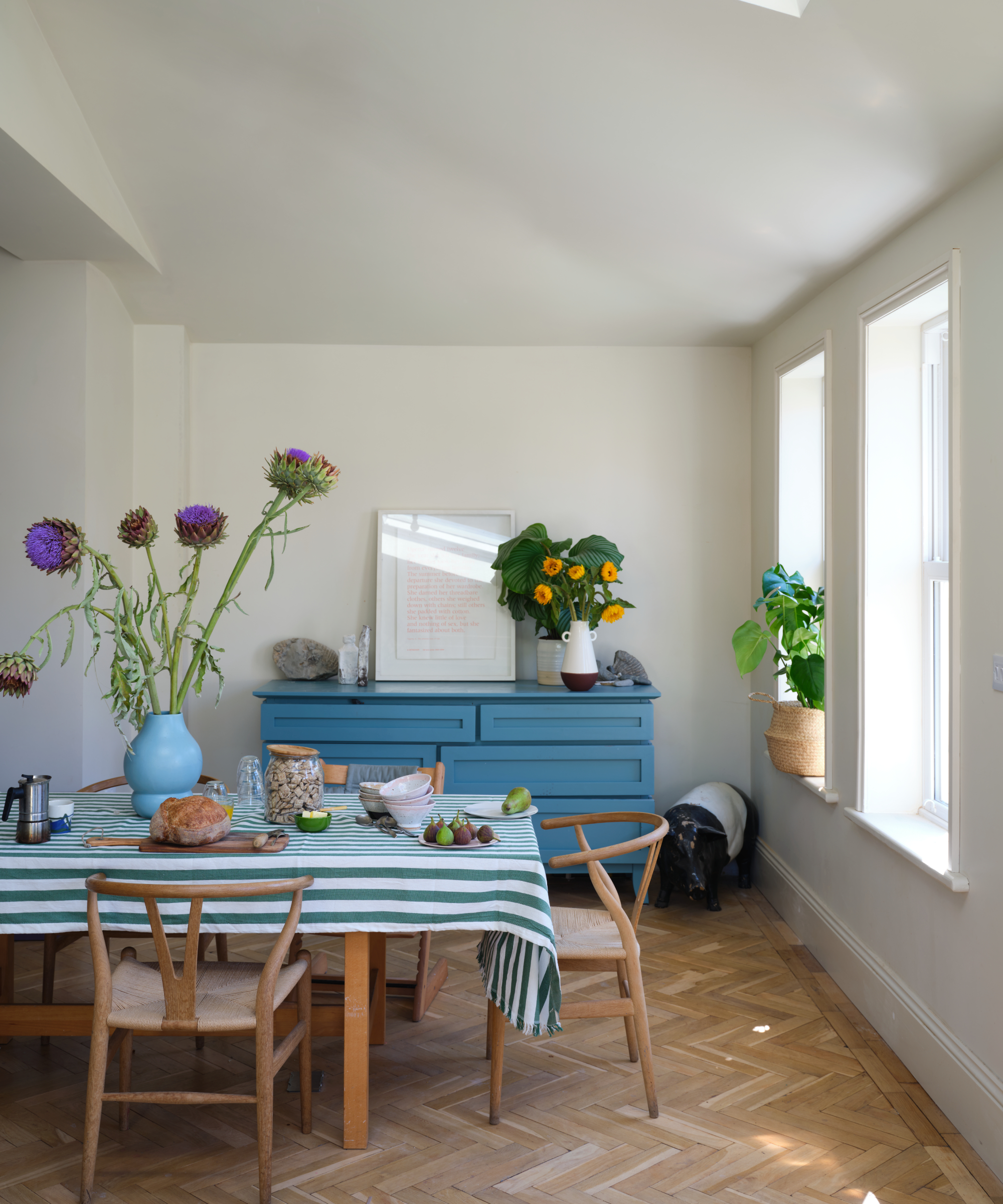
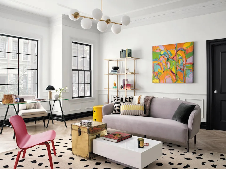
The article delves into the nuances of choosing off-white and neutral paint colors for interior design, emphasizing the shift in aesthetic preferences from sensory-deprived Minimalism to creating physical and visual comfort through plentiful upholstery, cushions, throws, nostalgic prints, deeper colors, and creamy whites. The author highlights the challenges in selecting the right neutral, contrasting it with the relative ease of choosing bold hues, and offers six key considerations for homeowners and designers.
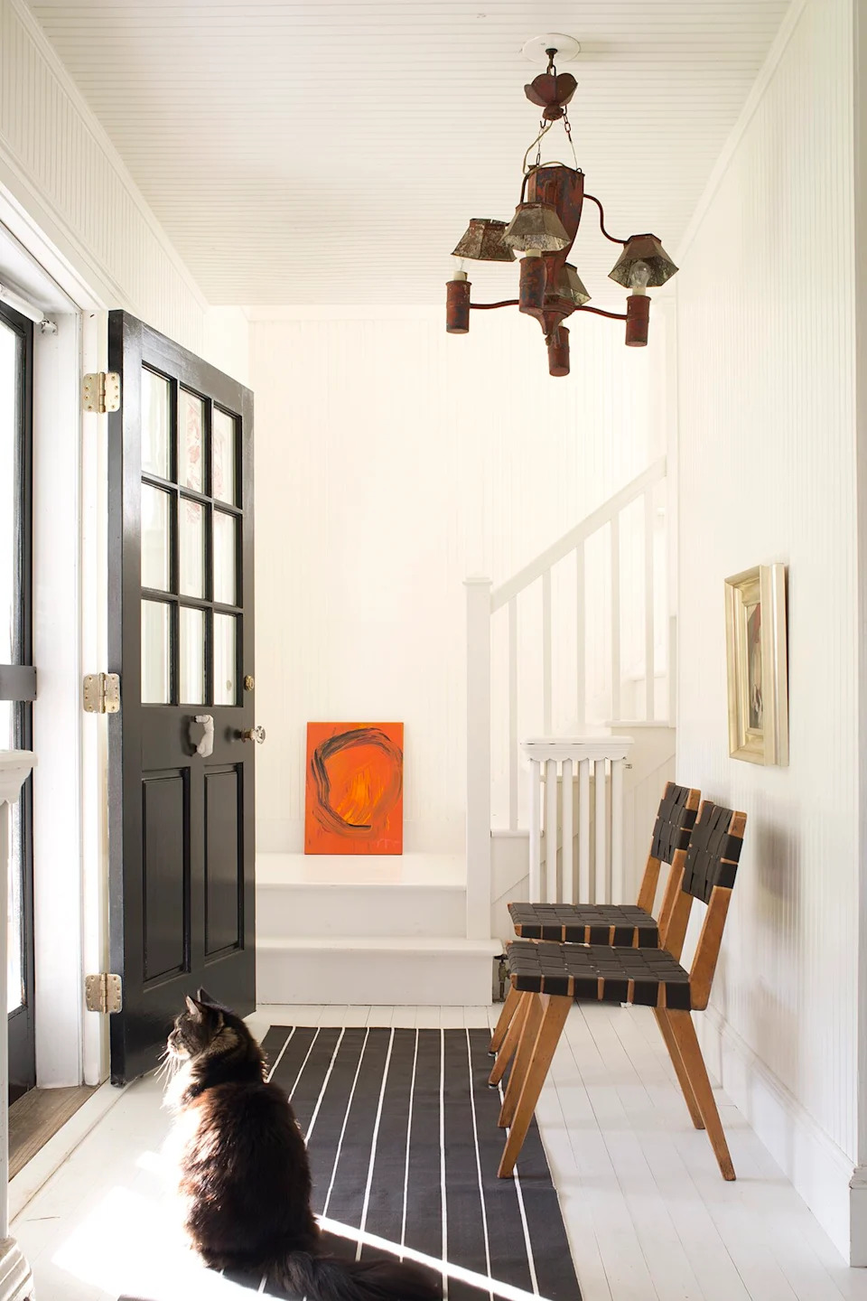
First, the article stresses the importance of considering the room's lighting conditions. Patrick Baty, a historic-paint consultant, explains that off-whites and neutrals are highly susceptible to lighting and on-site influences, often revealing unexpected undertones once applied to a wall. He recommends testing large patches of paint on site, despite categorizing popular whites into neutral, warm, and grey.
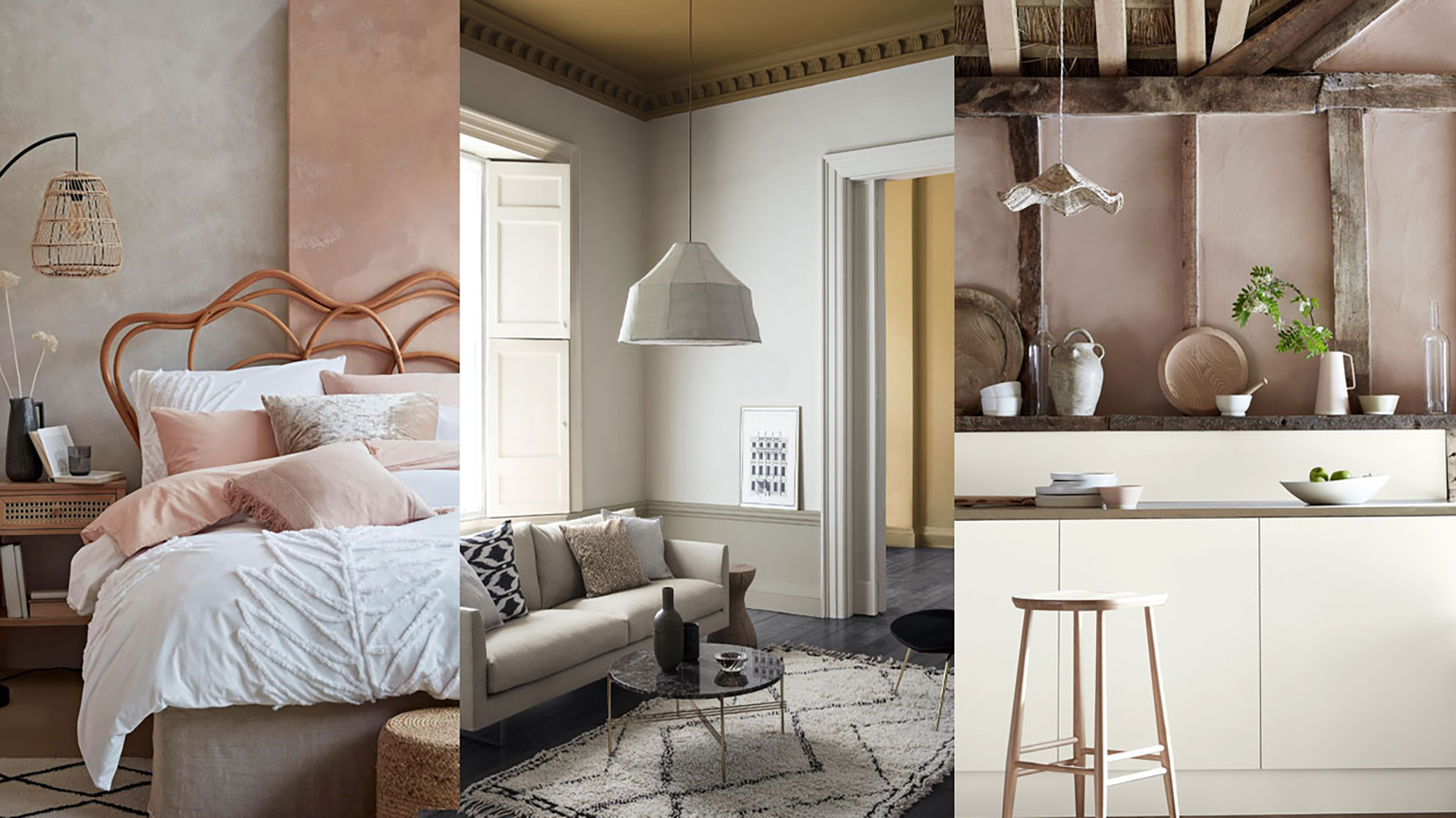
Second, it advises against automatically dismissing bright or earthy tones in off-white paints. Baty notes that ochre pigments can produce warm, soothing whites, citing his popular Quiet White. Interior designer Edward Bulmer adds that the best off-whites typically incorporate earth pigments like yellow ochre, red ochre, and raw umber, along with a touch of black, to achieve warmth and subtle variations in hue, ranging from yellow to red, green, and grey.
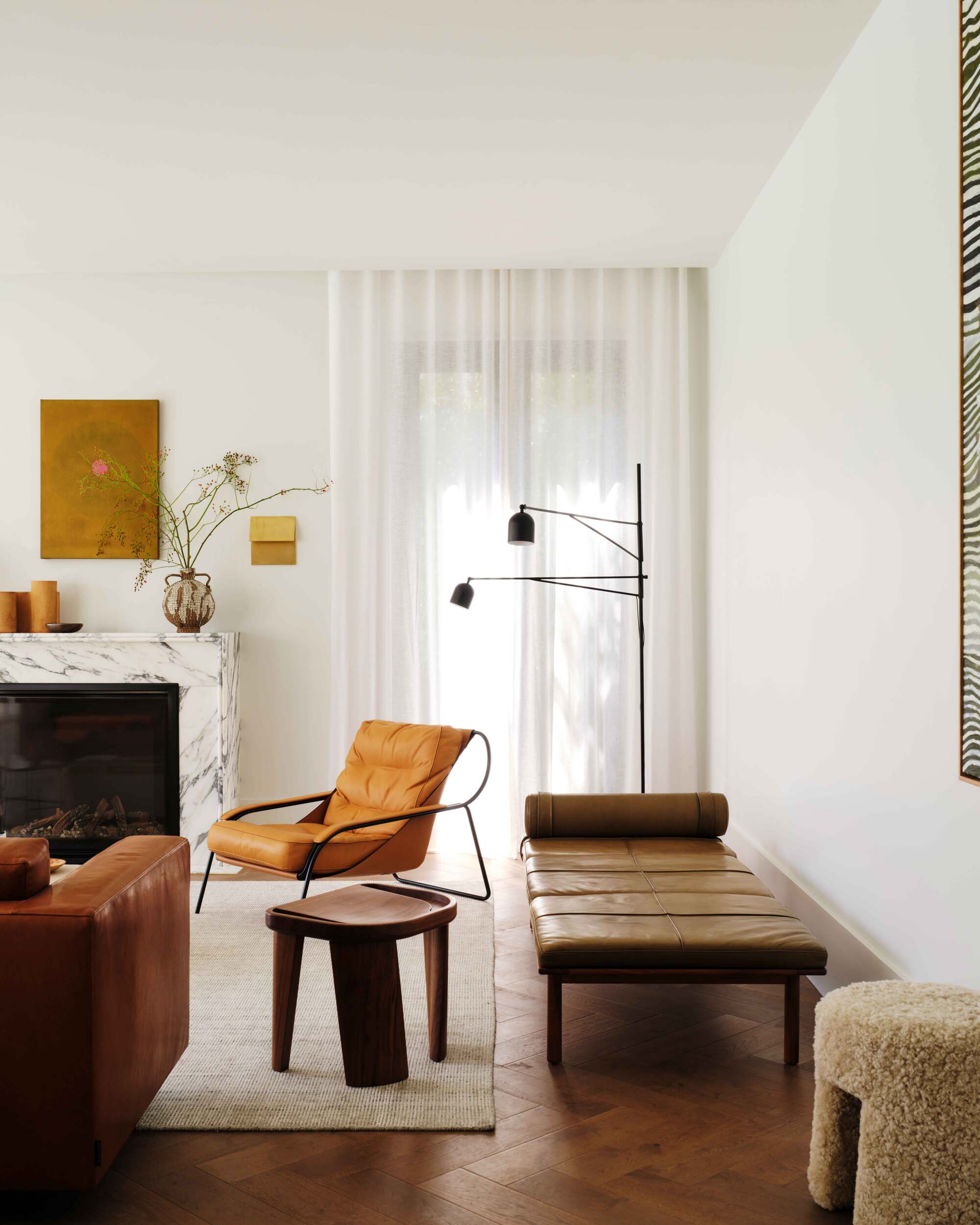
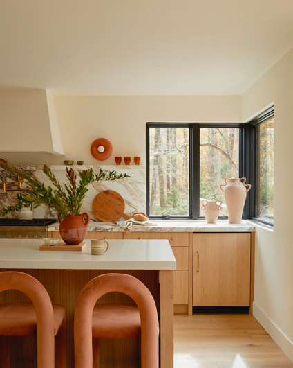
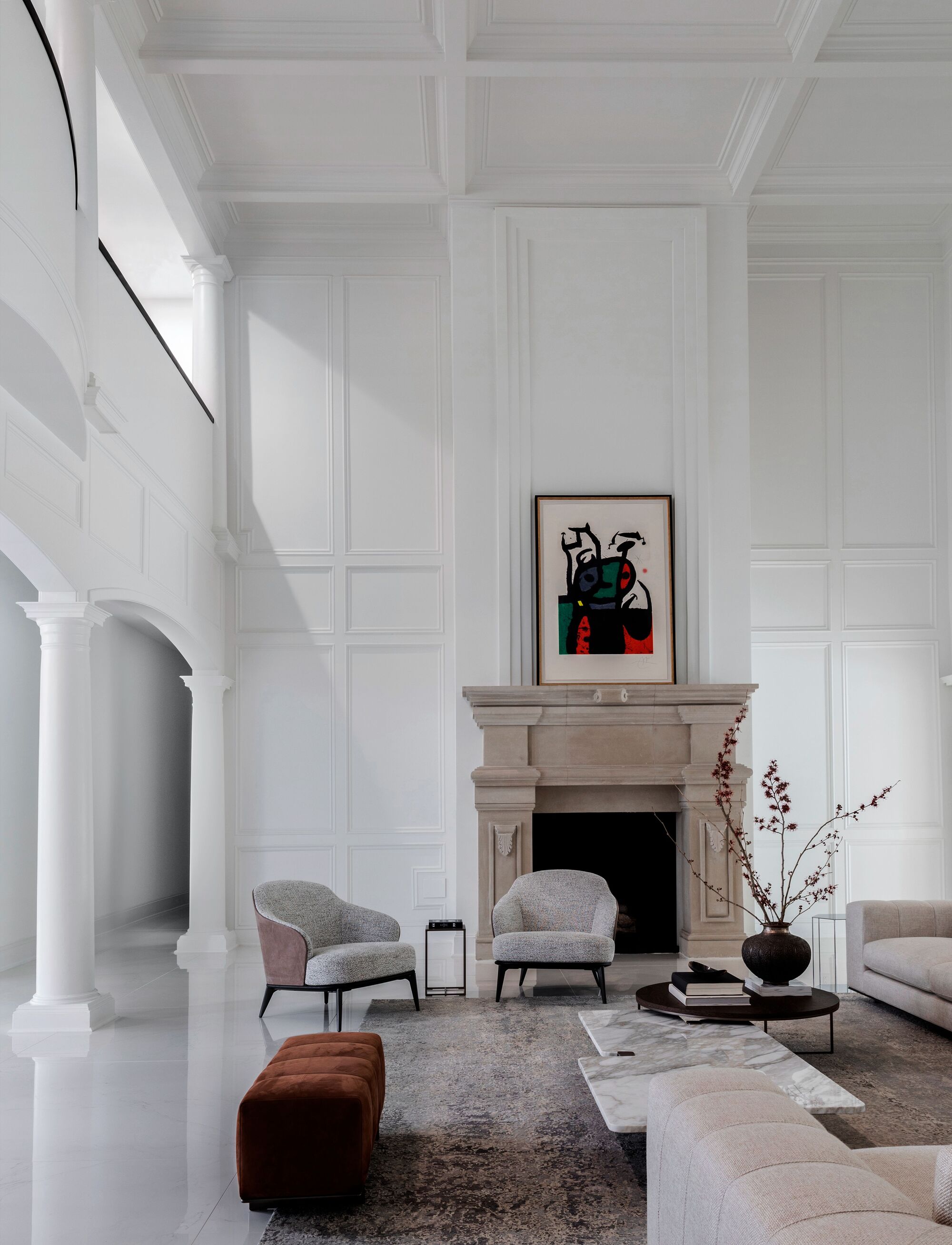
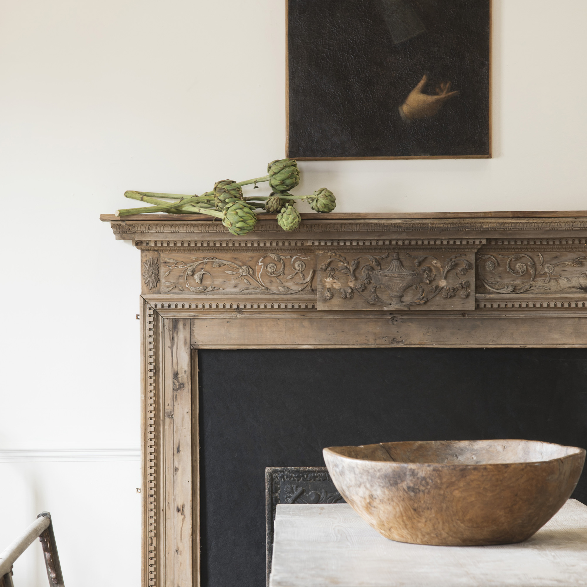
Third, the article points out the significant impact of a room's existing fittings on paint choice. Edward Bulmer suggests that elements such as stone or wood, and the desired color weight for the room, should guide the selection. He cautions that some off-whites may appear too bright against deep colors or antique furnishings, while others might look muddy in a modern setting.
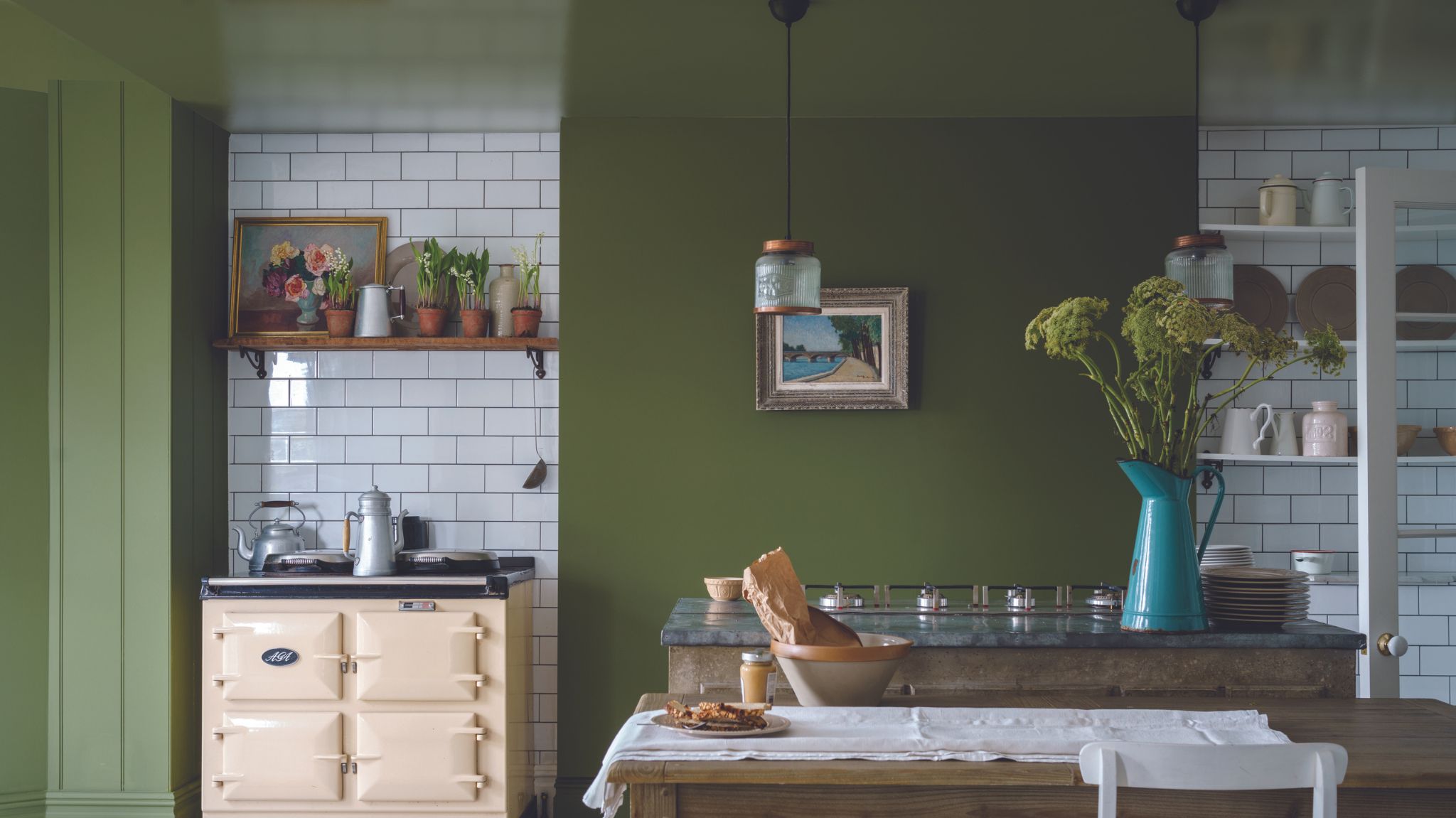
Fourth, it encourages homeowners to think about the intended feeling or mood of the room. Cassandra Ellis of Atelier Ellis recommends choosing a white or neutral with a sunny disposition and a yellow ochre base for a warm and bright ambiance. For a sophisticated and quiet atmosphere, she suggests options with umber and blue pigments, offering examples like Atelier Ellis Warm White and Quiet Grey.
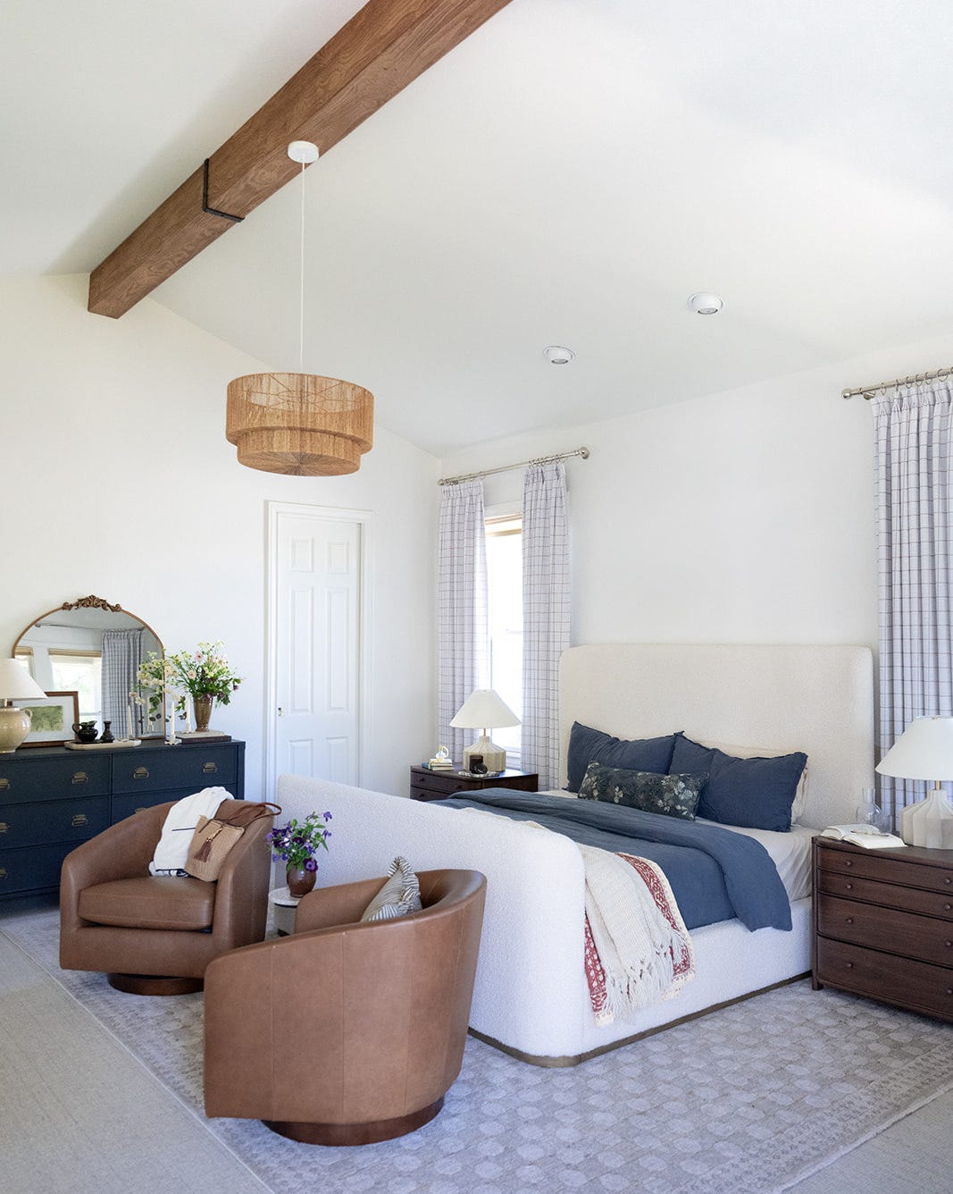
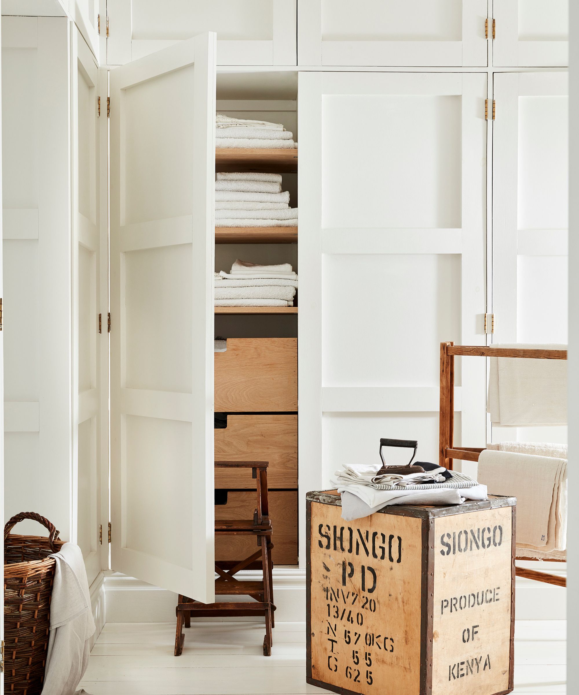
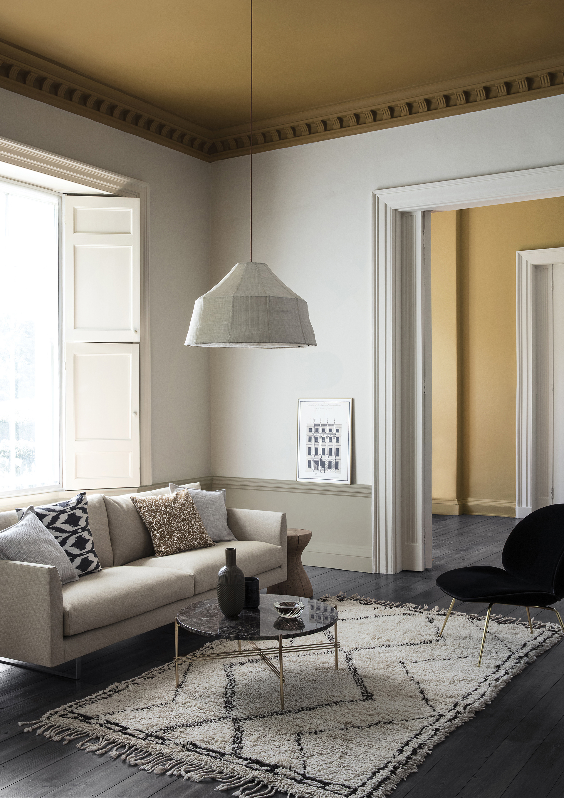
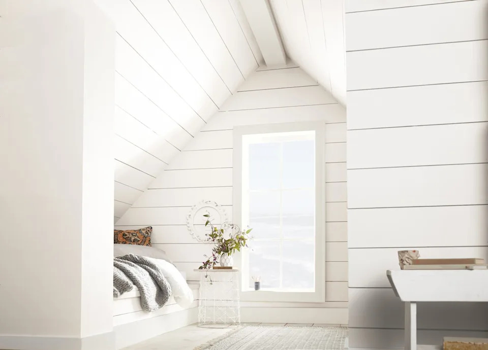
Fifth, the article challenges the common practice of painting ceilings brilliant white. Ruth Mottershead of Little Greene and Paint & Paper Library advises against this, explaining that brilliant white draws immediate attention to the ceiling due to its intense brightness. Instead, she recommends using an off-white, such as Little Greene's Shirting for a crisp, clean look, or warmer options like China Clay or Slaked Lime.
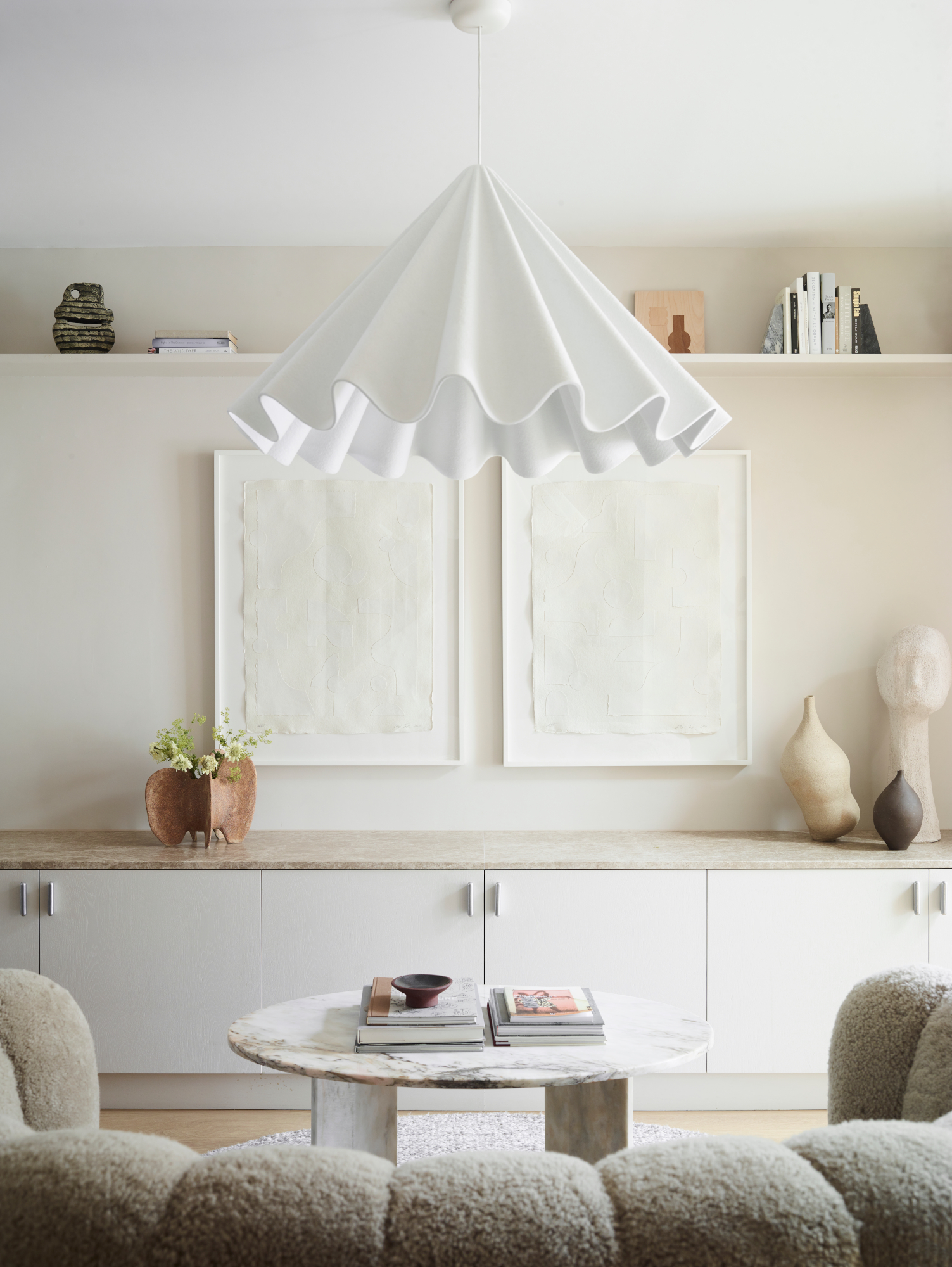
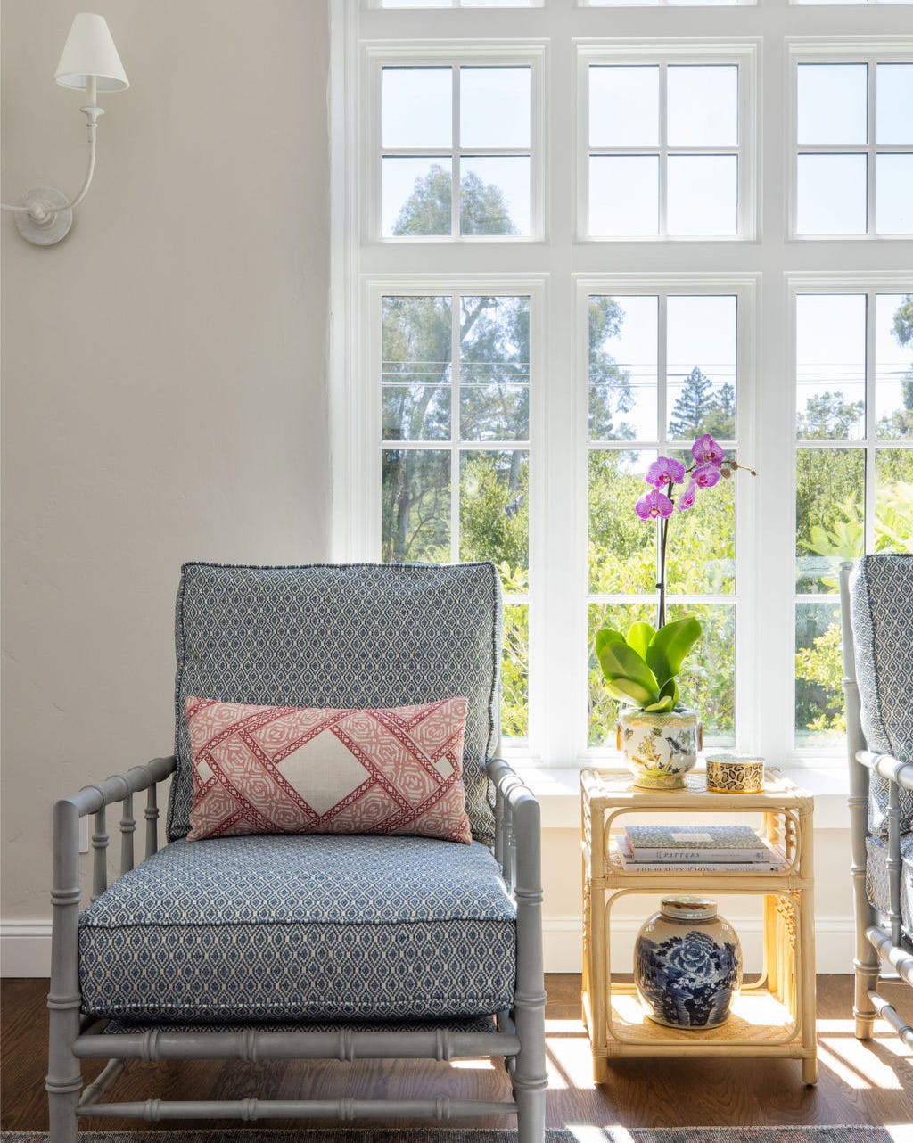
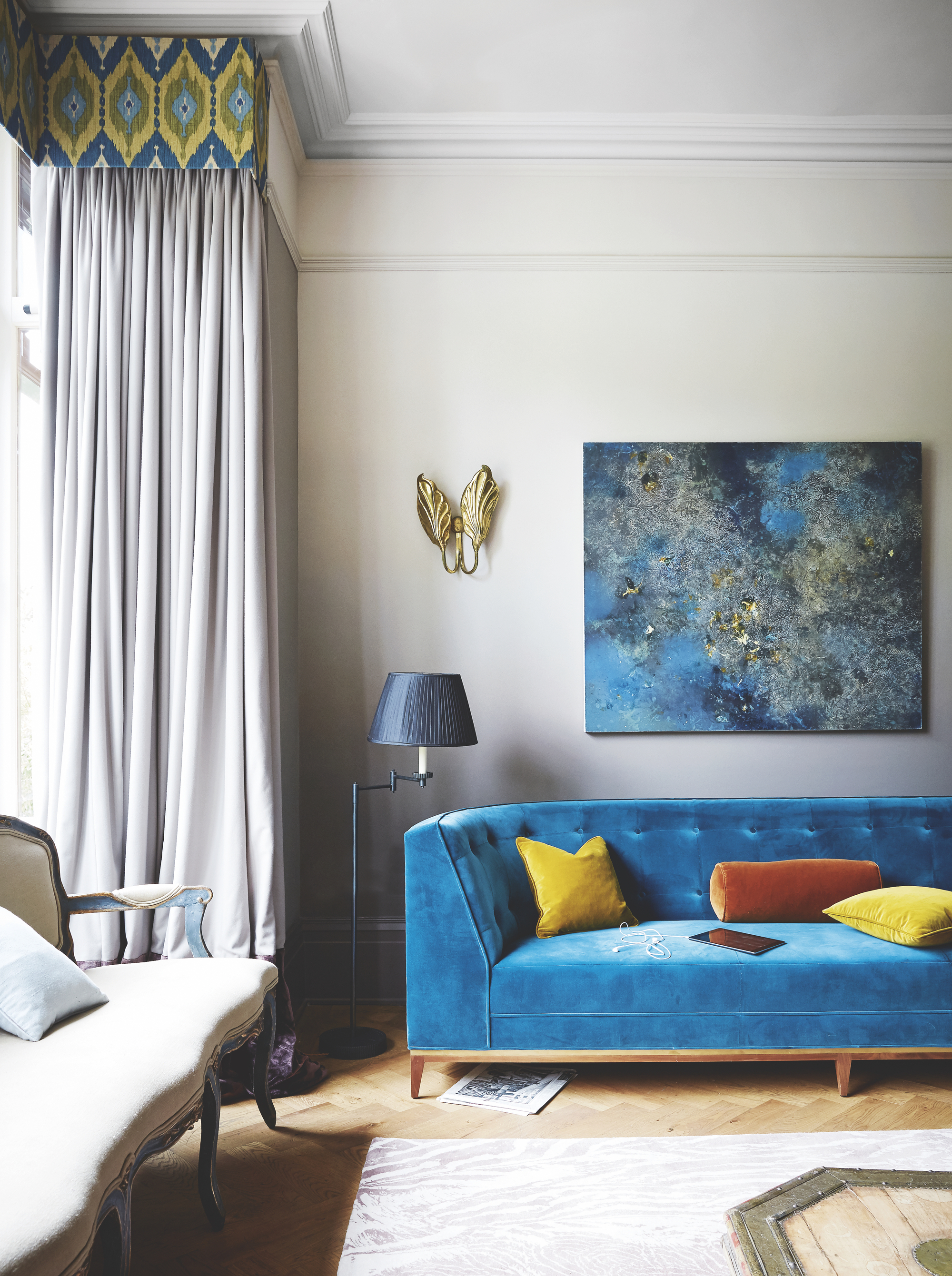
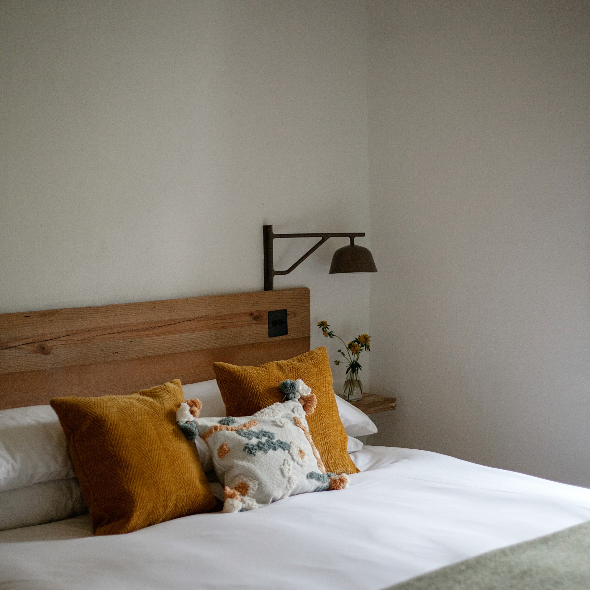
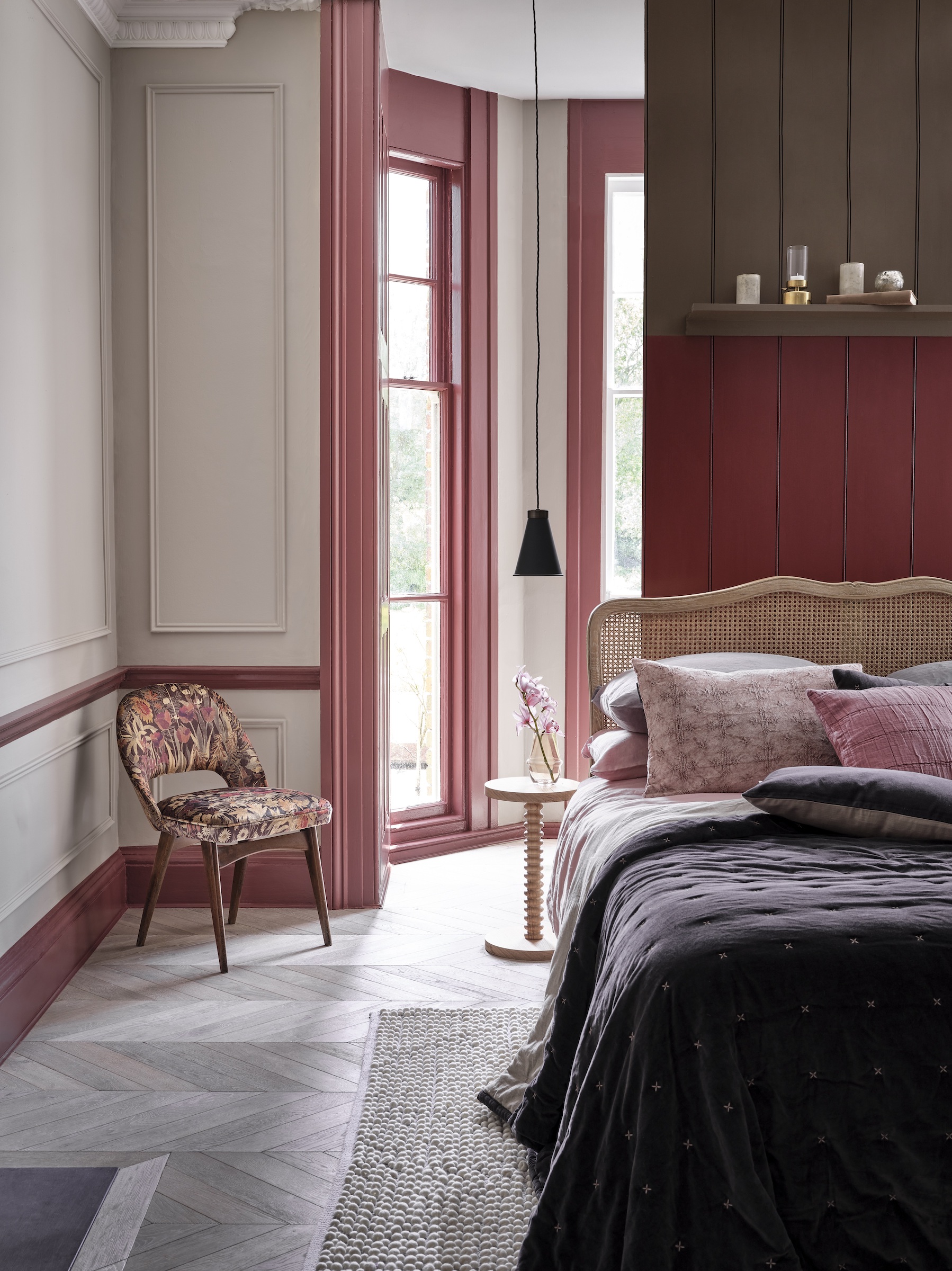
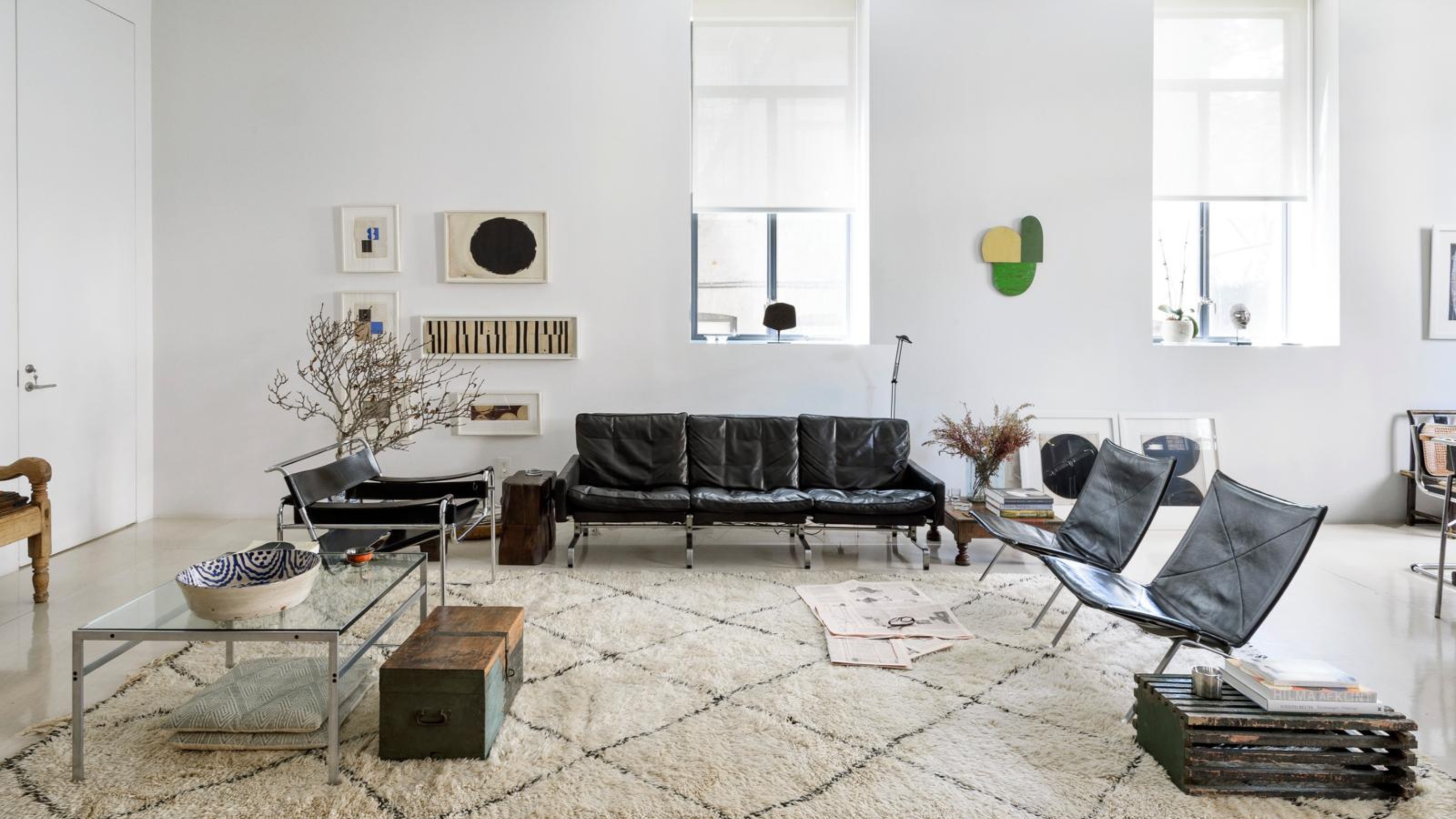
Finally, the piece highlights that soft off-white shades serve as an elegant backdrop, allowing other elements to introduce color and character. Designer Susie Watson suggests being generous with texture, pattern, and bright accessories to add depth and warmth to rooms painted in neutral colors.
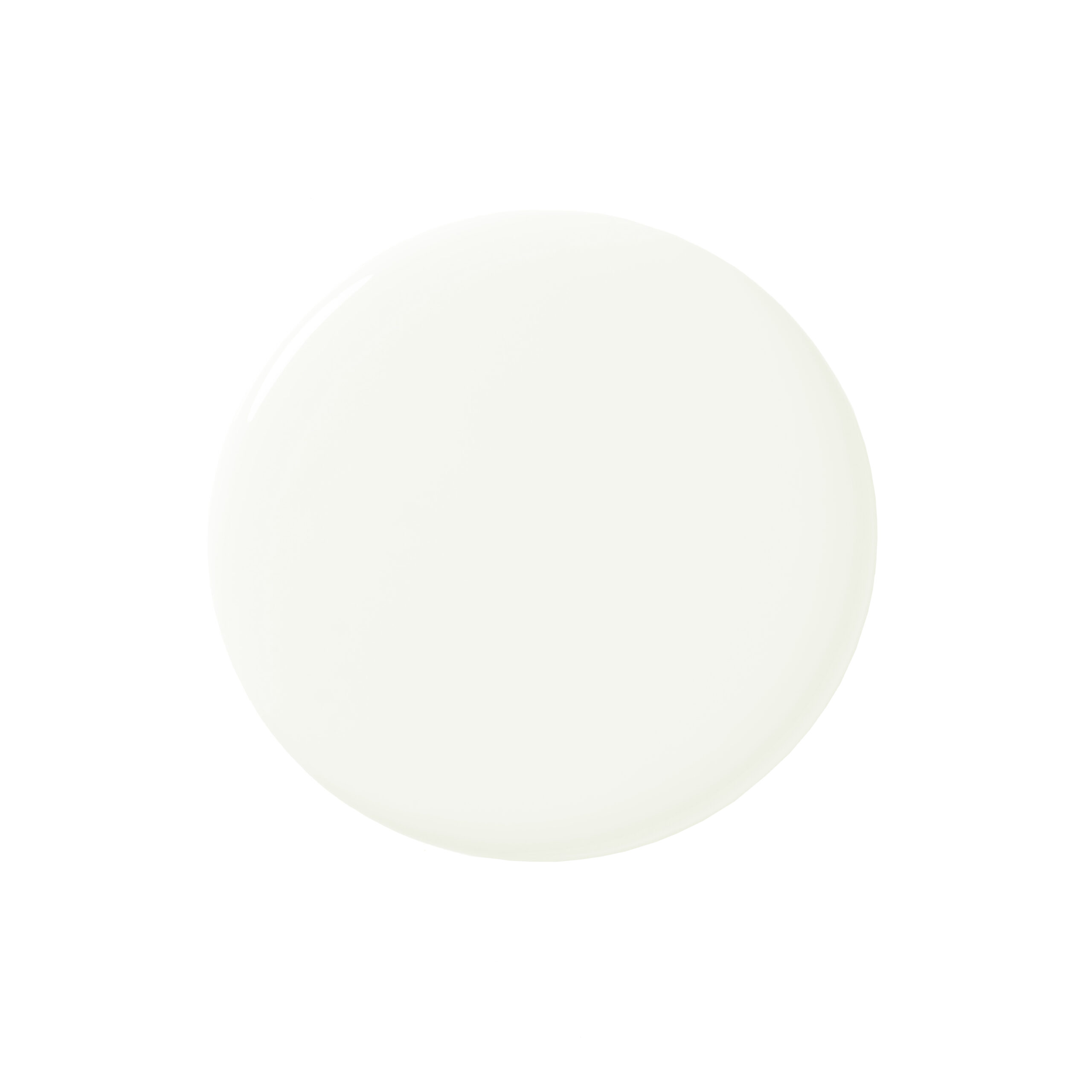
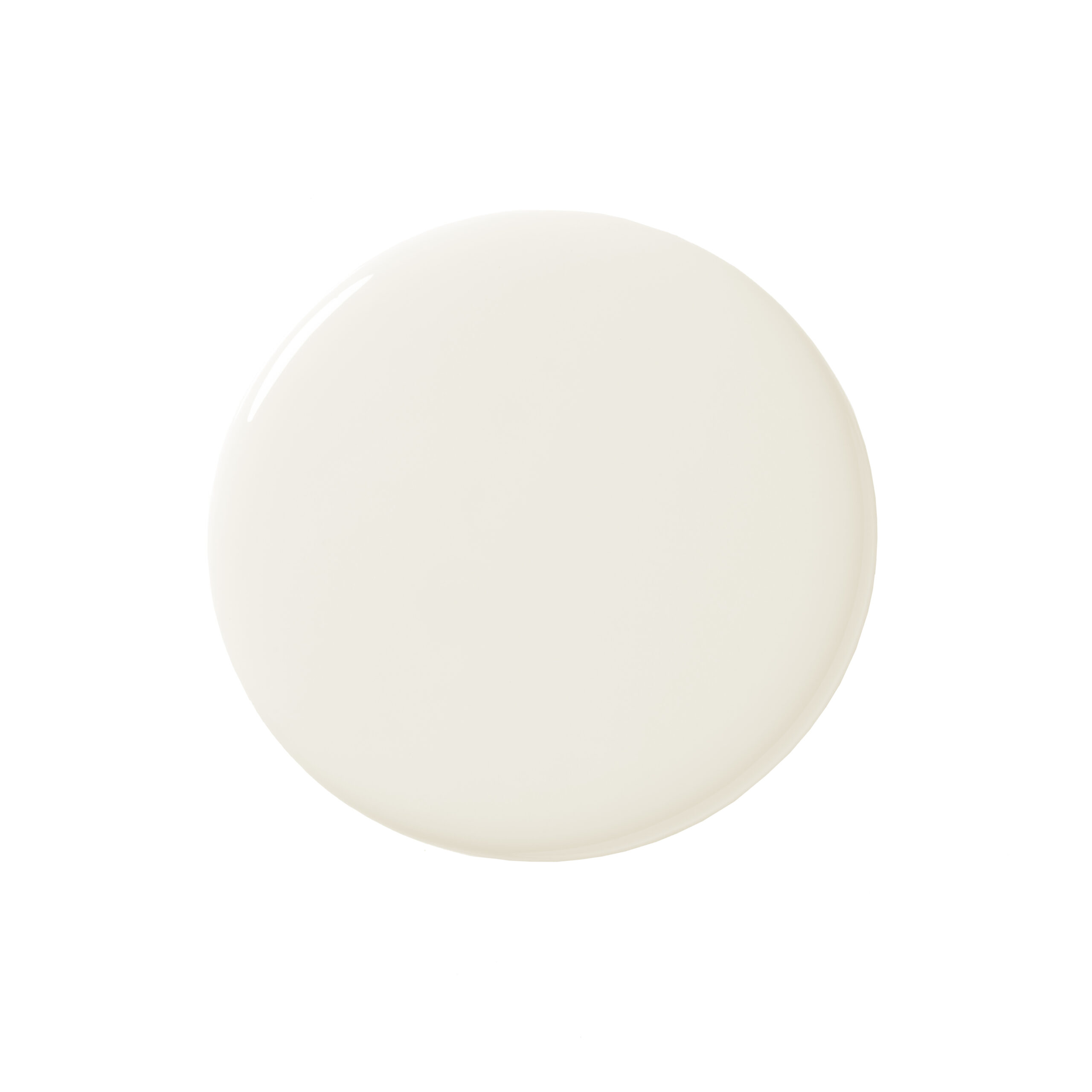
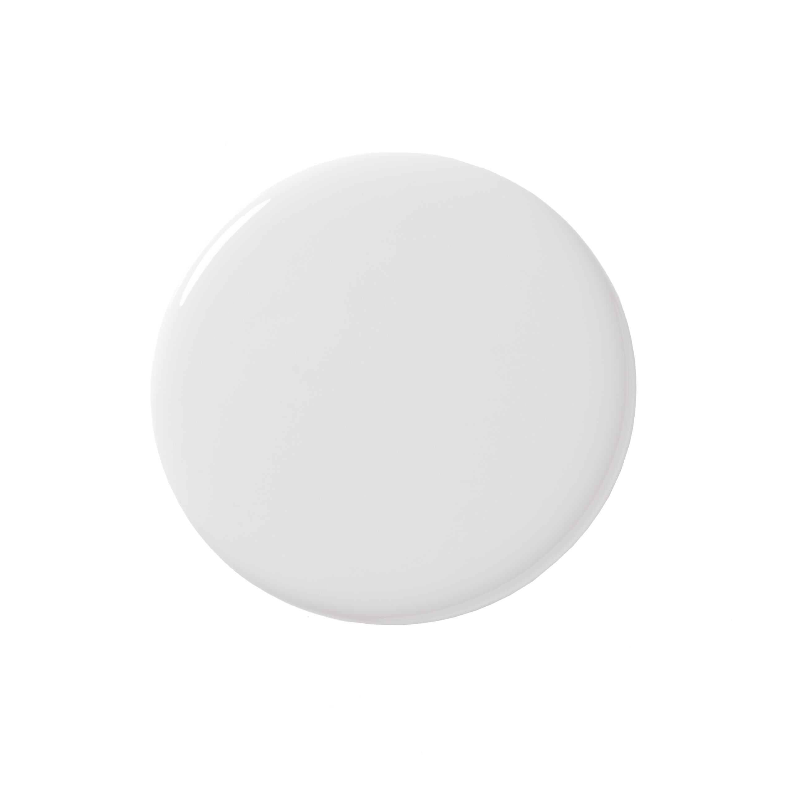
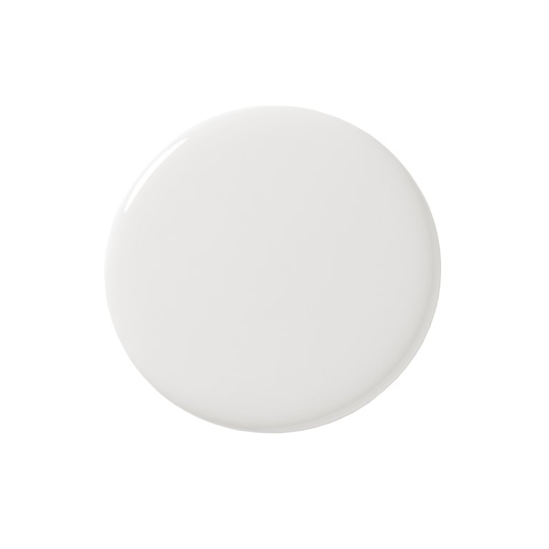
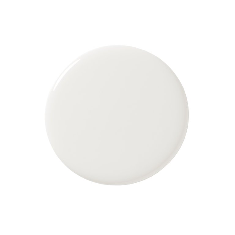
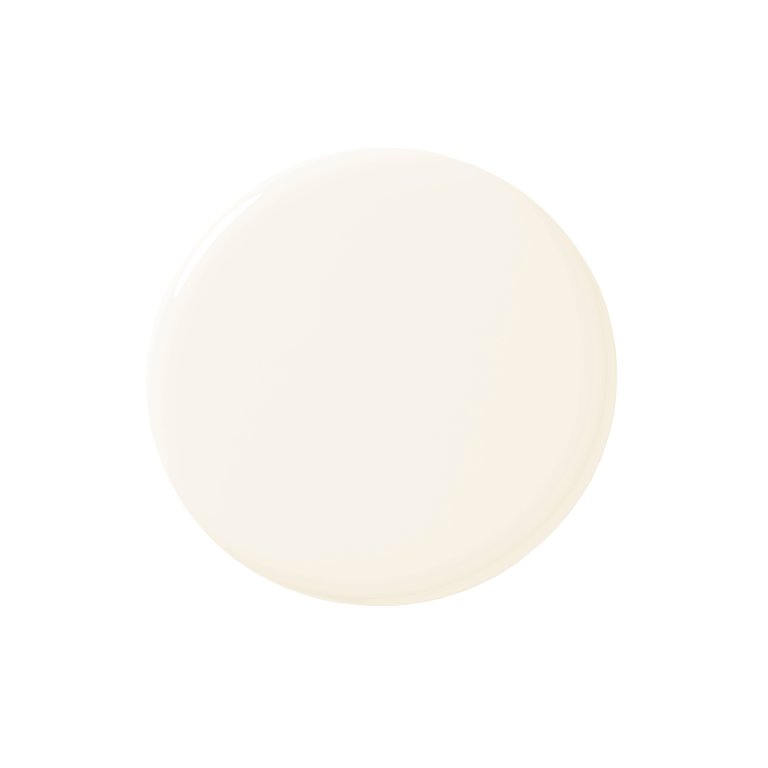
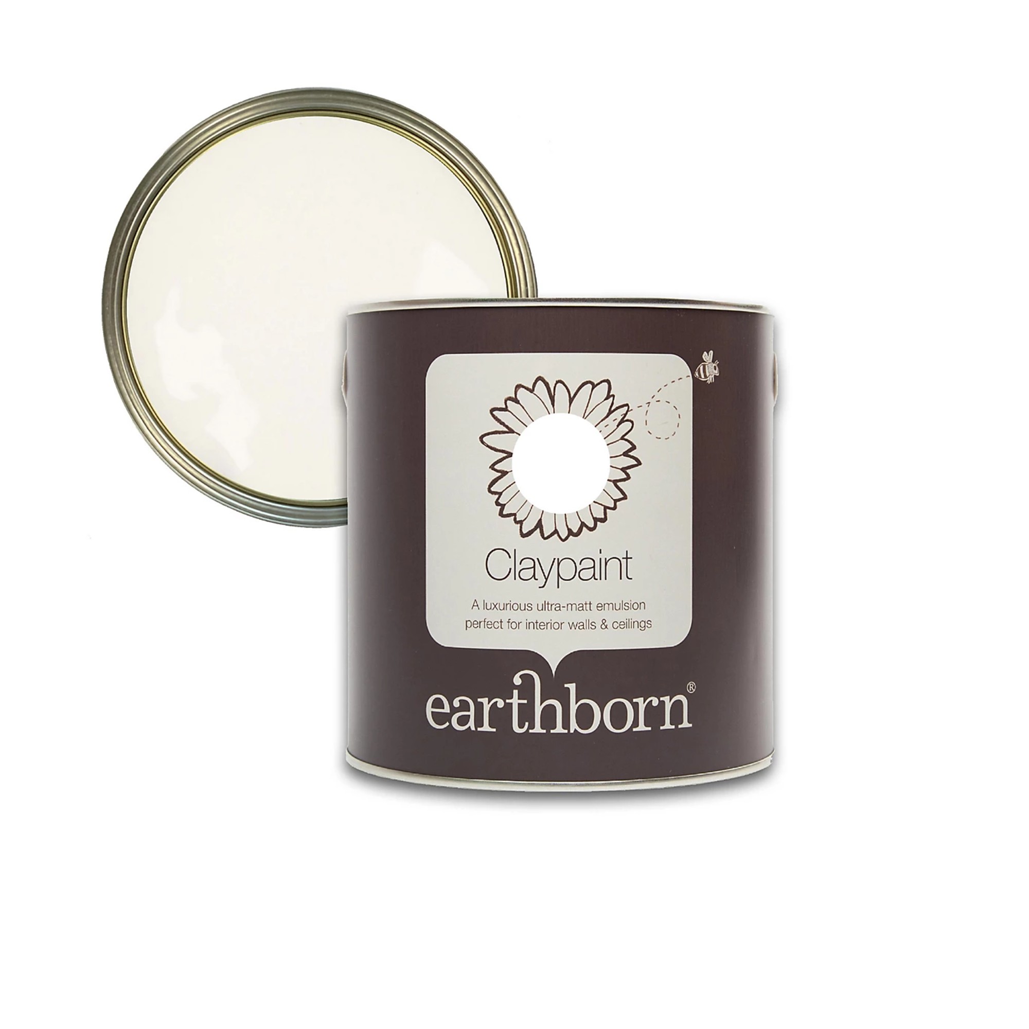
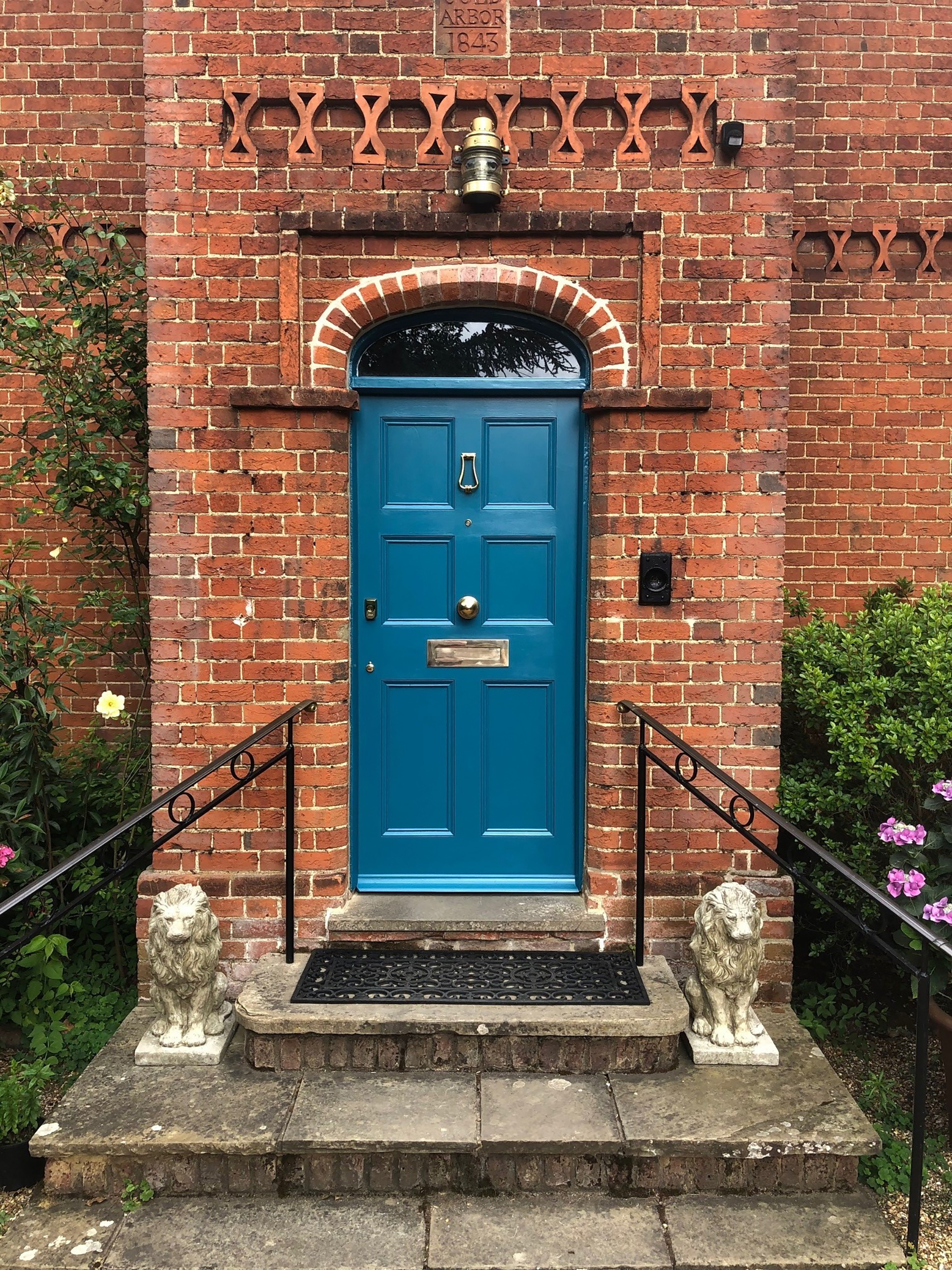
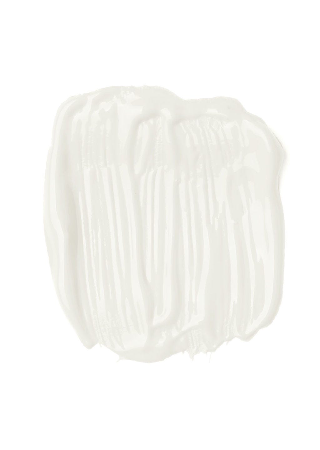
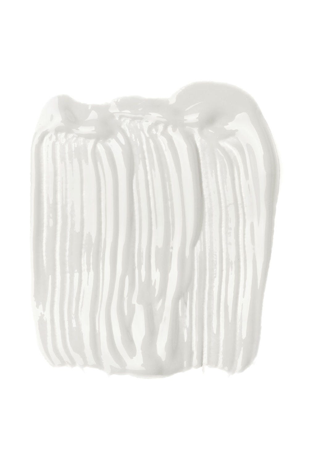
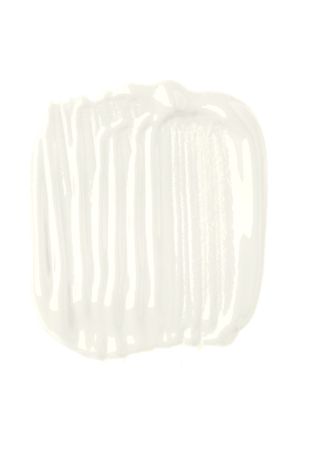
The article concludes by showcasing five specific off-white paint recommendations from leading experts: Cotta by Atelier Ellis, Milk White by Edward Bulmer, Minim by Paint and Paper Library, SC292 by Papers and Paints, and Ivory by Susie Watson, each with unique characteristics and suggested applications.
#InteriorDesign #PaintColors #OffWhite #NeutralPalette #HomeDecor #LightingConditions #EarthPigments #RoomMood #CeilingPaint #InteriorDesign #PaintColors #OffWhite #NeutralPalette #HomeDecor #LightingConditions #EarthPigments #RoomMood #CeilingPaint
0 ความคิดเห็นรวม
 ยังไม่มีความคิดเห็น
คุณอาจจะชอบอีกด้วย
5 Problems With Painting Your Walls White That No-One Ever Talks About (Until Now)

"Help, My White Walls Look Blue" — Here's Why It's Happening, and How to Fix This Common Problem
6 painting mistakes that are making your walls look 'dirtier' – and what you should be doing instead
13 Off-White Paint Colors That Make Any Room Feel Bigger and Brighter

I Sampled 24 White Paints—Here’s the One I Chose for Every Room of My Home

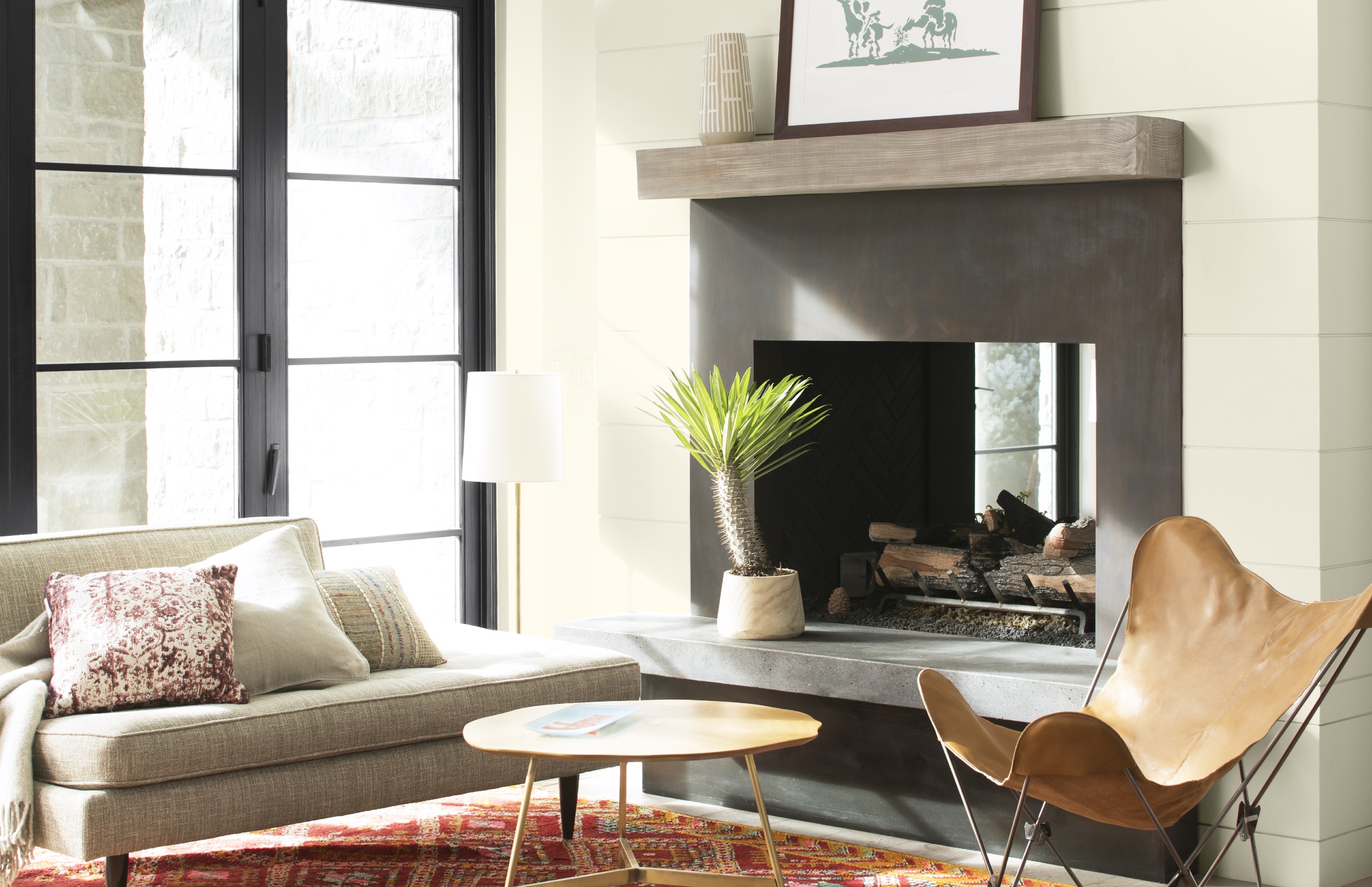
Best white paint colors: Expert share the top options

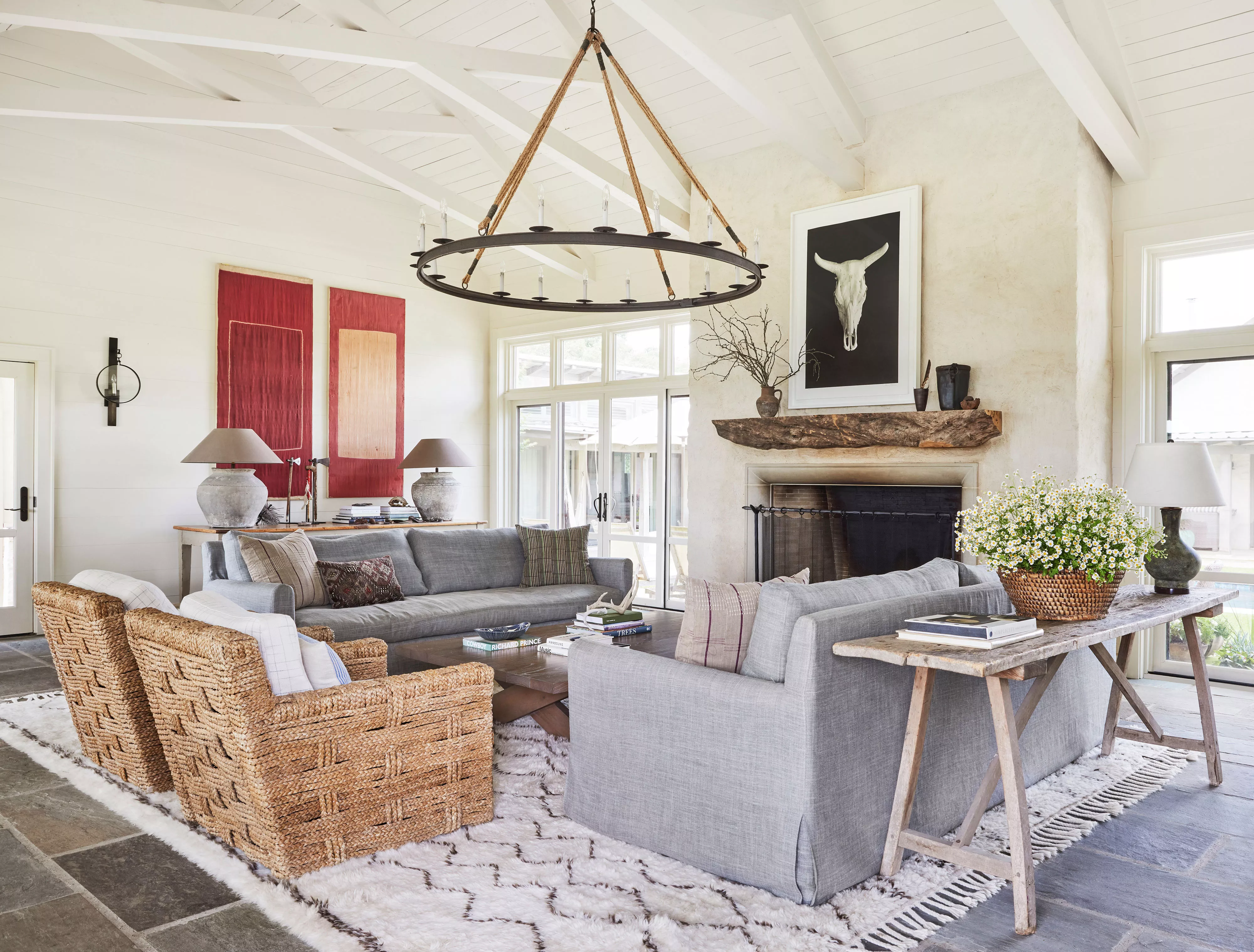
13 Off-White Paint Colors That Experts Always Recommend to Make Rooms Feel Bigger and Brighter
5 White Kitchen Paints Designers Swear By
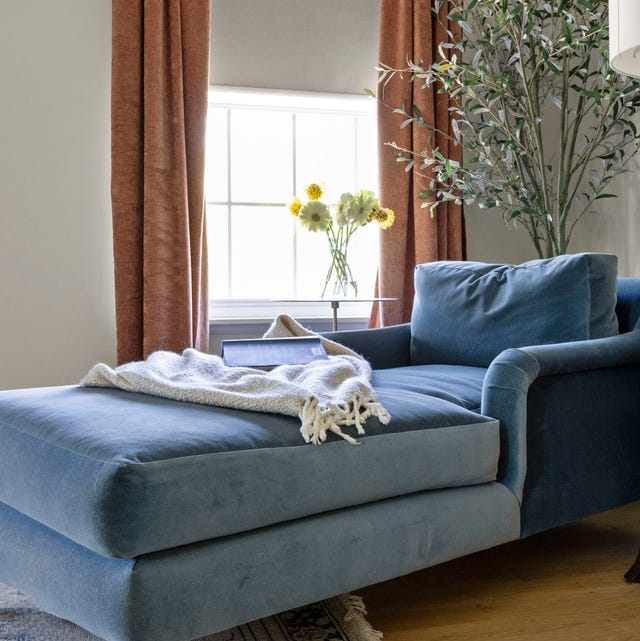
13 Best Off-White Paint Colors, According to Interior Designers

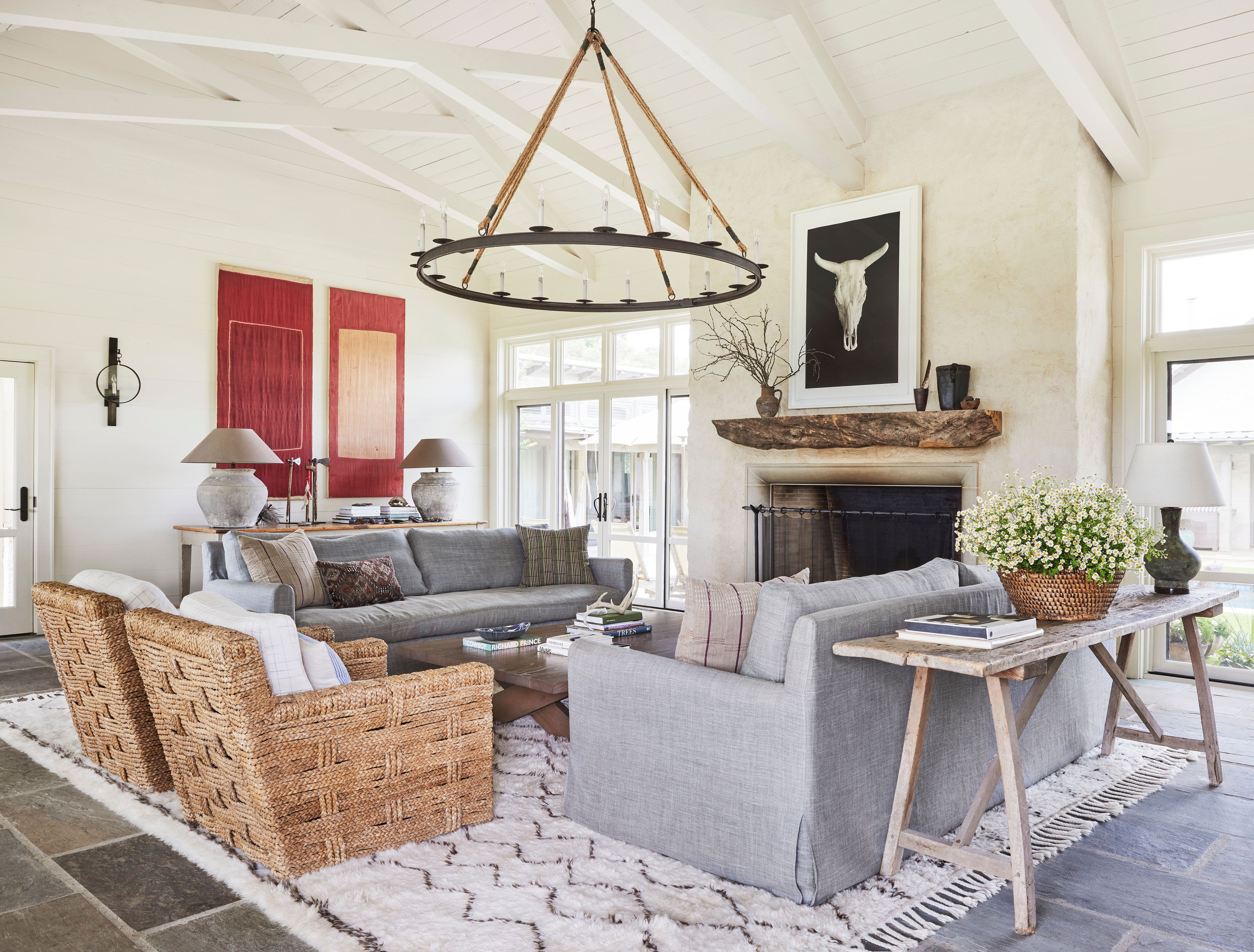
13 Off-White Paint Colors the Experts Recommend for Any Space
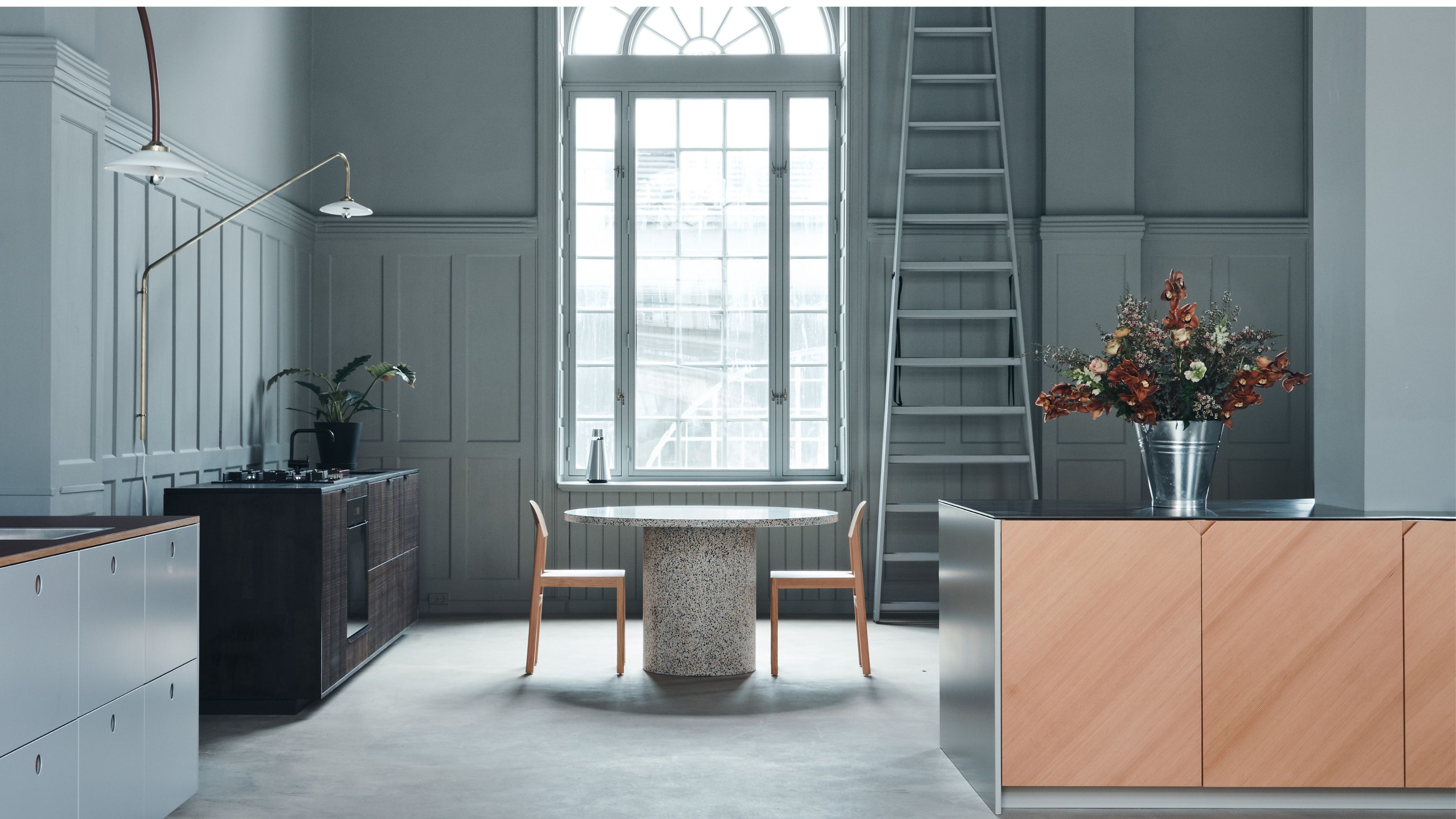
5 Reasons You Shouldn't Paint Your Kitchen Walls White — And the Alternatives You Need to Try
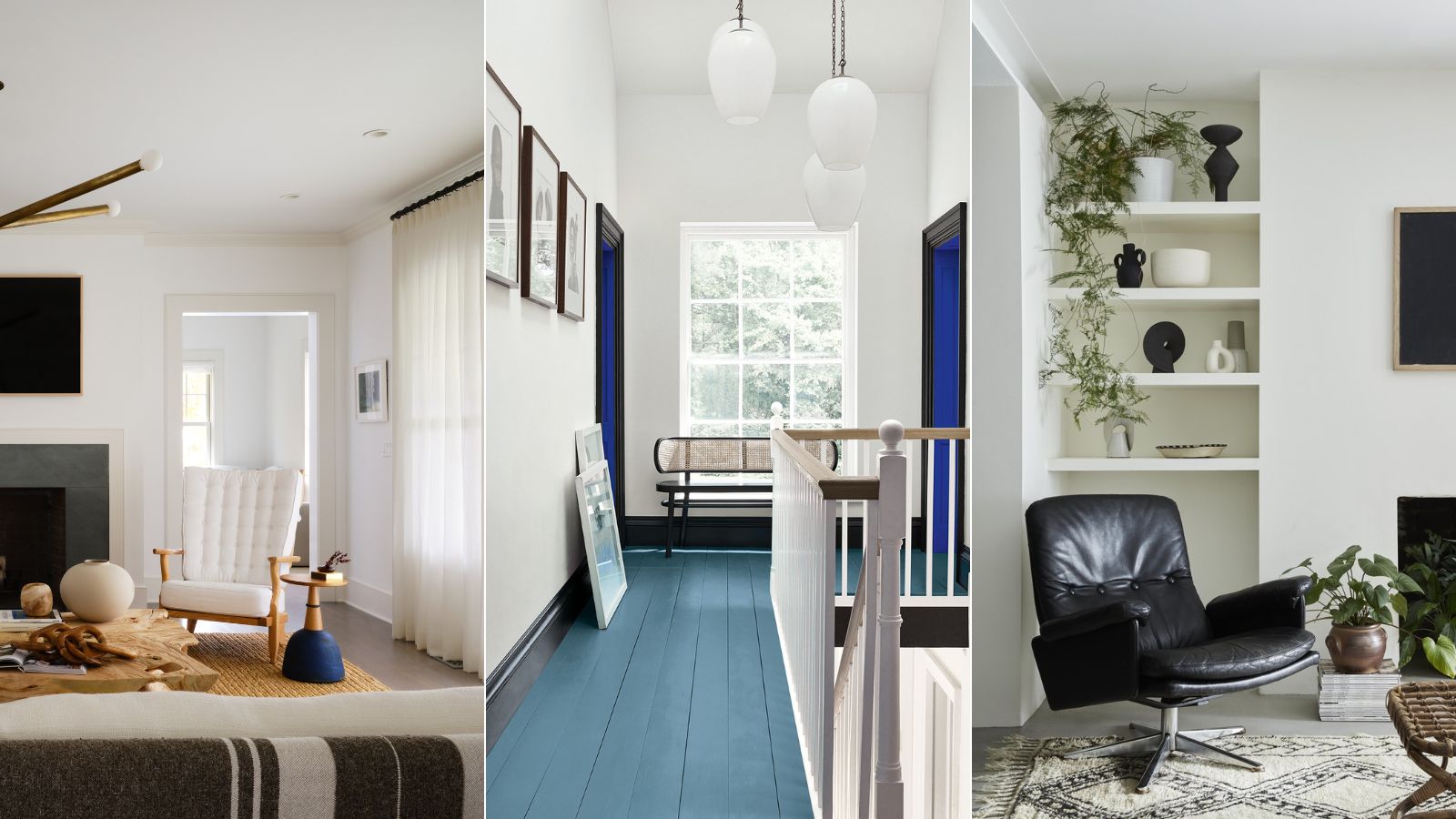
Is white actually out of style? Interior designers weigh in on this classic color for 2025 decorating

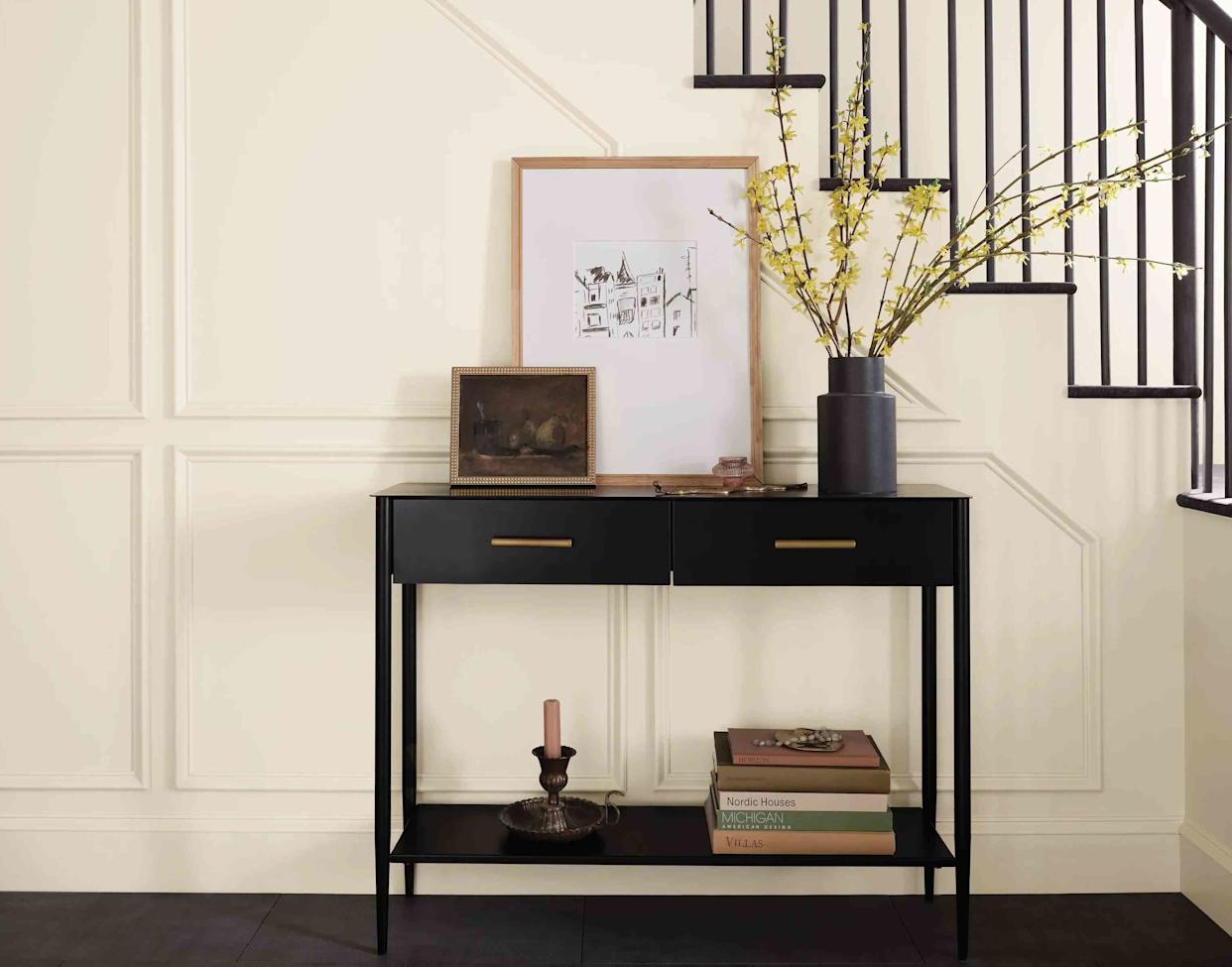
13 Off-White Paint Colors the Experts Recommend for Any Space

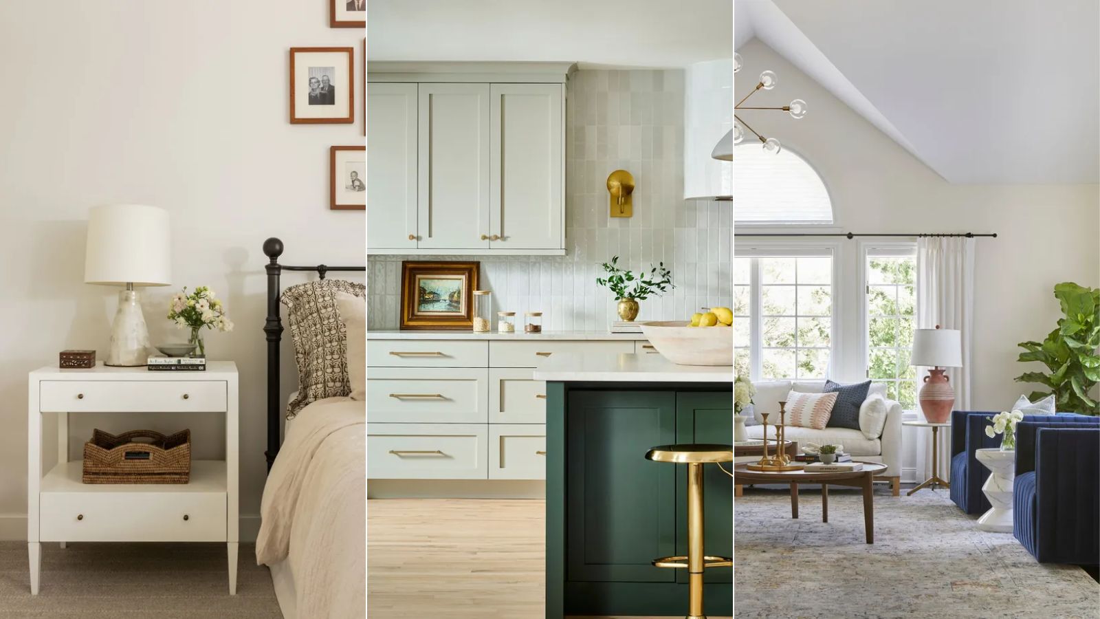
Best off-white paints according to designers
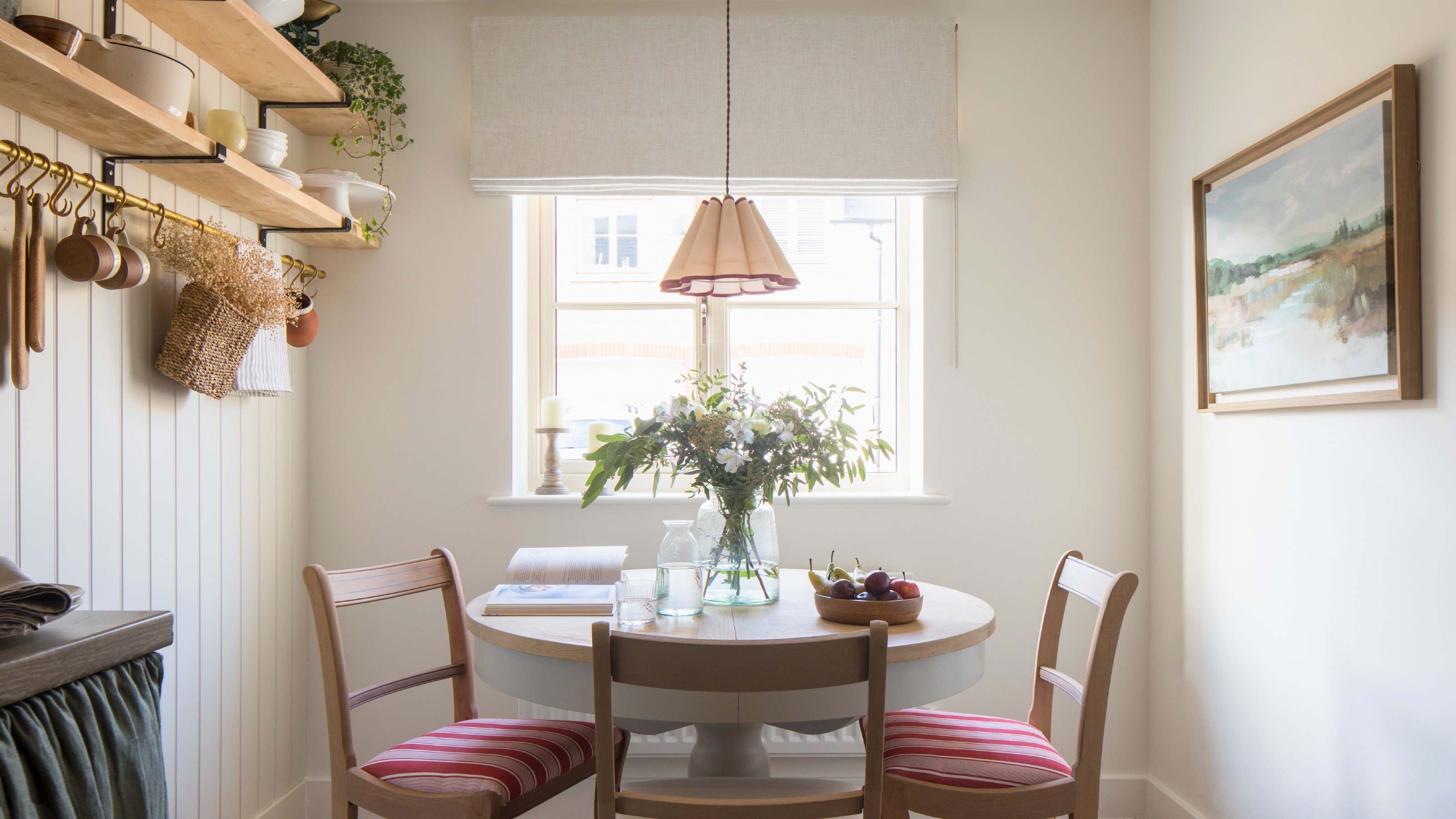
Which white paint is the best? Experts reveal the perfect shade of white for every room and feature

The Best White Paint Colors Experts Turn to Again and Again
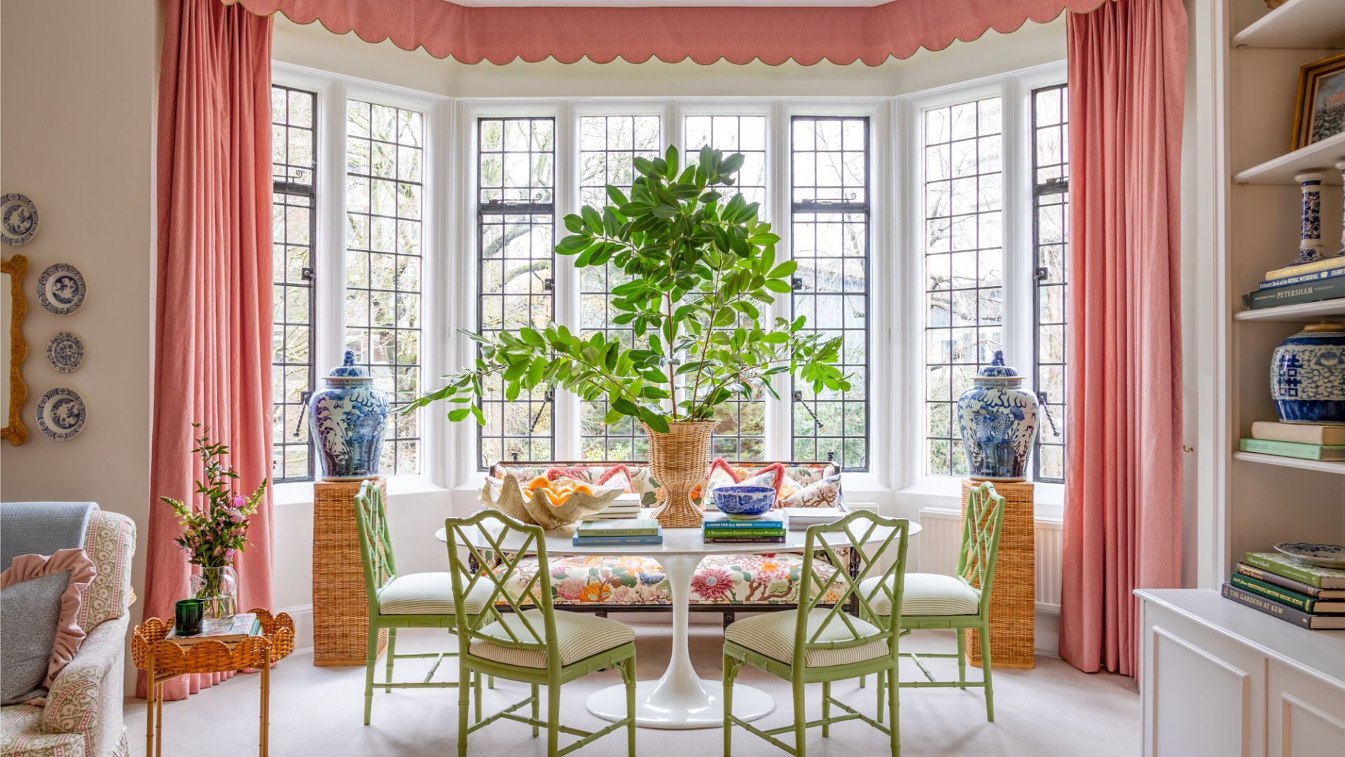
7 times you should never paint a room white
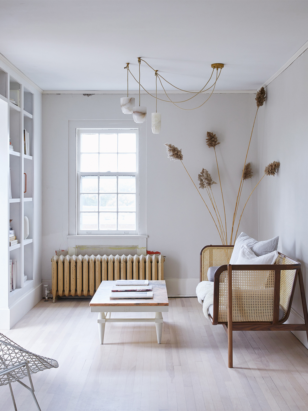
Designers’ Favorite White Paints Are Always Changing—We Asked 3 for Their Latest Pick
Paint finishes – a guide for every room
The Best White Paint for Walls That Experts Swear By