We Asked Designers Which Paint Colors Make a Room Feel Stuffy—And We're Repainting ASAP
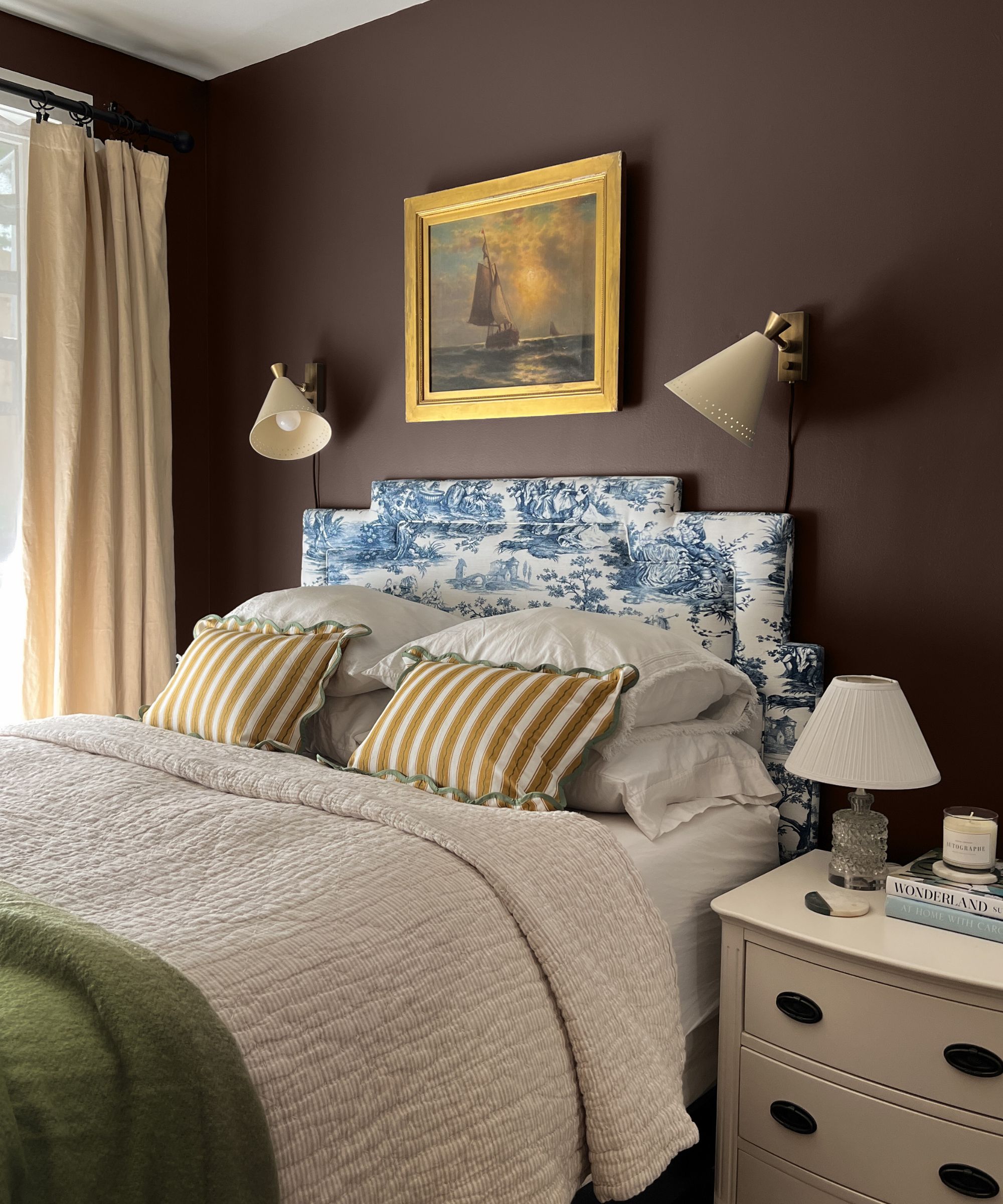
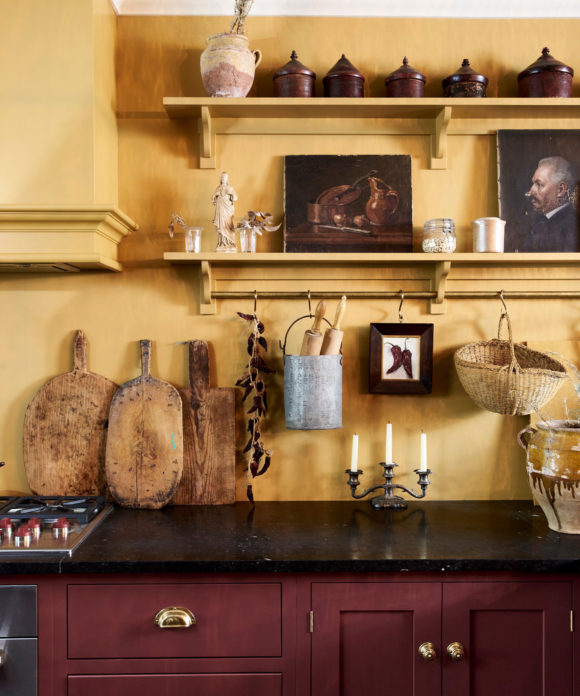
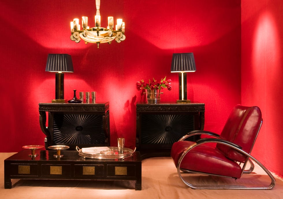
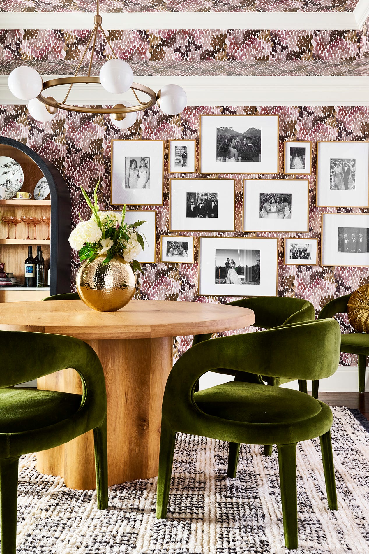
Paint color choice significantly influences a room's atmosphere, with certain hues making spaces feel stuffy, confined, and unwelcoming. Interior designers Carmen Henriquez of BoConcept and Anna Tatsioni of Decorilla offer insights into colors that should be approached with caution to avoid this effect. Deep burgundy, for instance, is identified as a color that tends to absorb light rather than reflect it, particularly in matte finishes. This characteristic can make a room, especially one lacking ample natural light, appear smaller and darker, creating a cave-like or confined sensation. While burgundy can be warm, its deep saturation can be detrimental in small spaces.
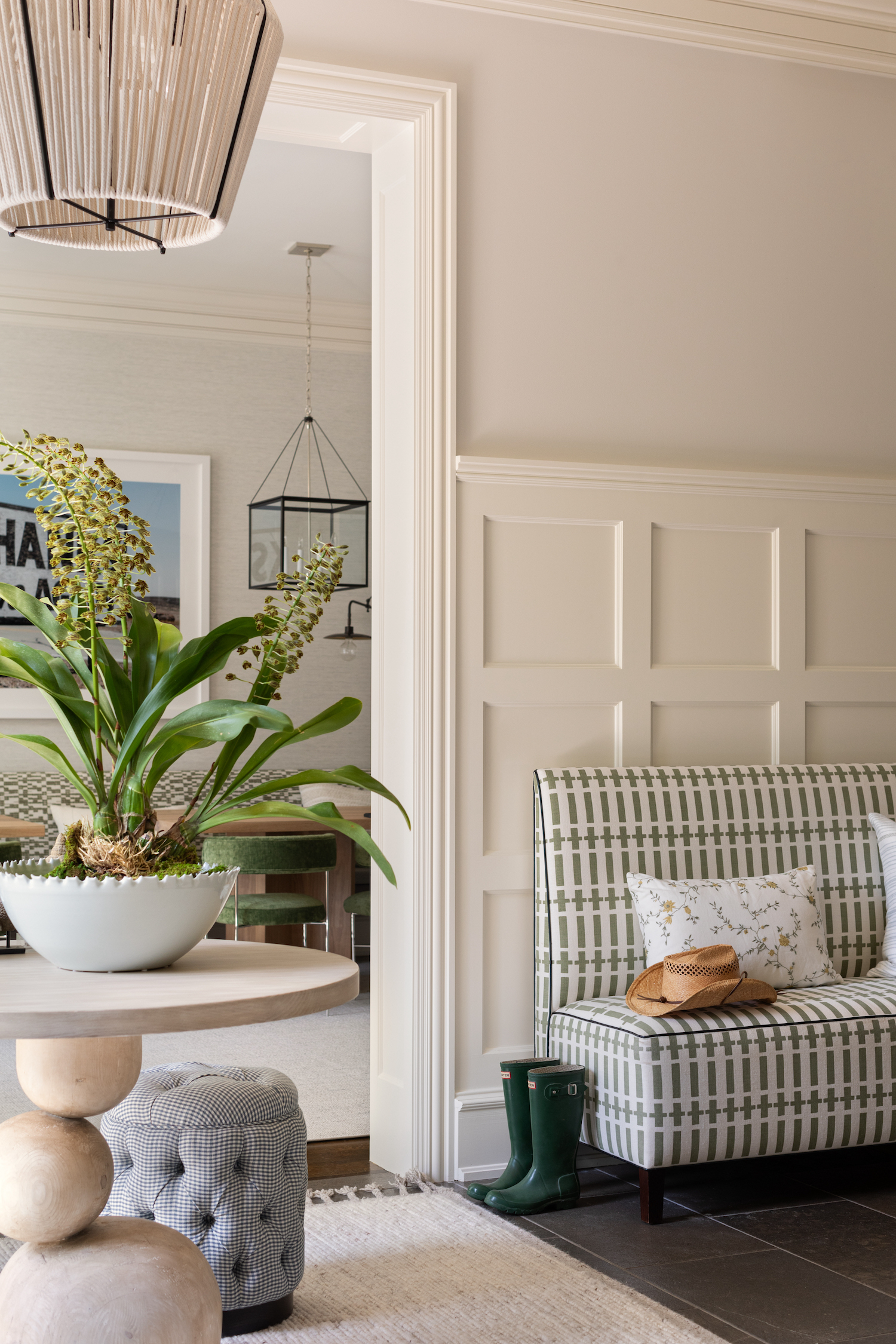
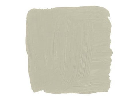
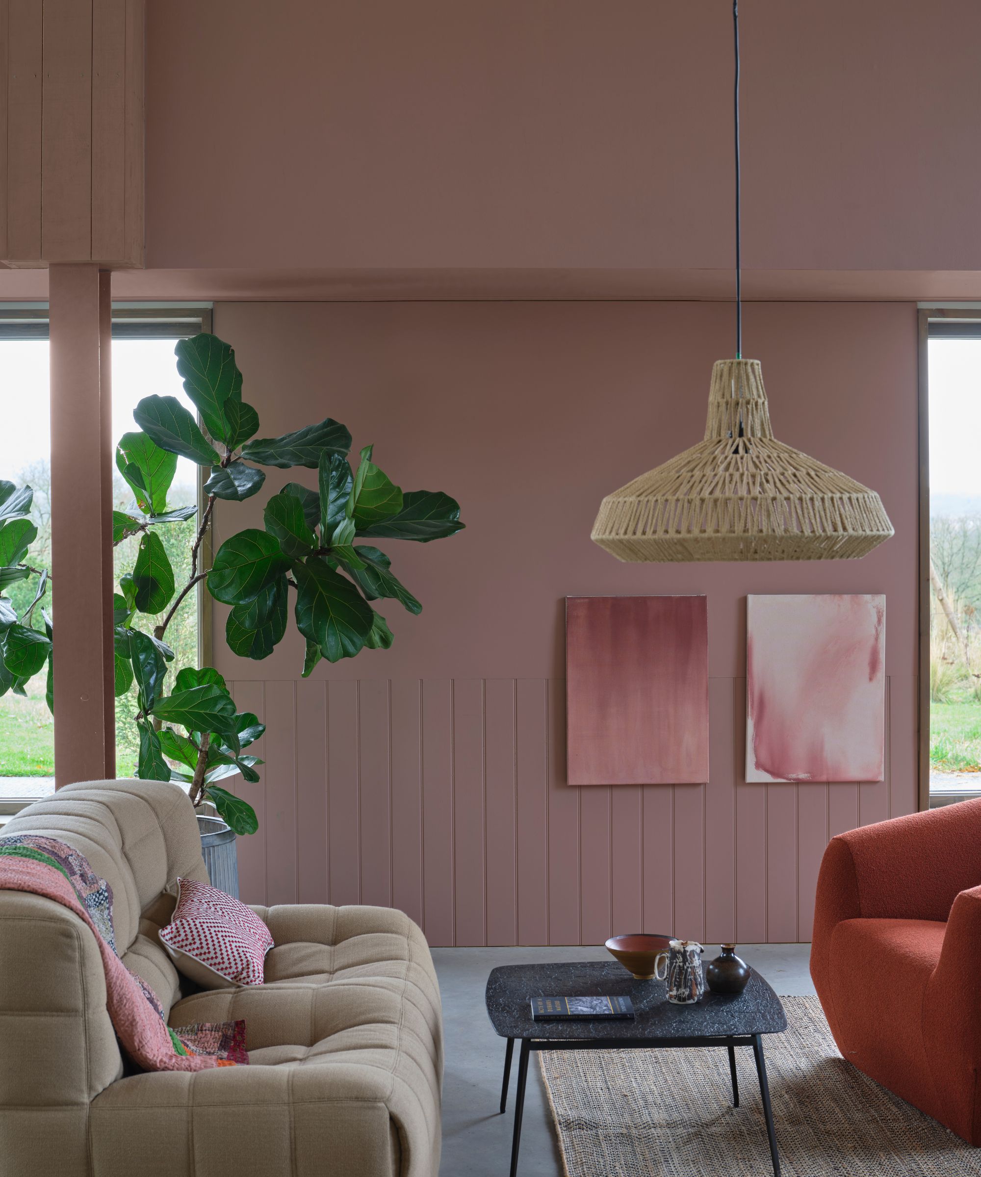
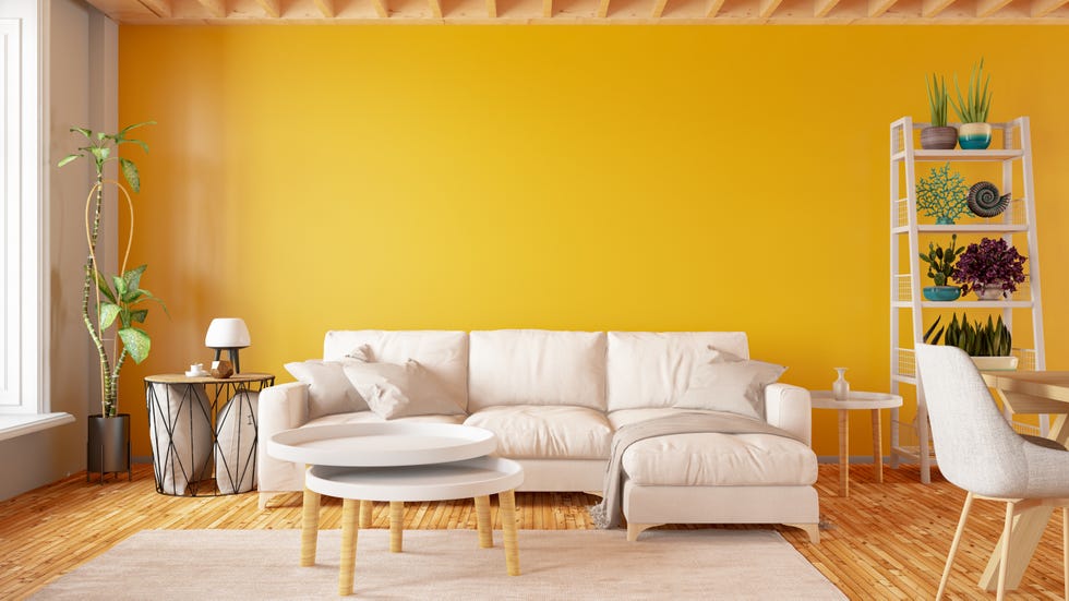
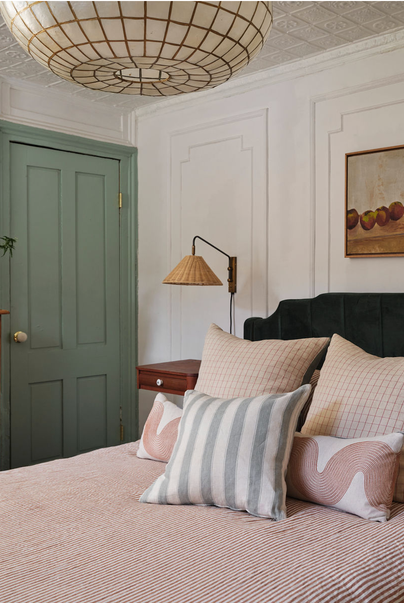
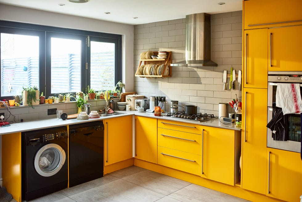
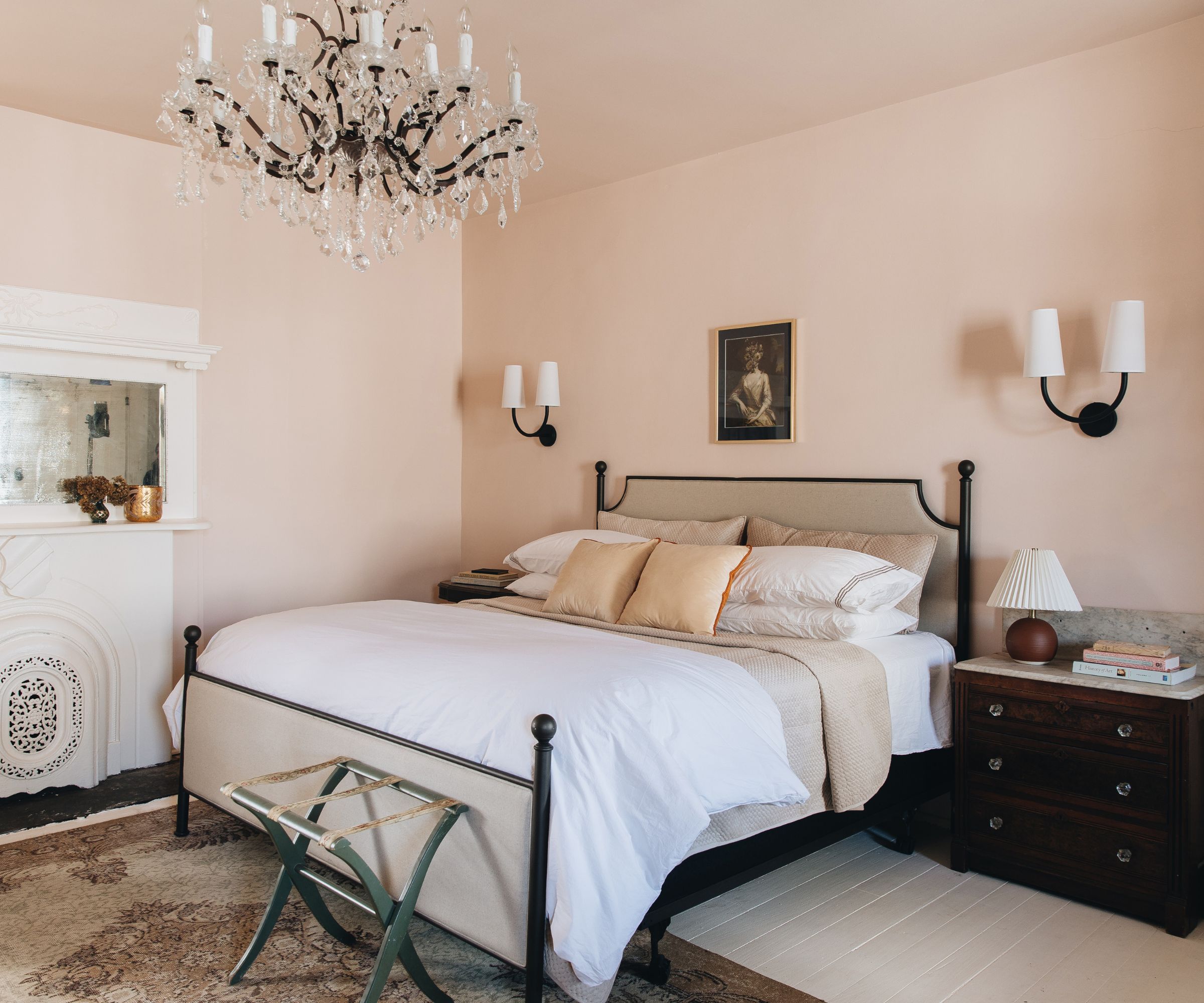
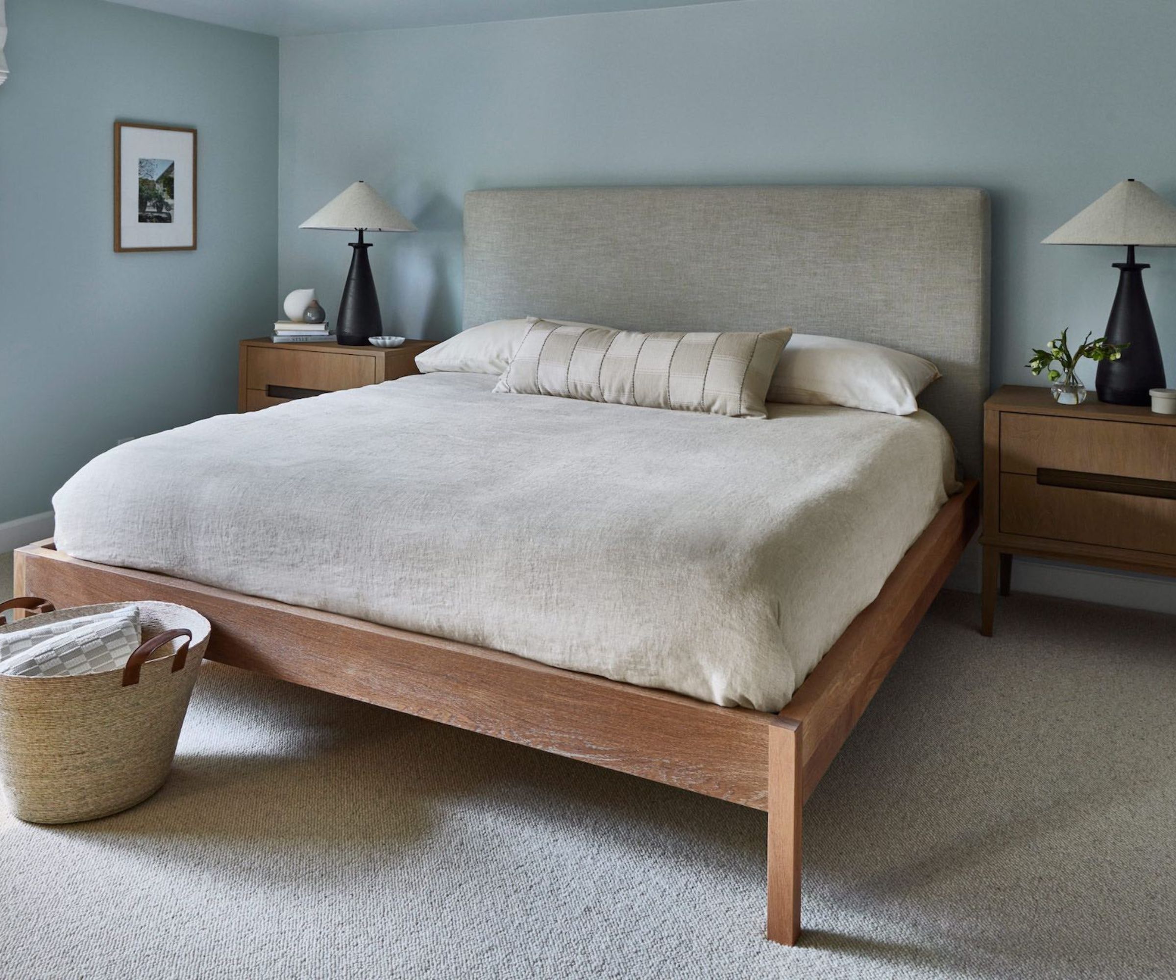
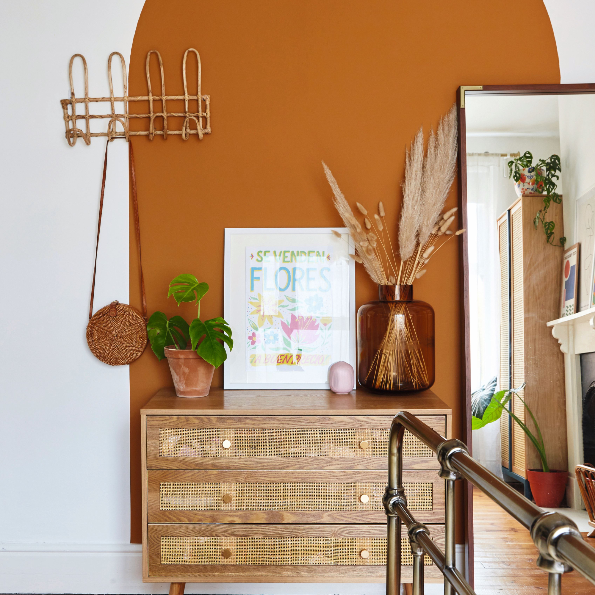
Another color often considered a neutral, cool beige, can also contribute to a stuffy feeling. Despite its lightness, a bland, cool-toned beige may lack the vibrancy needed to prevent a room from feeling unlively, especially in areas with poor natural illumination. Burnt orange, while potentially inviting, can be overpowering. Its intensity creates a visual loudness that can make walls seem closer than they are, resulting in an uncomfortably cramped and overly dramatic space rather than a vibrant one. This effect is largely due to its dark and muddy quality, which absorbs significant amounts of natural light.
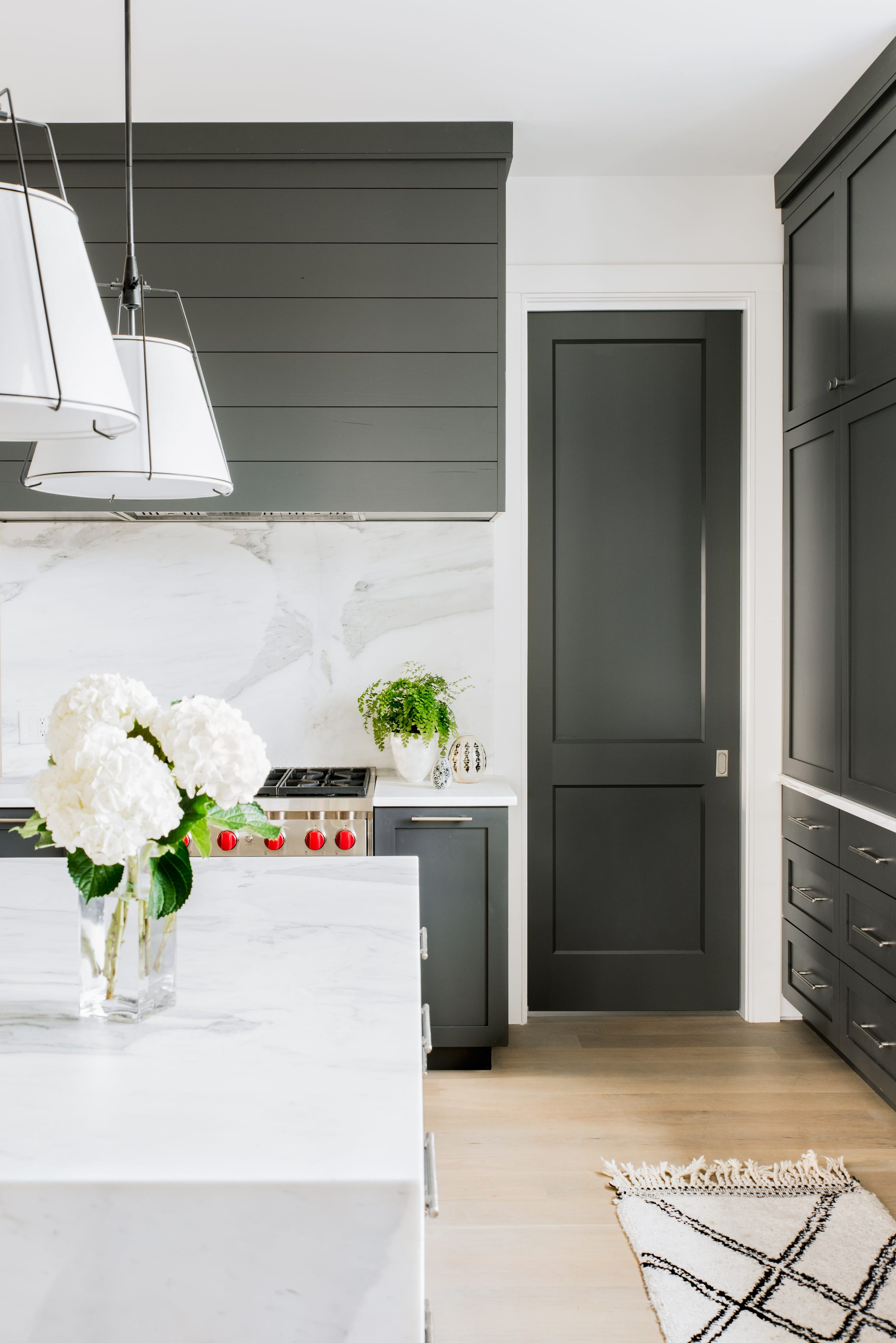
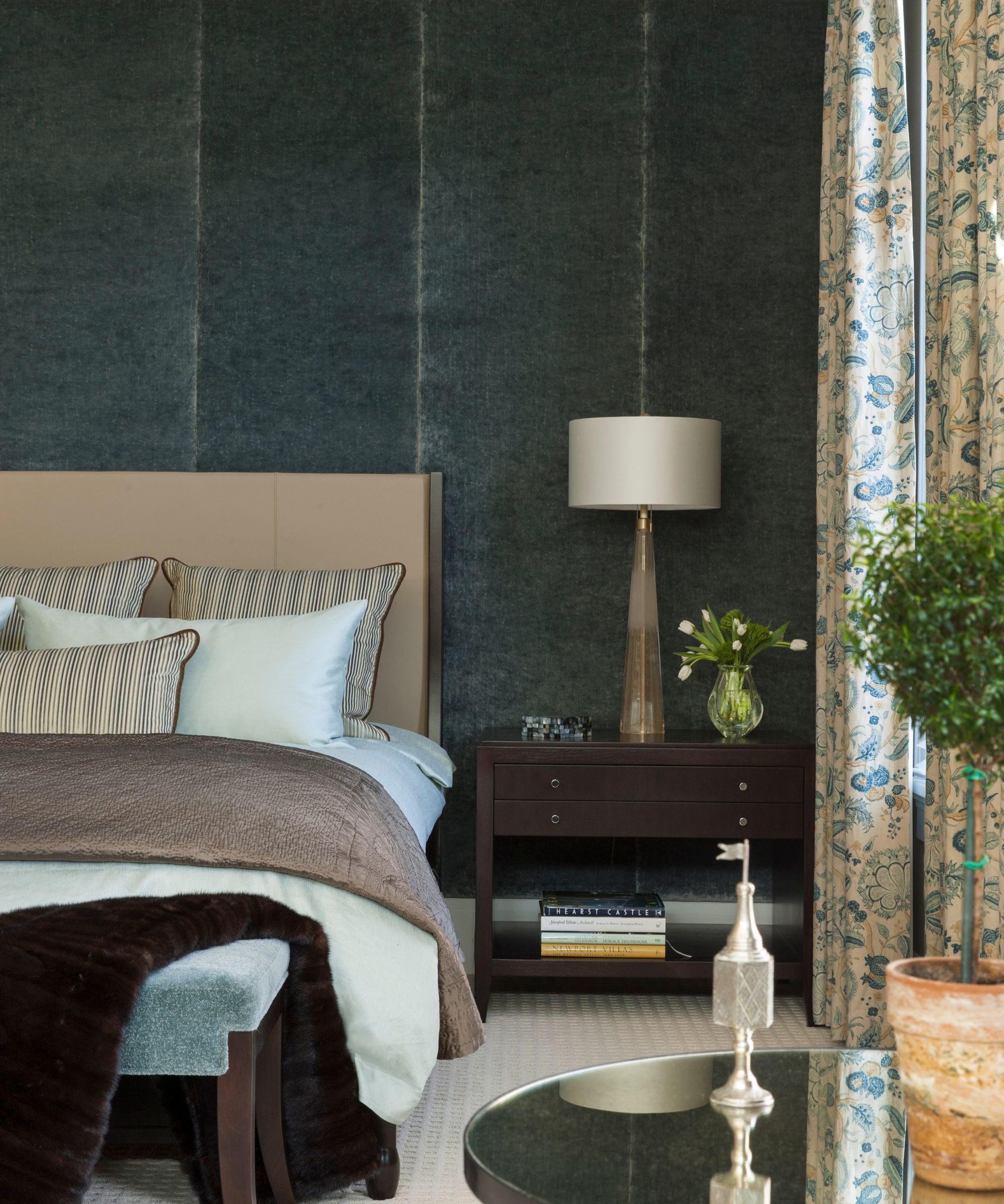
Charcoal gray is another culprit for creating a stuffy environment. A dull, heavy, and dark gray can overwhelm a room, effectively seeping out light and making the space feel oppressive. The perceived stuffiness of charcoal gray is not solely dependent on the color itself but also on the surrounding color palette. Combining charcoal gray with colors like neon yellow, brown, or red can result in garish and stuffy aesthetics. To counteract this, designers suggest pairing charcoal gray with bright whites or complementary colors to achieve a more serene effect.
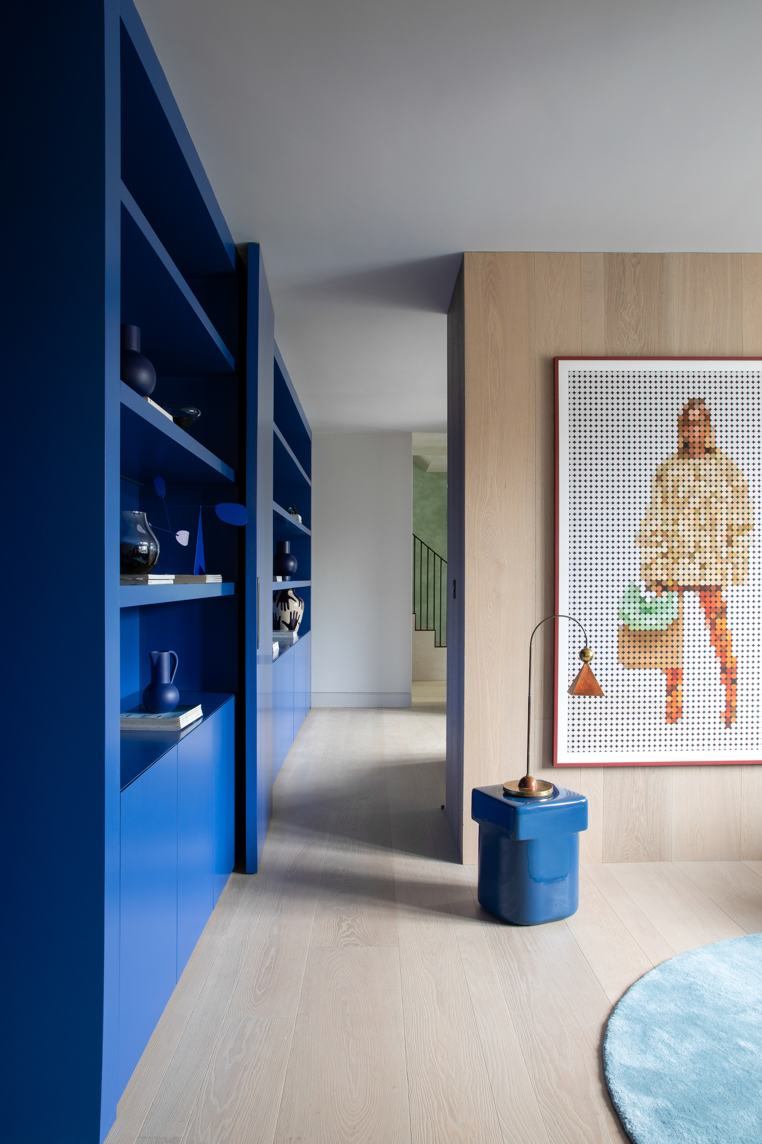
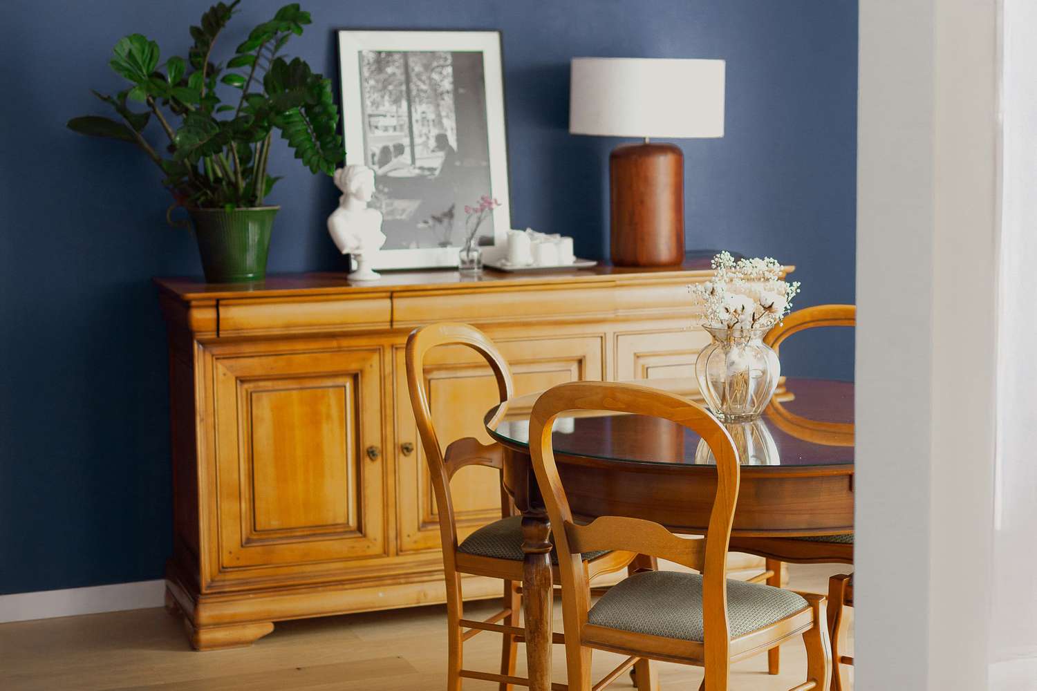
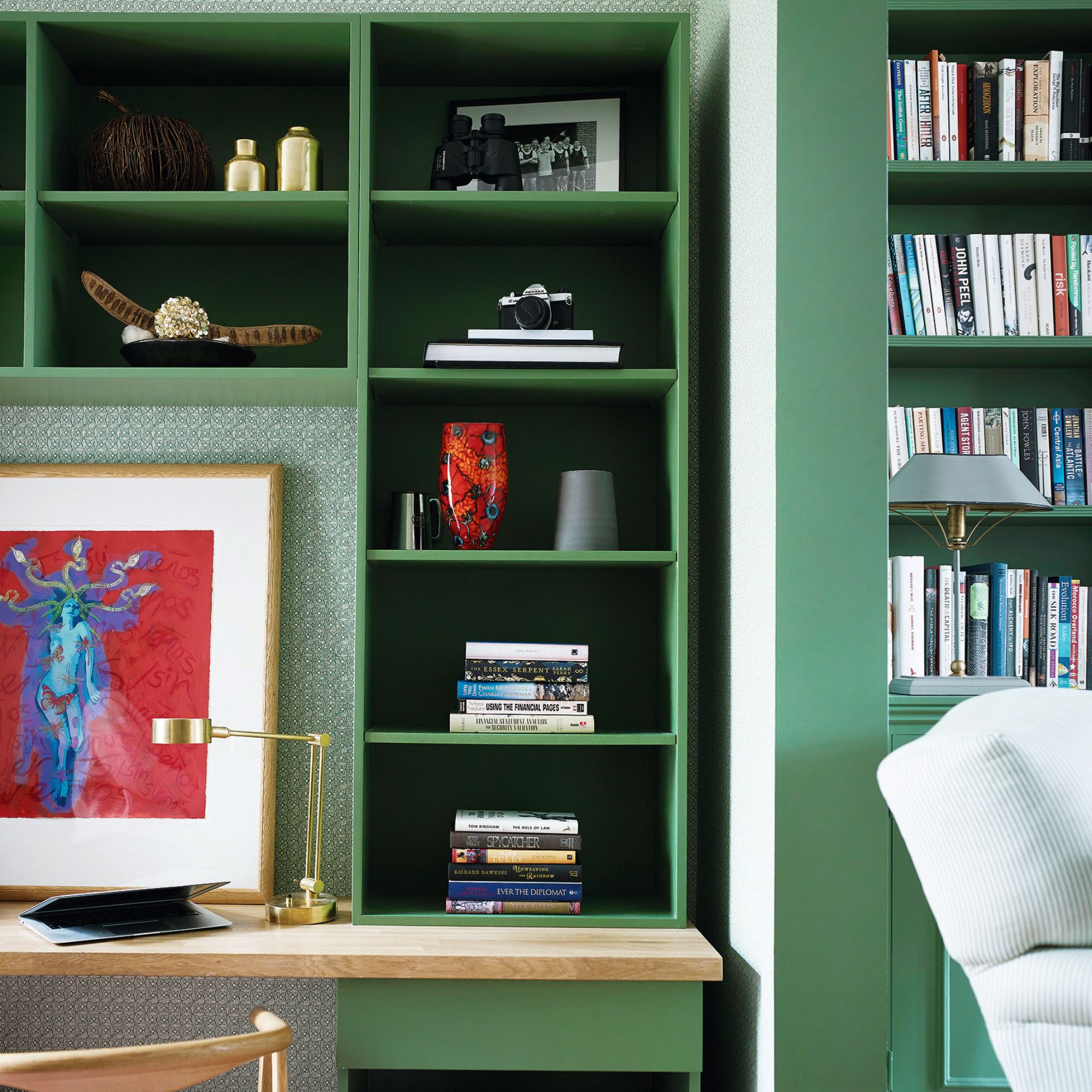
Navy blue also belongs to the category of colors that absorb light without adequately dispersing it. Colors that make a room feel larger and more inviting typically reflect light and possess a receding quality that visually expands walls. Navy blue, despite its aesthetic appeal, does not offer this expansive quality. It is best reserved for larger rooms with abundant natural light, as its use in smaller, poorly lit rooms can have the opposite effect, making them feel more enclosed. Ultimately, adequate natural or artificial lighting is crucial for any paint color to appear its best, preventing it from looking lifeless and contributing to a stuffy atmosphere.
#PaintColors #InteriorDesign #ColorTheory #RoomDecor #HomeImprovement #DesignTips #Lighting #ColorPsychology #PaintColors #InteriorDesign #ColorTheory #RoomDecor #HomeImprovement #DesignTips #Lighting #ColorPsychology
0 ความคิดเห็นรวม
 ยังไม่มีความคิดเห็น
คุณอาจจะชอบอีกด้วย
7 'Unhappy' Colors That Color Psychology Experts Would Never Paint Their Walls

My rented apartment follows the key rules of color psychology – here's why I'd never go back to an all-white home

Designers Say These Unusual Paint Color Combos Will Transform Your Home

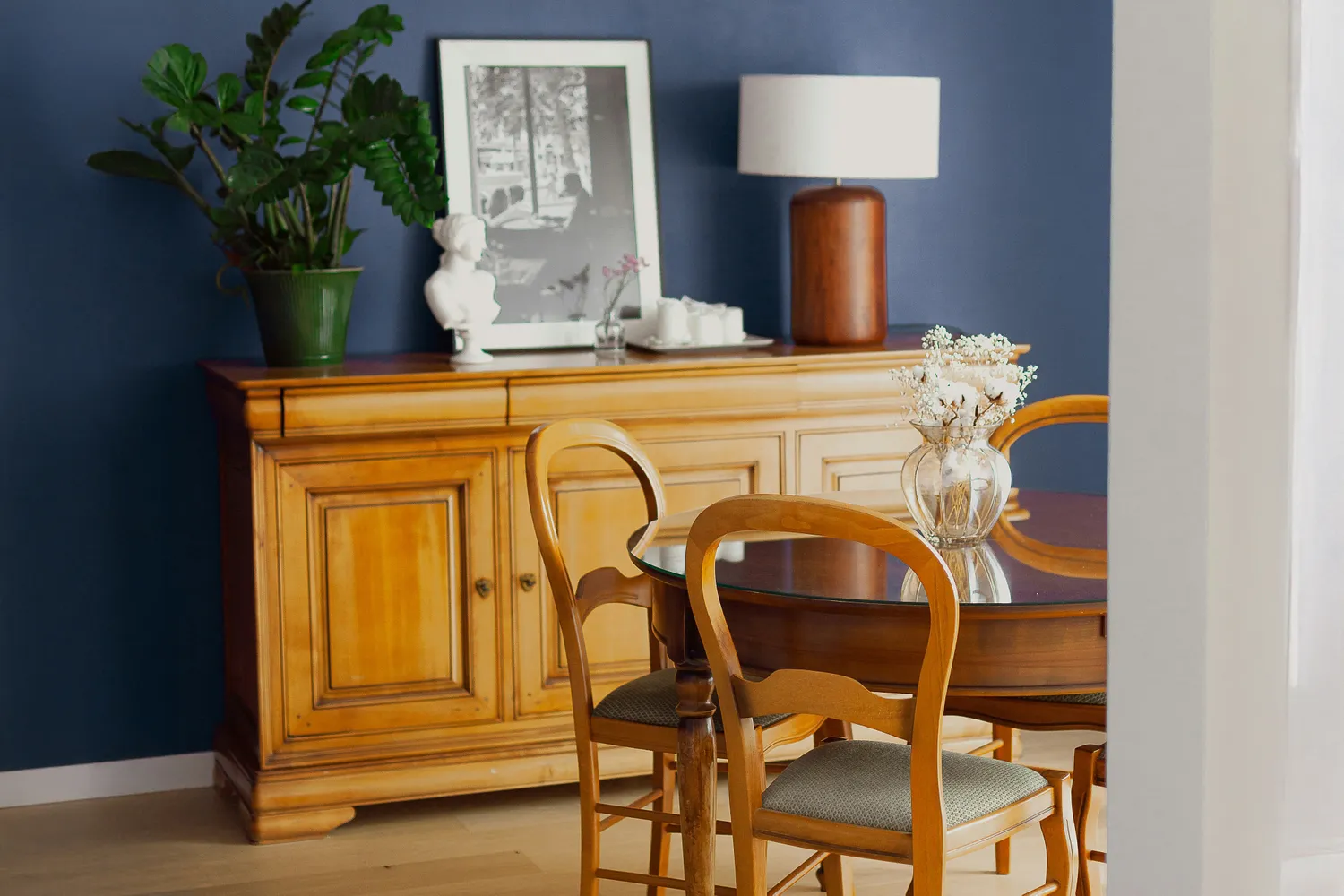
We Asked Designers Which Paint Colors Shrink a Dining Room—And These 5 Are Cramping Your Style
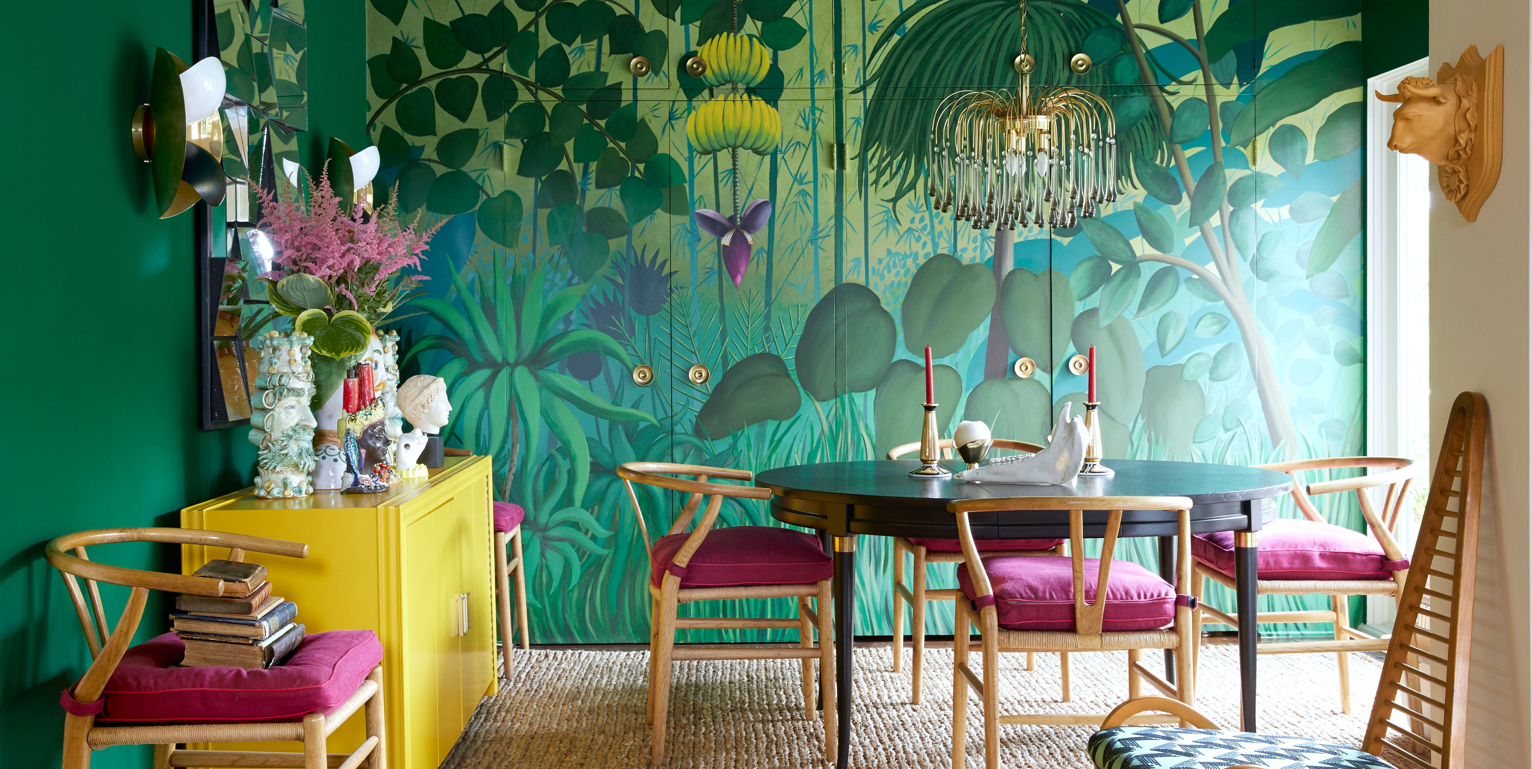
Need A Furniture Refresh? These Are Paint Colors That Top Designers Recommend


4 Interior Designers Share the Biggest Paint Color Trends Right Now (and What’s Out!)

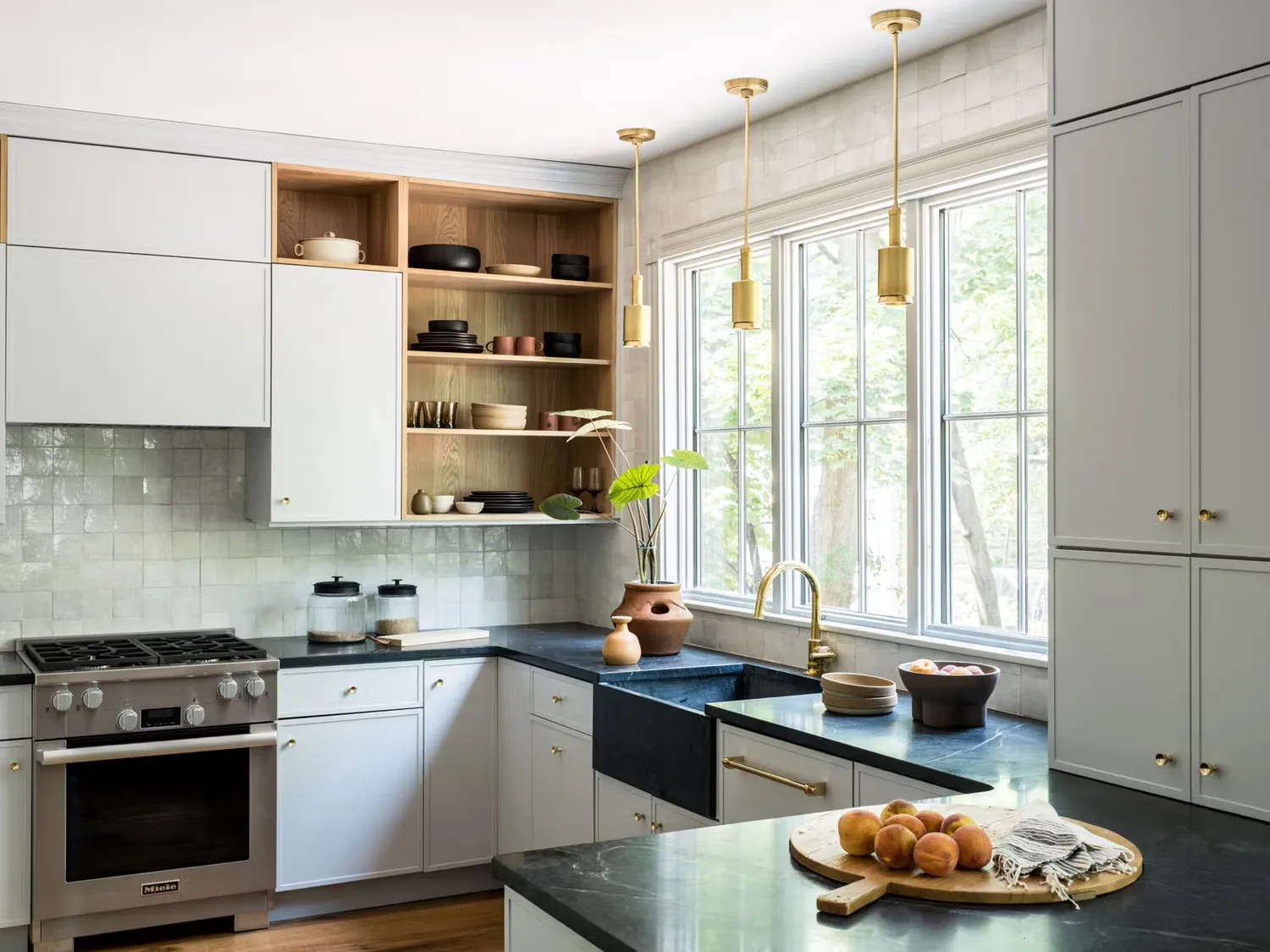
We Asked Designers What Color to Paint a Small Kitchen to Make it Look Bigger—And We're Obsessed
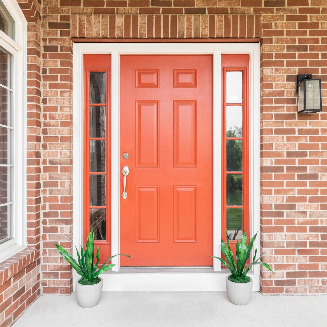
8 Surprising Colors That Will Decrease Your Home's Value, According to Experts

Time to rethink coloured ceilings and woodwork
We Asked Designers to Pick the Most Timeless Living Room Paint Color—and They Agreed

These Paint Colors Bring Hostility to Your Home, According to Experts
10 designers on the bedroom colors they always recommend
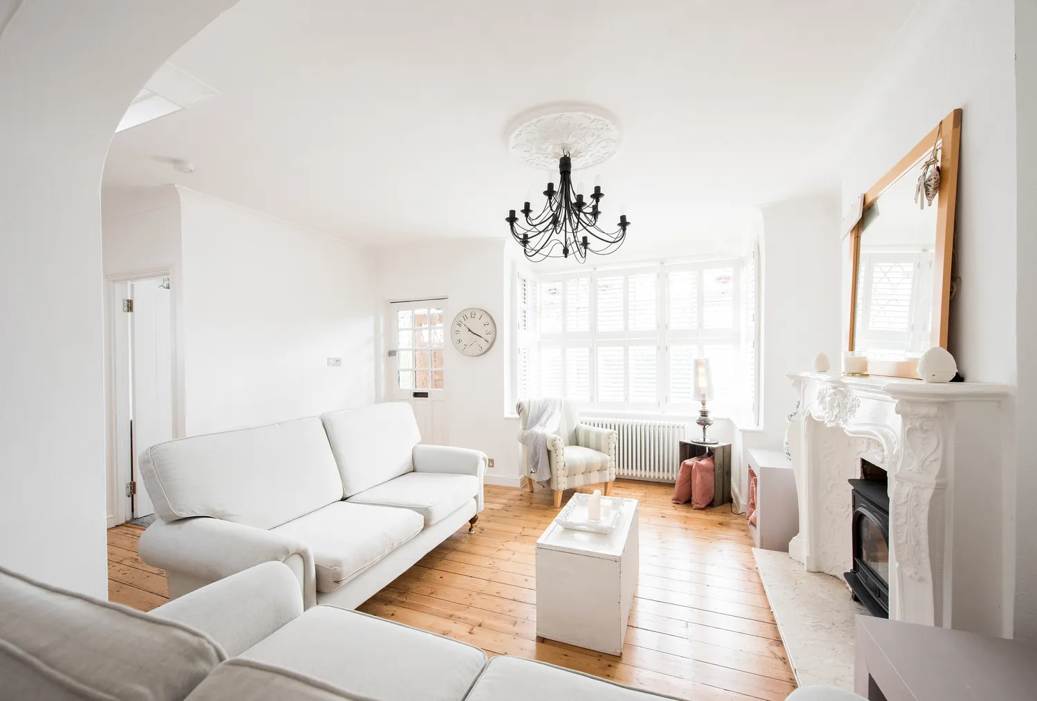
We Asked Designers Which Living Room Paint Colors People Regret Most—And We're All Guilty


What are the worst colors to paint a room? The shades experts say you should never use
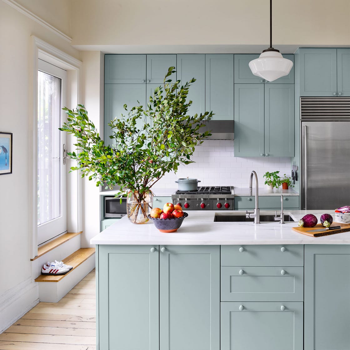
20 Kitchen Paint Colors to Try in 2024
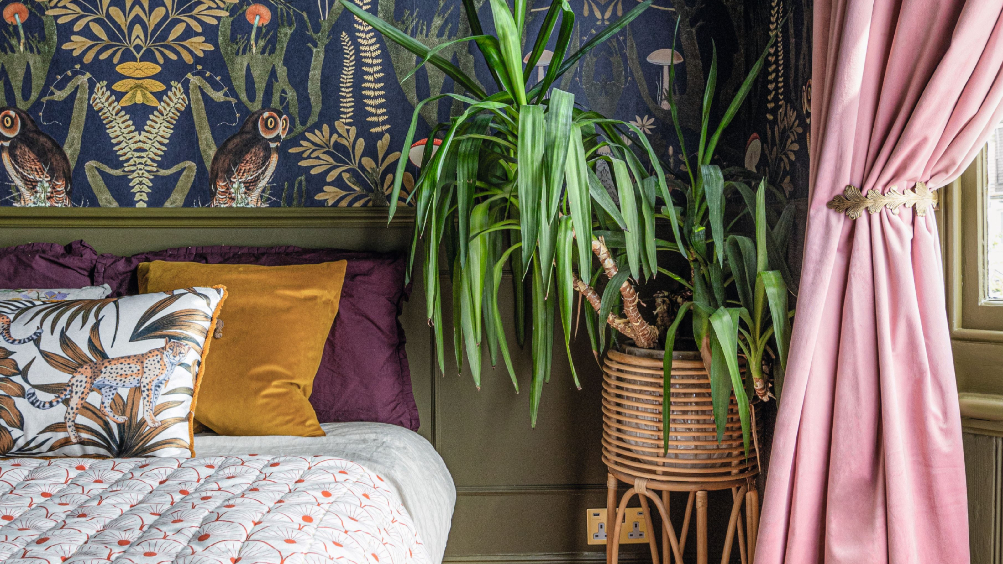
'It's so effective at making your home work harder' – the latest paint trend endorsed by colour gurus
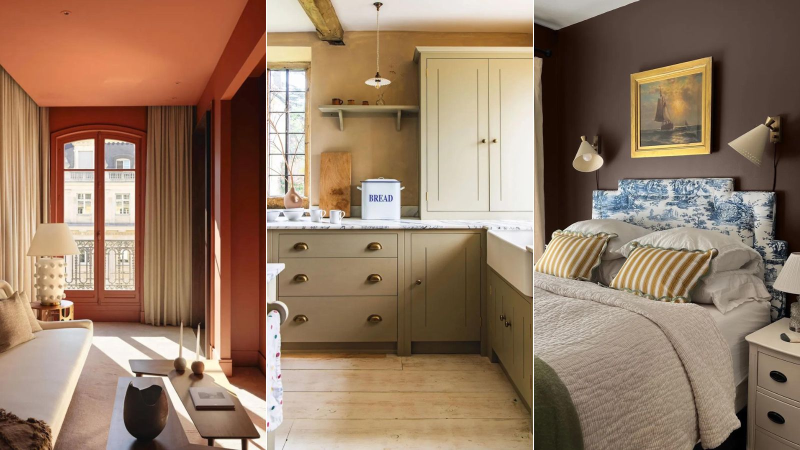
5 'ugly colors' that I'll be decorating with in 2024 – these undesirable colors will trend this year
A Color Psychologist Says This Is the Most Relaxing Paint Color

12 Color Schemes That Are Popping Off Right Now, According to Designers
We Asked Designers Which Living Room Paint Colors People Always Regret—These 6 Came Up the Most