The Best Beige Paint Color of All Time
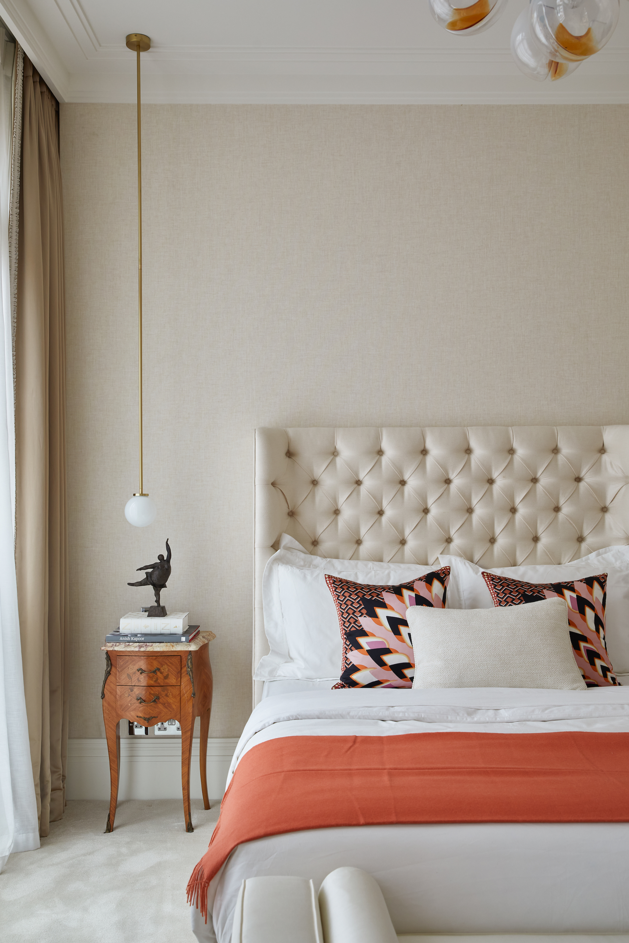
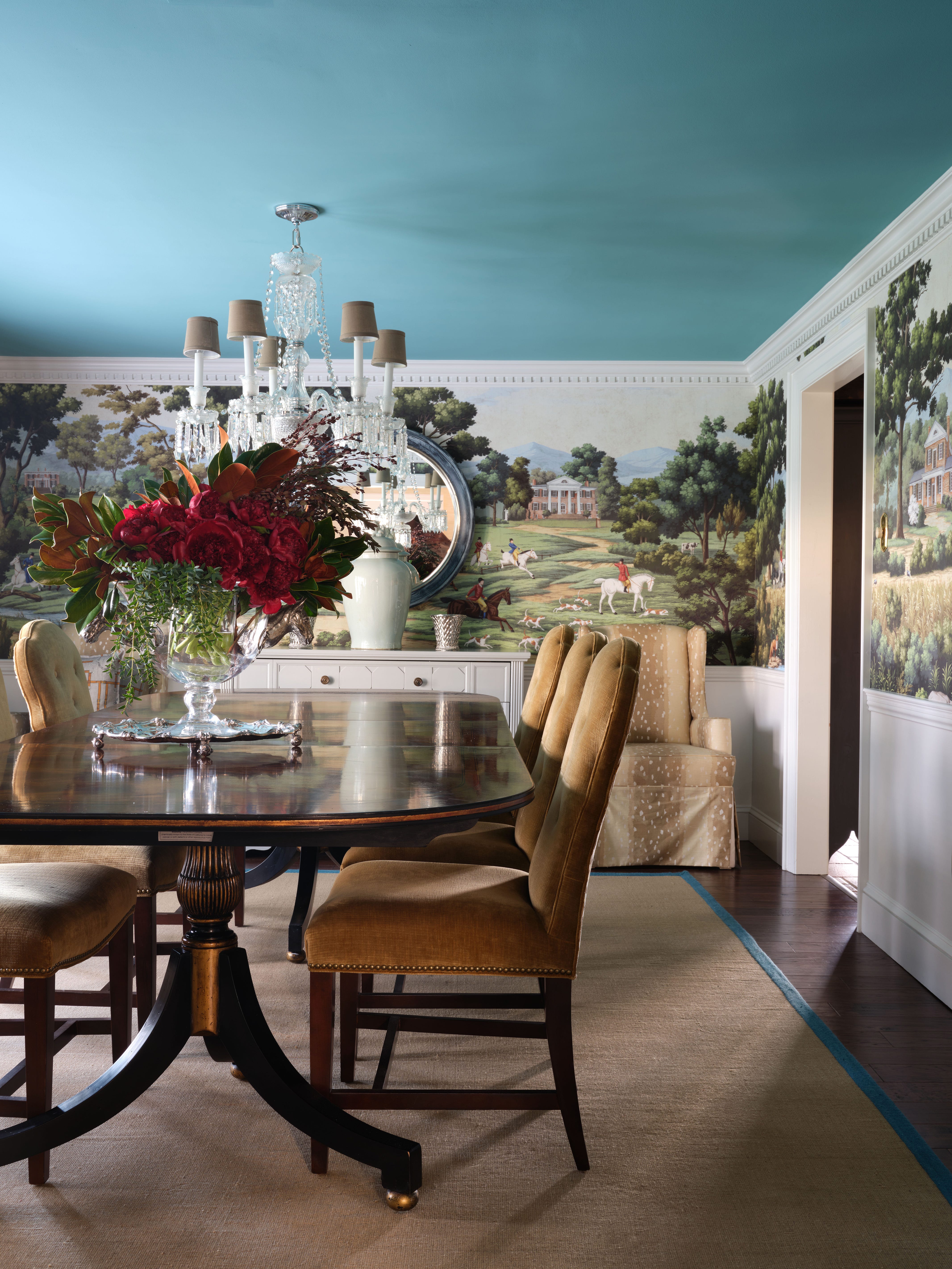
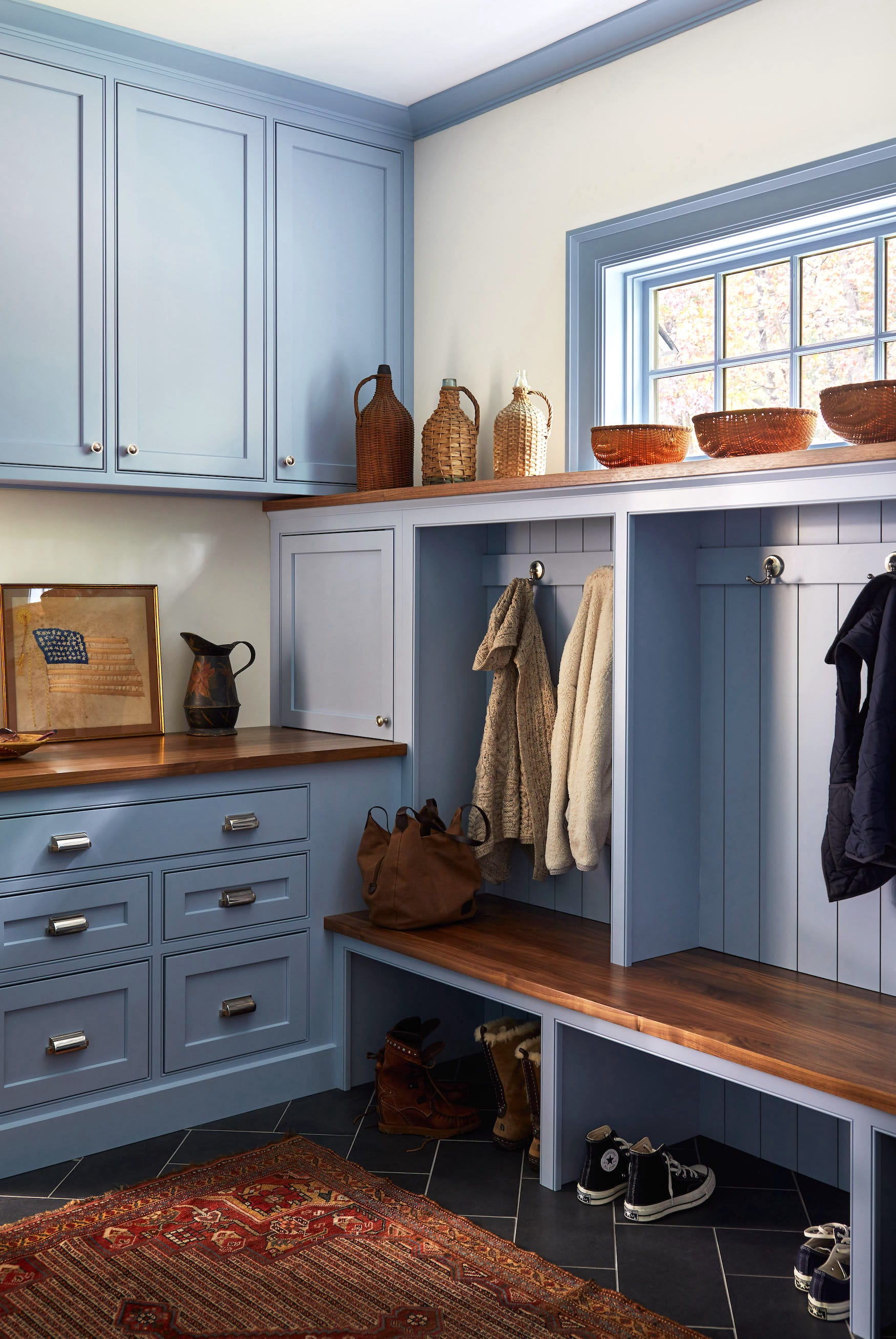
The article focuses on challenging the common negative perception of beige as a boring and unattractive paint color. It argues that beige can be an incredibly versatile and timeless neutral, especially as trends shift away from bright-white walls. The key to successfully using beige, according to the article, lies in selecting a shade with the correct undertones, a task that can be difficult when relying solely on paint chips or online swatches. The article highlights how many past beige choices, particularly those favored by builders and developers, often had strong yellow or orange undertones, leading to a color that was neither neutral nor easy to decorate around. These specific undertones caused the beige to become overpowering rather than a subtle backdrop.
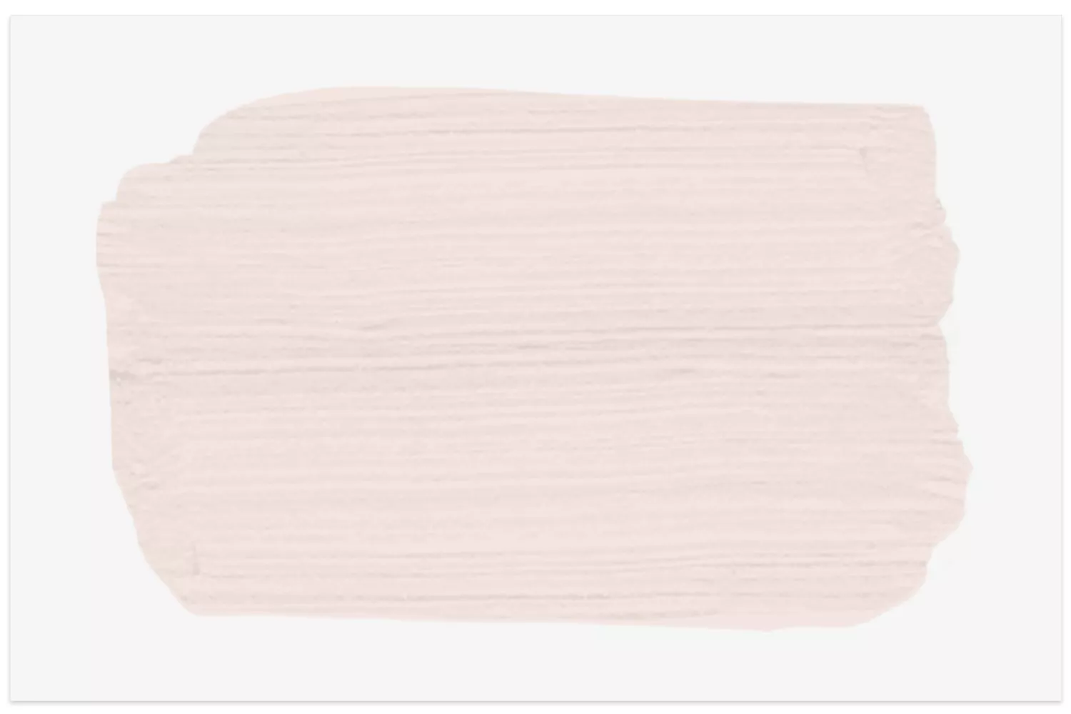
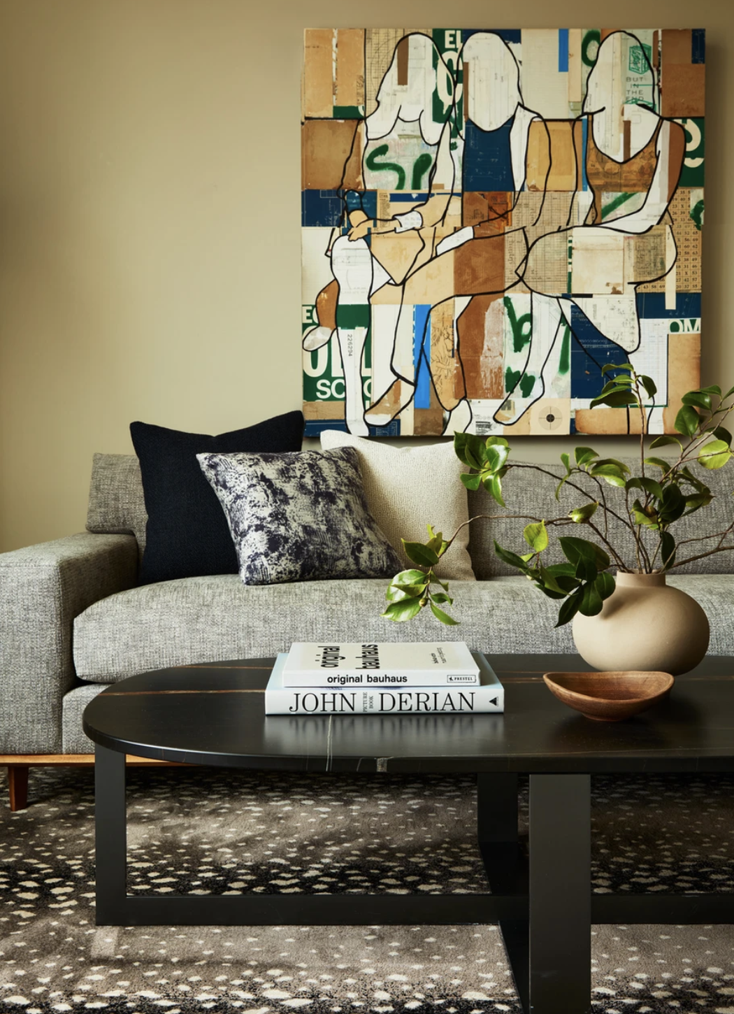
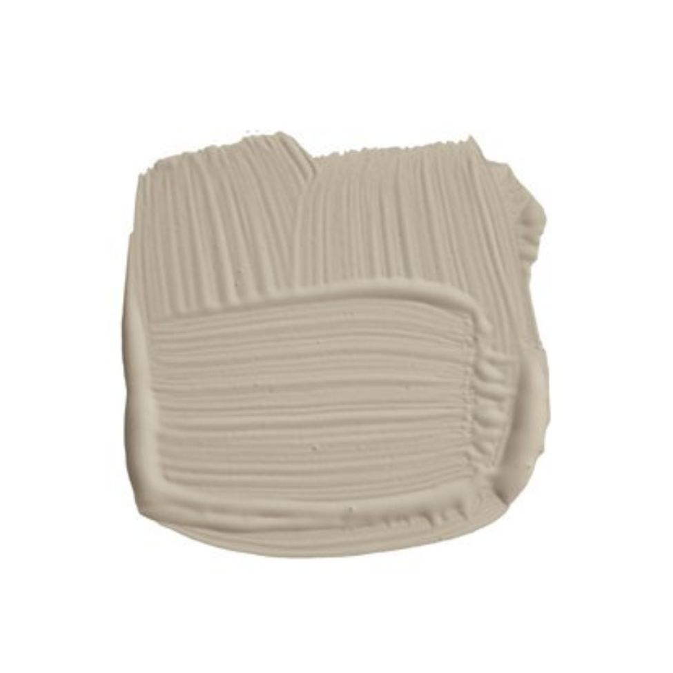
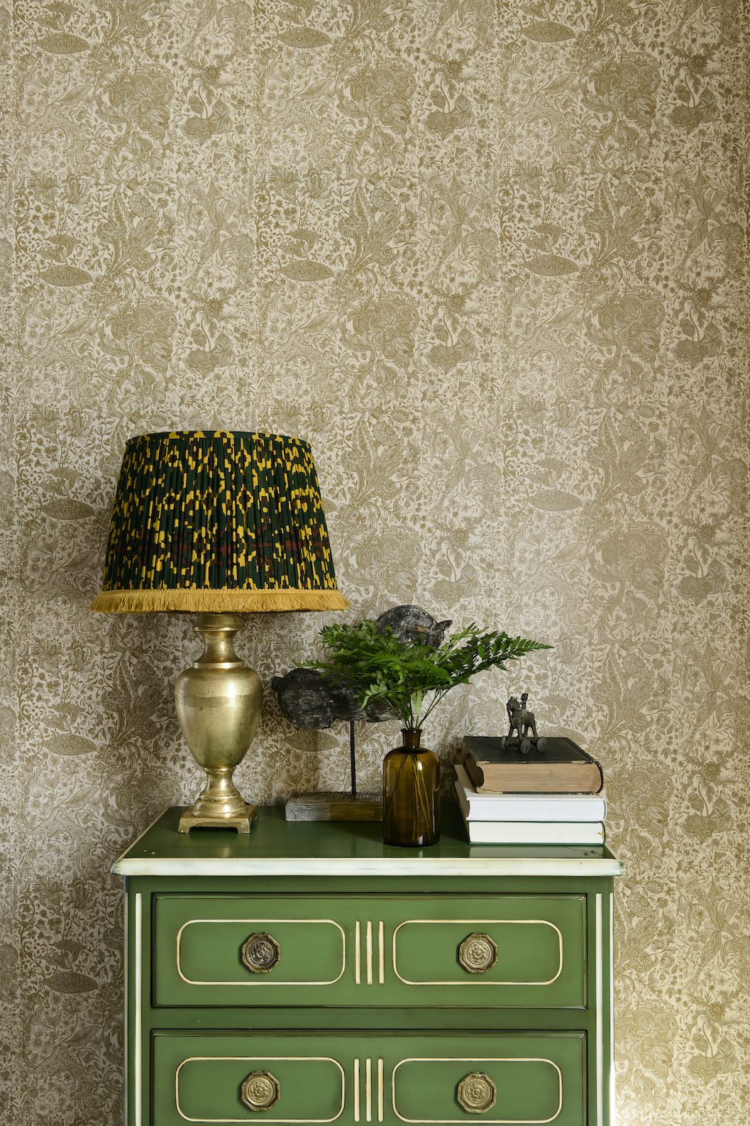
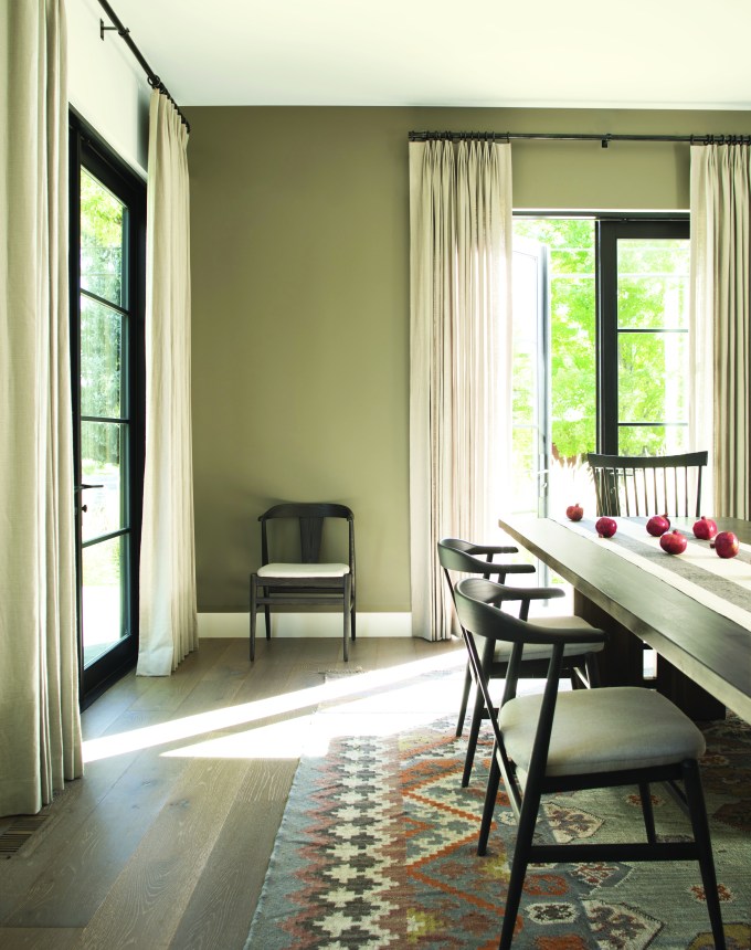
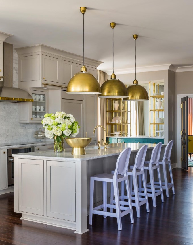
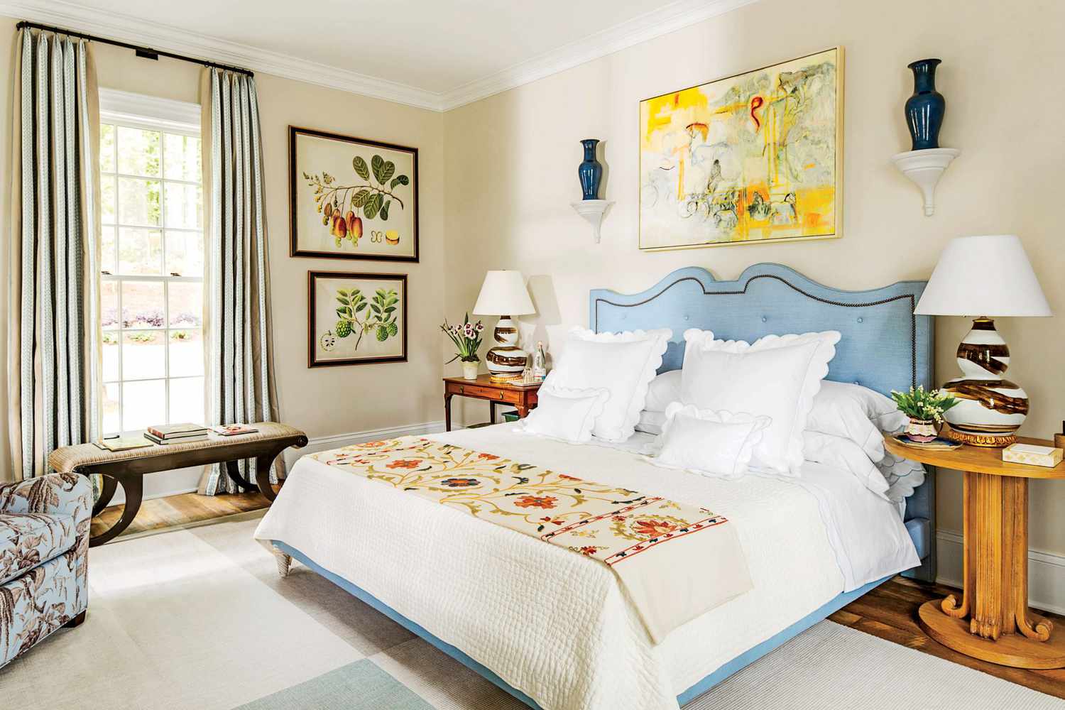
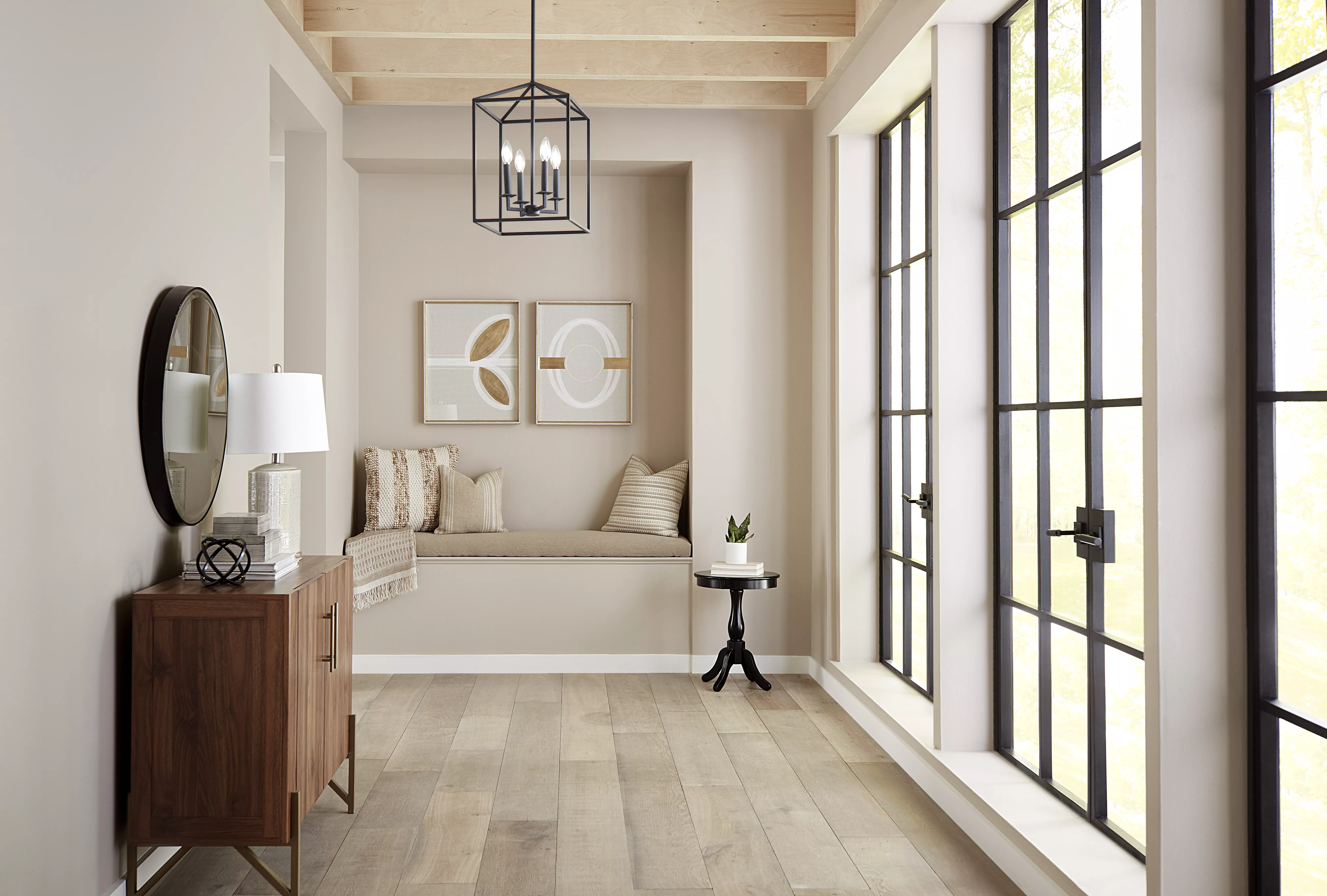
The author advocates for a beige that truly functions as a neutral, capable of serving as a beautiful foundation for furniture and artwork while simultaneously being able to recede into the background, becoming almost unnoticeable. The article's top recommendation for achieving this desired effect is Benjamin Moore's Hush. This specific shade is lauded for its soft, neutral quality, which avoids leaning too heavily into brown or gray. While it does possess slight yellow undertones, these are significantly muted compared to the more pronounced sandy tans that were popular in the early 2000s, which had contributed to beige's unfavorable reputation.
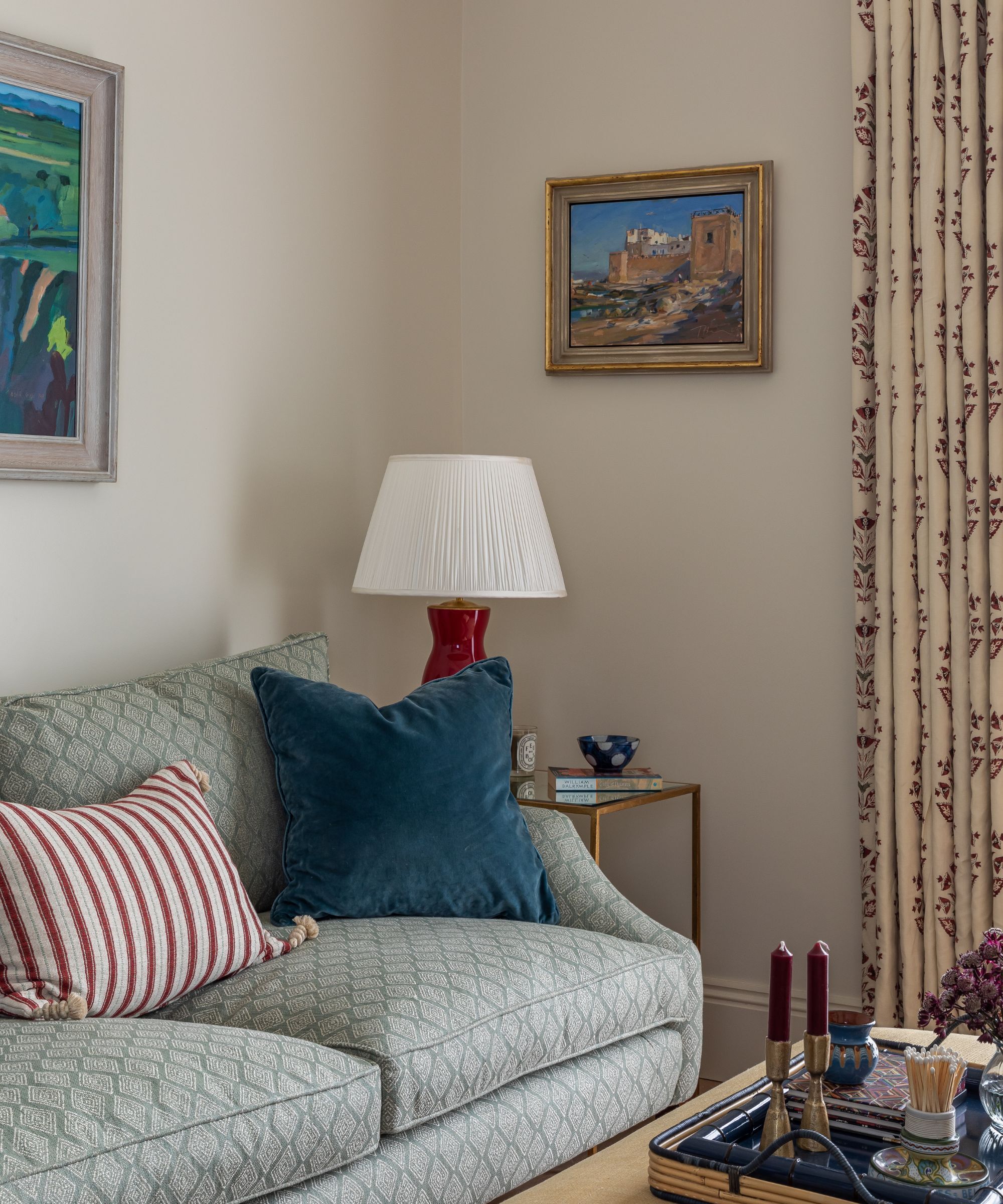
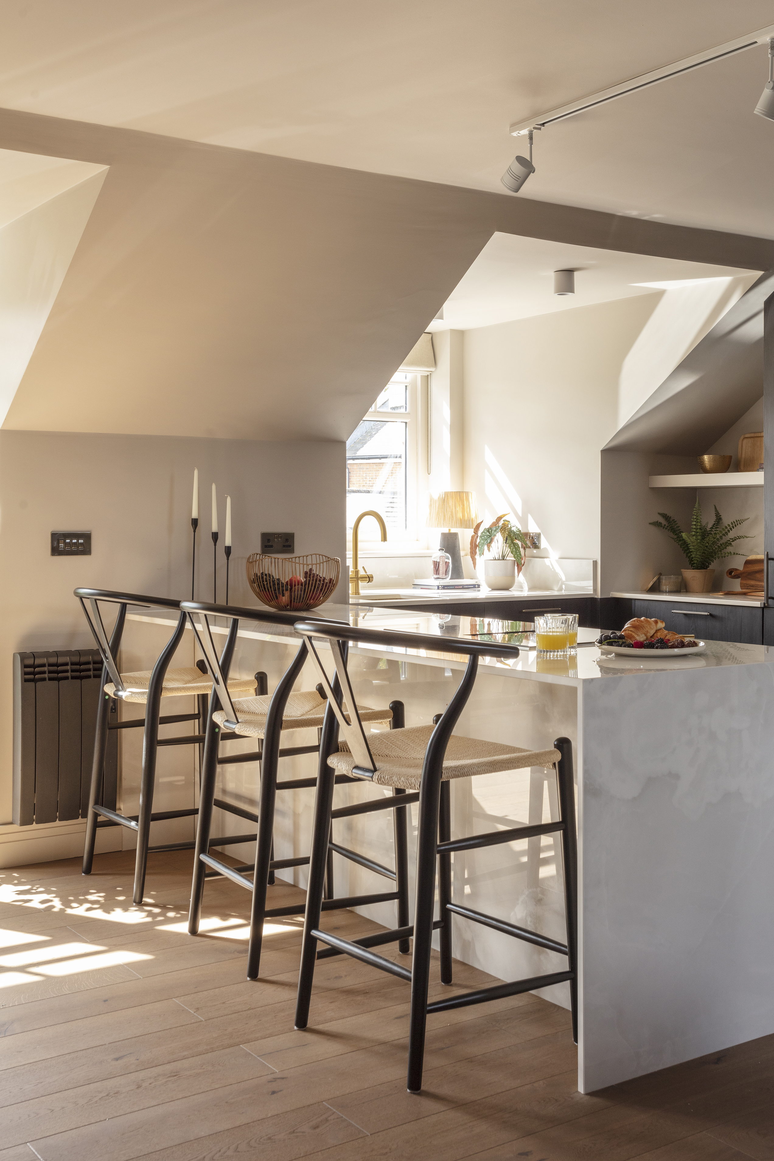
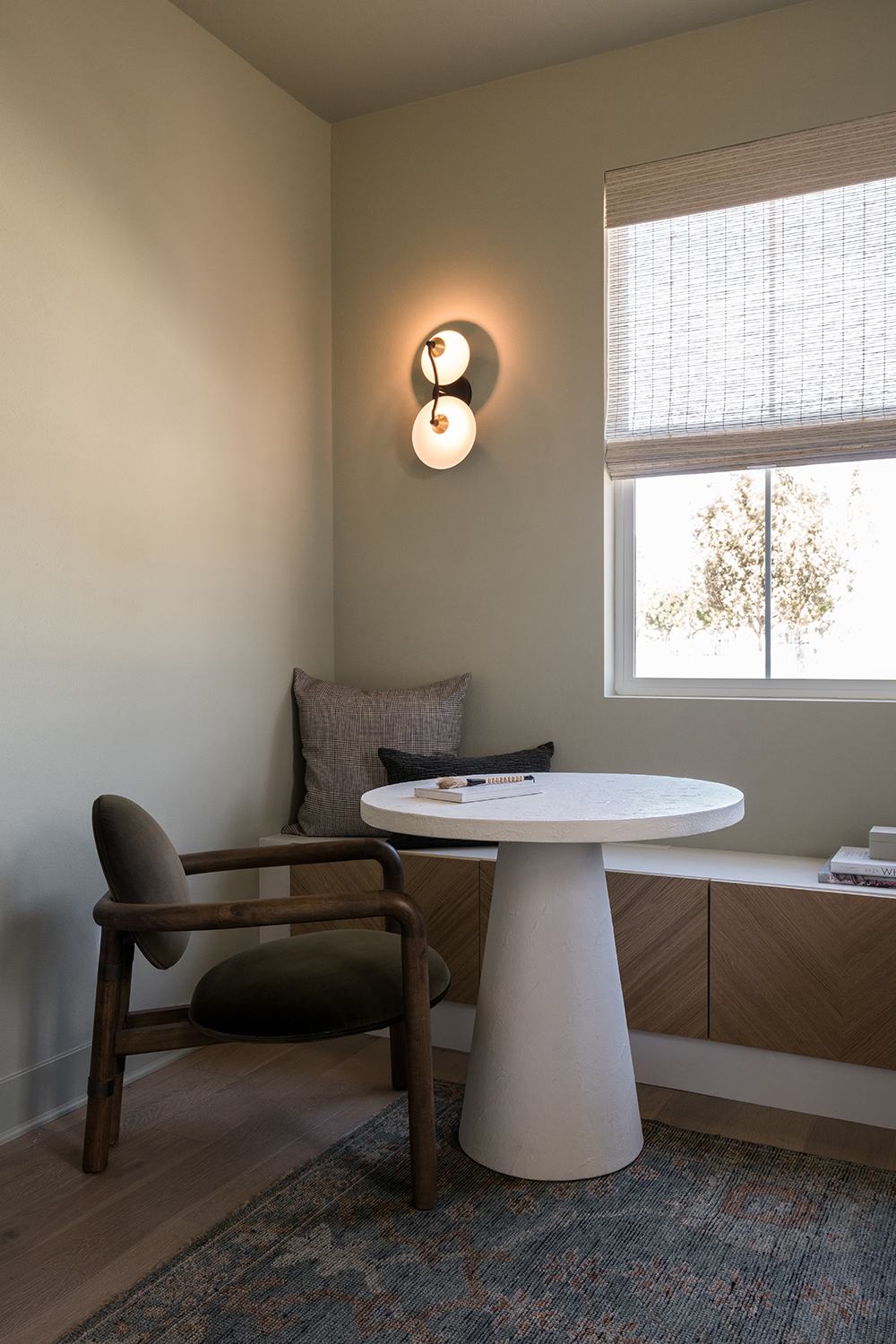
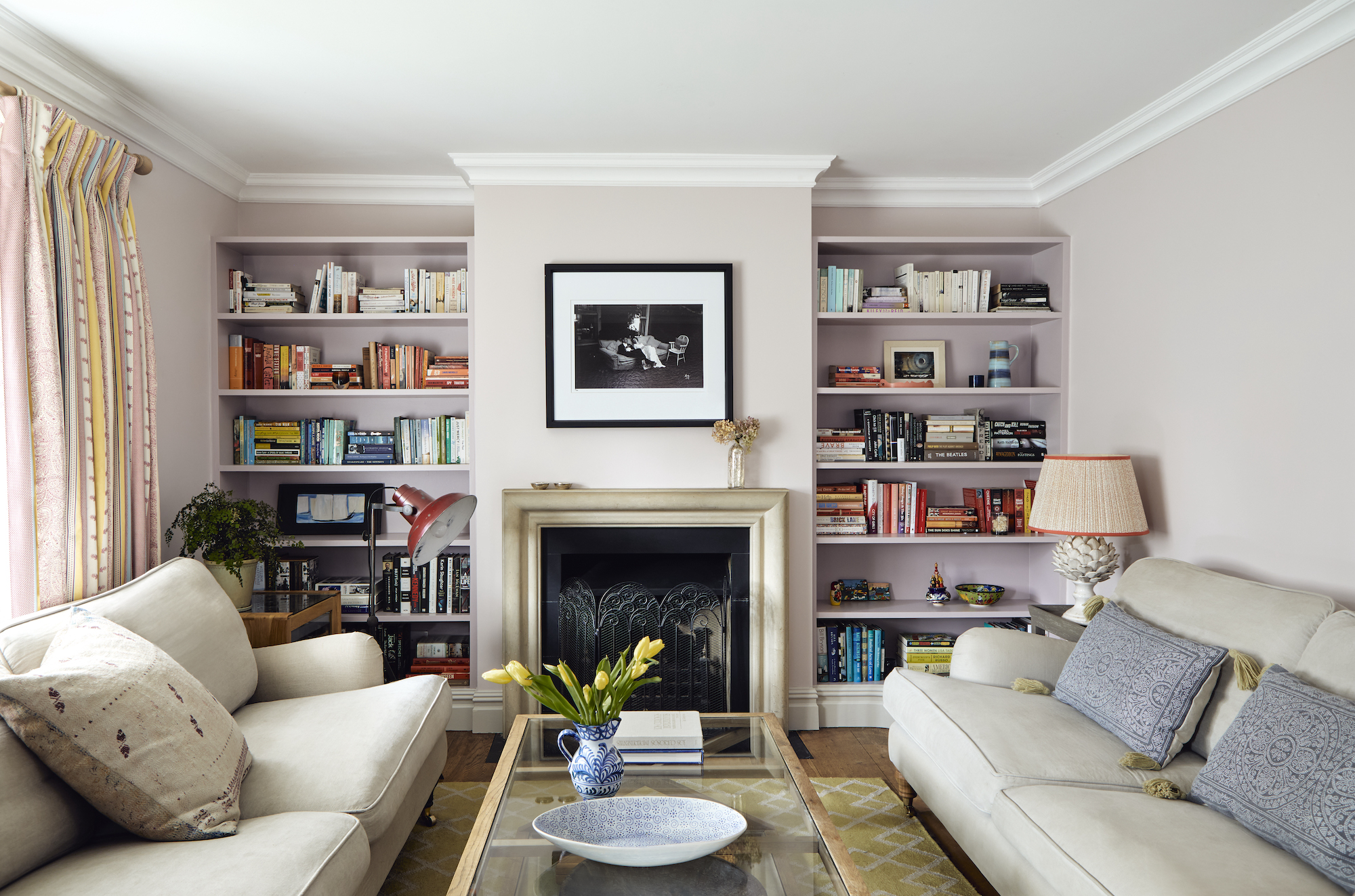
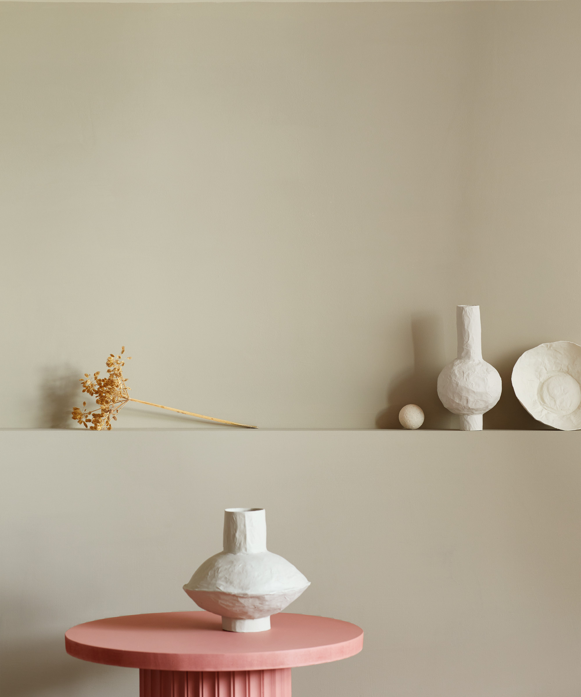
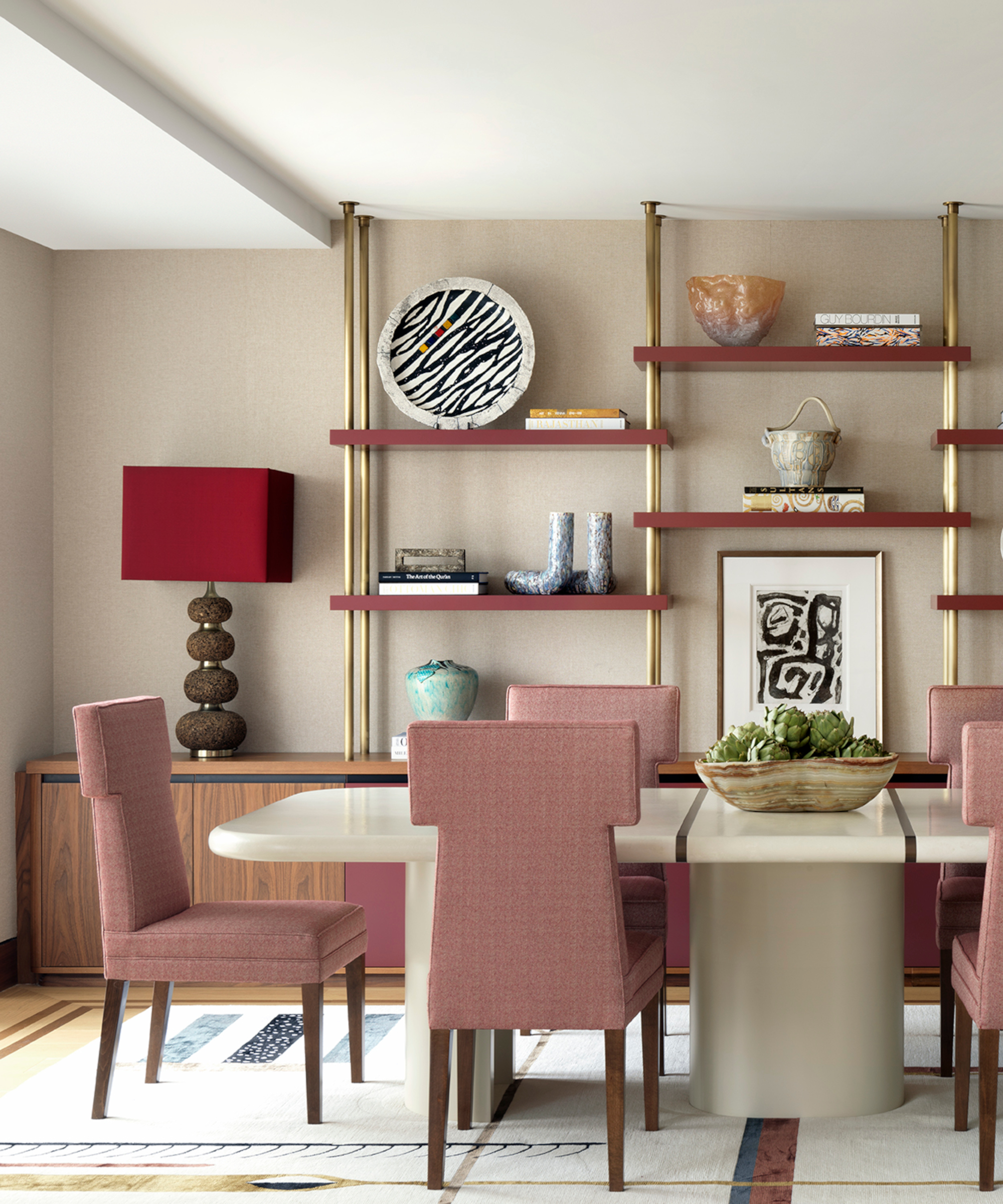
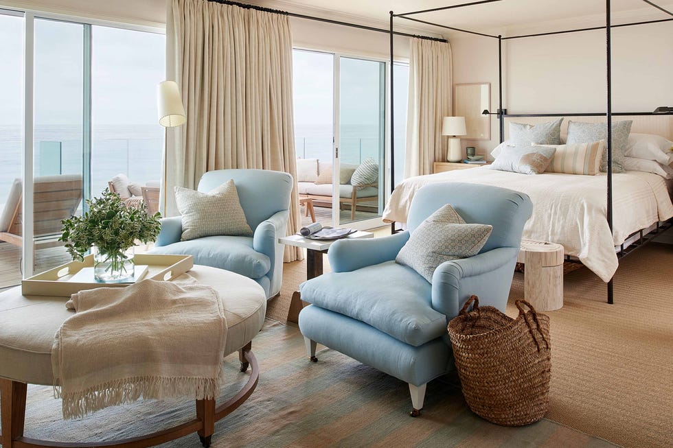
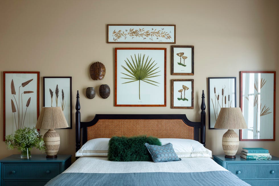
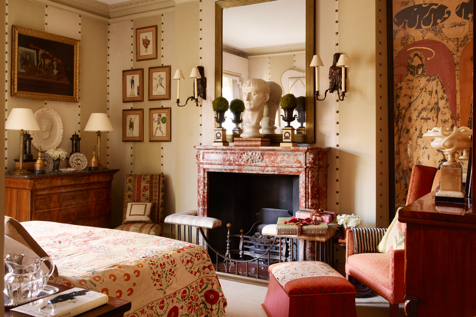
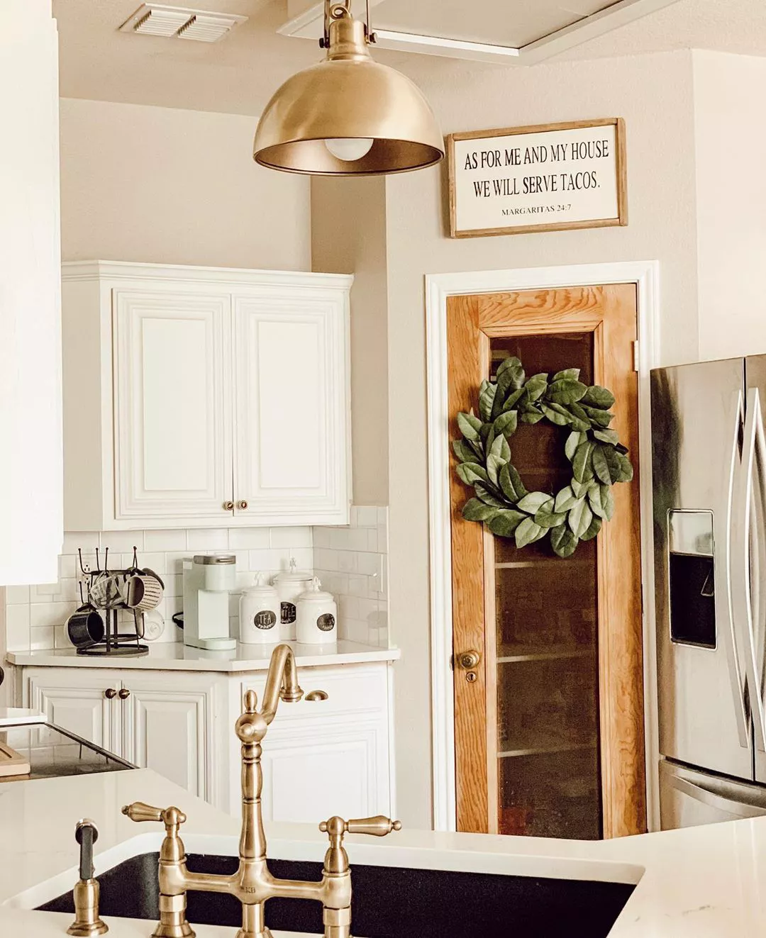
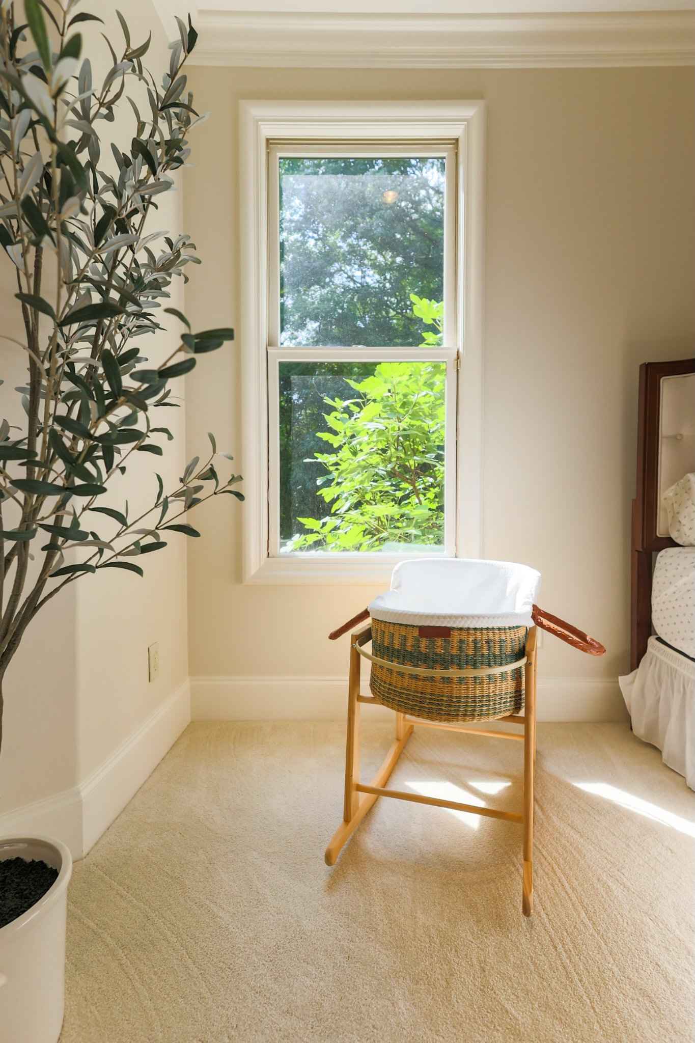
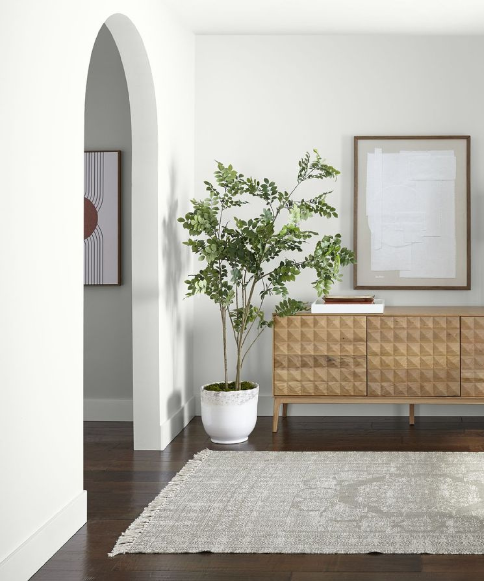
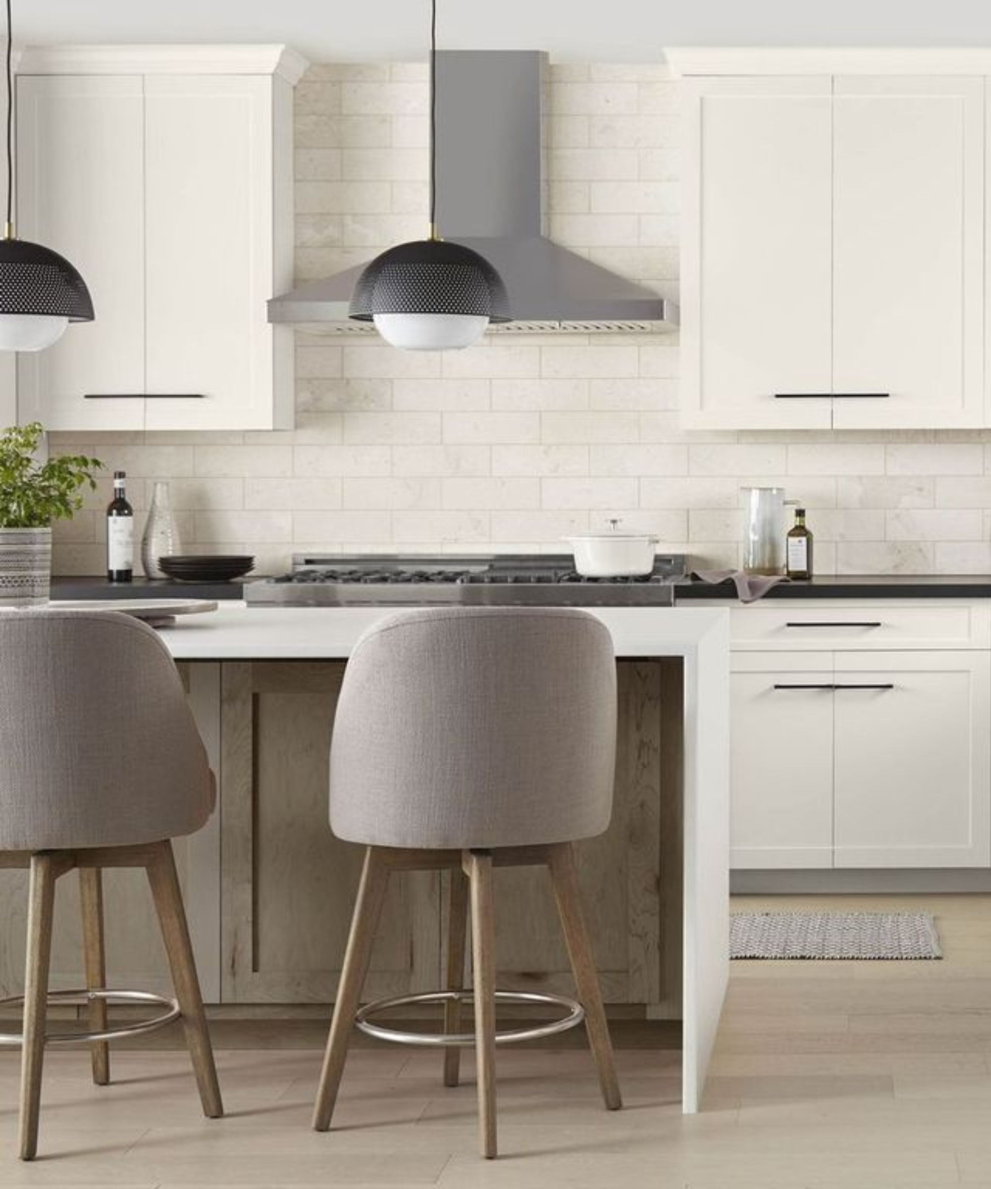
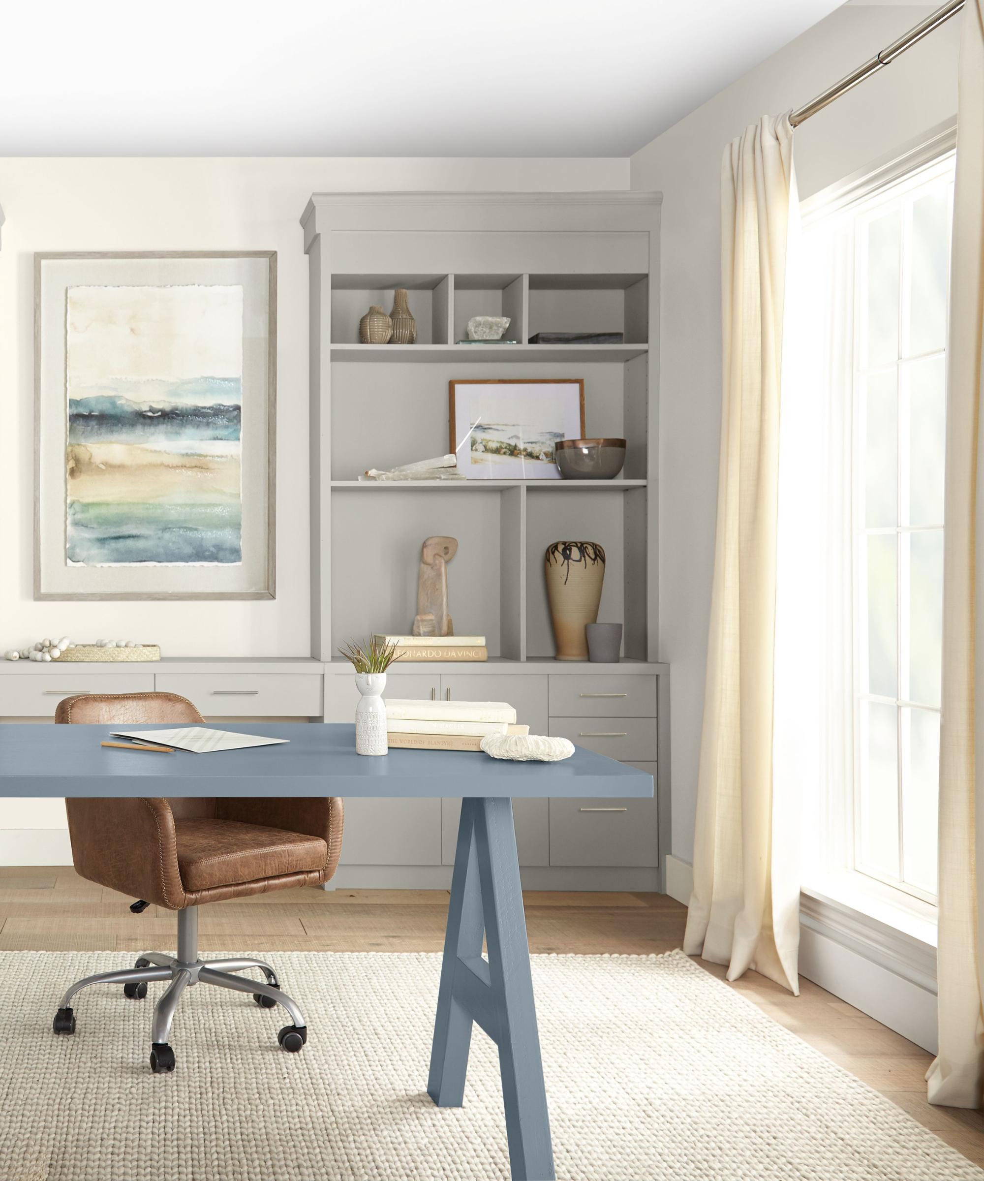
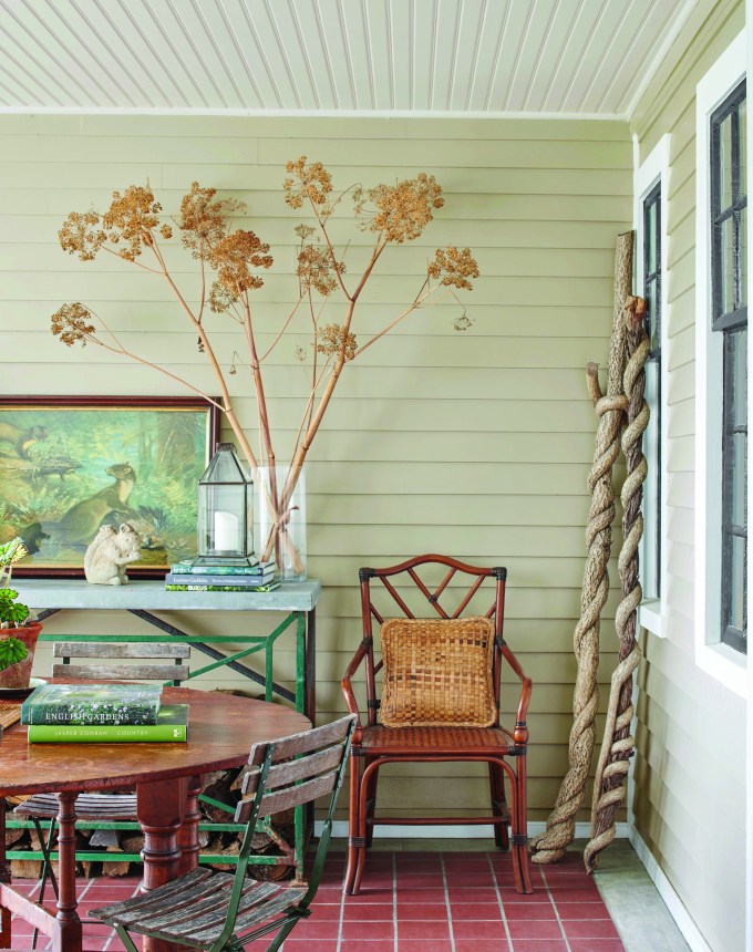
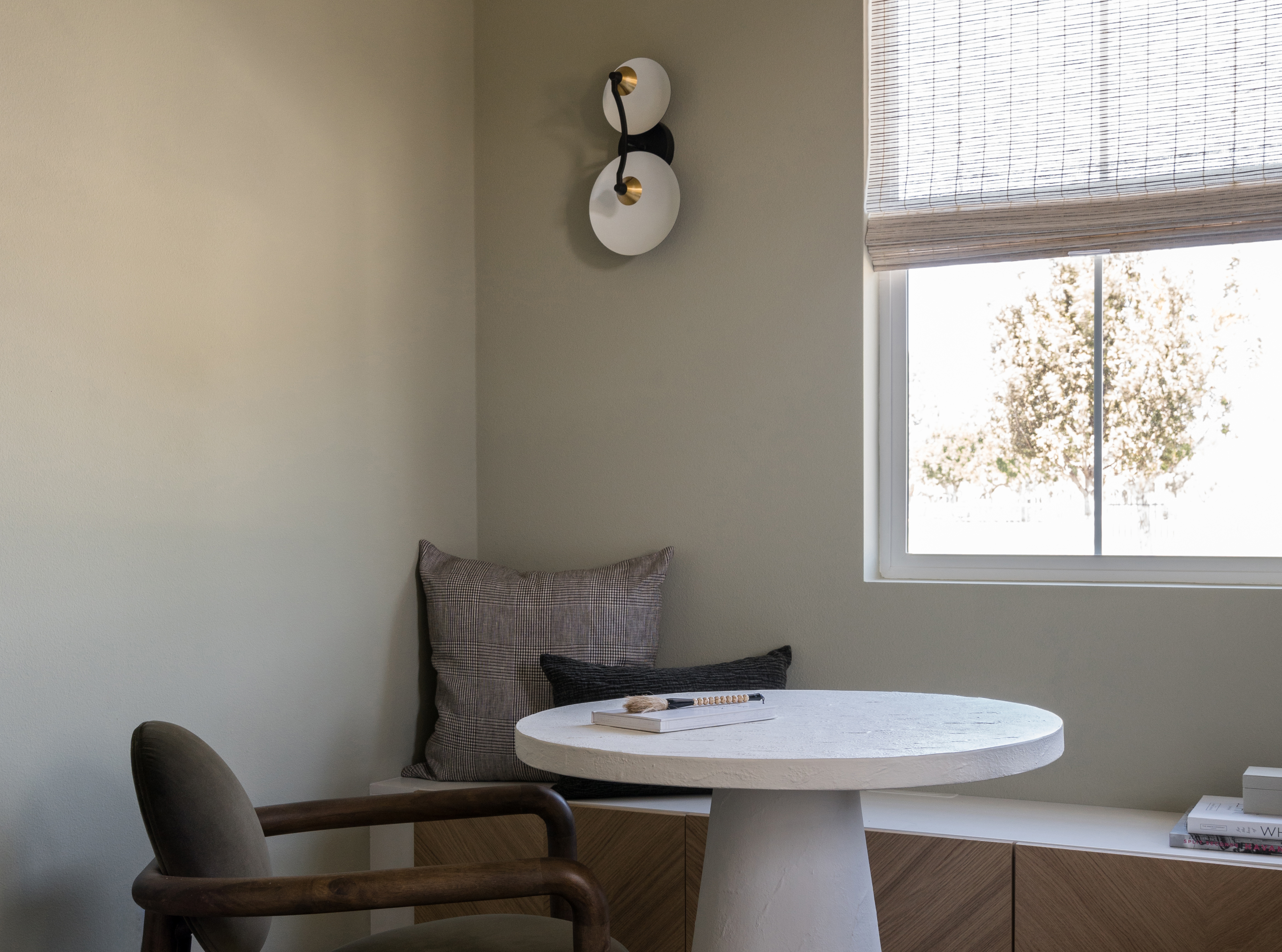
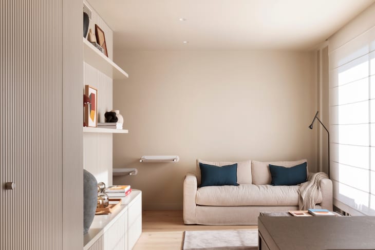
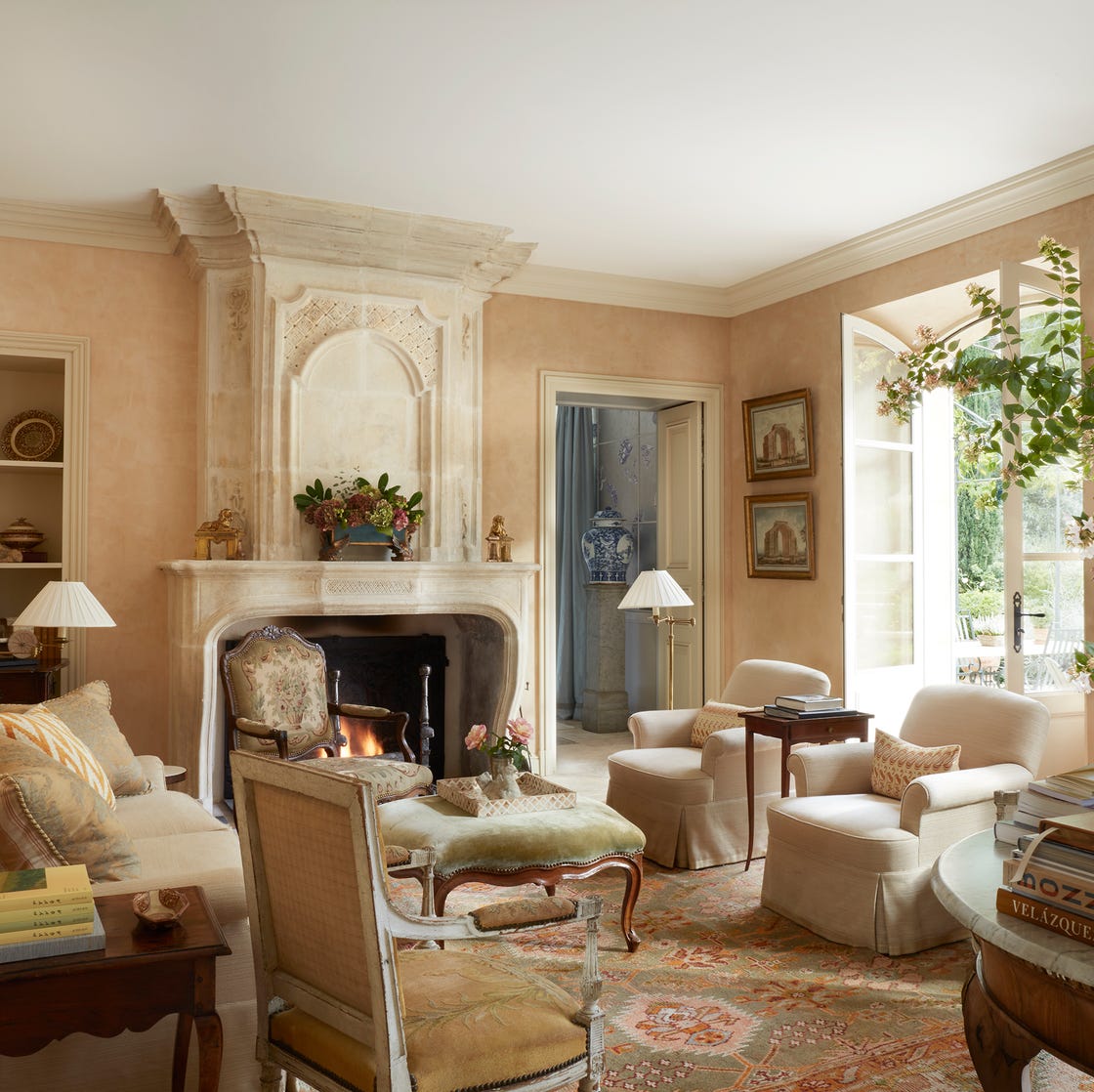
Benjamin Moore's Hush is presented as particularly effective in spaces that receive ample natural light. The article explains that a good way to assess a beige's neutrality is by observing how it appears when juxtaposed with white and off-white colors, as well as with more orange and red-toned browns. Unlike some cream paint colors that can blend too closely with white trim, making it difficult to create visual distinction, Hush offers sufficient saturation to pop against white trim. Furthermore, it creates a clear contrast with natural materials like bamboo shades or wicker baskets.
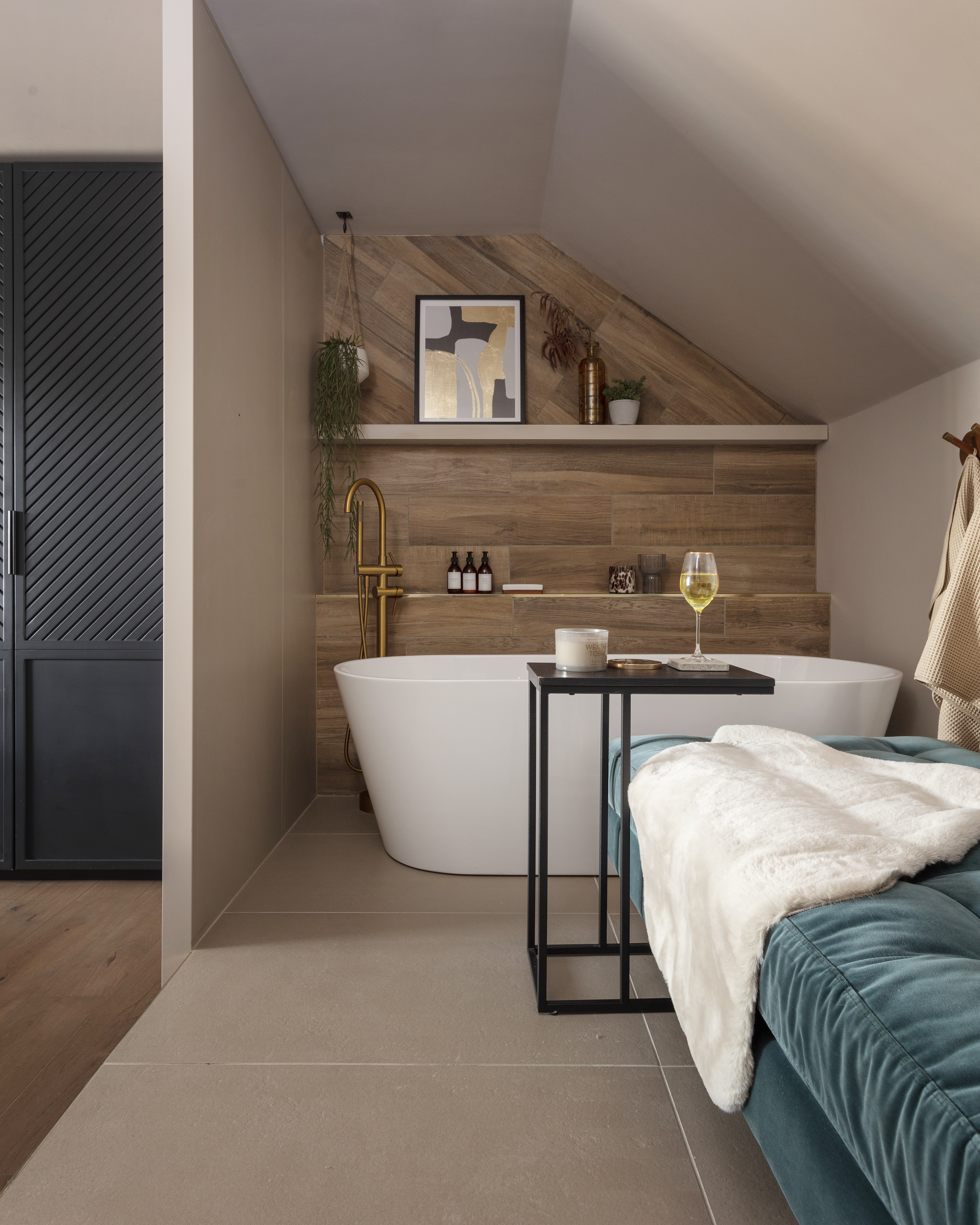
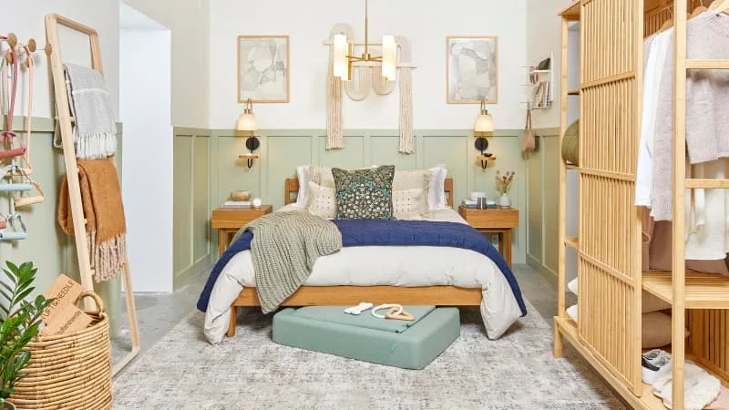
With a light reflectance value (LRV) of 57, Hush is described as a moderately saturated color, not inherently light, but a muted hue that isn't dark. However, the article notes that in rooms with less natural light, Hush may not significantly brighten the space. It also warns that incandescent lighting could potentially accentuate its warm yellow undertones in such environments. Despite this, Hush is still considered a beautiful backdrop suitable for living areas and bedrooms, providing an easy-to-work-with neutral option. The article concludes by encouraging readers to sample Hush to experience its qualities firsthand.
#InteriorDesign #PaintColor #HomeDecor #NeutralColors #BenjaminMoore #BeigePaint #WarmNeutral #HomeImprovement #ColorPalettes #InteriorDesign #PaintColor #HomeDecor #NeutralColors #BenjaminMoore #BeigePaint #WarmNeutral #HomeImprovement #ColorPalettes
0 комментариев всего
 Комментариев пока нет
Вам также может понравиться
14 best beige paints, as chosen by interior designers
The 8 Best Beige Paints Designers Turn to for Warmly Luxe Schemes – "It Evokes a Sense of Calm"


The most timeless paint colors according to designers

11 Beautiful Colors That Go With Beige

Beige Is My Favourite Colour—20 Pieces That Prove It's in No Way Boring

10 accent colors for beige – design experts' favorite color pairings
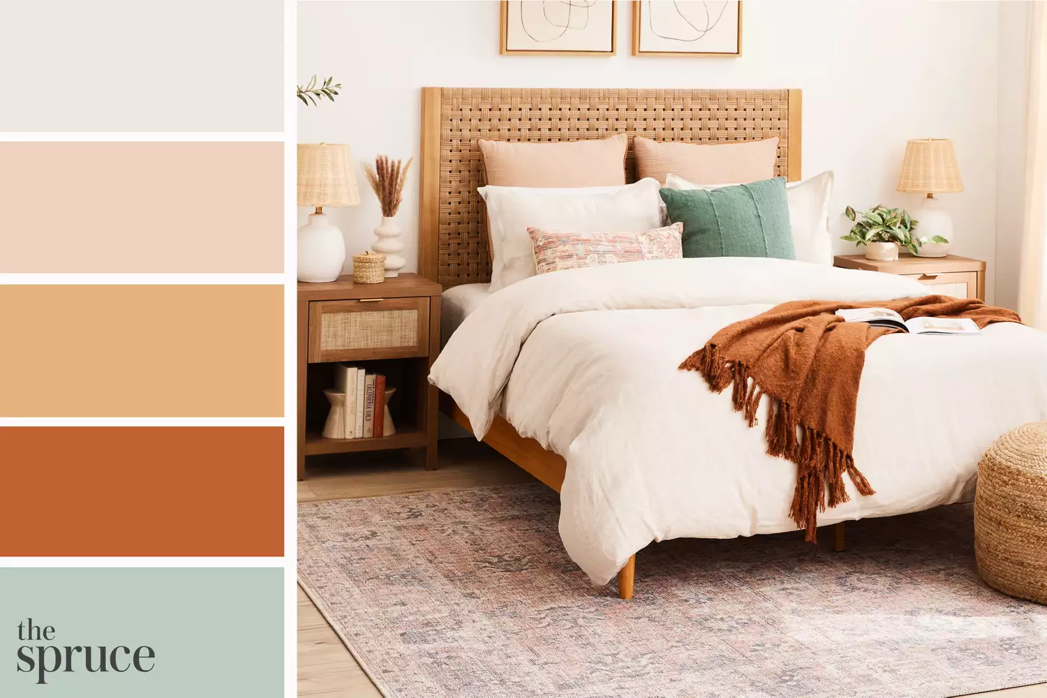
11 Beautiful Colors That Go Well With Beige
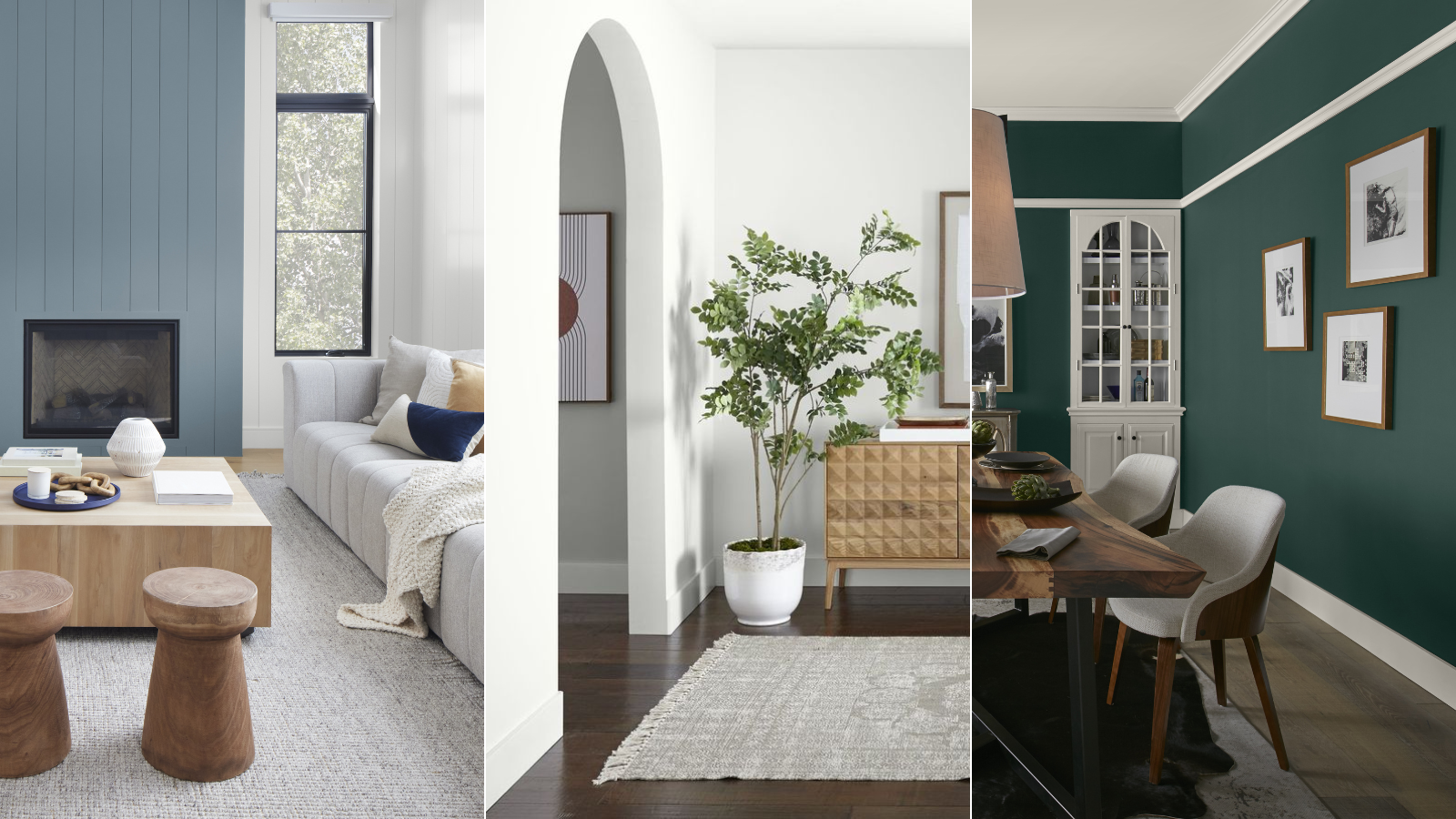
These are Behr's best-selling paint colors of all time – and there's something to suit every style
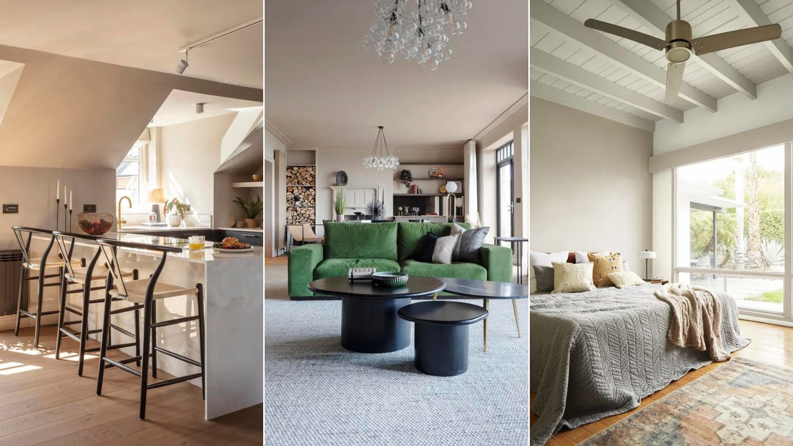
Is this the best beige paint? Why designers love Stone Hearth by Benjamin Moore
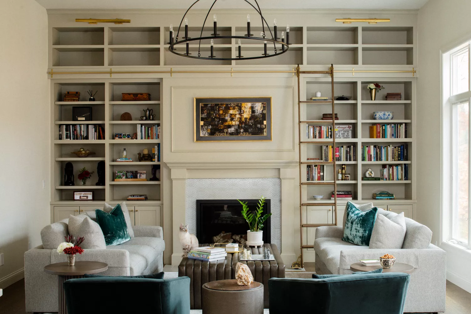
16 Beige Paint Colors That Never Go out of Style, According to Interior Designers
Forget Millennial Pink: When It Comes to Wall Paint, "Boring" Beige is Back
The 13 Best Greige Paint Colors to Buy Right Now
11 Best Beige Paint Colors for Interiors
Beige-grey – the timeless paint color perfect for a barely-there backdrop
This Is the Best Blue Paint Color, According to Designers

These 13 Green Paint Colors Are the Best We’ve Ever Seen

You Should Always Paint Your Home Beige
These Are the 10 Colors Interior Designers Would Pair with Beige

This Pale Color Is the New Beige for Fashion People Everywhere
10 Best-Selling Behr Paint Colors of All Time