1/12
4 Interior Designers Share the Biggest Paint Color Trends Right Now (and What’s Out!)
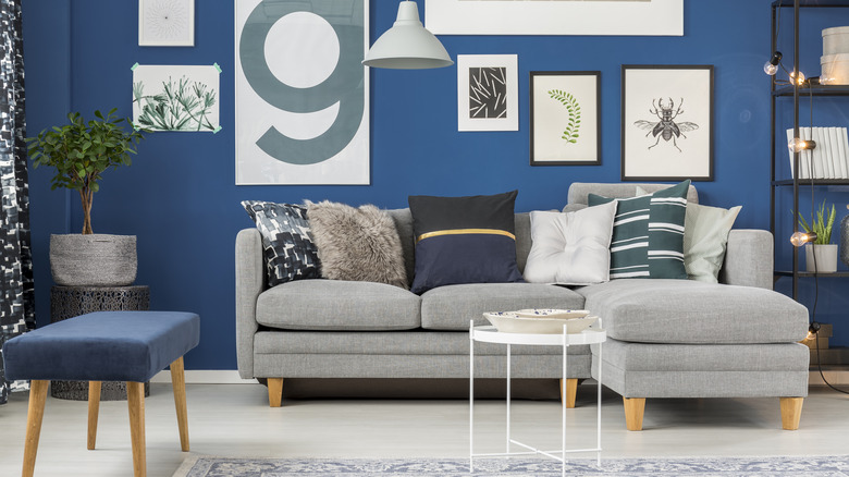
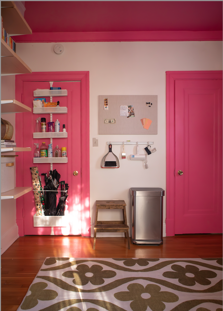
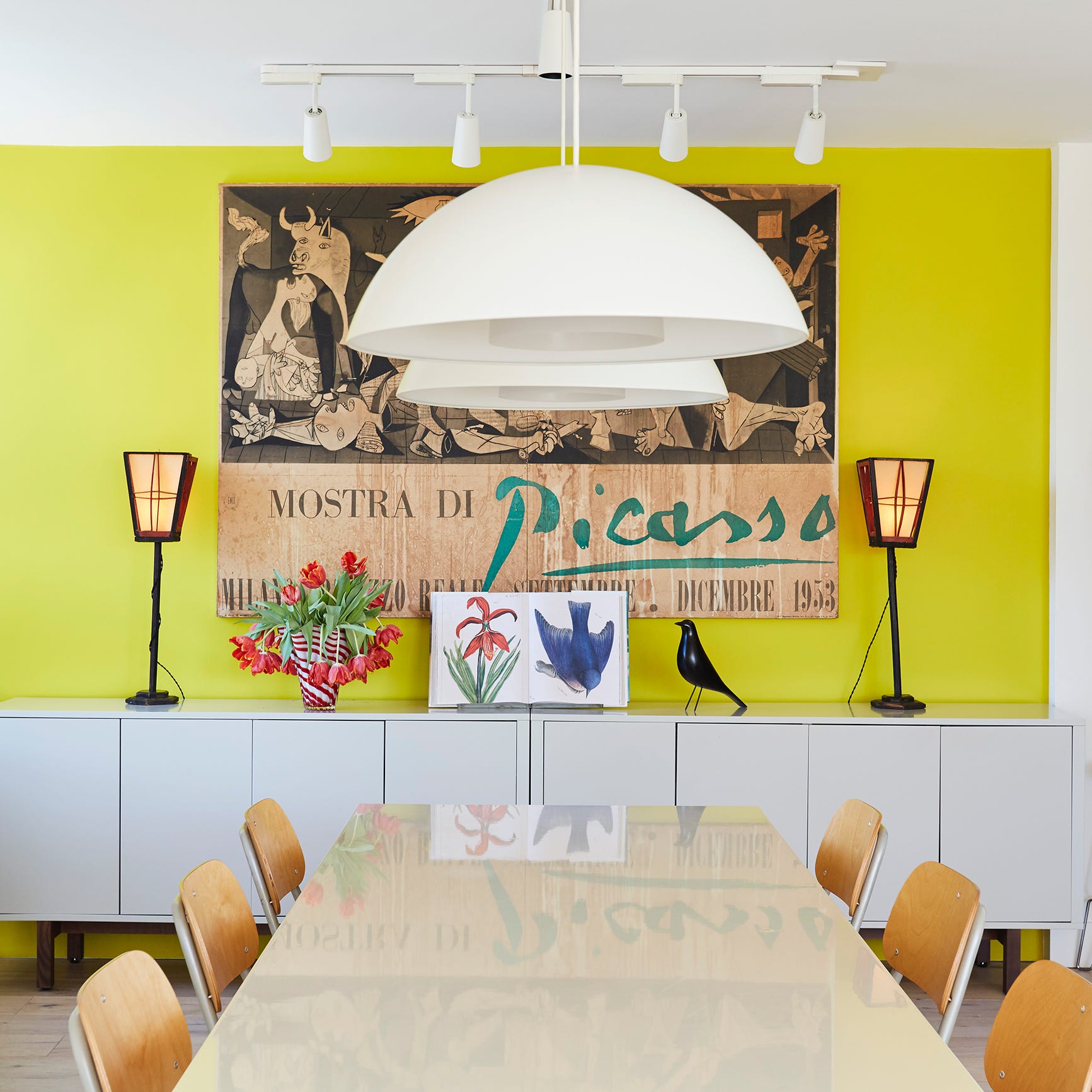
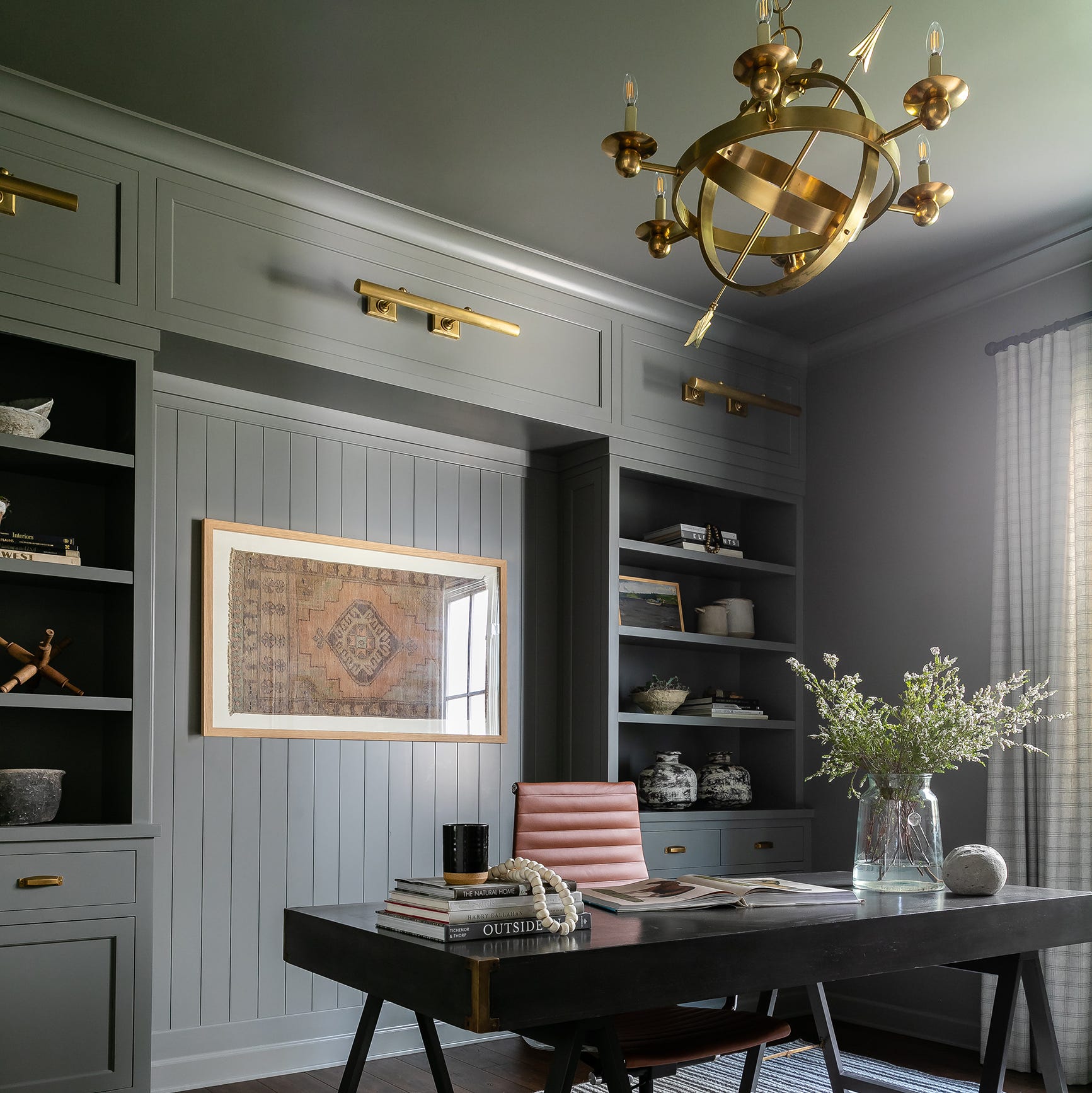
This blog post explores current paint color trends through the insights of four interior designers: Javaneh Pirooz, Beth Dotolo and Carolina V. Gentry of Pulp Design Studios, and Jamie Nusser of J Designs. The overarching theme identified by these experts is a significant shift towards warmer tones, a desire for comfort, and the embrace of bold hues in home interiors. The article highlights that after a period of spending more time at home, people are looking to infuse joy and vibrancy into their living spaces, moving away from previously popular stark whites and cool grays.
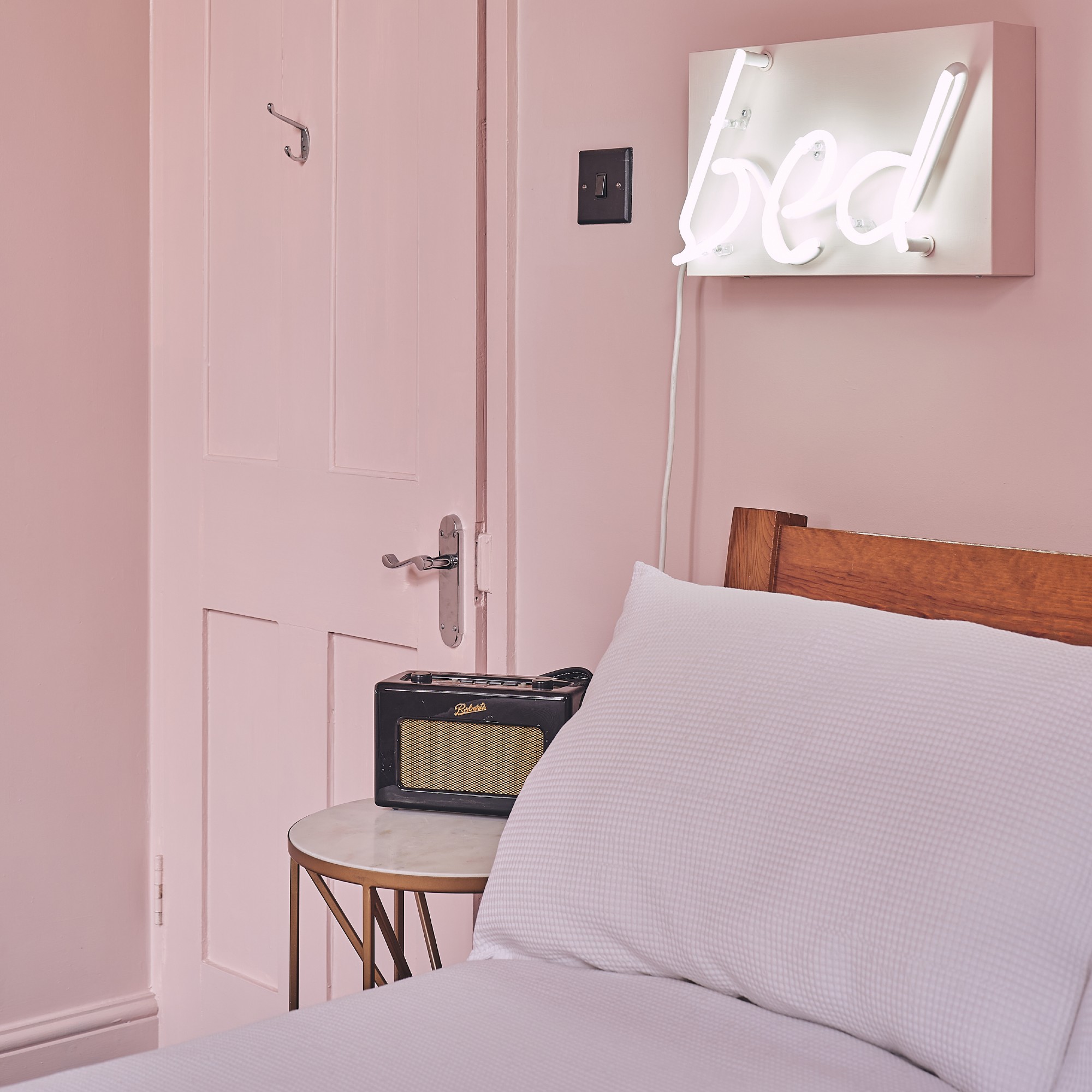
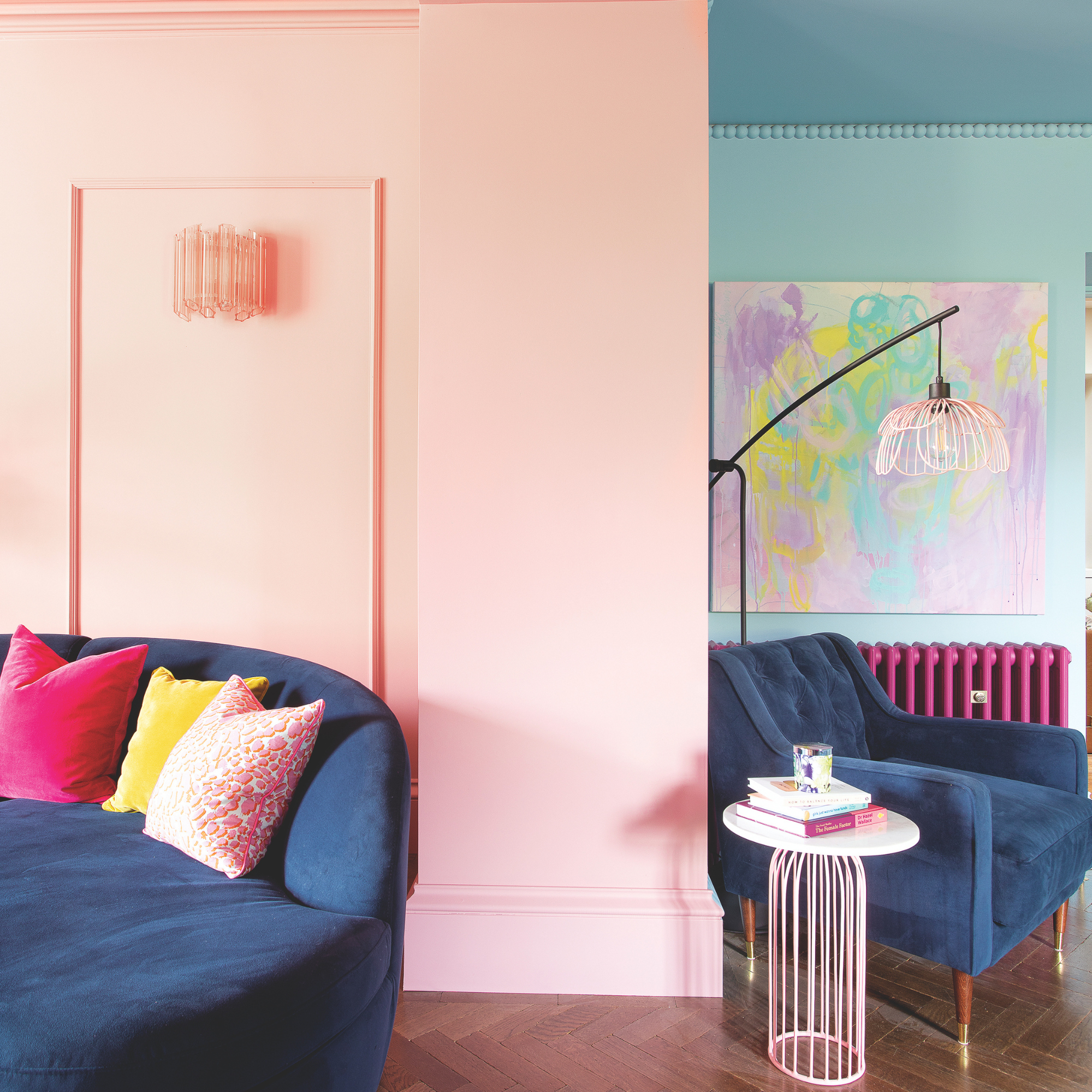
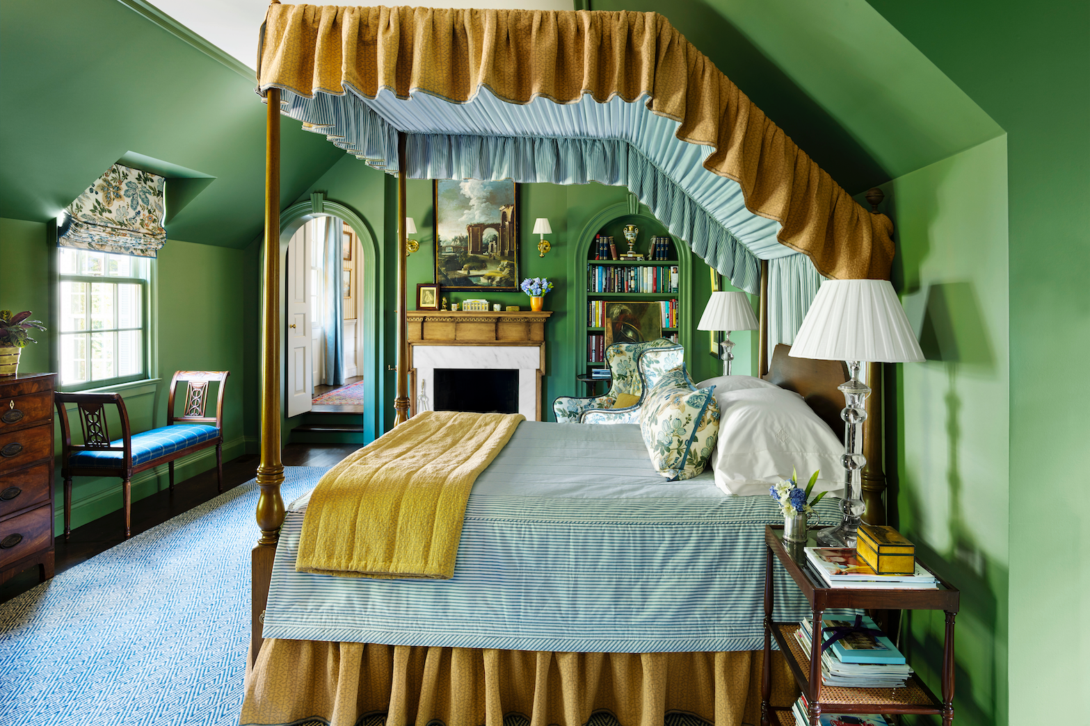
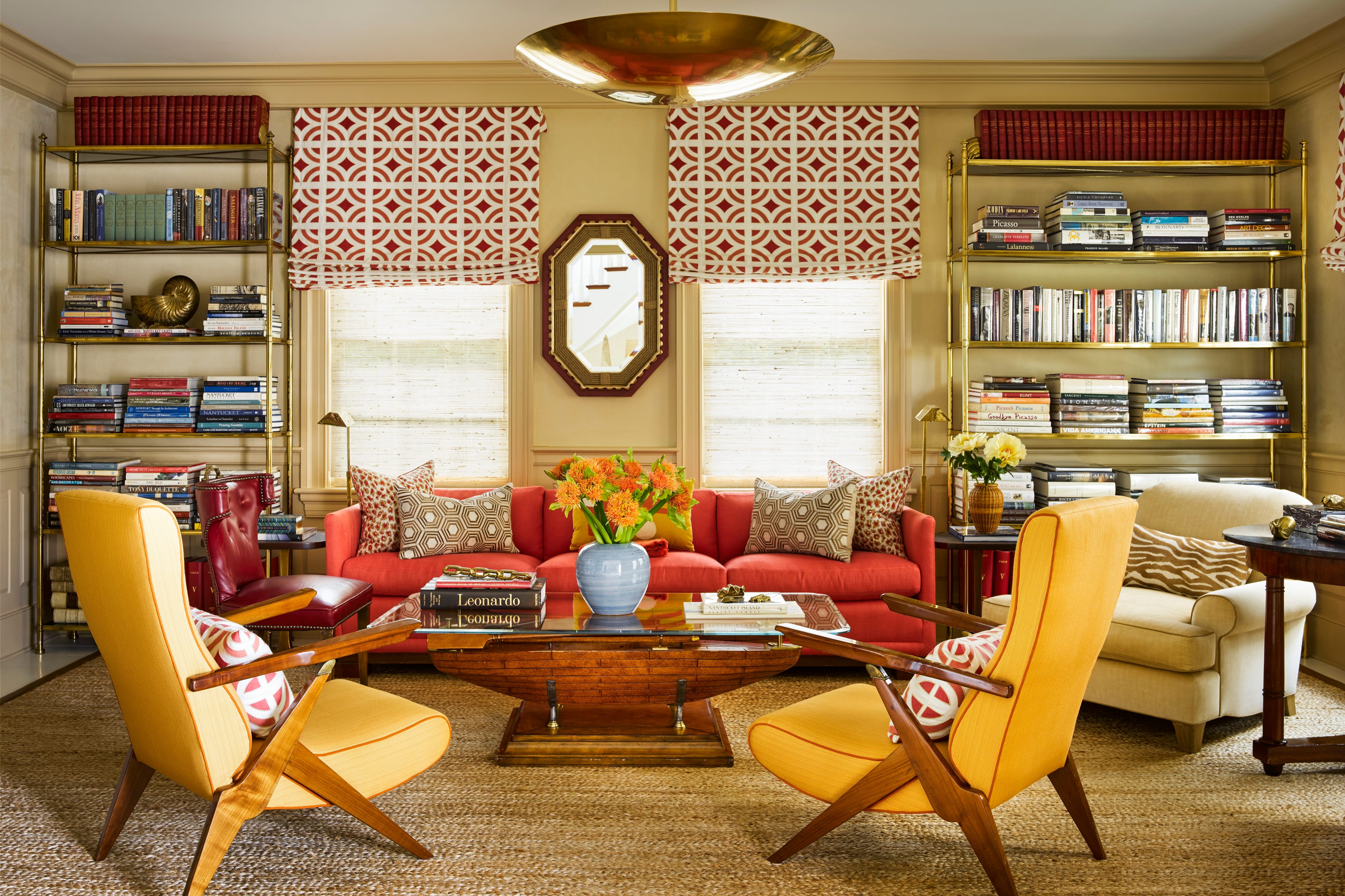
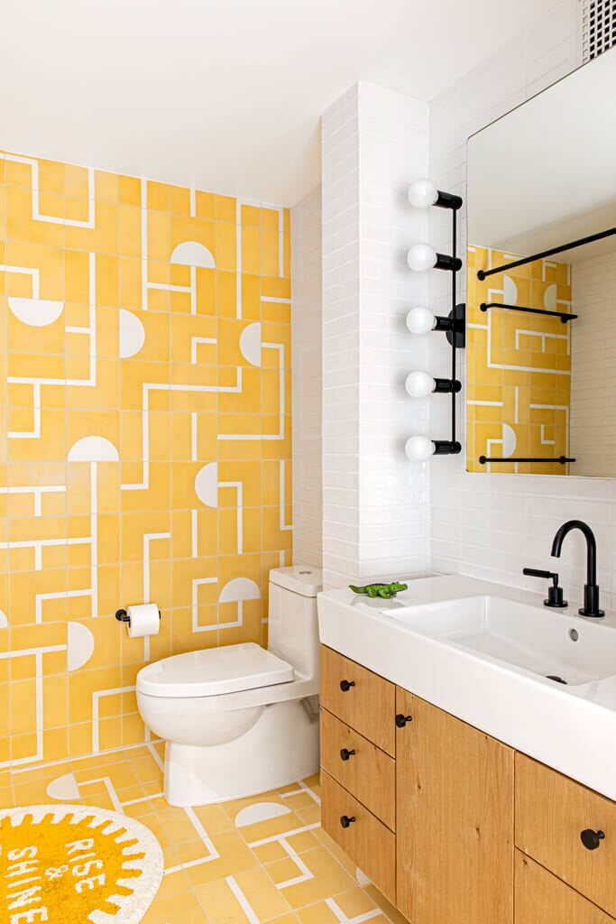
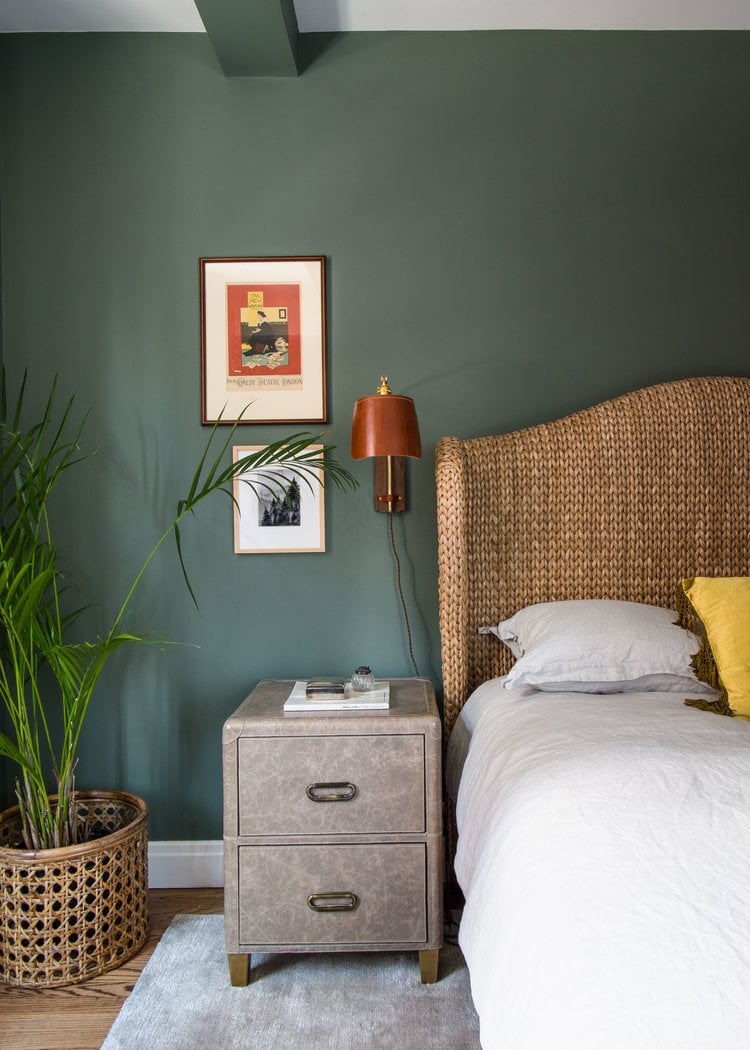
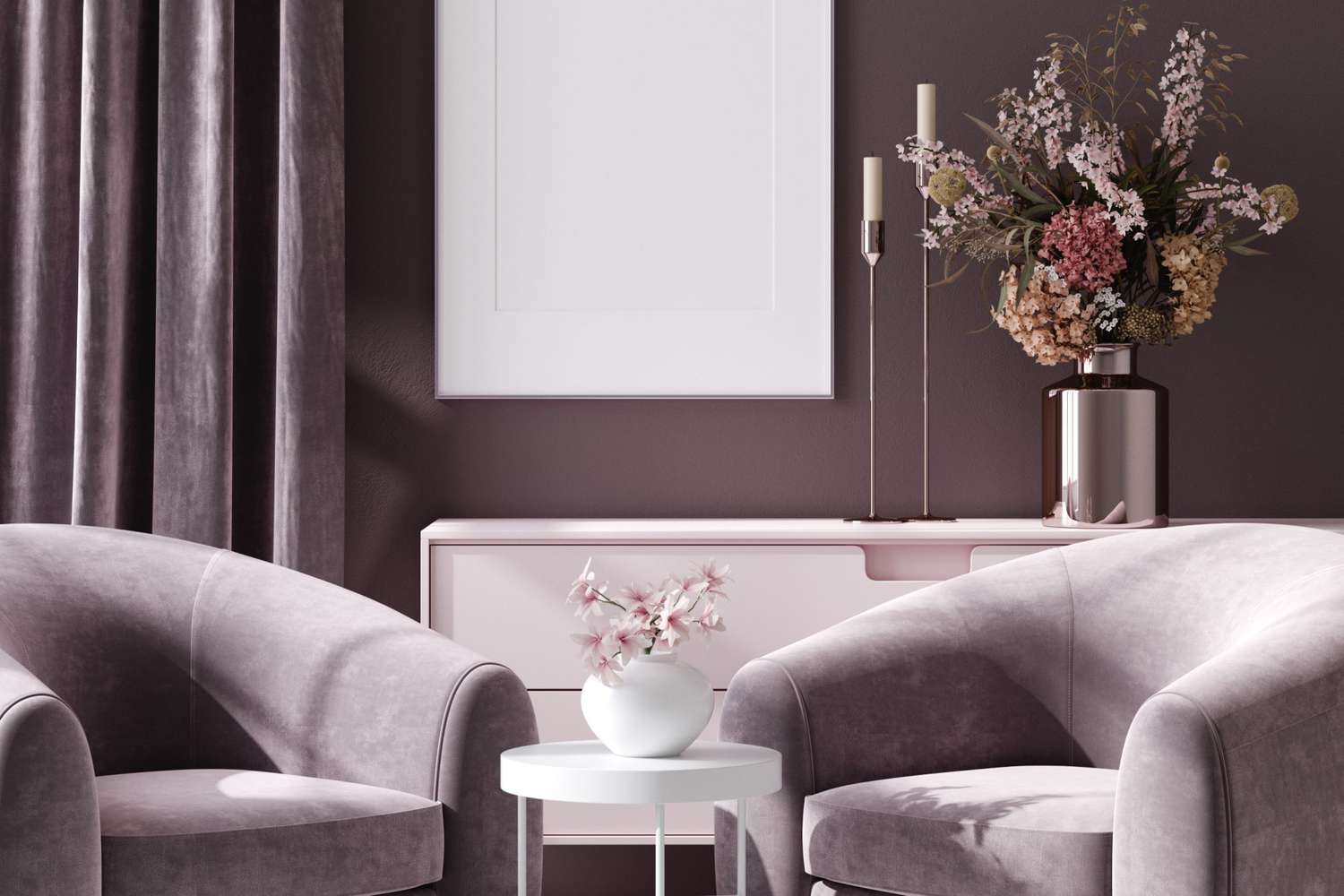
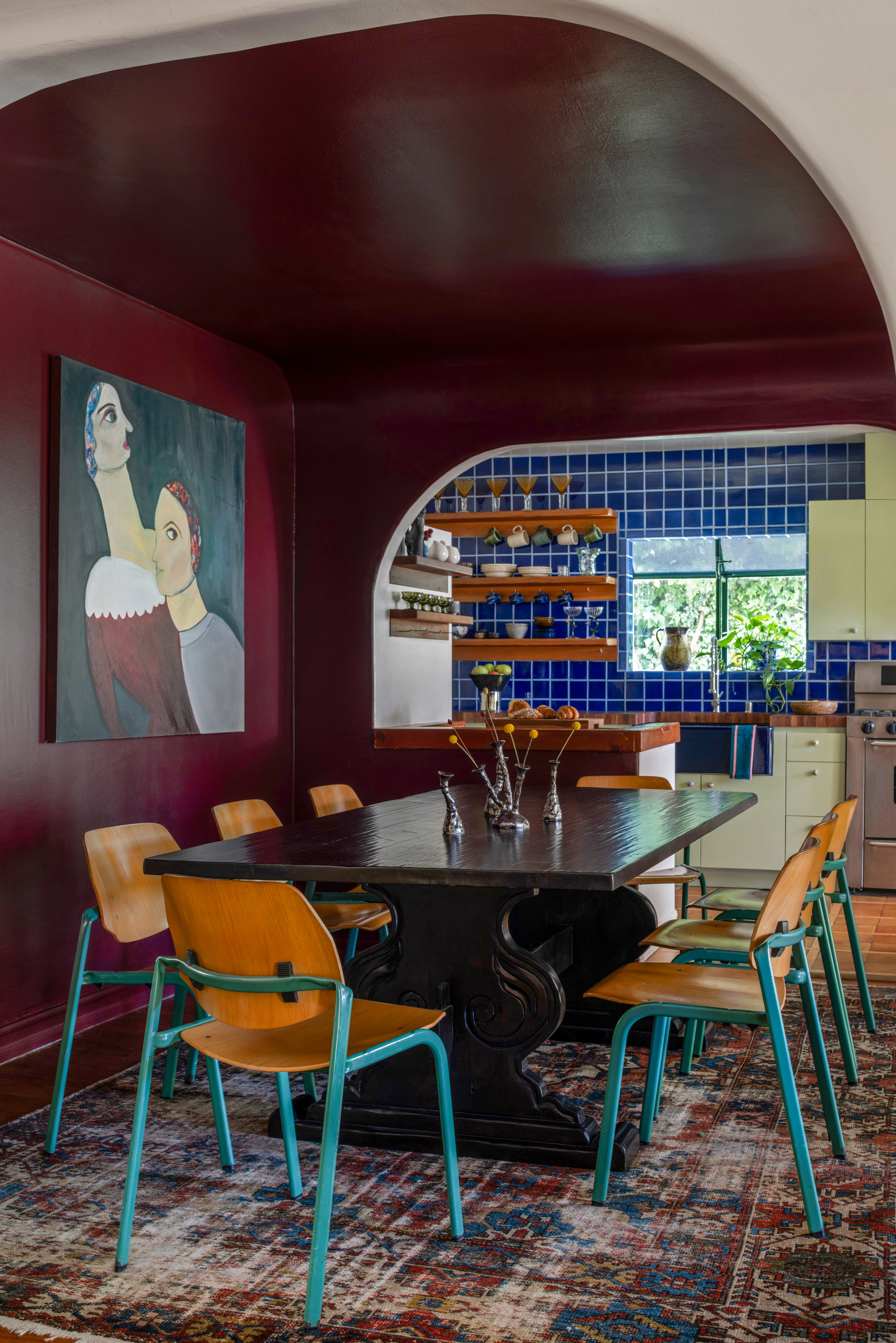
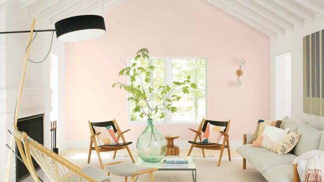
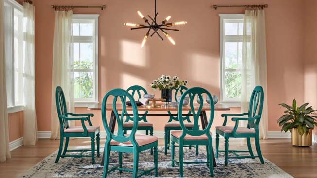
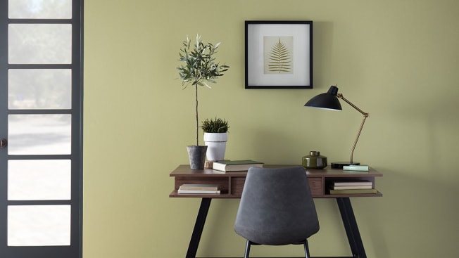
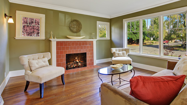
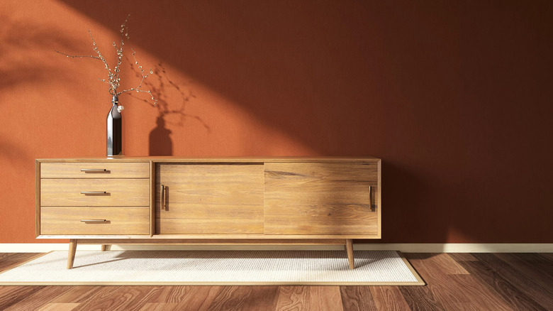
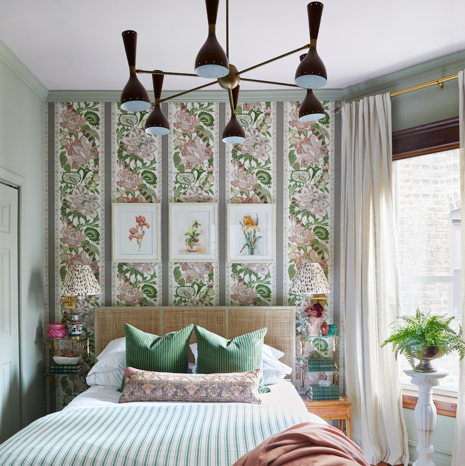
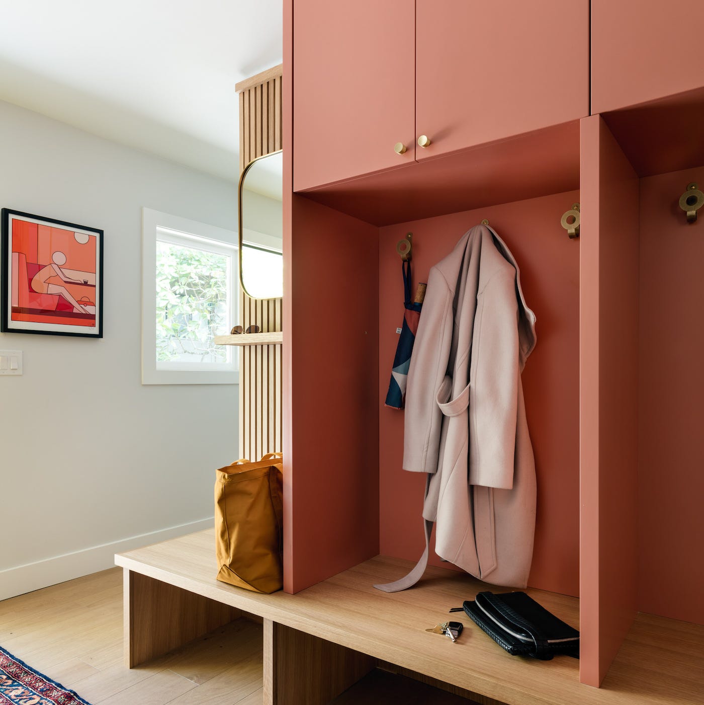
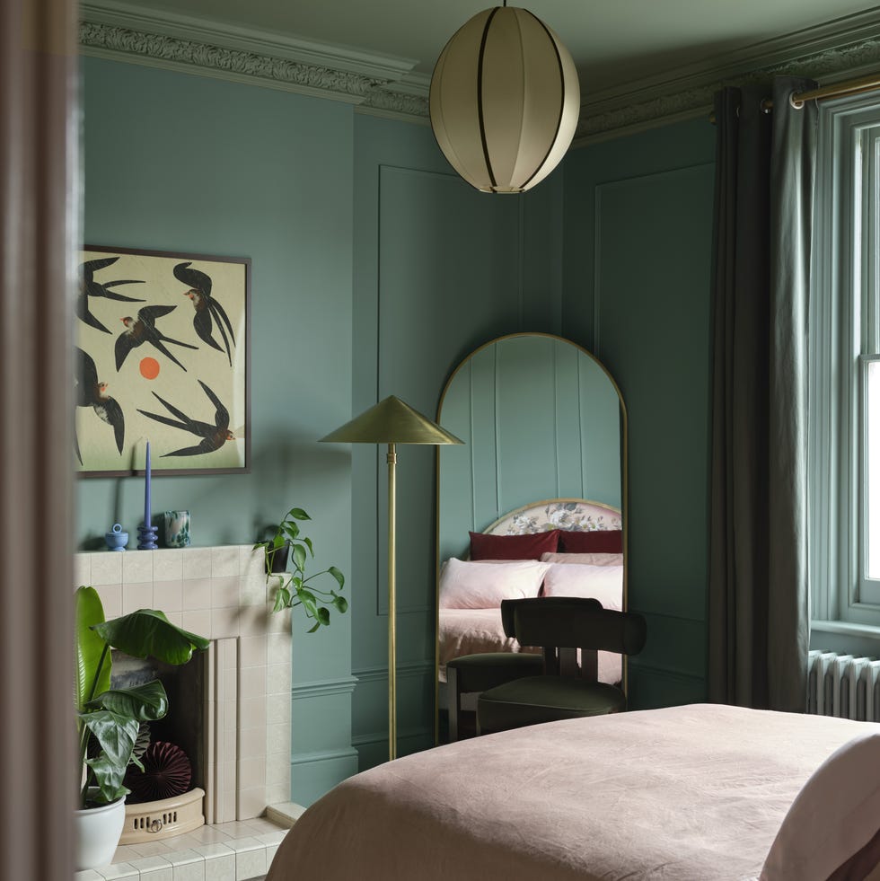
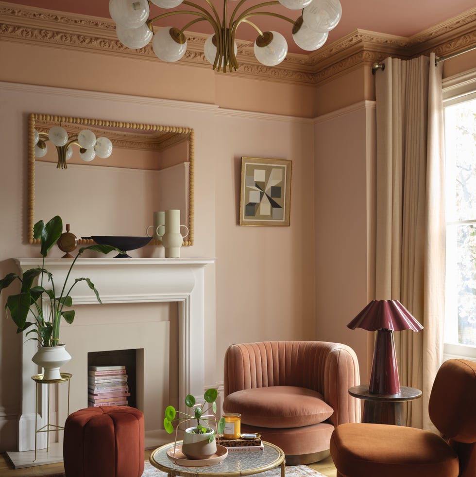
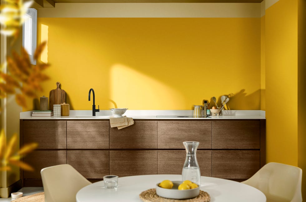
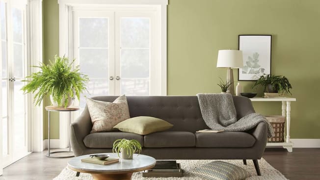
According to Javaneh Pirooz, there's a growing demand for limewashed finishes and muted wall tones, driven by a craving for travel and unique aesthetics. Her clients are transitioning from bright white walls to richer shades like terracotta, sage green, and muted marigold. Pirooz also observes a pastel trend, particularly favoring combinations of pistachio and rose blush, which are expected to remain popular into 2022. Jamie Nusser adds that the increased time spent indoors has spurred a desire for more color and bold statements, aiming to liven up spaces with brightness, mood, and fun.
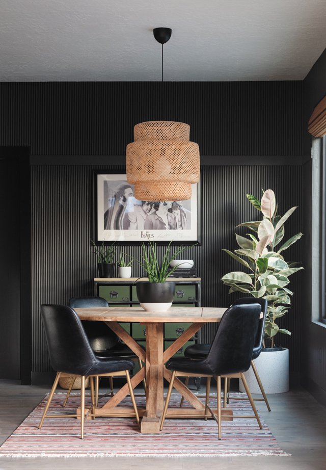
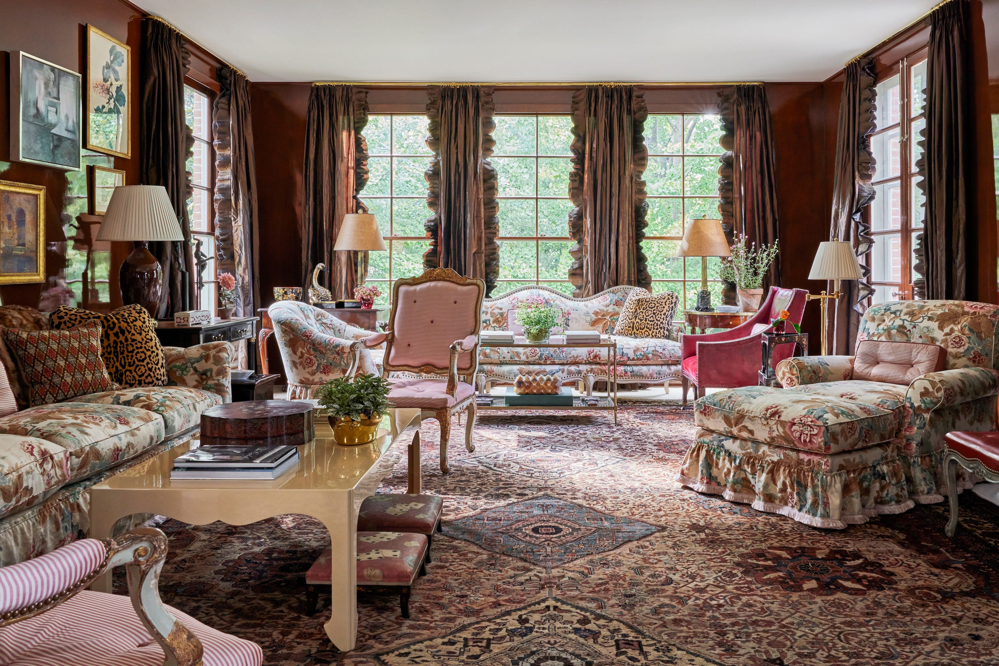
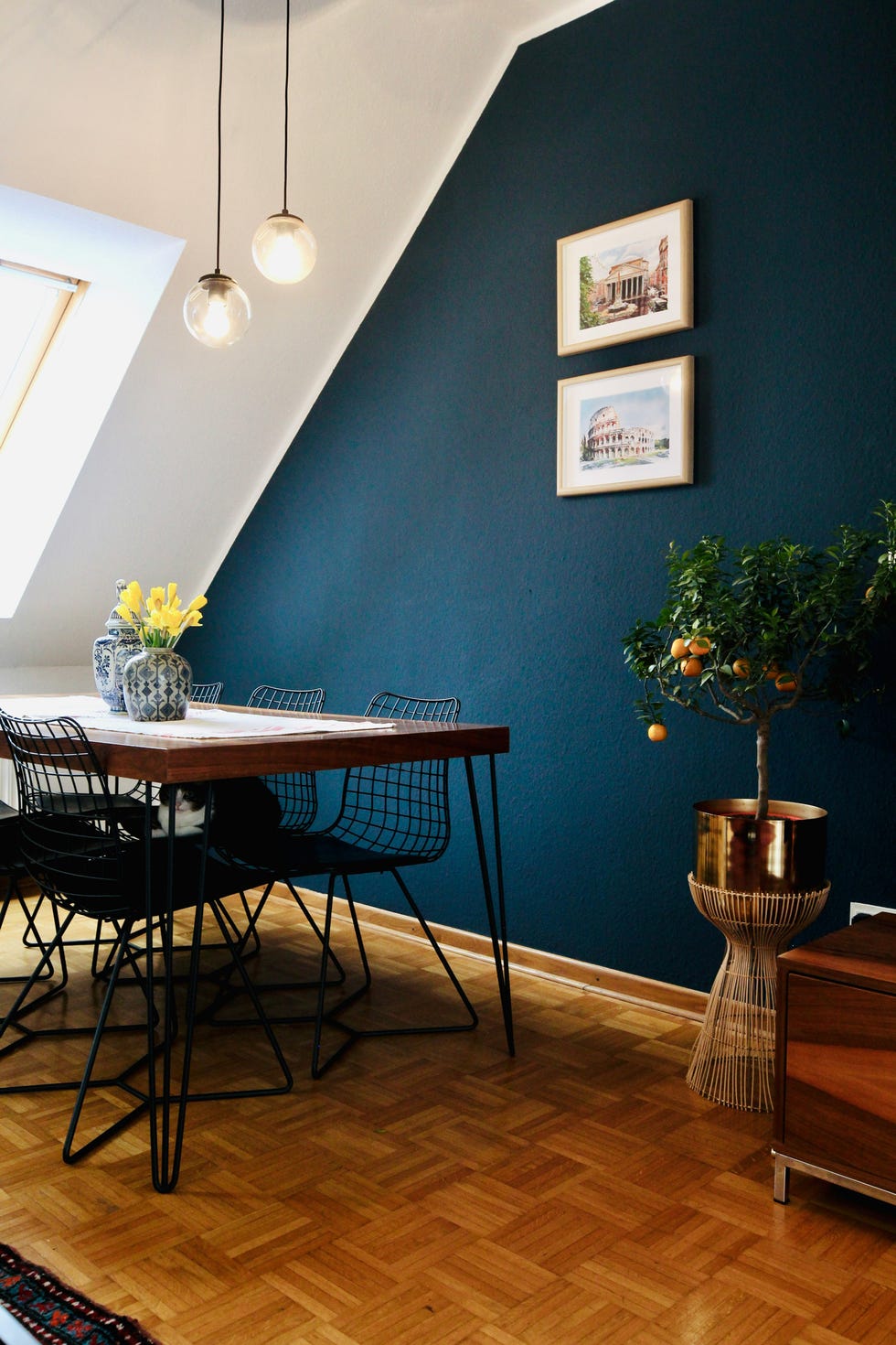
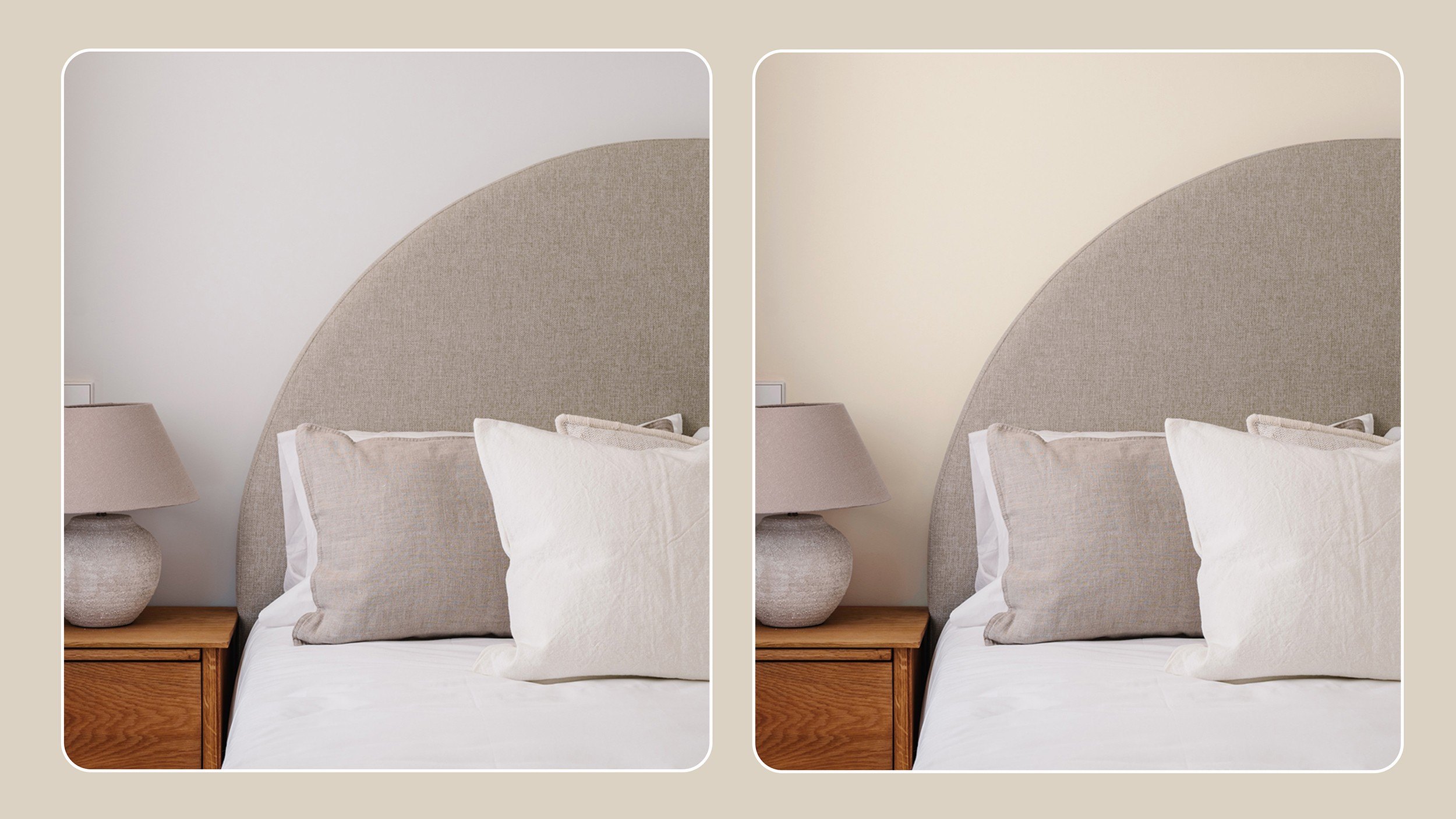
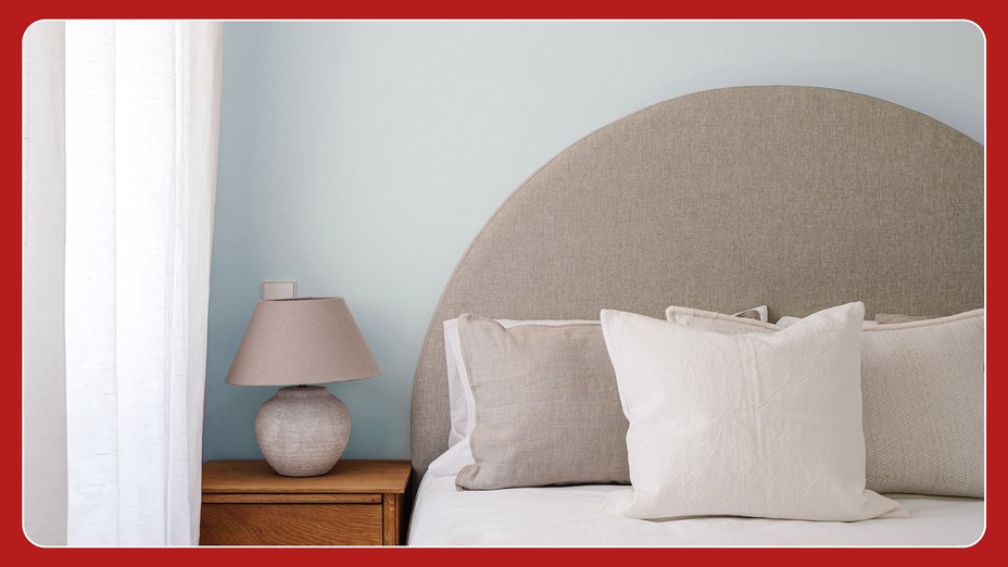
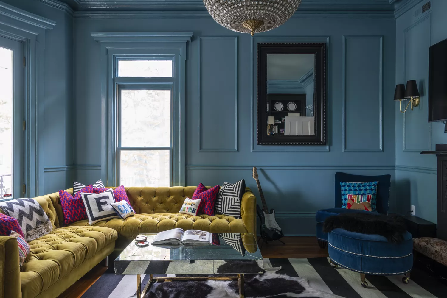
Carolina V. Gentry links the rise of bolder colors and maximalist trends to a post-pandemic desire for joy and celebration, stating that earthy hues, jewel tones, and creamy textures will be prominent. Beth Dotolo emphasizes that people seek "exuberant design" that brings happiness and a celebratory feel to their homes. A consensus among all designers is the decline of gray paint shades, with a move towards creamier neutrals that feature yellow and pink undertones rather than blue and green. Warm whites are now preferred over stark whites, as homeowners prioritize comfort and a sense of respite in their living environments.
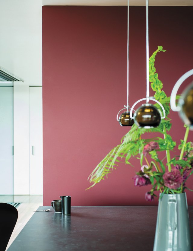
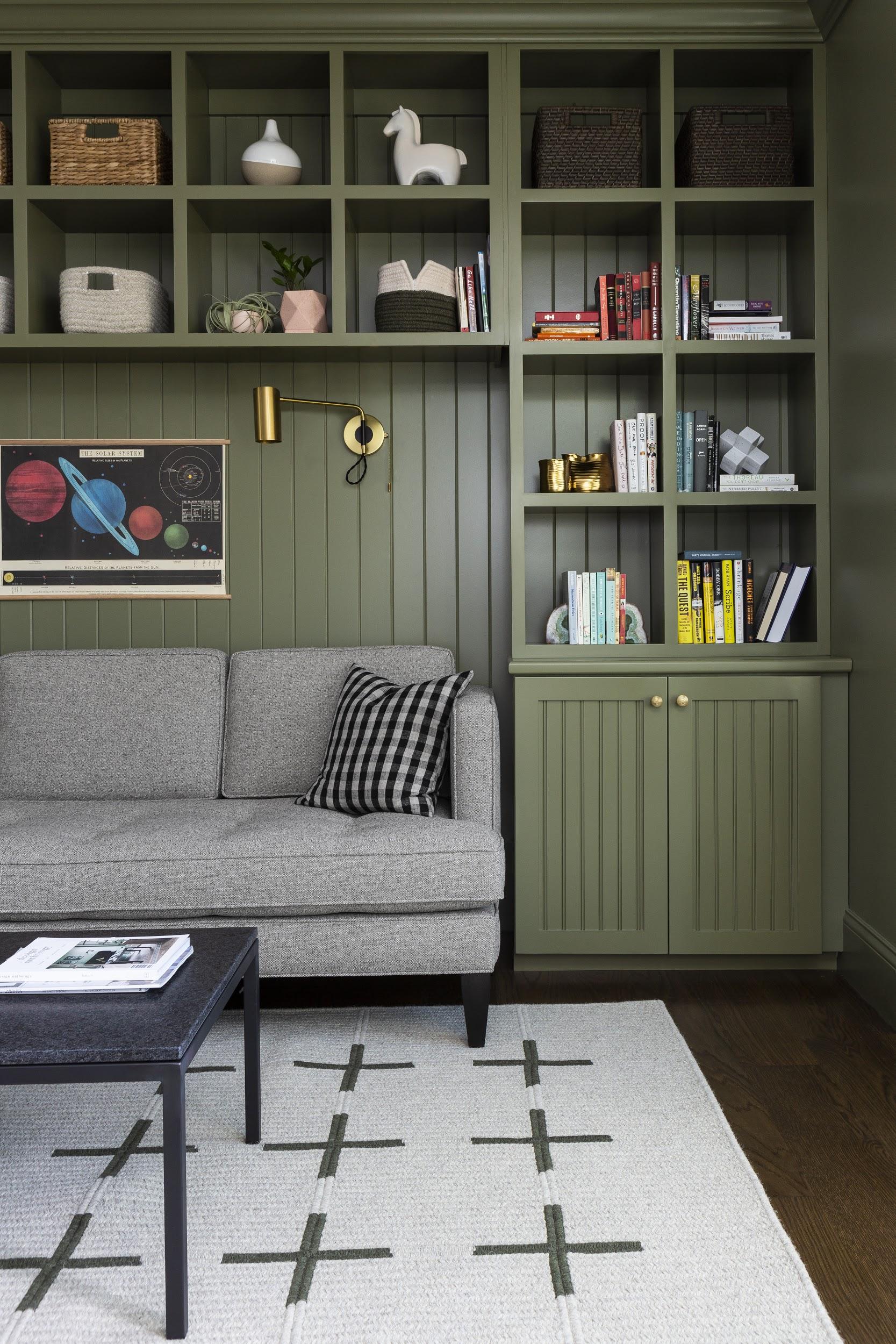
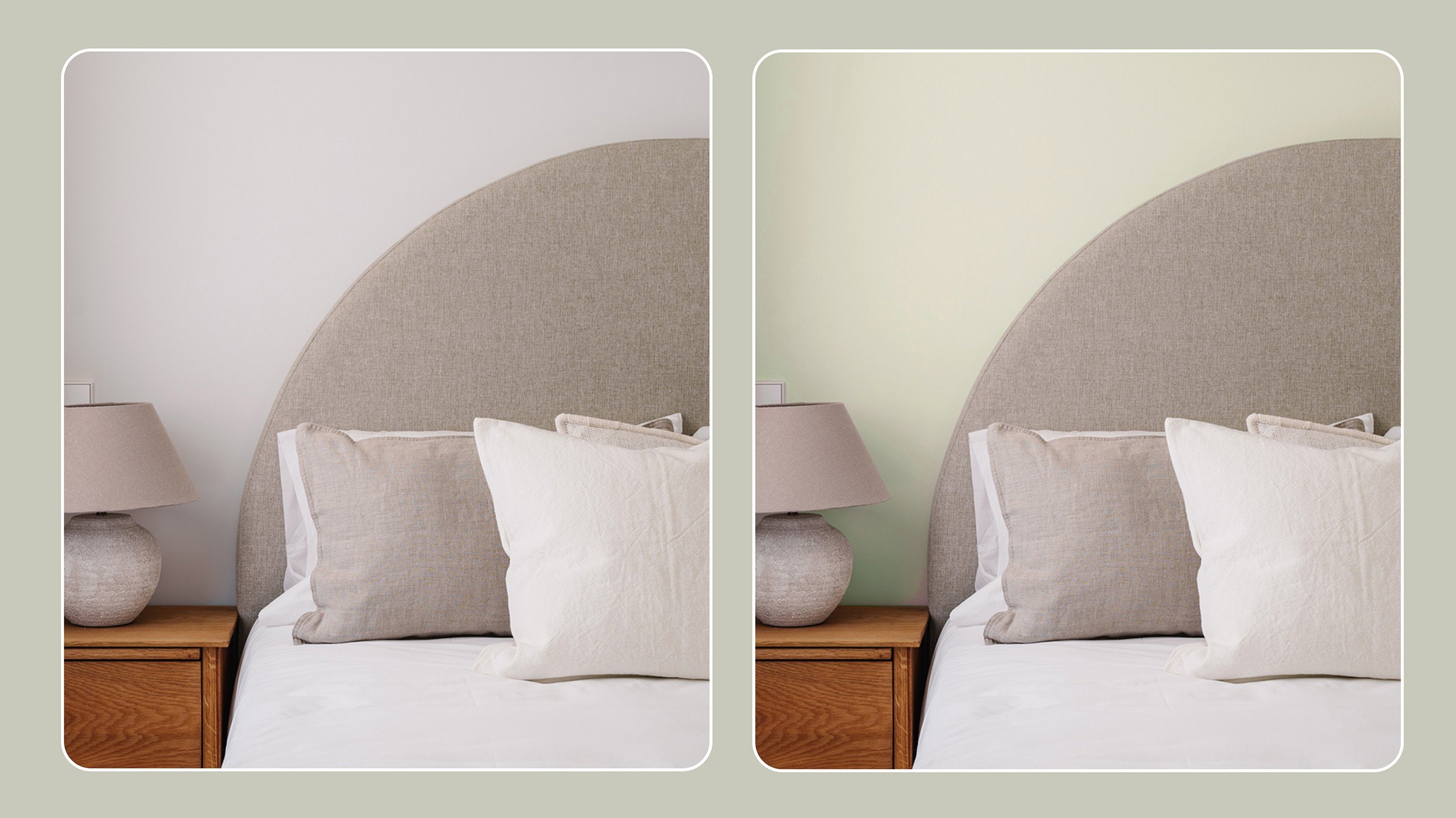
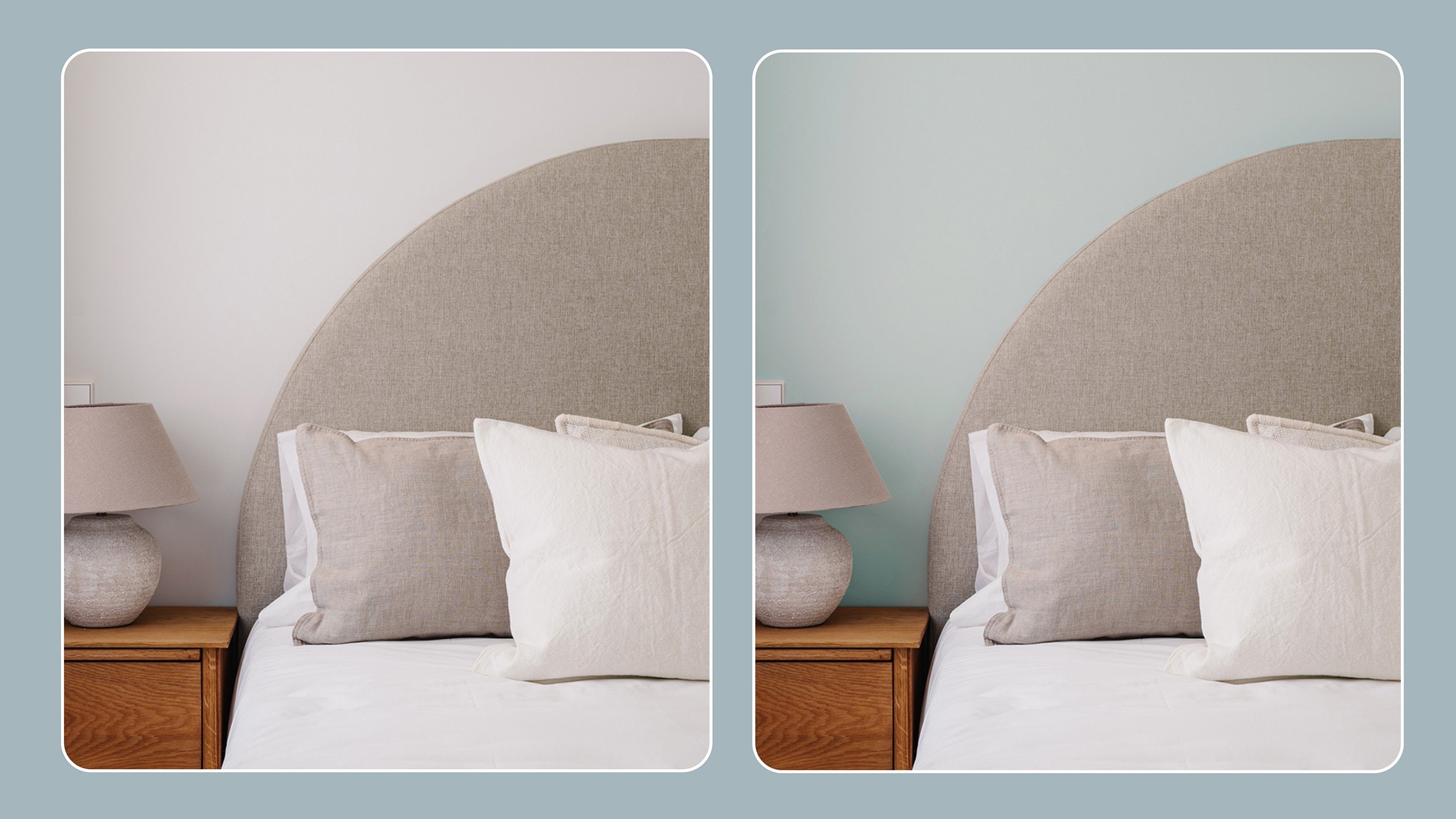
The article also provides specific paint recommendations from the featured designers. These include Portola Paints Korine Lime Wash for a romantic green texture, Backdrop Ghost Ranch for a rich, grounding terracotta, Farrow and Ball Vert De Terre for those easing into color, and Clare Golden Hour for trending marigold and yellow shades. Other suggestions are Backdrop Natural Habitat for a perfect pistachio green, Clare Baby Soft for a complementary pastel pink, Farrow & Ball Rectory Red for deep, opulent reds, Backdrop Interior Motives for a pale taupe earthy tone, and Portola Paints Dimly Lit as a favored off-white base shade. These recommendations aim to guide readers in selecting colors that align with the latest interior design trends, promoting a move towards more inviting and characterful spaces.
#InteriorDesign #PaintColors #HomeDecor #DesignTrends #WarmTones #BoldHues #NeutralColors #DecorInspiration #HomeImprovement #InteriorDesign #PaintColors #HomeDecor #DesignTrends #WarmTones #BoldHues #NeutralColors #DecorInspiration #HomeImprovement
Há 0 comentários no total
 Ainda não há comentários
Você também pode gostar

These 6 Colors Will Rule Interiors in 2026, According to Experts

These 7 Colors Will Rule Interiors in 2026, According to Experts

Interior Paint Color Trends You Should Know About In 2021

Every 2026 Color of the Year We Know So Far, From Soft Neutrals to Your New Favorite Green

Is colour drenching still on trend for 2025? Experts reveal how the popular paint trend is evolving in the new year
These 13 Paint Color Trends for 2021 Will Give Your Home a Fresh Look
The 5 Most Overused Paint Colors and What to Try Instead, According to Designers
Meet 'colour capping', the paint trend set to take over 2026
2021’s Palette of Possibilities
5 Paint Colors That Are Out for 2025, According to Interior Designers

These 5 Paint Color Trends Will Be Everywhere in 2024, According to Interior Designers

Experts Say These 5 Paint Colours Will Be Everywhere In 2026
12 Paint Colors That Interior Designers Are Buzzing About—See the Gorgeous Hues Here
The Color Trend Designers Are Painting Dining Rooms Right Now

Design Pros Have Spoken: Here Are the Only Paint Color Trends That Matter in 2023


The #1 Paint Color Trend of 2025, According to Designers

6 key colors to decorate with in May 2025, according to interior design and color experts in the know

Hottest Interior Paint Colors of 2020
Millennial Gray Is So Over—Here Are 5 Paint Colors to Try Right Now
9 Trending Paint Colors You'll See Everywhere in 2025, According to Designers