1/8
Does where you live affect the colors you decorate with? According to designers, yes – massively
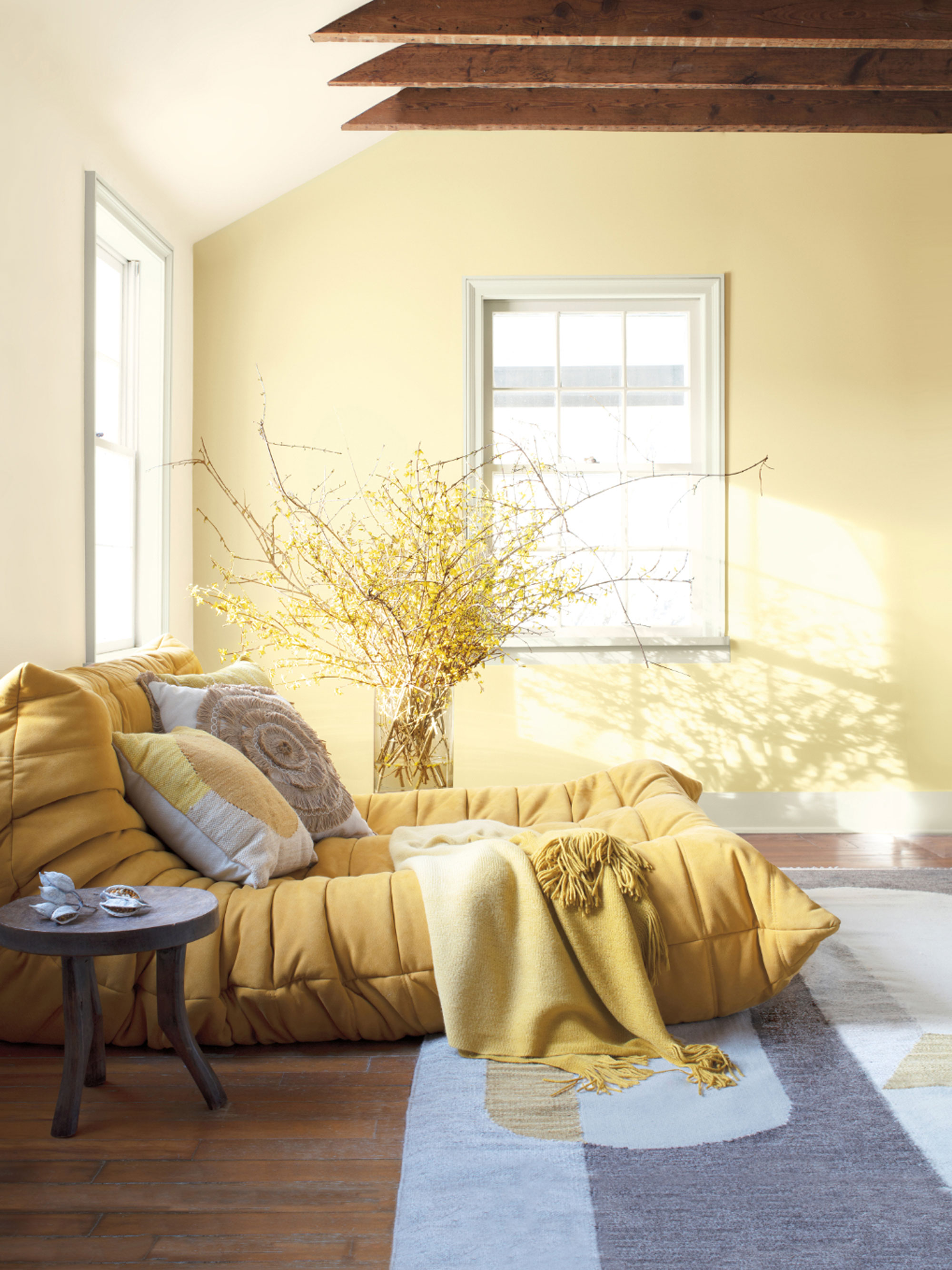

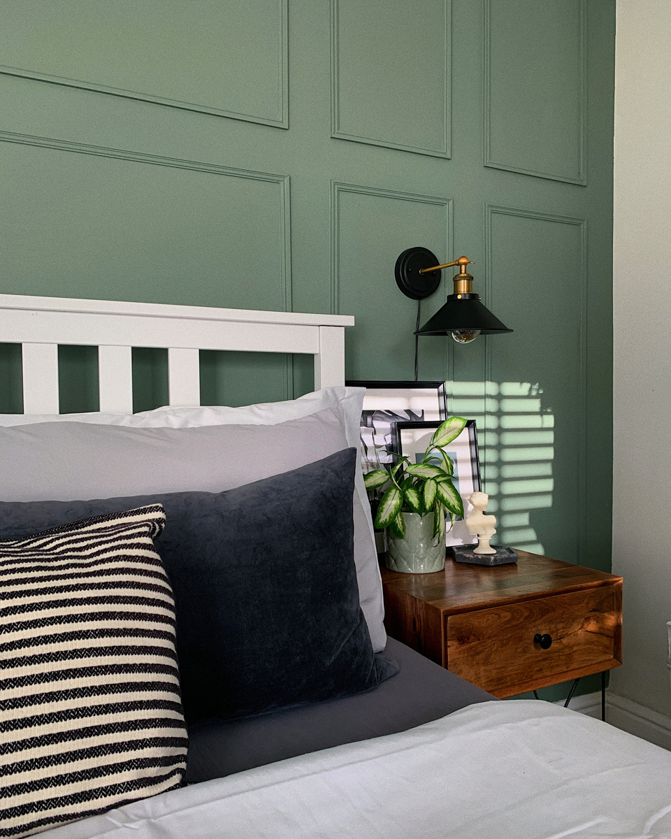
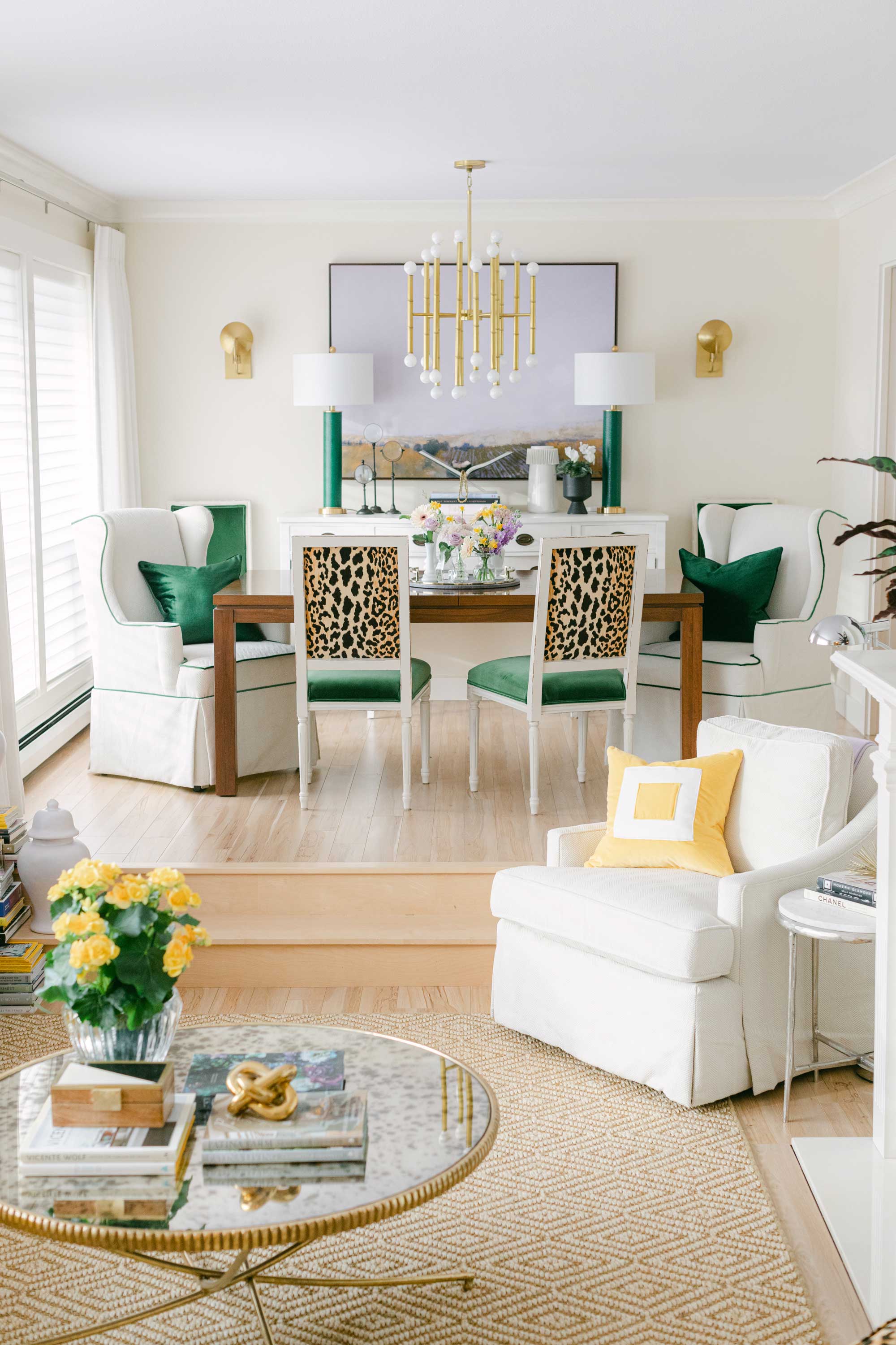
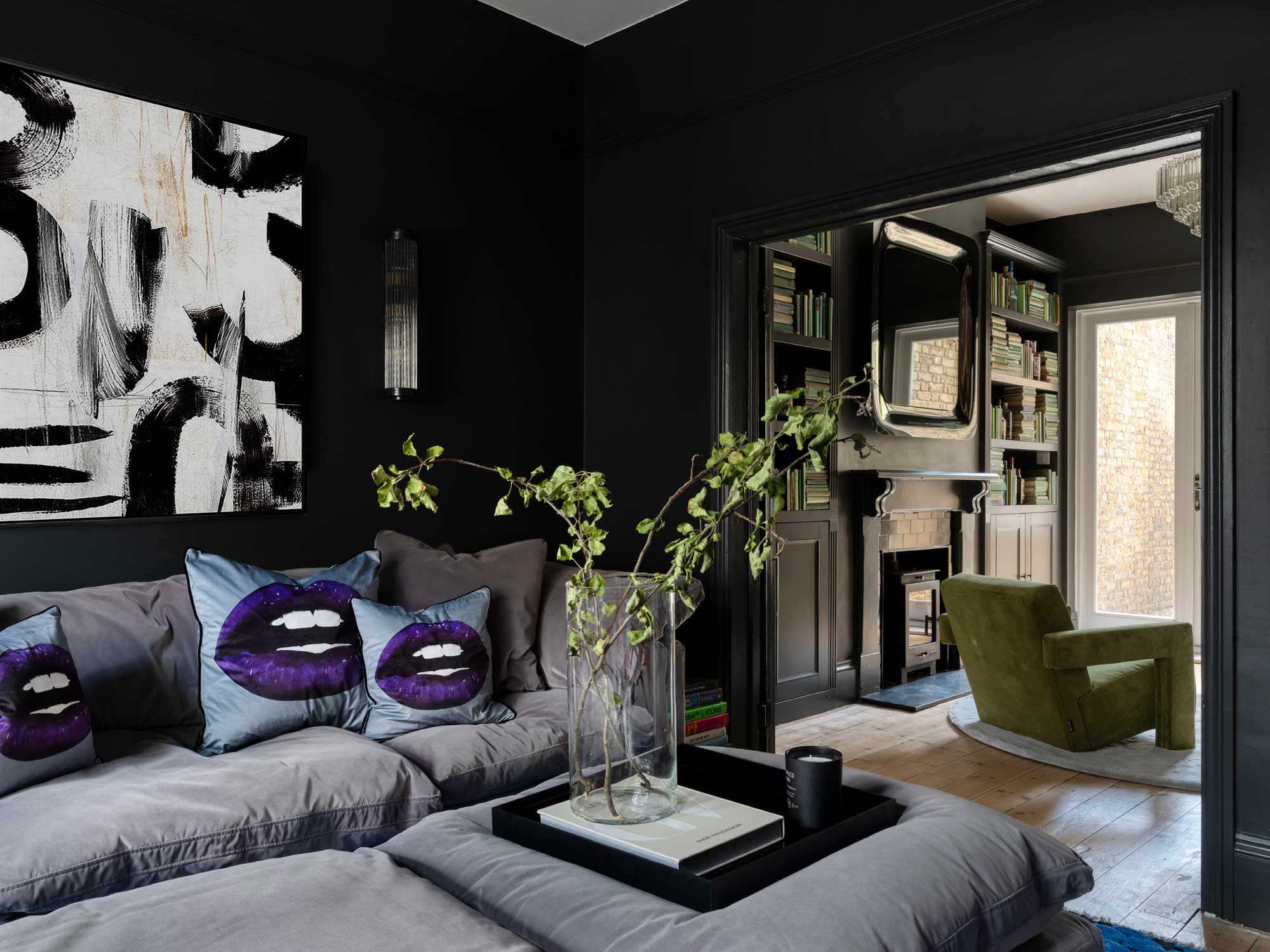
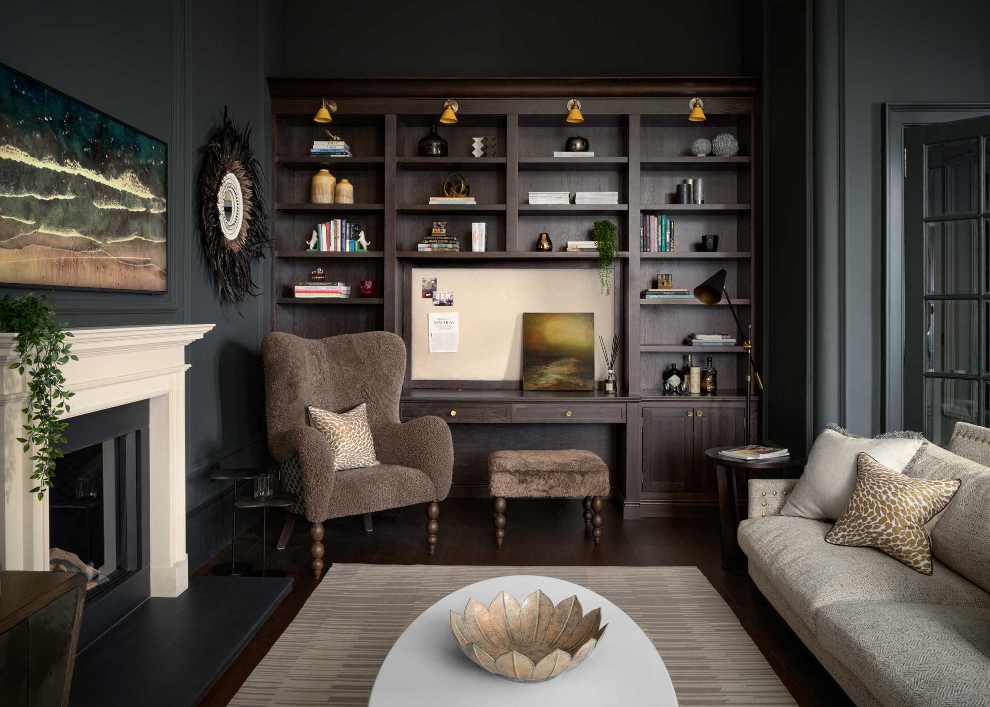
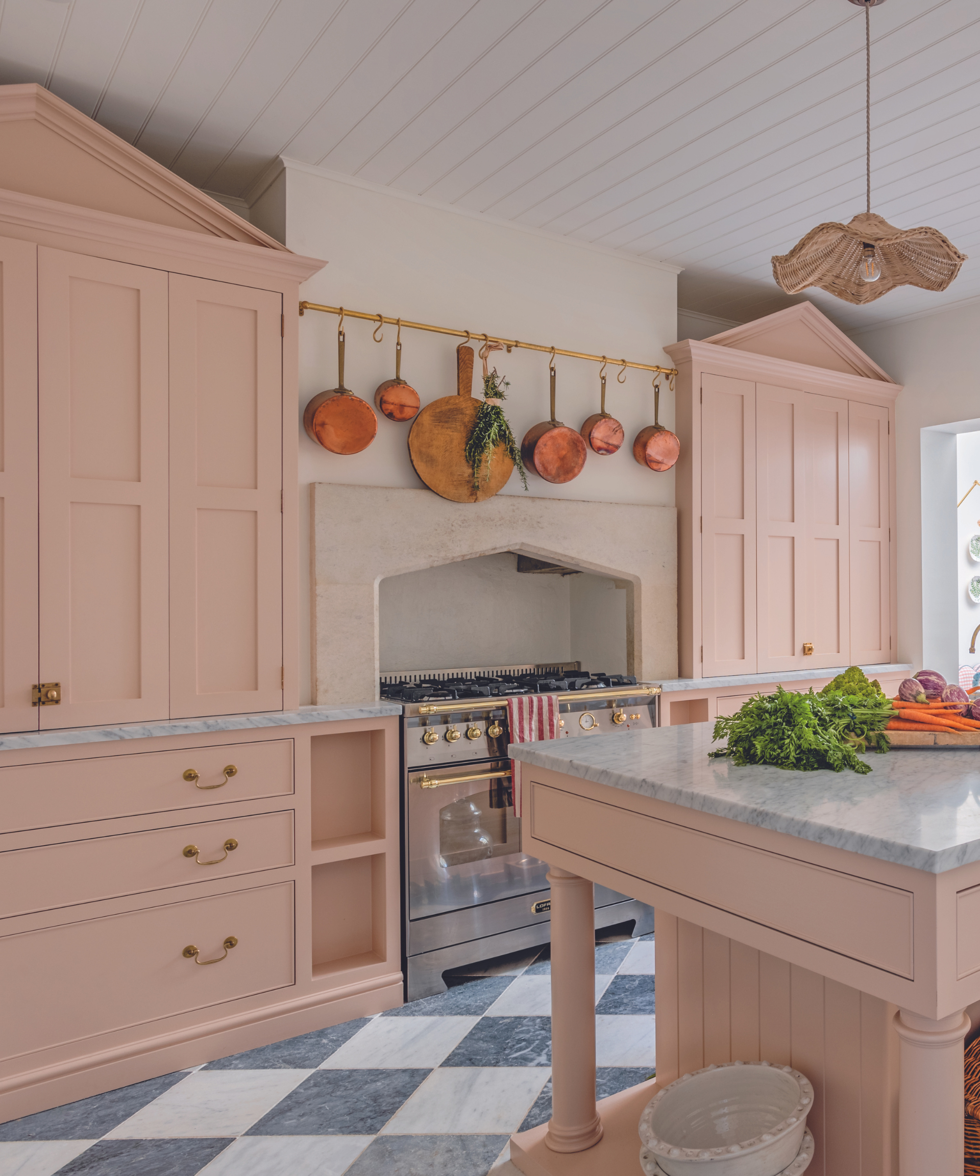
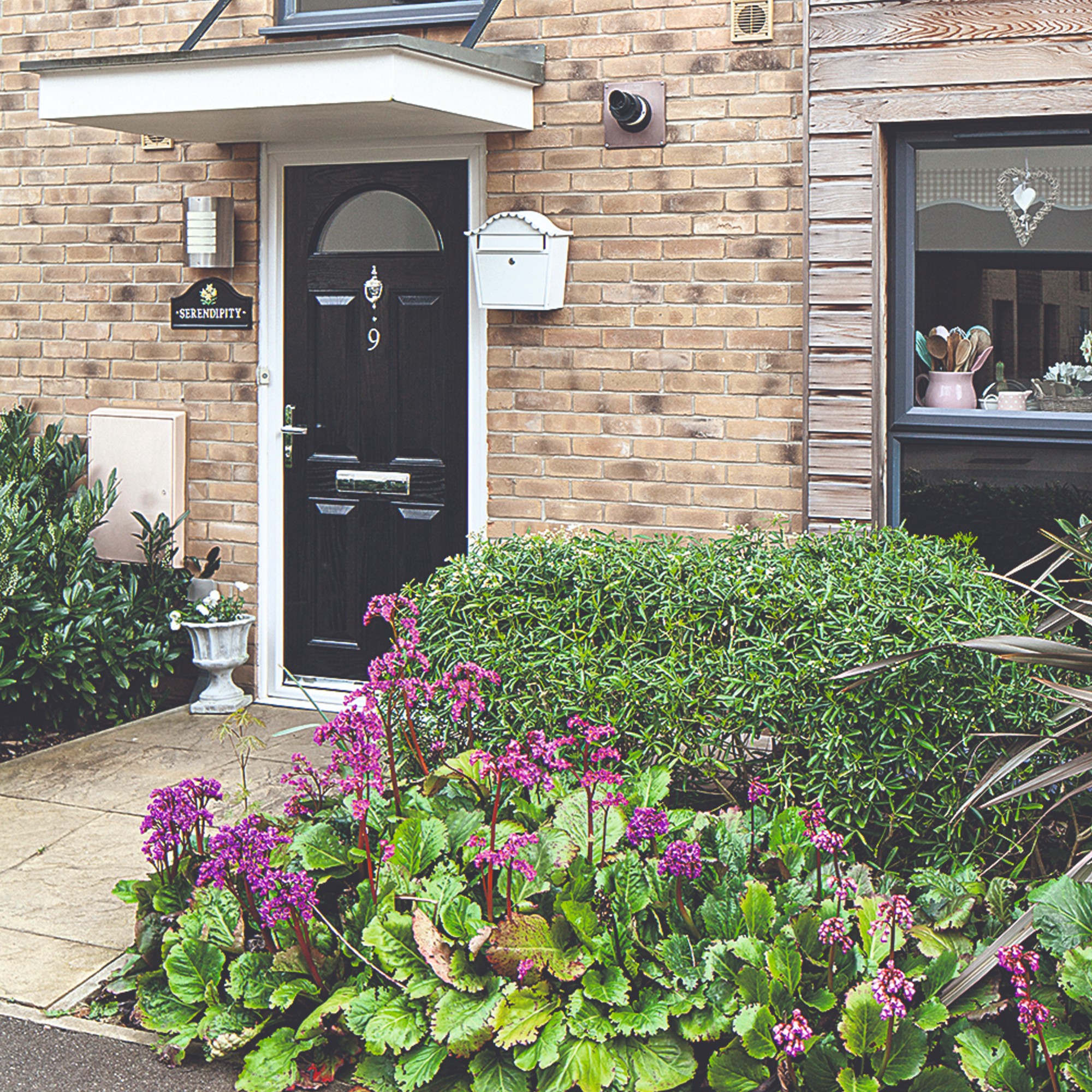
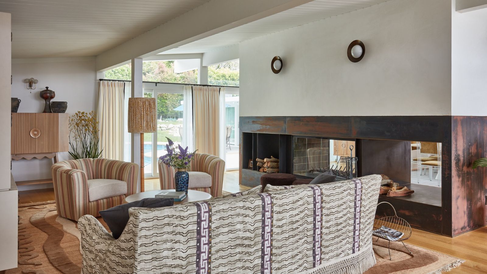
The article discusses how geographical location within the United States significantly influences interior color preferences, according to designers. Several factors, including local architectural styles, natural environments, and climate, are identified as key drivers behind these regional differences in color choices. The article segments the country into five major regions: Northeast, Midwest, West Coast, Southeast, and Southwest, detailing the distinct color trends prevalent in each.
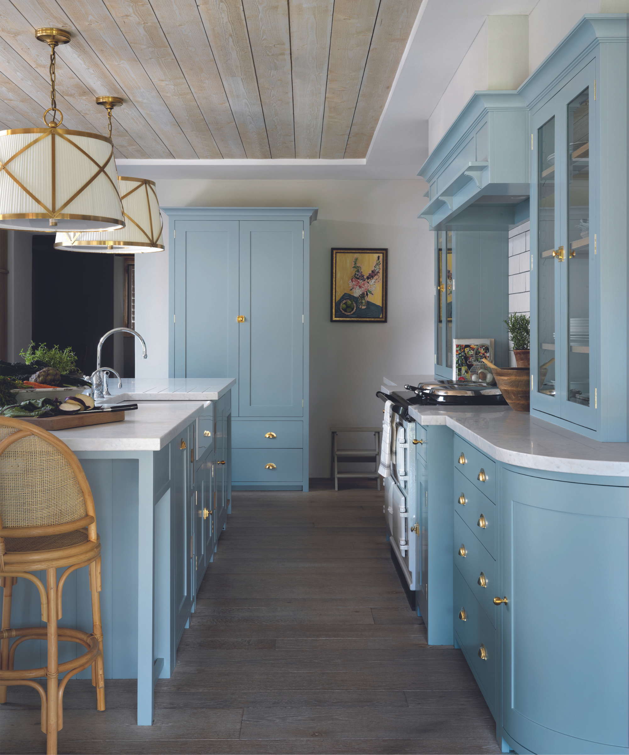
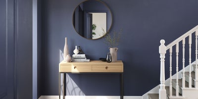
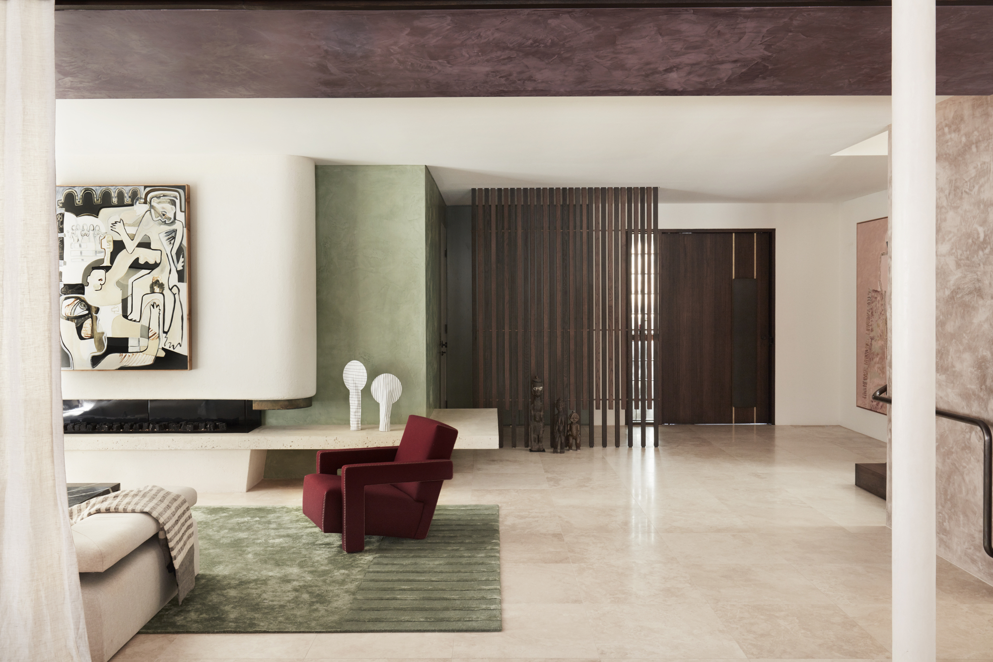
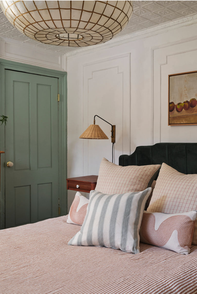
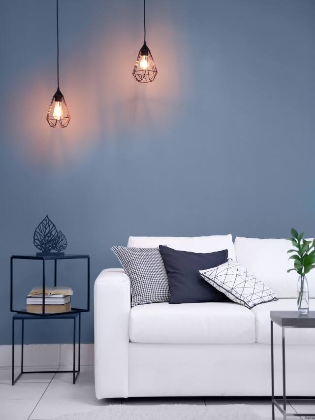
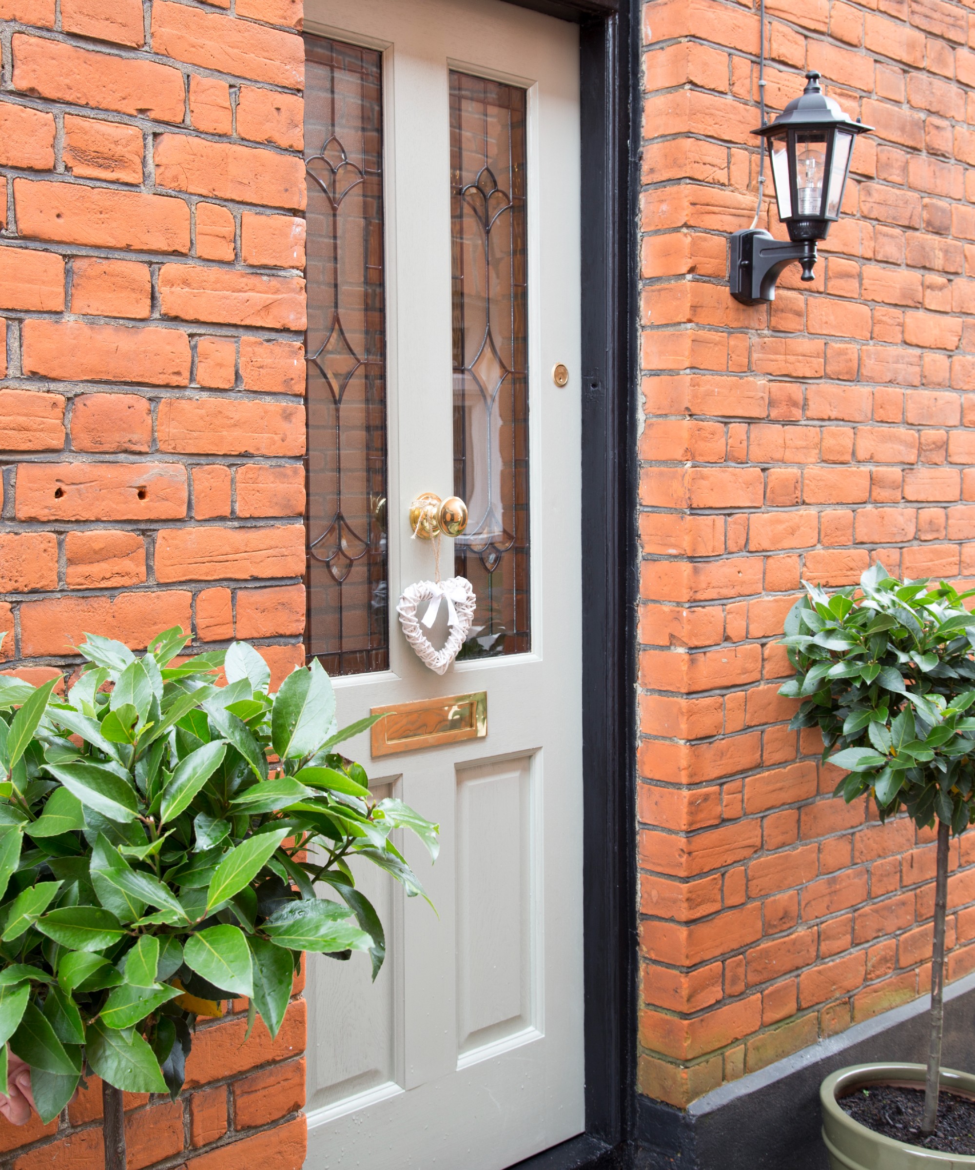
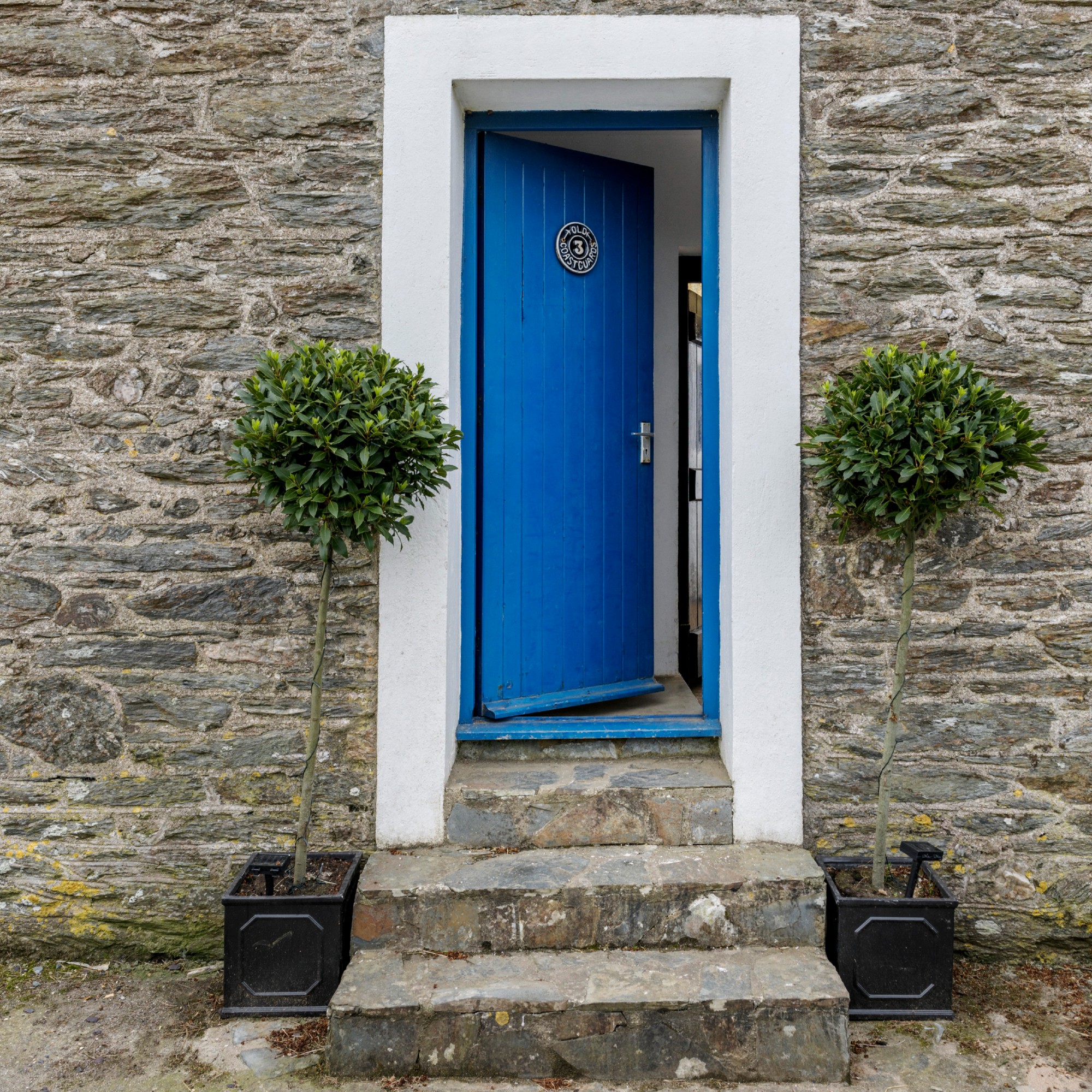
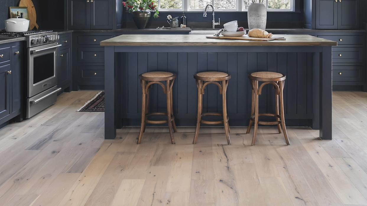
In the Northeast, designers observe a strong inclination towards neutrals, with bolder colors typically taking on a classic feel, such as blues and greens. Experts like Ruth Mottershead from Little Greene highlight Portland Stone as a popular neutral base, while shades like Obsidian Green and Air Force Blue are favored for more colorful applications. Allison Mattison of Trellis Home Design notes that these choices reflect the region's heritage and architectural styles, often incorporating deep navy, forest green, oxblood, and crisp ivory. Darci Hether, an interior designer based in Connecticut and NYC, explains that urban clients often opt for calming and serene colors like cream, gray, and slate blues to counteract the city's fast pace. Joe Waroquier adds that coastal New England, particularly Nantucket, prefers soft, weathered tones resembling driftwood grays, dune beiges, crisp whites, and classic Nantucket blues, which align with local architecture and misty Atlantic light.
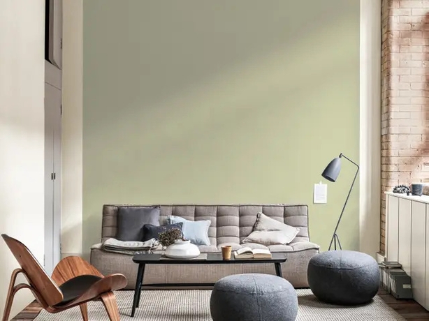
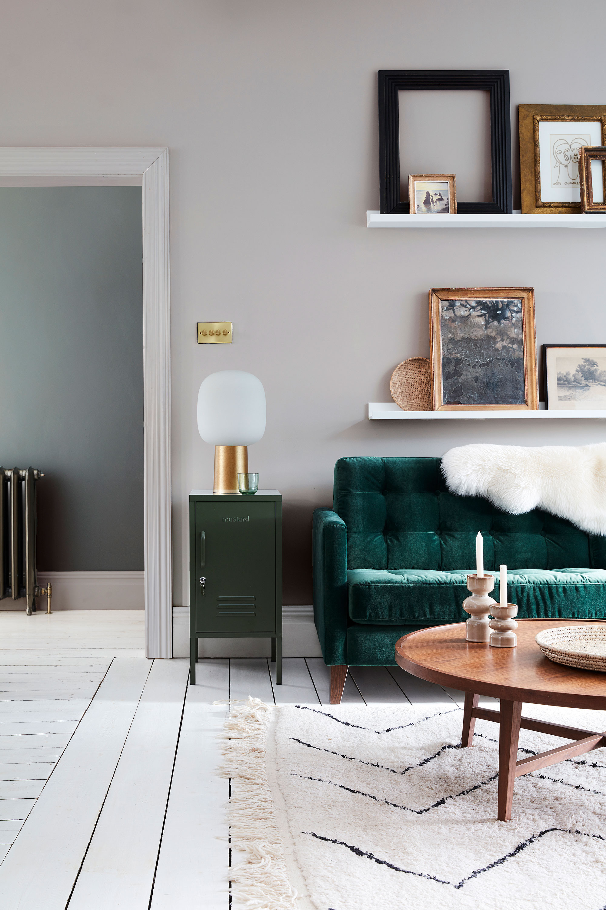
The Midwest shares similarities with the Northeast, favoring grounded palettes that include earthy neutrals and richer tones. Laura Lubin of Ellerslie Interiors mentions a preference for taupe, deep greens, and warm neutrals suited to the climate and architectural styles like Scandinavian, Prairie, and Craftsman. Behr paint company confirms the popularity of colors such as Muted Sage, Jojoba, North Woods, Vine Leaf, Cherry Cola, and Dark Crimson, indicating a leaning towards natural, earthy hues influenced by the region’s diverse landscapes.
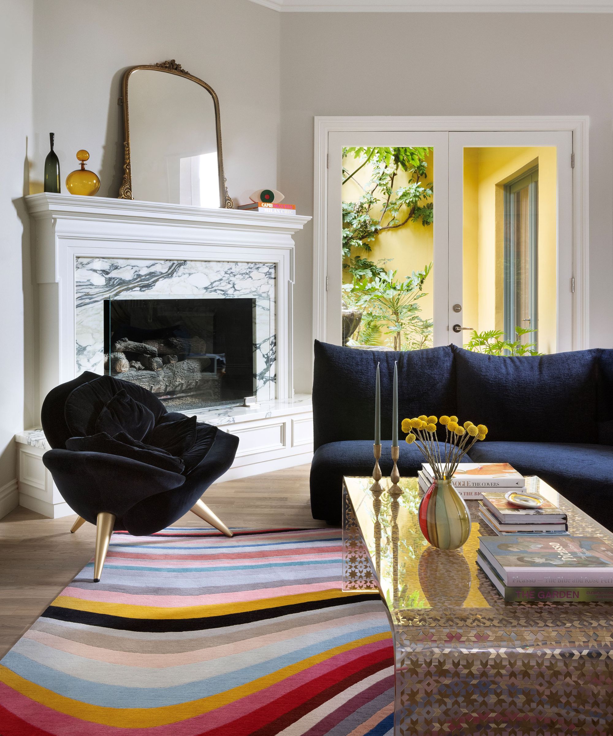
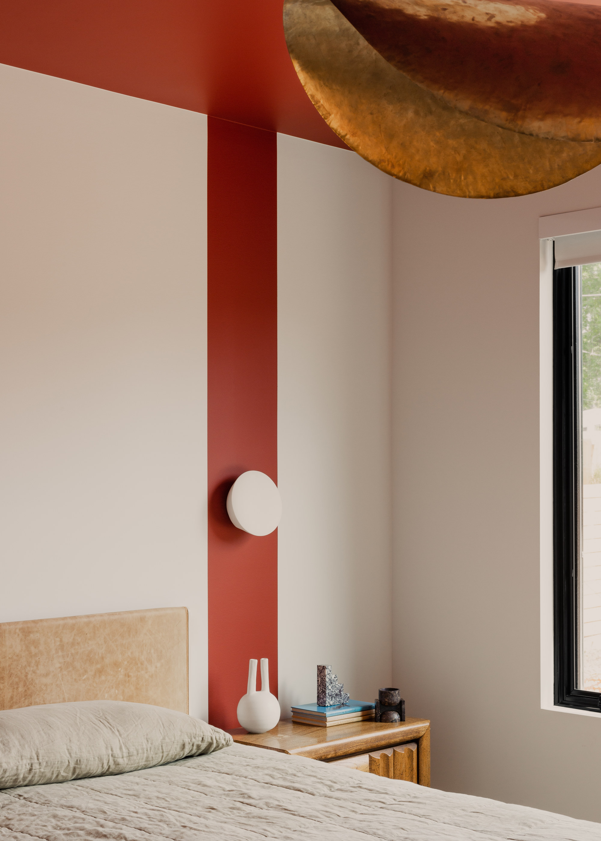
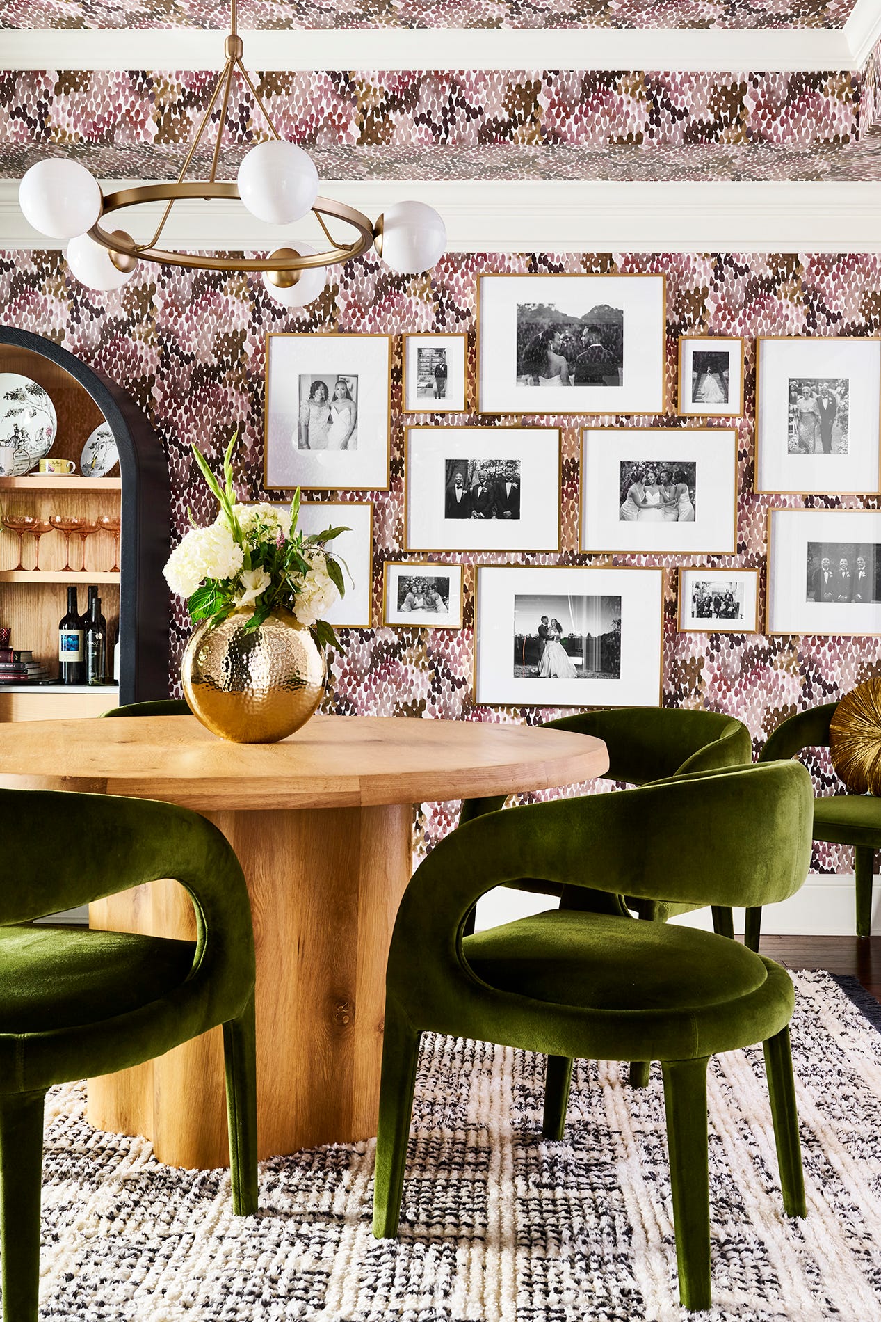
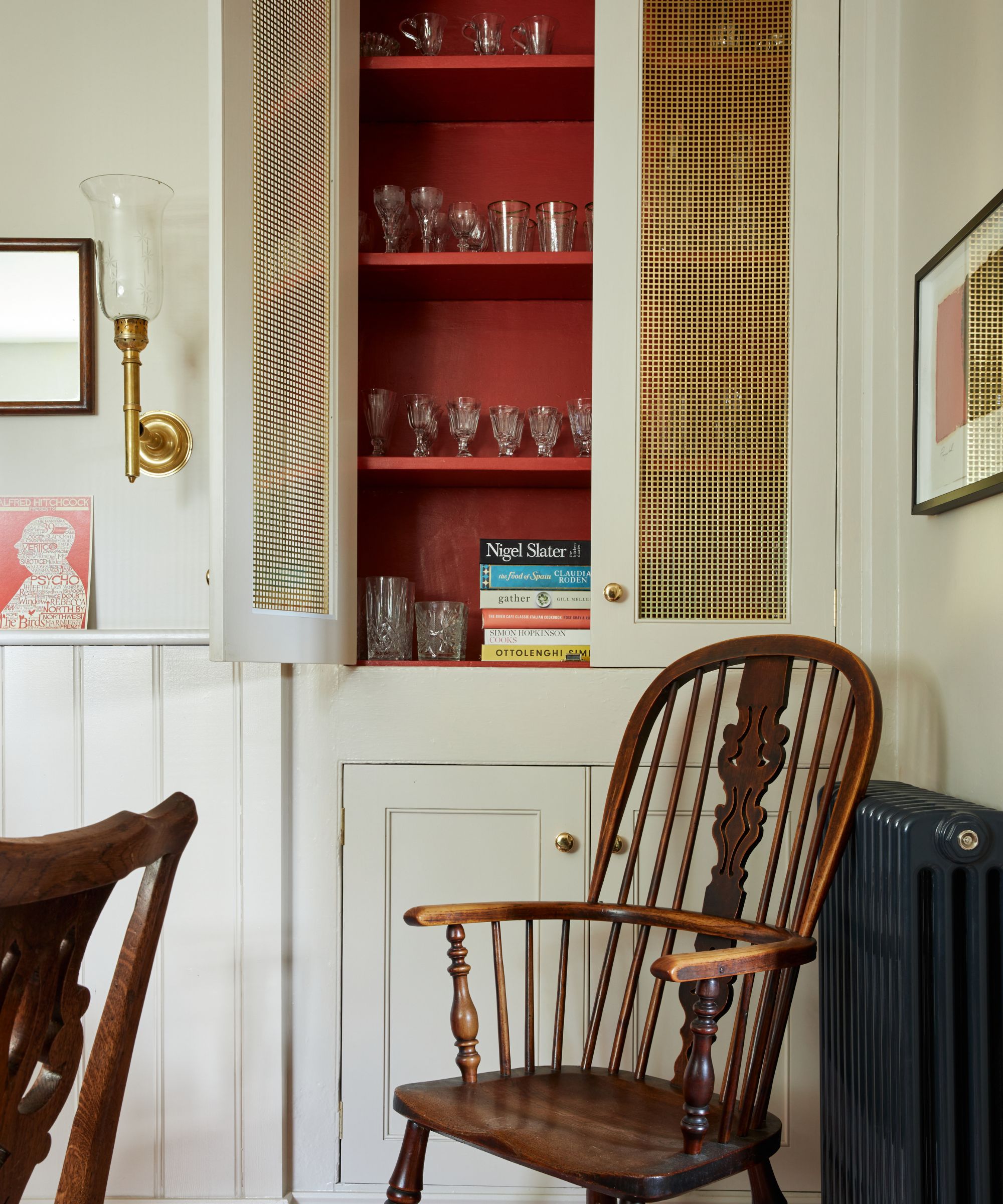
The West Coast, especially California, exhibits a more relaxed, sun-washed aesthetic. Staver Gray of Ward + Gray notes the prevalence of soft earth tones, warm terracottas, and faded coastal blues that complement the indoor-outdoor living style. Caitlin Creer observes a preference for 'muddy' earthy colors among her West Coast clients, contrasting with the 'cleaner and crisper shades' favored by her East Coast clientele. Little Greene’s sales data for California shows a trend towards red-based hues like Rolling Fog Light, Mochi, Atomic Red, Bronze Red, China Clay Dark, and Castell Pink, reflecting a preference for warm color schemes.
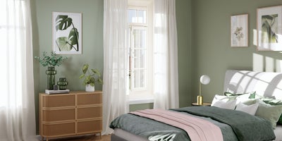
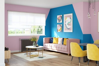
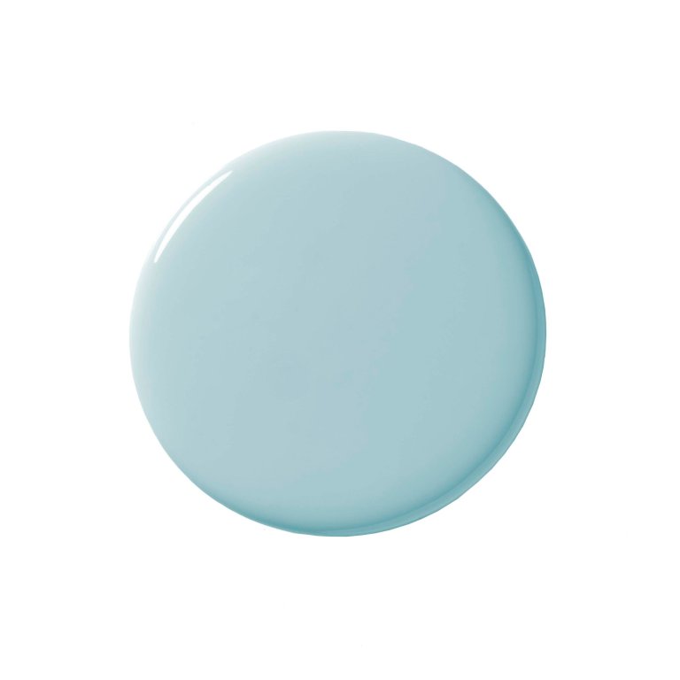
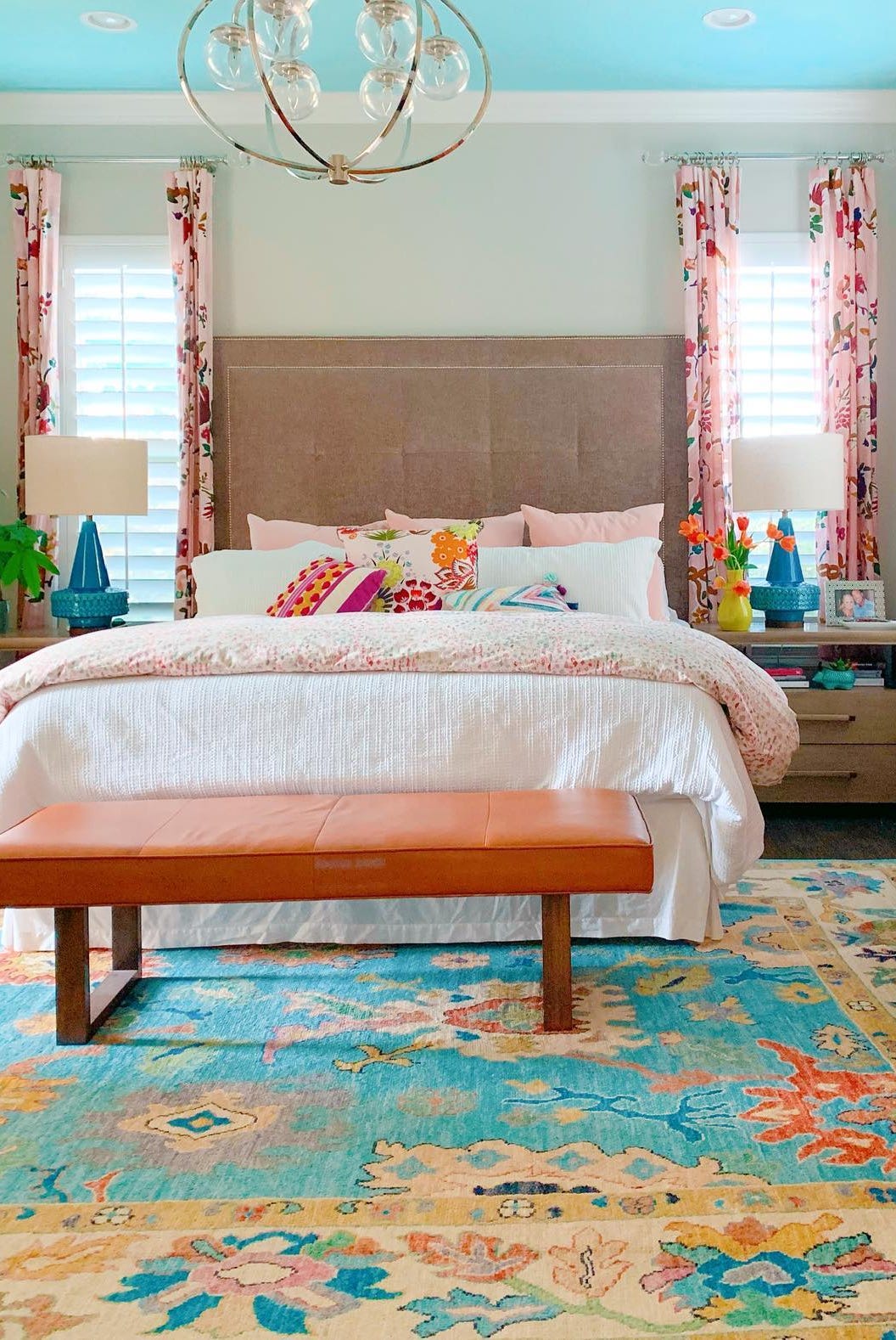
Moving to the Southeast, Allison Mattison describes a softer vibe with airy pastels, powdery blues, warm whites, and soft greens, creating a welcoming and graceful atmosphere reflective of the region’s hospitality. Karen Germond of KMG Design Studio highlights the enduring popularity of blues, particularly along the coast, which evoke the marshlands, ocean, and clear skies, offering a sense of calm and refreshment on hot days. However, in Florida, especially the southern part, colors become much more vibrant and tropical, featuring coral, turquoise, bright citrus, and lush greens, often paired with glossy whites and sleek finishes, reflecting a playful, resort-style energy.
Finally, the Southwest, according to Dallas-based designer Lauren Saab of Saab Studios, gravitates towards sunbaked, grounded colors such as terracotta and clay, exemplified by Benjamin Moore’s Cinnamon Slate, and sage green. These choices mirror the desert terrain and glow under golden afternoon light, creating interiors deeply rooted in the landscape. Behr’s top colors for the Southwest also include muted tones like Teton Blue, Jungle Camouflage, and Harvest Brown, reinforcing the preference for natural, earthy palettes. The article concludes by emphasizing that while regional preferences exist, homeowners ultimately should choose colors that reflect their personal taste, regardless of location.
#InteriorDesign #ColorTrends #PaintColors #RegionalPreferences #HomeDecor #NortheastDesign #WestCoastStyle #SouthwestPalette #SoutheastHues #InteriorDesign #ColorTrends #PaintColors #RegionalPreferences #HomeDecor #NortheastDesign #WestCoastStyle #SouthwestPalette #SoutheastHues
Toplam 0 yorum
 Henüz yorum yok
Bu da beğenebilirsiniz
Interior Color and Psychological Functioning in a University Residence Hall
Seasonal color analysis in interior design – should your ideal palette influence the shades you choose for your home?

'The World of Color is Rife With Danger' — 5 Color Combinations That Don't Go Together and What to Use Instead

These 5 Simple Questions Help Designers Pick the Perfect Paint Color Every Time

What are the worst colors to paint a room? The shades experts say you should never use
Decorating with paint

7 living room paint colors lower-middle-class people adore but others secretly find questionable

How to use paint to change the size and shape of your room
How paint colour in your home can affect your mood
10 home color choices that scream lower middle class energy to refined observers
12 Color Schemes That Are Popping Off Right Now, According to Designers

A color psychologist says these color schemes are the most likely to boost your mood
The colours you paint your walls can impact your mood, and here’s the science to prove it

Paint color ideas for every room – experts explain the best choices for different spaces
Incorporate Color Drenching Into Your Home Design

13 front door colours mistakes you might be making
15 ways to add color to your home, according to interior designers
A Color Psychologist Says This Is the Most Relaxing Paint Color

7 colour tricks to transform your mood and living room design

7 Paint Colors That Make a House Sell for More Money