1/5
Farrow & Ball's Wimborne White is an ever-popular paint – here's why experts love this 'empathetic' white
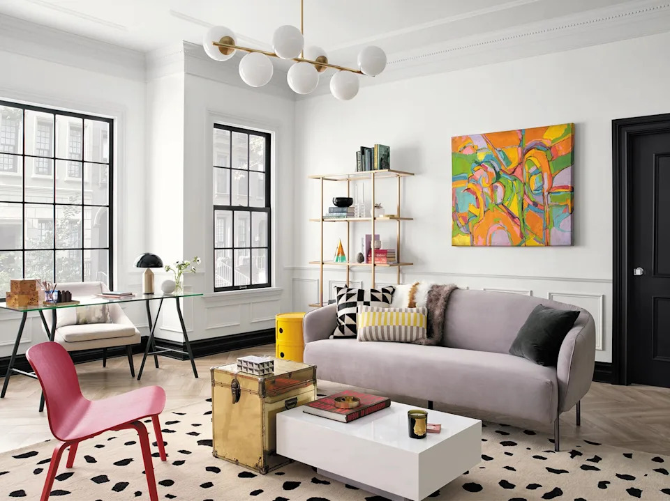
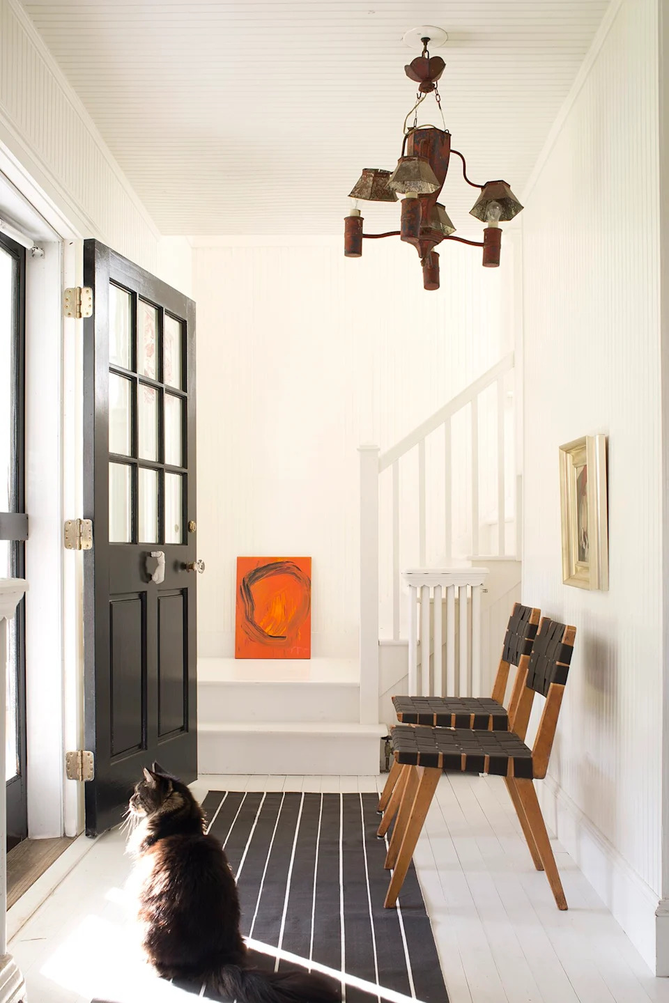
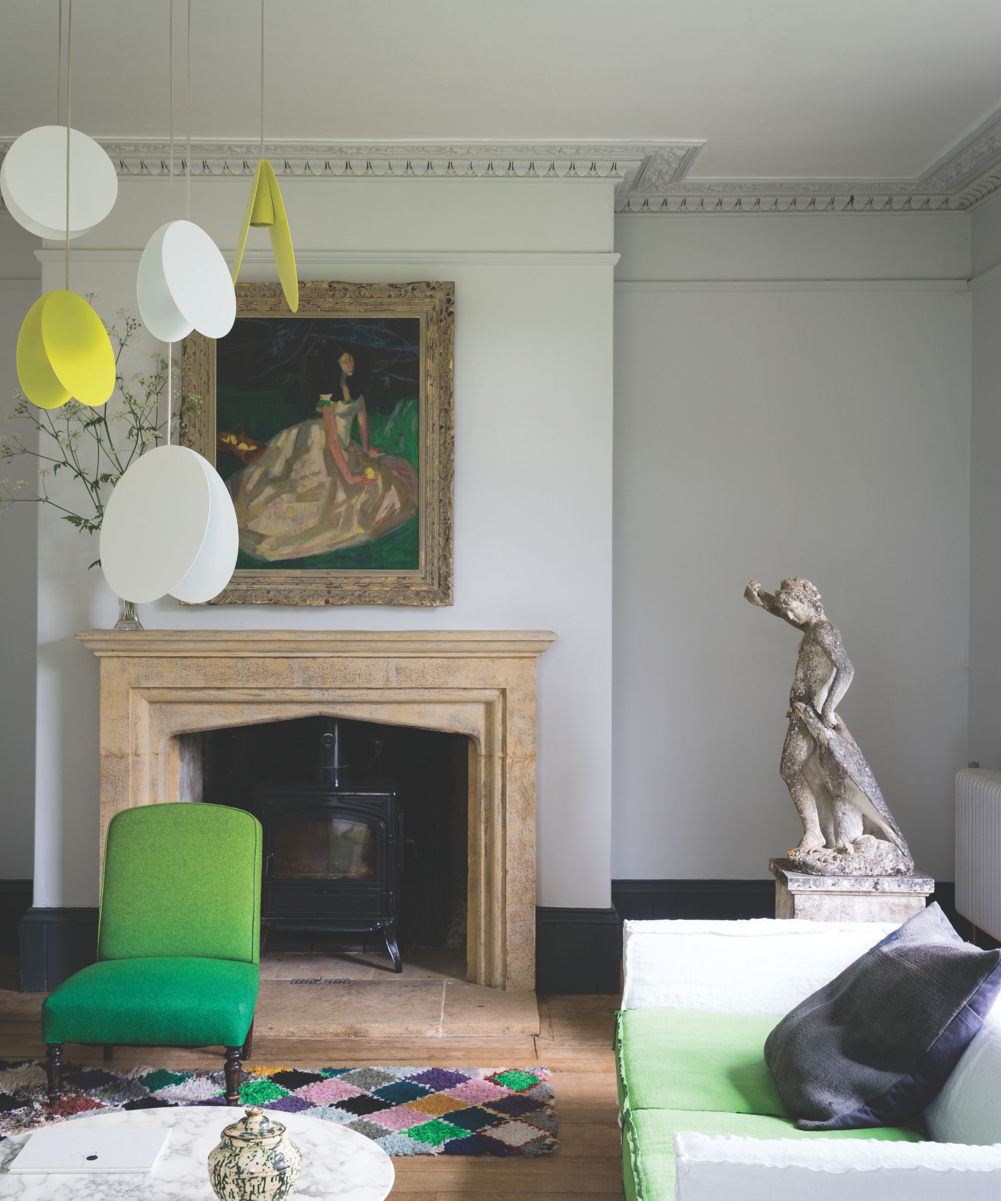
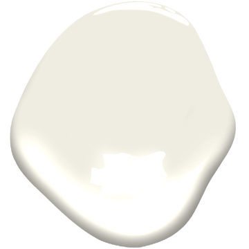
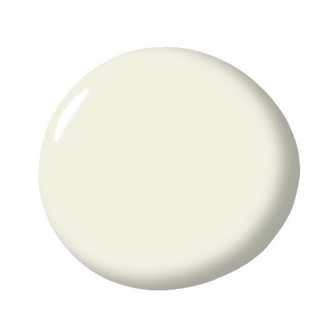
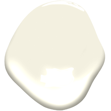
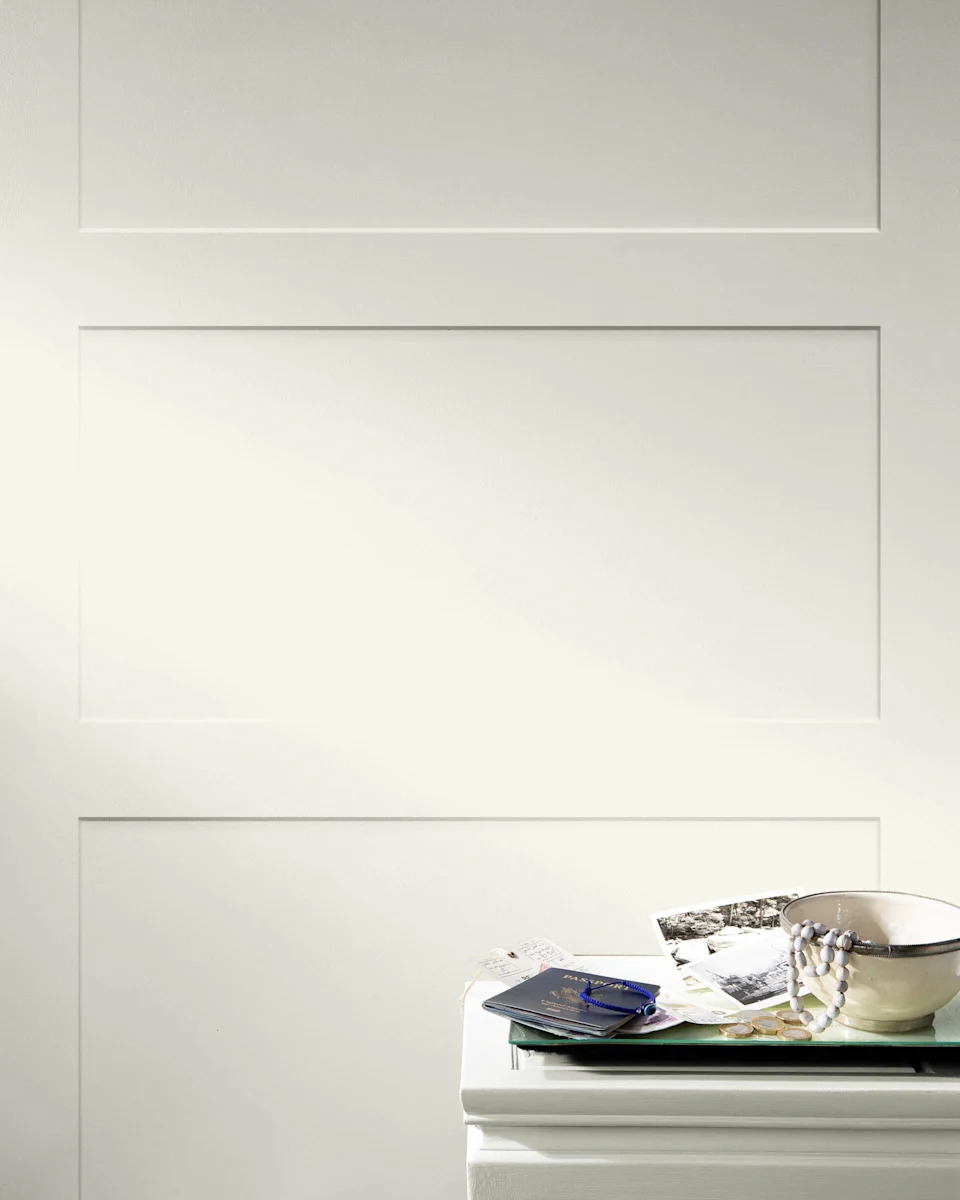
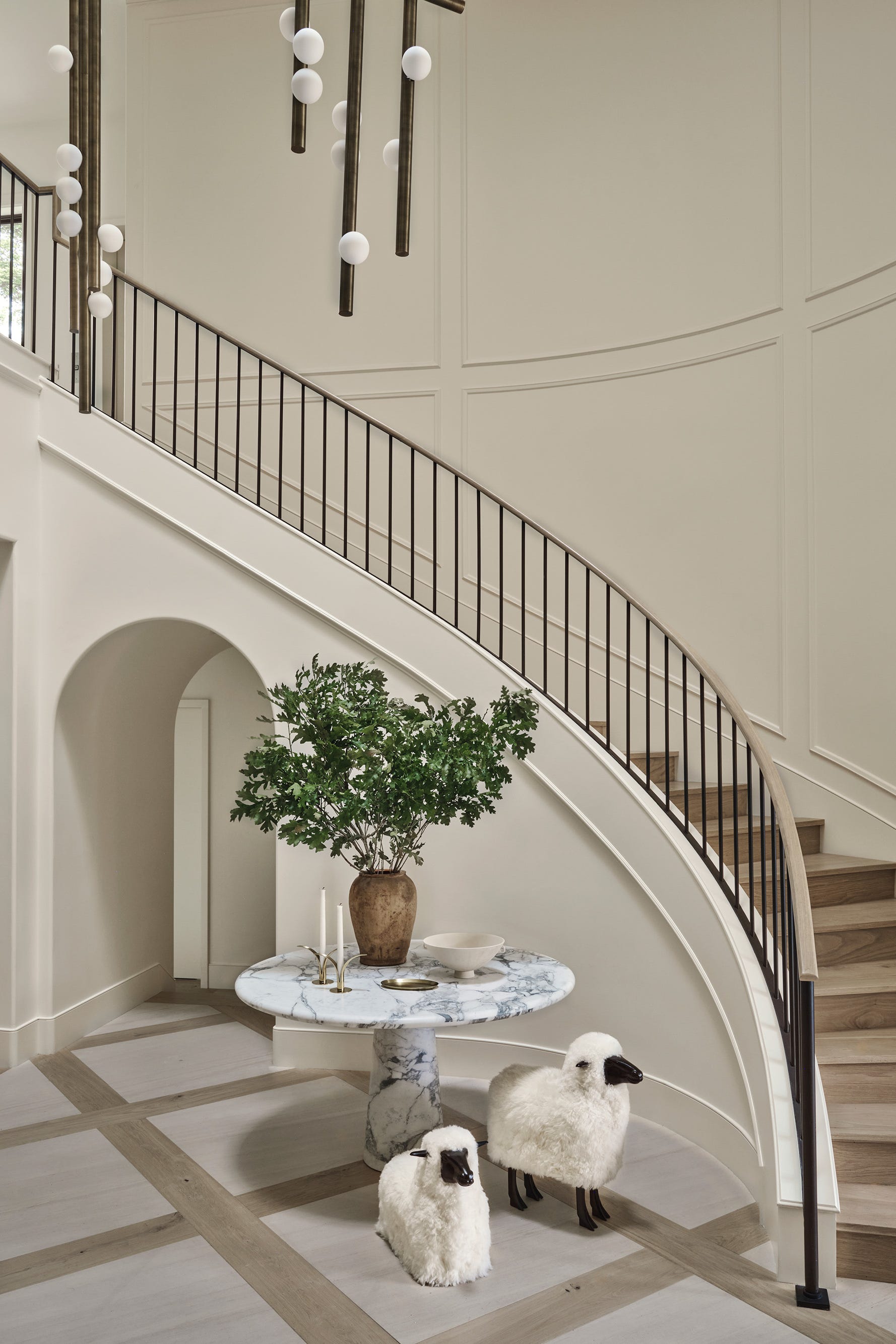
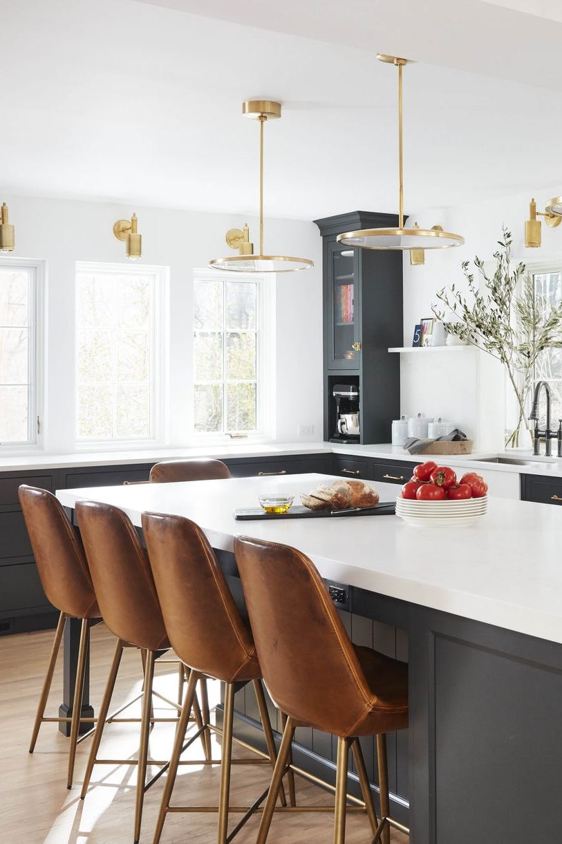
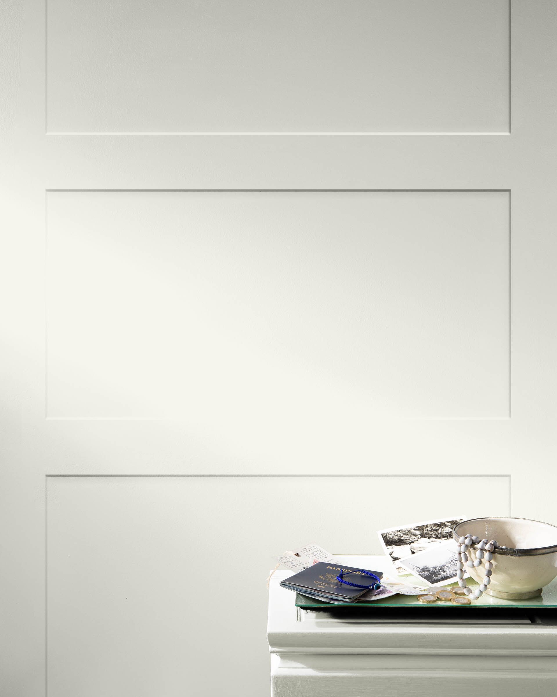
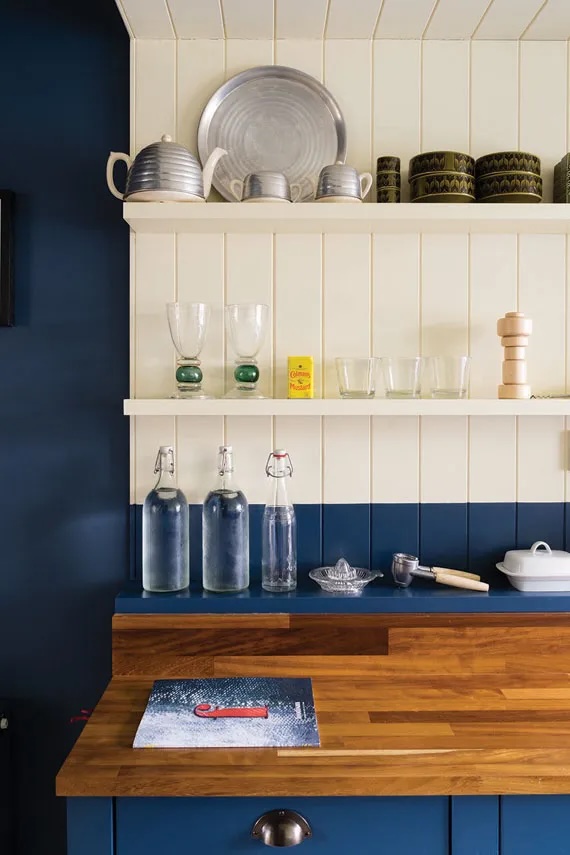
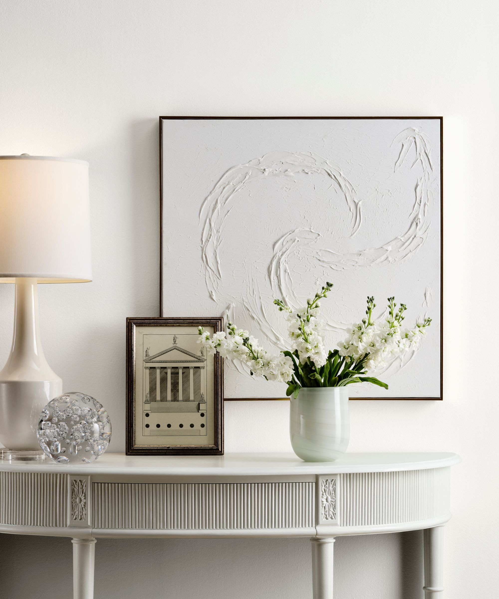
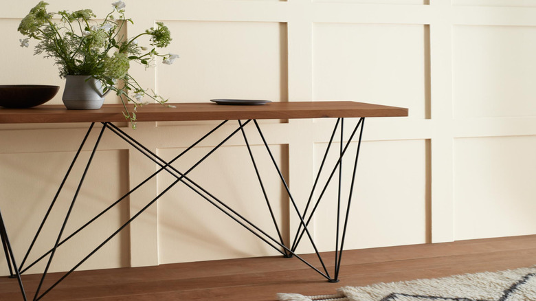
Farrow & Ball's Wimborne White is highlighted as an exceptionally popular and versatile off-white paint color, favored by interior designers and color specialists. The article delves into the characteristics that make this shade so appealing for various home aesthetics, from modern to traditional. It is described as a 'just off white' with a subtle yellow undertone, contributing to a warmer and cozier feel compared to pure whites like Farrow & Ball's All White.
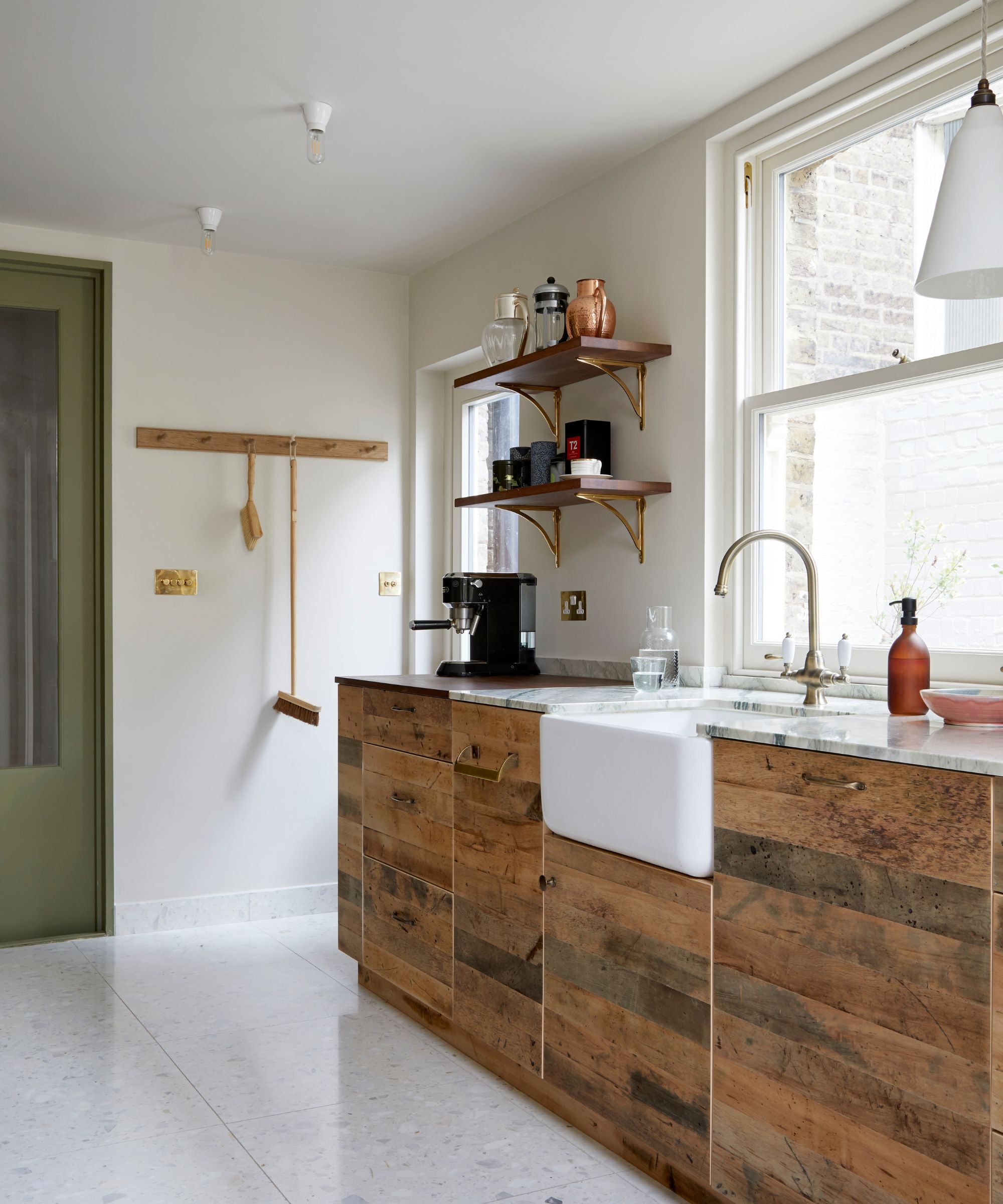
Patrick O'Donnell, a color expert at Farrow & Ball, characterizes Wimborne White as an 'empathetic white' due to its inherent warmth. This quality allows it to brighten and expand a room without imparting a cold or sterile ambiance, a common issue with some cooler white paints. Interior designer Betsy Wentz emphasizes its role as a neutral, suitable for a wide range of applications including walls, ceilings, trim, and cabinets.
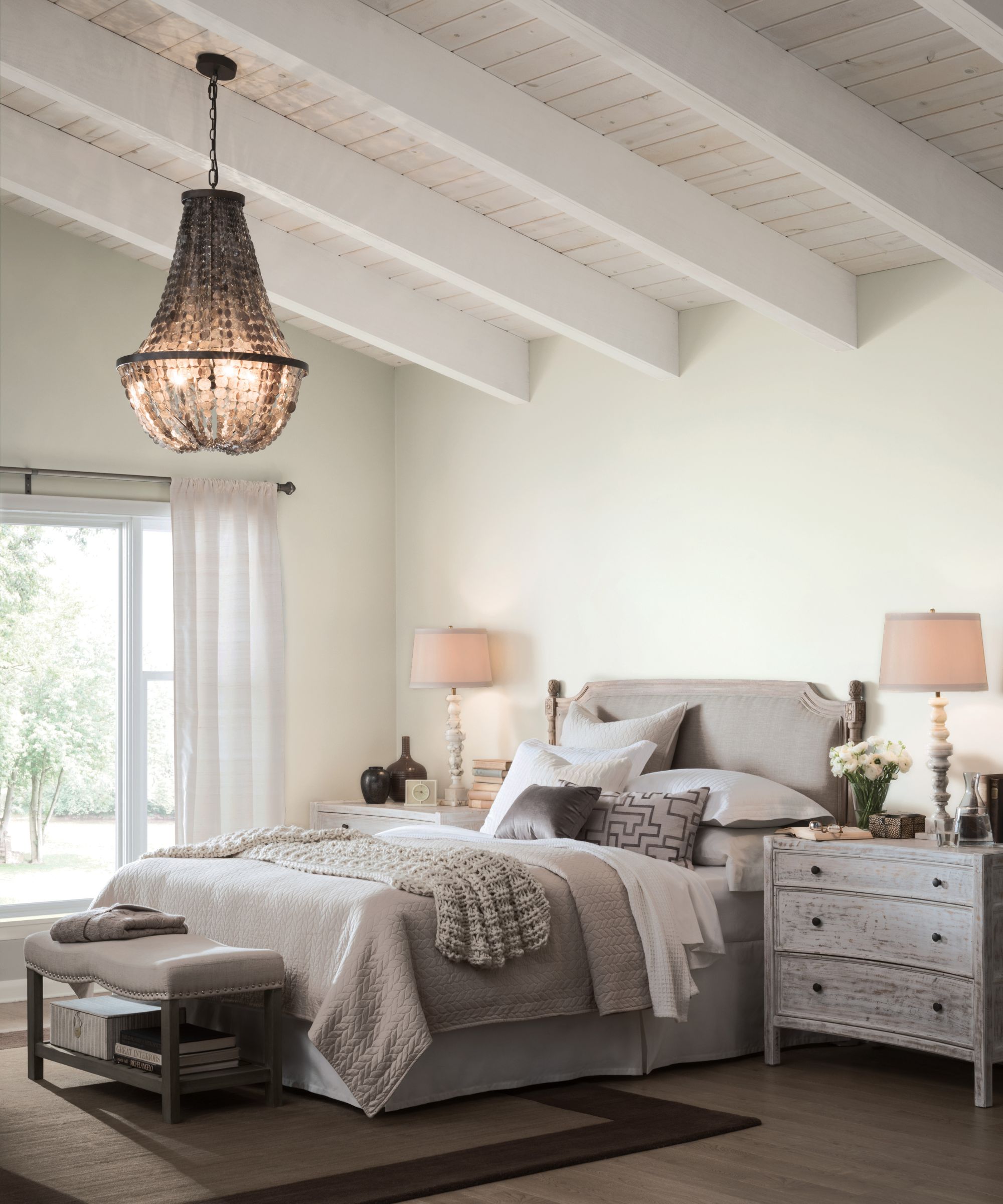
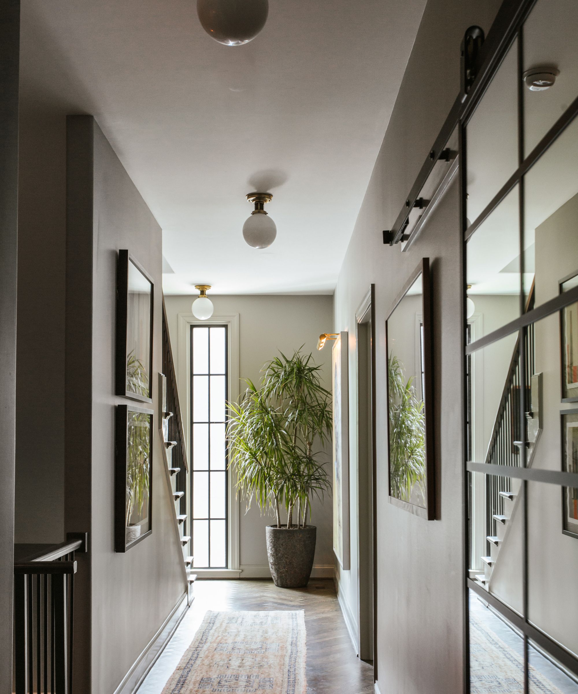
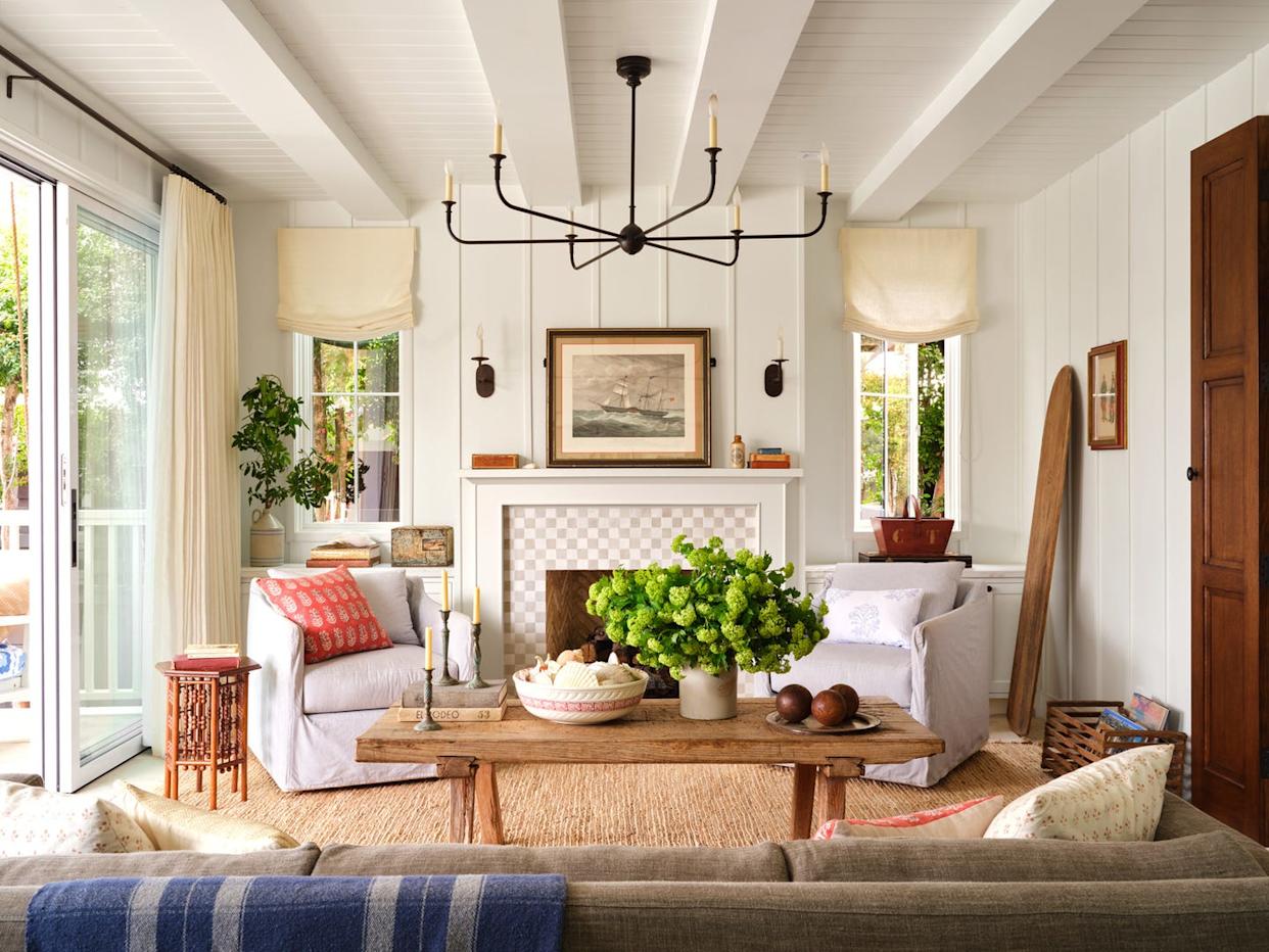
To maximize the perception of space and brightness, Patrick O'Donnell suggests a 'color-drenching' approach, where Wimborne White is extended from the walls onto the ceiling, avoiding contrasting colors that might visually break up the space. This technique enhances the expansive and fresh feel the paint offers.
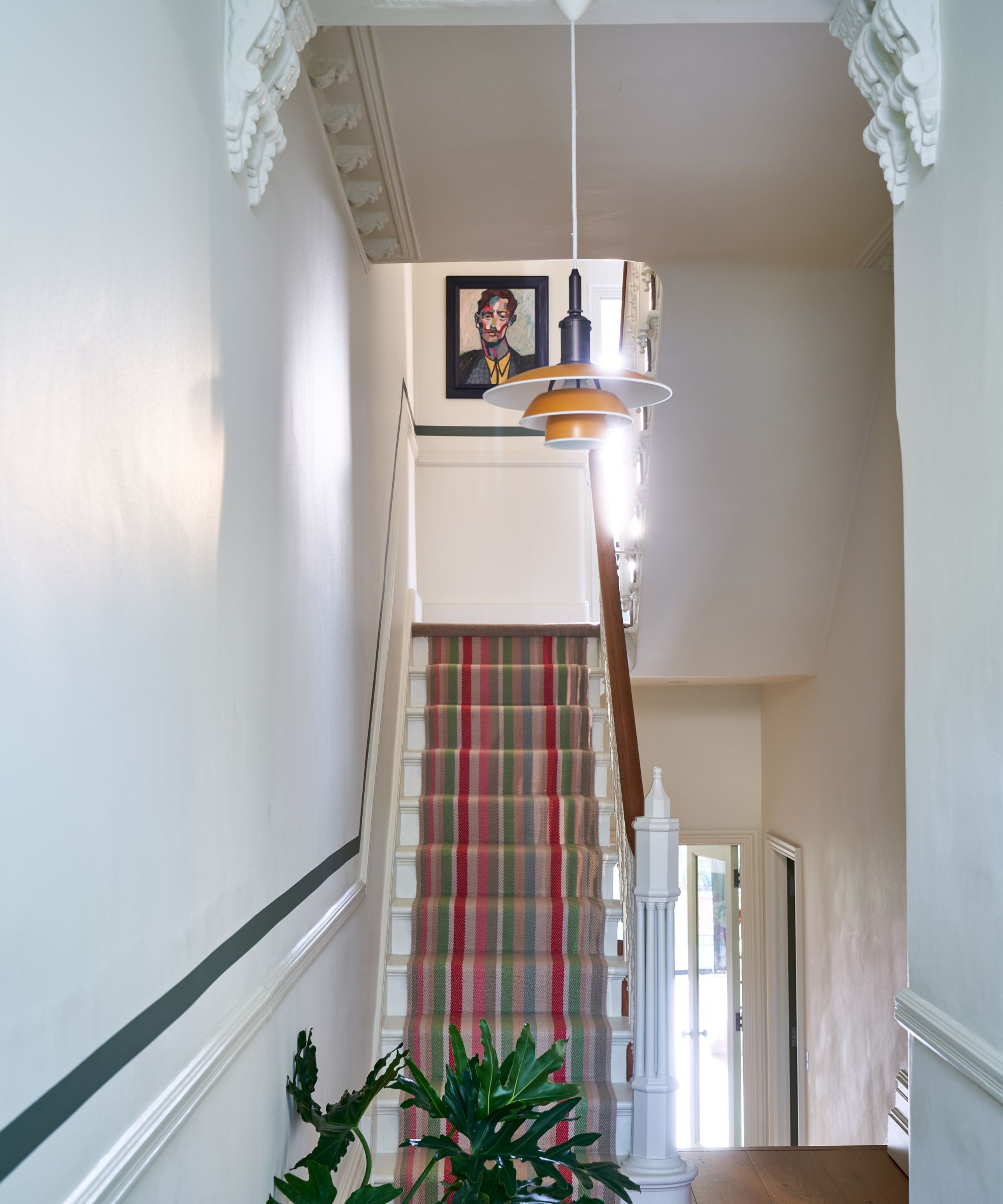
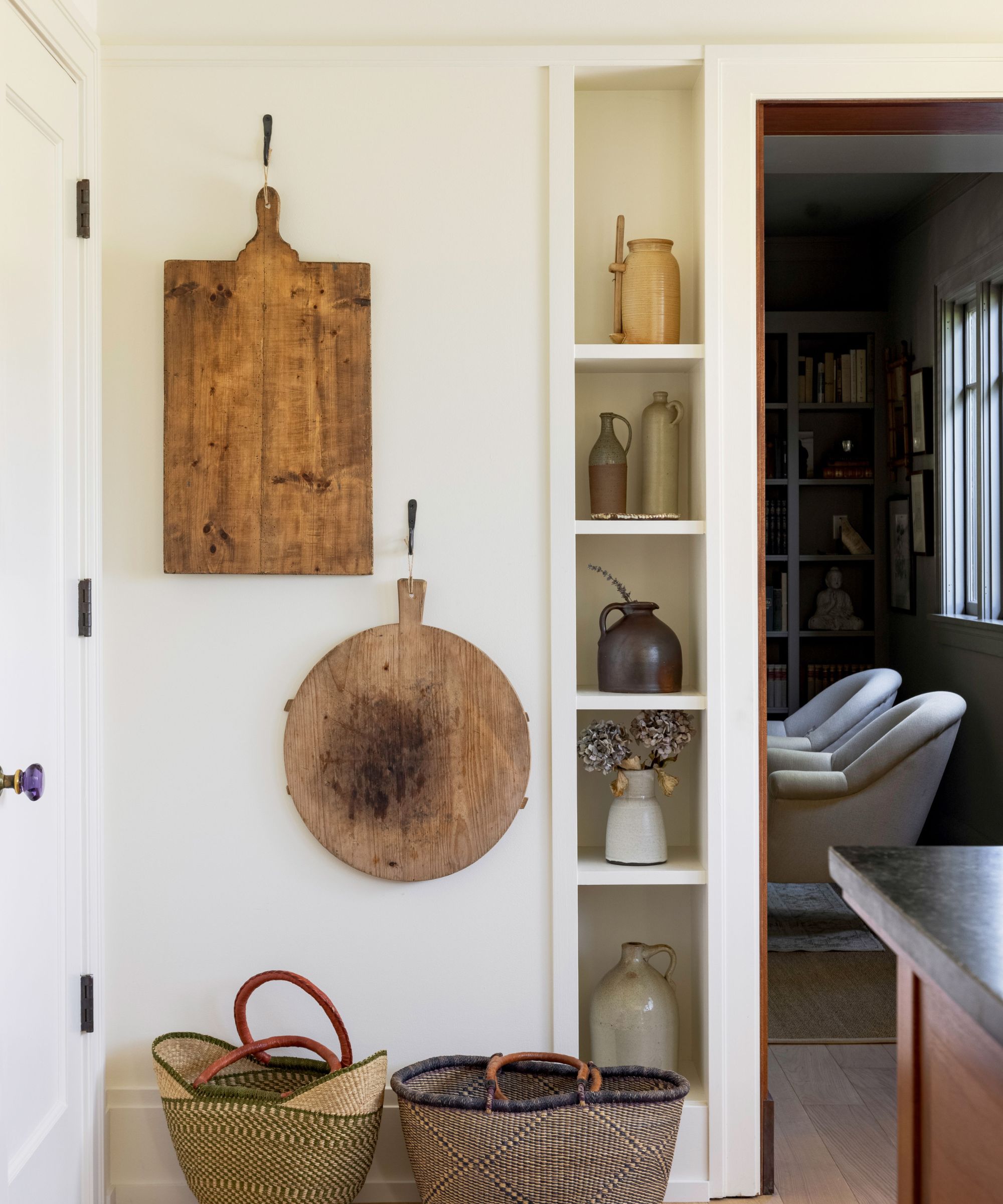
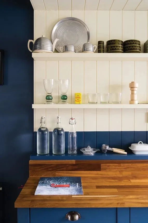
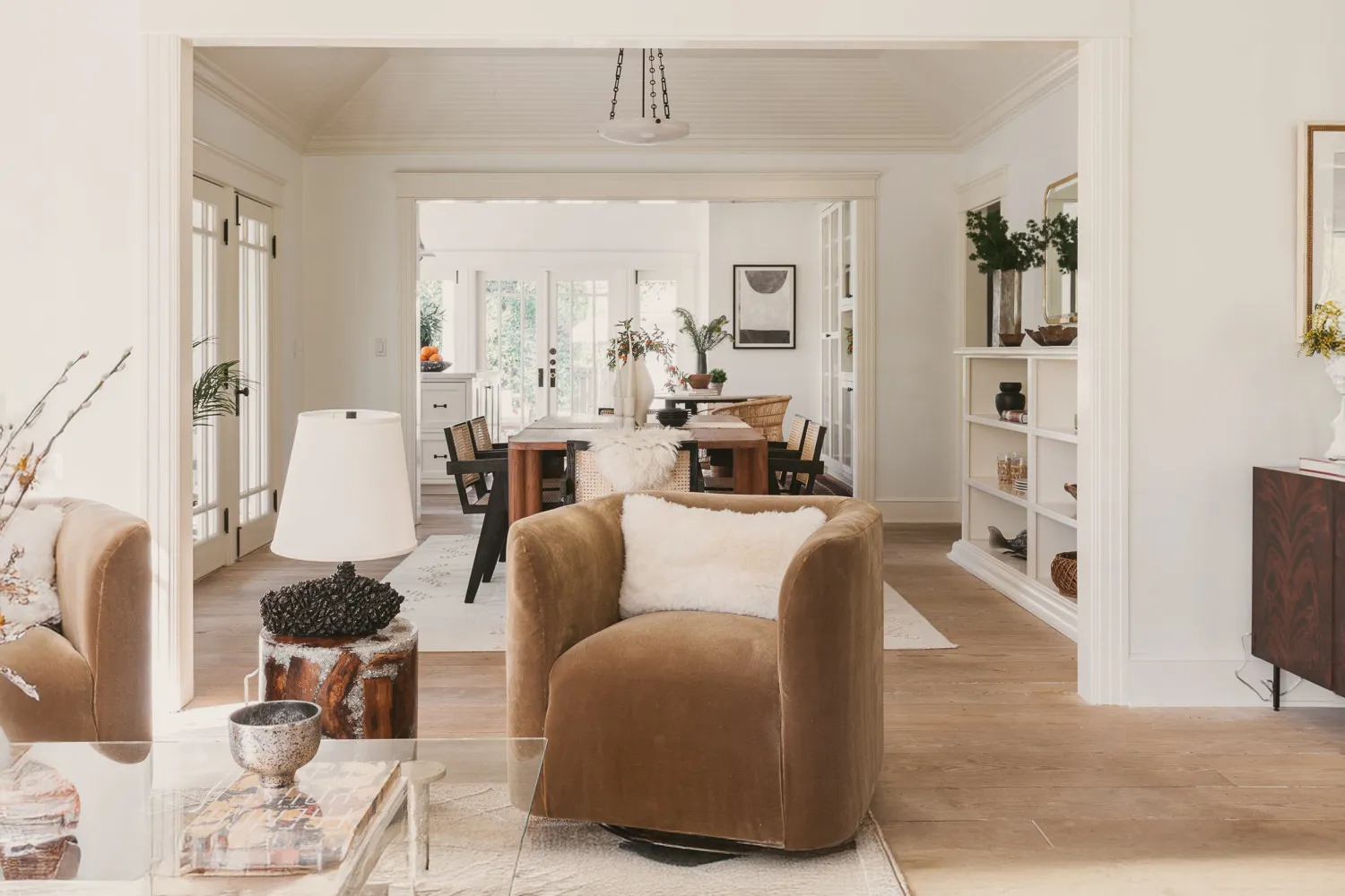
The subtle warmth of Wimborne White is crucial to its appeal, preventing spaces from feeling stark while still achieving a bright, clean aesthetic. Interior designer Kyle O'Donnell, who has used Wimborne White in his own living room, praises its consistent warmth regardless of ambient light. This makes it an excellent choice for social areas where an inviting atmosphere is desired.
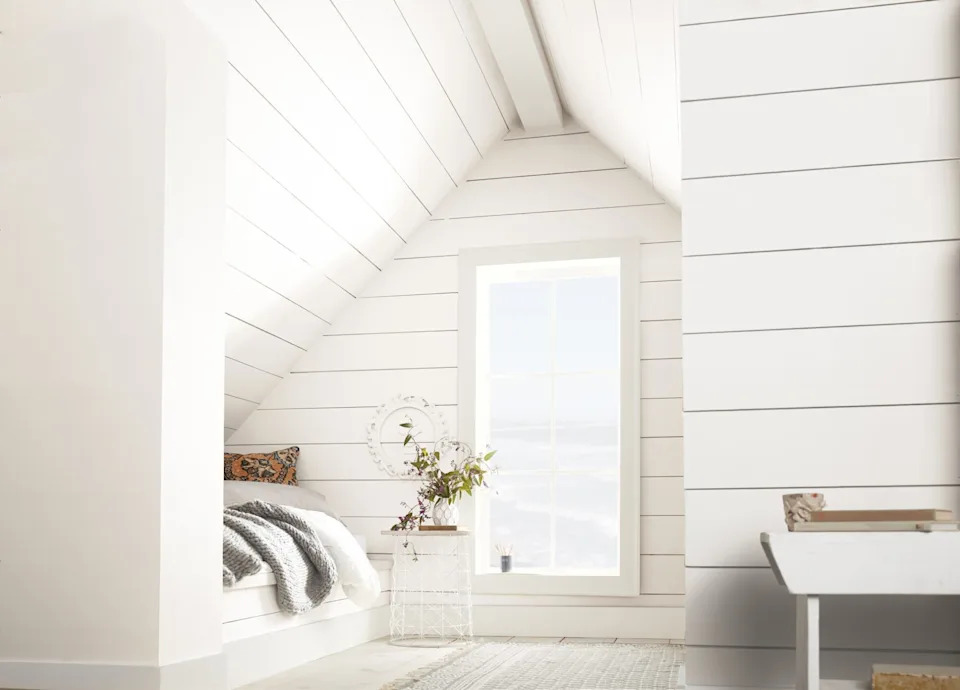
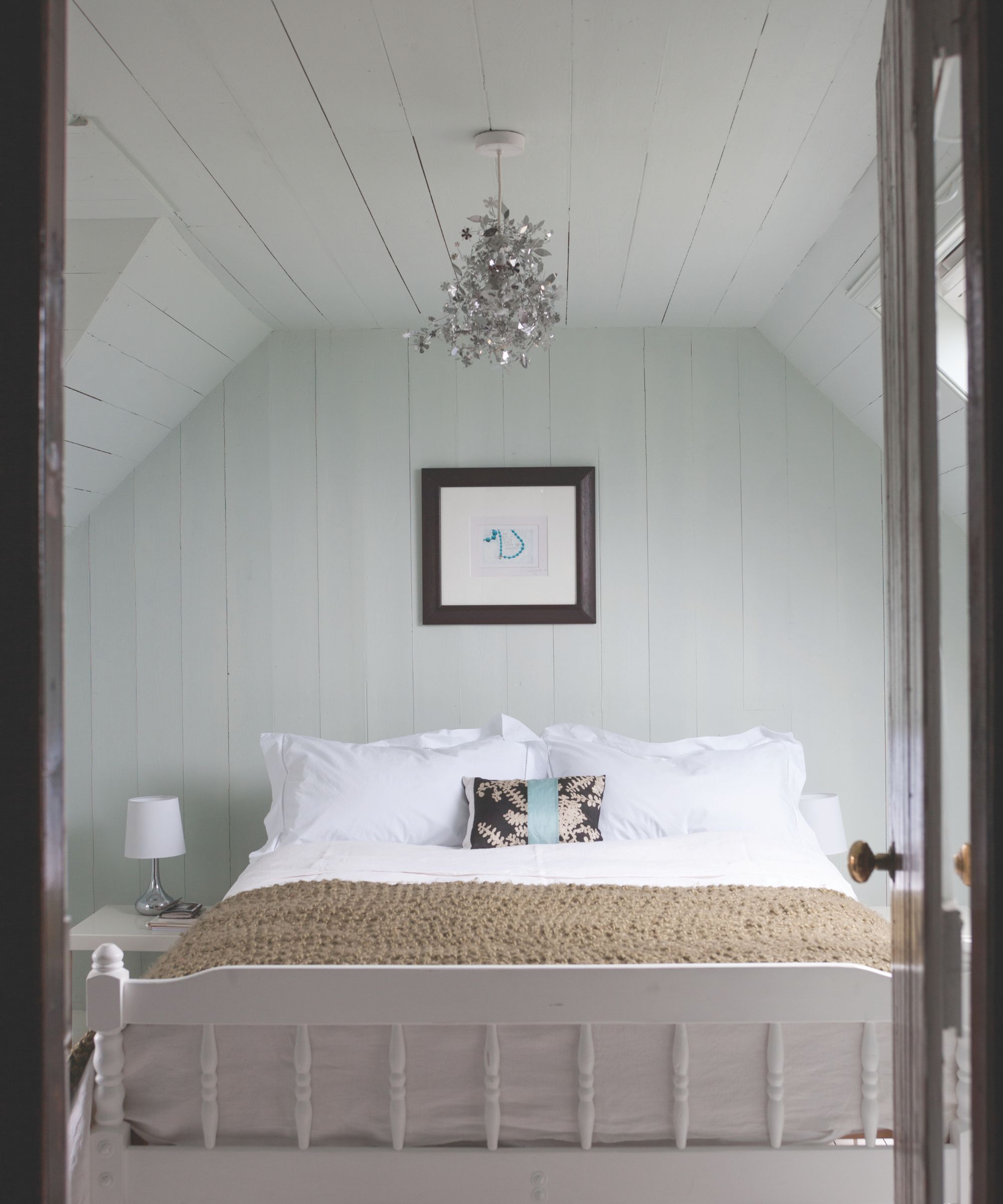
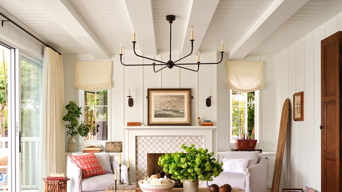
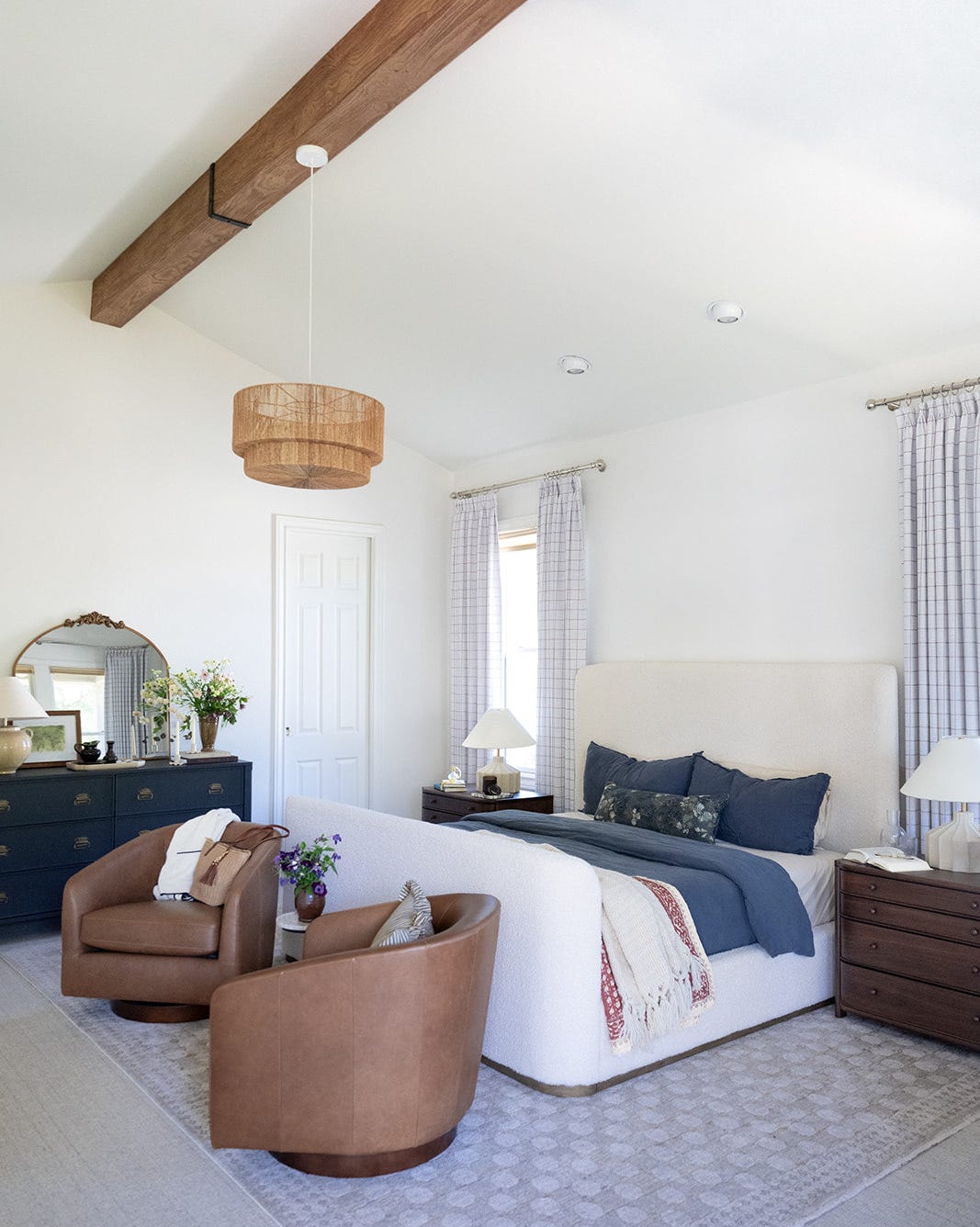
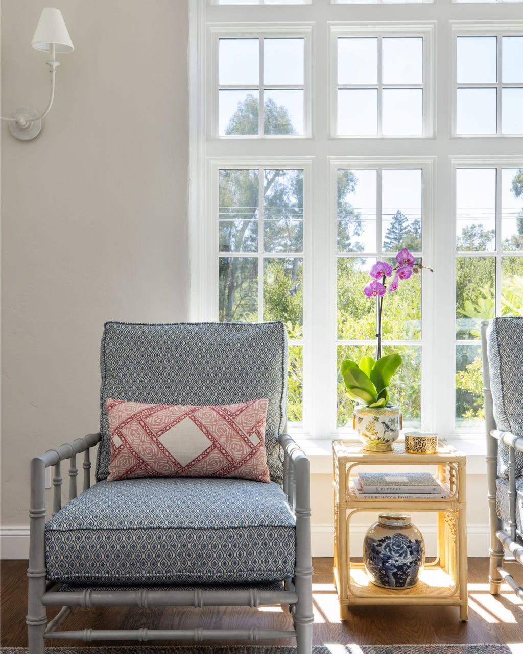
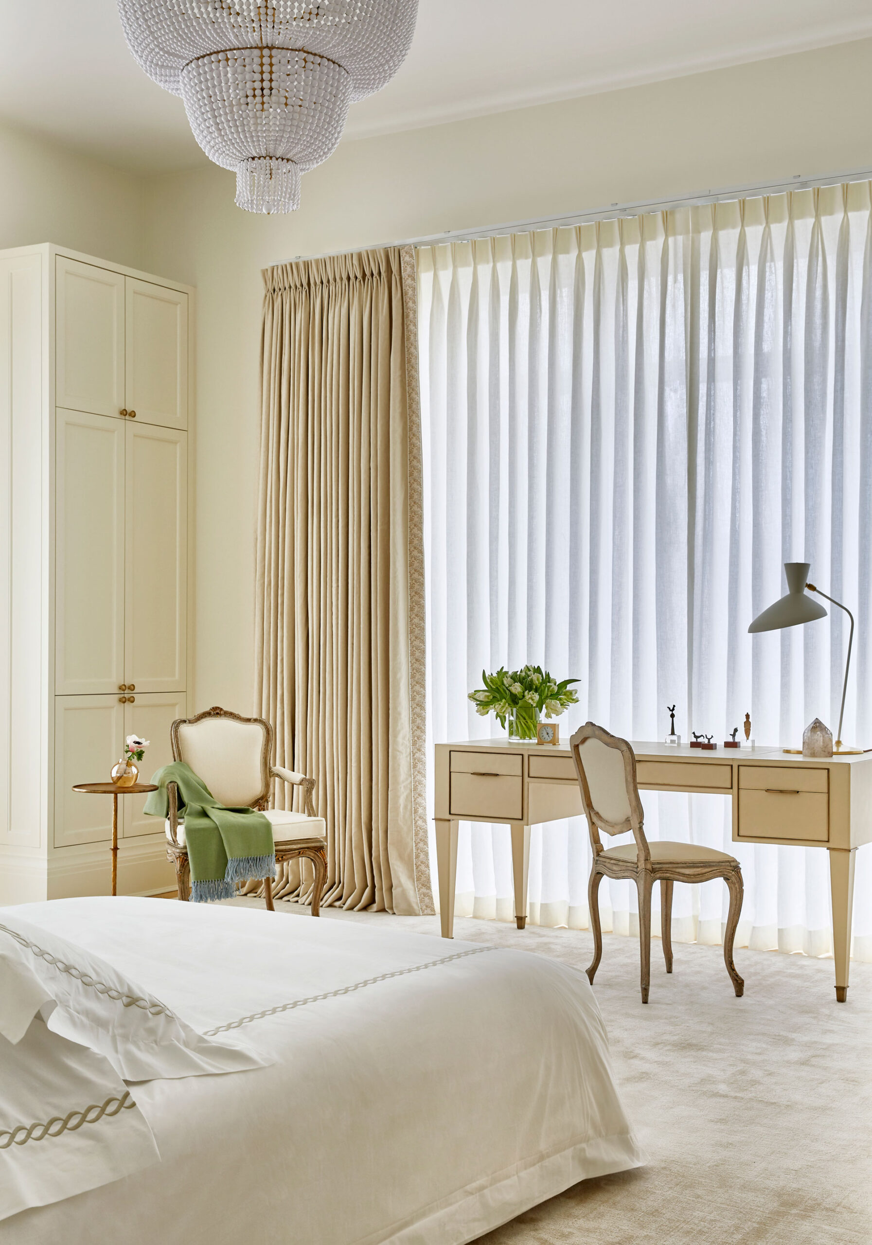
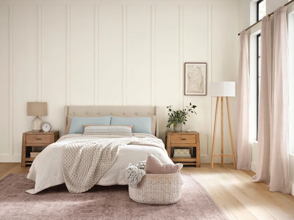
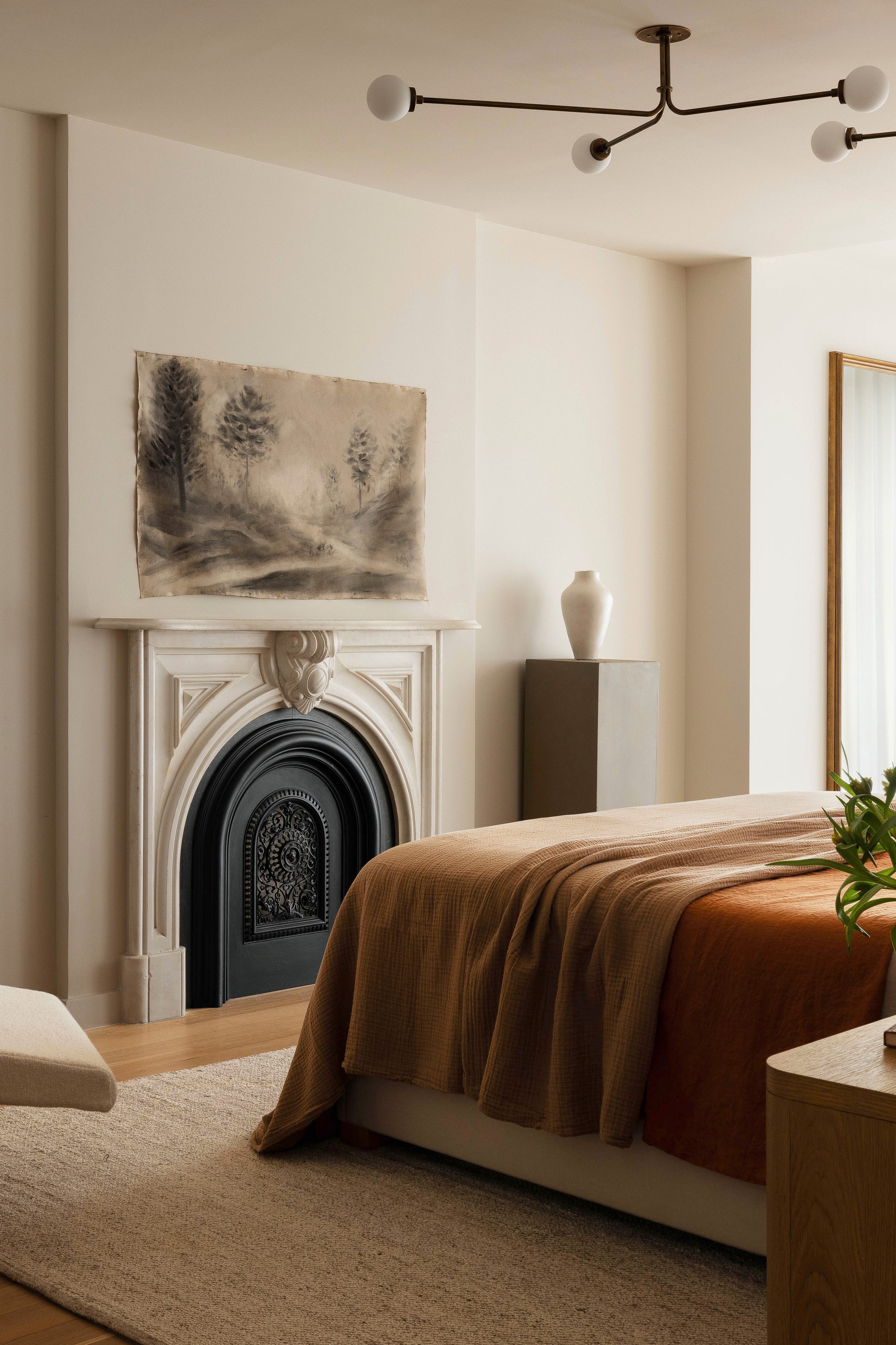
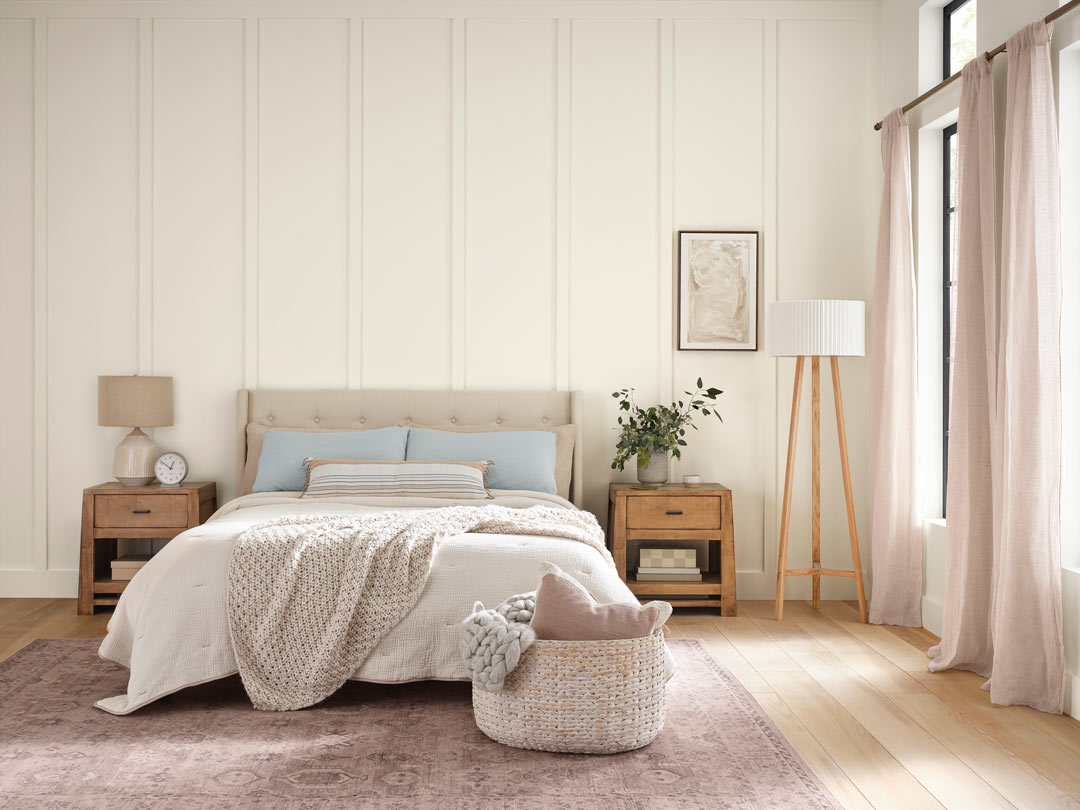
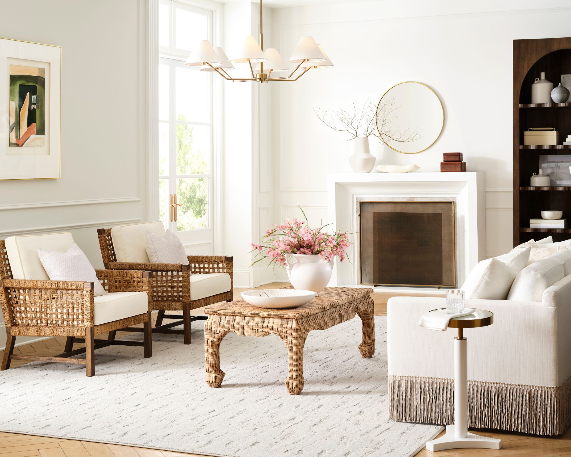
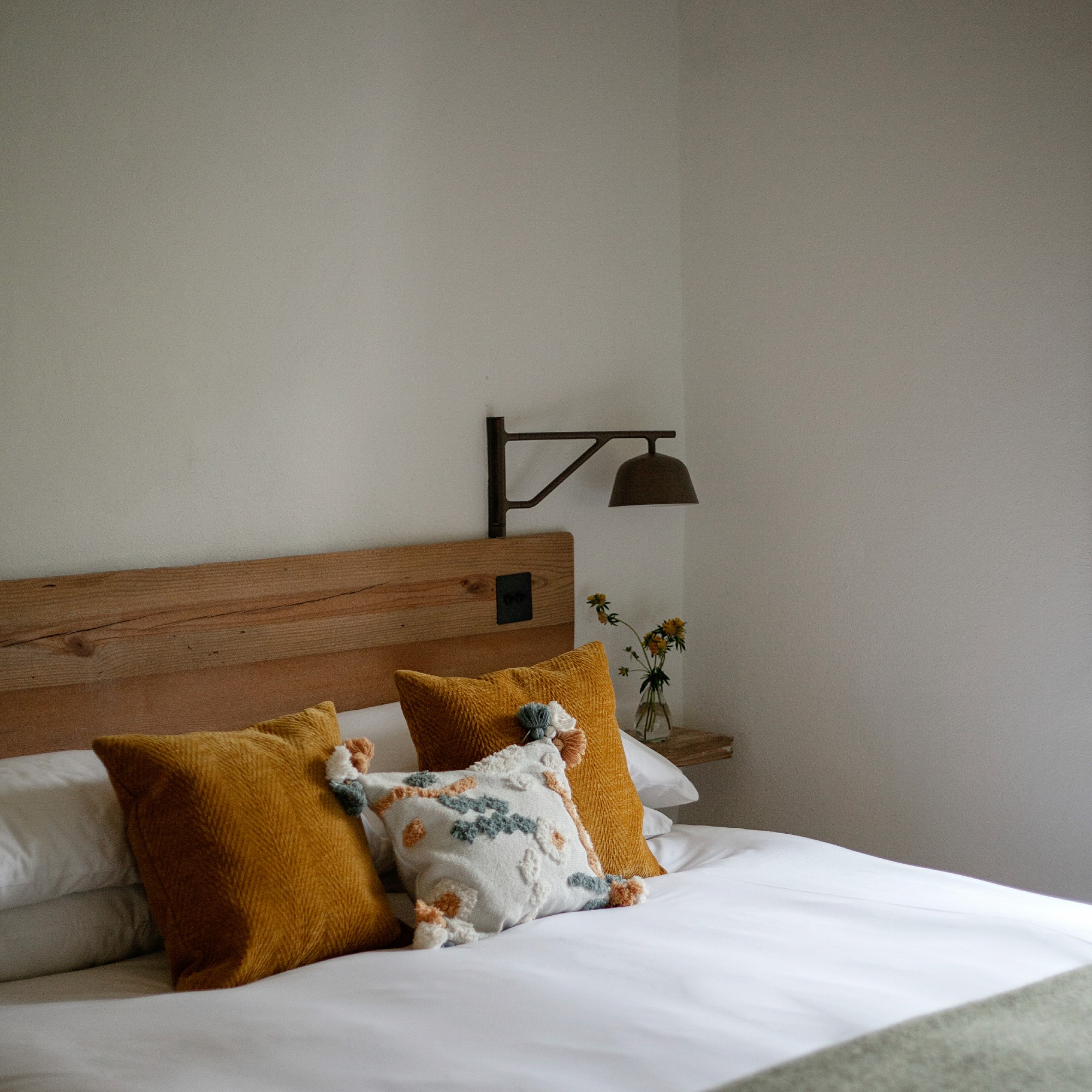
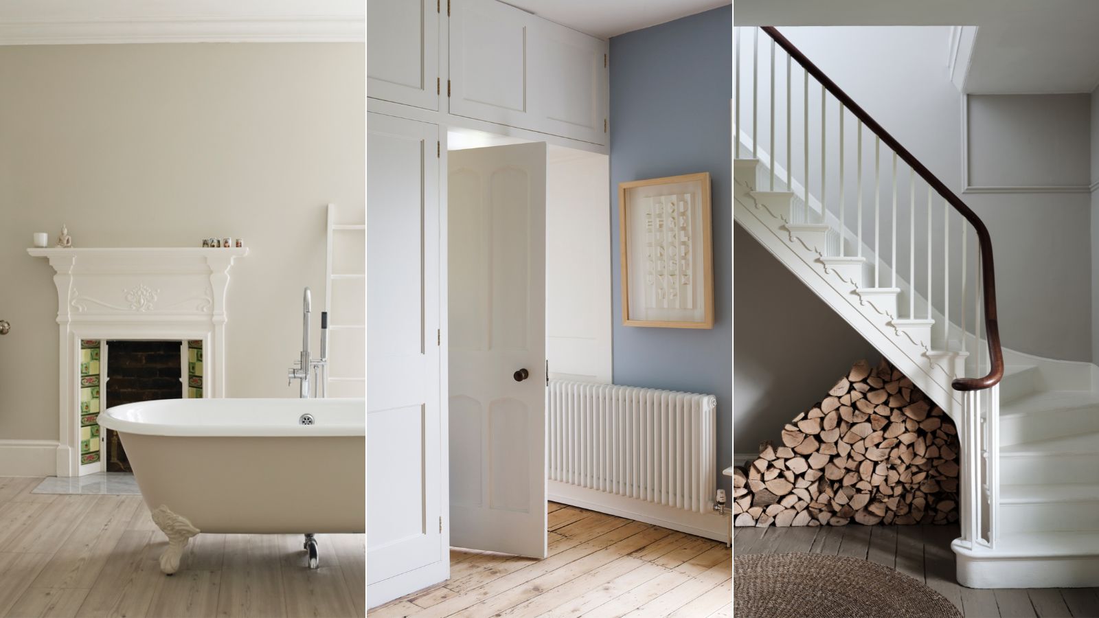
The article outlines three specific areas in a home where Wimborne White can be effectively utilized. Firstly, in a living room, it serves as a classic and understated backdrop that allows for vibrant furniture and decor elements to stand out, maintaining a light and airy feel. Secondly, for bedrooms, Wimborne White's gentle quality is ideal for fostering a calming and relaxing environment, free from stimulating colors. Patrick O'Donnell notes its ability to beautifully reflect light, contributing to a serene sleep space. Lastly, in bathrooms, this off-white provides the desired brightness without the clinical starkness often associated with cooler whites, ensuring a tranquil and inviting atmosphere. The warm undertones prevent the space from feeling cold, making it a timeless choice for bathroom decor.
#FarrowAndBall #WimborneWhite #InteriorDesign #PaintColors #HomeDecor #NeutralPalette #WarmWhites #LivingRoomDesign #BedroomDesign #BathroomDesign #FarrowAndBall #WimborneWhite #InteriorDesign #PaintColors #HomeDecor #NeutralPalette #WarmWhites #LivingRoomDesign #BedroomDesign #BathroomDesign
0 komentarzy łącznie
 Brak komentarzy jeszcze
Możesz również polubić

The Best White Paint Colors Experts Turn to Again and Again
5 best warm white paints, as chosen by interior designers
The 11 Best Warm White Paint Colors, According to Designers
Designers Swear By These 8 Off-White Paint Colors For Every Project

I promise, these 6 best white Farrow & Ball paints will end your search for the perfect shade
13 Best Off-White Paint Colors, According to Interior Designers

This Paint Color Has Been Benjamin Moore’s Best Seller for Years—and Designers Swear by It

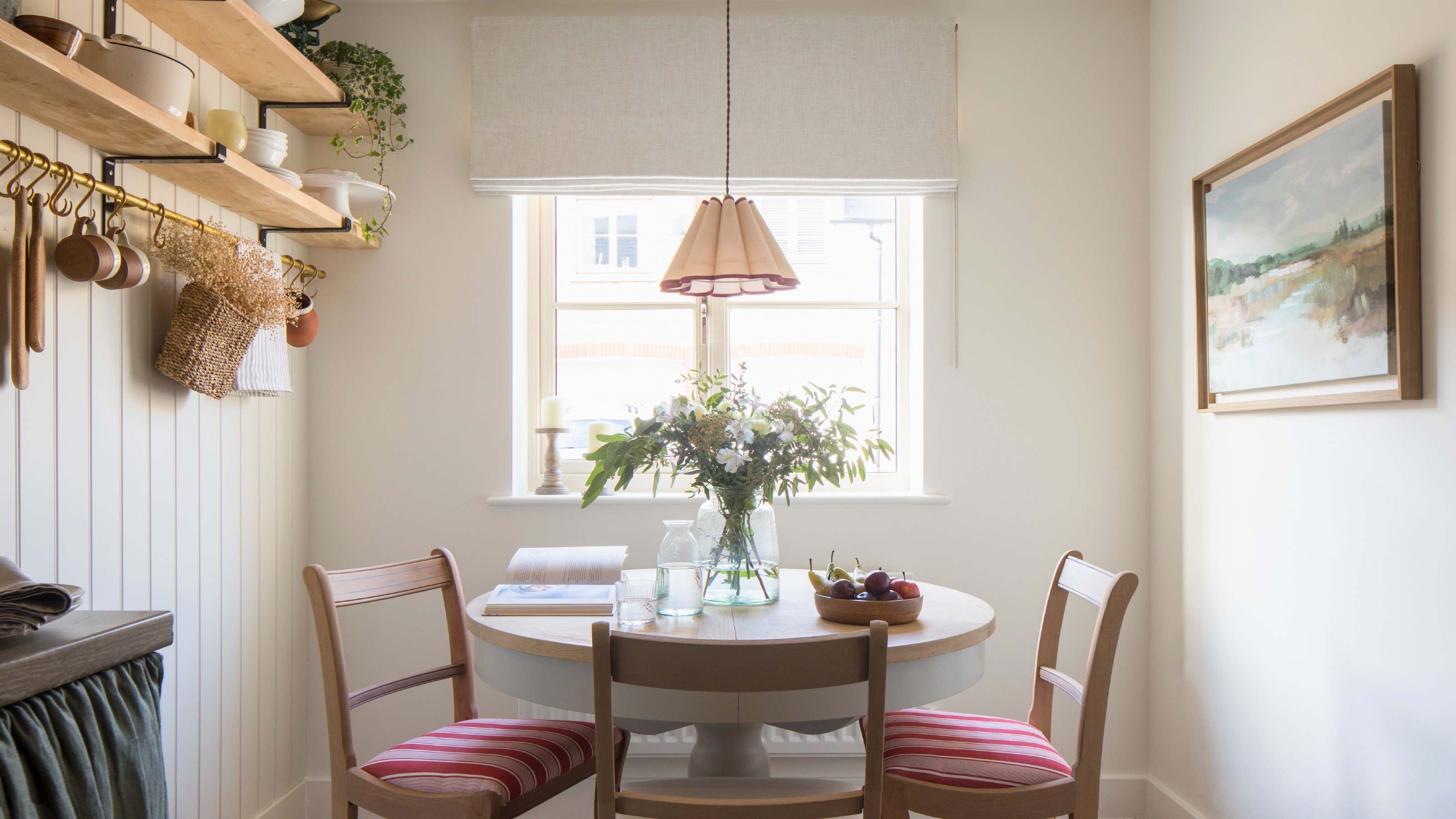
Which white paint is the best? Experts reveal the perfect shade of white for every room and feature
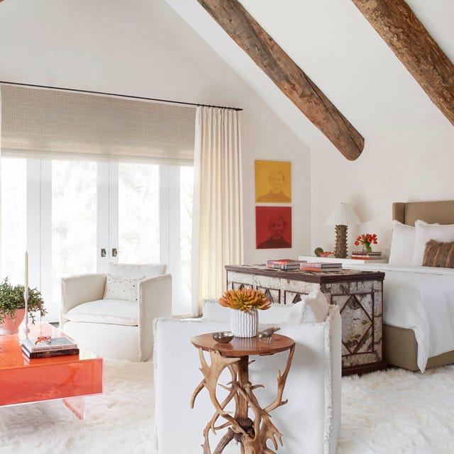
The 40 Best White Paint Colors, According to Designers
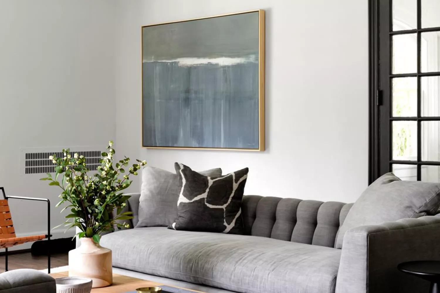
15 White Paint Colors Interior Designers Reach for Time and Again
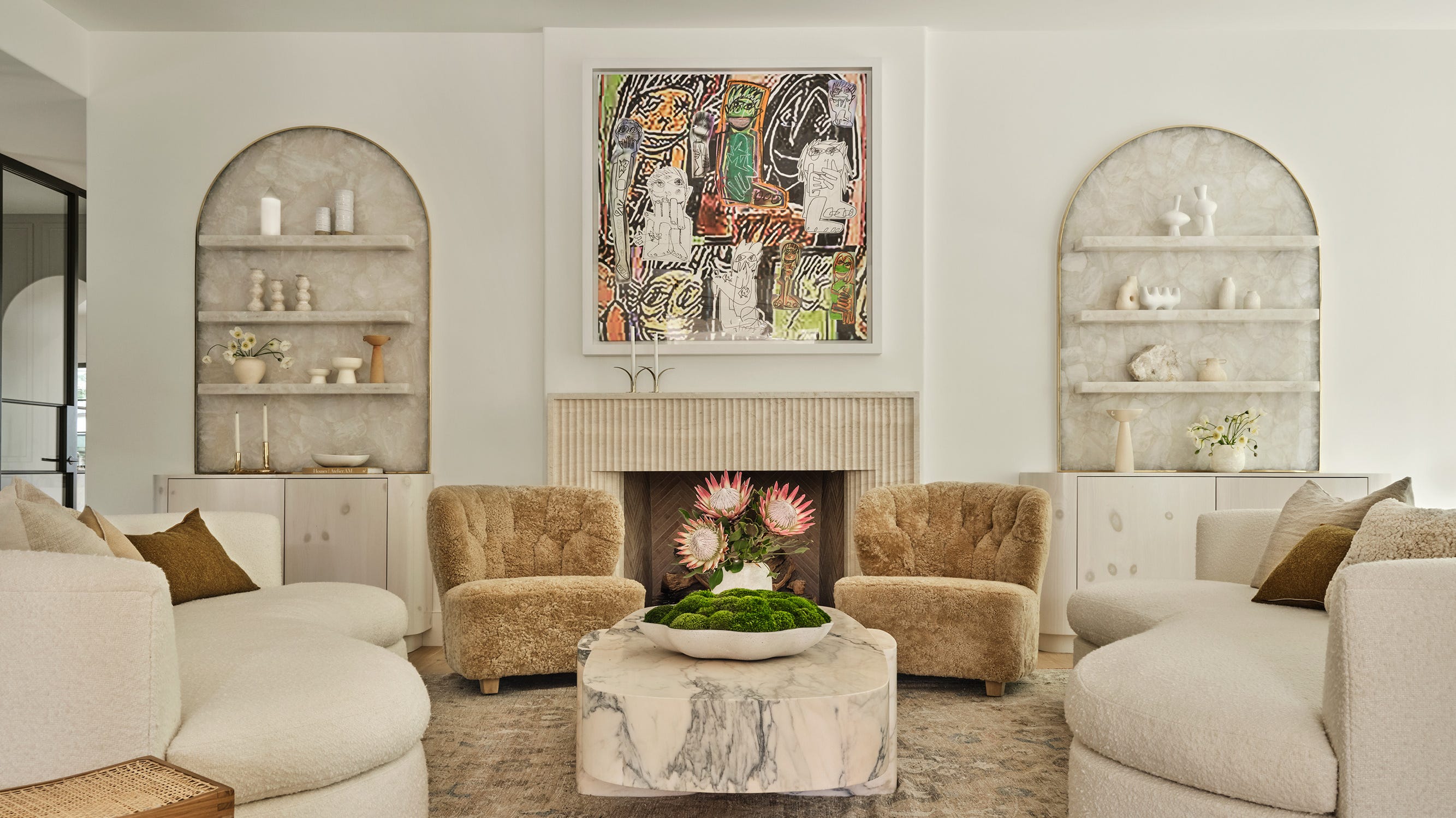
The 13 Best White Paint Colors That Interior Designers Swear By


The most timeless paint colors according to designers
How to Pick the Best White Paint Color—Without the Headache
What are the best Sherwin-Williams white paints? 6 favorite shades amongst interior designers
The 11 Best Warm White Paint Colors, According to Designers

12 Trending Paint Colors for 2024, According to Design Experts
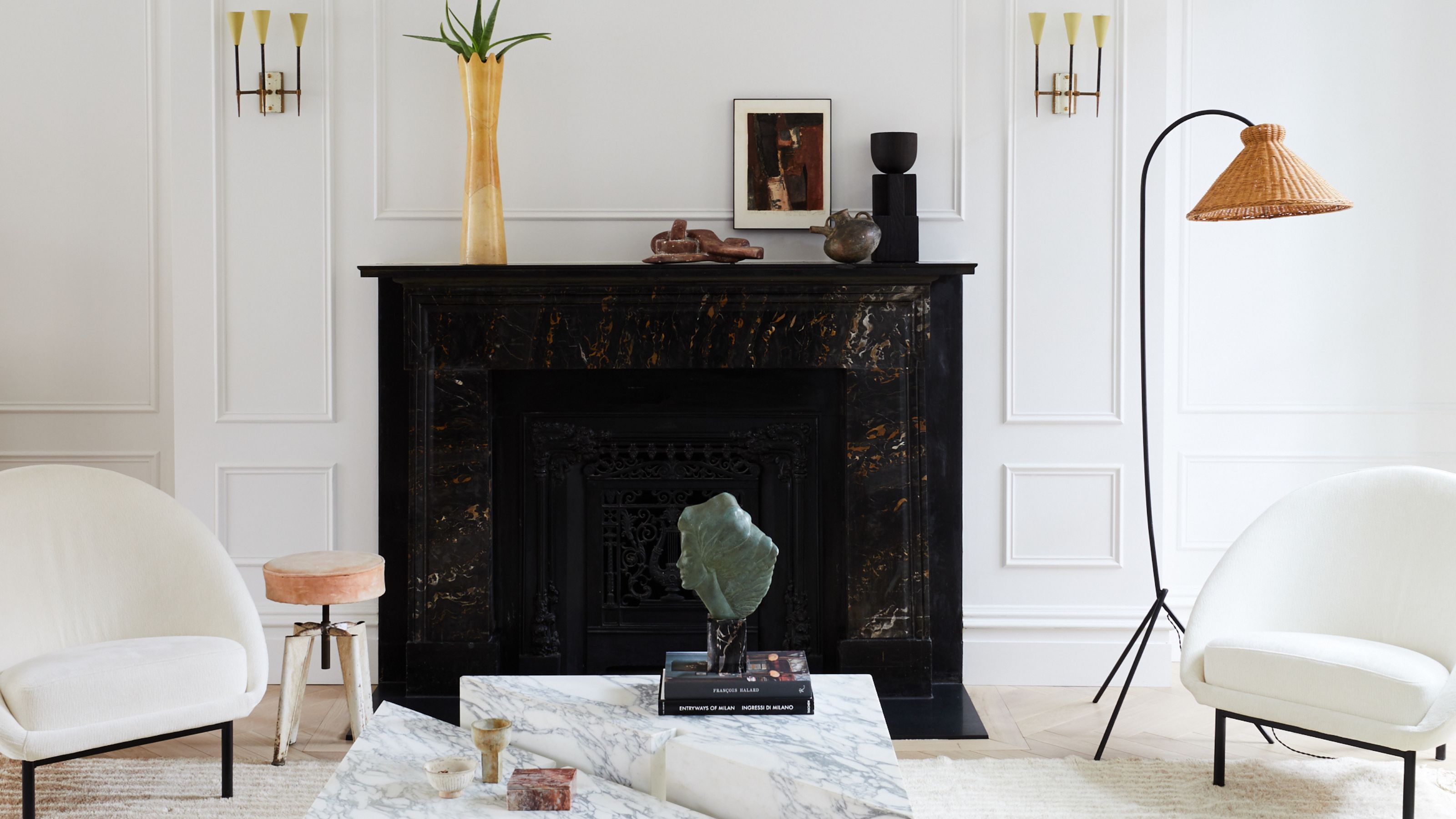
The ultimate guide to choosing the right shade of white for your walls

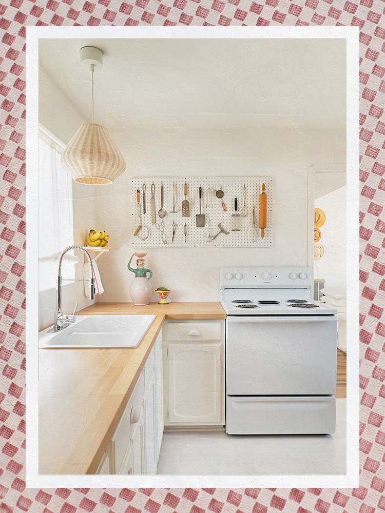
The Best Warm White Paint Colors, as Seen in 8 Designers’ Favorite Spaces
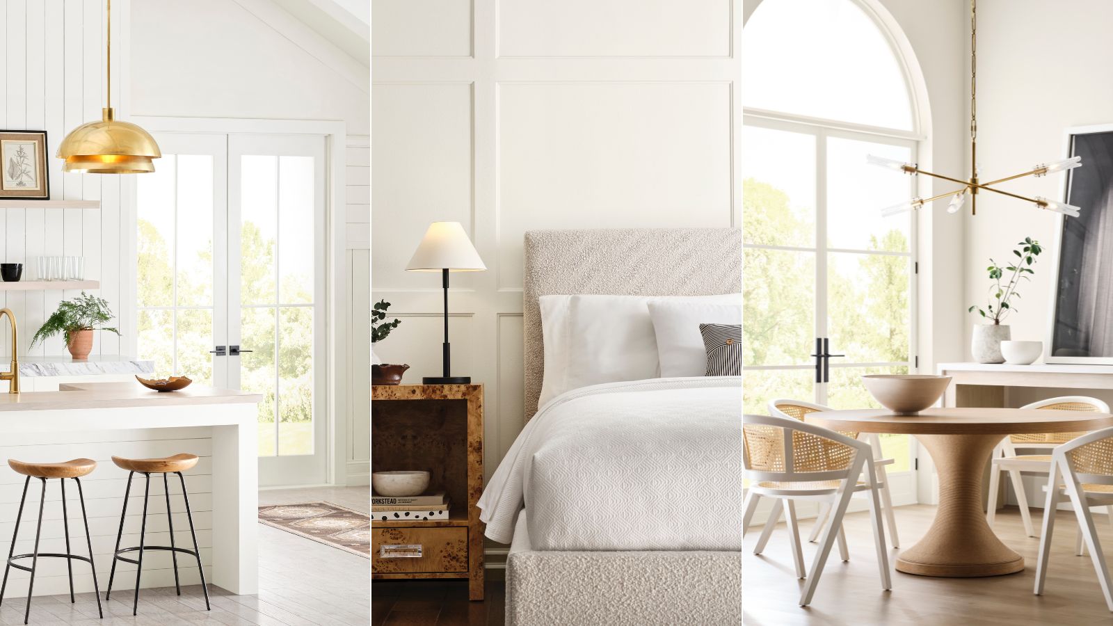
Sherwin-Williams' Designer Color Collection: 5 bright white paints
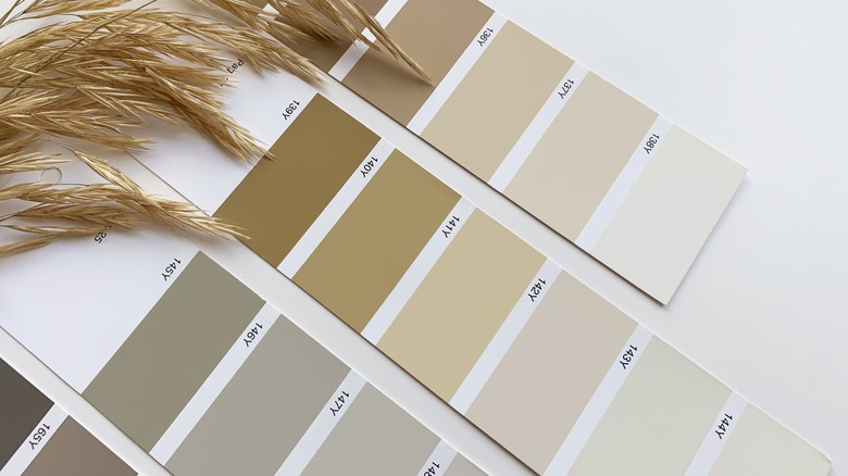
This Stunning Benjamin Moore Paint Color Is The Perfect Crisp White Alternative