1/4
2021’s Palette of Possibilities
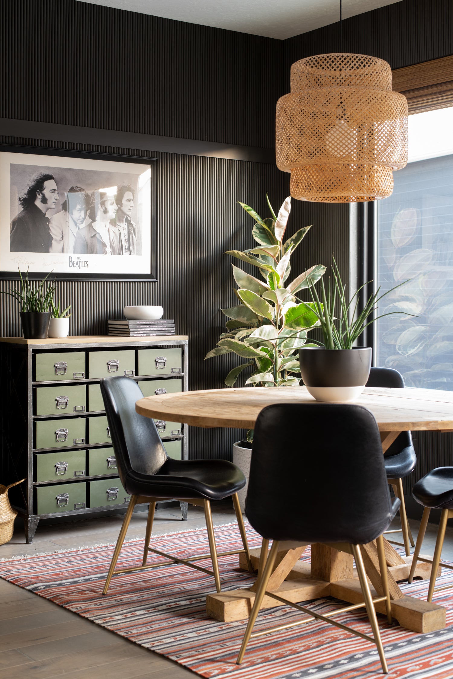
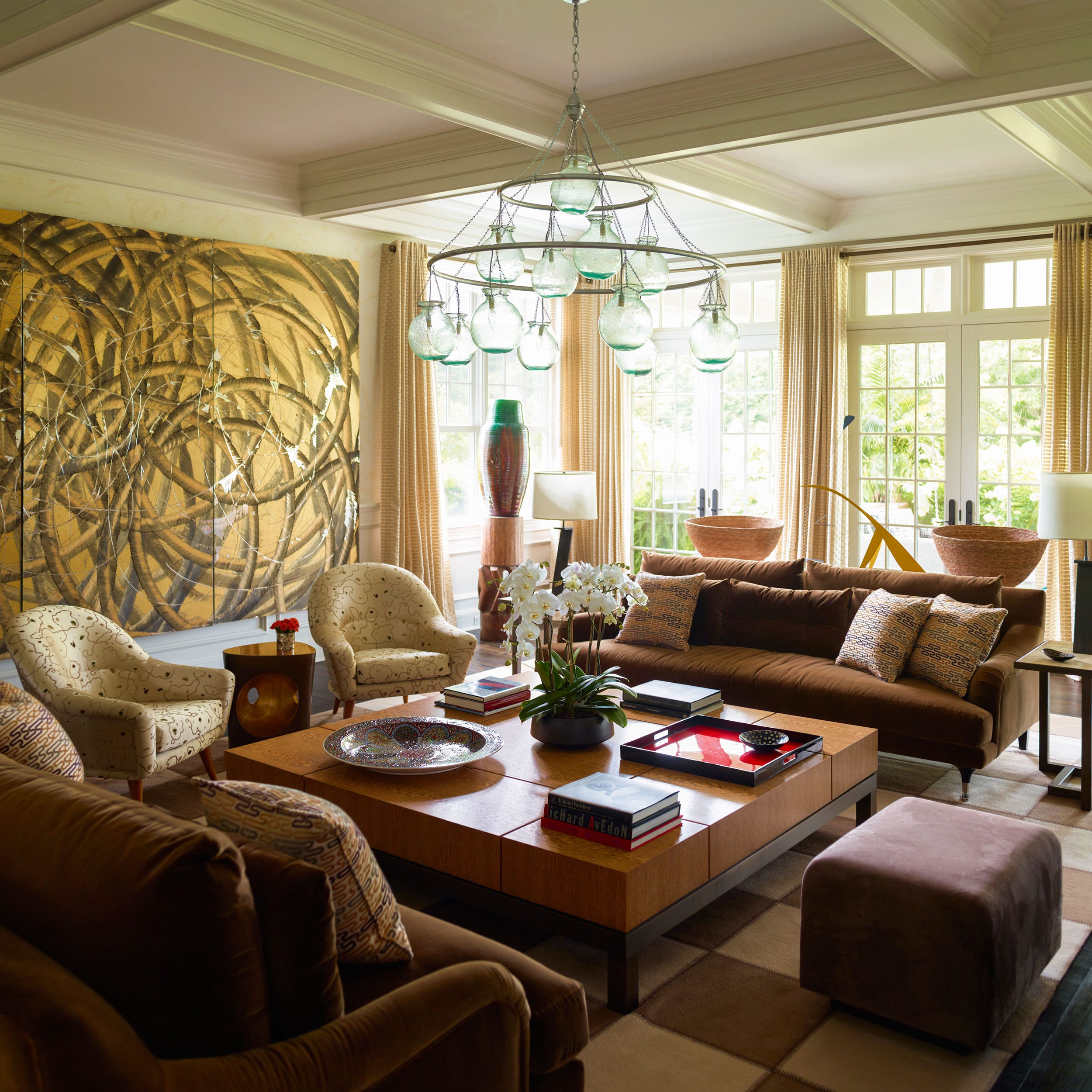
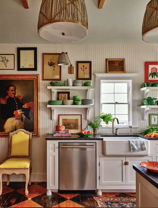
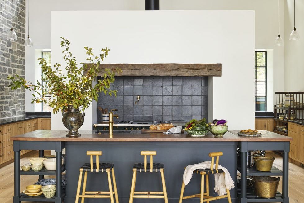
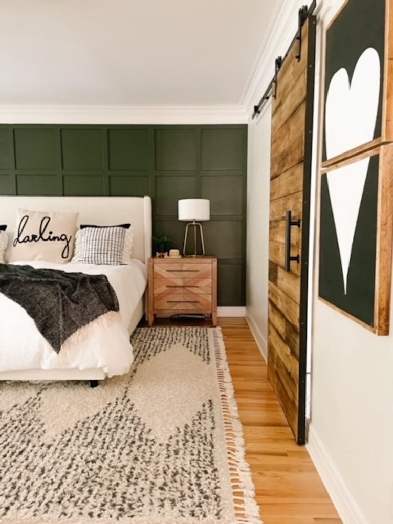
The year 2021 ushers in a diverse and rich palette of paint colors from leading brands, featuring vivid reds, calming blues, and dramatic earth tones designed to both energize and comfort indoor environments. This trend reflects a growing desire among individuals to infuse their homes with joy and personality, especially as people spend more time within their living spaces. Industry experts, such as Gary Inman of Gary Inman Interior Design and an advisor to the High Point Market Style Spotters, emphasize the significant role color plays in shaping a home's atmosphere and how people are actively seeking ways to enhance their surroundings.
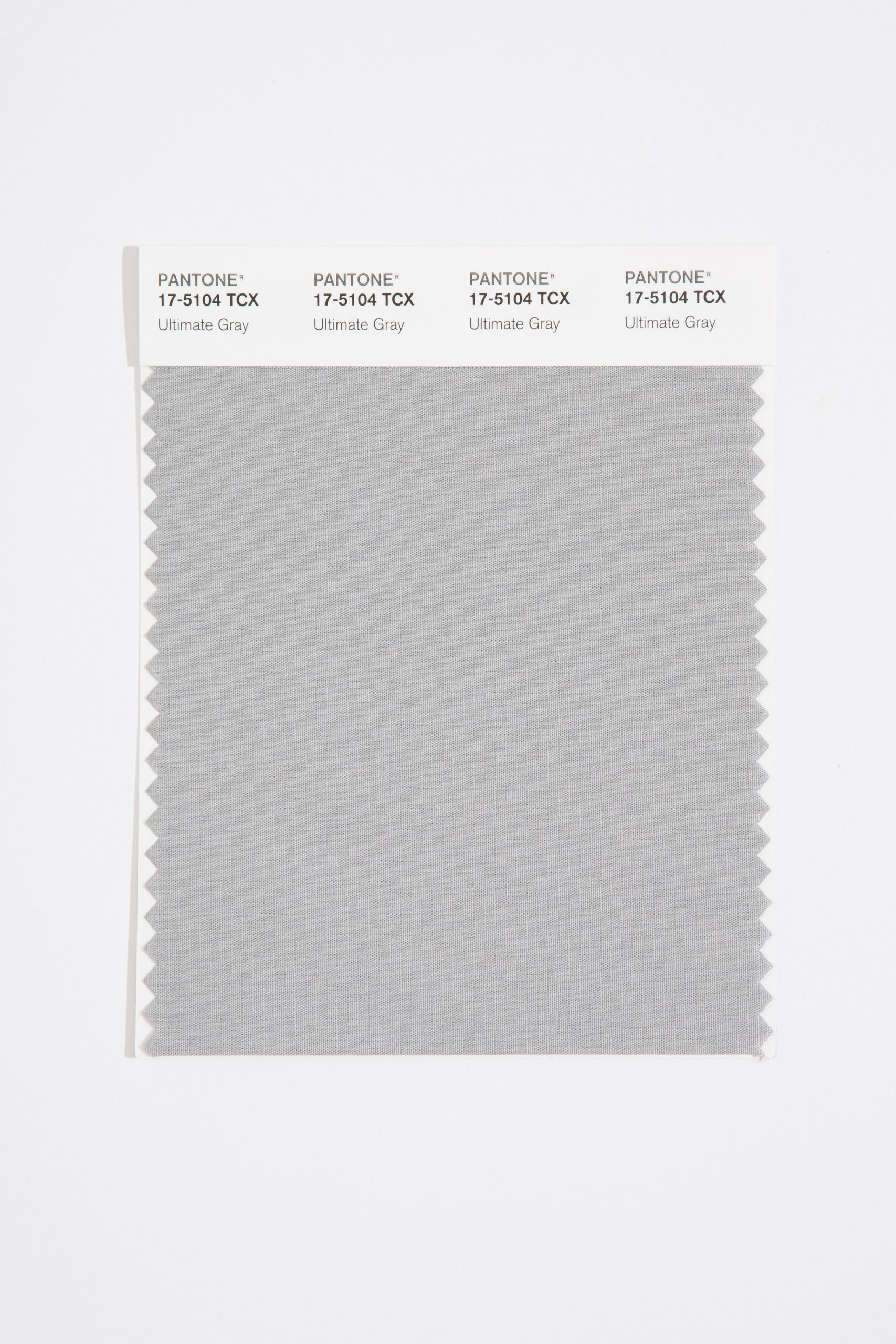
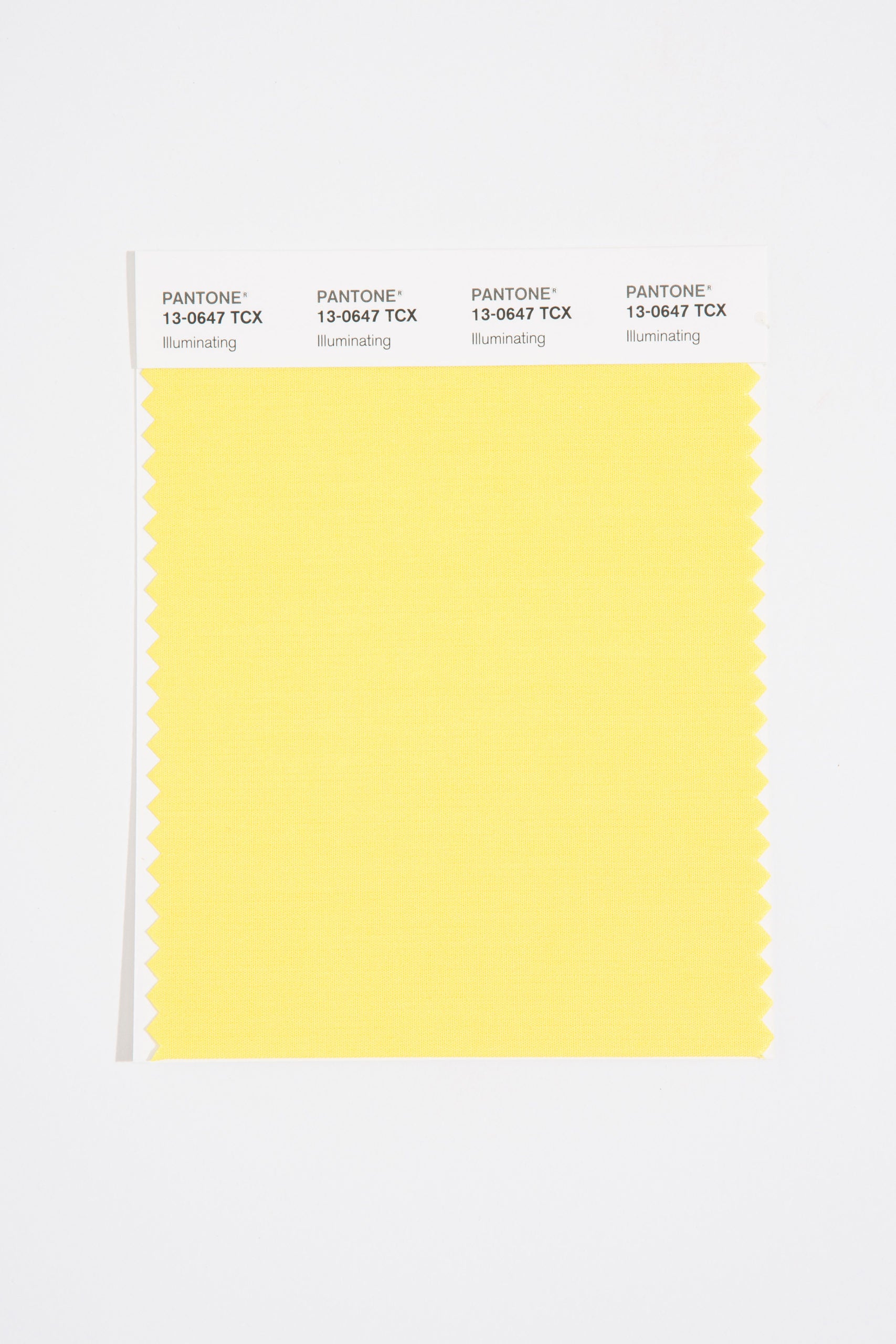
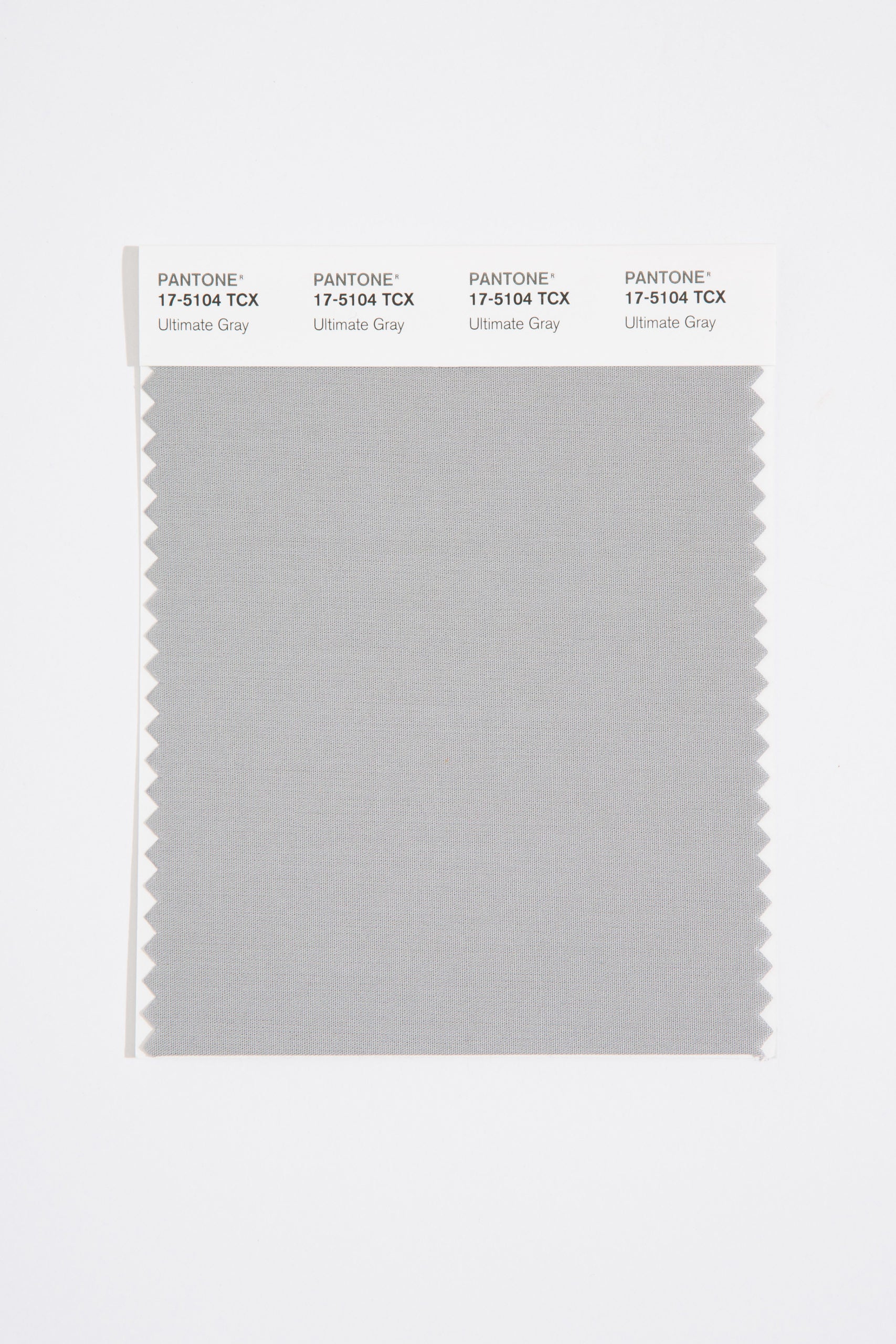
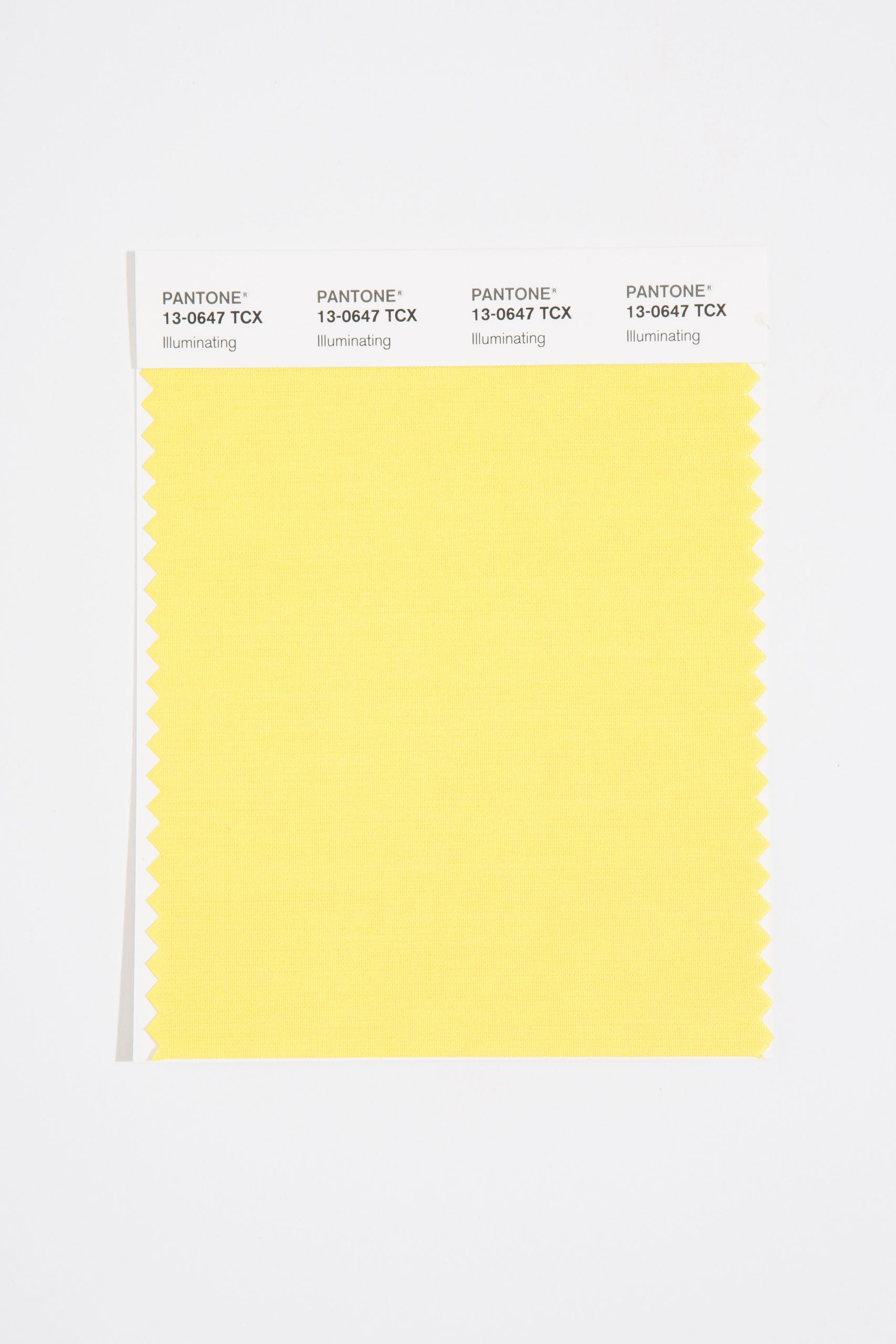
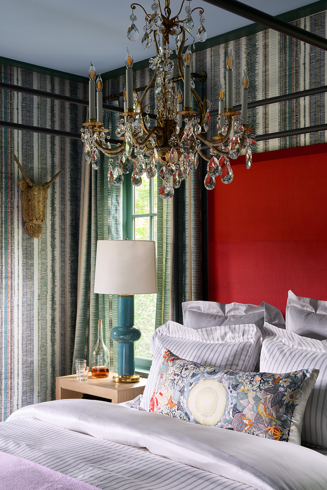
Prominent examples of this trend include HGTV Home by Sherwin-Williams' 2021 Color of the Year, "Passionate," a bold red from the "Delightfully Daring" collection, chosen to reflect a deeper understanding of what brings happiness and enriches the soul. Similarly, Farrow & Ball's "Preference Red" aligns with this vibrant direction. Global color authority Pantone made a unique selection for 2021, naming two independent colors: "Ultimate Gray" and "Illuminating." The latter, a cheerful yellow, works in conjunction with the gray to convey a message of hope and resilience, bringing a sense of warmth and positivity to any room, as explained by Leatrice Eiseman, executive director of the Pantone Color Institute.
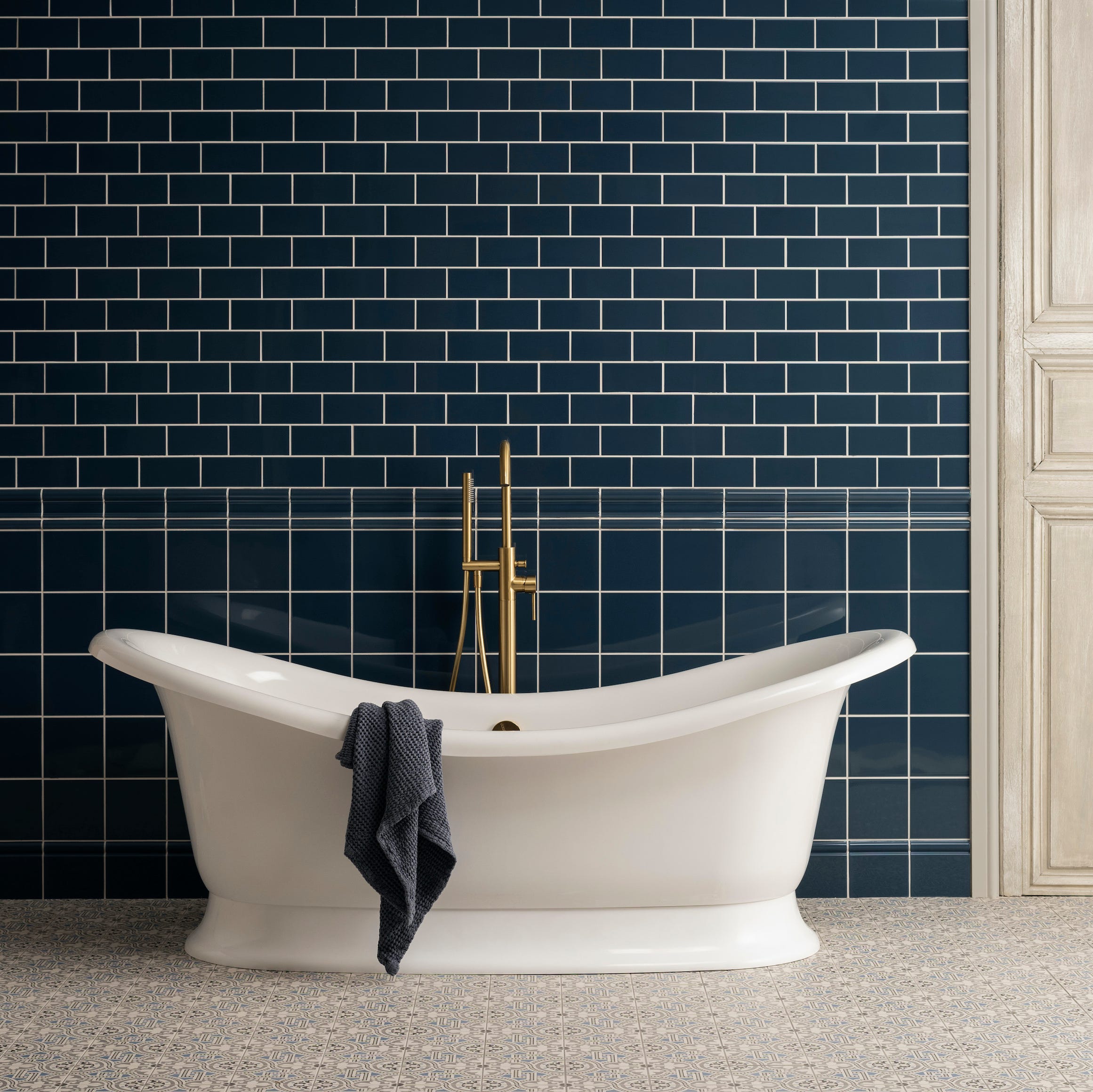
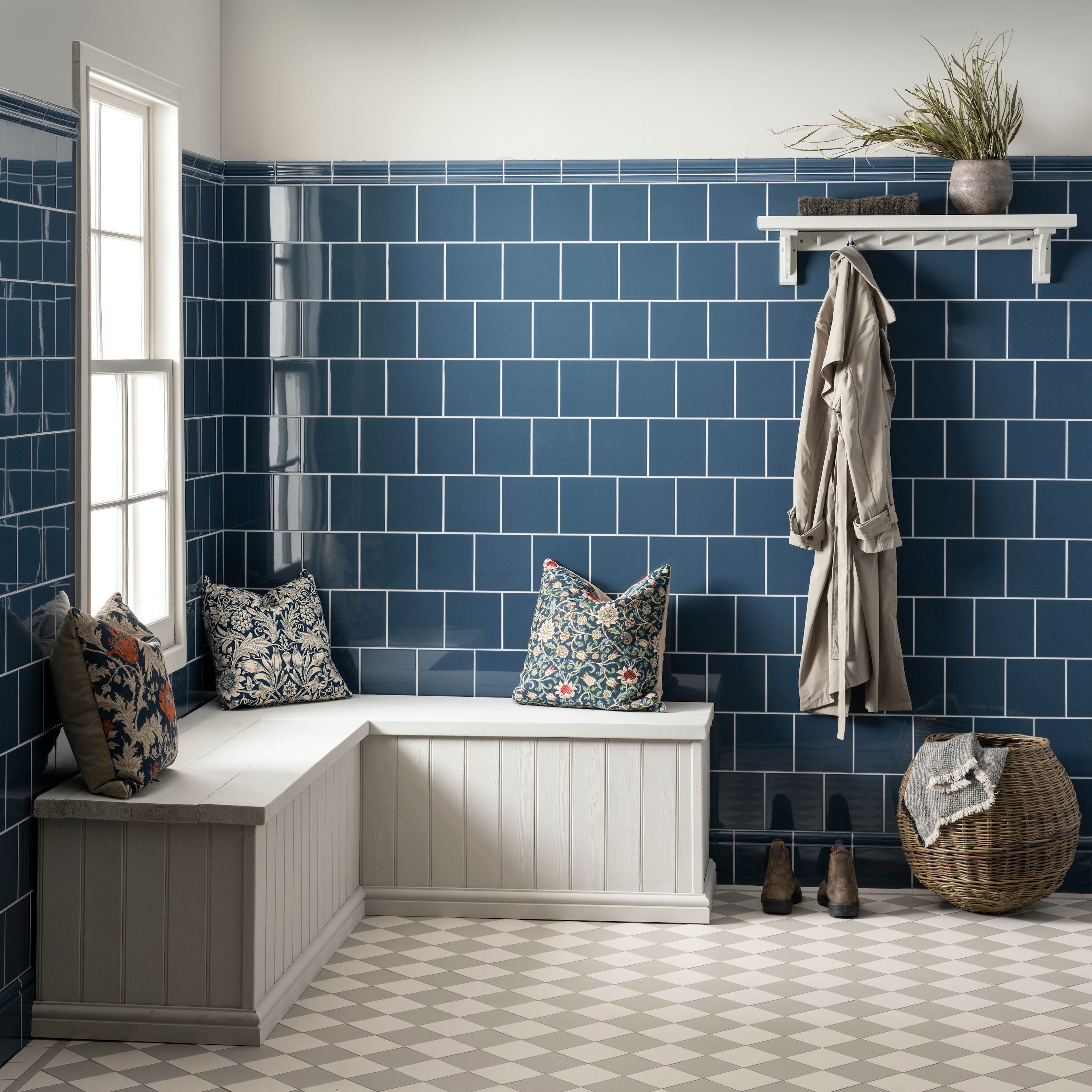
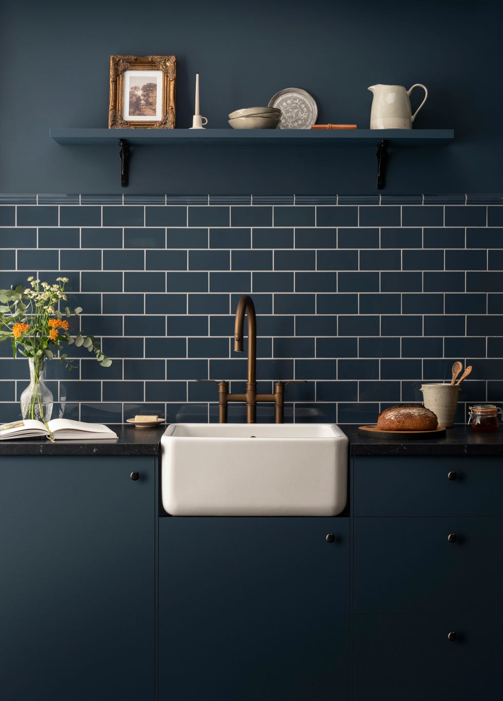
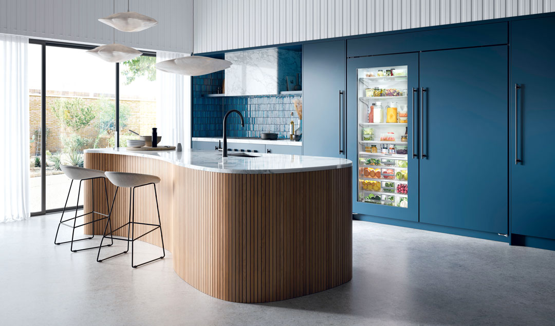
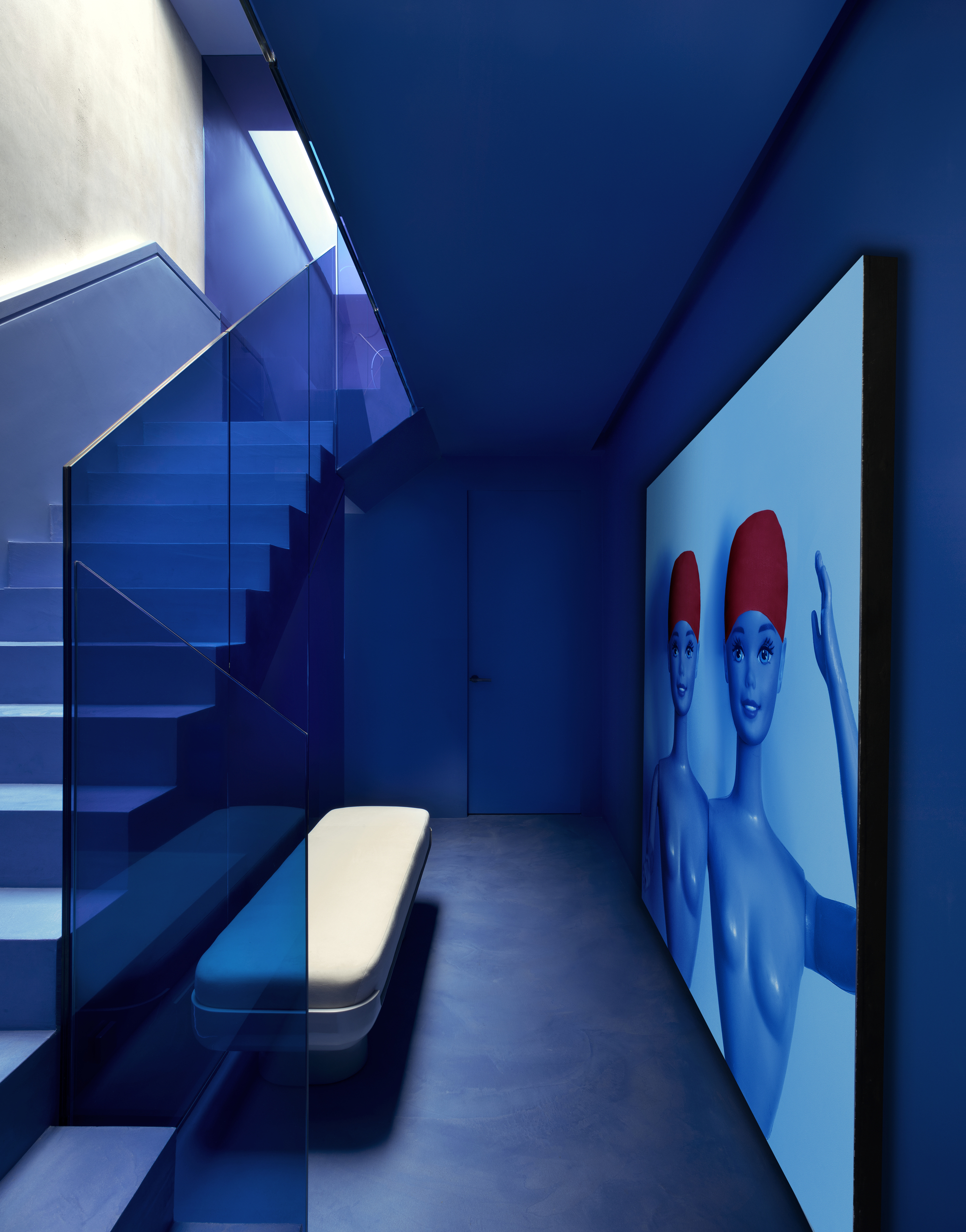
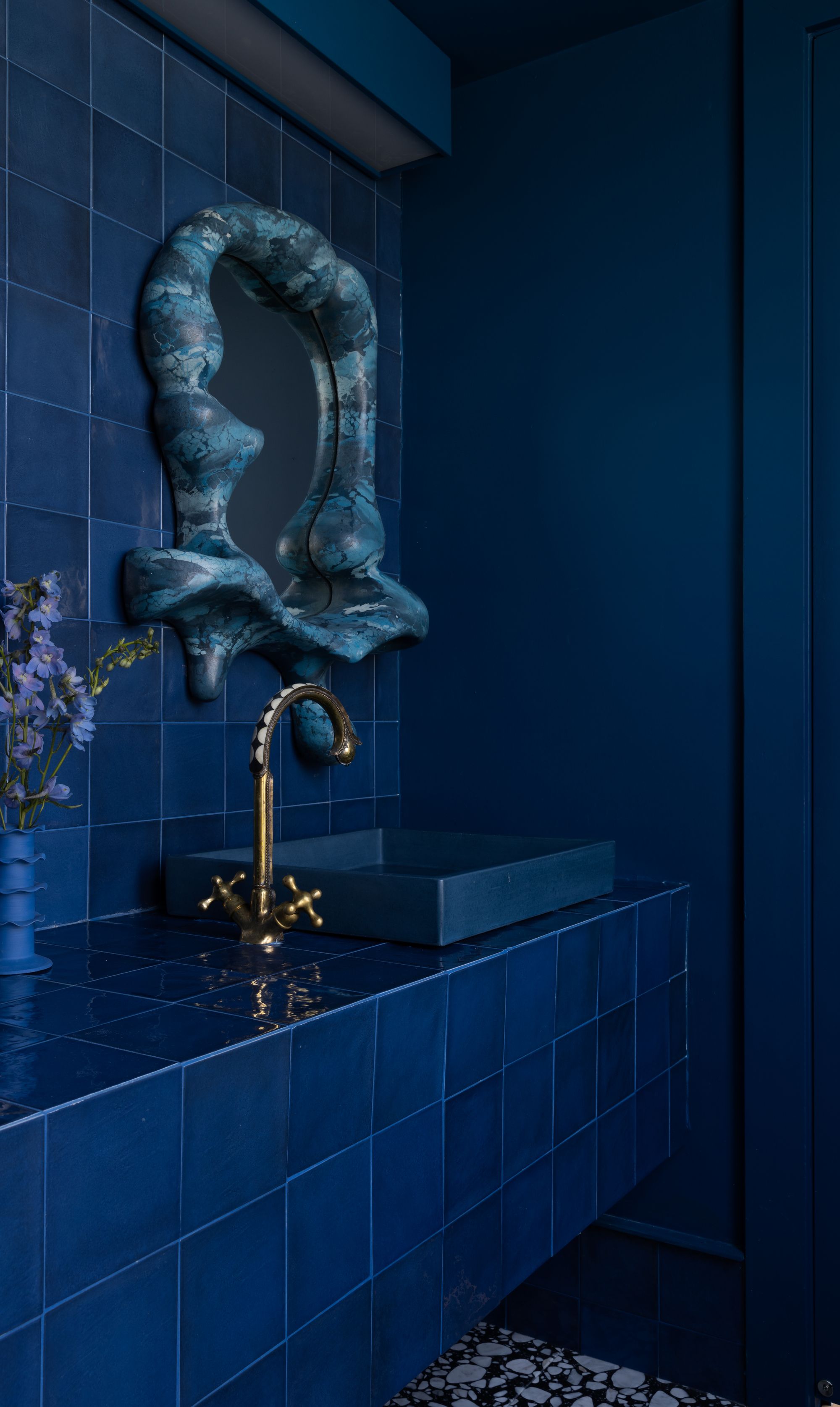
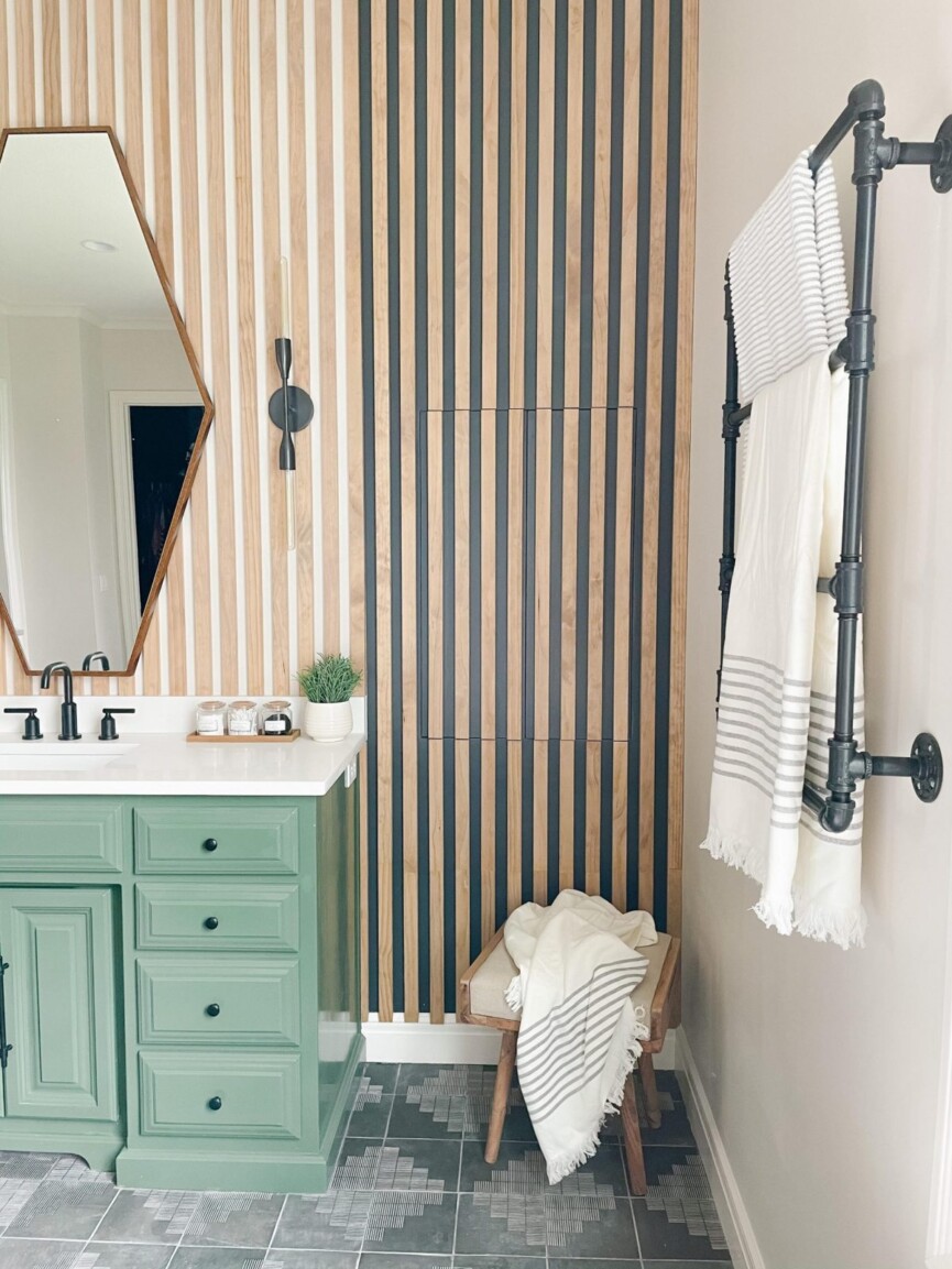
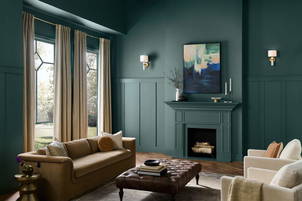
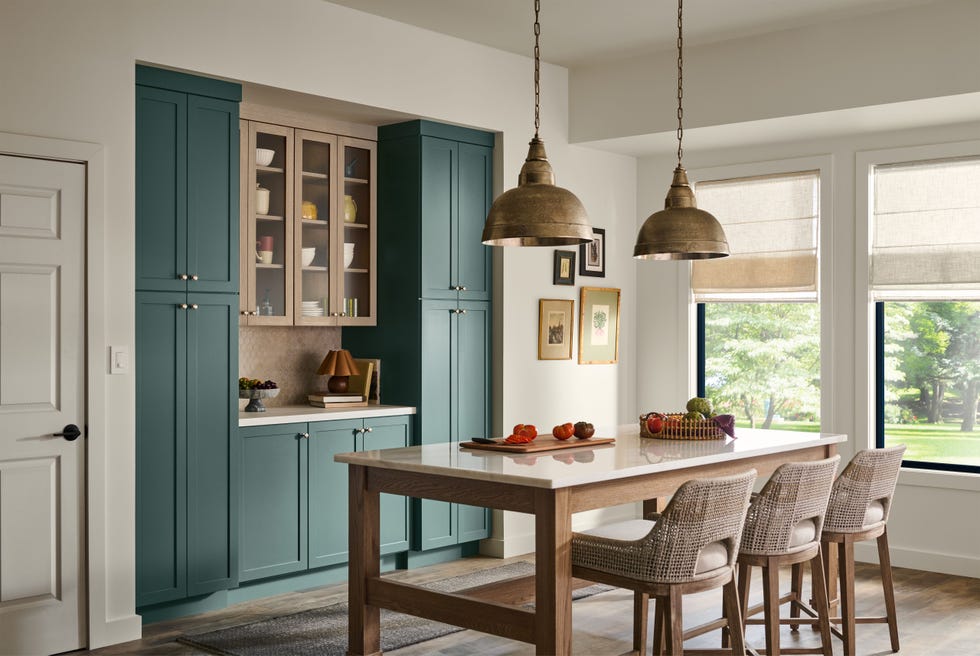
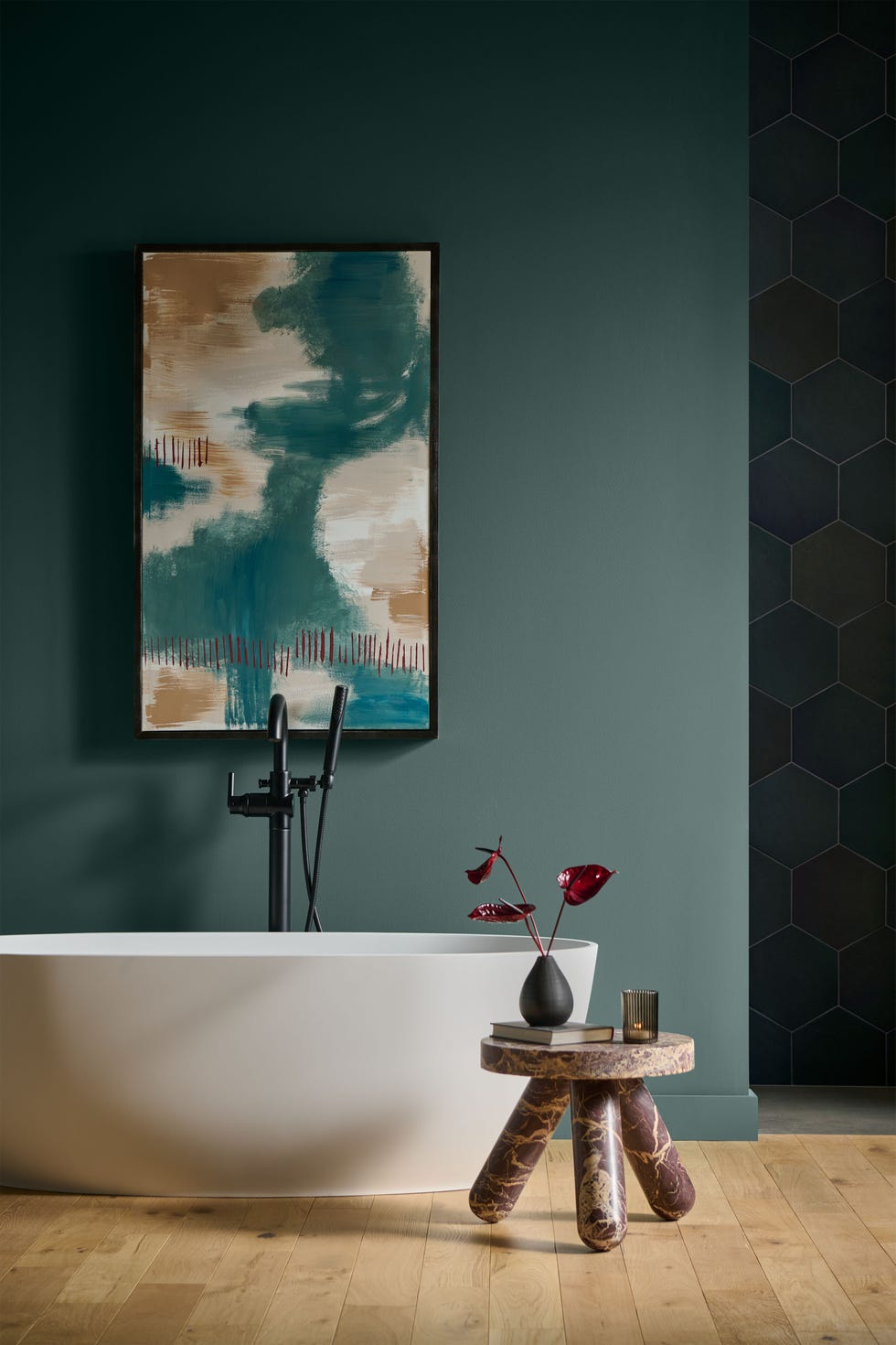
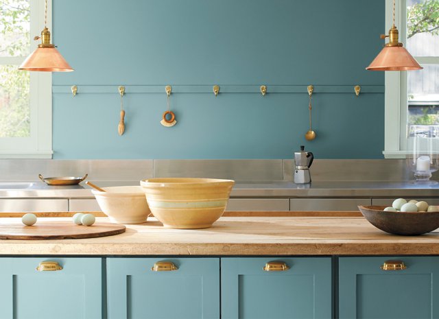
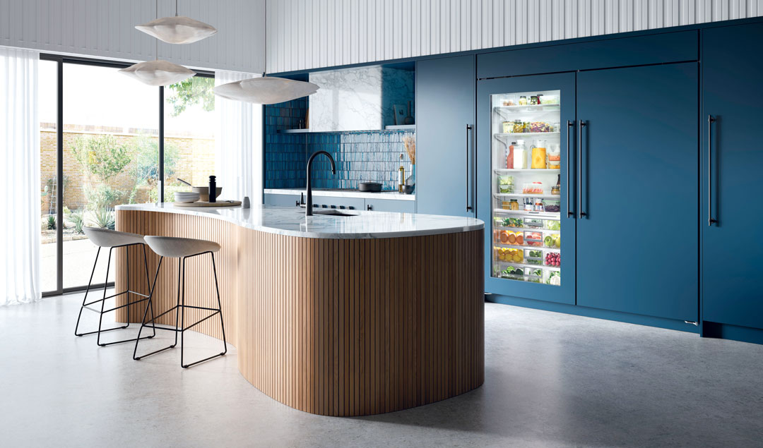
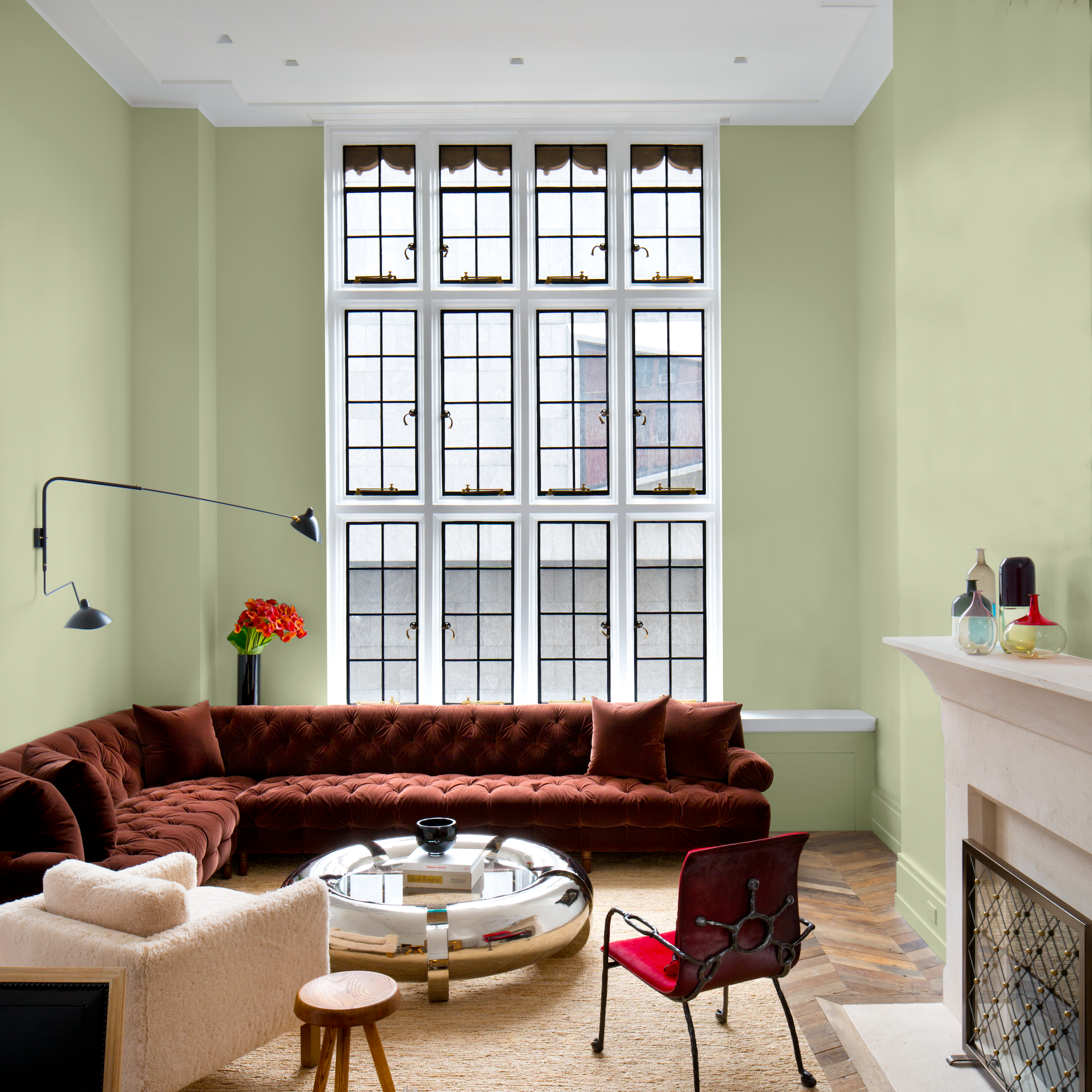
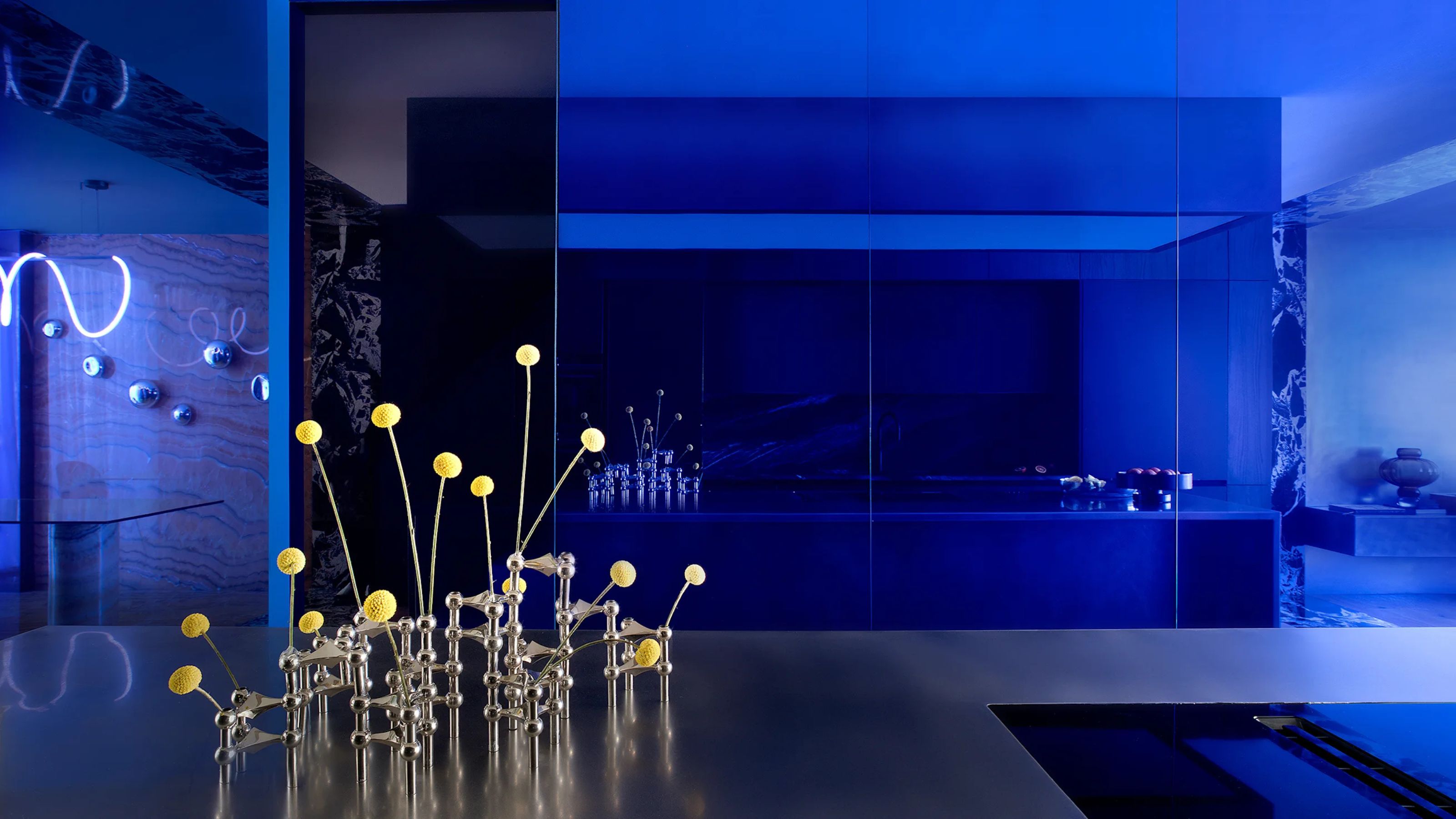
Blue and green hues are also gaining significant traction. Benjamin Moore's 2021 Color of the Year is "Aegean Teal," while Glidden introduced "Aqua Fiesta" as its first-ever accent color of the year. For those seeking deeper blues, options such as Behr’s "Jean Jacket Blue" and "Nocturne Blue," Valspar’s "Blissful Blue" and "Lucy Blue," and Farrow & Ball’s "Ultra Marine" and "Pitch Blue" are popular. "Pitch Blue" is notably described as a strong cobalt blue with a black pigment, reminiscent of dark tar used in roofing, indicating a move towards more intense and sophisticated shades.
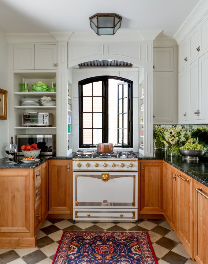
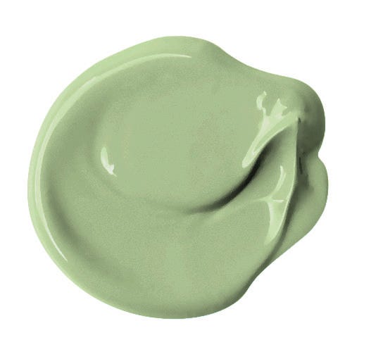
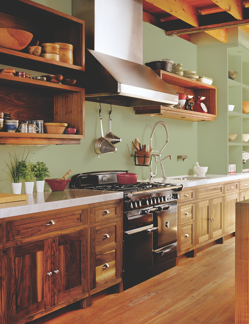
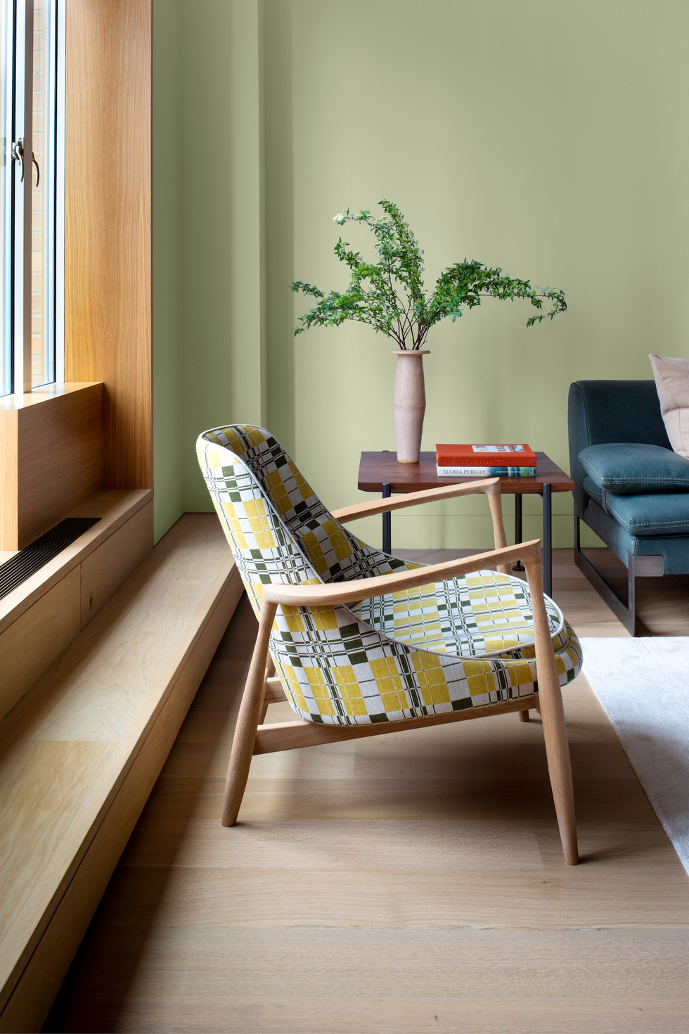
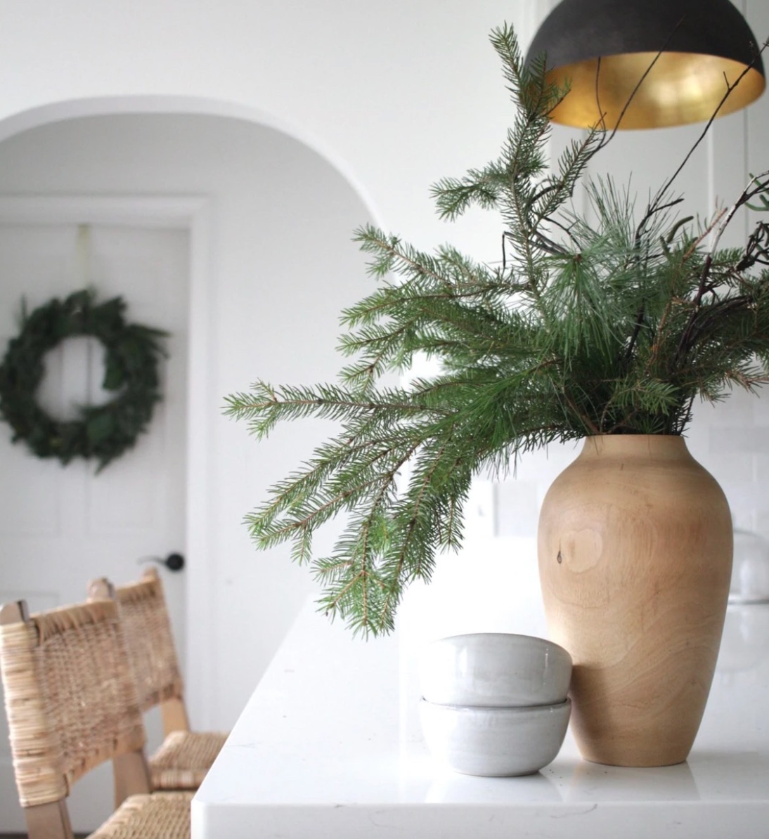
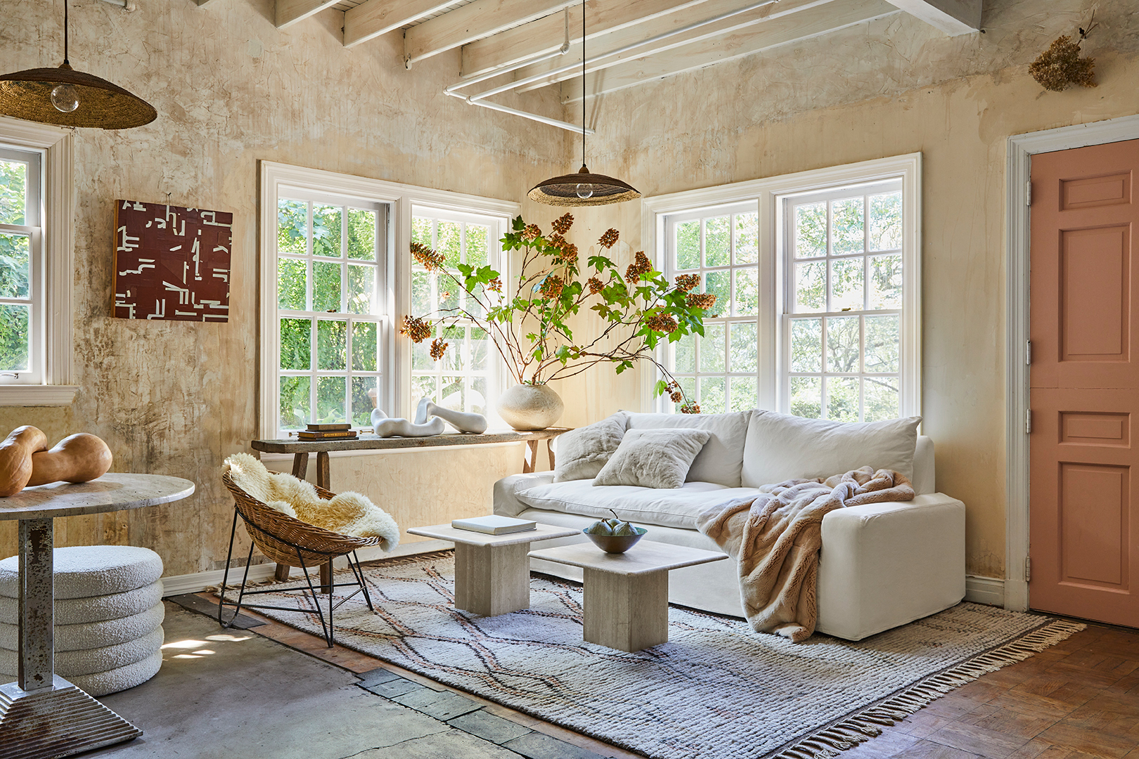
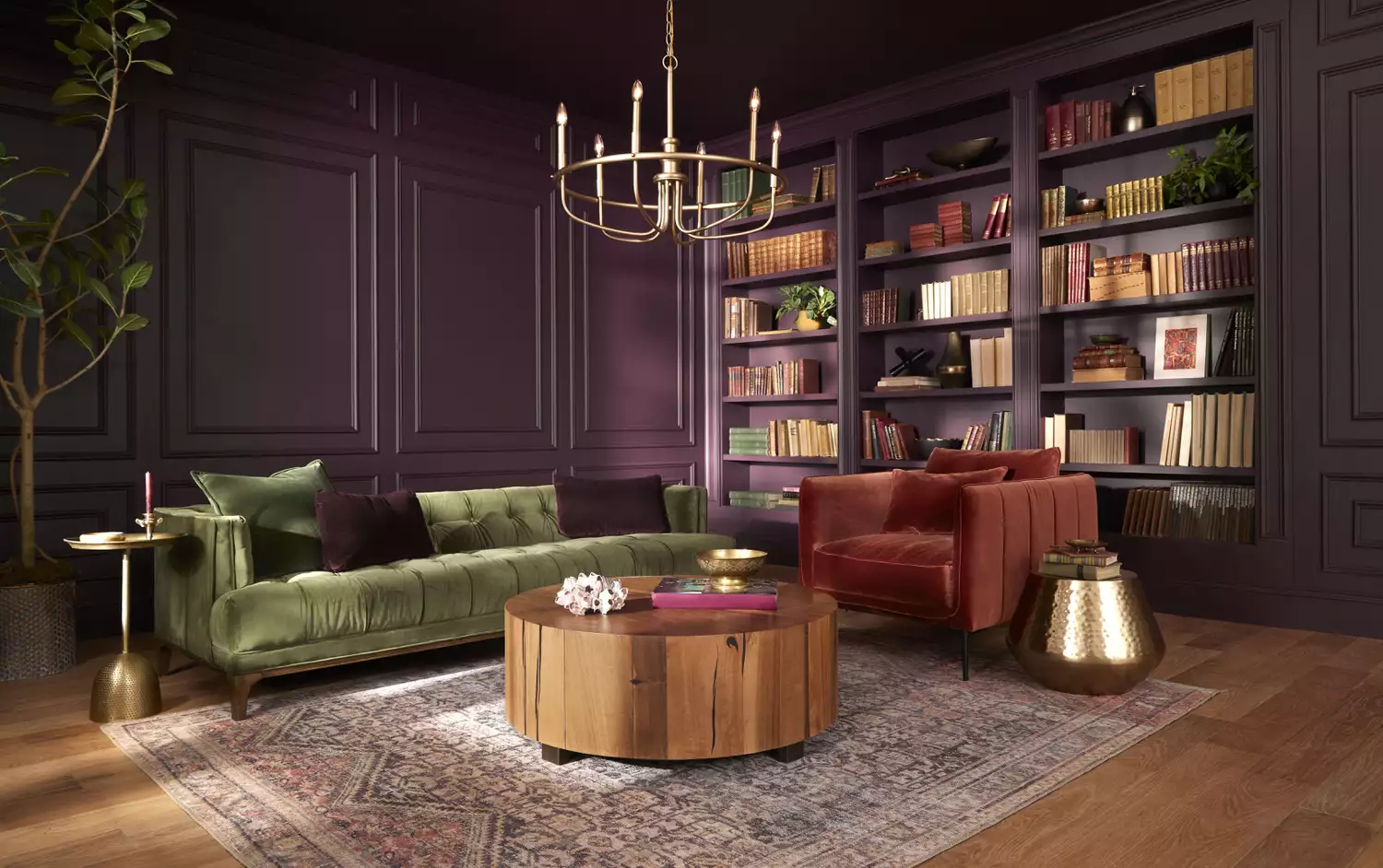
Furthermore, there is a pronounced embrace of organic materials and colors, a trend attributed to the desire for serenity and safety, particularly in response to global events. "Nature equals serenity and safety," Inman notes, highlighting this shift. Sherwin-Williams' 2021 Color of the Year, "Urbane Bronze," a saturated gray-brown, exemplifies this earthy trend. Autumnal shades like cognac, cinnamon, and burnt orange are also expected to remain strong for several seasons, with examples including Behr’s "Maple Glaze," "Saffron Strands," and "Cellini Gold," along with Valspar’s "Maple Leaf." In an innovative move, PPG introduced its first-ever color palette of the year, named "Be Well," which consists of a trio: "Transcend," a midtone oatmeal; "Big Cypress," a shaded ginger; and "Misty Aqua," a watercolor cerulean blue, all part of a larger group of 14 natural hues. These selections collectively underscore a collective desire for comfort, joy, and a connection to nature through interior design.
#HomeDecor #InteriorDesign #ColorTrends #PaintColors #DesignTrends #ColorPalette #HomeImprovement #Decorating #HomeDecor #InteriorDesign #ColorTrends #PaintColors #DesignTrends #ColorPalette #HomeImprovement #Decorating
0 komentarzy łącznie
 Brak komentarzy jeszcze
Możesz również polubić
2021: A Year In Review
These Are the Top Design Trends You’ll Be Seeing in Living Rooms in 2021


2026 Color of the Year Announcements Have This In Common
Every 2026 Color of the Year Revealed So Far—and What They Say About the Year Ahead

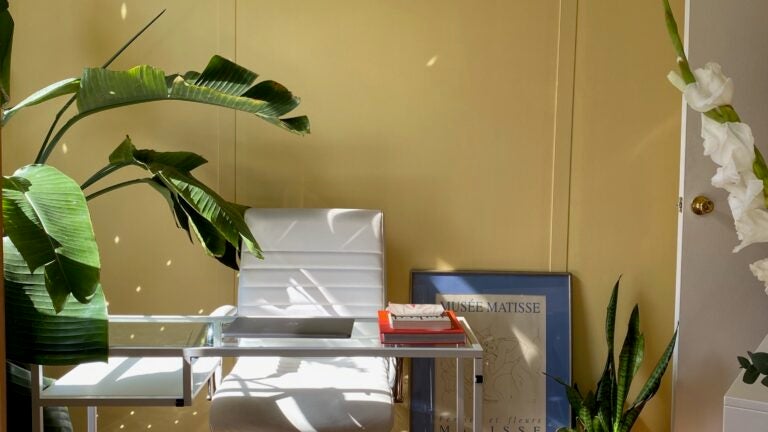
Take 'Disco Nap,' and other 2021 colors of the year, for a spin

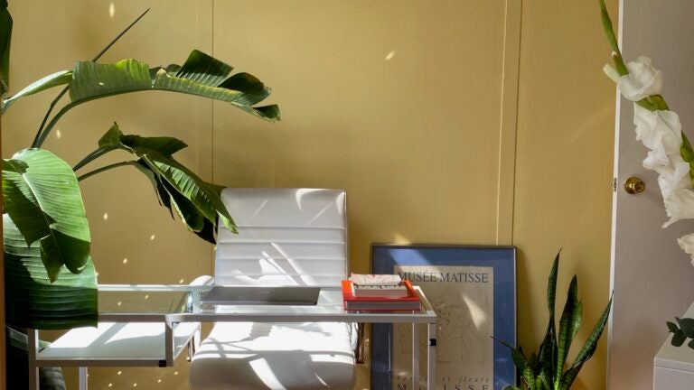
Take ‘Disco Nap’ for a spin. This lively hue is one of 2021’s colors of the year.
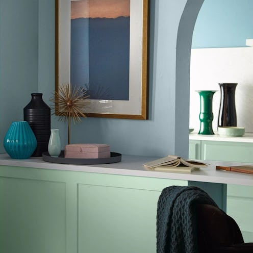
This Serene Paint Trend Is Set To Take Over In 2022
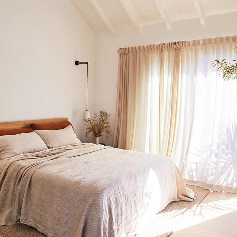
Designers Predict: These Will Be the Biggest Home Décor Trends of 2022

This is the Tile of the Year for 2024
January/February 2024 Resources

8 Kitchen Trends Designers Predict Will Be Everywhere in 2025

Behr's 2026 Color of the Year Is Here—And It’s Moody
Reflecting on Remodeling Choices in 2025

Mark Our Words, This Will Be The #1 Home Trend Of 2022
PPG's Color of the Year for 2022 Is Fulfilling All Our Verdant Dreams

Leanne Ford and 6 Other Pros Predict the Next Big Decorating Trends

2020 Industry Trends | Part 3
We Already Know the Color That's Going to Have 2027 in a Chokehold — Now's Your Chance to Beat the Trend

If You Want To Feel More Creative In 2022, Wear This New Color
The 2025 Colors of the Year Are Here—and They All Have One Thing in Common