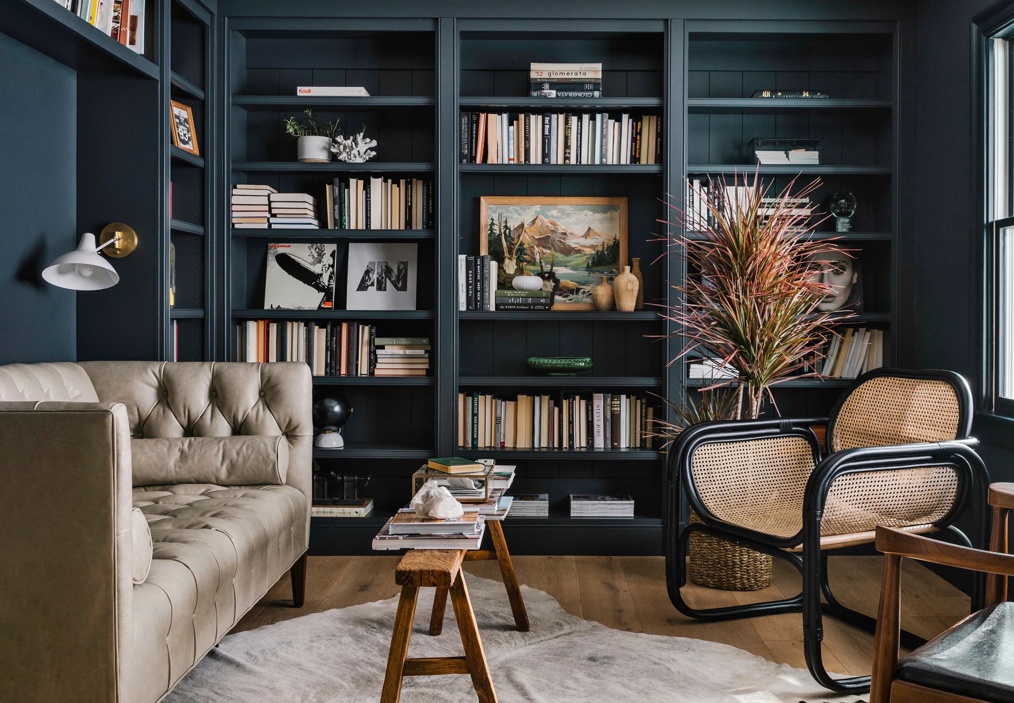
We Asked 5 Designers If Moody Paint Colors Are Still Trendy, and They All Said the Same Thing
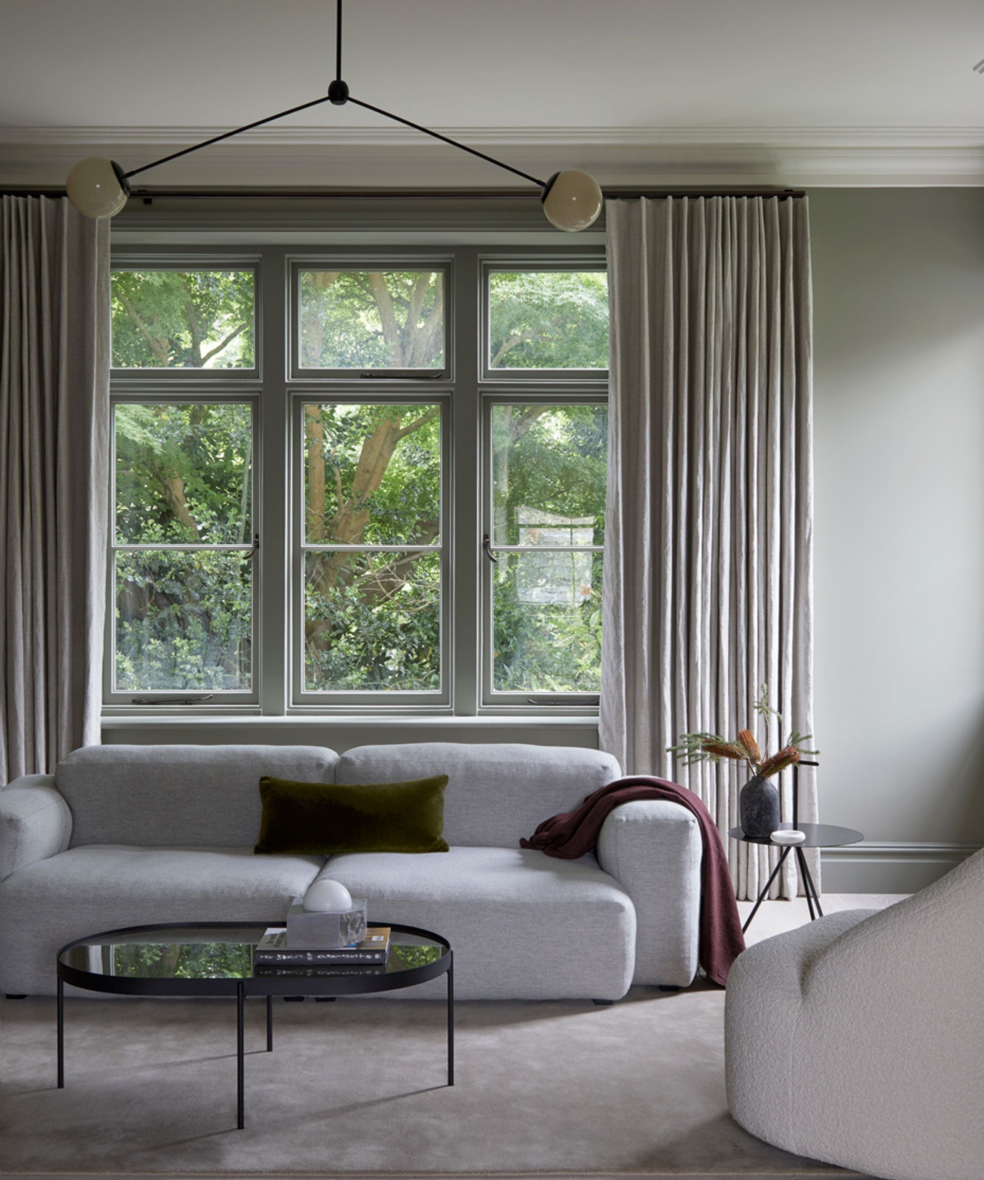
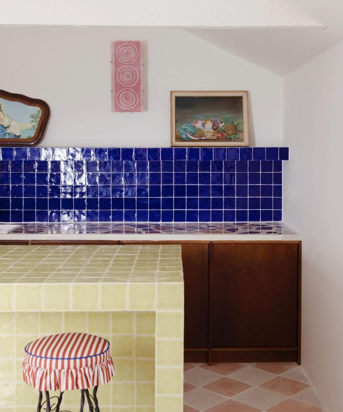
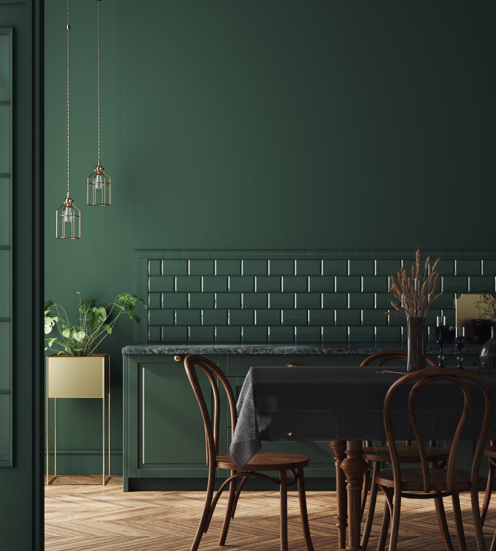
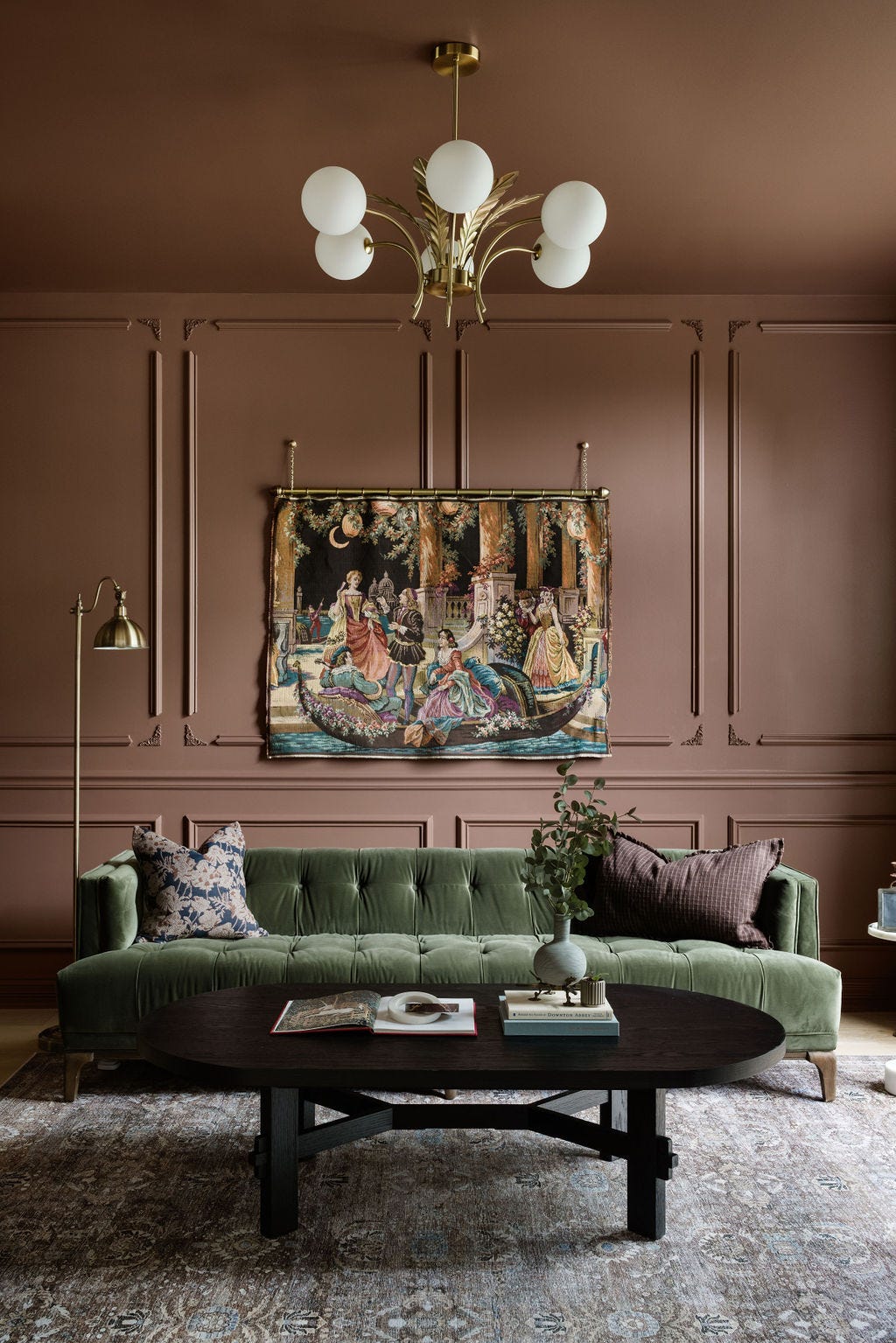
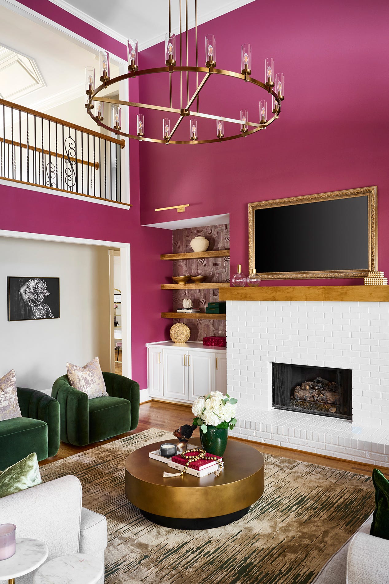
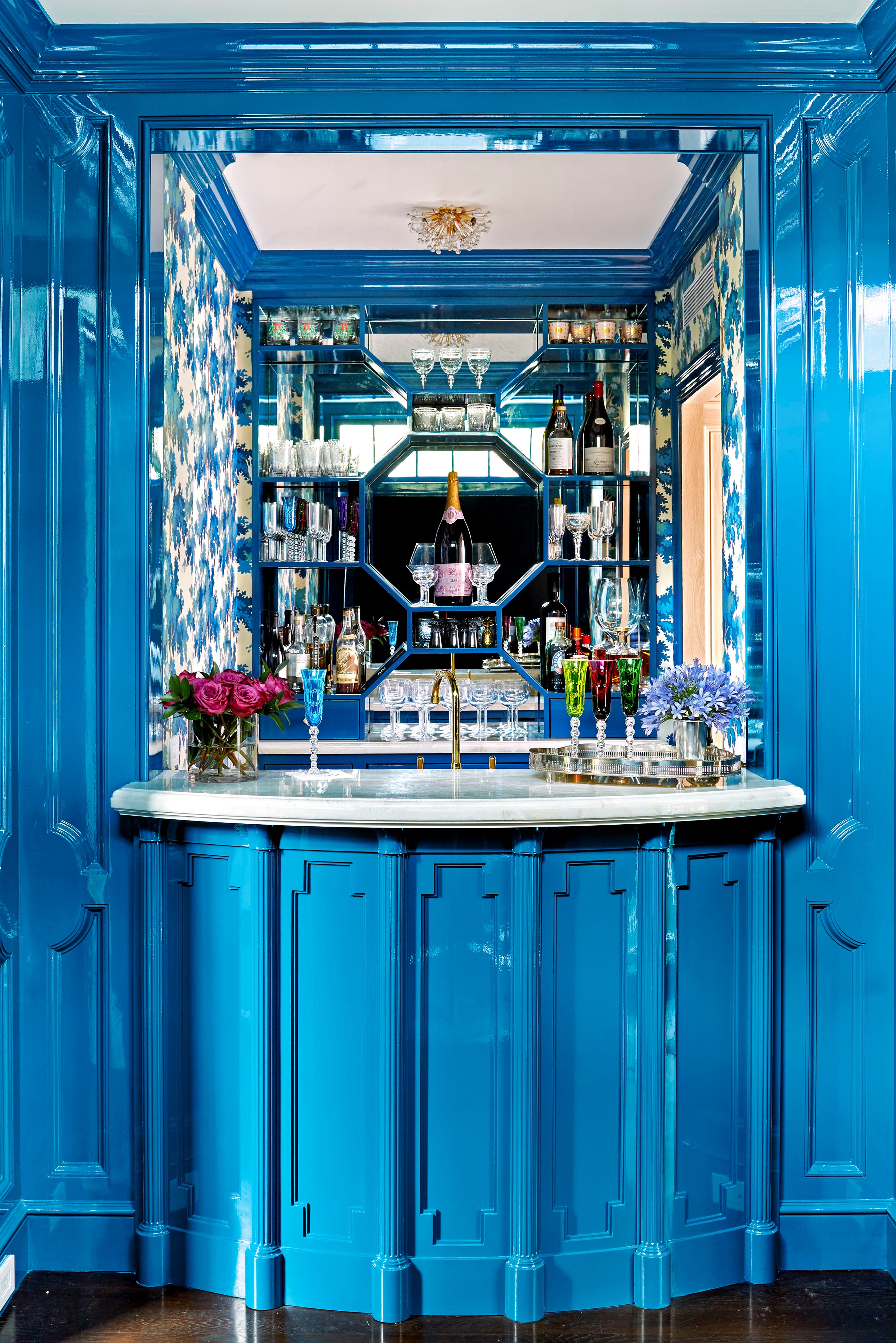
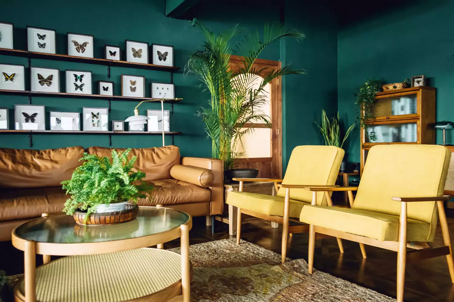
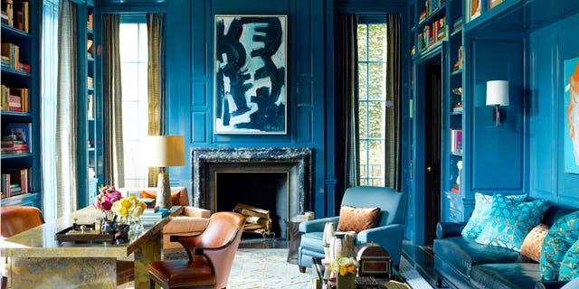
The popularity of dark, moody paint colors, such as deep navy blue, forest green, and even black, in interior design has been a prominent trend for the past five years. Despite their ubiquity, design experts assert that these hues are not merely a passing fad but rather a timeless element that has been integral to sophisticated interiors for centuries, imparting a sense of intimacy and luxury. While these colors retain their classic appeal, their recent widespread adoption necessitates a thoughtful approach to avoid a dated or trendy appearance.
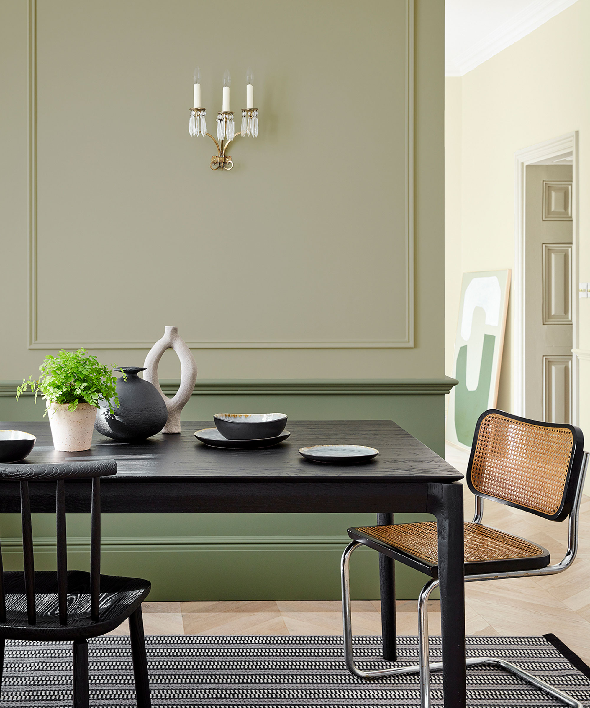
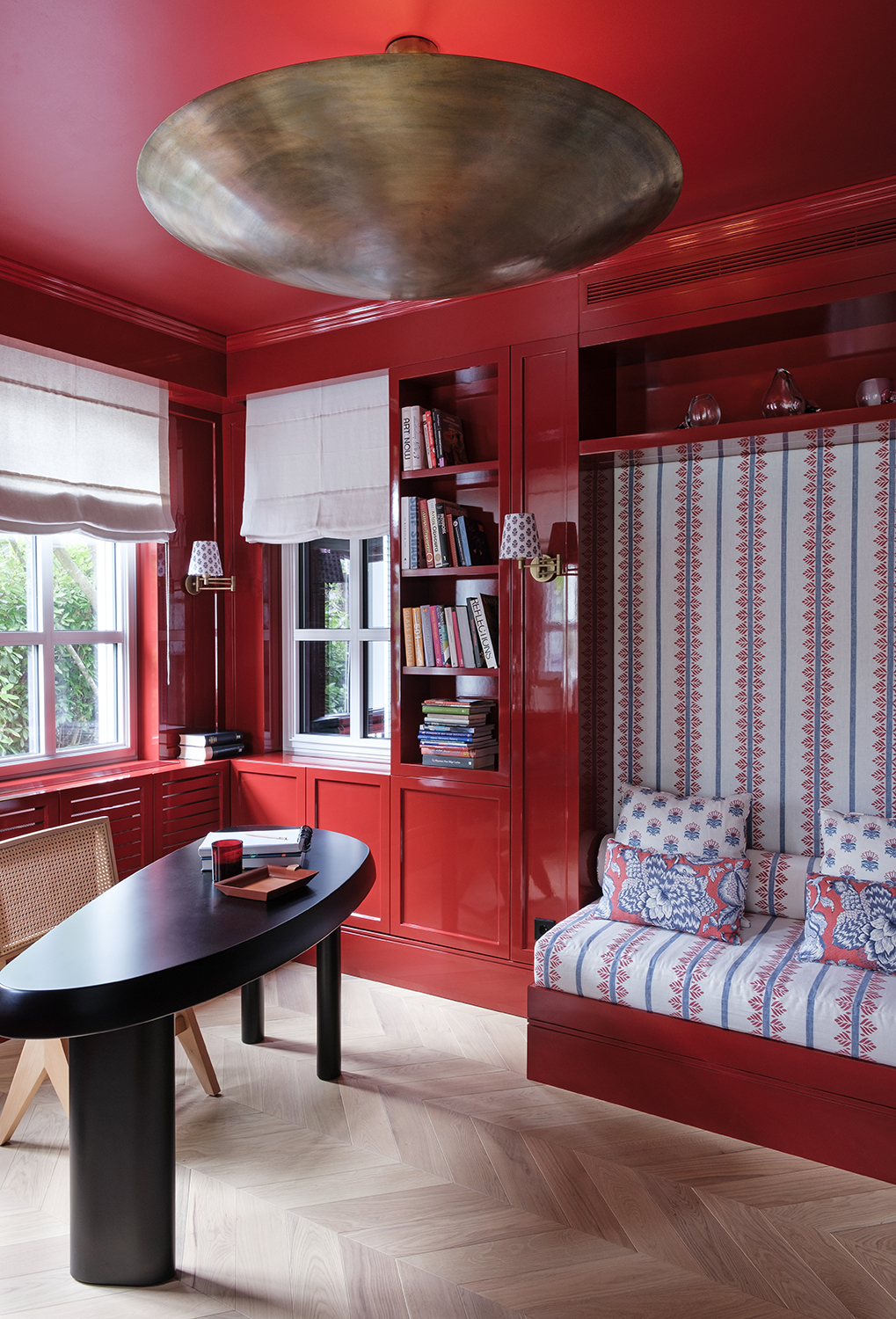
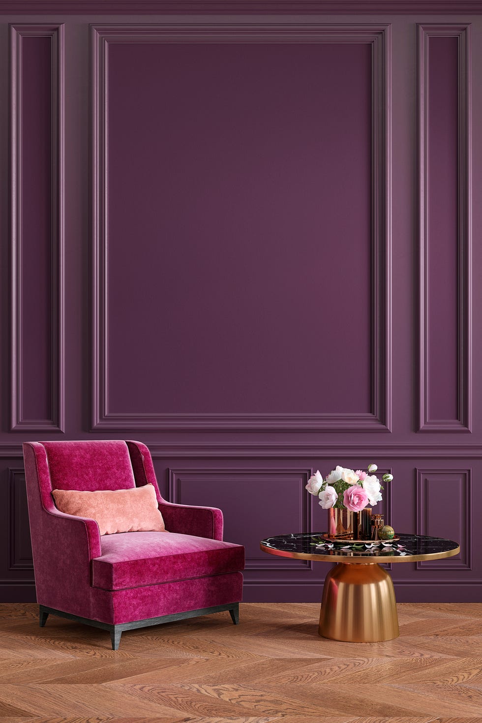
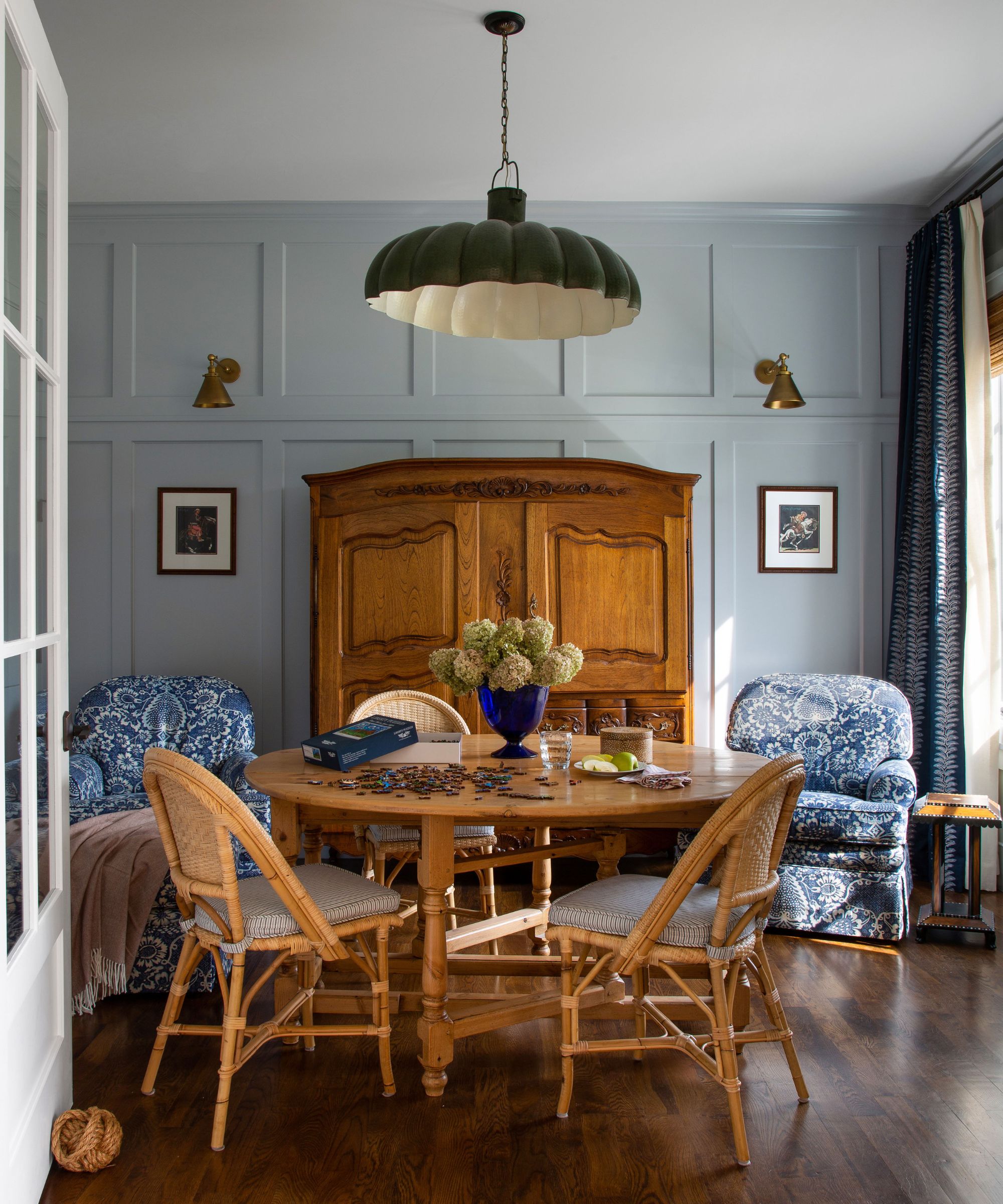
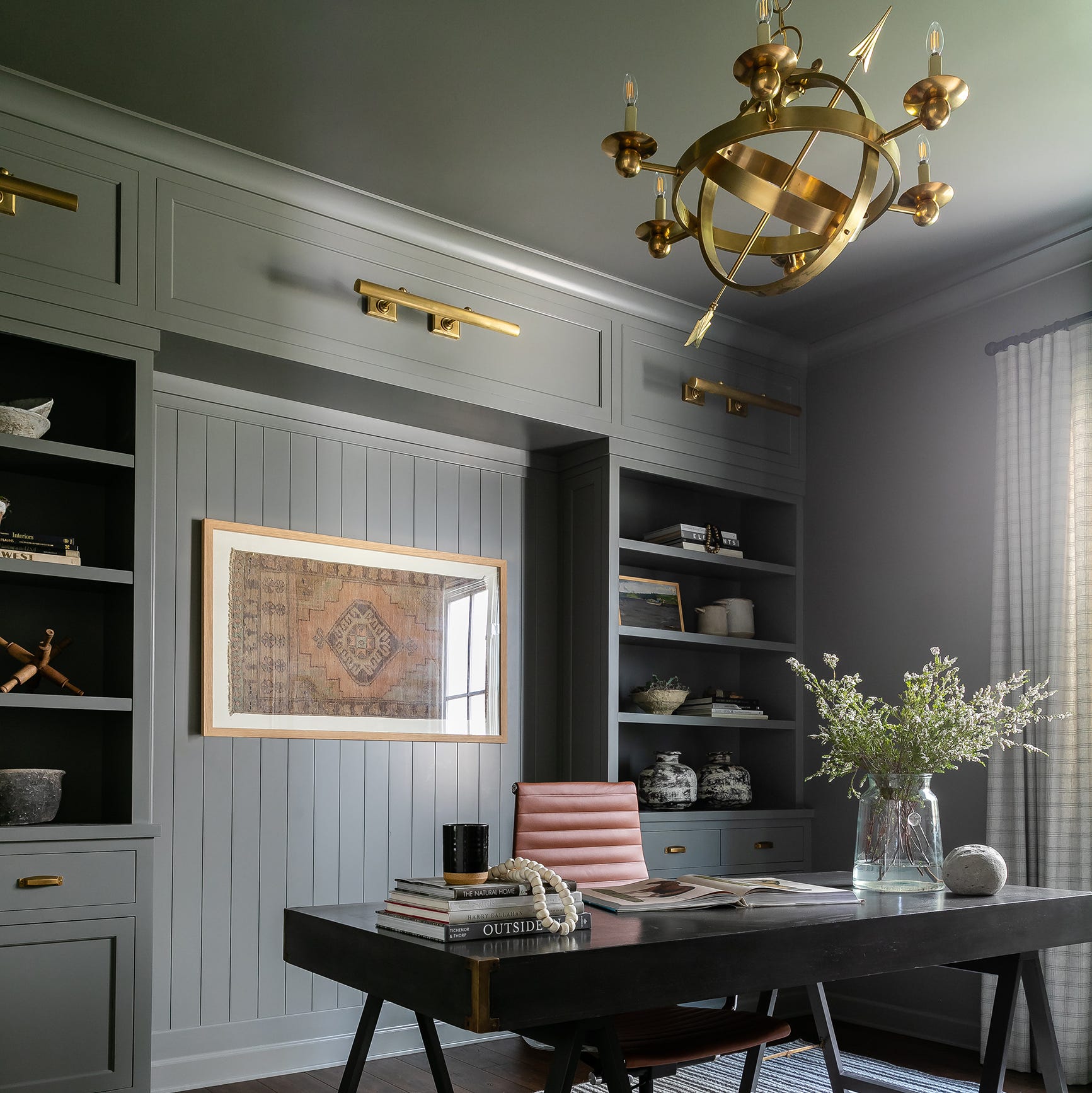
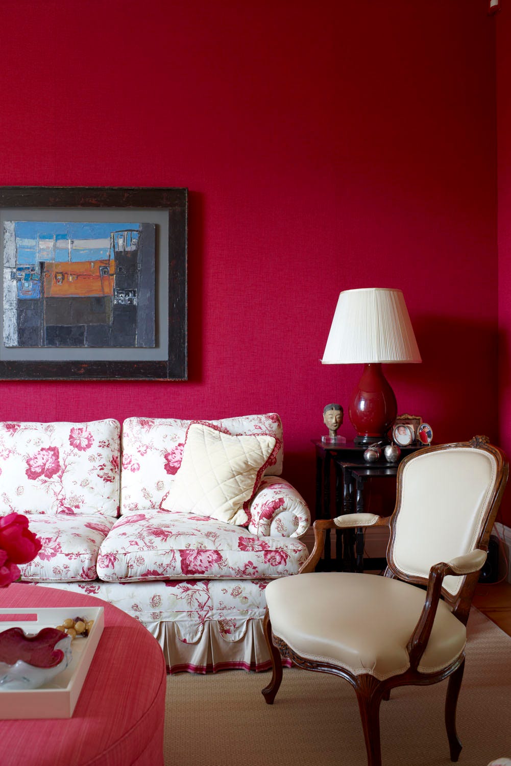
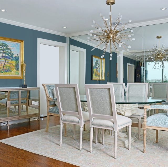
To effectively integrate dark paint colors into a home, designers recommend several strategies, beginning with the careful selection of rooms. Dining rooms are frequently cited as ideal spaces for dramatic, moody colors like burgundy or eggplant, as these shades enhance the room's ambiance, especially when paired with metallic accents. Other suitable locations include powder rooms and bedrooms, where dark colors can foster a sense of retreat and coziness. Conversely, these colors are generally not recommended for home offices, particularly for those who work remotely, as they can induce drowsiness.
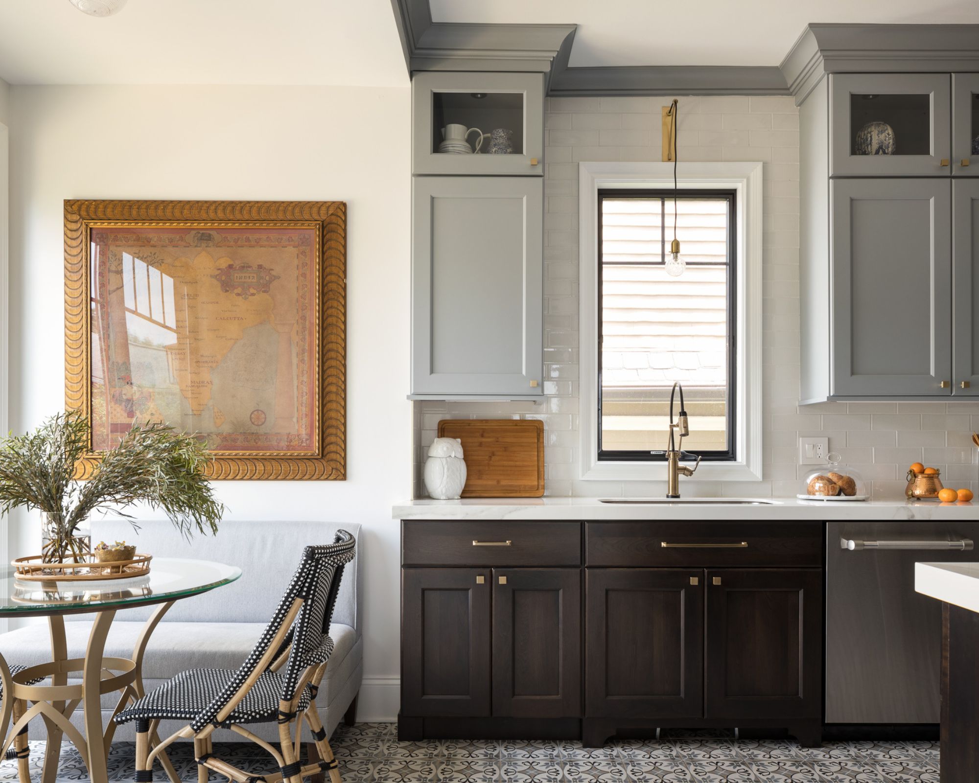
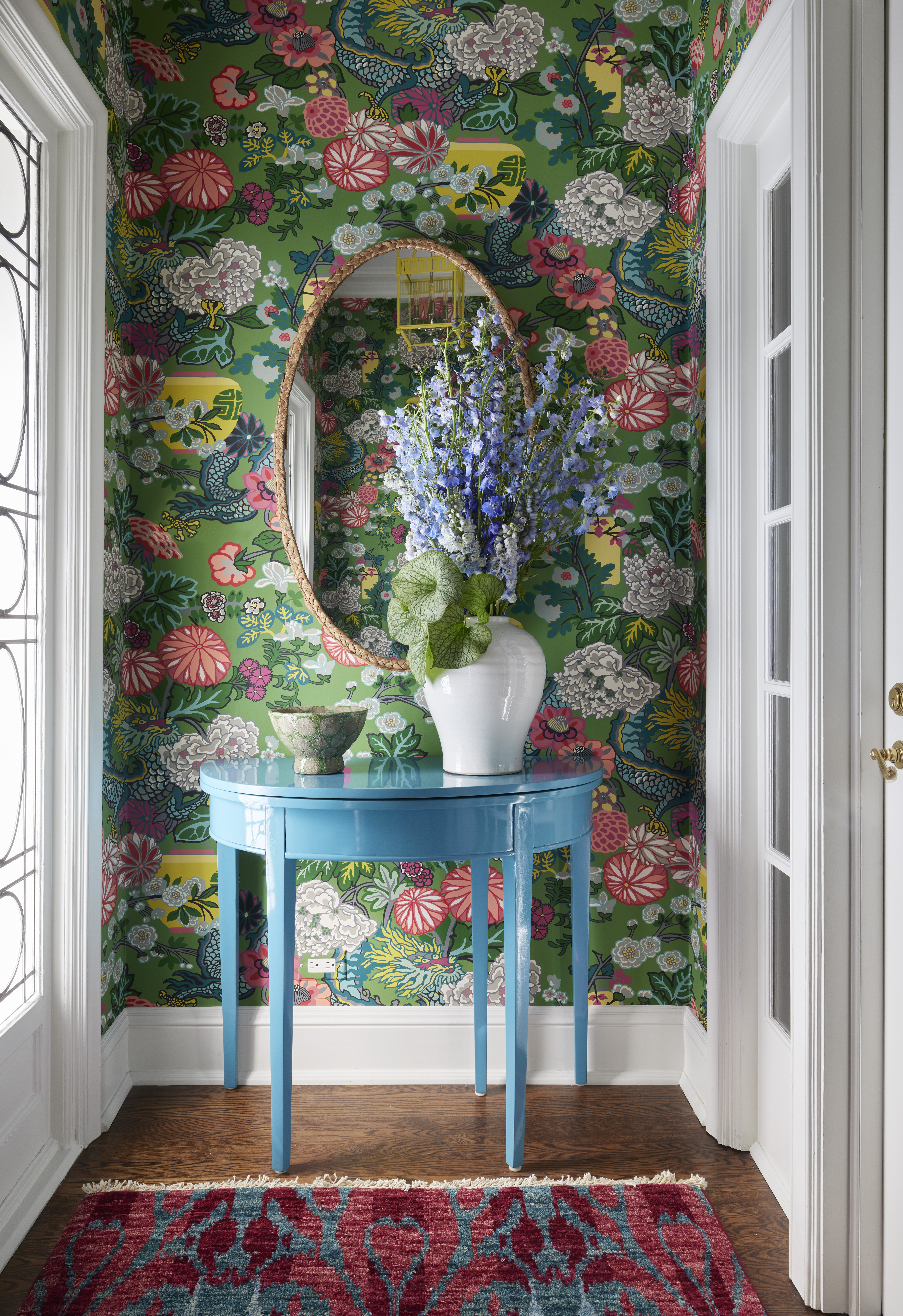
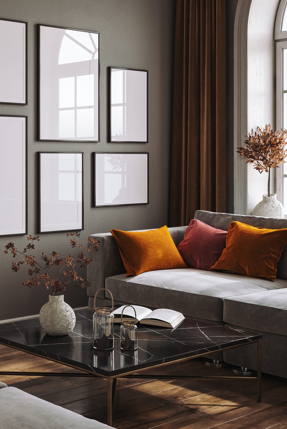
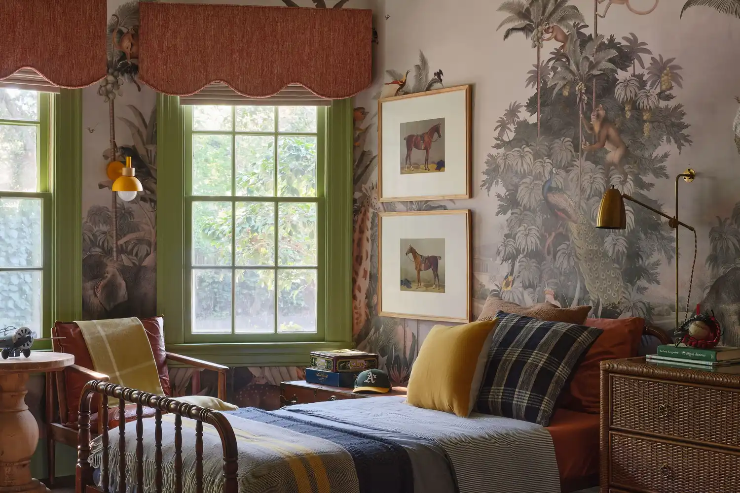
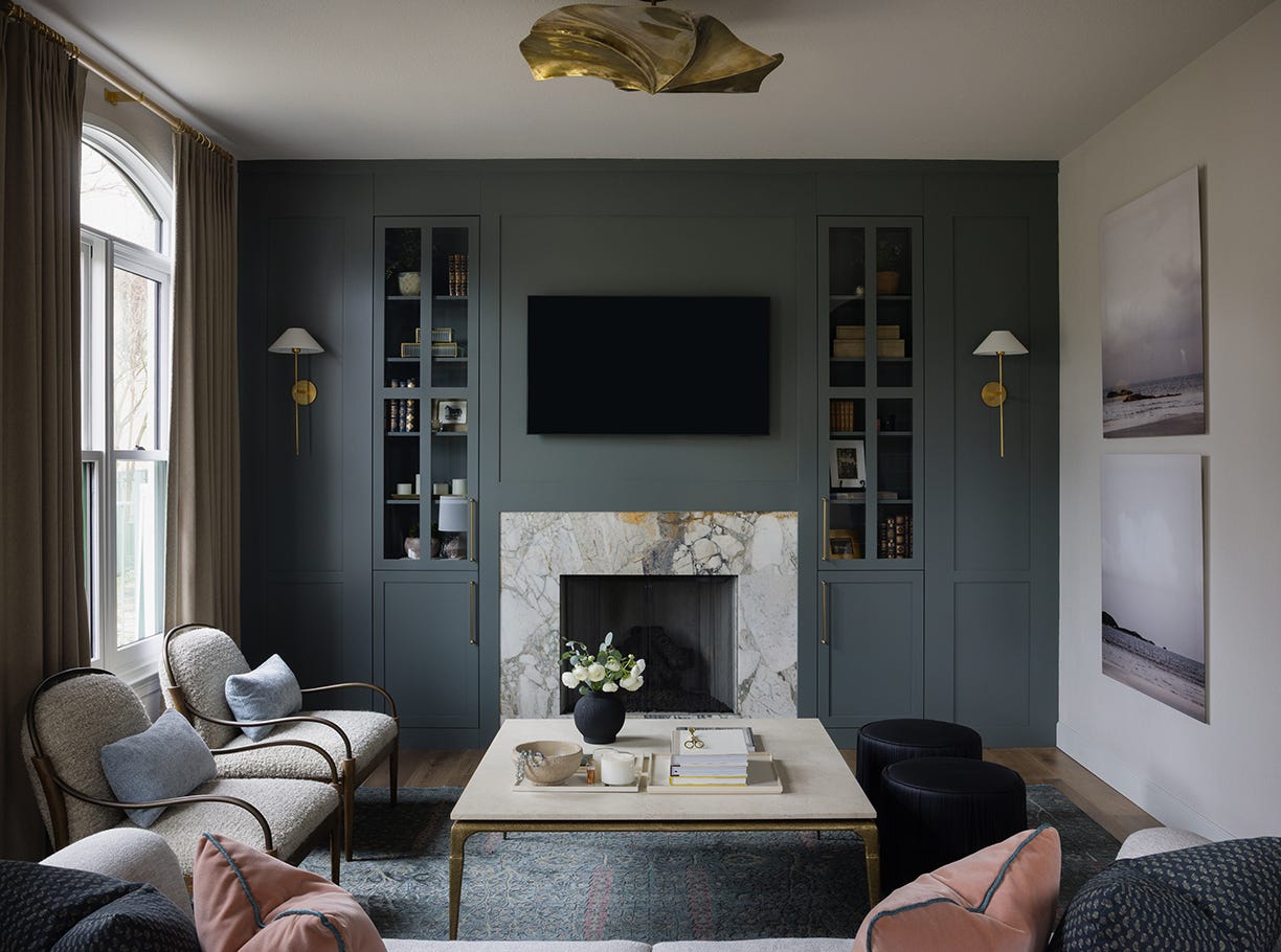
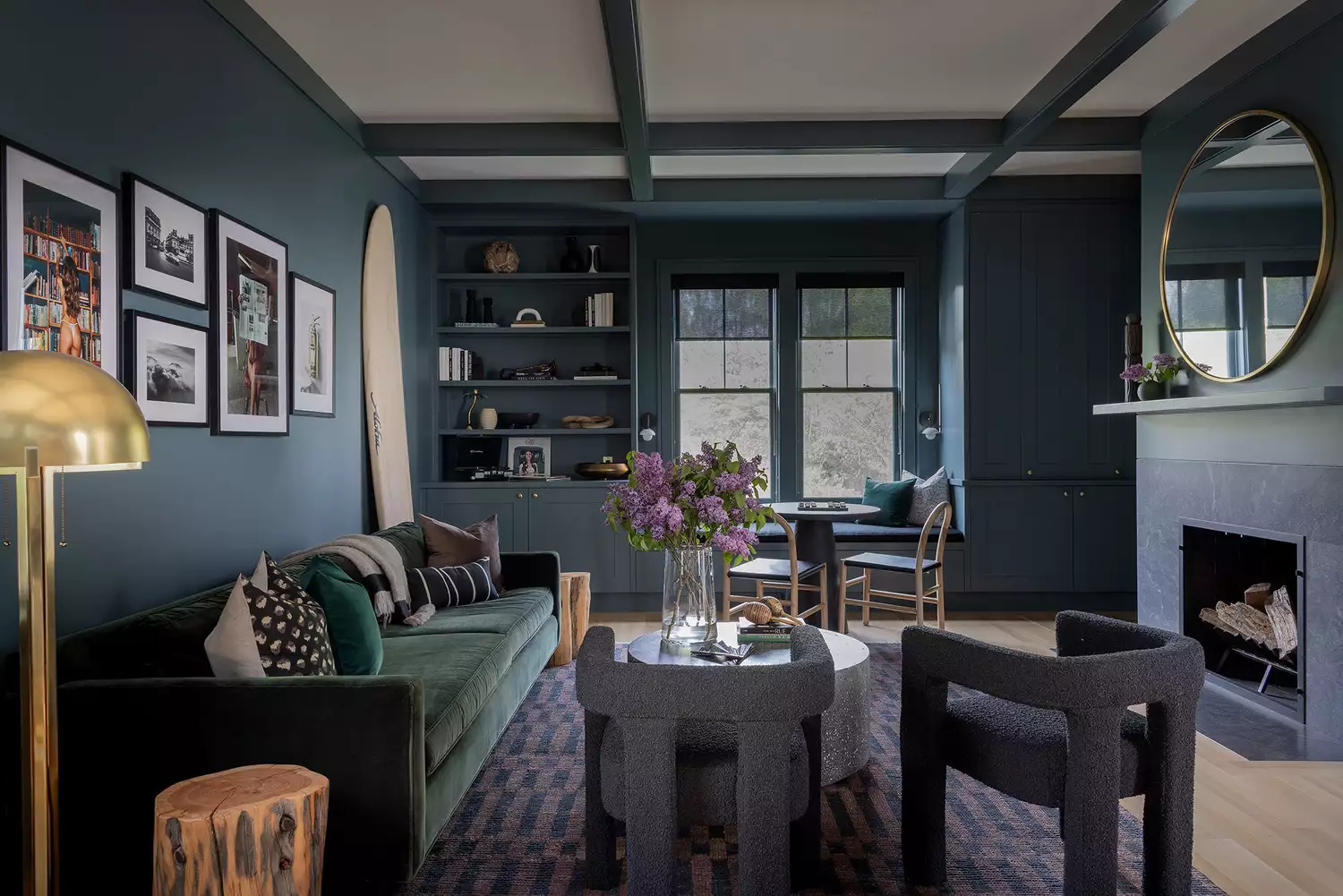
Another crucial consideration is the integration of dark colors into the home's overall color palette. Rather than using dark paint on a single accent wall, designers advise weaving these tones throughout the home in various elements such as accessories, furniture, wood stains, or wallpaper. This approach creates a cohesive and harmonious environment, preventing the home from appearing disjointed or like a collection of disparate trends. Layering moody tones thoughtfully can evoke a feeling of warmth, intimacy, and allure, contributing to a more peaceful and timeless aesthetic.
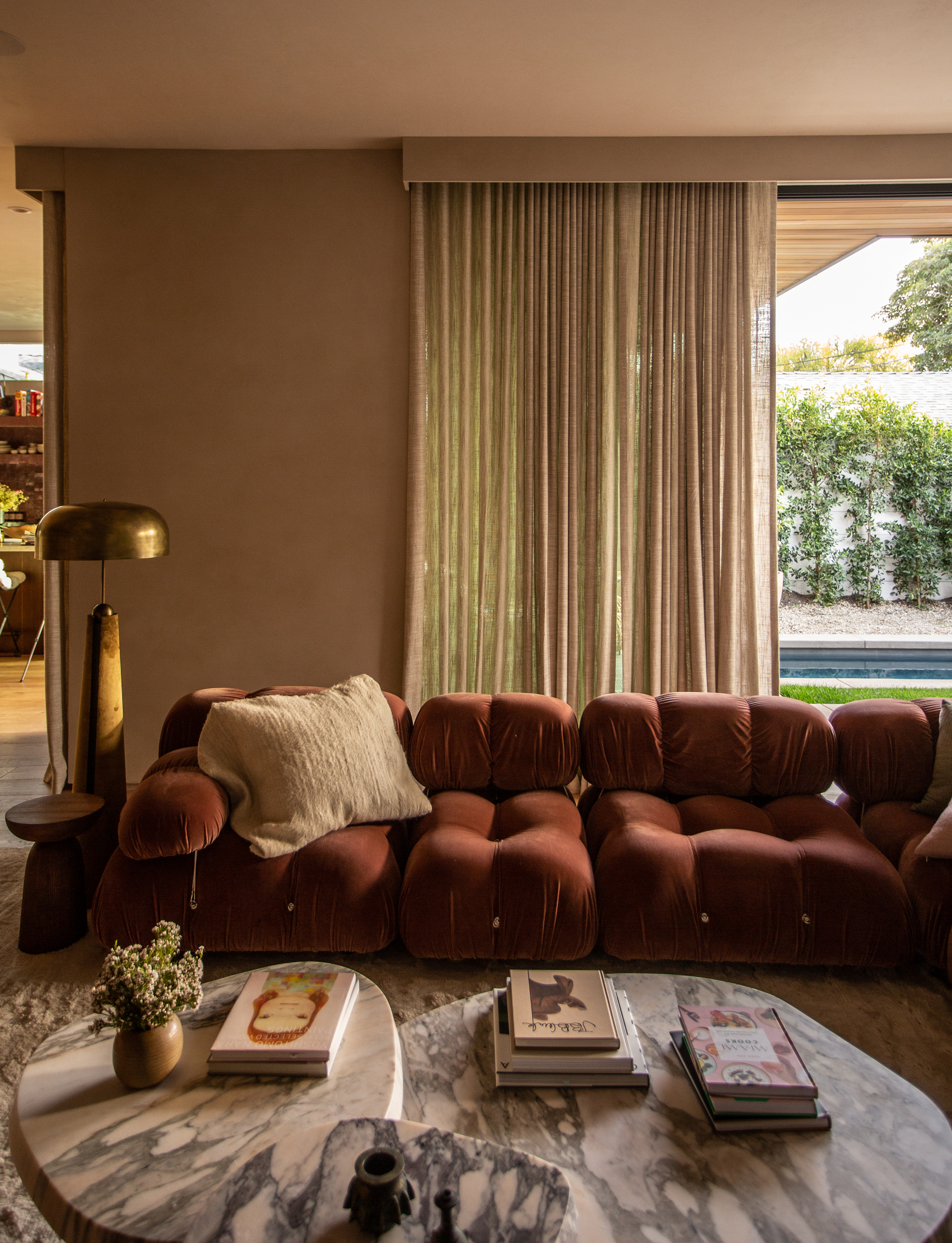
Furthermore, the quality and direction of natural and artificial light within a room are paramount when choosing dark paint colors. A deep charcoal, for instance, might appear sophisticated in a south-facing room with ample natural light but could feel confined and dull in a north-facing room with limited illumination. While not entirely precluding the use of dark colors in dimly lit spaces, it necessitates additional effort, such as selecting colors with warm undertones and incorporating lush drapes and brass light fixtures to enhance coziness and brightness.
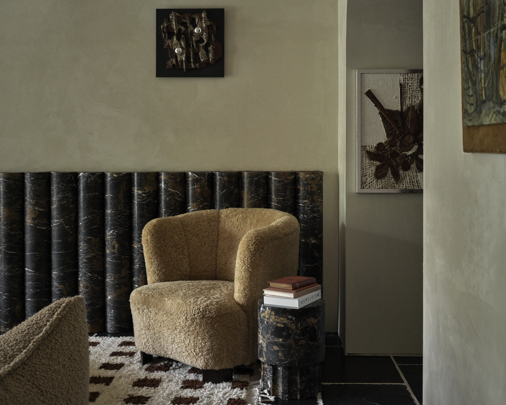
The paint finish also significantly influences the room's overall impression. Designers often prefer natural finishes like plaster or limewash for dark colors, as these finishes offer subtle variations and textures that contribute to a timeless feel, particularly in homes with traditional or old-world architectural elements. For more glamorous or formal aesthetics, glossy paints can be a suitable alternative.
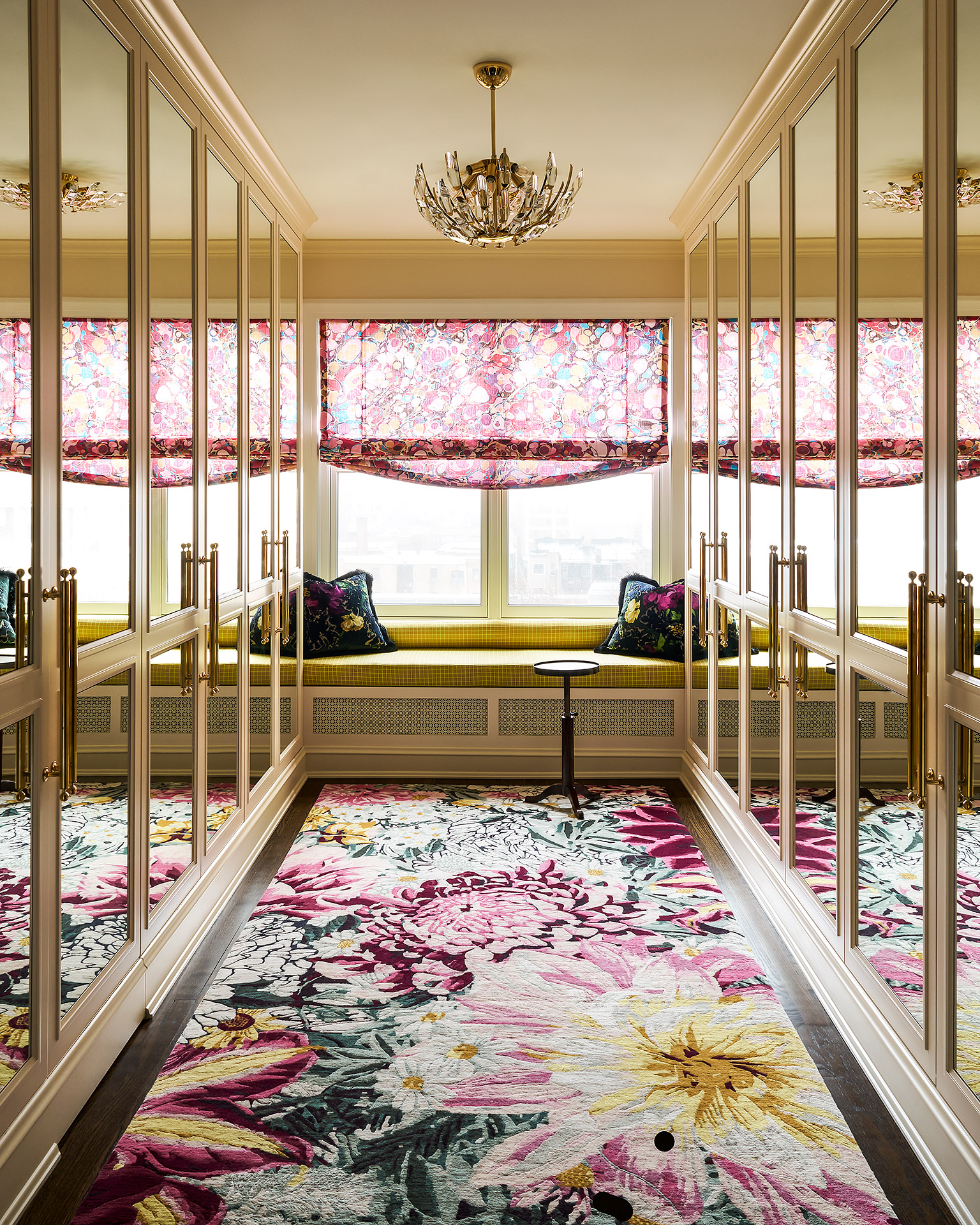
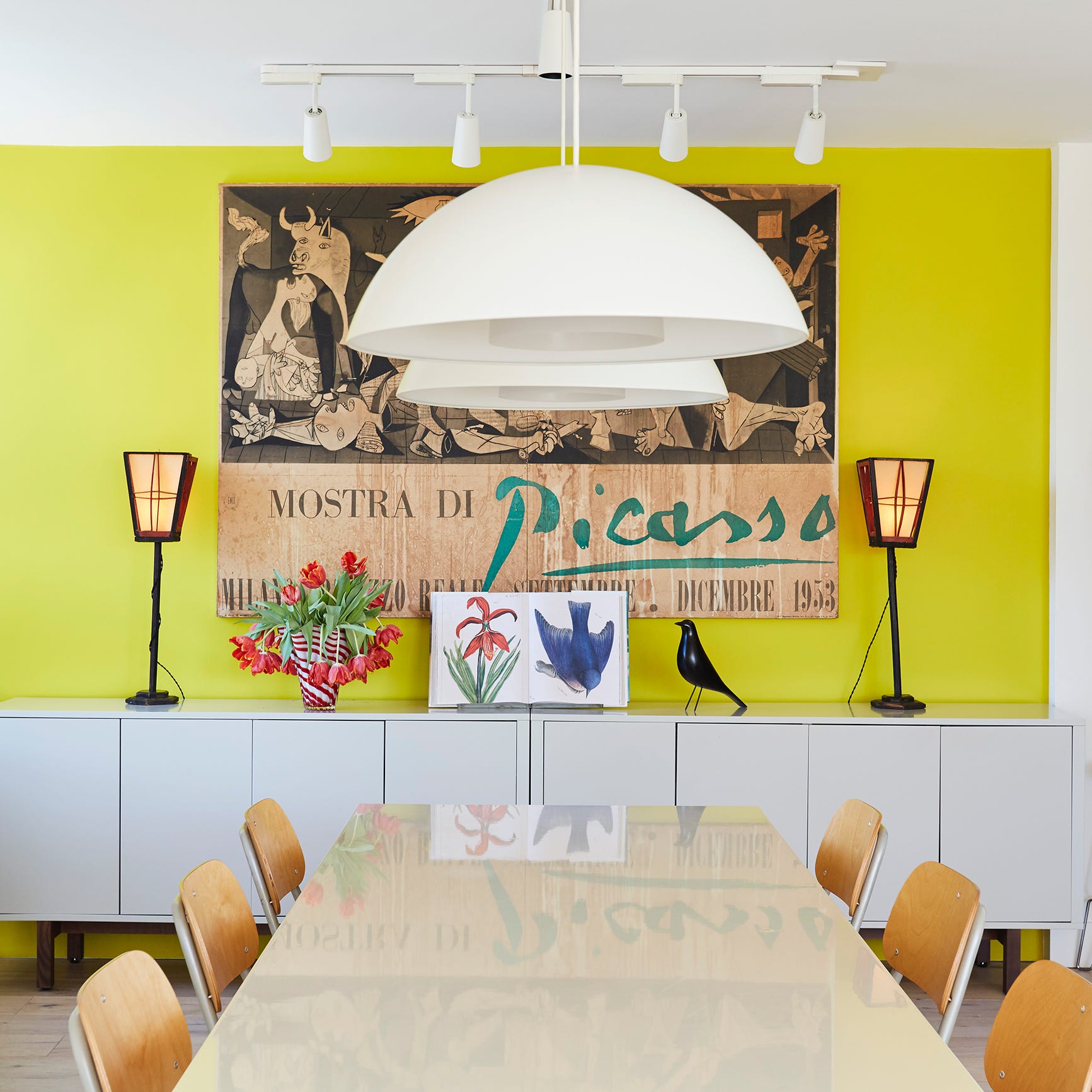
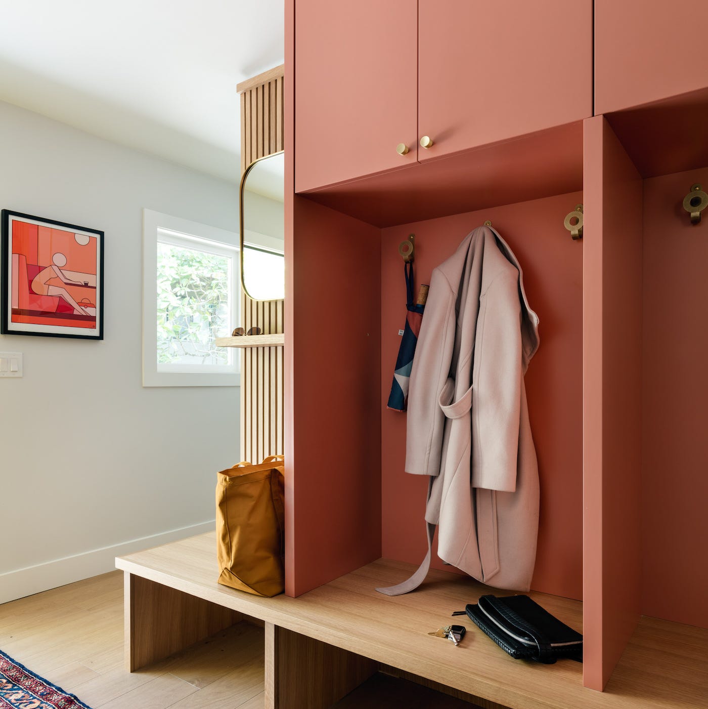
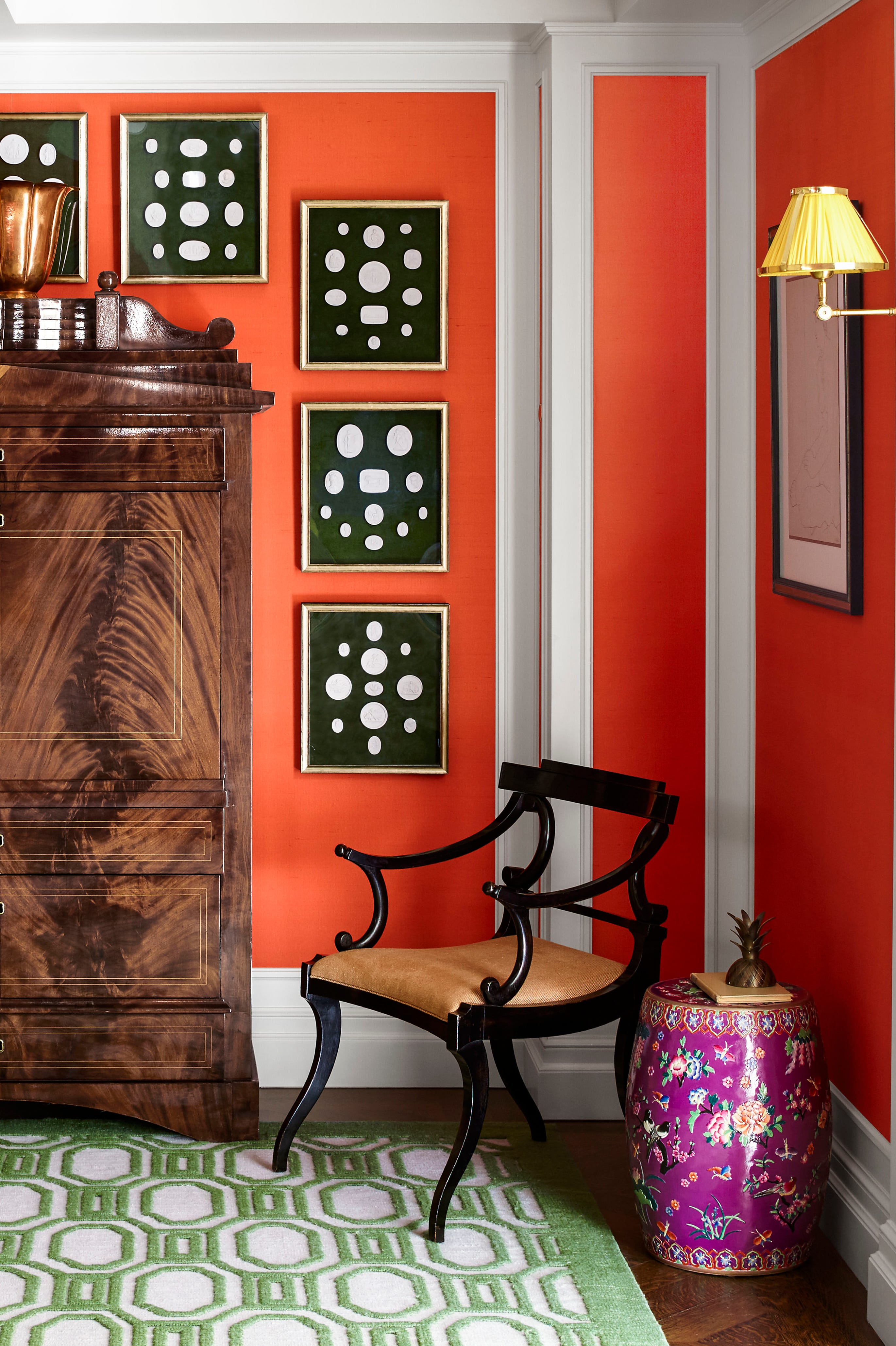
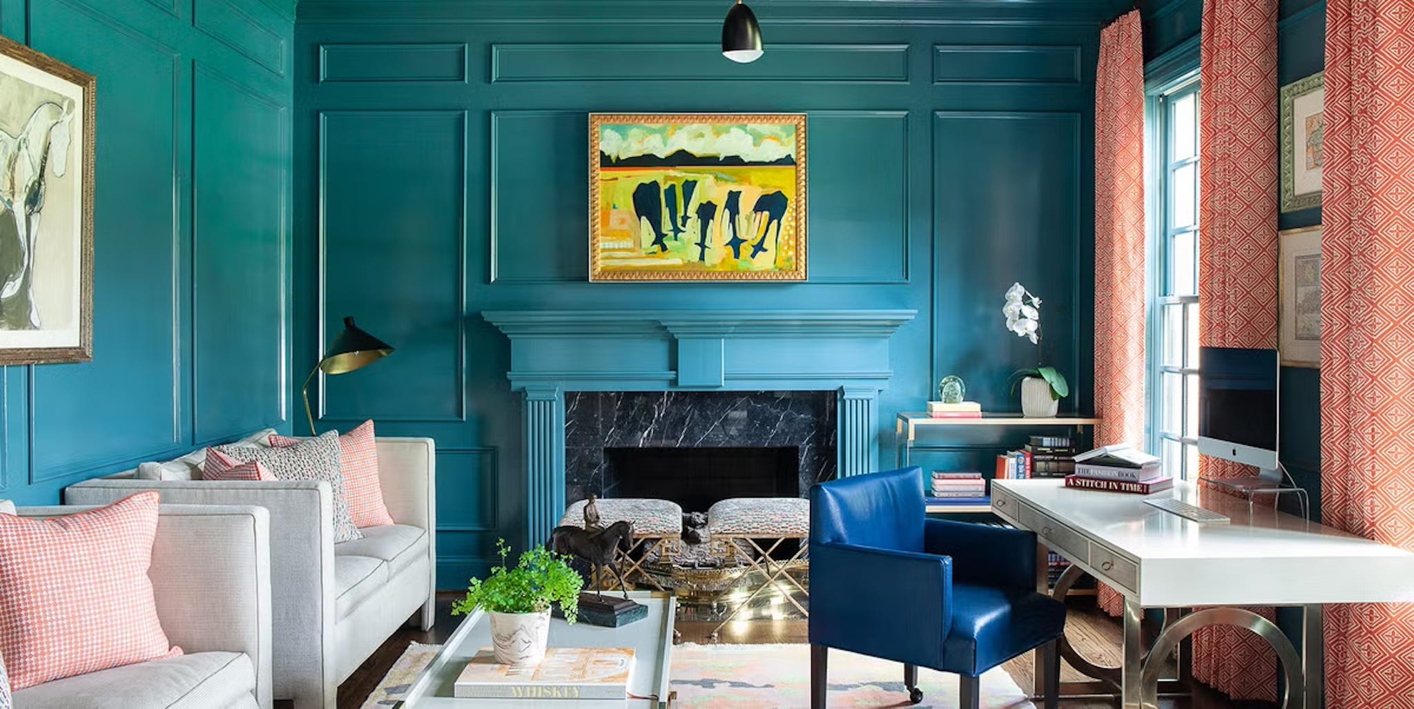
Finally, for individuals who have already embraced dark paint colors and are concerned about their room appearing dated, a simple yet effective solution is to update accessories. Introducing contrasting colors, such as red or coral, through decorative items can inject brightness and visual interest into a navy or deep green room. This can be achieved by incorporating new rugs or pulling in bold colors from other areas of the house, offering a lighter alternative to repainting and refreshing the space.
#MoodyPaintColors #InteriorDesignTrends #HomeDecor #PaintColors #ColorPalette #LightingConsiderations #PaintFinish #TimelessDesign #RoomSelection #HomeStyling #MoodyPaintColors #InteriorDesignTrends #HomeDecor #PaintColors #ColorPalette #LightingConsiderations #PaintFinish #TimelessDesign #RoomSelection #HomeStyling
0 opmerkingen in totaal
 Nog geen opmerkingen
Dit vindt u mogelijk ook leuk

5 Timeless Paint Colors That Will NEVER Go Out of Style, According to Designers

5 Vibrant Color Palettes Designers Are Using to Add Energy and Excitement to Decor

The Paint Color That All This Designer's Followers Ask About | domino

Are Neutral Paint Colors Finally Out of Style? We Asked Designers and They All Agreed


4 Interior Designers Share the Biggest Paint Color Trends Right Now (and What’s Out!)

5 "trend-proof" colors for your home designers think will be just as popular in 10 years' time
We Asked Designers to Pick the Most Timeless Living Room Paint Color—and They Agreed

Design Pros Have Spoken: Here Are the Only Paint Color Trends That Matter in 2022


The most timeless paint colors according to designers

12 Jewel-Tone Paint Colors Designers Say Are Always On-Trend
I asked interior designers what color they include in every project – these 5 enduring shades were the favorites
Designers’ Favorite White Paints Are Always Changing—We Asked 3 for Their Latest Pick

Every Designer I Talked to Said This Popular Paint Color Is on Its Way Out

These 20 Paint Colors Will Never Go Out of Style, According to Designers
6 Paint Color Duos Designers Can't Get Enough of This Fall
Can You Guess The Most Popular Paint Color The Year You Were Born?
5 enduring colors designers always return to when they have trend fatigue
Designers Say These Vintage Paint Colors Are Back
Design Pros Have Spoken: Here Are the Only Paint Color Trends That Matter in 2023
These 5 Simple Questions Help Designers Pick the Perfect Paint Color Every Time