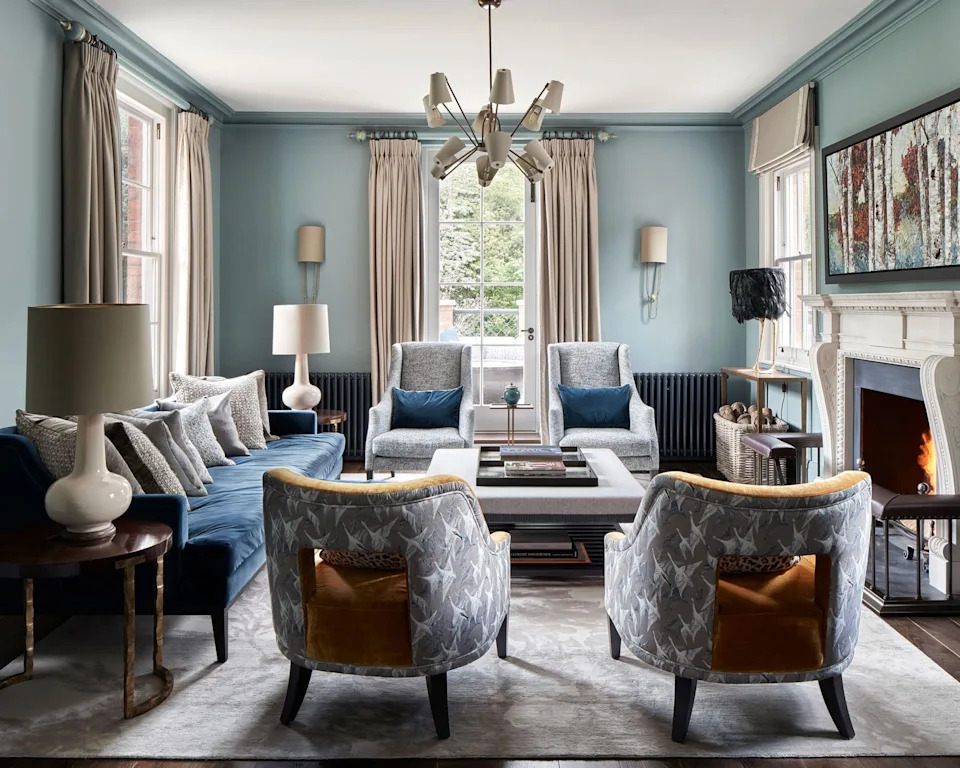
Living room paint ideas – stylish ways with paint
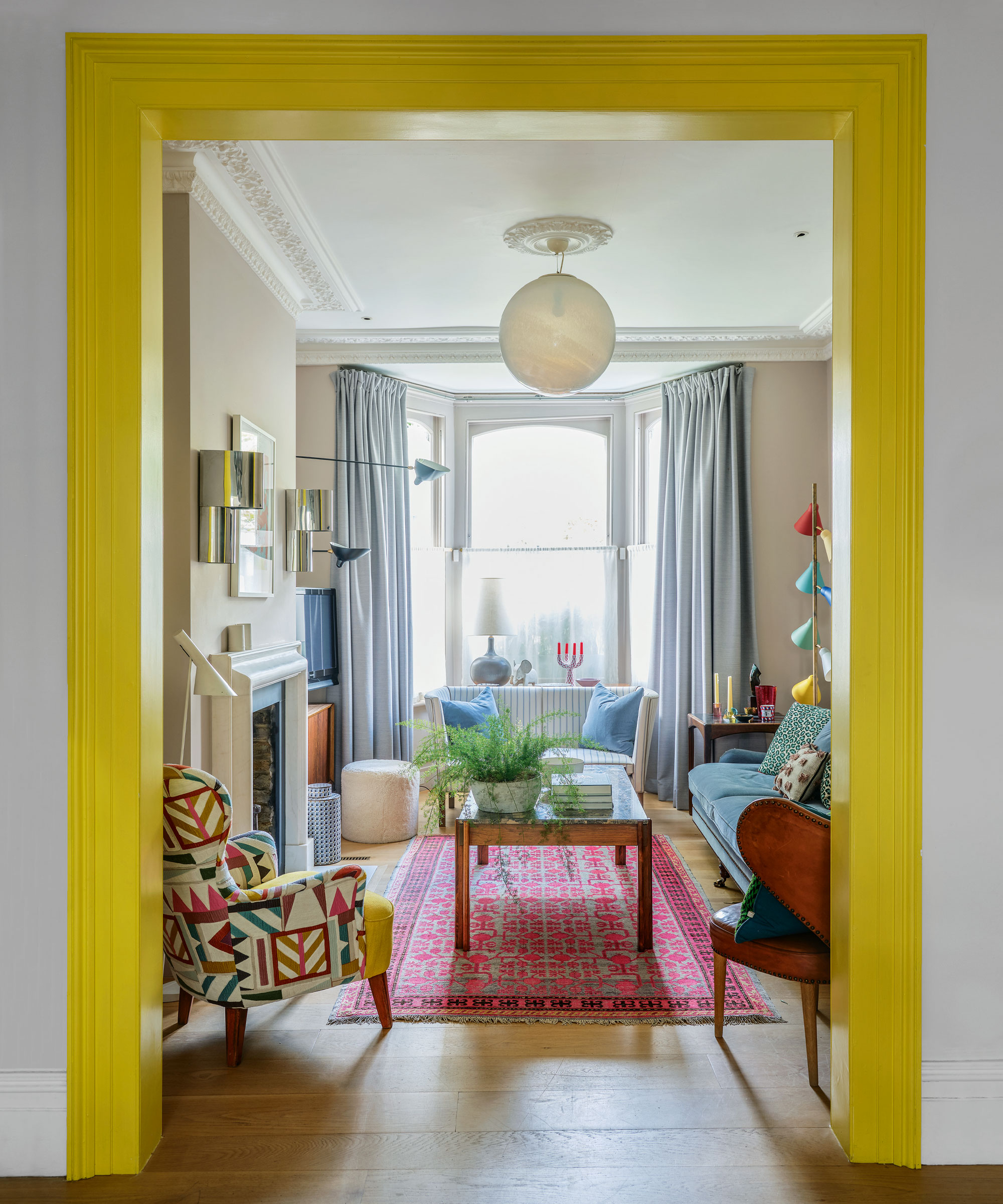
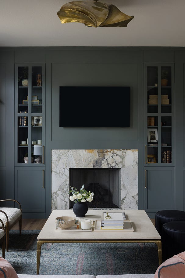
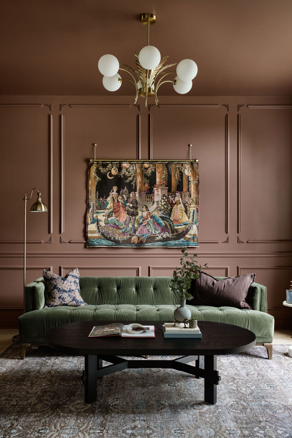
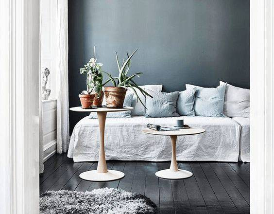
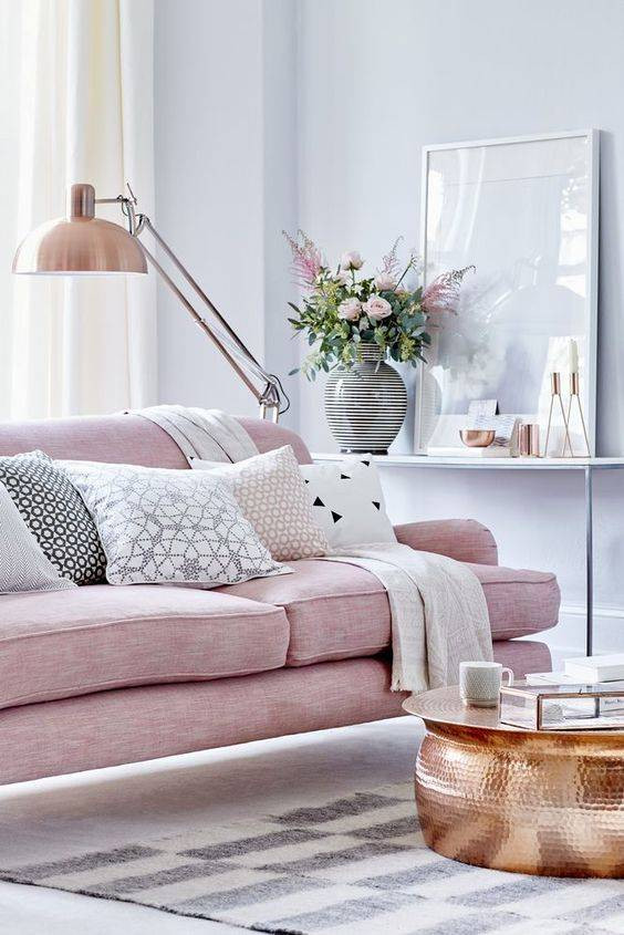
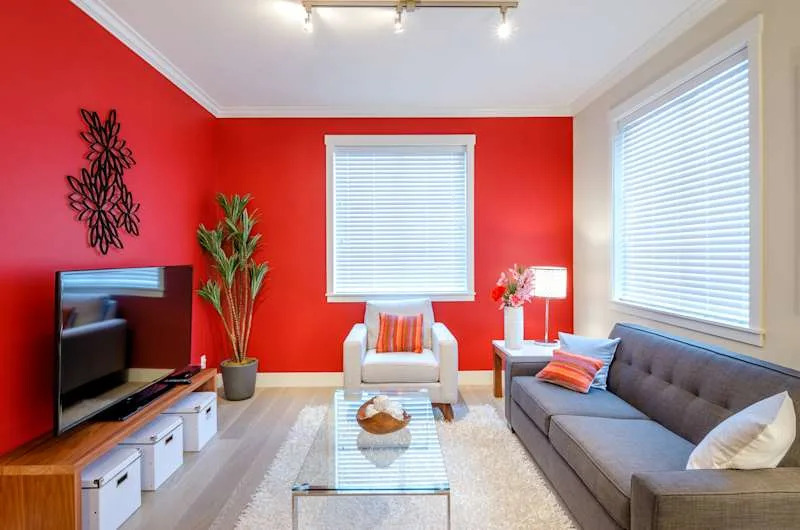
The article presents various living room paint ideas to help readers add style and personality to their living spaces. It emphasizes that paint is a quick and easy way to transform a room, whether it's meant to be a calm oasis or a vibrant family hub. The importance of selecting the right color is highlighted, suggesting that potential paint colors should first be tested on white paper and observed on different walls over several days to see how light affects them at various times. This method also helps ensure the chosen colors complement existing elements like curtains and furniture.
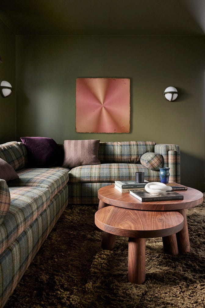
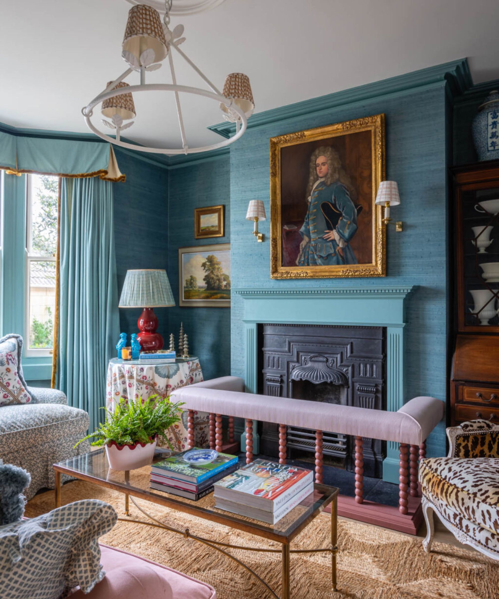
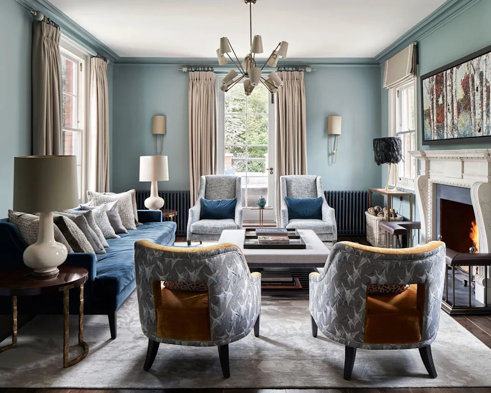
For those uncertain about color schemes, the article advises using pre-selected palettes from paint brands or following guidance on working with tonal, harmonizing, and contrasting colors. It points out that the featured paint ideas are chosen for their suitability for living rooms, their trendiness for the upcoming year, and their timeless appeal. The orientation of the room is a crucial factor in color selection; east- and north-facing rooms require warmer shades, while south- or west-facing rooms can accommodate cooler tones. Similarly, poorly lit rooms generally benefit from lighter shades unless a deliberate choice is made to create a dark, cozy atmosphere.
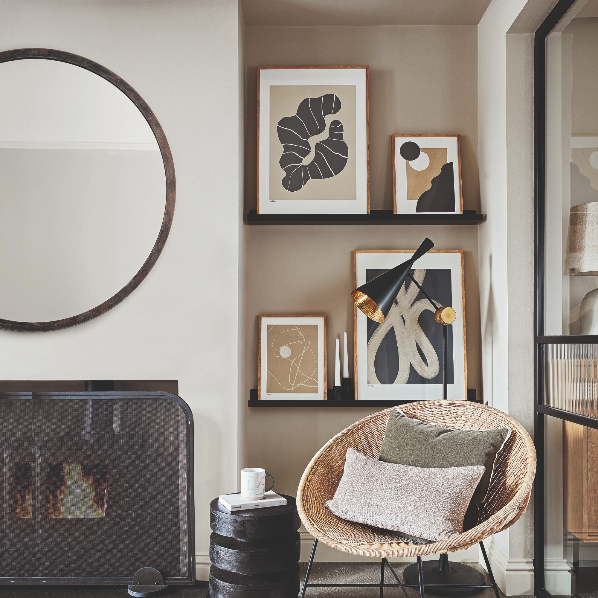
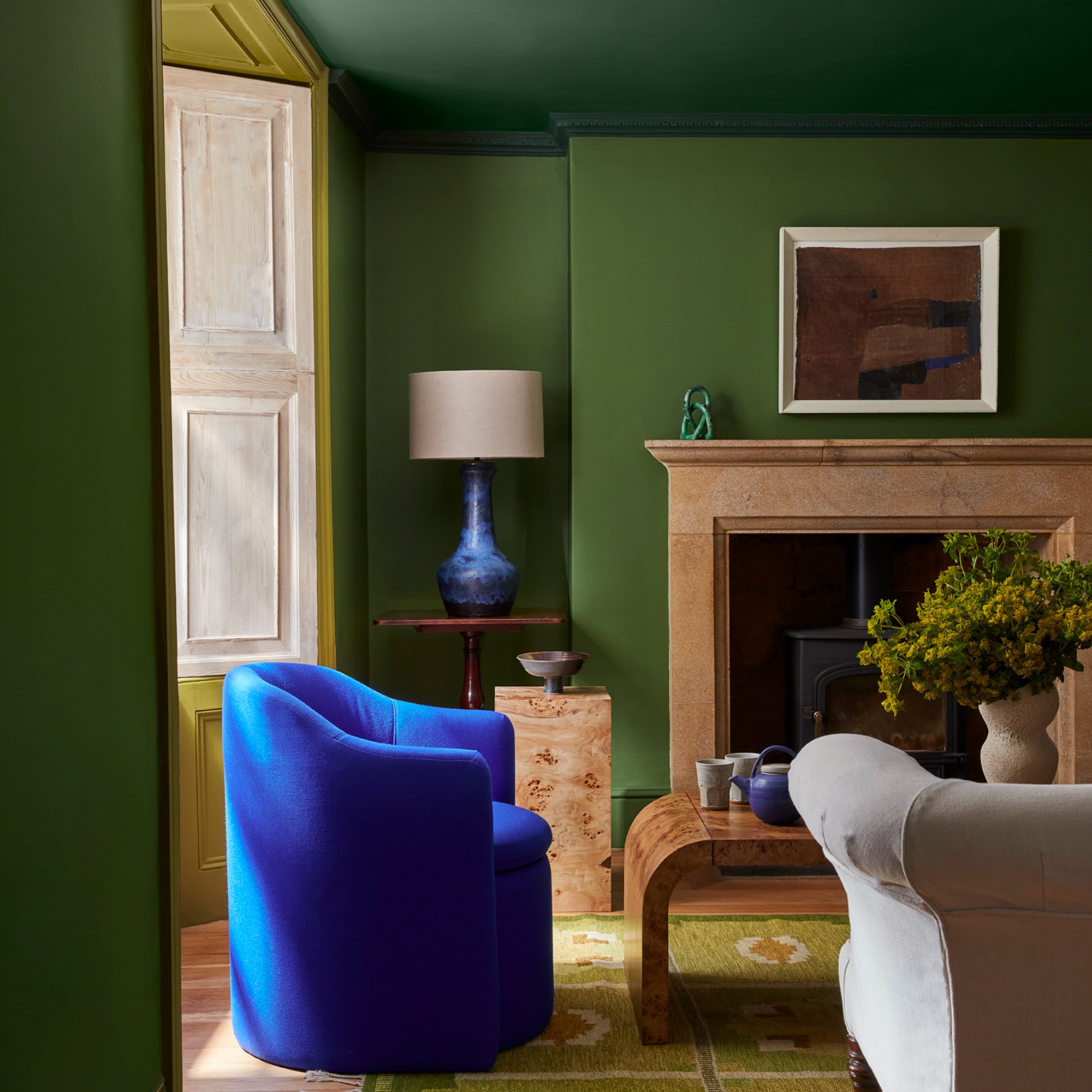
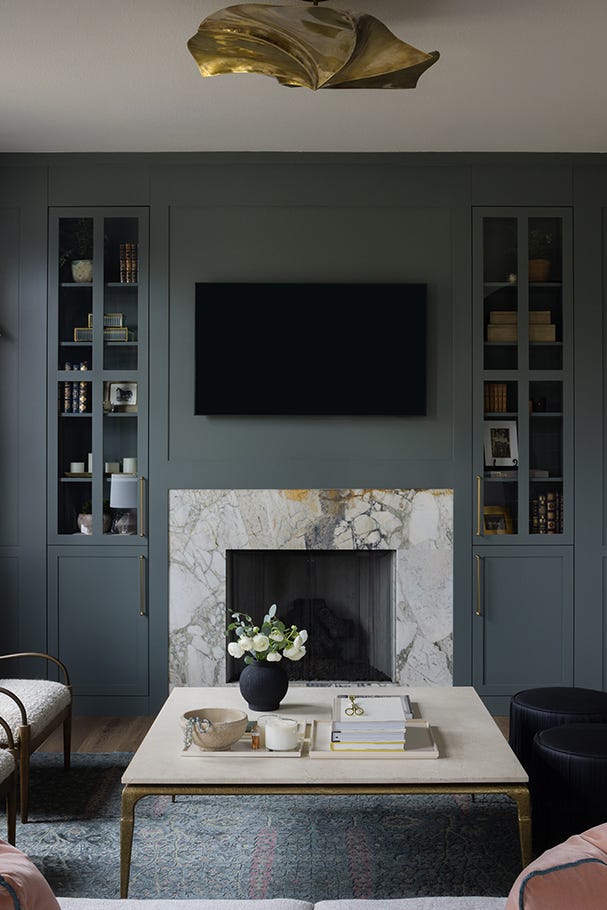
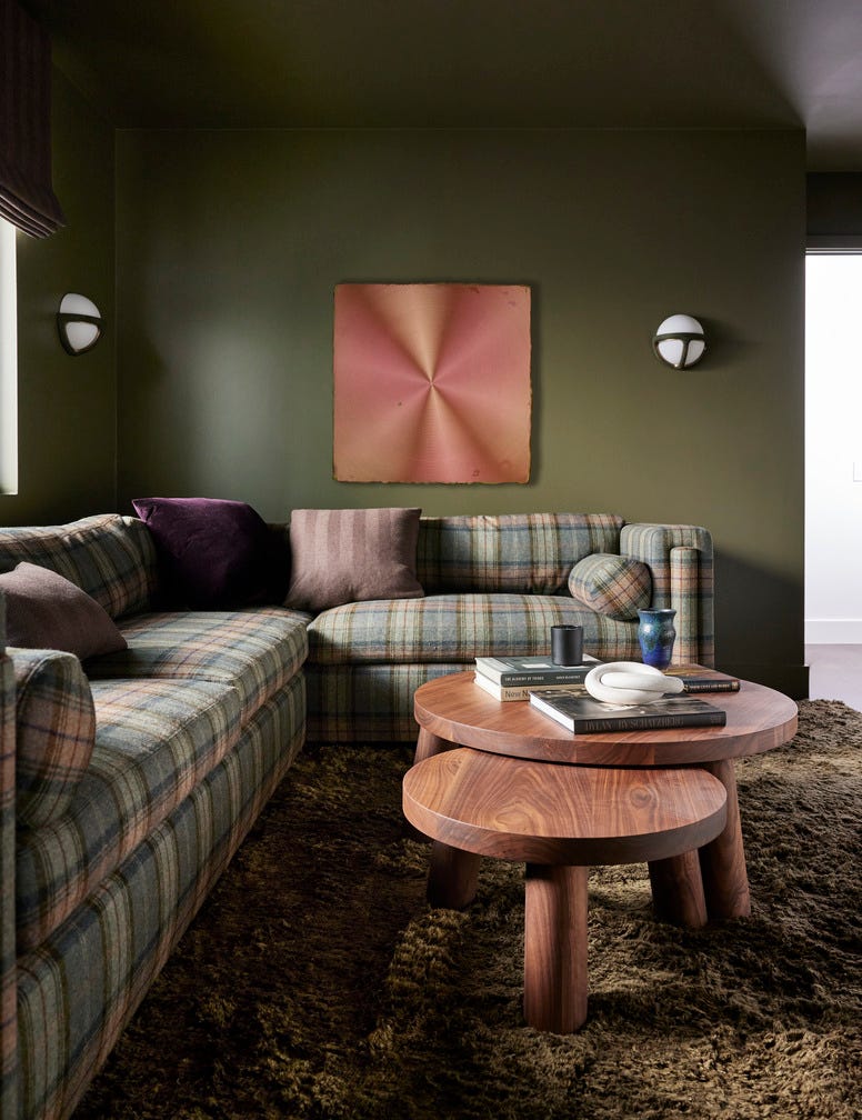
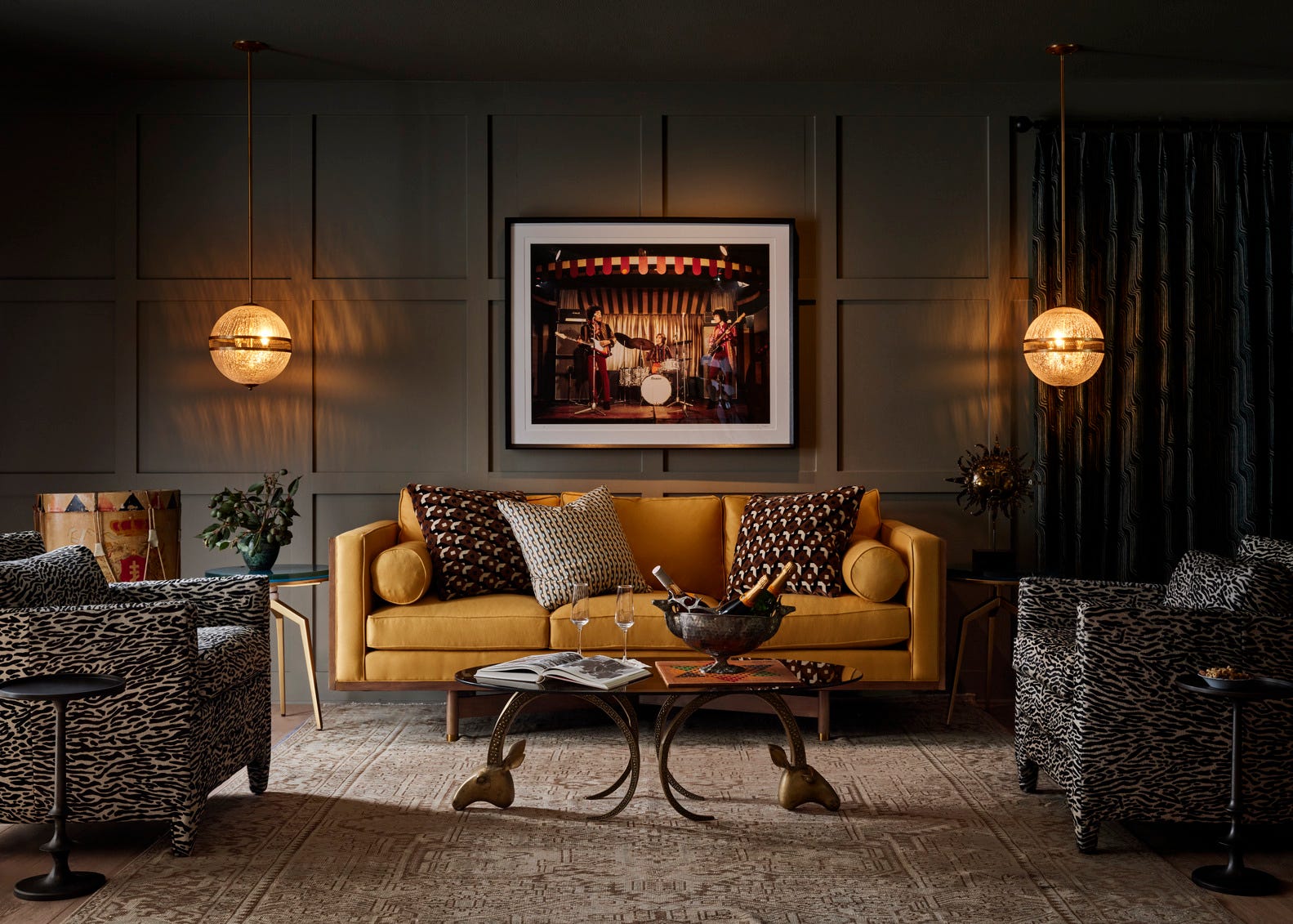
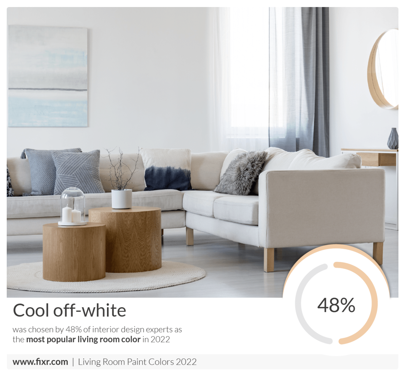
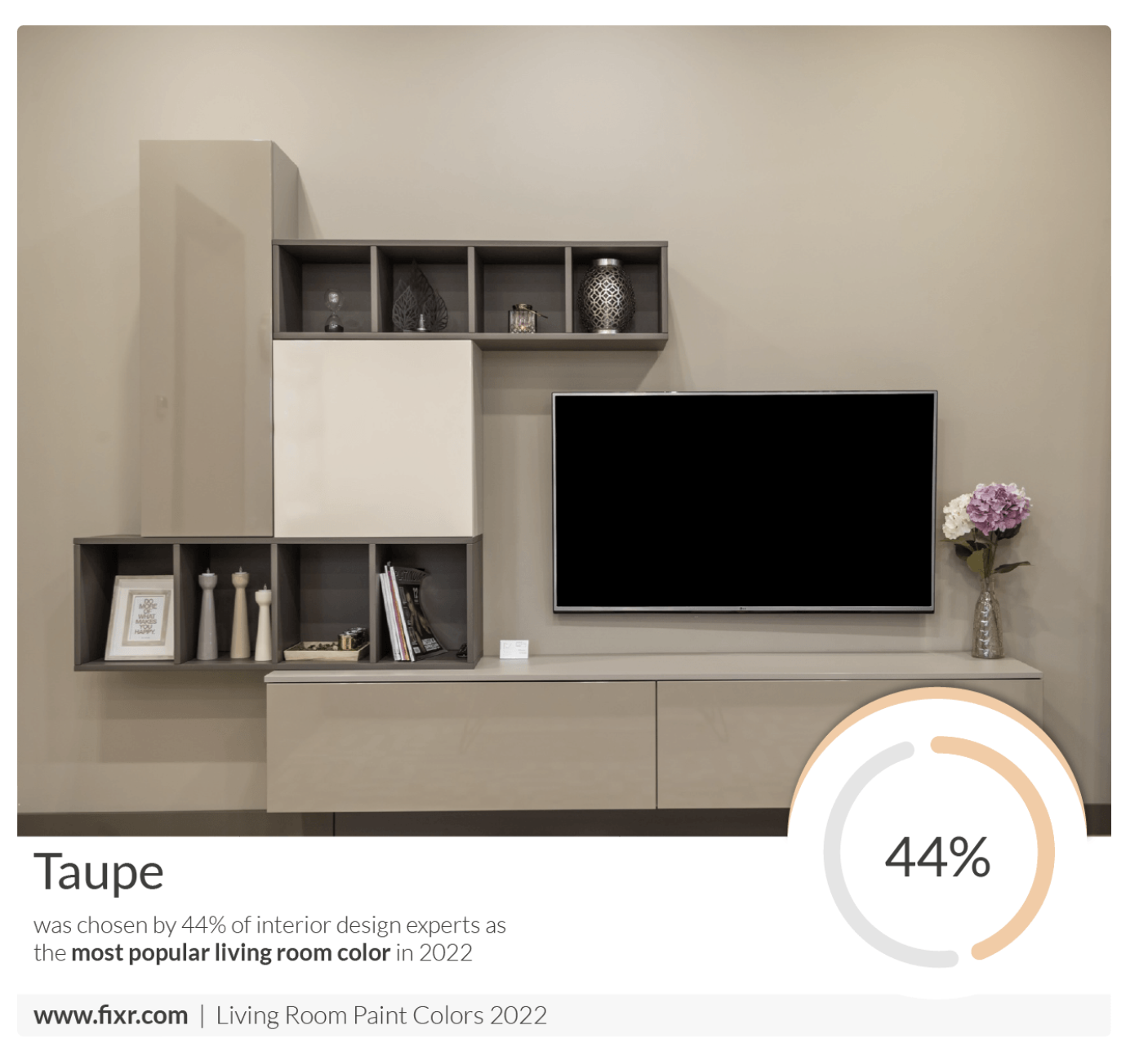
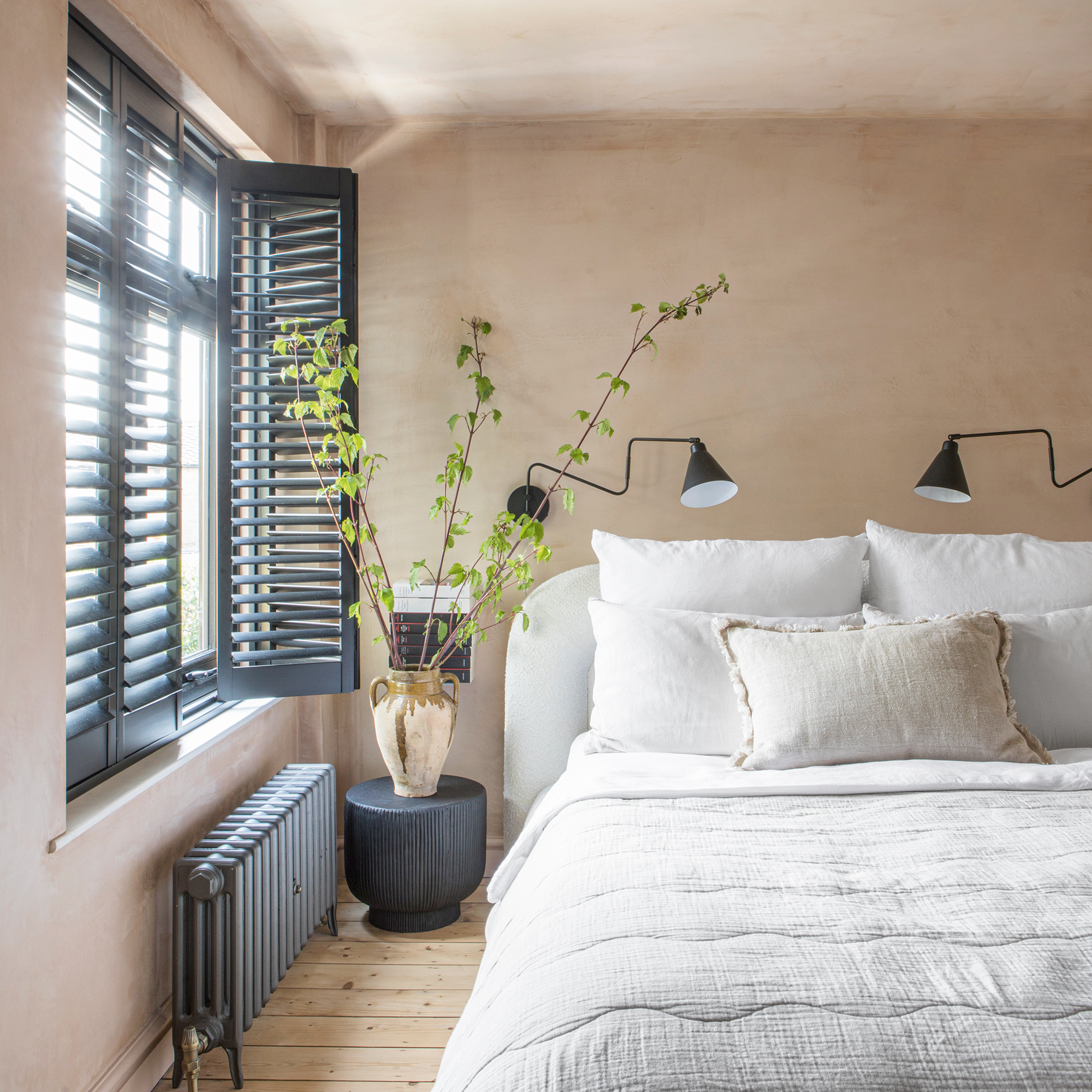
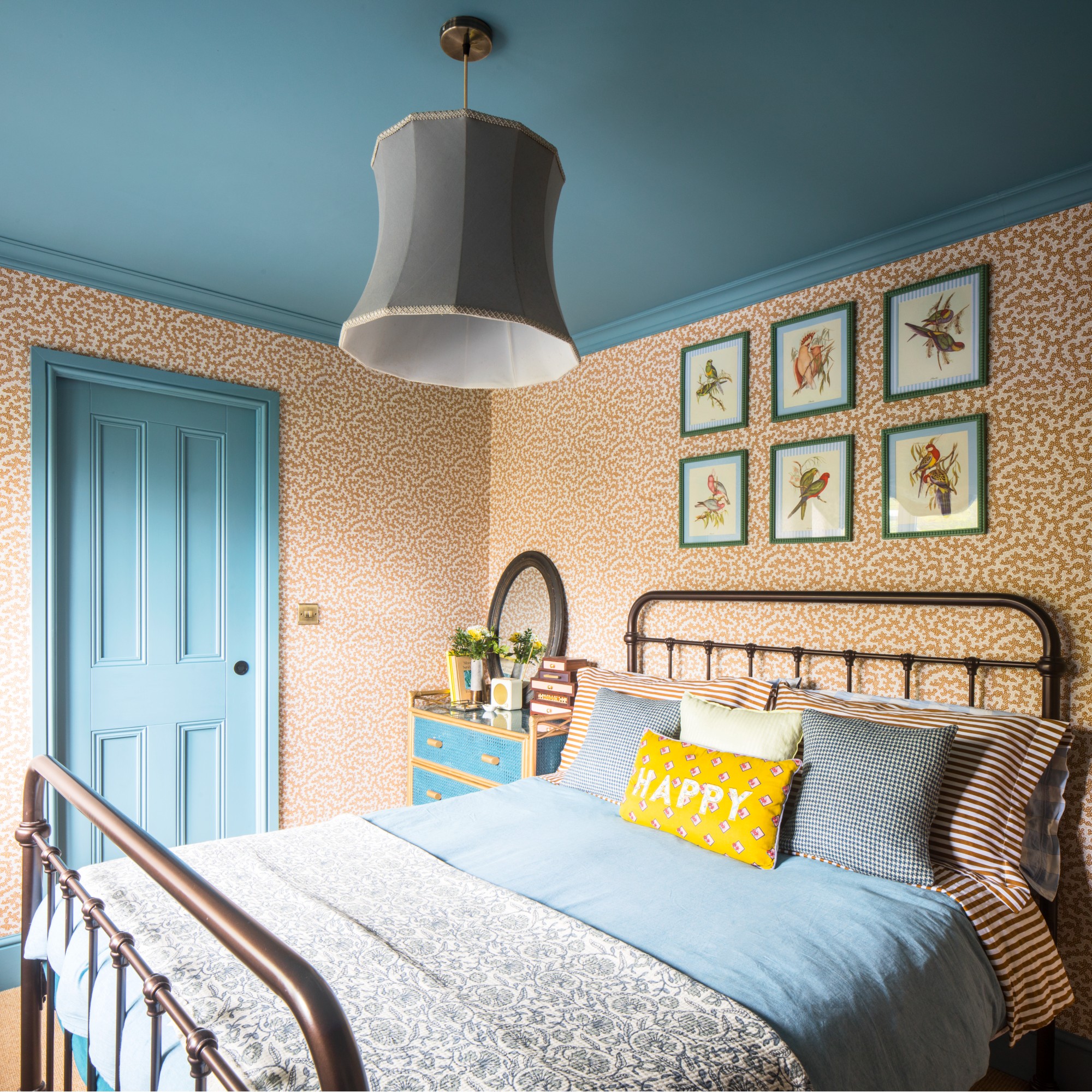
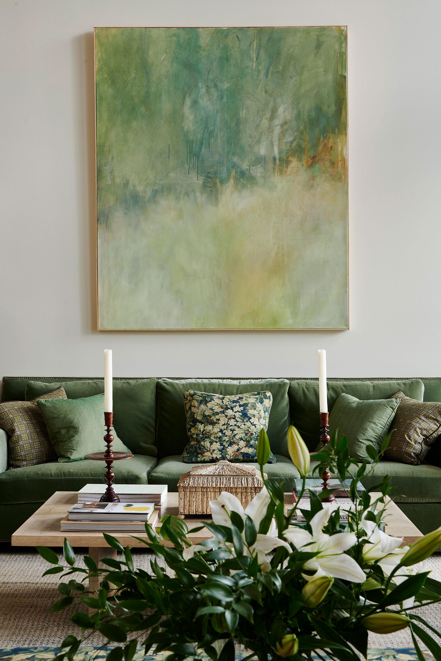
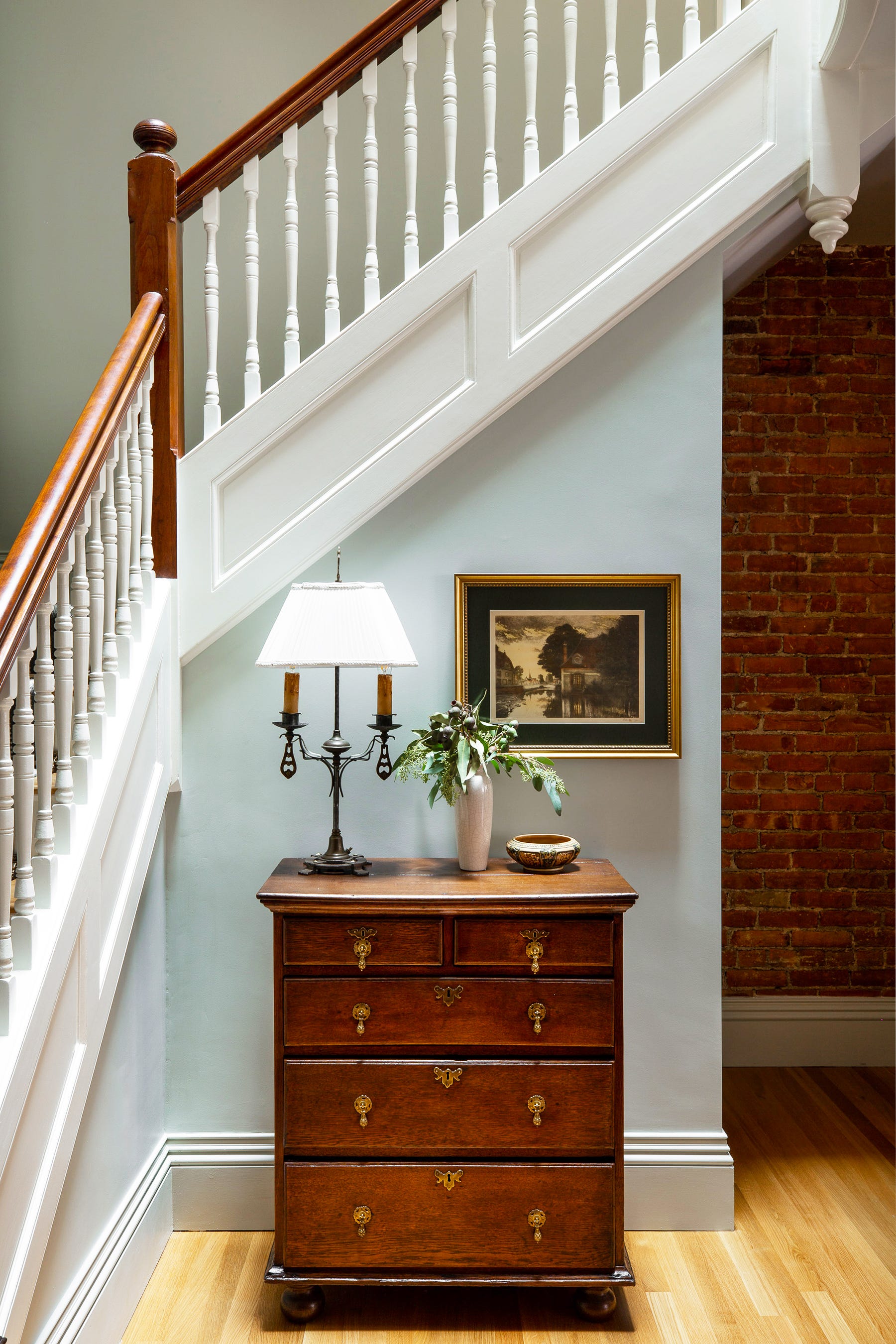
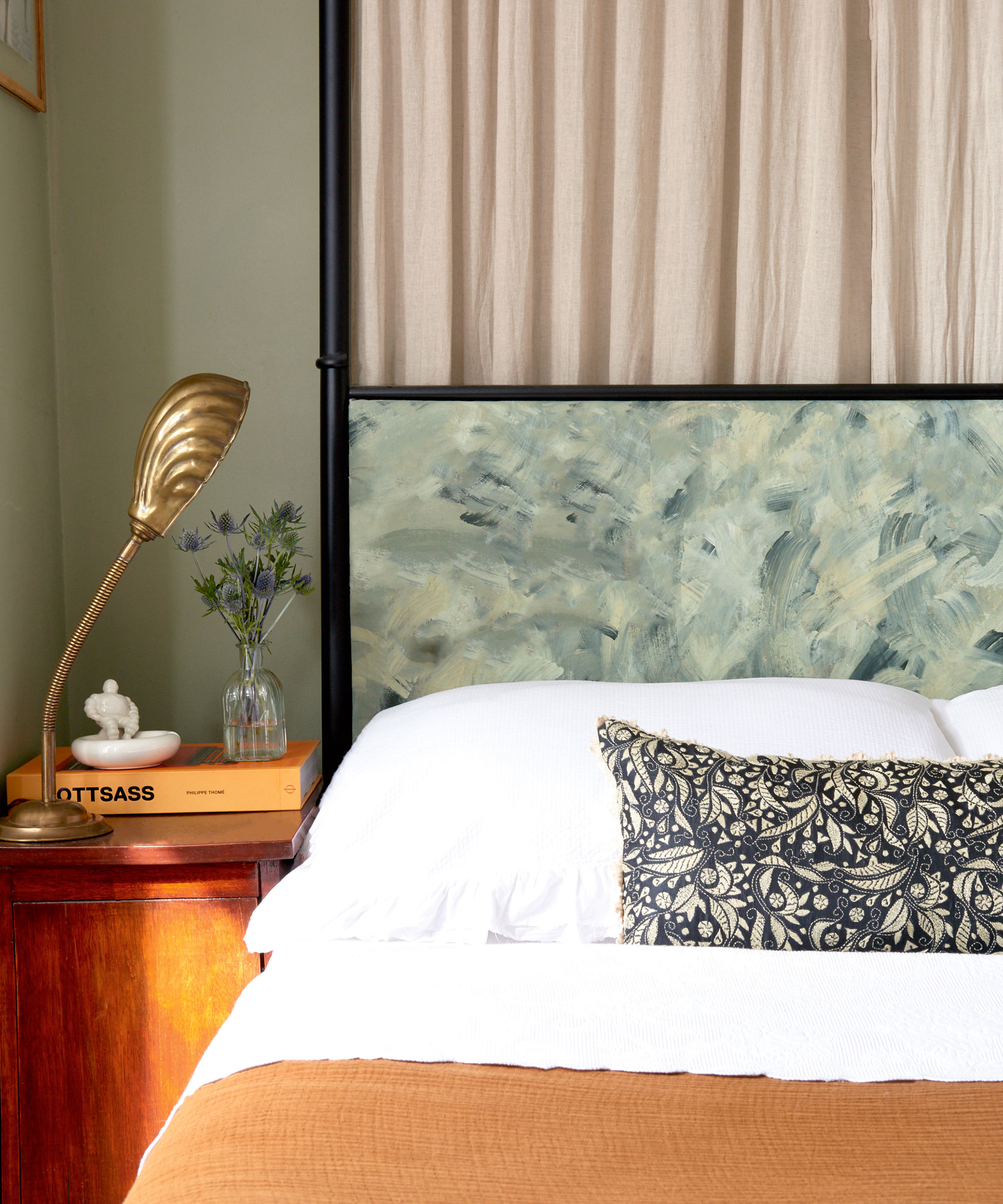
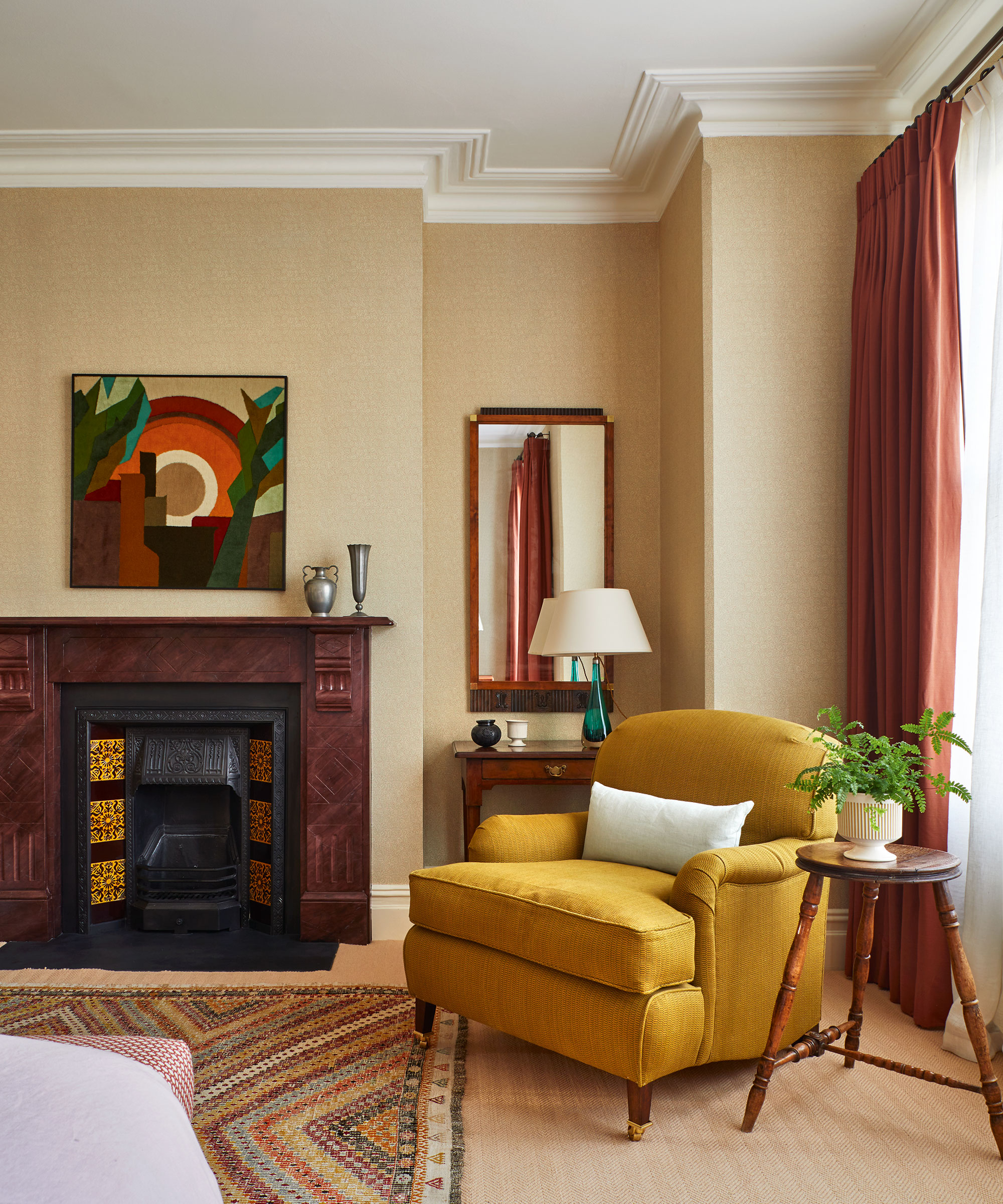
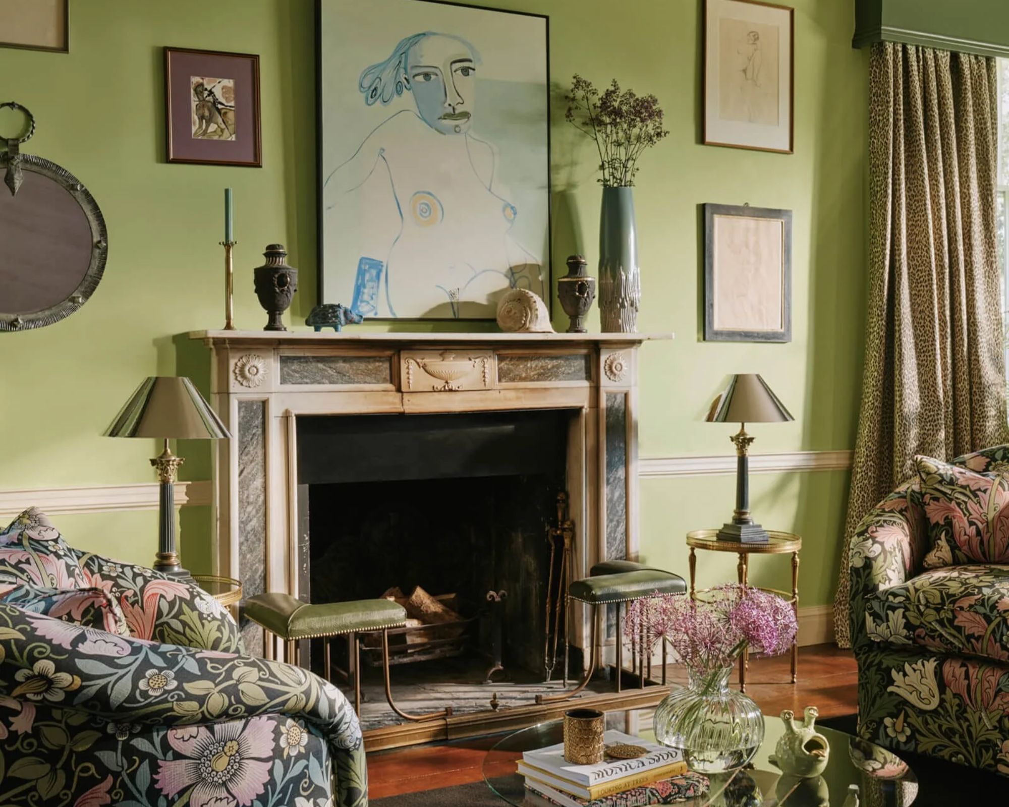
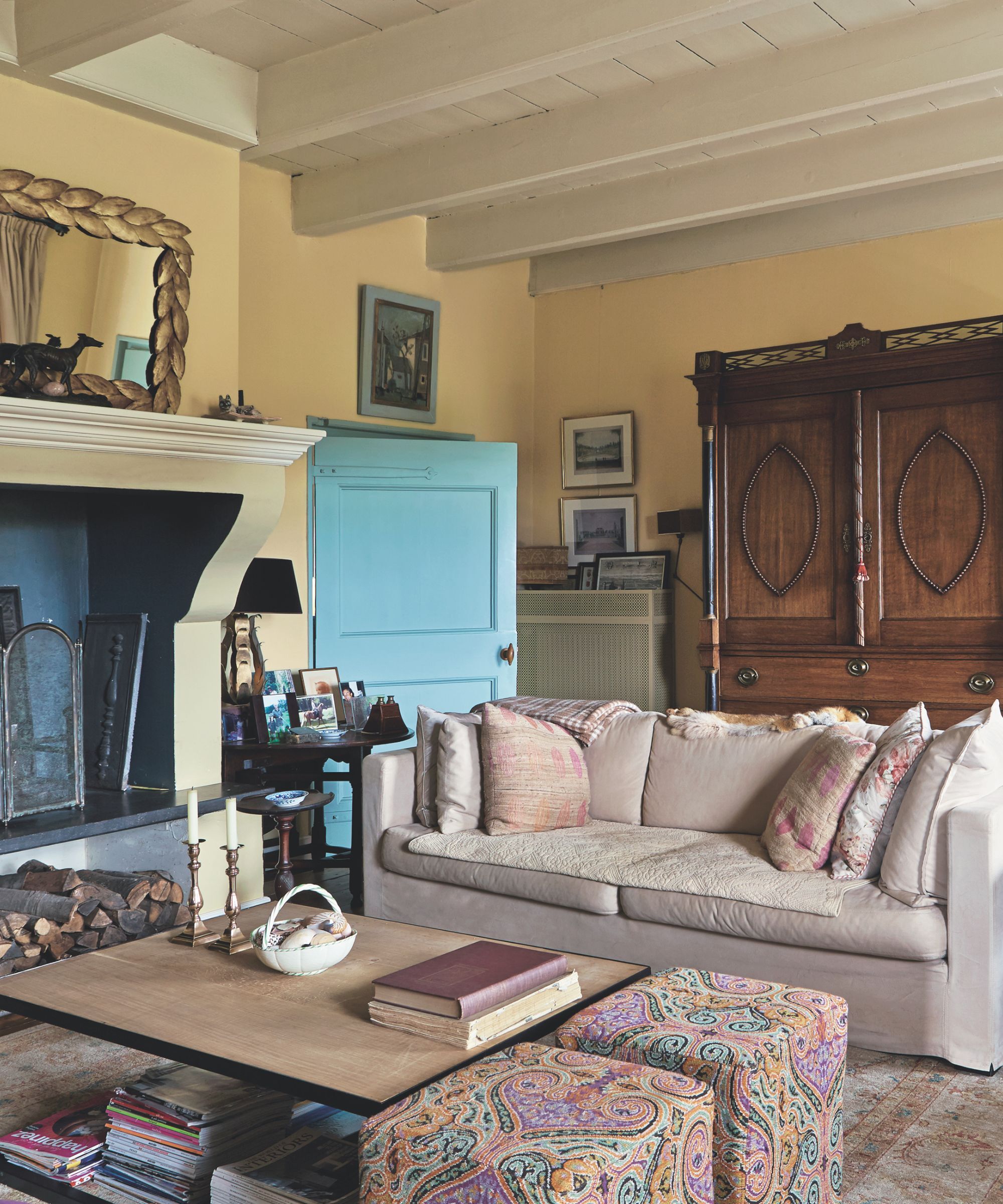
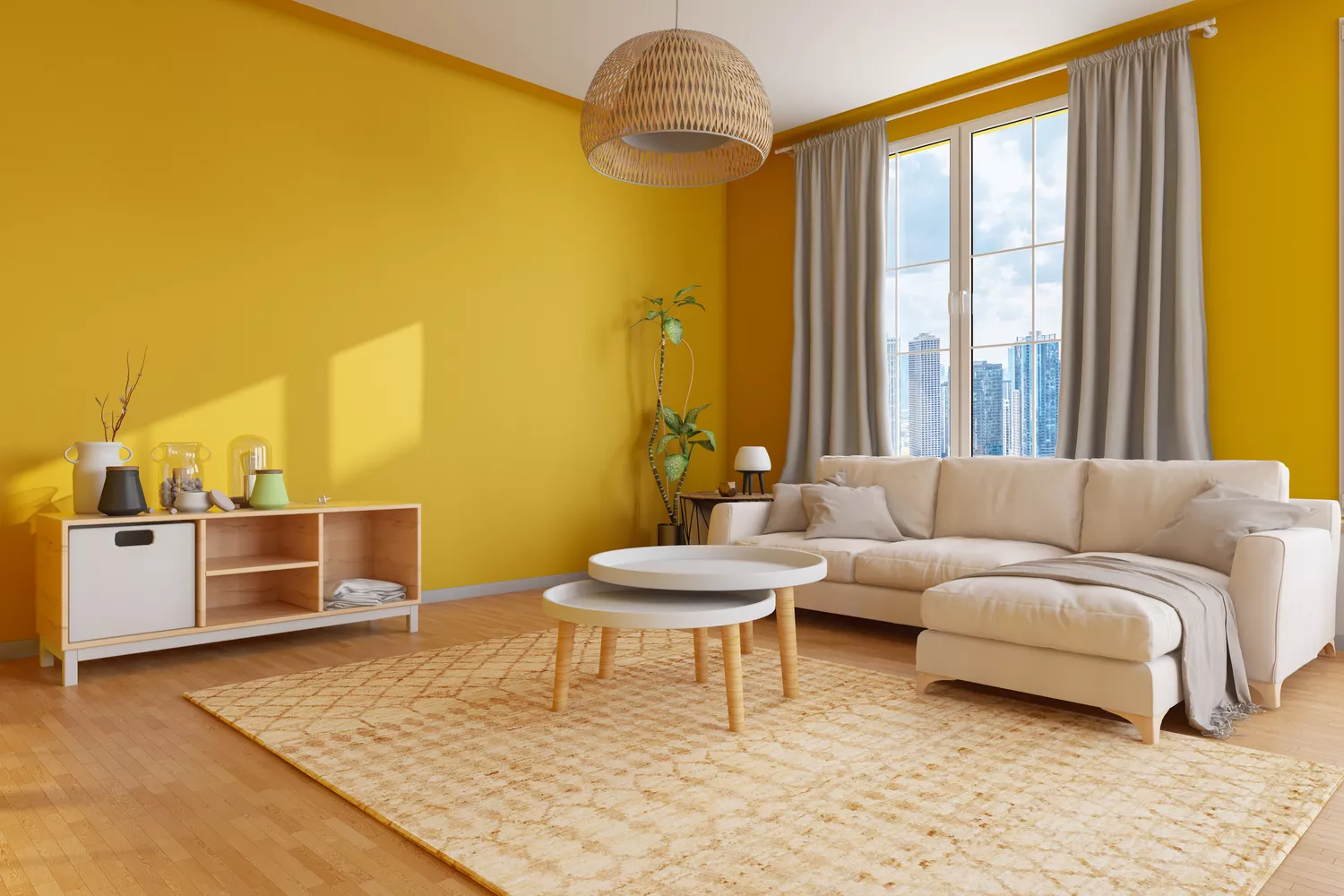
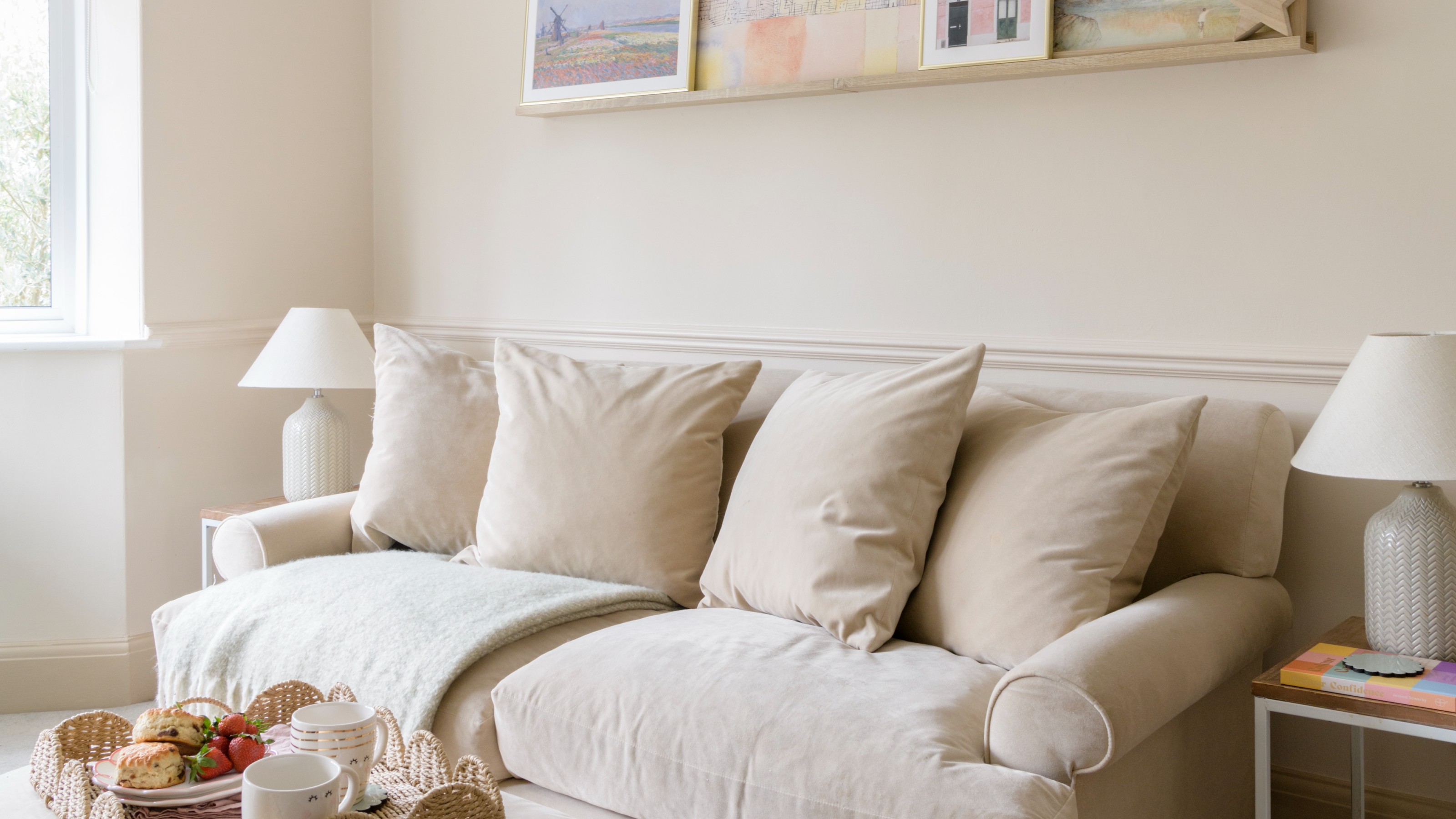
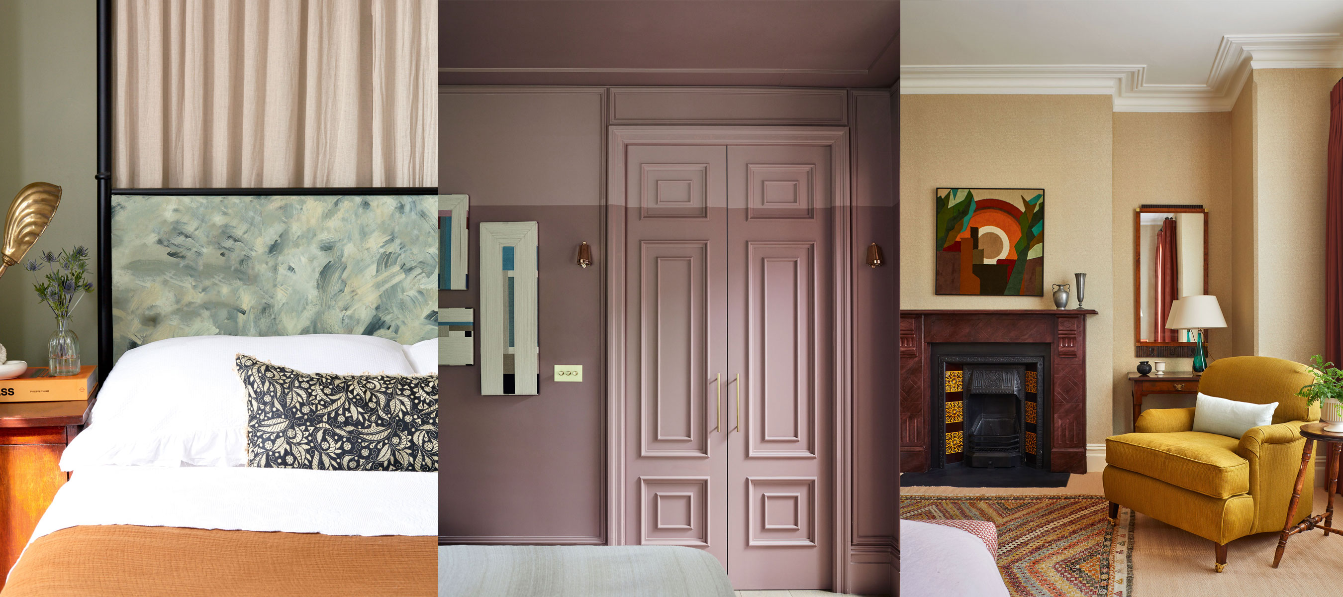
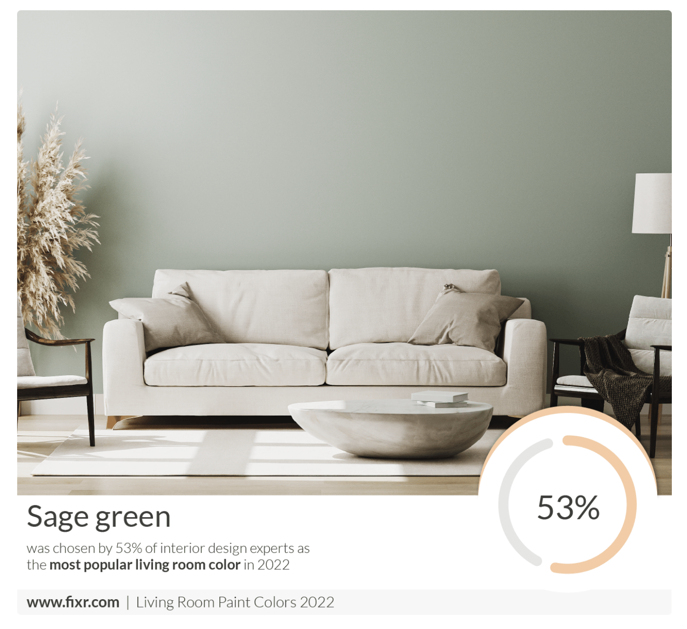
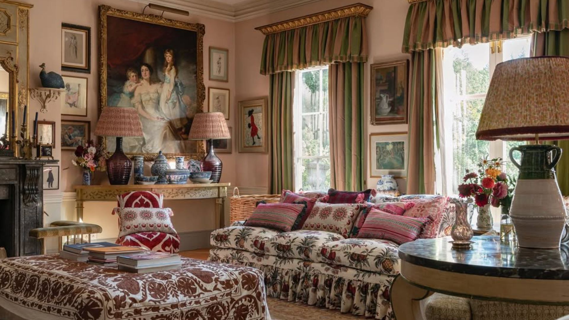
Specific color recommendations include beige with ochre undertones, which can warm up north-facing rooms. The use of neutral colors that mimic natural elements like stone and mushroom is suggested for their calming effect. Incorporating grass green accents in blinds and curtains is also recommended to add a fresh feel, reinforcing the idea of drawing inspiration from nature's palette.
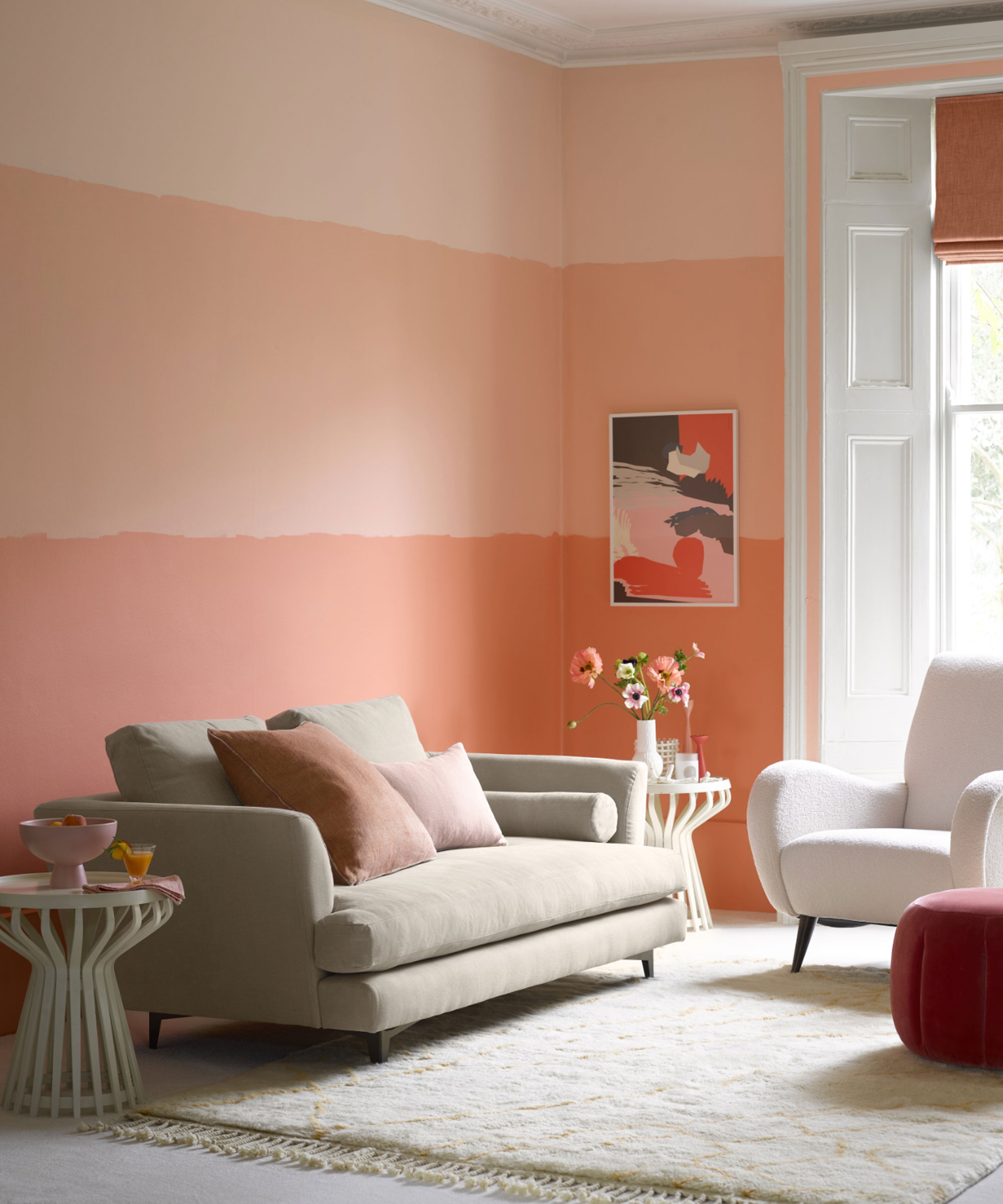
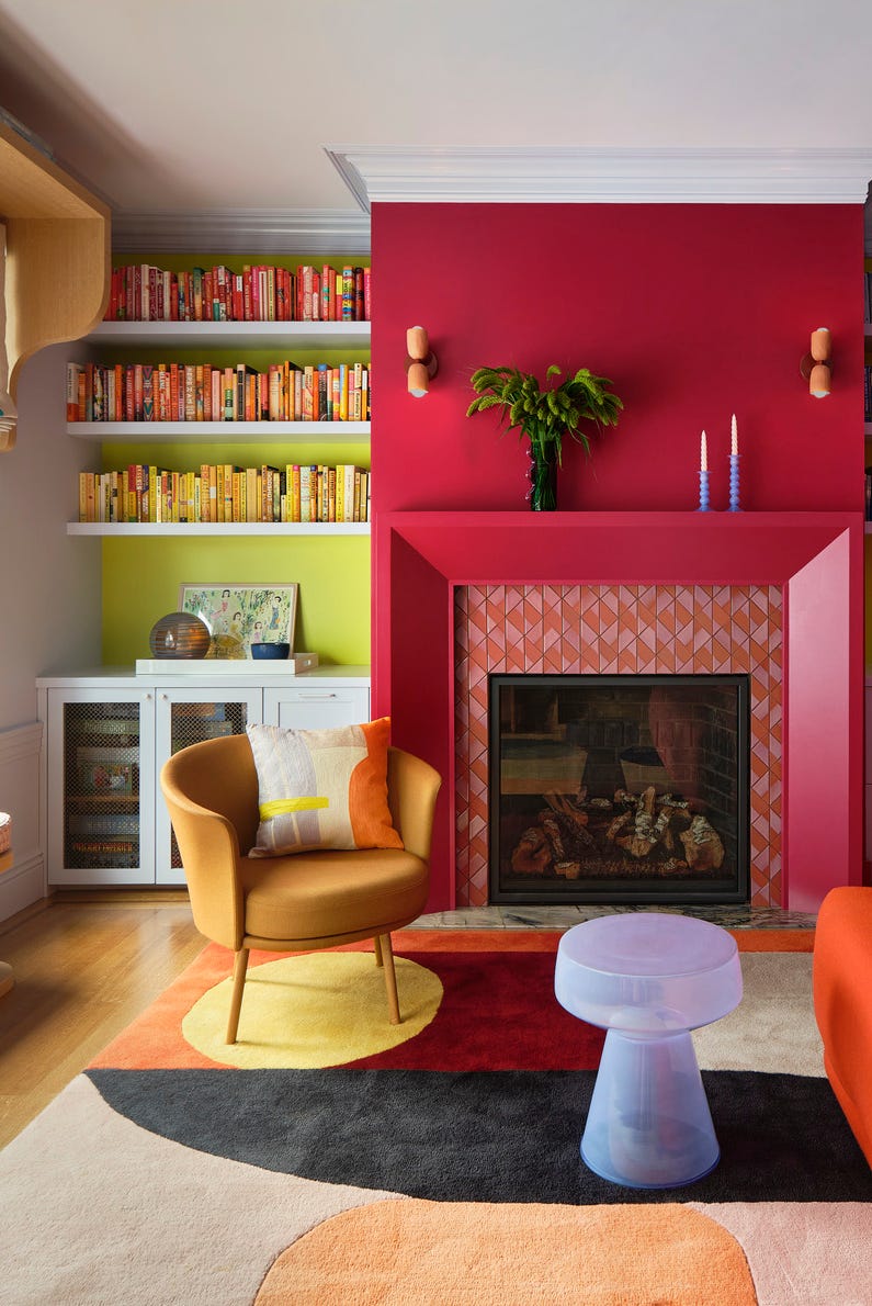
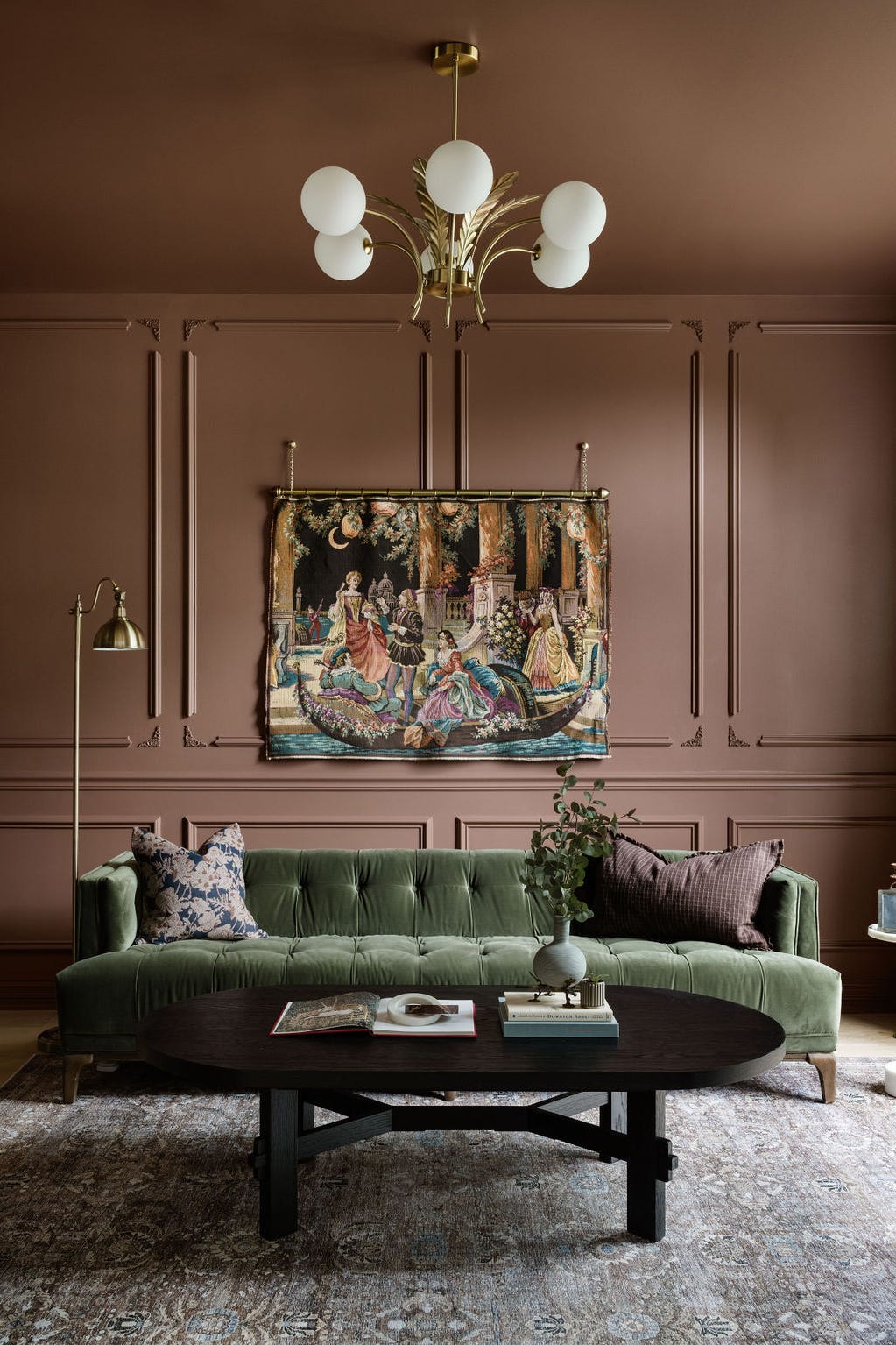
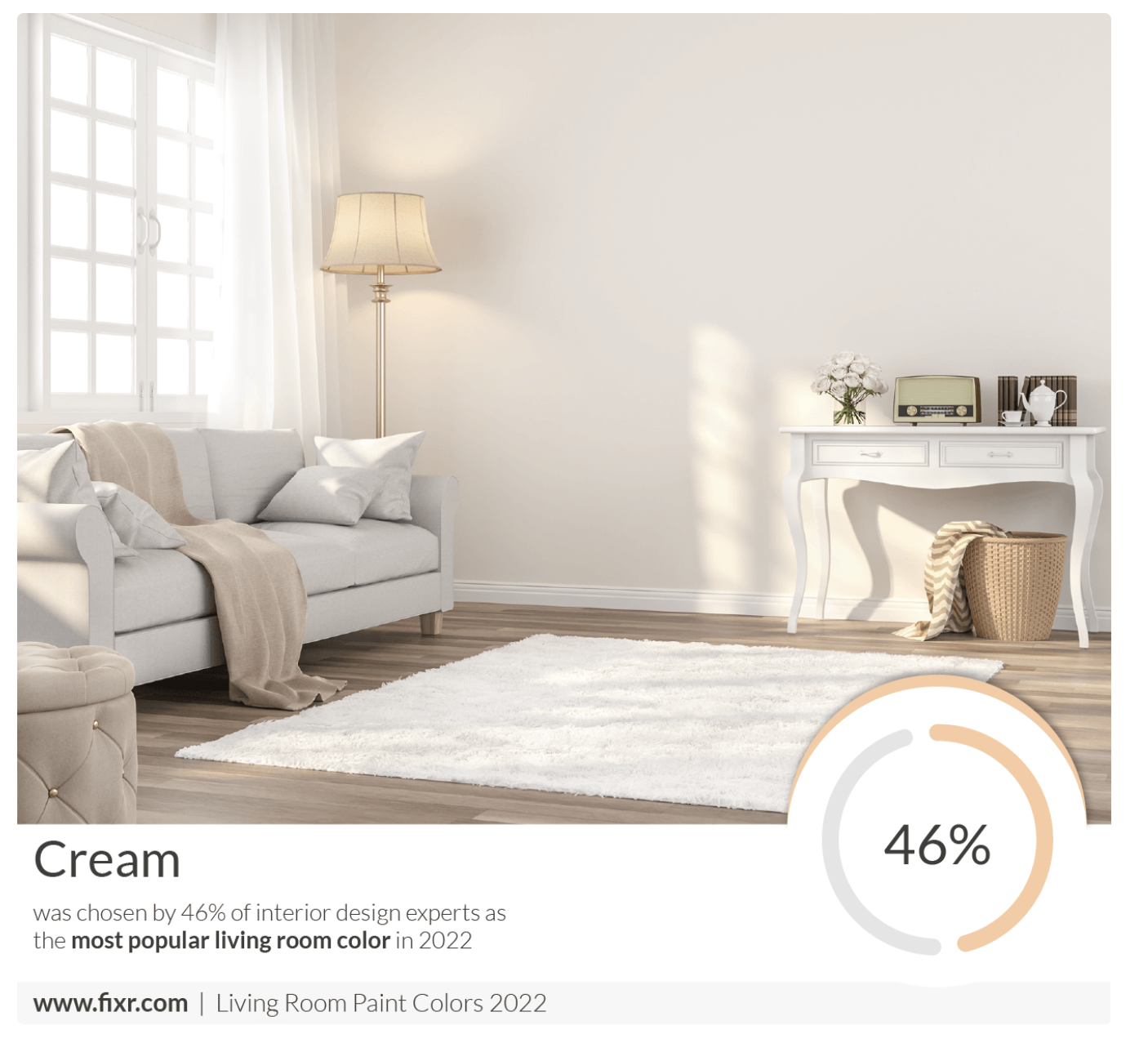
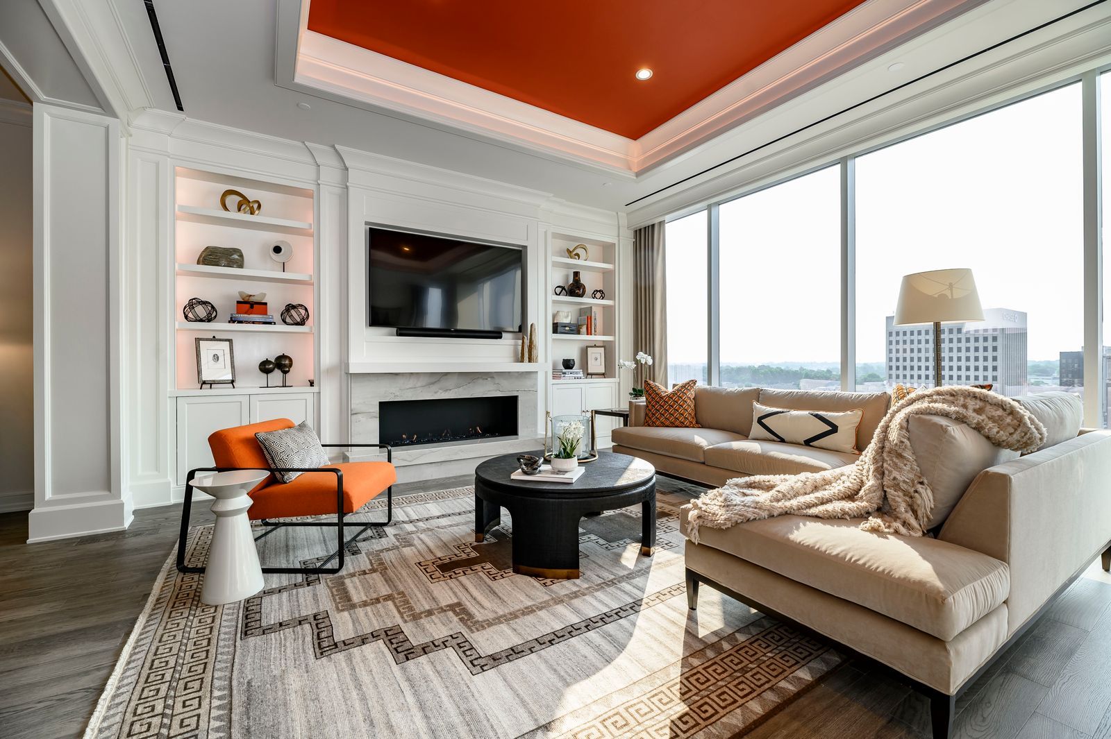
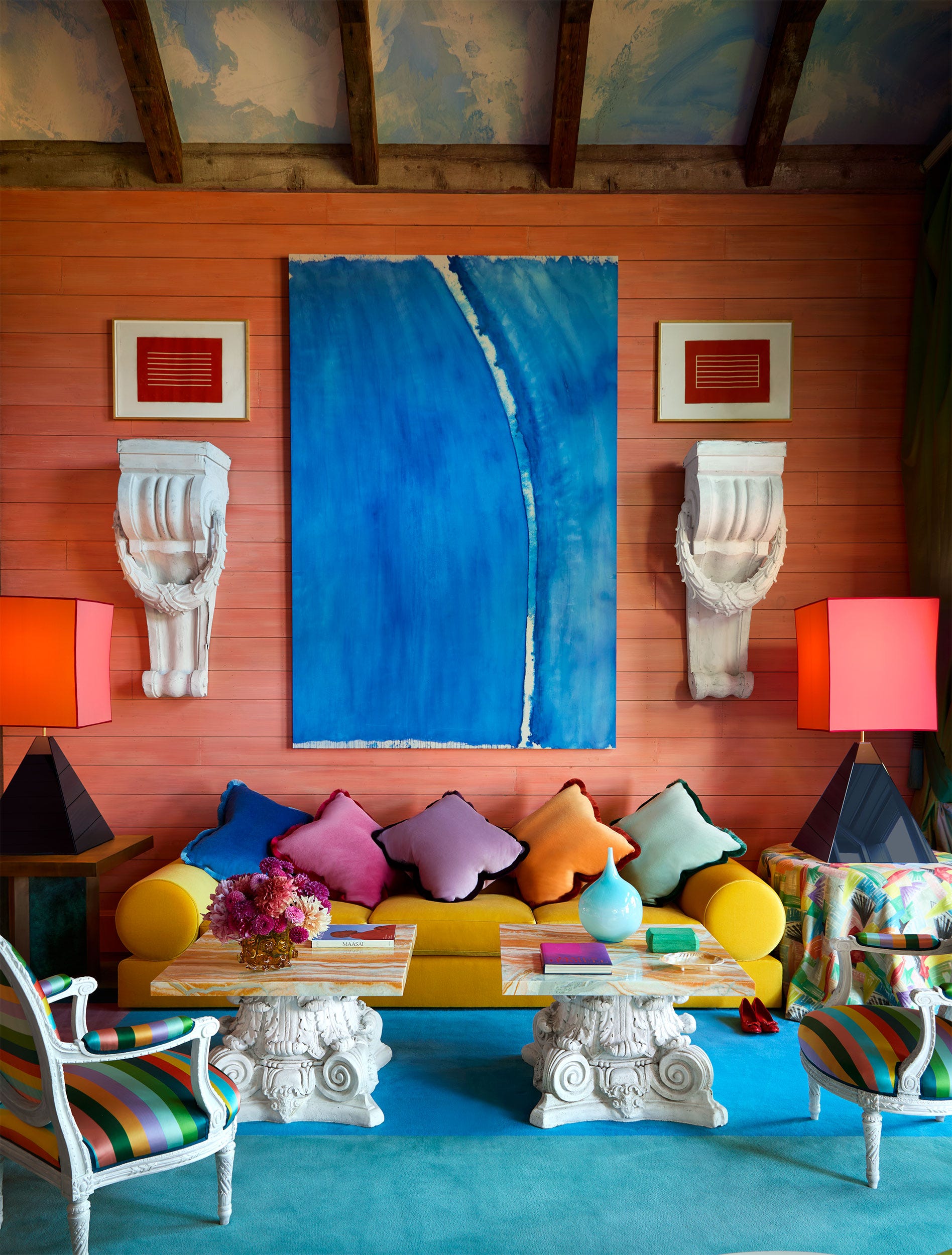
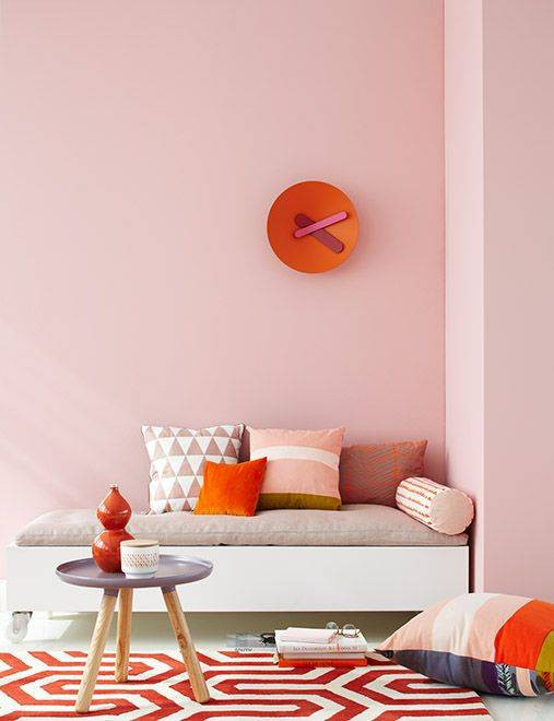
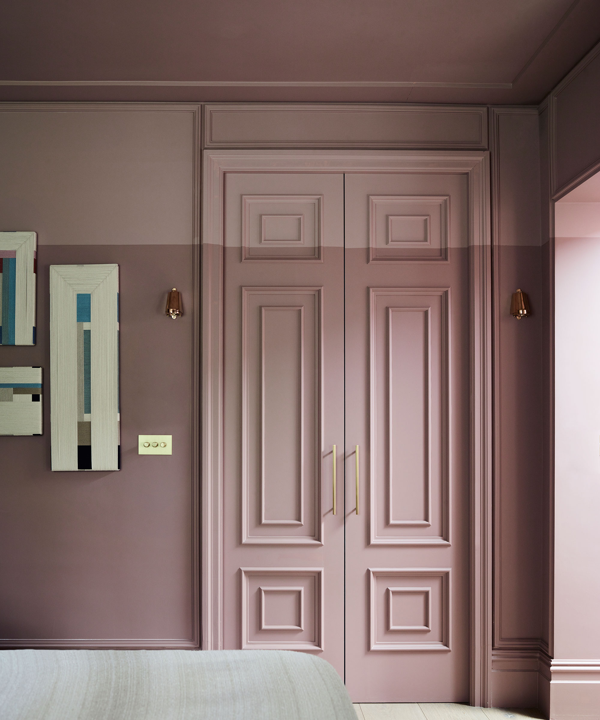
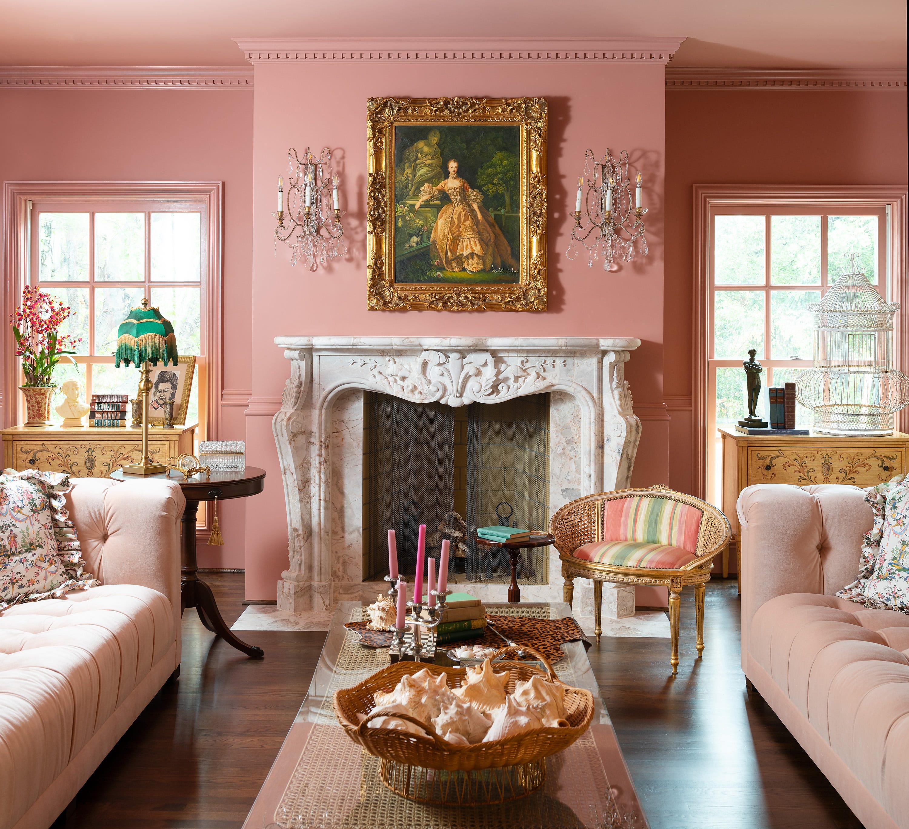
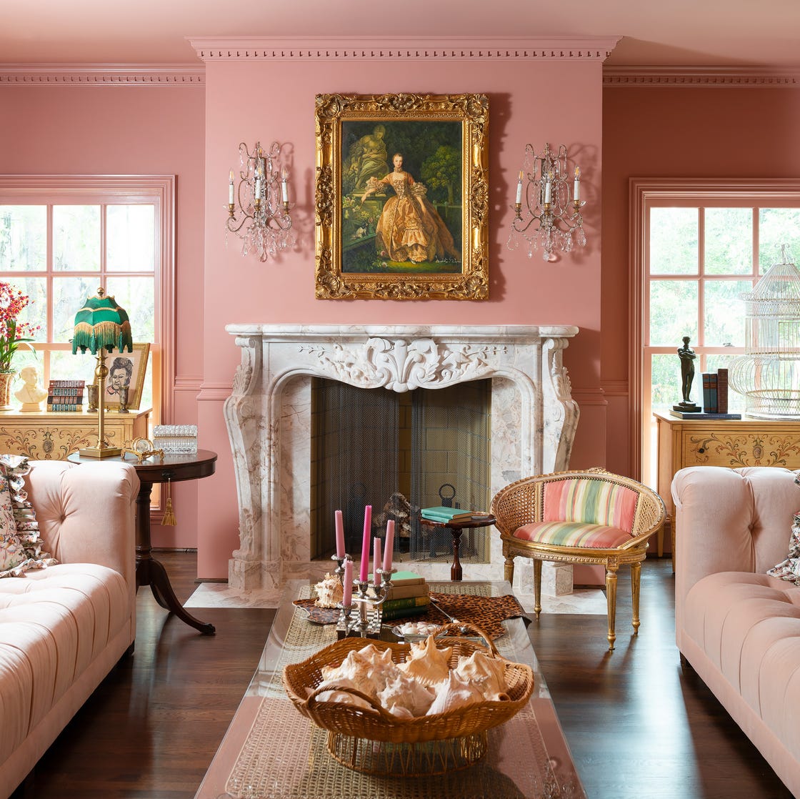
Coral is identified as a popular shade, and Helen Shaw, UK Director at Benjamin Moore, explains its appeal. She notes that corals and pink peach tones create a rich, warm, and welcoming ambiance with red, orange, and pink undertones. These colors work well as accents in grey schemes or as statement wall colors. More neutral plaster tones or light terracotta shades are also suggested for an earthy feel, particularly effective in well-lit spaces when combined with natural materials or painted wood.
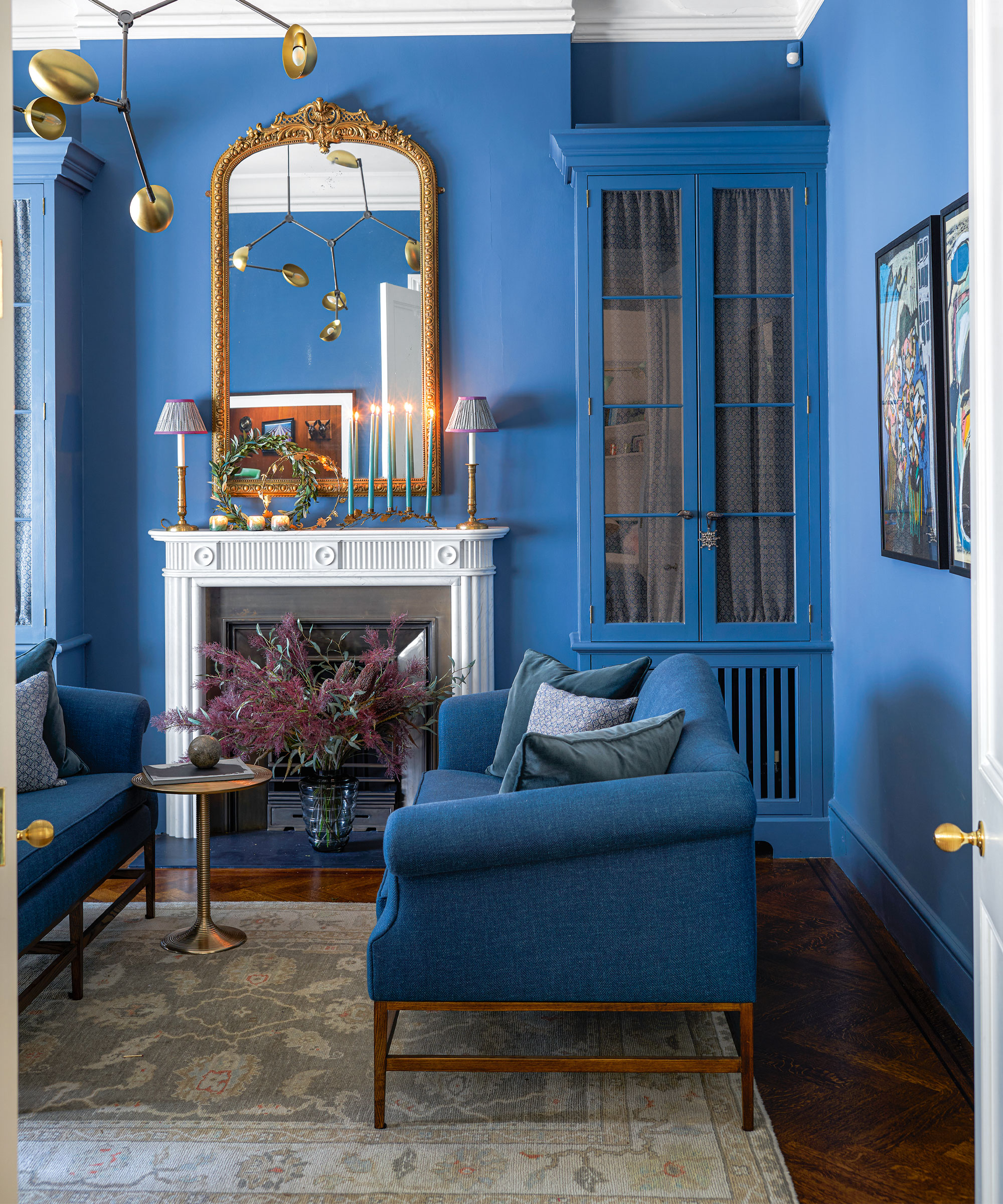
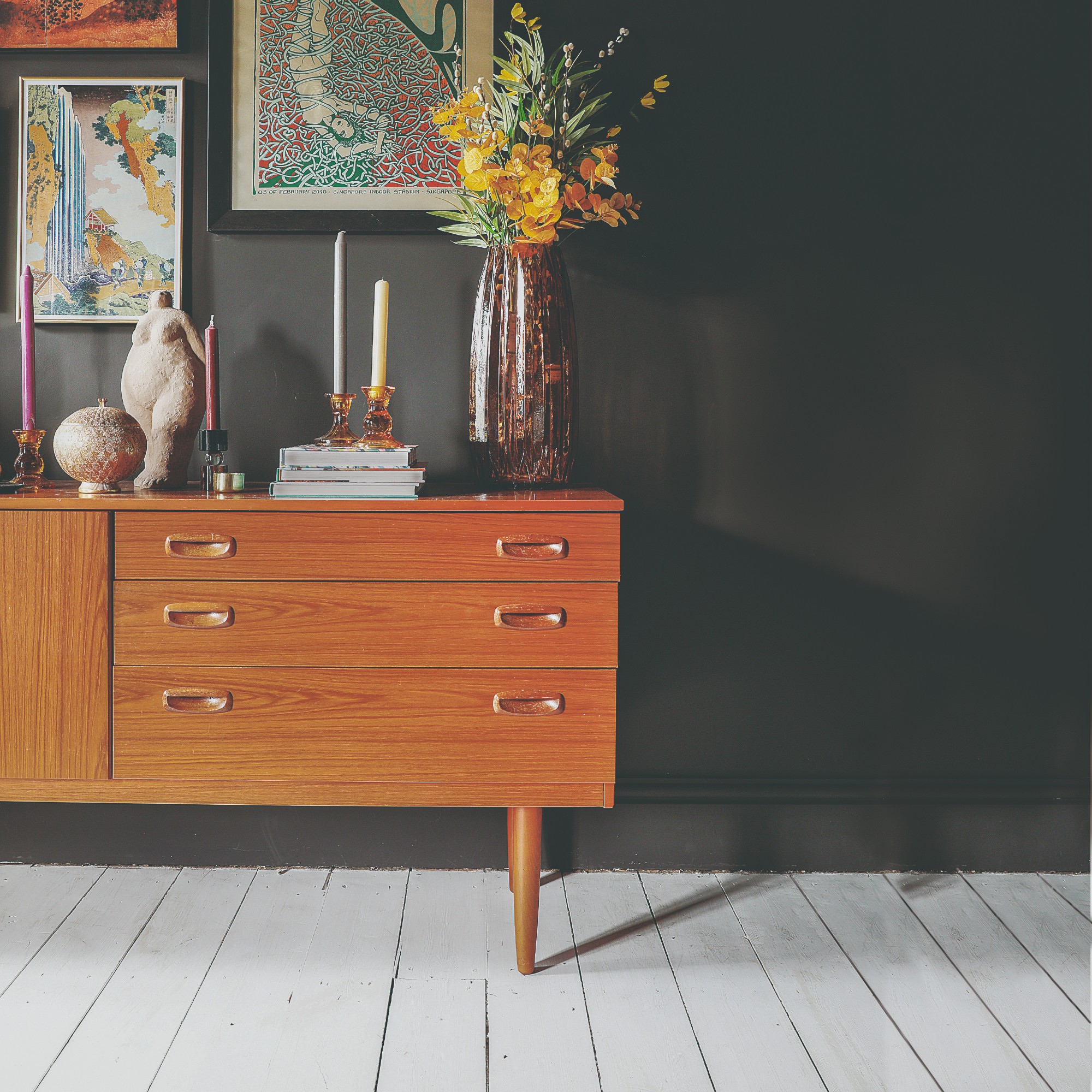
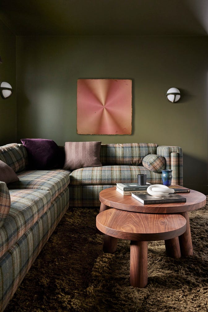
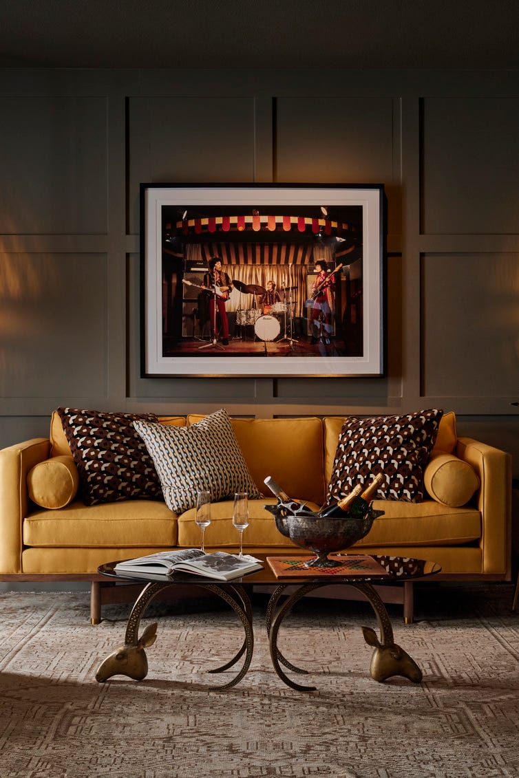
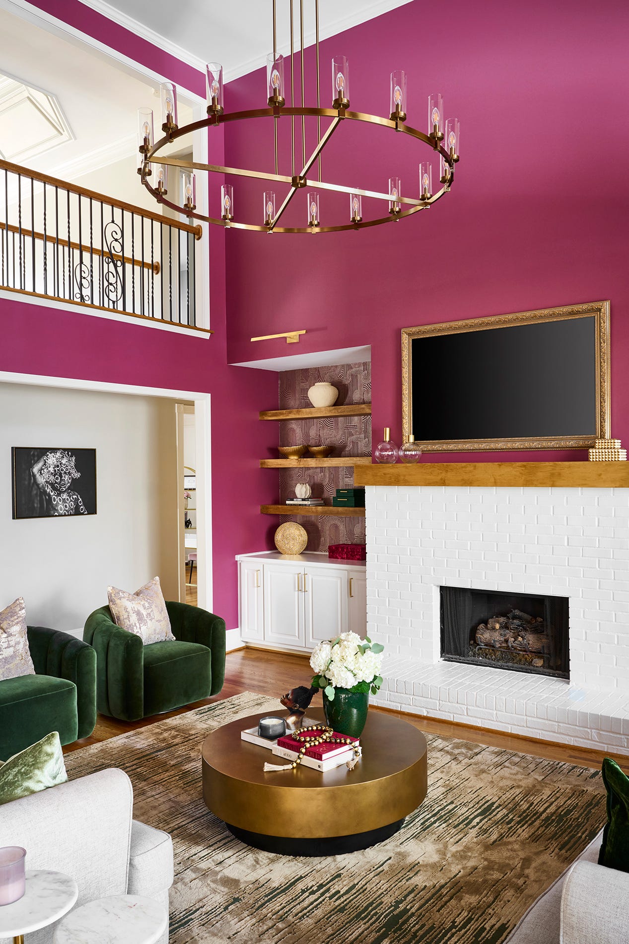
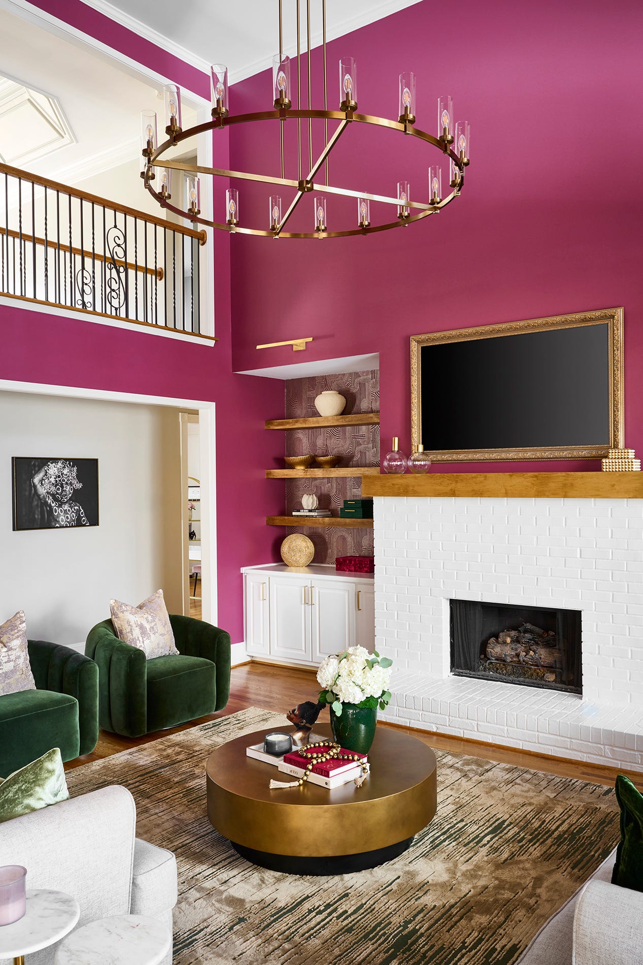
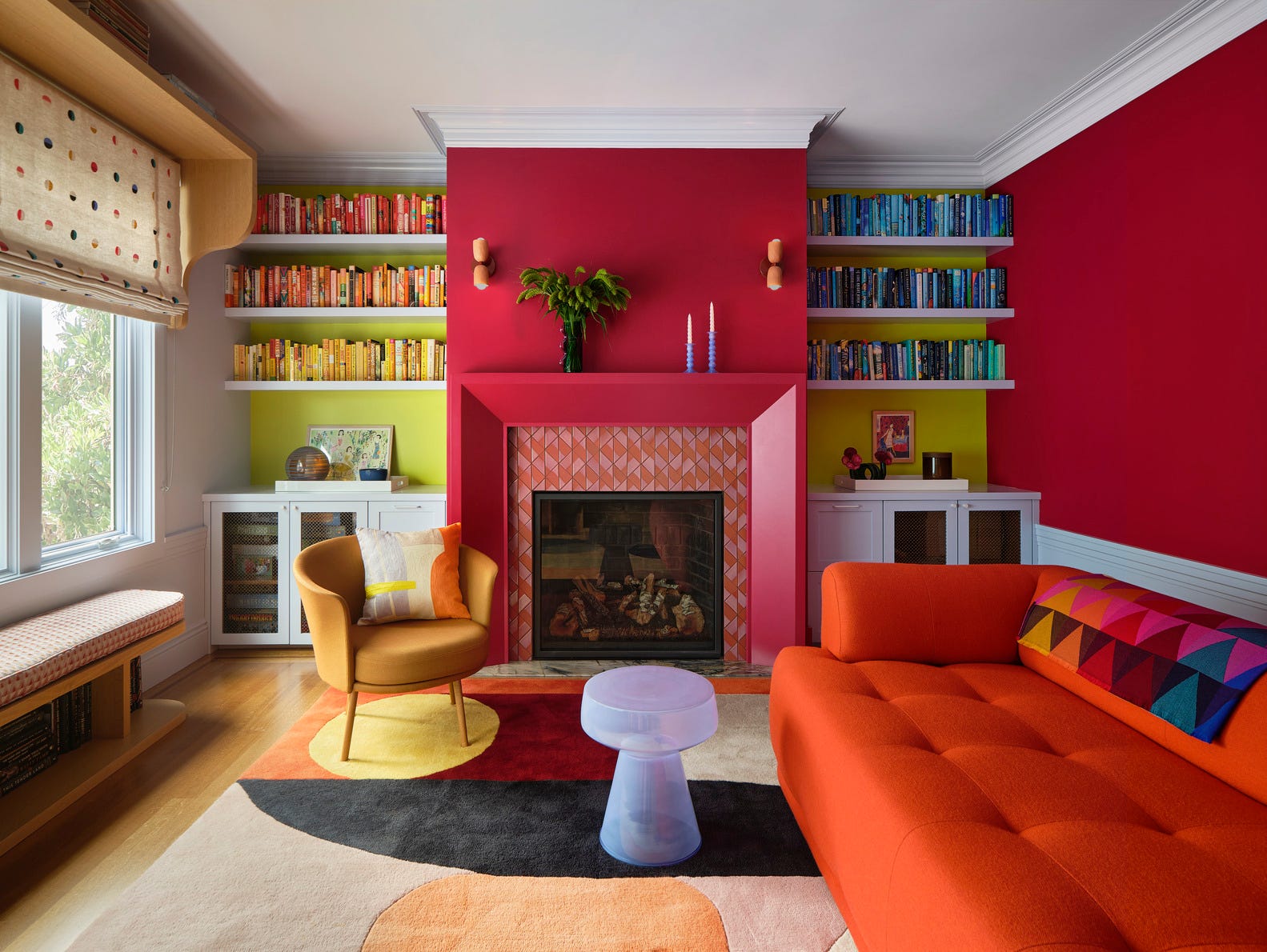
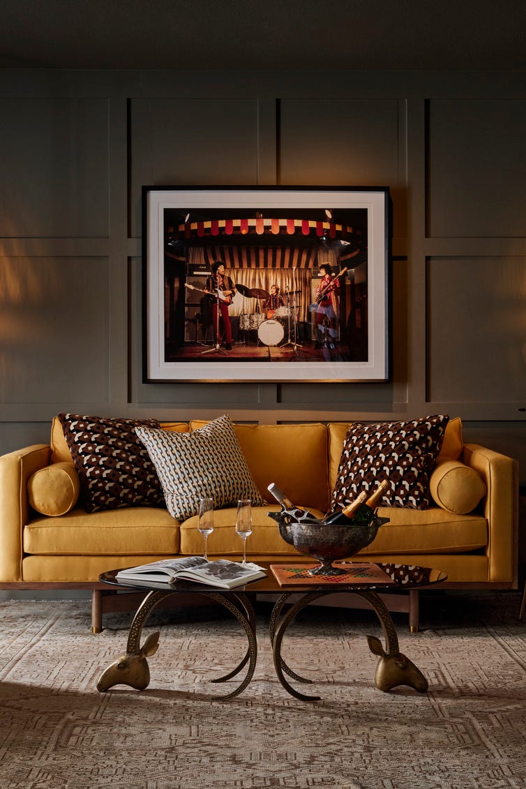
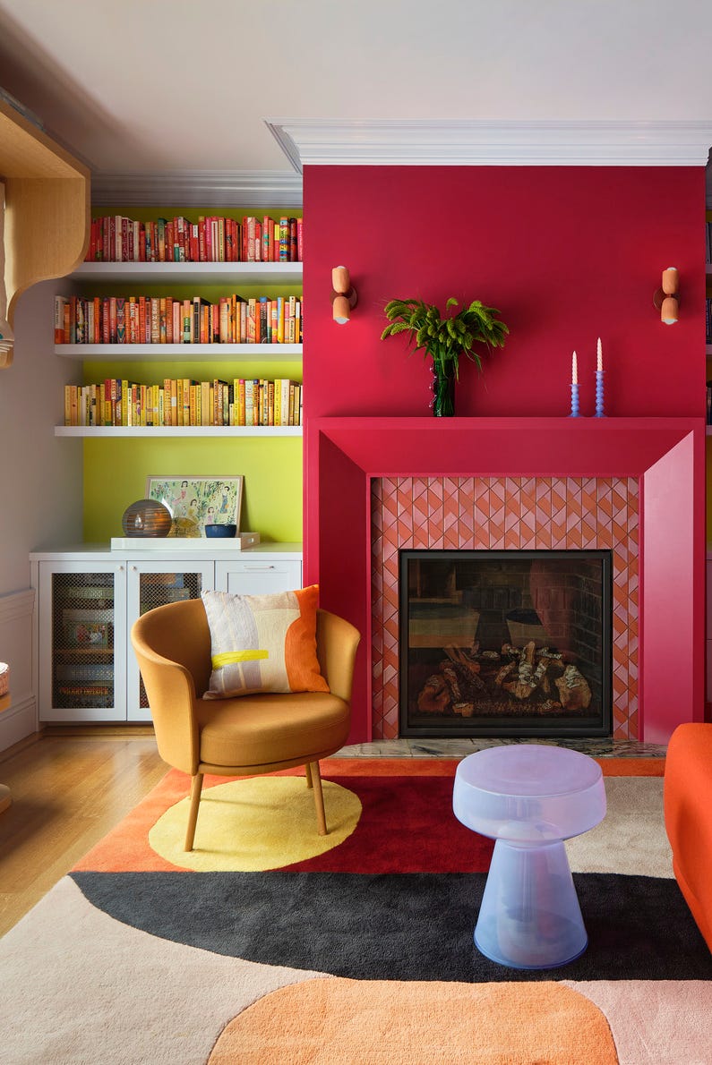
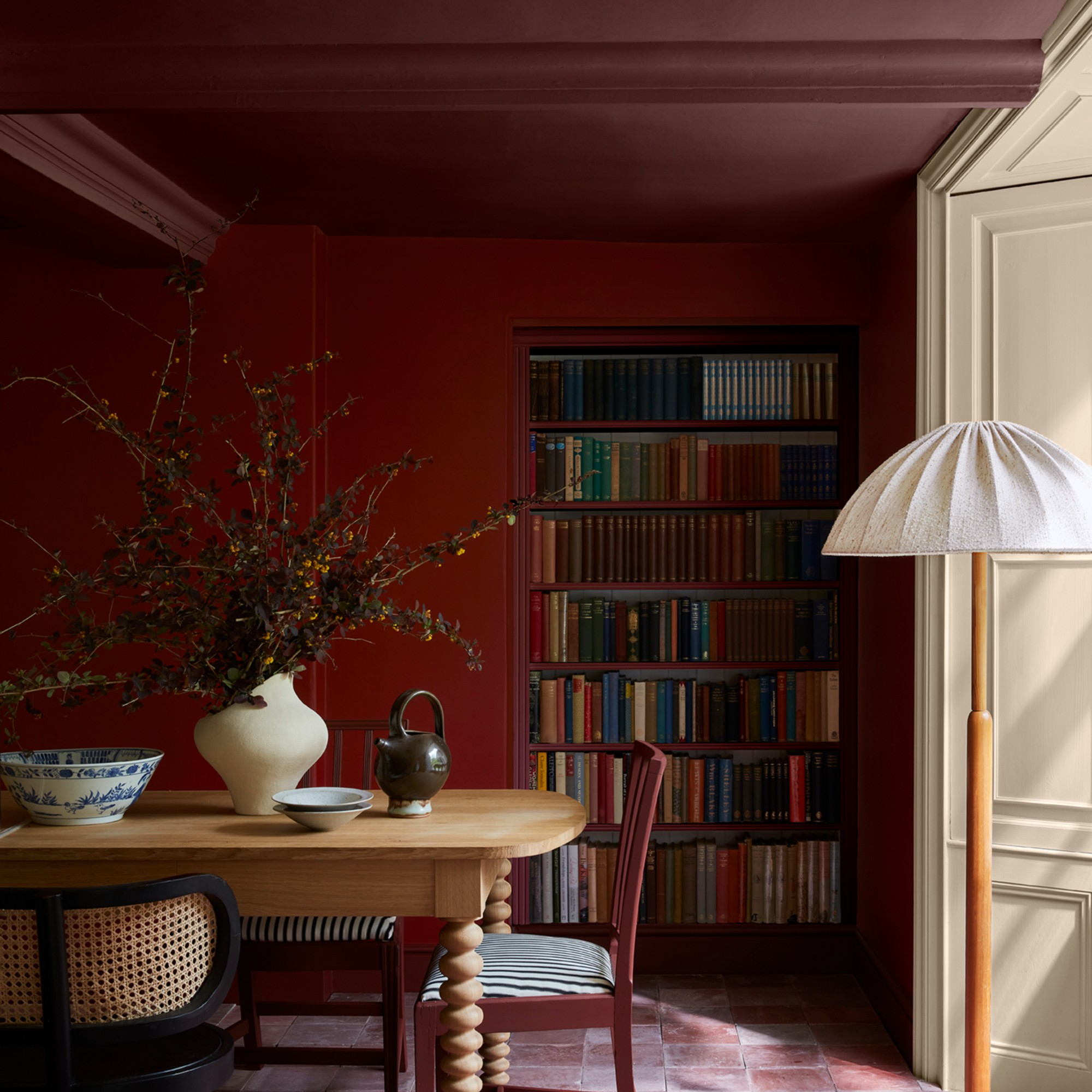
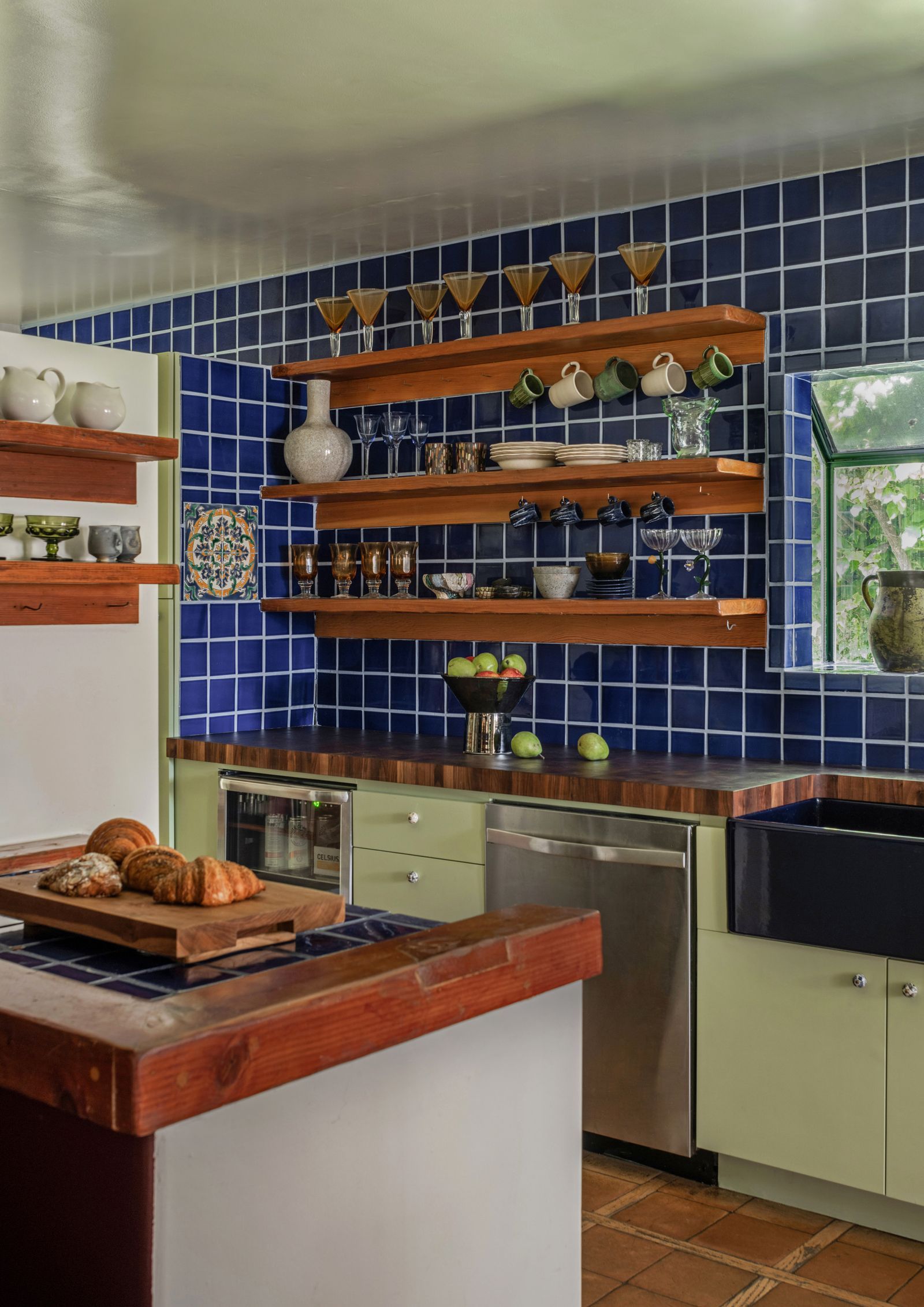
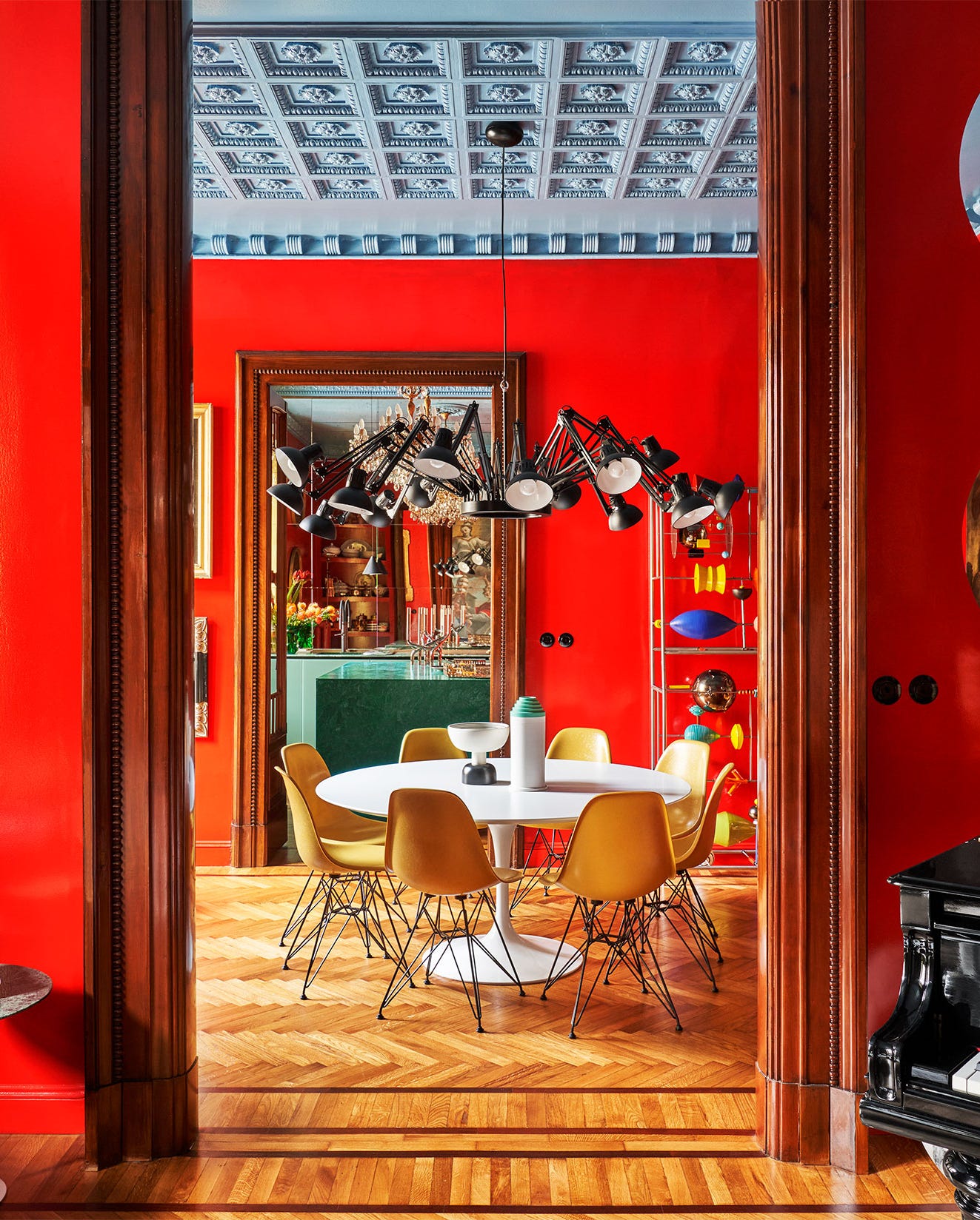
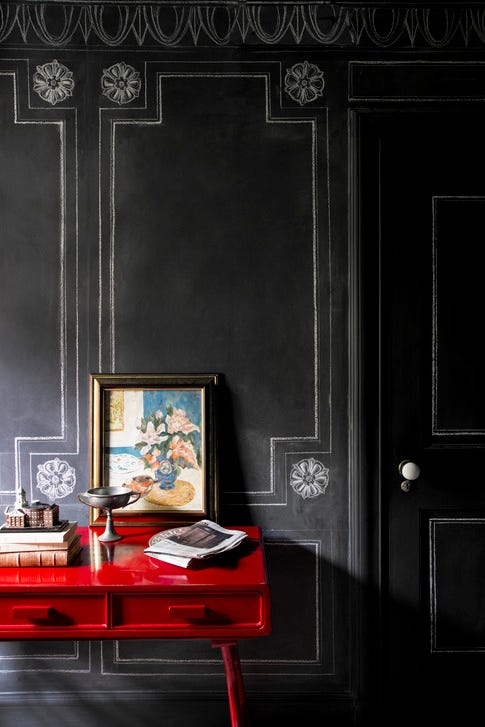
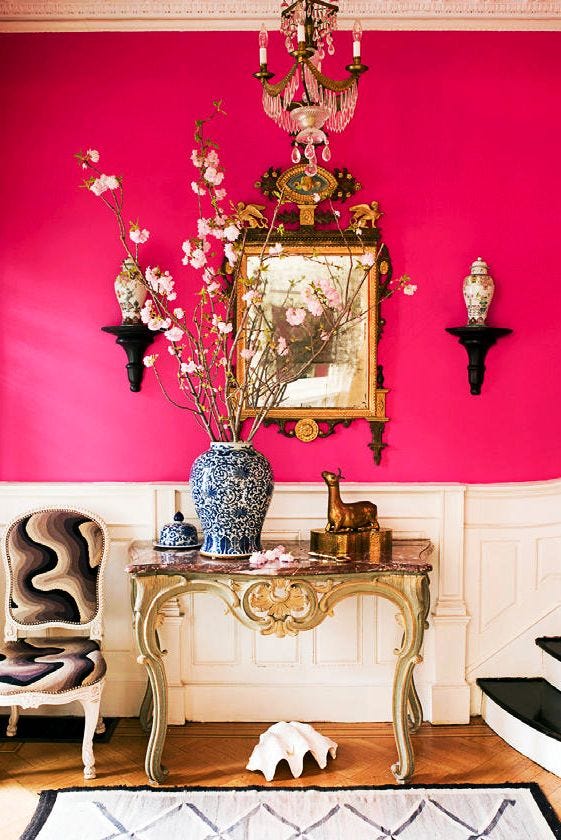
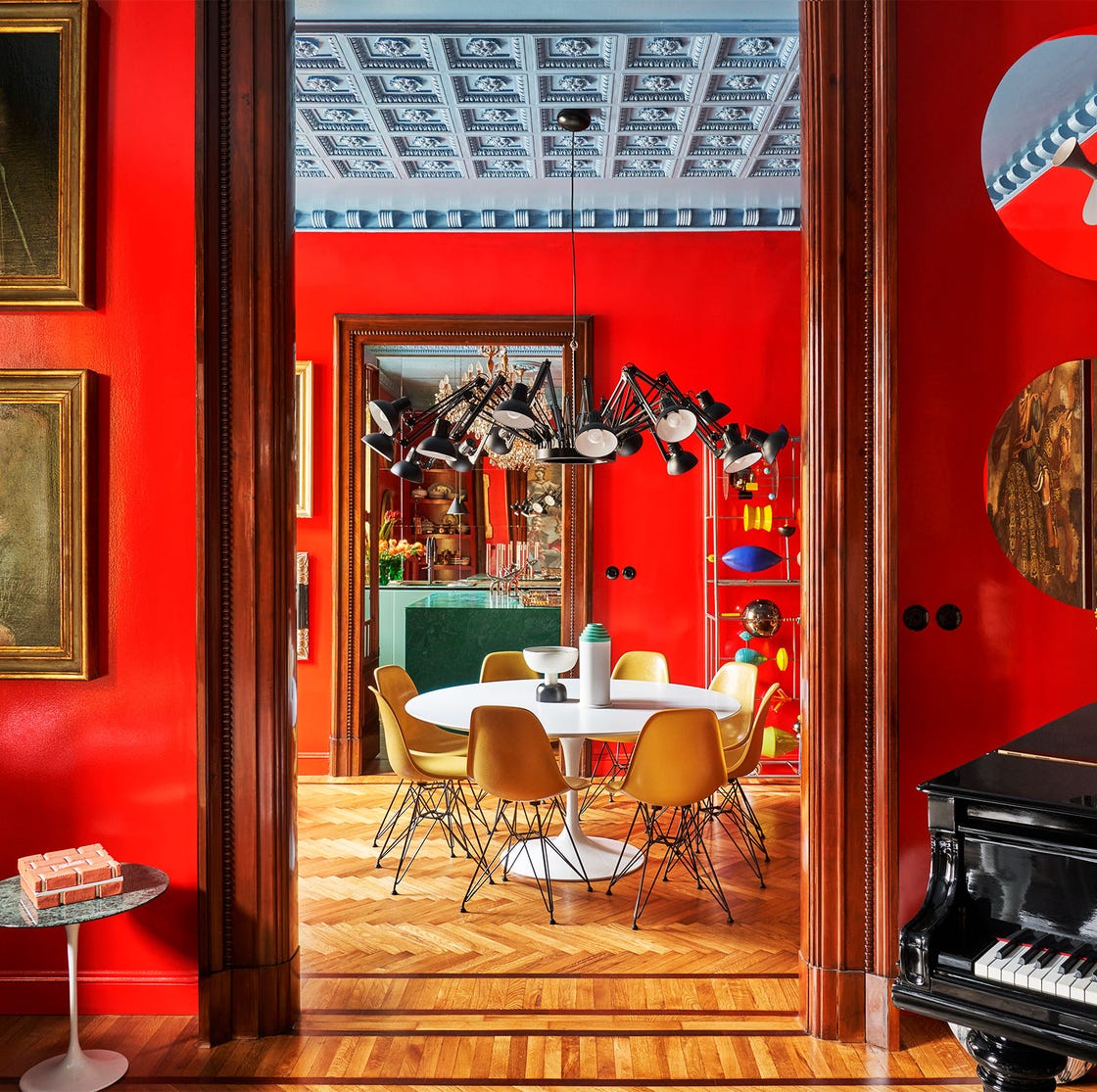
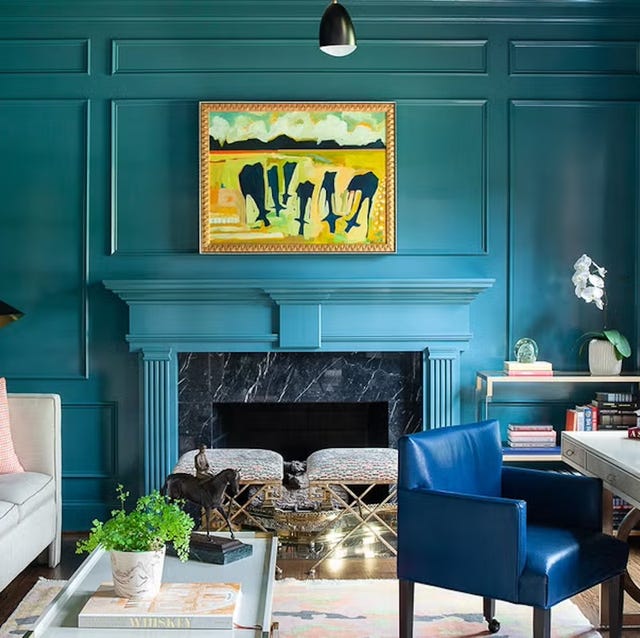
Beyond color, the article discusses the impact of paint finish. New York-based interior designer Phillip Thomas expresses his preference for high gloss lacquer finishes in living rooms, citing their ability to add lightness and luxury. He also suggests experimenting with metallic finishes on ceilings to make spaces appear taller and grander. Thomas elaborates on his design philosophy, explaining how satin finishes and metallic ceiling accents were used in his sister's apartment to create a luminous effect. He also emphasizes the importance of considering adjacent rooms' color schemes for overall balance, as exemplified by the use of Benjamin Moore's dahlia in the living room and Aniline Red in the adjoining library. Finally, the article mentions that orange, a favorite of Kelling Designs, is a versatile color that brings warmth, brightness, and uplifting energy to living rooms, whether used extensively or as accents, with an emphasis on incorporating varied textures and tones to prevent the space from becoming overwhelming.
#LivingRoom #PaintIdeas #InteriorDesign #ColorSchemes #HomeDecor #PaintFinishes #DecoratingTips #AccentColors #LivingRoom #PaintIdeas #InteriorDesign #ColorSchemes #HomeDecor #PaintFinishes #DecoratingTips #AccentColors
0개의 댓글이 총 표시됩니다.
 아직 댓글이 없습니다
추가로 마음에 드릴 만한 콘텐츠
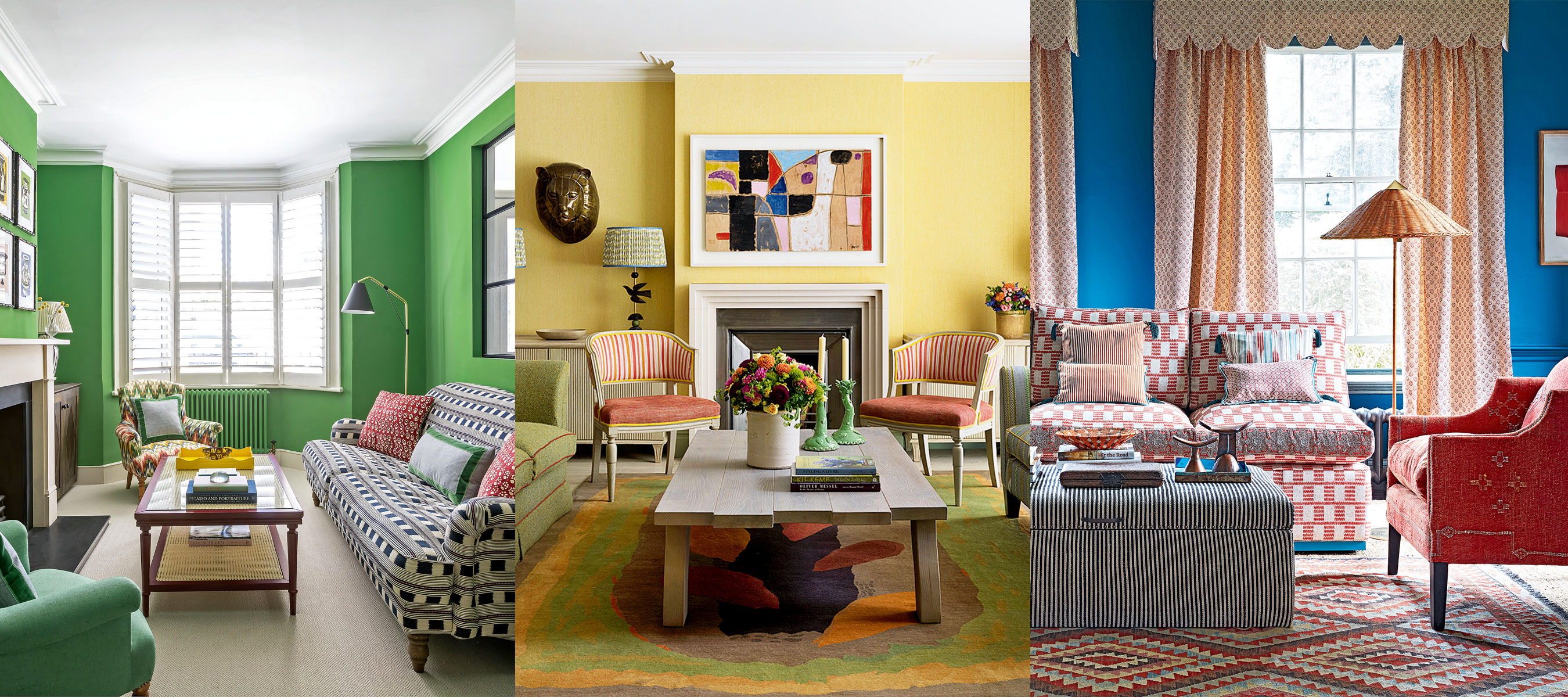
Living room paint ideas – 30 stylish ways with paint, and expert color tips

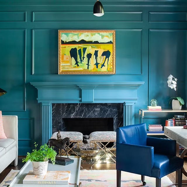
Listen Up: These Are the Best Paint Colors for Your Living Room

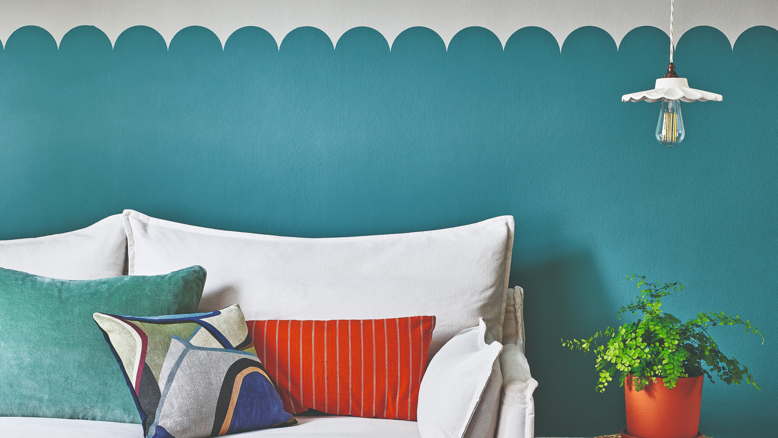
Paint ideas for your home – 36 ways to turn every room into a beautiful space bursting with character
5 Paint Colors to Never Use in Your Living Room, According to Interior Designers
Living room paint ideas – 27 easy ways to bring your lounge to life with stylish and creative colours and techniques
Jewel Tones Are Trending for Living Room Paint Colors, According to Designers

28 Living Room Paint Color Ideas That Make Beige Feel Basic (In the Best Way)

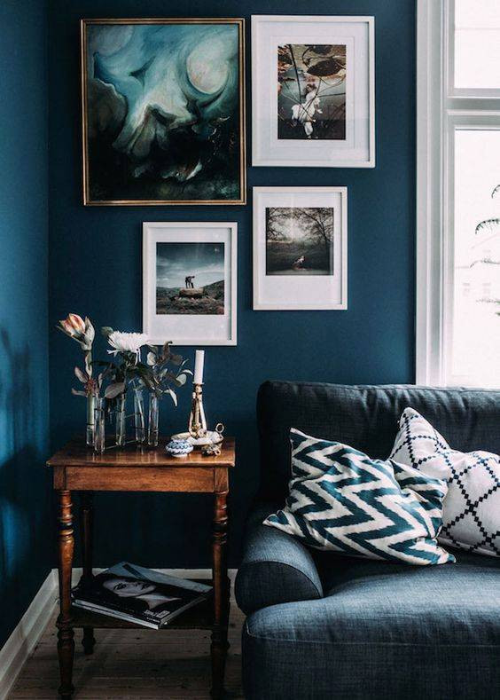
colorful living rooms (no beige allowed)!
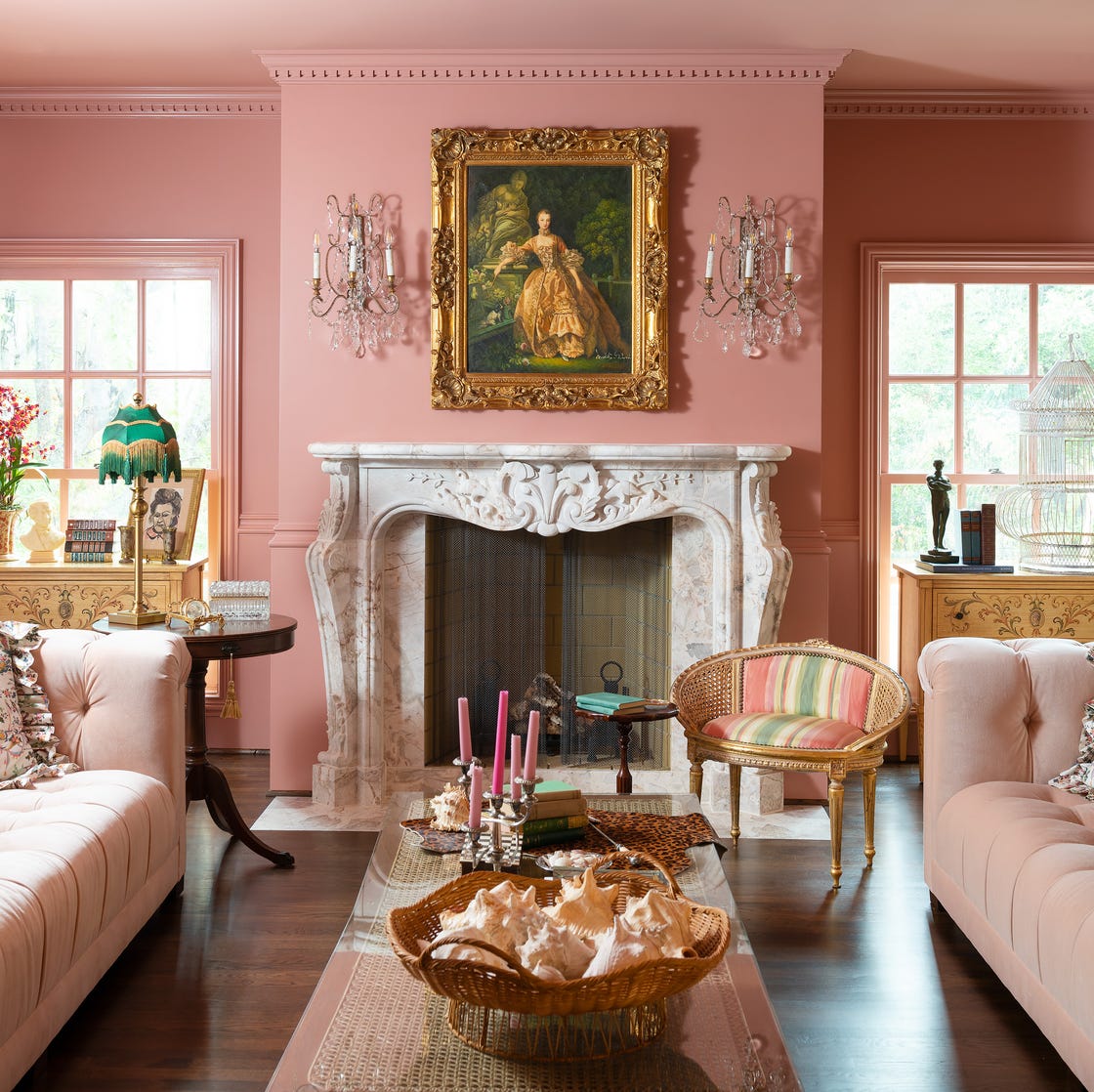
Designer-Approved Living Room Colors That'll Make You Feel Happier
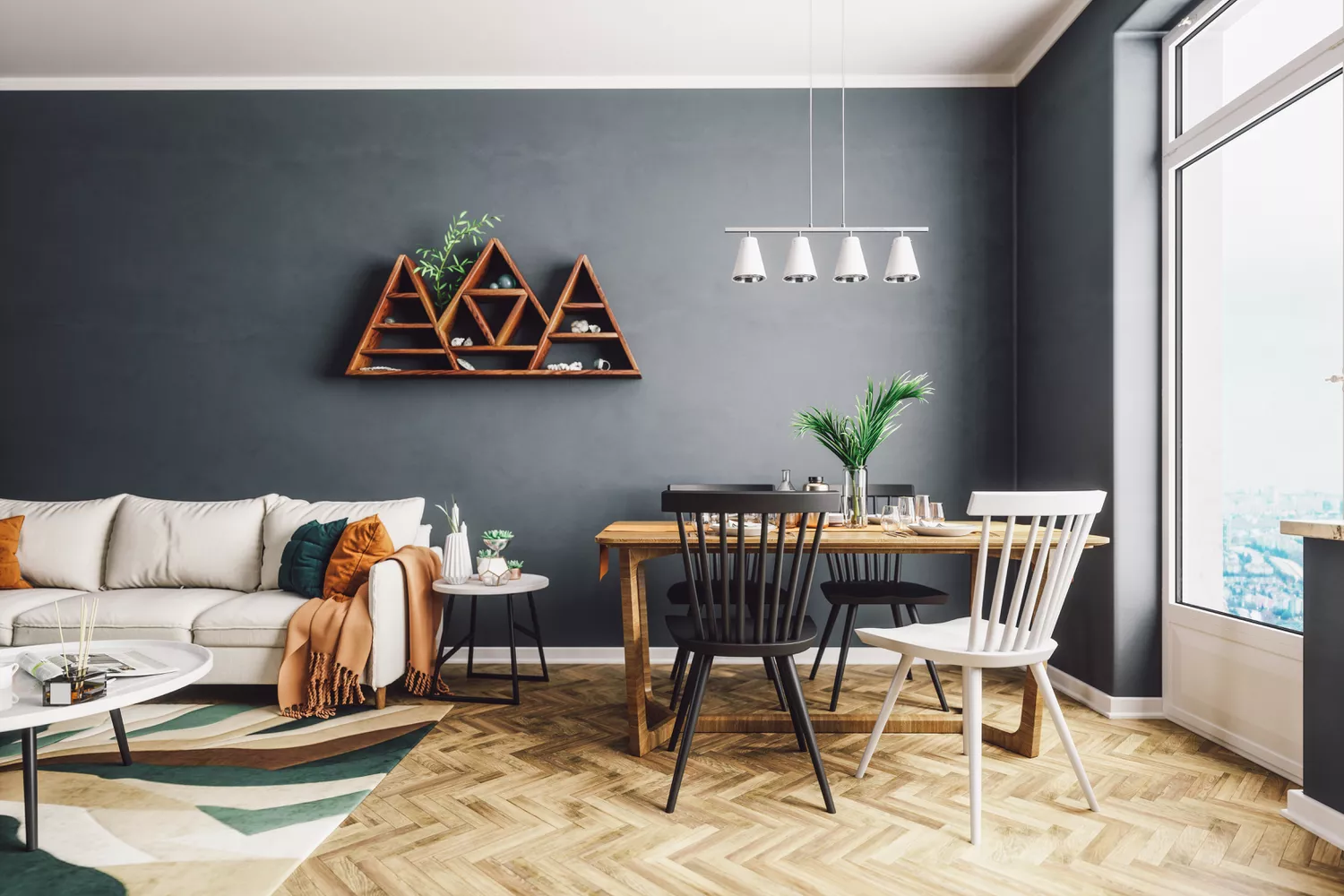
4 Living Room Paint Colors That Are So Outdated, According to Designers

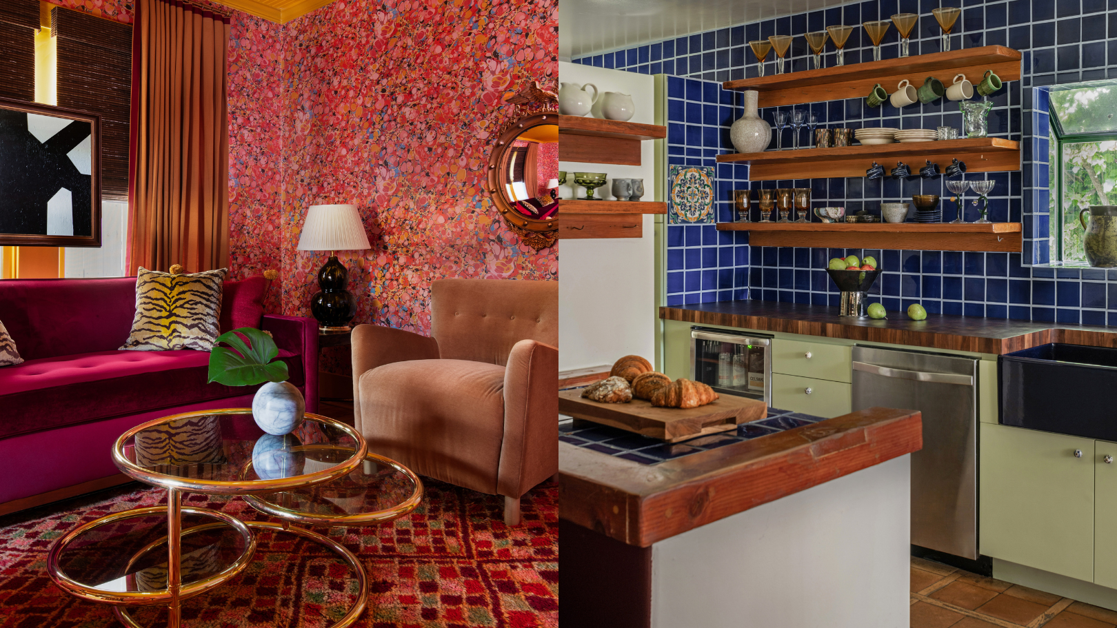
9 'good weird' paint colours approved by designers

Paint tricks – 10 painting tips and techniques loved by the experts
Living room paint ideas – stylish ways with paint
7 Popular Paint Colors for the Living Room
55 Living Room Color Ideas That Will Take Your Space from Drab to Fab

5 living room paint colors going out of style in 2025
The 60 Most Popular Living Room Paint Colors Right Now
The Year's Best Living Rooms
35 Paint Colors to Consider for Every Room in Your House
The 3 All-Time Worst Living-Room Paint Colors, According to Designers