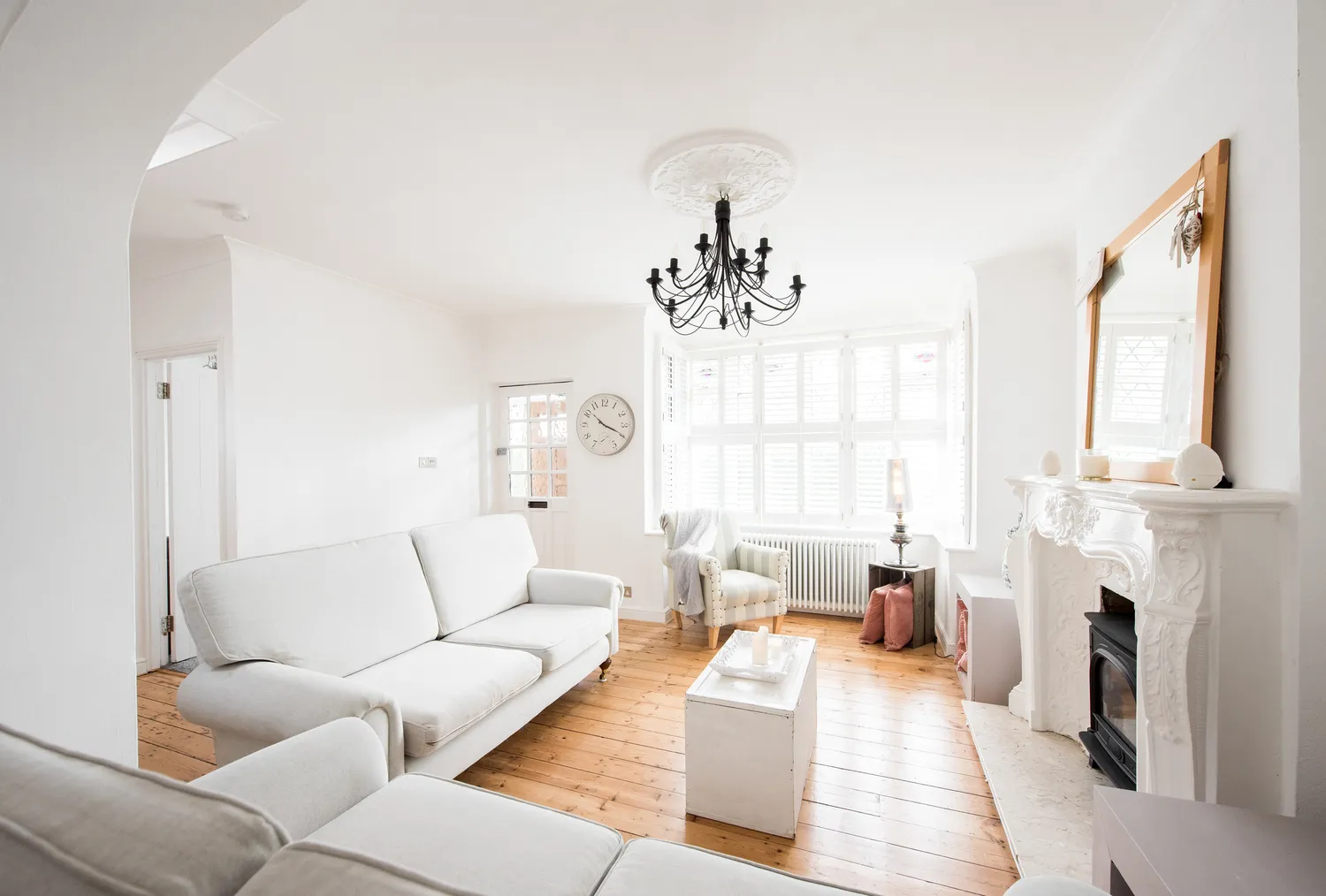
We Asked Designers Which Living Room Paint Colors People Always Regret—These 6 Came Up the Most
Homeowners often find themselves regretting certain living room paint colors over time, due to their tendency to appear sterile, overwhelming, or simply out-of-date. Several design experts, including Rona Edelman of Edelman Color & Design, Alice Moszczynski of Planner 5D, and Melissa Roberts of Melissa Roberts Interiors, have identified common culprits.
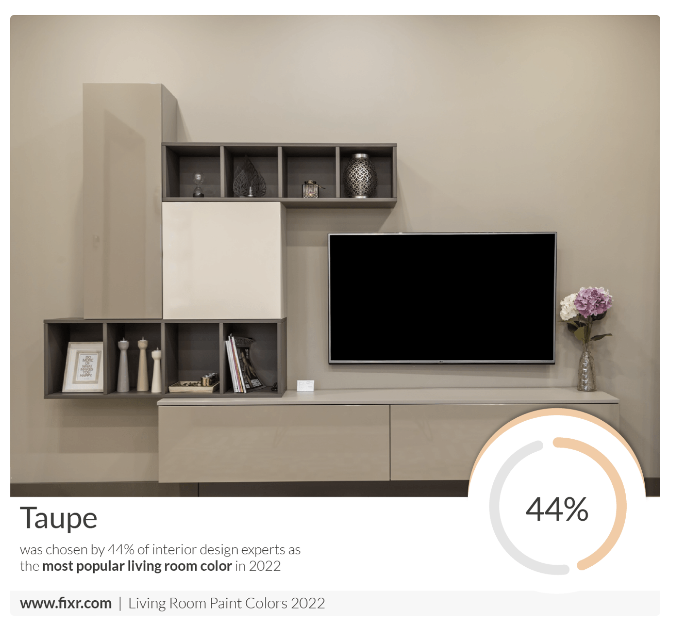
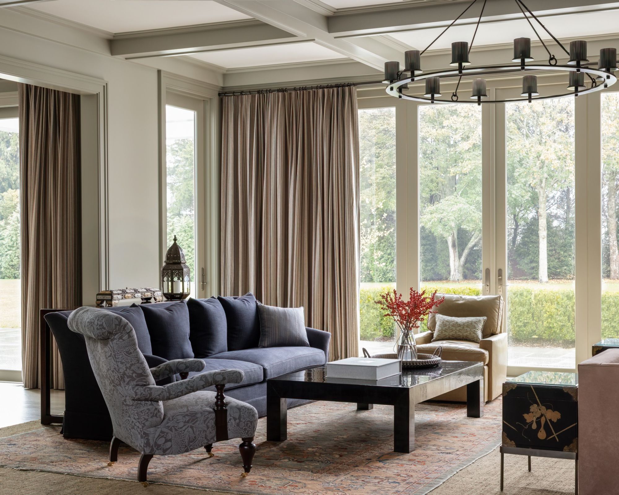
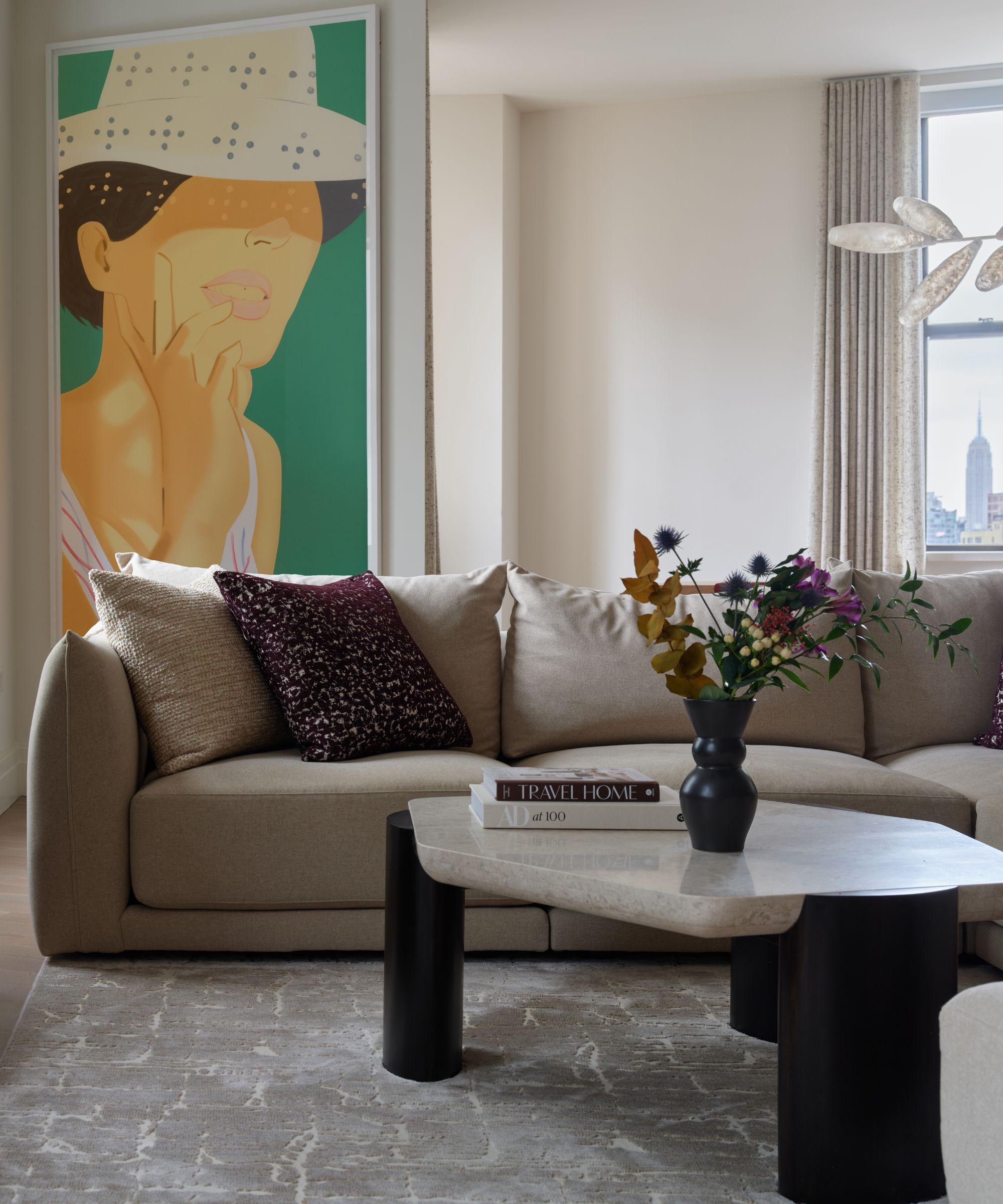
Cool gray is frequently regretted by millennials because it can make a living room feel sterile or gloomy, especially at night, often appearing lifeless compared to its sleek appearance in inspiration images. Instead, warmer neutrals like greige or taupe, with their brown and beige undertones, are suggested to create a more welcoming atmosphere.
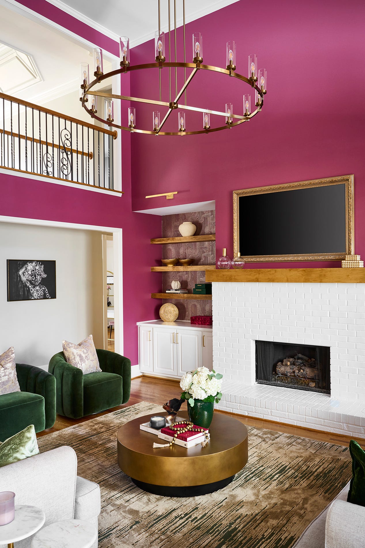
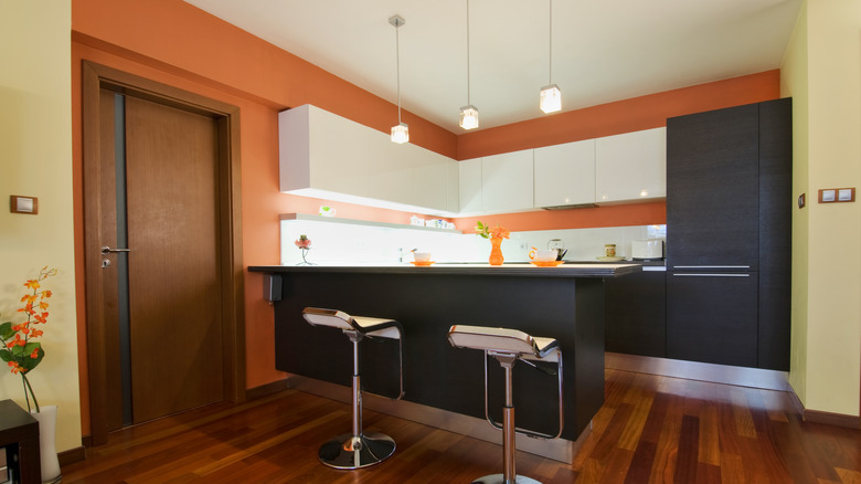
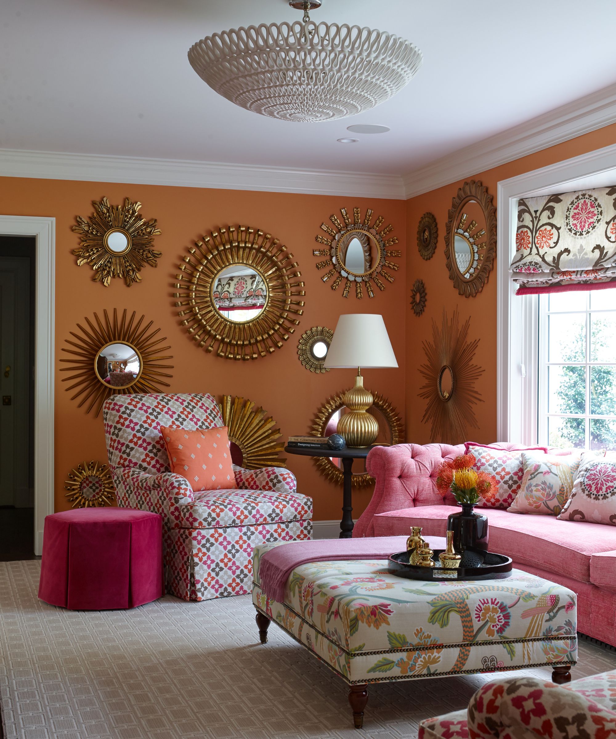
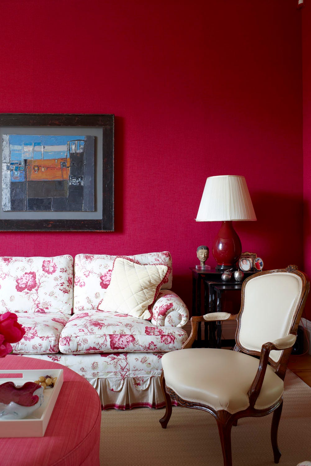
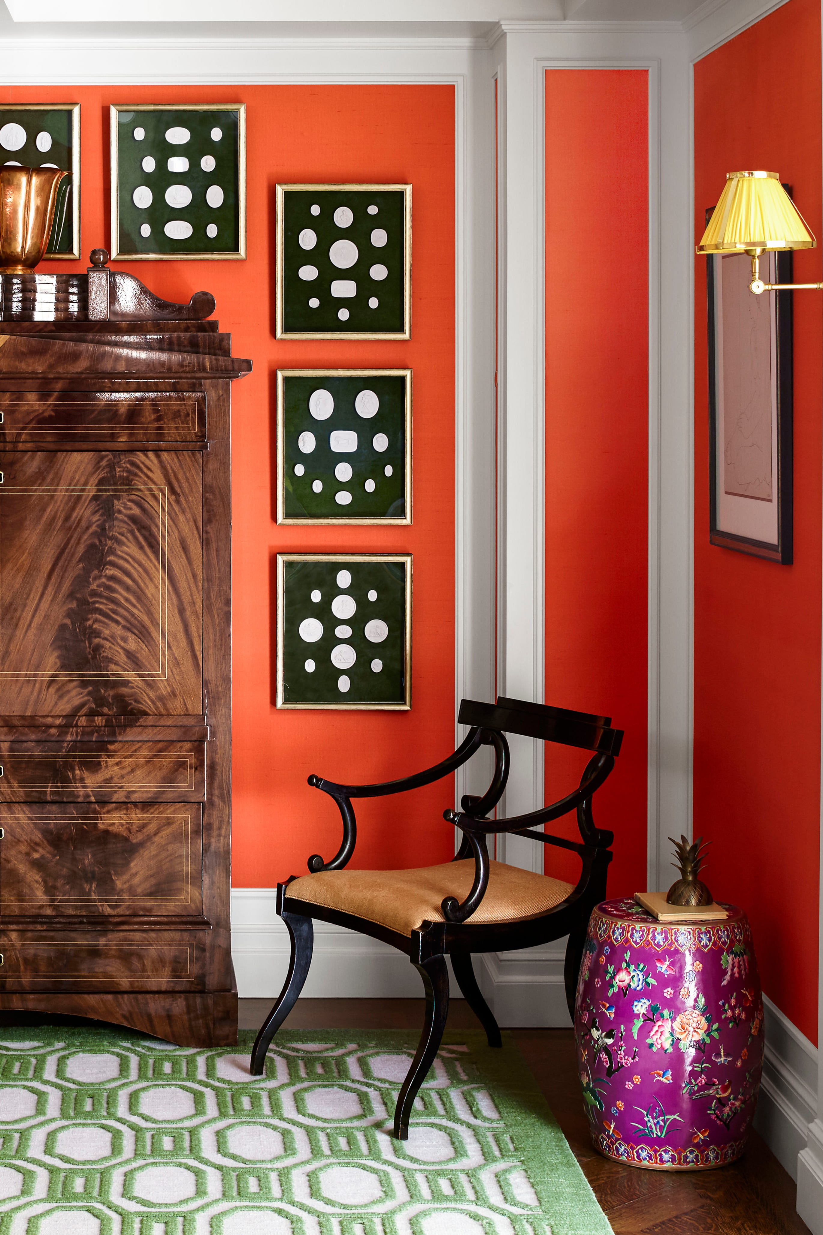
Bright colors such as red and orange, while initially enticing for their energy, can become overwhelming in a living room. These shades are known to trigger anxiety and restlessness, making them unsuitable for spaces intended for relaxation. For those who desire vibrancy, a pale to medium yellow with a touch of gray can offer a balanced and calm feel, or neutral colors with yellow undertones can provide warmth without being overstimulating, ensuring a cozy and timeless environment.
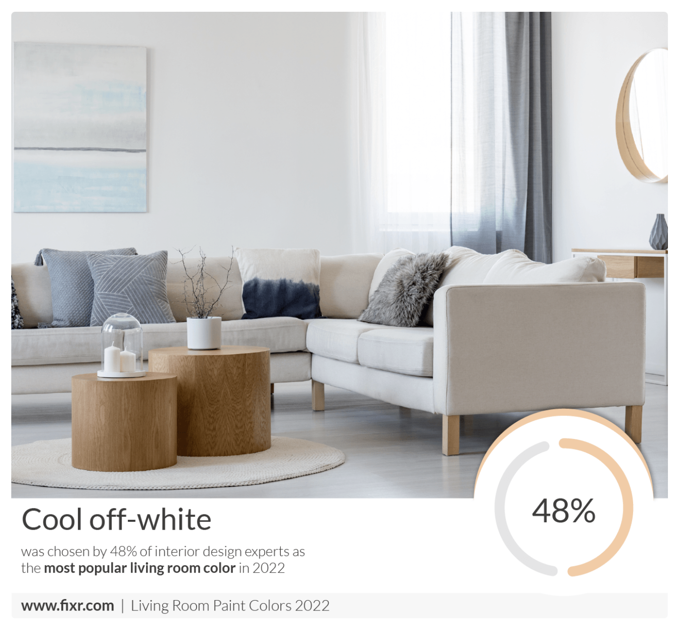
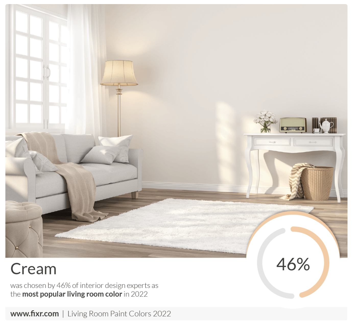
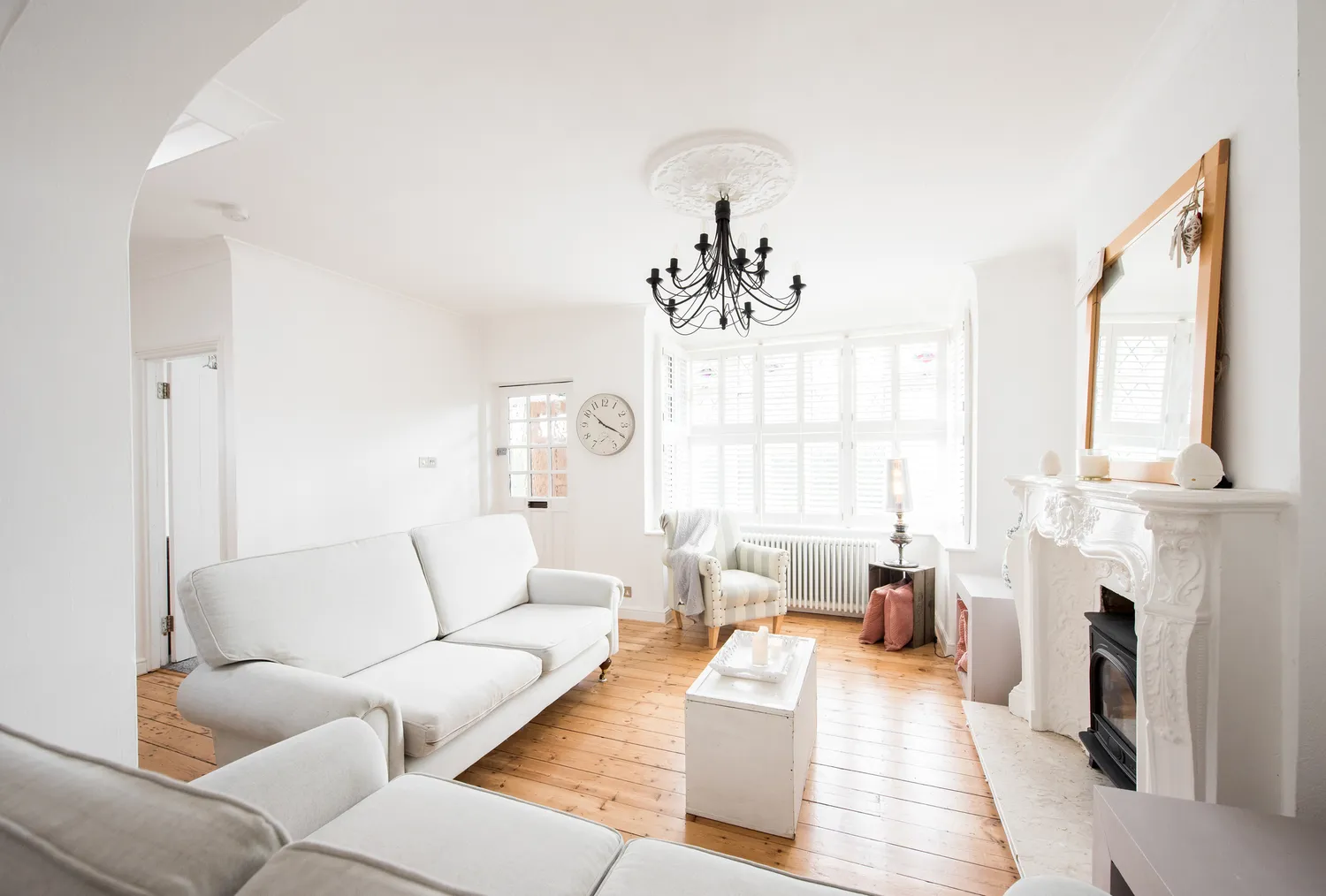
Bright gallery white, though seemingly a safe and common choice, is another frequently regretted color. It can appear harsh and overly reflective, particularly in rooms with limited natural light, and tends to highlight every imperfection on the walls. A softer white with creamy undertones is recommended as an alternative to bring freshness and warmth into the space.
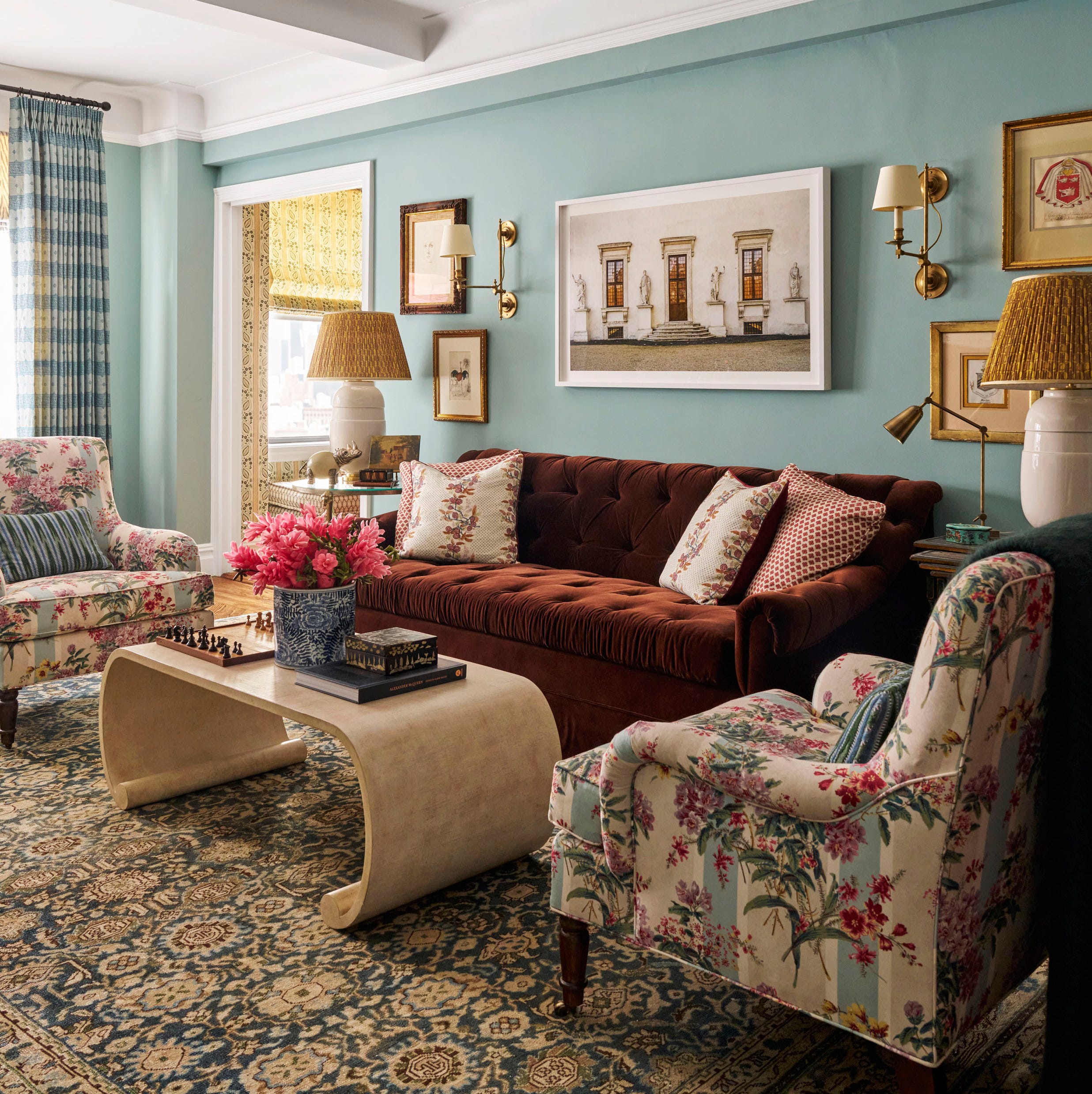
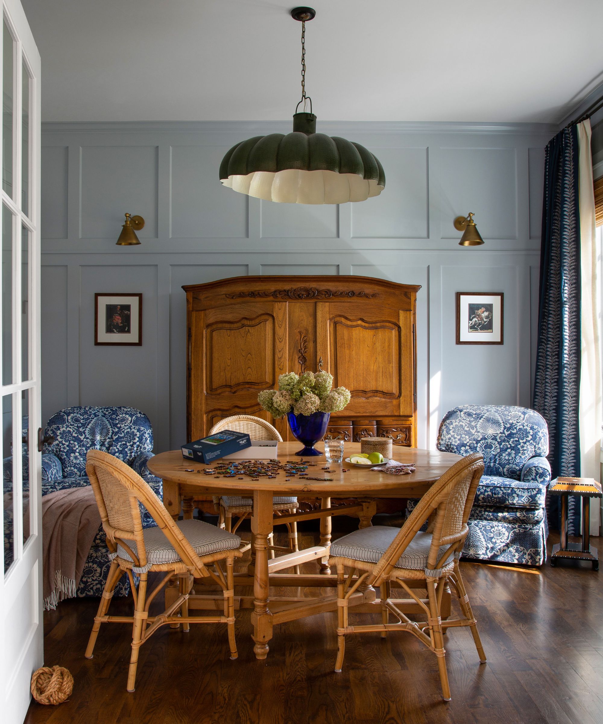
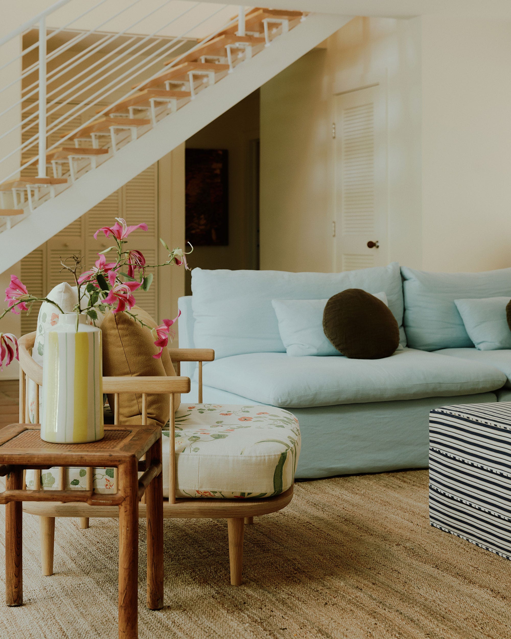
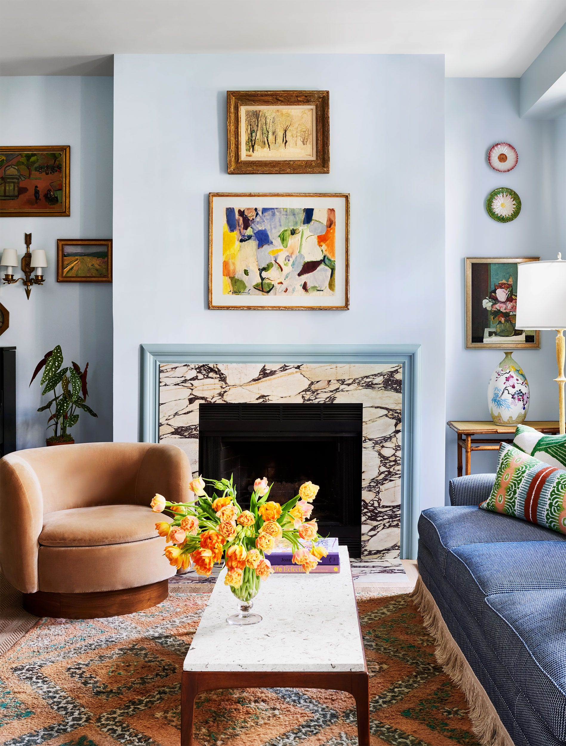
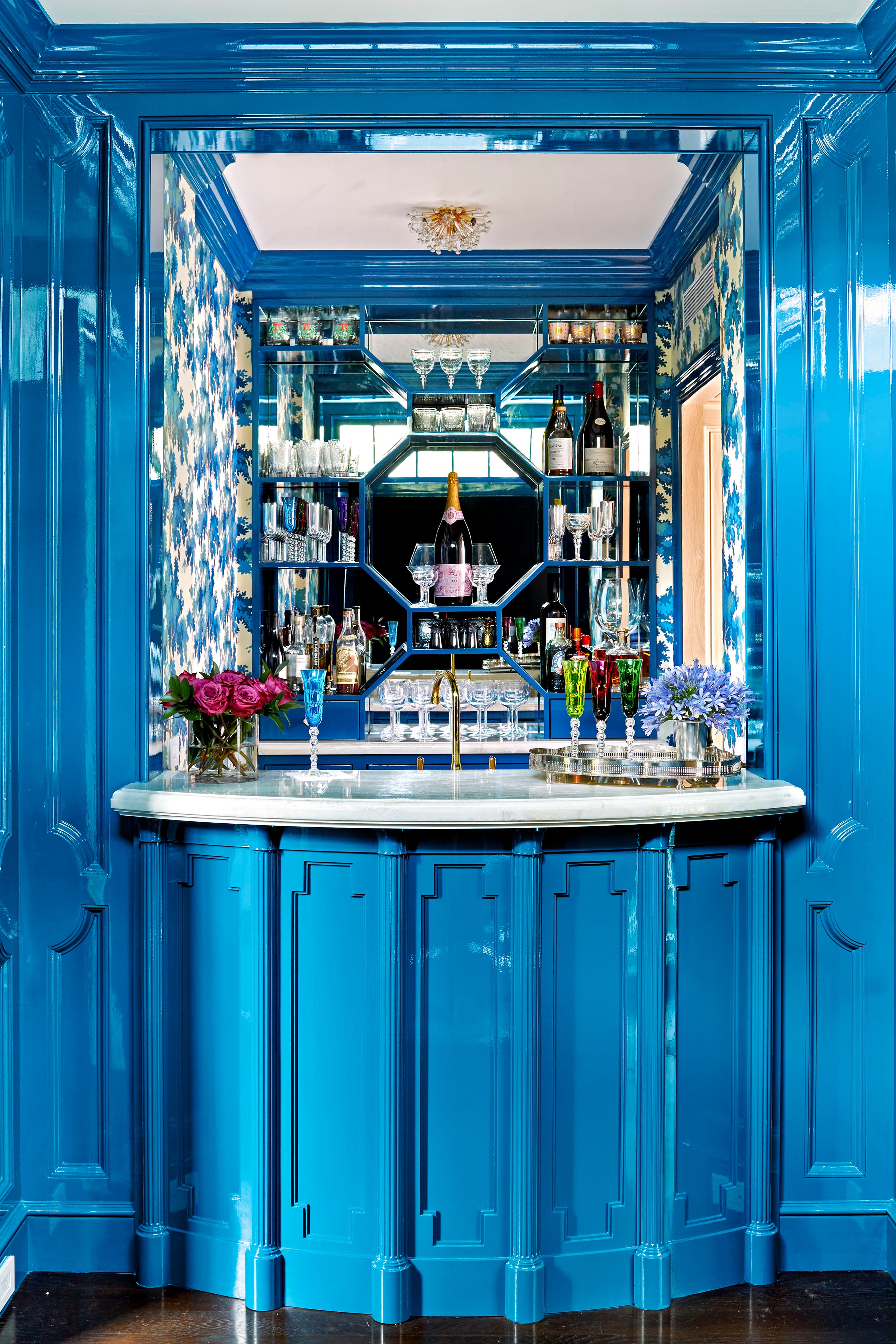
Dusty blue, a cooler-toned blue, also makes the list of regrettable colors. Despite blue's versatility, this specific shade can quickly feel dated and one-dimensional, contributing to a cold and sterile ambiance rather than a comforting one. Designers suggest opting for blues or other neutrals that possess warm, red, orange, or yellow undertones to avoid this cool and uninviting effect; navy blue, for instance, while bold, can feel sharp and fresh.
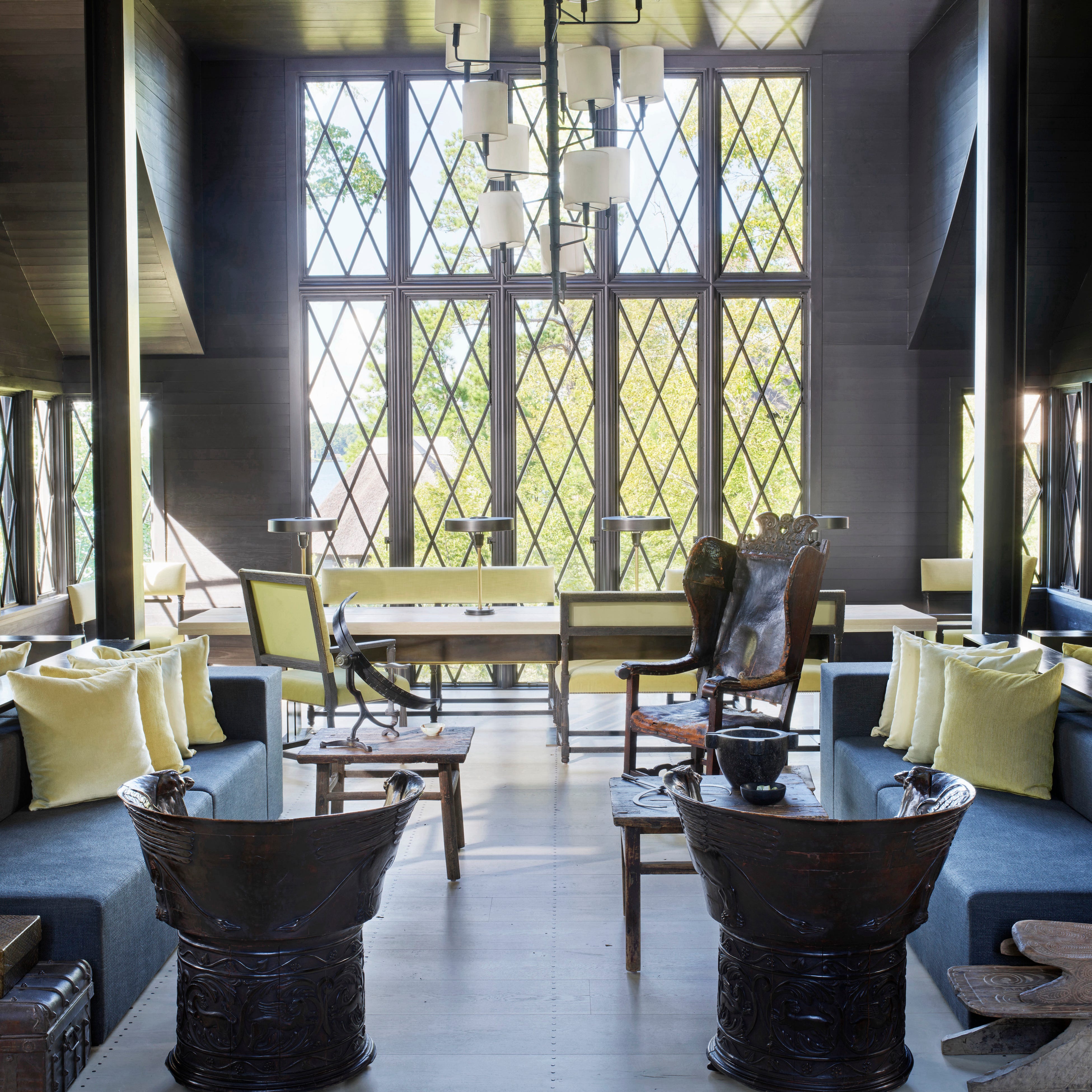
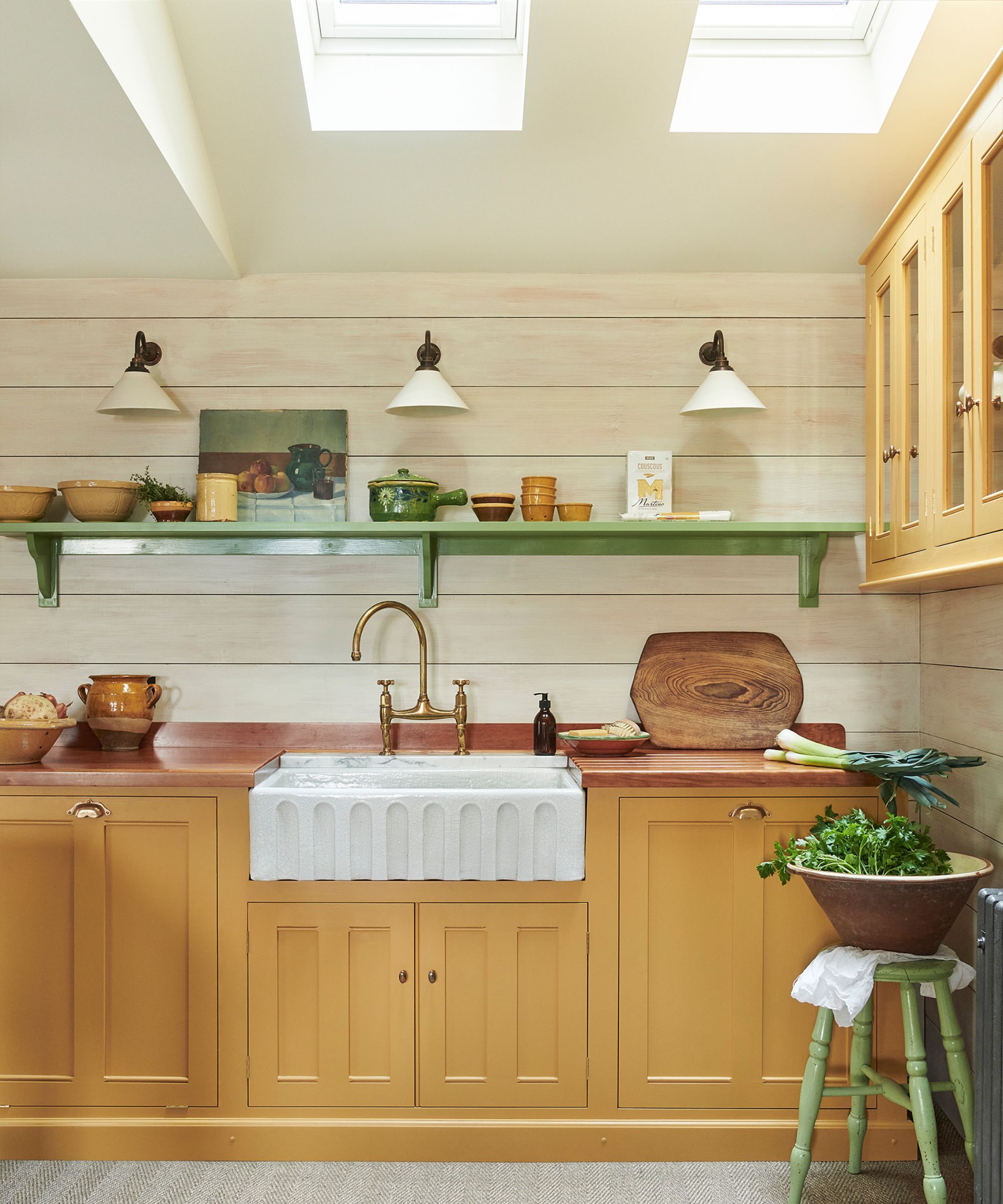
Similarly, bold yellow, often chosen to evoke happiness, can become too intense when applied on a large scale, appearing loud and even cartoon-like. It can also unflatteringly reflect on skin tones and furniture, making occupants appear sickly. Softer alternatives such as buttercream, wheat, or muted ochre are recommended to achieve warmth without the overwhelming vibrancy.
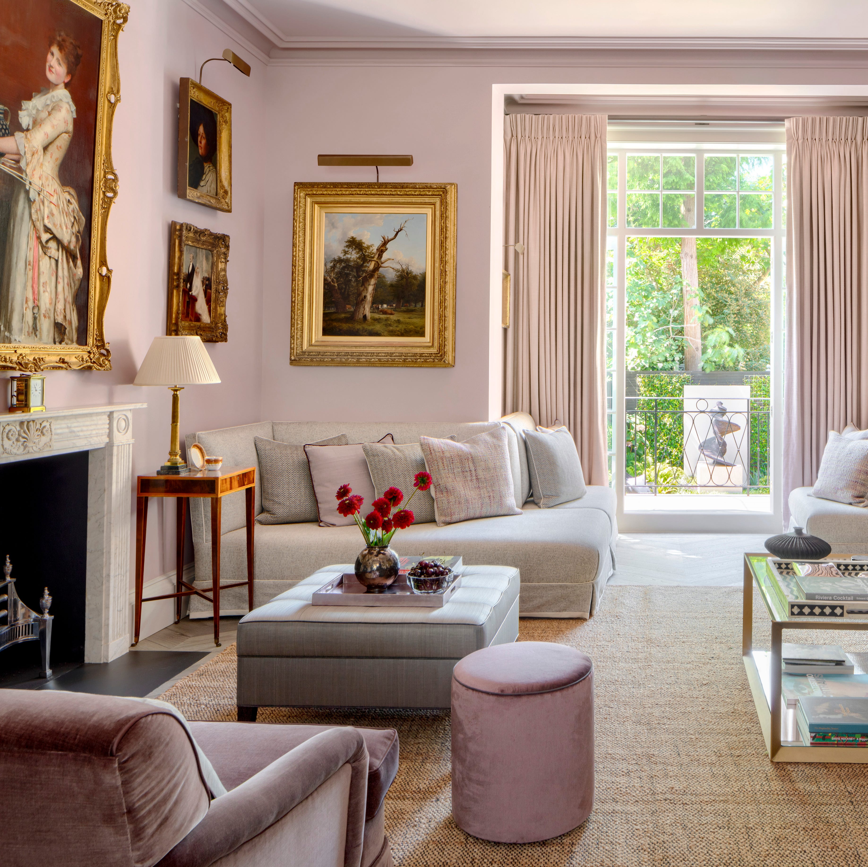
Cool greige, a once-popular blend of gray and beige, has also fallen out of favor, especially shades with cool undertones, which can make a room feel bland, sterile, and cold. Warmer replacements from brands like Sherwin-Williams, including Vandyke Brown, Smokehouse, Tony Taupe, Taupe Tone, Mushroom, and Universal Khaki, are suggested to create a more inviting and current look. Selecting paint colors with careful consideration of their undertones and overall impact on a room's mood can help homeowners avoid these common regrets.
#LivingRoom #PaintColors #InteriorDesign #HomeDecor #ColorPsychology #DesignTrends #NeutralColors #WarmTones #LivingRoom #PaintColors #InteriorDesign #HomeDecor #ColorPsychology #DesignTrends #NeutralColors #WarmTones
合計0件のコメント
 まだコメントはありません
あなたも好きかもしれません
Designers Swear By These 65 Living Room Paint Colors


Interior design experts reveal the colour rules you should be breaking

4 Outdated Colors Designers say you Should Steer Clear of When Decorating a Living Room

6 Calming Paint Colors Designers Swear By For A Relaxing Living Room
7 Popular Paint Colors for the Living Room
6 Worst Colors To Paint Your Kitchen (And What To Choose Instead)
We Asked a Designer Which Bathroom Paint Colors People Always Regret—These 4 Came Up the Most

8 Favorite Paint Colors of Local Interior Designers

The 60 Most Popular Living Room Paint Colors Right Now

We Asked Designers Which Paint Colors Homeowners Always Regret—These 5 Came Up the Most
These Living Room Paint Colors Are a Total Mindset Shift

4 Interior Designers Share the Biggest Paint Color Trends Right Now (and What’s Out!)

We Asked Designers Which Living Room Paint Colors People Regret Most—And We're All Guilty

I asked interior designers what color they include in every project – these 5 enduring shades were the favorites

Experts reveal the best living room paint colours to transform every space

Can You Guess The Most Popular Paint Color The Year You Were Born?

6 colors designers pick for laundry rooms - exact paint matches, from classic choices to surprising shades

10 Timeless Living Room Paint Colors Designers Swear By
These are interior designers' favorite color combinations for living rooms – from neutral and calming to bold and playful
6 Bedroom Paint Colors Designers Don't Want to See in 2026