1/32
8 of the best paint colors to enhance small spaces, according to experts
This article explores how paint colors can transform small spaces, making them feel lighter, brighter, and more spacious. It challenges the traditional notion that only light colors work for small rooms, offering a broader perspective on color theory and practical applications. The piece features insights from paint experts and interior designers who provide recommendations for specific shades and techniques.
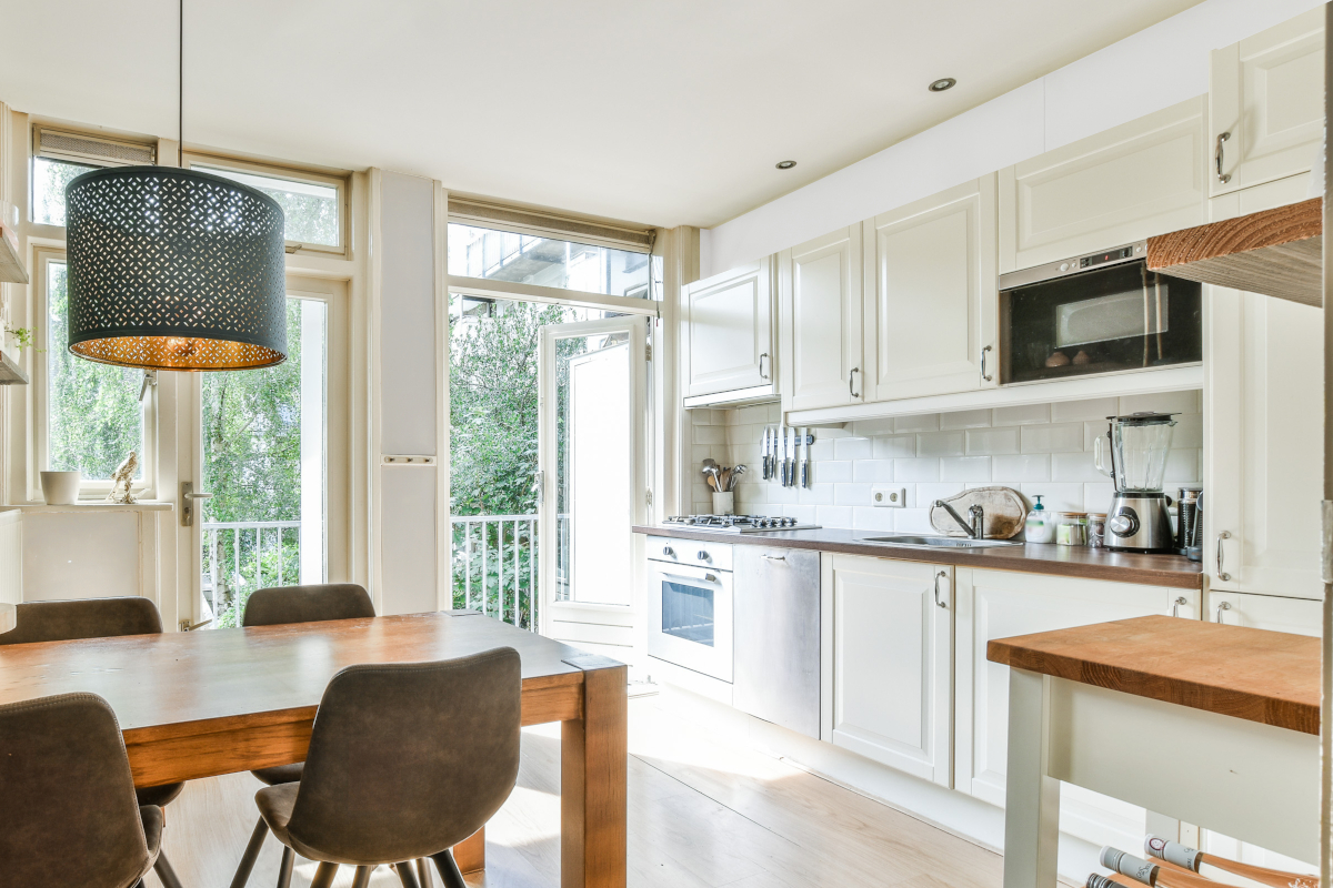
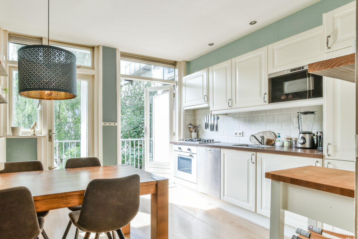
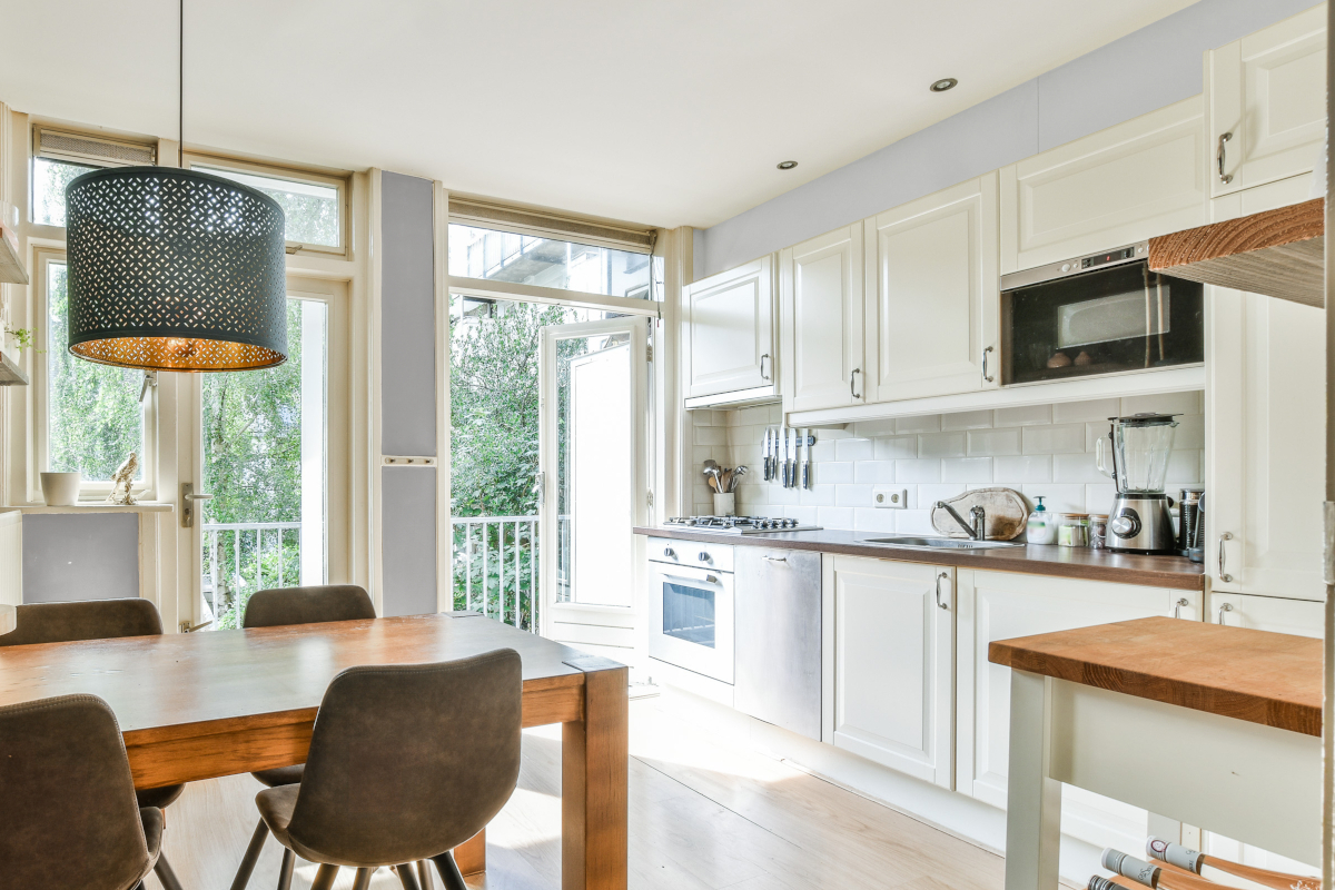
Sue Wadden, Director of Color Marketing at Sherwin-Williams, explains that while lighter colors like white and tinted neutrals are commonly used to make a room feel larger, creating a monochromatic look by painting ceilings or trim in the same color as the walls can also be effective in establishing a focal point. This approach helps to blur boundaries and enhance the perception of space.
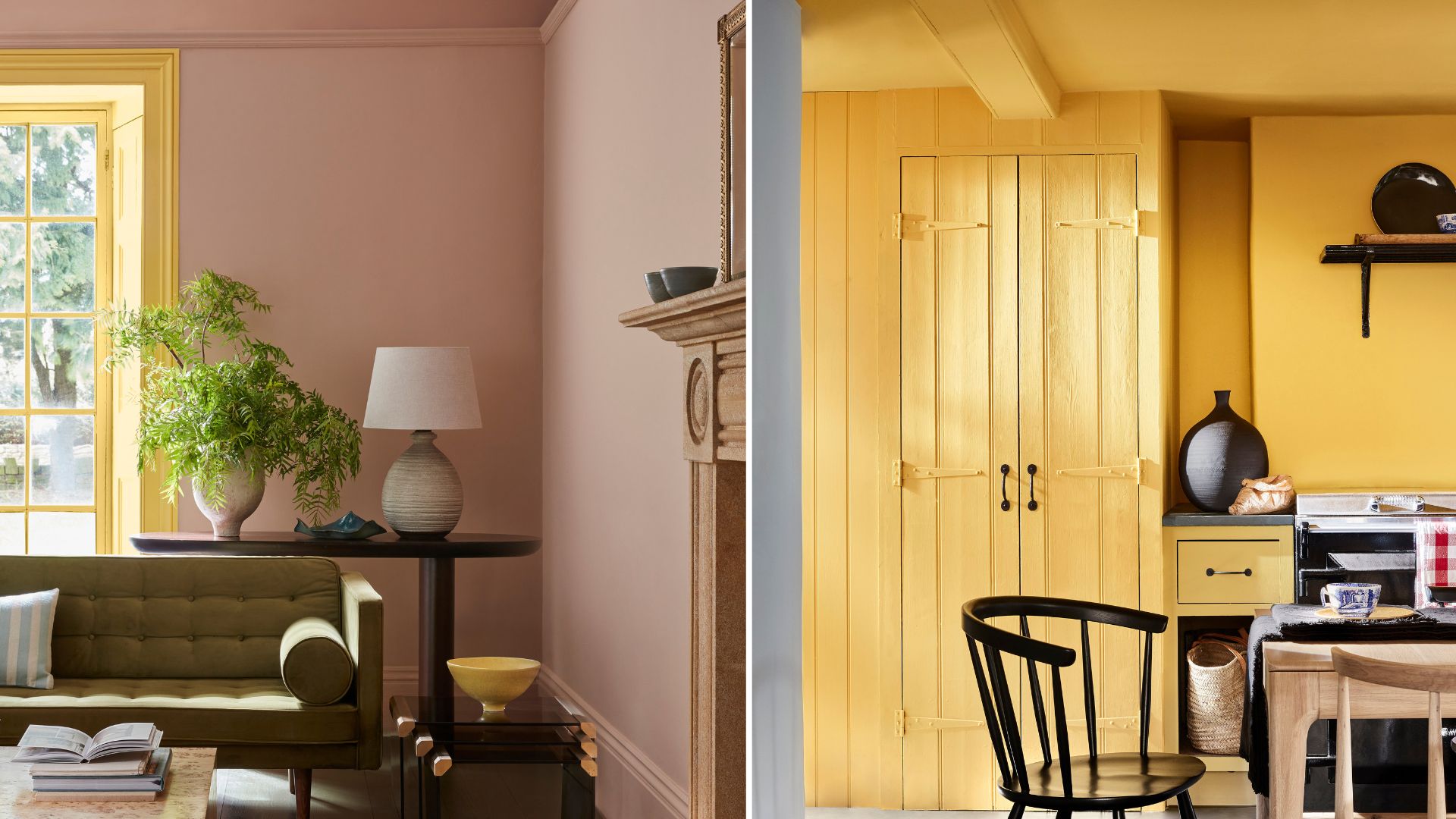
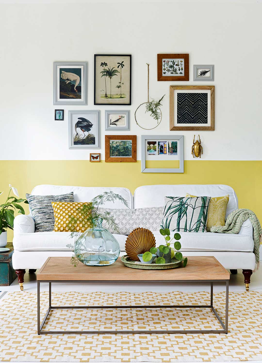
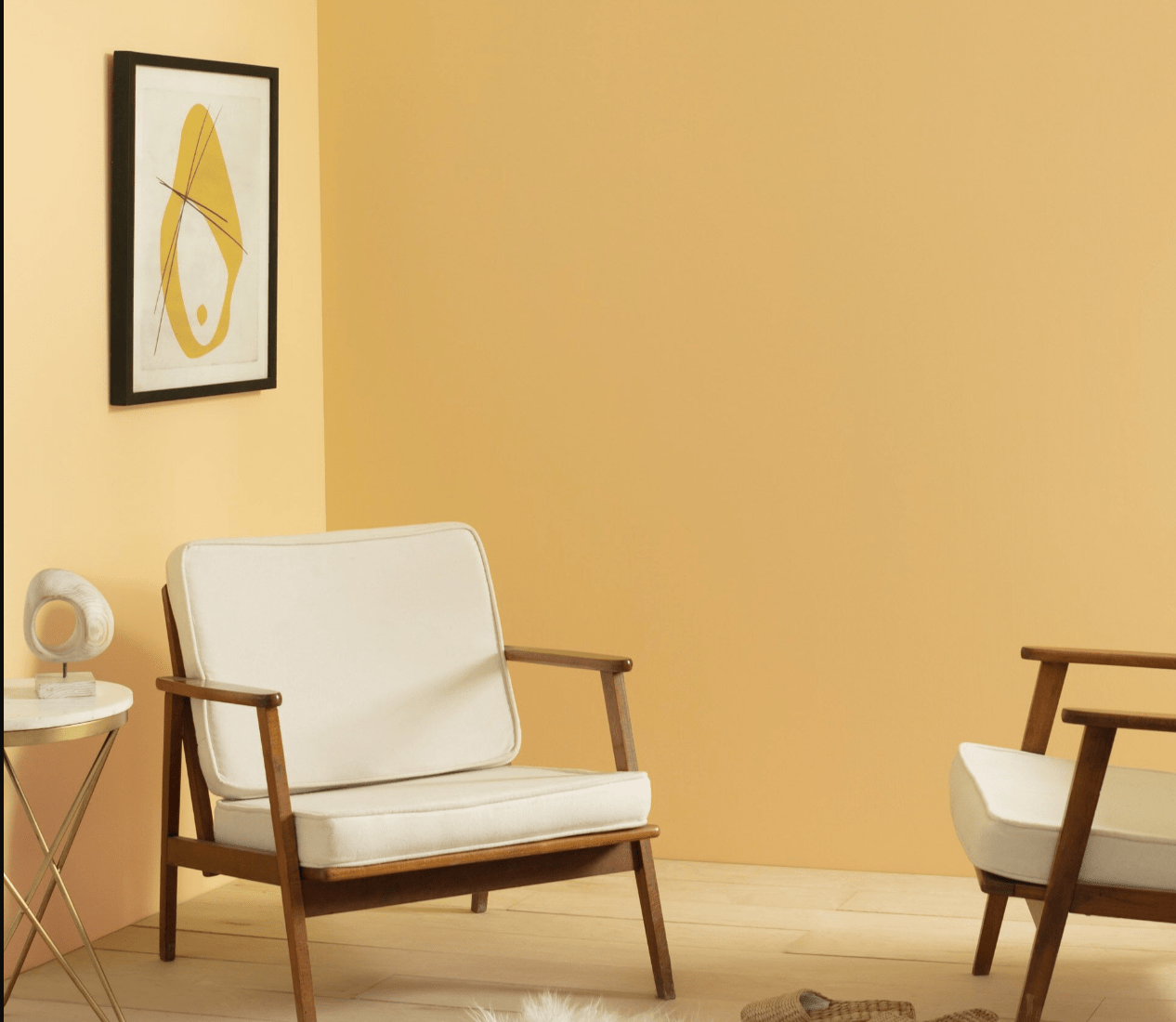
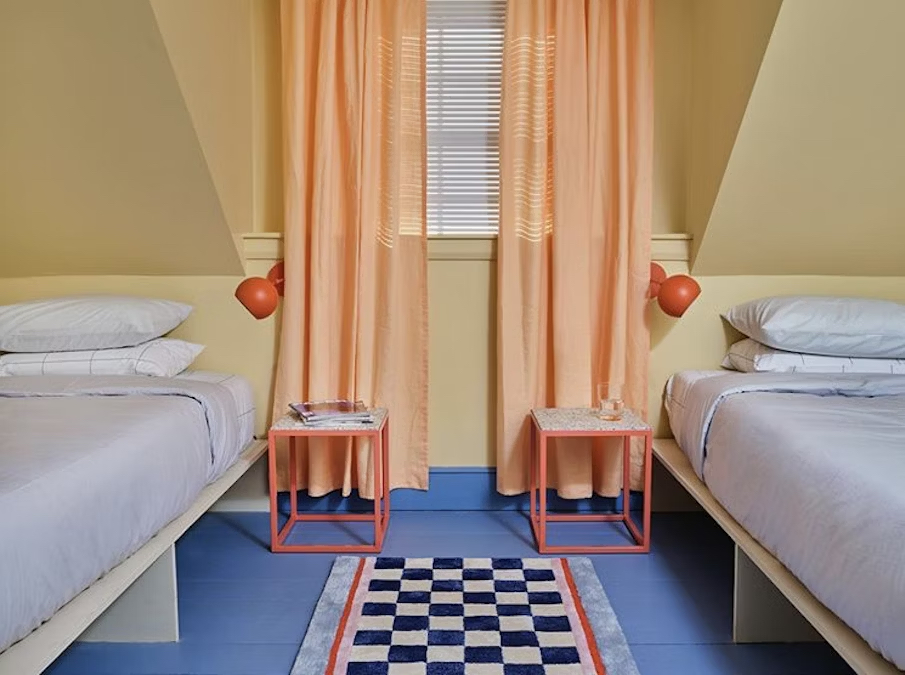
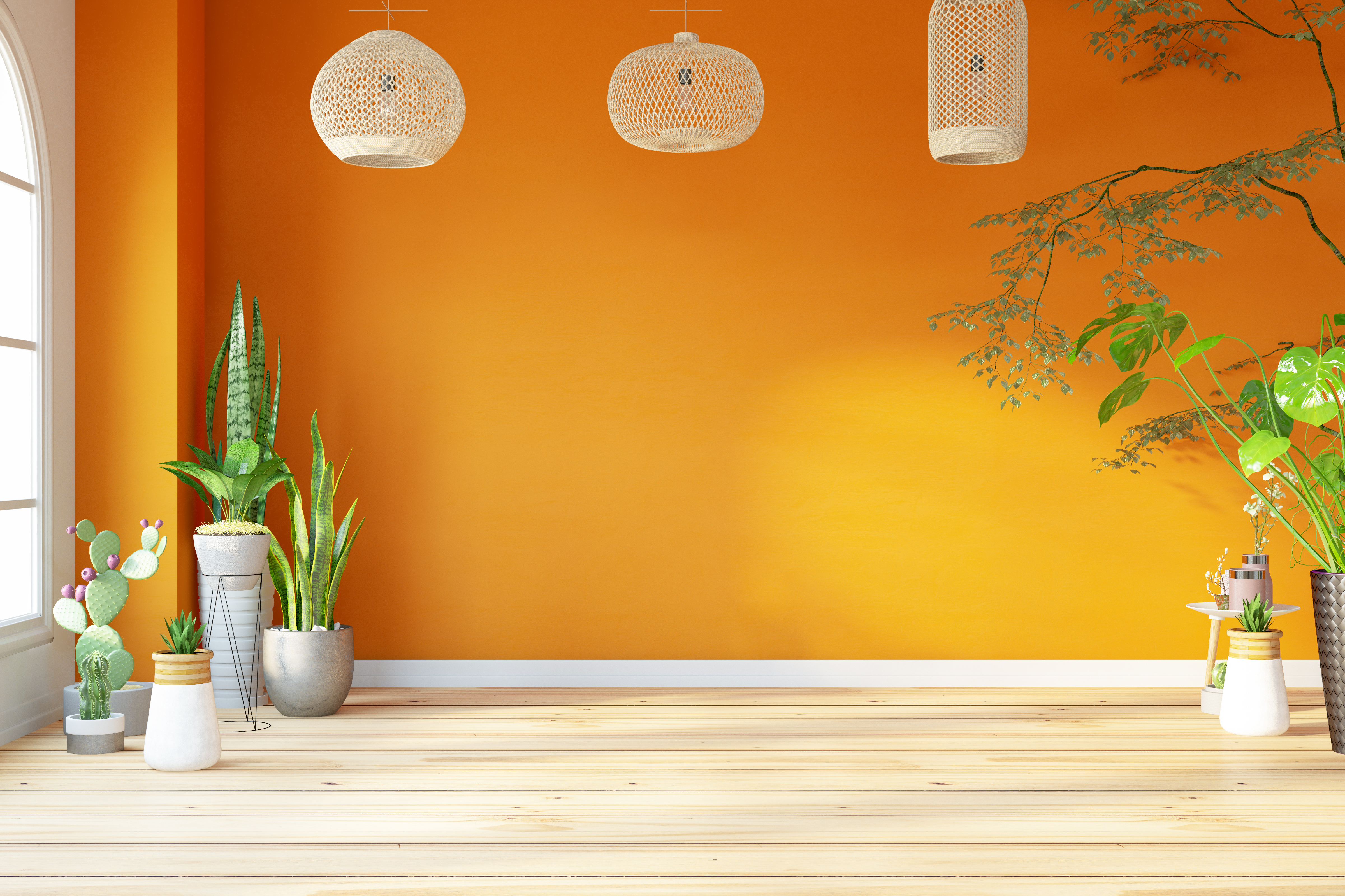
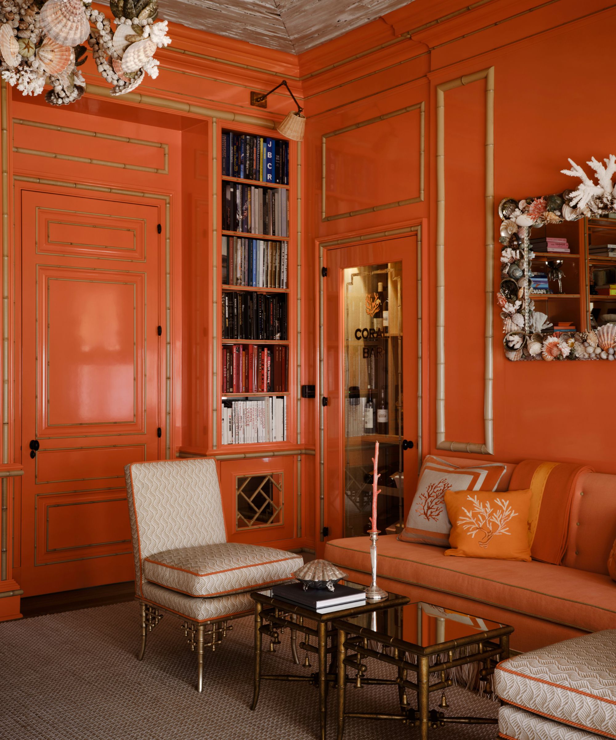
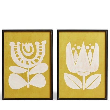
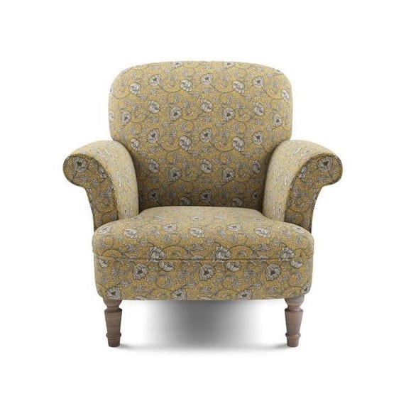
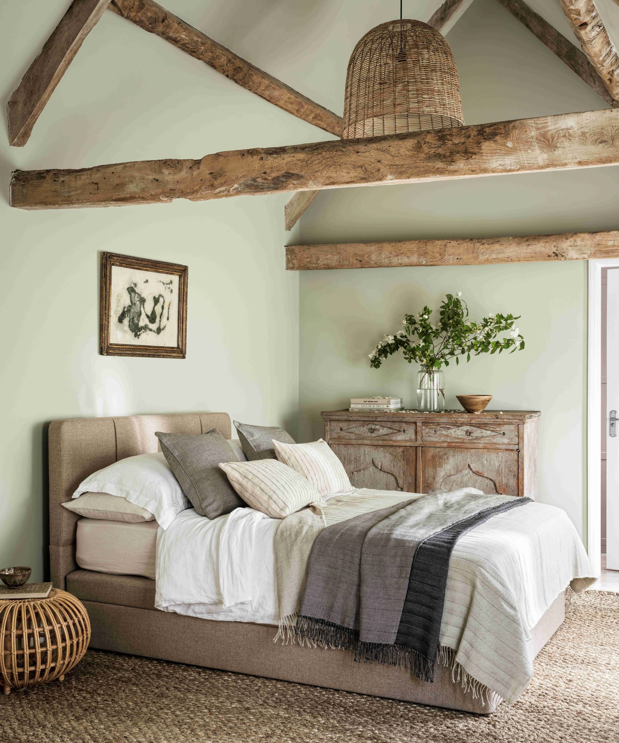
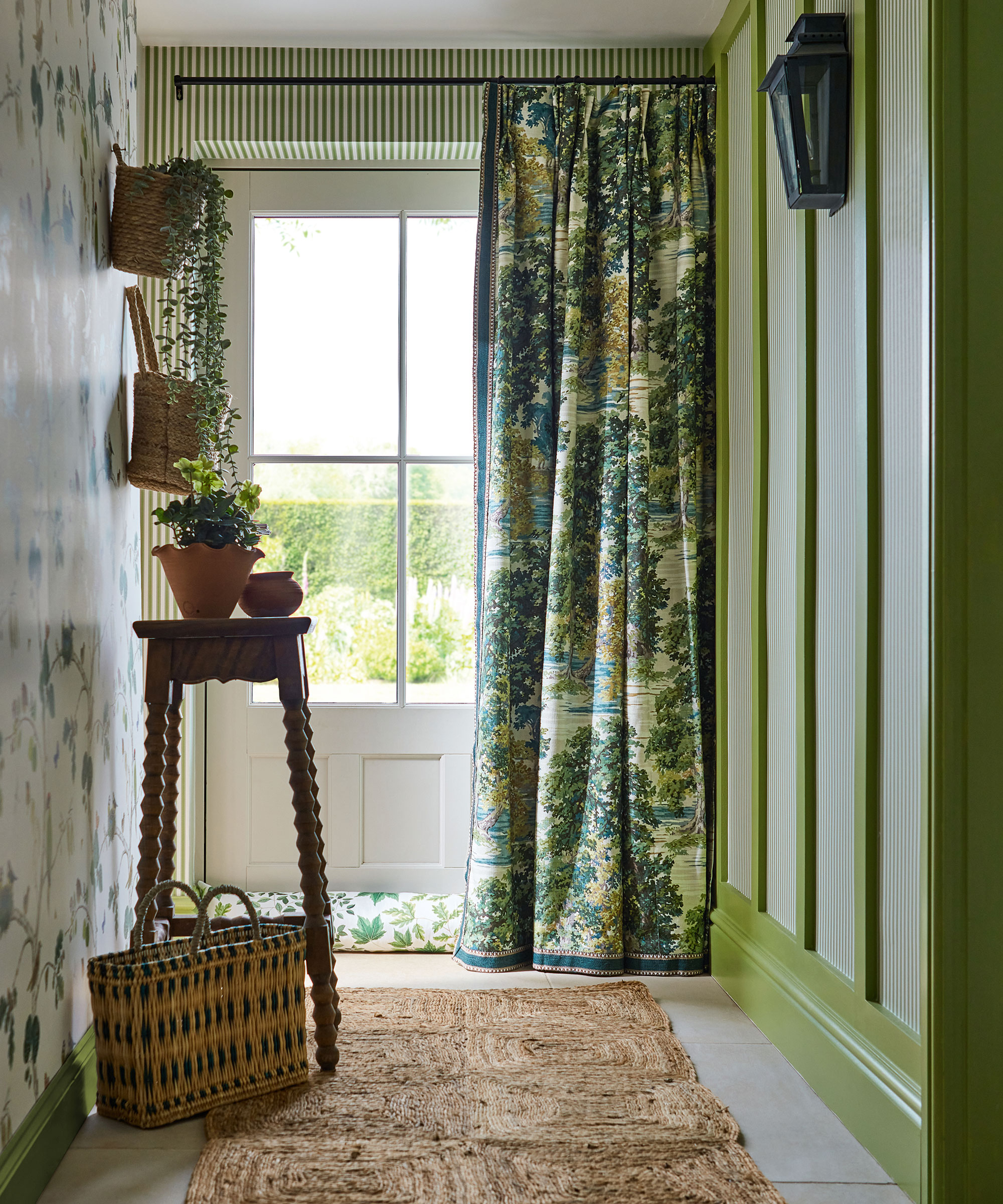
The article then presents eight distinct color categories with expert commentary and specific paint recommendations. "Golden ochre" is introduced as a joyful and brightening shade for small rooms, capable of bringing warmth. Helen Shaw from Benjamin Moore describes "Savannah Green" as a rich ochre with green and yellow undertones, suitable for creating either a quiet or striking effect, particularly when paired with white, black, or other golden hues. The suggestion is made to use this color on all walls for a bold statement or on two walls for a more subtle impact.
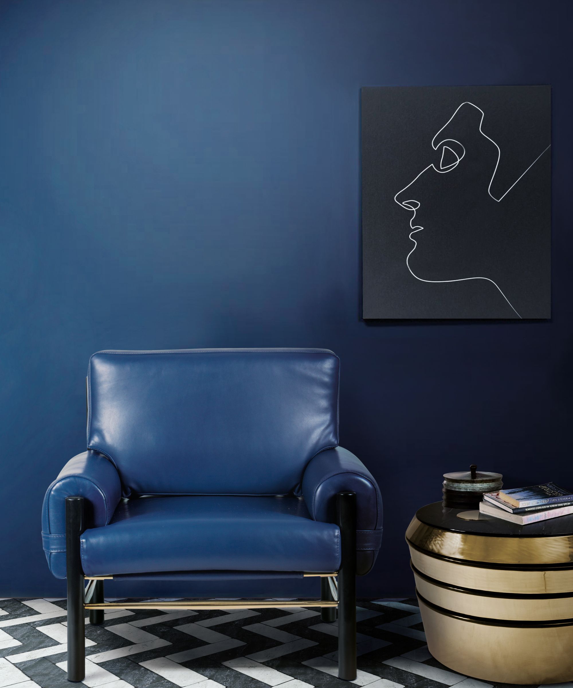
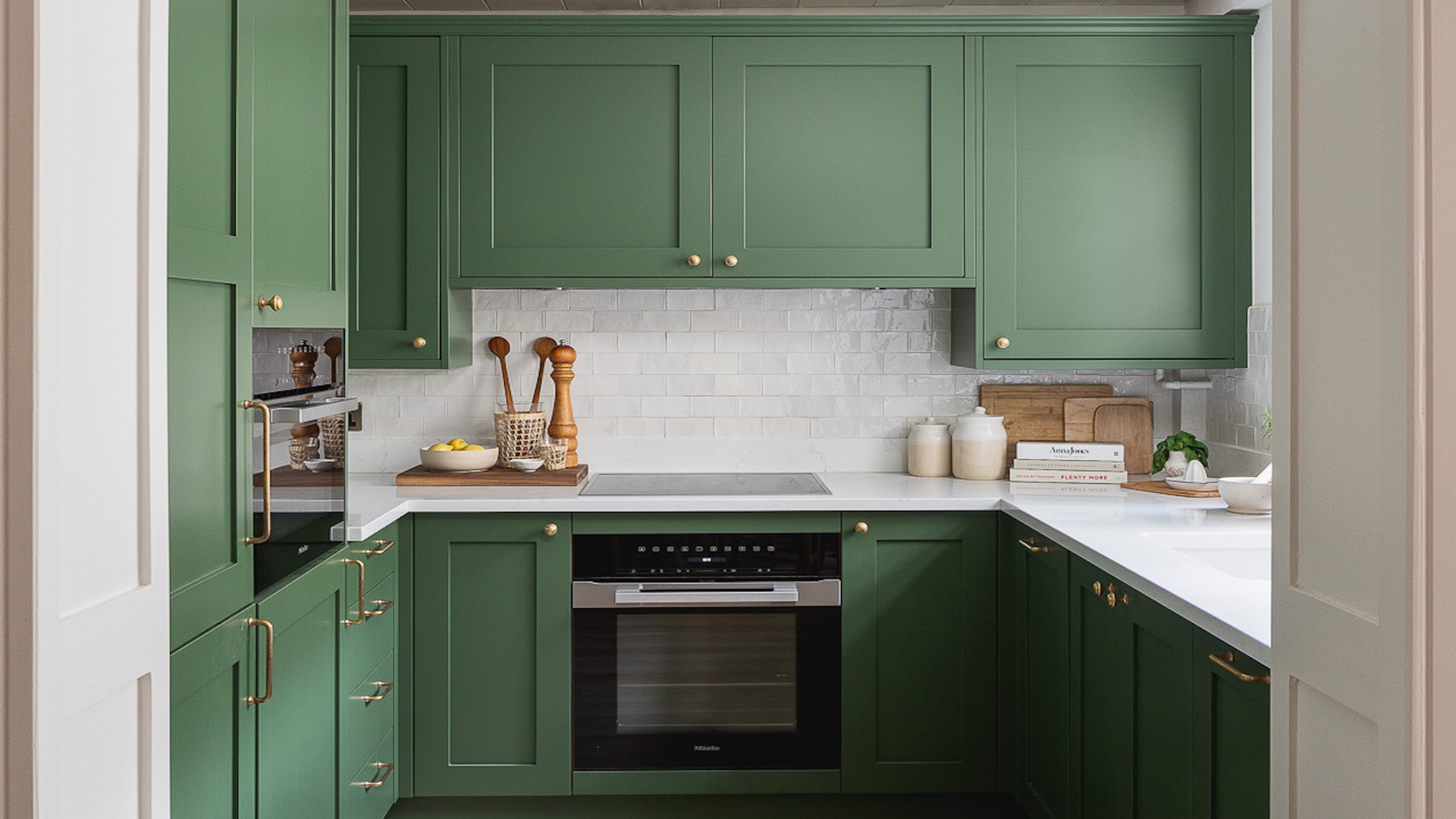
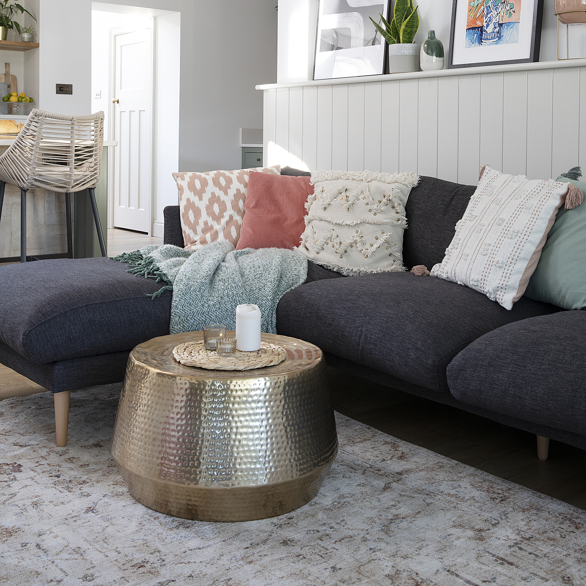
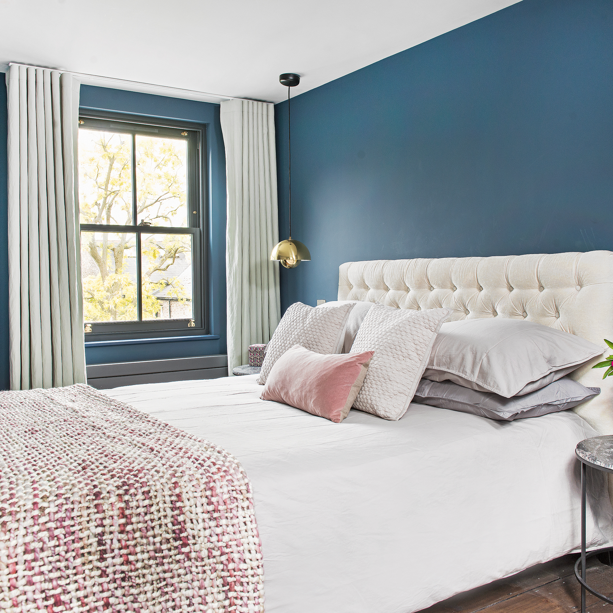
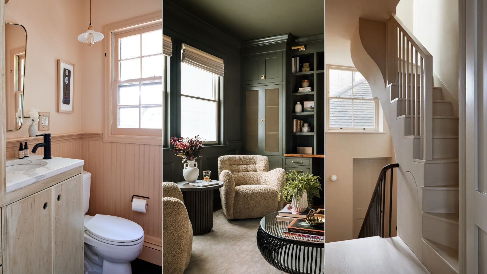
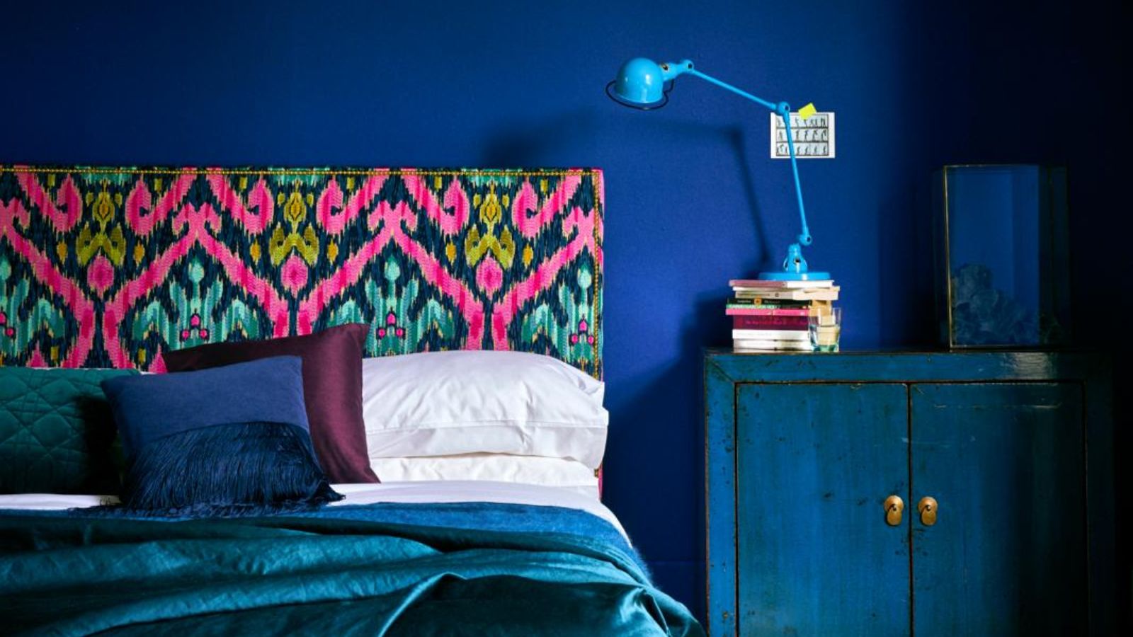
"Inky blue" is recommended for dark rooms, with Patrick O'Donnell from Farrow & Ball advocating for darker colors over white in such spaces. He notes that deep hues can recede, creating a cozy and comforting atmosphere, and suggests extending the wall color to the ceiling to blur wall height and add soft color saturation. The article suggests balancing deeper shades with light-colored furniture, such as a sage green couch, and incorporating wood accessories for warmth.
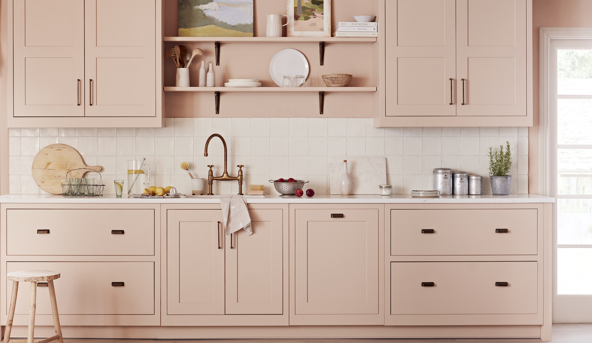
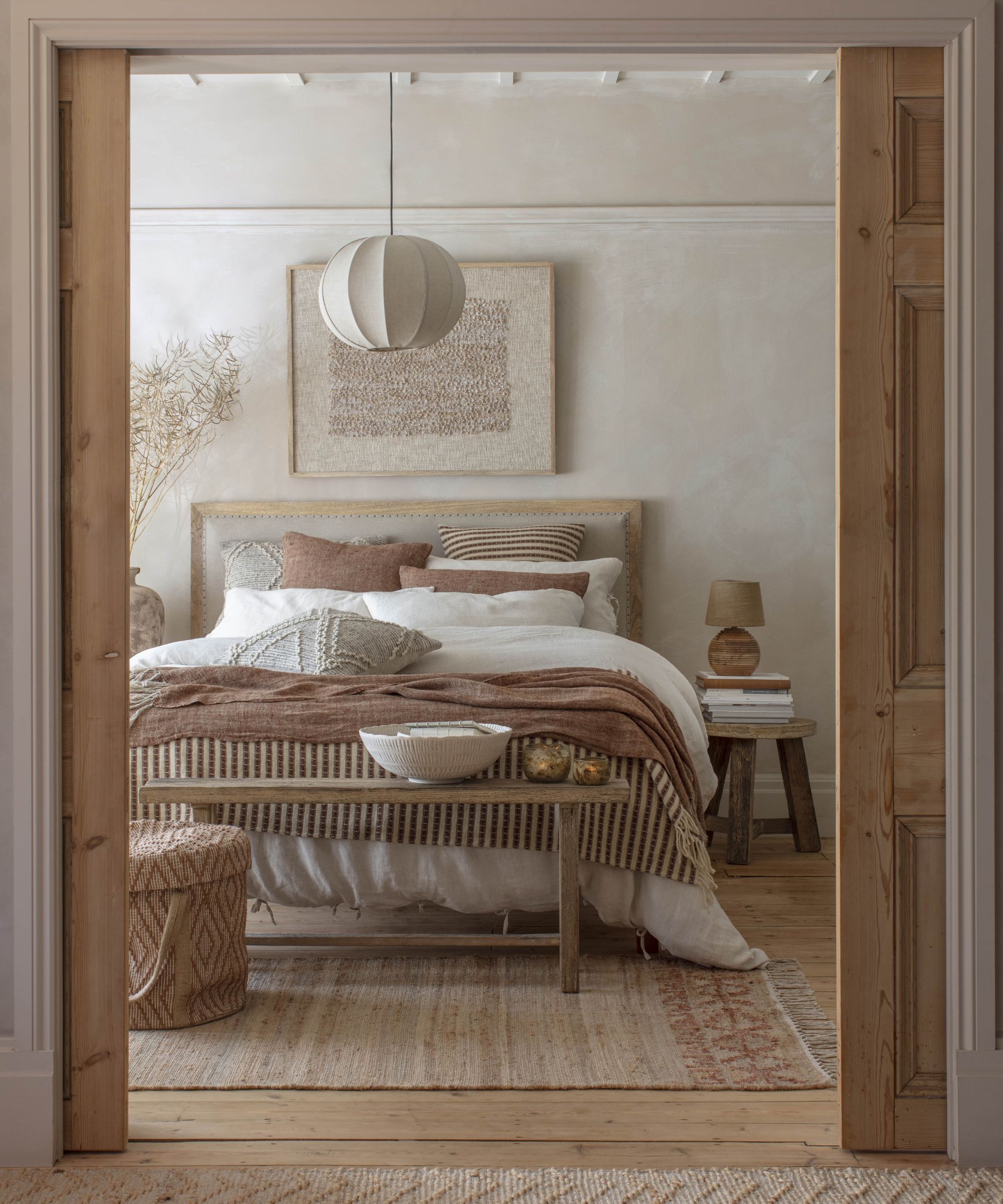
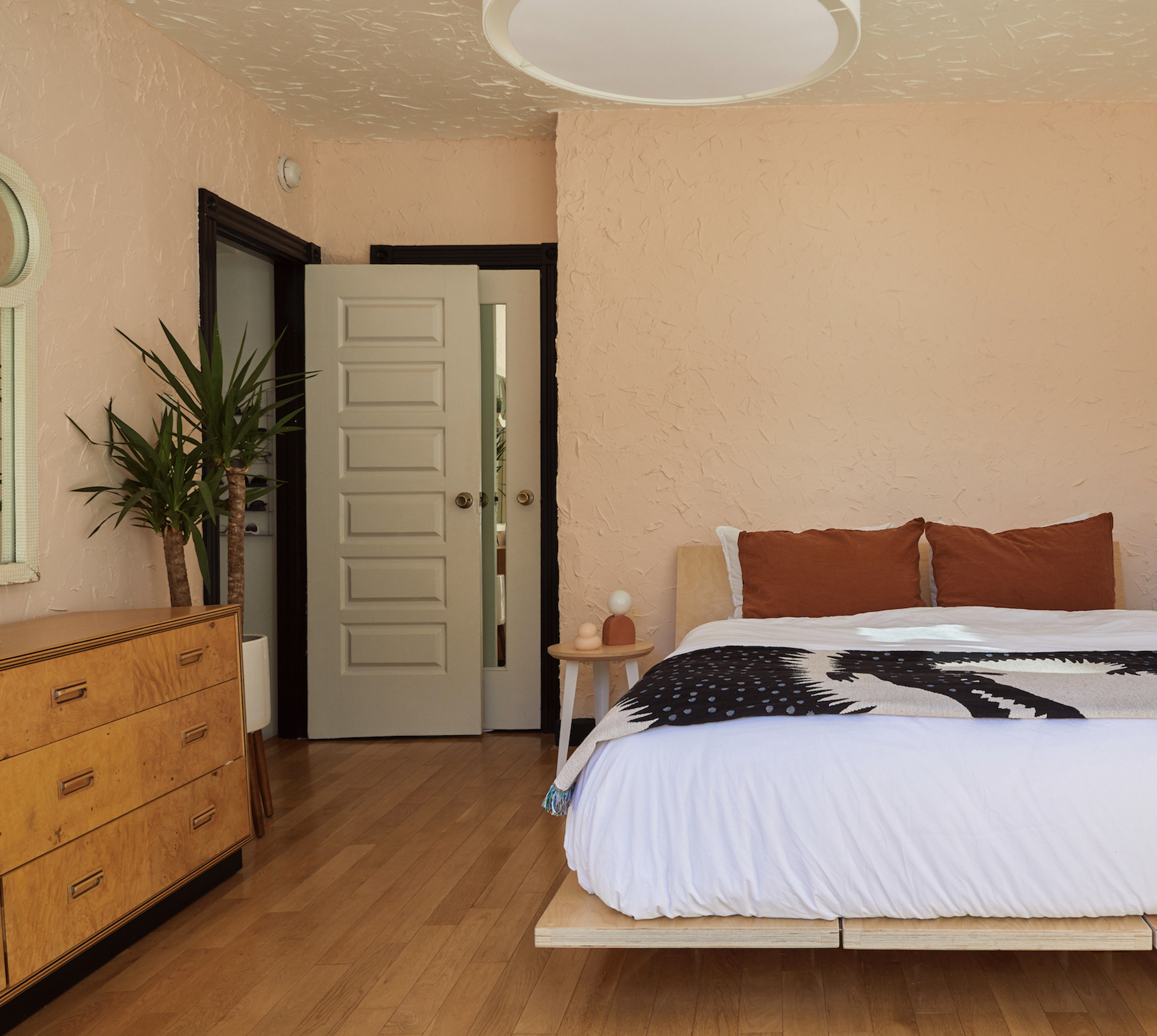
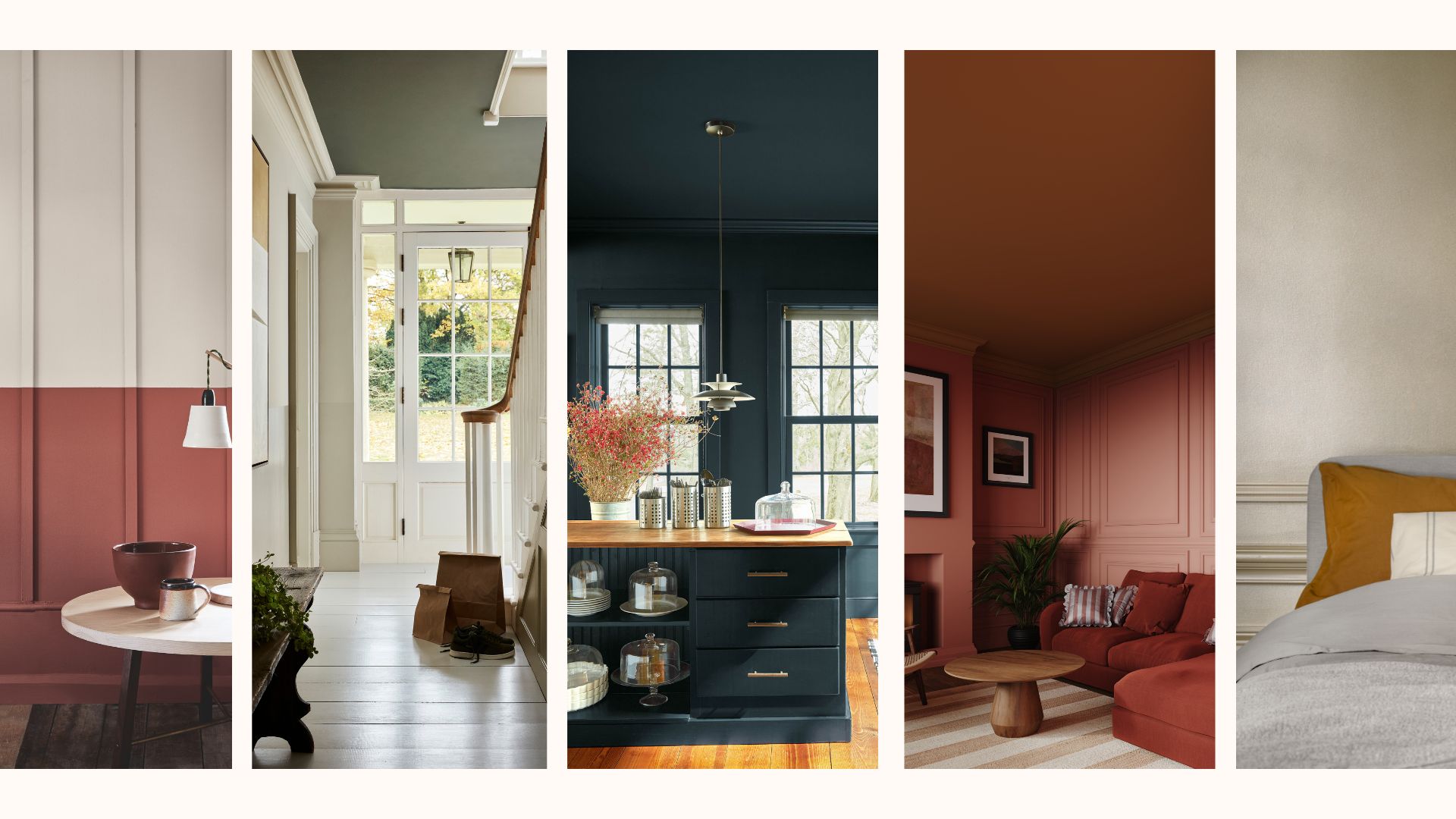
"Earthy pink" is highlighted as a versatile and gentle option that avoids being overly sweet. Natalie Ebel, co-founder of Backdrop, mentions "36 Hours in Marrakesh" as a popular warm, earthy pink that performs well in various lighting conditions and can enliven a small space. Other shades like "Harajuku Morning," "On Tour," and "Natural Habitat" are also suggested, along with the idea of pairing softer pinks with dark accents for added depth.
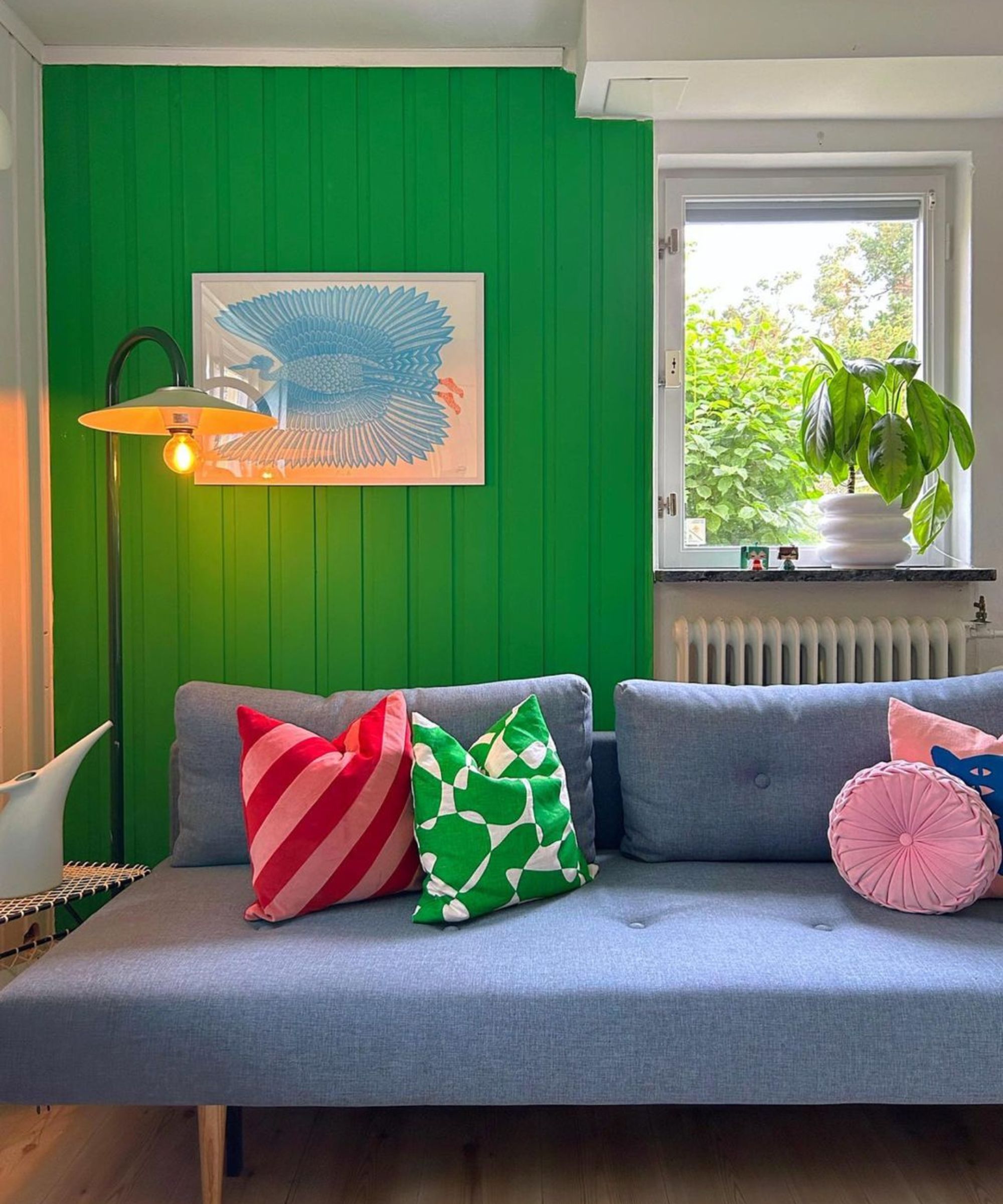
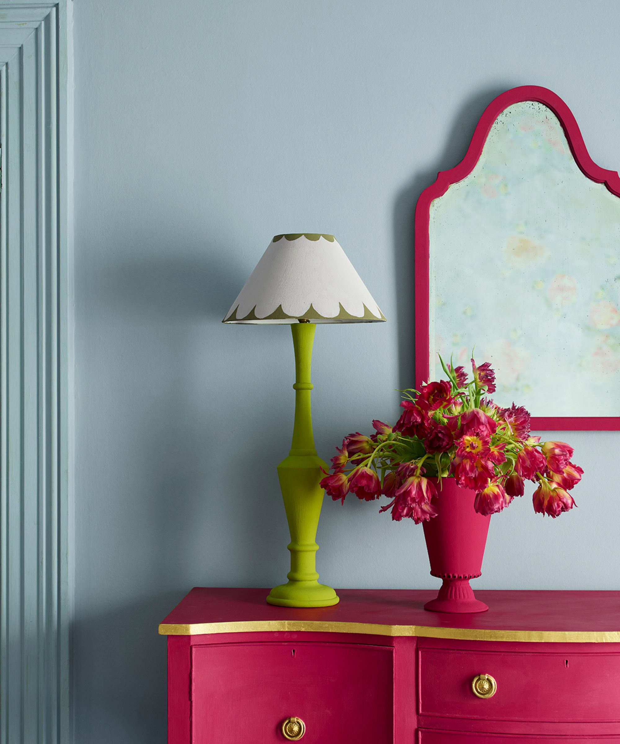
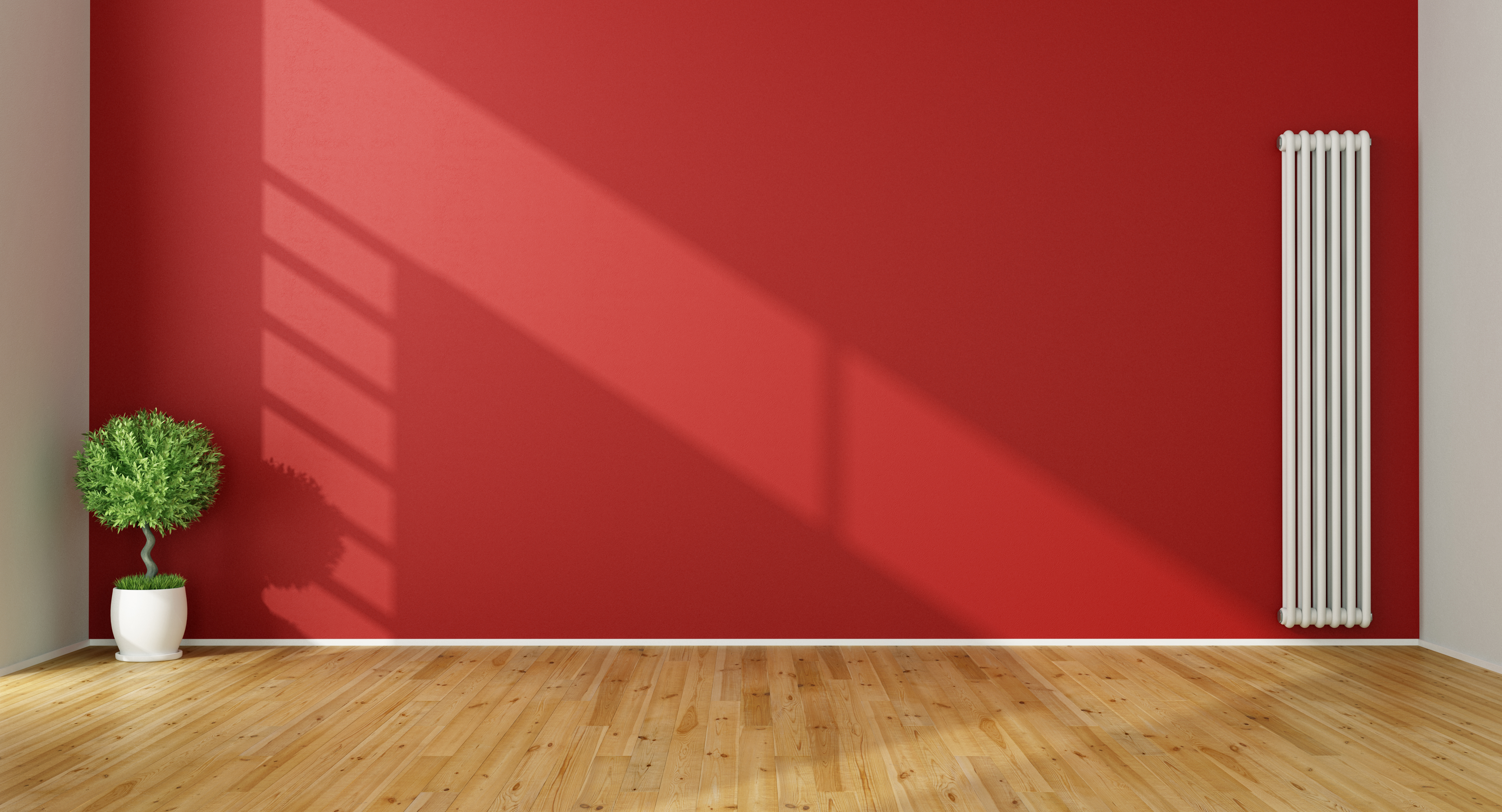
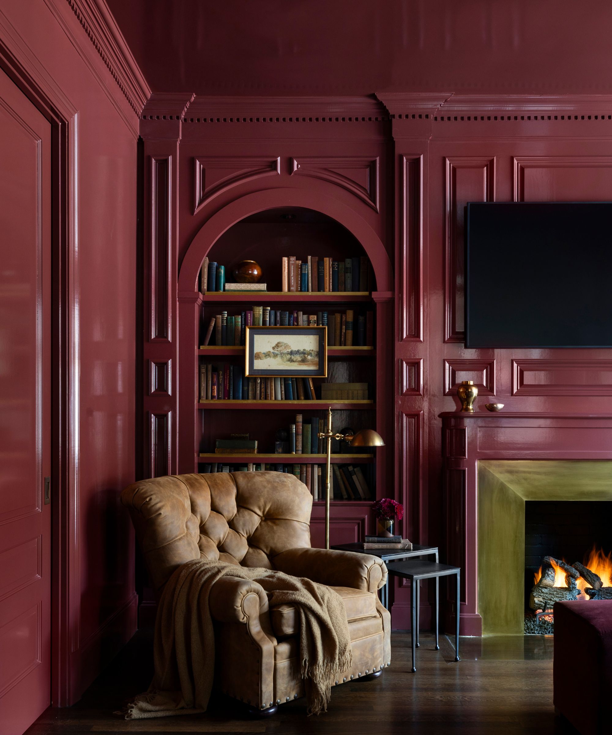
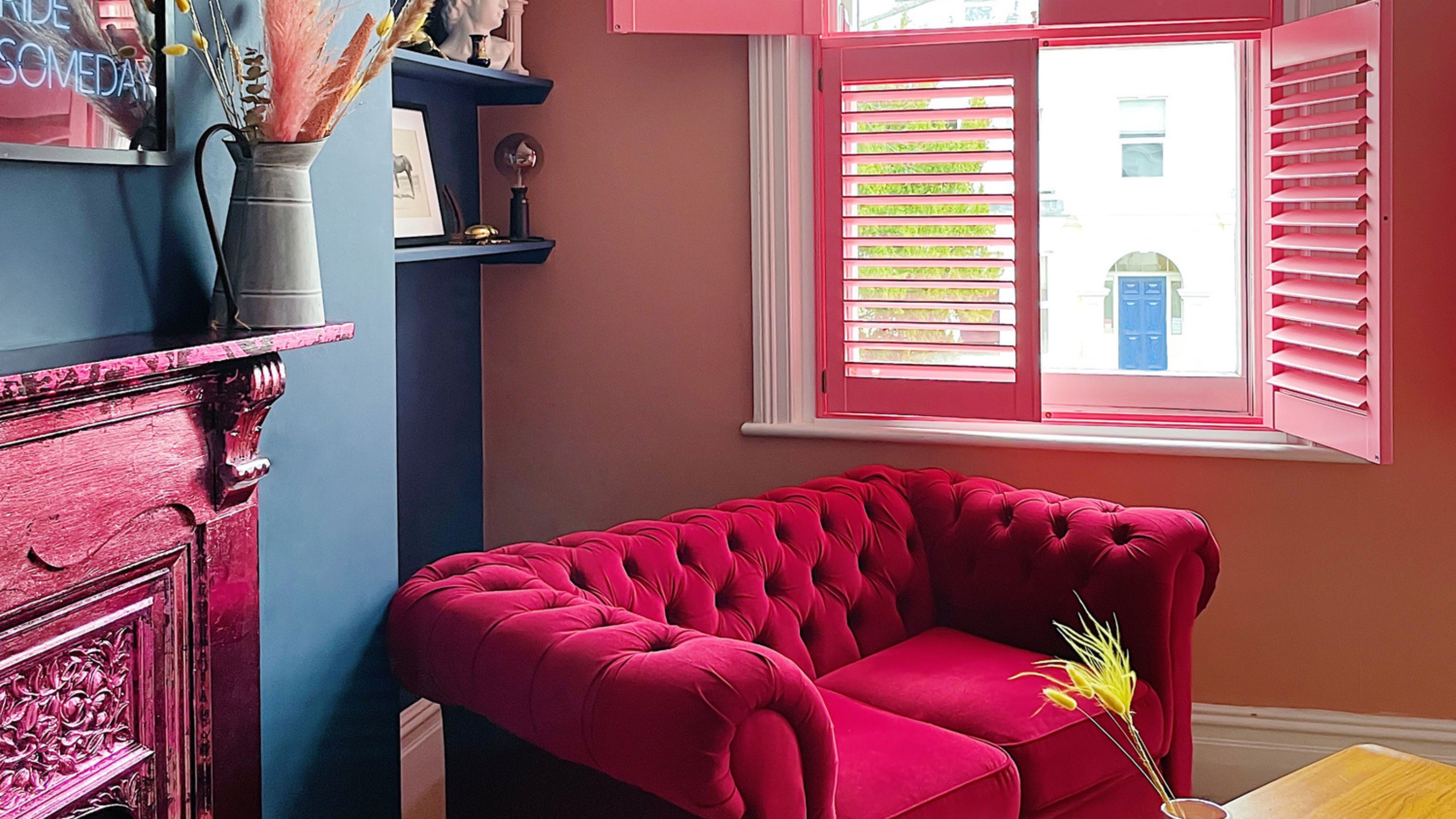
"Raspberry" is proposed as a warm, fresh, and modern color for small apartments. Shaw explains that deep or bright colors can cleverly absorb light, blurring wall divisions and making the space appear larger rather than claustrophobic. "Raspberry Blush" is specifically cited for its ability to add depth and dimension while filling a room with exuberance. The article encourages bold use of this color.
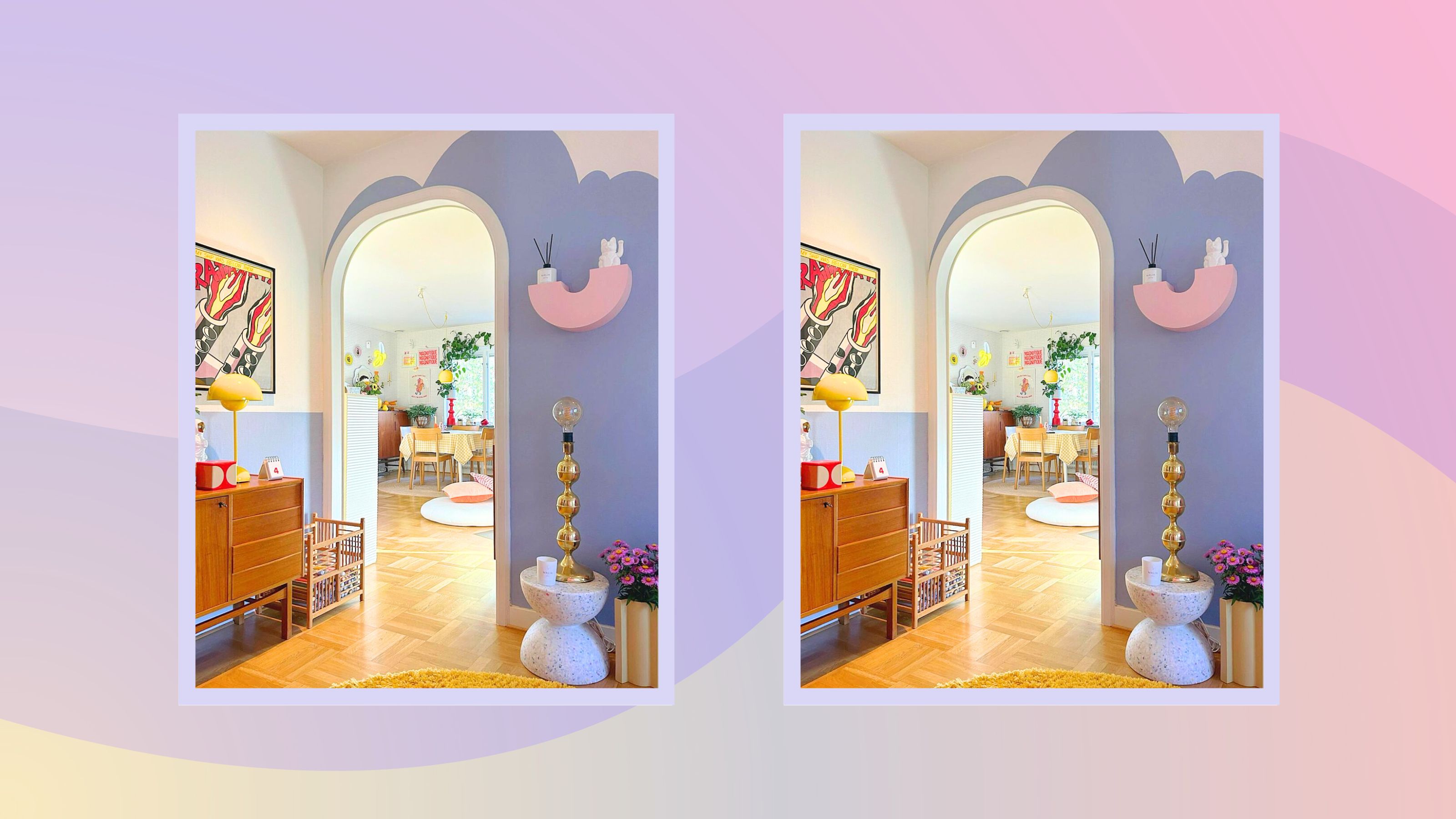
"Lavender" is praised for its ability to enhance architectural details and add height when used in varying tones. Gideon Mendelson, founder of Mendelson Group, suggests lavender as a color that conveys luxury, elegance, and serenity, moving away from stark all-white interiors. It is recommended for softening stark white spaces without making them feel cold.
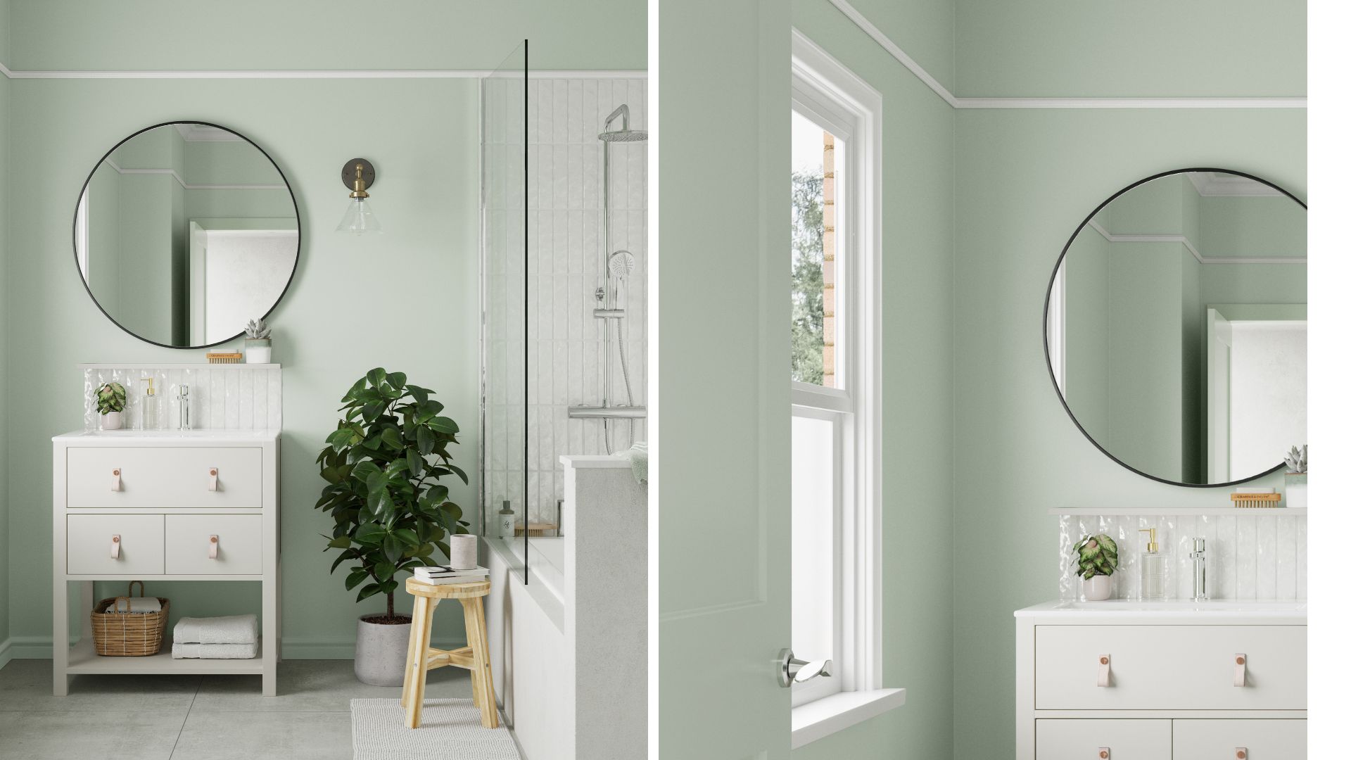
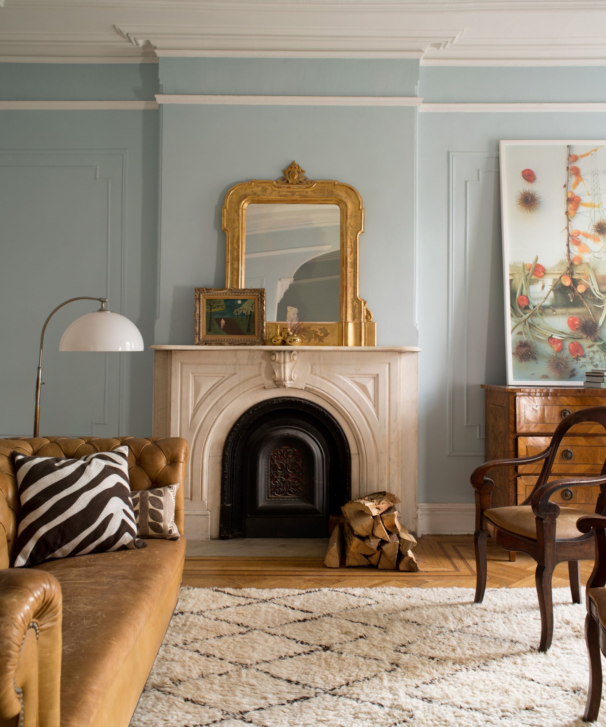
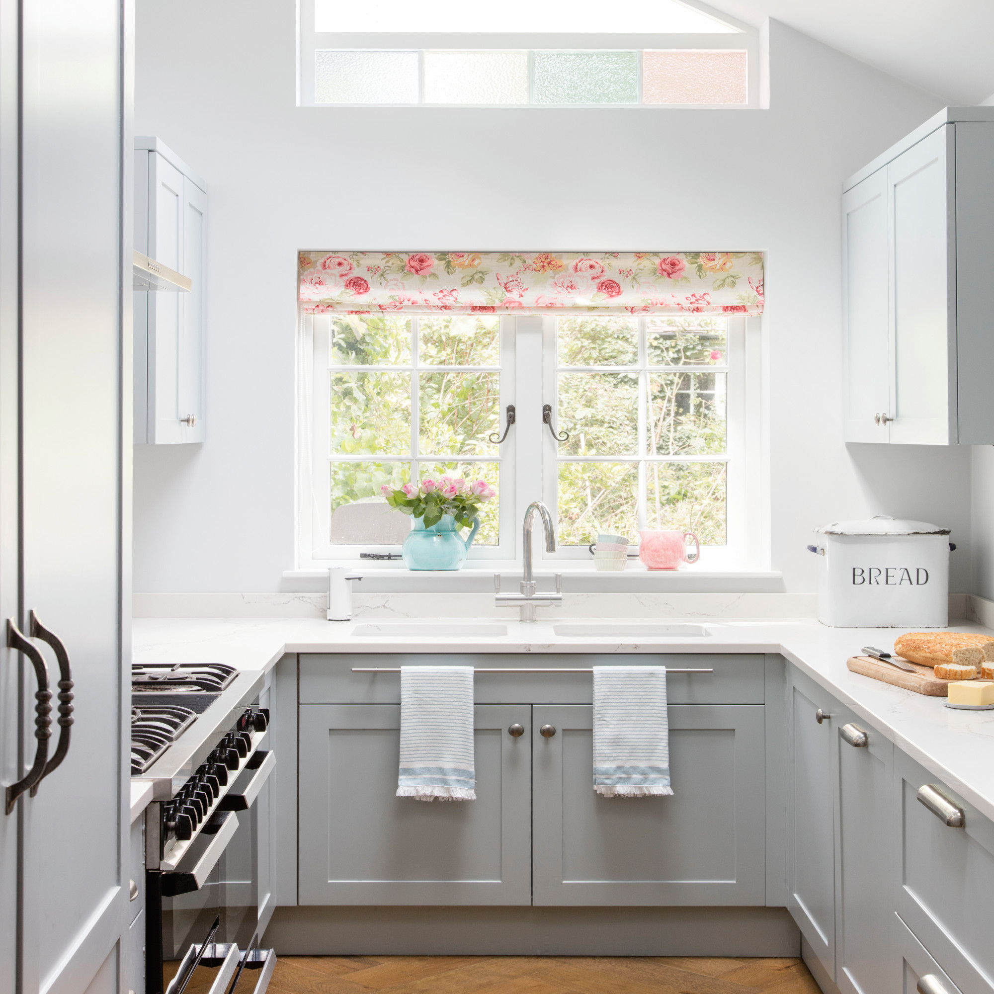
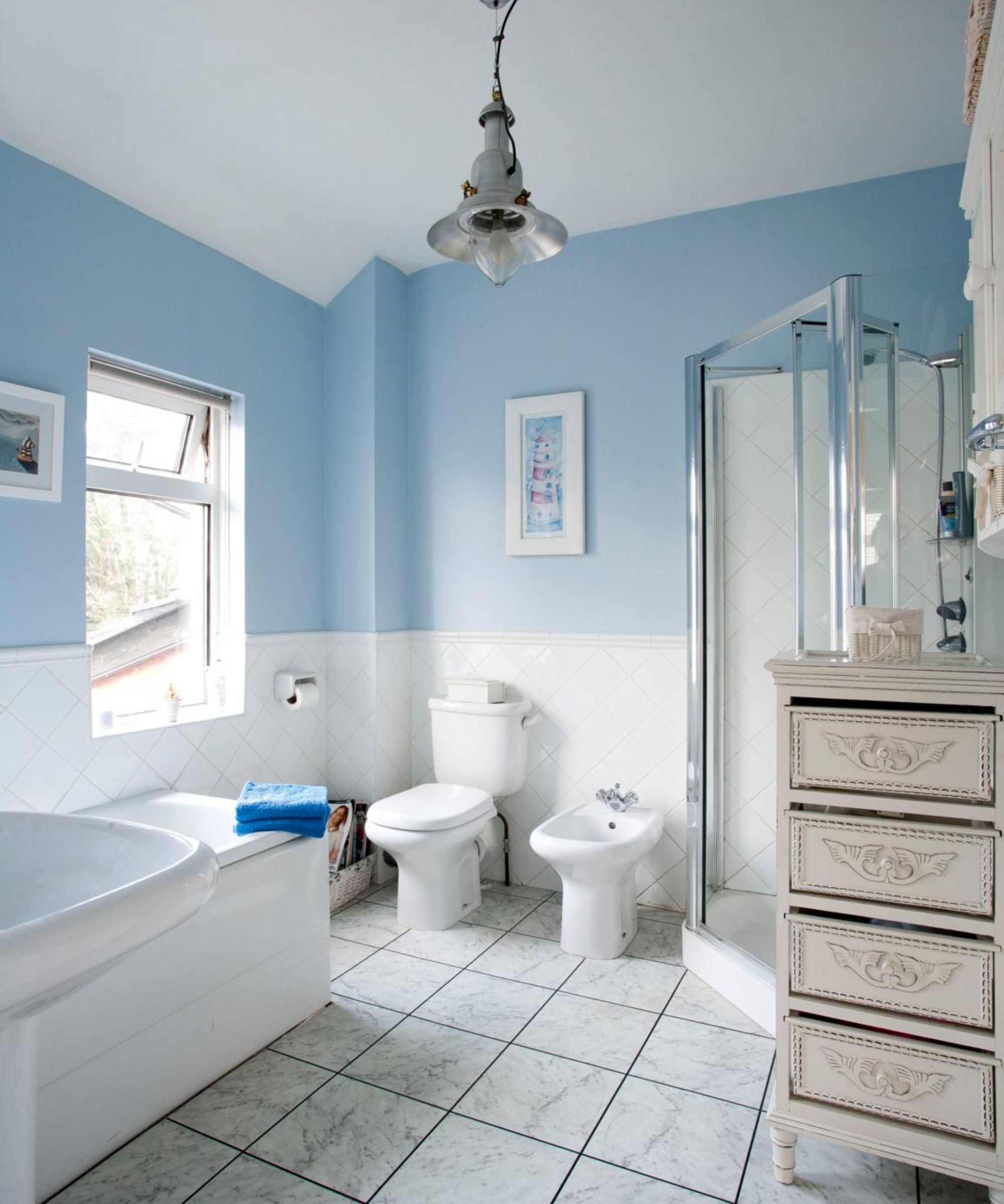
"Cool blue" is presented as a color that can lift a space while adding a touch of color, particularly suitable for south-facing rooms that tend to feel warm. Sue Kim, Valspar's color managing director, describes light blue with softness as a modern pastel with uplifting qualities, easy to complement with vibrant accessories like coral, turmeric, and indigo.
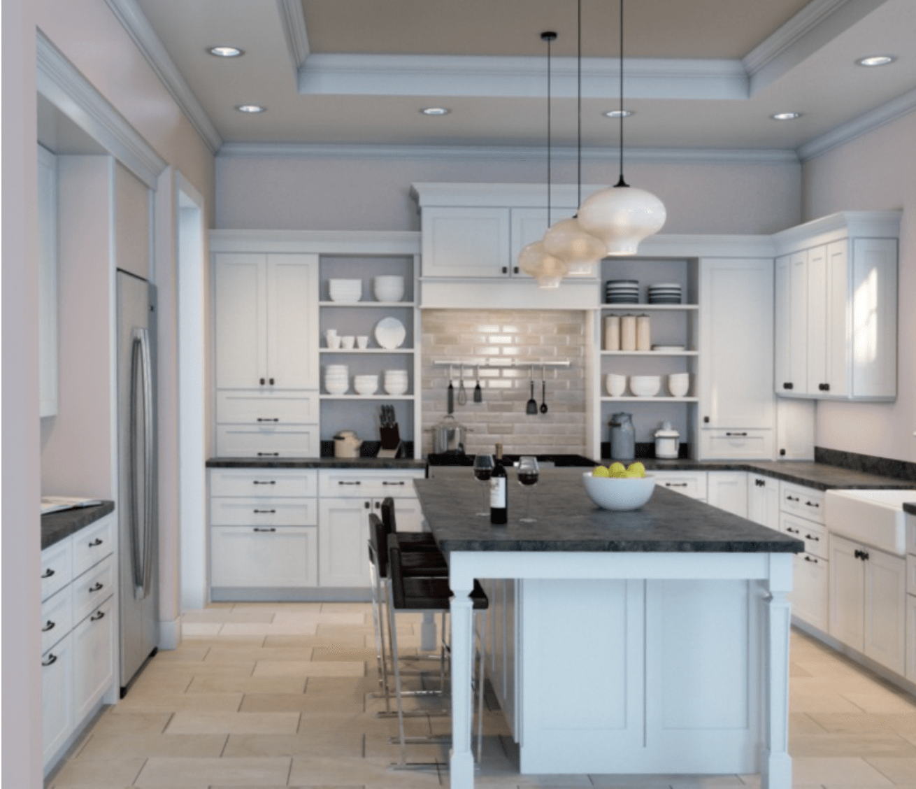
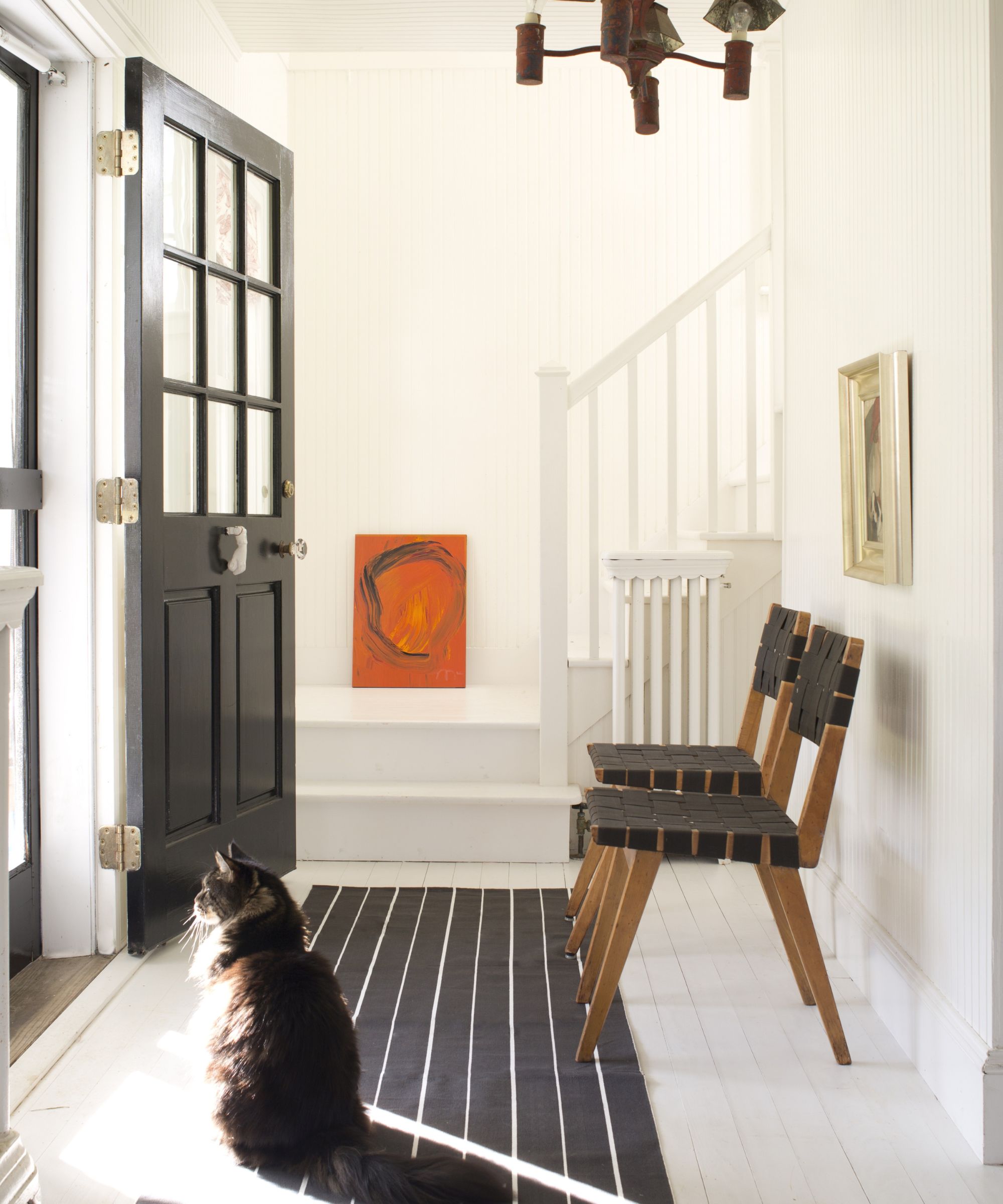
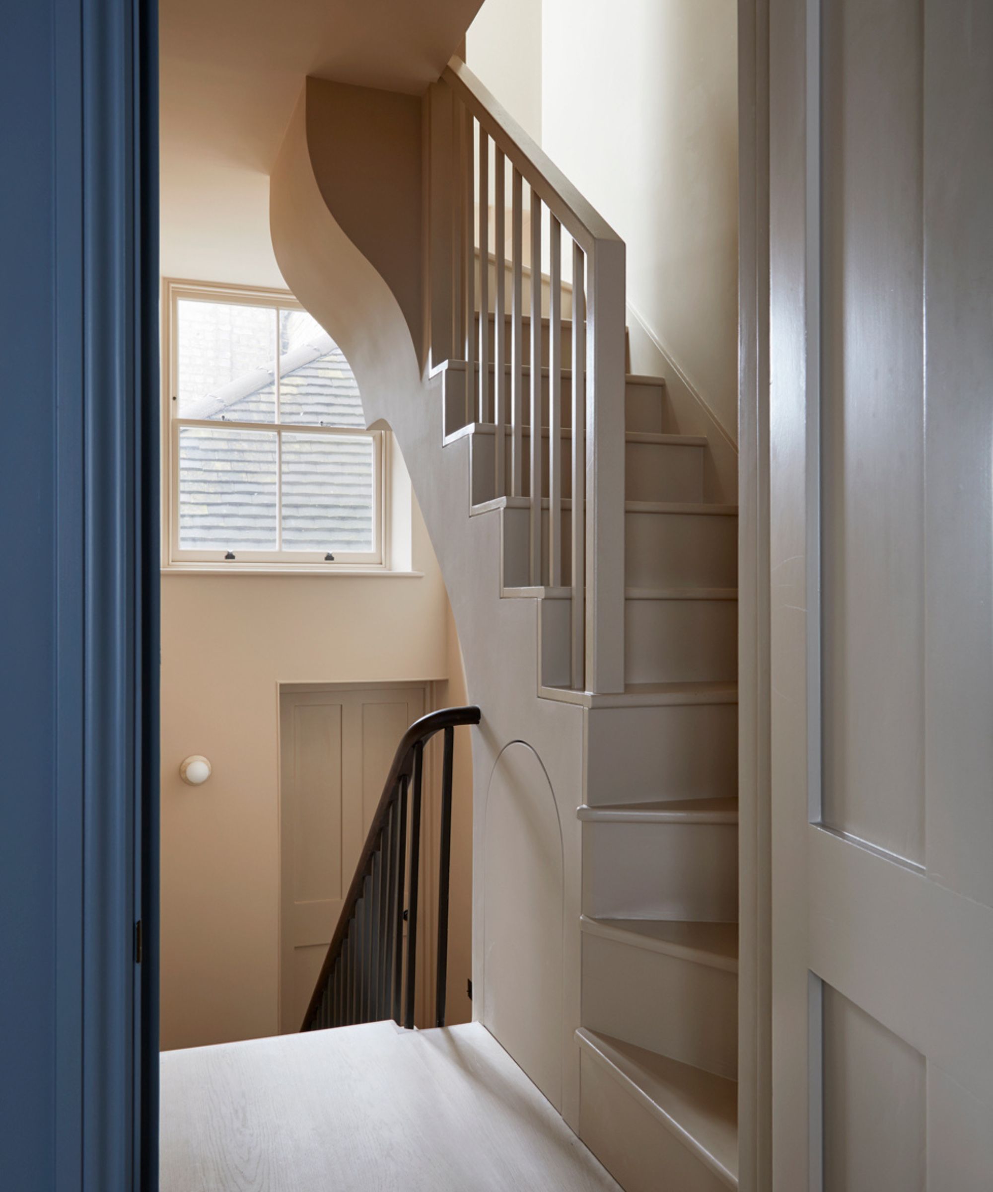
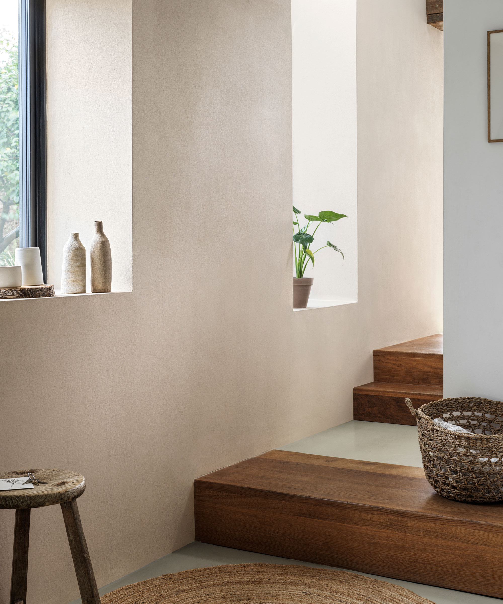
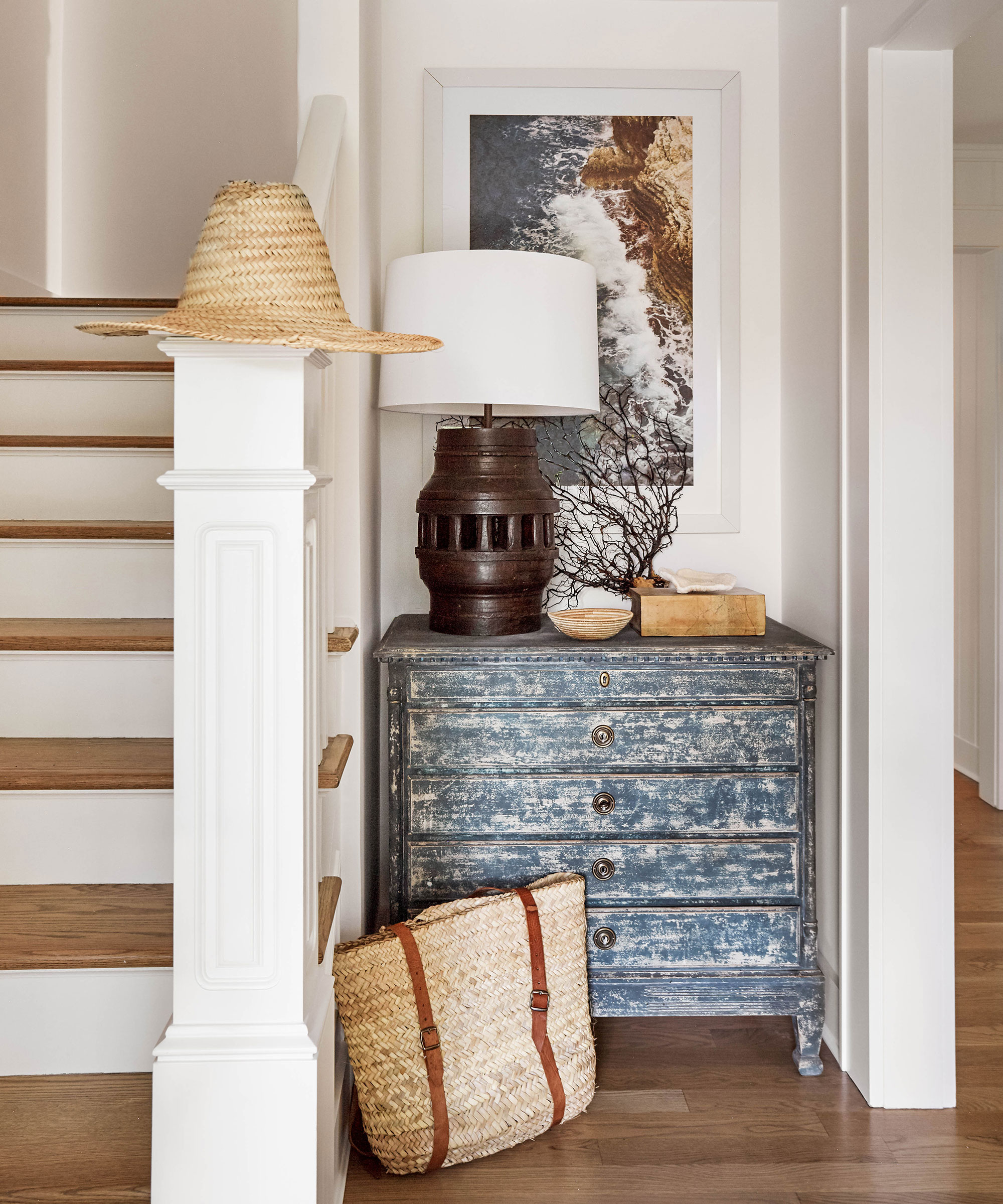
Finally, "Stone" is recommended as a cozy neutral that provides warmth in winter and cool vibes in summer, ideal for small, even open-plan, spaces. Wadden suggests rich neutrals like "Urbane Bronze SW 7048" or "Redend Point SW 9081" for transitional areas like mudrooms or entryways, as they make a significant impact without overwhelming the existing color palette.
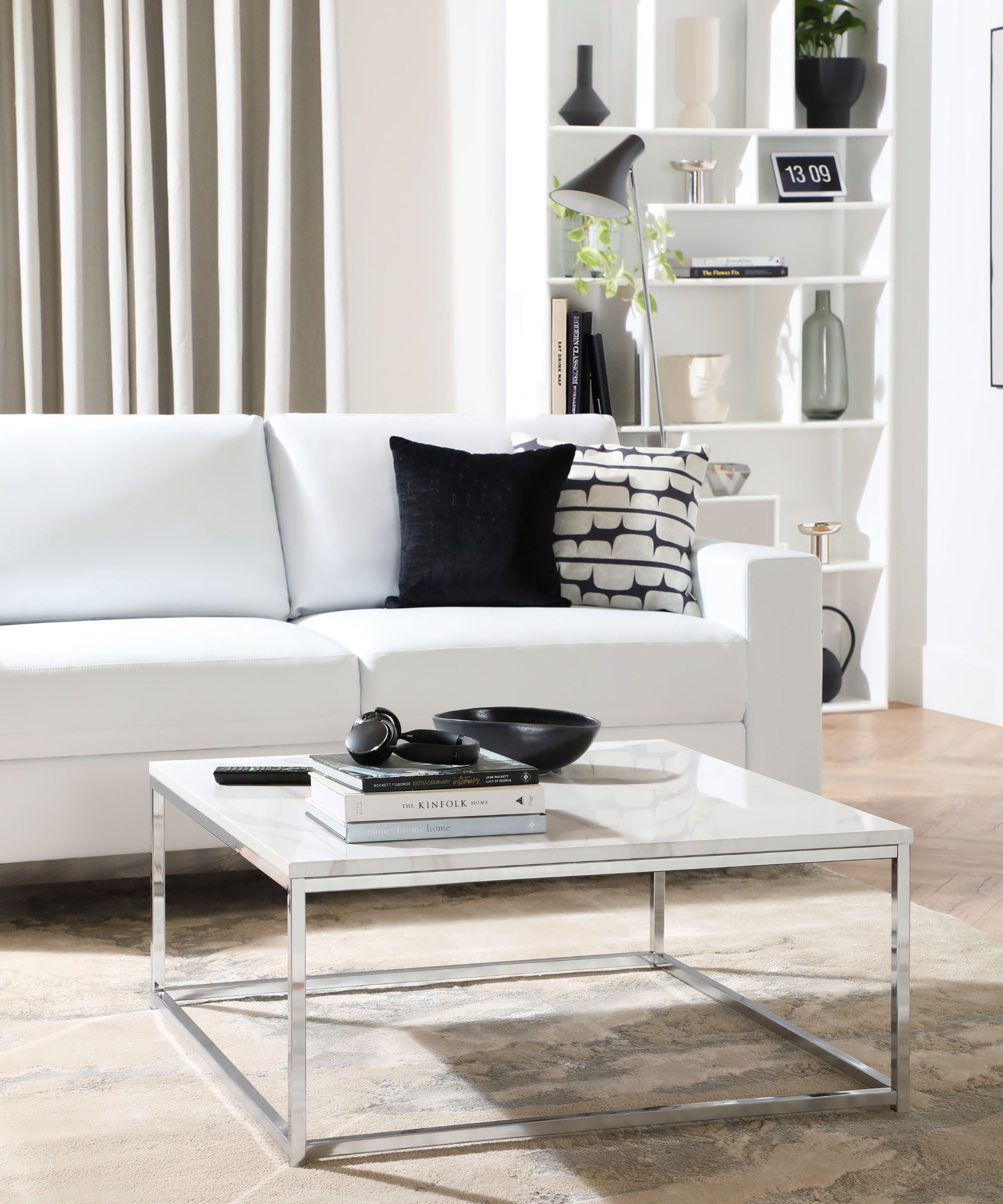
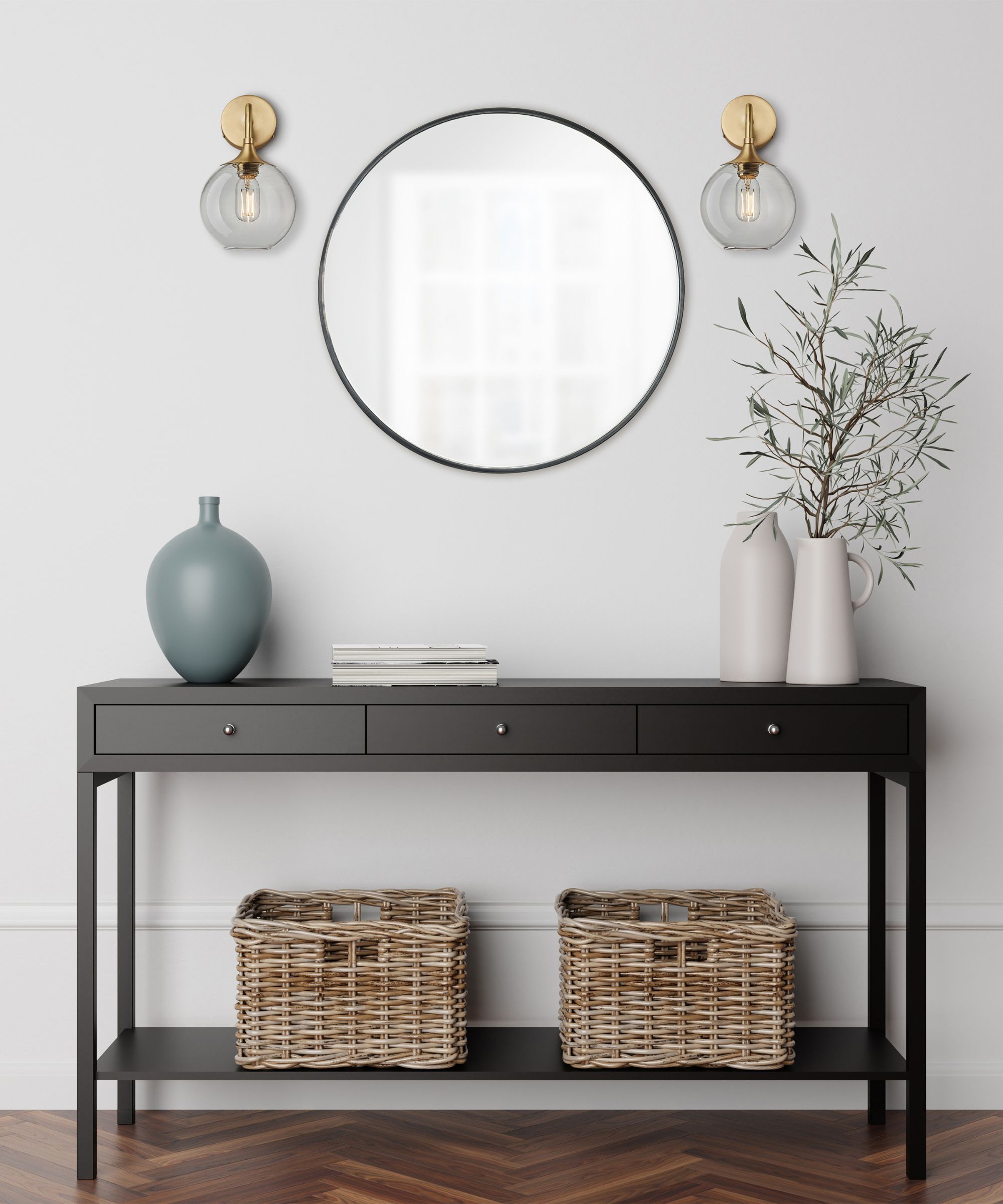
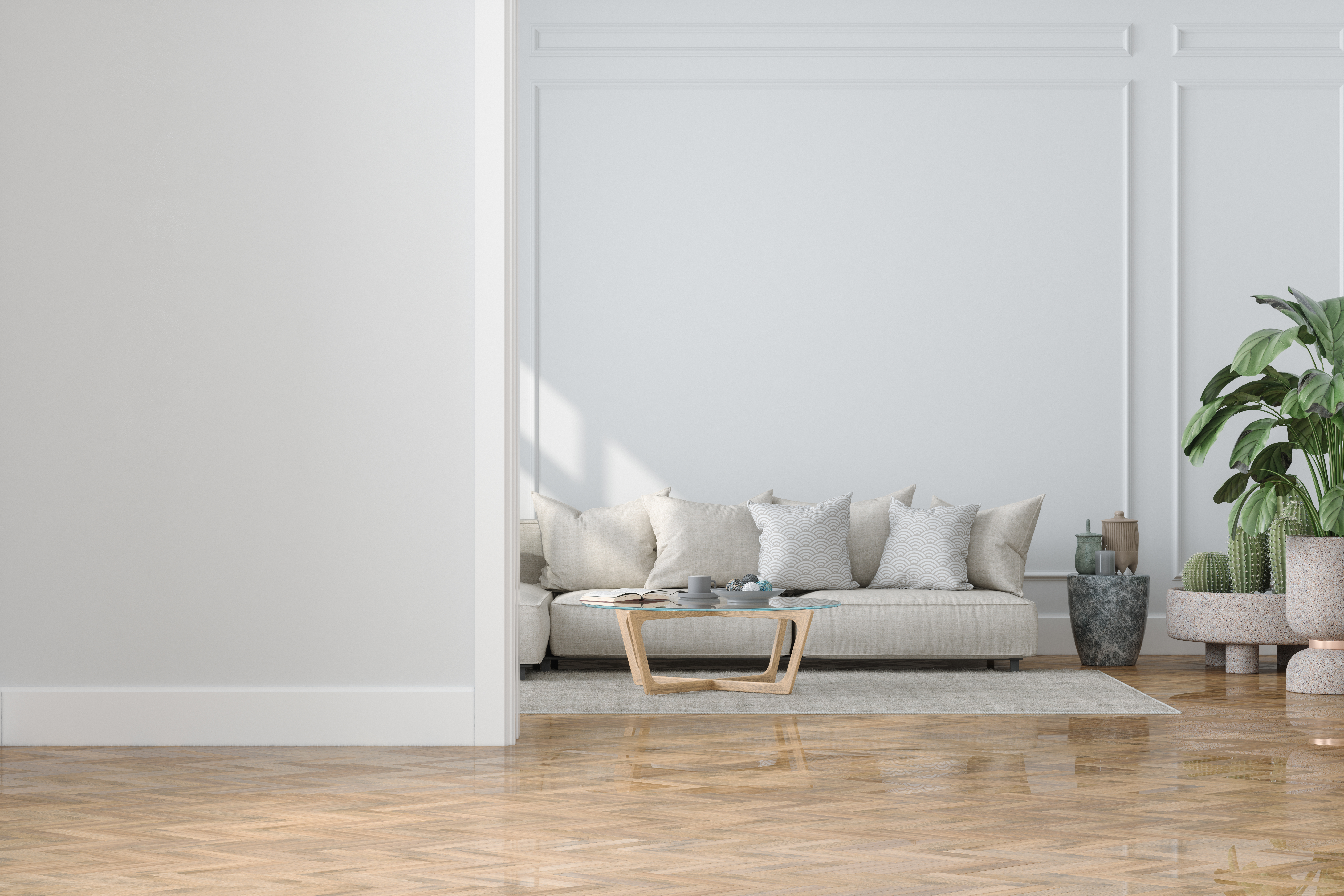
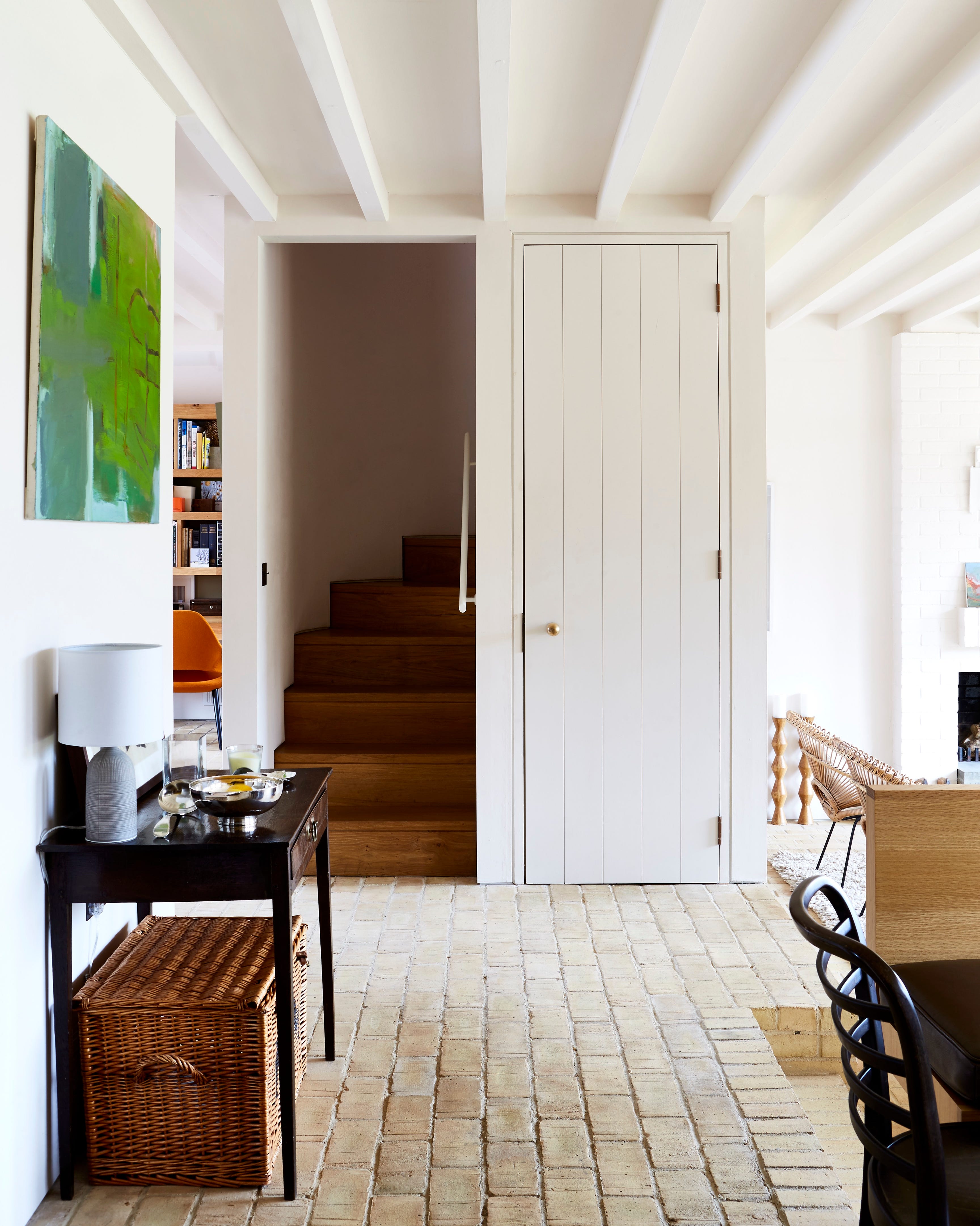
"Crisp white" remains a classic choice. Ginger Curtis, president of Urbanology Designs, showcases how white, when combined with diverse wood tones, textures, and finishes, can create depth and cohesion in compact spaces. She emphasizes that foundational neutral elements paired with white paint, particularly warm whites, act as color and contrast, maintaining an organic baseline without feeling flat or overly simplified.
#SmallSpaces #PaintColors #InteriorDesign #HomeDecor #ColorTheory #RoomTransformation #ExpertAdvice #PaintTrends #SmallSpaces #PaintColors #InteriorDesign #HomeDecor #ColorTheory #RoomTransformation #ExpertAdvice #PaintTrends
合計0件のコメント
 まだコメントはありません
あなたも好きかもしれません
The best paint colors for small living rooms, according to design experts
The best paint colors for small entryways — 7 shades design experts love
9 rooms that prove color drenching makes small spaces look bigger

14 Genius Painting Tricks to Make a Room Look Bigger
How to make a room look bigger with paint: 10 expert tips

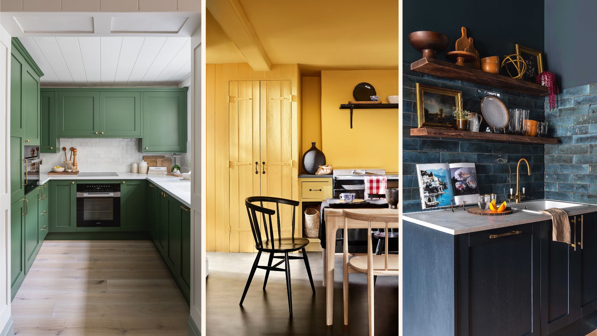
Experts reveal the best small kitchen color ideas to maximize compact spaces
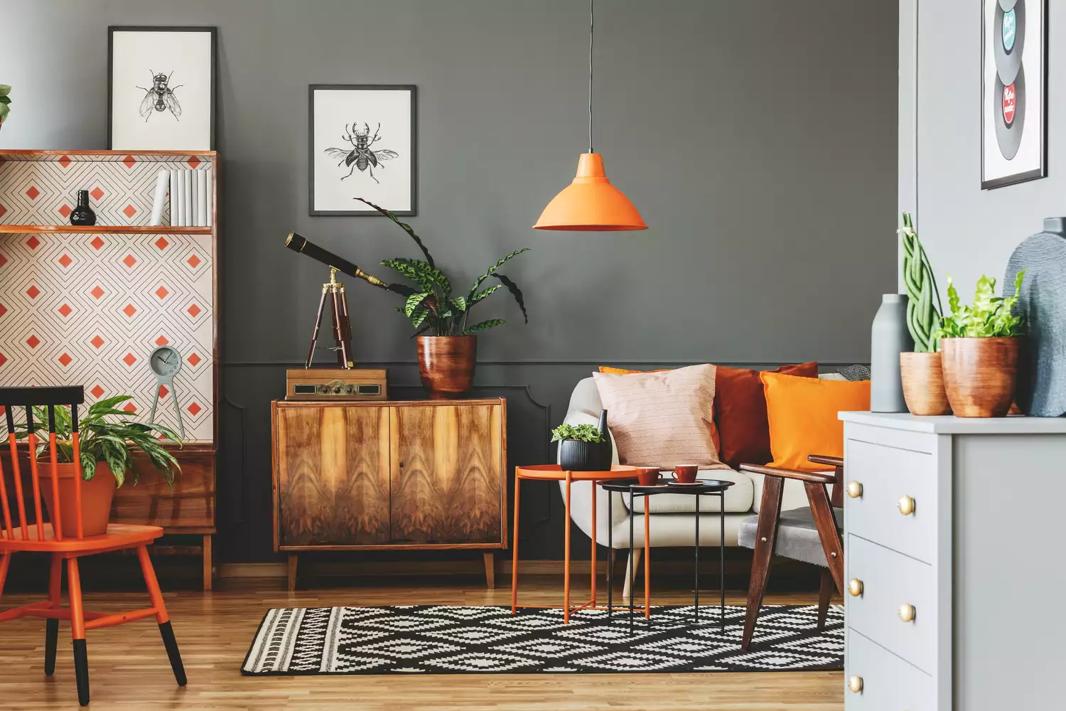
7 Paint Colors That Instantly Make Small Living Rooms Feel Bigger, Designers Say

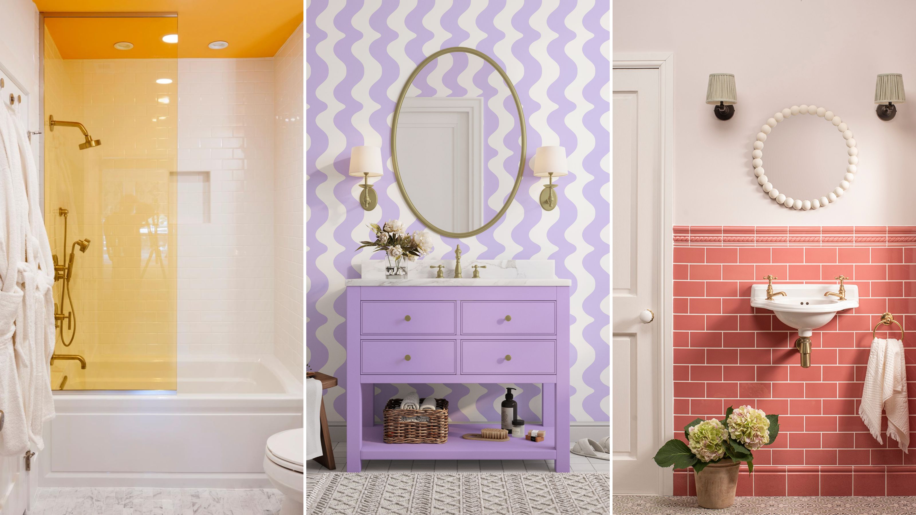
The 10 best paint colors for small bathrooms, according to design experts


5 colors you should never paint a small room – designers warn us to steer clear of these hues, and what to pick instead
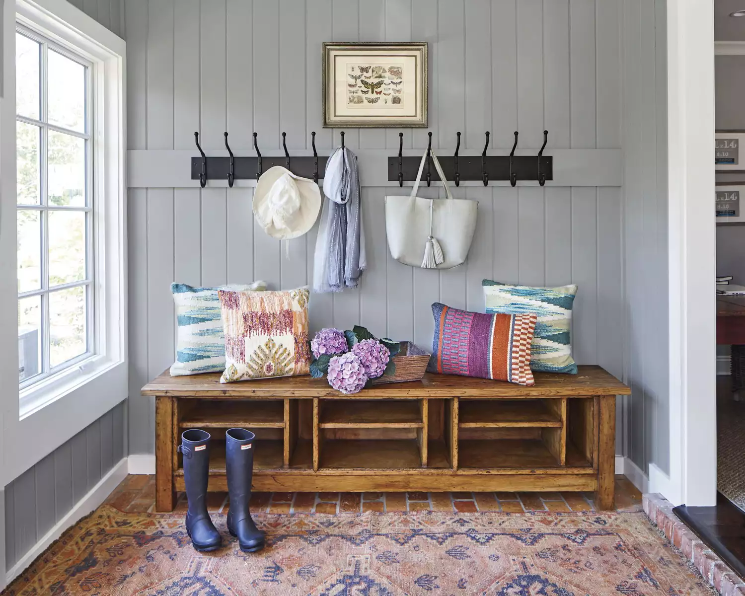
12 Paint Colors That Will Make Small Rooms Feel Bigger
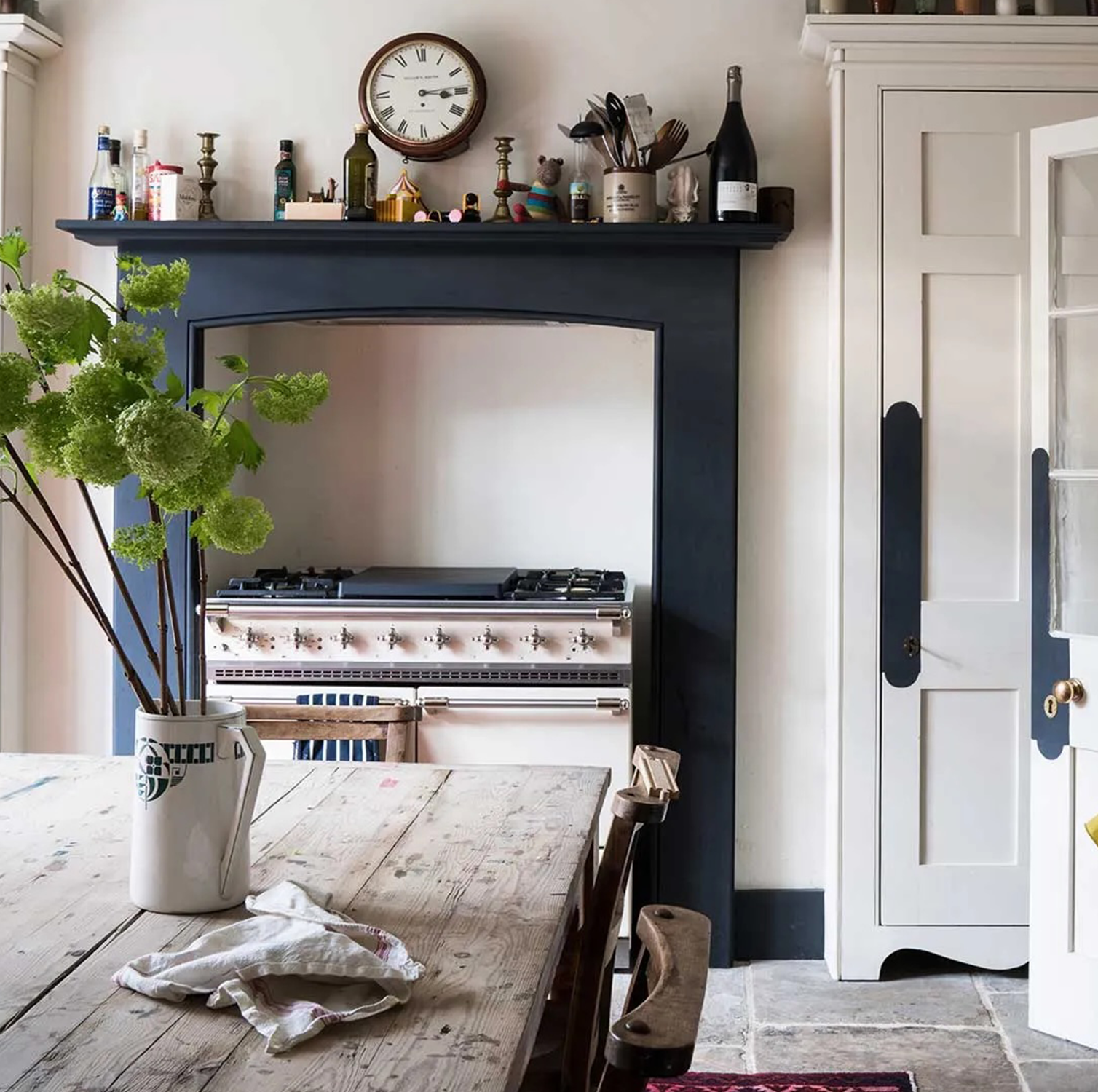
These 6 paint colours instantly make small rooms feel bigger
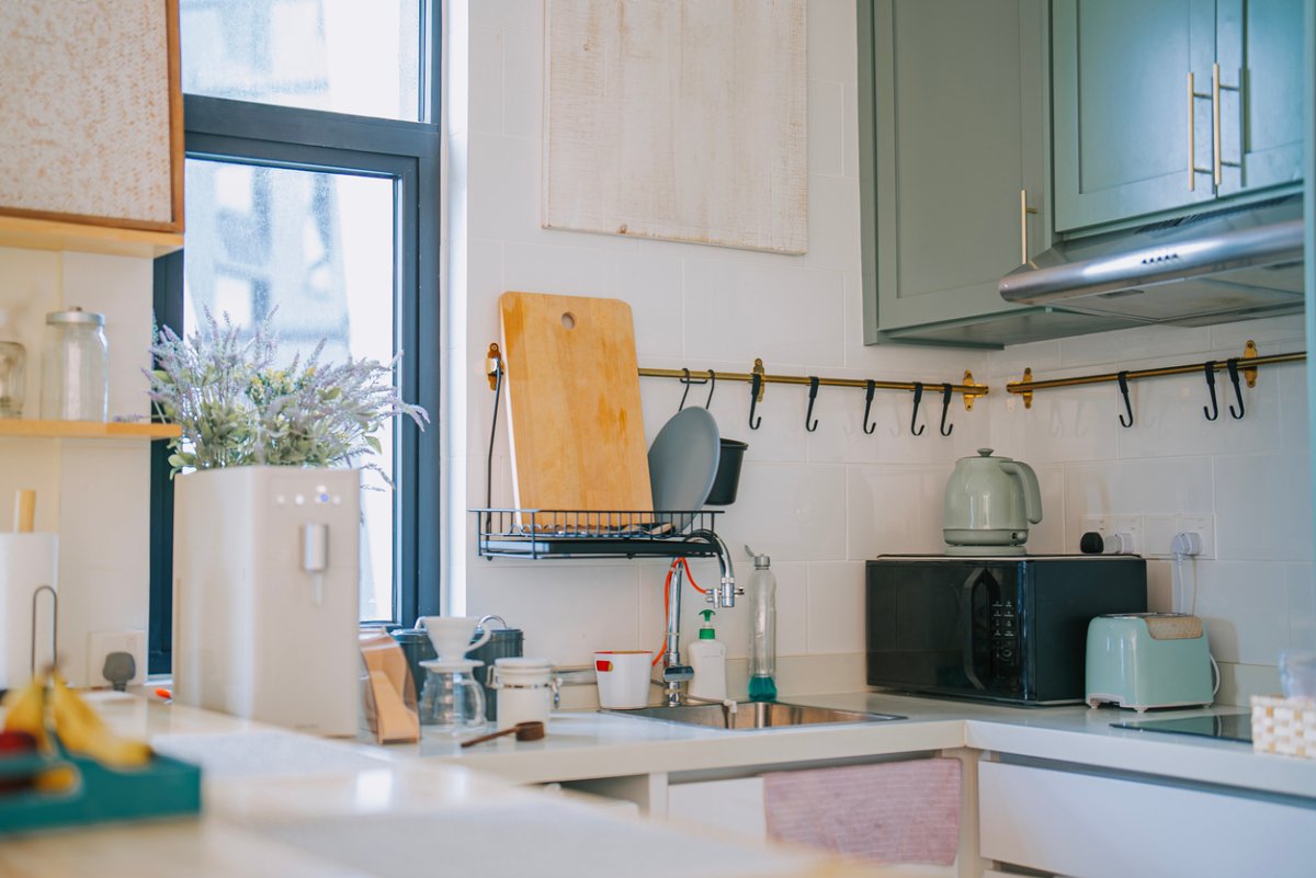
Cooking in a Shoebox-Sized Kitchen? 9 Paint Colors to Open Up the Room

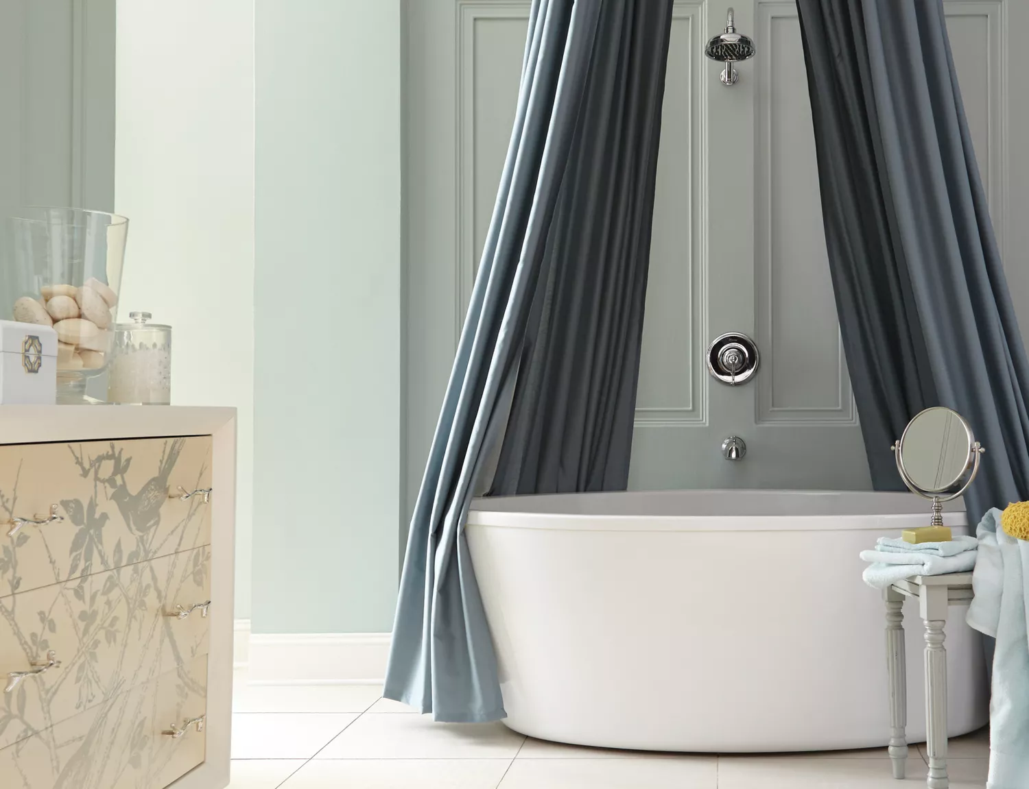
The Best Paint Colors to Make Small Rooms Feel Bigger (Some May Surprise You!)
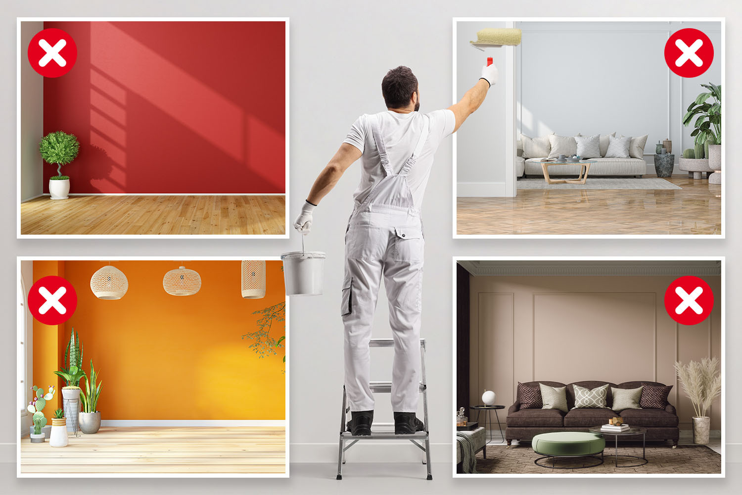
I’m an interior designer - the worst paint colours for small rooms, and why bright white walls is not a good idea

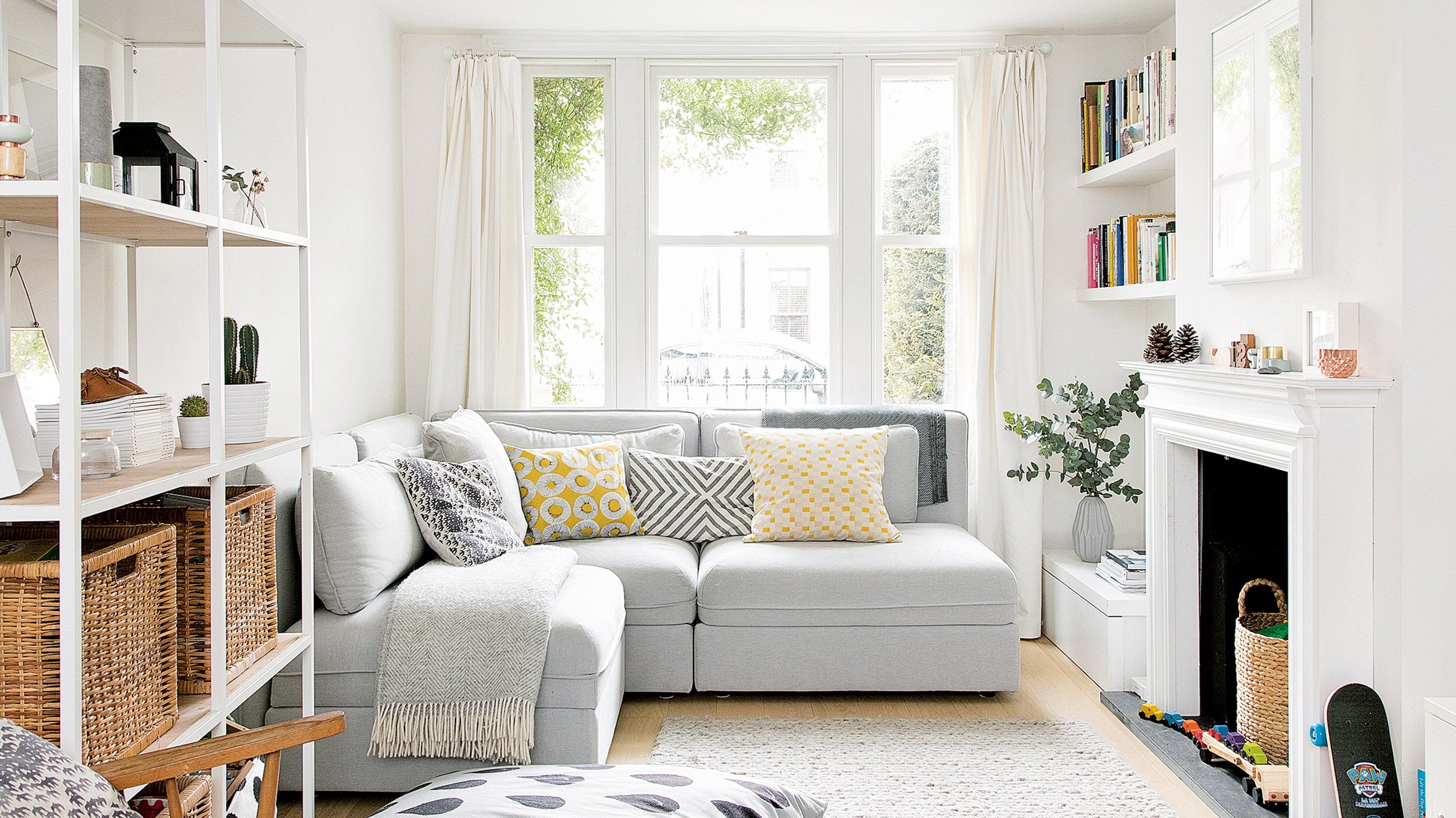
Is it better to paint small rooms light or dark? Here's what the top colour experts have to say
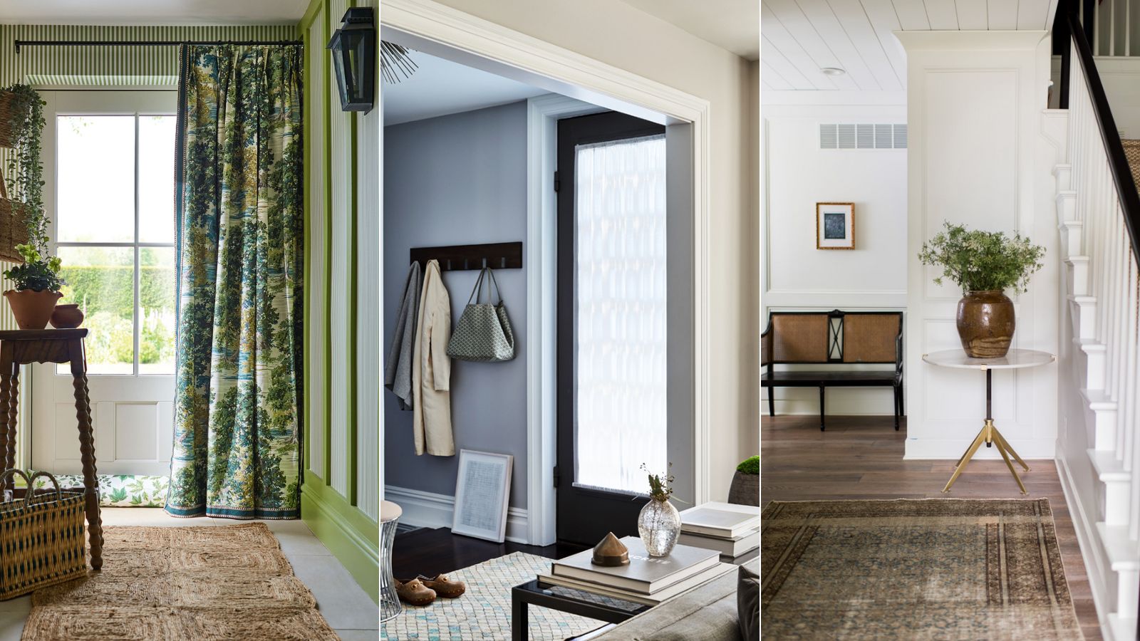
Best colors for small entryways – top designers swear by these 8 on-trend colors for the ultimate impact
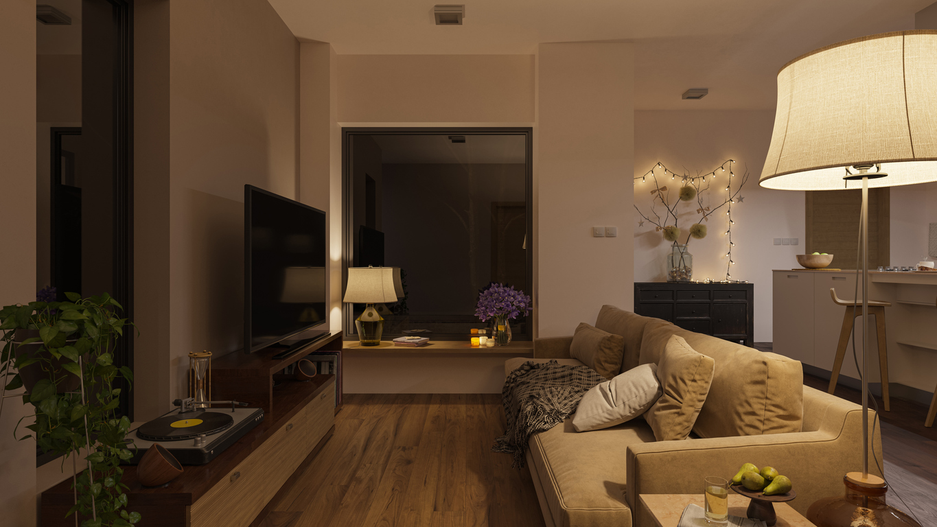
The 13 Best Paint Colors for Low-Light Rooms

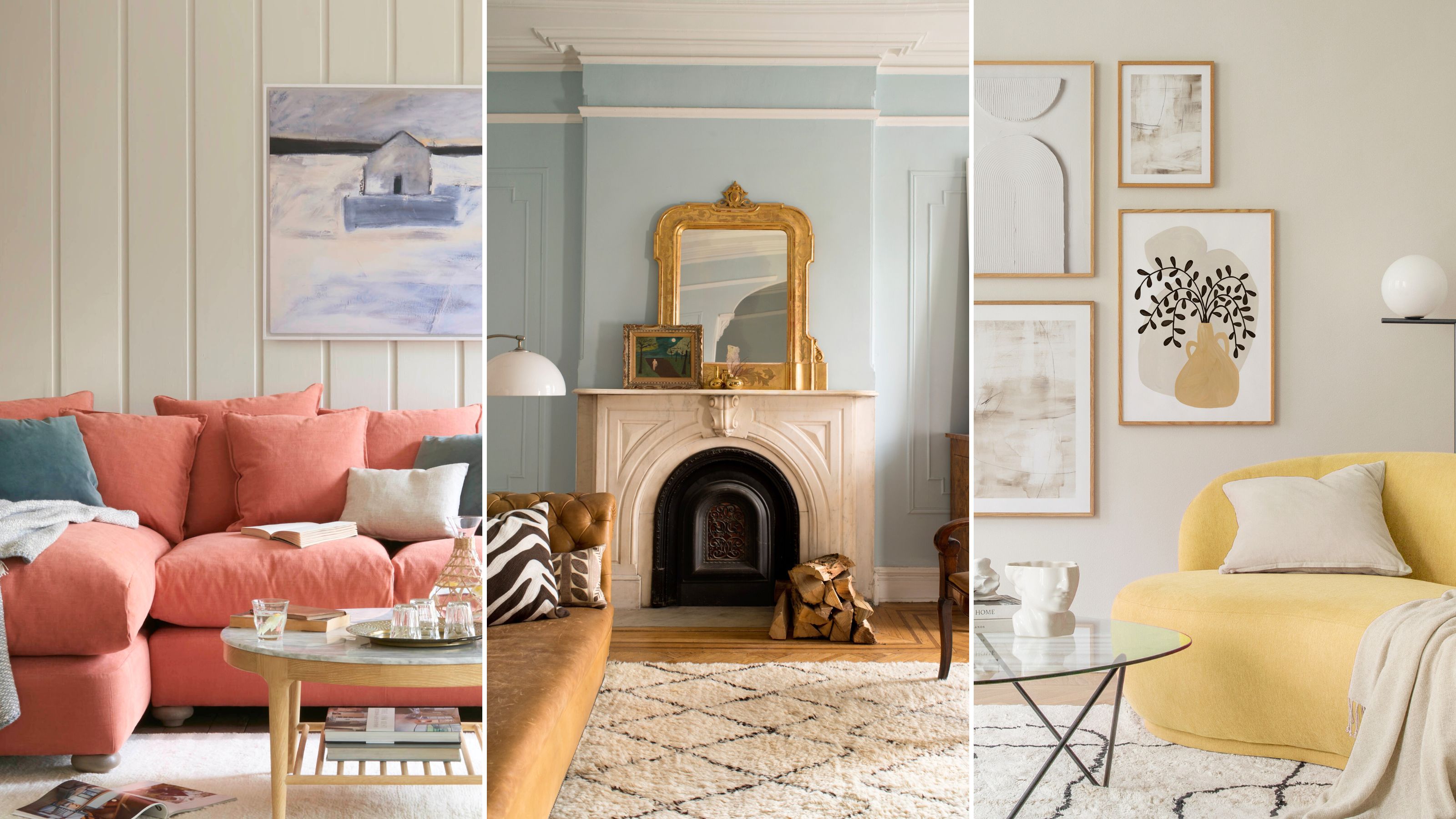
The paint colors to avoid in small living rooms — and what to use instead
The 10 Best Colors for Small Bedrooms, According to Color Experts and Interior Designers

8 Paint Colors to Enhance Your Hallways, According to Interior Designers