1/7
6 Worst Colors To Paint Your Kitchen (And What To Choose Instead)
The kitchen, often considered the heart of the home, requires careful consideration when selecting a paint color, as the chosen scheme significantly influences the area's ambiance. This article, drawing on expert advice from several design professionals, identifies six paint colors that are best avoided in kitchen environments and suggests contemporary alternatives to ensure a chic and stylish space. The article also provides actionable tips for incorporating color thoughtfully to create a welcoming and modern kitchen.
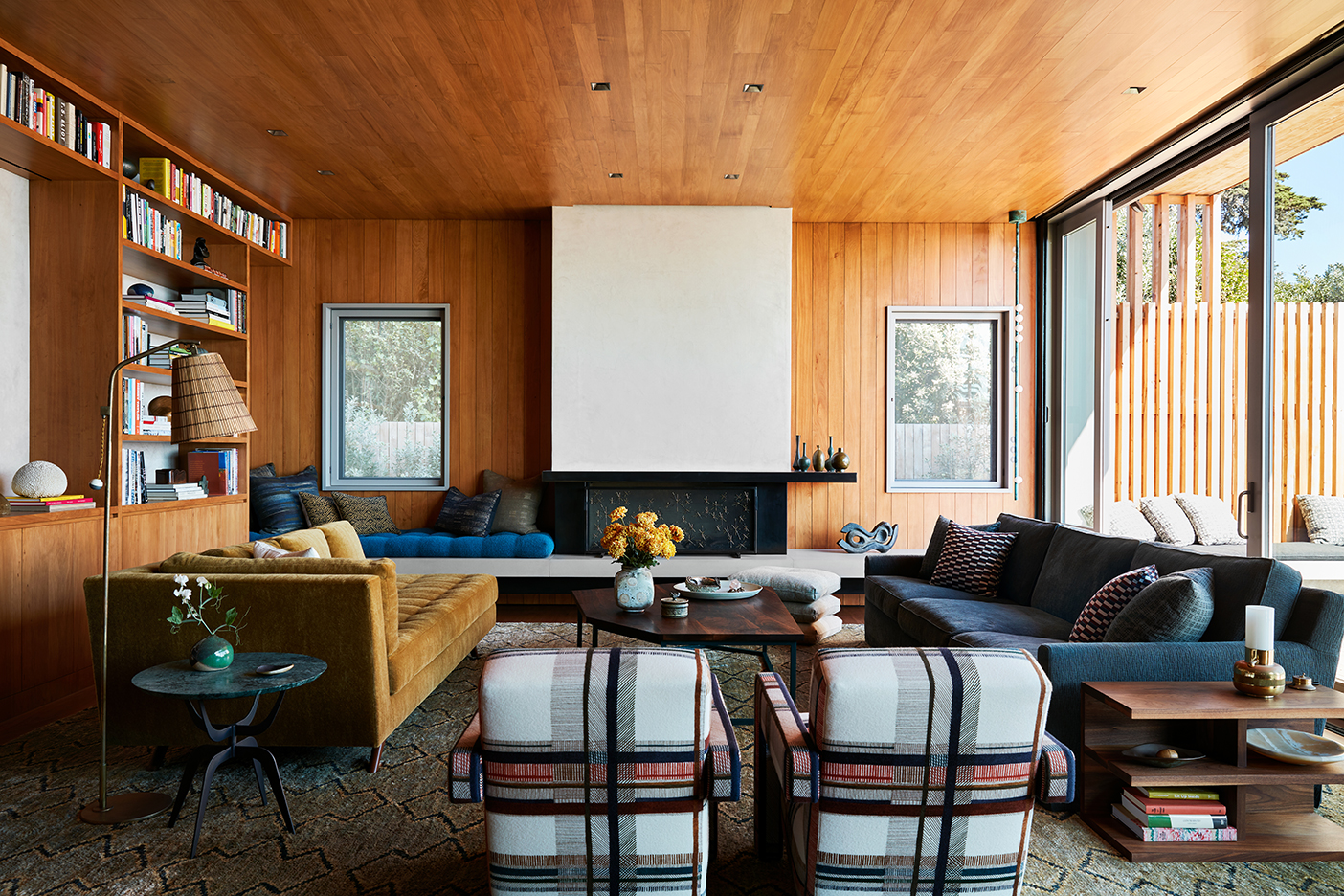
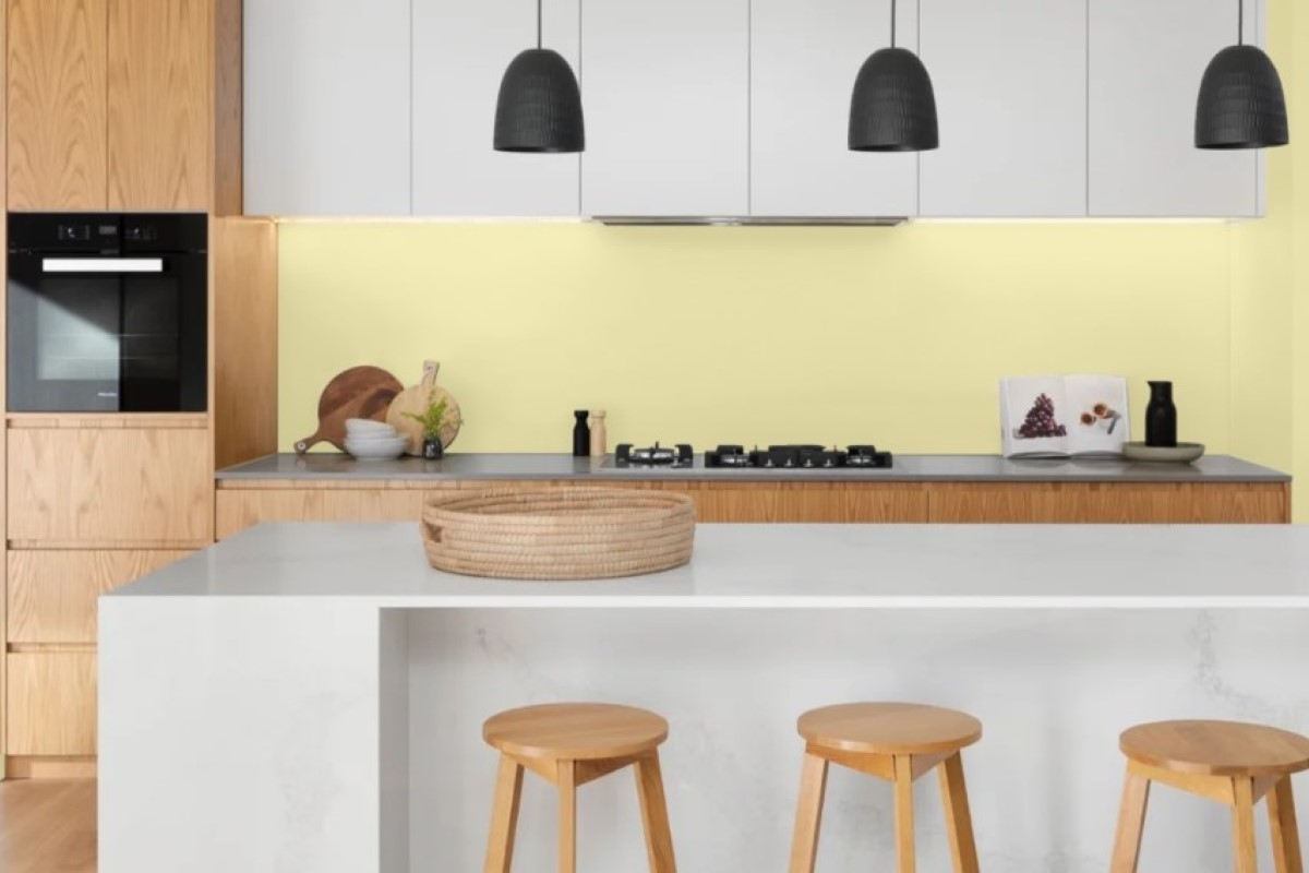
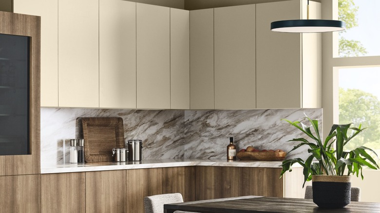
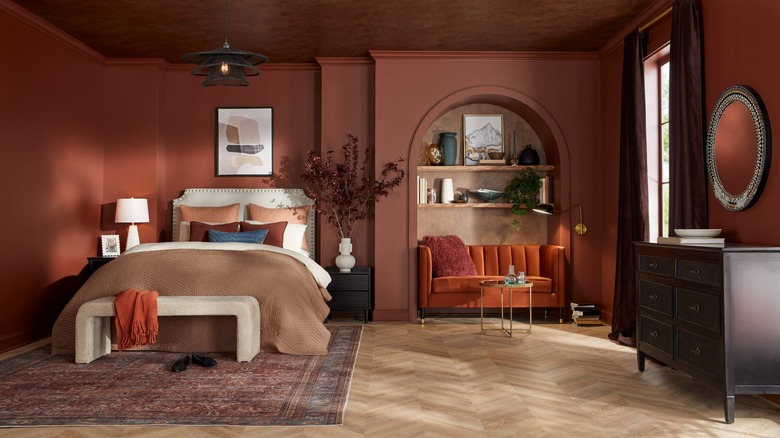
Orange, while energizing, can be overpowering in a kitchen, which already contains a lot of natural activity. Gala Magriñá, a holistic interior designer, explains that bright orange can be overstimulating and may even lead to headaches or negatively affect mood, especially in direct sunlight. Instead of saturated oranges, Magriñá recommends opting for soft, warm neutrals like Benjamin Moore's Bone China, a cream or ivory variation, which supports clarity and calm without draining the space. She advises incorporating warm wood and earthy tones to create a serene, contemporary feel.
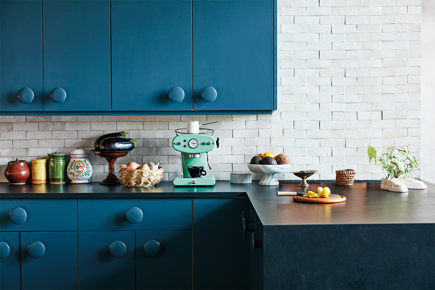
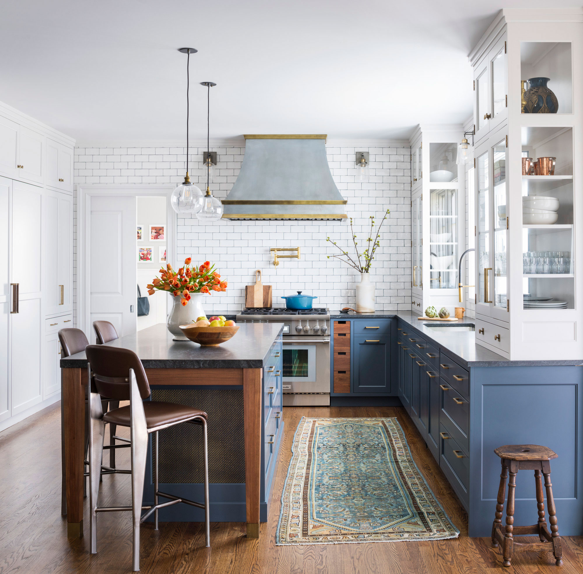
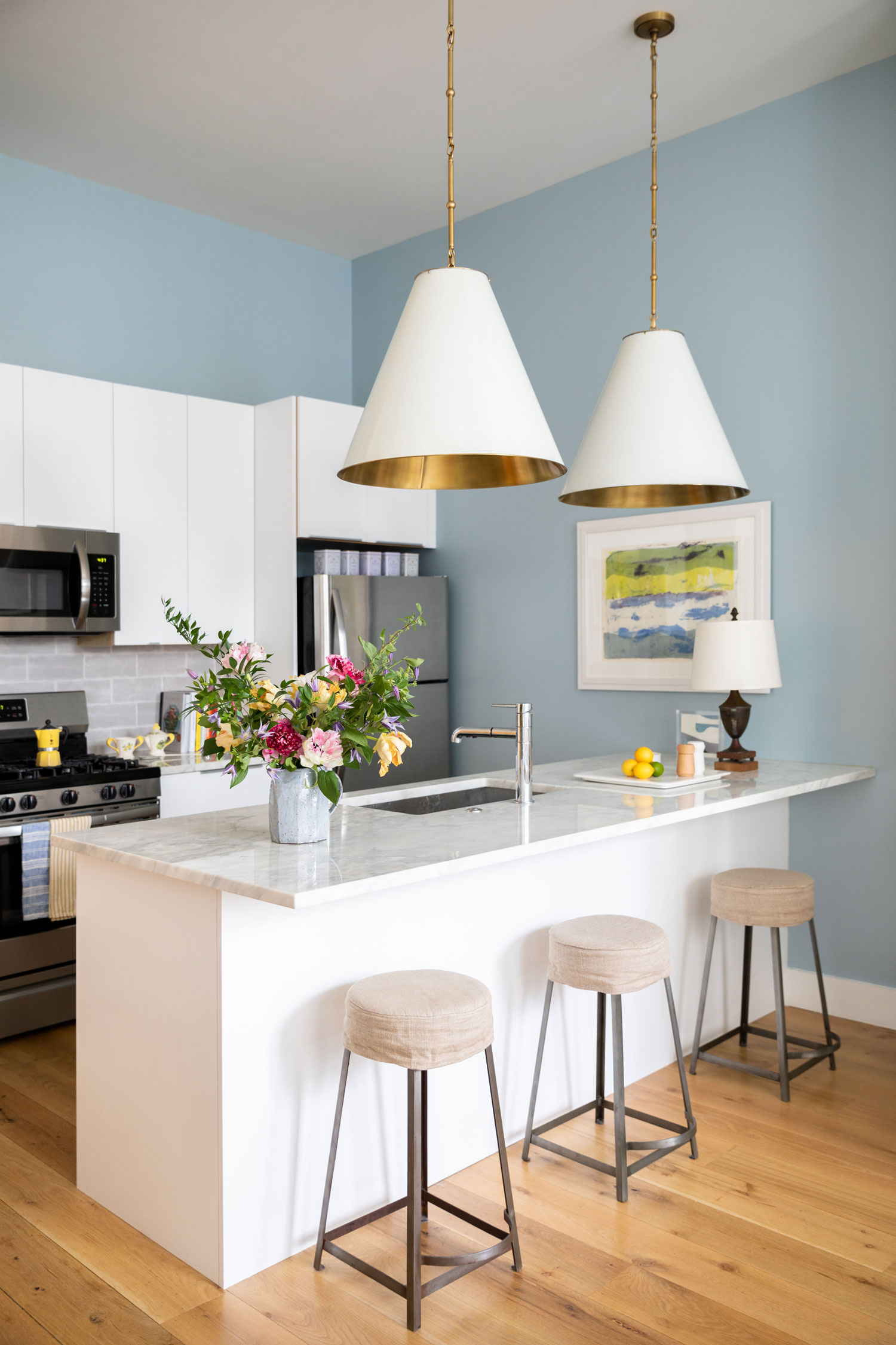
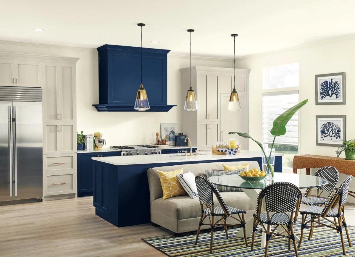
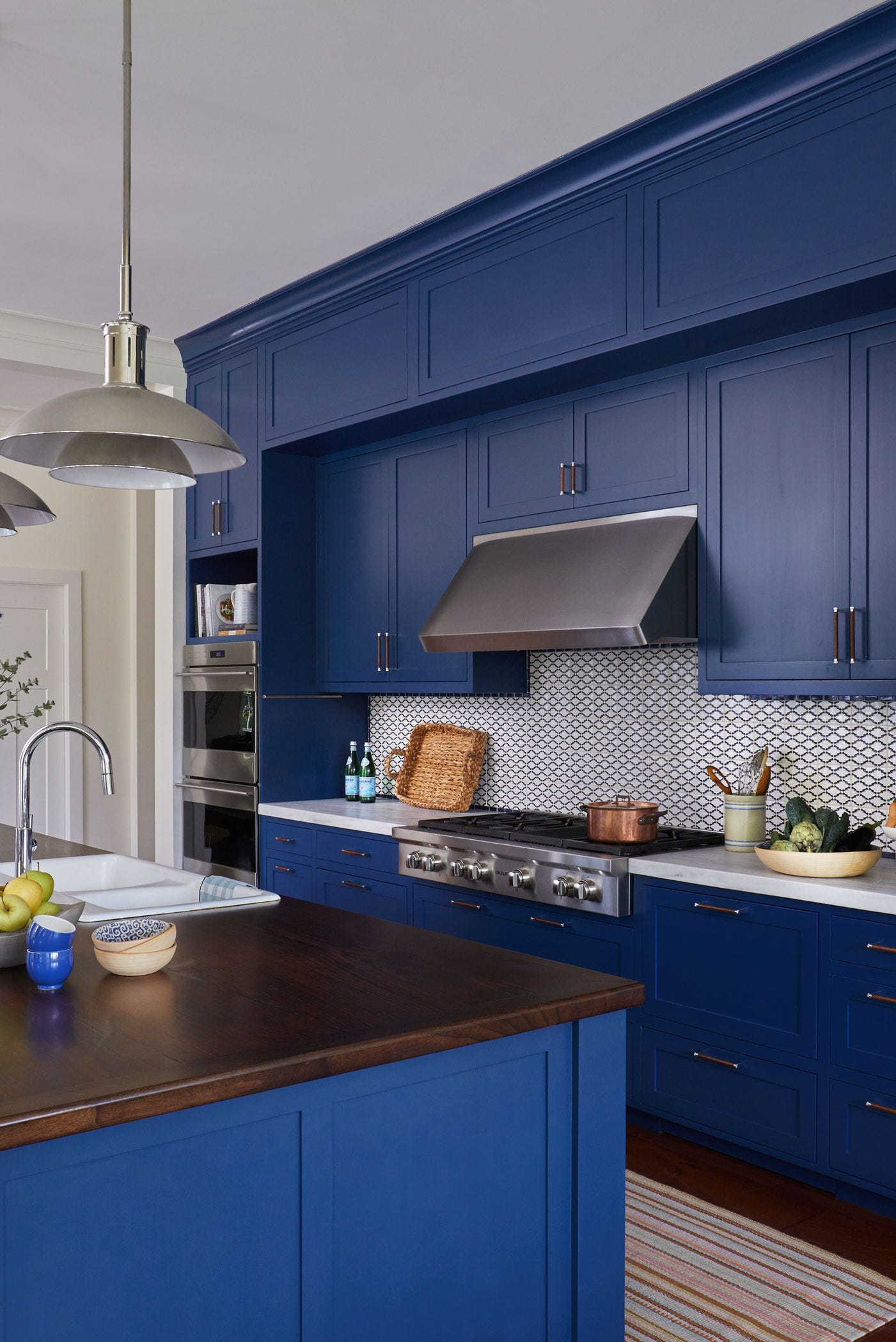
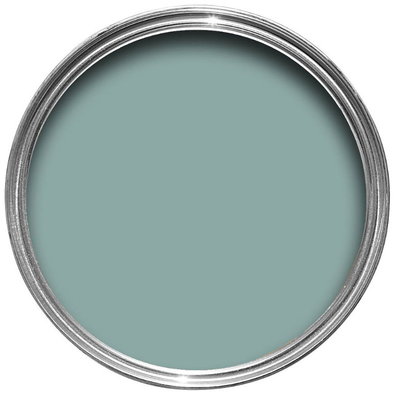
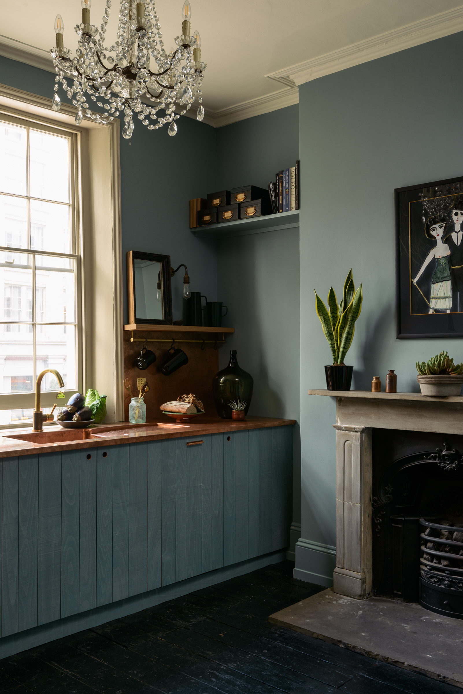
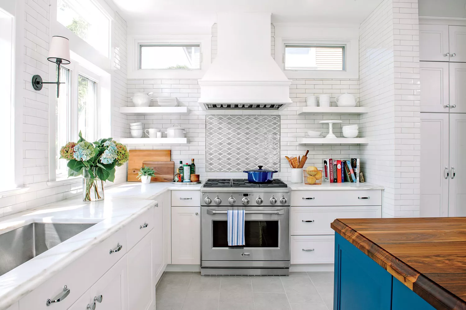
Primary shades of blue, despite being popular, are not universally suitable for kitchens. Jennifer Jones of Niche Interiors notes that blue can suppress appetite, as it is not a color commonly found in natural foods. Alice Moszczynski from Planner 5D adds that excessive blue can create a cold, clinical atmosphere, especially when paired with stark whites or grays. The trend has shifted towards warmer interiors, suggesting neutral or warmer tones are better choices for kitchens. For those committed to cooler shades, warmer variations with yellow undertones are recommended, or blue can be introduced through accents like dishware or textiles, with walls painted in warm neutrals or soft greens.
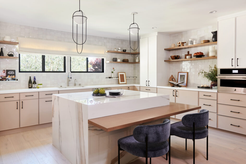
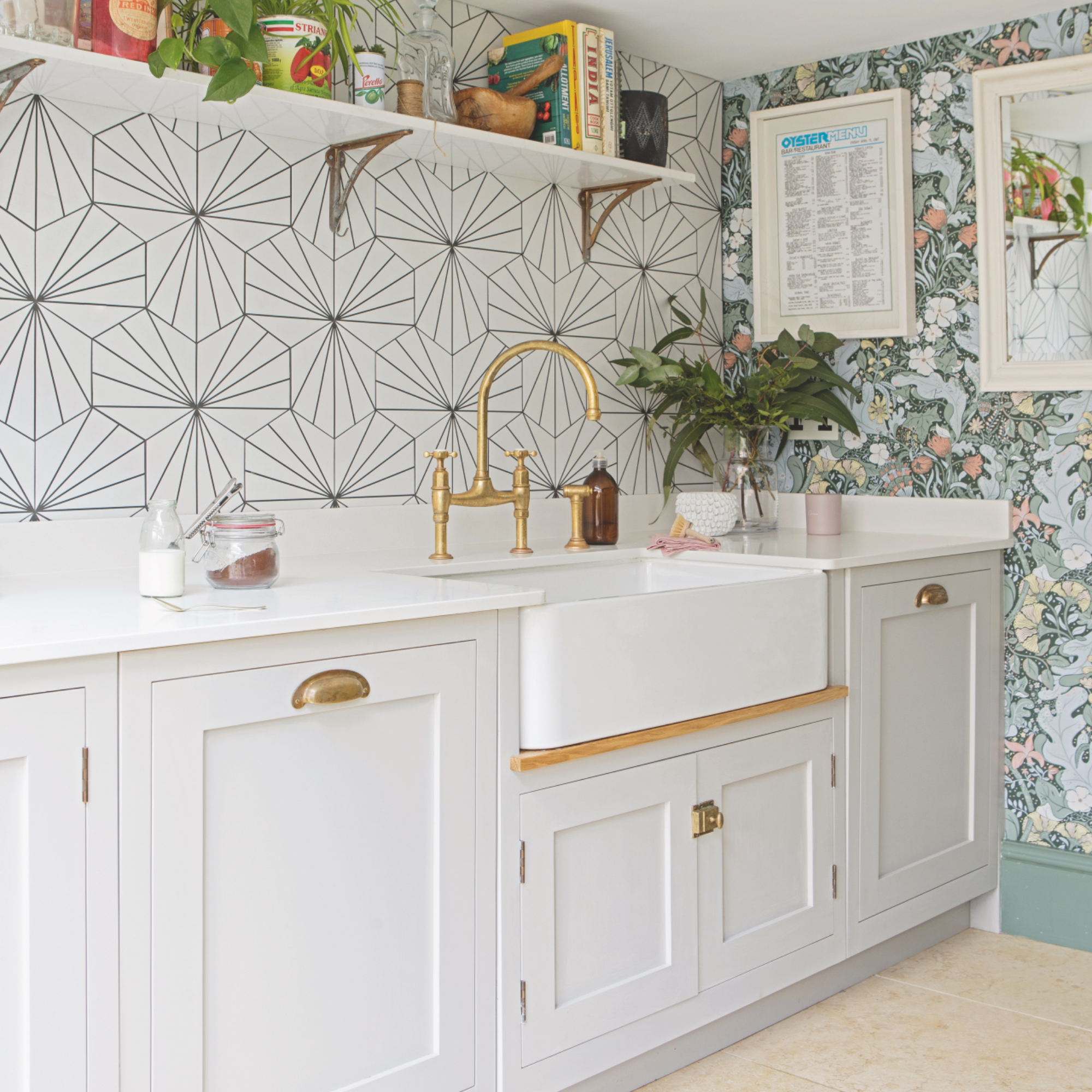
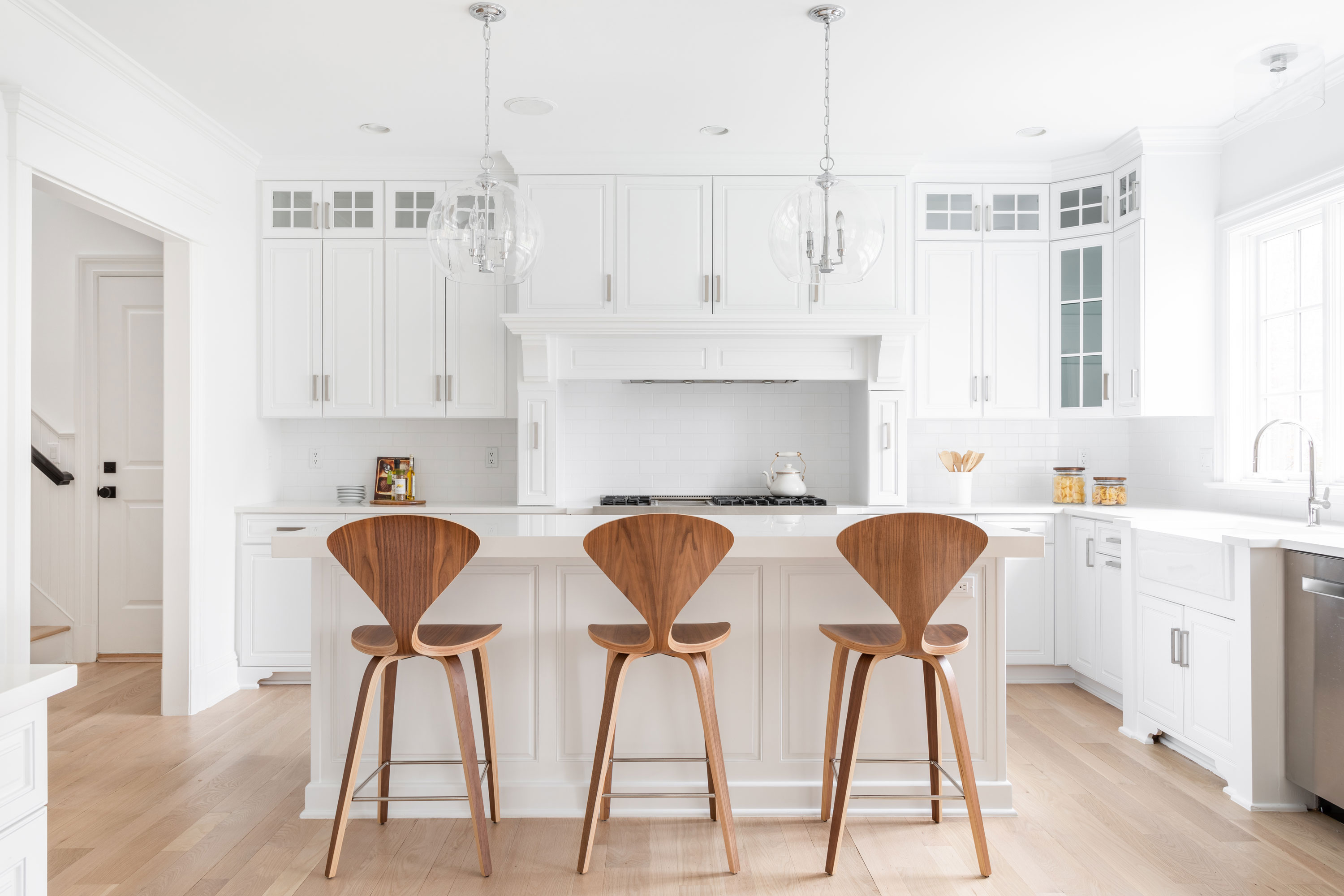
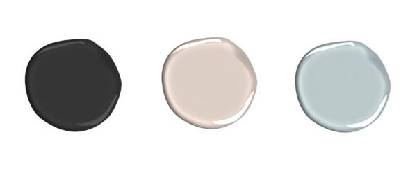
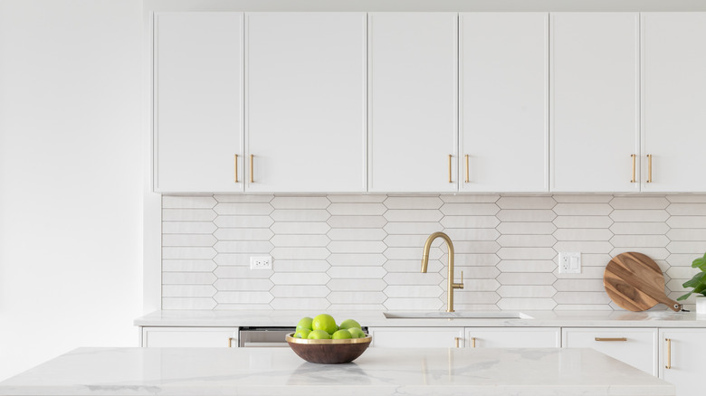
Stark white, once a symbol of contemporary design, can now appear harsh and uninviting. Angelique Kreller of Yabby cautions against using bright white without underlying dimension, stating it can make a home feel more like a lab than a comfortable living space. Instead, Kreller suggests soft off-whites or warm greiges to maintain brightness without harshness. Shades like greige or taupe can bridge the gap between brown and gray, ensuring the kitchen remains updated. Benjamin Moore's Natural Cream is presented as an understated option that harmonizes with both warm and cool decor.
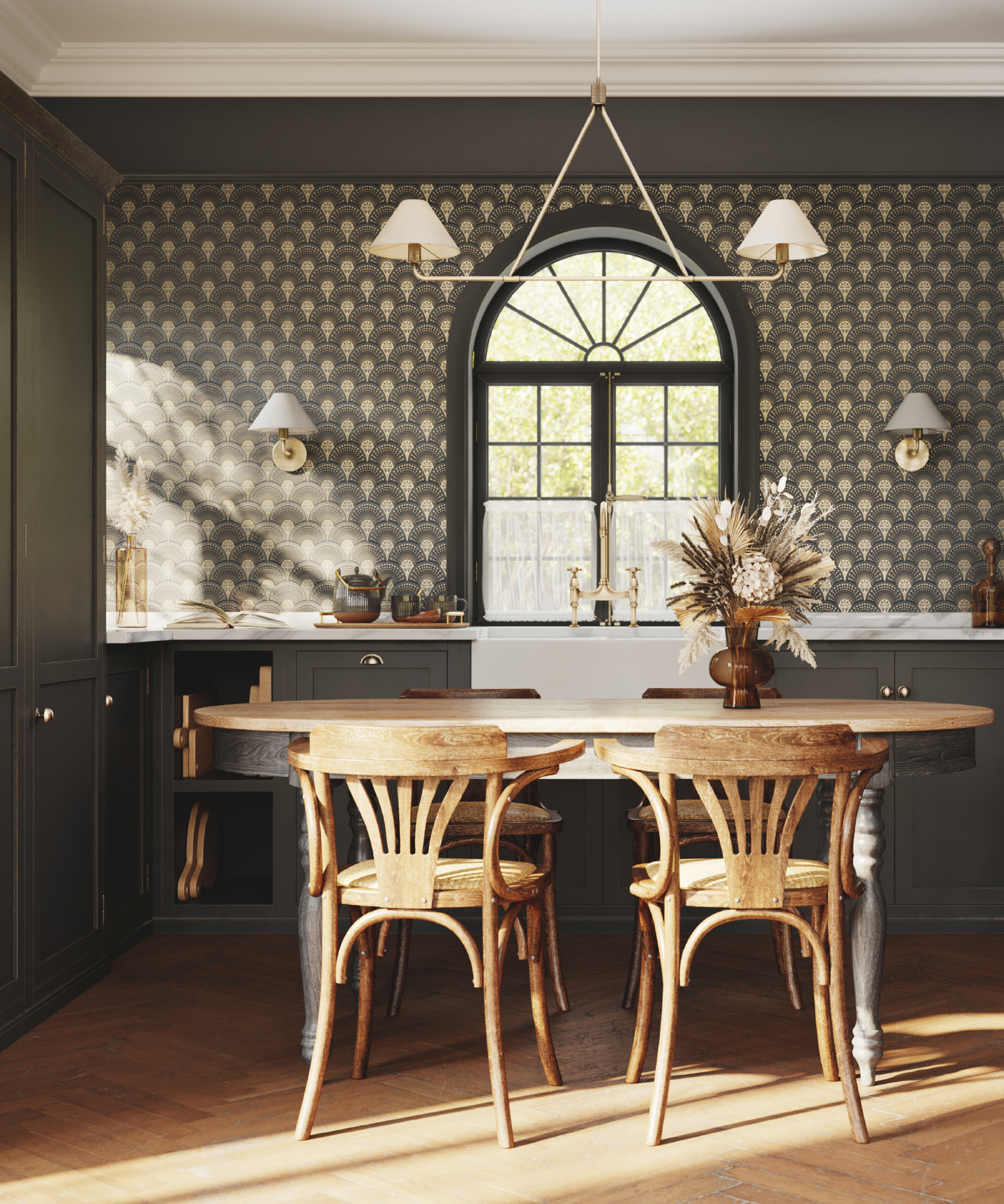
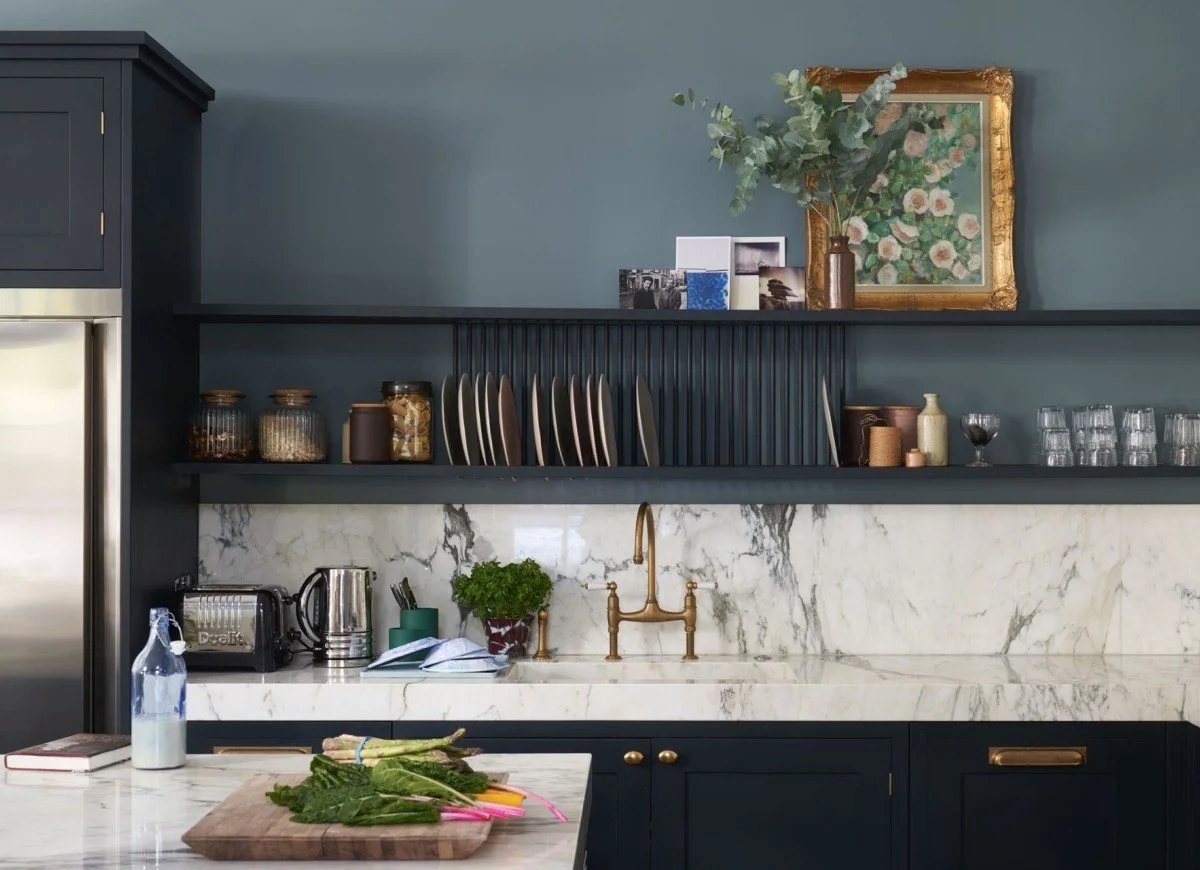
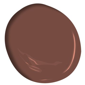
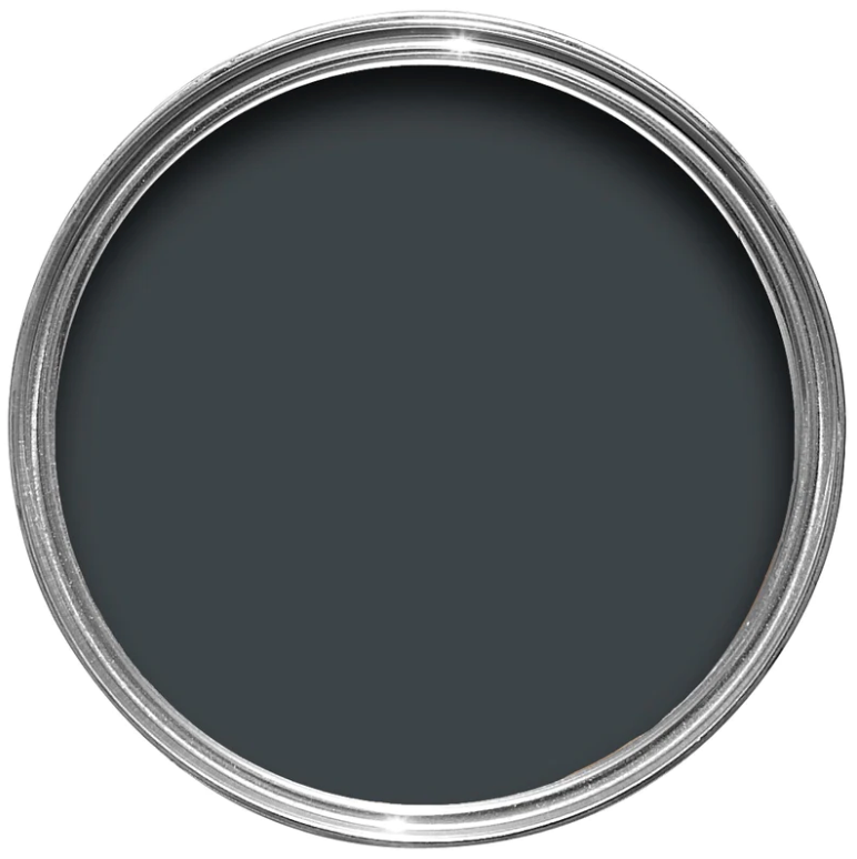
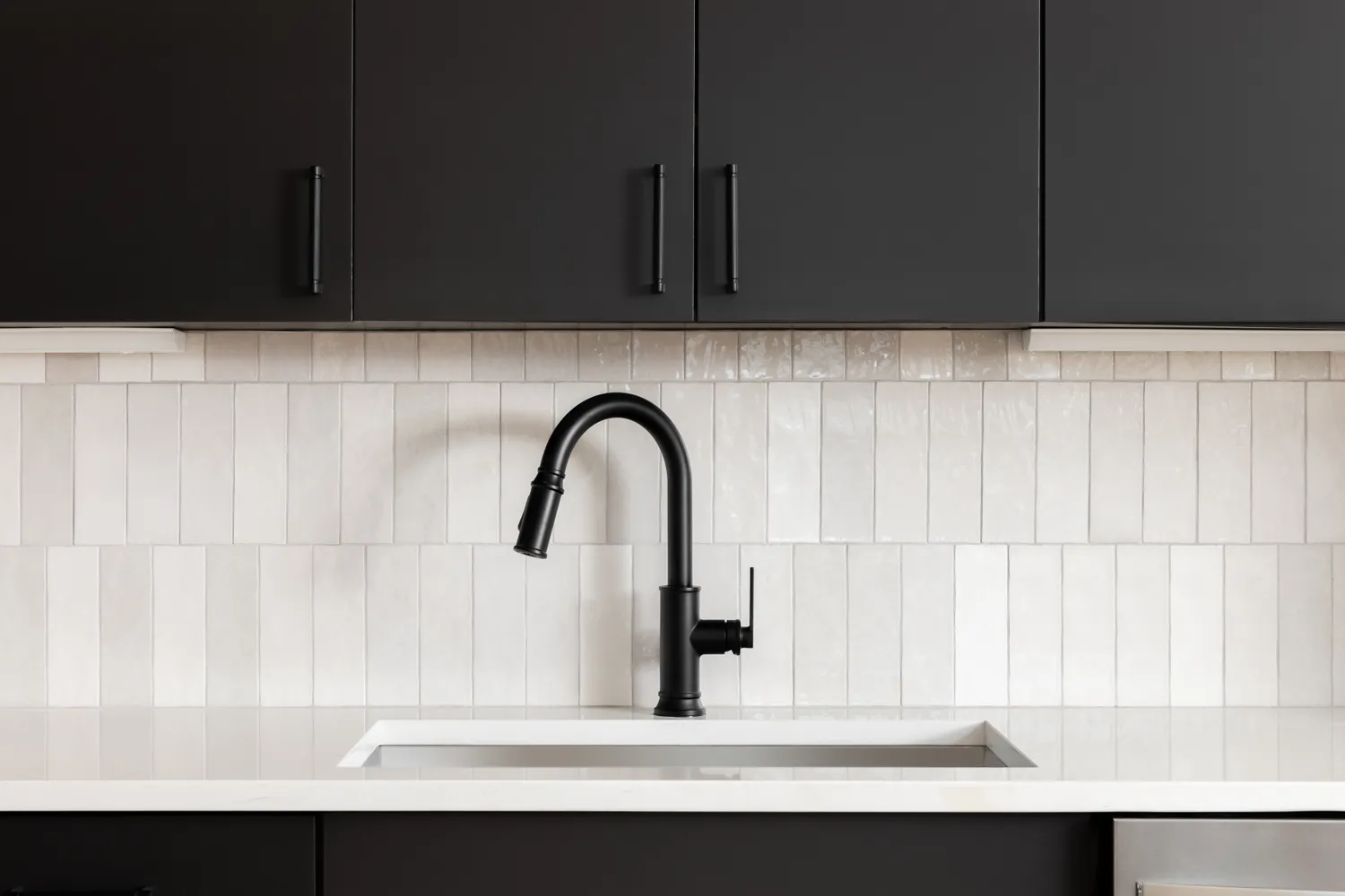
Black, though debated in design circles, can make a kitchen feel enclosed, especially in spaces with insufficient natural lighting. While not entirely dismissing dark hues, Kreller advises against a solid, true black kitchen. Alternatives such as charcoal, deep brown, or slate can provide a bold appearance without overwhelming the space. If black is desired, balancing it with light benchtops or brass fixtures is crucial to create contrast and prevent a gloomy atmosphere, emphasizing the importance of balance with dark colors.
Purple, in most shades, is identified as a color that can quickly make a kitchen look dated or dim. Moszczynski points out that deep shades like eggplant or plum can create a heavy, dim feel, while lighter lilac tones can appear dated, particularly under artificial lighting. She recommends avoiding drenching the kitchen in purple and instead suggests creamy whites, earthy taupes, or soft sage greens for a fresh, clean, and calming atmosphere. If purple is to be used, it should be incorporated sparingly through accents like vases or upholstery, where it acts as a playful touch rather than dominating the room.

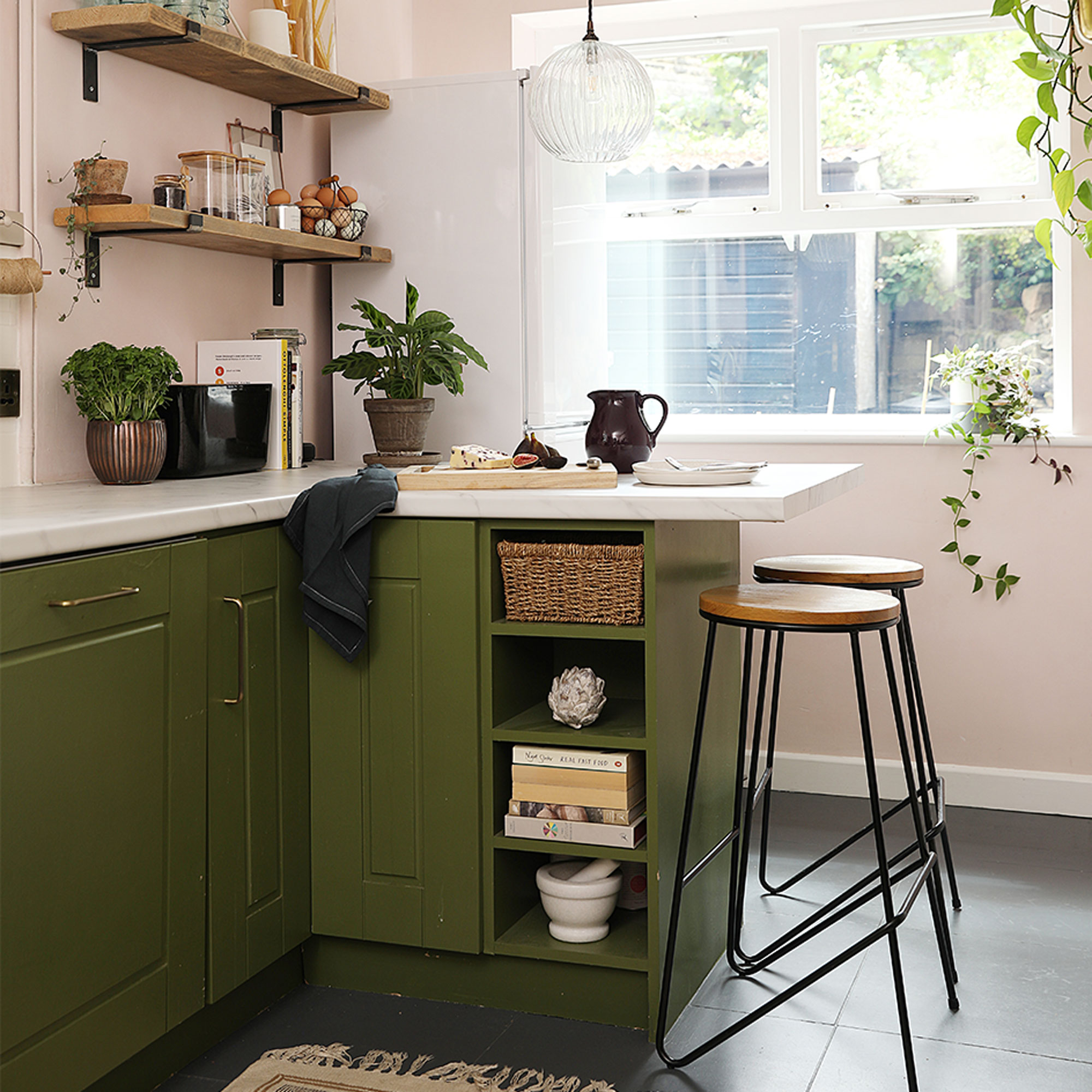
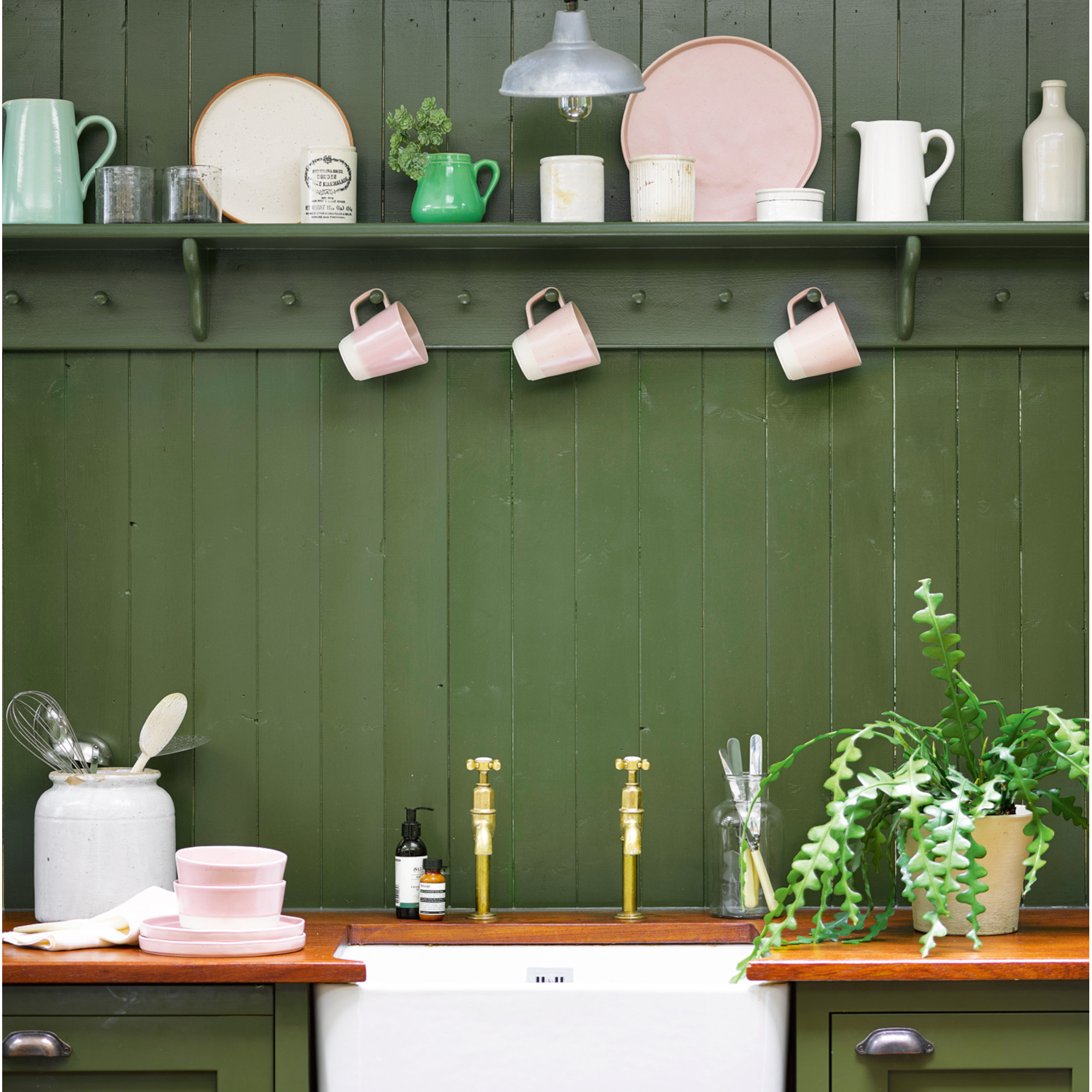
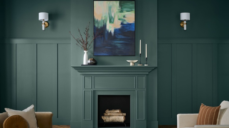
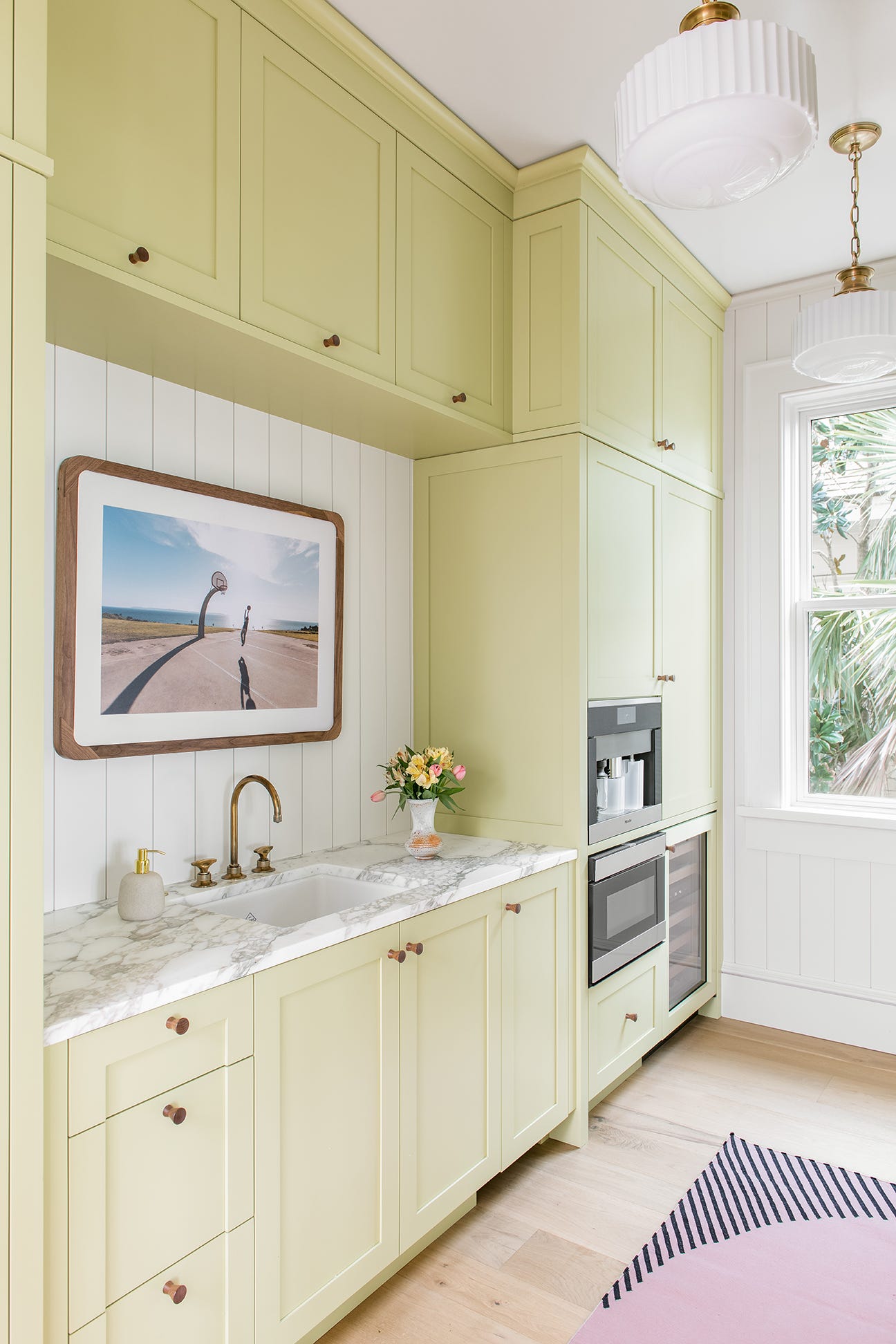
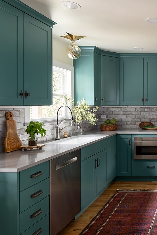
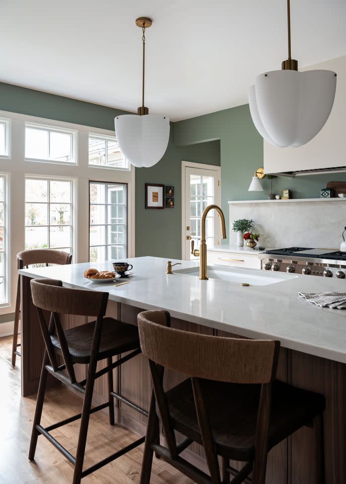
Finally, mint green shades can clash with contemporary kitchen aesthetics. Teri Simone, head of design and marketing at Nieu Cabinet Doors, warns that a mint chip tone can date a kitchen, reminiscent of retro designs. She advocates for earthy variations of green, noting that rich emerald hues and lighter, gray-undertoned earthy greens remain stylish. Benjamin Moore's Soft Fern, described as a pale green misted with gray tones, is highlighted as a versatile choice for cabinets, backsplashes, or walls, due to its ability to complement various surrounding shades and finishes.
#KitchenPaintColors #InteriorDesign #HomeImprovement #ColorPsychology #KitchenRemodel #DesignTrends #NeutralColors #ExpertAdvice #KitchenPaintColors #InteriorDesign #HomeImprovement #ColorPsychology #KitchenRemodel #DesignTrends #NeutralColors #ExpertAdvice
0 commenti in totale
 Nessun commento ancora
Potresti anche gradire
8 colors you should never paint kitchen cabinets according to the experts

The best colours to paint a kitchen according to paint pros - pick the perfect shade for large, small, dark and light spaces
11 Trendy Kitchen Paint Colors To Try In 2026

7 Paint Colors To Never Use In Your Kitchen, According To Designers
The 6 Paint Colors for Your Kitchen That Will Never Go out of Style
The Color to Never Paint Your Kitchen Cabinets, According to a Top L.A. Designer
6 Kitchen Cabinet Colors Designers Advise Against—and the Alternatives They Recommend Instead

Kitchen Color Selection Tips from 5 Designers

What are the worst colors to paint a room? The shades experts say you should never use

6 Colors You Should Never Paint Your Entryway, According to Color Experts

Ditch the White! Try One of These Designer-Approved Kitchen Colors

5 Reasons You Shouldn't Paint Your Kitchen Walls White — And the Alternatives You Need to Try

Experts Rank the 10 Worst Paint Colors for Your Kitchen
The Best Kitchen Paint Colors All Have This One Thing In Common

5 colors you should never paint a small room – designers warn us to steer clear of these hues, and what to pick instead
6 Kitchen Paint Color Trends That Are Already Taking Over Walls in 2026

5 colors you should never paint a pantry – designers share the shades they swerve
29 Best Paint Colors for a Kitchen You’ll Never Want to Leave

It’s Official: These are the Best Kitchen Paint Colors, According to Designers
6 Paint Colors To Avoid In Your Bathroom—And 6 Shades You Should Use Instead