
1/4
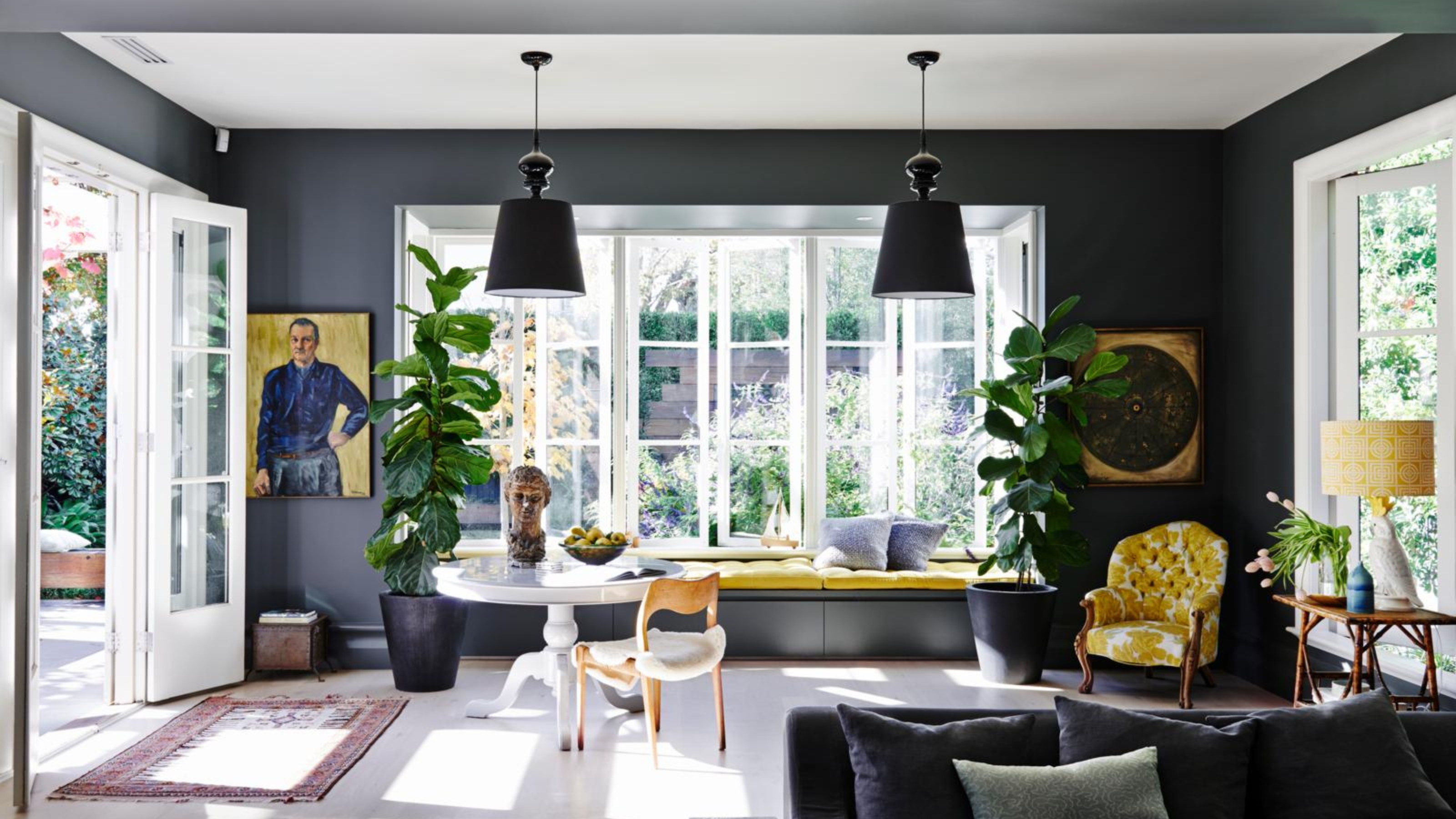
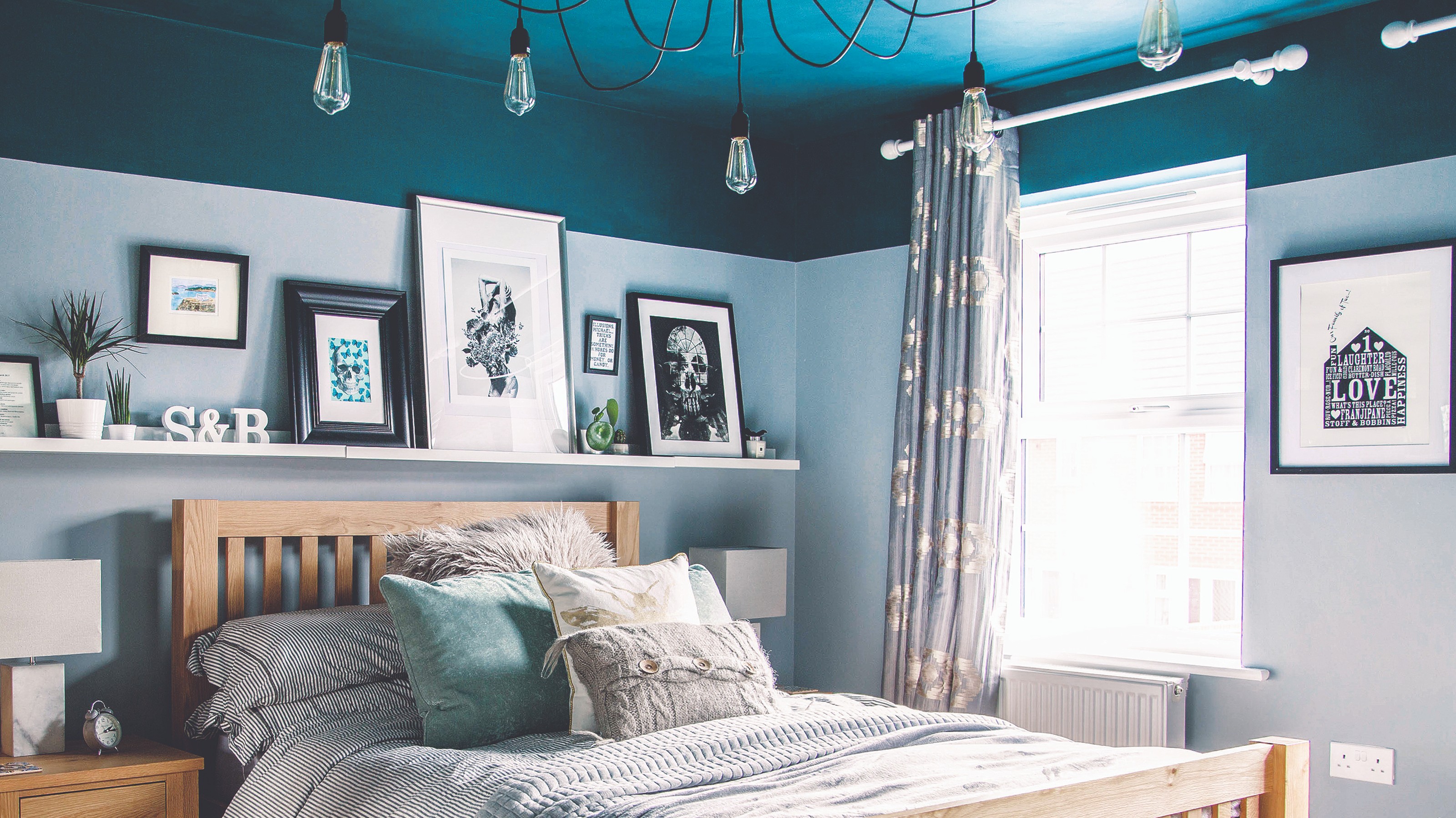
'Dark ceilings make the room look smaller': 6 classic paint colour myths it's time to give up on
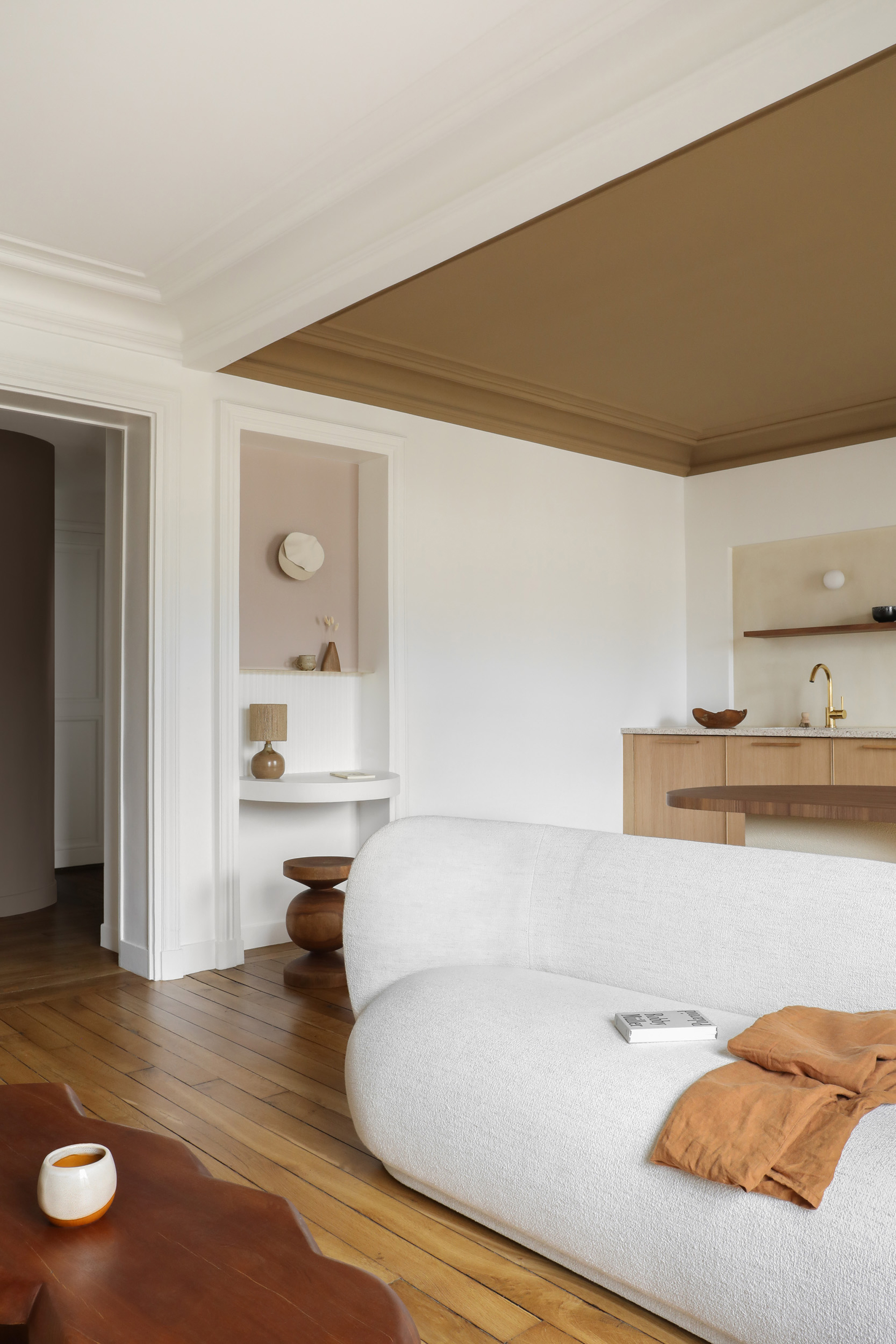
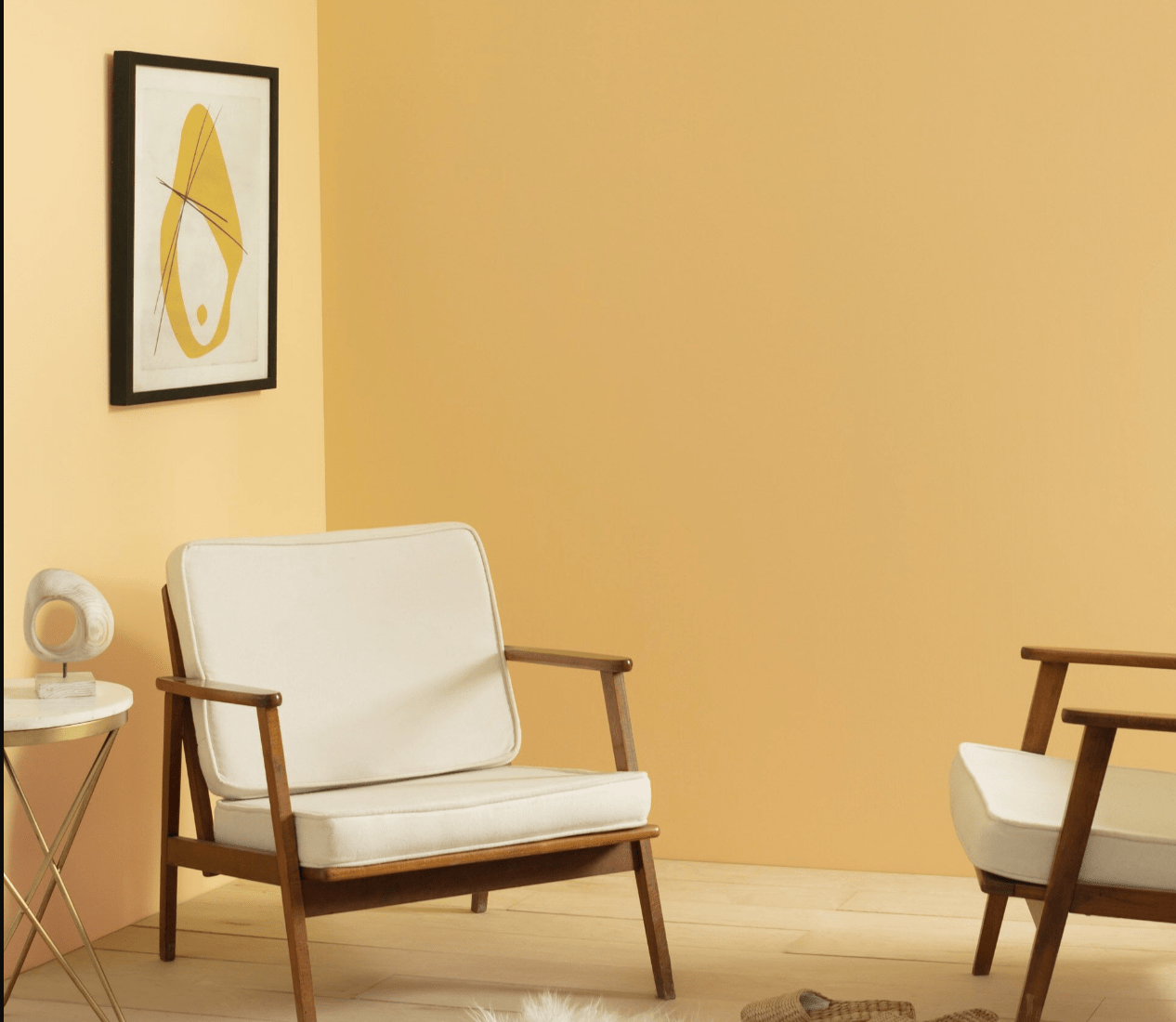
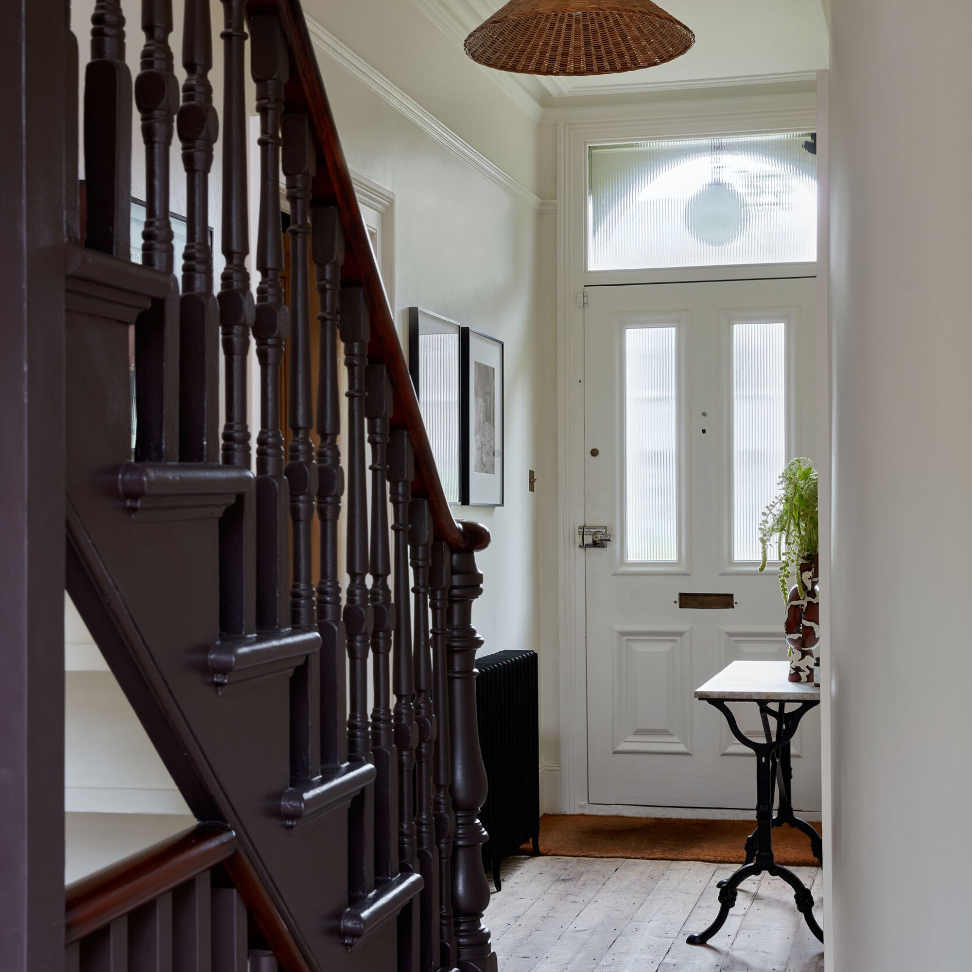
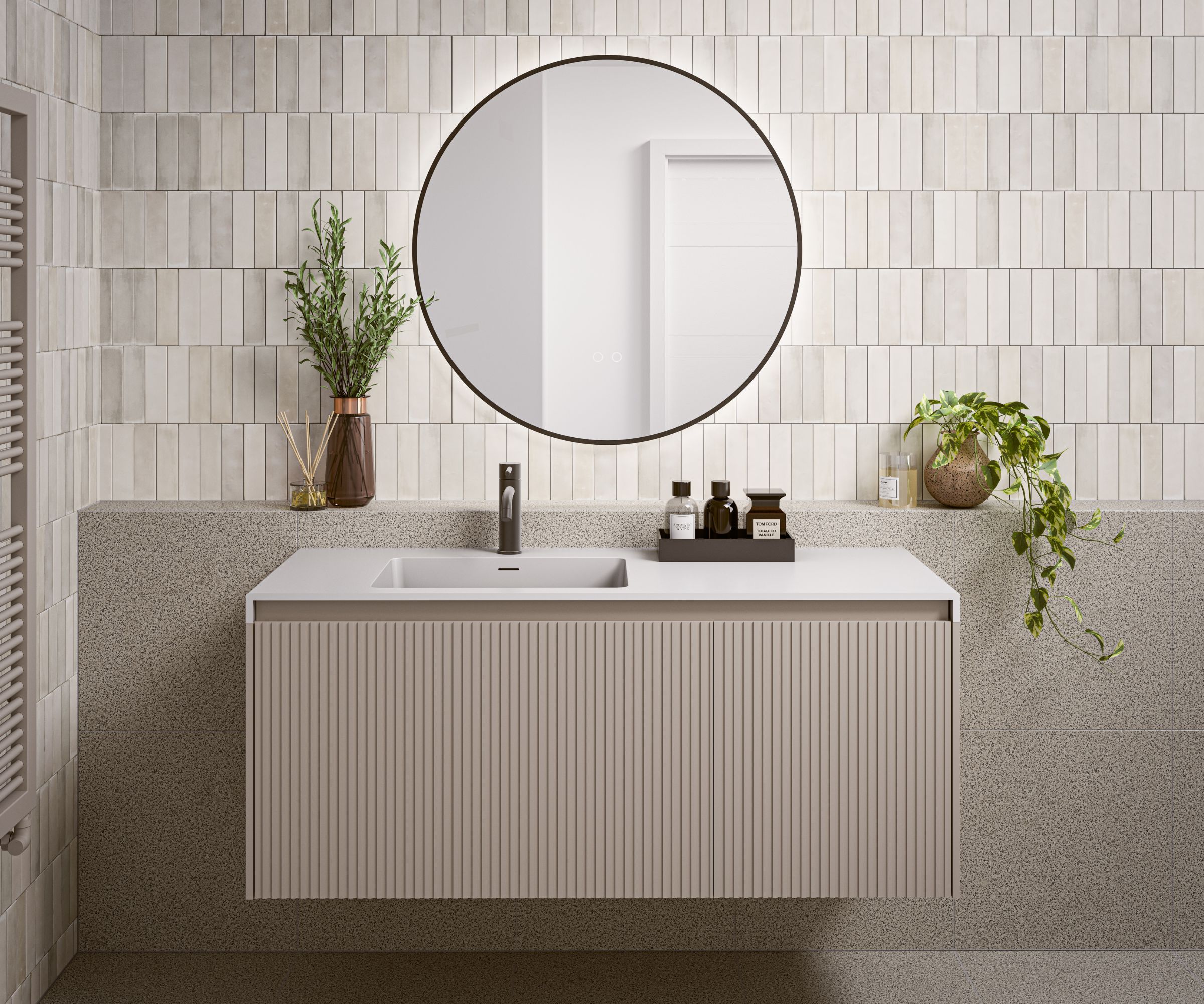
This article debunks six common paint colour myths that often influence home decoration decisions, providing practical tips for interior painting projects. The first myth addressed is the belief that small spaces should always be painted in light colours. While entirely dark tones can make small, naturally dim rooms feel cramped, integrating light colours through furniture and trim elements like skirting boards or window frames can create balance. For small rooms with more natural light, using high-gloss paint is recommended as it reflects light, contributing to a sense of increased space.
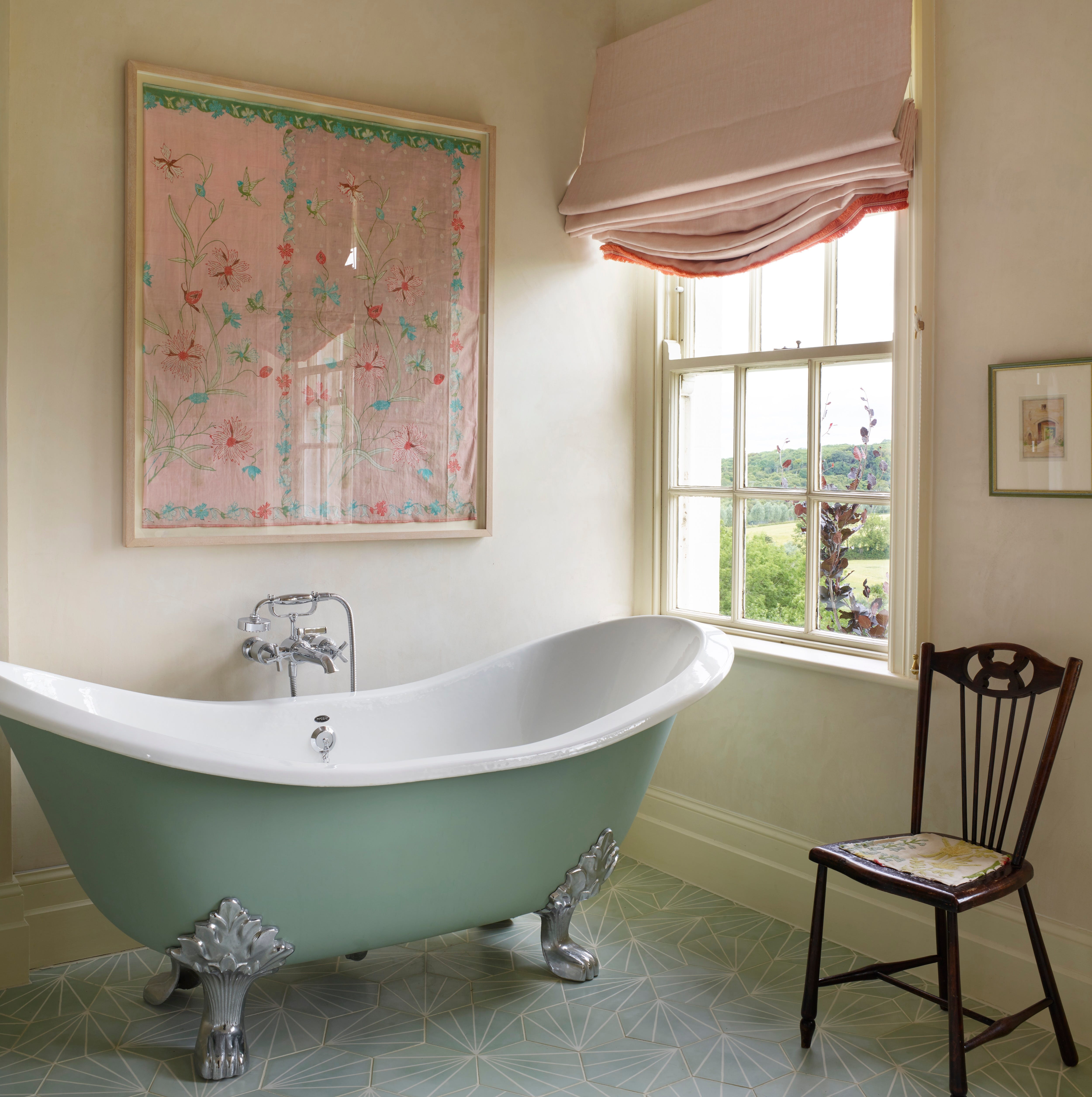
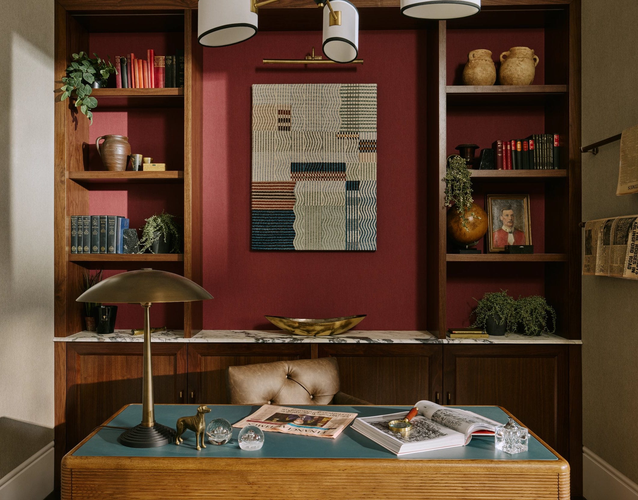
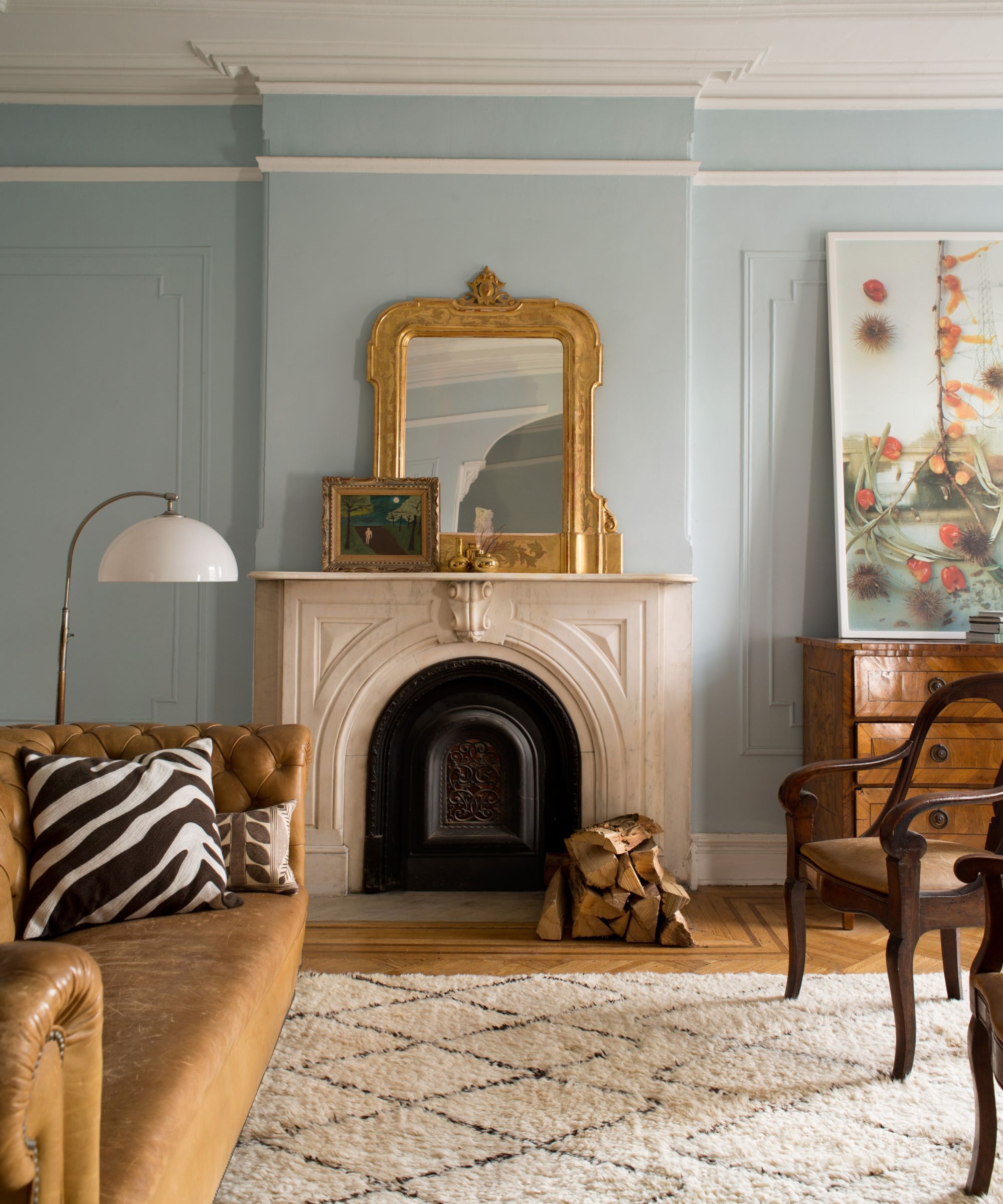
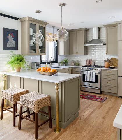
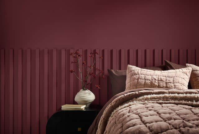
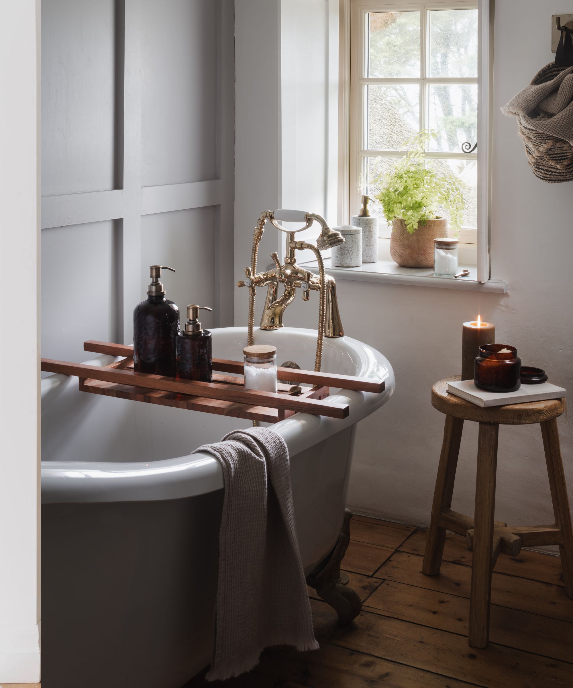
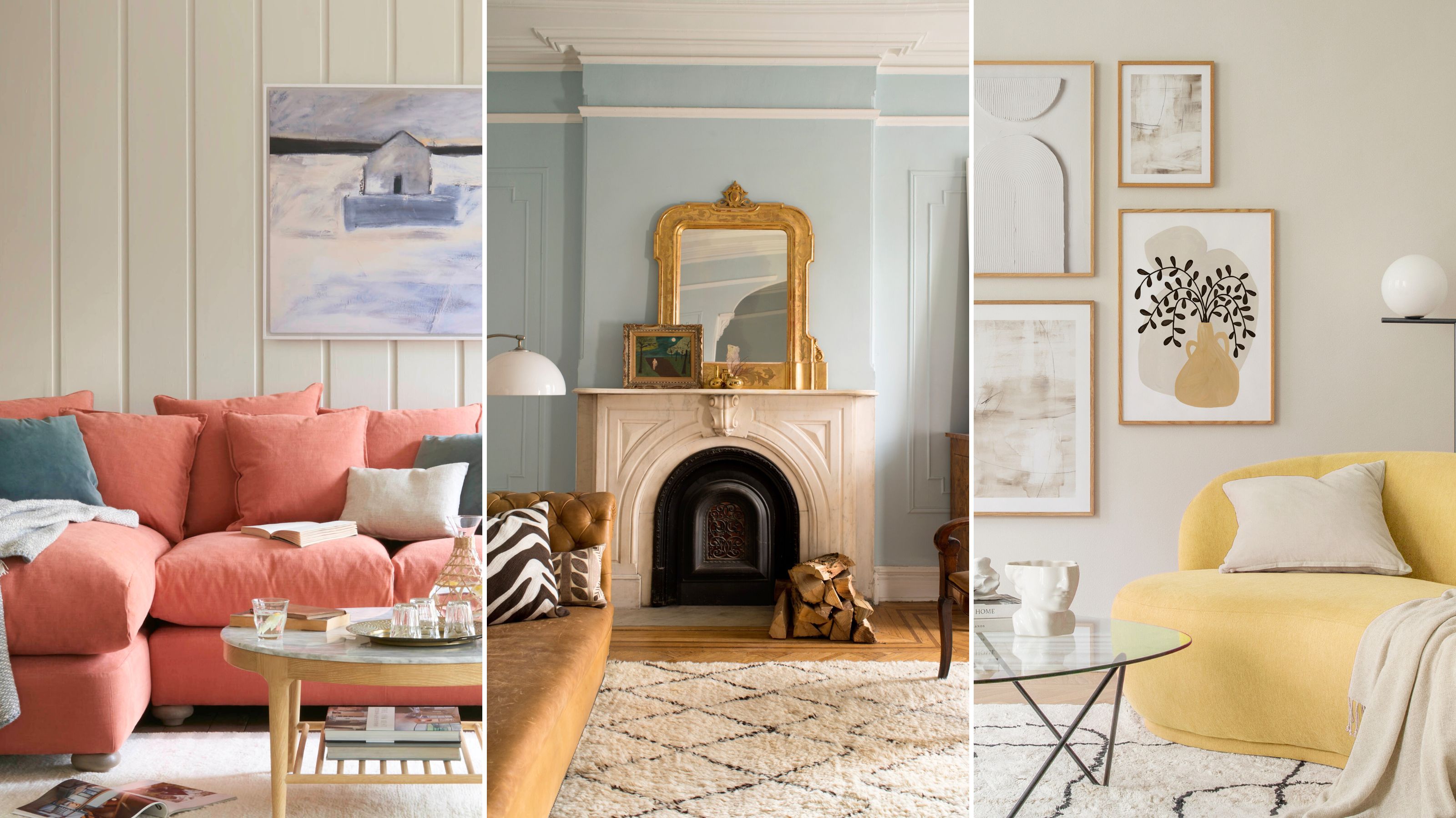
The second myth challenged is that white, grey, and cream are the only neutral colours. The article defines a neutral tone as any colour that serves as a versatile base for a colour palette and provides visual rest in a busy room. By this definition, many colours found in nature, such as greens, blues, and even certain reds, can function as neutrals, offering a broader spectrum of choices beyond traditional off-whites and greys.
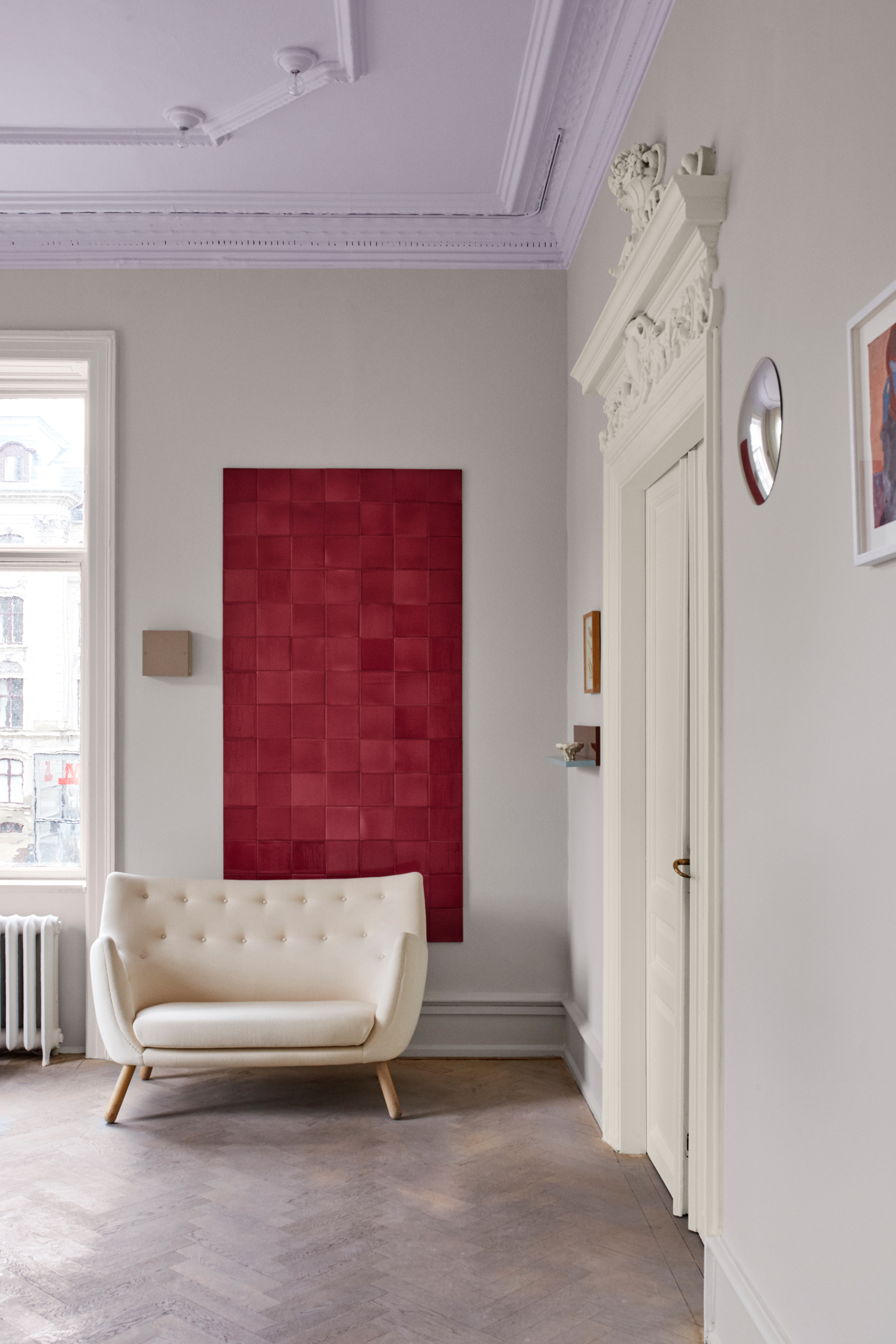
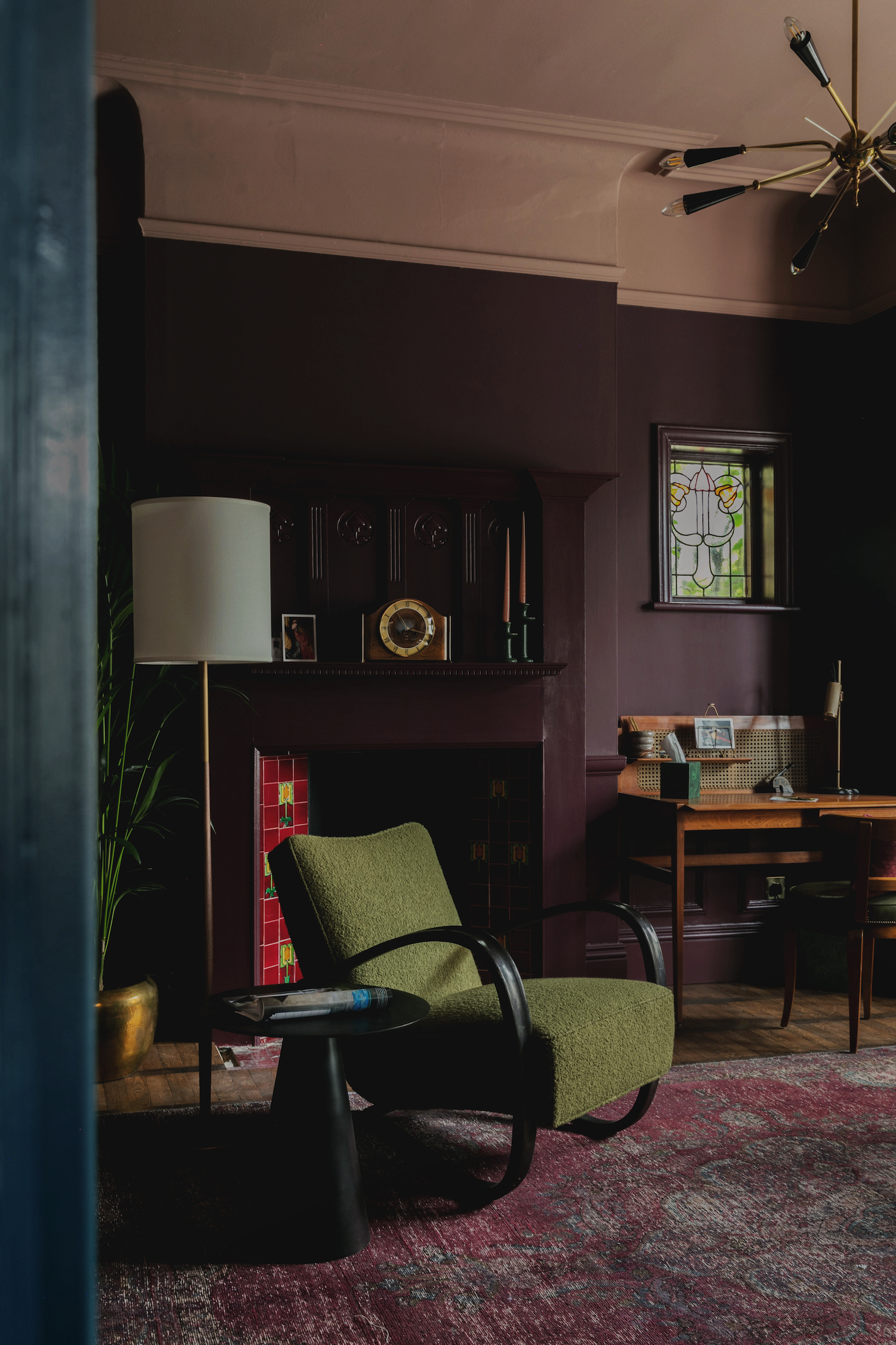
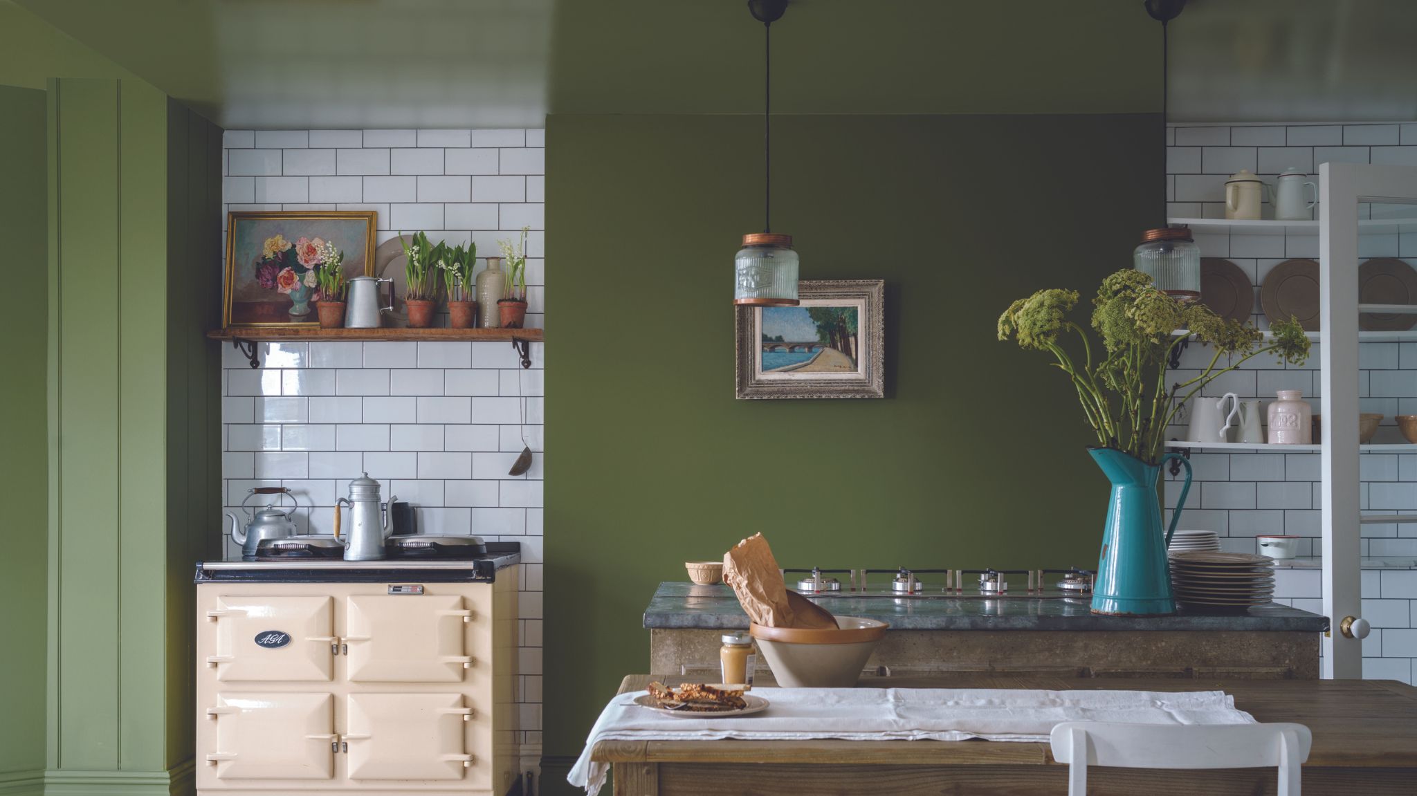
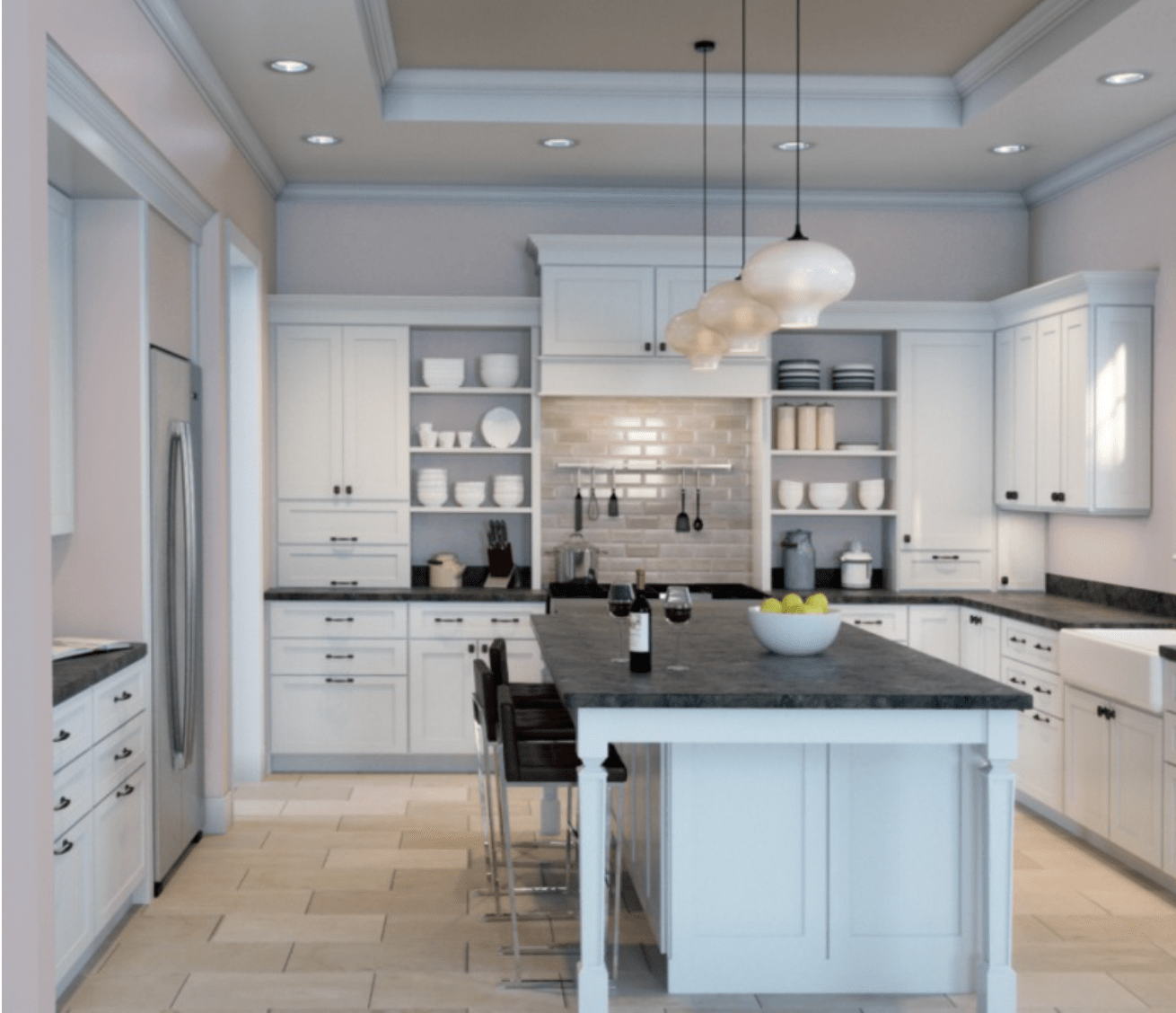
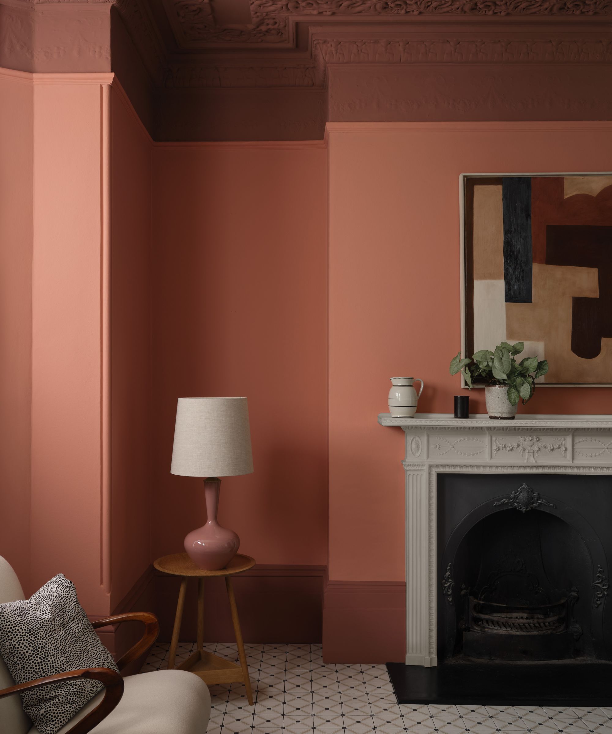
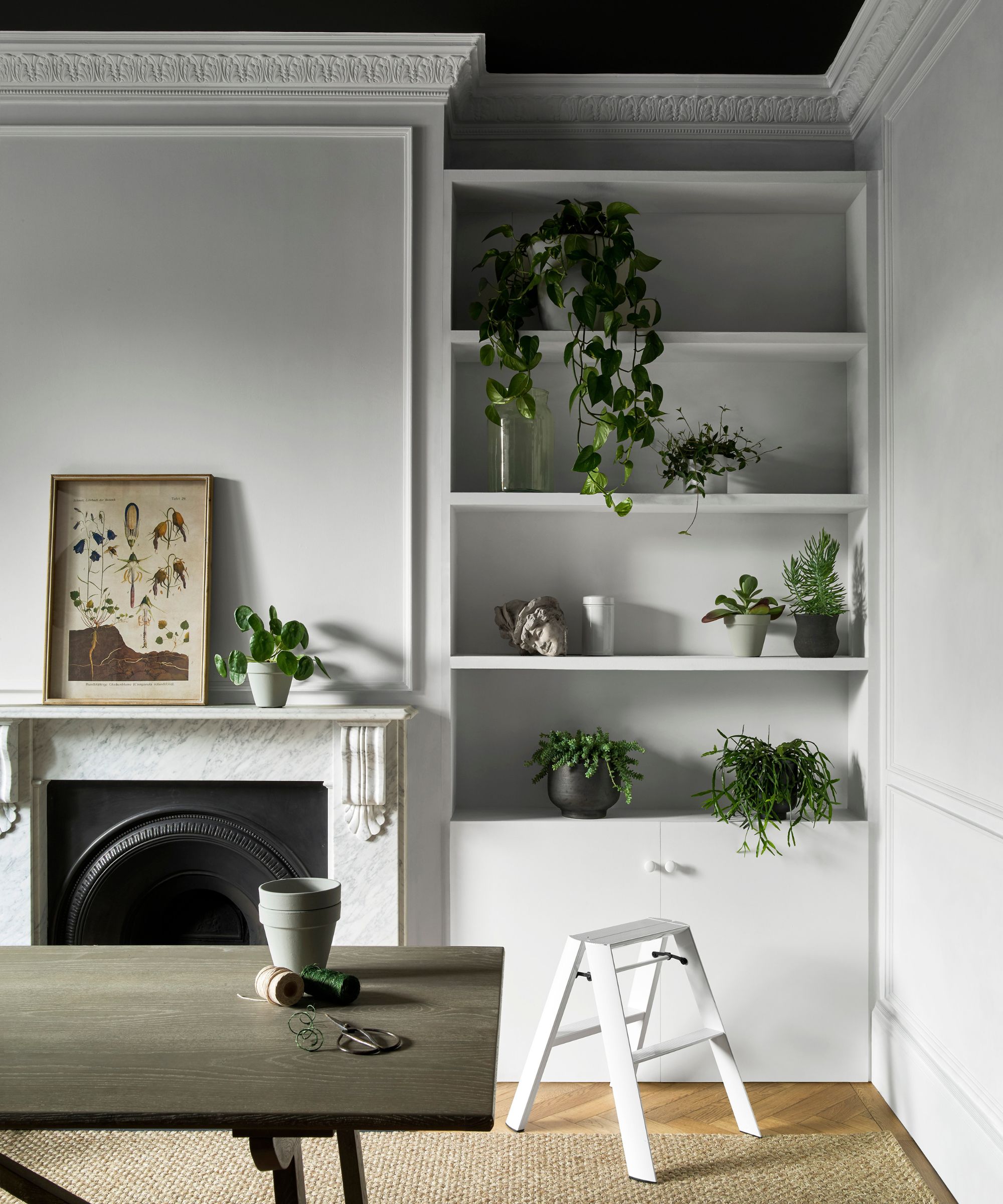
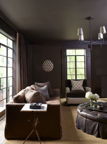
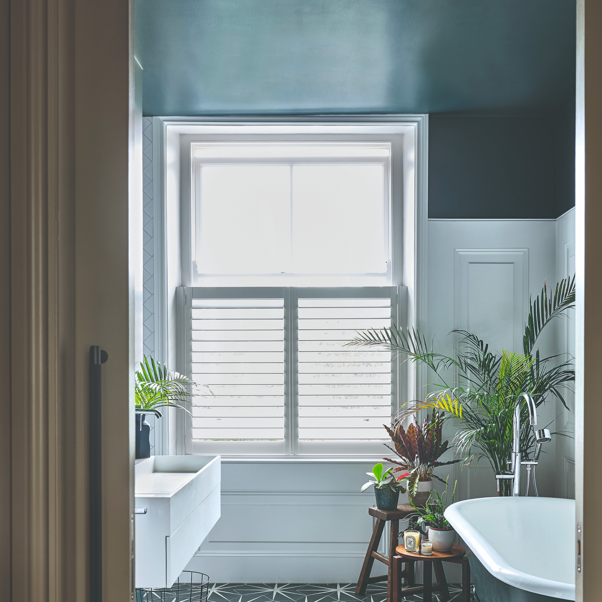
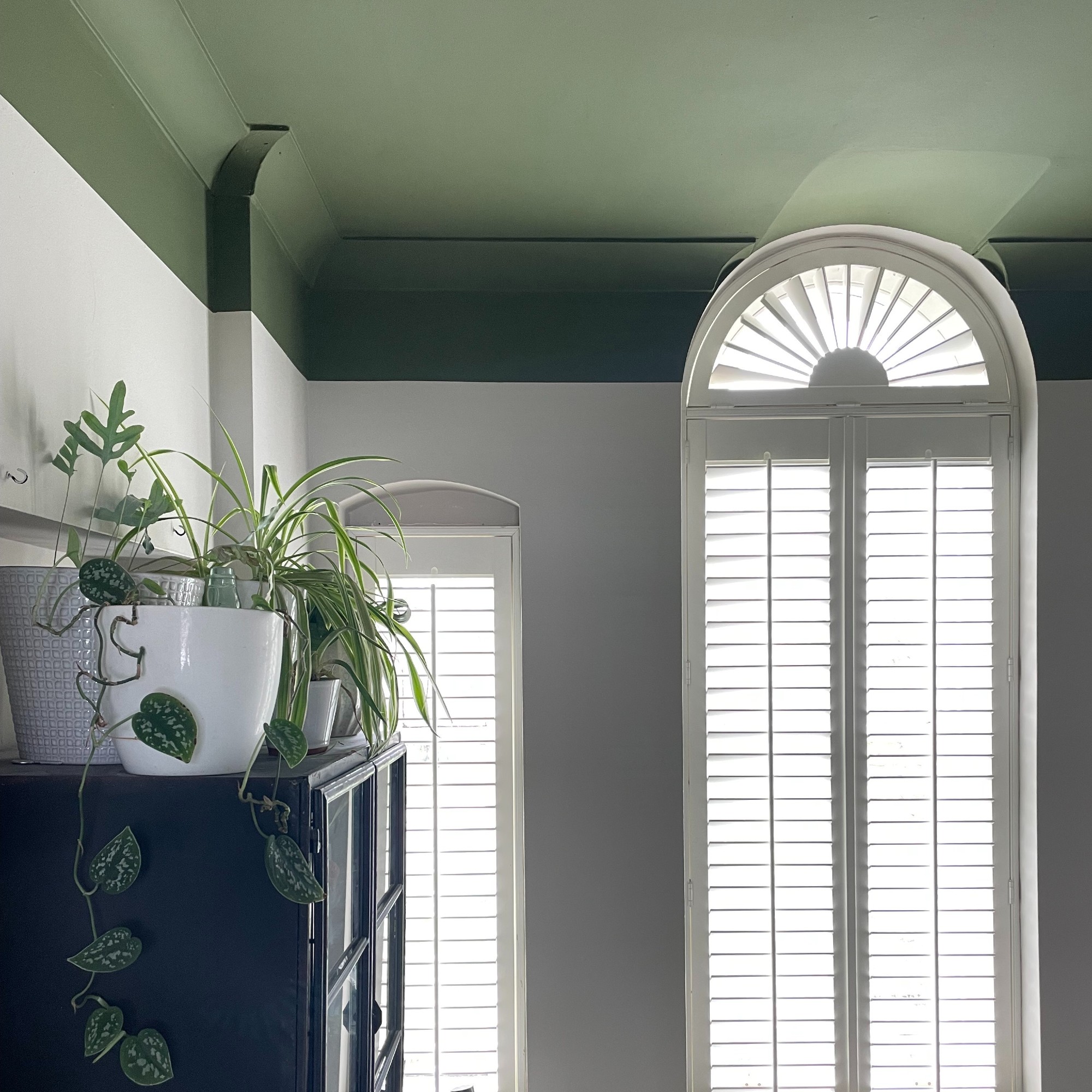
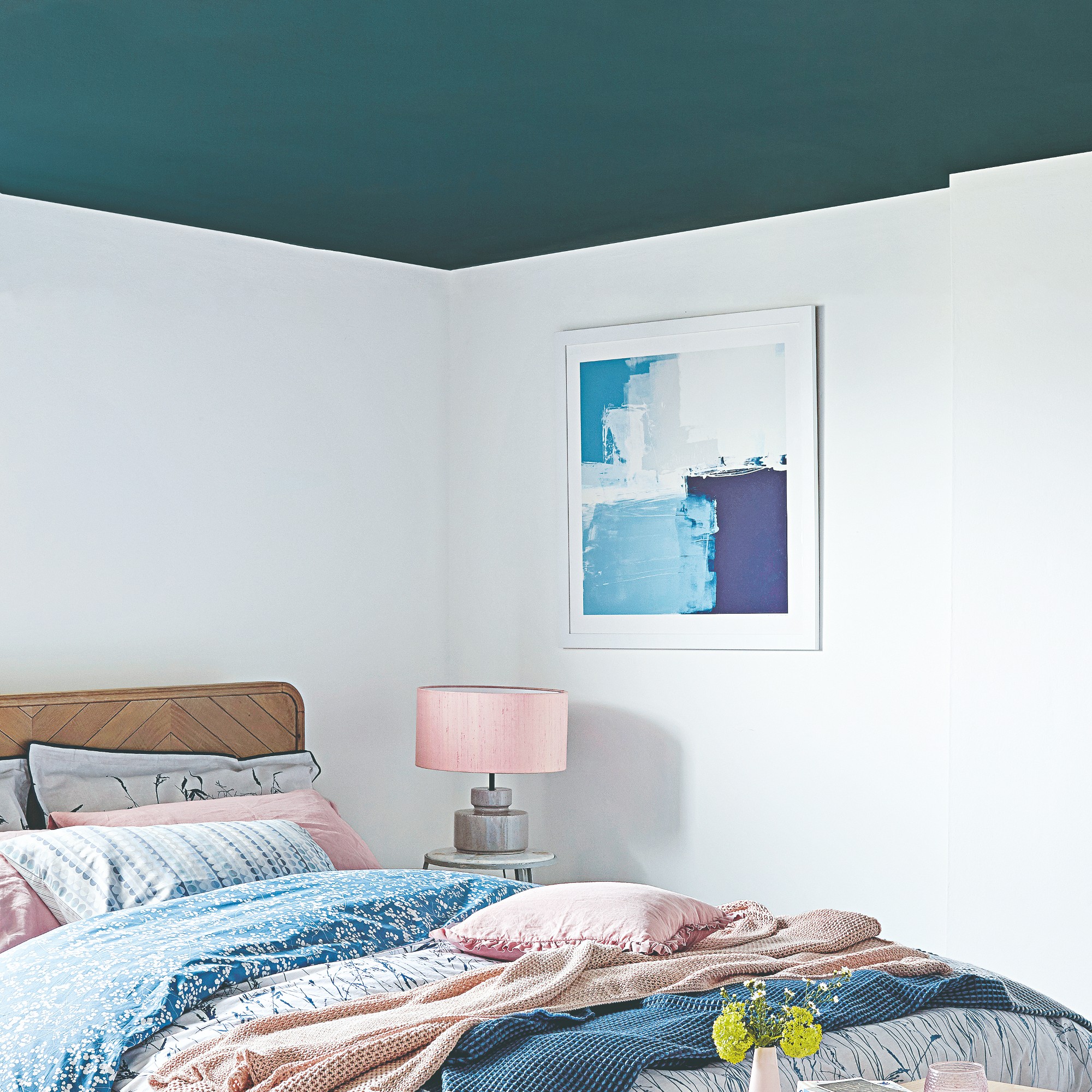
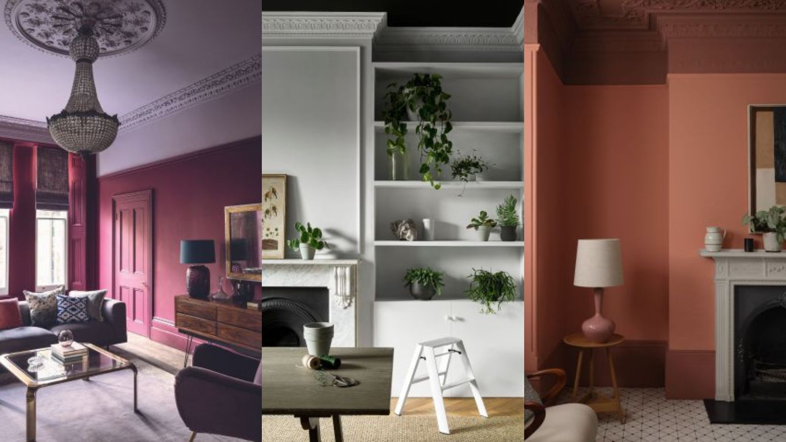
Thirdly, the article refutes the idea that painting a ceiling in a dark colour will make the room feel lower. It explains that while white is excellent for reflecting light, dark colours on the ceiling can actually draw the eye upwards, creating an almost cavernous effect that can make a room feel taller. This technique is particularly effective in smaller rooms where designers might otherwise feel restricted to light shades.
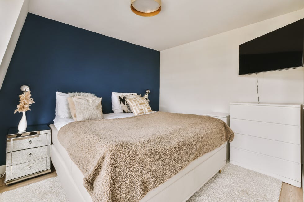
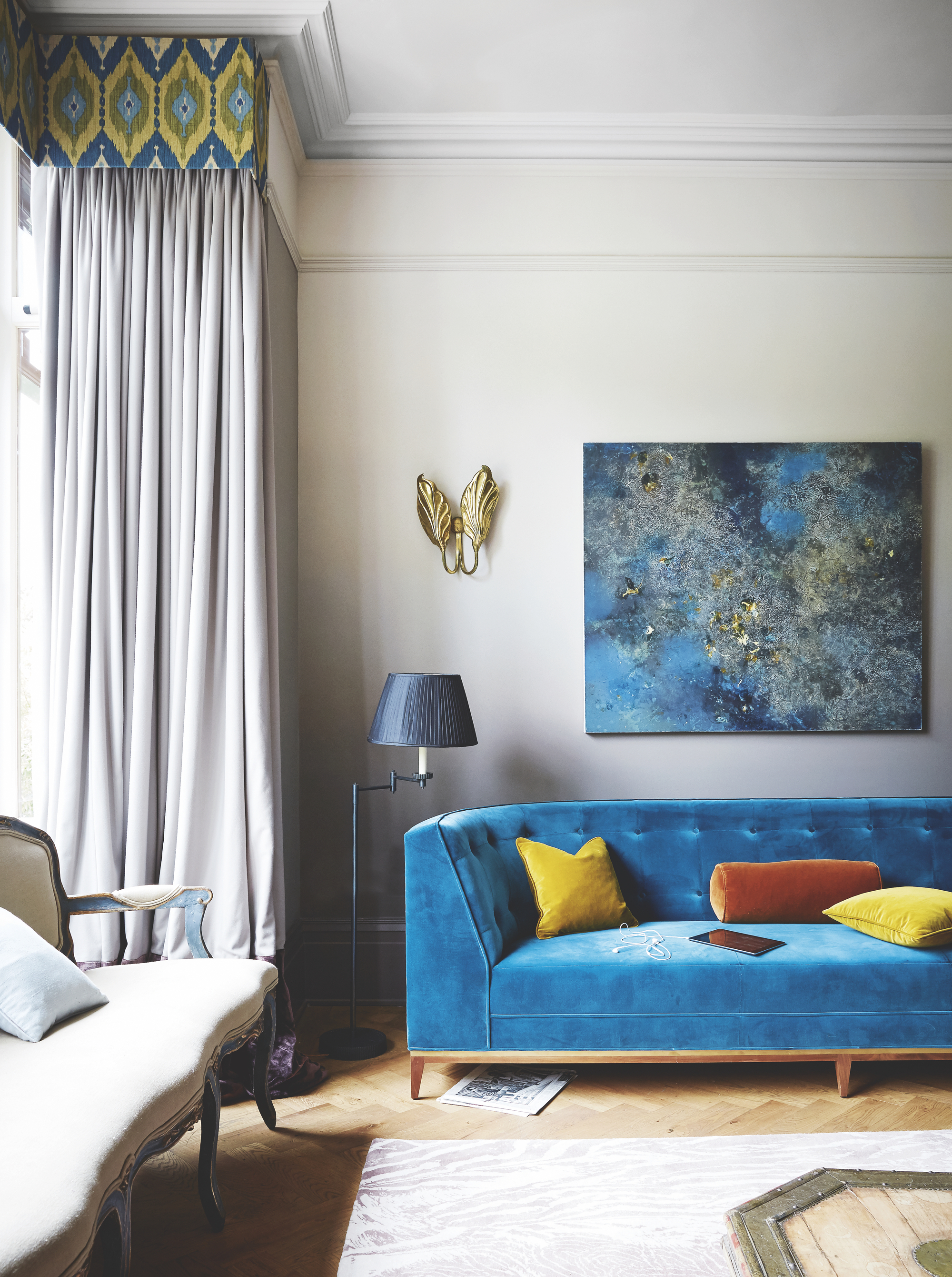
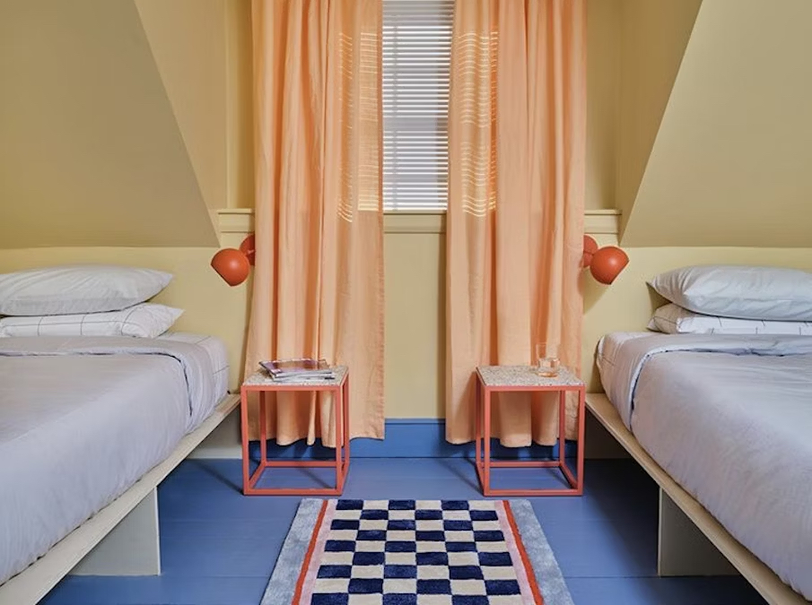
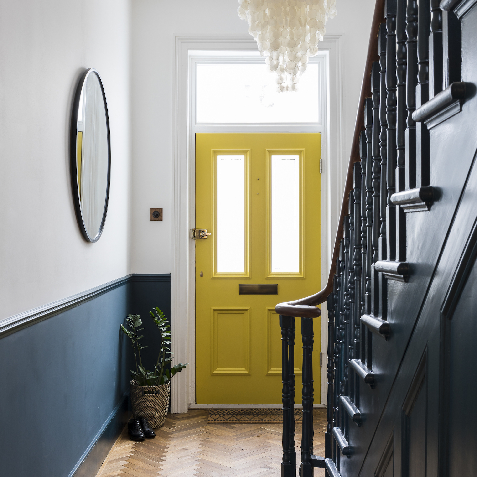
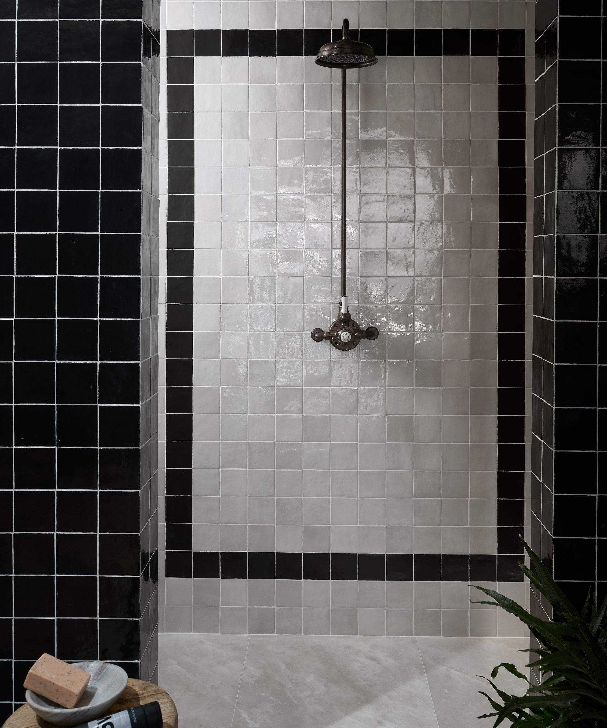
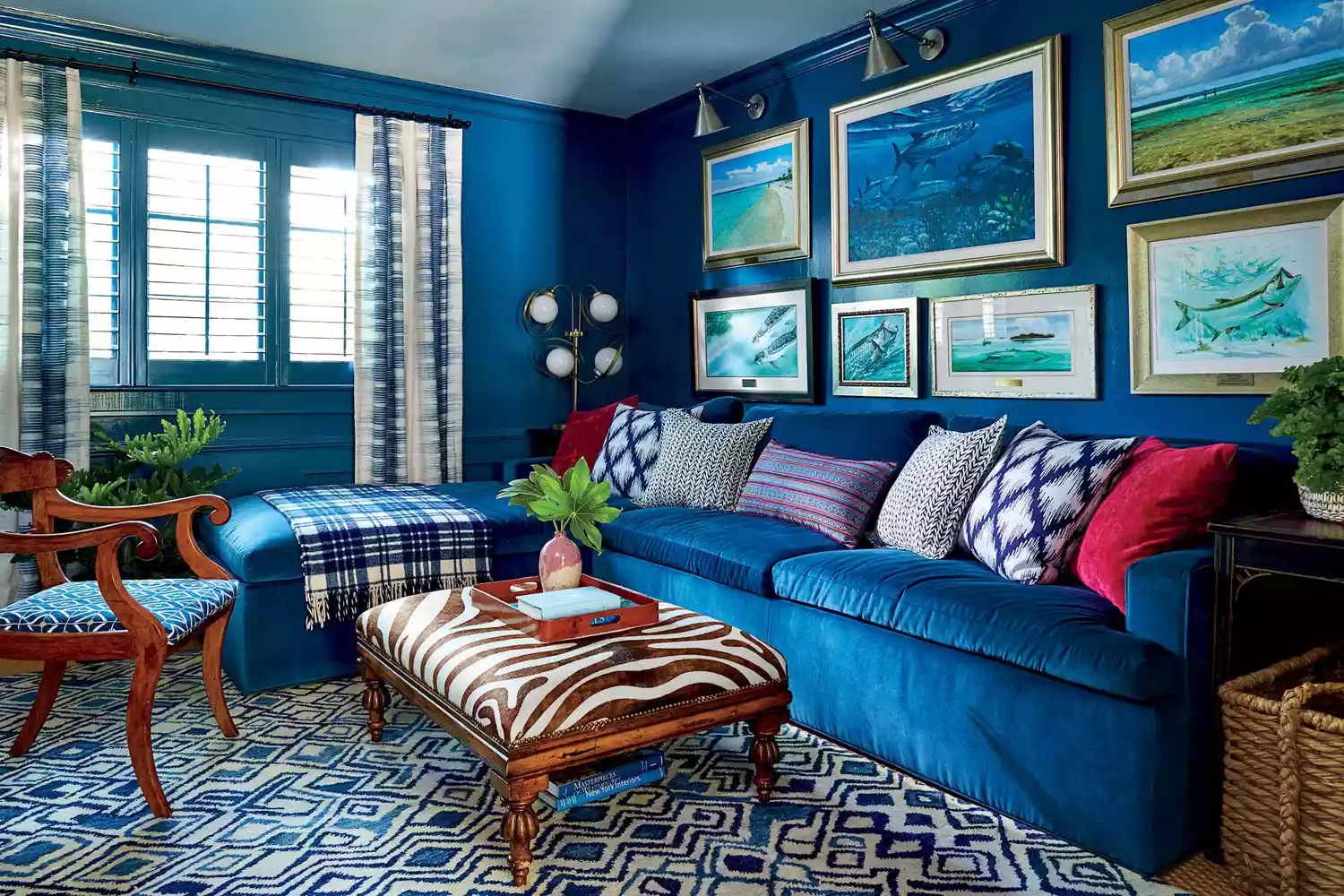
The fourth myth under scrutiny is the old adage that certain colour combinations, like blue and green or pink and red, should be avoided due to clashing. The article asserts that unexpected colour pairings can be highly effective in home design, adding excitement and visual interest. It suggests that while bold shades might need careful consideration, exploring deeper or lighter tones of these colours can result in harmonious and stunning combinations, such as a navy wall paired with vibrant greenery.
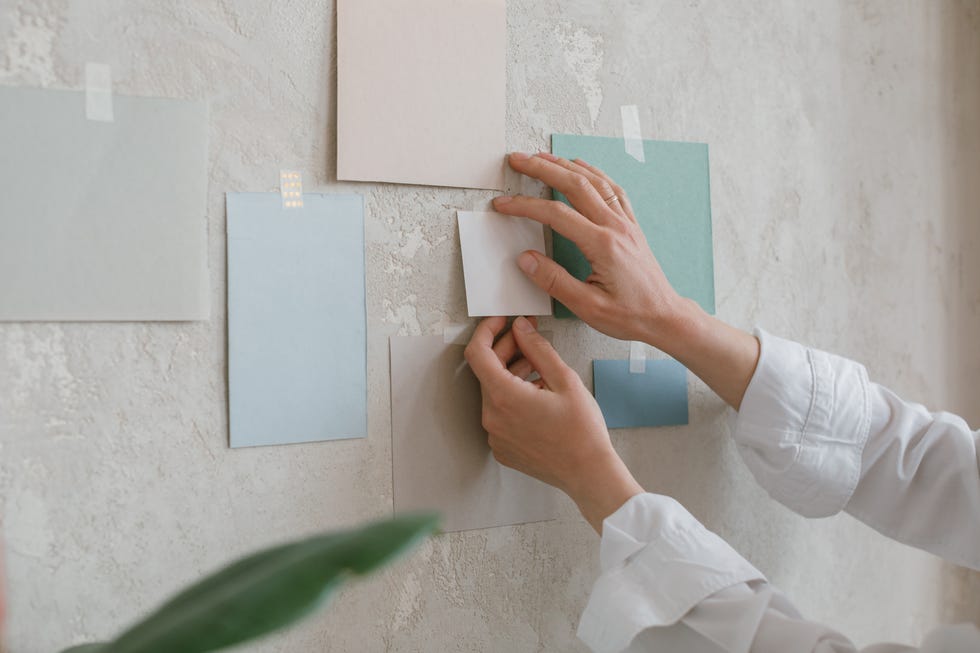
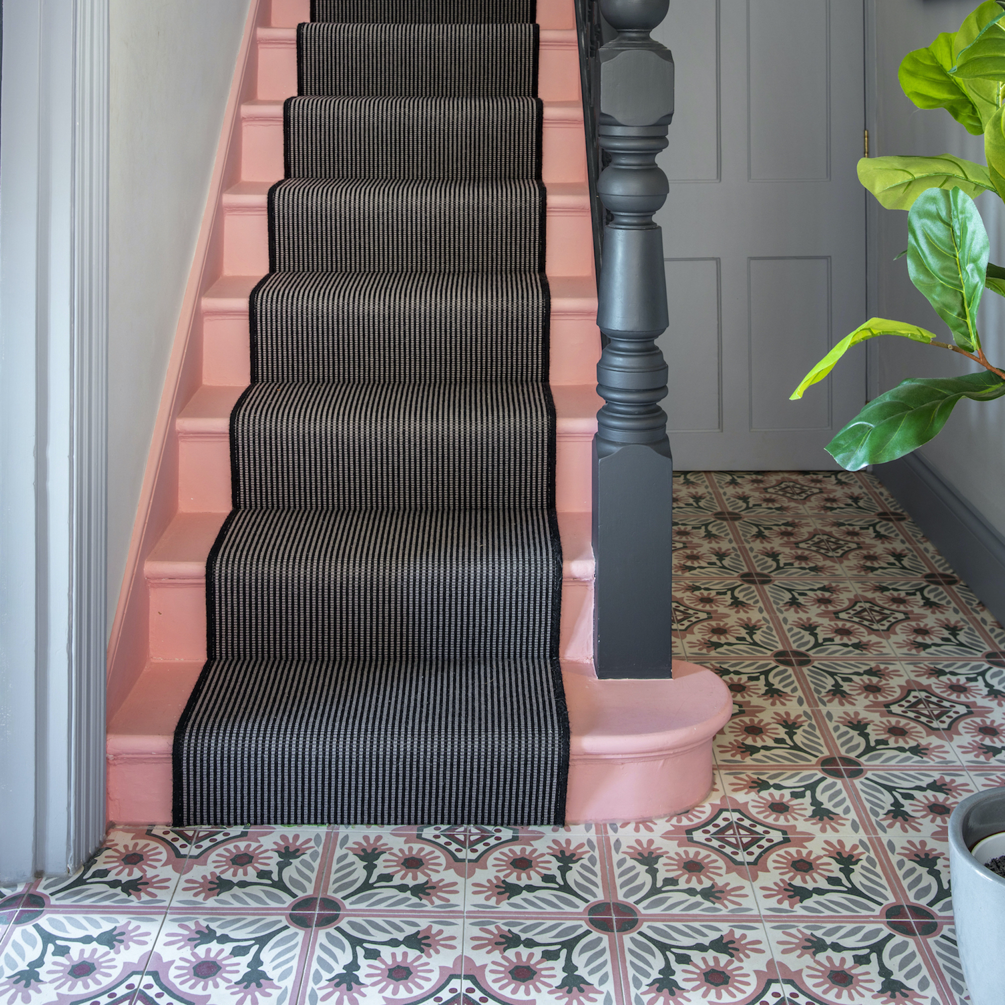
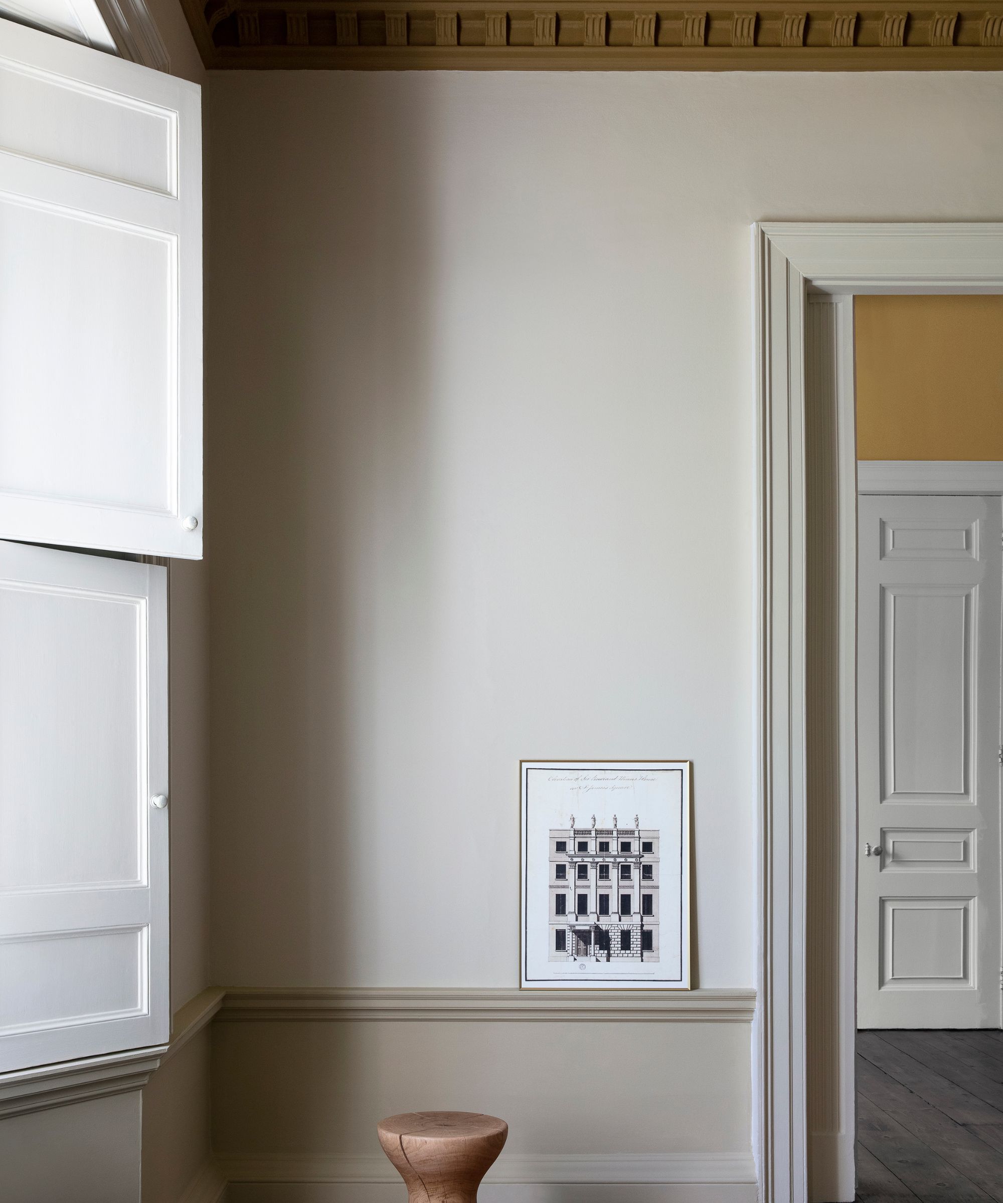
Fifth, the notion that every room in a house should be painted the same colour for a cohesive flow is debunked. The article emphasizes that the orientation of each room and how natural light interacts with different colours throughout the day are crucial factors. It recommends observing colour swatches at various times to understand their changing tones. An alternative to uniform painting is to use varying shades or tones of the same colour across different rooms, tying them together with a consistent paint colour on elements like skirting boards while allowing for individual wall colours.
Finally, the article encourages homeowners to disregard rigid design rules. It highlights that paint colour selection is a deeply personal choice, and despite conflicting views and evolving trends, individuals should trust their instincts when creating their dream space. Whether embarking on a DIY project or consulting professionals, personal preference should guide decisions, especially when conventional myths might deter desired aesthetic outcomes. The overarching message is to prioritize personal taste and practical application over outdated conventions in home painting.
#PaintColourMyths #HomeDecoration #InteriorDesign #PaintTips #ColourPalette #SmallSpaceDesign #NeutralColors #CeilingColors #ColourPairings #PaintColourMyths #HomeDecoration #InteriorDesign #PaintTips #ColourPalette #SmallSpaceDesign #NeutralColors #CeilingColors #ColourPairings
0 commentaire au total
 Aucun commentaire pour le moment
Vous aimerez aussi

Interior design experts reveal the colour rules you should be breaking
6 painting mistakes that are making your walls look 'dirtier' – and what you should be doing instead

5 reasons why you should never paint a ceiling white, reveals a leading paint and color expert

7 Paint Colors to Never Use on Your Ceiling, According to Interior Designers
7 Paint Mistakes That Make Designers Instantly Cringe When They Walk Into Someone's Home


7 Most Underrated Paint Colours, According To Colour Experts

6 Paint Colors That Make Your Living Room Look Smaller, According to Interior Designers

4 Outdated Colors Designers say you Should Steer Clear of When Decorating a Living Room
4 Times Designers Say You Definitely Shouldn't Paint Your Walls and Ceiling in the Same Color
6 Paint Color Mistakes To Stop Making, According To Designers
The paint colors to avoid in small living rooms — and what to use instead

6 bathroom design myths experts say you shouldn't believe
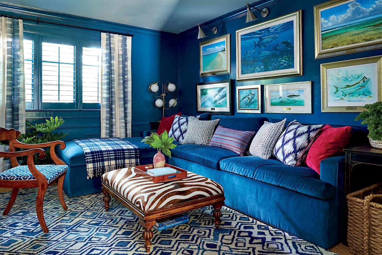
6 Paint Color Mistakes To Stop Making, According To Designers

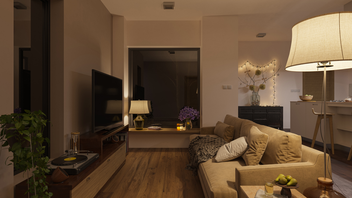
The 13 Best Paint Colors for Low-Light Rooms

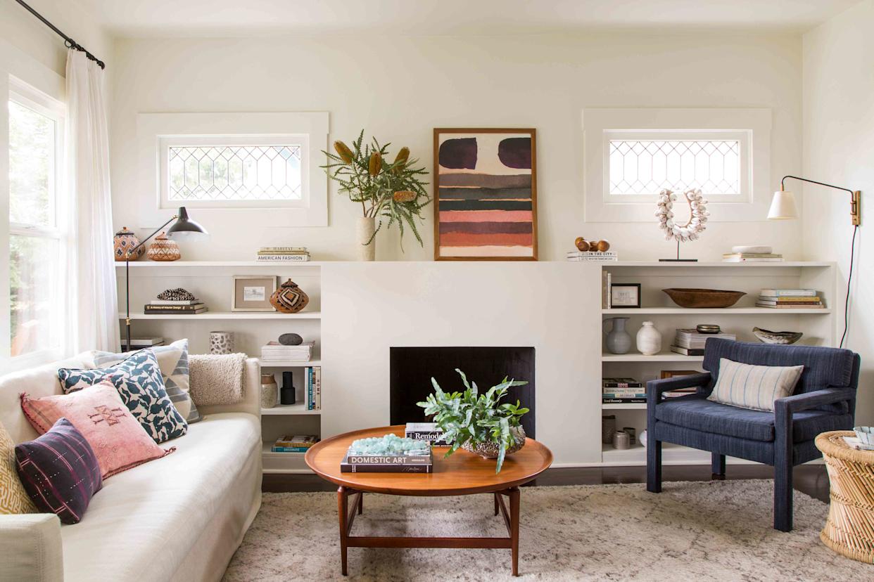
5 Paint Colors That Experts Say You Shouldn't Use in 2025


What are the worst colors to paint a room? The shades experts say you should never use

5 colors you should never paint a small room – designers warn us to steer clear of these hues, and what to pick instead
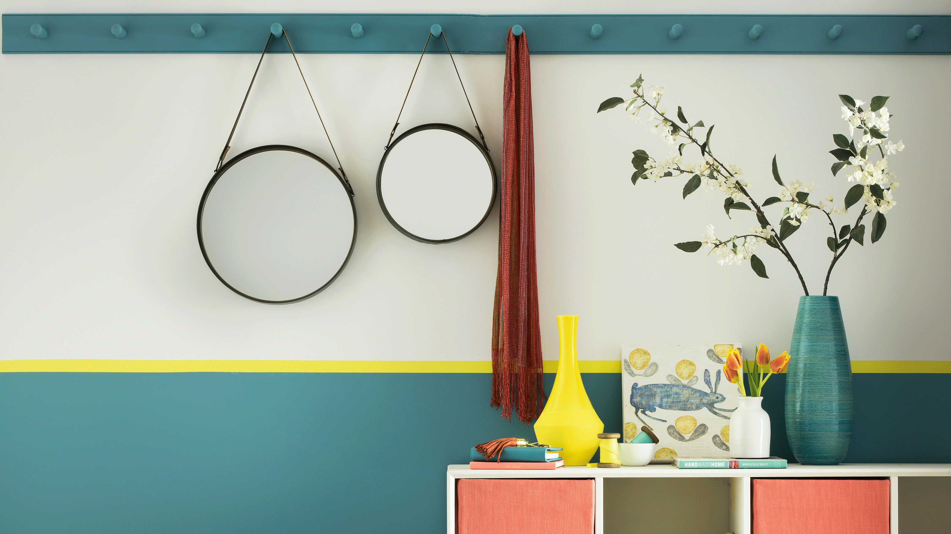
Trust us, these are the colours to avoid when painting a small hallway
Should you paint your ceiling a different colour to the walls? Experts explain why everyone should consider it
Never Regret a Paint Color Again—Avoid These 6 Common Mistakes