1/6
Designers Predict These Color Combinations Will Be EVERYWHERE This Summer
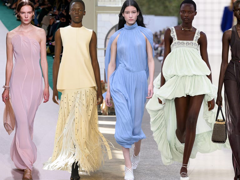
The article explores various color combinations predicted by interior designers to be popular for summer redecorating projects, emphasizing how pairing colors can enhance design elements. It highlights that while individual colors can be good, their combination can achieve perfection, similar to how chocolate and peanut butter complement each other. The piece moves beyond classic pairings to feature off-beat duos that offer memorable and unexpected aesthetics. Designers provide insights into color theory, explaining the effectiveness of these chosen shades and their suitability for summer. The discussion includes both warm weather-friendly hues, such as pastels, and some unexpected palettes.
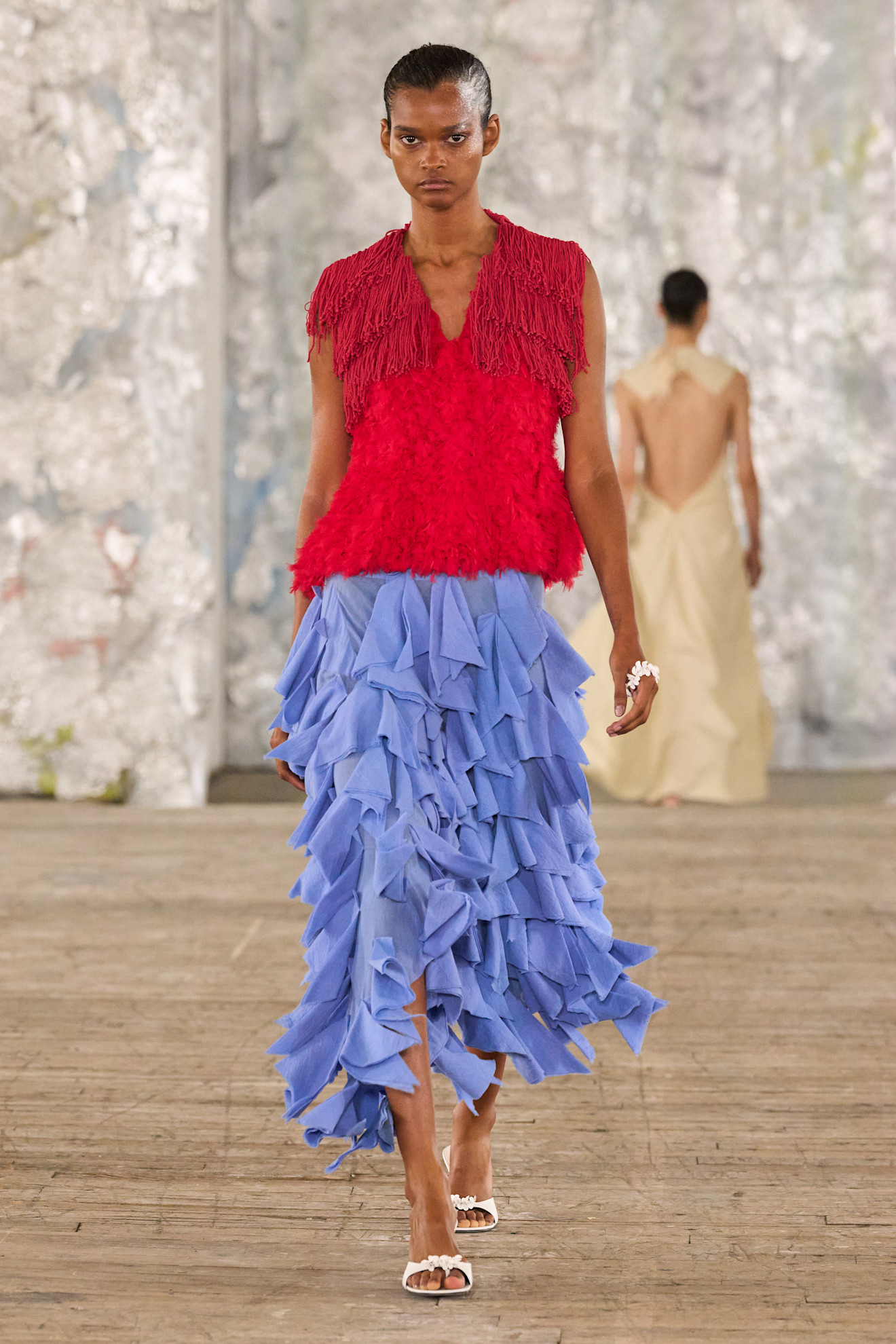
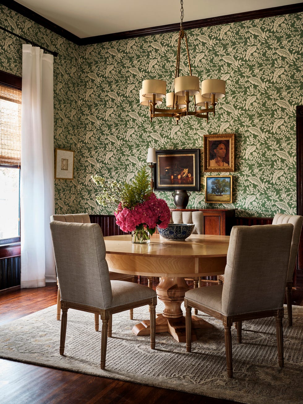
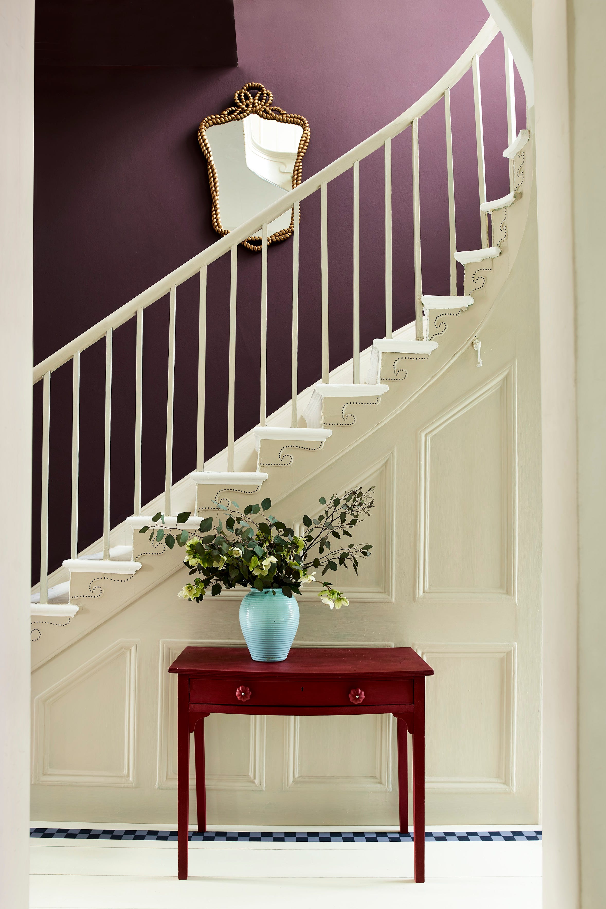
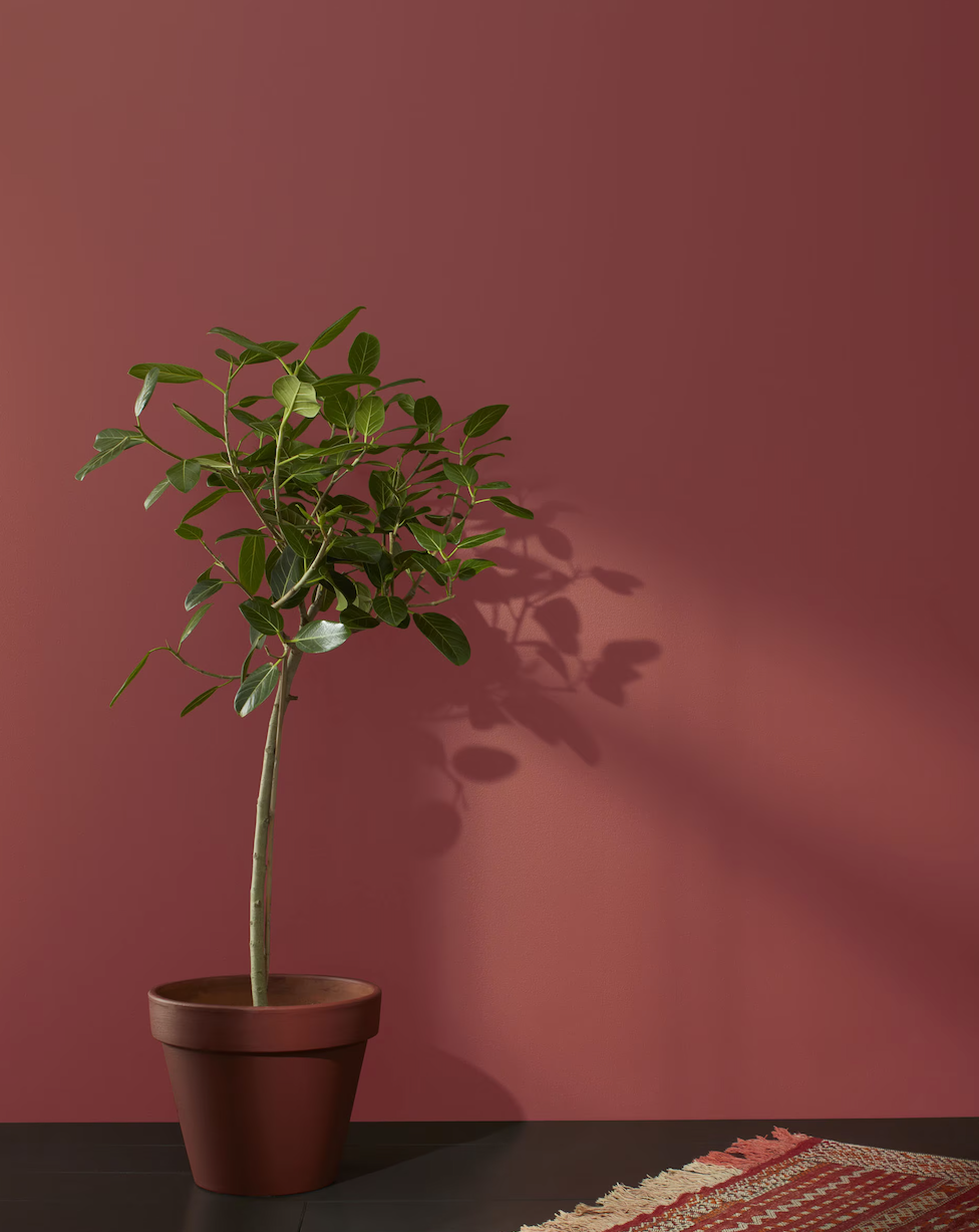
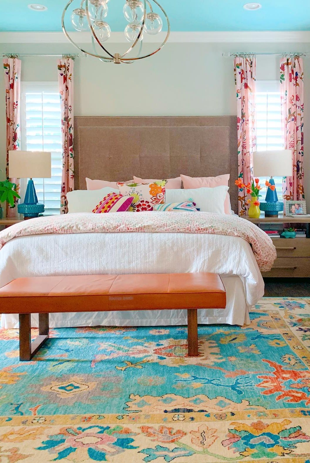
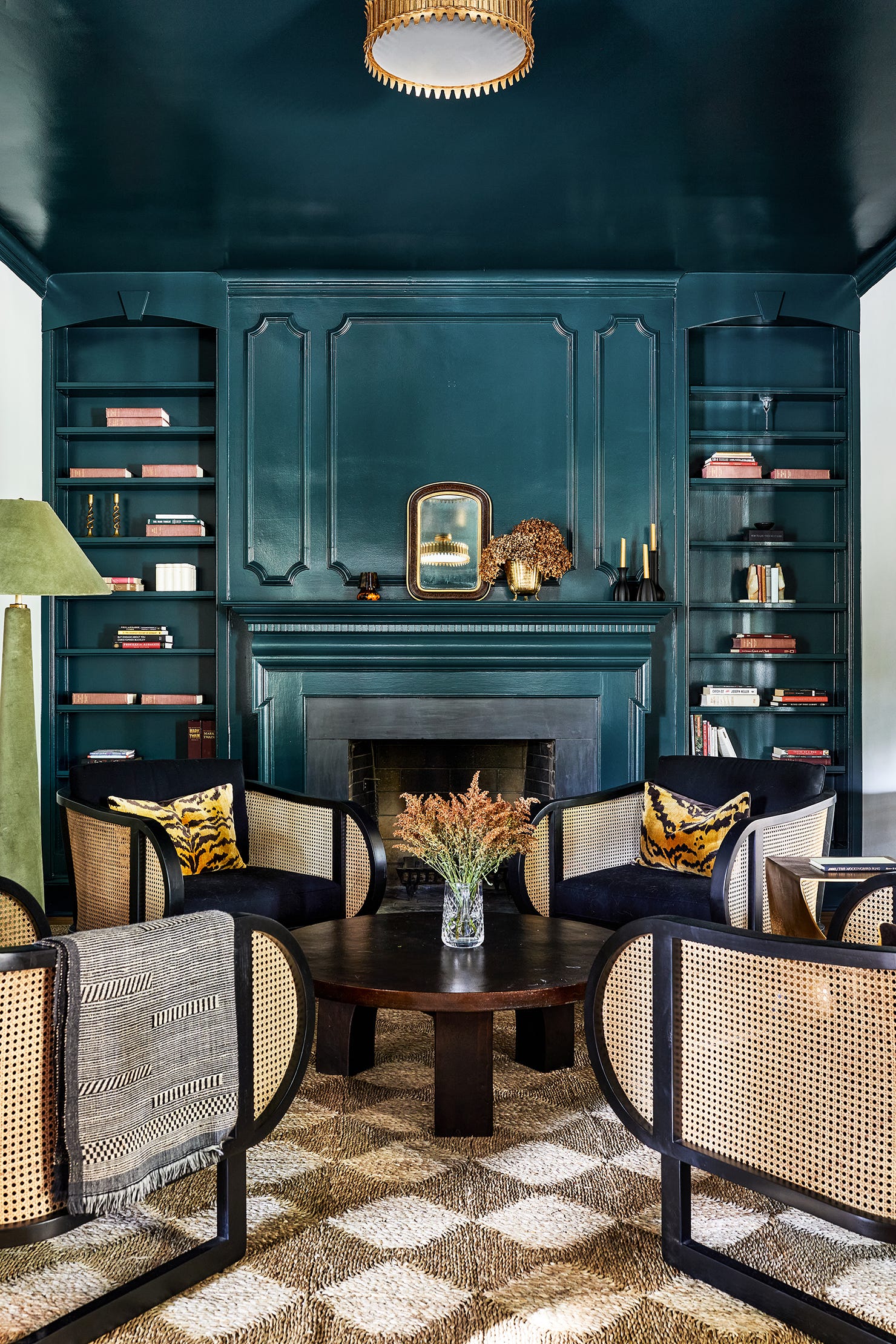
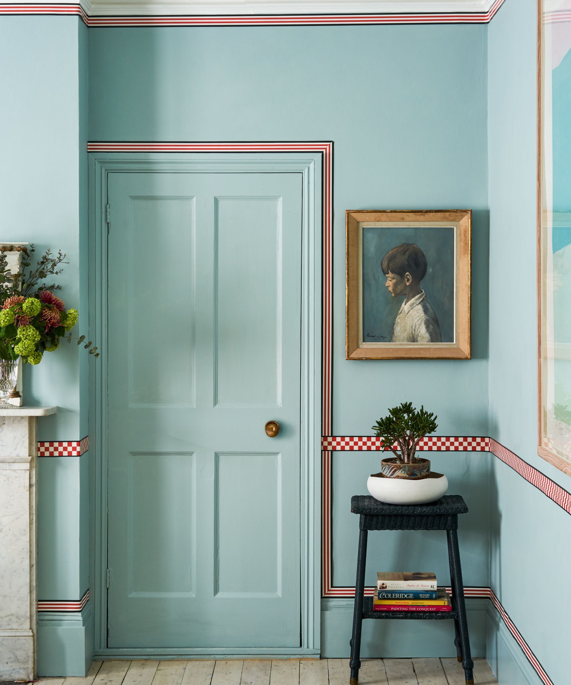
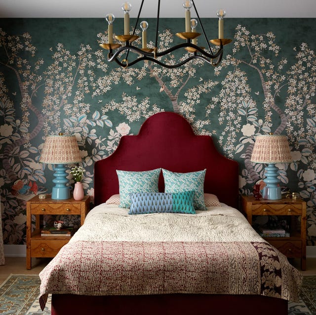
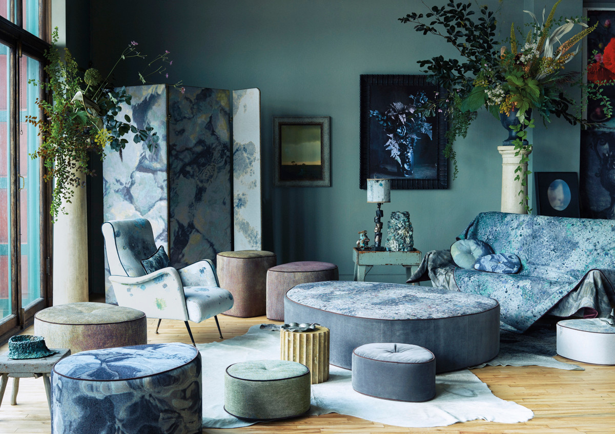
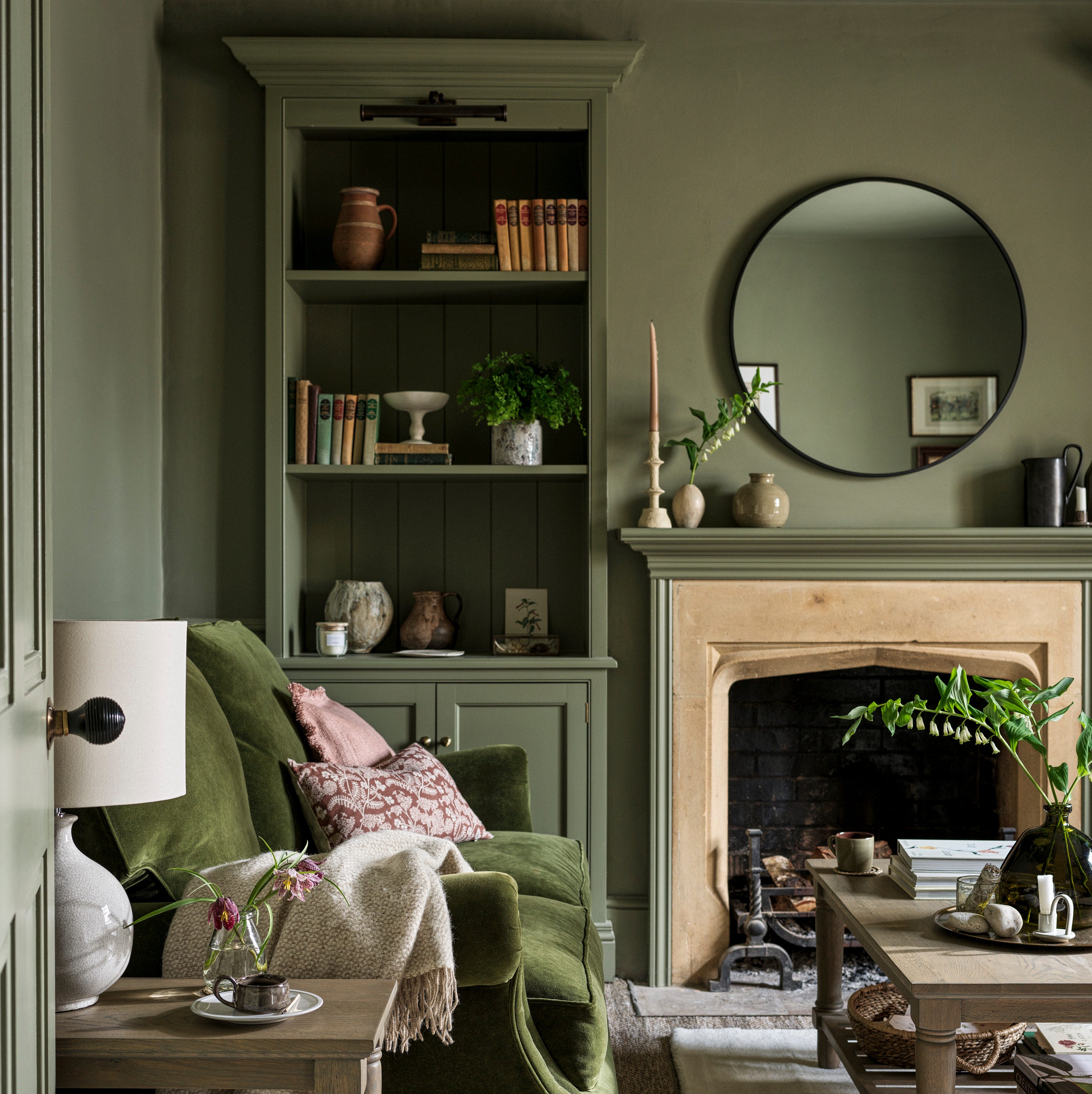
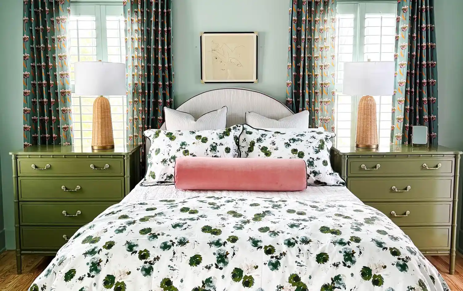
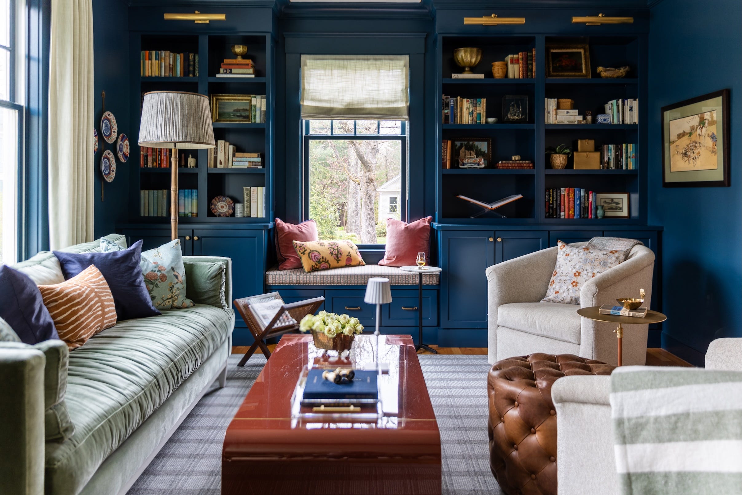
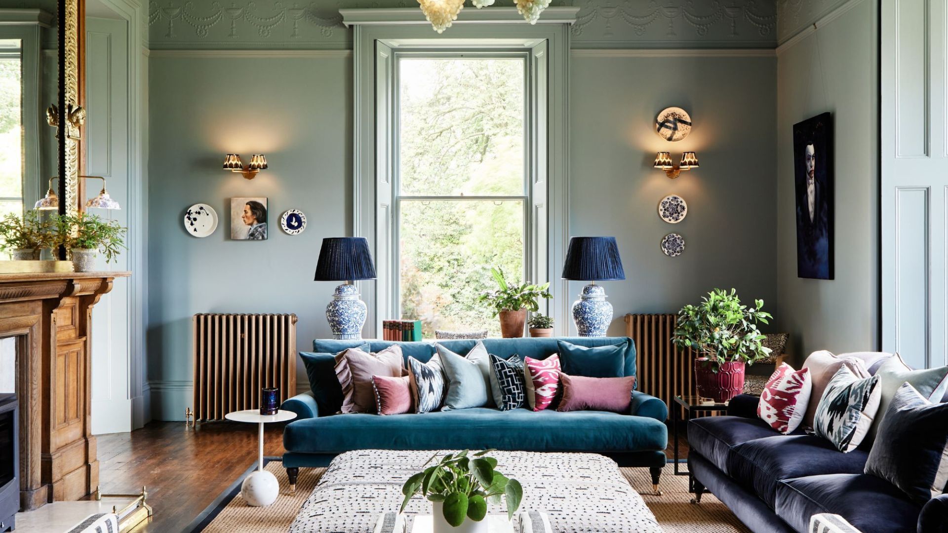
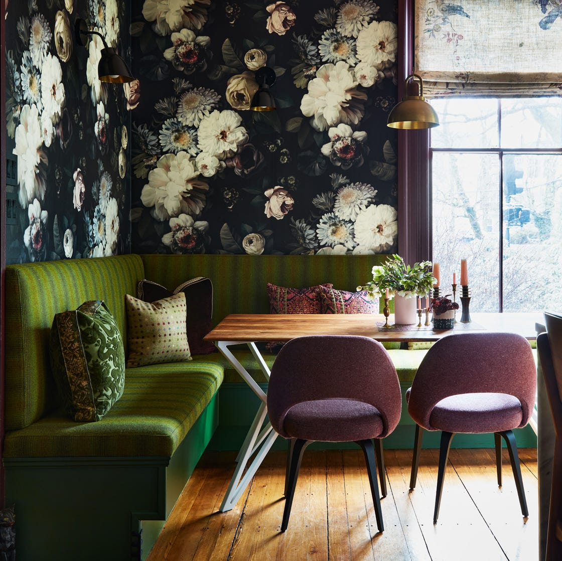
One featured combination is Red + Green, which moves beyond its traditional association with winter holidays. Designers suggest using more saturated and deep shades of red and green to create a moody and elegant palette. Michelle Gage, a Philadelphia-based interior designer, explains how she utilized petrol teal and beet hues with similar richness to create a feminine and luxurious bedroom. She notes that the beet color provides a pop against the petrol, with other elements in the space balancing their boldness, resulting in a soothing atmosphere.
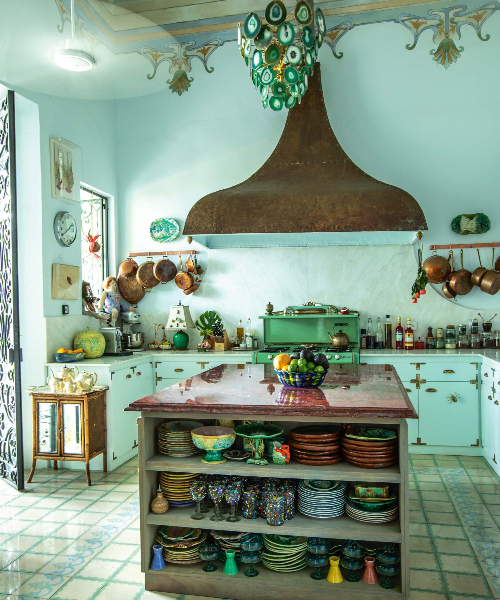
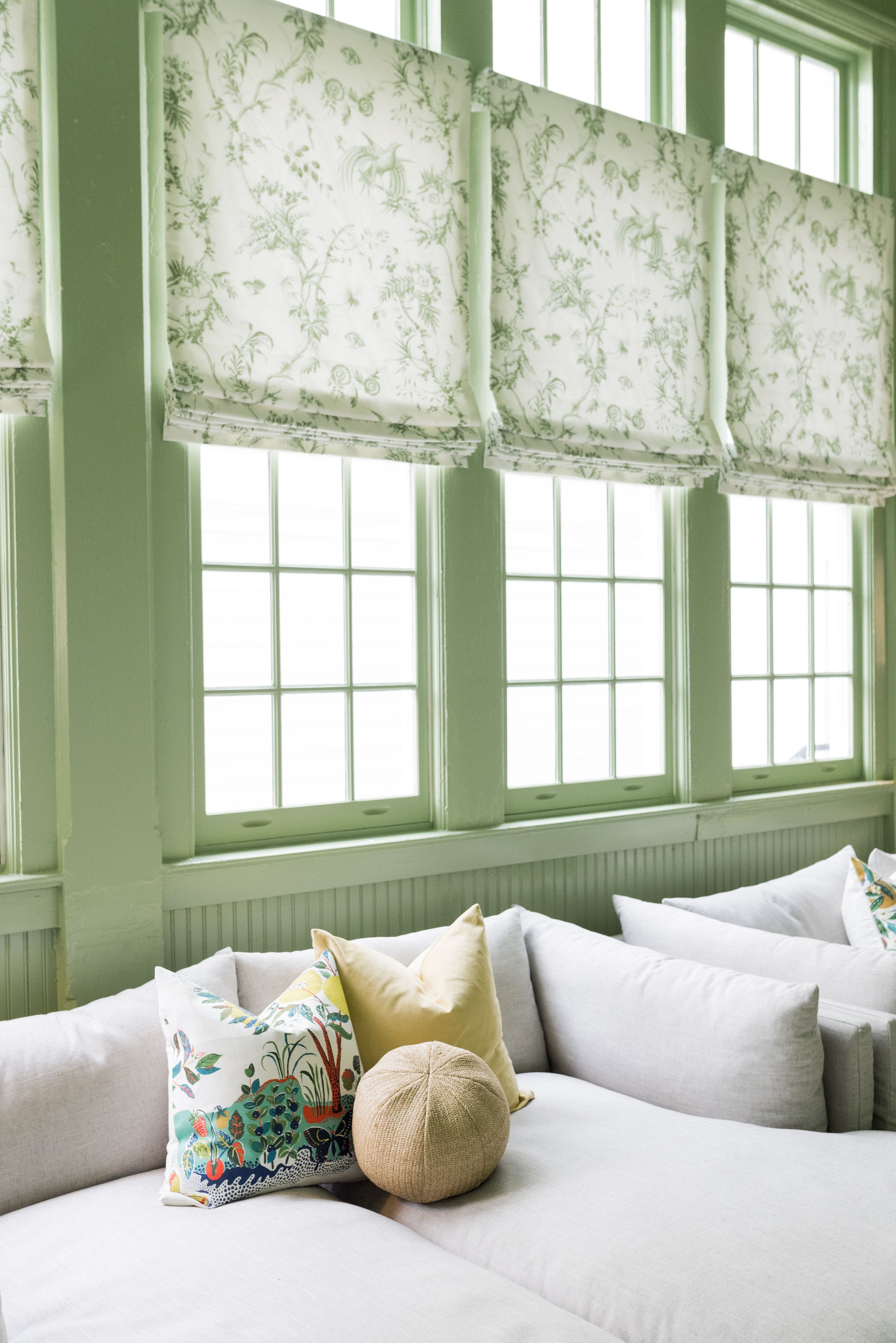
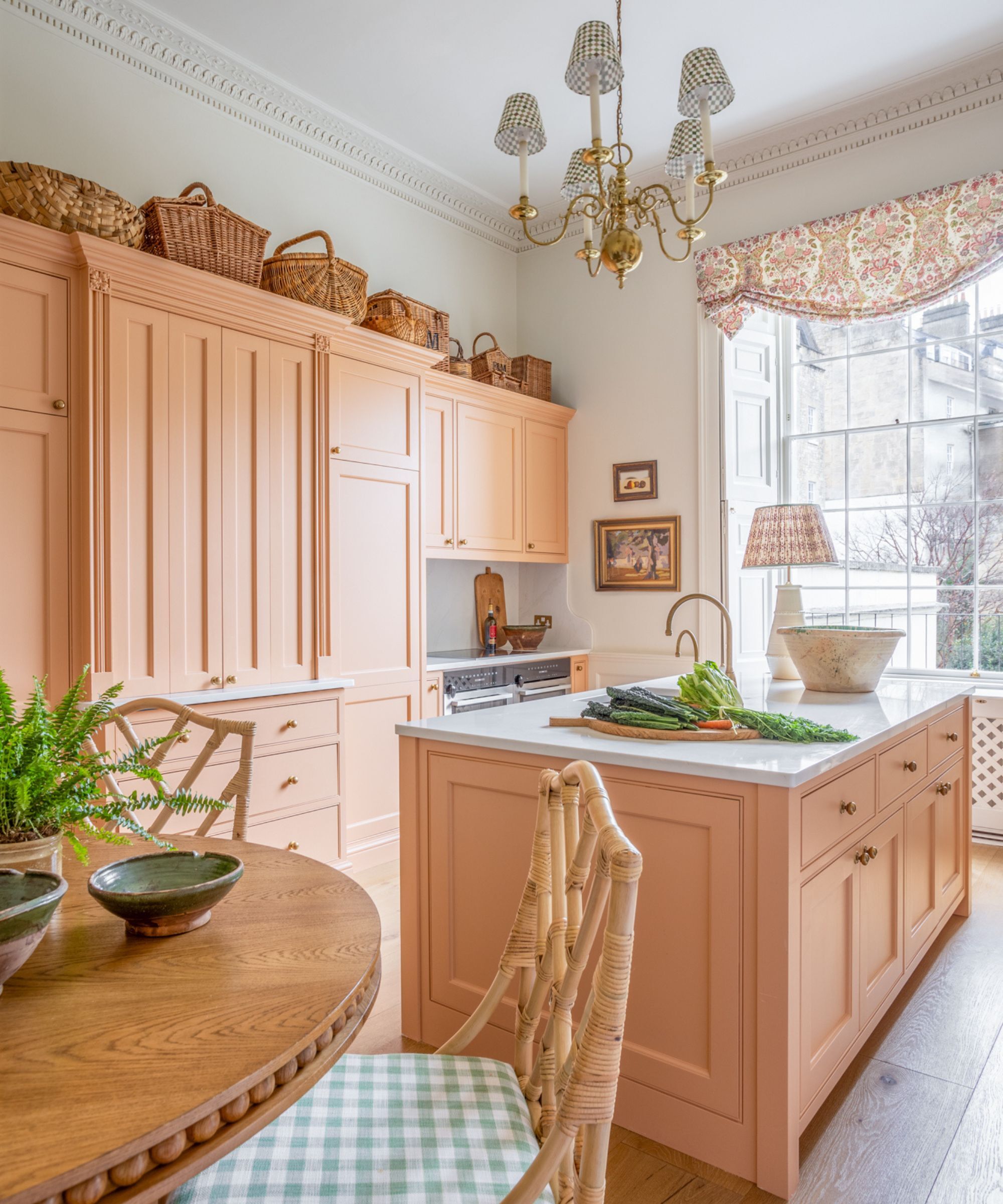
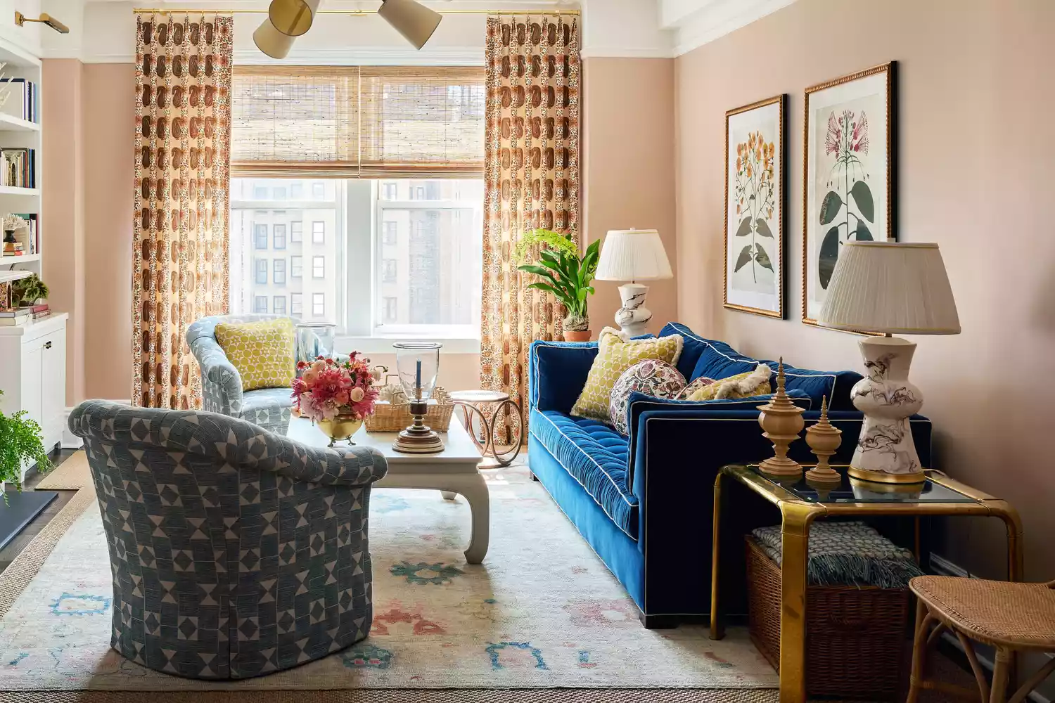
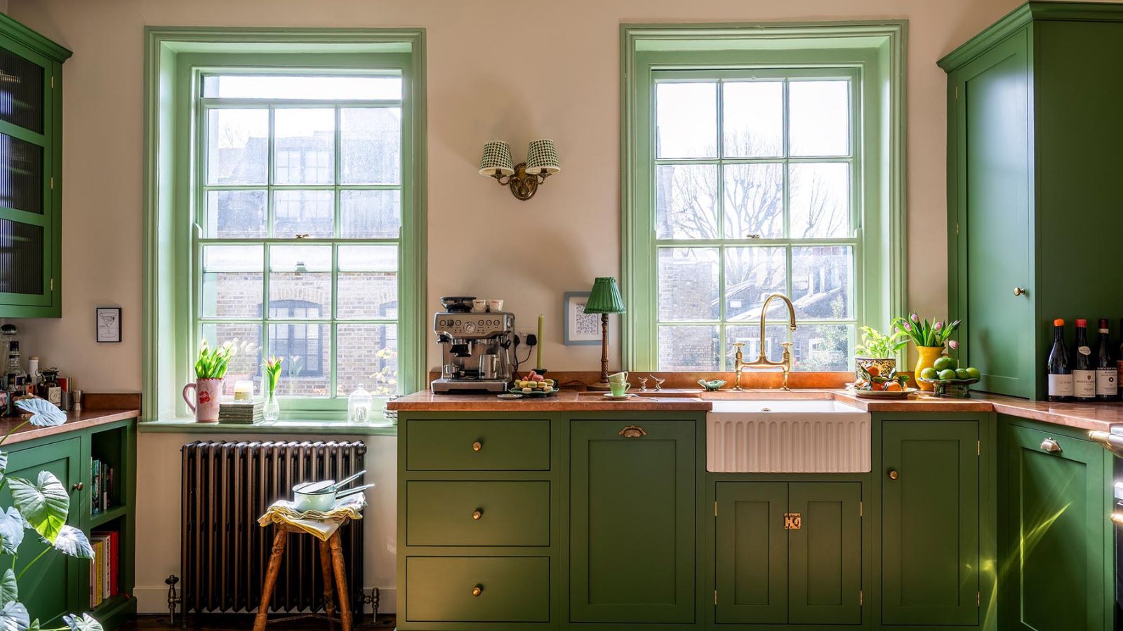
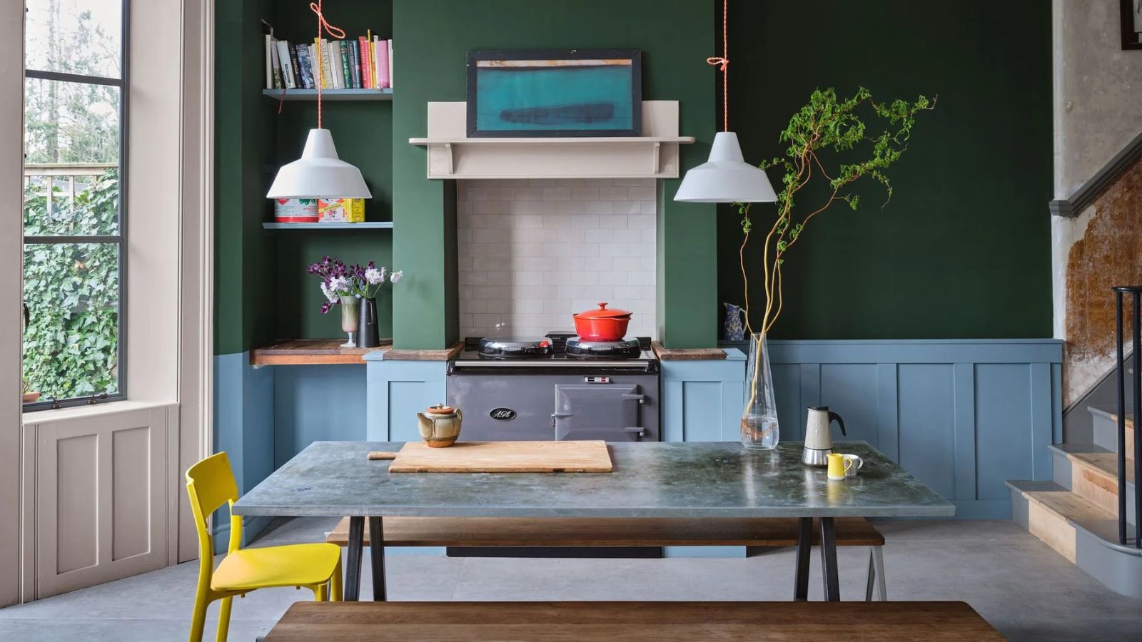
Next, the article delves into Green + Blue, showcasing a Miami home by Carola Pimentel of Assure Interiors. Pimentel demonstrates how color-blocking can be effectively used with an earthy palette grounded in neutral tones. For an office space, she was drawn to Benjamin Moore's Britannia Blue, inspired by the calming blues of the sky and sea, combined with vibrant apple greens. This pairing creates a relaxed yet sophisticated ambiance, fitting for a tropical setting.
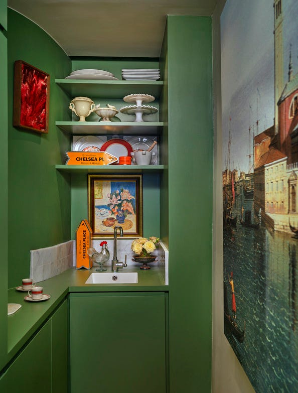
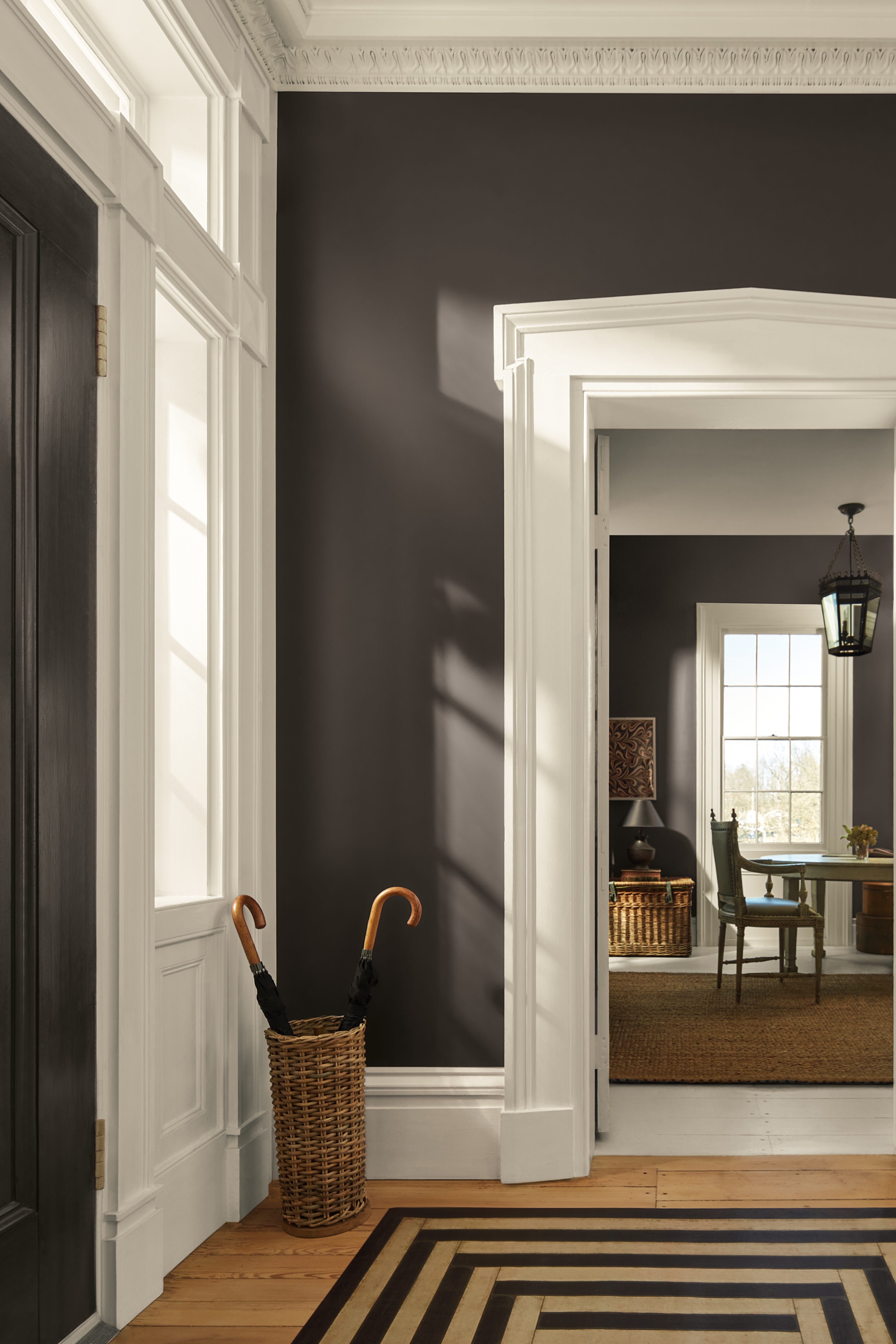
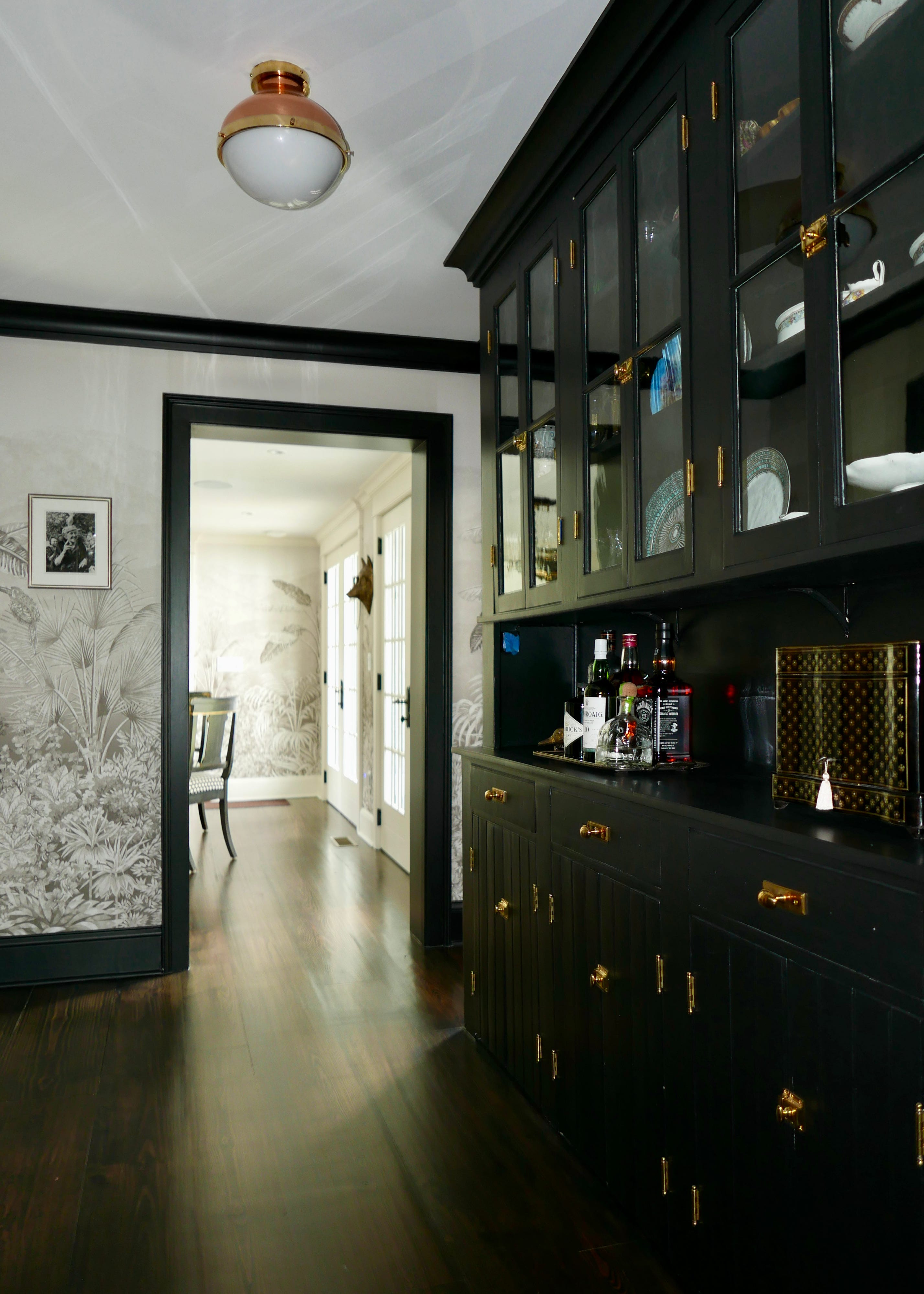
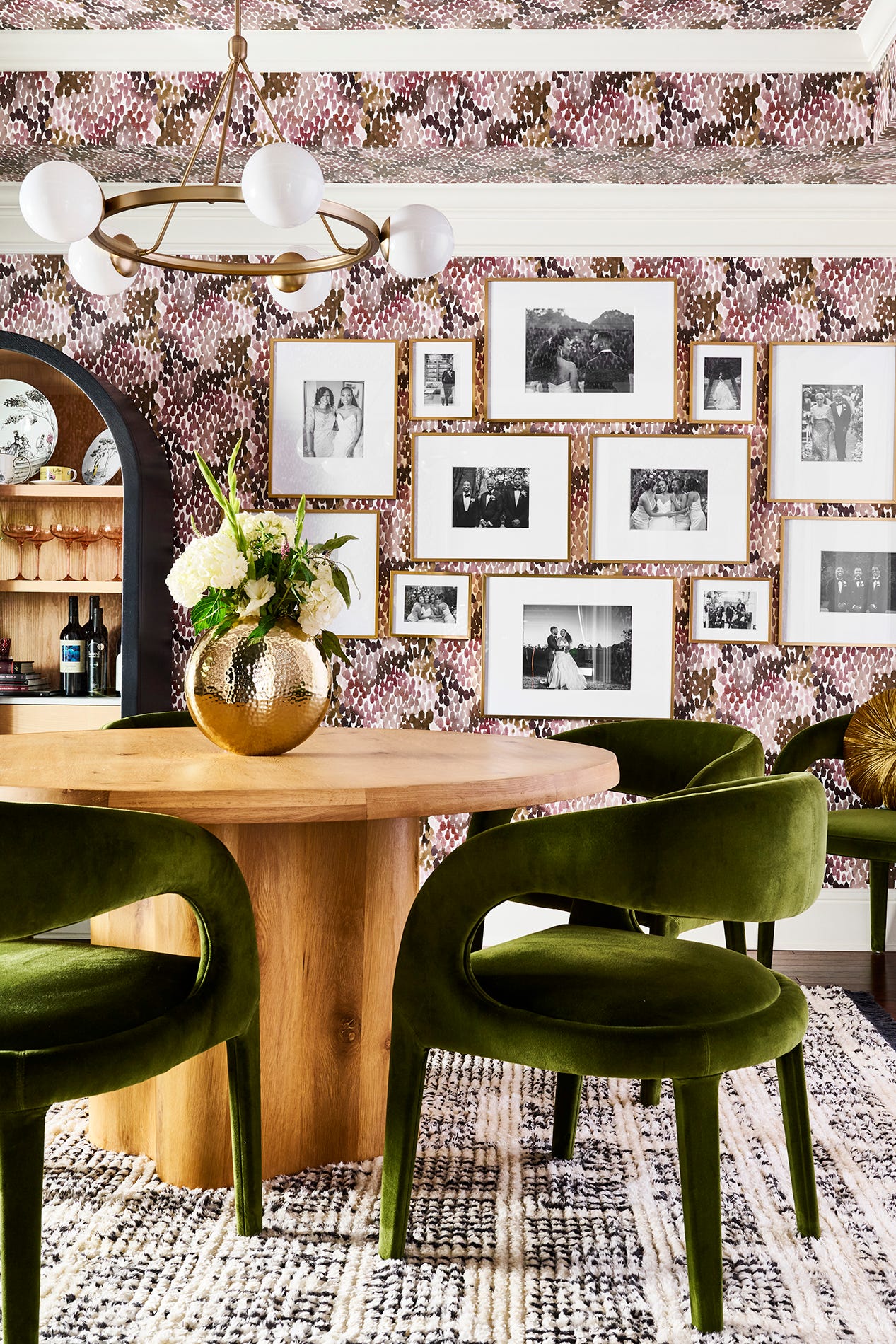
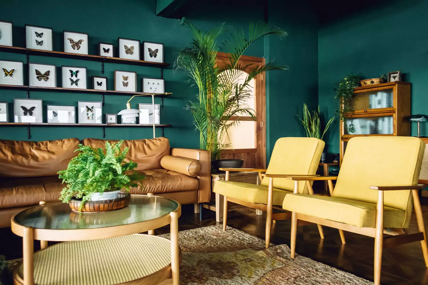
The discussion then shifts to Black + Brown, a combination that San Francisco designer Jeff Schlarb uses to create a dark, moody, and neutral aesthetic. Schlarb emphasizes that while color is important, classic combinations like black and brown have lasting appeal and can be adapted to various design styles. In a dining room project, he honored the classical architecture of the home while adding modern visual interest through custom hand-drawn wall coverings from MJ Atelier, juxtaposed with a black and white marble backsplash and lacquered ebony dining chairs upholstered in tobacco velvet from Pierre Frey.
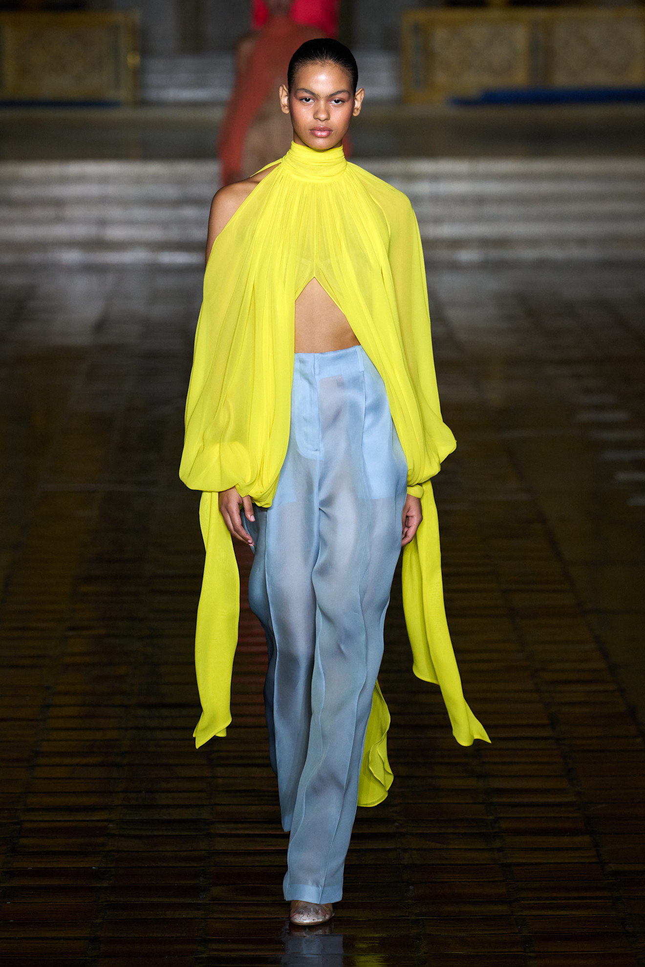
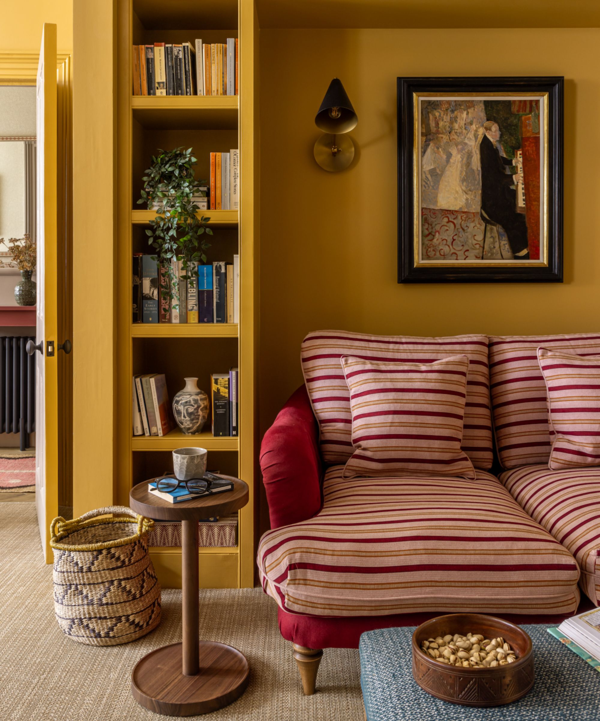
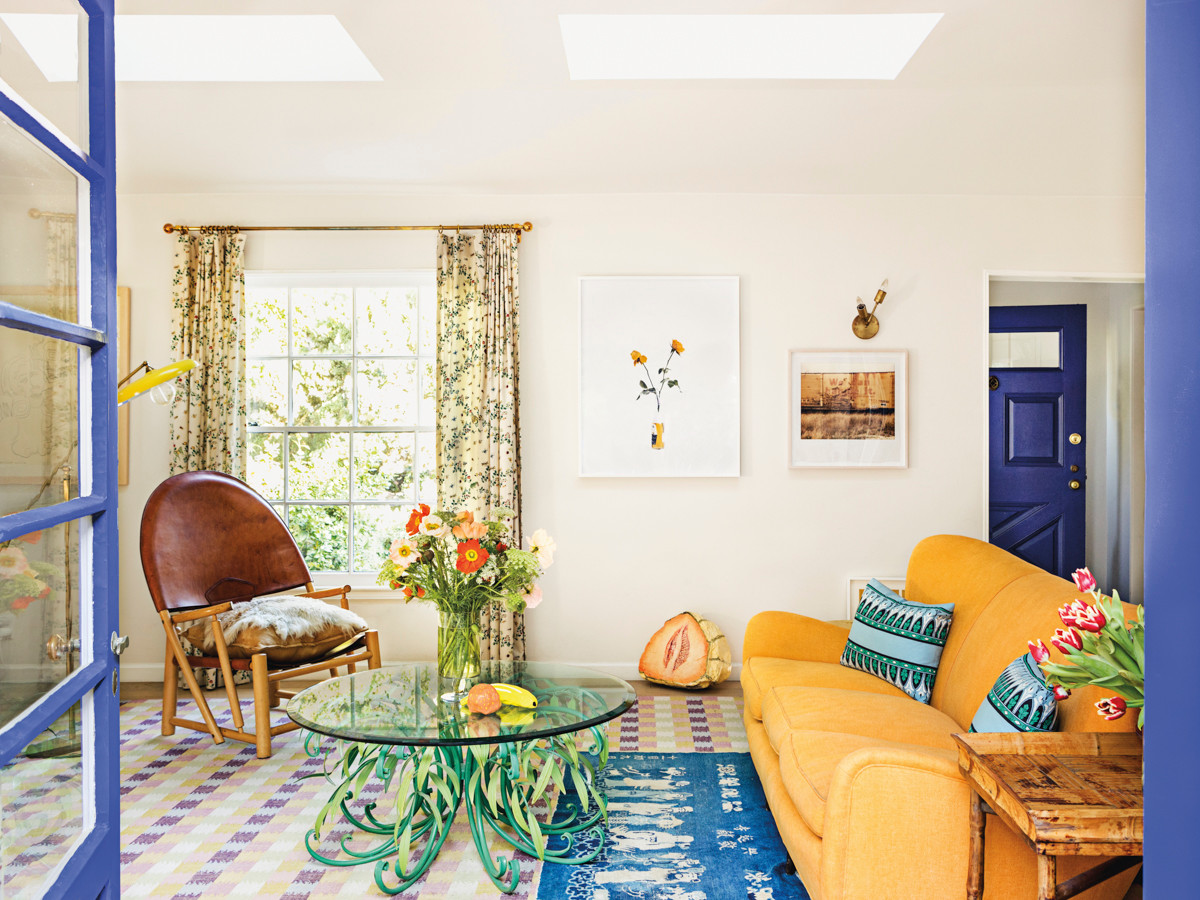
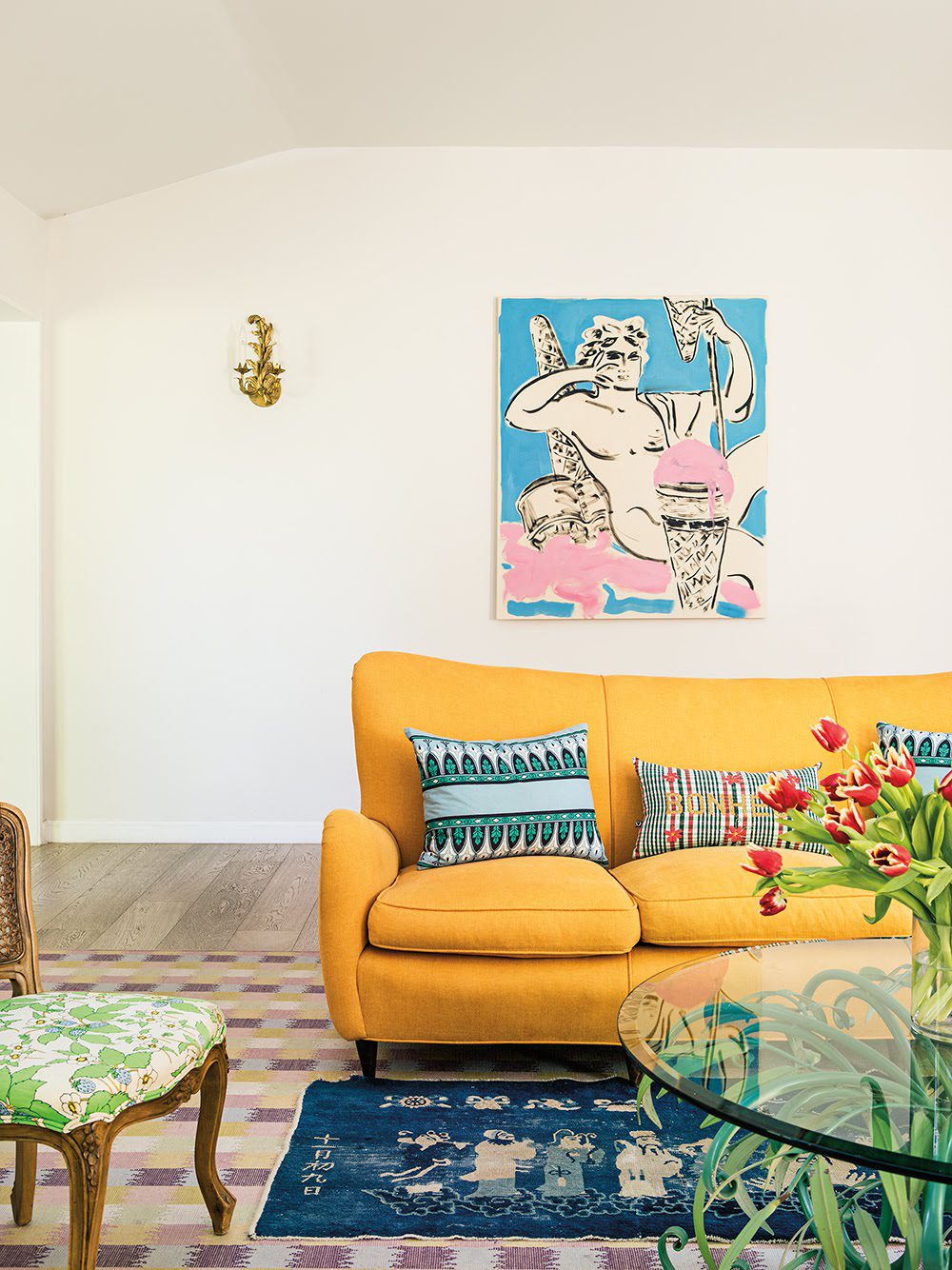
Fuchsia + Yellow is presented as a vibrant and energetic pairing. Jenna Gross, founder of Colordrunk Designs, embraces bright colors, explaining that bright yellow brings energy and pink brings a party atmosphere. She saturated a formal living room in yellow to make it more inviting, choosing specific shades inspired by wallpaper. Gross describes the bright pink as adding a fun element for all ages, suitable for various social gatherings.
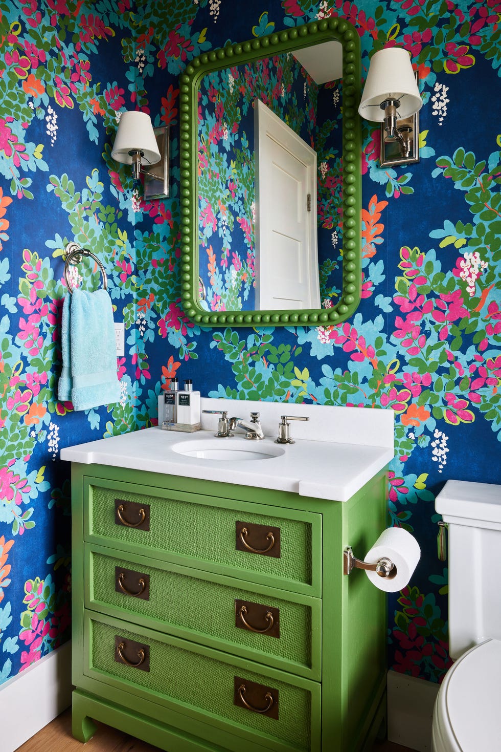
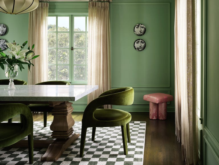
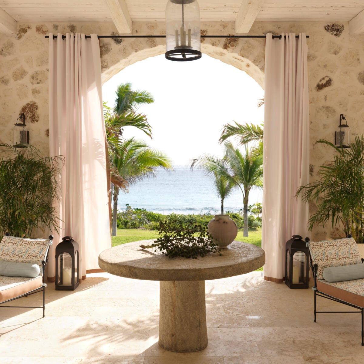
Finally, Pink + Green is highlighted as a classic and consistently effective color combination. Sasha Bikoff, a New York-based designer, draws inspiration from Hollywood Regency-era interiors, particularly those in Palm Beach and Beverly Hills. She views this pairing as an iconic match that offers a fresh, feminine, and classy look. Bikoff notes that in a Georgian-style home, pink and green tones complement each other like a bud and a stem, creating a harmonious and natural unity.
#InteriorDesign #ColorPalettes #SummerTrends #HomeDecor #DesignInspiration #ColorTheory #DecoratingIdeas #DesignerTips #InteriorDesign #ColorPalettes #SummerTrends #HomeDecor #DesignInspiration #ColorTheory #DecoratingIdeas #DesignerTips
0 comment in total
You may also like
These Are the Top 6 Color Trends We’ll Be Sporting This Summer
The Color Combo You’re About to See Everywhere
6 Fresh Color Trends To Inspire Your Summer 2023 Style

12 Jewel-Tone Paint Colors Designers Say Are Always On-Trend
Unexpected Color Combinations Trend Spring/Summer 2026

Experts Say These 5 Paint Colours Will Be Everywhere In 2026
21 Designers Share Their Color-Trend Predictions for Spring


6 Paint Color Duos Designers Can't Get Enough of This Fall

This SURPRISING Color Is About to Be Everywhere, According to Designers
6 Feel-Good Paint Colors That Are Suddenly Everywhere This Summer
Designers Say These 12 Paint Colors Will Be Everywhere in 2026

Designers Reveal the Surprising Home Trend That's Taking Over Right Now
These Will Be the Hottest Paint Colors for Summer 2025, Designers Predict
The colour trend taking over our gardens for summer holiday vibes all year round
Designers Share the 2025 Summer Trends They’re Actually Seeing
6 key colors to decorate with in May 2025, according to interior design and color experts in the know

Summer color trends for 2025 – 8 bang on shades interior designers can't get enough of
The 6 must-have colors to bring into your home this June
12 Color Schemes That Are Popping Off Right Now, According to Designers

The Top Deck Colors for Summer 2024, According to Experts