


1/4

Balancing Act: Japandi Color Palette Secrets 🎨💚
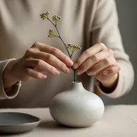
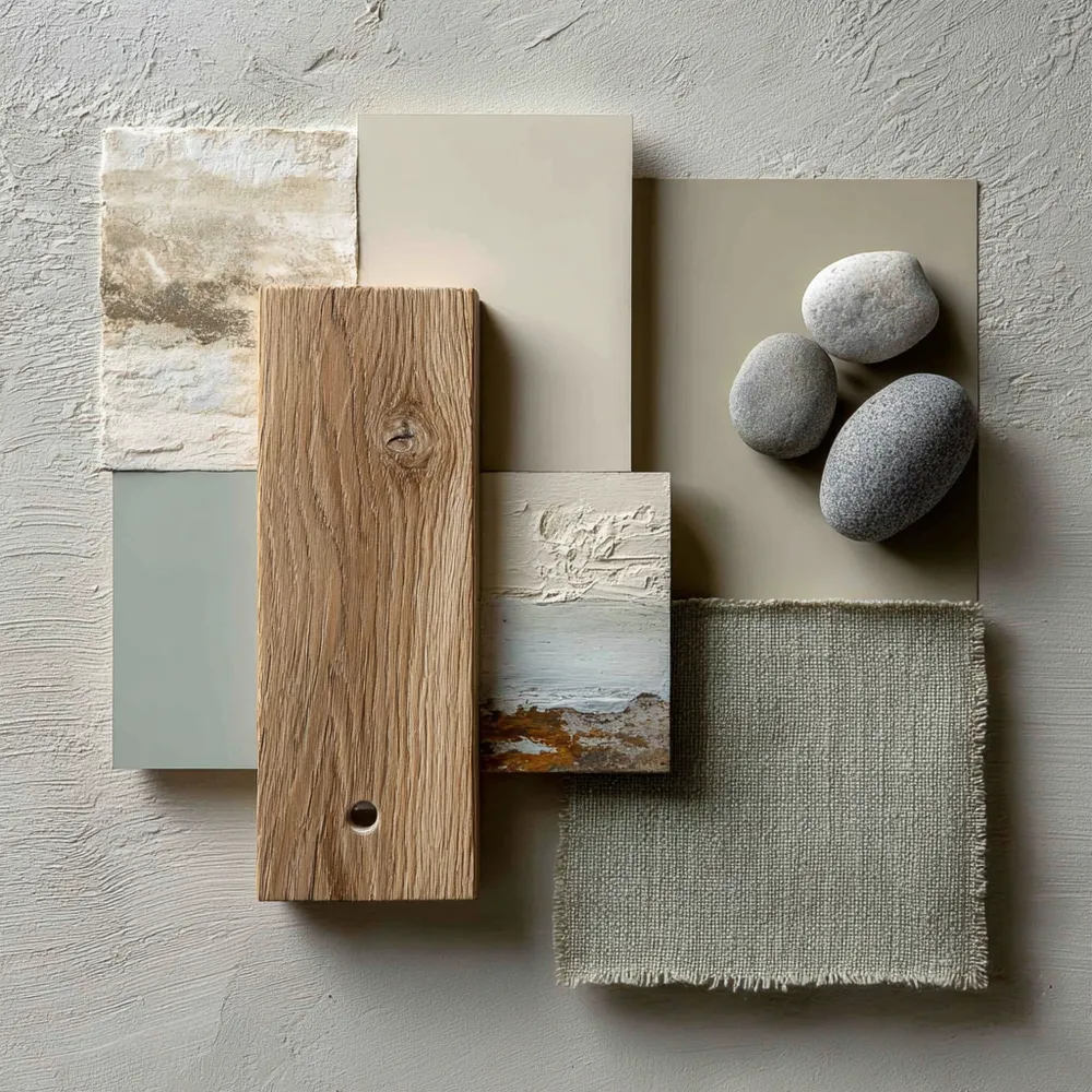
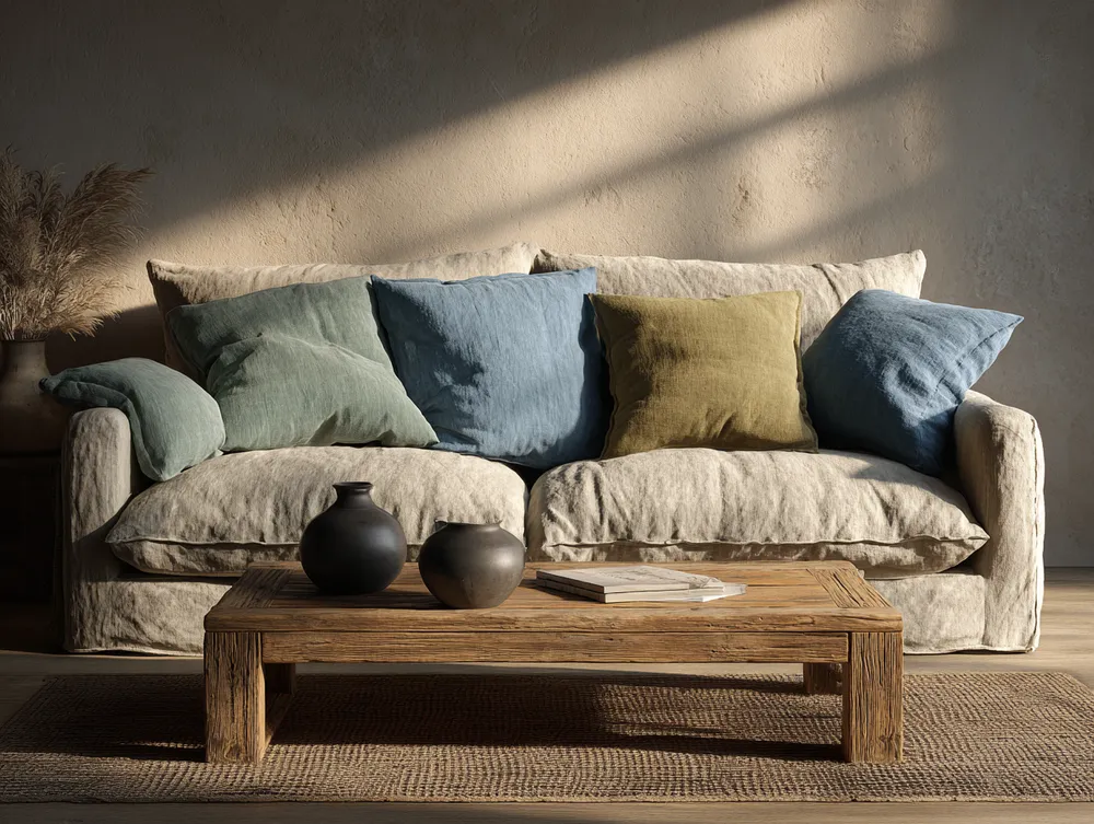
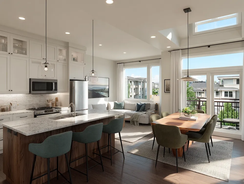
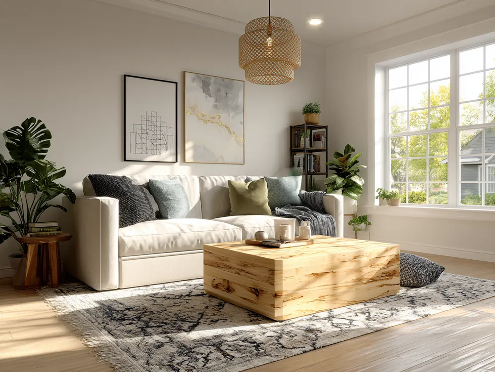
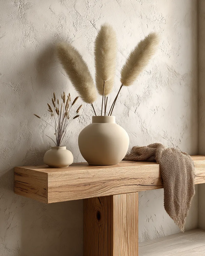
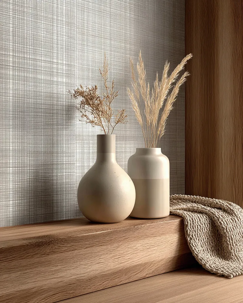
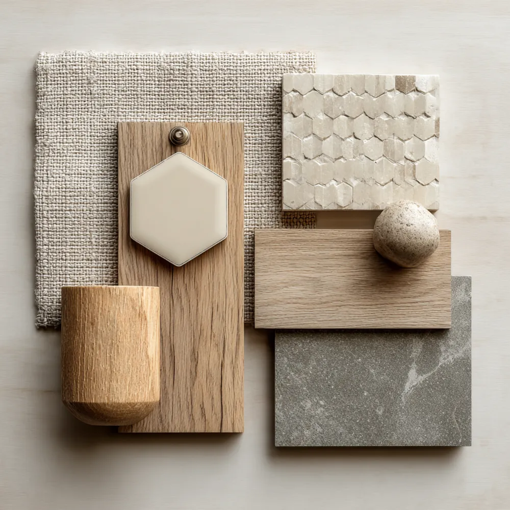
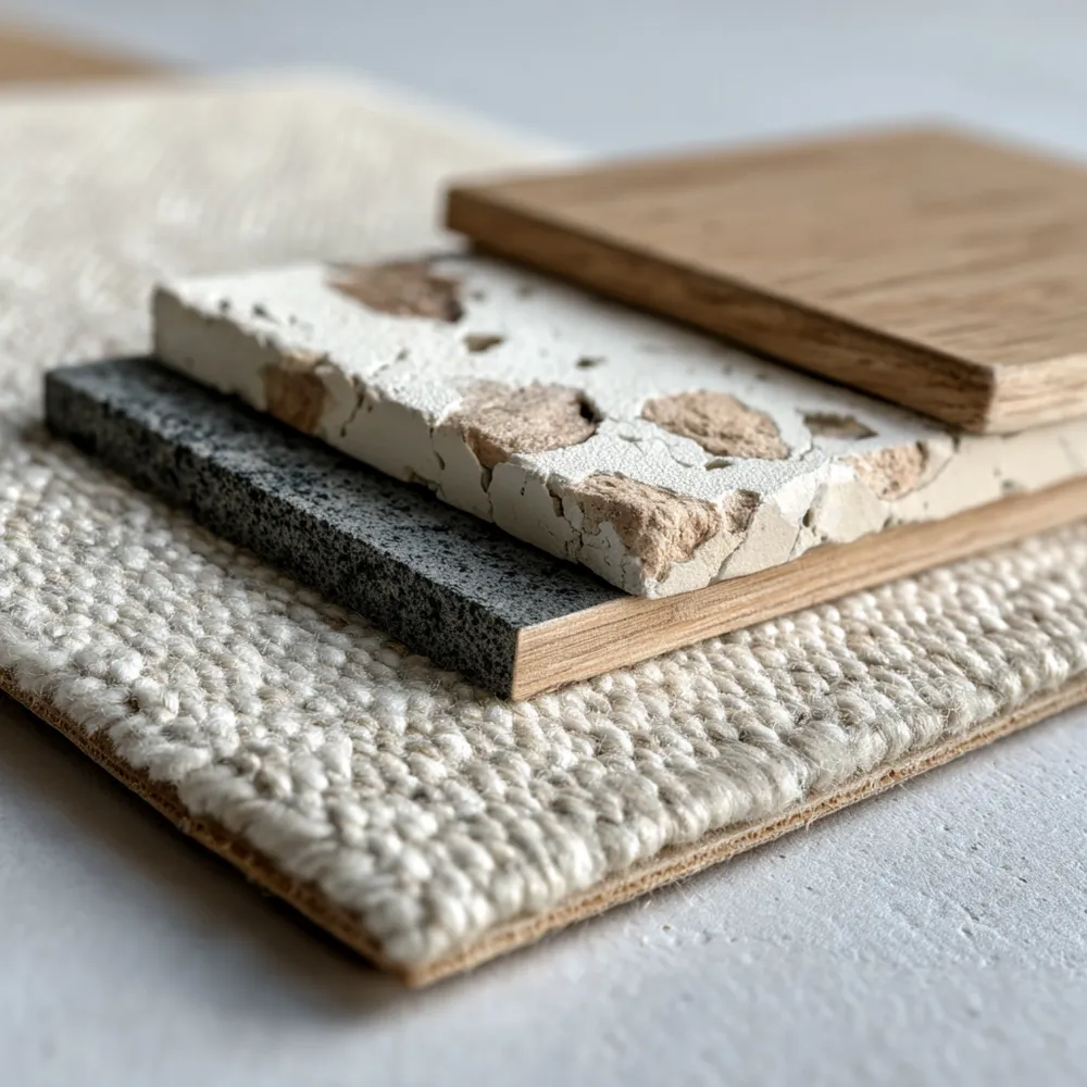
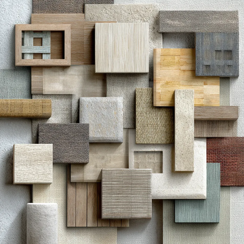
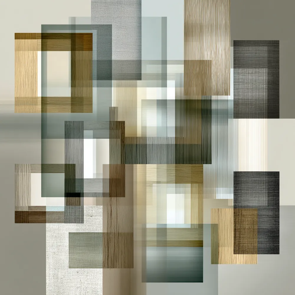
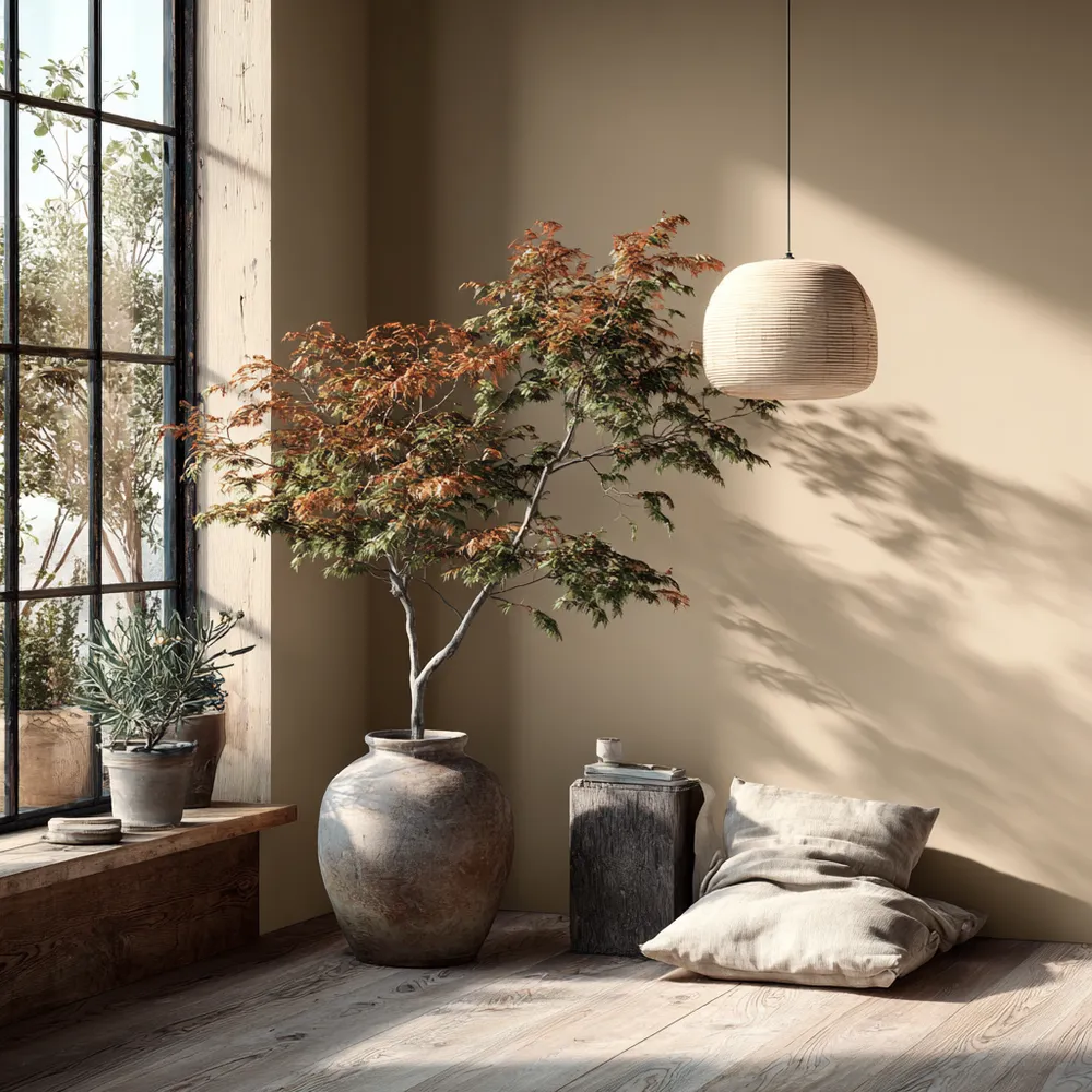
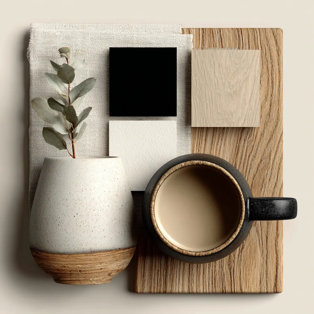
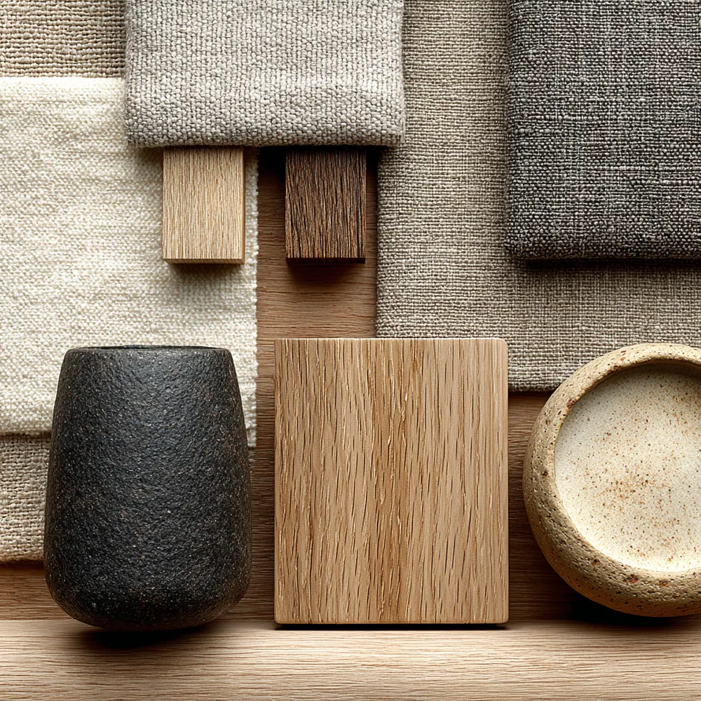
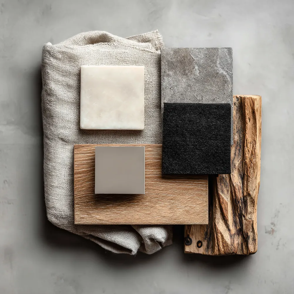
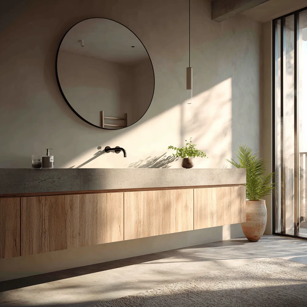
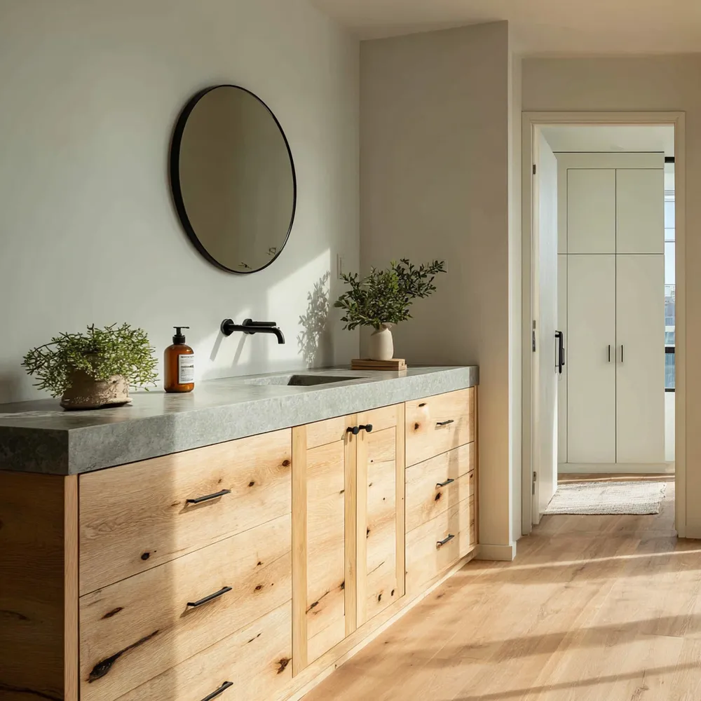
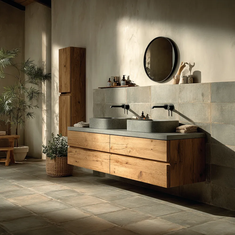
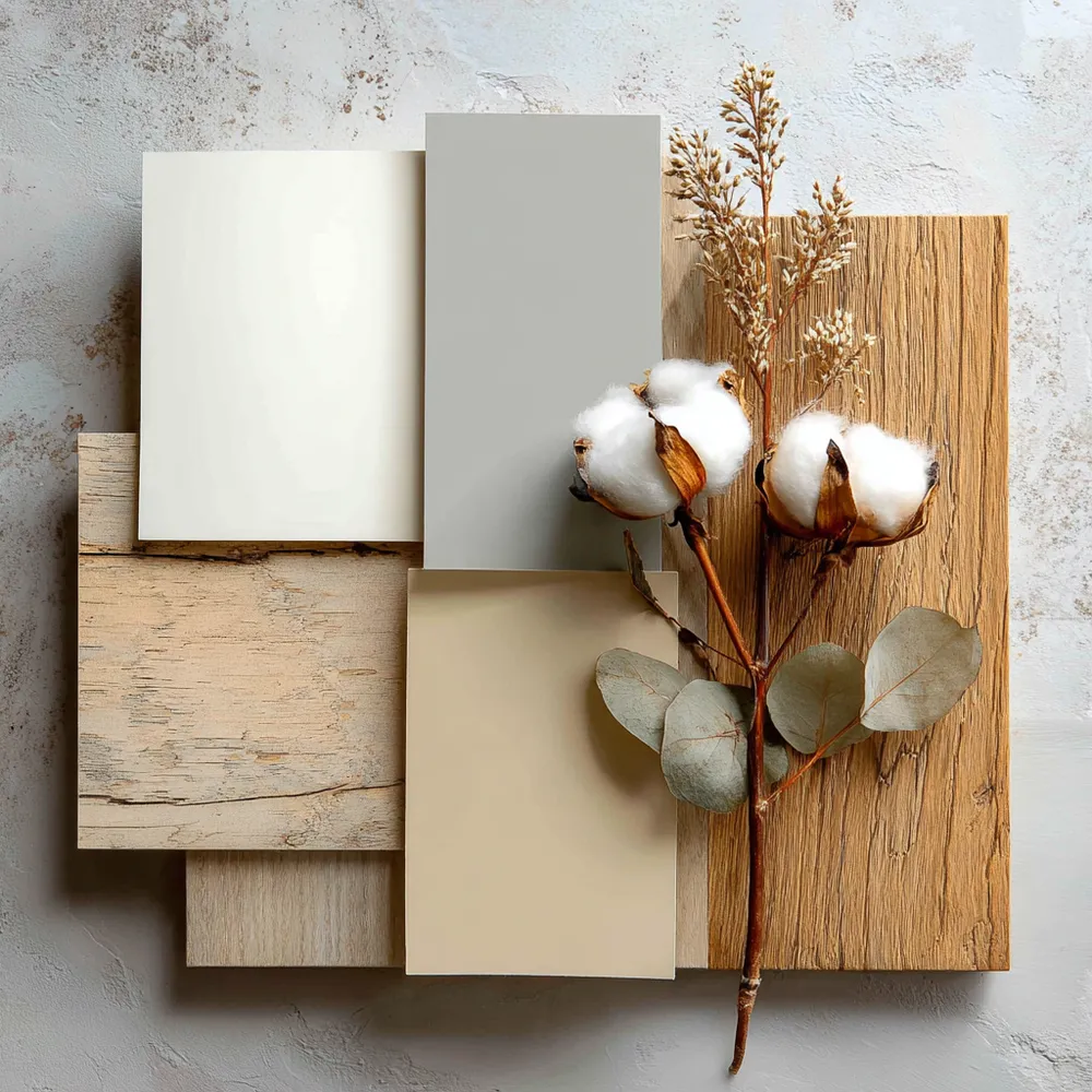
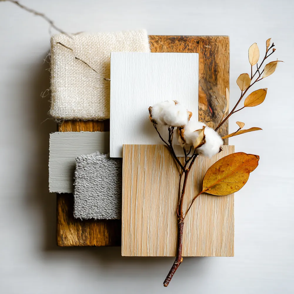
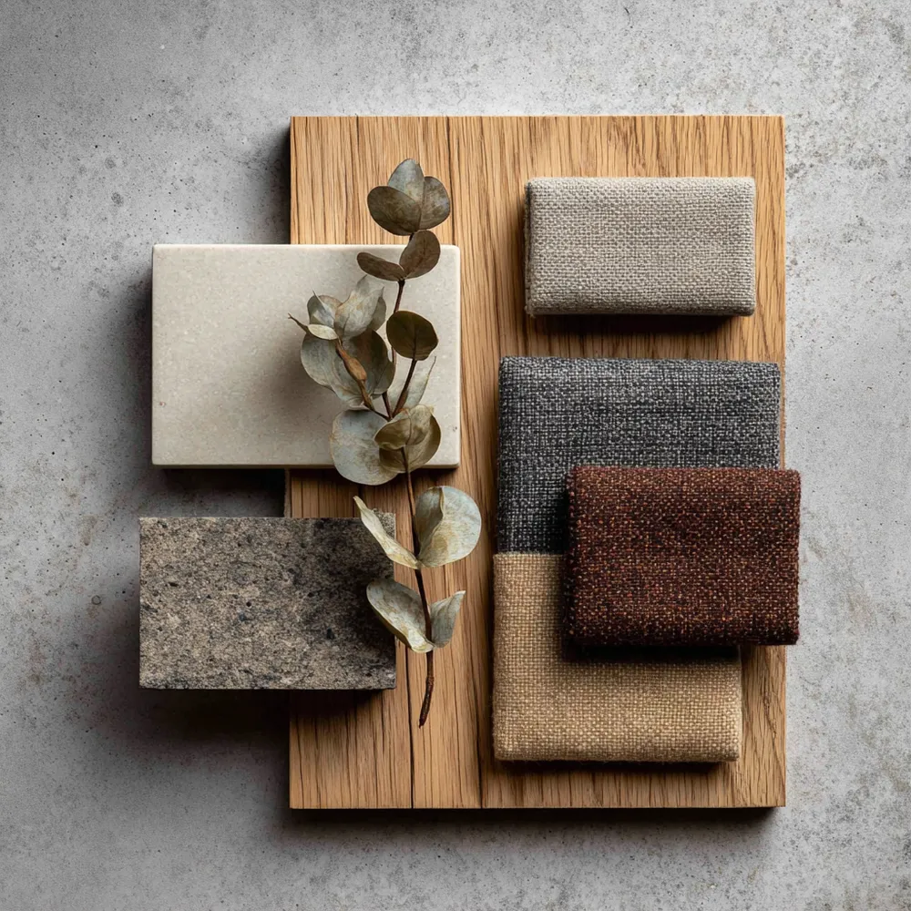
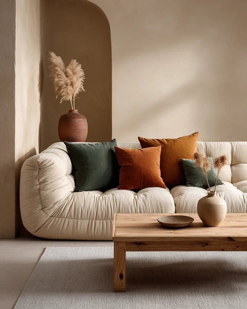
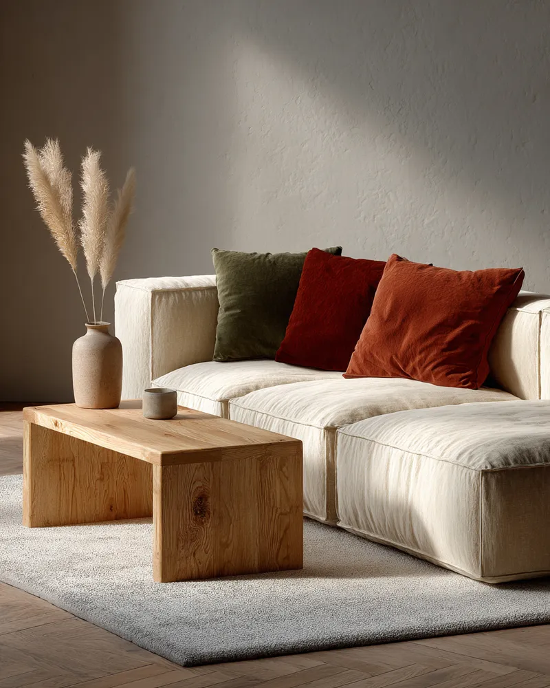
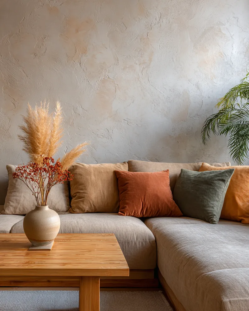
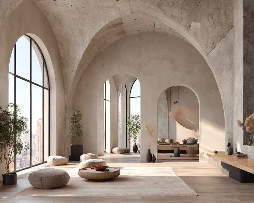
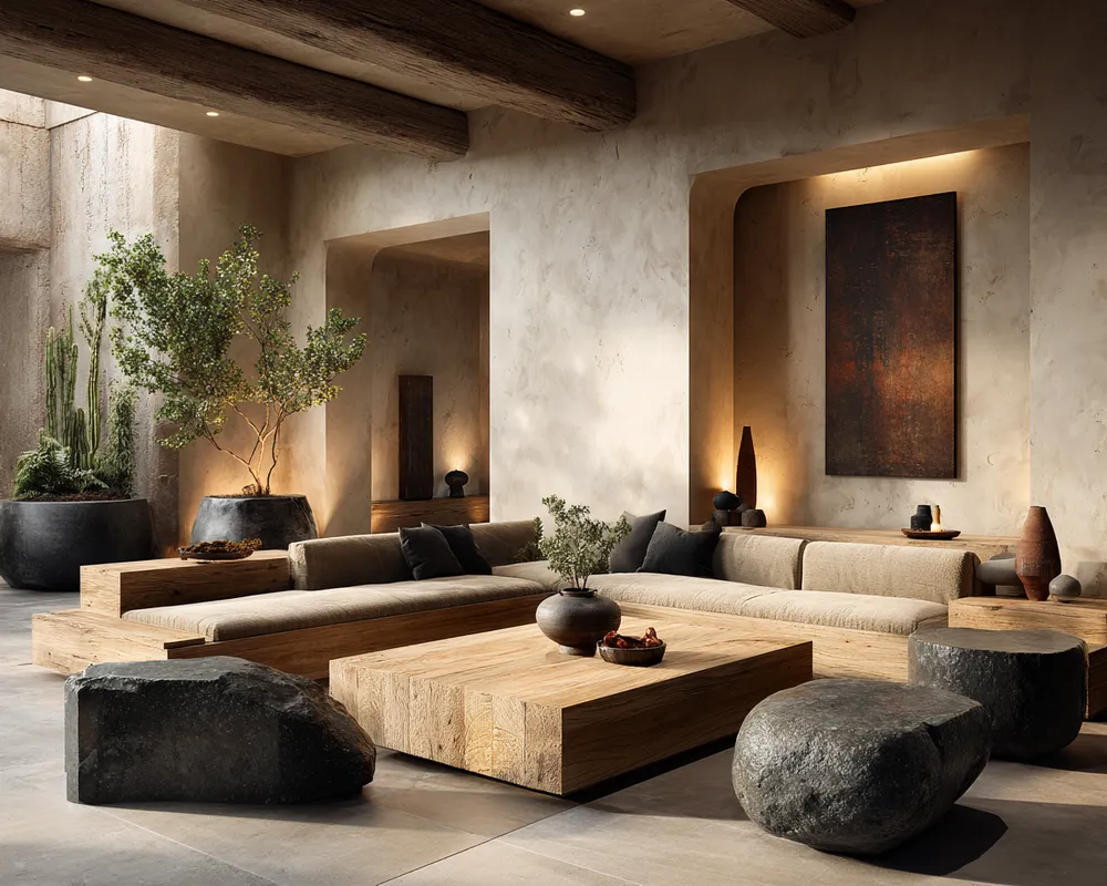
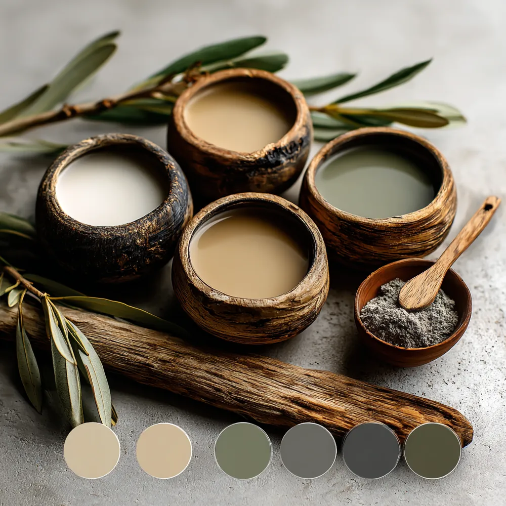
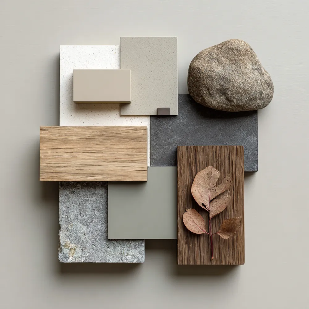
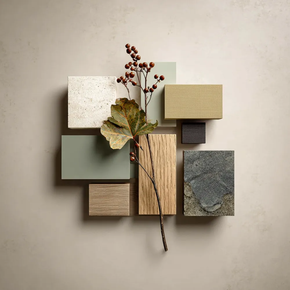
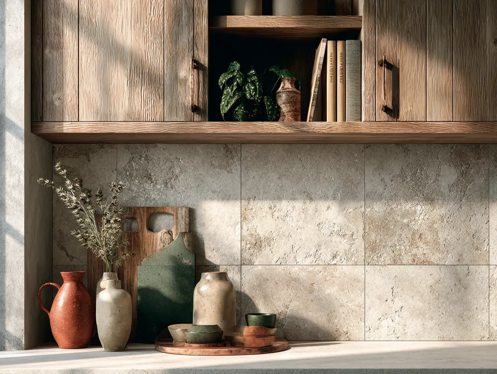
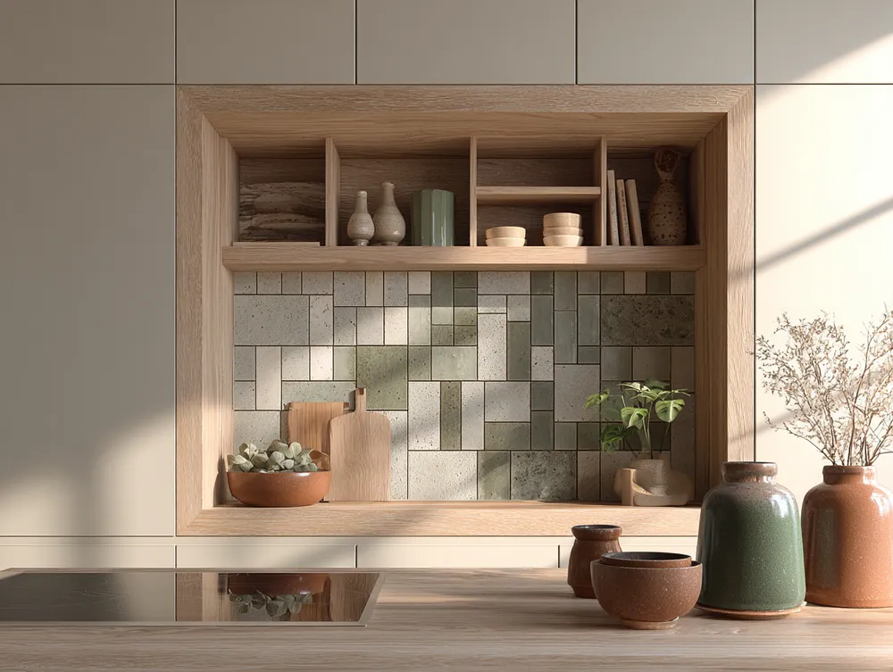
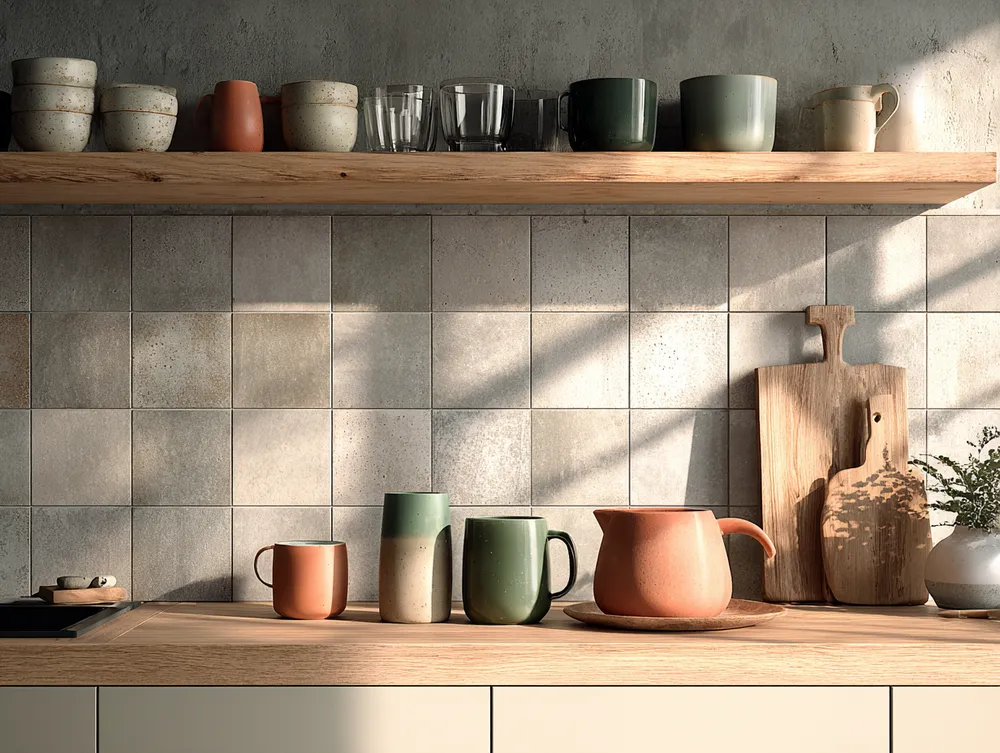
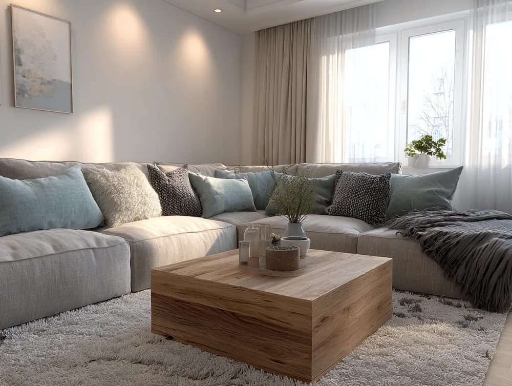
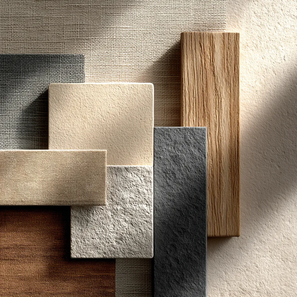
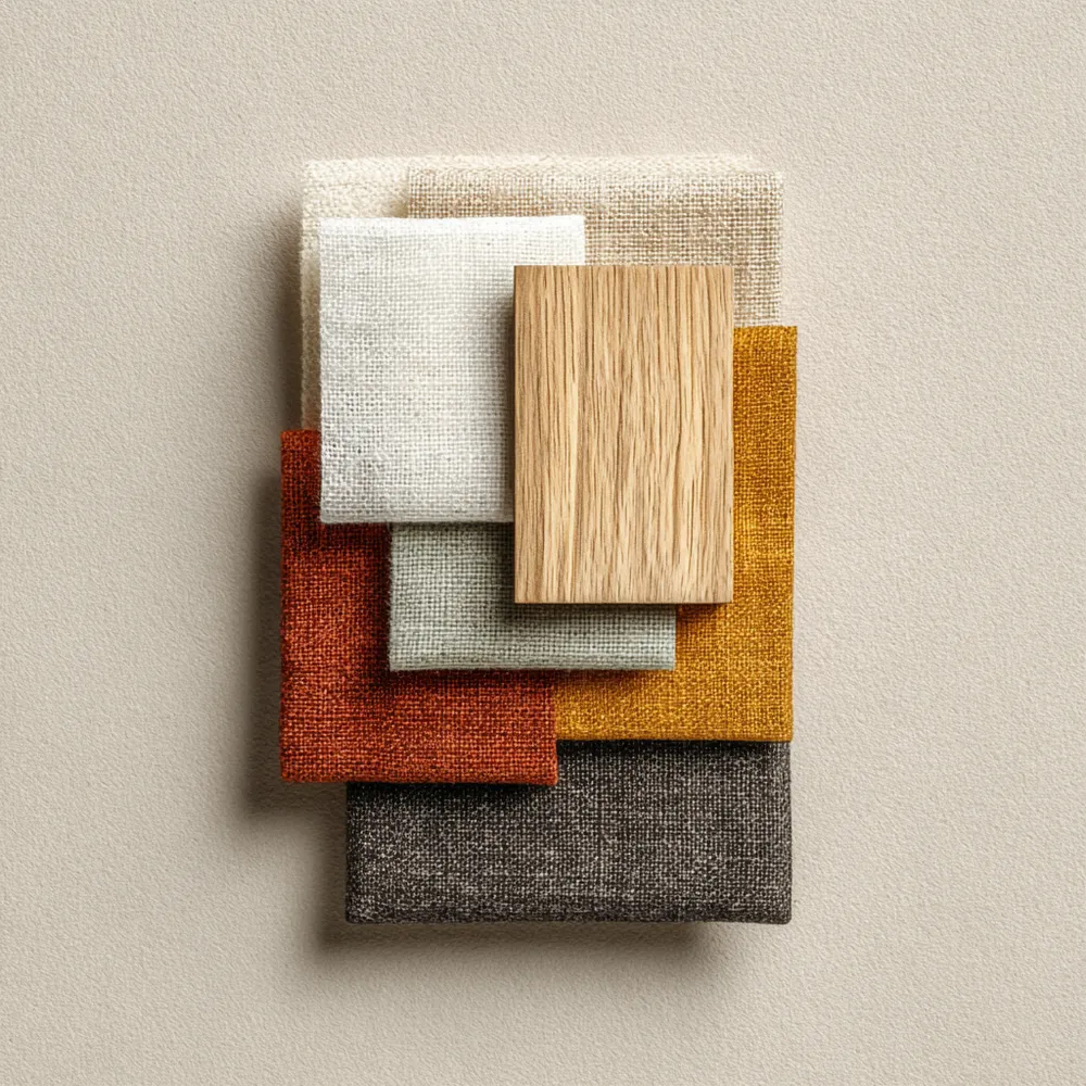
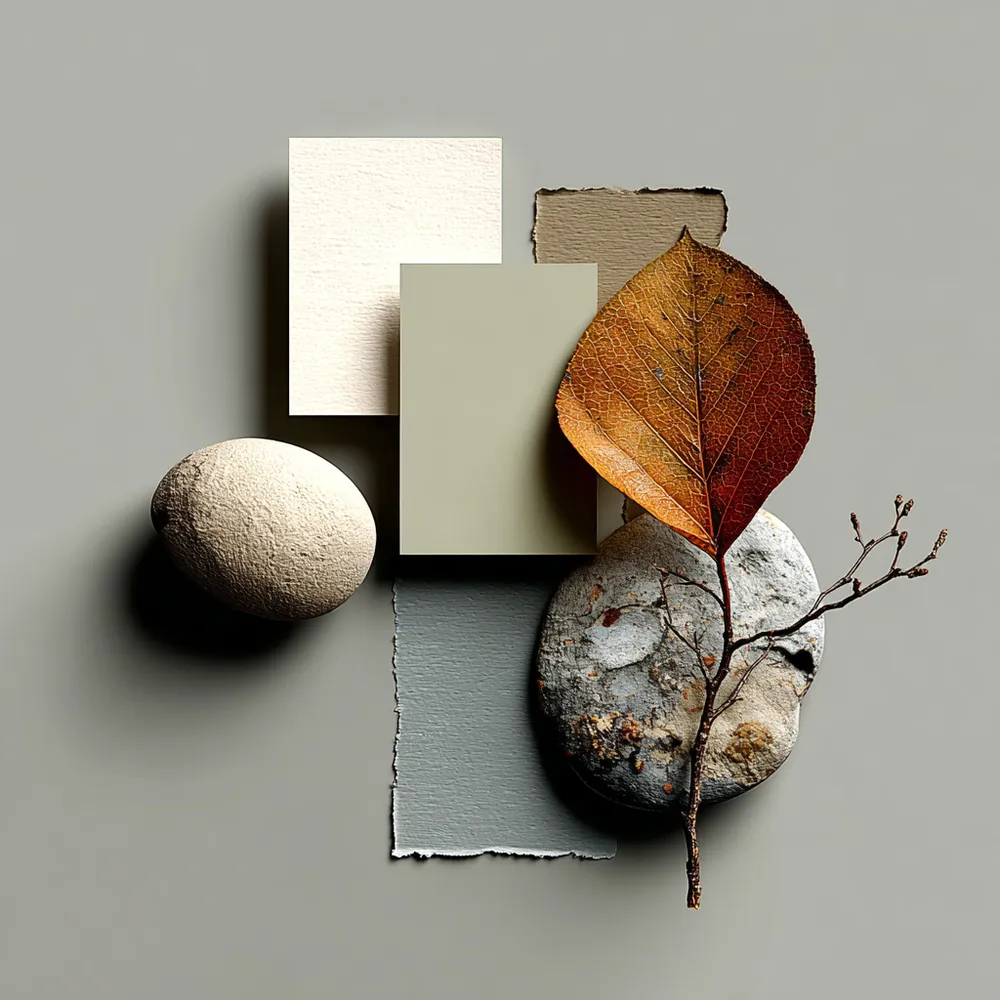
The Japandi color palette is the soul of its serene aesthetic. It’s a masterful blend of Japanese restraint and Scandinavian warmth, creating a peaceful and grounding atmosphere. 🌿
Embrace these hues for your Japandi home:
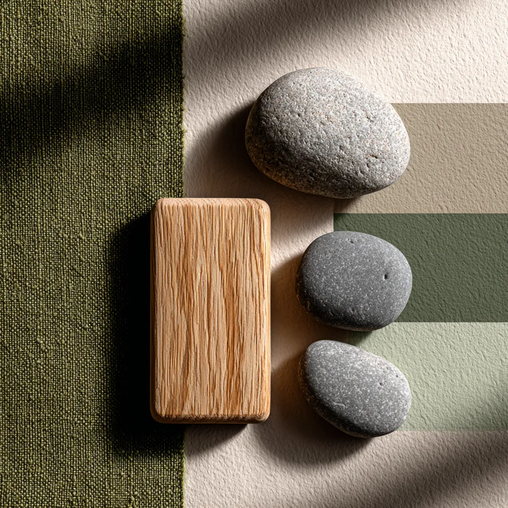
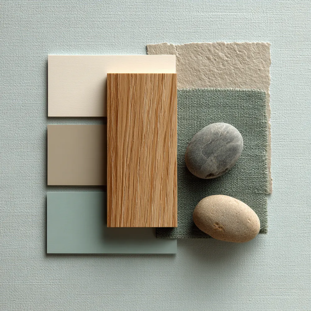
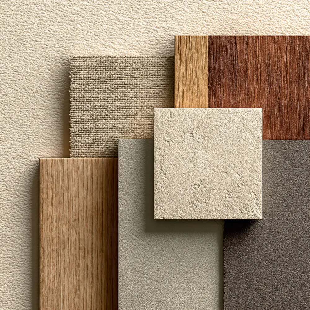
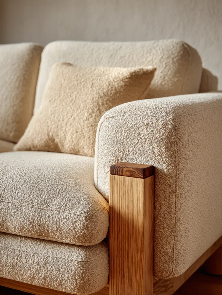
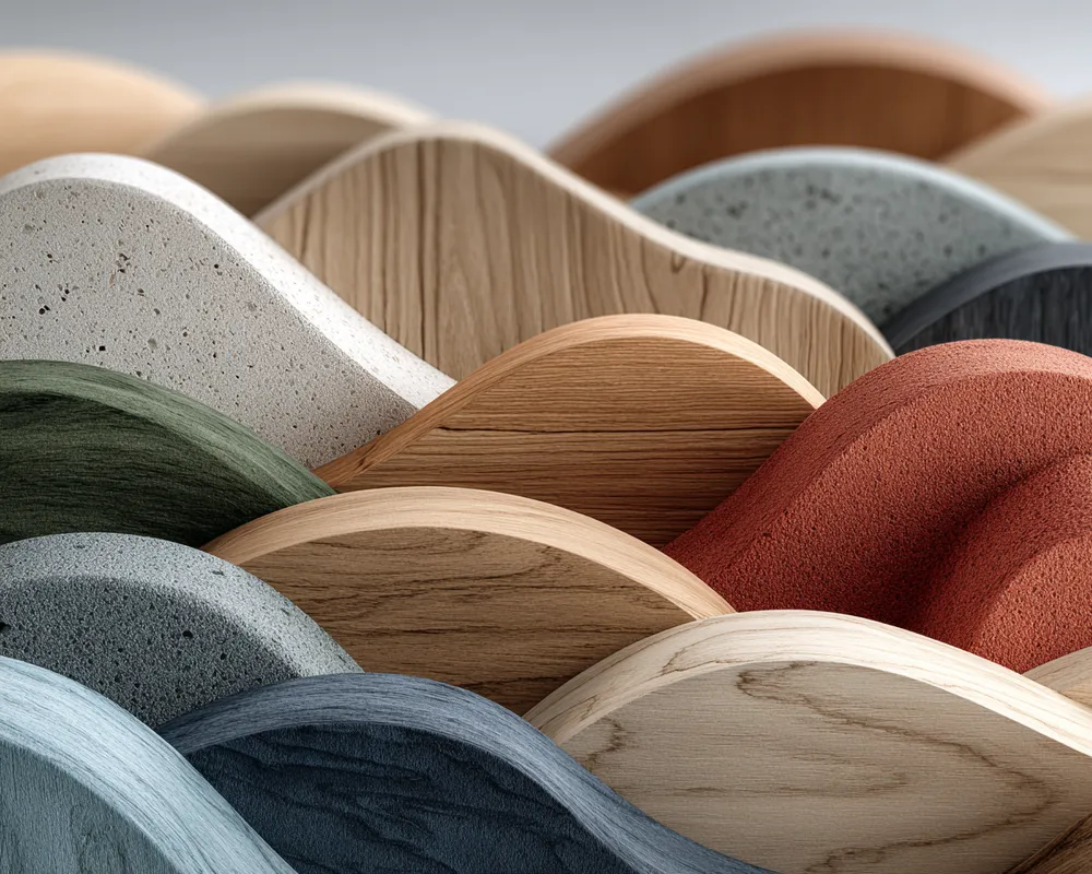
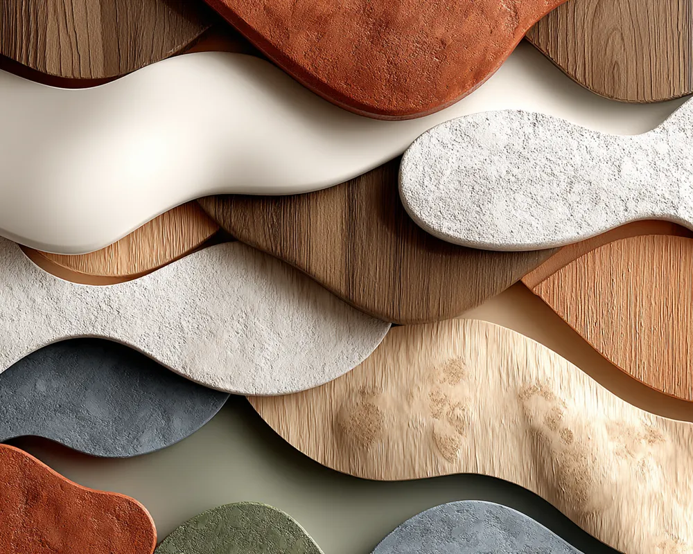
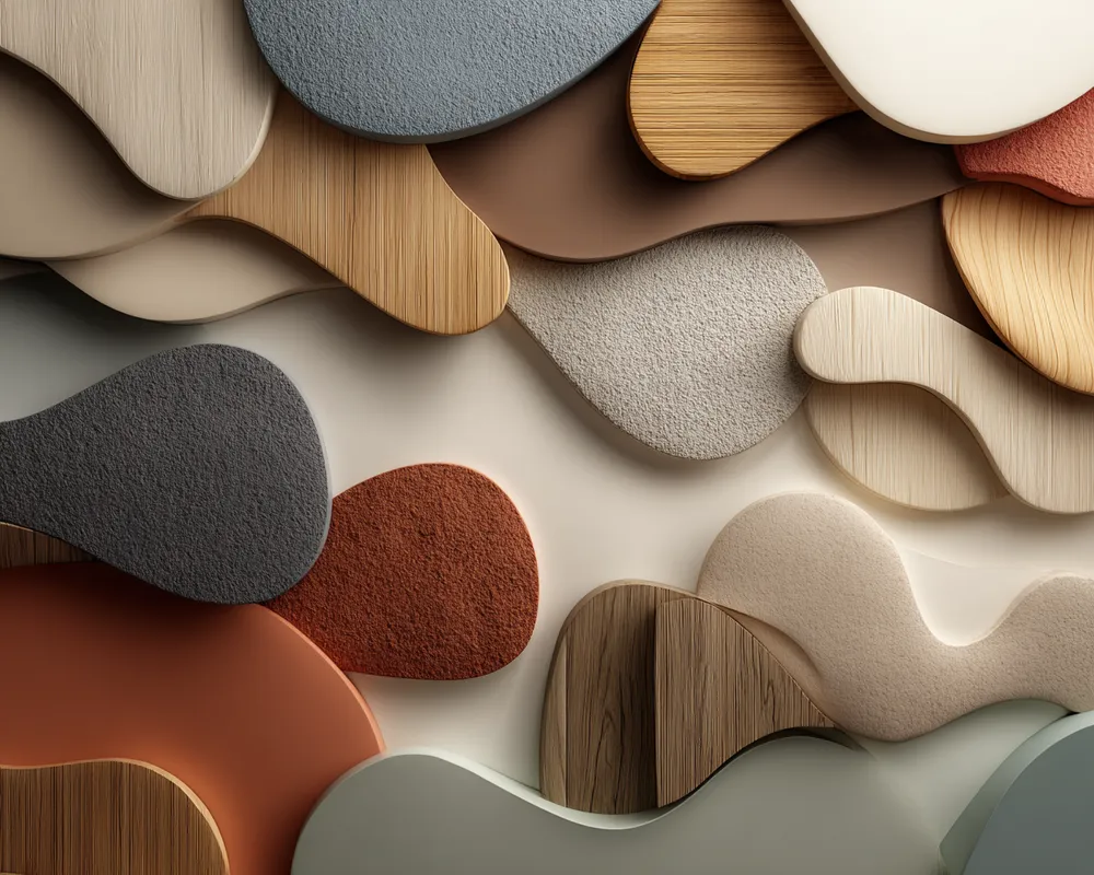
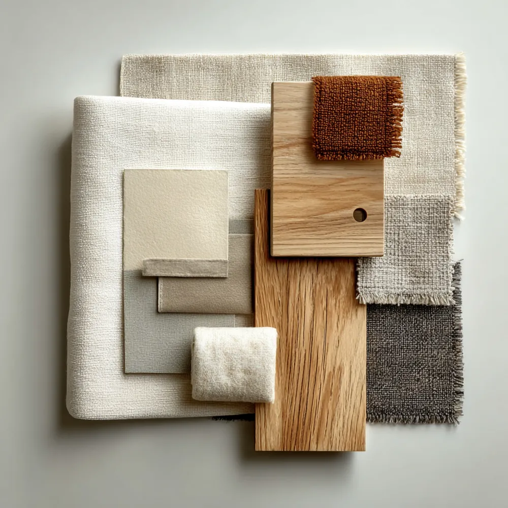
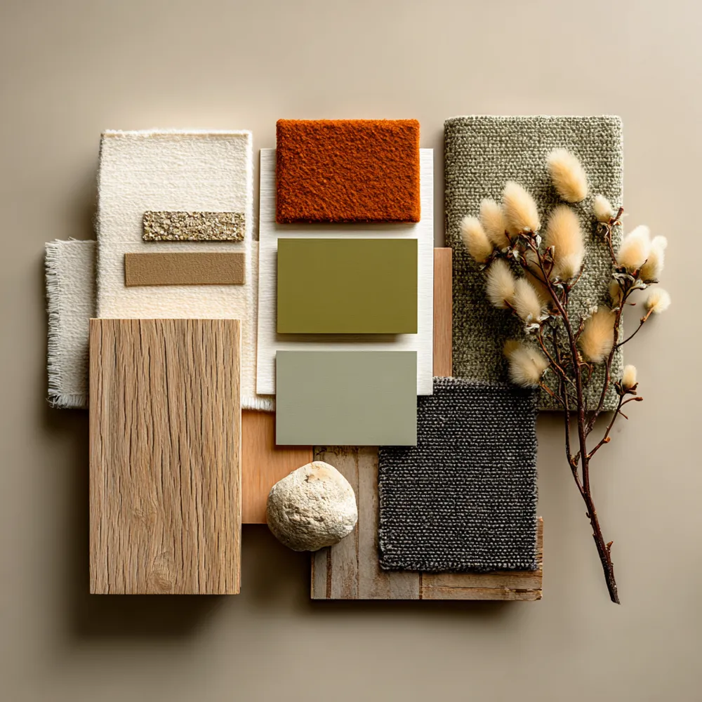
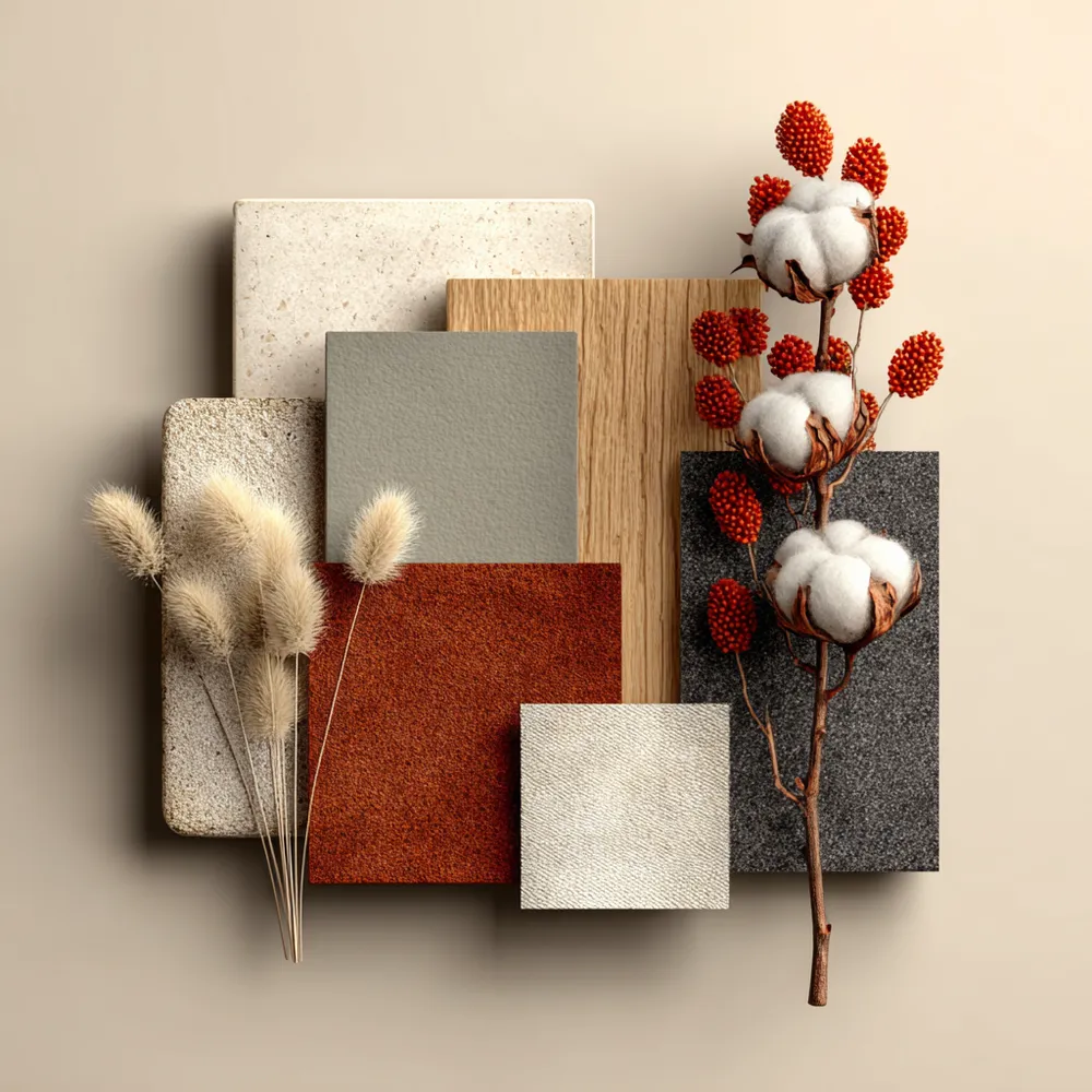
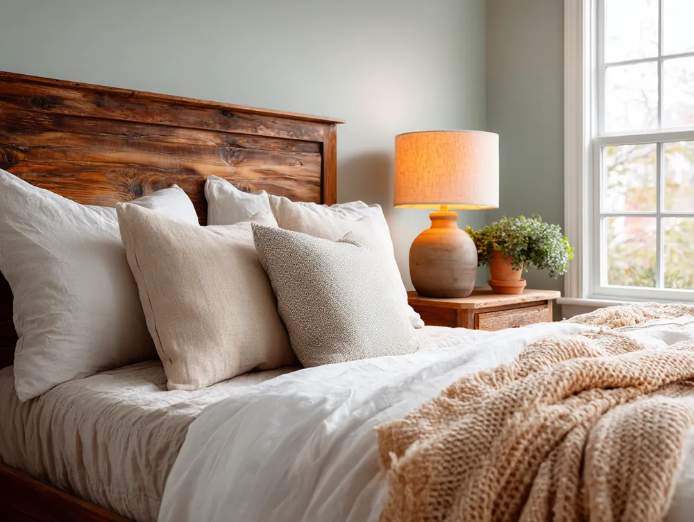
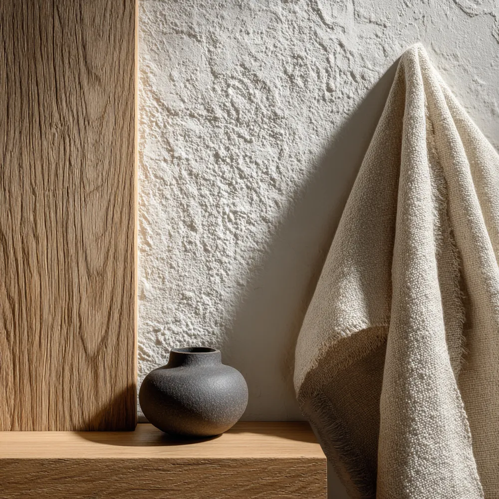
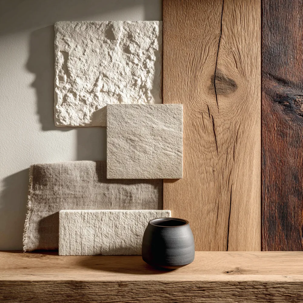
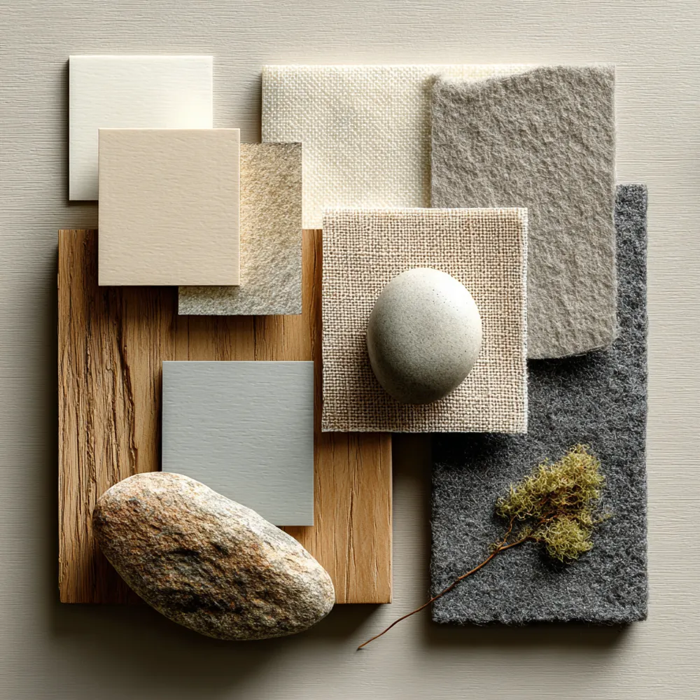
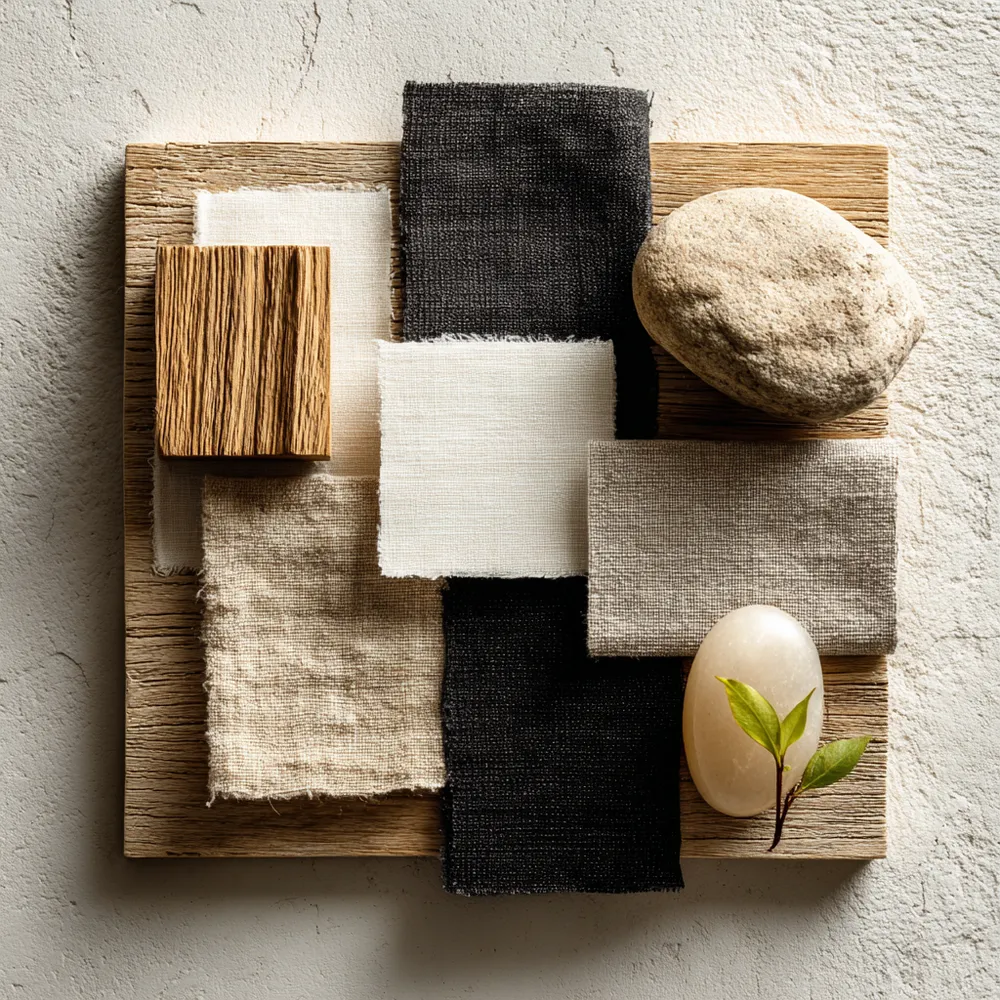
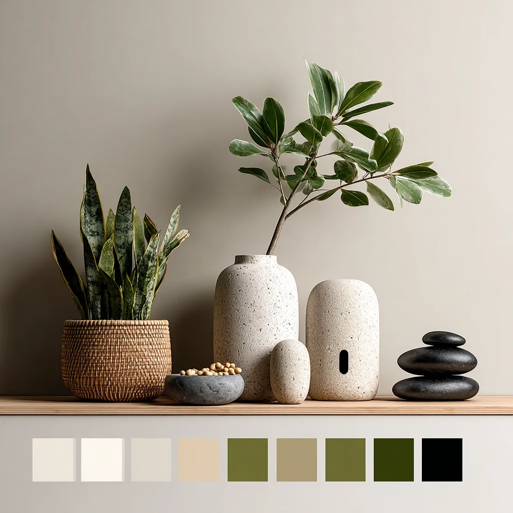
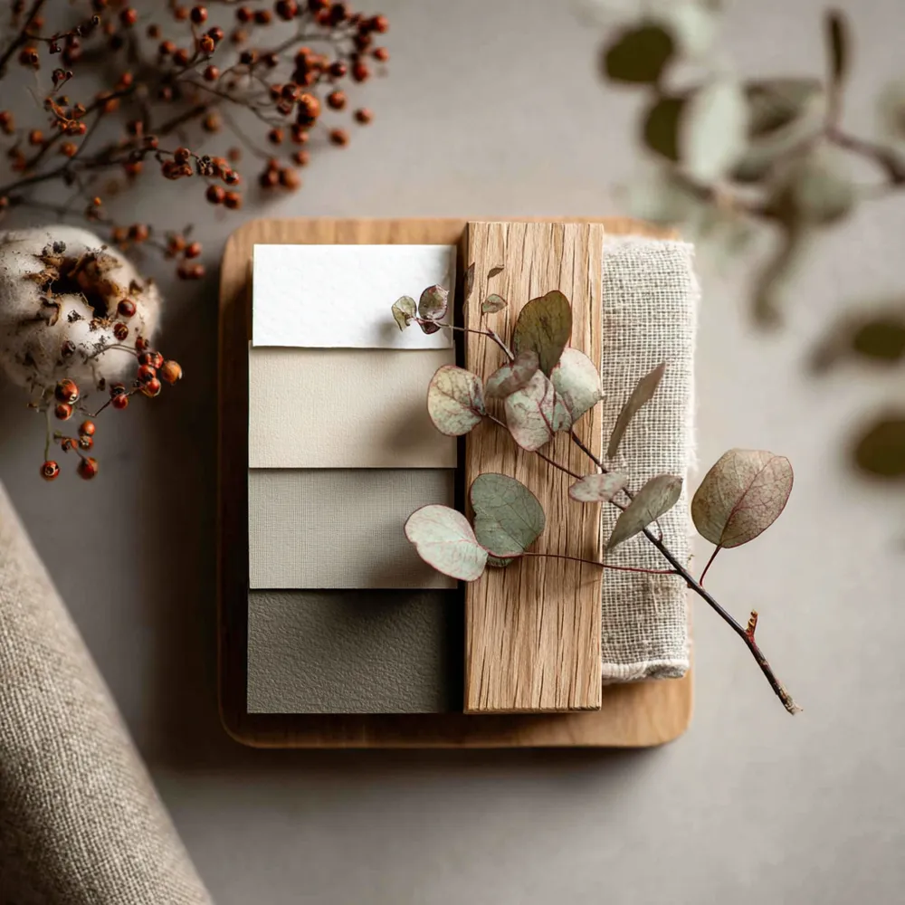
1. **Neutrals as a Base:** Whites, off-whites, creams, and light grays are your foundation.
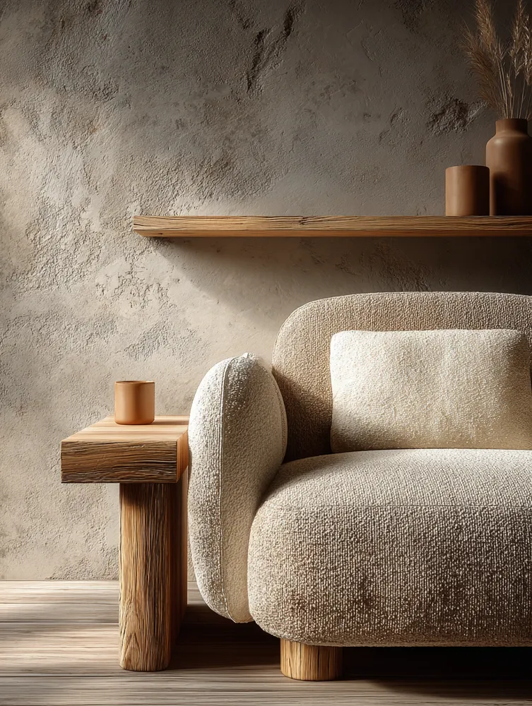
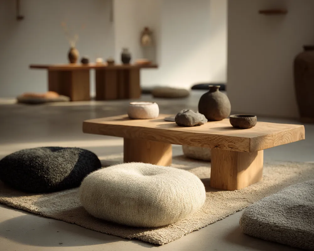
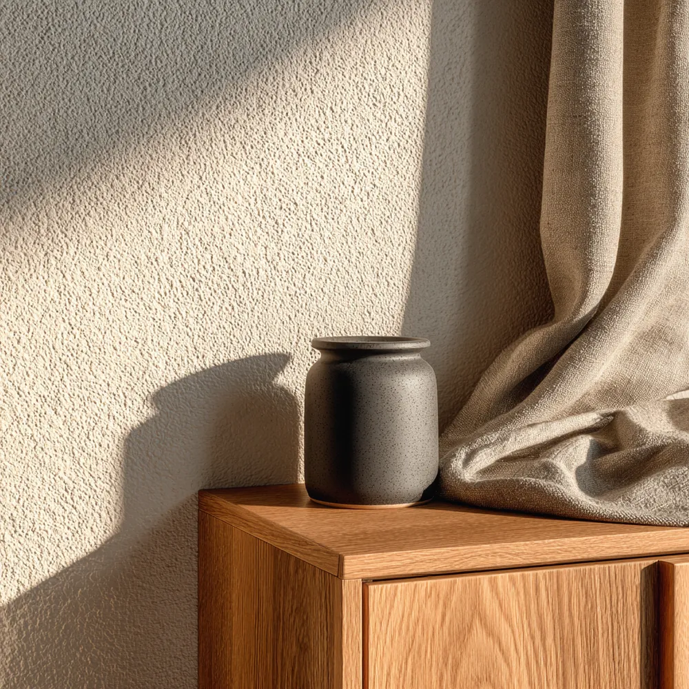
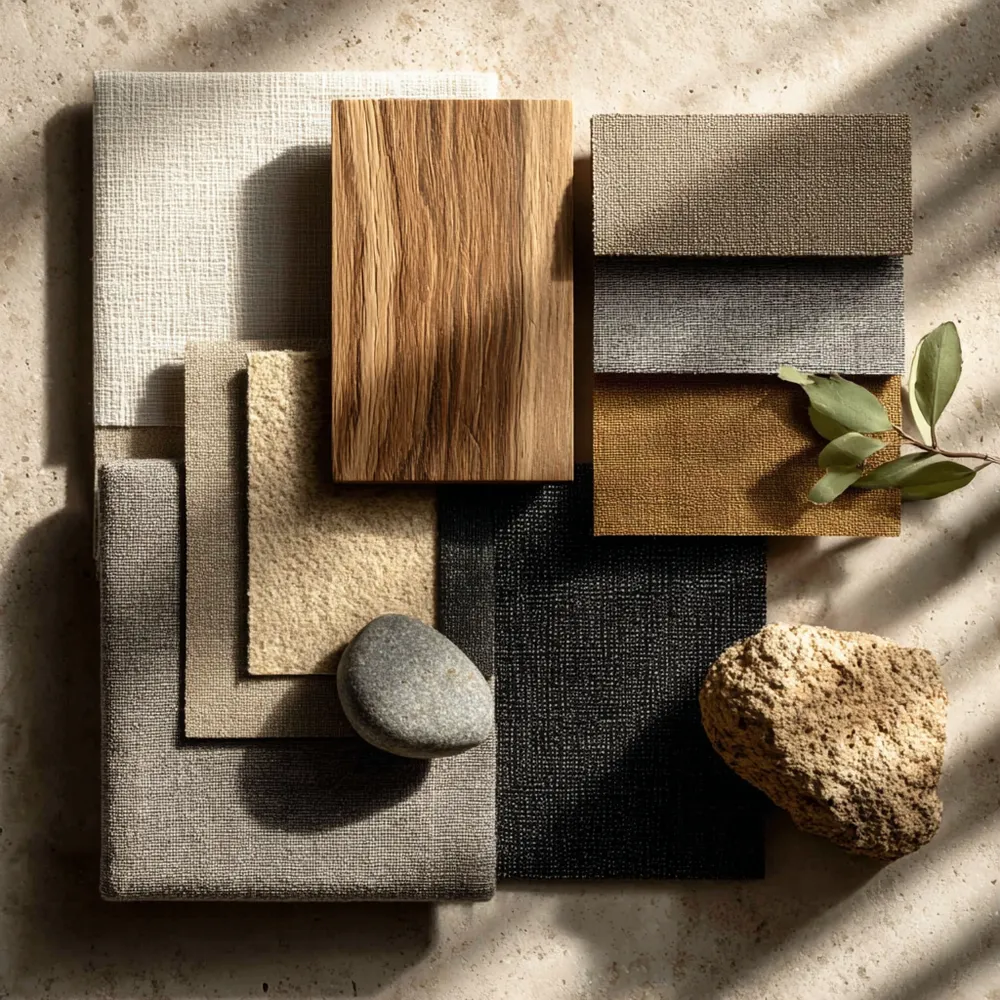
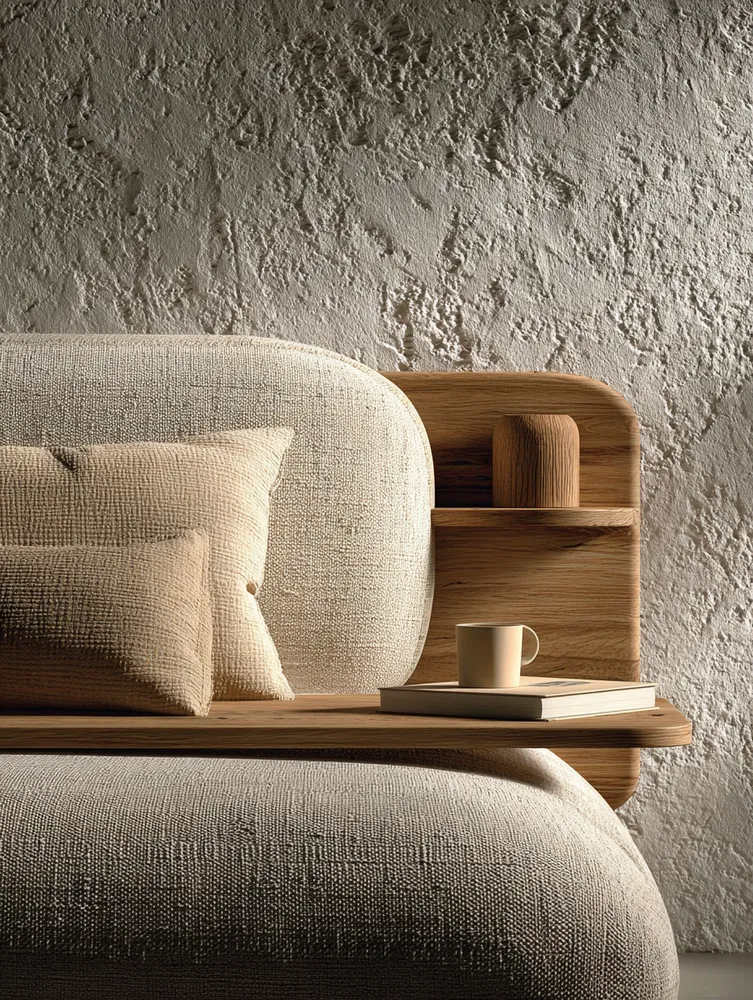
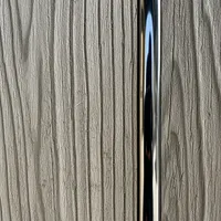
2. **Earthy Tones:** Think warm beiges, muted browns, and soft terracotta. 🤎
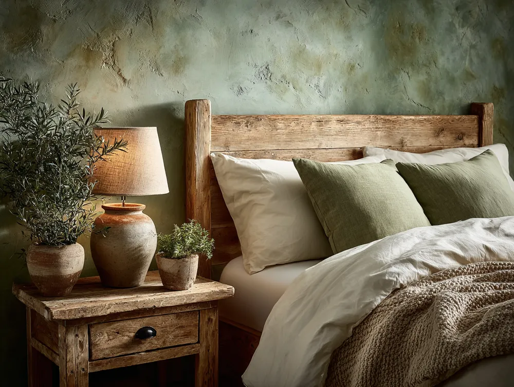
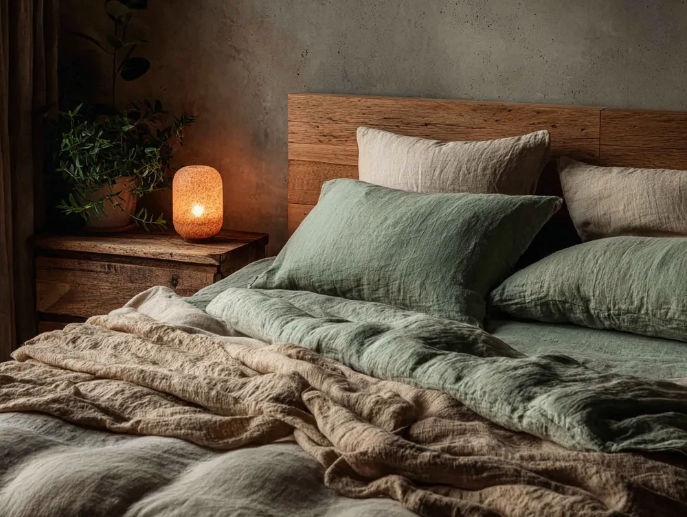
3. **Subtle Greens:** Olive green, sage, or muted moss tones bring the outdoors in.
4. **Natural Wood Tones:** The varying shades of wood act as a beautiful accent. 🪵
5. **Occasional Black Accents:** Used sparingly for definition and contrast, often in hardware or minimalist frames. 🖤
Keep your palette intentionally restrained for maximum tranquility. Save this for your color scheme inspo! #ColorPaletteIdeas #JapandiColorPaletteIdeas #MinimalistColorIdeas #HomeDecorColorIdeas #NeutralColorIdeas #EarthyTones #InteriorDesignPalette #SereneColors #ScandiMinimalism #CalmSpaces
28 oct 2025
Copiar Estilo
 Aún no hay comentarios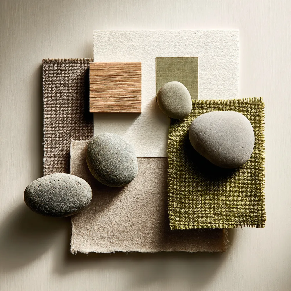
✨ Japandi Color Palette: The Serenity Secret!

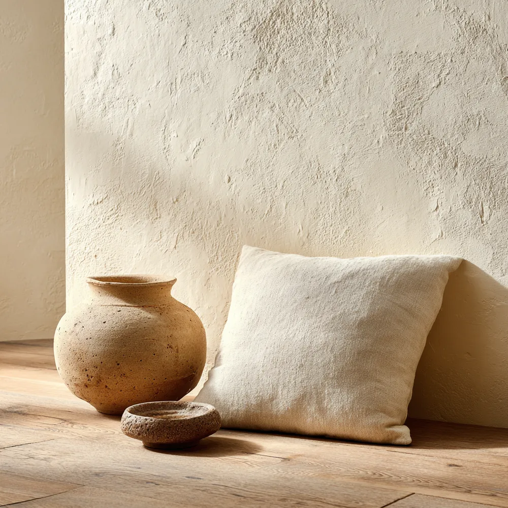
Neutral Palettes: Japandi's Serene Color Scheme 🤍

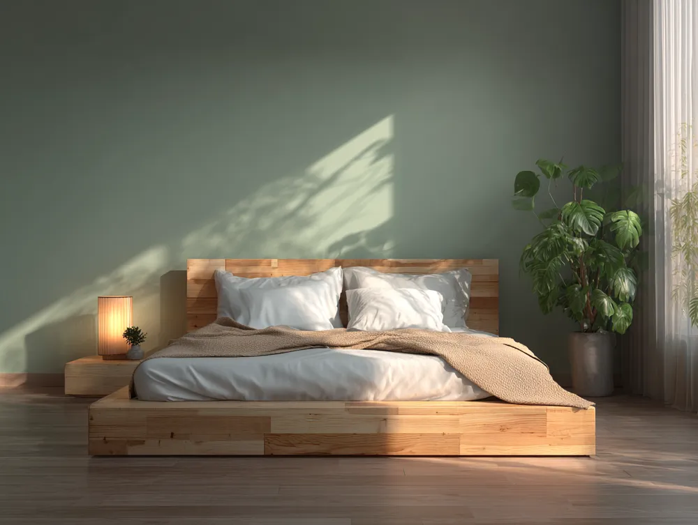
Harmonious Hues: Achieving Balance with a Natural Palette 🌿
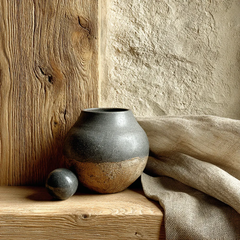
The Neutral Palette: Colors of Japandi Design 🎨
Bringing Balance: Japandi Approach to Color Palettes 🎨

Understated Elegance: The Role of Neutral Palettes in Japandi ☁️

Creating Tranquility: Japandi Color Palette Inspiration 🎨
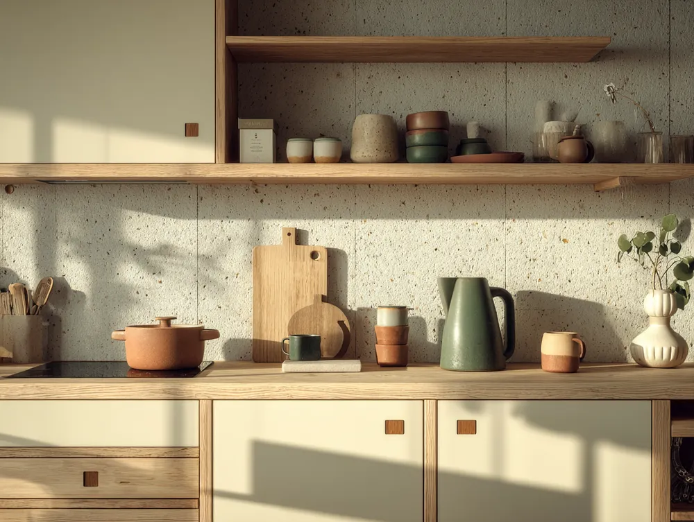
The Japandi Kitchen Palette: Neutrals & Nature Inspired Tones 🍎
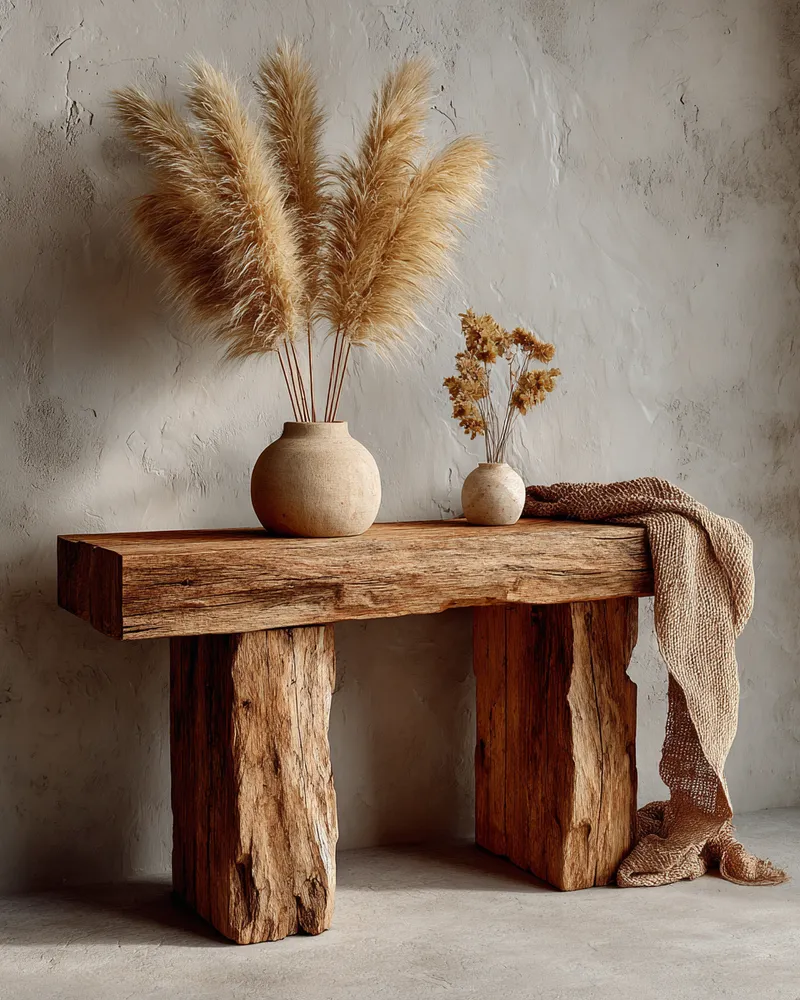
Japandi Color Palettes: The Power of Neutrals 🤍

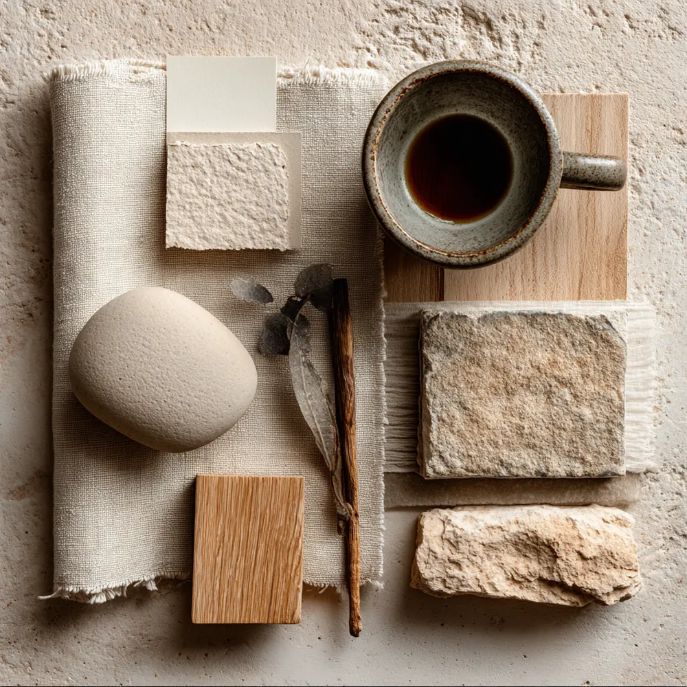
The Japandi Palette: Embracing Serene, Earthy Tones 🤍
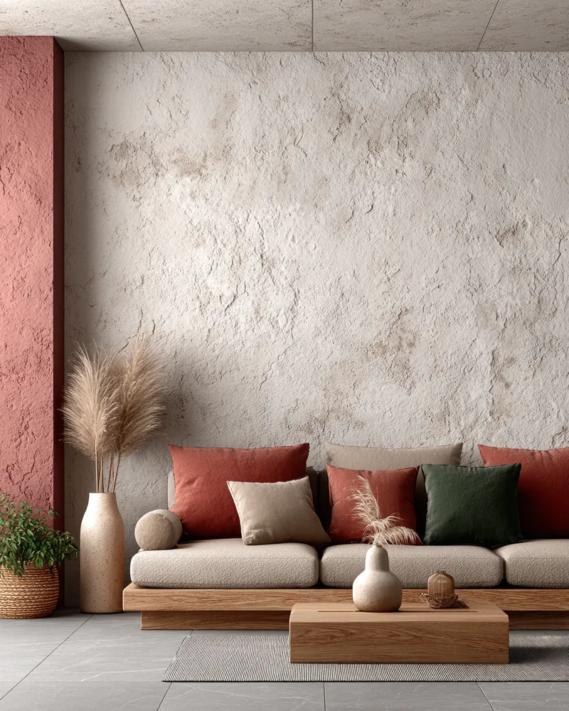
Soft Neutrals & Earthy Tones: The Japandi Color Palette 🤎

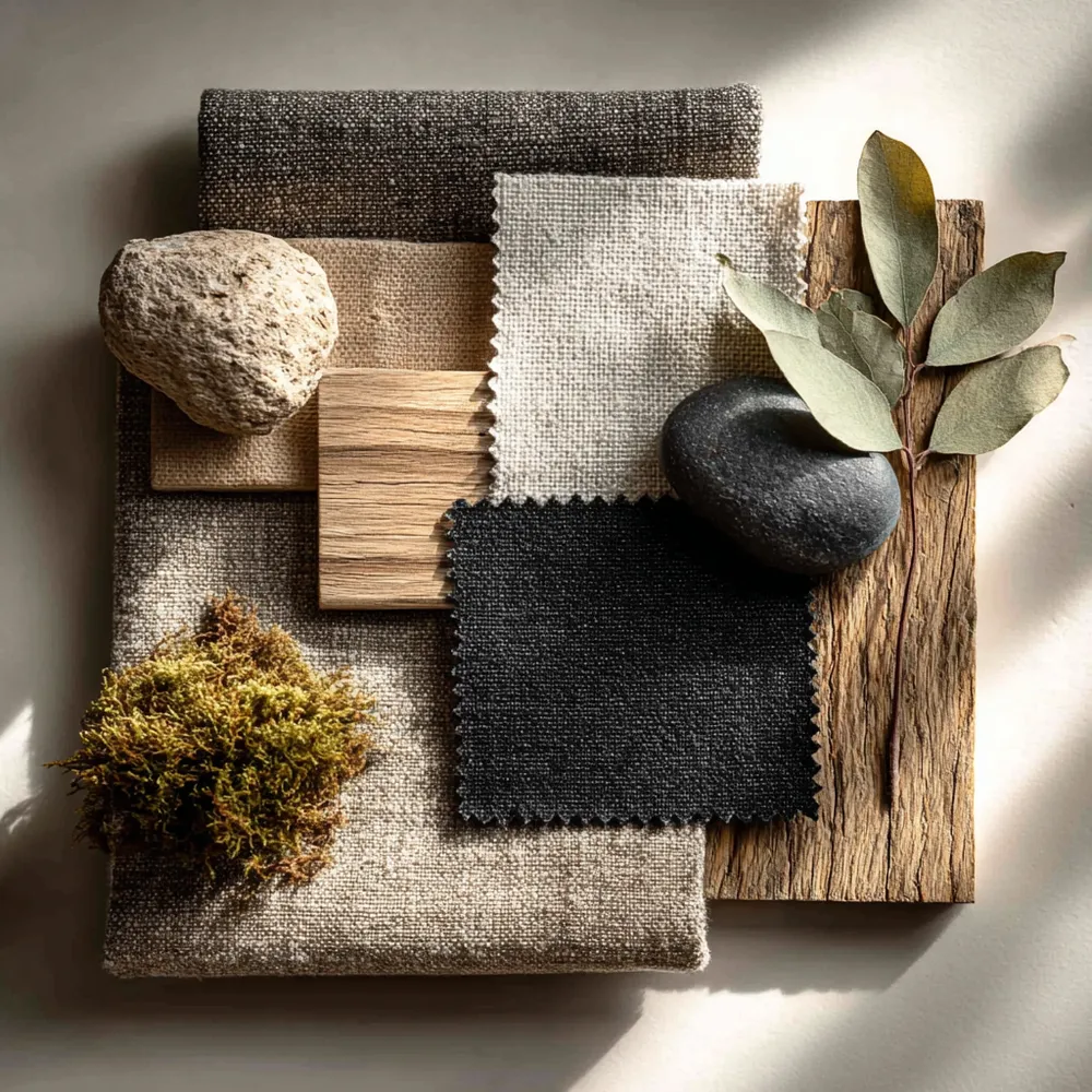
Japandi Color Palette: Soothing Neutrals & Earth Tones 🎨
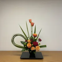

color
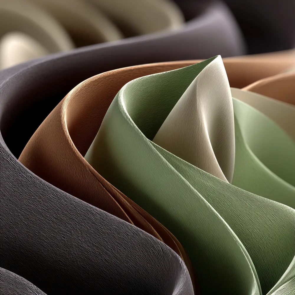
Harmonious Hues: The Japandi Color Palette 🎨

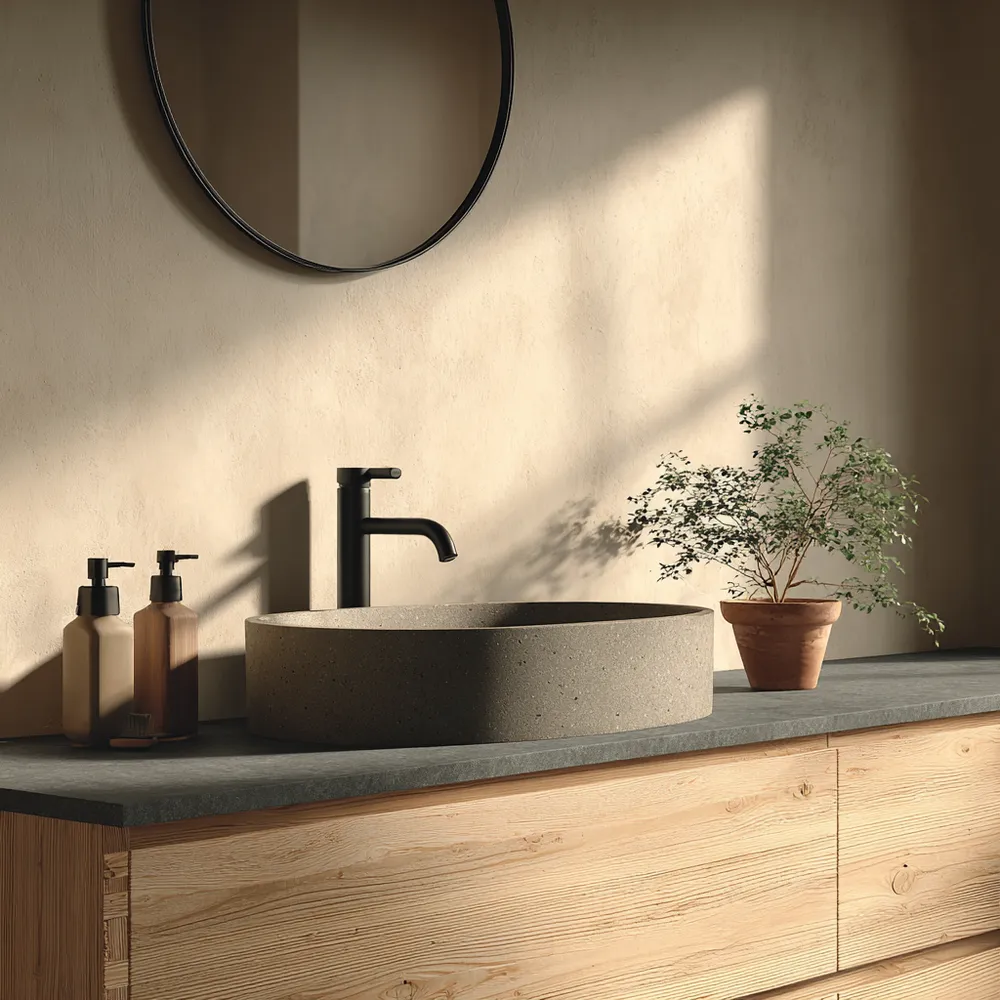
Color Palette Perfection: Japandi Bathroom Hues 🤍

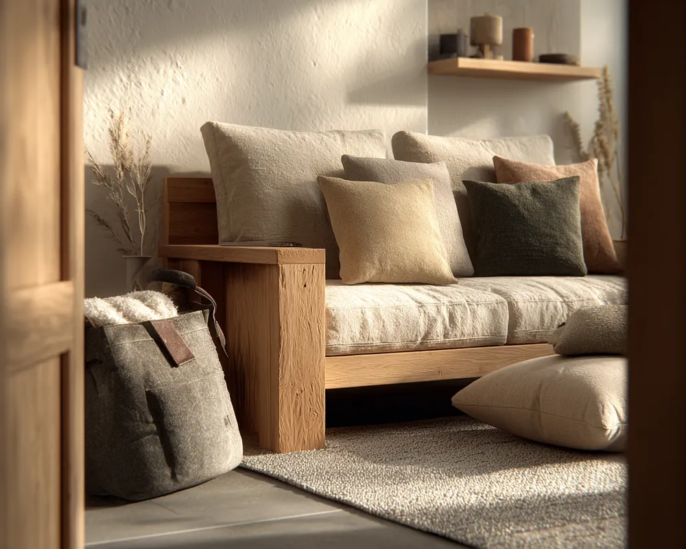
The Power of Neutrality: Japandi Color Schemes 🤍

Color Palette Perfection: Japandi Neutral Tones 🤍

My Go-To Palette: Creating Calm with Japandi Color Schemes 🎨
Creating Calm: Japandi Color Palettes for Your Home 🎨

The Japandi Color Palette: Serene & Earthy Tones 🎨