



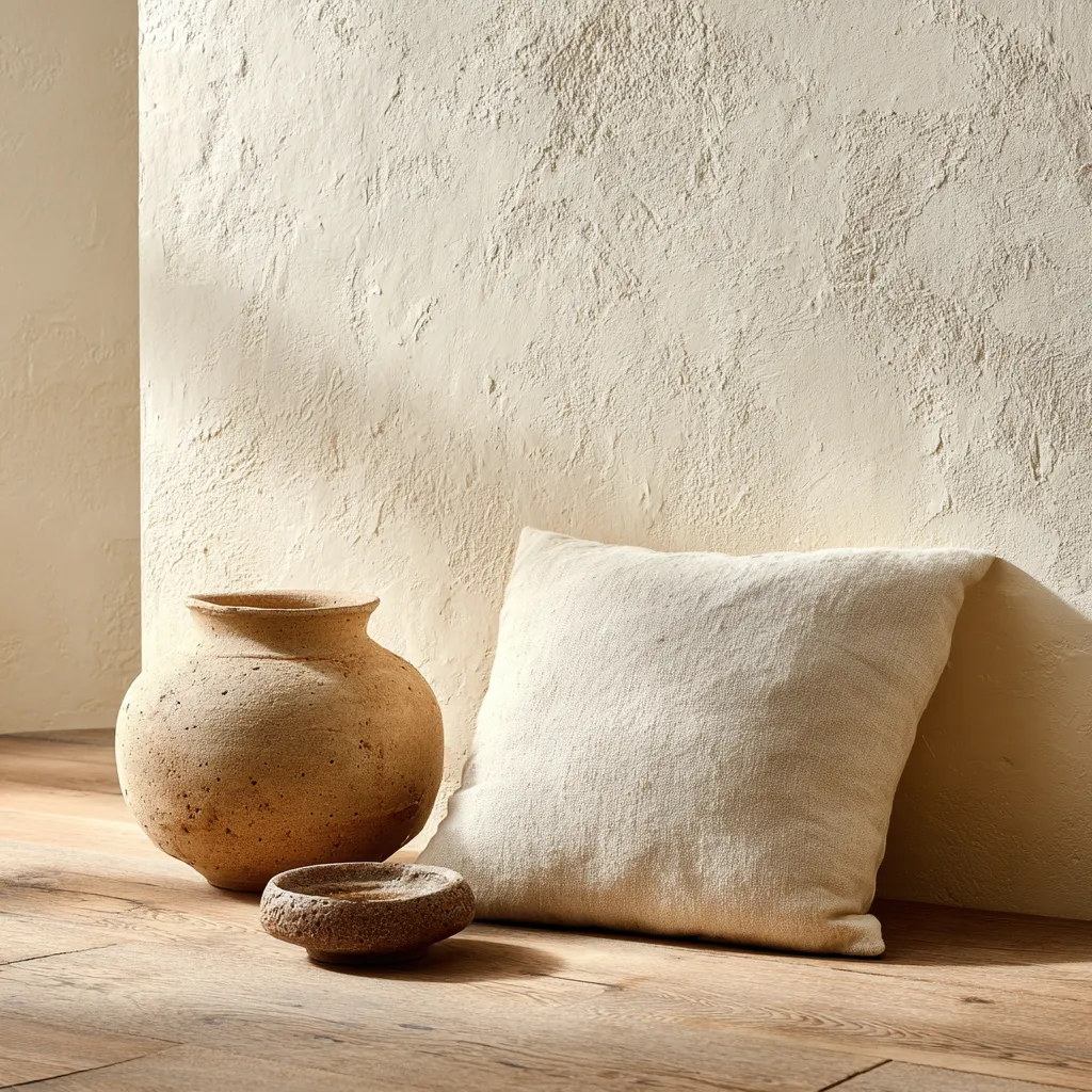
1/4

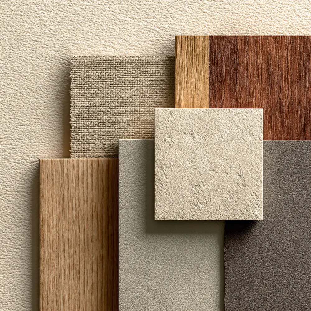
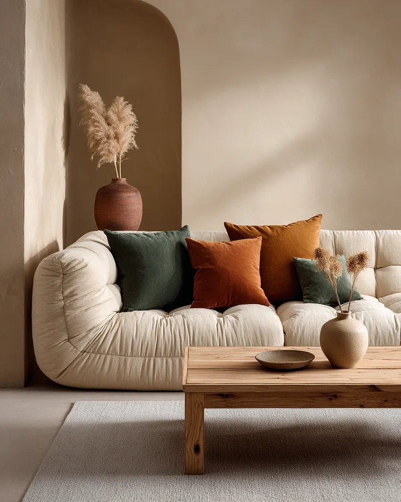
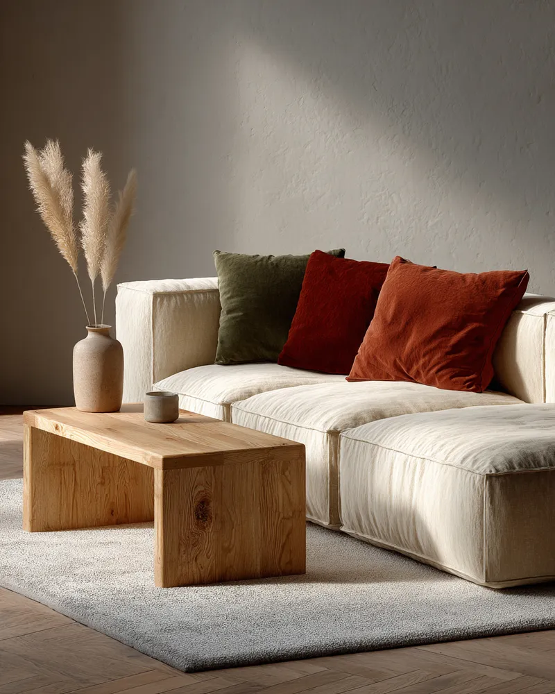
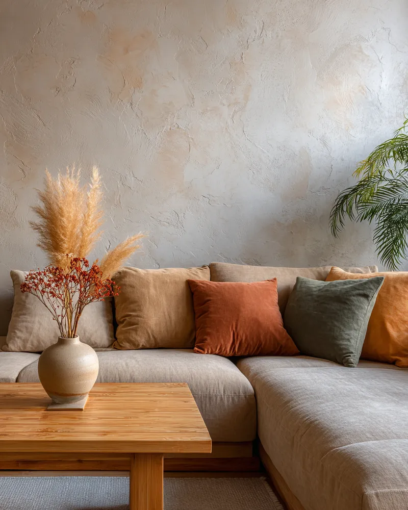
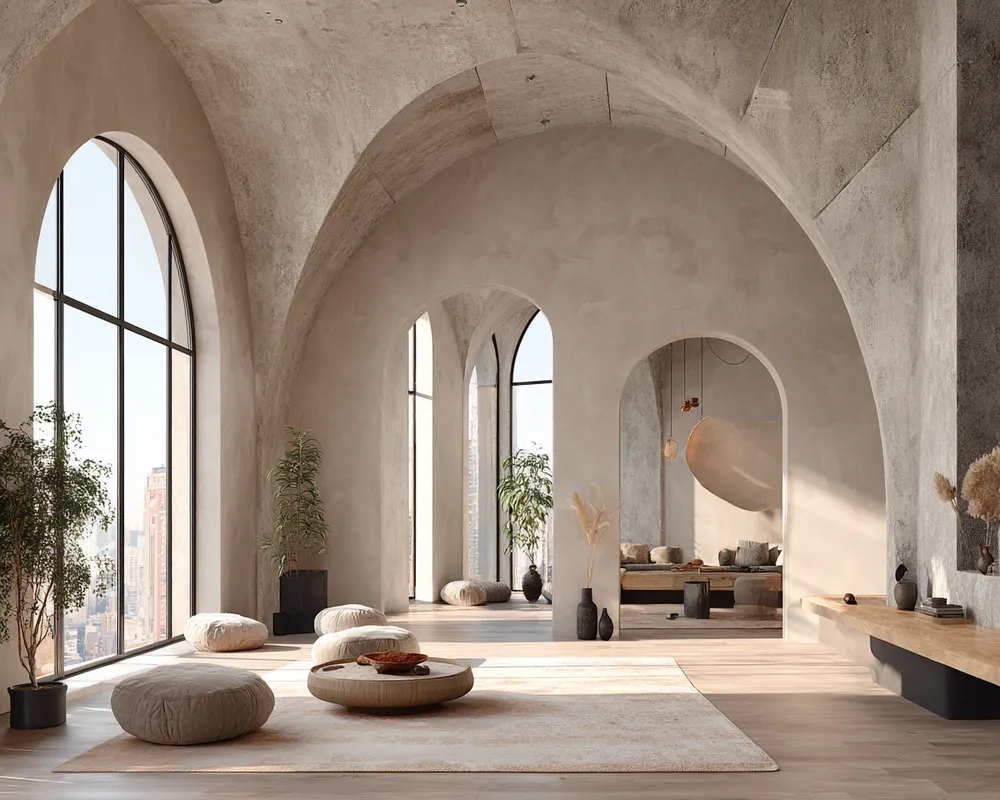
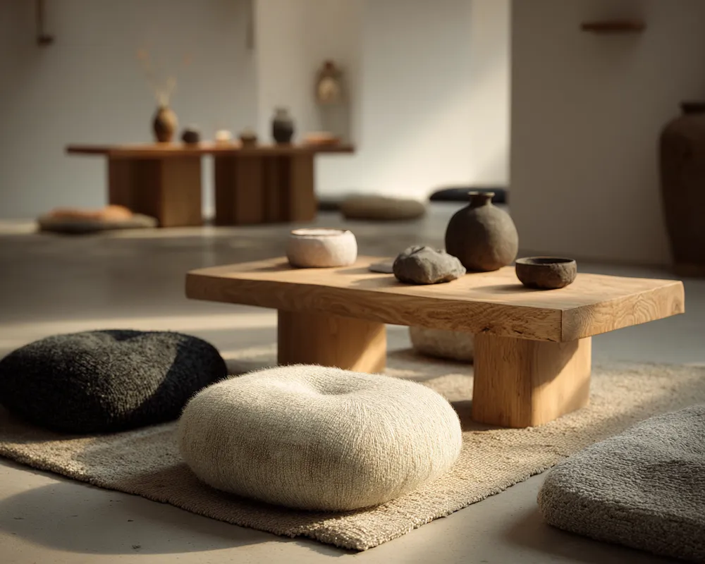
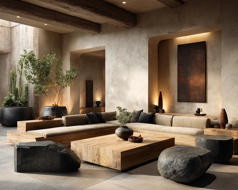
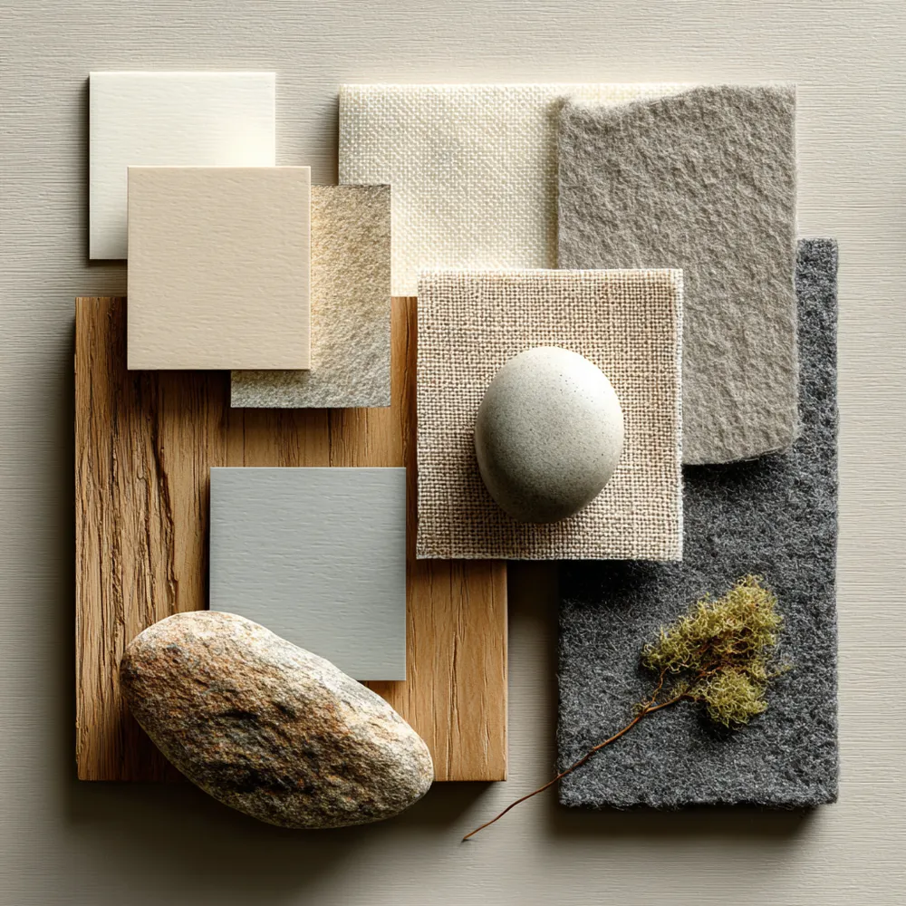
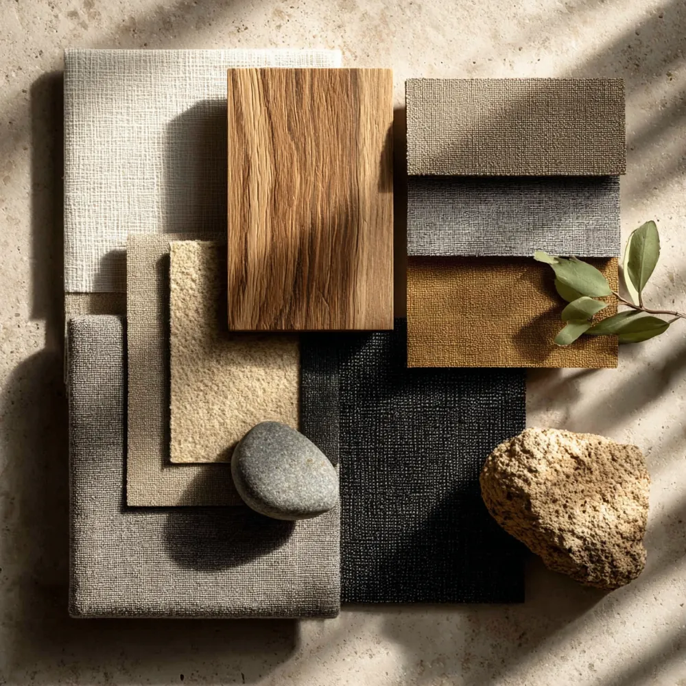
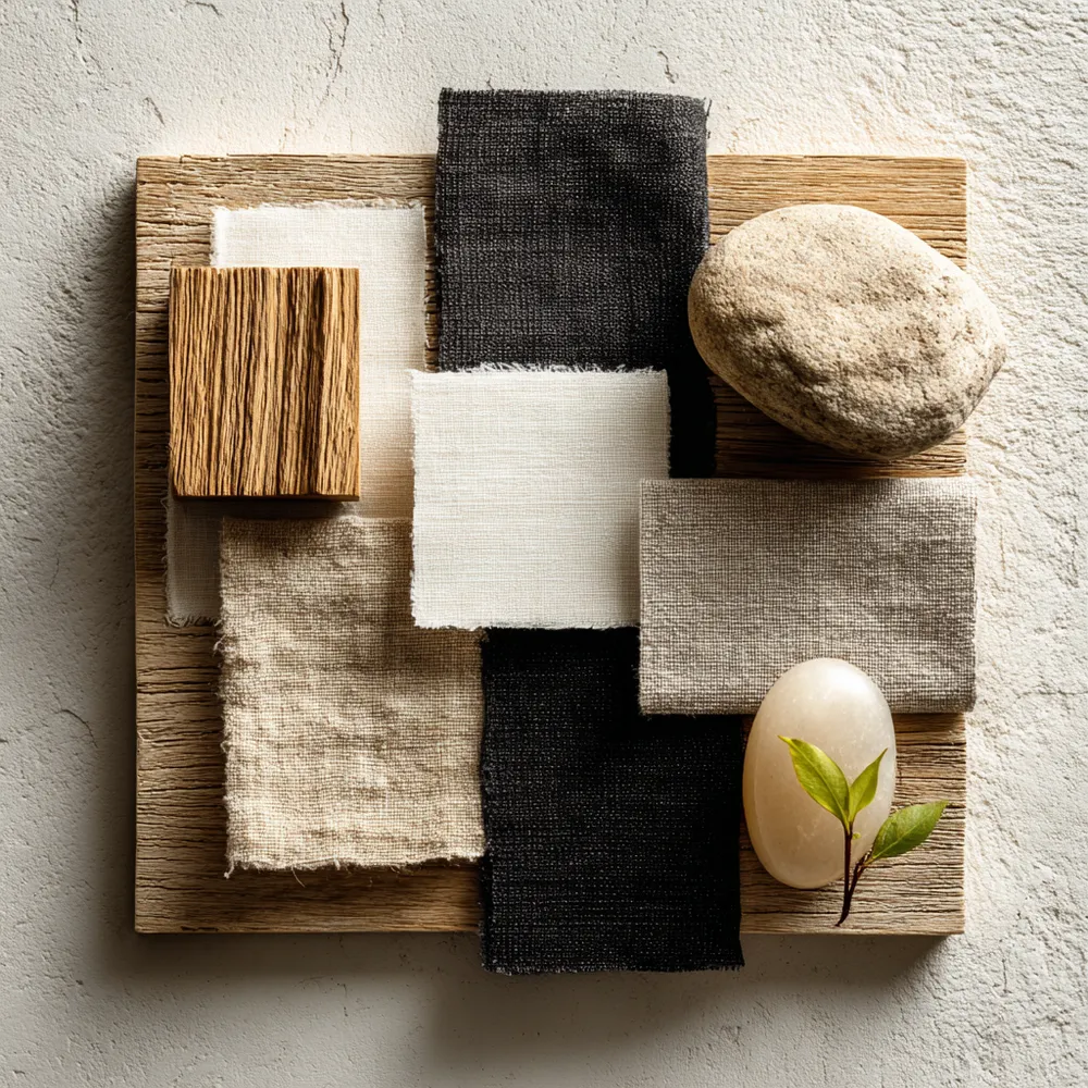
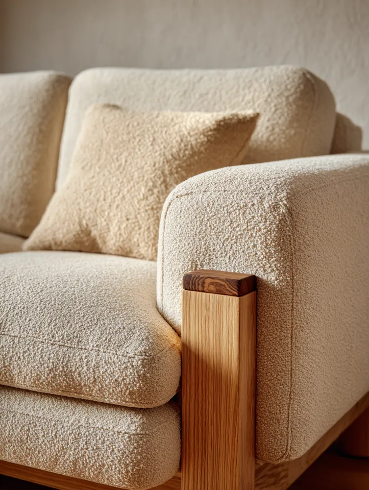
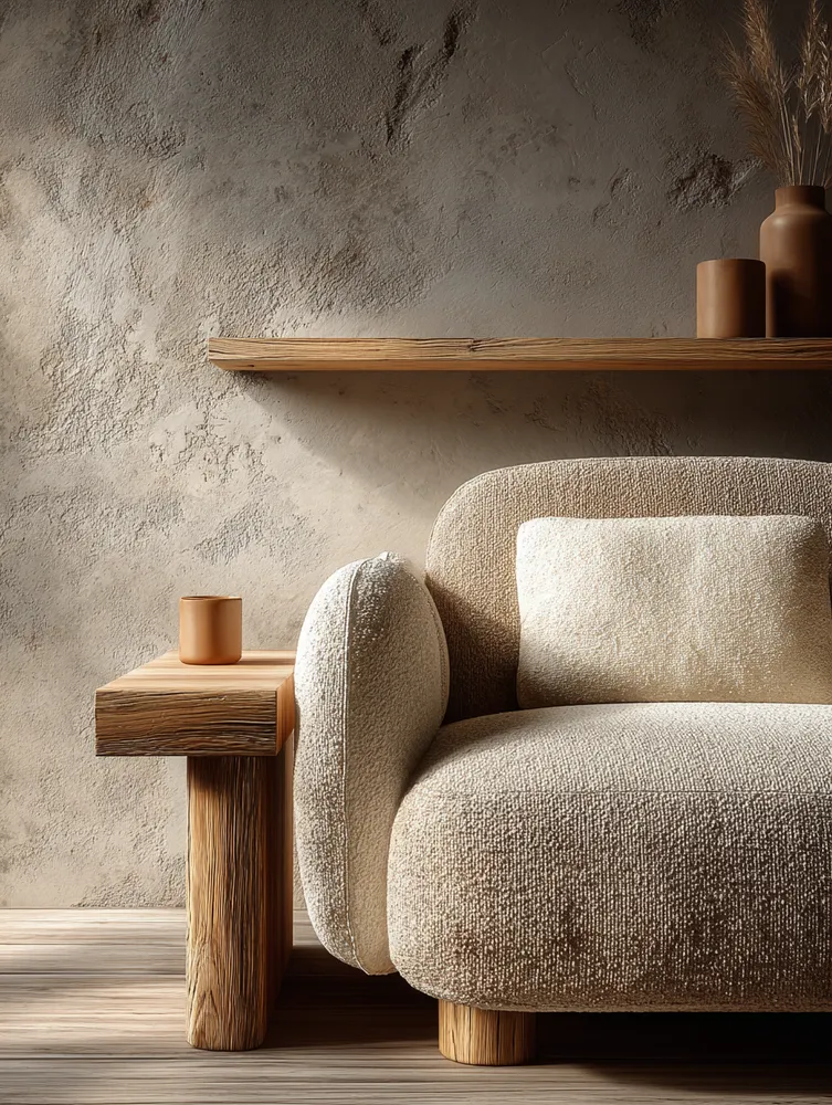
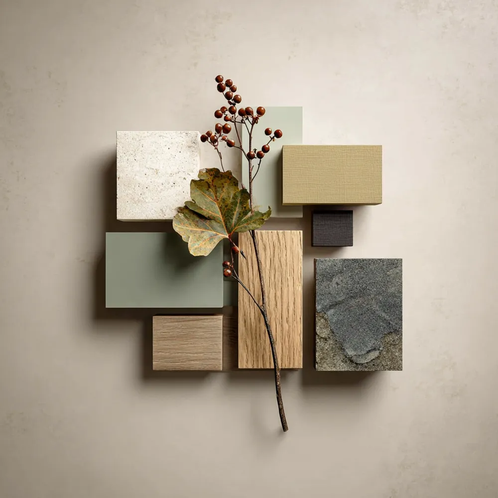
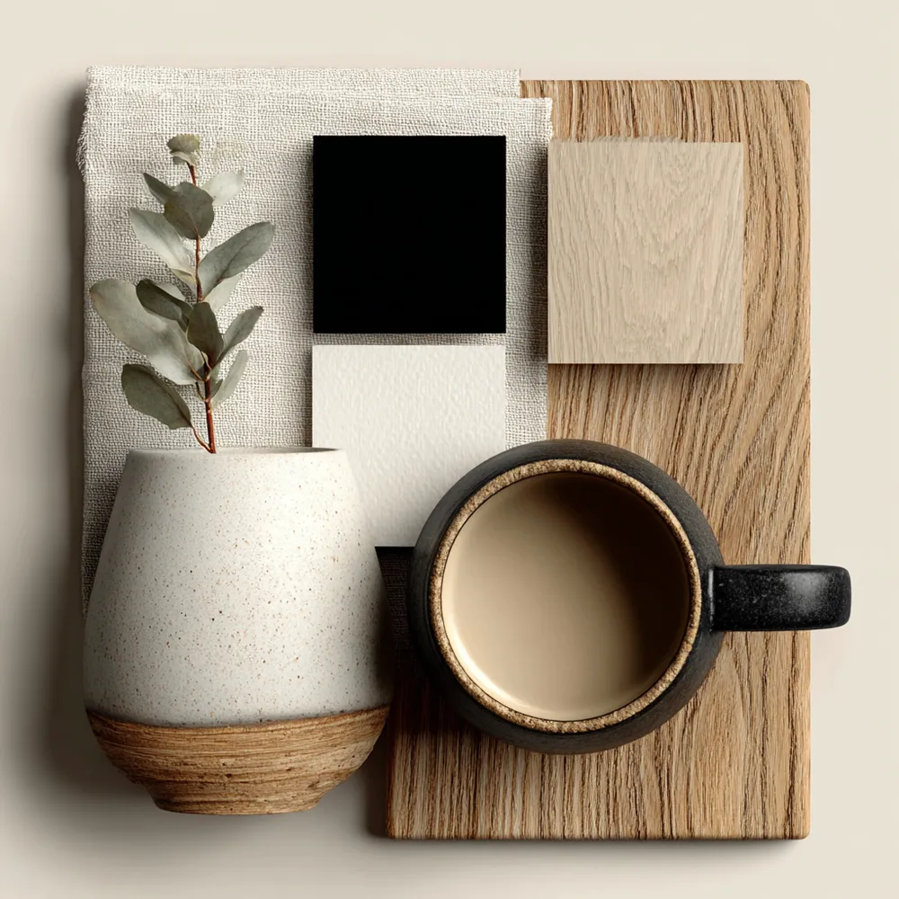
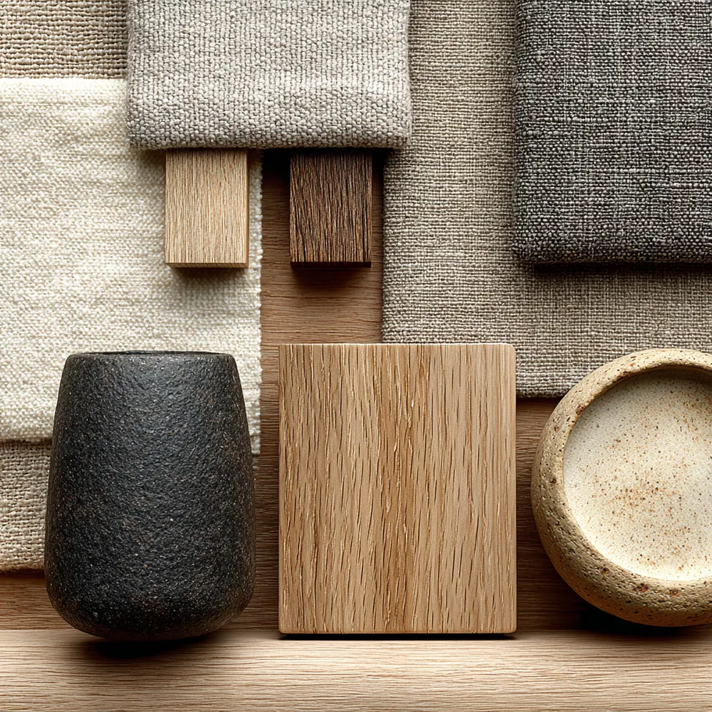
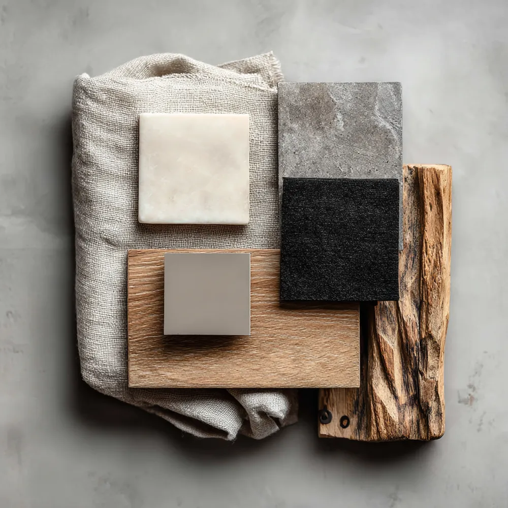
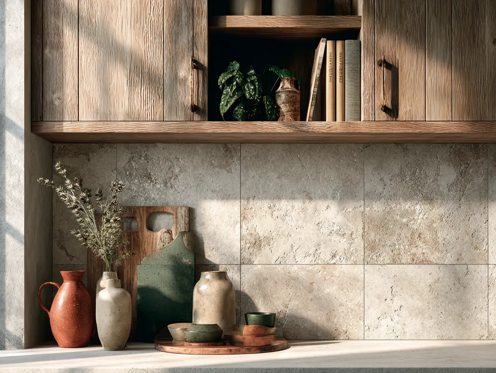
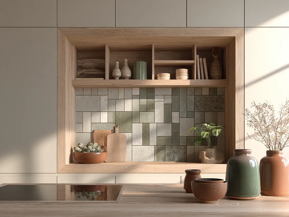
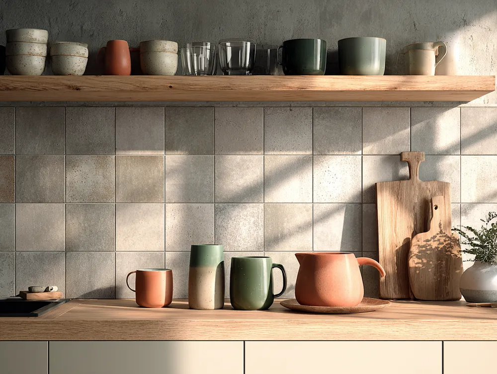
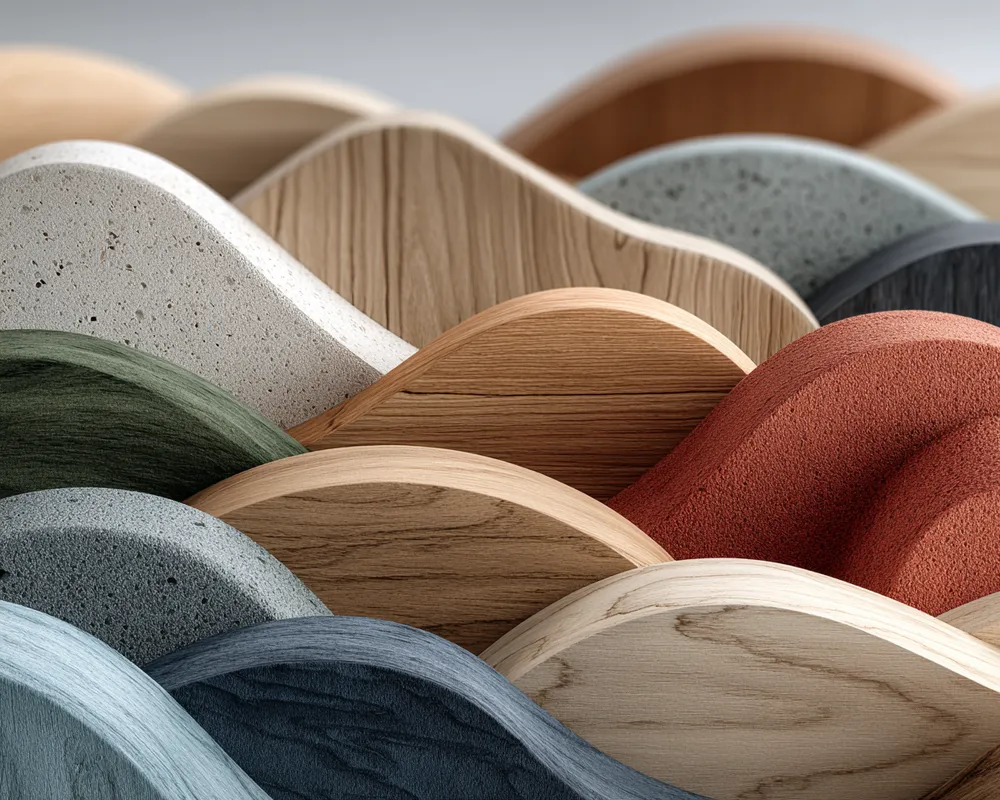
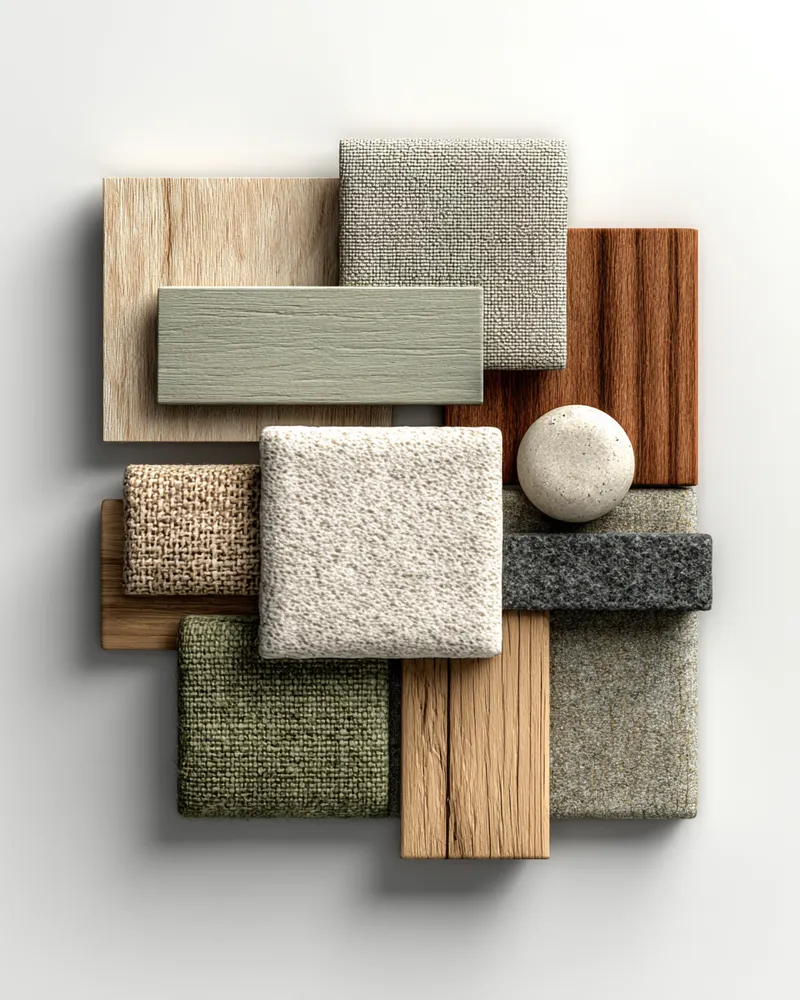
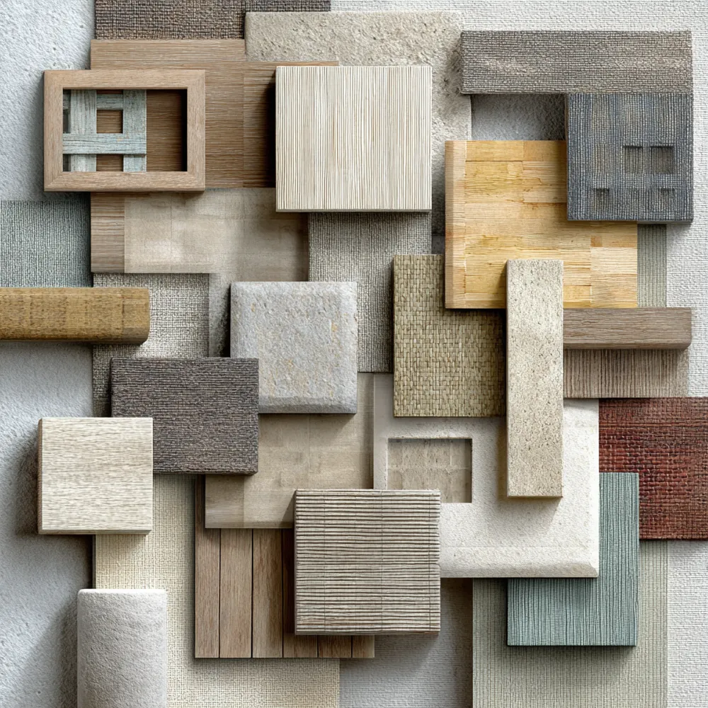
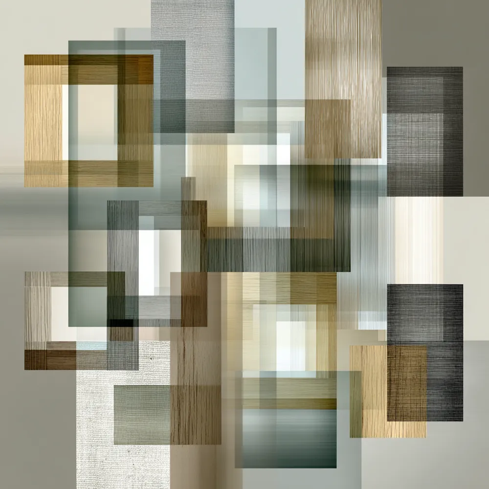
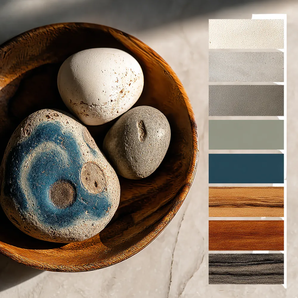
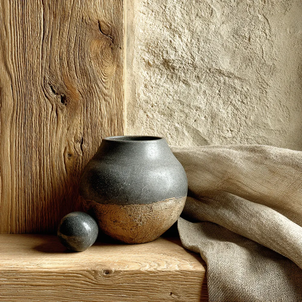
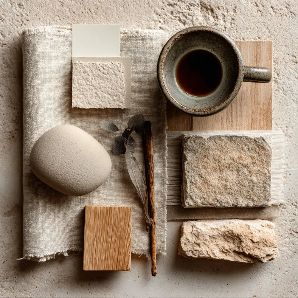
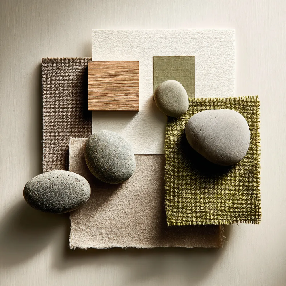
Neutral Palettes: Japandi's Serene Color Scheme 🤍
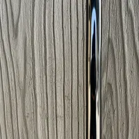
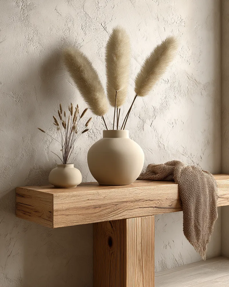
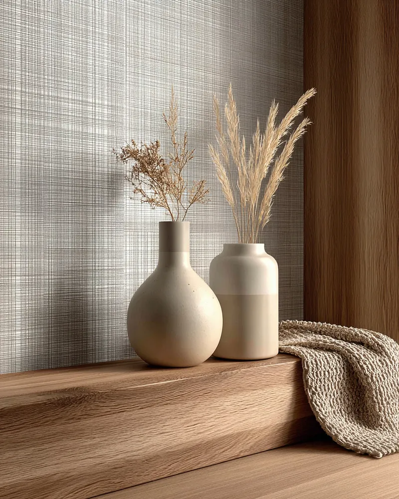
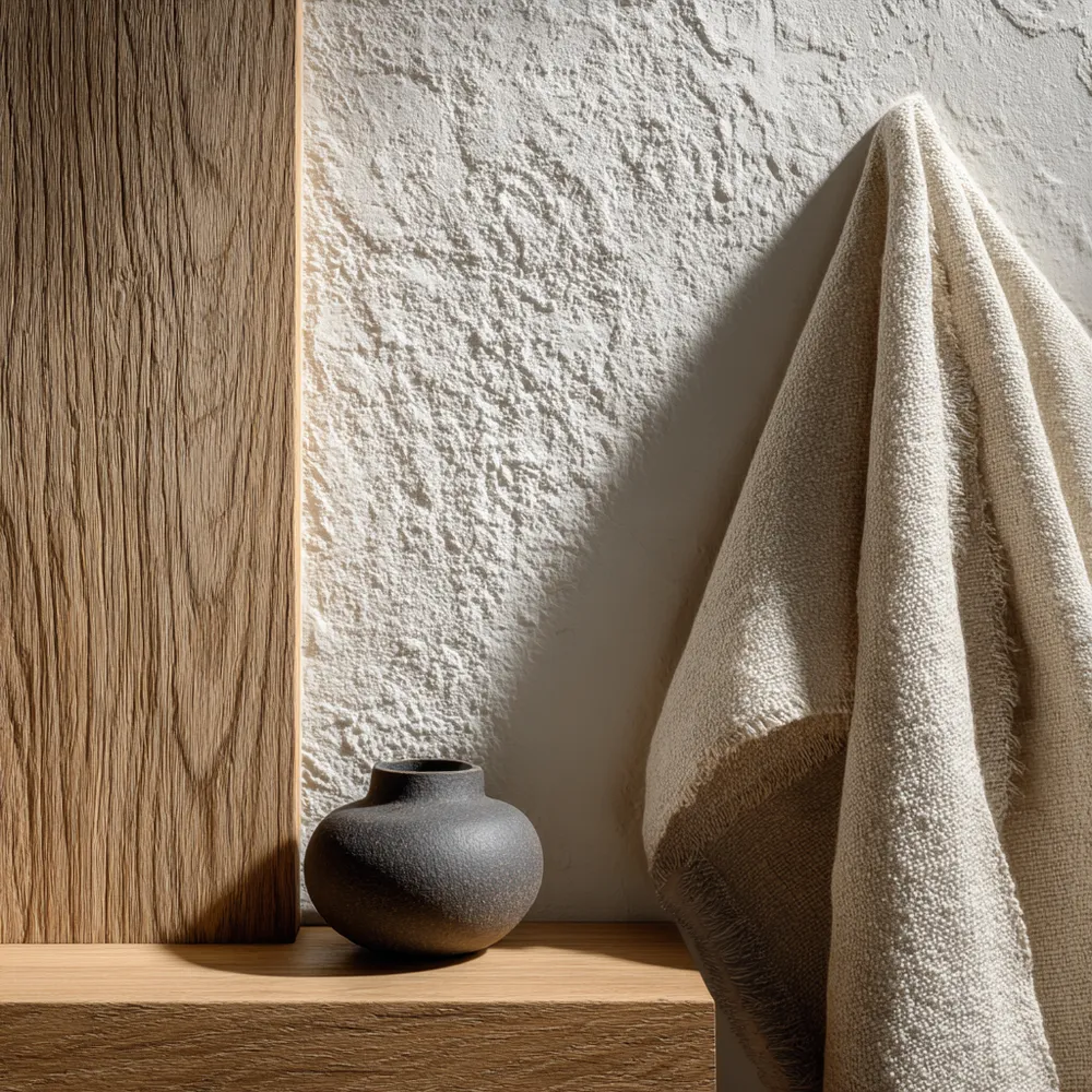
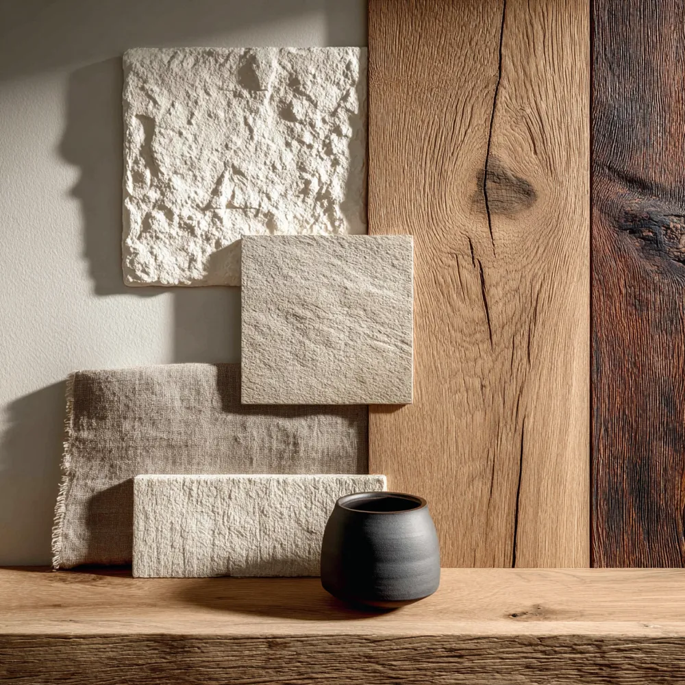
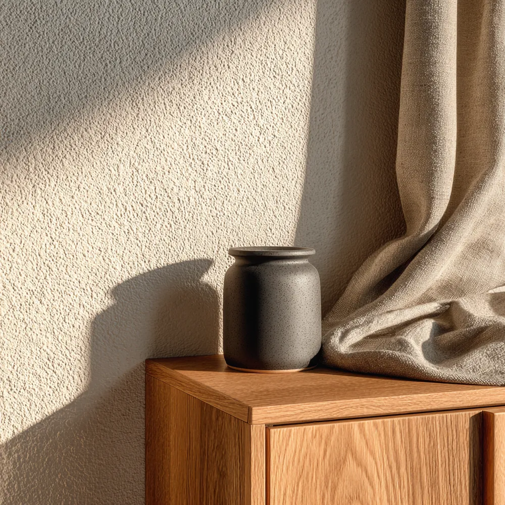
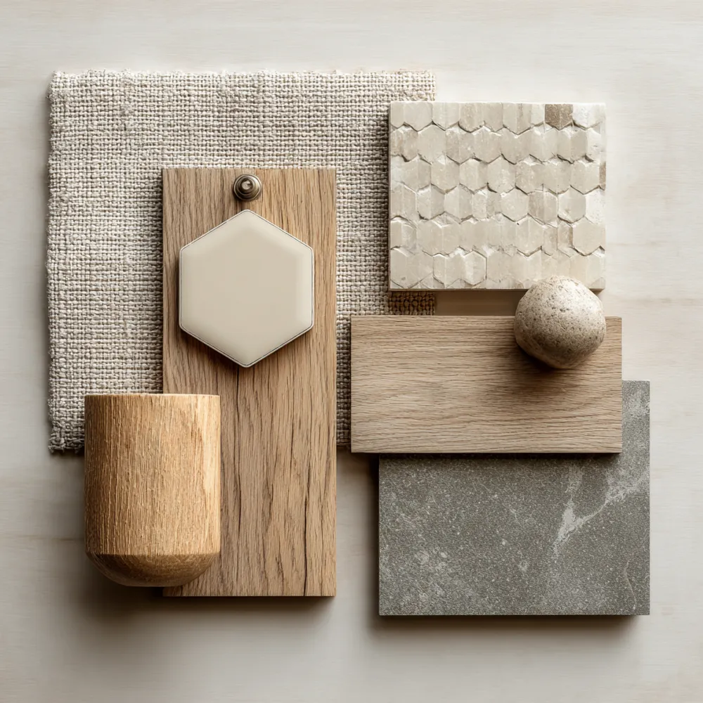
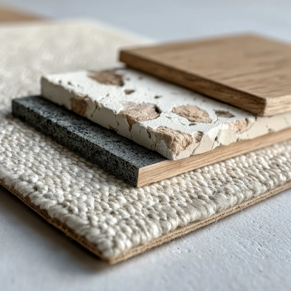
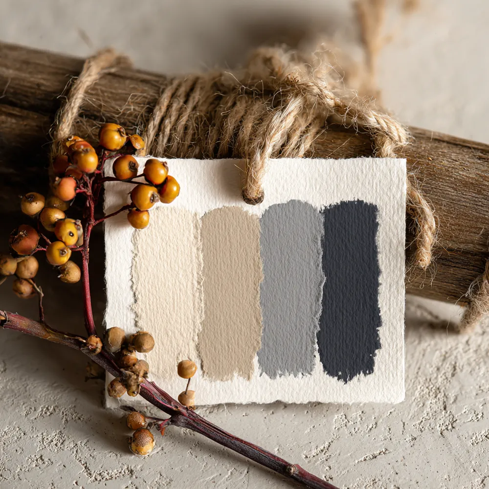
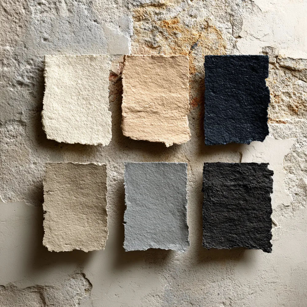
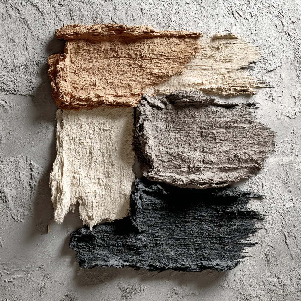
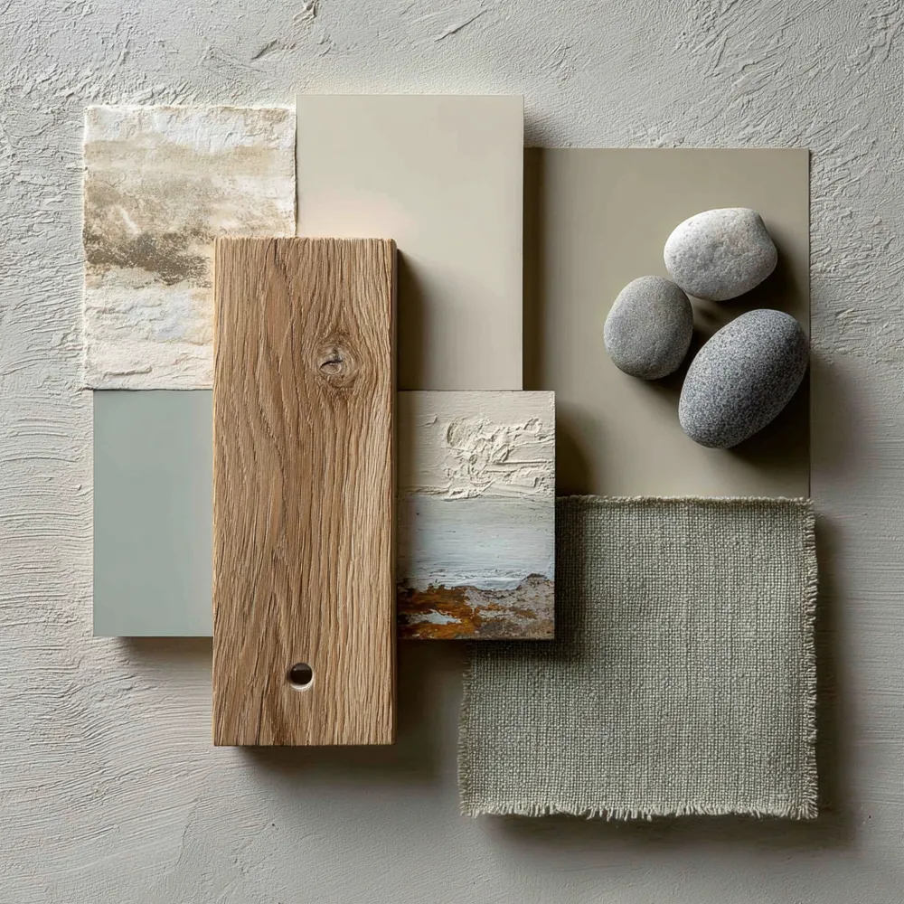
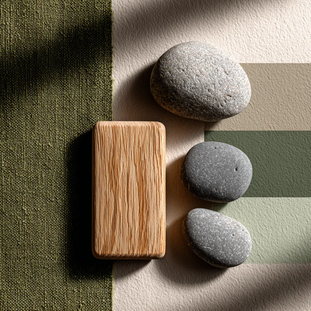
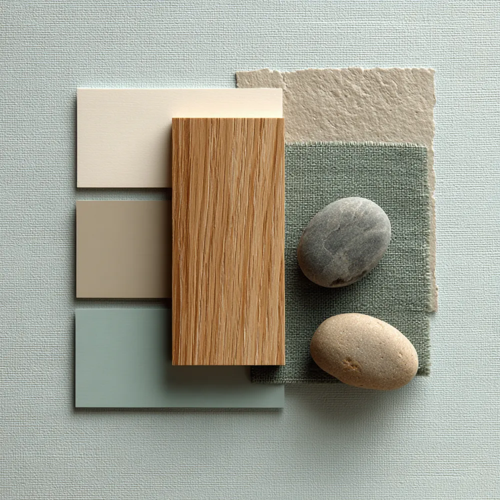
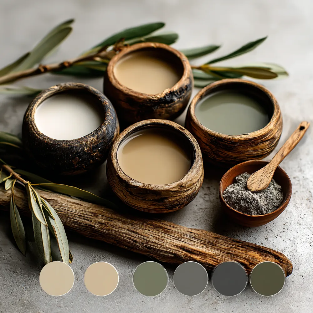
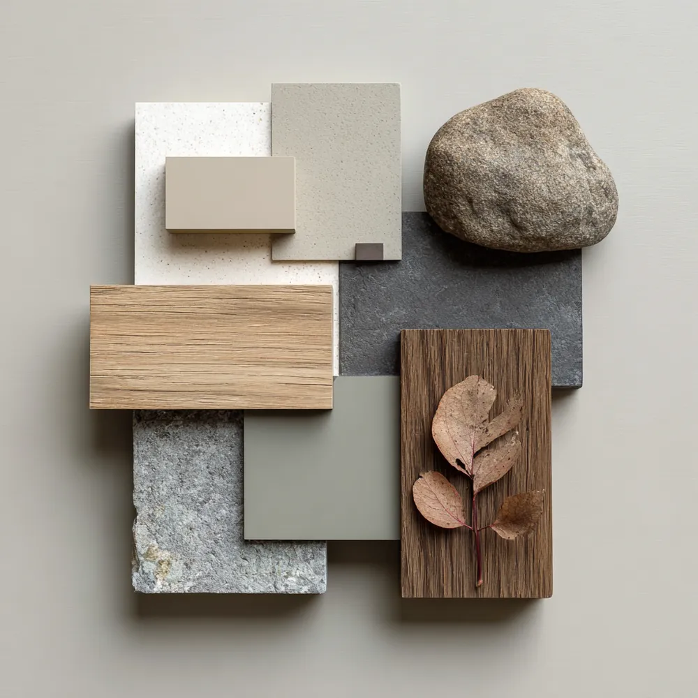
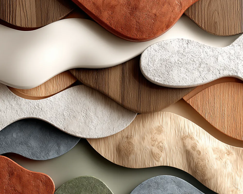
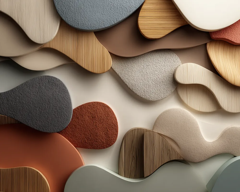
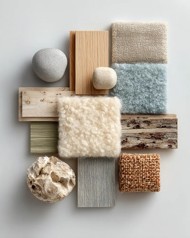
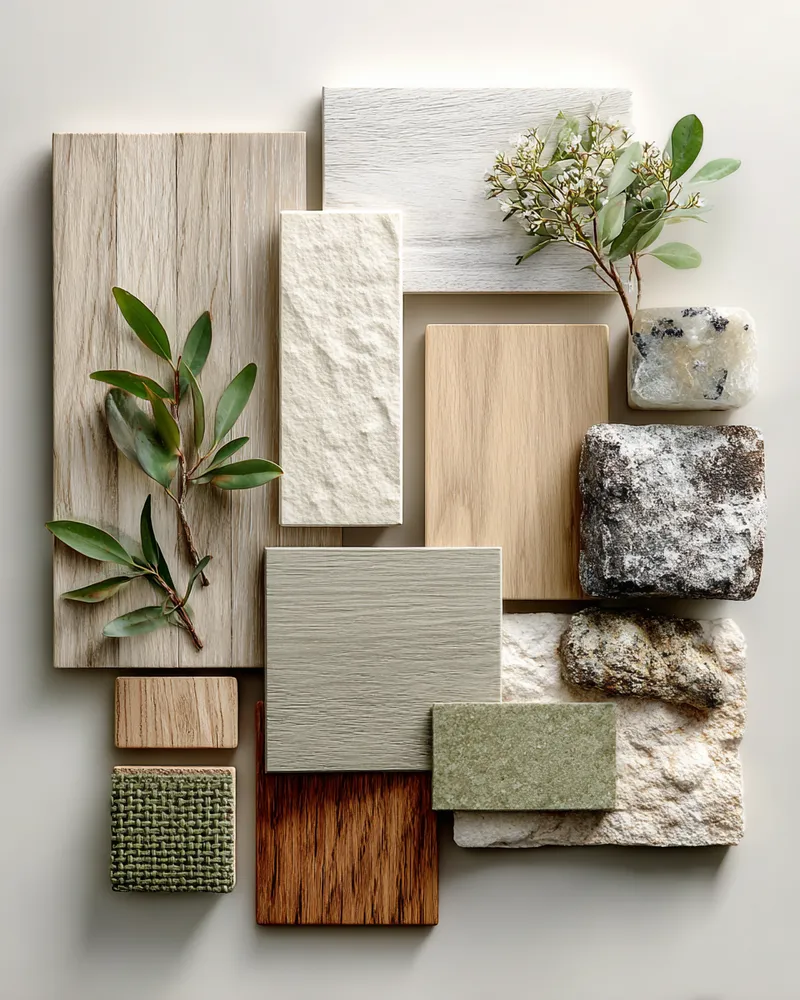
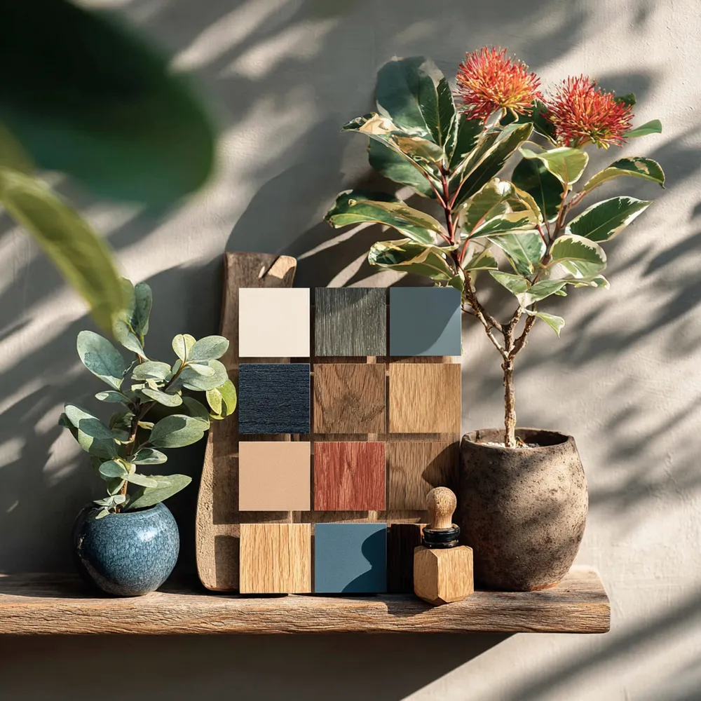
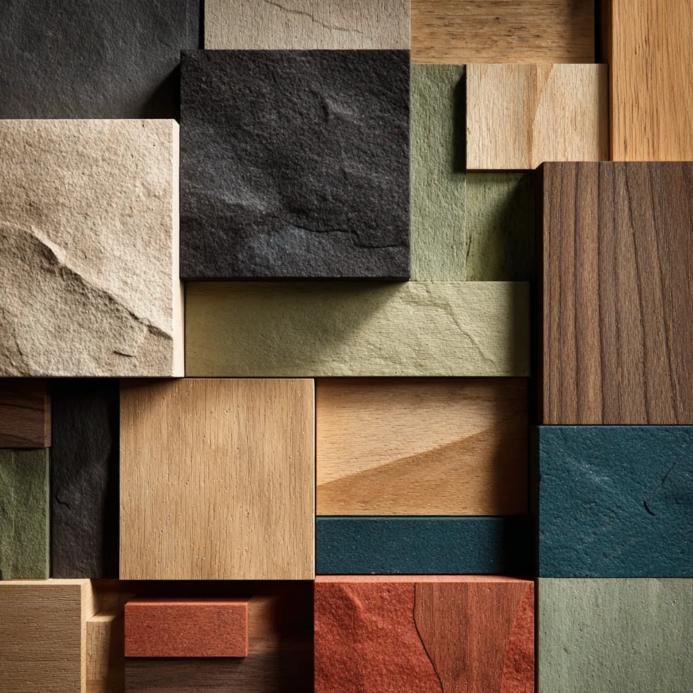
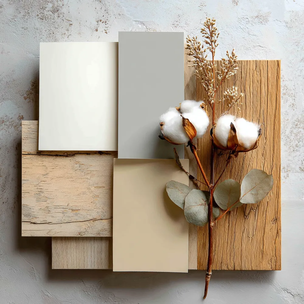
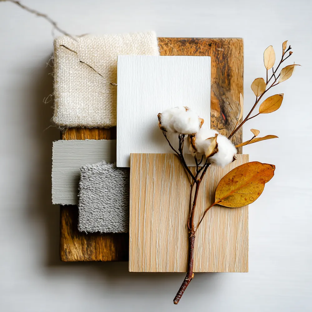
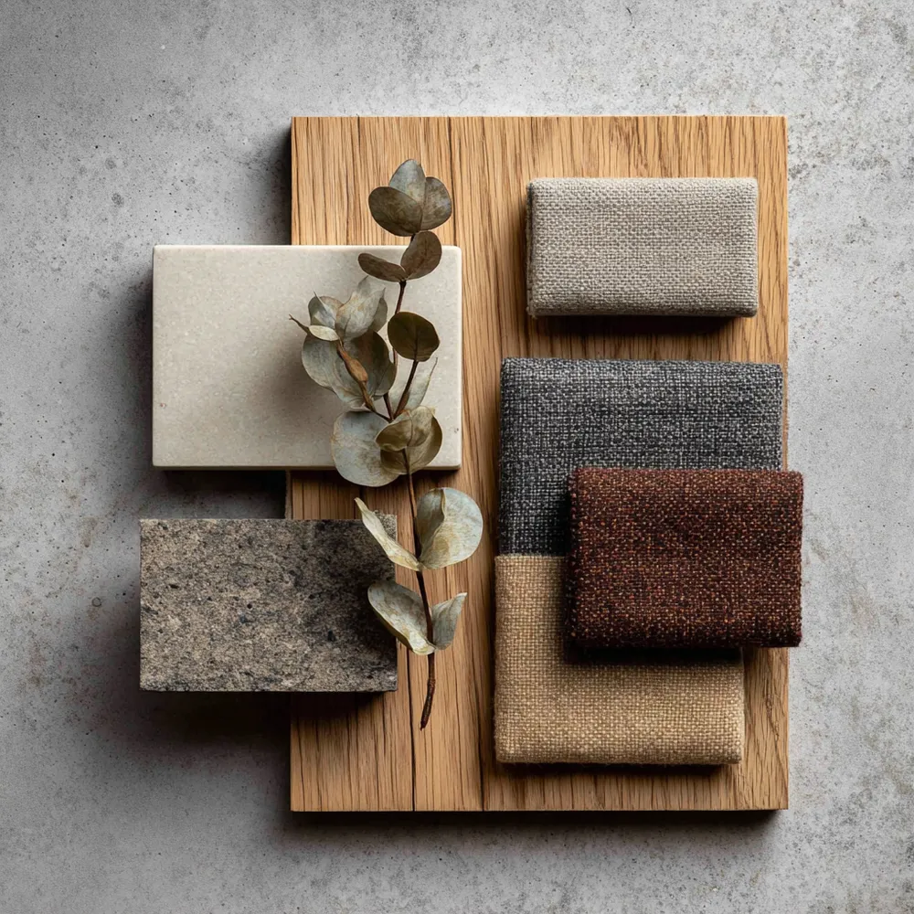
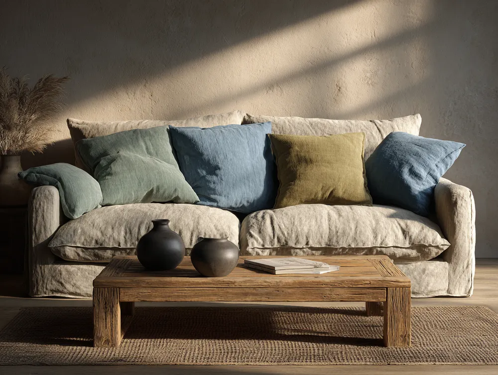
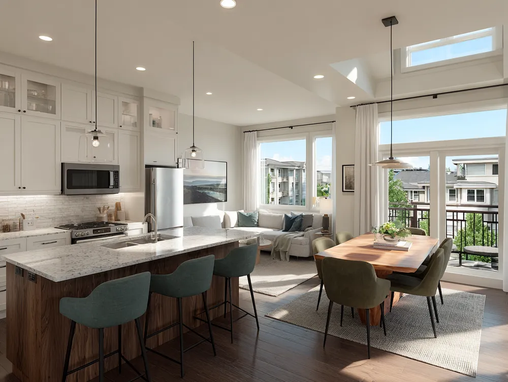
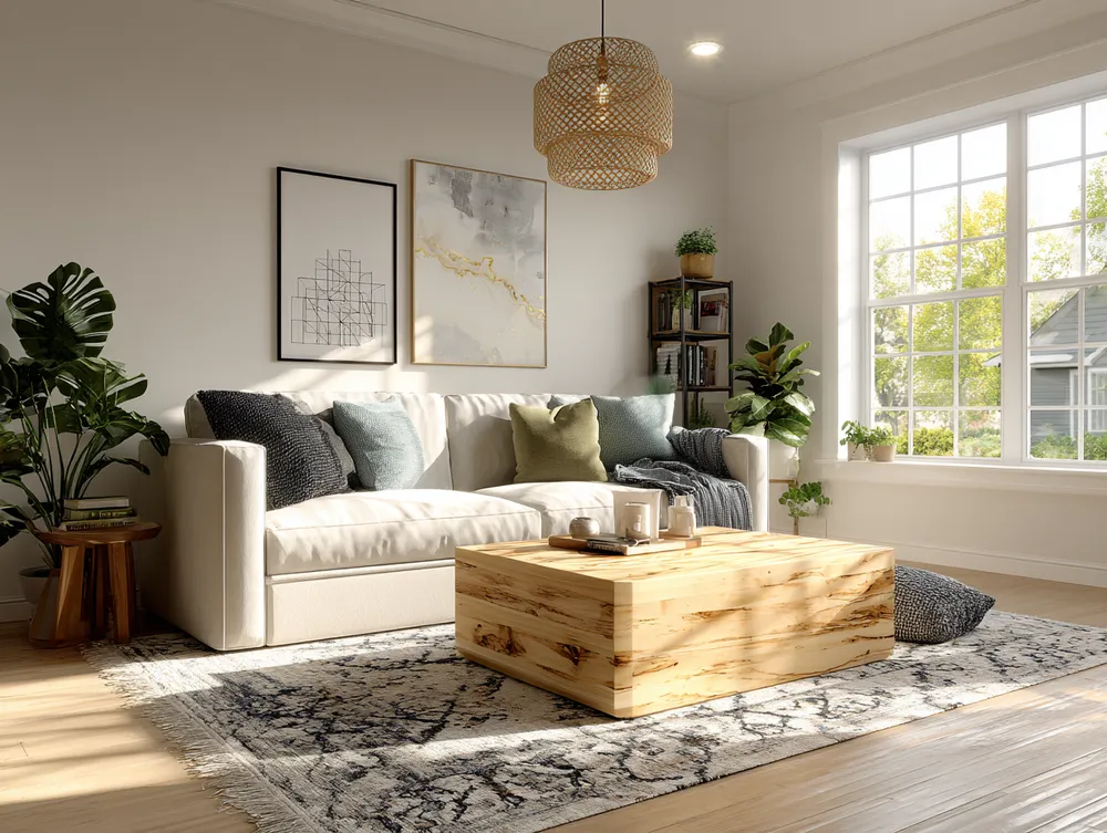
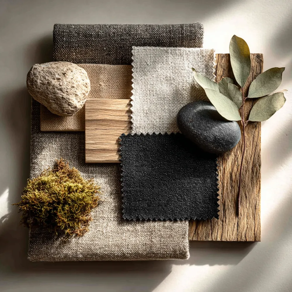
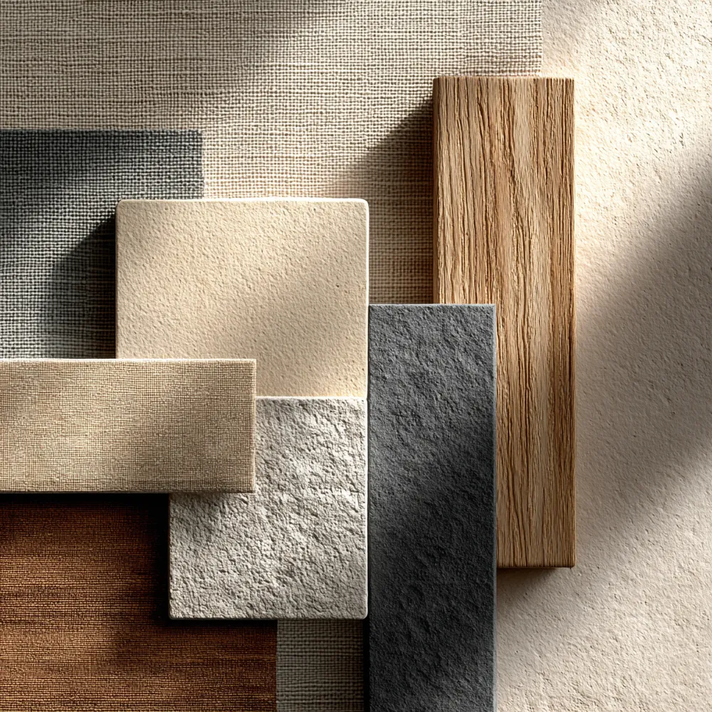
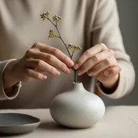
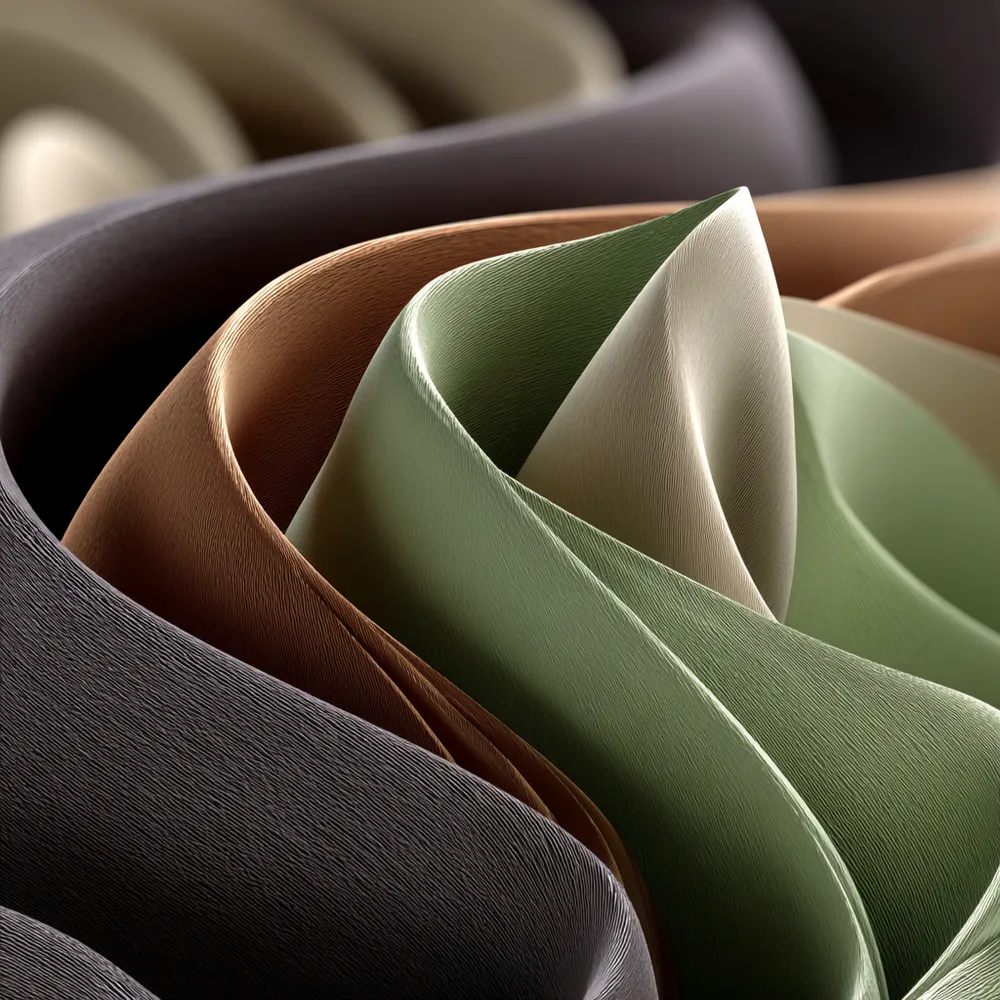
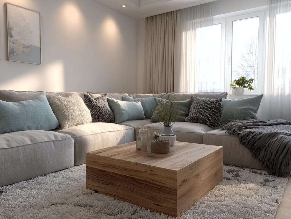
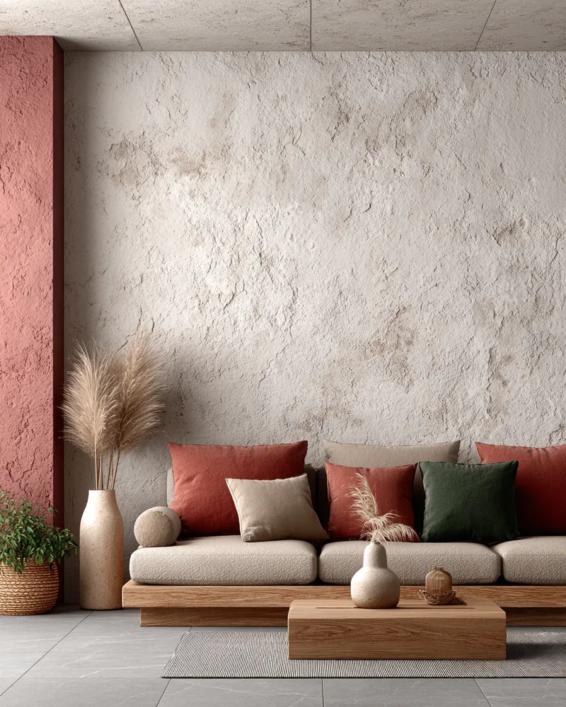
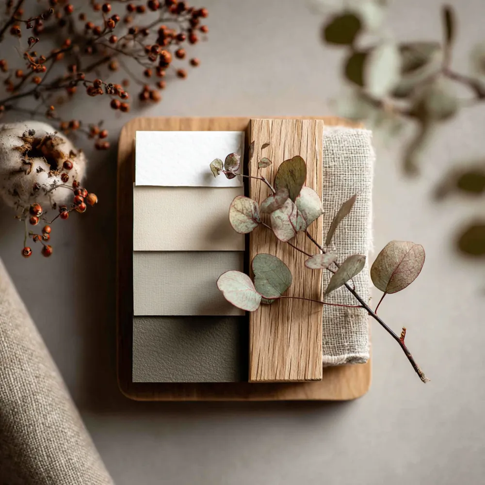
The magic of Japandi lies in its tranquil color palette. Think soft neutrals that create a sense of calm and spaciousness. ☁️ Embrace shades of white, cream, beige, light grey, and muted earth tones like sand or soft sage. Natural wood tones add warmth and depth. The absence of bright, saturated colors allows textures and forms to take center stage. This cohesive scheme creates a cohesive and peaceful environment, perfect for relaxation and mindfulness. Save this for your serene color inspo! ✨ #colorideas #japandiideas #neutraldecorideas #calmhomeideas #minimalistcolorideas #japandi #colorpalette #sereneinteriors #earthytone #designinspiration
Oct 18, 2025
Copy Style
0 comment in total
 No comments yet
You may also like
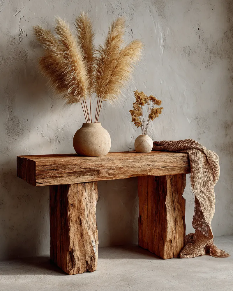
Japandi Color Palettes: The Power of Neutrals 🤍

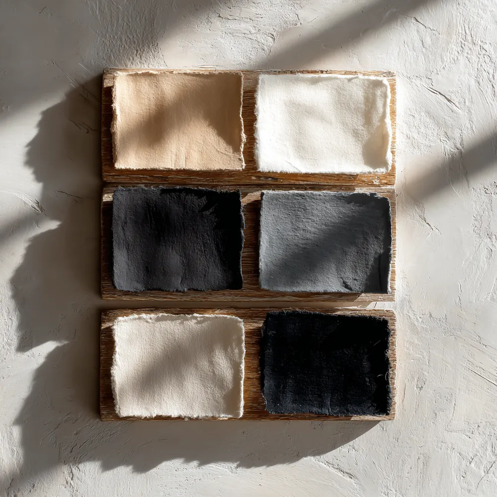
The Japandi Color Palette: Serene Neutrals for a Calm Home 🤍
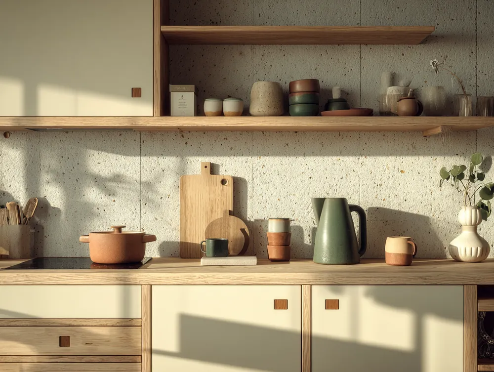
The Japandi Kitchen Palette: Neutrals & Nature Inspired Tones 🍎
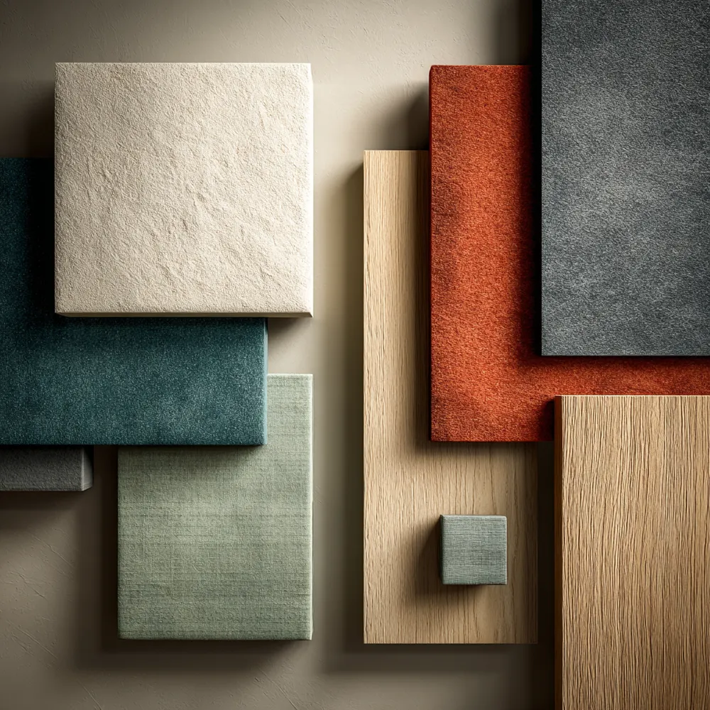
Finding Harmony: Japandi Color Palettes for a Tranquil Home ✨
The Neutral Palette: Colors of Japandi Design 🎨
Japandi Color Palette: Soothing Neutrals & Earth Tones 🎨
The Japandi Palette: Embracing Serene, Earthy Tones 🤍

Minimalist Japandi Color Palette: Serenity Found 🎨

Color Palette Perfection: Japandi Neutral Tones 🤍
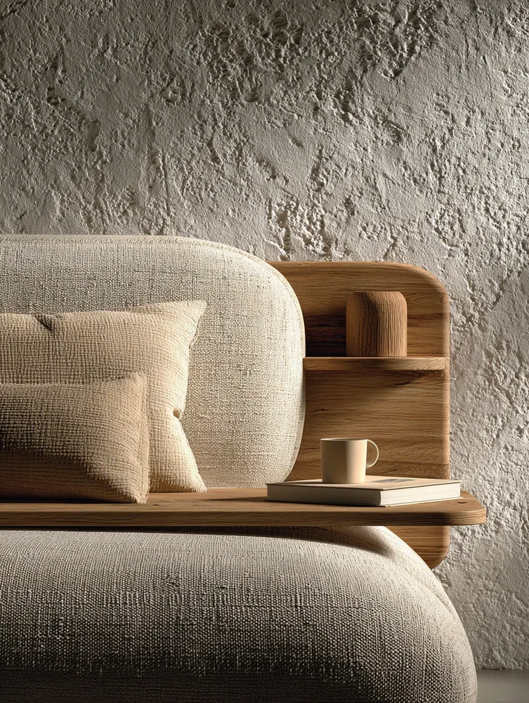
Understated Elegance: The Role of Neutral Palettes in Japandi ☁️

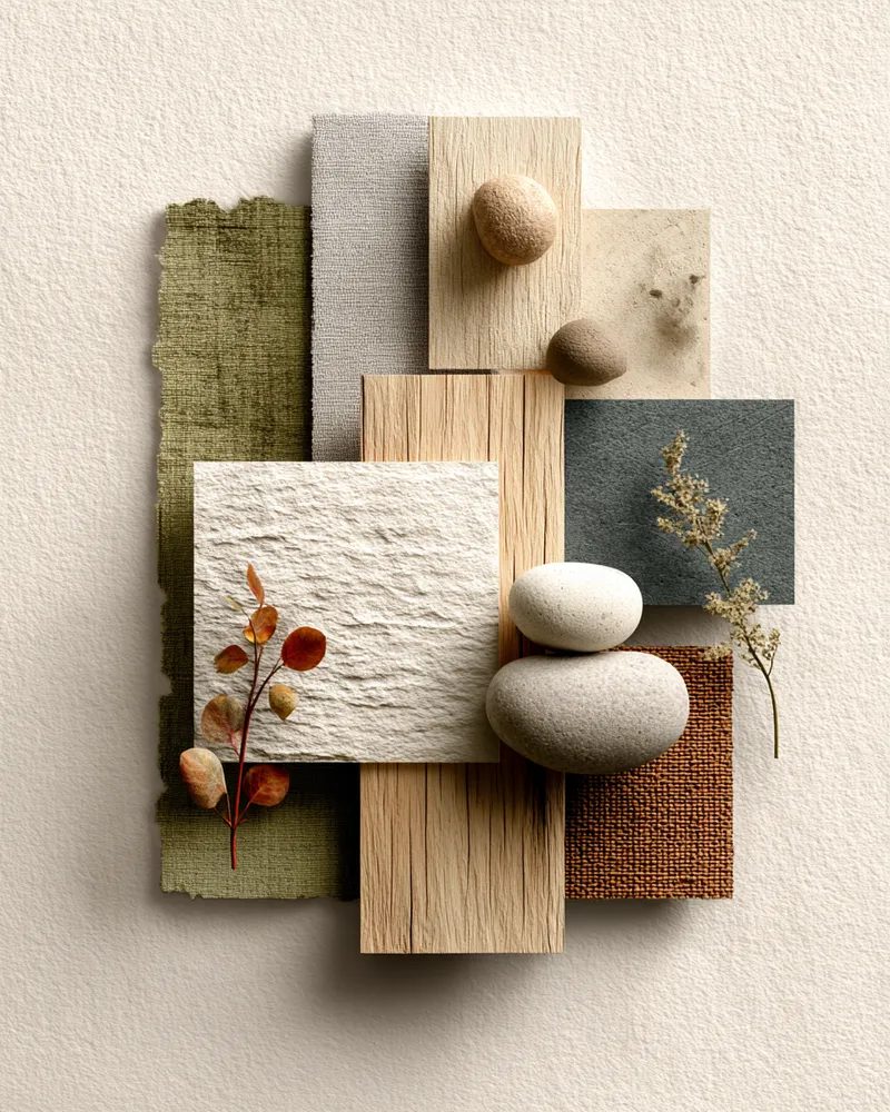
Color Palette: The Serene Neutrals of Japandi Living 🎨


color
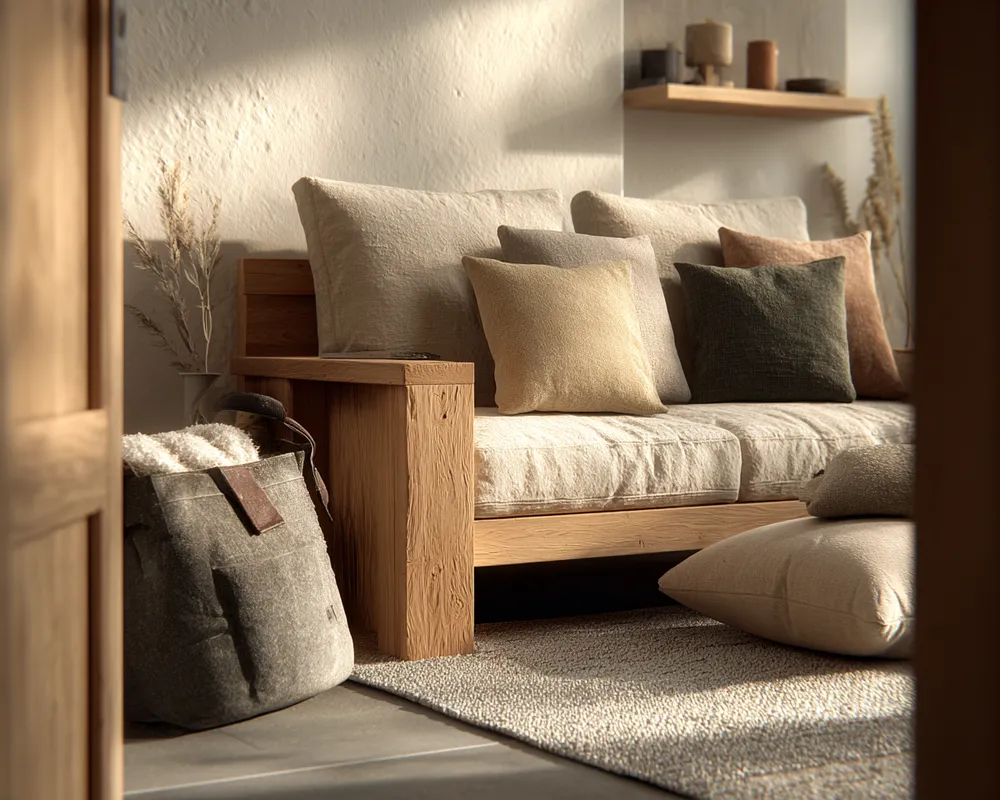
The Power of Neutrality: Japandi Color Schemes 🤍

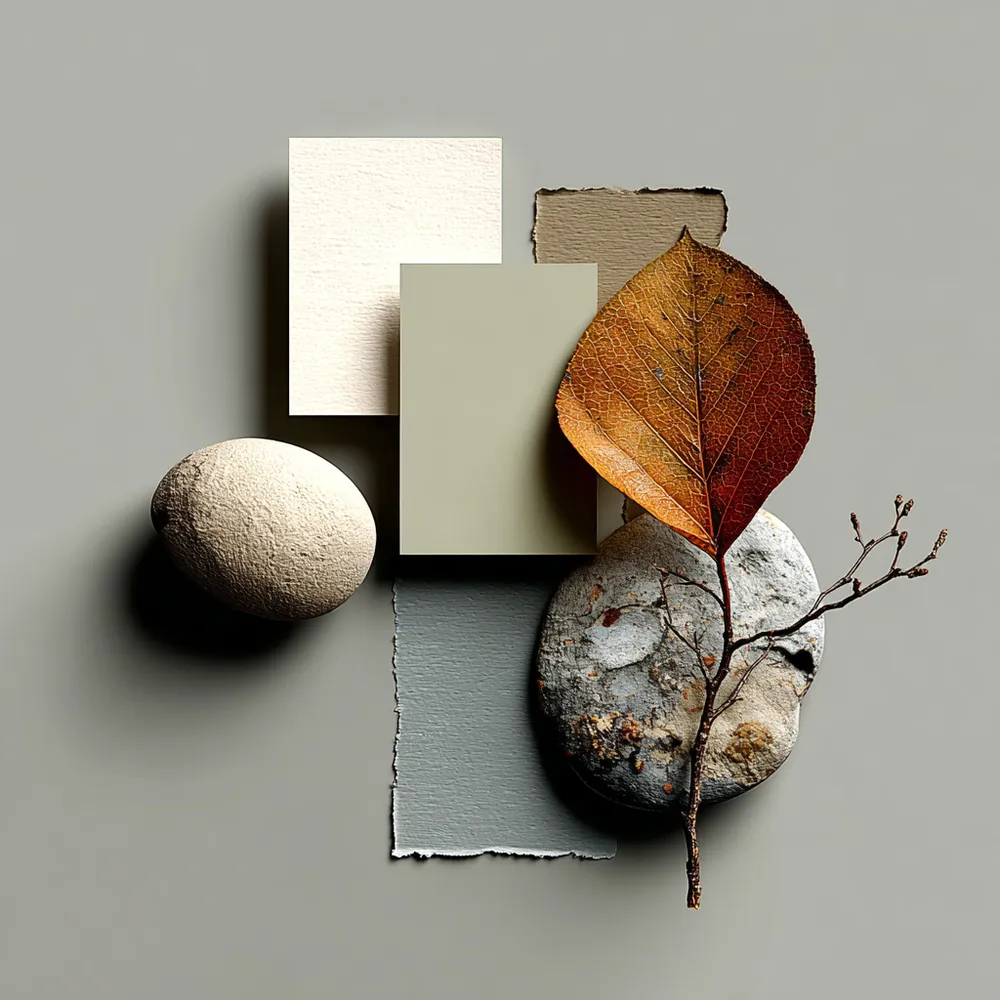
The Japandi Color Palette: Serene & Earthy Tones 🎨
Harmonious Hues: The Japandi Color Palette 🎨

Bringing Balance: Japandi Approach to Color Palettes 🎨

Soft Neutrals & Earthy Tones: The Japandi Color Palette 🤎

✨ Japandi Color Palette: The Serenity Secret!


My Go-To Palette: Creating Calm with Japandi Color Schemes 🎨
Creating Tranquility: Japandi Color Palette Inspiration 🎨