1/10
9 home office colour schemes to inspire productivity and focus in your WFH space
The selection of home office colour schemes plays a significant role in influencing mood, concentration, and productivity within a working-from-home environment. Colour psychology in interior design is a smart approach to creating a home office that supports both aesthetic appeal and emotional well-being. The article emphasizes that the right colour choices can prevent distraction and mental drain, encouraging focus and mental clarity.
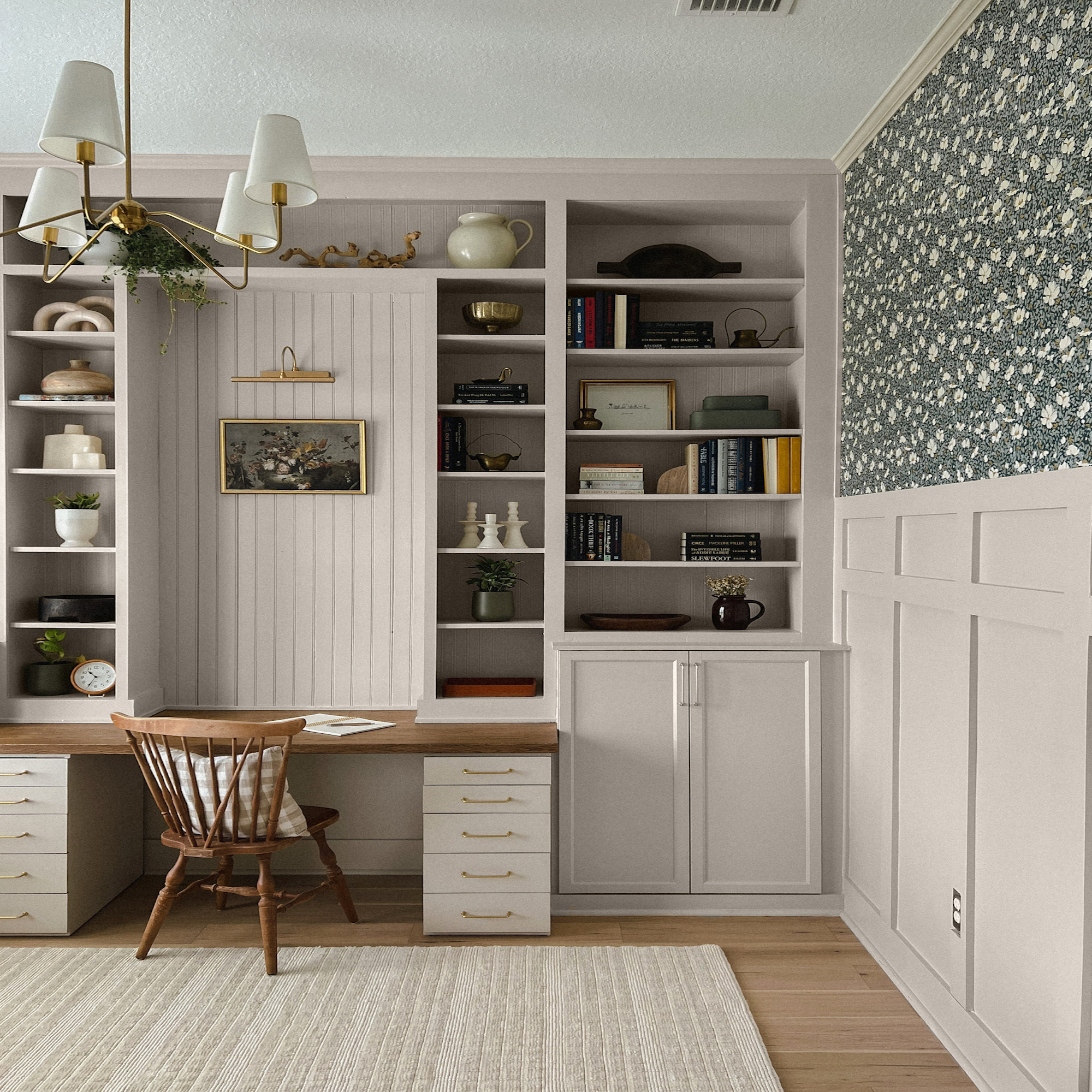
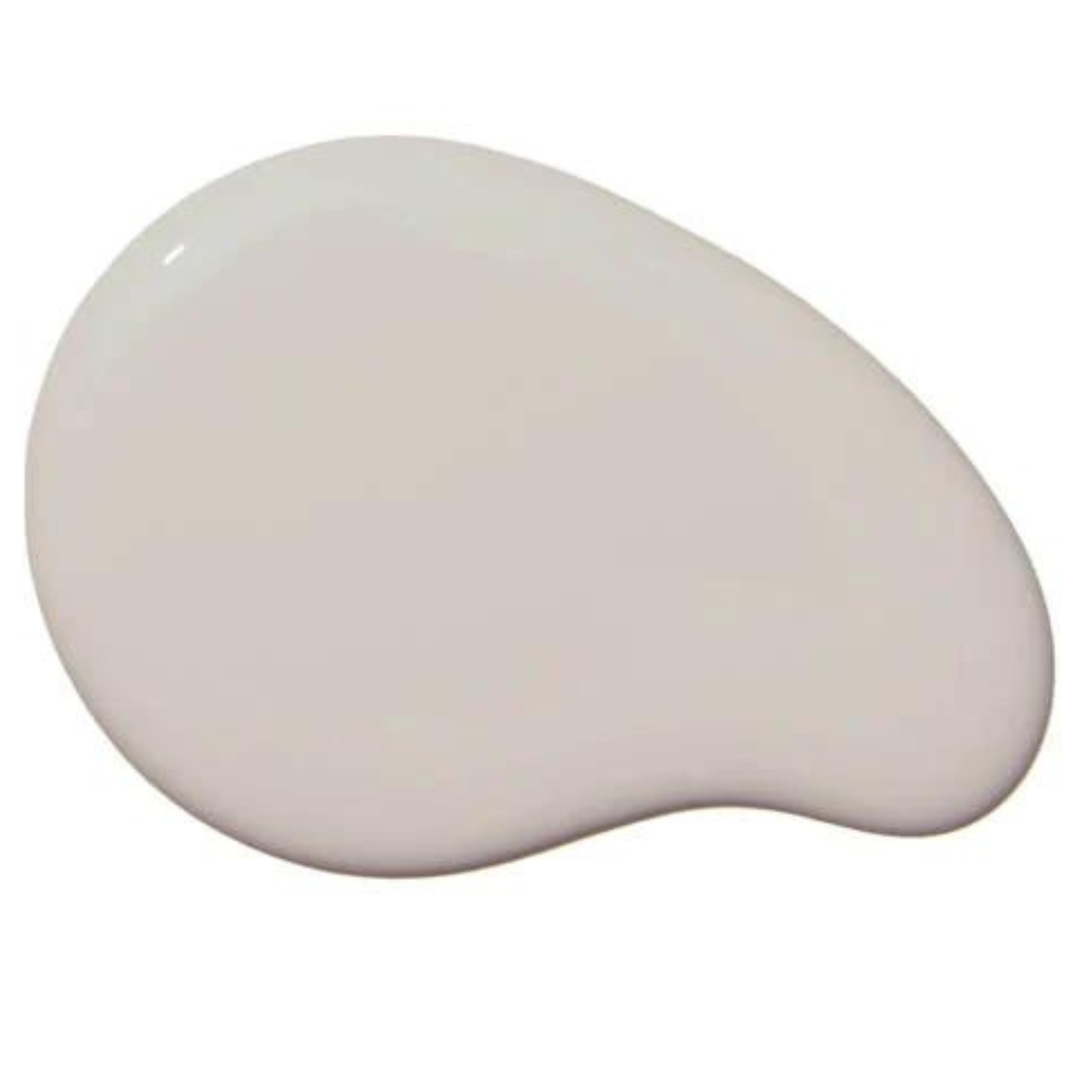
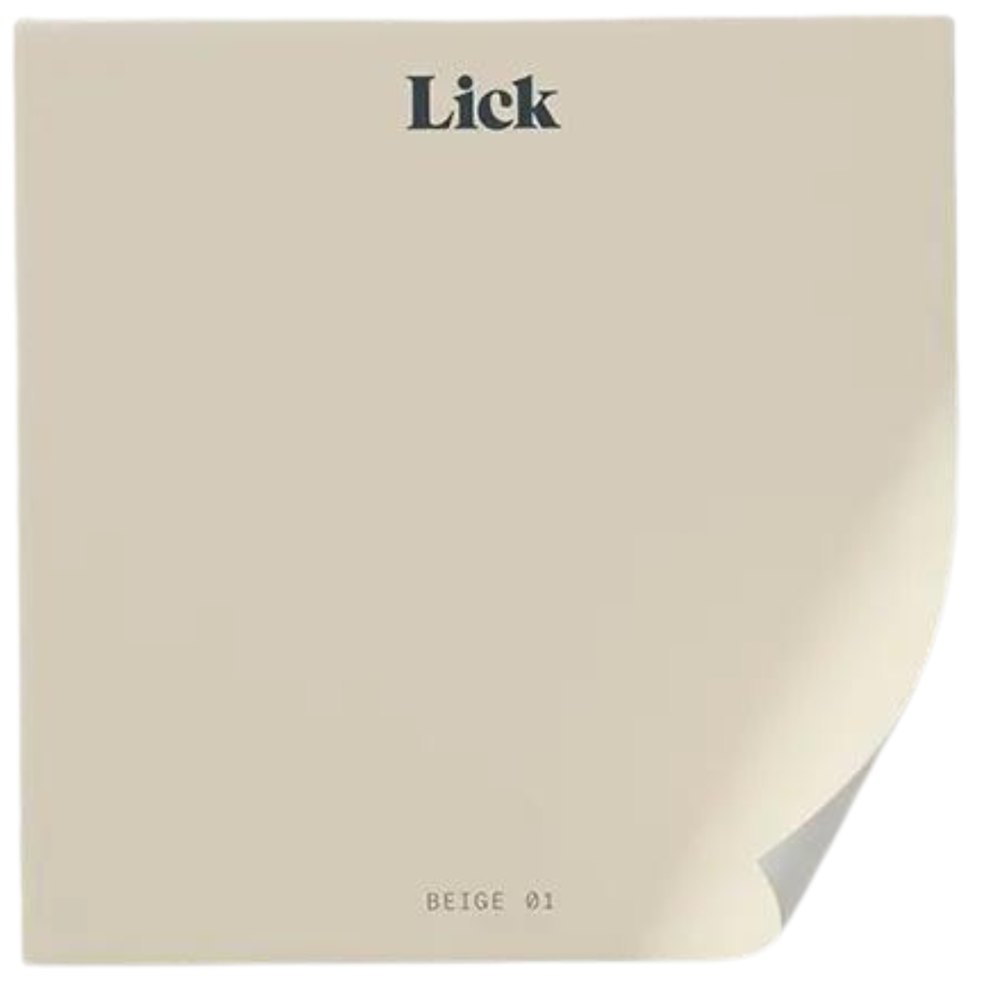
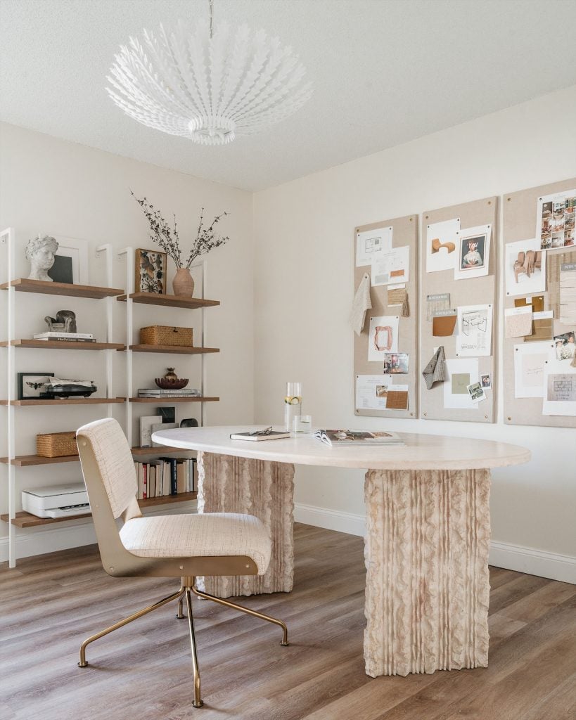
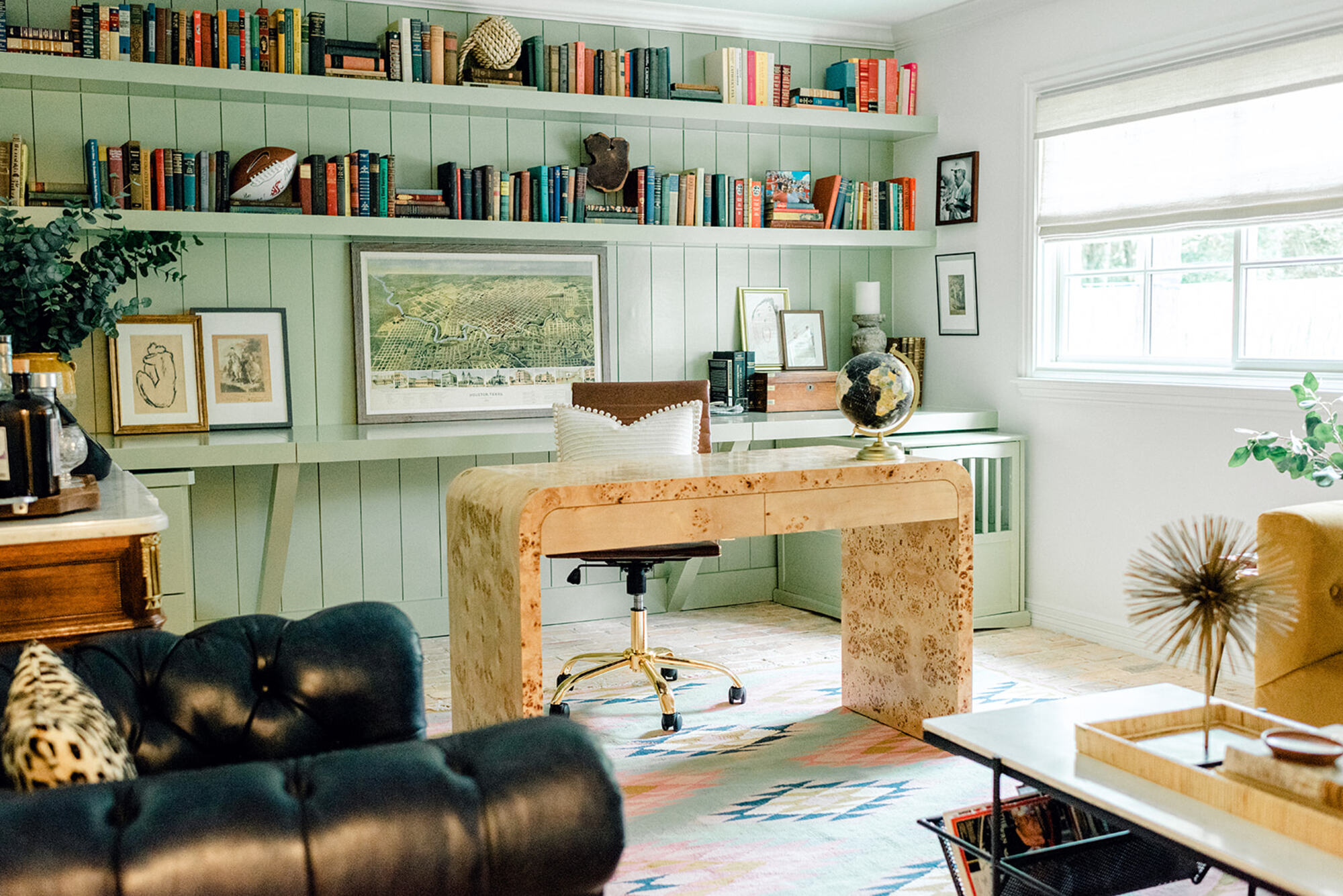
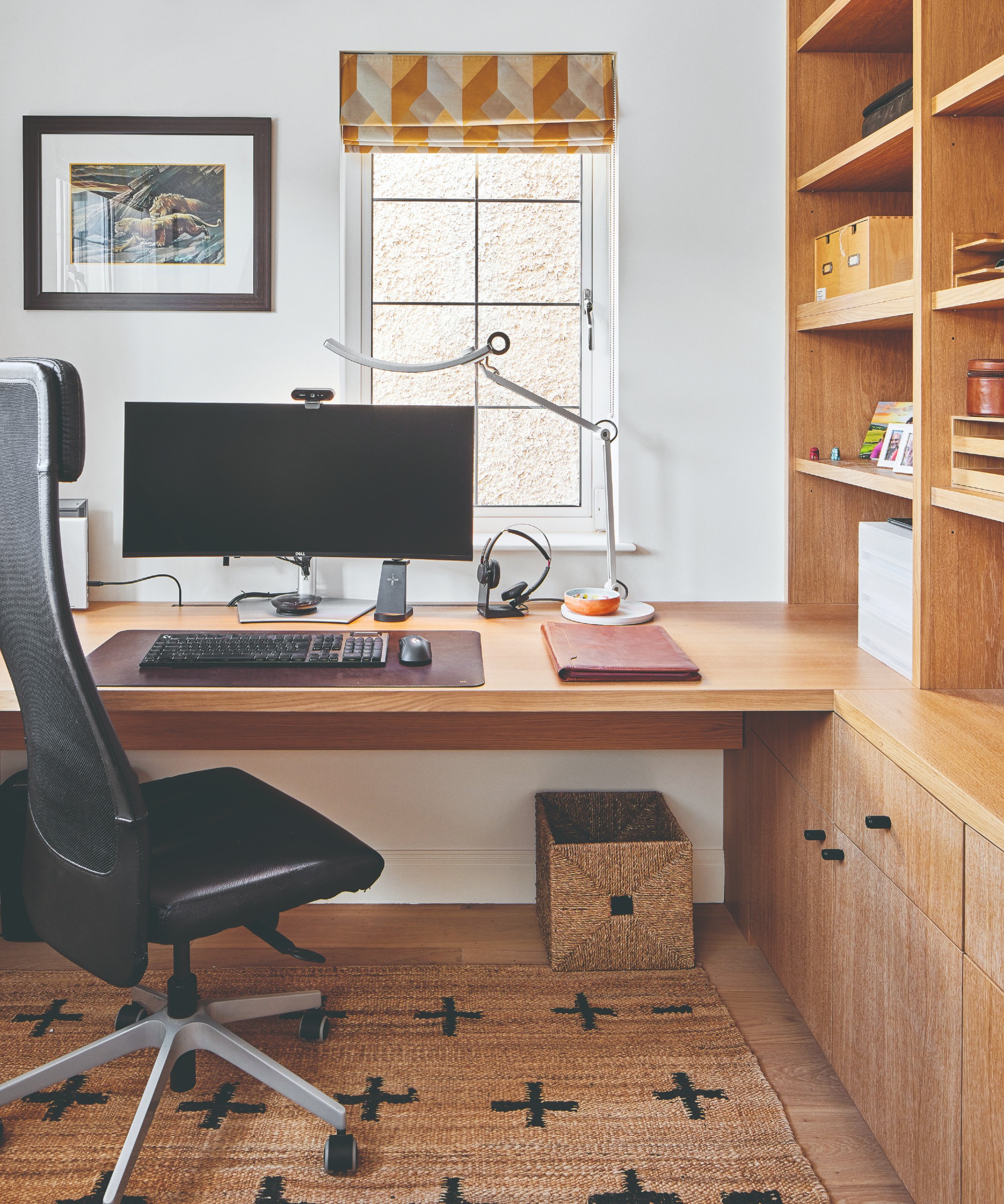
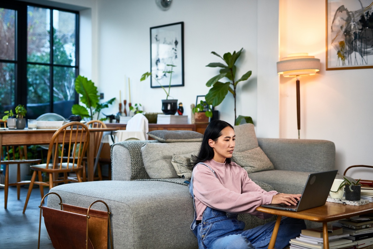
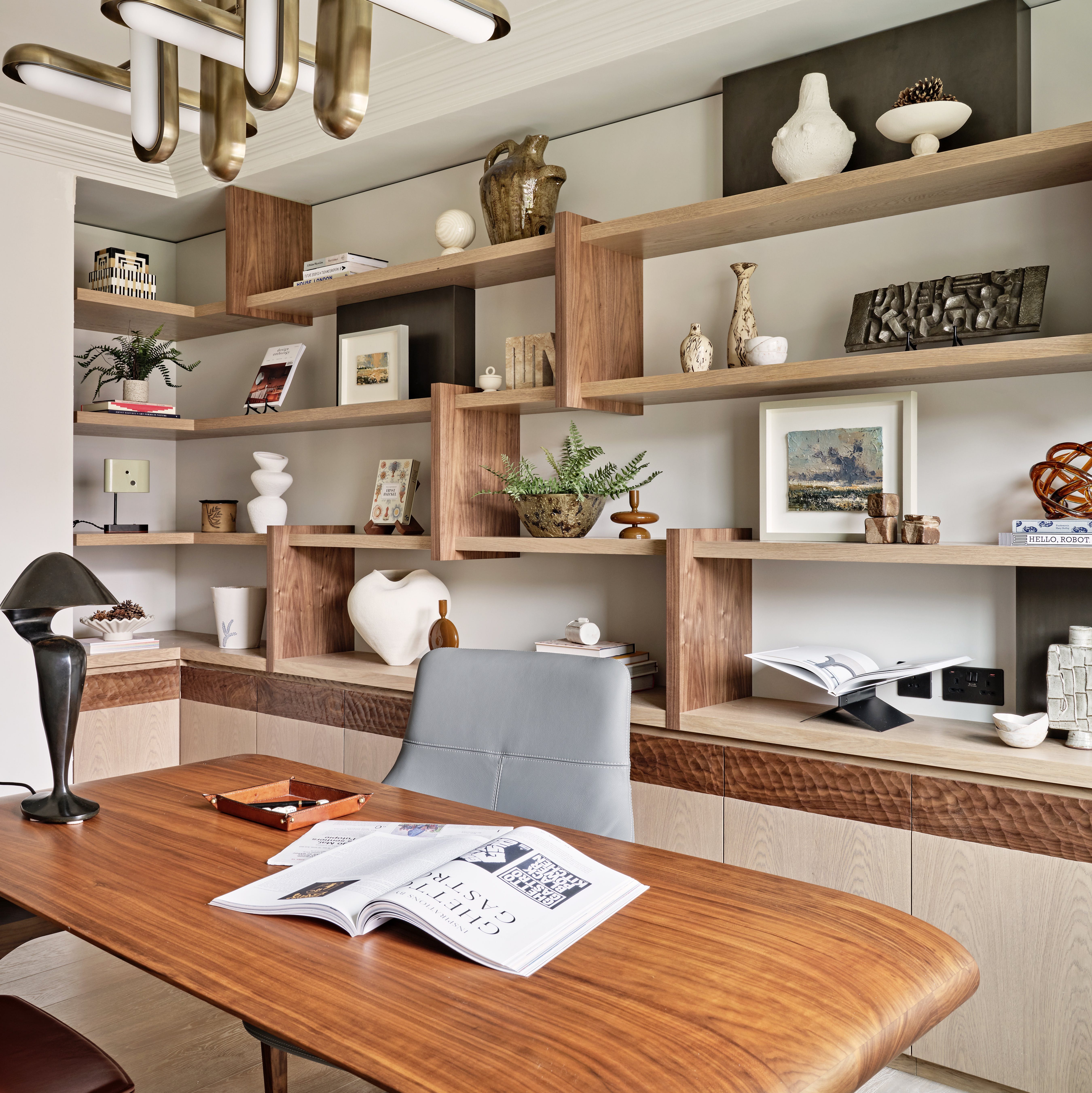
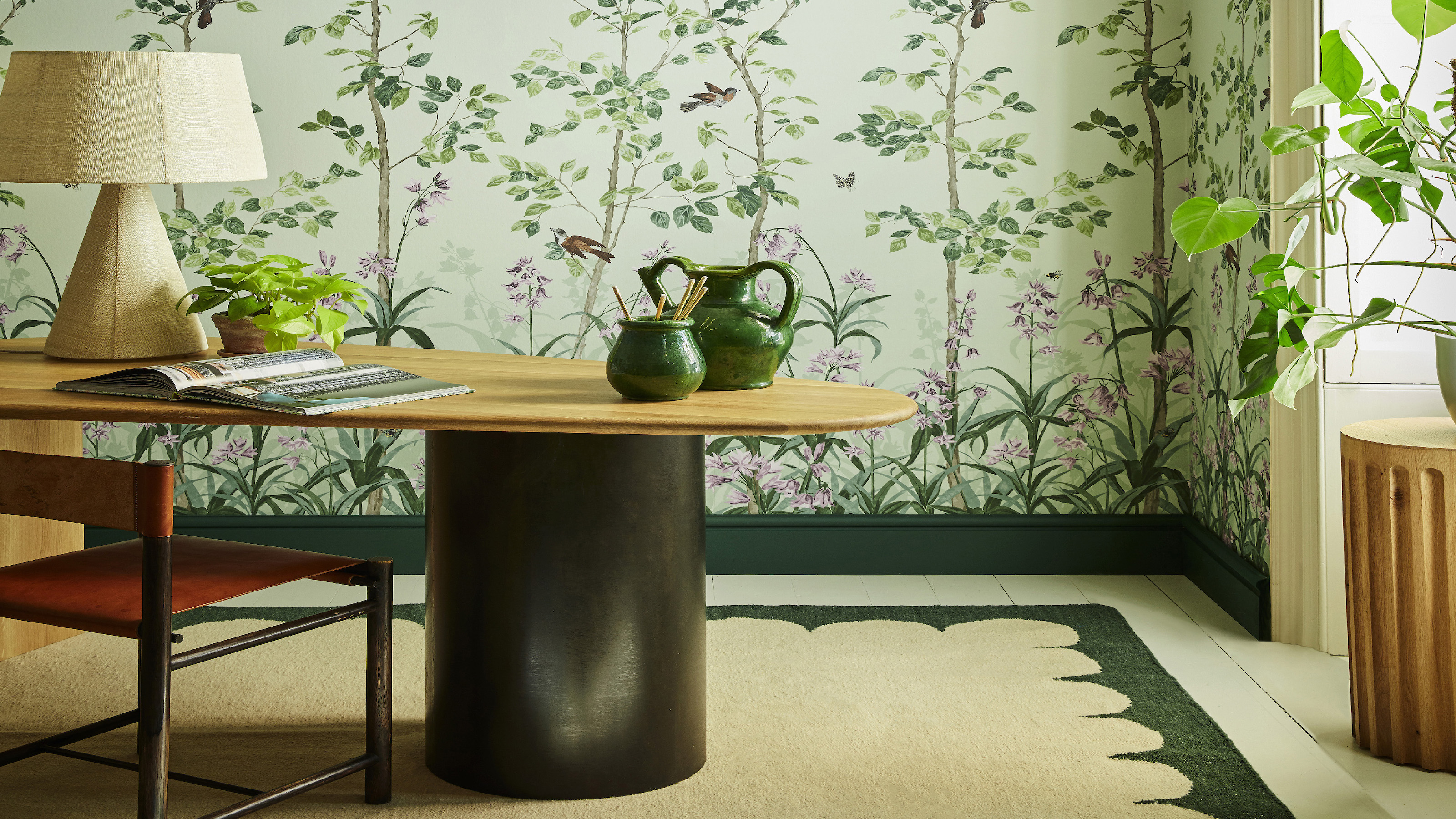
Several colour schemes are recommended by experts. Pairing sage green with beige creates a balanced and harmonious space. Sage green, known for reducing stress and promoting mental clarity, is considered the most restful colour for the eyes, particularly beneficial for prolonged screen time. Beige acts as a warm, understated neutral, allowing for easy layering of other colours and textures without causing distraction. This combination is stimulating enough for productivity yet maintains a calm atmosphere.
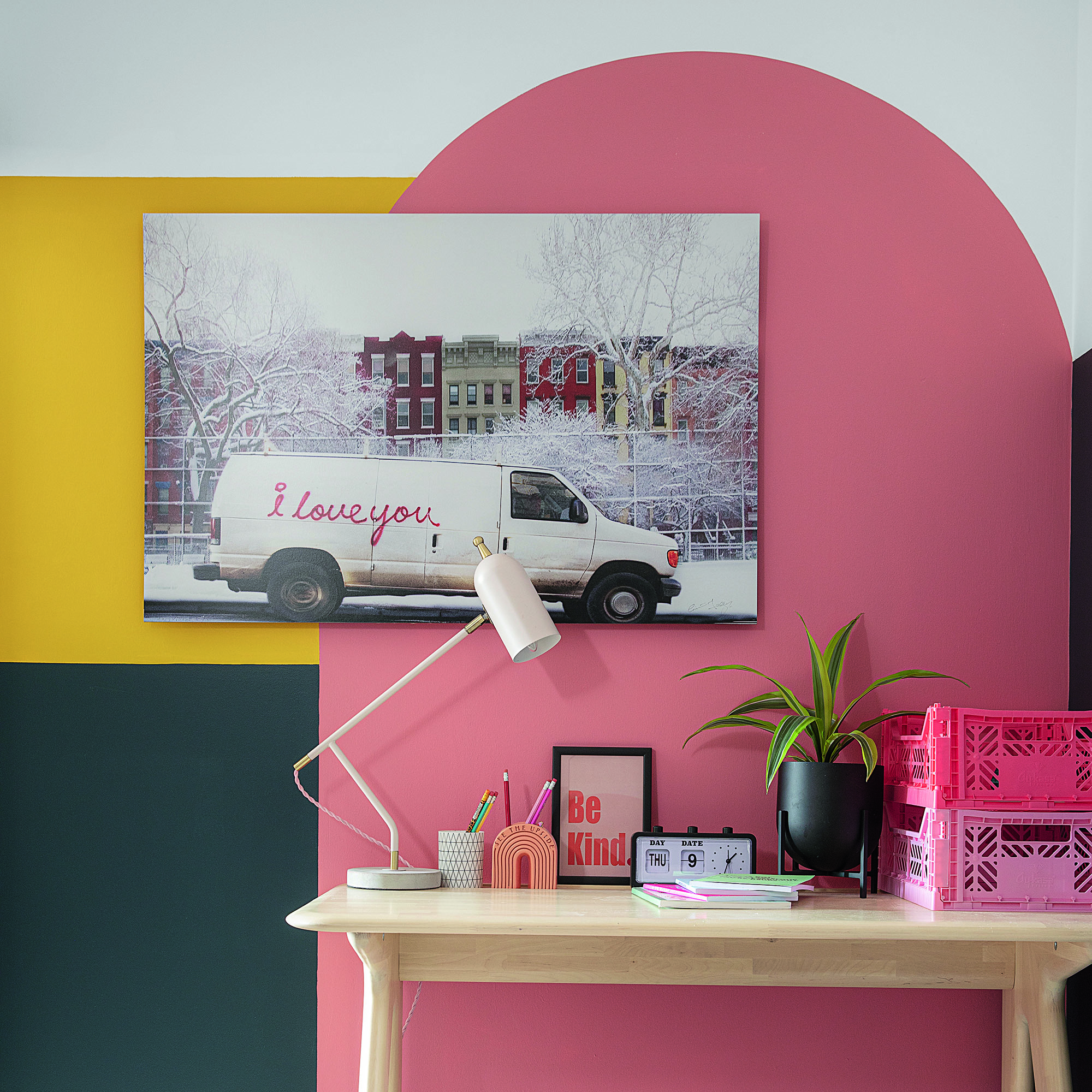
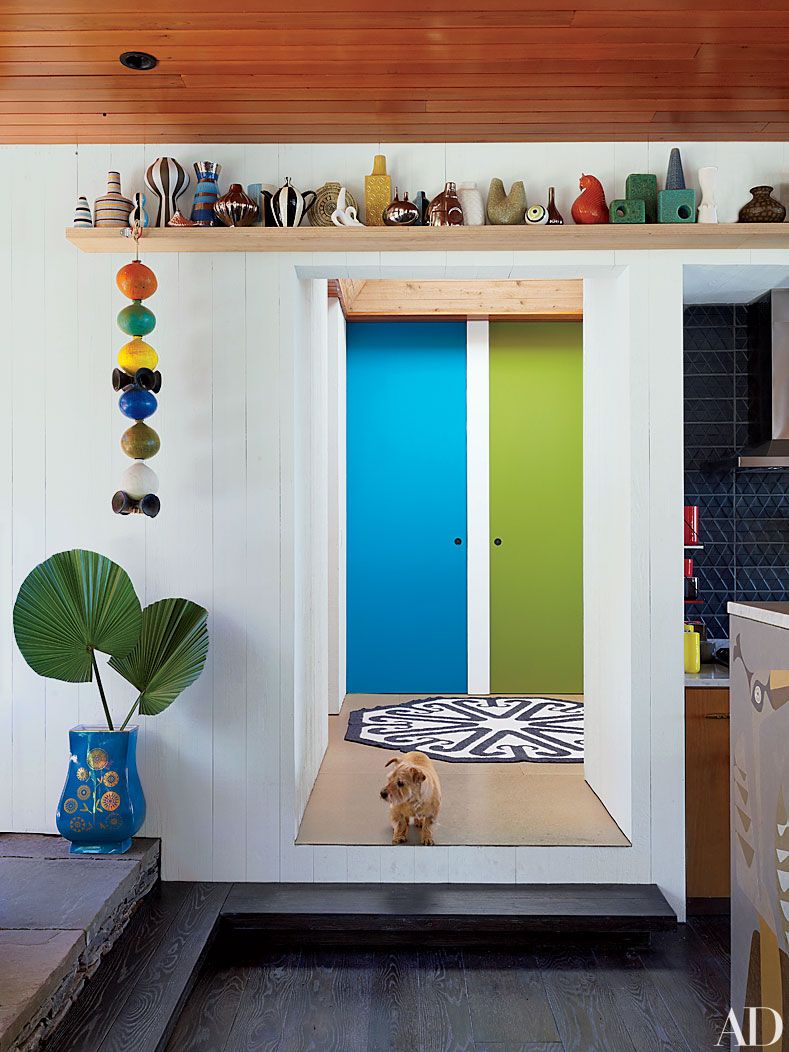
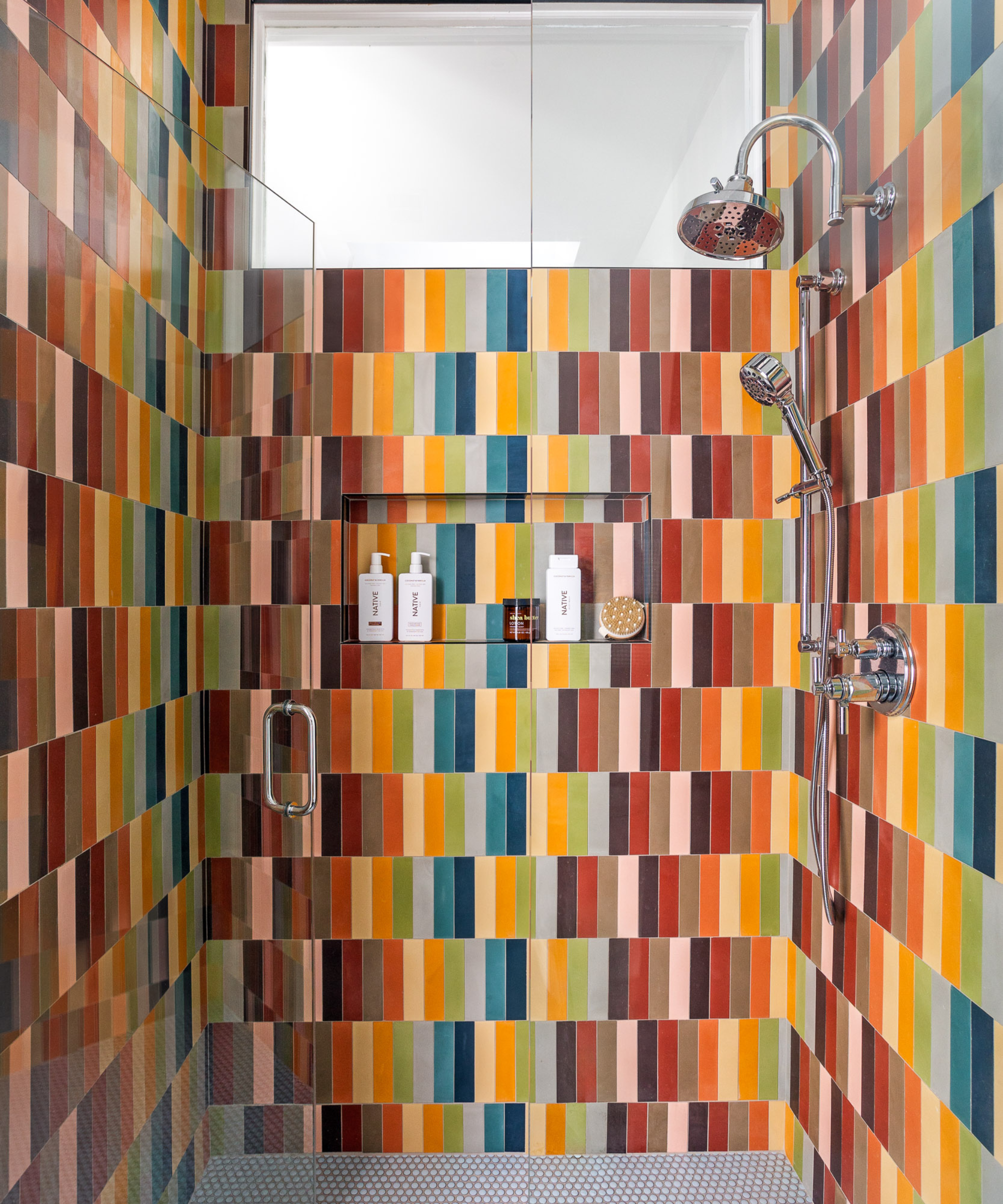
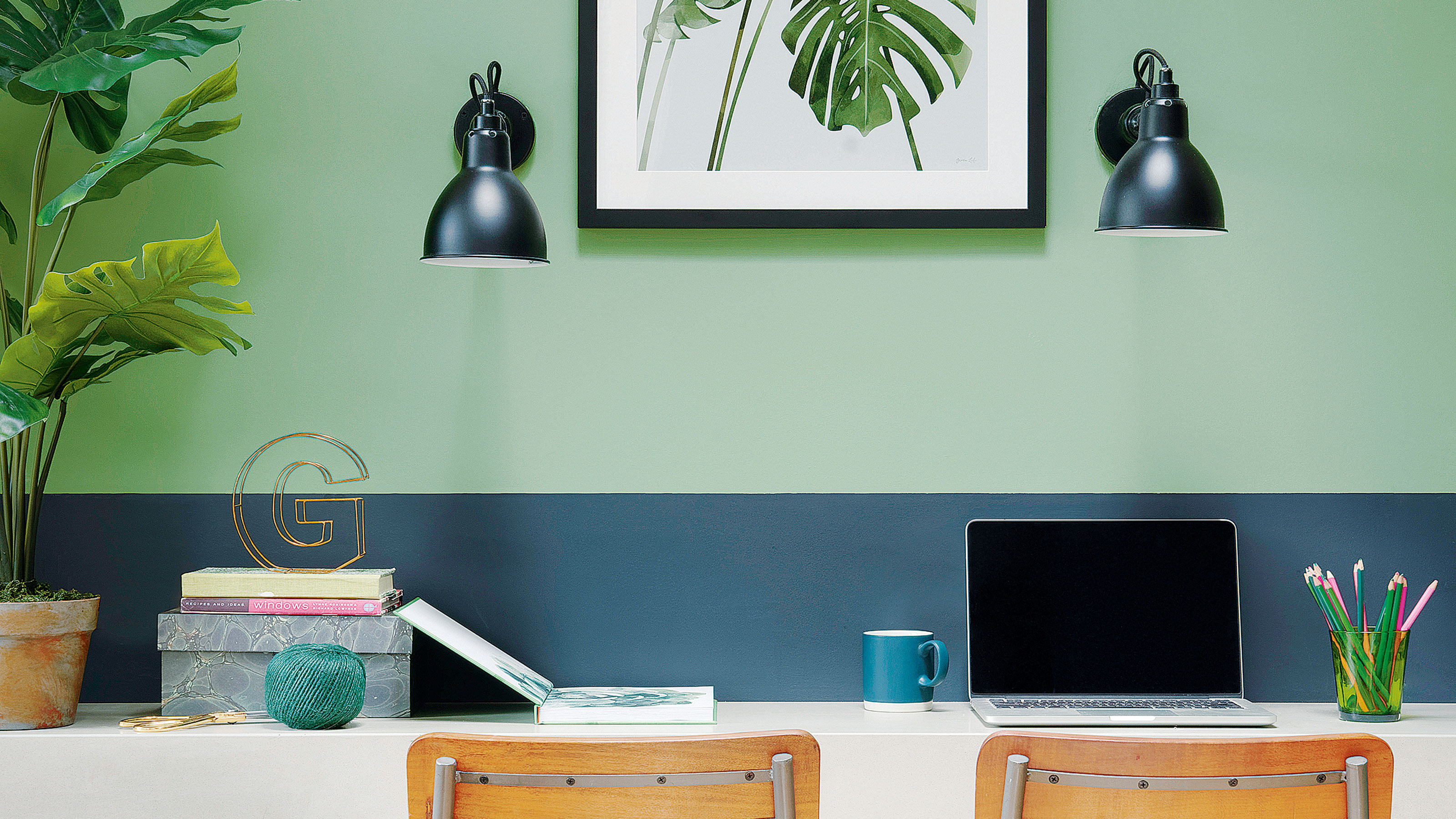
Colour-blocking is introduced as a modern method to incorporate multiple shades, especially gradients or complementary colours, onto walls. This technique can effectively zone a particular area, such as a desk space, by using colours within the same family but at different gradients, adding interest while isolating the workspace.
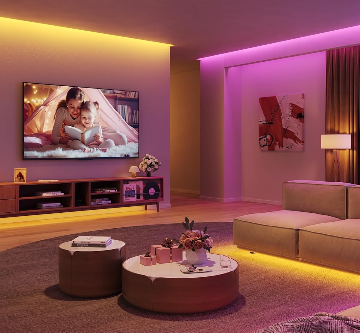
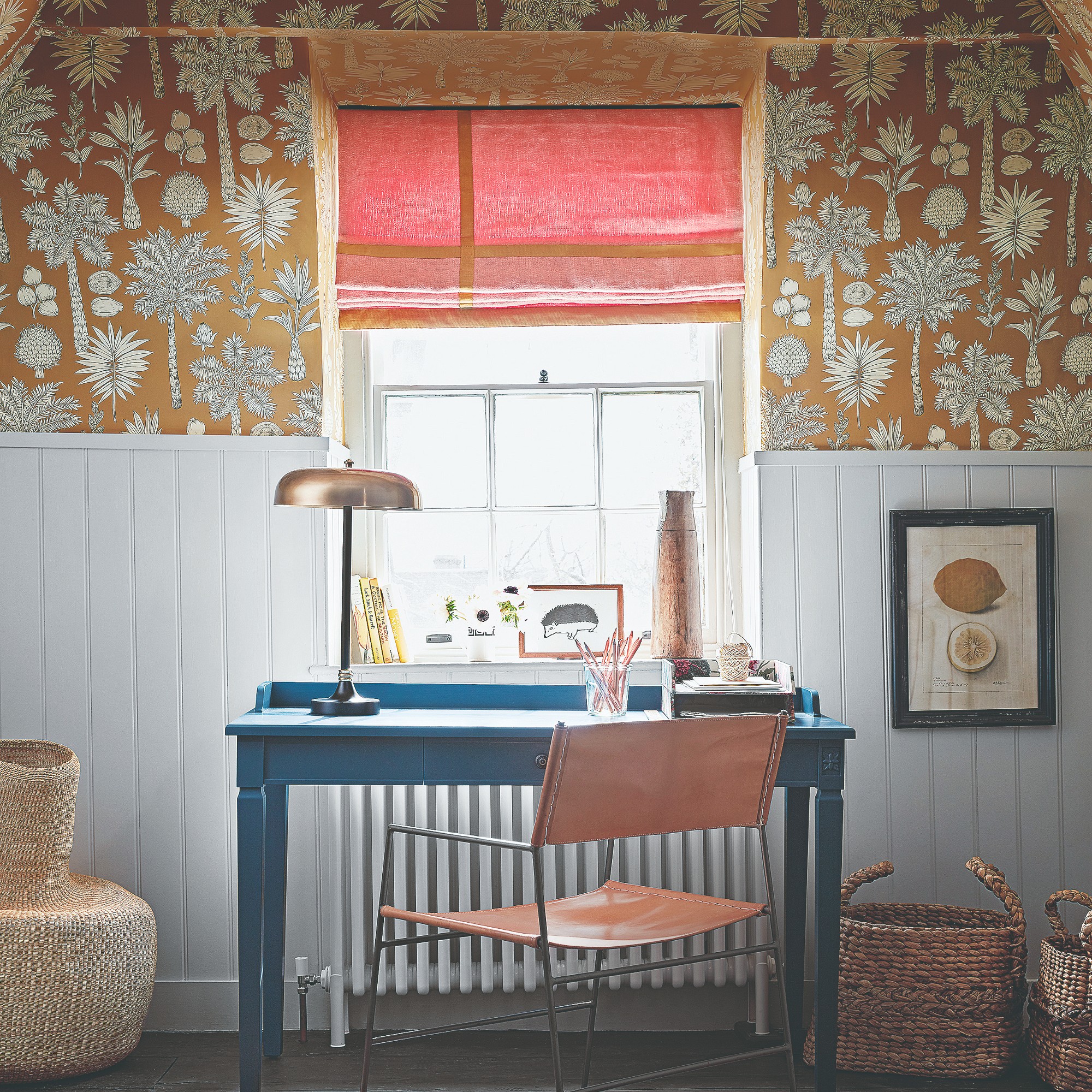
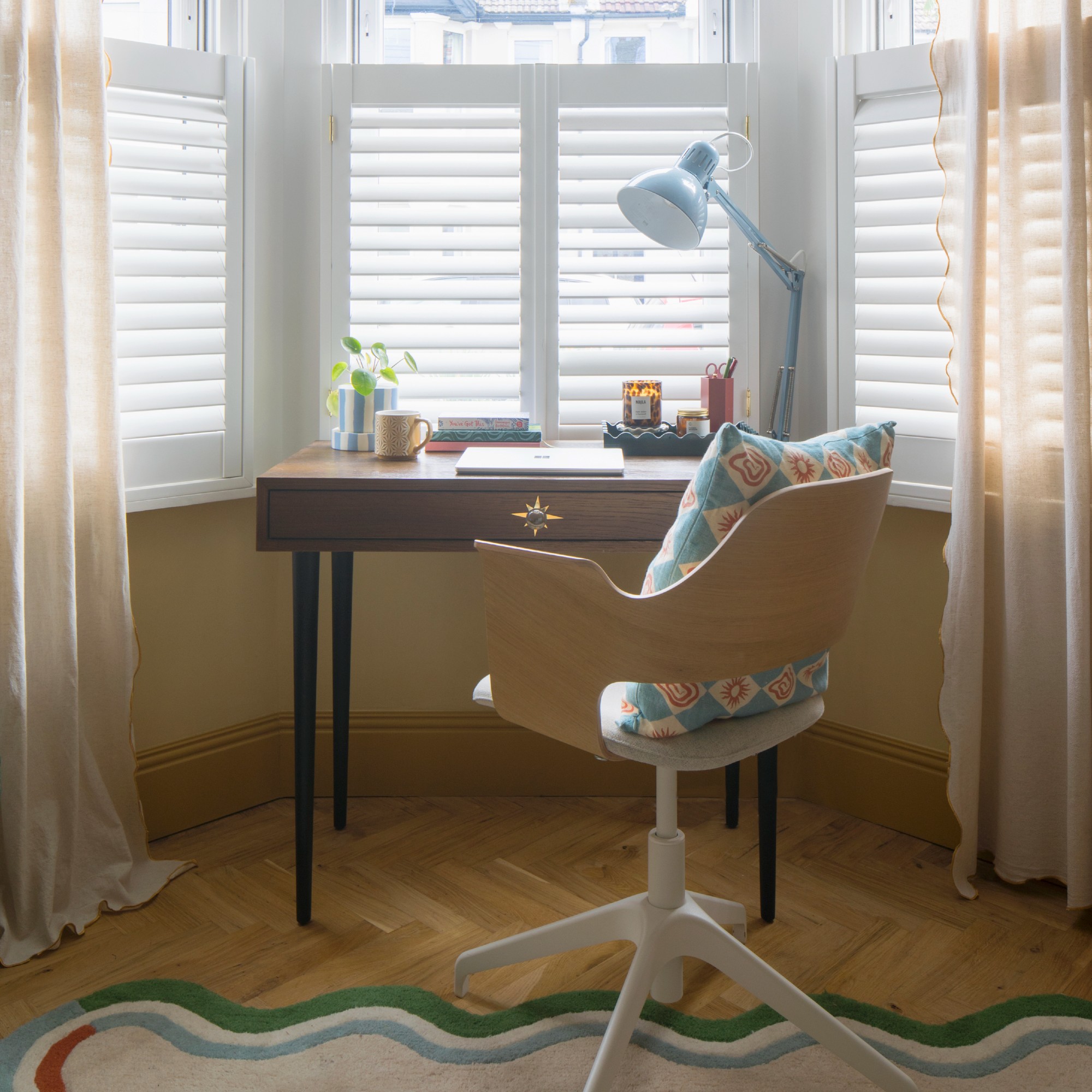
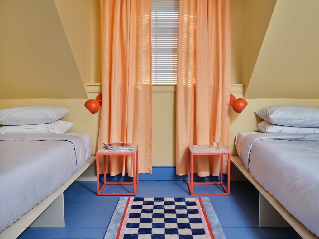
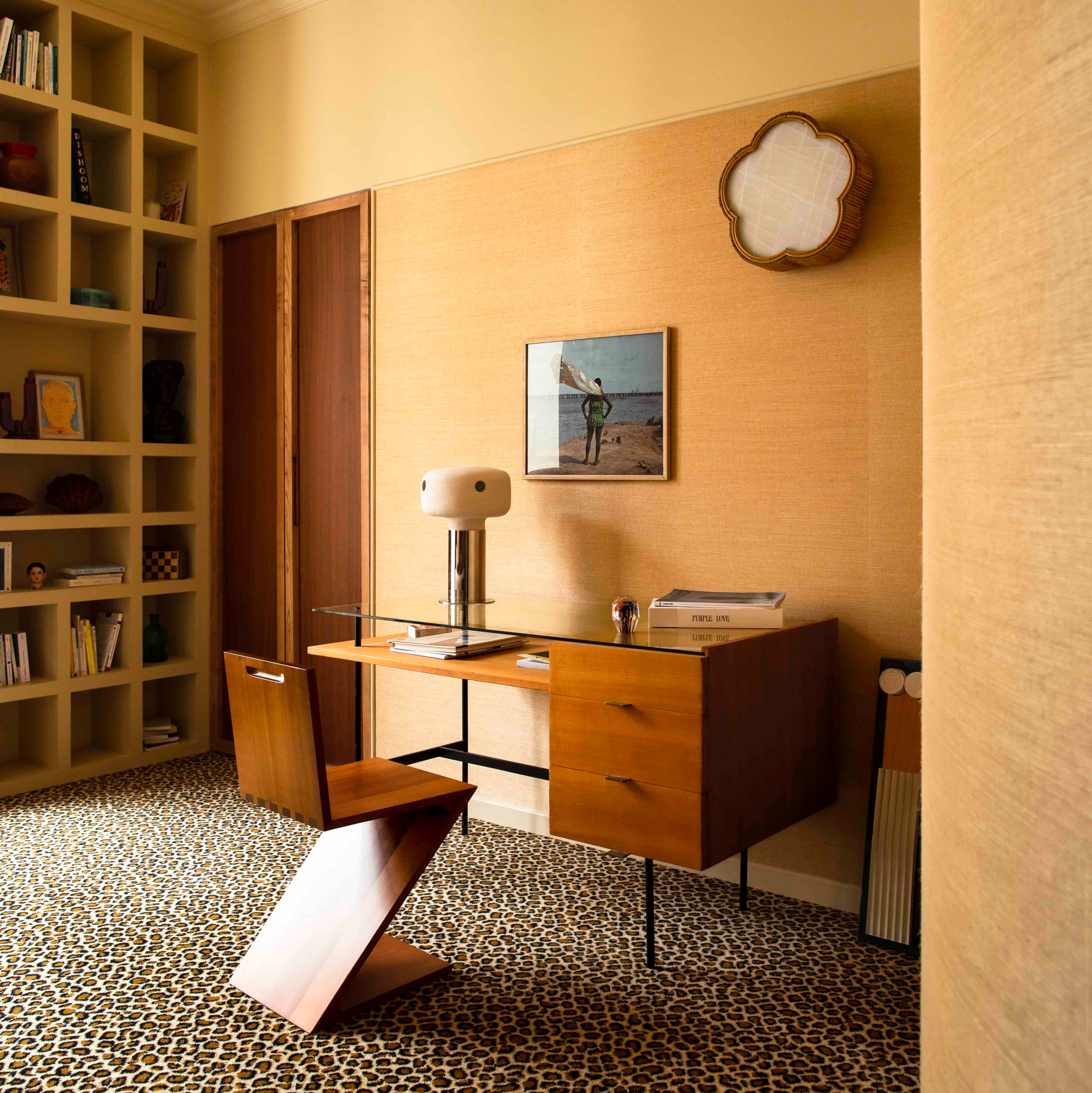
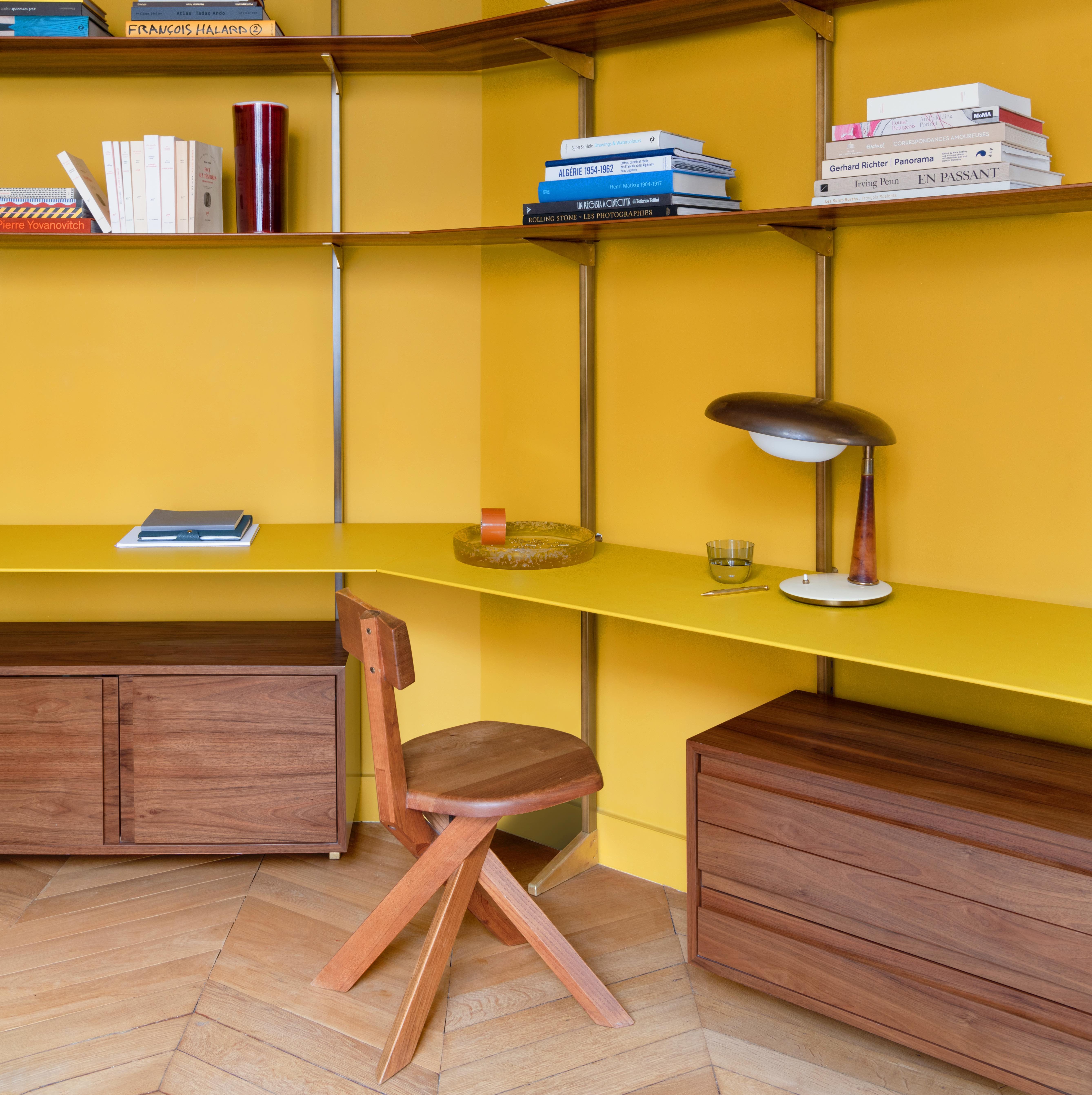
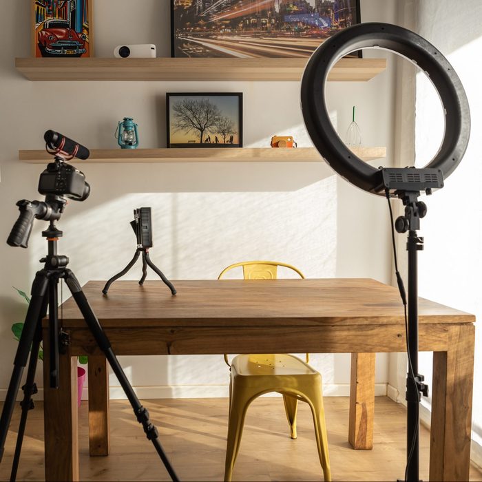
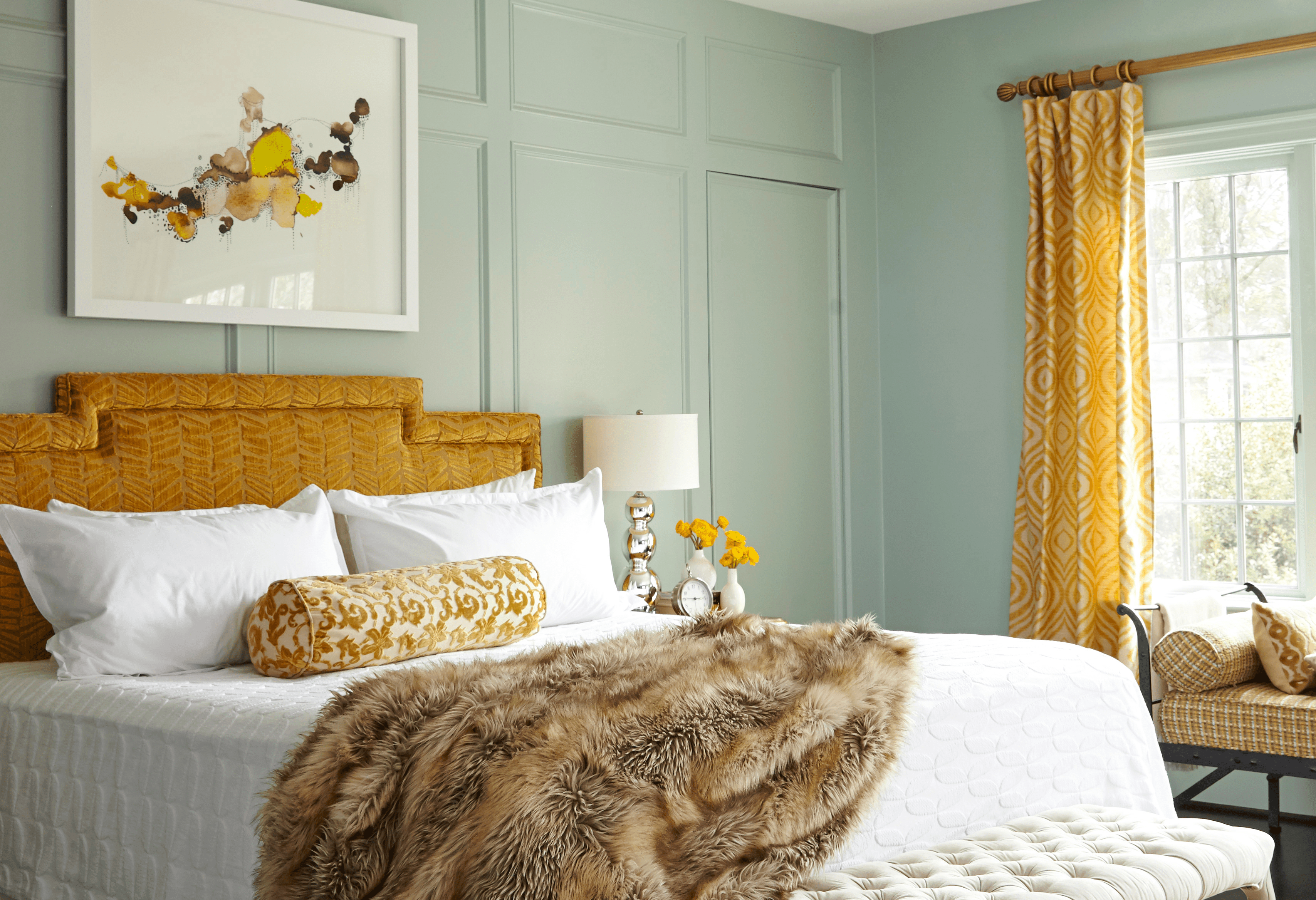
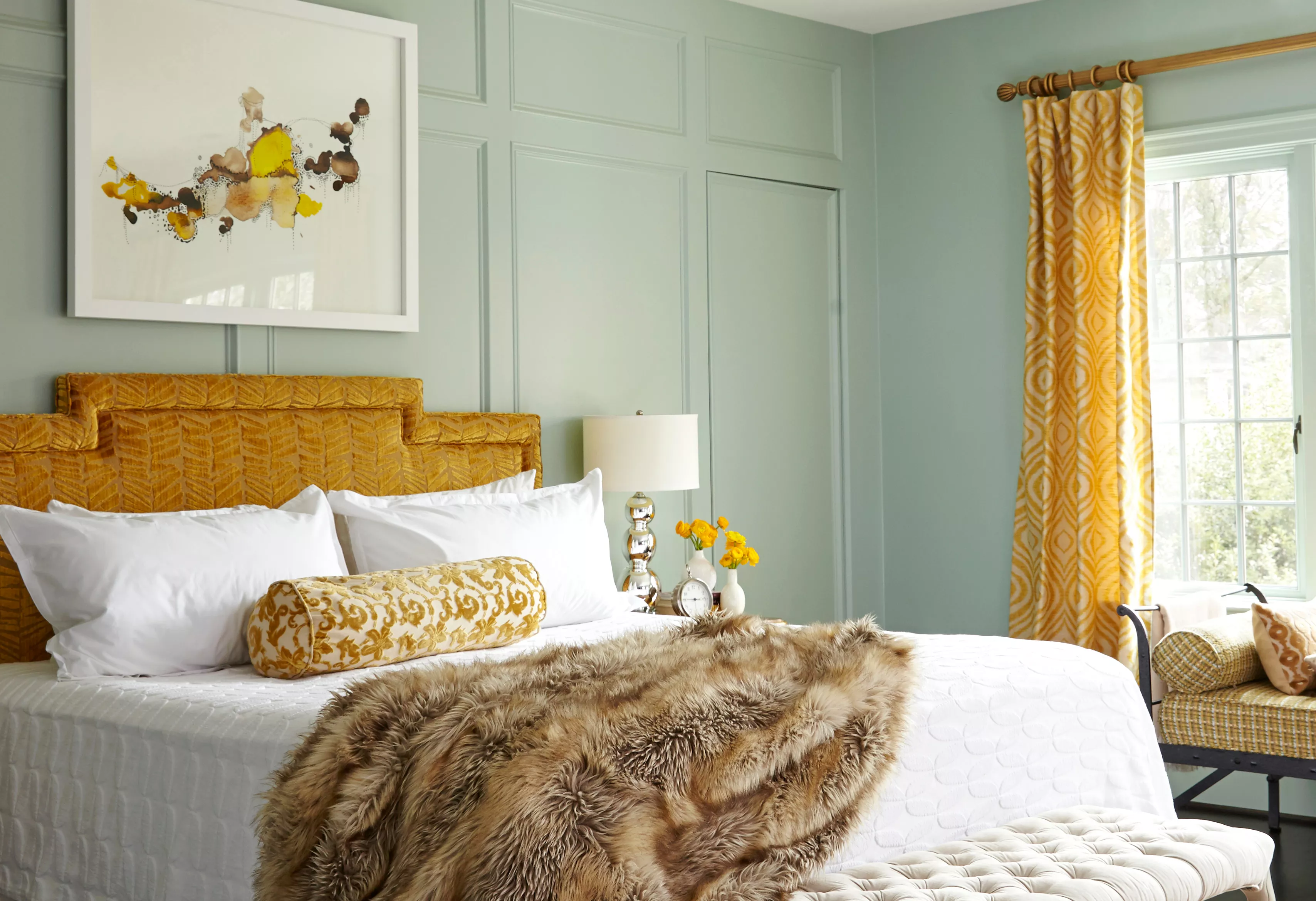
Yellow is highlighted for its cheerful and optimistic qualities, capable of bringing vibrancy and creativity to a home office. Light or warm yellow tones represent light and positivity, symbolizing a sharp mind, intellect, and curiosity, making them suitable for an office or reading room. Yellow can be paired with natural wood for a warm, autumnal feel, or with blue for a sophisticated contrast. Muted yellows and deeper blues are suggested for an energizing yet comfortable environment.
Coral, a blend of pink and orange, is presented as an uplifting and vibrant choice, injecting a "dopamine shot" into the workday. It is particularly effective for small, informal office areas or for creating a distinct, mood-boosting zone within an open-plan space. Coral pairs well with other warm colours like gold, yellow, and peach, as well as cooler shades such as white and pale grey.
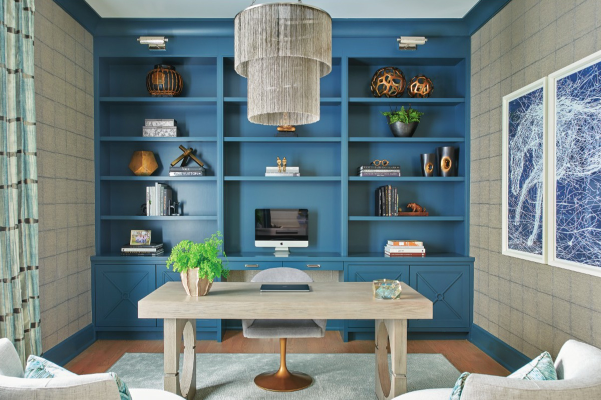
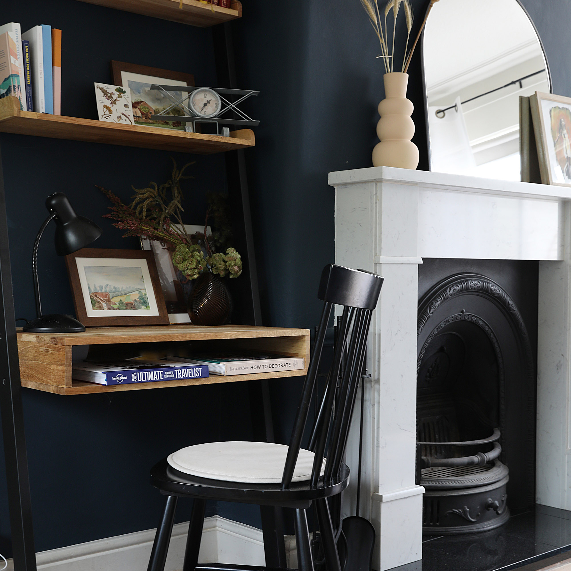
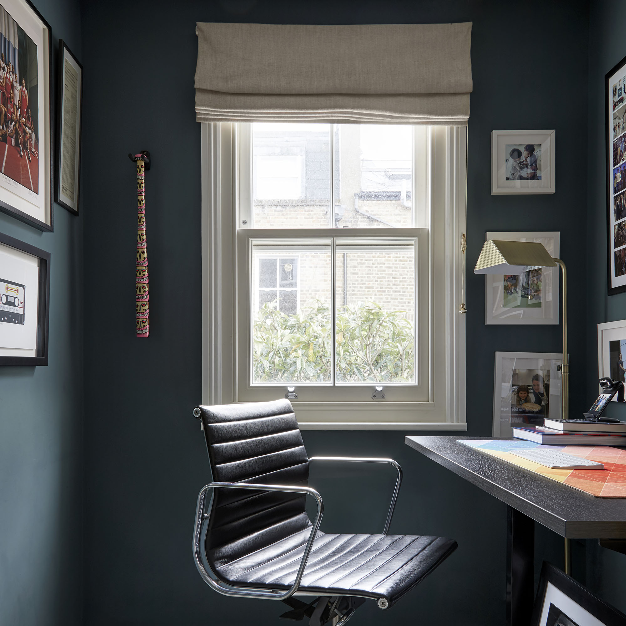
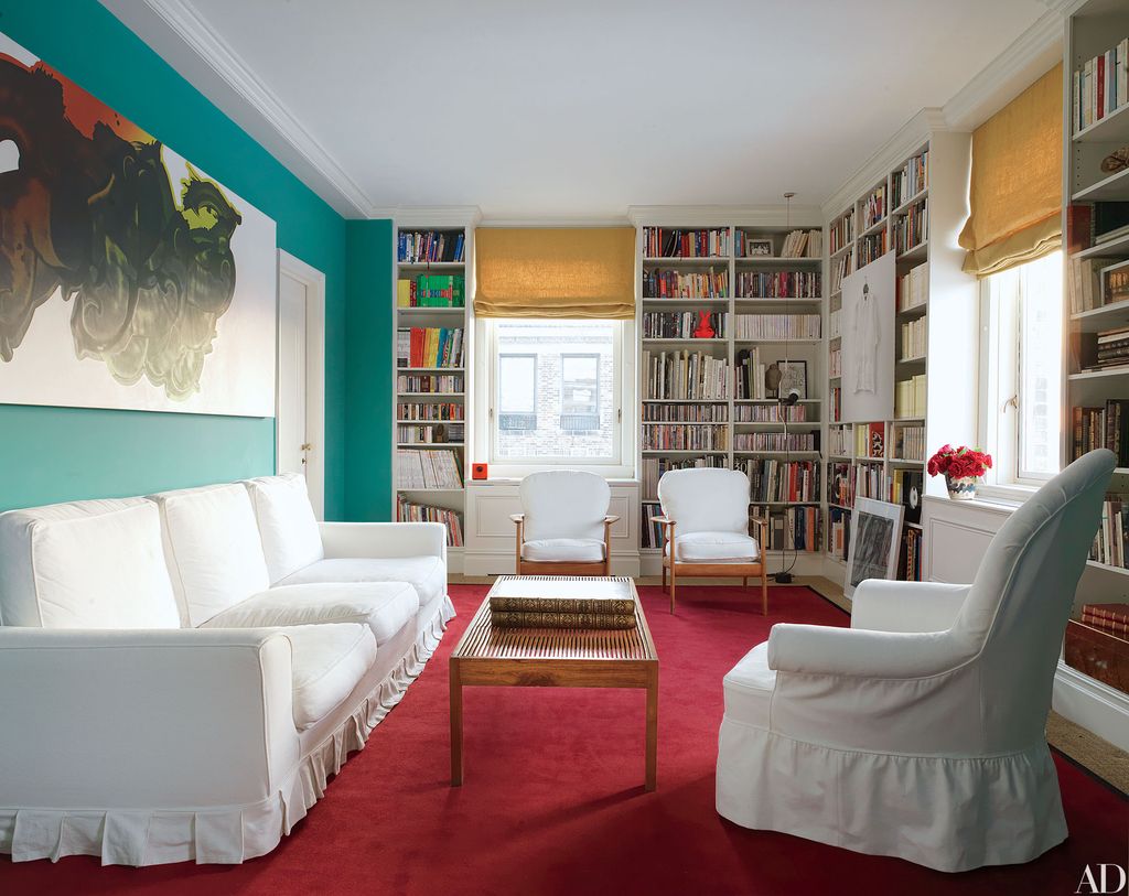
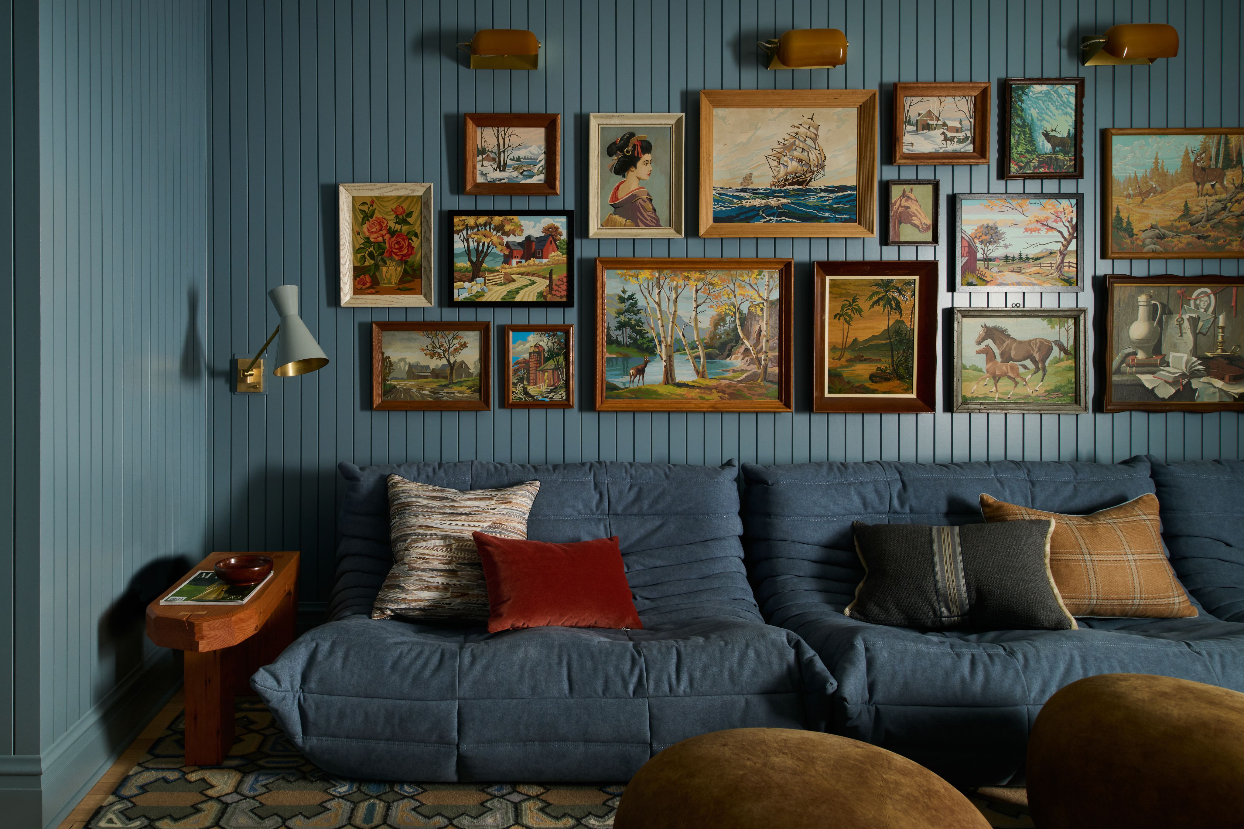
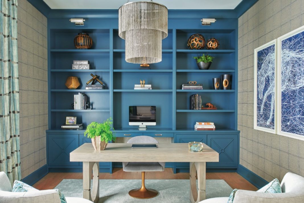
Blue is scientifically proven to enhance productivity in a home office. Short wavelength blues are considered "intellectual" shades that stimulate thought, communication, and concentration. Light blues promote mental clarity and focus during busy periods, while dark blues are effective in stimulating thought processes, making them ideal for working environments. These shades can also be used to create distinct zones within an open space, such as through painting half walls or panelling behind a desk.
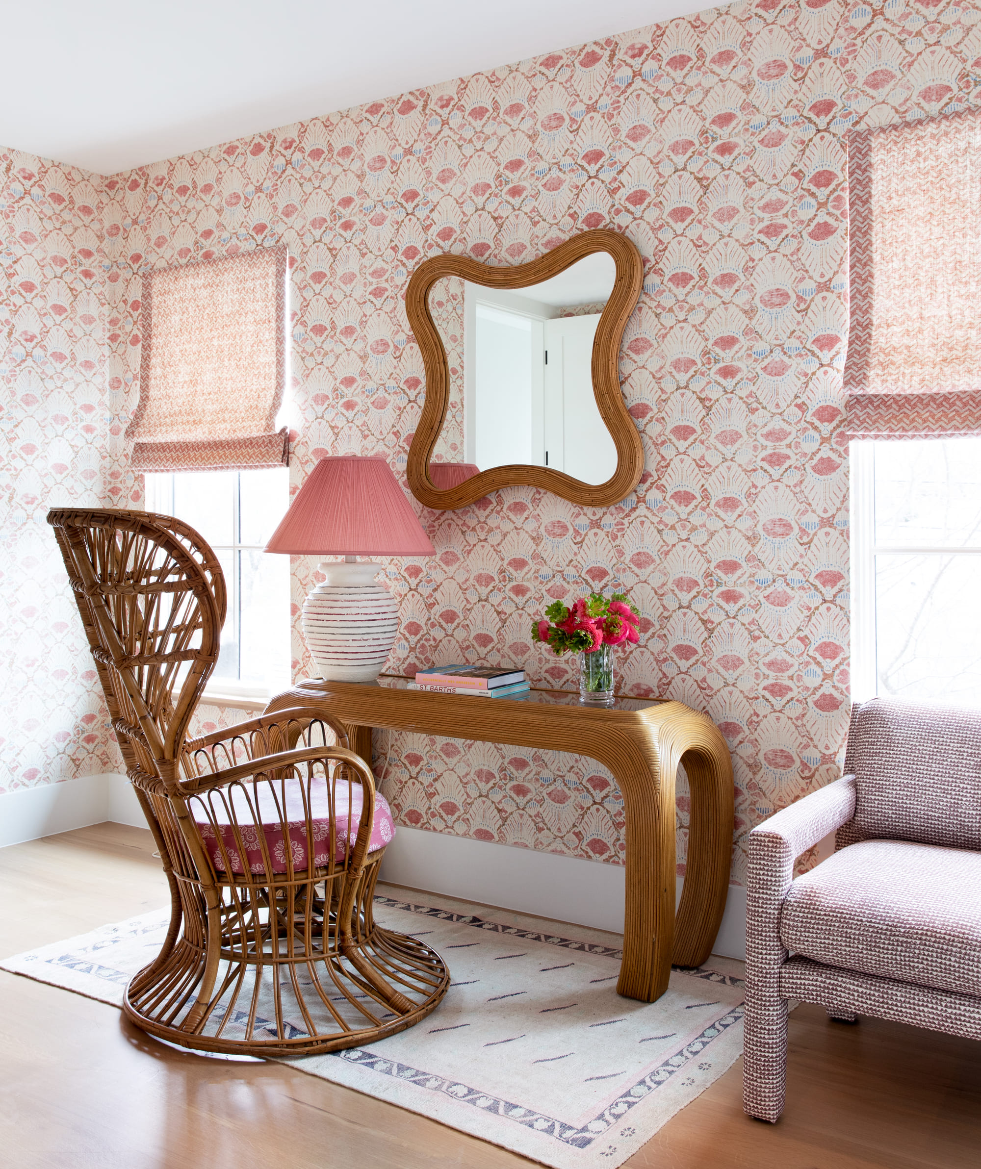
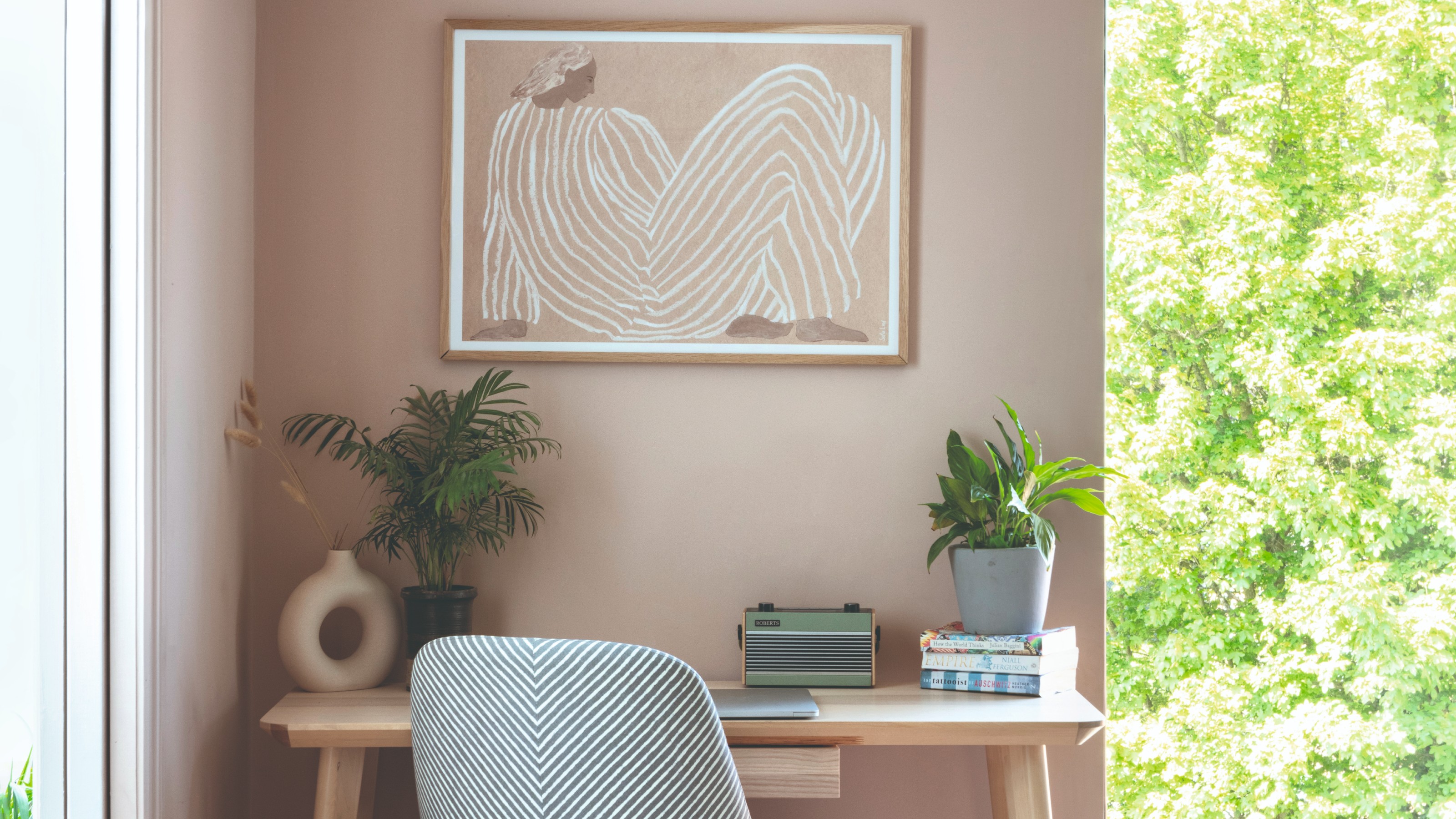
Soft and earthy shades of pink are recommended for a calming and positive atmosphere, contrasting with the bolder pinks of previous trends. A gentle blush pink can bring warmth and positivity without overwhelming the space, particularly suited for creative or multi-use home offices.
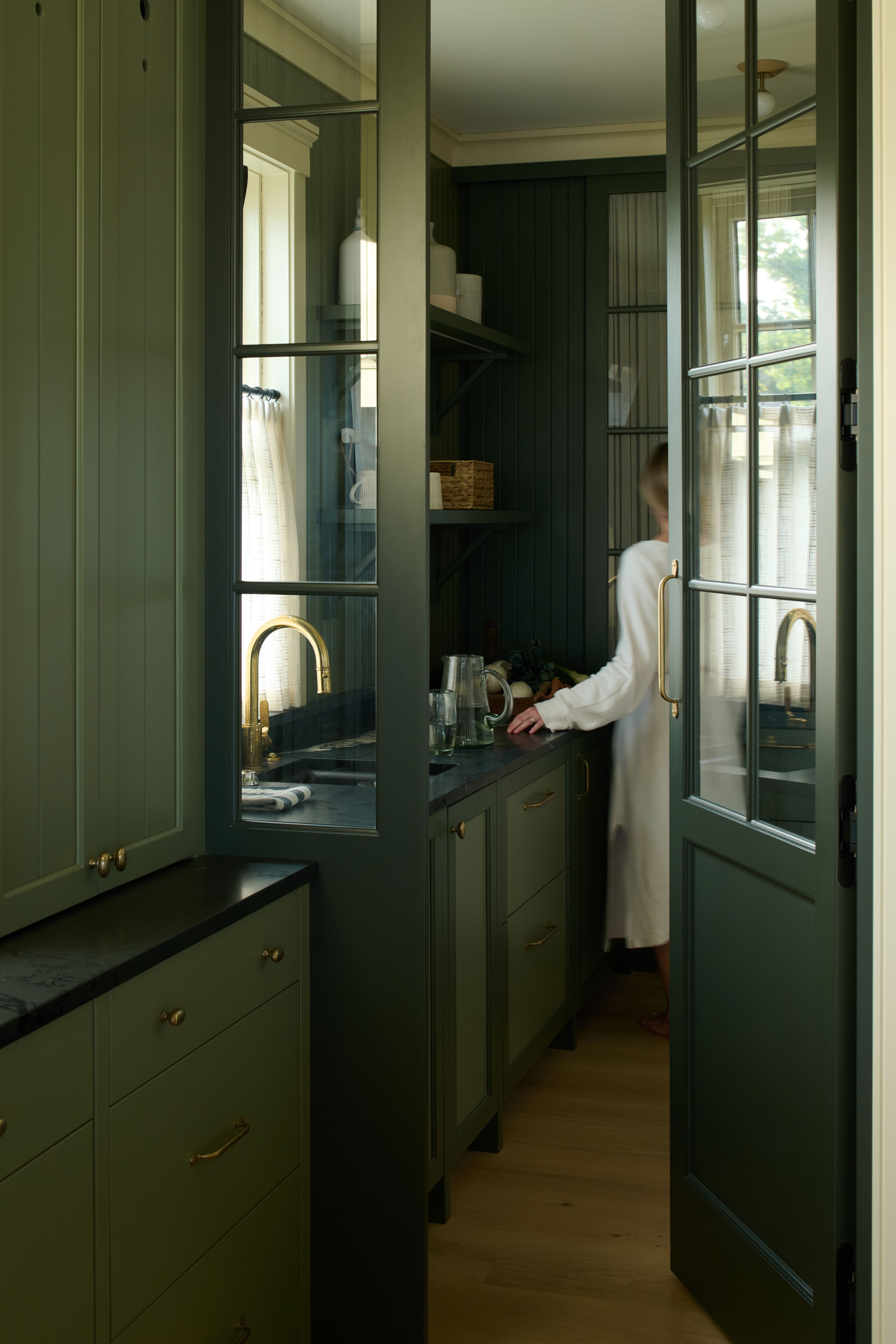
Green, associated with nature and growth, helps bring the outdoors inside, fostering a calming environment. Soft olives or sage tones are ideal choices, with darker greens creating a cosy feel during colder months. Green schemes can be complemented with whites, creams, oranges, and peaches. Sage paint, in particular, is noted for its calming properties, suitable for a serene office space when paired with pastel shades or light yellows, golds, and creams for warmth.
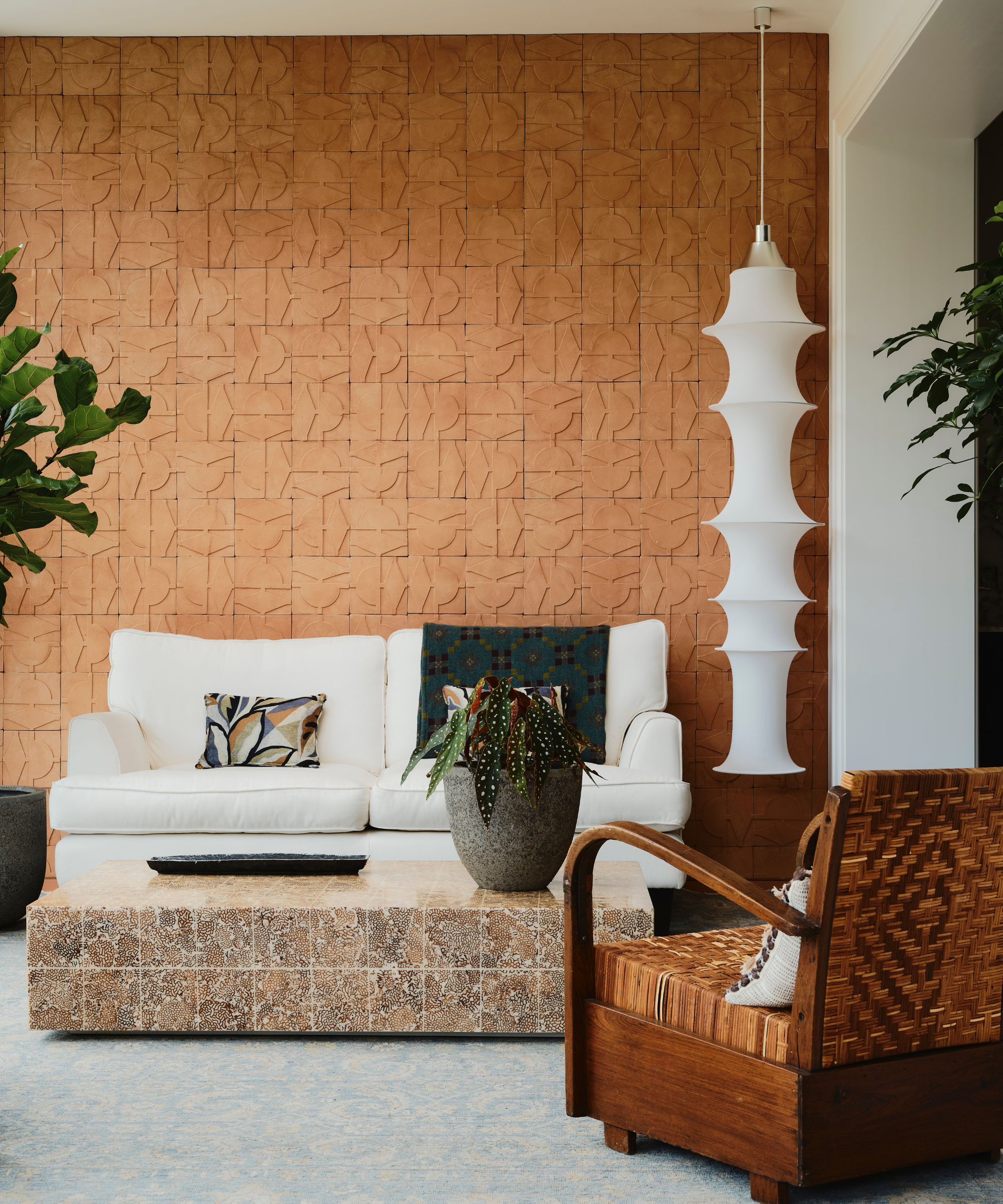
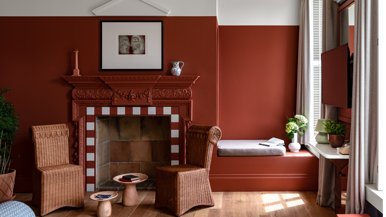
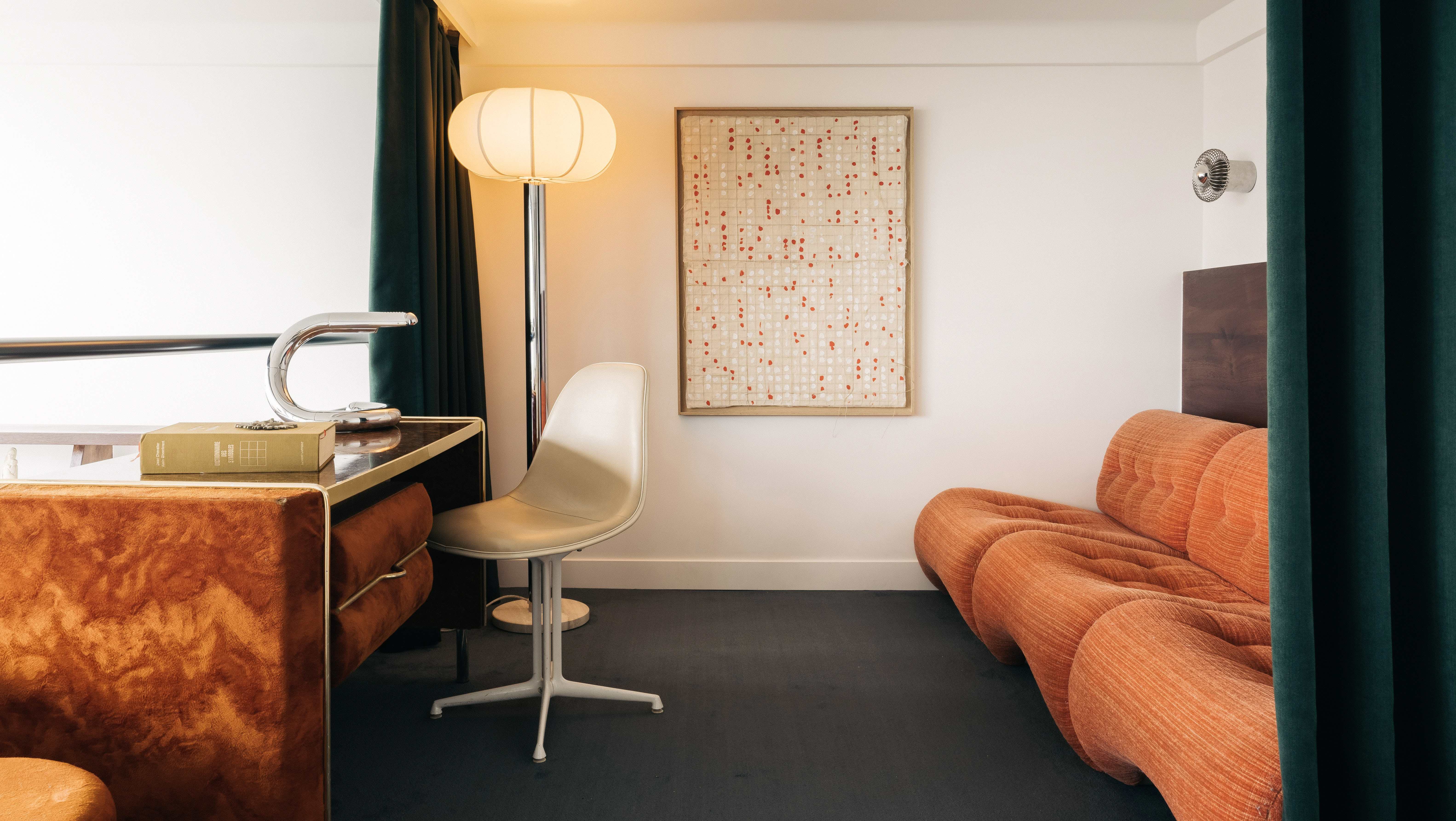
Earthy shades, including terracotta, warm blues, greens, and gentle yellows, offer a grounding and inviting feel. These "new neutrals" help create a comforting atmosphere, especially when working from home during colder periods. They are versatile and allow for flexibility in home design. Lastly, Scandi white provides a crisp, zen-like environment. To avoid a sterile look, the best white paint shade for the specific space should be chosen, and pops of colour added through accessories and inspirational artwork to inject personality and character.
#HomeOffice #ColourSchemes #InteriorDesign #Productivity #ColourPsychology #WorkFromHome #HomeDecor #PaintColours #ZoningSpaces #HomeOffice #ColourSchemes #InteriorDesign #Productivity #ColourPsychology #WorkFromHome #HomeDecor #PaintColours #ZoningSpaces
Hay 0 comentarios en total
 Aún no hay comentarios
También te puede gustar
5 best colors to paint a small office — expert advice for a productive, stress-free space

Home office ideas – 29 WFH spaces that marry practicality and style

10 Work From Home Hacks For Indian Homes: How To Build A Productive Home Office Without Spending Too Much
8 Paint Colors That Promote Wellness at Home

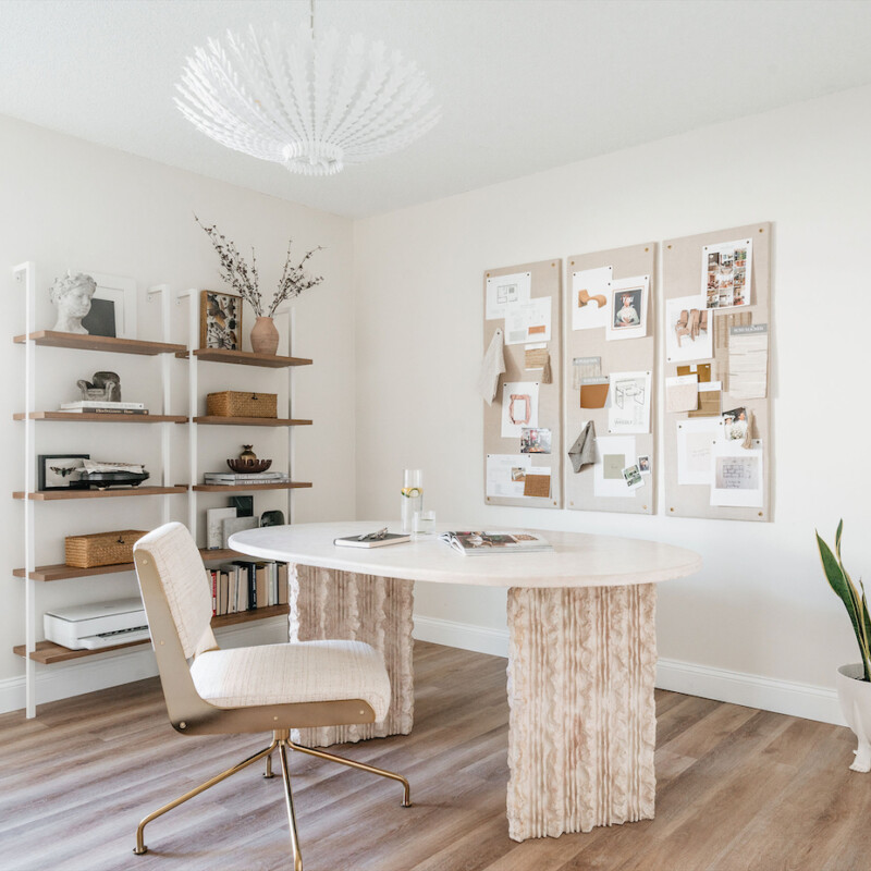
6 Home Office Design Ideas to Fuel Productivity and Keeps Spirits Lifted

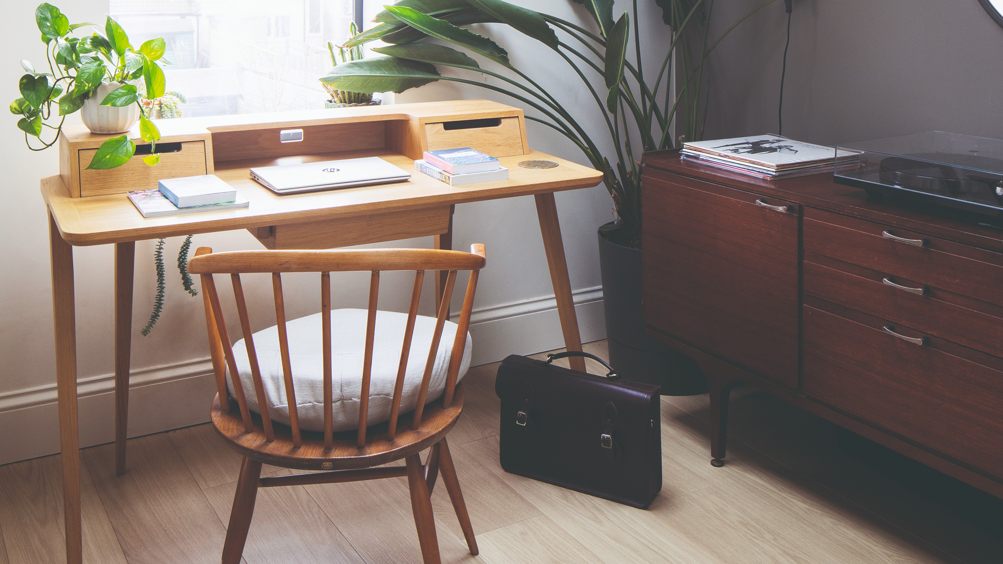
16 home office layout ideas to boost productivity and create a comfortable work space
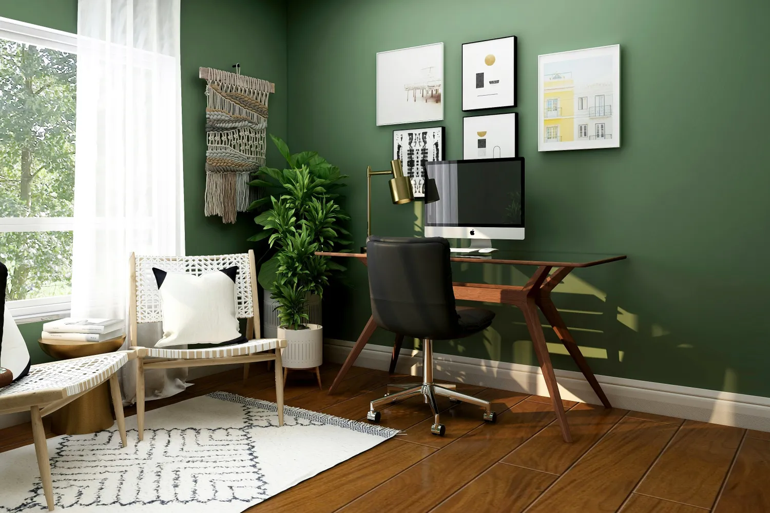
We Asked Designers for Their Top Home Office Trends This Year—And We're Trying Them ASAP

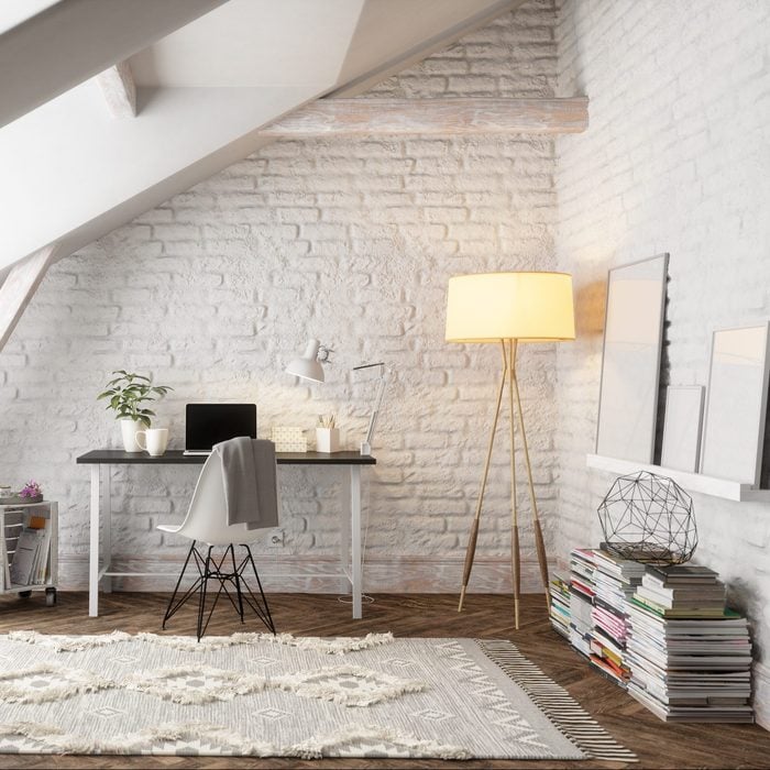
12 Home Office Lighting Ideas


Get More Done on WFH Days With These Home Office Lighting Ideas

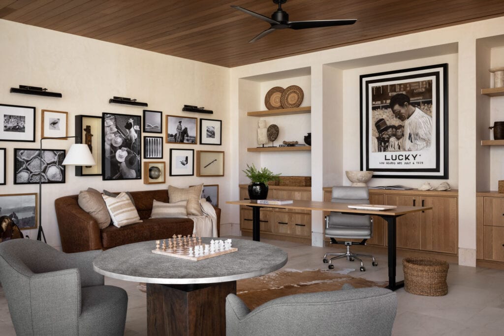
How To Recreate Our Favorite Office Spaces
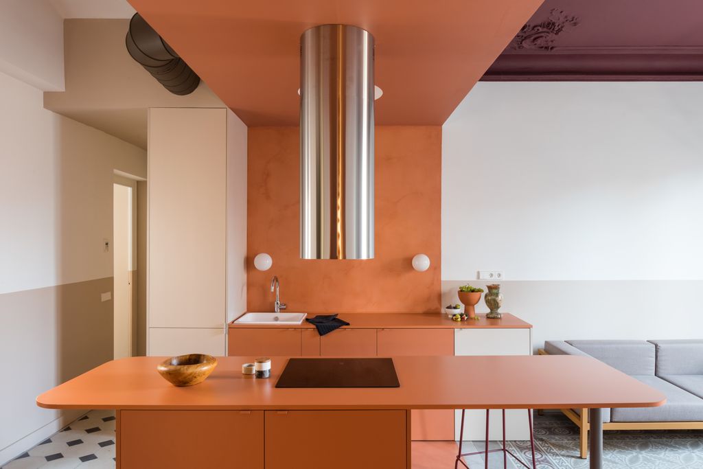
9 Color Blocking Ideas for a Bright, Cheery Home

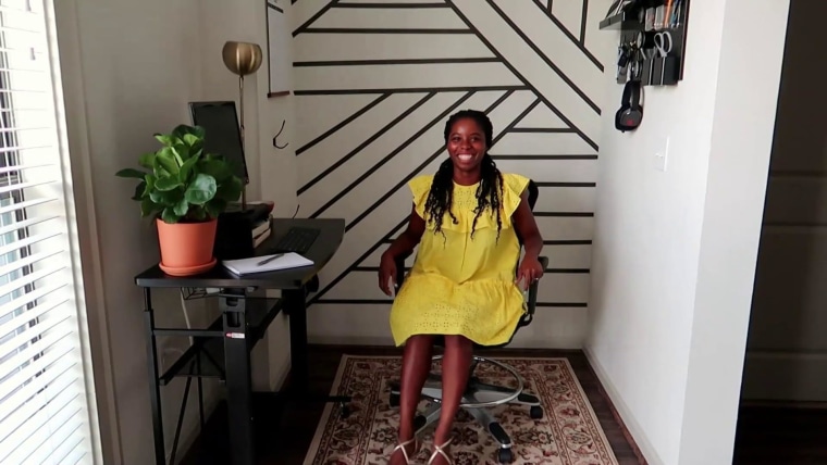
5 home office ideas to create the perfect workspace

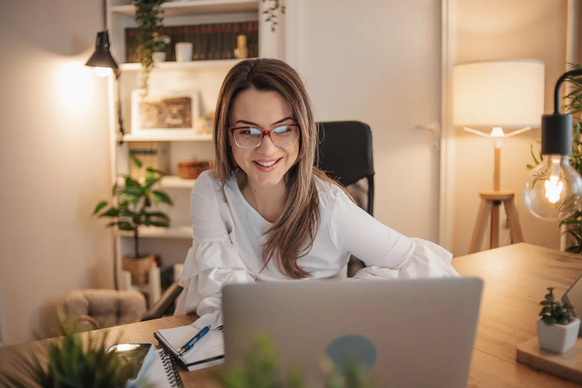
12 Home Office Lighting Ideas for a More Productive Workspace

Can’t Concentrate? Decorating Your Space With These Colors Can Sharpen Your Focus
8 Desk Lamps That Make Your Work-From-Home Setup Feel More Intentional

6 'Energetic Colors' for Vitality and "Sophisticated Interiors", According To Psychologists And Design Experts
Get the Look of This Colorful and Chic Home Office

Home office wall decor ideas to create an inspirational display
Who needs a Zoom background when your home office looks this good?

6 Paint Colors That Add Positive Feng Shui to Every Room in Your Home