11 Decor Mistakes That Always Make Your Home Look Tacky, According to Designers
The article addresses common interior design pitfalls that can detract from a room's aesthetic, providing advice from interior designers Erin Williamson, Christina Kim, and Jojo Barr. It highlights eleven specific decor mistakes that designers consider "tacky" and offers alternative solutions to create a more sophisticated and inviting living space.
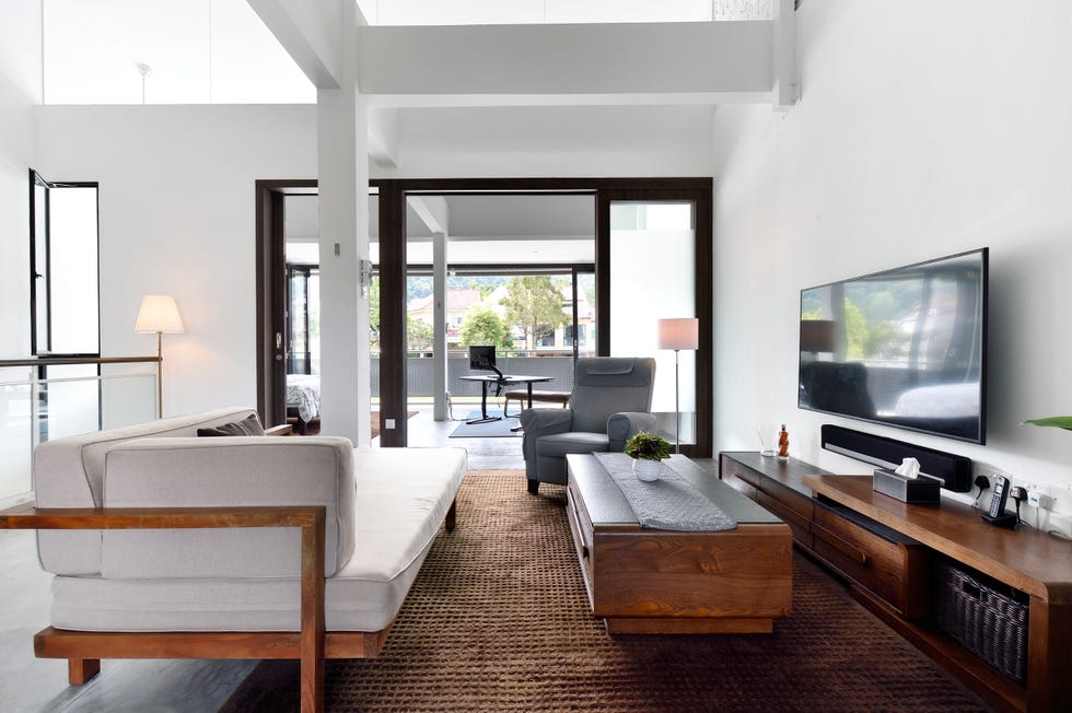
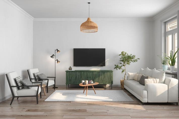
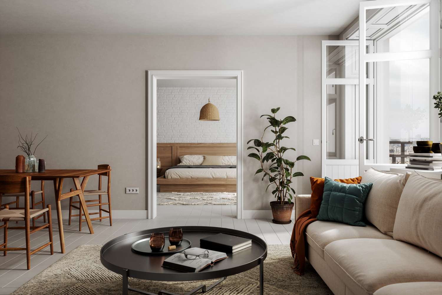
One significant mistake is using the television as the primary focal point of a living room. While unavoidable in most homes, designers recommend arranging furniture to allow for flexibility, such as using swivel chairs, so that seating can be reoriented when the TV is not in use. This approach helps prevent the "black mirror" from dominating the room's design.
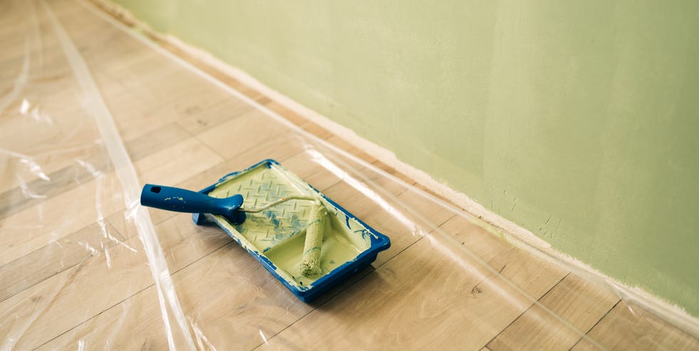
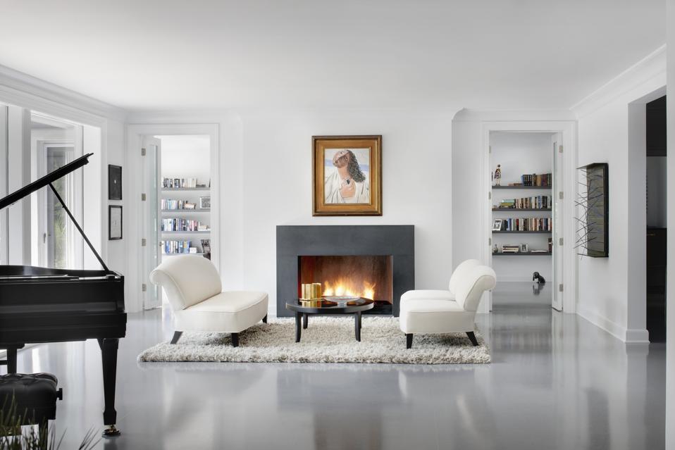
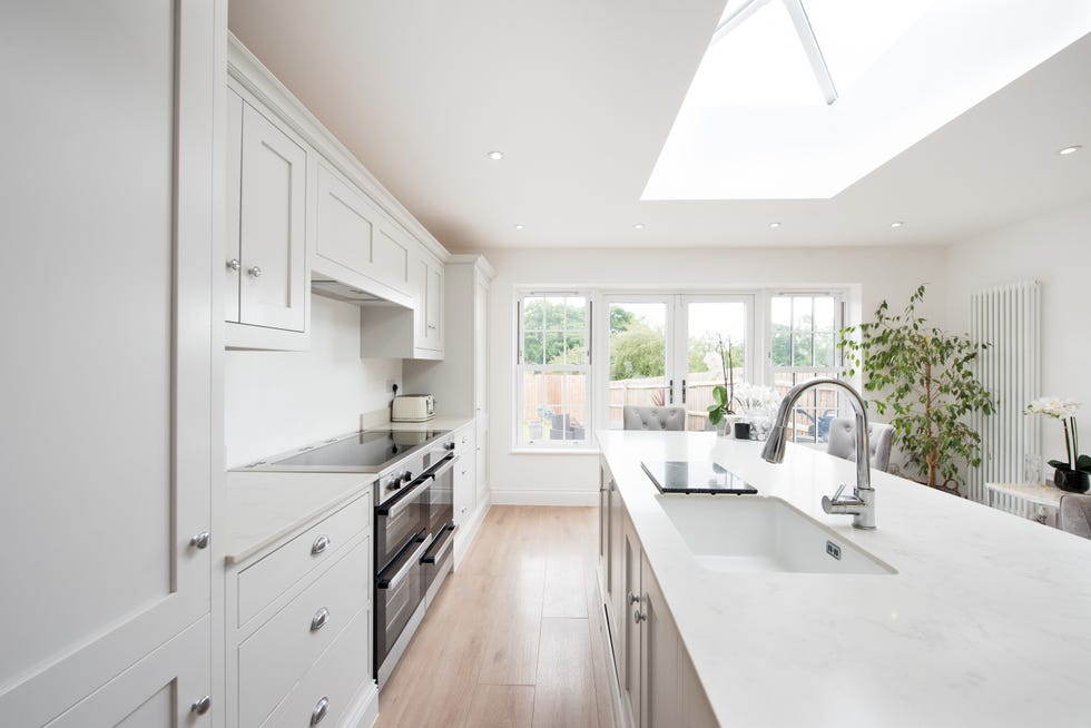
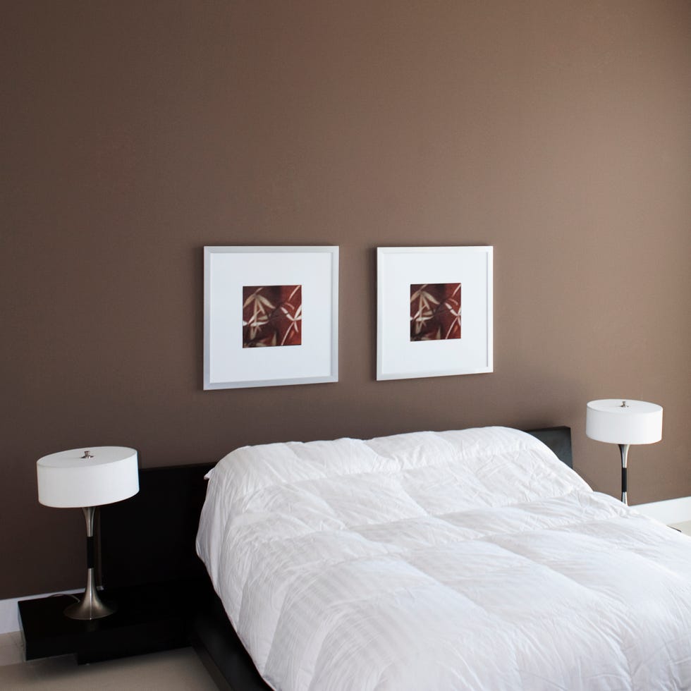
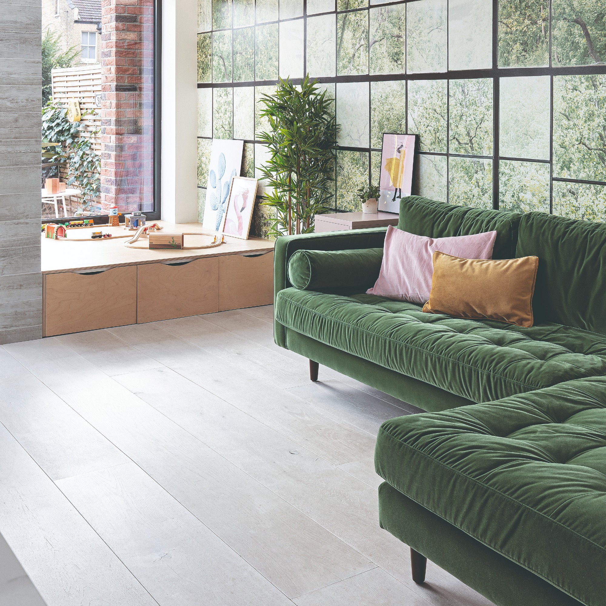
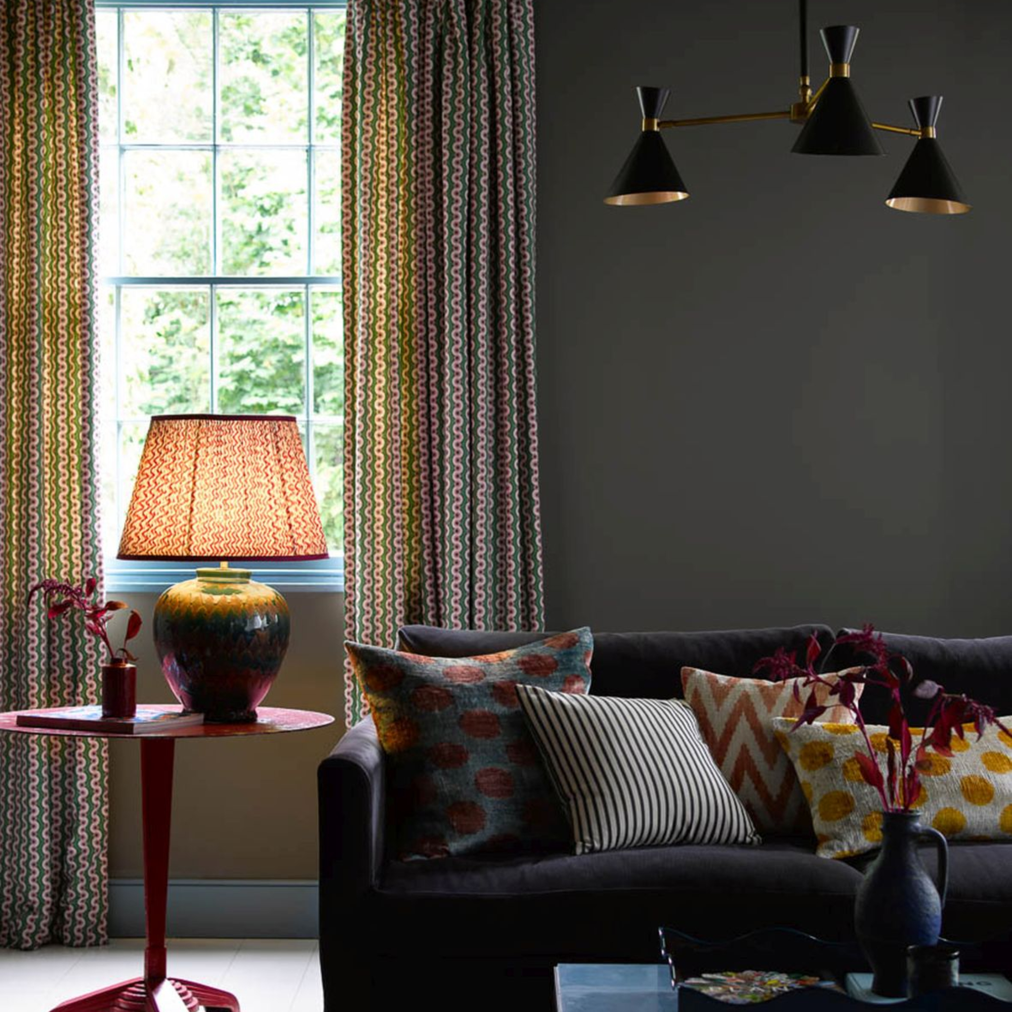
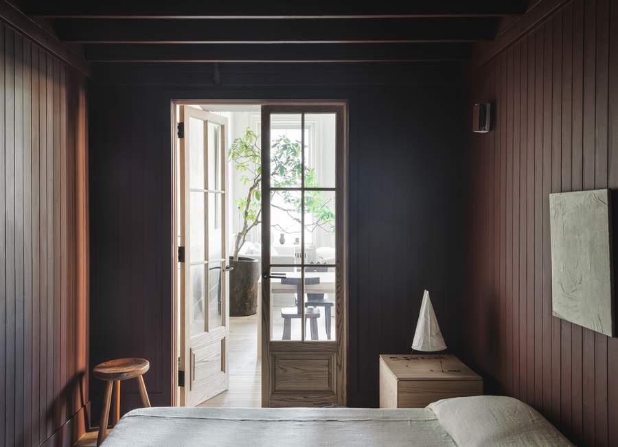
Another decor misstep is leaving walls blank and white, especially in dimly lit spaces. Contrary to popular belief, white paint does not inherently brighten a room; it can instead make it appear dull and highlight a lack of architectural detail. Designers suggest using mid-tone paints to create a backdrop for furnishings or, for a bolder statement, opting for dark, moody tones to foster a cozy atmosphere.
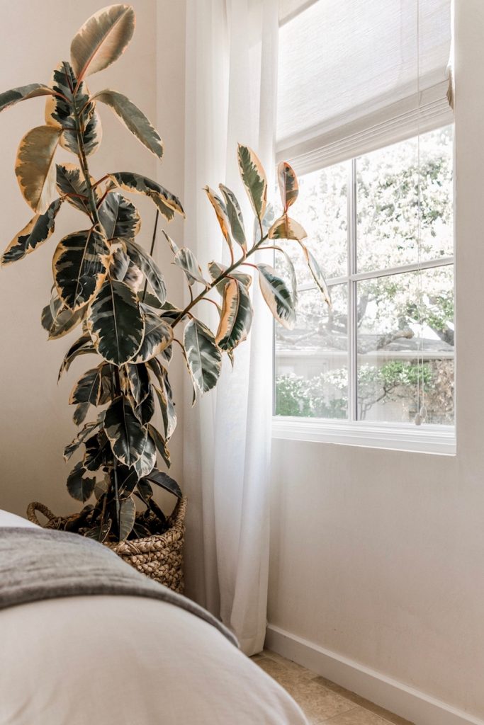
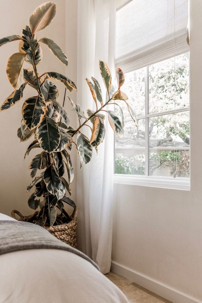
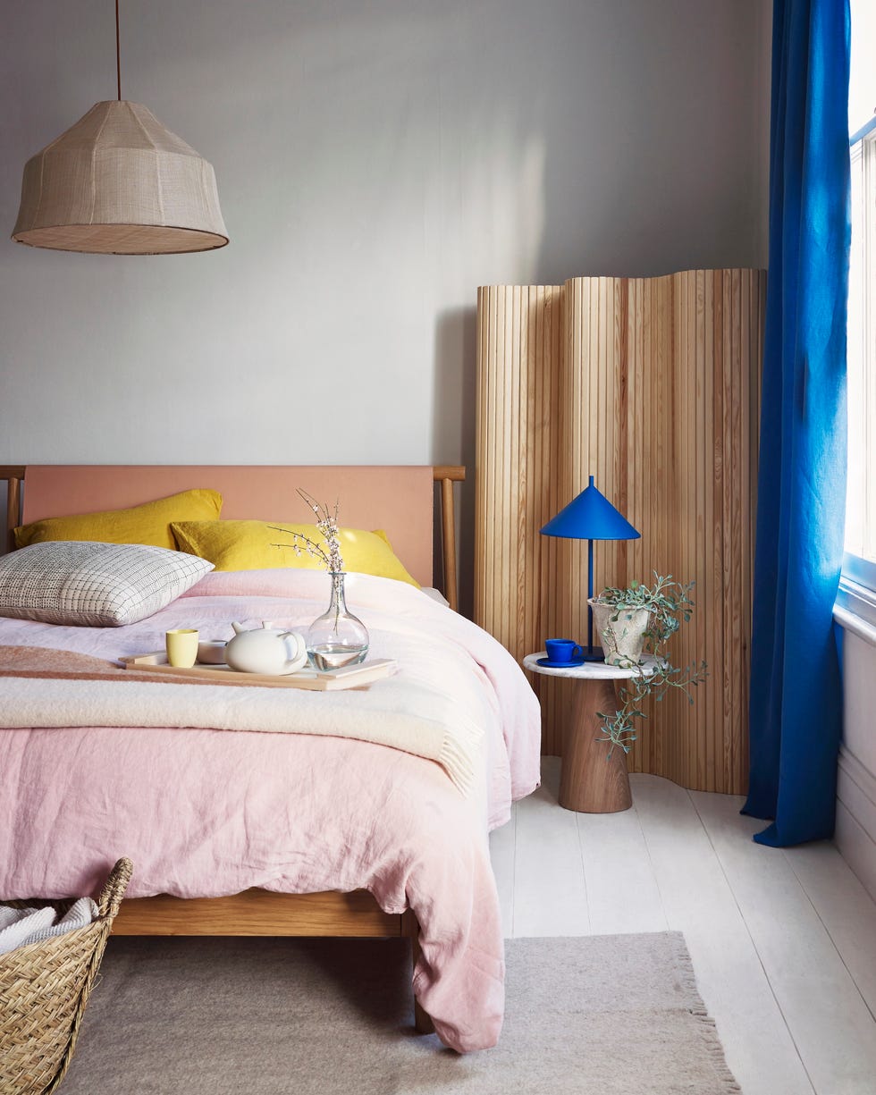
The choice of drapes is also critical. The article warns against using fabrics with sheen like dupioni silk in casual settings or velvet in sunny, hot rooms, as these can appear tacky. White curtains on white walls with minimal white furnishings are also discouraged due to their sterile, hospital-like appearance. A neutral oatmeal color is recommended as a versatile and elegant alternative.
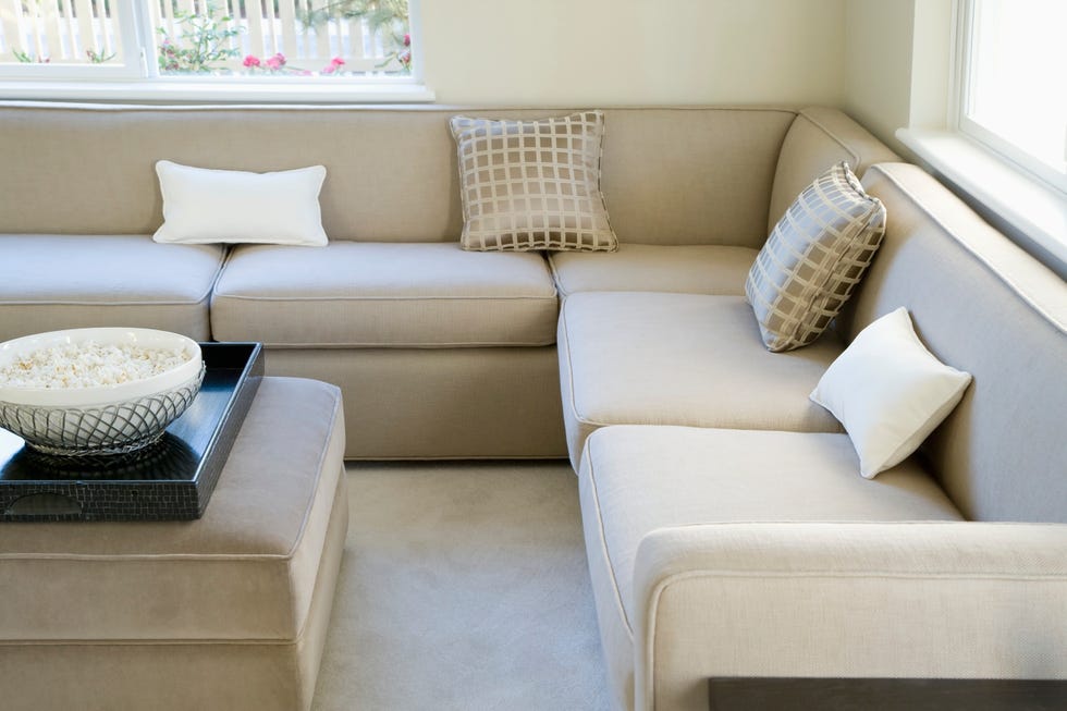
Overcrowding a room with too much small furniture is another common mistake that can make a space feel cramped and lack a focal point. Designers advise decluttering and selecting one larger piece to anchor the room, then complementing it with varied-sized furnishings to create visual interest and balance.
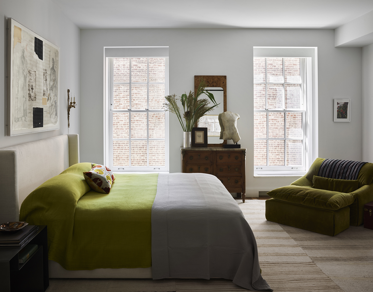
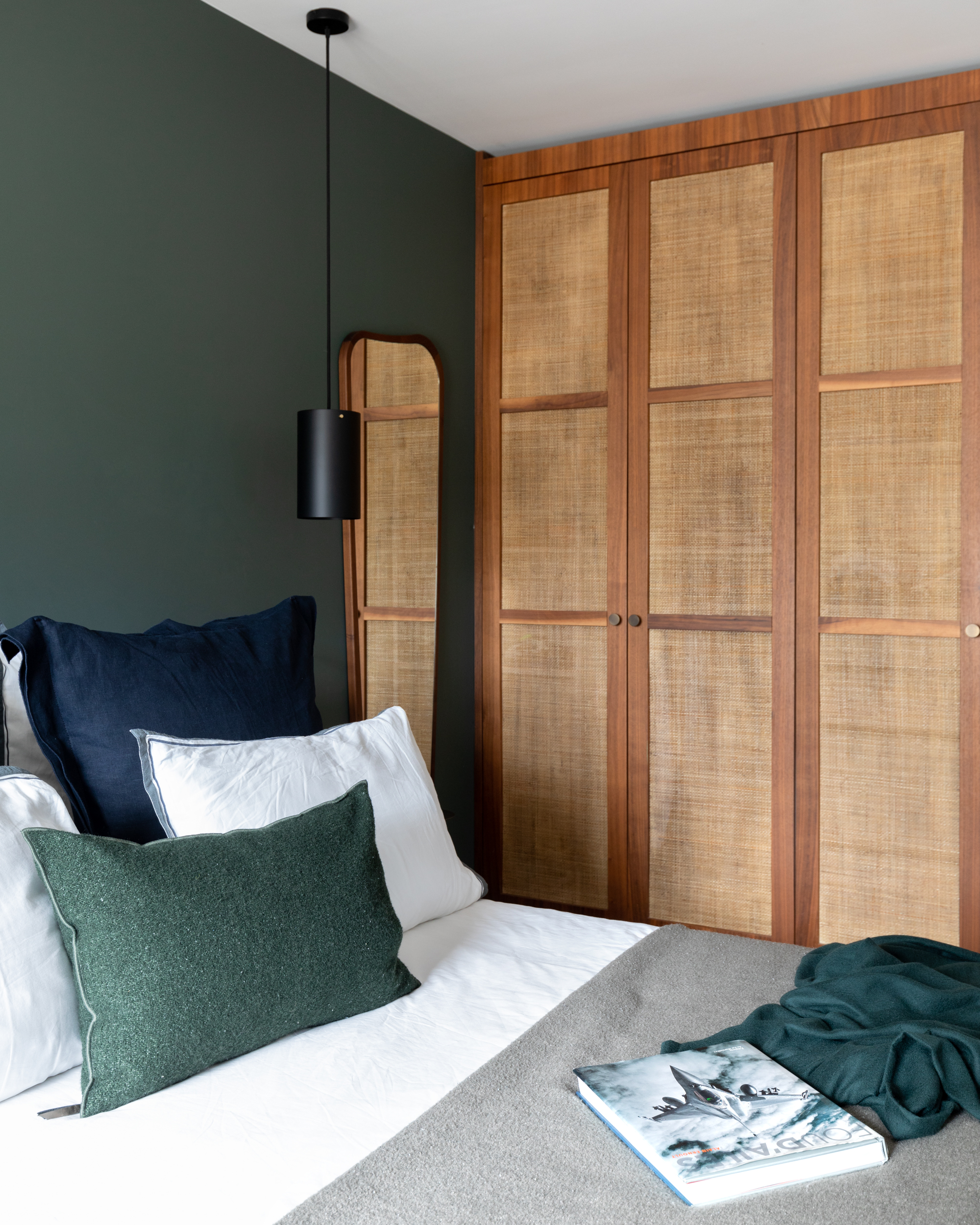
Regarding color, overly saturated light blue, particularly reminiscent of an "Easter-inspired nursery," is identified as tacky. Adding a touch of green to icy shades can soften them, preventing the room from feeling cold and uninviting. Similarly, an all-gray decor scheme is out, with designers advocating for nature-based palettes and earthy tones to achieve a timeless aesthetic.
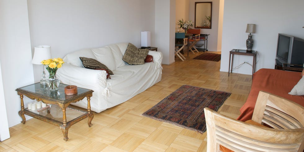
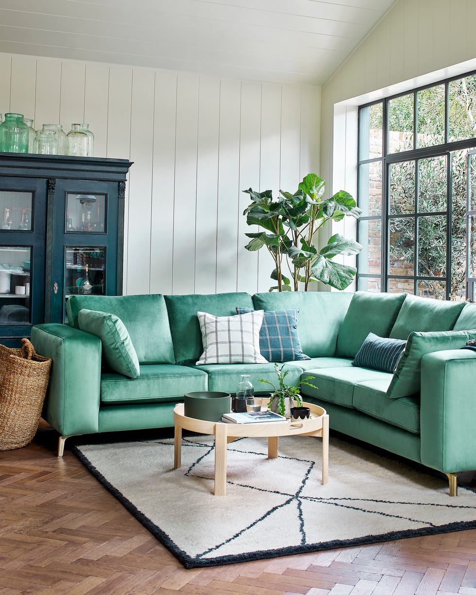
Undersized rugs are a major pet peeve for designers, as they can make a room look choppy and uncomfortable. The rule of thumb is that all furniture legs should either be entirely on or entirely off the rug, avoiding a mix. Scale is crucial; if a rug feels too small, it likely is.
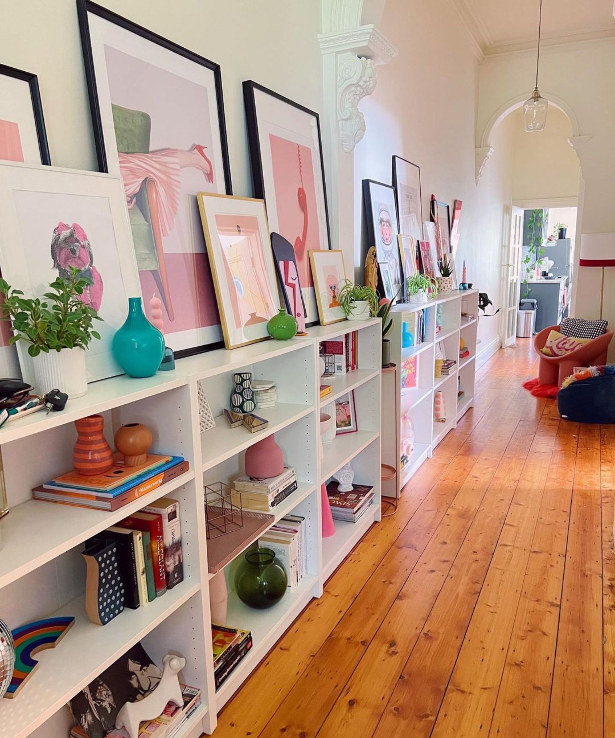
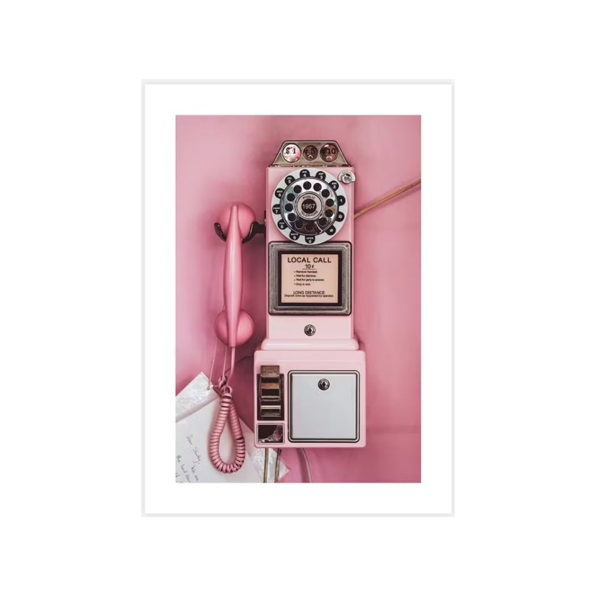
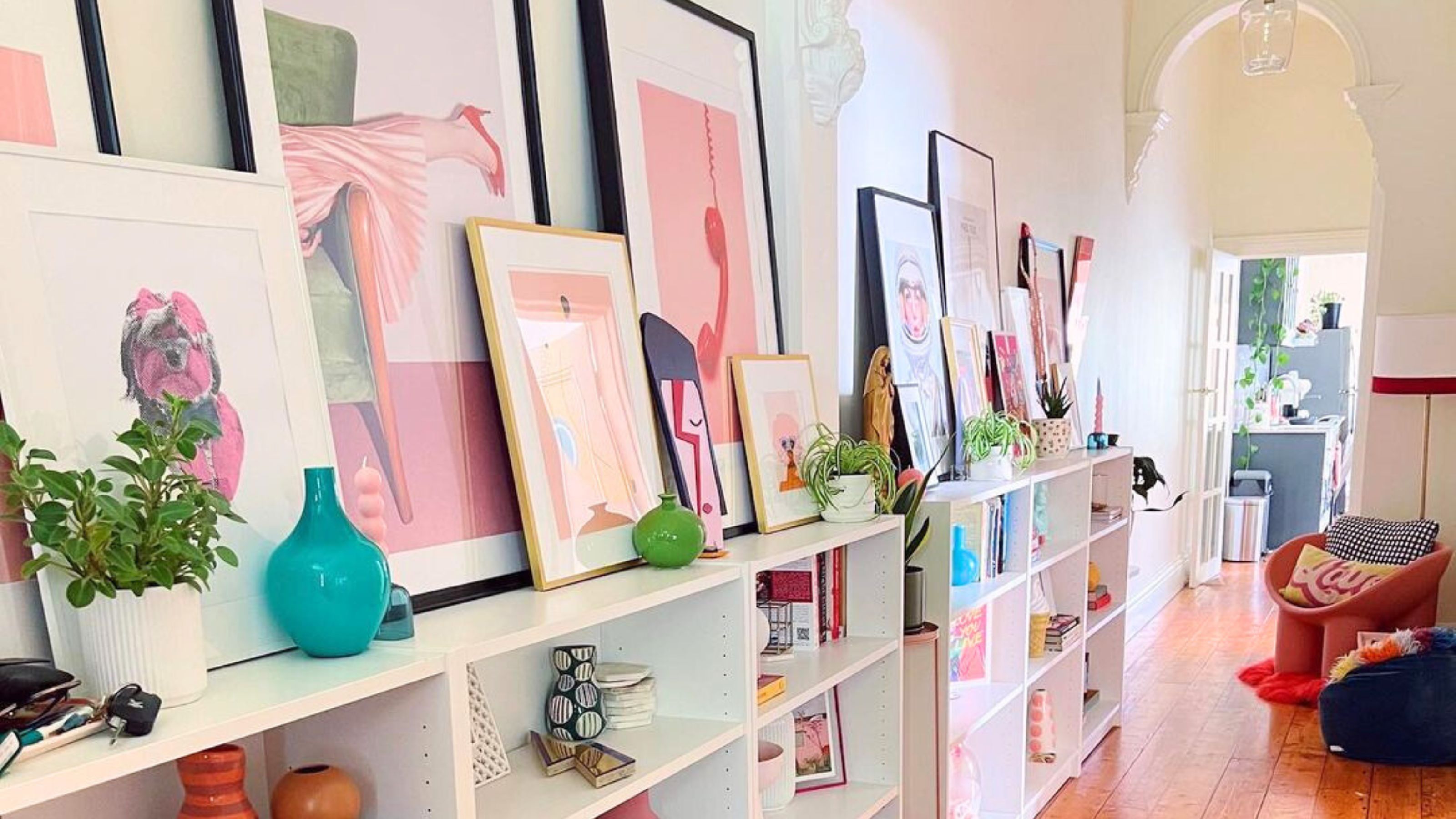
Gallery walls require thoughtful execution. Skimpy gallery walls that do not adequately fill the space are considered tacky. Designers recommend ensuring enough pieces are used to properly fill the wall and incorporating a unifying element, such as consistent frame colors or an all-black-and-white photography theme.
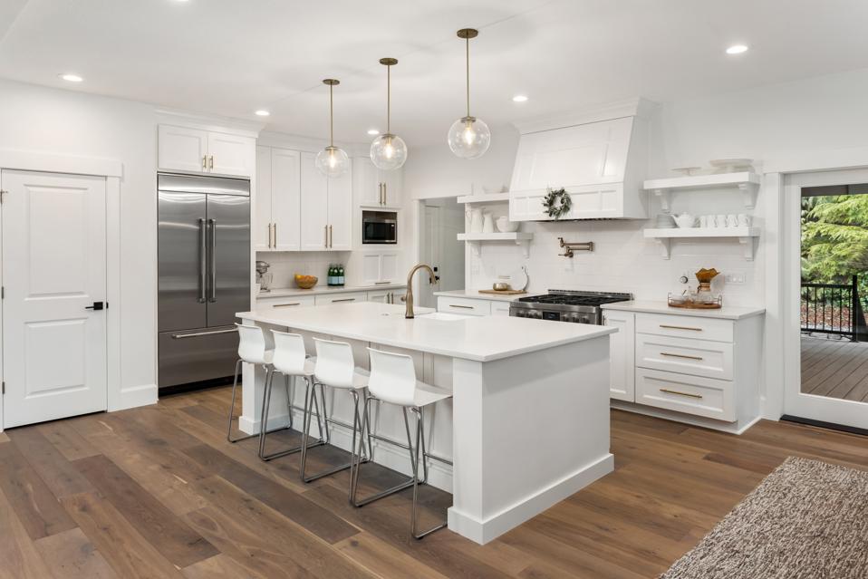
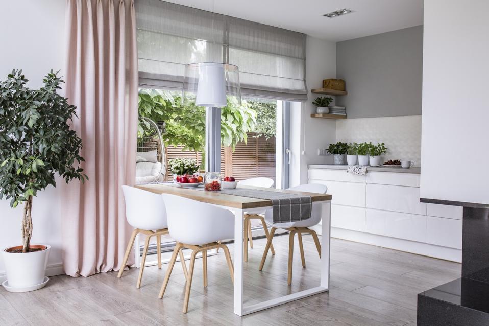
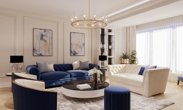
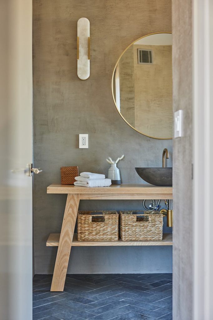
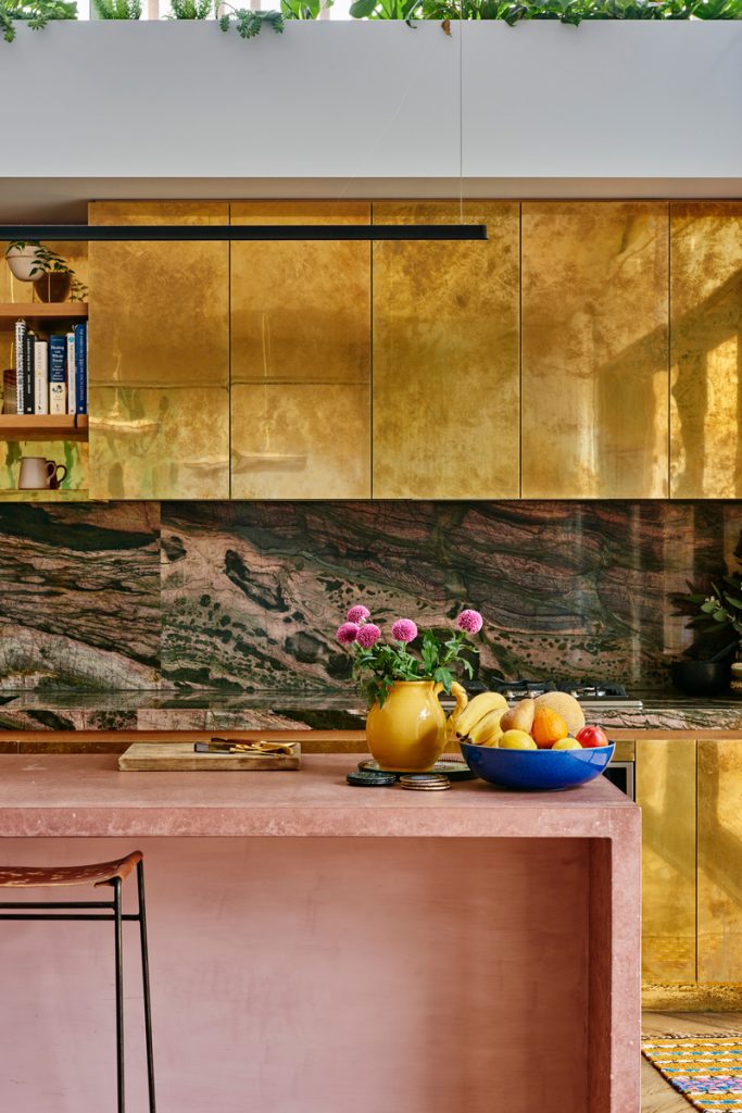
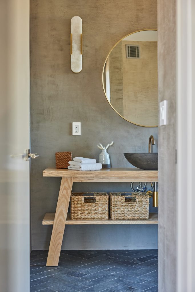
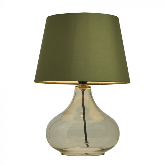
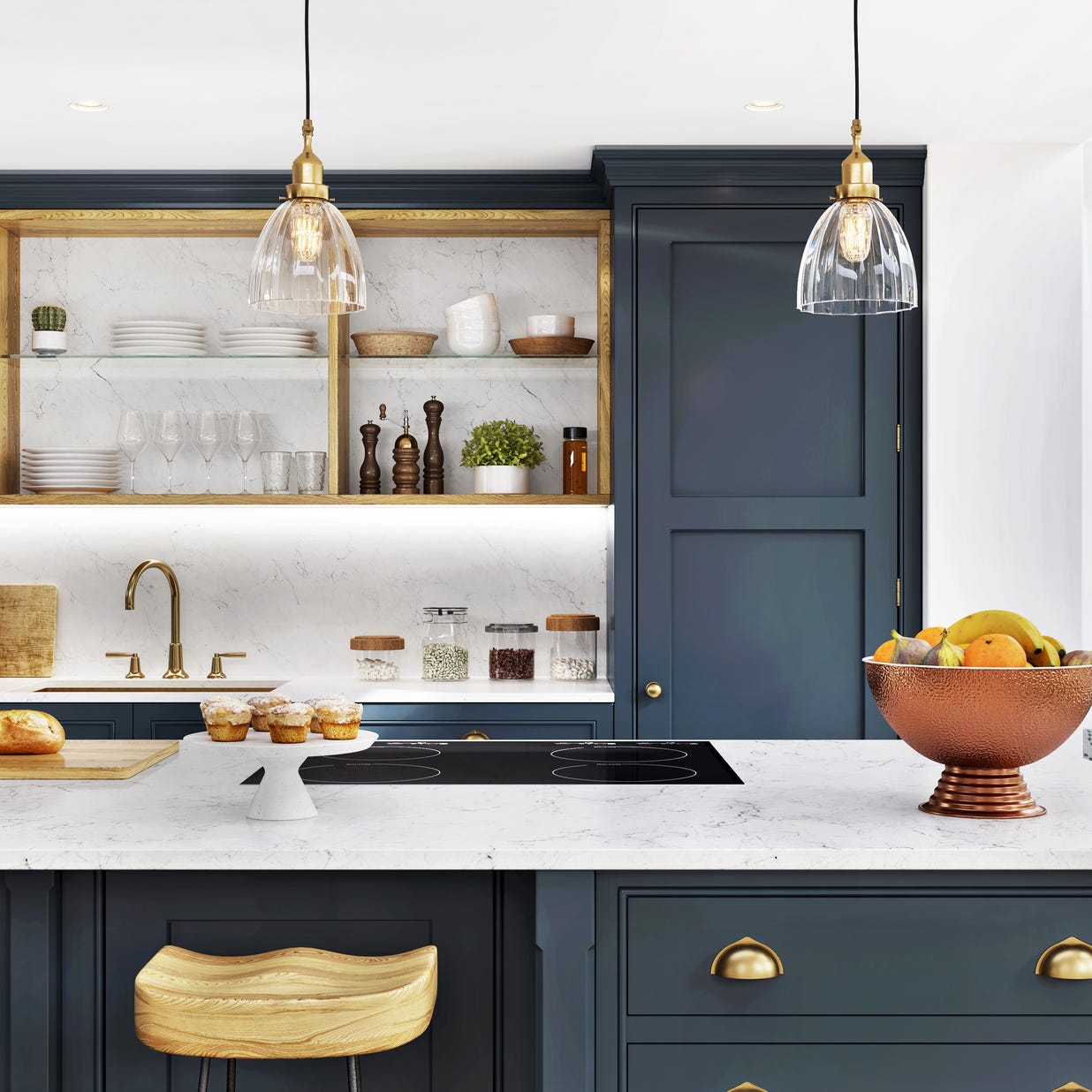
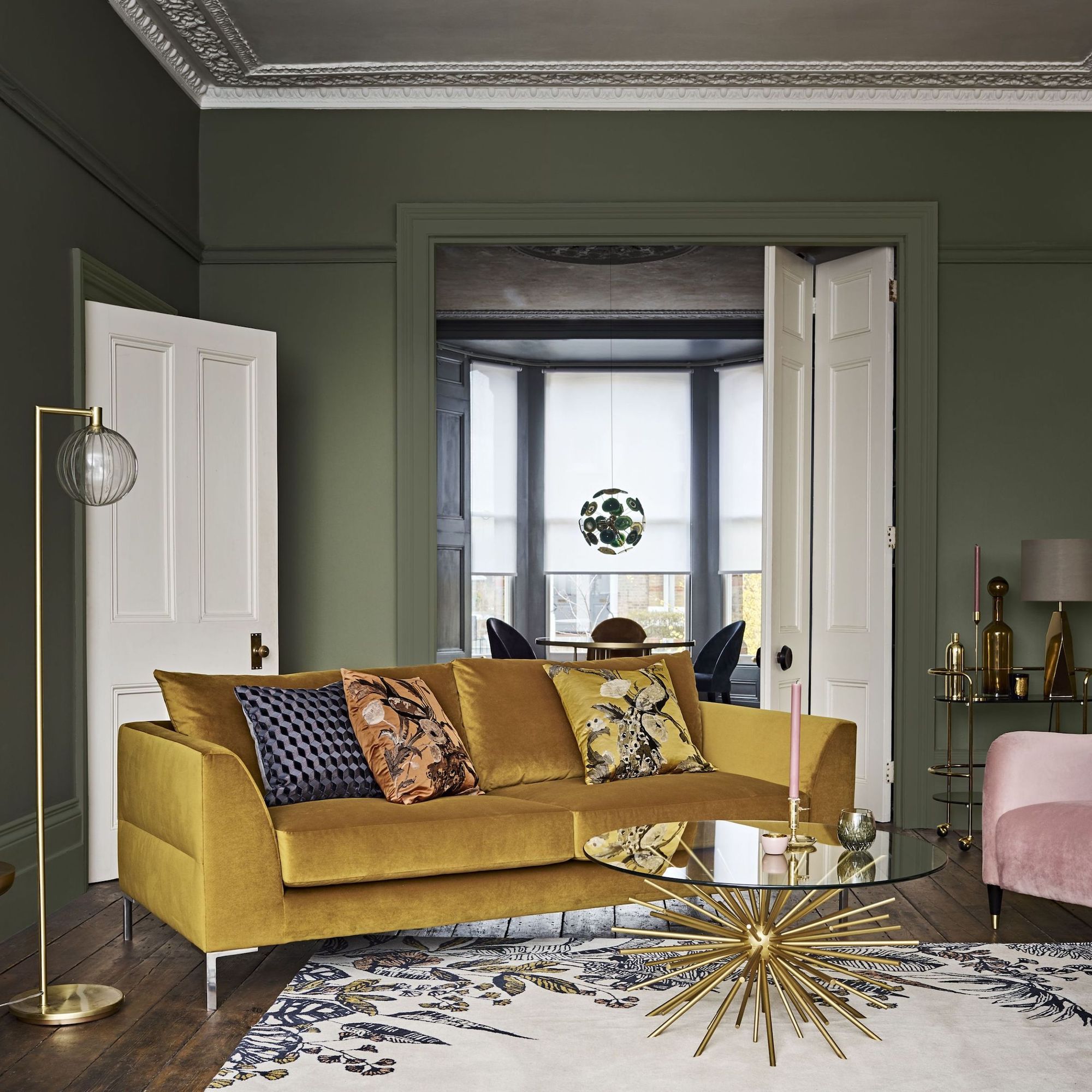
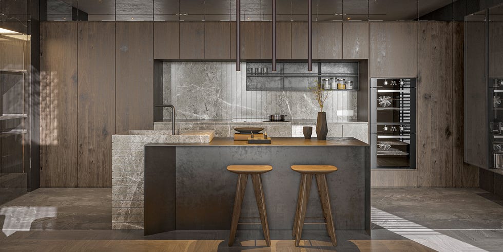
Monotone metal finishes are another dated choice. Mixing metals and finishes adds layers and visual interest to a room. Lastly, short curtains that do not reach the floor are a significant design faux pas, with the exception of French café curtains. For windows where full-length curtains are impractical, Roman blinds are suggested as a more appropriate and stylish alternative. Glass coffee tables are also considered too corporate and cold; natural wood options are preferred for creating a warm and inviting ambiance.
#InteriorDesign #HomeDecor #DesignTips #DecorMistakes #FurnitureArrangement #ColorPalette #WindowTreatments #RugPlacement #GalleryWalls #InteriorDesign #HomeDecor #DesignTips #DecorMistakes #FurnitureArrangement #ColorPalette #WindowTreatments #RugPlacement #GalleryWalls
Hay 0 comentarios en total
 Aún no hay comentarios
También te puede gustar
10 Mistakes Designers IMMEDIATELY Notice When They Walk Into Your Home

The 10 Biggest Interior Design No Nos According to Decorators

5 TikTok home decor trends that interior design experts can't stand – are you guilty of any?
7 Decorating Mistakes That Always Make Interior Designers Cringe
7 Design Mistakes Interior Designers Always Notice

9 CONTROVERSIAL Decor Choices Designers Secretly Wish You’d Stop Making
5 Tacky Home Decor Items That Instantly Make a Home Look Bad, According to Designers
10 common living room design disasters experts warn against falling for
10 Interior Design Mistakes Experts Avoid In Their Own Homes
An interior designer with 14 years of experience shares the 10 decor mistakes she hates seeing in people's homes
6 mistakes design experts instantly notice in your home – and how to fix them
The 10 biggest bedroom furniture mistakes that interior designers always notice – and how to fix them

10 Decorating Mistakes That Make Your Home Look Messy
From the Wrong Rug Size to Too-Short Curtains, Interior Designers Share Their Biggest Pet Peeves
Don't make these 5 entryway decor mistakes

The 13 Biggest "Scams" in Home Design Today, According to Designers
8 common design mistakes that make your home look dated — and how to avoid them
7 cheap and tacky interior design errors rich people never make — ban these aesthetic atrocities from your home
11 WORST Kitchen Design Mistakes You're Probably Making

6 Home Décor Mistakes Interior Designers Notice Right Away—and How to Fix Them