
1/3
Ready, Set, Paint! How to Choose Paint Colors for Your Home Interior
Choosing the right paint colors for a home interior can be a daunting task, but a structured approach can simplify the process, as demonstrated by George Oliphant and the “George to the Rescue” team during a home renovation for the Leroy family. The Leroy family, including Iva and her 7-year-old daughter Zoe, are recent cancer survivors, and their home renovation by Oliphant’s team provided an opportunity to highlight effective painting strategies.
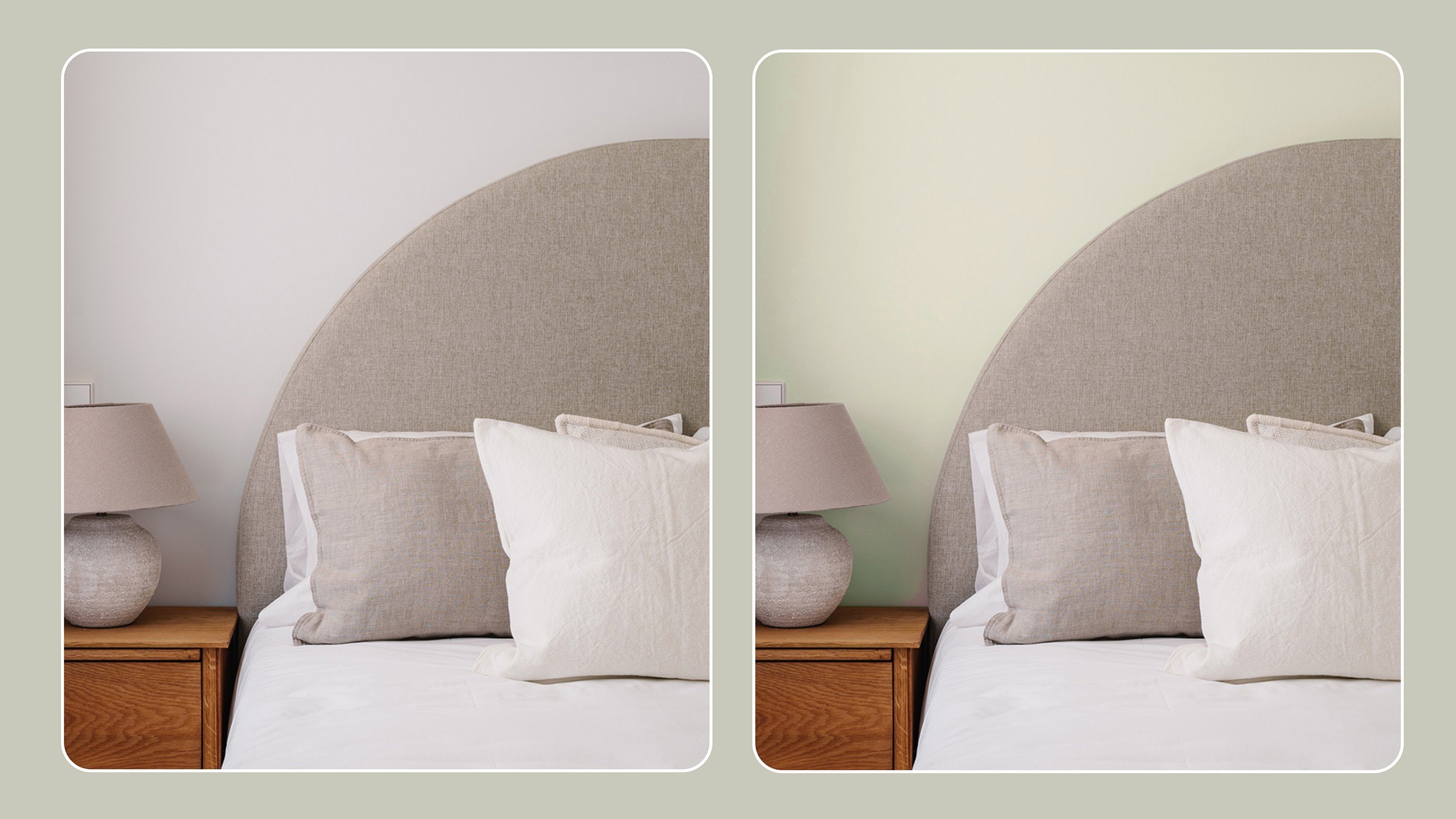
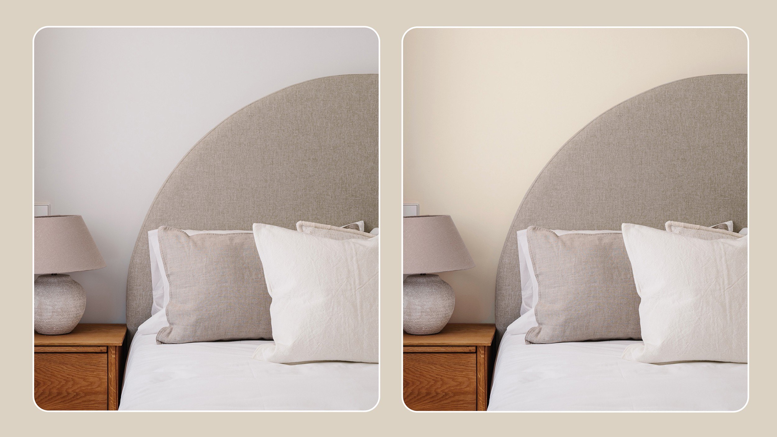
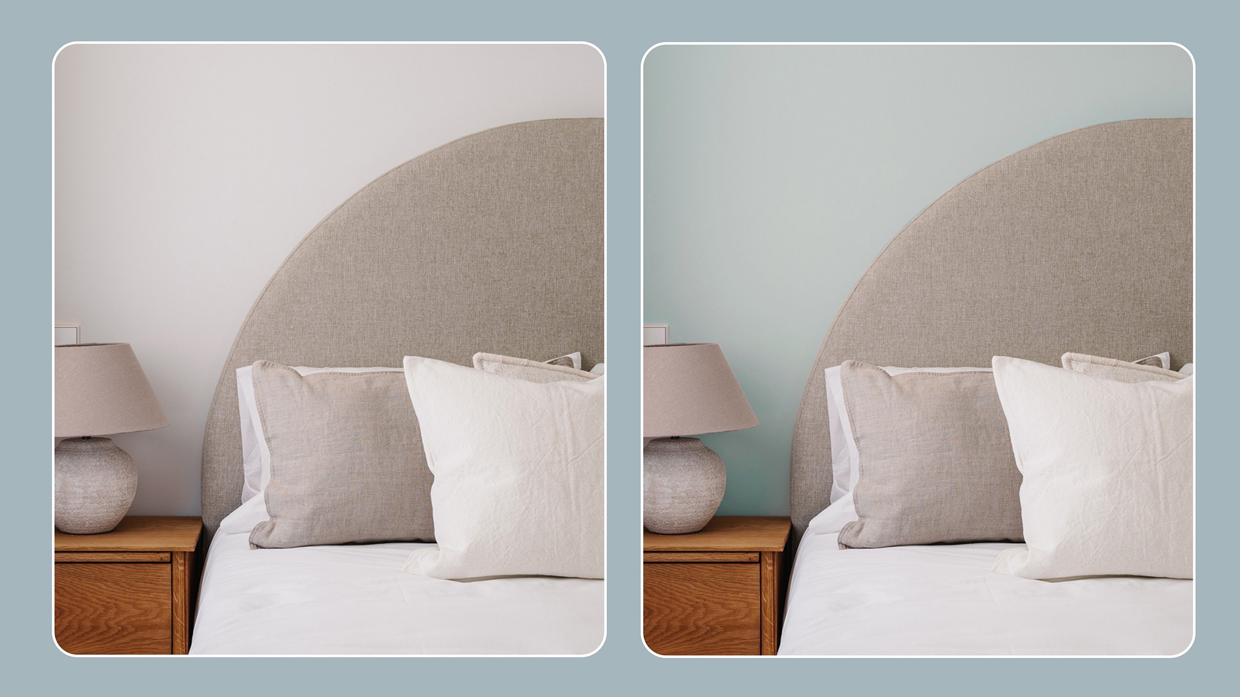
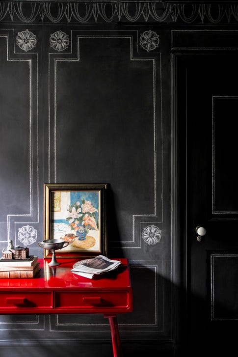
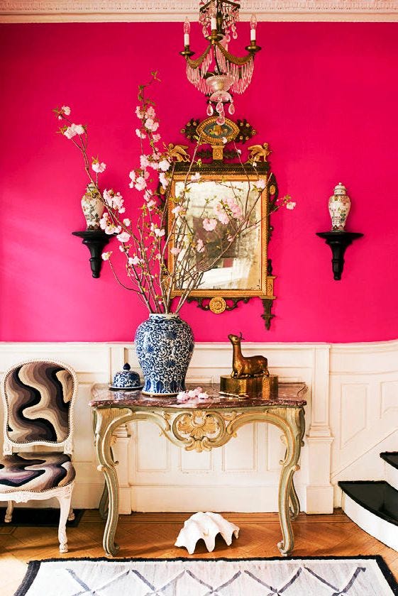
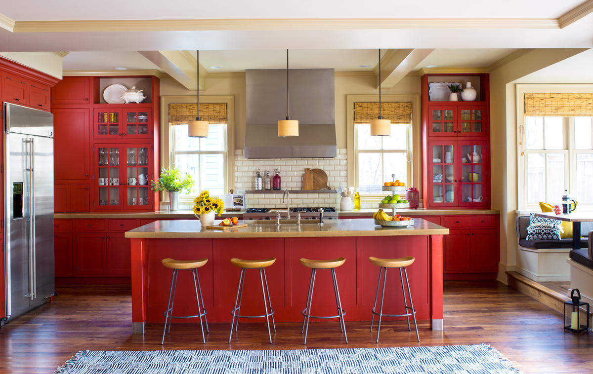
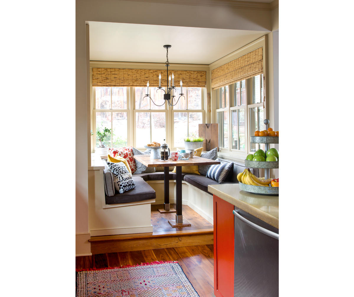
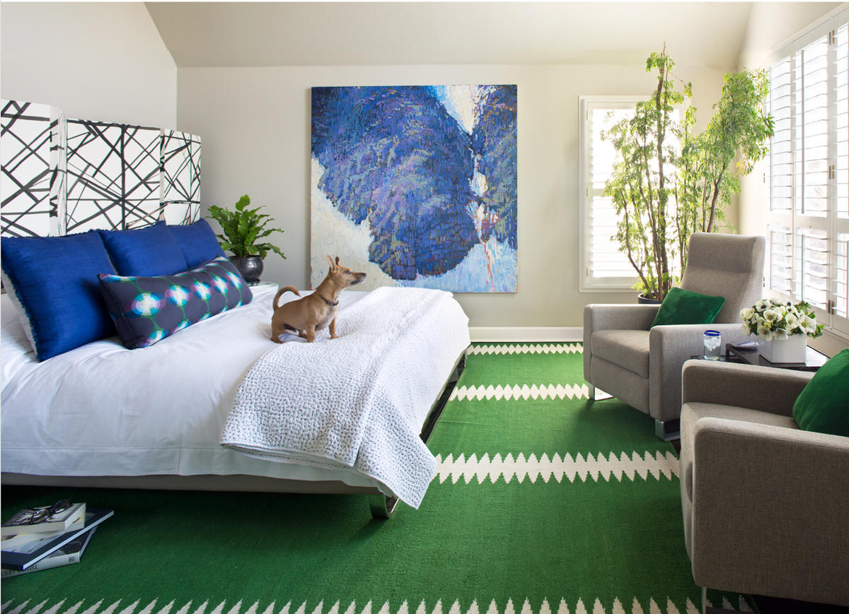
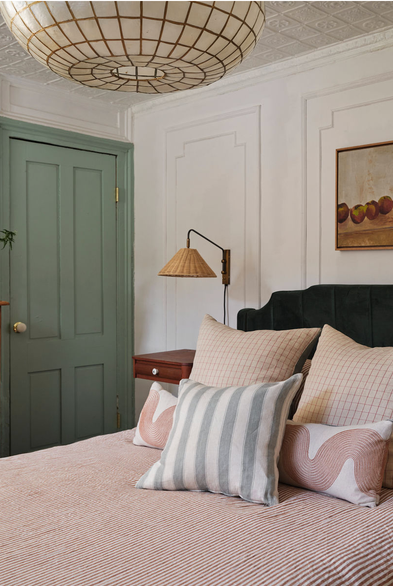
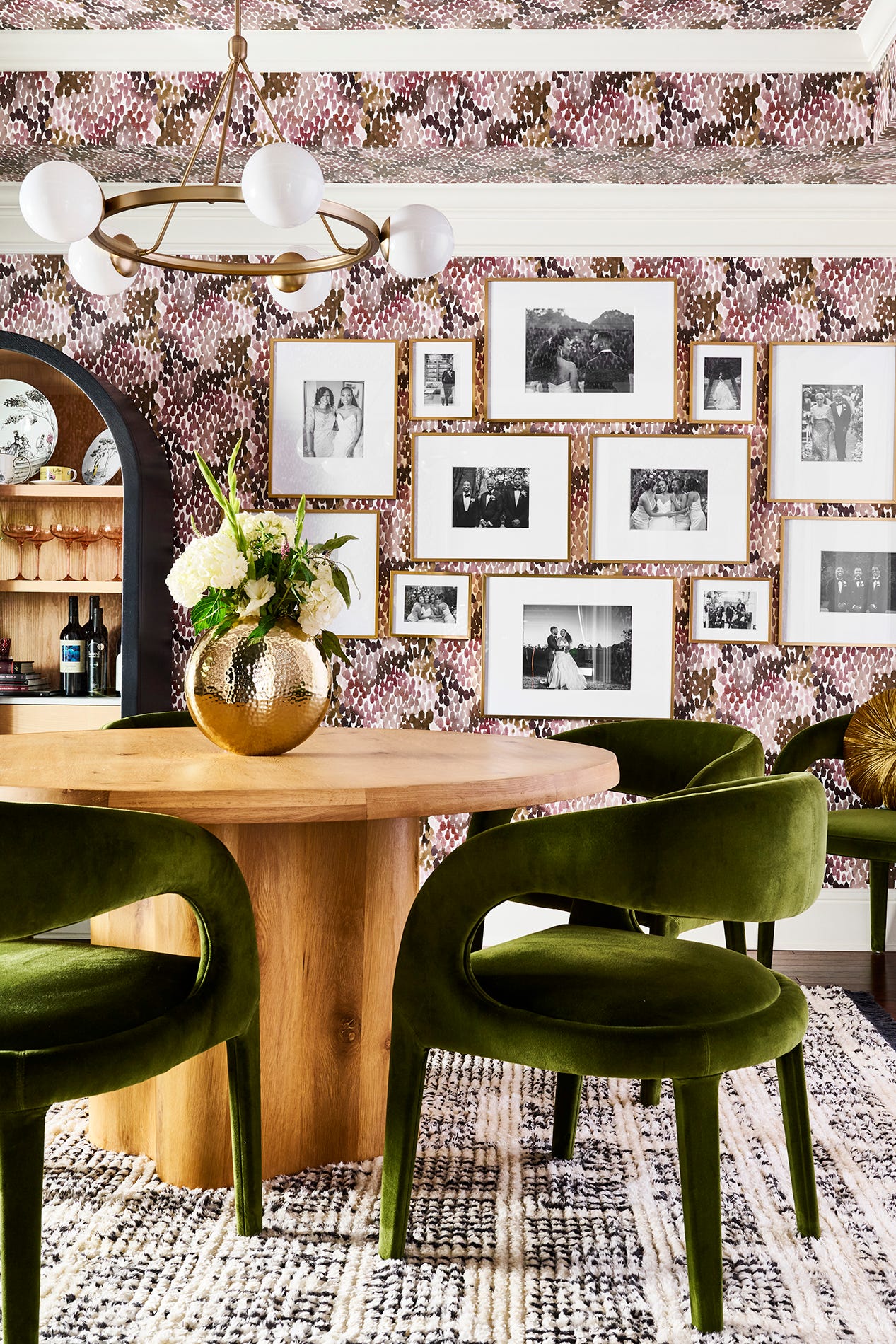
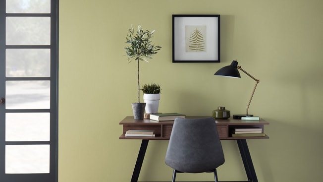
The initial step involves utilizing paint chips or samples, readily available and free at most home improvement stores. These chips offer a vast array of colors, allowing for preliminary selection and comparison. Once a general color direction is established, identifying a focal point within the room is crucial. This could be a piece of art, a significant furniture item, or even a rug. The chosen focal point then serves as the anchor around which the rest of the room’s design, including the paint color, is coordinated. For instance, in transforming Alex Leroy's bedroom, a red Manchester United jersey was used as a focal point, setting the color scheme for the room. Bringing accessories like swatches or pillows to the store can aid in selecting coordinating paint colors.
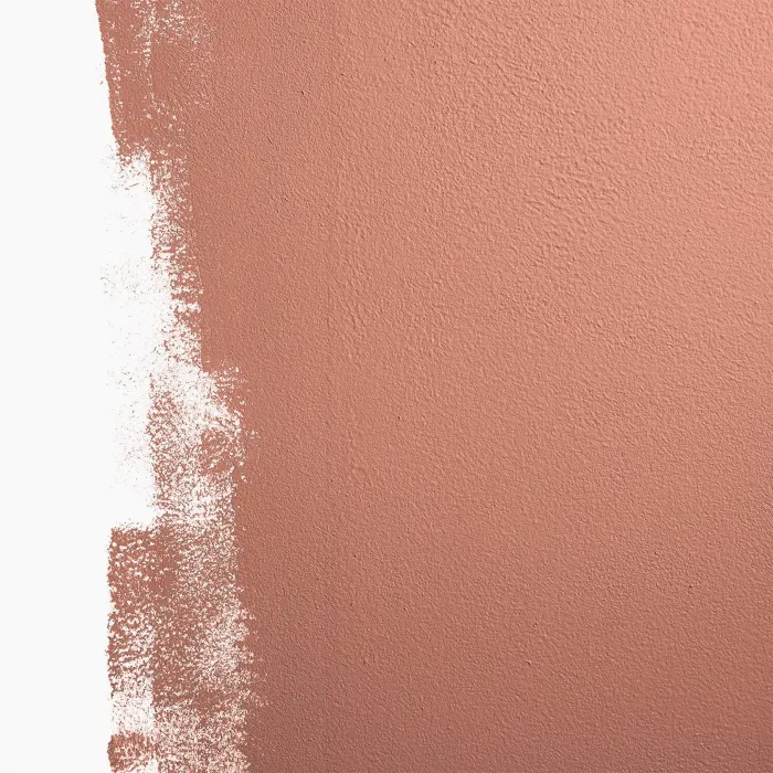
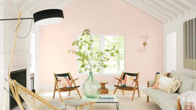
Testing paint colors directly in the home environment is a critical next step. Natural light conditions significantly impact how a color appears; bright light can make colors seem more vibrant, while dim lighting can make them appear darker. It is advisable to paint small patches on different parts of the wall and observe them under various lighting conditions, including sunny and cloudy weather, to accurately assess the color's true appearance. This method was applied in Zoe Leroy's reading nook, where lavender paint and cozy lighting brightened a drab attic eave.
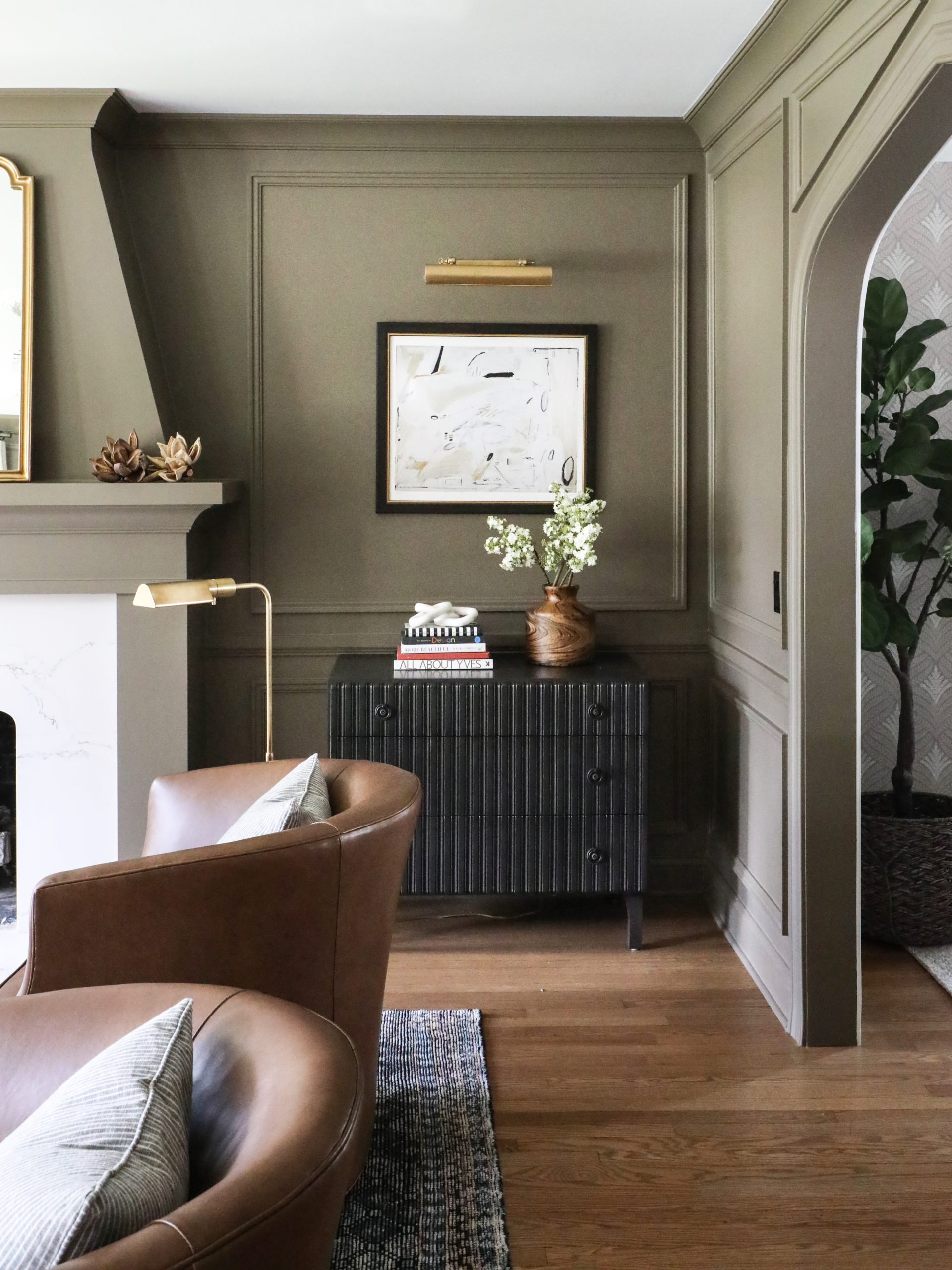
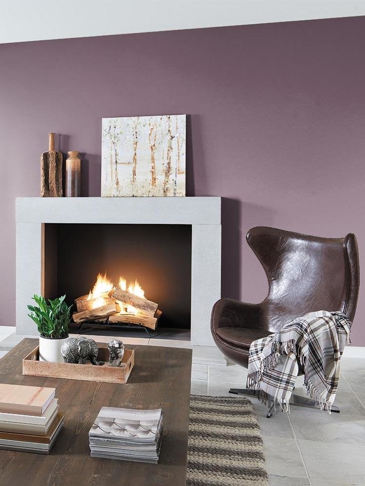
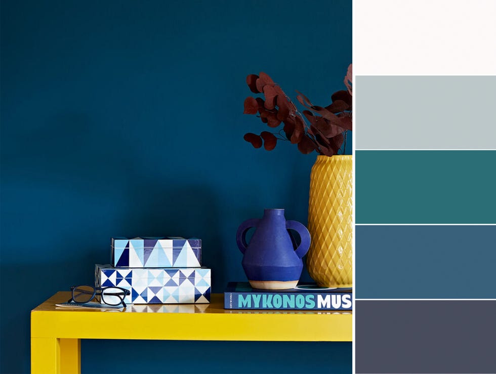
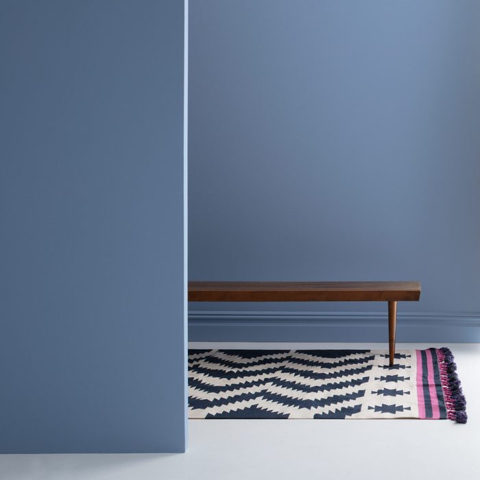
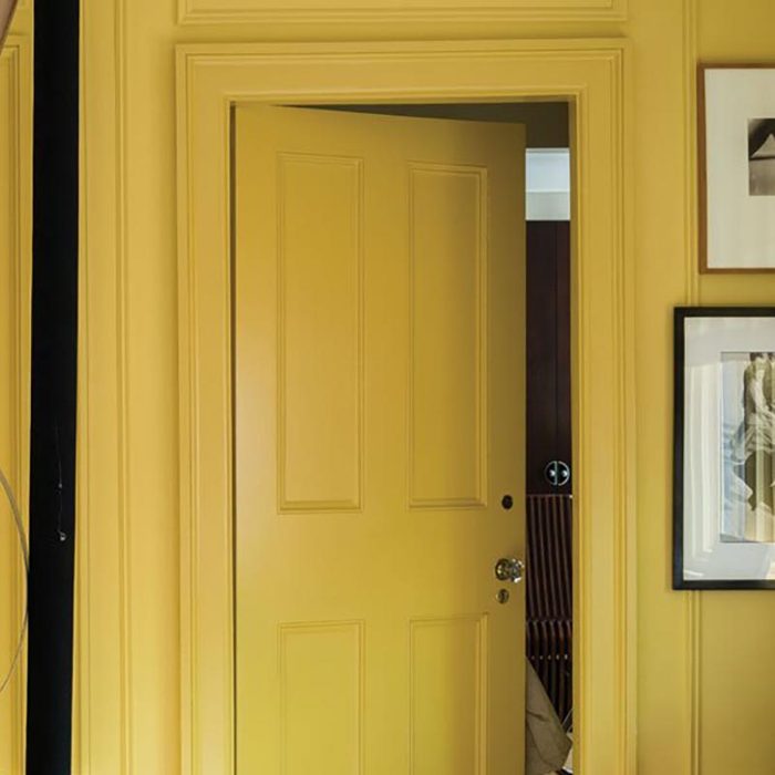
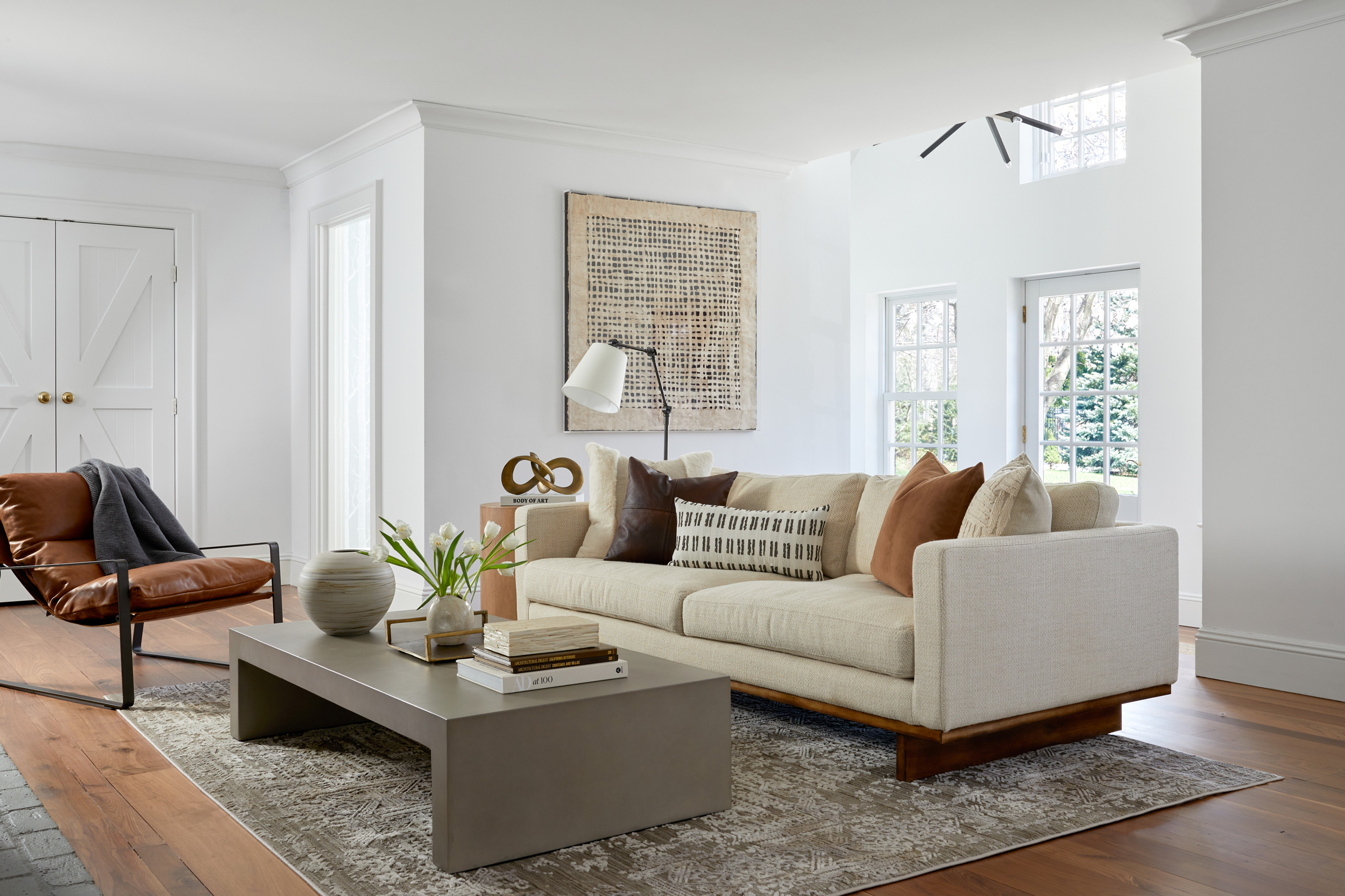
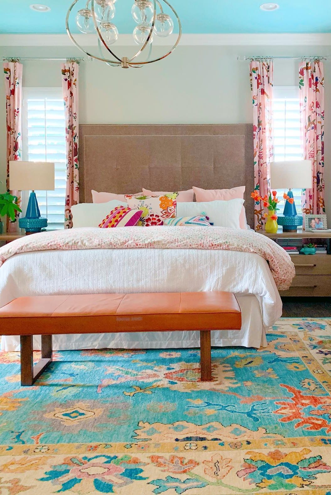
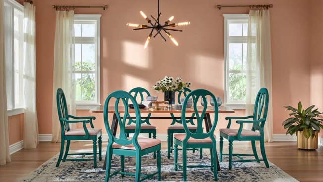
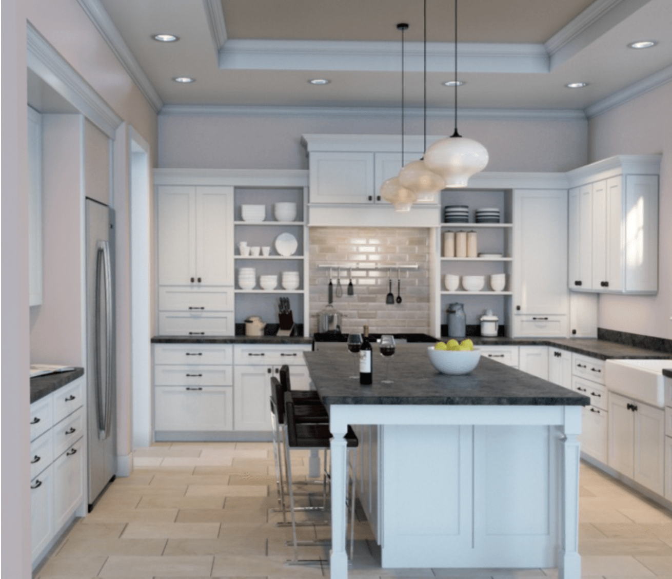
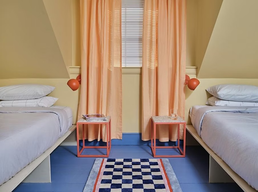
Developing a color palette involves building upon the main chosen color. A common and effective technique is to select one primary color and then incorporate various hues of that color throughout the space. The ceiling and trim do not necessarily need to match the wall color; an accent color on the ceiling can add a distinctive design element. For smaller rooms, employing neutral tones for both walls and ceiling can create the illusion of a larger space. This strategy was used in Peyton Triano's room, where lighter colors and an accent wall from Butter and Velvet experts made the space appear more expansive.
Effective paint preparation is paramount for a successful outcome. Experts emphasize that the quality of the prep work is often more important than the paint itself. This includes patching holes or imperfections using products like 3M’s high-strength hole repair, which changes color when dry, indicating readiness for sanding. George Oliphant recommends the 3M pro-grade precision sponge for its ergonomic design and dust-channeling capabilities. Additionally, using Scotch Blue sharp lines painter's tape, followed by delicate surface tape for freshly painted areas, ensures clean lines and easy removal without residue. Finally, measuring the space accurately before purchasing paint and supplies helps in efficient planning and execution of the painting project.
#HomeInterior #PaintColors #HomeRenovation #DIYHome #DesignTips #InteriorDesign #GeorgeToTheRescue #ColorPalette #HomeInterior #PaintColors #HomeRenovation #DIYHome #DesignTips #InteriorDesign #GeorgeToTheRescue #ColorPalette
0 Kommentare insgesamt
 Noch keine Kommentare
Das könnte Ihnen auch gefallen

Interior Paint: A Guide to Buying the Best Paints for Your Home

Millennial Gray Is So Over—Here Are 5 Paint Colors to Try Right Now
9 Best Interior Paint Colors

Never Regret a Paint Color Again—Avoid These 6 Common Mistakes

How to Pick the Best Paint Colors for Every Space in Your Home

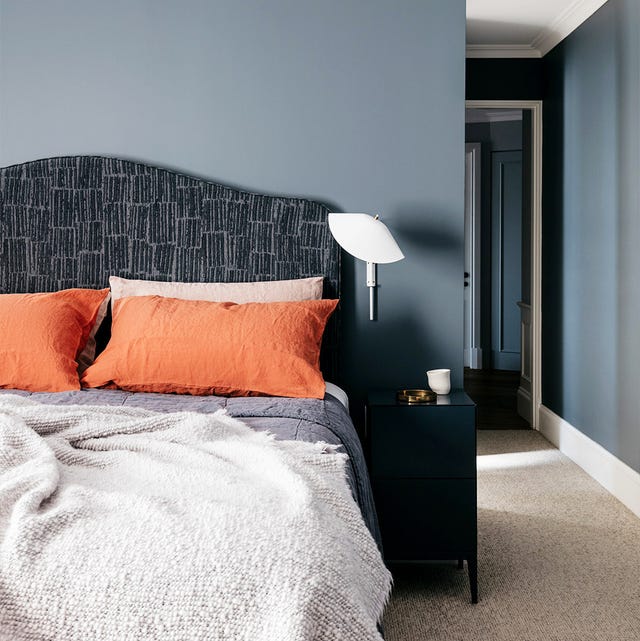
35 Paint Colors to Consider for Every Room in Your House


Real Simple Home Designers Share Their Secrets for Picking the Perfect Wall Color

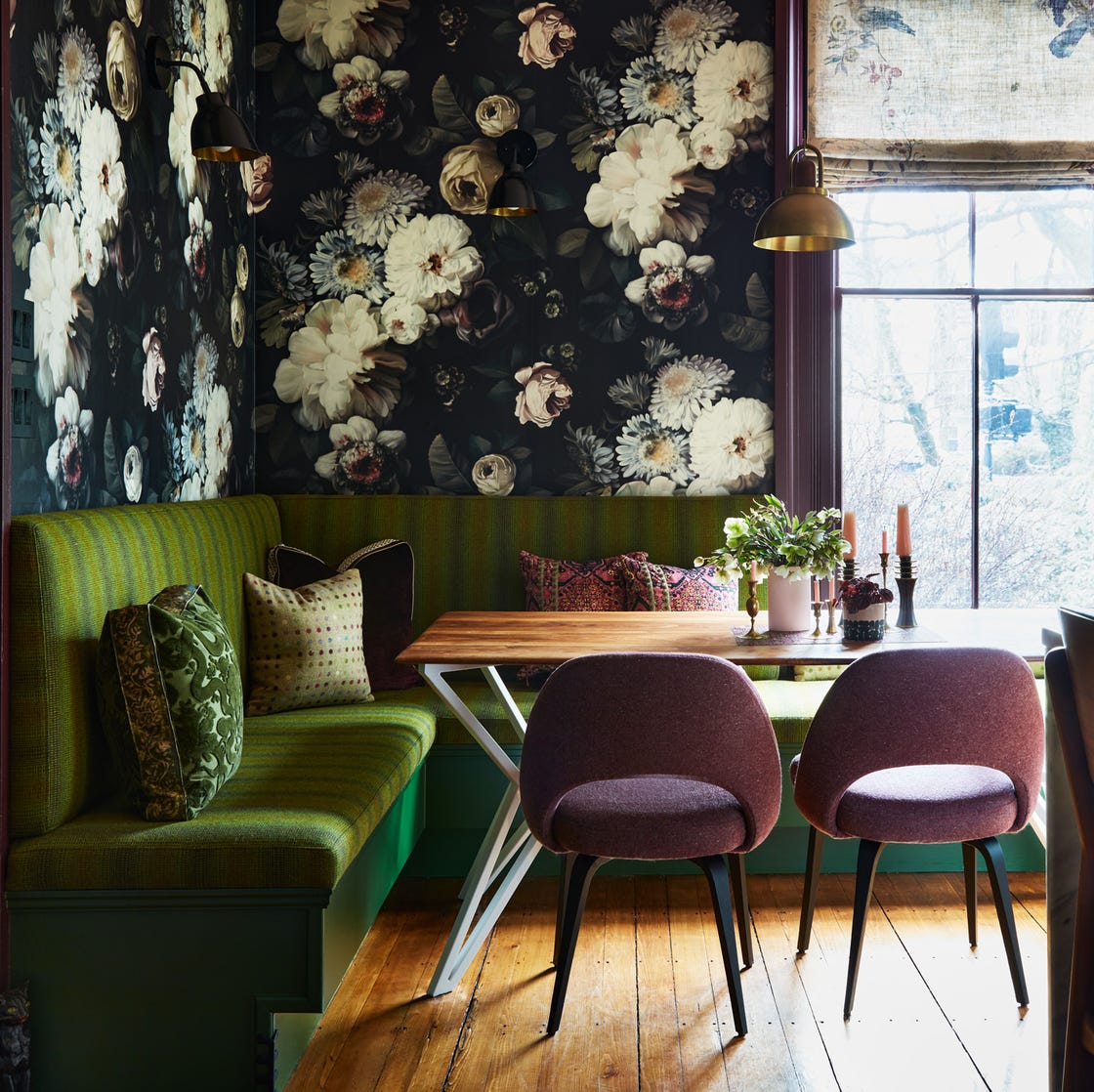
12 Color Schemes That Are Popping Off Right Now, According to Designers
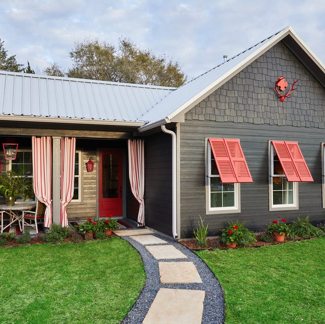
Here's What Colorists Want You to Know About Picking House Paint


How To Choose The Right Paint Color For Your Home, According To An Interior Design Expert

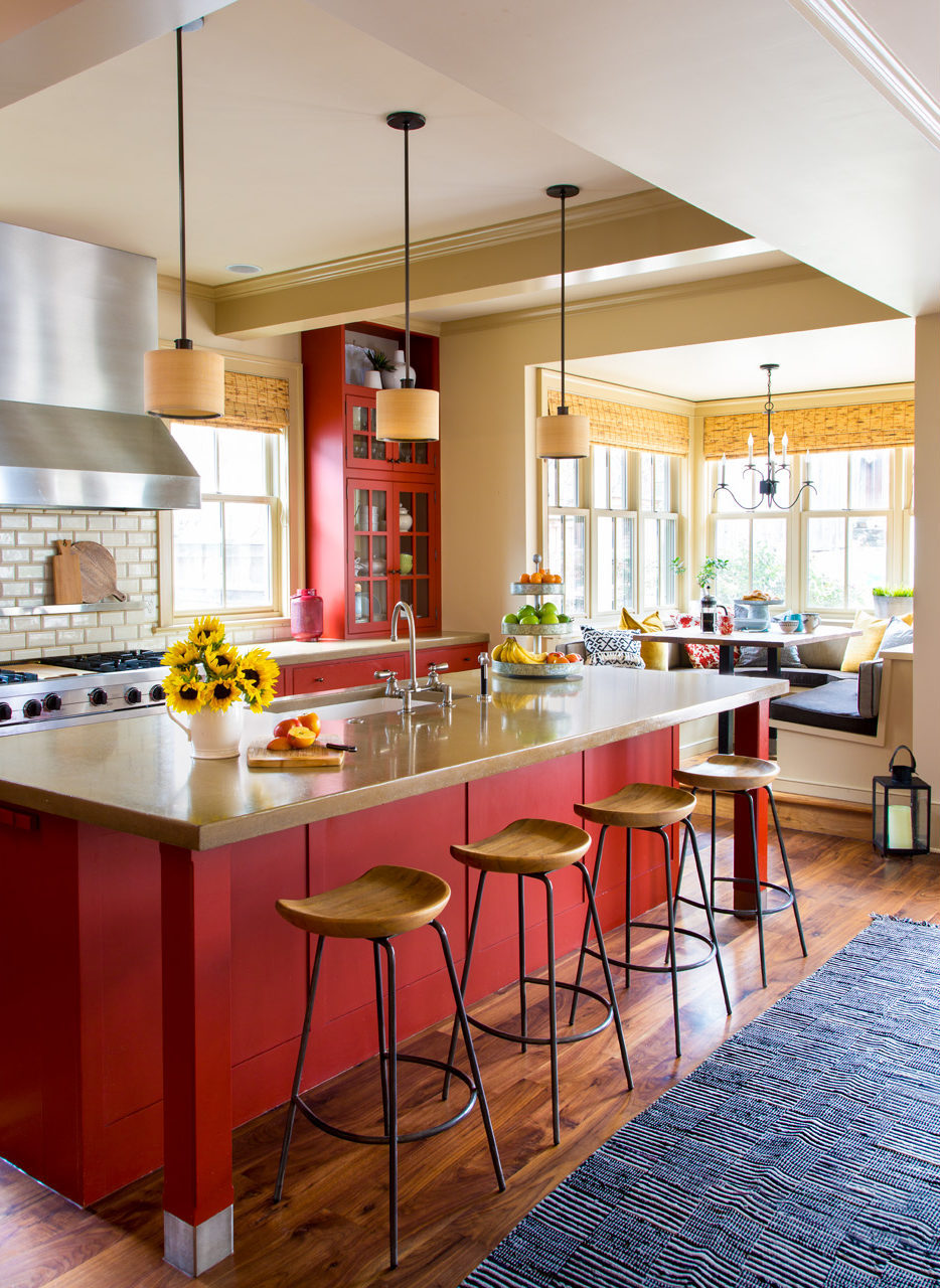
Four Gorgeous Front Range Rooms That Embrace Color
Hottest Interior Paint Colors of 2020
23 Expert Tips for Choosing the Right Paint Colors for Your Home

14 Paint Colors That Can Make a Room Feel Instantly Cozy

Designers Share Their Tried-and-True Shades From the Best Interior Paint Brands
The 13 Best Paint Colors for Low-Light Rooms

How to choose the best paint color for any room in your house
30 on-trend paint colours for every room in your home

What are the worst colors to paint a room? The shades experts say you should never use


Choose The Best Paint Then The Color | Interior Paint Reviews