8 Paint Colors to Enhance Your Hallways, According to Interior Designers
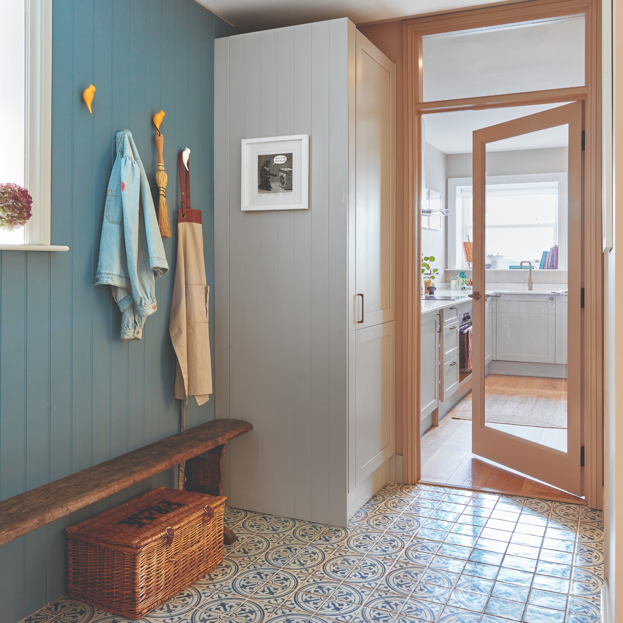
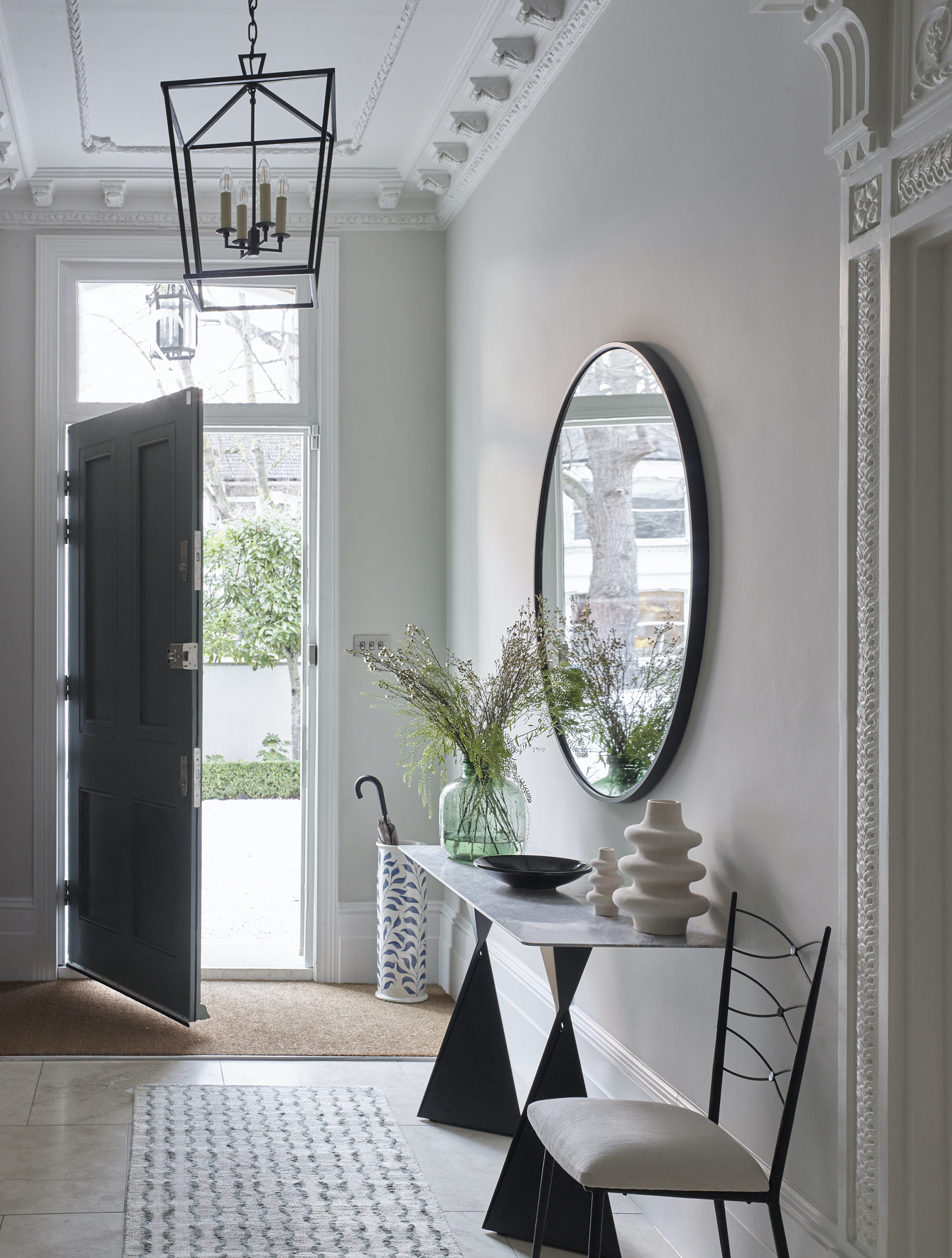
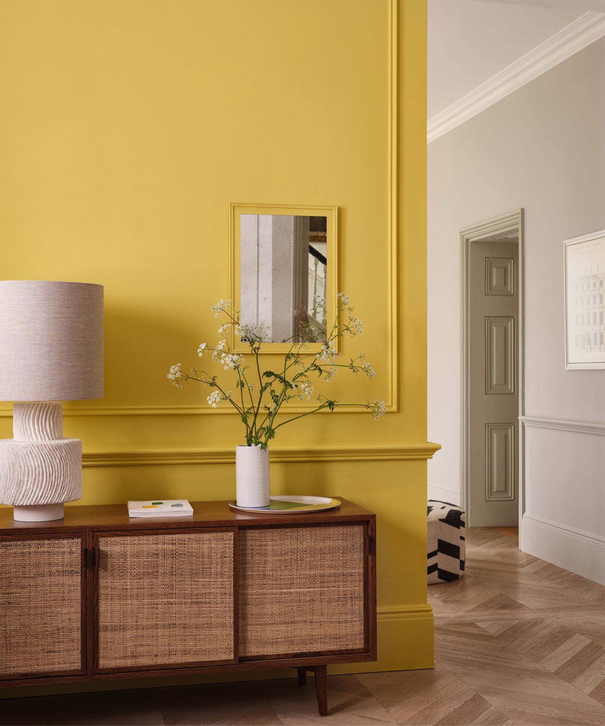
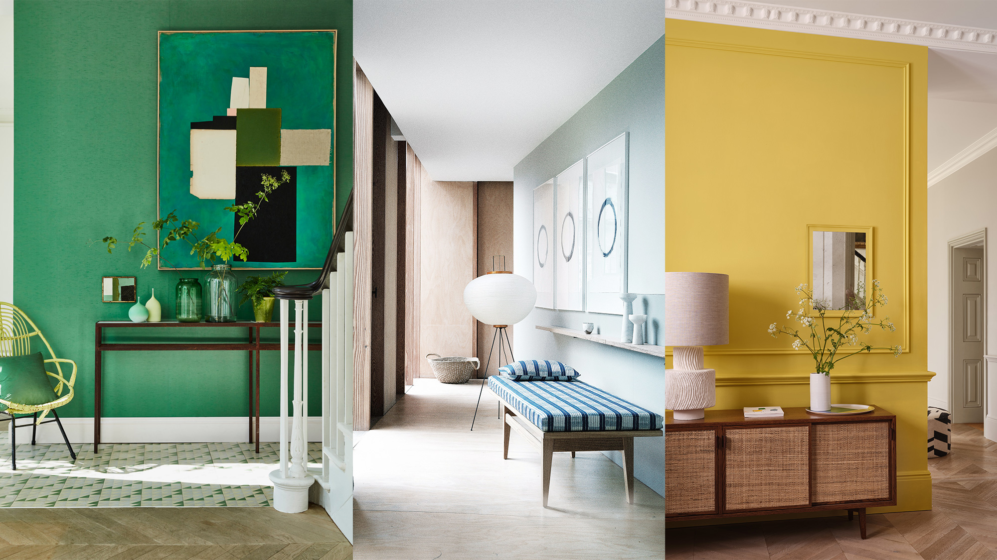
Hallways, often overlooked, play a crucial role in establishing the overall aesthetic and flow of a home. Rather than being mere transitional spaces, they can be transformed into integral parts of the home's design with the right paint choices. Interior designers emphasize that thoughtful color selection for hallways can unify design, manage light, and infuse personality without overpowering other areas. The article compiles recommendations from interior design experts on specific paint colors and approaches to maximize the potential of these corridors.
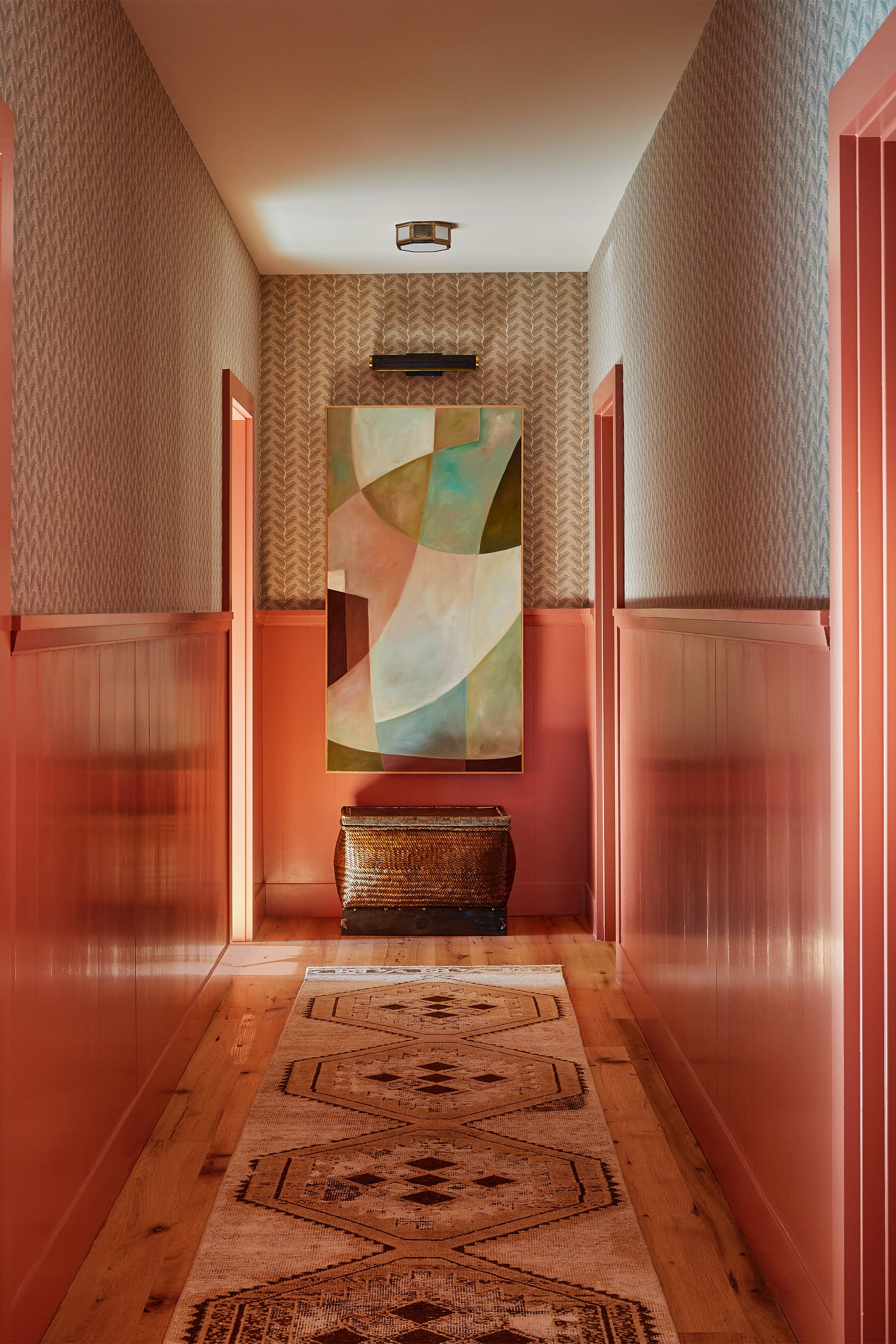
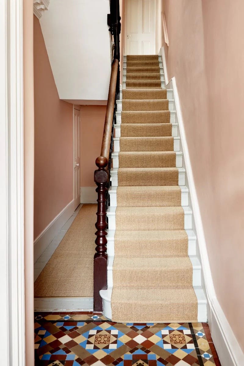
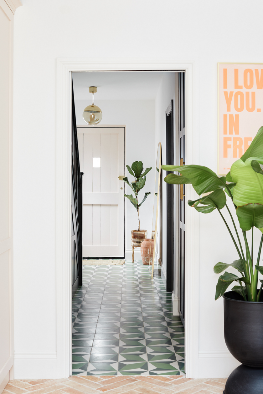
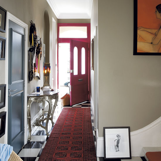
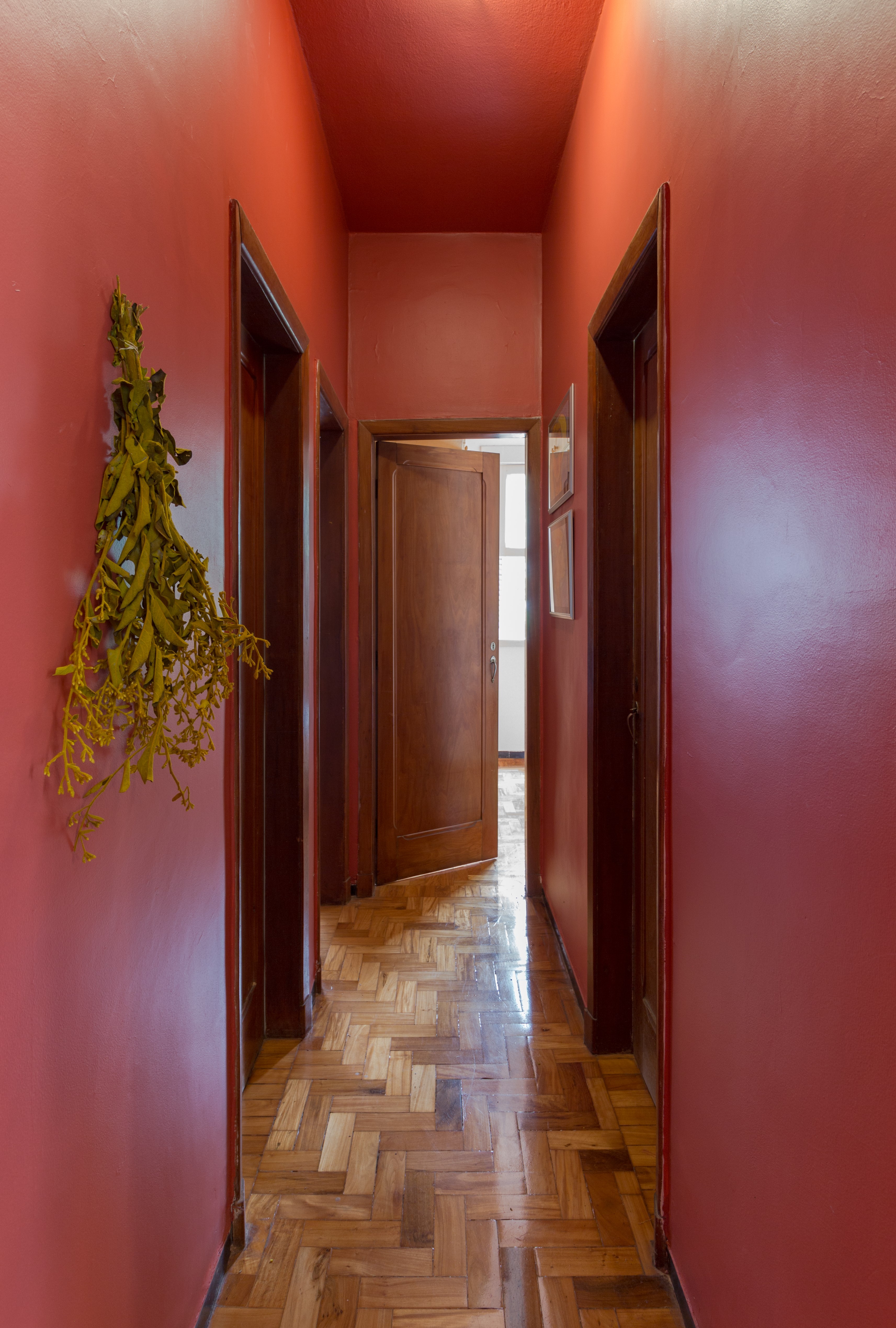
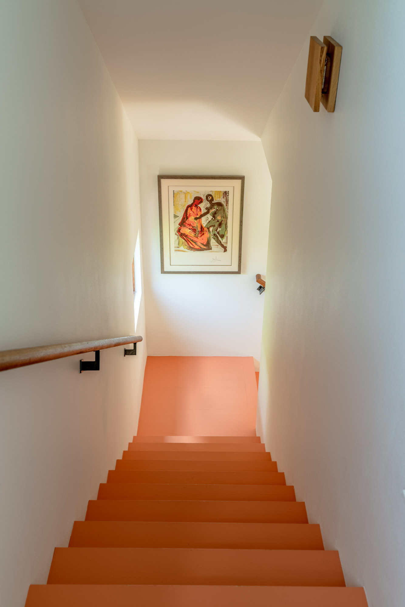
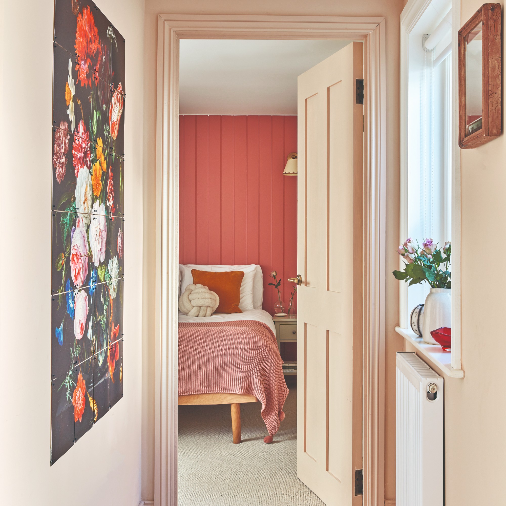
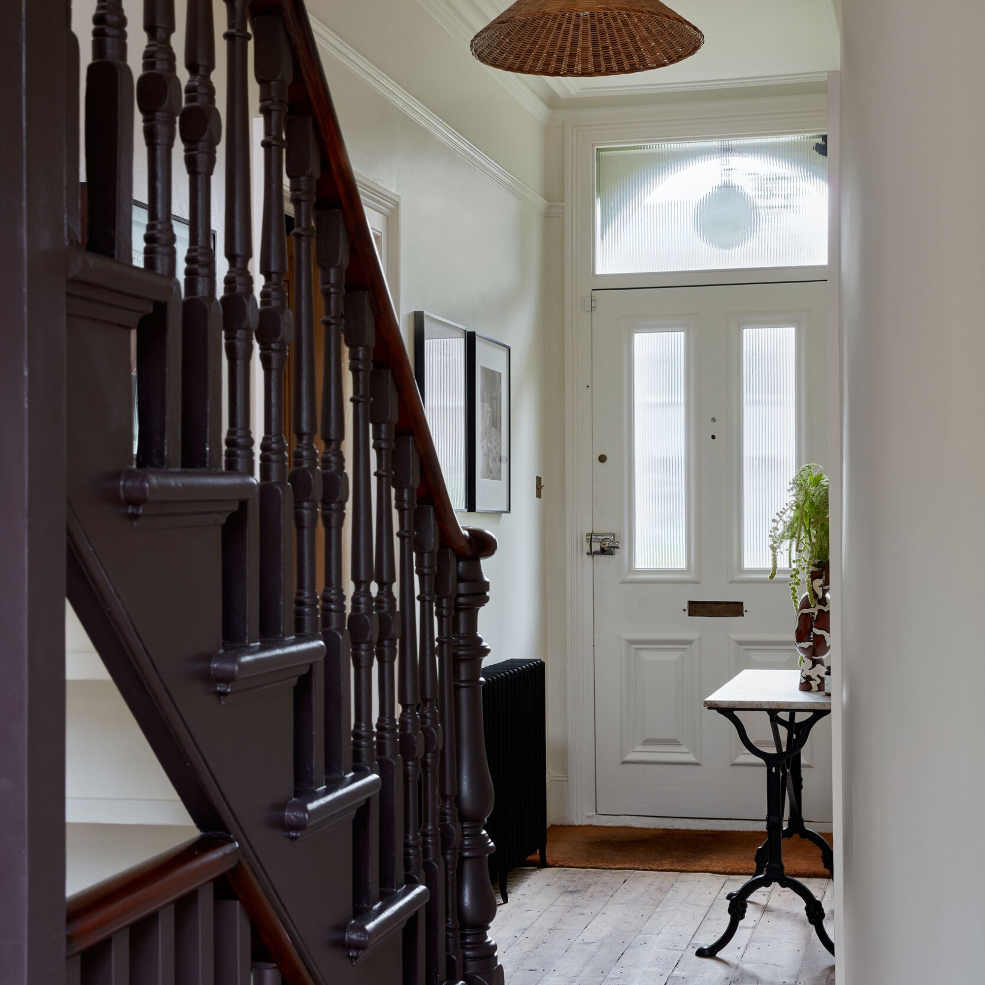
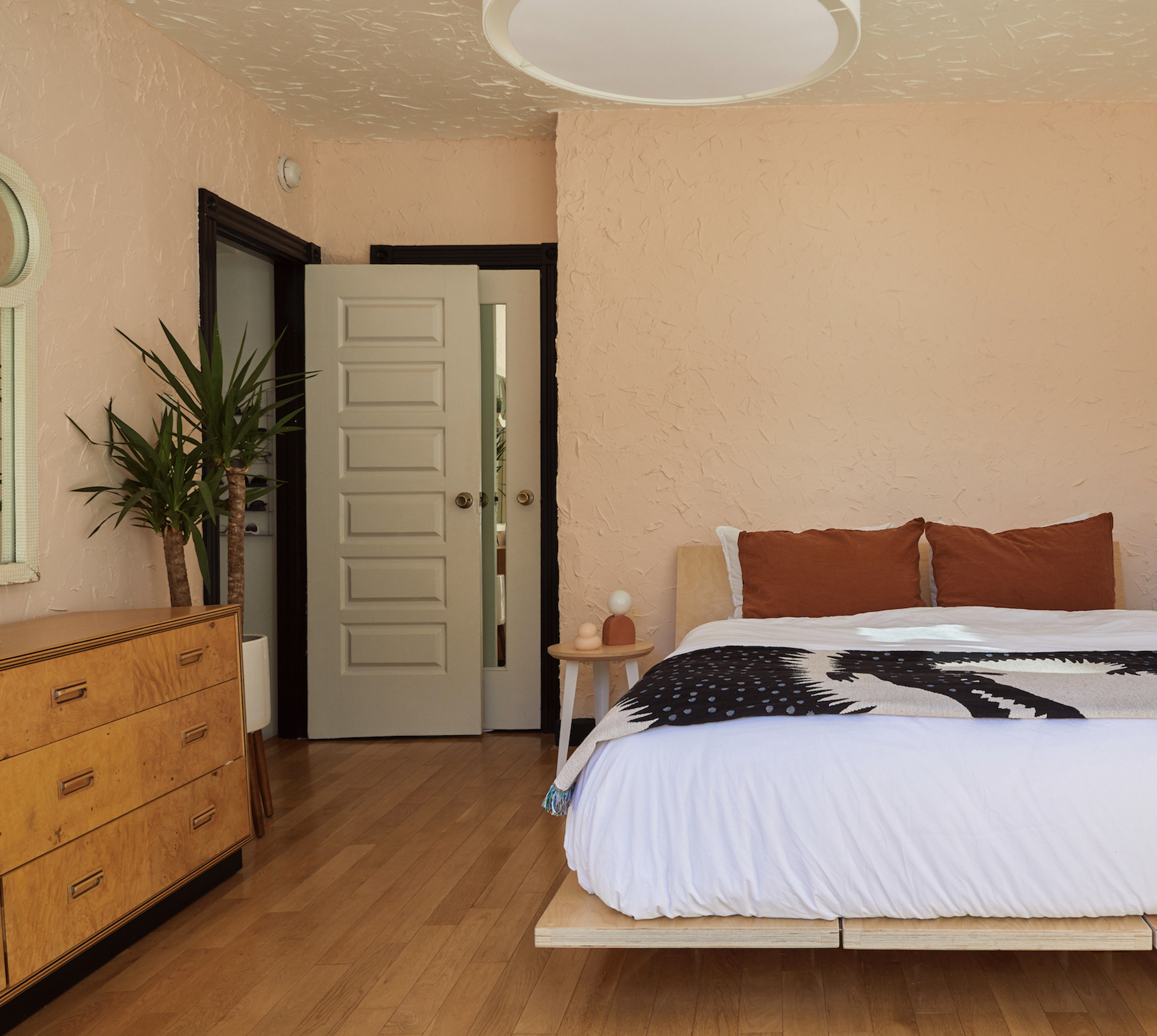
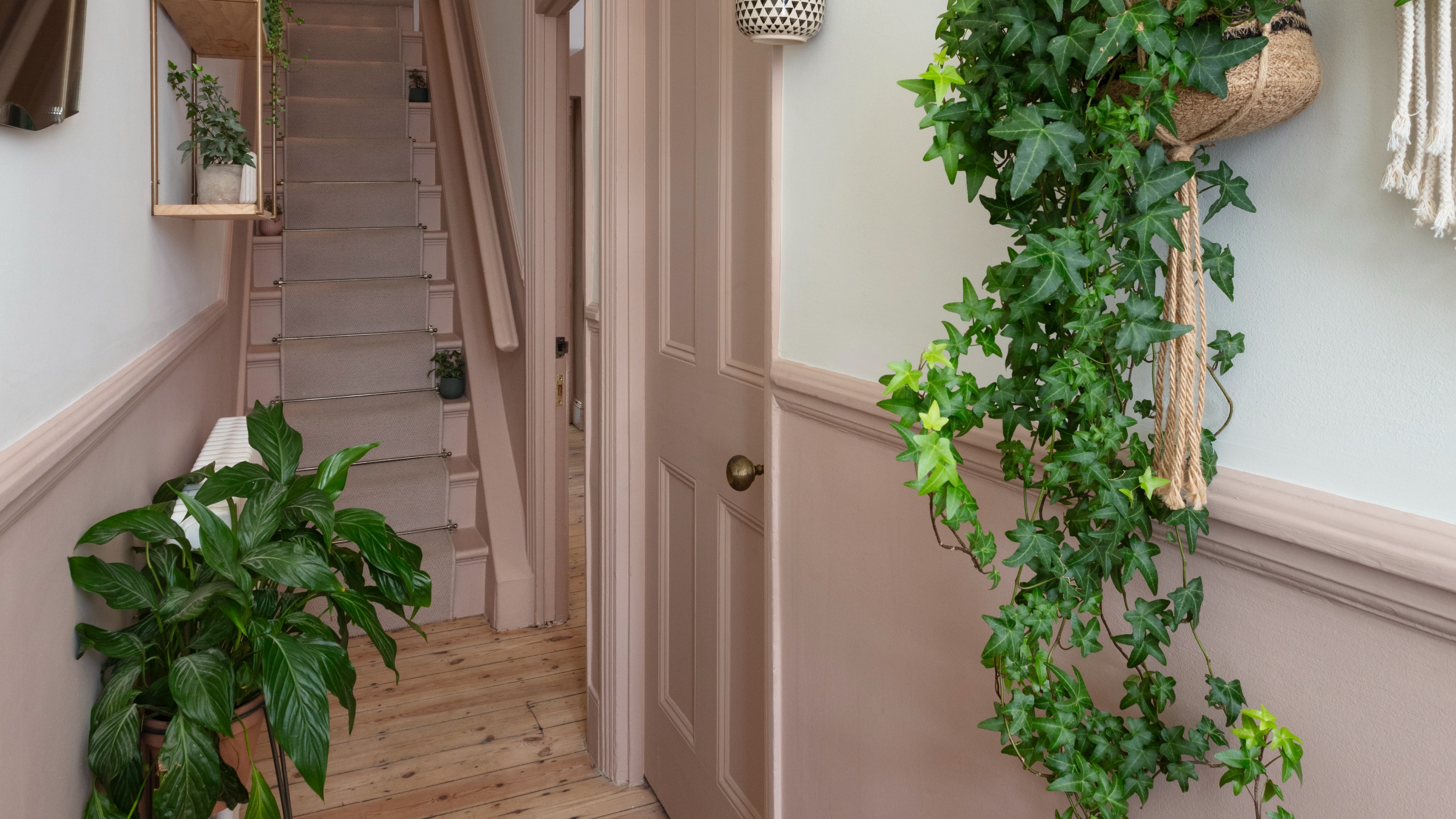
One approach, termed the "architectural whisperer approach," focuses on using colors that subtly highlight the architectural details of a hallway, such as moldings, trim, and door frames, to create gentle depth. Sherwin-Williams' Tamarind (SW 7538), a rich mushroom hue, is suggested for this purpose by Lisa Hudson, president of Fresh Coat Painters. Hudson also champions the "light infusion approach" for maximizing brightness and creating a sense of spaciousness, particularly in darker hallways. For this, she recommends Sherwin-Williams' Tudor Cream (SW 7711), a peachy cream known for its reflective qualities.
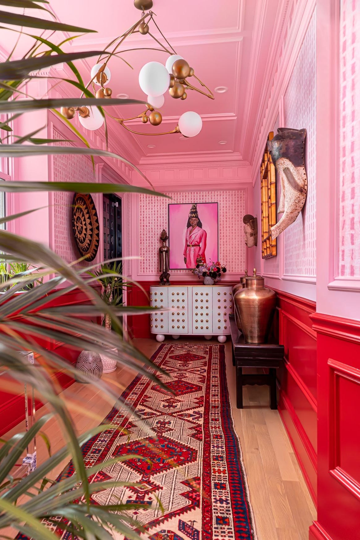
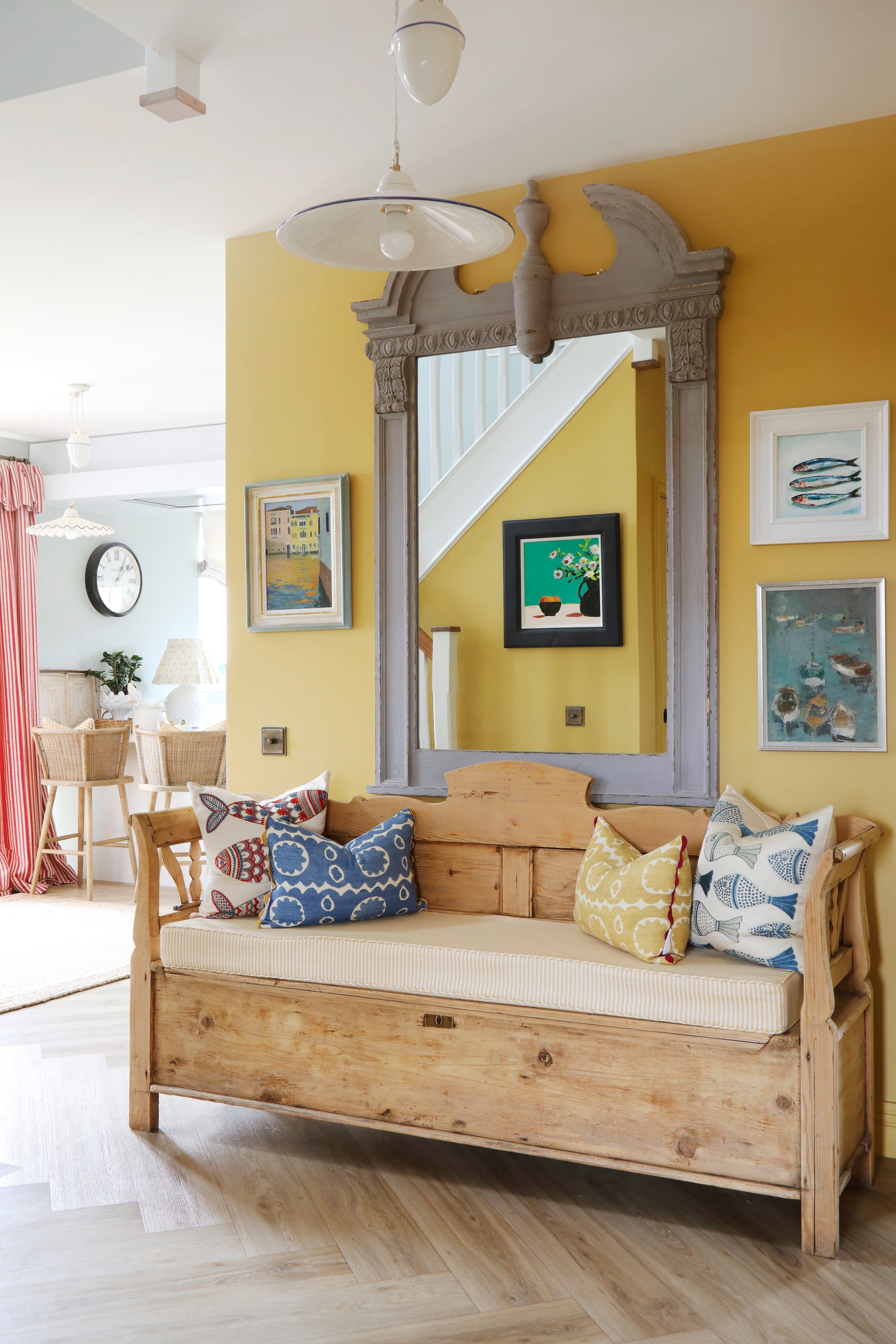
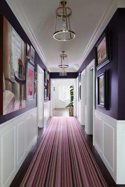
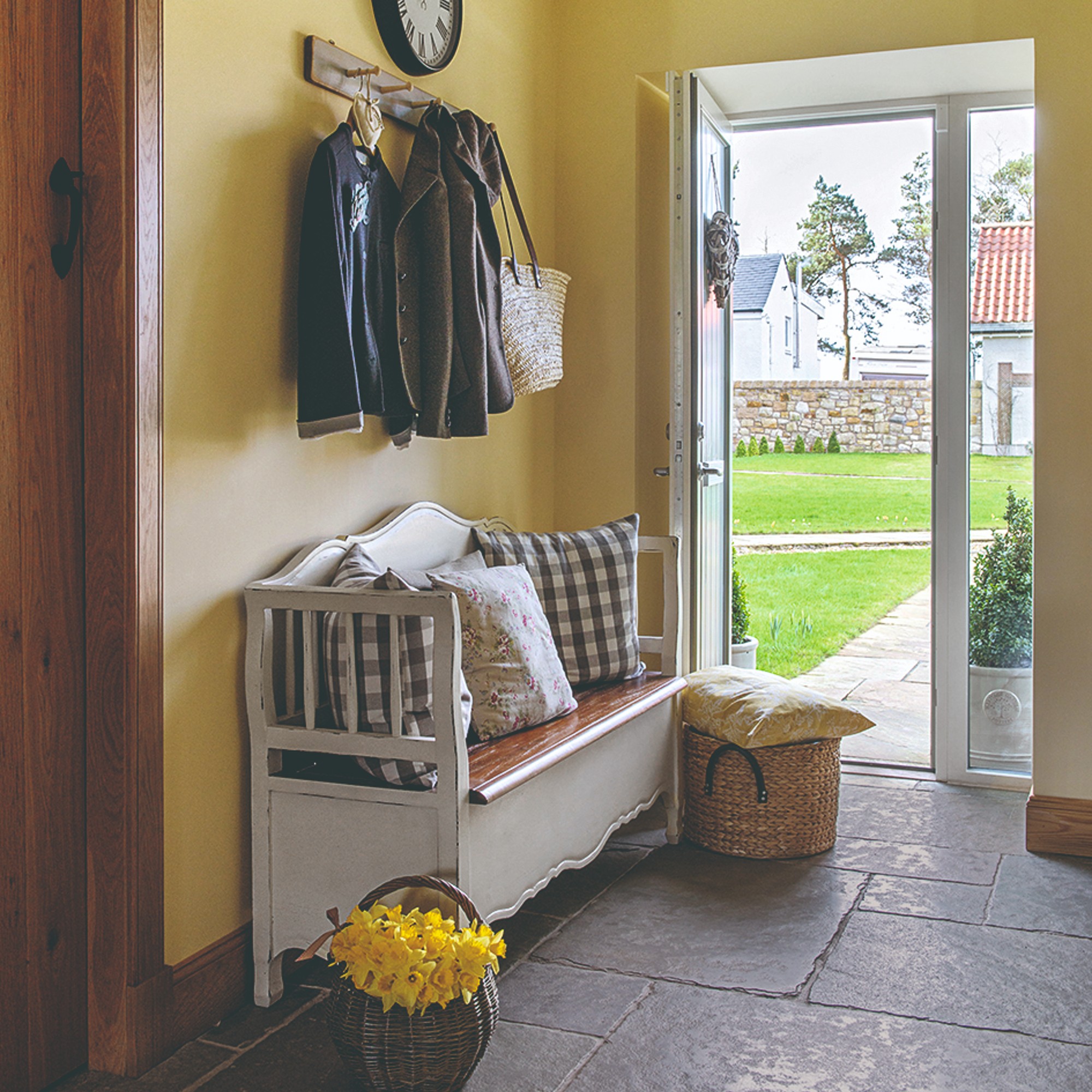
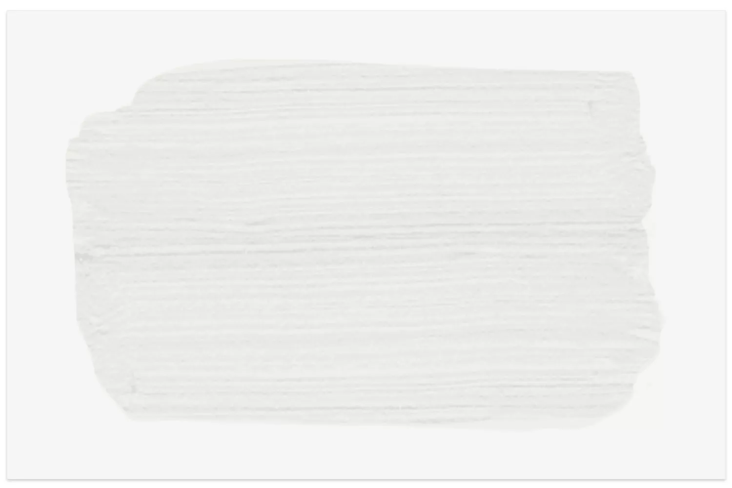
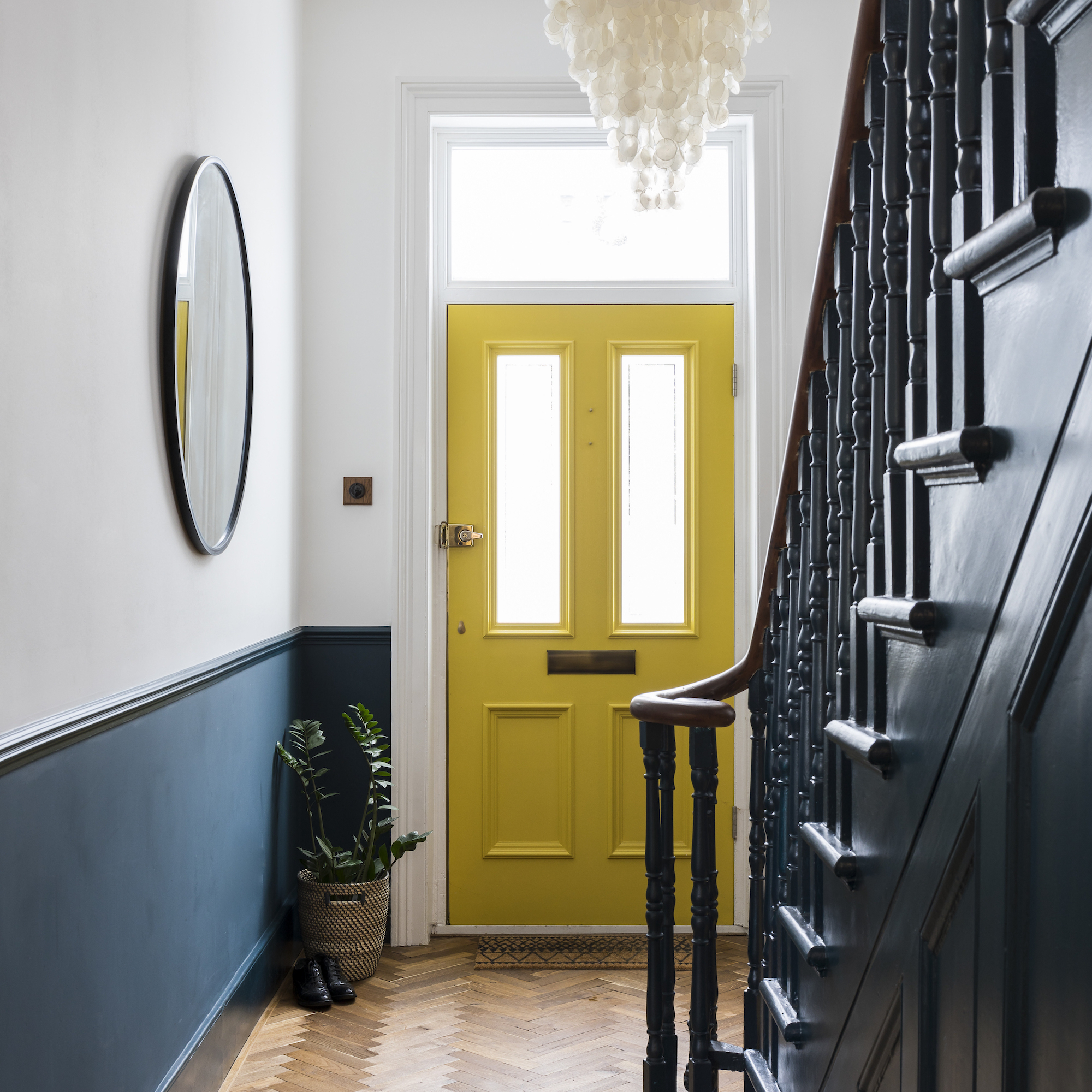
For homeowners aiming to make a bold statement, Jennifer Rogers, a designer at BKC Kitchen and Bath, proposes Sherwin-Williams' Urbane Bronze (SW 7048). This brownish-gray, rooted in nature, can add drama and warmth, turning a hallway into a focal point when combined with statement lighting. Rogers also highlights Farrow & Ball's Shadow White (No. 282) as a welcoming, light-enhancing option. This warm off-white, with its subtle depth, reflects natural light effectively, preventing hallways from appearing stark or sterile.
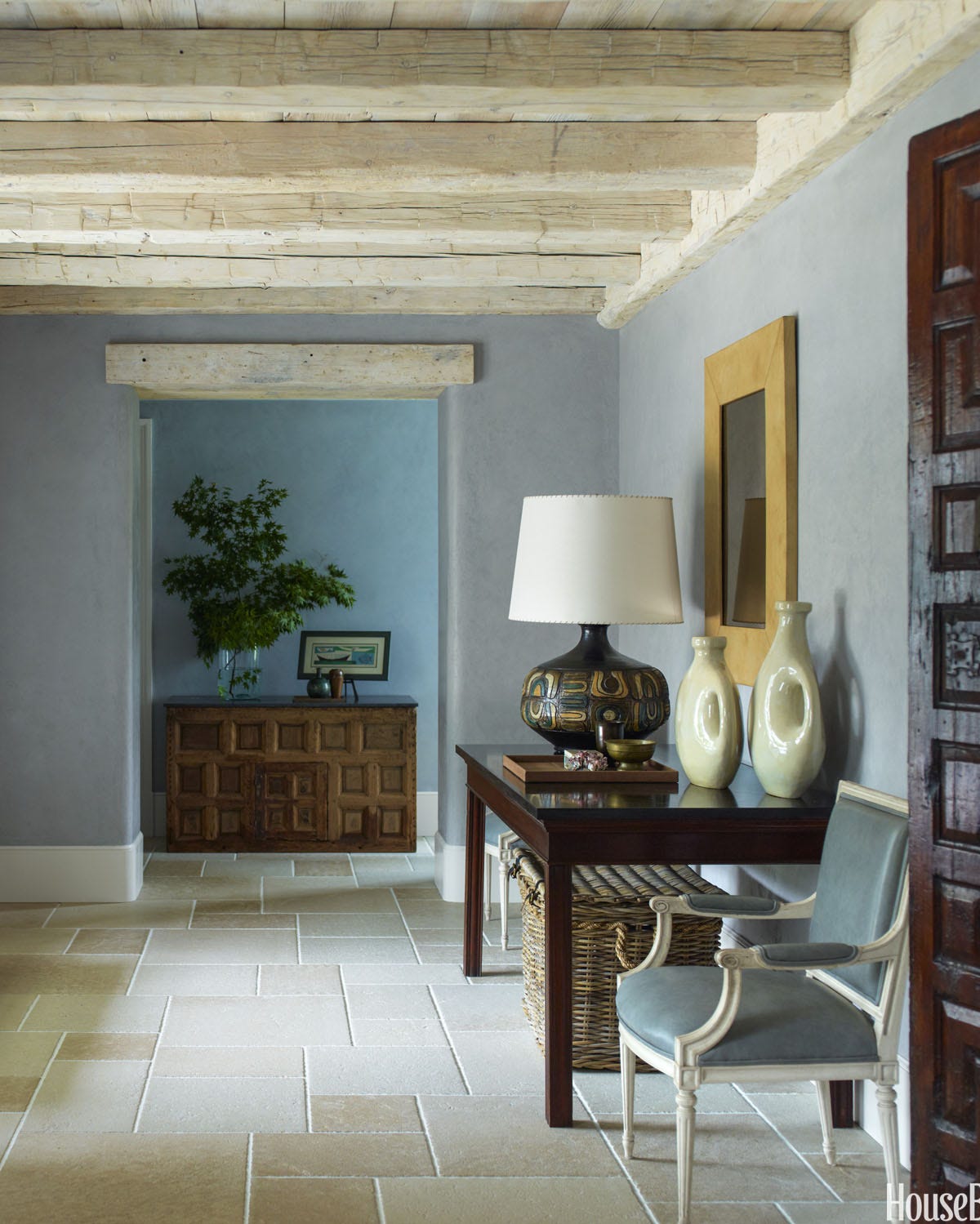
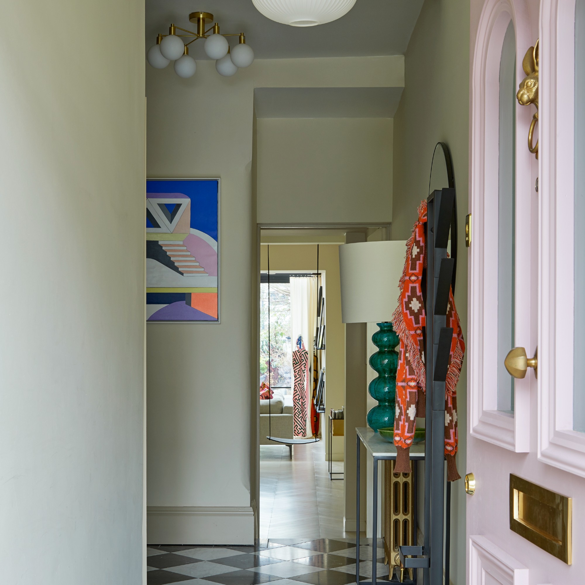
Another versatile choice is Classic Gray (OC-23) by Benjamin Moore, an ultra-light greige that can seamlessly blend with any room and function as an off-white. For a slightly deeper gray with cool undertones, Hudson suggests Sherwin-Williams' Silver Strand, noting its ability to reflect light and add sophistication. Little Greene's French Grey (113), a warm neutral grey mixed with blue and red, is recommended by Rogers for its timeless appeal and adaptability to various lighting conditions, offering a delicate and sophisticated touch.
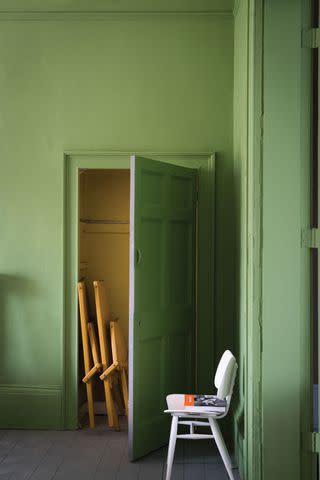
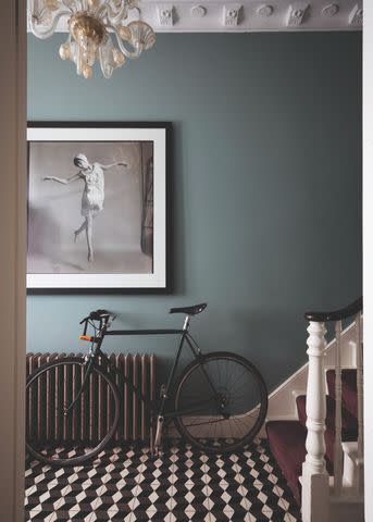
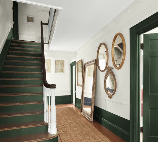
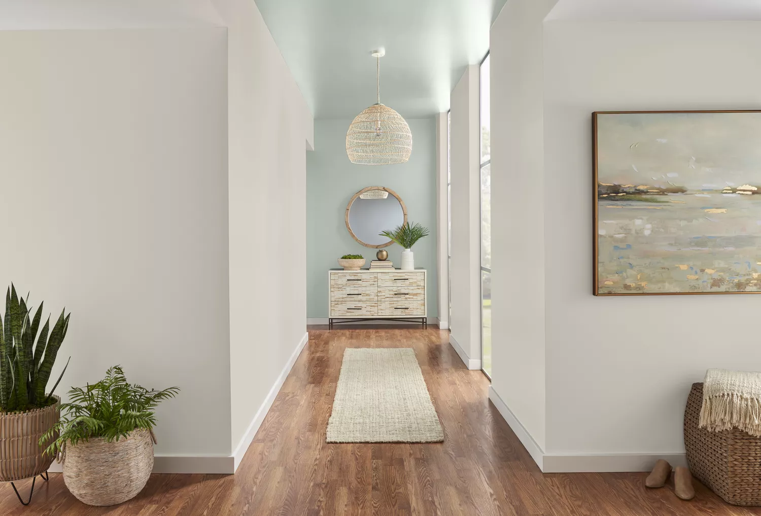
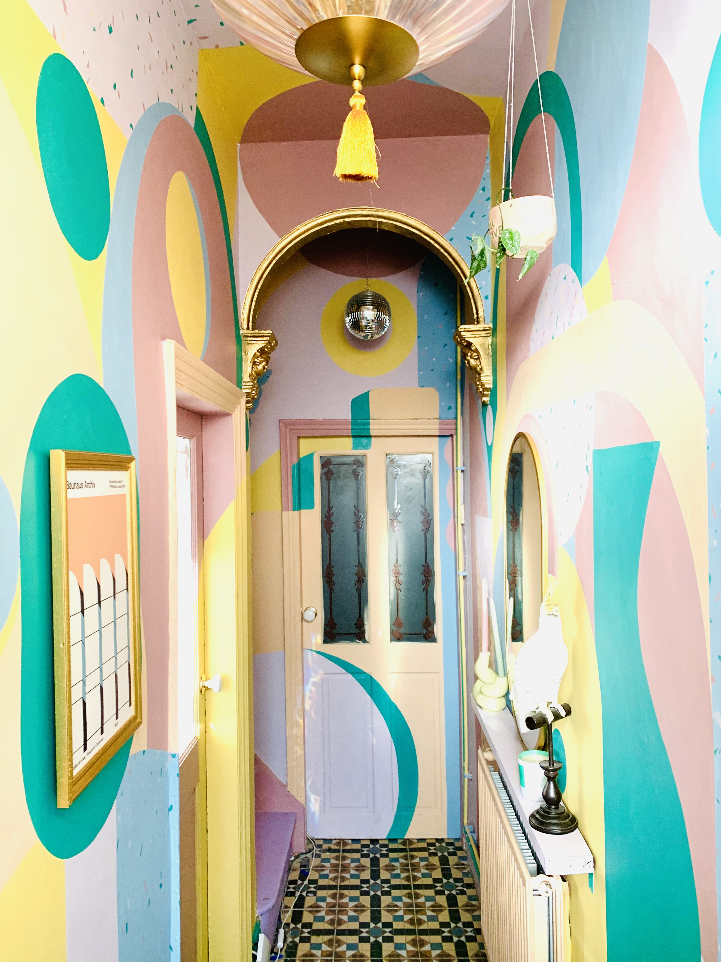
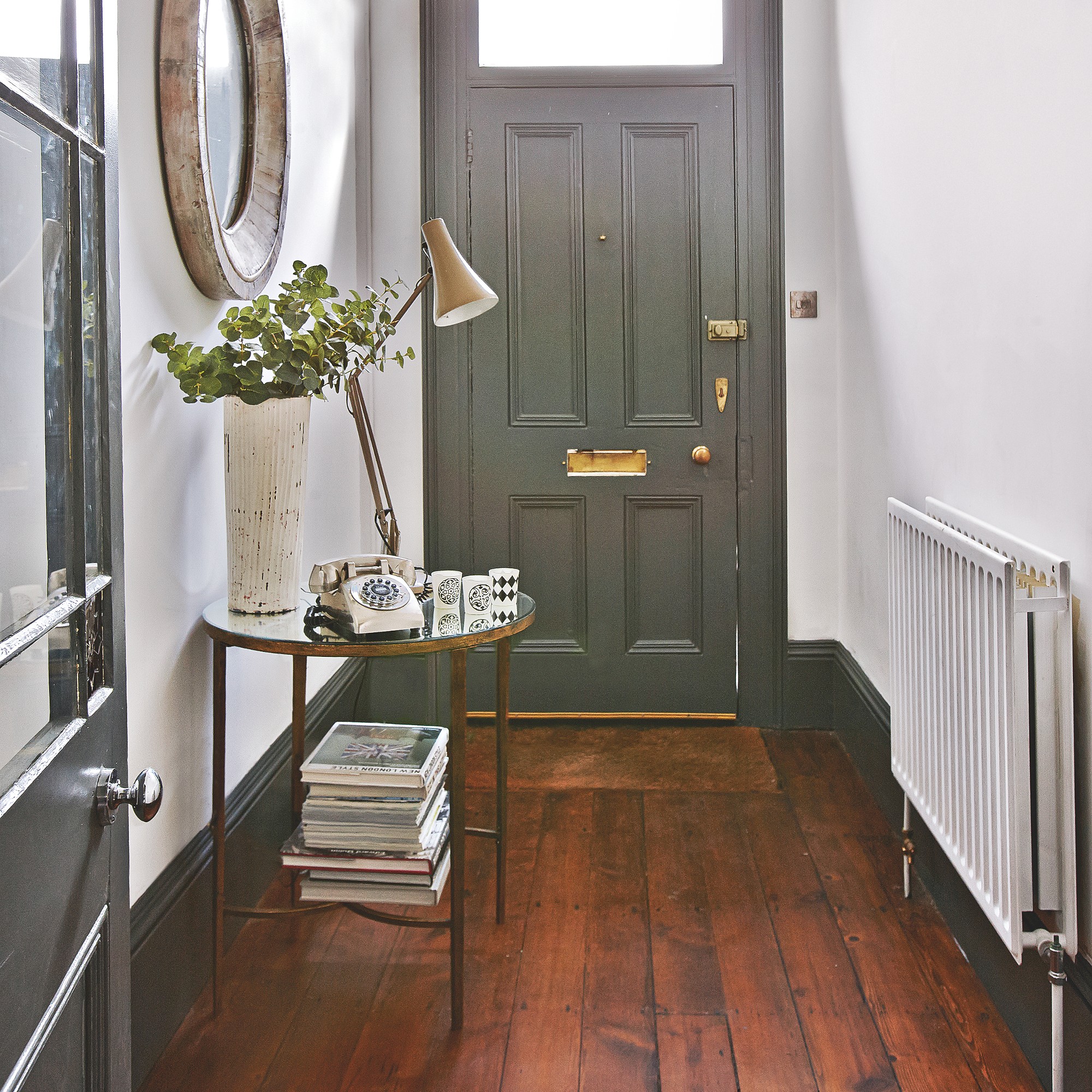
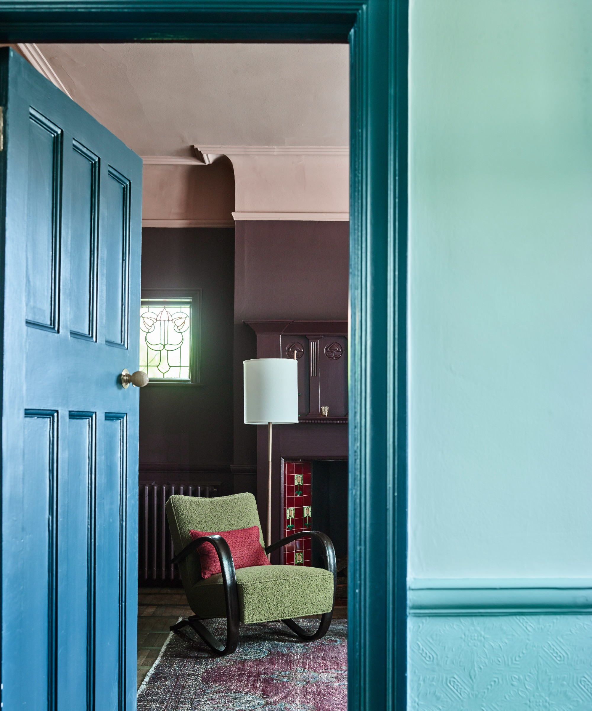

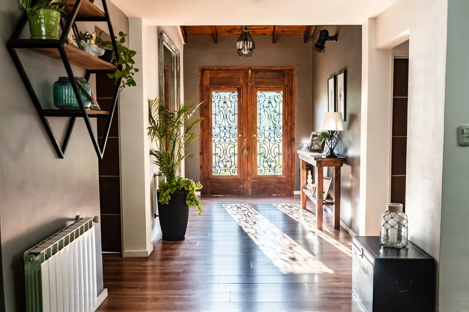
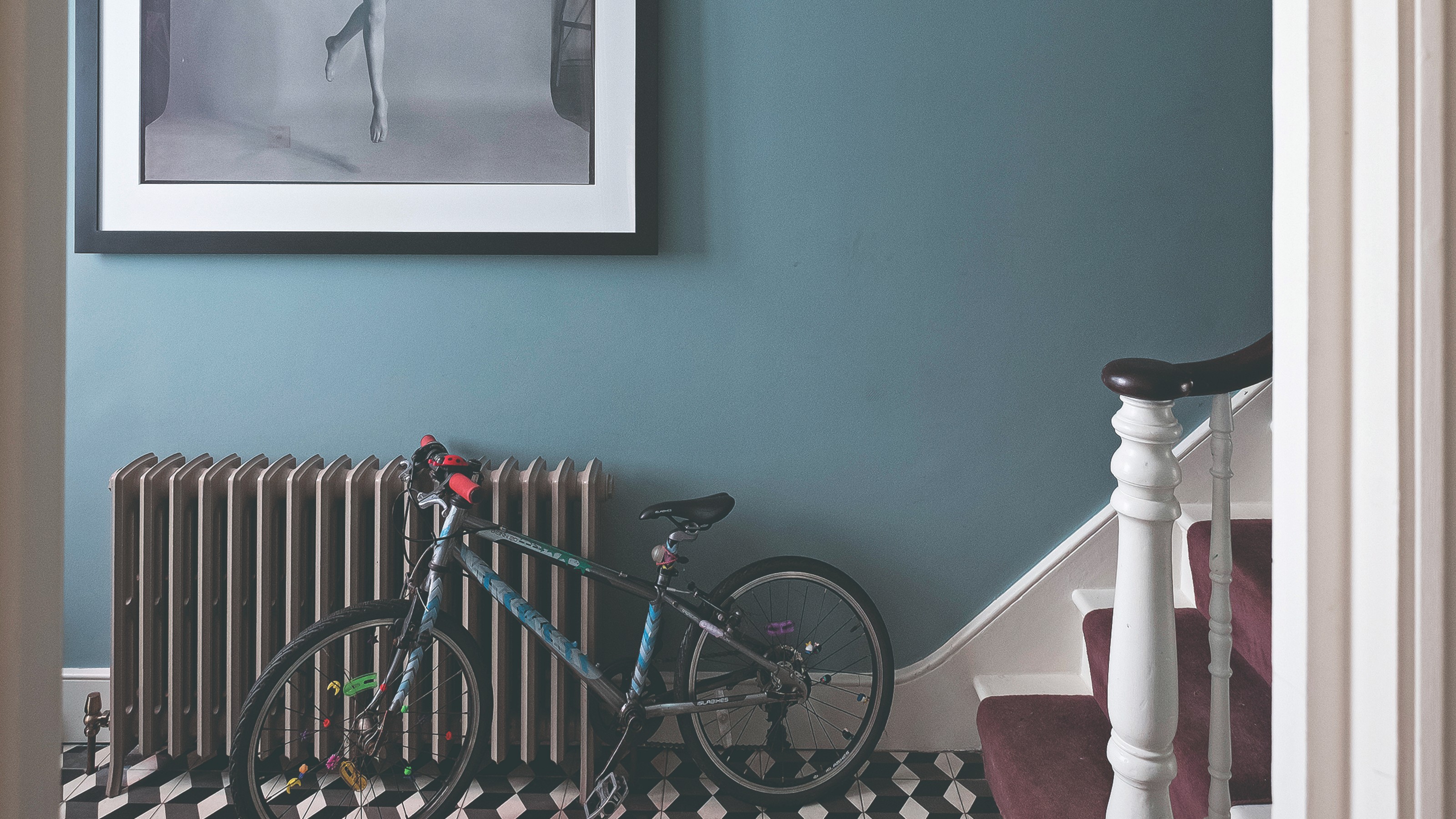
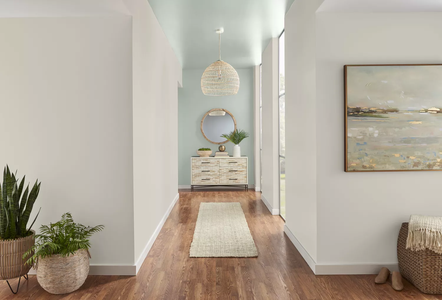
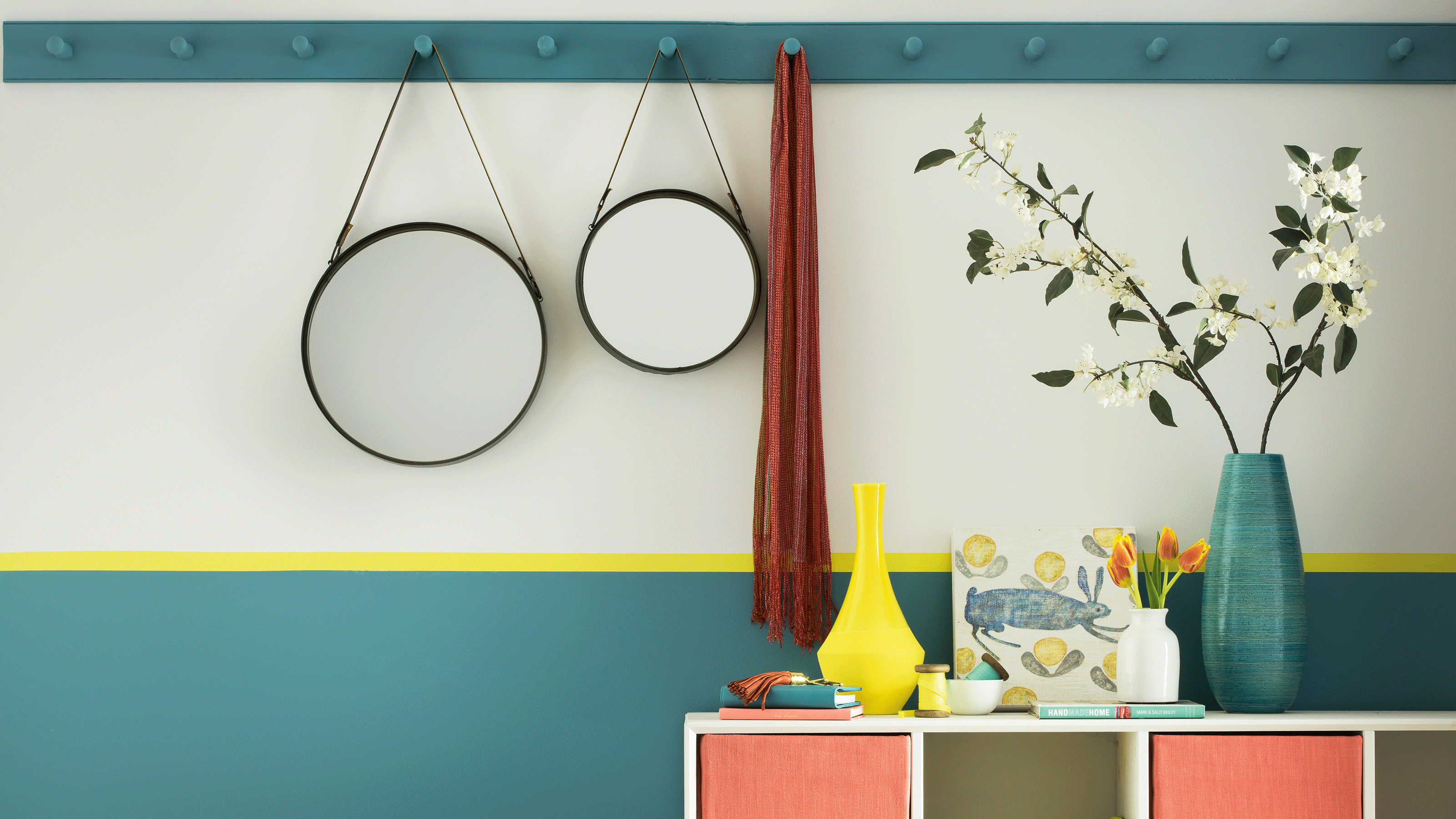
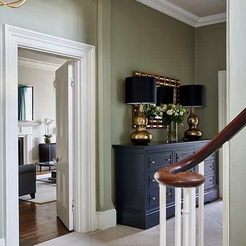
For those willing to explore darker shades, Libby Palmieri from House of L recommends Tonester's Charleston Green. This dark, moodier tone can warm up a space and create an interesting focal point, combating the sterility often associated with long corridors. Lastly, for longer hallways, Hudson suggests an accent wall at the far end painted in a deep, rich color like Sherwin-Williams' Intense Teal (SW 6943). Despite its name, this teal can energize drab hallways and create a sophisticated look when paired with neutral, nature-inspired tones. These expert recommendations offer diverse options for transforming hallways from neglected passages into impactful elements of home design, whether the goal is subtle enhancement, increased brightness, or a dramatic statement.
#HallwayDesign #PaintColors #InteriorDesign #HomeDecor #ColorSelection #SherwinWilliams #FarrowAndBall #BenjaminMoore #HallwayDesign #PaintColors #InteriorDesign #HomeDecor #ColorSelection #SherwinWilliams #FarrowAndBall #BenjaminMoore
0 Kommentare insgesamt
 Noch keine Kommentare
Das könnte Ihnen auch gefallen
19 Elegant Hallway Paint Colors That Designers Swear By in 2025

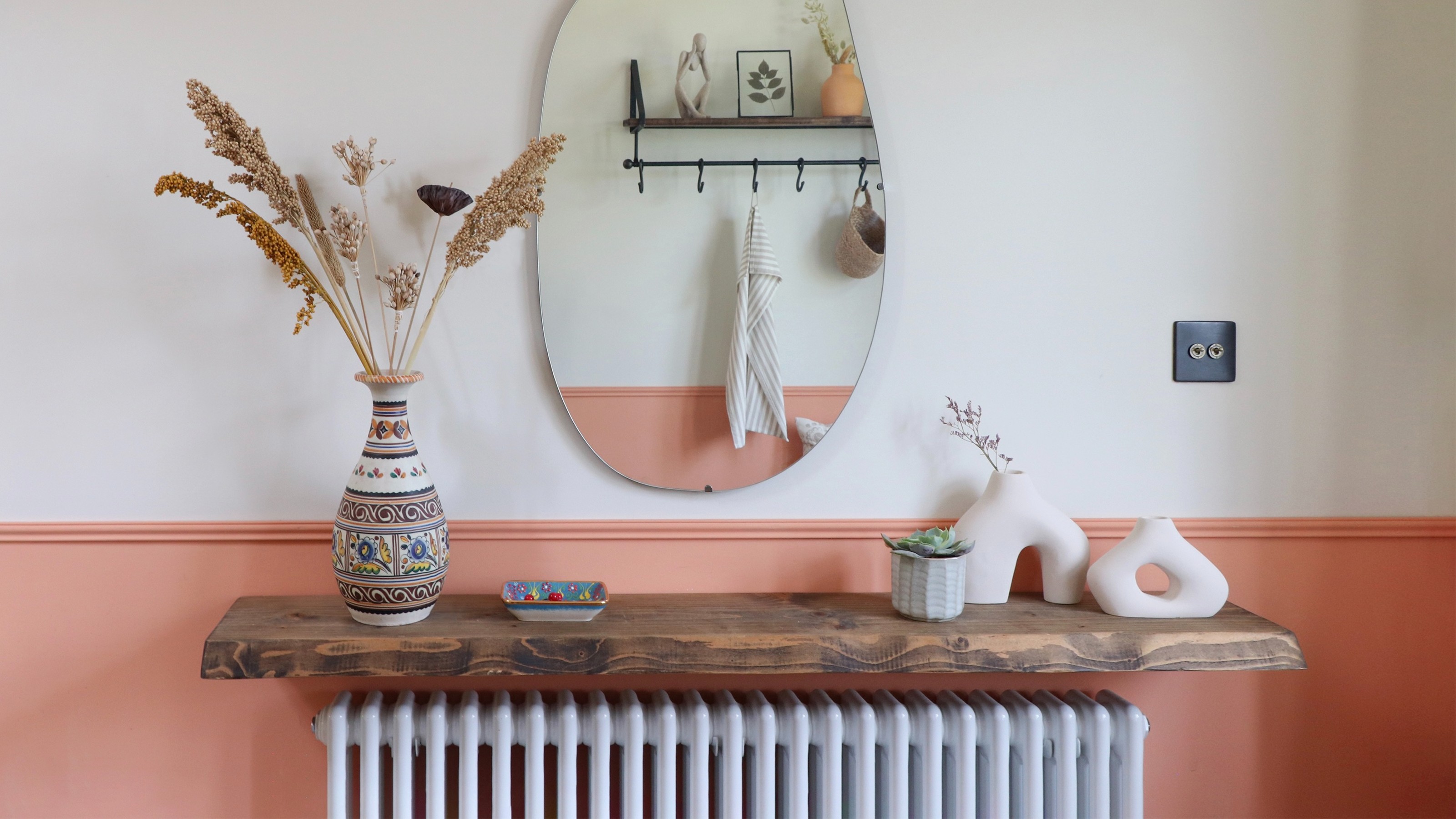
19 paint ideas for hallways – elevate your space with clever tricks and lustworthy shades
25 Latest Hall Painting Designs With Pictures 2024
The 8 Best Living Room Paint Colors, According to Design Experts
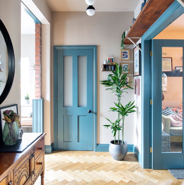
What colour should I paint my hallway? 28 ideas to inspire you
You should never paint your hallway this colour, according to colour psychologists
The 8 Best Foyer Paint Colors for an Elegant Entryway


8 Favorite Paint Colors of Local Interior Designers

20 Hallway Paint Colors That Bring This Space to Life
4 Paint Colors Designers Say You Should Never Use In A Hallway
8 of the best paint colors to enhance small spaces, according to experts

The 3 best Farrow & Ball paint colours for a hallway – the unexpected shades the experts recommend
20 Hallway Paint Colors That Bring This Space to Life
Hallway paint ideas – 15 ways to give this narrow room big personality

‘The colours that we decorate our hallway with should make us excited to be back’ – 16 hallway colour ideas to help you create a welcoming entryway
Trust us, these are the colours to avoid when painting a small hallway
Sherwin Williams' Framboise Was the Perfect Color to Upgrade This Hallway

Hallway paint ideas to elevate your space with clever tricks
What colors brighten up an entryway? 5 shades that will bring light and life to your space

8 Basement Paint Colors Interior Designers Rely on to Brighten Dark Spaces