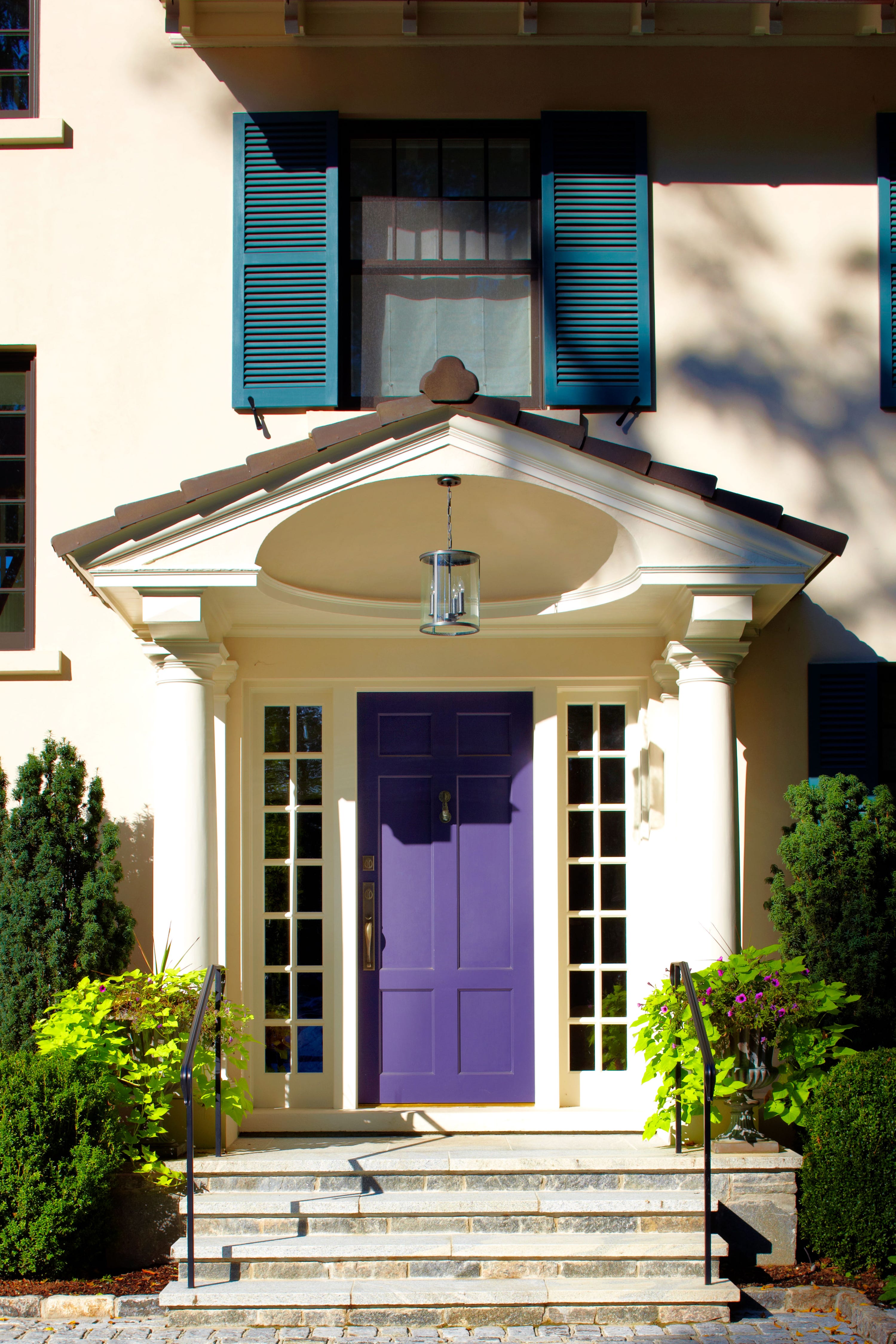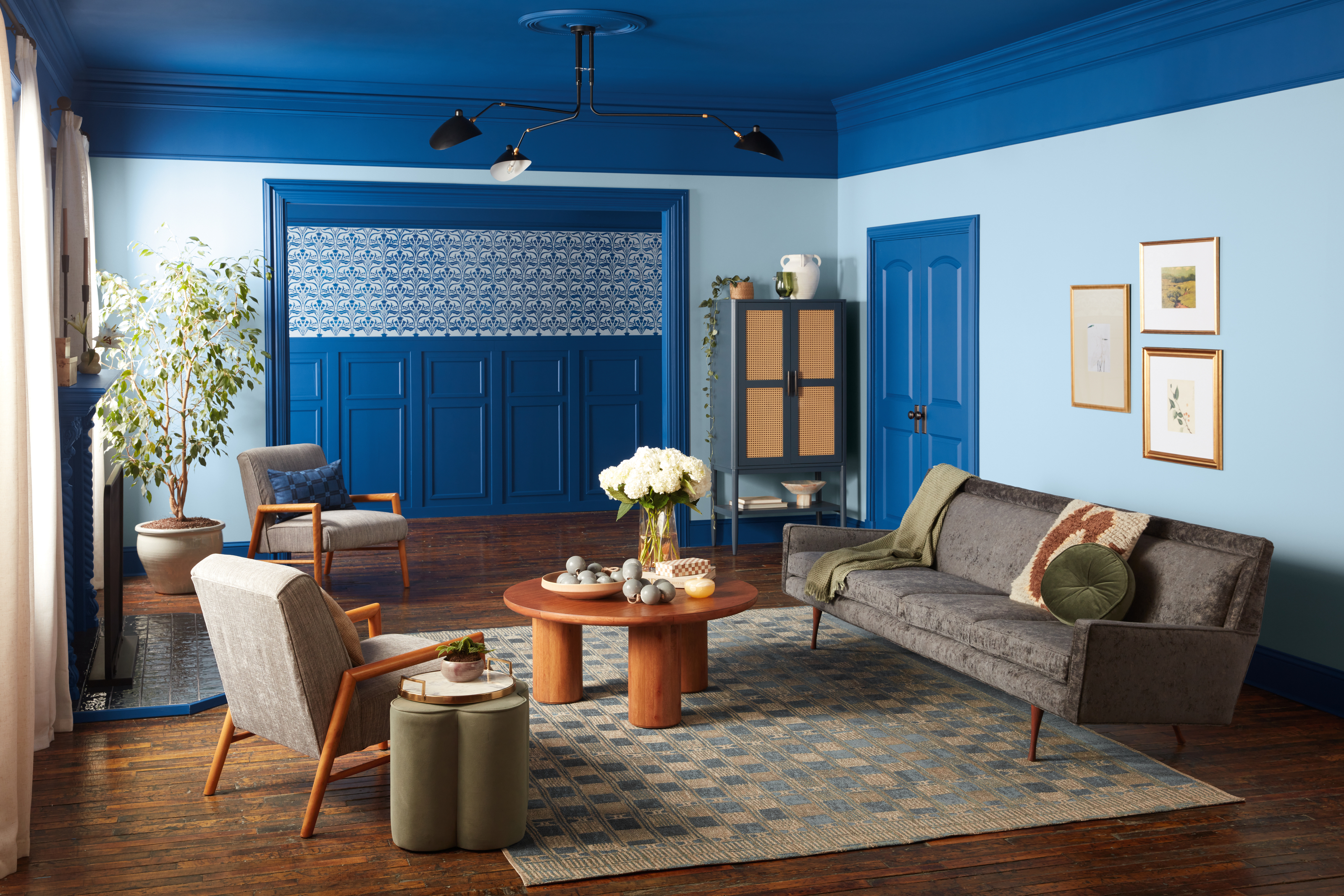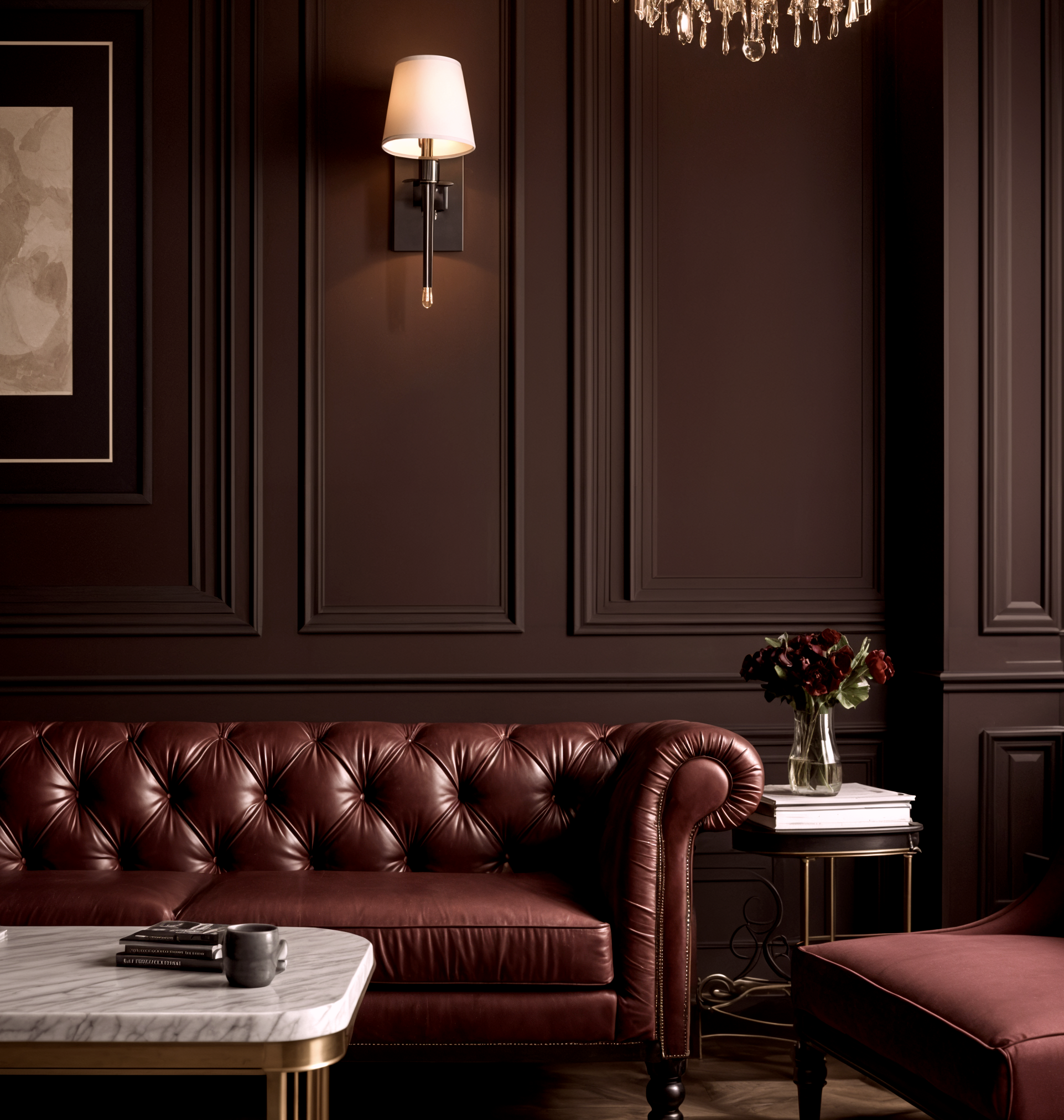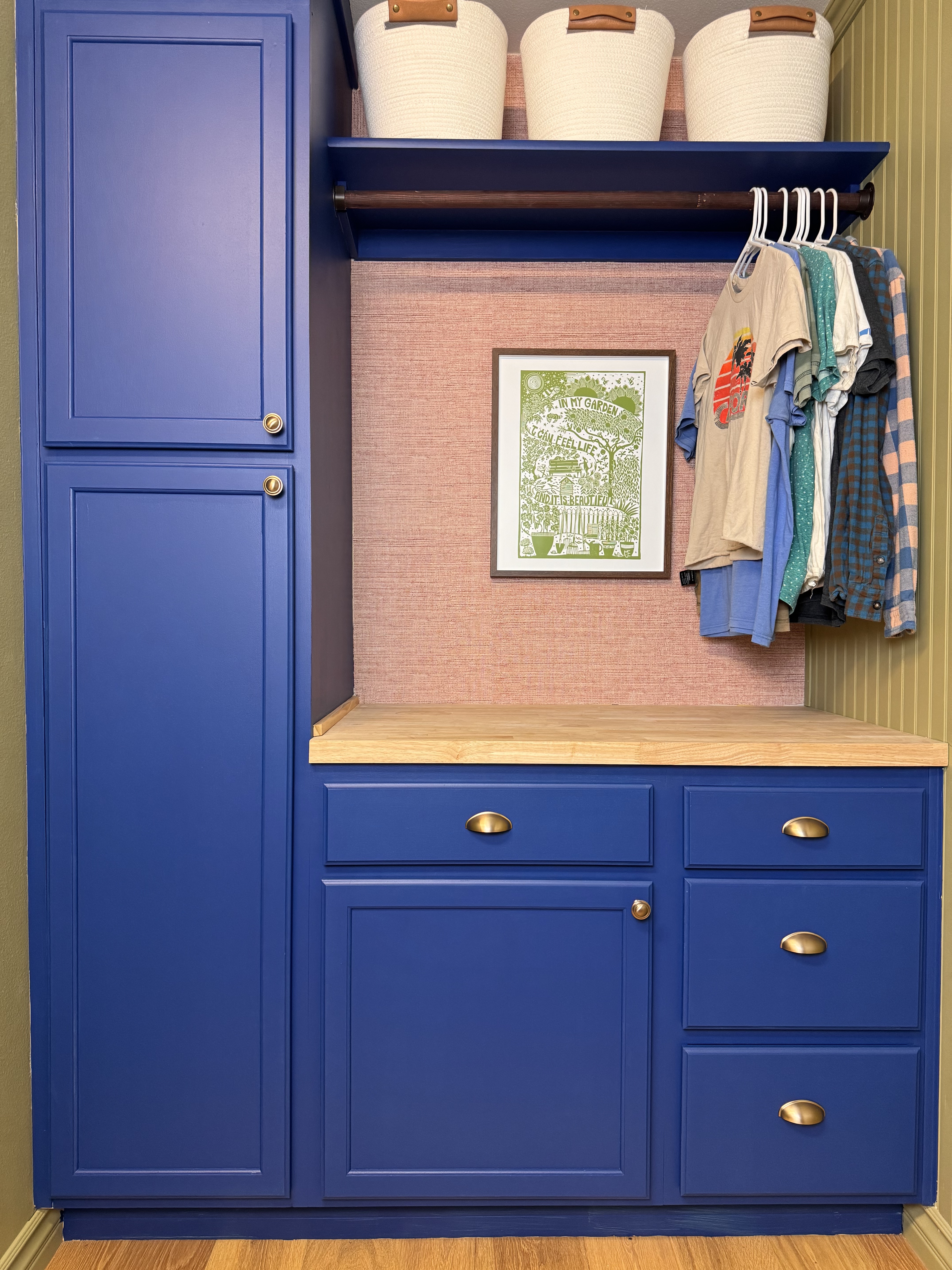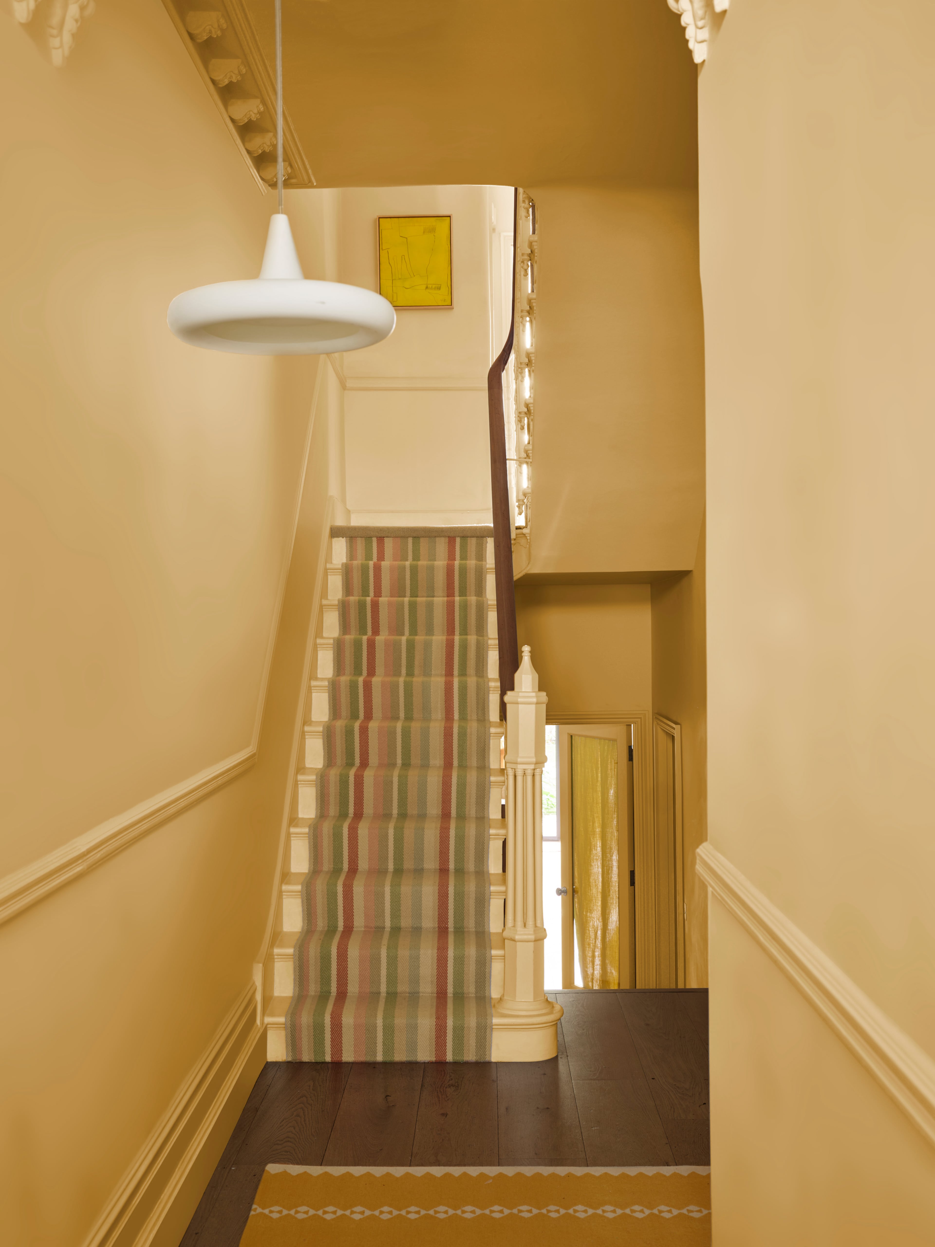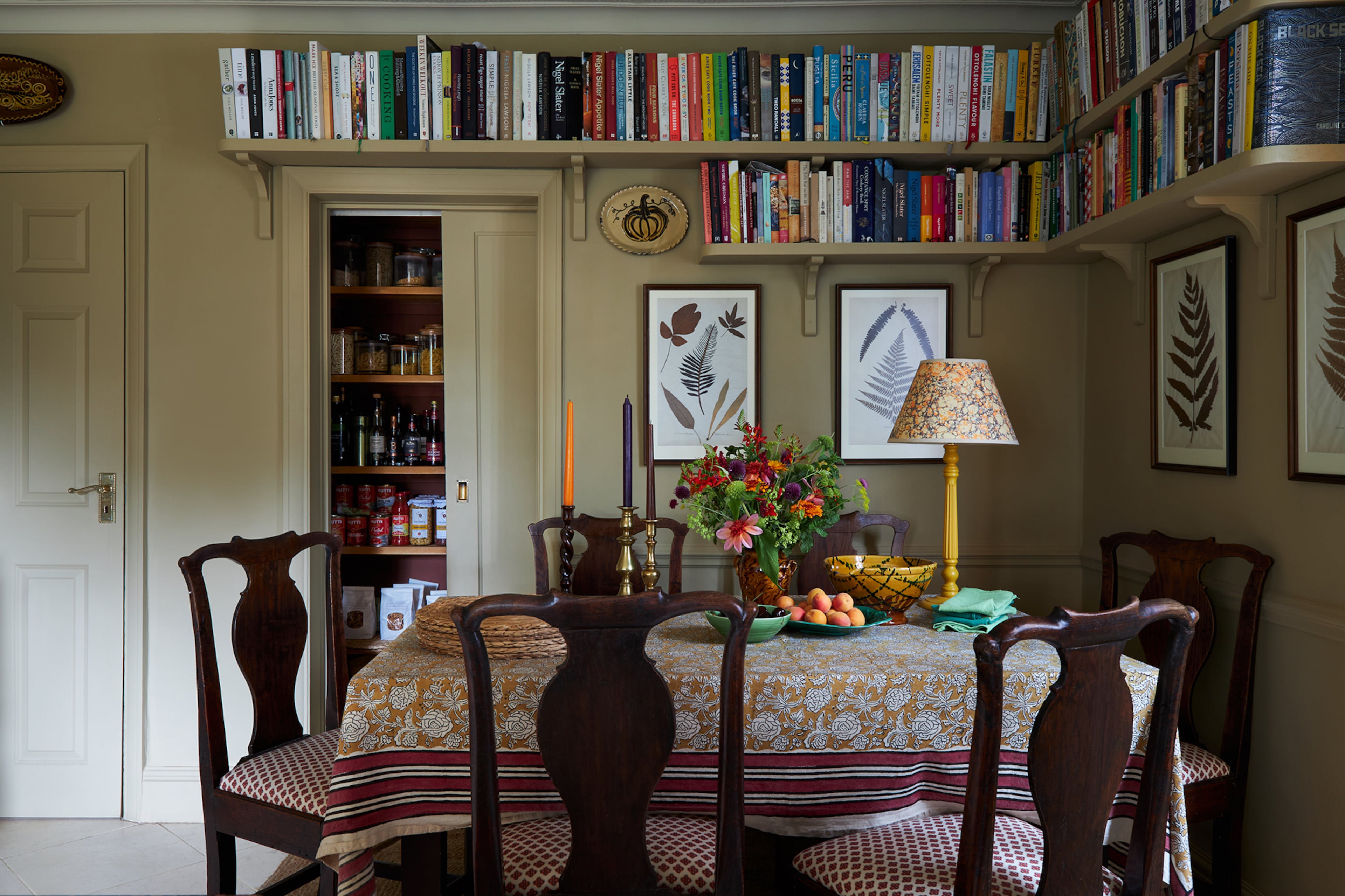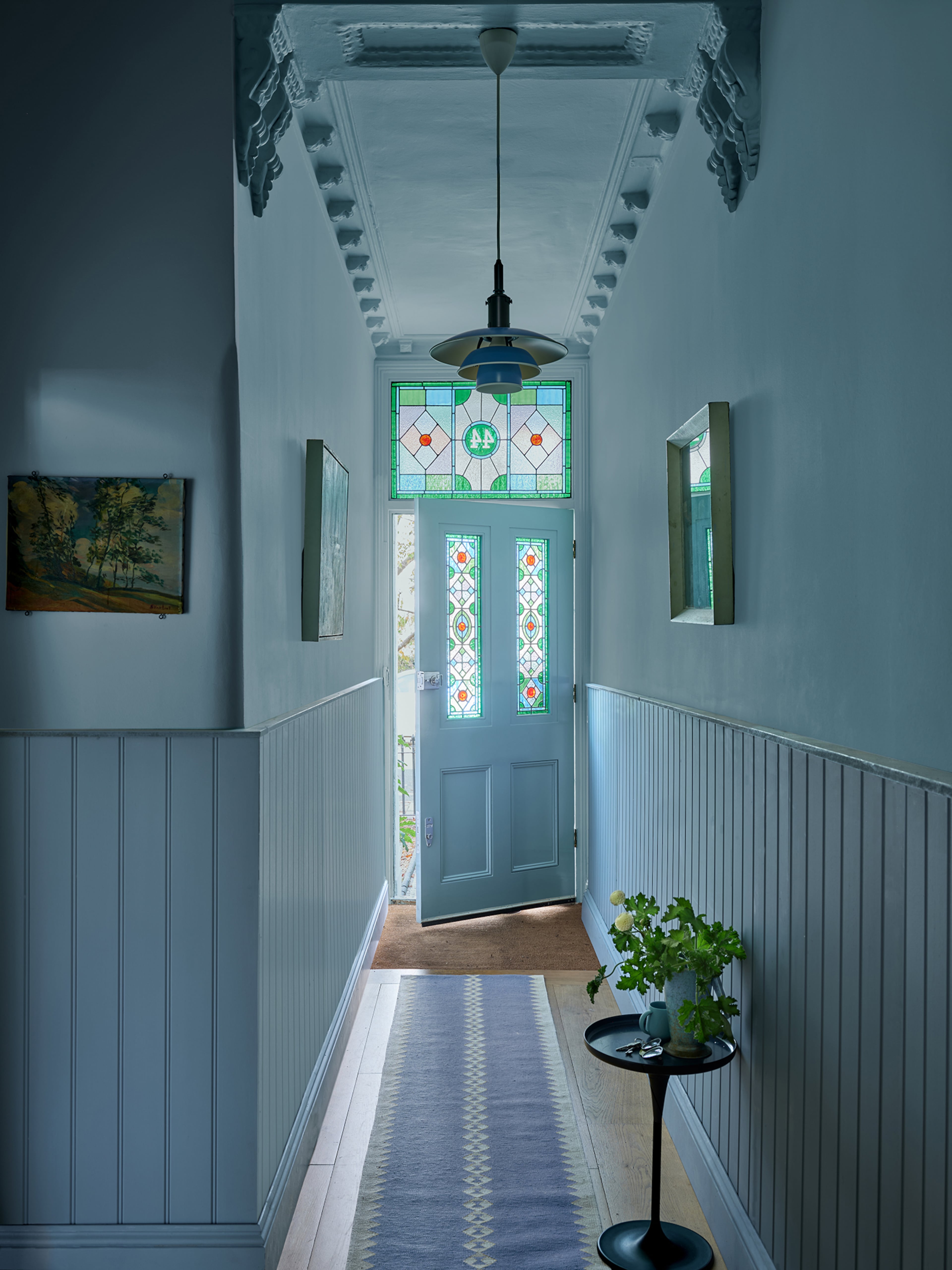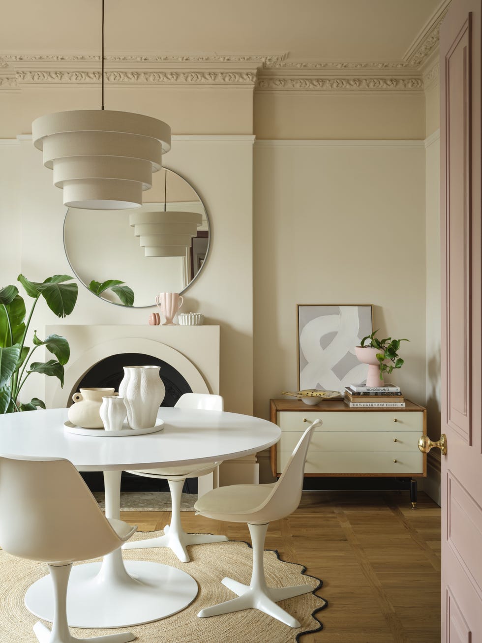
Martha Stewart's pistachio entryway will top color trends in 2025
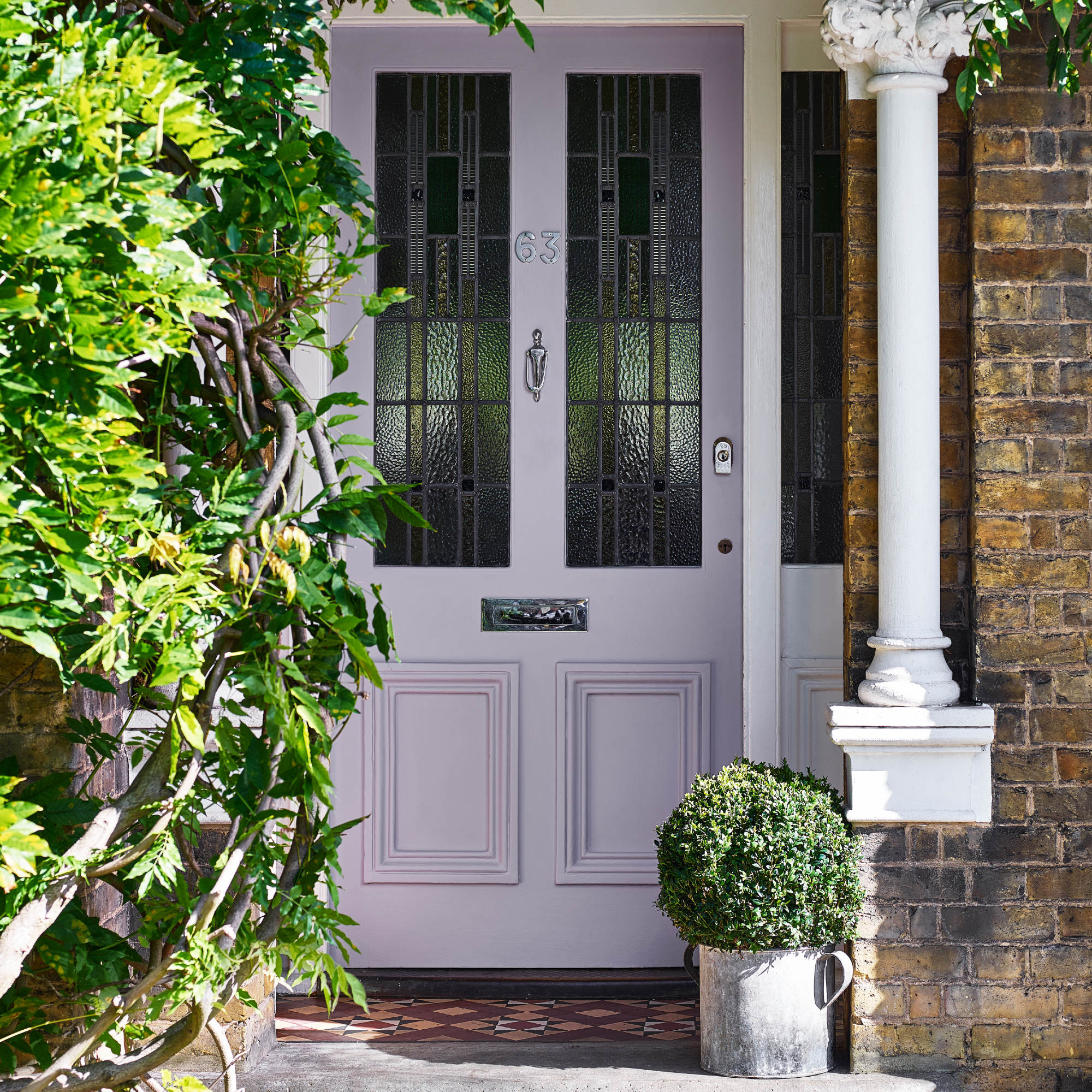
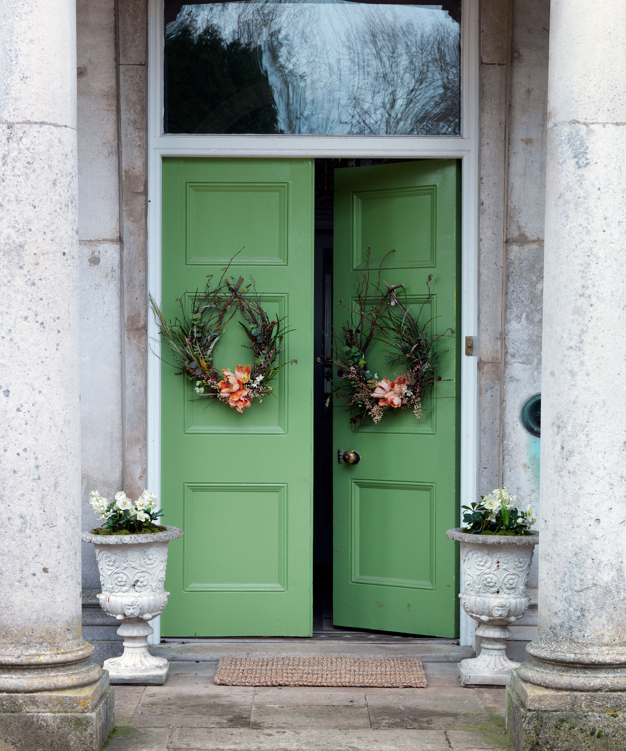
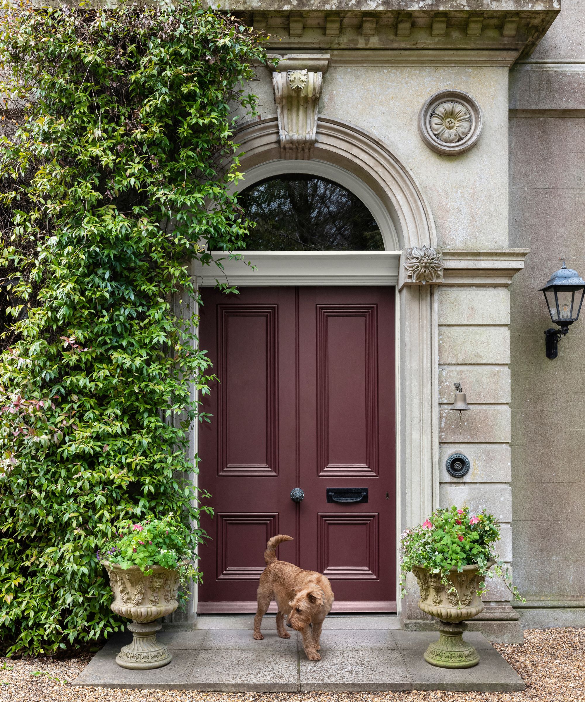
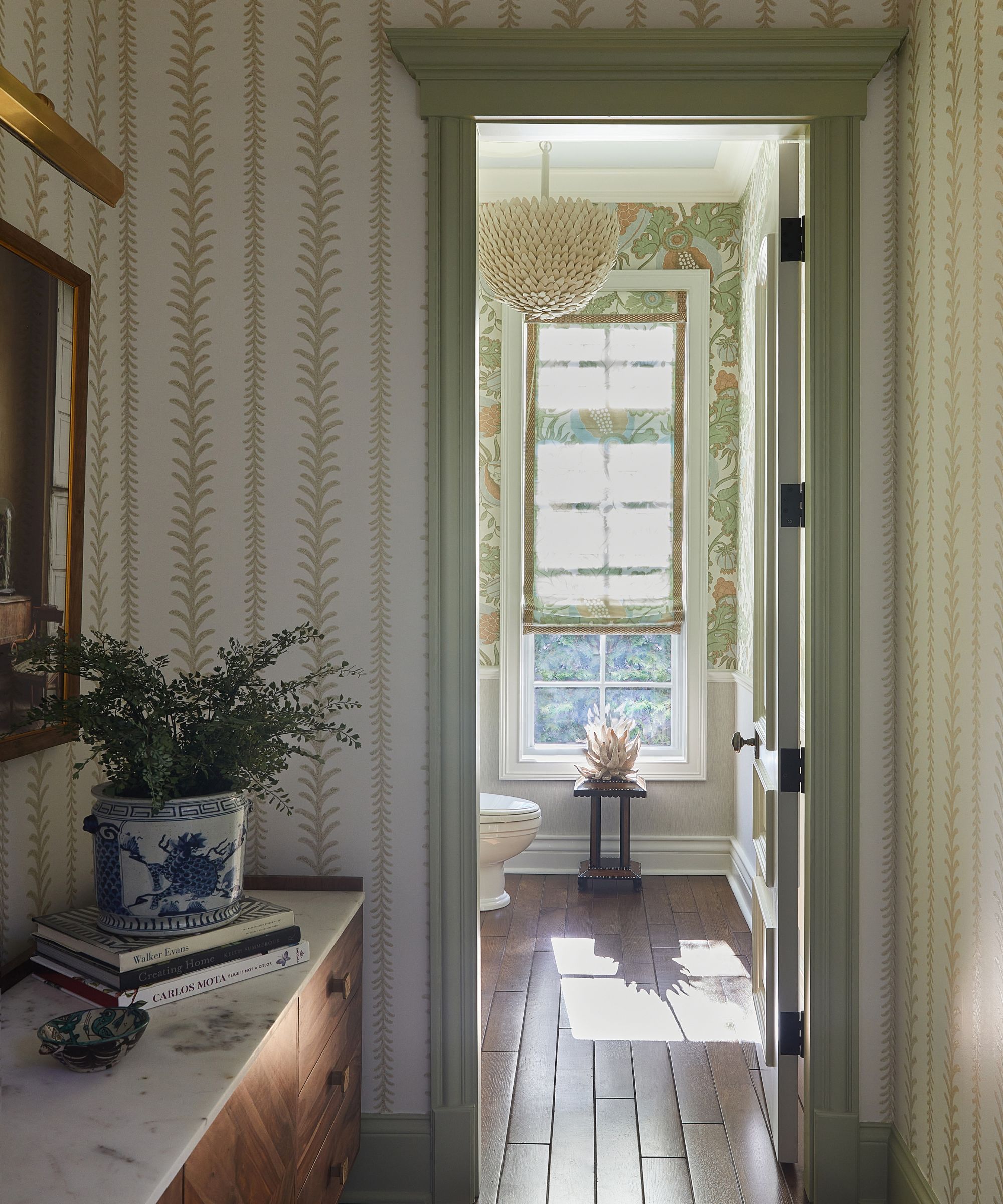
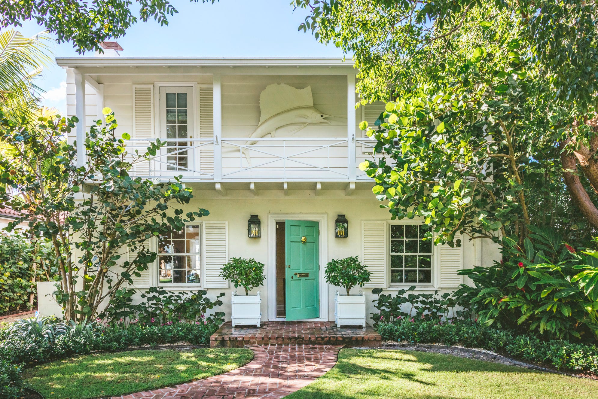
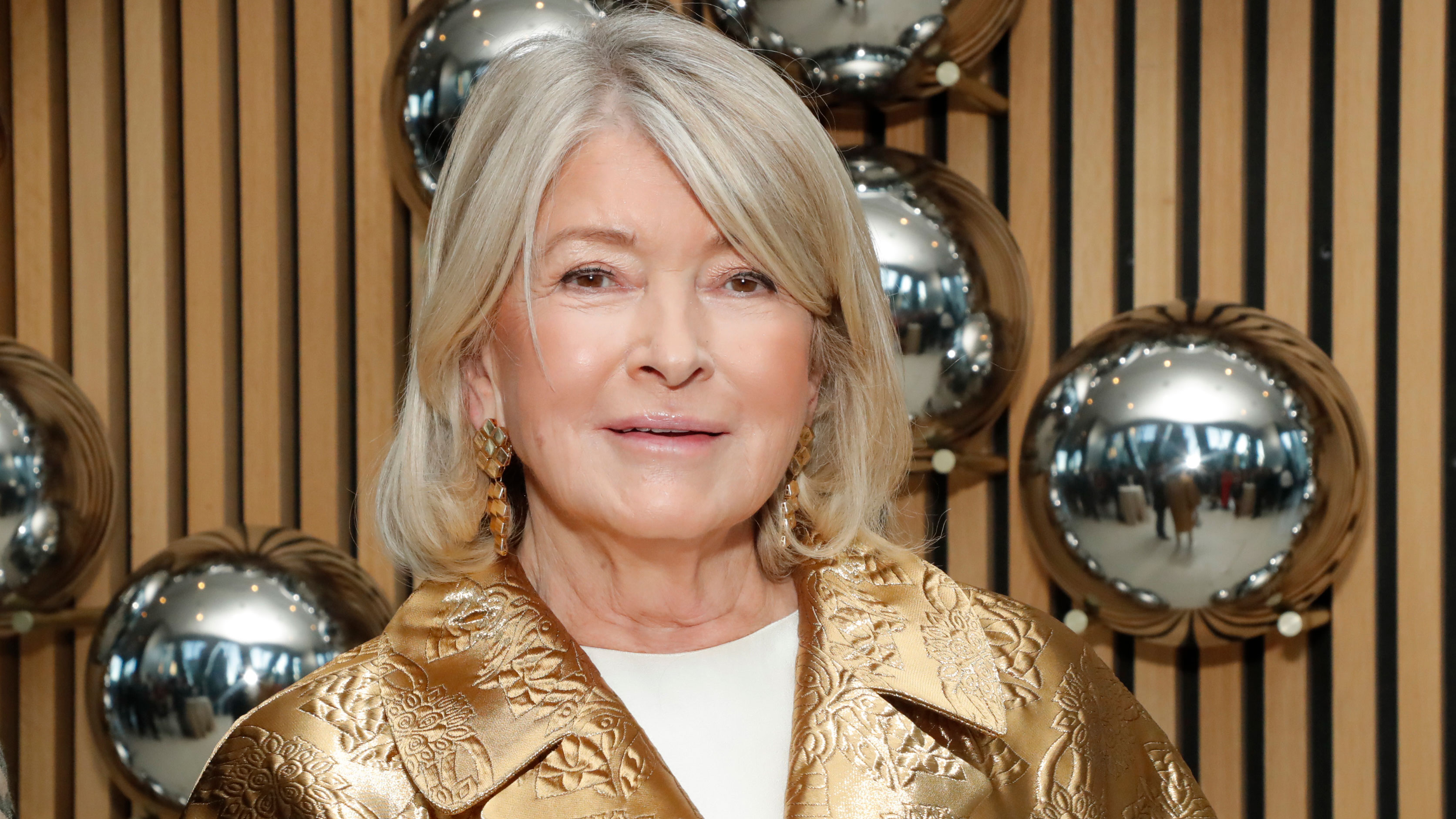
Martha Stewart's pale pistachio entryway highlights a growing trend in home decor, with designers and forecasters predicting that this specific green hue will be a dominant color trend in 2025. The article notes that pale pistachio green is experiencing a significant moment in interior design, largely due to a shift away from cooler, stark neutrals like steel grey and pure white. This transition reflects a post-pandemic preference for warmer, more inviting, and calming color palettes in homes.
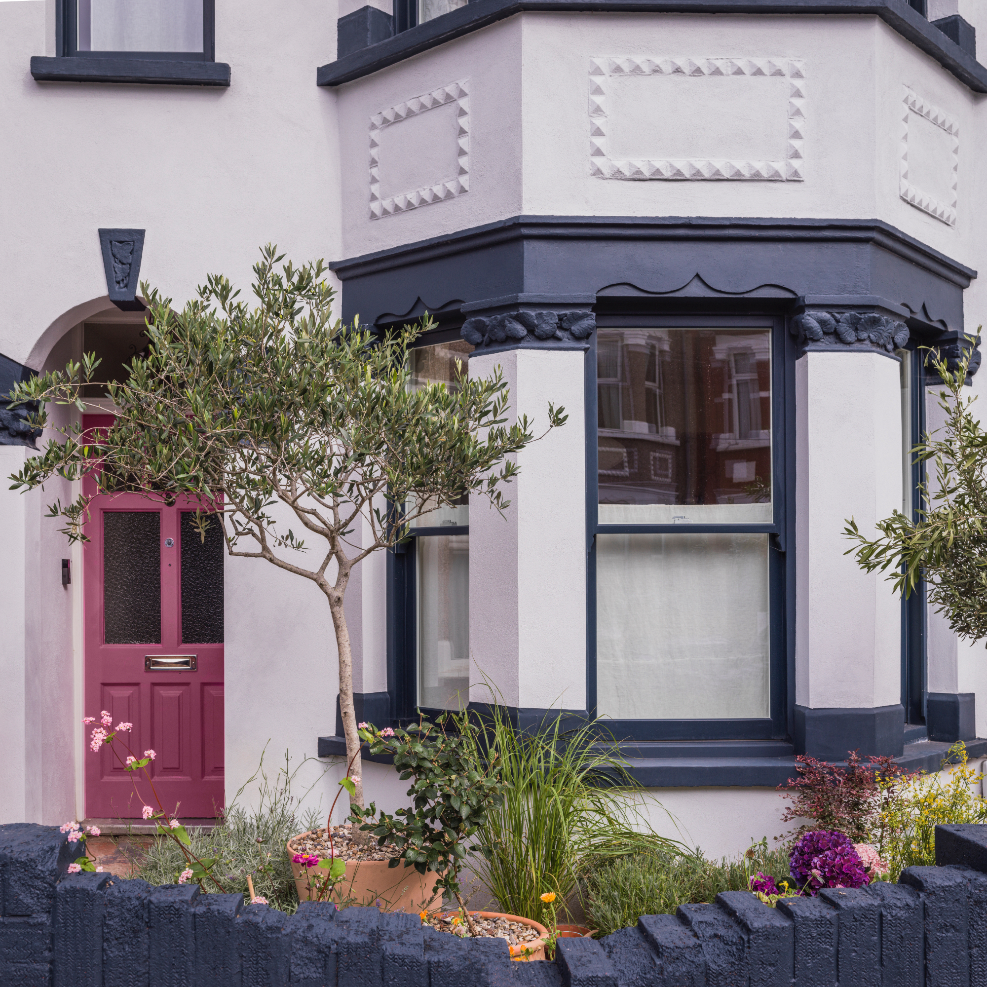
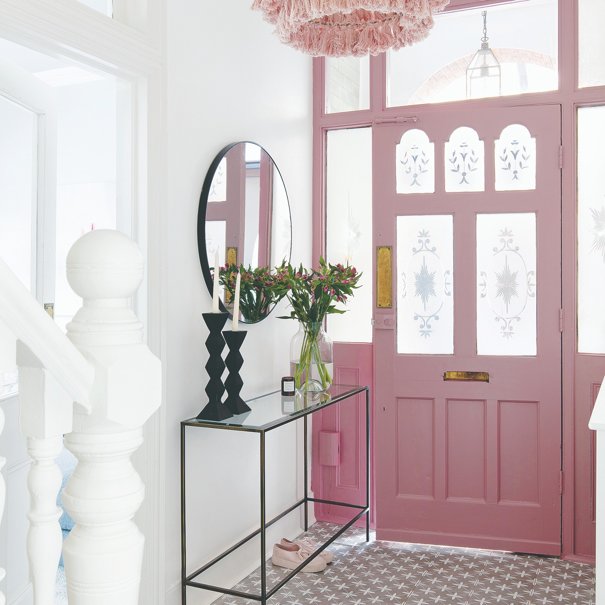
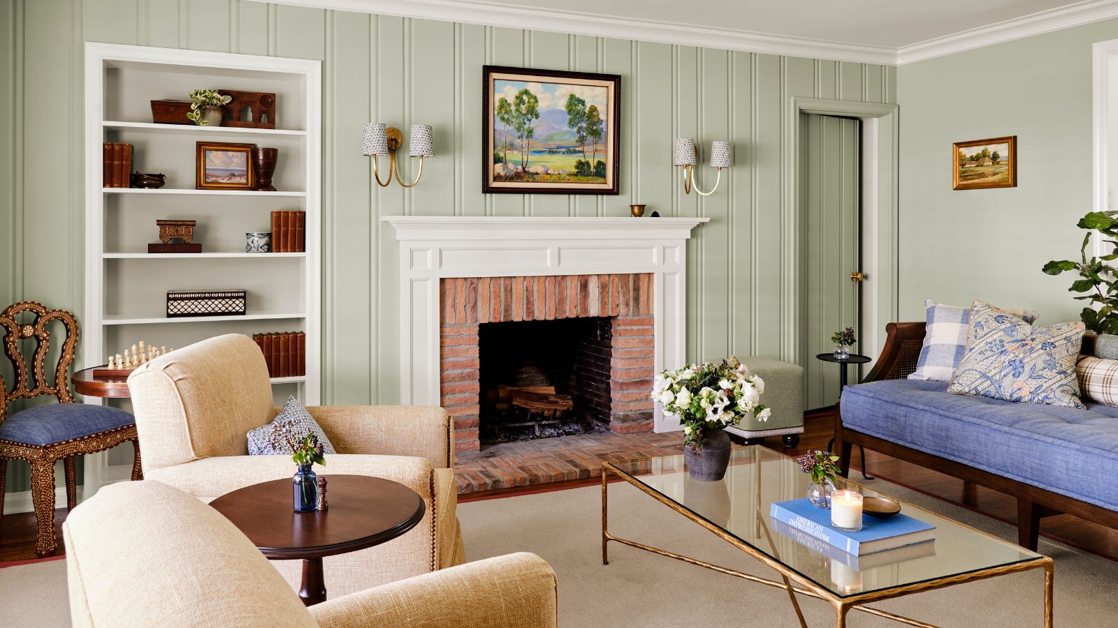
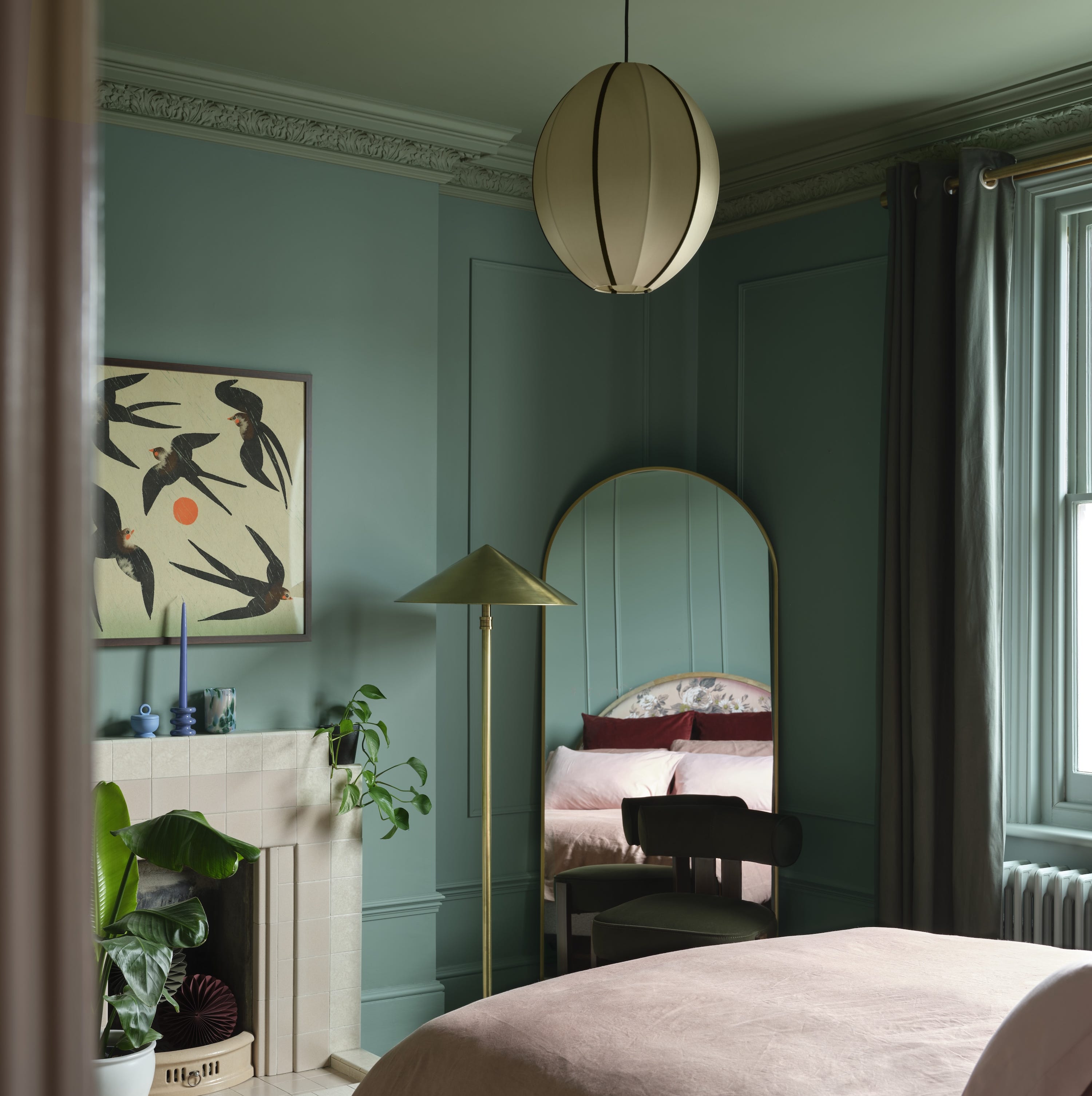
The appeal of pale pistachio green is attributed to its timeless, elegant, and serene qualities. It's described as a blend of yellow and green with a hint of cream, giving it a cheerful and fresh feel that adds depth to interiors. The color is particularly well-suited for entryways and landings, where it can serve as an inviting welcome to a home and a complementary background for artwork. Its natural and calming essence makes it an ideal choice for threshold spaces, effectively bridging the outdoor environment with the interior. When incorporated into enclosed rooms through wallpapers or furnishings, this shade offers a sense of relief and reassurance, subtly connecting the indoor living space with the natural world outside.
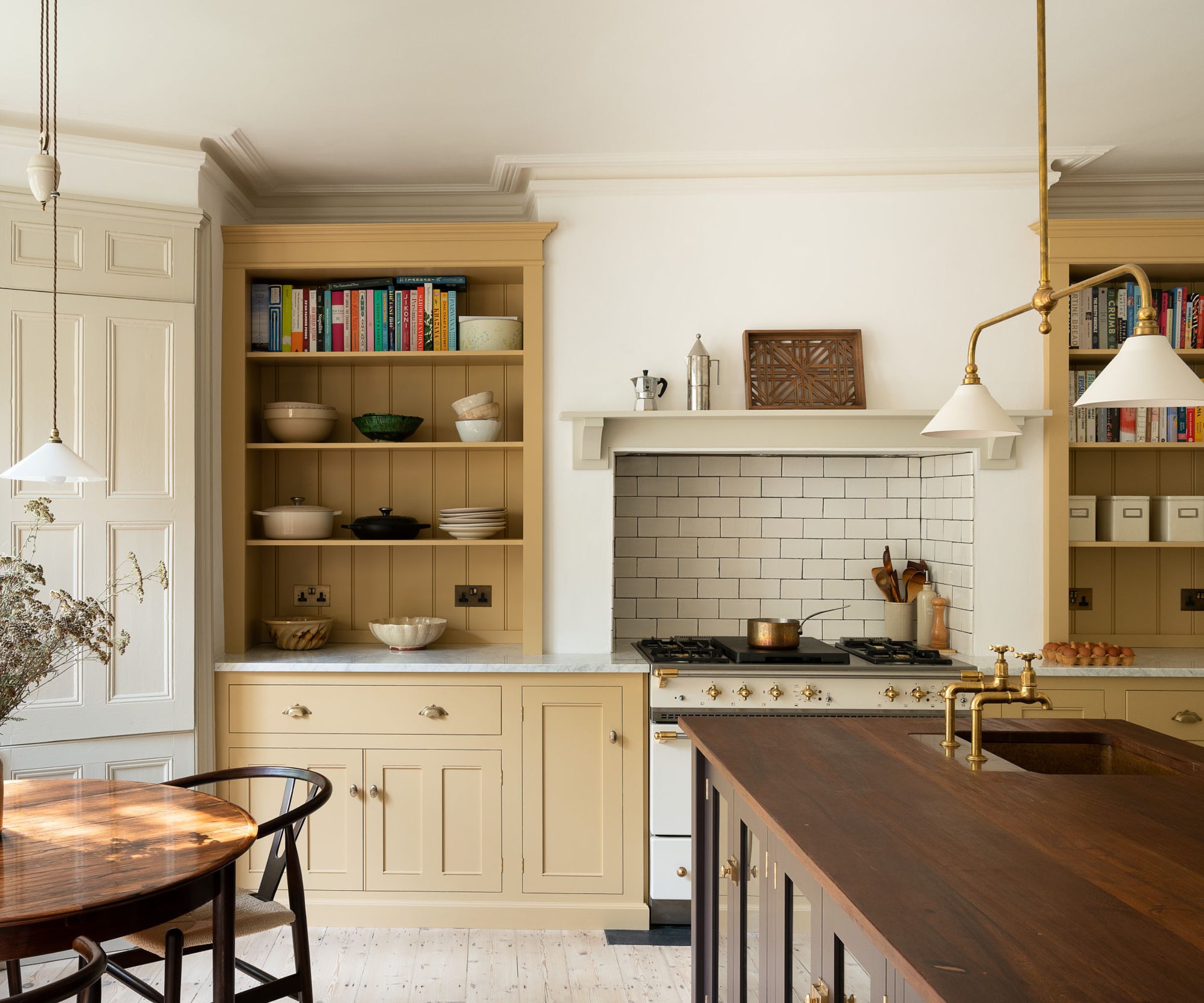
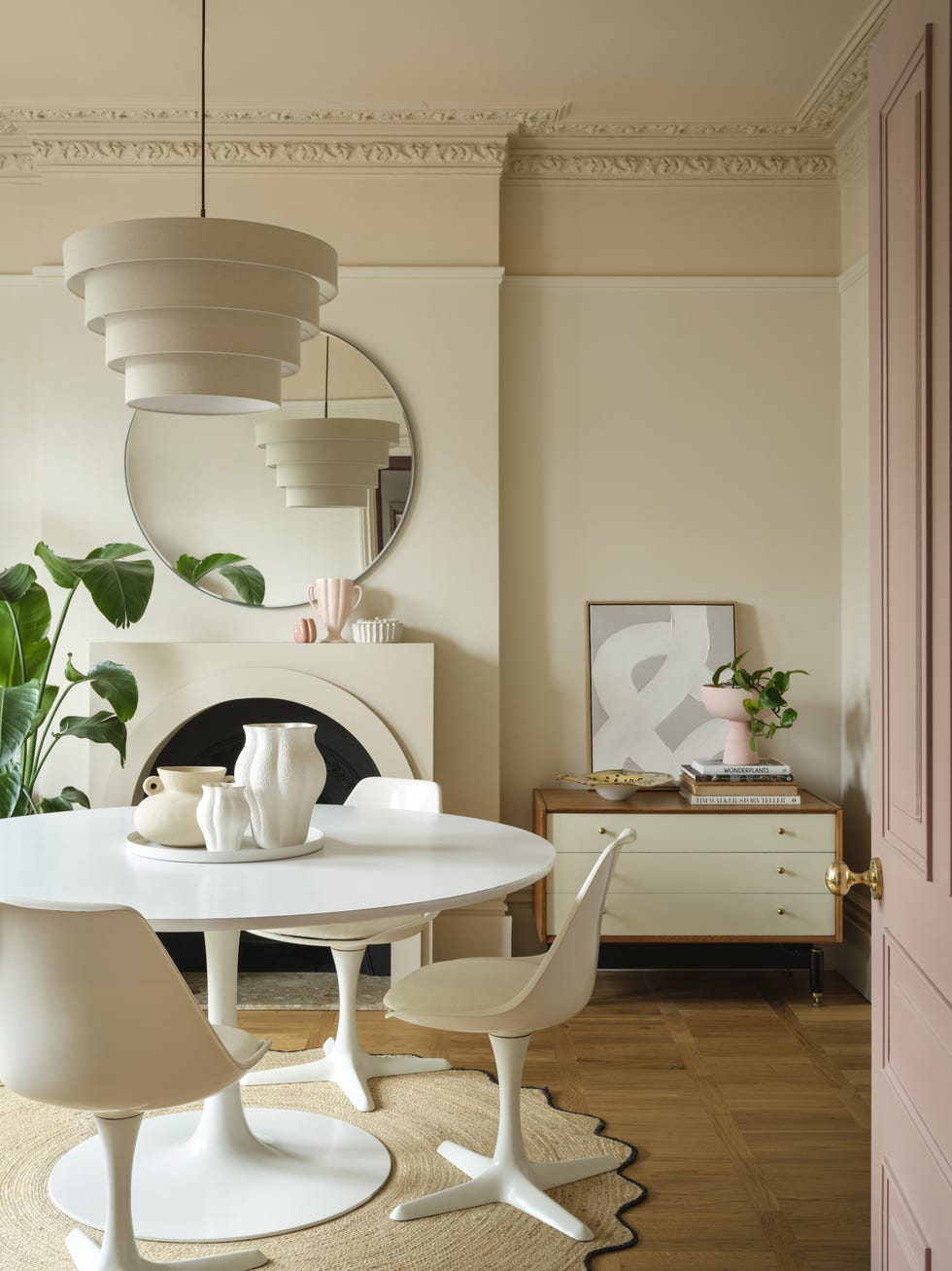
Decorating with neutrals, such as Martha Stewart's pale pistachio, requires a careful balance of natural light, artificial lighting, and various textures and tones to avoid a minimal or stark aesthetic. Experts emphasize the importance of sampling colors on-site, under different lighting conditions and at various times of the day, to ensure the desired effect. Pale green color schemes, with their vast potential as a mindful decor mainstay, also function as an effective backdrop for other organic shades. The trend signifies a broader movement towards softer hues being used as primary base colors, much like traditional neutrals.
Ruth Mottershead, creative director at Little Greene, points out that these calming and positive shades possess a timeless quality. They are muted enough to be versatile but vibrant enough to avoid fading into the background, making them excellent foils for similar earthy tones and richer colors to achieve a more dynamic look. The article also provides practical advice on using pistachio green, noting that while its graceful hue suits many rooms, its effectiveness can vary with room orientation. Bluer-tinged tones might feel cold in north-facing rooms, whereas south-facing areas can make the greener aspects appear more yellow. Despite these considerations, pistachio green is positioned as a mindful decor mainstay, versatile enough to be a backdrop for other organic shades, and is confidently declared as a favorite color for 2025.
#MarthaStewart #PistachioGreen #ColorTrends2025 #EntrywayDecor #InteriorDesign #NeutralColors #HomeDecor #ColorPalette #MarthaStewart #PistachioGreen #ColorTrends2025 #EntrywayDecor #InteriorDesign #NeutralColors #HomeDecor #ColorPalette
0 Kommentare insgesamt
 Noch keine Kommentare
Das könnte Ihnen auch gefallen
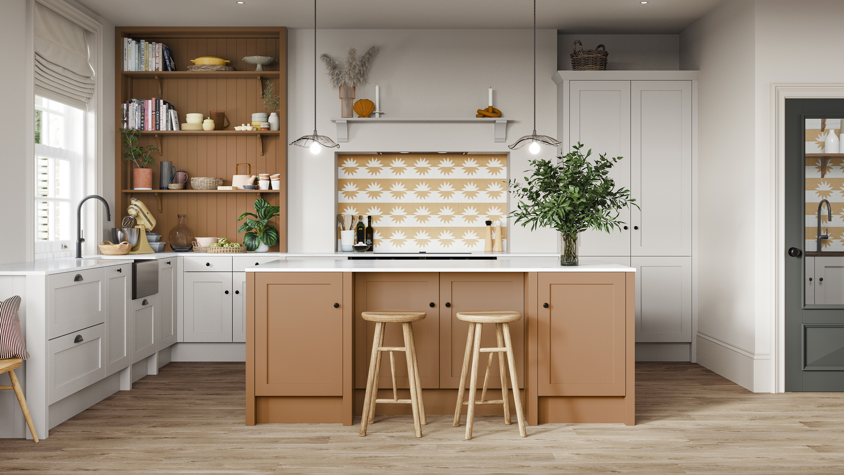
Kitchen colour experts are calling this the 'it' colour of 2024 that will go down as a future classic

These Colors Will Be Everywhere in Interiors in 2025

What is Color Forecasting? Experts Explain How to Map Trends |

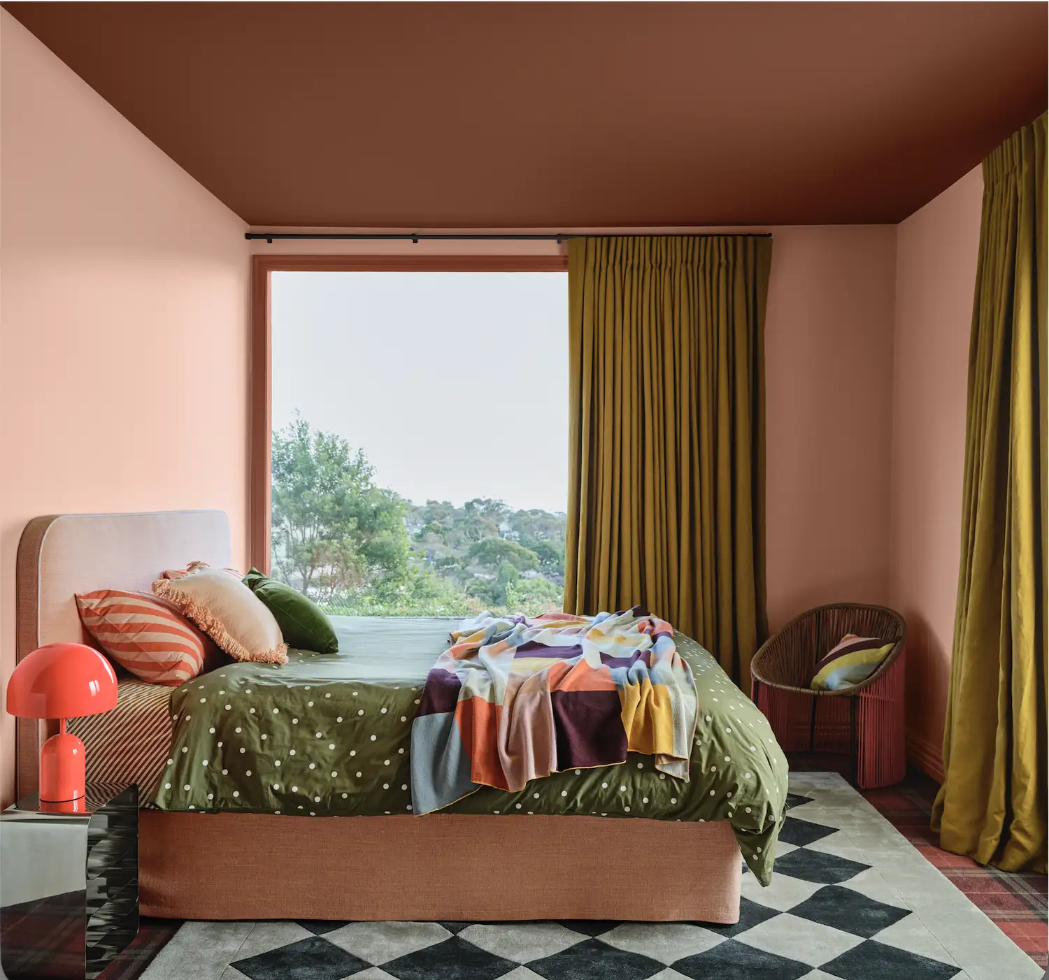
Move Over, Color Drenching— Color Capping Will Dominate 2026 Interiors

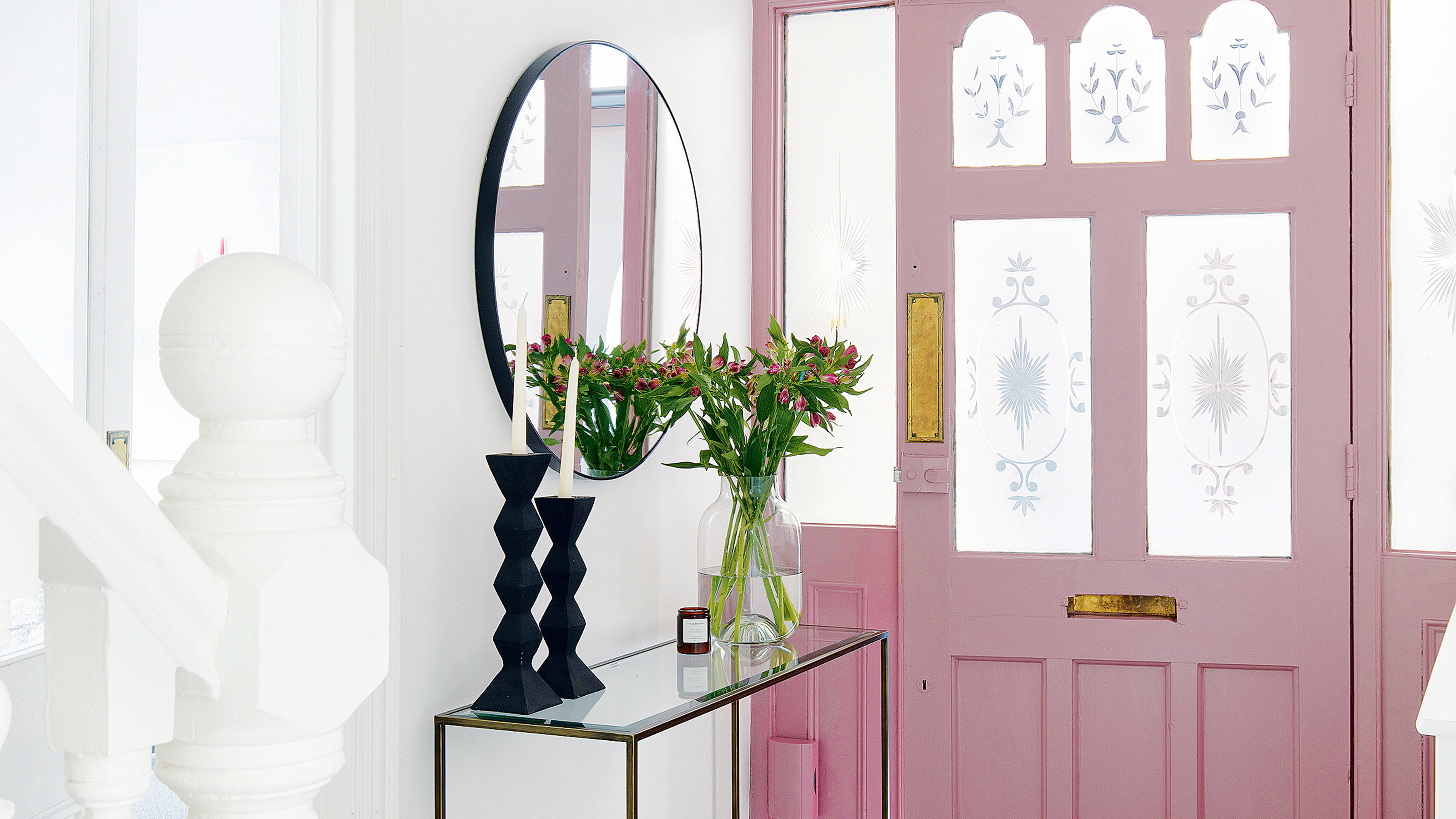
Designers and property experts have called it - this unique front door colour is set to be huge in 2024
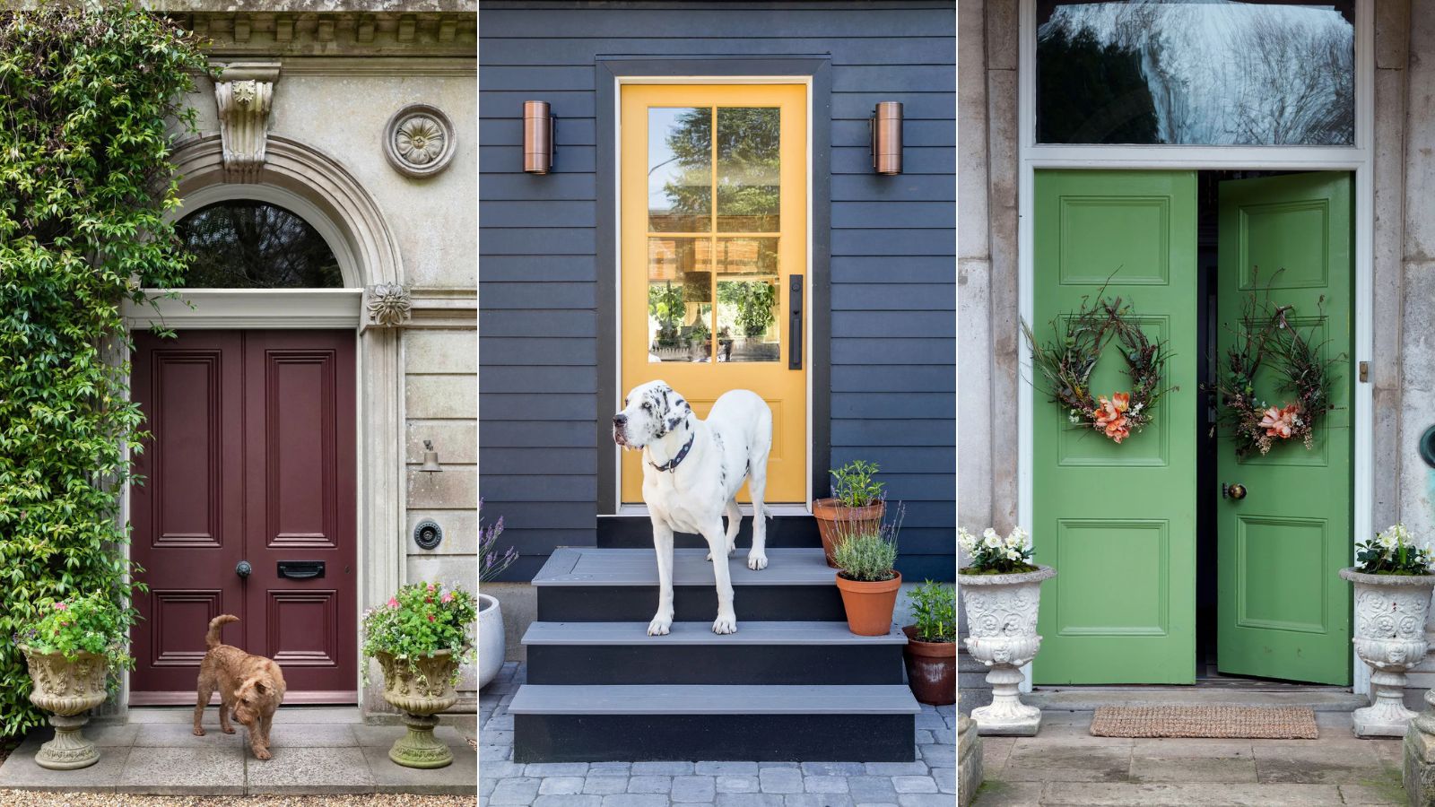
5 most welcoming front door colors for 2025, say experts
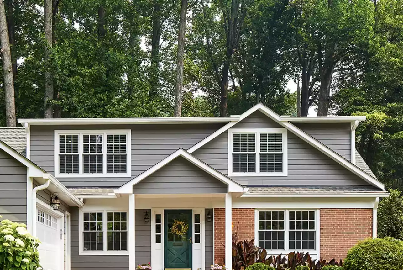
5 Front Door Paint Colors You're Going to See Everywhere in 2025, Designers Say

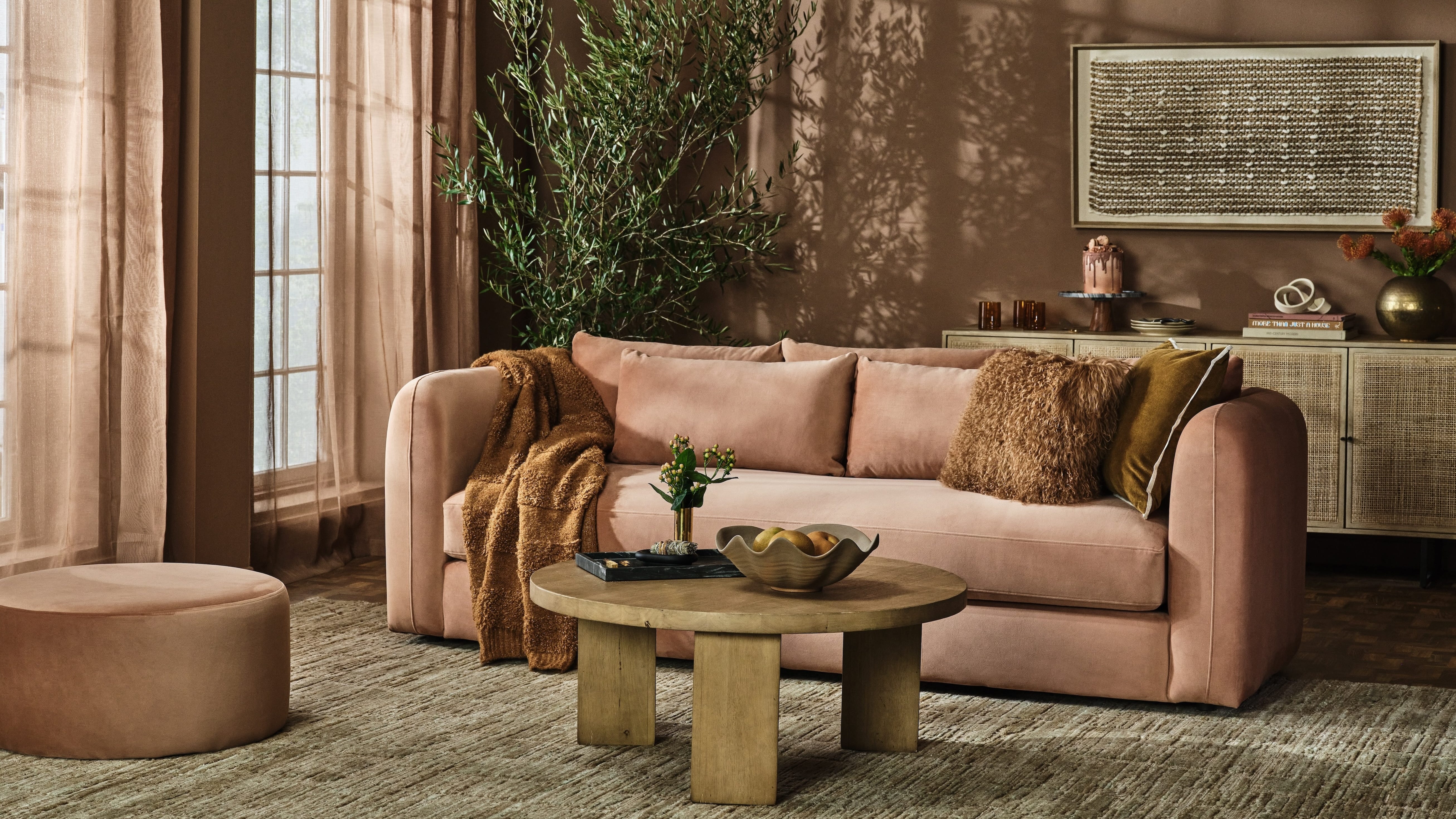
Designers Predict You'll Use AT LEAST One of These Colors in Your Home in 2025


The #1 Paint Color Trend of 2025, According to Designers

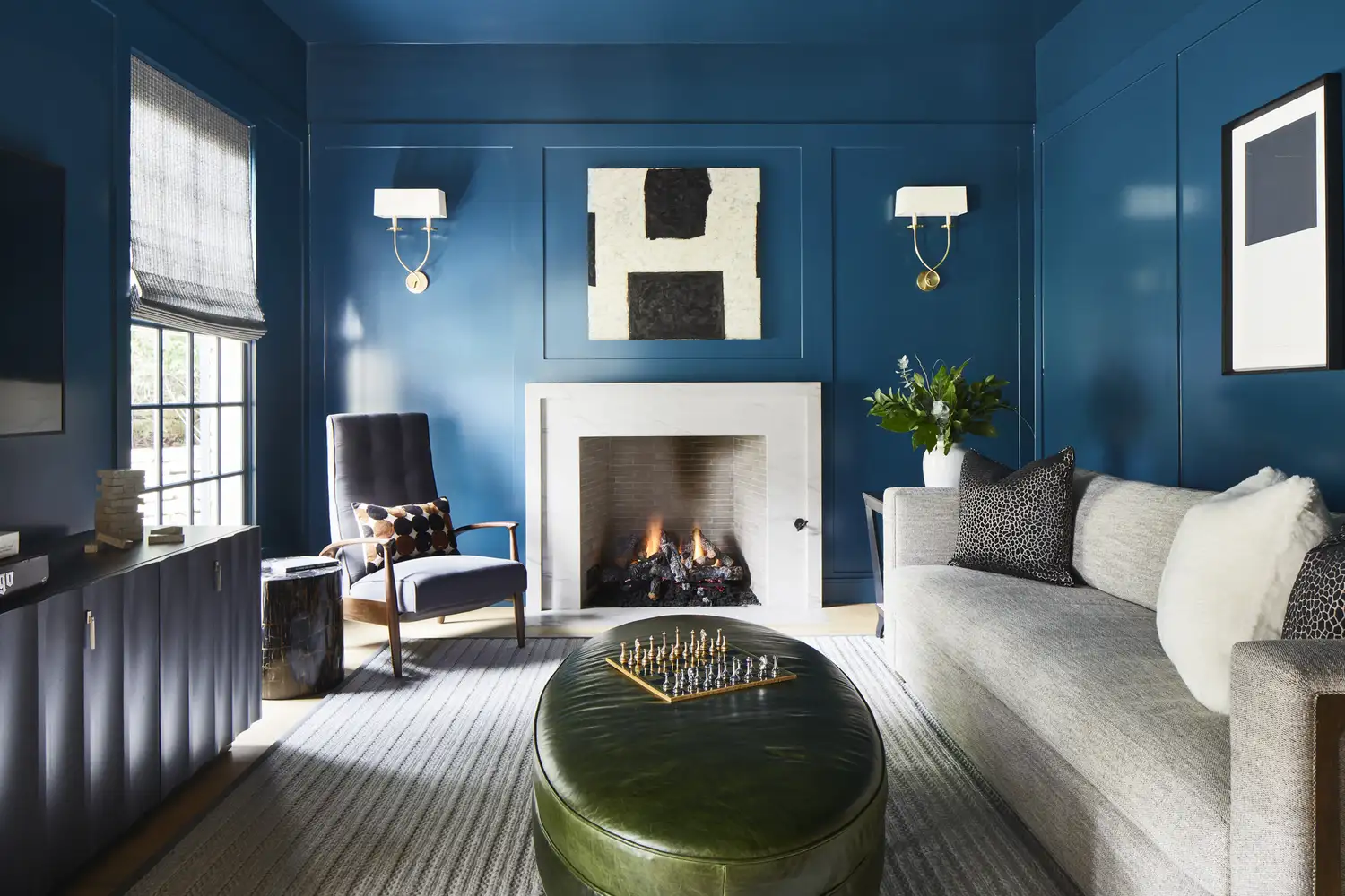
Say Goodbye to Neutrals: Color-Drenching Will Define 2026 Interiors

These Kitchen Paint Colors Will Be Everywhere in 2025

7 Front Door Color Trends That'll Surge in Popularity in 2025, According to Designers

Martha Stewart's butter yellow kitchen will dominate color trends in 2026
Pistachio green is the go-to color for spring and summer 2025
Bold, edgy color drenching is going to be big in 2024
This Opulent Decor Choice Is Poised to Become the Biggest Design Trend of 2025
Interiors experts predict this will be the biggest paint trend of 2026

Designers Predict Every Front Door Will Be One of These Colors in 2026
Designers Predict This Will Be The Biggest Paint Trend Of 2026
Designers Say These Nature-Inspired Colors Will Define Kitchens in 2026