1/4
This Sherwin-Williams color palette is inspired by the streets of Paris
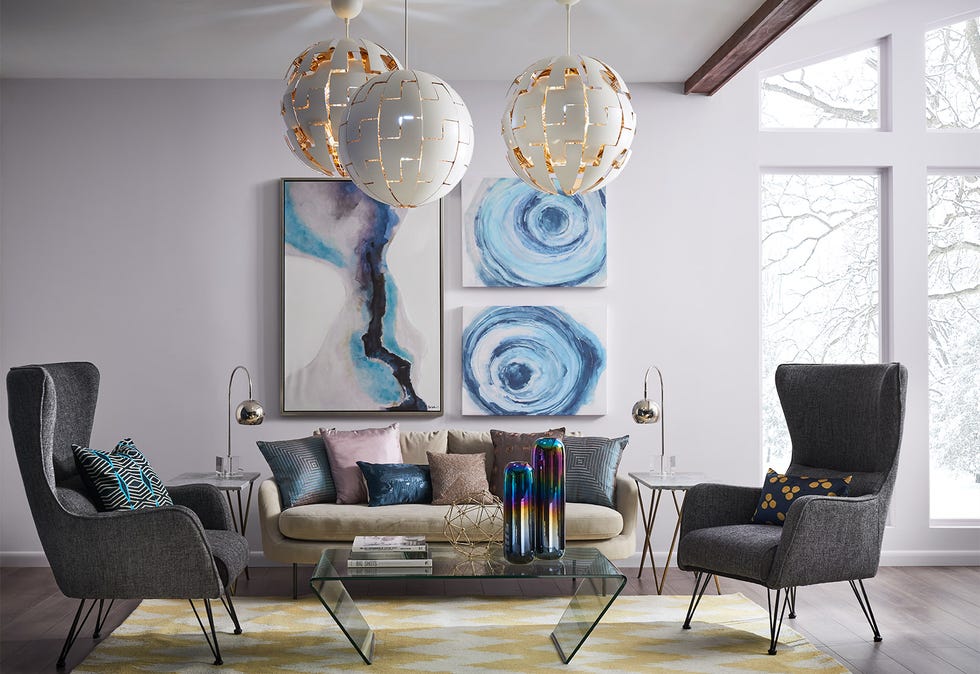
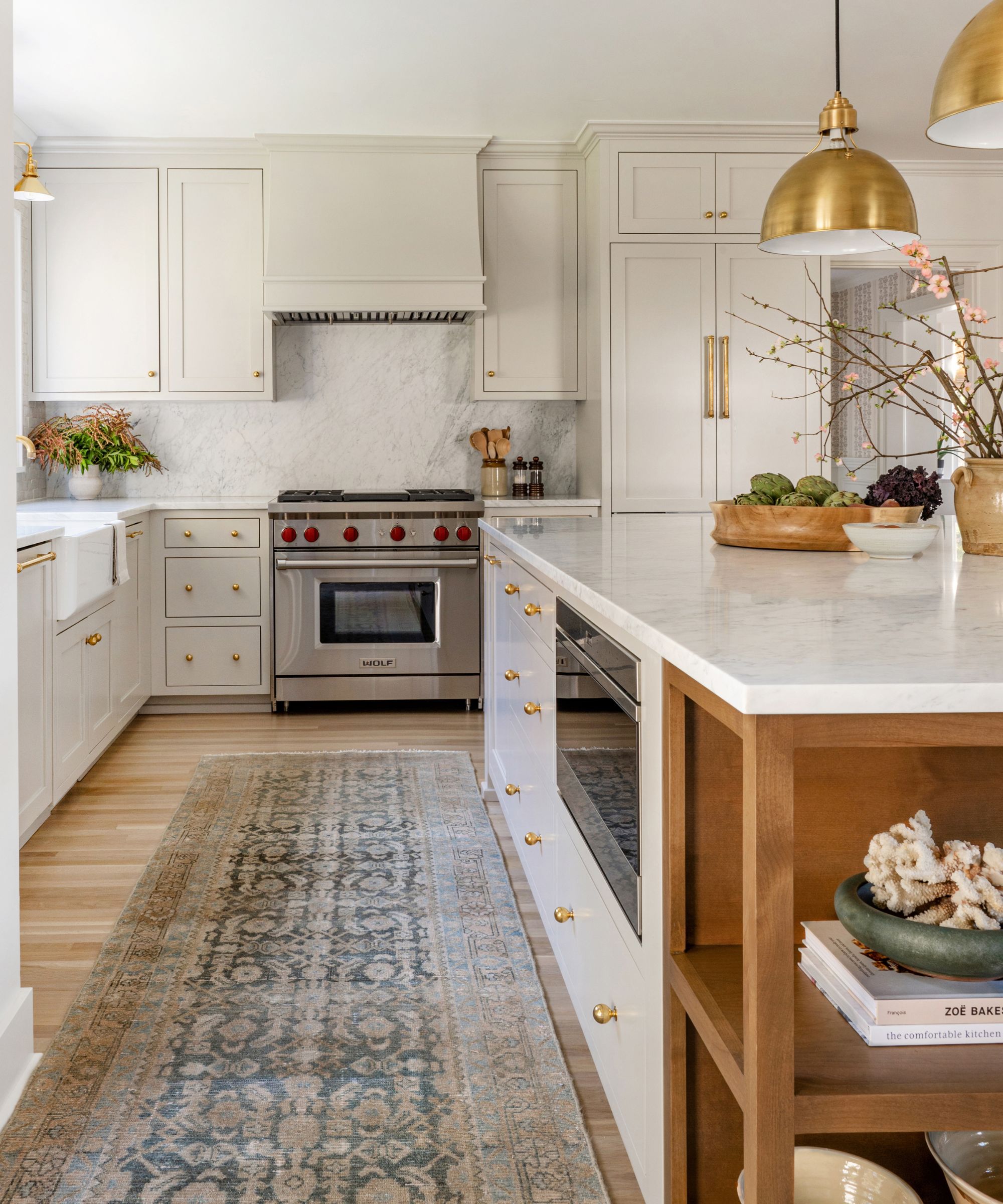
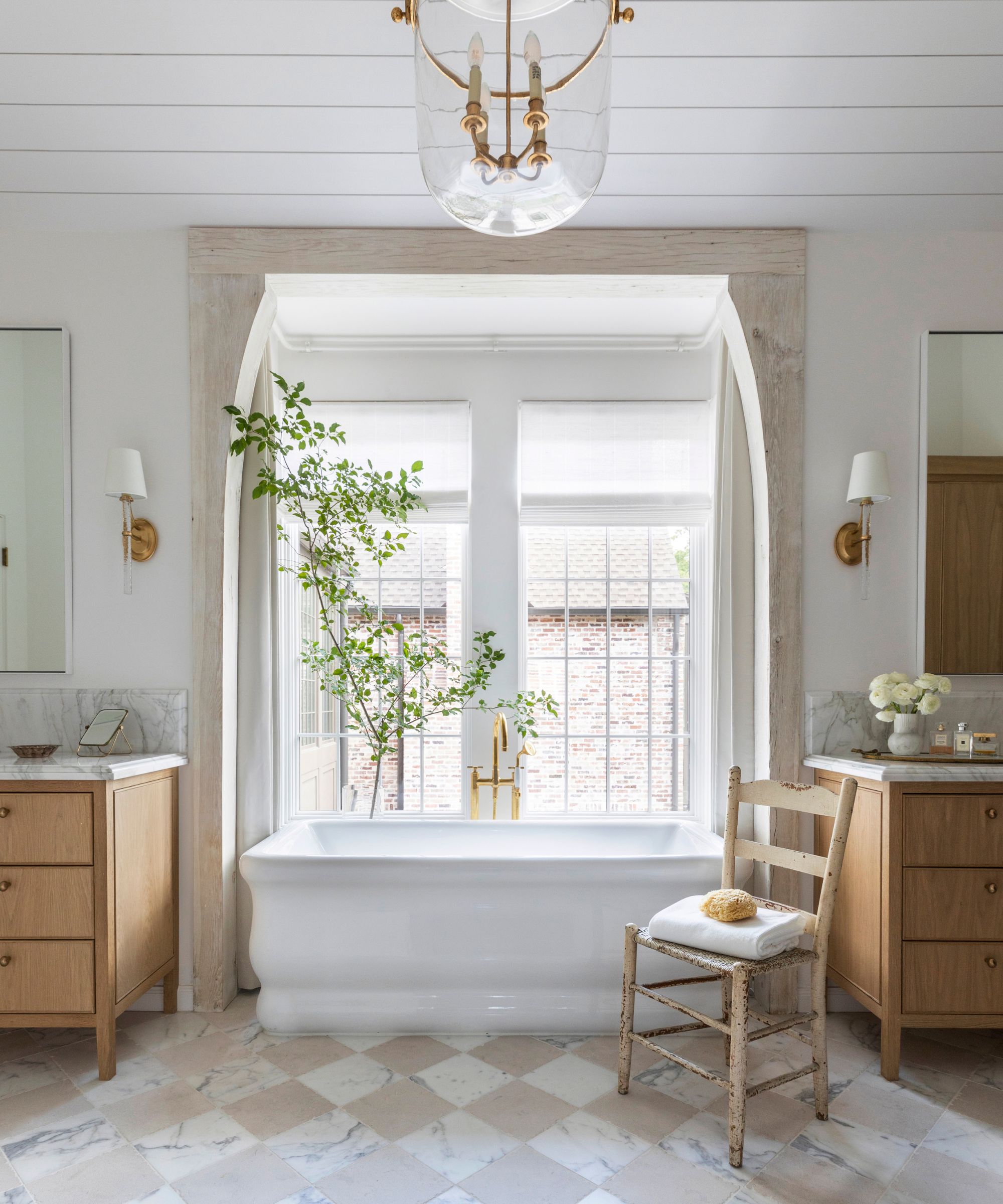
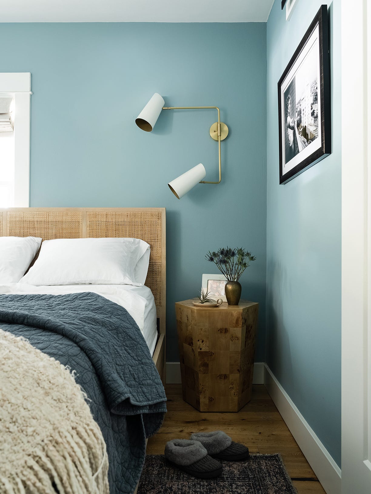
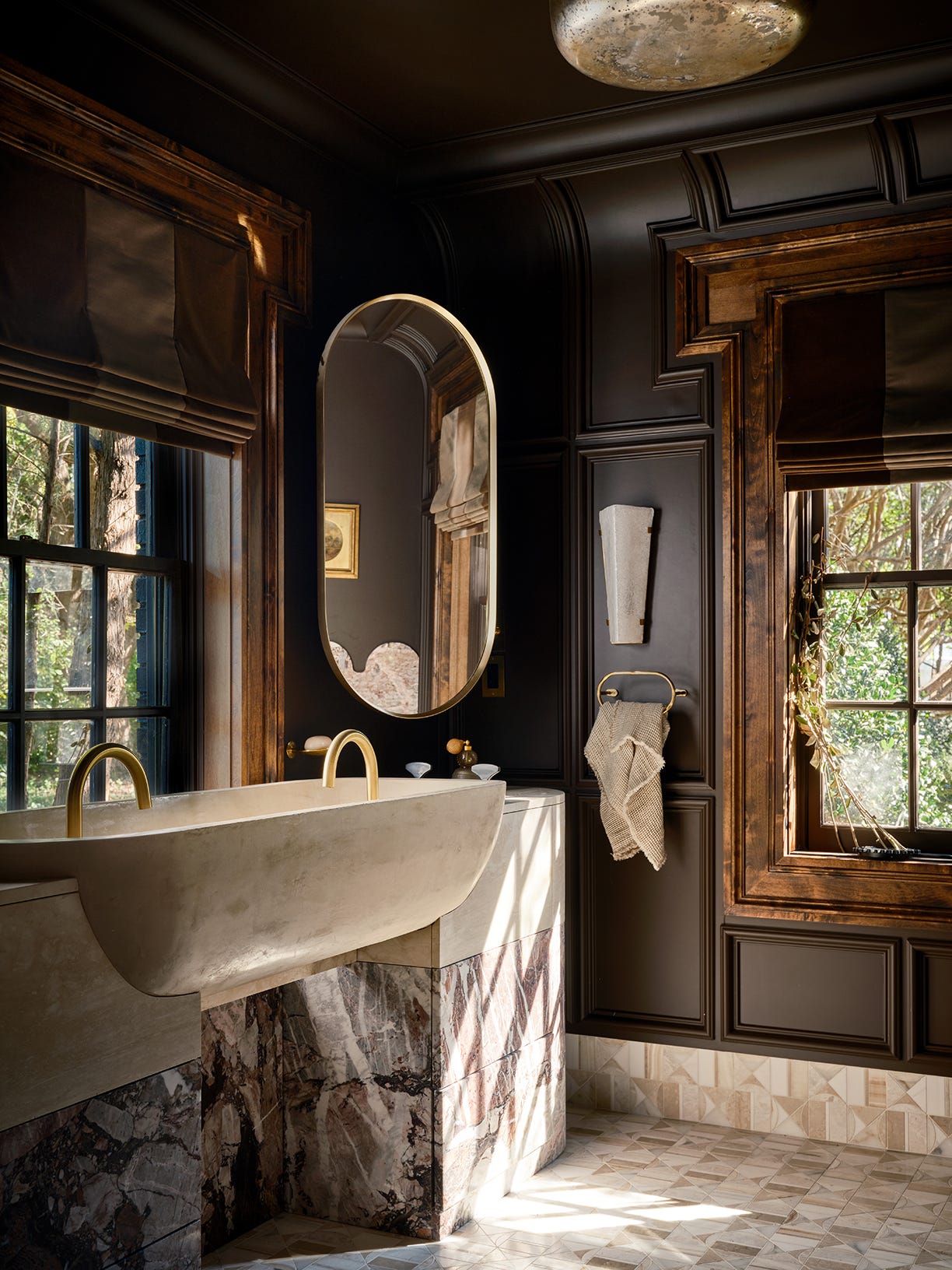
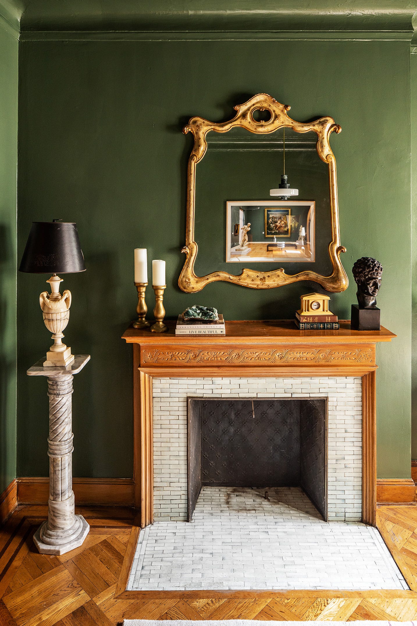
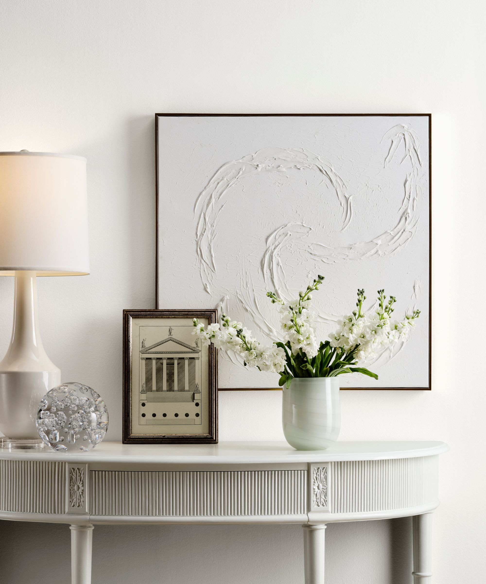
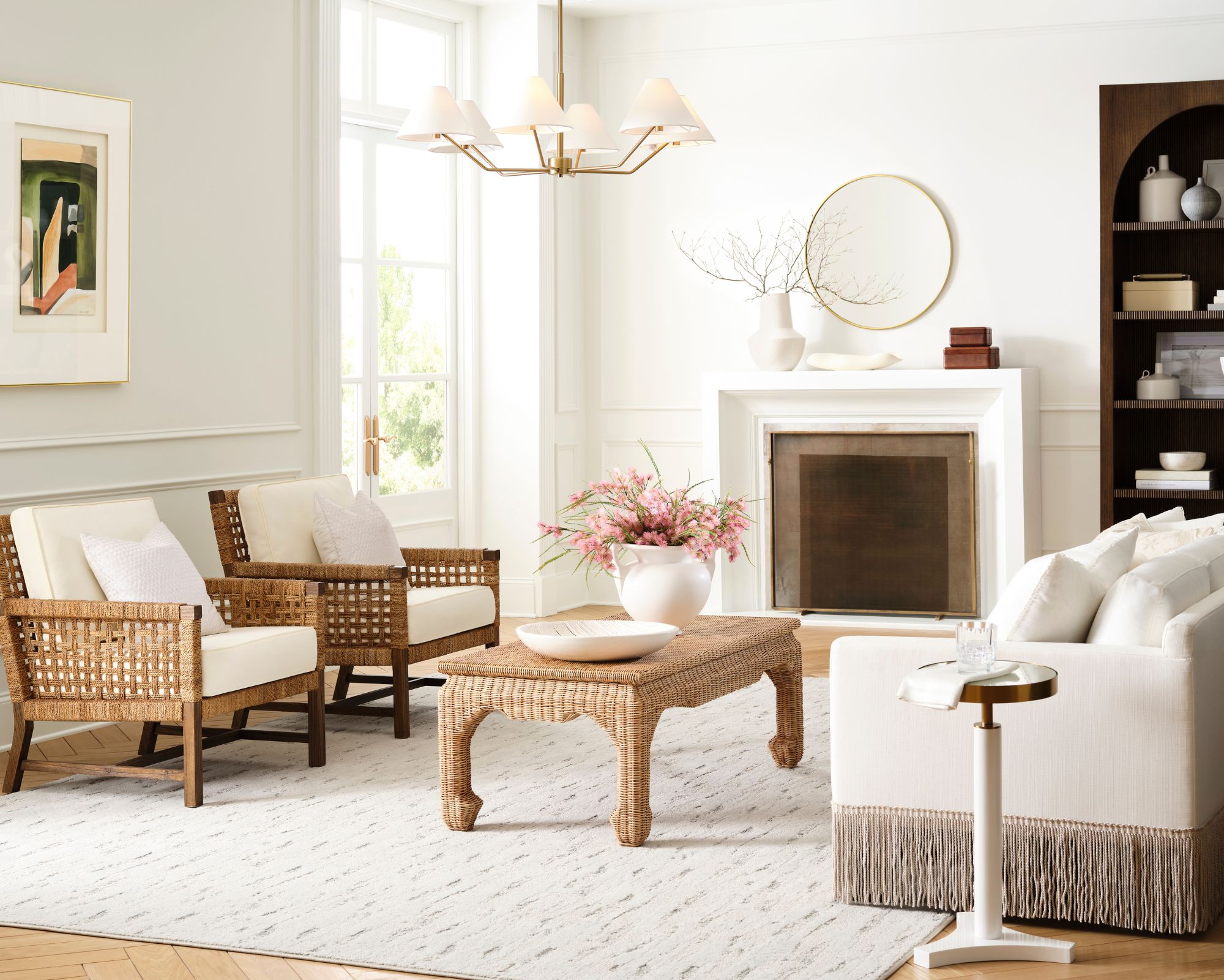
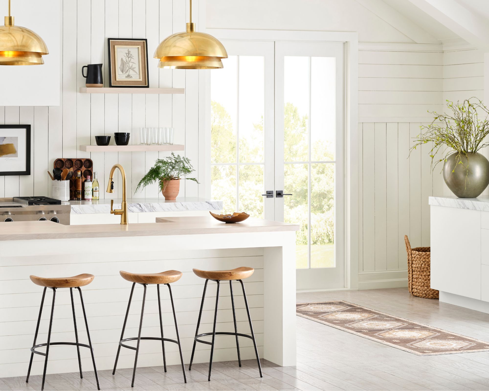
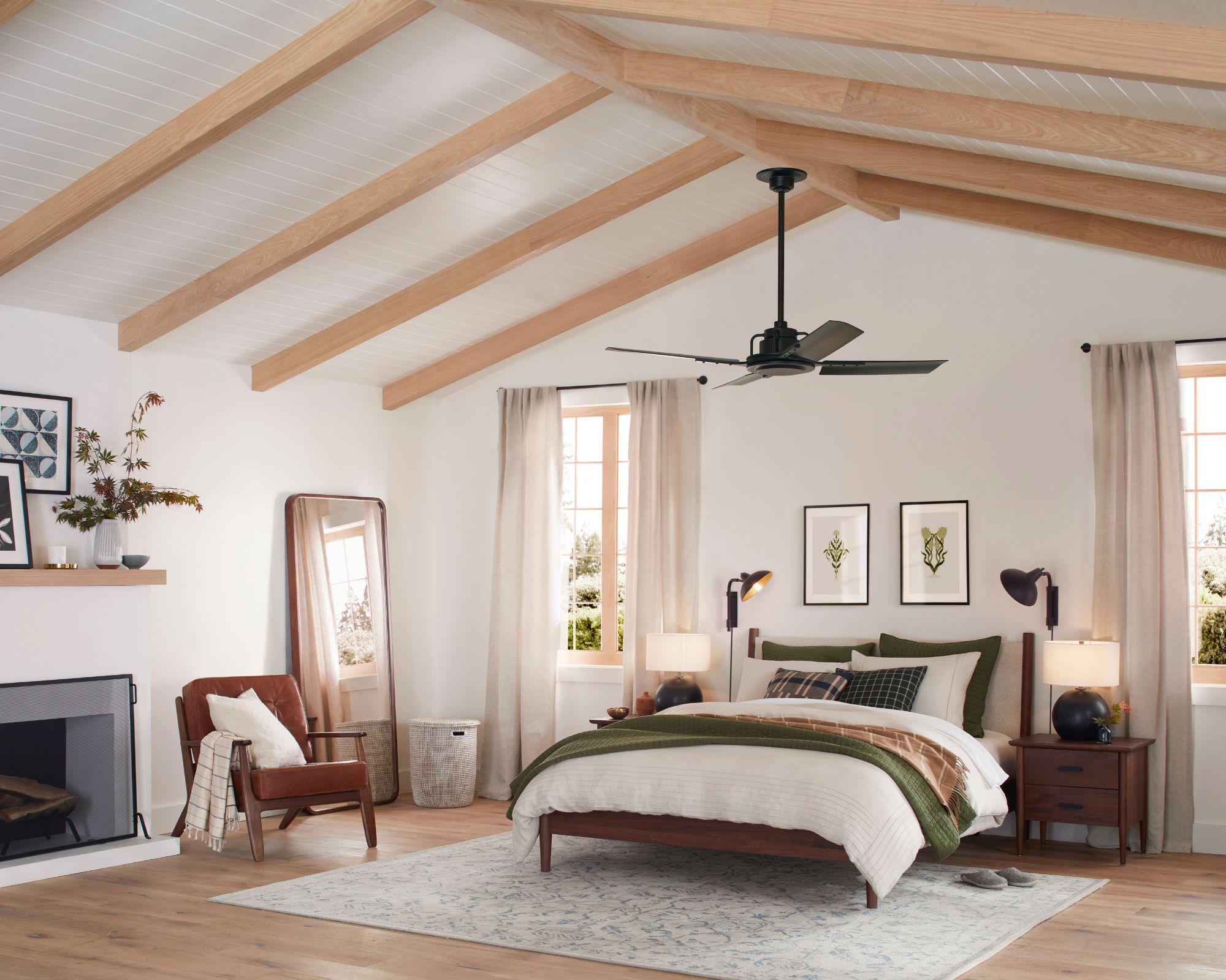
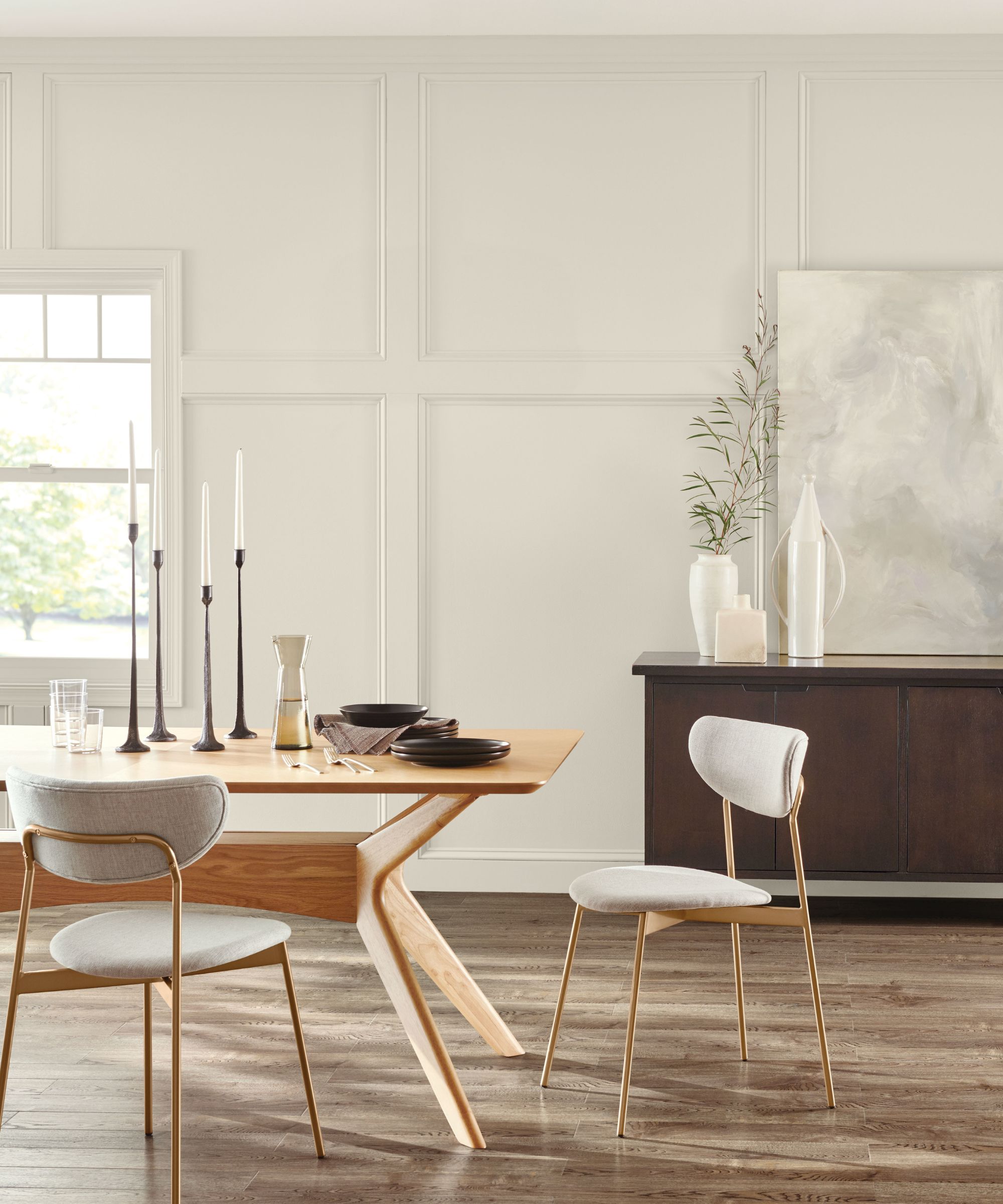
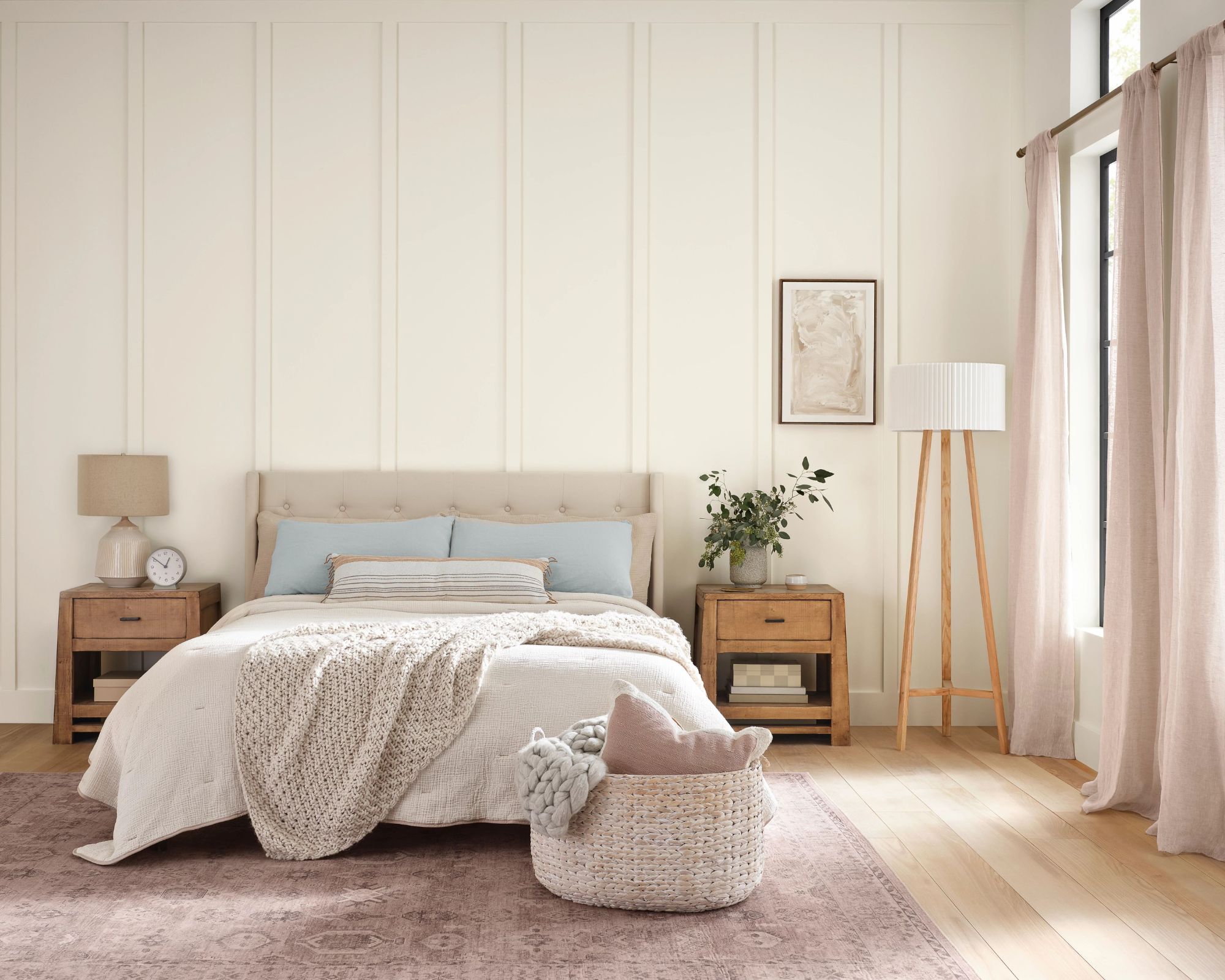
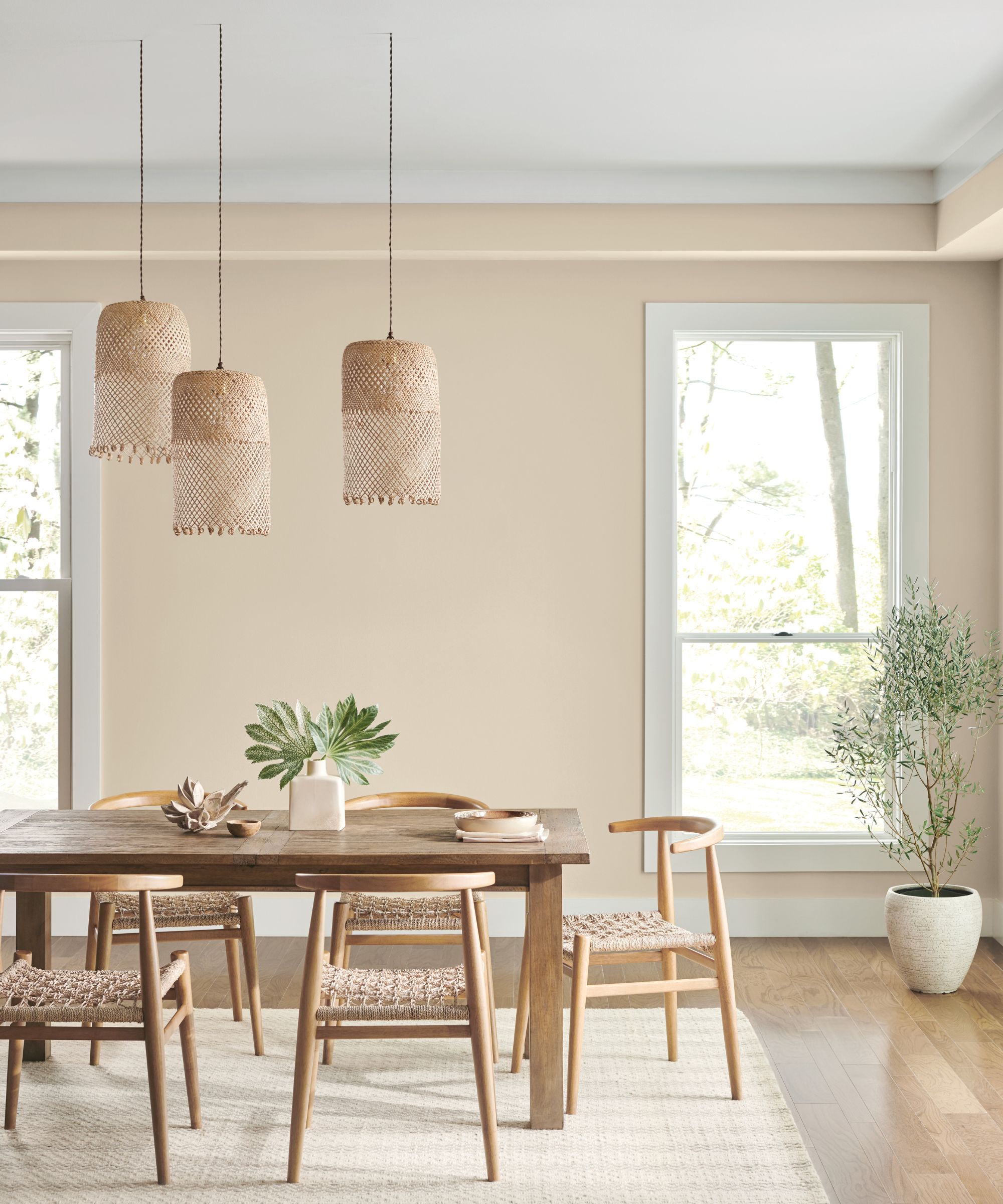
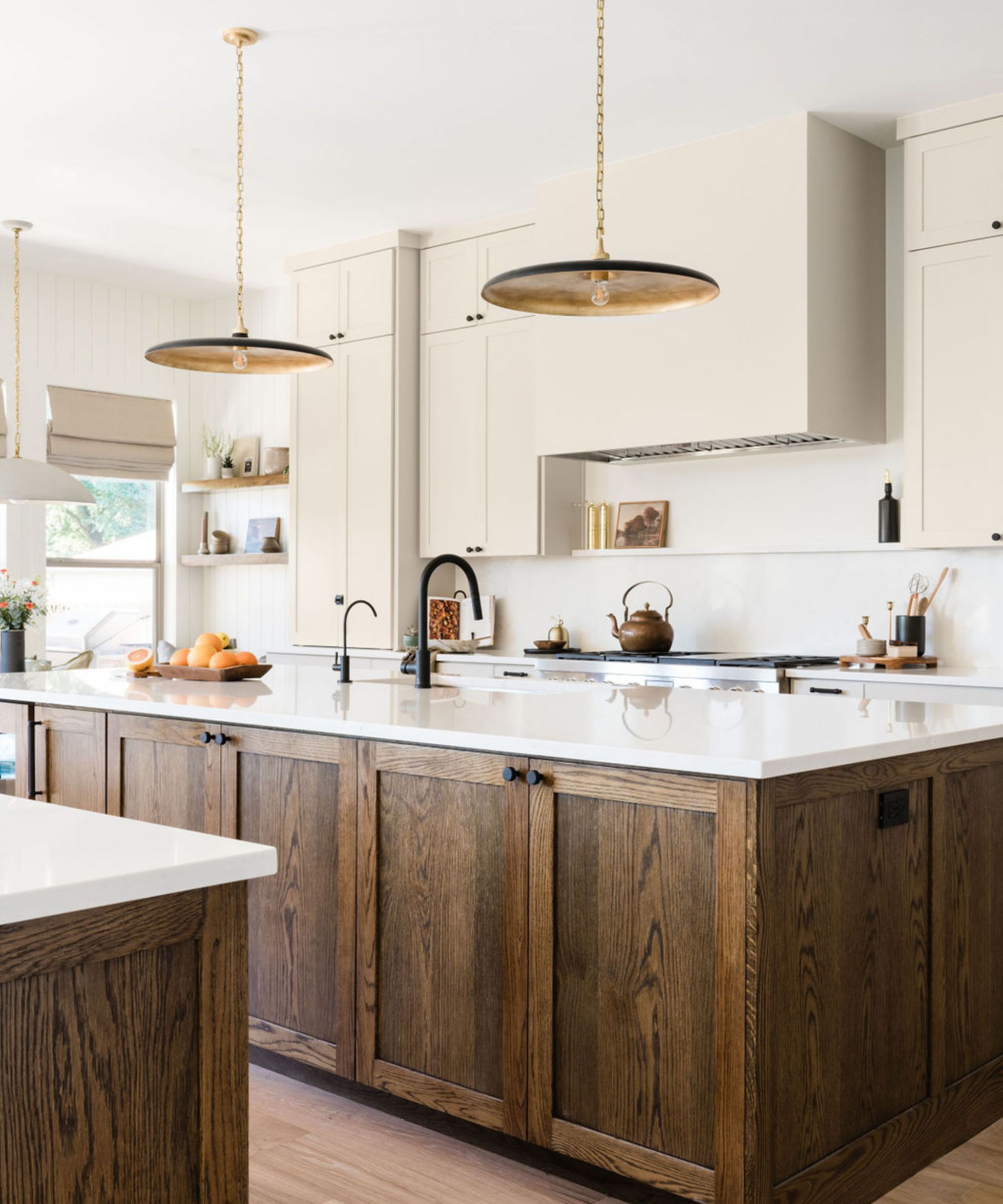
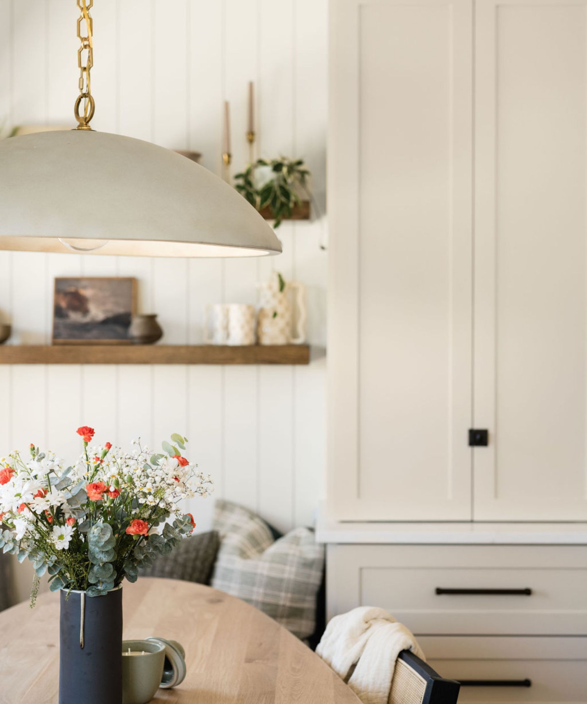
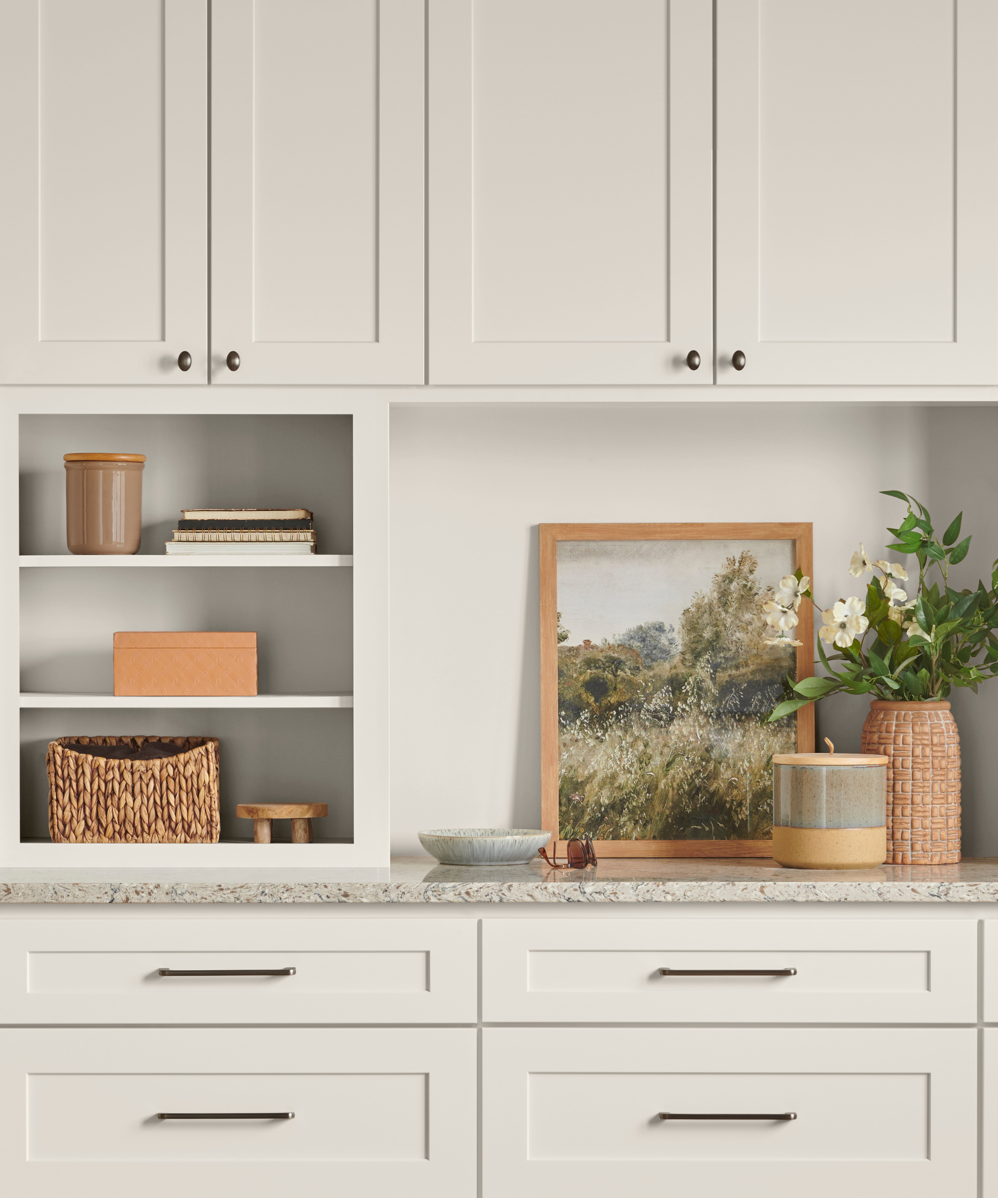
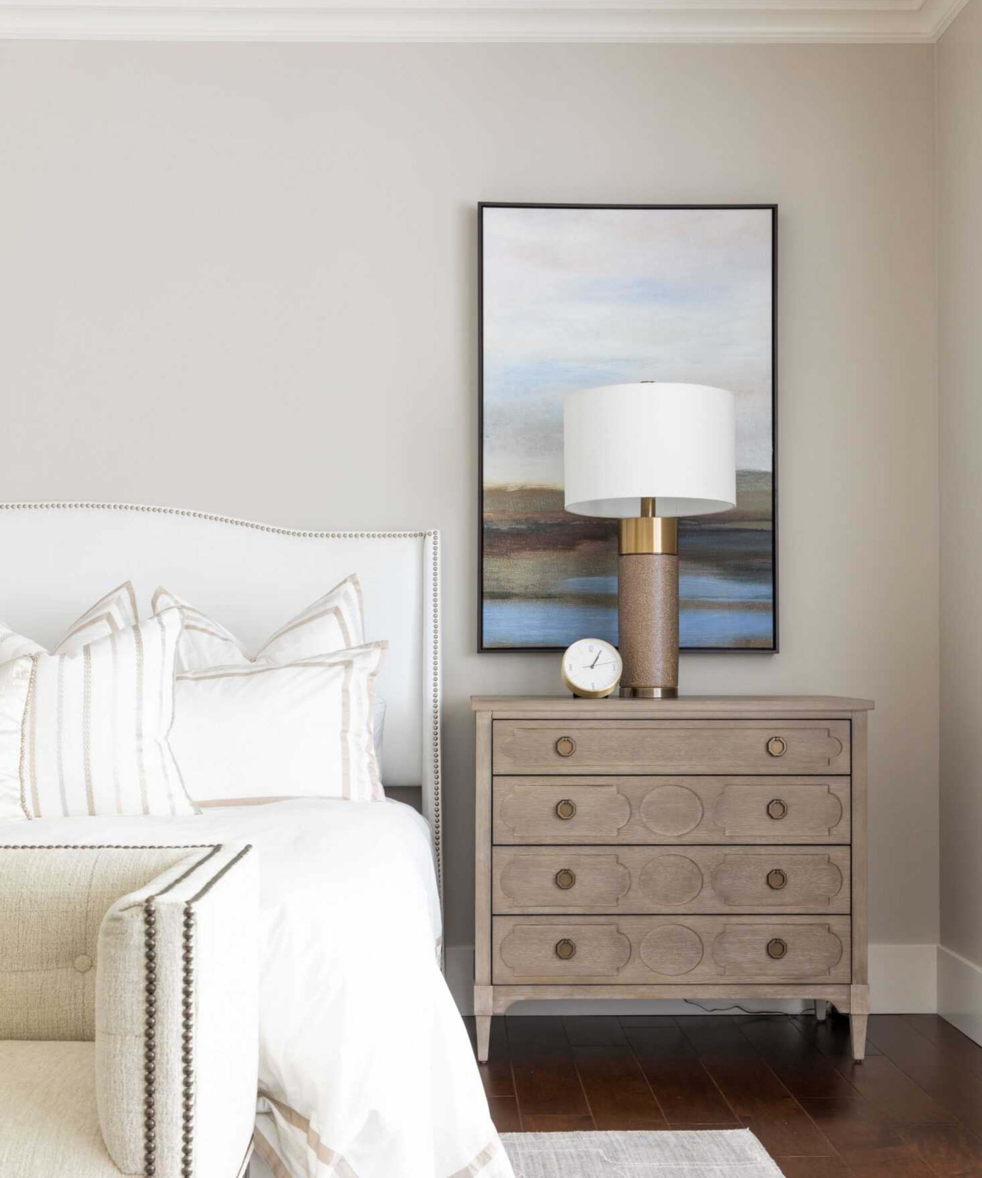
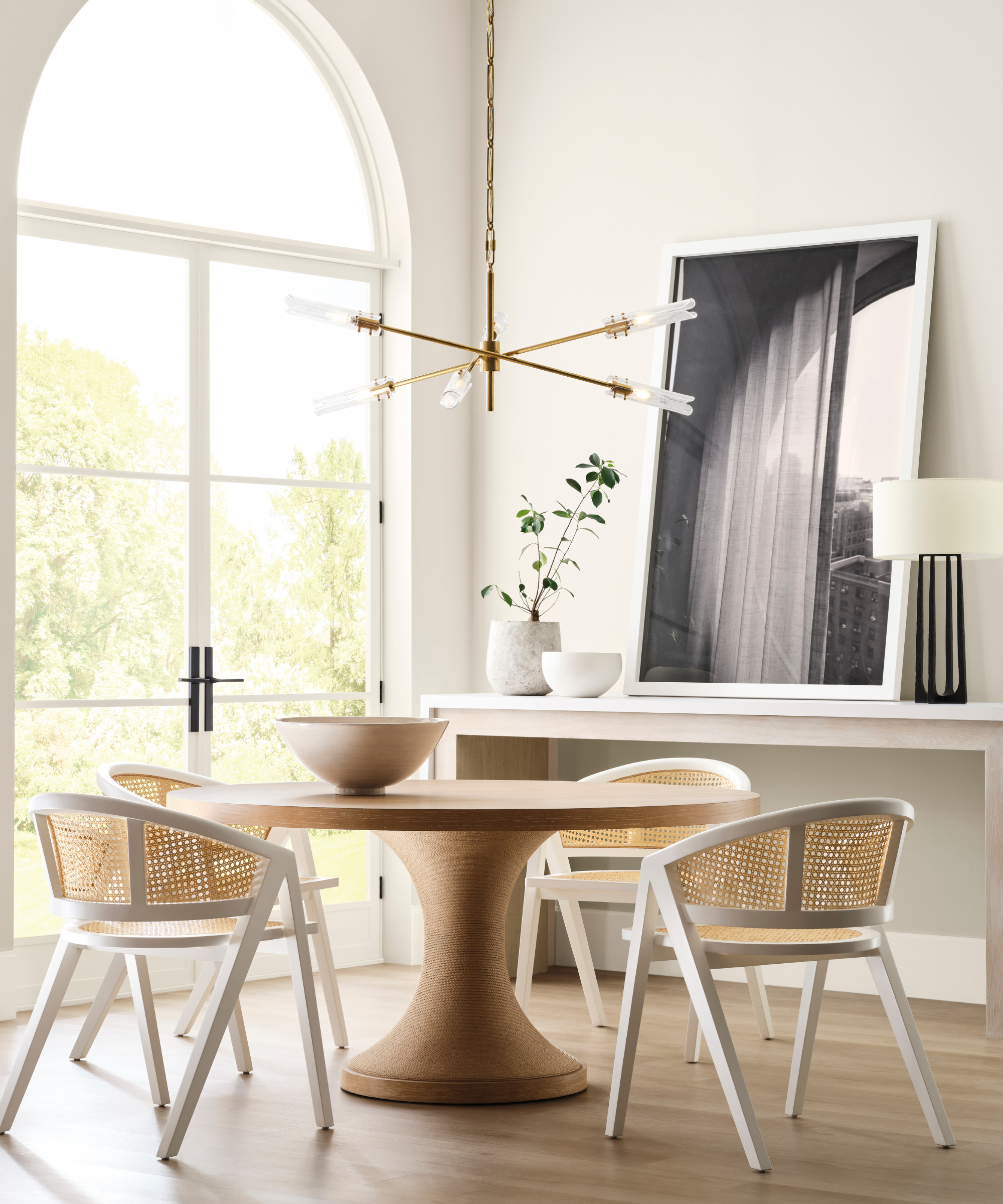
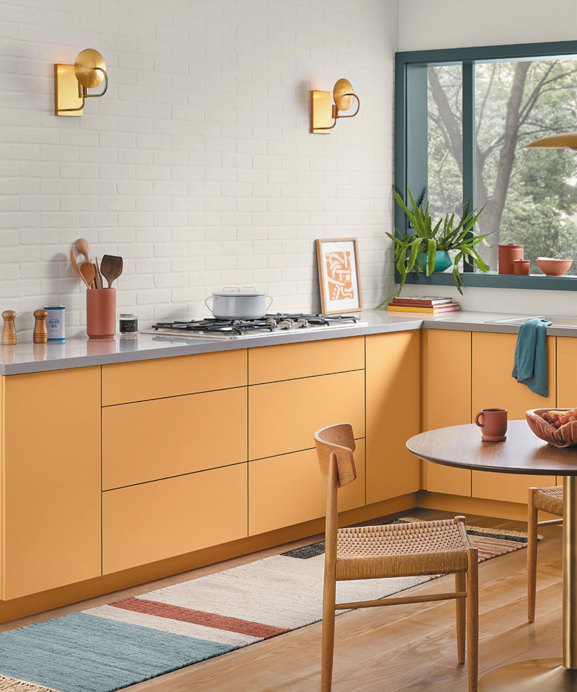
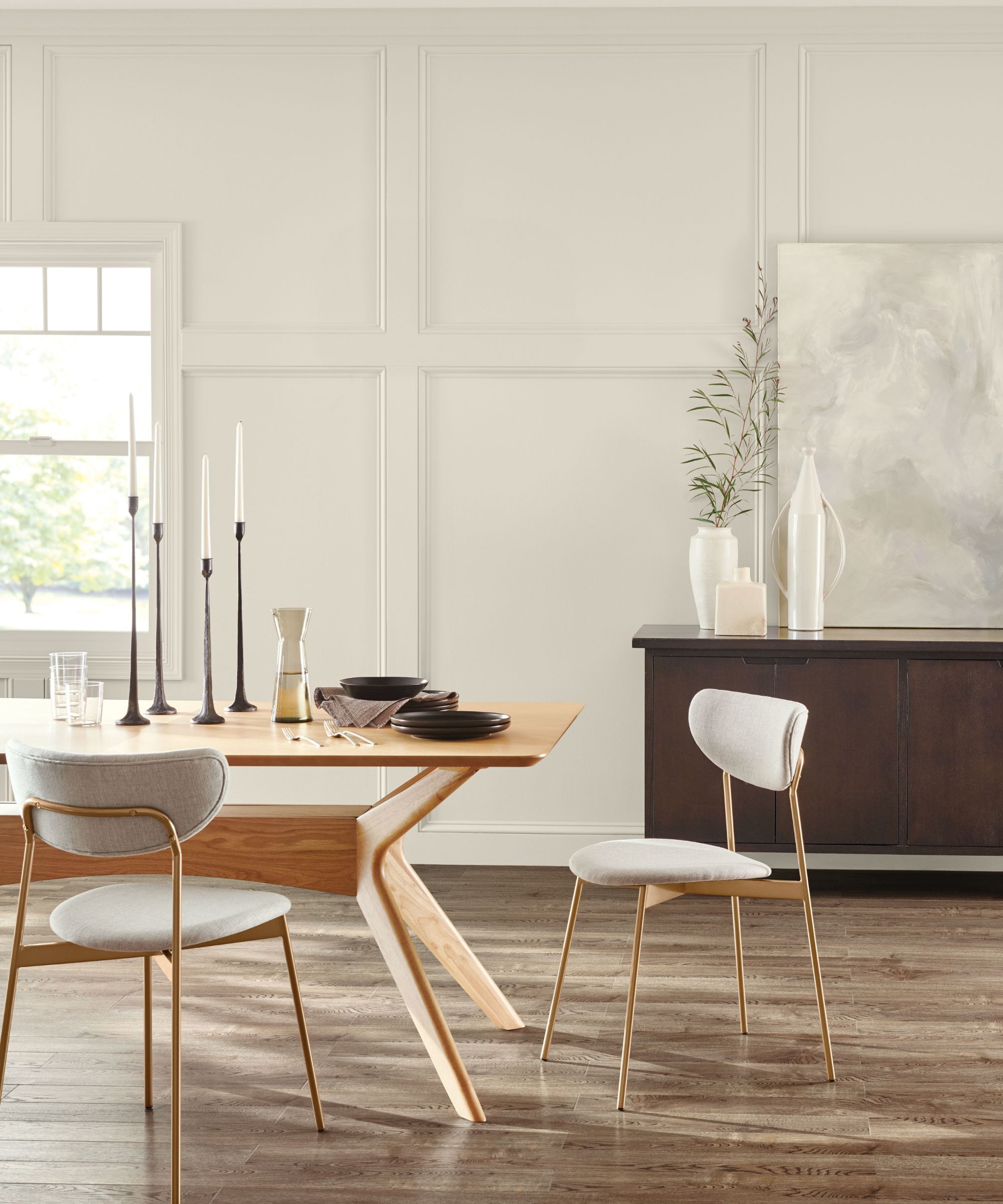
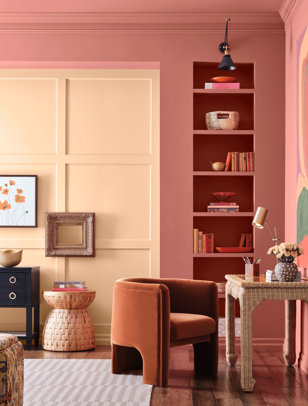
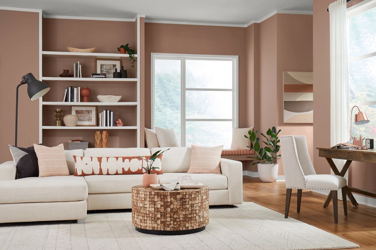
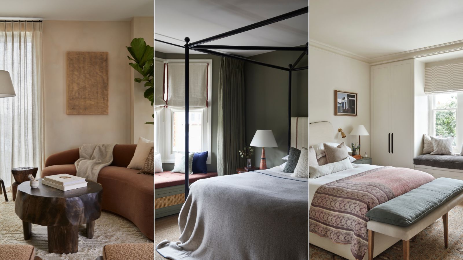
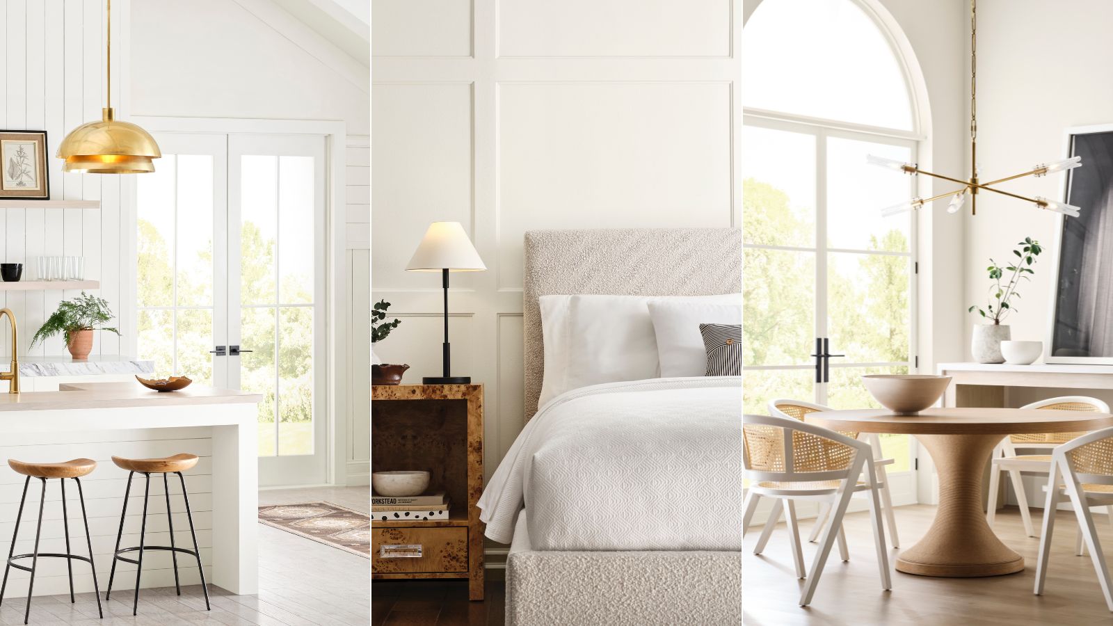
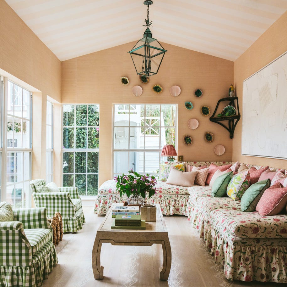
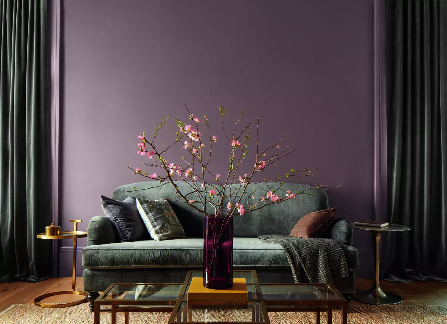
The 'Parisian Promenade' color palette from Sherwin-Williams offers a sophisticated approach to interior design, blending classic neutrals with subtle hints of color. This palette is presented as an ideal choice for individuals who appreciate neutral decor but are looking to introduce more visual interest and depth into their living spaces. The inspiration behind this palette is rooted in the elegance and timelessness associated with Parisian aesthetics, a theme gaining particular attention due to recent global events like the Olympic Games in Paris.
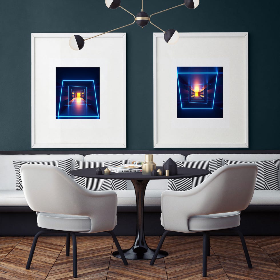
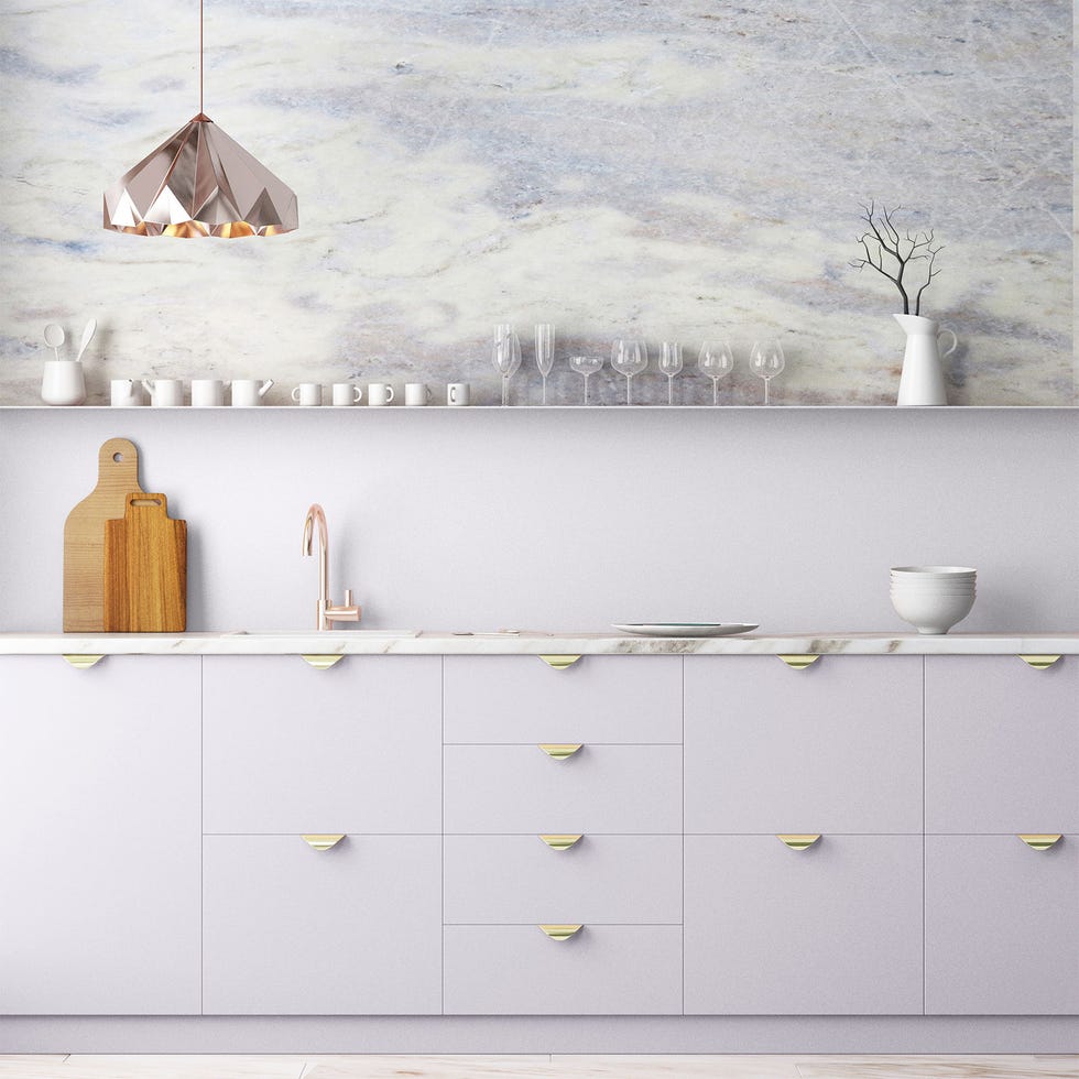
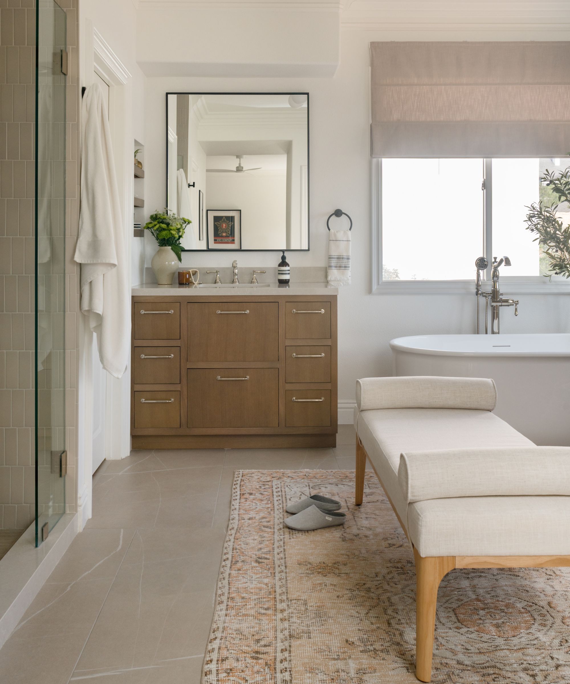
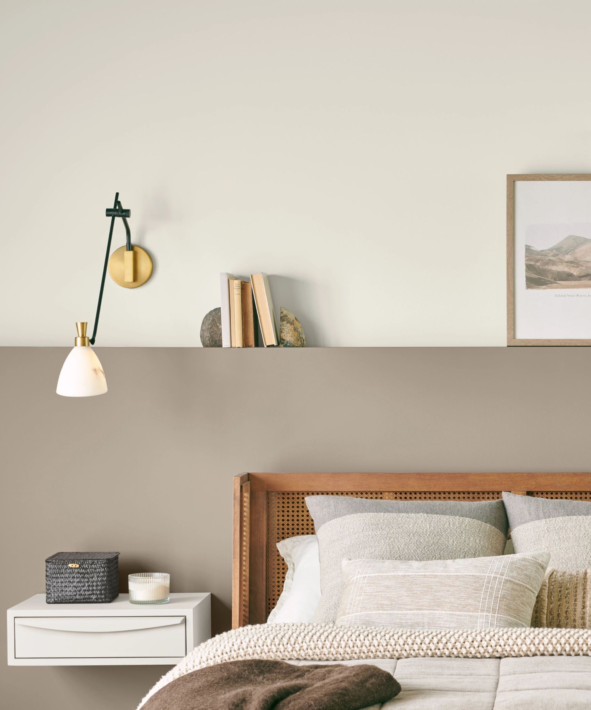
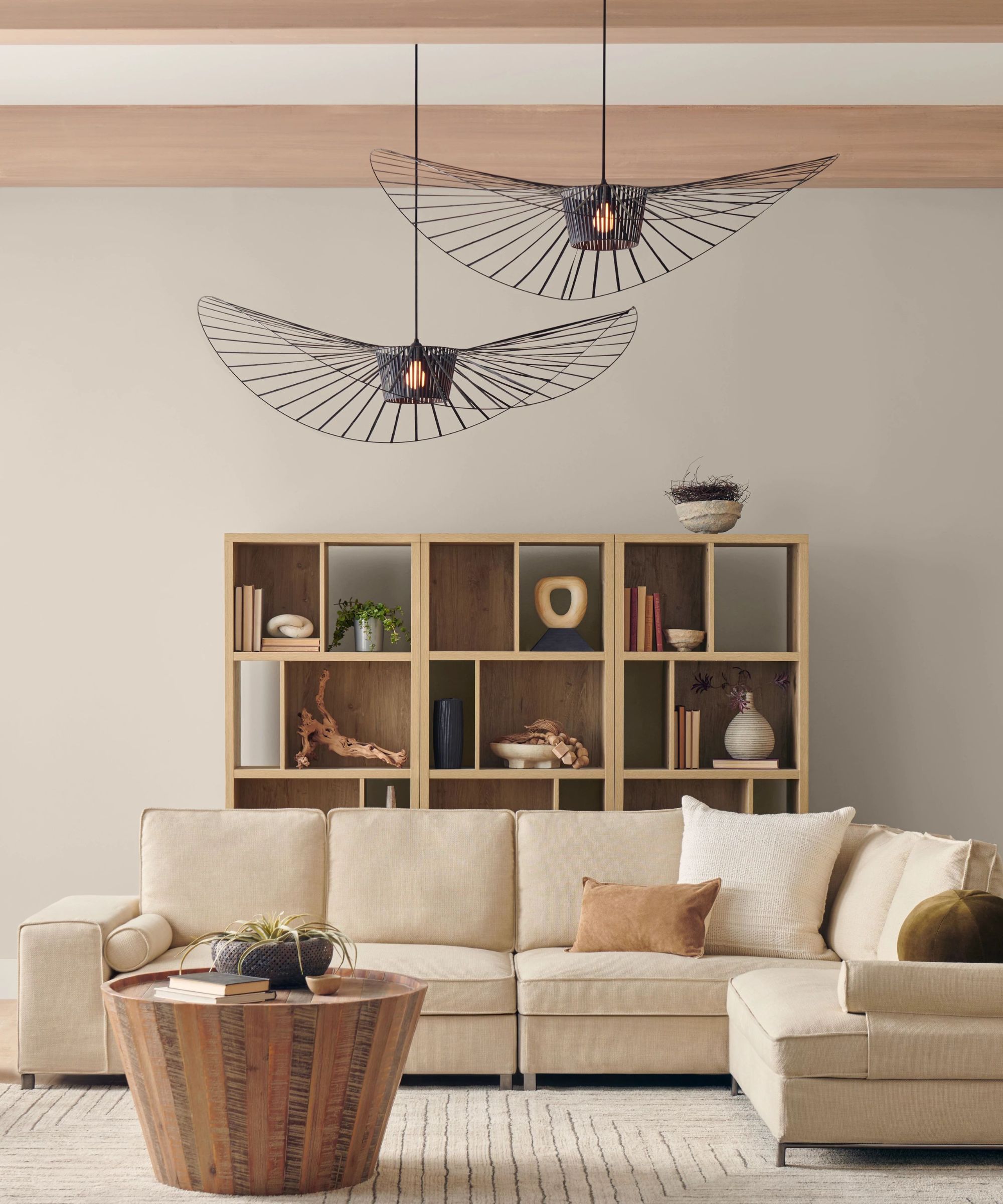
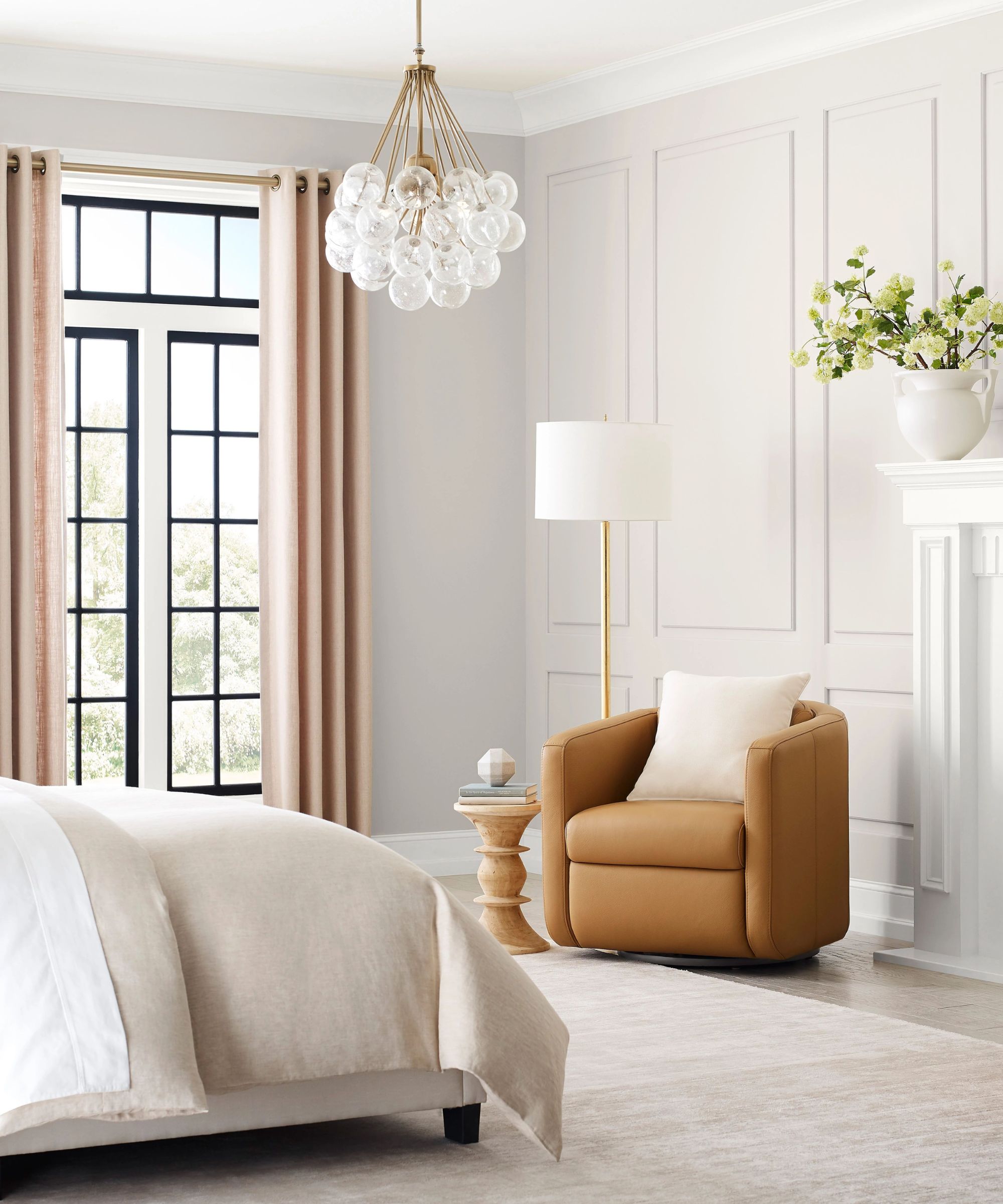
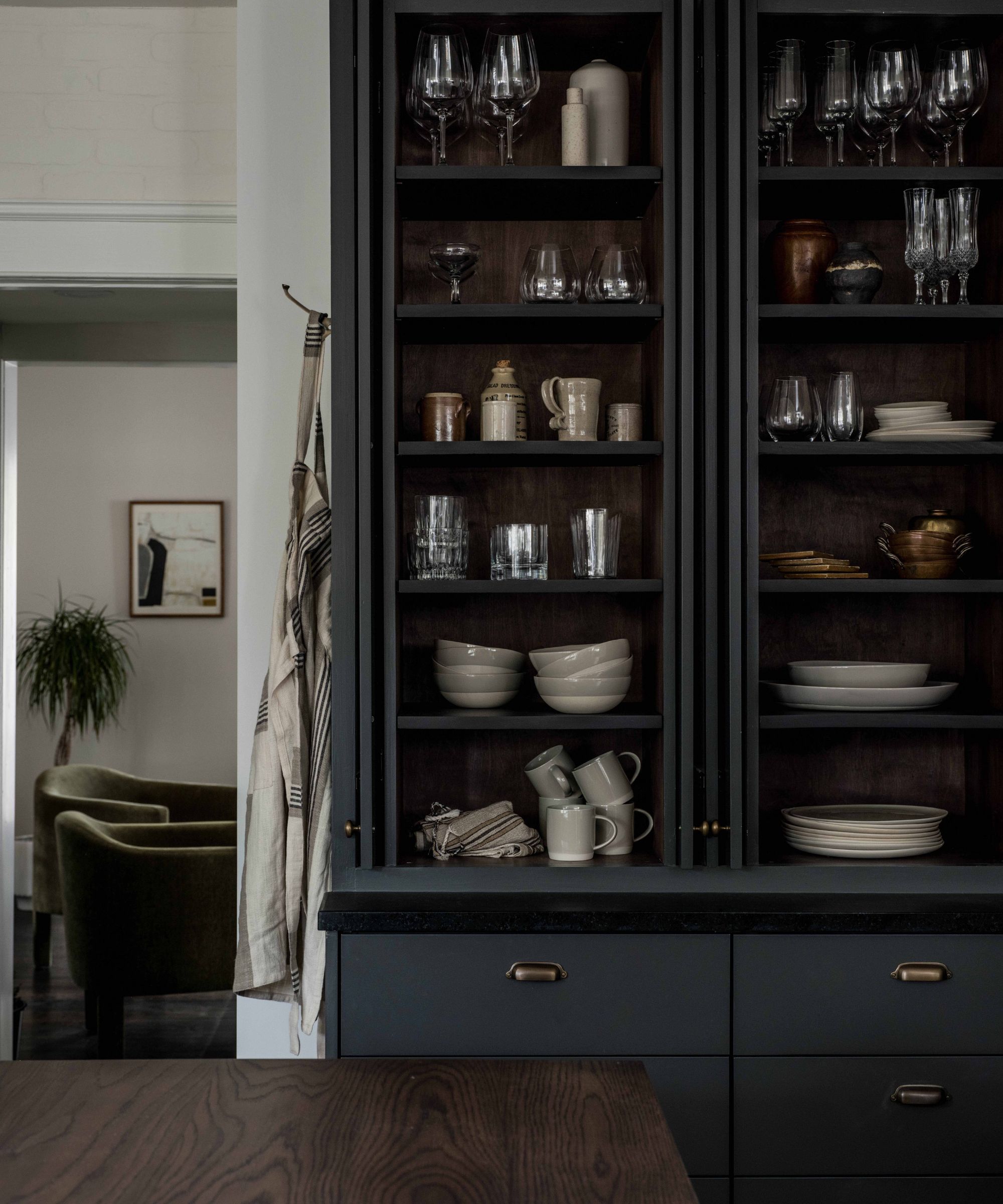
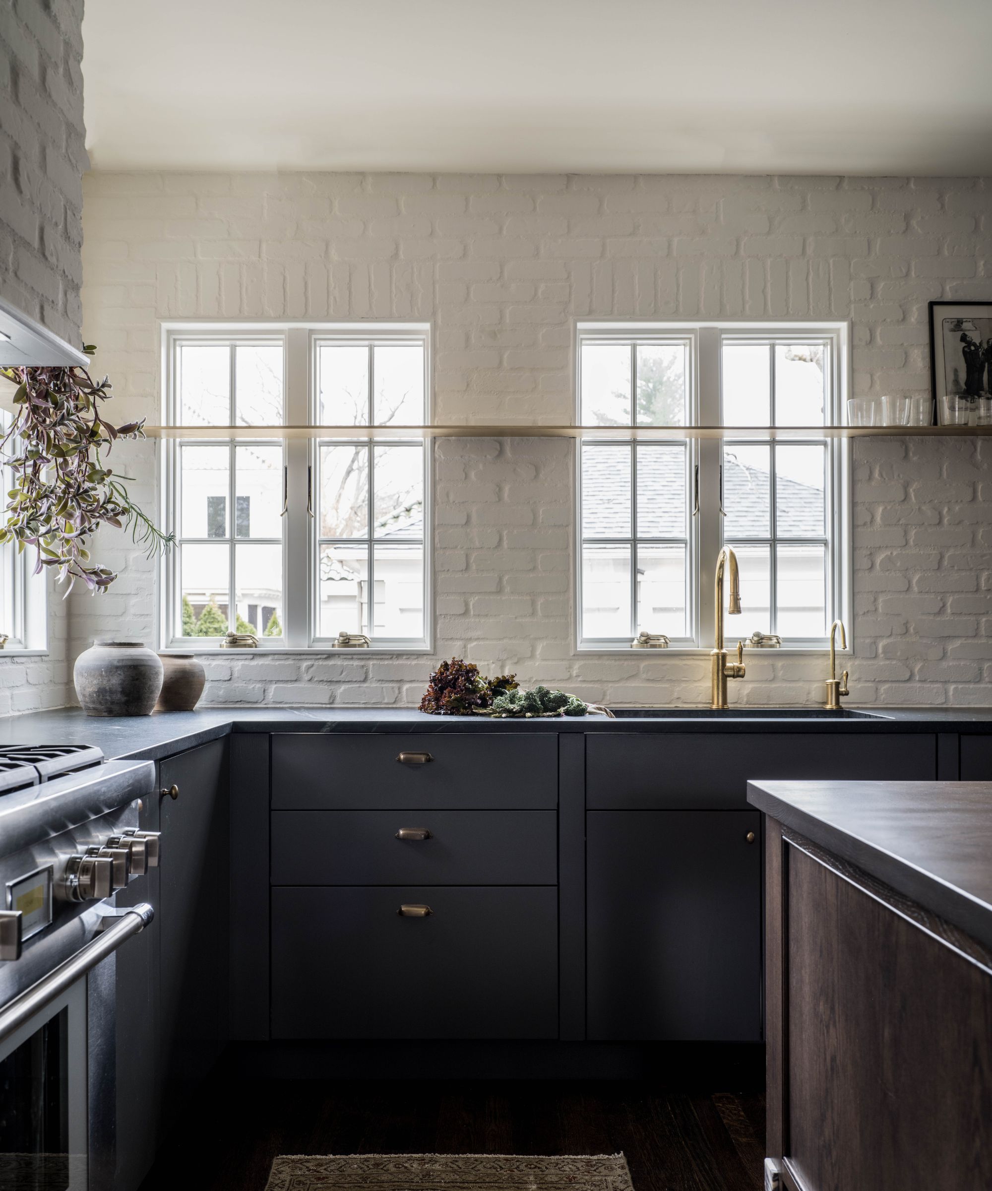
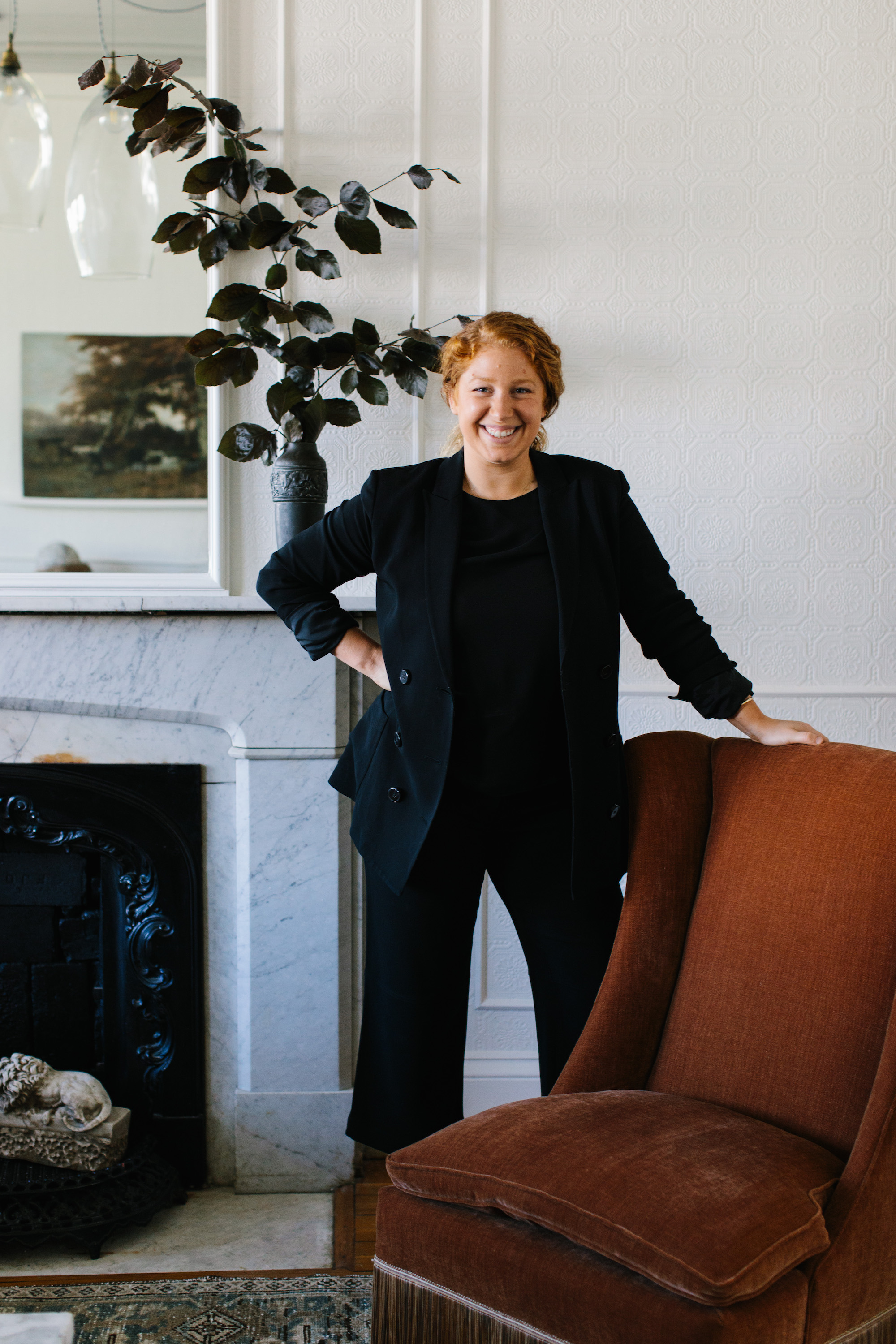
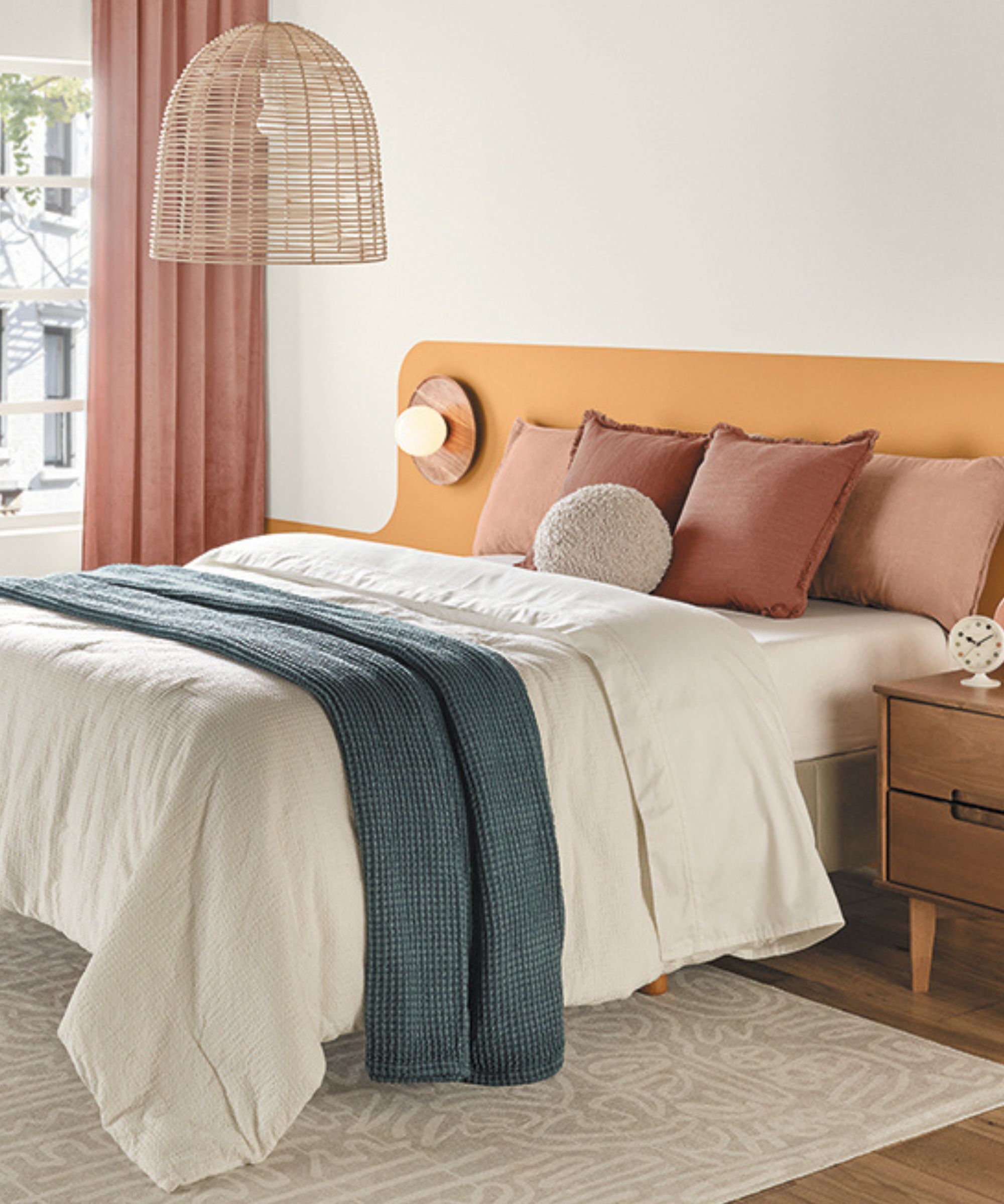
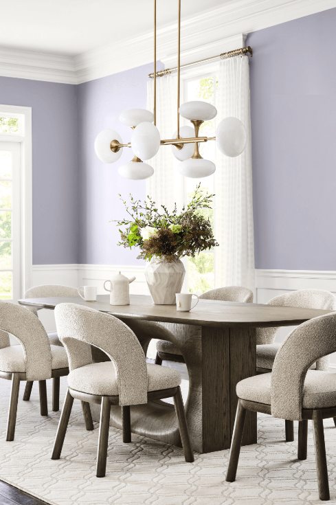
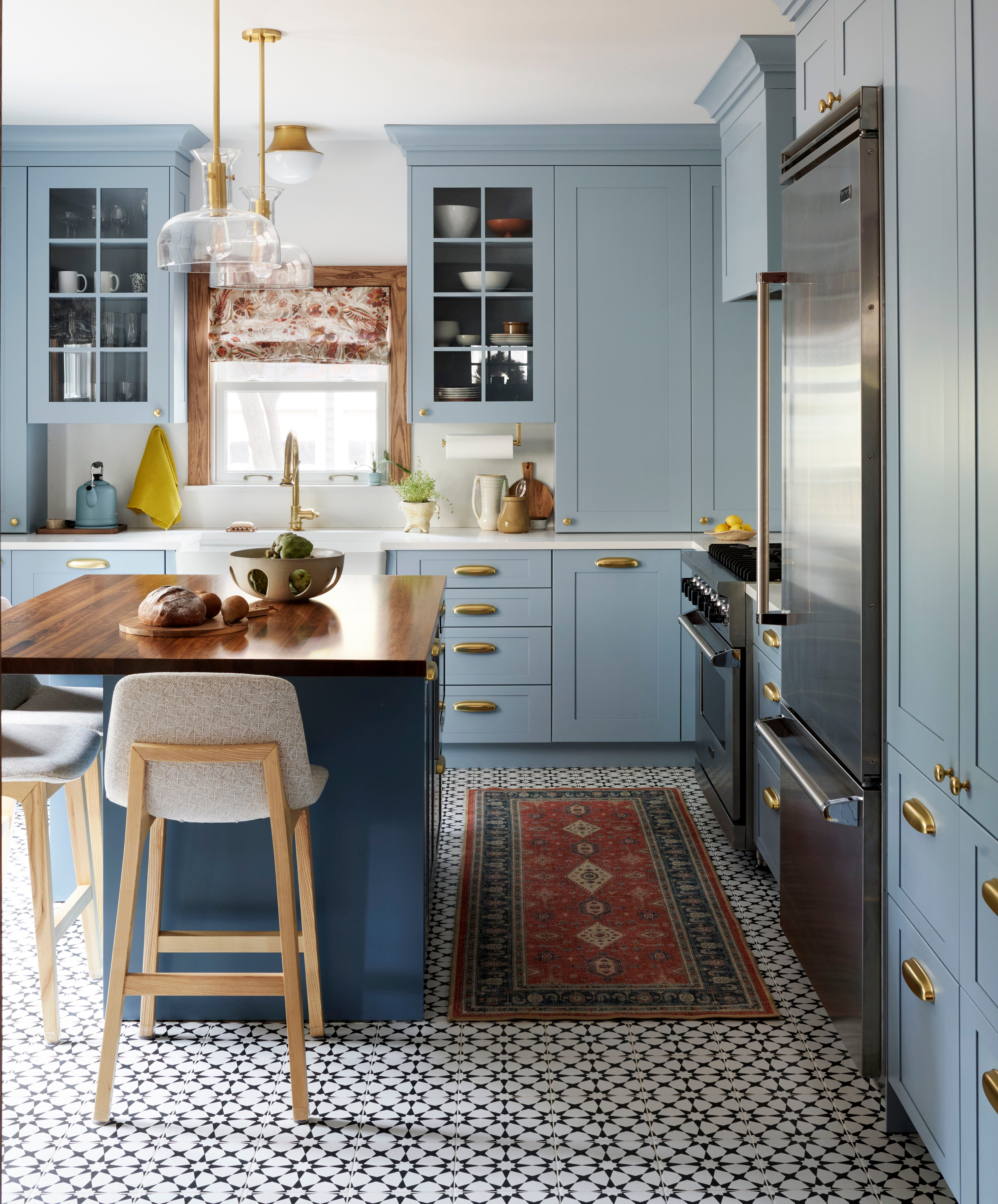
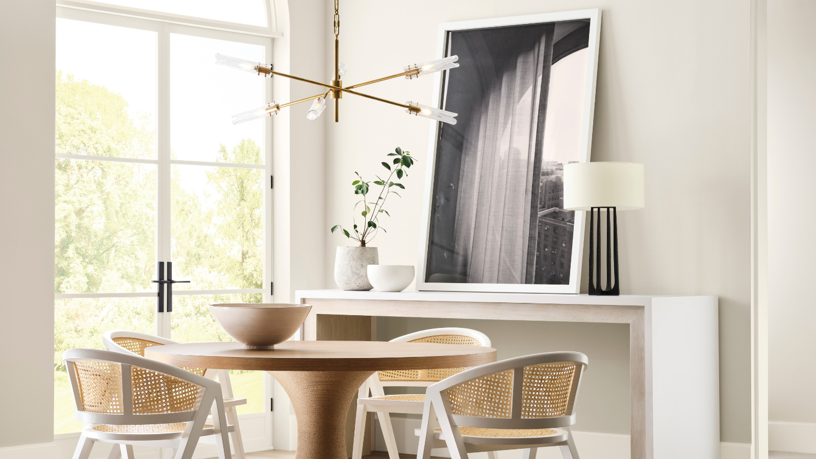
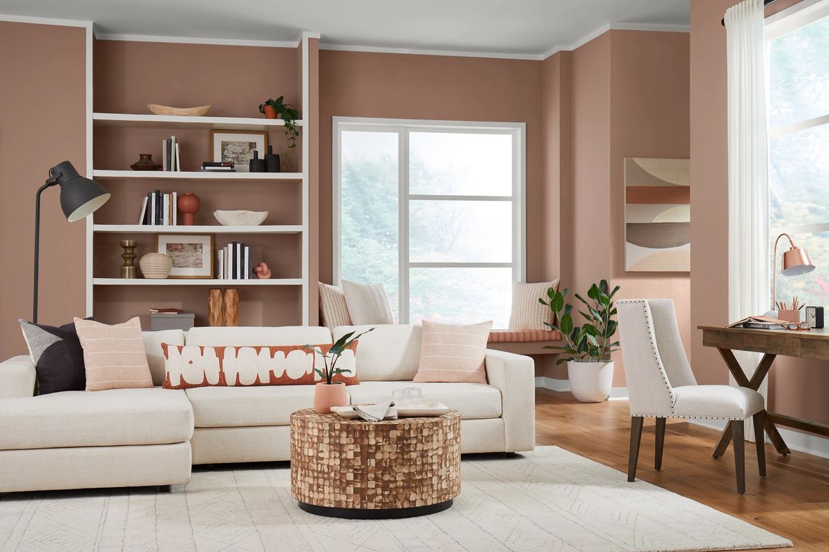
The palette consists of six shades: French Moire, Perle Noir, Crème, Parisian Patina, Chaise Mauve, and Ivoire. This selection includes creamy whites, soft beiges, and muted mauves, complemented by gentle blues, greens, and a soft charcoal gray. This combination aims to provide a scheme that is nearly neutral but infused with enough color to prevent drabness, appealing to those who desire a balanced yet understated vibrancy in their homes. Interior designers Kathy Kuo and Benji Lewis emphasize the palette's clever combination of warm and cool tones, as well as light and dark elements, which contribute to its subtle yet sophisticated appeal.
Kathy Kuo highlights how the neutral Crème, Ivorie, and Mauve tones establish a bright and warm foundation, against which the blues, greens, and the contrasting Noir create a harmonious interplay. Benji Lewis points out the intelligent color combination, noting that while pink and green are known to work well together, this palette specifically mutes these colors to achieve a gentle yet refined effect. He also acknowledges the inclusion of a black and white element, but in a toned-down manner, using a chalky black and a cream instead of stark white, which aligns with the overall muted aesthetic.
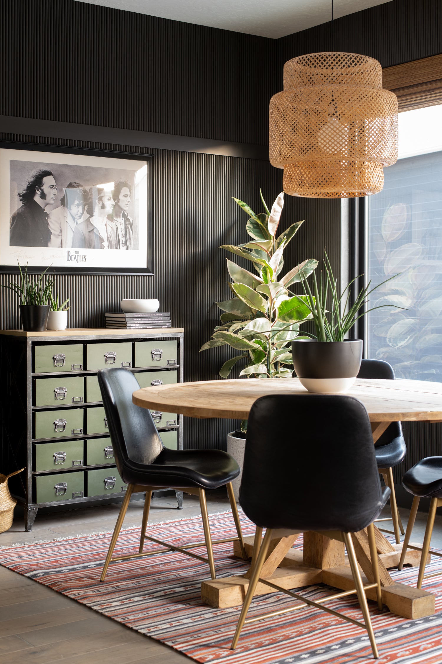
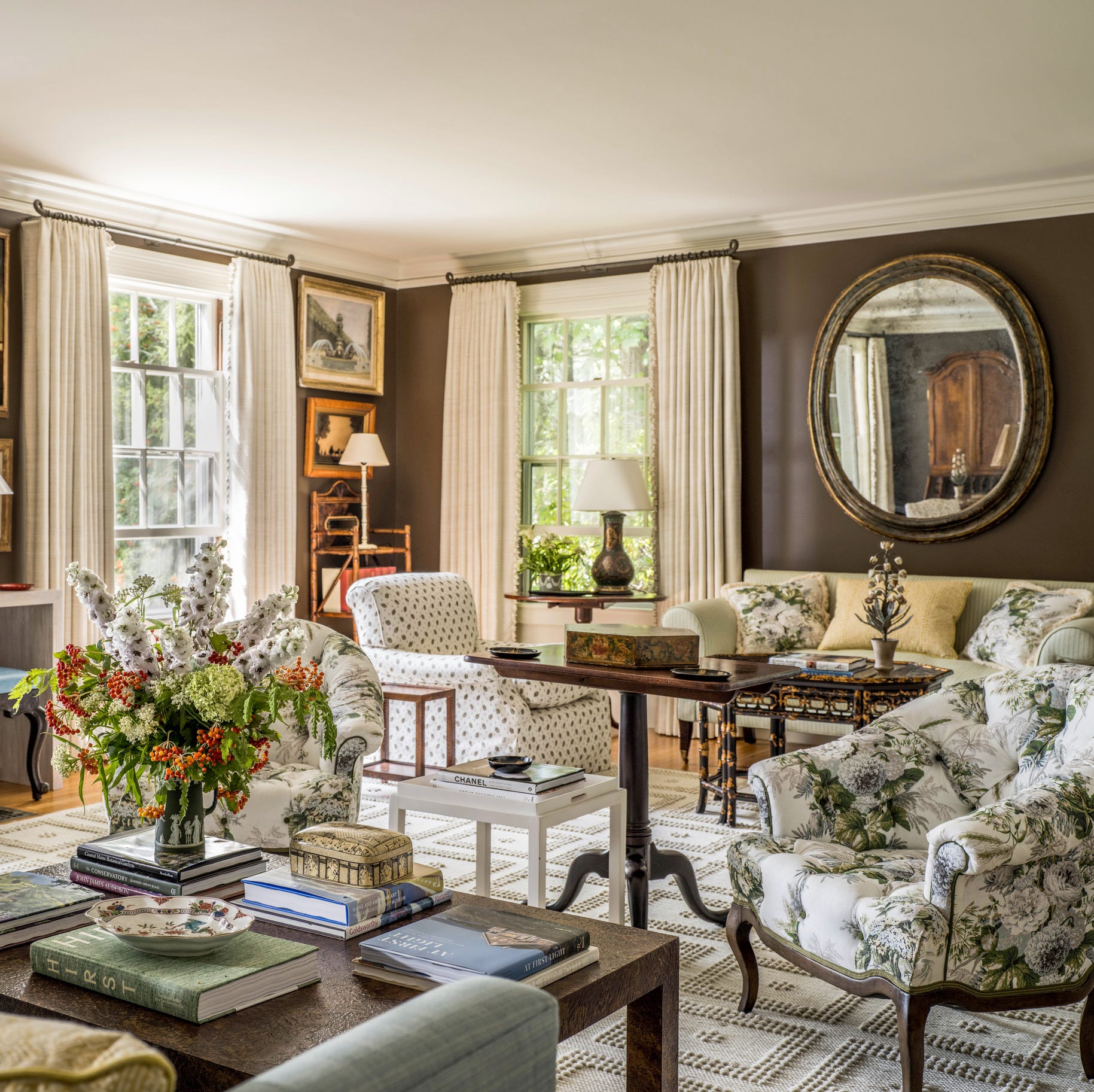
The 'Parisian Promenade' palette offers versatility, allowing for different applications ranging from soft and understated to more dramatic, depending on which shades are emphasized. For instance, making Perle Noir the dominant color can create a dramatic impact, while prioritizing the dusky pinks results in a softer effect. Interior designer Eliza Davey from De Rosee Sa describes the palette as calming yet balanced, with Crème and Ivorie forming a neutral base that is harmonized by the cooler tones of French Moire and Chaise Mauve, while Parisian Patina and Perle Noire ground the entire scheme. This balance of tone and color is crucial for achieving a sense of harmony within a room.
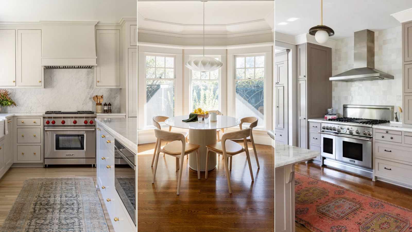
Murude Katipoglu, Founder of MURUDÉ, a design studio known for calm and inviting spaces, praises the palette for its ease of use and impactful combinations. Her studio frequently incorporates muted green and blue tones to add visual interest and identity to neutral schemes, recognizing the calming effect these hues have. When working with such subtle colors, the importance of texture becomes paramount to add depth and interest. Ultimately, the Parisian Promenade palette is presented as a foolproof option for those seeking an effortless, soft color scheme that subtly departs from a completely neutral foundation, incorporating cooler, earthier, and darker shades to introduce instant interest and a touch of drama, embodying a calming, cool, and effortless Parisian-inspired aesthetic.
#ParisianPromenade #SherwinWilliams #InteriorDesign #ColorPalette #NeutralDecor #HomeDecoration #EarthyTones #SophisticatedColors #DesignTrends #ParisianPromenade #SherwinWilliams #InteriorDesign #ColorPalette #NeutralDecor #HomeDecoration #EarthyTones #SophisticatedColors #DesignTrends
0 comment in total
 No comments yet
You may also like
These Are the Colors You'll Be Obsessed With Next Year, Based on Your Personality

Sherwin-Williams' Designer Color Collection: 5 bright white paints
'It's one of those rare neutrals that feels both effortless and elevated' – how designers use Sherwin-Williams soothing shade Sunbleached
The Christian Siriano x Sherwin-Williams Collaboration Brings Luxurious Shades To Your Spaces

What are Sherwin-Williams' best-selling paints? And how interior designers put them to use
We asked paint brands what their most popular shades of 2024 were – these were the 13 favorites

Sherwin-Williams Just Named Its Loneliest Color of 2025—and Everyone Should Be Using It


The most timeless paint colors according to designers
12 Trending Paint Colors for 2024, According to Design Experts

Sherwin-Williams Predicts These 4 Color Palettes Will Dominate Homes in 2026—and One May Surprise You
Sherwin-Williams' Agreeable Gray is one of the country's favorite gray paints – but is it the right choice for you?
The Paris apartment that takes colour drenching to new ombré heights

If You Can't Find Your New Paint Color in Sherwin-Williams' 2026 Palettes, We'll Be Shocked

How to decorate with Sherwin Williams’ Iron Ore – a ‘sophisticated, warm and timeless gray’
Sherwin-Williams' 2026 Color Forecast Is Here and It’s Packed With 48 Fresh Hues
7 Color Trends That Will Be Huge in 2024, According to Color Experts

How to decorate with Sherwin-Williams' Drift of Mist – an 'airy and inviting' gray
Sherwin-Williams' Accessible Beige is the 'perfect…

Take 'Disco Nap,' and other 2021 colors of the year, for a spin

12 Paint Colors That Interior Designers Are Buzzing About—See the Gorgeous Hues Here