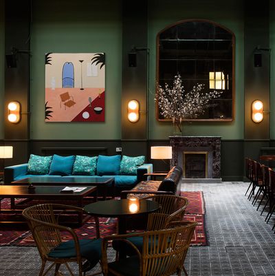
1/6
Here’s the Color for Everyone Who’s Sick of Pale Pink
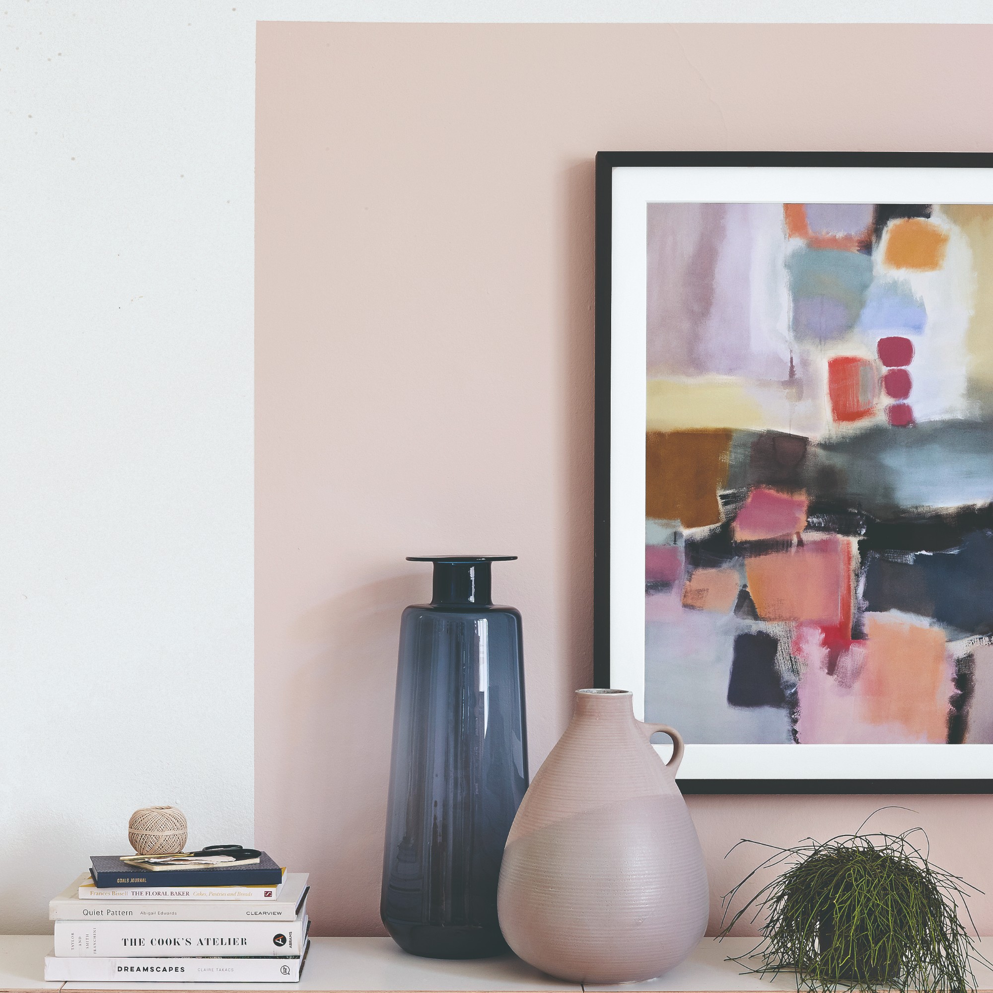
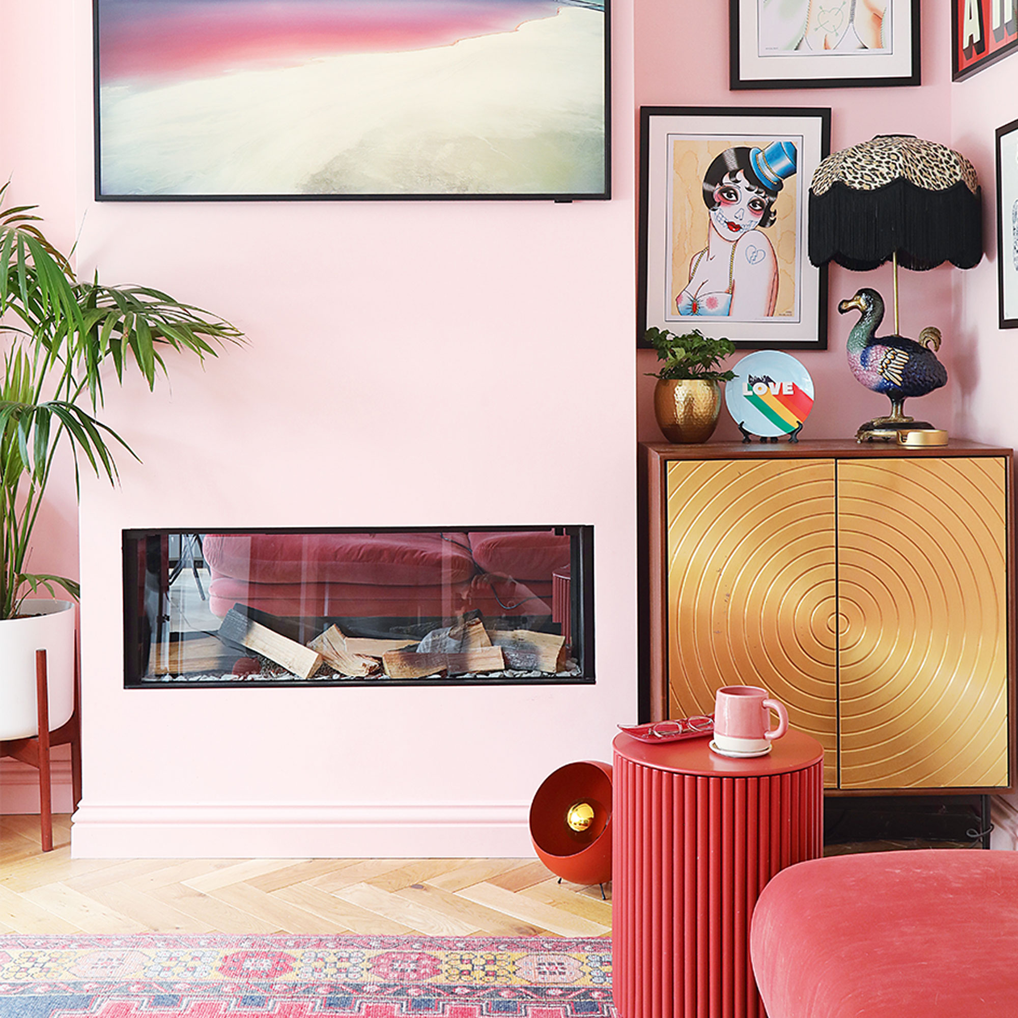
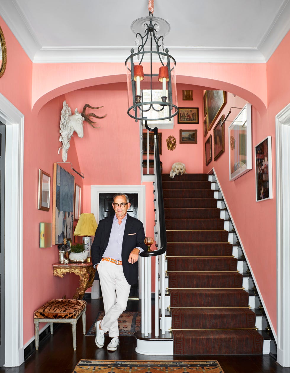
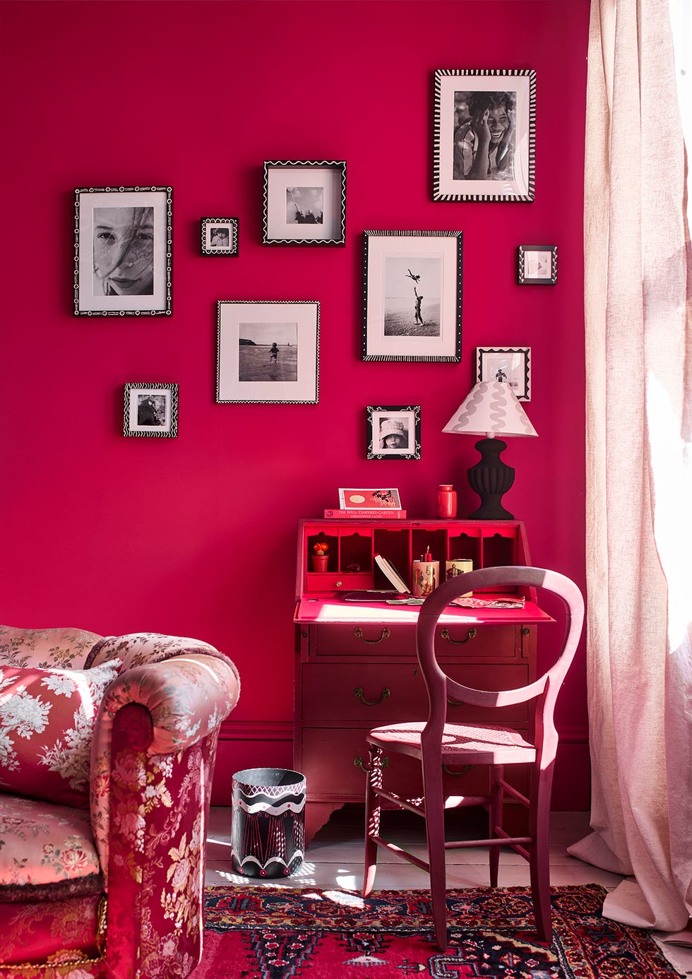
The article discusses the shifting trends in interior design and color preferences, specifically highlighting the decline of 'millennial pink' and the rise of teal as a prominent color. Millennial pink, also known as 'rose quartz' in Pantone's terminology, had been a ubiquitous presence in design for several years, influencing everything from branding to home decor. Its widespread adoption, however, inadvertently set the stage for a contrasting color to emerge.
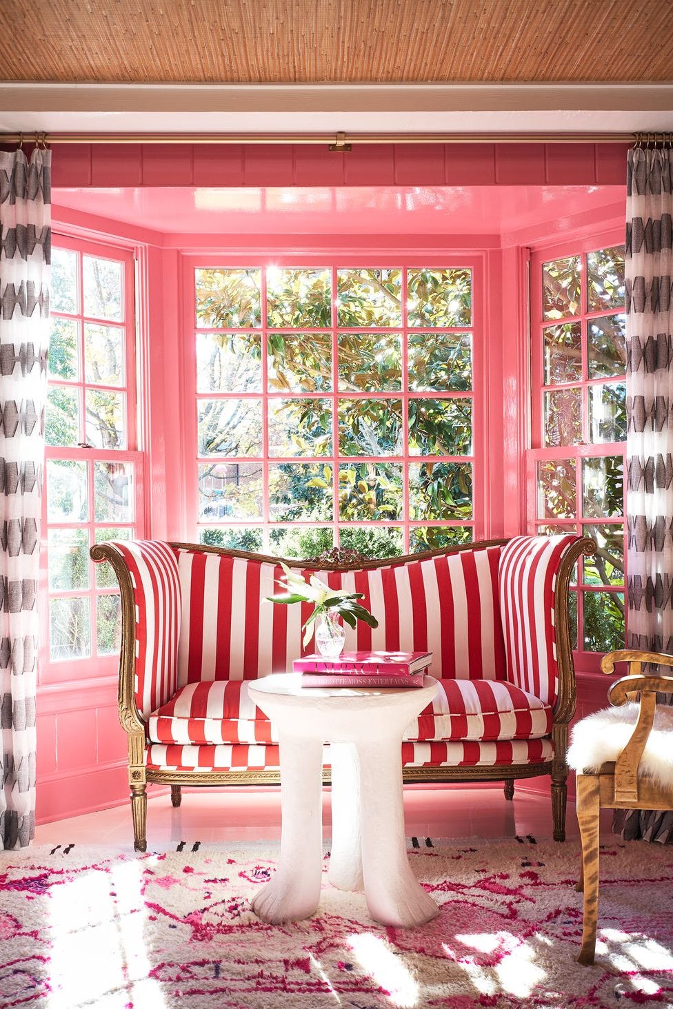
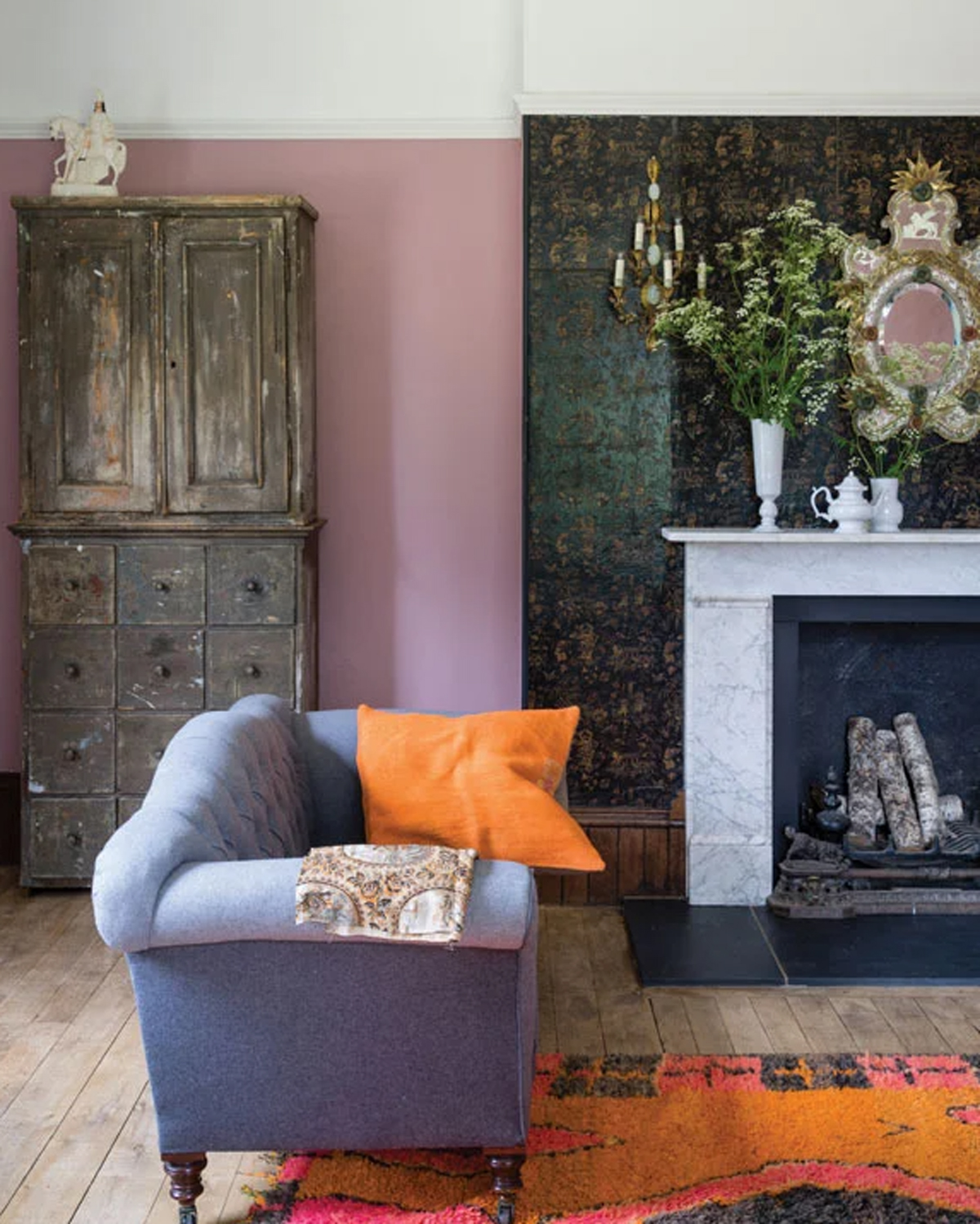
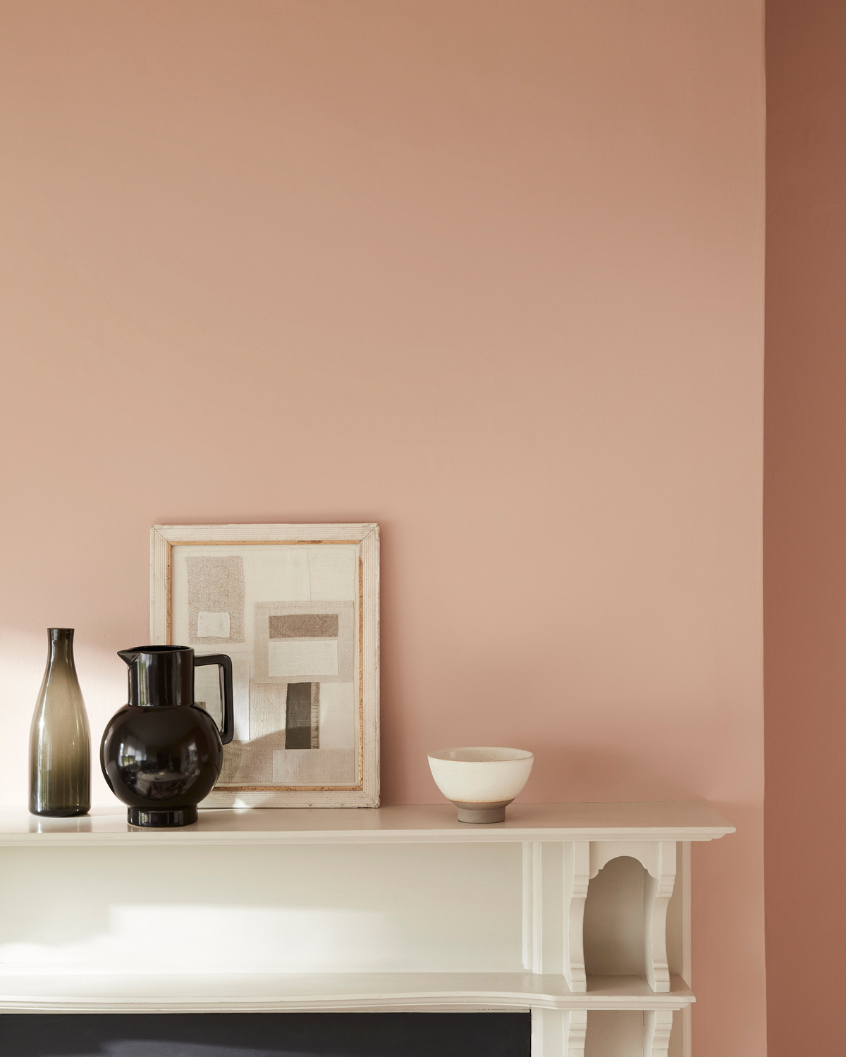
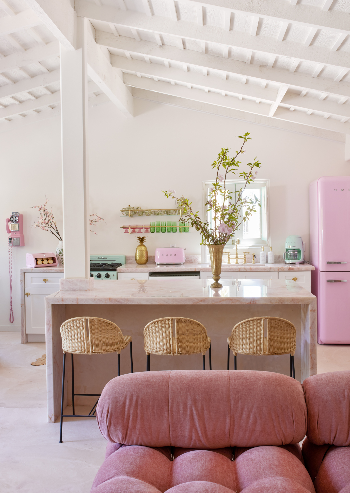
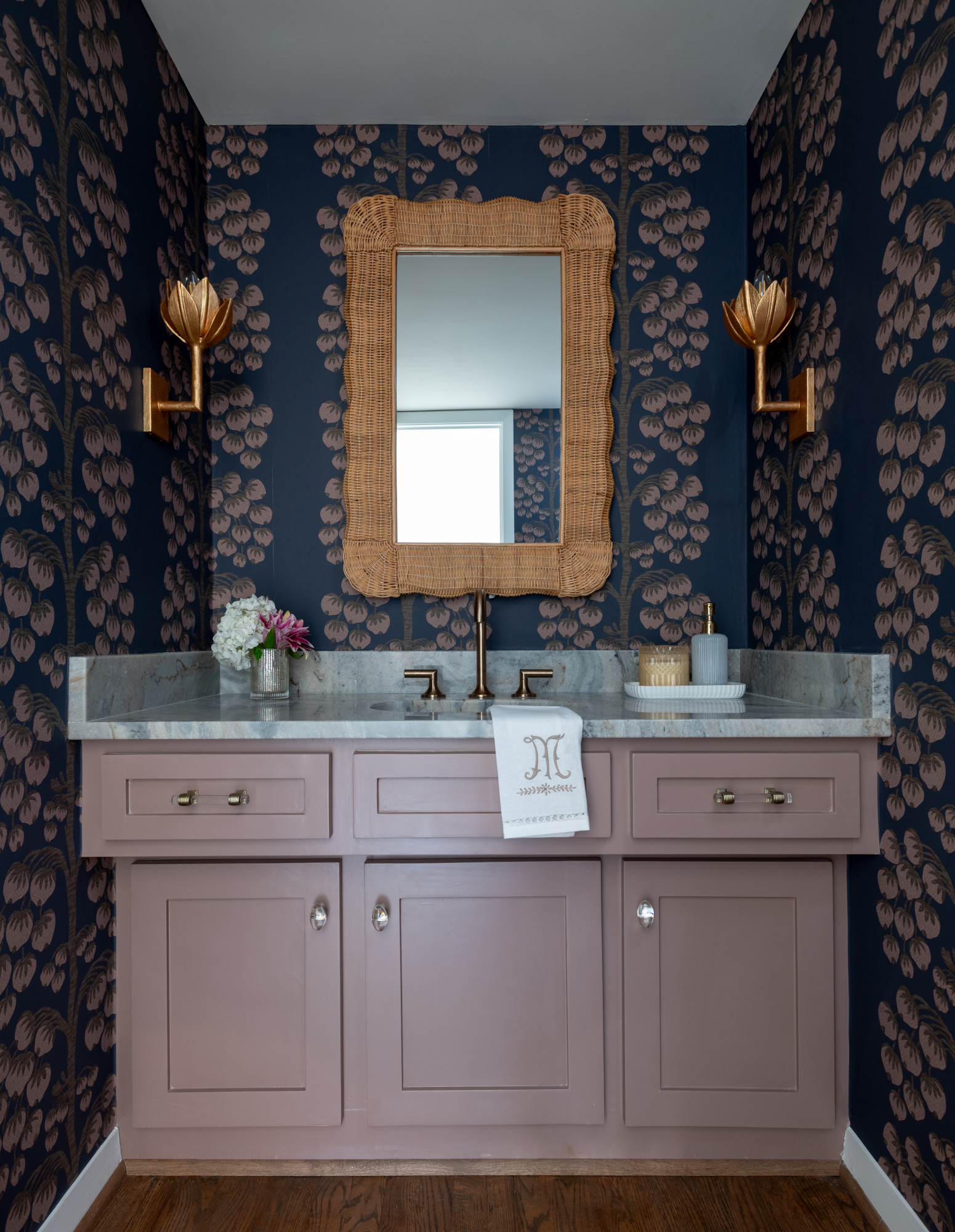
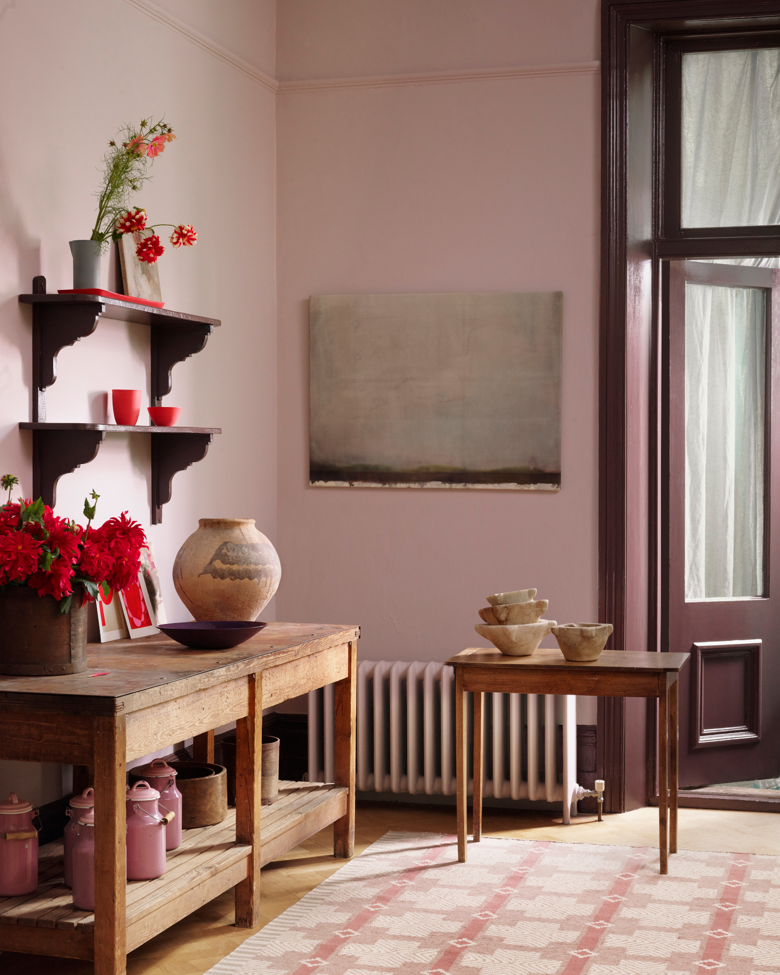
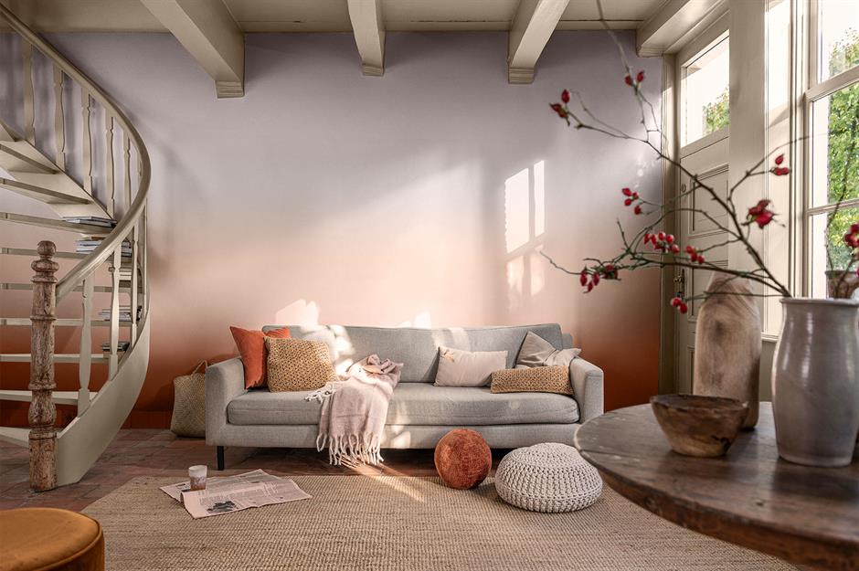
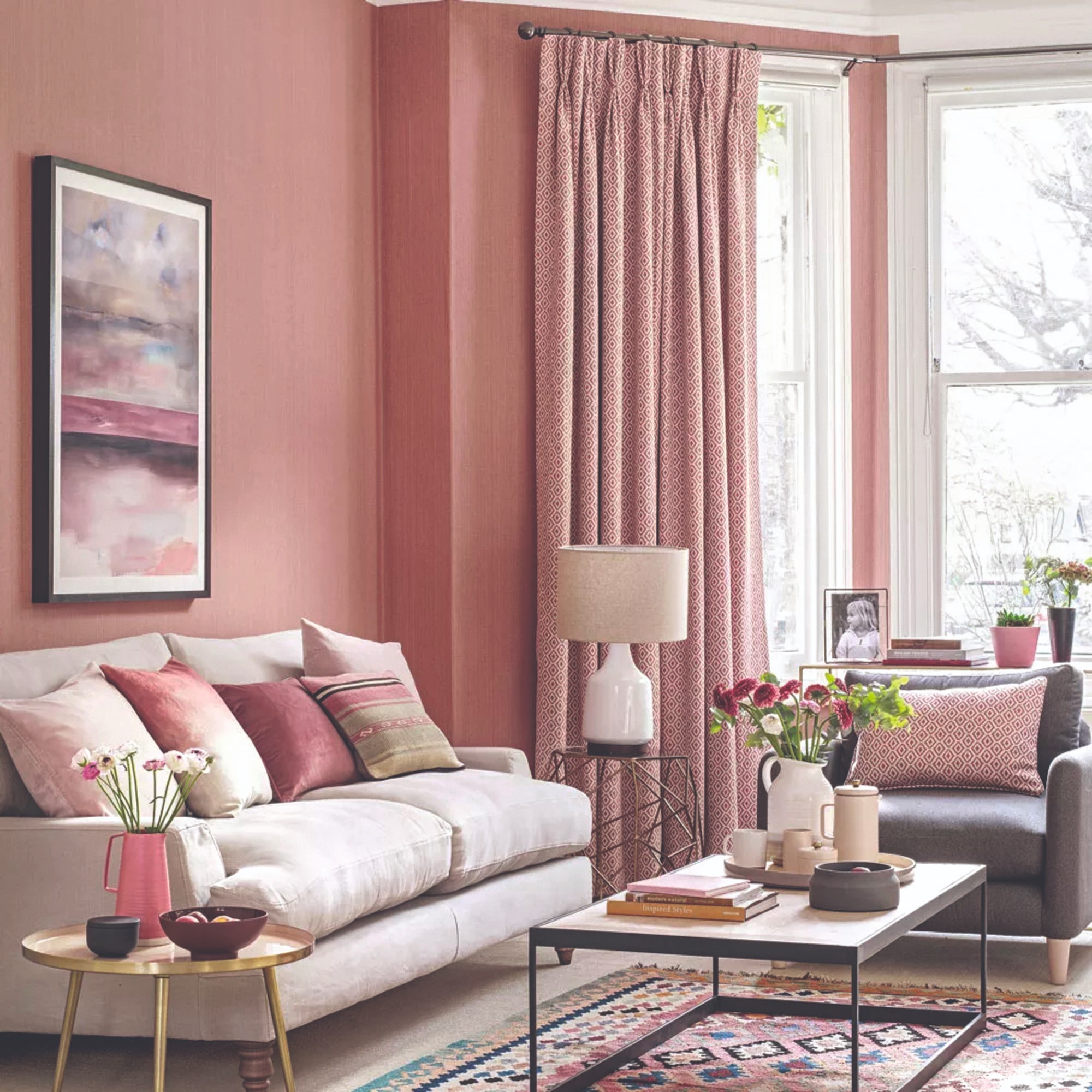
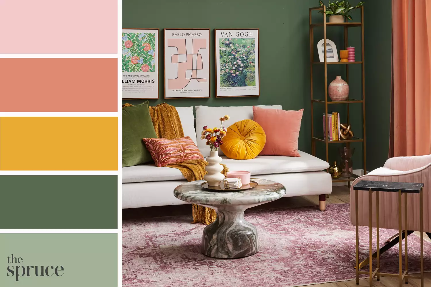
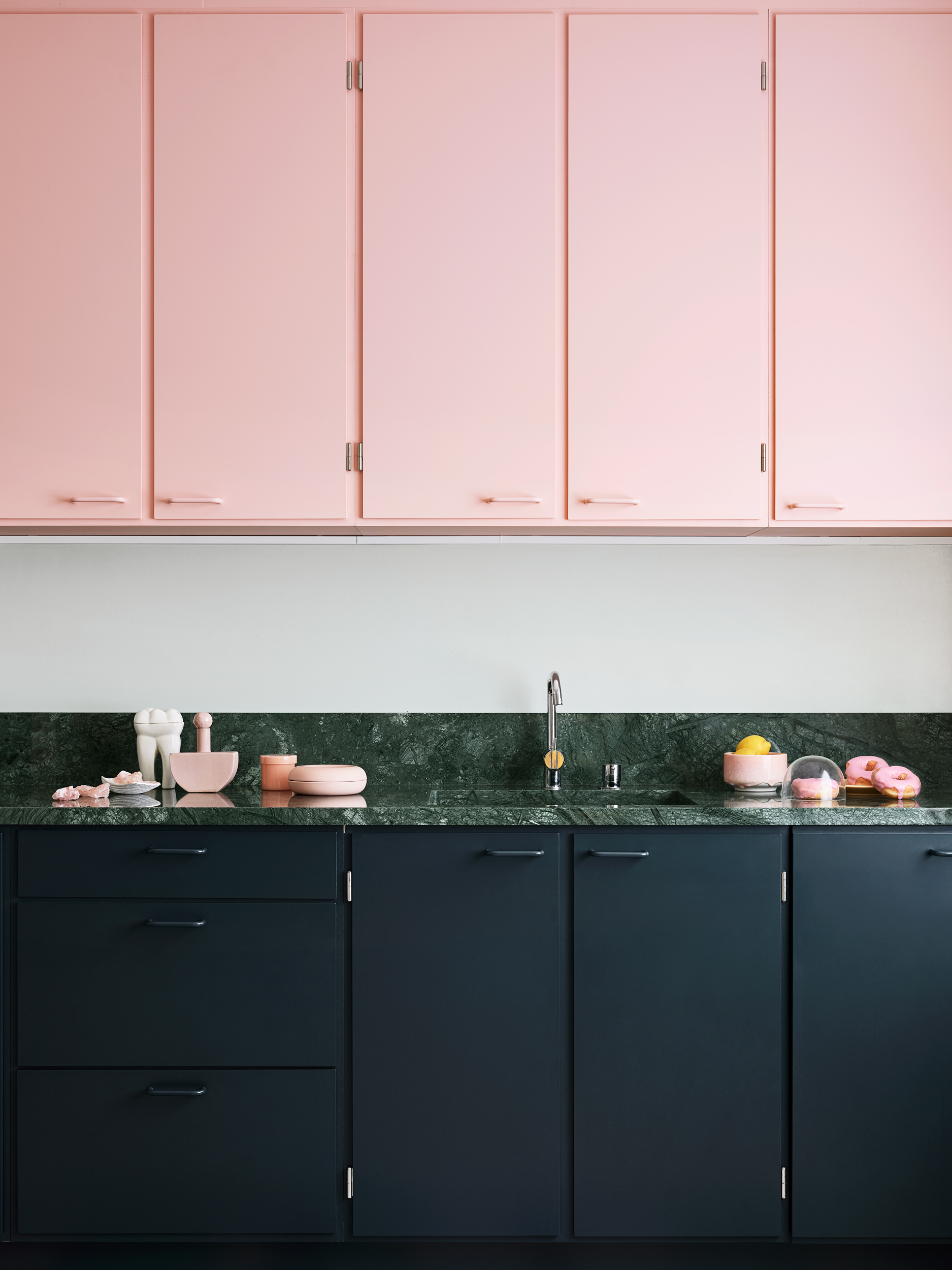
The popularity of millennial pink, a light, soft hue, created a visual context where deeper, more saturated colors would eventually feel fresh and new. This dynamic is exemplified by online phenomena like the Instagram account @plantsonpink, which showcased the aesthetic appeal of pink backgrounds paired with vibrant green plants. This visual interplay between soft pinks and rich greens inadvertently paved the way for teal, a color that naturally complements and contrasts with millennial pink.
The article points to several indicators of teal's growing prominence. Scottish paper company GF Smith, for instance, declared 'Marrs Green' (a shade of teal) as the world's favorite color in a large-scale survey, suggesting a broader cultural shift in color preference. More significantly, paint giant Sherwin-Williams announced 'Oceanside SW 6496' (another teal shade) as its color of the year for 2018. These announcements from influential industry players are not merely reactive; they often have a prescriptive quality, indicating and accelerating future trends in design and consumer taste.
The author posits that this shift is a natural progression, arguing that blush tones and other pastels have had extensive exposure, leading to a desire for more vibrant and rich colors. Teal, with its blend of blue and green, offers a sophisticated and calming alternative that also provides a sense of depth and saturation. The article suggests that this move away from delicate pastels towards more assertive hues is a common cycle in design trends, where one dominant aesthetic eventually gives way to its complementary opposite.
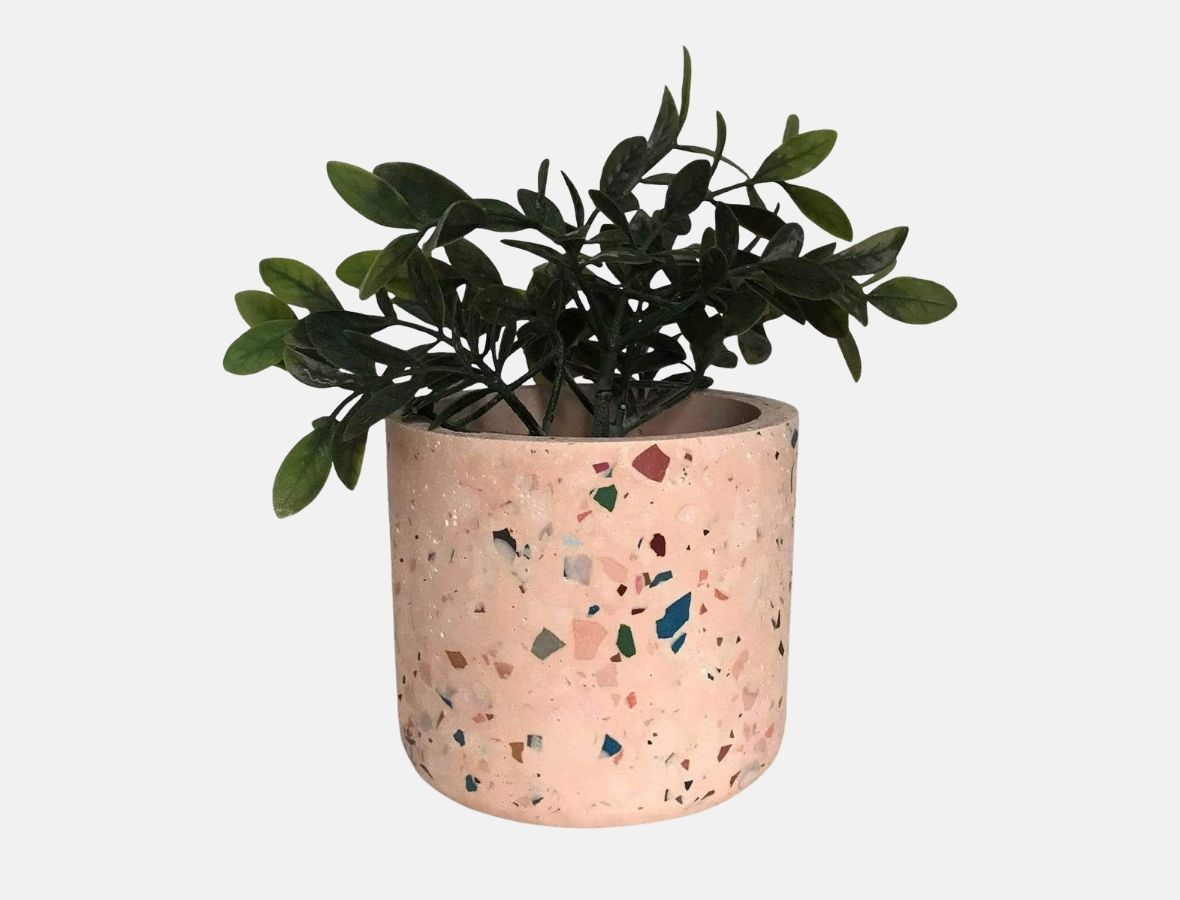
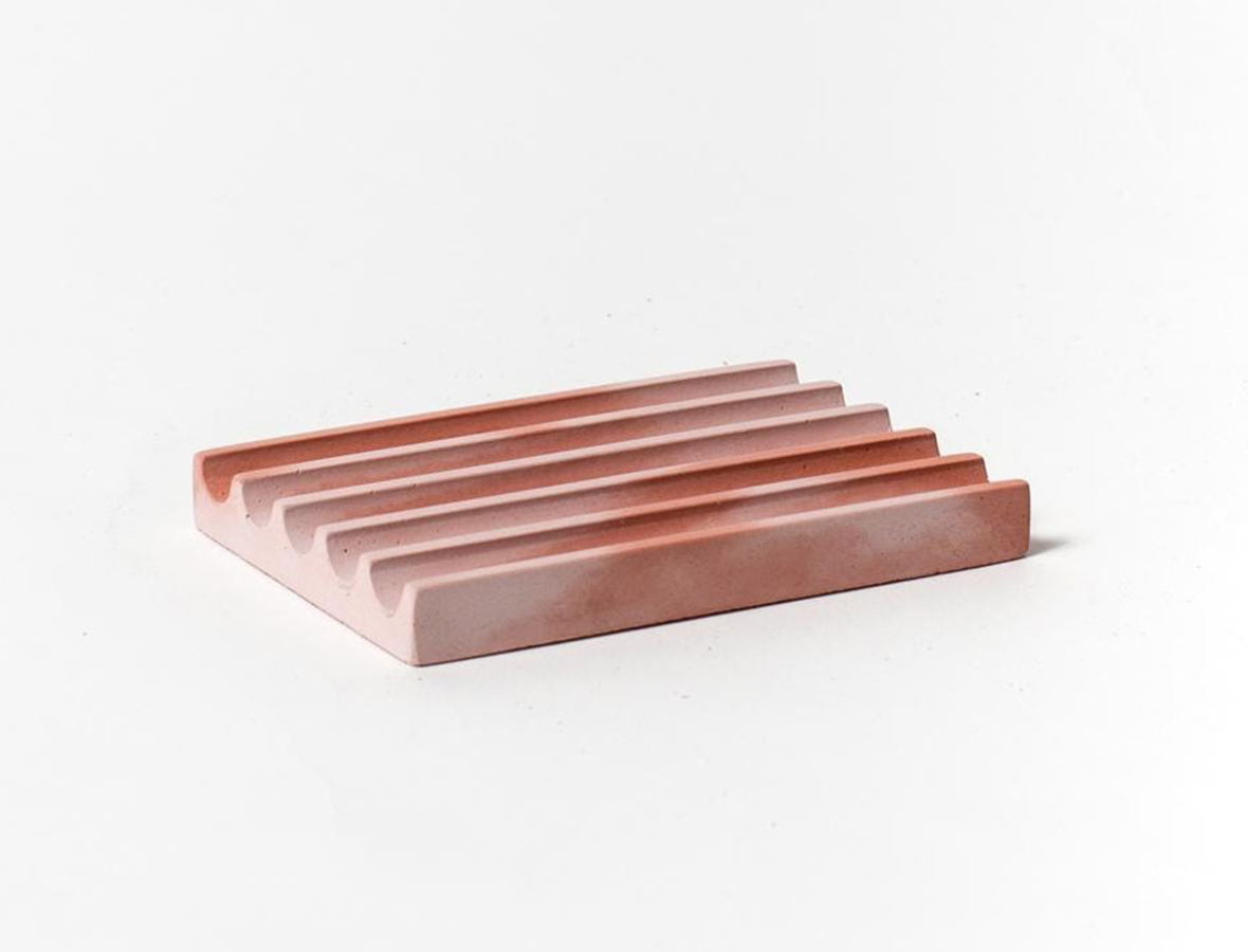
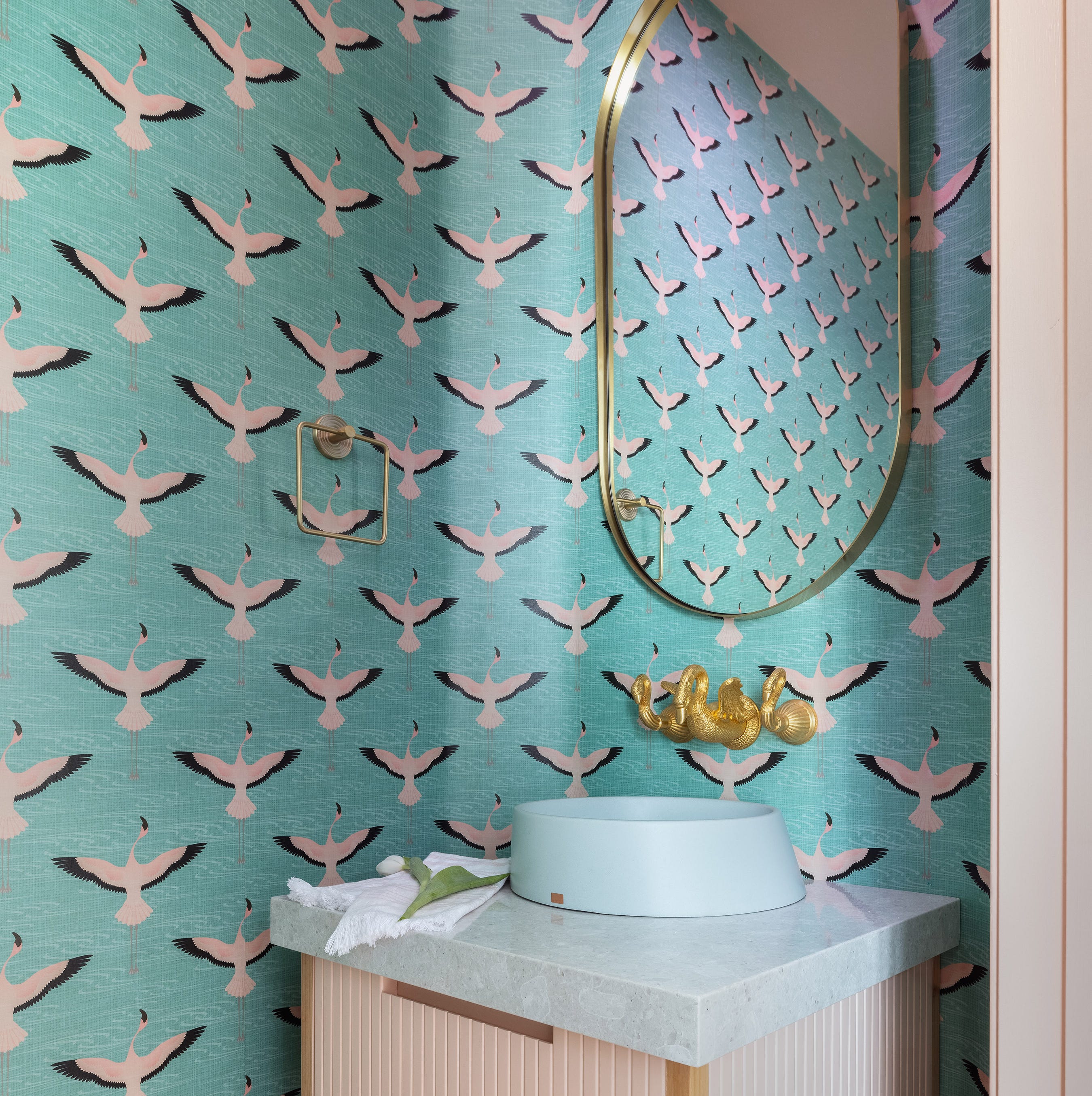
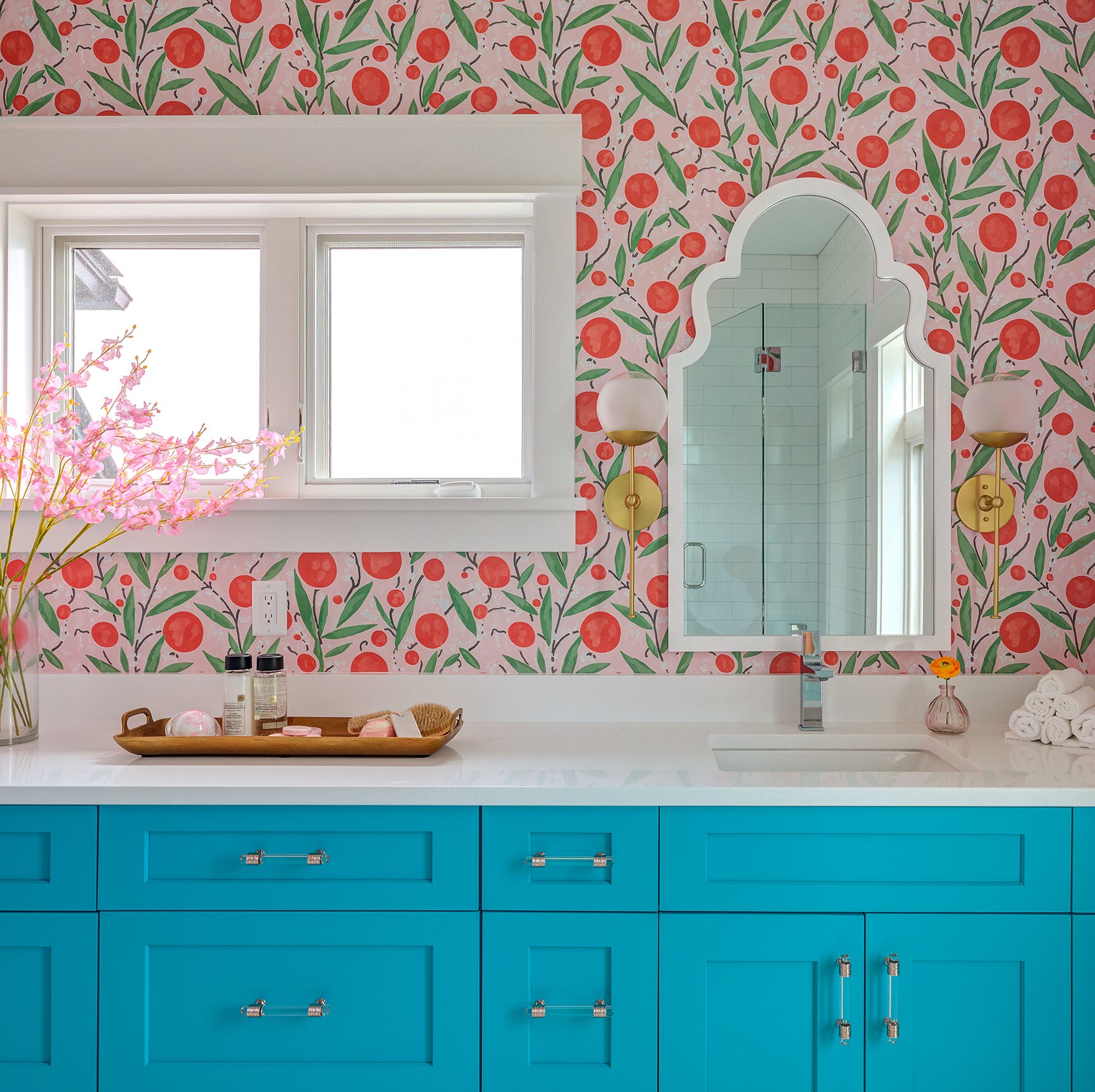
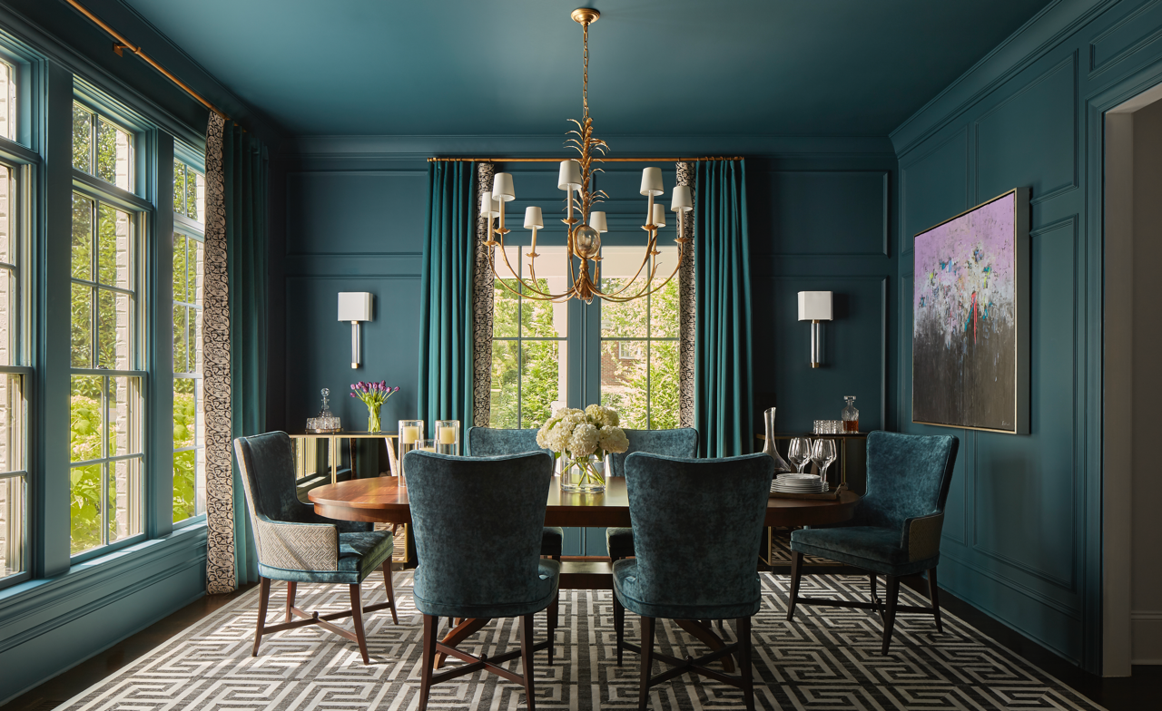
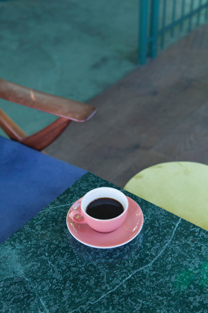
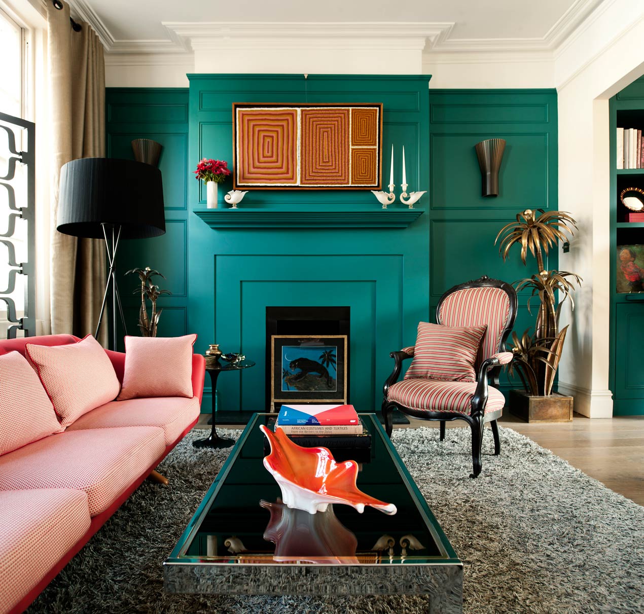
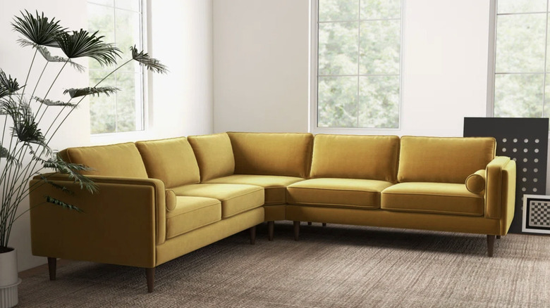
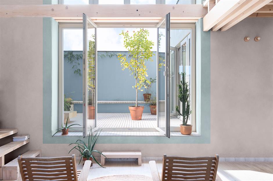
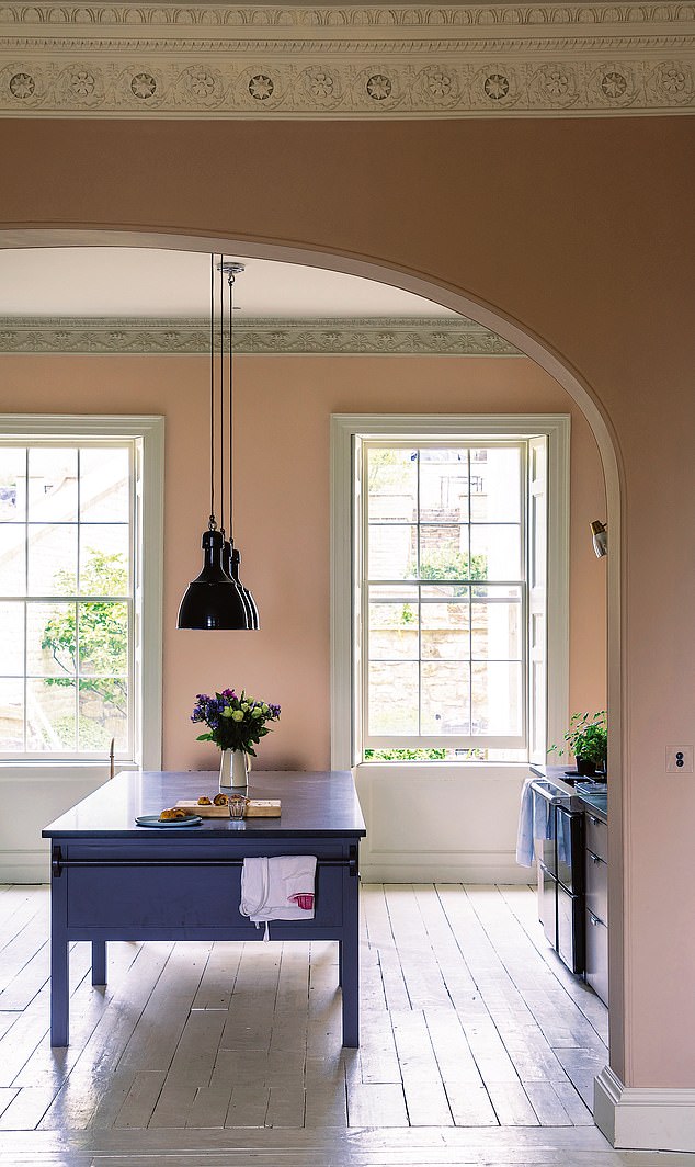
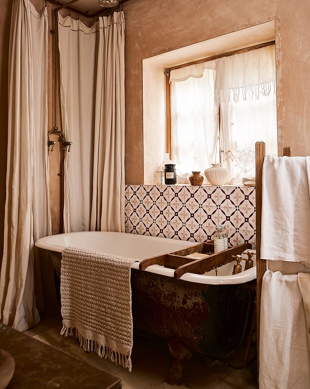
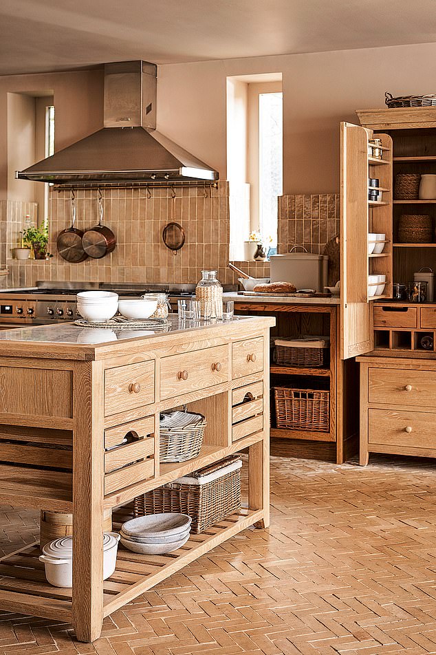
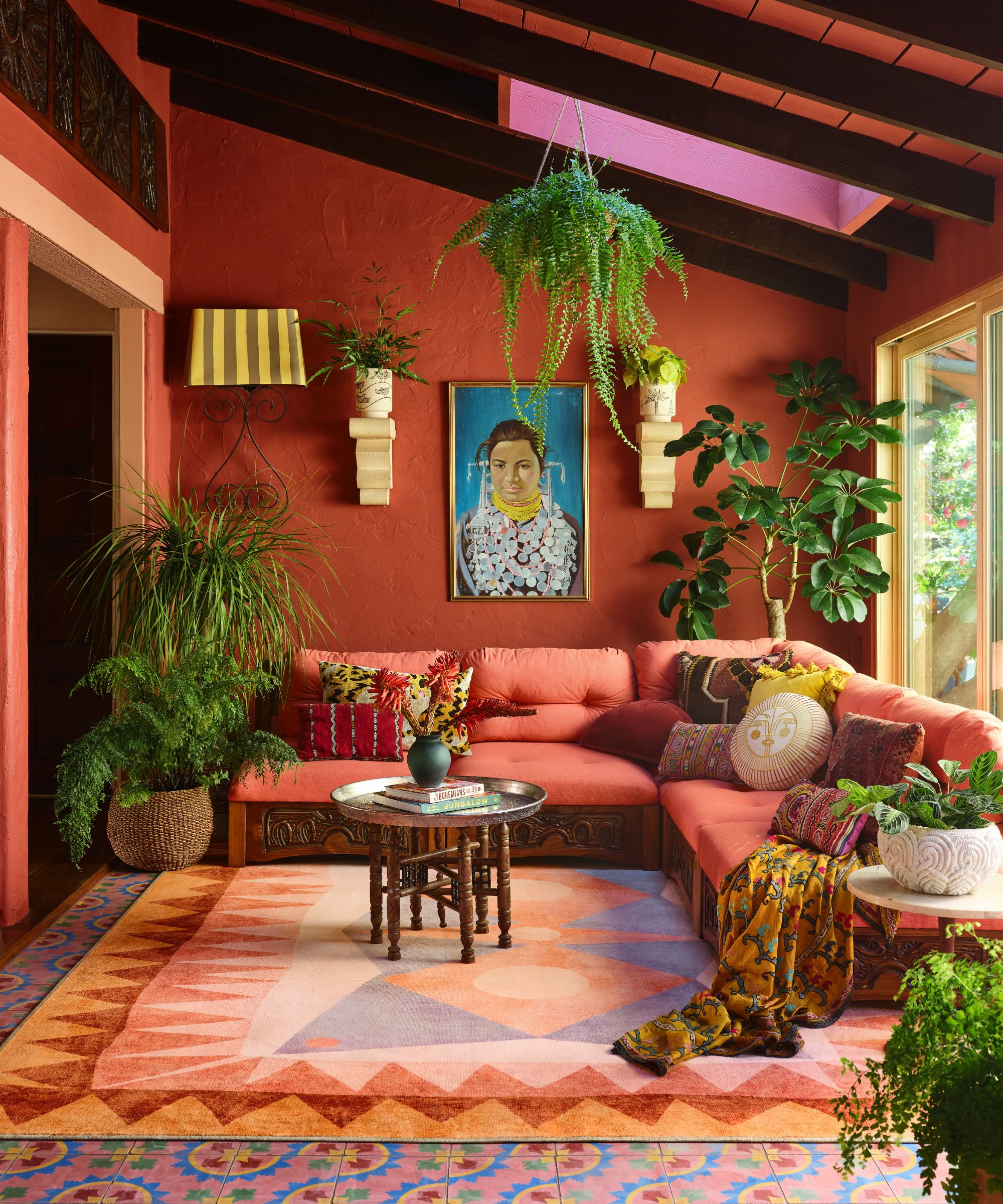
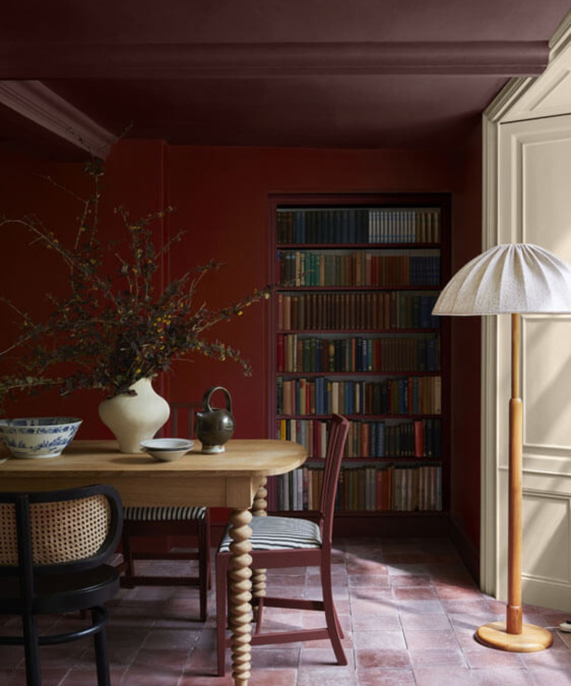
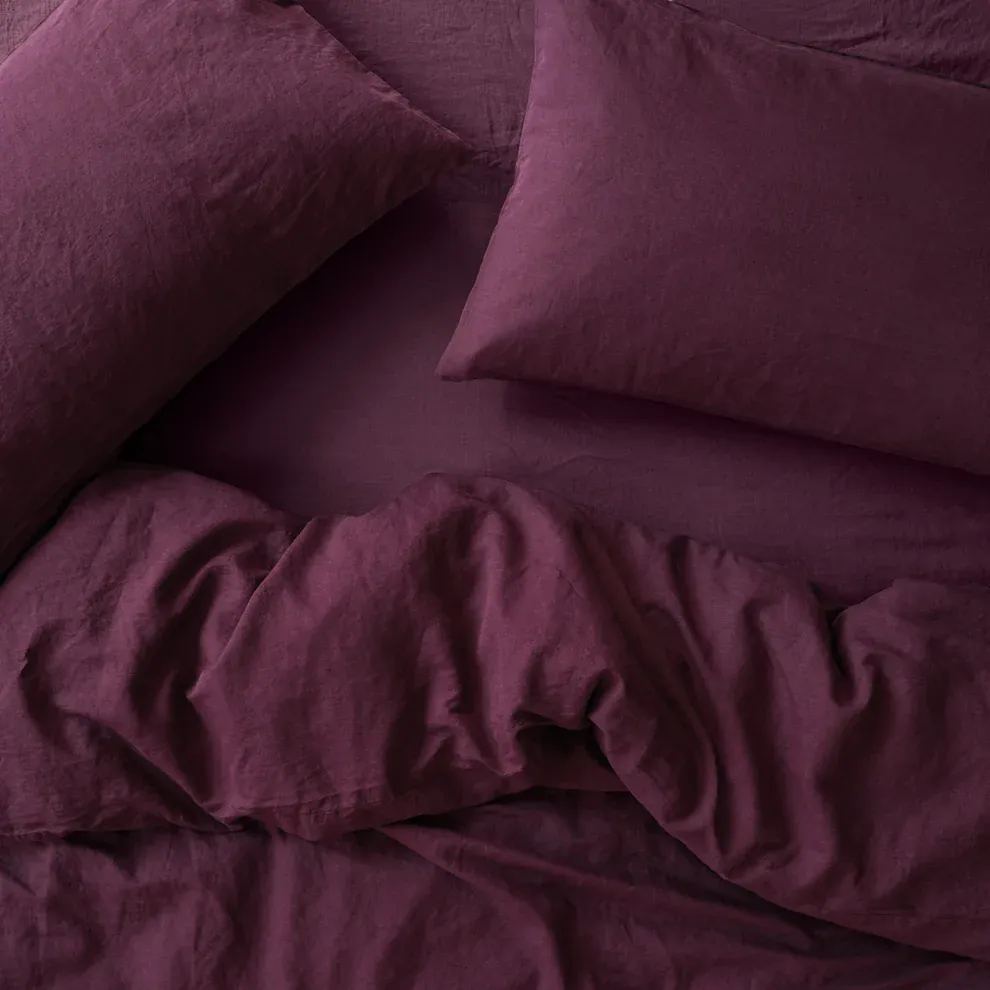
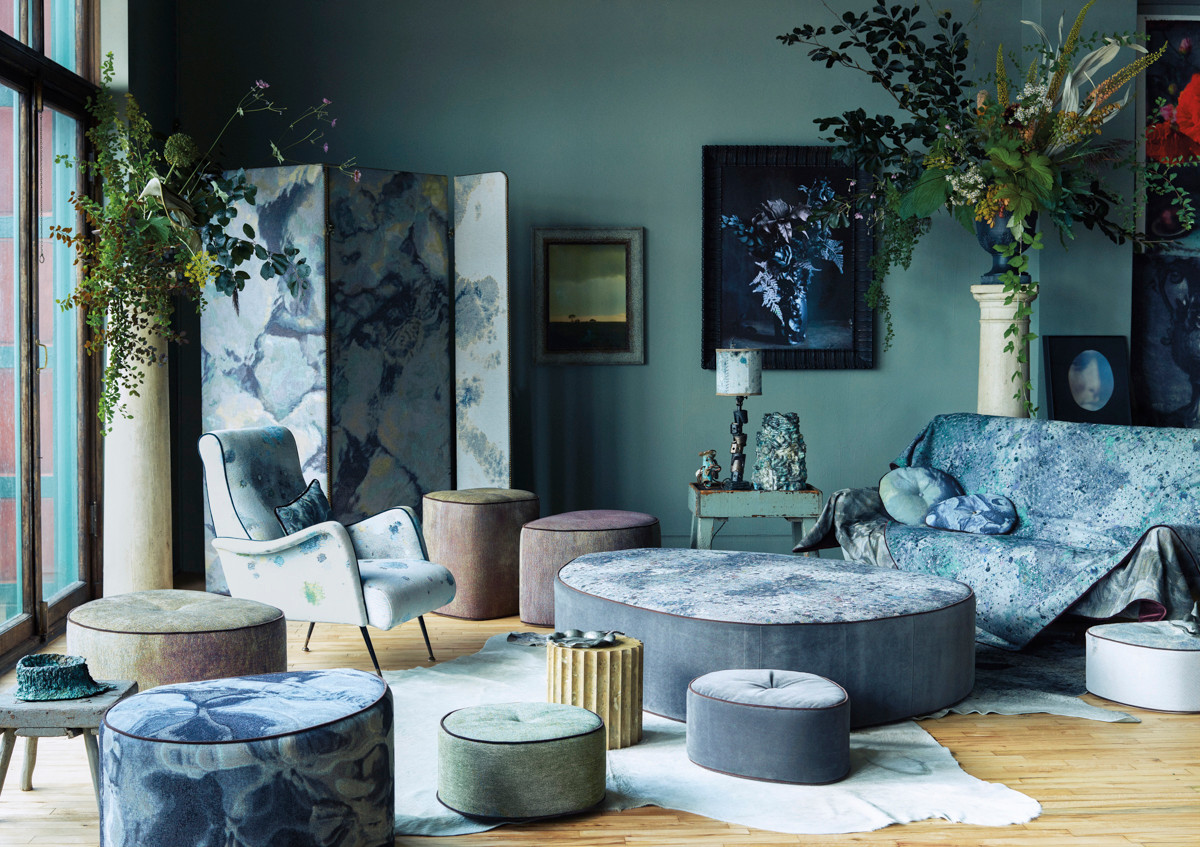
To illustrate teal's versatility and appeal, the article showcases various home decor items and materials. These examples include teal-colored textiles, wallpapers, and even high-end designer pieces from brands like Gucci. The featured illustrations highlight how teal is being incorporated into contemporary interiors, from the elegant teal furnishings of the Casa Bonay hotel in Barcelona to individual items like a Gucci velvet cushion, an overdyed rug, a side chair, and a Farrow & Ball wallpaper. These examples demonstrate that teal is being embraced across different product categories and design styles, signaling its strong position as the next trending color in home decor.
Overall, the article concludes that the fading of millennial pink marks a turning point in color trends, ushering in an era where teal is poised to dominate. This transition is framed as an organic evolution driven by consumer desire for novelty and contrast, as well as by the influence of color forecasters and design brands.
#DesignHunting #ColorTrends #MillennialPink #Teal #InteriorDesign #HomeDecor #SherwinWilliams #Gucci #ColorPsychology #DesignHunting #ColorTrends #MillennialPink #Teal #InteriorDesign #HomeDecor #SherwinWilliams #Gucci #ColorPsychology
0 comment in total
 No comments yet
You may also like
Color Therapy: Design That’s Pretty in Pink
14 Chic Pink Color Combinations Designers Swear By

‘It’s not Barbie Whatsoever’ – This is the Exact Shade of Pink Interior Designers are Choosing Now

12 Colors That Go With Pink: Classic and Modern Ideas

After This Design Trend Took Off, These Paint Colors Became 40% More Popular

The Color Combo You’re About to See Everywhere
Goodbye To Butter Yellow: The Moodier Hue That's On Trend

13 sophisticated pink living room ideas to inject your lounge with this new calming neutral
This Very "Controversial" Color Is About To Be Everywhere Again
Home design: Add some pink
Pretty in pink: decorating ideas for this year's hottest colour | loveproperty.com
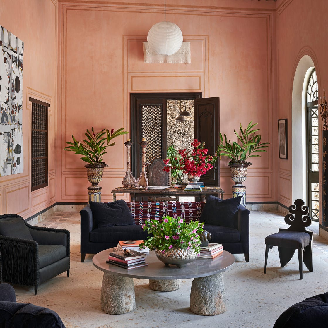
The *Right* Way to Decorate with Pink, According to Design Experts

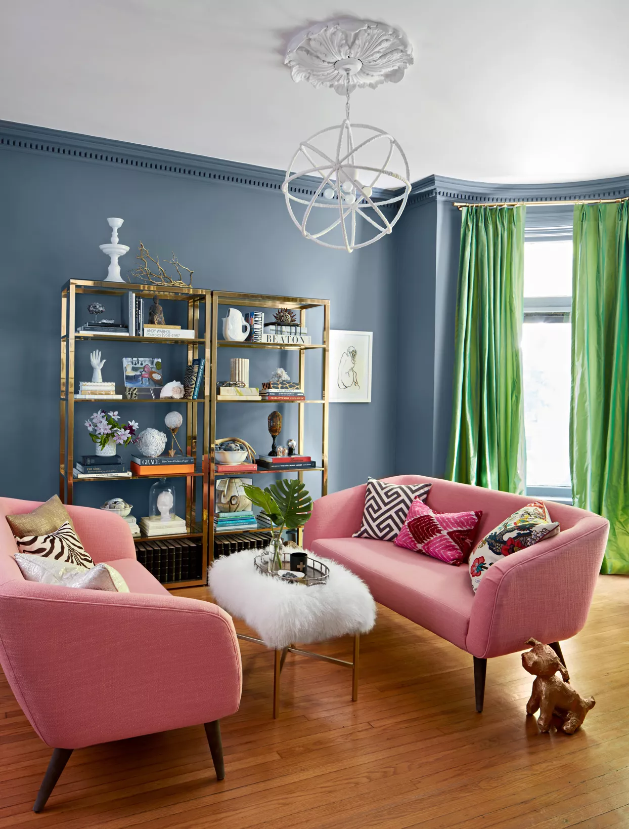
What Color Goes with Pink? 16 Pretty Pairings to Try

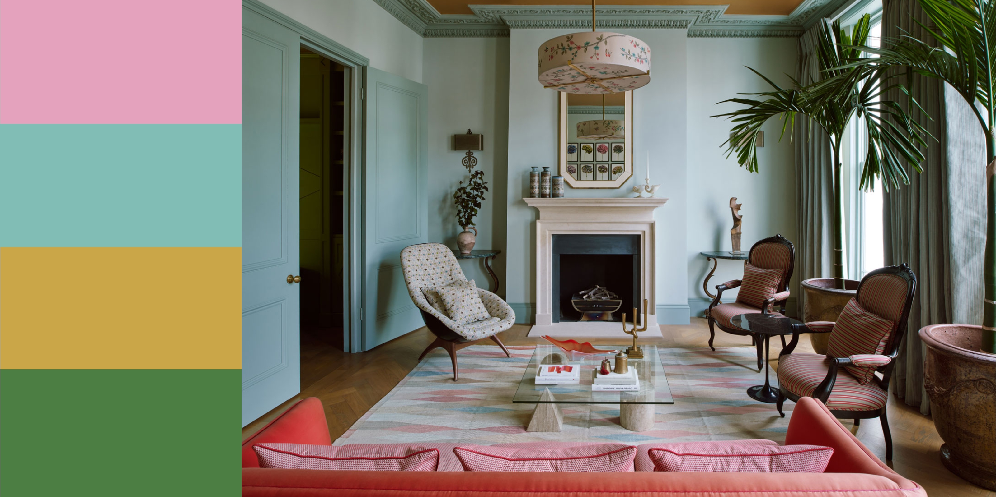
11 Colors That Go With Pink That Work in Homes Now
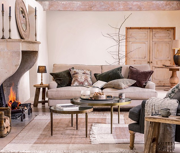
INTERIORS: The joy of plaster pink
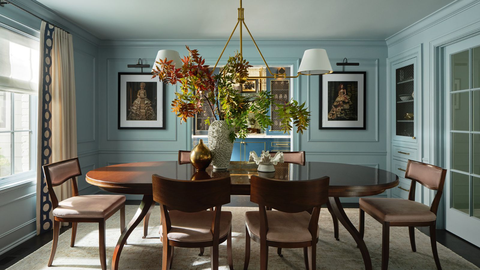
Sorry pastels, there's a new color palette on trend for spring – and it's all about playful and more saturated hues

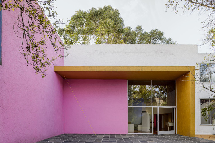
Thinking about Mexican Pink, the bold color that’s here to stay
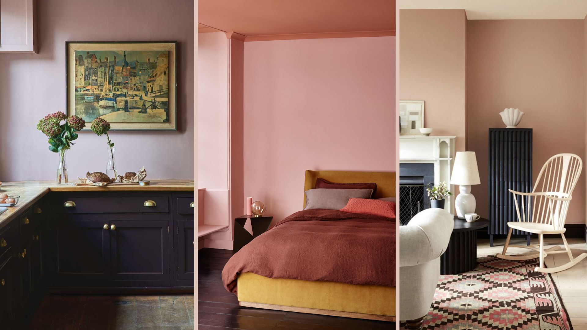
18 sophisticated pink paint colors recommended by interior designers

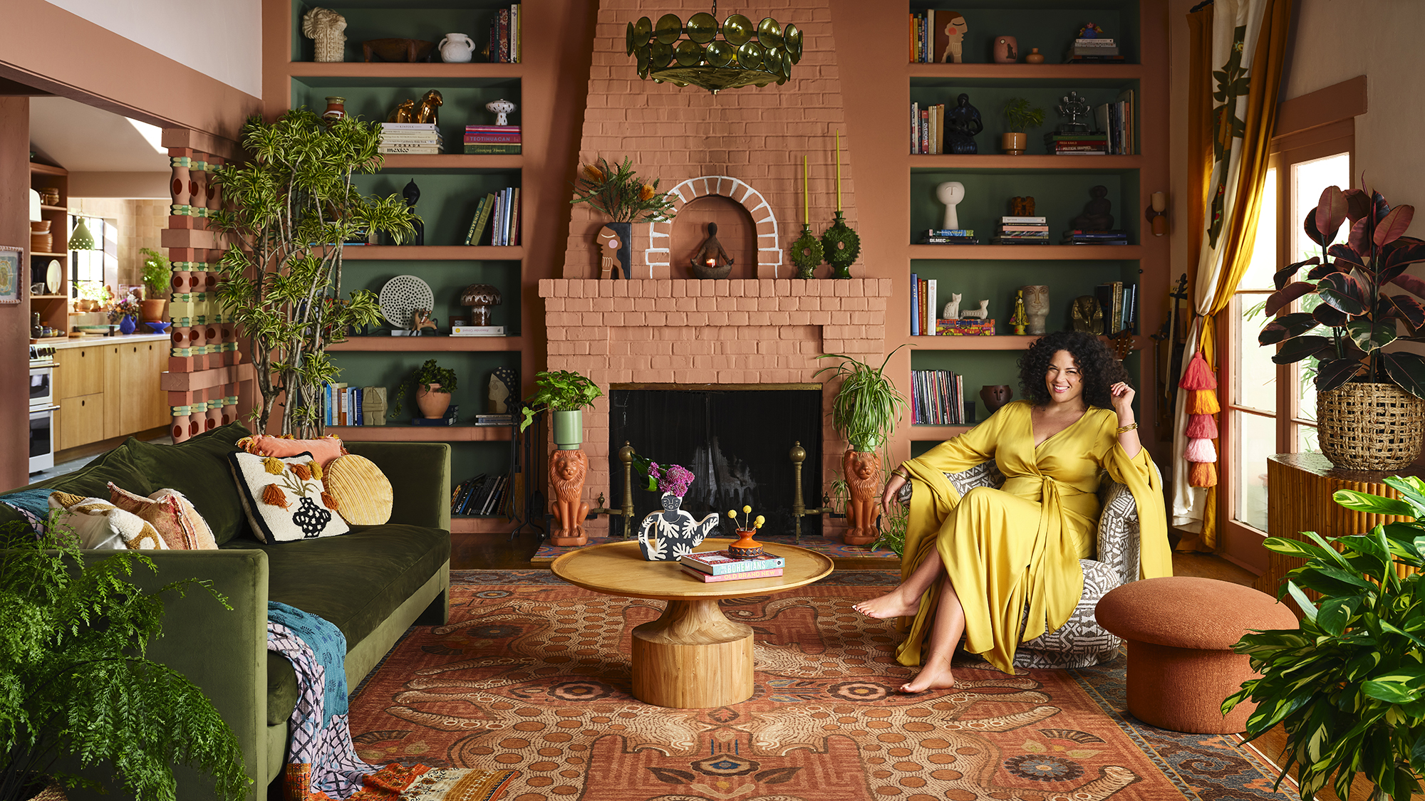
Designer Justina Blakeney Says This Paint Color Flatters Everyone and Is Perfect for Drenching Rooms
Reese Witherspoon's powder room is a beautiful homage to the most-talked-about color of 2023