1/13
The *Right* Way to Decorate with Pink, According to Design Experts
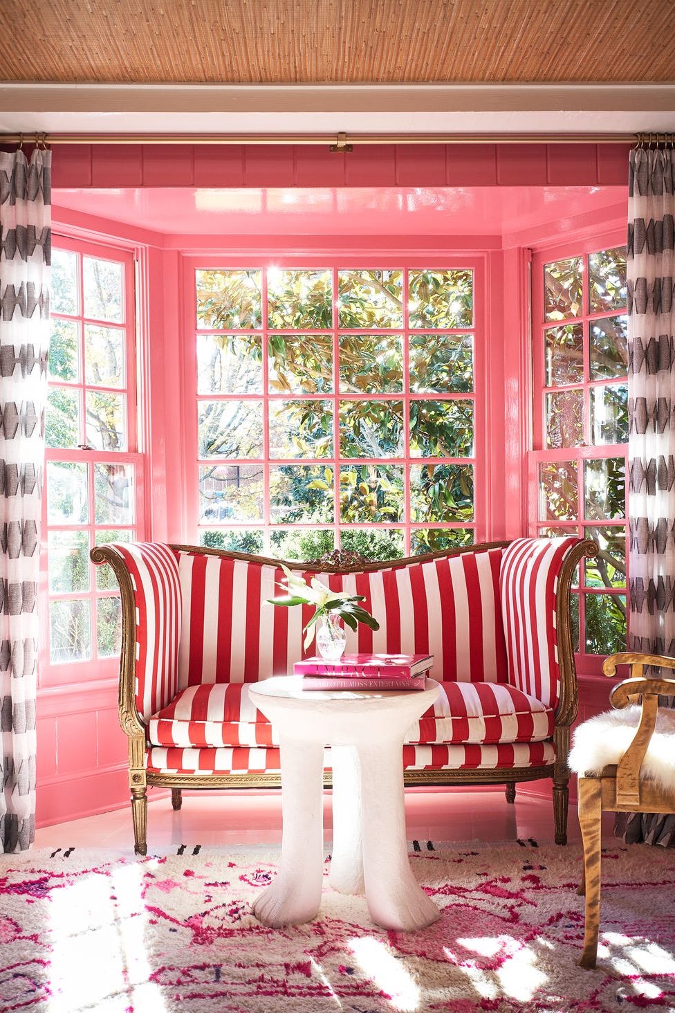
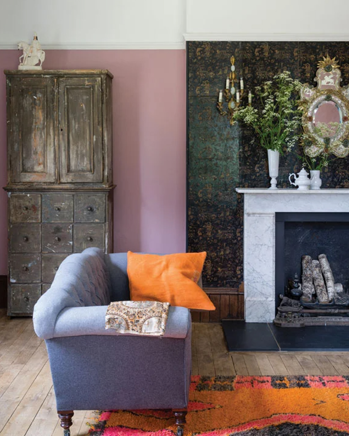
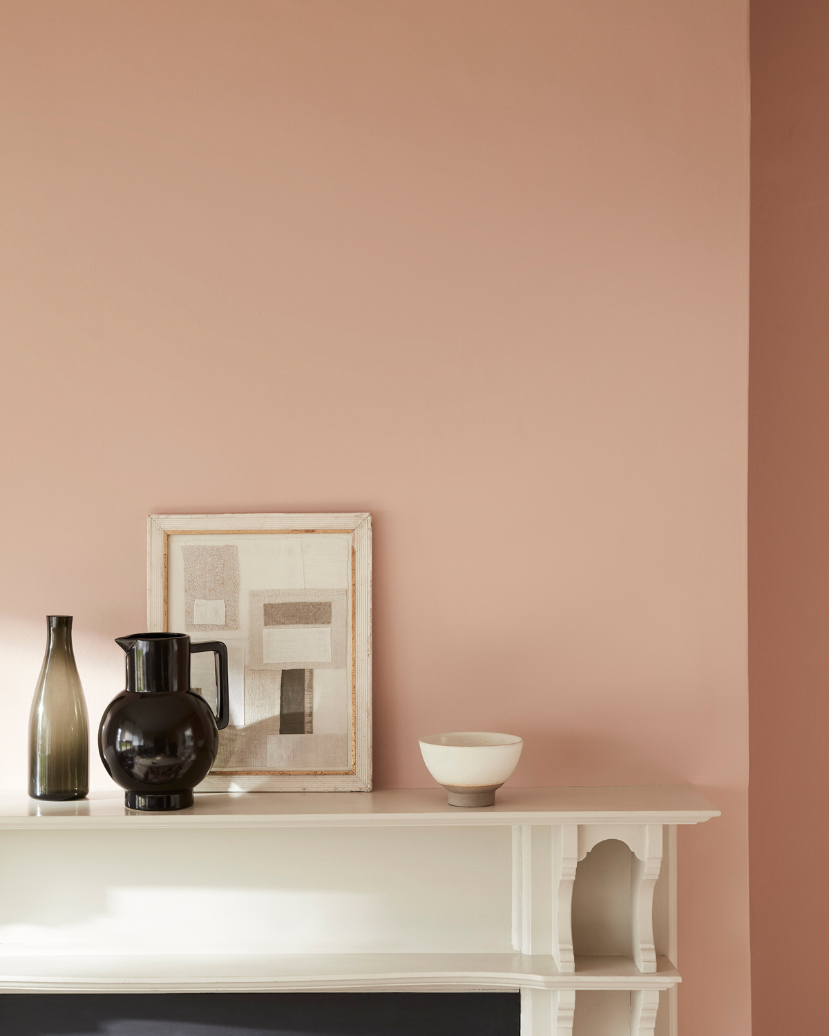
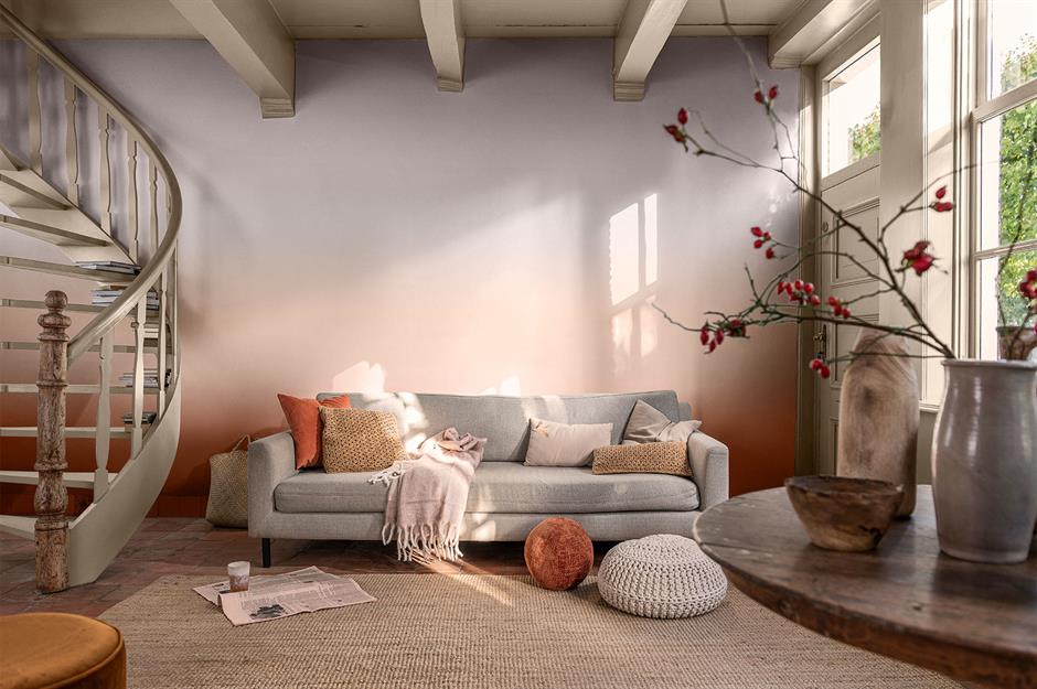
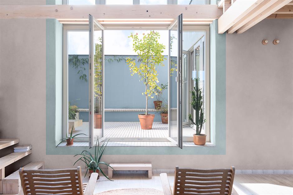
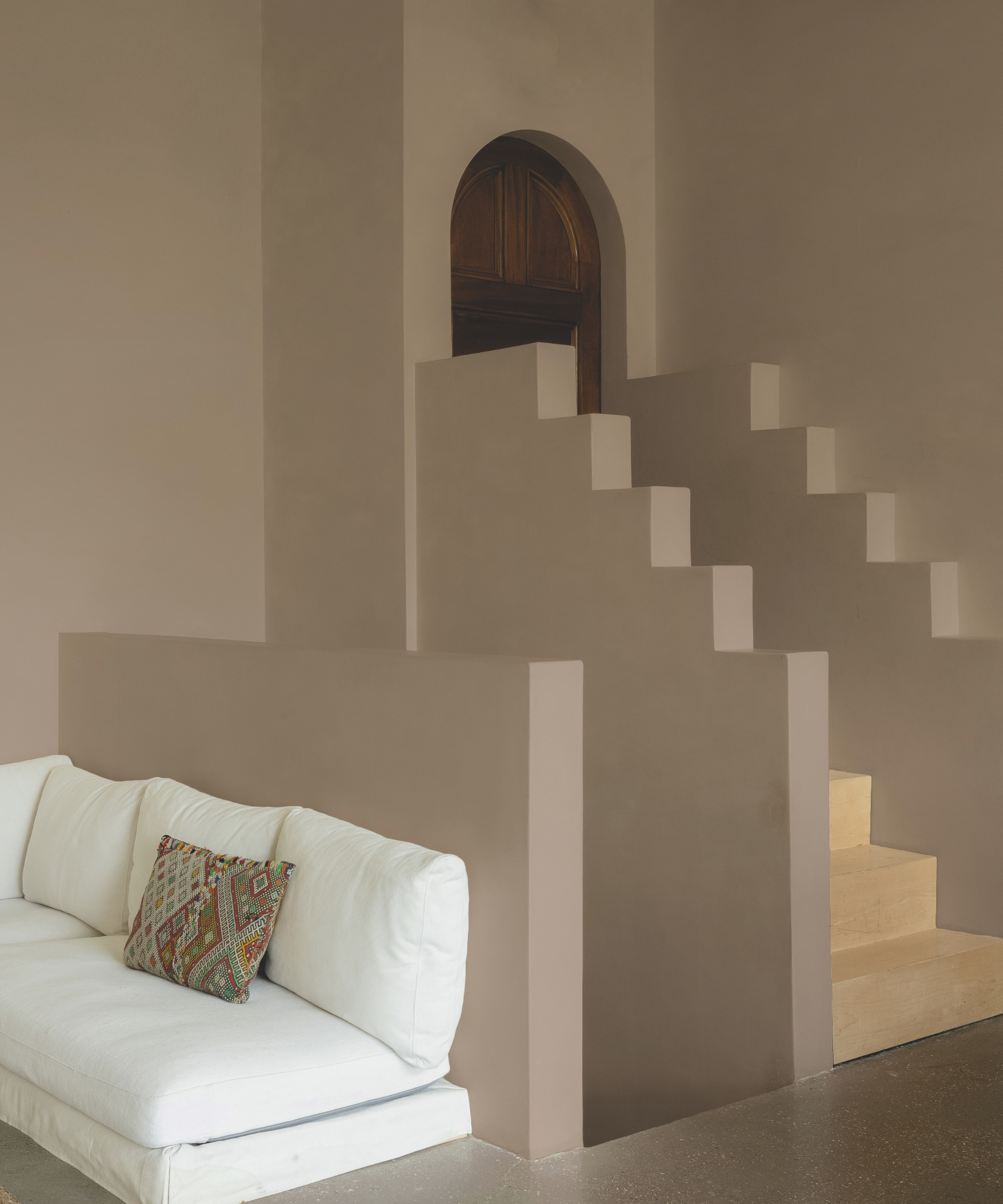
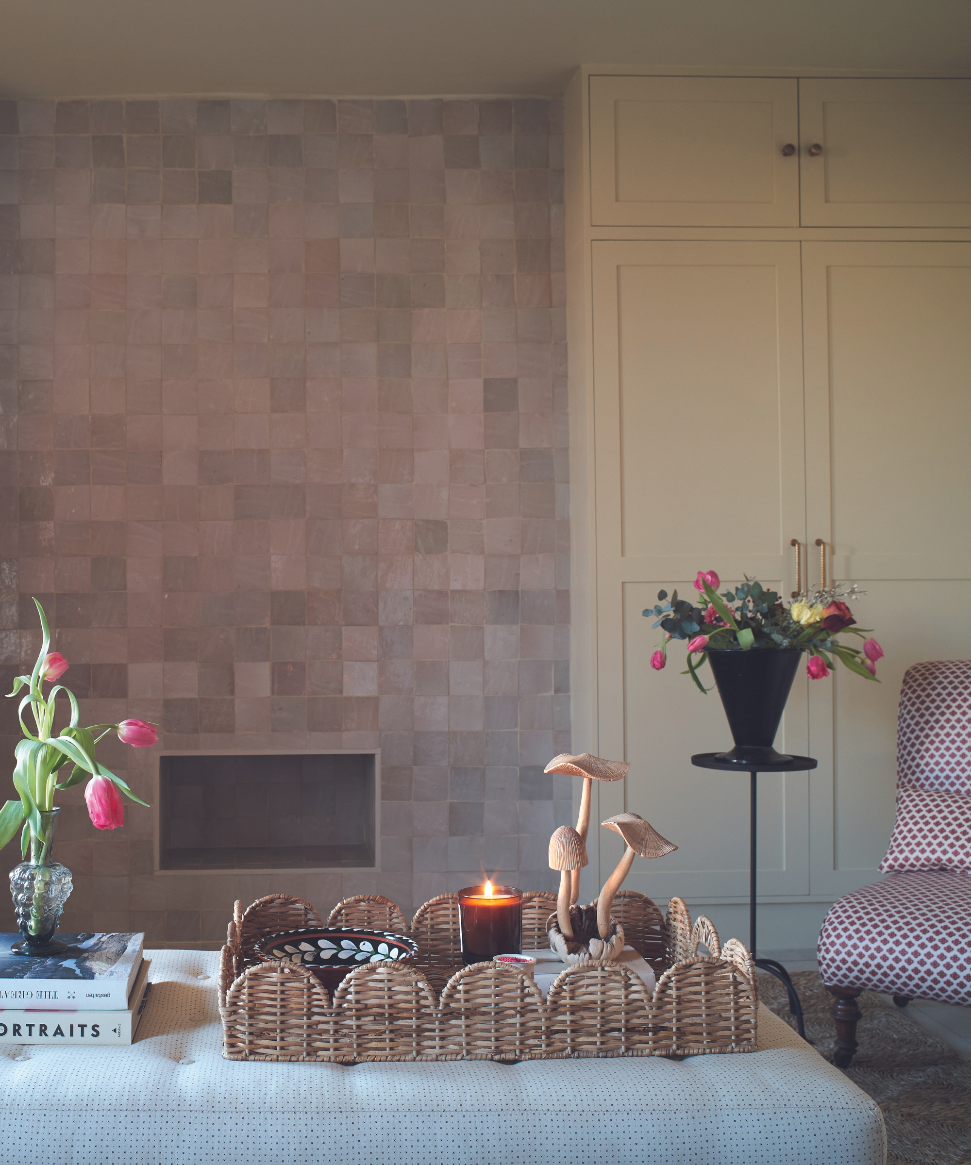
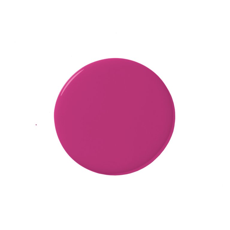
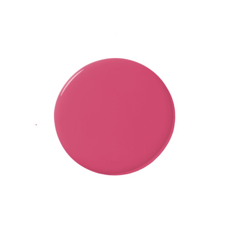
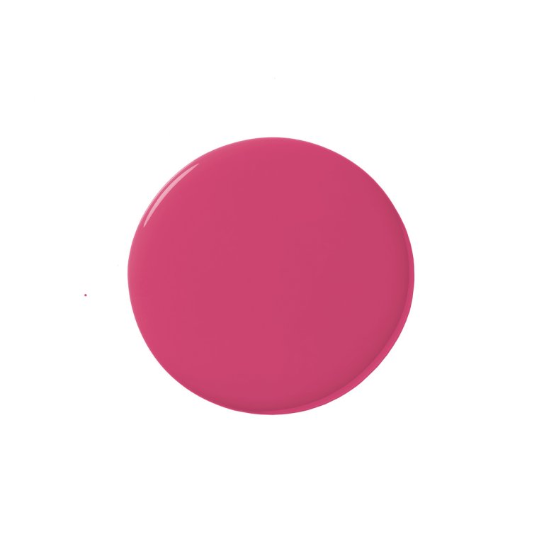
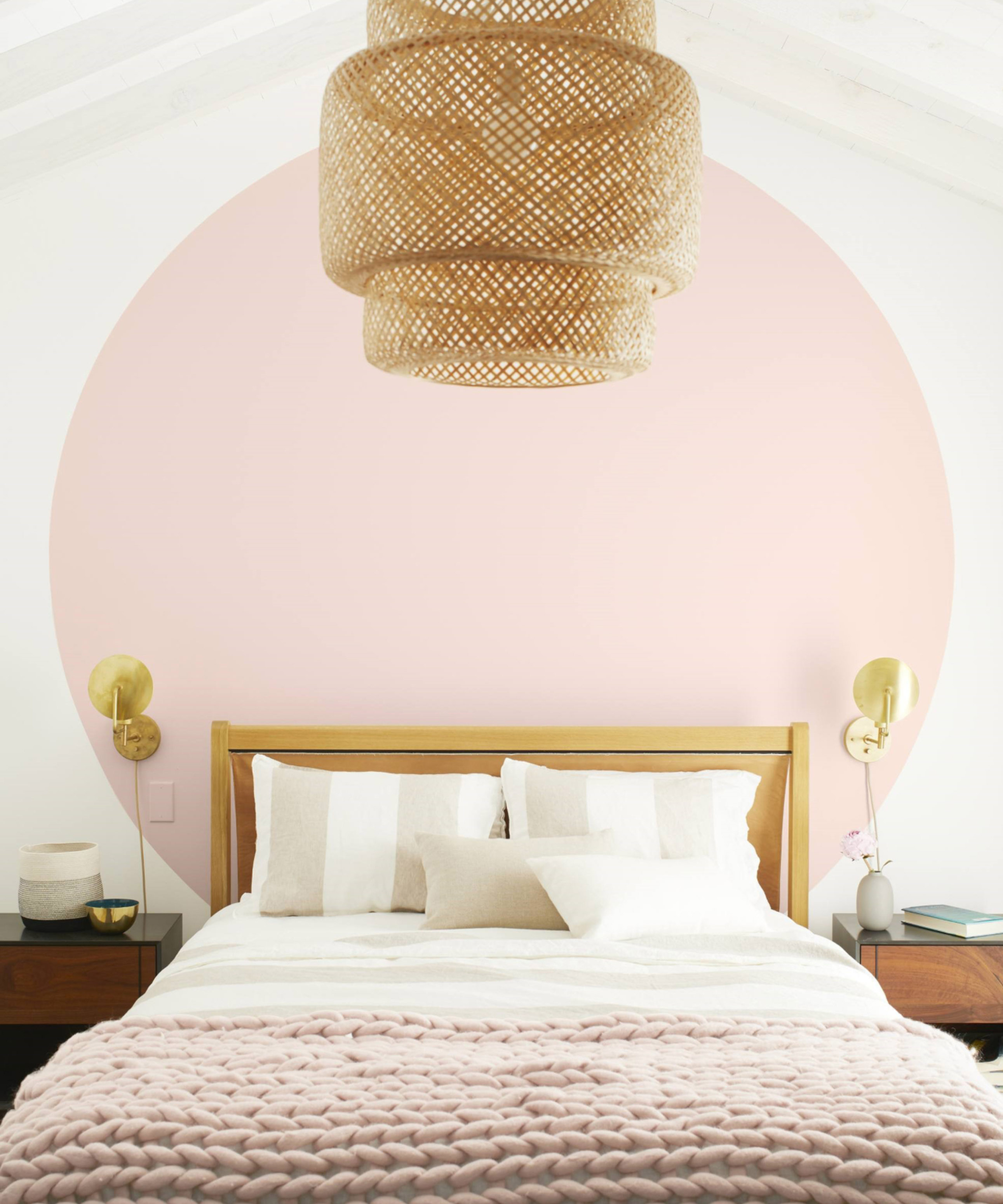
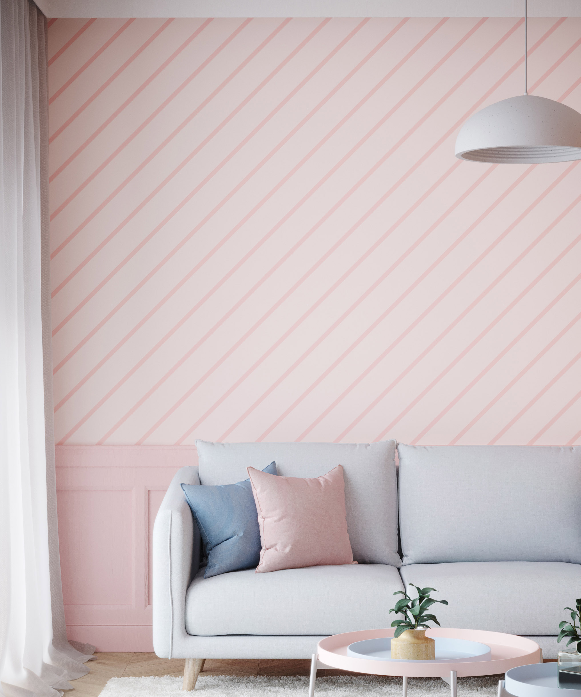
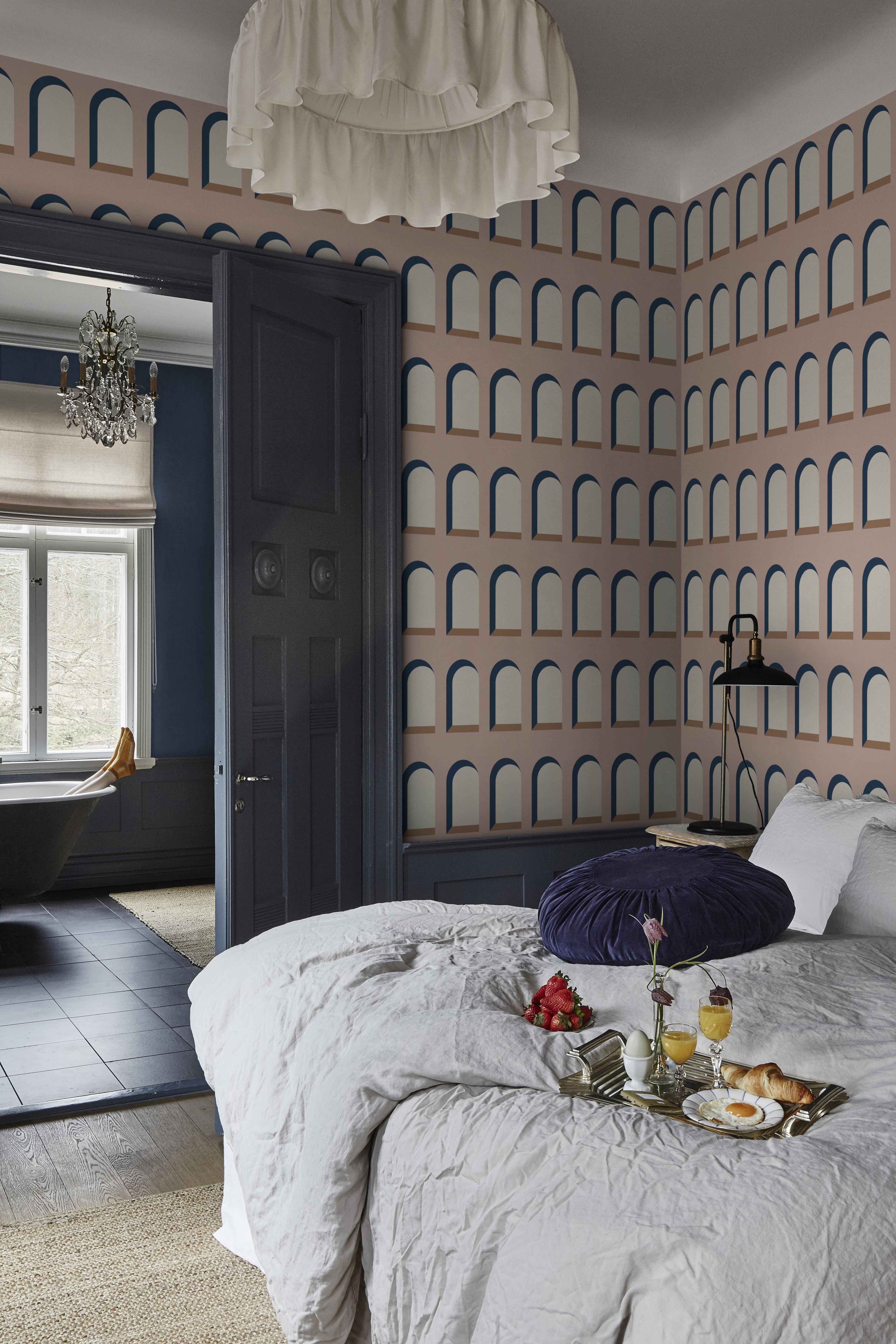
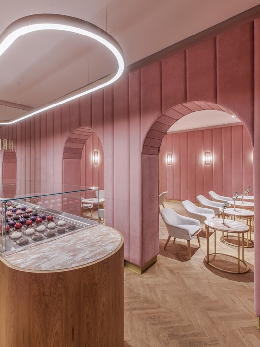
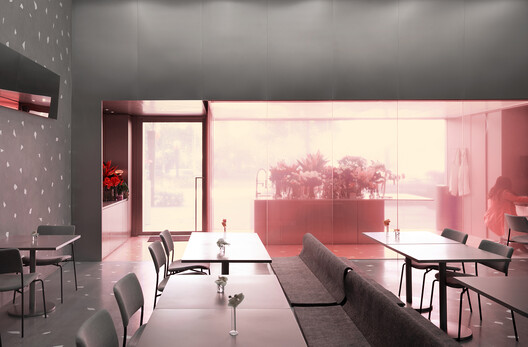
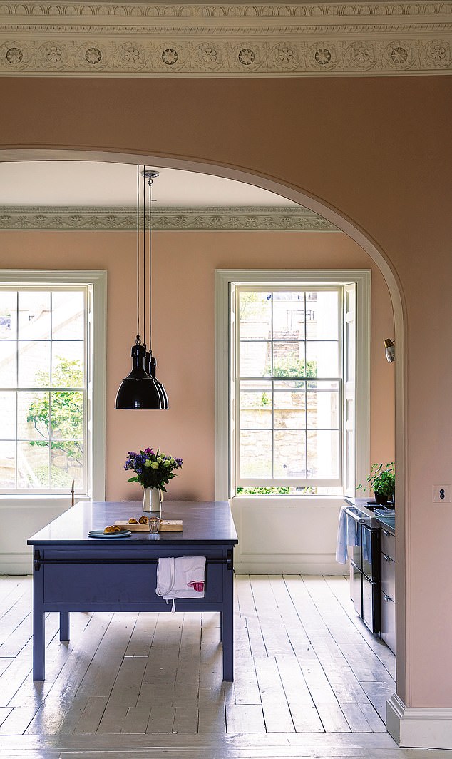
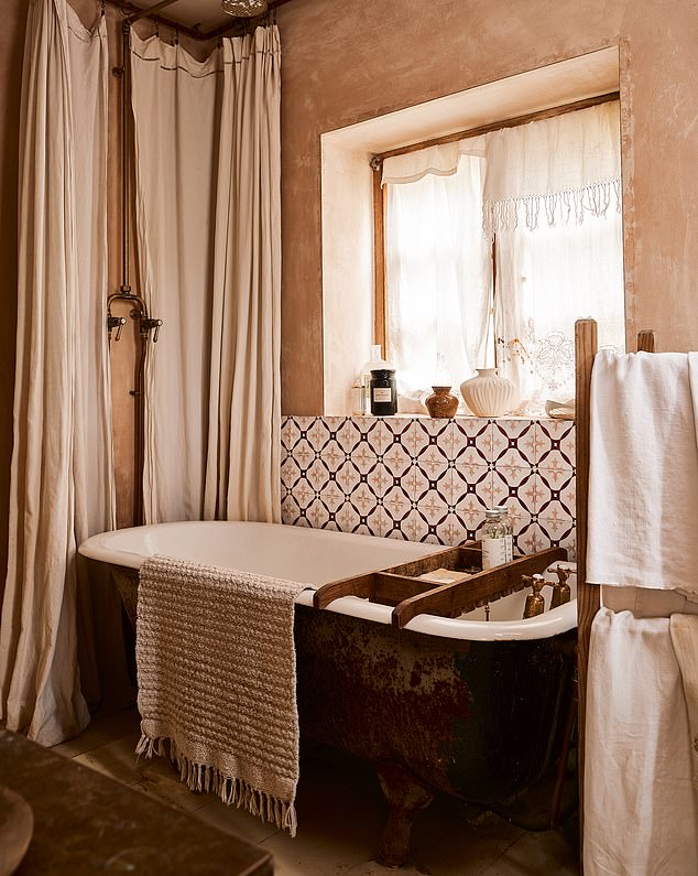
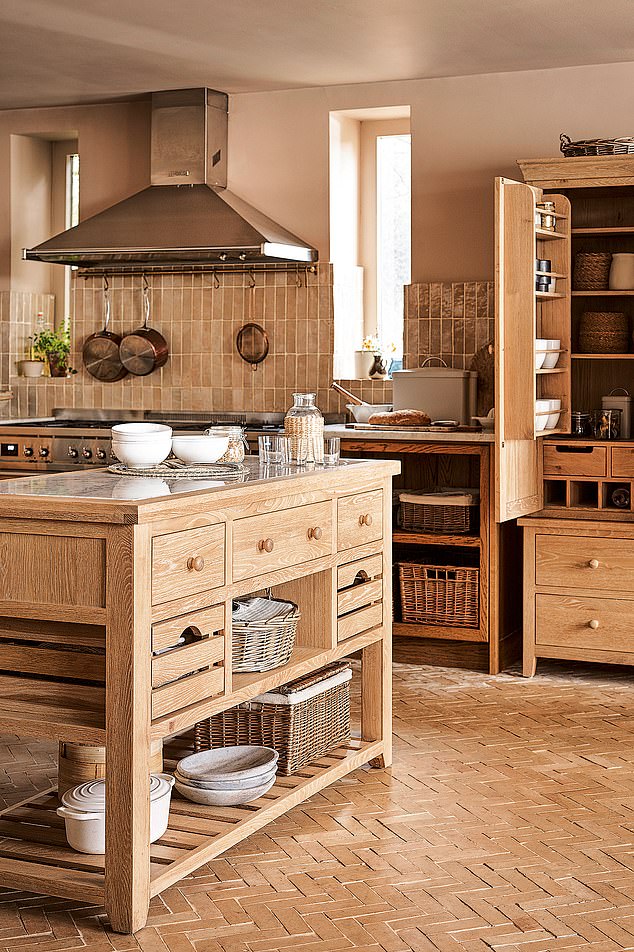
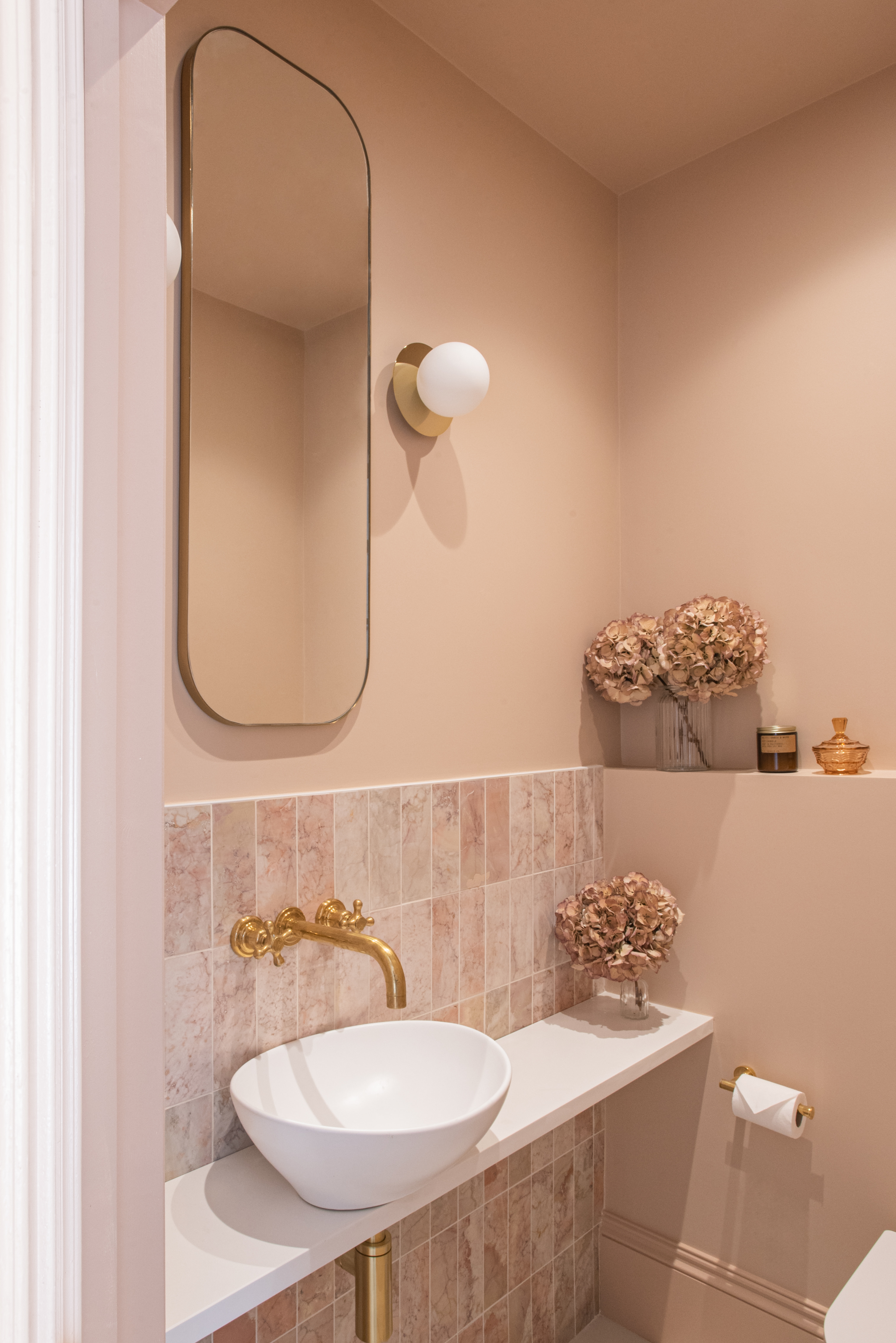
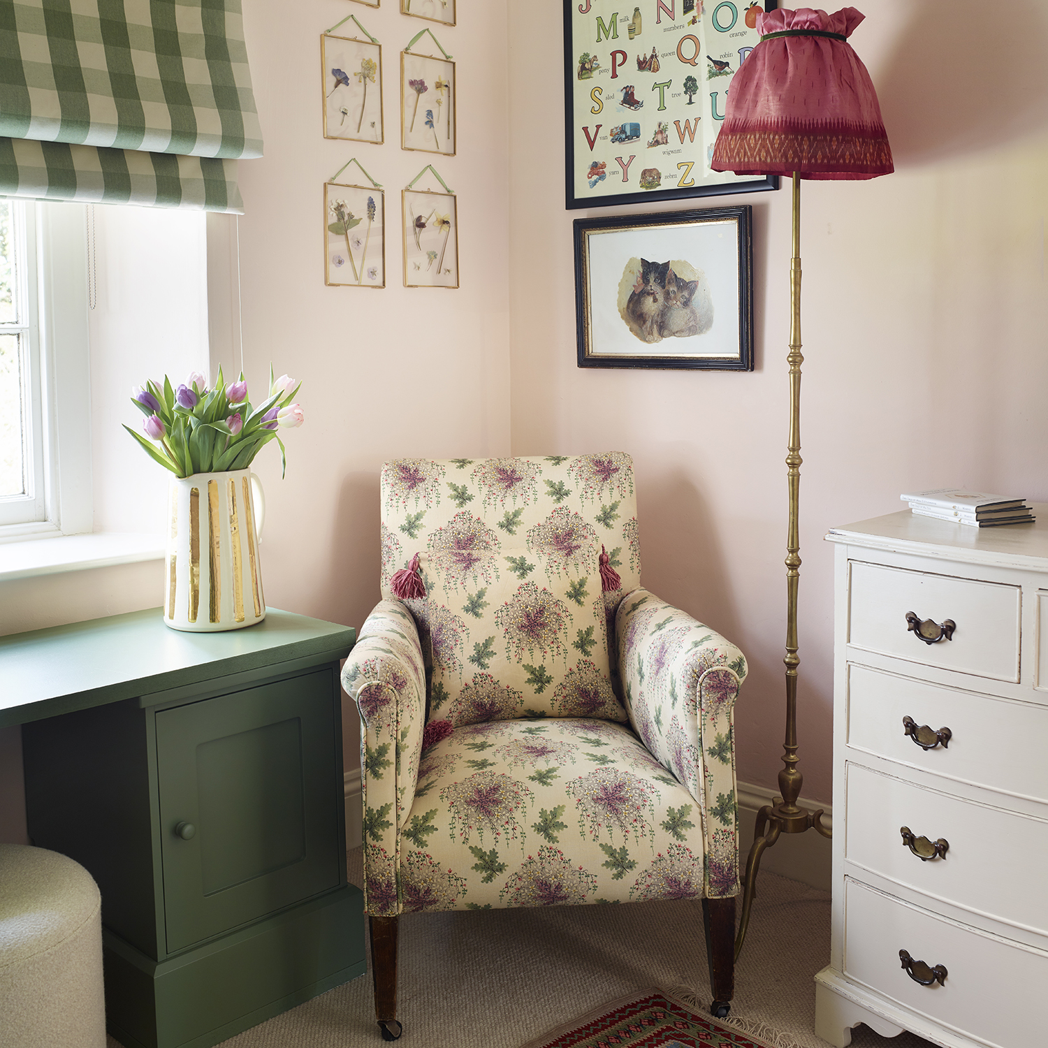

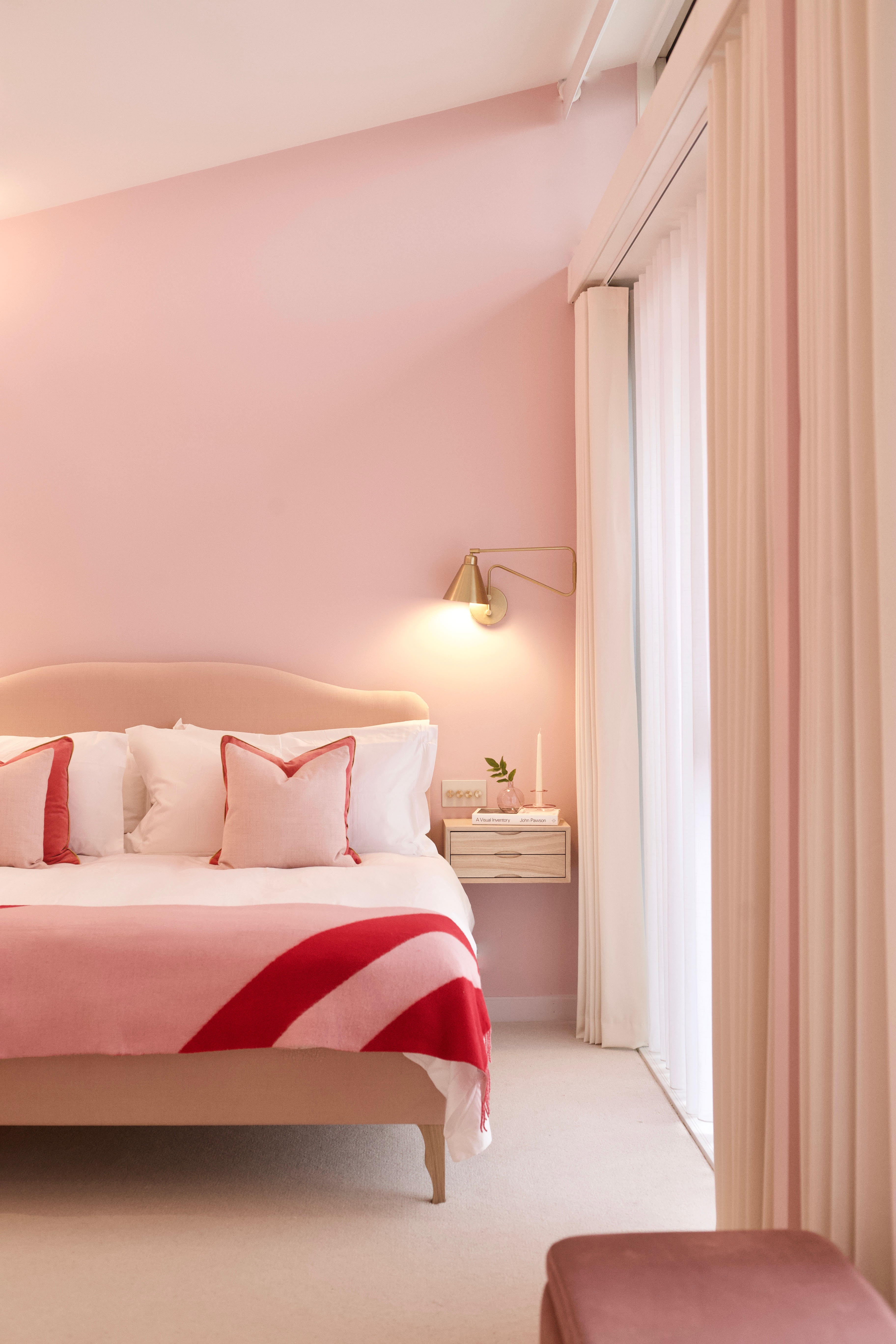
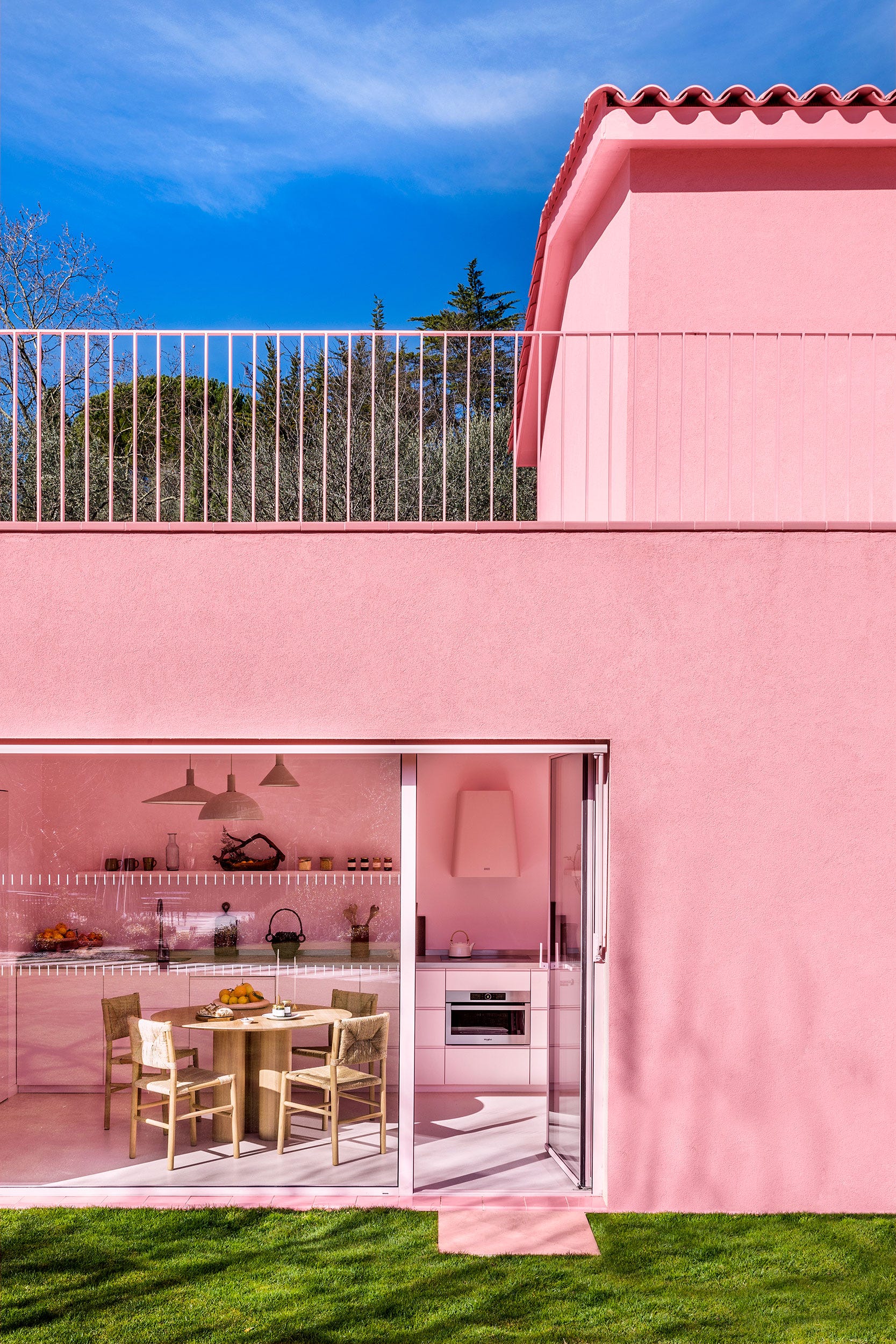
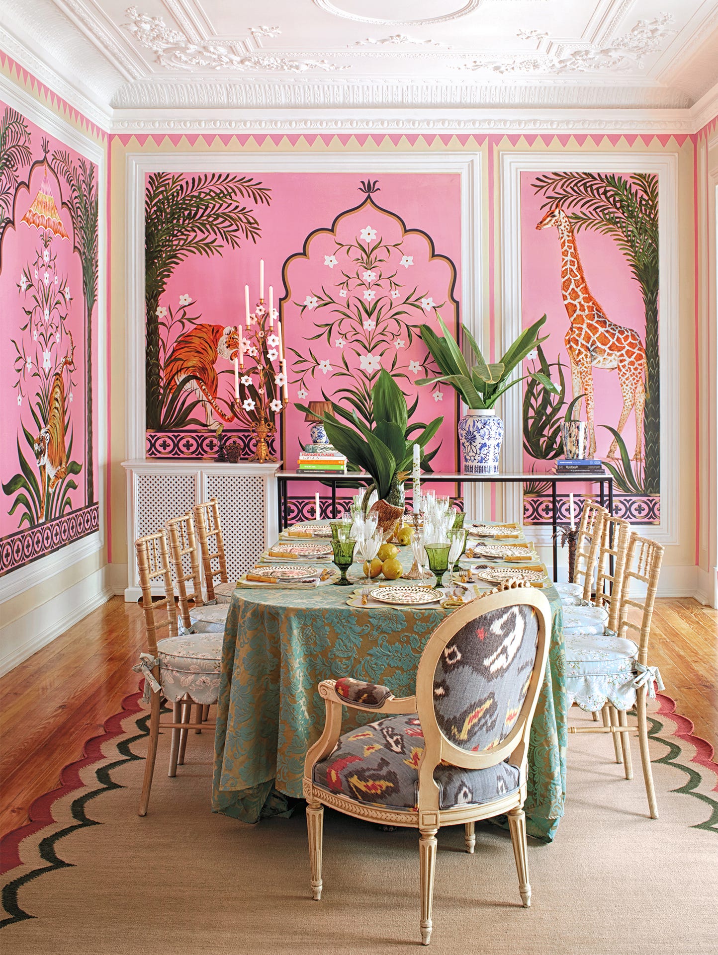
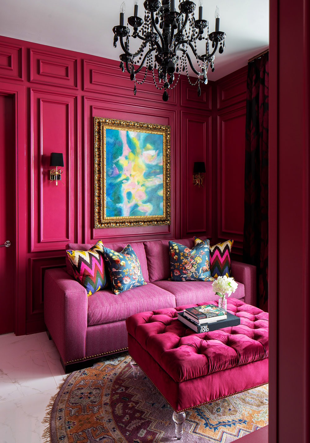
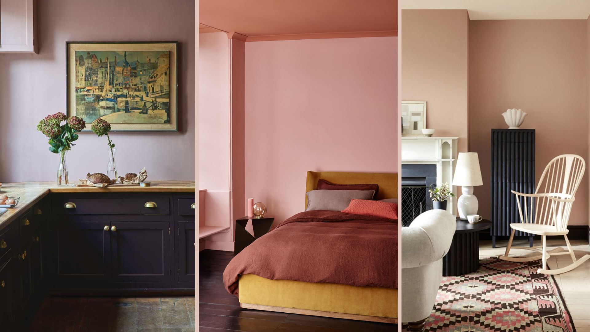
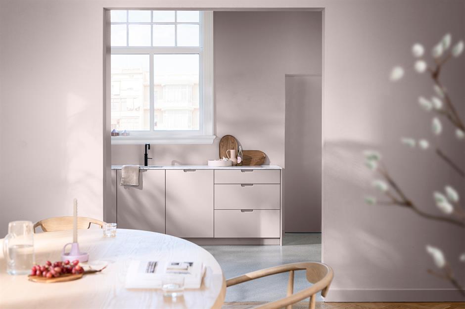
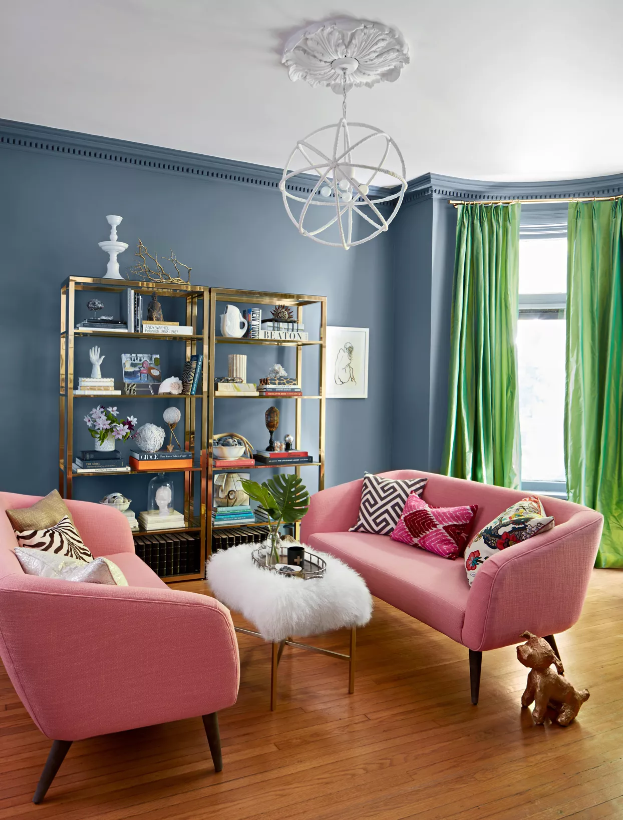
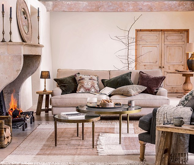
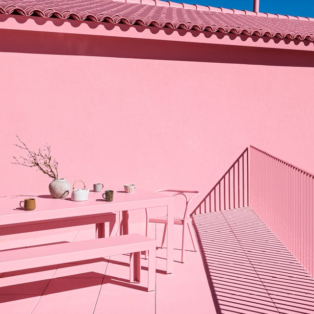
Pink has long been a versatile and uplifting color in interior design, transcending trends like millennial pink and Barbiecore. Designers Patrick Mele and Annie Sloan emphasize that pink, in its various undertones, brings vibrancy, warmth, and joy to a room. Mele describes pink as the color of warmth, glow, and health, noting its special beauty whether it's a warm, deep, or cool shade. Sloan, a color expert and creator of Chalk Paint, highlights that there's a pink shade for every palette, with soft pinks being universally flattering and hot pinks making a bold statement. She suggests using pastel pink ceilings to cast a soft, rosy glow, ideal for dining spaces or bedrooms. This guide, drawing on expert advice, explores twelve effective color pairings for pink in home decoration.
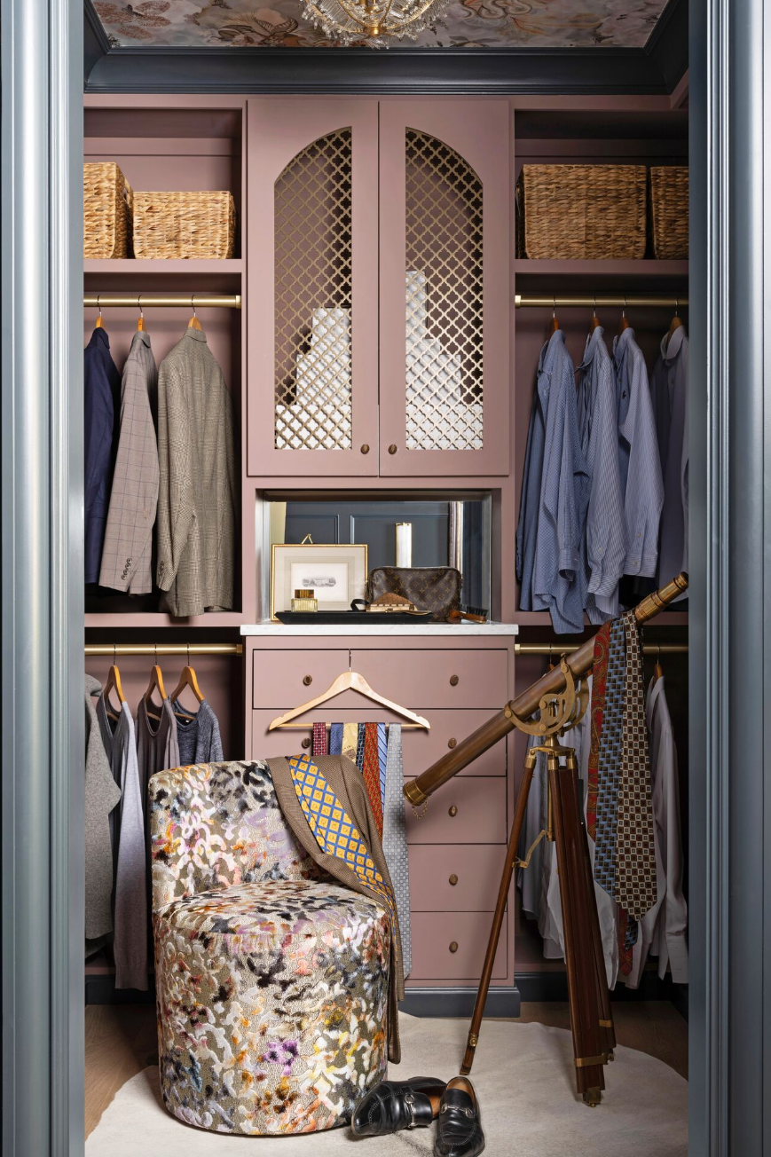
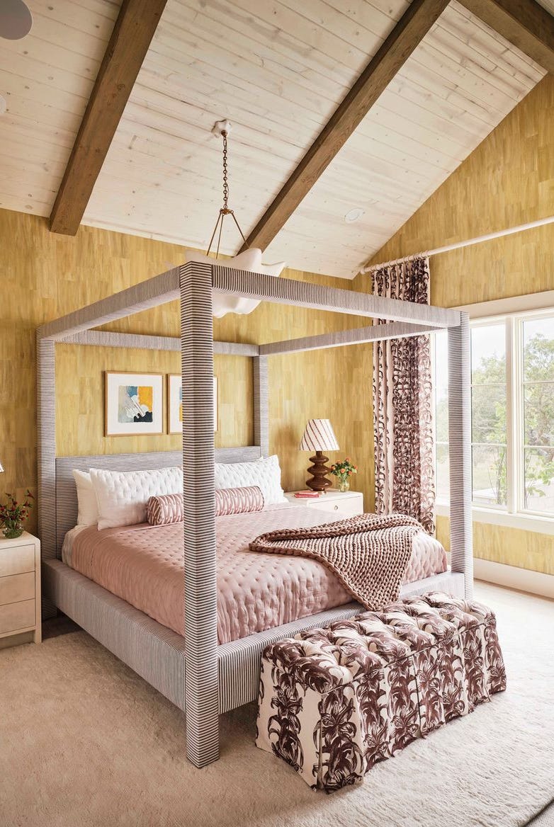
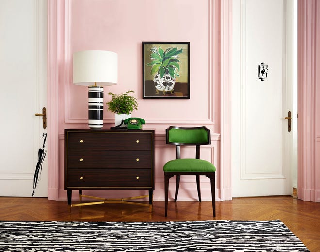
One sophisticated pairing is pink and chocolate brown, which Mele finds creates a sweet yet polished tension, especially with light pinks and rich brown tones. He suggests combining a chocolate brown velvet sofa with pink accents in a patterned rug or chair piping, or using vibrant pink walls with refined textiles. For a dramatic and opulent feel, Sloan recommends pairing neutral pinks with deep burnt reds, reminiscent of Renaissance paintings. Marigold yellow and pink offer an energetic, nature-inspired combination, evoking sunsets and gardens. This duo can be incorporated through furnishings, such as melon pink dining chairs with a saffron tablecloth.
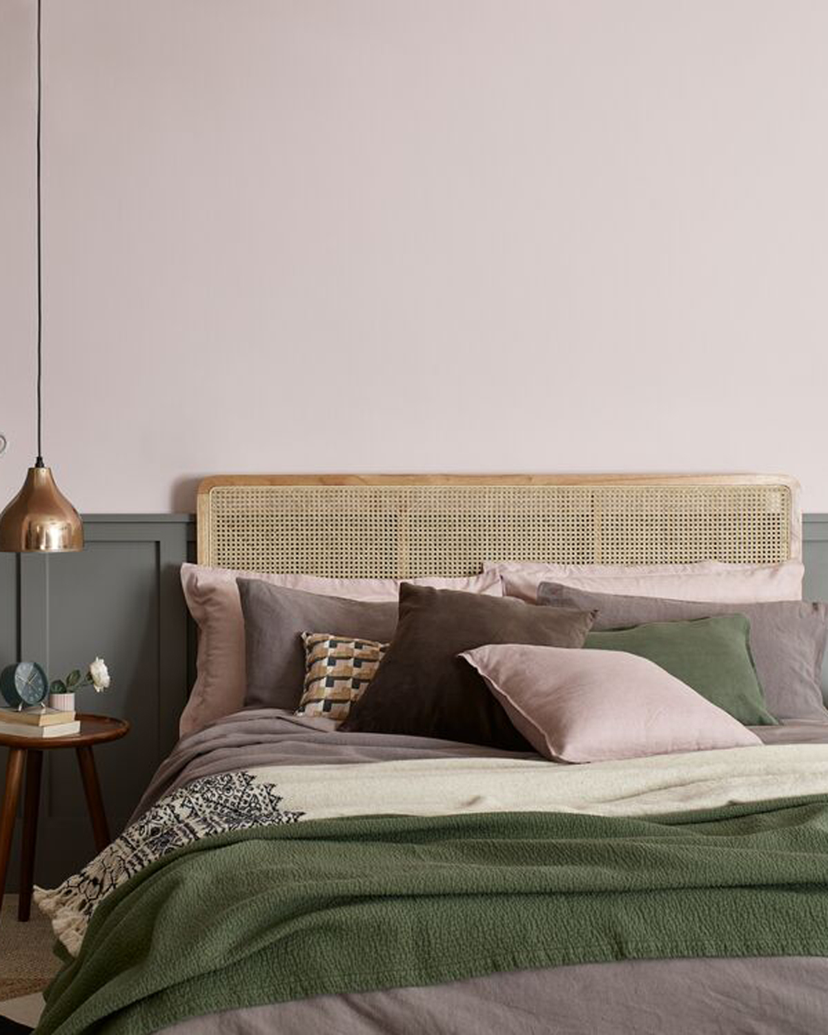
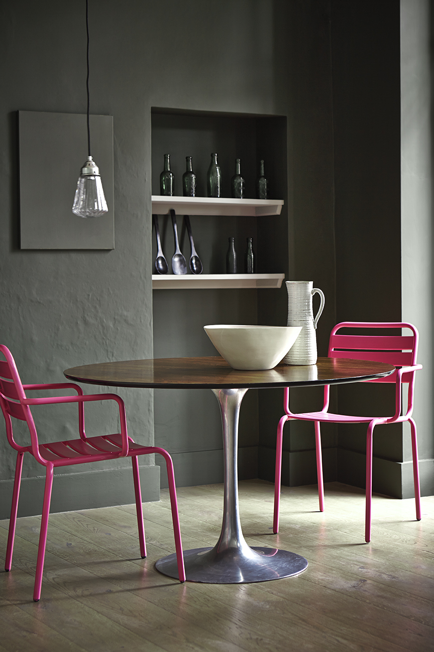
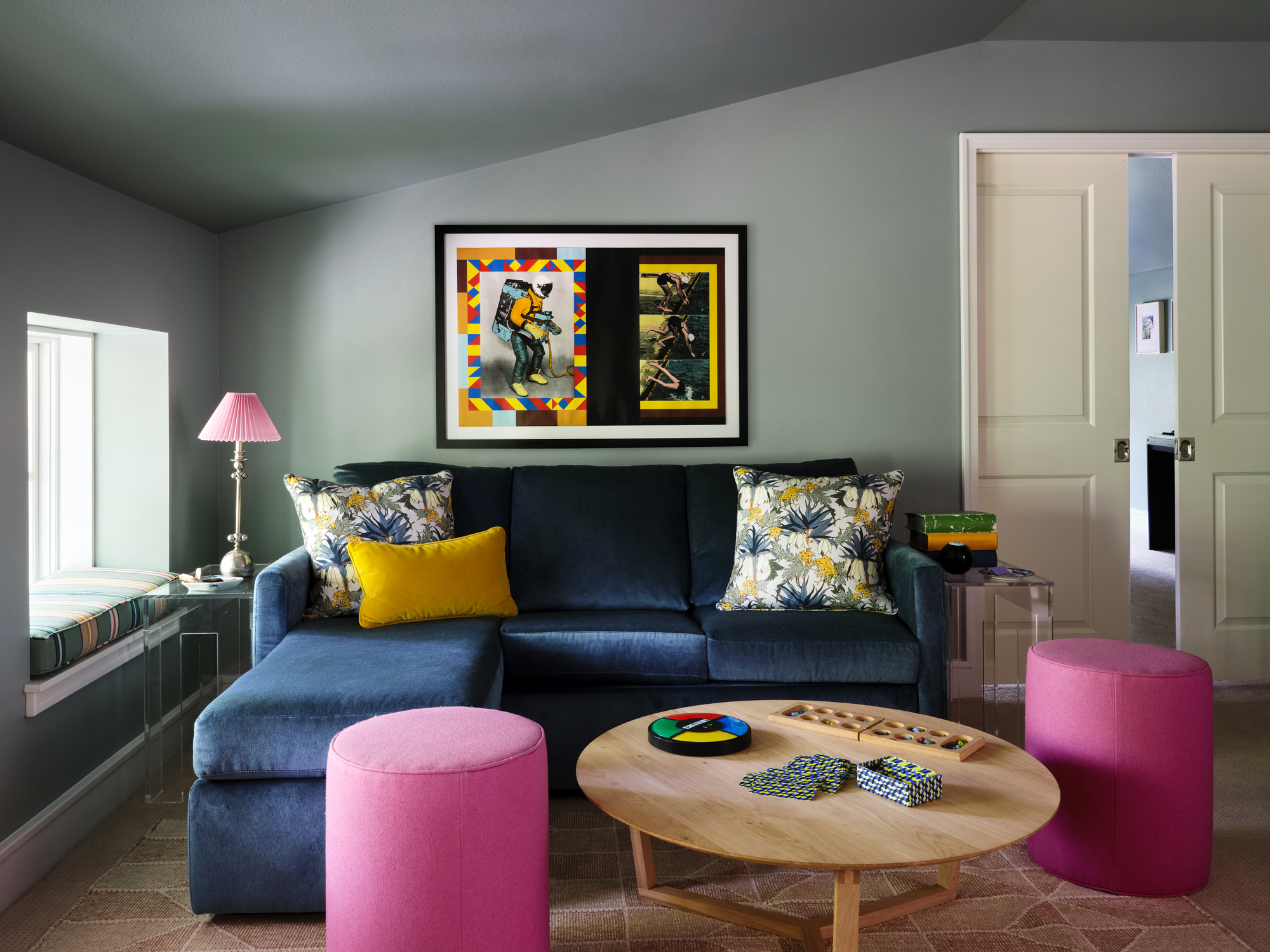
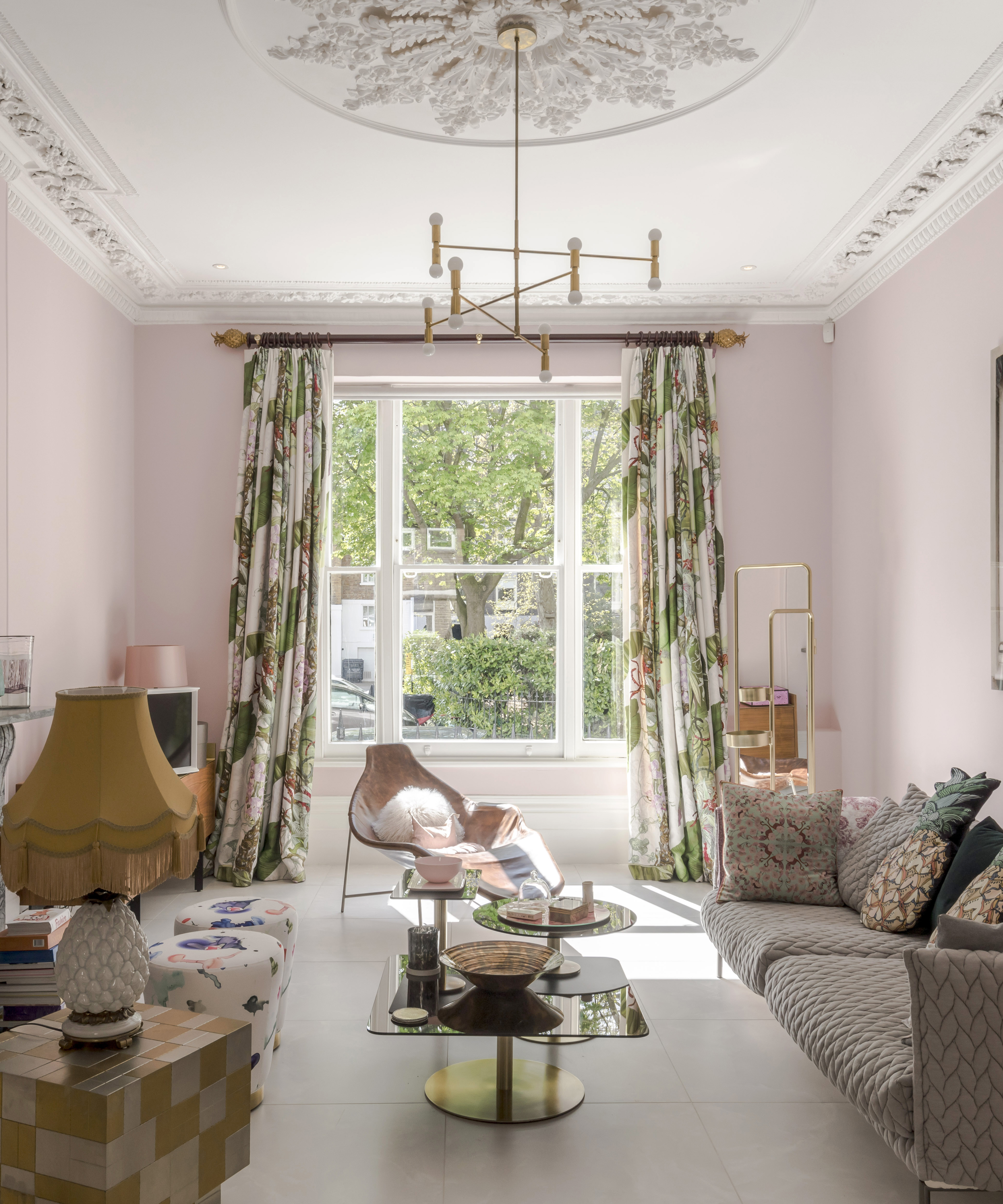
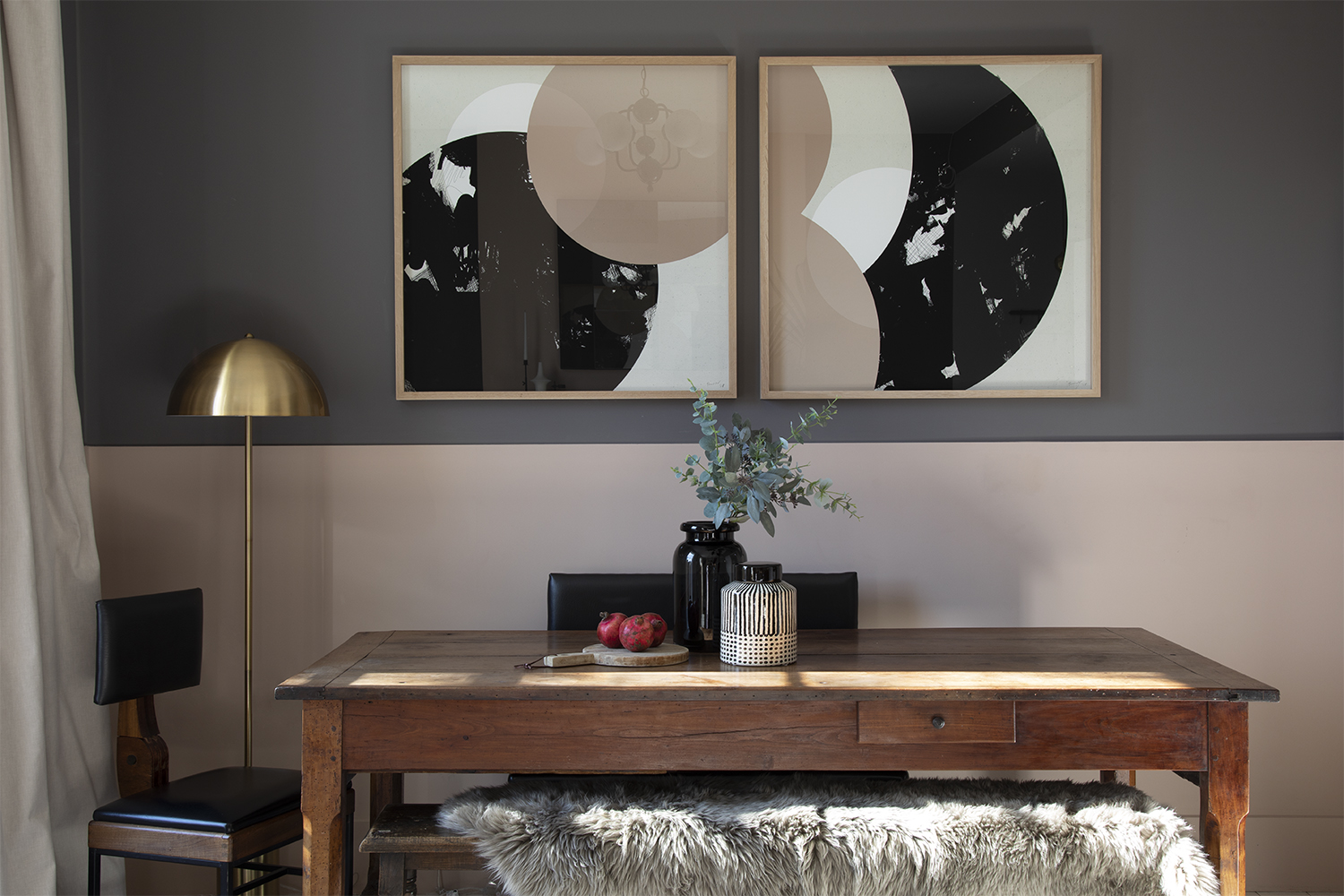
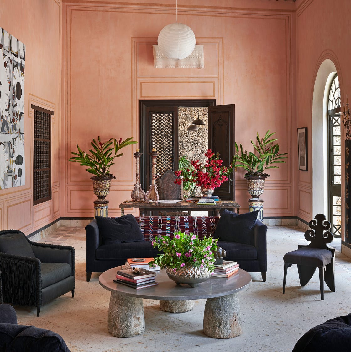
Pink and soft gray provide a timeless and sophisticated option, according to both Mele and Sloan. This combination can be airy and carefree in children's rooms with linens, or contemporary and modern with gray walls and bubblegum pink accents, particularly when the gray has naturalistic undertones. To add richness to pastel pink palettes, Mele suggests deep ebony accents, effective in wallcoverings or artwork. For example, designer Laura Kirar used ebony seating to temper sunbaked pink walls in her Mexico salon.
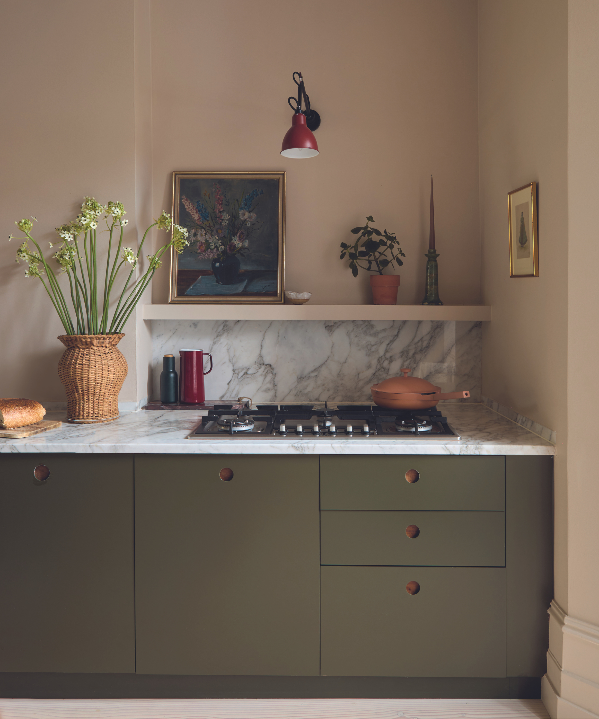
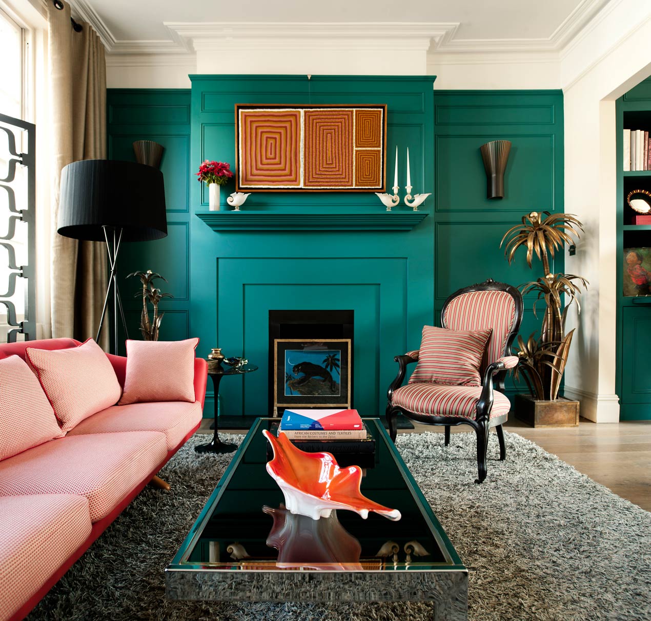
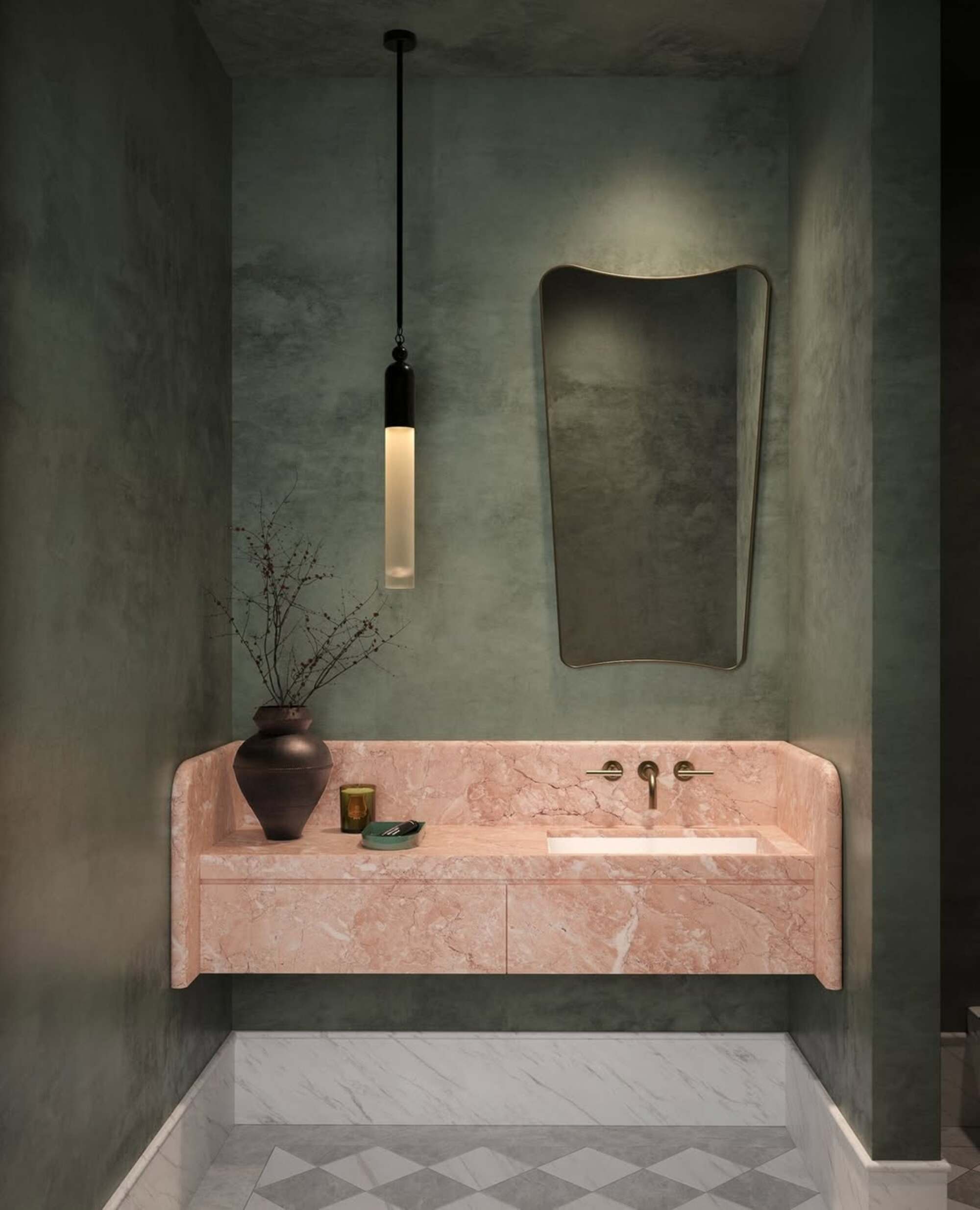
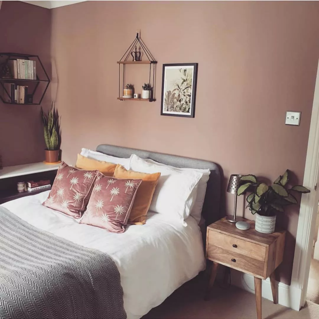
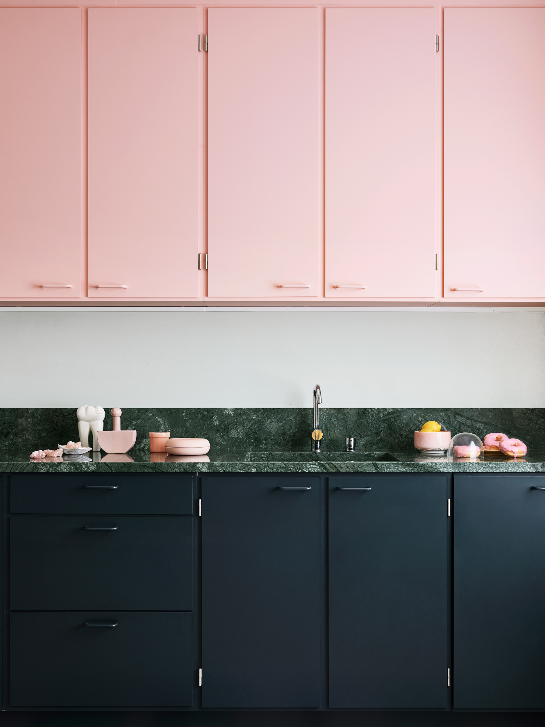
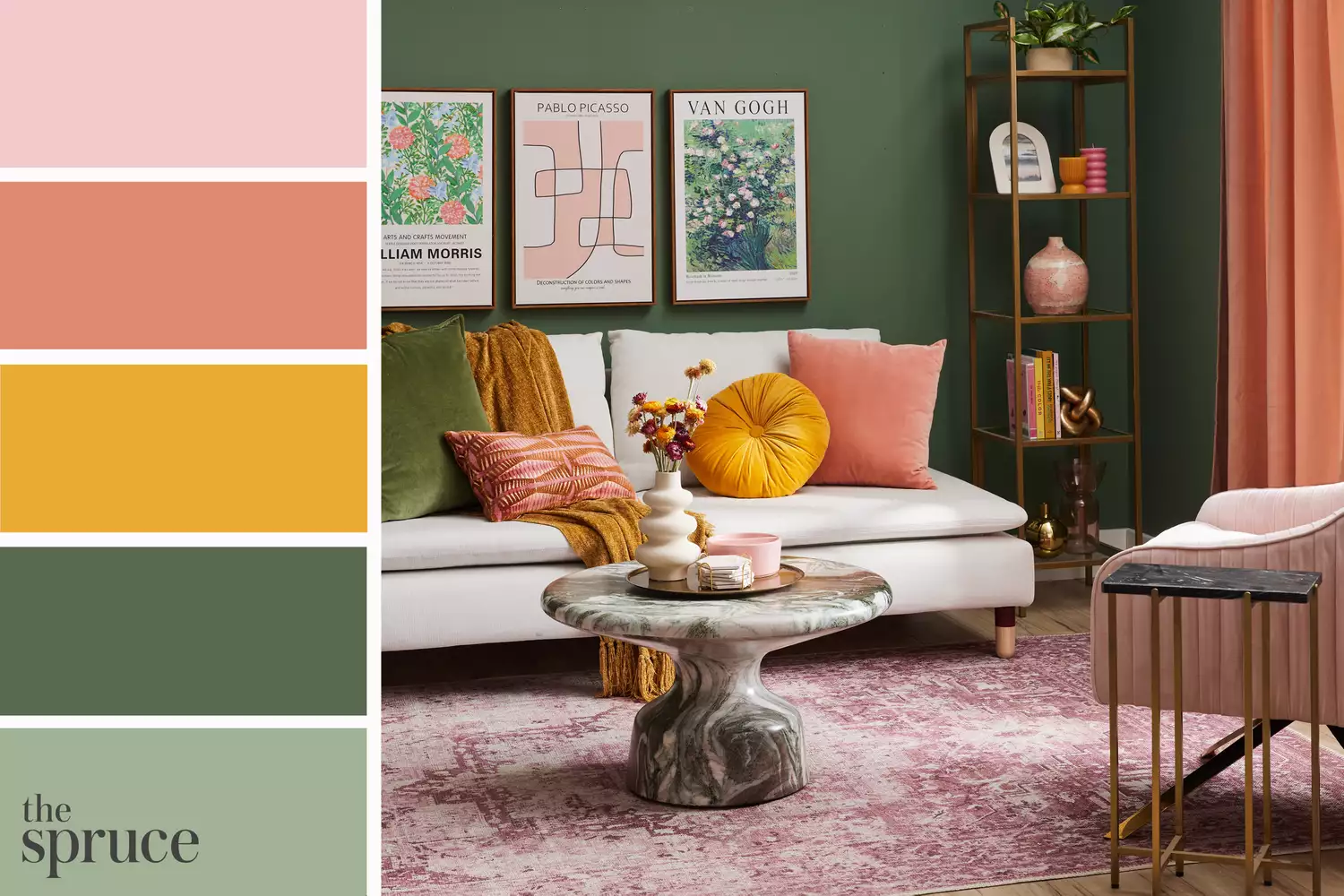
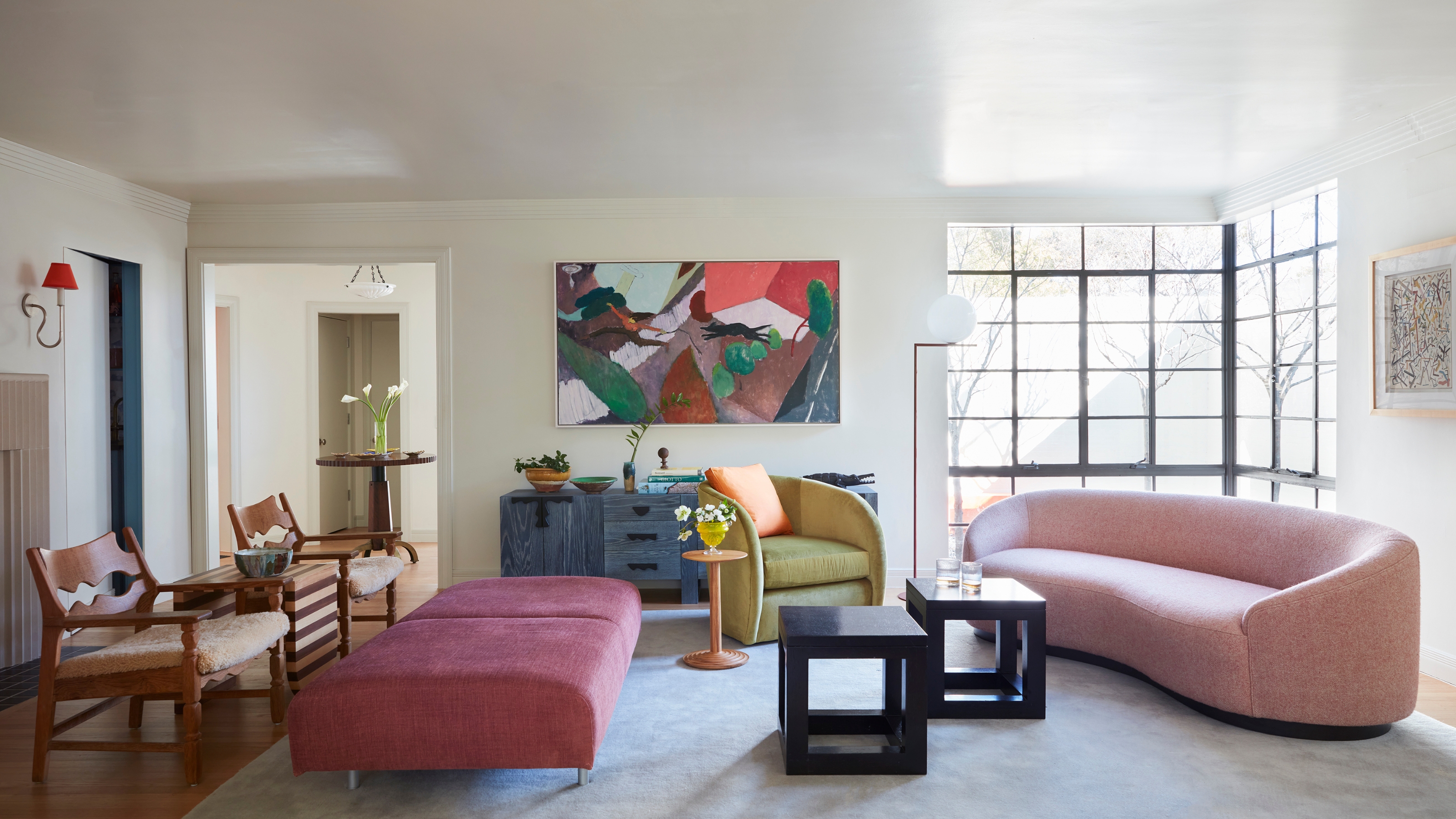
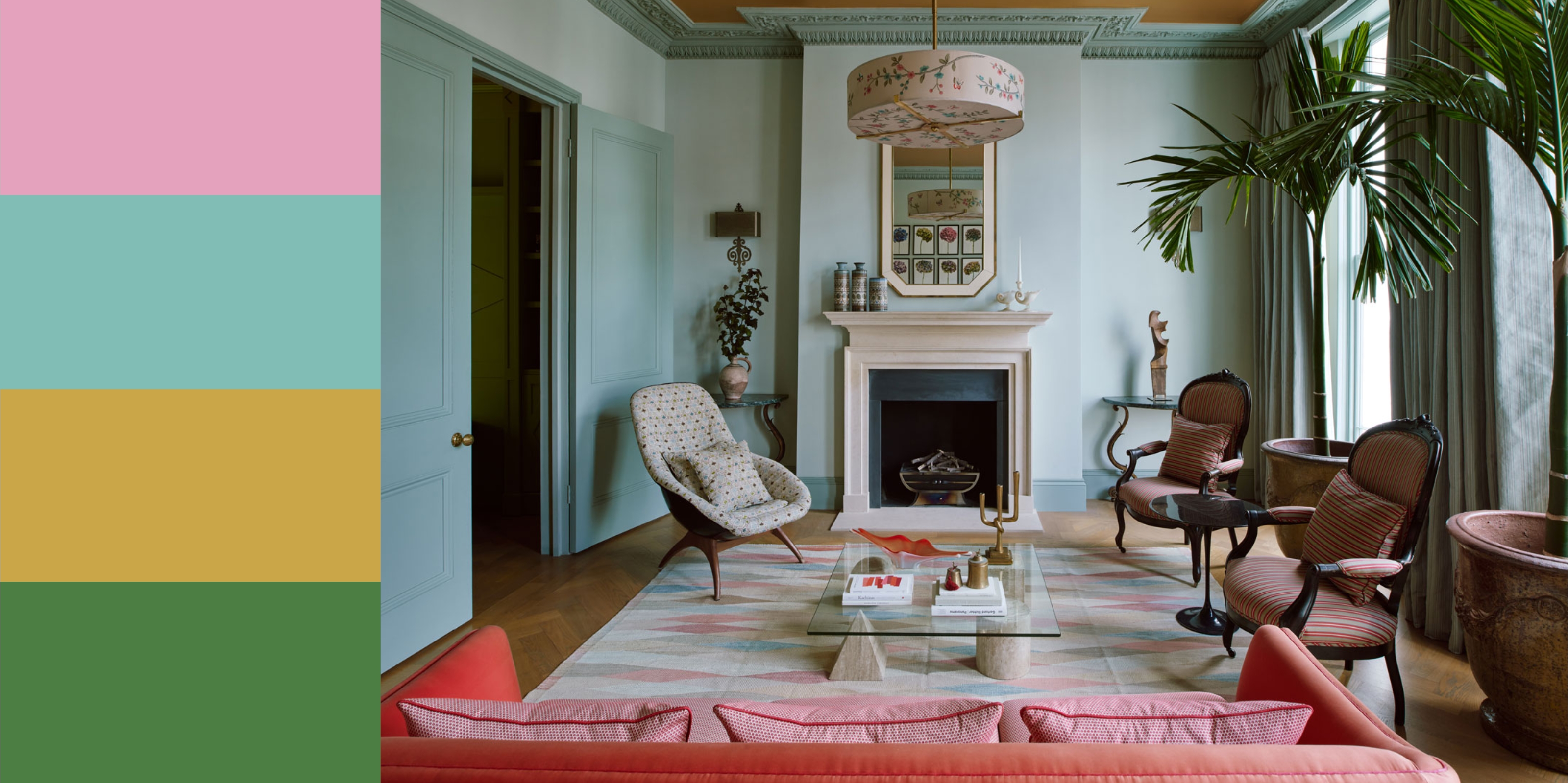
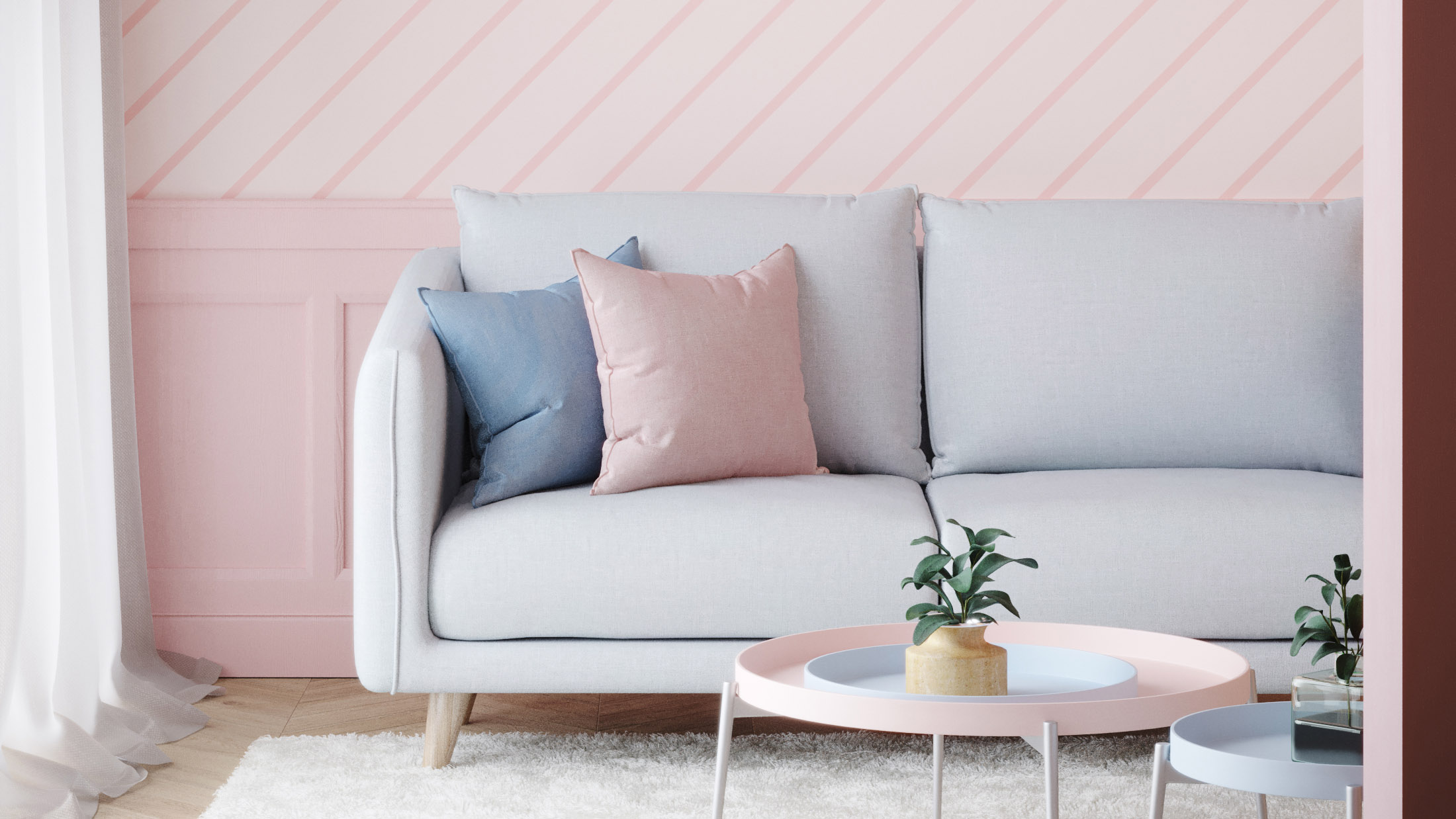
Baby blue and pink form a classic, whimsical pairing suitable for family rooms, yet it can also be sophisticated with refined furnishings and contemporary art, as demonstrated in a Philip Thomas-designed living room. Hot pink and emerald create a luxurious and refreshing jewel-toned combination, ideal for bars or lounges, exemplified by Nadia Watts's use of emerald fabric and electric pink art in the Kips Bay Palm Beach Show House. A more subdued green and pink palette can be achieved with olive and medium pink, using earthy undertones to create cozy and inviting spaces like bedrooms or reading nooks.
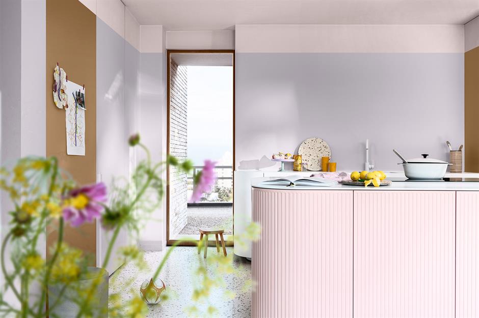
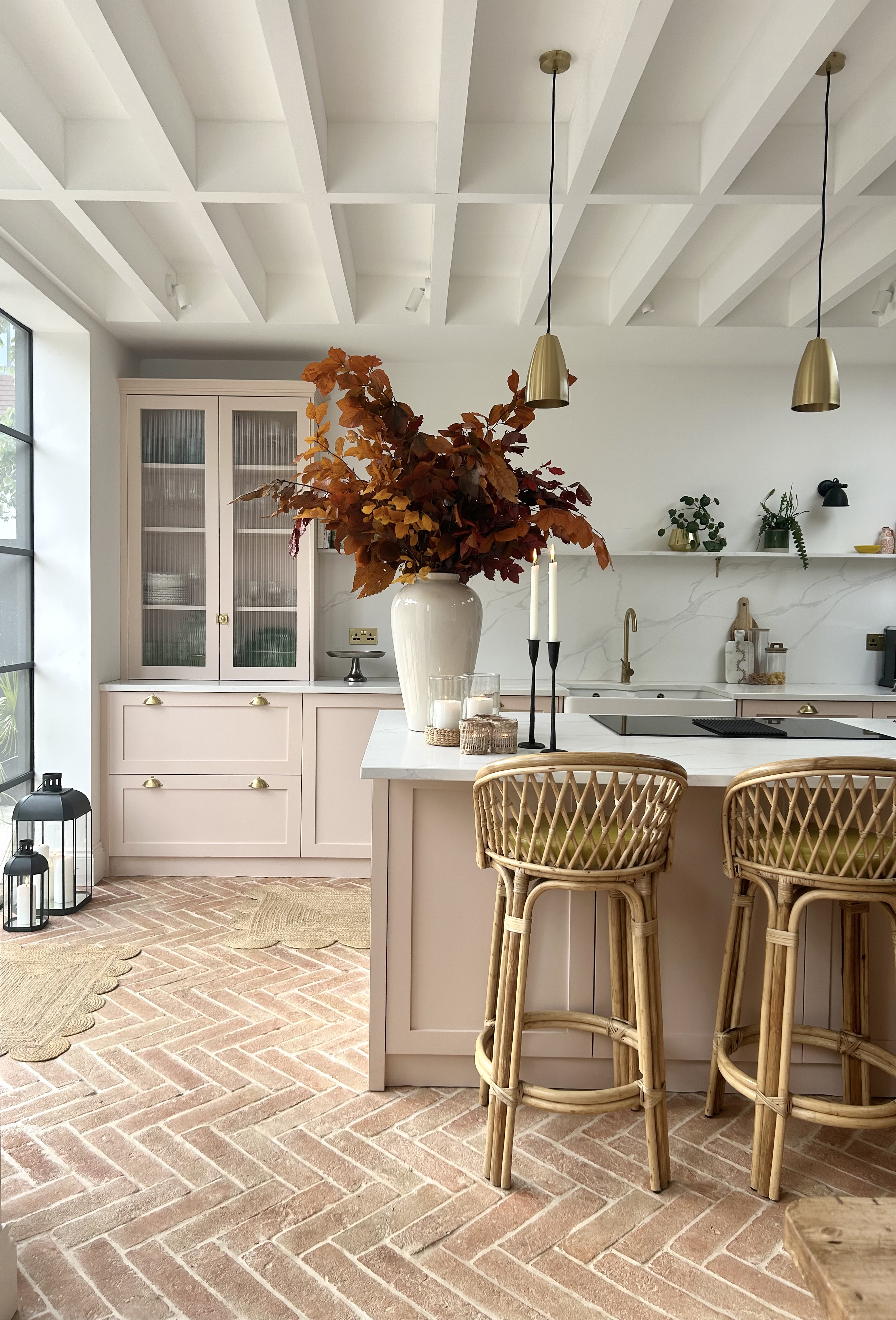

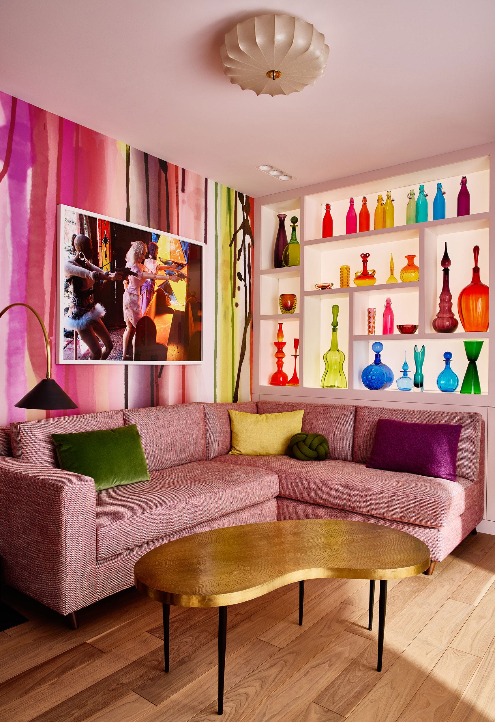
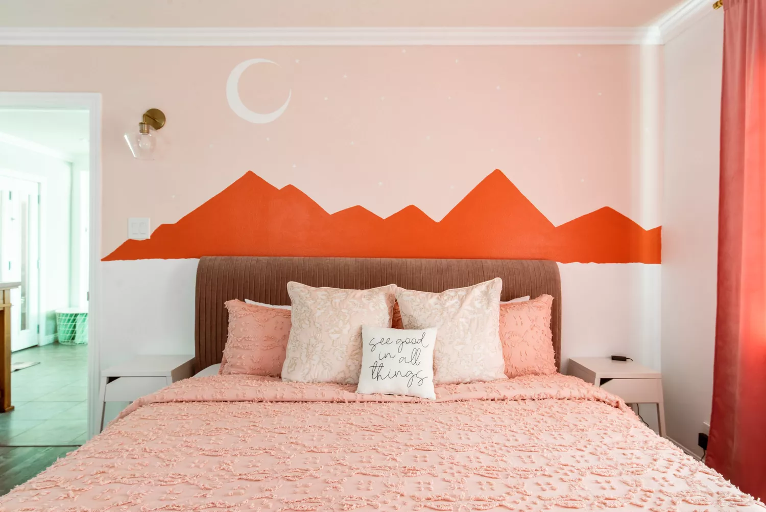
For vibrant and lively rooms, hot pink and orange can be infused, especially in dim studies or small kitchens. Sloan notes this pairing shows color confidence and joie de vivre, suggesting that if walls are a single color like apricot, pink fabrics with neutral accents can anchor the scheme. Pink and lavender offer a tranquil and unexpected alternative to neutral pairings, like Renvy Graves Pittman's lavender walls with pink drapery for a serene bedroom. Finally, warm blush and hazel shades naturally complement each other in cozy lounges, as seen in Joe Lucas's design where these hues blend in wall murals and rugs. Combining light pinks with peachy tones also adds warmth and depth without being overly vibrant, particularly when using different finishes and textures, as shown in Melanie Turner's Atlanta library.
#HomeDecor #ColorPalette #InteriorDesign #PinkDecor #DesignTrends #ColorCombinations #HomeStyling #DecoratingTips #AccentColors #HomeDecor #ColorPalette #InteriorDesign #PinkDecor #DesignTrends #ColorCombinations #HomeStyling #DecoratingTips #AccentColors
0 comment in total
 No comments yet
You may also like
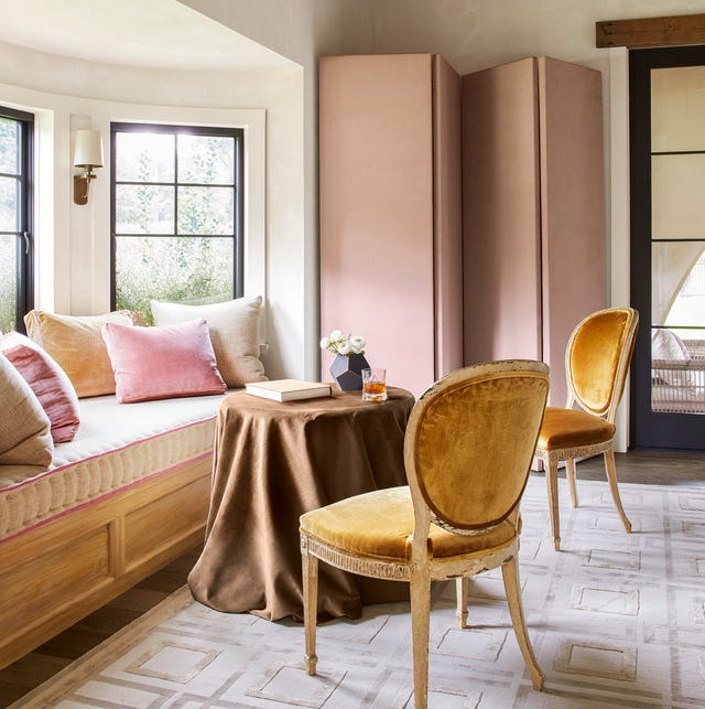
14 Chic Pink Color Combinations Designers Swear By

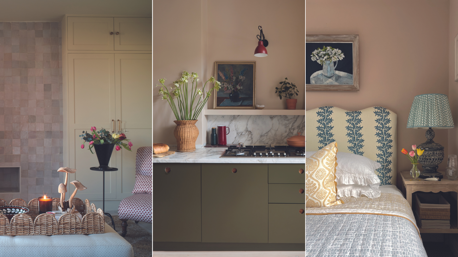
How to decorate with plaster pink tones – 5 ways to bring this timeless yet trendy hue into your home

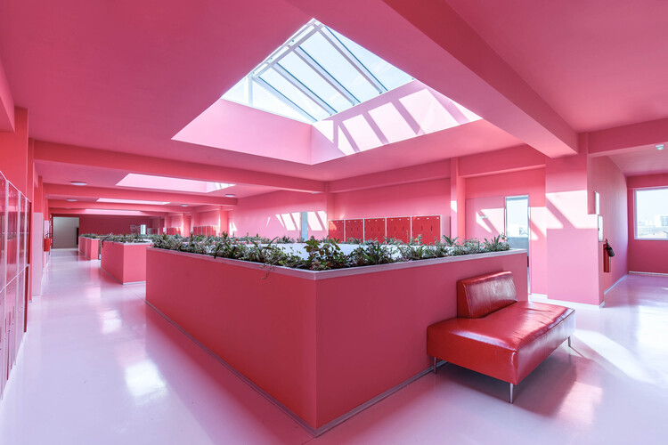
Pink as a Design Tool: Atmosphere, Identity, and Experimentation in Interior Design

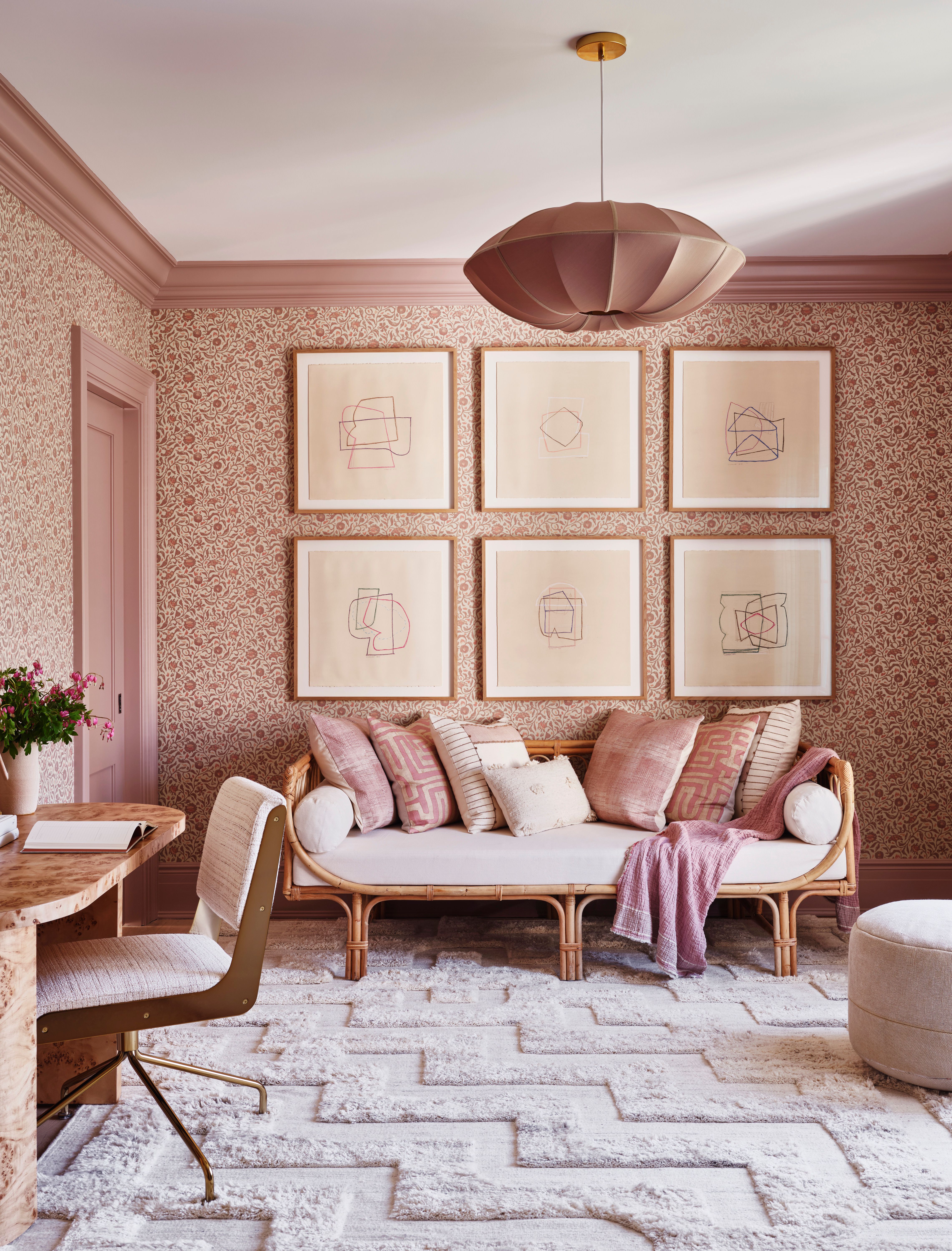
Pink Room Decor Ideas: 39 Ways to Use the Shade Throughout Your Home

18 sophisticated pink paint colors recommended by interior designers

After This Design Trend Took Off, These Paint Colors Became 40% More Popular

12 Colors That Go With Pink: Classic and Modern Ideas

Do Pink and Green Go Together in Interiors? A Professional Color Consultant's Verdict

Pretty in pink: decorating ideas for this year's hottest colour | loveproperty.com
What Color Goes with Pink? 16 Pretty Pairings to Try
INTERIORS: The joy of plaster pink
25 Pink Room Ideas to Satisfy Your Barbiecore Dreams

Home design: Add some pink
11 Colors That Go With Pink That Work in Homes Now
How to decorate with Farrow and Ball's Pink Ground – 7 designers share how they use this perfect pink shade
Pink living room ideas – 10 creative ways to use this enchanting hue
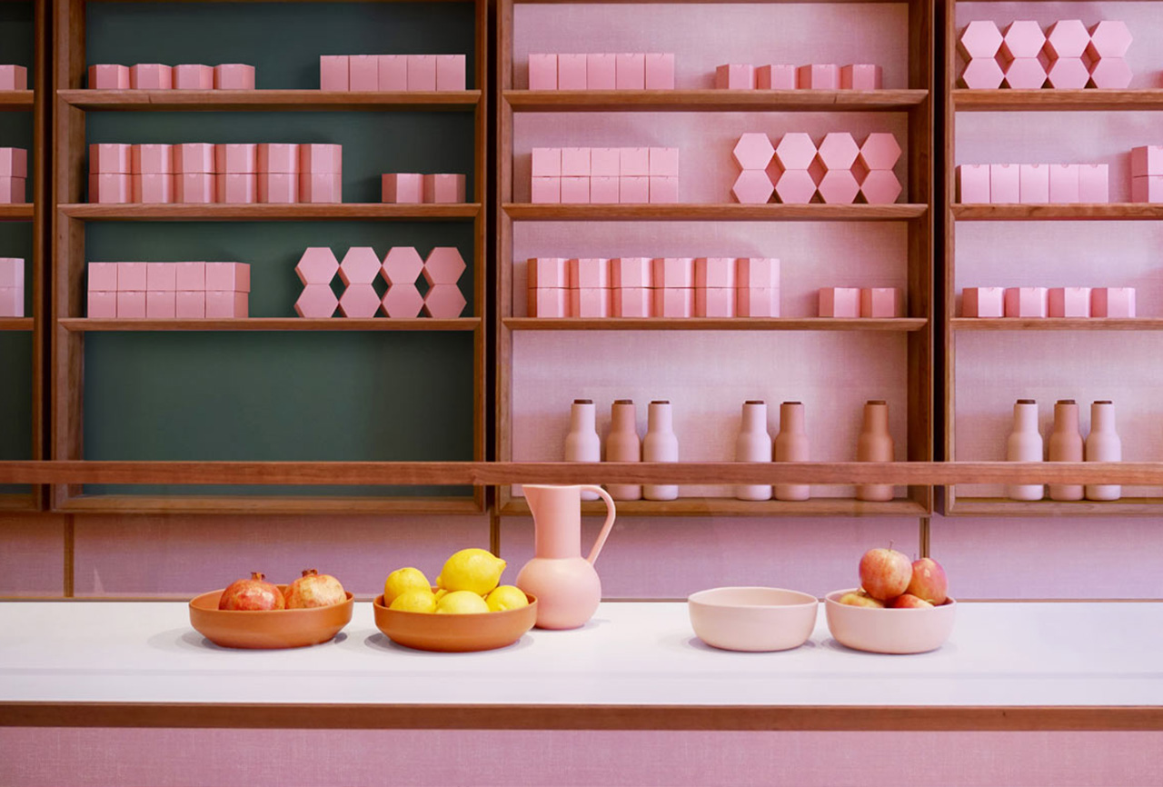
Color Therapy: Design That’s Pretty in Pink
Pink room decor ideas: 28 ways to use this sweet shade

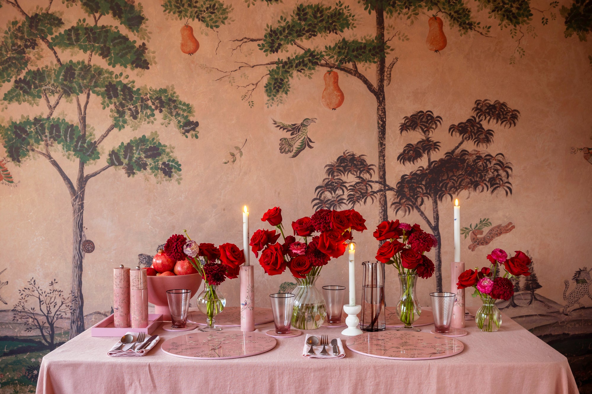
Decorating with red and pink: How to master this daring colour combination

Think Pink: 36 Beautiful Pink Bedrooms That Will Work With Any Style