1/12
Pink as a Design Tool: Atmosphere, Identity, and Experimentation in Interior Design
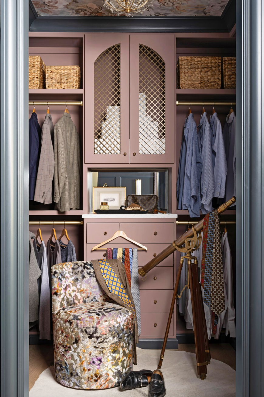
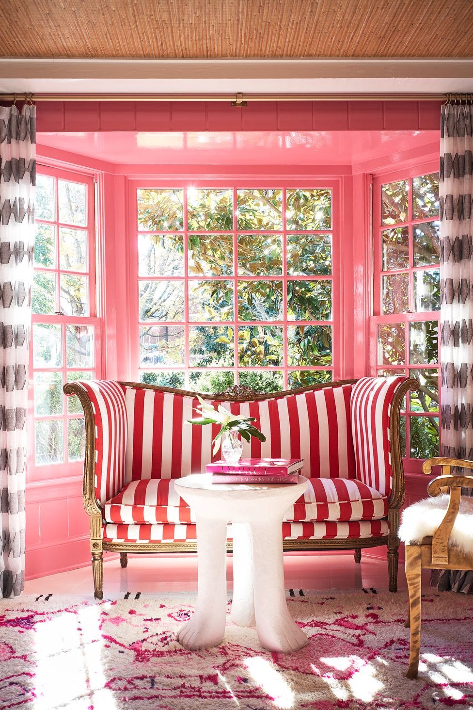
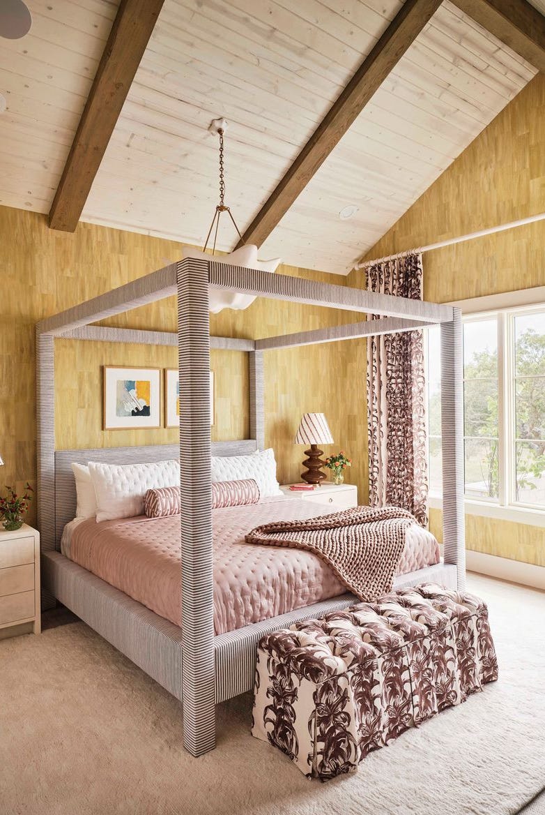
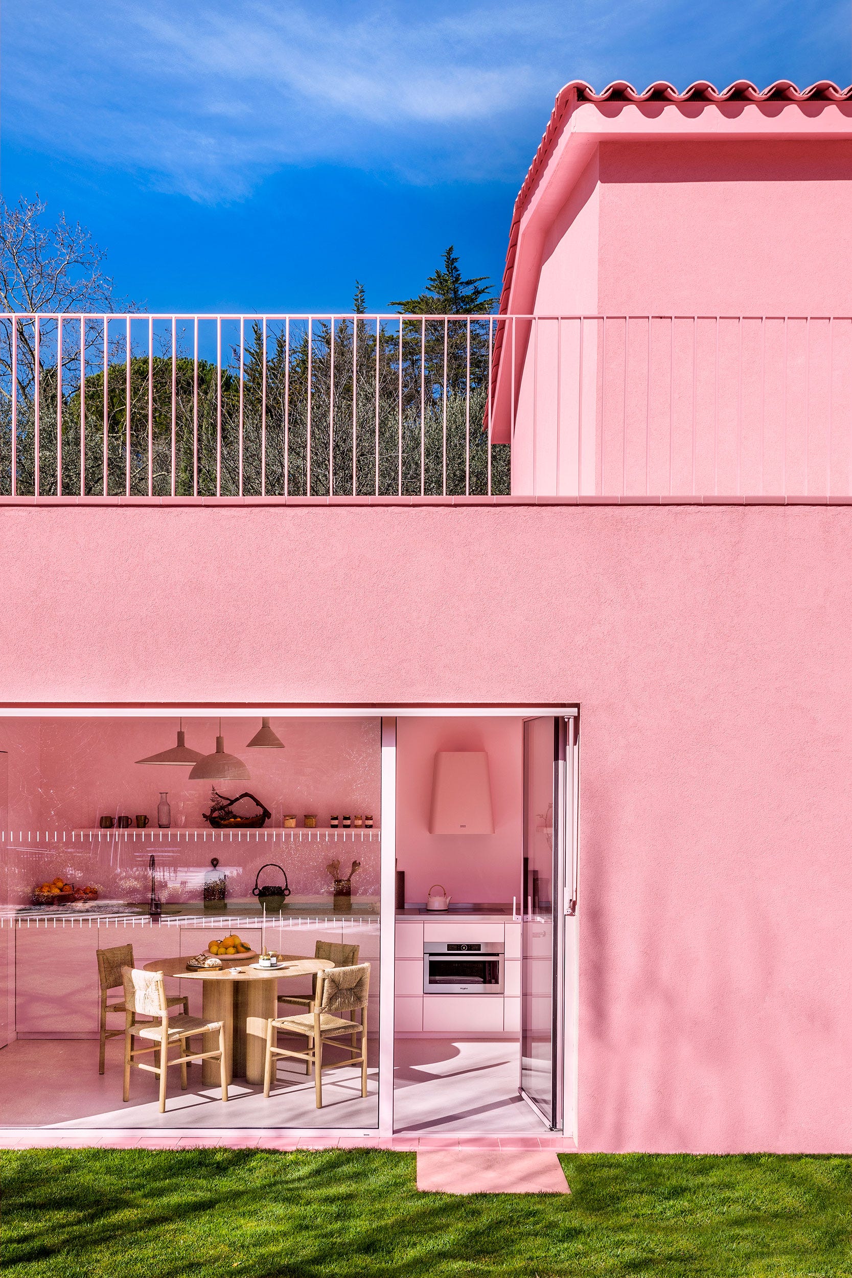
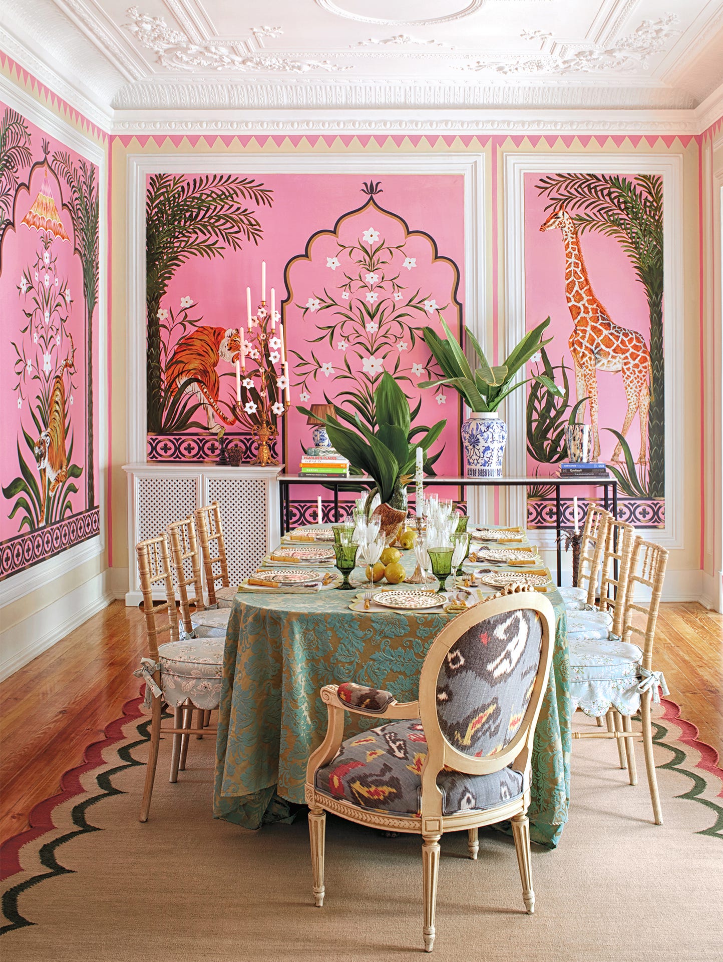
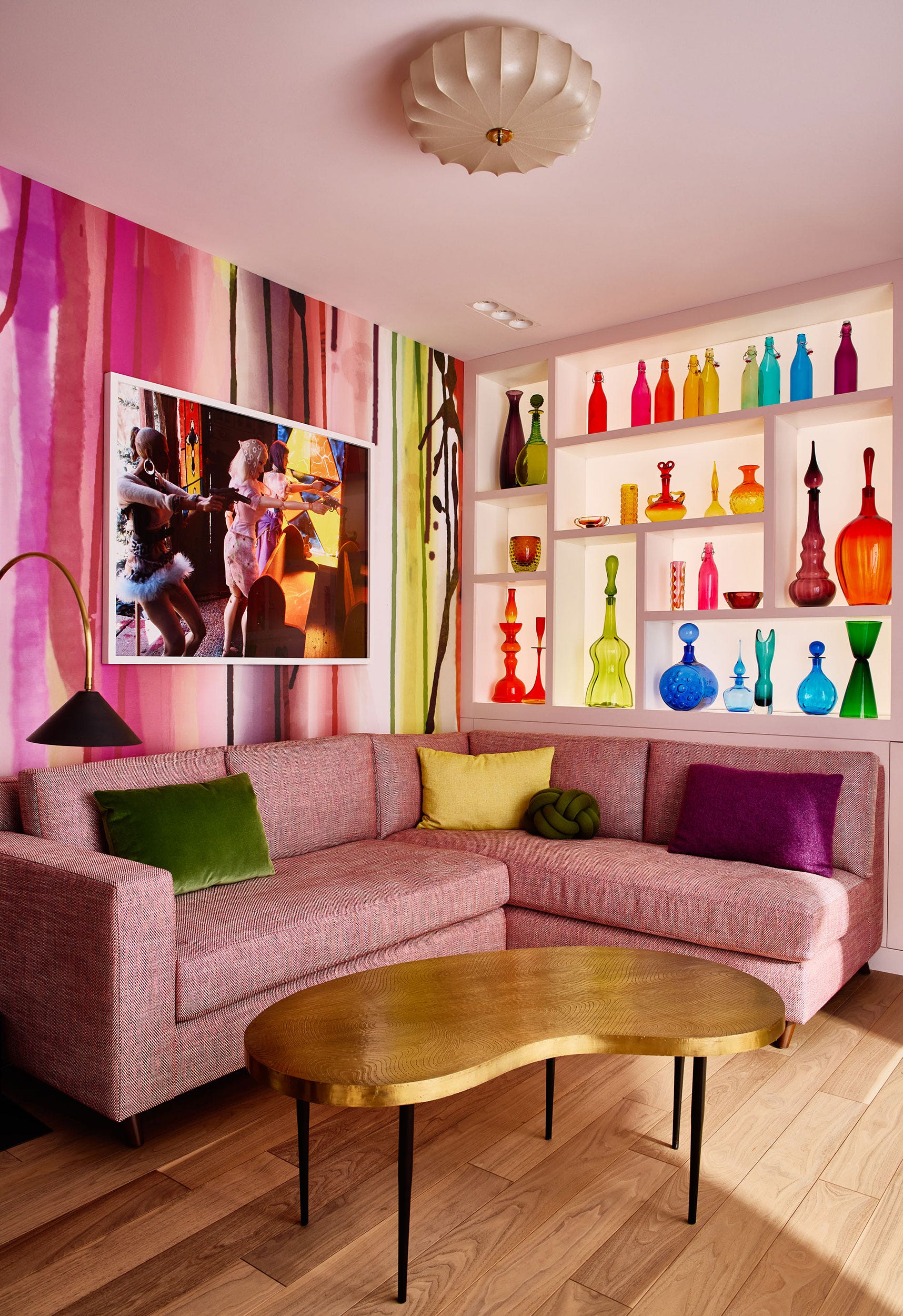
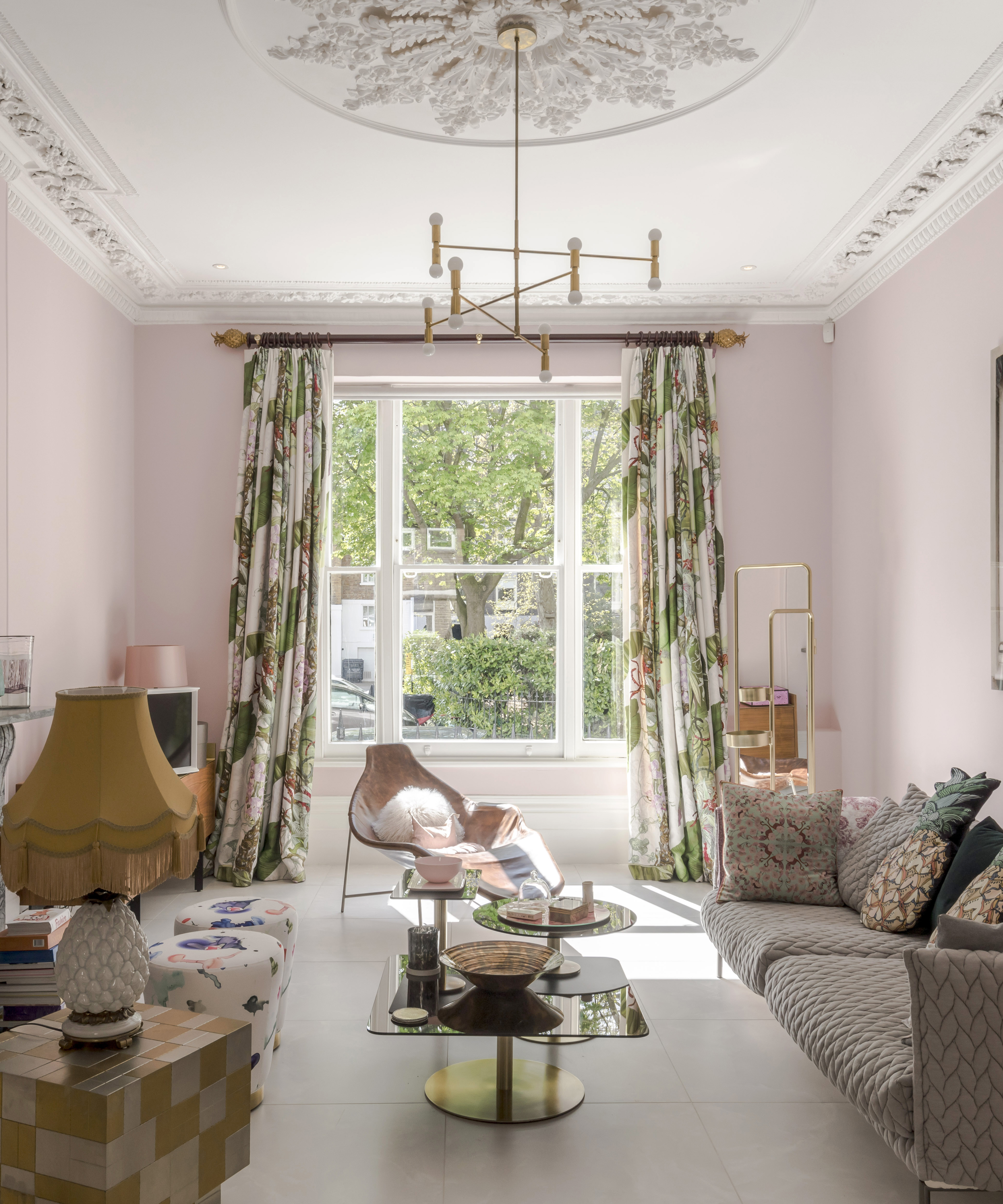
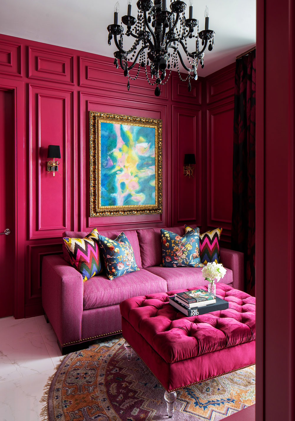
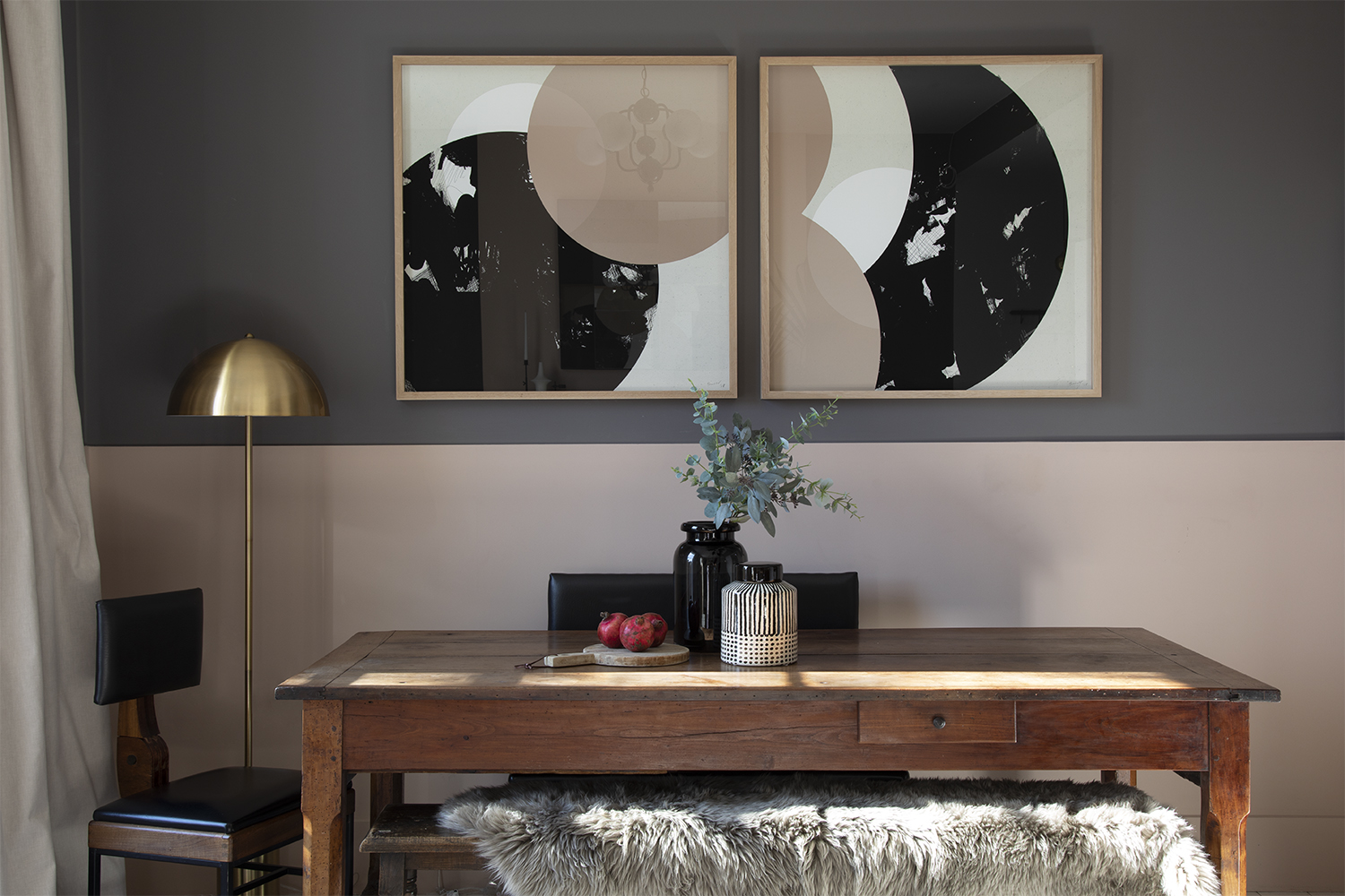
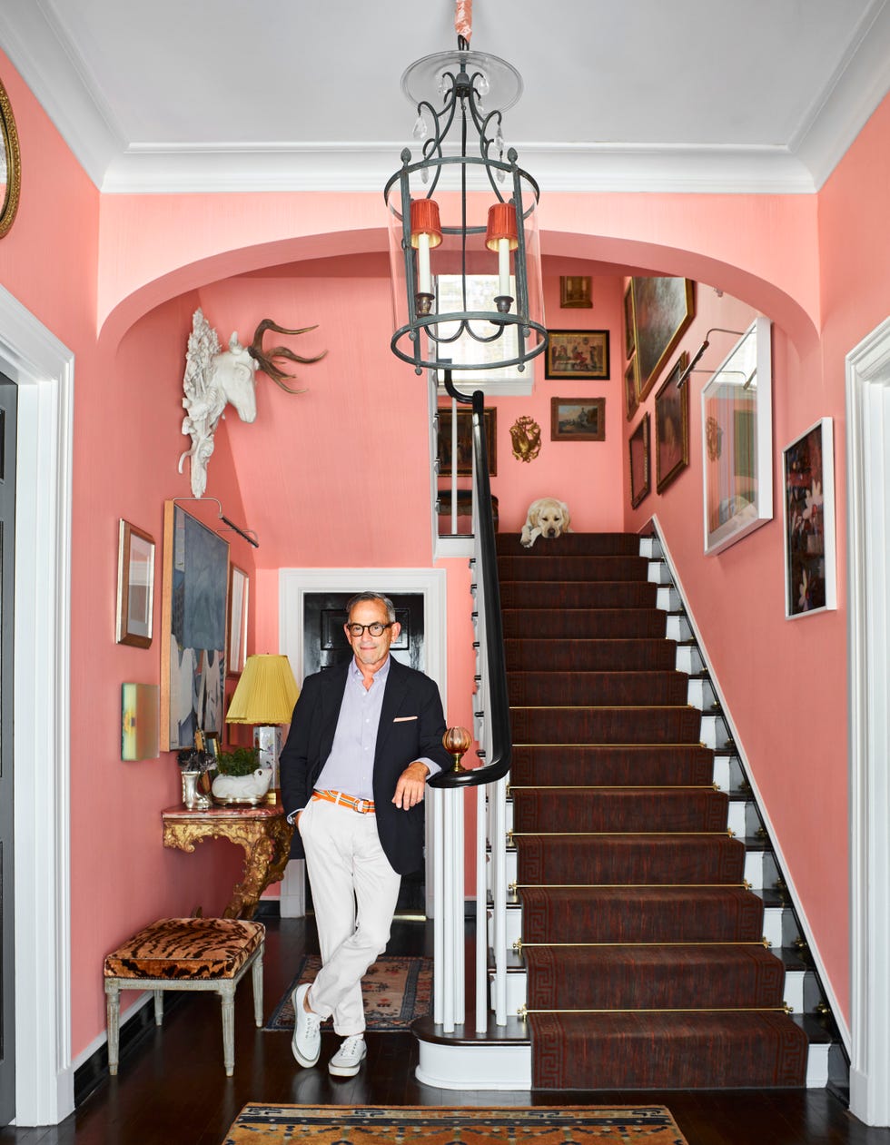
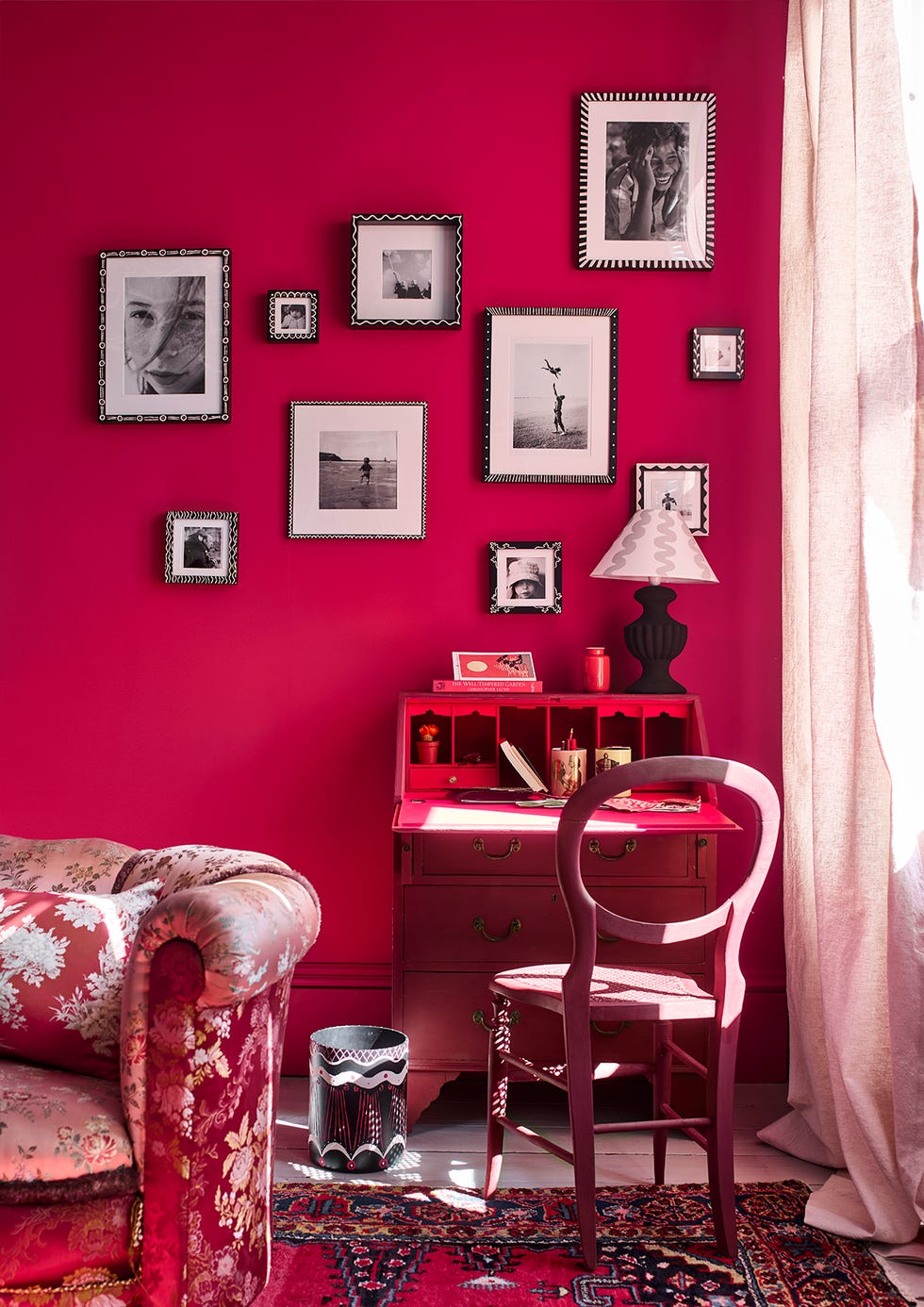
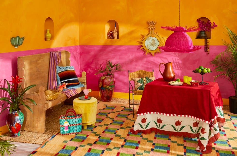
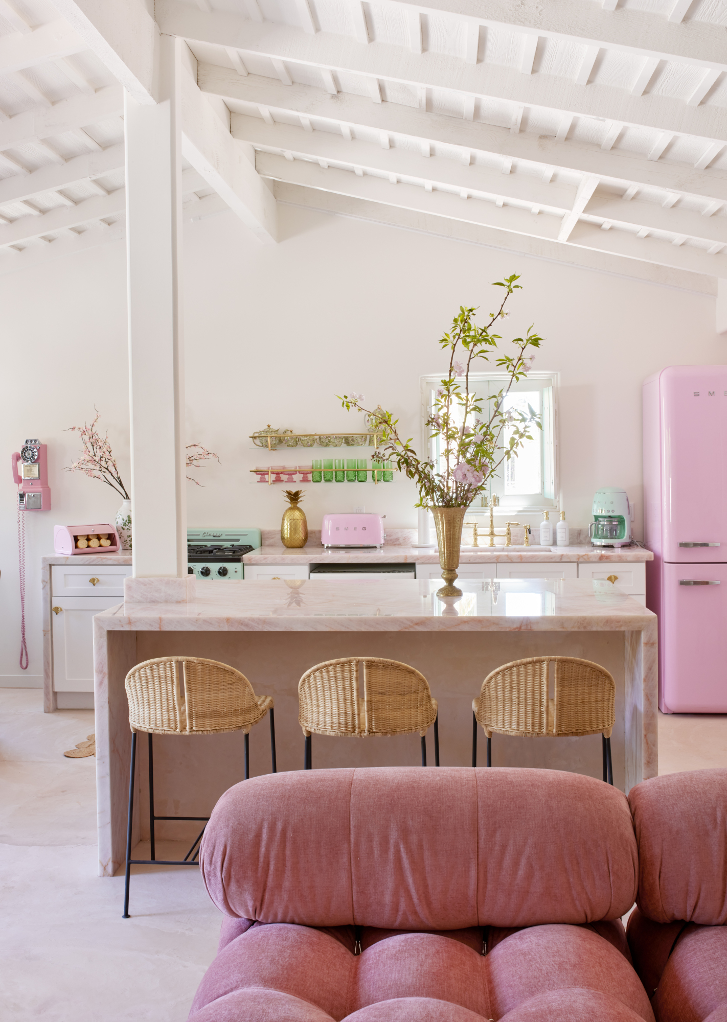
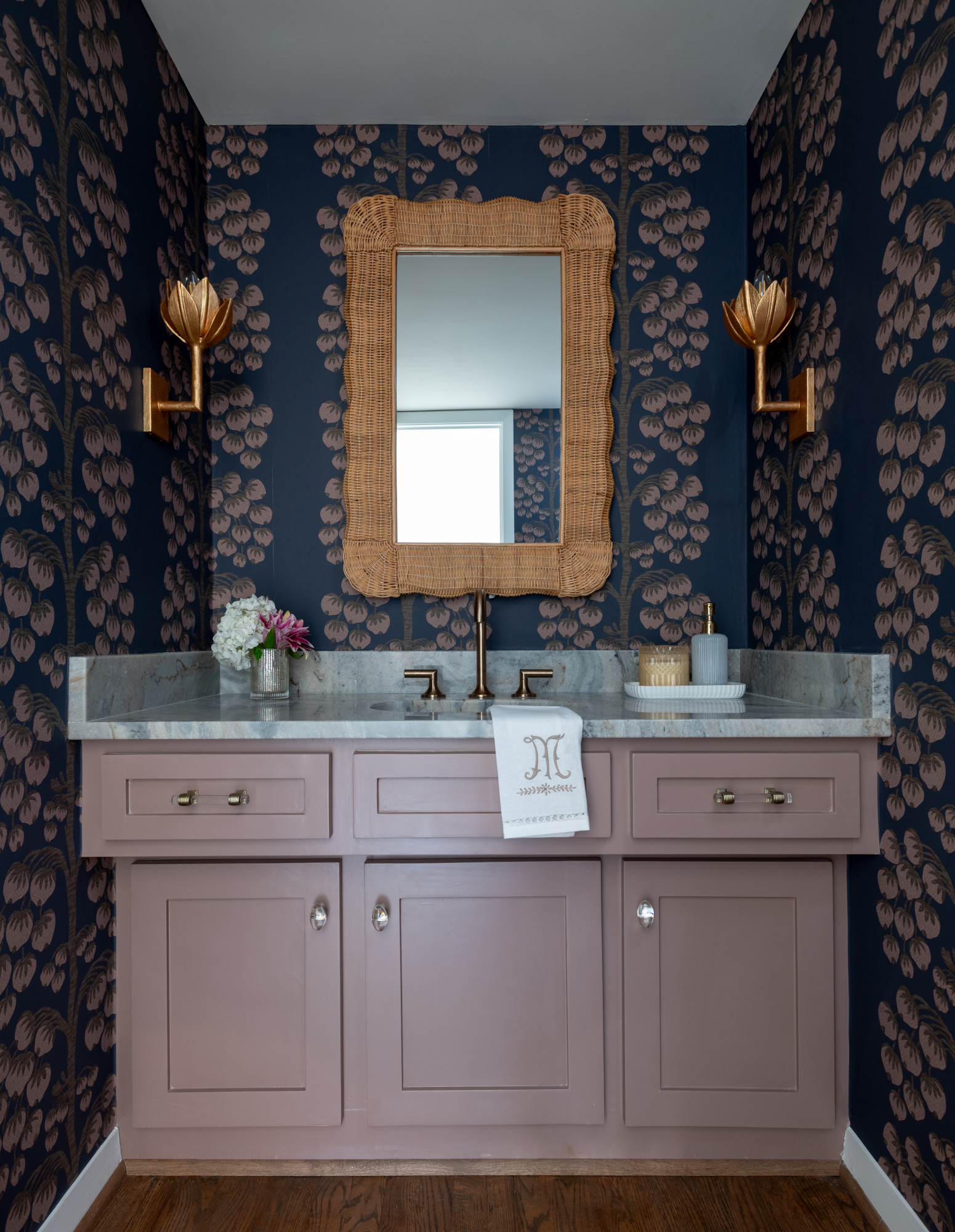
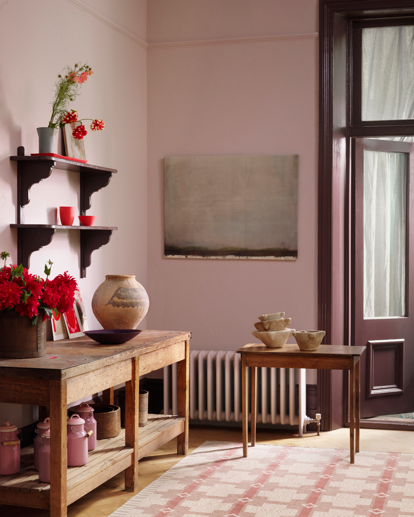
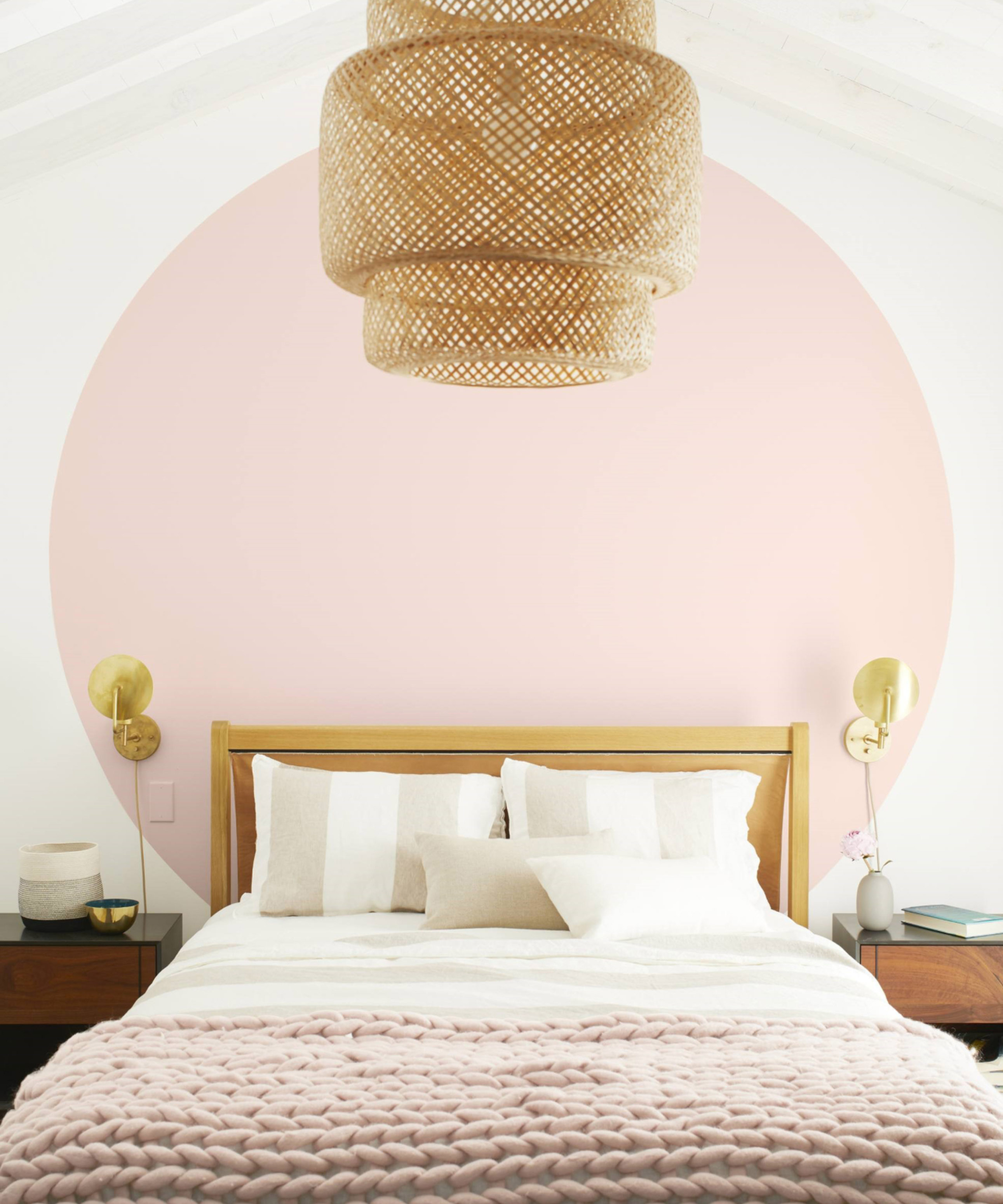
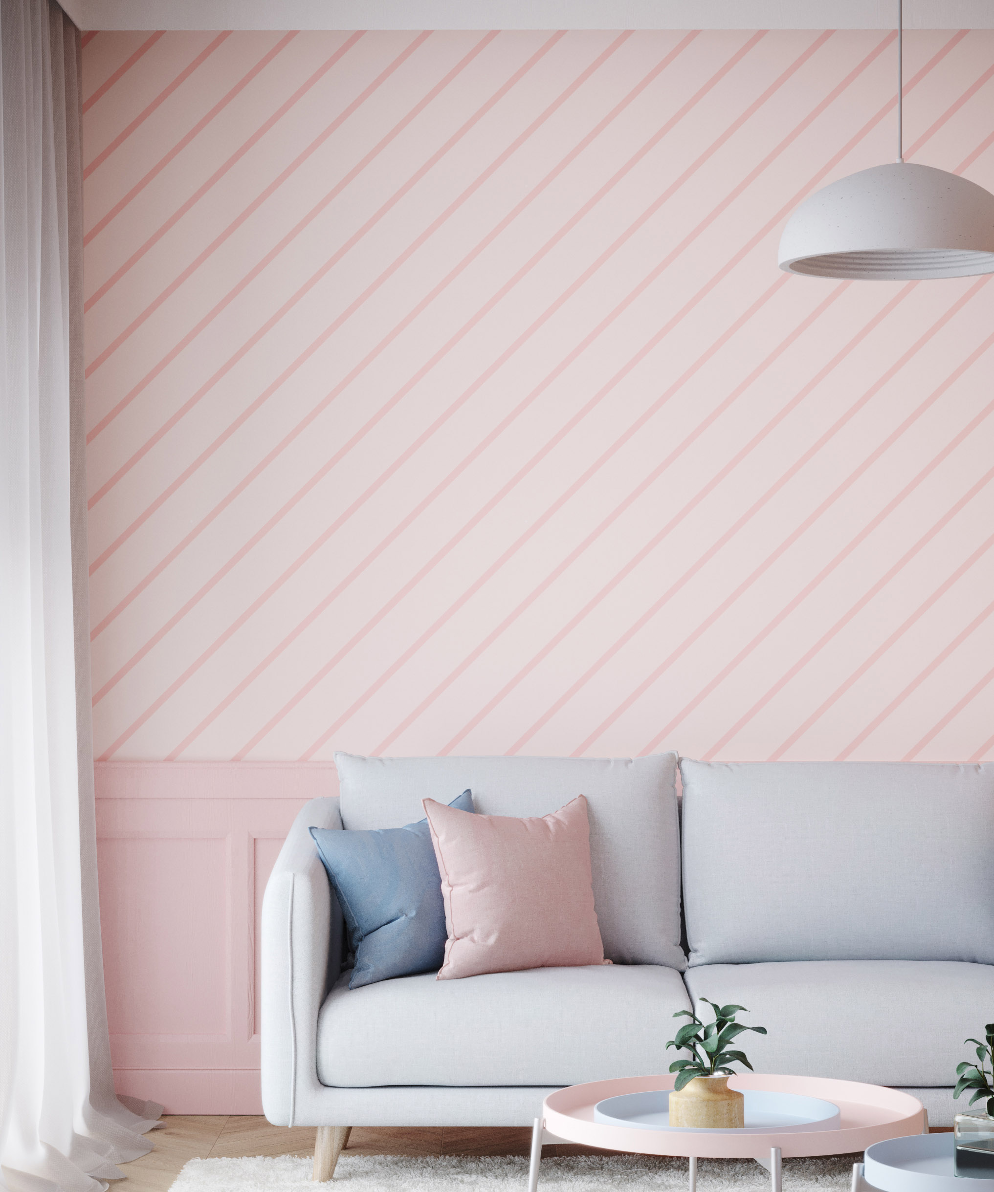
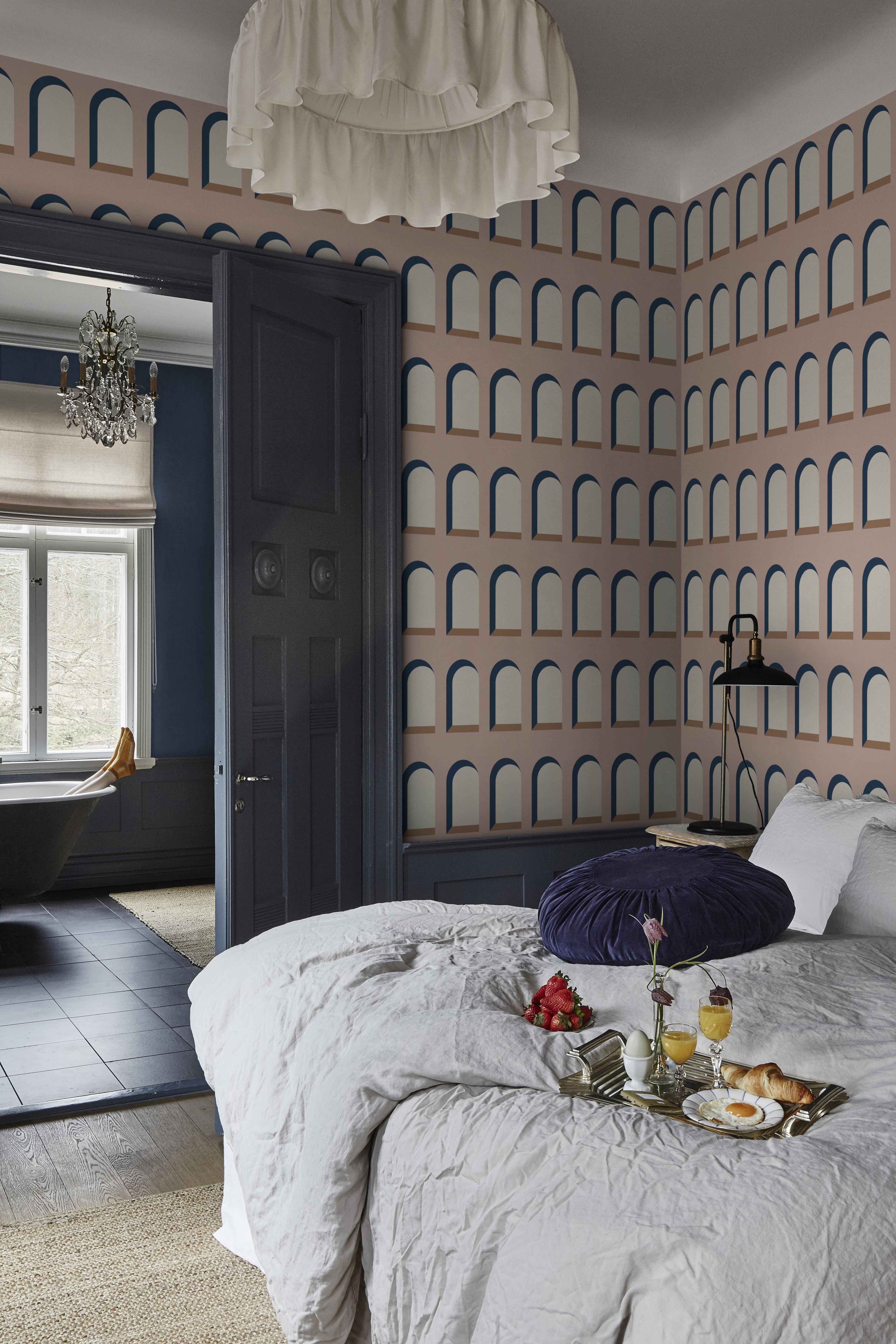
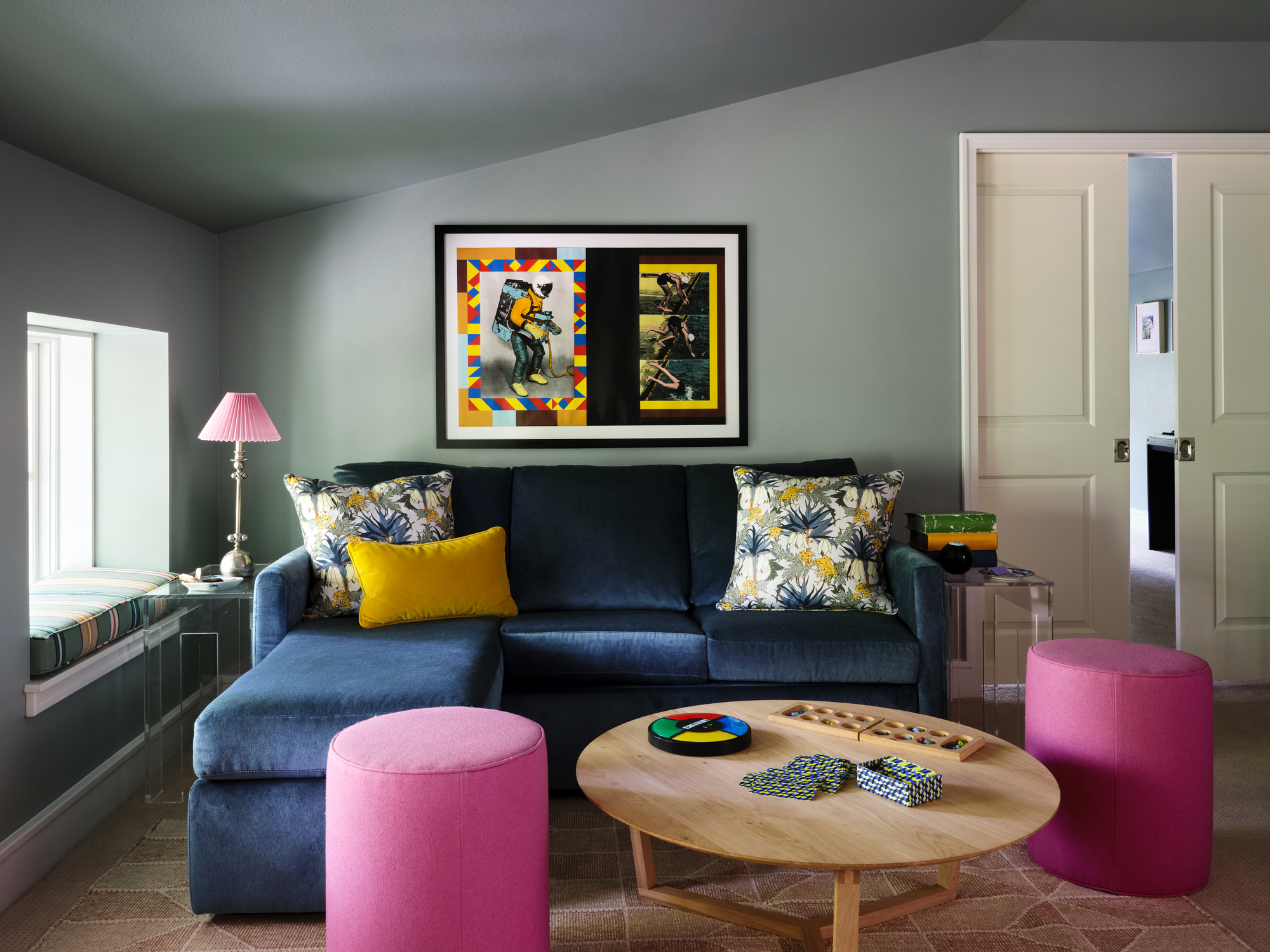
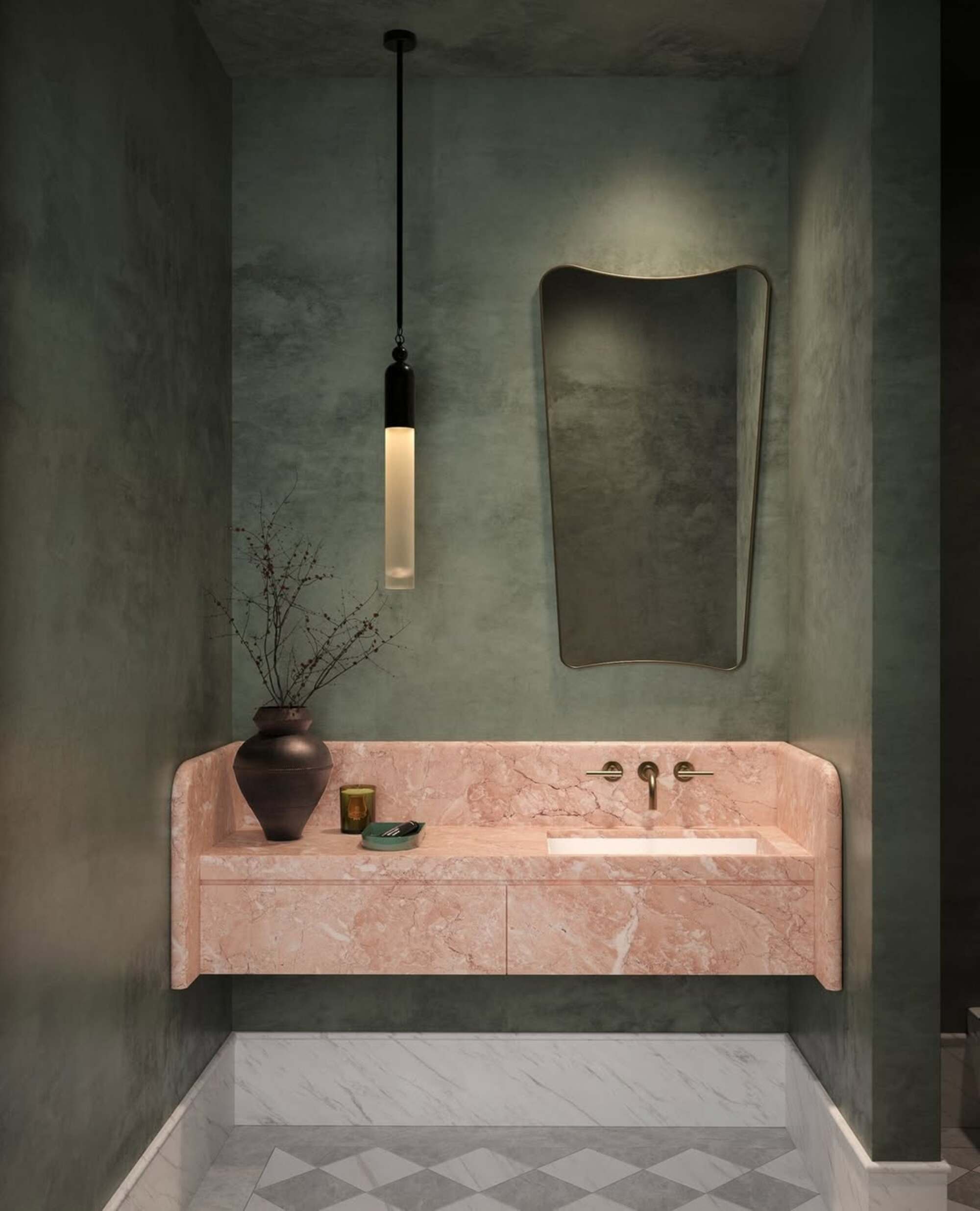
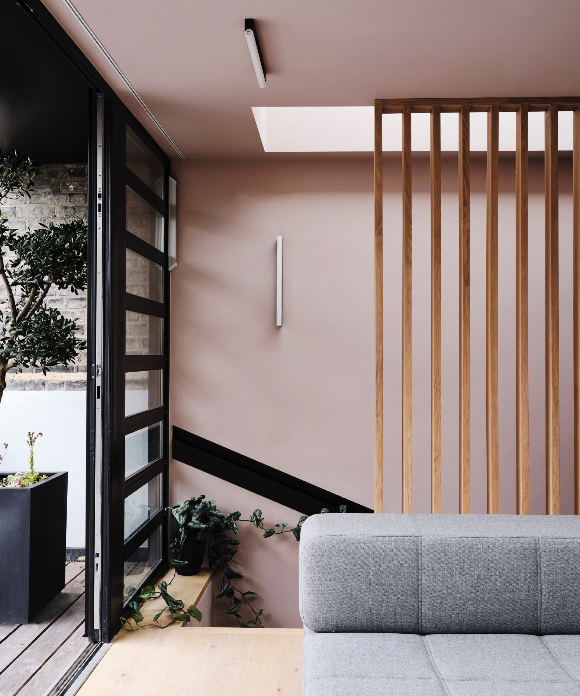
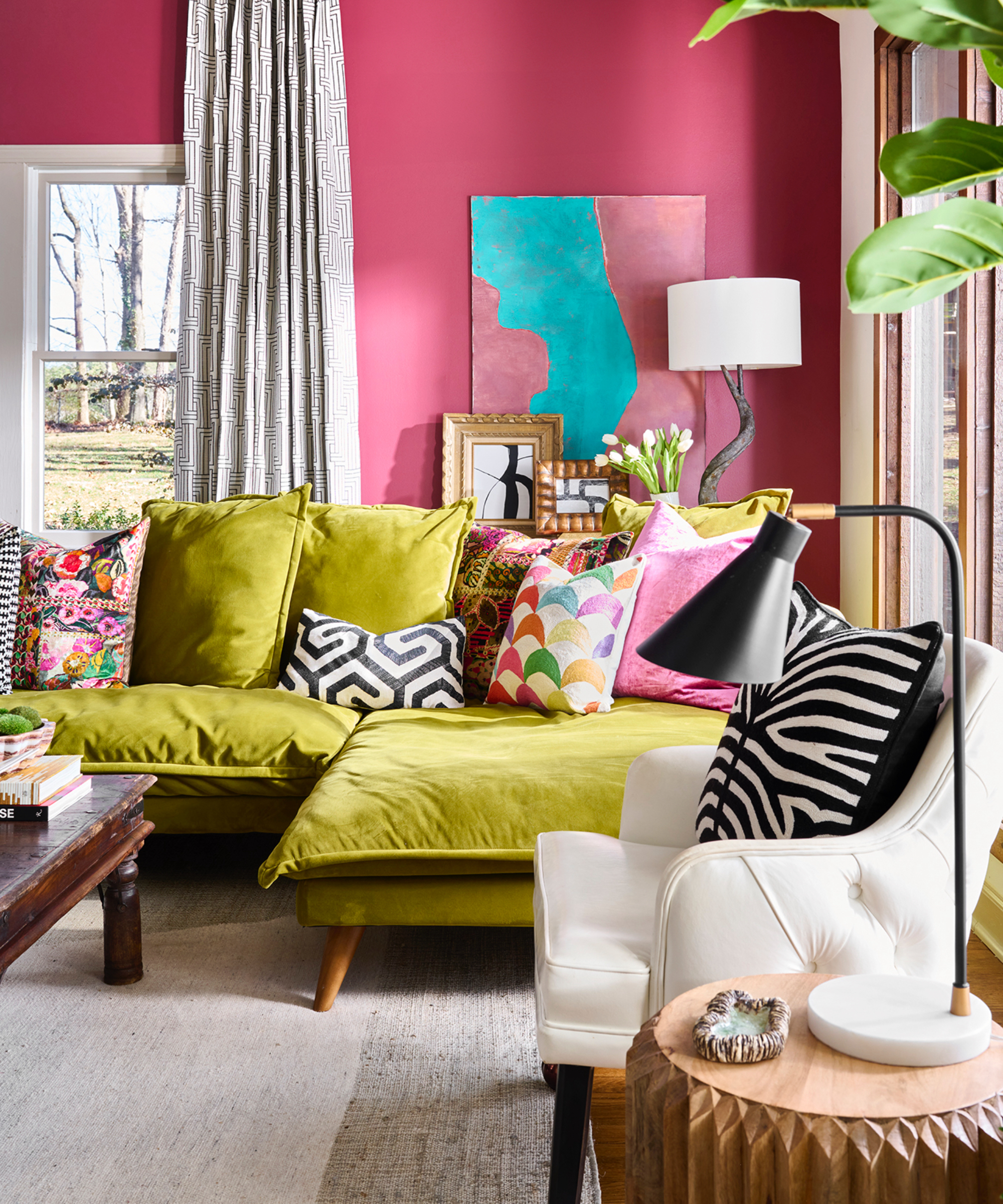
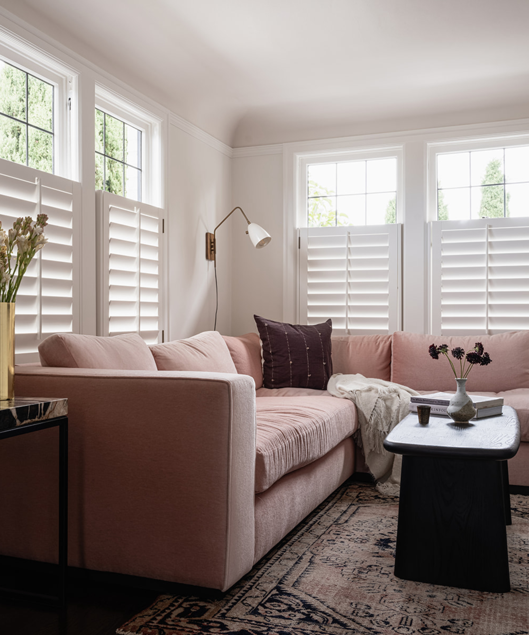
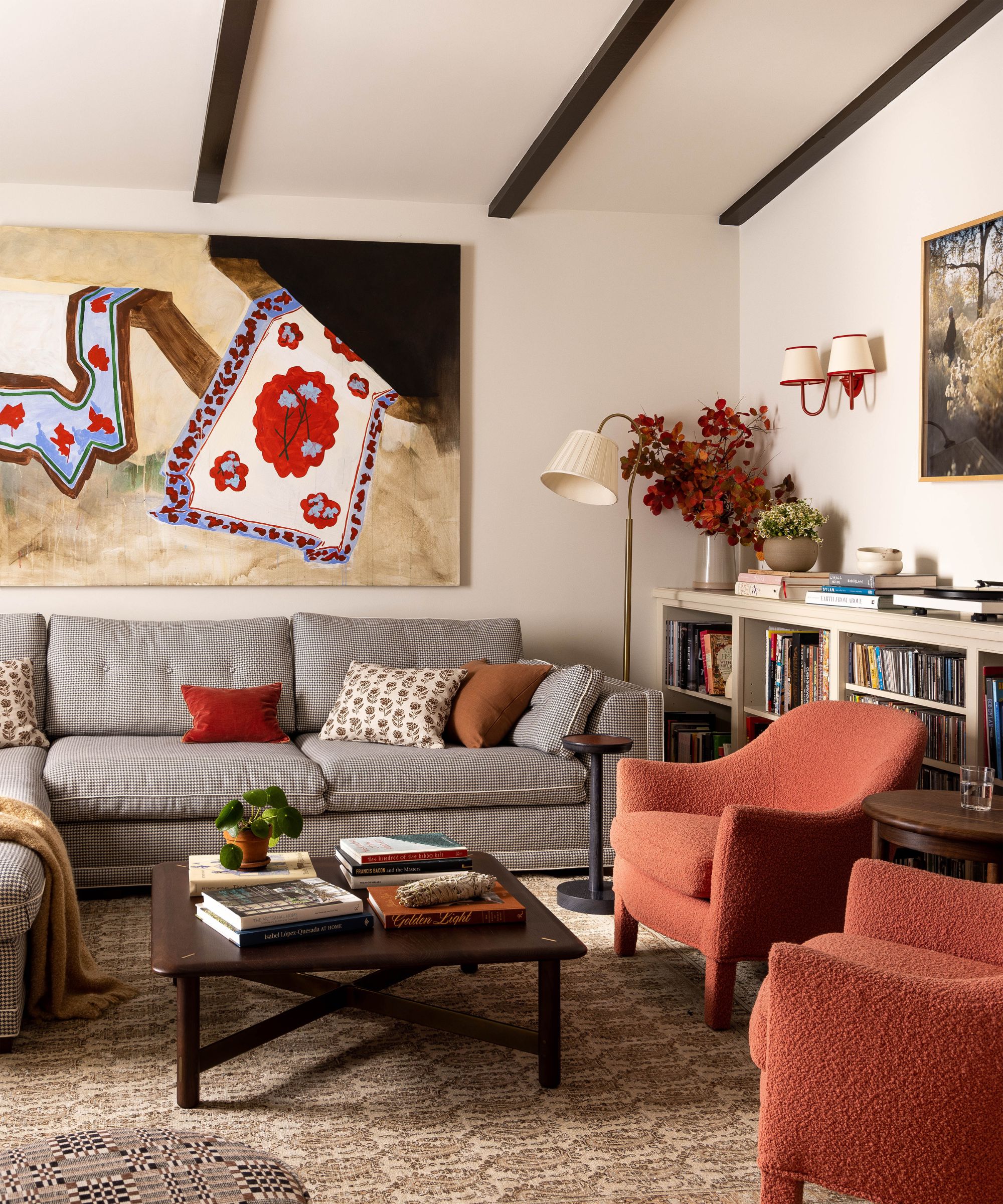
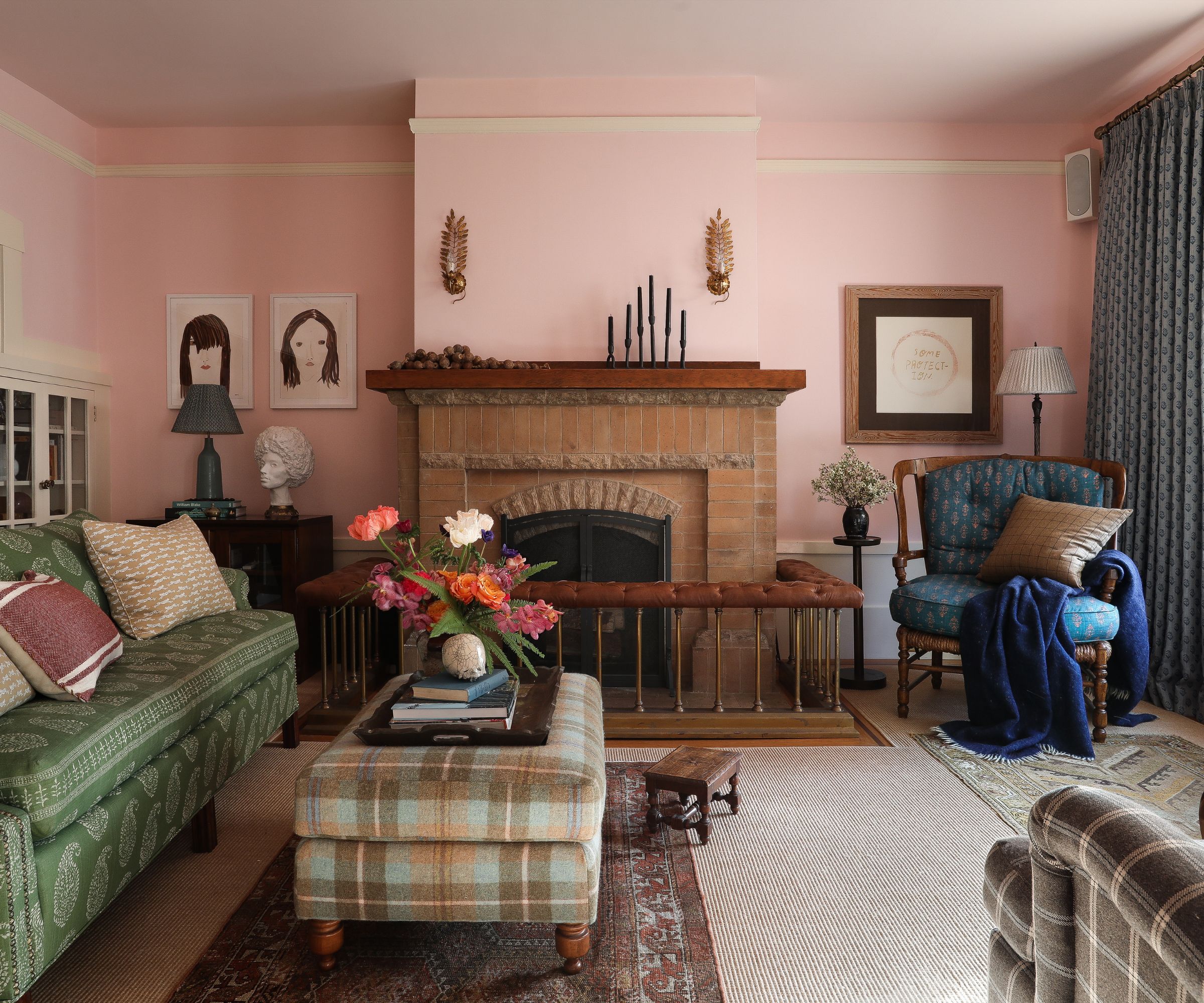
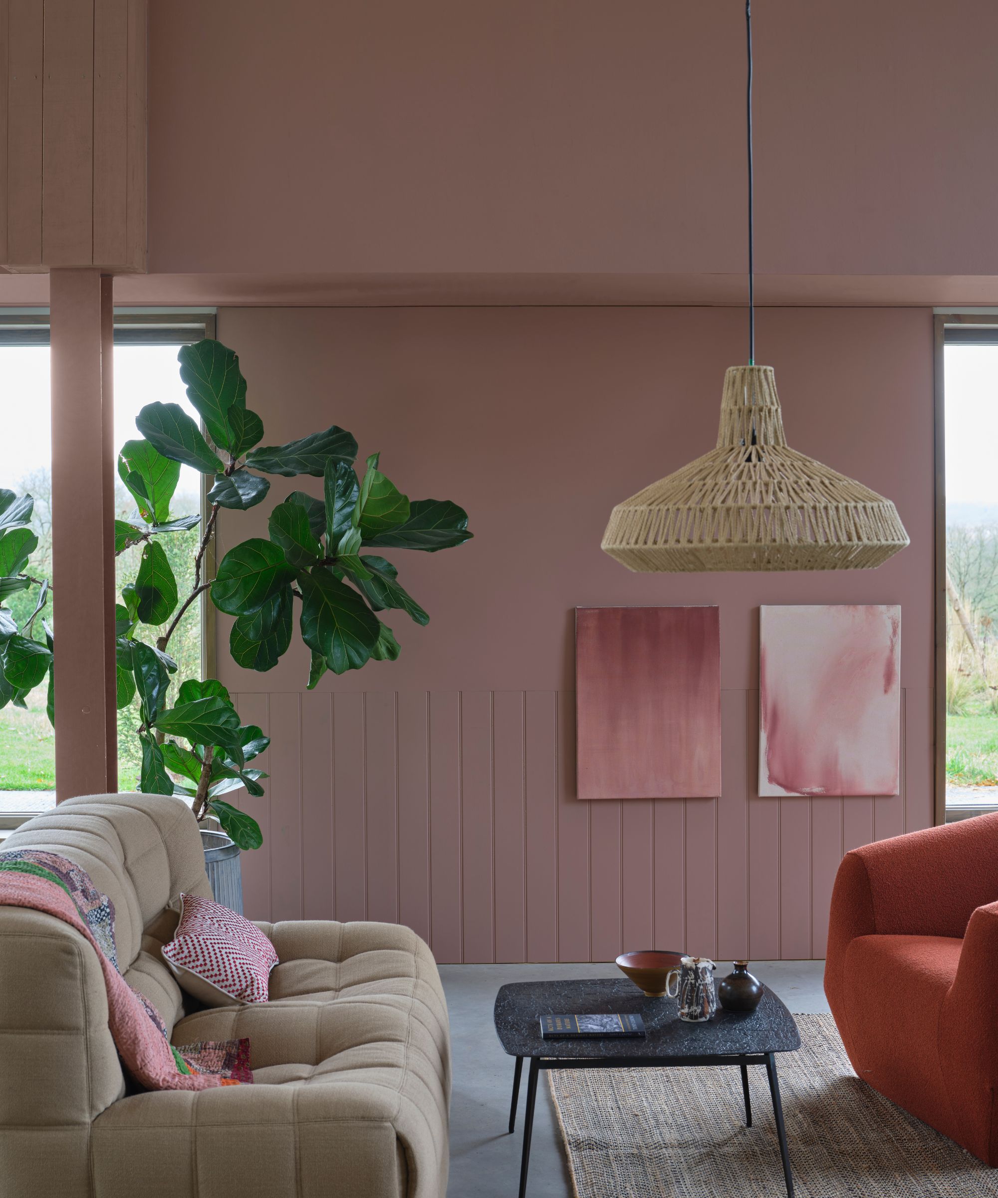
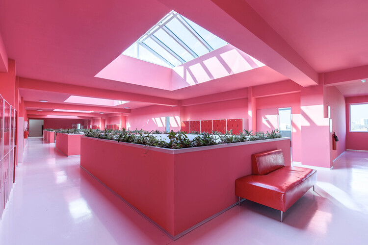
The color pink has transcended its traditional connotations to become a sophisticated and adaptable element in contemporary architecture and interior design. Defined by a wide spectrum of shades, from warm red tints to blends with yellow or blue, as categorized by the Natural Color System (NCS), pink offers a balance of vibrancy and softness that makes it suitable for diverse materials and contexts. This versatility is underscored by its recent evolution from the bold hues of the "Barbiecore" trend to the softer, powdery tones observed in 2025 fashion collections and Pantone's color palettes, highlighting its growing prominence as a deliberate design strategy capable of transforming spaces to feel inviting, expansive, or timeless.
Historically, pink has held significant cultural and architectural roles worldwide. In Japan, delicate cherry blossom-like shades symbolize transience and beauty, reflecting themes celebrated in Hanami festivals. In China, peach pink has been associated with longevity, a motif found in classical literature such as 'Journey to the West.' Architectural traditions globally also showcase pink's enduring presence, from the soft Suffolk pink houses in England to the terracotta-hued facades of Jaipur’s Hawa Mahal in India’s "Pink City." In Mexico and Spain, modernist architects like Luis Barragán and Ricardo Bofill famously utilized pink to enhance spatial depth and interact with natural light. Argentina's Casa Rosada further illustrates pink's capacity to serve as a powerful political and cultural symbol.
The article delves into the diverse applications of pink in various contemporary interior design projects, showcasing its ability to define atmosphere and identity. It examines how different shades and applications of pink contribute to unique spatial experiences. For instance, in the Nama Lingerie shop, pink is used to create a romantic and delicate ambiance. The interior of NANAN Patisserie employs pink to evoke a playful and inviting environment, while NOUS Restaurant utilizes it to establish a chic and modern aesthetic. Similarly, the Villa de Murir Store integrates pink to project a sophisticated and welcoming brand image. These examples demonstrate that pink is not merely a decorative element but a fundamental component in shaping the character and emotional resonance of a space.
The strategic use of pink in these projects highlights its capacity for experimentation and innovation in interior design. Designers are increasingly exploring pink's potential to break conventional norms and create distinctive identities for commercial and public spaces. The color’s adaptability allows it to be paired with various textures, lighting, and complementary colors, producing a wide range of effects. Whether used as a dominant color or as an accent, pink can significantly influence how users perceive and interact with an environment, making it a powerful tool for designers seeking to achieve specific atmospheric or branding objectives. The ongoing re-evaluation and expanded application of pink in design signal a broader recognition of its complex aesthetic and psychological impacts.
#Pink #InteriorDesign #Architecture #ColorTheory #DesignStrategy #CulturalInfluence #ContemporaryDesign #SpatialAtmosphere #DesignExperimentation #Pink #InteriorDesign #Architecture #ColorTheory #DesignStrategy #CulturalInfluence #ContemporaryDesign #SpatialAtmosphere #DesignExperimentation
0 comment in total
 No comments yet
You may also like
14 Chic Pink Color Combinations Designers Swear By

25 Pink Room Ideas to Satisfy Your Barbiecore Dreams

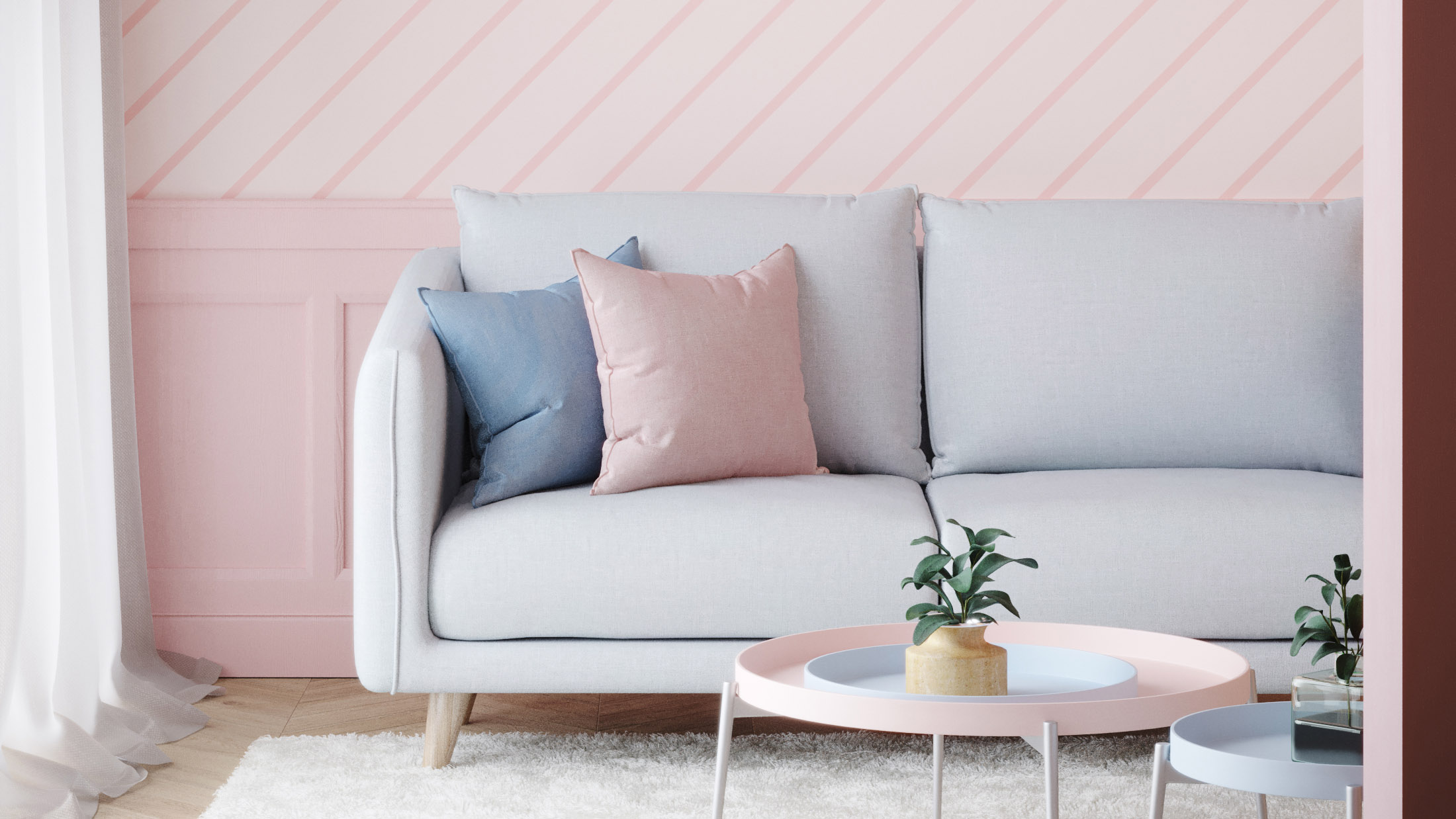
Pink room decor ideas: 28 ways to use this sweet shade

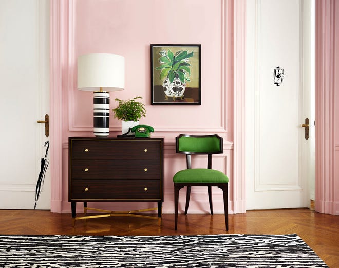
Home design: Add some pink
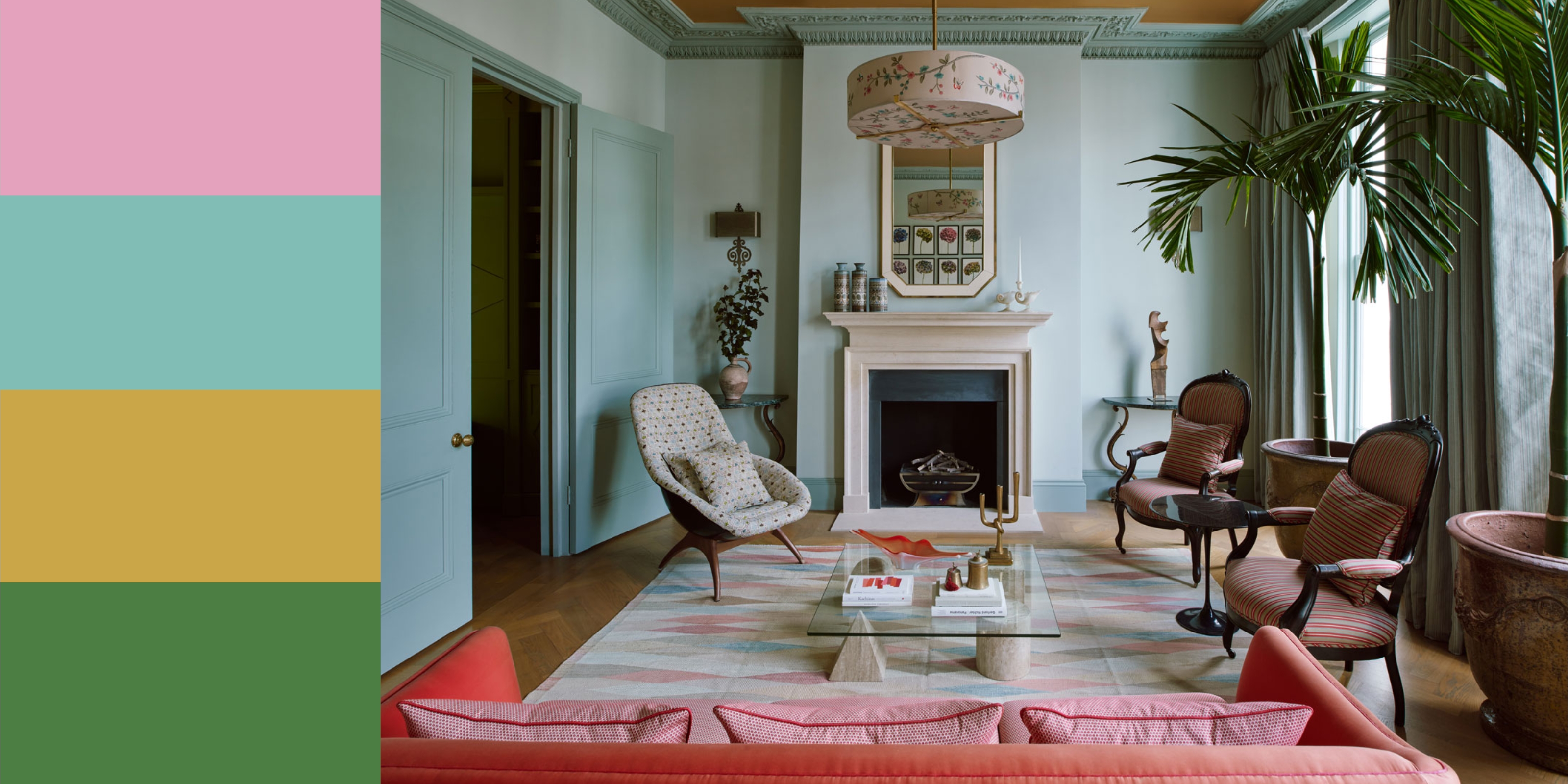
11 Colors That Go With Pink That Work in Homes Now


Pink living room ideas – 10 creative ways to use this enchanting hue
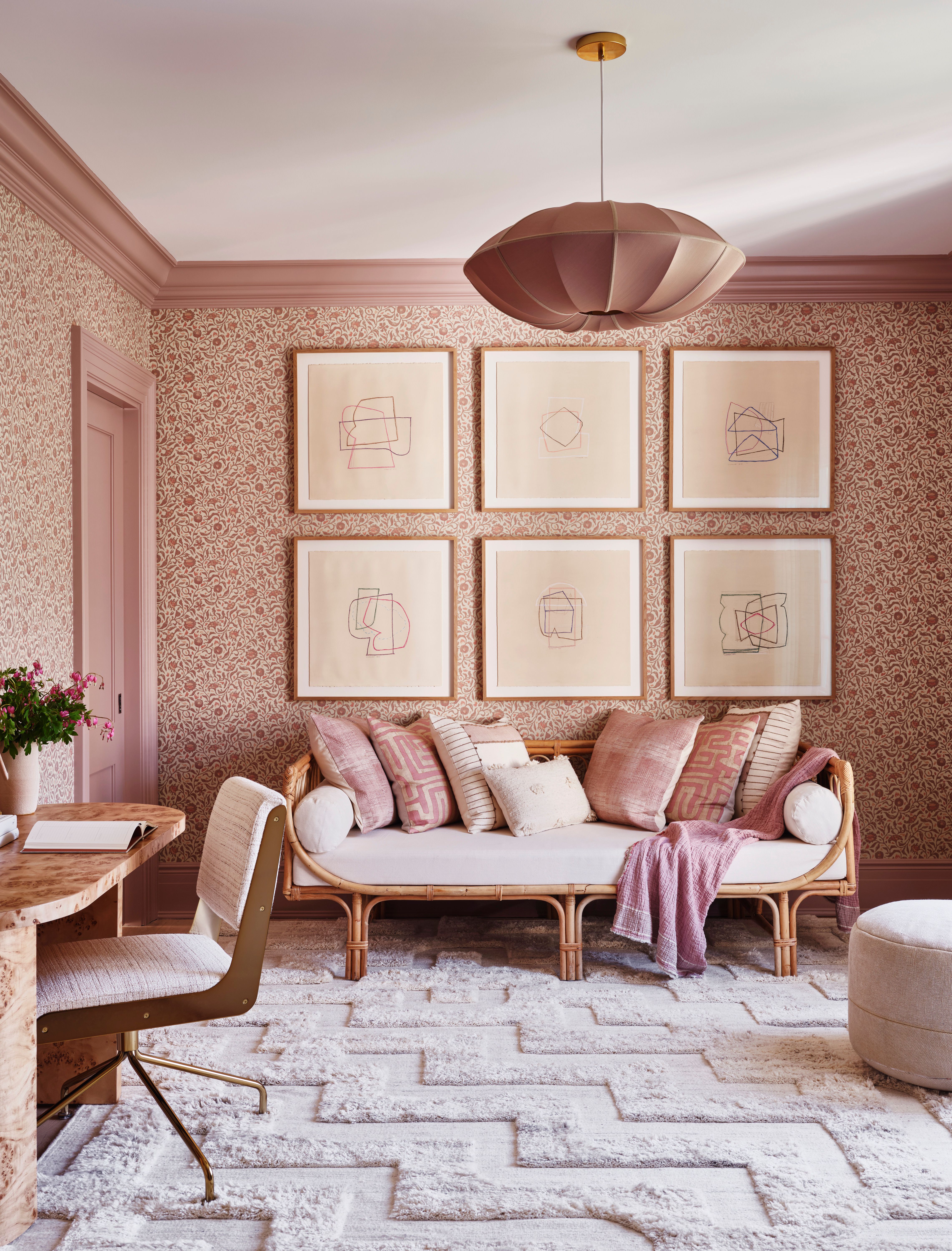
Pink Room Decor Ideas: 39 Ways to Use the Shade Throughout Your Home

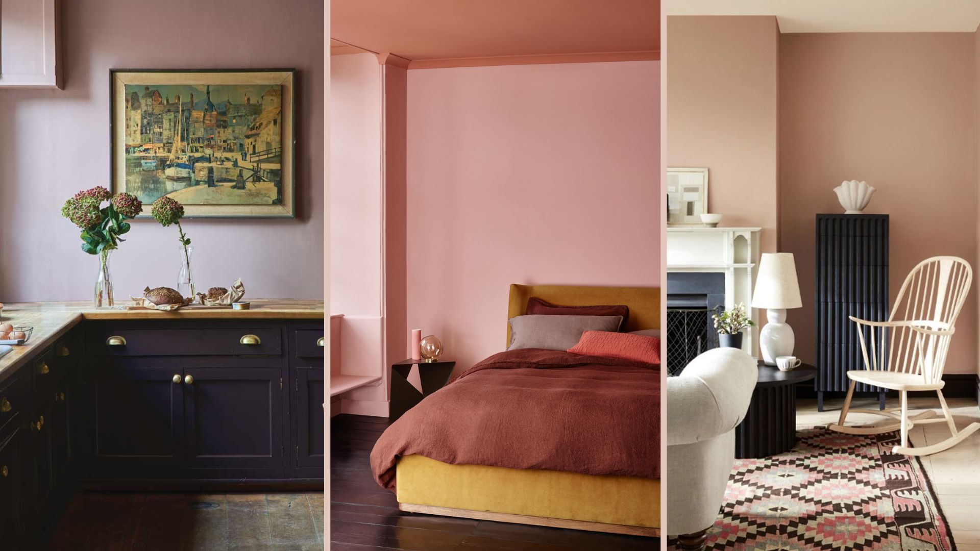
18 sophisticated pink paint colors recommended by interior designers

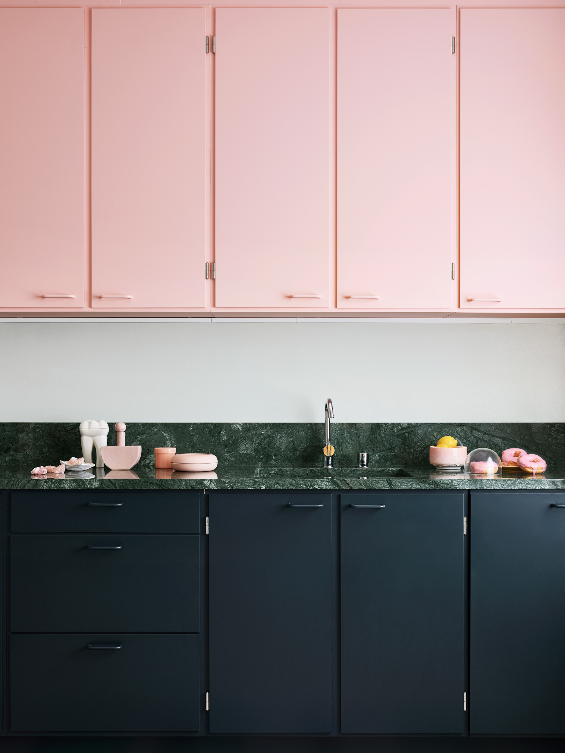
After This Design Trend Took Off, These Paint Colors Became 40% More Popular

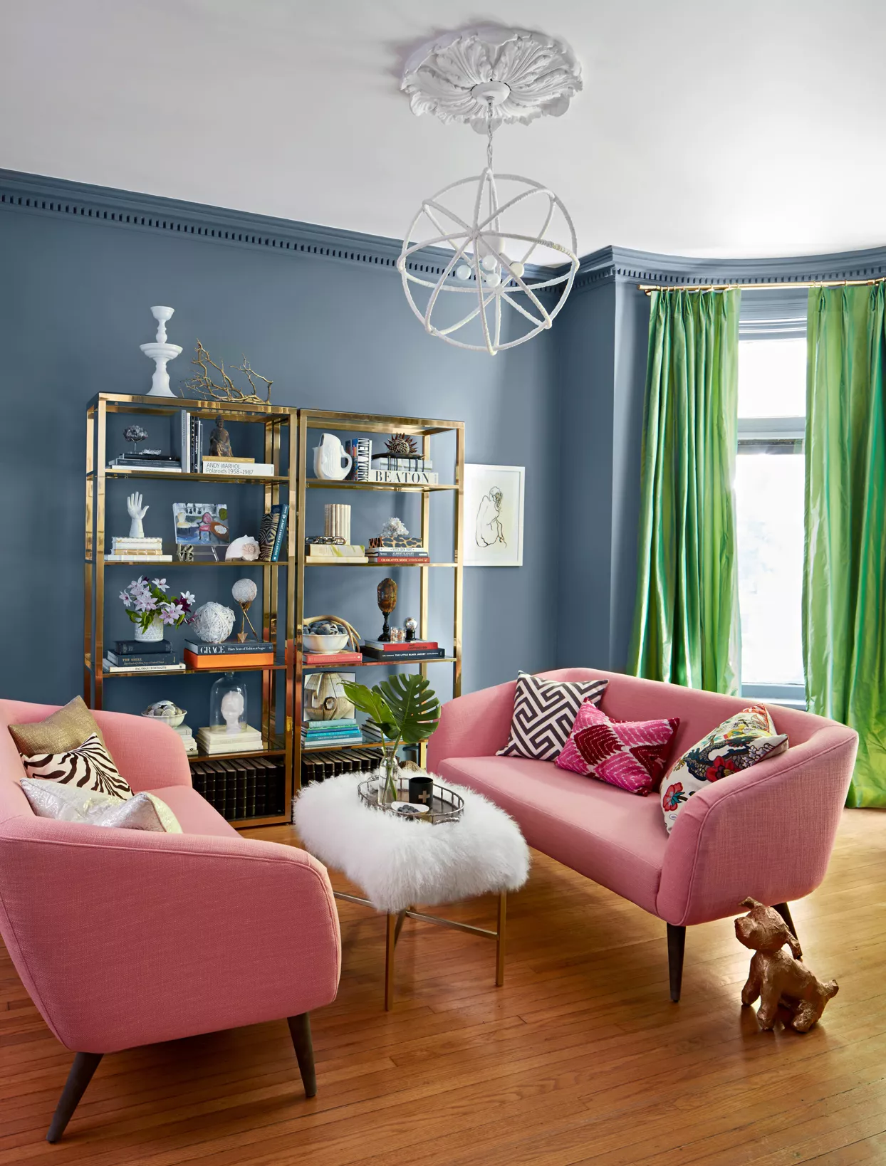
What Color Goes with Pink? 16 Pretty Pairings to Try
Do Pink and Green Go Together in Interiors? A Professional Color Consultant's Verdict
The Power of Color Psychology in Interior Design — How to Create a Home That Feels as Good as It Looks

12 Colors That Go With Pink: Classic and Modern Ideas

The *Right* Way to Decorate with Pink, According to Design Experts

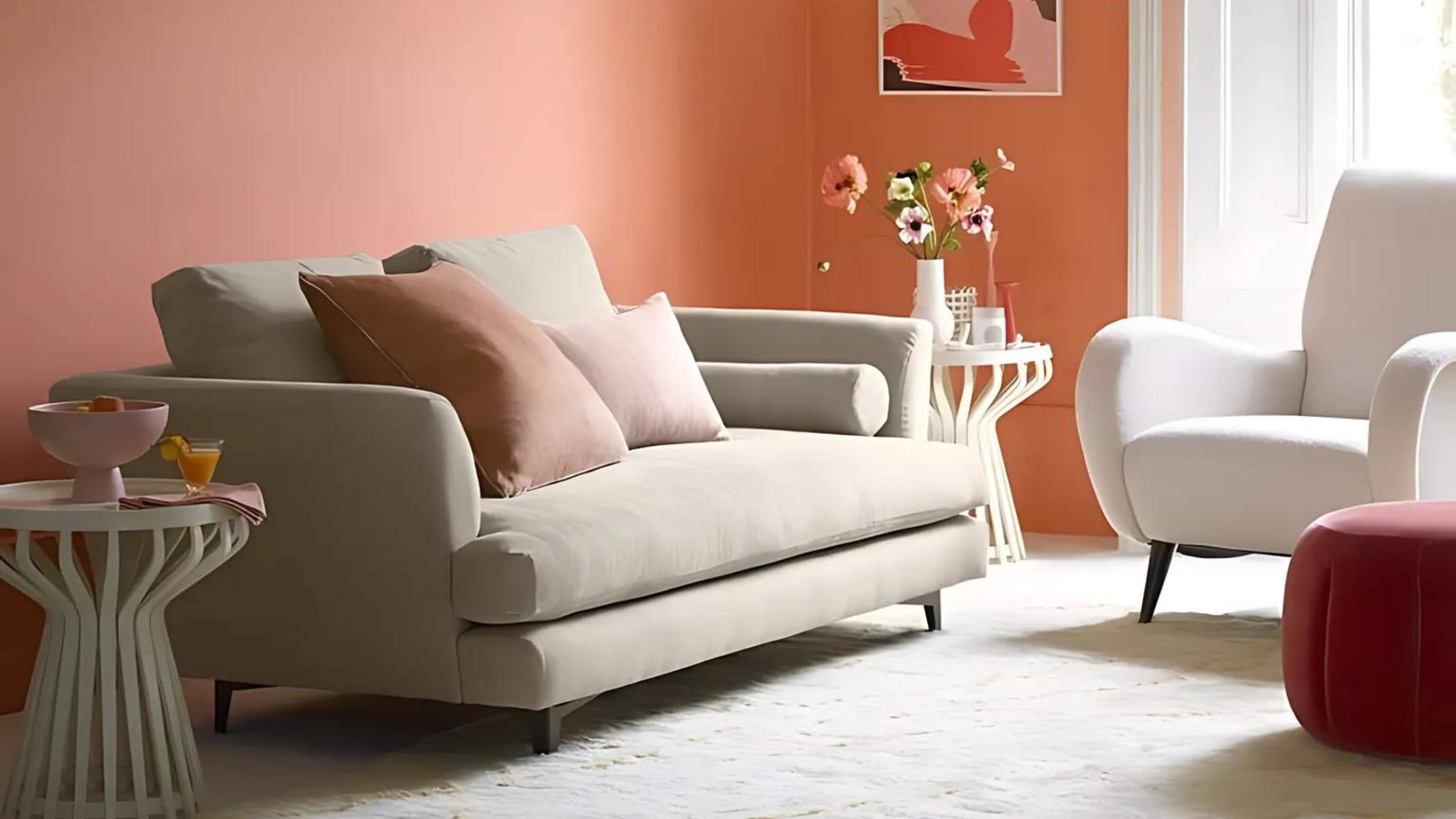
8 pink living room ideas – liven up your space with this joyful color
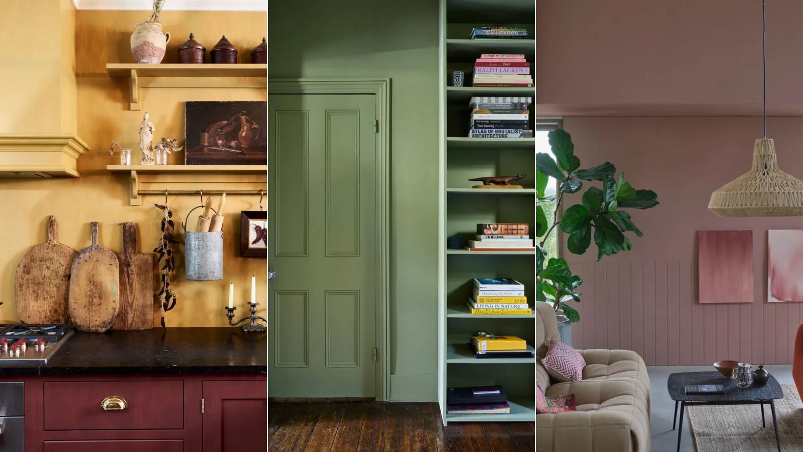
My rented apartment follows the key rules of color psychology – here's why I'd never go back to an all-white home

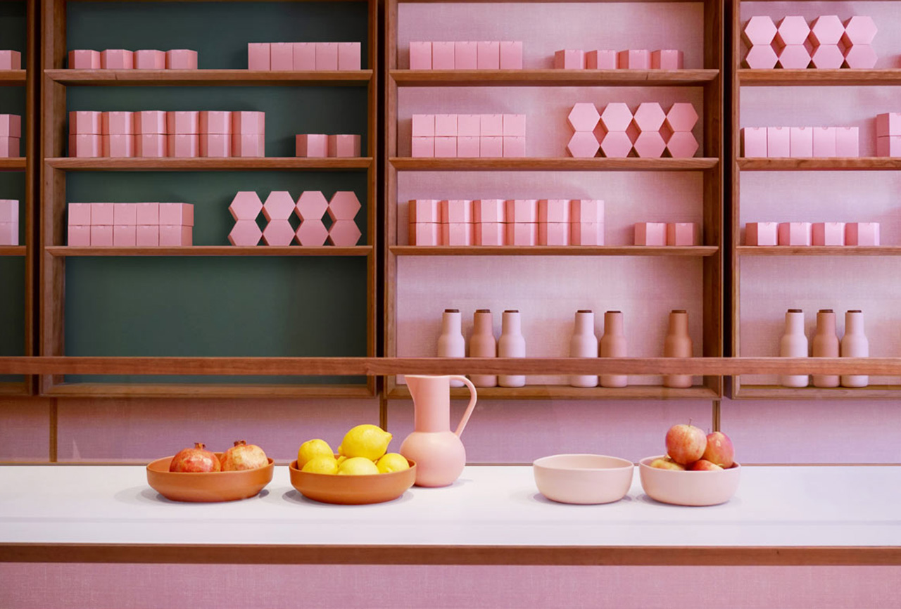
Color Therapy: Design That’s Pretty in Pink
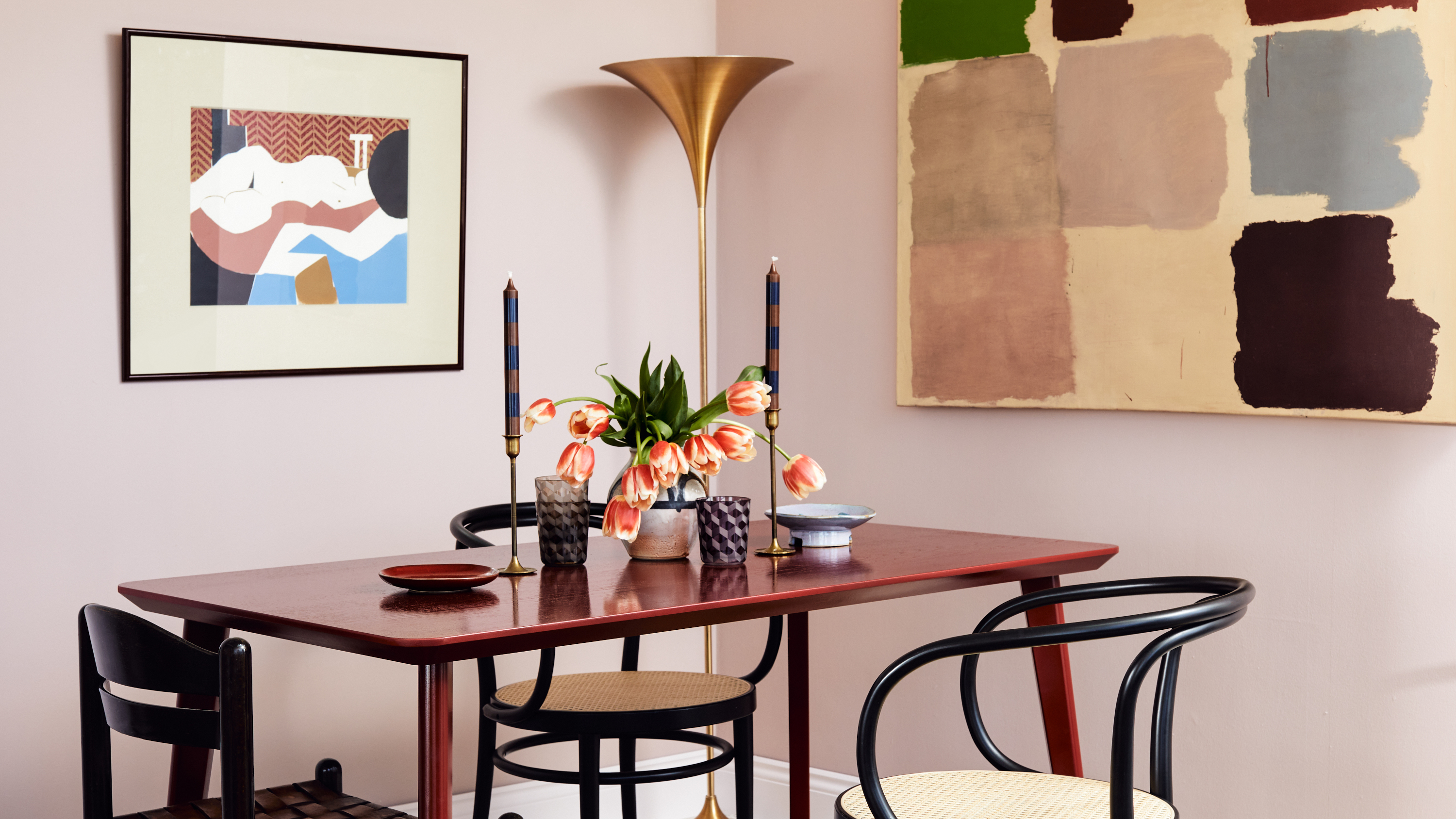
‘It’s not Barbie Whatsoever’ – This is the Exact Shade of Pink Interior Designers are Choosing Now
I never thought I would be decorating with pink and brown – but designers have convinced me this is the most sophisticated color combination for 2025 and beyond
These 5 Simple Questions Help Designers Pick the Perfect Paint Color Every Time