1/2
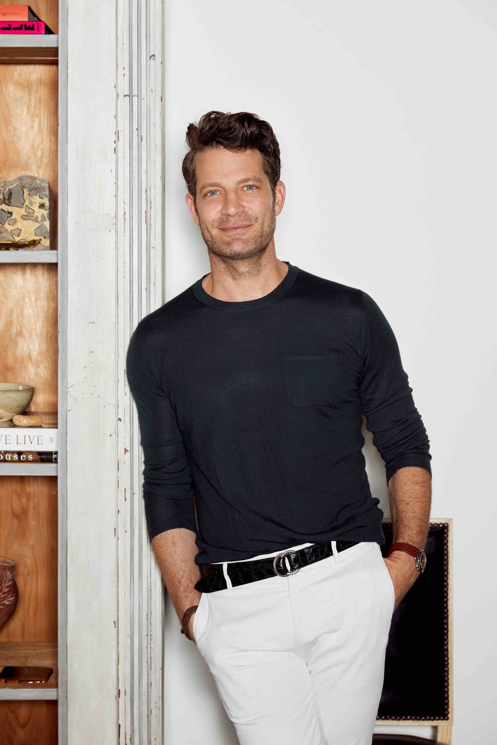
At last, Nate Berkus revealed the 'go-to' paints that made him the master of new neutrals
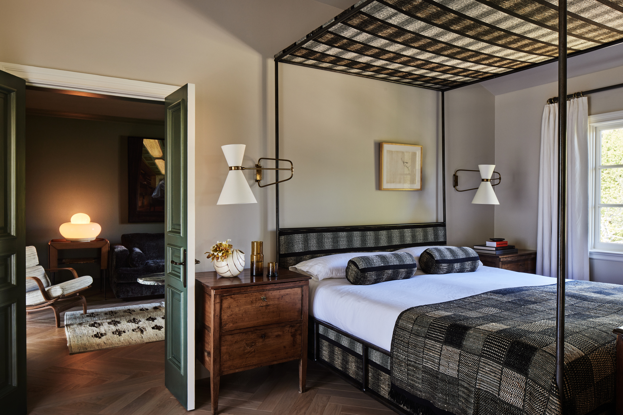
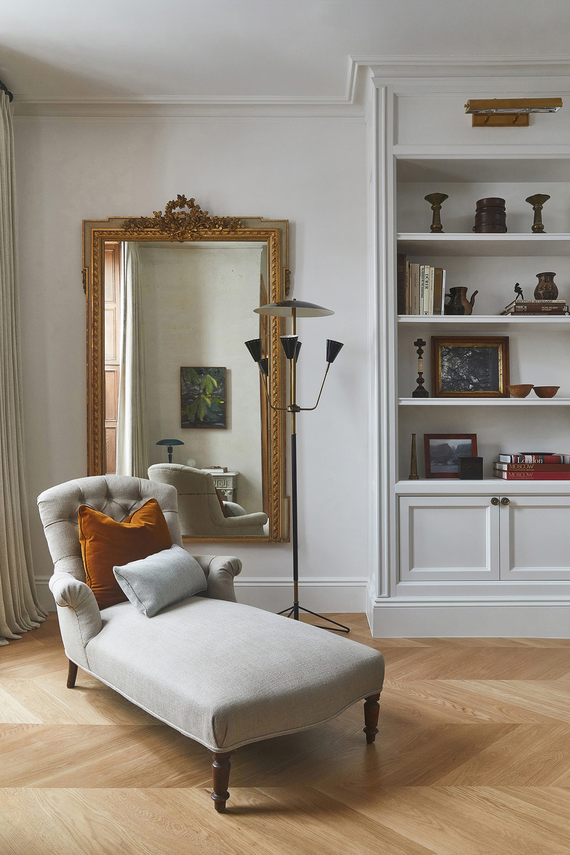
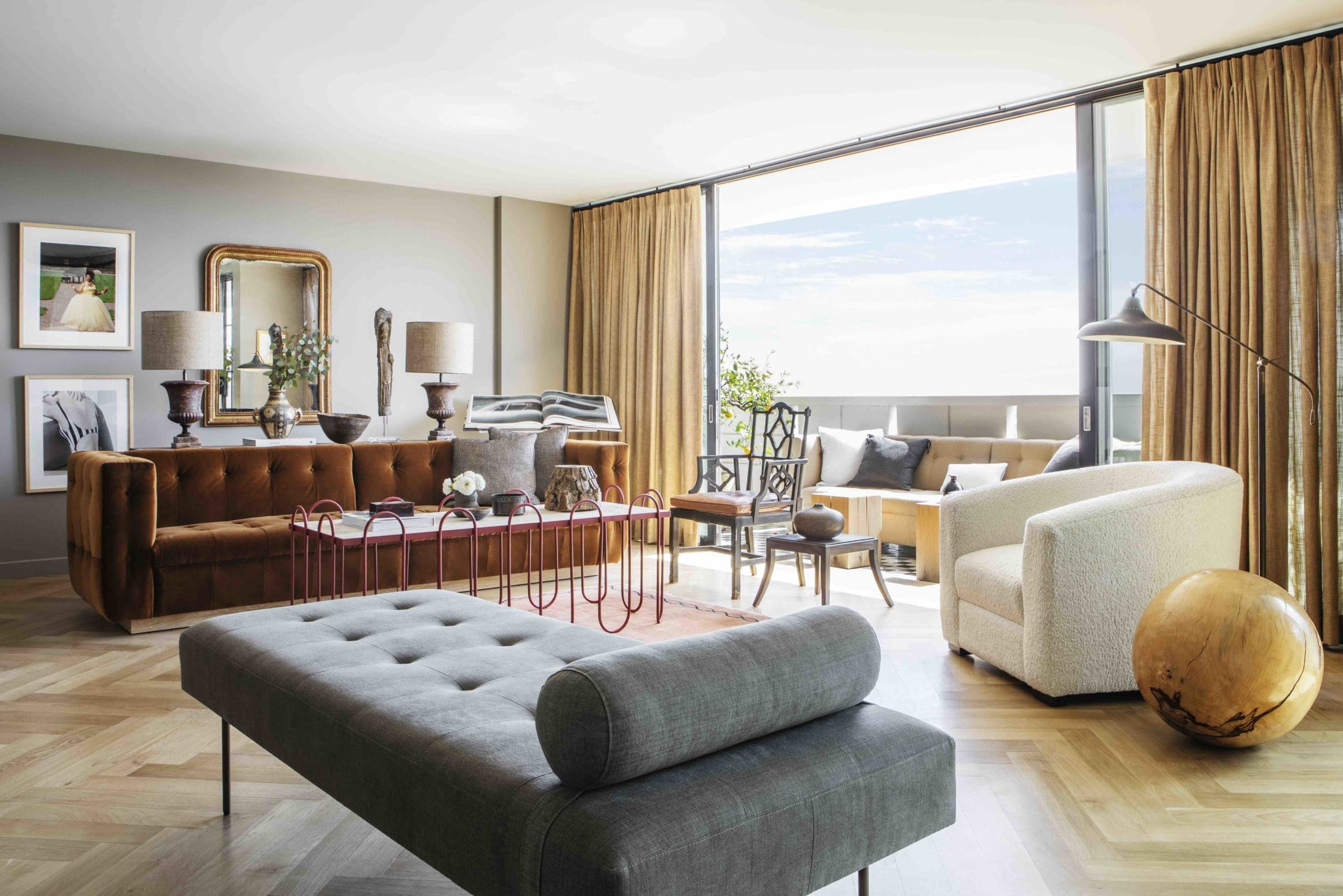
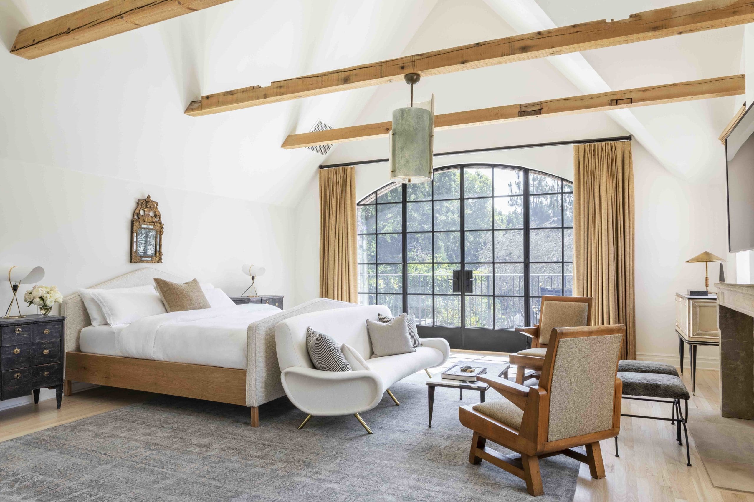
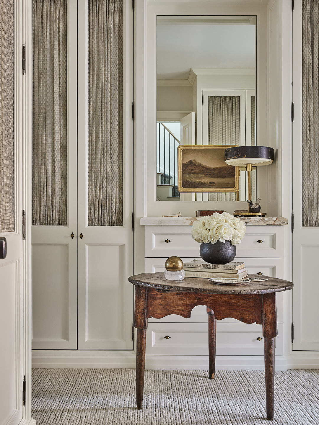
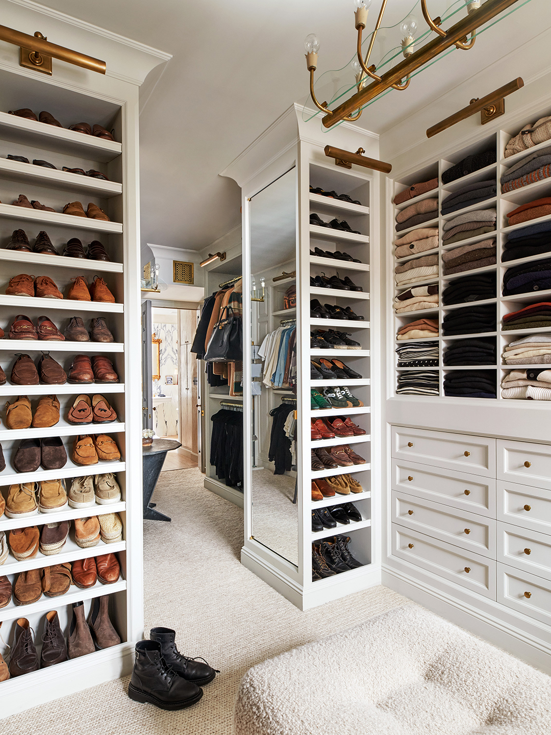
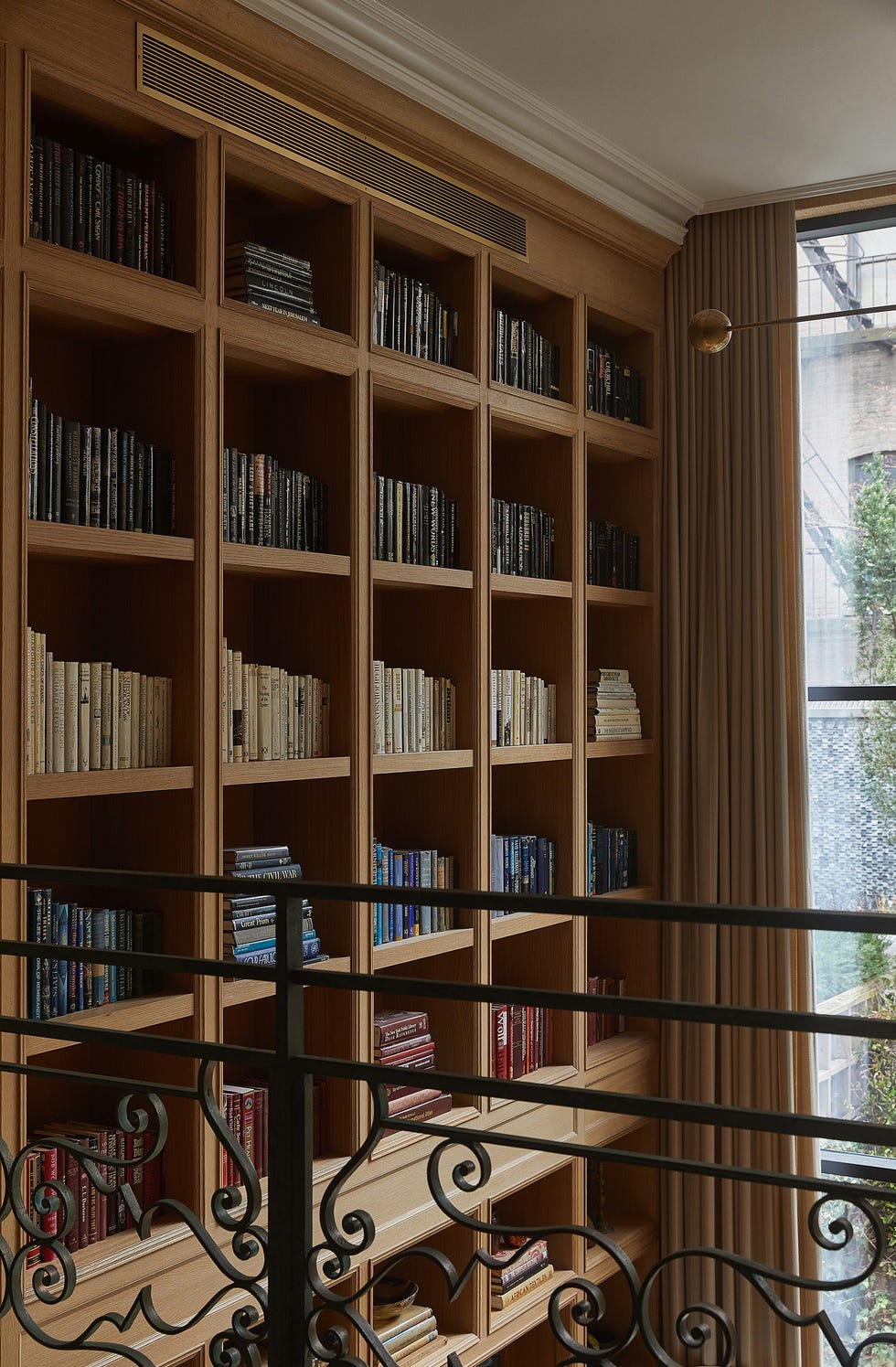
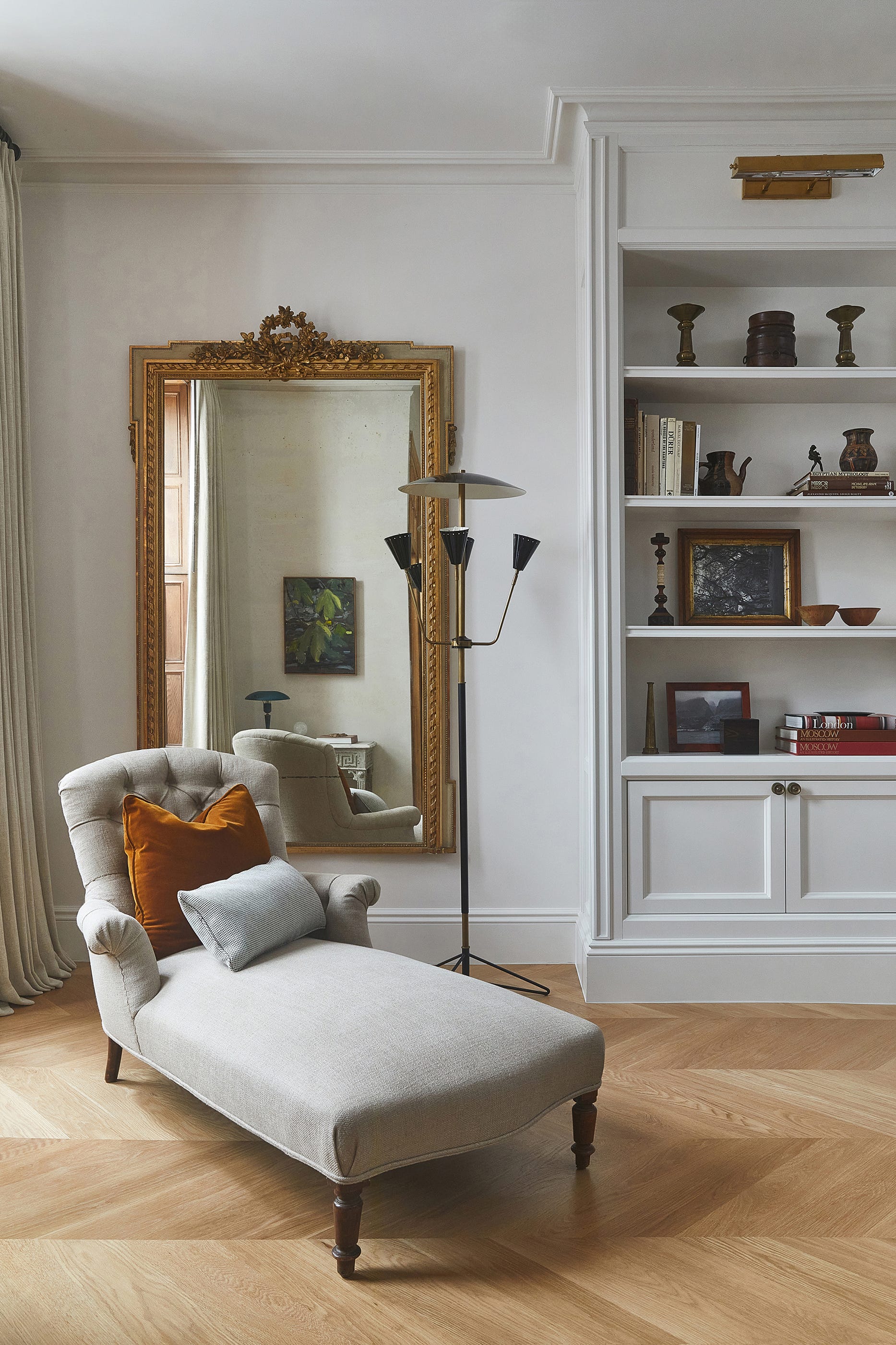
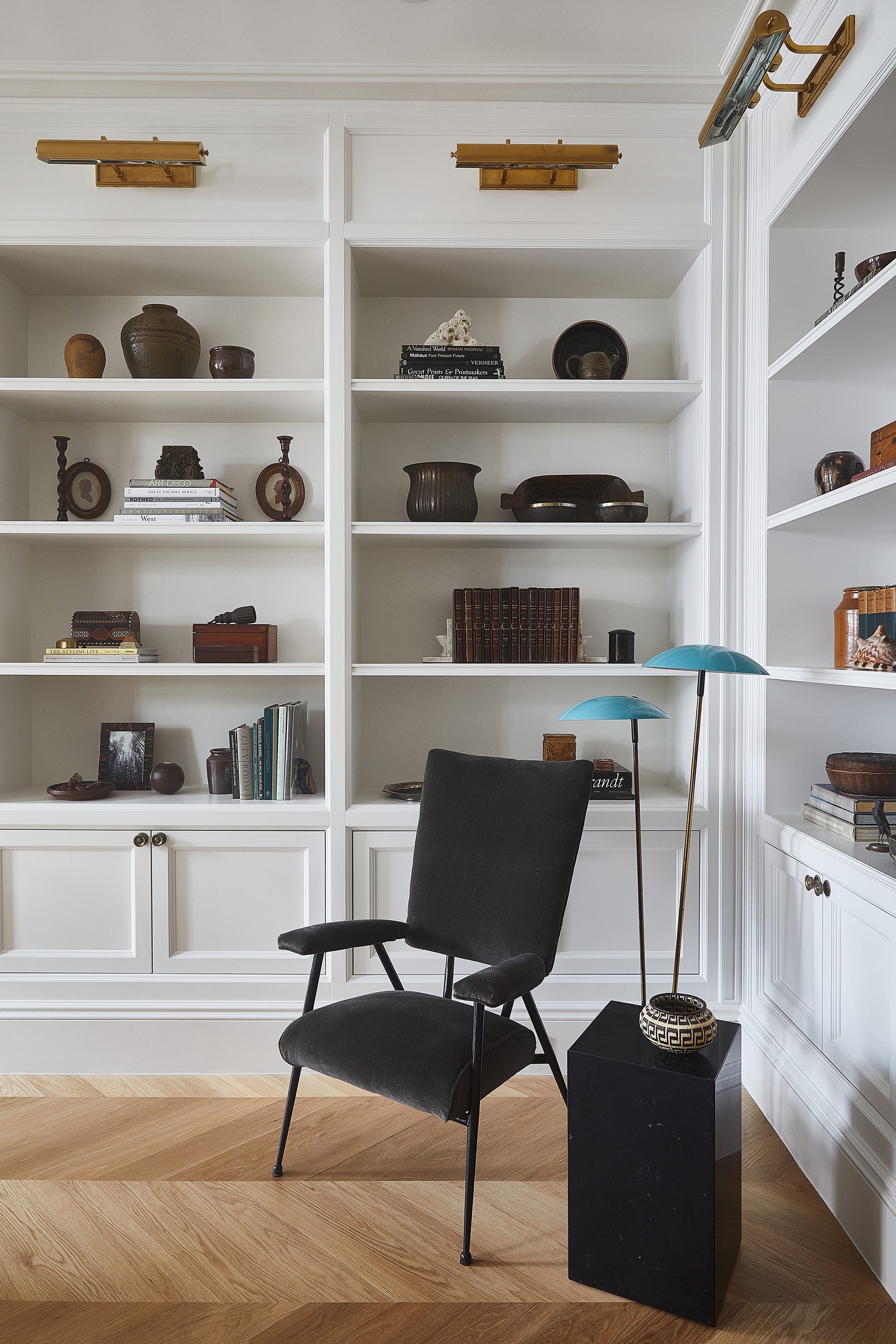
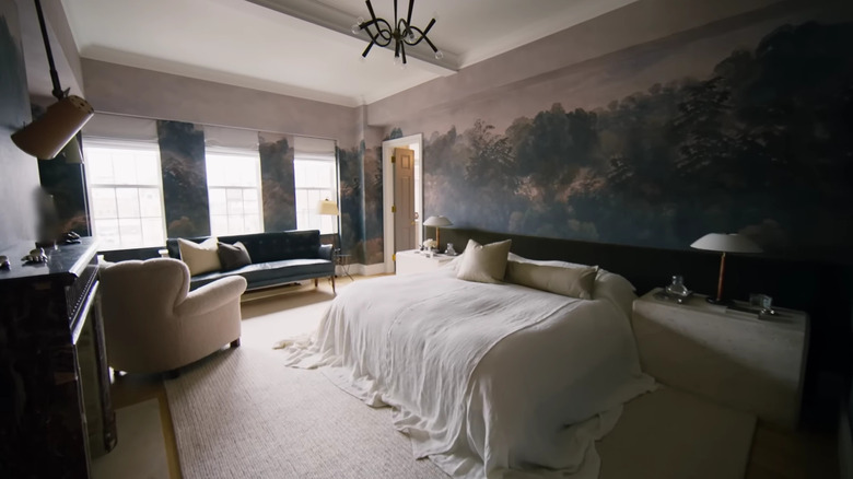
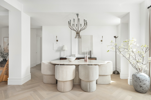
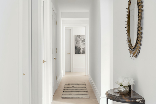
Nate Berkus, a renowned interior designer, has publicly shared his preferred neutral paint colors, a topic of frequent inquiry from his followers. Berkus, known for his masterful use of layered neutrals in interior design alongside his husband Jeremiah Brent, revealed his top selections for creating elegant, cohesive, and sophisticated spaces. His choices lean towards warmer, subtle tones rather than stark whites, ensuring a comforting backdrop that complements various furnishings and design styles.

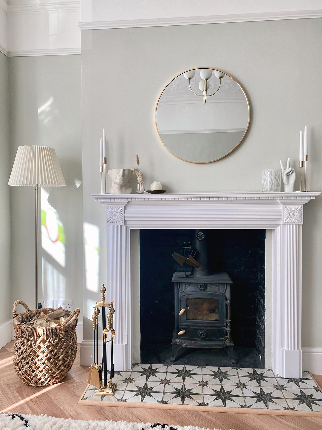
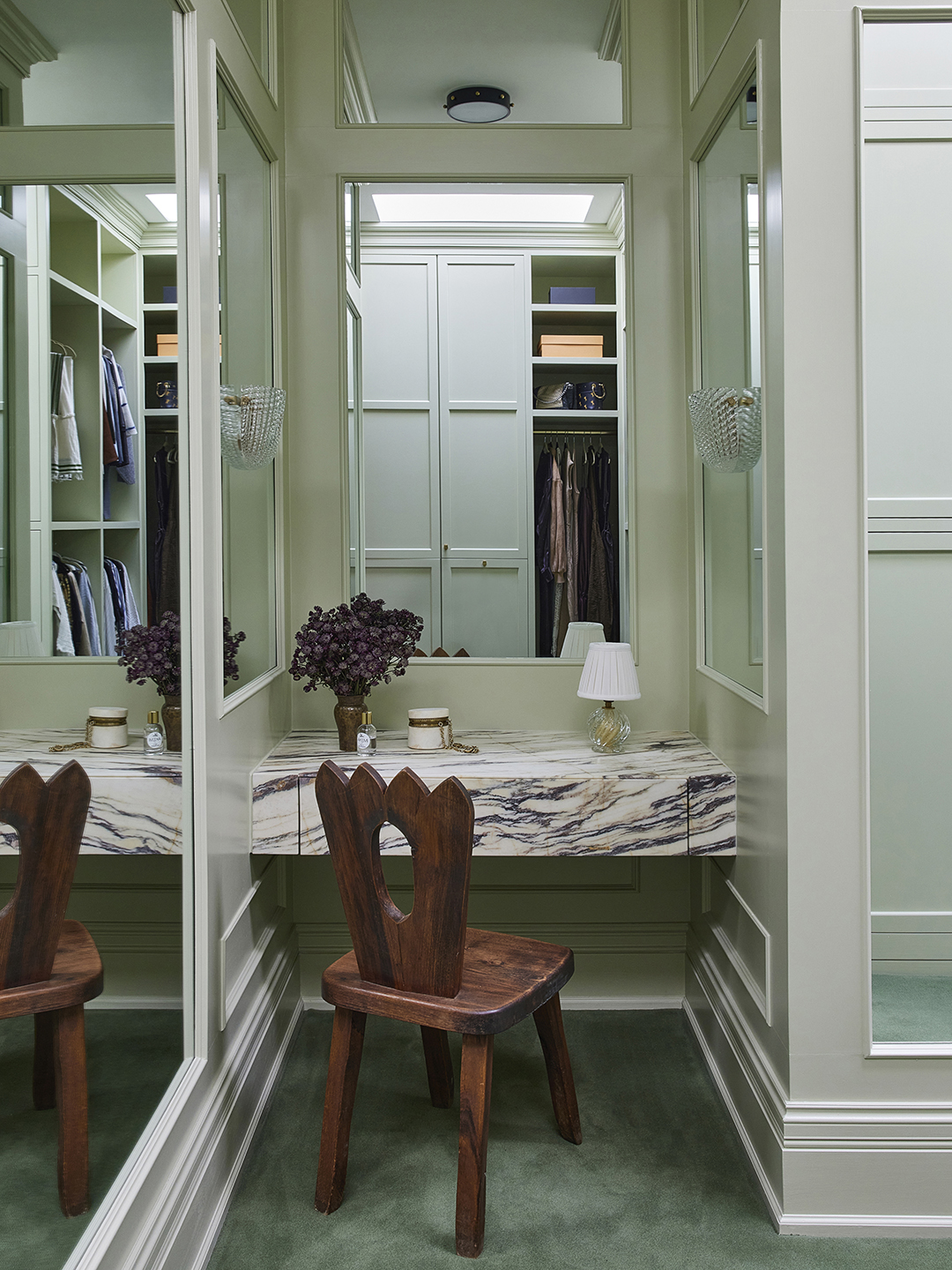
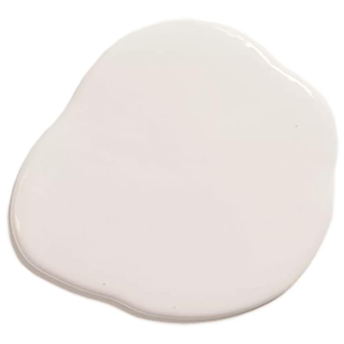
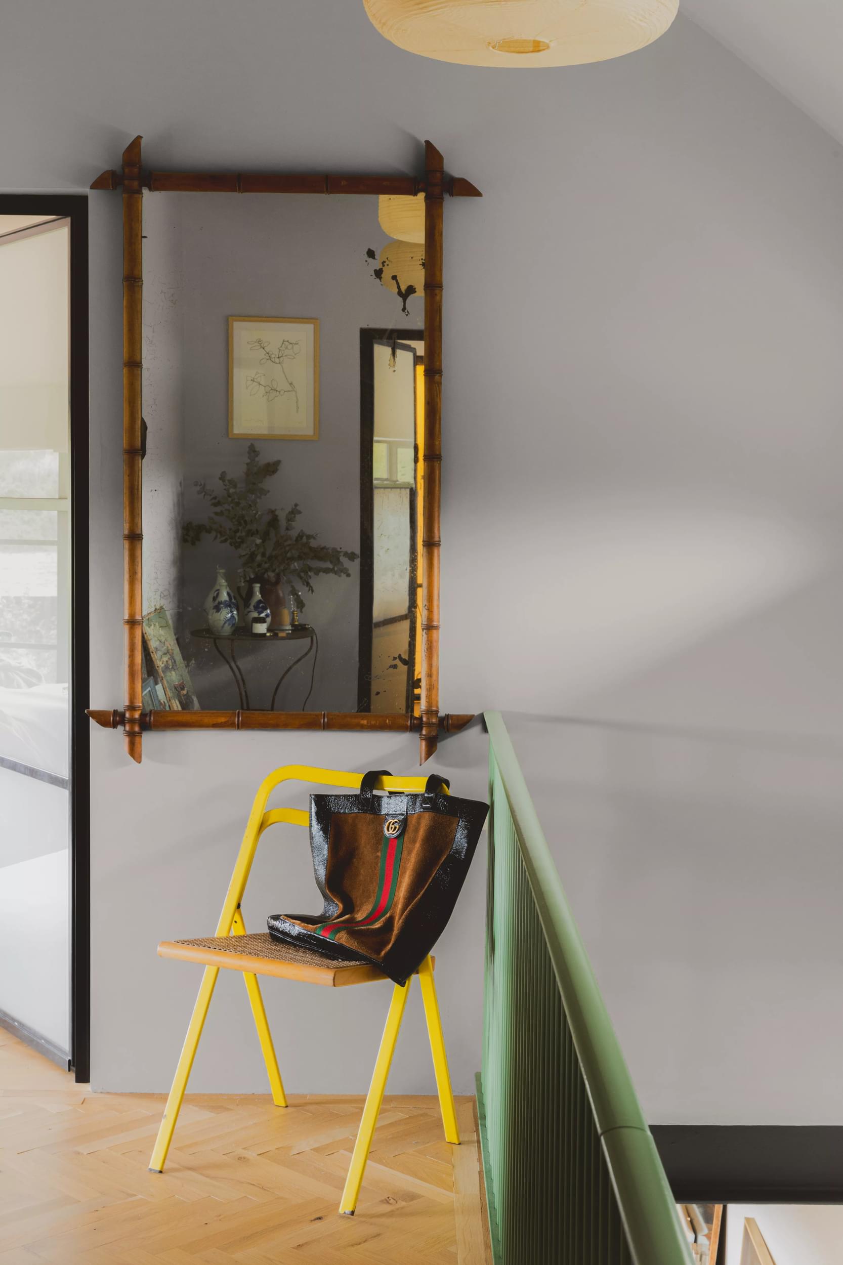
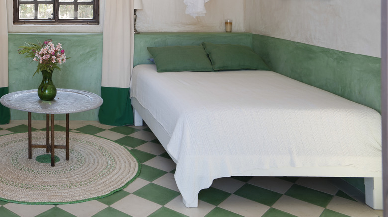
Among his favorite paint brands, Berkus highlighted several shades from Benjamin Moore. These include Alabaster, Swiss Coffee, Smokey Taupe, and Snowfall White. These colors are favored for their ability to provide a soft, nuanced base for a room. He also expressed a strong preference for Portola Paints, specifically mentioning Saint Sauvant and Lisbon. Lisbon, described as a 'greeny gray,' is notably used in his children’s bathroom, showcasing its versatility and appeal even in more private spaces.
While most of Berkus's preferred neutrals have warm undertones, he also acknowledged the demand for brighter white options. For those seeking a clean, crisp white, he recommended Clare Paint’s Fresh Kicks, alongside their white-green tone, Flatiron, in his Instagram caption. These recommendations provide a comprehensive palette for individuals looking to emulate his signature style of sophisticated neutrality.
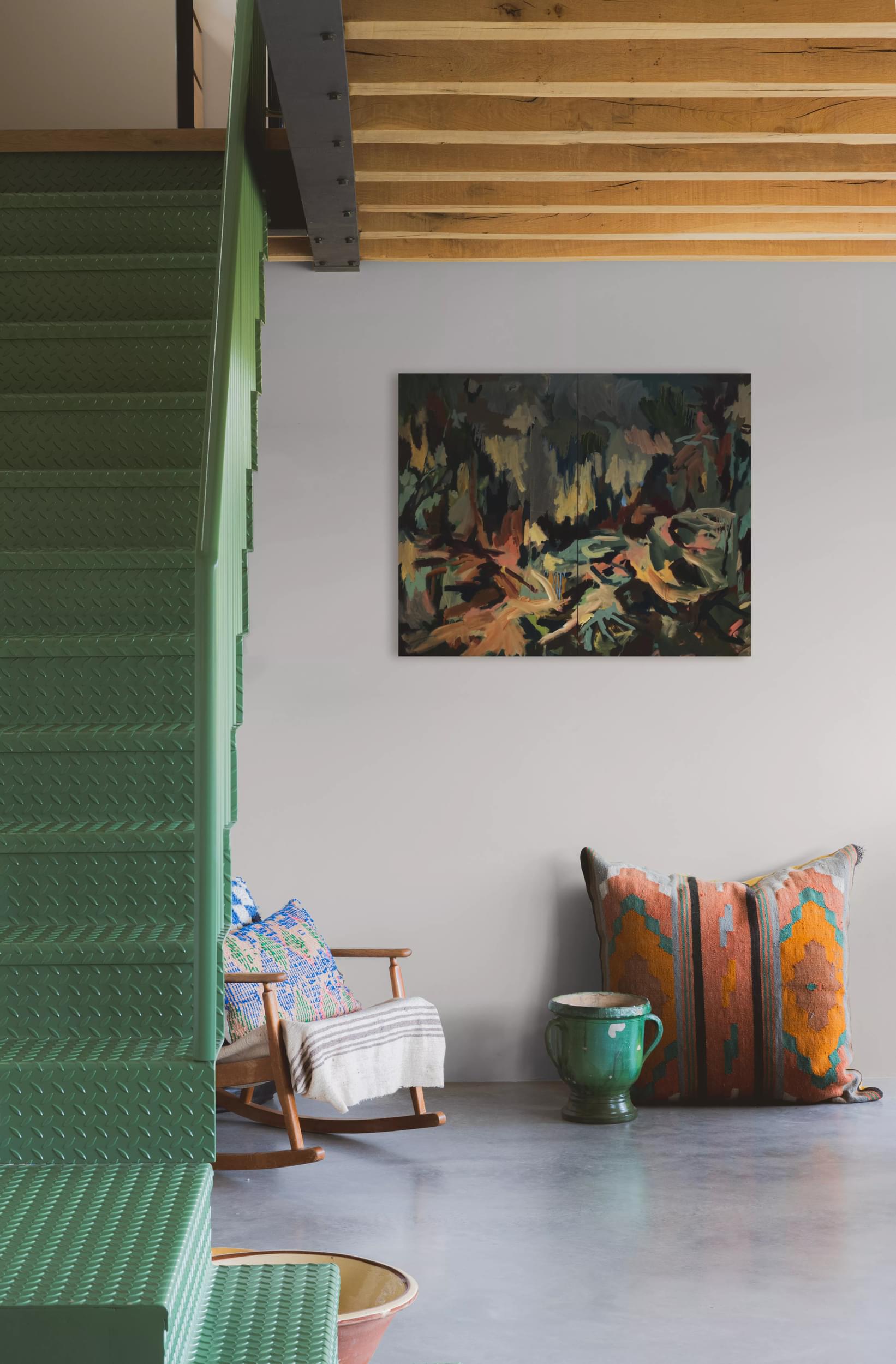
Berkus emphasized that neutrals serve as an ideal foundation, offering a 'blank canvas' that allows for flexibility in introducing different design styles or color schemes. He noted his preference for subtle experimentation, suggesting the use of accent colors in niches or shelving rather than on entire walls. This approach aligns with his philosophy of creating timeless interiors that can easily adapt to changing tastes or trends without requiring a complete overhaul.
In a previous discussion with Homes & Gardens, both Nate Berkus and Jeremiah Brent underscored the enduring influence of neutrals in design. Berkus specifically lauded Behr’s Even Better Beige as a standout choice for decorating with beige, further solidifying his diverse range of neutral recommendations. The designer's insights reinforce the idea that these versatile colors are suitable for rooms of any shape or size, providing a foundation for diverse aesthetic expressions.
The designer’s revelation is significant for design enthusiasts and professionals alike, offering direct access to the specific hues that define his highly acclaimed aesthetic. By sharing these 'go-to' paints, Berkus empowers others to achieve a similar level of design sophistication in their own homes, proving that neutrals, when chosen thoughtfully, are anything but boring.
#NateBerkus #NeutralPaints #InteriorDesign #HomeDecor #BenjaminMoore #PortolaPaints #ClarePaint #DesignTips #CelebrityStyle #NateBerkus #NeutralPaints #InteriorDesign #HomeDecor #BenjaminMoore #PortolaPaints #ClarePaint #DesignTips #CelebrityStyle
0 comment in total
 No comments yet
You may also like

Nate Berkus Reveals His Go-To Styling Hack—and It’s GENIUS

Nate Berkus Bedding Picks You Won’t Want to Miss


Nate Berkus' bookshelves are a lesson in curated eclectism


Say goodbye to dated vertical blinds with this elegant update from Nate Berkus

9 Neutral Paint Colors Designers Constantly Reach For — "It's My Tried-and-True"

The One Feature Nate Berkus Can’t Look at Without Wanting to Redo It


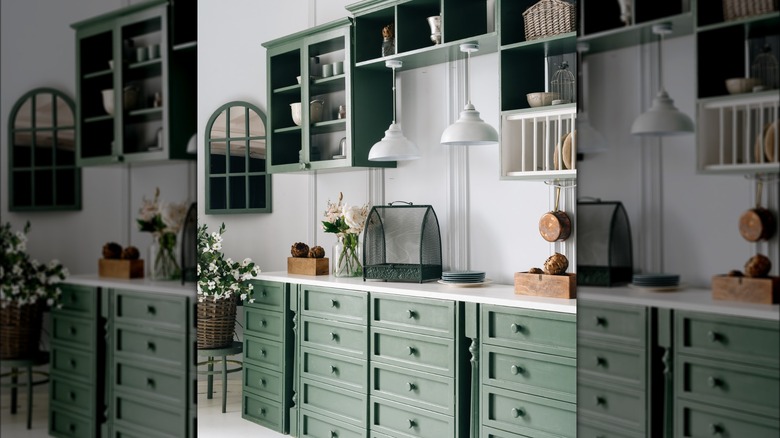
The Nate Berkus-Favored Neutral Green Paint Color That's Taking Over Kitchens

Find your perfect neutral with COAT Paints' new Polite Palette
Nate Berkus’s Latest Project Was Actually Inspired by His Own Home

Refresh Your Home With The Light Neutral Paint Shade Nate Berkus Absolutely Adores
Nate Berkus's Bathroom Proves That He's Braver Than the Rest of Us
Nyberg’s Ace: Your place for paint

Nate Berkus Revealed His FAVE Neutral Paint Color—and It's the Perfect Shade of White

Nate Berkus' most recent bedroom project nails the emerging trend for mixing the contemporary with the vintage eclectic

3 styling lessons I learnt from taking a tour of Nate Berkus' coffee table
Nate Berkus And Jeremiah Brent Add Finishing Touch To Upper West Side’s Marlow

Nate Berkus on the New Age of Interior Design


The 1920s Closet Detail Nate Berkus Is Bringing Back

10 Clever Ways Nate Berkus Incorporates A Gorgeous Green Color Into Any Design Space

How HGTV Star Nate Berkus Switches Up His Love For Checkerboard Floors