1/2
Refresh Your Home With The Light Neutral Paint Shade Nate Berkus Absolutely Adores
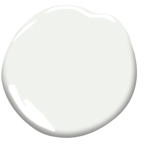
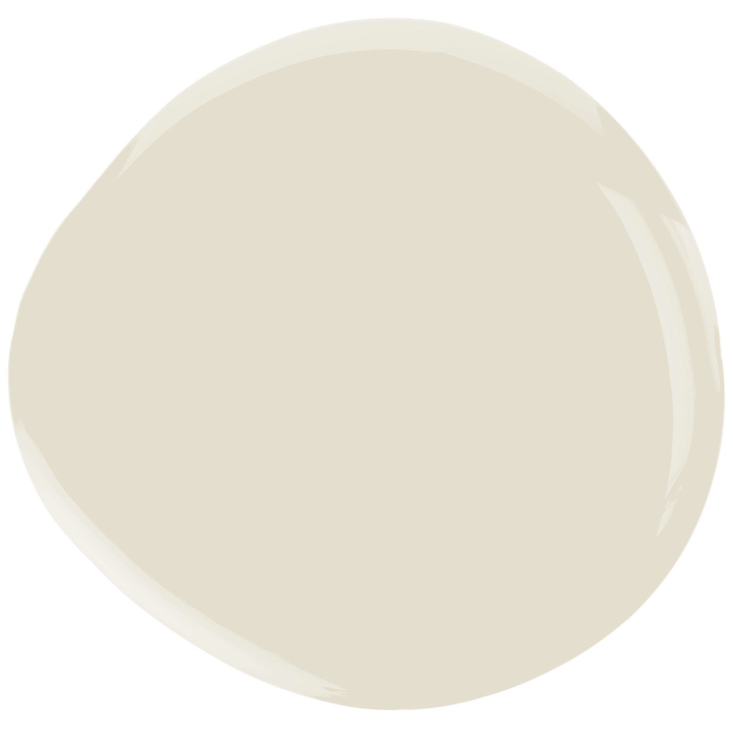
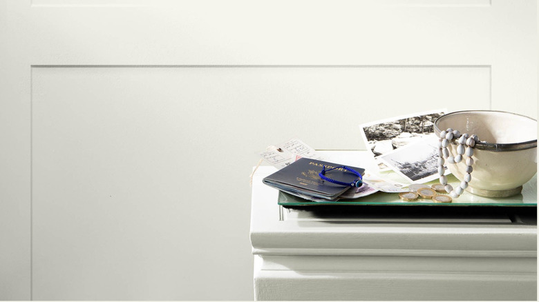
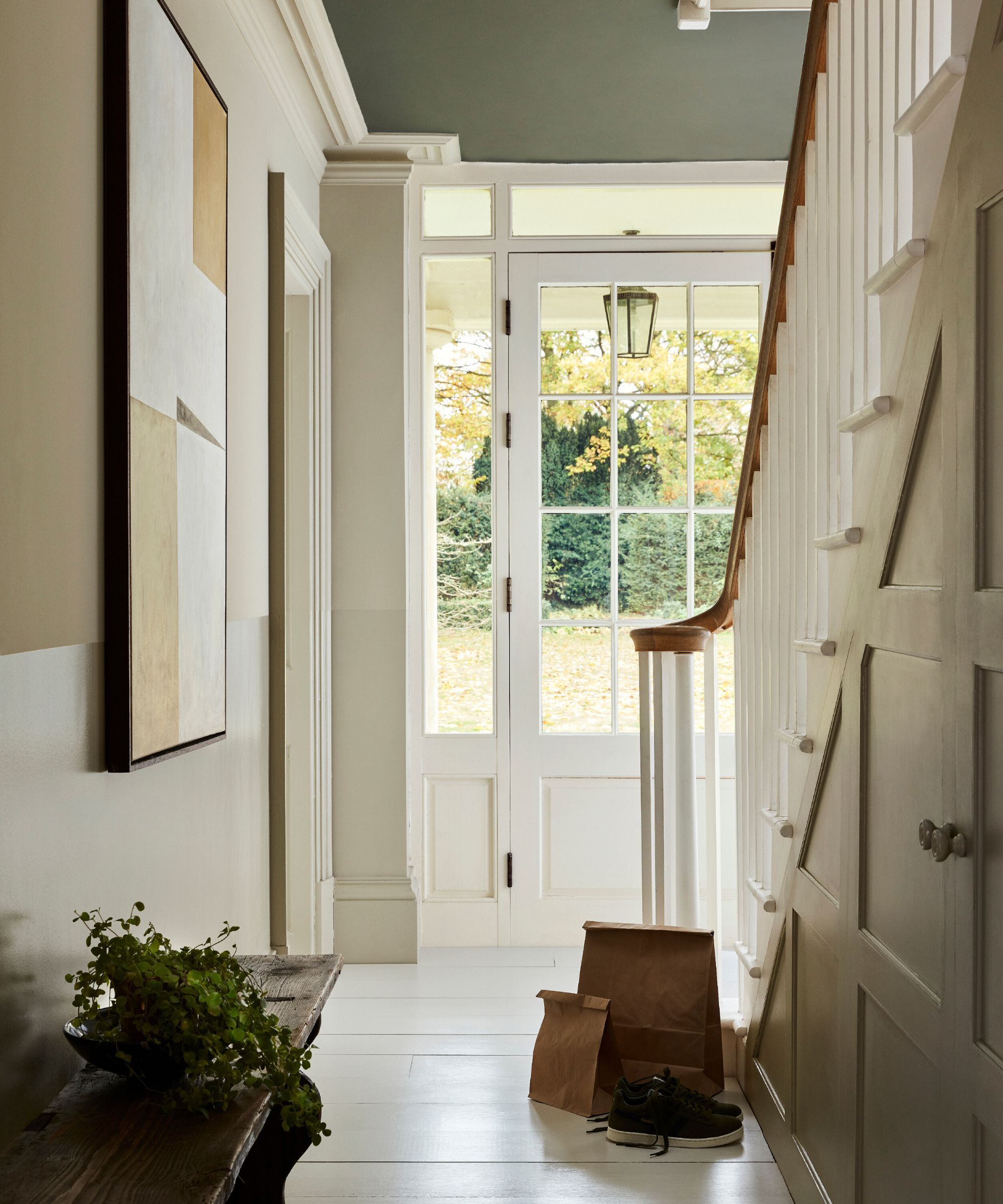
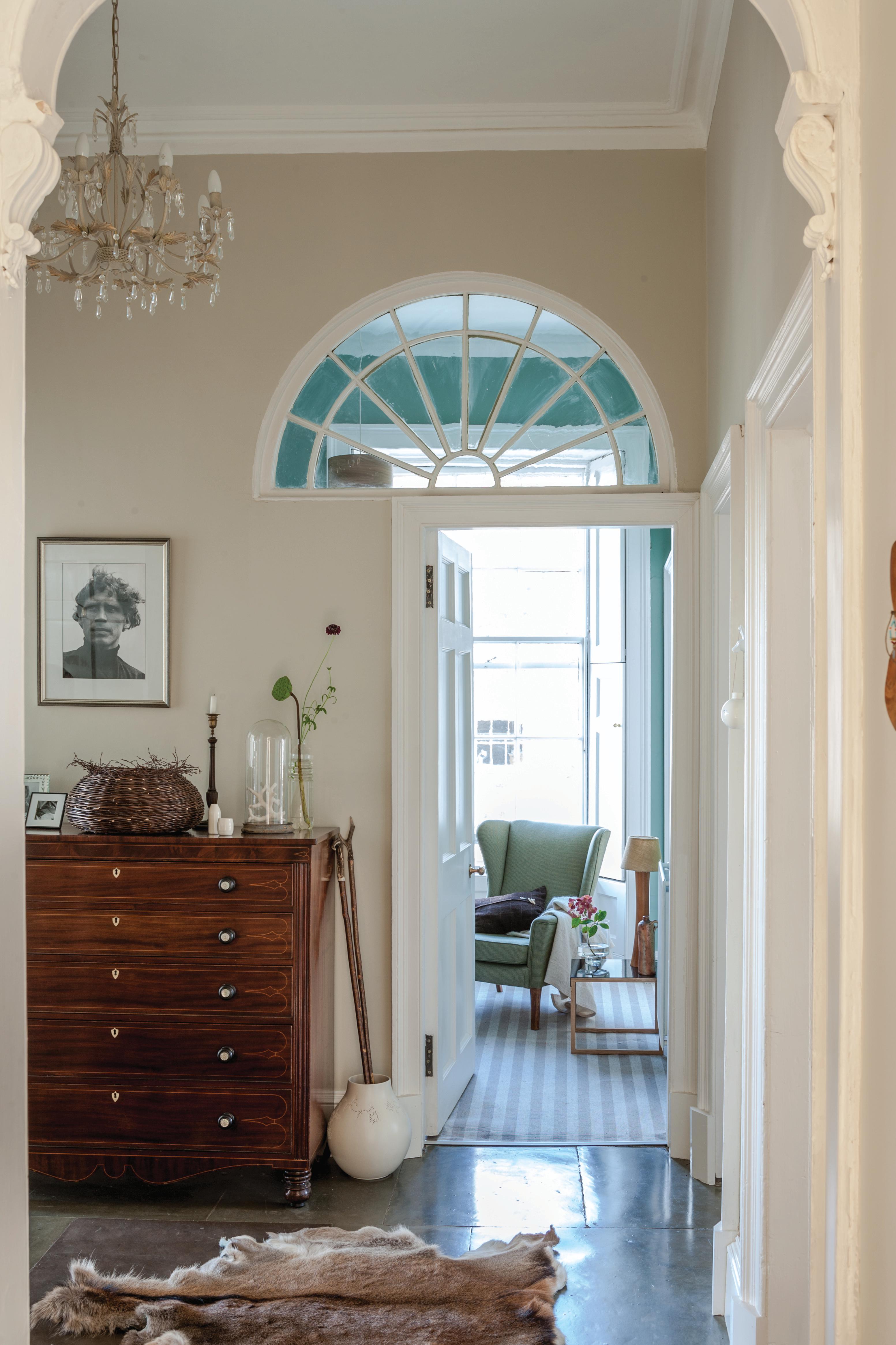
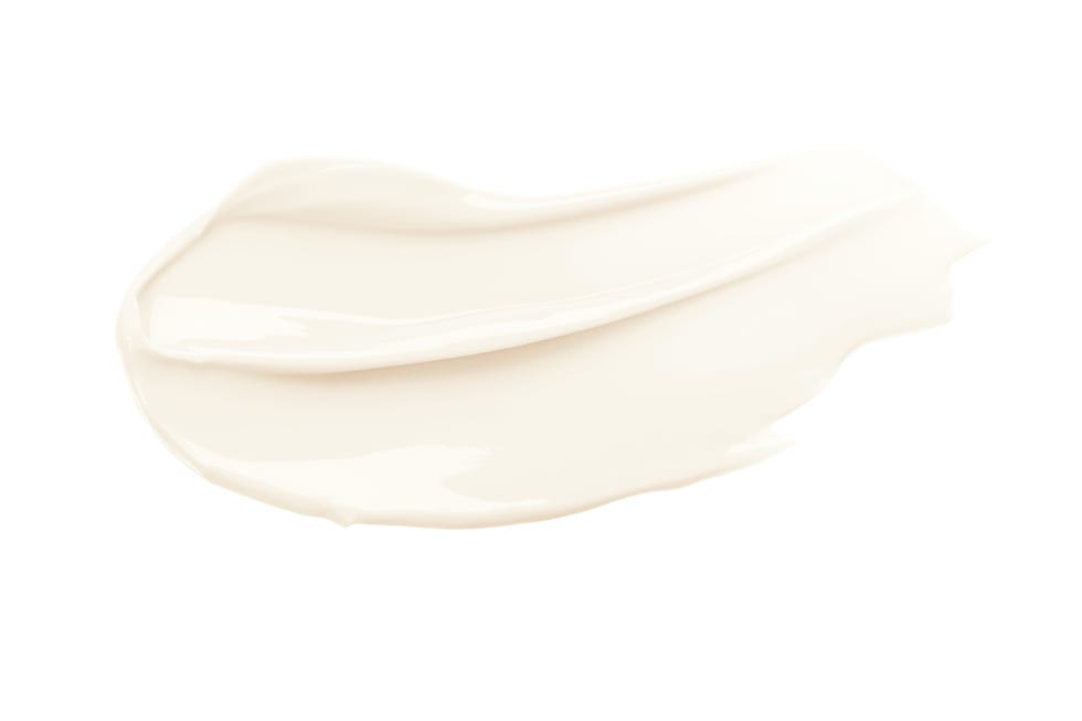
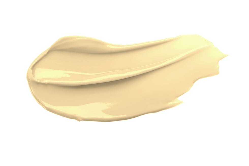
Neutral colors are considered timeless in interior design, and far from being uninteresting, they can create classic and enduring spaces. Design expert Nate Berkus frequently incorporates neutrals to achieve this effect, also skillfully blending them with bolder, more artistic hues to create modern flair. Berkus recently highlighted his affection for Benjamin Moore's color "Seaspray" on Instagram, describing it as a "chalky off-white." Benjamin Moore characterizes "Seaspray" as a "usable neutral" featuring "nuanced shades of beige, yellow, and green." Berkus has even applied this shade to the walls of his own residence.
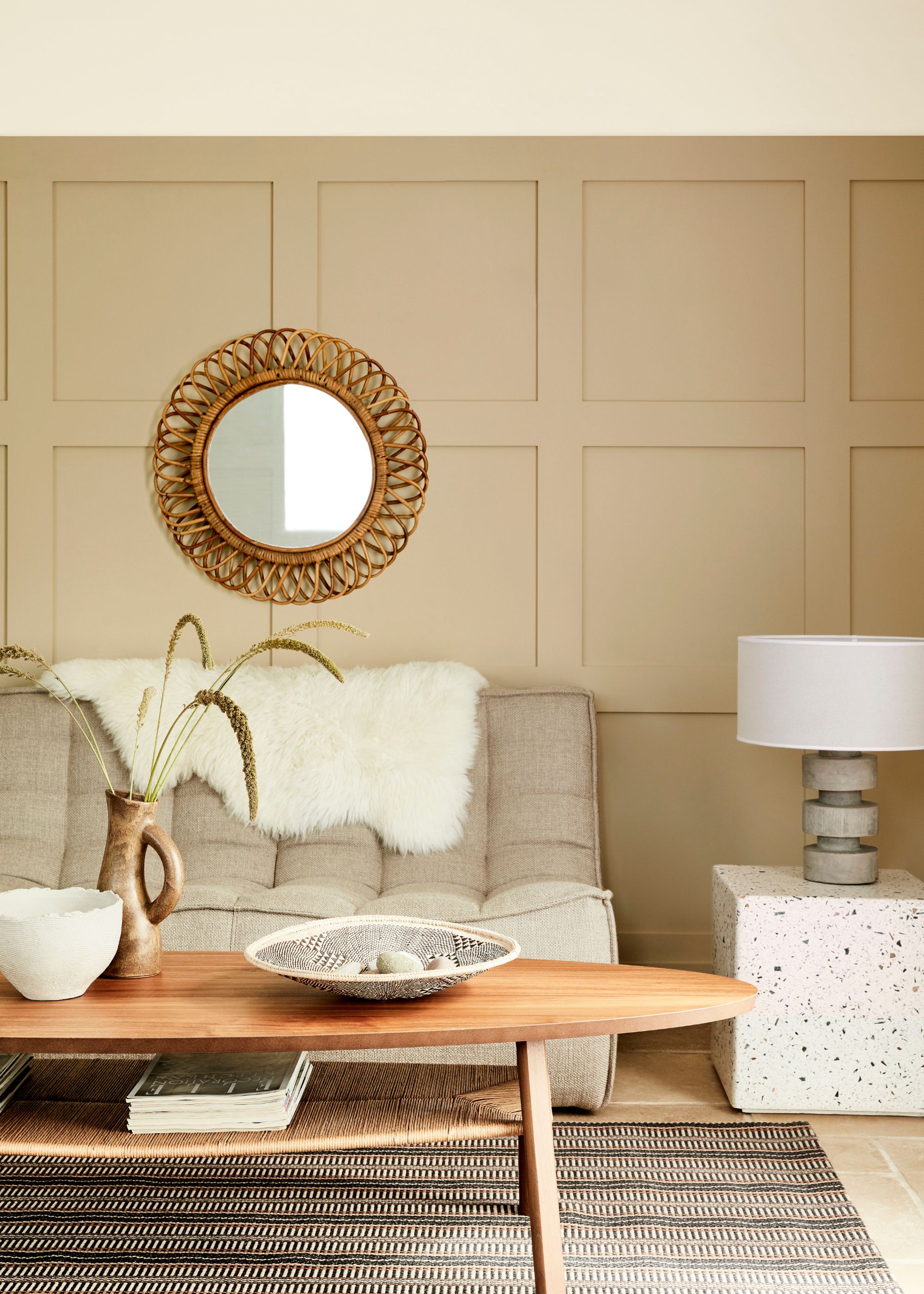
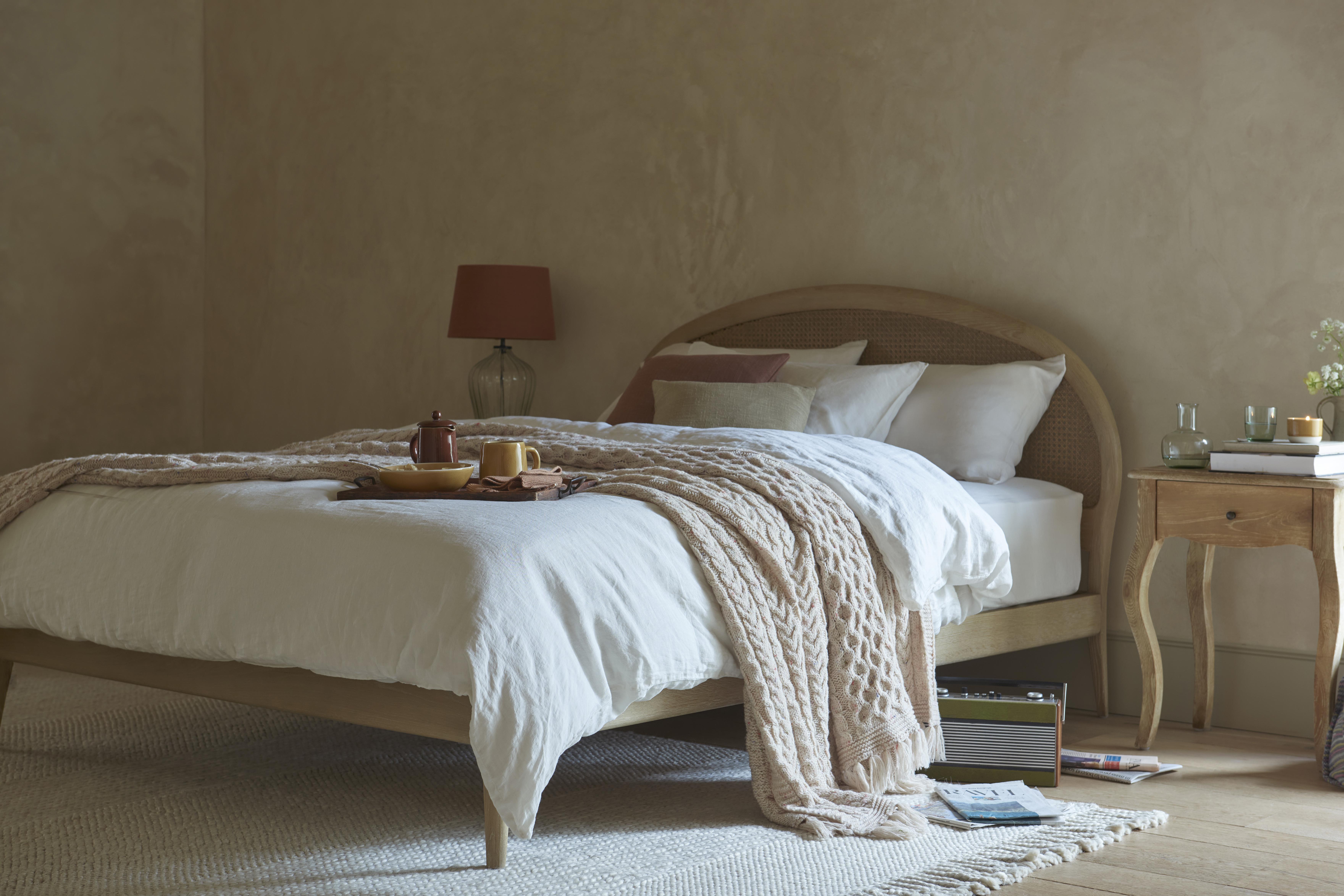
His husband, Jeremiah Brent, has expressed weariness with overly common beige paint colors. However, the versatility of "Seaspray," particularly its ability to harmonize with earth tones, likely won him over. The chalky quality of the paint lends a vividness that distinguishes it from other neutrals. This unique shade, with its naturalistic blend of beige and yellow, evokes the appearance of rich limewash paint. Similar to limewash, "Seaspray" can significantly transform a home's aesthetic. Its light, warm, and airy qualities contribute to a sense of both calm and invigoration. The color is often likened to a day at the beach, with its yellow tint resembling the sun and its smooth, natural beige reminiscent of serene sand.
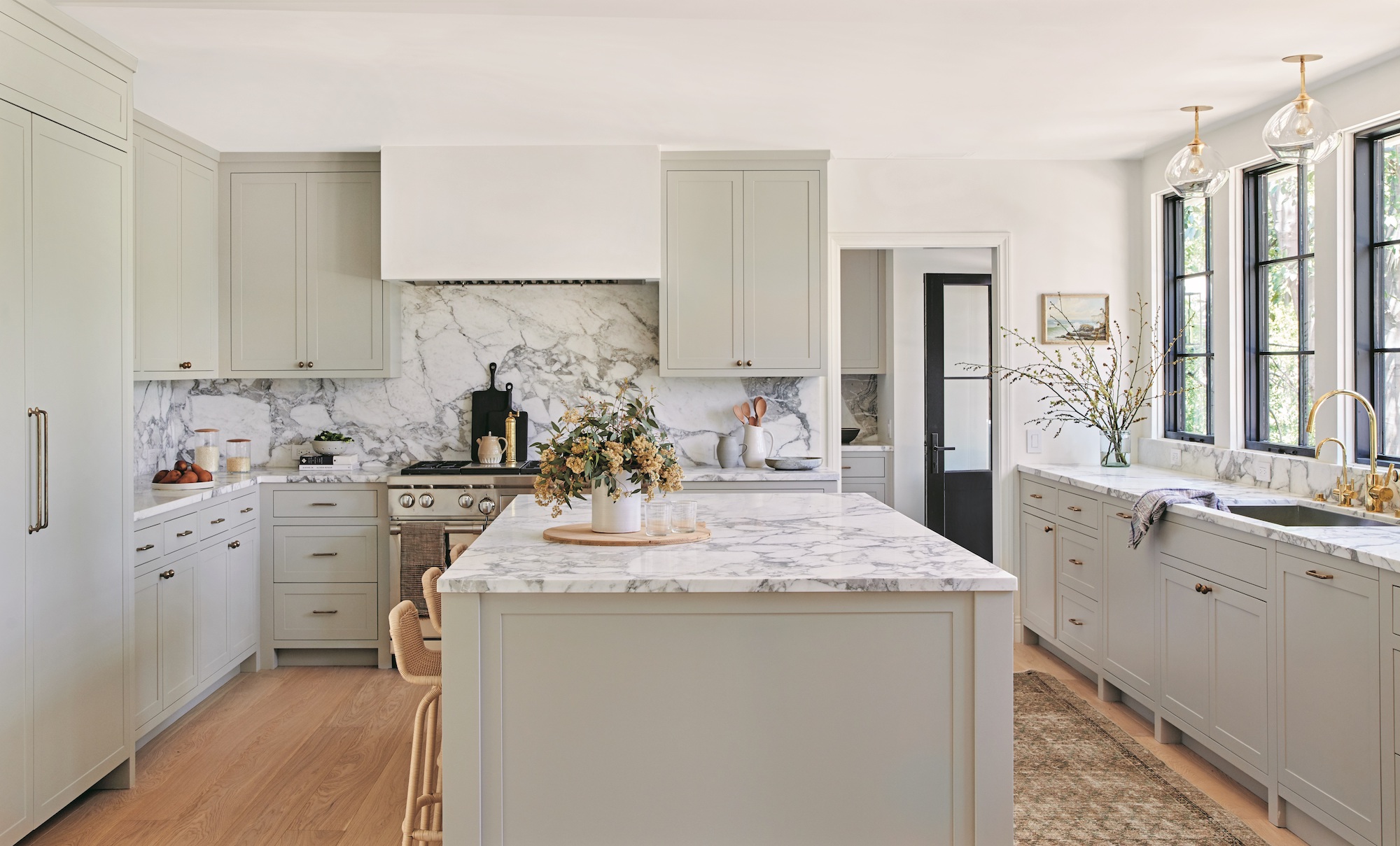
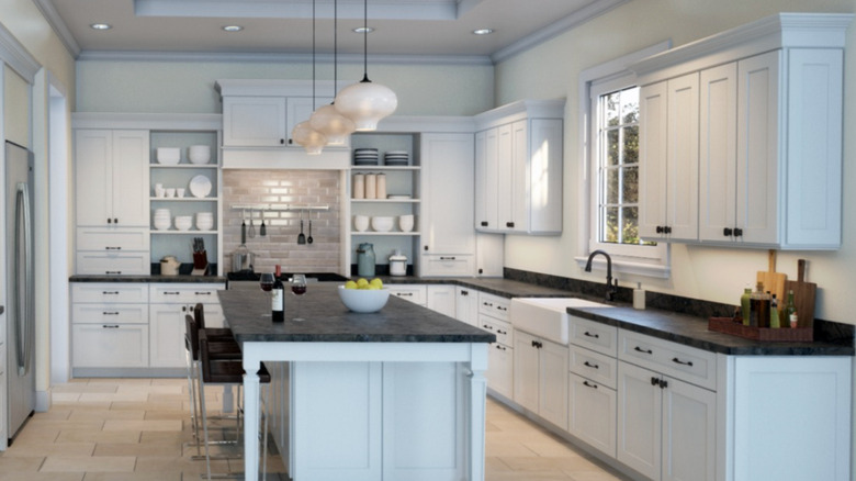
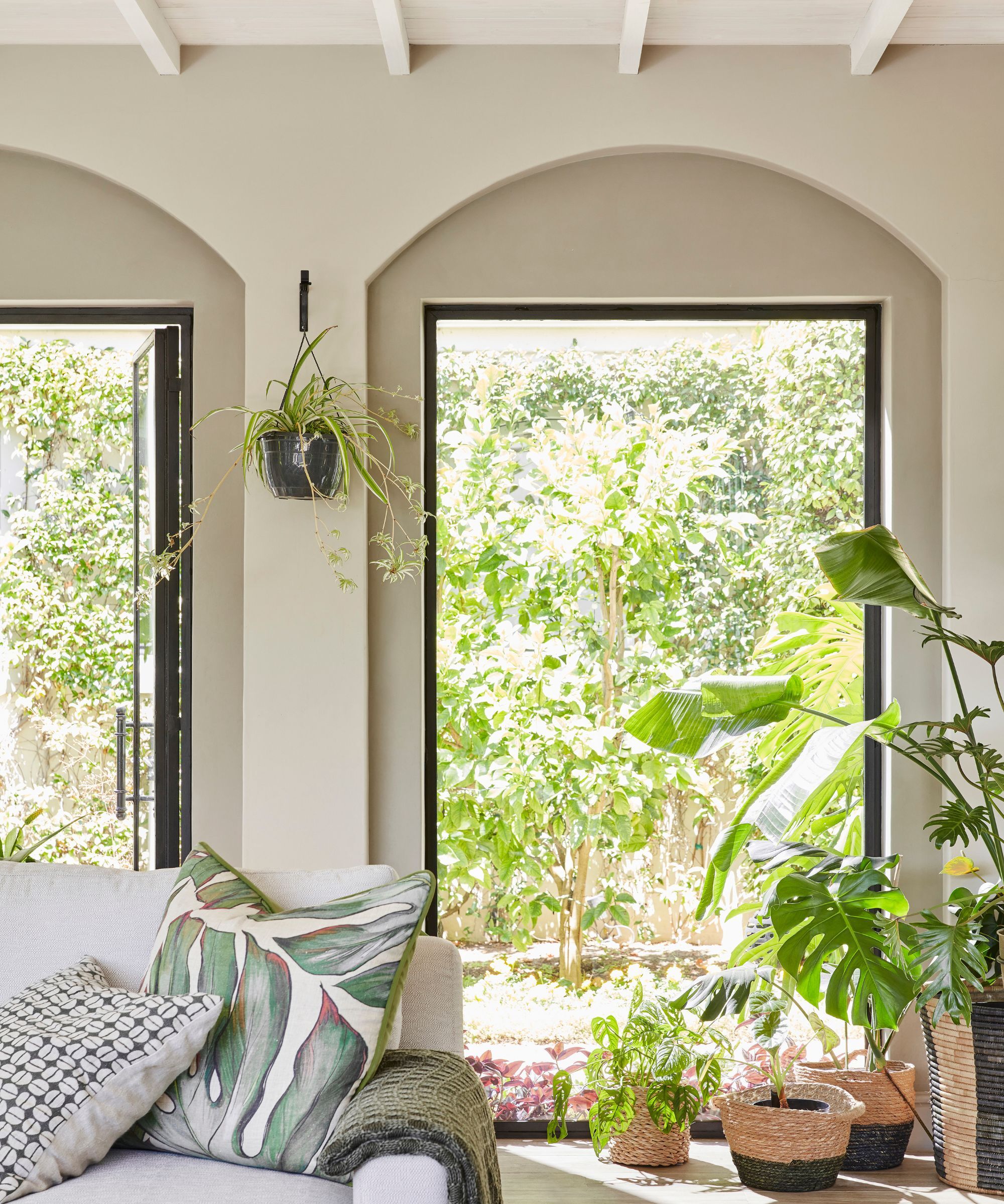
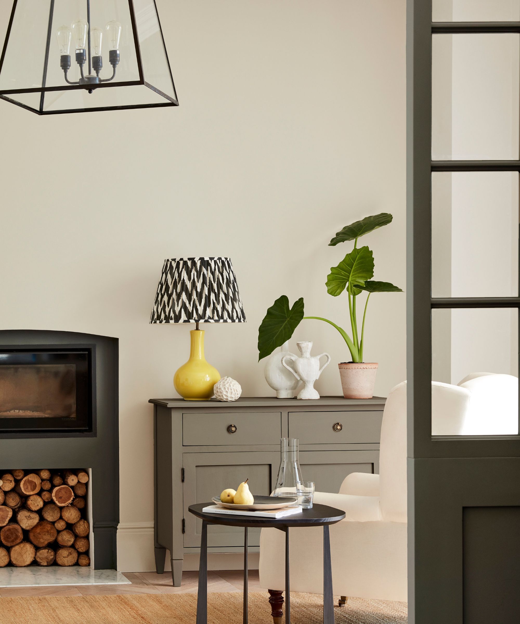
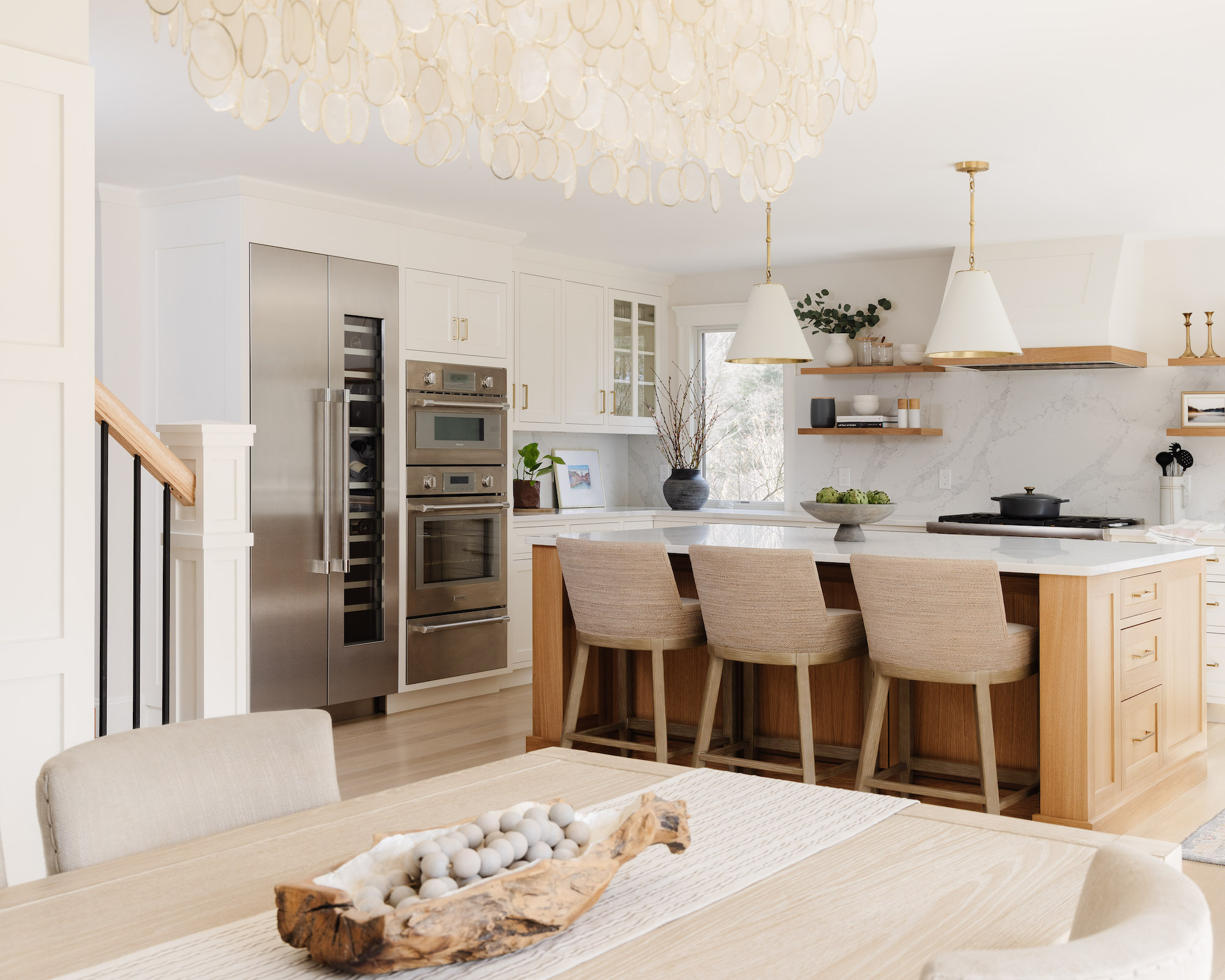
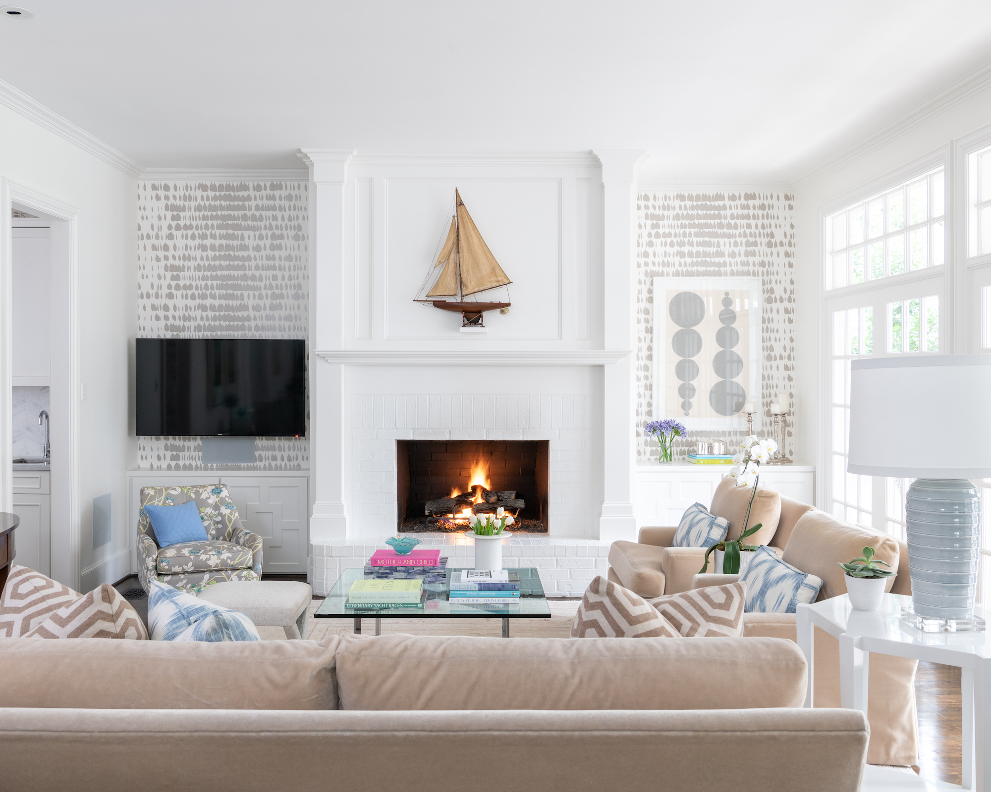
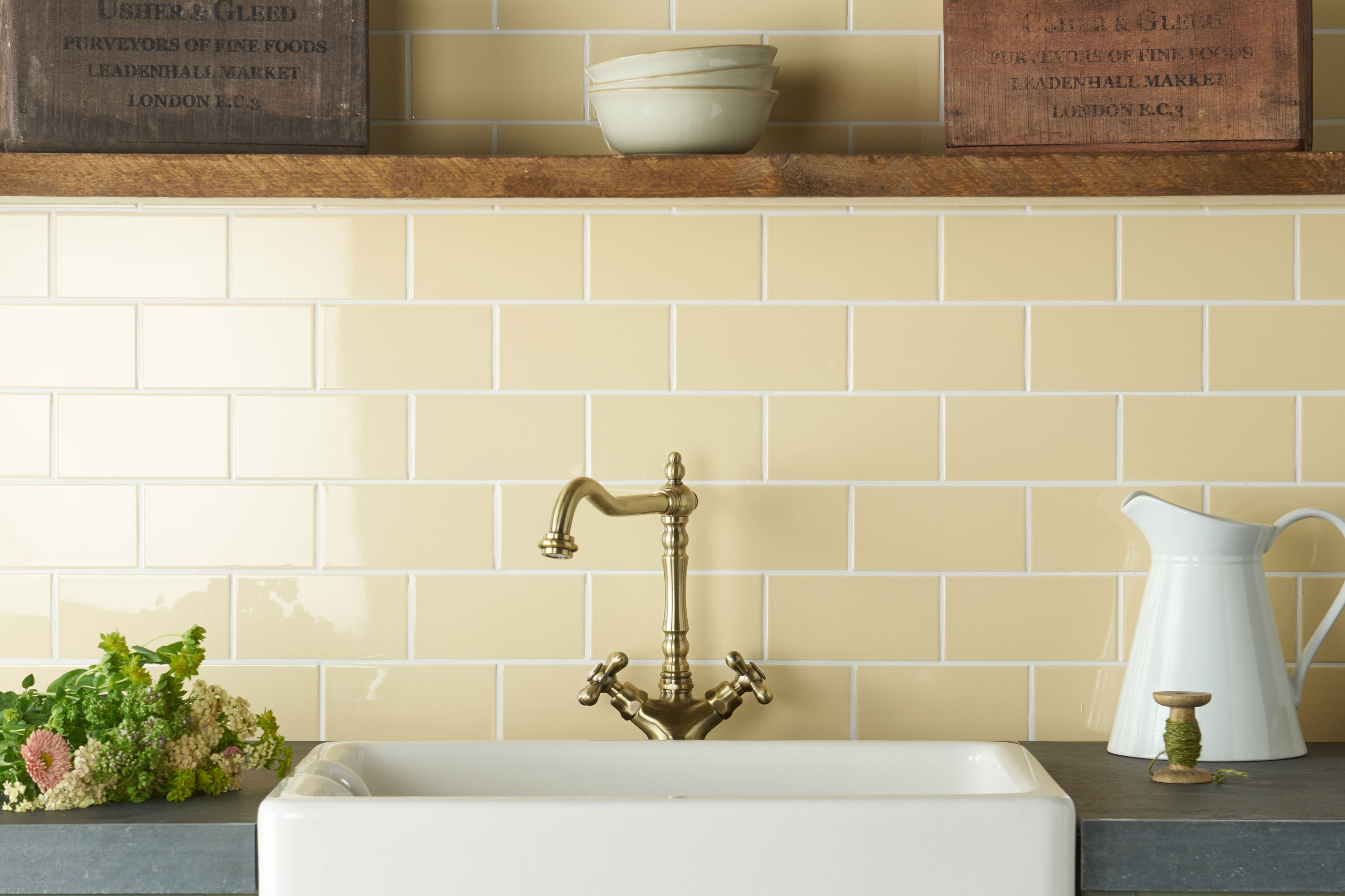
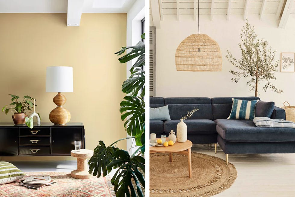
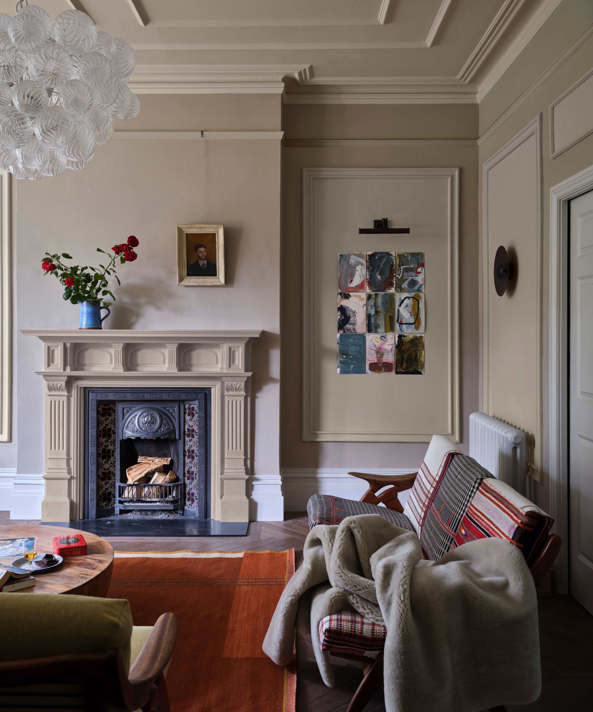
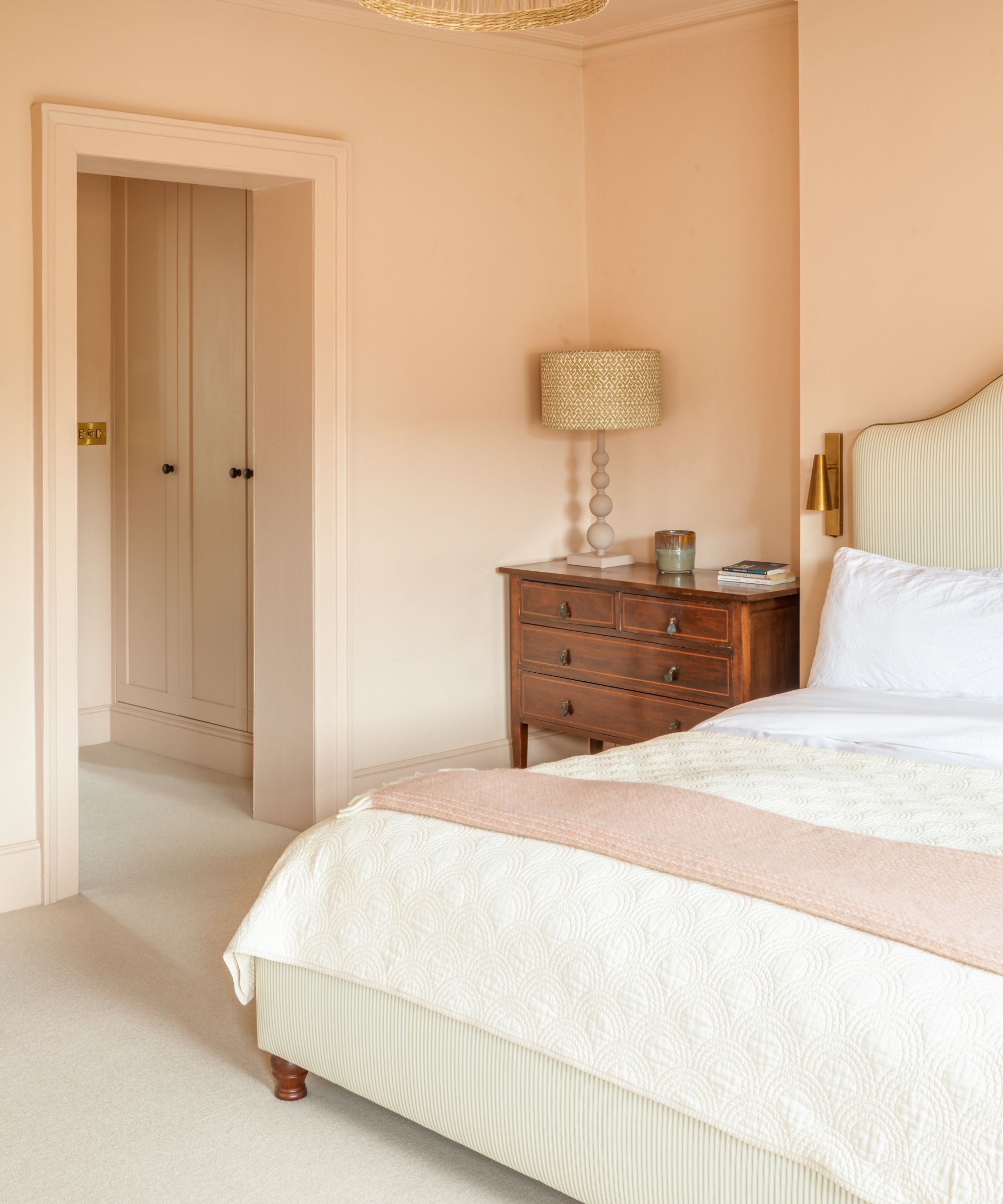
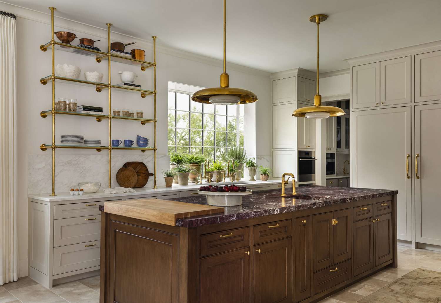
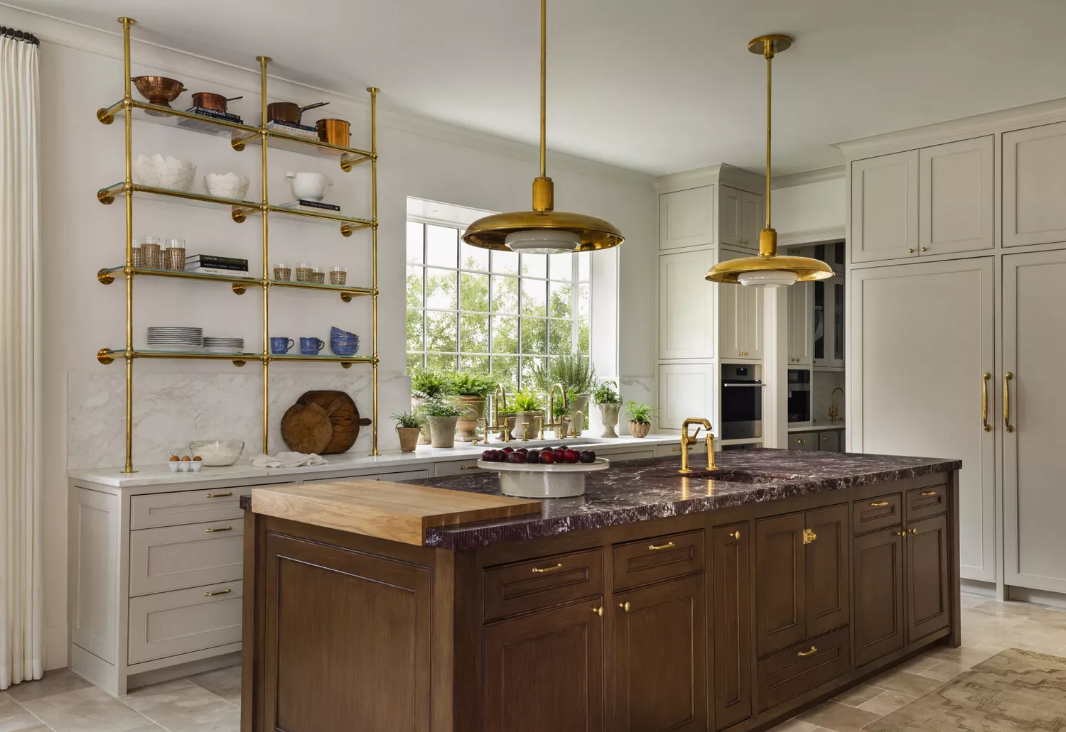
"Seaspray" can be incorporated into various spaces, both extensively and subtly. Its naturalistic essence means it pairs exceptionally well with elements like greenery and rustic wood textures. The organic undertones of the color complement golds and olive greens effectively. "Seaspray" possesses an earthy quality that makes it suitable for diverse design aesthetics, from bohemian to mid-century modern. Much like the current trend of butter yellow, "Seaspray" demonstrates that soft yellow tones can provide a lively pop of color or instill a cozy atmosphere in larger applications, such as cabinetry.
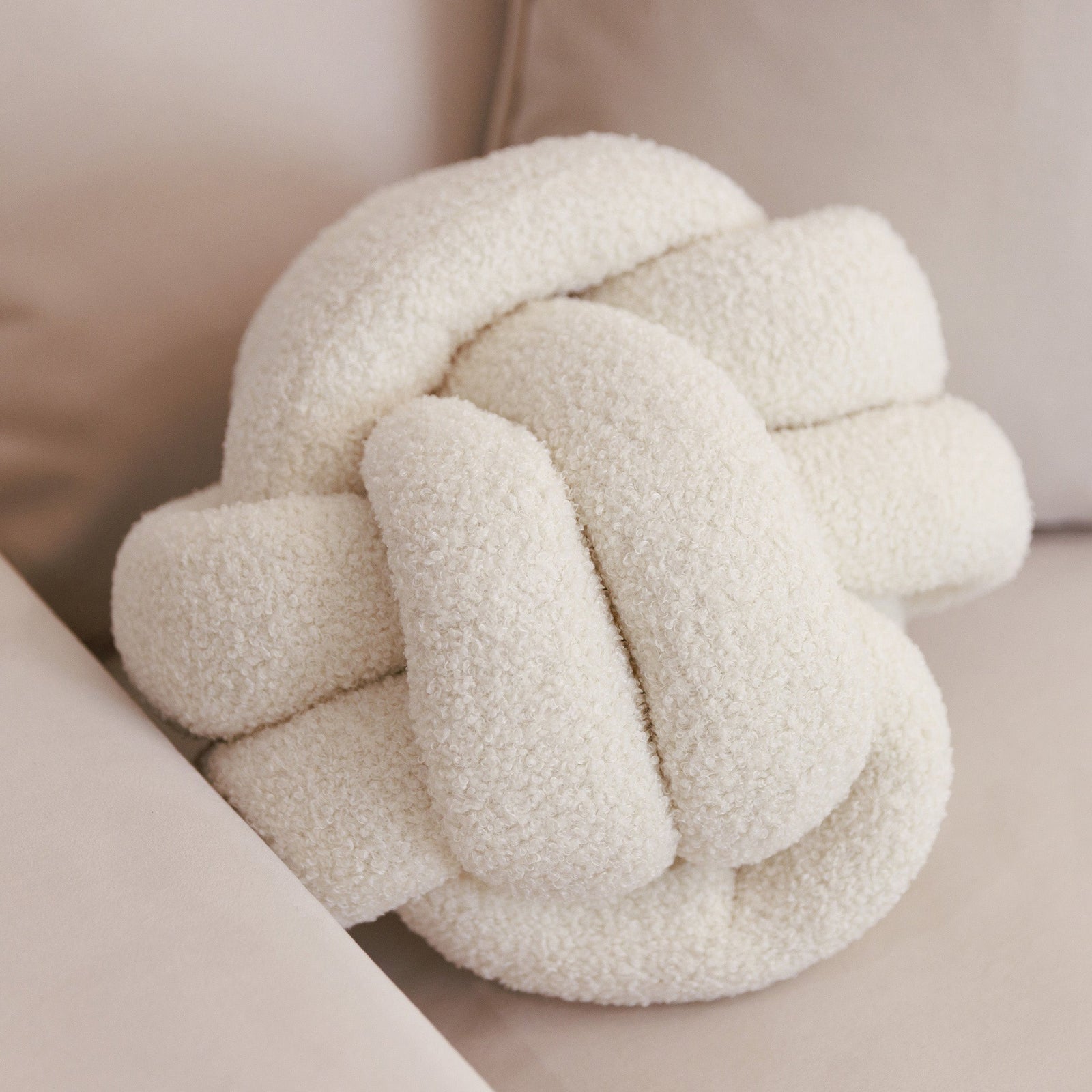
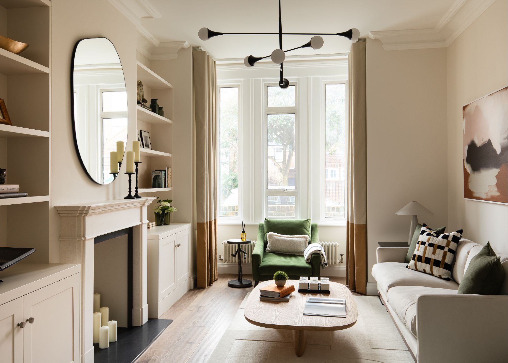
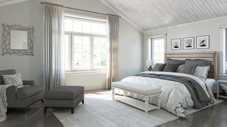
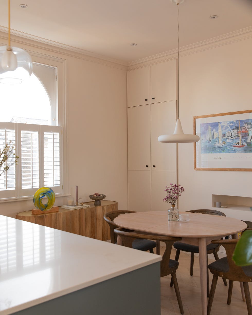
For those hesitant to paint entire walls in this shade, as Nate Berkus has done, it can be utilized as an accent color through items like pillows or a simple vase. The styling of "Seaspray" influences whether its beige or yellow undertones become more prominent. The color achieves an ideal balance between these two, offering the dynamism of yellow without being overpowering. While not blindingly bright, its lightness can expand a room visually and make it feel larger, particularly when applied to all walls. It is recommended to use "Seaspray" in areas that receive natural light, as harsh recessed lighting might diminish its nuanced qualities.
#NateBerkus #BenjaminMoore #SeasprayPaint #NeutralColors #HomeDesign #InteriorPaint #DecorTrends #ChalkyOffWhite #DesignInspiration #NateBerkus #BenjaminMoore #SeasprayPaint #NeutralColors #HomeDesign #InteriorPaint #DecorTrends #ChalkyOffWhite #DesignInspiration
0 comment in total
 No comments yet
You may also like
5 reasons to embrace a neutral palette

The Brighter, the Better—These Vibrant Paints Will Infuse Your Home With Positivity

Is Little Greene's Portland Stone the perfect neutral paint?

The Best Beige Paint Color of All Time
Amber Lewis Shares the Best Neutral Paint Colors for Every Room
The Best Paint Colors for North-Facing Rooms To Create a Cozy Space That Embraces The Limited Natural Light


The Nate Berkus-Favored Neutral Green Paint Color That's Taking Over Kitchens
The best dark neutral paints – 9 favorites among designers from Farrow & Ball, Sherwin-Williams, and more
35 Neutral Paint Colors Interior Designers Can't Get Enough Of


Nate Berkus Revealed His FAVE Neutral Paint Color—and It's the Perfect Shade of White

10 Neutral Room Ideas That Are Calming, Sophisticated — And Full of Decorative Interest
How to use warm neutrals in every room in your home, according to design experts

At last, Nate Berkus revealed the 'go-to' paints that made him the master of new neutrals

The All-Time Favorite Light Neutral Paints Of HGTV Stars
Creamy neutral paint colours are back — just don’t call it magnolia
6 earthy neutral paints that designers say are replacing bland white walls

10 Clever Ways Nate Berkus Incorporates A Gorgeous Green Color Into Any Design Space
Nate Berkus' most recent bedroom project nails the emerging trend for mixing the contemporary with the vintage eclectic
7 Paint Colours That Could Help You Sell Your Home For More
The Trendiest Neutral Of The Year Is A 2000s Classic—But Better