1/6
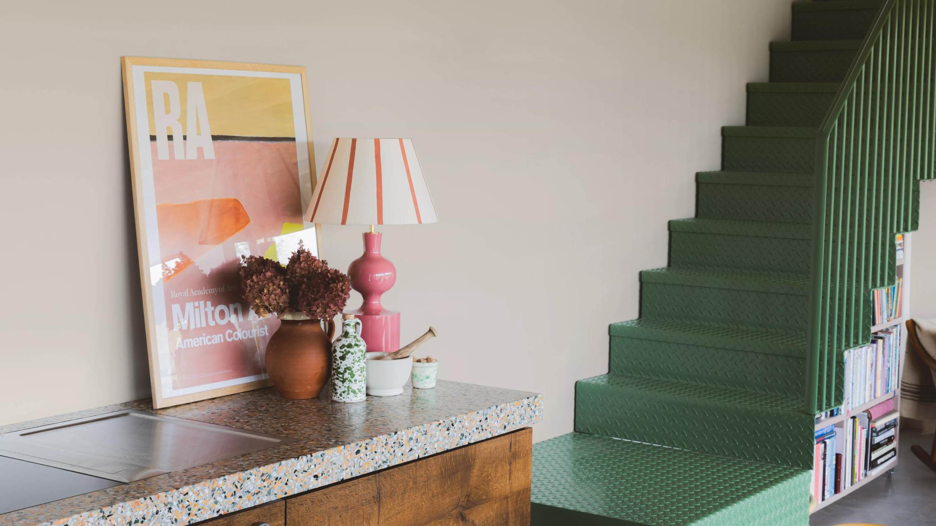
Is Little Greene's Portland Stone the perfect neutral paint?
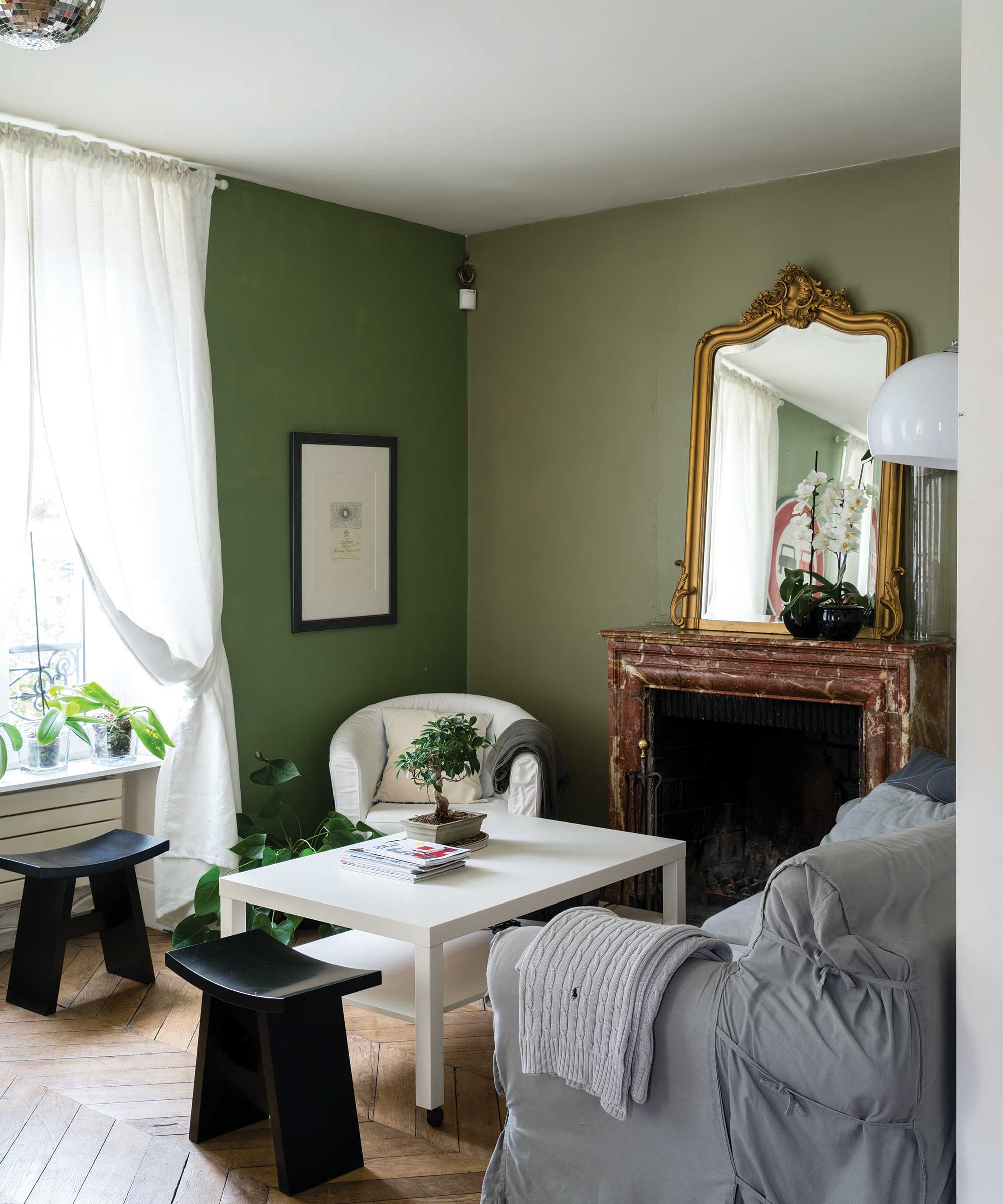
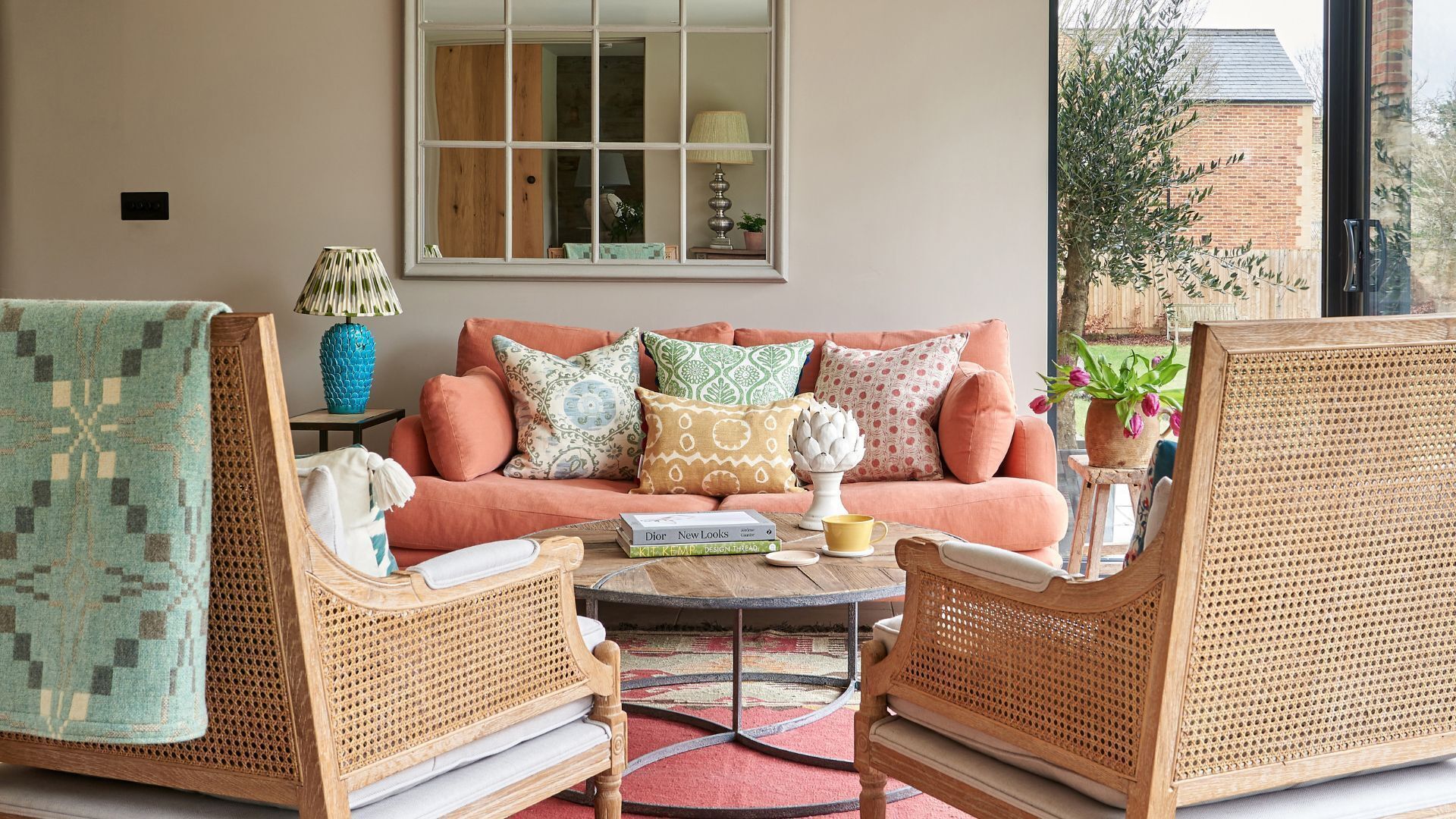
The article discusses the increasing popularity of Little Greene's Portland Stone paint, a neutral shade that has garnered significant attention from interior designers, both in the UK and, more recently, in the US. This shift in preference comes as cool-toned colors like stark whites and graphite grays are being replaced by warmer, earthier, and more organic hues in home design. The focus has moved from finding the best gray to discovering the ideal neutral paint.
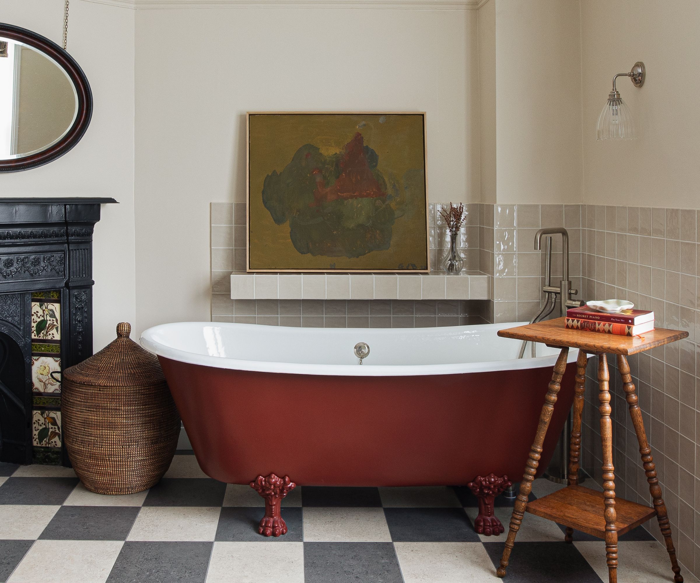
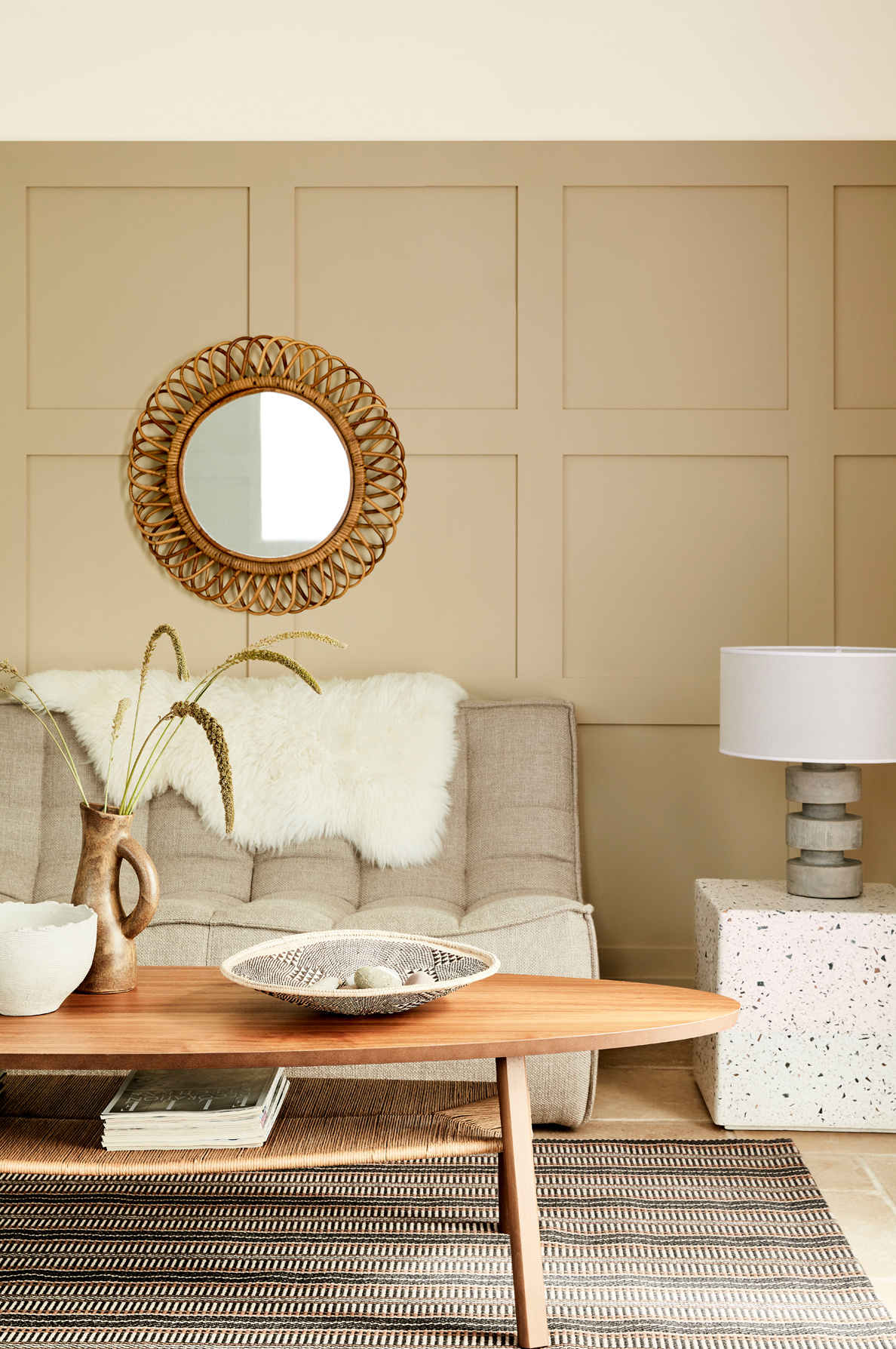
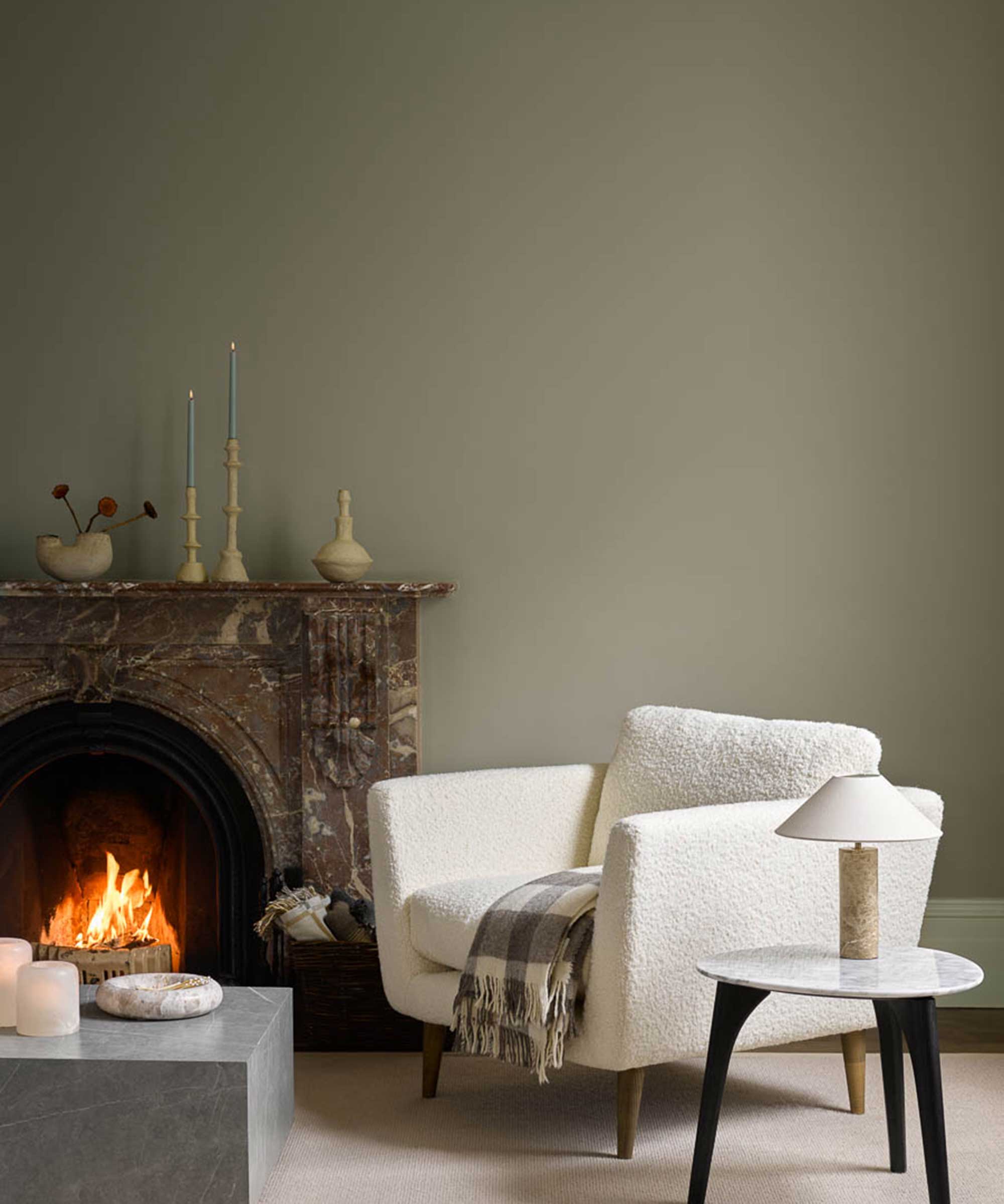
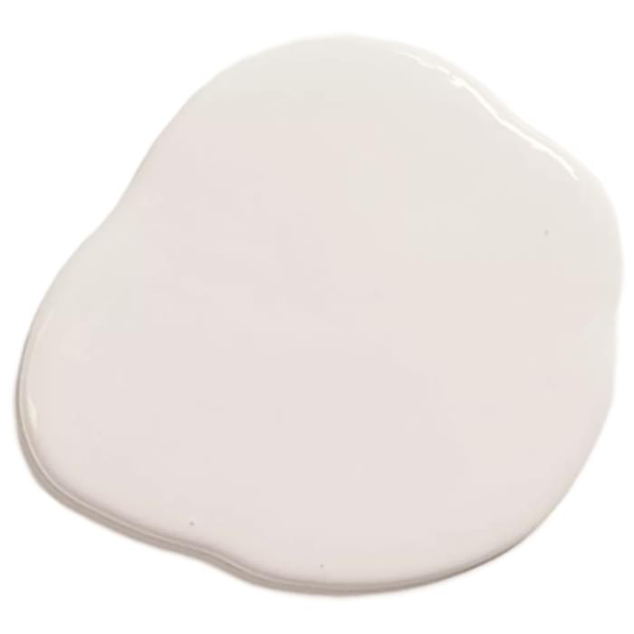

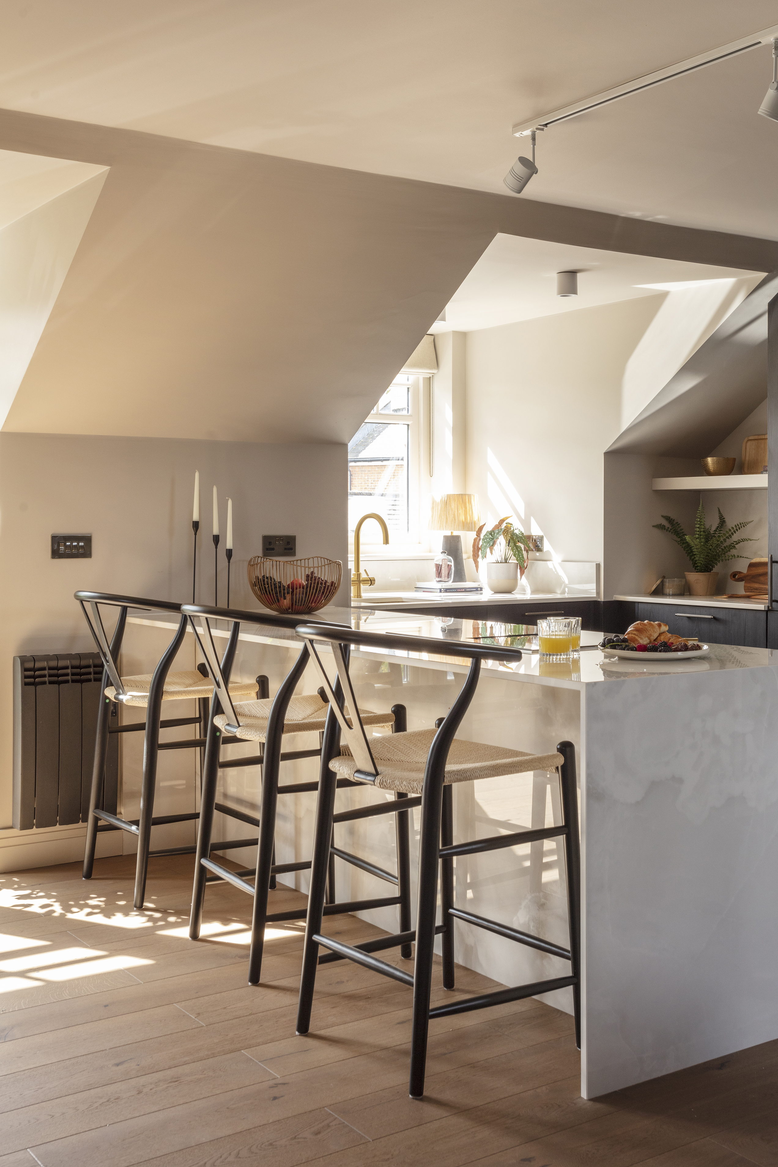
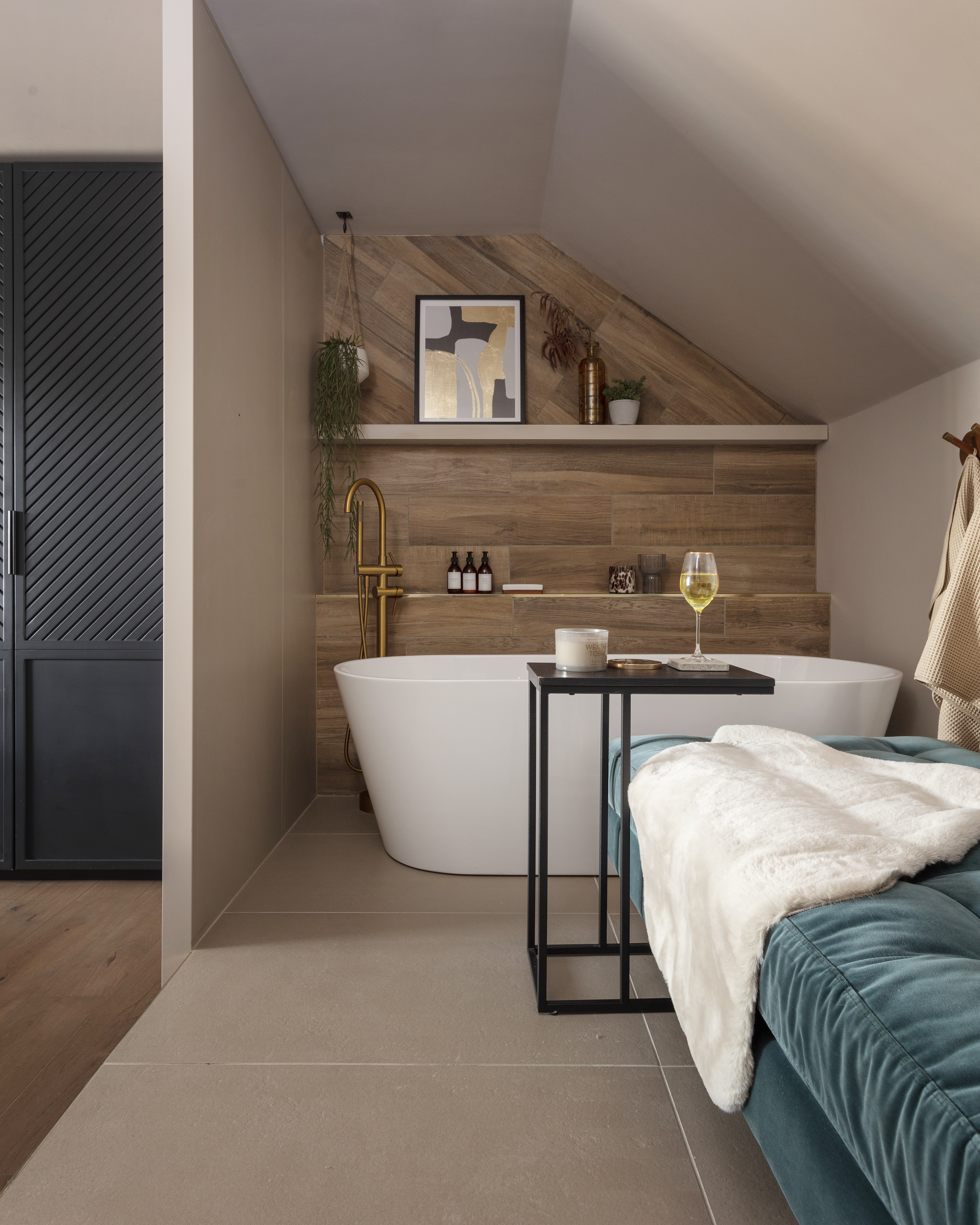
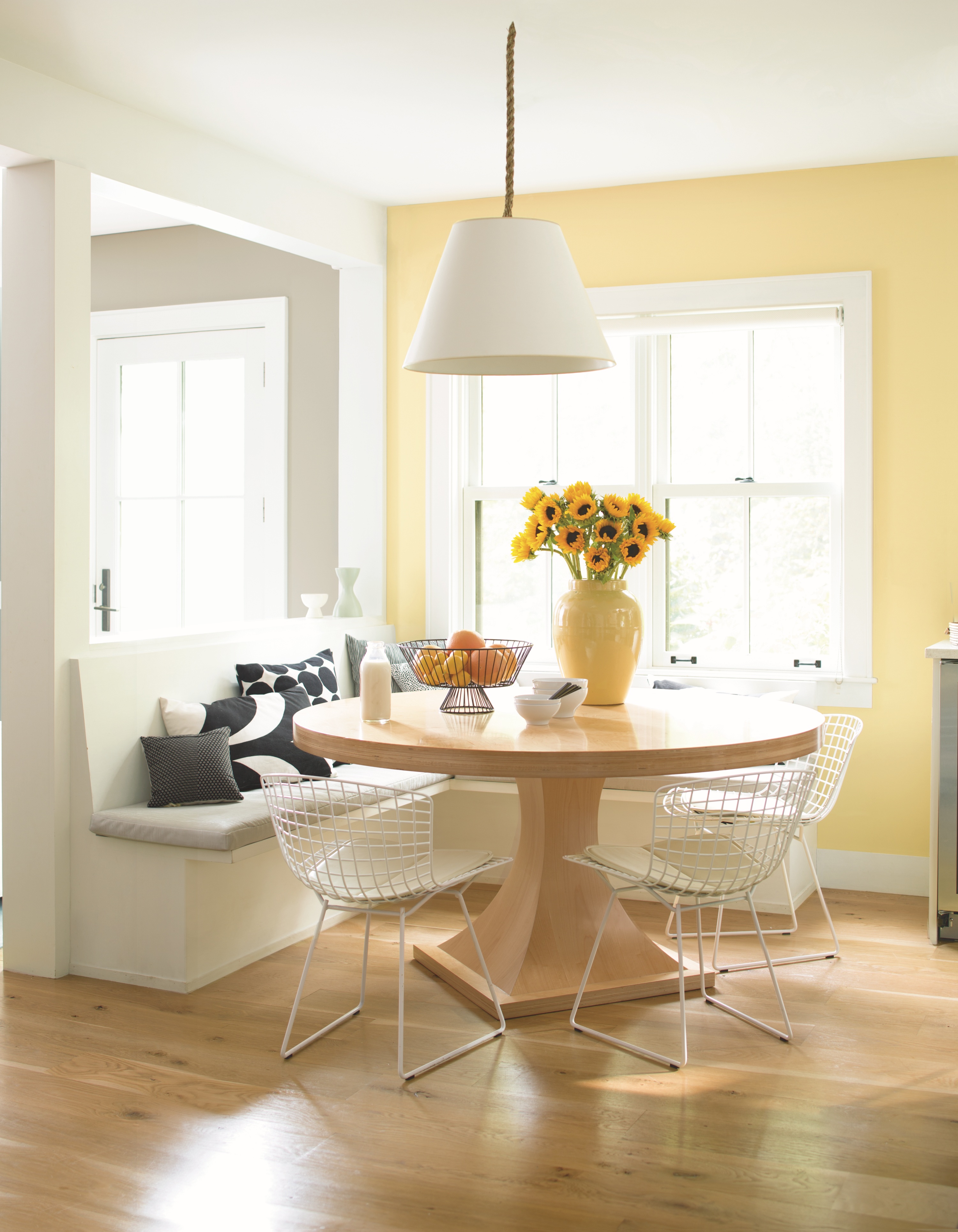
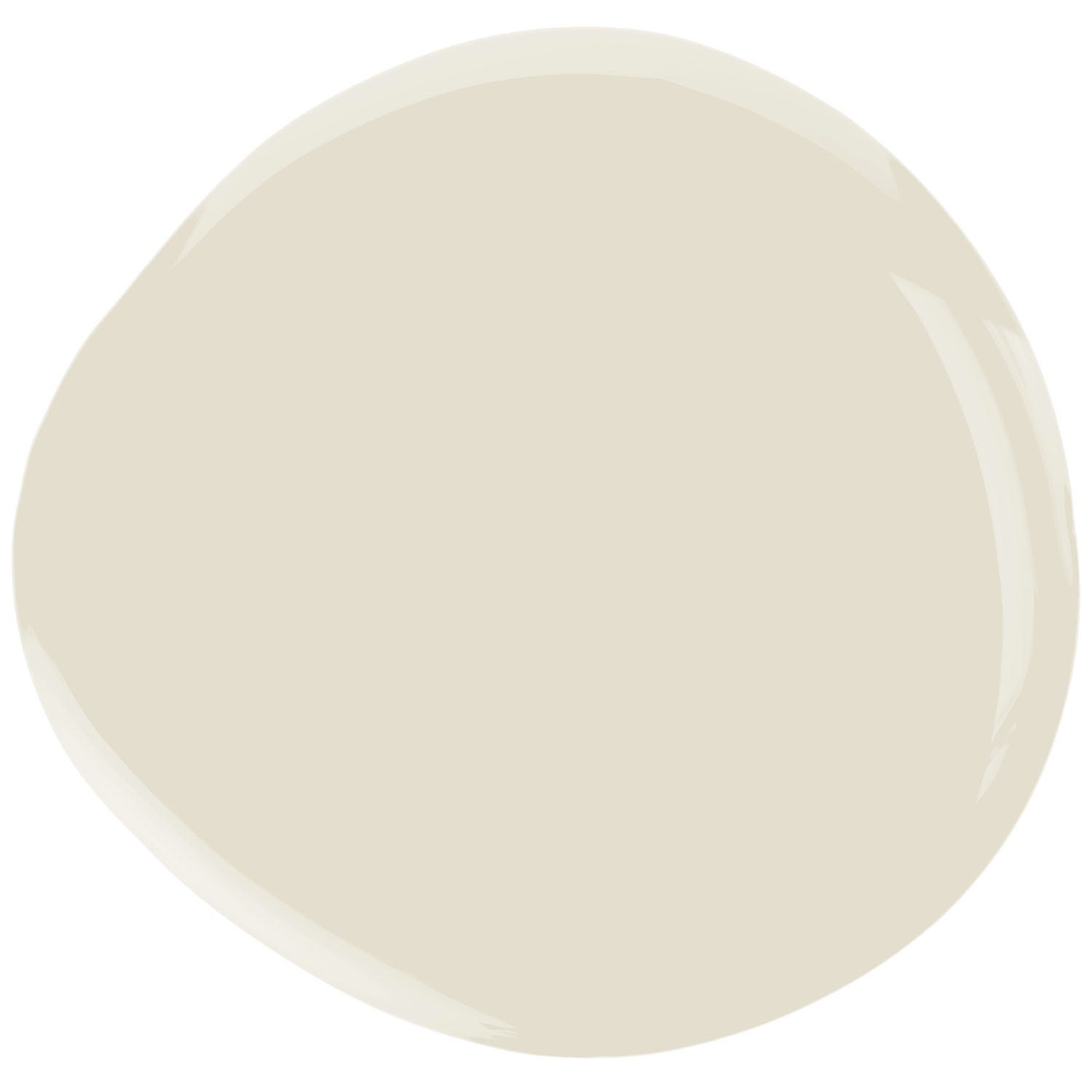
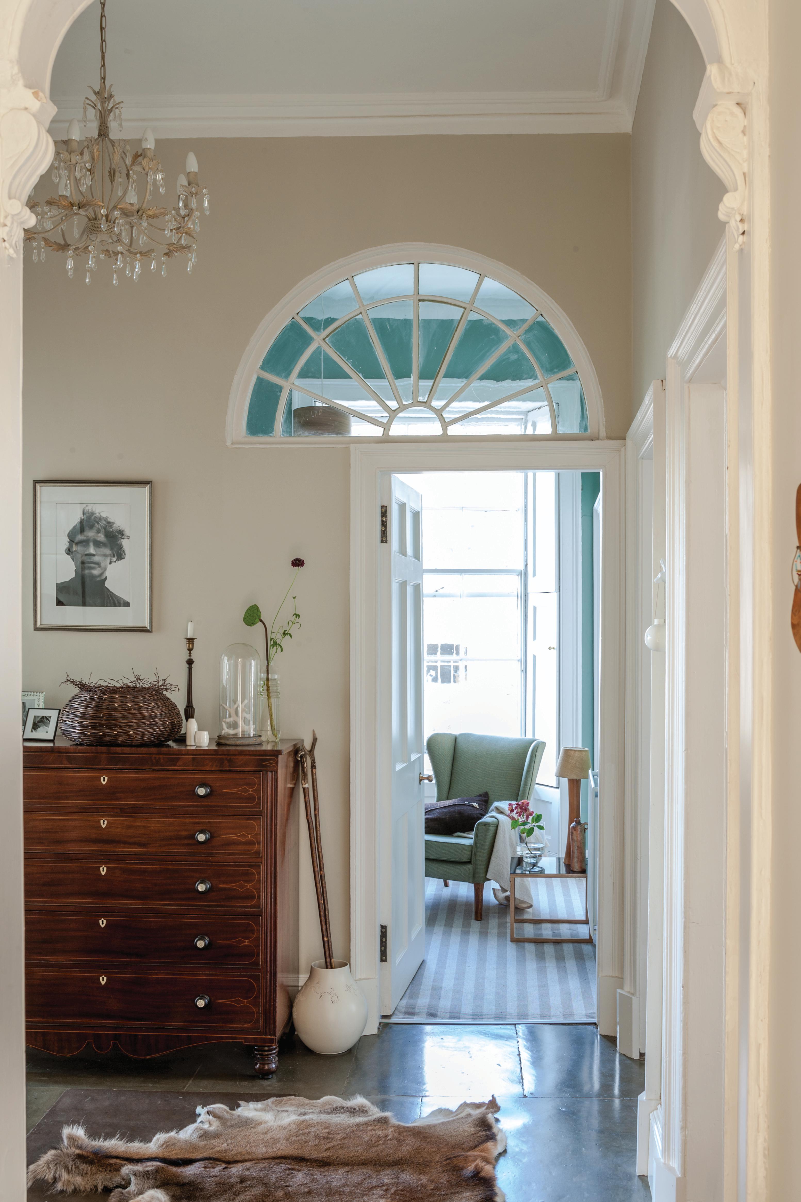
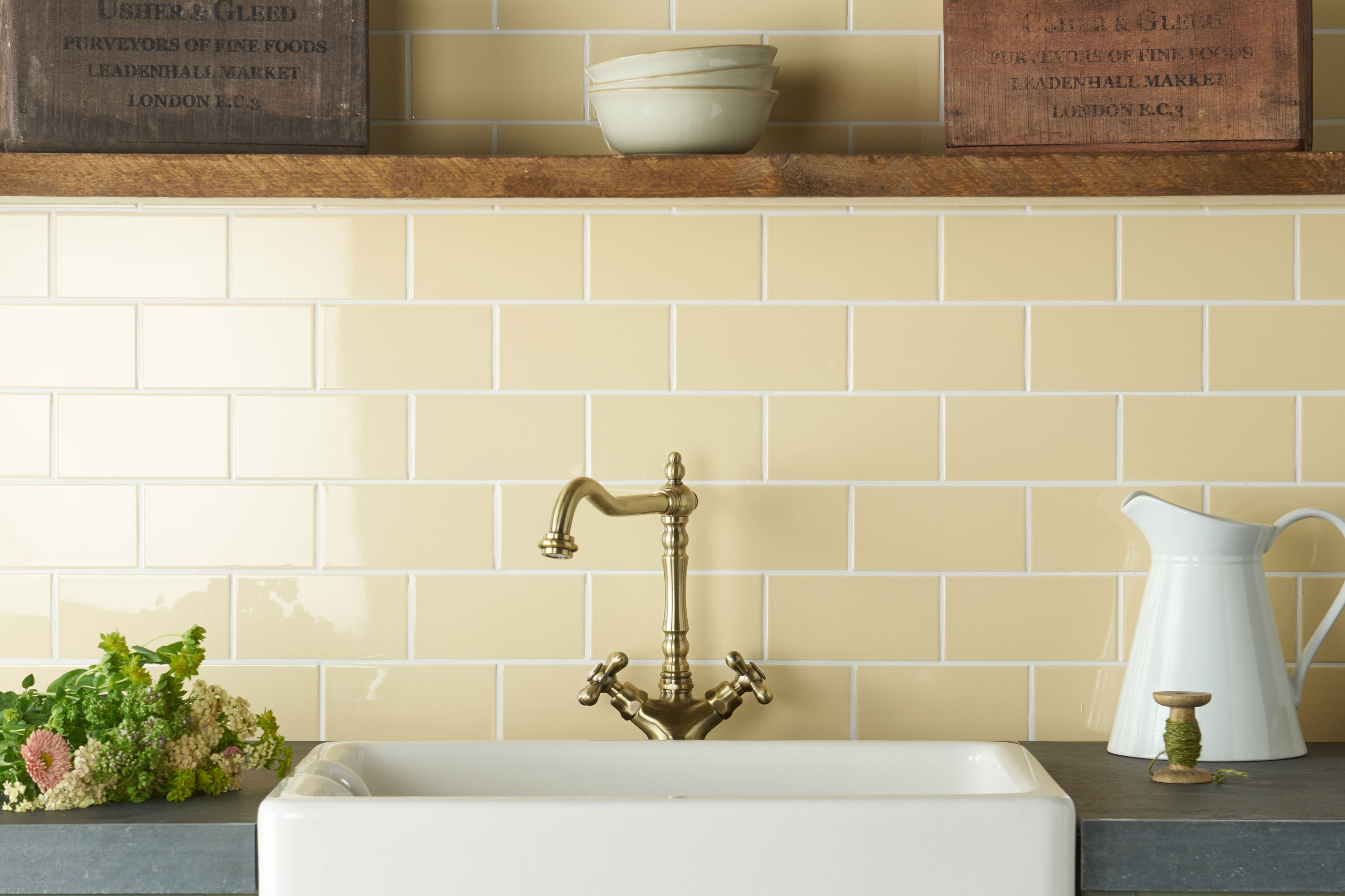
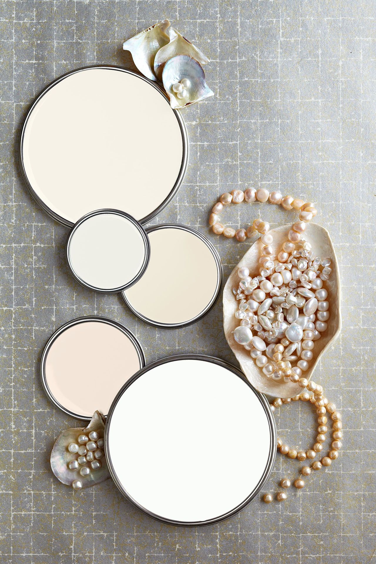
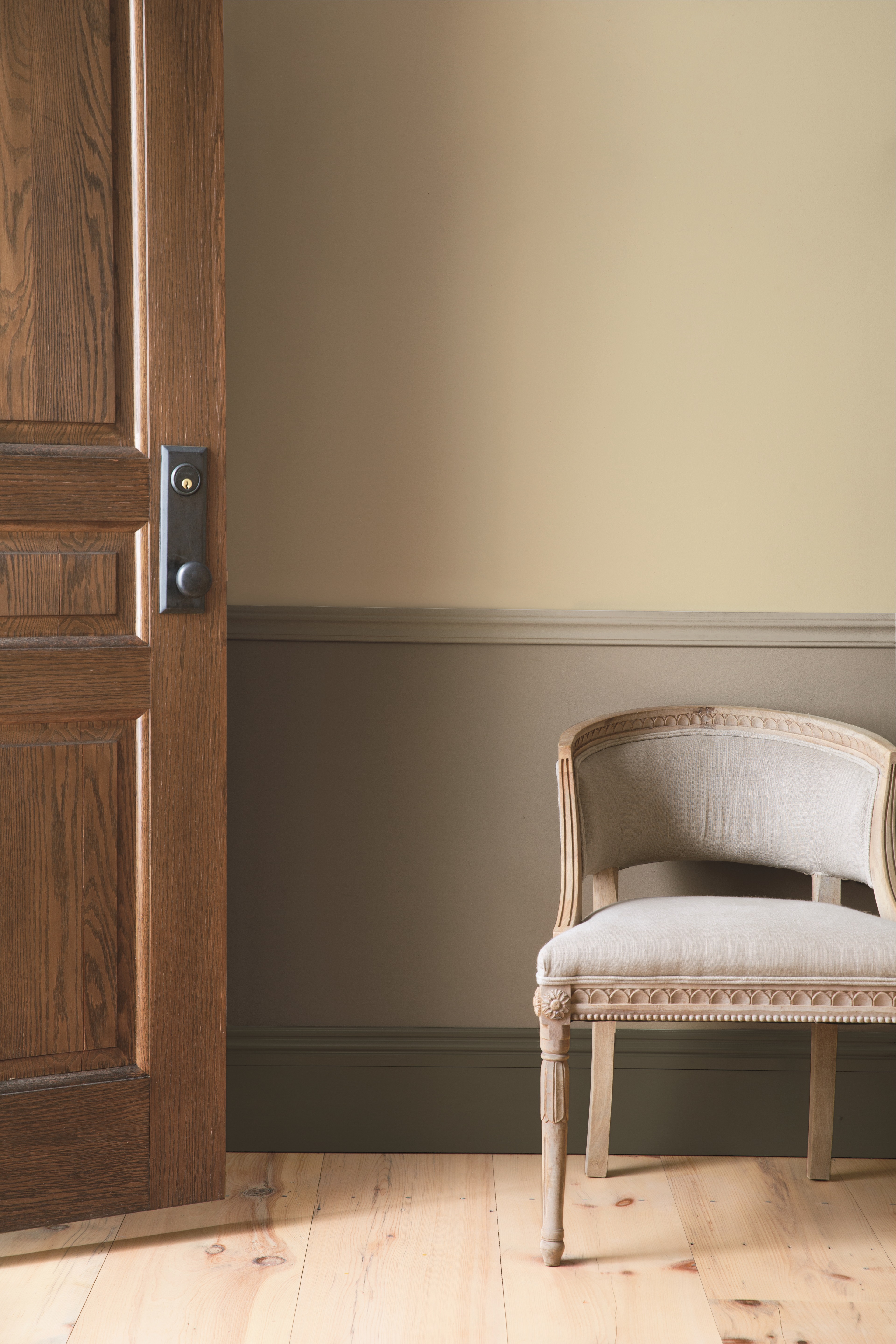
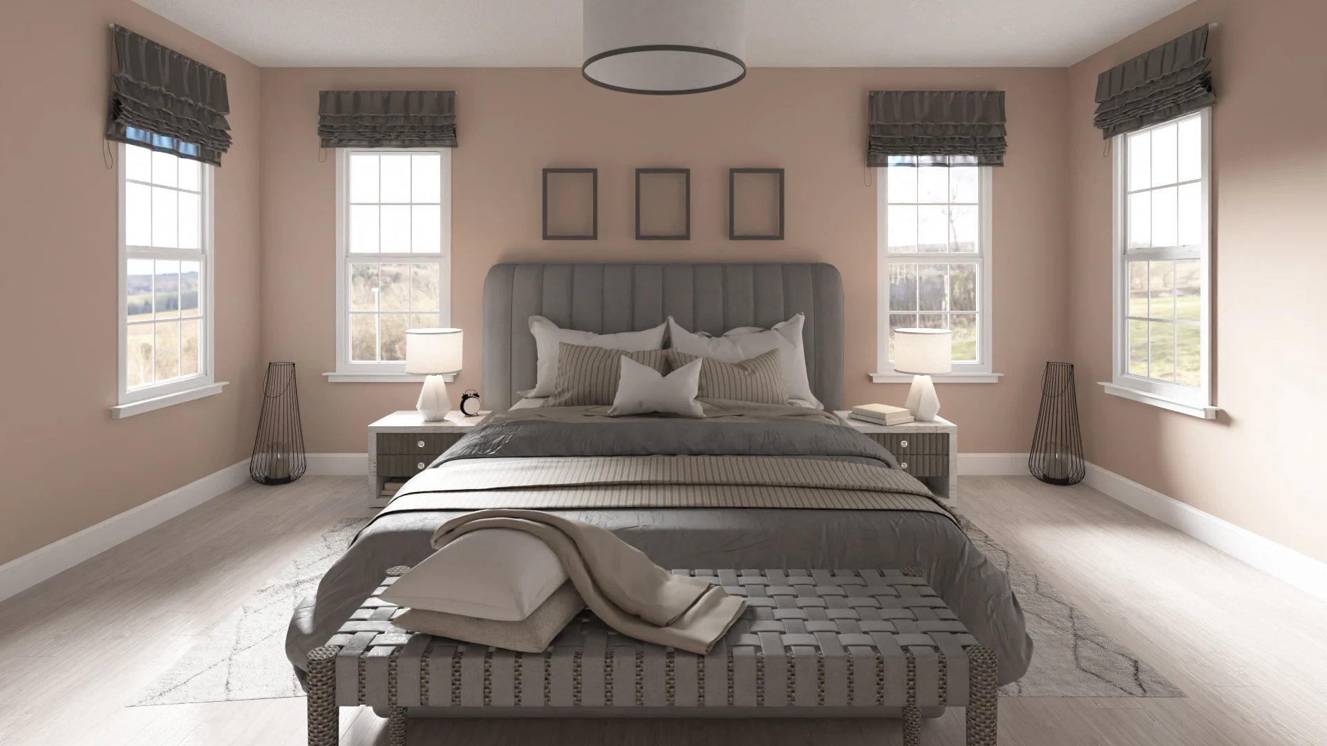
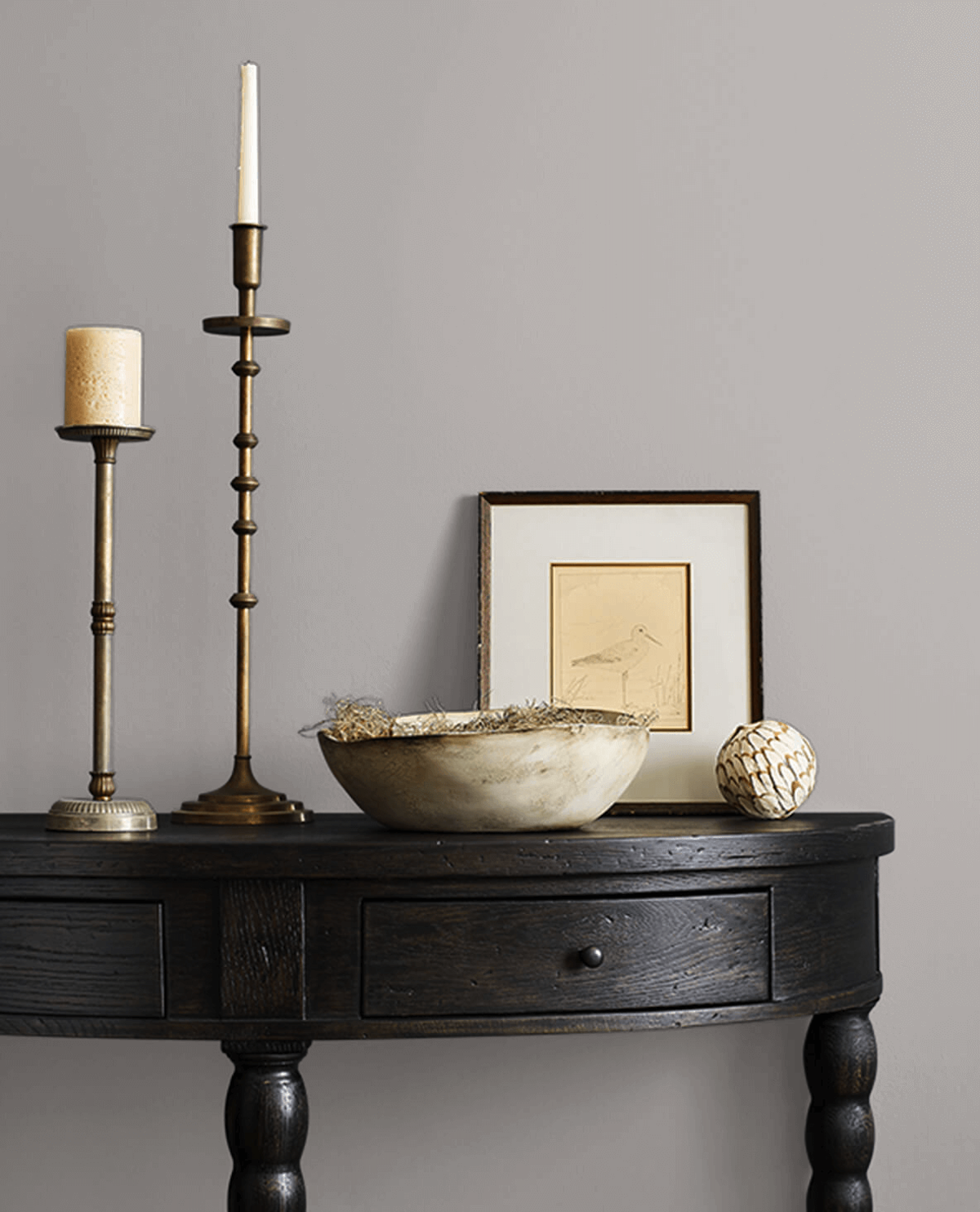
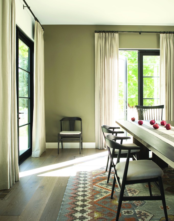
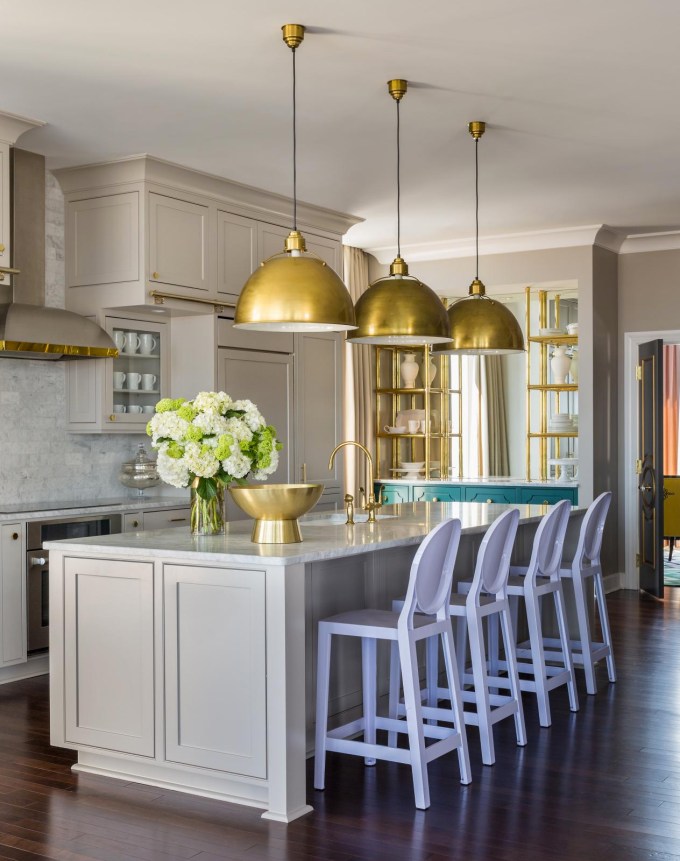
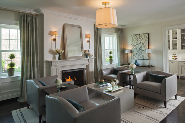
Ruth Mottershead, Creative Director of Little Greene, attributes the paint's popularity to a broader trend towards warmer, more natural color palettes, which she refers to as 'new neutrals.' These shades offer a restful alternative to cooler options and provide a gentle, soft white alternative. Portland Stone, in particular, is described as an earthy putty color with character. It serves as an alternative to traditional white paint, offering a cozier yet expansive, fresh, and uplifting feel. Despite its warmth, it maintains a light and breezy disposition, avoiding a heavy or overly toasty appearance, making it suitable for creating beautiful, non-bland beige rooms.
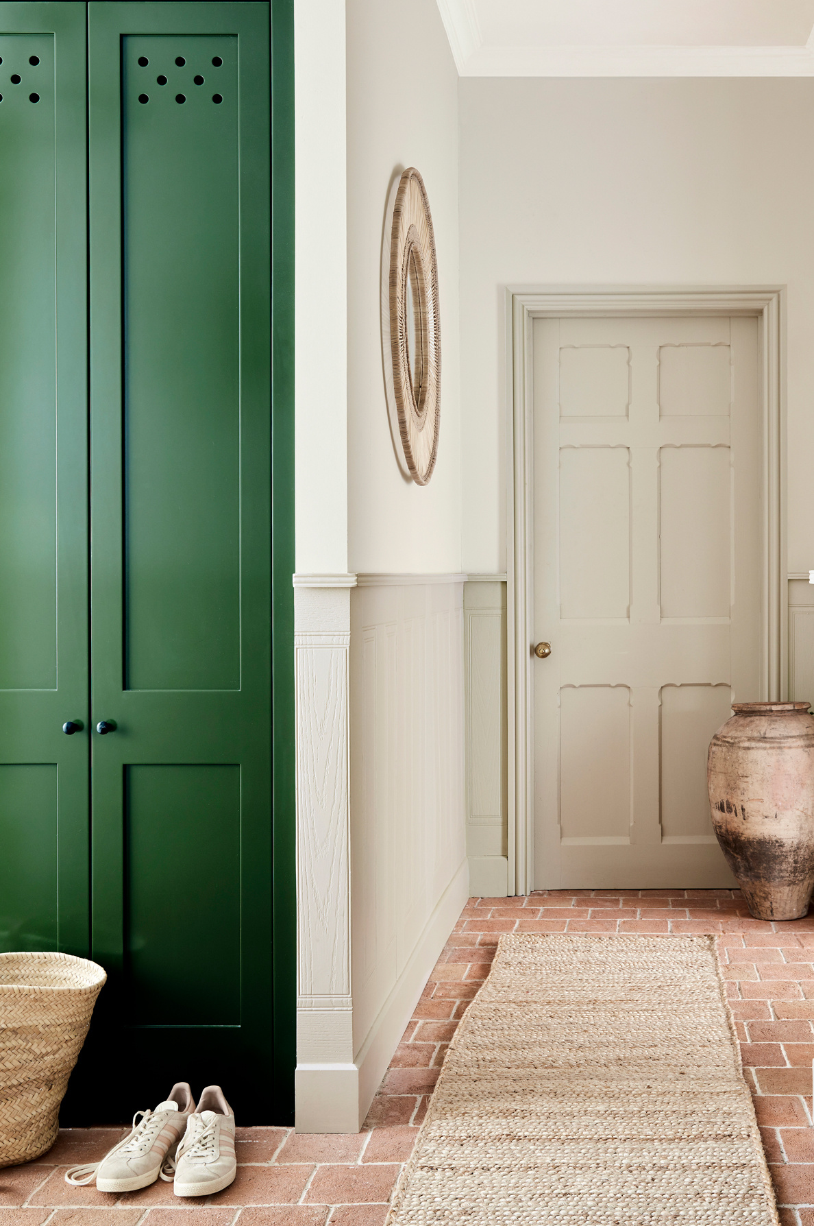
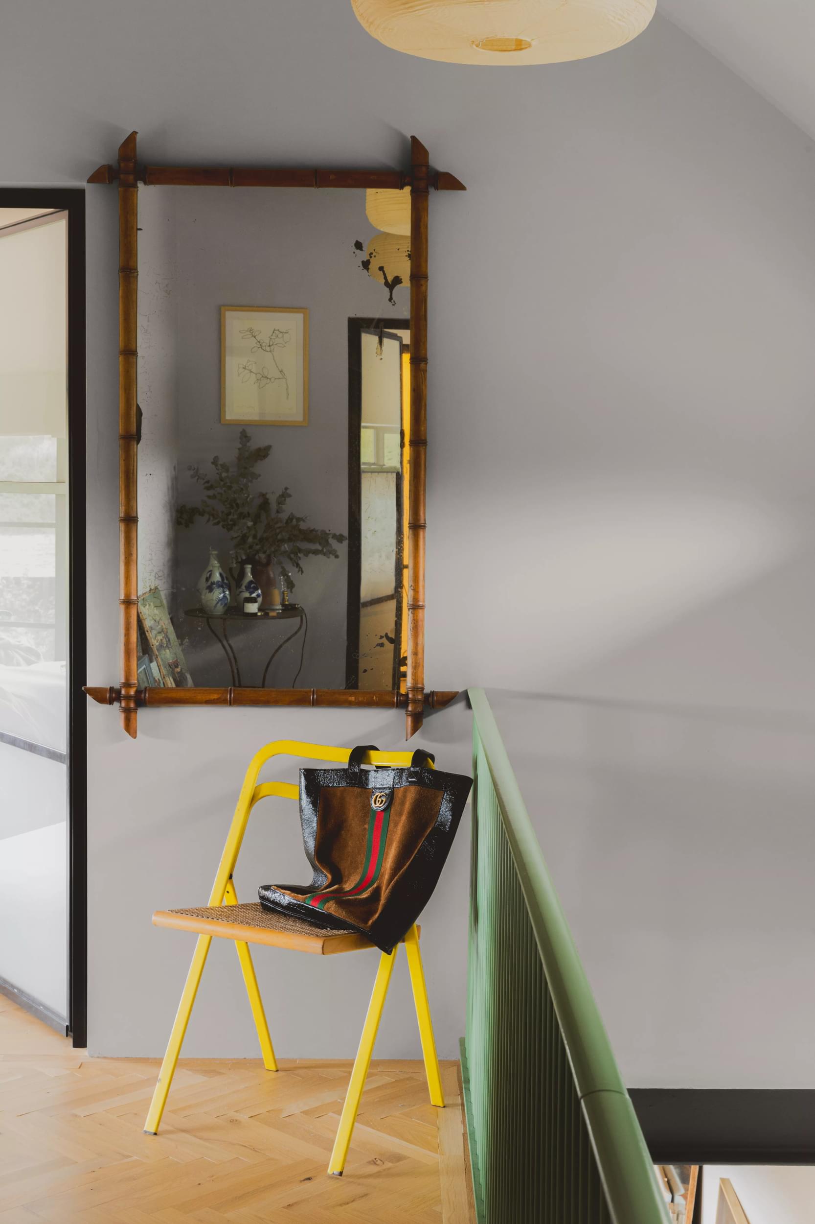
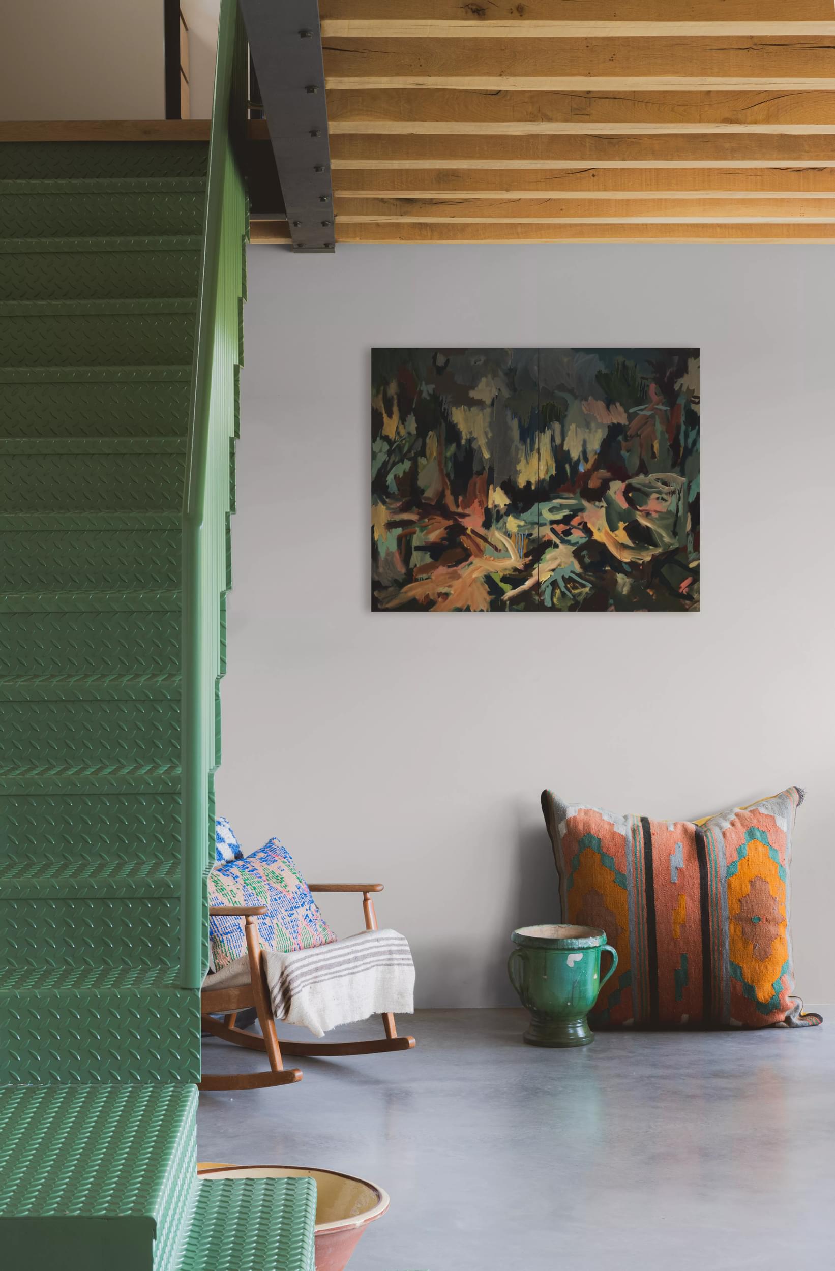
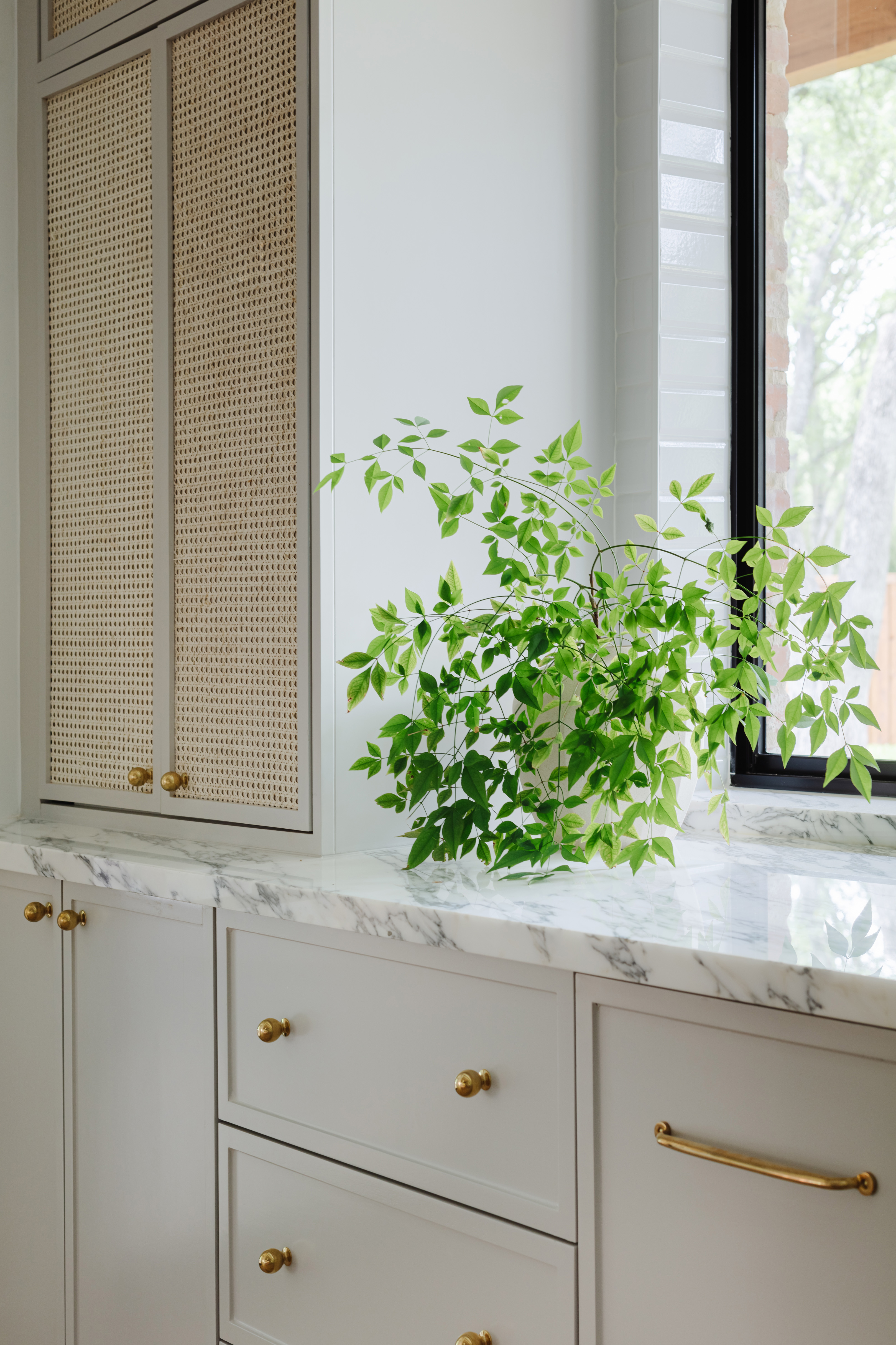
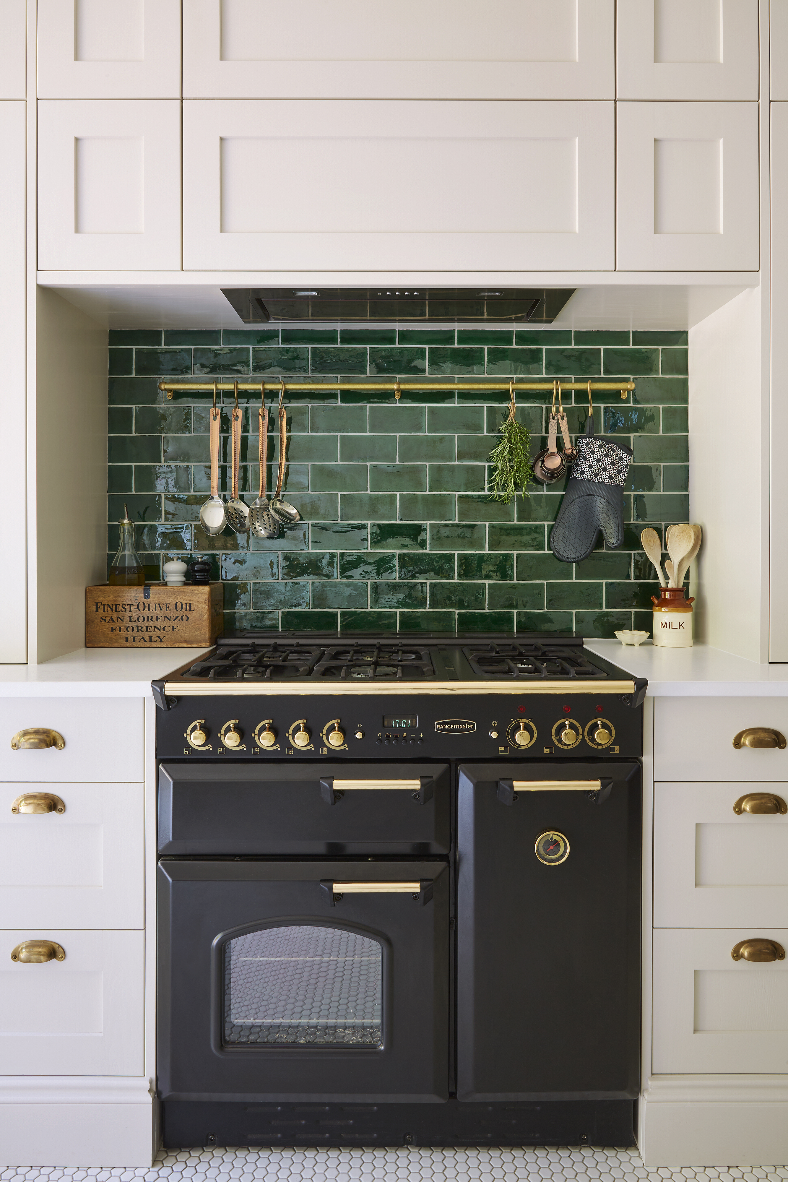
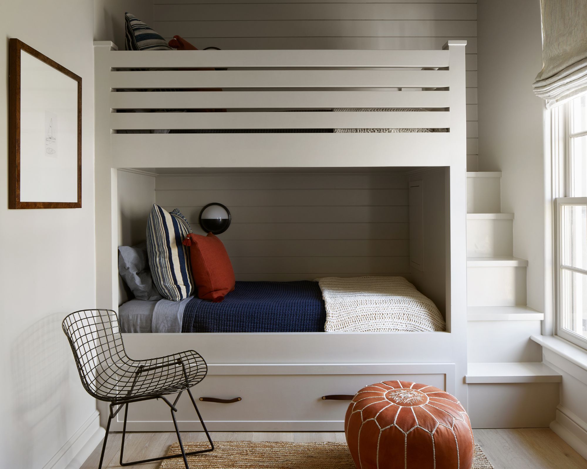
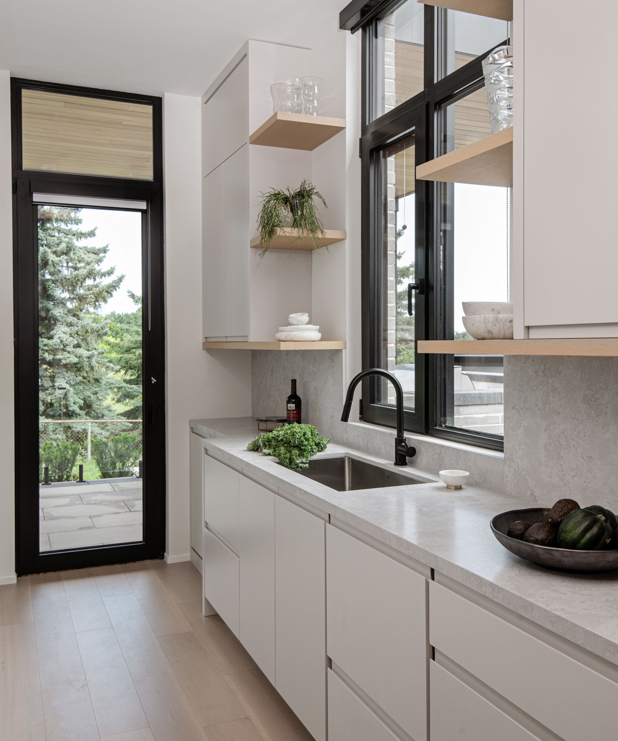
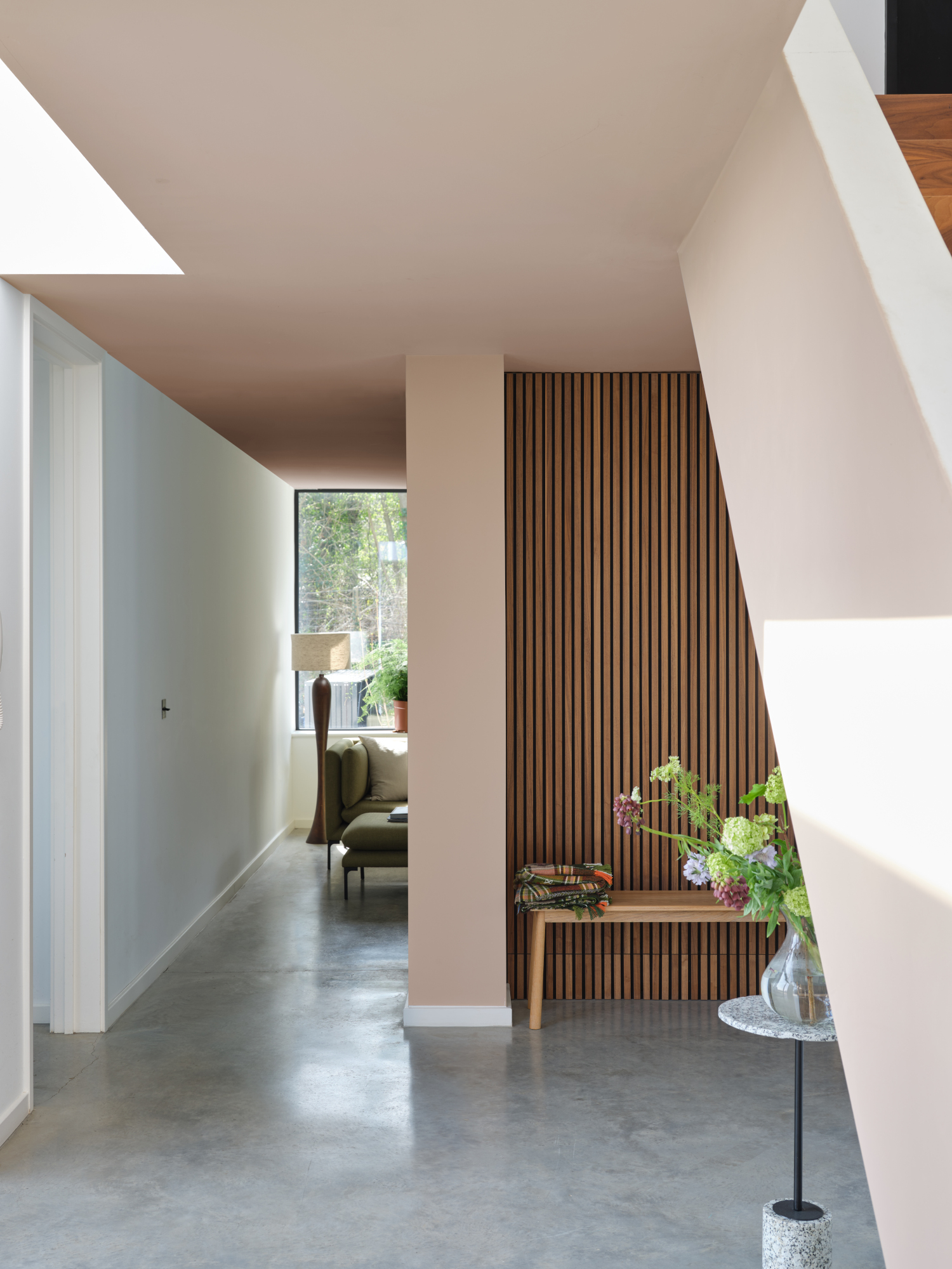
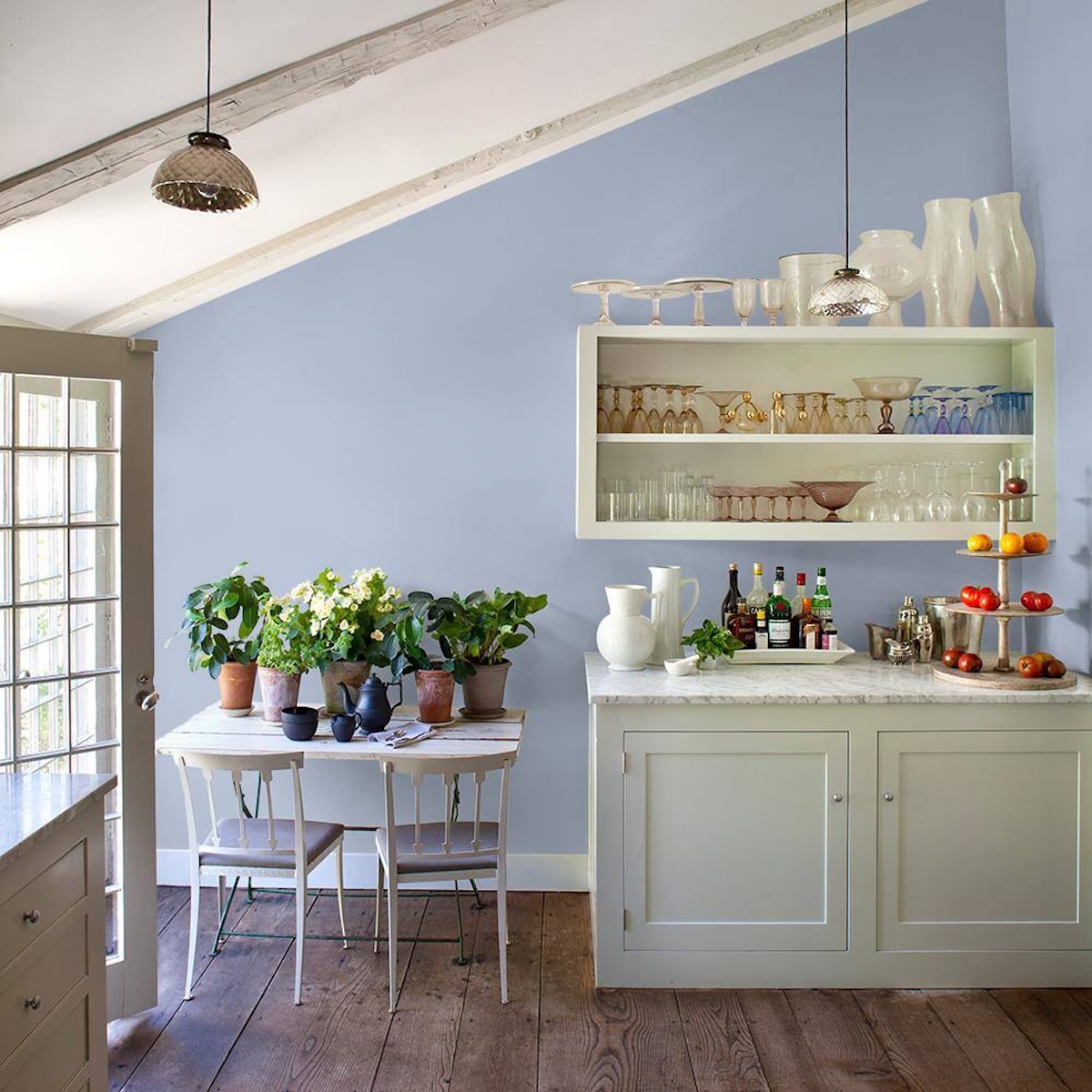
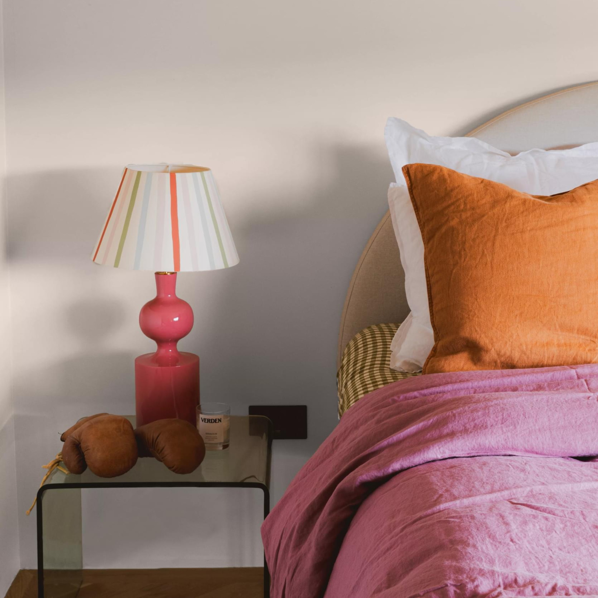
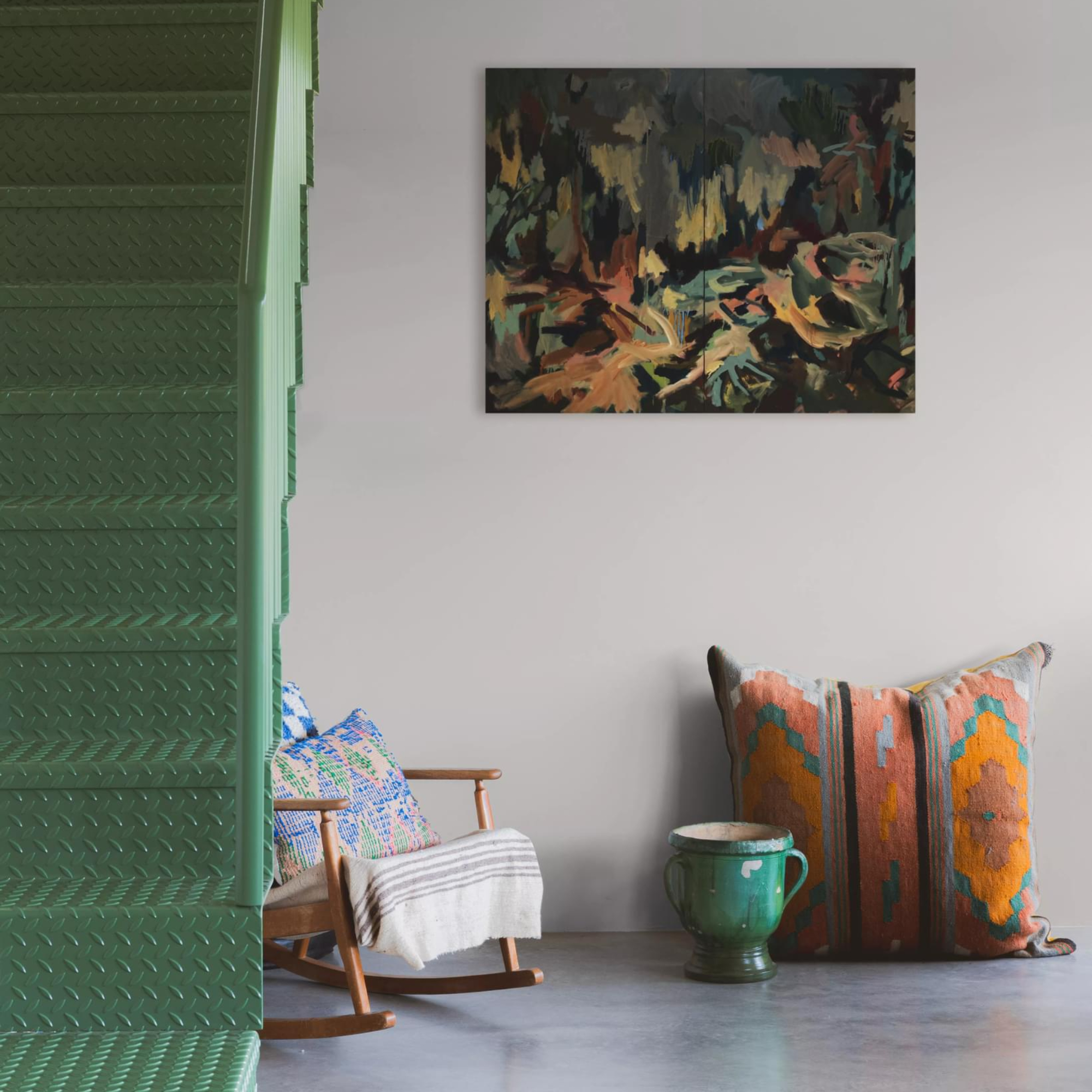
Caroline Borgman, a UK-based interior designer, frequently incorporates Portland Stone into her projects, especially in period properties. She highlights its ability to add a distinct layer of warmth and its versatility, making it a go-to neutral. Borgman notes that Portland Stone works well as a backdrop for various rooms, from entryways to living rooms. For a tonal beige scheme, she suggests using stronger levels like Portland Stone Dark for cabinetry or lighter shades like Portland Stone Light for ceilings. She also emphasizes its compatibility with colorful furniture and soft furnishings, particularly blues, greens, warm rusts, and burnt oranges.
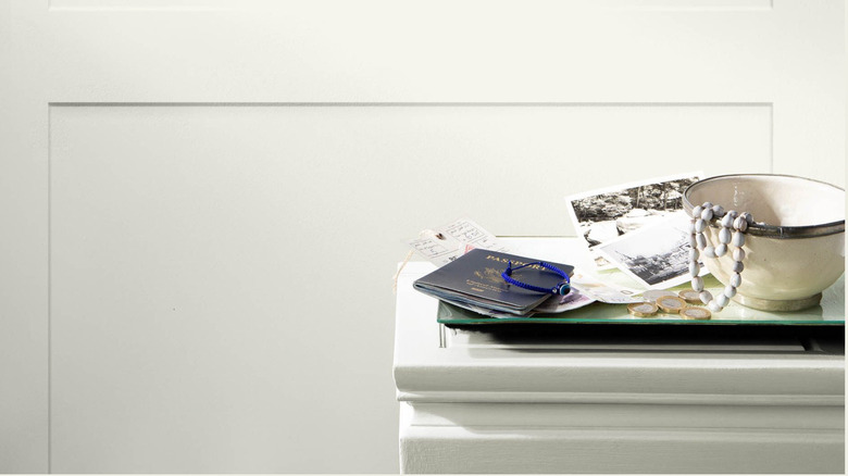
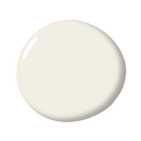
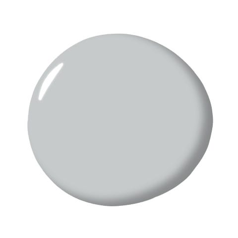
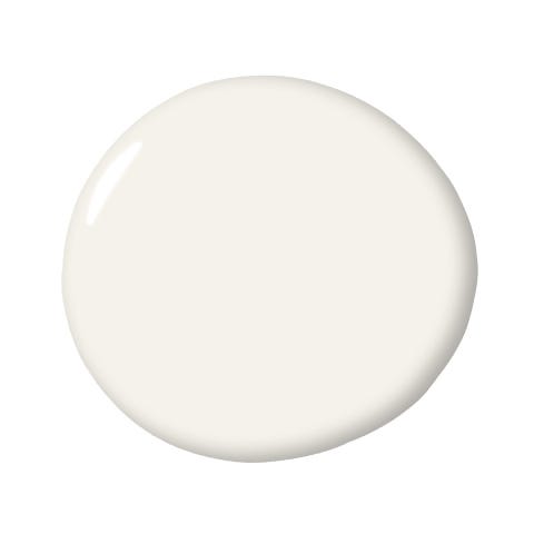
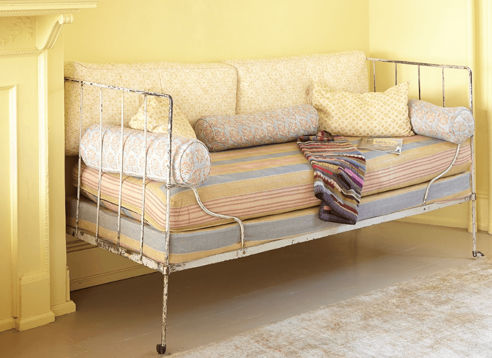
Little Greene has expanded the Portland Stone palette by introducing two complementary shades: Portland Stone Light and Portland Stone Dark. These sister neutrals are designed to work harmoniously together, allowing for layered and cohesive color schemes throughout a home. Ruth Mottershead explains that this trio of shades adds warmth and provides a versatile canvas for fabrics, wallcoverings, and furnishings across different styles.
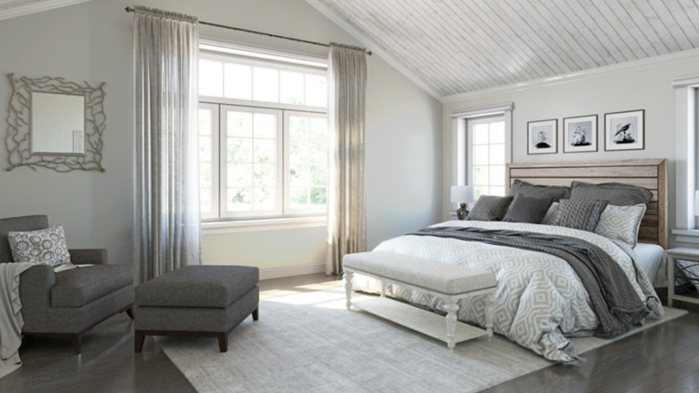
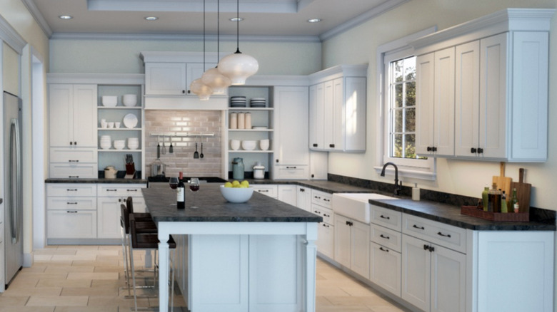
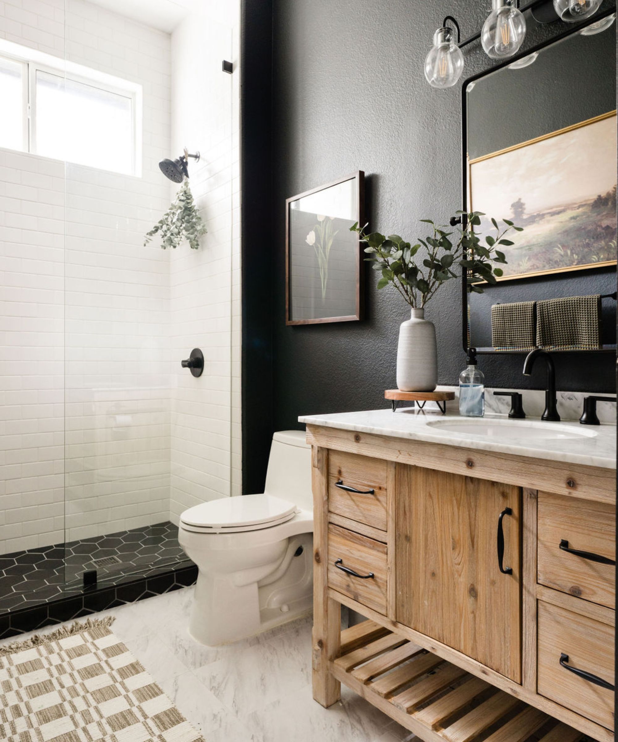
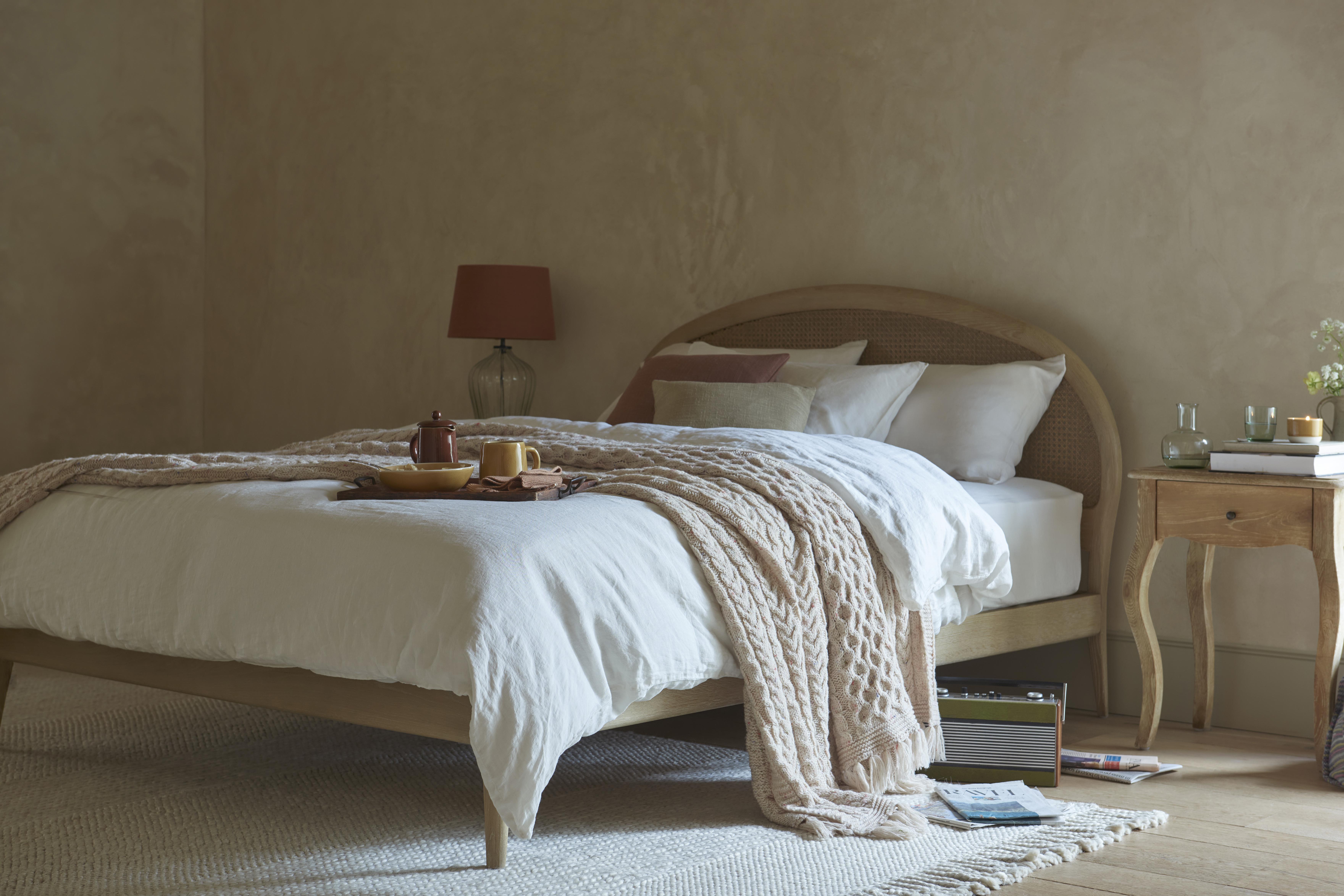
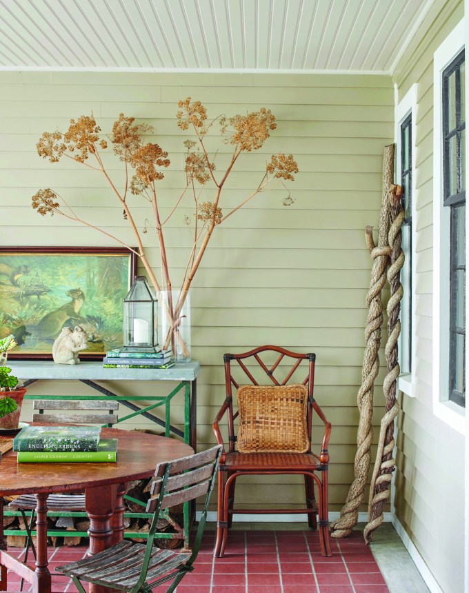
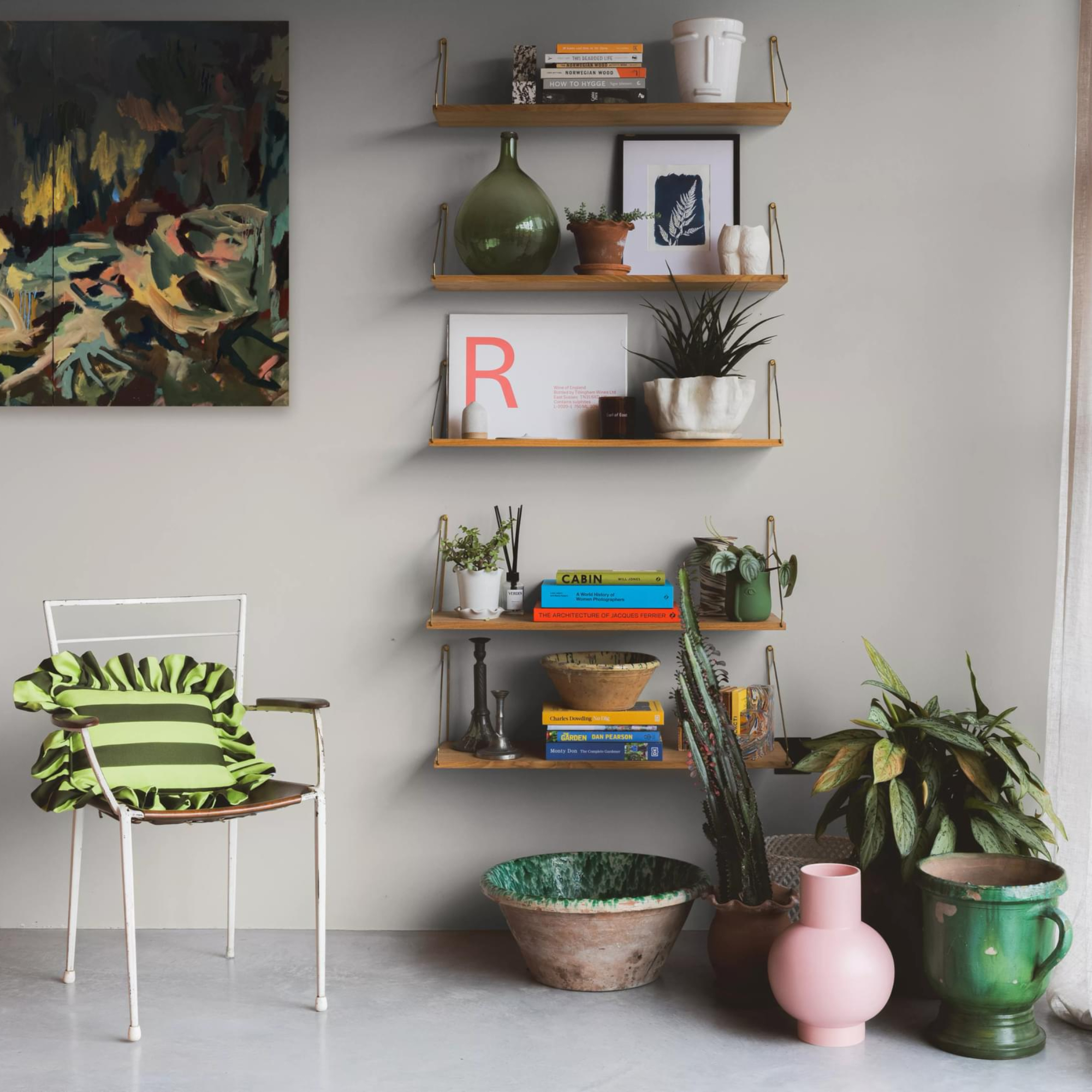
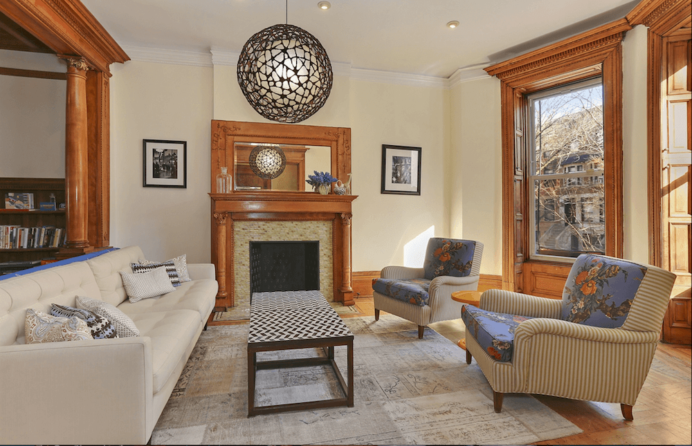
Jaime Zhener, a California-based interior designer, points out that Portland Stone's appeal lies in its ability to recede when needed without appearing drab. It acts as a supporting element rather than the central focus of a room. Zhener notes its excellent pairing with natural materials such as linen, stone, and wood, creating a layered, lived-in warmth. She suggests using it on walls, cabinetry, or trim to envelop a space in an inviting, organic softness that feels calming. Additionally, Caroline Borgman highlights its effectiveness as an exterior paint color, recounting a project where Portland Stone on the exterior with Portland Stone Dark on the front door created a handsome look.
Zehner further explains that Portland Stone offers an antidote to the overly 'light and bright' aesthetic that sometimes leads to monotonous and flat spaces. It provides a way to retain the clean crispness of a pale shade while introducing more depth and character. For those not ready to commit to a paint project, the article suggests incorporating similar soft and gentle shades through decor items like oatmeal linen bedding, neutral-colored glassware, a cream desk lamp, a cashmere throw, a scroll wall bracket, and a watercolor stripe tablecloth.
#InteriorDesign #PaintColors #NeutralPalette #LittleGreene #PortlandStone #HomeDecor #DesignTrends #BeigePaint #WarmNeutrals #InteriorDesign #PaintColors #NeutralPalette #LittleGreene #PortlandStone #HomeDecor #DesignTrends #BeigePaint #WarmNeutrals
0 comment in total
 No comments yet
You may also like
The 10 Best Little Greene Paint Colors For Your Home, as Chosen by Interior Designers

Is this the best beige paint? Why designers love Stone Hearth by Benjamin Moore
Creamy neutral paint colours are back — just don’t call it magnolia
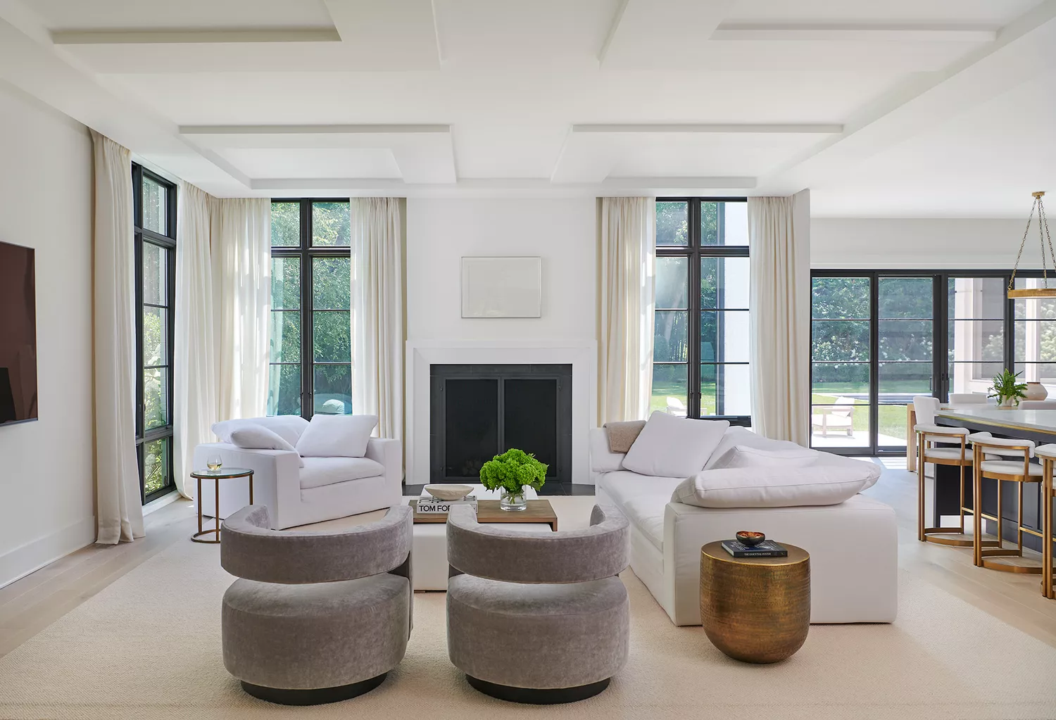
12 Neutral Paint Colors That Will Look Beautiful in Every Room
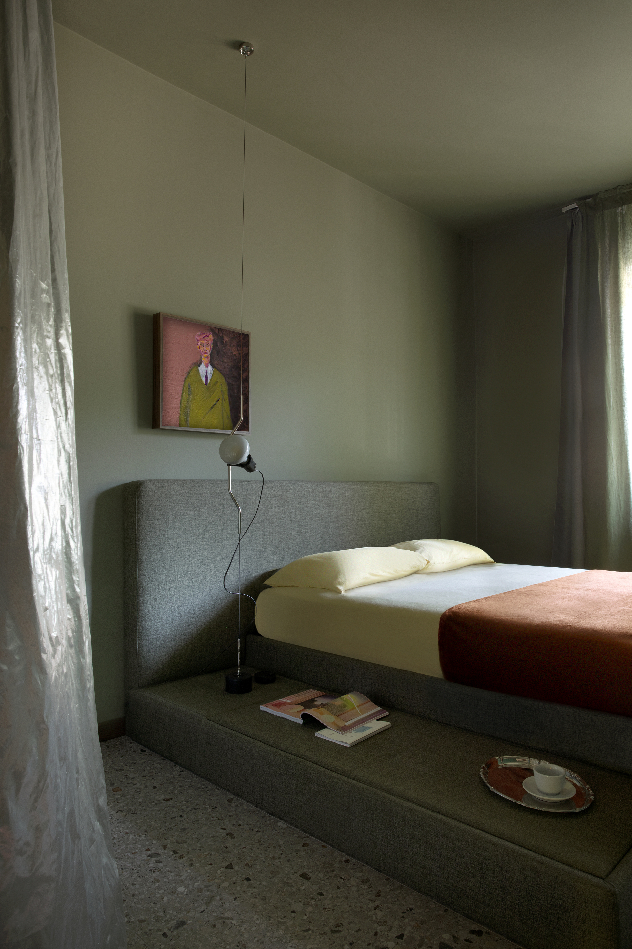
Is Green the New Neutral? Interior Designers Argue We Should All Be Using This Soothing Shade as Our Base Color
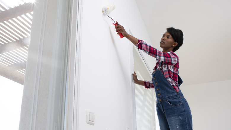
The All-Time Favorite Light Neutral Paints Of HGTV Stars
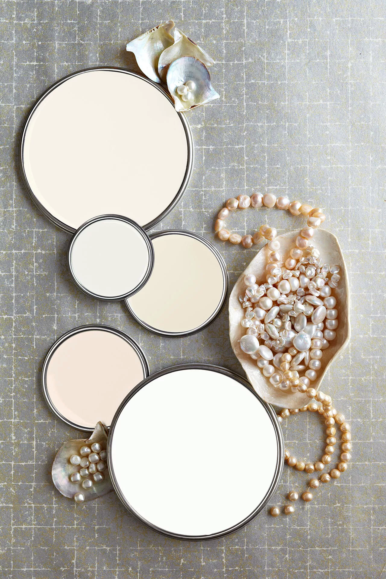
27 Neutral Paint Colors and Tips from Experts On How to Use Them

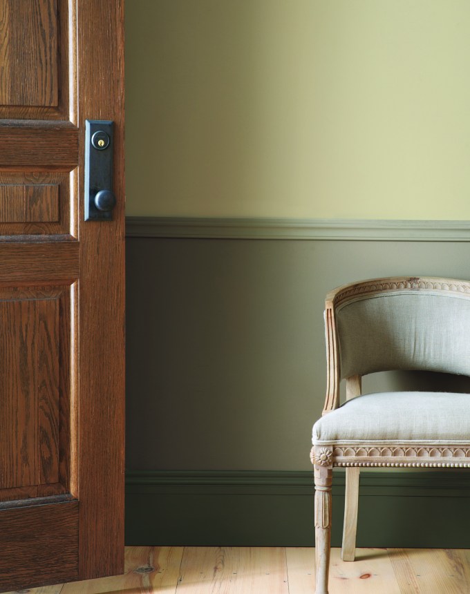
The 13 Best Greige Paint Colors to Buy Right Now
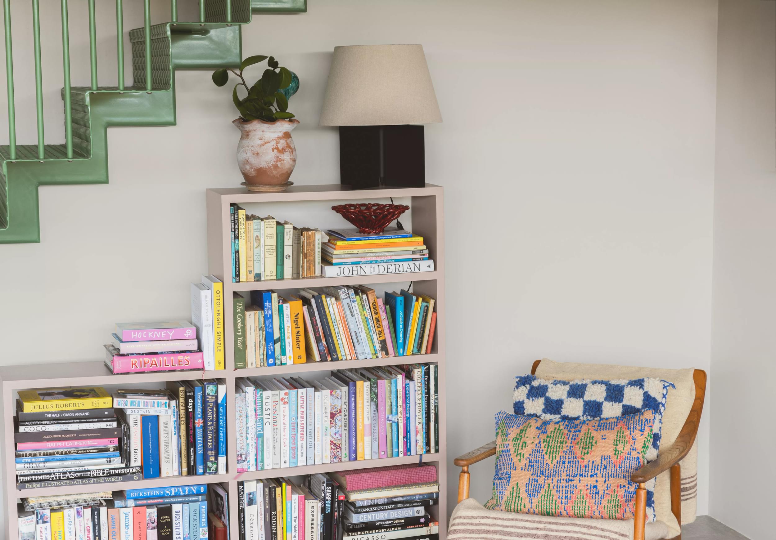
Find your perfect neutral with COAT Paints' new Polite Palette

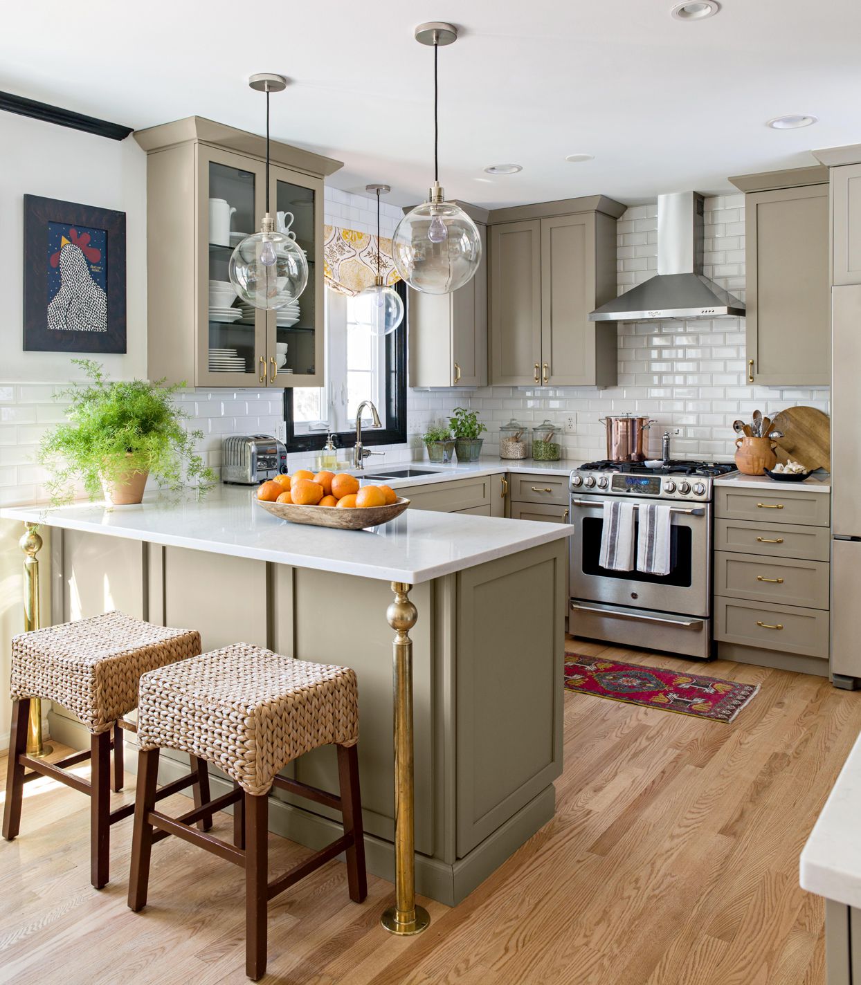
Earth Tone Paint Colors Designers Turn to Again and Again
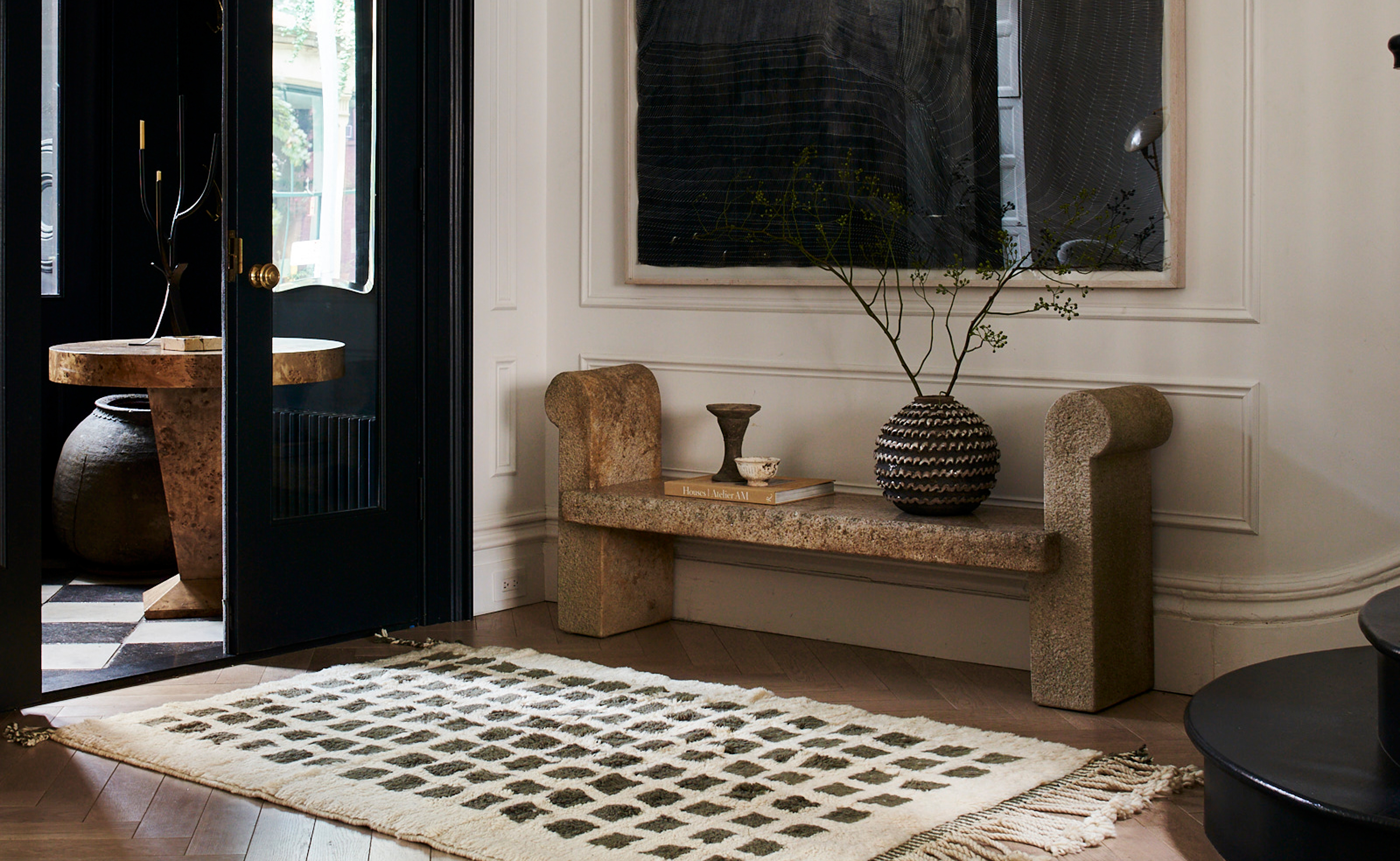
The 3 Best Neutral Entryway Paint Colors to Set the Right Tone for a Sophisticated Home
COAT Paints' newest palette is an antithesis to the Colour of the Year – embracing 'timeless' over 'trendy'

Bored With White Walls? Try One of These Designer-Recommended Neutral Paints Instead

35 Neutral Paint Colors Interior Designers Can't Get Enough Of

These Are The 12 Best-Selling Paint Colors From All Your Favorite Brands


Designers Load Up on Classic and Neutral Colors Inside Townhouses
Farrow & Ball's 'Skimming Stone' Is an "In Between" Shade That Designers Say Works in Every Space
What are the best Benjamin Moore gray paints? 7 go-to shades recommended by designers
The 20 Best Neutral Paint Colors for Your Home in 2025

10 Best-Selling Glidden Paint Colors of All Time