1/3
This "Everyday" Bedroom Feature Can Have a MASSIVE Impact on Your Sleep
The article explores the significant impact of bedroom paint and wallpaper colors on sleep quality, drawing on insights from a psychologist and interior designers. It highlights that sleep hygiene encompasses not only behavioral practices but also the interior design elements of a bedroom. Research indicates that colors have a neurological effect on humans, influencing emotional responses and ultimately affecting how well a person sleeps.
Leah Kaylor, a psychologist and CEO, explains that the human brain reacts to color on both biological and emotional levels, thereby influencing how individuals feel, think, and respond. Colors can either calm or energize, with some potentially even raising heart rates. These reactions are not random but are shaped by how the brain processes visual input, as well as personal and cultural associations. Kaylor suggests that if typical nighttime routines fail to improve sleep, the bedroom's wall colors or patterns could be the underlying issue.
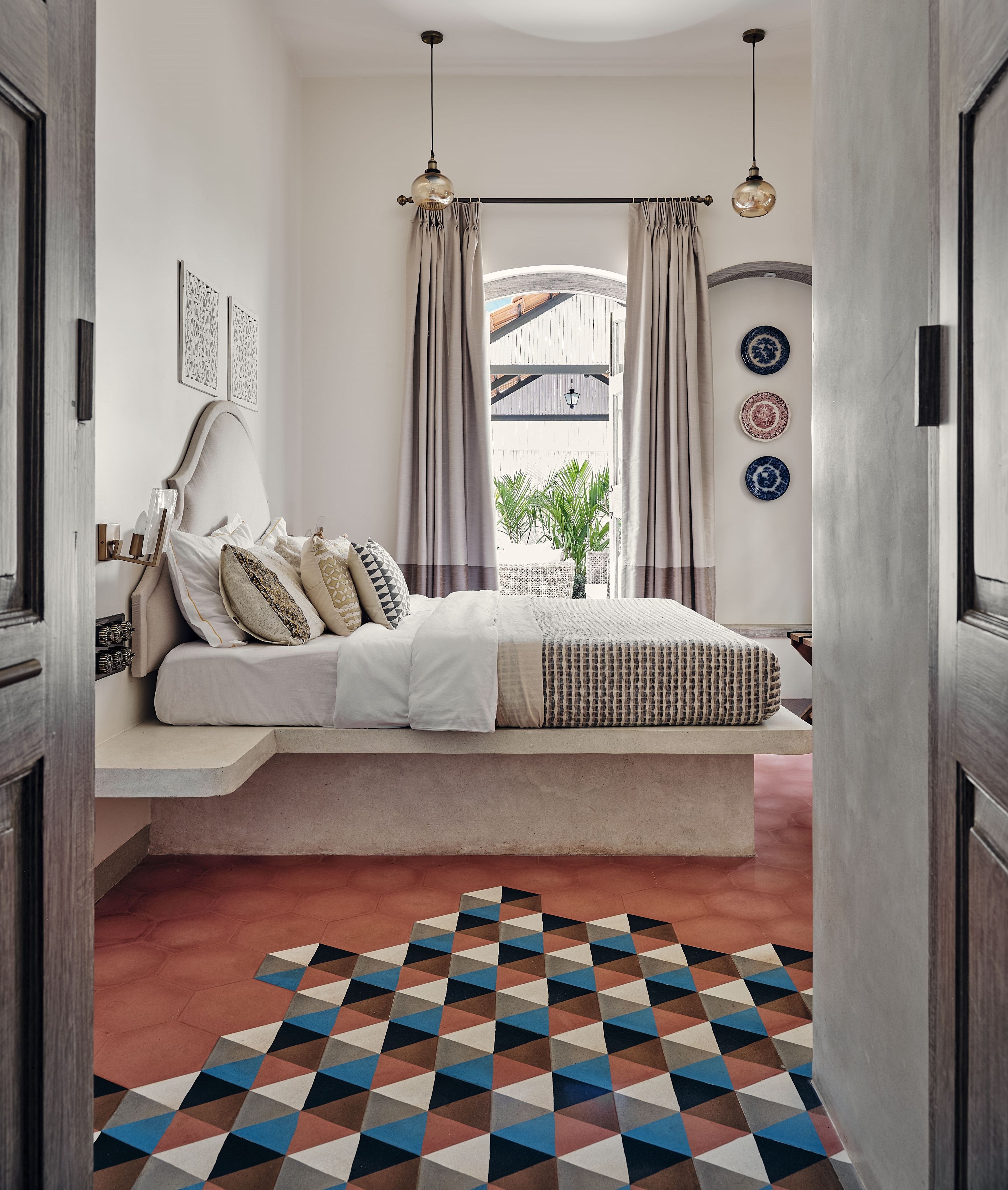
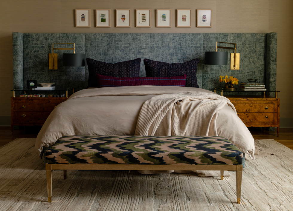
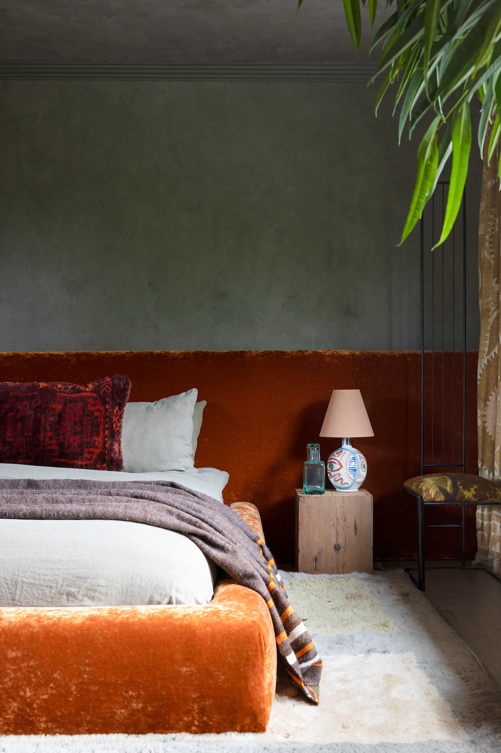
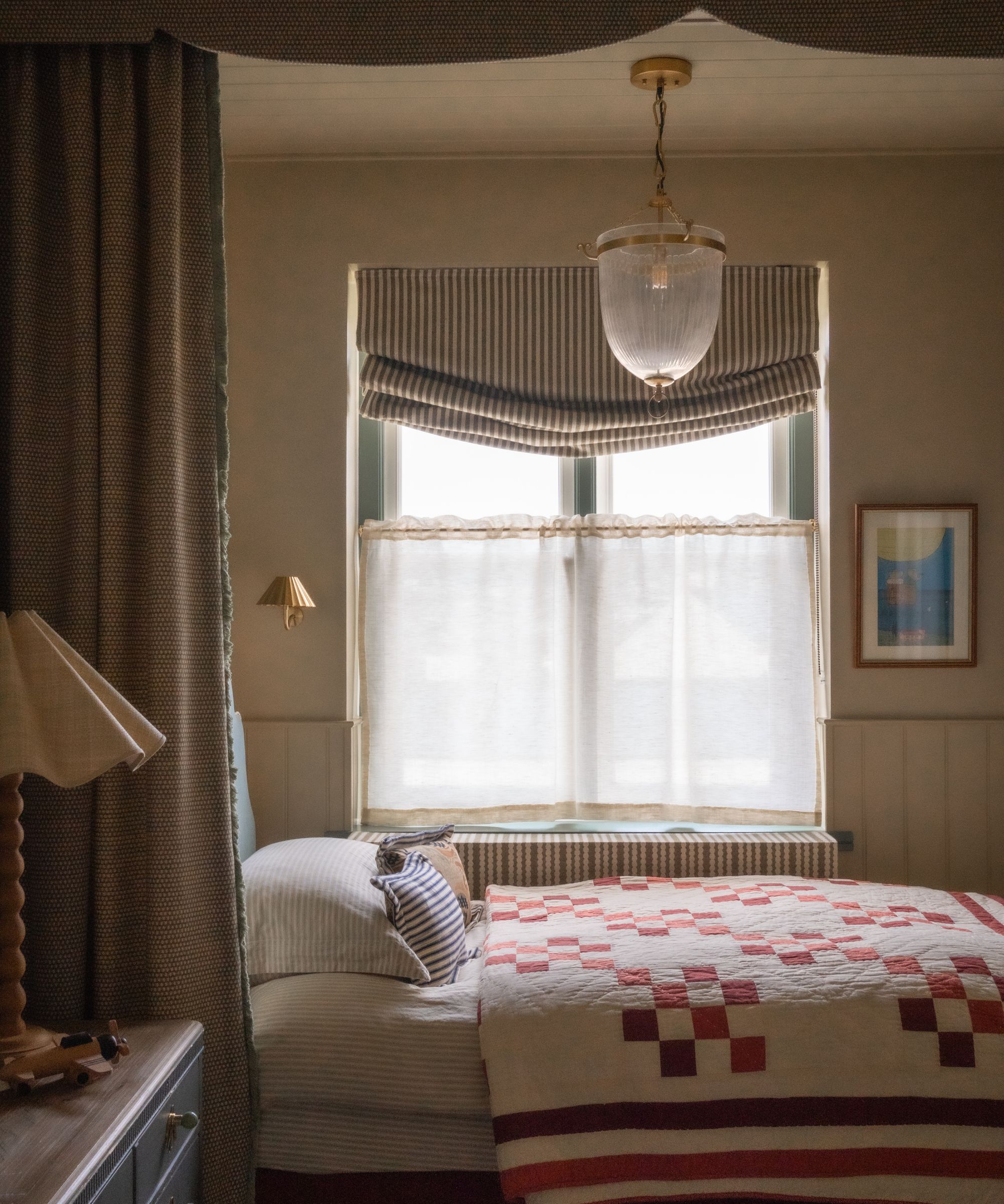
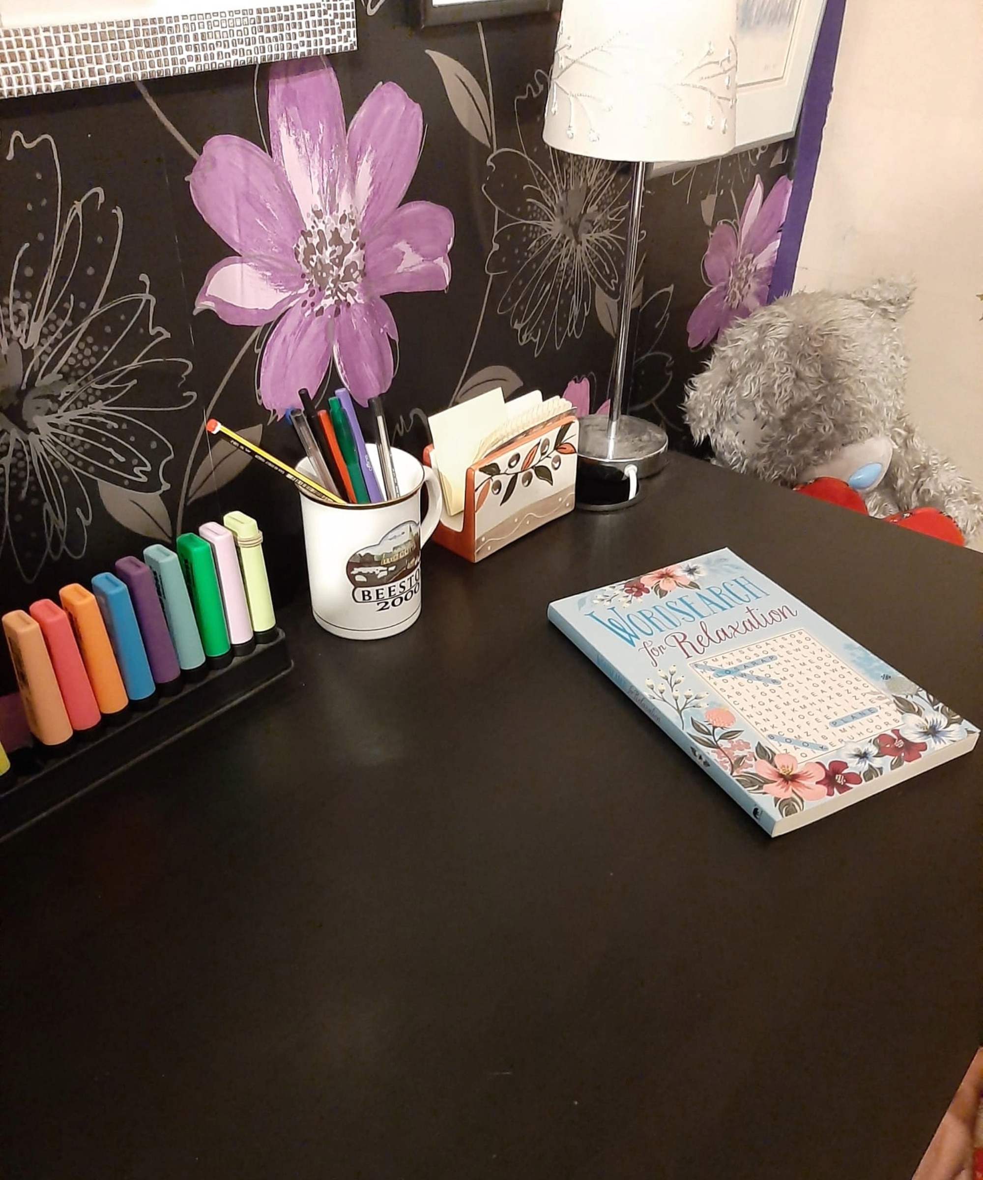
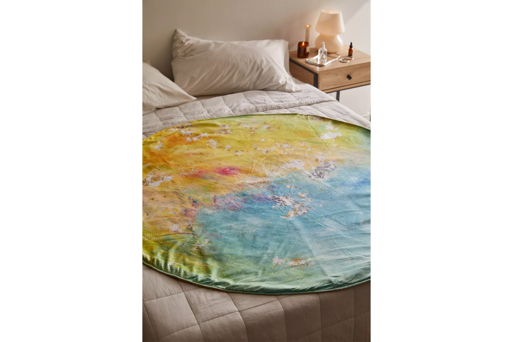
Certain colors and patterns are identified as detrimental to sleep. High-contrast or bright hues such as red, neon yellow, and stark black-and-white patterns can lead to sensory overload, signaling the brain to remain alert rather than unwind. Highly patterned or chaotic wallpapers can create similar low-level sensory disruptions that the brain continues to process, even during sleep, potentially causing lighter sleep or increased wakefulness, particularly for individuals with anxiety or PTSD. Red, despite its association with energy and passion, is considered overstimulating for sleep environments and should be used cautiously, perhaps only as an accent. Orange, while suitable for energetic spaces like home gyms, is also discouraged in bedrooms due to its stimulating effect on both mind and body. Interior designer Isfira Jensen advises against busy geometric prints and bold stripes, as they can be overwhelming and keep the eyes darting and brain alert.
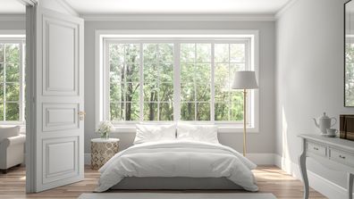
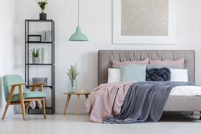
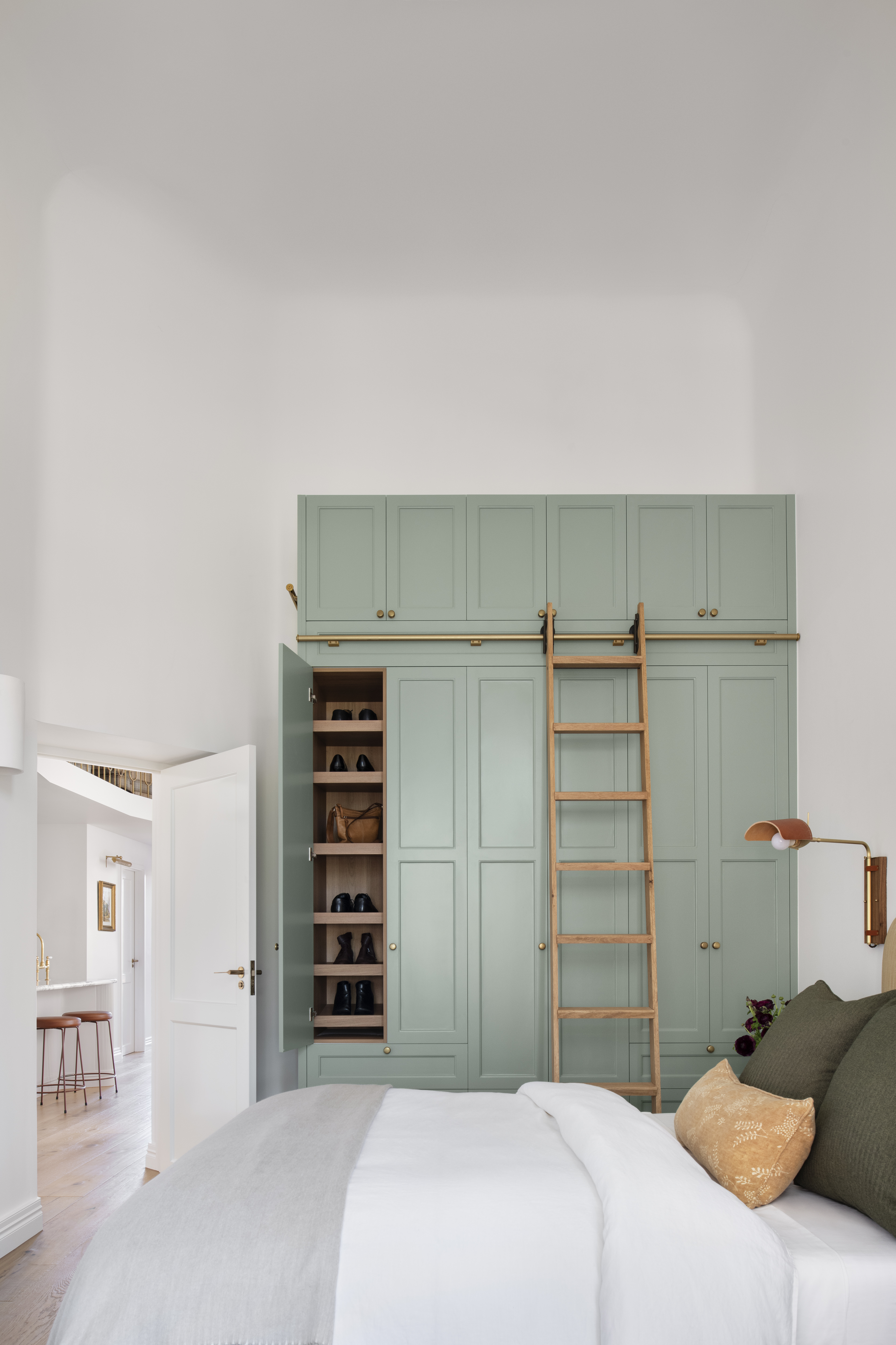
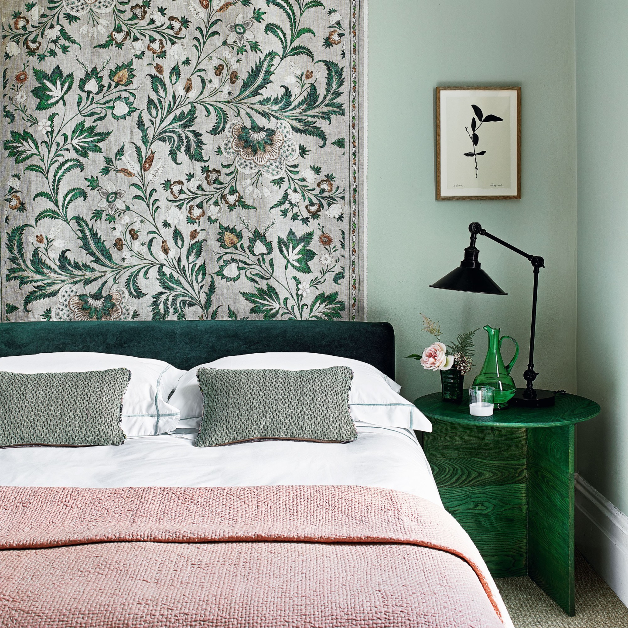
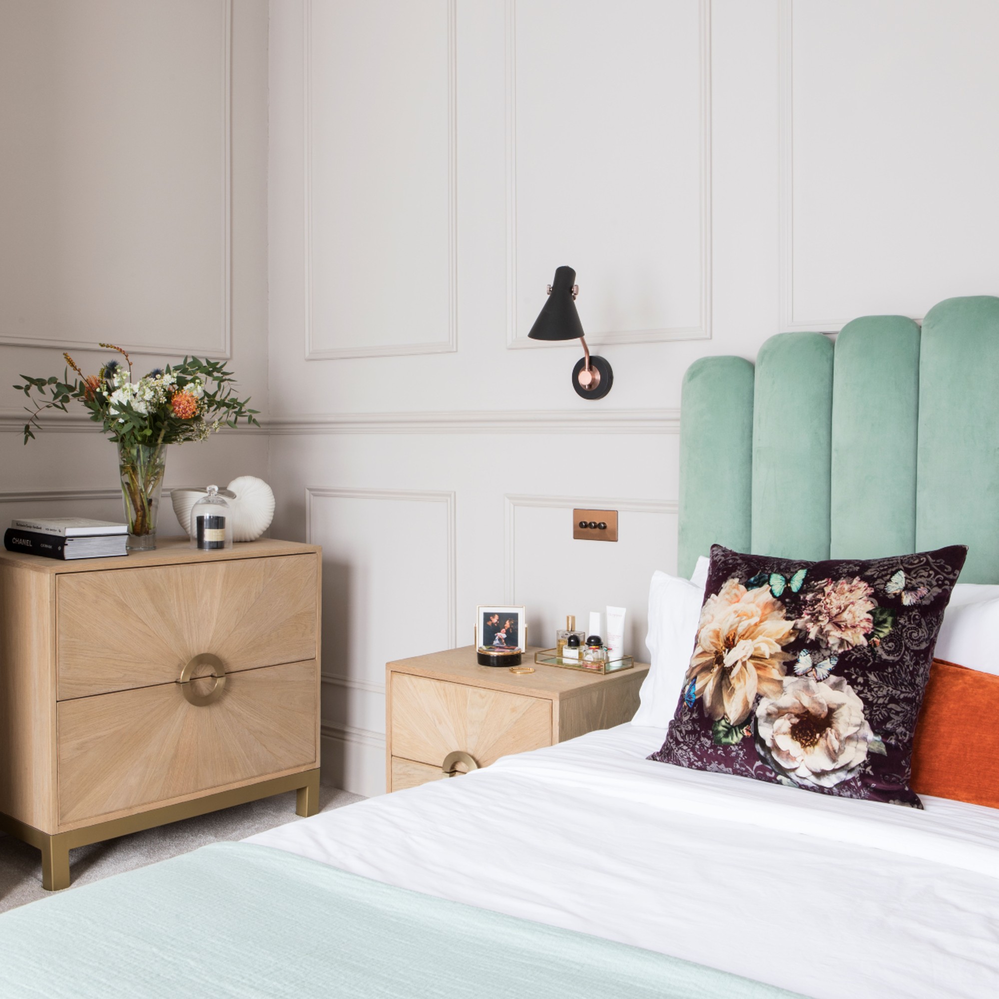
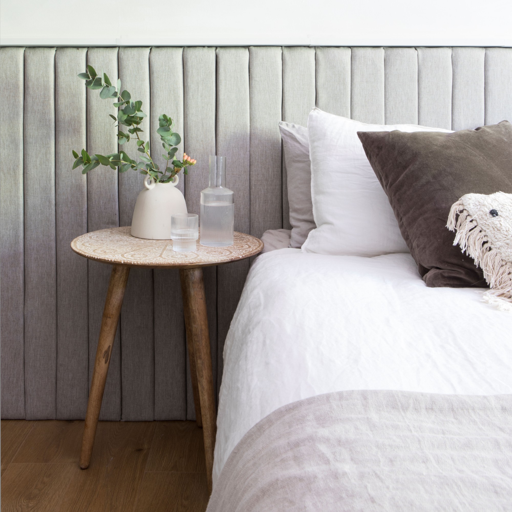
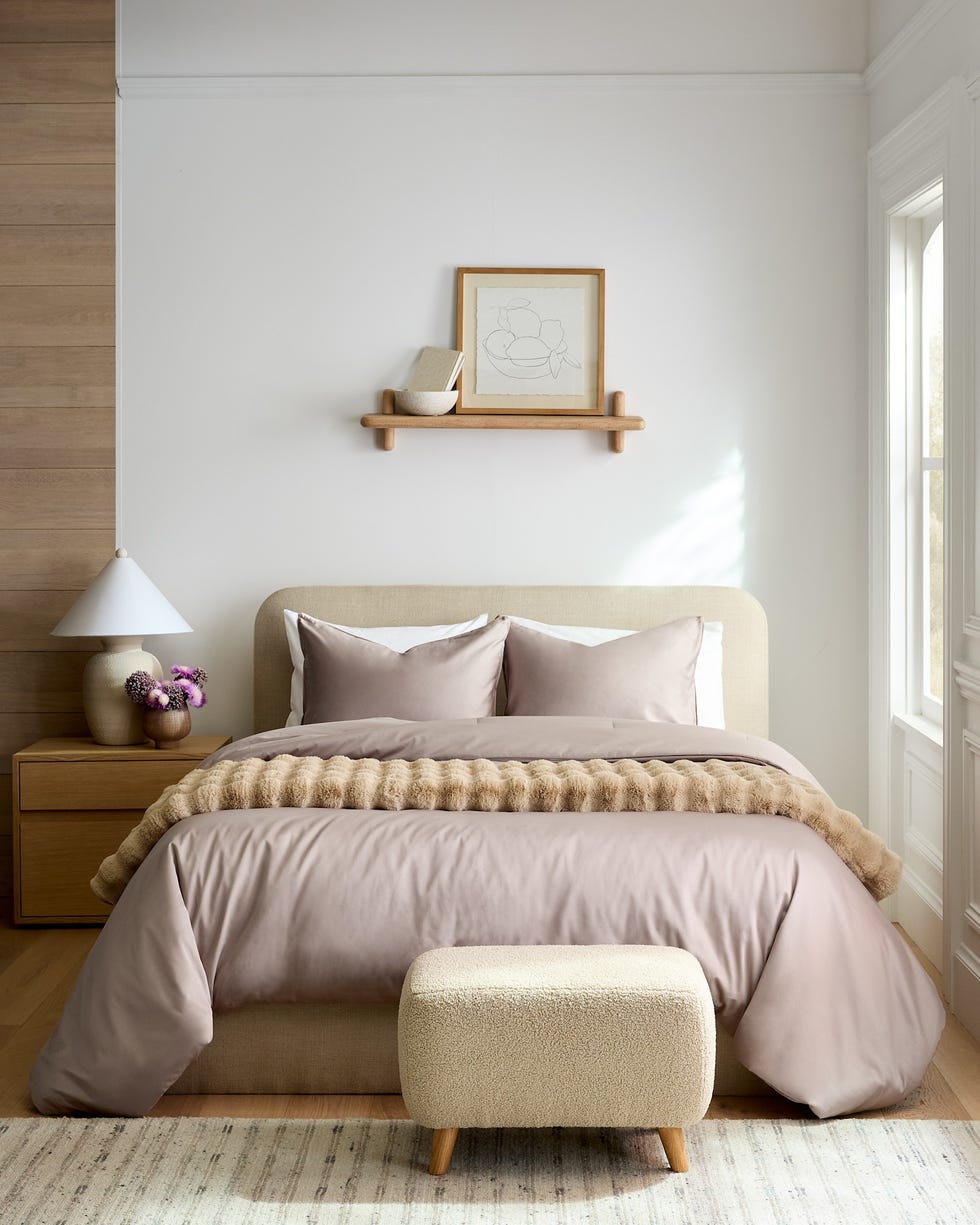
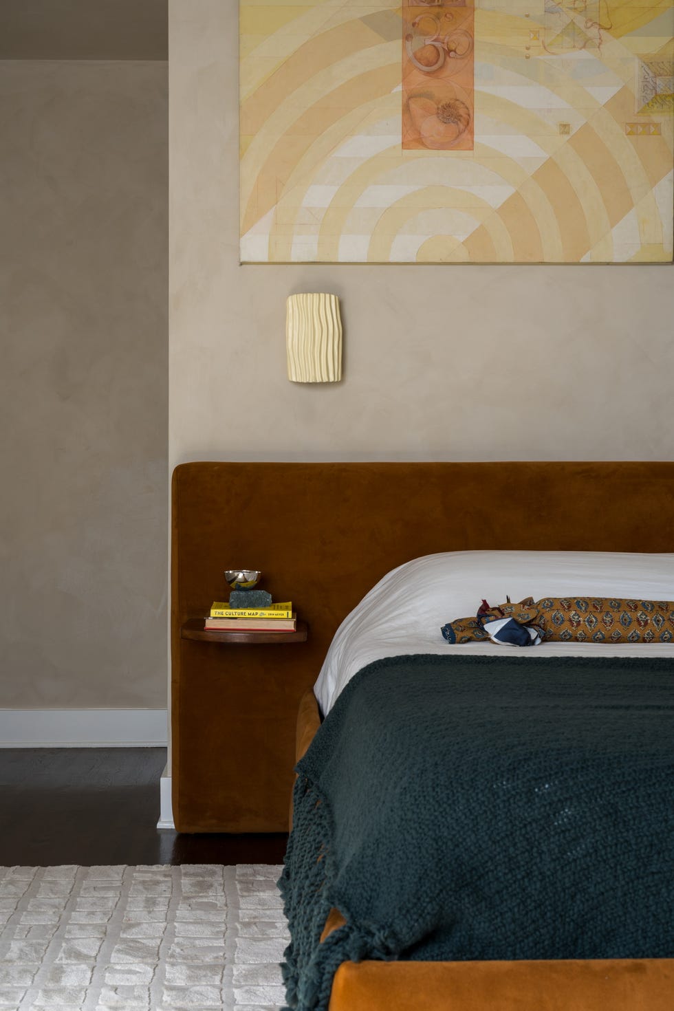
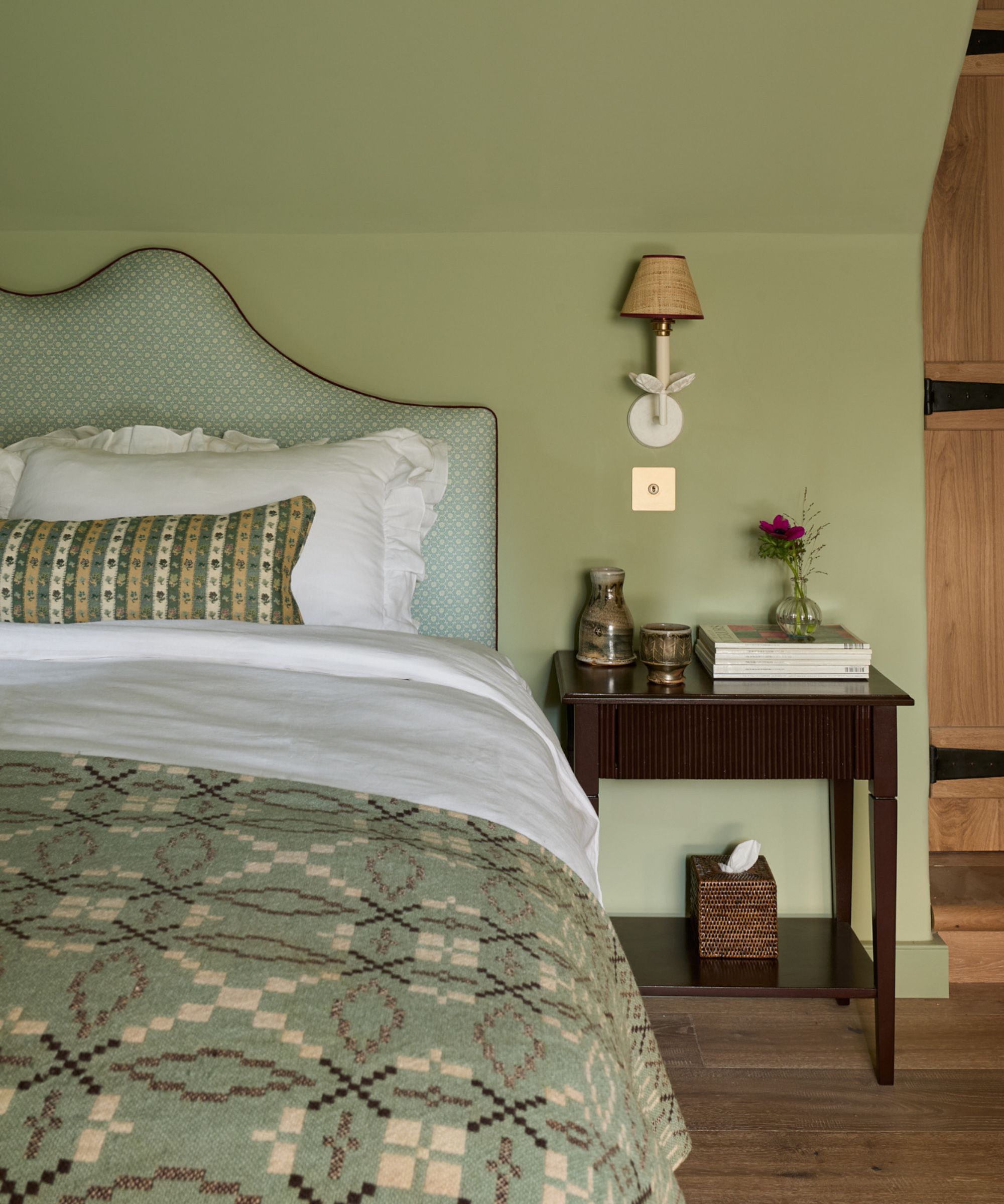
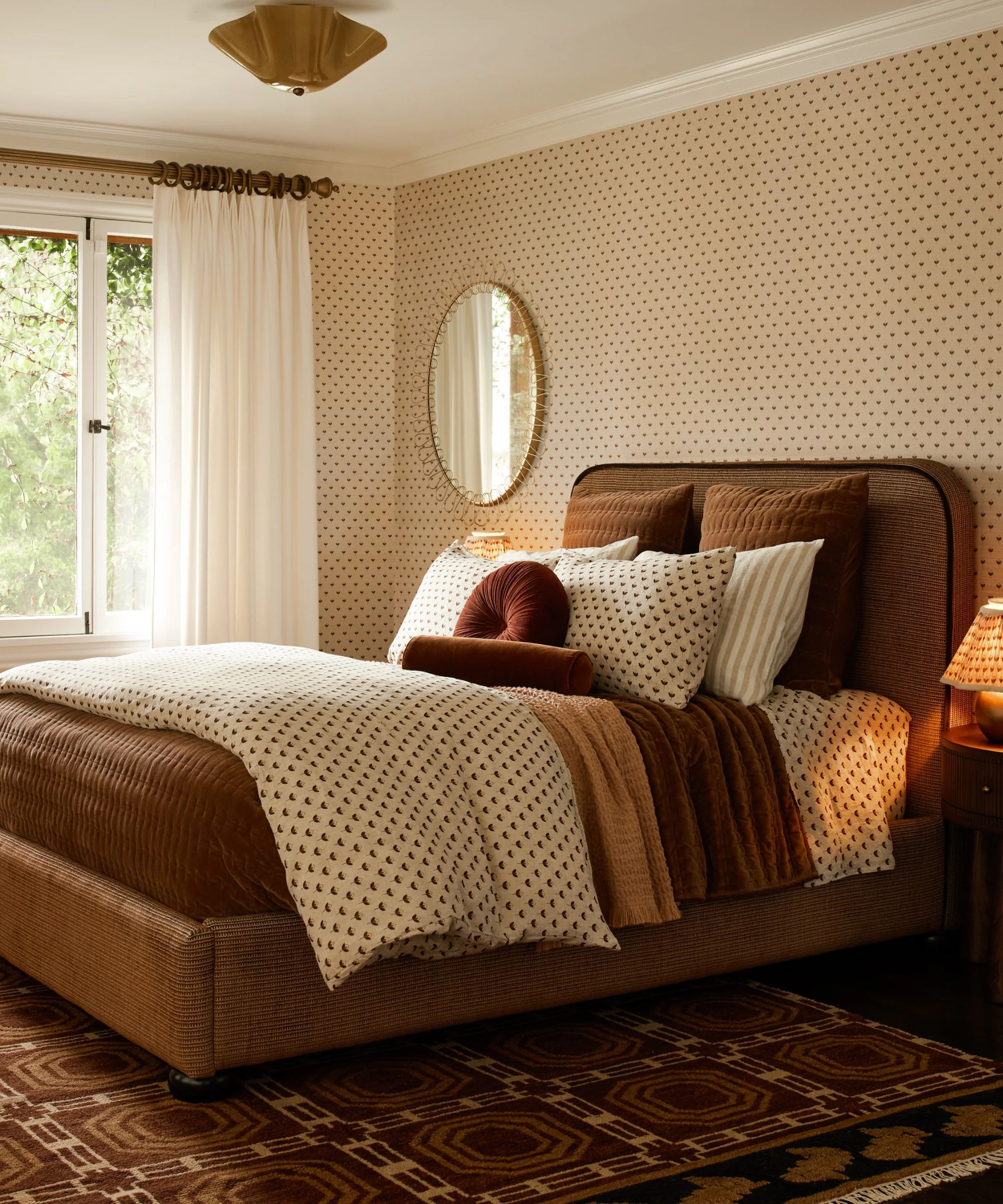
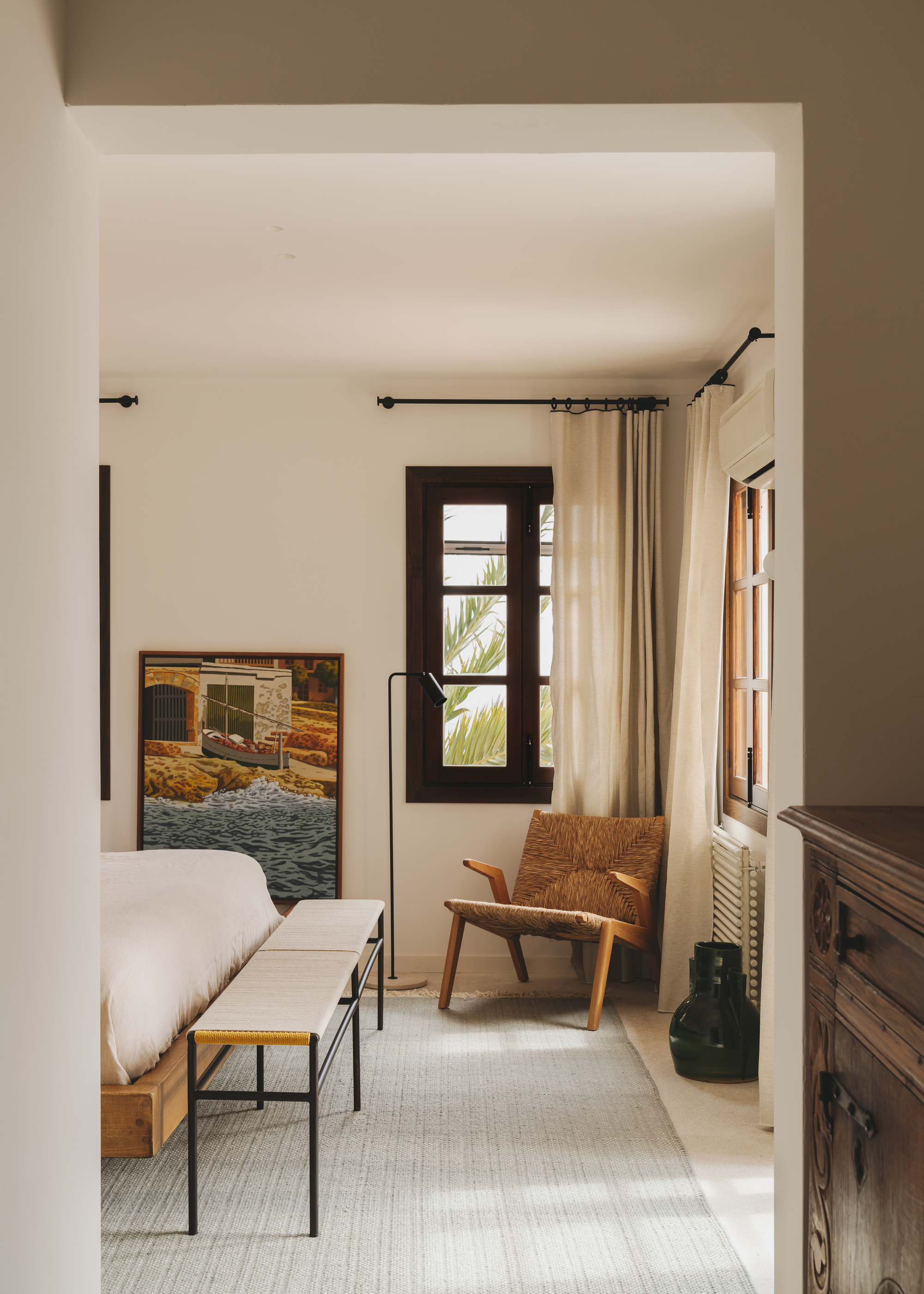
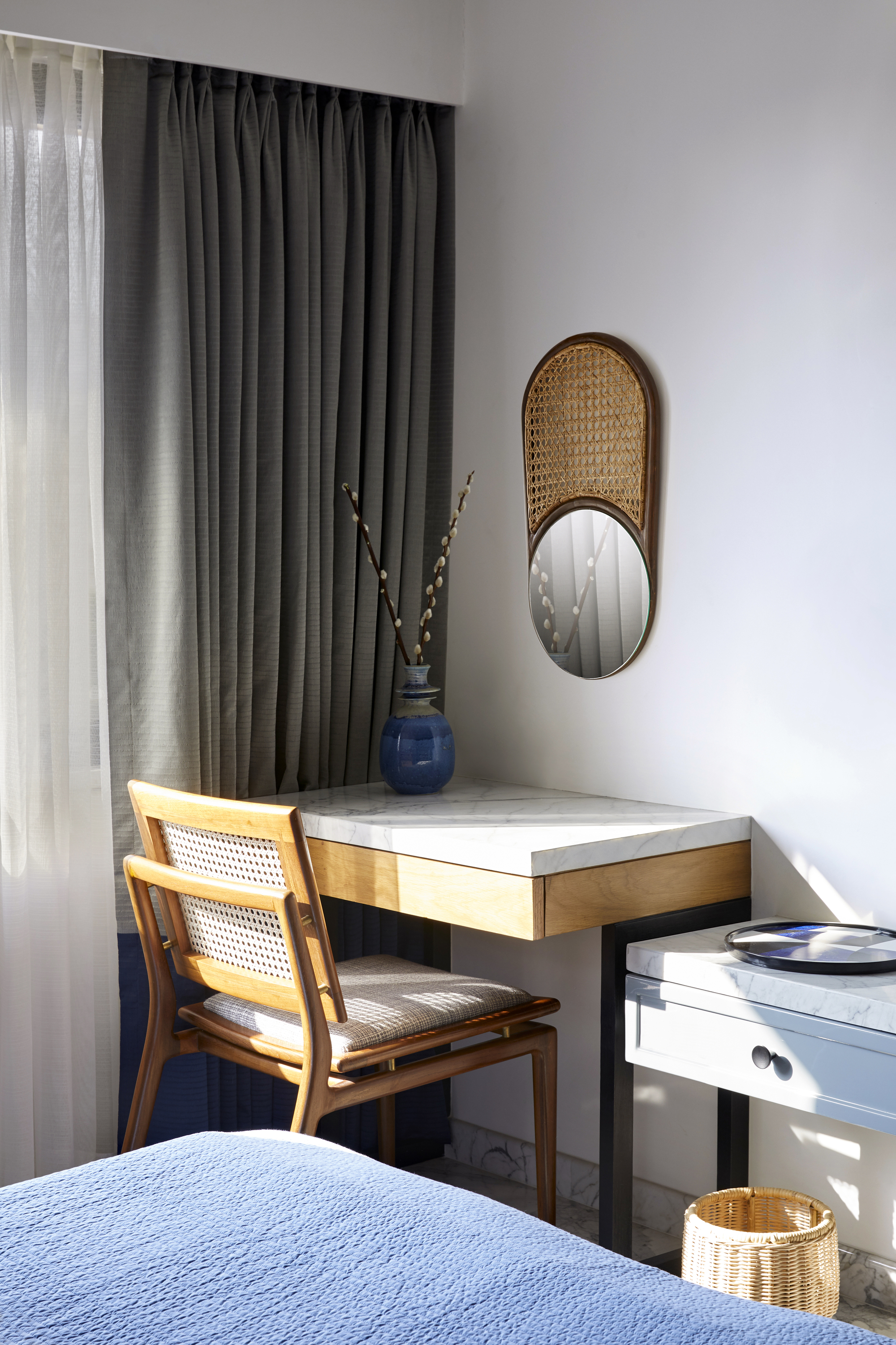
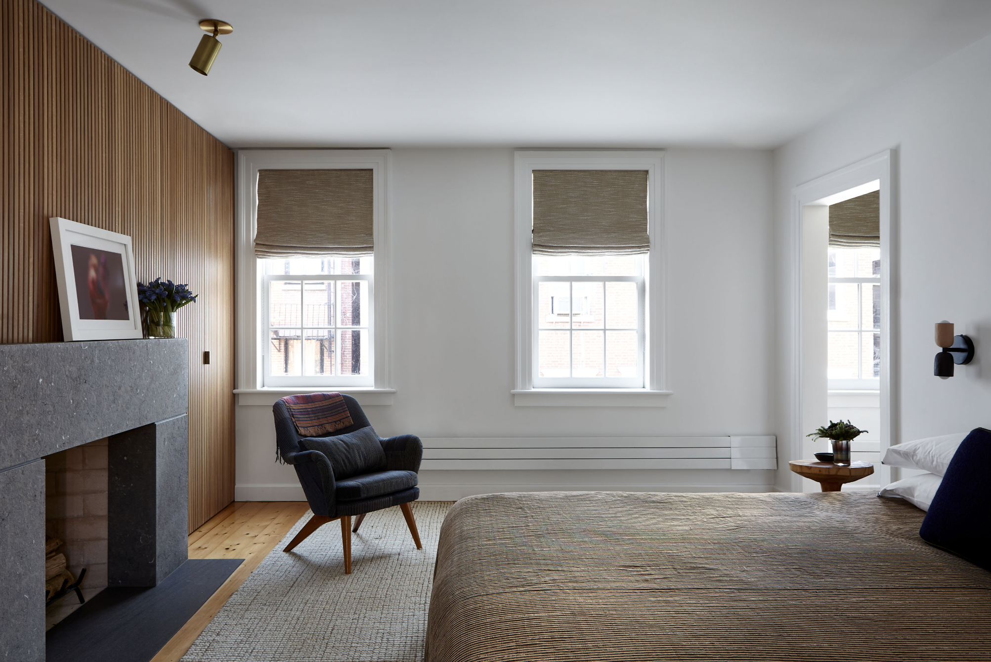
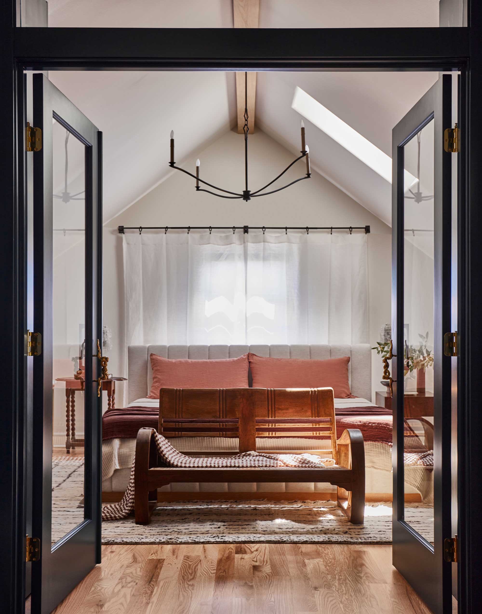
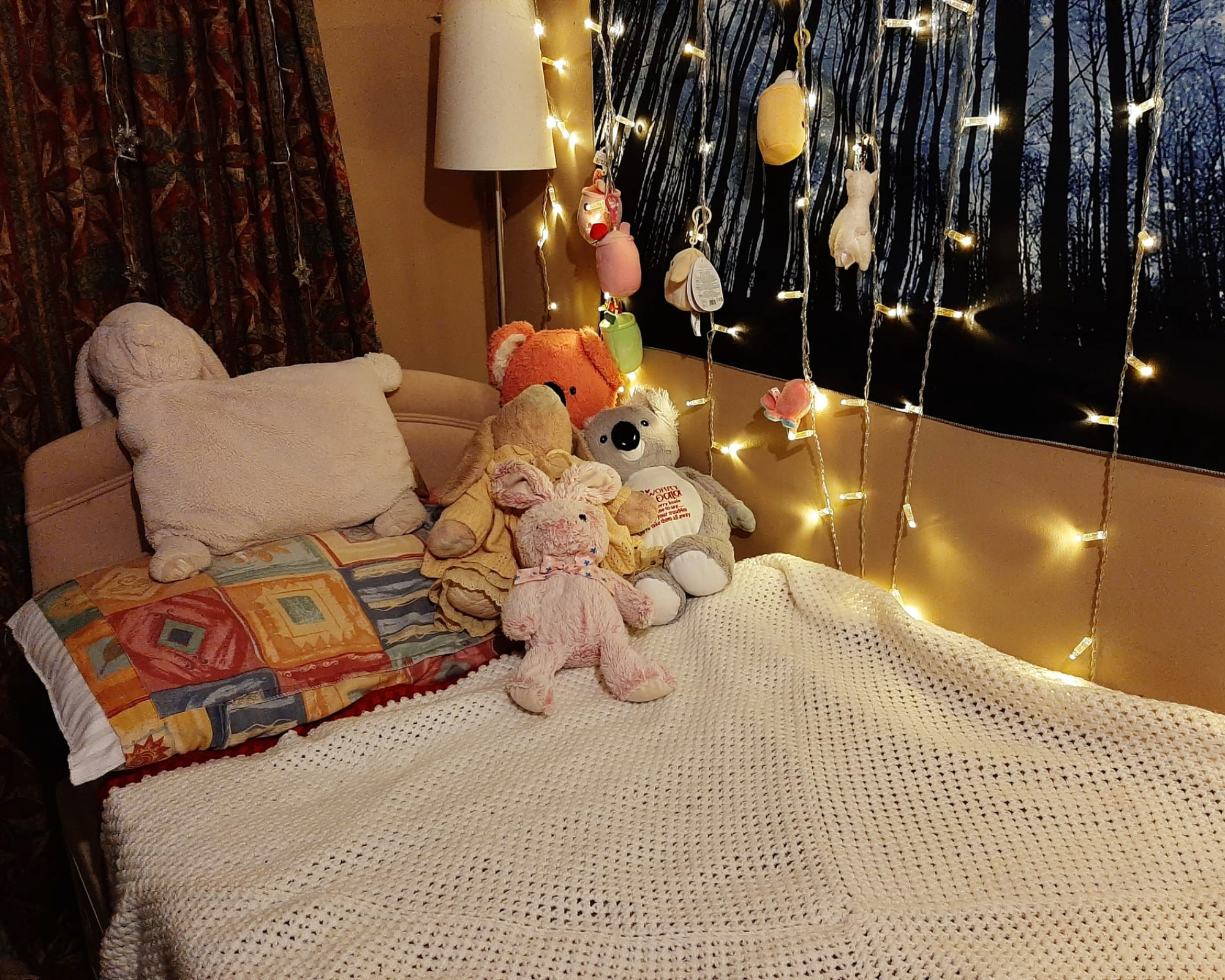
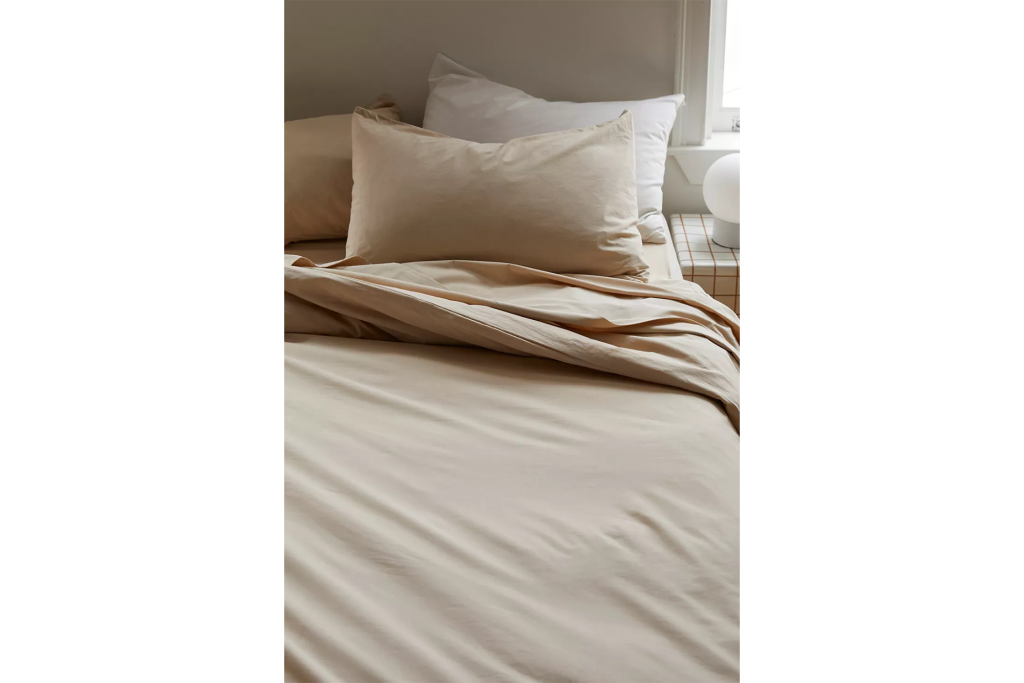
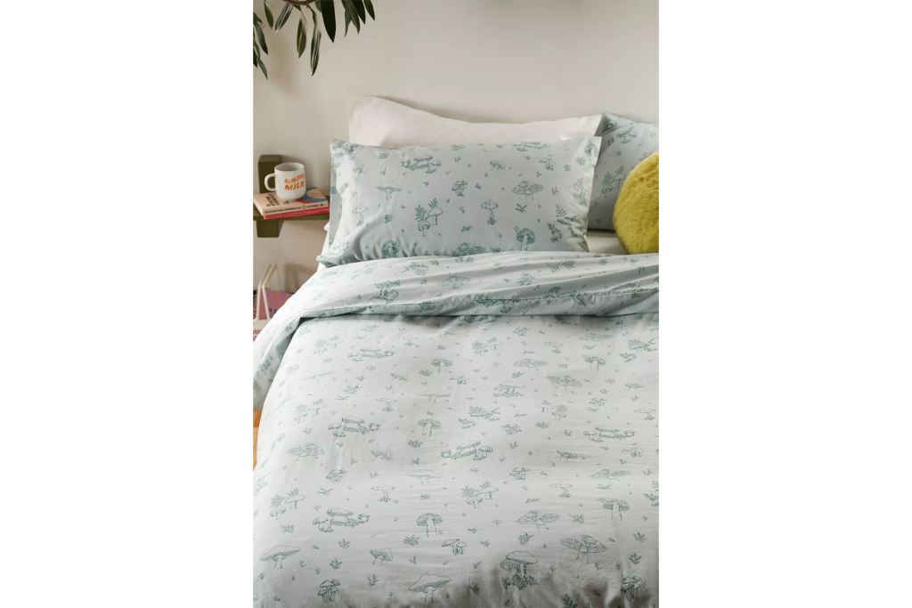
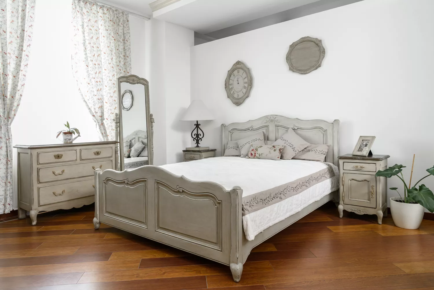
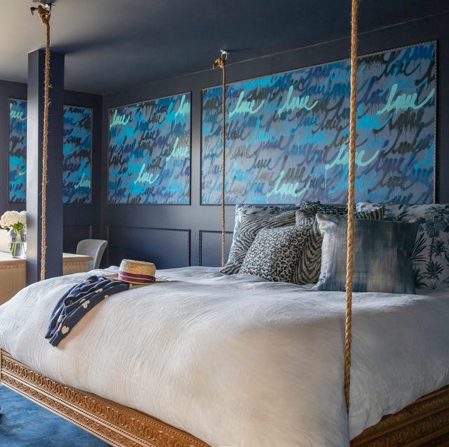
Conversely, specific colors and patterns are recommended for promoting better sleep. Soft floral and nature patterns are favored for wallpaper because they are rooted in the outdoors and often feature muted color palettes that are not distracting. Shades of blue are highly recommended for their serene and calming properties, with suggestions including dark navy or bright teal to induce peace. Earthy greens, such as mint or sage, also contribute to feelings of relaxation and offer a refreshing, breezy ambiance. For those who prefer wallpaper, calming imagery or soft, subtle textures and patterns like flowing lines, gentle curves, or natural motifs (clouds or leaves) can create a soothing rhythm. Gala Magriñá, another principal designer, advocates for tonal hues, including soft beiges, muted pinks, deep greens, and browns, emphasizing that the specific hue dictates its effect. A gentle blush pink, for example, is suitable for a restful bedroom, unlike a vibrant pink which is more energizing.
For individuals unable to immediately redecorate their bedroom, interiors expert Colin Pearson suggests alternative solutions. These include using soft lighting, incorporating softer visual breaks on the walls to minimize the impact of strong wallpaper, or rearranging the room layout. The overarching advice is to create an environment that fosters a sense of peace and relaxation, regardless of major renovations.
#BedroomDesign #SleepHygiene #PaintColors #Wallpaper #InteriorDesign #ColorPsychology #HomeDecor #Relaxation #MentalWellness #BedroomDesign #SleepHygiene #PaintColors #Wallpaper #InteriorDesign #ColorPsychology #HomeDecor #Relaxation #MentalWellness
0 comment in total
 No comments yet
You may also like
This big Feng Shui mistake in your bedroom could be causing your poor sleep
6 interior design mistakes that could be affecting your sleep
'Never sleep with a chair facing you' – Feng Shui experts bust this viral myth about your bedroom layout

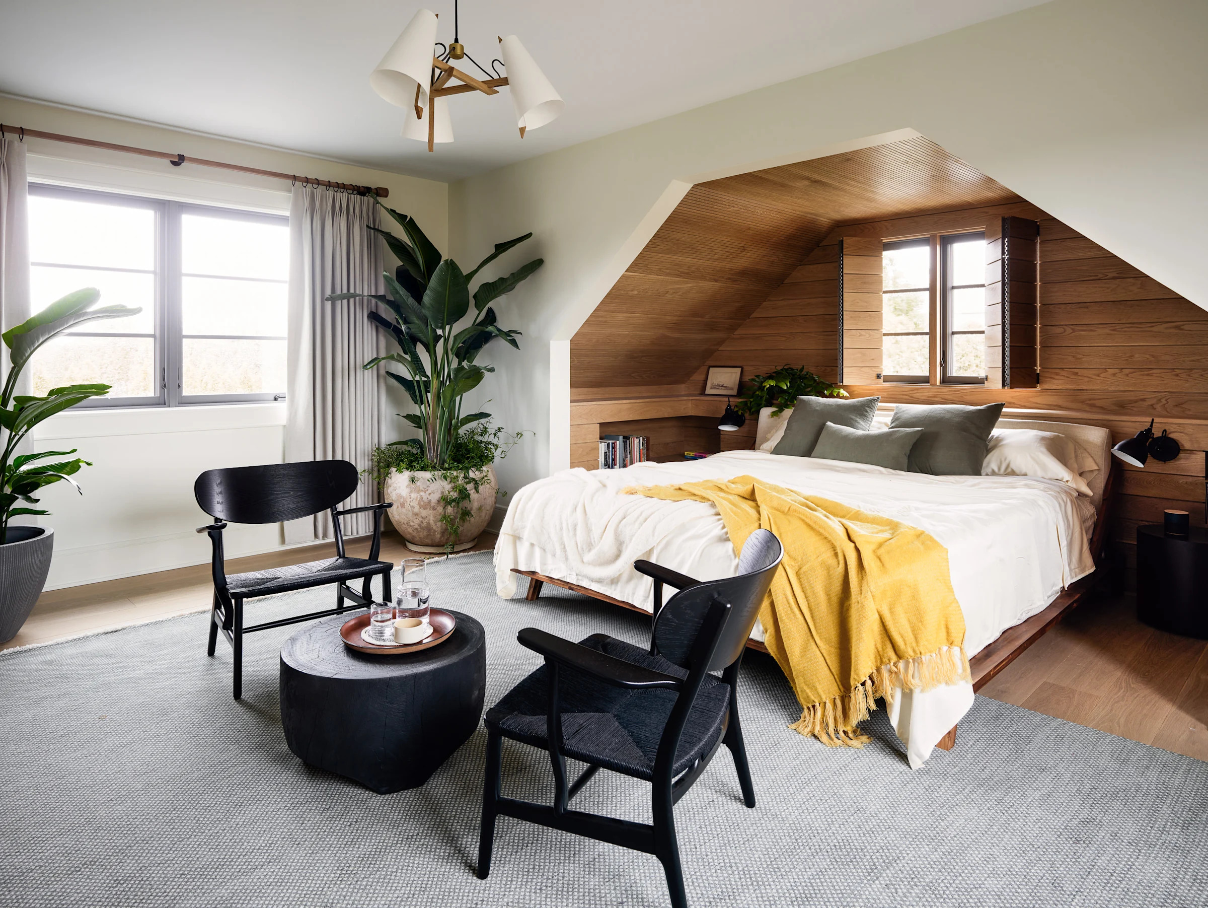
'Never sleep with a chair facing you' – Feng Shui experts bust this viral myth about your bedroom layout

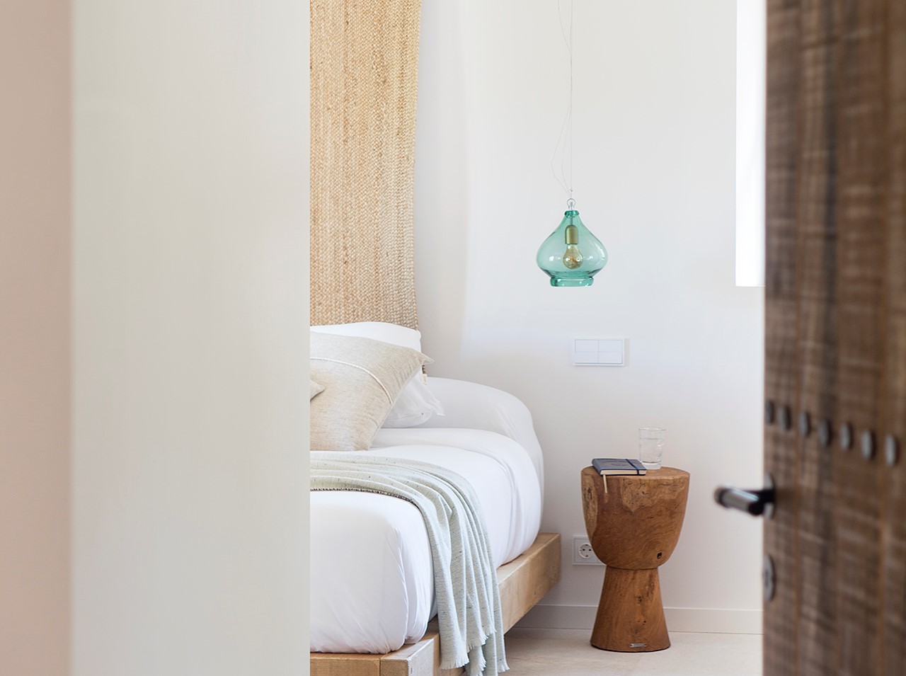
Should my bed be facing the door? Why the wrong bedroom layout could be disrupting your sleep
The evolution of the modern bedroom

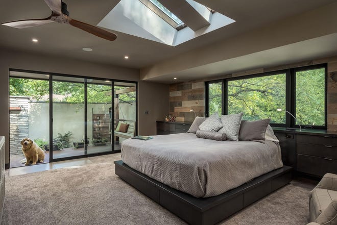
Bedroom design should emphasize stress-reducing, sleep-inducing features

How To Keep Sheets On a Bed (2025)

This often-overlooked bedroom spot could be teeming with bed bugs
Feng Shui experts warn you to avoid this mistake so that you sleep better, and to choose this bedroom layout instead

The Best Bedding to Improve Your Sleep

This simple lighting addition will make a world of difference in any bedroom

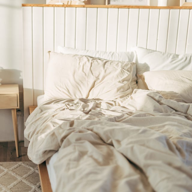
This ONE Everyday Feature Cheapens the Look of Your Bedroom
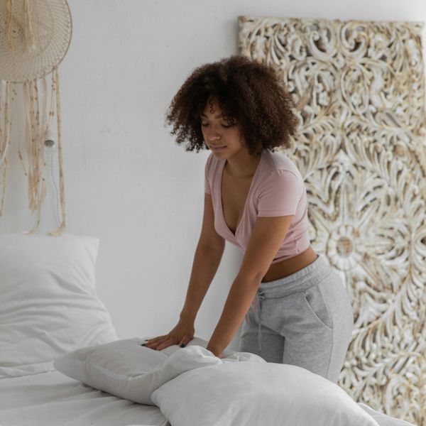
10 Bedroom Decor Mistakes Keeping You From Your Best Sleep Ever

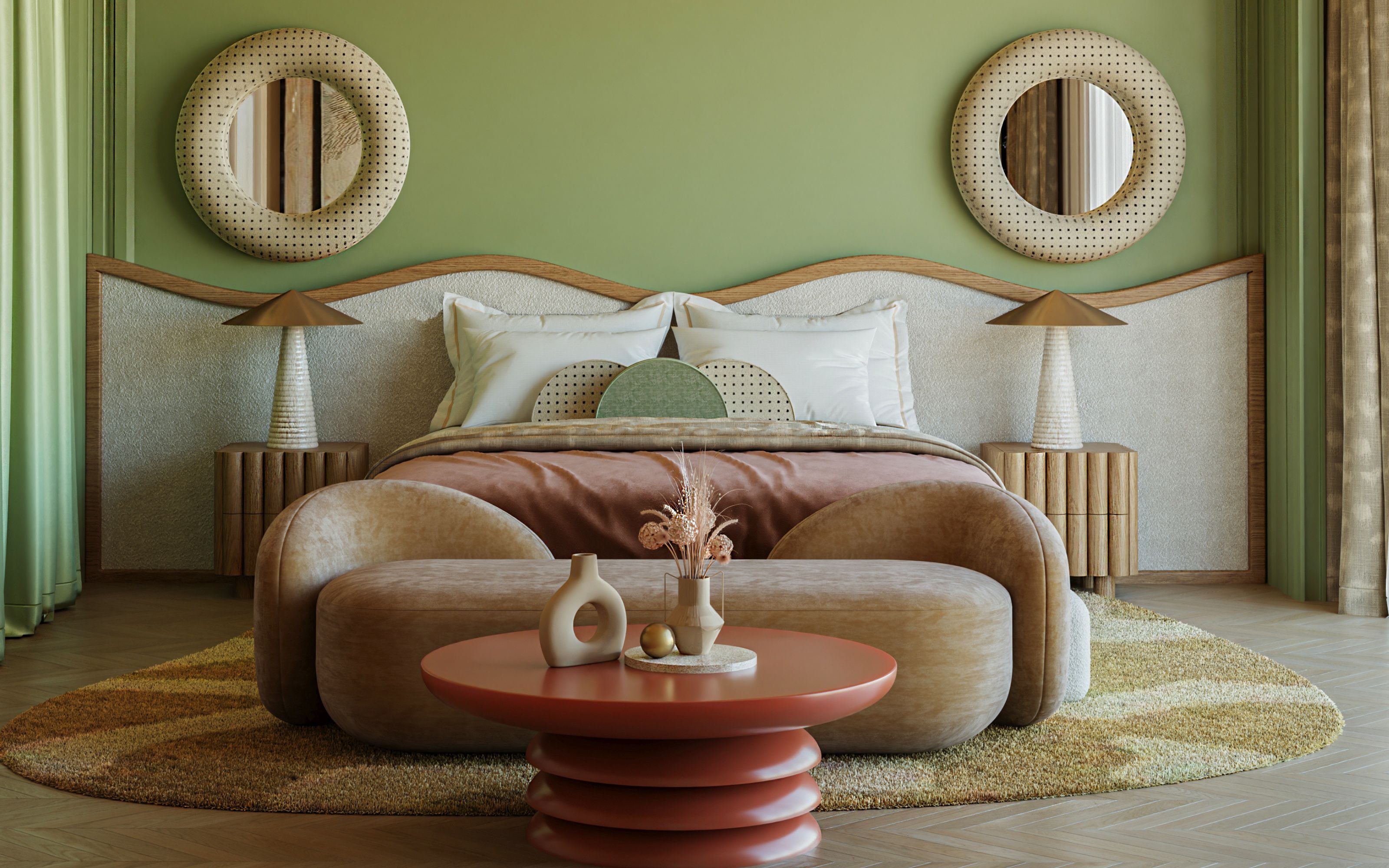
The smallest tweak to your bedroom makes the biggest difference - 5 designer secrets for creating restful schemes

Shop these 30 cute and cozy sleep products from Urban Outfitters
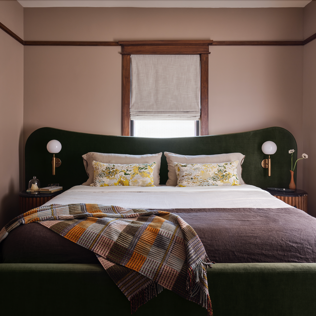
This Everyday Item INSTANTLY Makes Small Bedrooms Feel Bigger, According to Designers
This Headboard Cleans the Air Near You as You Sleep
Sleep experts helped organize my bedroom for better sleep
These Bedroom Features Are Always Eyesores (And You May Have Them), Designers Say