1/2
The 2 Cabinet Colors Designers Say Make Kitchens Look Outdated
This article discusses two cabinet colors that interior designers consider outdated and offers modern alternatives and design tips to refresh kitchens. The piece features insights from expert designers James Yarosh of James Yarosh Associates and Eva Littlefield of nobilia North America. It emphasizes that while trends come and go, intuition and personal preference should guide cabinet color choices, rather than adhering strictly to passing fads.
Historically, kitchen styles have mirrored cultural moods, with past trends like avocado greens in the 1970s and grayscale dominance in the 2010s. James Yarosh advises against following every trend, noting that past popular styles, such as formal mahogany and Tuscan-style kitchens, now appear dated. He advocates for cabinet choices that harmonize with a home’s architecture and surrounding environment, rather than being dictated by fleeting styles. Eva Littlefield observes a contemporary design ethos focused on authenticity and emotional resonance, where homeowners mix metals, combine bold and neutral tones, and blend elements from different eras to create timeless spaces.
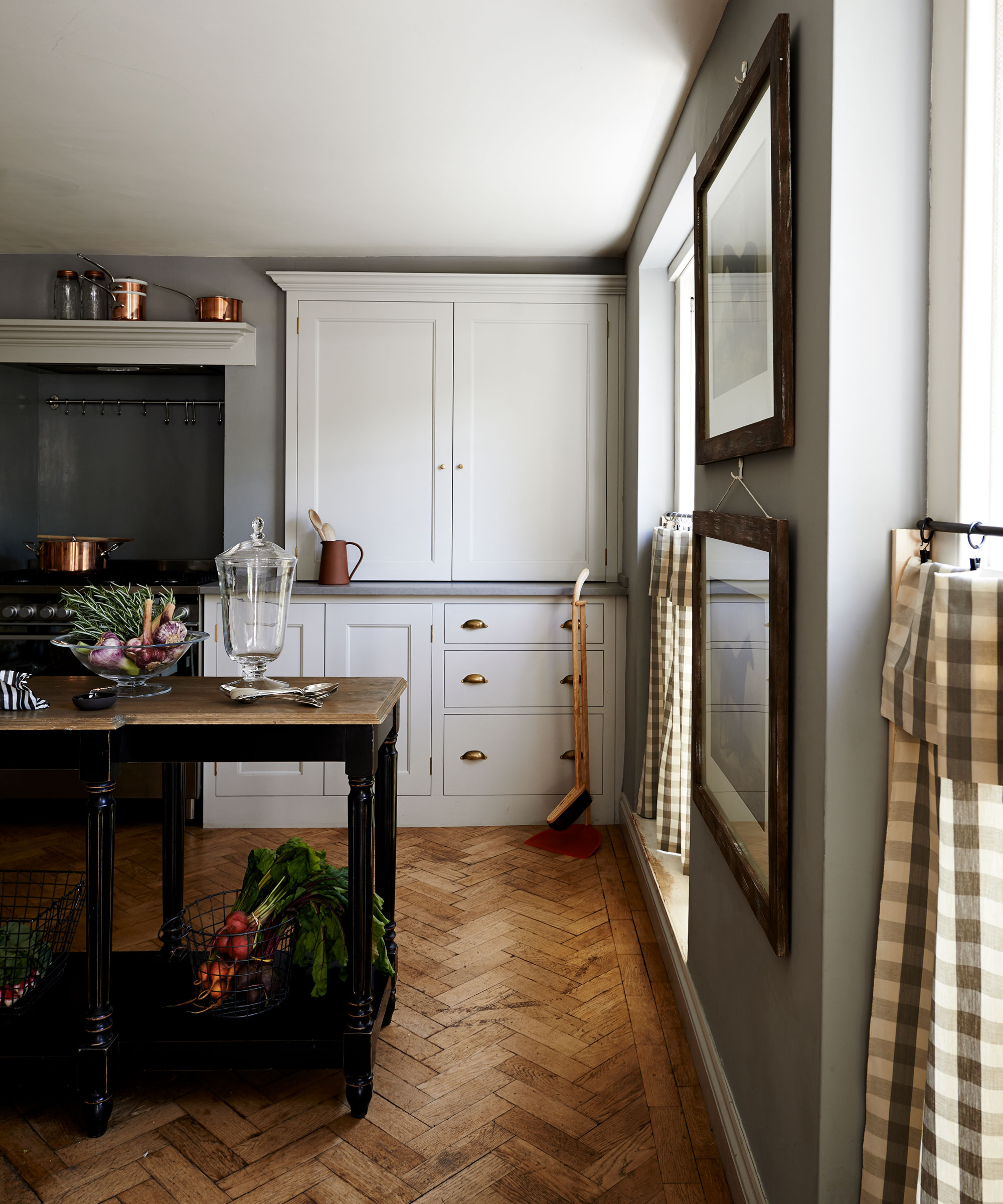
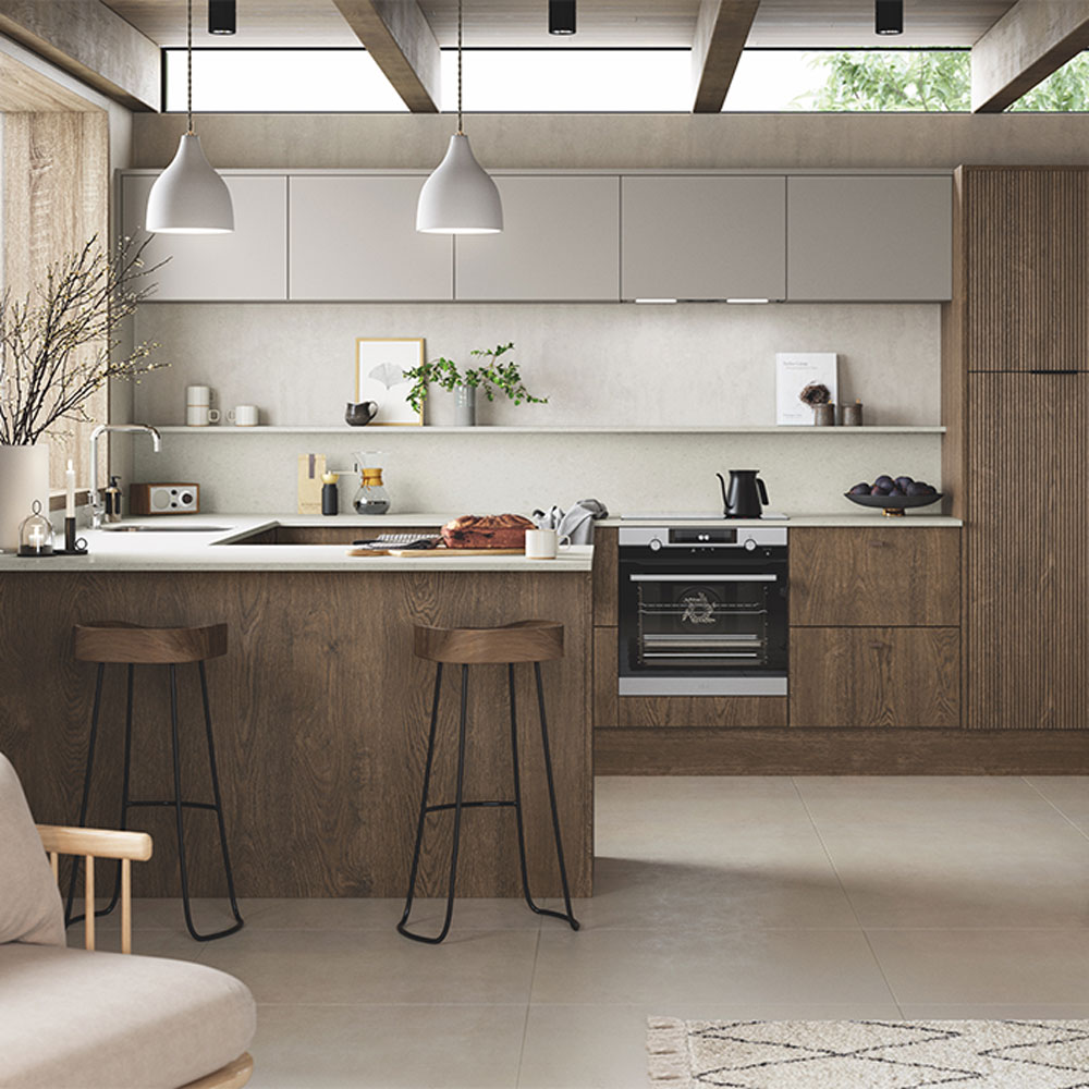
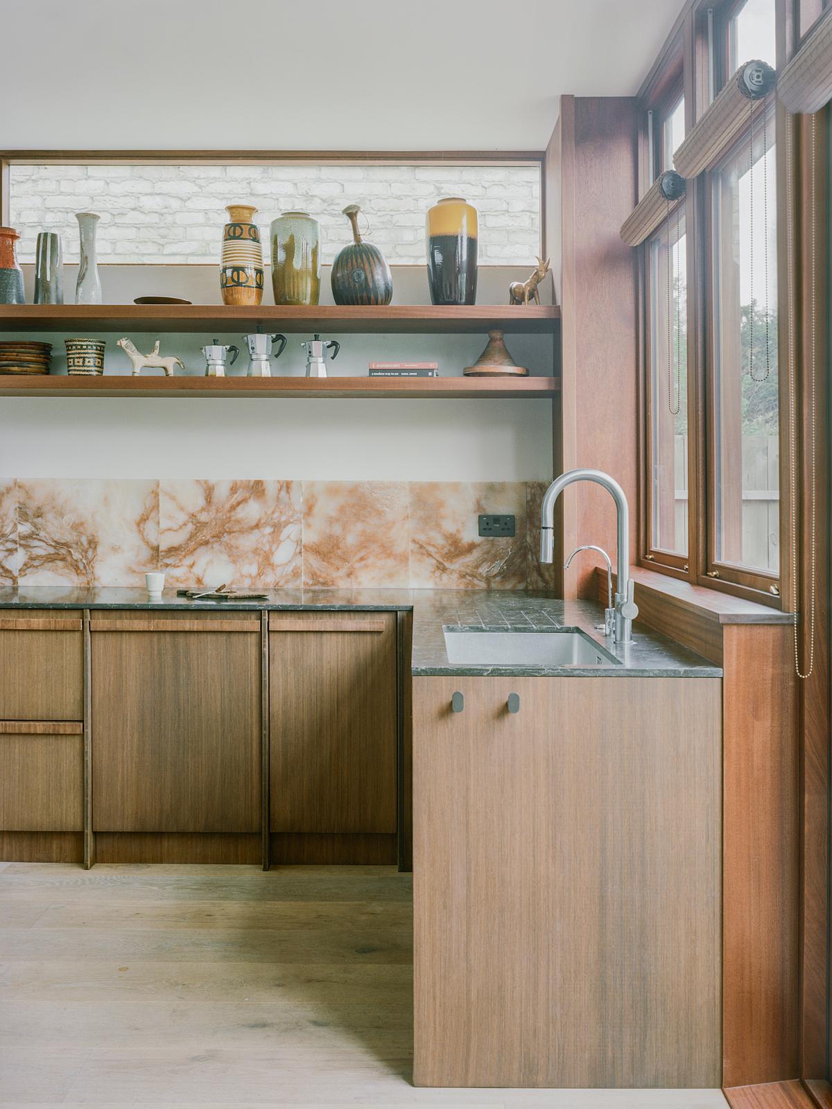
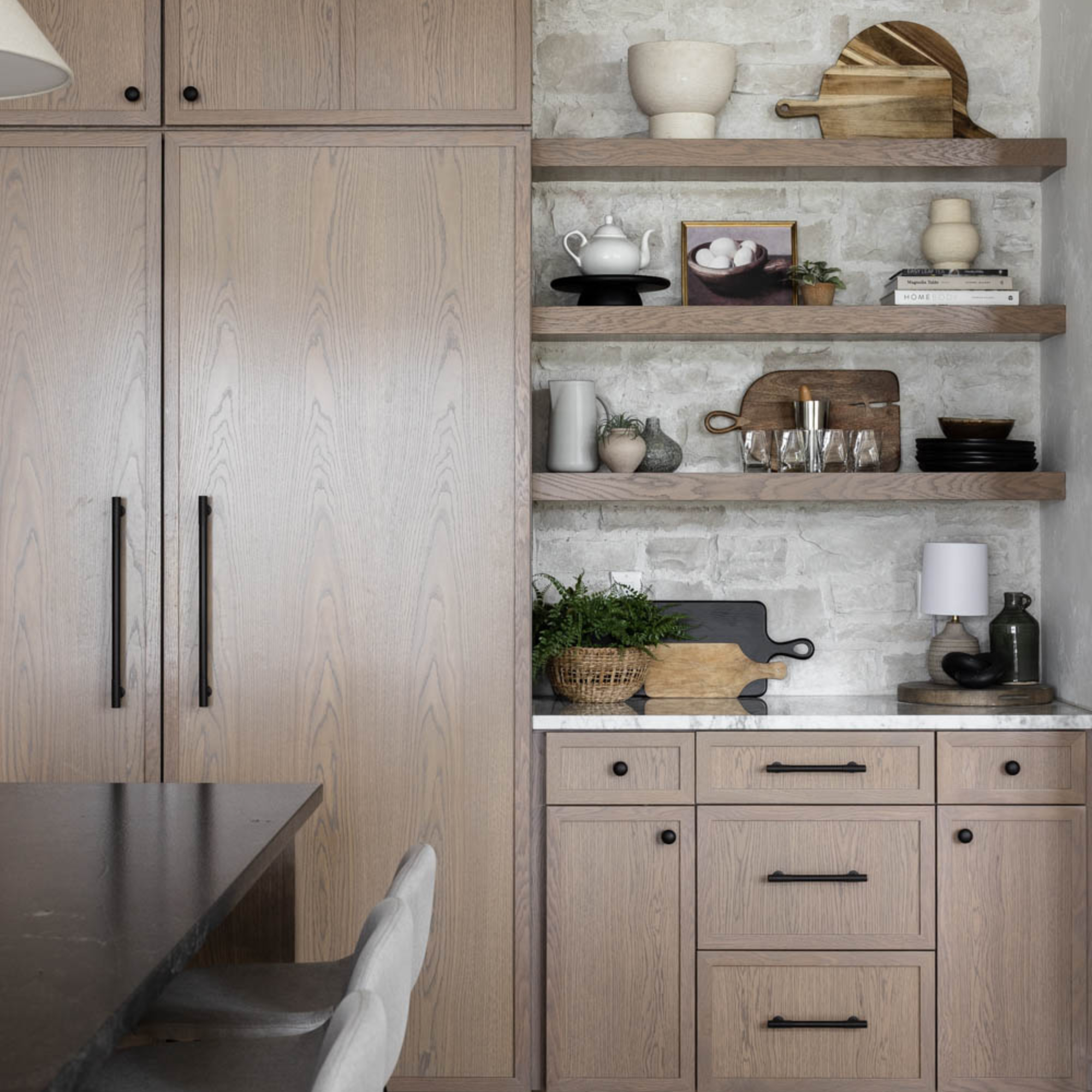
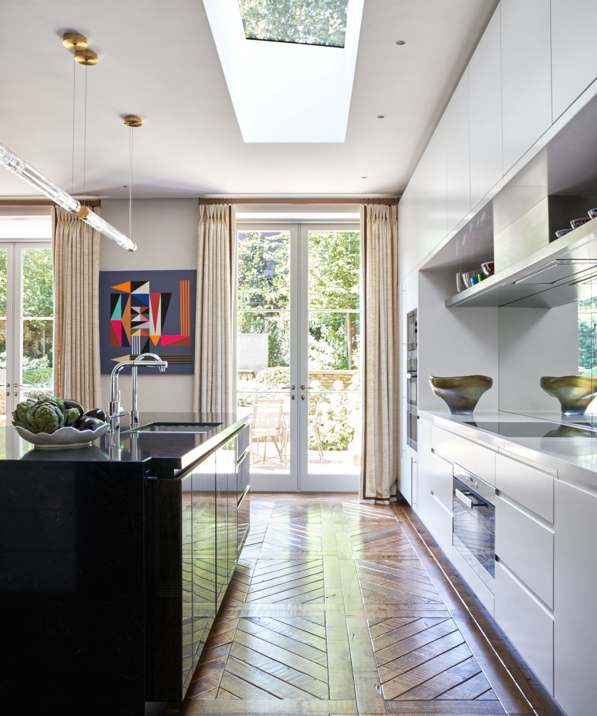
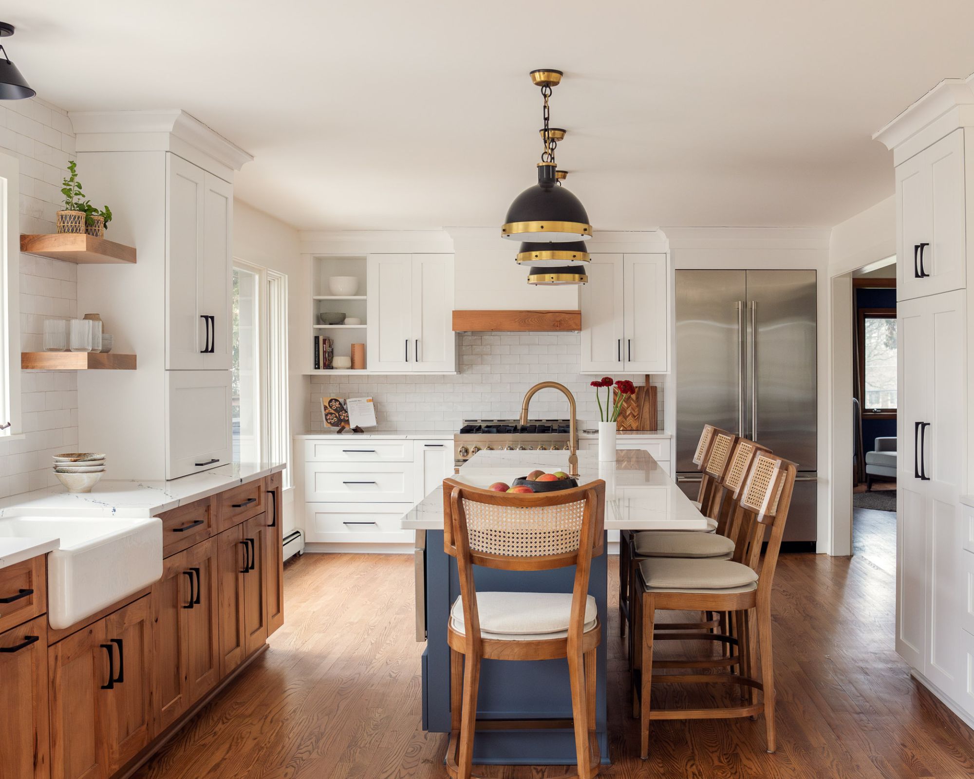
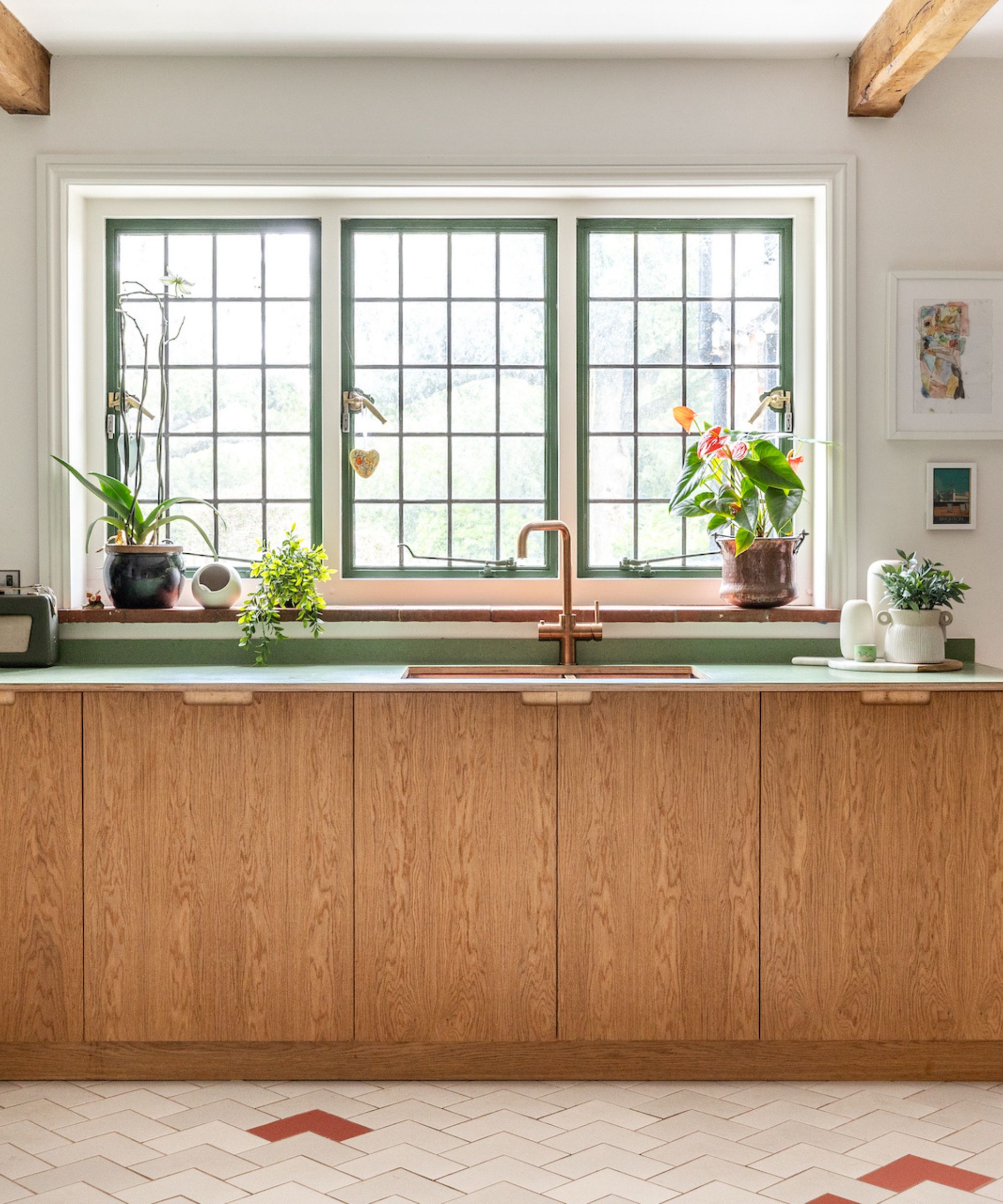
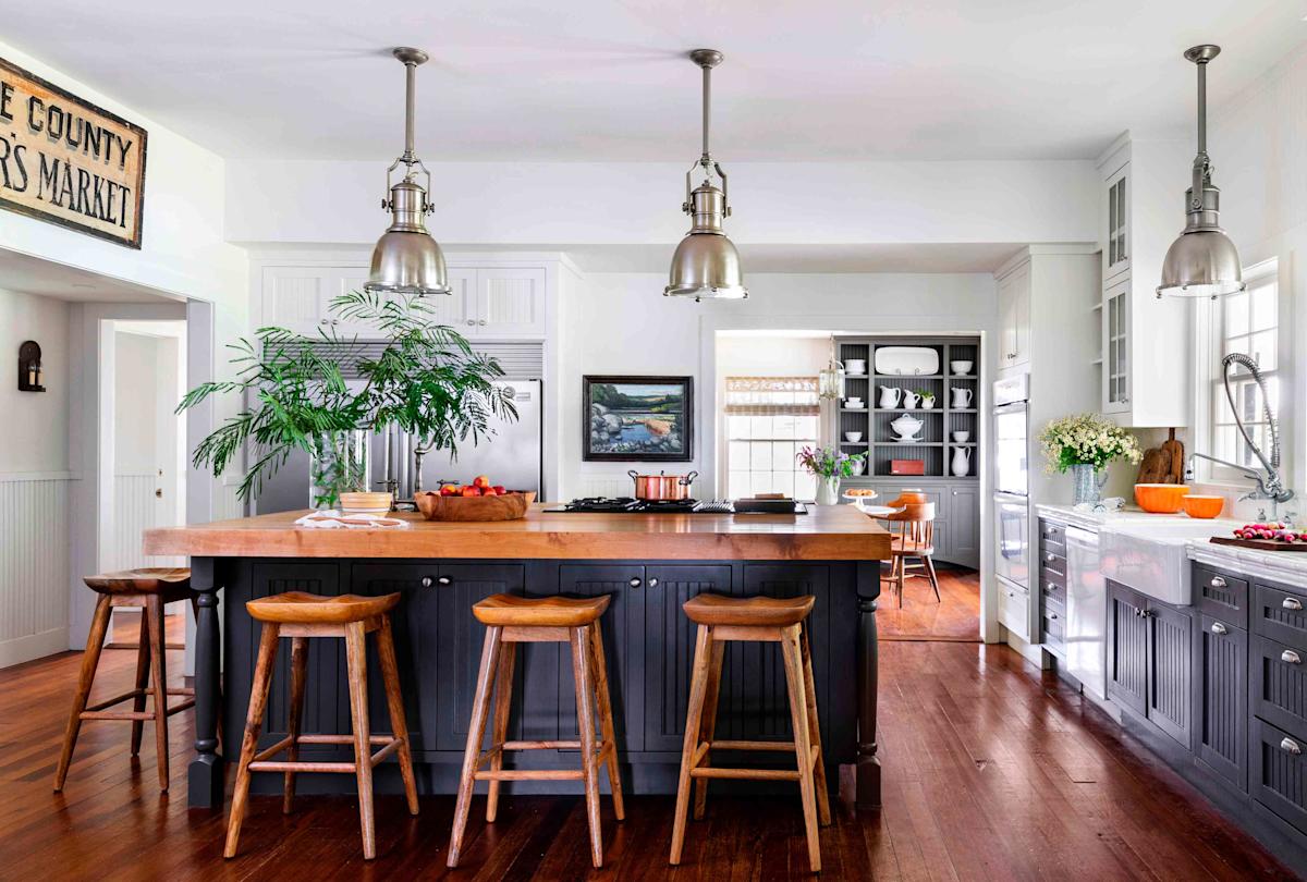
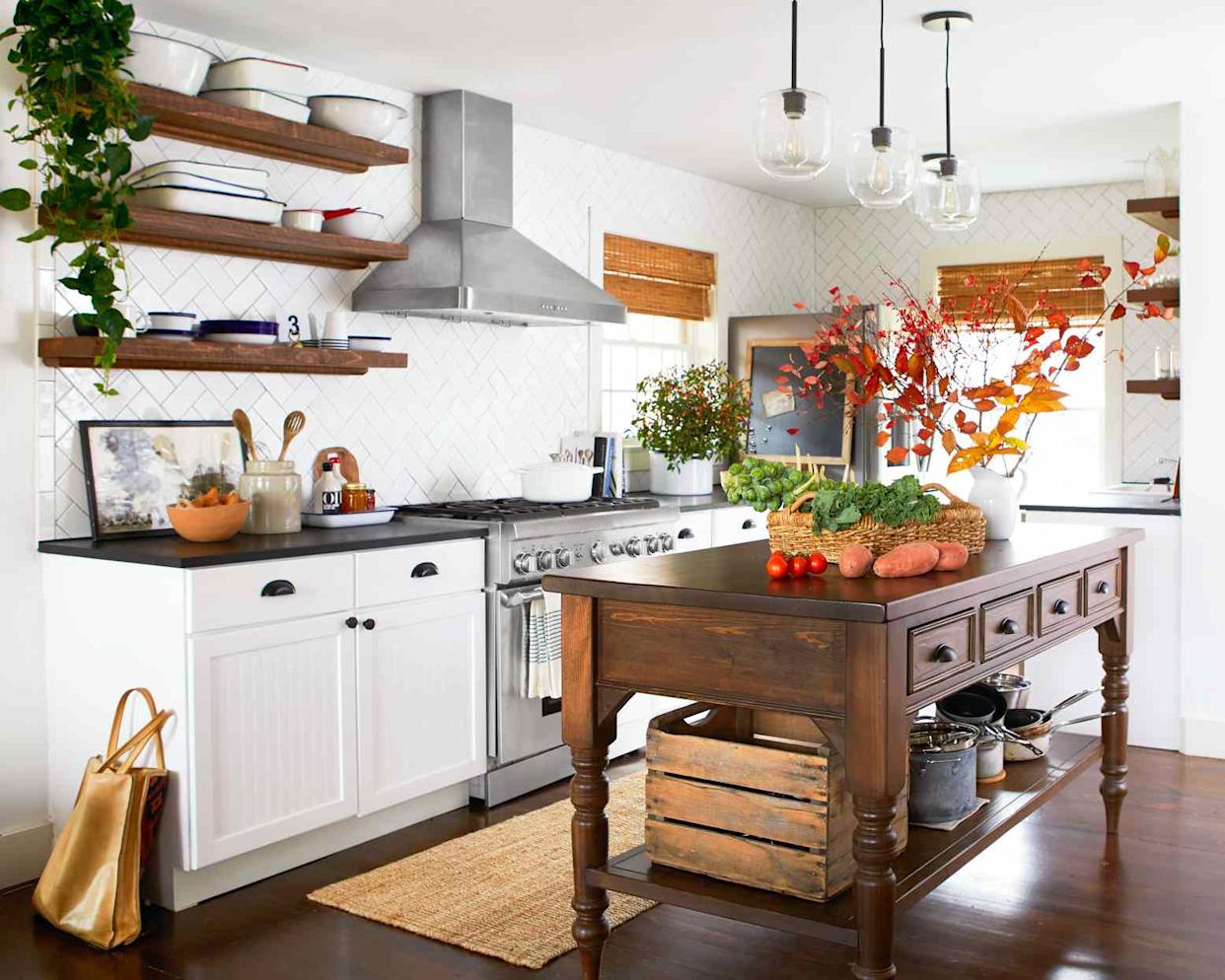
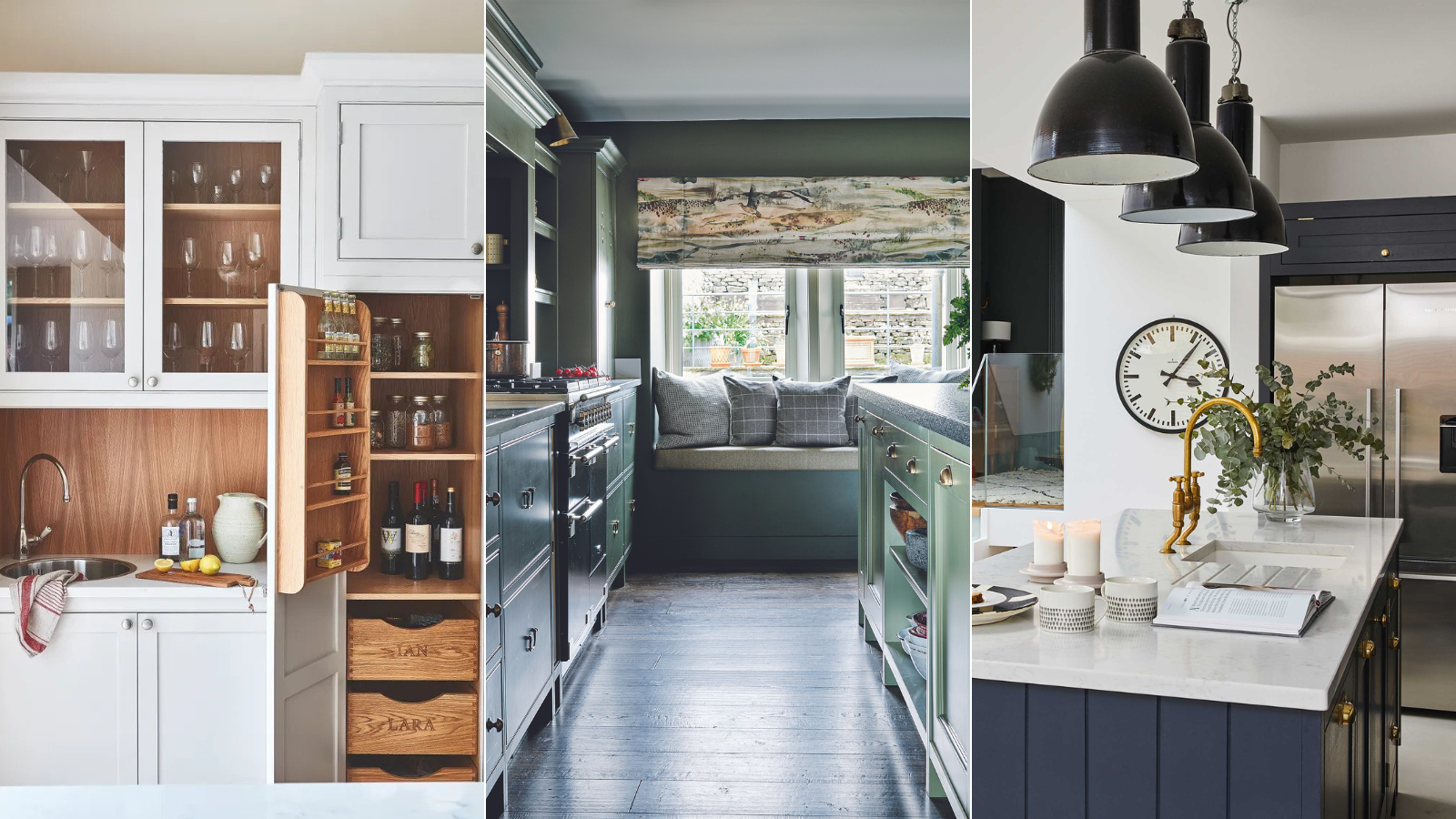
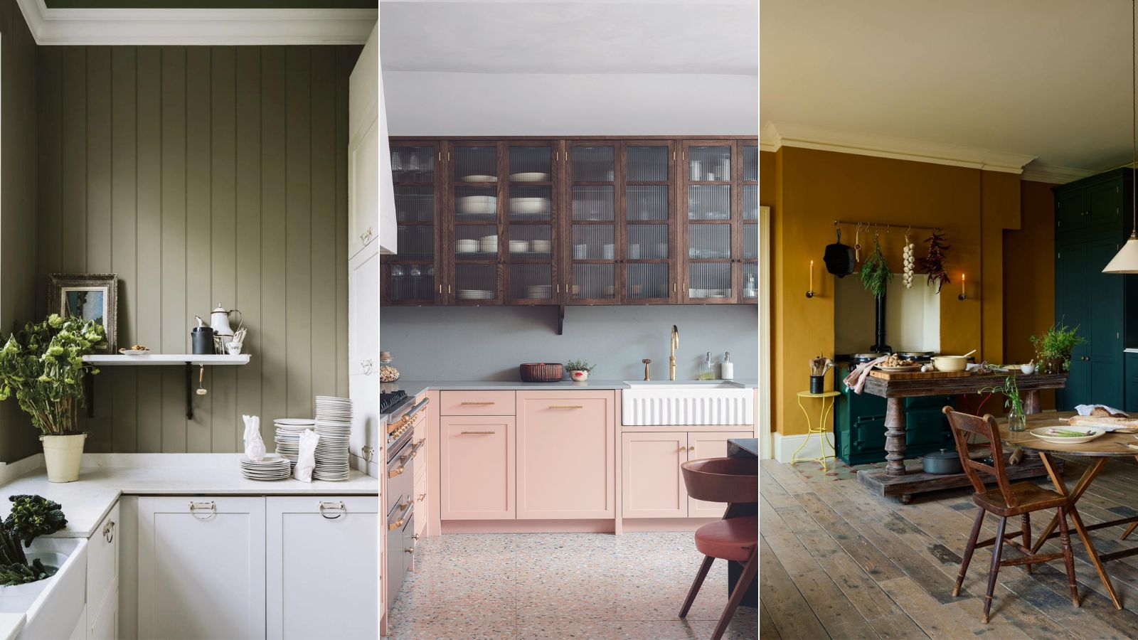
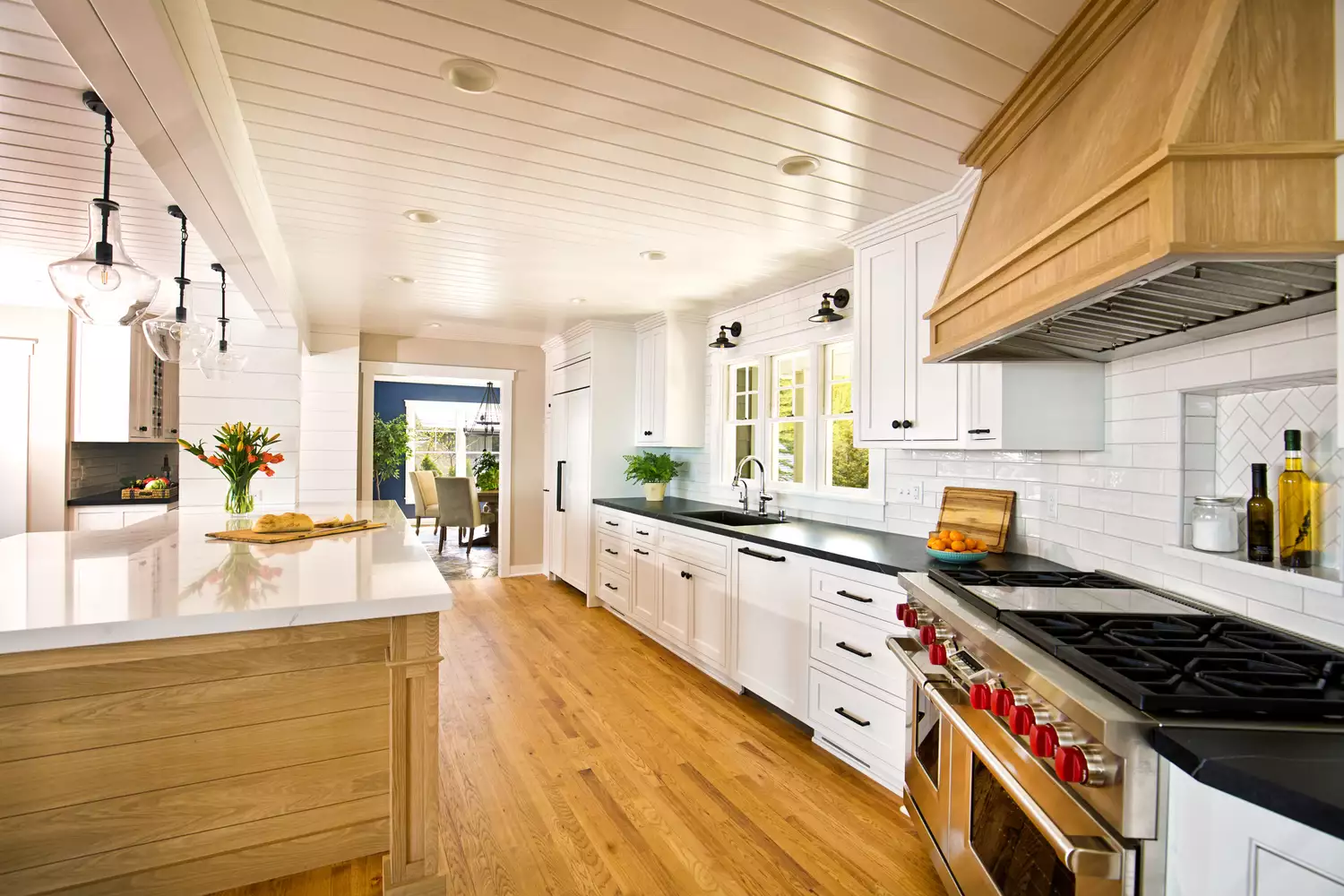
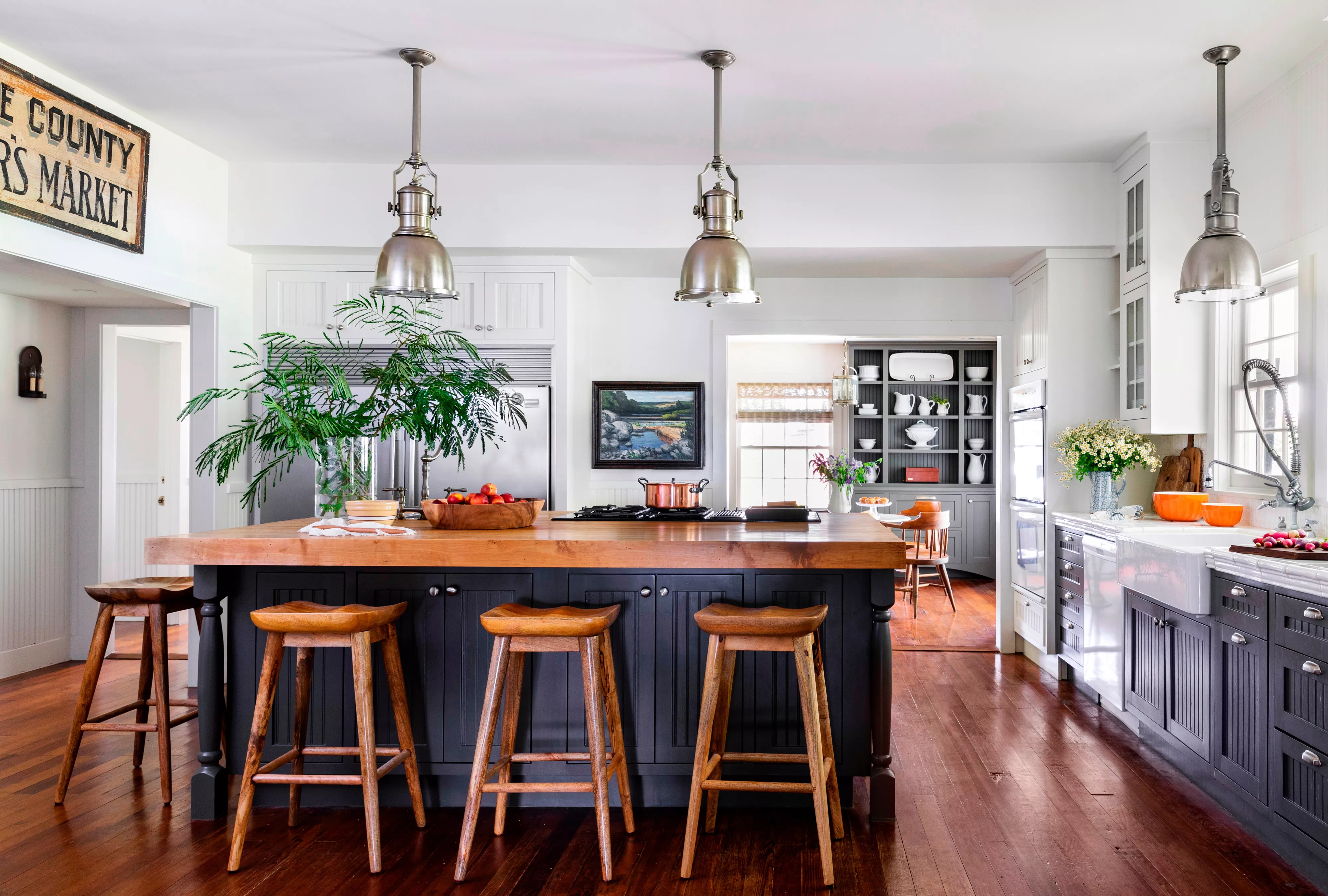
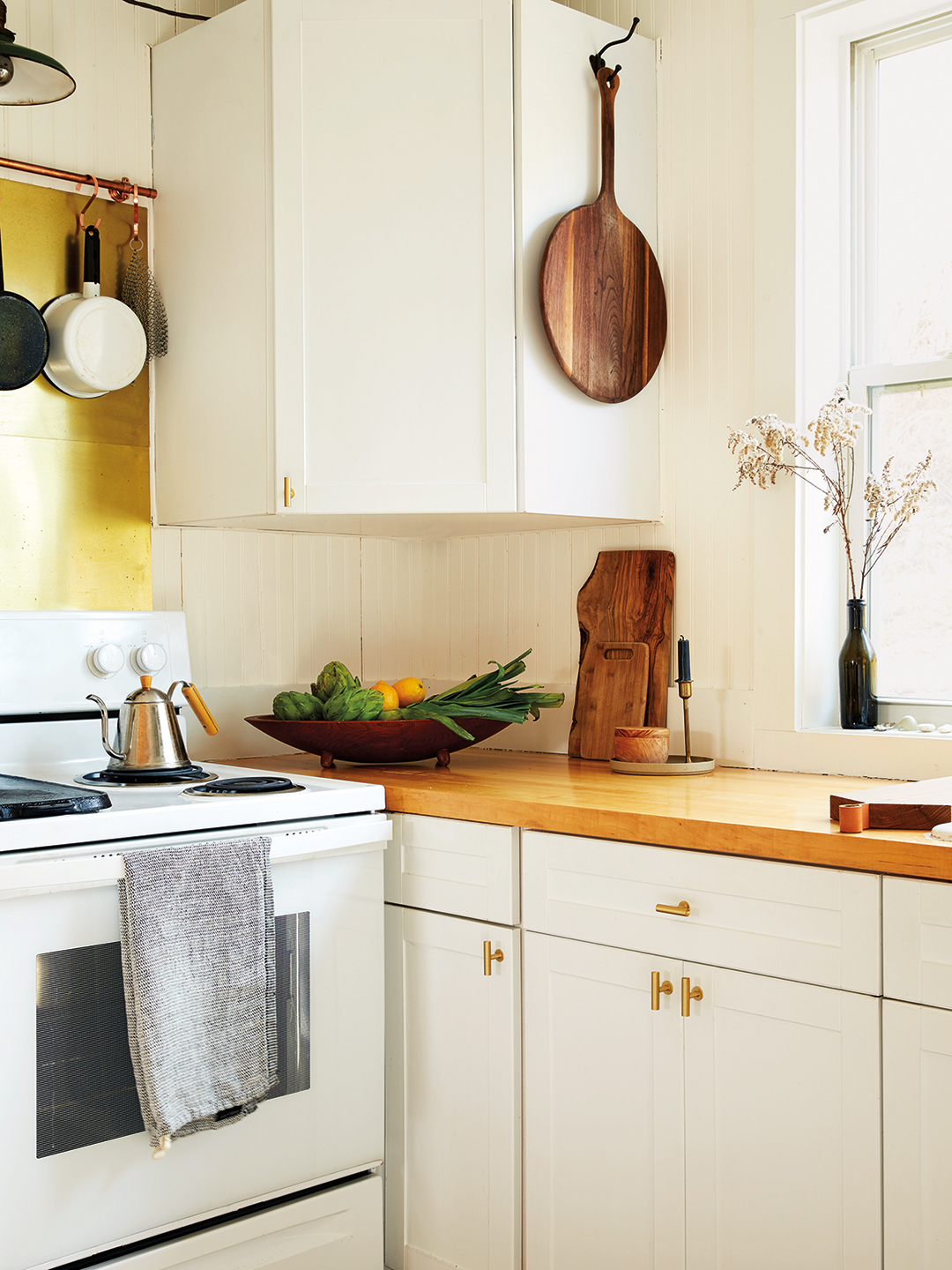
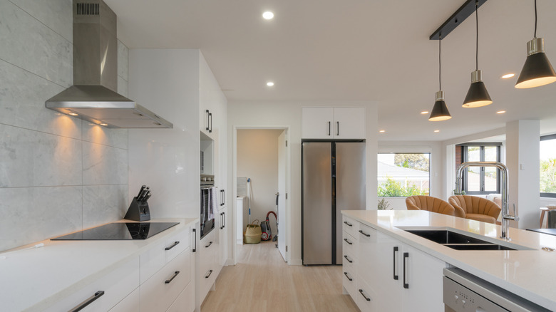
The article identifies two specific cabinet colors that designers frequently see as dating a kitchen: heavy red timber tones and stark white. Red-toned woods, including cherry and mahogany, are highlighted as finishes that can quickly make a kitchen feel old-fashioned. Littlefield suggests several methods to modernize these cabinets without a complete overhaul, such as adjusting lighting color temperature to alter how wood tones appear, using paint to neutralize red undertones (e.g., a soft white with a subtle green undertone), and updating hardware with options like sleek black handles or brushed brass. For those able to replace cabinetry, light oak or rich walnut are recommended as timeless timber choices that offer natural texture and a welcoming atmosphere, especially when paired with clean lines or handleless designs.
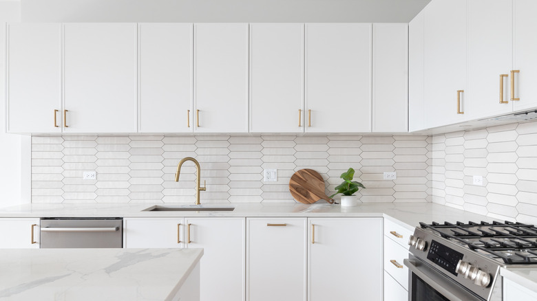
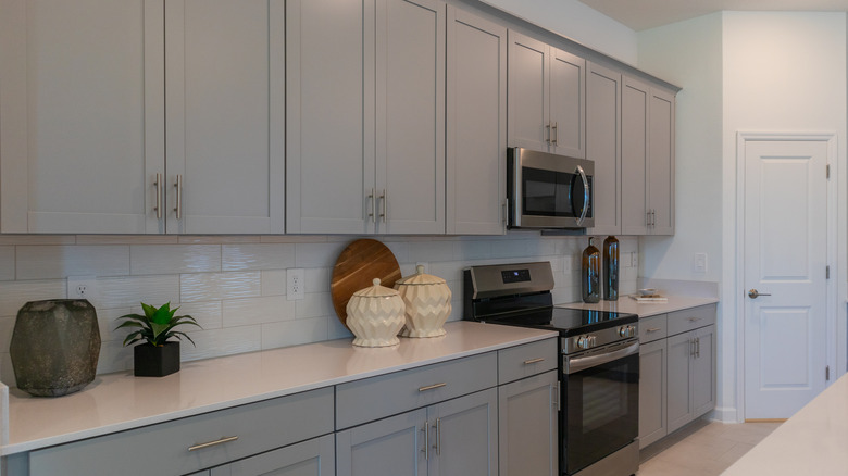
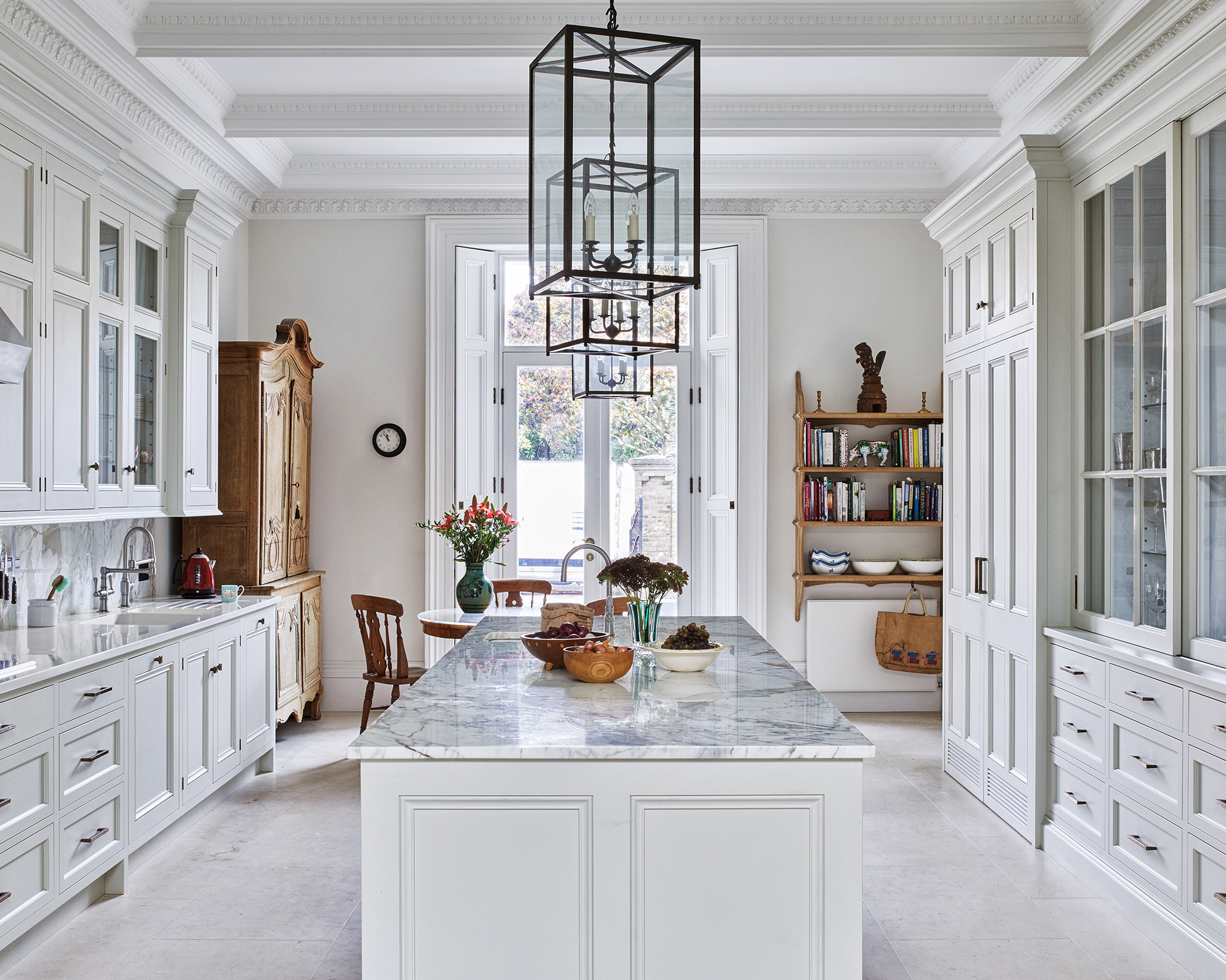
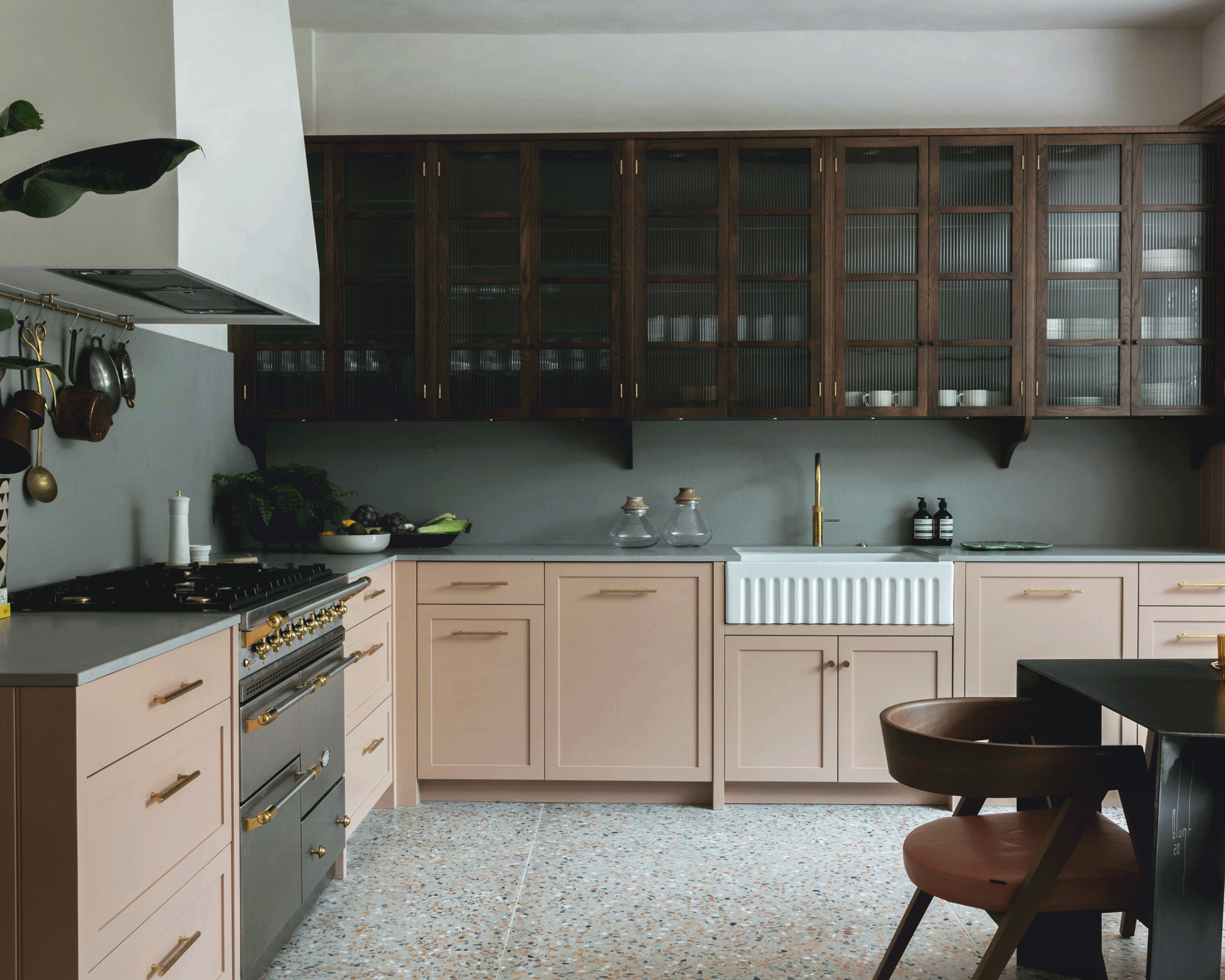
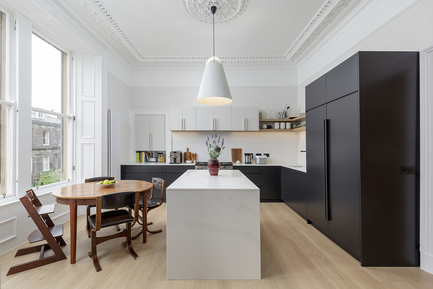
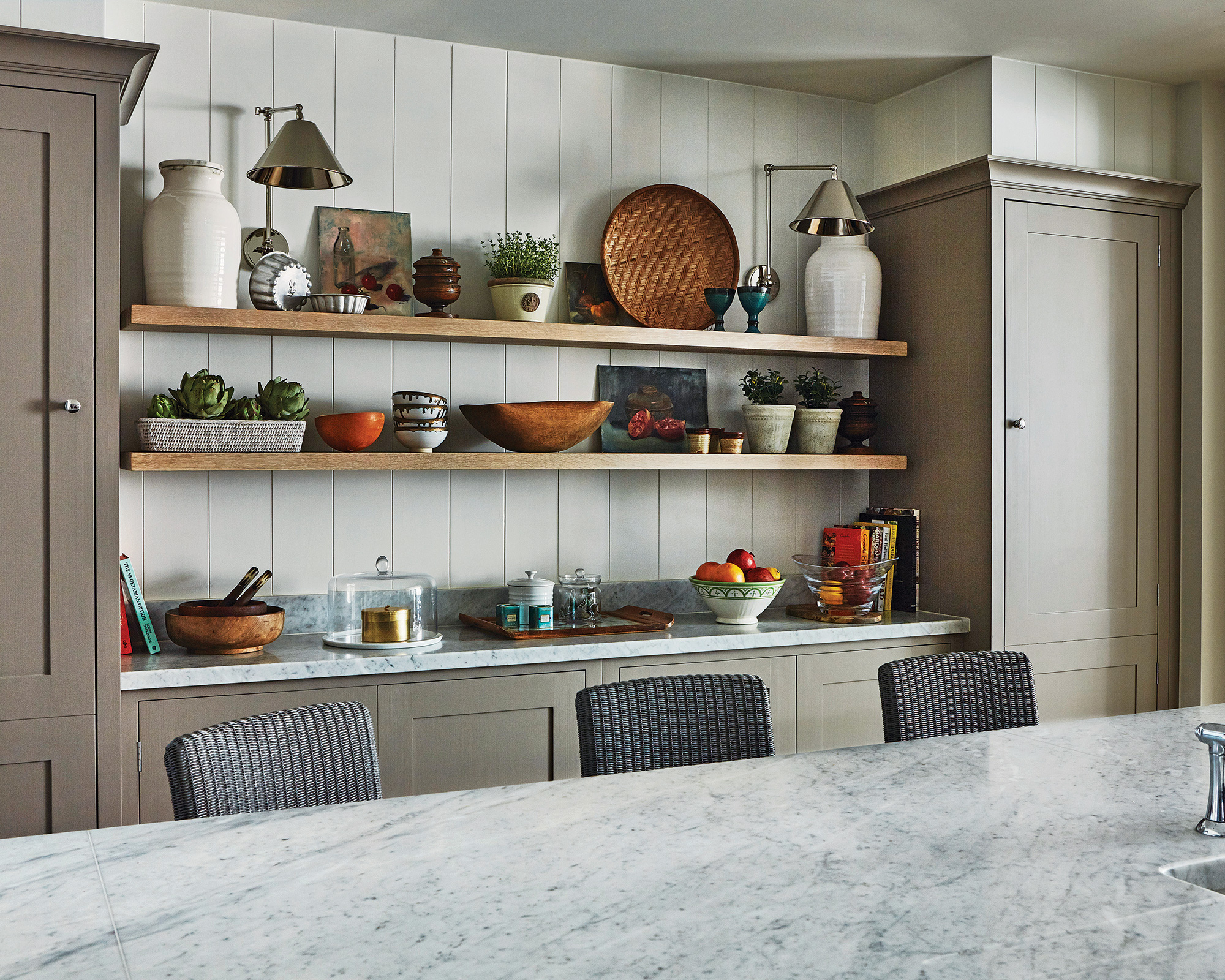
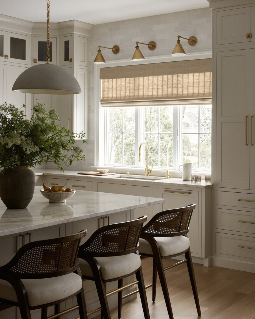
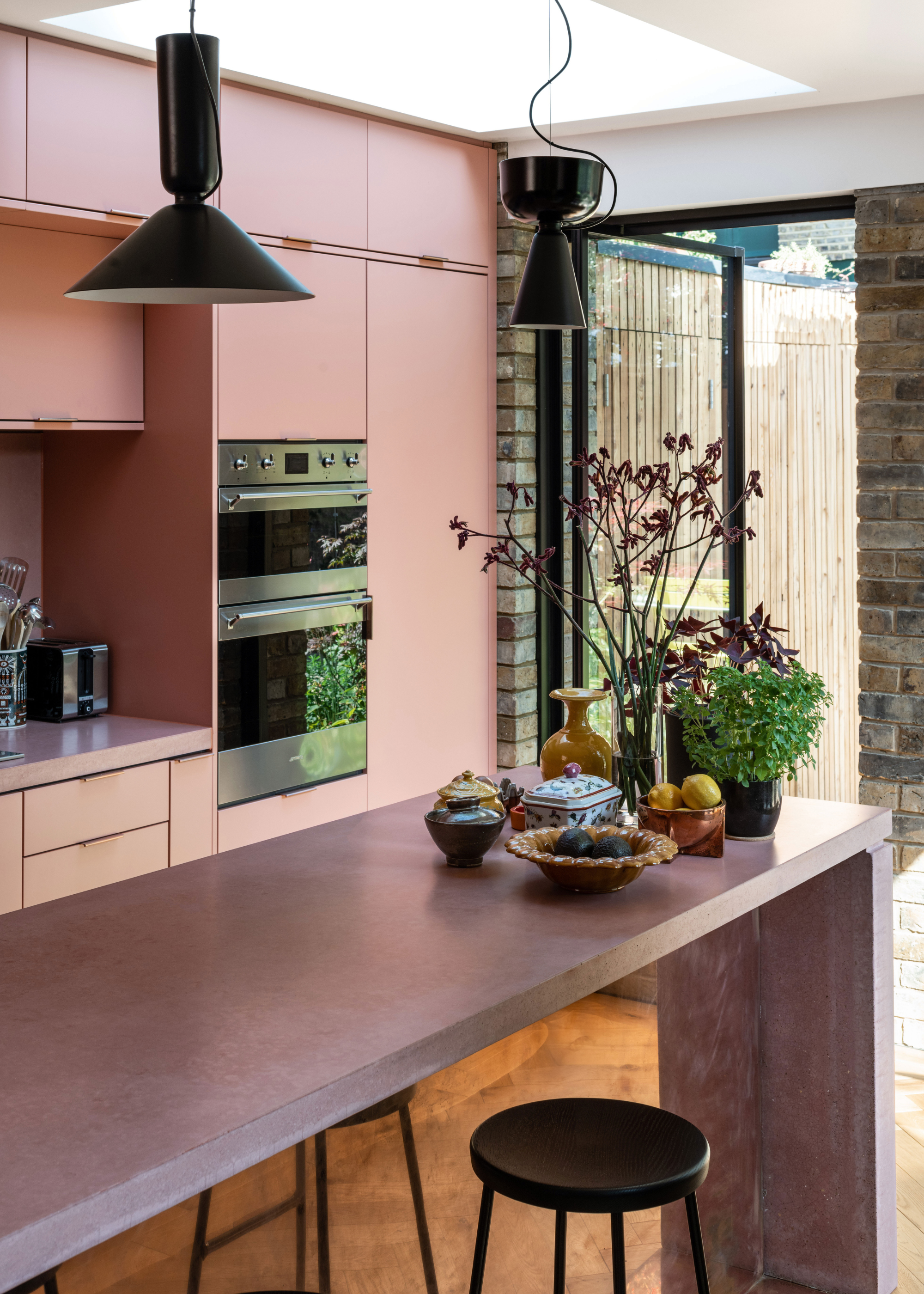
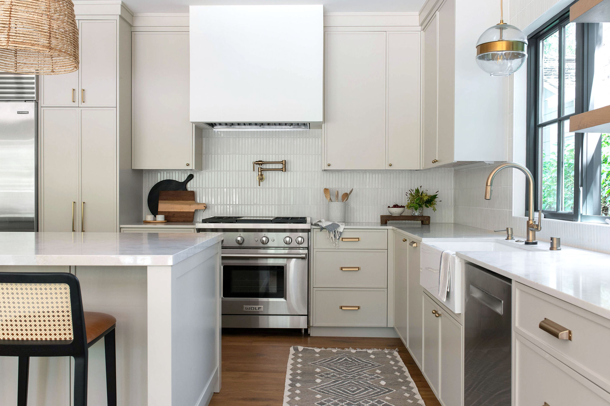
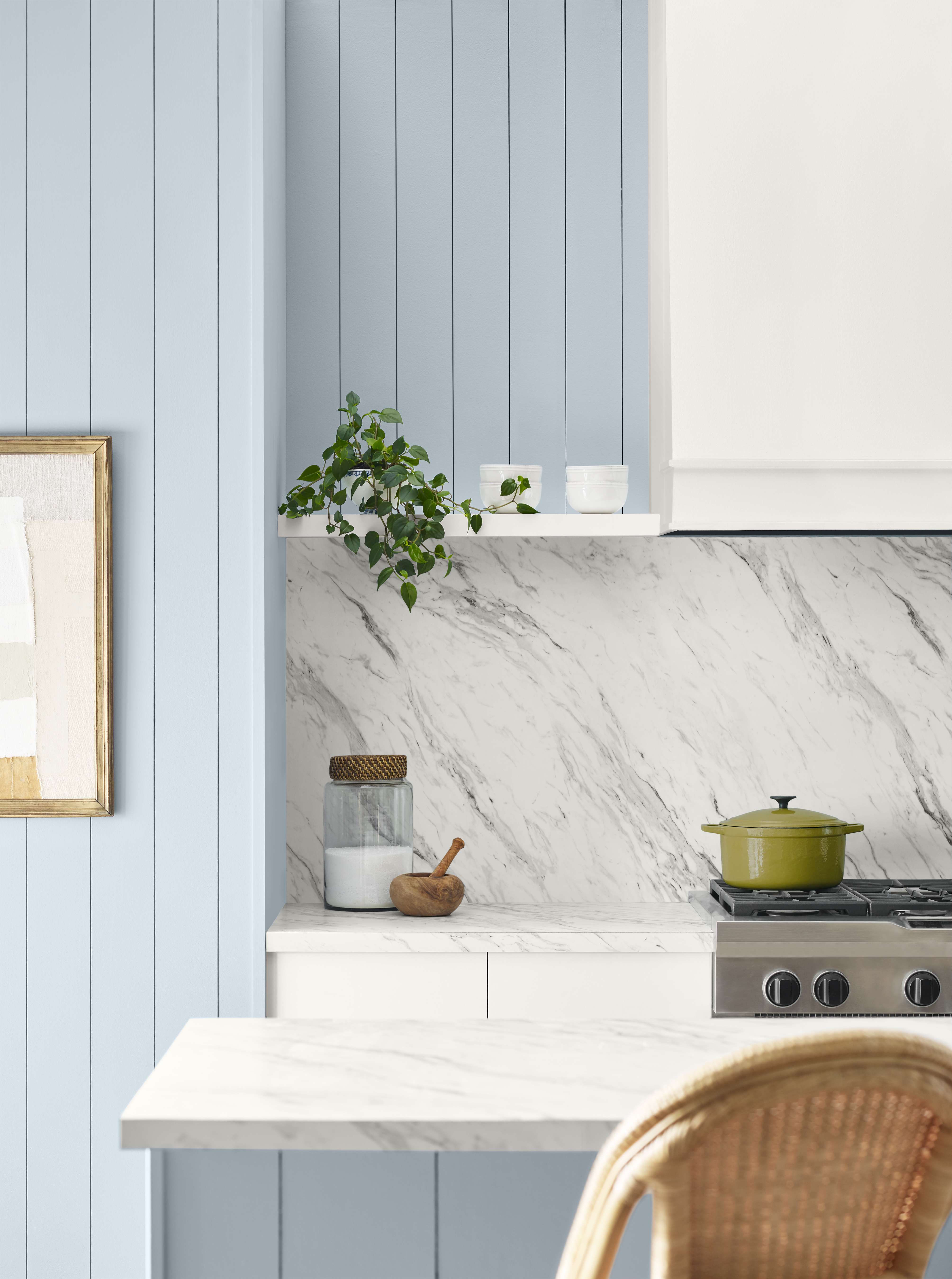
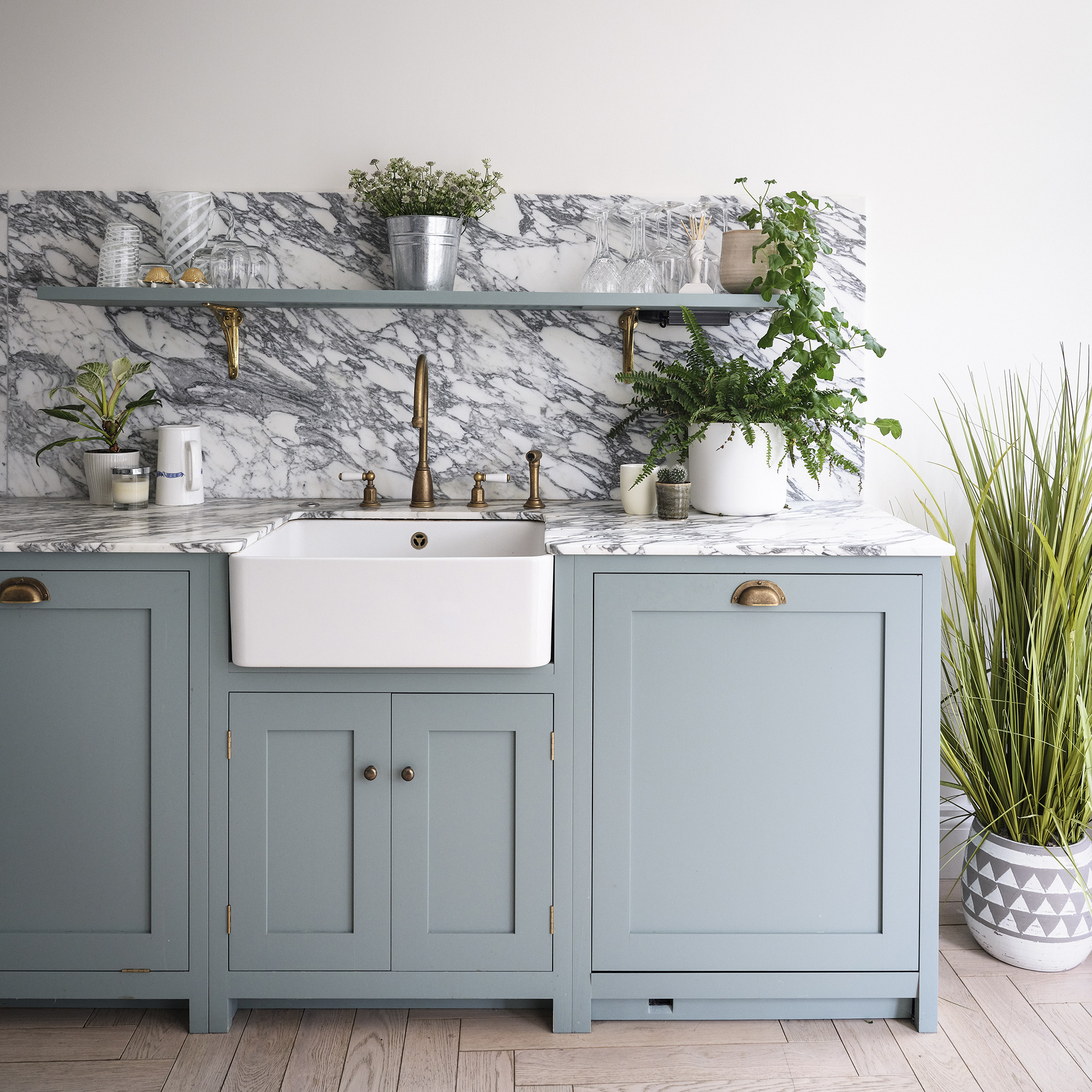
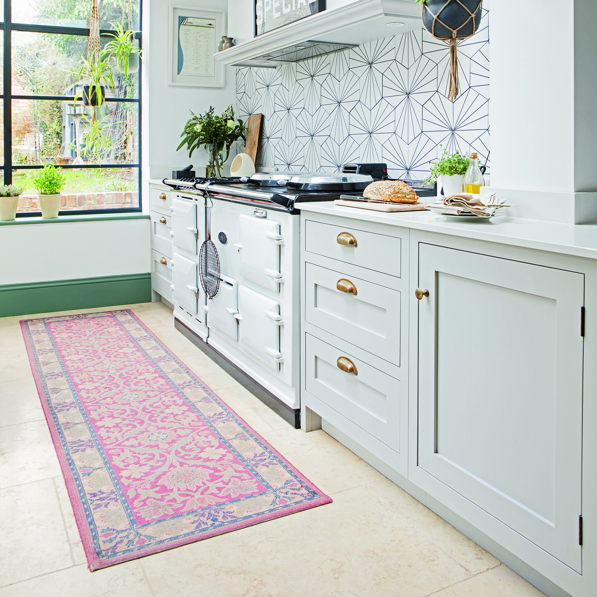
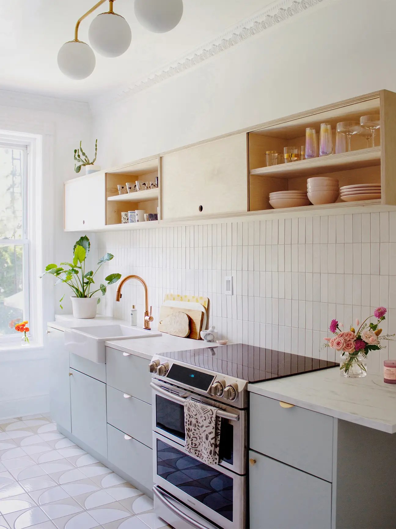
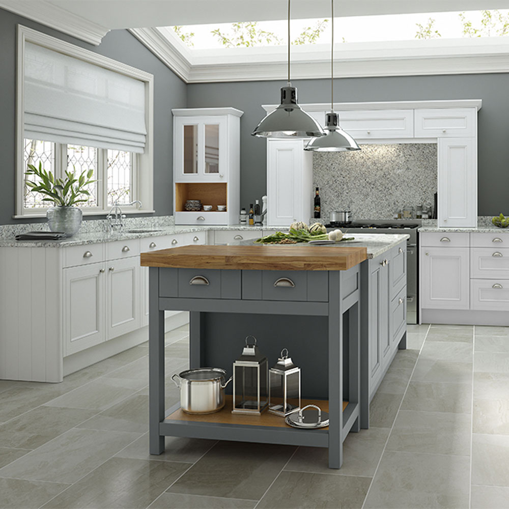
Stark white, once a popular and seemingly safe choice, is now considered a significant aging factor by designers. Littlefield notes its ubiquity, and Yarosh points out that without intentional design, white kitchens can appear lackluster. Instead of stark white, designers are advocating for alternative neutrals that are warmer, softer, and more layered. Yarosh recounts a project where blush pink served as a new neutral, creating a gentle and serene space with more personality than traditional white. Littlefield suggests nobilia’s Sand color as a versatile neutral that adapts to surrounding colors and natural light, offering good resale value.
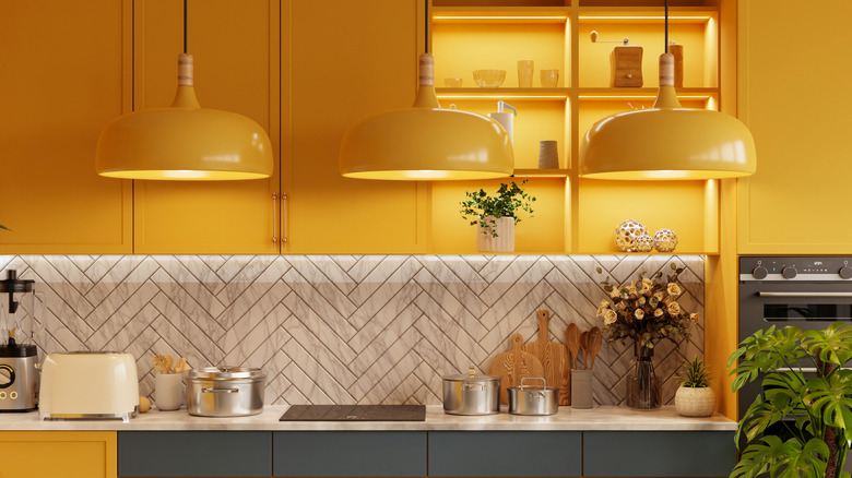
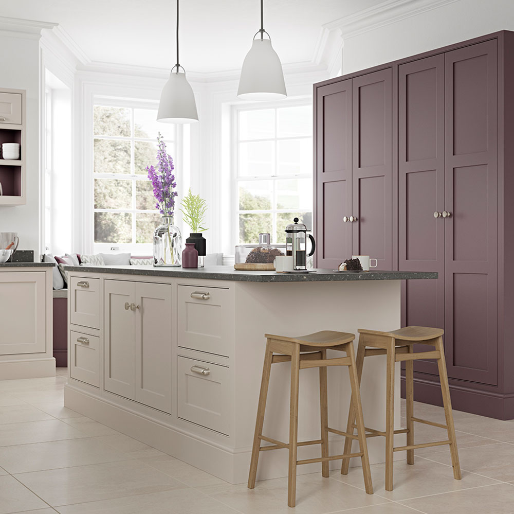
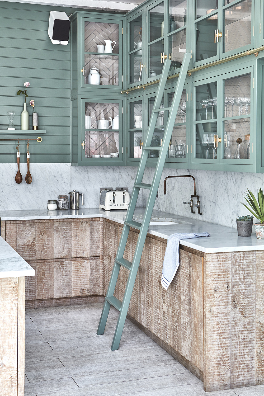
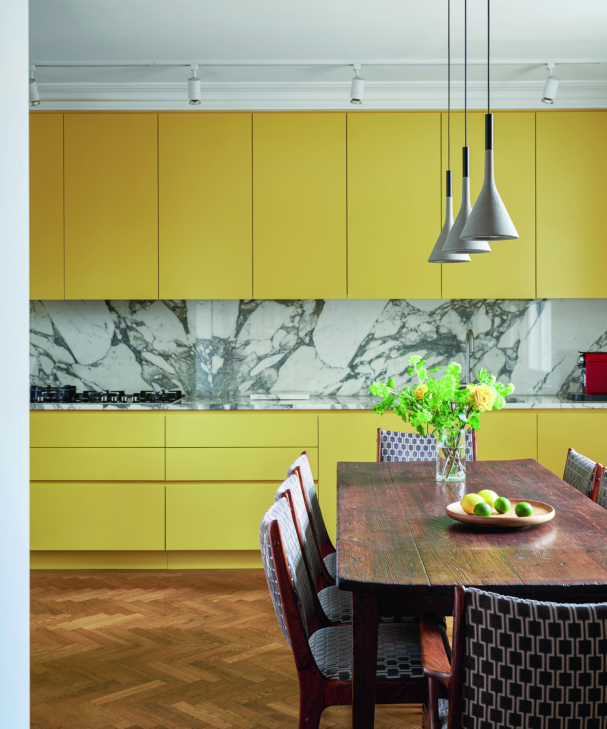
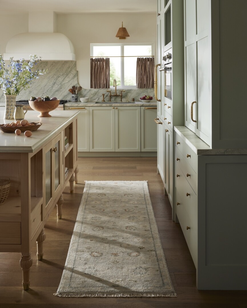
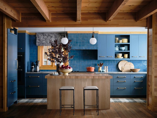
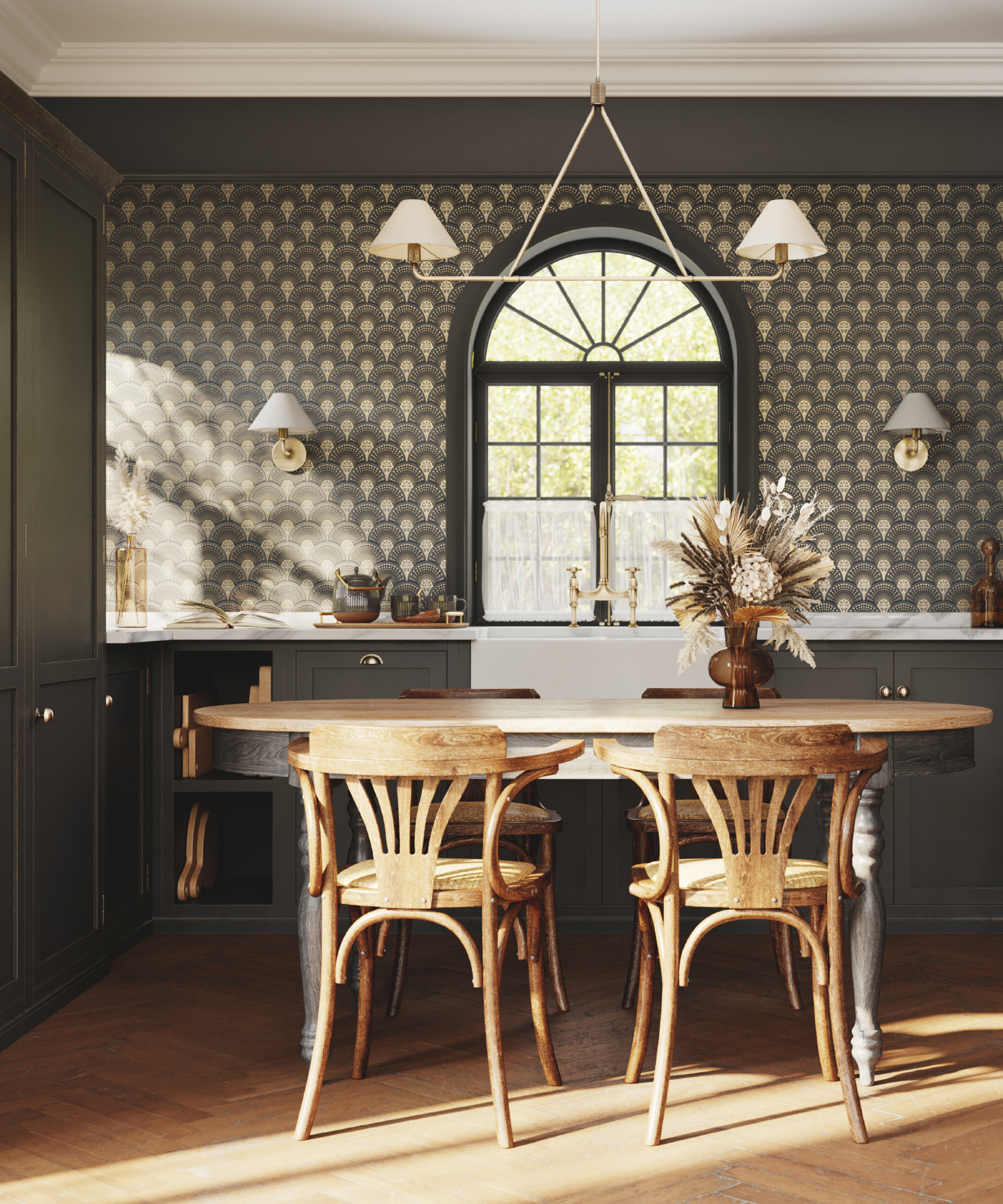
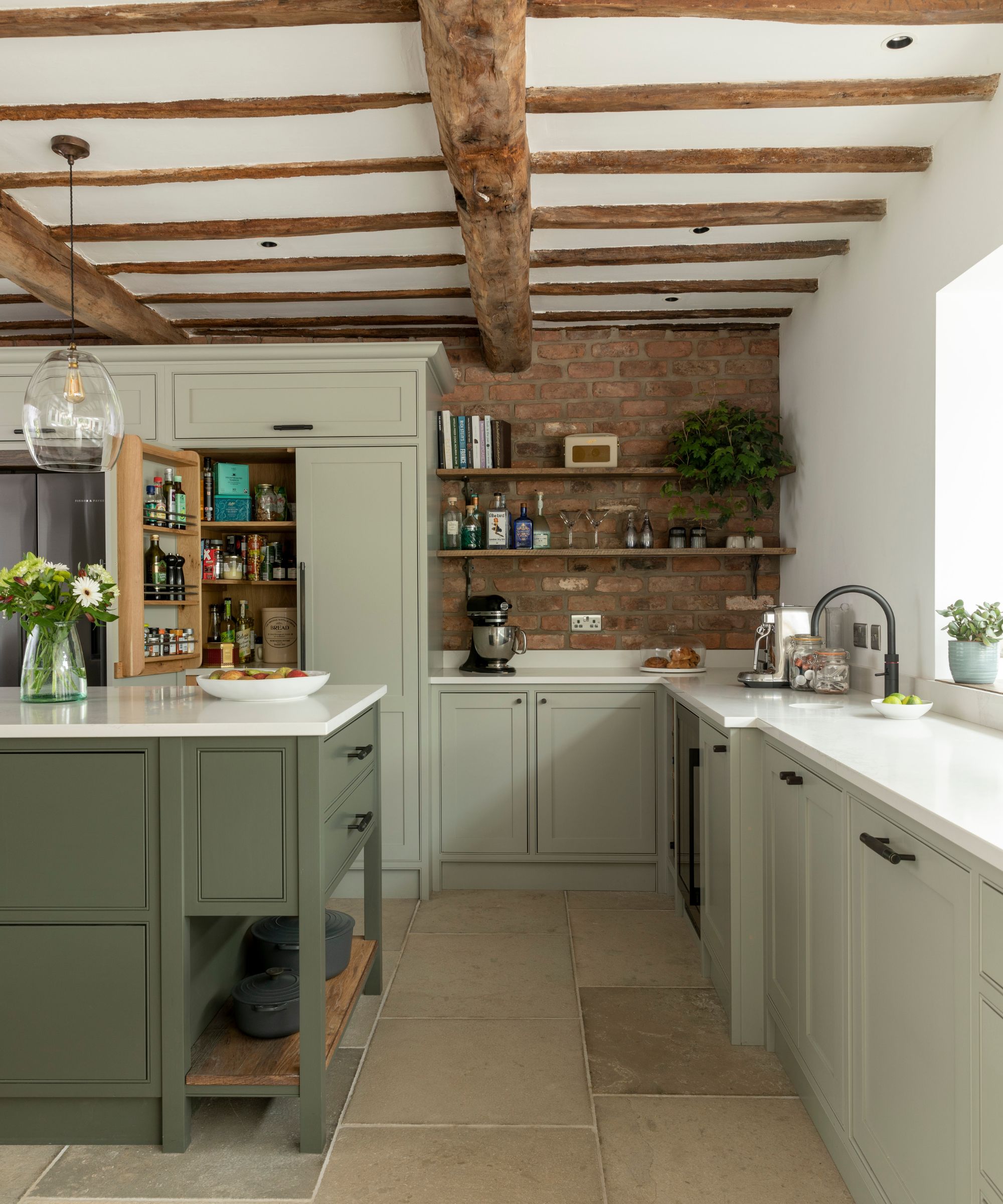
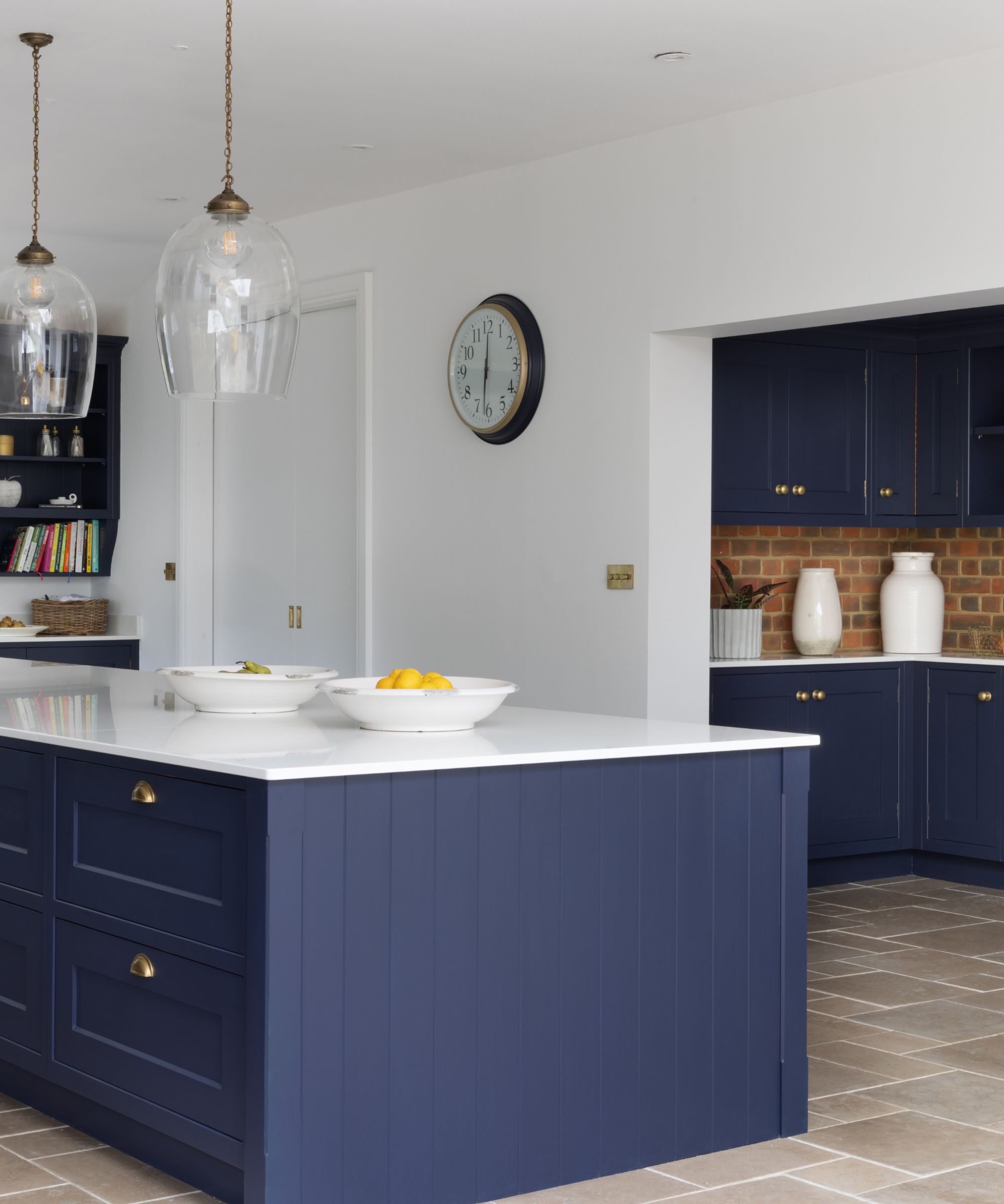
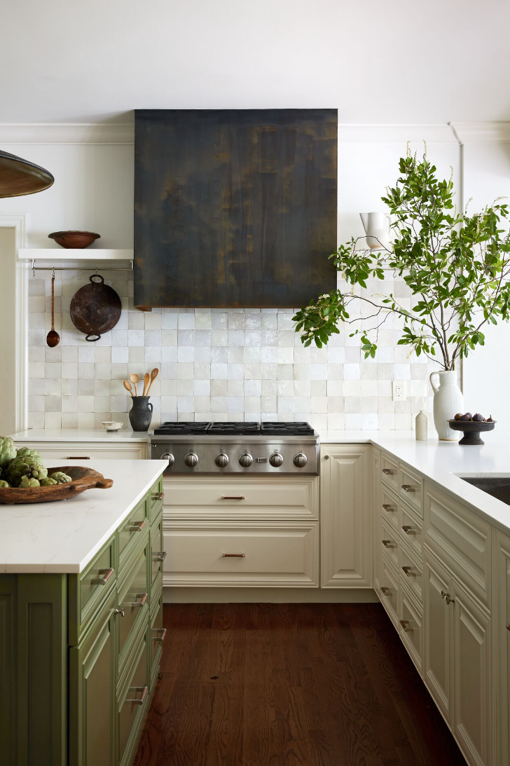
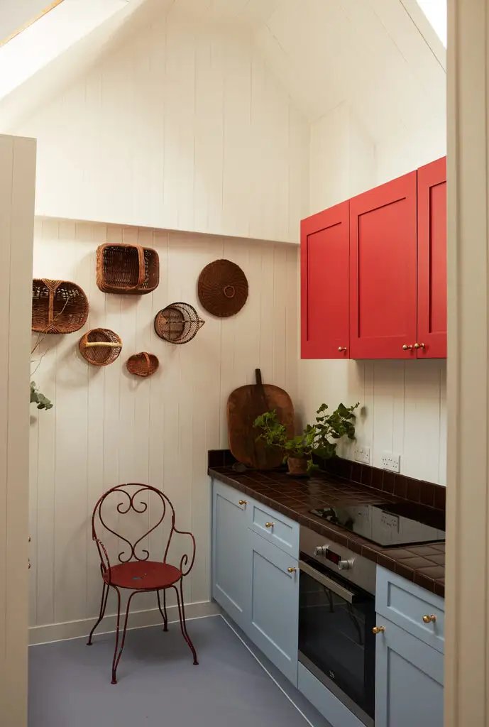
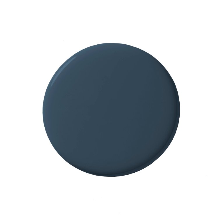
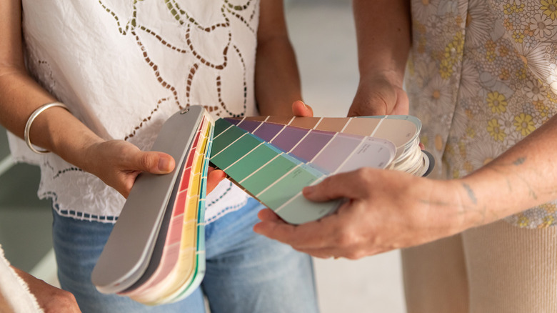
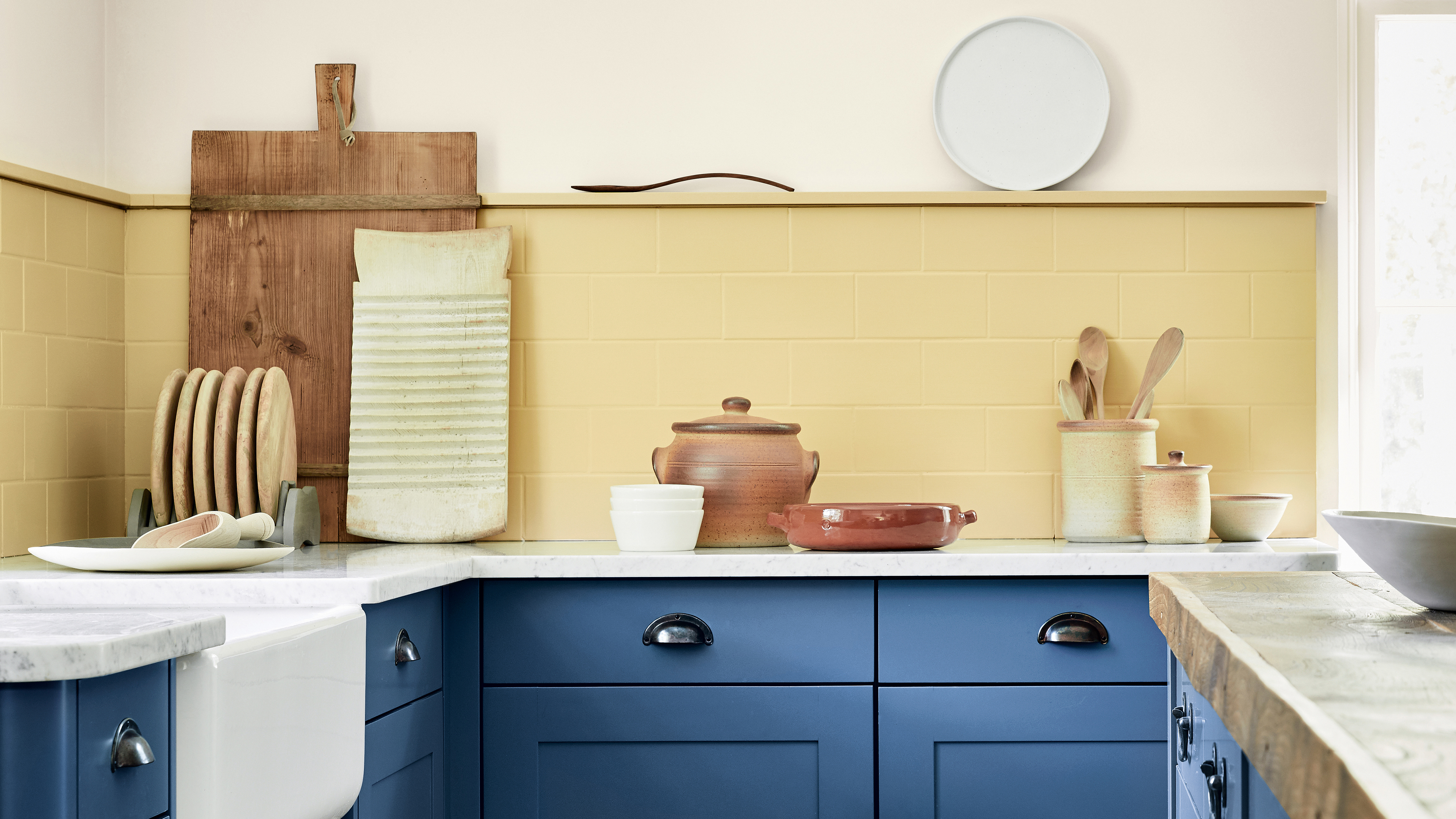
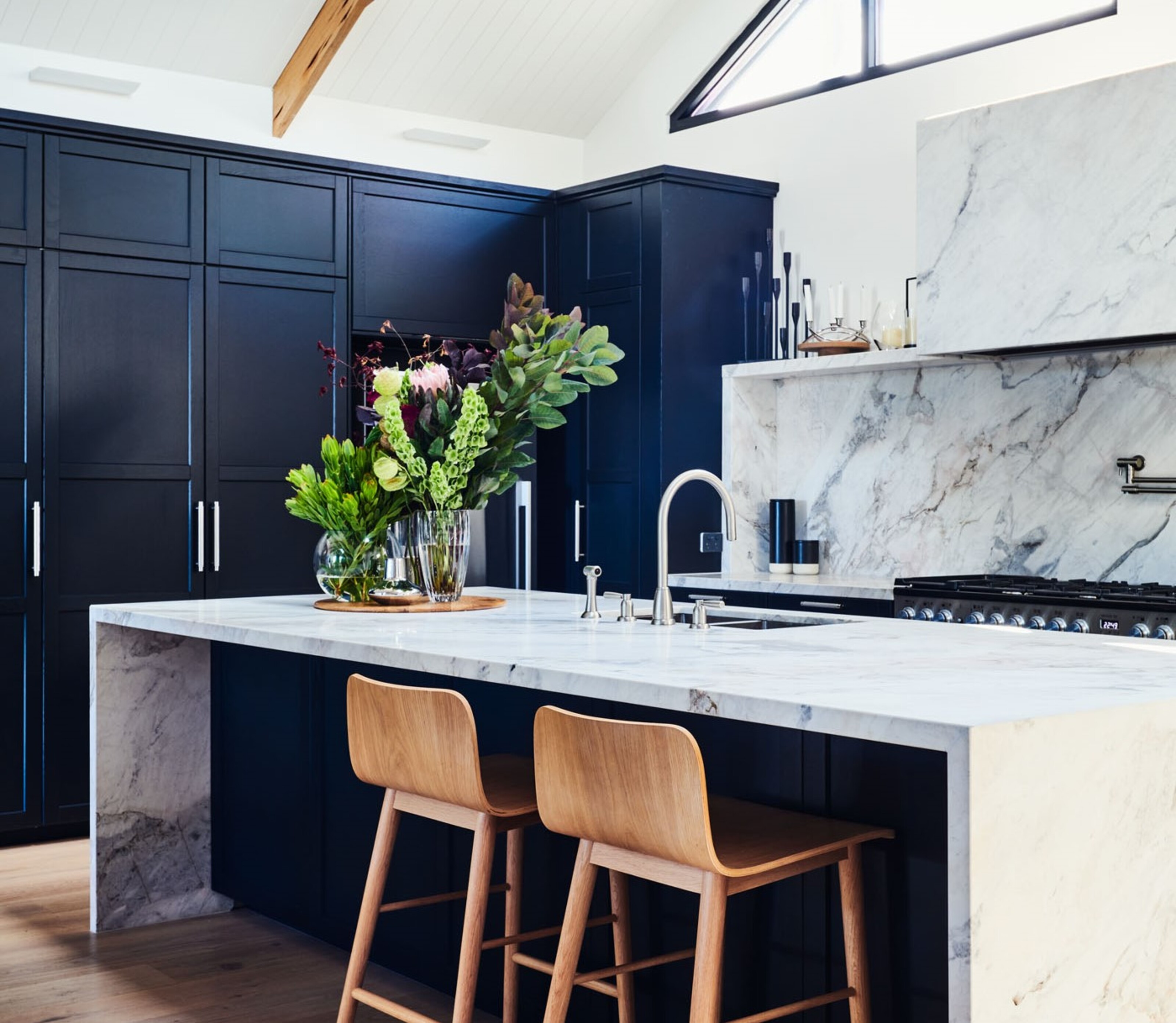
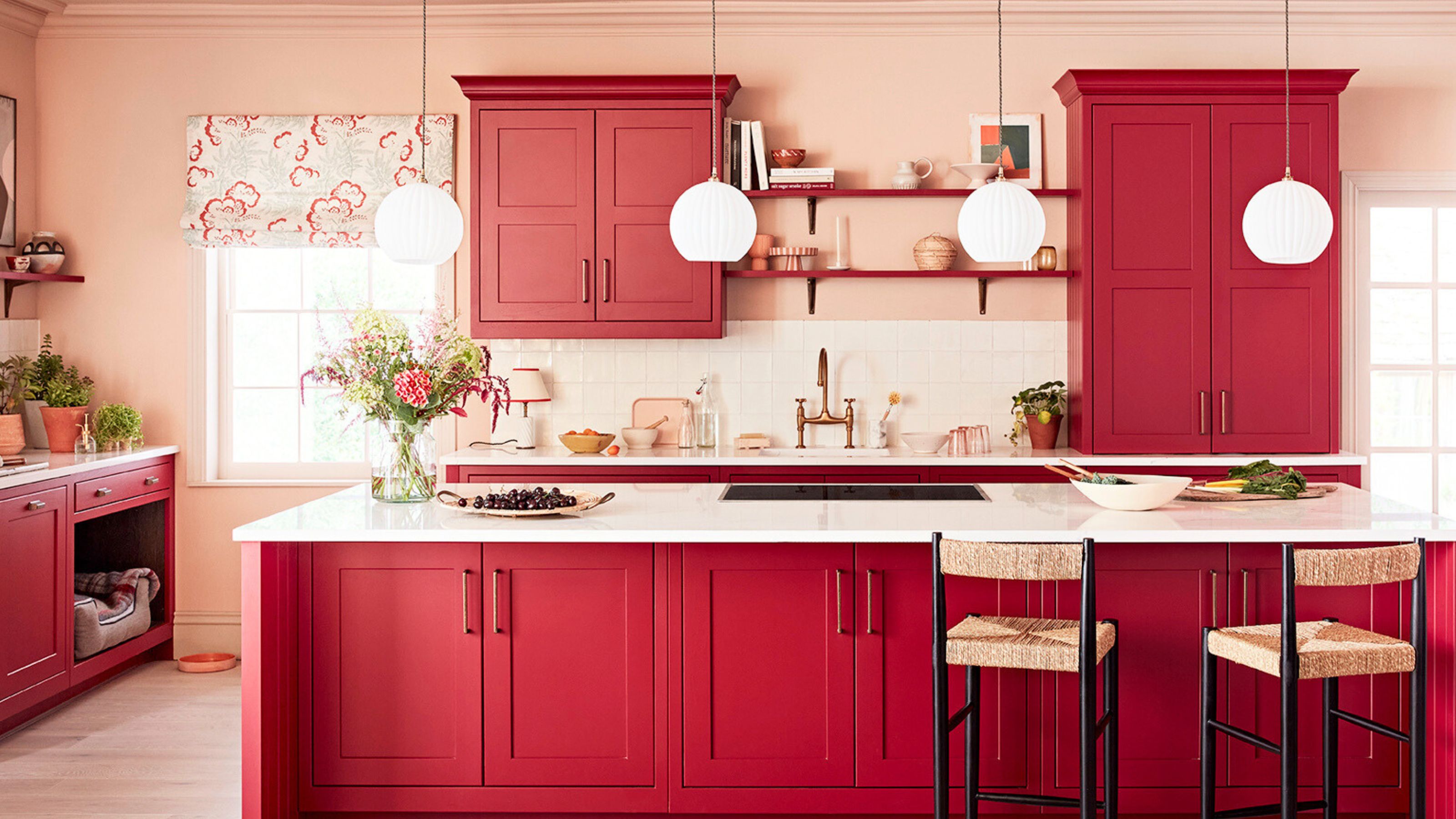
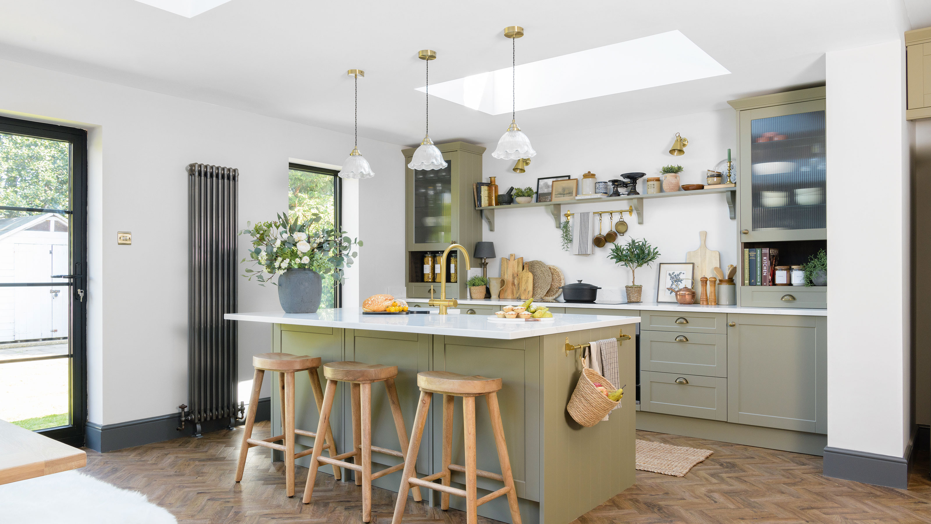
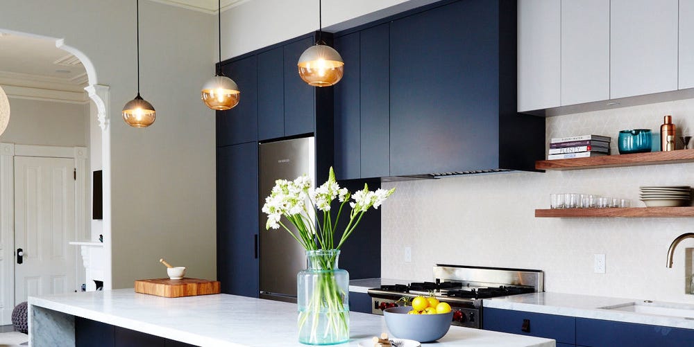
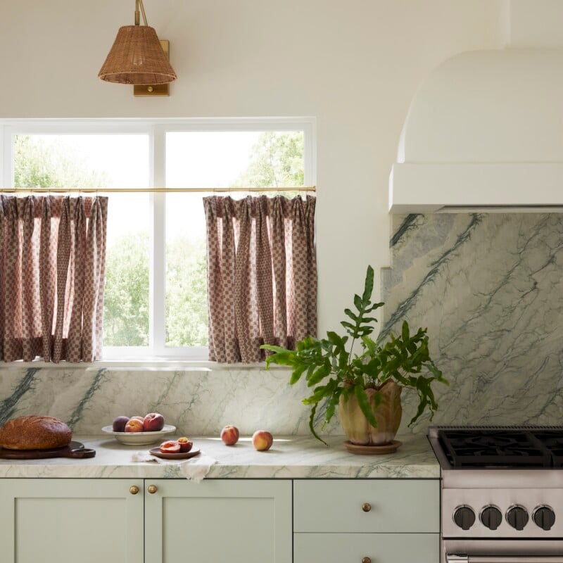
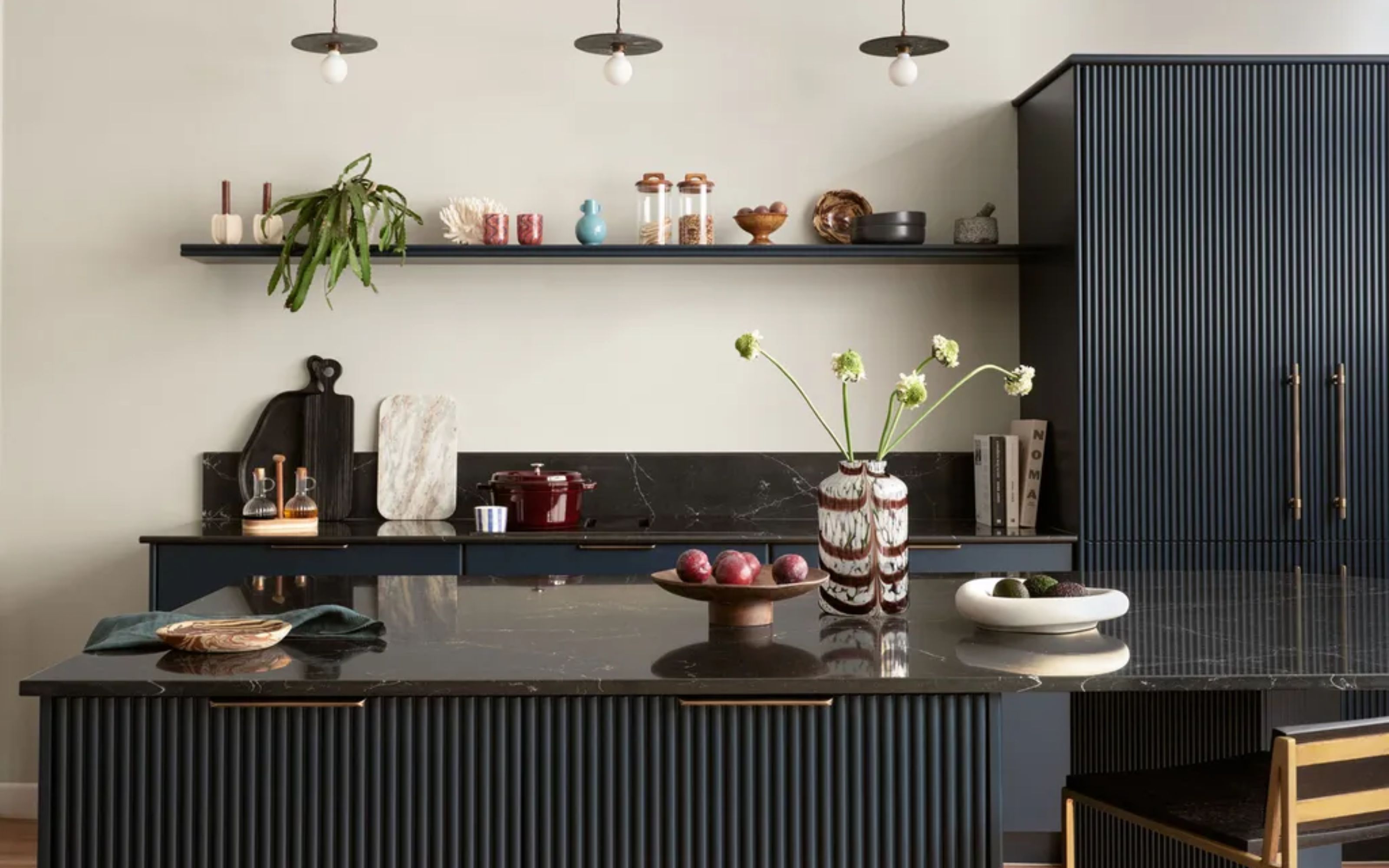
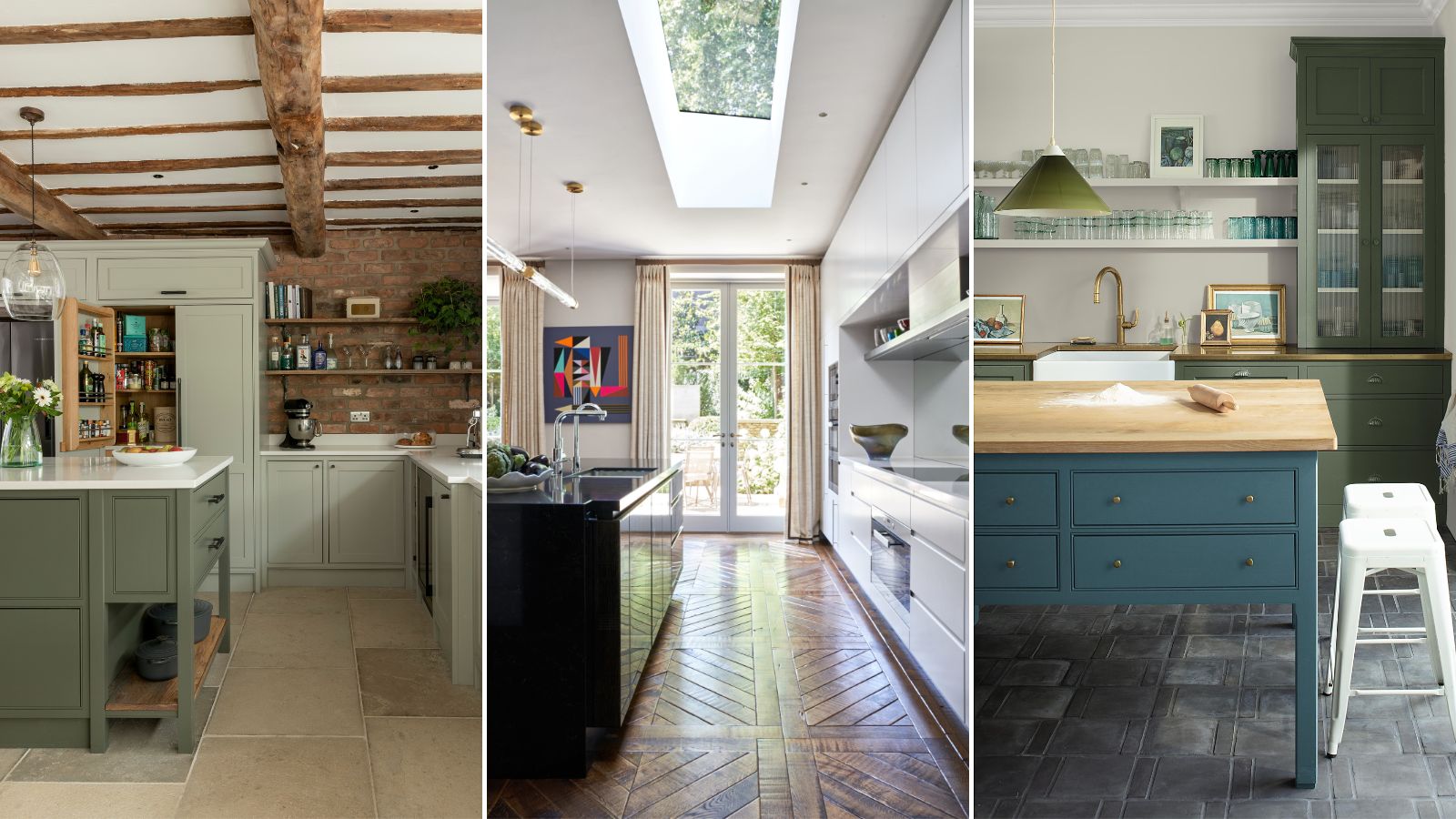
Post-pandemic, there's a growing trend among homeowners to select colors based on intuition and emotional connection rather than strict trends. Yarosh encourages bolder, more personal choices, highlighting a project where all-white cabinetry was repainted Benjamin Moore’s Scenic Drive, a mint green, to create a 'happy' kitchen. Blue and green cabinet colors are presented as enduring favorites, with deep blues offering elegance and green tones providing a connection to nature. Littlefield mentions Senso in Olive as a popular muted green from nobilia, valued for its calming and timeless qualities. Ultimately, the article concludes that the best cabinet color is one that reflects personal taste and can evolve with changing decor, and advises checking with manufacturers for repainting or restaining flexibility for long-term versatility.
#KitchenDesign #CabinetColors #InteriorDesign #HomeRenovation #DesignTrends #OutdatedKitchens #ModernKitchen #NeutralTones #TimelessDesign #KitchenDesign #CabinetColors #InteriorDesign #HomeRenovation #DesignTrends #OutdatedKitchens #ModernKitchen #NeutralTones #TimelessDesign
0 comment in total
You may also like
9 Outdated Kitchen Cabinet Colors We Hope To Never See In 2026
Two tone kitchen ideas – how to achieve the colorful kitchen trend we can't get enough of

5 kitchen cabinet colors interior designers are avoiding for 2024 - and the shades they're picking instead
Designers Agree: This Kitchen Trend Instantly Makes Your Home Look Outdated

9 Outdated Kitchen Cabinet Colors We Hope To Never See In 2026

These 5 features make kitchen cabinets look dated, designers warn us


9 Outdated Kitchen Cabinet Colors We Hope To Never See In 2026

7 outdated kitchen cabinet colors designers say you should wave goodbye to, plus what to try instead

5 outdated kitchen cabinet color trends to avoid if you don't want your kitchen to look unfashionable, say designers
These 7 Kitchen Cabinet Colors Are So Outdated, According to Interior Designers

5 kitchen cabinet colours to avoid in 2024 - and what to choose instead, according to experts
14 Kitchen Cabinet Colors You Can Easily Mix and Match

The 2 Cabinet Colors Designers Say Make Kitchens Look Outdated

Designers Predict the Next “It” Kitchen Cabinet Color

8 colors you should never paint kitchen cabinets according to the experts

This Paint Color Is Way More Popular With Lower Cabinets Than Upper Ones

Two tone kitchen cabinet ideas – 10 colour combinations to inspire
What Color is Replacing White in the Kitchen? 5 Sophisticated Shades Designers Say to Try Instead
5 fail-safe kitchen cabinet color combinations that always work
The Kitchen Appliance Color Mistake That Makes Interior Designers Cringe