1/28
Butter Yellow and the Foodification of Color
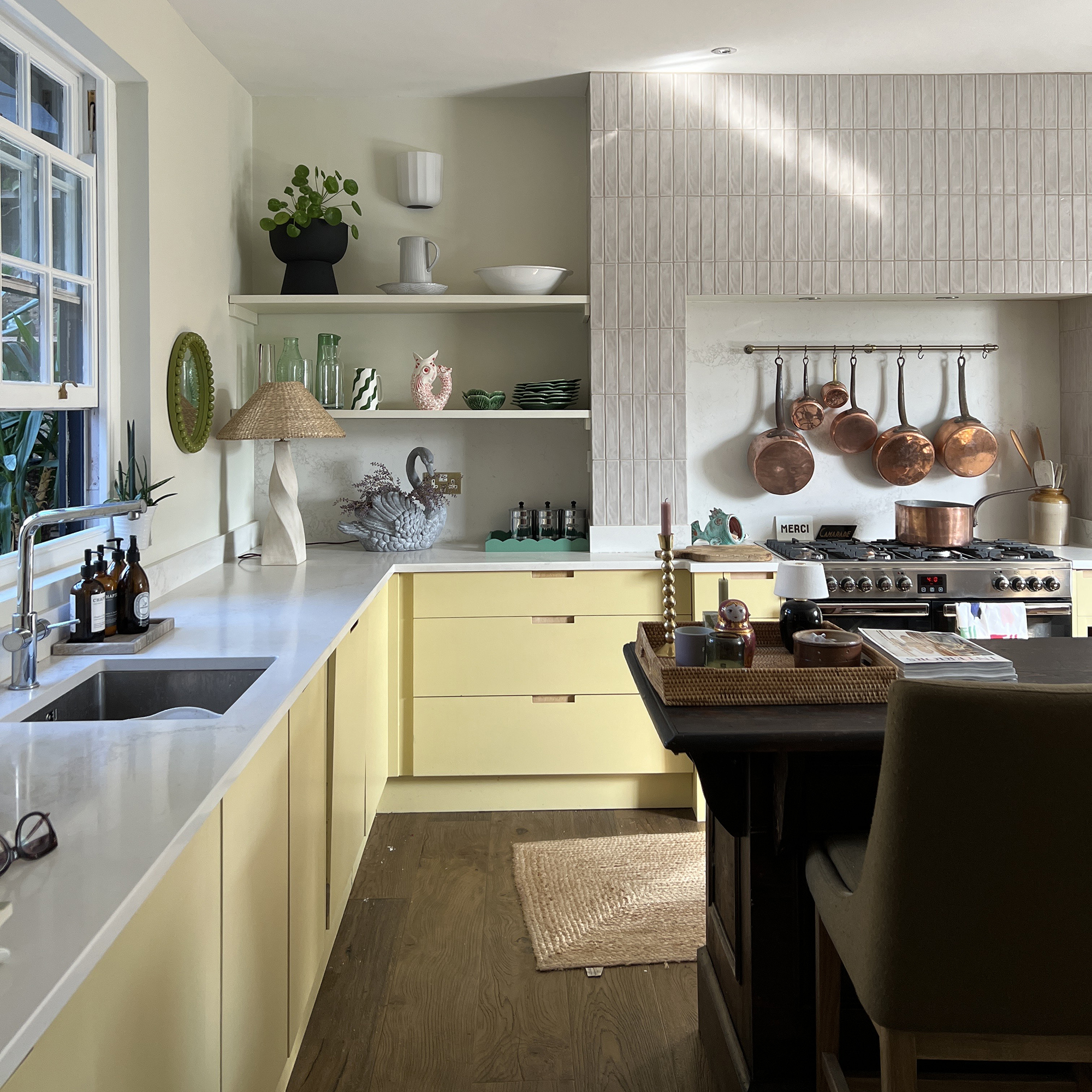
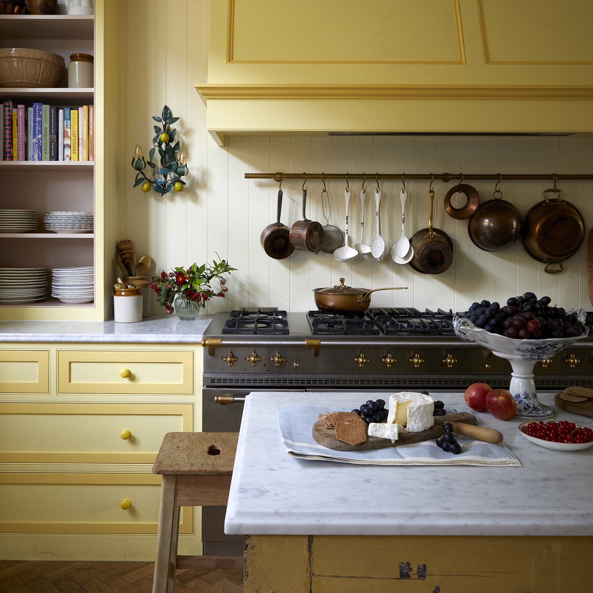
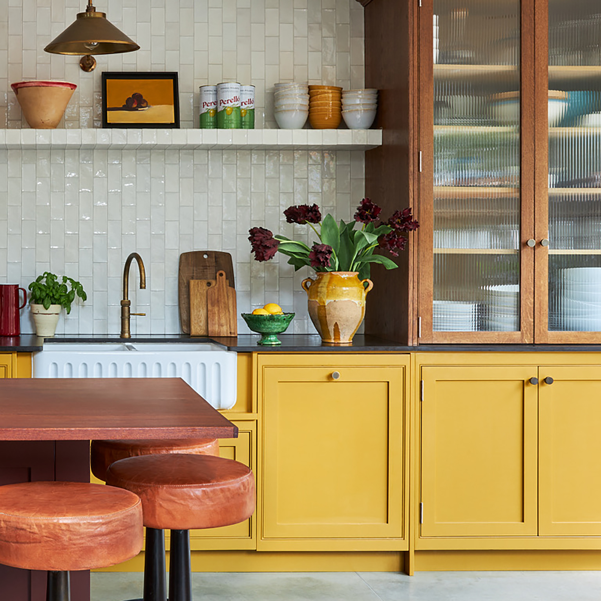
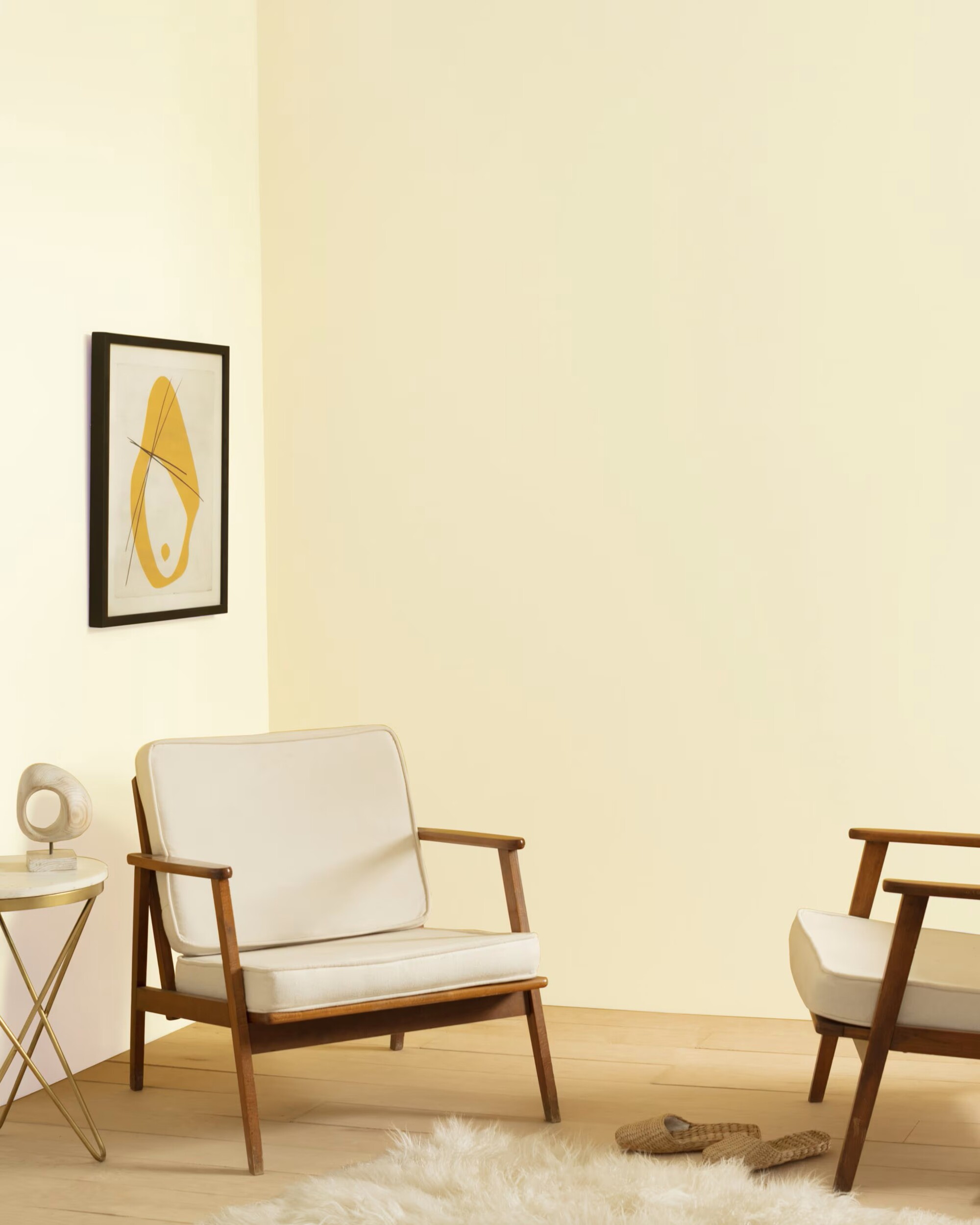
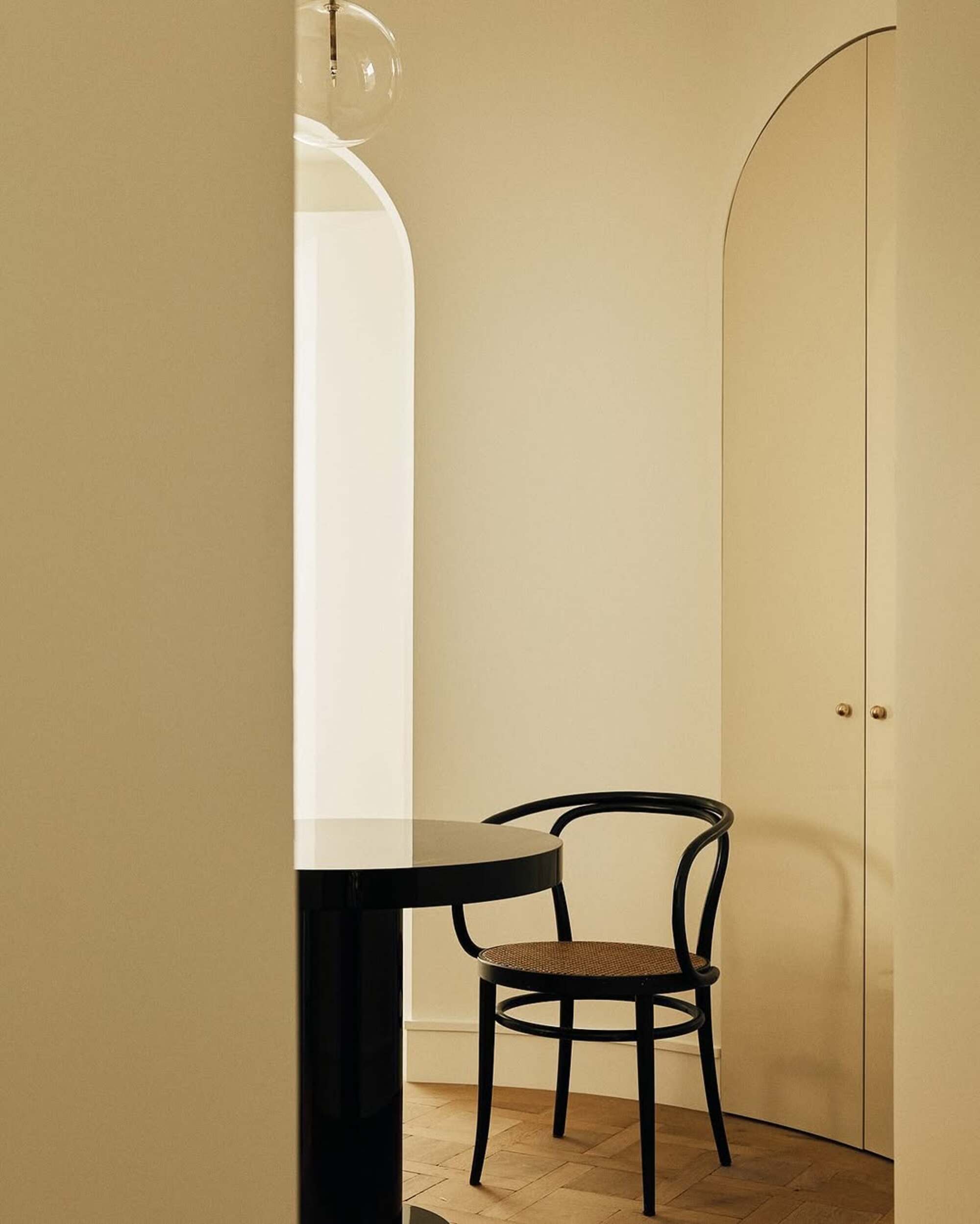
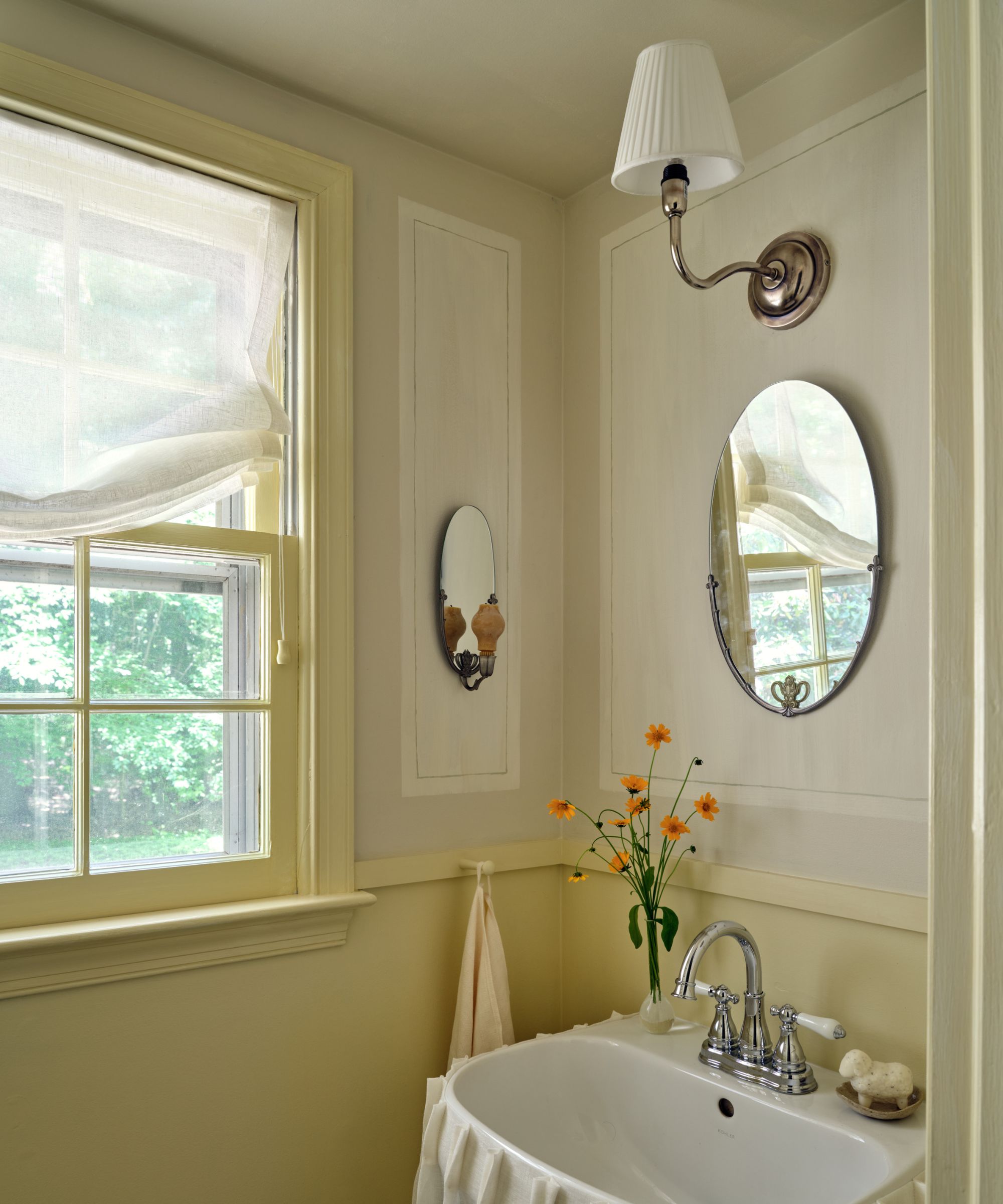
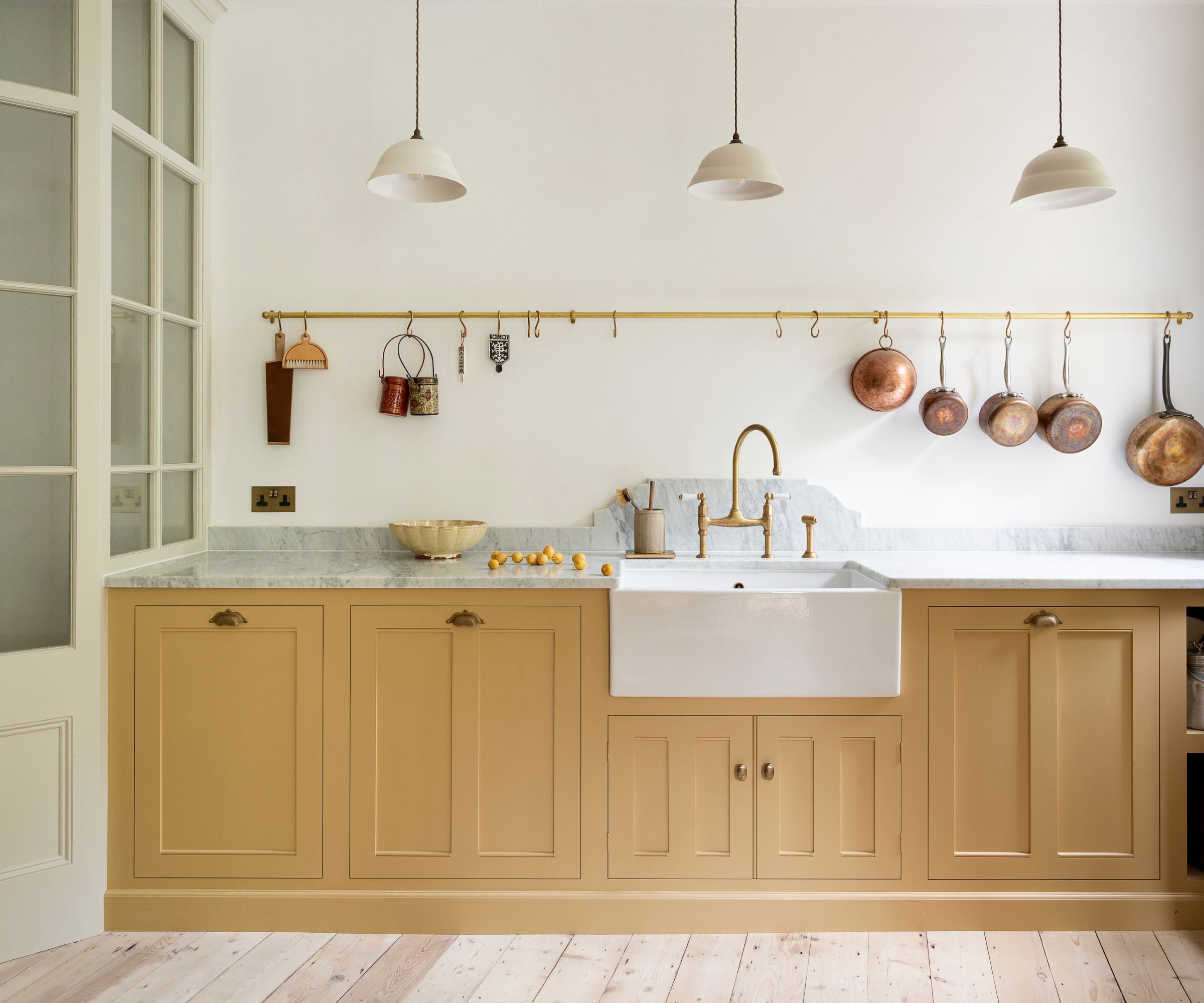
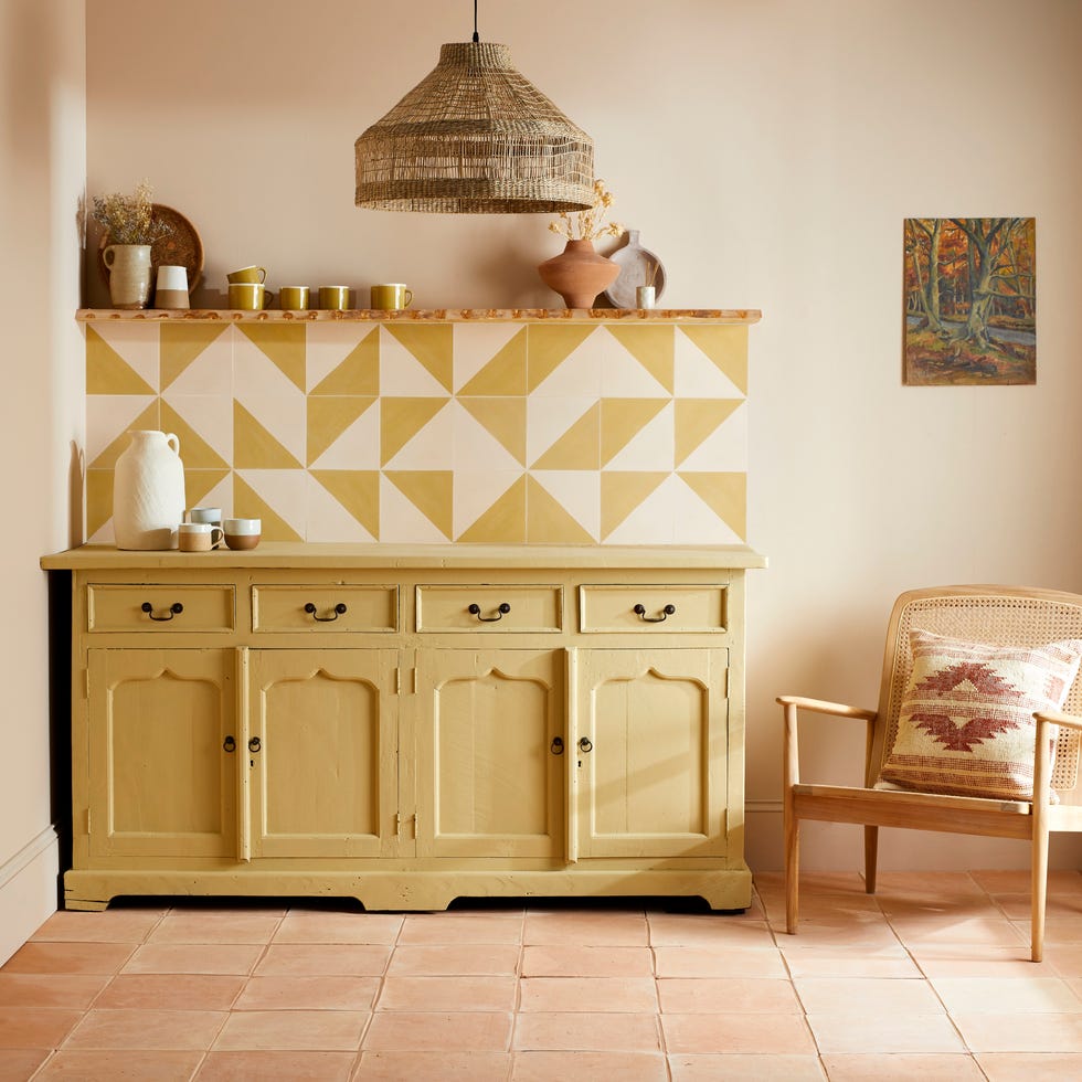
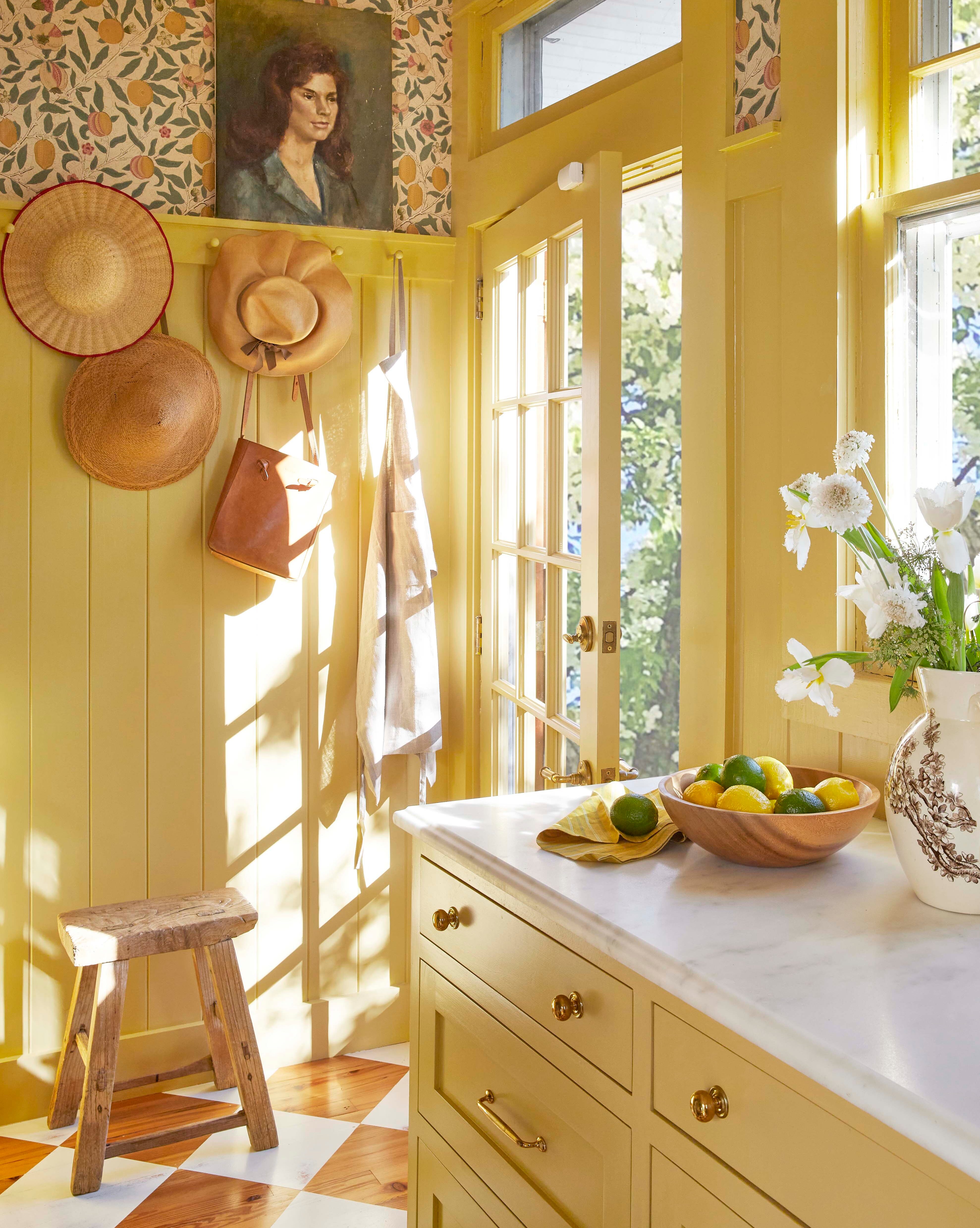
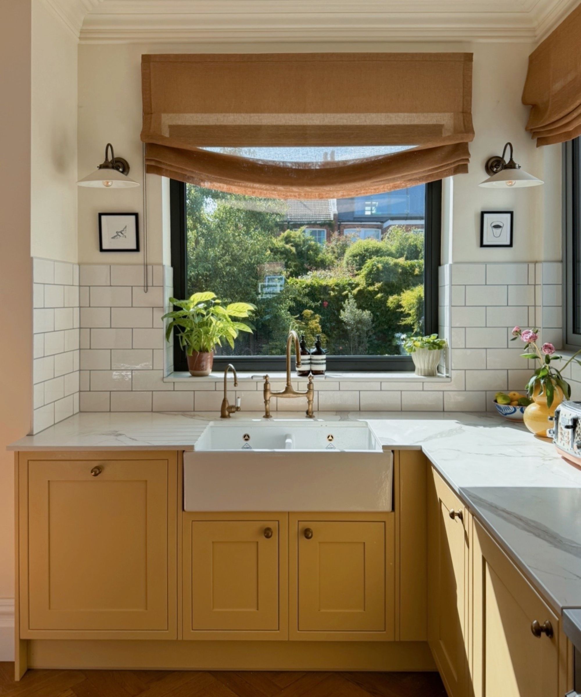
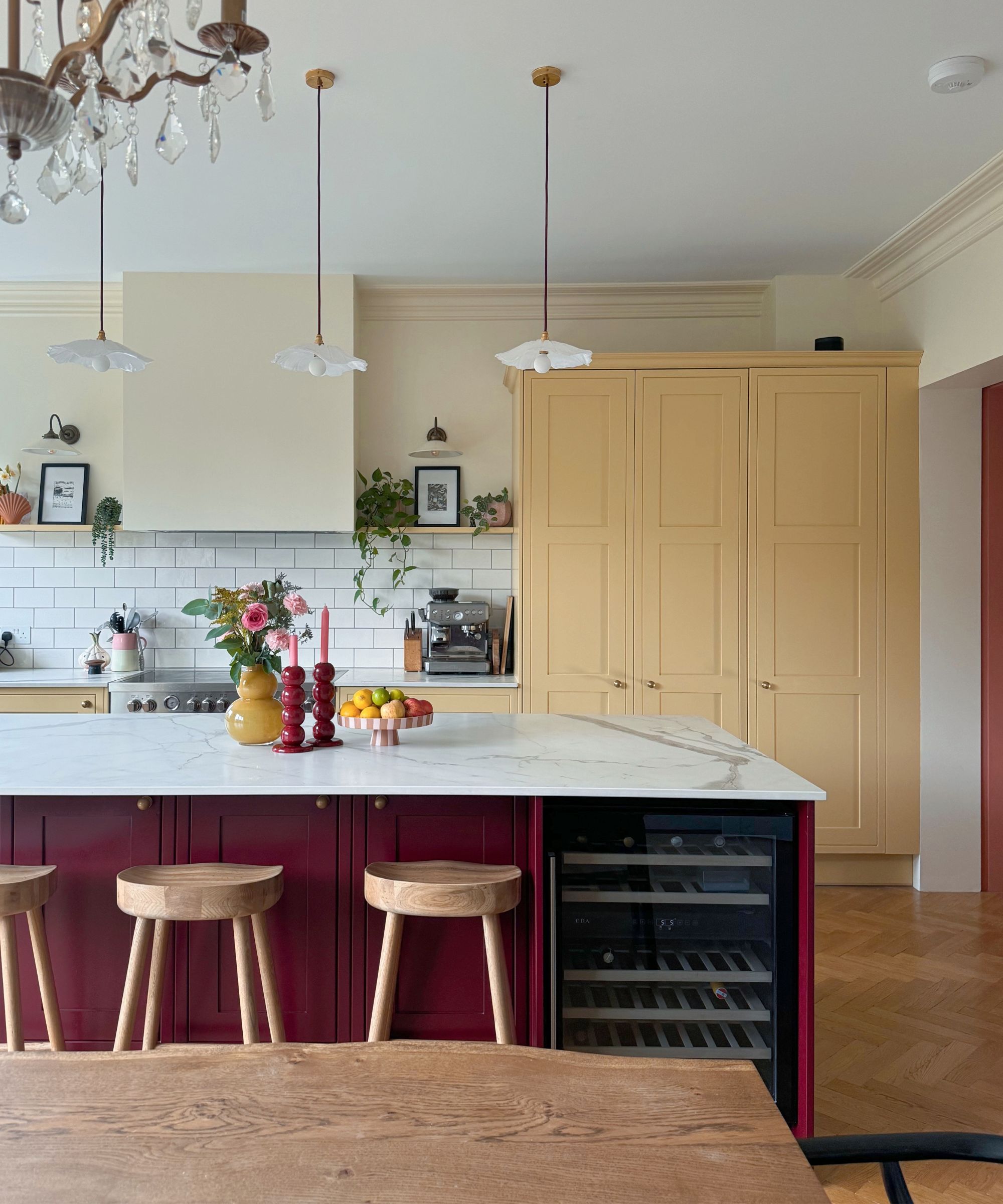
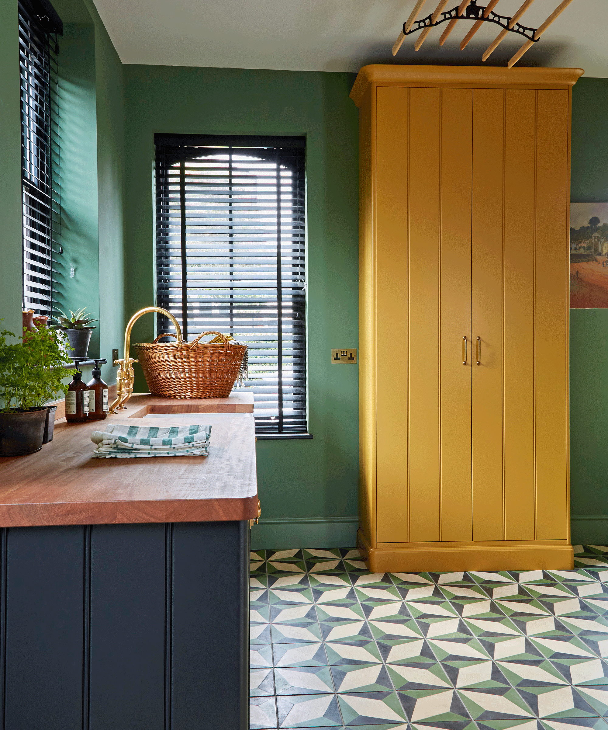
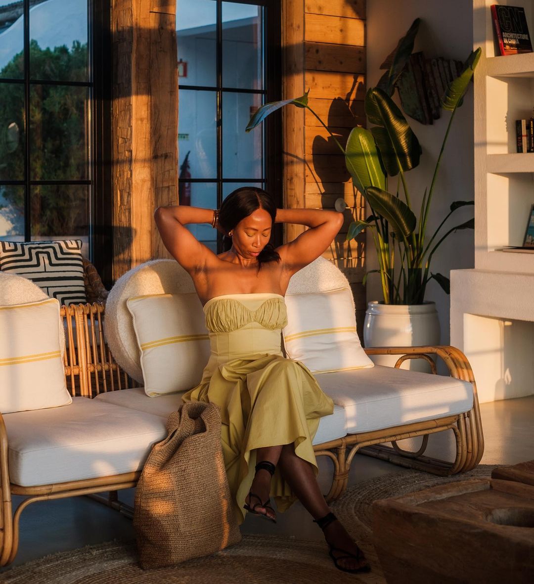
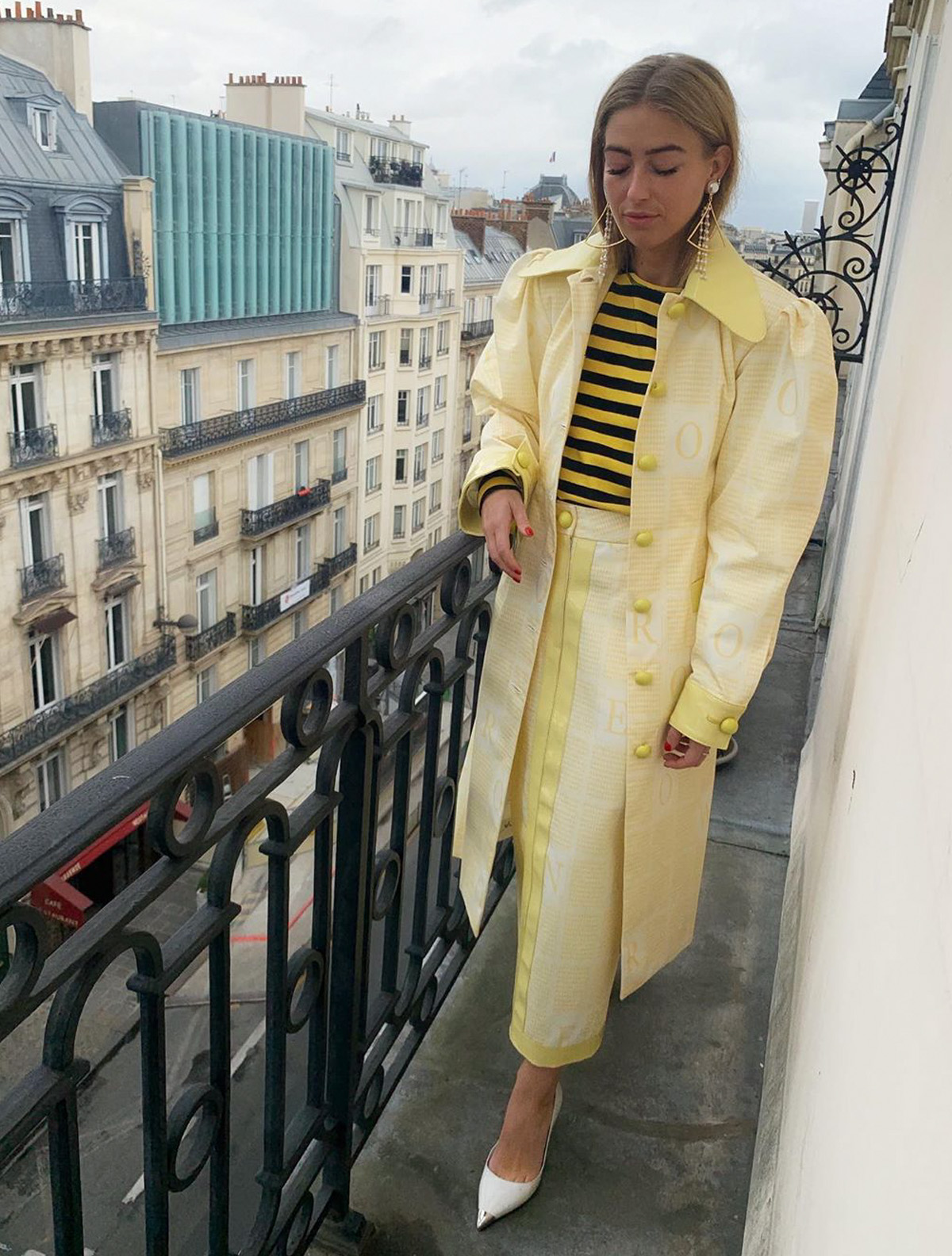
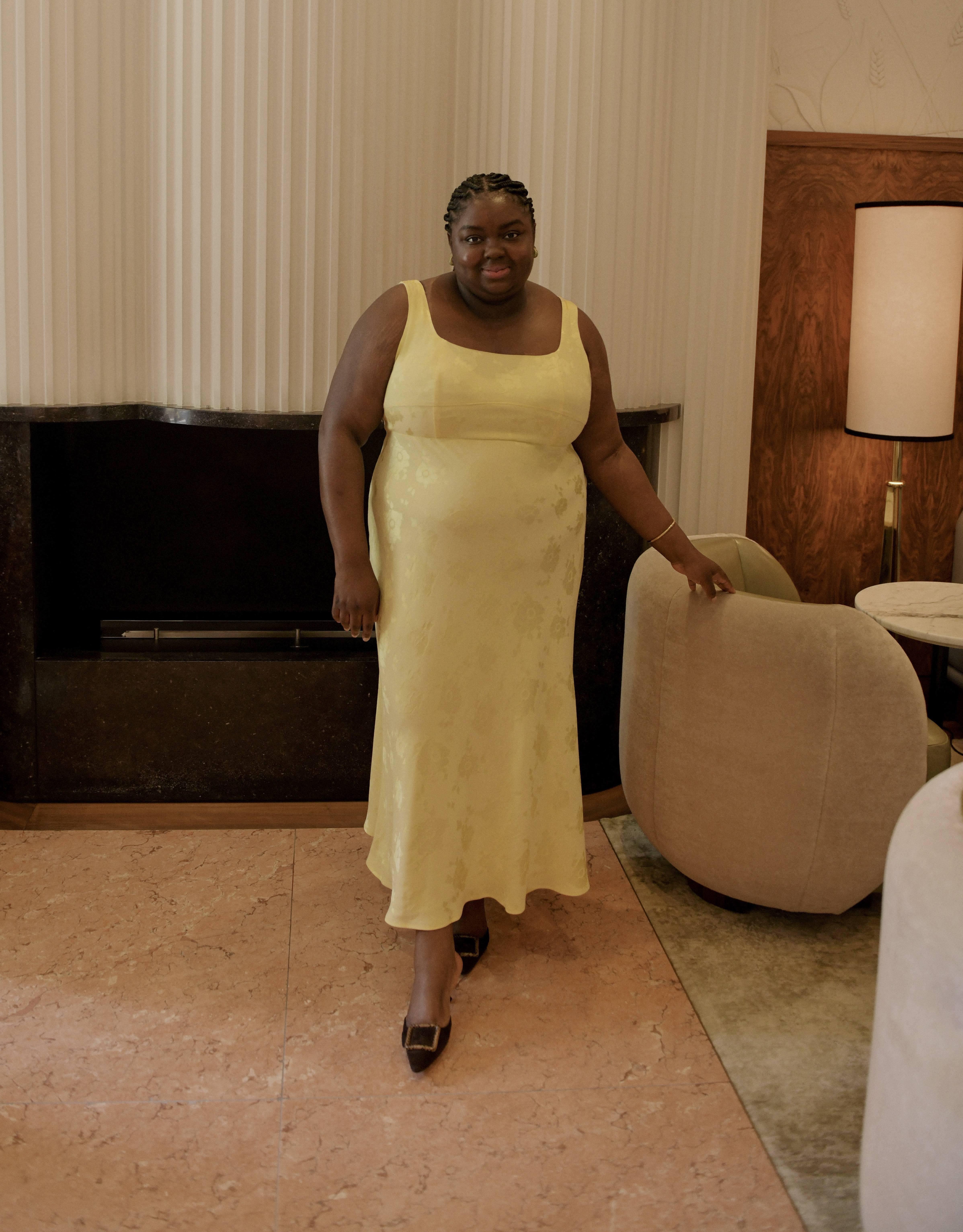
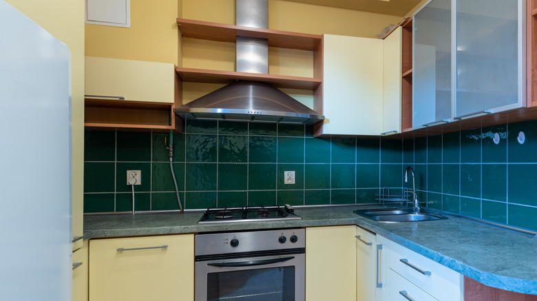
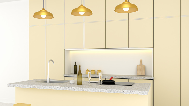
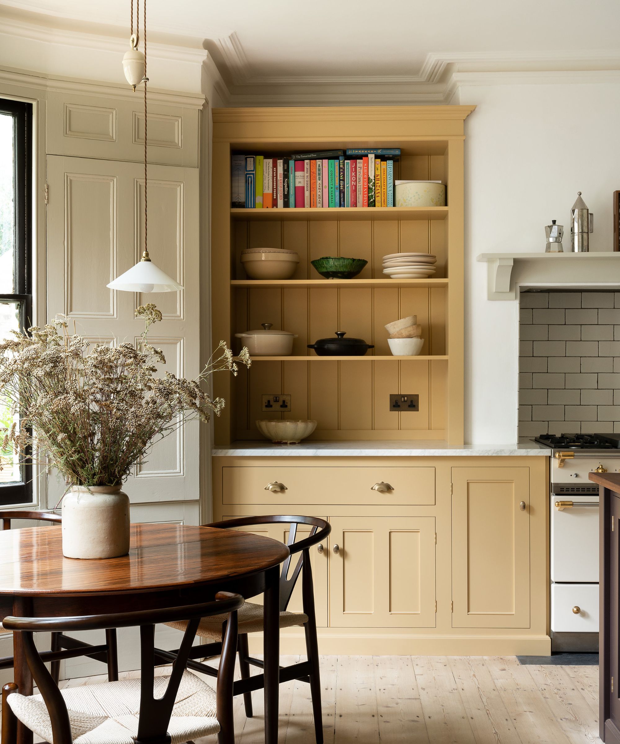
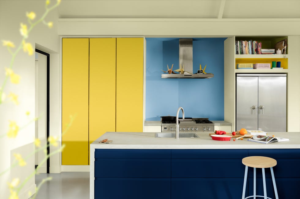
The article explores the trending color, butter yellow, noting its pervasive appearance in fashion and home decor. The author shares a personal decision to paint kitchen cabinets in this hue, acknowledging the potential fleeting nature of color trends. This trend is contextualized within a broader phenomenon termed "foodification of color," where colors gain popularity by being associated with appealing food items, such as "tomato girl red" and "martini olive green." This association, it is suggested, makes colors more desirable, driving consumption in various sectors.
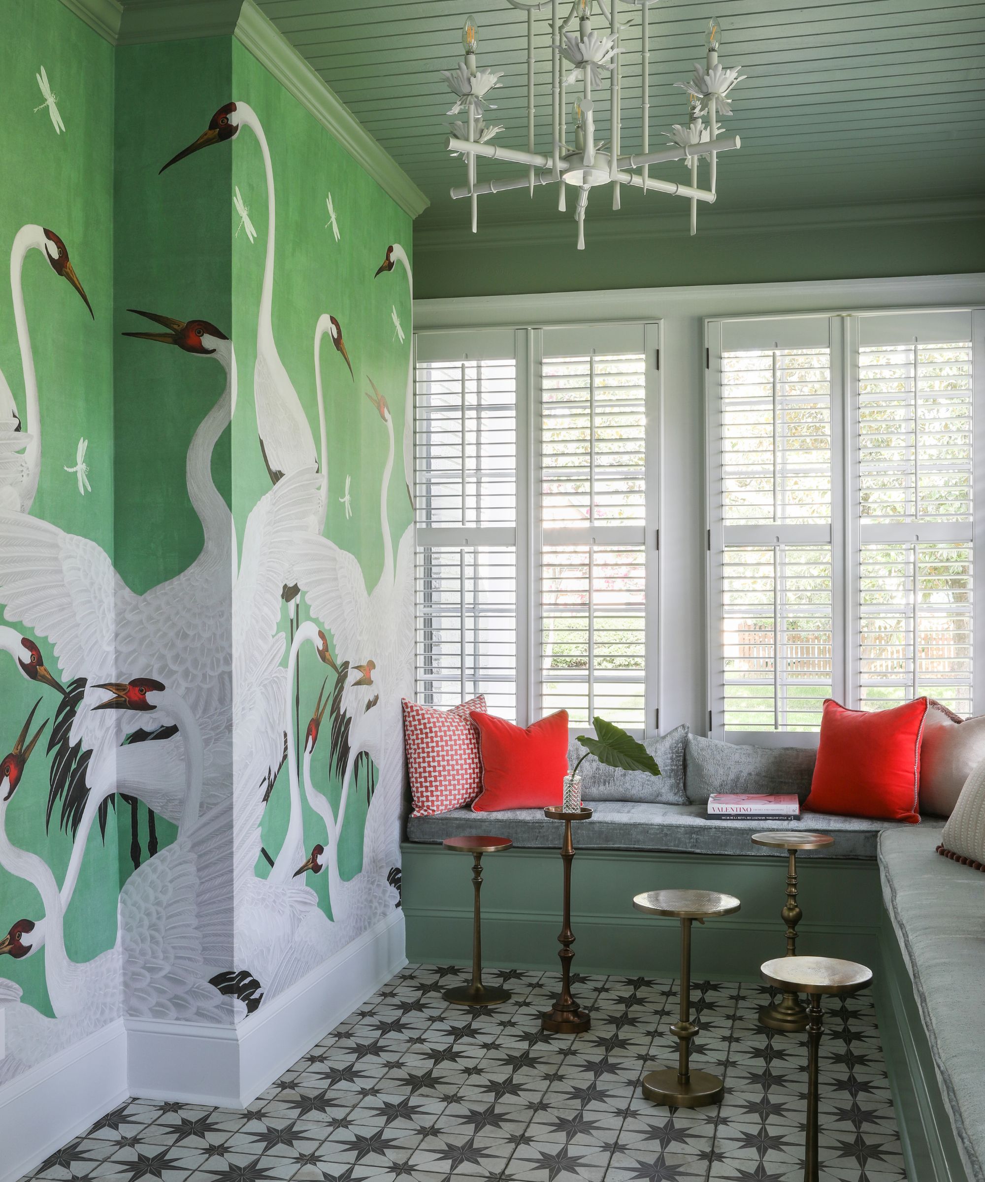
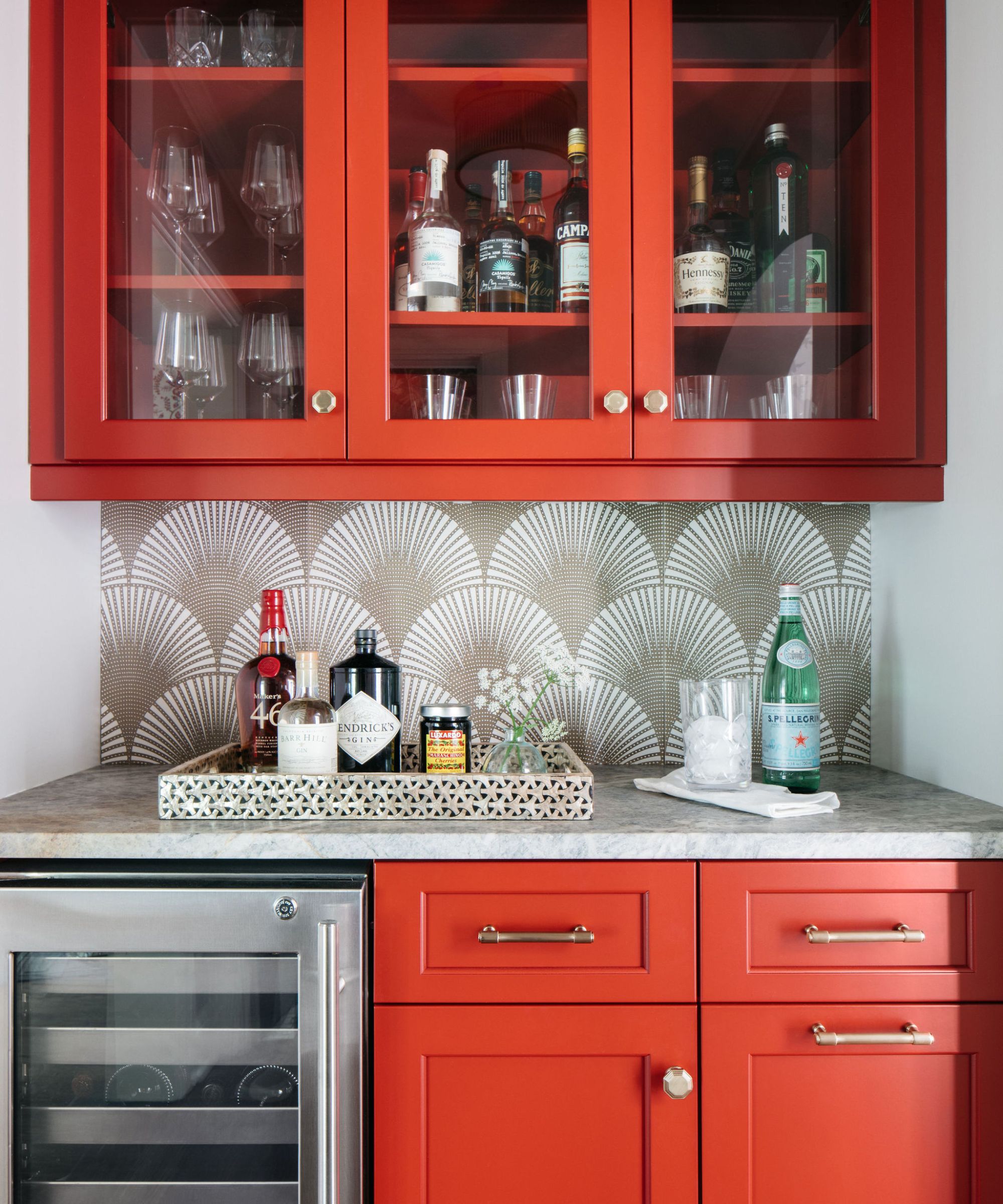
The article delves into the potential origins of this "foodification" trend, hypothesizing that the pandemic-era surge in elaborate butter sculptures—an art form transforming butter into intricate designs like chairs and cherubs—might have played a role. These sculptures are seen as a longing for nostalgia and the comfort of home-cooked meals and traditional gatherings. The influence of trending food and drink on color choices is further examined with olive green, whose recent resurgence is linked to the popularity of olives, olive centerpieces, and the "olive oil girls" cultural movement, transforming the hue into a lifestyle statement.
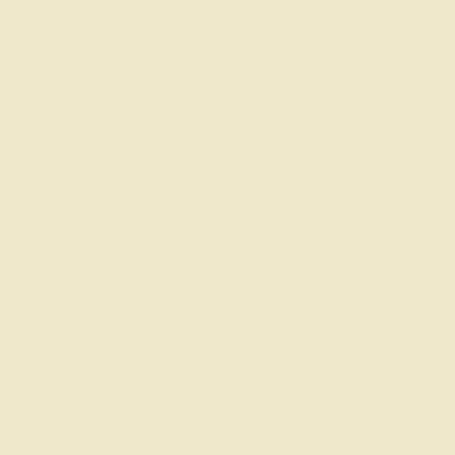
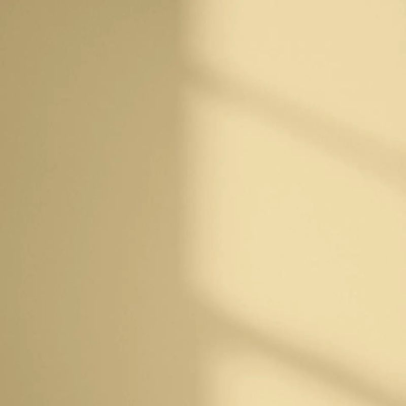
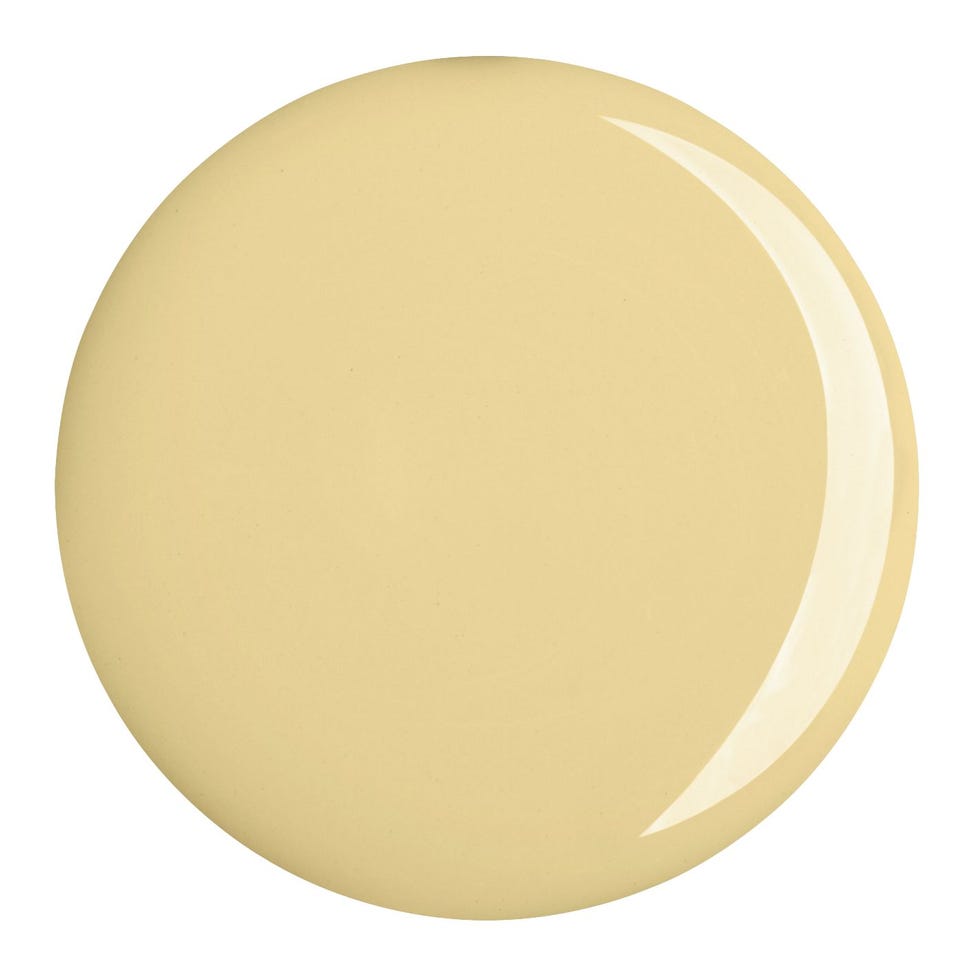
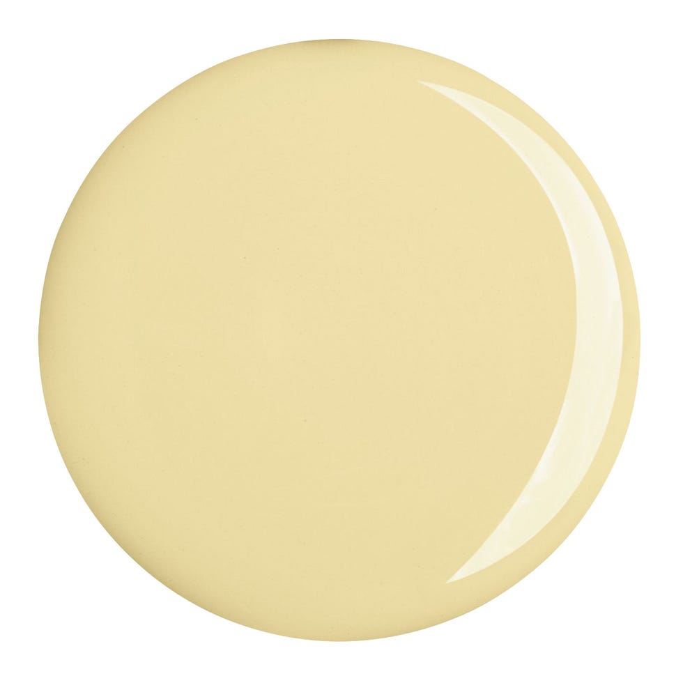
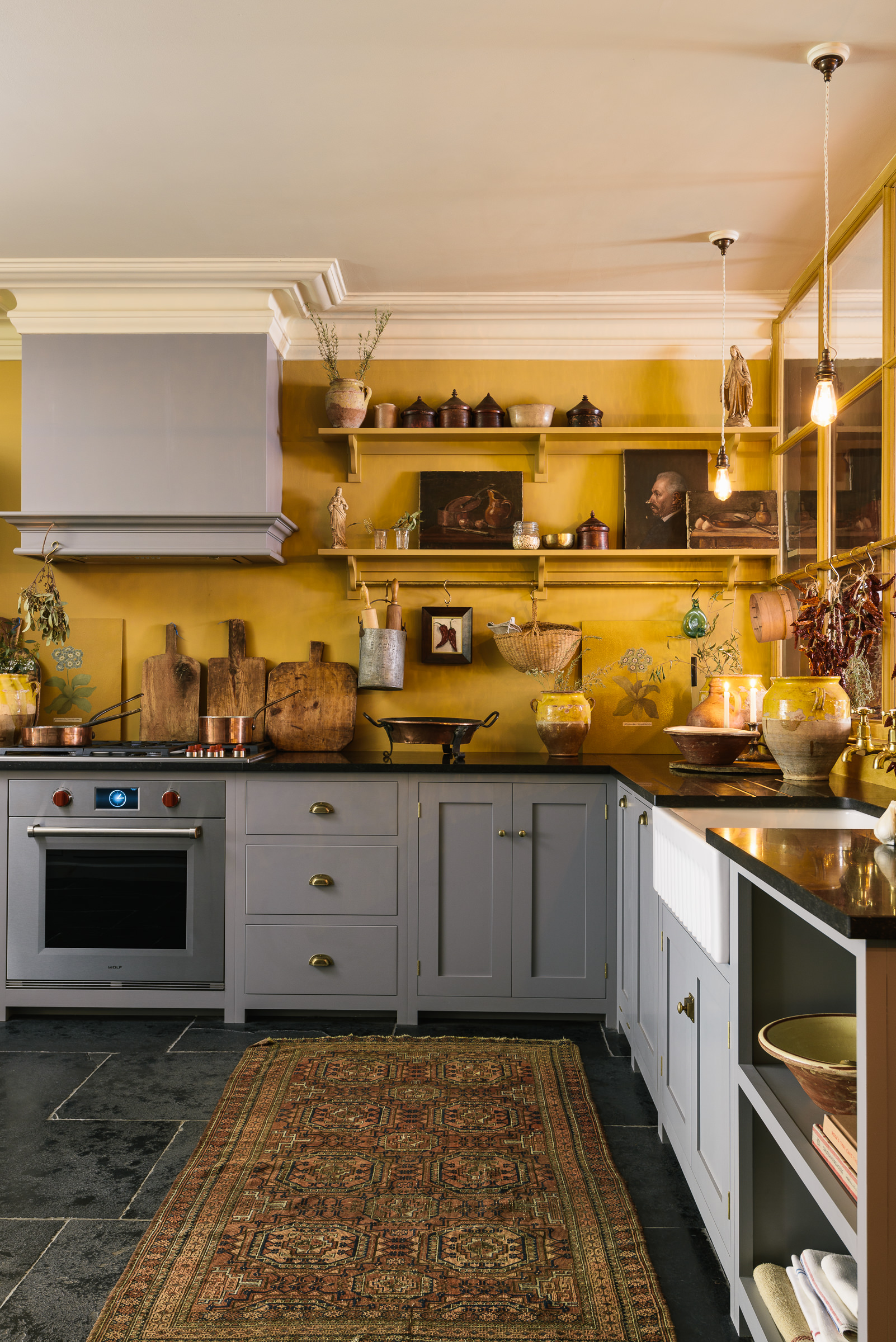
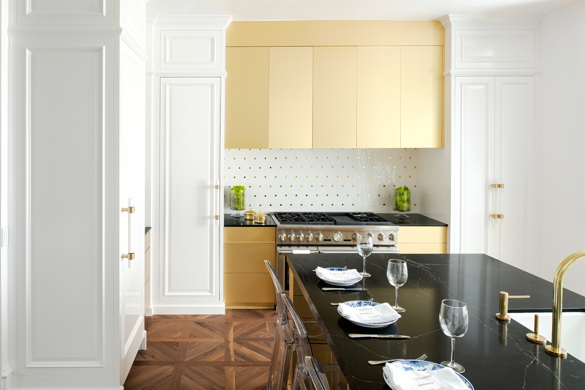
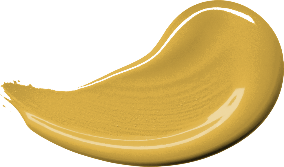
A key aspect of butter yellow's appeal is identified as its pale, creamy quality, which makes it more versatile and less assertive than other yellows. However, the article points out the inconsistency in defining "butter yellow," noting that the actual color of butter varies significantly based on factors like cow diet and breed. This variability is reflected in paint company databases, where Benjamin Moore lists seven shades of "butter yellow," while Behr's version leans more towards white. The blog post traces the historical presence of similar pale yellow shades, such as "Sunbeam Yellow" in the 1950s and CIL's "mellow yellow" in 2014, highlighting that the food descriptor is a more recent addition.
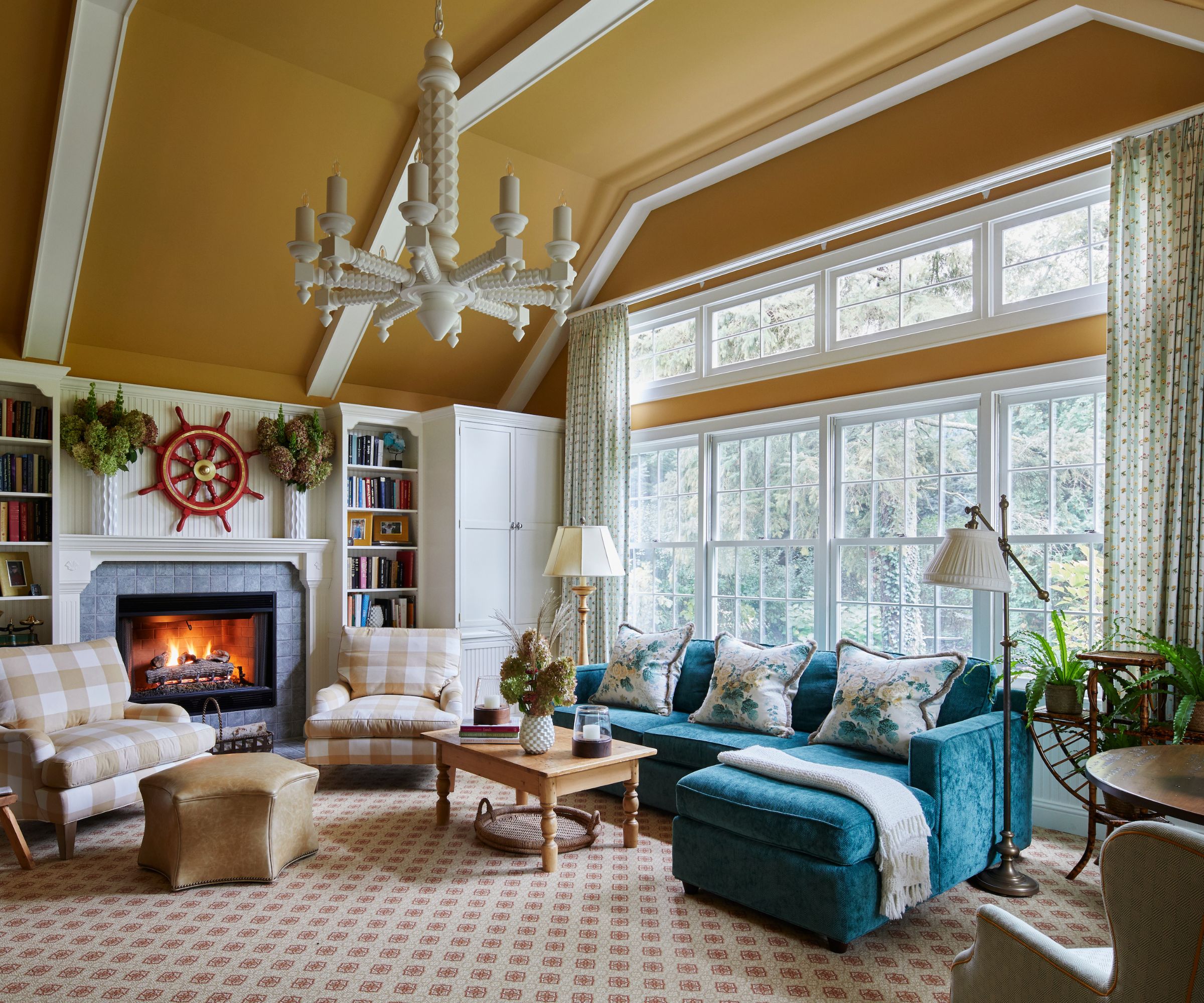
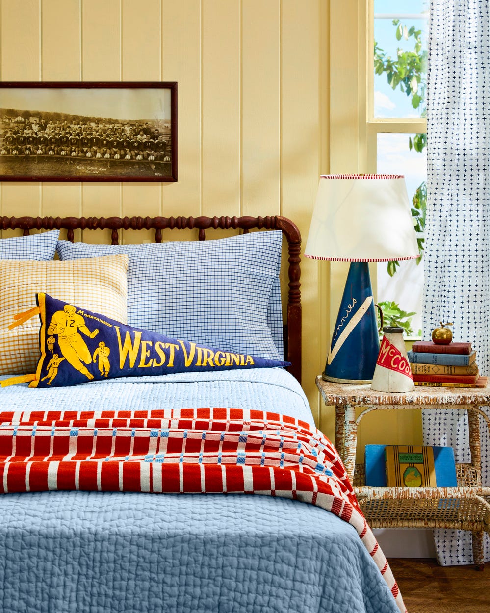
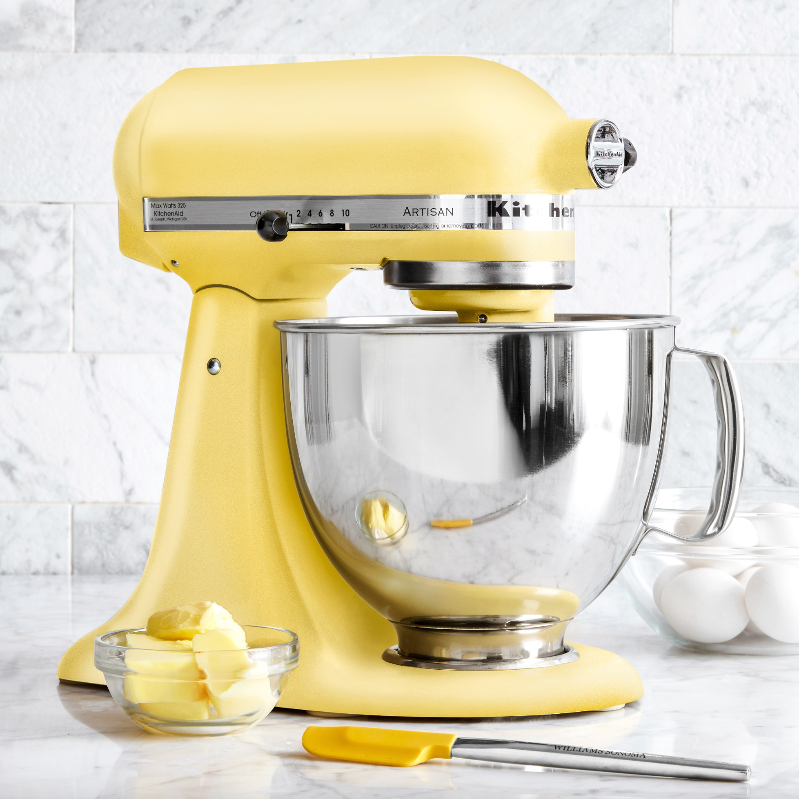
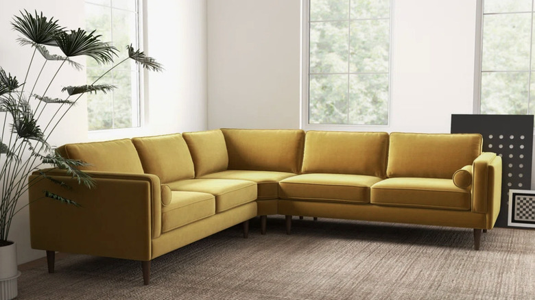
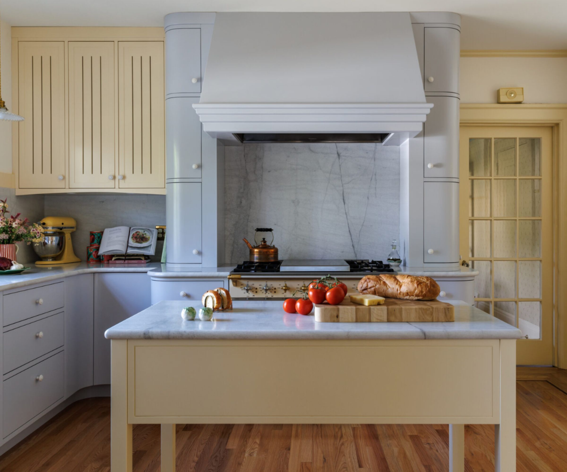
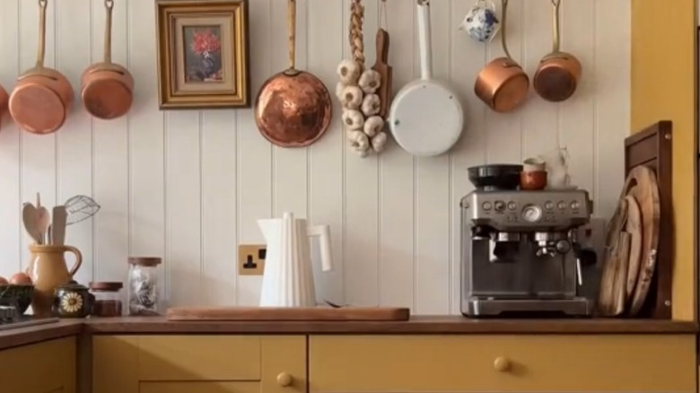
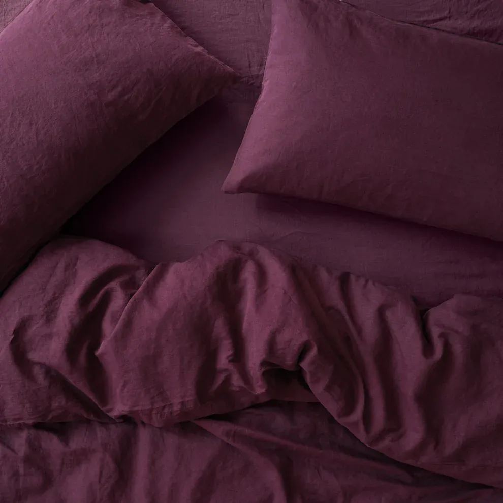
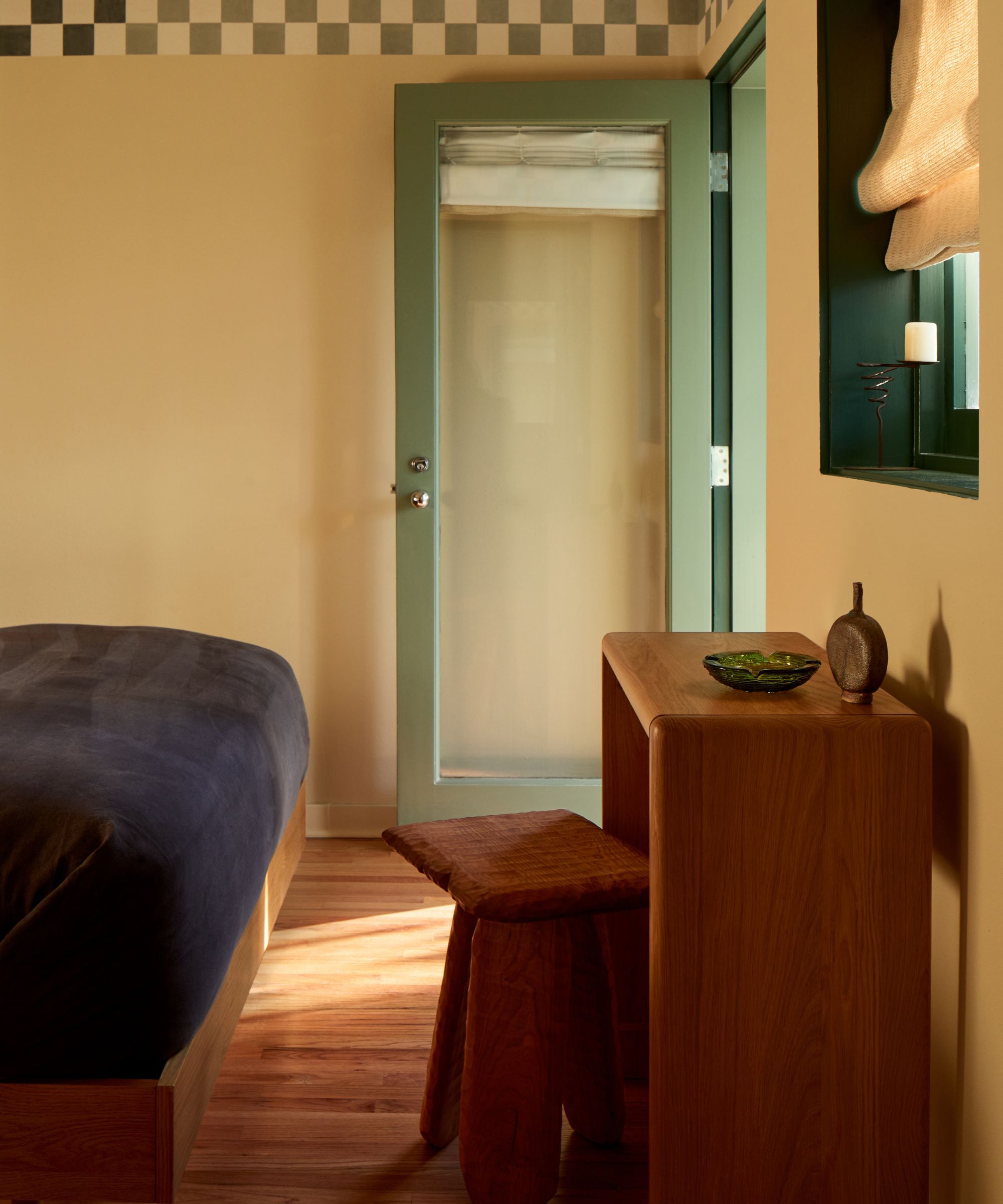
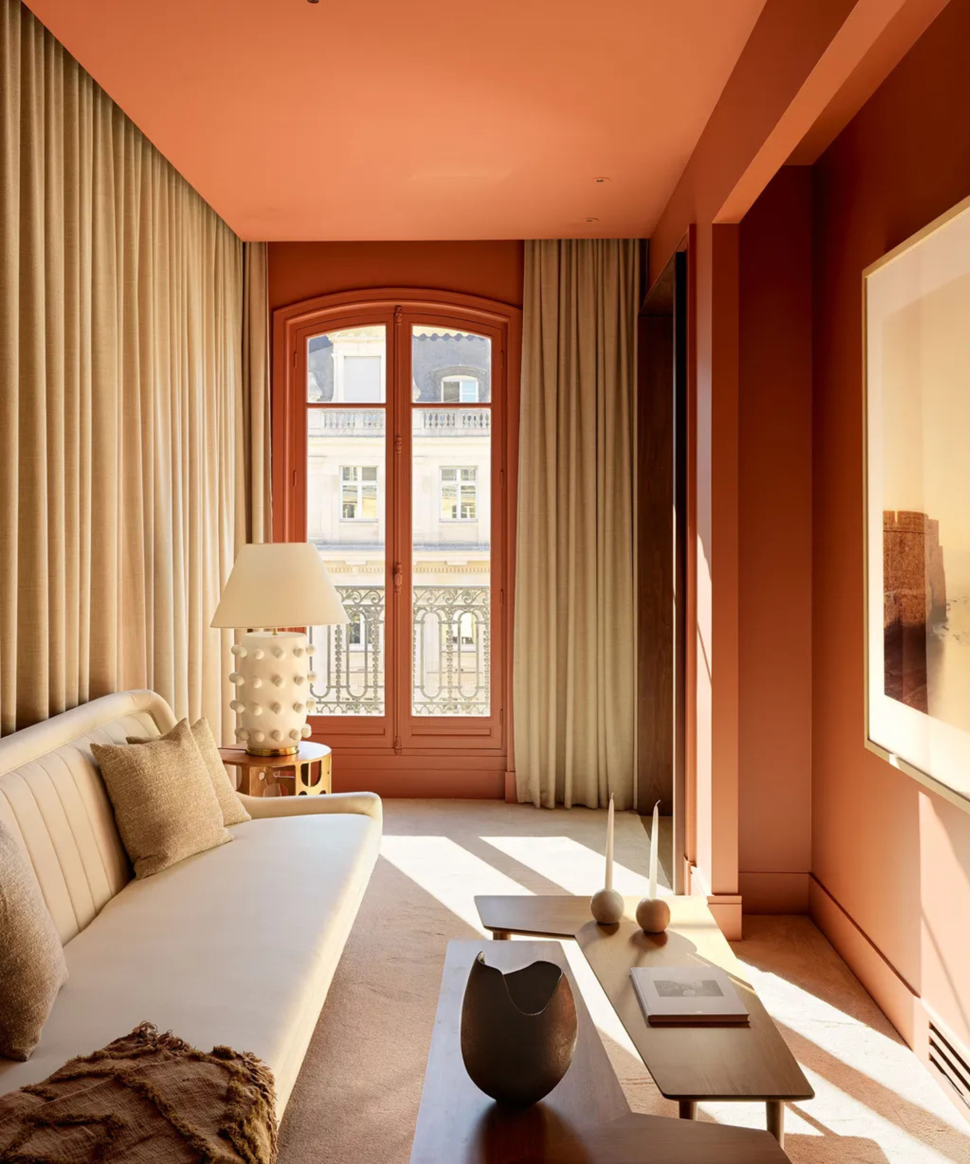
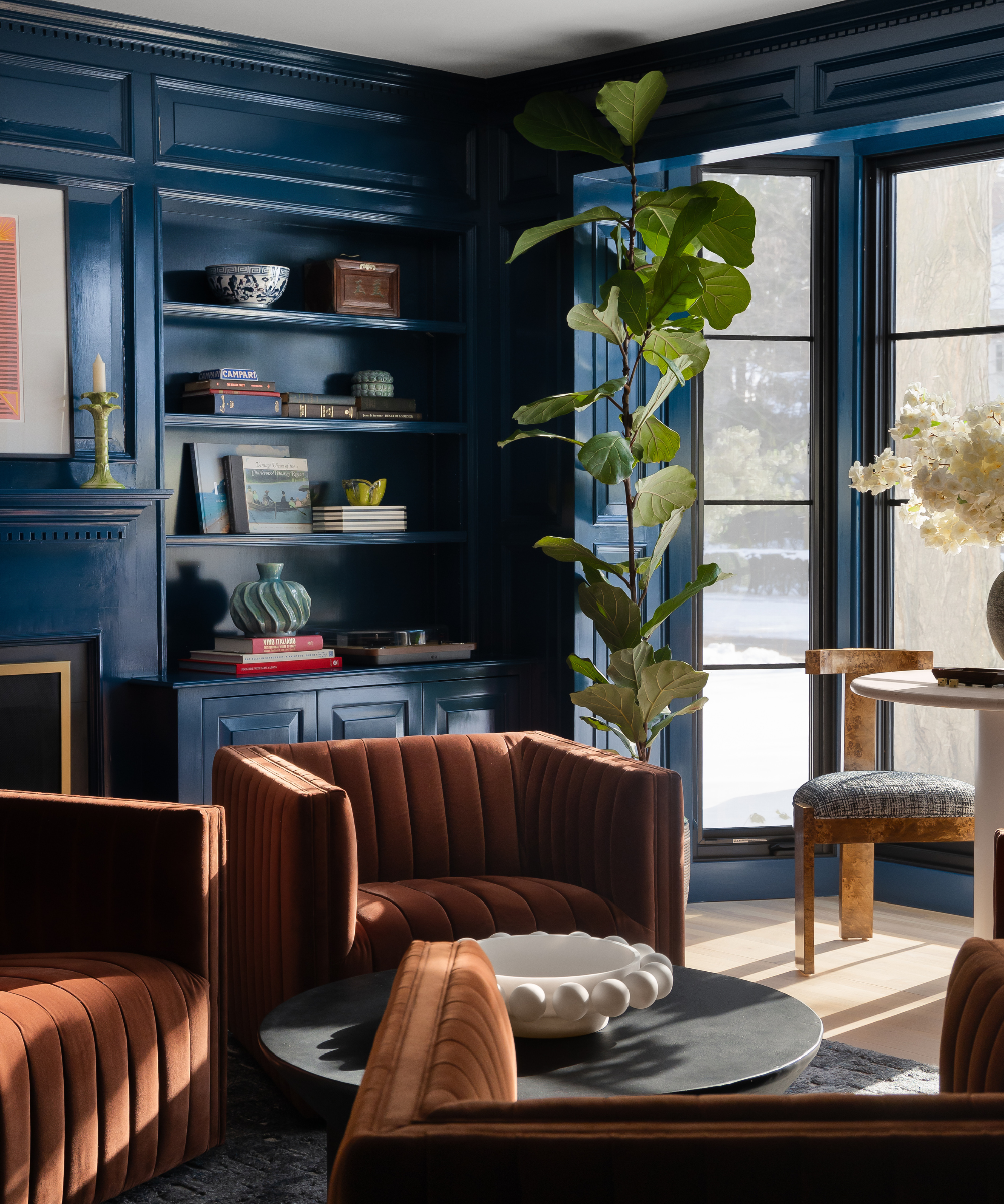
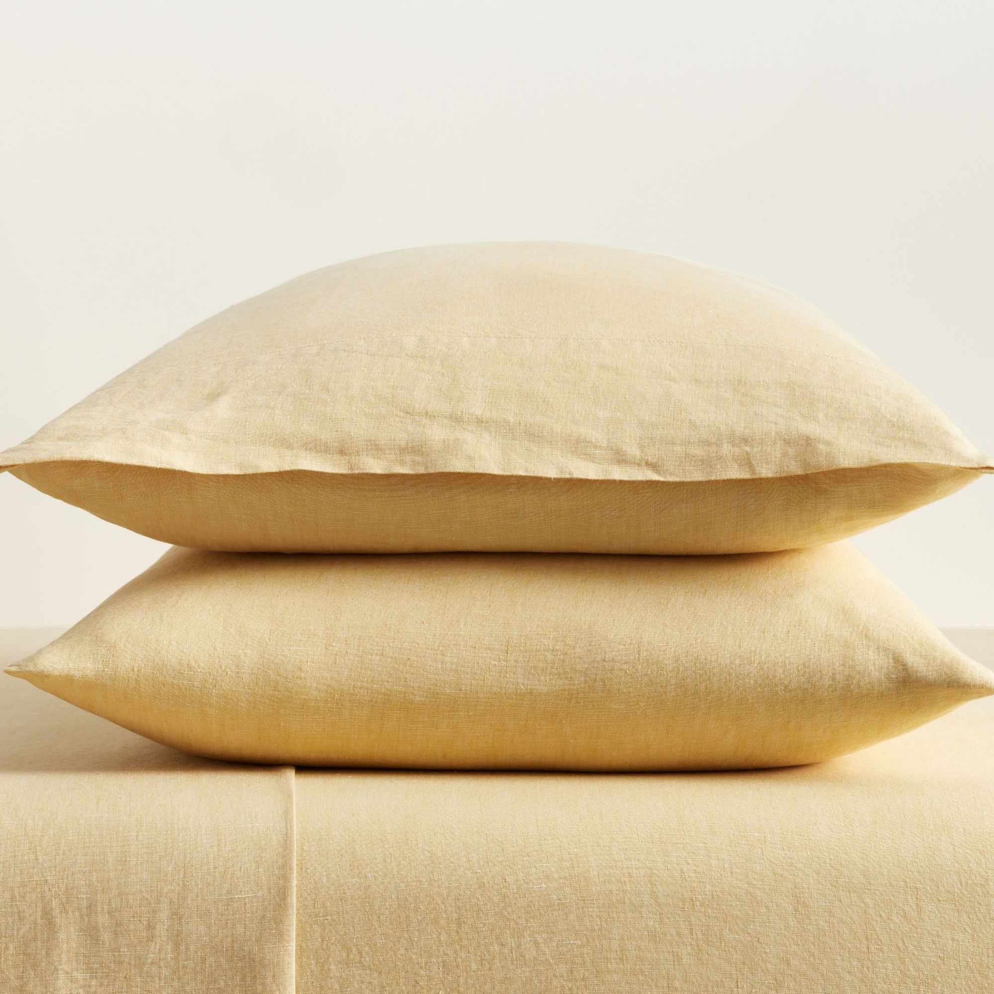
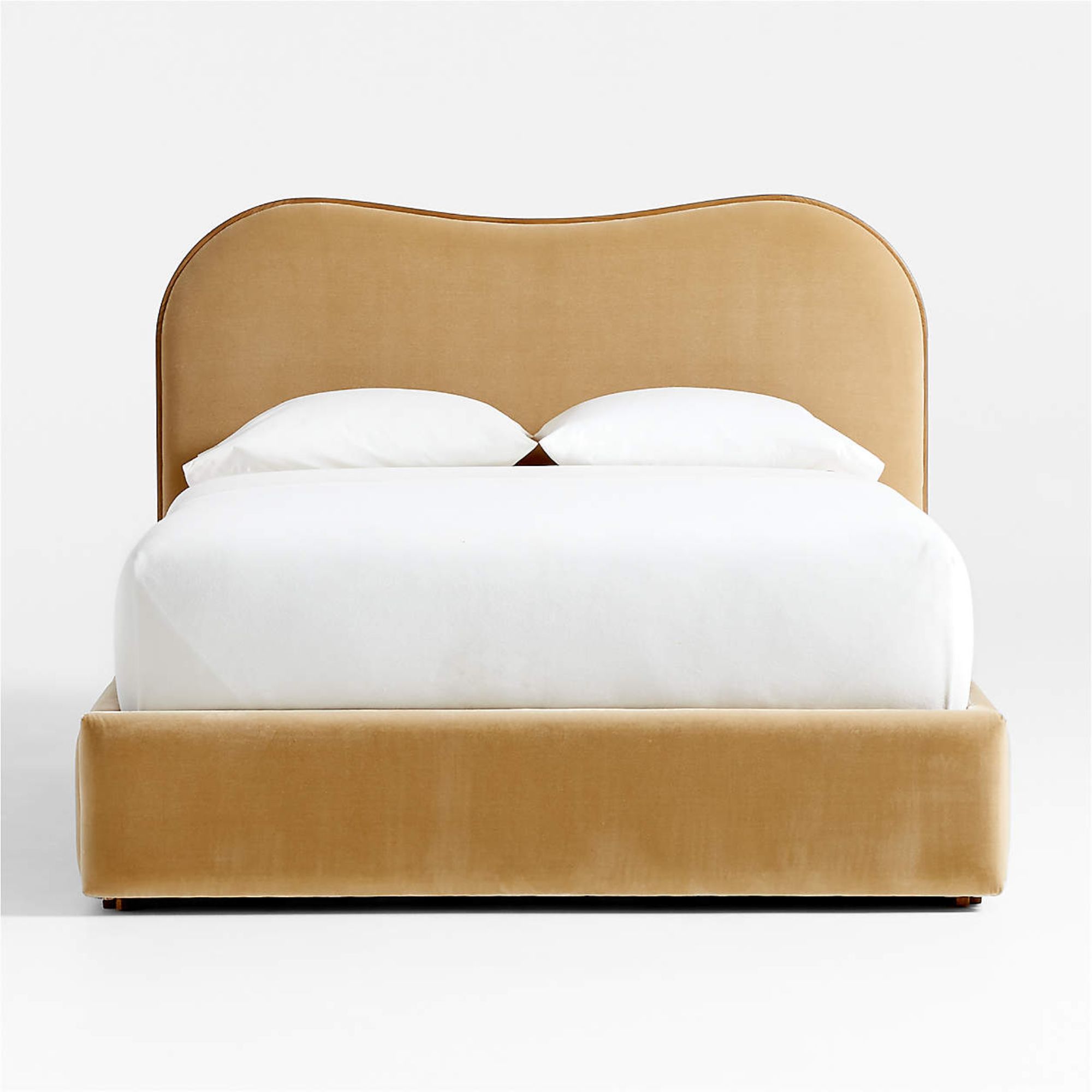
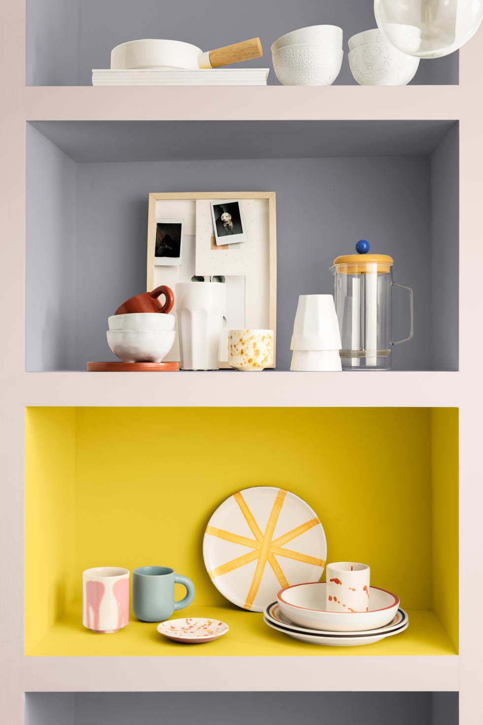
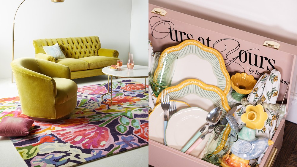
The timelessness versus trendiness of butter yellow is addressed through insights from interior designer Kiara Barrett, who affirms its lasting appeal and suggests incorporating it through low-commitment accessories like art, candles, throw blankets, and pillows. Jamie Lenore McKillop, founder of Lazy Jamie, adds that the longevity of any trend depends on its organic integration into a space rather than an overzealous adoption driven solely by its popularity. The author concludes by embracing a paler shade of butter yellow for kitchen cabinets, viewing it as a genuine reflection of personal style and a nod to Wes Anderson's aesthetic and midcentury design. The article also provides a curated selection of butter yellow home decor items, encouraging readers to integrate the color into their own living spaces through various products, from bedding and outdoor furniture to side tables, storage units, towels, shower curtains, mirrors, chairs, and even candles and wall organizers.
#ButterYellow #ColorTrends #HomeDecor #InteriorDesign #FoodificationOfColor #DesignInspiration #PaintColors #HomeAccessories #StylingTips #ButterYellow #ColorTrends #HomeDecor #InteriorDesign #FoodificationOfColor #DesignInspiration #PaintColors #HomeAccessories #StylingTips
0 comment in total
 No comments yet
You may also like
Butter yellow is the kitchen colour of the season - this is how to make the delicious shade work
9 On-Trend Yellow Paint Colours For 2025

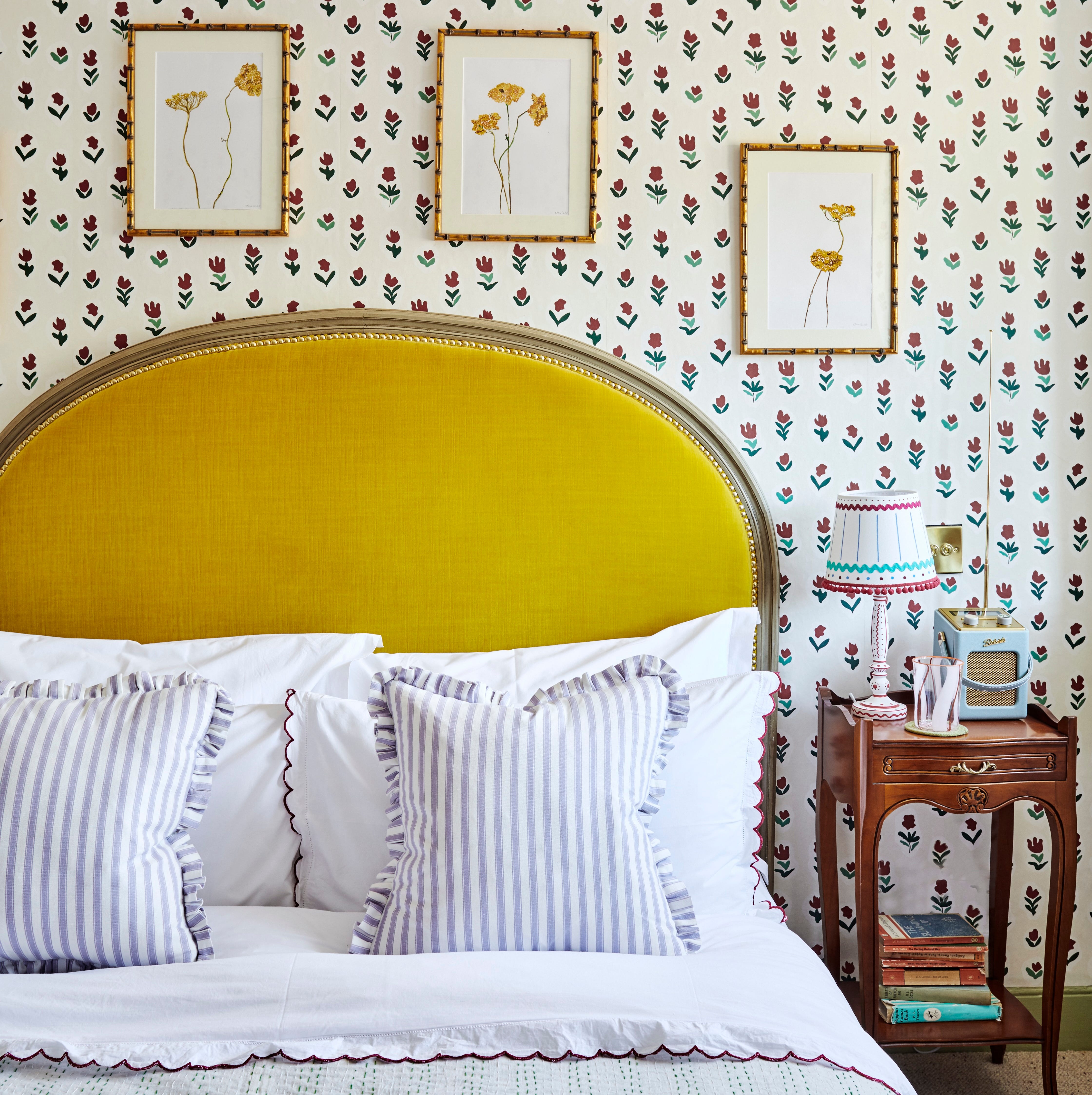
‘Unexpected Yellow Theory’: The Bold New Interior Trend Replacing Red in 2025

Butter Yellow Is the Deliciously Soft Shade Your Home Needs

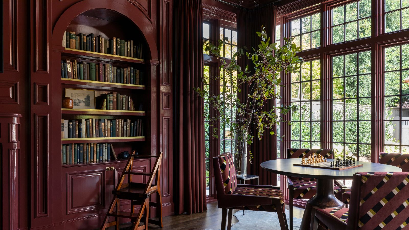
Food-themed color trends are taking over in 2025 – 6 spaces featuring the most delicious palettes, from butter yellow to pistachio green

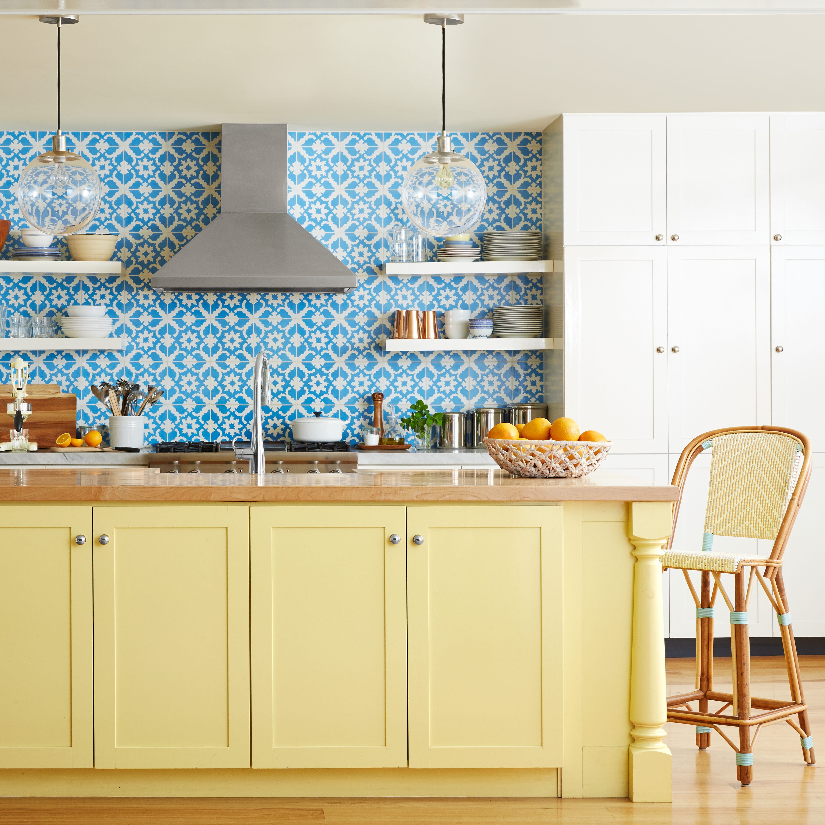
Butter Yellow Is the Hottest Color of the Year and the Met Gala Just Proved It
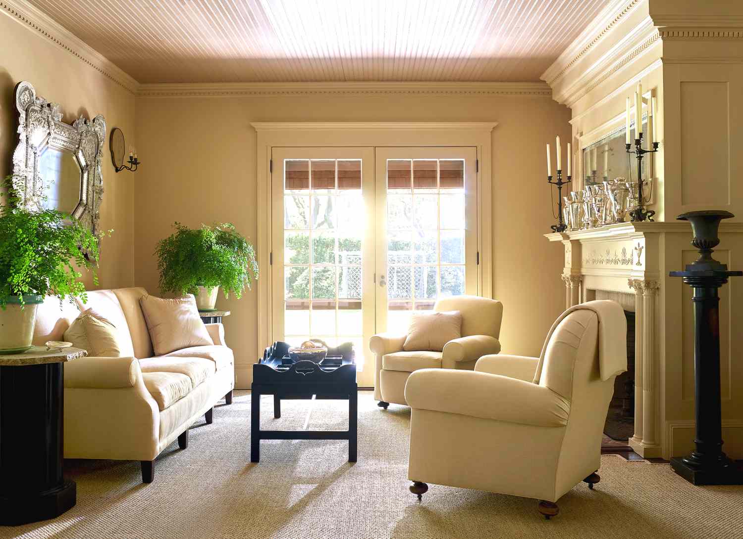
8 Butter Yellow Paint Colors That Will Bring a Charming, Serene Aesthetic to Every Room in Your Home
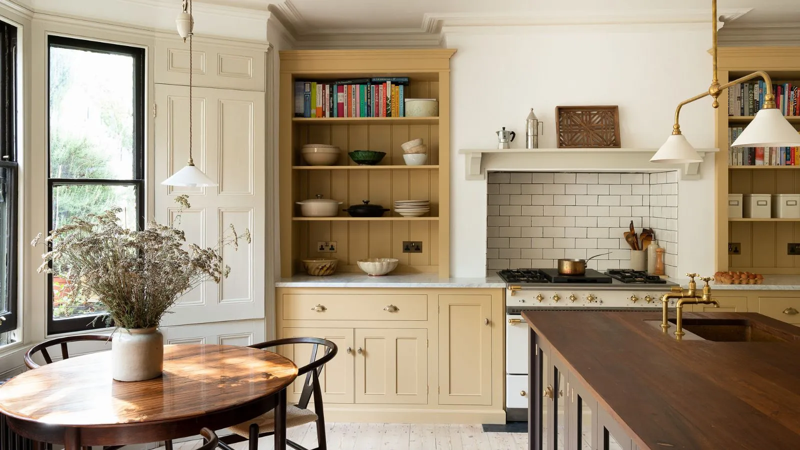
Has butter yellow's reign come to an end? Designers have mixed opinions, but think these are the new colors that might dethrone it
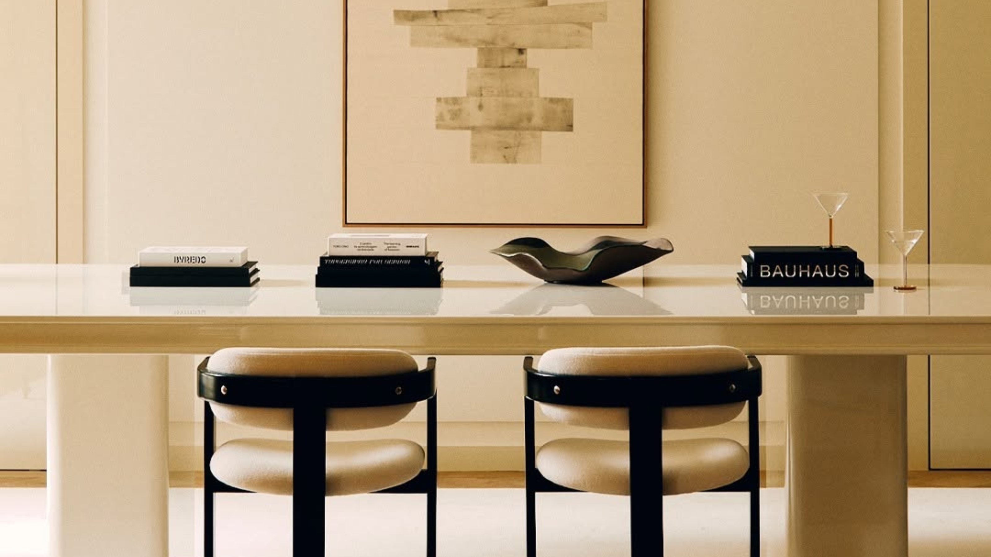
5 Butter Yellow Paints That Designers Swear By — So You Can Get This Trending Color on Your Walls With Confidence

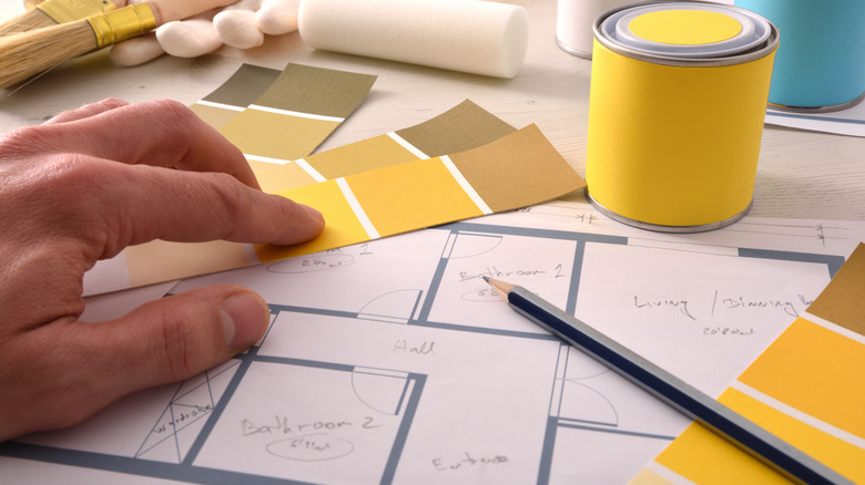
Goodbye To Butter Yellow: The Moodier Hue That's On Trend

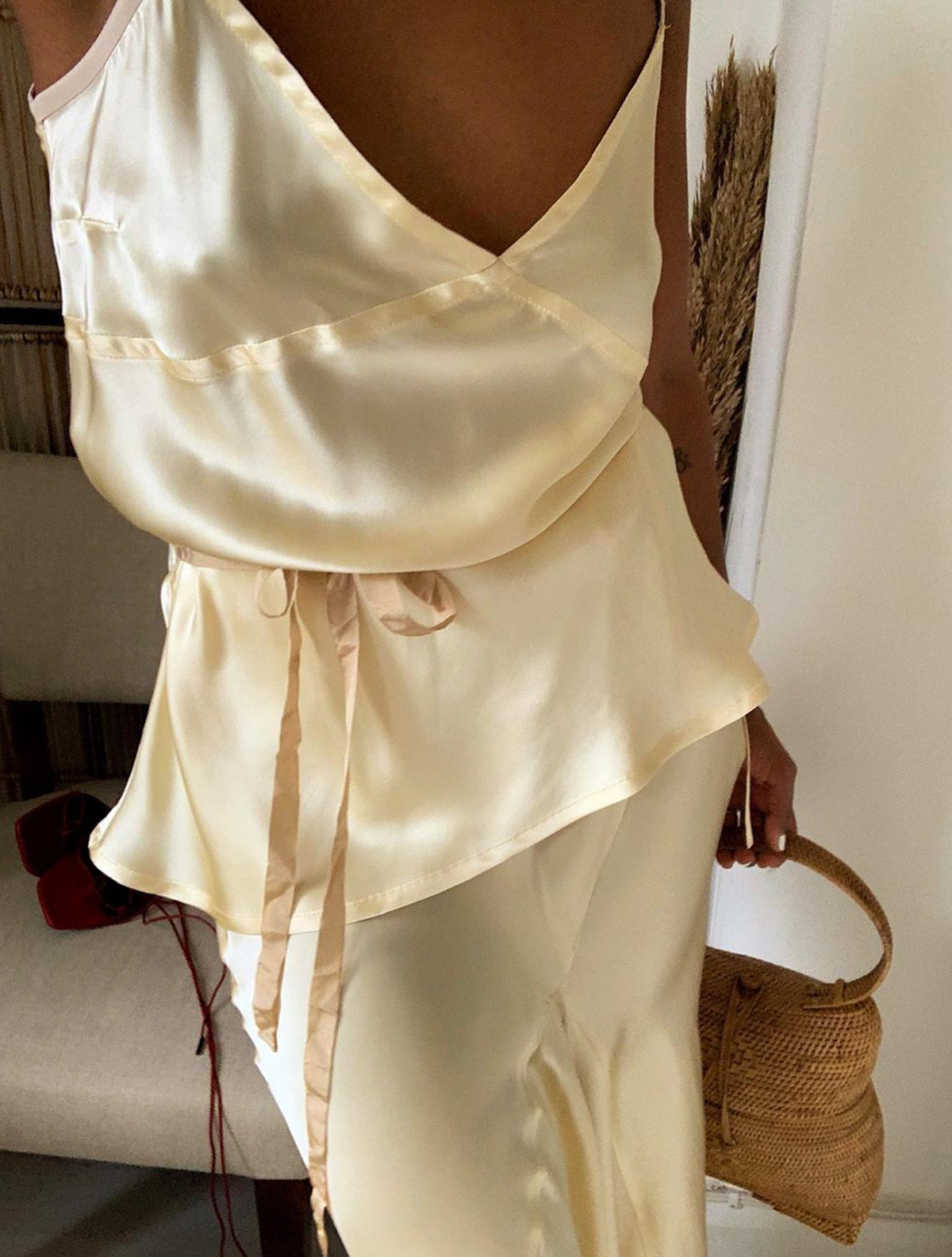
I'm Bored of Beige, So This Expensive-Looking Colour Is My New Go-To

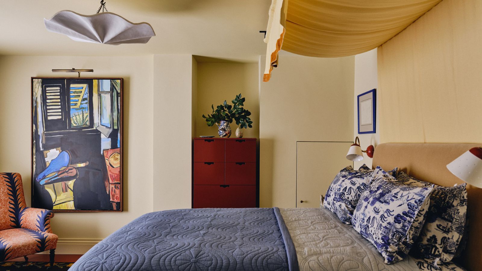
Butter yellow is 2025's new neutral – and these 12 delicious pale yellow buys have convinced me it beats my once-loved beige

How Color-changing Ice Cream Works
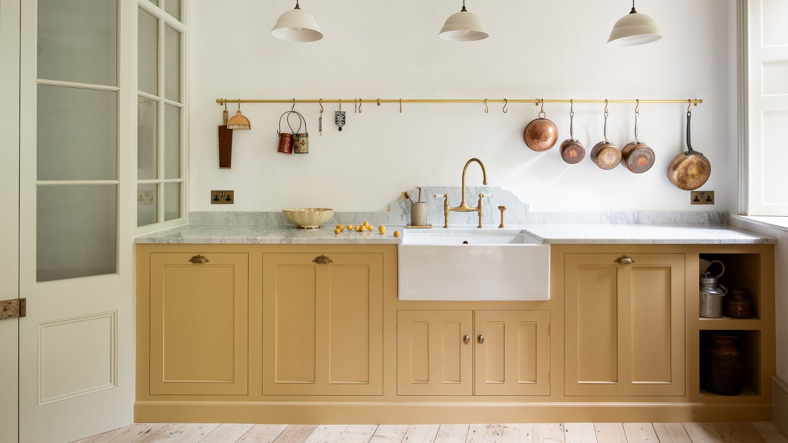
Butter yellow kitchens are dividing opinions – but these 7 designs prove this soft hue is more than just a fleeting trend
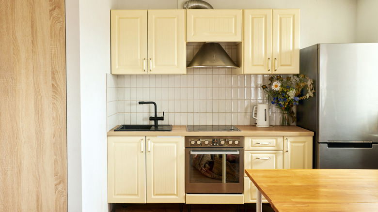
17 Perfect Paint Color Combinations To Pair With Trendy Butter Yellow Cabinets
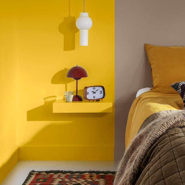
Dulux's Colour of the Year 2025 is guaranteed to bring you joy
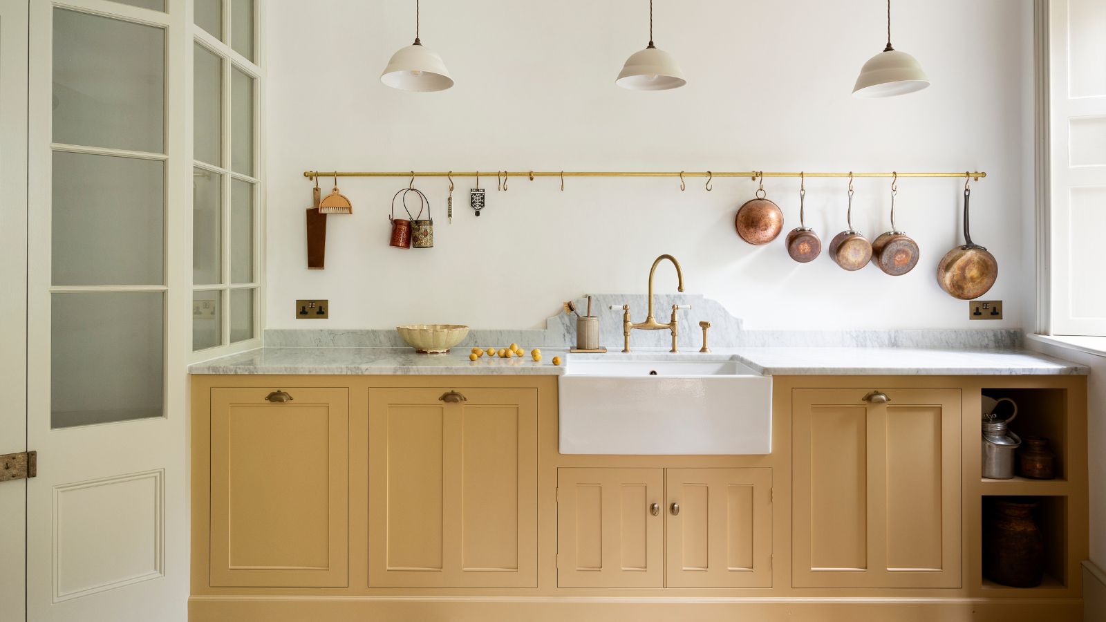
What colors go best with butter yellow? 8 equally delicious shades to pair with spring's hottest color trend
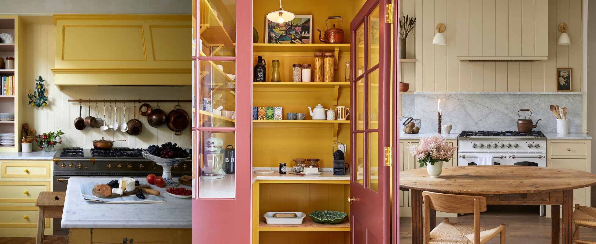
Yellow kitchen ideas – 12 ways to add sunshine all year round
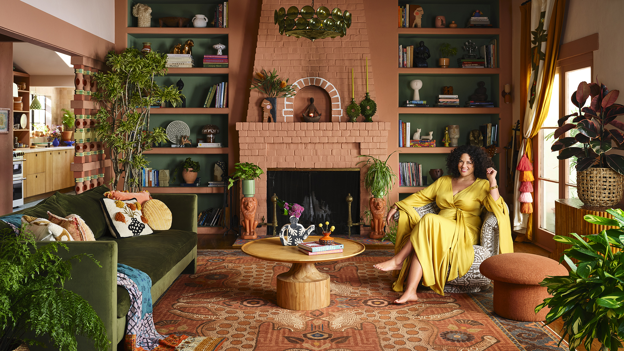
Designer Justina Blakeney Says This Paint Color Flatters Everyone and Is Perfect for Drenching Rooms
Experts Explain the Butter-Yellow Home Decor Trend for 2025