1/7
Has butter yellow's reign come to an end? Designers have mixed opinions, but think these are the new colors that might dethrone it
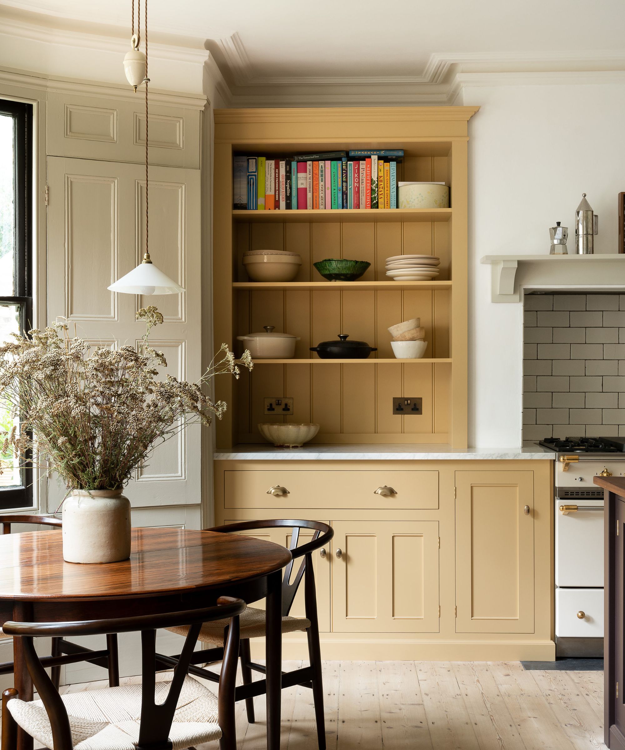
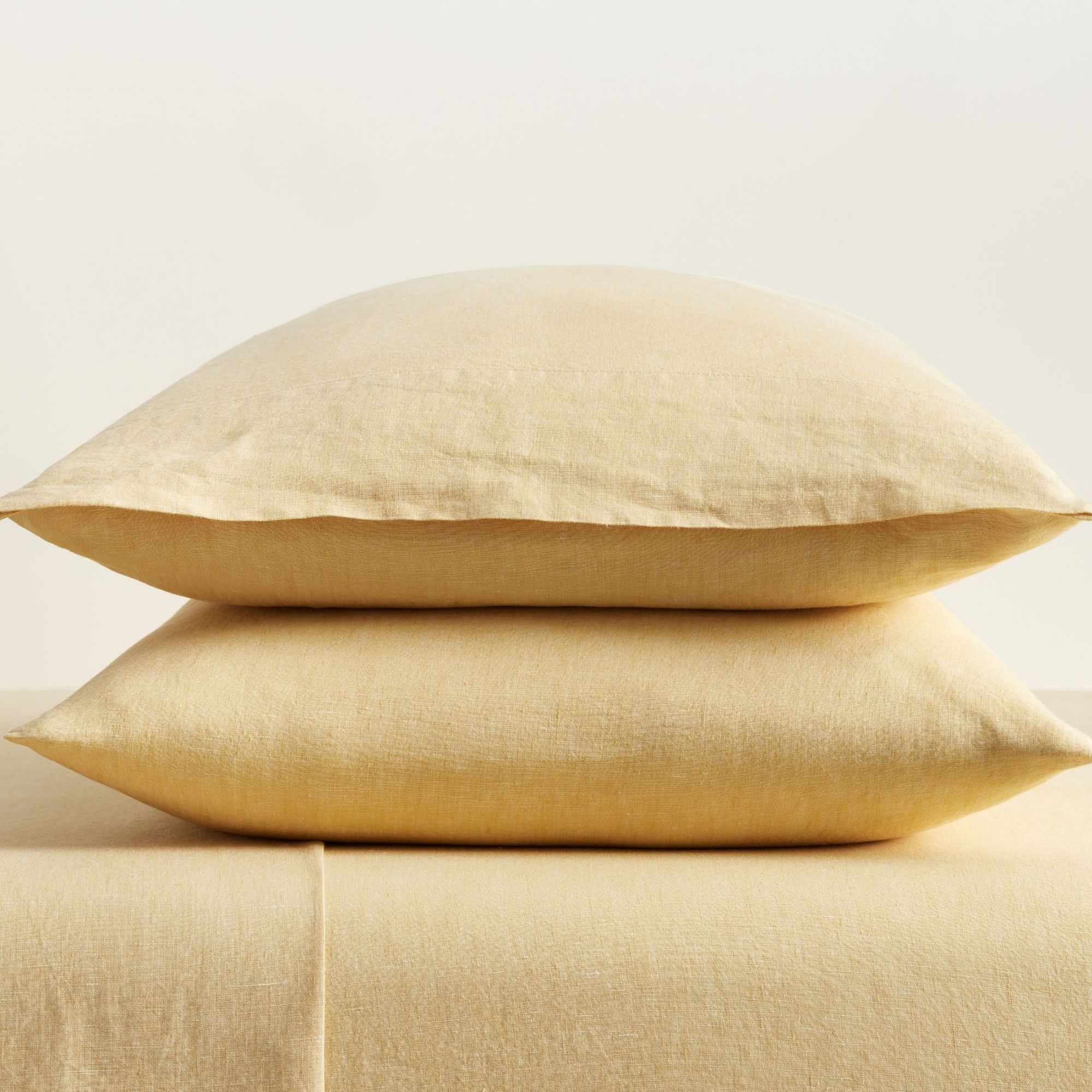
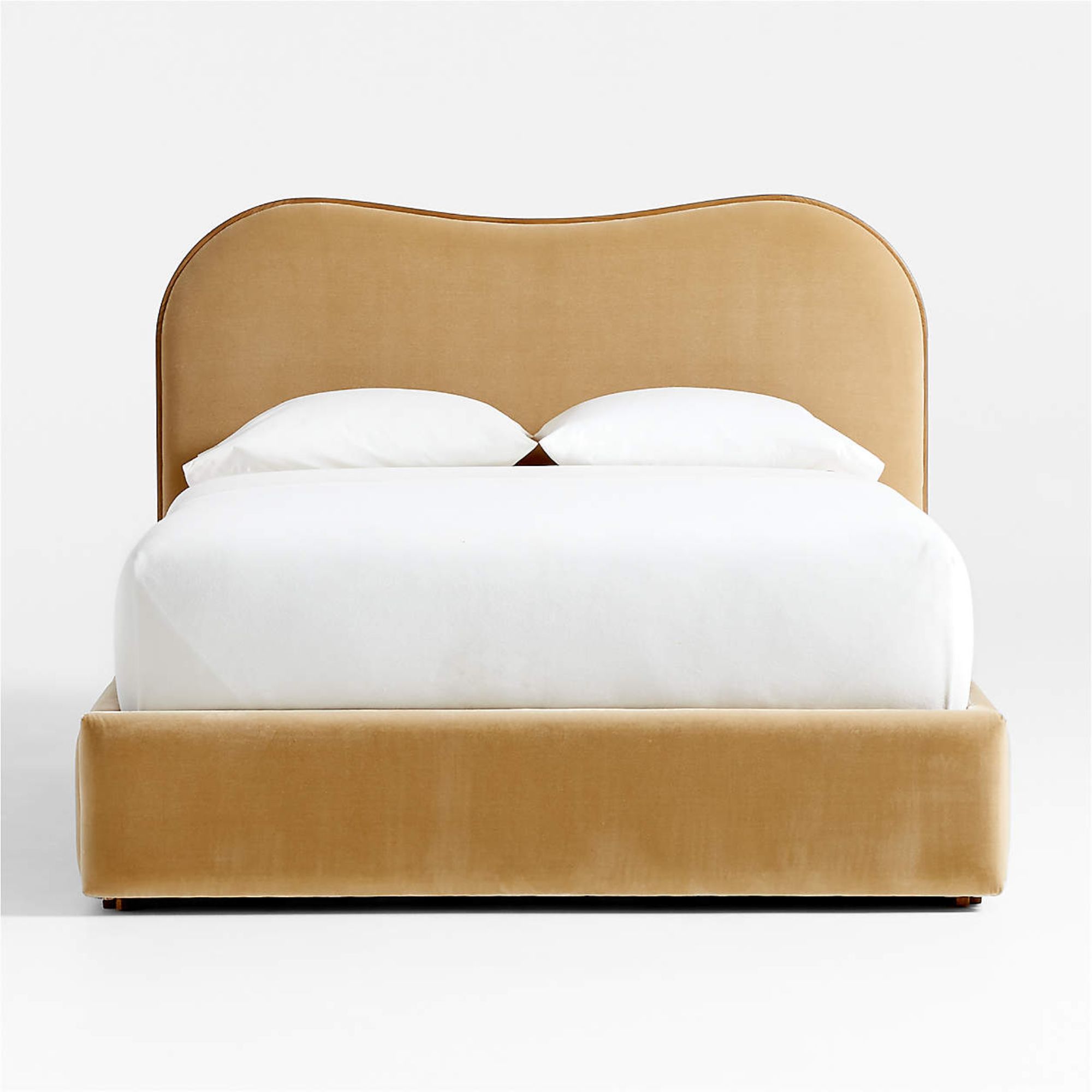
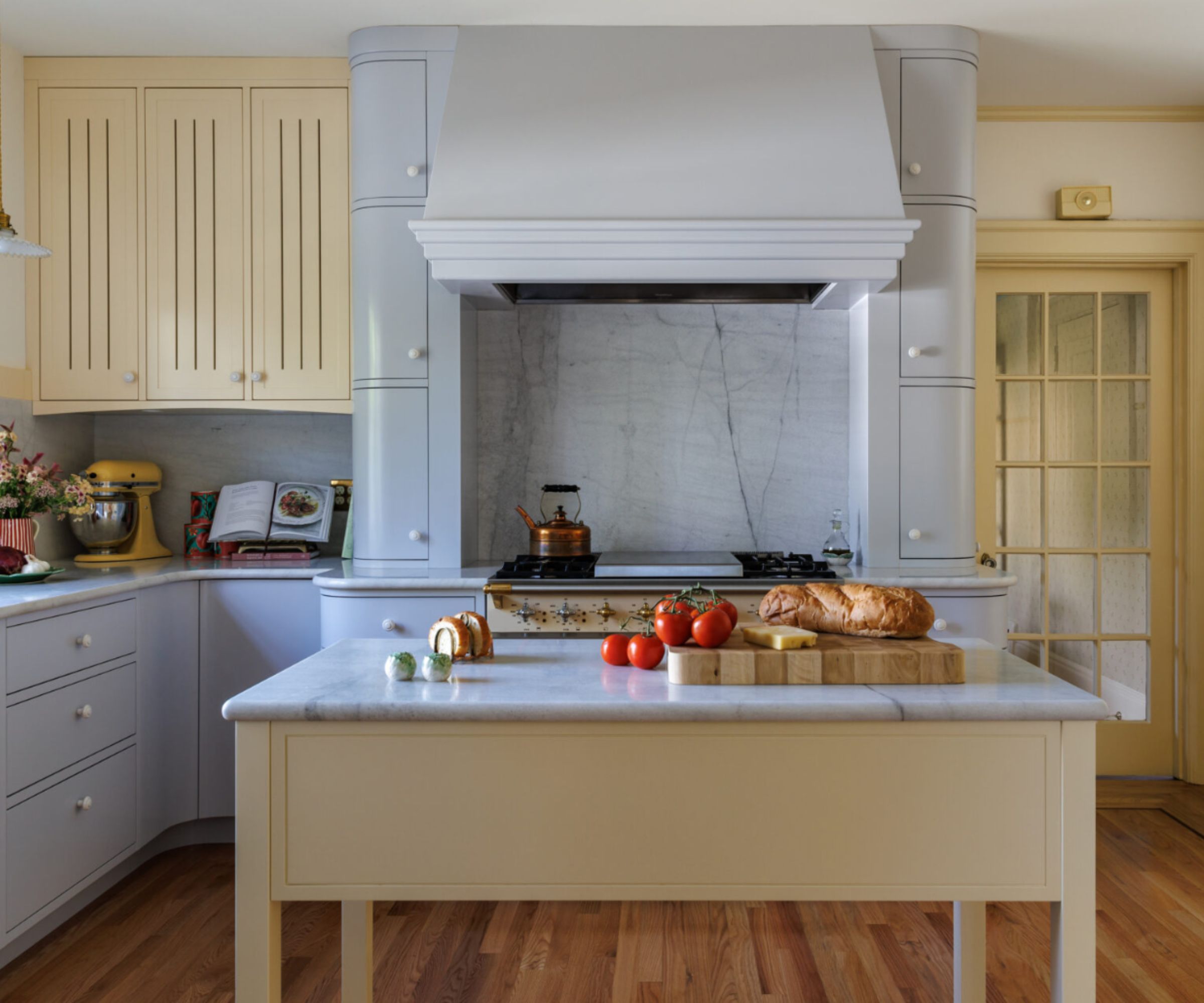
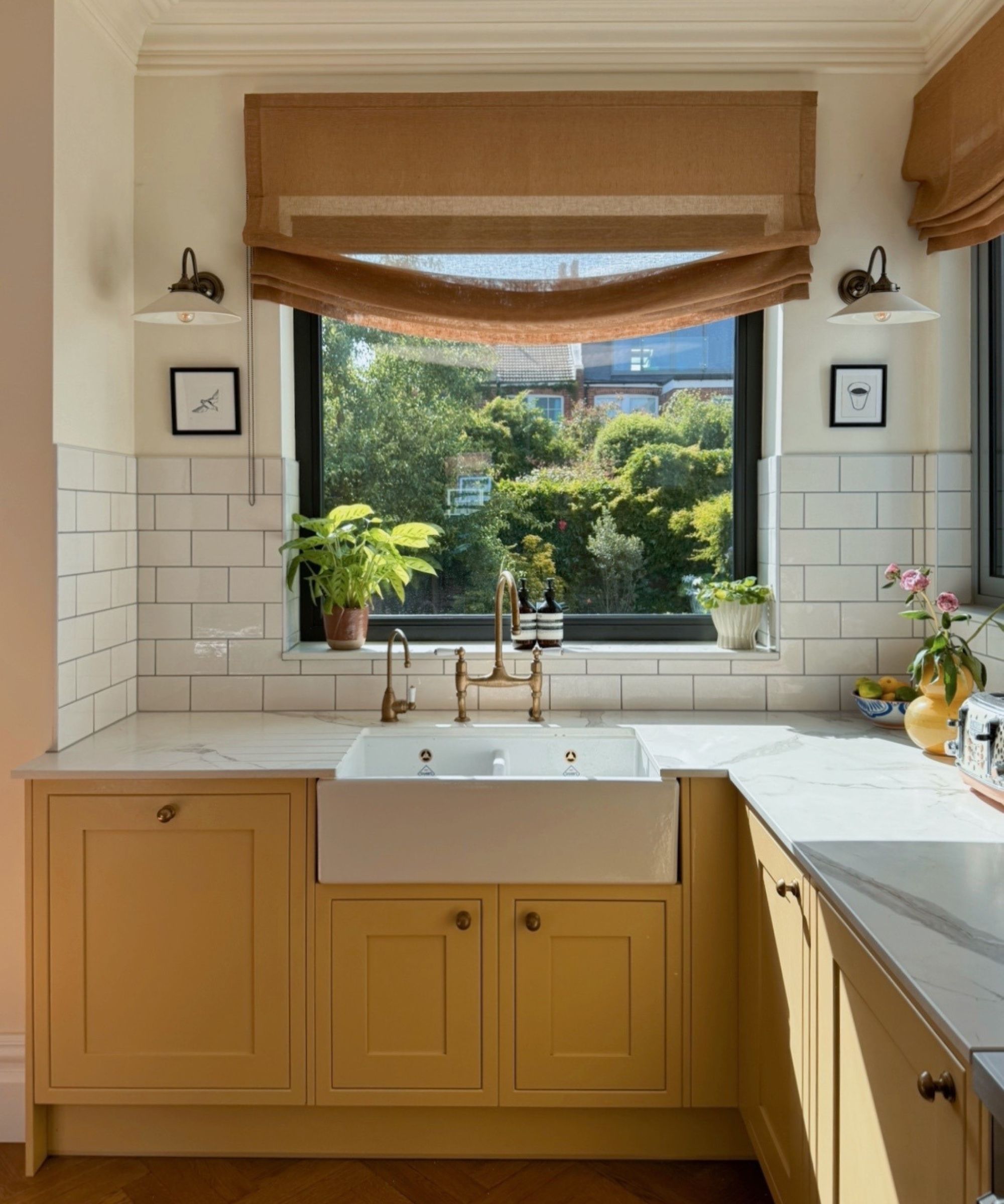
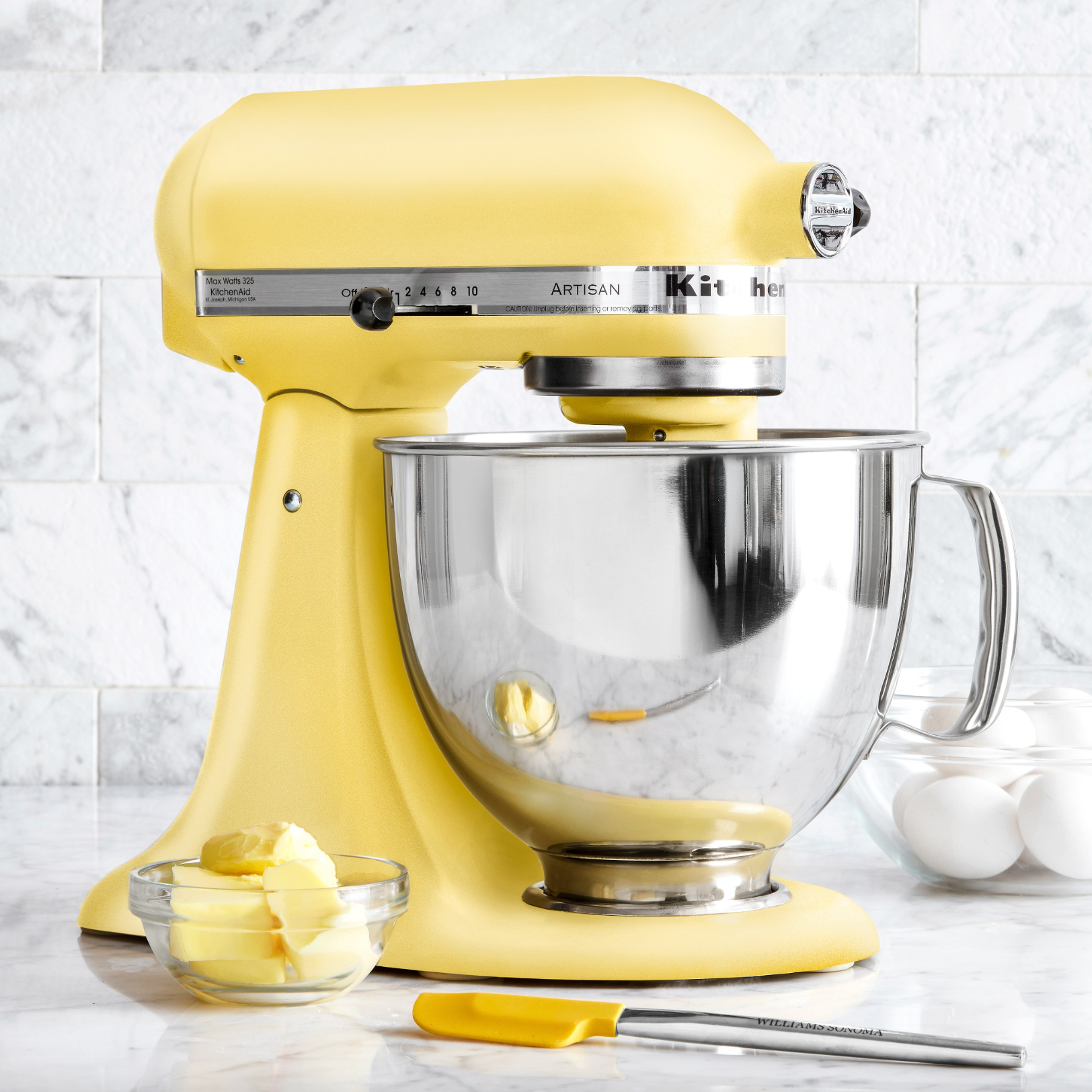
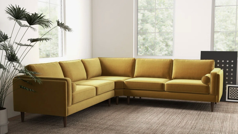
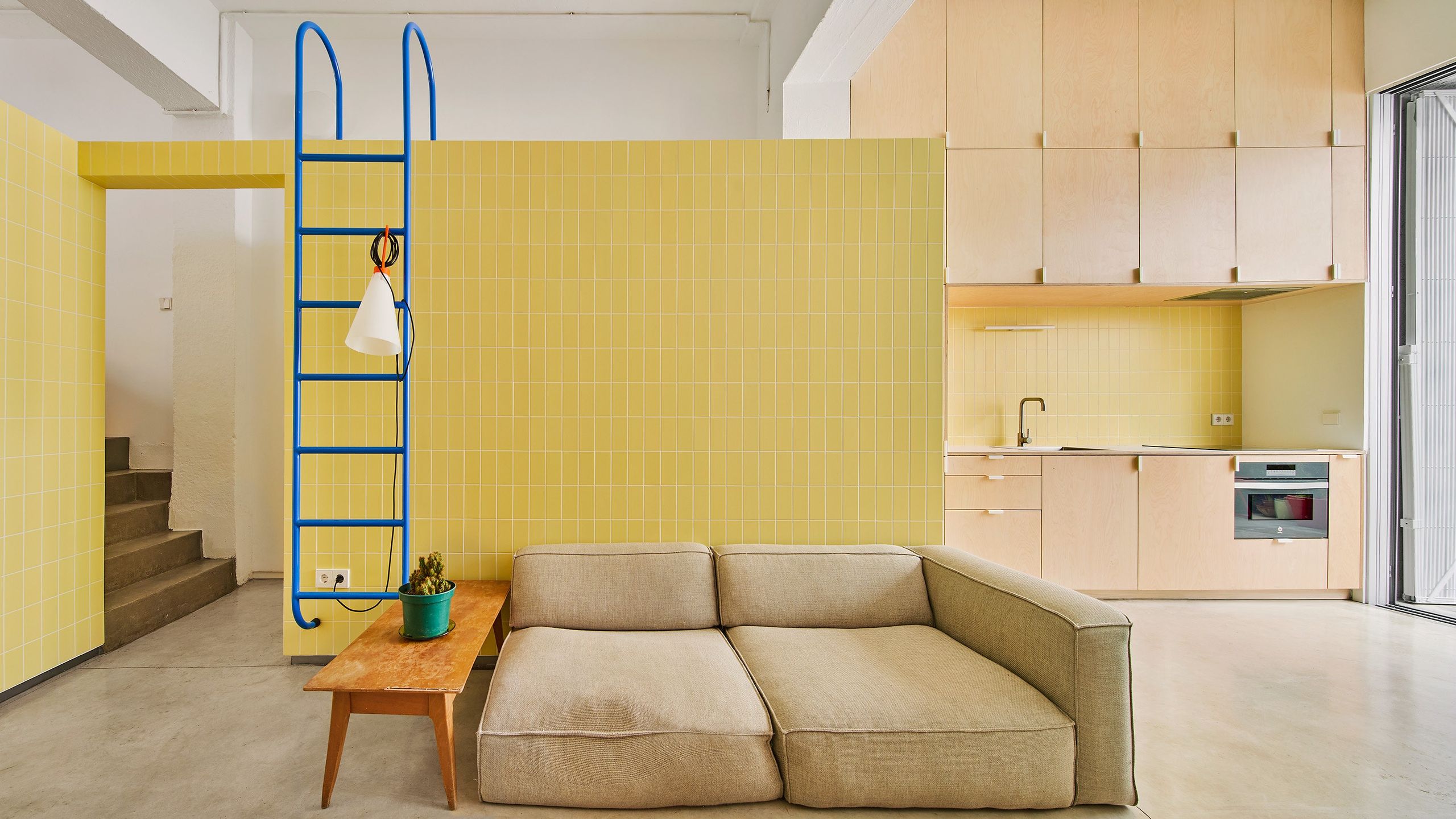
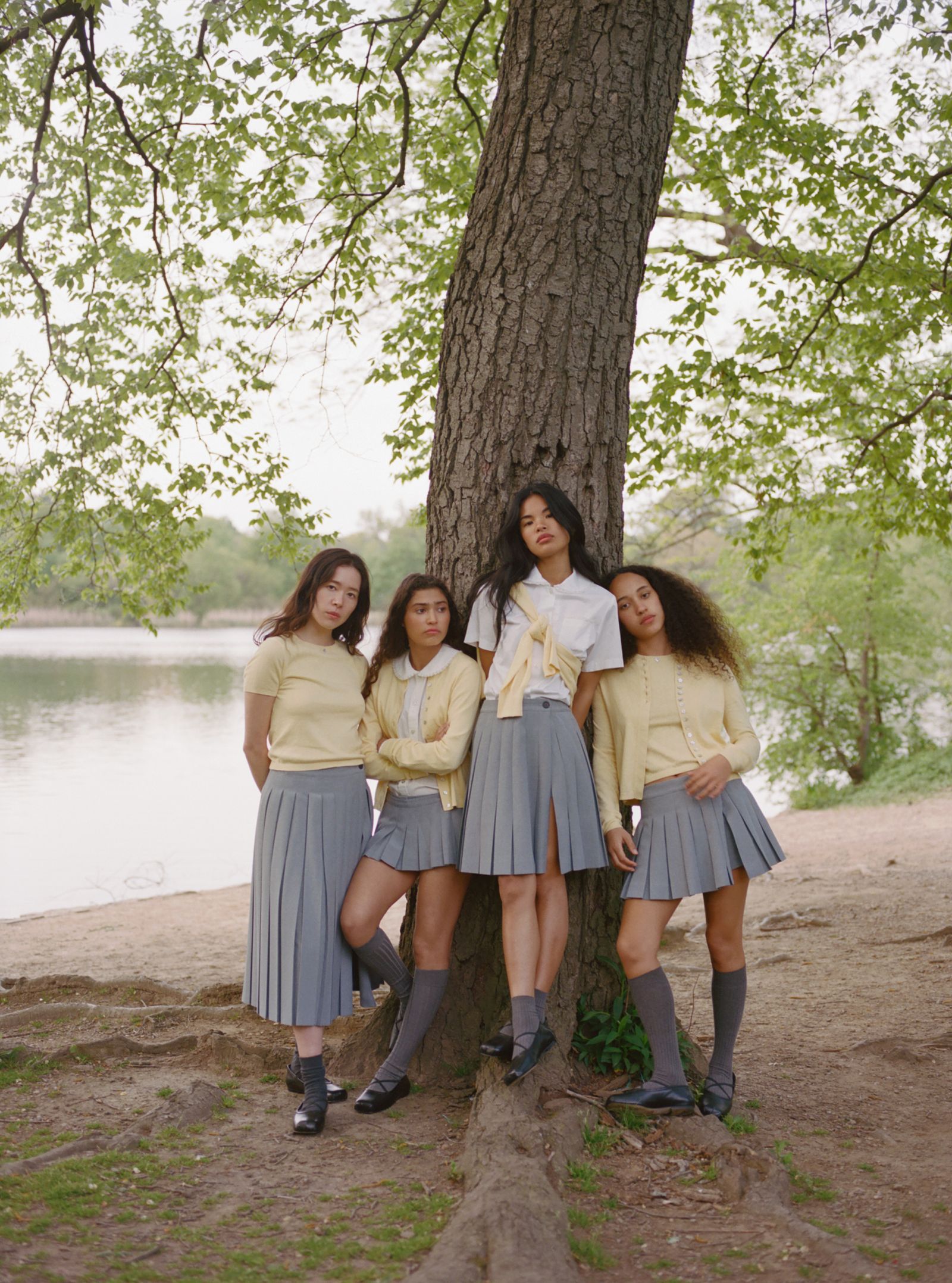
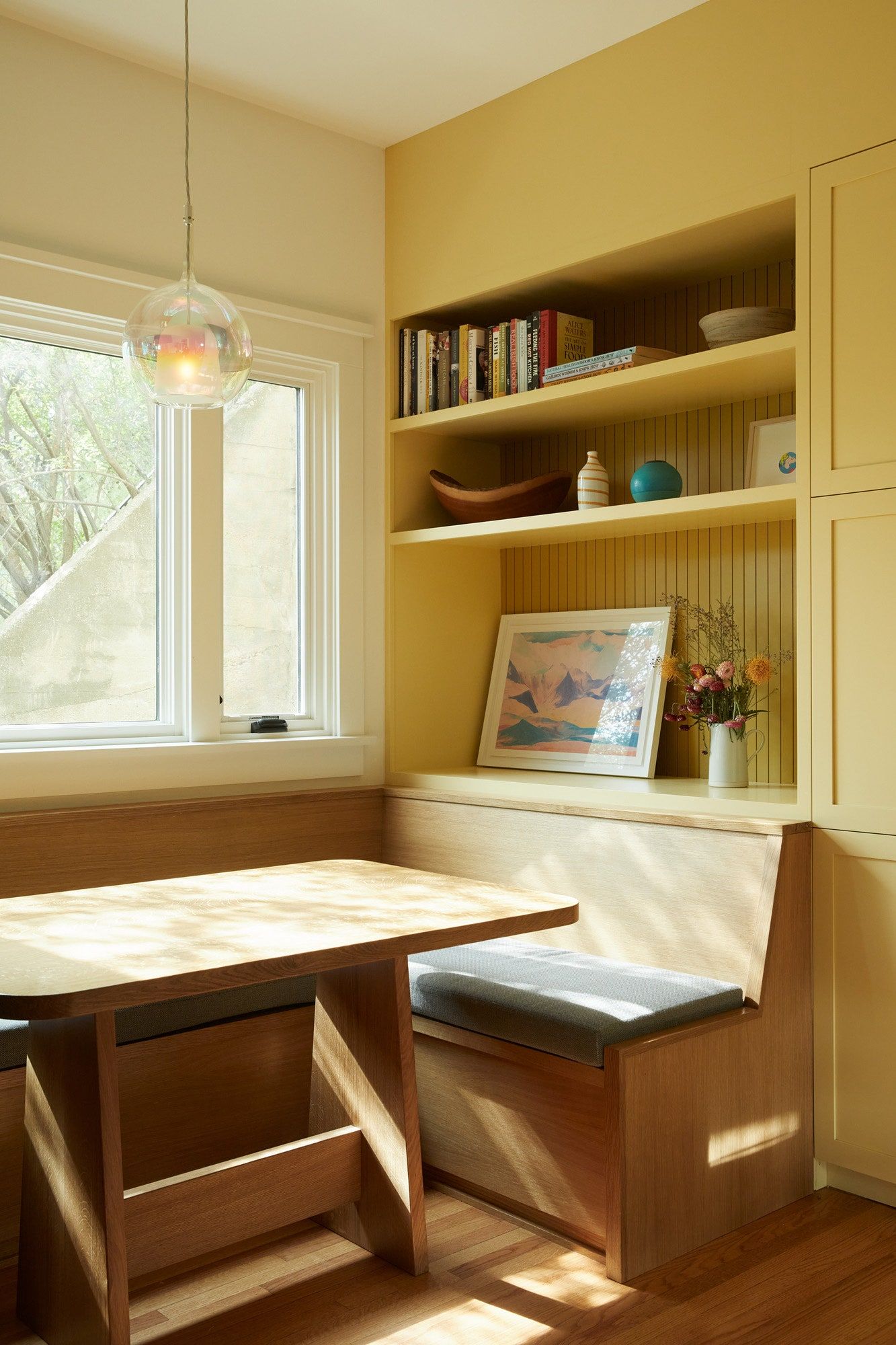
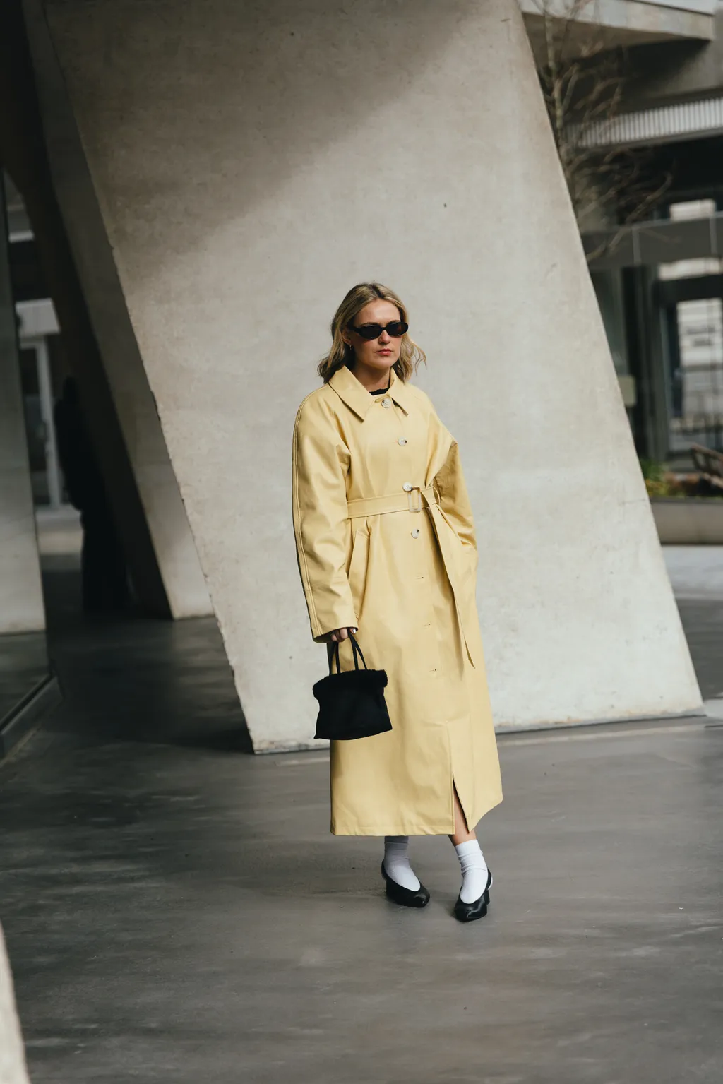
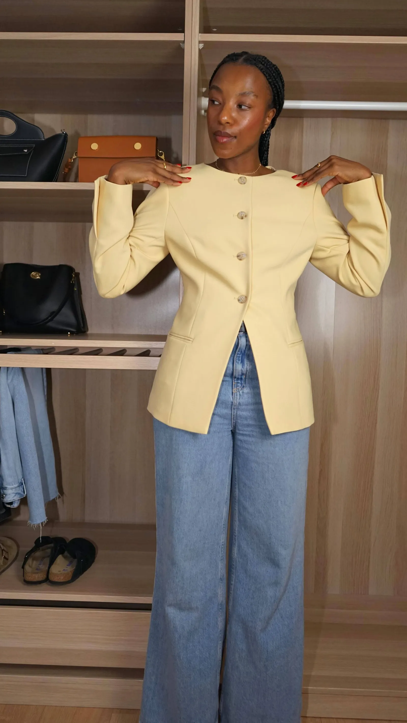
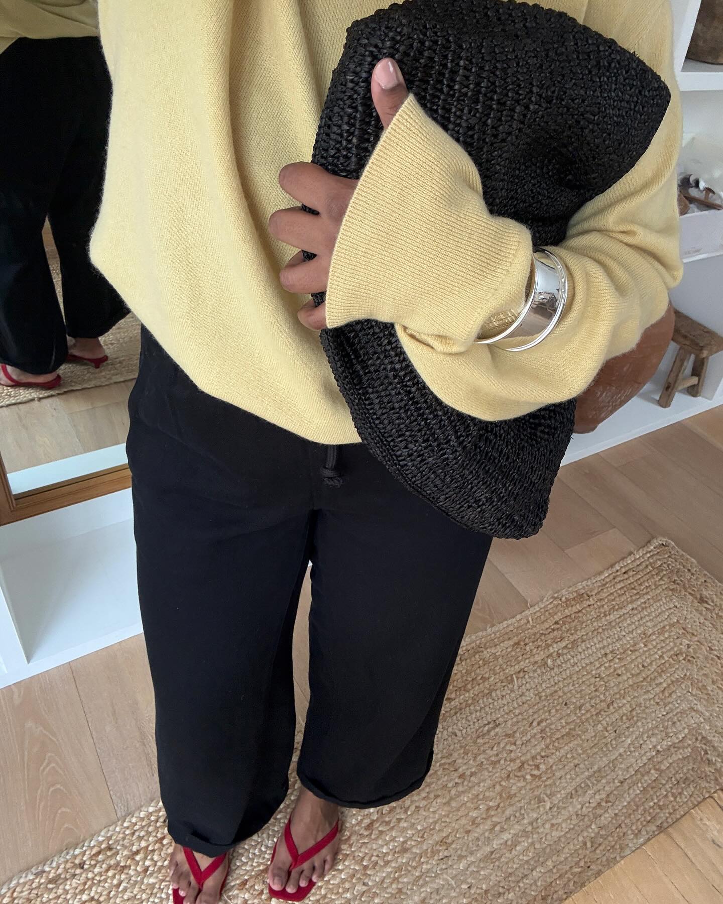
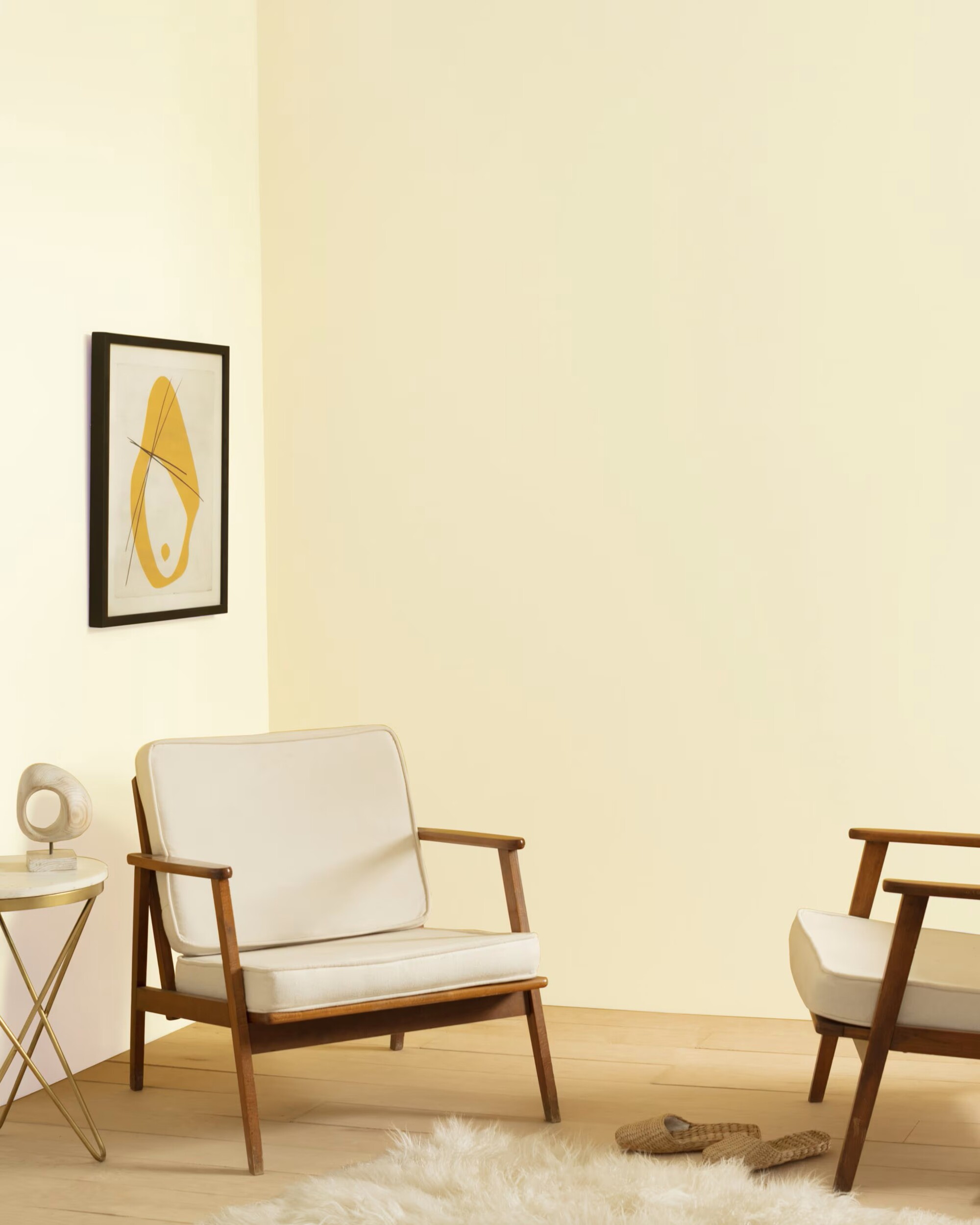
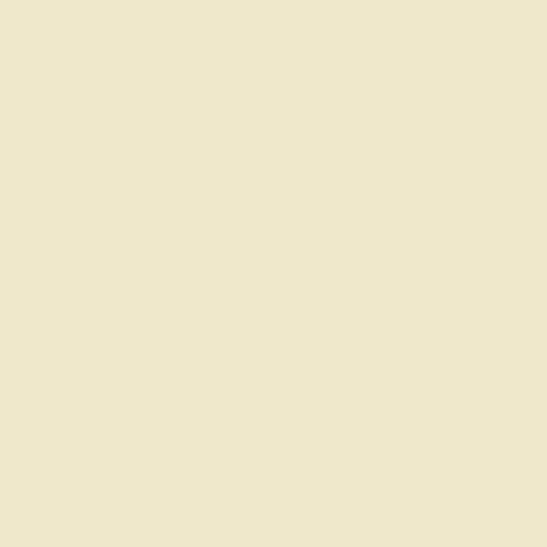
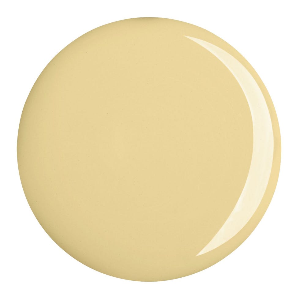
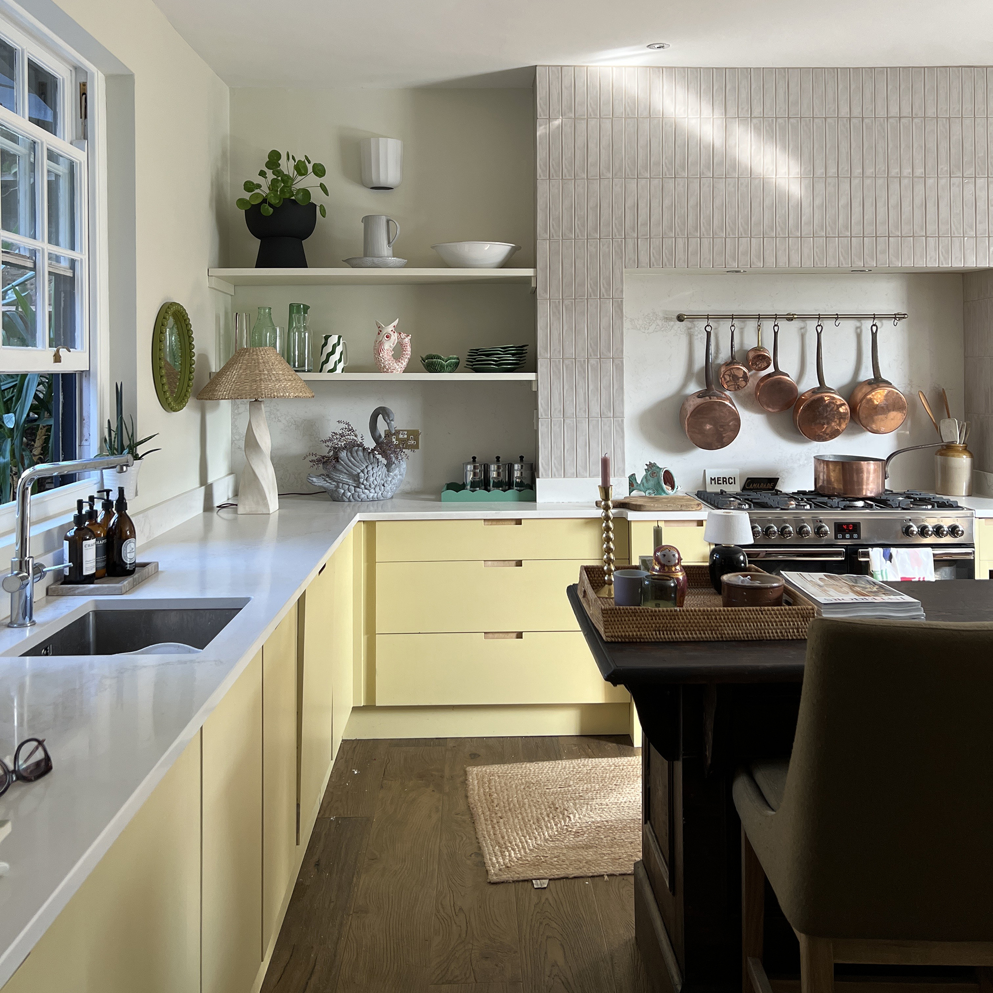
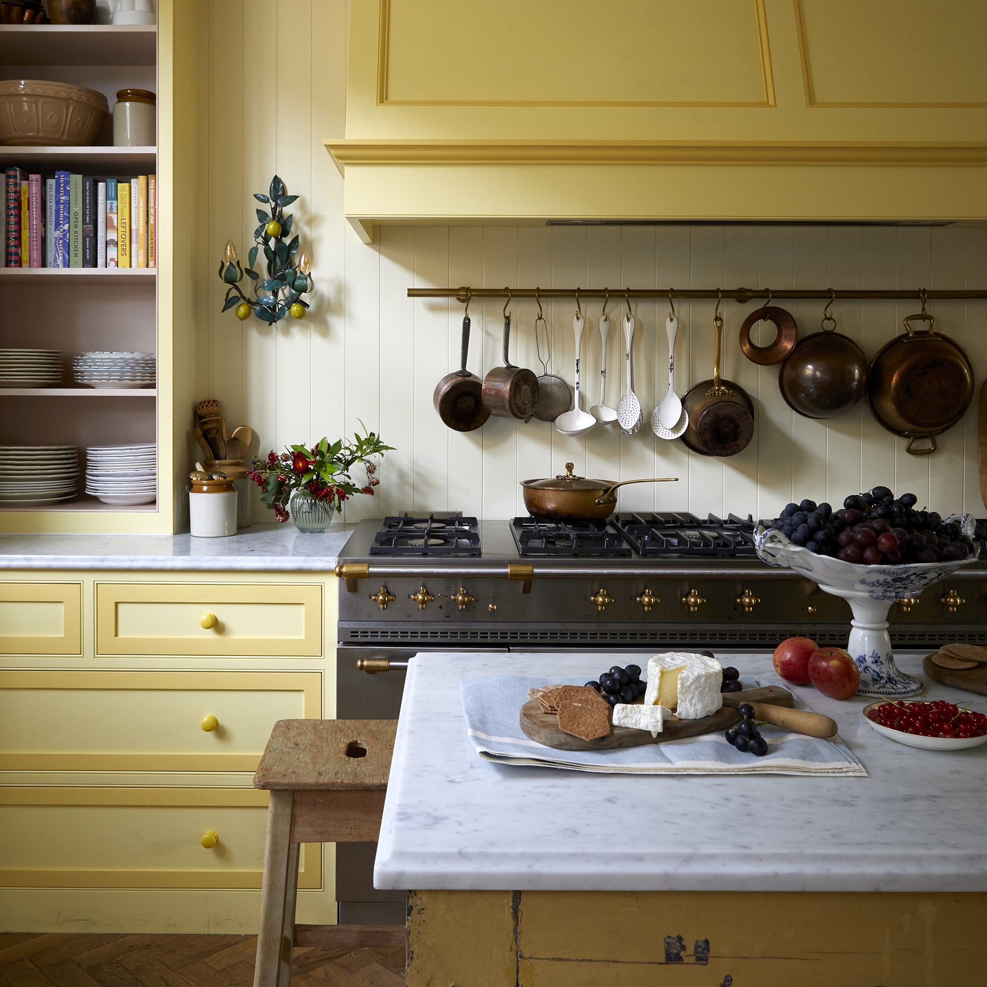
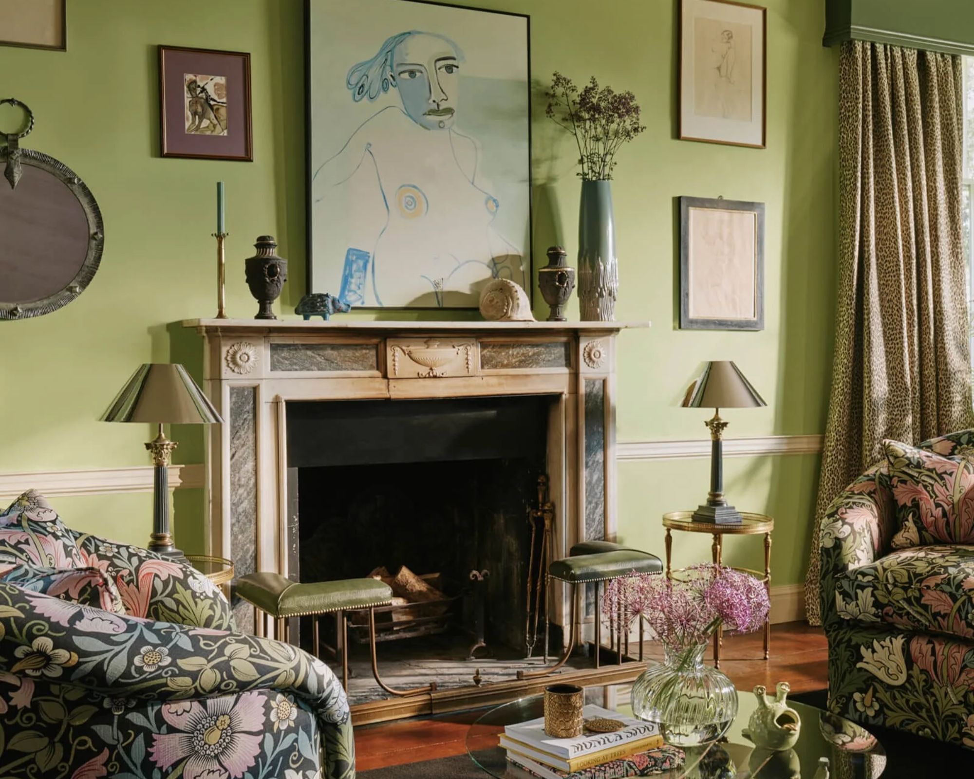
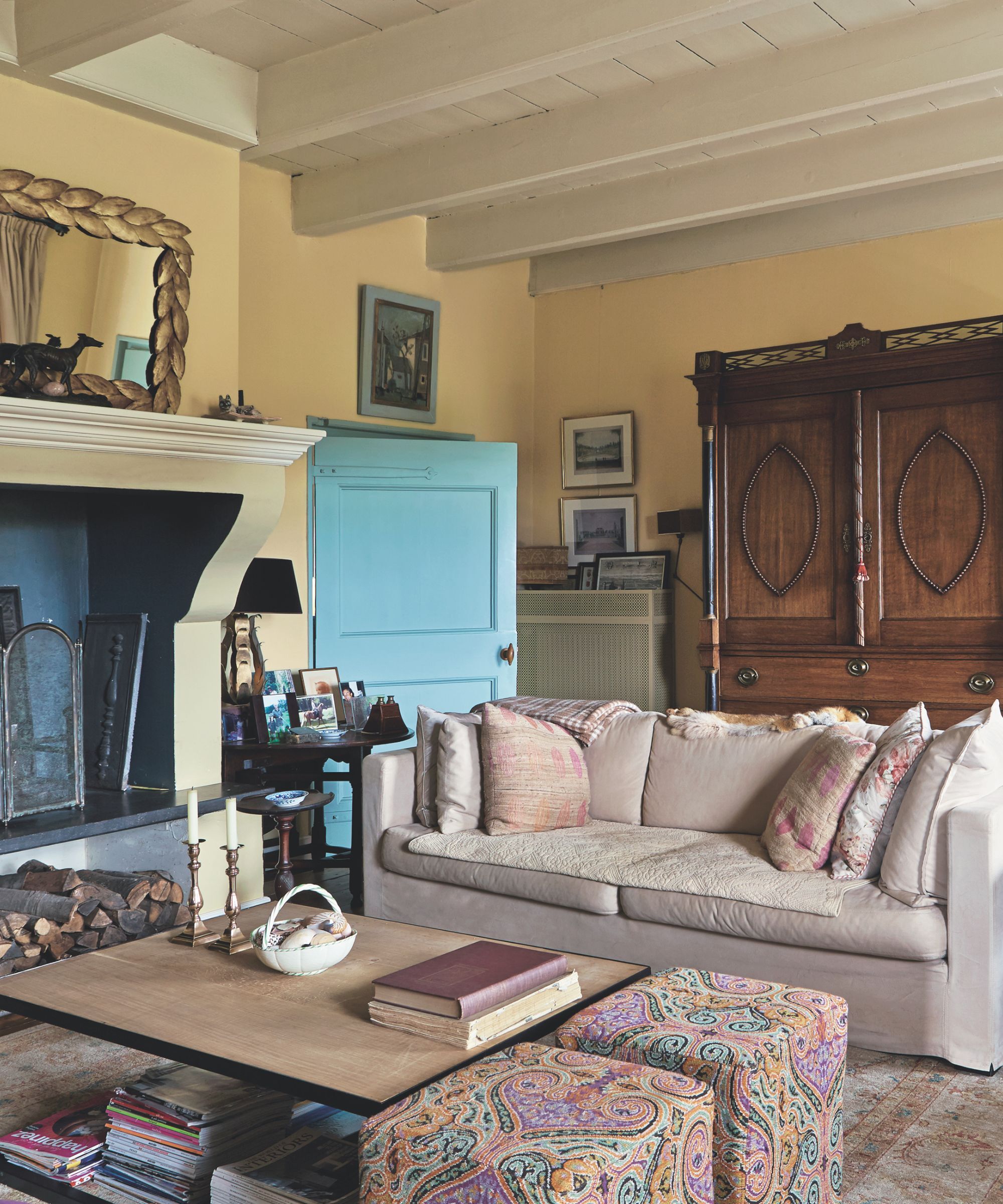
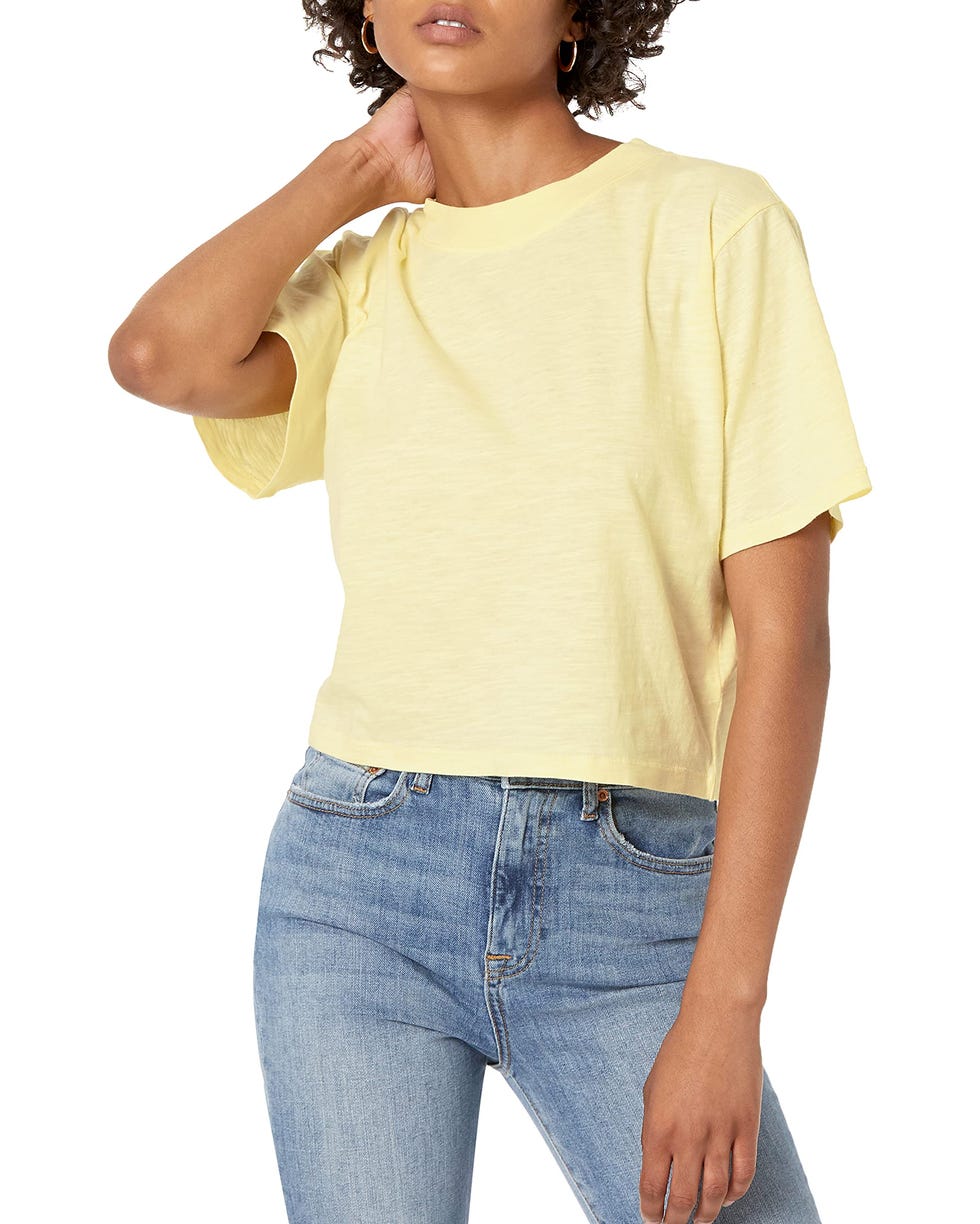
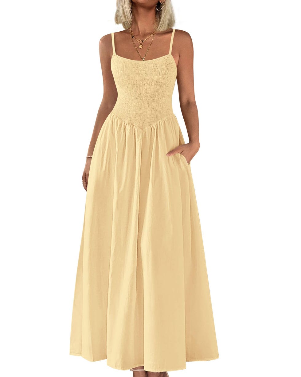
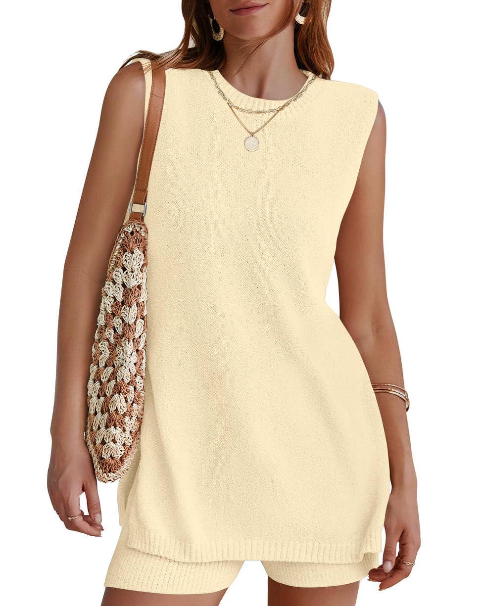
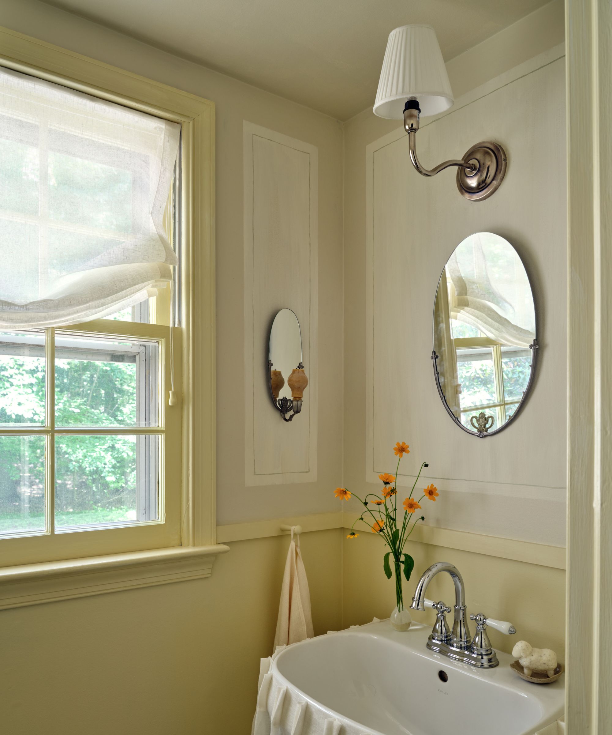
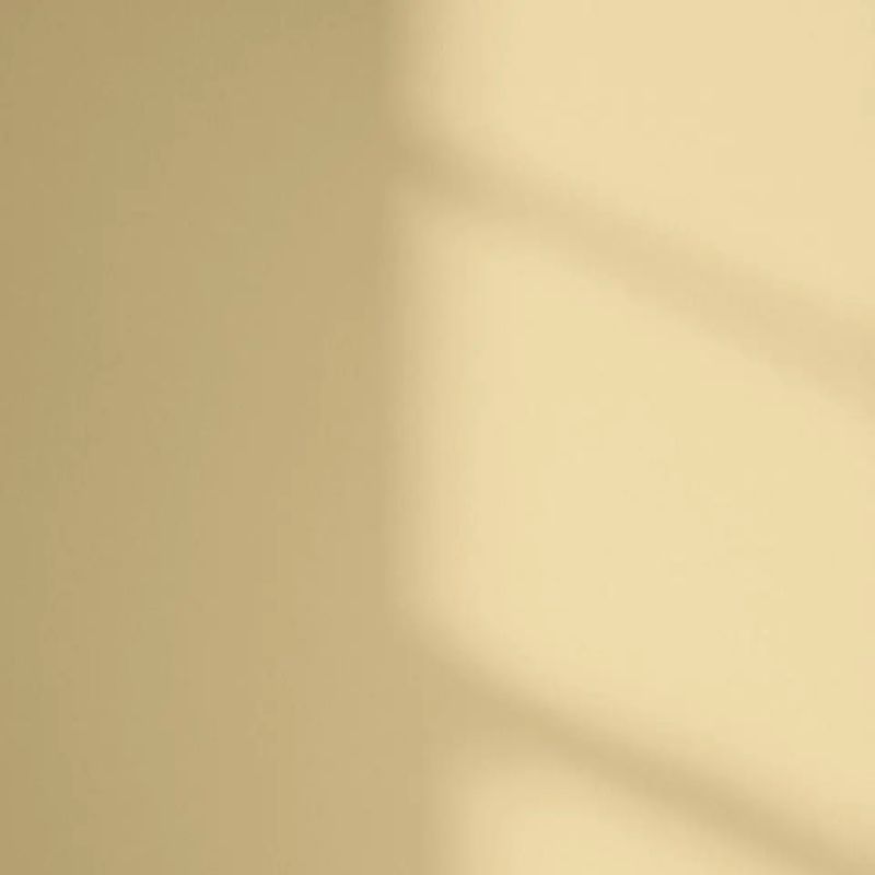
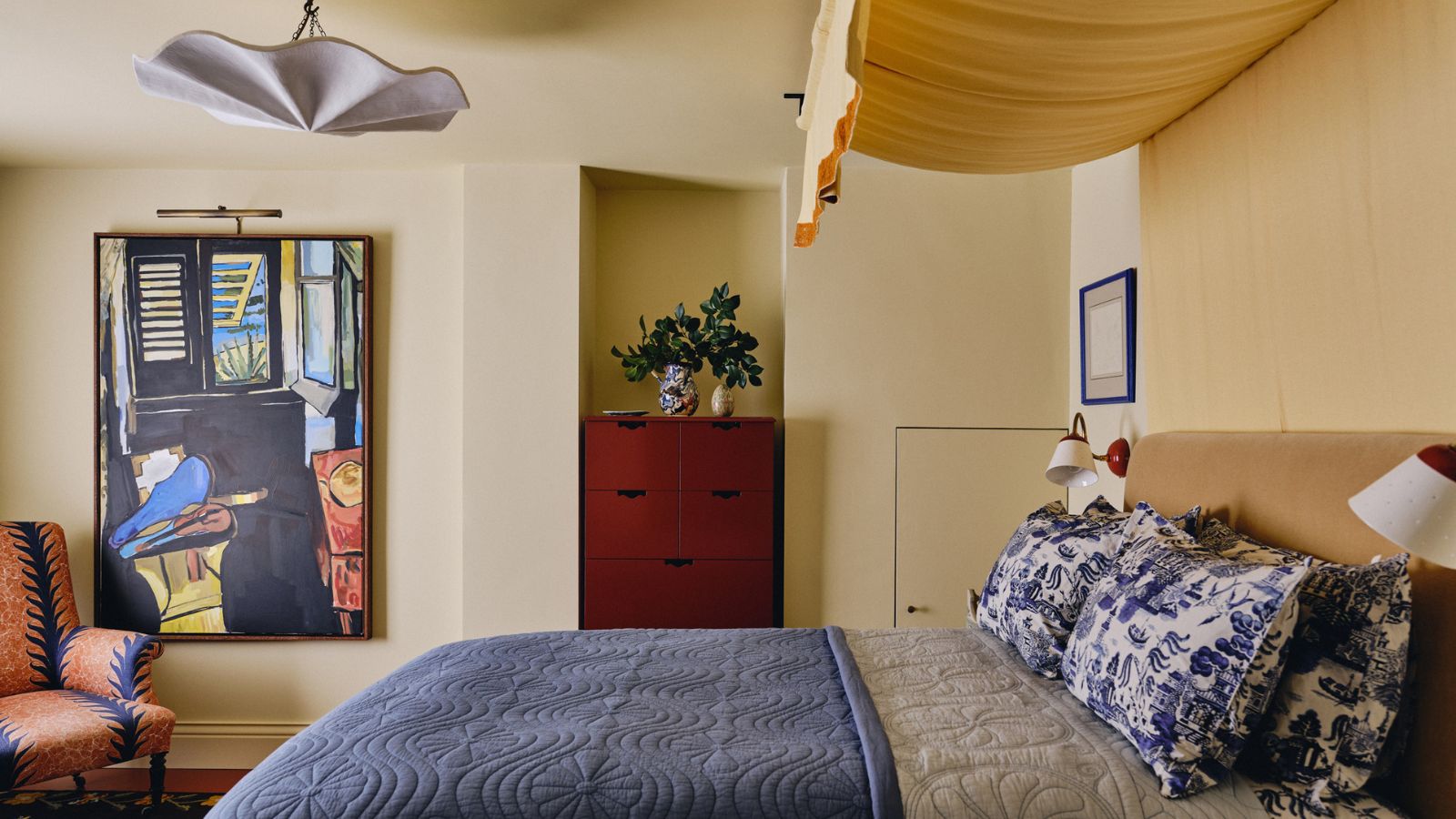
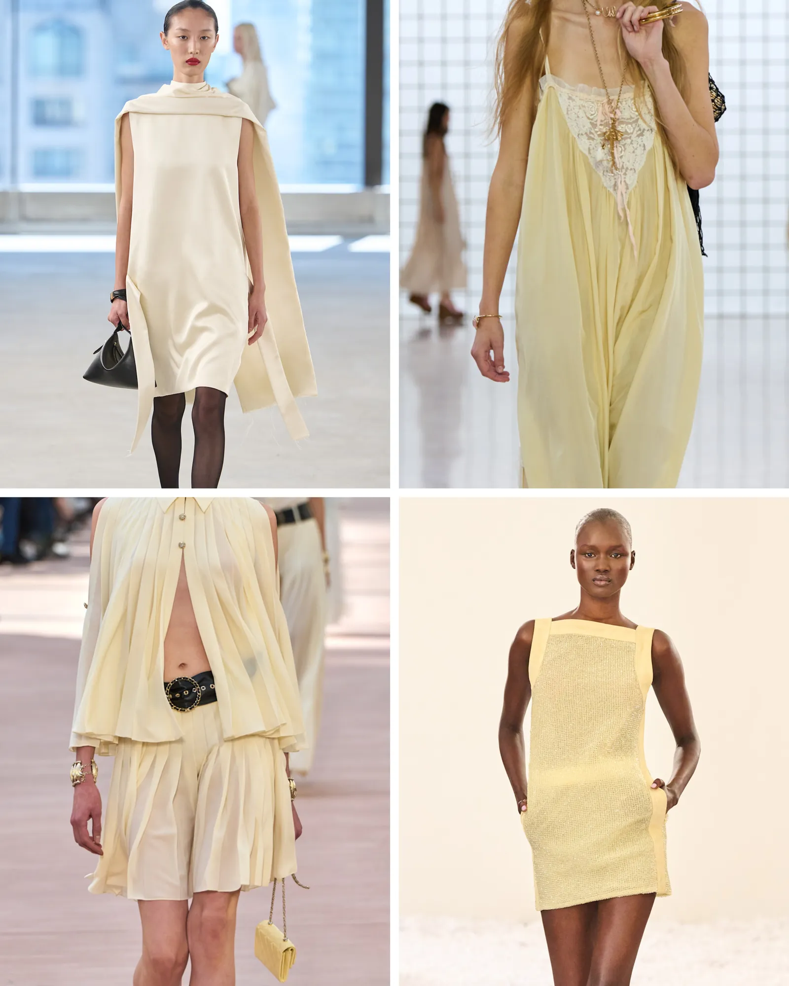
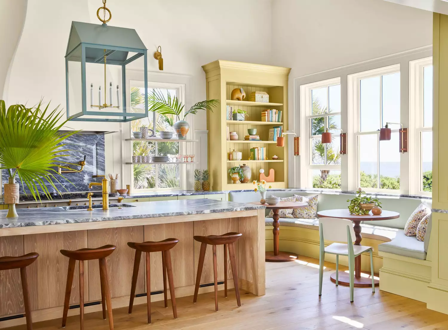
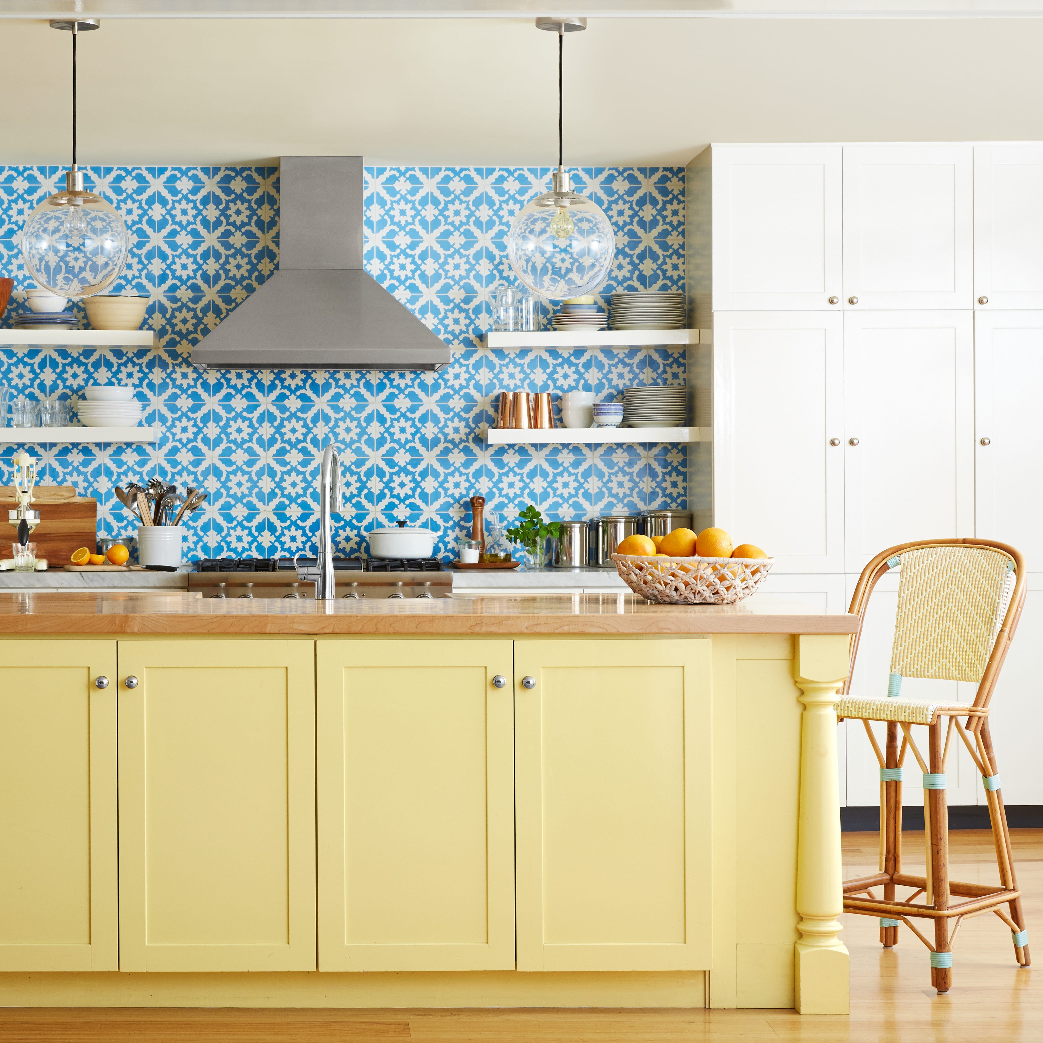
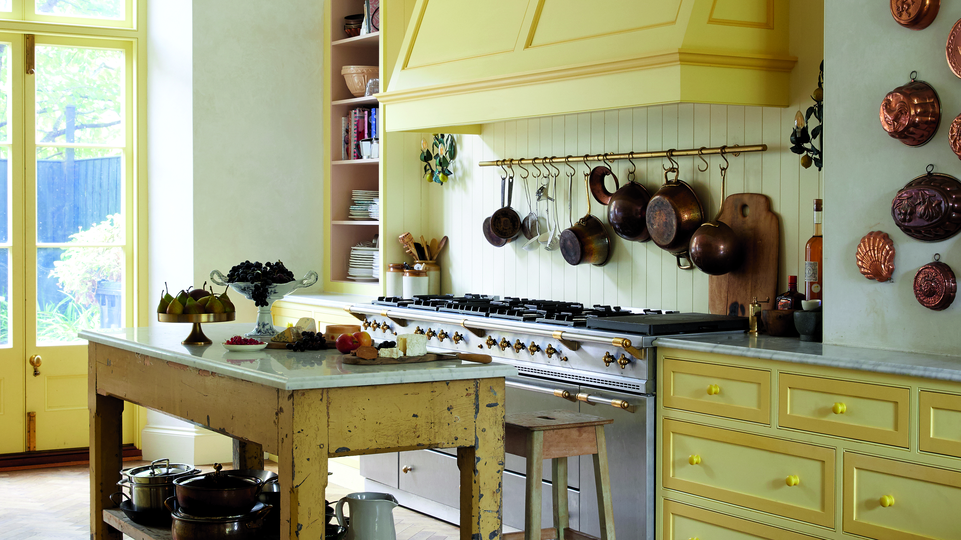
The article explores whether butter yellow, a dominant color trend in 2025, is nearing the end of its peak popularity in interior design. Designers hold mixed opinions on the color's longevity. Some, like Elizabeth Vergara, suggest that butter yellow has become oversaturated and thus "overdone." Conversely, Lauren Saab argues that butter yellow is not over but rather evolving into a more refined and mature application within design.
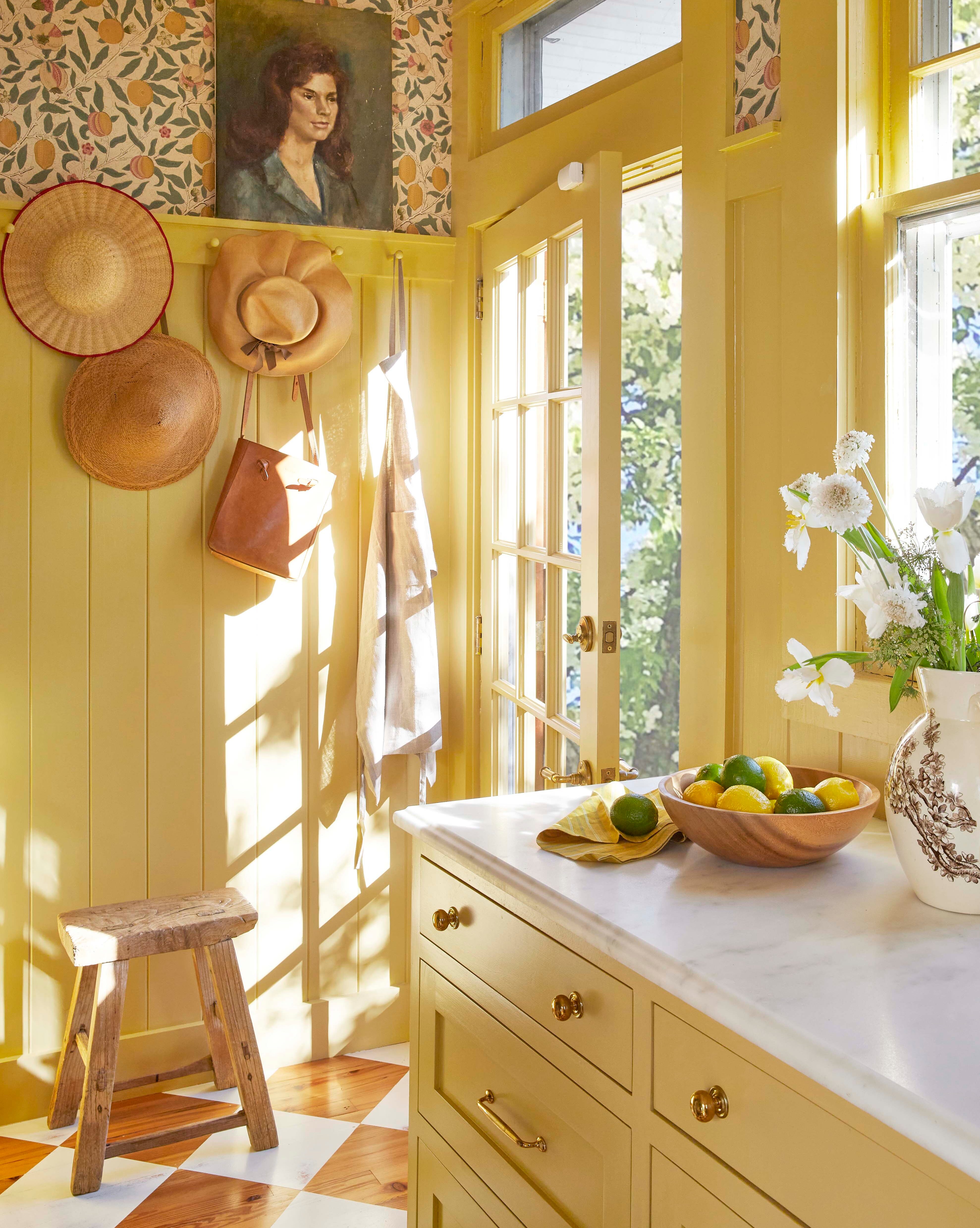
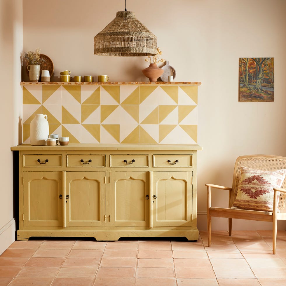
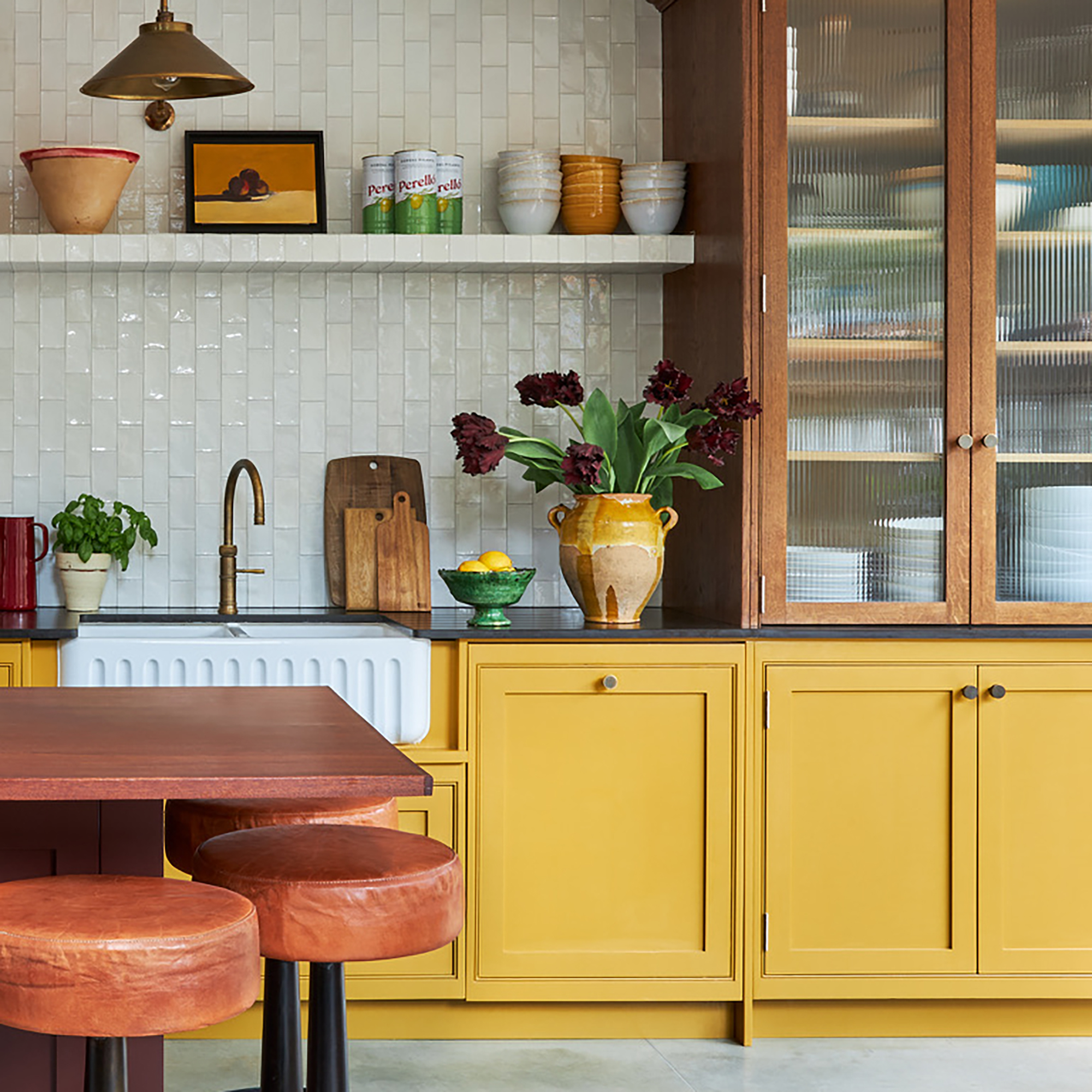
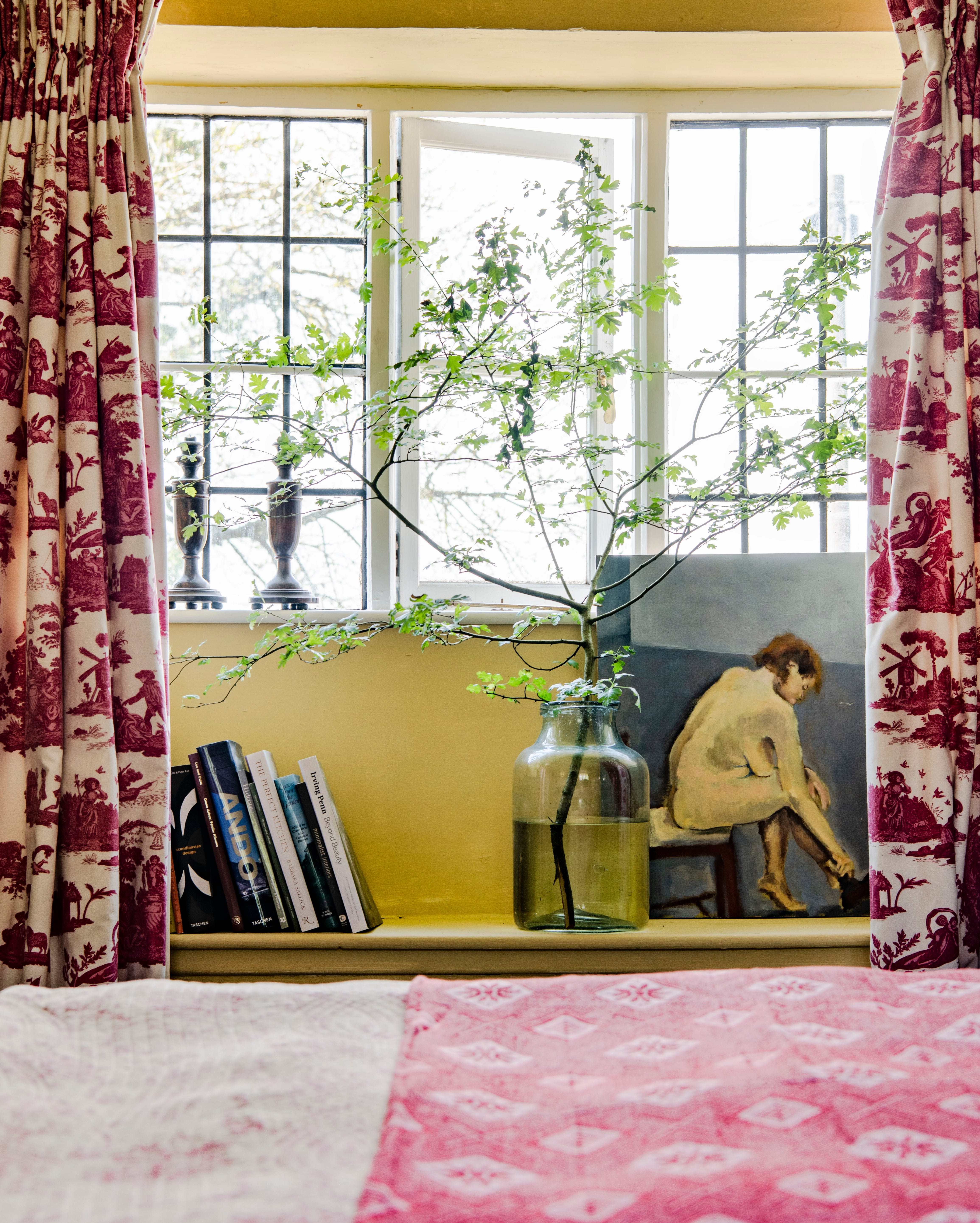
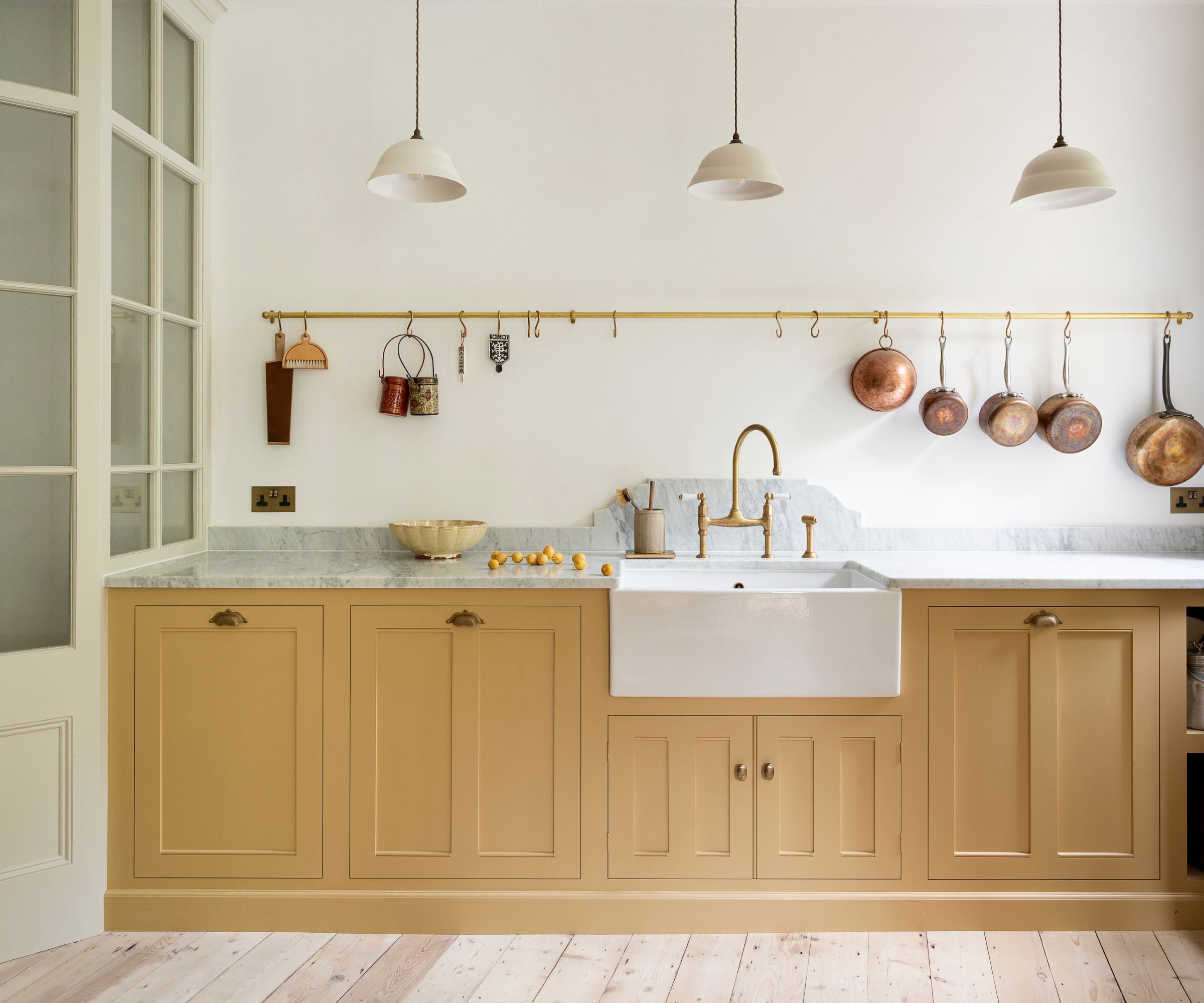
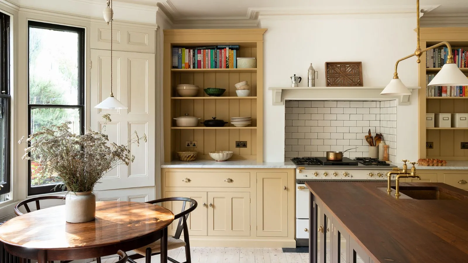
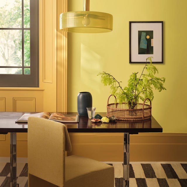
Despite differing views on butter yellow's status, designers agree on several emerging colors that could potentially overshadow its popularity in the coming months. These include sun-soaked shades such as ochre and muted clay. Lauren Saab notes that these colors offer similar warmth to butter yellow but with greater depth and a more architectural feel, shifting away from nostalgia towards stronger structural elements. Elizabeth Vergara adds that these richer, deeper yellows are more timeless and complement natural textures like oak and linen.
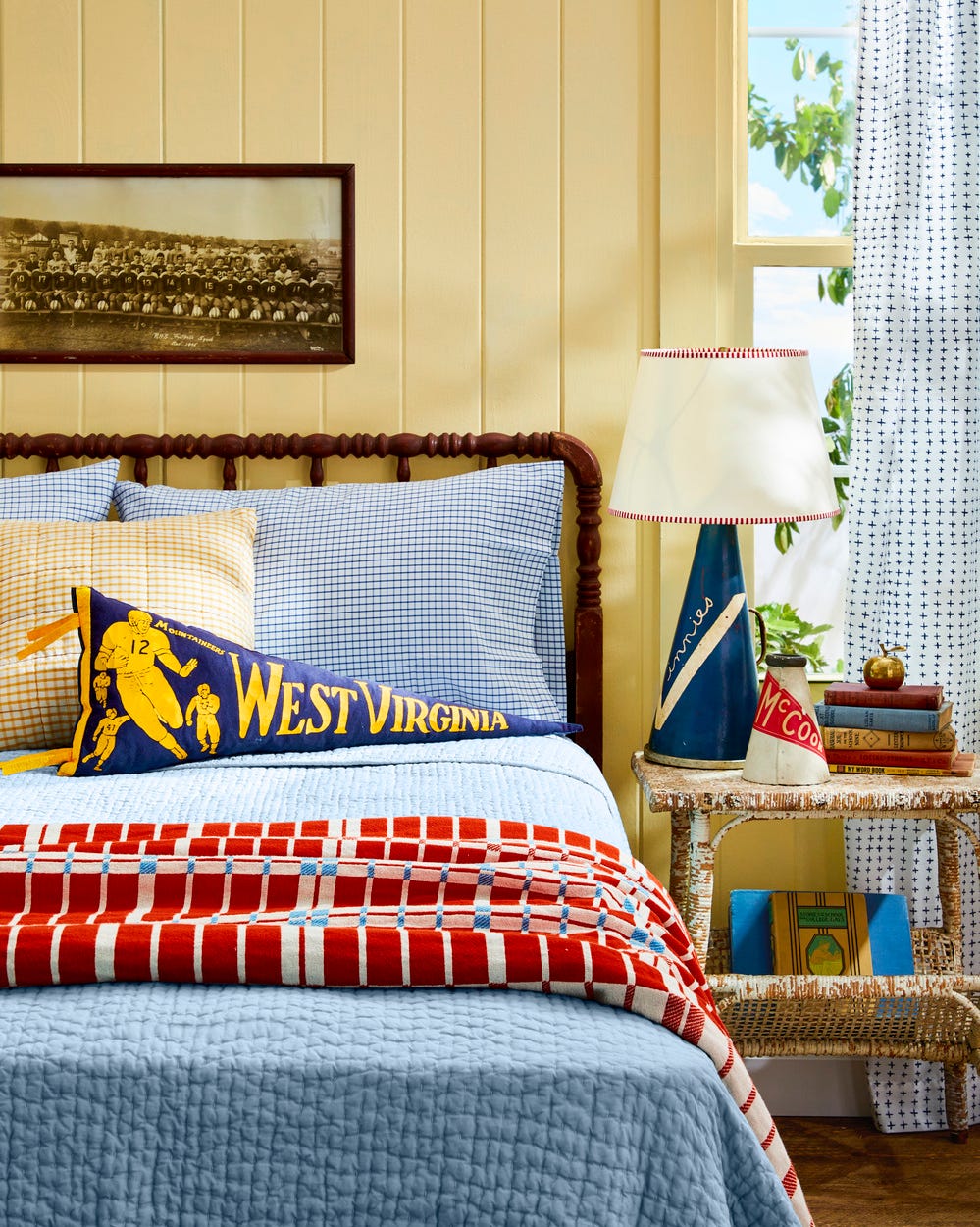
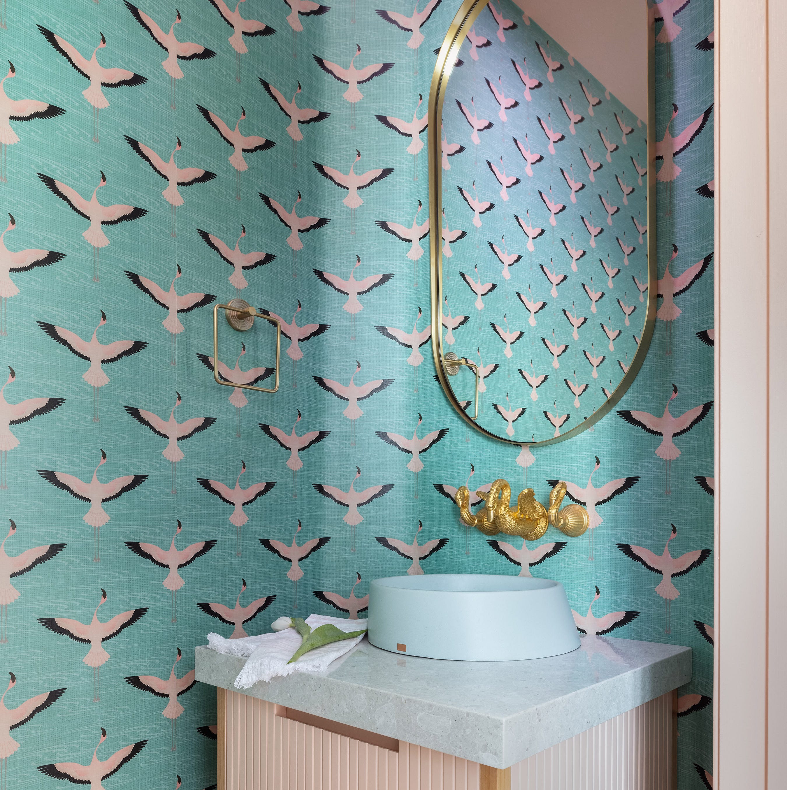
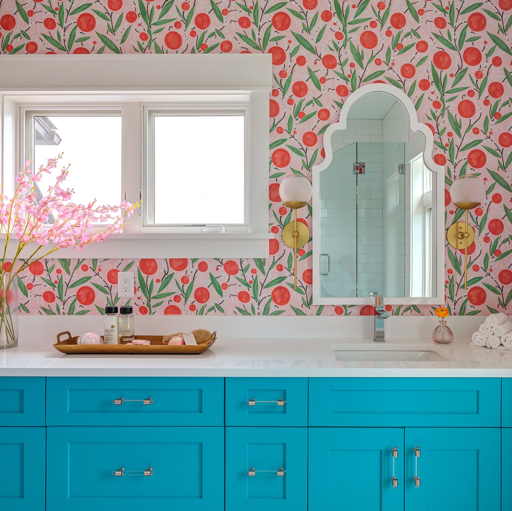
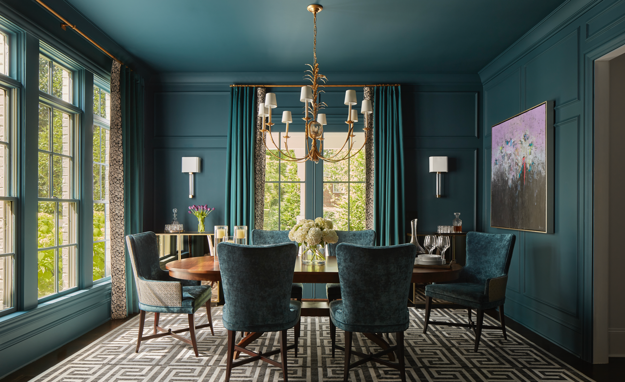
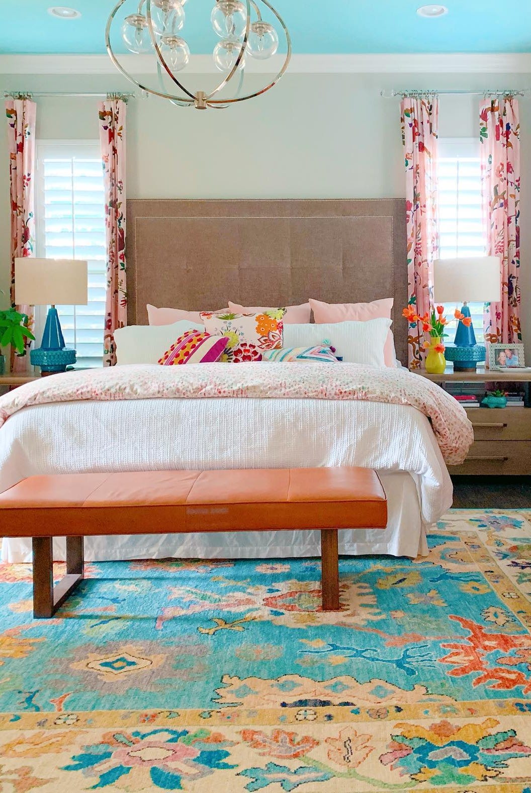
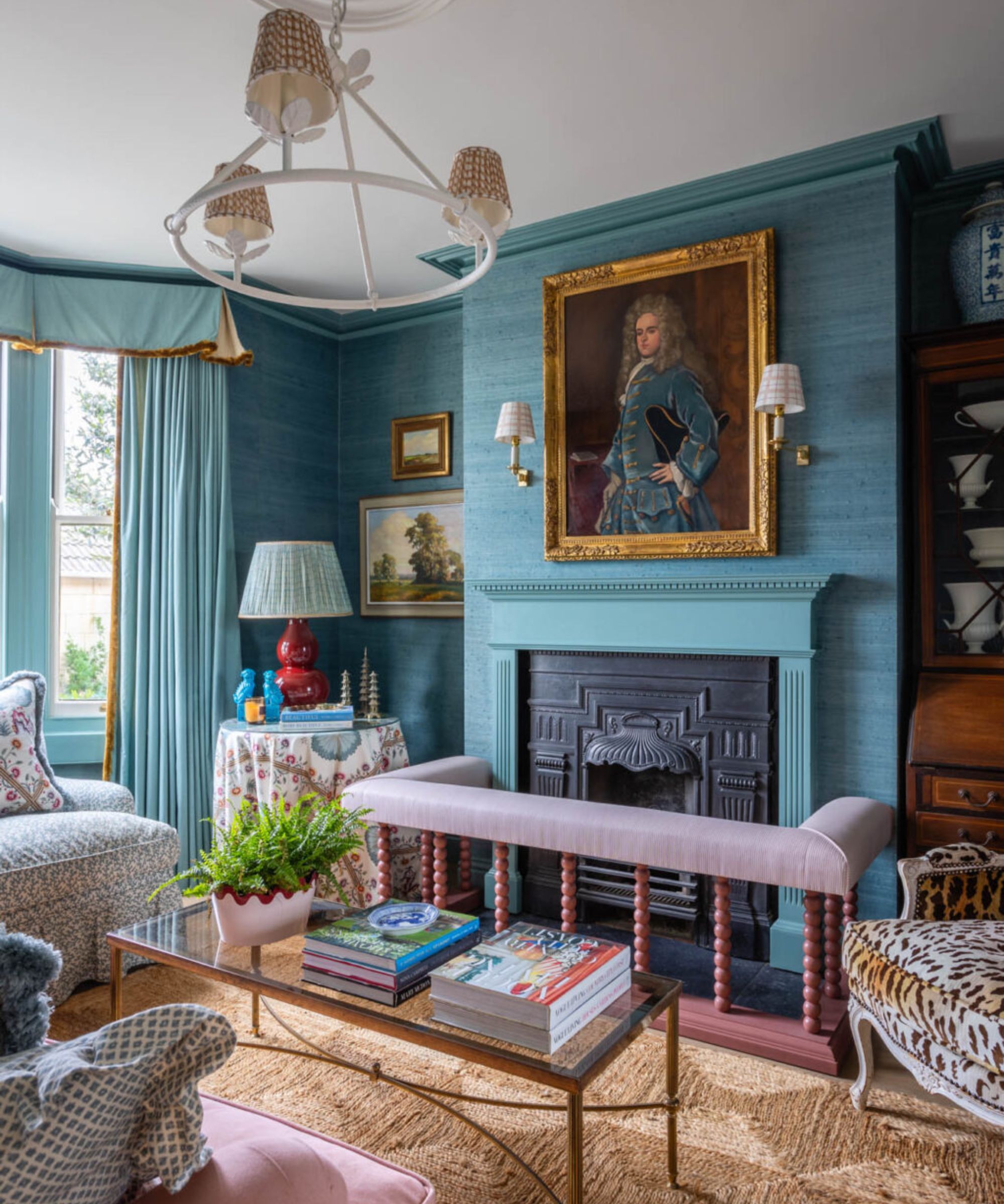
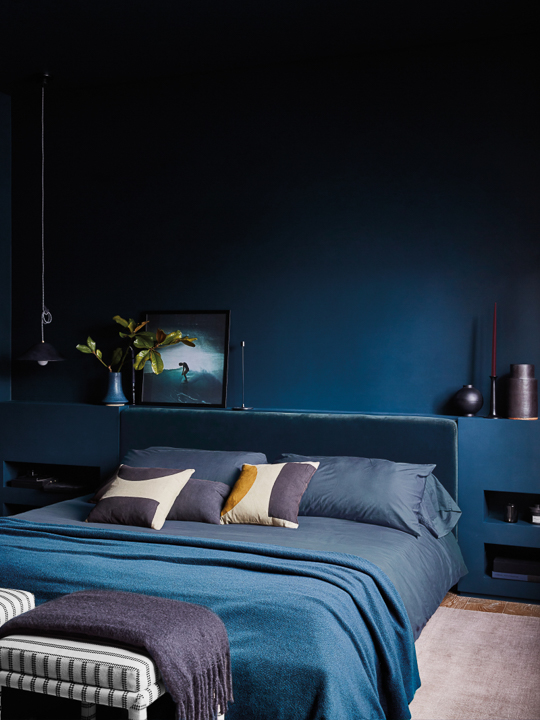
Another color identified as a potential successor is cobalt blue. Designer Jessica Brooks highlights its growing prominence in fashion, which often influences interior design. Cobalt blue, along with other sapphire-inspired tones, offers a jewel-like richness with a contemporary edge, appealing to those seeking a bold yet sophisticated statement. It provides a vibrant pop of color without being overwhelming, contributing to a sense of luxury and fun.
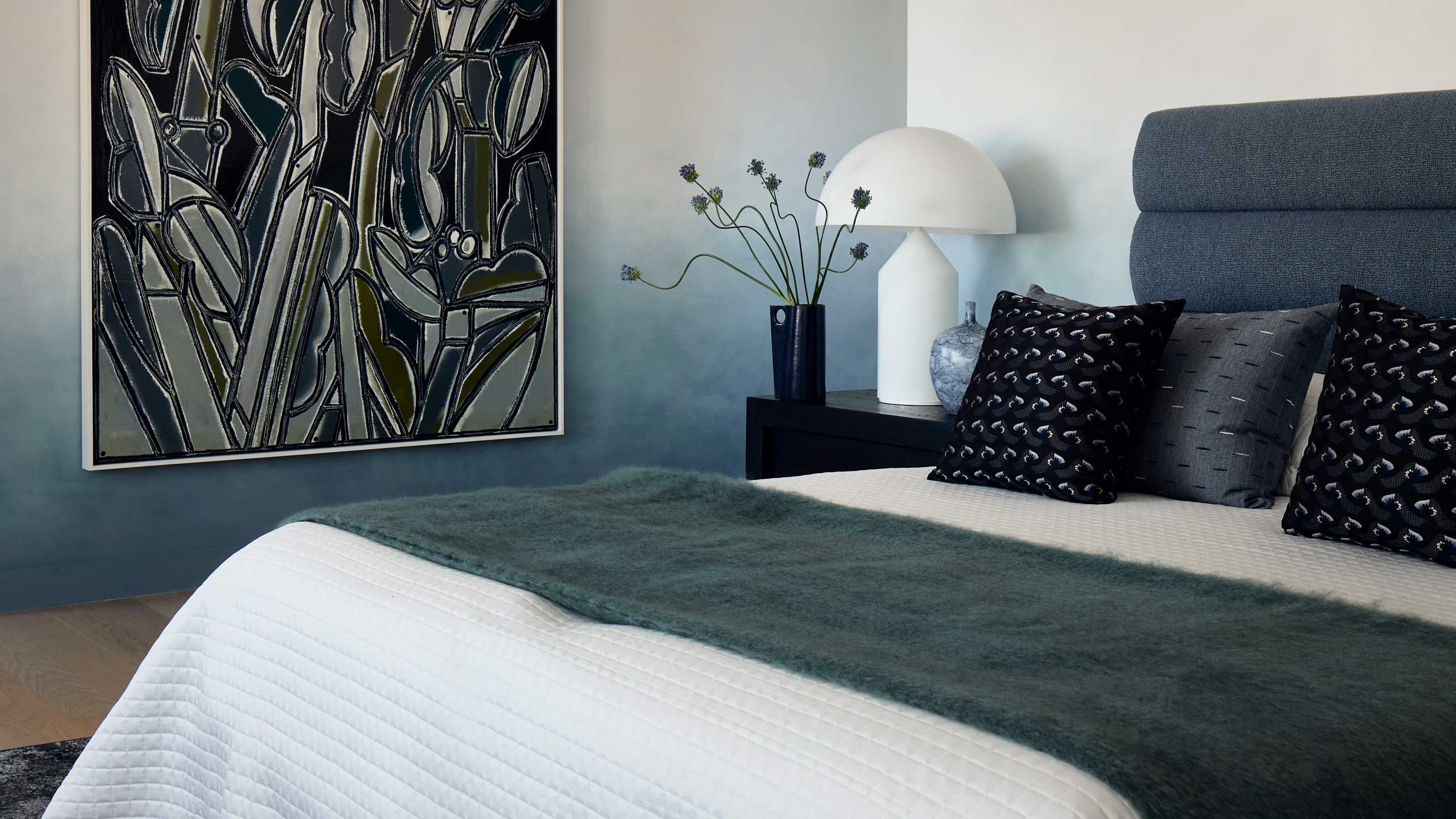
Light periwinkle is also presented as a contender, valued for its softness, a quality that initially endeared butter yellow to many. Interior designer Amy Konarzycki describes light periwinkle as evocative of dusk and dawn skies, pairing well with whites, grays, and bleached woods. This color, like butter yellow, strikes a balance between boldness and softness, making it a calming and potentially highly sought-after shade for interiors.
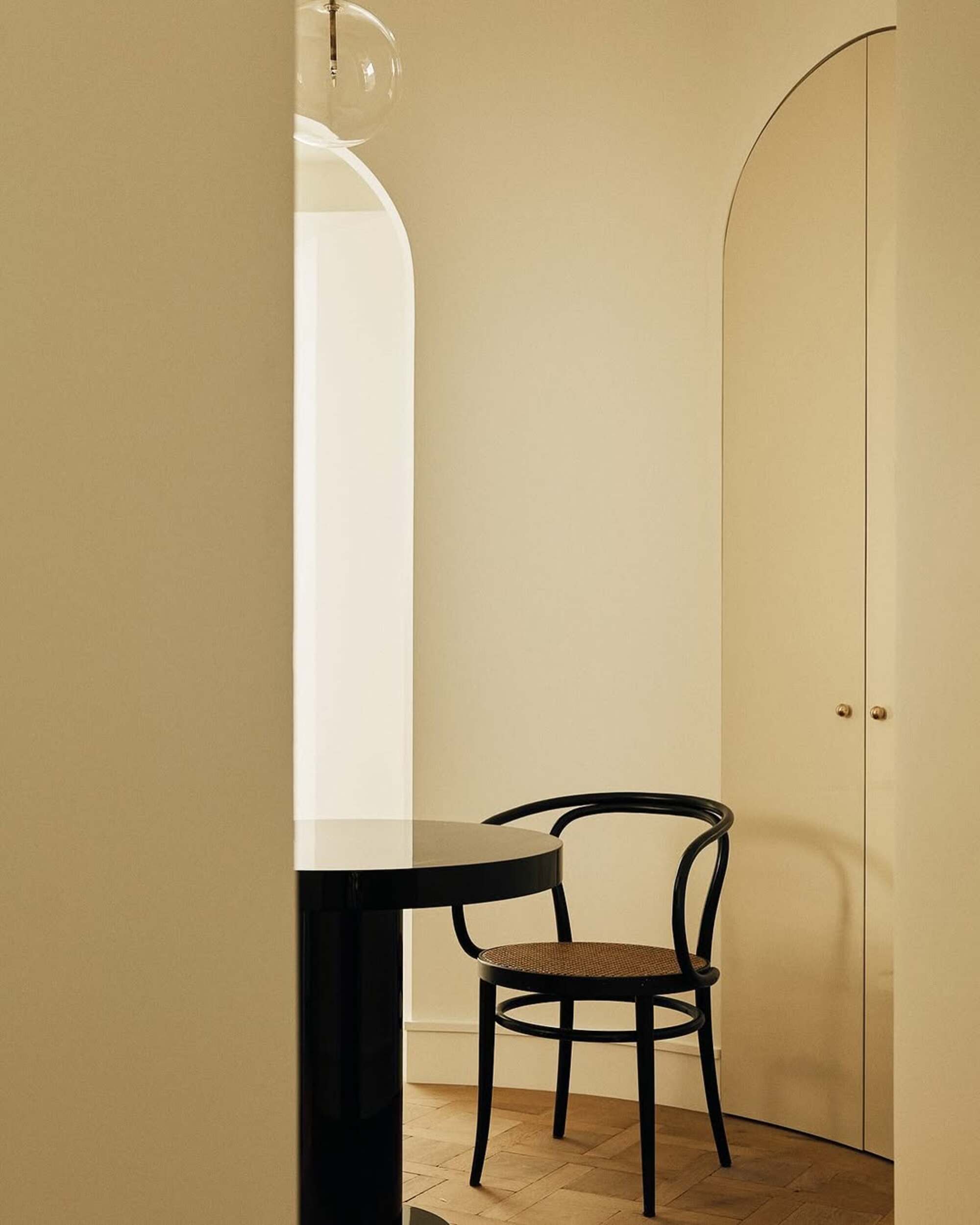
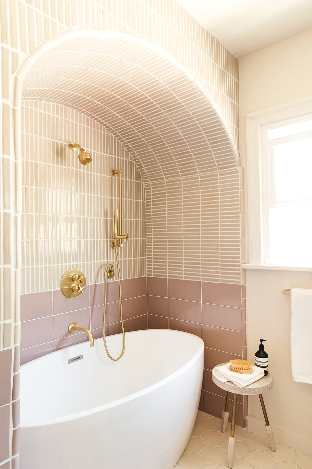
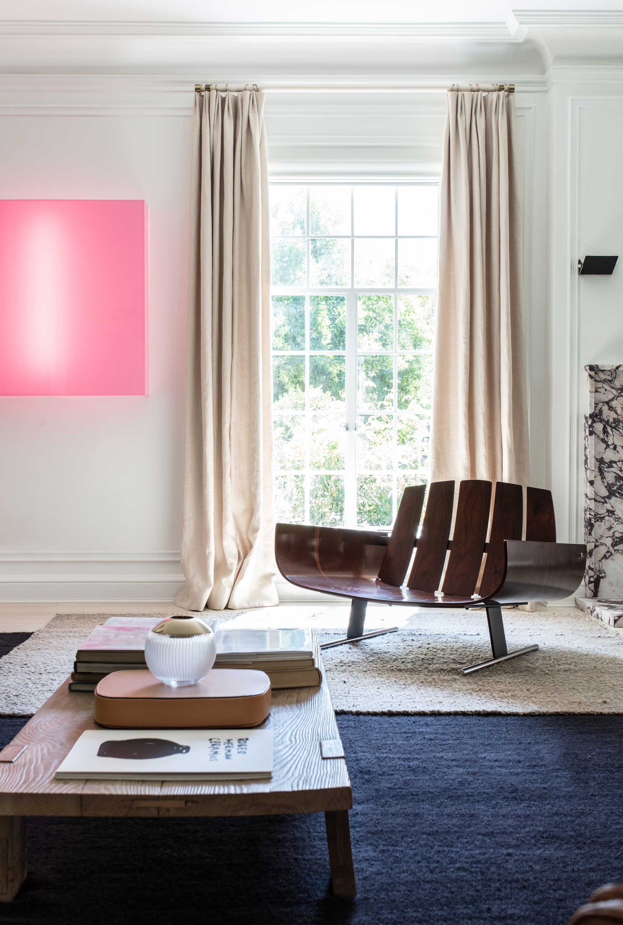
Warm neutrals, such as light beige, taupe, and cream, are considered timeless alternatives to butter yellow. Designer Sarah Trop explains that while butter yellow brightens a space, its trendy nature might limit its long-term appeal. Warm neutrals, particularly those with a pink undertone, offer enduring style and greater versatility, integrating seamlessly with a broader range of palettes. Examples provided are Benjamin Moore's Baby Fawn and Featherstone, which are warm, muted, and elegant.
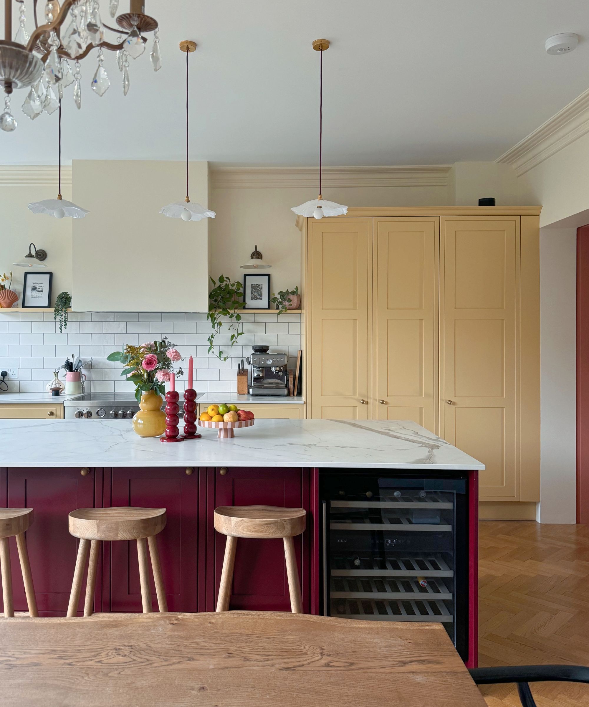
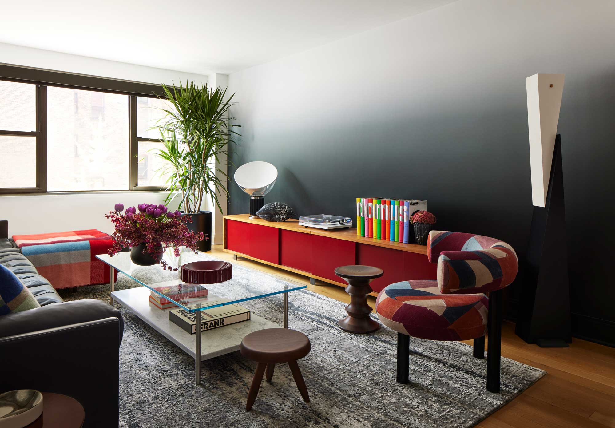
Finally, rich burgundy and maroon are anticipated to gain prominence as the seasons shift towards colder months. Ashley Stark suggests that these deeper hues offer a sense of richness and grounding that butter yellow cannot. They provide a bold statement while remaining harmonious with neutrals and create a "cocooning" atmosphere, ideal for autumn and winter. Farrow & Ball's Eating Room Red is cited as an example of an inviting, deep red that can establish a cozy ambiance. In summary, while butter yellow remains relevant, the design world is seeing a shift towards a diverse palette of colors offering depth, sophistication, and versatility for various aesthetic preferences and seasonal transitions.
#InteriorDesign #ColorTrends #HomeDecor #ButterYellow #ColorPalette #DecoratingIdeas #DesignInspiration #WarmNeutrals #InteriorDesign #ColorTrends #HomeDecor #ButterYellow #ColorPalette #DecoratingIdeas #DesignInspiration #WarmNeutrals
0 comment in total
 No comments yet
You may also like
Butter yellow is 2025's new neutral – and these 12 delicious pale yellow buys have convinced me it beats my once-loved beige
This Spring Colour Is the New Beige for Fashion People Everywhere

9 On-Trend Yellow Paint Colours For 2025

The 1950s Paint Color Trend Taking Over In 2025 That Designers Call ‘Refreshing’ And ‘Nostalgic’
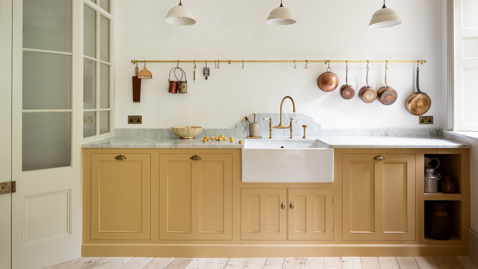
Butter yellow kitchens are dividing opinions – but these 7 designs prove this soft hue is more than just a fleeting trend
5 Butter Yellow Paints That Designers Swear By — So You Can Get This Trending Color on Your Walls With Confidence

The next butter yellow? I just spotted a vibrant twist on 2025's most beloved color on Emilia Clarke's country kitchen cabinets
How to Wear Chartreuse Like Amanda Seyfried
Butter Yellow Is the Hottest Color of the Year and the Met Gala Just Proved It
It’s Official: Designers Are Ditching This Once-Classic Color
Butter yellow is the kitchen colour of the season - this is how to make the delicious shade work
This surprising color trend is having a comeback
Goodbye To Butter Yellow: The Moodier Hue That's On Trend

This Very "Controversial" Color Is About To Be Everywhere Again

‘Unexpected Yellow Theory’: The Bold New Interior Trend Replacing Red in 2025
What colors go best with butter yellow? 8 equally delicious shades to pair with spring's hottest color trend

Butter Yellow and the Foodification of Color

12 Color Schemes That Are Popping Off Right Now, According to Designers
5 living room paint colors going out of style in 2025
6 Outdated Paint Colors Designers Don't Want to See in Homes Anymore in 2026