1/2
Pantone’s Color of the Year is Green—a Vastly Underappreciated Color
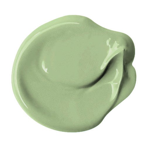
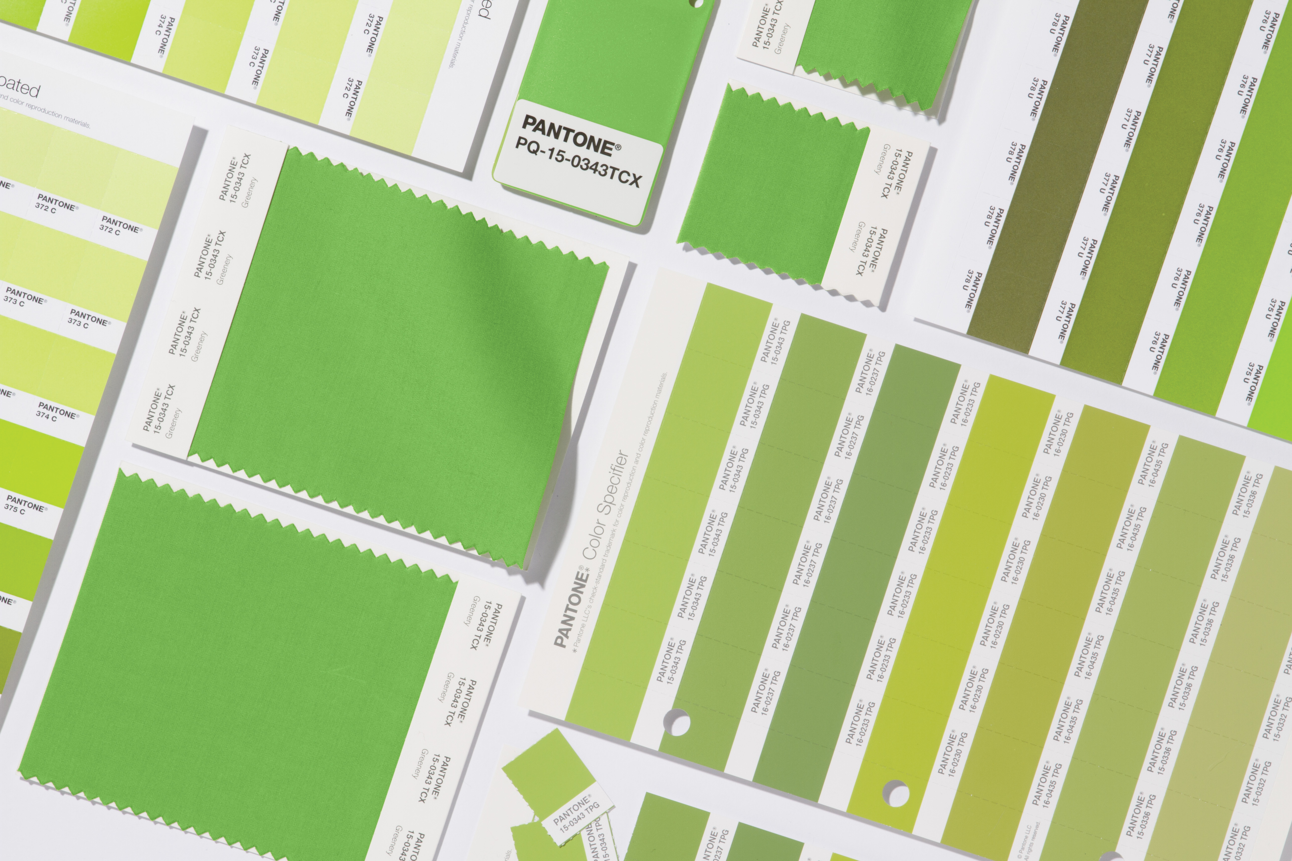
The article discusses Pantone's selection of "Greenery" as its Color of the Year for 2017, highlighting the color's significance and various applications across different aspects of life. The author expresses personal delight in the choice, considering green an underappreciated color. Pantone describes "Greenery" as a "fresh and zesty yellow-green shade that evokes the first days of spring," with Pantone Institute CEO Leatrice Eiseman noting its role in providing hope, rejuvenation, revitalization, and unity in a complex social and political landscape.
The article explores several categories where green plays a significant role. It begins by examining "Green Plants," emphasizing their literal presence across Earth and their environmental benefits. It mentions that while much of the planet is blue, green is crucial, with a single leaf producing approximately five milliliters of oxygen per hour. Houseplants like ivy are highlighted for their ability to produce oxygen and filter toxins from the air, linking this to the author's personal experience with asthma and houseplant ownership.
Next, the focus shifts to "Green Foods That Are Naturally Green," identifying nutritious vegetables such as spinach, kale, asparagus, and broccoli. These foods are recognized for their high fiber content, numerous vitamins, potassium, and anti-cancer compounds. The article acknowledges the health benefits of these natural green foods and the author's commitment to incorporating them into their diet, even if it's primarily for the visual appeal they add to a plate.
The discussion then moves to "Green Foods That _Aren’t_ Naturally Green," showcasing faux-green foods that are delicious despite being unhealthy. Examples include the soft drink Surge and traditionally green-dyed bagels and pizza for St. Patrick's Day. The article explains that the green coloring in these items makes them special rather than attempting to mislead consumers about their nutritional value.
"Green Power Dresses" explores the historical and cultural impact of green in fashion. Figures like Scarlett O’Hara from *Gone With the Wind*, who fashioned a dress from green drapes to project confidence, and Jennifer Lopez's iconic plunging green Versace dress at the 2000 Grammy Awards are cited. The article also touches upon art history, referencing the green pigments used in art, sometimes toxic, and the bundled green gown in Jan Van Eyck’s *The Arnolfini Portrait*, which has inspired extensive interpretations.
"Green (Lantern) Mythology" delves into the presence of green in pop culture, specifically through DC Comics' Green Lantern. The superhero's green strength is attributed to willpower, inspired by 1940s train engineers' green lanterns. The article also traces the historical significance of green lanterns in New York City, where 17th-century "Rattle Watchman" used them for patrolling, a tradition still reflected in many police stations today.
Finally, "Green Characters of My Childhood" lists beloved childhood characters associated with the color green, including Rainbow Brite’s Patty O’Green, Good Luck Bear from Care Bears, *Ghostbusters*’ Slimer, and Tinker Bell, all of whom hold a special place in the author's heart as embodiments of their favorite color.
#PantoneColor #ColorOfTheYear #Greenery #InteriorDesignTrends #SustainableLiving #HealthyEating #FashionHistory #PopCulture #EnvironmentalBenefits #PantoneColor #ColorOfTheYear #Greenery #InteriorDesignTrends #SustainableLiving #HealthyEating #FashionHistory #PopCulture #EnvironmentalBenefits
0 comment in total
 No comments yet
You may also like
Acid Green - The Color of the Year That No One Is Talking About

If You Want To Feel More Creative In 2022, Wear This New Color
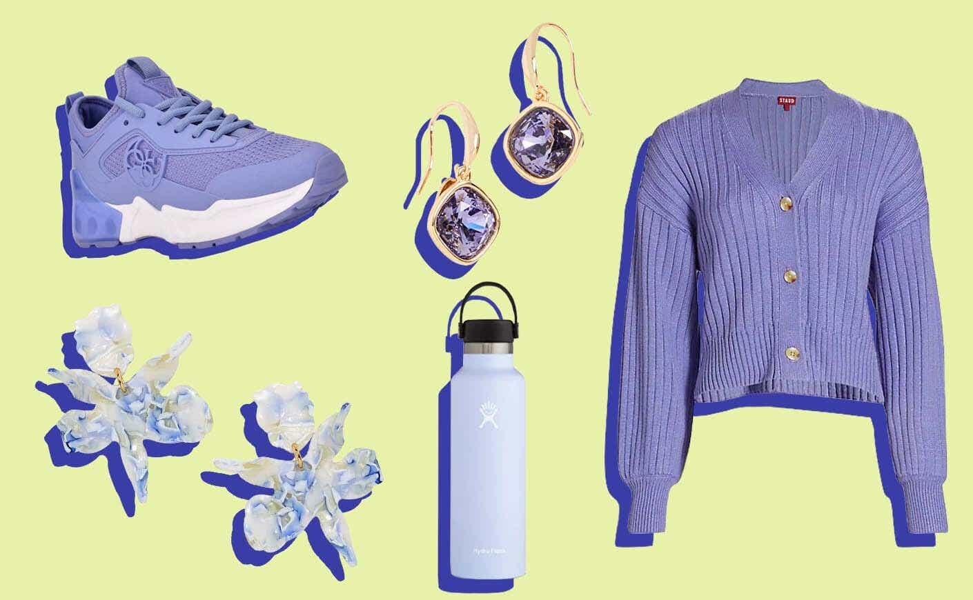
16 Gorgeous Products in Pantone’s Color of the Year: Very Peri
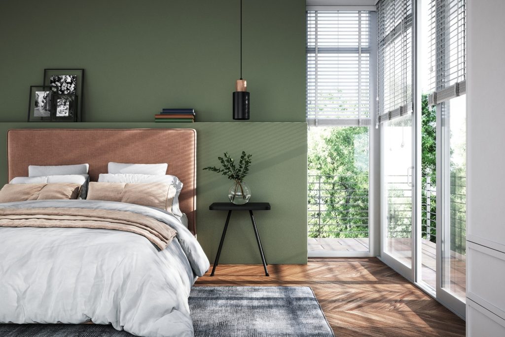
The best green paint colors for a soothing, sophisticated home

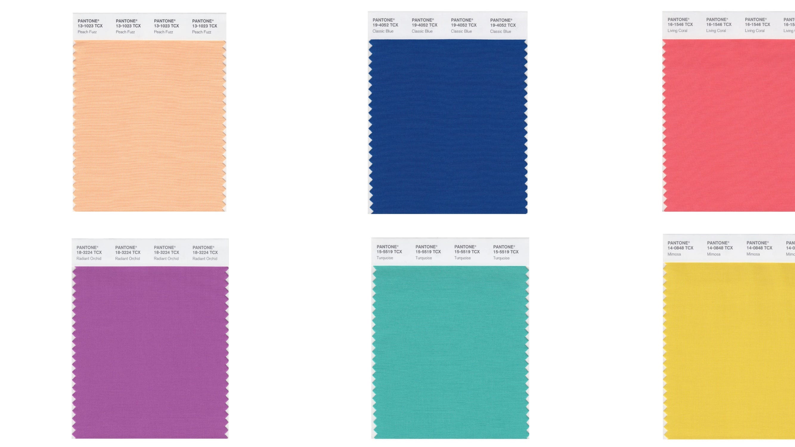
A Guide to All the Pantone Colors of the Year and What They've Represented

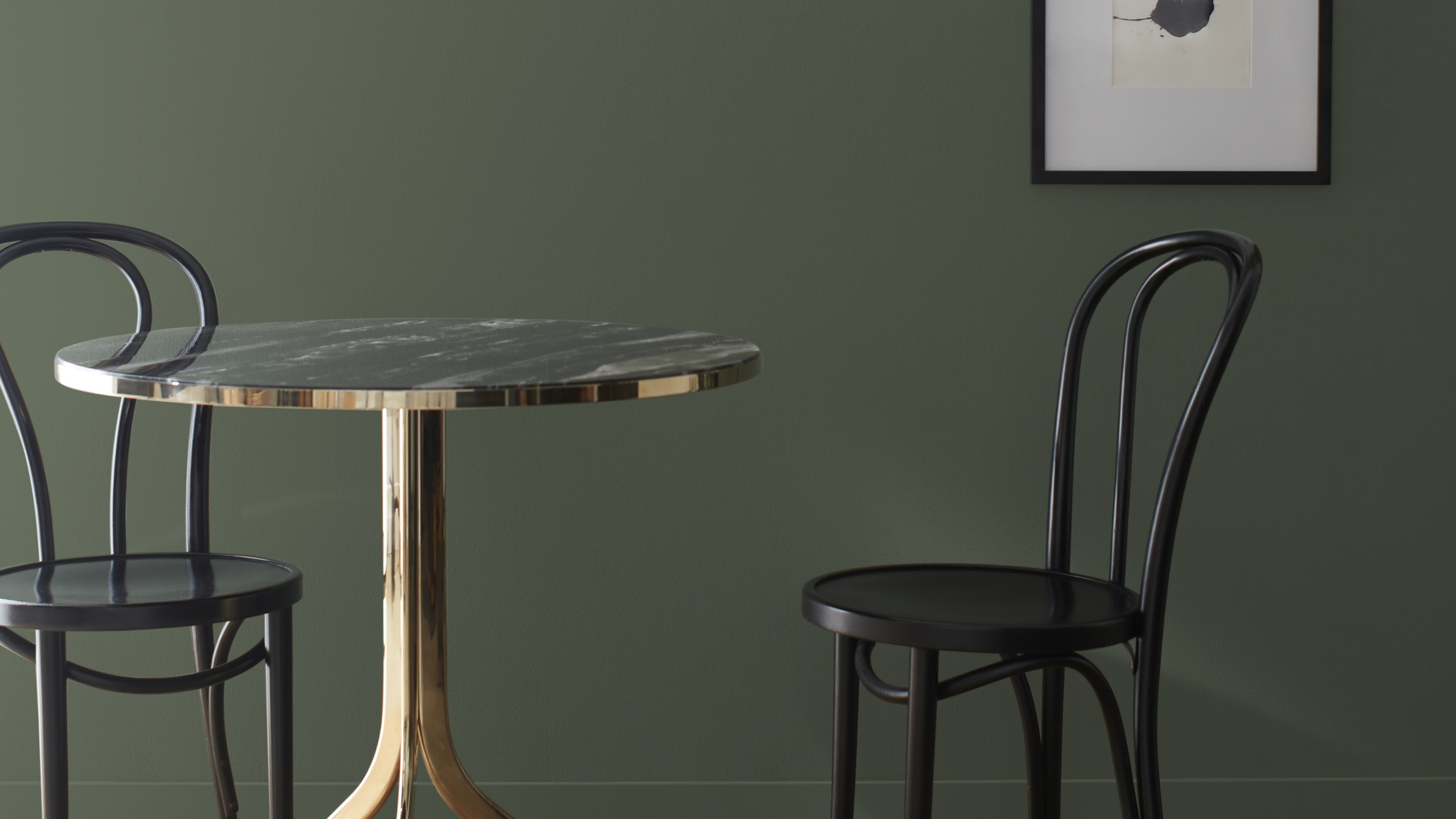
I Think I May Have Just Discovered the Most Timeless Green Paint Color

7 Brilliant Ways to Decorate with Pantone's 2022 Color of the Year

Pistachio green is the go-to color for spring and summer 2025

Homes With This Color Inside Are Worth More

White is the 2026 Pantone Color of the Year. They say the choice isn’t political.

'Cloud Dancer' to Claret: Eight paint colours that can easily transform your home

How to Use Pantone’s 2016 Color of the Year

Going Green: Inside This Year’s Color Craze
Vibrant Green Is The Color Trend That Comes Celeb Approved

Every Single Pantone Colour Of The Year From 2000 – 2026
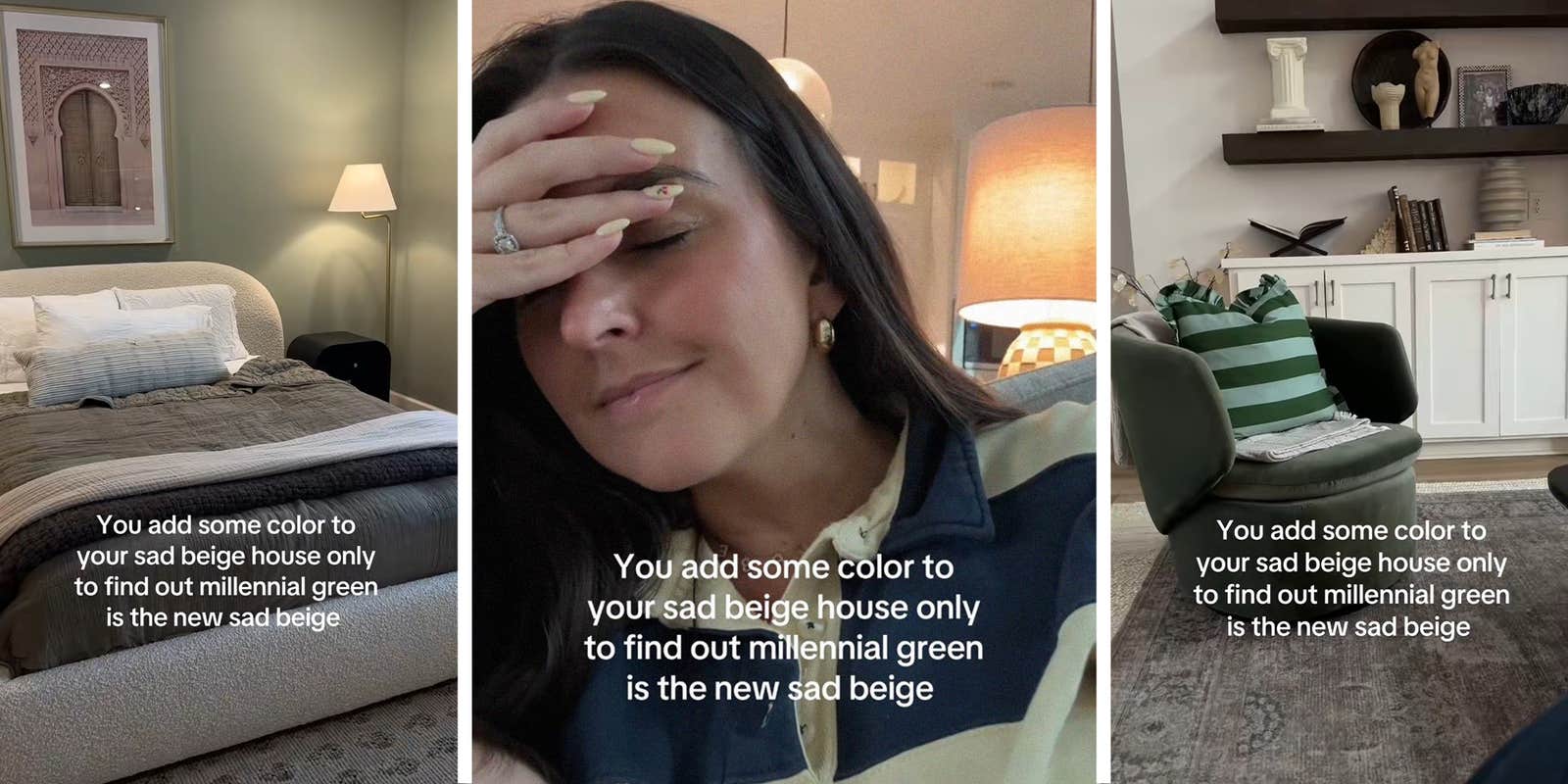
Is millennial green the new ‘sad beige’?
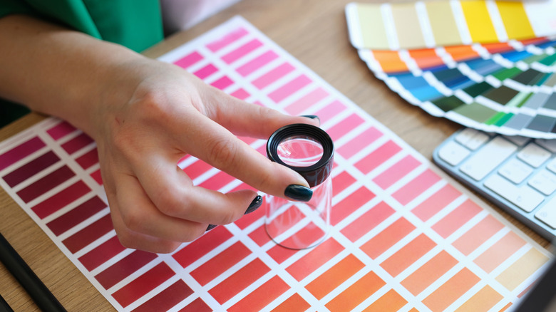
Every Pantone Color Of The Year For The Last Decade

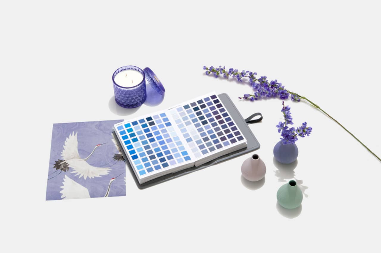
Designers Weigh in on 'Very Peri'—Pantone’s Color of the Year 2022
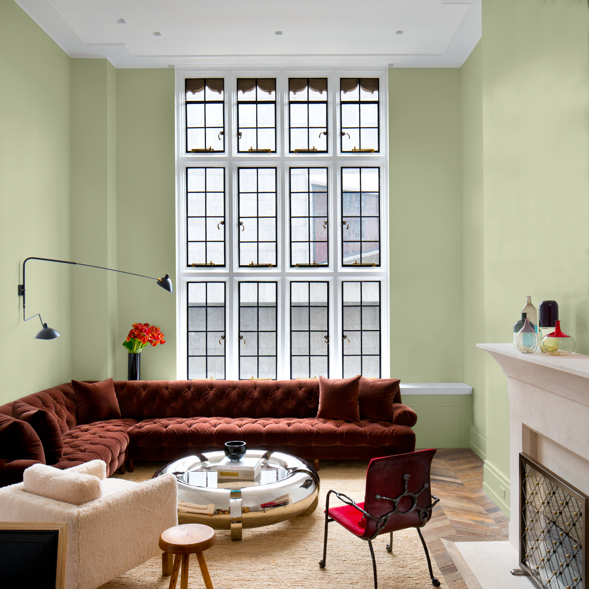
PPG's Color of the Year for 2022 Is Fulfilling All Our Verdant Dreams

The Color of the Year Is Chartreuse Shame